Table of Contents for
The Adobe Photoshop Lightroom Classic CC Book, Second Edition
 The Adobe Photoshop Lightroom Classic CC Book, Second Edition
Published by
Adobe Press, 2019
The Adobe Photoshop Lightroom Classic CC Book, Second Edition
Published by
Adobe Press, 2019
- Contents
- Cover Page
- Title Page
- Copyright Page
- Dedications
- Introduction
- Contents
- 1 Introducing Adobe Photoshop Lightroom
- 2 Importing photos
- 3 The Library module
- 4 Develop module image editing
- The Tone Curve Panel
- Easing the Workflow
- 5 The art of black and white
- 6 Sharpening and noise reduction
- 7 Exporting from Lightroom
- 8 Printing
- 9 Presenting your work
- 10 Managing your photos in Lightroom
- 11 Lightroom CC/mobile
- 12 Lightroom preferences and settings
- Index
1. This overexposed photograph was initially processed using the default Basic panel settings in the Develop module. The histogram showed severe clipping in the highlights, and you can see here how there is not much detail in the lightest areas. A histogram like this can appear disconcerting until you realize that there is more information contained in the image than appears at first sight.
2. The main treatment for an overexposed photo is to apply a combination of negative Exposure and Highlights adjustments, although I mainly used the Exposure slider here to achieve the desired darkening.
Correcting Underexposed Images
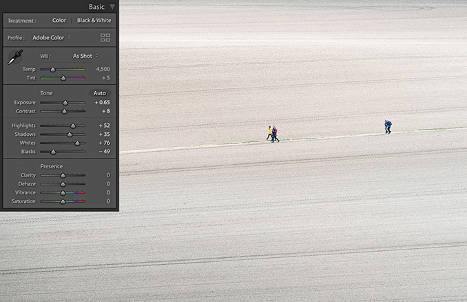
Underexposed images present a bigger problem because there will be fewer levels available for you to manipulate, particularly in the shadows. However, the Basic panel controls in Lightroom can be used to brighten an image and lift out the shadow detail. The way you need to approach this is to start by dragging the Exposure slider to the right until the image appears to have about the right brightness. As you do so, do not worry too much about the shadows, because the next step will be to adjust the Shadows slider by dragging this to the right to bring out more detail in the shadow regions of the image. Beyond that, it is all about fine-tuning the remaining sliders. In the example shown here, I needed to reduce the Highlights to preserve tonal detail in the highlight areas, and I also needed to adjust the Blacks slider to compensate for the Shadows adjustment and maintain the right amount of contrast in the darker areas. You will also want to watch out for deteriorating shadow detail, as brightening up a dark photo can reveal problems in the shadows such as tone banding and noise. See Chapter 6 for advice on how best to handle such situations.
1. To begin with, this image was underexposed and the Basic panel settings remained at the default 0 settings.
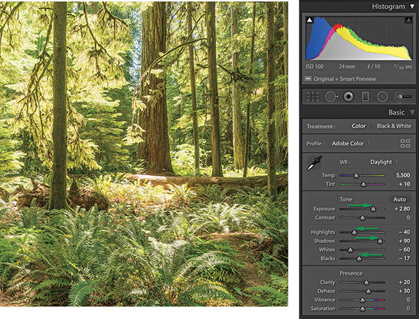
2. I dragged the Exposure slider to the right, which lightened the image considerably. But because I was lightening for the midpoint, this adjustment also over-brightened the highlight areas. To compensate for this, I applied a negative Highlights adjustment. I added a positive Shadows adjustment to lighten the dark areas of the photo and applied a small negative Blacks adjustment to ensure the shadows were clipped correctly. Finally, I added positive Clarity and Dehaze adjustments to boost the midtone contrast. The end result is a photo that is perfectly usable (considering how dark it was before). However, lightening such a dark original will also amplify the noise, which may be especially noticeable in the deep shadow areas.
Match Total Exposures
You can use the Match Total Exposures command to match the exposure brightness across a series of images that have been selected via the Filmstrip. Match Total Exposures calculates a match value by analyzing and combining the shutter speed, the lens aperture, the ISO, and any camera-set exposure compensation. It then factors in all these camera-set values, combines them with the desired exposure value (as set in the most selected image), and calculates new Lightroom exposure values for all the other selected images. I find this technique can often be used to help average out the exposure brightness in a series of photos where the light levels have gone up and down during a shoot, or where there is a variance in the strobe flash output. The former chief Lightroom architect Mark Hamburg also liked to describe this as a “de-bracketing” command. Basically, if you highlight an individual image in a series and select Match Total Exposures, the other images in that selection will automatically be balanced to match the exposure of the target image.
Tip
The Match Total Exposures command is also available as an option in the Library module Photo ![]() Develop Settings menu.
Develop Settings menu.
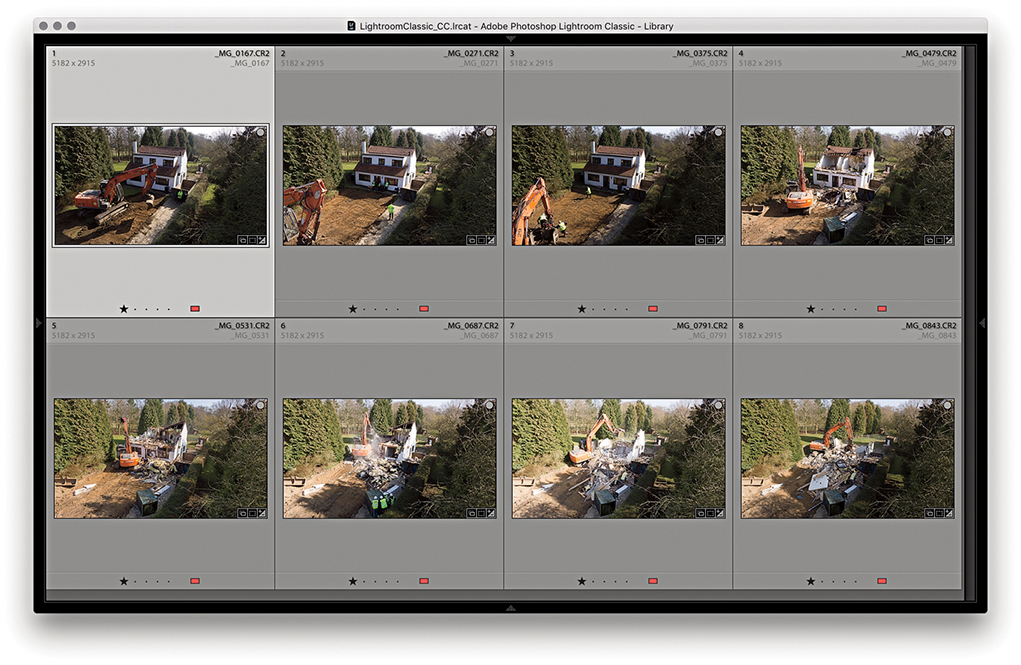
1. To begin, I made a selection of photographs in the Library module Grid view. As you can see, the light levels varied quite a bit when I shot this photo sequence.
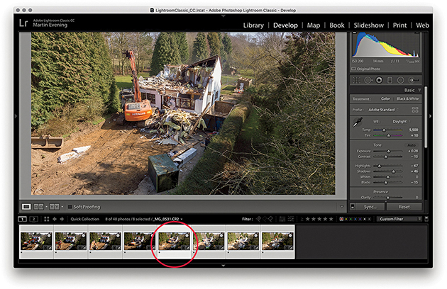
2. I selected the photo with the most correct-looking exposure and made this the most selected, target image. I went to the Develop module and chose Match Total Exposures from the Settings menu ( [Mac] or
  [PC]).
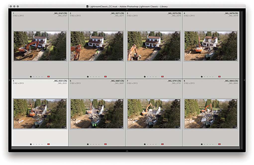
3. In the Library Grid view, you can see the exposure appearance of the selected photos is now more evenly balanced compared to the Library Grid view in Step 1.
Highlight Clipping and Exposure Settings
The main objective when optimizing an image is to ensure that the fullest tonal range can be reproduced in print. With this in mind, it is vitally important you set the highlights correctly. If the highlights are clipped, you risk losing important highlight detail in the finished print. And if you don’t clip them enough, you will end up with flat-looking prints that lack sparkle.
When setting the Exposure and Whites sliders, you need to be aware of the difference between reflective and nonreflective highlights and how the highlight clipping you apply affects the way the image will eventually print. The two examples shown in Figure 4.48 help explain these differences. A reflective highlight (also referred to as a specular highlight) is a shiny highlight, such as the light reflecting off a glass or metal surface, and contains no highlight detail. It is therefore advisable to clip these highlights so that they are the brightest part of the picture and are printed using the maximum paper-white value. In Figure 4.48, the metal sculpture has plenty of reflective highlights, and you would want to make sure these were clipped when making an Exposure adjustment. Nonreflective highlights (also known as nonspecular highlights) need to be treated more carefully. These mostly contain important detail that needs to be preserved. Each print process varies, but in general, whether you are printing to a CMYK press or printing via a desktop inkjet printer, if the nonreflective highlights are set too close to the point where the highlights start to clip, there is a risk that any important detail in these highlights may print as paper white.
It is not too difficult learning how to set the Exposure and Whites sliders correctly. Basically, you just need to be aware of the difference between a reflective and nonreflective highlight, and the clipping issues involved. Most photos will contain at least a few reflective highlights. In practice, I use the highlight clipping preview when adjusting the Whites slider (discussed on page 201) to analyze where the highlight clipping is taking place and toggle between the clipping preview and the Normal image preview to determine if these highlights contain important detail. Alternatively, you can use the clipping warning in the Histogram panel as a guide as to when the highlights are about to become clipped. I usually adjust the Whites slider so that the reflective highlights are slightly clipped, but at the same time, I carefully check the nonreflective highlights to make sure these are protected. To do this, I either reduce the Highlights slider to protect the highlights or (more likely) adjust the Whites slider so that the reflective highlights are a little less bright than the brightest white.
Clipping the blacks
Setting the blacks is not nearly as critical as adjusting the highlight clipping. It all boils down to a simple question of how much you want to clip the shadows. Do you want to clip them a little, or do you want to clip them a lot?
There is no need to set the shadow point to a specific black value that is lighter than a 0 black unless you are working toward a specific, known print output. Even then, this should not really be necessary, because both Lightroom and Photoshop are able to automatically compensate the shadow point every time you send a file to a desktop printer, or each time you convert an image to CMYK. Just remember this: Lightroom’s internal color management system always ensures that the blackest blacks you set in the Basic panel faithfully print as black and preserve all the shadow detail. When you convert an image to CMYK in Photoshop, the color management system in Photoshop similarly makes sure the blackest blacks are translated to a black value that will print successfully on the press.
On page 201, I showed an example of how to use a clipping preview to analyze the shadows and determine where to set the clipping point with the Blacks slider. In this example, the objective was to clip the blacks just a little so as to maximize the tonal range between the shadows and the highlights. It is rarely a good idea to clip the highlights unnecessarily, but clipping the shadows can be done to enhance the contrast. Figure 4.49 shows an example of deliberately clipping the shadows in an image to go to black. A great many photographers have built their style of photography around the use of deep blacks in their photographs. For example, photographer Greg Gorman regularly processes his black-and-white portraits so that the photographs he shoots against black are printed with a solid black backdrop. Some photographs, such as Figure 4.50, may contain important information in the shadows. In this example, a lot of information in the shadow region needs to be preserved. The last thing I would want to do here would be to clip the blacks too aggressively, as this might result in important shadow detail becoming lost.
Creating HDR Photos Using Photo Merge
The Photo Merge feature can be used to process raw or non-raw images to generate either high dynamic range (HDR) or panorama images, saved as master DNG files. Let’s start though by looking at how Photo Merge can be used to create HDR DNGs.
Tip
You can search for Photo Merge HDR images by creating a smart collection that filters photos that are both DNG files and have the -HDR suffix.
The principles here are the same as when using the Merge to HDR Pro method in Photoshop. You need to select two or more photos of a subject that has been photographed using different exposure settings and shot using the same format—either raw or JPEG. You can even use the Photo Merge feature when only Smart Previews are available. The photographs need to be shot from the same position, ideally with the camera firmly mounted on a tripod. When making the exposures, the lens aperture must remain fixed, and you adjust the exposure only by varying the time duration. You can shoot a bracketed sequence of two, three, five, or seven images, where the exposures can be bracketed in two-stop increments (or even wider). According to the engineers, a DNG Photo Merge can be really effective when processing just two image exposures; for example, you might have a landscape subject and one capture is exposed for the ground and the other for the sky.
Creating an HDR Photo Merge from raw file originals produces a merged DNG master image that extends the dynamic range and preserves the image data in a raw state. It can be argued that many raw images do already have a high dynamic range. Consequently, there should not necessarily be a huge difference when editing Photo Merge HDR photos compared to regular raw photos. The results you get using HDR Photo Merge in Lightroom will be slightly different from using Merge to HDR Pro in Photoshop. This is to be expected because the processing technique is not exactly the same. Therefore, you will find the results you get in Lightroom may be better, or they can sometimes be worse, compared to Photoshop.
To create an HDR Photo Merge, select two or more photos to merge; both must be in Version 4 or later. If not, make sure you update them to the latest process version. Having done that, choose Photo ![]() Photo Merge
Photo Merge ![]() HDR, or use the
HDR, or use the  shortcut. To open in “headless” mode, use
  . In “headless” mode, Lightroom processes the photos automatically without showing the HDR Merge Preview dialog (and processes the images based on the last-used settings). Otherwise, you will see the dialog shown in Step 2 (see page 216), where you have the option to edit the HDR Photo Merge settings. If the photos were shot handheld, you will need to select the Auto Align option.
If Auto Settings is unselected, default Develop settings will be applied and these will be based on the most selected photo. When Auto Settings is enabled, Lightroom applies a suitable Auto Tone adjustment during the Photo Merge HDR DNG creation process. If settings have already been applied to the source images, some of these will be copied to the resulting HDR DNG, but not all. In the case of an HDR Photo Merge, existing Basic panel tone adjustments, Tone Curve adjustments, localized corrections, plus Upright and Crop adjustments will not be copied, but other settings will be.
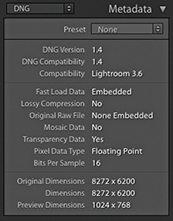
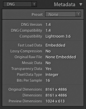
The resulting DNGs from an HDR Photo Merge will be saved as 16-bit floating point files (Figure 4.51), where the merged data will be raw linear RGB data. If the source images used in a Photo Merge come from multiple folders, the resulting DNG file will be created in the same folder as the first image in the selected set. The HDR DNG files can be quite large in size. You could argue these are not truly raw files, but DNGs produced this way are still mostly unprocessed and allow you to make creative color and tone decisions via the Lightroom Develop module. You also retain the flexibility to reprocess the resulting HDR DNG files at any time and apply later process versions. Essentially, you can merge raw files to create an unprocessed master where you can then fine-tune the settings at the post-Photo Merge stage, adjusting things like the white balance and endpoint clipping.
Whenever you carry out a Photo Merge HDR or Panorama, there is now an option to Auto Stack the Merge Operation result alongside the input images (see Figure 4.52). When checked, all photos are automatically stacked together and the merged image will be the cover image for the stack.
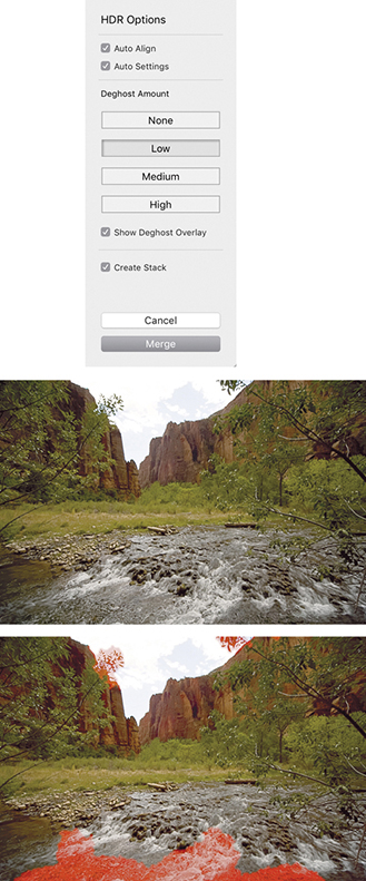
Deghost Amount options
It is crucial to avoid having anything in the scene move between exposures. Some cloud movement can be okay, providing the clouds haven’t moved too much. Where subject movement is likely to be a problem, such as with moving water and trees, the Lightroom Photo Merge deghosting algorithm can help reduce any ghosting artifacts.
When creating a Photo Merge HDR, you can click on one of the four buttons ranging from None to High (Figure 4.52) to apply the desired level of deghosting. In this particular example, I merged three bracketed exposures where there was movement in some of the trees and water between each exposure. I selected the Low Deghost Amount option and checked the Show Deghost Overlay option. This highlighted in red the areas where the deghosting would be applied. (On the Mac, use  to turn the overlay on or off and use
  to cycle through the available overlay colors.)
It is recommended that you enable deghosting only when it is necessary to do so. The Lightroom Photo Merge method may utilize more than one image to deghost the resulting HDR. When it works, it is great, but when it doesn’t, this can sometimes lead to unwanted artifacts in the final image, so it is best to leave it at the default None setting if you don’t need it.
1. I went to the Library module and selected the two photos shown here. There was a four-stop exposure difference between each of these captures. In the Library module, I chose Photo ![]() Photo Merge
Photo Merge ![]() HDR.
HDR.
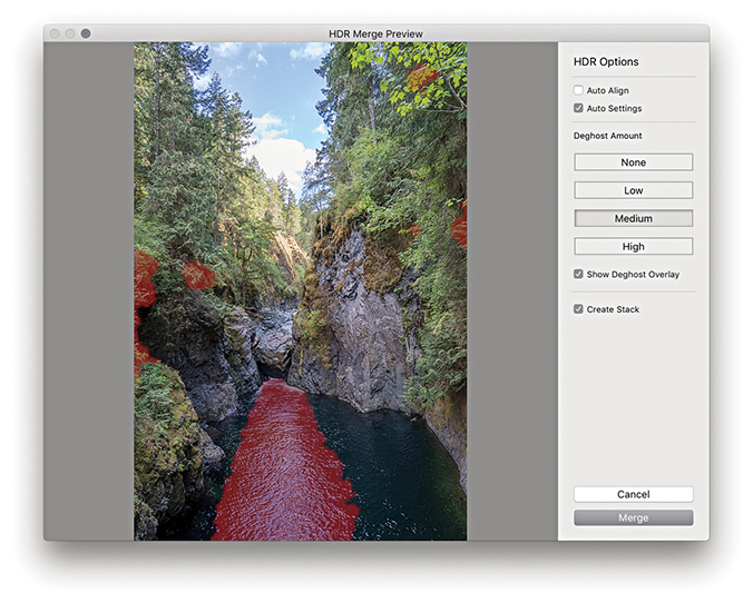
2. In the HDR Merge Preview dialog, I checked Auto Settings to apply an auto adjustment. Because this scene featured fast-flowing water, I selected a Medium Deghost setting with Show Deghost Overlay checked.
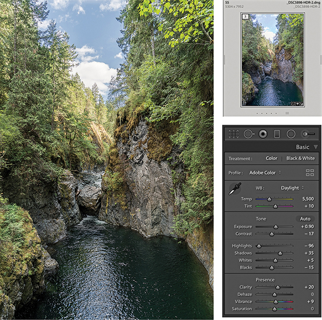
3. I clicked the Merge button in the Photo Merge – HDR dialog to create a DNG HDR master. This was automatically added to the catalog and named based on the most selected image in the photo selection with an –HDR suffix added. Because I had previously selected Create Stack, the HDR DNG appeared grouped with the source images in a stack. The Auto Settings provided a useful start upon which to fine-tune the Tone and Presence settings in the Basic panel.
Creating Photo Merge Panoramas
You can also use the Photo Merge feature to create DNG panoramas from raw as well as non-raw files. The resulting files are 16-bit integer DNGs. Like the HDR DNGs, these are demosaiced DNGs saved as raw linear RGB data (Figure 4.53). What distinguishes these from regular DNG files is the fact they don’t have mosaic data, but do have transparency data. Although the images are partially processed, you still retain the ability to apply Develop module edits and update to later process versions as they become available.
One of the things I have noticed with a conventional Photoshop Photomerge workflow is how the Photomerge processing can sometimes cause the highlight values to clip. You may carefully set the highlight end points at the pre-Photomerge stage, only to find they become clipped in the resulting Photomerge composite. Therefore, being able to preserve the raw data when using the panorama Photo Merge in Lightroom helps you avoid this problem completely, maintaining full control over the tones, and avoid undesired clipping.
To create a regular Photo Merge panorama, you first need to select a series of photographs that together make up a panoramic view. Then, go to the Photo menu and choose Photo Merge ![]() Panorama (
Panorama ( ). You can use
  to open Photo Merge in “headless” mode, without showing the Panorama Merge Preview dialog (and process the images based on the last used settings). Otherwise, you will see the dialog shown in Step 2 (see page 220), where you have the option to adjust the projection method and other settings.
When photographing a panorama sequence, it helps if you manage to capture a significant overlap between each capture. There should be at least 25% overlap, or more if shooting with a wide-angle lens. It helps if you have the camera mounted on a tripod when you capture these; better yet, use a special tripod head that allows you to align the nodal point of the lens to the rotation axis. But you can certainly get good-enough results shooting handheld. Ideally, the exposure setting should be consistent, but even if the photos are captured with a variance of exposure, the Photo Merge process can even these out to a certain extent. Lens warp, vignette, and chromatic aberration are automatically applied to the images behind the scenes before stitching, so such settings in the source images are ignored and not copied to the resulting panorama DNG. Other adjustments, such as Basic panel, Tone Curve panel, Lens Corrections panel defringe adjustments, and color adjustments, are copied, but Upright and Crop adjustments are not included.
Panorama projection options
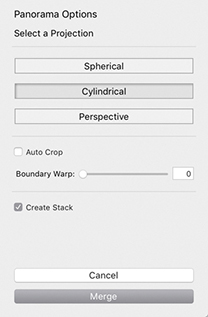
The Panorama Merge Preview projection options are shown in Figure 4.54. In most cases, Photo Merge auto-selects the best method and will give the best results. It may also better preserve image content in individual photos such as birds flying in the sky. But the auto-selected projection method won’t always be the best one to use, so it is often a good idea to check the alternatives. Perspective mode is the best option to choose for architectural subjects and can produce good results when processing images that were shot using a moderate wide-angle lens or longer. Even though the preview may show some perspective distortion, this can easily be corrected using the Transform panel controls. Cylindrical mode ensures that photos are correctly aligned to the horizontal axis. This mode is particularly appropriate when merging single rows of photographs that make up a super-wide panorama. Spherical mode transforms the photos both horizontally and vertically. This mode is more adaptable when it comes to aligning tricky panoramic sequences. So, for example, when you shoot a sequence of images that consists of two or more rows, the Spherical projection mode may produce better results than the Cylindrical method.
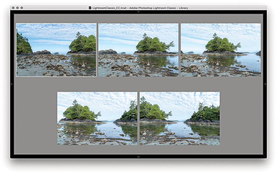
1. To demonstrate the Panorama Merge Preview function, I selected the five photographs that are shown here in the Library module Survey view mode. I then went to the Photo menu and chose Photo Merge ![]() Panorama.
Panorama.
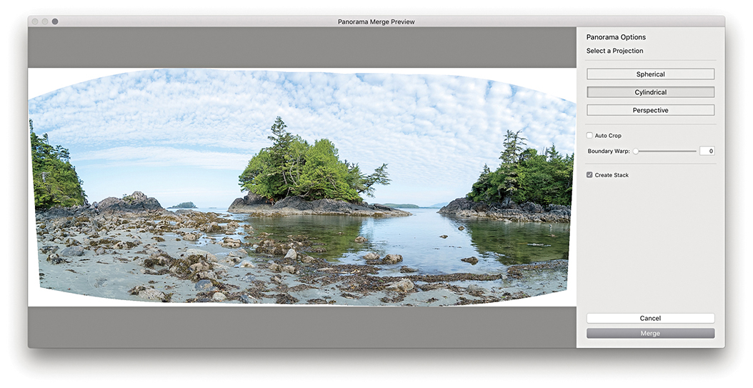
2. This opened the Panorama Merge Preview dialog, where I could select the desired projection and preview the results before committing to creating a full Photo Merge. In this instance, Photo Merge auto-selected the Cylindrical option.
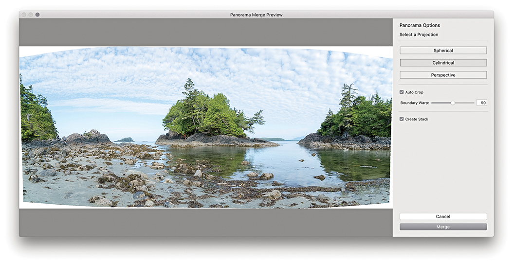
3. I set the Boundary Warp slider to 50% to warp the image to make the boundary fit the surrounding rectangular frame (Boundary Warp is discussed in the following section). I then clicked the Merge button.
4. This created a full Photo Merge Panorama DNG, renamed based on the most selected image in the photo selection, with a –Pano suffix added. The Develop settings applied here were based on whatever was the most selected photo in Step 1.
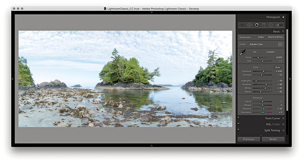
5. Finally, I adjusted the color and tone settings in the Basic panel to produce the finished version shown here.
Boundary Warp slider
You can adjust the Boundary Warp slider to preserve image content near the boundary that might otherwise be lost due to cropping. Higher amounts cause the boundary of the panorama to fit more closely to the surrounding rectangular frame. This can be beneficial when processing landscape panoramas, although it may cause some noticeable distortion if applied to architectural subjects. However, Lightroom-generated panoramas contain the necessary metadata to allow them to later be perspective-corrected using the Adaptive Wide Angle filter in Photoshop CC. Therefore it can sometimes be best to not use the Boundary Warp slider and instead make use of the Adaptive Wide Angle filter in Photoshop to carry out the necessary distortion corrections.
Panorama Photo Merge performance
Panorama Photo Merges have been optimized to run up to twice as fast compared with the previous version of Lightroom, plus you can create panorama Photo Merges when only Smart Previews are available. Multiple merge operations are added to a queue for better management. However, queued jobs are only initiated when the CPU usage is below a tolerable limit. Panorama Photo Merges also respect localized adjustments, such as spot removal work that may have been applied before merging. For example, if you have a dirty sensor, you can use the Spot removal tool and sync the edits across all the frames before you merge them. This might save you time carrying out repeat spotting work on the final merged image.
Combined HDR Panorama Photo Merge
This latest version of Lightroom allows you to merge panorama images that include bracketed exposures. This means you can combine the Merge to HDR and Merge to panorama processes in a single step. To do this you’ll need to photograph a scene by shooting an HDR bracketed sequence at each step as you capture the panoramic sweep. In Lightroom, make a selection of the captures and choose Photo ![]() Photo Merge
Photo Merge ![]() HDR Panorama. This pops the dialog shown in Step 2 opposite, where you can choose from the usual projection options, plus whether to Auto Crop, apply Auto Settings, or group within a stack with the source files. There are no options to control the HDR processing though. At the HDR Photo Merge stage, the images are auto-aligned automatically and with Deghosting turned off.
HDR Panorama. This pops the dialog shown in Step 2 opposite, where you can choose from the usual projection options, plus whether to Auto Crop, apply Auto Settings, or group within a stack with the source files. There are no options to control the HDR processing though. At the HDR Photo Merge stage, the images are auto-aligned automatically and with Deghosting turned off.
When you click the Merge button, Lightroom generates a DNG Photo Merge with an -HDR-Pano suffix (the interim HDR DNG files are discarded along the way). If you need more control over the HDR process, it may be best to separately make custom Merge to HDRs first, then select these after to create a panorama. This is because for optimum alignment, you must carry out the HDR Photo Merge first, and then apply the panorama Photo Merge after.
Note
For an HDR Panorama photo merge to work, it is essential that each exposure bracket contains the same number of images and the same exposure offset pattern. For example, if the first set of bracketed exposures is +2, 0, –2, then the same sequence must be applied to all the other photos in the HDR panorama sequence.
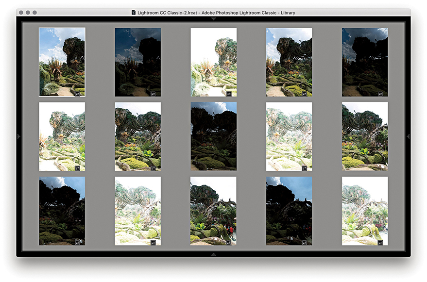
1. First, I selected a series of 15 images to merge as an HDR Panorama. I then choose Photo ![]() Photo Merge
Photo Merge ![]() HDR Panorama.
HDR Panorama.
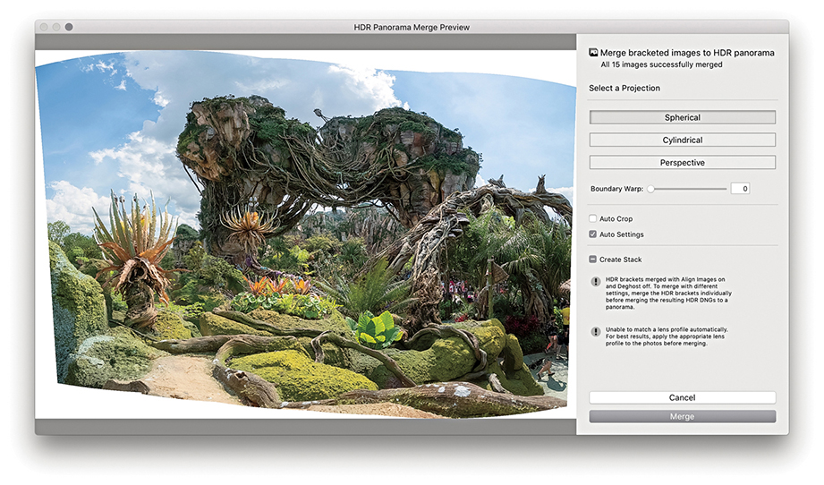
2. In the HDR Panorama Merge Preview dialog that opened, I was able to adjust the panorama projection method, the Boundary Warp, and whether to apply an Auto Crop and Auto Settings adjustments. When satisfied, I clicked Merge.
Clarity Slider
The Presence section in the Basic panel includes the Clarity slider, which is essentially a local area contrast adjustment control. The Clarity effect is achieved by creating variable amounts of contrast by adding soft halos to the edges in a photograph. This builds up the contrast in the midtone areas based on the edge detail in the image. The halos are generated with the same underlying tone mask algorithm that is utilized for the Highlights and Shadows sliders, which makes the halos less noticeable. The net effect is that a positive Clarity adjustment boosts the apparent contrast in the midtones but does so without affecting the overall global contrast. Normally, you would want to start with a Clarity setting of around 10 so as not to overdo the effect too much. But as you increase the Amount, this strengthens the midtone contrast, which in turn makes the midtone areas appear more crisp.
You can also add Clarity to an image using the localized adjustment tools. Later you will see a few examples of how you can apply Clarity adjustments with the Adjustment Brush.
1. This shows a photograph of a plowed field with the Clarity slider at the default 0 setting.
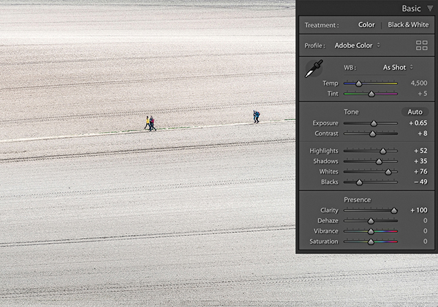
2. For comparison, I set the Clarity slider to +100. I took the slider all the way to the maximum setting to create the most dramatic difference between this and the previous screen shot. You can see much more midtone contrast in the texture of the field.
Images that benefit most from adding Clarity
All image adjustments are destructive. So, one way or another, you will end up either expanding the tones in an image, which stretches the levels farther apart, or compressing the tones by squeezing the levels closer together. Where tone areas become compressed and portions of the tone curve become flattened, you consequently lose some of the tonal separation that was in the original. A positive Clarity adjustment can, therefore, be used to expand areas of flat tone and enhance detail that was in the original capture image. The kinds of photos that benefit most from adding Clarity are those that have soft midtone contrast where you want to make the image look more contrasty, but without causing the shadows or highlights to clip. For example, when I use the Soft Proofing feature and preview photos that are to be printed on a matte paper, I find it helps to increase the Clarity to counter the lack of contrast seen in the soft preview image.
Negative Clarity adjustments
A negative Clarity adjustment does the exact opposite of a positive Clarity adjustment. It softens the midtones and does so in a way that produces an effect not too dissimilar to a traditional darkroom diffusion printing technique (see steps below). The net result is that you can create some quite beautiful diffuse soft-focus image effects, and negative clarity is particularly suited to black-and-white photography.
1. With the Clarity set to 0, this is a nice picture with lots of sharp detail, but it is also a good example to show the pseudo-diffusion printing technique.
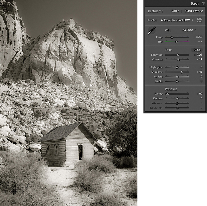
2. In this step, I applied a –90 Clarity adjustment. As you can see, the negative Clarity adjustment created a kind of diffuse printing effect.
Dehaze Slider
The Dehaze slider is now found in the Basic panel. This change was much requested, and Adobe has now responded. However, while this can make swapping between the Clarity and Dehaze sliders easier, the Dehaze is still essentially an Effects-type adjustment and should therefore be used with some caution when making Basic panel adjustments.
Dehaze adjustments
The Dehaze slider (Figure 4.55) can be used to compensate for atmospheric haze in photographs, as well as mist, fog, or anything that contributes to the softening of contrast and detail in a scene. For example, you can use the Dehaze slider to improve the contrast in photographs taken of a starry night sky and reduce the effects of light pollution. Drag the slider to the right to apply a positive value and remove haze from a scene. Basically, the results you get are in some ways similar to adjustments made using the Clarity slider, but a Dehaze effect is overall a lot stronger than what can be achieved using the Clarity slider on its own.
There are a few things to watch out for, though, when working with Dehaze. First, it is recommended you set the white balance first. When you apply a Dehaze adjustment to remove haze, this can emphasize the lens vignetting in an image. It is therefore best to make sure you apply a lens profile correction (or a manual vignetting correction) first to remove the lens vignetting before you apply a Dehaze slider adjustment. Similarly, a positive Dehaze adjustment will emphasize any sensor spots (although this can easily be dealt with using the Spot Removal tool).
Dehaze as a localized adjustment
Dehaze can be applied as a localized adjustment using the Graduated Filter, Radial Filter, or Adjustment Brush. This makes the effect more useful for treating landscape images where, very often, the foreground at the bottom of the frame will look fine and it is only the subject matter in the distance from the middle to the top of the frame that needs correcting. You don’t really want a Dehaze adjustment to be applied to areas that don’t need it, so it is great you can apply Dehaze using the localized adjustment tools. Personally, I find Dehaze adjustments to be more useful when applied as a localized adjustment.
Negative Dehaze adjustments
Dragging the slider to the left can add haze and make an image look more foggy. For example, you can apply a negative Dehaze using the Adjustment brush to create smoke and mist effects. When using Version 5 and applying negative amounts of Dehaze, there is less noise and the range of adjustment has been updated. At –100 the overall effect is stronger, but there is better preservation of the shadows at in-between settings up to around –90.
1. This landscape photograph was shot just before sunset. I applied the Basic panel adjustments shown here to optimize the tone contrast.
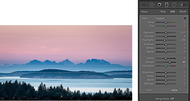
2. I selected the Graduated Filter tool and applied a positive Dehaze adjustment to the top half of the photograph to bring out more detail in the distant hills and clouds.
3. I then reset the Graduated Filter settings and, instead, applied a negative Dehaze adjustment to add haze to this scene.
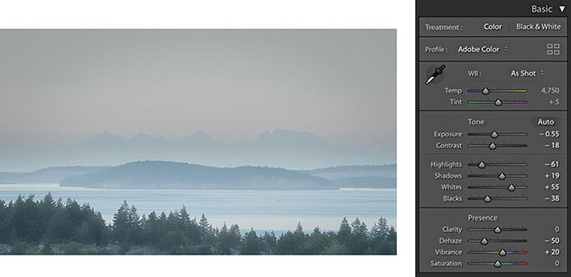
Vibrance and Saturation
The Vibrance and Saturation sliders are located at the bottom of the Basic panel in the Presence section (Figure 4.56). Both can be used to adjust the saturation in an image. The main difference between the two is that the Saturation slider applies a linear adjustment to the color saturation, whereas a Vibrance adjustment uses a nonlinear approach. In plain English, this means that when you increase the Vibrance, the less saturated colors get more of a Saturation boost than those colors that are already saturated. This can be of a real practical benefit when you are applying a Saturation adjustment to a picture and you want to make the softer colors look richer, but you do not want to boost the color saturation at the expense of losing important detail in the already bright colors. The other benefit of working with Vibrance is that it has a built-in Caucasian skin color protector that filters out colors that fall within the skin color range. This can be useful if you are editing a portrait and you want to boost the color of someone’s clothing, but at the same time, you do not want to oversaturate the skin tones.
With most photographs, Vibrance is the only saturation control you will want to use. However, the Saturation slider still remains useful, because a Saturation adjustment can be used to make big shifts to the saturation, such as when you want to dramatically boost the colors in a photograph or remove colors completely. If you examine what happens when you apply an Auto Settings adjustment, you’ll notice how Lightroom tends to apply both Vibrance and Saturation, but nearly always more Vibrance than Saturation. Figure 4.57 shows some examples of Saturation and Vibrance adjustments.
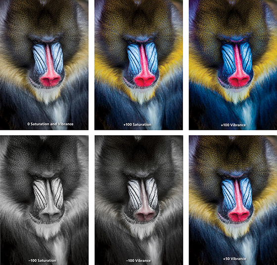
The main thing to understand is that a positive Saturation adjustment will boost all colors equally. In the example shown in Figure 4.57, it made all the colors equally more saturated and as a consequence, there was some color clipping in the red nose of the mandrill monkey. In the version next to it, I increased the Vibrance to +100. This resulted in an image where the reds in the nose did not receive such a big color boost, but the other colors, which were less saturated to begin with, did receive a major boost in saturation. However, they were not oversaturated to the point where any of the color channels were clipped. This shows how the Vibrance adjustment can be effective in preserving more tonal detail as you boost the color saturation. Dragging the sliders the other way, a full negative Saturation adjustment, will desaturate all the colors completely, whereas a negative Vibrance can be used to gently desaturate a photo. As you can see, a negative Vibrance of –100 produced a subtle, desaturated look. Ultimately, many images can benefit from a small Vibrance boost, although in this example, because I really wanted to emphasize the colors in the mandrill’s face, I felt the optimum adjustment would be +50 Vibrance. This is much more Vibrance than I would apply generally, but it seemed an appropriate setting to use for this particular photograph.
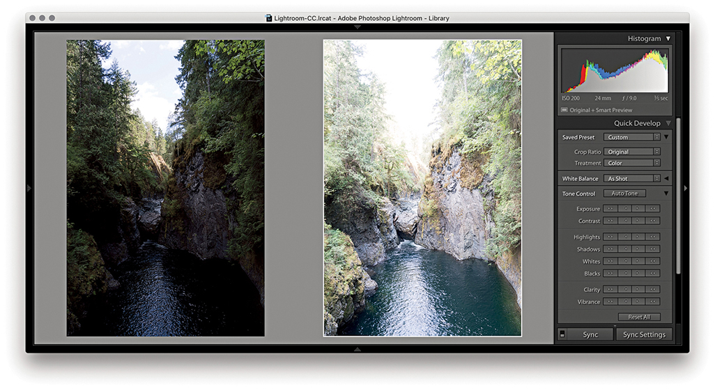
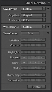
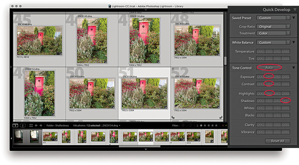
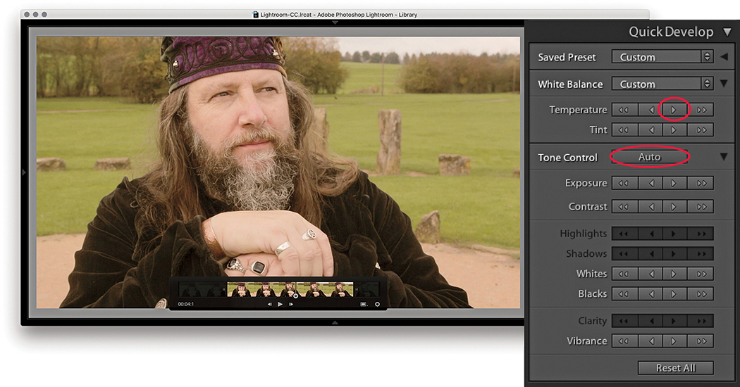
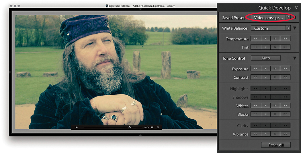
Quick Develop Panel Tone Adjustments
All the Develop controls discussed so far are also accessible via the Quick Develop panel in the Library module (Figure 4.58). To see all the controls shown here, you need to click the expansion arrows on the right. To restore an adjustment to its default setting, click the name of the adjustment. Using the Quick Develop panel, you can apply Basic panel tone and color adjustments without having to leave the Library module. And, any adjustments you make here simultaneously update the settings in the Develop module Basic panel. Quick Develop adjustments can be applied to multiple selected images in a Grid view or in the Filmstrip. But the main difference with Quick Develop is that Quick Develop adjustments are always applied relative to the current Develop settings. For example, if you select a number of images that have already had different Exposure settings applied to them, you can use the Exposure buttons in Quick Develop to make those photos relatively lighter or darker (as opposed to synchronizing all of the photos with the same Exposure value).
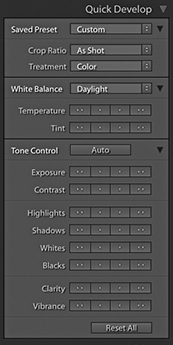
Using Quick Develop is the same as working in the Develop module, except you don’t have the same fine degree of control. It is therefore ideal for making first-pass edits, where you still need to do most of your work in the Library module (such as rating images and adding metadata) without having to switch back and forth between Library and Develop to apply image adjustments. However, it is important to bear in mind that the Library module preview will not be as accurate as that displayed in the Develop module. The Library module previews are Adobe RGB rendered, whereas when you edit a photo in the Develop module, the image is edited using the wider-gamut Lightroom RGB space and the image preview you see is generated on the fly via the Lightroom Camera Raw engine. Therefore, the previews you see in Develop are always going to be the most accurate. Also, when you edit a photo using the Quick Develop controls in the Library module, the quality of the Loupe view preview will be dependent on whatever settings you have selected in the Catalog Settings File Handling section. You have to bear in mind here that the Library preview mechanism is primarily designed to generate decent-quality previews that enable fast Library module browsing; it is not so ideal for assessing Develop settings adjustments. You will also notice that the Histogram panel in the Library module features an animated transition when adjusting the values in the Quick Develop panel.
To apply Quick Develop adjustments, go to the Library module and select a photo, or make a selection of several photos. Next, you can click to access the Saved Preset list shown in Figure 4.59 and choose a default setting or a previously saved preset as your starting point (the Develop settings are arranged here in a hierarchical list).
The Treatment menu lets you decide whether to process an image in Color or Black & White. To be honest, I think it is better to memorize the  shortcut as a means for toggling between the Color and Black & White modes and rely on the Treatment menu as an indicator of which mode a photo is in.
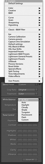
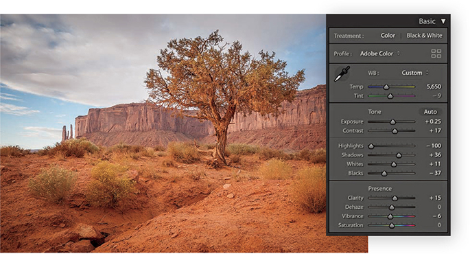
Next, we come to the White Balance options. If you are shooting with a camera set to Auto White Balance mode, or you used a white balance that was correct for the lighting conditions at the time of shooting, you will probably want to leave this set to As Shot. Otherwise, you can click the White Balance menu (Figure 4.45) and choose one of the preset settings listed there, or select the Auto setting, and Lightroom will calculate an optimized White Balance setting for you (or use the  [Mac] or
  [PC] shortcut). With the Temperature buttons, if you click the left-arrow buttons, the image becomes incrementally cooler, and if you click the right-arrow buttons, the image becomes warmer. The Tint buttons can be used to apply a green/magenta bias. Clicking the left-arrow buttons makes a photo more green, and clicking the right-arrow buttons makes it more magenta. The single-arrow buttons produce small shifts in color, and the double-arrow buttons produce more pronounced color shifts.
Clicking the Auto button applies an Auto Settings adjustment ( [Mac] or
  [PC]). This automatically adjusts the Exposure, Contrast, Highlights, Shadows, Whites, Blacks, Vibrance, and Saturation settings. But as mentioned earlier, an Auto Settings adjustment applied in the Library module mode won’t be as accurate as one applied via the Develop module.
Process version conflicts
If there is a process version conflict when two or more photos are selected, the Quick Develop buttons will appear dimmed (see page 164).
The tone and color controls
With the remaining tone and color controls, I advise you to start by adjusting the Exposure amount first, because the Exposure is critical for determining the overall brightness. A  -click on the Exposure single-arrow button is equivalent to a 0.17-unit shift in the Develop module, a single-click equivalent to a 0.33-unit shift, and a click on the double-arrow button equivalent to a 1.0-unit shift.
After you set the Exposure, you may want to adjust all the other tone control buttons. Here, a -click on the single-arrow button is equivalent to a 3.0-unit shift in the Develop module, a single-click on the single-arrow button equivalent to a 5.0-unit shift, and a double-arrow click equivalent to a 20.0-unit shift.
If you hold down the  key, the Clarity buttons in the Quick Develop panel switch to Sharpening buttons (Figure 4.60). In this key mode, the Sharpening controls in Quick Develop are equivalent to Sharpening Amount slider adjustments in the Develop module Detail panel. Although you do not have access to the other three sharpening sliders, you can still make an initial sharpening adjustment before you get around to fine-tuning the other settings later. As you hold down the key, the Vibrance buttons switch to become Saturation buttons. With both the Sharpening and Saturation controls, a single-arrow click is equivalent to a 5-unit shift in the Develop module, and a double-arrow click is equivalent to a 20-unit shift.
 key held down.
The Reset All button at the bottom resets all the Develop settings that have been applied to a photo (and not just those that have been applied via Quick Develop) to their default import settings. You can also use the  (Mac) or
  (PC) shortcut. However, this action resets all the Develop settings to a zeroed or default state, so use this button with caution.
A typical Quick Develop workflow
The following steps show how you might want to use the Quick Develop panel while working in the Library module.
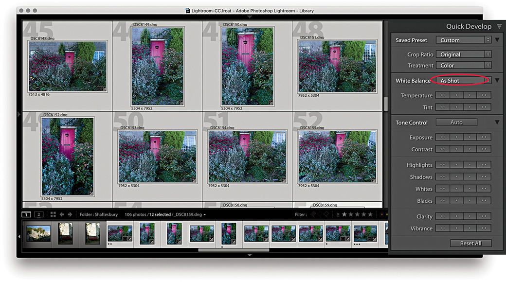
1. To begin, I made a selection of the photos I wanted to edit. These photographs were shot in raw mode and imported using the Default Develop settings and As Shot White Balance (circled above).
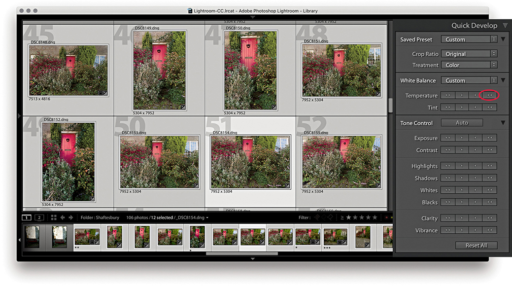
2. I wanted to warm the colors in the selected photos, so I clicked the double-arrow button (circled above) to make the selected photos appear warmer.
3. I then wanted to apply some tonal edits. I clicked the Auto button followed by the Exposure, Contrast, Highlights, and Shadows buttons (circled above). This improved the brightness and contrast.
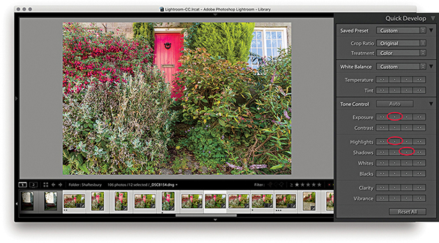
4. Alternatively, you can work on the images one at a time in Quick Develop. I double-clicked one of the photos to work in the Loupe view, then I reduced the Exposure, darkened the Highlights, and lightened the Shadows.
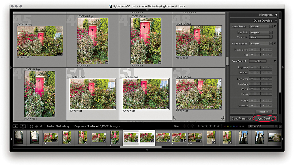
5. I selected this recently edited image and the photo next to it and clicked the Sync Settings button at the bottom (circled above).
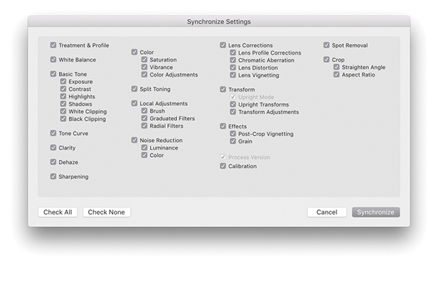
6. This opened the Synchronize Settings dialog, where I clicked the Check All button to select all settings. I then clicked the Synchronize button to synchronize the settings across the two photos selected in Step 5.
Note
The Sync Settings button can be used to synchronize all Develop module settings, not just those applied via the Quick Develop panel.
Editing Video Files in Quick Develop
As well as being able to play video files directly in the Library module Loupe view, some limited video editing is possible using the Quick Develop panel. Lightroom does not yet offer full video-editing features—for that, you will want to use dedicated video-editing software. But it is nonetheless possible to at least view and edit video clips in Lightroom. So, let me run through some of the key features. Figure 4.61 shows how video files are displayed in the Library module Grid view. In the Library Loupe view, you can navigate a clip to play it and edit the start and end times; you also have access to some of the Quick Develop image-adjustment options that will let you adjust the White Balance, Exposure, Contrast, Whites, Blacks, and Vibrance.
Loupe view video-editing options
There are a few selectable items in the options menu (which are shown in the following steps). Capture Frame can be used to extract a frame and automatically add this to the folder and to the catalog as a separate JPEG image. The Set Poster Frame option allows you to select a frame other than the start frame and then use it as the thumbnail preview in Lightroom (Slideshow will then also use the poster frame). Lastly, there is the Display Trim Time as SMTPE option. This is an absolute time code that is used when you want to synchronize different devices (providing they are compatible). It is something that is really of more interest to those who are carrying out professional video editing. Personally, although I find Lightroom useful for importing video clips at the shoot stage, I then do all the main editing and grading using Adobe Premiere.
Note
There is a Video mode for the Metadata panel, although most cameras record very little metadata.
1. When you inspect a video file in the Lightroom Library module Grid view, you can quickly track all the frames in a sequence by hovering over the thumbnail and moving from left to right.
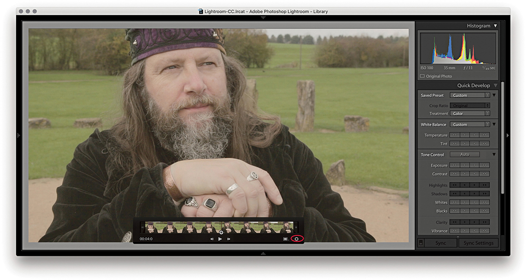
2. I double-clicked the thumbnail in the Grid to go to the Loupe view. Here, I could click the Play arrow button or tap the Spacebar to play the selected movie clip (click again to pause). I could quickly navigate a video clip by dragging the frame-selection button and click the gear button (circled) to reveal the key frames. If “Show frame number when displaying video time” is selected in the Loupe View Options, the frame number is displayed after the minutes/seconds timeline display.
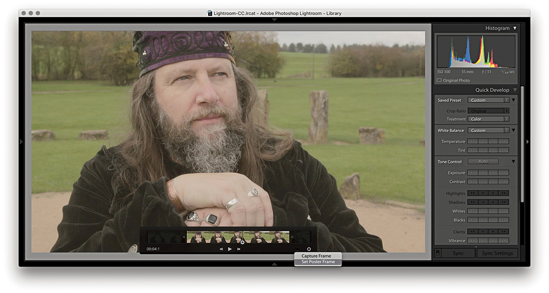
3. I dragged the start and end points to trim the movie sequence (You can also use  to set the input point and
  to set the output point for a clip). I then selected a midway point in the video clip and selected Set Poster Frame from the Settings menu. This updated the thumbnail preview in the Grid view with a more relevant frame from the movie sequence.
4. The Quick Develop controls can be used to apply basic Develop edits. In this example, I made the sequence a few clicks warmer to remove the slight bluish cast and also clicked the Auto button to optimize the tone balance.
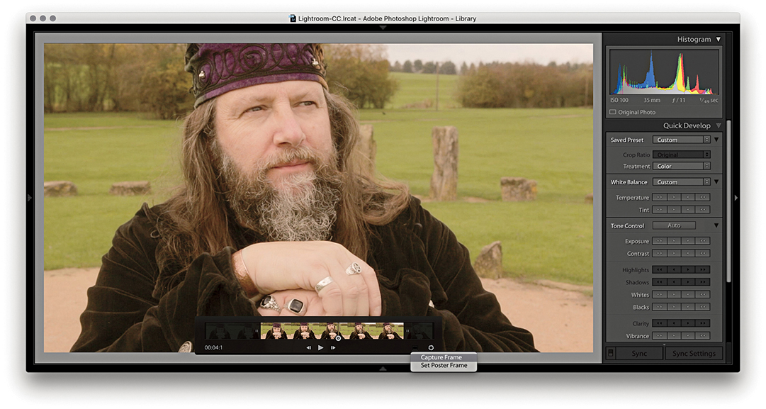
5. Although you cannot edit videos extensively in the Quick Develop panel or Develop module, you can make use of saved presets to apply some types of Develop adjustments. To do this, I clicked the Settings menu and selected Capture Frame. This created a JPEG photo from the selected frame stacked with the original.
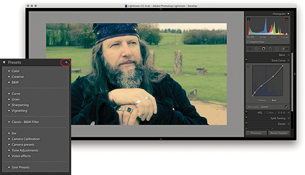
6. I was then able to edit the captured JPEG using the Develop module controls. Here, I applied a Tone Curve plus a Split Toning adjustment (which you can’t do using Quick Develop). I was thereby able to create an adjustment that produced a cross-process color effect.
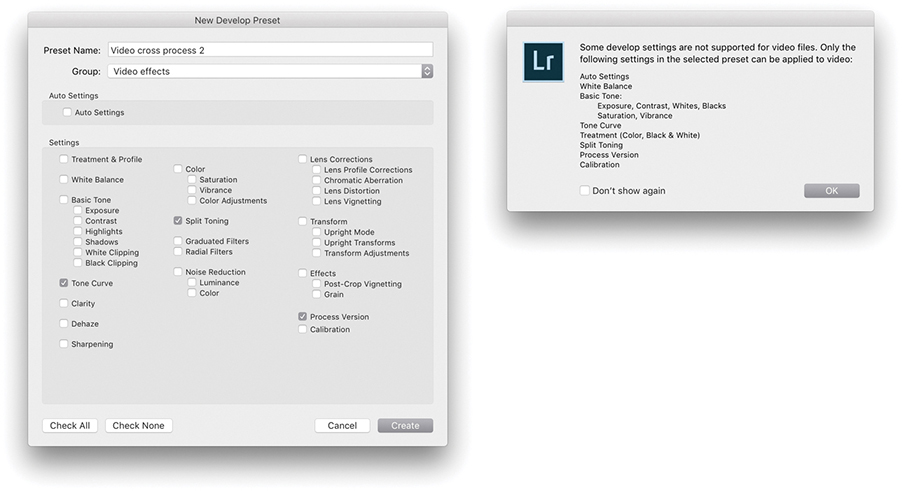
7. I then clicked the + button in the Develop module Presets panel and saved the edited setting as a new preset. Although you can save any Develop setting as a preset, there is still a limited range of settings that can be applied to a video clip. Therefore, when applying a preset to a video file, the dialog shown here warns not all types of settings are supported.
8. Finally, I returned to the video file in the Library module and selected the preset I had just created from the Saved Preset menu in the Quick Develop panel.
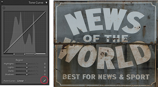
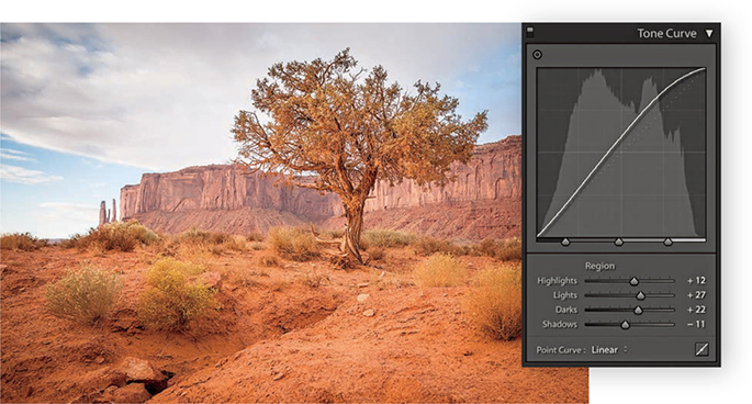
The Tone Curve Panel
The Tone Curve controls (Figure 4.62) offer a unique approach to tone curve mapping, where the tone curve is modified through slider control (parametric) adjustments. The Tone Curve controls are presented in this way to encourage people to make Tone Curve adjustments based on descriptive criteria. The Tone Curve panel now features a larger graph. And, you will notice the histogram display is more prominent. If you are used to working with the point-edit Curves dialog in Photoshop, the Lightroom method may appear restrictive at first, but the Tone Curve slider controls in Lightroom can often inspire you to create tone curve shapes that are quite unlike any curve shape you might have applied when using the traditional point-curve method. The parametric Tone Curve sliders now make curves adjustments accessible to everyone, but the good news is, you can still manipulate the curve graph directly by clicking a point on the curve and dragging up or down to modify that particular section of the curve. Best of all, you can edit the curve by targeting an area of interest in the image directly. You can also use the keyboard Arrow keys: The Up and Down Arrows can be used to increase or decrease the tone values (the Left and Right Arrow keys are reserved for navigating images in the Filmstrip). Holding down the  key as you adjust the values applies larger incremental adjustments. If you enable the Target Adjustment tool button
  (Mac) or
  (PC), you can then click any part of the image and drag up or down to make the tones there lighter or darker. When you start using the Target Adjustment tool editing method to refine the tones in an image, you will not necessarily even need to look at the Tone Curve panel. You can turn off the Target Adjustment tool by clicking the Target Adjustment tool button again, pressing
  , or by using the
  (Mac) or
  (PC) shortcut.
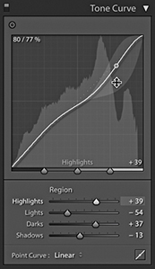
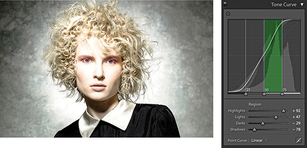
The four main sliders for controlling the tone curve are Highlights, Lights, Darks, and Shadows. These controls also provide a shaded preview of the range of the shapes an individual Tone Curve slider adjustment can make. In Figure 4.62, I was in the process of adjusting the Highlights slider, and you will notice how the histogram in the Histogram panel is mirrored in the curve graph and both are updated as you edit the Tone Curve controls. The gray-shaded area represents the limits of all possible tone curve shapes I could create with this particular slider in conjunction with the other current slider settings. For those who understand curves, this provides a useful visual reference of how the curve can look.
As mentioned earlier, the Basic panel is used to apply the main tone adjustments. It is important to understand that these are all applied upstream of any Tone Curve adjustments, so the Tone Curve slider is an image-adjustment control that you always want to apply after you have made the initial Basic panel adjustments.
The layout of the Tone Curve panel is influenced to some degree by the legacy constraints of the Adobe Camera Raw plug-in. It has been necessary to ensure that the settings applied to an image via Camera Raw in Photoshop are also recognized (and made accessible) when the same image is opened via the Develop module in Lightroom. I mention all this as an explanation for the presence of the Point Curve menu at the bottom of the Tone Curve panel (Figure 4.63).
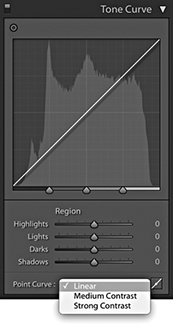
In the early days of Camera Raw, some purists argued that the tone curve for processing raw files should always default to a linear mode, and if you wanted to add contrast, it was up to you to edit the curve how you wanted. Meanwhile, almost every other raw converter program was applying a moderate amount of contrast to the curve by default. The reason for this was because most photographers tend to like their pictures with a more contrasty and film-like look as a standard setting. For example, Capture One applies adaptive tone adjustments to newly imported photos that in most instances produce a more contrasty default look compared to Lightroom. Consequently, the Adobe Camera Raw plug-in has evolved to offer three choices of curve contrast: Linear, Medium Contrast, and Strong Contrast. So, the Point Curve menu in the Tone Curve panel (not to be confused with the Point Curve editing mode discussed on page 244) is mainly there to allow you to match up raw files that have been imported with legacy Camera Raw settings. With Version 1/Version 2, the default setting for raw files was Medium Contrast. With Version 5, the default point curve now says Linear and, as you would expect, presents a straight line curve. But this is, in fact, applying the same underlying curve setting as the previous default Process Version 1/Version 2 Medium Contrast tone curve.
Basically, the current Linear curve does exactly the same thing as the older Version 1/Version 2 curve: It applies more of a kick to the shadows to make them slightly darker and lightens the highlights slightly. This also brings the benefit of tone curve setting compatibility between non-raw and raw images. Non-raw images have always defaulted to a linear tone curve shape. This remains the case in Version 5. Therefore, the starting point for both raw and non-raw images is now the same: a linear tone curve representation. The Point Curve options are nothing more than a curve shape setting, and these can be used as a starting point when making further edits to the tone curve.
If you convert a Version 1/Version 2 tone curve to Version 5, the tone curve shape will appear adjusted (even though the parameter values will actually remain the same). Therefore, Tone Curve settings are now process-version-specific. This means whenever you save a Develop preset that includes a Tone Curve setting, you are obliged to include saving the Process Version setting along with the Tone Curve setting.
The tone range split points at the bottom of the tone curve let you restrict or broaden the range of tones that are affected by the four Tone Curve sliders (Figure 4.64). Adjusting each of the three tone range split points allows you to further fine-tune the shape of the curve. For example, moving the dark tone range split point to the right offsets the midpoint between the Shadows and Darks adjustments. These adjustment sliders are particularly useful for those instances when you are unable to achieve the exact tone localized contrast adjustment you are after when using the Tone Curve sliders on their own (see also page 254).
Point Curve Editing Mode
To switch to the Point Curve editing mode (Figure 4.65), click the button circled in Step 1 below. In this mode, you can click on the curve to add new control points and drag these up or down to modify the curve shape. The before/after value of the control point that is being moved is shown in the top-left corner of the editor view as a percentage value. When selecting an existing control point to move, you do have to click within a few pixels of the control point on the curve. It can help here to hold down the key as you adjust individual control points. This reduces the sensitivity of tracking movements by a factor of ten. You can also click to select the Target Adjustment tool:  (Mac) or
  (PC). As with the Parametric editing mode, you can use up or down movements to make the selected region of the curve lighter or darker.
Unlike the Adjustment panel in Photoshop or the Point Curve mode for the Tone Curve panel in Camera Raw, Lightroom does not provide modal, keyboard focus when editing the tone curve control points, so you can’t nudge using the keyboard Arrow keys. To delete a selected point, right-click to open the context menu and select Delete Control Point, or double-click a control point. You can save the entire tone curve as a preset, including the Point Curve adjustments, but not separately as a preset. However, you can save custom Point Curve settings via the Point Curve menu (see Step 3).
1. I started with a photo to which I had applied a Linear curve. I clicked the Point Curve button (circled) to switch to the Point Curve editing mode.
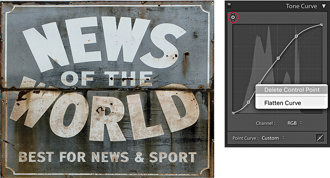
2. I selected the Target Adjustment tool from the top-left corner (circled), clicked in the preview area to add new control points to the tone curve, and dragged up or down to modify the curve shape. The context menu could be used to delete selected control points or flatten the curve.
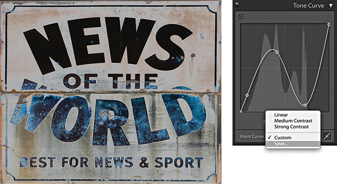
3. You can use the Point Curve editing mode to either invert the tones in an image or apply a solarized-type look to a photo and use the Point Curve menu at the bottom to save a custom curve setting.
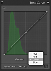
RGB Curves
You also have the option to separately edit the red, green, and blue channel curves, just as you can in Photoshop. To do this, you need to have the Tone Curve panel in Point Curve mode, where you will see the Channel menu (Figure 4.66). This defaults to the RGB Curve editing mode. If you click to open the pop-up menu, you will see the channel curve options shown in Figure 4.67.
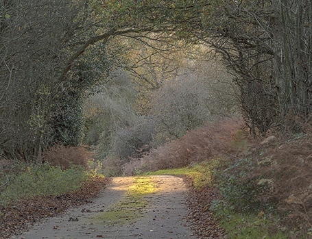
Having RGB curves in Lightroom gives you extra tools to work with when adjusting color, and allows you to achieve some unique color effects using just channel curve adjustments. You can use them to correct photos shot under mixed lighting conditions or to produce split-toning effects that are distinctly different from those that can be achieved using the Split Toning panel. Or, as shown here, you can use channel adjustments to apply strong color overlays. Just be aware there is a fair amount of overlap here with the functionality of the White Balance controls (which I would still advise you to use first when correcting color), as well as other controls, such as the Split Toning panel (see page 388).
1. In this example, I prepared an image in which the colors were neutralized and I applied a few Basic panel adjustments only.
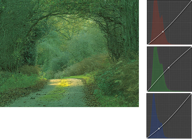
2. I then went to the Tone Curve panel in Point Curve editing mode and adjusted the individual red, green, and blue channels to achieve the saturated green color effect shown here.
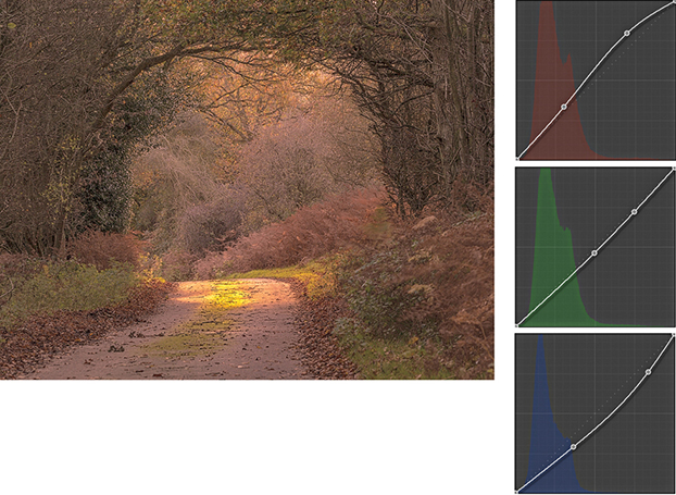
3. I next edited all three channels to achieve a warm autumn coloring effect.
Tip
The Target Adjustment tool can also be activated by going to the View ![]() Target Adjustment submenu, or by using the following shortcuts:
Target Adjustment submenu, or by using the following shortcuts:  (Mac) or
  (PC) to active; , or
  (Mac) or
  (PC) to deactivate.
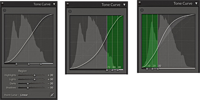
The Tone Curve Regions
The Tone Curve Zones are evenly divided between the four quadrants of the tone curve. In the following step-by-step example, I show a series of Tone Curve adjustments in which each of these regions gets adjusted. Here, I have highlighted the active quadrants with a green overlay to accentuate these zone regions and show which areas of the curve are being altered. If you want to reset the Tone Curve settings, you can do so by double-clicking the slider names in the Tone Curve panel; you can also reset the Tone Curve adjustments by double-clicking the adjusted region within the tone curve itself.
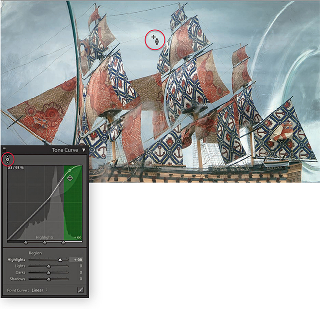
1. This photograph of a ship in the bottle lacked contrast. I began by adjusting the Highlights slider to make the brightest portion of the image lighter and set the Highlights to +66. This can be done in a number of ways: I could drag the Highlights slider in the Tone Curve panel to the right, or I could make the Highlights field active and use the Up Arrow key to increase the value. If I wanted, I could click anywhere in the green-shaded section of the tone curve and drag the curve upward, or click this portion of the curve and use the Up Arrow key on the keyboard to lighten the highlights. However, in this instance, I clicked the Target Adjustment tool button (circled) to make it active, moved the pointer over the image, and hovered over a highlight area in the clouds. I then clicked and dragged upward to lighten the tones in this selected portion of the curve.
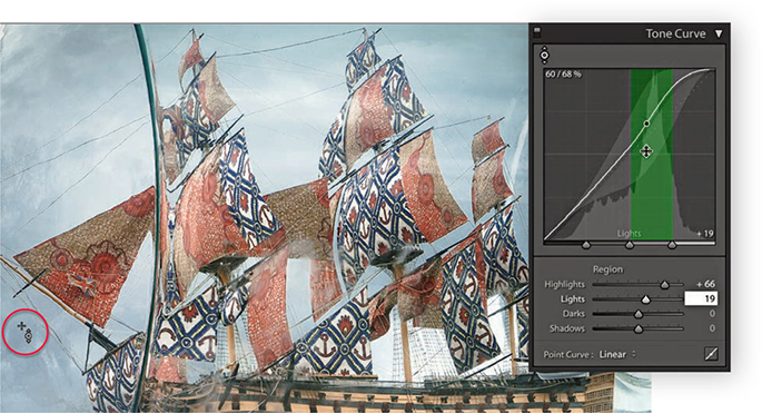
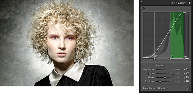
2. Next, I wanted to concentrate on lightening the tones within the Lights zone of the curve. I placed the pointer over a darker area of the sky and dragged upward.
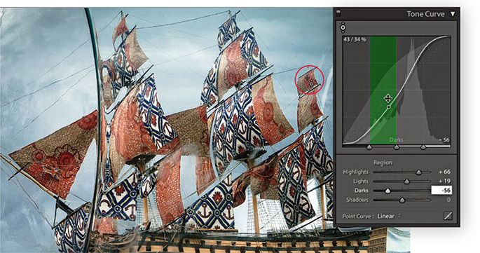
3. I then moved the pointer over one of the sails and dragged downward to darken the Darks zone.
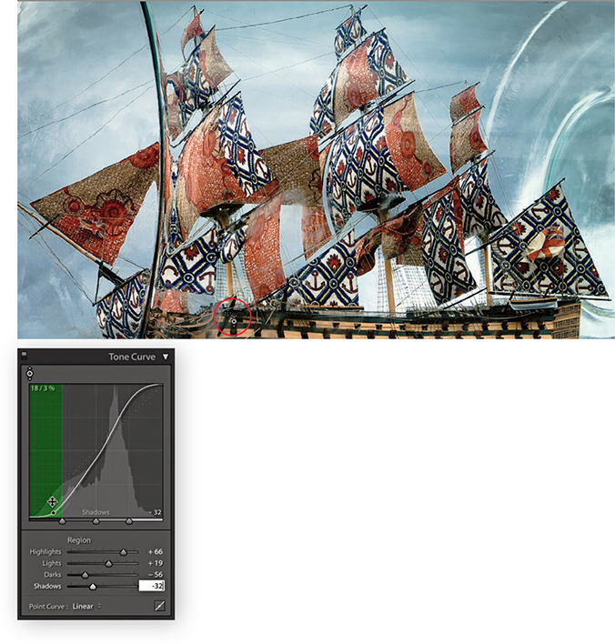
4. Lastly, I adjusted the Shadows by placing the pointer over the shadow area circled above and dragging downward to darken. If you compare the finished step here with where I started, you can see that the combined Tone Curve adjustments increased the image contrast, but in a more controlled way compared to using the Basic panel Contrast slider on its own.
Combining Basic and Tone Curve Adjustments
So far, I have shown how Tone Curve adjustments can be applied in isolation. But you would more typically work using a combination of both Basic and Tone Curve adjustments. Over the next few pages, I have shown a step-by-step example in which the Basic panel adjustments were applied first to correct the white balance and improve the overall tone contrast in the photograph. This was then followed by a Tone Curve adjustment to fine-tune the tonal balance and bring out more detail in the highlights and shadows. You can do a lot to improve the appearance of a photograph by making just a few Basic and Tone Curve adjustments. Through careful use of these adjustment controls, it is possible to edit the tones in a picture so that you will not always have to apply localized adjustments to achieve a good-looking image.
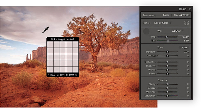
1. Here is a raw image in which the default Lightroom Develop settings had been applied. I first corrected the As Shot white balance by selecting the White Balance tool and rolling the pointer over an area that I wanted to make neutral.
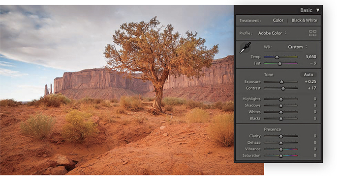
2. I clicked with the White Balance tool to achieve a slightly cooler color with less of a magenta tint, and then I proceeded to add more Exposure and Contrast.
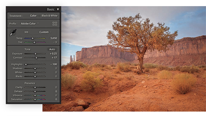
3. To bring out more detail in the clouds, I adjusted the Highlights slider to –100.
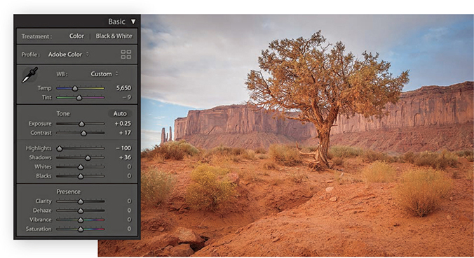
4. I then adjusted the Shadows slider to lighten the shadow detail, applying a +36 adjustment.
5. These next adjustments were all about fine-tuning the Basic panel settings. I used the Whites slider to set the white clipping and the Blacks slider to set the black clipping. I also adjusted the Clarity and Vibrance.
6. Finally, I went to the Tone Curve panel and adjusted the parametric sliders to further improve the tone contrast.
Tone range split point adjustments
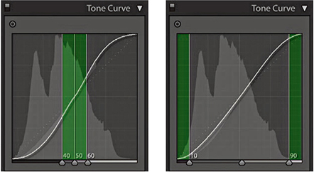
The tone range split points are at the bottom of the Tone Curve panel. In Figure 4.68, The Tone Curve panel on the left shows an S-shaped tone curve with the tone range split points in their normal positions with equal spacing for the Shadows, Darks, Lights, and Highlights zones. The middle example shows the Shadows zone set to its widest extent, compressing the other three zones. The example on the right shows the Highlights zone set to the widest point. Figure 4.69 shows how moving the two outer tone range split points in closer increases the midtone contrast, while moving them farther apart reduces the midtone contrast.
Double-click the tone range split points to reset to their default settings.
Refining the tone curve contrast
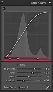
The following example shows how the Tone Curve Zones can be adjusted to fine-tune the tone curve contrast. I find it also helps sometimes to drag the Shadows zone slider to the extreme left position and the Highlights zone slider to the extreme right to concentrate a contrast boost to add a contrast kick to the shadows and highlights and leave the midtone contrast relatively flat.
1. Here, a contrast-increasing tone curve was applied to the image. The tone range split points were in their default positions and, as you can see, the Tone Curve Zones were evenly divided.
2. In this step, I moved the middle and outer right sliders to the right. This compressed the width of the Lights zone and thereby increased the contrast in the Lights zone area. This revealed more tone detail in the face.
HSL/Color Panel
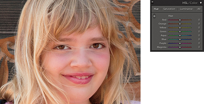
When editing color images, the HSL/Color panel is an all-in-one panel for making fine-tuned color adjustments. The HSL component (Figure 4.70) is kind of equivalent to the Hue/Saturation dialog found in Photoshop, except in Lightroom you can apply these types of adjustments to raw photos as well as rendered pixel images, such as JPEGs and TIFFs. It is a color adjustment tool to use when you need to target specific colors. The HSL panel has three color adjustment sections that allow you to control the Hue, Saturation, and Luminance over eight color-band ranges. These provide a more practical range of color hues to work with and more usefully match the colors people most often want to adjust. The Color section of this panel (Figure 4.71) provides a more simplified version of the HSL controls, with button selectors at the top for choosing the desired color band to edit, with Hue, Saturation, and Luminance sliders below. If an image has been converted to black and white, however, you will see instead the B&W panel shown in Figure 4.72. This can be used to carry out black-and-white conversions (which I discuss in the following chapter).
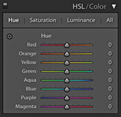
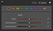
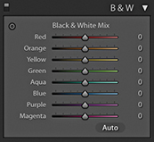
The sliders in the Hue section control the hue color balance, and these can be used to make hue color shifts in each of the eight color-band ranges. For example, dragging the Green Hue slider to the right makes the greens more cyan, while dragging to the left makes them more yellow. The sliders in the Saturation section control the color saturation. Dragging a slider to the right increases the saturation, while dragging to the left decreases the saturation. By dragging all the Saturation sliders to the left, you can convert the whole image to black and white. The Saturation slider controls apply a nonlinear saturation-type adjustment (similar to what the Vibrance slider does). This means that as you increase the saturation, lower saturated pixel values are increased relative to the already higher saturated pixel values in an image. The sliders in the Luminance section can be used to darken or lighten colors in the selected color ranges, and in a way that manages to preserve the hue and saturation. If you click the All button, the panel expands to let you see all the sliders at once. Also, clicking the Hue, Saturation, or Luminance tabs toggles showing just the controls for those parameters or showing All sliders.
As with the Tone Curve panel, the HSL controls can be applied using a Target Adjustment mode. Select the Hue, Saturation, or Luminance tab and click the Target Adjustment tool button to activate it. You can then click an image and drag up or down to adjust the colors targeted by the pointer. You can use the following shortcuts to enable the various HSL Target Adjustment modes: Hue,  (Mac) or
  (PC); Saturation,
  (Mac) or
  (PC); and Luminance,
  (Mac) or (PC). You can turn off the Target Adjustment tool by clicking the Target Adjustment button again, pressing , or using the
  (Mac) or
  (PC) shortcut. The Target Adjustment tool is deactivated whenever you switch to working in a new panel.
1. To better handle skin tones, you might consider using the Adobe Portrait profile, or create a custom camera calibration profile (see page 187). But if you shoot a mixture of subjects with the same camera profile, you can also use the HSL panel Hue section to compensate for reddish skin tone colors.
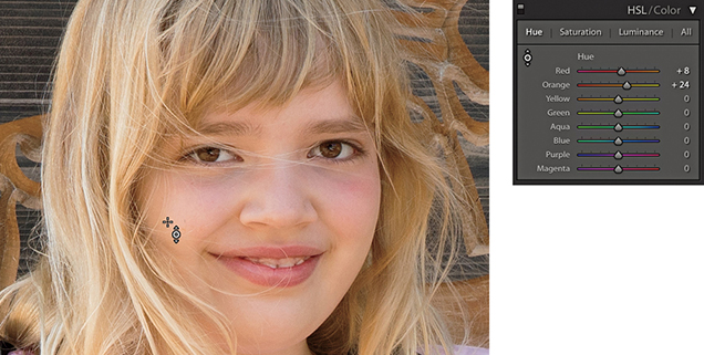
2. In this example, I went to the Hue section and activated the Target Adjustment tool. I then clicked on a skin tone area in the picture and dragged upward to make the skin tones less red and more yellow.
Selective color darkening
At first glance, the HSL controls in Lightroom appear to work the same as those used in Photoshop’s Hue/Saturation dialog, but if you experiment a little further, you will notice some distinct differences. For example, the Lightroom Hue slider adjustments are somewhat tamer than their Photoshop cousins. The Saturation sliders respond more or less the same as they do in Photoshop, but the most marked differences are revealed when working with the Luminance controls. You may have noticed that when you adjust the Lightness slider in the Photoshop Hue/Saturation dialog, the adjusted colors tend to lose their saturation. To selectively darken a color in Photoshop, you generally have to search for a particular combination of Saturation and Lightness to achieve the desired result. However, the Lightroom sliders really do respond the way you would expect them to and provide you with complete control over the luminance of any color range, as shown in the following steps.
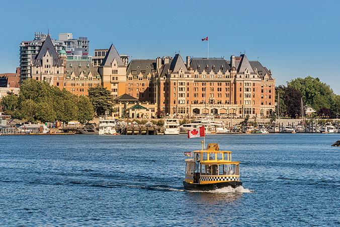
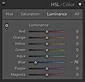
1. The challenge here was to simulate the effect of a polarizing lens filter and darken the blue sky without affecting the tonal balance of the other colors.
2. To darken the blue sky colors in Lightroom, I enabled the Target Adjustment mode in the Luminance section of the HSL panel, clicked an area of blue sky, and dragged downward. As you can see, this mainly reduced the Blue slider luminance and successfully added more contrast between the sky and the hotel.
When darkening a blue sky, as in the example shown here, you sometimes end up seeing banding or mottling in the blue sky areas. One solution is to go to the Detail panel and increase the Color and Smoothness settings in the Noise Reduction section.
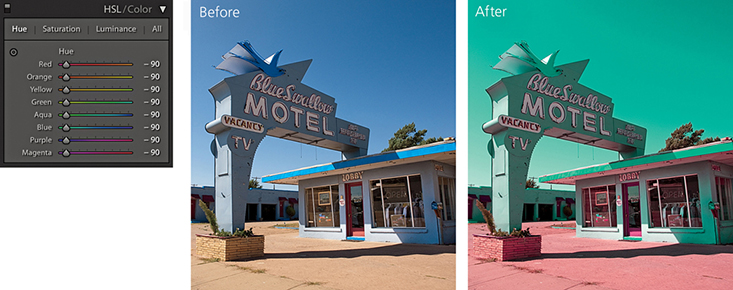
False color hue adjustments
There is still some room to go crazy and do things like turn blue skies purple, but the Hue adjustments in Lightroom are definitely more constrained. To create more extreme hue shifts, you may want to shift more than one Hue slider at a time. For example, you could create a series of Develop settings in which all the Hue sliders are shifted by equal amounts. To give you an example, I created a series of hue-shifted Develop preset settings. In one setting, all the Hue sliders are shifted +30; in another, they are shifted to +60; and so on. I suggest this as one way to create creative hue-shift coloring effects (Figure 4.73).
Using the HSL controls to reduce gamut clipping
The camera you are shooting with is almost certainly capable of capturing a greater range of colors than can be shown on your computer display or in print. But just because you cannot see these colors does not mean they are not there.
The following steps show a photograph taken of a rock formation in Arches National Park in Utah. This was shot at sunset when the rocks appeared at their reddest. At first glance, there did not appear to be much detail in the rocks, but this was only because the computer display was unable to show all the color information that was actually contained in the image. By using the HSL panel Luminance controls to darken the red and orange colors, I was able to bring these colors more into the gamut of the computer display so that they no longer appear clipped.
If you are using a standard LCD display, there is a good chance the more saturated colors will appear clipped, which can make it hard to predict how some colors will appear in print if you can’t actually see them. If the display you are using has a wide color gamut, it should be a better indicator as to which colors will and will not print. This is especially true when using soft proofing to visualize what the final print should look like (see Chapter 8). The display I work with has a gamut that matches 98% of the Adobe RGB color space, and this certainly helps when making evaluative adjustments such as in the example shown here. Even so, I find with certain color images I need to constrain the color saturation and luminance to achieve more printable result.
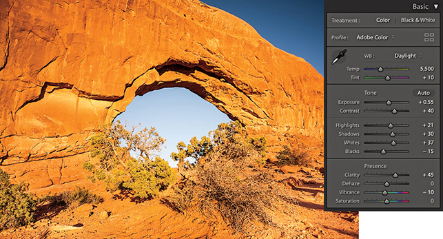
1. Shot late in the day as the sun was setting, this photograph captured a lovely warm glow on the red rocks. Shown here are the Basic panel settings I used.
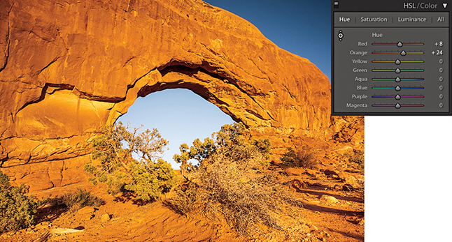
2. From the HSL panel, I selected the Luminance tab and adjusted the Red and Orange sliders to darken the luminance of the red rocks.
Lens Corrections Panel Profile Mode
The Lens Corrections panel can be used to cure various kinds of lens problems and has two sections: Profile and Manual (Figure 4.74). I will start by looking at the Profile controls.
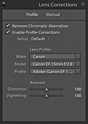
Lens profile corrections
Checking the Enable Profile Corrections box applies an auto lens profile correction adjustment. This can be done for any image, providing it contains the lens information in the EXIF data and there is a matching lens profile in the Lightroom lens profile database. Also, some lens corrections profiles now also take into account when a teleconverter is combined with a lens. Images that are missing their EXIF metadata cannot be processed using the Enable Profile Corrections feature. However, by saving Lens Profile Corrections settings as Develop presets, it is possible to apply such adjustments where the EXIF metadata is missing.
Assuming Lightroom offers lens profiles for the lenses you are shooting with, it is a simple matter of clicking the Enable Profile Corrections box to apply an auto lens correction to any selected photo. When you do this, you should see in the boxes below the make of the lens manufacturer, the specific lens model, and the lens profile (which will most likely be the installed Adobe profile). If these appear empty, then you may need to first select the lens manufacturer from the Make menu, the lens model from the Model menu, and the preferred lens profile from the Profile menu. It is important to appreciate that some camera systems capture a full-frame image (therefore making full use of the usable lens coverage area for many lenses), whereas compact cameras tend to have smaller sensors that capture the image using a smaller portion of the lens’s total coverage area. The Adobe lens profiles have mostly been built using cameras that have full-frame sensors. This means that from a single lens profile, it is possible to automatically calculate the appropriate lens correction adjustments to make for all other types of cameras where the sensor size is smaller. Lightroom and Camera Raw should preferably use lens profiles generated from raw capture files. This is because the vignette estimation and removal has to be measured directly from the raw linear sensor data rather than from a gamma-corrected JPEG or TIFF image.
Lens profile corrections consist of two components: a Distortion correction to correct for the barrel or pincushion geometric distortion, along with a Vignetting correction. The Amount sliders allow you to fine-tune a profiled lens correction. So, for example, if you wanted to allow an automatic lens correction to automatically correct for the lens vignetting, but not correct for, say, a fisheye lens distortion, you could set the Distortion slider to 0 (dragging it all the way to the left). On the other hand, if you believe an auto lens correction to be too strong or not strong enough, you can easily apply a compensation to the correction amount by dragging either of these sliders left or right.
The Setup menu is normally set to Default. This instructs Lightroom to automatically work out what is the correct lens profile to use based on the available EXIF metadata contained in the image file or to use whatever might be assigned as a default Lens Correction with this particular lens. The Custom option appears only if you choose to override the auto-selected default setting, or you have to manually apply the appropriate lens profile. As you work with the automatic lens corrections feature on specific images, you also have the option to customize the Lens Corrections settings and use the Setup menu to select the Save New Defaults option. This lets you set new Lens Corrections settings as the default to use when an image with identical camera EXIF lens data settings is selected (such as when you adjust the Distortion and Vignetting sliders to under- or overcompensate for a lens profile correction). The Setup menu will, in these instances, show Default as the selected option in the Setup menu.
Note
Custom lens profiles created via Adobe Lens Profile Creator 1.0 should be saved to the following shared locations. Mac OS X: Library/Application Support/Adobe/CameraRaw/Lens Profiles/1.0 Windows: Program Data\Adobe\Camera Raw\Lens Profiles\1.0
Accessing and creating custom camera lens profiles
If you do not see any lens profiles listed for a particular lens, you have two choices: You can either locate a custom profile that someone else has made or make one yourself using the Adobe Lens Profile Creator program, which is available for free from tinyurl.com/y7szywdo. Go to this link and scroll down to the bottom to download the Mac or PC builds. Also download the Adobe Lens Profile Creator User Guide that explains how to go about photographing an Adobe Lens Calibration chart and build custom lens profiles for your own lenses. This is not too difficult to do once you have mastered the basic principles.
Incidentally, the Photoshop Lens Correction filter includes an Auto Correction tab where one of the submenus allows you to access shared custom lens profiles that have been created by other Photoshop customers (using the Adobe Lens Profile Creator program). Unfortunately, the Lens Corrections panel in Lightroom does not provide a shared-user lens profile option, so whether you are creating lens profiles for yourself or wish to install a custom lens profile, you will need to reference the directory path lists shown in the Note opposite. After you add a new lens profile to the Lens Profiles folder, you need to quit Lightroom and restart before a newly added lens profile appears listed in the Lens Corrections panel Lens Profile list.
Profile lens corrections in use
The following steps show I was able to use a lens profile correction to correct the geometric distortion in a fisheye-lens photograph.
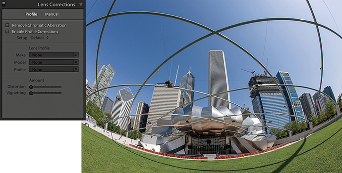
1. Shot using a 15mm fisheye lens, this photograph has a noticeable curvature in the image.
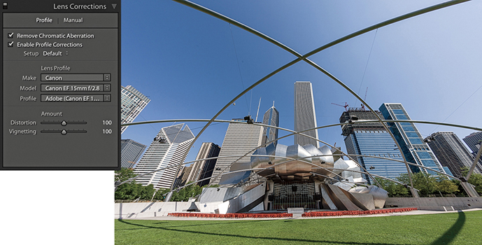
2. In the Lens Corrections panel, I checked the Enable Profile Corrections box to apply an auto lens correction to the photograph. Here, I left the Distortion and Vignetting sliders at their default 100 settings.
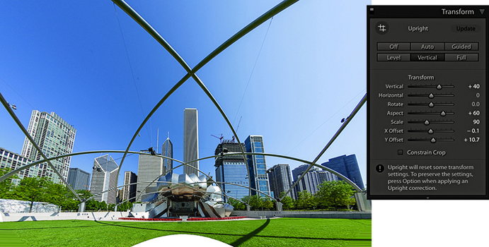
3. Next, I went to the Transform panel and applied a Vertical Upright correction. In the Transform section, I adjusted the Vertical slider to partially restore some of the keystone distortion. I adjusted the Aspect Ratio slider to stretch the image vertically and adjusted the Scale slider to zoom out slightly and reveal more of the image content.
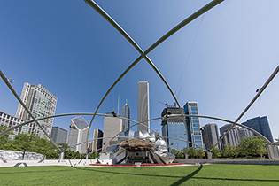
4. Finally, I opened the photo in Photoshop and used the Content-Aware Fill feature to fill in the white space at the bottom. (There is a video on the book website that shows how this was done.)
Downloadable Content:

In-camera lens corrections
Some digital cameras, such as the Panasonic DMC-LX3 and Sony RX100, are capable of storing lens-corrected linear raw data that can be read and used to optically correct for things like geometric distortion. Lightroom is able to read this data and use what are referred to in the DNG specification as “opcodes.” This allows the lens correction processing to be applied at the raw processing stage rather than in-camera. In fact, the camera manufacturers have not been willing to allow Adobe to provide Camera Raw support for their cameras unless Adobe respects this data and applies the lens corrections in Camera Raw. In instances where a built-in profile has already been applied, the Lens Corrections panel now indicates this with an alert message stating that a built-in lens profile has already been applied automatically. Clicking the “i” button opens a dialog with a more detailed description of the lens profile correction that has been applied (Figure 4.75).
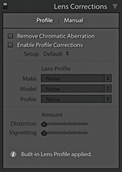
Removing chromatic aberration
Chromatic aberration is caused by an inability to focus the red, green, and blue light wavelengths at the same position toward the edges of the frame, which is more correctly known as lateral or latitudinal chromatic aberration. The sensors in the latest digital SLRs and medium-format camera backs are able to resolve a much finer level of detail than was possible with film. As a consequence, any deficiencies in the lens optics can be made even more apparent. Therefore, where some color wavelengths are focused at different points, you may see color fringes around the high-contrast edges of a picture. This can be particularly noticeable when shooting with wide-angle lenses (especially when they are being used at wider apertures), and here you may well see signs of color fringing toward the edges of the frame. This is easy enough to fix by selecting the Remove Chromatic Aberration option in the Profile tab section of the Lens Corrections panel (Figure 4.76). When this option is on, Lightroom carries out an automatic chromatic aberration correction regardless of whether you have a lens profile correction enabled or whether a suitable lens profile is available or not. This option can also automatically correct for chromatic aberrations when using decentered lenses, such as tilt/shift lenses.
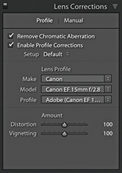
The following steps show how the Remove Chromatic Aberration option can help improve the appearance of an image that has obvious signs of color fringing.
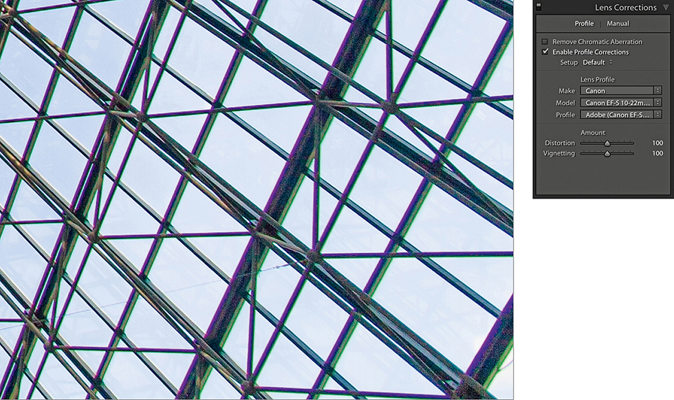
1. Here is a typical example of color fringing caused by lateral chromatic aberration toward the edges of the frame of a wide-angle zoom lens. This is the uncorrected version with the Remove Chromatic Aberration box unselected.
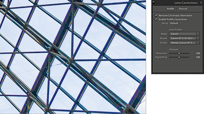
2. I turned on the Remove Chromatic Aberration option in the Lens Corrections panel Profile tab section to remove the color fringing.
Lens Corrections Panel Manual Mode
Sometimes an image needs a little more fine-tuning than the automatic corrections can provide. That’s where the Manual mode comes in handy.
Defringe adjustments
The Defringe controls are designed to fix axial (longitudinal) chromatic aberration. This can be caused due to ghosting, lens flare, charge leakage (which affects some CCD sensors), as well as changes in focus.
Unlike lateral chromatic aberration, which occurs toward the edges of the frame, this type of aberration can appear anywhere in an image. It particularly affects fast, wide-aperture lenses and is typically most noticeable when shooting at the widest lens apertures, where fringes will usually be at their most visible just in front of and just behind the plane of focus. These will typically appear purple/magenta when they are in front of the plane of focus and appear green when they are behind the plane of focus. But even at the exact point of focus, you may sometimes see purple fringes (especially along high-contrast or backlit edges), which can be caused by flare. As you stop down the lens aperture, these types of aberrations are usually less noticeable.
The Defringe section consists of four sliders (Figure 4.77). The Purple Amount and Green Amount sliders control the degree of correction, and below each of these are the Purple Hue and Green Hue sliders, which have split slider controls.
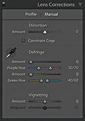
Looking at the two Purple sliders, the Amount slider has a range of 0 to 20 and is used to determine the strength of the purple fringing removal. The Purple Hue slider can then be used to fine-tune the range of purple colors that are to be affected. What you need to be aware of here is that a higher Purple Amount setting applies a stronger correction, but the downside is that at higher settings this may cause purple colors in the image that are not the result of fringing to also become affected by the Purple Amount adjustment. To moderate this undesired effect, you can tweak the Purple Hue slider split points to narrow or realign the purple range of colors to be targeted. You can drag either of the knobs one at a time, or you can drag the central bar to align the Hue selection to a different portion of the blue/purple/red color spectrum. If you need to reset these sliders, just double-click each individual knob. Likewise, double-click the central bar to reset it to its default position. The minimum distance that may be set between the two sliders is 10 units.
The Green Amount and Green Hue sliders work in exactly the same fashion as the Purple sliders, except they allow you to control the green fringes. However, the default range for the Green Hue slider has a narrower range of 40 to 60, affecting the yellow/green/cyan color spectrum. The reason for this is to help protect common green and yellow colors such as those found in foliage.
The Defringe controls in use
The recommended approach is to carry out all your major tone and color edits first and make sure that you have turned on the profile-based lens corrections to correct for geometric distortion and vignetting. Once these steps have been done, go to the Profile tab of the Lens Corrections panel and check the Remove Chromatic Aberration check box. Then go to the Manual tab and use the Defringe sliders to remove any remaining signs of fringing. As with the Detail panel controls, the Lens Correction Defringe controls are best used when viewing an image at a 100% view or higher. If a global adjustment is having an adverse effect on the rest of the image, you can always turn down the Purple or Green Amount sliders and use a localized adjustment with the Defringe slider set to a positive value to apply a stronger, localized adjustment.
You can also use the  key as a visualization aid. This can greatly help you see an emphasized overlay that gives a clearer indication of what effect the sliders are having and making the most suitable slider adjustments. Hold the key and drag the Purple Amount slider to visualize purple fringe removal. This will cause the preview to reveal only the affected areas of the image. All other areas will be shown as white. This lets you concentrate on the affected areas and help verify that the purple fringe color is being removed. Hold the key and drag either of the Purple Hue slider knobs to visualize the range of hues that are to be defringed. As you do this, the preview will show the affected hue range as being blacked out. As you drag a slider, you need to pay close attention to the borders of the blacked-out area to check if there are any residual purple colors showing. The same principles apply when adjusting the Green Amount and Green Hue sliders with the key held down.
Eyedropper tool
When working with the Defringe sliders you can activate the Eyedropper tool and use this to select a target fringe color, analyze the pixels in the local area around where you clicked, and auto-calculate the required fringe amount and hue adjustment for the purple and/or green color fringes. To use this tool, it helps to be zoomed in extra close, such as at a 200% or even a 400% view, as this will make the color picking more accurate. If the Eyedropper tool detects a purple fringe color as you move it over the image, the Eyedropper will appear filled with a purple color, indicating this is an okay area to click to sample a representative purple fringe color. Likewise, if the Eyedropper tool detects a green fringe color, you will see a green Eyedropper (Figure 4.78). However, if the area below the tool is too neutral, or the color falls outside the supported color range, the Eyedropper tool will be filled gray. If you click, an error message will appear saying, “Cannot set the purple or green fringe color. Please sample a representative fringe color again.”
Applying a global Defringe adjustment
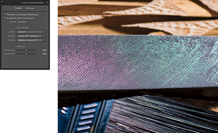
1. Before I started defringing, I applied all the main color and tone adjustments and enable the lens profile corrections in the Lens Corrections Profile tab section.
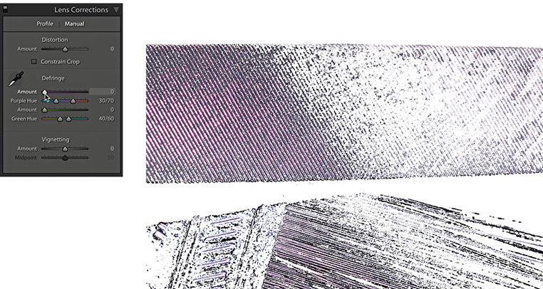
2. I clicked the Manual tab to view the Defringe controls. I then held down the key and clicked and moused down on the Purple Amount slider to get a visualization of the extent of the purple fringed area, with everything else displayed with a white overlay.
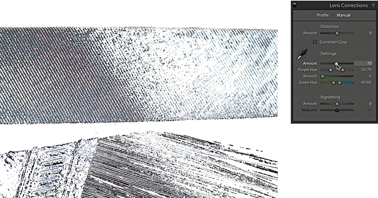
3. With the key held down, I dragged the Purple Amount slider until all of the purple fringing appeared to have been removed. (It helps to use a 200% close-up view or higher when judging the effectiveness of such an adjustment.)
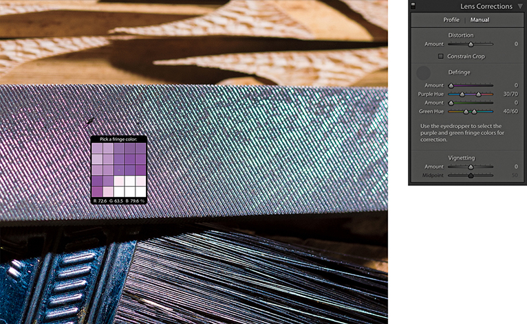
4. I reset the Purple Amount slider and decided instead to carry out an auto-calculated adjustment. I selected the Eyedropper and rolled the tool over the image to locate a magnified view of the purple fringe pixels.
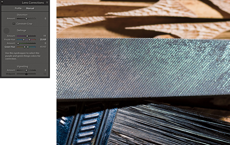
5. Here, you can see what the image looked like after I clicked the purple fringe area that I located in Step 4 using the Eyedropper. Lightroom auto-calculated the required adjustment and set the Purple Amount and Purple Hue sliders accordingly.
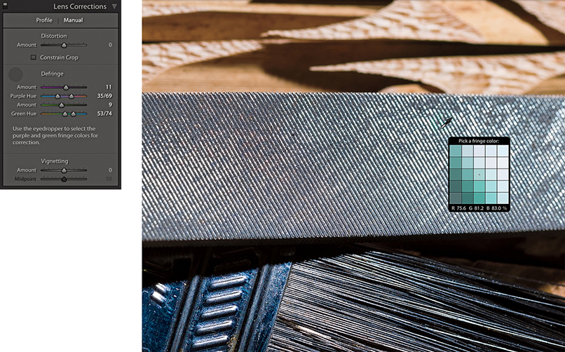
6. Lastly, I used the key to locate the green areas and used the Eyedropper to select a green fringe area to auto-calculate the settings for the Green Amount and Green Hue sliders.
Applying a localized Defringe adjustment
The global Defringe controls should be all that you need in order to remove troublesome fringing. However, there may be instances where it will not be possible to remove all visible fringing using the global Defringe sliders on their own. Or, it may be the case that when applying a strong global correction, the adjustment you apply has an adverse effect on other areas. In situations like this, it can be useful to apply a global adjustment combined with a localized defringe correction using either the Adjustment Brush or the Graduated Filter. With some images, a localized defringe adjustment might be all you need to apply. It is worth pointing out here that localized Defringe adjustments will remove fringes for all colors (not just purple and green), and therefore work independently from the global Purple Hue and Green Hue settings set in the Lens Corrections panel.
To apply a localized a Defringe adjustment, the image you are processing must be updated to Version 3 or later. The Defringe slider range goes from −100 to +100. A positive Defringe adjustment can be used to apply extra defringing where required, such as when working on specific problem areas in a picture. A negative Defringe adjustment can be used to say “don’t apply a defringe and protect this area.” When might you want to use this? Imagine a picture in which, say, a strong purple defringe was applied globally and resulted in some of the purple areas becoming desaturated. In a situation like this, you can paint over the affected areas with the Defringe slider set to −100, which will allow you to restore the original color to these parts of the image.
Localized defringe adjustments are not as powerful as the global defringe corrections and therefore cannot be as effective on their own when correcting an image. This is why it is often best to use the global controls first and then use a localized adjustment to fine-tune as necessary. Just be aware that, unlike other localized adjustments, there is no benefit to be gained in applying multiple localized defringe adjustments to improve upon what can be achieved with a single localized adjustment step. The steps on the following page show an example of a localized Defringe adjustment.
Vignetting sliders
The Vignetting sliders at the bottom of the Lens Correction panel provide manual controls to correct for lens vignetting. These can be regarded as legacy sliders that have been present in Lightroom since before the introduction of profiled lens corrections. These sliders provide backward compatibility for images that were edited in older versions of Lightroom. They are not really so necessary now, although having said that, you can use them in conjunction with the Effects panel Post-Crop Vignetting sliders to apply vignetting effects.

1. As you can see in this close-up, this image has some obvious signs of color fringing.
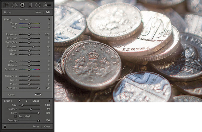
2. Here, I selected the Adjustment Brush, set the Defringe slider to +100, and painted over the affected areas to reduce the color fringing. I was able to get rid of nearly all the visible fringing and target the Defringe adjustment precisely where it was needed most.
Transform Panel
The Transform panel (Figure 4.79) can be used to apply Upright (automated perspective corrections) and manual transform adjustments. These provide you with control over the perspective and scaling of an image. Note that should you want to flip a photograph you can choose Photo ![]() Flip Horizontal or Flip Vertical.
Flip Horizontal or Flip Vertical.
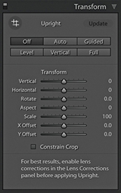
Upright adjustments
When applying an Upright adjustment, Lightroom first analyzes the image for straight-line edges and, from this, is able to estimate a perspective transform adjustment. To get the best results, it is recommended you apply a lens profile correction first. There are several Upright options for you to choose from because no single type of adjustment will work perfectly for every image, so it is always worth checking out each option to see which adjustment works best for an individual photo. To help, each button has a tooltip that explains its function.
Clicking the Auto button applies a balanced correction to the image; that is, it applies a balanced combination of the options listed below plus an auto Aspect Ratio correction. Essentially, Auto aims to level the image and, at the same time, fix converging vertical and horizontal lines in an image. The ultimate goal is to apply a suitable transform adjustment that avoids applying too strong a perspective correction. The Auto setting mostly crops the image to hide the outside areas. However, if the auto adjustment ends up being quite strong, some outside areas may remain visible. With the Guided option, you manually add guides to define the horizontal and vertical lines. The Level correction applies a leveling adjustment only—like an auto-straighten tool. The Vertical perspective correction applies a level and a converging vertical lines adjustment. And lastly, the Full correction applies a full level and a converging vertical and horizontal perspective adjustment, and in doing so, it will allow strong perspective corrections to occur. To cycle through the Upright modes, use  (this shortcut is the same for both Mac and PC).
The Off setting can be used to turn off an Upright correction, while preserving the initial, precomputed analysis of the image. As you click any of the above options (except Off), this automatically resets the Horizontal, Vertical, and Rotate sliders. Upright adjustments preserve any crop that is active, but will reset a crop rotate angle. If an Upright adjustment is unable to do anything, you’ll see a message at the bottom of the panel saying “No Upright correction found” and the manual transform sliders will remain as they are.
How Upright adjustments work
It is important to understand that the underlying math behind Upright adjustments is doing more than auto-applying Vertical, Horizontal, and Rotate adjustments. Upright adjustments work quite differently than the manual sliders in the Transform section. The vertical and horizontal adjustments involved in the Upright process are actually quite sophisticated. Behind the scenes, there are angle of view and center of projection adjustments taking place. This all has to do with the fact that the interaction of one rotation movement can have an impact on another, and such interactions can be quite complex. For example, think about what happens when you adjust the tilt and yaw on a camera tripod head, and you may get some idea of what goes on behind the scenes.
Having the choice of four auto Upright methods means at least one of these should work well and, failing that, there is the manually controlled Guided Upright option. What tends to happen, though, is the perspective can often end up looking too perfect. When correcting the perspective for a building to remove a keystone effect, it is generally a good idea to go to the Manual tab afterward and adjust the Vertical slide, adding something like a +10 adjustment so the corrected verticals still converge slightly. You might even consider creating a preset that combines, say, an Auto Upright correction with a Vertical slider tweak. You may also find it helpful here to enable the Grid overlay via the View Loupe Overlay menu (see page 106).
Upright corrections and transparency
Lightroom supports and preserves image transparency when reading TIFF, PNG, and DNG files. In Lightroom, you will notice how transparent areas (which can appear when applying a Geometric correction, Upright correction, or Manual transform) are represented in Lightroom as white. It is inevitable that extreme adjustments may cause the image to distort so much that you will end up seeing transparent areas. Where this happens, you can check the “Constrain to crop” box to apply an auto-crop adjustment that trims the image accordingly. Or, you can always apply a manual crop to the image afterwards to set the crop boundary. When exporting images as TIFF or PSD to Photoshop, the transparency will be preserved and appear represented with the usual checkerboard pattern. When exporting as JPEG, the transparent areas are represented as white.
Suggested order for Upright adjustments
You’ll want to apply an Upright adjustment early on in the image processing, because unlike most other image edits carried out in the Develop module, the order matters. In particular, you will want to ensure you apply an Upright adjustment before you apply a rotate crop or a Vertical, Horizontal or Rotate Transform adjustment. As for lens profile corrections, it is best to apply these before an Upright adjustment, as a geometrically corrected image can help the line detection work better.
Synchronizing Upright settings
When synchronizing Upright settings, you have to think carefully about what you wish to achieve, as this will have a bearing on the options you select in the Copy/Synchronize Settings dialog (see page 353). If Transform panel adjustments have been applied to an image and you wish to synchronize the Transform panel settings with other images, you can choose to synchronize the Upright Mode, Upright Transforms, or Transform Adjustments. Upright mode simply synchronizes the Upright method, i.e., Auto, Level, Vertical, or Full (note that you can’t sync a Guided Upright adjustment using the Upright Mode option). This will result in Lightroom synchronizing the Upright mode method, which means it will analyze each image individually as it does so and may well produce a different outcome on other images. The Upright Transforms option synchronizes the Upright transform adjustment precisely. For example, if you were to prepare a group of bracketed exposure images to create an HDR master, you would want to use this method to synchronize the Upright settings, so the transform adjustments keep all the images in register. The Transform Adjustments option just syncs the manual slider settings in the Transform panel, such as the Vertical and Horizontal Transform sliders.
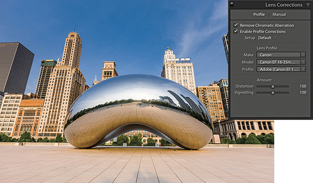
1. I began by checking the Remove Chromatic Aberrations and Enable Profile Corrections boxes in the Lens Corrections panel.
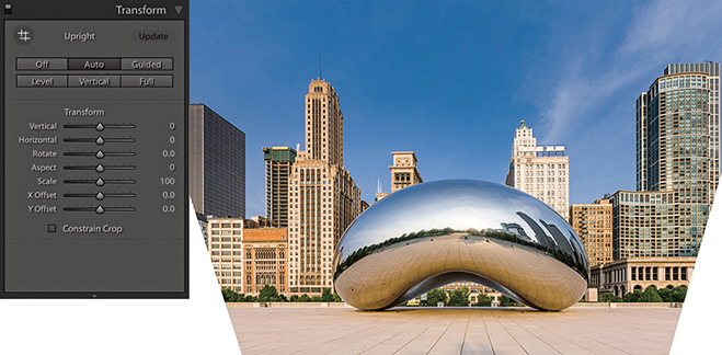
2. In the Transform panel, I clicked the Auto Upright button to apply an auto-correction. This applied an auto-perspective adjustment that combined a leveling and a horizontal and vertical perspective correction and, as you can see, transformed the image in such a way the bottom edge of the image was shortened and revealed white padded areas on either side.
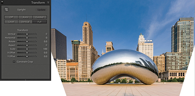
3. I then selected the Full option. This applied a strong perspective correction, similar to the Auto adjustment, which also revealed white padded areas.
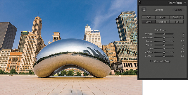
4. I then selected the Level correction. This correction simply applied an auto-level adjustment and did not attempt to fix the keystone perspective.
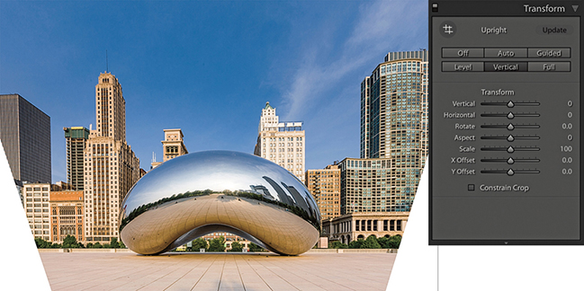
5. Lastly, I selected the Vertical correction. This leveled the image and corrected the keystone effect. Now, with every image you will see different kinds of outcomes when running through these options. Although the Auto, Full, Level, and Vertical corrections looked fairly similar, they were, in fact, subtly different. Of the four methods, I liked Auto best.
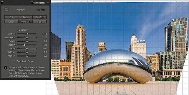
6. In the Transform section, I adjusted the Vertical slider, setting it to +10, which made the vertical lines converge slightly and produced a more natural-looking perspective. The image was a little squashed horizontally, so I also adjusted the Aspect slider to −30 to widen the aspect ratio.
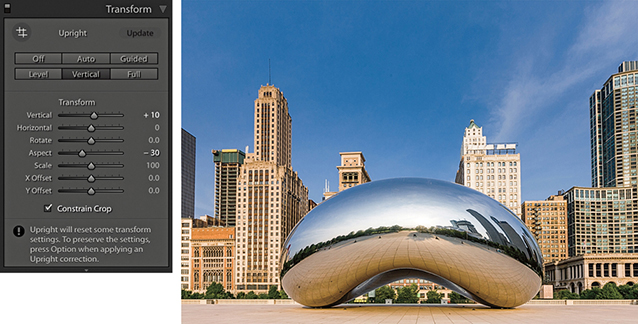
7. Finally, I checked the Constrain Crop box to apply an auto crop that removed the white padded areas and trimmed the image accordingly.
Guided Upright adjustments
When you click the Guided Upright option or click to select the Guided Upright tool ( ), you can use the Guided Upright tool (Figure 4.80) to add up to four guide lines to define vertical and horizontal lines in an image. It is best to apply a lens profile correction first before you do this, and you will need to first apply a minimum of two guide lines. For example, you can start by adding two guide lines to define the verticals in a photograph followed by one or two more horizontal guides to define the horizontals. Any error, and instruction messages will appear at the bottom of the panel. Enabling the Show Loupe option in the Toolbar will reveal a magnifying loupe, which can assist when defining the guide lines.
In practice, I think you will find it still easiest to begin by selecting one of the regular Upright button options to see which works best. If you can’t find an optimum result, it is then worth selecting the Guided Upright option so you have complete control and can achieve the desired perspective correction. Another thing about working with the Guided Upright mode is that you don’t have to use it just with architectural subjects. It can work on any image and be used as a tool to transform the shape of the image beyond what can be achieved using the Vertical and Horizontal Transform sliders. You don’t have to align to straight lines either. You can deliberately offset the lines at an angle to get the image to transform to any angle you like.
1. In Transform panel, I selected the Guided Upright option, then applied a horizontal guide line to the top of the sign. Nothing will happen yet until a second horizontal guide line is added.
2. I added a second horizontal guide at the bottom of the sign, which then caused the horizontal lines to straighten.
3. After straightening the horizontals, I added a guide line to the left edge to straighten it.
4. I then added a fourth guide line to the right edge. This final version has the Grid Overlay visible in the Toolbar.
The Transform sliders
The Transform sliders in the Transform panel can be used to apply manual transform adjustments (Figure 4.81). The Vertical slider lets you apply a keystone correction to the converging verticals in a photograph, such as those produced when pointing the camera upward to photograph a tall building. The Horizontal slider similarly corrects for horizontal shifts in perspective, which might occur when a photo is captured from a viewpoint other than completely “front on” to a subject. The Rotate slider lets you adjust the rotation of the transform adjustment. Although it is possible to use the Rotate slider to straighten a photo, you can also use a Level Upright adjustment or the Straighten tool in Crop Overlay mode to achieve the same kind of result. When correcting the perspective, the resulting image may look vertically or horizontally stretched. Using the Aspect slider, you can control how much the image is stretched vertically and horizontally so the image view looks more natural. The Scale slider lets you adjust the image scale. As you reduce the Scale amount, the outer image area will appear as an undefined white padded area (see the previous step examples). Lightroom does not provide any options for filling in this border (as you have with the Lens Corrections filter in Photoshop), but there are still ways you can do this in Photoshop when retouching a rendered pixel image that has been exported from Lightroom. Lastly, the X and Y Offset sliders can be used to center the image vertically or horizontally. This can be particularly helpful after applying a strong transform adjustment, such as when applying a Guided Upright adjustment.
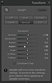
Effects Panel
Whether you need to apply a vignette as a finishing touch to your image or add a bit of grain, the Effects panel can help. The following section demonstrates how to work with the post-crop vignette sliders.
Post-Crop vignettes
The Post-Crop Vignetting controls in the Effects panel can do more or less the same thing as the Lens Corrections panel’s Vignetting sliders, except these adjustments are applied relative to the proportions of the cropped photograph. However, whenever you use the Crop Overlay mode to edit a crop setting, you will notice the vignette effect is temporarily disabled. The Amount and Midpoint sliders work the same as those found in the Lens Corrections panel Manual tab Vignetting section, while the Roundness slider lets you adjust the shape of the vignette relative to the proportions of the image. In Figure 4.82, you can see that at 0 Roundness, the vignette shape matches the proportions of the cropped image. At +100, the Roundness slider makes the post-crop vignette more circular. The Feather slider can be used to soften or harden the vignette edge. For example, in Figure 4.82, I applied a 0 Feather amount, and this applied a hard edge to the vignette.
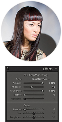
The Effects panel has several Post-Crop Vignetting Style options. In Figure 4.83, you can see I applied four different Post-Crop Vignetting settings to the same photograph. Also, the ability to apply both an Effects panel Post-Crop vignette and a Lens Corrections panel vignetting effect means that you can experiment using different combinations of these two settings when editing a cropped photograph. For example, in the bottom-right image in Figure 4.83, I combined a maximum +100 Lens Corrections panel Vignetting Amount correction with a maximum +100 Post-Crop Vignetting Amount correction in Paint Overlay mode.
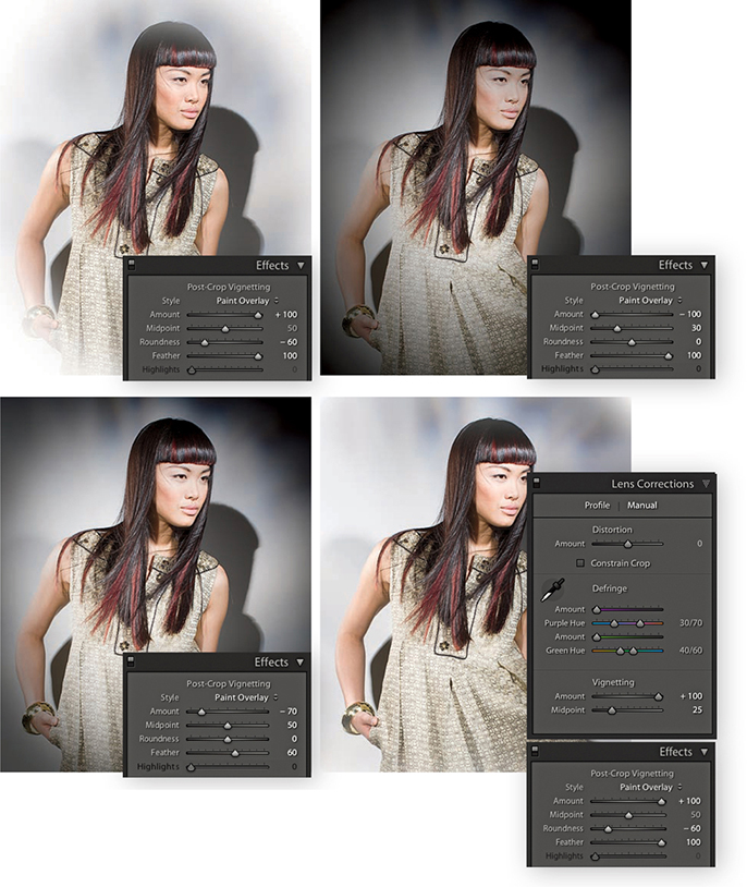
Post-Crop vignette options
I have so far shown just the Paint Overlay effect in use, which was once the only post-crop vignette mode available in Lightroom. The Paint Overlay effect blends either a black or white color into the edges of the frame, depending on which direction you drag the Amount slider. When it was first introduced, some people were quick to point out that this post-crop vignetting was not exactly the same as a Lens Corrections panel vignette effect. You can see for yourself how a Paint Overlay vignette applies a soft-contrast, hazy kind of look. This was not to everyone’s taste, though (although sometimes I quite like the look it creates). The two additional post-crop editing modes apply vignetting effects that are close in appearance to lens vignetting corrections applied via the Lens Corrections panel, where the darkening or lightening is produced by varying the exposure at the edges. There is also added scope to refine a vignetting effect whether you are using it to darken or lighten.
In Figure 4.84, I initially applied a lens profile correction adjustment to correct for the lens vignetting. I then applied the Paint Overlay Post-Crop Vignetting settings shown. As you can see, this applied a hazy, darkening effect to the edges of the photo.
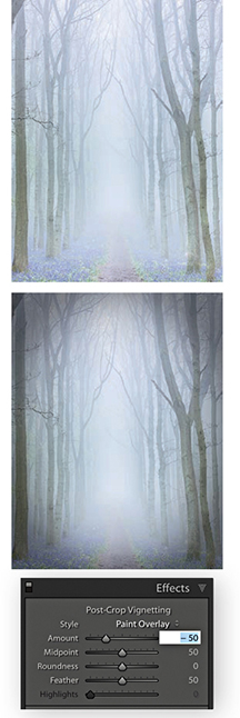
In Figure 4.85, I used a positive Amount setting to lighten the corners of the photo. I applied Color Priority mode to the image on the left and Highlight Priority mode to the image on the right. Of the two, the Color Priority effect is the more gentle, because it applies the post-crop vignette after the Basic panel Exposure adjustments but before the tone adjustment stage. This minimizes color shifts in the darkened areas, but it is unable to perform any highlight recovery in areas that might be burnt out. Highlight Priority mode, on the other hand, tends to produce more dramatic results. It applies the post-crop vignette prior to the Exposure adjustment and has the benefit of allowing better highlight recovery, but this can sometimes lead to color shifts in the darkened areas.
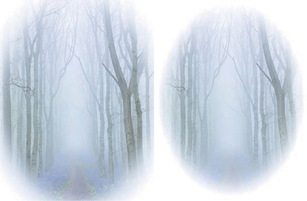
Figures 4.86 and 4.87 show examples of the Highlight Priority and Color Priority modes applying darkening vignettes. The Highlights slider can further modify this effect, but it is only active when applying a negative Amount setting. As soon as you apply a lightening vignette, the Highlights slider is disabled. Increasing the Highlights setting lets you boost the contrast in the vignetted areas. The effect is really only noticeable in subjects that feature bright highlights, lightening them to take them back more to their original exposure value. Overall, I find the Highlights slider has the greatest impact when editing a post-crop vignette in Color Priority mode.
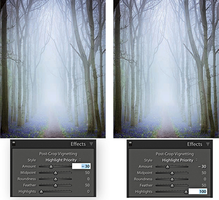
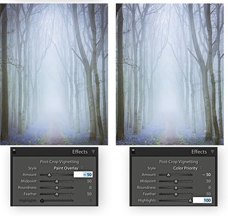
Assessing Your Images
Lightroom offers several ways to assess and compare your image edits. You can choose to split your preview into either side-by-side or top and bottom views of before and after edits, or you can use Reference view mode to compare your working image to a standard reference image.
Tip
You can switch between the before and after versions in the Develop module by going to the View menu and choosing Before/After ![]() Before Only. Or, use the Backslash key (
Before Only. Or, use the Backslash key ( ) shortcut to quickly toggle between these two viewing modes.
Comparing Before and After Versions
While you are working in the Develop module, you can simultaneously compare the before and after versions of any photograph you are working on. This lets you compare the effect of the Develop settings adjustments, as they are applied to the image. To view the before and after adjustments, click the Before/After view mode button in the Toolbar, and then click the disclosure triangle (circled in Figure 4.88) to select one of the four Before/After viewing modes from the menu. These viewing modes display two identical views of the currently selected image. You can choose a Left/Right view to see a horizontal, side-by-side before-and-after preview, or you can choose a Top/Bottom view to see a vertical side-by-side before-and-after preview. Meanwhile, the Split views divide the preview in half, displaying a Before view on the left and an After view on the right (Figure 4.89), or a Before view on top and an After view below (Figure 4.90). Alternatively, you can repeatedly click the Before/After button to cycle through all the available views. You can also use the  key to toggle the standard Left/Right view mode on or off, press
  to toggle the standard Top/Bottom view mode on or off, and use
  to toggle between a split-screen preview or side-by-side previews. Press
  to return to the default full-screen preview in the Develop module. While you are in any of the Before/After view modes, you can zoom and scroll the image to compare the adjusted version with the before image.
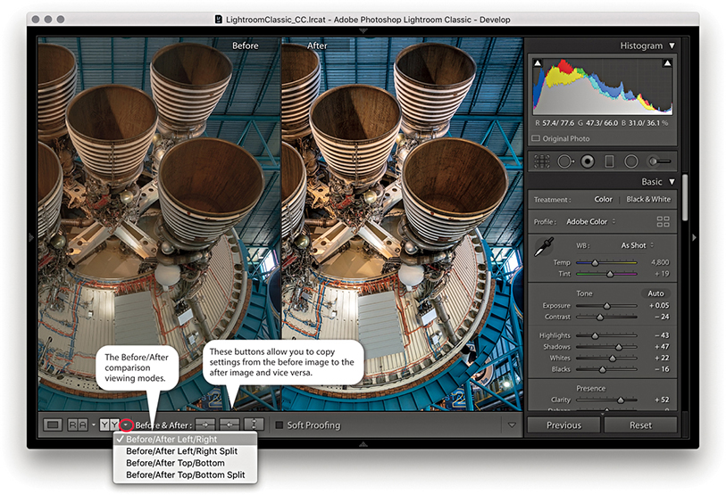
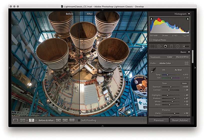
Managing the Before and After previews
When you edit an image in one of the Before/After viewing modes, you can make umpteen adjustments via the Develop module and at all times be able to compare the revised, After version with the Before version. Just to clarify here, the Before version view uses either the Develop settings that were applied when the photo was first imported into Lightroom or the last assigned Before state.
Tip
To Copy After’s settings to Before the shortcut is  (Mac) or
  (PC). The shortcut to copy Before’s settings to After is
  (Mac) or
  (PC).
(PC).
The Copy Settings and Swap Before and After Settings buttons in the Toolbar can then be used to update the settings in either the before or current after version of the image. Suppose that you want to make the current After version view the new Before. You can do this by clicking the “Copy settings from the After photo to the Before photo” button. This updates the Before image view with the current After image settings. What you are effectively doing is saving a snapshot of the settings at a certain point in the Develop adjustment process and updating the before version. You can then make further new adjustments and compare these with the new Before version. Let’s say at this point that you continue making more tweaks to the Develop panel settings, but you decide that these corrections have not actually improved the image and the Before version view is better. You can reverse the process by clicking the “Copy settings from the Before photo to the After photo” button. Basically, the Before and After Copy Settings controls (Figure 4.91) give you control over the settings that are applied to the before and after (current) versions of the image. The following steps illustrate one such workflow.
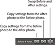
Tip
You can drag a history step from the History panel and drop it in the Before side of the Before/After to set it as the Before state.
1. I began in the Develop module with the settings that were applied to the image at the import stage.
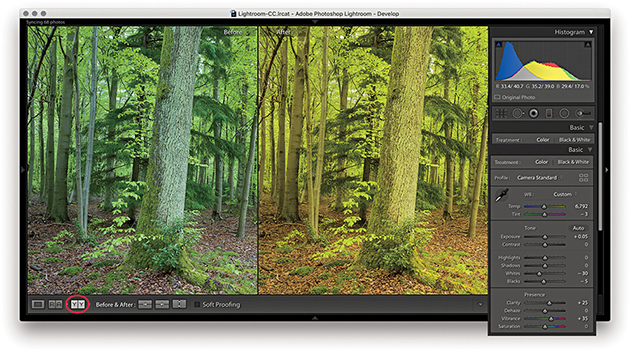
2. I clicked the Before/After view YY button (you can also use the keyboard shortcut) and began to adjust the image by altering the white balance. Notice that the modified After version got warmer in color. I also optimized the Tone settings.
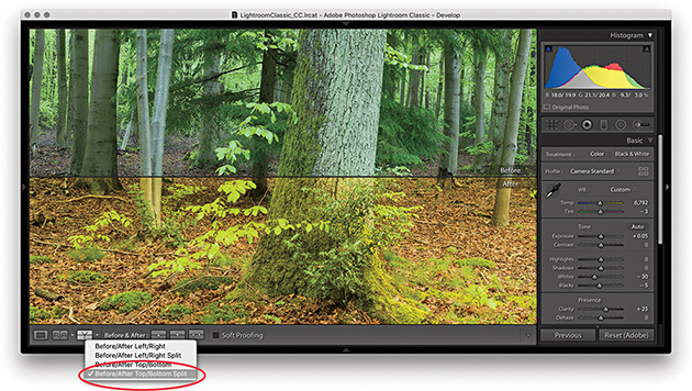
3. I then went to the Before/After viewing mode menu and switched view modes, selecting the Before/After Top/Bottom Split view.
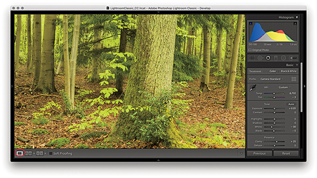
4. I clicked the Develop module full-view button to switch out of the Before/After view mode so I could work on the photo in a normal full-screen view.
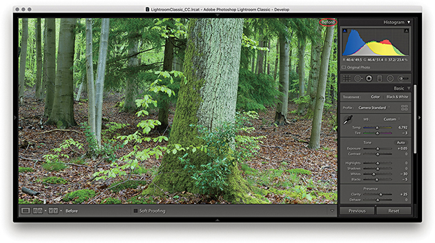
5. While working in the Develop module, you can easily compare the current Develop settings with the before version, using the keyboard shortcut. This switches to the Before view, shown here. I then pressed again to revert to the After view.
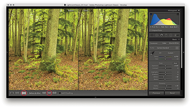
6. I clicked the Before/After view button again () and clicked the “Copy After’s settings to Before photo” button ( [Mac] or [PC]), making the current (After) version the new Before setting.
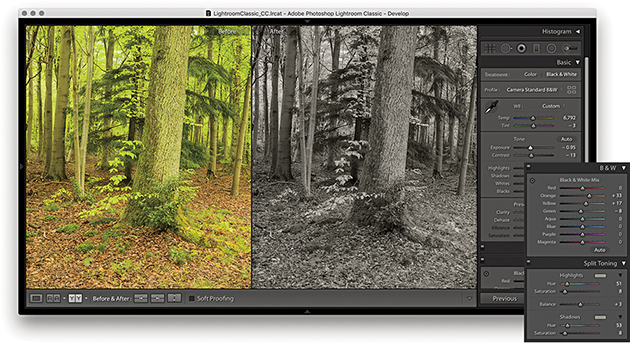
7. The warmer version now became the new Before setting associated with this photo. I could then make further edits, such as convert the photo to black and white, and compare the results with the updated Before version.
Reference View
The Reference view mode in the Toolbar ( ) can be used to compare Develop edits you make in one image with a static “reference” image. I see this as a useful feature that can help you achieve a consistent look between a collection of photographs. By having one image on screen as a reference, you can see how the image you are currently working on compares with it and maintain the same style or feel throughout a series of pictures. If Auto Sync is enabled, you can sync and edit multiple photos at the same time.
Note
The RGB readouts just below the Histogram panel let you compare the RGB values for the active image with that of the Reference image, but only if the crop ratios between the two images match. Otherwise, the RGB readouts will be displayed using (--) for the reference image (as shown in Step 2 opposite).
When you first use the Reference view, both sides will be blank unless you have an image selected. If an image is selected, it will appear in the right as the Active image. If more than one image is selected, the most selected one will be the active image, the Reference section on the left will be blank. You then need to select a reference image and drag to add it as a reference. This reference image remains sticky until you select another image to replace it, up until the point where you quit Lightroom. You can therefore use the Reference view mode to compare images from different source collections or folders. The lock in the Toolbar can be used to keep the reference image locked if you exit the current Folder/Collection and wish to compare the same reference image with a photo from another source.
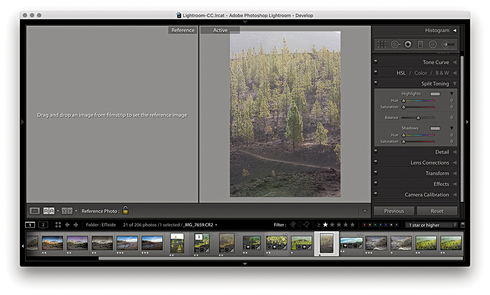
1. I selected an active image I wished to edit and used  to enter Reference View mode. The Reference section on the left was blank. I therefore needed to select an image to reference by dragging from the Filmstrip.

2. Here, I selected an image from the same series. As I rolled the pointer over the Active image, the RGB values were shown as (--) for the reference image and actual values for the Active image. This was because the crop ratios differed.
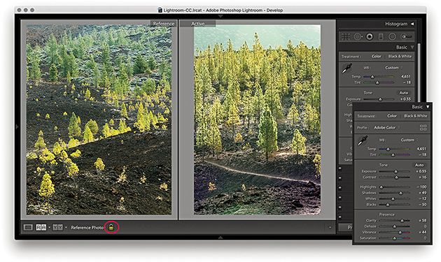
3. I adjusted the Basic panel settings to achieve a close match to the look and feel of the Reference image. I then clicked the lock to keep the Reference image sticky.
Image Retouching
The retouching tools in the Develop module (Figure 4.92) can be used to retouch without actually editing the pixel data. When you work with the Spot Removal, Red Eye Correction, Graduated Filter, Radial Filter, or Adjustment Brush tool, these actions are recorded as sets of instructions and the original pixel image data remains untouched. It is only when you export a file as a TIFF, JPEG, or PSD, or edit in an external editor that the retouching work is permanently applied to the image.
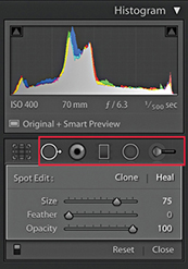
Spot Removal Tool
The Spot Removal tool ( ) has Clone and Heal modes (use
  to toggle between the two). In Clone mode, the Spot Removal tool copies and repairs from a sample area with the surrounding area, but does not blend the result. The Heal mode on the other hand does blend the copied area with the image information that is just outside the area you are trying to repair. You can use the Clone/Heal buttons in the Tool Options panel to switch the Spot Removal mode for any circle spot. The Heal mode is nearly always successful at hiding blemishes because of the way it invisibly blends the healed area with the surrounding pixels. In recent years, subtle improvements have been made to the Spot Removal heal blending in Lightroom. In particular, you should see better blending along the edges of an image. But only newly created spots will use the new healing method.
To work with the Spot Removal tool, you can start by adjusting the Size slider in the Spot Removal tool options (Figure 4.92) so the Spot Removal tool matches the size of the areas you intend to repair. You can also use the Bracket keys on the keyboard (press or hold down the  key) to make the Spot Removal circle spot size bigger, or use the
  key to make the size smaller. Or, scroll with your trackpad or mouse. If you then simply click the spot or blemish you wish to remove, this adds a new circle spot and auto-finds a source sample area to clone from. If the tool size is large enough, you will see a small crosshair in the middle of the circle spot, and you can use this to target the blemish you want to remove and center the tool more precisely. A linking arrow also appears to indicate the relationship between the target circle and sample circle areas (Figure 4.93). Lightroom then automatically calculates a suitable source area to clone from. It may seem that the auto-find selection is quite random, but each time Lightroom intelligently seeks an ideal area to sample from (this is similar to the logic used by Photoshop’s Spot Healing Brush tool). If you need to improve this selection you can use
  to auto-select a new source area and recompute (see “Auto-calculate behavior” on page 304). Rather than have Lightroom auto-select, you can hold down the
  key (Mac) or
  key (PC) as you click and drag outward to manually select the image area to sample from. As you do this, you will notice that the original (target) circle disappears so you can preview the effect of the spot removal action without being distracted by the circle spot. If you click and drag with the
  keys (Mac) or
  keys (PC) held down, you can create a user-defined circle spot scaled from the initial anchor point. And, if you click and drag with the
  keys (Mac) or
  keys (PC) held down, the circle spot scales from the center. Because Lightroom is recording all these actions as edit instructions, you have the freedom to fine-tune any Spot Removal step. For example, you can click inside a circle spot to reactivate it and reposition either the target or the sample circles. If you click the edge of the target circle, a bar with a bidirectional arrow appears and you can click and drag to adjust the size of both the target and sample circles.
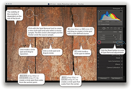
Note
With Use Graphics Processor enabled, you’ll see speed improvements to the Spot Removal tool, Local Adjustment Brush, and Radial and Graduated Filters, plus Red Eye Correction.
When you have finished applying a spot removal, the target circle spot remains as a thin, white circle on the screen for as long as the Spot Removal tool is active in the Develop module. Use the  key to toggle showing/hiding all the Spot Removal spots. You can use the On/Off button at the bottom of the Spot Removal tool options (circled red in Figure 4.93) to toggle disabling/enabling the spot removal retouching and click the Reset button to cancel and clear all the current Spot Removal tool edits. You can quit working with the tool by clicking the Close button (circled blue in Figure 4.93) or by pressing the key again.
Visualizing spots
In Spot Removal mode, you can use the Visualize Spots feature to detect dust spots and other anomalies. If you go to the Toolbar, you will see a Visualize Spots check box ( ) and slider. When you enable it, the image view will switch to a threshold mode preview and you can drag the slider to determine the ideal threshold point to highlight the spots that need to be removed. The slider setting you use remains sticky until you turn on Visualize Spots to treat another image.
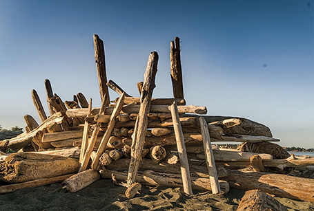
1. The effects of the camera’s dirty sensor can be seen in this captured image.
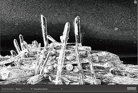
2. I selected the Visualize Spots box at the bottom of the Spot Removal panel options and adjusted the slider to obtain a suitable threshold preview, one that picked out the spots clearly.
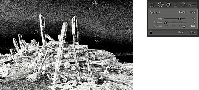
3. I then clicked with the Spot Removal tool to remove the spots that had been identified using this method.
Creating brush spots
So far, I have shown you how to create basic circle spots using the Spot Removal tool. In Lightroom, you can also click and drag to define noncircular areas, known as brush spots, where you basically click and drag to paint over the area you wish to remove. As you do so, you will see the area you are removing covered in a white overlay. When you release the pointer, you will see a brush spot represented like the one shown in Figure 4.94. As with circle spots, Lightroom auto-selects the most suitable area to clone from, and you can use the key to auto-select a new source area and recompute. To override the auto-select choice, you can click inside a target or source brush spot and drag to reposition, but you cannot scale brush spots the way you can when editing circle spots. If you drag with the  key held down, this constrains the line to a horizontal or vertical direction. But, if you click and click again with the key held down, you can create a “connect the dots” selection. Figure 4.95 shows an illustrated summary of the brush spots behavior.
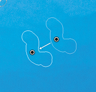
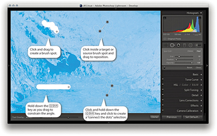
Brush spots add really useful functionality to Lightroom, but all this comes at a cost. Heavy use of the Spot Removal tool, especially in brush spot mode, can add to the Develop module processing and slow down your editing work.
Retouching example using brush spots
1. In this example, I wanted to remove the wire fence from the shot.
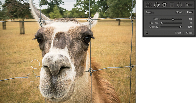
2. I selected the Spot Removal tool in Heal mode and clicked on top of the first wire section. This added a regular circle spot and auto-calculated the source area to sample from.
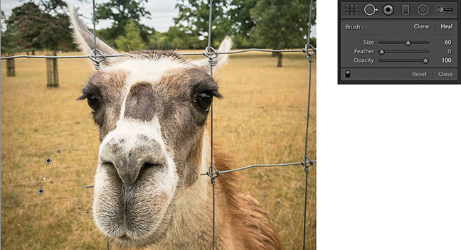
3. I then held down the  key and clicked to the left of the first circle spot. The circle spot became a brush spot, constrained to a straight line.
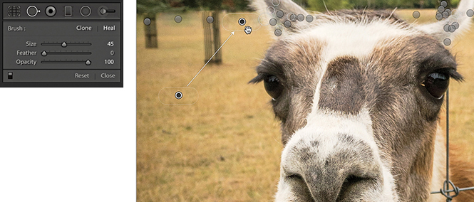
4. I repeated the process to remove the other fence wires, letting Lightroom auto-calculate the most suitable areas to clone from. You can use the  key to recompute a new source, or you can click and hold inside the brush spot source outline and drag to select a new area to clone from.
5. After much editing with the Spot Removal tool, I removed all traces of the wire fence.
Editing circle and brush spots summary
The circle spots always remain editable. You can select an individual circle and use the Spot Removal Size slider to readjust the size. Or, click the edge of a target circle spot and drag to resize. As you drag, the thin circle conveniently disappears, which allows you to see more clearly the effect the circle resizing is having on the photo. If you click inside a target circle or brush spot, the thin circle/outline disappears and changes to show a hand icon. This allows you to drag and reposition the spot so that you can readjust the target position. You can also click on or inside a sample circle/brush spot and drag to reposition the sample area relative to the target so that you can select a new area to sample from. You can use the keyboard Arrow keys to nudge a destination circle spot or brush spot. Hold down the  key to magnify the Arrow key movements. The nudging becomes more precise the more you are zoomed in.
Tip
Carrying out the spot healing first can help improve the accuracy of the spot healing. Also, because the spot removal happens early on in the image edit calculation process, by doing spot removal first, the imaging pipeline does not have to compute or re-render other adjustment settings.
Tool Overlay options
The Tool Overlay options can be accessed via the Develop module Toolbar (Figure 4.96), as well as via the Tools menu. If you select the Auto option, the circle/brush spots are made visible only when you roll over the preview area. If you select the Always option, the circle/brush spots remain visible at all times. When the Selected option is chosen, only the active circle/brush spot is shown and all others are hidden. When the Never menu option is selected, all the Spot Removal overlays remain hidden (even when you roll over the image). But as soon as you start working with the Spot Removal tool, the tool overlay behavior automatically switches to Auto Show mode. The  keyboard shortcut toggles the Tools overlay view between Selected and Never. I think the most convenient way to work here is to operate in Auto mode and use the keyboard shortcut to toggle between the Auto and Never overlay modes. This toggle action allows you to work on an image without always being distracted by all the circle/brush spot overlays.
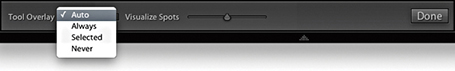
Undoing/deleting spots
You can use  (Mac) or
  (PC) to undo the last circle/brush spot. To delete, -click inside a circle/brush spot. To delete multiple circle/brush spots, -marquee drag to select those you wish to remove. To delete all circle/brush spots, click the Reset button in the Tool Options panel.
Auto-calculate behavior
As mentioned earlier, you can use the Forward Slash key () to auto-select a new source area and recompute a Spot Removal tool step, which is also available as a context menu item (Figure 4.97). The auto-calculate source feature copes well with textured areas, such as rocks, tree bark, and foliage, and also takes the applied crop into account. This means that if a crop is active, Lightroom carries out two searches for a most suitable area to clone from: one within the cropped area and one outside it. Preference is then given to the search inside the cropped area when computing the auto-find area. If somewhere outside the cropped area yields a significantly better result, then that is used instead.
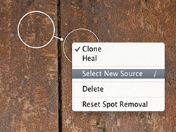
Spot Removal Tool Feathering
The Spot Removal tool in Lightroom has a Feather slider (Figure 4.98). This lets you modify the brush hardness when working with the Spot Removal tool in Clone or Heal mode. You can use  to decrease the feathering amount and
  to increase the feathering, and there is a circle spot feather visualization, which can be seen in Figure 4.99.
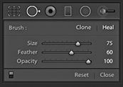
Although it has always been possible to adjust the brush hardness in Photoshop when working with the Clone Stamp tool, there has never been a similar hardness control option for the Healing Brush. The Photoshop Healing Brush and Spot Healing Brush have always had an internal feathering mechanism built-in, so additional feathering was never needed. However, in Lightroom, the Feather slider works well and is useful for both modes of operation. The Feather slider offers more control over the spot removal blending and can help overcome the edge contamination sometimes evident when using the Spot Removal tool in Heal mode with a fixed feather edge of 0. The feathering is applied to the destination circle spot or brush spot, and the Feather amount is proportional to the size of the spot; bigger spots will use a bigger feather. For brush-type spots, you should think of this in terms of the thickness of the brush stroke (as opposed to the overall length) and the feathering range for brush spots is also slightly greater than for circle spots. The Feather setting remains sticky across Lightroom sessions.
Synchronized Spotting
You can synchronize the Spot Removal settings in one image with others from the same sequence. So, if you get the spotting work right for one image, you can synchronize the spot removal work across other selected photos. There are two ways you can do this. One way is to work with the Spot Removal tool on one photo and synchronize the spotting with the other photos later. The other is to Auto Sync a selection of photos and update all the selected images at once as you retouch the most selected photo.
Remember, if you simply click or drag with the Spot Removal tool, Lightroom automatically chooses the best area of the photo to sample from. As long as you don’t / -drag to manually set the sample point, or edit the sample point (by manually dragging the sample circle or brush spot to reposition it), the sample points will remain in “auto-select sample point” mode. If you carry out a series of spot removals obeying these rules, you can then synchronize the spot removal adjustments more efficiently, as Lightroom will auto-select the best sample points in each of the individual synchronized photos. This does not guarantee 100% successful spot removal for every image that’s synchronized in this way, but you may still find that this saves you time compared to retouching every photo individually one by one.
Tip
Syncing the spot-removal settings or using Auto Sync mode when working with the Spot Removal tool can save lots of time when repetitively removing spots from areas such as skies or plain studio backdrops.
Synchronized settings spot removal
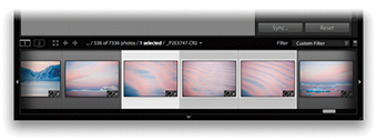
1. I first made sure that the photo that had all the spotting work done to it was the most selected in the Filmstrip (the one with the lighter gray border). I then clicked the Sync button to open the Synchronize Settings dialog.
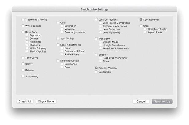
2. In the Synchronize Settings dialog, I made sure the Spot Removal box was selected. I then clicked the Synchronize button, and Lightroom synchronized the Spot Removal settings across all the selected photos.
Auto Sync spot removal
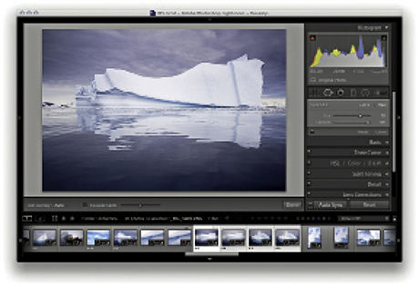
1. I made a selection of photos and held down the  key (Mac) (use the
  key on a PC). This changed the Sync button to Auto Sync, which I clicked to set the photo selection to Auto Sync mode.
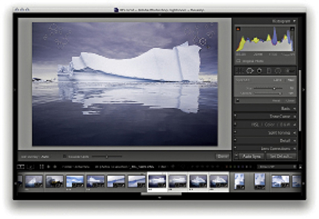
2. I then edited one of the selected photos (I could have chosen any of them), and all the Develop settings were automatically synchronized to the target photo. Here, I used the Spot Removal tool in Heal mode to remove dust marks from the photo. As I did so, the Spot Removal settings were automatically applied to all the photos in the selection. When finished, I clicked the Auto Sync button to revert to the standard Sync mode behavior.