Table of Contents for
The Adobe Photoshop Lightroom Classic CC Book, Second Edition
 The Adobe Photoshop Lightroom Classic CC Book, Second Edition
Published by
Adobe Press, 2019
The Adobe Photoshop Lightroom Classic CC Book, Second Edition
Published by
Adobe Press, 2019
- Contents
- Cover Page
- Title Page
- Copyright Page
- Dedications
- Introduction
- Contents
- 1 Introducing Adobe Photoshop Lightroom
- 2 Importing photos
- 3 The Library module
- 4 Develop module image editing
- The Tone Curve Panel
- Easing the Workflow
- 5 The art of black and white
- 6 Sharpening and noise reduction
- 7 Exporting from Lightroom
- 8 Printing
- 9 Presenting your work
- 10 Managing your photos in Lightroom
- 11 Lightroom CC/mobile
- 12 Lightroom preferences and settings
- Index
5 The art of black and white
How to achieve full creative control over your black-and-white conversions
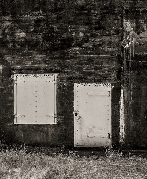
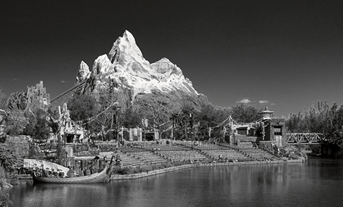
Photograph: Fort Rodd Hill, BC, Canada © 2018 Martin Evening
Sony A7rII | 35mm | 200 ISO | f8 @ 1/100
I began my photographic career learning how to photograph and print in black and white. Since then, I have retained an enduring passion for black-and-white photography. In this respect, Lightroom does not disappoint because the Develop module tools provide the best environment I can think of to gain the most creative control possible from your color to black-and-white conversions.
The techniques described in this chapter show you the three main ways to convert a photo to black and white. You will find out how to master the B&W sliders in manual, auto, and target adjustment mode; how to work with the White Balance sliders while in black-and-white mode; and how to use the HSL panel controls as an alternative approach to black-and-white conversions. I show you how to achieve particular black-and-white styles such as the black-and-white infrared look, as well as how to work with the Split Toning panel to color-tone your photos.
Black-and-White Conversions
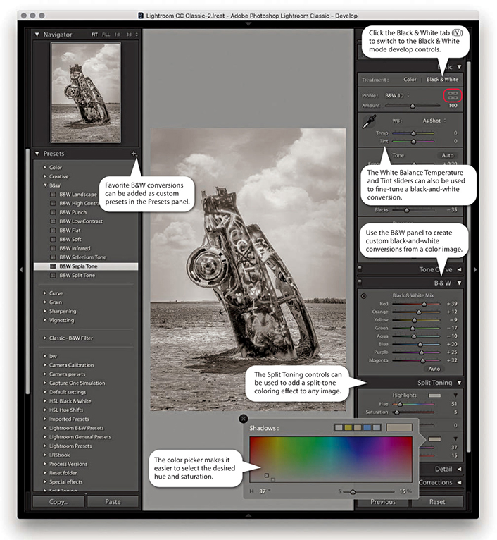
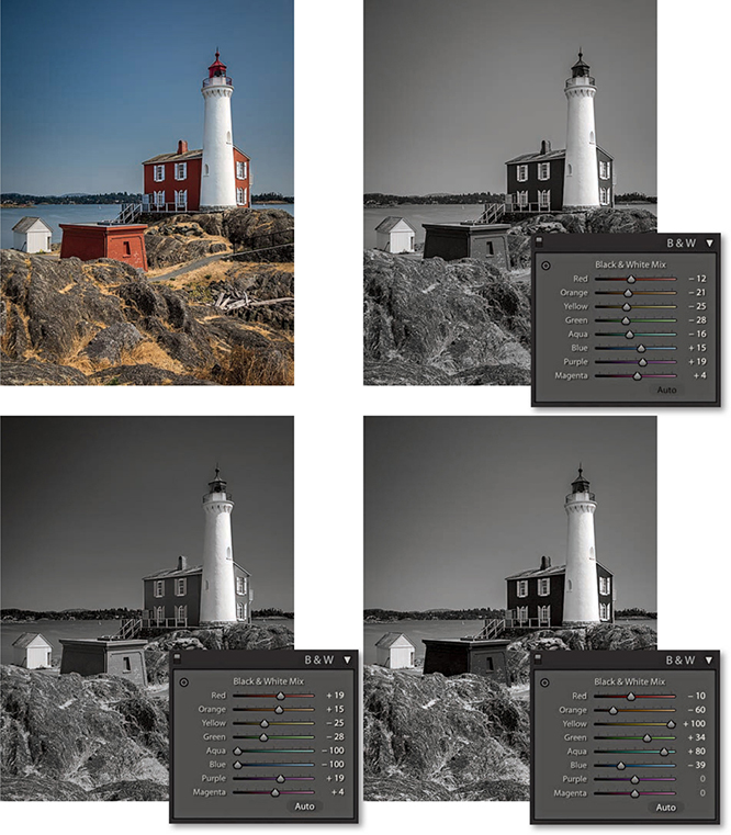
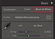
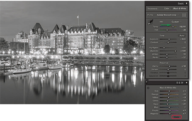
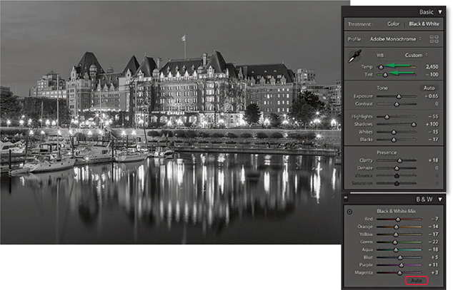
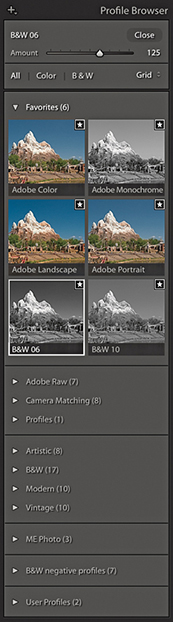
There are various ways you can convert a color image to black and white. You can click the Black & White button in the Basic panel; you can select a black-and-white profile via the Profile Browser (circled in Figure 5.1); or you can use the  keyboard shortcut. Figure 5.1 shows the main panels associated with black-and-white conversions. It is important to understand that when you create a black-and-white image, Lightroom is not permanently converting a color image to black and white. Rather, it is creating a black-and-white version of the color original. When you select a black-and-white profile or adjust the B&W panel controls, Lightroom blends the grayscale information contained in the individual red, green, and blue channels that make up the composite RGB image. If you have ever played with the Channel Mixer settings or the Black & White adjustment in Photoshop, the B&W panel controls will probably appear familiar. In Lightroom, you have eight color sliders to play with, and these provide you with some nice, subtle control over how the color component channels are blended in the conversion process to create custom black-and-white conversions. To make things a little easier, the B&W panel has an Auto button that, when you click it, applies an automatic black-and-white conversion that is determined by the White Balance setting in the Basic panel. You can then further vary a black-and-white conversion by adjusting the Temperature and Tint sliders in the Basic panel and re-clicking the Auto button if necessary.
The great thing about the Lightroom B&W panel is how the tonal balance of the image automatically compensates for any adjustments you make. Even so, it may still be necessary to revisit the Basic panel and readjust the tone controls such as the Exposure, Contrast, Highlights, and Shadows sliders after you have applied a B&W panel adjustment. In addition, you can also use the HSL desaturate technique described at the end of this chapter, which does provide you with more scope to produce different types of black-and-white conversions.
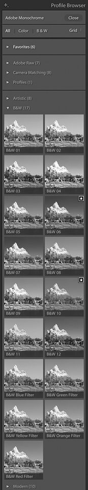
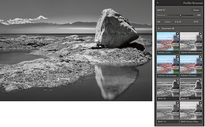
The main focus now is on the Basic panel Profile Browser, which is probably the best place to begin when converting an image to black and white. Lightroom provides 18 black-and-white profiles with which to get started, plus you can also use the Amount slider to adjust a profile’s conversion intensity.
The Split Toning panel can be used to add a split-tone color effect to a black-and-white image, but it can also be applied to color originals to produce color cross-processing effects. As always, favorite Develop settings can be saved as presets in the Presets panel, and there are already a couple of black-and-white presets there for you to play with. In Figure 5.1, I rolled the pointer over the B&W Sepia Tone preset, which updated the Navigator preview and main image accordingly.
Black-and-White Conversion Options
In the early days of black-and-white photography, film emulsions were fairly limited in their color response. Most were mainly sensitive to blue and green light only, which is why the skies in old photographs often appear very light and why photographers could process their films in the darkroom using a red safe light. As film emulsion technology improved, panchromatic black-and-white films began to emerge, and film photographers were able to creatively exploit their extended color sensitivity. This section shows you how to continue that tradition when working with digital-capture images.
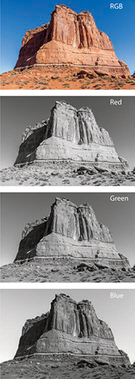
RGB color images, such as raw-processed digital captures, are made up of three grayscale channels that record the luminance information of the original scene after it has passed through the red, green, and blue filters that overlay the camera sensor’s photosites. The color image you preview on the computer display is therefore a composite made up of three different grayscale recorded captures. Figure 5.2 shows what the individual red, green, and blue components look like when viewed separately. The B&W controls in Lightroom let you blend the red, green, and blue filtered grayscale capture information in various ways to produce different black-and-white conversion outcomes, such as in the examples in Figure 5.3. You will notice that there are actually eight B&W panel sliders you can use when converting to black and white: Red, Orange, Yellow, Green, Aqua, Blue, Purple, and Magenta. Adjusting these sliders allows you to lighten or darken these respective colors in the color original when making the conversion.
How not to convert
Some photographers limit their black-and-white options unnecessarily, simply because they are unaware of the black-and-white conversion techniques that are available to them in Lightroom and Photoshop. For example, some people may set their cameras to shoot in a black-and-white JPEG mode. This restricts not only the tone adjustment, but also the black-and-white conversion options. The camera’s onboard image processor decides on the fly how to blend the color channel information and produces a fixed color-to-black-and-white conversion. You are consequently left with no room to maneuver, because all the color data has been thrown away during the in-camera JPEG conversion process. Then there is the RGB-to-Lab mode method in which you delete the a and b channels and convert the remaining, monochrome Lightness channel to grayscale or RGB mode. There is nothing to be gained from this approach, because, yet again, you are throwing away all the color data rather than making use of it in the conversion.
Temperature Slider Conversions
Let’s now look at some of the different ways in Lightroom to convert a color image to black and white. The most direct way to do this is to click the Black & White tab in the Basic panel (circled in Figure 5.4). This applies a default black-and-white profile conversion in which the Auto slider settings are linked to the White Balance settings. The Step 2 and Step 3 examples opposite show two possible black-and-white outcomes that can be achieved by first adjusting the Temp slider in the Basic panel and then clicking the Auto button in the B&W panel. The Step 2 version shows a white balance with a warm bias. Notice how the red and yellow colors appear lighter when converted this way. When I dragged the Temp slider in the opposite direction, as shown in Step 3, the red and yellow colors ended up darker. You can also vary the black-and-white conversion by adjusting the Tint slider. For example, in Step 3, I set the Tint slider to –100, which had quite an effect on the outcome. There is also an example coming up on page 385 where you will see how a green Tint slider adjustment can be used to simulate an infrared look.
1. I decided to convert this color photograph to black and white.
2. Here, I applied a warm White Balance setting and clicked the Auto button in the B&W panel. The B&W sliders adjusted accordingly.
3. Next, I applied a cooler White Balance setting and clicked the Auto button for the B&W sliders to adjust again.
Black-and-White Profiles
The new Lightroom profiles can be accessed via the Profile Browser (circled in Figure 5.1). These expand the range of options you have when processing an image, whether in color or black and white, as you now have 17 B&W profile options to choose from (Figure 5.5), plus the default Adobe Monochrome black-and-white profile. If you are editing an image in color mode and click the Black & White tab in the Basic panel (or use the shortcut), Lightroom applies this profile by default. If you then select any other B&W profile, Lightroom selects that profile when you next switch from color to black and white. Basically, when toggling between color and black and white Lightroom selects the last used profile for that particular image. However, doing so will zap any B&W panel settings. The Adobe Monochrome profile is a fixed Adobe raw profile, which means there is no Amount slider available with which to adjust the intensity of the profile adjustment. But, you can still use the B&W panel to further adjust the individual sliders to modify the black-and-white conversion. When any of the other B&W profiles are selected you will see an Amount slider, and this can be used to modify the conversion outcome. In the following steps, you can see how selecting a B&W profile other than Adobe Monochrome and adjusting the Amount slider offers extra potential to control the black-and-white conversion process before editing the B&W panel sliders. In most instances, I find the Adobe Monochrome profile always makes for a good starting point, but I also like using the new B&W 10 profile as a next-best alternative for standard conversions. I should add that when editing non-raw files the default profile option is simply “Monochrome,” but you can still access all the Enhanced profiles in Figure 5.5. Also, color images that start out in Adobe Standard are converted to Adobe Standard B&W, rather than the newer Adobe Monochrome profile.
1. I converted this photograph to black and white using Adobe Monochrome.
2. Using the Profile Browser, I selected the B&W 06 profile. This applied a black-and-white conversion that added more contrast and darkened the blue sky.
3. To intensify the black-and-white conversion, I dragged the Amount slider to the right. You can do this when applying any of the B&W enhanced profiles (but not with the Adobe Monochrome profile, which is an Adobe raw profile).
Tip
As mentioned in the text, toggling from black and white to color and back using will reset the B&W panel sliders. Therefore, use an undo instead. Also switching from one of the numbered B&W profiles to the Green filter, Blue filter, and so on also resets the B&W panel sliders.
Manual Black-and-White Adjustments
The profile selection is now the most important first step when converting to black and white. But subsequent B&W panel slider adjustments gives you almost unlimited freedom to create any number of different types of black-and-white adjustments. This gives you even more control over how light or dark certain colors will be rendered in a black-and-white conversion. The following steps show how I was able to improve upon a B&W profile setting and add more contrast between the piano player and the sky. Although you can adjust the B&W sliders by dragging them, you may find it easier to select the Target Adjustment tool mentioned in Steps 4 and 5 to edit the image directly. You can use  [Mac] or
  [PC] to enable the Target Adjustment tool and use
  [Mac],
  [PC] or
  to disable it.
Tip
Fringe artifacts can be avoided by backing off on the more extreme slider adjustments. Extreme slider adjustments in black-and-white images can result in ugly fringe artifacts. However, you may find you can improve the quality by adjusting the Color, Detail, and Smoothness color noise reduction sliders in the Detail panel.
Black-and-white adjustments are accessible and easy to work with. However, when you switch to Black & White mode in Lightroom, the Vibrance and Saturation controls appear grayed out (if you adjust them the image converts to color). This is a shame, because these sliders can potentially affect the black-and-white conversion, but you can overcome this limitation by using the HSL desaturate technique described at the end of this chapter.
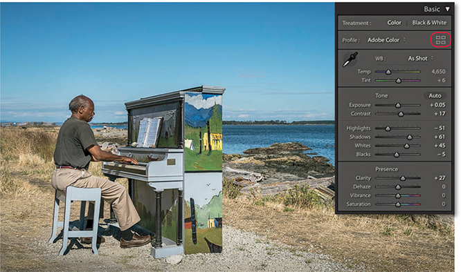
1. To begin, I optimized the colors and tones using the Basic panel controls only.
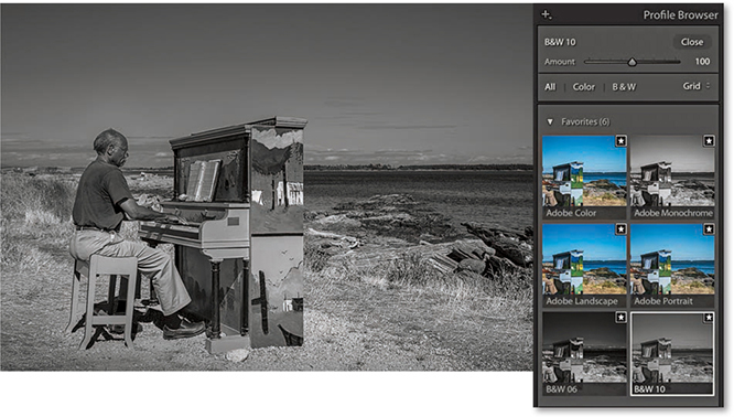
2. I clicked the Profile Browser (highlighted in Step 1) and selected the B&W 10 profile in place of the Adobe Monochrome profile.
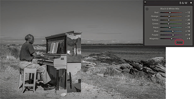
3. I then expanded the B&W panel and clicked the Auto button at the bottom to auto-set the Black & White Mix sliders based on the current White Balance settings in the Basic panel.
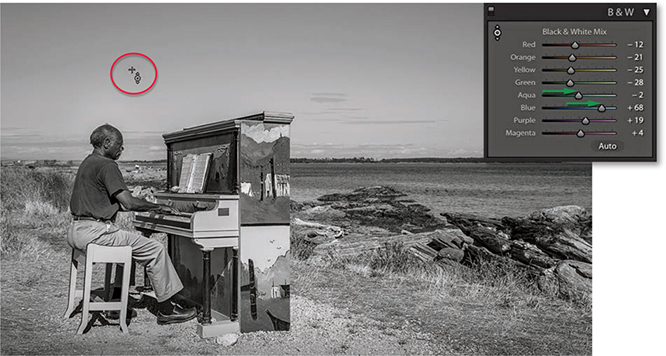
4. I selected the Target Adjustment tool, hovered over the sky and dragged upward to lighten the Aqua and Blue colors.
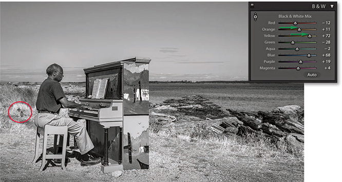
5. I then moved the Target Adjustment tool over the grass and again dragged upward to lighten.
Black-and-White Infrared Effect
Now watch what happens when you take the White Balance settings to extremes. The following black-and-white infrared technique illustrates just one of the ways you can achieve a creative black-and-white conversion using Lightroom.
1. Here is the Before version, which is ideal for demonstrating the infrared effect.
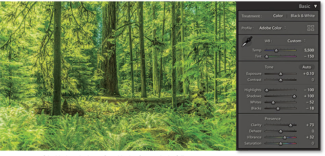
2. To create a fake black-and-white infrared look, I first applied a full negative Tint adjustment to the white balance. This made all the green colors (i.e., the leaf foliage) as bright green as possible.
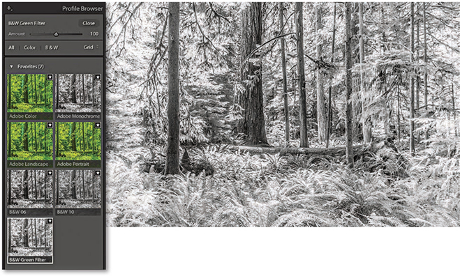
3. I clicked the Black & White tab in the Basic panel to convert the photograph to black and white. I then opened the Profile Browser and selected the B&W Green Filter profile.
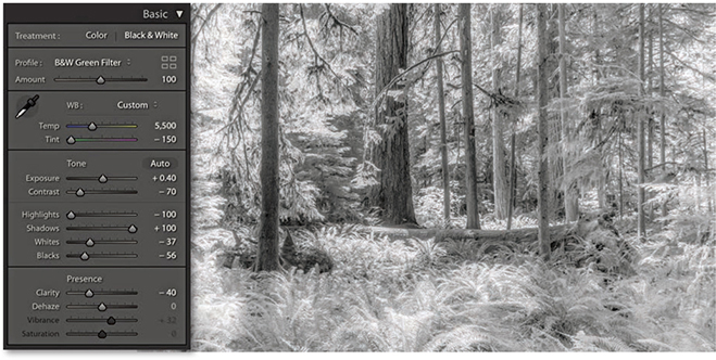
4. Back in the Basic panel settings, I reduced the Contrast, readjusted the Whites and Blacks sliders, plus I also set the Clarity slider to –40. This added a diffused printing effect that gave the photograph a nice, soft glow.
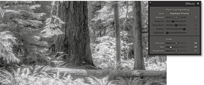
5. I next went to the Effects panel, where I added a large Amount and medium size Grain effect.
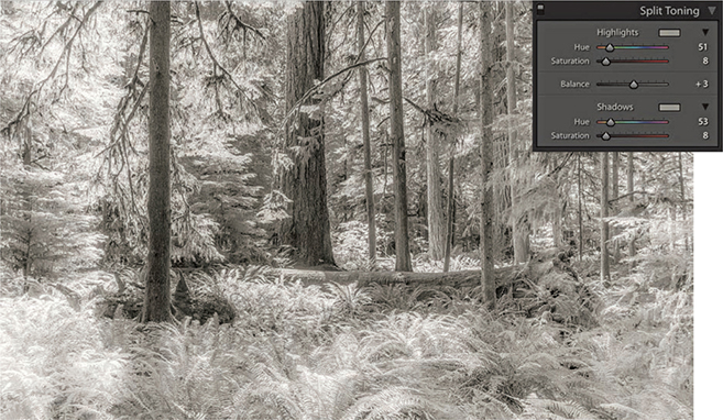
6. Finally, I used the Split Toning panel to add a split-tone coloring effect. The settings shown here worked well for this particular image. If I wanted to apply this black-and-white infrared effect to other photographs, I could save these settings as a custom Develop preset.
Refining Black-and-White Conversions
As long as you have a good profile for your printer, it should be easy to obtain a neutral gray print. It does not even matter how well your display is calibrated. If an image is in black and white, you should be able to produce a neutral gray print regardless of how neutral the photo looks on the display. If not, there may be something wrong with your printer profiles. Or, the print heads on your inkjet printer may need cleaning. Many times, I have gone to make a print and the colors have been distinctly off, all because it was several weeks since I had last used that particular printer. Usually a quick nozzle clean is all that is required.
Now that we’ve looked at the main basic black-and-white controls, let’s take a look at how you can customize further using the Split Toning, HSL, and Calibration panels.
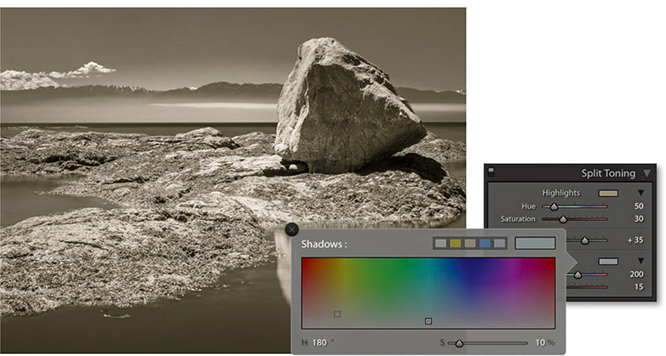
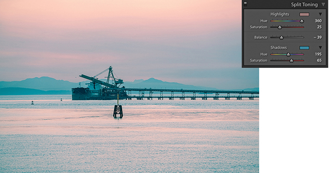
Split Toning Panel
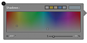
The Split Toning controls (Figure 5.6) let you add color tones to a photo after it has been converted to black and white. The Hue sliders can be used to adjust the hue color in either the highlights or the shadows, and the Saturation sliders to apply varying strengths of color. If you hold down the  key as you drag a Hue slider, you will get a saturation-boosted preview that can help you see more clearly which hue color you are selecting without having to adjust the Saturation slider first. Clicking on either of the color swatches opens the color picker shown in Figure 5.7. This lets you quickly select the hue and saturation in one step. Click anywhere in the color ramp to select a color. You can even select colors from anywhere on the display, such as an image that’s opened in Photoshop. To do this, click the color ramp and drag outside the color ramp to anywhere you want. You can save a new color swatch as a preset by clicking in any of the preset swatch boxes to the left of the main before/after color swatch box. To do this, click to change the selected preset to the current selected color. You will notice that the color picker displays both the Highlight and Shadows color positions on the color ramp, so you can judge the relative positions of the two color sample points. (The current selected color is the one with the thicker border.) Incidentally, if you click in the Highlights swatch, you can
  -click (Mac) or
  -click (PC) to select a color for the Shadows (and vice versa). And, there is a slider at the bottom you can use to adjust the saturation while keeping the hue value locked.
The Balance slider in the Split Toning panel can be used to offset the balance between the shadow and highlight color toning and provides a nice fine-tuning control for your split-tone effects. Even when the Hue and Saturation settings are identical for both the highlights and shadows, the Balance slider can induce quite subtle variations to a split-toning effect. The following two examples give you an idea of what is possible using the Split Toning panel controls on a black-and-white as well as a color image.
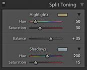
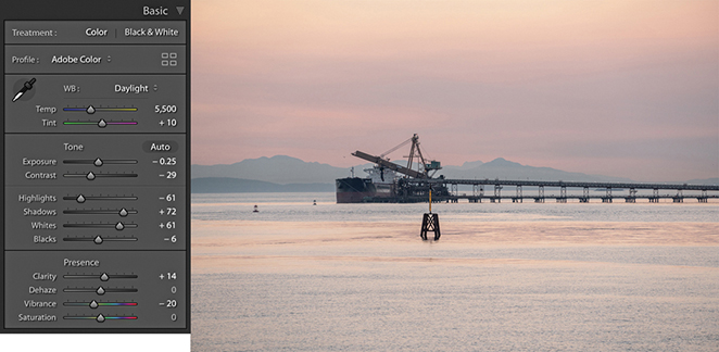
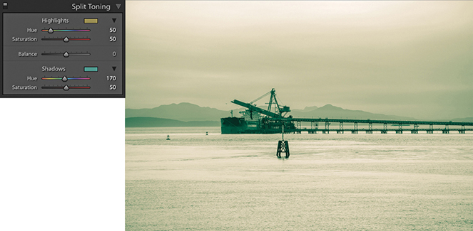
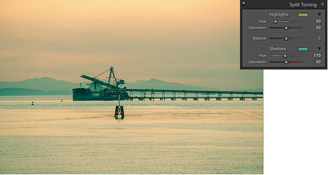
1. I first converted this photo to black and white using the B&W 07 profile.
2. I then went to the Split Toning panel and used the color picker to select a warm sepia color for the highlights and a cool color for the shadows. Lastly, I offset the split-tone midpoint by dragging the Balance slider to the right.
Split-toning a color image
The Split Toning controls can also work well on regular color images. If you want to give your photographs a distorted color look, here is how to create a cross-processed effect in Lightroom. It is really easy to vary the effects shown here and save favorite color split-tone effects as presets.
1. Here is a color photograph that I converted to black and white and applied a split-tone effect to warm the highlights and add a green tint to the shadows.
2. I then converted the image back to color again. As you can see, in color, this produced a classic type of cross-processing effect.
3. In this example, I used a different split-tone effect to achieve a pink/blue type of color split-toning effect.
Desaturated Color Adjustments
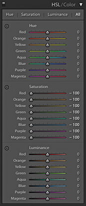
There is another, less obvious way to convert to black and white. If you go to the HSL panel and drag all the Saturation sliders to –100 (Figure 5.8), you can desaturate the color completely to create a black-and-white version of a photo. On the face of it, this would appear to be the same thing as dragging the Basic panel Saturation slider all the way to the left, but the key difference here is that the Basic panel Saturation slider applies its adjustment upstream of all the other color sliders, thus rendering them inoperable (apart from White Balance, Color Noise, and Calibration). The HSL desaturate method cleverly gives you full access to all the color controls in the Develop module, and this is where it can sometimes score favorably against regular B&W panel adjustments. You see, when you work with the B&W panel, the Vibrance and Saturation sliders are both unavailable and appear grayed out. This is a shame, because when you use the HSL desaturate method, the Vibrance and Saturation sliders provide you with added control over the outcome of your black-and-white conversions. With the HSL desaturate method, the Saturation slider in the Basic panel can act like an amplifier volume control for the HSL Luminance adjustments. So, increasing the Saturation can therefore magnify the effect of the HSL slider settings. The Vibrance slider offers a more subtle, fine-tuning control. But interestingly, a Vibrance adjustment can sometimes appear to have an opposite effect to the Saturation slider, and decreasing the Vibrance can sometimes make certain colors (such as blue) appear darker when converted to black and white.
The HSL black-and-white method in detail
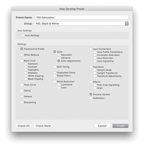
To create an HSL black-and-white conversion, go to the HSL panel and set all the Saturation sliders to –100. Before you do anything else, it is worth saving this adjustment as a preset setting, as shown in Figure 5.9. At the end of Chapter 4, I suggested that you use folders to organize your Develop presets, so my advice here would be to save a setting like this to a dedicated folder for storing HSL black-and-white presets such as the HSL Black & White folder I previously created and then selected in Figure 5.9.
Having done that, all you need to do is to apply this saved preset and then adjust the HSL panel Luminance sliders. Don’t bother editing the Hue sliders, as they won’t have any effect on the black-and-white conversion. The Luminance sliders can be used to lighten or darken specific colors in the photo, just as you would when adjusting the B&W panel sliders. The Target Adjustment tool can also be used here. Click the tool button to activate it, or use the  (Mac) or
  (PC) keyboard shortcut to switch to Target Adjustment mode and
  (Mac) or
  (PC) to exit. If you want, you can save individual HSL black-and-white settings as new presets, in which case you would click the + button in the Presets panel, select the Develop settings shown in Figure 5.9, and save them as a new custom preset.
Calibration panel adjustments
You can also use the Calibration panel sliders to apply further fine-tuned adjustments. Here, things do get a little more unpredictable, and it can be a matter of playing with the sliders and seeing what happens. Even so, this method still offers more opportunities for experimentation that are otherwise lacking with a standard Lightroom black-and-white conversion.
Not all black-and-white conversions are likely to require these alternative methods. However, the following steps illustrate a typical example of where an HSL desaturate black-and-white conversion plus use of the Calibration panel adjustments can be used to achieve a strong cloud contrast in an image.
1. For this photograph, I applied some tone adjustments via the Basic panel.
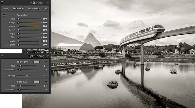
2. Next, I set all the HSL/Color panel Saturation sliders to –100. I also went to the Split Toning panel and added a sepia-color split-toning effect.
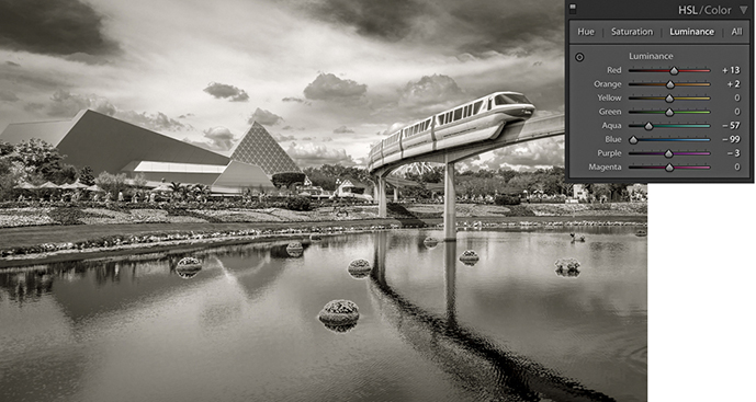
3. I adjusted the HSL/Color panel Luminance sliders to darken the sky.
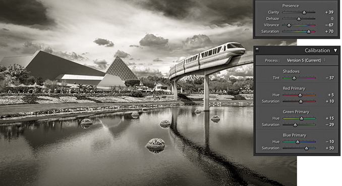
4. Finally, I added a negative amount of Vibrance and a positive Saturation adjustment. I then went to the Calibration panel and adjusted the Hue and Saturation sliders, which added even more tone contrast to the photograph.