Table of Contents for
Electron in Action
 Electron in Action
Published by
Manning Publications, 2018
Electron in Action
Published by
Manning Publications, 2018
- Cover
- Electron in Action
- Copyright
- Electron in Action
- Brief Table of Contents
- Table of Contents
- Preface
- Acknowledgments
- About this book
- About the cover illustration
- Part 1. Getting started with Electron
- Chapter 1. Introducing Electron
- Chapter 2. Your first Electron application
- Part 2. Building cross-platform applications with Electron
- Chapter 3. Building a notes application
- Chapter 4. Using native file dialog boxes and facilitating interprocess communication
- Chapter 5. Working with multiple windows
- Chapter 6. Working with files
- Chapter 7. Building application and context menus
- Chapter 8. Further operating system integration and dynamically enabling menu items
- Chapter 9. Introducing the tray module
- Chapter 10. Building applications with the menubar library
- Chapter 11. Using transpilers and frameworks
- Chapter 12. Persisting user data and using native Node.js modules
- Chapter 13. Testing applications with Spectron
- Part 3. Deploying Electron applications
- Chapter 14. Building applications for deployment
- Chapter 15. Releasing and updating applications
- Chapter 16. Distributing your application through the Mac App Store
- Code from the end of chapter 6
- Index
- List of Figures
- List of Tables
- List of Listings
Chapter 11. Using transpilers and frameworks
- Setting up electron-compile to transpile CoffeeScript, TypeScript, and upcoming JavaScript features (using Babel) without a build step in an Electron application.
- Using electron-compile to transpile Less, Sass, and Stylus to CSS and Jade to HTML.
- Building a simple Electron application using React, Sass, and Jade.
- Setting up live reload, which reloads the browser window whenever the code in the renderer process has been changed.
In the chapters leading up to this one, we’ve been writing all of our UIs using vanilla JavaScript and CSS. This was intentional—this is a book on Electron, after all. It’s not a book on client-side frameworks. That said, it’s impossible to ignore that modern web developers use a wide variety of languages, frameworks, and tools to build the increasingly complex UIs that users have come to expect from the web.
In this chapter, I’ll show you how to set up Electron to work with an assortment of web languages. With that covered, we build a small application using three languages: React (using JSX and upcoming JavaScript features that are not yet supported by Node or Chromium), Sass, and Jade. It’s not a requirement that you’ve used React or any of the other languages. In fact, if you’re an expert in any of them, you might notice that we kept them deliberately simple and omit things like PropTypes. I chose React, Sass, and Jade because they hit the sweet spot of being popular and relatively approachable for developers unfamiliar with them. Though this book is not on React, Sass, or Jade, it is titled Electron in Action so we we’re going to learn by doing. We use this application in the next chapter when we hook up real, persistent data stores to the application. A branch of this application is ready for you to use if you are already familiar with React or don’t have a strong desire to learn it. That said, do not miss section 11.5 where I cover how to enable live reloading using electron-compile.
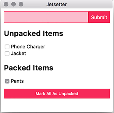
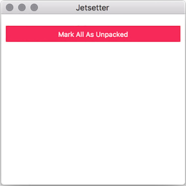
In this chapter, we build an application called Jetsetter, shown in figure 11.1. This application solves a problem that I’ve been having. I’ve been traveling a lot recently to speak at JavaScript conferences, and the only thing worse than showing up to the conference venue without the right adapter is showing up at the hotel without enough socks for the week. In the past, I’ve tried to use a to-do list to track everything I needed to pack. But to-do list applications aren’t really built for this purpose, and I find it tedious to check and uncheck all the tasks when I’m packing for the next trip. Hence, Jetsetter was born.
Figure 11.1. In this chapter, we build an application to track what we need to pack for an upcoming trip.
You can find the source code for Jetsetter at https://github.com/electron-in-action/jetsetter. We start with the master branch as the foundation of the application as we go through this chapter, but you can also find a completed version on the branch named completed-example. To get started, clone the repository, and install the dependencies.
We build an application that allows the user to add items and mark them as either packed or unpacked. A button at the bottom of the UI allows the user to mark everything as unpacked again when they’re getting ready for the next trip. The version we are building in this chapter has a fatal flaw: it doesn’t save the list of items anywhere. This means that whenever you close the application, all your new items are lost. Chapter 12 addresses this issue by showing how to persist data in several different ways, from in-browser storage to directly accessing databases from the UI.
11.1. Introducing electron-compile
Despite all the languages that developers use to build web applications these days, the browser understands only three of them: HTML, CSS, and JavaScript. Some minor exceptions have existed over the years—Google’s Dartium, which was a build of Chromium that ran Dart alongside JavaScript, and Netscape Navigator’s short-lived support of JavaScript Stylesheets come to mind—but, for the most part, this situation has been true for as long as the web has been around.
In addition to compiling from alternative languages into JavaScript, it has become fashionable to compile JavaScript into JavaScript. Tools such as Babel allow developers to use the latest and greatest—and in some cases, upcoming—features of the language and then compile them down into more verbose versions that older browsers support. We’re not concerned with older browsers when building Electron applications because we’re shipping our own modern versions of Chromium and Node, but Babel plugins are available for upcoming language features and alternative syntaxes like JSX or Flow, the former of which we use in this chapter.
Typically, developers write in their language of choice and then use a build tool to compile their code into JavaScript, CSS, or HTML for the browser. This process is commonly called transpilation because we’re compiling one language into another instead of into byte code or assembly. We could certainly do that in this chapter, but it requires running a separate process to compile our code. We’d have to wait for that process to finish before refreshing the Electron application’s browser window to see the changes.
More importantly, the process is not much different for Electron applications than it is for traditional web applications and certainly doesn’t warrant an entire chapter in this book. And so, it is with great pleasure that I get to introduce you to electron-compile.
electron-compile enables Electron to use alternative languages in addition to the ones supported by Chromium and Node, as illustrated in figure 11.2. They are transpiled on the fly and without the need for an additional build process.
Figure 11.2. electron-compile supports a wide variety of languages.
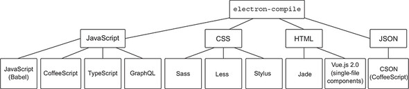
As you can see in figure 11.2, electron-compile supports a healthy number of languages. Getting started with electron-compile is suspiciously easy. In the package.json file of the application, you’ll find the important dependency electron as well as electron-prebuilt-compile, which is a version of Electron that has been configured with electron-compile.
electron-compile determines the language by looking at the file extension. If you load a file with a .coffee extension, it automatically transpiles it using CoffeeScript. The same goes for TypeScript with the .ts extension and so on. All files with a .js extension will be transpiled using Babel. By default, Babel doesn’t do anything, so it has no effect on your JavaScript files unless you intentionally configure it to, which I cover in the next section.
For now, if you run npm start, the application starts as you’d expect, but it now has full support for electron-compile. If your needs are simple, then this is all that you must do. In the next section, we configure electron-compile to support JSX and other upcoming features to JavaScript as well as support source maps in development.
11.2. Laying the application’s foundation
In this chapter, we use JavaScript with a few additional features and support for JSX—an HTML-like syntax that makes it easier to define React components. As such, we need to configure Babel to support these features. When the application starts, electron-compile looks to a file called .compilerc for any additional configuration beyond the default. I’ve included this file for you in the repository you cloned earlier in this chapter, but let’s look at it in this listing.
Listing 11.1. Configuring Babel for use with electron-compile: ./.compilerc
{
  "env": {
    "development": {                                     1
      "application/javascript": {                        2
        "presets": [                                     3
          [
            "env",                                       4
            {
              "targets": {
                "electron": "1.8"                        5
              }
            }
          ],
          "react"                                        6
        ],
        "plugins": [
          "transform-es2015-classes",
          "transform-es2015-modules-commonjs",           7
          "transform-object-rest-spread"                 8
        ],
        "sourceMaps": "inline"                           9
      },
      "text/jade": {
        "pretty": true                                   10
      }
    },
    "production": {                                      11
      "application/javascript": {
        "presets": [
          [
            "env",
            {
              "targets": {
                "electron": "1.8"
              }
            }
          ],
          "react"
        ],
        "plugins": [
          "transform-es2015-classes",
          "transform-es2015-modules-commonjs",
          "transform-object-rest-spread"
        ],
        "sourceMaps": "none"
      }
    }
  }
}
- 1 electron-compile allows you to specify different configurations for development as opposed to production. This is the configuration for development.
- 2 electron-compile supports a variety of file types. This is the configuration that applies to JavaScript files.
- 3 The list of Babel presets we wish to use. Presets are groups of plugins.
- 4 babel-env allows us to dynamically select plugins based on the target.
- 5 Jetsetter uses Electron 1.6. This setting tells Babel not to transpile features already supported by Electron 1.6.
- 6 Loads the preset collection of React plugins for Babel
- 7 Despite supporting most of ES2015, Node doesn’t support ES modules. This plugin adds support.
- 8 Object Rest Spread is a stage 3 proposal commonly used by React developers to make copies of objects.
- 9 Source maps allow developers to see the untranspiled source in their developer tools.
- 10 By default, Jade formats its output without any spaces or new lines. This setting generates more human-readable output.
- 11 In production, we instruct electron-compile not to include source maps or format Jade’s output.
At first glance, this configuration file can be overwhelming, but there is a beauty to it. First, electron-compile allows us to maintain two separate configuration sets: one for development, and one for production. We chose to omit source maps and not format the HTML generated by Jade for production. Source maps are a convenience for developers.
When we are using transpilation, the code we write is not the code that is being executed by the browser. This inherently makes sense because that’s the whole point of using transpilation, but the catch is that it can be hard to debug code that has been compiled. An error on line 36 of the code in the output may be on line 12 of the code you wrote. Source maps allow Chromium to map the output to the input and show you where that error is in the code you wrote. Generating source maps can take time, so they are generally omitted from production versions of the application.
electron-compile doesn’t configure the transpilation process itself. It simply passes on those options to the tool doing the actual transpilation. Under the development key, we have two additional keys: text/jade and application/javascript. These options are passed to Jade and Babel, respectively. Any options listed under an application/coffeescript are passed to the CoffeeScript compiler.
Within the options being passed to Babel, we see that we’re using both plugins and presets. Presets are just groups of plugins. The react preset includes all the presets related to React, such as the ability to parse and transform JSX. Many other presets are available on npm, but babel-preset-env is a bit of a special beast. It maintains a list of commonly used plugins and the browsers—Electron is included among these—that already have built-in support and do not require a plugin. This allows Babel to intelligently skip transpiling features that are already natively supported by Electron.
In addition to the presets, we include a few other plugins. Node.js does not currently support the ES modules, so I included a plugin that will convert the ES module syntax into the CommonJS module syntax that we’ve been using thus far in this book. We also add support for an upcoming language feature called Object Rest Spread, which is popular with React developers and used to clone objects to avoid mutation.
You may have noticed that I’ve included a plugin for ECMAScript classes, which are already supported in both Node and Chromium, so this plugin is not required. At the time of this writing, a bug with hot module reloading in React requires that this plugin be included. I mention this because if you try to apply the concepts from this chapter in the future, you may also run into this bug (https://github.com/gaearon/react-hot-loader/issues/313). This bug has been open for just over a year and a half, so you may run into it and lose the better part of your afternoon, like I did.
With electron-compile configured, let’s look at the foundation of the application. Instead of an HTML file, we use Jade as the markup language. This file is relatively simple, because React handles most of the heavy lifting for the UI. Replace index.html with index.jade, and add the following content.
Listing 11.2. The renderer process’s HTML file written in Jade: ./app/index.jade
doctype html
html(lang='en')
  head
    title Jetsetter
    meta(charset='UTF-8')
    meta(name='viewport', content='width=device-width, initial-scale=1')
    meta(
      http-equiv="Content-Security-Policy",
      content="default-src 'self'; script-src 'self' 'unsafe-inline'"
    )
    link(rel='stylesheet', href='style.scss')
  body
    #application
      .loading Loading...
    script.
      require('./renderer');
Jade was officially renamed Pug a while back due to a trademark dispute, but it is still referred to as Jade by electron-compile, so I do the same for the remainder of this chapter. We also write our stylesheet in Sass, a feature-rich alternative to CSS. Rename style.css to style.scss, and update the content as follows.
Listing 11.3. Application styles using Sass: ./app/style.scss
$accent-color: rgb(243,46,91);                         1

html {
  box-sizing: border-box;
}

body, input {
  font: caption;
}

input {
  padding: 0.5em;
  border: 1px solid $accent-color;
  background-color: lighten($accent-color, 30);        2
}

button, .button, input[type="submit"] {
  background-color: $accent-color;
  border: 1px solid darken($accent-color, 10);
  color: white;
  padding: 0.5em;
  &:hover {                                            3
    background-color: lighten($accent-color, 10);
  }
  &:active {
    background-color: lighten($accent-color, 5);
  }
  &.full-width {
    width: 100%;
    margin: 1em 0;
  }
}

.NewItem {
  display: flex;
}

.NewItem-input {
  width: 100%;
}
- 1 Sass supports variables.
- 2 Sass includes many helper functions for working with colors. The first argument is the color. The second argument is the amount you wish to adjust the color.
- 3 Sass allows you to nest selectors. This is the equivalent to writing each of the selectors with the addition of the :hover pseudo-selector.
Sass supports a wide range of features—many of which I won’t discuss in this chapter. In the previous example, I used a variable to set the main color of the buttons and input fields and used built-in helper functions such as lighten() and darken() to adjust the color for different parts of the UI.
With the markup and styling in place, we can set up our main and renderer processes. The main process is deliberately simpler than it has been in previous chapters because it’s not the focus.
Listing 11.4. The main process for Jetsetter: ./app/main.js
import { app, BrowserWindow } from 'electron';

let mainWindow;

app.on('ready', () => {
  mainWindow = new BrowserWindow({
    width: 300,
    height: 600,
    minWidth: 300,
    minHeight: 300,
    show: false
  });
  mainWindow.loadFile('index.jade');          1
  mainWindow.once('ready-to-show', () => {
    mainWindow.show();
  });
});
- 1 electron-compile allows us to use nonstandard file extensions
Notice that we can use files with extensions that are not normally supported in the browser. electron-compile transpiles this to an HTML file on the fly, and Chromium is none the wiser. If you look again at listing 11.2, you notice that we requested a stylesheet named style.scss instead of style.css. The .scss extension is used by Sass, and electron-compile transpiles it using Sass before handing the CSS off to Chromium. The last piece of the puzzle is to set up the renderer process.
Listing 11.5. A simple component using JSX and React: ./app/renderer.js
import React from 'react';                                         1
import { render } from 'react-dom';                                2

const Application = () => {                                        3
  return (
    <div>
      <h1>Hello world!</h1>
      <button className="full-width">
        This button does not do anything.
      </button>
    </div>
  );
};

render(<Application />, document.getElementById('application'));   4
- 1 Requires the React library.
- 2 Pulls in the render() method from the ReactDOM library.
- 3 Creates an Application component with some placeholder content.
- 4 Renders the Application component into the DOM node with the ID of “application.”
If this is your first time seeing React, you might be surprised to see HTML in your JavaScript. This syntax is known as JSX (JavaScript with XML). It’s a convenient way of describing the markup that a React component should create. Babel transpiles this code into traditional JavaScript to be read by the browser. The actual JavaScript looks like this listing.
Listing 11.6. The Application component after transpilation
const Application = () => {
  return React.createElement(
    "div",
    null,
    React.createElement(
      "h1",
      null,
      "Hello world!"
    ),
    React.createElement(
      "button",
      { className: "full-width" },
      "This button does not do anything."
    )
  );
};
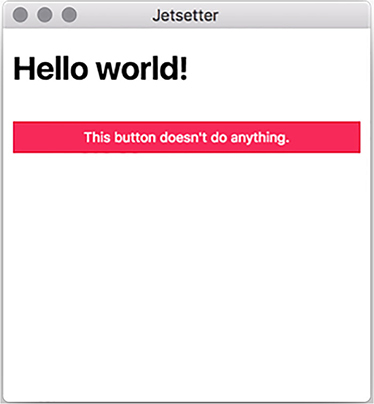
Listing 11.5 is a bit easier on the eyes than listing 11.6—especially as the application begins to grow. We didn’t need to set up a build chain using webpack or Gulp. electron-compile takes care of configuring Babel based on the options we specify in .compilerc. If you fire up the application using npm start, you should see a slightly taller version of figure 11.3.
Figure 11.3. The foundation of our application using React, Sass, and Jade.
11.3. Building the UI in React
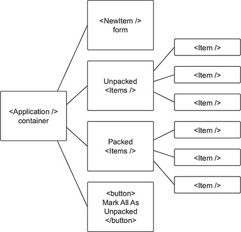
Our Application component is the starting point for Jetsetter’s UI. Jetsetter has four main parts: a form for adding new items, a list of all the items that still need to be packed, a list of all the items that have been packed, and a button for returning all of the items marked as packed to the unpacked list.
The two lists are pretty much the same, so they use the same component, but each list also has a subcomponent for every item on the list. In addition to modifying Application to be a bit more useful, we need to create three more components: Item, Items, and NewItem. The Mark All as Unpacked button can use a standard <button> element. The hierarchy of the components is laid out in figure 11.4.
Figure 11.4. Jetsetter is broken into small components as illustrated here.
11.3.1. The Application component
Our pleasant greeting to the world and useless button serve admirably as proof that electron-compile processed our JavaScript, but we need to swap it out with something a bit more functional. We haven’t built our NewItem form, Items list, or individual Item components yet, but we lay the groundwork now for managing the state of our application and getting the bones in place. By the end of this section, our application will look like figure 11.5.
Figure 11.5. The Application component without items
The first version of our Application component was what’s known as a stateless functional component. It was a function and, when called, returned a value. It couldn’t maintain any UI state. In this chapter, the Application component maintains the master list of all the items being tracked in Jetsetter. Like with Clipmaster, we use a simple array in memory to track the list. In chapter 12, we’ll replace this array with a persistent data store so that we don’t lose our list every time we quit the application.
The Application component tracks the items in Jetsetter, adds new items to that list, and marks them as either packed or unpacked. We add these features as we need them. Let’s start by initializing the component with a list of items and adding placeholder methods for adding and marking the items. We also set up a foundation for the UI as shown in figure 11.1. You’ll find a file for the Application component in the ./app/components directory.
Listing 11.7. Application component foundation: ./app/components/Application.js
import React, { Component } from 'react';                               1

class Application extends Component {                                   2
  constructor(props) {                                                  3
    super(props);
    this.state = {                                                      4
      items: [{ value: 'Pants', id: Date.now(), packed: false }]
    };

    this.addItem = this.addItem.bind(this);                             5
    this.markAsPacked = this.markAsPacked.bind(this);
    this.markAllAsUnpacked = this.markAllAsUnpacked.bind(this);
  }

  addItem(item) {} // To be implemented...

  markAsPacked(item) {} // To be implemented...

  markAllAsUnpacked() {} // To be implemented...

  render() {
    const { items } = this.state;                                       6
    const unpackedItems = items.filter(item => !item.packed);           7
    const packedItems = items.filter(item => item.packed);              8

    return (
      <div className="Application">
        {/* To be implented: <NewItem /> */}
        {/* To be implented: <Items title="Unpacked Items" /> */}
        {/* To be implented: <Items title="Packed Items" /> */}
        <button
          className="full-width" onClick={this.markAllAsUnpacked}       9
        >
          Mark All As Unpacked
        </button>
      </div>
    );
  }
}

export default Application;                                             10
- 1 In addition to importing React, we import its Component class.
- 2 The Application component is a subclass of React’s component class.
- 3 The constructor() method is called when the component is first initialized.
- 4 When the component is initialized, we set its state to include an array of items with one item in it.
- 5 Each of the actions happens on the event loop, which means that they lose context of this component. Binding the methods to the current instance of the Application component is a common pattern in React.
- 6 Pulls the list of items off the component’s state. Alternatively, you could use this.state.items everywhere that you see items in the code that follows.
- 7 Filters the list to find all the items that are not marked as packed.
- 8 Filters the list to find all the items that are marked as packed.
- 9 React components use className, instead of class, because class is a reserved word in JavaScript.
- 10 export default is similar to module.exports in CommonJS modules, which is what we used in previous chapters.
Components that inherit from React’s Component class can have methods and hold onto state. In the previous listing, we initialize the state to have an array of items. For now, we put an important article of clothing in there. In chapter 12, we’ll fetch this item from persistent storage when the application launches. We also follow a common React pattern of binding the methods to the new instance when it’s initialized. This ensures that the methods are bound to the correct this when they are called later. We put in empty placeholders for addItem(), markAsPacked(), and markAllAsUnpacked() for now. We fill these in as we move through the chapter.
When it’s time to render the component to the DOM, we separate the complete list of items into smaller lists of packed and unpacked items. We haven’t built the rest of the components needed to render the UI, so we include placeholders for now. We are, however, able to place the Mark All as Unpacked button at the bottom of the page. The last thing we need to do is replace that placeholder Application component in ./app/renderer.js with the real—if incomplete—thing.
Listing 11.8. Mounting the new Application component onto the DOM: ./app/renderer.js
import React from 'react';
import { render } from 'react-dom';
import Application from './components/Application';           1

render(<Application />, document.getElementById('application'));
- 1 Imports the new Application component.
11.3.2. Displaying the lists of items
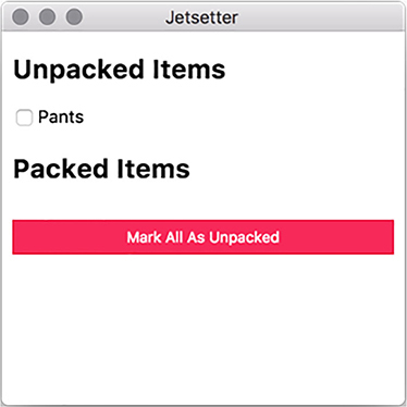
An application that tracks your packed and unpacked items isn’t much good if it can’t display those items to you. In this section, we implement the two lists, as well as the ability to toggle an item between its packed and unpacked states. This capability requires creating components for individual items and for the lists of items. With the ability to mark items as packed or unpacked in place, we also go the extra mile and connect the Mark All as Unpacked button to the list of items. At the end of this section, the application looks like figure 11.6.
Figure 11.6. The application now includes lists of packed and unpacked items.
Individual items
The Application component is doing the hard work of tracking all of the items loaded into Jetsetter. The individual Item just needs to be told what it should display and given a function to be called in the event that a user clicks its check box.
Listing 11.9. Individual Item component: ./app/components/Item.js
import React from 'react';

const Item = (({ packed, id, value, onCheckOff }) => {                     1
  return (
    <article className="Item">
      <label>
        <input type="checkbox" checked={packed} onChange={onCheckOff} />   2
        {value}
      </label>
    </article>
  );
});

export default Item;
- 1 This functional component expects four properties and stores them as local variables inside of the function.
- 2 The function passed to the input as the onChange property is called whenever checkbox is clicked.
The individual Item component is relatively straightforward. It’s a container with a check box and a label. Surrounding the input in the <label> tag allows the user to click the label in addition to the check box to check or uncheck the box. React triggers the function passed to onChange() whenever the check box is checked or unchecked. This functionality eventually becomes the Application component’s markAsPacked() method.
Having individual items is well and good, but they need a container. In the following listing we create a simple component that accepts a list of items along with what to do if one of them is clicked. It returns a <section> with each item as a child. It also takes a title property to help us differentiate between the packed and unpacked lists.
Listing 11.10. Item list component: ./app/components/Items.js
import React from 'react';
import Item from './Item';

const Items = ({ title, items, onCheckOff }) => {
  return (
    <section className="Items">
      <h2>{ title }</h2>
      {items.map(item => (
        <Item
          key={item.id}                            1
          onCheckOff={() => onCheckOff(item)}      2

          {...item}                                3
        />
      ))}
    </section>
  );
};

export default Items;
- 1 When working with an array of components, React requires that each component has a unique key.
- 2 Passes the specific item that should be checked off to onCheckOff()
- 3 The spread operator passes all the item’s properties to the component.
The Items component takes the title property for itself and then creates a set of Item components based on the array of items it was provided and passes the onCheckoff() function it was given to each of them with a reference to the specific item. We now have the UI elements we need. It’s time to hook them up to the Application component.
The Items component knows how to work with the individual Item components, so we only need to bring the Items component into the Application component. We do need to implement markAsPacked() and markAllAsUnpacked().
Listing 11.11. Item and Items in the Application component: ./app/components/Application.js
import React, { Component } from 'react';
import Items from './Items';                                                 1

class Application extends Component {
  constructor(props) {
    // Omitted for brevity...
  }

  addItem(item) {} // To be implemented...

  markAsPacked(item) {
    const otherItems = this.state.items.filter(                              2
      other => other.id !== item.id
    );
    const updatedItem = { ...item, packed: !item.packed };                   3
    this.setState({ items: [updatedItem, ...otherItems] });                  4
  }

  markAllAsUnpacked() {
    const items = this.state.items.map(item => ({ ...item, packed: false }));5
    this.setState({ items });                                                6
  }

  render() {
    const { items } = this.state;
    const unpackedItems = items.filter(item => !item.packed);
    const packedItems = items.filter(item => item.packed);

    return (
      <div className="Application">
        <Items                                                               7
          title="Unpacked Items"
          items={unpackedItems}
          onCheckOff={this.markAsPacked}
        />
        <Items                                                               8
          title="Packed Items"
          items={packedItems}
          onCheckOff={this.markAsPacked}
        />
        <button
          className="button full-width"
          onClick={this.markAllAsUnpacked}                                   9
        >
          Mark All As Unpacked
        </button>
      </div>
    );
  }
}

export default Application;
- 1 Imports the Items component
- 2 Creates a new array of all the items that are not the one we’re looking for
- 3 Uses the object rest spread operator to make a clone of the object replacing the packed key with its opposite.
- 4 Replaces the items in the component’s state with the item and all the other items
- 5 Makes a new array of items with copies of the existing items with their packed property set to false.
- 6 Replaces the items in state with the new array of items we just made.
- 7 Uses the new Items component to display the unpacked items.
- 8 Uses the new Items component to display the packed items.
- 9 Calls the markAllAsUnpacked() method when the Mark All as Unpacked button is clicked.
We start by bringing in the Items component that we created in the previous section. We use it twice in the render() method: once for packed items, and once for the unpacked items. We pass each instance its respective list of items along with a title and the markAsPacked() method, which will eventually be passed down to the individual components.
The trickier part lies in the markAsPacked() and markAllAsPacked() methods. Both are modifying and updating the array of items being passed to the two lists. A core tenant of building React actions is that we try not to mutate objects and arrays; instead, we create new ones. It is easier for React’s virtual DOM diffing algorithm to see that it’s working with a totally new object, as opposed to a new version of an existing object that has been subtly changed.
In markAsPacked(), we start with a list of all of the items we’re not working with and put them aside. We then make a copy of the item passed to the method. We keep everything the same but override the packed key with its opposite. If it was true, now it’s false; if it was false, now it’s true. We then update the state of the component with a new array containing our new item mixed in with all the items we put aside earlier.
In markAllAsPacked(), we create an array of items by mapping over the existing items and replacing their packed key with a value of false. The Mark All as Unpacked button should set the item back to unpacked, regardless. With these methods in place, you should be able to mark “Pants” as either packed or unpacked. This application benefits from the fact that we hard-coded an item into the initial state of the application, but it’s high time we gave users the ability to add their own items to Jetsetter.
11.4. Adding new items
Our next step is to create the NewItem component and connect it to the application’s state. Unlike Item and Items, NewItem needs to hold on to its own piece of state: the contents of the input field. At the end of this section, the application will look like figure 11.7.
Figure 11.7. The application can now add a new item in addition to “Pants.”
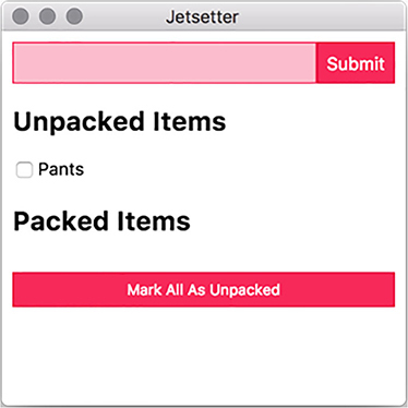
NewItem is another stateful component. It needs to track the value of the input field to correctly name the new item that it creates when the user submits the form. It updates its internal state to reflect the value whenever the user types into the input field. This change itself is represented in the input field, creating a virtuous cycle.
Listing 11.12. Adding a NewItem: ./app/components/NewItem.js
import React, { Component } from 'react';

class NewItem extends Component {
  constructor(props) {
    super(props);
    this.state = {                                                   1
      value: ''
    };

    this.handleChange = this.handleChange.bind(this);                2
    this.handleSubmit = this.handleSubmit.bind(this);                3
  }

  handleChange(event) {
    const { value } = event.target;                                  4
    this.setState({ value });                                        5
  }

  handleSubmit(event) {
    const { onSubmit } = this.props;                                 6
    const { value } = this.state;                                    7

    event.preventDefault();
    onSubmit({ value, packed: false, id: Date.now() });              8
    this.setState({ value: '' });                                    9
  }

  render() {
    const { value } = this.state;

    return (
      <form className="NewItem" onSubmit={this.handleSubmit}>        10
        <input
          className="NewItem-input"
          type="text"
          value={value}                                              11
          onChange={this.handleChange}                               12
        />
        <input className="NewItem-submit button" type="submit" />
      </form>
    );
  }
}

NewItem.defaultProps = {
  onSubmit: () => {}                                                 13
};

export default NewItem;
- 1 Sets the initial state of the input field as an empty string
- 2 Binds the handleChange() method so that it has a reference to the component when invoked from the event queue
- 3 Binds the handleSubmit() method so that it has a reference to the component when invoked from the event queue
- 4 event.target is the DOM node that triggered the event. In this case, that is the input field. We pull the value from the input field.
- 5 Updates the state of the component based on the value of the input field.
- 6 We pass in a function dictating what to do when the user clicks submit (or presses the return key) from the Application as a prop to this component.
- 7 Pulls the current value of the input field from the component’s state.
- 8 Passes an object representing the new item using the current UNIX timestamp as a plausibly unique identifier.
- 9 Resets the value of the input to an empty string to make it easy for the user to enter another item.
- 10 Triggers the handleSubmit() method when the user submits the form.
- 11 Uses the current value in state when the user submits the form.
- 12 Updates the value in state whenever the user makes a change to the input field.
- 13 Sets the default value of onSubmit() to an empty function so that we don’t accidentally trigger “undefined is not a function” as an error if it’s omitted.
The user typing in the input field triggers the function passed in as its onChange prop. We’re using the aptly named handleChange() method for this purpose. onChange passes in a representation of the DOM event to handleChange(). event.target is the input field’s DOM node. We ask for its value as we did with the text area in Fire Sale. With this value, we update the state of the component, which also updates the value of the input as shown in the UI.
In React, components do not typically know about their parents. NewItem cannot talk to Application directly. Instead, Application passes in a function as a prop to NewItem. NewItem uses this function when the user submits the form. We haven’t written this function yet, but—when we do—it simply adds the new item to Application’s array of items, which—as of right now—contains only a lonely pair of pants.
When the user submits the form, the function passed in as its onSubmit prop is called. Again, we are good at naming things and opted to name this method handleSubmit(). On form submission, create an item and pass it in to the method passed in as the NewItem’s onSubmit prop. The Application component will pass one of its methods to NewItem as its onSubmit prop. NewItem, in turn, passes it as the onSubmit prop to the form that it creates. Once the form is submitted, we replace the value in state with an empty string—allowing the user to enter another item.
NewItem currently lives in a vacuum. It theoretically works, but it needs to be added to the Application component before we can effectively use it. Our next step is to add it to the UI and pass it a function that adds it to Application’s list of items. We do this here.
Listing 11.13. NewItem in the Application component: ./app/components/application.js
import React, { Component } from 'react';
import NewItem from './NewItem';
import Items from './Items';

class Application extends Component {
  constructor(props) {
       // Omitted for brevity...
  }

  addItem(item) {
    this.setState({ items: [item, ...this.state.items] });       1
  }

  markAsPacked(item) {
       // Omitted for brevity...
  }

  markAllAsUnpacked() {
       // Omitted for brevity...
  }

  render() {
    const { items } = this.state;
    const unpackedItems = items.filter(item => !item.packed);
    const packedItems = items.filter(item => item.packed);

    return (
      <div className="Application">
        <NewItem onSubmit={this.addItem} />                      2
        <Items
          title="Unpacked Items"
          items={unpackedItems}
          onCheckOff={this.markAsPacked}
        />
        <Items
          title="Packed Items"
          items={packedItems}
          onCheckOff={this.markAsPacked}
        />
        <button
          className="button full-width"
          onClick={this.markAllAsUnpacked}
        >
          Mark All As Unpacked
        </button>
      </div>
    );
  }
}

export default Application;
- 1 addItem() sets the state to a new array consisting of all of the existing items along with the item passed in as an argument.
- 2 We add the NewItem component to the Application component and pass it the addItem() method as its onSubmit prop.
With the NewItem component added to the Application component, you should now be able to create additional items, toggle them between the unpacked and packed lists, and move all items to the unpacked list.
11.5. Live reload and hot module reloading
Throughout this book, we’ve developed muscle memory by pressing Command-R or Control-R to refresh the renderer process after changes on macOS and Windows/Linux, respectively. It can get a bit tedious, however, to switch back and forth between your text editor and your application every time you make a relatively small change.
electron-compile can trigger a reload whenever the file is changed on disk. This means that when you save the file in your text editor, it instantly reloads the open renderer processes—allowing you to see your changes immediately. electron-compile also supports hot module reloading in React, which takes live reloading one step further by swapping modules that have been updated on the fly without reloading the page itself. In this section, we look at implementing each of these approaches.
11.5.1. Enabling live reload
Until this point, electron-compile has just worked. We used electron-compile-prebuilt in place of electron in our package.json, did some minimal—and optional—configuration, and we were off to the races. electron-compile can also be required like any other module. The module provides an enableLiveReload() method that does what it says on the tin.
Listing 11.14. Enabling live reload: ./app/main.js
import { app, BrowserWindow } from 'electron';
import { enableLiveReload } from 'electron-compile';     1

enableLiveReload();                                      2

let mainWindow;

app.on('ready', () => {
  // Omitted for brevity...
});
- 1 Pulls in the enableLiveReload() function from the electron-compile module
- 2 Invokes the function before the application is ready to enable live reloading
When we call the enableLiveReload() function before the application has started, electron-compile sets up an IPC connection that listens for filesystem changes and sends a message to the renderer process, requesting that it reload whenever it detects a change.
11.5.2. Setting up hot module reloading
enableLiveReload() is framework-agnostic and works even in simple applications like Fire Sale and Clipmaster 9000. enableLiveReload() also supports hot module reloading with React applications. The first step is to let enableLiveReload() know that we prefer it to use hot module reloading as an alternative to refreshing the entire page.
Listing 11.15. Setting up hot module reloading: ./app/main.js
import { app, BrowserWindow } from 'electron';
import { enableLiveReload } from 'electron-compile';

enableLiveReload({ strategy: 'react-hmr' });         1

let mainWindow;

app.on('ready', () => {
  // Omitted for brevity...
});
- 1 Passes enableLiveReload() an object that tells it to use hot module reloading
With enableLiveReload() configured to use hot module reloading, it no longer refreshes the page when you change a file. But hot module reloading doesn’t work, either. Bummer. We’re effectively back at square one. We have a little more work to do.
If you’re using TypeScript, you can skip this next step. But we haven’t been using TypeScript in this chapter, so it’s on us to let Babel know that we are using hot module reloading. We add it to the list of plugins in .compilerc. We won’t add it as a plugin in production, because we’ll likely not be changing files often on our users’ machines.
Listing 11.16. Adding Babel support for hot module reloading: ./.compilerc
{
  "env": {
    "development": {
      "application/javascript": {
        // Omitted for brevity...
        "plugins": [
          "react-hot-loader/babel",           1
          // Additional plugins here...
        ],
        "sourceMaps": "inline"
      },
      "text/jade": {
        "pretty": true
      }
    },
    "production": {
      // Omitted for brevity...
    }
}
- 1 Adds react-hot-loader/babel to the list of Babel plugins
We’re not out of the woods yet—there is one other change that we need to make: our application needs to be wrapped in a container component that listens for the changes and passes those changes to our Application component. The good news is that we don’t have to write this component ourselves; we only have to require it from the react-hot-loader module.
Listing 11.17. Using AppContainer to subscribe to updates: ./app/renderer.js
import React from 'react';
import { render } from 'react-dom';
import { AppContainer } from 'react-hot-loader';

const renderApplication = () => {                                        1
  const { default: Application } = require('./components/Application');  2
  render(
    <AppContainer>
      <Application />
    </AppContainer>,
    document.getElementById('application')
  );
};

renderApplication();                                                     3

if (module.hot) { module.hot.accept(renderApplication); }                4
- 1 Wraps our initial render method in a function that we can call repeatedly
- 2 Requires a fresh version of the Application, which requires all the other modules in our application when rendering
- 3 Renders the application as we would normally when the application starts for the first time
- 4 If hot module reloading is enabled, renders the application again whenever we receive a message that the components have changed.
We have a few moving pieces. In our original implementation, we pull in the Application component and render it when the renderer process starts. This method is standard practice when building React applications and not specific to the fact that we’re doing all of this inside of Electron. But if we are going to take advantage of hot module reloading, we need to make some adjustments. We need to move the act of rendering the application into a function that we can call repeatedly. We name this function renderApplication() and call it when the renderer process is first evaluated. This function mimics the existing functionality before we implemented the changes described earlier.
When rendering the application, we need a fresh version of the Application component because it may have changed. As of this writing, ECMAScript’s module imports can be used only at the top level, so we have to fall back on the CommonJS require() function to pull in the Application component. We wrap Application in react-hot-loader’s AppContainer component, which lets it know about changes to the filesystem, and mounts it to the same DOM node that we did at the beginning of the chapter.
With all of this in place, hot module reloading should be enabled and you can see the changes to your modules in real time. If the mix of the CommonJS require() and ECMAScript import statements make you feel weird inside, you do have some options. An upcoming change to the specification allows for a second version of import() that can asynchronously fetch modules using a promise-based API. Listing 11.19 shows how to implement this. We used export default in ./components/Application.js, so we need to destructure the default property of the object passed to the promise and name it Application.
Listing 11.18. Using import() to asynchronously load dependencies: ./app/renderer.js
const renderApplication = () => {
  import('./components/Application').then(
    ({ default: Application }) => {               1
      render(
        <AppContainer>
          <Application />
        </AppContainer>,
        document.getElementById('application'),
      );
    }
  );
};
- 1 import() returns a promise with the contents of the module.
Both Node and Chromium support the upcoming async/await syntax that allows for a more traditional, synchronous syntax when using promised-based APIs. You can use this without Babel and electron-compile, because it is natively supported by Node and the browser.
Listing 11.19. Using async/await to asynchronously load dependencies: ./app/renderer.js
const renderApplication = async () => {
  const { default: Application } = await import('./components/Application');
  render(
    <AppContainer>
      <Application />
    </AppContainer>,
    document.getElementById('application')
  );
};
Both refactors are completely optional and exist mostly to illustrate the fact that Electron supports cutting-edge syntax out of the box and that electron-compile makes it easy to use Babel to add support for future features of the JavaScript language.
Summary
- electron-compile allows developers to use an assortment of languages that compile to HTML, JavaScript, and CSS such as Jade, TypeScript, CoffeeScript, Sass, and Less.
- electron-prebuilt-compile is a version of the Electron binary with electron-compile installed.
- Many languages can be used without configuration, but electron-compile also supports a .compilerc file that allows developers to configure each language.
- electron-compile can be configured to compile JSX using Babel.
- electron-compile can automatically detect which transpiler to use based on the file extension.
- Electron applications using electron-compile can use live reloading to automatically refresh all open browser windows.
- electron-compile’s live reloading feature also supports hot module reloading in React applications