Table of Contents for
Graph Algorithms
 Graph Algorithms
Published by
O'Reilly Media, Inc., 2019
Graph Algorithms
Published by
O'Reilly Media, Inc., 2019
- Cover
- nav
- Graph Algorithms
- Graph Algorithms
- Preface
- 1. Introduction
- 2. Graph Theory and Concepts
- 3. Graph Platforms and Processing
- 4. Pathfinding and Graph Search Algorithms
- 5. Centrality Algorithms
- 6. Community Detection Algorithms
- 7. Graph Algorithms in Practice
- 8. Using Graph Algorithms to Enhance Machine Learning
- About the Authors
Chapter 8. Using Graph Algorithms to Enhance Machine Learning
We’ve covered several algorithms that learn and update state at each iteration, such as Label Propagation, however up until this point, we’ve emphasized graph algorithms for general analytics. Since there’s increasing application of graphs in machine learning (ML), we now look at how graph algorithms can be used to enhance ML workflows.
In this chapter, our focus is on the most practical way to start improving ML predictions using graph algorithms: connected feature extraction and its use in predicting relationships. First, we’ll cover some basic ML concepts and the importance of contextual data for better predictions. Then there’s a quick survey of ways graph features are applied, including uses for spammer fraud, detection, and link prediction.
We’ll demonstrate how to create a machine learning pipeline and then train and evaluate a model for link prediction – integrating Neo4j and Spark in our workflow. We’ll use several models to predict whether research authors are likely to collaborate and show how graph algorithms improve results.
Machine Learning and the Importance of Context
Machine learning is not artificial intelligence (AI), but a method for achieving AI. ML uses algorithms to train software through specific examples and progressive improvements based on expected outcome – without explicit programming of how to accomplish these better results. Training involves providing a lot of data to a model and enabling it to learn how to process and incorporate that information.
In this sense, learning means that algorithms iterate, continually making changes to get closer to an objective goal, such as reducing classification errors in comparison to the training data. ML is also dynamic with the ability to modify and optimize itself when presented with more data. This can take place in pre-usage training on many batches or as online-learning during usage.
Recent successes in ML predictions, accessibility of large datasets, and parallel compute power has made ML more practical for those developing probabilistic models for AI applications. As machine learning becomes more widespread, it’s important to remember the fundamental goal of ML: making choices similar to the way humans do. If we forget that, we may end up with just another version of highly targeted, rules-based software.
In order to increase machine learning accuracy while also making solutions more broadly applicable, we need to incorporate a lot of contextual information - just as people should use context for better decisions. Humans use their surrounding context, not just direct data points, to figure out what’s essential in a situation, estimate missing information, and how to apply learnings to new situations. Context helps us improve predictions.
Graphs, Context, and Accuracy
Without peripheral and related information, solutions that attempt to predict behavior or make recommendations for varying circumstances require more exhaustive training and prescriptive rules. This is partly why AI is good at specific, well-defined tasks but struggles with ambiguity. Graph enhanced ML can help fill in that missing contextual information that is so important for better decisions.
We know from graph theory and from real-life that relationships are often the strongest predictors of behavior. For example, if one person votes, there’s an increased likelihood that their friends, family, and even coworkers will vote. Figure 8-1 illustrates a ripple effect based on reported voting and Facebook friends from the research paper, “A 61-million-person experiment in social influence and political mobilization”1 by R. Bond, C. Fariss, J. Jones, A. Kramer, C. Marlow, J. Settle, and J. Fowler.

Figure 8-1. People are influenced to vote by their social networks. In this example, friends 2 hops away had more total impact than direct relationships.
The authors found that friends reporting voting influenced an additional 1.4% of users to also claim they voted and, interestingly, friends of friends added another 1.7%. Small percentages can have a significant impact and we can see in Figure 8-1 that people at 2 hops out had in total more impact than the direct friends alone. Voting and other examples of how our social network impact us are covered in the book, “Connected,”2 by Nicholas Christakis and James Fowler.
Adding graph features and context improves predictions, especially in situations where connections matter. For example, retail companies personalize product recommendations with not only historical data but with contextual data about customer similarities and online behavior. Amazon’s Alexa uses several layers of contextual models that demonstrate improved accuracy.3 Additionally in 2018, they introduced “context carryover” to incorporate previous references in a conversation when answering new questions.
Unfortunately, many machine learning approaches today miss a lot of rich contextual information. This stems from ML reliance on input data built from tuples, leaving out a lot of predictive relationships and network data. Furthermore, contextual information is not always readily available or is too difficult to access and process. Even finding connections that are 4 or more hops away can be a challenge at scale for traditional methods. Using graphs we can more easily reach and incorporate connected data.
Connected Feature Extraction and Selection
Feature extraction and selection helps us take raw data and create a suitable subset and format for training our machine learning modeling. It’s a foundational step that when well-executed, leads to ML that produces more consistently accurate predictions.
Putting together the right mix of features can increase accuracy because it fundamentally influences how our models learn. Since even modest improvements can make a significant difference, our focus in this chapter is on connected features. And it’s not only important to get the right combination of features but also, eliminate unnecessary features to reduce the likelihood that our models will be hyper-targeted. This keeps us from creating models that only work well on our training data and significantly expands applicability.
Adding graph algorithms to traditional approaches can identify the most predictive elements within data based on relationships for connected feature extraction. We can further use graph algorithms to evaluate those features and determine which ones are most influential to our model for connected feature selection. For example, we can map features to nodes in a graph, create relationships based on similar features, and then compute the centrality of features. Features relationships can be defined by the ability to preserve cluster densities of data points. This method is described using datasets with high dimension and low sample size in “Unsupervised graph-based feature selection via subspace and pagerank centrality” 4 by K.Henniab, N.Mezghaniab and C.Gouin-Valleranda.
Now let’s look at some of the types of connected features and how they are used.
Graphy features
Graphy features include any number of connection-related metrics about our graph such as the number of relationships coming in or out of nodes, a count of potential triangles, and neighbors in common. In our example, we’ll start with these measures because they are simple to gather and a good test of early hypotheses.
In addition, when we know precisely what we’re looking for, we can use feature engineering. For instance, if we want to know how many people have a fraudulent account at up to four hops out. This approach uses graph traversal to very efficiently find deep paths of relationships, looking at things such as labels, attributes, counts, and inferred relationships.
We can also easily automate these processes and deliver those predictive graphy features into our existing pipeline. For example, we could abstract a count of fraudster relationships and add that number as a node attribute to be used for other machine learning tasks.
Graph algorithm features
We can also use graph algorithms to find features where we know the general structure we’re looking for but not the exact pattern. As an illustration, let’s say we know certain types of community groupings are indicative of fraud; perhaps there’s a prototypical density or hierarchy of relationships. In this case, we don’t want a rigid feature of an exact organization but rather a flexible and globally relevant structure. We’ll use community detection algorithms to extract connected features in our example, but centrality algorithms, like PageRank, are also frequently applied.
Furthermore, approaches that combine several types of connected features seem to outperform sticking to one single method. For example, we could combine connected features to predict fraud with indicators based on communities found via the Louvain algorithm, influential nodes using PageRank, and the measure of known fraudsters at 3 hops out.
A combined approach is demonstrated in Figure 8-3, where the authors combine graph algorithms like PageRank and Coloring with graphy measure such as in-degree and out-degree. This diagram is taken from the paper “Collective Spammer Detection in Evolving Multi-Relational Social Networks.” 8
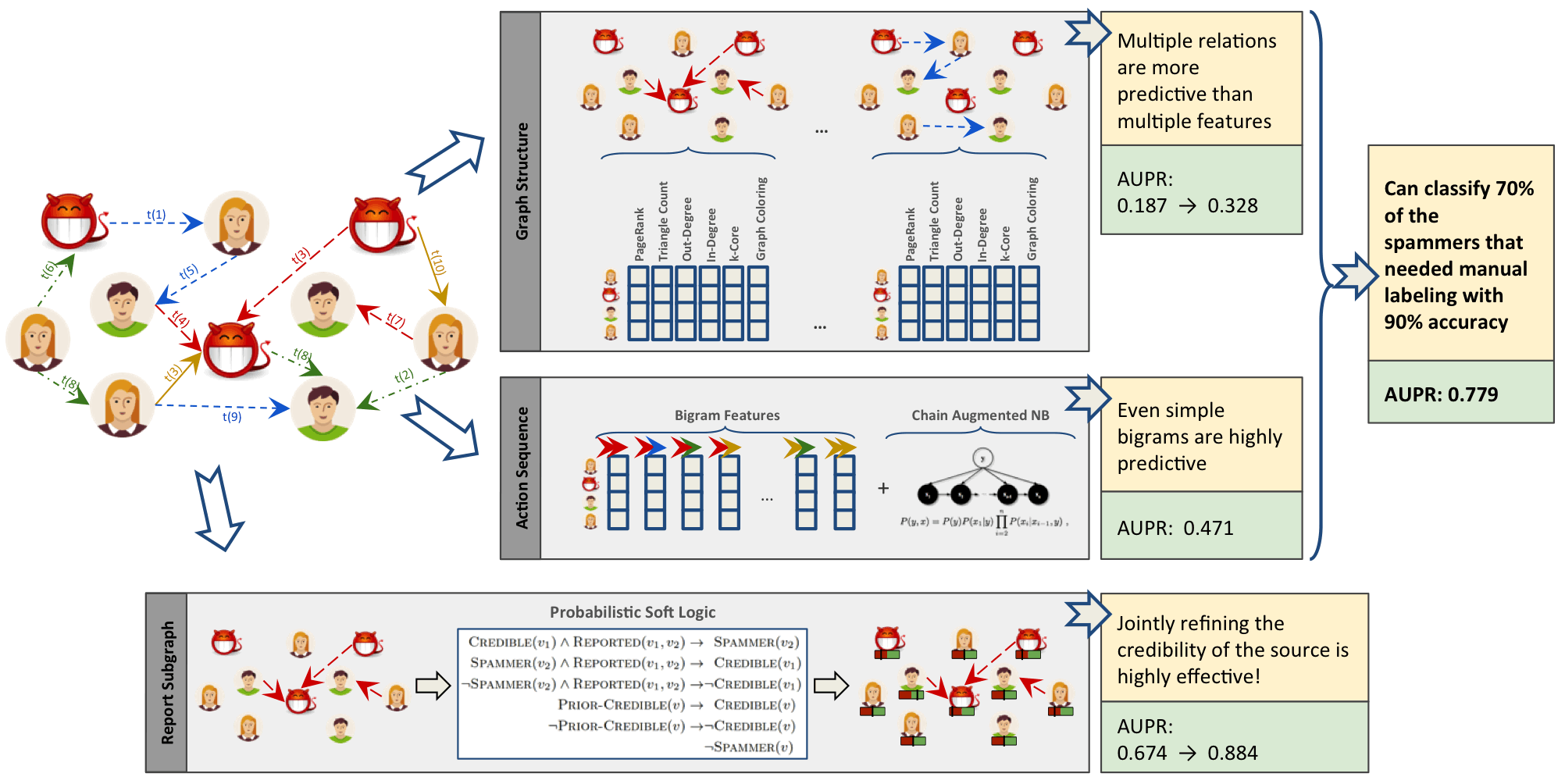
Figure 8-3. Connected Feature Extraction can be combined with other predictive methods to improve results. AUPR refers to the area under the precision-recall curve with higher numbers preferred.
The Graph Structure section illustrates connected feature extraction using several graph algorithms. Interestingly, the authors found extracting connected features from multiple types of relationships even more predictive than simply adding more features. The Report Subgraph section shows how graph features are converted into features that the ML model can use. By combining multiple methods in a graph-enhanced ML workflow, the authors were able to improve prior detection methods and classify 70% of spammers that had previously required manual labeling–with 90% accuracy.
Even once we have extracted connected features, we can improve our training by using graph algorithms like PageRank to prioritize the features with the most influence. This enables us to adequately represent our data while eliminating noisy variables that could degrade results or slow processing. With this type of information, we can also identify features with high co-occurrence for further model tuning via feature reduction. This method is outlined in the research paper “Using PageRank in Feature Selection” by Dino Ienco, Rosa Meo, and Marco Botta.9
We’ve discussed how connected features are applied to scenarios involving fraud and spammer detection. In these situations, activities are often hidden in multiple layers of obfuscation and network relationships. Traditional feature extraction and selection methods may be unable to detect that behavior without the contextual information that graphs bring.
Another area where connected features enhance machine learning (and the focus of the rest of this chapter) is link prediction. Link prediction is a way to estimate how likely a relationship is to form in the future or whether it should already be in our graph but is missing due to incomplete data. Since networks are dynamic and can grow fairly quickly, being able to predict links that will soon be added has broad applicability from product recommendations to drug retargeting and even inferring criminal relationships.
Connected features from graphs are often used to improve link prediction using basic graphy features as well as features extracted from centrality and community algorithms. Link prediction based on node proximity or similarity is also standard, for example as presented in the paper, “The Link Prediction Problem for Social Networks” 10 by David Liben-Nowell and Jon Kleinberg. In this research, they suggest that the network structure alone may contain enough latent information to detect node proximity and outperform more direct measures.
At each layer, features can be retained or discarded depending on whether they add new, significant information. DeepGL provides a flexible method to discover node and relationship features with baseline feature customization and the avoidance of manual feature engineering.
Now that we’ve looked at ways connected features can enhance machine learning, let’s dive into our link prediction example and look at how we can apply graph algorithms and improve our predictions.
Graphs and Machine Learning in Practice: Link Prediction
The rest of the chapter will demonstrate hands-on examples. First, we’ll set up the required tools and import data from a research citation network into Neo4j. Then we’ll cover how to properly balance data and split samples into Spark DataFrames for training and testing. After that, we explain our hypothesis and methods for link prediction before creating a machine learning pipeline in Spark. Finally, we’ll walk through training and evaluating various prediction models starting with basic graphy features and adding more graph algorithm features extracted using Neo4j.
Tools and Data
Let’s get started by setting up our tools and data. Then we’ll explore our dataset and create a machine learning pipeline.
Before we do anything else, let’s set up the libraries used in this chapter:
-
py2neo is a Neo4j Python library that integrates well with the Python data science ecosystem.
-
pandas is a high-performance library for data wrangling outside of a database with easy-to-use data structures and data analysis tools.
-
Spark MLlib is Spark’s machine learning library.
Note
We use MLlib as an example of a machine learning library. The approach shown in this chapter could be used in combination with other machine libraries, for example scikit-learn.
All the code shown will be run within the pyspark REPL. We can launch the REPL by running the following command:
exportSPARK_VERSION="spark-2.4.0-bin-hadoop2.7"./${SPARK_VERSION}/bin/pyspark\--driver-memory 2g\--executor-memory 6g\--packages julioasotodv:spark-tree-plotting:0.2
This is similar to the command we used to launch the REPL in Chapter 3, but instead of GraphFrames, we’re loading the spark-tree-plotting package.
At the time of writing the latest released version of Spark is spark-2.4.0-bin-hadoop2.7 but that may have changed by the time you read this so be sure to change the SPARK_VERSION environment variable appropriately.
Once we’ve launched that we’ll import the following libraries that we’ll use in this chapter:
frompy2neoimportGraphimportpandasaspdfromnumpy.randomimportrandintfrompyspark.mlimportPipelinefrompyspark.ml.classificationimportRandomForestClassifierfrompyspark.ml.featureimportStringIndexer,VectorAssemblerfrompyspark.ml.evaluationimportBinaryClassificationEvaluatorfrompyspark.sql.typesimport*frompyspark.sqlimportfunctionsasFfromsklearn.metricsimportroc_curve,aucfromcollectionsimportCounterfromcyclerimportcyclerimportmatplotlibmatplotlib.use('TkAgg')importmatplotlib.pyplotasplt
And now let’s create a connection to our Neo4j database:
graph=Graph("bolt://localhost:7687",auth=("neo4j","neo"))
We’ll be working with the Citation Network Dataset 11, a research dataset extracted from DBLP, ACM, and MAG (Microsoft Academic Graph). The dataset is described in Jie Tang, Jing Zhang, Limin Yao, Juanzi Li, Li Zhang, and Zhong Su’s paper “ArnetMiner: Extraction and Mining of Academic Social Networks” 12 Version 10 13 of the dataset contains 3,079,007 papers, 1,766,547 authors, 9,437,718 author relationships, and 25,166,994 citation relationships. We’ll be working with a subset focused on articles published in the following venues:
-
Lecture Notes in Computer Science
-
Communications of The ACM
-
International Conference on Software Engineering
-
Advances in Computing and Communications
Our resulting dataset contains 51,956 papers, 80,299 authors, 140,575 author relationships, and 28,706 citation relationships. We’ll create a co-authors graph based on authors who have collaborated on papers and then predict future collaborations between pairs of authors.
Importing the Data into Neo4j
Now we’re ready to load the data into Neo4j and create a balanced split for our training and testing.
We need to download Version 10 of the dataset, unzip it, and place the contents in the import folder.
We should have the following files:
-
dblp-ref-0.json -
dblp-ref-1.json -
dblp-ref-2.json -
dblp-ref-3.json
Once we have those files in the import folder, we need to add the following property to our Neo4j settings file so that we’ll be able to process them using the APOC library:
apoc.import.file.enabled=true
apoc.import.file.use_neo4j_config=true
First we’ll create some constraints to ensure that we don’t create duplicate articles or authors:
CREATECONSTRAINT ON (article:Article)ASSERT article.indexIS UNIQUE;CREATECONSTRAINT ON (author:Author)ASSERT author.nameIS UNIQUE;
Now we can run the following query to import the data from the JSON files:
CALL apoc.periodic.iterate('UNWIND ["dblp-ref-0.json","dblp-ref-1.json","dblp-ref-2.json","dblp-ref-3.json"] AS fileCALL apoc.load.json("file:///" + file)YIELD valueWHERE value.venue IN ["Lecture Notes in Computer Science", "Communications of The ACM","international conference on software engineering","advances in computing and communications"]return value','MERGE (a:Article {index:value.id})ON CREATE SET a += apoc.map.clean(value,["id","authors","references"],[0])WITH a,value.authors as authorsUNWIND authors as authorMERGE (b:Author{name:author})MERGE (b)<-[:AUTHOR]-(a)', {batchSize: 10000, iterateList:true});
This results in the graph schema as seen in Figure 8-4.
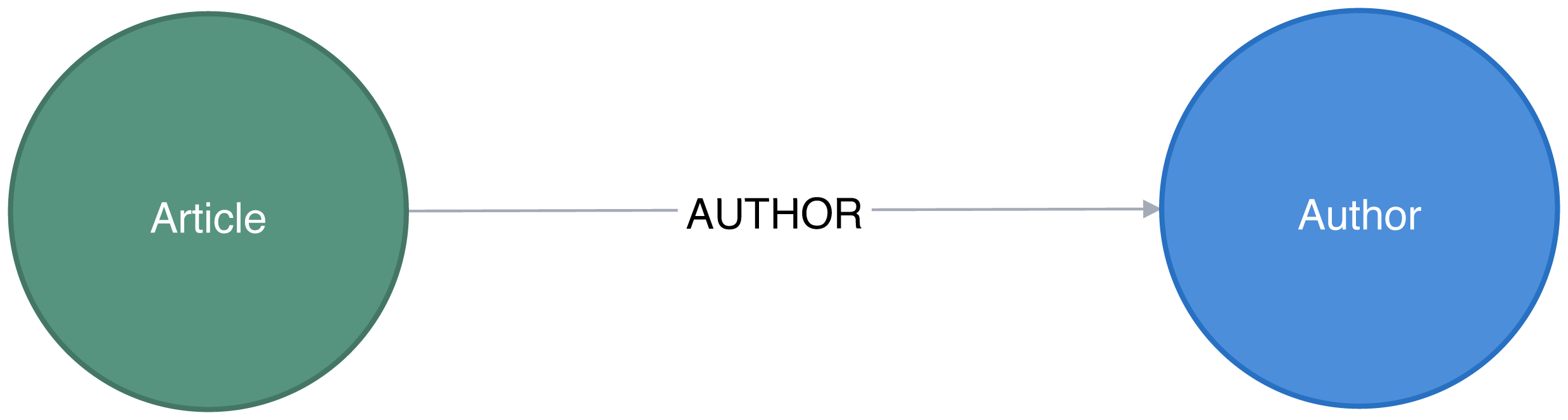
Figure 8-4. Citation Graph
This is a simple graph that connects articles and authors, so we’ll add more information we can infer from relationships to help with predictions.
Co-Authorship Graph
We want to predict future collaborations between authors, so we’ll start by creating a co-authorship graph.
The following Neo4j Cypher query will create a CO_AUTHOR relationship between every pair of authors that have collaborated on a paper:
MATCH(a1)<-[:AUTHOR]-(paper)-[:AUTHOR]->(a2:Author)WITHa1, a2, paperORDER BYa1, paper.yearWITHa1, a2,collect(paper)[0].yearASyear,count(*)AScollaborationsMERGE (a1)-[coauthor:CO_AUTHOR {year: year}]-(a2)SETcoauthor.collaborations = collaborations;
The year property is the earliest year when those two authors collaborated.
Figure 8-5 is in an example of part of the graph that gets created and we can already see some interesting community structures.
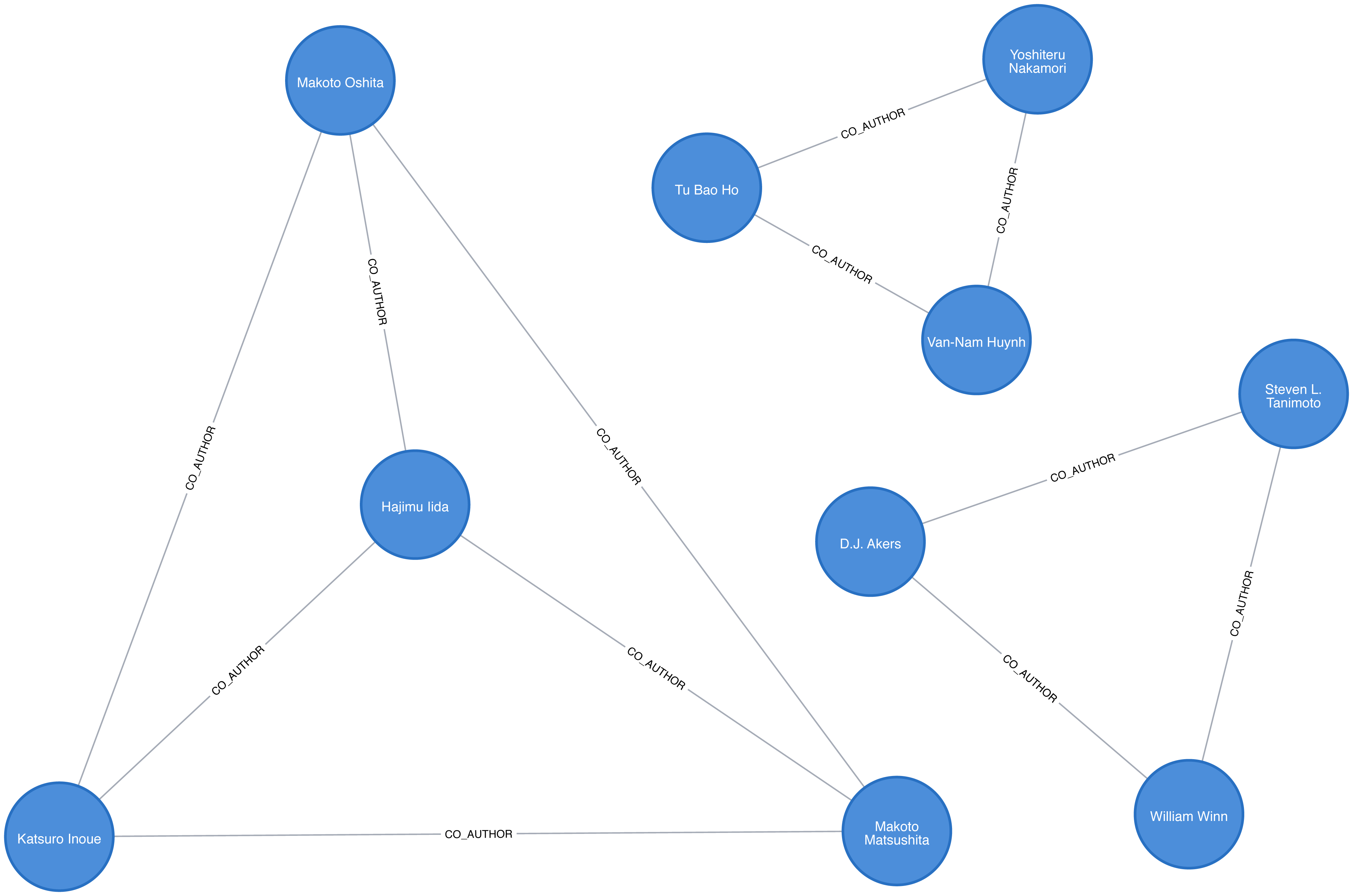
Figure 8-5. The co-author graph
Now that we have our data loaded and a basic graph, let’s create the two datasets we’ll need for training and testing.
Creating Balanced Training and Testing Datasets
With link prediction problems we want to try and predict the future creation of links. This dataset works well for that because we have dates on the articles that we can use to split our data.
We need to work out which year we’ll use as our training/test split. We’ll train our model on everything before that year and then test it on the links created after that date.
Let’s start by finding out when the articles were published. We can write the following query to get a count of the number of articles, grouped by year:
query="""MATCH (article:Article)RETURN article.year AS year, count(*) AS countORDER BY year"""by_year=graph.run(query).to_data_frame()
Let’s visualize as a bar chart, with the following code:
plt.style.use('fivethirtyeight')ax=by_year.plot(kind='bar',x='year',y='count',legend=None,figsize=(15,8))ax.xaxis.set_label_text("")plt.tight_layout()plt.show()
We can see the chart generated by executing this code in Figure 8-6.
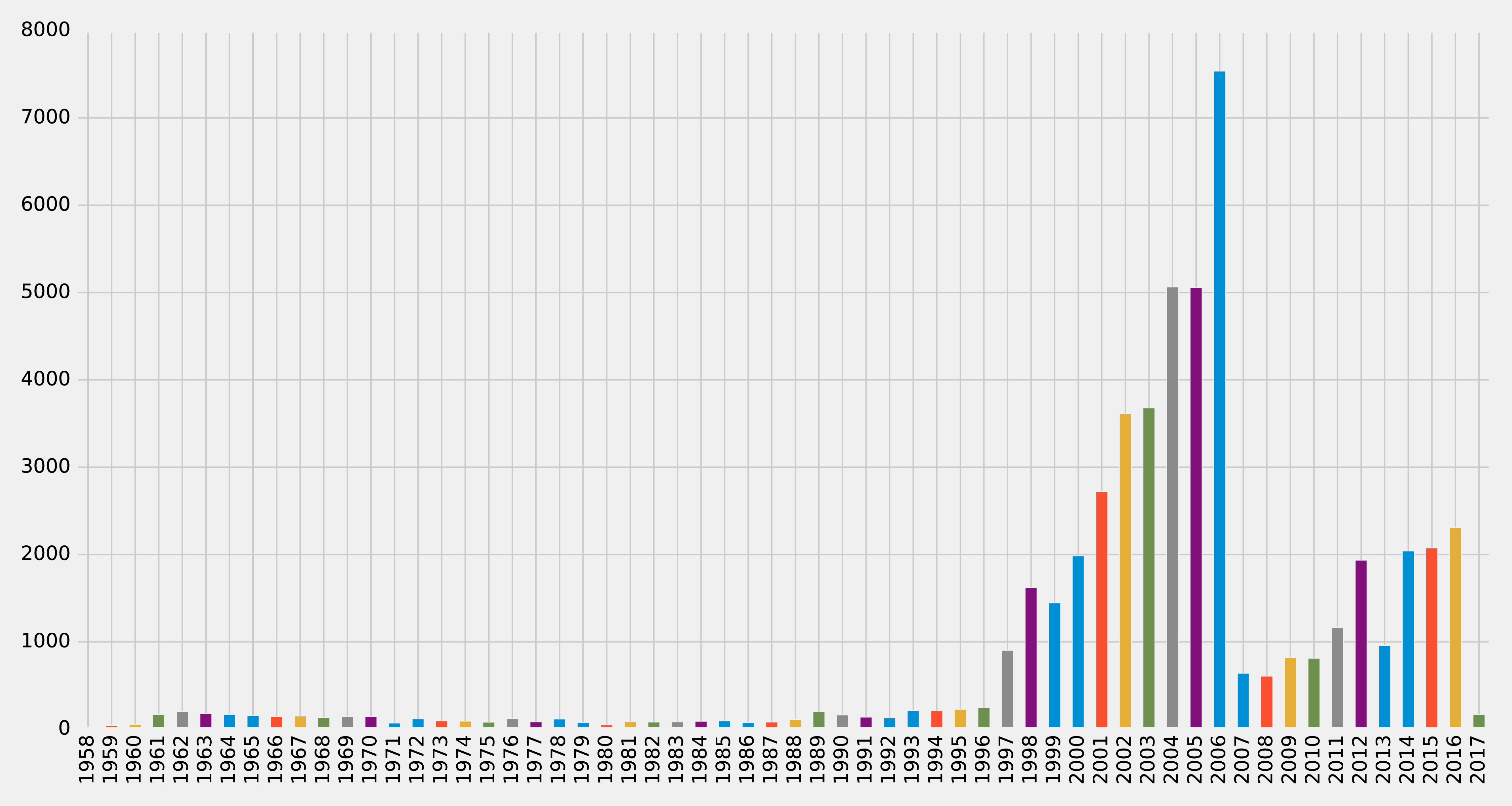
Figure 8-6. Articles by year
Very few articles were published before 1997, and then there were a lot published between 2001 and 2006, before a dip, and then a gradual climb since 2011 (excluding 2013). It looks like 2006 could be a good year to split our data between training our model and then making predictions. Let’s check how many papers there were before that year and how many during and after. We can write the following query to compute this:
MATCH(article:Article)RETURNarticle.year < 2006AStraining,count(*)AScount
We can see the result of this query in Table 8-1, where true means a paper was written before 2006.
| training | count |
|---|---|
false |
21059 |
true |
30897 |
Not bad! 60% of the papers were written before 2006 and 40% were written during or after 2006. This is a fairly balanced split of data for our training and testing.
So now that we have a good split of papers, let’s use the same 2006 split for co-authorship. We’ll create a CO_AUTHOR_EARLY relationship between pairs of authors whose first collaboration was before 2006:
MATCH(a1)<-[:AUTHOR]-(paper)-[:AUTHOR]->(a2:Author)WITHa1, a2, paperORDER BYa1, paper.yearWITHa1, a2,collect(paper)[0].yearASyear,count(*)AScollaborationsWHEREyear < 2006MERGE (a1)-[coauthor:CO_AUTHOR_EARLY {year: year}]-(a2)SETcoauthor.collaborations = collaborations;
And then we’ll create a CO_AUTHOR_LATE relationship between pairs of authors whose first collaboration was during or after 2006:
MATCH(a1)<-[:AUTHOR]-(paper)-[:AUTHOR]->(a2:Author)WITHa1, a2, paperORDER BYa1, paper.yearWITHa1, a2,collect(paper)[0].yearASyear,count(*)AScollaborationsWHEREyear >= 2006MERGE (a1)-[coauthor:CO_AUTHOR_LATE {year: year}]-(a2)SETcoauthor.collaborations = collaborations;
Before we build our training and test sets, let’s check how many pairs of nodes we have that do have links between them.
The following query will find the number of CO_AUTHOR_EARLY pairs:
MATCH()-[:CO_AUTHOR_EARLY]->()RETURNcount(*)AScount
Running that query will return the following count:
| count |
|---|
81096 |
And this query will find the number of CO_AUTHOR_LATE pairs:
MATCH()-[:CO_AUTHOR_LATE]->()RETURNcount(*)AScount
Running that query will return the following count:
| count |
|---|
74128 |
Now we’re ready to build our training and test datasets.
Balancing and Splitting Data
The pairs of nodes with CO_AUTHOR_EARLY and CO_AUTHOR_LATE relationships between them will act as our positive examples, but we’ll also need to create some negative examples.
Most real-world networks are sparse with concentrations of relationships, and this graph is no different. The number of examples where two nodes do not have a relationship is much larger than the number that do have a relationship.
If we query our CO_AUTHOR_EARLY data, we’ll find there are 45,018 authors with that type of relationship but only 81,096 relationships between authors. Although that might not sound imbalanced, it is: the potential maximum number of relationships that our graph could have is (45018 * 45017) / 2 = 1,013,287,653, which means there are a lot of negative examples (no links). If we used all the negative examples to train our model, we’d have a severe class imbalance problem.
A model could achieve extremely high accuracy by predicting that every pair of nodes doesn’t have a relationship – similar to our previous example predicting every image was a cat.
Ryan Lichtenwalter, Jake Lussier, and Nitesh Chawla describe several methods to address this challenge in their paper “New Perspectives and Methods in Link Prediction” 14. One of these approaches is to build negative examples by finding nodes within our neighborhood that we aren’t currently connected to.
We will build our negative examples by finding pairs of nodes that are a mix of between 2 and 3 hops away from each other, excluding those pairs that already have a relationship. We’ll then downsample those pairs of nodes so that we have an equal number of positive and negative examples.
Note
We have 314,248 pairs of nodes that don’t have a relationship between each other at a distance of 2 hops. If we increase the distance to 3 hops, we have 967,677 pairs of nodes.
The following function will be used to down sample the negative examples:
defdown_sample(df):copy=df.copy()zero=Counter(copy.label.values)[0]un=Counter(copy.label.values)[1]n=zero-uncopy=copy.drop(copy[copy.label==0].sample(n=n,random_state=1).index)returncopy.sample(frac=1)
This function works out the difference between the number of positive and negative examples, and then samples the negative examples so that there are equal numbers. We can then run the following code to build a training set with balanced positive and negative examples:
train_existing_links=graph.run("""MATCH (author:Author)-[:CO_AUTHOR_EARLY]->(other:Author)RETURN id(author) AS node1, id(other) AS node2, 1 AS label""").to_data_frame()train_missing_links=graph.run("""MATCH (author:Author)WHERE (author)-[:CO_AUTHOR_EARLY]-()MATCH (author)-[:CO_AUTHOR_EARLY*2..3]-(other)WHERE not((author)-[:CO_AUTHOR_EARLY]-(other))RETURN id(author) AS node1, id(other) AS node2, 0 AS label""").to_data_frame()train_missing_links=train_missing_links.drop_duplicates()training_df=train_missing_links.append(train_existing_links,ignore_index=True)training_df['label']=training_df['label'].astype('category')training_df=down_sample(training_df)training_data=spark.createDataFrame(training_df)
We’ve now coerced the label column to be a category, where 1 indicates that there is a link between a pair of nodes, and 0 indicates that there is not a link.
We can look at the data in our DataFrame by running the following code and looking at the results in Table 8-4:
training_data.show(n=5)
| node1 | node2 | label |
|---|---|---|
10019 |
28091 |
1 |
10170 |
51476 |
1 |
10259 |
17140 |
0 |
10259 |
26047 |
1 |
10293 |
71349 |
1 |
Table 8-4 simple shows us a list of node pairs and wether they have a co-author relationship, for example nodes 10019 and 28091 have a 1 label indicating a collaboration.
Now let’s execute the following code to check the summary of contents for the DataFrame and look at the results in Table 8-5:
training_data.groupby("label").count().show()
| label | count |
|---|---|
0 |
81096 |
1 |
81096 |
We can see that we’ve created our training set with the same number of positive and negative samples. Now we need to do the same thing for the test set. The following code will build a test set with balanced positive and negative examples:
test_existing_links=graph.run("""MATCH (author:Author)-[:CO_AUTHOR_LATE]->(other:Author)RETURN id(author) AS node1, id(other) AS node2, 1 AS label""").to_data_frame()test_missing_links=graph.run("""MATCH (author:Author)WHERE (author)-[:CO_AUTHOR_LATE]-()MATCH (author)-[:CO_AUTHOR*2..3]-(other)WHERE not((author)-[:CO_AUTHOR]-(other))RETURN id(author) AS node1, id(other) AS node2, 0 AS label""").to_data_frame()test_missing_links=test_missing_links.drop_duplicates()test_df=test_missing_links.append(test_existing_links,ignore_index=True)test_df['label']=test_df['label'].astype('category')test_df=down_sample(test_df)test_data=spark.createDataFrame(test_df)
We can execute the following code to check the contents of the DataFrame and show the results in Table 8-6:
test_data.groupby("label").count().show()
| label | count |
|---|---|
0 |
74128 |
1 |
74128 |
Now that we have balanced training and test datasets, let’s look at our methods for predicting links.
How We Predict Missing Links
We need to start with some basic assumptions about what elements in our data might predict whether two authors will become co-authors at a later date. Our hypothesis would vary by domain and problem, but in this case, we believe the most predictive features will be related to communities. We’ll begin with the assumption that the below elements increase the probability that authors become co-authors:
-
More co-authors in common
-
Potential triadic relationships between authors
-
Authors with more relationships
-
Authors in the same community
-
Authors in the same, tighter community
We’ll build graph features based on our assumptions and use those to train a binary classifier. Binary classification is a type of machine learning where the task of predicting which of two predefined groups an element belongs to based on a rule. We’re using the classifier for the task of predicting whether a pair of authors will have a link or not, based on a classification rule. For our examples, a value of 1 means there is a link (co-authorship), and a value of 0 means there isn’t a link (no co-authorship).
We’ll implement our binary classifier as a random forest in Spark. A random forest is an ensemble learning method for classification, regression and other tasks as illustrated in Figure 8-7.
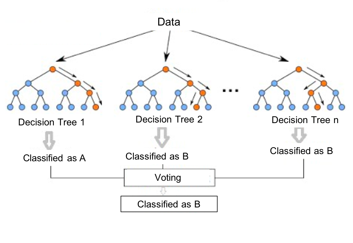
Figure 8-7. A Random Forest builds a collection of decision trees and then aggregates results for a majority vote (for classification) or an average value (for regression).
Our random forest classifier will take the results from the multiple decision trees we train and then use voting to predict a classification; in our exmaple, whether there is a link (co-authorship) or not.
Now let’s create our workflow.
Creating a Machine Learning Pipeline
We’ll create our machine learning pipeline based on a random forest classifier in Spark. This method is well suited as our data set will be comprised of a mix of strong and weak features. While the weak features will sometimes be helpful, the random forest method will ensure we don’t create a model that only fits our training data.
To create our ML pipeline, we’ll pass in a list of features as the fields variables - these are the features that our classifier will use.
The classifier expects to receive those features as a single column called features, so we use the VectorAssembler to transform the data into the required format.
The below code creates a machine learning pipeline and sets up our parameters using MLlib:
defcreate_pipeline(fields):assembler=VectorAssembler(inputCols=fields,outputCol="features")rf=RandomForestClassifier(labelCol="label",featuresCol="features",numTrees=30,maxDepth=10)returnPipeline(stages=[assembler,rf])
The RandomForestClassifier uses the below parameters:
-
labelCol- the name of the field containing the variable we want to predict i.e. whether a pair of nodes have a link -
featuresCol- the name of the field containing the variables that will be used to predict whether a pair of nodes have a link -
numTrees- the number of decision trees that form the random forest -
maxDepth- the maximum depth of the decision trees
We chose the number of decision trees and depth based on experimentation. We can think about hyperparameters like the settings of an algorithm that can be adjusted to optimize performance. The best hyperparameters are often difficult to determine ahead of time and tuning a model usually requires some trial and error.
We’ve covered the basics and set up our pipeline, so let’s dive into creating our model and evaluating how well it performs.
Predicting Links: Basic graph features
We’ll start by creating a simple model that tries to predict whether two authors will have a future collaboration based on features extracted from common authors, preferential attachment, and the total union of neighbors.
-
Common Authors - finds the number of potential triangles between two authors. This captures the idea that two authors who have co-authors in common may be introduced and collaborate in the future.
-
Preferential Attachment - produces a score for each pair of authors by multiplying the number of co-authors each has. The intuition is that authors are more likely to collaborate with someone who already co-authors a lot of papers.
-
Total Union of Neighbors - finds the total number of co-authors that each author has minus the duplicates.
In Neo4j, we can compute these values using Cypher queries. The following function will compute these measures for the training set:
defapply_graphy_training_features(data):query="""UNWIND $pairs AS pairMATCH (p1) WHERE id(p1) = pair.node1MATCH (p2) WHERE id(p2) = pair.node2RETURN pair.node1 AS node1,pair.node2 AS node2,size([(p1)-[:CO_AUTHOR_EARLY]-(a)-[:CO_AUTHOR_EARLY]-(p2) | a]) AS commonAuthors,size((p1)-[:CO_AUTHOR_EARLY]-()) * size((p2)-[:CO_AUTHOR_EARLY]-()) AS prefAttachment,size(apoc.coll.toSet([(p1)-[:CO_AUTHOR_EARLY]->(a) | id(a)] + [(p2)-[:CO_AUTHOR_EARLY]->(a) | id(a)])) AS totalNeighbours"""pairs=[{"node1":row["node1"],"node2":row["node2"]}forrowindata.collect()]features=spark.createDataFrame(graph.run(query,{"pairs":pairs}).to_data_frame())returndata.join(features,["node1","node2"])
And the following function will compute them for the test set:
defapply_graphy_test_features(data):query="""UNWIND $pairs AS pairMATCH (p1) WHERE id(p1) = pair.node1MATCH (p2) WHERE id(p2) = pair.node2RETURN pair.node1 AS node1,pair.node2 AS node2,size([(p1)-[:CO_AUTHOR]-(a)-[:CO_AUTHOR]-(p2) | a]) AS commonAuthors,size((p1)-[:CO_AUTHOR]-()) * size((p2)-[:CO_AUTHOR]-()) AS prefAttachment,size(apoc.coll.toSet([(p1)-[:CO_AUTHOR]->(a) | id(a)] + [(p2)-[:CO_AUTHOR]->(a) | id(a)])) AS totalNeighbours"""pairs=[{"node1":row["node1"],"node2":row["node2"]}forrowindata.collect()]features=spark.createDataFrame(graph.run(query,{"pairs":pairs}).to_data_frame())returndata.join(features,["node1","node2"])
Both of these functions take in a DataFrame that contains pairs of nodes in the columns node1 and node2.
We then build an array of maps containing these pairs and compute each of the measures for each pair of nodes.
Note
The UNWIND clause is particularly useful in this chapter for taking a large collection of node-pairs and returning all their features in one query.
We apply these functions in Spark to our training and test DataFrames with the following code:
training_data=apply_graphy_training_features(training_data)test_data=apply_graphy_test_features(test_data)
Let’s explore the data in our training set.
The following code will plot a histogram of the frequency of commonAuthors:
plt.style.use('fivethirtyeight')fig,axs=plt.subplots(1,2,figsize=(18,7),sharey=True)charts=[(1,"have collaborated"),(0,"haven't collaborated")]forindex,chartinenumerate(charts):label,title=chartfiltered=training_data.filter(training_data["label"]==label)common_authors=filtered.toPandas()["commonAuthors"]histogram=common_authors.value_counts().sort_index()histogram/=float(histogram.sum())histogram.plot(kind="bar",x='Common Authors',color="darkblue",ax=axs[index],title=f"Authors who {title} (label={label})")axs[index].xaxis.set_label_text("Common Authors")plt.tight_layout()plt.show()
We can see the chart generated in Figure 8-8.
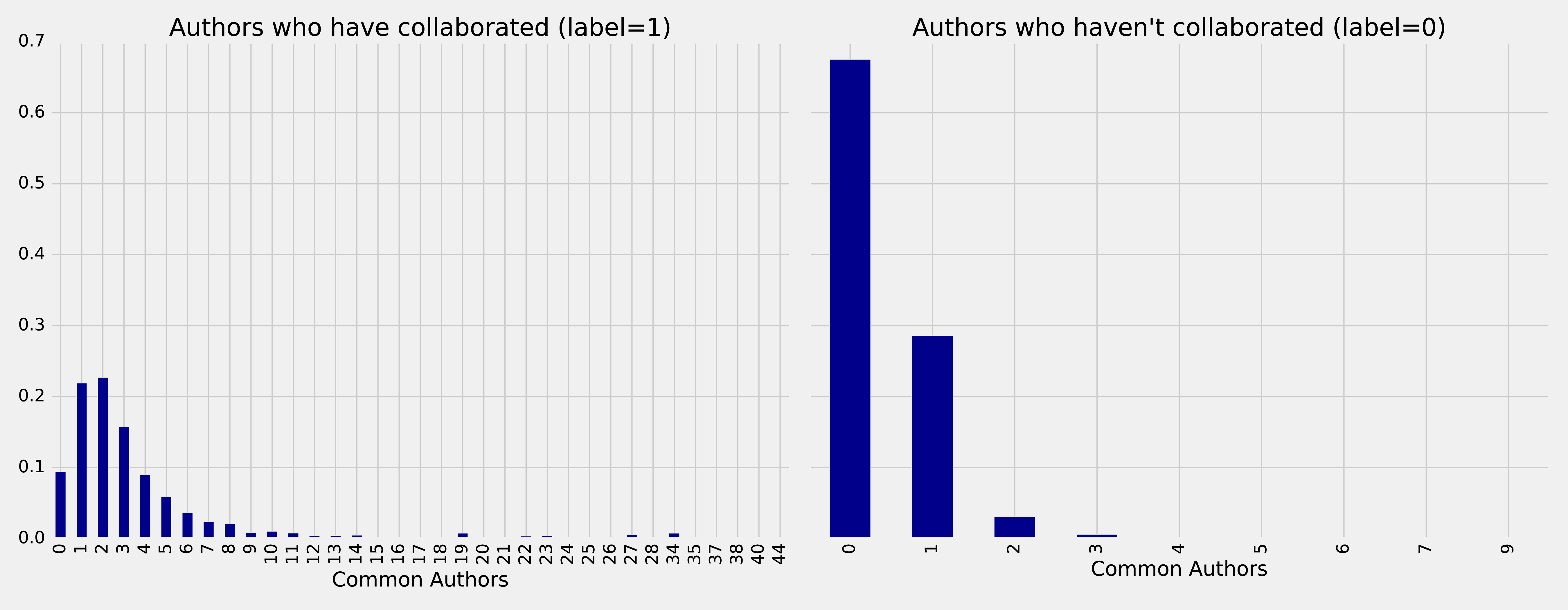
Figure 8-8. Frequency of common authors
On the left we see the frequency of commonAuthors when authors have collaborated, and on the right we can see the frequency of commonAuthors when they haven’t.
For those who haven’t collaborated (right side) the maximum number of common authors is 9, but 95% of the values are 1 or 0. It’s not surprising that of the people who have not collaborated on a paper, most also do not have many other co-authors in common.
For those that have collaborated (left side), 70% have less than 5 co-authors in common with a spike between 1 and 2 other co-authos.
Now we want to train a model to predict missing links. The following function does this:
deftrain_model(fields,training_data):pipeline=create_pipeline(fields)model=pipeline.fit(training_data)returnmodel
We’ll start by creating a basic model that only uses the commonAuthors.
We can create that model by running this code:
basic_model=train_model(["commonAuthors"],training_data)
Now that we’ve trained our model, let’s quickly check how it performs against some dummy data.
The following code evaluates the code against different values for commonAuthors:
eval_df=spark.createDataFrame([(0,),(1,),(2,),(10,),(100,)],['commonAuthors'])(basic_model.transform(eval_df).select("commonAuthors","probability","prediction").show(truncate=False))
Running that code will give the results in Table 8-7:
| commonAuthors | probability | prediction |
|---|---|---|
0 |
[0.7540494940434322,0.24595050595656787] |
0.0 |
1 |
[0.7540494940434322,0.24595050595656787] |
0.0 |
2 |
[0.0536835525078107,0.9463164474921892] |
1.0 |
10 |
[0.0536835525078107,0.9463164474921892] |
1.0 |
If we have a commonAuthors value of less than 2 there’s a 75% probability that there won’t be a relationship between the authors, so our model predicts 0.
If we have a commonAuthors value of 2 or more there’s a 94% probability that there will be a relationship between the authors, so our model predicts 1.
Let’s now evaluate our model against the test set. Although there are several ways to evaluate how well a model performs, most are derived from a few baseline predictive metrics:
Accuracy
Fraction of predictions our model gets right, or the total number of correct predictions divided by the total number of predictions. Note that accuracy alone can be misleading, especially when our data is unbalanced. For example, if we have a dataset containing 95 cats and 5 dogs and our model predicts that every image is a cat we’ll have a 95% accuracy despite correctly identifying none of the dogs.
Precision
The proportion of positive identifications that are correct. A low precision score indicates more false positives. A model that produces no false positives has a precision of 1.0.
Recall (True Positive Rate)
The proportion of actual positives that are identified correctly. A low recall score indicates more false negatives. A model that produces no false negatives has a recall of 1.0.
False Positive Rate
The proportion of incorrect positives that are identified. A high score indicates more false positives.
ROC Curve X-Y Chart
The receiver operating characteristic curve (ROC Curve) is the plot of the Recall(True Positive Rate) to the False Positive rate at different classification thresholds. The area under the ROC curve (AUC) measures the two-dimensional area underneath the ROC curve from an X-Y axis (0,0) to (1,1).
We’ll use Accuracy, Precision, Recall, and ROC curves to evaluate our models. Accuracy is coarse measure, so we’ll focus on increasing our overall Precision and Recall measures. We’ll use the ROC curves to compare how individual features change predictive rates.
Tip
Depending on our goals we may want to favor different measures. For example, we may want to eliminate all false negatives for disease indicators, but we wouldn’t want to push predictions of everything into a positive result. There may be multiple thresholds we set for different models that pass some results through to secondary inspection on the likelihood of false results.
Lowering classification thresholds results in more overall positive results, thus increasing both false positives and true positives.
Let’s use the following function to compute these predictive measures:
defevaluate_model(model,test_data):# Execute the model against the test setpredictions=model.transform(test_data)# Compute true positive, false positive, false negative countstp=predictions[(predictions.label==1)&(predictions.prediction==1)].count()fp=predictions[(predictions.label==0)&(predictions.prediction==1)].count()fn=predictions[(predictions.label==1)&(predictions.prediction==0)].count()# Compute recall and precision manuallyrecall=float(tp)/(tp+fn)precision=float(tp)/(tp+fp)# Compute accuracy using Spark MLLib's binary classification evaluatoraccuracy=BinaryClassificationEvaluator().evaluate(predictions)# Compute False Positive Rate and True Positive Rate using sklearn functionslabels=[row["label"]forrowinpredictions.select("label").collect()]preds=[row["probability"][1]forrowinpredictions.select("probability").collect()]fpr,tpr,threshold=roc_curve(labels,preds)roc_auc=auc(fpr,tpr)return{"fpr":fpr,"tpr":tpr,"roc_auc":roc_auc,"accuracy":accuracy,"recall":recall,"precision":precision}
We’ll then write a function to display the results in an easier to consume format:
defdisplay_results(results):results={k:vfork,vinresults.items()ifknotin["fpr","tpr","roc_auc"]}returnpd.DataFrame({"Measure":list(results.keys()),"Score":list(results.values())})
We can call the function with this code and see the results:
basic_results=evaluate_model(basic_model,test_data)display_results(basic_results)
| Measure | Score |
|---|---|
accuracy |
0.864457 |
recall |
0.753278 |
precision |
0.968670 |
This is not a bad start given we’re predicting future collaboration based only on the number of common authors our pairs of authors. However, we get a bigger picture if we consider these measures in context to each other. For example this model has a precision of 0.968670 which means it’s very good at prediciting that links exist. However, our recall is 0.753278 which means it’s not good at predicting when links do not exist.
We can also plot the ROC curve (correlation of True Positives and False Positives) using the following functions:
defcreate_roc_plot():plt.style.use('classic')fig=plt.figure(figsize=(13,8))plt.xlim([0,1])plt.ylim([0,1])plt.ylabel('True Positive Rate')plt.xlabel('False Positive Rate')plt.rc('axes',prop_cycle=(cycler('color',['r','g','b','c','m','y','k'])))plt.plot([0,1],[0,1],linestyle='--',label='Random score (AUC = 0.50)')returnplt,figdefadd_curve(plt,title,fpr,tpr,roc):plt.plot(fpr,tpr,label=f"{title} (AUC = {roc:0.2})")
We call it like this:
plt,fig=create_roc_plot()add_curve(plt,"Common Authors",basic_results["fpr"],basic_results["tpr"],basic_results["roc_auc"])plt.legend(loc='lower right')plt.show()
We can see the ROC curve for our basic model in Figure 8-9.
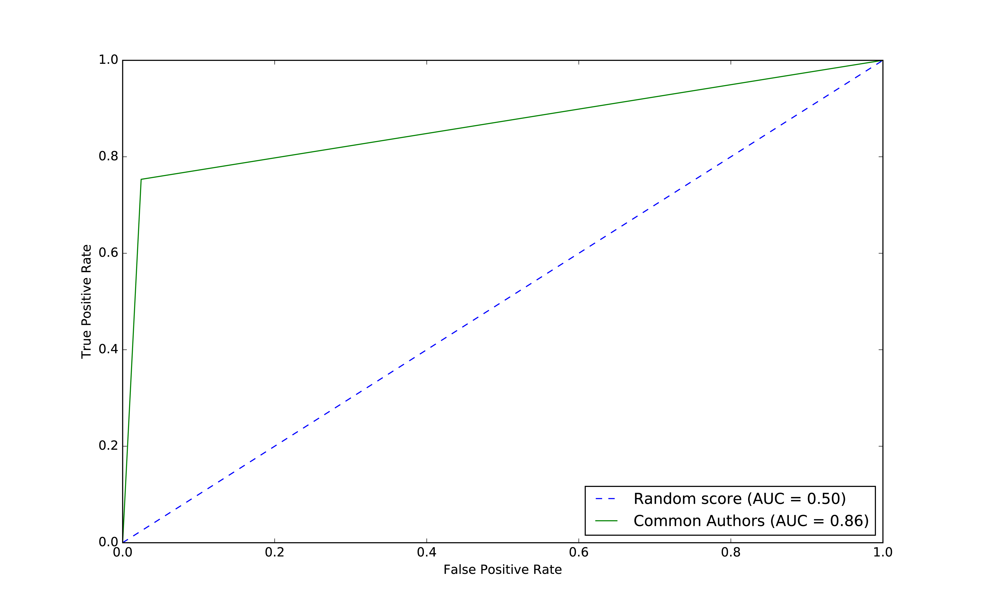
Figure 8-9. ROC for basic model
The common authors give us a 0.86 area under the curve (AUC). Although this gives us one overall predictive measure, we need the chart (or other measures) to evaluate whether this fits our goal. If we look at Figure 8-9 we can see that as soon as we get close to a 80% true positive rate (recall) our false positive rate would reach about 20%. That could be problematic for scenarios like fraud detection where false positives are expensive to chase.
Now let’s use the other graphy features to see if we can improve our predictions. Before we train our model, let’s see how the data is distributed. We can run the following code to show descriptive statistics for each of our graphy features:
(training_data.filter(training_data["label"]==1).describe().select("summary","commonAuthors","prefAttachment","totalNeighbours").show())
(training_data.filter(training_data["label"]==0).describe().select("summary","commonAuthors","prefAttachment","totalNeighbours").show())
We can see the results of running those bits of code in Table 8-9 and Table 8-10.
| summary | commonAuthors | prefAttachment | totalNeighbours |
|---|---|---|---|
count |
81096 |
81096 |
81096 |
mean |
3.5959233501035808 |
69.93537289138798 |
6.800569695176088 |
stddev |
4.715942231635516 |
171.47092255919472 |
7.18648361508341 |
min |
0 |
1 |
1 |
max |
44 |
3150 |
85 |
| summary | commonAuthors | prefAttachment | totalNeighbours |
|---|---|---|---|
count |
81096 |
81096 |
81096 |
mean |
0.37666469369635985 |
48.18137762651672 |
7.277042024267534 |
stddev |
0.6194576095461857 |
94.92635344980489 |
8.221620974228365 |
min |
0 |
1 |
0 |
max |
9 |
1849 |
85 |
Features with larger differences between linked (co-authorship) and no link (no co-authorship) should be more predictive because the divide is greater. The average value for prefAttachment is higher for authors who collaborated versus those that haven’t. That difference is even more substantial for commonAuthors.
We notice that there isn’t much difference in the values for totalNeighbours, which probably means this feature won’t be very predictive.
Also interesting is the large standard deviation and min/max for preferential attachment. This is inline with what we might expect for small-world networks with conncentrated hubs (super connectors).
Now let’s train a new model, adding Preferential Attachment and Total Union of Neighbors, by running the following code:
fields=["commonAuthors","prefAttachment","totalNeighbours"]graphy_model=train_model(fields,training_data)
And now let’s evaluate the model and see the results:
graphy_results=evaluate_model(graphy_model,test_data)display_results(graphy_results)
| Measure | Score |
|---|---|
accuracy |
0.982788 |
recall |
0.921379 |
precision |
0.949284 |
Our accuracy and recall have increased substantially, but the precision has dropped a bit and we’re still misclassifying about 8% of the links.
Let’s plot the ROC curve and compare our basic and graphy models by running the following code:
plt,fig=create_roc_plot()add_curve(plt,"Common Authors",basic_results["fpr"],basic_results["tpr"],basic_results["roc_auc"])add_curve(plt,"Graphy",graphy_results["fpr"],graphy_results["tpr"],graphy_results["roc_auc"])plt.legend(loc='lower right')plt.show()
We can see the output in Figure 8-10.
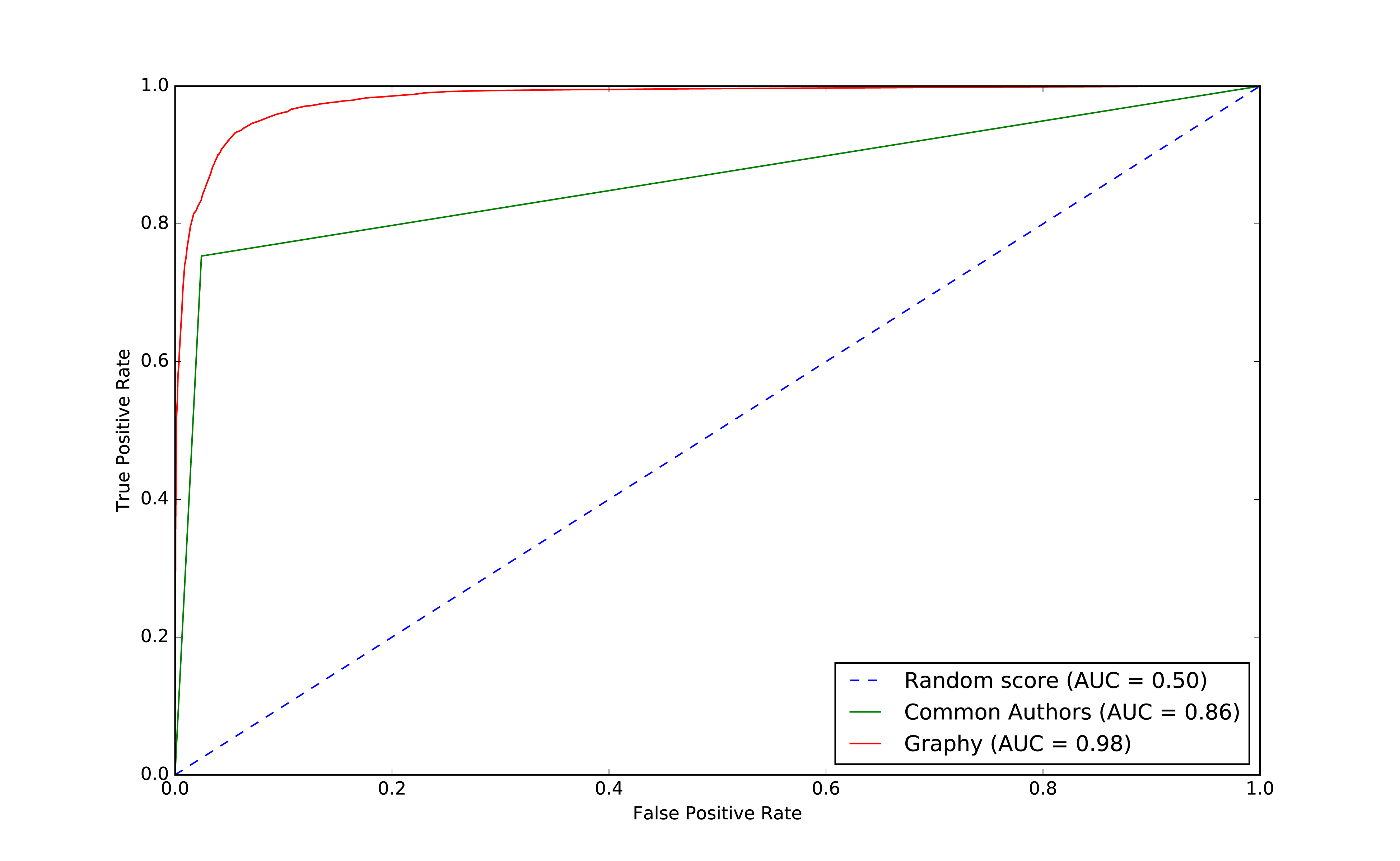
Figure 8-10. ROC for graphy model
Overall it looks like we’re headed in the rigth direction and it’s helpful to visualize comparisons to get a feel for how different models impact our results.
Now that we have more than one feature, we want to evaluate which features are making the most difference. We’ll use feature importance to rank the impact of different features to our model’s prediction. This enables us to evaluate the influence on results that different algorithms and statistics have.
Note
To compute feature importance, the random forest algorithm in Spark averages the reduction in impurity across all trees in the forest. The impurity is the frequency that randomly assigned labels are incorrect.
Feature rankings are in comparison to the group of features we’re evaluating, always normalized to 1. If we only rank one feature, its feature importance is 1.0 as it has 100% of the influence on the model.
The following function creates a chart showing the most influential features:
defplot_feature_importance(fields,feature_importances):df=pd.DataFrame({"Feature":fields,"Importance":feature_importances})df=df.sort_values("Importance",ascending=False)ax=df.plot(kind='bar',x='Feature',y='Importance',legend=None)ax.xaxis.set_label_text("")plt.tight_layout()plt.show()
And we call it like this:
rf_model=graphy_model.stages[-1]plot_feature_importance(fields,rf_model.featureImportances)
The results of running that function can be seen in Figure 8-11:
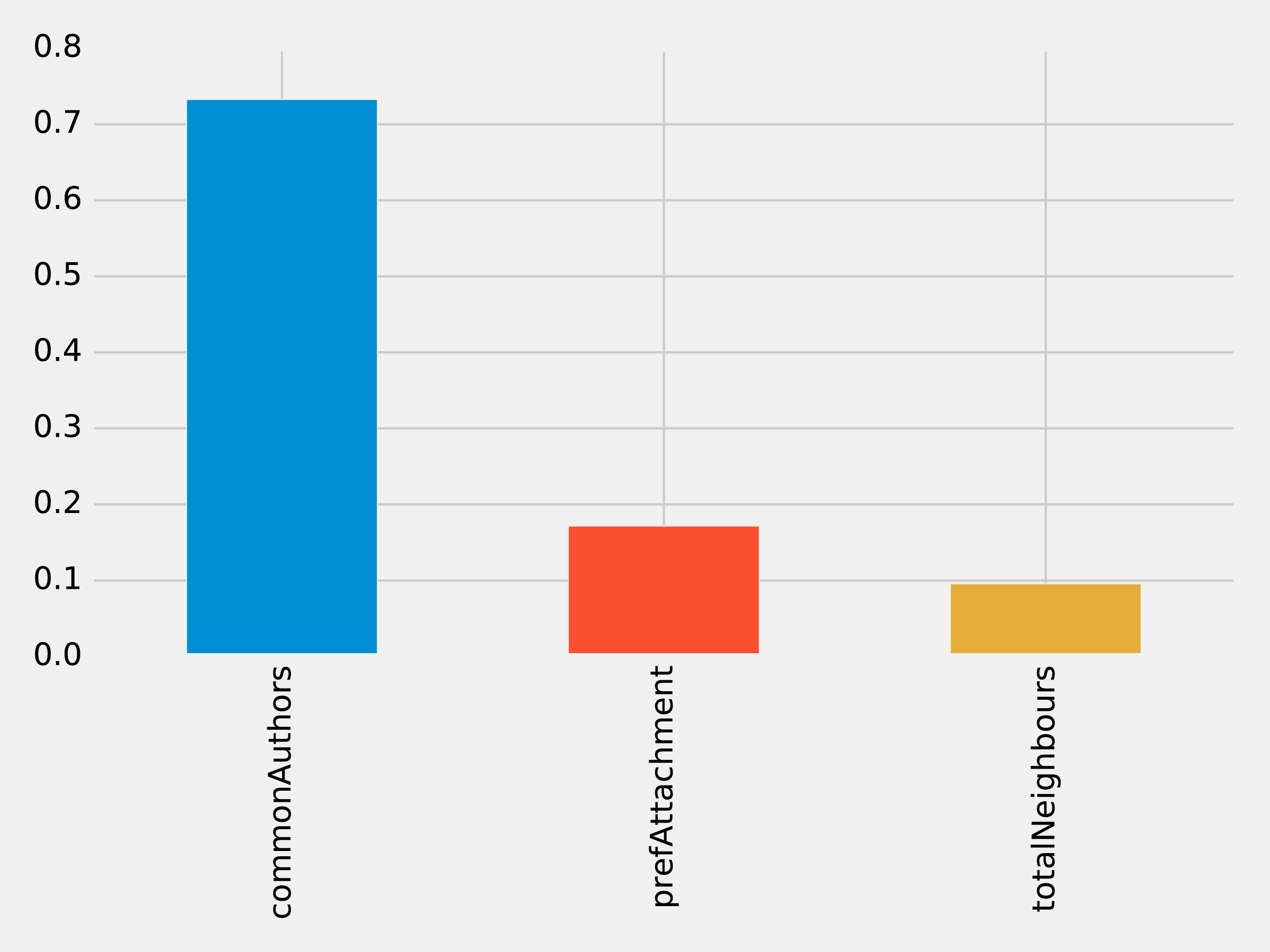
Figure 8-11. Feature Importance: Graphy Model
Of the three features we’ve used so far, commonAuthors is the most important feature by a large margin.
To understand how our predictive models are created, we can visualize one of the decision trees in our random forest using the spark-tree-plotting library 15. The following code generates a GraphViz 16 file of one of our decision trees:
fromspark_tree_plottingimportexport_graphvizdot_string=export_graphviz(rf_model.trees[0],featureNames=fields,categoryNames=[],classNames=["True","False"],filled=True,roundedCorners=True,roundLeaves=True)withopen("/tmp/rf.dot","w")asfile:file.write(dot_string)
We can then generate a visual representation of that file by running the following command from the terminal:
dot -Tpdf /tmp/rf.dot -o /tmp/rf.pdf
The output of that command can be seen in Figure 8-12:
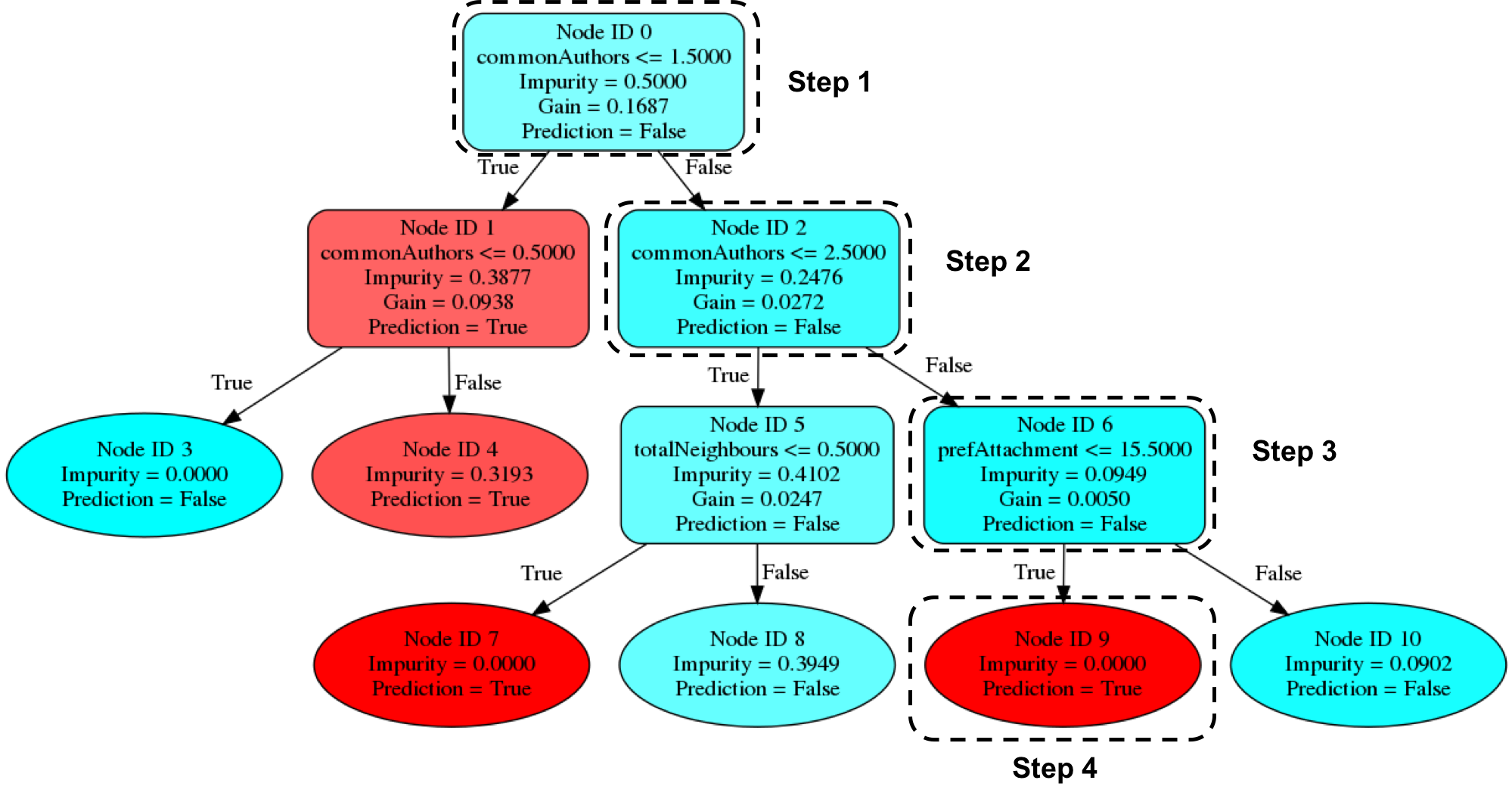
Figure 8-12. Visualizing a decision tree
Imagine that we’re using this decision tree to predict whether a pair of nodes with the following features are linked:
| commonAuthors | prefAttachment | totalNeighbours |
|---|---|---|
10 |
12 |
5 |
Our random forest walks through several steps to create a prediction:
-
Start from
Node ID 0, where we have more than1.5commonAuthors, so we follow theFalsebranch down toNode ID 2. -
We have more than
2.5forcommonAuthors, so we follow theFalsebranch toNode ID 6. -
We have less than
15.5forprefAttachment, which takes us toNode ID 9. -
Node ID 9is a leaf node in this decision tree, which means that we don’t have to check any more conditions - the value ofPrediction(i.e.True) on this node is the decision tree’s prediction. -
Finally the random forest evaluates the item being predicted against a collection of these decisions trees and makes its prediction based on the most popular outcome.
Now let’s look at adding more graph features.
Predicting Links: Triangles and The Clustering Coefficient
Recommendation solutions often base predictions on some form of triangle metric so let’s see if they further help with our example. We can compute the number of triangles that a node is a part of and its clustering coefficient by executing the following query:
CALL algo.triangleCount('Author','CO_AUTHOR_EARLY', { write:true,writeProperty:'trianglesTrain', clusteringCoefficientProperty:'coefficientTrain'});CALL algo.triangleCount('Author','CO_AUTHOR', { write:true,writeProperty:'trianglesTest', clusteringCoefficientProperty:'coefficientTest'});
The following function will add these features to our DataFrames:
def apply_triangles_features(data, triangles_prop, coefficient_prop):query ="""UNWIND $pairs AS pairMATCH (p1) WHERE id(p1) = pair.node1MATCH (p2) WHERE id(p2) = pair.node2RETURN pair.node1 AS node1,pair.node2 AS node2,apoc.coll.min([p1[$trianglesProp], p2[$trianglesProp]]) AS minTriangles,apoc.coll.max([p1[$trianglesProp], p2[$trianglesProp]]) AS maxTriangles,apoc.coll.min([p1[$coefficientProp], p2[$coefficientProp]]) AS minCoefficient,apoc.coll.max([p1[$coefficientProp], p2[$coefficientProp]]) AS maxCoefficient"""params = {"pairs": [{"node1": row["node1"],"node2": row["node2"]} for rowindata.collect()],"trianglesProp": triangles_prop,"coefficientProp": coefficient_prop}features = spark.createDataFrame(graph.run(query, params).to_data_frame())returndata.join(features, ["node1","node2"])
Note
Notice that we’ve used Min and Max prefixes for our Triangle Count and Clustering Coefficient algorithms. We need a way to prevent our model from learning based on the order authors in pairs are passed in from our undirected graph. To do this, we’ve split these features by the authors with minimum and maximum counts.
We can apply this function to our training and test DataFrames with the following code:
training_data=apply_triangles_features(training_data,"trianglesTrain","coefficientTrain")test_data=apply_triangles_features(test_data,"trianglesTest","coefficientTest")
We can run the following code to show descriptive statistics for each of our triangles features:
(training_data.filter(training_data["label"]==1).describe().select("summary","minTriangles","maxTriangles","minCoefficient","maxCoefficient").show())
(training_data.filter(training_data["label"]==0).describe().select("summary","minTriangles","maxTriangles","minCoefficient","maxCoefficient").show())
We can see the results of running those bits of code in Table 8-13 and Table 8-14.
| summary | minTriangles | maxTriangles | minCoefficient | maxCoefficient |
|---|---|---|---|---|
count |
81096 |
81096 |
81096 |
81096 |
mean |
19.478260333431983 |
27.73590559337082 |
0.5703773654487051 |
0.8453786164620439 |
stddev |
65.7615282768483 |
74.01896188921927 |
0.3614610553659958 |
0.2939681857356519 |
min |
0 |
0 |
0.0 |
0.0 |
max |
622 |
785 |
1.0 |
1.0 |
| summary | minTriangles | maxTriangles | minCoefficient | maxCoefficient |
|---|---|---|---|---|
count |
81096 |
81096 |
81096 |
81096 |
mean |
5.754661142349808 |
35.651980368945445 |
0.49048921333297446 |
0.860283935358397 |
stddev |
20.639236521699 |
85.82843448272624 |
0.3684138346533951 |
0.2578219623967906 |
min |
0 |
0 |
0.0 |
0.0 |
max |
617 |
785 |
1.0 |
1.0 |
Notice in this comparison there isn’t as great a difference between the co-authoriship and no co-authorship data. This could mean that these feature aren’t as predicitve.
We can train another model by running the following code:
fields=["commonAuthors","prefAttachment","totalNeighbours","minTriangles","maxTriangles","minCoefficient","maxCoefficient"]triangle_model=train_model(fields,training_data)
And now let’s evaluate the model and display the results:
triangle_results=evaluate_model(triangle_model,test_data)display_results(triangle_results)
| Measure | Score |
|---|---|
accuracy |
0.993530 |
recall |
0.964467 |
precision |
0.960812 |
Our predicitive measures have increased well by adding each new feature to the previous model. Let’s add our triangles model to our ROC curve chart with the following code:
plt,fig=create_roc_plot()add_curve(plt,"Common Authors",basic_results["fpr"],basic_results["tpr"],basic_results["roc_auc"])add_curve(plt,"Graphy",graphy_results["fpr"],graphy_results["tpr"],graphy_results["roc_auc"])add_curve(plt,"Triangles",triangle_results["fpr"],triangle_results["tpr"],triangle_results["roc_auc"])plt.legend(loc='lower right')plt.show()
We can see the output in Figure 8-13.
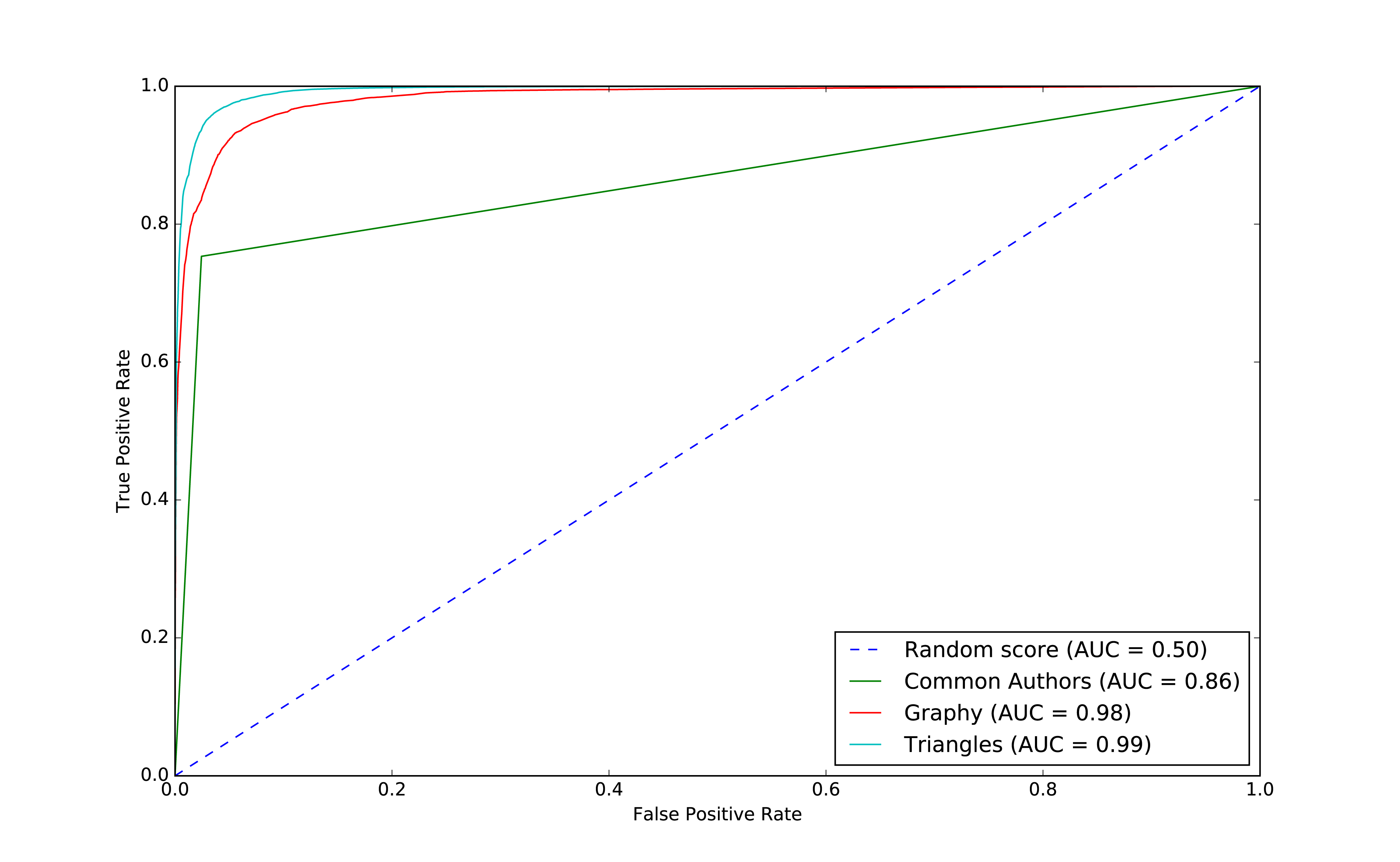
Figure 8-13. ROC for triangles model
Our models have generally improved well and we’re in the high 90’s for our predicitive measures. And this is where things usually get difficult because the easiest gains have been made and yet there’s still room for improvement. Let’s look at how the important features have changed:
rf_model=triangle_model.stages[-1]plot_feature_importance(fields,rf_model.featureImportances)
The results of running that function can be seen in Figure 8-14:
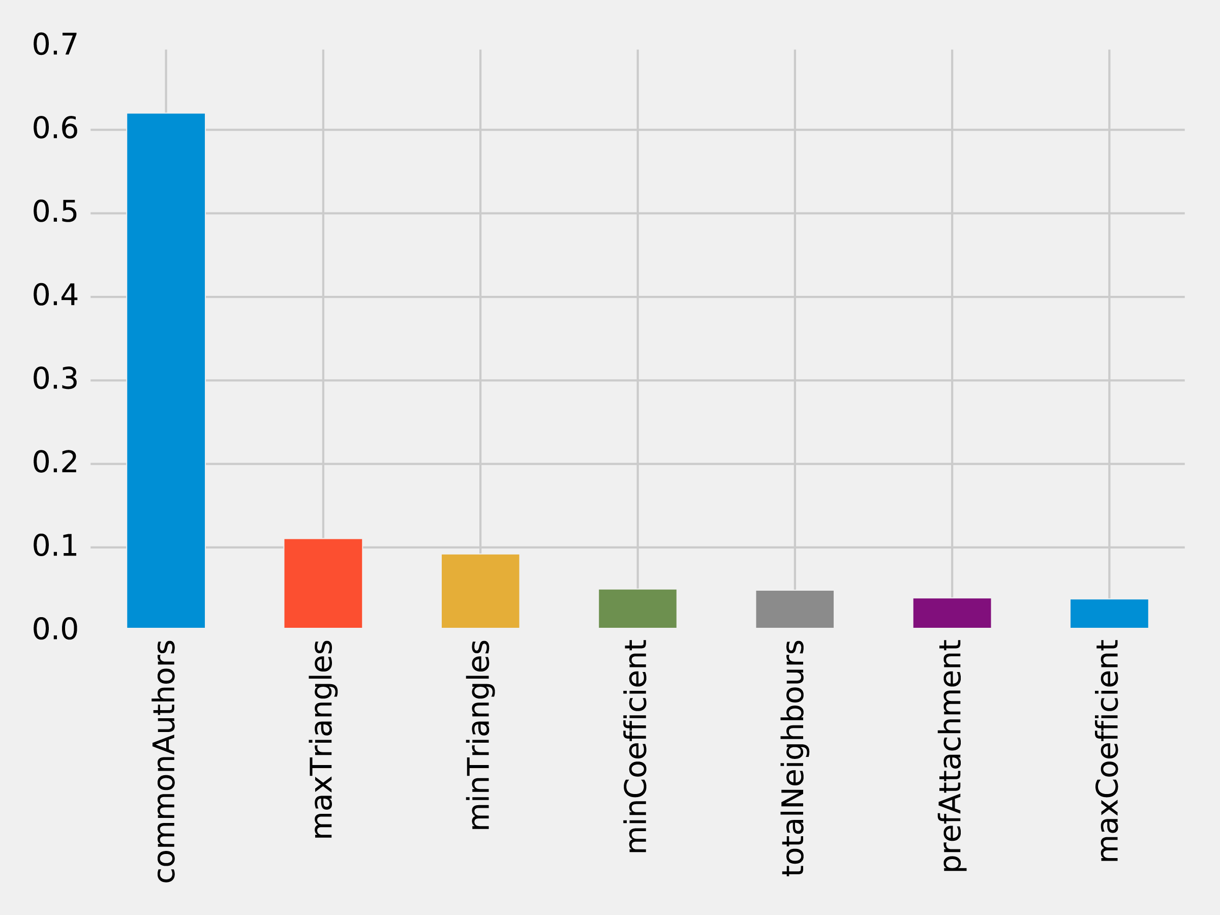
Figure 8-14. Feature Importance: Triangles Model
The common authors feature still has the most, single impact on our model. Perhaps we need to look at new areas and see what happens when we add in community information.
Predicting Links: Community Detection
We hypothesize that nodes that are in the same community are more likely to have a link between them if they don’t already. Moreover, we believe that the tighter a community, the more likely links are.
First, we’ll compute more coarse-grained communities using the Label Propagation algorithm in Neo4j.
We can do this by running the following query, which will store the community in the property partitionTrain for the training set and partitionTest for the test set:
CALL algo.labelPropagation("Author","CO_AUTHOR_EARLY","BOTH",{partitionProperty:"partitionTrain"});CALL algo.labelPropagation("Author","CO_AUTHOR","BOTH",{partitionProperty:"partitionTest"});
We’ll also compute finer-grained groups using the Louvain algorithm.
The Louvain algorithm returns intermediate clusters, and we’ll store the smallest of these clusters in the property louvainTrain for the training set and louvainTest for the test set:
CALL algo.louvain.stream("Author","CO_AUTHOR_EARLY", {includeIntermediateCommunities:true})YIELD nodeId, community, communitiesWITHalgo.getNodeById(nodeId)AS node, communities[0]ASsmallestCommunitySET node.louvainTrain = smallestCommunity;CALL algo.louvain.stream("Author","CO_AUTHOR", {includeIntermediateCommunities:true})YIELD nodeId, community, communitiesWITHalgo.getNodeById(nodeId)AS node, communities[0]ASsmallestCommunitySET node.louvainTest = smallestCommunity;
We’ll now create the following function to return the values from these algorithms:
def apply_community_features(data, partition_prop, louvain_prop):query ="""UNWIND $pairs AS pairMATCH (p1) WHERE id(p1) = pair.node1MATCH (p2) WHERE id(p2) = pair.node2RETURN pair.node1 AS node1,pair.node2 AS node2,CASE WHEN p1[$partitionProp] = p2[$partitionProp] THEN 1 ELSE 0 END AS samePartition,CASE WHEN p1[$louvainProp] = p2[$louvainProp] THEN 1 ELSE 0 END AS sameLouvain"""params = {"pairs": [{"node1": row["node1"],"node2": row["node2"]} for rowindata.collect()],"partitionProp": partition_prop,"louvainProp": louvain_prop}features = spark.createDataFrame(graph.run(query, params).to_data_frame())returndata.join(features, ["node1","node2"])
We can apply this function to our training and test DataFrames in Spark with the following code:
training_data=apply_community_features(training_data,"partitionTrain","louvainTrain")test_data=apply_community_features(test_data,"partitionTest","louvainTest")
We can run the following code to see whether pairs of nodes belong in the same partition:
plt.style.use('fivethirtyeight')fig,axs=plt.subplots(1,2,figsize=(18,7),sharey=True)charts=[(1,"have collaborated"),(0,"haven't collaborated")]forindex,chartinenumerate(charts):label,title=chartfiltered=training_data.filter(training_data["label"]==label)values=(filtered.withColumn('samePartition',F.when(F.col("samePartition")==0,"False").otherwise("True")).groupby("samePartition").agg(F.count("label").alias("count")).select("samePartition","count").toPandas())values.set_index("samePartition",drop=True,inplace=True)values.plot(kind="bar",ax=axs[index],legend=None,title=f"Authors who {title} (label={label})")axs[index].xaxis.set_label_text("Same Partition")plt.tight_layout()plt.show()
We see the results of running that code in Figure 8-15.
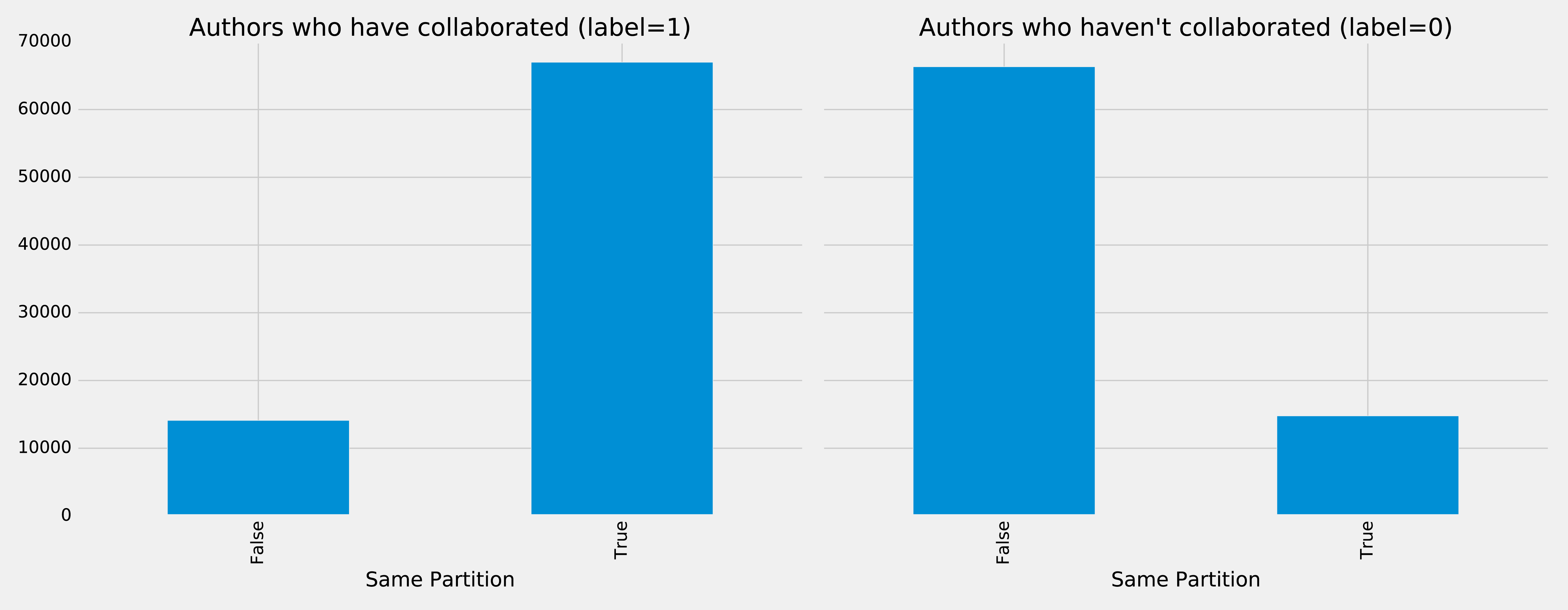
Figure 8-15. Same Partitions
It looks like this feature could be quite predictive - authors who have collaborated are much more likely to be in the same partition than those that haven’t. We can do the same thing for the Louvain clusters by running the following code:
plt.style.use('fivethirtyeight')fig,axs=plt.subplots(1,2,figsize=(18,7),sharey=True)charts=[(1,"have collaborated"),(0,"haven't collaborated")]forindex,chartinenumerate(charts):label,title=chartfiltered=training_data.filter(training_data["label"]==label)values=(filtered.withColumn('sameLouvain',F.when(F.col("sameLouvain")==0,"False").otherwise("True")).groupby("sameLouvain").agg(F.count("label").alias("count")).select("sameLouvain","count").toPandas())values.set_index("sameLouvain",drop=True,inplace=True)values.plot(kind="bar",ax=axs[index],legend=None,title=f"Authors who {title} (label={label})")axs[index].xaxis.set_label_text("Same Louvain")plt.tight_layout()plt.show()
We see the results of running that code in Figure 8-16.
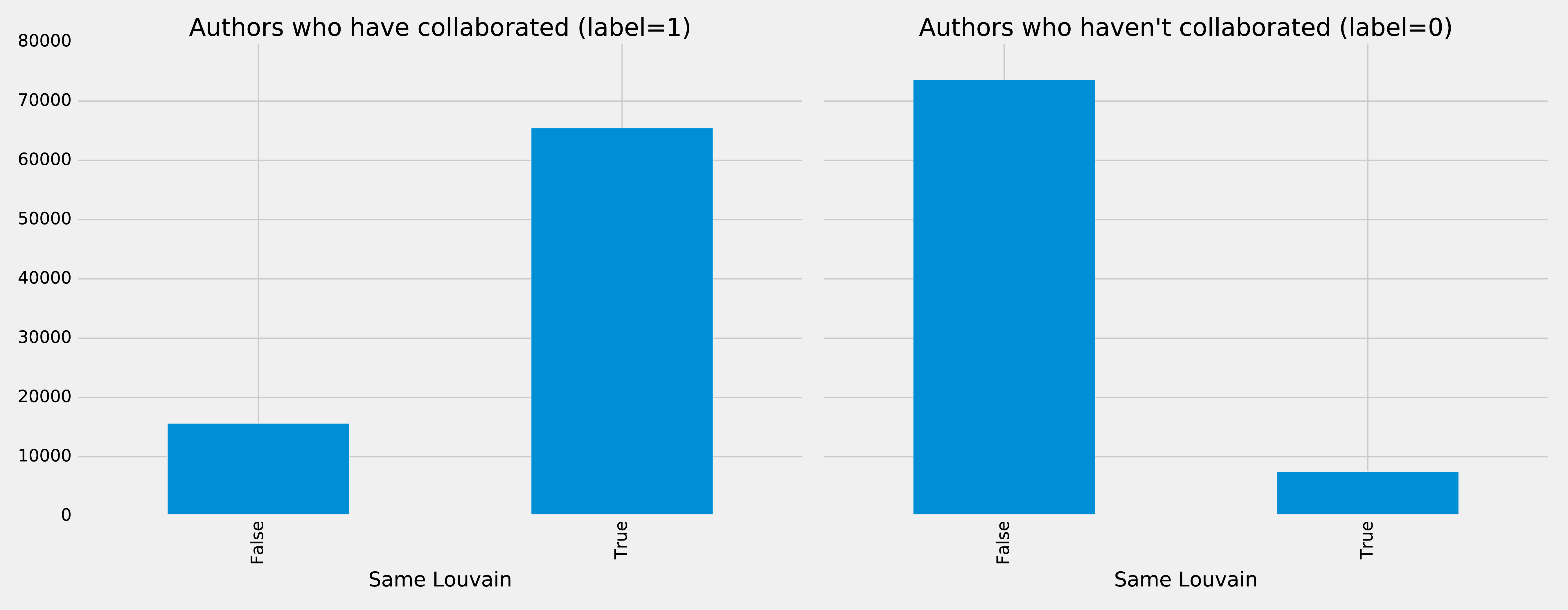
Figure 8-16. Same Louvain
It looks like this feature could be quite predictive as well - authors who have collaborated are likely to be in the same cluster, and those that haven’t are very unlikely to be in the same cluster.
We can train another model by running the following code:
fields=["commonAuthors","prefAttachment","totalNeighbours","minTriangles","maxTriangles","minCoefficient","maxCoefficient","samePartition","sameLouvain"]community_model=train_model(fields,training_data)
And now let’s evaluate the model and disply the results:
community_results=evaluate_model(community_model,test_data)display_results(community_results)
| Measure | Score |
|---|---|
accuracy |
0.995780 |
recall |
0.956467 |
precision |
0.978444 |
Some of our measures have improved, so let’s plot the ROC curve for all our models by running the following code:
plt,fig=create_roc_plot()add_curve(plt,"Common Authors",basic_results["fpr"],basic_results["tpr"],basic_results["roc_auc"])add_curve(plt,"Graphy",graphy_results["fpr"],graphy_results["tpr"],graphy_results["roc_auc"])add_curve(plt,"Triangles",triangle_results["fpr"],triangle_results["tpr"],triangle_results["roc_auc"])add_curve(plt,"Community",community_results["fpr"],community_results["tpr"],community_results["roc_auc"])plt.legend(loc='lower right')plt.show()
We see the output in Figure 8-17.
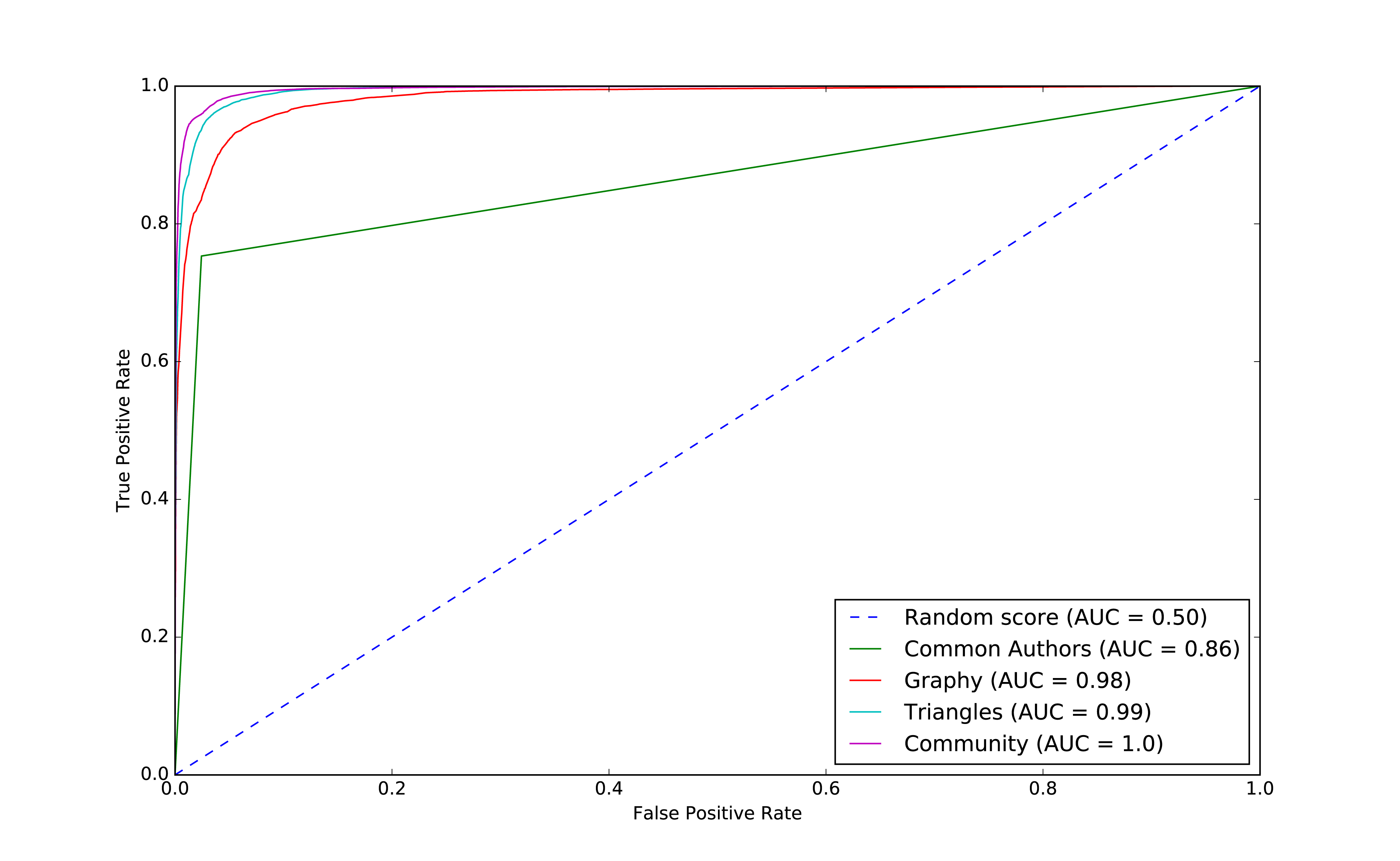
Figure 8-17. ROC for community model
We can see improvements with the addition of the community model, so let’s see which are the most important features.
rf_model=community_model.stages[-1]plot_feature_importance(fields,rf_model.featureImportances)
The results of running that function can be seen in Figure 8-18:
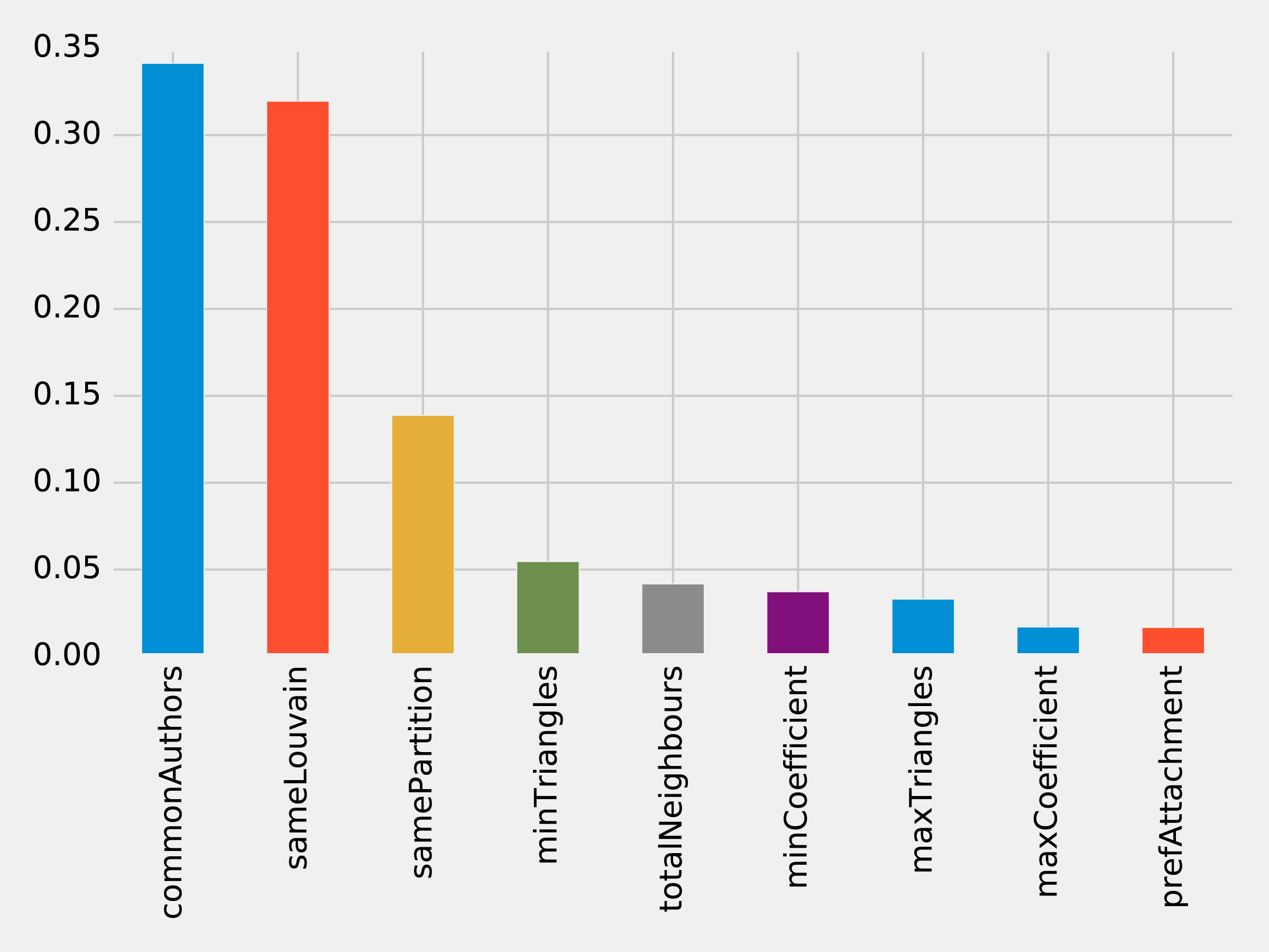
Figure 8-18. Feature Importance: Community Model
Although the common authors model is overall very important, it’s good to avoid having an overly dominant element that might skew predictions on new data. Community detection algorithms had a lot of influence in our last model with all the features included and helps round out our predicitive approach.
We’ve seen in our examples that simple graph-based features are a good start and then as we add more graphy and graph algorithm based features, we continue to improve our predictive measures. We now have a good, balanced model for predicting co-authorship links.
Using graphs for connected features extraction can significantly improve our predictions. The ideal graph features and algorithms vary depending on the attributes of our data, including the network domain and graph shape. We suggest first considering the predictive elements within your data and testing hypotheses with different types of connected features before finetuning.
Note
Reader Exercises
There are several areas we could investigate and ways to build other models. You’re encouraged to explore some of these ideas.
-
How predictive is our model on conference data we did not include?
-
When testing new data, what happens when we remove some features?
-
Does splitting the years differently for training and testing impact our predictions?
-
This dataset also has citations between papers, can we use that data to generate different features or predict future citations?
Wrapping Things Up
In this chapter, we looked at using graph features and algorithms to enhance machine learning. We covered a few preliminary concepts and then walked through a detailed example integrating Neo4j and Apache Spark for link prediction. We illustrated how to evaluate random forest classifier models and incorporate various types of connected features to improve results.
Summary
In this book, we’ve covered graph concepts as well as processing platforms and analytics. We then walked through many practical examples of how to use graph algorithms in Apache Spark and Neo4j. We finished with how graphs enhance machine learning.
Graph algorithms are the powerhouse behind the analysis of real-world systems – from preventing fraud and optimizing call routing to predicting the spread of the flu. We hope you join us and develop your own unique solutions that take advantage of today’s highly connected data.
1 https://www.nature.com/articles/nature11421
2 http://www.connectedthebook.com
3 https://developer.amazon.com/fr/blogs/alexa/post/37473f78-6726-4b8a-b08d-6b0d41c62753/Alexa%20Skills%20Kit
4 https://www.sciencedirect.com/science/article/pii/S0957417418304470?via%3Dihub
5 https://arxiv.org/abs/1706.02216
6 https://arxiv.org/abs/1403.6652
7 https://arxiv.org/abs/1704.08829
8 https://www.cs.umd.edu/~shobeir/papers/fakhraei_kdd_2015.pdf
9 https://pdfs.semanticscholar.org/398f/6844a99cf4e2c847c1887bfb8e9012deccb3.pdf
10 https://www.cs.cornell.edu/home/kleinber/link-pred.pdf
11 https://aminer.org/citation
12 http://keg.cs.tsinghua.edu.cn/jietang/publications/KDD08-Tang-et-al-ArnetMiner.pdf
13 https://lfs.aminer.cn/lab-datasets/citation/dblp.v10.zip
14 https://www3.nd.edu/~dial/publications/lichtenwalter2010new.pdf