Table of Contents for
Graph Algorithms
 Graph Algorithms
Published by
O'Reilly Media, Inc., 2019
Graph Algorithms
Published by
O'Reilly Media, Inc., 2019
- Cover
- nav
- Graph Algorithms
- Graph Algorithms
- Preface
- 1. Introduction
- 2. Graph Theory and Concepts
- 3. Graph Platforms and Processing
- 4. Pathfinding and Graph Search Algorithms
- 5. Centrality Algorithms
- 6. Community Detection Algorithms
- 7. Graph Algorithms in Practice
- 8. Using Graph Algorithms to Enhance Machine Learning
- About the Authors
Chapter 7. Graph Algorithms in Practice
Our approach to graph analysis will evolve as we become more familiar with the behavior of different algorithms on specific datasets. In this chapter, we’ll run through several examples to give a better feeling for how to tackle large-scale graph data analysis using datasets from Yelp and the U.S. Department of Transportation. We’ll walk through Yelp data analysis in Neo4j that includes a general over of the data, combining algorithms to make trip recommendations, and mining user and business data for consulting. In Spark, we’ll look into U.S. Airline data for understanding traffic patterns and delays as well as how airports are connected by different airlines.
Since pathfinding algorithms are straightforward, our examples will use these centrality and community detection algorithms:
-
PageRank to find influential Yelp reviewers and then correlate their ratings for specific hotels
-
Betweenness Centrality to uncover reviewers connected to multiple groups and then extract their preferences
-
Label Propagation with a projection to create super-categories of similar Yelp businesses
-
Degree Centrality to quickly identify airport hubs in the U.S. transport dataset
-
Strongly Connected Components to look at clusters of airport routes in the U.S.
Analyzing Yelp Data with Neo4j
Yelp 1 helps people find local businesses based on reviews, preferences, and recommendations. Over 163 million reviews have been written on the platform as of the middle of 2018. Yelp has been running the Yelp Dataset challenge 2 since 2013, a competition that encourages people to explore and research Yelp’s open dataset.
As of Round 12 of the challenge, the open dataset contained:
-
Over 7 million reviews plus tips
-
Over 1.5 million users and 280,000 pictures
-
Over 188,000 businesses with 1.4 million attributes
-
10 metropolitan areas
Since its launch, the dataset has become popular, with hundreds of academic papers 3 written about it. The Yelp dataset represents real data that is very well structured and highly interconnected. It’s a great showcase for graph algorithms that you can also download and explore.
The Yelp dataset also includes a social network. Figure 7-1 is a print screen of the friends section of Mark’s Yelp profile.
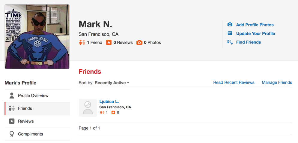
Figure 7-1. Mark’s Yelp Profile
Apart from the fact that Mark needs a few more friends, we’re all set to get started. For illustrating how we might analyse Yelp data in Neo4j, we’ll use a scenario where we work for a travel information business. First we’ll explore the Yelp data and then look at how to help people plan trips with our app. We walk through finding good recommendation for places to stay and things to do in major cities like Las Vegas. Another part of our business will involve consulting to travel-destination businesses. In one example we’ll help hotels identify influential visitors and then businesses that they should target for cross-promotion programs.
Data Import
There are many different methods for importing data into Neo4j, including the import tool 4, the LOAD CSV 5 command that we’ve seen in earlier chapters, and Neo4j Drivers 6.
For the Yelp dataset we need to do a one-off import of a large amount of data so the import tool is the best choice.
Graph Model
The Yelp data is represented in a graph model as shown in Figure 7-2.
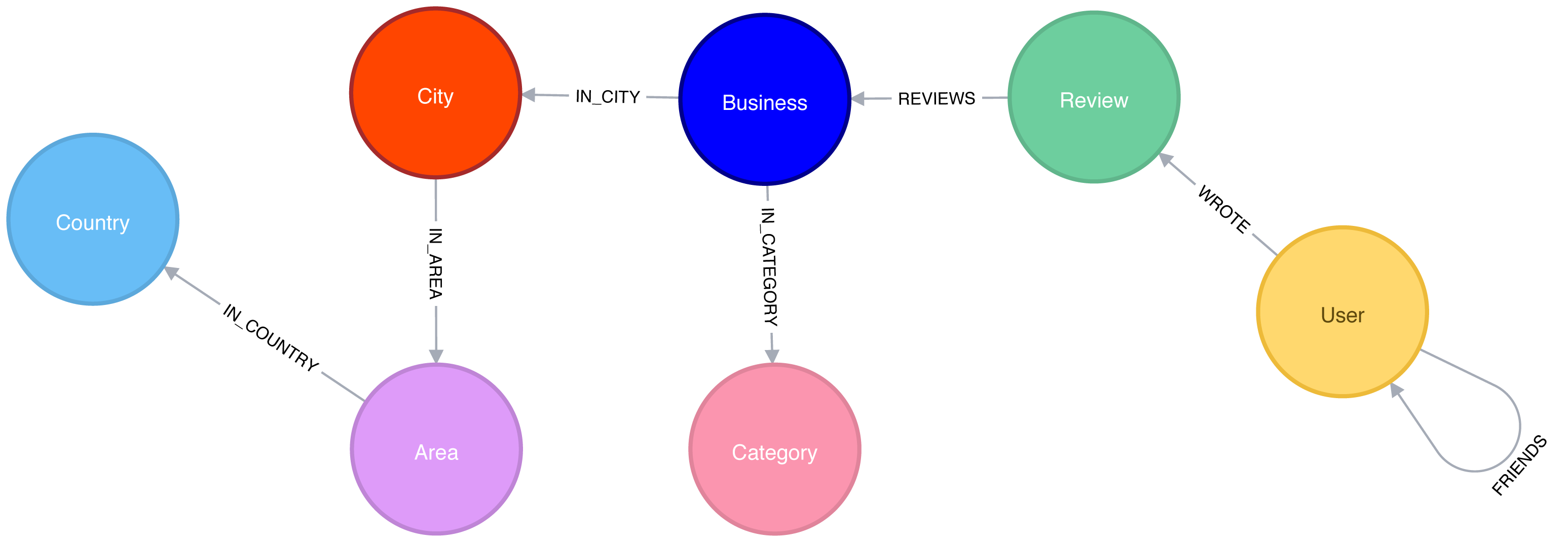
Figure 7-2. Yelp Graph Model
Our graph contains User labeled nodes, which have a FRIENDS relationship with other Users.
Users also WRITE Reviews and tips about Businesses.
All of the metadata is stored as properties of nodes, except for Categories of the Businesses, which are represented by separate nodes.
For location data we’ve extracted City, Area, and Country into the subgraph.
In other use cases it might make sense to extract other attributes to nodes such as date or collapse nodes to relationships such as reviews.
A Quick Overview of the Yelp Data
Once we have the data loaded in Neo4j, we’ll execute some exploratory queries. We’ll ask how many nodes are in each category or what types of relations exist, to get a feel for the Yelp data. Previously we’ve shown Cypher queries for our Neo4j examples, but we might be executing these from another programming language. Since Python is the go-to language for data scientists, we’ll use Neo4j’s Python driver in this section when we want to connect the results to other libraries from the Python ecosystem. If we just want to show the result of a query we’ll use Cypher directly.
We’ll also show how to combine Neo4j with the popular pandas library, which is effective for data wrangling outside of the database. We’ll see how to use the tabulate library to prettify the results we get from pandas, and how to create visual representations of data using matplotlib.
We’ll also be using Neo4j’s APOC library of procedues to help write even more powerful Cypher queries.
Let’s first install the Python libraries:
pip install neo4j-driver tabulate pandas matplotlib
Once we’ve done that we’ll import those libraries:
fromneo4j.v1importGraphDatabaseimportpandasaspdfromtabulateimporttabulate
Importing matplotlib can be fiddly on Mac OS X, but the following lines should do the trick:
importmatplotlibmatplotlib.use('TkAgg')importmatplotlib.pyplotasplt
If we’re running on another operating system, the middle line may not be required.
And now let’s create an instance of the Neo4j driver pointing at a local Neo4j database:
driver=GraphDatabase.driver("bolt://localhost",auth=("neo4j","neo"))
Note
You’ll need to update the initialization of the driver to use your own host and credentials.
To get started, let’s look at some general numbers for nodes and relationships. The following code calculates the cardinalities of node labels (counts the number of nodes for each label) in the database:
result={"label":[],"count":[]}withdriver.session()assession:labels=[row["label"]forrowinsession.run("CALL db.labels()")]forlabelinlabels:query=f"MATCH (:`{label}`) RETURN count(*) as count"count=session.run(query).single()["count"]result["label"].append(label)result["count"].append(count)df=pd.DataFrame(data=result)(tabulate(df.sort_values("count"),headers='keys',tablefmt='psql',showindex=False))
If we run that code we’ll see how many nodes we have for each label:
| label | count |
|---|---|
Country |
17 |
Area |
54 |
City |
1093 |
Category |
1293 |
Business |
174567 |
User |
1326101 |
Review |
5261669 |
We could also create a visual representation of the cardinalities, with the following code:
plt.style.use('fivethirtyeight')ax=df.plot(kind='bar',x='label',y='count',legend=None)ax.xaxis.set_label_text("")plt.yscale("log")plt.xticks(rotation=45)plt.tight_layout()plt.show()
We can see the chart that gets generated by this code in Figure 7-3. Note that this chart is using log scale.
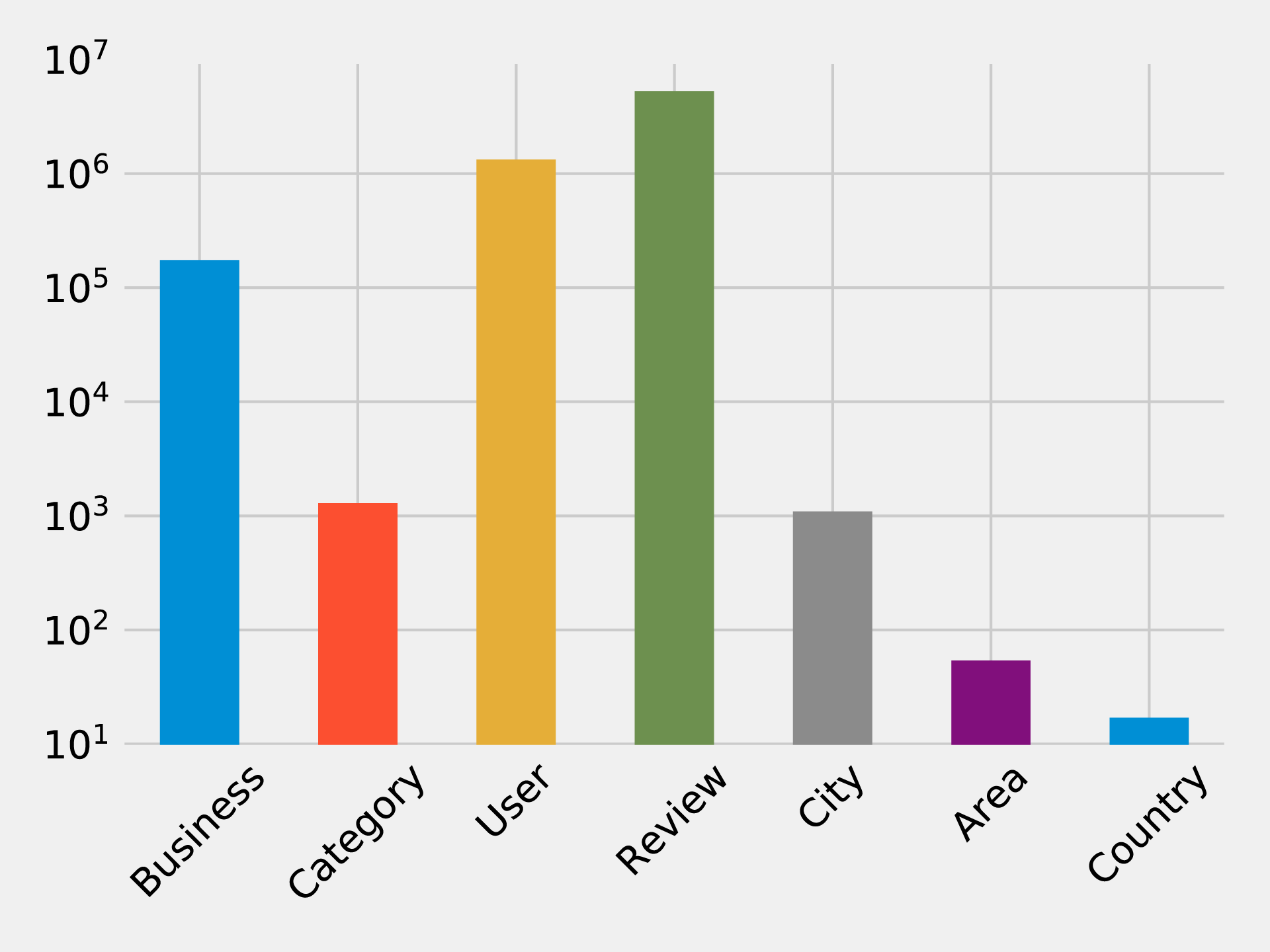
Figure 7-3. Number of Nodes for each Label Category
Similarly, we can calculate the cardinalities of relationships as well:
result={"relType":[],"count":[]}withdriver.session()assession:rel_types=[row["relationshipType"]forrowinsession.run("CALL db.relationshipTypes()")]forrel_typeinrel_types:query=f"MATCH ()-[:`{rel_type}`]->() RETURN count(*) as count"count=session.run(query).single()["count"]result["relType"].append(rel_type)result["count"].append(count)df=pd.DataFrame(data=result)(tabulate(df.sort_values("count"),headers='keys',tablefmt='psql',showindex=False))
If we run that code we’ll see the number of each type of relationship:
| relType | count |
|---|---|
IN_COUNTRY |
54 |
IN_AREA |
1154 |
IN_CITY |
174566 |
IN_CATEGORY |
667527 |
WROTE |
5261669 |
REVIEWS |
5261669 |
FRIENDS |
10645356 |
We can see a chart of the cardinalities in Figure 7-4. As with the node cardinalities chart, this chart is using log scale.
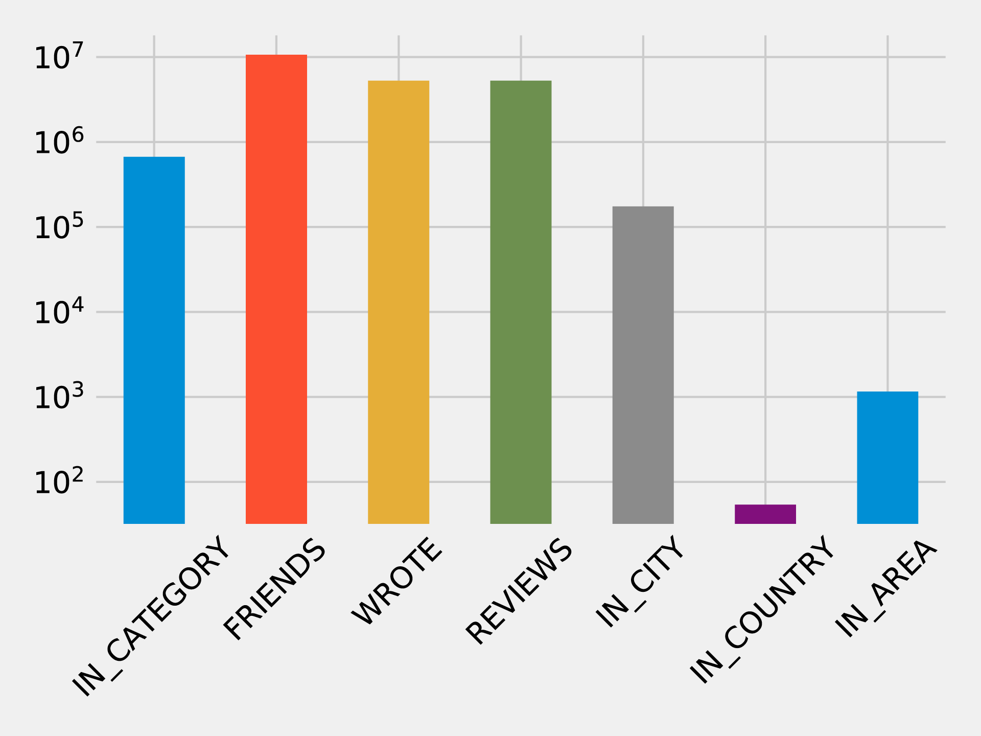
Figure 7-4. Number of Relationships for each Relationship Type
These queries shouldn’t reveal anything surprising, but it’s useful to get a general feel for what’s in the data. This can also serve as a quick check that the data imported correctly.
We assume Yelp has many hotels reviews but it makes sense to check before we focus on that sector. We can find out how many hotel businesses are in that data and how many reviews they have by running the following query.
MATCH(category:Category {name:"Hotels"})RETURNsize((category)<-[:IN_CATEGORY]-())ASbusinesses,size((:Review)-[:REVIEWS]->(:Business)-[:IN_CATEGORY]->(category))ASreviews
If we run that query we’ll see this output:
| businesses | reviews |
|---|---|
2683 |
183759 |
We have a good number of businesses to work with, and a lot of reviews! In the next section we’ll explore the data further with our business scenario.
Trip Planning App
To get started on adding well-liked recommendations to our app, we start by finding the most rated hotels as a heuristic for popular choices for reservations. We can add in how well they’ve been rated to understand the actual experience.
In order to look at the 10 hotels with the most reviews and plot their rating distributions, we use the following code:
# Find the top 10 hotels with the most reviewsquery="""MATCH (review:Review)-[:REVIEWS]->(business:Business),(business)-[:IN_CATEGORY]->(category:Category {name: $category}),(business)-[:IN_CITY]->(:City {name: $city})RETURN business.name AS business, collect(review.stars) AS allReviewsORDER BY size(allReviews) DESCLIMIT 10"""fig=plt.figure()fig.set_size_inches(10.5,14.5)fig.subplots_adjust(hspace=0.4,wspace=0.4)withdriver.session()assession:params={"city":"Las Vegas","category":"Hotels"}result=session.run(query,params)forindex,rowinenumerate(result):business=row["business"]stars=pd.Series(row["allReviews"])total=stars.count()average_stars=stars.mean().round(2)# Calculate the star distributionstars_histogram=stars.value_counts().sort_index()stars_histogram/=float(stars_histogram.sum())# Plot a bar chart showing the distribution of star ratingsax=fig.add_subplot(5,2,index+1)stars_histogram.plot(kind="bar",legend=None,color="darkblue",title=f"{business}\nAve: {average_stars}, Total: {total}")plt.tight_layout()plt.show()
You can see we’ve constrained by city and category to focus on Las Vegas hotels. If we run that code we’ll get the chart in Figure 7-5. Note that the X axis represents the number of stars the hotel was rated and the Y axis represents the overall precentage of each rating.
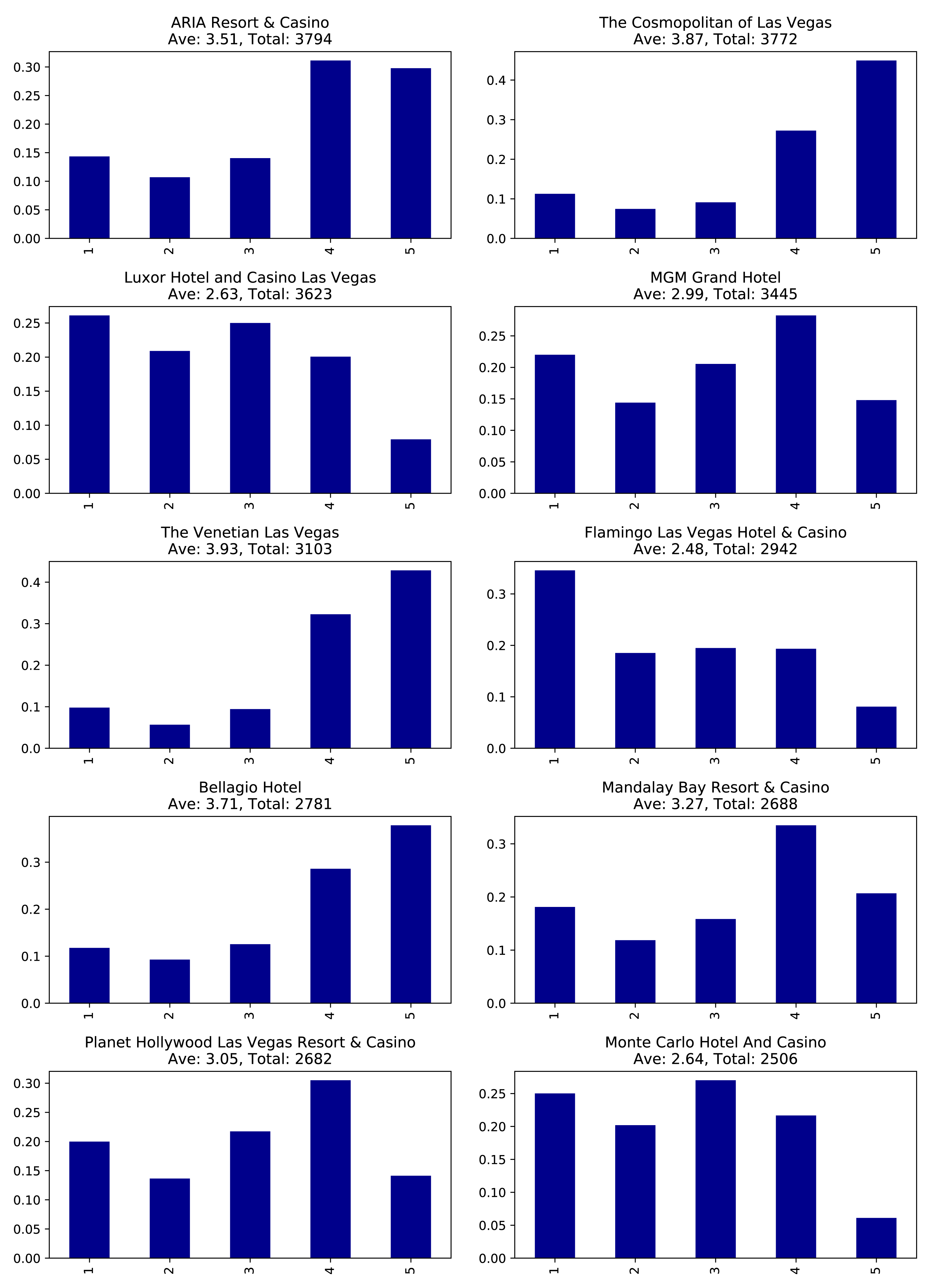
Figure 7-5. Most reviewed hotels
These hotels have lots of reviews, far more than anyone would be likely to read. It would be better to show our users the content from the most relevant reviews and make them more prominent on our app.
To do this analysis, we’ll move from basic graph exploration to using graph algorithms.
Finding Influential Hotels Reviewers
One way we can decide which reviews to post is by ordering reviews based on the influence of the reviewer on Yelp.
We’ll run the PageRank algorithm over the projected graph of all users that have reviewed at least 3 hotels. Remember from earlier chapters that a projection can help filter out unessential information as well add relationship data (sometimes inferred). We’ll use Yelp’s friend graph (introduced in ???) as the relationships between users. The PageRank algorithm will uncover those reviewers with more sway over more users, even if they are not direct friends.
Note
If two people are Yelp friends there are two FRIENDS relationships between them.
For example, if A and B are friend there will be a FRIENDS relationship from A to B and another from B to A.
We need to write a query that projects a subgraph of users with more than 3 reviews and then executes the PageRank algorithm over that projected subgraph.
It’s easier to understand how the subgraph projection works with a small example. Figure 7-6 shows a graph of 3 mutual friends - Mark, Arya, and Praveena. Mark and Praveena have both reviewed 3 hotels and will be part of the projected graph. Arya, on the other hand, has only reviewed one hotel and will therefore be excluded from the projection.
Figure 7-6. A sample Yelp graph
Our projected graph will only include Mark and Praveena, as show in Figure 7-7.
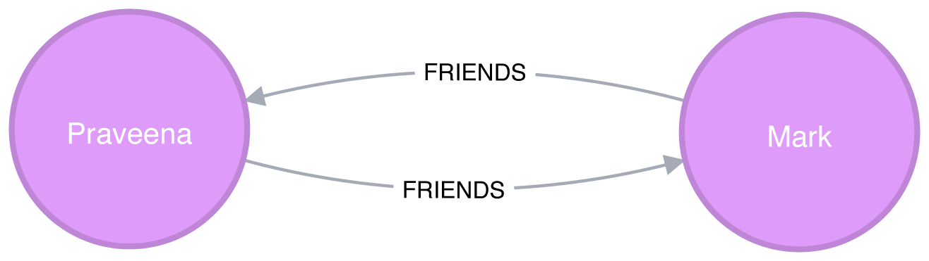
Figure 7-7. Our sample projected graph
Now that we’ve seen how graph projections works, let’s move forward. The following query executes the PageRank algorithm over our projected graph and stores the result in the hotelPageRank property on each node:
CALL algo.pageRank('MATCH (u:User)-[:WROTE]->()-[:REVIEWS]->()-[:IN_CATEGORY]->(:Category {name: $category})WITH u, count(*) AS reviewsWHERE reviews >= $cutOffRETURN id(u) AS id','MATCH (u1:User)-[:WROTE]->()-[:REVIEWS]->()-[:IN_CATEGORY]->(:Category {name: $category})MATCH (u1)-[:FRIENDS]->(u2)RETURN id(u1) AS source, id(u2) AS target',{graph:"cypher", write:true, writeProperty:"hotelPageRank",params: {category:"Hotels", cutOff: 3}})
You might notice that we didn’t set a dampening factor or maximum iteration limit that was discussed in chapter 5.
If not explicitly set, Neo4j defaults to a 0.85 dampening factor with max iterations set to 20.
Now let’s look at the distribution of the PageRank values so we’ll know how to filter our data:
MATCH(u:User)WHEREexists(u.hotelPageRank)RETURNcount(u.hotelPageRank)AScount,avg(u.hotelPageRank)ASave,percentileDisc(u.hotelPageRank, 0.5)AS`50%`,percentileDisc(u.hotelPageRank, 0.75)AS`75%`,percentileDisc(u.hotelPageRank, 0.90)AS`90%`,percentileDisc(u.hotelPageRank, 0.95)AS`95%`,percentileDisc(u.hotelPageRank, 0.99)AS`99%`,percentileDisc(u.hotelPageRank, 0.999)AS`99.9%`,percentileDisc(u.hotelPageRank, 0.9999)AS`99.99%`,percentileDisc(u.hotelPageRank, 0.99999)AS`99.999%`,percentileDisc(u.hotelPageRank, 1)AS`100%`
If we run that query we’ll see this output:
| count | ave | 50% | 75% | 90% | 95% | 99% | 99.9% | 99.99% | 99.999% | 100% |
|---|---|---|---|---|---|---|---|---|---|---|
1326101 |
0.1614898 |
0.15 |
0.15 |
0.157497 |
0.181875 |
0.330081 |
1.649511 |
6.825738 |
15.27376 |
22.98046 |
To interpret this percentile table, the 90% value of 0.157497 means that 90% of users had a lower PageRank score, which is close to the overall average. 99.99% reflects the influence rank for the top 0.0001% reviewers and 100% is simply the highest PageRank score.
It’s interesting that 90% of our users have a score of under 0.16, which is only marginally more than the 0.15 that they are initialized with by the PageRank algorithm. It seems like this data reflects a power-law distribution with a few very influential reviewers.
Since we’re interested in finding only the most influential users, we’ll write a query that only finds users with a PageRank score in the top 0.001% of all users. The following query finds reviewers with a higher than 1.64951 PageRank score (notice that correlates to the 99.9% group):
// Only find users that have a hotelPageRank score in the top 0.001% of usersMATCH(u:User)WHEREu.hotelPageRank > 1.64951// Find the top 10 of those usersWITHuORDER BYu.hotelPageRankDESCLIMIT10RETURNu.nameASname,u.hotelPageRankASpageRank,size((u)-[:WROTE]->()-[:REVIEWS]->()-[:IN_CATEGORY]->(:Category {name:"Hotels"}))AShotelReviews,size((u)-[:WROTE]->())AStotalReviews,size((u)-[:FRIENDS]-())ASfriends
If we run that query we’ll get these results:
| name | pageRank | hotelReviews | totalReviews | friends |
|---|---|---|---|---|
Phil |
17.361242 |
15 |
134 |
8154 |
Philip |
16.871013 |
21 |
620 |
9634 |
Carol |
12.416060999999997 |
6 |
119 |
6218 |
Misti |
12.239516000000004 |
19 |
730 |
6230 |
Joseph |
12.003887499999998 |
5 |
32 |
6596 |
Michael |
11.460049 |
13 |
51 |
6572 |
J |
11.431505999999997 |
103 |
1322 |
6498 |
Abby |
11.376136999999998 |
9 |
82 |
7922 |
Erica |
10.993773 |
6 |
15 |
7071 |
Randy |
10.748785999999999 |
21 |
125 |
7846 |
These results show us that Phil is the most credible reviewer, although he hasn’t reviewed a lot of hotels. He’s likely connected to some very influential people, but if we wanted a stream of new reviews, his profile wouldn’t be the best selection. Philip has a slightly lower score, but has the most friends and has written 5 times more reviews than Phil. While J has written the most reviews of all and has a reasonable number of friends, J’s PageRank score isn’t the highest – but it’s still in the top 10. For our app we choose to highlight hotel reviews from Phil, Philip, and J to give us the right mix of influencers and number of reviews.
Now that we’ve improved our in-app recommendations with relevant reviews, let’s turn to our other side of the business; consulting.
Travel Business Consulting
As part of our consulting, hotels subscribe to be alerted when an influential visitor writes about their stay so they can take any necessary action. First, we’ll look at ratings of the Bellagio sorted by the most influential reviewers. Then we’ll also help the Bellagio identify target partner businesses for cross-promotion programs.
query ="""\MATCH (b:Business {name: $hotel})MATCH (b)<-[:REVIEWS]-(review)<-[:WROTE]-(user)WHERE exists(user.hotelPageRank)RETURN user.name AS name,user.hotelPageRank AS pageRank,review.stars AS stars"""withdriver.session()assession:params = {"hotel":"Bellagio Hotel"}df = pd.DataFrame([dict(record) for recordinsession.run(query, params)])df = df.round(2)df = df[["name","pageRank","stars"]]top_reviews = df.sort_values(by=["pageRank"],ascending=False).head(10)print(tabulate(top_reviews, headers='keys', tablefmt='psql', showindex=False))
If we run that code we’ll get these results:
| name | pageRank | stars |
|---|---|---|
Misti |
12.239516000000004 |
5 |
Michael |
11.460049 |
4 |
J |
11.431505999999997 |
5 |
Erica |
10.993773 |
4 |
Christine |
10.740770499999998 |
4 |
Jeremy |
9.576763499999998 |
5 |
Connie |
9.118103499999998 |
5 |
Joyce |
7.621449000000001 |
4 |
Henry |
7.299146 |
5 |
Flora |
6.7570075 |
4 |
Note that these results are different than [tag=best-reviewers-query] because we are only looking at reviewers that have rated the Bellagio.
Things are looking good for the hotel customer service team at the Bellagio - the top 10 influencers all give their hotel good rankings. They may want to encourage these people to visit again and share their experience.
Are there any influential guests who haven’t had such a good experience? We can run the following code to find the guests with the highest PageRank that rated their experience with fewer than 4 stars:
query ="""\MATCH (b:Business {name: $hotel})MATCH (b)<-[:REVIEWS]-(review)<-[:WROTE]-(user)WHERE exists(user.hotelPageRank) AND review.stars < $goodRatingRETURN user.name AS name,user.hotelPageRank AS pageRank,review.stars AS stars"""withdriver.session()assession:params = {"hotel":"Bellagio Hotel","goodRating": 4 }df = pd.DataFrame([dict(record) for recordinsession.run(query, params)])df = df.round(2)df = df[["name","pageRank","stars"]]top_reviews = df.sort_values(by=["pageRank"],ascending=False).head(10)print(tabulate(top_reviews, headers='keys', tablefmt='psql', showindex=False))
If we run that code we’ll get these results:
| name | pageRank | stars |
|---|---|---|
Chris |
5.84 |
3 |
Lorrie |
4.95 |
2 |
Dani |
3.47 |
1 |
Victor |
3.35 |
3 |
Francine |
2.93 |
3 |
Rex |
2.79 |
2 |
Jon |
2.55 |
3 |
Rachel |
2.47 |
3 |
Leslie |
2.46 |
2 |
Benay |
2.46 |
3 |
Our highest ranked users, Chris and Lorrie, are amongst the top 1,000 most influential users (as per Table 7-4), so perhaps a personal outreach is warranted. Also, because many reviewers write during their stay, real-time alerts about influencers may facilitate even more positive interactions.
Bellagio cross promotion
After helping with finding influential reviewers, the Bellagio has now asked us to help identify other businesses for cross promotion with help from well connected customers. In our scenario, we recommend they increase their customer base by attracting new guests from different types of communities as a green-field opportunity. We can use the Betweenness Centrality algorithm to work out which Bellagio reviewers are not only well connected across the whole Yelp network but also may act as a bridge between different groups.
We’re only interested in finding influencers in Las Vegas so we’ll first tag those users:
MATCH(u:User)WHEREexists((u)-[:WROTE]->()-[:REVIEWS]->()-[:IN_CITY]->(:City {name:"Las Vegas"}))SETu:LasVegas
It would take a long time to run the Betweenness Centrality algorithm over our Las Vegas users, so instead we’ll use the Approximate Betweenness Centrality variant. This algorithm calculates a betweenness score by sampling nodes and only exploring shortest paths to a certain depth.
After some experimentation, we improved results with a few parameters set differently than the default values. We’ll use shortest paths of up to 4 hops (maxDepth of 4) and we’ll sample 20% of the nodes (probability of 0.2).
The following query will execute the algorithm, and store the result in the between property:
CALL algo.betweenness.sampled('LasVegas','FRIENDS',{write:true, writeProperty:"between", maxDepth: 4, probability: 0.2})
Before we use these scores in our queries let’s write a quick exploratory query to see how the scores are distributed:
MATCH(u:User)WHEREexists(u.between)RETURNcount(u.between)AScount,avg(u.between)ASave,toInteger(percentileDisc(u.between, 0.5))AS`50%`,toInteger(percentileDisc(u.between, 0.75))AS`75%`,toInteger(percentileDisc(u.between, 0.90))AS`90%`,toInteger(percentileDisc(u.between, 0.95))AS`95%`,toInteger(percentileDisc(u.between, 0.99))AS`99%`,toInteger(percentileDisc(u.between, 0.999))AS`99.9%`,toInteger(percentileDisc(u.between, 0.9999))AS`99.99%`,toInteger(percentileDisc(u.between, 0.99999))AS`99.999%`,toInteger(percentileDisc(u.between, 1))ASp100
If we run that query we’ll see this output:
| count | ave | 50% | 75% | 90% | 95% | 99% | 99.9% | 99.99% | 99.999% | 100% |
|---|---|---|---|---|---|---|---|---|---|---|
506028 |
320538.6014 |
0 |
10005 |
318944 |
1001655 |
4436409 |
34854988 |
214080923 |
621434012 |
1998032952 |
Half our users have a score of 0 meaning they are not well connected at all. The top 1% (99%) are on at least 4 million shortest paths between our set of 500,000 users. Considered together, we know that most of our users are poorly connected, but a few exert a lot of control over information; this is a classic behavior of small-world networks.
We can find out who our super-connectors are by running the following query:
MATCH(u:User)-[:WROTE]->()-[:REVIEWS]->(:Business {name:"Bellagio Hotel"})WHEREexists(u.between)RETURNu.nameASuser,toInteger(u.between)ASbetweenness,u.hotelPageRankASpageRank,size((u)-[:WROTE]->()-[:REVIEWS]->()-[:IN_CATEGORY]->(:Category {name:"Hotels"}))AShotelReviewsORDER BYu.betweenDESCLIMIT10
If we run that query we’ll see this output:
| user | betweenness | pageRank | hotelReviews |
|---|---|---|---|
Misti |
841707563 |
12.239516000000004 |
19 |
Christine |
236269693 |
10.740770499999998 |
16 |
Erica |
235806844 |
10.993773 |
6 |
Mike |
215534452 |
NULL |
2 |
J |
192155233 |
11.431505999999997 |
103 |
Michael |
161335816 |
5.105143 |
31 |
Jeremy |
160312436 |
9.576763499999998 |
6 |
Michael |
139960910 |
11.460049 |
13 |
Chris |
136697785 |
5.838922499999999 |
5 |
Connie |
133372418 |
9.118103499999998 |
7 |
We see some of the same people that we saw earlier in our PageRank query - Mike being an interesting exception. He was excluded from that calculation because he hasn’t reviewed enough hotels (3 was the cut off), but it seems like he’s quite well connected in the world of Las Vegas Yelp users.
In an effort to reach a wider variety of customers, we’re going to look at other preferences these “connectors” display to see what we should promote. Many of these users have also reviewed restaurants, so we write the following query to find out which ones they like best:
// Find the top 50 users who have reviewed the BellagioMATCH(u:User)-[:WROTE]->()-[:REVIEWS]->(:Business {name:"Bellagio Hotel"})WHEREu.between > 4436409WITHuORDER BYu.betweenDESC LIMIT50// Find the restaurants those users have reviewed in Las VegasMATCH(u)-[:WROTE]->(review)-[:REVIEWS]-(business)WHERE(business)-[:IN_CATEGORY]->(:Category {name:"Restaurants"})AND(business)-[:IN_CITY]->(:City {name:"Las Vegas"})// Only include restaurants that have more than 3 reviews by these usersWITHbusiness,avg(review.stars)ASaverageReview,count(*)ASnumberOfReviewsWHEREnumberOfReviews >= 3RETURNbusiness.nameASbusiness, averageReview, numberOfReviewsORDER BYaverageReviewDESC, numberOfReviewsDESCLIMIT10
This query finds our top 50 influential connectors and finds the top 10 Las Vegas restaurants where at least 3 of them have rated the restaurant. If we run that query we’ll see the following output:
| business | averageReview | numberOfReviews |
|---|---|---|
Jean Georges Steakhouse |
5.0 |
6 |
Sushi House Goyemon |
5.0 |
6 |
Art of Flavors |
5.0 |
4 |
é by José Andrés |
5.0 |
4 |
Parma By Chef Marc |
5.0 |
4 |
Yonaka Modern Japanese |
5.0 |
4 |
Kabuto |
5.0 |
4 |
Harvest by Roy Ellamar |
5.0 |
3 |
Portofino by Chef Michael LaPlaca |
5.0 |
3 |
Montesano’s Eateria |
5.0 |
3 |
We can now recommend that the Bellagio run a joint promotion with these restaurants to attract new guests from groups they might not typically reach. Super-connectors who rate the Bellagio well become our proxy for estimating which restaurants would catch the eye of new types of target visitors.
Now that we have helped the Bellagio reach new groups, we’re going to see how we can use community detection to further improve our app.
Finding similar categories
While our end-users are using the app to find hotels, we want to showcase other businesses they might be interested in. The Yelp dataset contains more than 1,000 categories, and it seems likely that some of those categories are similar to each other. We’ll use that similarity to make in-app recommendations for new businesses that our users will likely find interesting.
Our graph model doesn’t have any relationships between categories, but we can use the ideas described in “Monopartite, Bipartite, and K-Partite Graphs” to build a category similarity graph based on how businesses categorize themselves.
For example, imagine that only one business categorizes itself under both Hotels and Historical Tours, as seen in Figure 7-8.
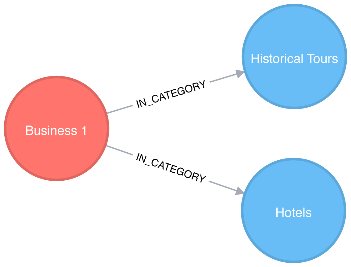
Figure 7-8. A business with two categories
This would result in a projected graph that has a link between Hotels and Historical Tours with a weight of 1, as seen in Figure 7-9.
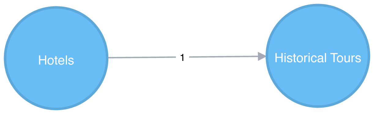
Figure 7-9. A projected categories graph
In this case, we don’t actually have to create the similarity graph – we can run a community detection algorithm, such as Label Propagation, over a projected similarity graph. Using Label Propagation will effectively cluster businesses around the super category they have most in common.
CALL algo.labelPropagation.stream('MATCH (c:Category) RETURN id(c) AS id','MATCH (c1:Category)<-[:IN_CATEGORY]-()-[:IN_CATEGORY]->(c2:Category)WHERE id(c1) < id(c2)RETURN id(c1) AS source, id(c2) AS target, count(*) AS weight',{graph:"cypher"})YIELD nodeId, labelMATCH(c:Category)WHEREid(c) = nodeIdMERGE (sc:SuperCategory {name:"SuperCategory-"+ label})MERGE (c)-[:IN_SUPER_CATEGORY]->(sc)
Let’s give those super categories a friendlier name - the name of their largest category works well here:
MATCH(sc:SuperCategory)<-[:IN_SUPER_CATEGORY]-(category)WITHsc, category, size((category)<-[:IN_CATEGORY]-())assizeORDER BYsizeDESCWITHsc,collect(category.name)[0]asbiggestCategorySETsc.friendlyName ="SuperCat "+ biggestCategory
We can see a sample of categories and super categories in Figure 7-10.
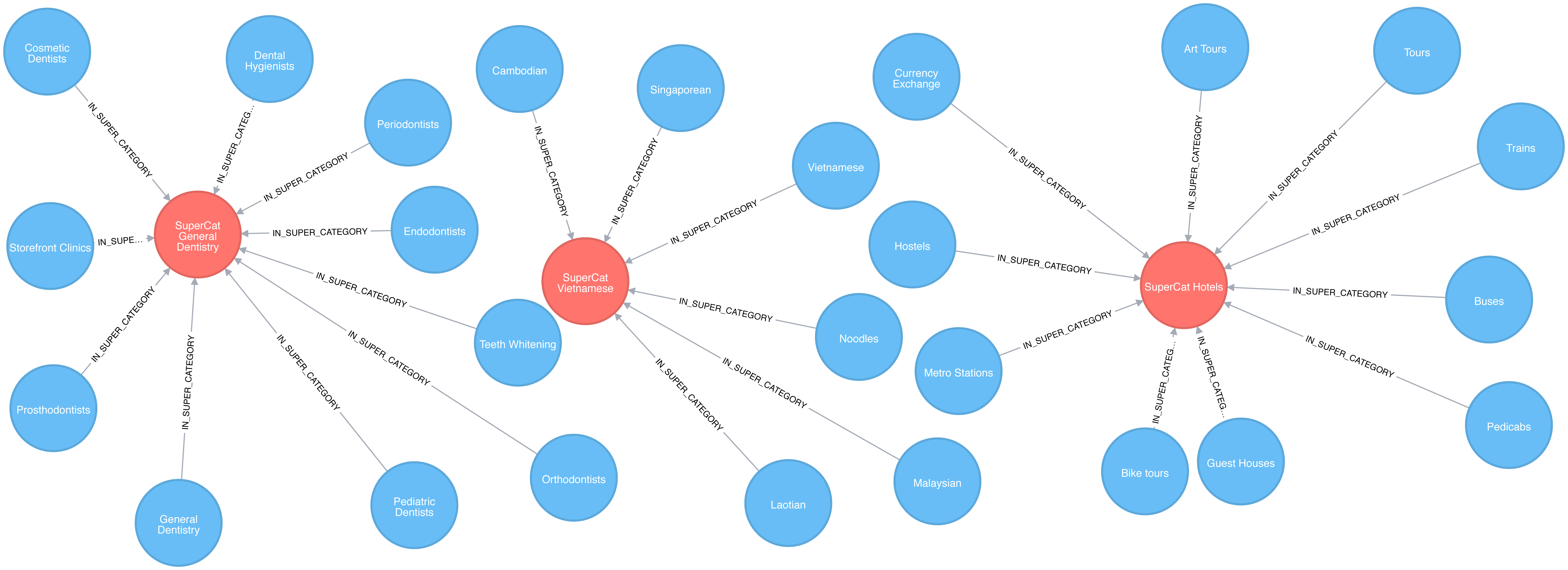
Figure 7-10. Categories and Super Categories
The following query find the most prevalent similar categories to Hotels in Las Vegas:
MATCH(hotels:Category {name:"Hotels"}),(lasVegas:City {name:"Las Vegas"}),(hotels)-[:IN_SUPER_CATEGORY]->()<-[:IN_SUPER_CATEGORY]-(otherCategory)RETURNotherCategory.nameASotherCategory,size((otherCategory)<-[:IN_CATEGORY]-(:Business)-[:IN_CITY]->(lasVegas))ASbusinessesORDER BYcountDESCLIMIT10
If we run that query we’ll see these results:
| otherCategory | businesses |
|---|---|
Tours |
189 |
Car Rental |
160 |
Limos |
84 |
Resorts |
73 |
Airport Shuttles |
52 |
Taxis |
35 |
Vacation Rentals |
29 |
Airports |
25 |
Airlines |
23 |
Motorcycle Rental |
19 |
Do these results seem odd? Obviously taxis and tours aren’t hotels but remember that this is based on self-reported catagorizations. What the Label Propagation is really showing us in this similiarity group are adjacent businesses and services.
Now let’s find some businesses with an above average rating in each of those categories.
// Find businesses in Las Vegas that have the same SuperCategory as HotelsMATCH(hotels:Category {name:"Hotels"}),(hotels)-[:IN_SUPER_CATEGORY]->()<-[:IN_SUPER_CATEGORY]-(otherCategory),(otherCategory)<-[:IN_CATEGORY]-(business)WHERE(business)-[:IN_CITY]->(:City {name:"Las Vegas"})// Select 10 random categories and calculate the 90th percentile star ratingWITHotherCategory,count(*)AScount,collect(business)ASbusinesses,percentileDisc(business.averageStars, 0.9)ASp90StarsORDER BYrand()DESCLIMIT10// Select businesses from each of those categories that have an average rating higher// than the 90th percentile using a pattern comprehensionWITHotherCategory, [binbusinesseswhereb.averageStars >= p90Stars]ASbusinesses// Select one business per categoryWITHotherCategory, businesses[toInteger(rand() * size(businesses))]ASbusinessRETURNotherCategory.nameASotherCategory,business.nameASbusiness,business.averageStarsASaverageStars
In this query we use a pattern comprehension 7 for the first time.
Pattern comprehension is a syntax construction for creating a list based on pattern matching. It finds a specified pattern using a MATCH clause with a WHERE clause for predicates and then yields a custom projection. This Cypher feature was added in 2016 with inspiration from GraphQL.
If we run that query we’ll see these results:
| otherCategory | business | averageStars |
|---|---|---|
Motorcycle Rental |
Adrenaline Rush Slingshot Rentals |
5.0 |
Snorkeling |
Sin City Scuba |
5.0 |
Guest Houses |
Hotel Del Kacvinsky |
5.0 |
Car Rental |
The Lead Team |
5.0 |
Food Tours |
Taste BUZZ Food Tours |
5.0 |
Airports |
Signature Flight Support |
5.0 |
Public Transportation |
JetSuiteX |
4.6875 |
Ski Resorts |
Trikke Las Vegas |
4.833333333333332 |
Town Car Service |
MW Travel Vegas |
4.866666666666665 |
Campgrounds |
McWilliams Campground |
3.875 |
We could then make real-time recommendations based on a user’s immediate app behavior. For example, while users are looking at Las Vegas hotels, we can now highlight a variety of Las Vegas businesses with good ratings that are all in the hotel super category.
We can generalize these approaches to any business category, such as restaurants or theaters, in any location.
Note
Reader Exercises
-
Can you plot how the reviews for a city’s hotels vary over time?
-
What about for a particular hotel or other business?
-
Are there any trends (seasonal or otherwise) in popularity?
-
Do the most influential reviewers connect to (out-link) to only other influential reviewers?
Analyzing Airline Flight Data with Apache Spark
In this section, we’ll use a different scenario to illustrate the analysis of U.S. airport data in Apaches Spark. Imagine we’re a data scientist with a considerable travel schedule and would like to dig into information about airline flights and delays. We’ll first explore airport and flight information and then look deeper into delays at two specific airports. Community detection will be used to analyze routes and find the best use of our frequent flyer points.
The U.S. Bureau of Transportation Statistics makes available a significant amount of transportation information 8. For our analysis, we’ll use their air travel on-time performance data from May 2018. This includes flights originating and ending in the U.S in that month. In order to add more detail about airports, such as location information, we’ll also load data from a separate source, OpenFlights 9.
Let’s load the data in Spark. As in the previous sections, our data is in CSV files which are available on the Github repository.
nodes=spark.read.csv("data/airports.csv",header=False)cleaned_nodes=(nodes.select("_c1","_c3","_c4","_c6","_c7").filter("_c3 = 'United States'").withColumnRenamed("_c1","name").withColumnRenamed("_c4","id").withColumnRenamed("_c6","latitude").withColumnRenamed("_c7","longitude").drop("_c3"))cleaned_nodes=cleaned_nodes[cleaned_nodes["id"]!="\\N"]relationships=spark.read.csv("data/188591317_T_ONTIME.csv",header=True)cleaned_relationships=(relationships.select("ORIGIN","DEST","FL_DATE","DEP_DELAY","ARR_DELAY","DISTANCE","TAIL_NUM","FL_NUM","CRS_DEP_TIME","CRS_ARR_TIME","UNIQUE_CARRIER").withColumnRenamed("ORIGIN","src").withColumnRenamed("DEST","dst").withColumnRenamed("DEP_DELAY","deptDelay").withColumnRenamed("ARR_DELAY","arrDelay").withColumnRenamed("TAIL_NUM","tailNumber").withColumnRenamed("FL_NUM","flightNumber").withColumnRenamed("FL_DATE","date").withColumnRenamed("CRS_DEP_TIME","time").withColumnRenamed("CRS_ARR_TIME","arrivalTime").withColumnRenamed("DISTANCE","distance").withColumnRenamed("UNIQUE_CARRIER","airline").withColumn("deptDelay",F.col("deptDelay").cast(FloatType())).withColumn("arrDelay",F.col("arrDelay").cast(FloatType())).withColumn("time",F.col("time").cast(IntegerType())).withColumn("arrivalTime",F.col("arrivalTime").cast(IntegerType())))g=GraphFrame(cleaned_nodes,cleaned_relationships)
We have to do some cleanup on the nodes as some airports don’t have valid airport codes.
We’ll give the columns more descriptive names and convert some items into appropriate numeric types.
We also need to make sure that we have columns named id, dst, and src as this is expected by Apache Spark’s GraphFrames library.
We’ll also create a separate DataFrame that maps airline codes to airline names. We’ll use this later in the chapter:
airlines_reference=(spark.read.csv("data/airlines.csv").select("_c1","_c3").withColumnRenamed("_c1","name").withColumnRenamed("_c3","code"))airlines_reference=airlines_reference[airlines_reference["code"]!="null"]
Exploratory Analysis
Let’s start with some exploratory analysis to see what the data looks like.
First let’s see how many airports we have:
g.vertices.count()
1435
And how many connections do we have between these airports?
g.edges.count()
616529
Popular airports
Which airports have the most departing flights? We can work out the number of outgoing flights from an airport using the Degree Centrality algorithm:
airports_degree=g.outDegrees.withColumnRenamed("id","oId")full_airports_degree=(airports_degree.join(g.vertices,airports_degree.oId==g.vertices.id).sort("outDegree",ascending=False).select("id","name","outDegree"))full_airports_degree.show(n=10,truncate=False)
If we run that code we’ll see the following output:
| id | name | outDegree |
|---|---|---|
ATL |
Hartsfield Jackson Atlanta International Airport |
33837 |
ORD |
Chicago O’Hare International Airport |
28338 |
DFW |
Dallas Fort Worth International Airport |
23765 |
CLT |
Charlotte Douglas International Airport |
20251 |
DEN |
Denver International Airport |
19836 |
LAX |
Los Angeles International Airport |
19059 |
PHX |
Phoenix Sky Harbor International Airport |
15103 |
SFO |
San Francisco International Airport |
14934 |
LGA |
La Guardia Airport |
14709 |
IAH |
George Bush Intercontinental Houston Airport |
14407 |
Most of the big US cities show up on this list - Chicago, Atlanta, Los Angeles, and New York all have popular airports. We can also create a visual representation of the outgoing flights using the following code:
plt.style.use('fivethirtyeight')ax=(full_airports_degree.toPandas().head(10).plot(kind='bar',x='id',y='outDegree',legend=None))ax.xaxis.set_label_text("")plt.xticks(rotation=45)plt.tight_layout()plt.show()
The resulting chart can be seen in Figure 7-11.
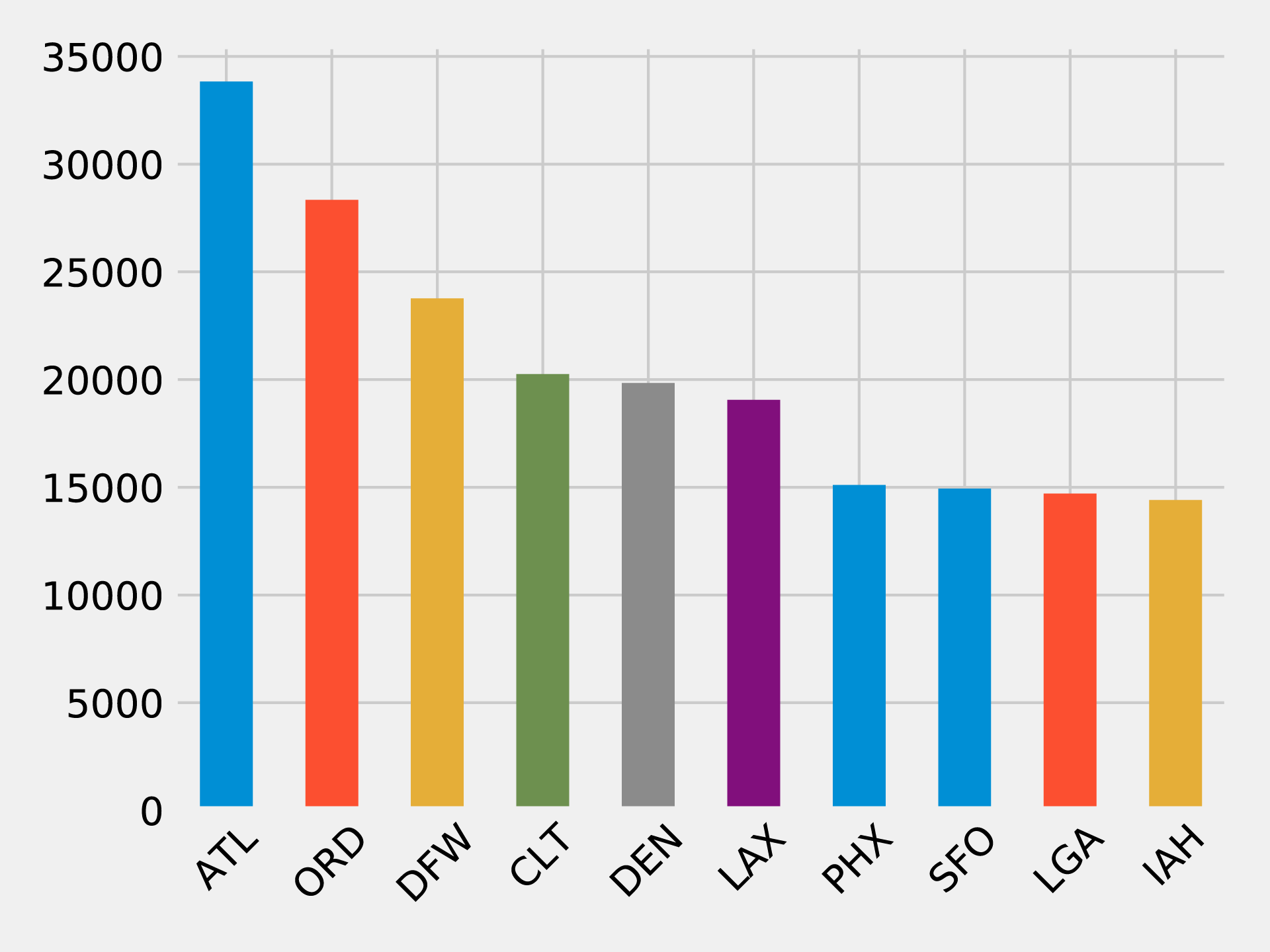
Figure 7-11. Outgoing flights by airport
It’s quite striking how suddenly the number of flights drops off. Denver International Airport (DEN), the 5th most popular airport, has just over half as many outgoing fights as Hartsfield Jackson Atlanta International Airport (ATL) in 1st place.
Delays from ORD
In our scenario, we assume you frequently travel between the west coast and east coast and want to see delays through a midpoint hub like Chicago O’Hare International Airport (ORD). This dataset contains flight delay data so we can dive right in.
The following code finds the average delay of flights departing from ORD grouped by the destination airport:
delayed_flights=(g.edges.filter("src = 'ORD' and deptDelay > 0").groupBy("dst").agg(F.avg("deptDelay"),F.count("deptDelay")).withColumn("averageDelay",F.round(F.col("avg(deptDelay)"),2)).withColumn("numberOfDelays",F.col("count(deptDelay)")))(delayed_flights.join(g.vertices,delayed_flights.dst==g.vertices.id).sort(F.desc("averageDelay")).select("dst","name","averageDelay","numberOfDelays").show(n=10,truncate=False))
Once we’ve calculated the average delay grouped by destination we join the resulting Spark DataFrame with a DataFrame containing all vertices, so that we can print the full name of the destination airport.
If we execute this code we’ll see the results for the top ten worst delayed destinations:
| dst | name | averageDelay | numberOfDelays |
|---|---|---|---|
CKB |
North Central West Virginia Airport |
145.08 |
12 |
OGG |
Kahului Airport |
119.67 |
9 |
MQT |
Sawyer International Airport |
114.75 |
12 |
MOB |
Mobile Regional Airport |
102.2 |
10 |
TTN |
Trenton Mercer Airport |
101.18 |
17 |
AVL |
Asheville Regional Airport |
98.5 |
28 |
ISP |
Long Island Mac Arthur Airport |
94.08 |
13 |
ANC |
Ted Stevens Anchorage International Airport |
83.74 |
23 |
BTV |
Burlington International Airport |
83.2 |
25 |
CMX |
Houghton County Memorial Airport |
79.18 |
17 |
This is interesting but one data point really stands out.
There have been 12 flights from ORD to CKB, delayed by more than 2 hours on average!
Let’s find the flights between those airports and see what’s going on:
from_expr='id = "ORD"'to_expr='id = "CKB"'ord_to_ckb=g.bfs(from_expr,to_expr)ord_to_ckb=ord_to_ckb.select(F.col("e0.date"),F.col("e0.time"),F.col("e0.flightNumber"),F.col("e0.deptDelay"))
We can then plot the flights with the following code:
ax=(ord_to_ckb.sort("date").toPandas().plot(kind='bar',x='date',y='deptDelay',legend=None))ax.xaxis.set_label_text("")plt.tight_layout()plt.show()
If we run that code we’ll get the chart in Figure 7-12.
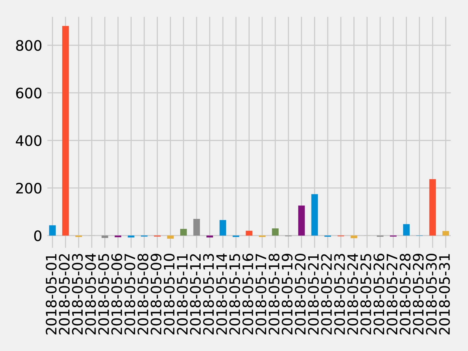
Figure 7-12. Flights from ORD to CKB
About half of the flights were delayed, but the delay of more than 14 hours on May 2nd 2018 has massively skewed the average.
What if we want to find delays coming into and going out of a coastal airport? Those airports are often affected by adverse weather conditions so we might be able to find some interesting delays.
Bad day at SFO
Let’s consider delays at an airport known for fog-related, “low ceiling” issues: San Francisco International Airport (SFO). One method for analysis would be to look at motifs which are recurrent subgraphs or patterns.
Note
The equivalent to motifs in Neo4j is graph patterns that are found using the MATCH clause or with pattern expressions in Cypher.
GraphFrames lets us search for motifs 10 so we can use the structure of flights as part of a query.
Let’s use motifs to find the most delayed flights going into and out of SFO on 11th May 2018. The following code will find these delays:
motifs=(g.find("(a)-[ab]->(b); (b)-[bc]->(c)").filter("""(b.id = 'SFO') and(ab.date = '2018-05-11' and bc.date = '2018-05-11') and(ab.arrDelay > 30 or bc.deptDelay > 30) and(ab.flightNumber = bc.flightNumber) and(ab.airline = bc.airline) and(ab.time < bc.time)"""))
The motif (a)-[ab]->(b); (b)-[bc]->(c) finds flights coming into and out from the same airport.
We then filter the resulting pattern to find flights that:
-
have the sequence of the first flight arriving at SFO and the second flight departing from SFO
-
have delays when arriving at SFO or departing from it of over 30 minutes
-
have the same flight number and airline
We can then take the result and select the columns we’re interested in:
result=(motifs.withColumn("delta",motifs.bc.deptDelay-motifs.ab.arrDelay).select("ab","bc","delta").sort("delta",ascending=False))result.select(F.col("ab.src").alias("a1"),F.col("ab.time").alias("a1DeptTime"),F.col("ab.arrDelay"),F.col("ab.dst").alias("a2"),F.col("bc.time").alias("a2DeptTime"),F.col("bc.deptDelay"),F.col("bc.dst").alias("a3"),F.col("ab.airline"),F.col("ab.flightNumber"),F.col("delta")).show()
We’re also calculating the delta between the arriving and departing flights to see which delays we can truly attribute to SFO.
If we execute this code we’ll see this output:
| airline | flightNumber | a1 | a1DeptTime | arrDelay | a2 | a2DeptTime | deptDelay | a3 | delta |
|---|---|---|---|---|---|---|---|---|---|
WN |
1454 |
PDX |
1130 |
-18.0 |
SFO |
1350 |
178.0 |
BUR |
196.0 |
OO |
5700 |
ACV |
1755 |
-9.0 |
SFO |
2235 |
64.0 |
RDM |
73.0 |
UA |
753 |
BWI |
700 |
-3.0 |
SFO |
1125 |
49.0 |
IAD |
52.0 |
UA |
1900 |
ATL |
740 |
40.0 |
SFO |
1110 |
77.0 |
SAN |
37.0 |
WN |
157 |
BUR |
1405 |
25.0 |
SFO |
1600 |
39.0 |
PDX |
14.0 |
DL |
745 |
DTW |
835 |
34.0 |
SFO |
1135 |
44.0 |
DTW |
10.0 |
WN |
1783 |
DEN |
1830 |
25.0 |
SFO |
2045 |
33.0 |
BUR |
8.0 |
WN |
5789 |
PDX |
1855 |
119.0 |
SFO |
2120 |
117.0 |
DEN |
-2.0 |
WN |
1585 |
BUR |
2025 |
31.0 |
SFO |
2230 |
11.0 |
PHX |
-20.0 |
The worst offender is shown on the top row, WN 1454, which arrived early but departed almost 3 hours late.
We can also see that there are some negative values in the arrDelay column; this means that the flight into SFO was early.
Also notice that a few flights, WN 5789 and WN 1585, made up time while on the ground in SFO.
Interconnected airports by airline
Now let’s say you’ve traveled so much that you have expiring frequent flyer points you’re determined to use to see as many destinations as efficiently as possible. If you start from a specific U.S. airport how many different airports can you visit and come back to the starting airport using the same airline?
Let’s first identify all the airlines and work out how many flights there are on each of them:
airlines=(g.edges.groupBy("airline").agg(F.count("airline").alias("flights")).sort("flights",ascending=False))full_name_airlines=(airlines_reference.join(airlines,airlines.airline==airlines_reference.code).select("code","name","flights"))
And now let’s create a bar chart showing our airlines:
ax=(full_name_airlines.toPandas().plot(kind='bar',x='name',y='flights',legend=None))ax.xaxis.set_label_text("")plt.tight_layout()plt.show()
If we run that query we’ll get the output in Figure 7-13.
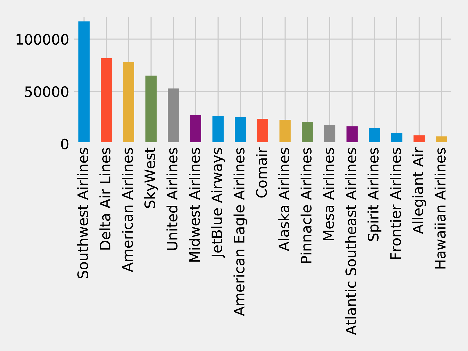
Figure 7-13. Number of flights by airline
Now let’s write a function that uses the Strongly Connected Components algorithm to find airport groupings for each airline where all the airports have flights to and from all the other airports in that group:
deffind_scc_components(g,airline):# Create a sub graph containing only flights on the provided airlineairline_relationships=g.edges[g.edges.airline==airline]airline_graph=GraphFrame(g.vertices,airline_relationships)# Calculate the Strongly Connected Componentsscc=airline_graph.stronglyConnectedComponents(maxIter=10)# Find the size of the biggest component and return thatreturn(scc.groupBy("component").agg(F.count("id").alias("size")).sort("size",ascending=False).take(1)[0]["size"])
We can write the following code to create a DataFrame containing each airline and the number of airports of their largest Strongly Connected Component:
# Calculate the largest Strongly Connected Component for each airlineairline_scc=[(airline,find_scc_components(g,airline))forairlineinairlines.toPandas()["airline"].tolist()]airline_scc_df=spark.createDataFrame(airline_scc,['id','sccCount'])# Join the SCC DataFrame with the airlines DataFrame so that we can show the number of flights# an airline has alongside the number of airports reachable in its biggest componentairline_reach=(airline_scc_df.join(full_name_airlines,full_name_airlines.code==airline_scc_df.id).select("code","name","flights","sccCount").sort("sccCount",ascending=False))
And now let’s create a bar chart showing our airlines:
ax=(airline_reach.toPandas().plot(kind='bar',x='name',y='sccCount',legend=None))ax.xaxis.set_label_text("")plt.tight_layout()plt.show()
If we run that query we’ll get the output in Figure 7-14.
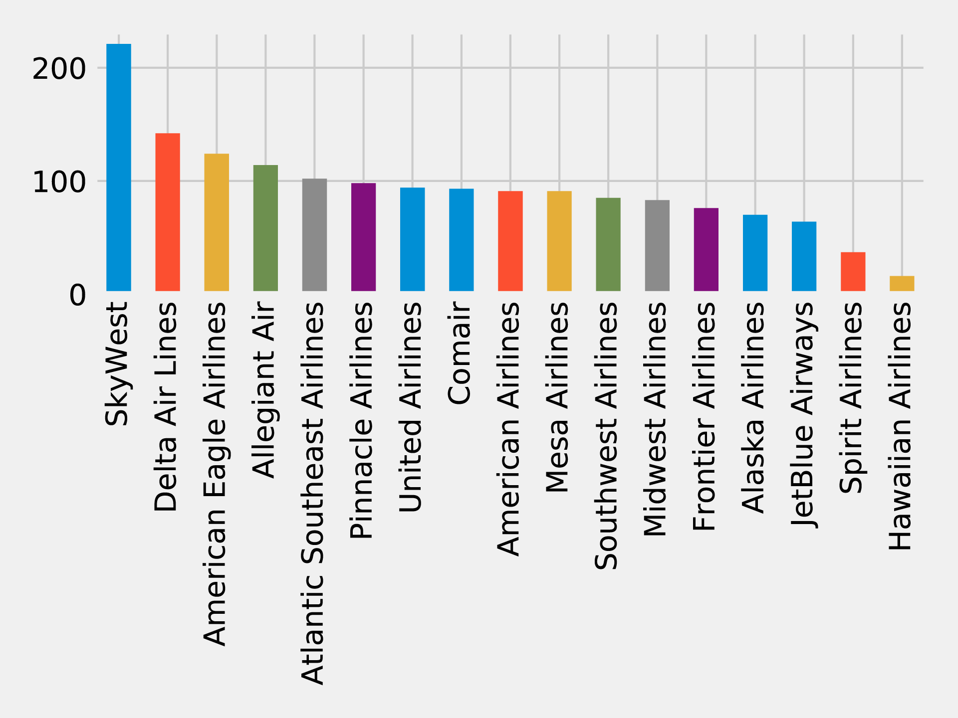
Figure 7-14. Number of reachable airports by airline
Skywest has the largest community with over 200 strongly connected airports. This might partially reflect their business model as an affiliate airline which operates aircraft used on flights for partner airlines. Southwest, on the other hand, has the highest number of flights but only connects around 80 airports.
Now let’s say you have a lot of airline points on DL that you want to use. Can we find airports that form communities within the network for the given airline carrier?
airline_relationships=g.edges.filter("airline = 'DL'")airline_graph=GraphFrame(g.vertices,airline_relationships)clusters=airline_graph.labelPropagation(maxIter=10)(clusters.sort("label").groupby("label").agg(F.collect_list("id").alias("airports"),F.count("id").alias("count")).sort("count",ascending=False).show(truncate=70,n=10))
If we run that query we’ll see this output:
| label | airports | count |
|---|---|---|
1606317768706 |
[IND, ORF, ATW, RIC, TRI, XNA, ECP, AVL, JAX, SYR, BHM, GSO, MEM, C… |
89 |
1219770712067 |
[GEG, SLC, DTW, LAS, SEA, BOS, MSN, SNA, JFK, TVC, LIH, JAC, FLL, M… |
53 |
17179869187 |
[RHV] |
1 |
25769803777 |
[CWT] |
1 |
25769803776 |
[CDW] |
1 |
25769803782 |
[KNW] |
1 |
25769803778 |
[DRT] |
1 |
25769803779 |
[FOK] |
1 |
25769803781 |
[HVR] |
1 |
42949672962 |
[GTF] |
1 |
Most of the airports DL uses have clustered into two groups, let’s drill down into those.
There are too many airports to show here so we’ll just show the airports with the biggest degree (ingoing and outgoing flights). We can write the following code to calculate airport degree:
all_flights=g.degrees.withColumnRenamed("id","aId")
We’ll then combine this with the airports that belong to the largest cluster:
(clusters.filter("label=1606317768706").join(all_flights,all_flights.aId==result.id).sort("degree",ascending=False).select("id","name","degree").show(truncate=False))
If we run that query we’ll see this output:
| id | name | degree |
|---|---|---|
DFW |
Dallas Fort Worth International Airport |
47514 |
CLT |
Charlotte Douglas International Airport |
40495 |
IAH |
George Bush Intercontinental Houston Airport |
28814 |
EWR |
Newark Liberty International Airport |
25131 |
PHL |
Philadelphia International Airport |
20804 |
BWI |
Baltimore/Washington International Thurgood Marshall Airport |
18989 |
MDW |
Chicago Midway International Airport |
15178 |
BNA |
Nashville International Airport |
12455 |
DAL |
Dallas Love Field |
12084 |
IAD |
Washington Dulles International Airport |
11566 |
STL |
Lambert St Louis International Airport |
11439 |
HOU |
William P Hobby Airport |
9742 |
IND |
Indianapolis International Airport |
8543 |
PIT |
Pittsburgh International Airport |
8410 |
CLE |
Cleveland Hopkins International Airport |
8238 |
CMH |
Port Columbus International Airport |
7640 |
SAT |
San Antonio International Airport |
6532 |
JAX |
Jacksonville International Airport |
5495 |
BDL |
Bradley International Airport |
4866 |
RSW |
Southwest Florida International Airport |
4569 |
In Figure 7-15 we can see that this cluster is actually focused on the east coast to midwest of the U.S
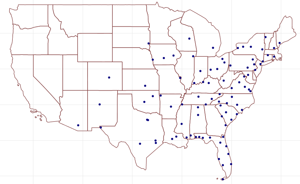
Figure 7-15. Cluster 1606317768706 Airports
And now let’s do the same thing with the second largest cluster:
(clusters.filter("label=1219770712067").join(all_flights,all_flights.aId==result.id).sort("degree",ascending=False).select("id","name","degree").show(truncate=False))
If we run that query we’ll see this output:
| id | name | degree |
|---|---|---|
ATL |
Hartsfield Jackson Atlanta International Airport |
67672 |
ORD |
Chicago O’Hare International Airport |
56681 |
DEN |
Denver International Airport |
39671 |
LAX |
Los Angeles International Airport |
38116 |
PHX |
Phoenix Sky Harbor International Airport |
30206 |
SFO |
San Francisco International Airport |
29865 |
LGA |
La Guardia Airport |
29416 |
LAS |
McCarran International Airport |
27801 |
DTW |
Detroit Metropolitan Wayne County Airport |
27477 |
MSP |
Minneapolis-St Paul International/Wold-Chamberlain Airport |
27163 |
BOS |
General Edward Lawrence Logan International Airport |
26214 |
SEA |
Seattle Tacoma International Airport |
24098 |
MCO |
Orlando International Airport |
23442 |
JFK |
John F Kennedy International Airport |
22294 |
DCA |
Ronald Reagan Washington National Airport |
22244 |
SLC |
Salt Lake City International Airport |
18661 |
FLL |
Fort Lauderdale Hollywood International Airport |
16364 |
SAN |
San Diego International Airport |
15401 |
MIA |
Miami International Airport |
14869 |
TPA |
Tampa International Airport |
12509 |
In Figure 7-16 we can see that this cluster is apparently more hub-focused with some additional northwest stops along the way.
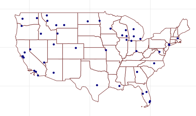
Figure 7-16. Cluster 1219770712067 Airports
The code we used to generate these maps is available on the book’s GitHub repository 11.
When checking the DL website for frequent flyer programs, you notice a use-two-get-one-free promotion. If you use your points for two flights you get another for free – but only if you fly within one of the two clusters! Perhaps it’s a better use of your time, and certainly your points, to stay intra-cluster.
Note
Reader Exercises
-
Use a Shortest Path algorithm to evaluate the number of flights from your home to the Bozeman Yellowstone International Airport (BZN)?
-
Are there any differences if you use relationship weigths?
Summary
In the last few chapters we’ve provided detail on how key graph algorithms for pathfinding, centrality, and community detection work in Apache Spark and Neo4j. In this chapter we walked through workflows that included using several algorithms in context with other tasks and analysis.
Next, we’ll look at a use for graph algorithms that’s becoming increasingly important, graph enhanced machine learning.
2 https://www.yelp.com/dataset/challenge
3 https://scholar.google.com/scholar?q=citation%3A+Yelp+Dataset&btnG=&hl=en&as_sdt=0%2C5
4 https://neo4j.com/docs/operations-manual/current/tools/import/
5 https://neo4j.com/developer/guide-import-csv/
6 https://neo4j.com/docs/developer-manual/current/drivers/
7 https://neo4j.com/docs/developer-manual/current/cypher/syntax/lists/#cypher-pattern-comprehension
8 https://www.transtats.bts.gov/DL_SelectFields.asp?Table_ID=236
9 https://openflights.org/data.html
10 https://graphframes.github.io/user-guide.html#motif-finding
11 https://github.com/neo4j-graph-analytics/book/blob/master/scripts/airports/draw_map.py