Copyright © 2019 Amy E. Hodler and Mark Needham. All rights reserved.
Printed in the United States of America.
Published by O’Reilly Media, Inc., 1005 Gravenstein Highway North, Sebastopol, CA 95472.
O’Reilly books may be purchased for educational, business, or sales promotional use. Online editions are also available for most titles (http://oreilly.com/safari). For more information, contact our corporate/institutional sales department: 800-998-9938 or corporate@oreilly.com.
See http://oreilly.com/catalog/errata.csp?isbn=9781492047681 for release details.
The O’Reilly logo is a registered trademark of O’Reilly Media, Inc. Graphic Algorithms, the cover image, and related trade dress are trademarks of O’Reilly Media, Inc.
While the publisher and the authors have used good faith efforts to ensure that the information and instructions contained in this work are accurate, the publisher and the authors disclaim all responsibility for errors or omissions, including without limitation responsibility for damages resulting from the use of or reliance on this work. Use of the information and instructions contained in this work is at your own risk. If any code samples or other technology this work contains or describes is subject to open source licenses or the intellectual property rights of others, it is your responsibility to ensure that your use thereof complies with such licenses and/or rights.
978-1-492-04761-2
The world is driven by connections—from financial and communication systems to social and biological processes. Revealing the meaning behind these connections drives breakthroughs across industries in areas such as identifying fraud rings and optimizing recommendations to evaluating the strength of a group and predicting cascading failures.
As connectedness continues to accelerate, it’s not surprising that interest in graph algorithms has exploded because they are based on mathematics explicitly developed to gain insights from the relationships between data. Graph analytics can uncover the workings of intricate systems and networks at massive scales— for any organization.
We are passionate about the utility and importance of graph analytics as well as the joy of uncovering the inner workings of complex scenarios. Until recently, adopting graph analytics required significant expertise and determination since tools and integrations were difficult and few knew how to apply graph algorithms to their quandaries. It is our goal to help change this. We wrote this book to help organizations better leverage graph analytics so that they can make new discoveries and develop intelligent solutions faster.
We’ve chosen to focus practical examples on graph algorithms in Apache Spark and the Neo4j platform. However, this guide is helpful for understanding more general graph concepts regardless of what graph technology you use.
This book is written as a practical guide to getting started with graph algorithms for developers and data scientists who have Apache Spark or Neo4j experience. The first two chapters provide an introduction to graph analytics, algorithms, and theory. The third chapter briefly covers the platforms used in this book before we dive into three chapters focusing on classic graph algorithms: pathfinding, centrality, and community detections. We wrap up the book with two chapters showing how graph algorithms are used within workflows: one for general analysis and one for machine learning.
At the beginning of each category of algorithms, there is a reference table to help you quickly jump to the relevant algorithm. For each algorithm, you’ll find:
The following typographical conventions are used in this book:
Indicates new terms, URLs, email addresses, filenames, and file extensions.
Constant widthUsed for program listings, as well as within paragraphs to refer to program elements such as variable or function names, databases, data types, environment variables, statements, and keywords.
Constant width boldShows commands or other text that should be typed literally by the user.
Constant width italicShows text that should be replaced with user-supplied values or by values determined by context.
This element signifies a tip or suggestion.
This element signifies a general note.
This element indicates a warning or caution.
Supplemental material (code examples, exercises, etc.) is available for download at https://github.com/oreillymedia/graph_algorithms.
This book is here to help you get your job done. In general, if example code is offered with this book, you may use it in your programs and documentation. You do not need to contact us for permission unless you’re reproducing a significant portion of the code. For example, writing a program that uses several chunks of code from this book does not require permission. Selling or distributing a CD-ROM of examples from O’Reilly books does require permission. Answering a question by citing this book and quoting example code does not require permission. Incorporating a significant amount of example code from this book into your product’s documentation does require permission.
We appreciate, but do not require, attribution. An attribution usually includes the title, author, publisher, and ISBN. For example: “Graph Algorithms by Amy E. Hodler and Mark Needham (O’Reilly). Copyright 2019 Amy E. Hodler and Mark Needham, 978-1-492-04768-1.”
If you feel your use of code examples falls outside fair use or the permission given above, feel free to contact us at permissions@oreilly.com.
Safari (formerly Safari Books Online) is a membership-based training and reference platform for enterprise, government, educators, and individuals.
Members have access to thousands of books, training videos, Learning Paths, interactive tutorials, and curated playlists from over 250 publishers, including O’Reilly Media, Harvard Business Review, Prentice Hall Professional, Addison-Wesley Professional, Microsoft Press, Sams, Que, Peachpit Press, Adobe, Focal Press, Cisco Press, John Wiley & Sons, Syngress, Morgan Kaufmann, IBM Redbooks, Packt, Adobe Press, FT Press, Apress, Manning, New Riders, McGraw-Hill, Jones & Bartlett, and Course Technology, among others.
For more information, please visit http://oreilly.com/safari.
Please address comments and questions concerning this book to the publisher:
We have a web page for this book, where we list errata, examples, and any additional information. You can access this page at http://www.oreilly.com/catalog/.
To comment or ask technical questions about this book, send email to bookquestions@oreilly.com.
For more information about our books, courses, conferences, and news, see our website at http://www.oreilly.com.
Find us on Facebook: http://facebook.com/oreilly
Follow us on Twitter: http://twitter.com/oreillymedia
Watch us on YouTube: http://www.youtube.com/oreillymedia
We’ve thoroughly enjoyed putting together the material for this book and thank all those who assisted. We’d especially like to thank Michael Hunger for his guidance, Jim Webber for his valuable edits, and Tomaz Bratanic for his keen research. Finally, we greatly appreciate Yelp permitting us to use its rich dataset for powerful examples.
Today’s most pressing data challenges center around relationships, not just tabulating discrete data. Graph technologies and analytics provide powerful tools for connected data that are used in research, social initiatives, and business solutions such as:
As data becomes increasingly interconnected and systems increasingly sophisticated, it’s essential to make use of the rich and evolving relationships within our data.
This chapter provides an introduction to graph analysis and graph algorithms. We’ll start with a brief refresher about the origin of graphs, before introducing graph algorithms and explaining the difference between graph databases and graph processing. We’ll explore the nature of modern data itself, and how the information contained in connections is far more sophisticated than basic statistical methods permit. The chapter will conclude with a look at use cases where graph algorithms can be employed.
Graphs have a history dating back to 1736 when Leonhard Euler solved the “Seven Bridges of Königsberg” problem. The problem asked whether it was possible to visit all four areas of a city, connected by seven bridges, while only crossing each bridge once. It wasn’t.
With the insight that only the connections themselves were relevant, Euler set the groundwork for graph theory and its mathematics. Figure 1-1 depicts Euler’s progression with one of his original sketches, from the paper ‘Solutio problematis ad geometriam situs pertinentis‘.
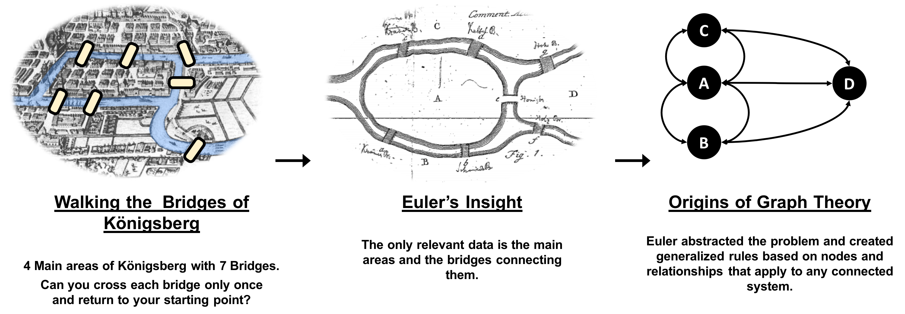
While graphs came from mathematics, they are also a pragmatic and high fidelity way of modeling and analyzing data. The objects that make up a graph are called nodes or vertices and the links between them are known as relationships, links, or edges. We use the term node in this book and you can think of nodes as the nouns in sentences. We use the term relationships and think of those as verbs giving context to the nodes. To avoid any confusion, the graphs we talk about in this book have nothing to do with graphing an equation, graphics, or charts as in Figure 1-2.
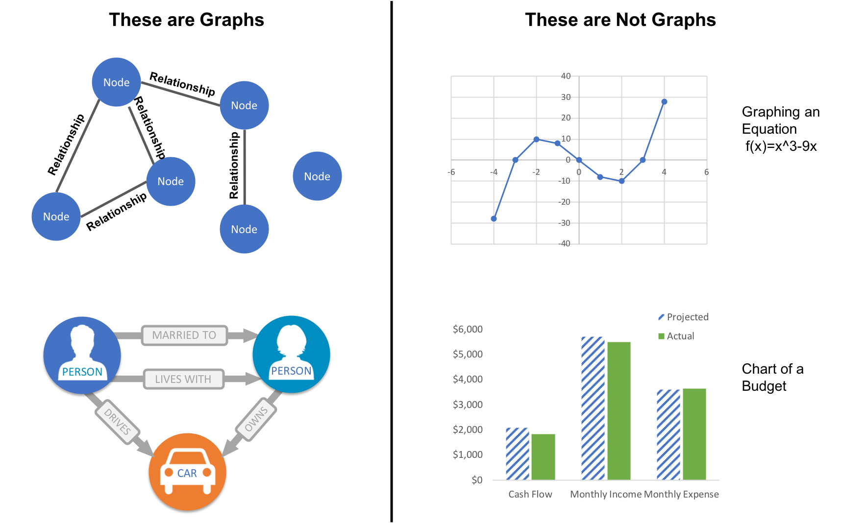
Looking at the person graph in Figure 1-2, we can easily construct several sentences which describe it. For example, person A lives with person B who owns a car and person A drives a car that person B owns. This modeling approach is compelling because it maps easily to the real world and is very “whiteboard friendly.” This helps align data modeling and algorithmic analysis.
But modeling graphs is only half the story. We might also want to process them to reveal insight that isn’t immediately obvious. This is the domain of graph algorithms.
Graph algorithms are a subset of tools for graph analytics. Graph analytics is something we do–it’s the use of any graph-based approach to analyzing connected data. There are various methods we could use: We might query the graph data, use basic statistics, visually explore the graph, or incorporate graphs into our machine learning tasks. Graph algorithms provide one of the most potent approach to analyzing connected data because their mathematical calculations are specifically built to operate on relationships.
Graph algorithms describe steps to be taken to process a graph to discover its general qualities or specific quantities. Based on the mathematics of graph theory (also known as network science), graph algorithms use the relationships between nodes to infer the organization and dynamics of complex systems. Network scientists use these algorithms to uncover hidden information, test hypotheses, and make predictions about behavior.
For example, we might like to discover neighborhoods in the graph which correspond to congestion in a transport system. Or we might want to score particular nodes that could correspond to overload conditions in a power system. In fact graph algorithms have widespread potential: from preventing fraud and optimizing call routing to predicting the spread of the flu.
In 2010 U.S. air travel systems experienced two serious events involving multiple congested airports. Network scientists were able to use graph algorithms to confirm the events as part of systematic cascading delays and use this information for corrective advice. 1
Figure 1-3 illustrates the highly connected structure of air transportation clusters. Many transportation systems exhibit a concentrated distribution of links with clear hub-and-spoke patterns that influence delays.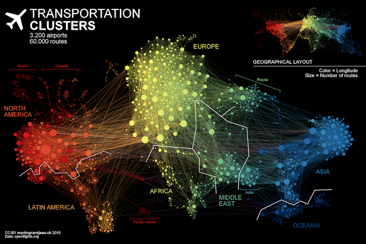
Graphs help to uncover how very small interactions and dynamics lead to global mutations. They tie together the micro- and macro-scales by representing exactly which things are interacting with each other within global structures. These associations are used to forecast behavior and determine missing links. Figure 1-4 shows a food web of grassland species interactions that used graph analysis to evaluate the hierarchical organization and species interactions and then predict missing relationships.2
Graph algorithms provide a rich and varied set of analytical tools for distilling insight from connected data. Typically, graph algorithms are employed to find global patterns and structures. The input to the algorithm is the whole graph and the output can be an enriched graph or some aggregate values such as a score. We categorize such processing as Graph Global and it implies (iteratively) processing a graph’s structure. This approach sheds light on the overall nature of a network through its connections. Organizations tend to use graph algorithms to model systems and predict behavior based on how things disseminate, important components, group identification, and the overall robustness of a system.
Conversely, for most graph queries the input is specific parts of the graph (e.g. a starting node) and the work is usually focused in the surrounding subgraph. We term this Graph Local and it implies (declaratively) querying a graph’s structure (as our colleagues explain in O’Reilly’s Graph Databases book3). There may be some overlap in these definitions: sometimes we can use processing to answer a query and querying to perform processing, but simplistically speaking whole-graph operations are processed by algorithms and subgraph operations are queried in databases.
Traditionally transaction processing and analysis have been siloed. This was an unnatural split based on technology limitations. Our view is that graph analytics drives smarter transactions, which creates new data and opportunities for further analysis. More recently there has been a trend to integrate these silos for real-time decision making.
Online Transaction Processing (OLTP) operations are typically short activities like booking a ticket, crediting an account, booking a sale and so forth. OLTP implies voluminous low latency query processing and high data integrity. Although OLTP may involve only a smaller number of records per transaction, systems process many transactions concurrently.
Online Analytical Processing (OLAP) facilitates more complex queries and analysis over historical data. These analyses may include multiple data sources, formats, and types. Detecting trends, conducting “what-if” scenarios, making predictions, and uncovering structural patterns are typical OLAP use cases. Compared to OLTP, OLAP systems process fewer but longer-running transactions over many records. OLAP systems are biased towards faster reading without the expectation of transactional updates found in OLTP and batch-oriented operation is common.
Recently, however, the line between OLTP and OLAP started to blur. Modern data-intensive applications now combine real-time transactional operations with analytics. This merging of processing has been spurred by several advances in software such as more scalable transaction management, incremental stream processing, and in lower-cost, large-memory hardware.
Bringing together analytics and transactions enables continual analysis as a natural part of regular operations. As data is gathered–from point-of-sale (POS) machines, from manufacturing systems, or from IoT devices–analytics now supports the ability to make real-time recommendations and decisions while processing. This trend was observed several years ago, and terms to describe this merging include “Transalytics” and Hybrid Transactional and Analytical Processing (HTAP). Figure 1-5 illustrates how read-only replicas can be used to bring together these different types of processing.
“[HTAP] could potentially redefine the way some business processes are executed, as real-time advanced analytics (for example, planning, forecasting and what-if analysis) becomes an integral part of the process itself, rather than a separate activity performed after the fact. This would enable new forms of real-time business-driven decision-making process. Ultimately, HTAP will become a key enabling architecture for intelligent business operations.” –Gartner
OLTP and OLAP become more integrated and support functionality previously offered in only one silo, it’s no longer necessary to use different data products or systems for these workloads–we can simplify our architecture by using the same platform for both. This means our analytical queries can take advantage of real-time data and we can streamline the iterative process of analysis.
Graph algorithms are used to help make sense of connected data. We see relationships within real-world systems from protein interactions to social networks, from communication systems to power grids, and from retail experiences to Mars mission planning. Understanding networks and the connections within them offers incredible potential for insight and innovation.
Graph algorithms are uniquely suited to understanding structures and revealing patterns in datasets that are highly connected. Nowhere is the connectivity and interactivity so apparent than in big data. The amount of information that has been brought together, commingled, and dynamically updated is impressive. This is where graph algorithms can help make sense of our volumes of data: for both sophisticated analytics of the graph and to improve artificial intelligence by fuelling our models with structural context.
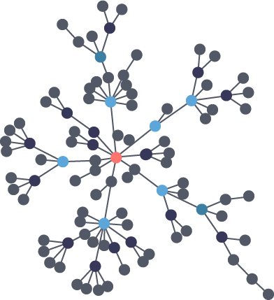
Scientists that study the growth of networks have noted that connectivity increases over time, but not uniformly. Preferential attachment is one theory on how the dynamics of growth impact structure. This idea, illustrated in Figure 1-6, describes the tendency of a node to link to other nodes that already have a lot of connections.
Regardless of the underlying causes, many researchers believe that how a network develops is inseparable from their resulting shapes and hierarchies. Highly dense groups and lumpy data networks tend to develop, in effect growing both data size and its complexity. Trying to “average out” the network, in general, won’t work well for investigating relationships. We see this clustering of relationships in most real-world networks today from the internet to social networks such as a gaming community shown in Figure 1-7.
This is significantly different than what an average distribution model would predict, where most nodes would have the same number of connections. For instance, if the World Wide Web had an average distribution of connections, all pages would have about the same number of links coming in and going out. Average distribution models assert that most nodes are equally connected but many types of graphs and many real networks exhibit concentrations. The Web, in common with graphs like travel and social networks, has a power-law distribution with few nodes being highly connected and most nodes being modestly connected.
We can readily see in Figure 1-8; how using an average of characteristics for data that is uneven, would lead to incorrect results.
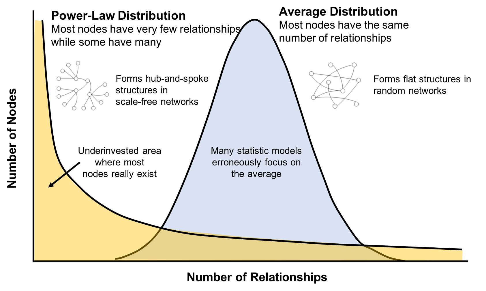
This is important to recognize as most graph data does not adhere to an average distribution. Network scientists use graph analytics to search for and interpret structures and relationship distributions in real-world data.
There is no network in nature that we know of that would be described by the random network model. —Albert-László Barabási, director, Center for Complex Network Research Northeastern University, and author of numerous network science books
The challenge is that densely yet unevenly connected data is troublesome to analyze with traditional analytical tools. There might be a structure there but it’s hard to find. So, it’s tempting to take an averages approach to messy data but doing so will conceal patterns and ensure our results are not representing any real groups. For instance, if you average the demographic information of all your customers and offer an experience based solely on averages, you’d be guaranteed to miss most communities: communities tend to cluster around related factors like age and occupation or marital status and location.
Furthermore, dynamic behavior, particularly around sudden events and bursts, can’t be seen with a snapshot. To illustrate, if you imagine a social group with increasing relationships, you’d also expect increased communications. This could lead to a tipping point of coordination and a subsequent coalition or, alternatively, subgroup formation and polarization in, for example, elections. Sophisticated methods are required to forecast a network’s evolution over time but we can infer behavior if we understand the structures and interactions within our data. Graph analytics are used to predict group resiliency because of the focus on relationships.
At the most abstract level, graph analytics is applied to forecast behavior and prescribe action for dynamic groups. Doing this requires understanding the relationships and structure within that group. Graph algorithms accomplish this by examining the overall nature of networks through their connections. With this approach, you can understand the topology of connected systems and model their processes.
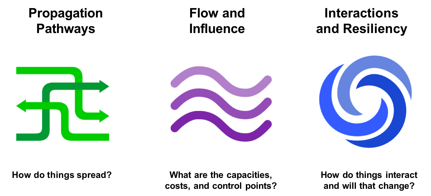
There are three general buckets of question that indicate graph analytics and algorithms are warranted, as shown in Figure 1-9.
Below are a few types of challenges where graph algorithms are employed. Are your challenges similar?
In this chapter, we’ve looked at how data today is extremely connected. Analysis of group dynamics and relationships has robust scientific practices, yet those tools are not always commonplace in businesses. As we evaluate advanced analytics techniques, we should consider the nature of our data and whether we need to understand community attributes or predict complex behavior. If our data represents a network, we should avoid the temptation to reduce factors to an average. Instead, we should use tools that match our data and the insights we’re seeking.
In the next chapter, we’ll cover graph concepts and terminology.
In this chapter, we go into more detail on the terminology of graph algorithms. The basics of graph theory are explained with a focus on the concepts that are most relevant to a practitioner.
We’ll describe how graphs are represented and then explain the different types of graphs and their attributes. This will be important later as our graph’s characteristics will inform our algorithm choices and help interpret results. We’ll finish the chapter with the types of graph algorithms available to us.
The labeled property graph is the dominant way of modeling graph data. An example can be seen in Figure 2-1.
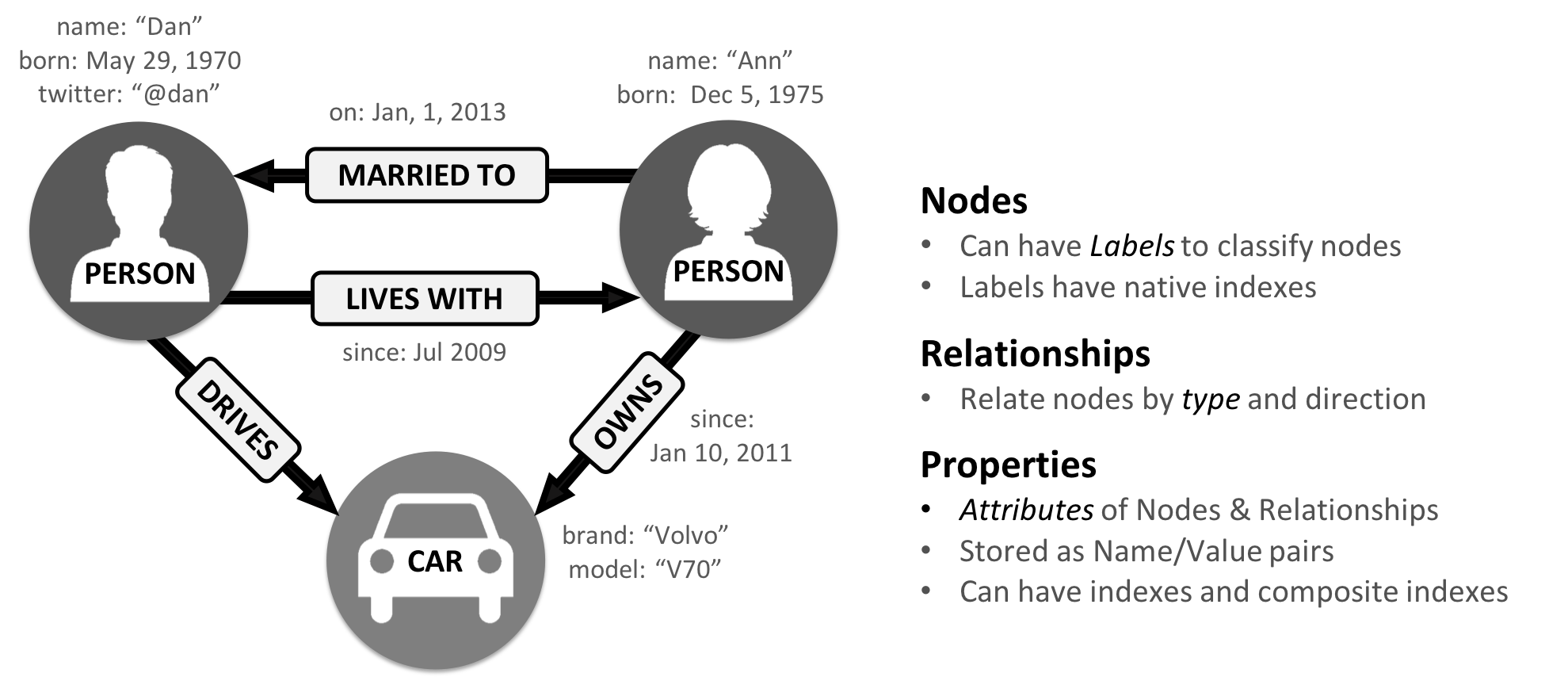
A label marks a node as part of a group. Here we have two groups of nodes: Person and Car. (Although in classic graph theory, a label applies to a single node, it’s now commonly used to mean a node group.)
Relationships are classified based on relationship-type. Our example includes the relationship types of DRIVES, OWNS, LIVES_WITH, and MARRIED_TO.
Properties are synonymous with attributes and can contain a variety of data types from numbers and strings to spatial and temporal data. In Figure 2-1 , we assigned the properties as named value pairs where the name of the property comes first and then its value. For example, the Person node on the left has a property name: Dan and the MARRIED_TO relationship as a property of on: Jan, 1, 2013 .
A subgraph is a graph within a larger graph. Subgraphs are useful as a filter for our graph such as when we need a subset with particular characteristics for focused analysis.
A path is a group of nodes and their connecting relationships. An example of a simple path, based on Figure 2-1, could contain the nodes Dan, Ann and Car and the LIVES_WITH and OWNS relationships.
Graphs vary in type, shape and size as well the kind of attributes that can be used for analysis. In the next section, we’ll describe the kinds of graphs most suited for graph algorithms. Keep in mind that these explanations apply to graphs as well as subgraphs.
In classic graph theory, the term graph is equated with a simple (or strict) graph where nodes only have one relationship between them, as shown on the left side of Figure 2-2. Most real-world graphs, however, has many relationships between nodes and even self-referencing relationships. Today, the term graph is commonly used for all three graph types in Figure 2-2 and so we also use the term inclusively.

Graphs take on a variety of shapes. Figure 2-3 illustrates three representative network types:
These network types produce graphs with distinctive structures, distributions, and behaviors.
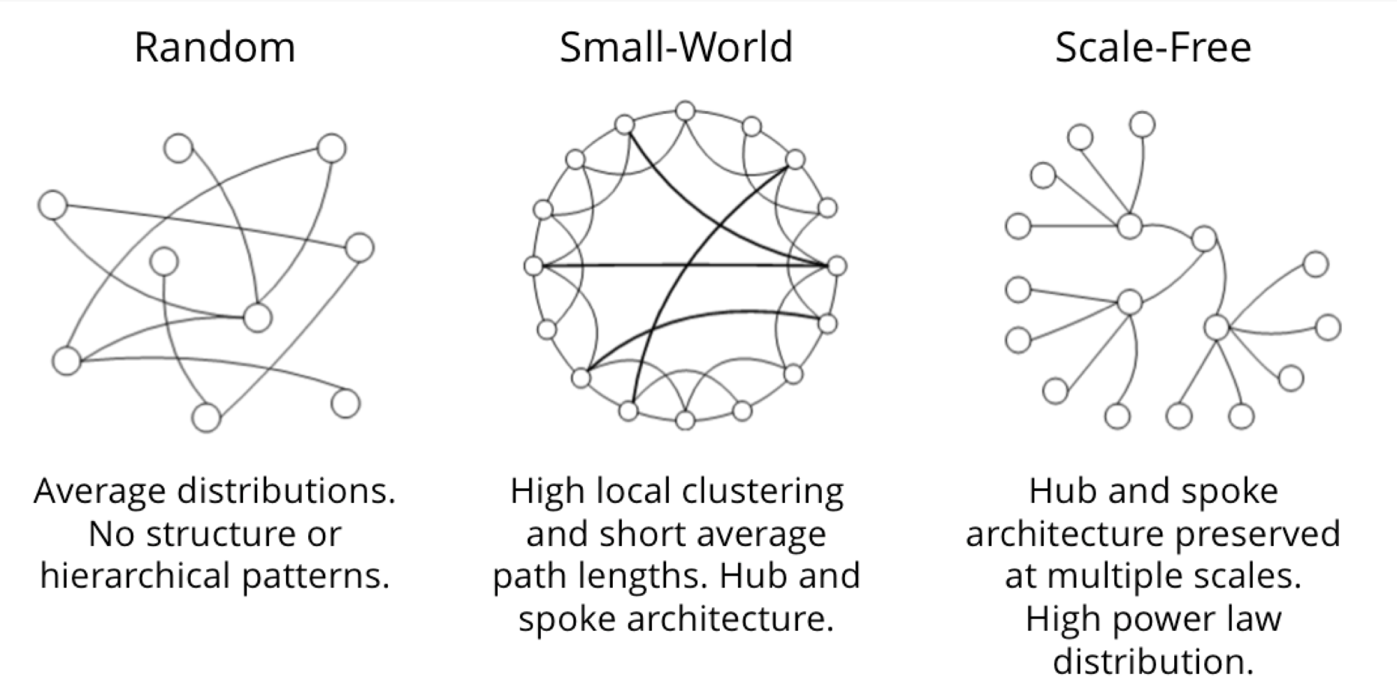
To get the most out of graph algorithms, it’s important to familiarize ourselves with the most characteristic graphs we’ll encounter.
| Graph Attributes | Key Factor | Algorithm Consideration |
|---|---|---|
| Connected versus Disconnected | Whether or not there is a path between any two nodes in the graph, irrespective of distance. | Islands of nodes can cause unexpected behavior such as getting stuck in or failing to process disconnected components. |
| Weighted versus Unweighted | Whether there are (domain-specific) values on relationships or nodes. | Many algorithms expect weights and we’ll see significant differences in performance and results when ignored. |
| Directed versus Undirected | Whether or not relationships explicitly define a start and end node. |
Adds rich context to infer additional meaning. In some algorithms, you can explicitly set the use of one, both, or no direction. |
| Cyclic versus Acyclic | Paths start and end at the same node | Cyclic is common but algorithms must be careful (typically by storing traversal state) or cycles may prevent termination. Acyclic graphs (or spanning trees) are the basis for many graph algorithms. |
| Sparse versus Dense | Relationship to node ratio | Extremely dense or extremely sparsely connected graphs can cause divergent results. Data modeling may help, assuming the domain is not inherently dense or sparse. |
| Monopartite, Bipartite, and K-Partite | Nodes connect to only one other node type (users like movies) versus many other node types (users like users who like movies) | Helpful for creating relationships to analyze and projecting more useful graphs. |
A graph is connected if there is a path from any node to every node and disconnected if there is not. If we have islands in our graph, it’s disconnected. If the nodes in those islands are connected, they are called components (or sometimes clusters) as shown in Figure 2-4.

Some algorithms struggle with disconnected graphs and can produce misleading results. If we have unexpected results, checking the structure of our graph is a good first step.
Unweighted graphs have no weight values assigned to their nodes or relationships. For weighted graphs, these values can represent a variety of measures such as cost, time, distance, capacity, or even a domain-specific prioritization. Figure 2-5 visualizes the difference.
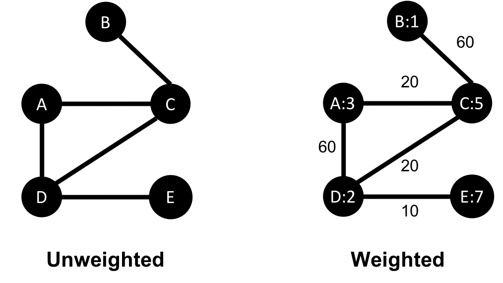
Basic graph algorithms can use weights for processing as a representation for the strength or value of relationships. Many algorithms compute metrics which then can be used as weights for follow-up processing. Some algorithms update weight values as they proceed to find cumulative totals, lowest values, or optimums.
The classic use for weighted graphs is in pathfinding algorithms. Such algorithms underpin the mapping applications on our phones and compute the shortest/cheapest/fastest transport routes between locations. For example, Figure 2-6 uses two different methods of computing the shortest route.
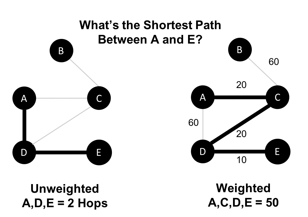
Without weights, our shortest route is calculated in terms of the number of relationships (commonly called hops). A and E have a 2 hop shortest path, which indicates only 1 city (D) between them. However, the shortest weighted path from A to E takes us from A to C to D to E. If weights represent a physical distance in kilometers the total distance would be 50 km. In this case, the shortest path in terms of the number of hops would equate to a longer physical route of 70 km.
In an undirected graph, relationships are considered bi-directional, such as commonly used for friendships. In a directed graph, relationships have a specific direction. Relationships pointing to a node are referred to as in-links and, unsurprisingly, out-links are those originating from a node.
Direction adds another dimension of information. Relationships of the same type but in opposing directions carry different semantic meaning, as it expresses a dependency or indicates a flow. This may then be used as an indicator of credibility or group strength. Personal preferences and social relations are expressed very well with direction.
For example, if we assumed in Figure 2-7 that the directed graph was a network of students and the relationships were “likes” then we’d calculate that A and C are more popular.
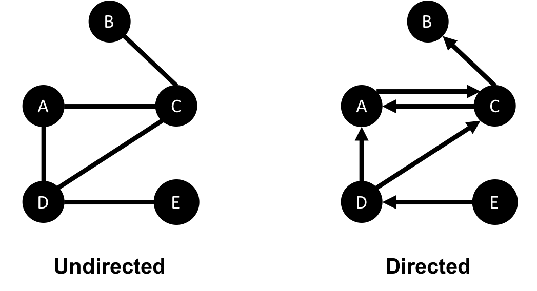
Road networks illustrate why we might want to use both types of graphs. For example, highways between cities are often traveled in both directions. However, within cities, some roads are one-way streets. (The same is true for some information flows!)
We get different results running algorithms in an undirected fashion compared to directed. If we want an undirected graph, for example, we would assume highways or friendship always go both ways.
If we reimagine Figure 2-7 as a directed road network, you can drive to A from C and D but you can only leave through C. Furthermore if there were no relationships from A to C, that would indicate a dead-end. Perhaps that’s less likely for a one-way road network but not for a process or a webpage.
In graph theory, cycles are paths through relationships and nodes which start and end at the same node. An acyclic graph has no such cycles. As shown in Figure 2-8, directed and undirected graphs can have cycles but when directed, paths follow the relationship direction. A directed acyclic graph (DAG), shown in Graph 1, will by definition always have dead ends (leaf nodes).
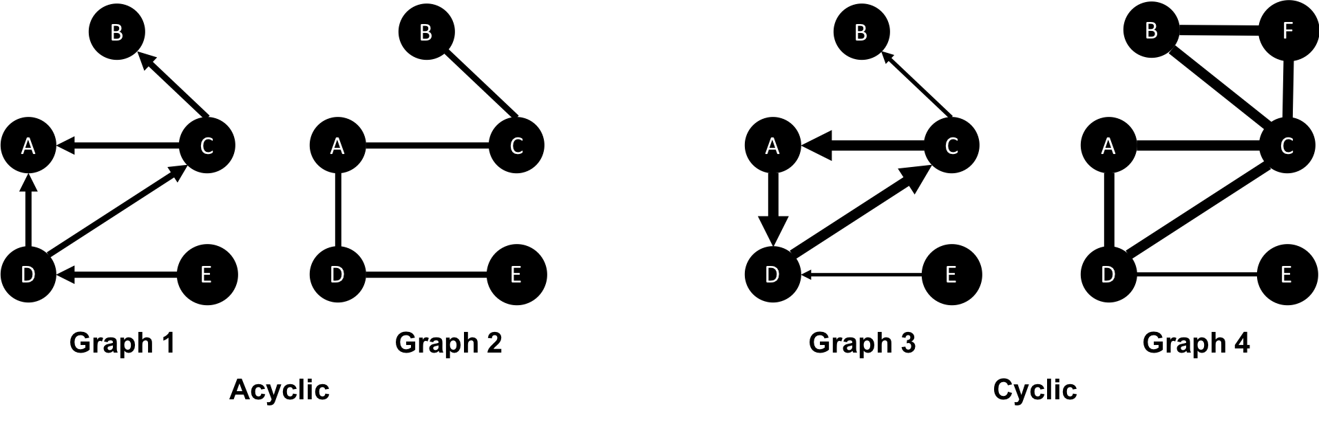
Graphs 1 and 2 have no cycles as there’s no way to start and end on the same node without repeating a relationship. You might remember from chapter 1 that not repeating relationships was the Königsberg bridges problem that started graph theory! Graph 3 in Figure 2-8 shows a simple cycle with no repeated nodes of A-D-C-A. In graph 4, the undirected cyclic graph has been made more interesting by adding a node and relationship. There’s now a closed cycle with a repeated node (C), following B-F-C-D-A-C-B. There are actually multiple cycles in graph 4.
Cycles are common and we sometimes need to convert cyclic graphs to acyclic graphs (by cutting relationships) to eliminate processing problems. Directed acyclic graphs naturally arise in scheduling, genealogy, and version histories.
In classic graph theory, an acyclic graph that is undirected is called a tree. While, in computer science, trees can also be directed. A more inclusive definition would be a graph where any two nodes are connected by only one path. Trees are significant for understanding graph structures and many algorithms. They play a key role in designing networks, data structures, and search optimizations to improve categorization or organizational hierarchies.
Much has been written about trees and their variations, Figure 2-9 illustrates the common trees that we’re likely to encounter.
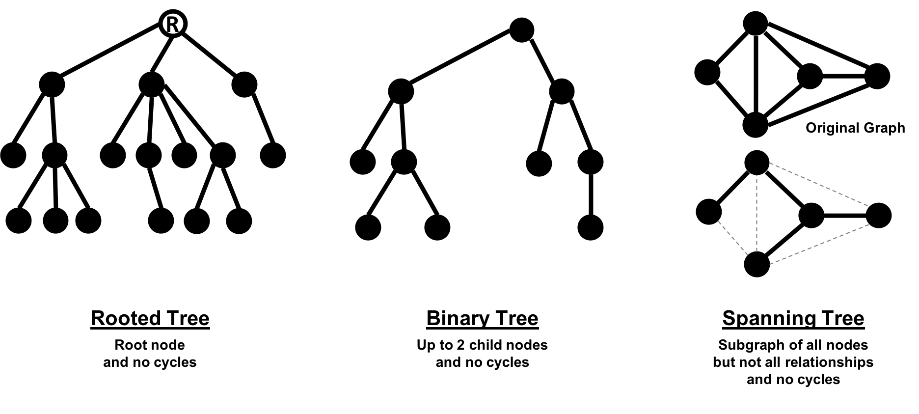
Of these variations, spanning trees are the most relevant for this book. A spanning tree is a subgraph, that includes all the nodes of a larger acyclic graph but not all the relationships. A minimum spanning tree connects all the nodes of a graph with the either the least number of hops or least weighted paths.
The sparsity of a graph is based on the number of relationships it has compared to the maximum possible number of relationships, which would occur if there was a relationship between every pair of nodes. A graph where every node has a relationship with every other node is called a complete graph, or a clique for components. For instance, if all my friends knew each other, that would be a clique.
The maximum density of a graph is calculated with the formula,[ where N is the number of nodes. Any graph that approaches the maximum density is considered dense, although there is no strict definition. In Figure 2-10 we can see three measures of density for undirected graphs which uses the formula, where R is the number of relationships.
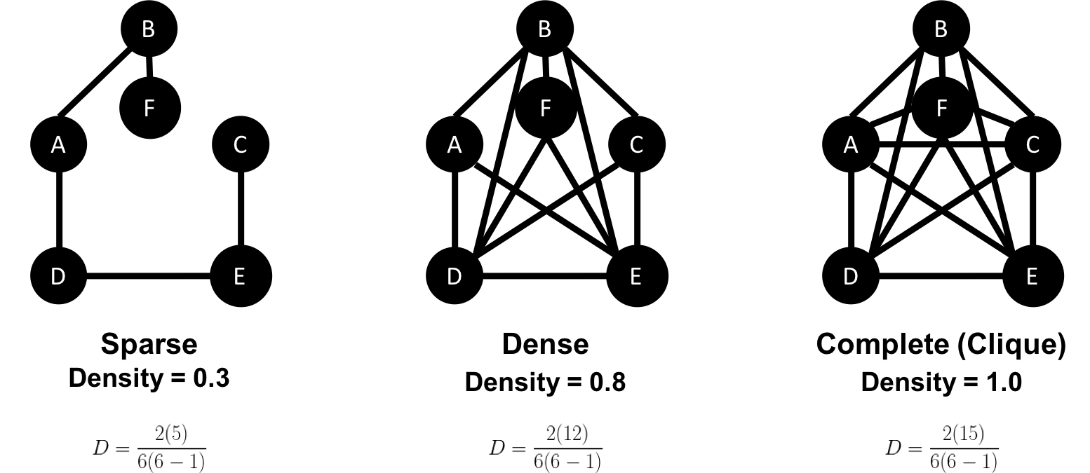
Most graphs based on real networks tend toward sparseness with an approximately linear correlation of total nodes to total relationships. This is especially the case where physical elements come into play such as the practical limitations to how many wires, pipes, roads, or friendships you can join at one point.
Some algorithms will return nonsensical results when executed on very sparse or dense graphs. If a graph is very sparse there may not be enough relationships for algorithms to compute useful results. Alternatively, very densely connected nodes don’t add much additional information since they are so highly connected. Dense nodes may also skew some results or add computational complexity.
Most networks contain data with multiple node and relationship types. Graph algorithms, however, frequently consider only one node type and one relationship type. Graphs with one one node type and relationship type are sometimes referred to as monopartite
A bipartite graph is a graph whose nodes can be divided into two sets, such that relationships only connect a node from one set to a node from a different set. Figure 2-11 shows an example of such a graph. It has 2 sets of nodes: a viewer set and a TV-show set. There are only relationships between the two sets and no intra-set connections. In other words in Graph 1, TV shows are only related to viewers, not other TV shows and viewers are likewise not directly linked to other viewers.
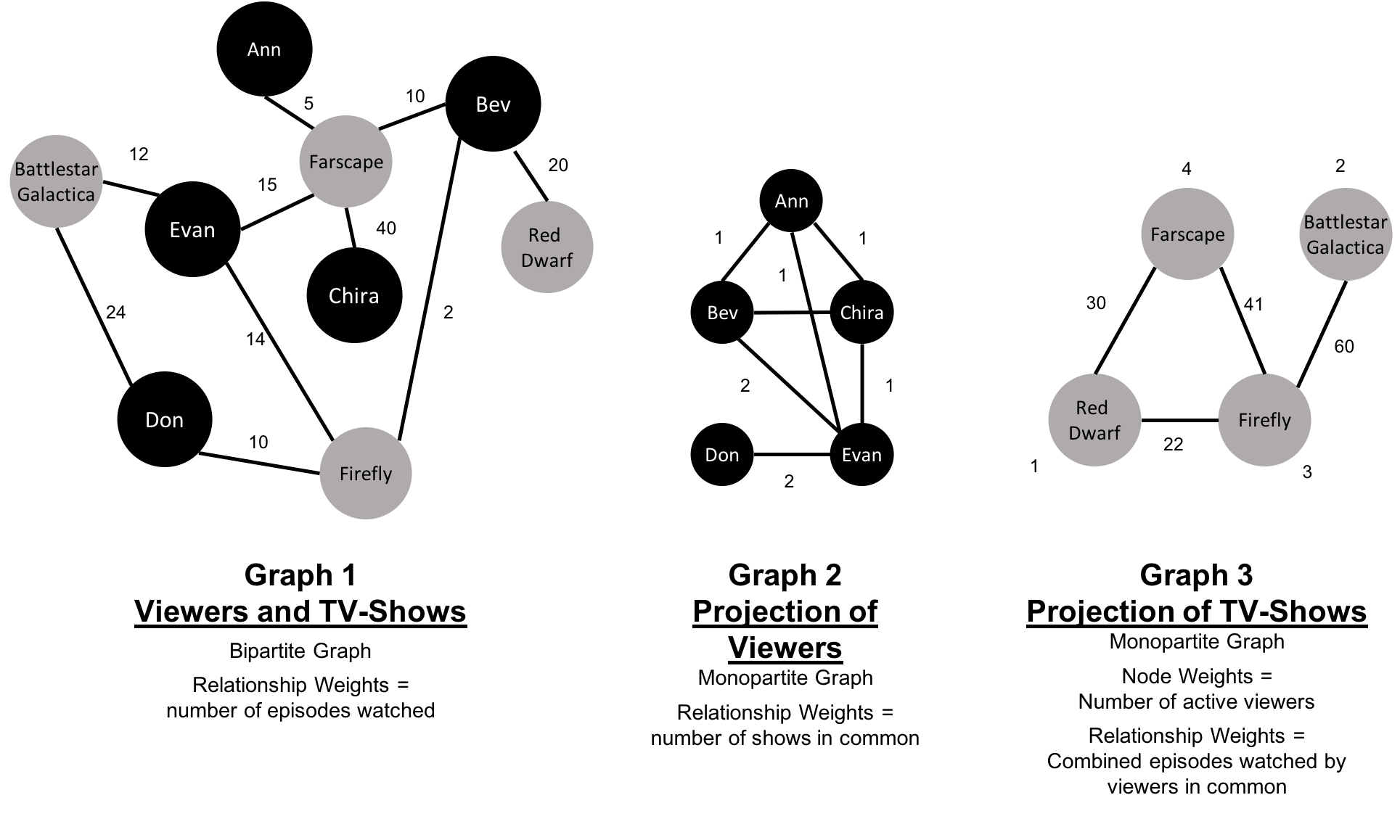
Starting from our bipartite graph of viewers and TV-shows we created two monopartite projections: Graph 2 of viewer connections based on movies in common and Graph 3 of TV shows based on viewers in common. We can also filter based on relationship type such as watched, rated, or reviewed.
Projecting monopartite graphs with inferred connections is an important part of graph analysis. These type of projections help uncover indirect relationships and qualities. For example, in Figure 2-11 Graph 2, we’ve weighted relationship in the TV show graph by the aggregated views by viewers common. In this case, Bev and Ann have watched only one TV show in common whereas Bev and Evan have two shows in common. This, or other metrics such as similarity, can be used to infer meaning between activities like watching Battlestar Galactica and Firefly. That can inform our recommendation for someone similar to Evan who, in Figure 2-11, just finished watching the last episode of Firefly.
K-partite graphs reference the number of node-types our data has (k). For example, if we have 3 node types, we’d have a tripartite graph. This just extends bipartite and monopartite concepts to account for more node types. Many real-world graphs, especially knowledge graphs, have a large value for k, as they combine many different concepts and types of information. An example of using a larger number of node-types is creating new recipes by mapping a recipe set to an ingredient set to a chemical compound—and then deducing new mixes that connect popular preferences. We could also reduce the number of nodes-types by generalization such as treating many forms of a node, like spinach or collards, as just as a “leafy green.”
Now that we’ve reviewed the types of graphs we’re most likely to work with, let’s learn about the types of graph algorithms we can execute on those graphs.
Let’s look into the three areas of analysis that are at the heart of graph algorithms. These categories correspond to the chapters on algorithms for pathfinding and search, centrality computation and community detection.
Paths are fundamental to graph analytics and algorithms. Finding shortest paths is probably the most frequent task performed with graph algorithms and is a precursor for several different types of analysis. The shortest path is the traversal route with the fewest hops or lowest weight. If the graph is directed, then it’s the shortest path between two nodes as allowed by the relationship directions.
Centrality is all about understanding which nodes are more important in a network. But what do we mean by importance? There are different types of centrality algorithms created to measure different things such as the ability to quickly spread information versus bridge between distinct groups. In this book, we are mostly focused on topological analysis: looking at how nodes and relationships are structured.
Connectedness is a core concept of graph theory that enables a sophisticated network analysis such as finding communities. Most real-world networks exhibit sub-structures (often quasi-fractal) of more or less independent subgraphs.
Connectivity is used to find communities and quantify the quality of groupings. Evaluating different types of communities within a graph can uncover structures, like hubs and hierarchies, and tendencies of groups to attract or repel others. These techniques are used to study the phenomenon in modern social networks that lead to echo chambers and filter-bubble effects, which are prevalent in modern political science.
Graphs are intuitive. They align with how we think about and draw systems. The primary tenets of working with graphs can be quickly assimilated once we’ve unraveled some of the terminology and layers. In this chapter we’ve explained the ideas and expressions used later in this book and described flavors of graphs you’ll come across.
Next, we’ll look at graph processing and types of analysis before diving into how to use graph algorithms in Apache Spark and Neo4j.
In this chapter, we’ll quickly cover different methods for graph processing and the most common platform approaches. We’ll look closer at the two platforms, Apache Spark and Neo4j, used in this book and when they may be appropriate for different requirements. Platform installation guidelines are included to prepare us for the next several chapters.
Graph analytical processing has unique qualities such as computation that is structure-driven, globally focused, and difficult to parse. In this section we’ll look at the general considerations for graph platforms and processing.
There’s a debate as to whether it’s better to scale up or scale out graph processing. Should you use powerful multicore, large-memory machines and focus on efficient data-structures and multithreaded algorithms? Or are investments in distributed processing frameworks and related algorithms worthwhile?
A useful approach is the Configuration that Outperforms a Single Thread (COST) as described in the research paper, “Scalability! But at what COST?”1. The concept is that a well configured system using an optimized algorithm and data-structure can outperform current general-purpose scale-out solutions. COST provides us with a way to compare a system’s scalability with the overhead the system introduces. It’s a method for measuring performance gains without rewarding systems that mask inefficiencies through parallelization. Separating the ideas of scalability and efficient use of resources will help build a platform configured explicitly for our needs.
Some approaches to graph platforms include highly integrated solutions that optimize algorithms, processing, and memory retrieval to work in tighter coordination.
There are different approaches for expressing data processing; for example, stream or batch processing or the map-reduce paradigm for records-based data. However, for graph data, there also exist approaches which incorporate the data-dependencies inherent in graph structures into their processing.
A node-centric approach uses nodes as processing units having them accumulate and compute state and communicate state changes via messages to their neighbors. This model uses the provided transformation functions for more straightforward implementations of each algorithm.
A relationship-centric approach has similiarities with the node-centric model but may perform better for subgraph and sequential analysis.
Graph-centric models process nodes within a subgraph independently of other subgraphs while (mimimal) communication to other subgraphs happens via messaging.
Traversal-centric models use the accumulation of data by the traverser while navigating the graph as their means of computation.
Algorithm-centric approaches use various methods to optimize implementations per algorithm. This is a hybrid of previous models.
Most of these graph specific approaches require the presence of the entire graph for efficient cross-topological operations. This is because separating and distributing the graph data leads to extensive data transfers and reshuffling between worker instances. This can be difficult for the many algorithms that need to iteratively process the global graph structure.
To address the requirements of graph processing several platforms have emerged. Traditionally there was a separation between graph compute engines and graph databases, that required users to move their data depending on their process needs.
Graph compute engines are read-only, non-transactional engines that focus on efficient execution of iterative graph analytics and queries of the whole graph. Graph compute engines support different definition and processing paradigms for graph algorithms, like vertex-centric (Pregel, Gather-Apply-Scatter) or map-reduce based approaches (PACT). Examples of such engines are Giraph, GraphLab, Graph-Engine, and Apache Spark.
Graph databases come from a transactional background focussing on fast writes and reads using smaller queries that generally touch only a small fraction of a graph. Their strengths are in operational robustness and high concurrent scalability for many users.
Choosing a production platform has many considersations such as the type of analysis to be run, performance needs, the existing environment, and team preferences. We use Apache Spark and Neo4j to showcase graph algorithms in this book because they both offer unique advantages.
Spark is an example of scale-out and node-centric graph compute engine. Its popular computing framework and libraries suppport a variety of data science workflows. Spark may be the right platform when our:
Algorithms are fundamentally parallelizable or partitionable.
Algorithm workflows needs “multi-lingual” operations in multiple tools and languages.
Analysis can be run off-line in batch mode.
Graph analysis is on data not transformed into a graph format.
Team has the expertise to code and implement new algorithms.
Team uses graph algorithms infrequently.
Team prefers to keep all data and analysis within the Hadoop ecosystem.
The Neo4j Graph Platform is an example of a tightly integrated graph database and algorithm-centric processing, optimized for graphs. Its popular for building graph-based applications and includes a graph algorithms library tuned for the native graph database. Neo4j may be the right platform when our:
Algorithms are more iterative and require good memory locality.
Algorithms and results are performance sensitive.
Graph analysis is on complex graph data and / or requires deep path traversal.
Analysis / Results are tightly integrated with transactional workloads.
Results are used to enrich an existing graph.
Team needs to integrate with graph-based visualization tools.
Team prefers prepackaged and supported algorithms.
Finally, some organizations select both Neo4j and Spark for graph processing. Using Spark for the high-level filtering and pre-processing of massive datasets and data integration and then the leveraging Neo4j for more specific processing and integration with graph-based applications.
Apache Spark (henceforth just Spark) is a analytics engine for large-scale data processing. It uses a table abstraction called a DataFrame to represent and process data in rows of named and typed columns. The platform integrates diverse data sources and supports several languages such as Scala, Python, and R.
Spark supports a variety of analytics libraries as shown in Figure 3-1. It’s memory-based system uses efficiently distributed compute graphs for it’s operations.
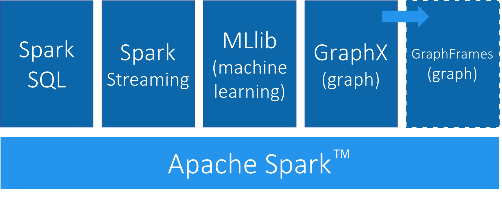
GraphFrames is a graph processing library for Spark that succeeded GraphX in 2016, although it is still separate from the core Apache Spark. GraphFrames is based on GraphX, but uses DataFrames as its underlying data structure. GraphFrames has support for the Java, Scala, and Python programming languages. In this book our examples will be based on the Python API (PySpark).
Nodes and relationships are represented as DataFrames with a unique ID for each node and a source and destination node for each relationship.
We can see an example of a nodes DataFrame in Table 3-1 and a relationships DataFrame in Table 3-2.
A GraphFrame based on these DataFrames would have two nodes: JFK and SEA, and one relationship from JFK to SEA.
| id | city | state |
|---|---|---|
JFK |
New York |
NY |
SEA |
Seattle |
WA |
| src | dst | delay | tripId |
|---|---|---|---|
JFK |
SEA |
45 |
1058923 |
The nodes DataFrame must have an id column-the value in this column is used to uniquely identify that node.
The relationships DataFrame must have src and dst columns-the values in these columns describe which nodes are connected and should refer to entries that appear in the id column of the nodes DataFrame.
The nodes and relationships DataFrames can be loaded using any of the DataFrame data sources3, including Parquet, JSON, and CSV. Queries are described using a combination of the PySpark API and Spark SQL.
GraphFrames also provides users with an extension point4 to implement algorithms that aren’t available out of the box.
We can download Spark from the Apache Spark website5. Once we’ve downloaded Spark we need to install the following libraries to execute Spark jobs from Python:
pip install pyspark
pip install git+https://github.com/munro/graphframes.git@release-0.5.0#egg=graphframes
Once we’ve done that we can launch the pyspark REPL by executing the following command:
exportSPARK_VERSION="spark-2.4.0-bin-hadoop2.7"./${SPARK_VERSION}/bin/pyspark\--driver-memory 2g\--executor-memory 6g\--packages graphframes:graphframes:0.5.0-spark2.1-s_2.11
At the time of writing the latest released version of Spark is spark-2.4.0-bin-hadoop2.7 but that may have changed by the time you read this so be sure to change the SPARK_VERSION environment variable appropriately.
We’re now ready to learn how to run graph algorithms on Spark.
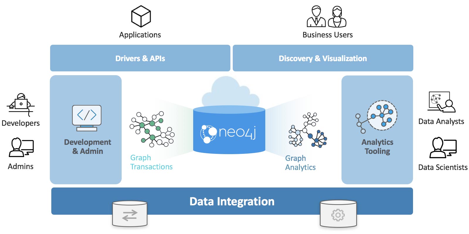
The Neo4j Graph Platform provides transactional processing and analytical processing of graph data. It includes graph storage and compute with data management and analytics tooling. The set of integrated tools sits on top of a common protocol, API, and query language (Cypher) to provide effective access for different uses as shown in Figure 3-2.
In this book we’ll be using the Neo4j Graph Algorithms library7, which was released in July 2017. The library can be installed as a plugin alongside the database, and provides a set of user defined procedures8 that can be executed via the Cypher query language.
The graph algorithm library includes parallel versions of algorithms supporting graph-analytics and machine-learning workflows. The algorithms are executed on top of a task based parallel computation framework and are optimized for the Neo4j platform. For different graph sizes there are internal implementations that scale up to tens of billions of nodes and relationships.
Results can be streamed to the client as a tuples stream and tabular results can be used as a driving table for further processing. Results can also be optionally written back to the database efficiently as node-properties or relationship types.
In this book, we’ll also be using the Neo4j APOC (Awesome Procedures On Cypher) library 9. APOC consists of more than 450 procedures and functions to help with common tasks such as data integration, data conversion, and model refactoring.
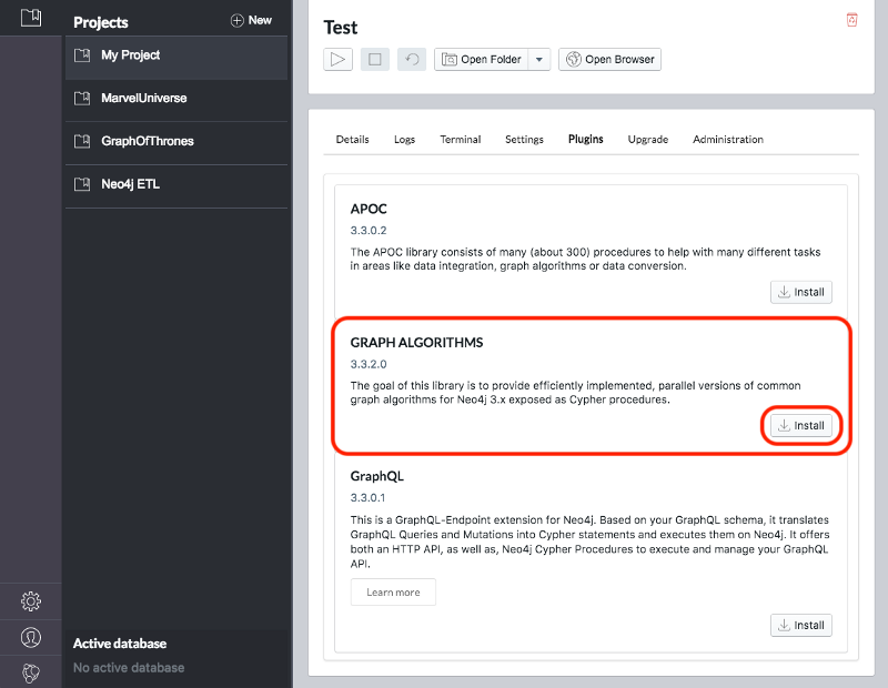
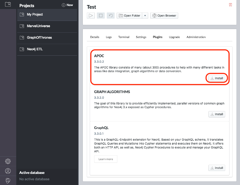
We can download the Neo4j desktop from the Neo4j website10. The Graph Algorithms and APOC libraries can be installed as plugins once we’ve installed and launched the Neo4j desktop.
Once we’ve created a project we need to select it on the left menu and click Manage on the database where we want to install the plugins.
Under the Plugins tab we’ll see options for several plugins and we need to click the Install button for Graph Algorithms and APOC.
See Figure 3-3 and Figure 3-4.
Jennifer Reif explains the installation process in more detail in her blog post “Explore New Worlds—Adding Plugins to Neo4j” 11. We’re now ready to learn how to run graph algorithms on Neo4j.
The last few chapters we’ve described why graph analytics is important to studying real-work networks and looked at fundamental graph concepts, processing, and analysis. This puts us on solid footing for understanding how to apply graph algorithms. In the next chapters we’ll discover how to run graph algorithms with examples in Apache Spark and Neo4j.
1 https://www.usenix.org/system/files/conference/hotos15/hotos15-paper-mcsherry.pdf
2 https://kowshik.github.io/JPregel/pregel_paper.pdf
3 http://spark.apache.org/docs/latest/sql-programming-guide.html#data-sources
4 https://graphframes.github.io/user-guide.html#message-passing-via-aggregatemessages
5 http://spark.apache.org/downloads.html
6 http://shop.oreilly.com/product/0636920034957.do
7 https://neo4j.com/docs/graph-algorithms/current/
8 https://neo4j.com/docs/developer-manual/current/extending-neo4j/procedures/
9 https://github.com/neo4j-contrib/neo4j-apoc-procedures
10 https://neo4j.com/download/
11 https://medium.com/neo4j/explore-new-worlds-adding-plugins-to-neo4j-26e6a8e5d37e
Pathfinding and Graph Search algorithms are used to identify optimal routes through a graph, and are often a required first step for many other types of analysis. In this chapter we’ll explain how these algorithms work and show examples in Spark and Neo4j. In cases where an algorithm is only available in one platform, we’ll provide just that one example or illustrate how you can customize your implementation.
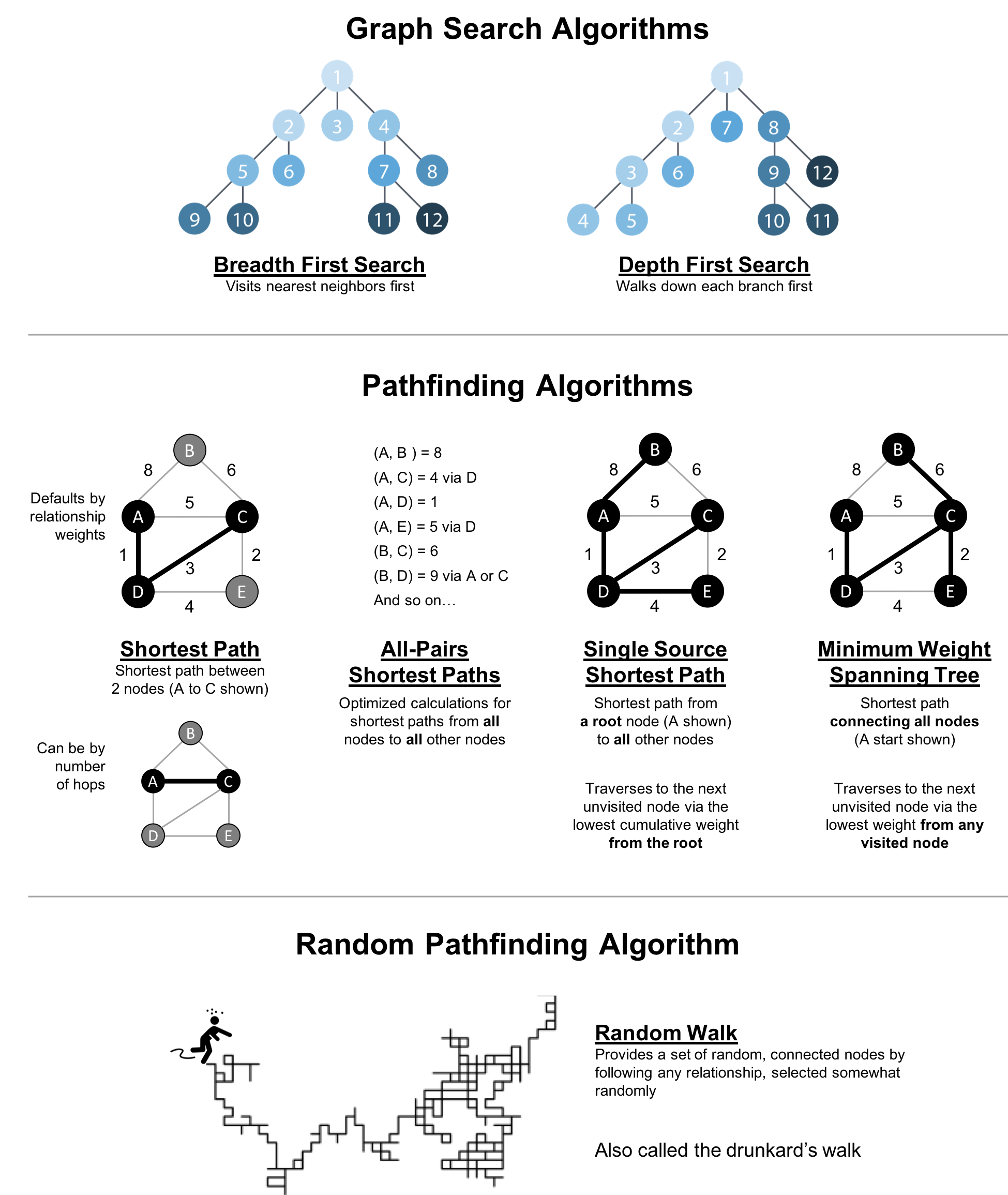
Graph search algorithms explore a graph either for general discovery or explicit search. These algorithms carve paths through the graph, but there is no expectation that those paths are computationally optimal. In this chapter we will go into detail on the two types of of graph search algorithms, Breadth First Search and Depth First Search because they are so fundamental for traversing and searching a graph.
Pathfinding algorithms build on top of graph search algorithms and explore routes between nodes, starting at one node and traversing through relationships until the destination has been reached. These algorithms find the cheapest path in terms of the number of hops or weight. Weights can be anything measured, such as time, distance, capacity, or cost.
Specifically the algorithms we’ll cover are:
Shortest Path with 2 useful variations (A* and Yen’s) for finding the shortest path or paths between two chosen nodes
Single Source Shortest Path for finding the shortest path from a chosen node to all others
Minimum Spanning Tree for finding a connected tree structure with the smallest cost for visiting all nodes from a chosen node
Random Walk because it’s a useful pre-processing/sampling step for machine learning workflows and other graph algorithms
Figure 4-1 shows the key differences between these types of algorithms and Table 4-1 is a quick reference to what each algorithm computes with an example use.
| Algorithm Type | What It Does | Example Uses | Spark Example | Neo4j Example |
|---|---|---|---|---|
Traverses a tree structure by fanning out to explore the nearest neighbors and then their sub-level neighbors. |
Locate neighbor nodes in GPS systems to identify nearby places of interest. |
Yes |
No |
|
Traverses a tree structure by exploring as far as possible down each branch before backtracking. |
Discover an optimal solution path in gaming simulations with hierarchical choices. |
No |
No |
|
Calculates the shortest path between a pair of nodes. |
Find driving directions between two locations. |
Yes |
Yes |
|
Calculates the shortest path between all pairs of nodes in the graph. |
Evaluate alternate routes around a traffic jam. |
Yes |
Yes |
|
Calculates the shorest path between a single root node and all other nodes. |
Least cost routing of phone calls. |
Yes |
Yes |
|
Calculates the path in a connected tree structure with the smallest cost for visiting all nodes. |
Optimize connected routing such as laying cable or garbage collection. |
No |
Yes |
|
Returns a list of nodes along a path of specified size by randomly choosing relationships to traverse. |
Augment training for machine learning or data for graph algorithms. |
No |
Yes |
First we’ll take a look at the dataset for our examples and walk through how to import the data into Apache Spark and Neo4j. For each algorithm, we’ll start with a short description of the algorithm and any pertinent information on how it operates. Most sections also include guidance on when to use any related algorithms. Finally we provide working sample code using a sample dataset at the end of each section.
Let’s get started!
All connected data contains paths between nodes and transportation datasets show this in an intuitive and accessible way. The examples in this chapter run against a graph containing a subset of the European road network 1. You can download the nodes 2 and relationships 3 files from the book’s GitHub repository 4.
transport-nodes.csv
| id | latitude | longitude | population |
|---|---|---|---|
Amsterdam |
52.379189 |
4.899431 |
821752 |
Utrecht |
52.092876 |
5.104480 |
334176 |
Den Haag |
52.078663 |
4.288788 |
514861 |
Immingham |
53.61239 |
-0.22219 |
9642 |
Doncaster |
53.52285 |
-1.13116 |
302400 |
Hoek van Holland |
51.9775 |
4.13333 |
9382 |
Felixstowe |
51.96375 |
1.3511 |
23689 |
Ipswich |
52.05917 |
1.15545 |
133384 |
Colchester |
51.88921 |
0.90421 |
104390 |
London |
51.509865 |
-0.118092 |
8787892 |
Rotterdam |
51.9225 |
4.47917 |
623652 |
Gouda |
52.01667 |
4.70833 |
70939 |
transport-relationships.csv
| src | dst | relationship | cost |
|---|---|---|---|
Amsterdam |
Utrecht |
EROAD |
46 |
Amsterdam |
Den Haag |
EROAD |
59 |
Den Haag |
Rotterdam |
EROAD |
26 |
Amsterdam |
Immingham |
EROAD |
369 |
Immingham |
Doncaster |
EROAD |
74 |
Doncaster |
London |
EROAD |
277 |
Hoek van Holland |
Den Haag |
EROAD |
27 |
Felixstowe |
Hoek van Holland |
EROAD |
207 |
Ipswich |
Felixstowe |
EROAD |
22 |
Colchester |
Ipswich |
EROAD |
32 |
London |
Colchester |
EROAD |
106 |
Gouda |
Rotterdam |
EROAD |
25 |
Gouda |
Utrecht |
EROAD |
35 |
Den Haag |
Gouda |
EROAD |
32 |
Hoek van Holland |
Rotterdam |
EROAD |
33 |
Figure 4-2 shows the target graph that we want to construct:
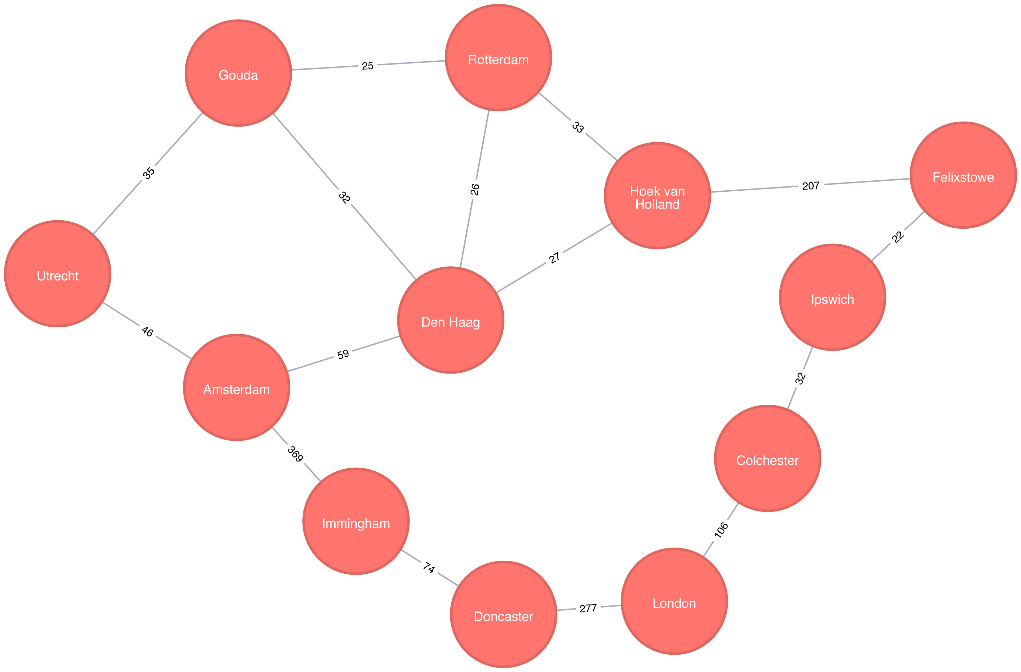
For simplicity we consider the graph in Figure 4-2 to be undirected because most roads between cities are bidirectional. We’d get slightly different results if we evaluated the graph as directed because of the small number of one-way streets, but the overall approach remains similar. Conversely, both Apache Spark and Neo4j operate on directed graphs. In cases like this where we want to work with undirected graphs (bidirectional roads) there is an easy workaround:
For Apache Spark we’ll create two relationships for each row in transport-relationships.csv - one going from dst to src and one from src to dst.
For Neo4j we’ll create a single relationship and then ignore the relationship direction when we run the algorithms.
Having understood those little modeling workarounds, we can now get on with loading graphs into Apache Spark and Neo4j from the example CSV files.
Starting with Apache Spark, we’ll first import the packages we need from Spark and the GraphFrames package.
frompyspark.sql.typesimport*fromgraphframesimport*
The following function creates a GraphFrame from the example CSV files:
defcreate_transport_graph():node_fields=[StructField("id",StringType(),True),StructField("latitude",FloatType(),True),StructField("longitude",FloatType(),True),StructField("population",IntegerType(),True)]nodes=spark.read.csv("data/transport-nodes.csv",header=True,schema=StructType(node_fields))rels=spark.read.csv("data/transport-relationships.csv",header=True)reversed_rels=rels.withColumn("newSrc",rels.dst)\.withColumn("newDst",rels.src)\.drop("dst","src")\.withColumnRenamed("newSrc","src")\.withColumnRenamed("newDst","dst")\.select("src","dst","relationship","cost")relationships=rels.union(reversed_rels)returnGraphFrame(nodes,relationships)
Loading the nodes is easy, but for the relationships we need to do a little preprocessing so that we can create each relationship twice.
Now let’s call that function:
g=create_transport_graph()
Now for Neo4j. We’ll start by loading the nodes:
WITH"https://github.com/neo4j-graph-analytics/book/raw/master/data/transport-nodes.csv"ASuriLOAD CSVWITHHEADERS FROM uriASrowMERGE (place:Place {id:row.id})SETplace.latitude = toFloat(row.latitude),place.longitude = toFloat(row.latitude),place.population = toInteger(row.population)
And now the relationships:
WITH"https://github.com/neo4j-graph-analytics/book/raw/master/data/transport-relationships.csv"ASuriLOAD CSVWITHHEADERS FROM uriASrowMATCH(origin:Place {id: row.src})MATCH(destination:Place {id: row.dst})MERGE (origin)-[:EROAD {distance: toInteger(row.cost)}]->(destination)
Although we’re storing a directed relationship we’ll ignore the direction when we execute algorithms later in the chapter.
Breadth First Search (BFS) is one of the fundamental graph traversal algorithms. It starts from a chosen node and explores all of its neighbors at one hop away before visiting all neighbors at two hops away and so on.
The algorithm was first published in 1959 by Edward F. Moore who used it to find the shortest path out of a maze. It was later developed into a wire routing algorithm by C. Y. Lee in 1961 as described in “An Algorithm for Path Connections and Its Applications” 5
It is most commonly used as the basis for other more goal-oriented algorithms. For example Shortest Path, Connected Components, and Closeness Centrality all use the BFS algorithm. It can also be used to find the shortest path between nodes.
Figure 4-3 shows the order that we would visit the nodes of our transport graph if we were performing a breadth first search that started from Den Haag (in English, the Dutch city of The Hague). We first visit all of Den Haag’s direct neighbors, before visiting their neighbors, and their neighbors neighbors, until we’ve run out of relationships to traverse.
Apache Spark’s implementation of the Breadth First Search algorithm finds the shortest path between two nodes by the number of relationships (i.e. hops) between them. You can explicitly name your target node or add a criteria to be met.
For example, we can use the bfs function to find the first medium sized (by European standards) city that has a population of between 100,000 and 300,000 people.
Let’s first check which places have a population matching that criteria:
g.vertices\.filter("population > 100000 and population < 300000")\.sort("population")\.show()
This is the output we’ll see:
| id | latitude | longitude | population |
|---|---|---|---|
Colchester |
51.88921 |
0.90421 |
104390 |
Ipswich |
52.05917 |
1.15545 |
133384 |
There are only two places matching our criteria and we’d expect to reach Ipswich first based on a breadth first search.
The following code finds the shortest path from Den Haag to a medium-sized city:
from_expr="id='Den Haag'"to_expr="population > 100000 and population < 300000 and id <> 'Den Haag'"result=g.bfs(from_expr,to_expr)
result contains columns that describe the nodes and relationships between the two cities.
We can run the following code to see the list of columns returned:
(result.columns)
This is the output we’ll see:
['from', 'e0', 'v1', 'e1', 'v2', 'e2', 'to']
Columns beginning with e represent relationships (edges) and columns beginning with v represent nodes (vertices).
We’re only interested in the nodes so let’s filter out any columns that begin with e from the resulting DataFrame.
columns=[columnforcolumninresult.columnsifnotcolumn.startswith("e")]result.select(columns).show()
If we run the code in pyspark we’ll see this output:
| from | v1 | v2 | to |
|---|---|---|---|
[Den Haag, 52.078… |
[Hoek van Holland… |
[Felixstowe, 51.9… |
[Ipswich, 52.0591… |
As expected the bfs algorithm returns Ipswich!
Remember that this function is satisfied when it finds the first matching criteria and as you can see in Figure 4-3, Ipswich is evaluated before Colchester.
Depth First Search (DFS) is the other fundamental graph traversal algorithm. It was originally invented by French mathematician Charles Pierre Trémaux as a strategy for solving mazes. It starts from a chosen node, picks one of its neighbors and then traverses as far as it can along that path before backtracking.
Figure 4-4 shows the order that we would visit the nodes of our transport graph if we were performing a DFS that started from Den Haag. We start by traversing from Den Haag to Amsterdam, and are then able to get to every other node in the graph without needing to backtrack at all!

The Shortest Path algorithm calculates the shortest (weighted) path between a pair of nodes. It’s useful for user interactions and dynamic workflows because it works in real-time.
Pathfinding has a history dating back to the 19th century and is considered to be a classic graph problem. It gained prominence in the early 1950s in the context of alternate routing, that is, finding the second shortest route if the shortest route is blocked. In 1956, Edsger Dijkstra created the most well known of the shortest path algorithms.
Dijkstra’s Shortest Path operates by first finding the lowest weight relationship from the start node to directly connected nodes. It keeps track of those weights and moves to the “closest” node. It then performs the same calculation but now as a cumulative total from the start node. The algorithm continues to do this, evaluating a “wave” of cumulative weights and always choosing the lowest cumulative path to advance along. It reaches the destination node.
You’ll notice in graph analytics the use of the terms weight, cost, distance, and hop when describing relationships and paths. “Weight” is the numeric value of a particular property of a relationship. “Cost” is similarly used but is more often when considering the total weight of a path.
“Distance” is often used within an algorithm as the name of the relationship property that indicates the cost of traversing between a pair of nodes. It’s not required that this be an actual physical measure of distance. “Hop” is commonly used to express the number of relationships between two nodes. You may see some of these terms combined such as, “it’s a 5-hop distance to London,” or, “that’s the lowest cost for the distance.”
Use Shortest Path to find optimal routes between a pair of nodes, based on either the number of hops or any weighted relationship value. For example, it can provide real-time answers about degrees of separation, the shortest distance between points, or the least expensive route. You can also use this algorithm to simply explore the connections between particular nodes.
Example use cases include:
Finding directions between locations: Web mapping tools such as Google Maps use the Shortest Path algorithm, or a close variant, to provide driving directions.
Social networks to find the degrees of separation between people. For example, when you view someone’s profile on LinkedIn, it will indicate how many people separate you in the graph, as well as listing your mutual connections.
The Bacon Number to find the number of degrees of separation between an actor and Kevin Bacon based on the movies they’ve appeared in. An example of this can be seen on the Oracle of Bacon 6 website. The Erdős Number Project 7 provides a similar graph analysis based on collaboration with Paul Erdős, one of the most prolific mathematicians of the 20th century.
Dijkstra does not support negative weights. The algorithm assumes that adding a relationship to a path can never make a path shorter—an invariant that would be violated with negative weights.
In the Breadth First Search with Apache Spark section we learned how to find the shortest path between two nodes. That shortest path was based on hops and therefore isn’t the same as the shortest weighted path, which would tell us the shortest total distance between cities.
If we want to find the shortest weighted path (i.e. distance) we need to use the cost property, which is used for various types of weighting.
This option is not available out of the box with GraphFrames, so we need to write our own version of weighted shortest path using its aggregateMessages framework 8.
More information on aggregateMessages can be found in the Message passing via AggregateMessages 9 section of the GraphFrames user guide.
When available, we recommend you leverage pre-existing and tested libraries. Writing your own functions, especially for more complicated algorithms, require a deeper understanding of your data and calculations.
Before we create our function, we’ll import some libraries that we’ll use:
fromscripts.aggregate_messagesimportAggregateMessagesasAMfrompyspark.sqlimportfunctionsasF
The aggregate_messages module contains some useful helper functions.
It’s part of the GraphFrames library but isn’t available in a published artefact at the time of writing.
We’ve copied the module 10 into the book’s GitHub repository so that we can use it in our examples.
Now let’s write our function. We first create a User Defined Function that we’ll use to build the paths between our source and destination:
add_path_udf=F.udf(lambdapath,id:path+[id],ArrayType(StringType()))
And now for the main function which calculates the shortest path starting from an origin and returns as soon as the destination has been visited:
defshortest_path(g,origin,destination,column_name="cost"):ifg.vertices.filter(g.vertices.id==destination).count()==0:return(spark.createDataFrame(sc.emptyRDD(),g.vertices.schema).withColumn("path",F.array()))vertices=(g.vertices.withColumn("visited",F.lit(False)).withColumn("distance",F.when(g.vertices["id"]==origin,0).otherwise(float("inf"))).withColumn("path",F.array()))cached_vertices=AM.getCachedDataFrame(vertices)g2=GraphFrame(cached_vertices,g.edges)whileg2.vertices.filter('visited == False').first():current_node_id=g2.vertices.filter('visited == False').sort("distance").first().idmsg_distance=AM.edge[column_name]+AM.src['distance']msg_path=add_path_udf(AM.src["path"],AM.src["id"])msg_for_dst=F.when(AM.src['id']==current_node_id,F.struct(msg_distance,msg_path))new_distances=g2.aggregateMessages(F.min(AM.msg).alias("aggMess"),sendToDst=msg_for_dst)new_visited_col=F.when(g2.vertices.visited|(g2.vertices.id==current_node_id),True).otherwise(False)new_distance_col=F.when(new_distances["aggMess"].isNotNull()&(new_distances.aggMess["col1"]<g2.vertices.distance),new_distances.aggMess["col1"])\.otherwise(g2.vertices.distance)new_path_col=F.when(new_distances["aggMess"].isNotNull()&(new_distances.aggMess["col1"]<g2.vertices.distance),new_distances.aggMess["col2"].cast("array<string>"))\.otherwise(g2.vertices.path)new_vertices=(g2.vertices.join(new_distances,on="id",how="left_outer").drop(new_distances["id"]).withColumn("visited",new_visited_col).withColumn("newDistance",new_distance_col).withColumn("newPath",new_path_col).drop("aggMess","distance","path").withColumnRenamed('newDistance','distance').withColumnRenamed('newPath','path'))cached_new_vertices=AM.getCachedDataFrame(new_vertices)g2=GraphFrame(cached_new_vertices,g2.edges)ifg2.vertices.filter(g2.vertices.id==destination).first().visited:return(g2.vertices.filter(g2.vertices.id==destination).withColumn("newPath",add_path_udf("path","id")).drop("visited","path").withColumnRenamed("newPath","path"))return(spark.createDataFrame(sc.emptyRDD(),g.vertices.schema).withColumn("path",F.array()))
If we store references to any DataFrames in our functions we need to cache them using the AM.getCachedDataFrame function or we’ll encounter a memory leak when we execute the function.
In the shortest_path function we use this function to cache the vertices and new_vertices DataFrames.
If we want to find the shortest path between Amsterdam and Colchester we could call that function like so:
result=shortest_path(g,"Amsterdam","Colchester","cost")result.select("id","distance","path").show(truncate=False)
which would return the following results:
| id | distance | path |
|---|---|---|
Colchester |
347.0 |
[Amsterdam, Den Haag, Hoek van Holland, Felixstowe, Ipswich, Colchester] |
The total distance of the shortest path between Amsterdam and Colchester is 347 km and takes us via Den Haag, Hoek van Holland, Felixstowe, and Ipswich. By contrast the shortest path in terms of number of relationships between the locations, which we worked out with the Breadth First Search algorithm (refer back to Figure 4-4), would take us via Immingham, Doncaster, and London.
The Neo4j Graph Algorithms library also has a built-in shortest weighted path procedure that we can use.
All of Neo4j’s shortest path algorithms assume that the underlying graph is undirected.
You can override this by passing in the parameter direction: "OUTGOING" or direction: "INCOMING".
We can execute the weighted shortest path algorithm to find the shortest path between Amsterdam and London like this:
MATCH(source:Place {id:"Amsterdam"}),(destination:Place {id:"London"})CALL algo.shortestPath.stream(source, destination,"distance")YIELD nodeId, costRETURNalgo.getNodeById(nodeId).idASplace, cost
The parameters passed to this algorithm are:
source–the node where our shortest path search begins
destination–the node where our shortest path ends
distance–the name of the relationship property that indicates the cost of traversing between a pair of nodes.
The cost is the number of kilometers between two locations.
The query returns the following result:
| place | cost |
|---|---|
Amsterdam |
0.0 |
Den Haag |
59.0 |
Hoek van Holland |
86.0 |
Felixstowe |
293.0 |
Ipswich |
315.0 |
Colchester |
347.0 |
London |
453.0 |
The quickest route takes us via Den Haag, Hoek van Holland, Felixstowe, Ipswich, and Colchester! The cost shown is the cumulative total as we progress through cities. First, we go from Amsterdam to Den Haag, at a cost of 59. Then, we go from Den Haag to Hoek van Holland, at a cumulative cost of 86–and so on. Finally, we arrive from Colchester to London, for a total cost of 45 km.
We can also run an unweighted shortest path in Neo4j.
To have Neo4j’s shortest path algorithm do this we can pass null as the 3rd parameter to the procedure.
The algorithm will then assume a default weight of 1.0 for each relationship.
MATCH(source:Place {id:"Amsterdam"}),(destination:Place {id:"London"})CALL algo.shortestPath.stream(source, destination,null)YIELD nodeId, costRETURNalgo.getNodeById(nodeId).idASplace, cost
This query returns the following output:
| place | cost |
|---|---|
Amsterdam |
0.0 |
Immingham |
1.0 |
Doncaster |
2.0 |
London |
3.0 |
Here the cost is the cumulative total for relationships (or hops.) This is the same path as we would see using Breadth First Search in Spark.
We could even work out the total distance of following this path by writing a bit of post processing Cypher. The following procedure calculates the shortest unweighted path and then works out what the actual cost of that path would be:
MATCH(source:Place {id:"Amsterdam"}),(destination:Place {id:"London"})CALL algo.shortestPath.stream(source, destination,null)YIELD nodeId, costWITHcollect(algo.getNodeById(nodeId))ASpathUNWINDrange(0, size(path)-1)ASindexWITHpath[index]AScurrent, path[index+1]ASnextWITHcurrent, next, [(current)-[r:EROAD]-(next) | r.distance][0]ASdistanceWITHcollect({current: current, next:next, distance: distance})ASstopsUNWINDrange(0, size(stops)-1)ASindexWITHstops[index]ASlocation, stops, indexRETURNlocation.current.idASplace,reduce(acc=0.0,distancein[stopinstops[0..index] | stop.distance] |acc + distance)AScost
It’s a bit unwieldy-the tricky part is figuring out how to massage the data in such a way that we can see the cumulative cost over the whole journey. The query returns the following result:
| place | cost |
|---|---|
Amsterdam |
0.0 |
Immingham |
369.0 |
Doncaster |
443.0 |
London |
720.0 |
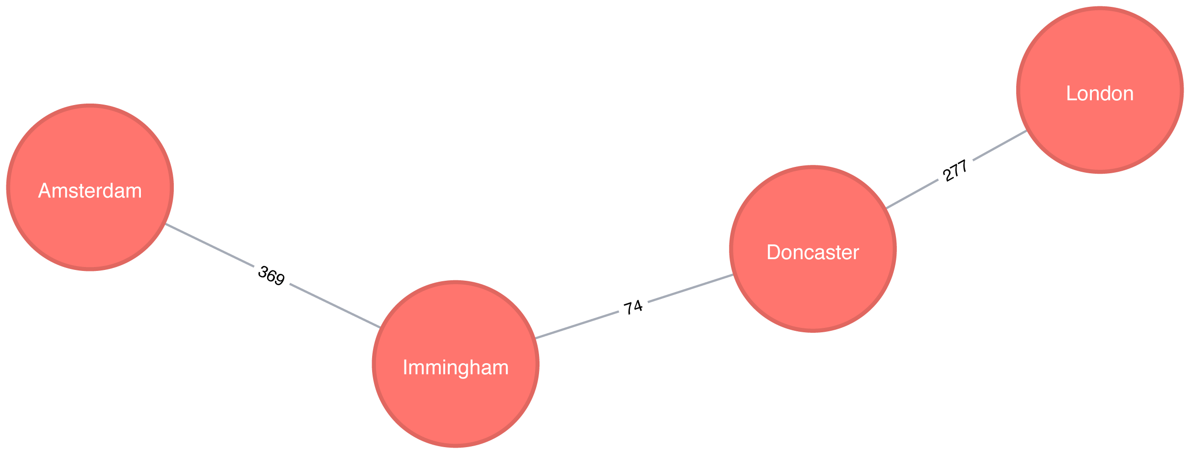
Figure 4-6 shows the unweighted shortest path from Amsterdam to London. It has a total cost of 720 km, routing us through the fewest number of cities. The weighted shortest path, however, had a total cost of 453 km even though we visited more towns.
The A* algorithm improves on Dijkstra’s algorithm, by finding shortest paths more quickly. It does this by allowing the inclusion of extra information that the algorithm can use, as part of a heuristic function, when determining which paths to explore next.
The algorithm was invented by Peter Hart, Nils Nilsson, and Bertram Raphael and described in their 1968 paper “A Formal Basis for the Heuristic Determination of Minimum Cost Paths” 11.
The A* algorithm operates by determining which of its partial paths to expand at each iteration of its main loop. It does so based on an estimate of the cost still to go to the goal node.
A* selects the path that minimizes the following function:
f(n) = g(n) + h(n)
where :
g(n) - the cost of the path from the starting point to node n.
h(n) - the estimated cost of the path from node n to the destination node, as computed by a heuristic.
In Neo4j’s implementation, geospatial distance is used as the heuristic. In our example transportation dataset we use the latitude and longitude of each location as part of the heuristic function.
The following query executes the A* algorithm to find the shortest path between Den Haag and London:
MATCH(source:Place {id:"Den Haag"}),(destination:Place {id:"London"})CALL algo.shortestPath.astar.stream(source, destination,"distance","latitude","longitude")YIELD nodeId, costRETURNalgo.getNodeById(nodeId).idASplace, cost
The parameters passed to this algorithm are:
source-the node where our shortest path search begins
destination-the node where our shortest path search ends
distance-the name of the relationship property that indicates the cost of traversing between a pair of nodes. The cost is the number of kilometers between two locations.
latitude-the name of the node property used to represent the latitude of each node as part of the geospatial heuristic calculation
longitude-the name of the node property used to represent the longitude of each node as part of the geospatial heuristic calculation
Running this procedure gives the following result:
| place | cost |
|---|---|
Den Haag |
0.0 |
Hoek van Holland |
27.0 |
Felixstowe |
234.0 |
Ipswich |
256.0 |
Colchester |
288.0 |
London |
394.0 |
We’d get the same result using the Shortest Path algorithm, but on more complex datasets the A* algorithm will be faster as it evaluates fewer paths.
Yen’s algorithm is similar to the shortest path algorithm, but rather than finding just the shortest path between two pairs of nodes, it also calculates the 2nd shortest path, 3rd shortest path, up to k-1 deviations of shortest paths.
Jin Y. Yen invented the algorithm in 1971 and described it in “Finding the K Shortest Loopless Paths in a Network” 12. This algorithm is useful for getting alternative paths when finding the absolute shortest path isn’t our only goal.
The following query executes the Yen’s algorithm to find the shortest paths between Gouda and Felixstowe.
MATCH(start:Place {id:"Gouda"}),(end:Place {id:"Felixstowe"})CALL algo.kShortestPaths.stream(start, end, 5,'distance')YIELD index, nodeIds, path, costsRETURNindex,[node inalgo.getNodesById(nodeIds[1..-1]) |node.id]ASvia,reduce(acc=0.0, costincosts | acc + cost)AStotalCost
The parameters passed to this algorithm are:
start-the node where our shortest path search begins
end-the node where our shortest path search ends
5-the maximum number of shortest paths to find
distance-the name of the relationship property that indicates the cost of traversing between a pair of nodes. The cost is the number of kilometers between two locations.
After we get back the shortest paths we look up the associated node for each node id and then we filter out the start and end nodes from the collection.
Running this procedure gives the following result:
| index | via | totalCost |
|---|---|---|
0 |
[Rotterdam, Hoek van Holland] |
265.0 |
1 |
[Den Haag, Hoek van Holland] |
266.0 |
2 |
[Rotterdam, Den Haag, Hoek van Holland] |
285.0 |
3 |
[Den Haag, Rotterdam, Hoek van Holland] |
298.0 |
4 |
[Utrecht, Amsterdam, Den Haag, Hoek van Holland] |
374.0 |
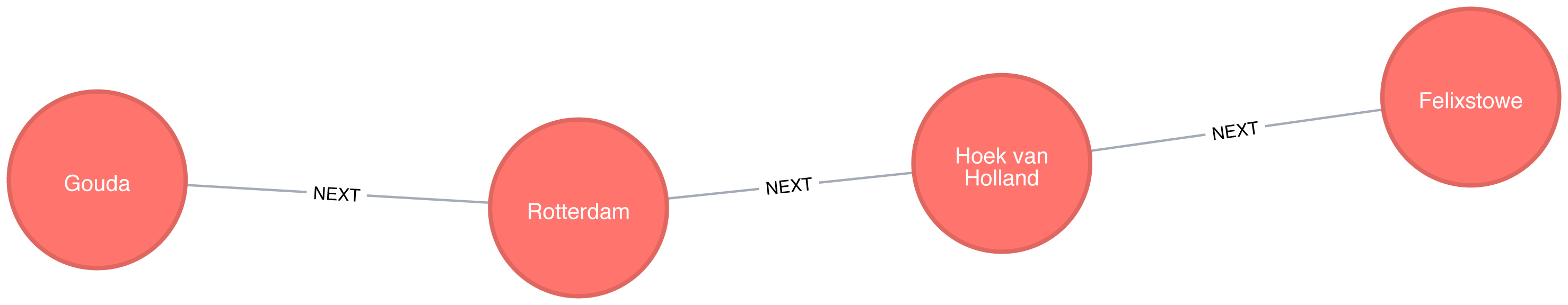
The shortest path between Gouda and Felixstowe in Figure 4-7 is interesting in comparison to the results ordered by total cost. It illustrates that sometimes you may want to consider several shortest paths or other parameters. In this example, the second shortest route is only 1 km longer than the shortest one. If we prefer the scenery, we might choose the slightly longer route.
The All Pairs Shortest Path (APSP) calculates the shortest (weighted) path between all pairs of nodes. The algorithm can do this more quickly than calling the Single Source Shortest Path algorithm for every pair of nodes in the graph.
It optimizes operations by keeping track of the distances calculated so far and running on nodes in parallel. Those known distances can then be reused when calculating the shortest path to an unseen node. You can follow the example in the next section to get a better understanding of how the algorithm works.
Some pairs of nodes might not be reachable from each other, which means that there is no shortest path between these nodes. The algorithm doesn’t return distances for these pairs of nodes.
The calculations for All Pairs Shortest Paths is easiest to understand when you follow a sequence of operations. The diagram in Figure 4-8 walks through the steps for A node calculations.
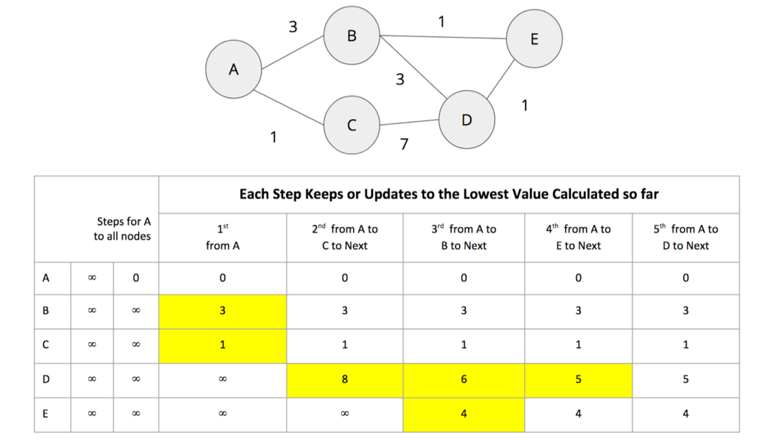
Initially the algorithm assumes an infinite distance to all nodes. When a start node is selected, then the distance to that node is set to 0.
From start node A we evaluate the cost of moving to the nodes we can reach and update those values. Looking for the smallest value, we have a choice of B (cost of 3) or C (cost of 1). C is selected for the next phase of traversal.
Now from node C, the algorithm updates the cumulative distances from A to nodes that can be reached directly from C. Values are only updated when a lower cost has been found:
A=0, B=3, C=1, D=8, E=∞
B is selected as the next closest node that hasn’t already been visited. B has relationships to nodes A, D, and E. The algorithm works out the distance to A, D, and E by summing the distance from A to B with the distance from B to those nodes. Note that the lowest cost from the start node (A) to the current node is always preserved as a sunk cost. The distance calculation results:
d(A,A) = d(A,B) + d(B,A) = 3 + 3 = 6
d(A,D) = d(A,B) + d(B,D) = 3 + 3 = 6
d(A,E) = d(A,B) + d(B,E) = 3 + 1 = 4
The distance for node A (6) – from node A to B and back – in this step is greater than the shortest distance already computed (0), so its value is not updated.
The distances for nodes D (6) and E (4) are less then the previously calculated distances, so their values are updated.
E is selected next and only the cumulative total for reaching D (5) is now lower and therefore is the only one updated. When D is finally evaluated, there are no new minimum path weights, nothign is updated, and the algorithm terminates.
Even though the All Pairs Shortest Paths algorithm is optimized to run calculations in parallel for each node, this can still add up for a very large graph. Consider using a subgraph if you only need to evaluate paths between a sub-category of nodes.
All Pairs Shortest Path is commonly used for understanding alternate routing when the shortest route is blocked or becomes suboptimal. For example, this algorithm is used in logical route planning to ensure the best multiple paths for diversity routing. Use All Pairs Shortest Path when you need to consider all possible routes between all or most of your nodes.
Example use cases include:
Urban service problems, such as the location of urban facilities and the distribution of goods. One example of this is determining the traffic load expected on different segments of a transportation grid. For more information, see Urban Operations Research 13.
Finding a network with maximum bandwidth and minimal latency as part of a data center design algorithm. There are more details about this approach in the following academic paper: REWIRE: An Optimization-based Framework for Data Center Network Design 14.
Apache Spark’s shortestPaths function is designed for finding the path from all nodes to a set of nodes they call landmarks.
If we want to find the shortest path from every location to Colchester, Berlin, and Hoek van Holland, we write the following query:
result=g.shortestPaths(["Colchester","Immingham","Hoek van Holland"])result.sort(["id"]).select("id","distances").show(truncate=False)
If we run that code in pyspark we’ll see this output:
| id | distances |
|---|---|
Amsterdam |
[Immingham → 1, Hoek van Holland → 2, Colchester → 4] |
Colchester |
[Colchester → 0, Hoek van Holland → 3, Immingham → 3] |
Den Haag |
[Hoek van Holland → 1, Immingham → 2, Colchester → 4] |
Doncaster |
[Immingham → 1, Colchester → 2, Hoek van Holland → 4] |
Felixstowe |
[Hoek van Holland → 1, Colchester → 2, Immingham → 4] |
Gouda |
[Hoek van Holland → 2, Immingham → 3, Colchester → 5] |
Hoek van Holland |
[Hoek van Holland → 0, Immingham → 3, Colchester → 3] |
Immingham |
[Immingham → 0, Colchester → 3, Hoek van Holland → 3] |
Ipswich |
[Colchester → 1, Hoek van Holland → 2, Immingham → 4] |
London |
[Colchester → 1, Immingham → 2, Hoek van Holland → 4] |
Rotterdam |
[Hoek van Holland → 1, Immingham → 3, Colchester → 4] |
Utrecht |
[Immingham → 2, Hoek van Holland → 3, Colchester → 5] |
The number next to each location in the distances column is the number of relationships (roads) between cities we need to traverse to get there from the source node. In our example, Colchester is one of our destination cities and you can see it has 0 roads to traverse to get to itself but 3 hops to make from Immigham and Hoek van Holland.
Neo4j has an implementation of All Pairs Shortest path which returns the distance between every pairs of nodes.
The first parameter to this procedure is the property to use to work out the shortest weighted path.
If we set this to null then the algorithm will calculate the non-weighted shortest path between all pairs of nodes.
The following query does this:
CALL algo.allShortestPaths.stream(null)YIELD sourceNodeId, targetNodeId, distanceWHEREsourceNodeId < targetNodeIdRETURNalgo.getNodeById(sourceNodeId).idASsource,algo.getNodeById(targetNodeId).idAStarget,distanceORDER BYdistanceDESCLIMIT10
This algorithm returns the shortest path between every pair of nodes twice - once with each of the nodes as the source node. This would be helpful if you were evaluting a directed graph of one way streets.
However, we don’t need to see each path twice so we filter the results to only keep one of them by using the sourceNodeId < targetNodeId predicate.
The query returns the following result:
| source | target | distance |
|---|---|---|
Colchester |
Utrecht |
5.0 |
London |
Rotterdam |
5.0 |
London |
Gouda |
5.0 |
Ipswich |
Utrecht |
5.0 |
Colchester |
Gouda |
5.0 |
Colchester |
Den Haag |
4.0 |
London |
Utrecht |
4.0 |
London |
Den Haag |
4.0 |
Colchester |
Amsterdam |
4.0 |
Ipswich |
Gouda |
4.0 |
This output shows the 10 pairs of locations that have the most relationships between them because we asked for results in descending order.
If we want to calculate the shortest weighted path, rather than passing in null as the first parameter, we can pass in the property name that contains the cost to be used in the shortest path calculation.
This property will then be evaluated to work out the shortest weighted path.
The following query does this:
CALL algo.allShortestPaths.stream("distance")YIELD sourceNodeId, targetNodeId, distanceWHEREsourceNodeId < targetNodeIdRETURNalgo.getNodeById(sourceNodeId).idASsource,algo.getNodeById(targetNodeId).idAStarget,distanceORDER BYdistanceDESCLIMIT10
The query returns the following result:
| source | target | distance |
|---|---|---|
Doncaster |
Hoek van Holland |
529.0 |
Rotterdam |
Doncaster |
528.0 |
Gouda |
Doncaster |
524.0 |
Felixstowe |
Immingham |
511.0 |
Den Haag |
Doncaster |
502.0 |
Ipswich |
Immingham |
489.0 |
Utrecht |
Doncaster |
489.0 |
London |
Utrecht |
460.0 |
Colchester |
Immingham |
457.0 |
Immingham |
Hoek van Holland |
455.0 |
Now we’re seeing the 10 pairs of locations furthest from each other in terms of the total distance between them.
Single Source Shortest Path (SSSP), which came into prominence at the same time as the Shortest Path algorithm and Dijkstra’s algorithm, acts as an implementation for both problems.
The SSSP algorithm calculates the shortest (weighted) path from a root node to all other nodes in the graph, by executing the following steps:
It begins with a root node from which all paths will be measured.
Then the relationship with smallest weight coming from that root node is selected and added to the tree (along with its connected node).
Then the next relationship with smallest cumulative weight from your root node to any unvisited node is selected and added to the tree in the same way.
When there are no more nodes to add, you have your single source shortest path.
Figure 4-9 provides an example sequence.
Use Single Source Shortest Path when you need to evaluate the optimal route from a fixed start point to all other individual nodes. Because the route is chosen based on the total path weight from the root, it’s useful for finding the best path to each nodes but not necessarily when all nodes need to be visited in a single trip.
For example, identifying the main routes used for emergency services where you don’t visit every location on each incident versus a single route for garbage collection where you need to visit each house. (In the latter case, you’d use the Minimum Spanning Tree algorithm covered later.)
Example use case:
We can adapt the shortest path function that we wrote to calculate the shortest path between two locations to instead return us the shortest path from one location to all others.
We’ll first import the same libraries as before:
fromscripts.aggregate_messagesimportAggregateMessagesasAMfrompyspark.sqlimportfunctionsasF
And we’ll use the same User Defined function to construct paths:
add_path_udf=F.udf(lambdapath,id:path+[id],ArrayType(StringType()))
Now for the main function which calculates the shortest path starting from an origin:
defsssp(g,origin,column_name="cost"):vertices=g.vertices\.withColumn("visited",F.lit(False))\.withColumn("distance",F.when(g.vertices["id"]==origin,0).otherwise(float("inf")))\.withColumn("path",F.array())cached_vertices=AM.getCachedDataFrame(vertices)g2=GraphFrame(cached_vertices,g.edges)whileg2.vertices.filter('visited == False').first():current_node_id=g2.vertices.filter('visited == False').sort("distance").first().idmsg_distance=AM.edge[column_name]+AM.src['distance']msg_path=add_path_udf(AM.src["path"],AM.src["id"])msg_for_dst=F.when(AM.src['id']==current_node_id,F.struct(msg_distance,msg_path))new_distances=g2.aggregateMessages(F.min(AM.msg).alias("aggMess"),sendToDst=msg_for_dst)new_visited_col=F.when(g2.vertices.visited|(g2.vertices.id==current_node_id),True).otherwise(False)new_distance_col=F.when(new_distances["aggMess"].isNotNull()&(new_distances.aggMess["col1"]<g2.vertices.distance),new_distances.aggMess["col1"])\.otherwise(g2.vertices.distance)new_path_col=F.when(new_distances["aggMess"].isNotNull()&(new_distances.aggMess["col1"]<g2.vertices.distance),new_distances.aggMess["col2"].cast("array<string>"))\.otherwise(g2.vertices.path)new_vertices=g2.vertices.join(new_distances,on="id",how="left_outer")\.drop(new_distances["id"])\.withColumn("visited",new_visited_col)\.withColumn("newDistance",new_distance_col)\.withColumn("newPath",new_path_col)\.drop("aggMess","distance","path")\.withColumnRenamed('newDistance','distance')\.withColumnRenamed('newPath','path')cached_new_vertices=AM.getCachedDataFrame(new_vertices)g2=GraphFrame(cached_new_vertices,g2.edges)returng2.vertices\.withColumn("newPath",add_path_udf("path","id"))\.drop("visited","path")\.withColumnRenamed("newPath","path")
If we want to find the shortest path from Amsterdam to all other locations we can call the function like this:
via_udf=F.udf(lambdapath:path[1:-1],ArrayType(StringType()))
result=sssp(g,"Amsterdam","cost")(result.withColumn("via",via_udf("path")).select("id","distance","via").sort("distance").show(truncate=False))
We define another User Defined Function to filter out the start and end nodes from the resulting path. If we run that code we’ll see the following output:
| id | distance | via |
|---|---|---|
Amsterdam |
0.0 |
[] |
Utrecht |
46.0 |
[] |
Den Haag |
59.0 |
[] |
Gouda |
81.0 |
[Utrecht] |
Rotterdam |
85.0 |
[Den Haag] |
Hoek van Holland |
86.0 |
[Den Haag] |
Felixstowe |
293.0 |
[Den Haag, Hoek van Holland] |
Ipswich |
315.0 |
[Den Haag, Hoek van Holland, Felixstowe] |
Colchester |
347.0 |
[Den Haag, Hoek van Holland, Felixstowe, Ipswich] |
Immingham |
369.0 |
[] |
Doncaster |
443.0 |
[Immingham] |
London |
453.0 |
[Den Haag, Hoek van Holland, Felixstowe, Ipswich, Colchester] |
In these results we see the physical distances in kilometers from the root node, Amsterdam, to all other cities in the graph, ordered by shortest distance.
Neo4j implements a variation of SSSP, the delta-stepping algorithm. The delta-stepping algorithm 17 divides Dijkstra’s algorithm into a number of phases that can be executed in parallel.
The following query executes the delta-stepping algorithm:
MATCH(n:Place {id:"London"})CALL algo.shortestPath.deltaStepping.stream(n,"distance", 1.0)YIELD nodeId, distanceWHEREalgo.isFinite(distance)RETURNalgo.getNodeById(nodeId).idASdestination, distanceORDER BYdistance
The query returns the following result:
| destination | distance |
|---|---|
London |
0.0 |
Colchester |
106.0 |
Ipswich |
138.0 |
Felixstowe |
160.0 |
Doncaster |
277.0 |
Immingham |
351.0 |
Hoek van Holland |
367.0 |
Den Haag |
394.0 |
Rotterdam |
400.0 |
Gouda |
425.0 |
Amsterdam |
453.0 |
Utrecht |
460.0 |
In these results we see the physical distances in kilometers from the root node, London, to all other cities in the graph, ordered by shortest distance.
The Minimum (Weight) Spanning Tree starts from a given node, and finds all its reachable nodes and the set of relationships that connect the nodes together with the minimum possible weight. It traverses to the next unvisited node with the lowest weight from any visited node, avoiding cycles.
The first known minimum weight spanning tree algorithm was developed by the Czech scientist Otakar Borůvka in 1926. tPrim’s algorithm, invented in 1957, is the simplest and best known.
Prim’s algorithm is similar to Dijkstra’s Shortest Path algorithm, but rather than minimizing the total length of a path ending at each relationship, it minimizes the length of each relationship individually. Unlike Dijkstra’s algorithm, it tolerates negative-weight relationships.
The Minimum Spanning Tree algorithm operates as demonstrated in Figure 4-10.
It begins with a tree containing only one node.
Then the relationship with smallest weight coming from that node is selected and added to the tree (along with its connected node).
This process is repeated, always choosing the minimal-weight relationship that joins any node not already in the tree
When there are no more nodes to add, the tree is a minimum spanning tree.
There are also variants of this algorithm that find the maximum weight spanning tree, where we find the highest cost tree, or k-spanning tree, where we limit the size of the resulting tree.
Use Minimum Spanning Tree when you need the best route to visit all nodes. Because the route is chosen based on the cost of each next step, it’s useful when you must visit all nodes in a single walk. (Review the previous section on Single Source Shortest Path if you don’t need a path for a single trip.)
You can use this algorithm for optimizing paths for connected systems like water pipes and circuit design. It’s also employed to approximate some problems with unknown compute times such as the traveling salesman problem and certain types of rounding.
Example use cases include:
Minimizing the travel cost of exploring a country. “An Application of Minimum Spanning Trees to Travel Planning” 18 describes how the algorithm analyzed airline and sea connections to do this.
Visualizing correlations between currency returns. This is described in “Minimum Spanning Tree Application in the Currency Market” 19.
Tracing the history of infection transmission in an outbreak. For more information, see “Use of the Minimum Spanning Tree Model for Molecular Epidemiological Investigation of a Nosocomial Outbreak of Hepatitis C Virus Infection” 20.
The Minimum Spanning Tree algorithm only gives meaningful results when run on a graph where the relationships have different weights. If the graph has no weights, or all relationships have the same weight, then any spanning tree is a minimum spanning tree.
Let’s see the Minimum Spanning Tree algorithm in action. The following query finds a spanning tree starting from Amsterdam:
MATCH(n:Place {id:"Amsterdam"})CALL algo.spanningTree.minimum("Place","EROAD","distance",id(n),{write:true, writeProperty:"MINST"})YIELD loadMillis, computeMillis, writeMillis, effectiveNodeCountRETURNloadMillis, computeMillis, writeMillis, effectiveNodeCount
The parameters passed to this algorithm are:
Place-the node labels to consider when computing the spanning tree
EROAD-the relationship types to consider when computing the spanning tree
distance-the name of the relationship property that indicates the cost of traversing between a pair of nodes
id(n)-the internal node id of the node from which the spanning tree should begin
This query stores its results in the graph. If we want to return the minimum weight spanning tree we can run the following query:
MATCHpath = (n:Place {id:"Amsterdam"})-[:MINST*]-()WITHrelationships(path)ASrelsUNWIND relsAS relWITH DISTINCT rel AS relRETURNstartNode(rel).idASsource, endNode(rel).idASdestination,rel.distanceAScost
And this is the output of the query:
| source | destination | cost |
|---|---|---|
Amsterdam |
Utrecht |
46.0 |
Utrecht |
Gouda |
35.0 |
Gouda |
Rotterdam |
25.0 |
Rotterdam |
Den Haag |
26.0 |
Den Haag |
Hoek van Holland |
27.0 |
Hoek van Holland |
Felixstowe |
207.0 |
Felixstowe |
Ipswich |
22.0 |
Ipswich |
Colchester |
32.0 |
Colchester |
London |
106.0 |
London |
Doncaster |
277.0 |
Doncaster |
Immingham |
74.0 |
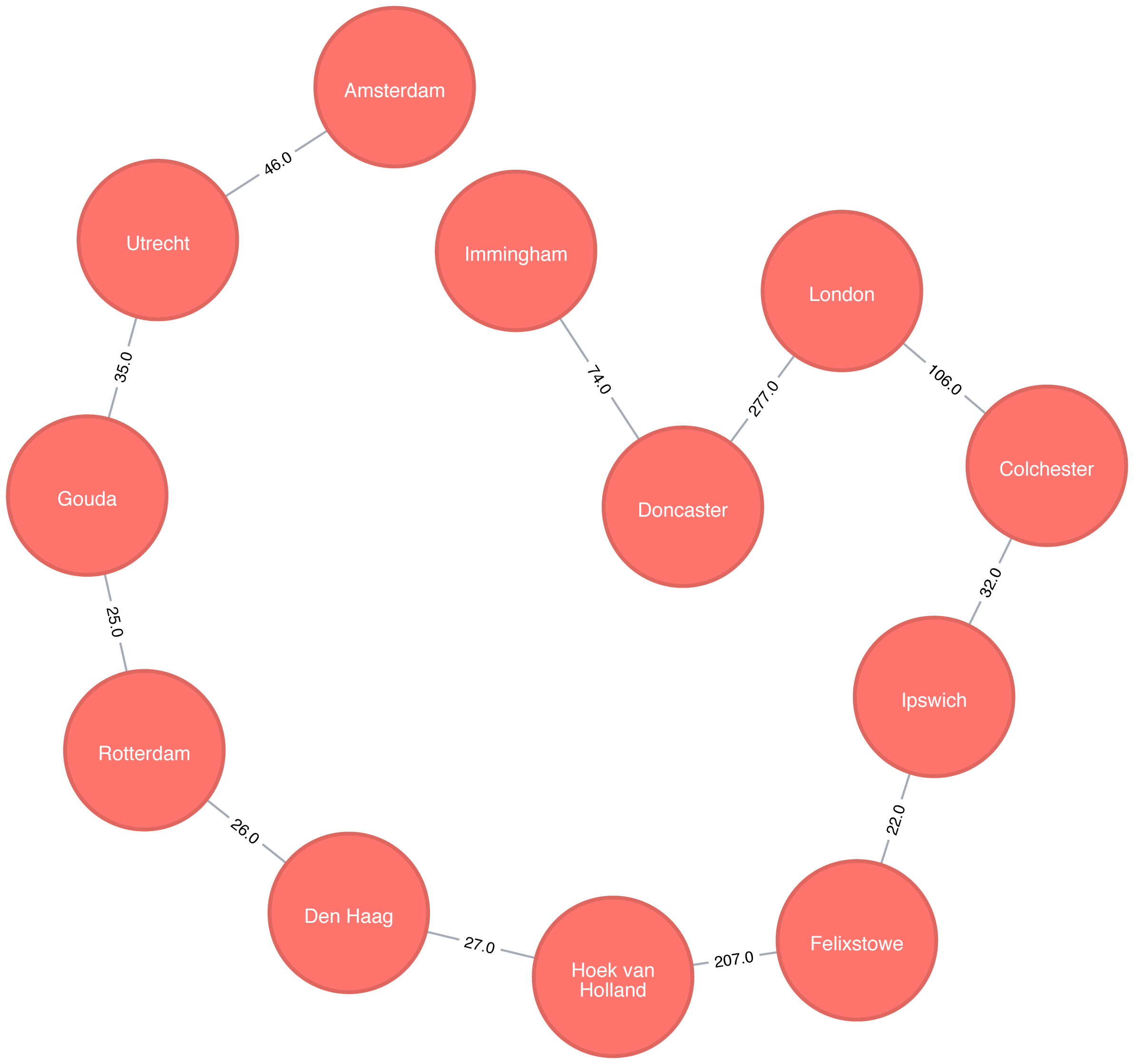
If we were in Amsterdam and wanted to visit every other place in our dataset, Figure 4-11 demonstrates the shortest continuous route to do so.
The Random Walk algorithm that provides a set of nodes on a random path in a graph. The term was first mentioned by Karl Pearson in 1905 in a letter to Nature magazine titled “The Problem of the Random Walk” 21. Although the concept goes back even further, it’s only more recently that random walks have been applied to network science.
A random walk, in general, is sometimes described as being similar to how a drunk person traverses a city. They know what direction or end point they want to reach but may take a very circuitous route to get there.
The algorithm starts at one node and somewhat randomly follows one of the relationships forward or back to a neighbor node. It then does the same from that node and so on, until it reaches the set path length. (We say somewhat randomly because the number of relationships a node has, and its neighbors have, influences the probability a node will be walked through.)
Use the Random Walk algorithm as part of other algorithms or data pipelines when you need to generate a mostly random set of connected nodes.
Example use cases include:
It can be used as part of the node2vec and graph2vec algorithms, that create node embeddings. These node embeddings could then be used as the input to a neural network.
It can be used as part of the Walktrap and Infomap community detection* algorithms. If a random walk returns a small set of nodes repeatedly, then it indicates that those set of nodes may have a community structure.
The training process of machine learning models. This is described further in David Mack’s article “Review Prediction with Neo4j and TensorFlow” 22.
You can read about more use cases in Random walks and diffusion on networks 23.
Neo4j has an implementation of the Random Walk algorithm. It supports two modes for choosing the next relationship to follow at each stage of the algorithm:
random-randomly chooses a relationship to follow
node2vec-chooses relationship to follow based on computing a probability distribution of the previous neighbours
The following query does this:
MATCH(source:Place {id:"London"})CALL algo.randomWalk.stream(id(source), 5, 1)YIELD nodeIdsUNWIND algo.getNodesById(nodeIds)ASplaceRETURNplace.idASplace
The parameters passed to this algorithm are:
id(source)-the internal node id of the starting point for our random walk
5-the number of hops our random walk should take
1-the number of random walks we want to compute
It returns the following result:
| place |
|---|
London |
Doncaster |
Immingham |
Amsterdam |
Utrecht |
Amsterdam |
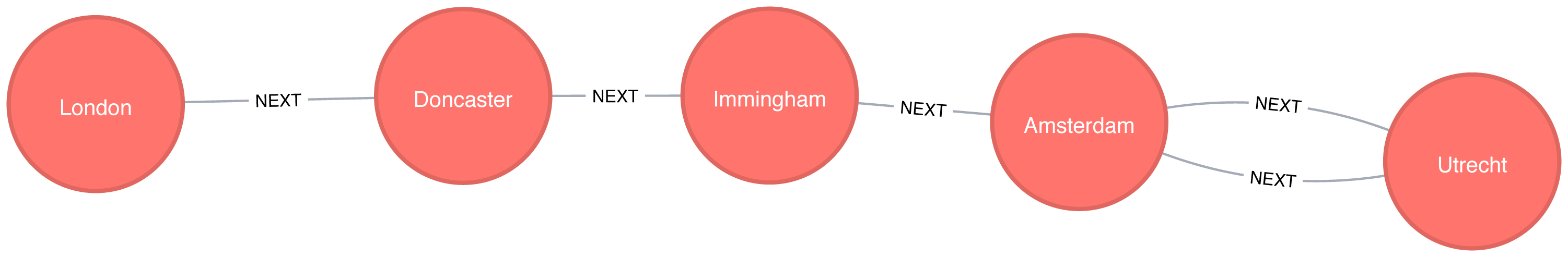
At each stage of the random walk the next relationship to follow is chosen randomly. This means that if we run the alogrithm again, even with the same parameters, we likely won’t get the exact same result. It’s also possible for a walk to go back on itself as we can see in Figure 4-12 where we go from Amsterdam to Den Haag and back again.
Pathfinding algorithms are useful for understanding the way that our data is connected. In this chapter we started out with the fundamental Breadth- and Depth-First algorithms, before moving onto Dijkstra and other shortest path algorithms.
We’ve also learnt about variants of the shortest path algorithms that are optimised for finding the shortest path from one node to all other nodes or between all pairs of nodes in a graph. We finished by learning about the random walk algorithm which can be used to find arbitrary sets of paths.
Next we’ll learn about Centrality algorithms that can be used to find influential nodes in a graph.
1 http://www.elbruz.org/e-roads/
2 https://github.com/neo4j-graph-analytics/book/blob/master/data/transport-nodes.csv
3 https://github.com/neo4j-graph-analytics/book/blob/master/data/transport-relationships.csv
4 https://github.com/neo4j-graph-analytics/book
5 https://ieeexplore.ieee.org/document/5219222/?arnumber=5219222
7 https://www.oakland.edu/enp/
8 https://github.com/graphframes/graphframes/issues/185
9 https://graphframes.github.io/user-guide.html#message-passing-via-aggregatemessages
10 https://github.com/neo4j-graph-analytics/book/blob/master/scripts/aggregate_messages/aggregate_messages.py
11 https://ieeexplore.ieee.org/document/4082128/
12 https://pubsonline.informs.org/doi/abs/10.1287/mnsc.17.11.712
13 http://web.mit.edu/urban_or_book/www/book/
14 https://cs.uwaterloo.ca/research/tr/2011/CS-2011-21.pdf
15 https://routing-bits.com/2009/08/06/ospf-convergence/
16 https://en.wikipedia.org/wiki/Open_Shortest_Path_First
17 https://arxiv.org/pdf/1604.02113v1.pdf
18 http://www.dwu.ac.pg/en/images/Research_Journal/2010_Vol_12/1_Fitina_et_al_spanning_trees_for_travel_planning.pdf
19 https://www.nbs.sk/_img/Documents/_PUBLIK_NBS_FSR/Biatec/Rok2013/07-2013/05_biatec13-7_resovsky_EN.pdf
20 https://www.ncbi.nlm.nih.gov/pmc/articles/PMC516344/
21 https://www.nature.com/physics/looking-back/pearson/index.html
22 https://medium.com/octavian-ai/review-prediction-with-neo4j-and-tensorflow-1cd33996632a
Centrality algorithms are used to understand the roles of particular nodes in a graph and their impact on that network. Centrality algorithms are useful because they identify the most important nodes and help us understand group dynamics such as credibility, accessibility, the speed at which things spread, and bridges between groups. Although many of these algorithms were invented for social network analysis, they have since found uses in many industries and fields.
We’ll cover the following algorithms:
Degree Centrality as a baseline metric of connectedness
Closeness Centrality for measuring how central a node is to the group, including two variations for disconnected groups
Betweenness Centrality for finding control points, including an alternative for approximation
PageRank for understanding the overall influence, including a popular option for personalization
Different centrality algorithms can produce significantly different results based on what they were created to measure. When we see sub-optimal answers, it’s best to check our algorithm use is in alignment with its intended purpose.
We’ll explain how these algorithms work and show examples in Spark and Neo4j. Where an algorithm is unavailable on one platform or where the differences are unimportant, we’ll provide just one platform example.
| Algorithm Type | What It Does | Example Uses | Spark Example | Neo4j Example |
|---|---|---|---|---|
Measures the number of relationships a node has. |
Estimate a person’s popularity by looking at their in-degree and use their out-degree for gregariousness. |
Yes |
No |
|
Variations: Wasserman and Faust, Harmonic Centrality |
Calculates which nodes have the shortest paths to all other nodes. |
Find the optimal location of new public services for maximum accessibility. |
Yes |
Yes |
Measures the number of shortest paths that pass through a node. |
Improve drug targeting by finding the control genes for specific diseases. |
No |
Yes |
|
Variation: Personalized PageRank |
Estimates a current node’s importance from its linked neighbors and their neighbors. Popularized by Google. |
Find the most influential features for extraction in machine learning and rank text for entity relevance in natural language processing. |
Yes |
Yes |
Figure 5-1 illustrates the graph that we want to construct:
We have one larger set of users with connections between them and a smaller set with no connections to that larger group.
Let’s create graphs in Apache Spark and Neo4j based on the contents of those CSV files.
First, we’ll import the required packages from Apache Spark and the GraphFrames package.
fromgraphframesimport*frompysparkimportSparkContext
We can write the following code to create a GraphFrame based on the contents of the above CSV files.
v=spark.read.csv("data/social-nodes.csv",header=True)e=spark.read.csv("data/social-relationships.csv",header=True)g=GraphFrame(v,e)
Next, we’ll load the data for Neo4j. The following query imports nodes:
WITH"https://github.com/neo4j-graph-analytics/book/raw/master/data/social-nodes.csv"ASuriLOAD CSVWITHHEADERS FROM uriASrowMERGE (:User {id: row.id})
And this query imports relationships:
WITH"https://github.com/neo4j-graph-analytics/book/raw/master/data/social-relationships.csv"ASuriLOAD CSVWITHHEADERS FROM uriASrowMATCH(source:User {id: row.src})MATCH(destination:User {id: row.dst})MERGE (source)-[:FOLLOWS]->(destination)
Now that our graphs are loaded, it’s onto the algorithms!
Degree Centrality is the simplest of the algorithms that we’ll cover in this book. It counts the number of incoming and outgoing relationships from a node, and is used to find popular nodes in a graph.
Degree Centrality was proposed by Linton C. Freeman in his 1979 paper Centrality in Social Networks Conceptual Clarification 1.
Understanding the reach of a node is a fair measure of importance. How many other nodes can it touch right now? The degree of a node is the number of direct relationships it has, calculated for in- degree and out-degree. You can think of this as the immediate reach of node. For example, a person with a high degree in an active social network would have a lot of immediate contacts and be more likely to catch a cold circulating in their network.
The average degree of a network is simply the total number of relationships divided by the total number of nodes; it can be heavily skewed by high degree nodes. Alternatively, the degree distribution is the probability that a randomly selected node will have a certain number of relationships.
Figure 5-2 illustrates the difference looking at the actual distribution of connections among subreddit topics. If you simply took the average, you’d assume most topics have 10 connections whereas, in fact, most topics only have 2 connections.
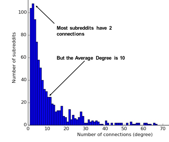
These measures are used to categorize network types such as the scale-free or small-world networks that were discussed in chapter 2. They also provide a quick measure to help estimate the potential for things to spread or ripple throughout a network.
Use Degree Centrality if you’re attempting to analyze influence by looking at the number of incoming and outgoing relationships, or find the “popularity” of individual nodes. It works well when you’re concerned with immediate connectedness or near-term probabilities. However, Degree Centrality is also applied to global analysis when you want to evaluate the minimum degree, maximum degree, mean degree, and standard deviation across the entire graph.
Example use cases include:
Degree Centrality is used to identify powerful individuals though their relationships, such as connections of people on a social network. For example, in BrandWatch’s most influential men and women on Twitter 2017 2, the top five people in each category have over 40 million followers each.
Weighted Degree Centrality has been applied to help separate fraudsters from legitimate users of an online auction. The weighted centrality of fraudsters tends to be significantly higher due collusion aimed at artificially increasing prices. Read more in Two Step graph-based semi-supervised Learning for Online Auction Fraud Detection. 3
Now we’ll execute the Degree Centrality algorithm with the following code:
total_degree=g.degreesin_degree=g.inDegreesout_degree=g.outDegreestotal_degree.join(in_degree,"id",how="left")\.join(out_degree,"id",how="left")\.fillna(0)\.sort("inDegree",ascending=False)\.show()
We first calculated the total, in, and out degrees. Then we joined those DataFrames together, using a left join to retain any nodes that don’t have incoming or outgoing relationships.
If nodes don’t have relationships we set that value to 0 using the fillna function.
Let’s run the code in pyspark:
| id | degree | inDegree | outDegree |
|---|---|---|---|
Doug |
6 |
5 |
1 |
Alice |
7 |
3 |
4 |
Michael |
5 |
2 |
3 |
Bridget |
5 |
2 |
3 |
Charles |
2 |
1 |
1 |
Mark |
3 |
1 |
2 |
David |
2 |
1 |
1 |
Amy |
1 |
1 |
0 |
James |
1 |
0 |
1 |
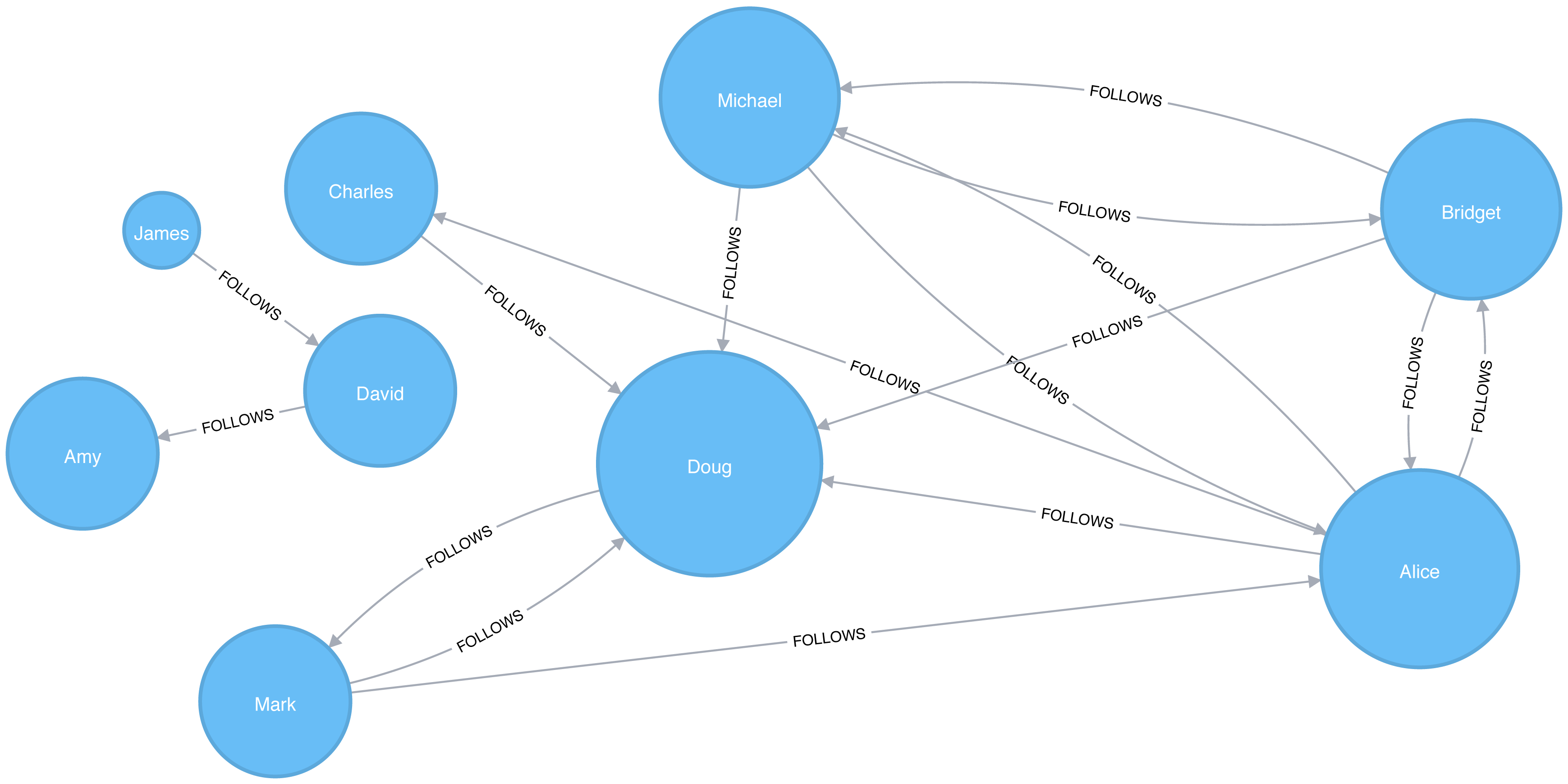
We can see in Figure 5-3 that Doug is the most popular user in our Twitter graph with five followers (in-links). All other users in that part of the graph follow him and he only follows one person back. In the real Twitter network, celebrities have high follower counts but tend to follow few people. We could therefore consider Doug a celebrity!
If we were creating a page showing the most followed users or wanted to suggest people to follow we would use this algorithm to identify those people.
Some data may contain very dense nodes with lots of relationships. These don’t add much additional information and can skew some results or add computational complexity. We may want to filter them with a subgraph or project the graph summarizes the relationships as a weight.
Closeness Centrality is a way of detecting nodes that are able to spread information efficiently through a subgraph.
The closeness centrality of a node measures its average farness (inverse distance) to all other nodes. Nodes with a high closeness score have the shortest distances to all other nodes.
For each node, the Closeness Centrality algorithm calculates the sum of its distances to all other nodes, based on calculating the shortest paths between all pairs of nodes. The resulting sum is then inverted to determine the closeness centrality score for that node.
The closeness centrality of a node is calculated using the formula:
where:
u is a node
n is the number of nodes in the graph
d(u,v) is the shortest-path distance between another node v and u
It is more common to normalize this score so that it represents the average length of the shortest paths rather than their sum. This adjustment allows comparisons of the closeness centrality of nodes of graphs of different sizes.
The formula for normalized closeness centrality is as follows:
Apply Closeness Centrality when you need to know which nodes disseminate things the fastest. Using weighted relationships can be especially helpful in evaluating interaction speeds in communication and behavioural analyses.
Example use cases include:
Closeness Centrality is used to uncover individuals in very favorable positions to control and acquire vital information and resources within an organization. One such study is Mapping Networks of Terrorist Cells 4 by Valdis E. Krebs.
Closeness Centrality is applied as a heuristic for estimating arrival time in telecommunications and package delivery where content flows through shortest paths to a predefined target. It is also used to shed light on propagation through all shortest paths simultaneously, such as infections spreading through a local community. Find more details in Centrality and Network Flow 5 by Stephen P. Borgatti.
Closeness Centrality also identifies the importance of words in a document, based on a graph-based keyphrase extraction process. This process is described by Florian Boudin in A Comparison of Centrality Measures for Graph-Based Keyphrase Extraction. 6
Closeness Centrality works best on connected graphs. When the original formula is applied to an unconnected graph, we end up with an infinite distance between two nodes where there is no path between them. This means that we’ll end up with an infinite closeness centrality score when we sum up all the distances from that node. To avoid this issue, a variation on the original formula will be shown after the next example.
Apache Spark doesn’t have a built in algorithm for Closeness Centrality, but we can write our own using the aggregateMessages framework that we introduced in the shortest weighted path section in the previous chapter.
Before we create our function, we’ll import some libraries that we’ll use:
fromscripts.aggregate_messagesimportAggregateMessagesasAMfrompyspark.sqlimportfunctionsasFfrompyspark.sql.typesimport*fromoperatorimportitemgetter
We’ll also create a few User Defined functions that we’ll need later:
defcollect_paths(paths):returnF.collect_set(paths)collect_paths_udf=F.udf(collect_paths,ArrayType(StringType()))paths_type=ArrayType(StructType([StructField("id",StringType()),StructField("distance",IntegerType())]))defflatten(ids):flat_list=[itemforsublistinidsforiteminsublist]returnlist(dict(sorted(flat_list,key=itemgetter(0))).items())flatten_udf=F.udf(flatten,paths_type)defnew_paths(paths,id):paths=[{"id":col1,"distance":col2+1}forcol1,col2inpathsifcol1!=id]paths.append({"id":id,"distance":1})returnpathsnew_paths_udf=F.udf(new_paths,paths_type)defmerge_paths(ids,new_ids,id):joined_ids=ids+(new_idsifnew_idselse[])merged_ids=[(col1,col2)forcol1,col2injoined_idsifcol1!=id]best_ids=dict(sorted(merged_ids,key=itemgetter(1),reverse=True))return[{"id":col1,"distance":col2}forcol1,col2inbest_ids.items()]merge_paths_udf=F.udf(merge_paths,paths_type)defcalculate_closeness(ids):nodes=len(ids)total_distance=sum([col2forcol1,col2inids])return0iftotal_distance==0elsenodes*1.0/total_distancecloseness_udf=F.udf(calculate_closeness,DoubleType())
And now for the main body that calculates the closeness centrality for each node:
vertices=g.vertices.withColumn("ids",F.array())cached_vertices=AM.getCachedDataFrame(vertices)g2=GraphFrame(cached_vertices,g.edges)foriinrange(0,g2.vertices.count()):msg_dst=new_paths_udf(AM.src["ids"],AM.src["id"])msg_src=new_paths_udf(AM.dst["ids"],AM.dst["id"])agg=g2.aggregateMessages(F.collect_set(AM.msg).alias("agg"),sendToSrc=msg_src,sendToDst=msg_dst)res=agg.withColumn("newIds",flatten_udf("agg")).drop("agg")new_vertices=g2.vertices.join(res,on="id",how="left_outer")\.withColumn("mergedIds",merge_paths_udf("ids","newIds","id"))\.drop("ids","newIds")\.withColumnRenamed("mergedIds","ids")cached_new_vertices=AM.getCachedDataFrame(new_vertices)g2=GraphFrame(cached_new_vertices,g2.edges)g2.vertices\.withColumn("closeness",closeness_udf("ids"))\.sort("closeness",ascending=False)\.show(truncate=False)
If we run that we’ll see the following output:
| id | ids | closeness |
|---|---|---|
Doug |
[[Charles, 1], [Mark, 1], [Alice, 1], [Bridget, 1], [Michael, 1]] |
1.0 |
Alice |
[[Charles, 1], [Mark, 1], [Bridget, 1], [Doug, 1], [Michael, 1]] |
1.0 |
David |
[[James, 1], [Amy, 1]] |
1.0 |
Bridget |
[[Charles, 2], [Mark, 2], [Alice, 1], [Doug, 1], [Michael, 1]] |
0.7142857142857143 |
Michael |
[[Charles, 2], [Mark, 2], [Alice, 1], [Doug, 1], [Bridget, 1]] |
0.7142857142857143 |
James |
[[Amy, 2], [David, 1]] |
0.6666666666666666 |
Amy |
[[James, 2], [David, 1]] |
0.6666666666666666 |
Mark |
[[Bridget, 2], [Charles, 2], [Michael, 2], [Doug, 1], [Alice, 1]] |
0.625 |
Charles |
[[Bridget, 2], [Mark, 2], [Michael, 2], [Doug, 1], [Alice, 1]] |
0.625 |
Alice, Doug, and David are the most closely connected nodes in the graph with a 1.0 score, which means each directly connects to all nodes in their part of the graph. Figure 5-4 illustrates that even though David has only a few connections, that’s significant within group of friends. In other words, this score represents their closeness to others within their subgraph but not the entire graph.
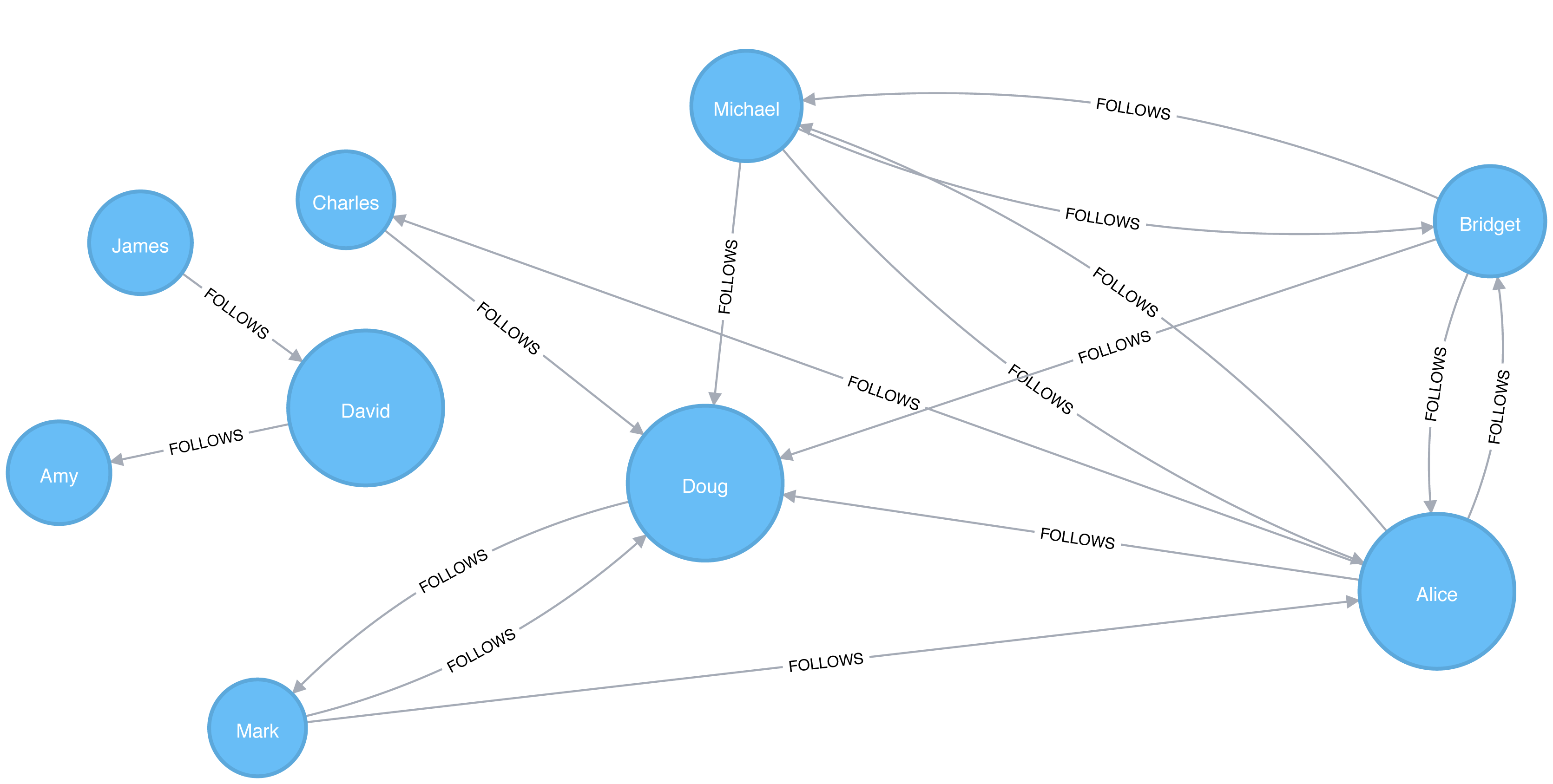
Neo4j’s implementation of Closeness Centrality uses the following formula:
where:
u is a node
n is the number of nodes in the same component (subgraph or group) as u
d(u,v) is the shortest-path distance between another node v and u
A call to the following procedure will calculate the closeness centrality for each of the nodes in our graph:
CALL algo.closeness.stream("User","FOLLOWS")YIELD nodeId, centralityRETURNalgo.getNodeById(nodeId).id, centralityORDER BYcentralityDESC
Running this procedure gives the following result:
| user | centrality |
|---|---|
Alice |
1.0 |
Doug |
1.0 |
David |
1.0 |
Bridget |
0.7142857142857143 |
Michael |
0.7142857142857143 |
Amy |
0.6666666666666666 |
James |
0.6666666666666666 |
Charles |
0.625 |
Mark |
0.625 |
We get the same results as with the Apache Spark algorithm but, as before, the score represents their closeness to others within their subgraph but not the entire graph.
In the strict interpretation of the Closeness Centrality algorithm all the nodes in our graph would have a score of ∞ because every node has at least one other node that it’s unable to reach.
Ideally we’d like to get an indication of closeness across the whole graph, and in the next two sections we’ll learn about a few variations of the Closeness Centrality algorithm that do this.
Stanley Wasserman and Katherine Faust came up with 7 an improved formula for calculating closeness for graphs with multiple subgraphs without connections between those groups. The result of this formula is a ratio of the fraction of nodes in the group that are reachable, to the average distance from the reachable nodes.
The formula is as follows:
where:
u is a node
N is the total node count
n is the number of nodes in the same component as u
d(u,v) is the shortest-path distance between another node v and u
We can tell the Closeness Centrality procedure to use this formula by passing the parameter improved: true.
The following query executes Closeness Centrality using the Wasserman Faust formula:
CALL algo.closeness.stream("User","FOLLOWS", {improved:true})YIELD nodeId, centralityRETURNalgo.getNodeById(nodeId).idASuser, centralityORDER BYcentralityDESC
The procedure gives the following result:
| user | centrality |
|---|---|
Alice |
0.5 |
Doug |
0.5 |
Bridget |
0.35714285714285715 |
Michael |
0.35714285714285715 |
Charles |
0.3125 |
Mark |
0.3125 |
David |
0.125 |
Amy |
0.08333333333333333 |
James |
0.08333333333333333 |
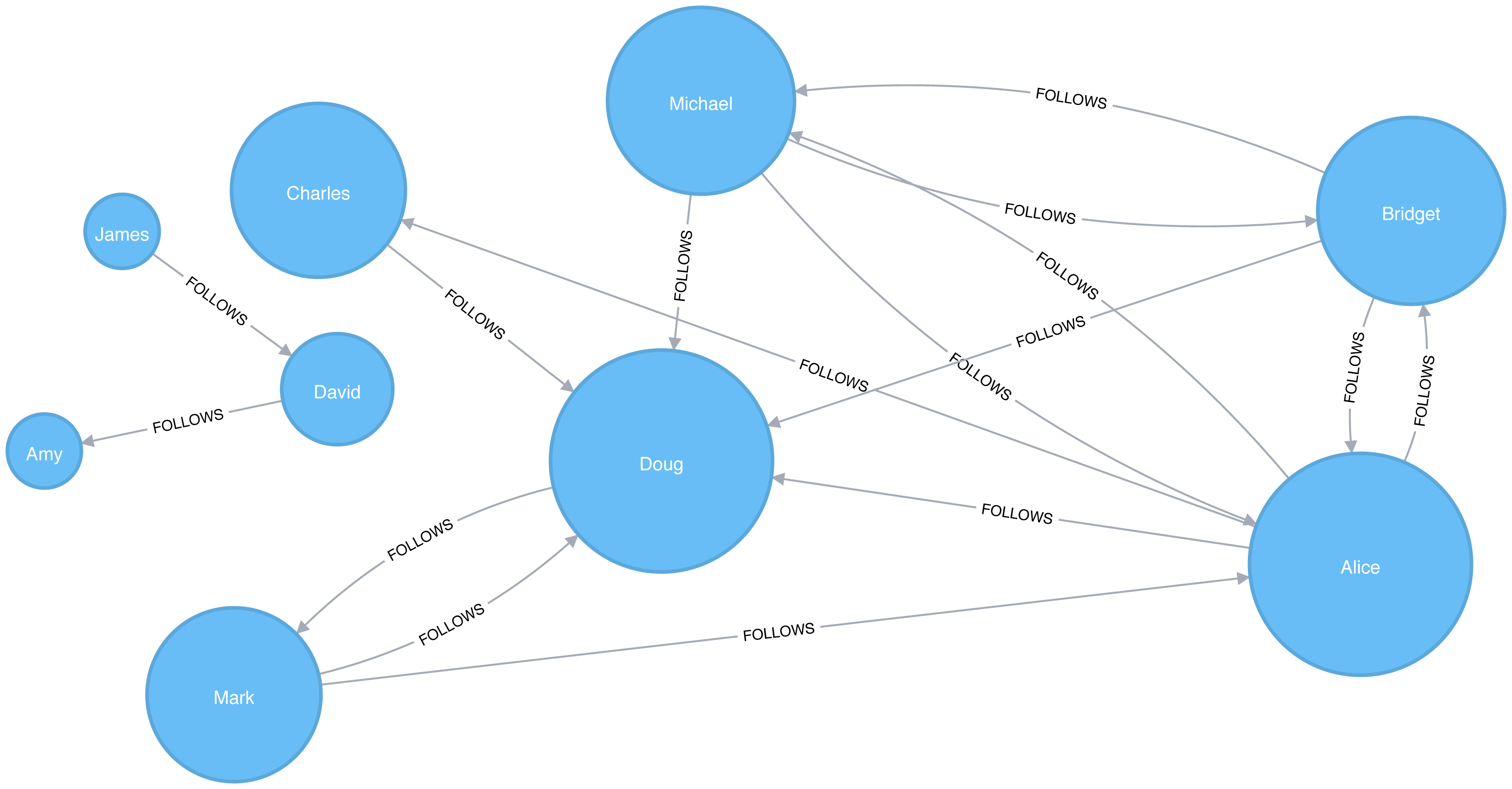
Now Figure 5-5 shows the results are more representative of the closeness of nodes to the entire graph. The scores for the members of the smaller subgraph (David, Amy, and James) have been dampened and now have the lowest scores of all users. This makes sense as they are the most isolated nodes. This formula is more useful for detecting the importance of a node across the entire graph rather than within their own subgraph.
In the next section we’ll learn about the Harmonic Centrality algorithm, which achieves similar results using another formula to calculate closeness.
Harmonic Centrality (also known as valued centrality) is a variant of Closeness Centrality, invented to solve the original problem with unconnected graphs. In “Harmony in a Small World” 8 Marchiori and Latora proposed this concept as a practical representation of an average shortest path.
When calculating the closeness score for each node, rather than summing the distances of a node to all other nodes, it sums the inverse of those distances. This means that infinite values become irrelevant.
The raw harmonic centrality for a node is calculated using the following formula:
where:
u is a node
n is the number of nodes in the graph
d(u,v) is the shortest-path distance between another node v and u
As with closeness centrality we also calculate a normalized harmonic centrality with the following formula:
In this formula, ∞ values are handled cleanly.
The following query executes the Harmonic Centrality algorithm:
CALL algo.closeness.harmonic.stream("User","FOLLOWS")YIELD nodeId, centralityRETURNalgo.getNodeById(nodeId).idASuser, centralityORDER BYcentralityDESC
Running this procedure gives the following result:
| user | centrality |
|---|---|
Alice |
0.625 |
Doug |
0.625 |
Bridget |
0.5 |
Michael |
0.5 |
Charles |
0.4375 |
Mark |
0.4375 |
David |
0.25 |
Amy |
0.1875 |
James |
0.1875 |
The results from this algorithm differ from the original Closeness Centrality but are similar to those from the Wasserman and Faust improvement. Either algorithm can be used when working with graphs with more than one connected component.
Sometimes the most important cog in the system is not the one with the most overt power or the highest status. Sometimes it’s the middlemen that connect groups or the brokers with the most control over resources or the flow of information. Betweenness Centrality is a way of detecting the amount of influence a node has over the flow of information in a graph. It is typically used to find nodes that serve as a bridge from one part of a graph to another.
The Betweenness Centrality algorithm first calculates the shortest (weighted) path between every pair of nodes in a connected graph. Each node receives a score, based on the number of these shortest paths that pass through the node. The more shortest paths that a node lies on, the higher its score.
Betweenness Centrality was considered one of the “three distinct intuitive conceptions of centrality” when it was introduced by Linton Freeman in his 1971 paper A Set of Measures of Centrality Based on Betweenness. 9
A bridge in a network can be a node or a relationship. In a very simple graph, you can find them by looking for the node or relationship that if removed, would cause a section of the graph to become disconnected. However, as that’s not practical in a typical graph, we use a betweenness centrality algorithm. We can also measure the betweenness of a cluster by treating the group as a node.
A node is considered pivotal for two other nodes if it lies on every shortest path between those nodes as shown in Figure 5-6.
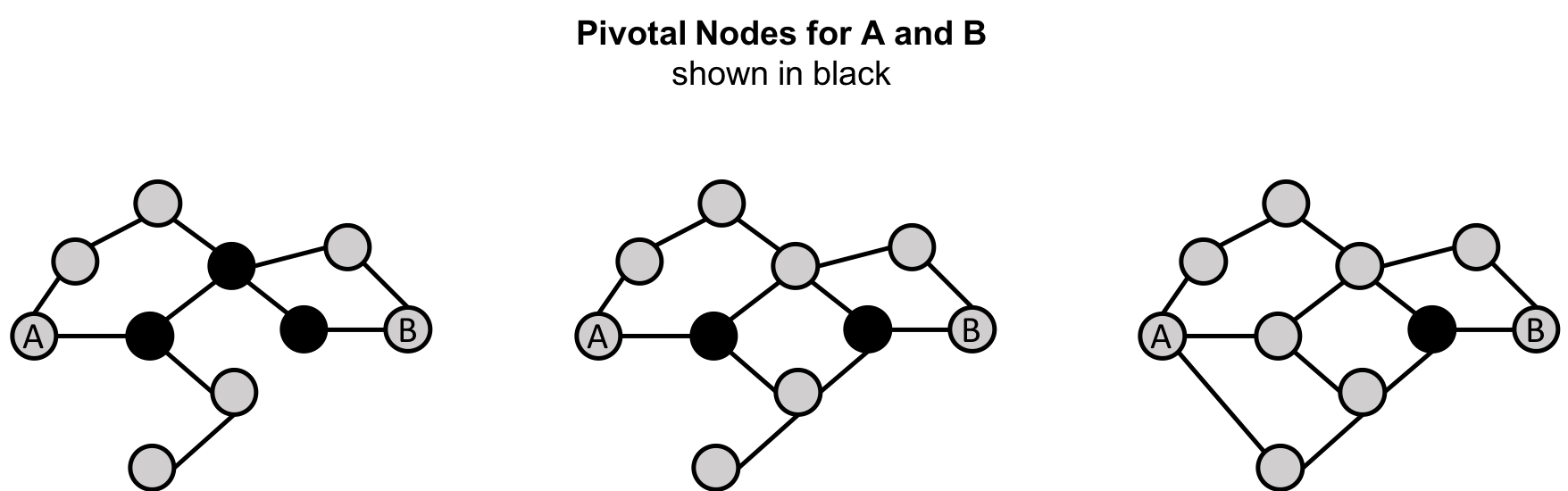
Pivotal nodes play an important role in connecting other nodes - if you remove a pivotal node, the new shortest path for the original node pairs will be longer or more costly. This can be a consideration for evaluating single points of vulnerability.
The Betweenness Centrality of a node is calculated by adding the results of the below formula for all shortest-paths:
where:
u is a node
p is the total number of shortest-path between nodes s and t
p(u) is the number shortest-path between nodes s and t that pass through node u
Figure 5-7 describes the steps for working out Betweenness Centrality.
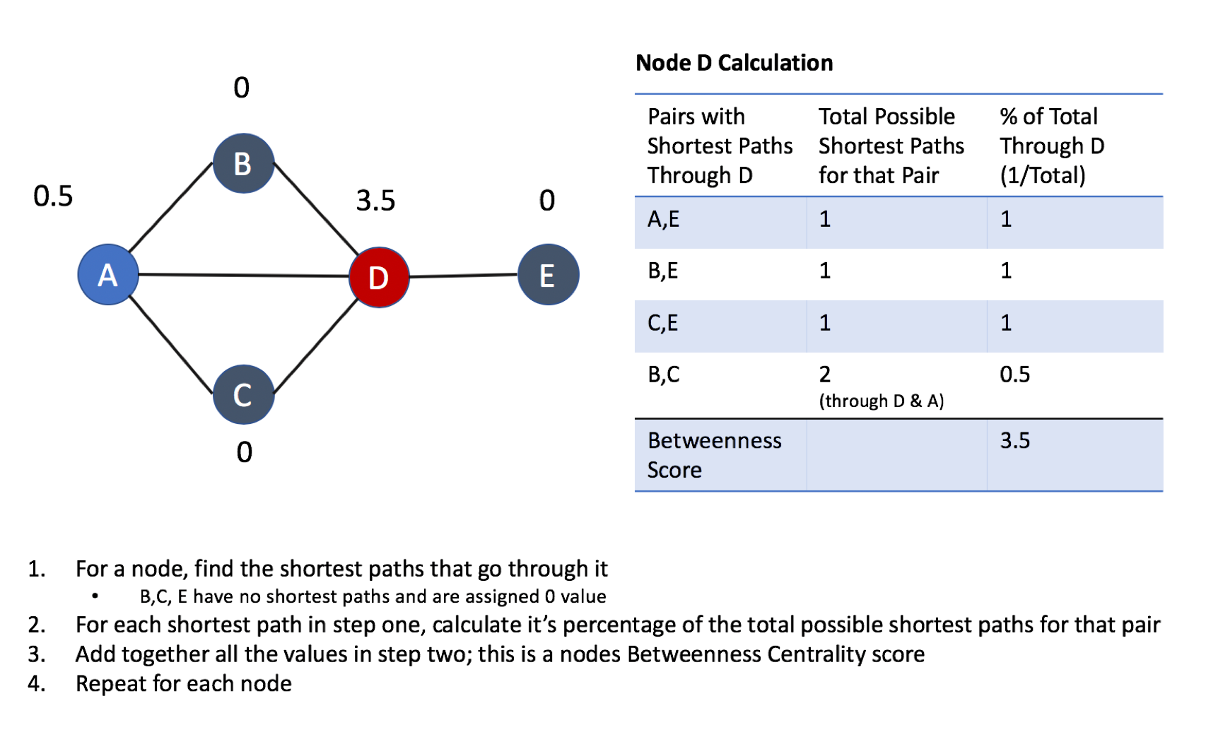
Betweenness Centrality applies to a wide range of problems in real-world networks. We use it to find bottlenecks, control points, and vulnerabilities.
Example use cases include:
Betweenness Centrality is used to identify influencers in various organizations. Powerful individuals are not necessarily in management positions, but can be found in “brokerage positions” using Betweenness Centrality. Removal of such influencers seriously destabilize the organization. This might be a welcome disruption by law enforcement if the organization is criminal, or may be a disaster if a business loses key staff it never knew about. More details are found in Brokerage qualifications in ringing operations 10 by Carlo Morselli and Julie Roy.
Betweenness Centrality uncovers key transfer points in networks such electrical grids. Counterintuitively, removal of specific bridges can actually improve overall robustness by “islanding” disturbances. Research details are included in Robustness of the European power grids under intentional attack 11 by Sol´e R., Rosas-Casals M., Corominas-Murtral B., and Valverde S.
Betweenness Centrality is also used to help microbloggers spread their reach on Twitter, with a recommendation engine for targeting influencers. This approach is described in Making Recommendations in a Microblog to Improve the Impact of a Focal User. 12
Betweenness Centrality makes the assumption that all communication between nodes happens along the shortest path and with the same frequency, which isn’t always the case in real life. Therefore, it doesn’t give us a perfect view of the most influential nodes in a graph, but rather a good representation. Newman explains in more detail on page 186 of Networks: An Introduction. 13
Apache Spark doesn’t have a built in algorithm for Betweenness Centrality so we’ll demonstrate this algorithm using Neo4j. A call to the following procedure will calculate the Betweenness Centrality for each of the nodes in our graph:
CALL algo.betweenness.stream("User","FOLLOWS")YIELD nodeId, centralityRETURNalgo.getNodeById(nodeId).idASuser, centralityORDER BYcentralityDESC
Running this procedure gives the following result:
| user | centrality |
|---|---|
Alice |
10.0 |
Doug |
7.0 |
Mark |
7.0 |
David |
1.0 |
Bridget |
0.0 |
Charles |
0.0 |
Michael |
0.0 |
Amy |
0.0 |
James |
0.0 |
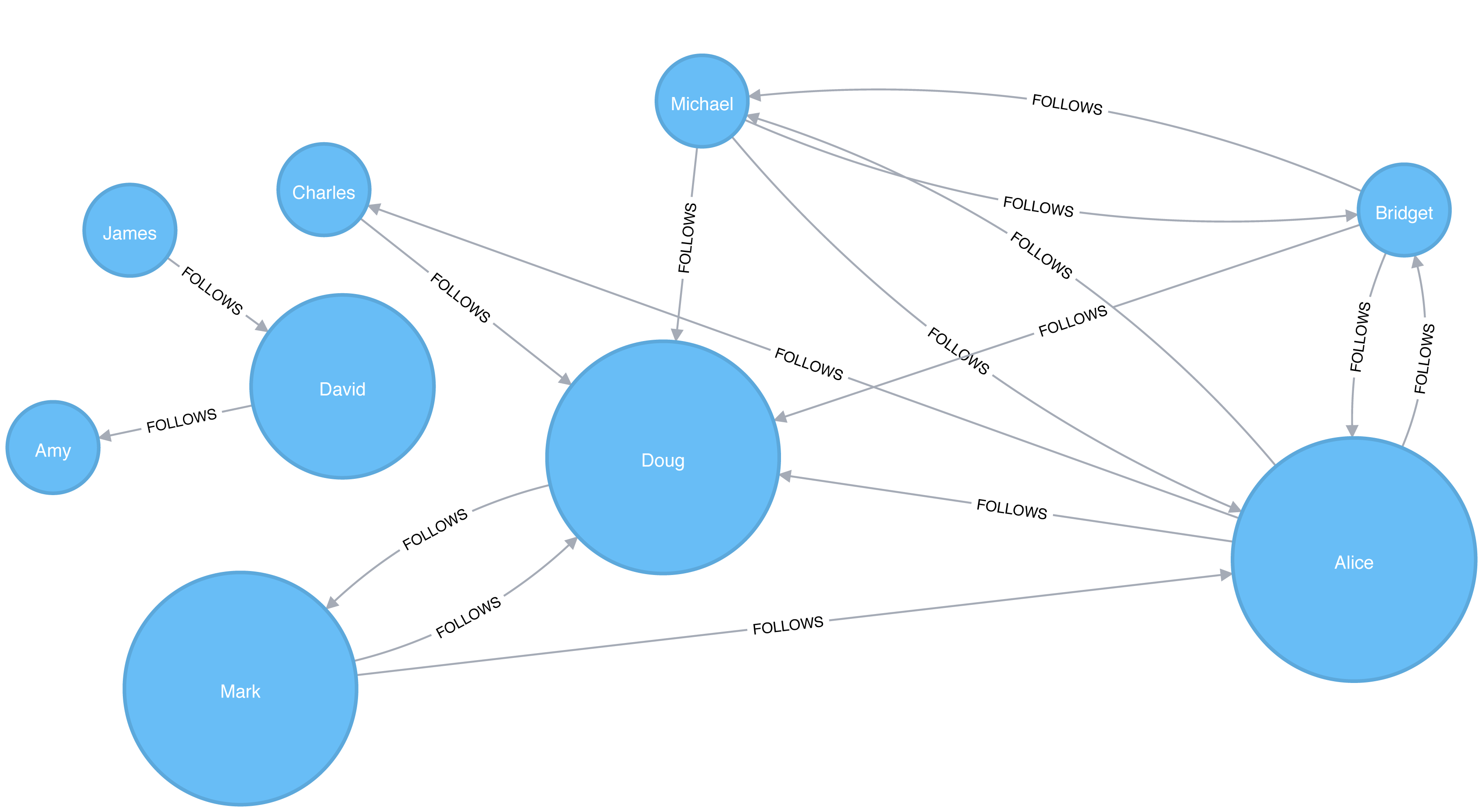
As we can see in Figure 5-8, Alice is the main broker in this network, but Mark and Doug aren’t far behind. In the smaller sub graph all shortest paths go between David so he is important for information flow amongst those nodes.
For large graphs, exact centrality computation isn’t practical. The fastest known algorithm for exactly computing betweenness of all the nodes has a run time proportional to the product of the number of nodes and the number of relationships.
We may want to filter down to a subgraph first or use an approximation algorithm (shown later) that works with a subset of nodes.
We can now join our two disconnected components together by introducing a new user called Jason. Jason follows and is followed by people from both groups of users.
WITH["James","Michael","Alice","Doug","Amy"]ASexistingUsersMATCH(existing:User)WHEREexisting.idINexistingUsersMERGE (newUser:User {id:"Jason"})MERGE (newUser)<-[:FOLLOWS]-(existing)MERGE (newUser)-[:FOLLOWS]->(existing)
If we re-run the algorithm we’ll see this output:
| user | centrality |
|---|---|
Jason |
44.33333333333333 |
Doug |
18.333333333333332 |
Alice |
16.666666666666664 |
Amy |
8.0 |
James |
8.0 |
Michael |
4.0 |
Mark |
2.1666666666666665 |
David |
0.5 |
Bridget |
0.0 |
Charles |
0.0 |
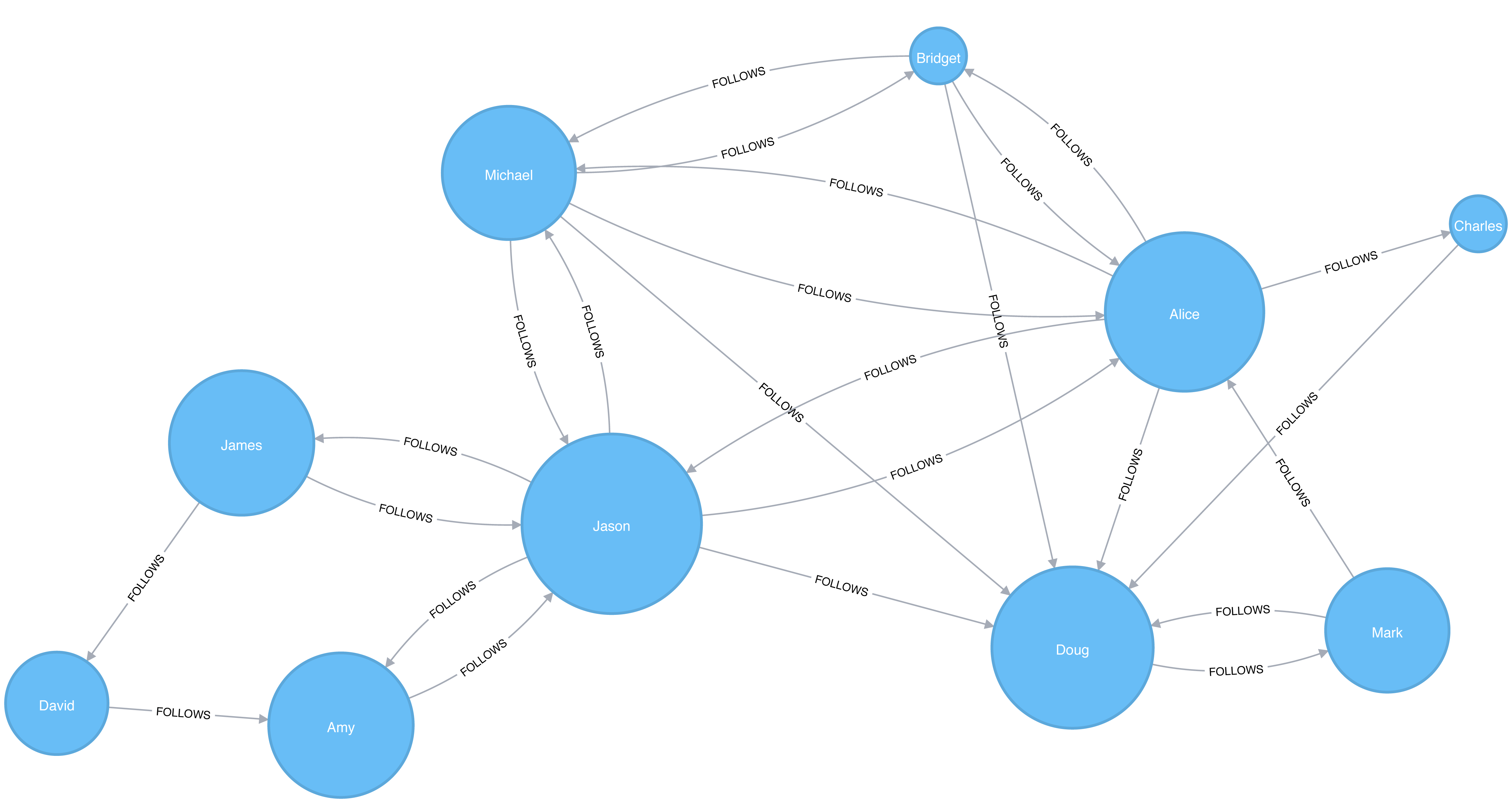
Jason has the highest score because communication between the two sets of users will pass through him. Jason can be said to act as a local bridge between the two sets of users, which is illustrated in Figure 5-9.
Before we move onto the next section reset our graph by deleting Jason and his relationships:
MATCH(user:User {id:"Jason"})DETACHDELETEuser
Recall that calculating the exact betweenness centrality on large graphs can be very expensive. We could therefore choose to use an approximation algorithm that runs much quicker and still provides useful (albeit imprecise) information.
The Randomized-Approximate Brandes, or in short RA-Brandes, algorithm is the best-known algorithm for calculating an approximate score for betweenness centrality. Rather than calculating the shortest path between every pair of nodes, the RA-Brandes algorithm considers only a subset of nodes. Two common strategies for selecting the subset of nodes are:
Nodes are selected uniformly, at random, with defined probability of selection. The default probability is . If the probability is 1, the algorithm works the same way as the normal Betweenness Centrality algorithm, where all nodes are loaded.
Nodes are selected randomly, but those whose degree is lower than the mean are automatically excluded. (i.e. only nodes with a lot of relationships have a chance of being visited).
As a further optimization, you could limit the depth used by the Shortest Path algorithm, which will then provide a subset of all shortest paths.
The following query executes the RA-Brandes algorithm using the random selection method.
CALL algo.betweenness.sampled.stream("User","FOLLOWS", {strategy:"degree"})YIELD nodeId, centralityRETURNalgo.getNodeById(nodeId).idASuser, centralityORDER BYcentralityDESC
Running this procedure gives the following result:
| user | centrality |
|---|---|
Alice |
9.0 |
Mark |
9.0 |
Doug |
4.5 |
David |
2.25 |
Bridget |
0.0 |
Charles |
0.0 |
Michael |
0.0 |
Amy |
0.0 |
James |
0.0 |
Our top influencers are similar to before although Mark now has a higher ranking than Doug.
Due to the random nature of this algorithm we will see different results each time that we run it. On larger graphs this randomness will have less of an impact than it does on our small sample graph.
PageRank is the best known of the Centrality algorithms and measures the transitive (or directional) influence of nodes. All the other Centrality algorithms we discuss measure the direct influence of a node, whereas PageRank considers the influence of your neighbors and their neighbors. For example, having a few powerful friends can make you more influential than just having a lot of less powerful friends. PageRank is computed by either iteratively distributing one node’s rank over its neighbors or by randomly traversing the graph and counting the frequency of hitting each node during these walks.
PageRank is named after Google co-founder Larry Page, who created it to rank websites in Google’s search results. The basic assumption is that a page with more incoming and influential incoming links is a more likely a credible source. PageRank counts the number, and quality, of incoming relationships to a node, which determines an estimation of how important that node is. Nodes with more sway over a network are presumed to have more incoming relationships from other influential nodes.
The intuition behind influence is that relationships to more important nodes contribute more to the influence of the node in question than equivalent connections to less important nodes. Measuring influence usually involves scoring nodes, often with weighted relationships, and then updating scores over many iterations. Sometimes all nodes are scored and sometimes a random selection is used as a representative distribution.
Keep in mind that centrality measures the importance of a node in comparison to other nodes. It is a ranking among the potential impact of nodes, not a measure of actual impact. For example, you might identify the 2 people with the highest centrality in a network but perhaps set policies or cultural norms actually have more effect. Quantifying actual impact is an active research area to develop more node influence metrics.
PageRank is defined in the original Google paper as follows:
where:
we assume that a page u has citations from pages T1 to Tn
d is a damping factor which is set between 0 and 1. It is usually set to 0.85. You can think of this as the probability that a user will continue clicking. This helps minimize Rank Sink, explained below.
1-d is the probability that a node is reached directly without following any relationships
C(T) is defined as out-degree of a node T.
Figure 5-10 walks through a small example of how PageRank would continue to update the rank of a node until it converges or meets the set number of iterations.
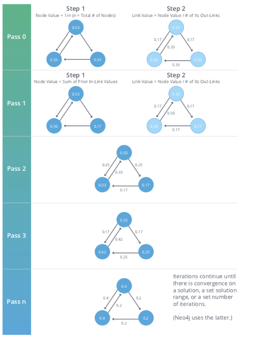
PageRank is an iterative algorithm that runs either until scores converge or a simply for a set number of iterations.
Conceptually, PageRank assumes there is a web surfer visiting pages by following links or by using a random URL.
A damping factor d defines the probability that the next click will be through a link.
You can think of it as the probability that a surfer will become bored and randomly switches to a page.
A PageRank score represents the likelihood that a page is visited through an incoming link and not randomly.
A node, or group of nodes, without outgoing relationships (also called dangling nodes), can monopolize the PageRank score. This is a rank sink. You can imagine this as a surfer that gets stuck on a page, or a subset of pages, with no way out. Another difficulty is created by nodes that point only to each other in a group. Circular references cause the increase in their ranks as the surfer bounces back and forth among nodes. These situations are protrayed in Figure 5-11.
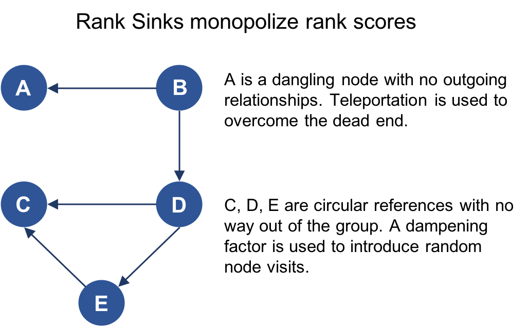
There are two strategies used to avoid rank sink.
First, when a node is reached with no outgoing relationships, PageRank assumes outgoing relationships to all nodes.
Traversing these invisible links is sometimes called teleportation.
Second, the dampening factor provides another opportunity to avoid sinks by introducing a probability for direct link versus random node visitation.
When you set d to 0.85, a completely random node is visited 15% of the time.
Although the original formula recommends a dampening factor of 0.85, its initial use was on the World Wide Web with a power law distribution of links where most pages have very few links and a few pages have many. Lowering our damping factor decreases the likelihood of following long relationship paths before taking a random jump. In turn this increases the contribution of immediate neighbors to a node’s score and rank.
If you see unexpected results from running the algorithm, it is worth doing some exploratory analysis of the graph to see if any of these problems are the cause. You can read “The Google PageRank Algorithm and How It Works”14 to learn more.
PageRank is now used in many domains outside Web indexing. Use this algorithm anytime you’re looking for broad influence over a network. For instance, if you’re looking to target a gene that has the highest overall impact to a biological function, it may not be the most connected one. It may, in fact, be the gene with relationships with other, more significant functions.
Example use cases include:
Twitter uses Personalized PageRank to present users with recommendations of other accounts that they may wish to follow. The algorithm is run over a graph that contains shared interests and common connections. Their approach is described in more detail in WTF: The Who to Follow Service at Twitter. 15
PageRank has been used to rank public spaces or streets, predicting traffic flow and human movement in these areas. The algorithm is run over a graph of road intersections, where the PageRank score reflects the tendency of people to park, or end their journey, on each street. This is described in more detail in Self-organized Natural Roads for Predicting Traffic Flow: A Sensitivity Study. 16
PageRank is also used as part of an anomaly and fraud detection system in the healthcare and insurance industries. It helps reveal doctors or providers that are behaving in an unusual manner and then feeds the score into a machine learning algorithm.
David Gleich describes many more uses for the algorithm in his paper, PageRank Beyond the Web. 17
Now we’re ready to execute the PageRank algorithm.
GraphFrames supports two implementations of PageRank:
The first implementation runs PageRank for a fixed number of iterations.
This can be run by setting the maxIter parameter.
The second implementation runs PageRank until convergence.
This can be run by setting the tol parameter.
Let’s see an example of the fixed iterations approach:
results=g.pageRank(resetProbability=0.15,maxIter=20)results.vertices.sort("pagerank",ascending=False).show()
Notice in Apache Spark, that the dampening factor is more intuitively called the reset probability with the inverse value.
In other words, resetProbability=0.15 in this example is equivalent to dampingFactor:0.85 in Neo4j.
If we run that code in pyspark we’ll see this output:
| id | pagerank |
|---|---|
Doug |
2.2865372087512252 |
Mark |
2.1424484186137263 |
Alice |
1.520330830262095 |
Michael |
0.7274429252585624 |
Bridget |
0.7274429252585624 |
Charles |
0.5213852310709753 |
Amy |
0.5097143486157744 |
David |
0.36655842368870073 |
James |
0.1981396884803788 |
As we might expect, Doug has the highest PageRank because he is followed by all other users in his sub graph. Although Mark only has one follower, that follower is Doug, so Mark is also considered important in this graph. It’s not only the number of followers that is important, but also the importance of those followers.
And now let’s try the convergence implementation which will run PageRank until it closes in on a solution within the set tolerance:
results=g.pageRank(resetProbability=0.15,tol=0.01)results.vertices.sort("pagerank",ascending=False).show()
If we run that code in pyspark we’ll see this output:
| id | pagerank |
|---|---|
Doug |
2.2233188859989745 |
Mark |
2.090451188336932 |
Alice |
1.5056291439101062 |
Michael |
0.733738785109624 |
Bridget |
0.733738785109624 |
Amy |
0.559446807245026 |
Charles |
0.5338811076334145 |
David |
0.40232326274180685 |
James |
0.21747203391449021 |
Although convergence on a perfect solution may sound ideal, in some scenarios PageRank cannot mathematically converge. For larger graphs, PageRank execution may be prohibitively long. A tolerance limit helps set an acceptable range for a converged result, but many choose to use or combine with the maximum iteration option instead. The maximum iteration setting will generally provide more performance consistency. Regardless of which option you choose, you may need to test several different limits to find what works for your dataset. Larger graphs typcially require more iterations or smaller tolerance than medium sized graphs for better accuracy.
We also can run PageRank in Neo4j. A call to the following procedure will calculate the PageRank for each of the nodes in our graph:
CALL algo.pageRank.stream('User','FOLLOWS', {iterations:20, dampingFactor:0.85})YIELD nodeId, scoreRETURNalgo.getNodeById(nodeId).idASpage, scoreORDER BYscoreDESC
Running this procedure gives the following result:
| page | score |
|---|---|
Doug |
1.6704119999999998 |
Mark |
1.5610085 |
Alice |
1.1106700000000003 |
Bridget |
0.535373 |
Michael |
0.535373 |
Amy |
0.385875 |
Charles |
0.3844895 |
David |
0.2775 |
James |
0.15000000000000002 |
As with the Apache Spark example, Doug is the most influential user and Mark follows closely after as the only user that Doug follows. We can see the importance of nodes relative to each other in Figure 5-12.
PageRank implementations vary.
This can produce different scoring even when ordering is the same.
Neo4j initializes nodes using a value of 1-the dampening factor whereas Spark uses a value of 1.
In this case, the relative rankings (the goal of PageRank) are identical but the underlying score values used to reach those results are different.
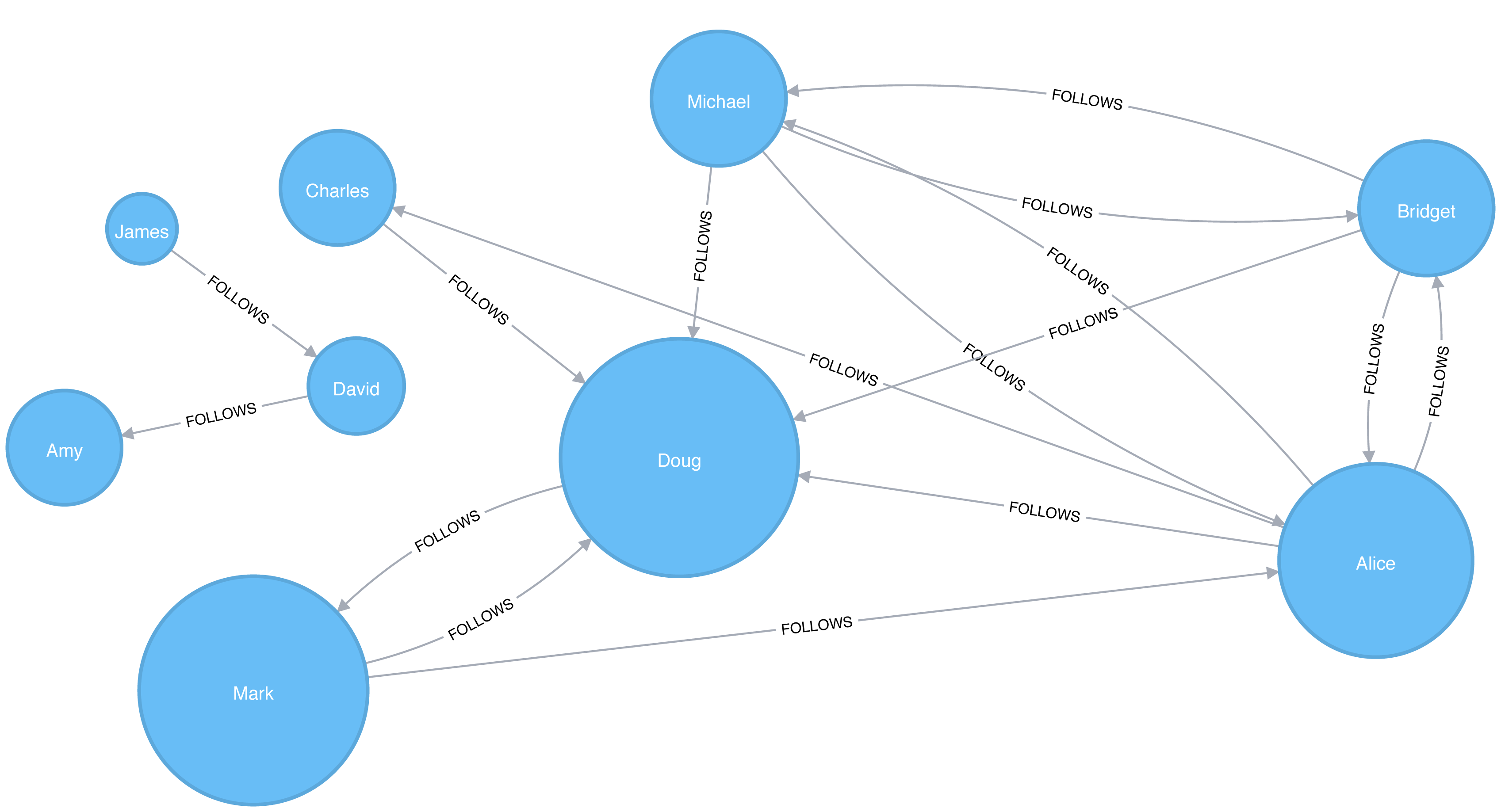
Personalized PageRank (PPR) is a variant of the PageRank algorithm which calculates the importance of nodes in a graph from the perspective of a specific node. For PPR, random jumps refer back to a given set of starting nodes. This biases results towards, or personalizes for, the start node. This bias and localization make it useful for hihgly targeted recommendations.
We can calculate the Personalized PageRank for a given node by passing in the sourceId parameter.
The following code calculates the Personalized PageRank for Doug:
me="Doug"results=g.pageRank(resetProbability=0.15,maxIter=20,sourceId=me)people_to_follow=results.vertices.sort("pagerank",ascending=False)already_follows=list(g.edges.filter(f"src = '{me}'").toPandas()["dst"])people_to_exclude=already_follows+[me]people_to_follow[~people_to_follow.id.isin(people_to_exclude)].show()
The results of this query could be used to make recommendations for people that Doug should follow. Notice that we’re also making sure that we exclude people that Doug already follows as well as himself from our final result.
If we run that code in pyspark we’ll see this output:
| id | pagerank |
|---|---|
Alice |
0.1650183746272782 |
Michael |
0.048842467744891996 |
Bridget |
0.048842467744891996 |
Charles |
0.03497796119878669 |
David |
0.0 |
James |
0.0 |
Amy |
0.0 |
Alice is the best suggestion for somebody that Doug should follow, but we might suggest Michael and Bridget as well.
Centrality algorithms are an excellent tool for identifying influencers in a network. In this chapter we’ve learned about the prototypical Centrality algorithms: Degree Centrality, Closeness Centrality, Betweenness Centrality, and PageRank. We’ve also covered several variations to deal with issues such as long run times and isolated components, as well as options for alternative uses.
There are many, wide-ranging uses for Centrality algorithms and we encourage you to put them to work in your analyses. Apply what you’ve learned to locate optimal touch points for disseminating information, find the hidden brokers that control the flow of resources, and uncover the indirect power players lurking in the shadows.
Next, we’ll turn to turn Community Detection algorithms that look at groups and partitions.
1 http://leonidzhukov.net/hse/2014/socialnetworks/papers/freeman79-centrality.pdf
2 https://www.brandwatch.com/blog/react-influential-men-and-women-2017/
3 https://link.springer.com/chapter/10.1007/978-3-319-23461-8_11
4 http://www.orgnet.com/MappingTerroristNetworks.pdf
5 http://www.analytictech.com/borgatti/papers/centflow.pdf
6 https://www.aclweb.org/anthology/I/I13/I13-1102.pdf
7 pg. 201 of Wasserman, S. and Faust, K., Social Network Analysis: Methods and Applications, 1994, Cambridge University Press.
8 https://arxiv.org/pdf/cond-mat/0008357.pdf
9 http://moreno.ss.uci.edu/23.pdf
10 http://archives.cerium.ca/IMG/pdf/Morselli_and_Roy_2008_.pdf
11 More https://arxiv.org/pdf/0711.3710.pdf
12 ftp://ftp.umiacs.umd.edu/incoming/louiqa/PUB2012/RecMB.pdf
13 https://global.oup.com/academic/product/networks-9780199206650?cc=us&lang=en&
14 http://www.cs.princeton.edu/~chazelle/courses/BIB/pagerank.htm
15 https://web.stanford.edu/~rezab/papers/wtf_overview.pdf
Community formation is common in complex networks for evaluating group behavior and emergent phenomena. The general principle in identifying communities is that a community will have more relationships within the group than with nodes outside their group. Identifying these related sets reveals clusters of nodes, isolated groups, and network structure. This information helps infer similar behavior or preferences of peer groups, estimate resiliency, find nested relationships, and prepare data for other analysis. Commonly community detection algorithms are also used to produce network visualization for general inspection.
We’ll provide detail on the most representative community detection algorithms:
Triangle Count and Clustering Coefficient for overall relationship density
Strongly Connected Components and Connected Components for finding connected clusters
Label Propagation for quickly inferring groups based on node labels
Louvain Modularity for looking at grouping quality and hierarchies
We’ll explain how the algorithms work and show examples in Apache Spark and Neo4j. In cases where an algorithm is only available in one platform, we’ll provide just one example. We use weighted relationships for these algorithms because they’re typically used to capture the significance of different relationships.
Figure 6-1 illustrates and overview of differences between the community detection algorithms covered and Table 6-1 provides a quick reference to what each algorithm calculates with example uses.
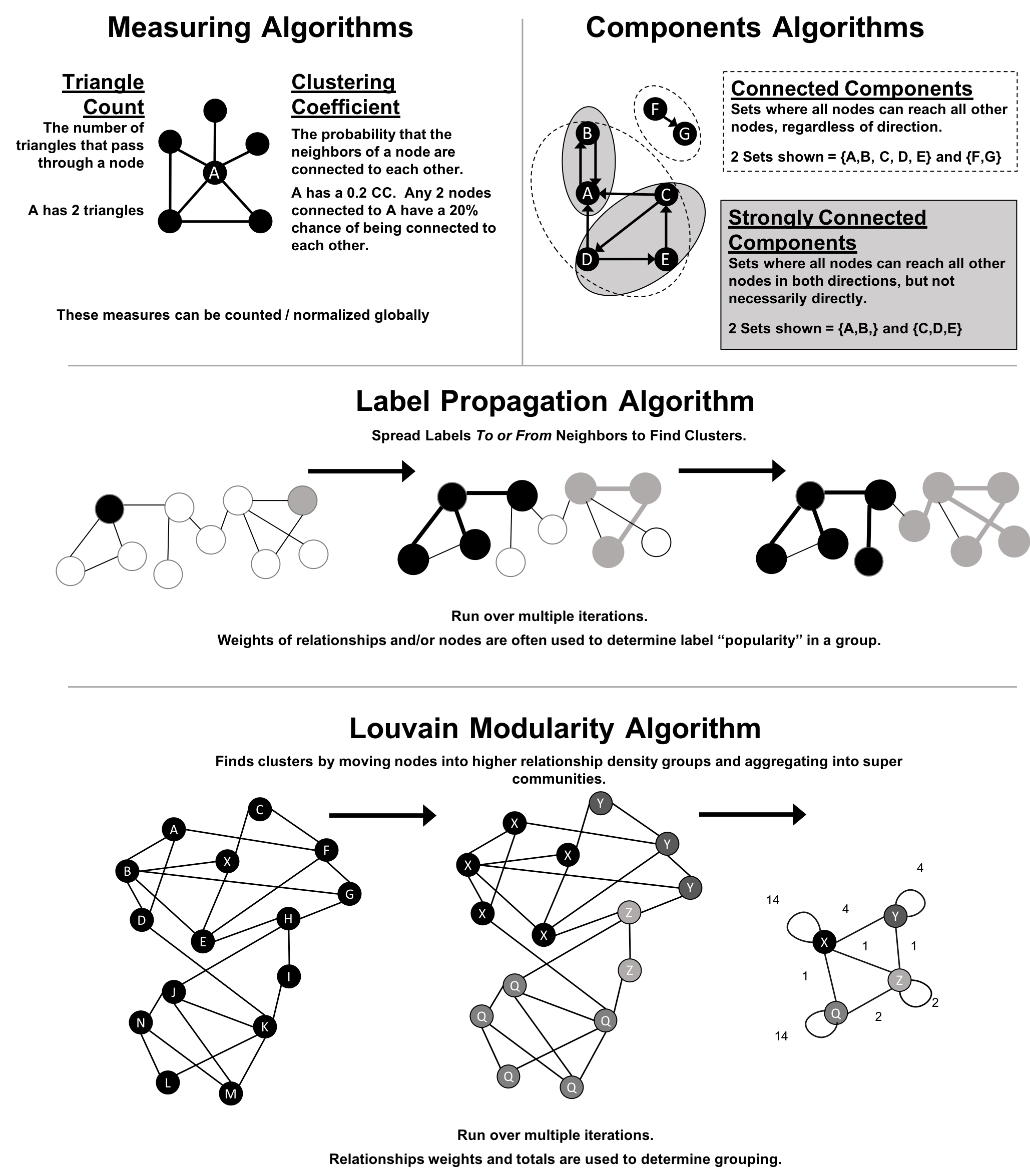
We use the terms “set,” “partition,” “cluster,” “group,” and “community” interchangeably. These terms are different ways to indicate that similar nodes can be grouped. Community Detection algorithms are also called clustering and partitioning algorithms. In each section, we use the terms that are most prominent in the literature for a particular algorithm.
| Algorithm Type | What It Does | Example Uses | Spark Example | Neo4j Example |
|---|---|---|---|---|
Measures how many nodes form triangles and the degree to which nodes tend to cluster together. |
Estimate group stability and whether the network might exhibit “small-world” behaviors seen in graphs with tightly knit clusters. |
Yes |
Yes |
|
Finds groups where each node is reachable from every other node in that same group following the direction of relationships. |
Make product recommendations based on group affiliation or similar items. |
Yes |
Yes |
|
Finds groups where each node is reachable from every other node in that same group, regardless of the direction of relationships. |
Perform fast grouping for other algorithms and identify islands. |
Yes |
Yes |
|
Infers clusters by spreading labels based on neighborhood majorities. |
Understand consensus in social communities or find dangerous combinations of possible co-prescribed drugs. |
Yes |
Yes |
|
Maximizes the presumed accuracy of groupings by comparing relationship weights and densities to a defined estimate or average. |
In fraud analysis, evaluate whether a group has just a few discrete bad behaviors or is acting as a fraud ring. |
No |
Yes |
First, we’ll describe the data for our examples and walk through importing data into Apache Spark and Neo4j. You’ll find each algorithm covered in the order listed in Table 6-1. Each algorithm has a short description and advice on when to use it. Most sections also include guidance on when to use any related algorithms. We demonstrate example code using a sample data at the end of each section.
When using community detection algorithms, be conscious of the density of the relationships.
If the graph is very dense, we may end up with all nodes congregating in one or just a few clusters. You can counteract this by filtering by degree, relationship-weights, or similarity metrics.
On the other hand, if it’s too sparse with few connected nodes, then we may end up with each node in its own cluster. In this case, try to incorporate additional relationship types that carry more relevant information.
Dependency graphs are particularly well suited for demonstrating the sometimes subtle differences between community detection algorithms because they tend to be densely connected and hierarchical. The examples in this chapter are run against a graph containing dependencies between Python libraries, although dependency graphs are used in various fields from software to energy grids. This kind of software dependency graph is used by developers to keep track of transitive interdependencies and conflicts in software projects. You can download the nodes1 and relationships2 files from the book’s GitHub repository3.
sw-nodes.csv
| id |
|---|
six |
pandas |
numpy |
python-dateutil |
pytz |
pyspark |
matplotlib |
spacy |
py4j |
jupyter |
jpy-console |
nbconvert |
ipykernel |
jpy-client |
jpy-core |
sw-relationships.csv
| src | dst | relationship |
|---|---|---|
pandas |
numpy |
DEPENDS_ON |
pandas |
pytz |
DEPENDS_ON |
pandas |
python-dateutil |
DEPENDS_ON |
python-dateutil |
six |
DEPENDS_ON |
pyspark |
py4j |
DEPENDS_ON |
matplotlib |
numpy |
DEPENDS_ON |
matplotlib |
python-dateutil |
DEPENDS_ON |
matplotlib |
six |
DEPENDS_ON |
matplotlib |
pytz |
DEPENDS_ON |
spacy |
six |
DEPENDS_ON |
spacy |
numpy |
DEPENDS_ON |
jupyter |
nbconvert |
DEPENDS_ON |
jupyter |
ipykernel |
DEPENDS_ON |
jupyter |
jpy-console |
DEPENDS_ON |
jpy-console |
jpy-client |
DEPENDS_ON |
jpy-console |
ipykernel |
DEPENDS_ON |
jpy-client |
jpy-core |
DEPENDS_ON |
nbconvert |
jpy-core |
DEPENDS_ON |
Figure 6-2 shows the graph that we want to construct. Just by looking at this graph we can clearly see that there are 3 clusters of libraries. We can use visualizations as a tool to help validate the clusters derived by community detection algorithms.
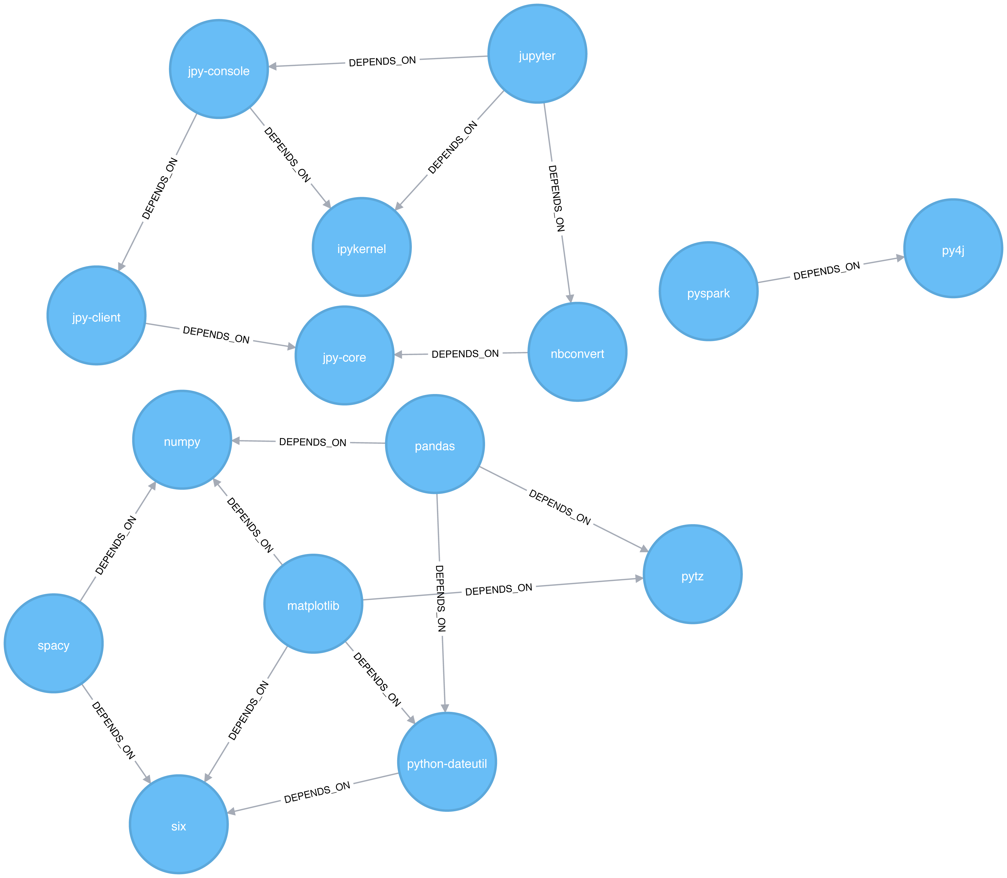
Let’s create graphs in Apache Spark and Neo4j from the example CSV files.
We’ll first import the packages we need from Apache Spark and the GraphFrames package.
fromgraphframesimport*
The following function creates a GraphFrame from the example CSV files:
defcreate_software_graph():nodes=spark.read.csv("data/sw-nodes.csv",header=True)relationships=spark.read.csv("data/sw-relationships.csv",header=True)returnGraphFrame(nodes,relationships)
Now let’s call that function:
g=create_software_graph()
Next we’ll do the same for Neo4j. The following query imports nodes:
WITH"https://github.com/neo4j-graph-analytics/book/raw/master/data/sw-nodes.csv"ASuriLOAD CSVWITHHEADERS FROM uriASrowMERGE (:Library {id: row.id})
And then the relationships:
WITH"https://github.com/neo4j-graph-analytics/book/raw/master/data/sw-relationships.csv"ASuriLOAD CSVWITHHEADERS FROM uriASrowMATCH(source:Library {id: row.src})MATCH(destination:Library {id: row.dst})MERGE (source)-[:DEPENDS_ON]->(destination)
Now that we’ve got our graphs loaded it’s onto the algorithms!
Triangle Count and Clustering Coefficient algorithms are presented together because they are so often used together. Triangle Count determines the number of triangles passing through each node in the graph. A triangle is a set of three nodes, where each node has a relationship to all other nodes. Triangle Count can also be run globally for evaluating our overall data set.
Networks with a high number of triangles are more likely to exhibit small-world structures and behaviors.
The goal of the Clustering Coefficient algorithm is to measure how tightly a group is clustered compared to how tightly it could be clustered. The algorithm uses Triangle count in its calucluations which provides a ratio of existing triangles to possible relationships. A maximun value of 1 indicates a clique where every node is connected to every other node.
There are two types of clustering coefficients:
The local clustering coefficient of a node is the likelihood that its neighbors are also connected. The computation of this score involves triangle counting.
The clustering coefficient of a node can be found by multiplying the number of triangles passing through a node by two and then diving that by the maximum number of relationships in the group, which is always the degree of that node, minus one. Examples of different triangles and clustering coefficients for a node with 5 relationships is protrayed in Figure 6-3.
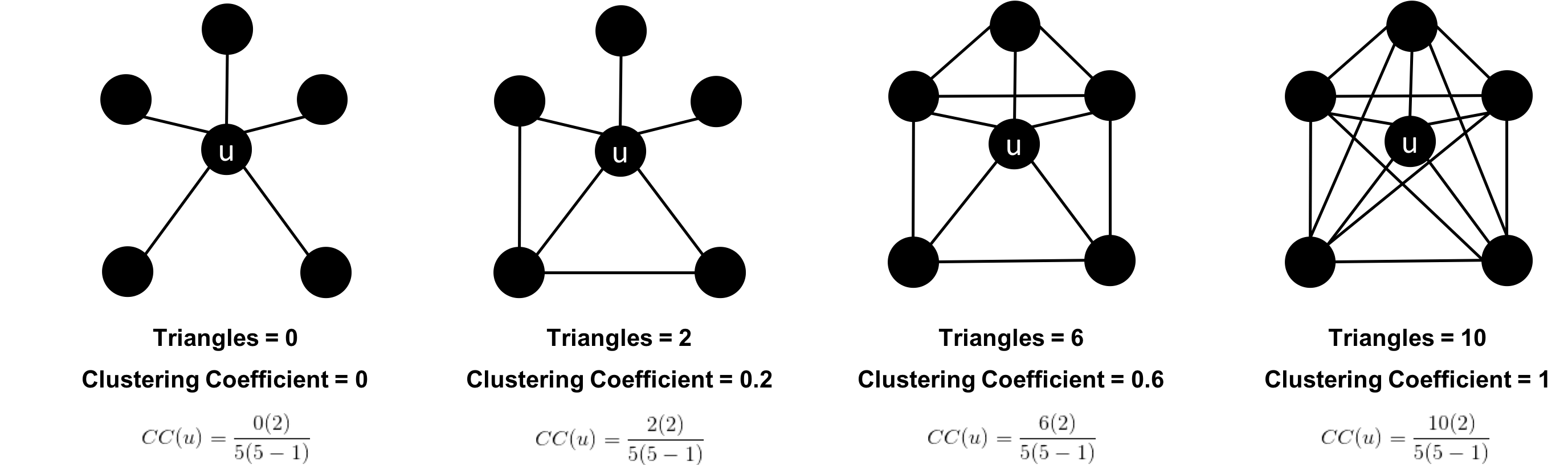
The clustering coefficient for a node uses the formula:
where:
u is a node
R(u) is the number of relationships through the neighbors of u (this can be obtained by using the number of triangles passing through u.)
k(u) is the degree of u
The global clustering coefficient is the normalized sum of the local clustering coefficients.
Clustering coefficients give us an effective means to find obvious groups like cliques, where every node has a relationship with all other nodes, but also specify thresholds to set the levels, say where nodes are 40% connected.
Use Triangle Count when you need to determine the stability of a group or as part of calculating other network measures such as the clustering coefficient. Triangle counting gained popularity in social network analysis, where it is used to detect communities.
Clustering Coefficient can provide the probability that randomly chosen nodes will be connected. You can also use it to quickly evaluate the cohesiveness of a specific group or your overall network. Together these algorithms are used to estimate resiliency and look for network structures.
Example use cases include:
Identifying features for classifying a given website as spam content. This is described in Efficient Semi-streaming Algorithms for Local Triangle Counting in Massive Graphs 4.
Investigating the community structure of Facebook’s social graph, where researchers found dense neighborhoods of users in an otherwise sparse global graph. Find this study in The Anatomy of the Facebook Social Graph 5.
Exploring the thematic structure of the Web and detecting communities of pages with a common topics based on the reciprocal links between them. For more information, see Curvature of co-links uncovers hidden thematic layers in the World Wide Web 6.
Now we’re ready to execute the Triangle Count algorithm. We write the following code to do this:
result=g.triangleCount()result.sort("count",ascending=False)\.filter('count > 0')\.show()
If we run that code in pyspark we’ll see this output:
| count | id |
|---|---|
1 |
jupyter |
1 |
python-dateutil |
1 |
six |
1 |
ipykernel |
1 |
matplotlib |
1 |
jpy-console |
A triangle in this graph would indicate that two of a node’s neighbors are also neighbors. 6 of our libraries participate in such triangles.
What if we want to know which nodes are in those triangles? That’s where a triangle stream comes in.
Getting a stream of the triangles isn’t available using Apache Spark, but we can return it using Neo4j:
CALL algo.triangle.stream("Library","DEPENDS_ON")YIELD nodeA, nodeB, nodeCRETURNalgo.getNodeById(nodeA).idASnodeA,algo.getNodeById(nodeB).idASnodeB,algo.getNodeById(nodeC).idASnodeC
Running this procedure gives the following result:
| nodeA | nodeB | nodeC |
|---|---|---|
matplotlib |
six |
python-dateutil |
jupyter |
jpy-console |
ipykernel |
We see the same 6 libraries as we did before, but now we know how they’re connected. matplotlib, six, and python-dateutil form one triangle. jupyter, jpy-console, and ipykernel form the other.
We can see these triangles visually in Figure 6-4.
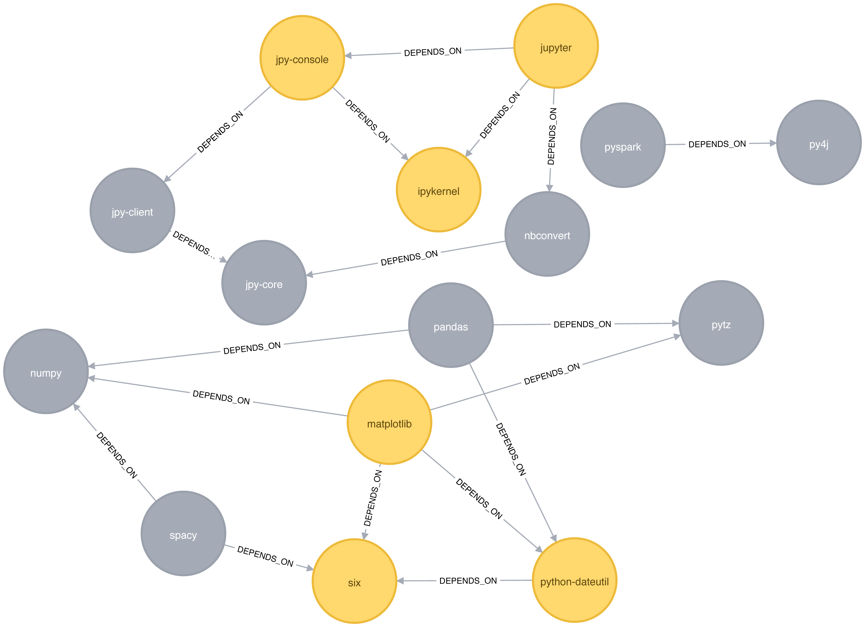
We can also work out the local clustering coefficient. The following query will calculate this for each node:
CALL algo.triangleCount.stream('Library','DEPENDS_ON')YIELD nodeId, triangles, coefficientWHEREcoefficient > 0RETURNalgo.getNodeById(nodeId).idASlibrary, coefficientORDER BYcoefficientDESC
Running this procedure gives the following result:
| library | coefficient |
|---|---|
ipykernel |
1.0 |
jupyter |
0.3333333333333333 |
jpy-console |
0.3333333333333333 |
six |
0.3333333333333333 |
python-dateutil |
0.3333333333333333 |
matplotlib |
0.16666666666666666 |
ipykernel has a score of 1, which means that all ipykernel’s neighbors are neighbors of each other. We can clearly see that in Figure 6-4. This tells us that the community directly around ipykernel is very cohesive.
We’ve filtered out nodes with a coefficient score of 0 in this code sample, but nodes with low coefficients may also be interesting. A low score can be an indicator that a node is a structural hole. 7 A structural hole is a node that is well connected to nodes in different communities that aren’t otherwise connected to each other. This is another method for finding potential bridges, that we discussed last chapter.
The Strongly Connected Components (SCC) algorithm is one of the earliest graph algorithms. SCC finds sets of connected nodes in a directed graph where each node is reachable in both directions from any other node in the same set. It’s run-time operations scale well, proportional to the number of nodes. In Figure 6-5 you can see that the nodes in an SCC group don’t need to be immediate neighbors, but there must be directional paths between all nodes in the set.
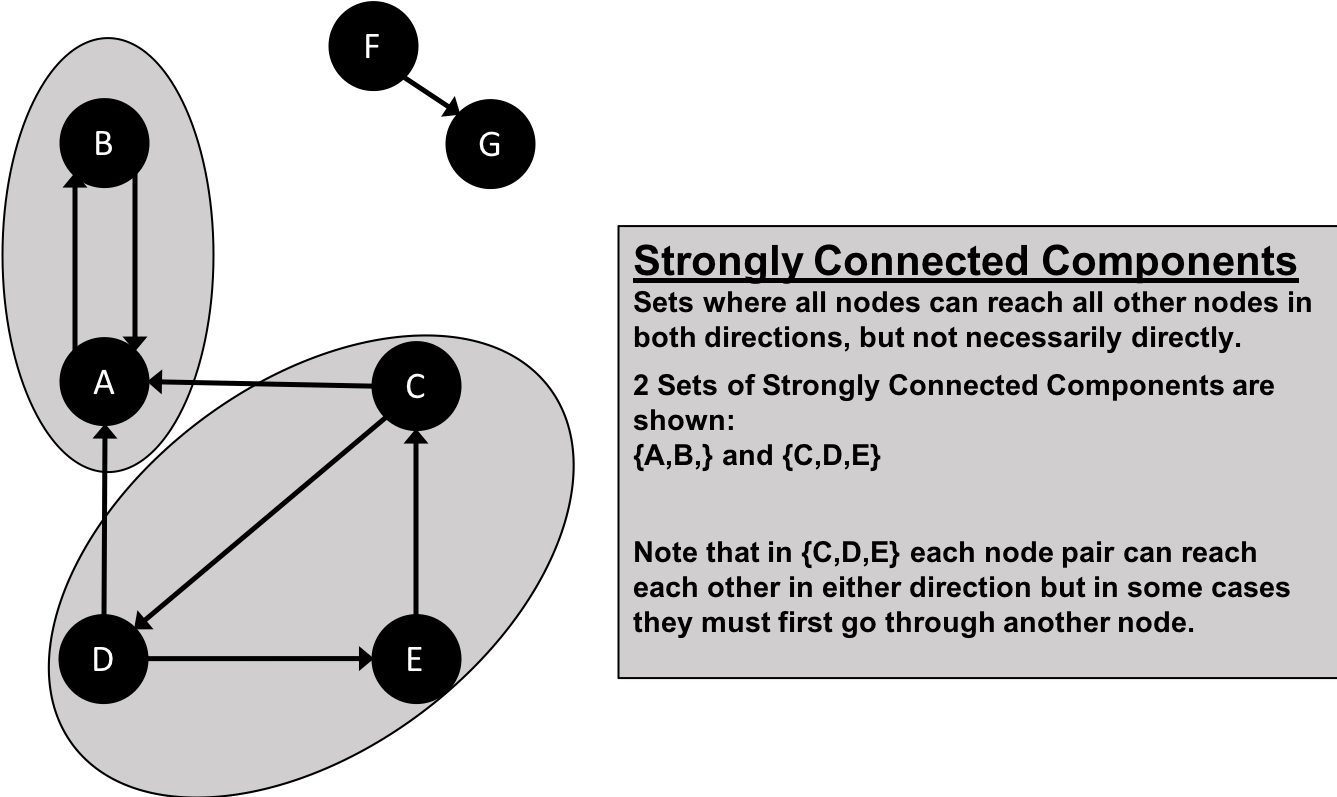
Decomposing a directed graph into its strongly connected components is a classic application of the Depth First Search algorithm. Neo4j uses DFS under the hood as part of its implementation of the SCC algorithm.
Use Strongly Connected Components as an early step in graph analysis to see how our graph is structured or to identify tight clusters that may warrant independent investigation. A component that is strongly connected can be used to profile similar behavior or inclinations in a group for applications such as recommendation engines.
Many community detection algorithms like SCC are used to find and collapse clusters into single nodes for further inter-cluster analysis. You can also use SCC to visualize cycles for analysis like finding processes that might deadlock because each sub-process is waiting for another member to take action.
Example use cases include:
Finding the set of firms in which every member directly owns and/or indirectly owns shares in every other member, in the analysis of powerful transnational corporations 8.
Computing the connectivity of different network configurations when measuring routing performance in multihop wireless networks. Read more in Routing performance in the presence of unidirectional links in multihop wireless networks 9.
Acting as the first step in many graph algorithms that work only on strongly connected graphs. In social networks we find many strongly connected groups. In these sets, people often have similar preferences and the SCC algorithm is used to find such groups and suggest liked pages or purchased products to the people in the group who have not yet liked those pages or purchased those products.
Some algorithms have strategies for escaping infinite loops but if we’re writing our own algorithms or finding non-terminating processes, we canuse SCC to check for cycles.
Starting with Apache Spark, we’ll first import the packages we need from Spark and the GraphFrames package.
fromgraphframesimport*frompyspark.sqlimportfunctionsasF
Now we’re ready to execute the Strongly Connected Components algorithm. We’ll use it to work out whether there are any circular dependencies in our graph.
Two nodes can only be in the same strongly connected component if there are paths between them in both directions.
We write the following code to do this:
result=g.stronglyConnectedComponents(maxIter=10)result.sort("component")\.groupby("component")\.agg(F.collect_list("id").alias("libraries"))\.show(truncate=False)
If we run that code in pyspark we’ll see this output:
| component | libraries |
|---|---|
180388626432 |
[jpy-core] |
223338299392 |
[spacy] |
498216206336 |
[numpy] |
523986010112 |
[six] |
549755813888 |
[pandas] |
558345748480 |
[nbconvert] |
661424963584 |
[ipykernel] |
721554505728 |
[jupyter] |
764504178688 |
[jpy-client] |
833223655424 |
[pytz] |
910533066752 |
[python-dateutil] |
936302870528 |
[pyspark] |
944892805120 |
[matplotlib] |
1099511627776 |
[jpy-console] |
1279900254208 |
[py4j] |
You might notice that every library node is assigned to a unique component. This is the partition or subgroup it belongs to and as we (hopefully!) expected, every node is in its own partition. This means our software project has no circular dependencies amongst these libraries.
Let’s run the same algorithm using Neo4j. Execute the following query to run the algorithm:
CALL algo.scc.stream("Library","DEPENDS_ON")YIELD nodeId, partitionRETURNpartition,collect(algo.getNodeById(nodeId))ASlibrariesORDER BYsize(libraries)DESC
The parameters passed to this algorithm are:
Library - the node label to load from the graph
DEPENDS_ON - the relationship type to load from the graph
This is the output we’ll see when we run the query:
| partition | libraries |
|---|---|
8 |
[ipykernel] |
11 |
[six] |
2 |
[matplotlib] |
5 |
[jupyter] |
14 |
[python-dateutil] |
13 |
[numpy] |
4 |
[py4j] |
7 |
[nbconvert] |
1 |
[pyspark] |
10 |
[jpy-core] |
9 |
[jpy-client] |
3 |
[spacy] |
12 |
[pandas] |
6 |
[jpy-console] |
0 |
[pytz] |
As with the Apache Spark example, every node is in it’s own partition.
So far the algorithm has only revealed that our Python libraries are very well behaved, but let’s create a circular dependency in the graph to make things more interesting. This should mean that we’ll end up with some nodes in the same partition.
The following query adds an extra library that creates a circular dependency between py4j and pyspark:
MATCH(py4j:Library {id:"py4j"})MATCH(pyspark:Library {id:"pyspark"})MERGE (extra:Library {id:"extra"})MERGE (py4j)-[:DEPENDS_ON]->(extra)MERGE (extra)-[:DEPENDS_ON]->(pyspark)
We can clearly see the circular dependency that got created in Figure 6-6
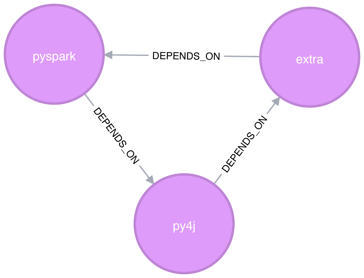
Now if we run the Strongly Connected Components algorithm again we’ll see a slightly different result:
| partition | libraries |
|---|---|
1 |
[pyspark, py4j, extra] |
8 |
[ipykernel] |
11 |
[six] |
2 |
[matplotlib] |
5 |
[jupyter] |
14 |
[numpy] |
13 |
[pandas] |
7 |
[nbconvert] |
10 |
[jpy-core] |
9 |
[jpy-client] |
3 |
[spacy] |
15 |
[python-dateutil] |
6 |
[jpy-console] |
0 |
[pytz] |
pyspark, py4j, and extra are all part of the same partition, and Strongly Connected Components has helped find the circular dependency!
Before we move onto the next algorithm we’ll delete the extra library and its relationships from the graph:
MATCH(extra:Library {id:"extra"})DETACHDELETEextra
The Connected Components algorithm finds sets of connected nodes in an undirected graph where each node is reachable from any other node in the same set (sometimes called Union Find or Weakly Connected Components). It differs from the Strongly Connected Components algorithm (SCC) because it only needs a path to exist between pairs of nodes in one direction, whereas SCC needs a path to exist in both directions.
Bernard A. Galler and Michael J. Fischer first described this algorithm in their 1964 paper, An improved equivalence algorithm 10.
As with SCC, Connected Components is often used early in an analysis to understand a graph’s structure. Because it scales efficiently, consider this algorithm for graphs requiring frequent updates. It can quickly show new nodes in common between groups which is useful for analysis such as fraud detection.
Make it a habit to run Connected Components to test whether a graph is connected as a preparatory step for all our graph algorithms. Performing this quick test can avoid accidentally running algorithms on only one disconnected component of a graph and getting incorrect results.
Example use cases include:
Keeping track of clusters of database records, as part of the de-duplication process. Deduplication is an important task in master data management applications, and the approach is described in more detail in An Efficient Domain-Independent Algorithm for Detecting Approximately Duplicate Database Records 11.
Analyzing citation networks. One study uses Connected Components to work out how well-connected the network is, and then to see whether the connectivity remains if “hub” or “authority” nodes are moved from the graph. This use case is explained further in Characterizing and Mining Citation Graph of Computer Science Literature 12.
Starting with Apache Spark, we’ll first import the packages we need from Spark and the GraphFrames package.
frompyspark.sqlimportfunctionsasF
Now we’re ready to execute the Connected Components algorithm.
Two nodes can be in the same connected component if there is a path between them in either direction.
We write the following code to do this:
result=g.connectedComponents()result.sort("component")\.groupby("component")\.agg(F.collect_list("id").alias("libraries"))\.show(truncate=False)
If we run that code in pyspark we’ll see this output:
| component | libraries |
|---|---|
180388626432 |
[jpy-core, nbconvert, ipykernel, jupyter, jpy-client, jpy-console] |
223338299392 |
[spacy, numpy, six, pandas, pytz, python-dateutil, matplotlib] |
936302870528 |
[pyspark, py4j] |
The results show three clusters of nodes, which can also be seen visually in Figure 6-7.
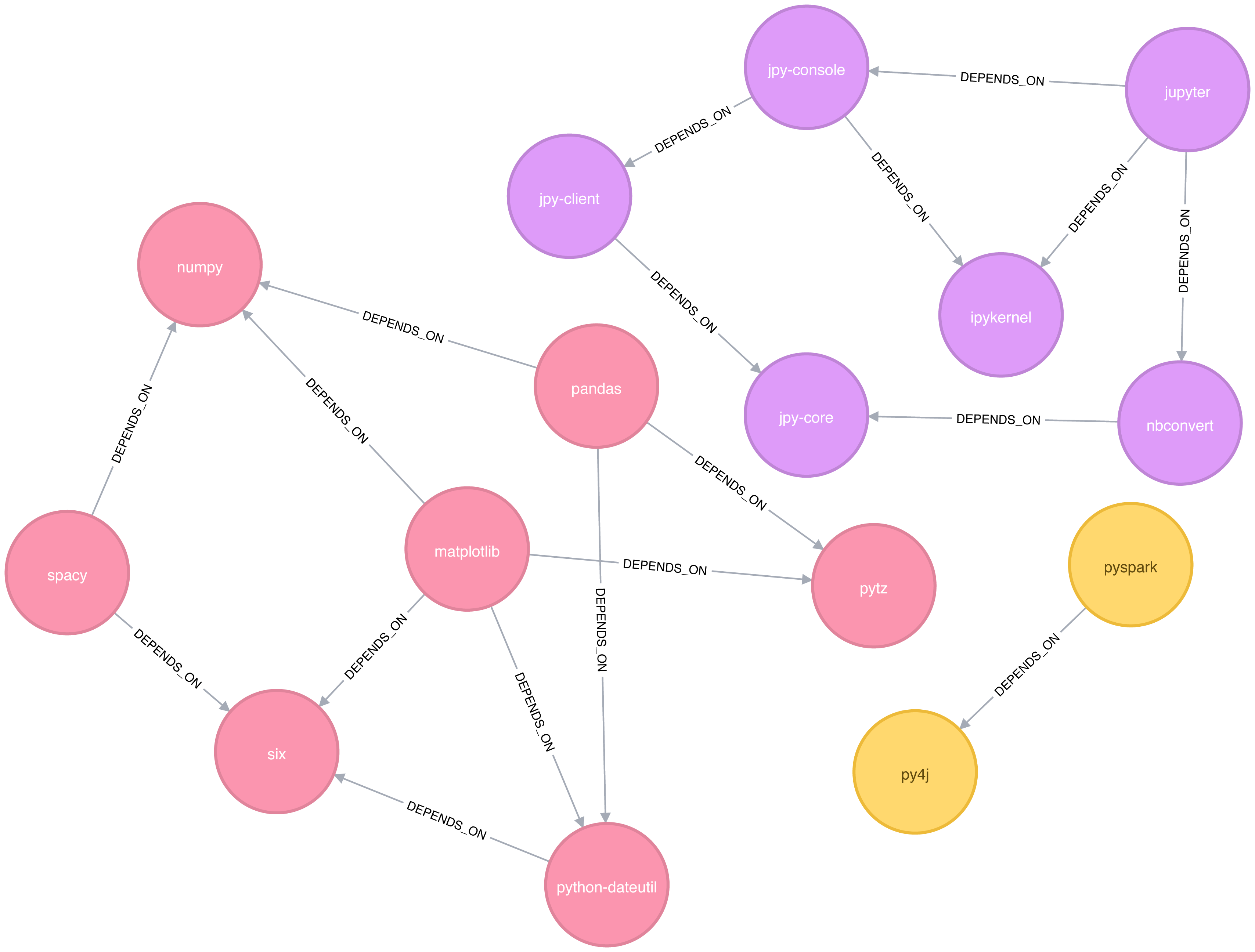
In this example it’s very easy to see that there are 3 components just by visual inspection. This algorithm shows its value more on larger graphs where visual inspection isn’t possible or is very time consuming.
We can also execute this algorithm in Neo4j by running the following query:
CALL algo.unionFind.stream("Library","DEPENDS_ON")YIELD nodeId,setIdRETURNsetId,collect(algo.getNodeById(nodeId))ASlibrariesORDER BYsize(libraries)DESC
The parameters passed to this algorithm are:
Library - the node label to load from the graph
DEPENDS_ON - the relationship type to load from the graph
This are the results:
| setId | libraries |
|---|---|
2 |
[pytz, matplotlib, spacy, six, pandas, numpy, python-dateutil] |
5 |
[jupyter, jpy-console, nbconvert, ipykernel, jpy-client, jpy-core] |
1 |
[pyspark, py4j] |
As expected, we get exactly the same results as we did with Apache Spark.
Both of the community detection algorithms that we’ve covered so far are deterministic: they return the same results each time we run them. Our next two algorithms are examples of non-deterministic algorithms, where we may see different results if we run them multiple times, even on the same data.
The Label Propagation algorithm (LPA) is a fast algorithm for finding communities in a graph. In LPA, nodes select their group based on their direct neighbors. This process is well suited where groupings are less clear and weights can be used to help determine which community to place itself within. It also lends itself well to semi-supervised learning because you can seed the process with pre-assigned, indicative node labels.
The intuition behind this algorithm is that a single label can quickly become dominant in a densely connected group of nodes, but it will have trouble crossing a sparsely connected region. Labels get trapped inside a densely connected group of nodes, and nodes that end up with the same label when the algorithm finishes are considered part of the same community. The algorithm resolves overlaps, where nodes are potentially part of multiple clusters, by assigning membership to the label neighbourhood with the highest combined relationship and node weight.
LPA is a relatively new algorithm and was only proposed by Raghavan et al., in 2007, in a paper titled Near linear time algorithm to detect community structures in large-scale networks 13.
Figure 6-8 depicts 2 variations of Label Propagation, a simple push method and the more typical pull method that relies on relationship weights. The pull method lends itself well to parallelization.
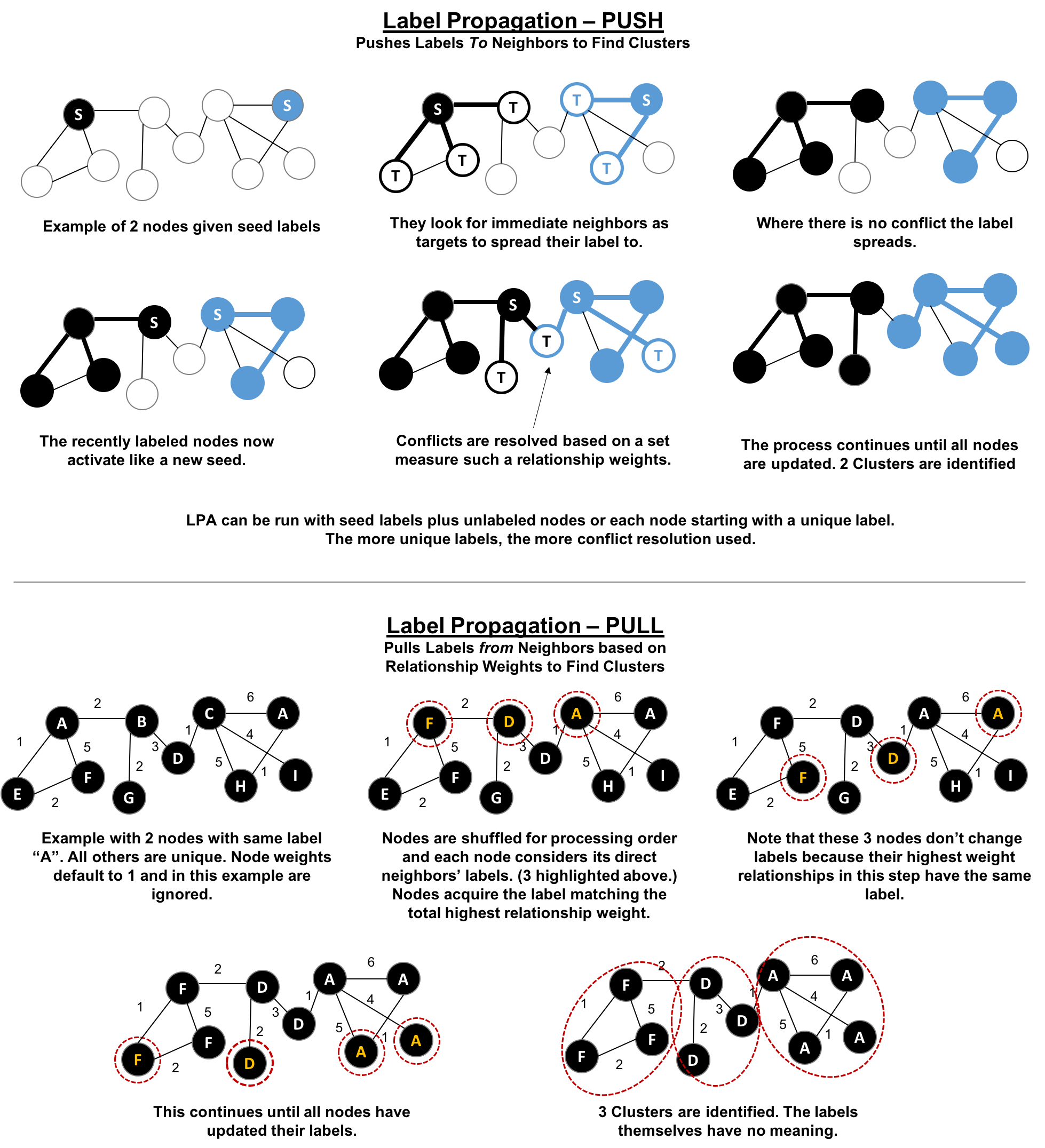
The steps for the Label Propagation pull method often used are:
Every node is initialized with a unique label (an identifier).
These labels propagate through the network.
At every propagation iteration, each node updates its label to match the one with the maximum weight, which is calculated based on the weights of neighbor nodes and their relationships. Ties are broken uniformly and randomly.
LPA reaches convergence when each node has the majority label of its neighbors.
As labels propagate, densely connected groups of nodes quickly reach a consensus on a unique label. At the end of the propagation, only a few labels will remain, and nodes that have the same label belong to the same community.
In contrast to other algorithms, Label Propagation can return different community structures when run multiple times on the same graph. The order in which LPA evaluates nodes can have an influence on the final communities it returns.
The range of solutions is narrowed when some nodes are given preliminary labels (i.e., seed labels), while others are unlabeled. Unlabeled nodes are more likely to adopt the preliminary labels.
This use of Label Propagation can be considered as a semi-supervised learning method to find communities. Semi-supervised learning is a class of machine learning tasks and techniques that operate on a small amount of labeled data, along with a larger amount of unlabeled data. We can also run the algorithm repeatedly on graphs as they evolve.
Finally, LPA sometimes doesn’t converge on a single solution. In this situation, our community results will continually flip between a few remarkably similar communities and would never complete. Seed labels help guide the algorithm towards a solution. Apache Spark and Neo4j set a maximum number of iterations to avoid never-ending execution. We should test the iteration setting for our data to balance accuracy and execution time.
Use Label Propagation in large-scale networks for initial community detection. This algorithm can be parallelised and is therefore extremely fast at graph partitioning.
Example use cases include:
Assigning polarity of tweets as a part of semantic analysis. In this scenario, positive and negative seed labels from a classifier are used in combination with the Twitter follower graph. For more information, see Twitter polarity classification with label propagation over lexical links and the follower graph 14.
Finding potentially dangerous combinations of possible co-prescribed drugs, based on the chemical similarity and side effect profiles. The study is found in Label Propagation Prediction of Drug-Drug Interactions Based on Clinical Side Effects 15.
Inferring dialogue features and user intention for a machine learning model. For more information, see Feature Inference Based on Label Propagation on Wikidata Graph for DST 16.
Starting with Apache Spark, we’ll first import the packages we need from Apache Spark and the GraphFrames package.
frompyspark.sqlimportfunctionsasF
Now we’re ready to execute the Label Propagation algorithm. We write the following code to do this:
result=g.labelPropagation(maxIter=10)result.sort("label").groupby("label").agg(F.collect_list("id")).show(truncate=False)
If we run that code in pyspark we’ll see this output:
| label | collect_list(id) |
|---|---|
180388626432 |
[jpy-core, jpy-console, jupyter] |
223338299392 |
[matplotlib, spacy] |
498216206336 |
[python-dateutil, numpy, six, pytz] |
549755813888 |
[pandas] |
558345748480 |
[nbconvert, ipykernel, jpy-client] |
936302870528 |
[pyspark] |
1279900254208 |
[py4j] |
Compared to Connected Components we have more clusters of libraries in this example. LPA is less strict than Connected Components with respect to how it determines clusters. Two neighbors (directly connected nodes) may be found to be in different clusters using Label Propagation. However, using Connected Components a node would always be in the same cluster as its neighbors because that algorithm bases grouping strictly on relationships.
In our example, the most obvious difference is that the Jupyter libraries have been split into two communities - one containing the core parts of the library and the other with the client facing tools.
Now let’s try the same algorithm with Neo4j. We can execute LPA by running the following query:
CALL algo.labelPropagation.stream("Library","DEPENDS_ON",{ iterations: 10 })YIELD nodeId, labelRETURNlabel,collect(algo.getNodeById(nodeId).id)ASlibrariesORDER BYsize(libraries)DESC
The parameters passed to this algorithm are:
Library - the node label to load from the graph
DEPENDS_ON - the relationship type to load from the graph
iterations: 10 - the maximum number of iterations to run
These are the results we’d see:
| label | libraries |
|---|---|
11 |
[matplotlib, spacy, six, pandas, python-dateutil] |
10 |
[jupyter, jpy-console, nbconvert, jpy-client, jpy-core] |
4 |
[pyspark, py4j] |
8 |
[ipykernel] |
13 |
[numpy] |
0 |
[pytz] |
The results, which can also be seen visually in Figure 6-9, are fairly similar to those we got with Apache Spark.
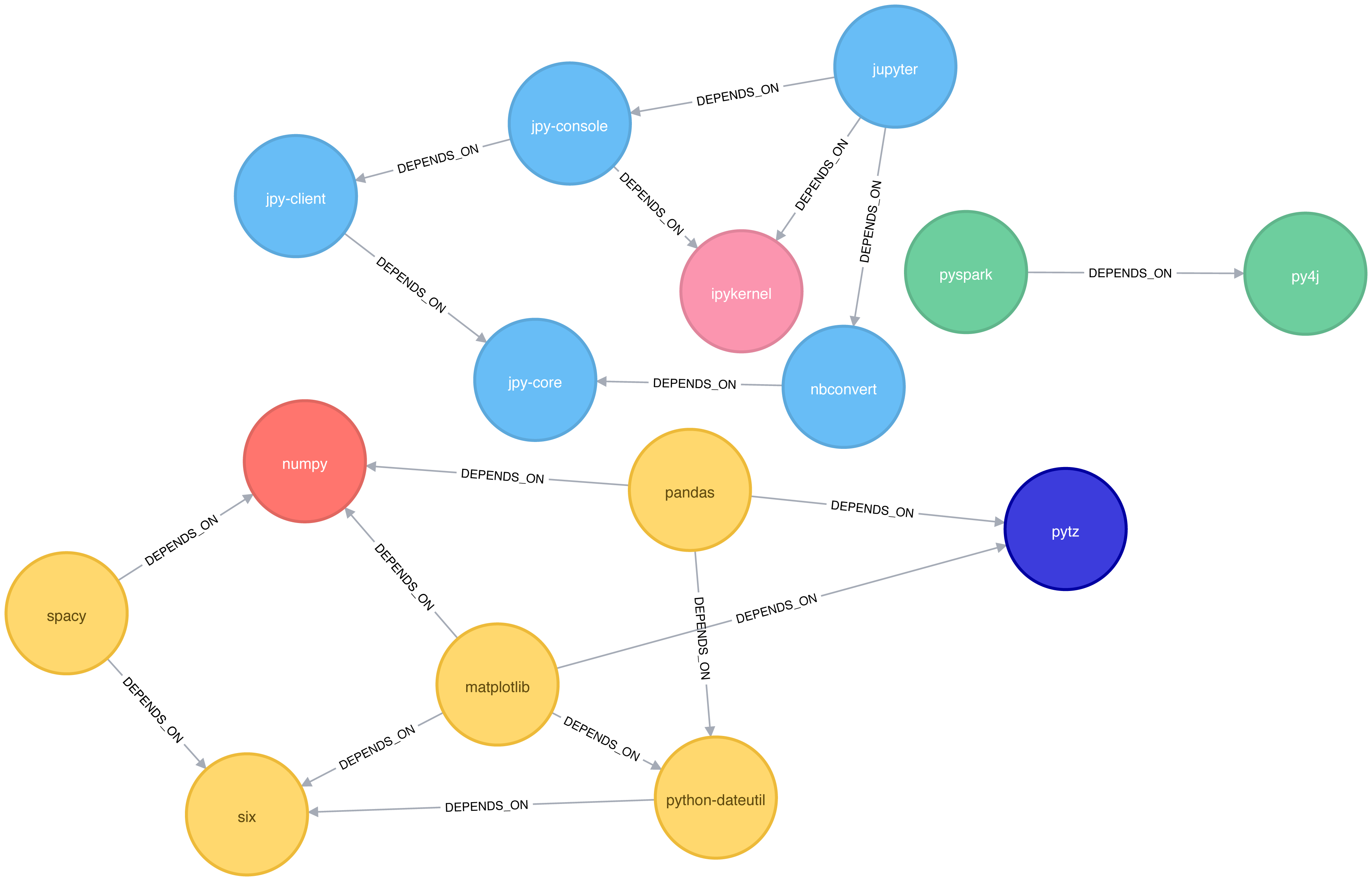
We can also run the algorithm assuming that the graph is undirected, which means that nodes will try and adopt the labels both of libraries they depend on as well as ones that depend on them.
To do this, we pass the DIRECTION:BOTH parameter to the algorithm:
CALL algo.labelPropagation.stream("Library","DEPENDS_ON",{ iterations: 10, direction:"BOTH"})YIELD nodeId, labelRETURNlabel,collect(algo.getNodeById(nodeId).id)ASlibrariesORDER BYsize(libraries)DESC
If we run that algorithm we’ll get the following output:
| label | libraries |
|---|---|
11 |
[pytz, matplotlib, spacy, six, pandas, numpy, python-dateutil] |
10 |
[nbconvert, jpy-client, jpy-core] |
6 |
[jupyter, jpy-console, ipykernel] |
4 |
[pyspark, py4j] |
The number of clusters has reduced from 6 to 4, and all the nodes in the matplotlib part of the graph are now grouped together. This can be seen more clearly in Figure 6-10.
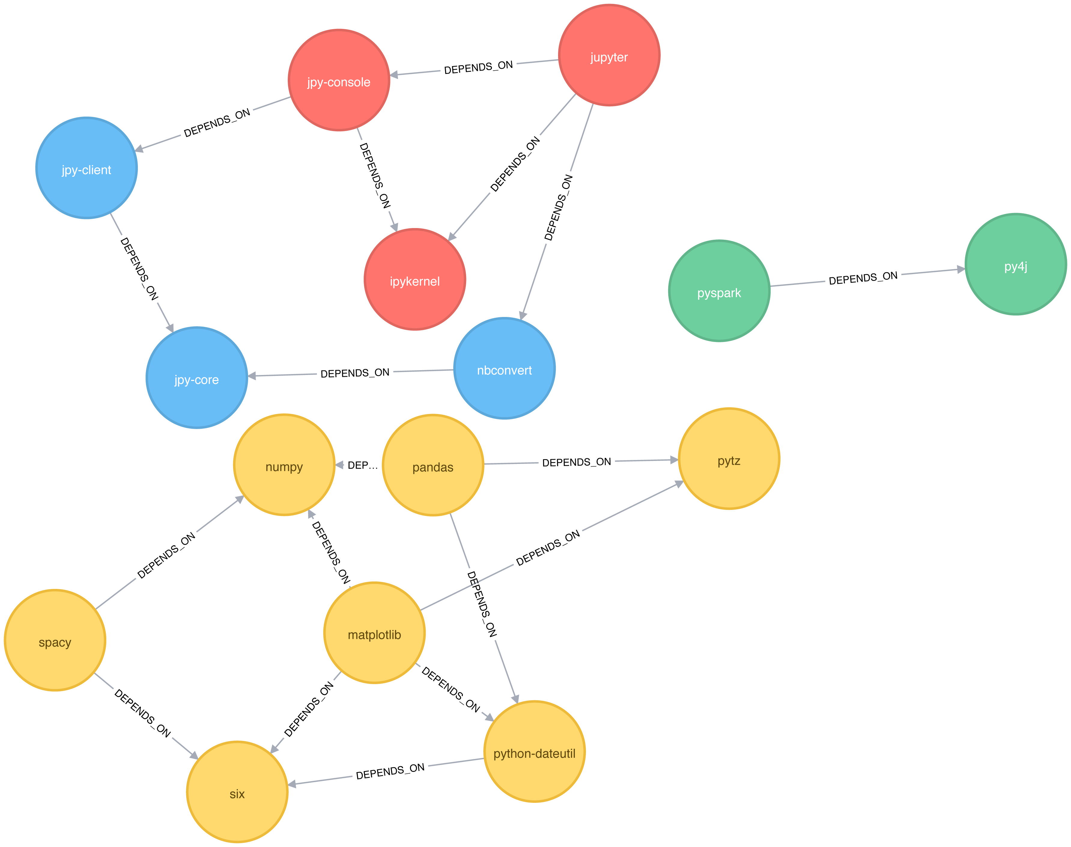
Although the results of running Label Propagation on this data are similiar for undirected and directed calculation, on complicated graphs you will see more significant differences. This is because ignoring direction causes nodes to try and adopt the labels both of libraries they depend on as well as ones that depend on them.
The Louvain Modularity algorithm finds clusters by comparing community density as it assigns nodes to different groups. You can think of this as a “what if” analysis to try out various grouping with the goal of eventually reaching a global optimum.
The Louvain algorithm 17 was proposed in 2008, and is one of the fastest modularity-based algorithms. As well as detecting communities, it also reveals a hierarchy of communities at different scales. This is useful for understanding the structure of a network at different levels of granularity.
Lovain quantifies how well a node is assigned to group by looking at the density of connections within a cluster in comparison to an average or random sample. This measure of community assignment is called modularity.
Modularity is a technique for uncovering communities by partitioning a graph into more coarse-grained modules (or clusters) and then measuring the strength of the groupings. As opposed to just looking at the concentration of connections within a cluster, this method compares relationship densities in given clusters to densities between clusters. The measure of the quality of those groupings is called modularity.
Modularity algorithms optimize communities locally and then globally, using multiple iterations to test different groupings and increasing coarseness. This strategy identifies community hierarchies and provides a broad understanding of the overall structure. However, all modularity algorithms suffer from two drawbacks:
1) they merge smaller communities into larger ones 2) a plateau where several partition options with similar modularity forming local maxima and preventing progress.
For more information, see “The performance of modularity maximization in practical contexts .”18 Remember that communities evolve and change over time so comparative analysis can help predict whether your groups are growing, merging, splitting or shrinking.
1 https://github.com/neo4j-graph-analytics/book/blob/master/data/sw-nodes.csv
2 https://github.com/neo4j-graph-analytics/book/blob/master/data/sw-relationships.csv
3 https://github.com/neo4j-graph-analytics/book
4 http://chato.cl/papers/becchetti_2007_approximate_count_triangles.pdf
5 https://arxiv.org/pdf/1111.4503.pdf
6 http://www.pnas.org/content/99/9/5825
7 http://theory.stanford.edu/~tim/s14/l/l1.pdf
8 http://journals.plos.org/plosone/article/file?id=10.1371/journal.pone.0025995&type=printable
9 https://dl.acm.org/citation.cfm?id=513803
10 https://dl.acm.org/citation.cfm?doid=364099.364331
11 http://citeseerx.ist.psu.edu/viewdoc/summary?doi=10.1.1.28.8405
12 https://pdfs.semanticscholar.org/a8e0/5f803312032569688005acadaa4d4abf0136.pdf
13 https://arxiv.org/pdf/0709.2938.pdf
14 https://dl.acm.org/citation.cfm?id=2140465
15 https://www.nature.com/articles/srep12339
16 https://www.uni-ulm.de/fileadmin/website_uni_ulm/iui.iwsds2017/papers/IWSDS2017_paper_12.pdf
17 https://arxiv.org/pdf/0803.0476.pdf
18 https://arxiv.org/abs/0910.0165
19 https://docs.lib.purdue.edu/cgi/viewcontent.cgi?article=1871&context=open_access_theses
Our approach to graph analysis will evolve as we become more familiar with the behavior of different algorithms on specific datasets. In this chapter, we’ll run through several examples to give a better feeling for how to tackle large-scale graph data analysis using datasets from Yelp and the U.S. Department of Transportation. We’ll walk through Yelp data analysis in Neo4j that includes a general over of the data, combining algorithms to make trip recommendations, and mining user and business data for consulting. In Spark, we’ll look into U.S. Airline data for understanding traffic patterns and delays as well as how airports are connected by different airlines.
Since pathfinding algorithms are straightforward, our examples will use these centrality and community detection algorithms:
PageRank to find influential Yelp reviewers and then correlate their ratings for specific hotels
Betweenness Centrality to uncover reviewers connected to multiple groups and then extract their preferences
Label Propagation with a projection to create super-categories of similar Yelp businesses
Degree Centrality to quickly identify airport hubs in the U.S. transport dataset
Strongly Connected Components to look at clusters of airport routes in the U.S.
Yelp 1 helps people find local businesses based on reviews, preferences, and recommendations. Over 163 million reviews have been written on the platform as of the middle of 2018. Yelp has been running the Yelp Dataset challenge 2 since 2013, a competition that encourages people to explore and research Yelp’s open dataset.
As of Round 12 of the challenge, the open dataset contained:
Over 7 million reviews plus tips
Over 1.5 million users and 280,000 pictures
Over 188,000 businesses with 1.4 million attributes
10 metropolitan areas
Since its launch, the dataset has become popular, with hundreds of academic papers 3 written about it. The Yelp dataset represents real data that is very well structured and highly interconnected. It’s a great showcase for graph algorithms that you can also download and explore.
The Yelp dataset also includes a social network. Figure 7-1 is a print screen of the friends section of Mark’s Yelp profile.

Apart from the fact that Mark needs a few more friends, we’re all set to get started. For illustrating how we might analyse Yelp data in Neo4j, we’ll use a scenario where we work for a travel information business. First we’ll explore the Yelp data and then look at how to help people plan trips with our app. We walk through finding good recommendation for places to stay and things to do in major cities like Las Vegas. Another part of our business will involve consulting to travel-destination businesses. In one example we’ll help hotels identify influential visitors and then businesses that they should target for cross-promotion programs.
There are many different methods for importing data into Neo4j, including the import tool 4, the LOAD CSV 5 command that we’ve seen in earlier chapters, and Neo4j Drivers 6.
For the Yelp dataset we need to do a one-off import of a large amount of data so the import tool is the best choice.
The Yelp data is represented in a graph model as shown in Figure 7-2.
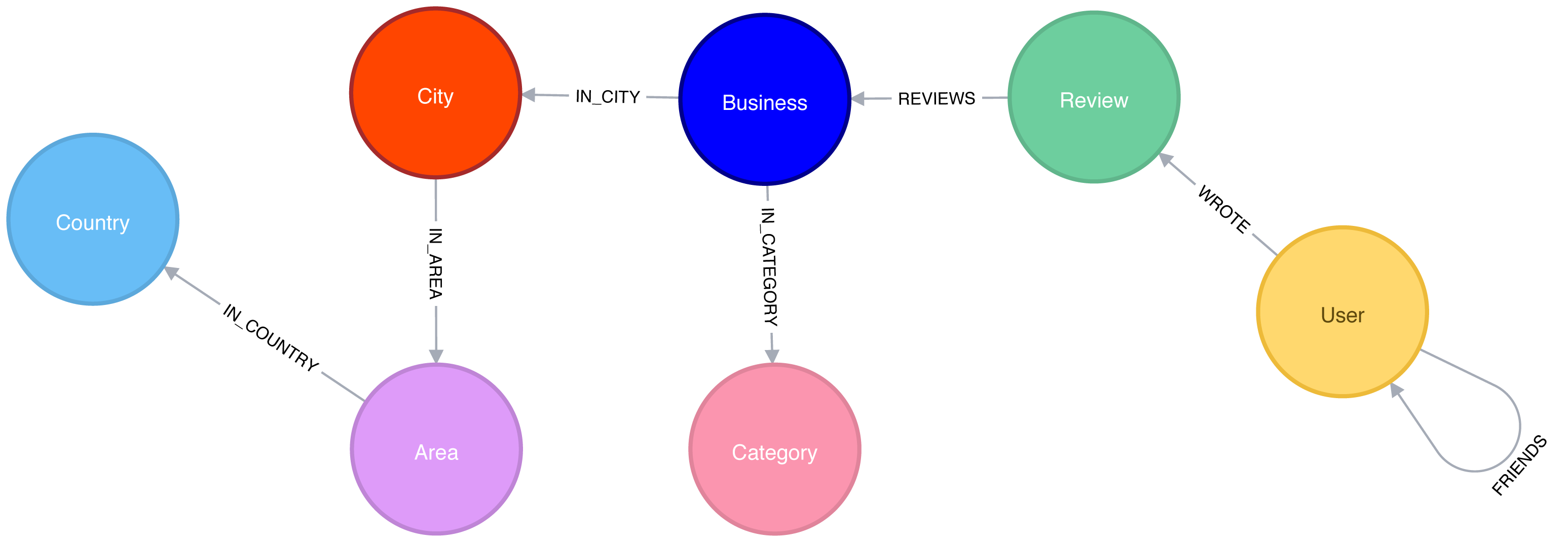
Our graph contains User labeled nodes, which have a FRIENDS relationship with other Users.
Users also WRITE Reviews and tips about Businesses.
All of the metadata is stored as properties of nodes, except for Categories of the Businesses, which are represented by separate nodes.
For location data we’ve extracted City, Area, and Country into the subgraph.
In other use cases it might make sense to extract other attributes to nodes such as date or collapse nodes to relationships such as reviews.
Once we have the data loaded in Neo4j, we’ll execute some exploratory queries. We’ll ask how many nodes are in each category or what types of relations exist, to get a feel for the Yelp data. Previously we’ve shown Cypher queries for our Neo4j examples, but we might be executing these from another programming language. Since Python is the go-to language for data scientists, we’ll use Neo4j’s Python driver in this section when we want to connect the results to other libraries from the Python ecosystem. If we just want to show the result of a query we’ll use Cypher directly.
We’ll also show how to combine Neo4j with the popular pandas library, which is effective for data wrangling outside of the database. We’ll see how to use the tabulate library to prettify the results we get from pandas, and how to create visual representations of data using matplotlib.
We’ll also be using Neo4j’s APOC library of procedues to help write even more powerful Cypher queries.
Let’s first install the Python libraries:
pip install neo4j-driver tabulate pandas matplotlib
Once we’ve done that we’ll import those libraries:
fromneo4j.v1importGraphDatabaseimportpandasaspdfromtabulateimporttabulate
Importing matplotlib can be fiddly on Mac OS X, but the following lines should do the trick:
importmatplotlibmatplotlib.use('TkAgg')importmatplotlib.pyplotasplt
If we’re running on another operating system, the middle line may not be required.
And now let’s create an instance of the Neo4j driver pointing at a local Neo4j database:
driver=GraphDatabase.driver("bolt://localhost",auth=("neo4j","neo"))
You’ll need to update the initialization of the driver to use your own host and credentials.
To get started, let’s look at some general numbers for nodes and relationships. The following code calculates the cardinalities of node labels (counts the number of nodes for each label) in the database:
result={"label":[],"count":[]}withdriver.session()assession:labels=[row["label"]forrowinsession.run("CALL db.labels()")]forlabelinlabels:query=f"MATCH (:`{label}`) RETURN count(*) as count"count=session.run(query).single()["count"]result["label"].append(label)result["count"].append(count)df=pd.DataFrame(data=result)(tabulate(df.sort_values("count"),headers='keys',tablefmt='psql',showindex=False))
If we run that code we’ll see how many nodes we have for each label:
| label | count |
|---|---|
Country |
17 |
Area |
54 |
City |
1093 |
Category |
1293 |
Business |
174567 |
User |
1326101 |
Review |
5261669 |
We could also create a visual representation of the cardinalities, with the following code:
plt.style.use('fivethirtyeight')ax=df.plot(kind='bar',x='label',y='count',legend=None)ax.xaxis.set_label_text("")plt.yscale("log")plt.xticks(rotation=45)plt.tight_layout()plt.show()
We can see the chart that gets generated by this code in Figure 7-3. Note that this chart is using log scale.
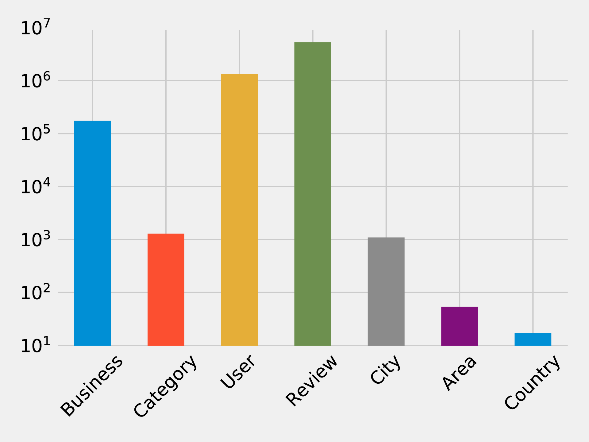
Similarly, we can calculate the cardinalities of relationships as well:
result={"relType":[],"count":[]}withdriver.session()assession:rel_types=[row["relationshipType"]forrowinsession.run("CALL db.relationshipTypes()")]forrel_typeinrel_types:query=f"MATCH ()-[:`{rel_type}`]->() RETURN count(*) as count"count=session.run(query).single()["count"]result["relType"].append(rel_type)result["count"].append(count)df=pd.DataFrame(data=result)(tabulate(df.sort_values("count"),headers='keys',tablefmt='psql',showindex=False))
If we run that code we’ll see the number of each type of relationship:
| relType | count |
|---|---|
IN_COUNTRY |
54 |
IN_AREA |
1154 |
IN_CITY |
174566 |
IN_CATEGORY |
667527 |
WROTE |
5261669 |
REVIEWS |
5261669 |
FRIENDS |
10645356 |
We can see a chart of the cardinalities in Figure 7-4. As with the node cardinalities chart, this chart is using log scale.
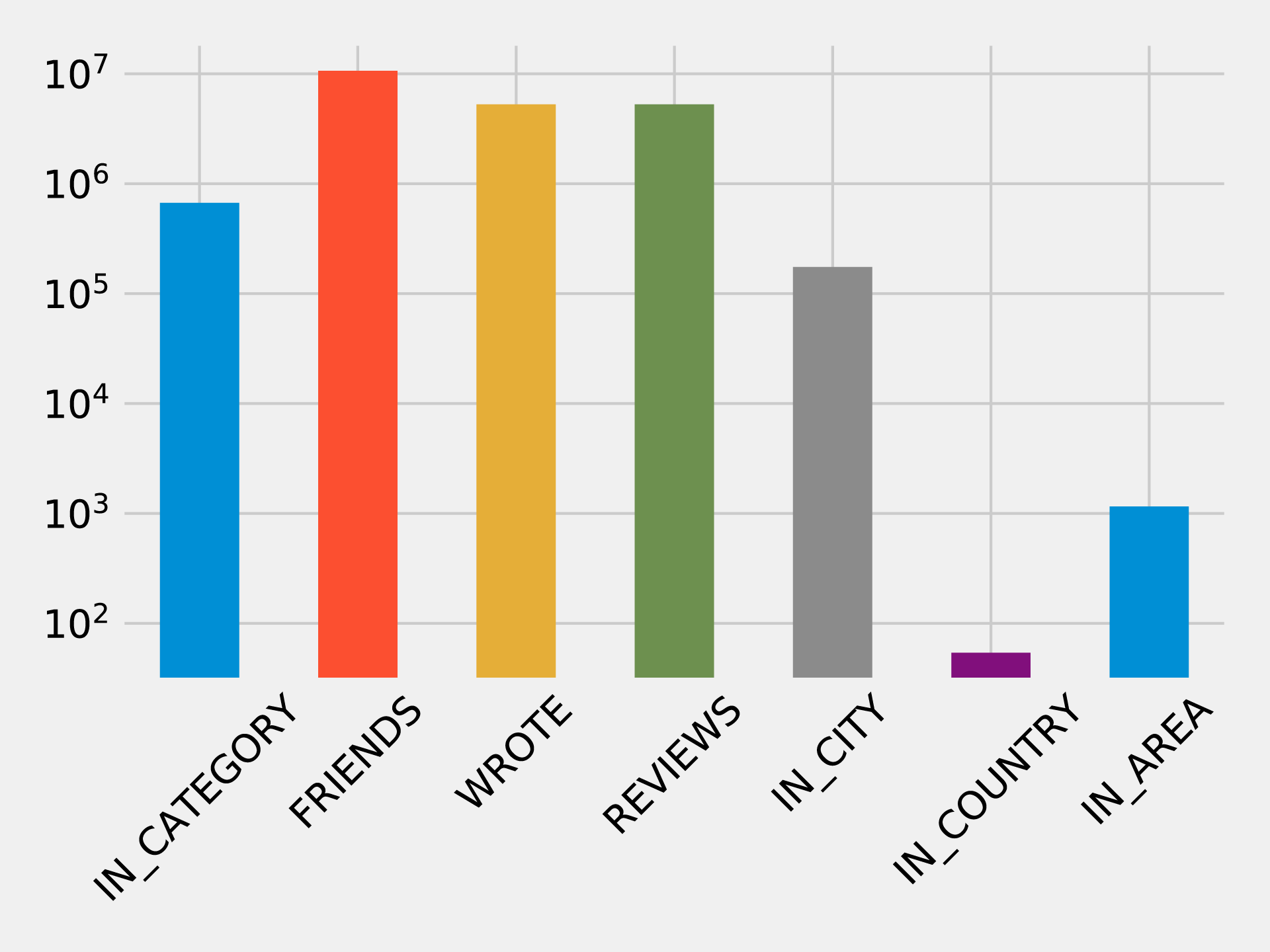
These queries shouldn’t reveal anything surprising, but it’s useful to get a general feel for what’s in the data. This can also serve as a quick check that the data imported correctly.
We assume Yelp has many hotels reviews but it makes sense to check before we focus on that sector. We can find out how many hotel businesses are in that data and how many reviews they have by running the following query.
MATCH(category:Category {name:"Hotels"})RETURNsize((category)<-[:IN_CATEGORY]-())ASbusinesses,size((:Review)-[:REVIEWS]->(:Business)-[:IN_CATEGORY]->(category))ASreviews
If we run that query we’ll see this output:
| businesses | reviews |
|---|---|
2683 |
183759 |
We have a good number of businesses to work with, and a lot of reviews! In the next section we’ll explore the data further with our business scenario.
To get started on adding well-liked recommendations to our app, we start by finding the most rated hotels as a heuristic for popular choices for reservations. We can add in how well they’ve been rated to understand the actual experience.
In order to look at the 10 hotels with the most reviews and plot their rating distributions, we use the following code:
# Find the top 10 hotels with the most reviewsquery="""MATCH (review:Review)-[:REVIEWS]->(business:Business),(business)-[:IN_CATEGORY]->(category:Category {name: $category}),(business)-[:IN_CITY]->(:City {name: $city})RETURN business.name AS business, collect(review.stars) AS allReviewsORDER BY size(allReviews) DESCLIMIT 10"""fig=plt.figure()fig.set_size_inches(10.5,14.5)fig.subplots_adjust(hspace=0.4,wspace=0.4)withdriver.session()assession:params={"city":"Las Vegas","category":"Hotels"}result=session.run(query,params)forindex,rowinenumerate(result):business=row["business"]stars=pd.Series(row["allReviews"])total=stars.count()average_stars=stars.mean().round(2)# Calculate the star distributionstars_histogram=stars.value_counts().sort_index()stars_histogram/=float(stars_histogram.sum())# Plot a bar chart showing the distribution of star ratingsax=fig.add_subplot(5,2,index+1)stars_histogram.plot(kind="bar",legend=None,color="darkblue",title=f"{business}\nAve: {average_stars}, Total: {total}")plt.tight_layout()plt.show()
You can see we’ve constrained by city and category to focus on Las Vegas hotels. If we run that code we’ll get the chart in Figure 7-5. Note that the X axis represents the number of stars the hotel was rated and the Y axis represents the overall precentage of each rating.
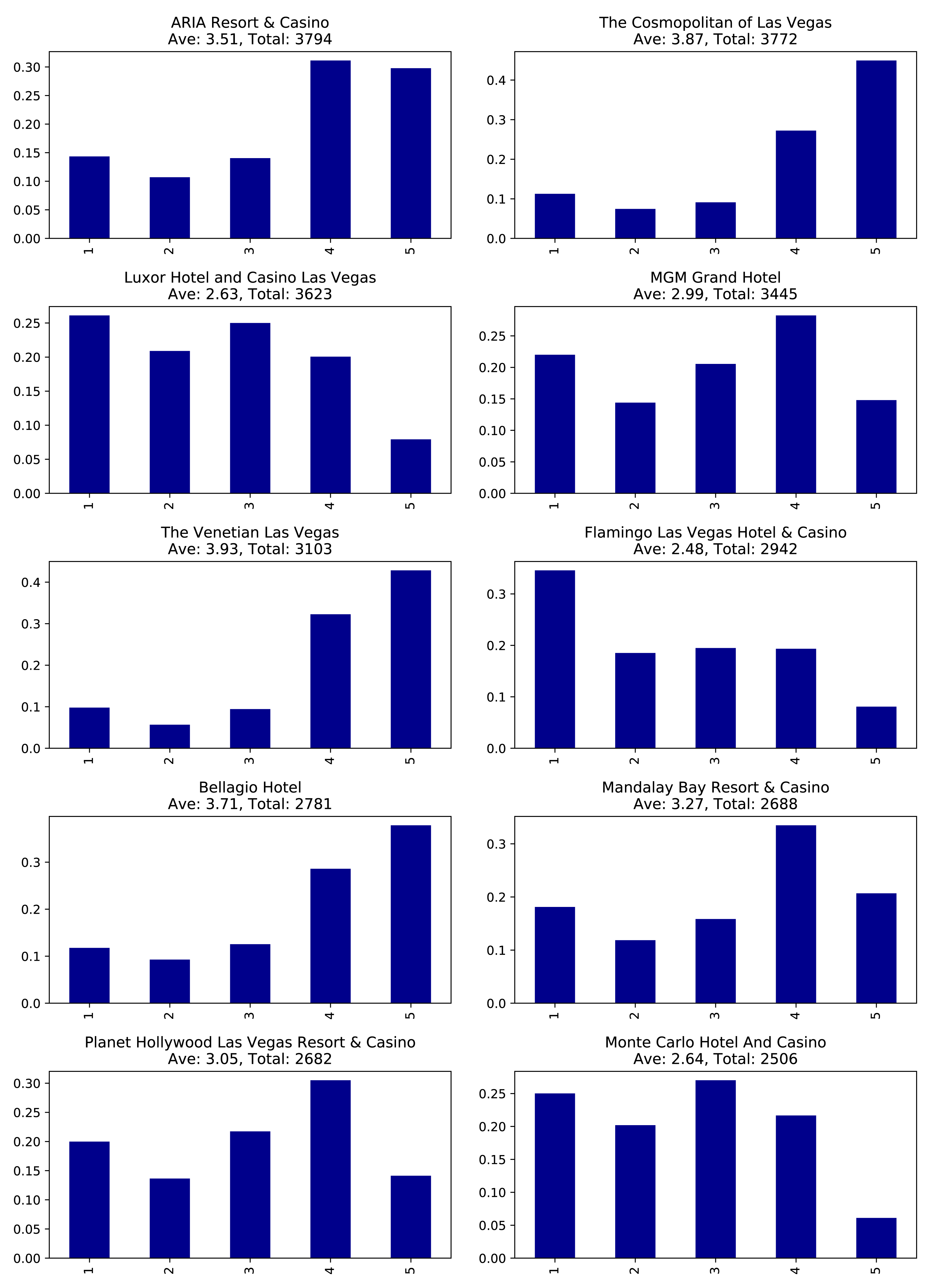
These hotels have lots of reviews, far more than anyone would be likely to read. It would be better to show our users the content from the most relevant reviews and make them more prominent on our app.
To do this analysis, we’ll move from basic graph exploration to using graph algorithms.
One way we can decide which reviews to post is by ordering reviews based on the influence of the reviewer on Yelp.
We’ll run the PageRank algorithm over the projected graph of all users that have reviewed at least 3 hotels. Remember from earlier chapters that a projection can help filter out unessential information as well add relationship data (sometimes inferred). We’ll use Yelp’s friend graph (introduced in ???) as the relationships between users. The PageRank algorithm will uncover those reviewers with more sway over more users, even if they are not direct friends.
If two people are Yelp friends there are two FRIENDS relationships between them.
For example, if A and B are friend there will be a FRIENDS relationship from A to B and another from B to A.
We need to write a query that projects a subgraph of users with more than 3 reviews and then executes the PageRank algorithm over that projected subgraph.
It’s easier to understand how the subgraph projection works with a small example. Figure 7-6 shows a graph of 3 mutual friends - Mark, Arya, and Praveena. Mark and Praveena have both reviewed 3 hotels and will be part of the projected graph. Arya, on the other hand, has only reviewed one hotel and will therefore be excluded from the projection.
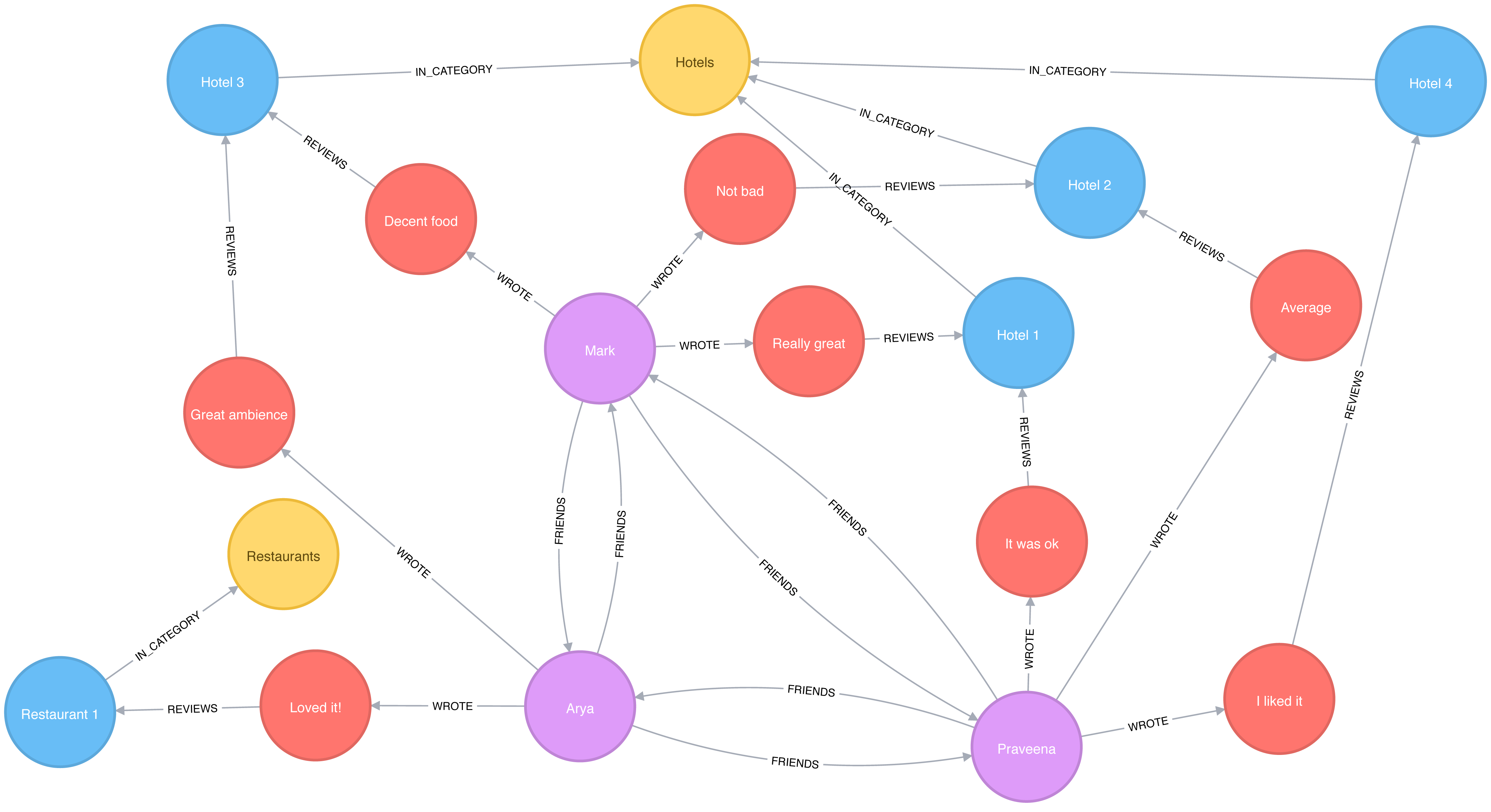
Our projected graph will only include Mark and Praveena, as show in Figure 7-7.
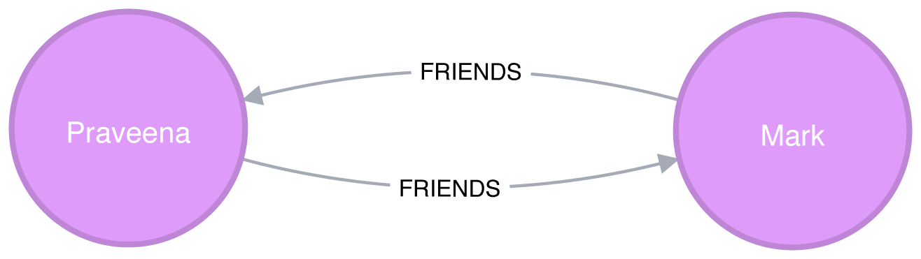
Now that we’ve seen how graph projections works, let’s move forward. The following query executes the PageRank algorithm over our projected graph and stores the result in the hotelPageRank property on each node:
CALL algo.pageRank('MATCH (u:User)-[:WROTE]->()-[:REVIEWS]->()-[:IN_CATEGORY]->(:Category {name: $category})WITH u, count(*) AS reviewsWHERE reviews >= $cutOffRETURN id(u) AS id','MATCH (u1:User)-[:WROTE]->()-[:REVIEWS]->()-[:IN_CATEGORY]->(:Category {name: $category})MATCH (u1)-[:FRIENDS]->(u2)RETURN id(u1) AS source, id(u2) AS target',{graph:"cypher", write:true, writeProperty:"hotelPageRank",params: {category:"Hotels", cutOff: 3}})
You might notice that we didn’t set a dampening factor or maximum iteration limit that was discussed in chapter 5.
If not explicitly set, Neo4j defaults to a 0.85 dampening factor with max iterations set to 20.
Now let’s look at the distribution of the PageRank values so we’ll know how to filter our data:
MATCH(u:User)WHEREexists(u.hotelPageRank)RETURNcount(u.hotelPageRank)AScount,avg(u.hotelPageRank)ASave,percentileDisc(u.hotelPageRank, 0.5)AS`50%`,percentileDisc(u.hotelPageRank, 0.75)AS`75%`,percentileDisc(u.hotelPageRank, 0.90)AS`90%`,percentileDisc(u.hotelPageRank, 0.95)AS`95%`,percentileDisc(u.hotelPageRank, 0.99)AS`99%`,percentileDisc(u.hotelPageRank, 0.999)AS`99.9%`,percentileDisc(u.hotelPageRank, 0.9999)AS`99.99%`,percentileDisc(u.hotelPageRank, 0.99999)AS`99.999%`,percentileDisc(u.hotelPageRank, 1)AS`100%`
If we run that query we’ll see this output:
| count | ave | 50% | 75% | 90% | 95% | 99% | 99.9% | 99.99% | 99.999% | 100% |
|---|---|---|---|---|---|---|---|---|---|---|
1326101 |
0.1614898 |
0.15 |
0.15 |
0.157497 |
0.181875 |
0.330081 |
1.649511 |
6.825738 |
15.27376 |
22.98046 |
To interpret this percentile table, the 90% value of 0.157497 means that 90% of users had a lower PageRank score, which is close to the overall average. 99.99% reflects the influence rank for the top 0.0001% reviewers and 100% is simply the highest PageRank score.
It’s interesting that 90% of our users have a score of under 0.16, which is only marginally more than the 0.15 that they are initialized with by the PageRank algorithm. It seems like this data reflects a power-law distribution with a few very influential reviewers.
Since we’re interested in finding only the most influential users, we’ll write a query that only finds users with a PageRank score in the top 0.001% of all users. The following query finds reviewers with a higher than 1.64951 PageRank score (notice that correlates to the 99.9% group):
// Only find users that have a hotelPageRank score in the top 0.001% of usersMATCH(u:User)WHEREu.hotelPageRank > 1.64951// Find the top 10 of those usersWITHuORDER BYu.hotelPageRankDESCLIMIT10RETURNu.nameASname,u.hotelPageRankASpageRank,size((u)-[:WROTE]->()-[:REVIEWS]->()-[:IN_CATEGORY]->(:Category {name:"Hotels"}))AShotelReviews,size((u)-[:WROTE]->())AStotalReviews,size((u)-[:FRIENDS]-())ASfriends
If we run that query we’ll get these results:
| name | pageRank | hotelReviews | totalReviews | friends |
|---|---|---|---|---|
Phil |
17.361242 |
15 |
134 |
8154 |
Philip |
16.871013 |
21 |
620 |
9634 |
Carol |
12.416060999999997 |
6 |
119 |
6218 |
Misti |
12.239516000000004 |
19 |
730 |
6230 |
Joseph |
12.003887499999998 |
5 |
32 |
6596 |
Michael |
11.460049 |
13 |
51 |
6572 |
J |
11.431505999999997 |
103 |
1322 |
6498 |
Abby |
11.376136999999998 |
9 |
82 |
7922 |
Erica |
10.993773 |
6 |
15 |
7071 |
Randy |
10.748785999999999 |
21 |
125 |
7846 |
These results show us that Phil is the most credible reviewer, although he hasn’t reviewed a lot of hotels. He’s likely connected to some very influential people, but if we wanted a stream of new reviews, his profile wouldn’t be the best selection. Philip has a slightly lower score, but has the most friends and has written 5 times more reviews than Phil. While J has written the most reviews of all and has a reasonable number of friends, J’s PageRank score isn’t the highest – but it’s still in the top 10. For our app we choose to highlight hotel reviews from Phil, Philip, and J to give us the right mix of influencers and number of reviews.
Now that we’ve improved our in-app recommendations with relevant reviews, let’s turn to our other side of the business; consulting.
As part of our consulting, hotels subscribe to be alerted when an influential visitor writes about their stay so they can take any necessary action. First, we’ll look at ratings of the Bellagio sorted by the most influential reviewers. Then we’ll also help the Bellagio identify target partner businesses for cross-promotion programs.
query ="""\MATCH (b:Business {name: $hotel})MATCH (b)<-[:REVIEWS]-(review)<-[:WROTE]-(user)WHERE exists(user.hotelPageRank)RETURN user.name AS name,user.hotelPageRank AS pageRank,review.stars AS stars"""withdriver.session()assession:params = {"hotel":"Bellagio Hotel"}df = pd.DataFrame([dict(record) for recordinsession.run(query, params)])df = df.round(2)df = df[["name","pageRank","stars"]]top_reviews = df.sort_values(by=["pageRank"],ascending=False).head(10)print(tabulate(top_reviews, headers='keys', tablefmt='psql', showindex=False))
If we run that code we’ll get these results:
| name | pageRank | stars |
|---|---|---|
Misti |
12.239516000000004 |
5 |
Michael |
11.460049 |
4 |
J |
11.431505999999997 |
5 |
Erica |
10.993773 |
4 |
Christine |
10.740770499999998 |
4 |
Jeremy |
9.576763499999998 |
5 |
Connie |
9.118103499999998 |
5 |
Joyce |
7.621449000000001 |
4 |
Henry |
7.299146 |
5 |
Flora |
6.7570075 |
4 |
Note that these results are different than [tag=best-reviewers-query] because we are only looking at reviewers that have rated the Bellagio.
Things are looking good for the hotel customer service team at the Bellagio - the top 10 influencers all give their hotel good rankings. They may want to encourage these people to visit again and share their experience.
Are there any influential guests who haven’t had such a good experience? We can run the following code to find the guests with the highest PageRank that rated their experience with fewer than 4 stars:
query ="""\MATCH (b:Business {name: $hotel})MATCH (b)<-[:REVIEWS]-(review)<-[:WROTE]-(user)WHERE exists(user.hotelPageRank) AND review.stars < $goodRatingRETURN user.name AS name,user.hotelPageRank AS pageRank,review.stars AS stars"""withdriver.session()assession:params = {"hotel":"Bellagio Hotel","goodRating": 4 }df = pd.DataFrame([dict(record) for recordinsession.run(query, params)])df = df.round(2)df = df[["name","pageRank","stars"]]top_reviews = df.sort_values(by=["pageRank"],ascending=False).head(10)print(tabulate(top_reviews, headers='keys', tablefmt='psql', showindex=False))
If we run that code we’ll get these results:
| name | pageRank | stars |
|---|---|---|
Chris |
5.84 |
3 |
Lorrie |
4.95 |
2 |
Dani |
3.47 |
1 |
Victor |
3.35 |
3 |
Francine |
2.93 |
3 |
Rex |
2.79 |
2 |
Jon |
2.55 |
3 |
Rachel |
2.47 |
3 |
Leslie |
2.46 |
2 |
Benay |
2.46 |
3 |
Our highest ranked users, Chris and Lorrie, are amongst the top 1,000 most influential users (as per Table 7-4), so perhaps a personal outreach is warranted. Also, because many reviewers write during their stay, real-time alerts about influencers may facilitate even more positive interactions.
After helping with finding influential reviewers, the Bellagio has now asked us to help identify other businesses for cross promotion with help from well connected customers. In our scenario, we recommend they increase their customer base by attracting new guests from different types of communities as a green-field opportunity. We can use the Betweenness Centrality algorithm to work out which Bellagio reviewers are not only well connected across the whole Yelp network but also may act as a bridge between different groups.
We’re only interested in finding influencers in Las Vegas so we’ll first tag those users:
MATCH(u:User)WHEREexists((u)-[:WROTE]->()-[:REVIEWS]->()-[:IN_CITY]->(:City {name:"Las Vegas"}))SETu:LasVegas
It would take a long time to run the Betweenness Centrality algorithm over our Las Vegas users, so instead we’ll use the Approximate Betweenness Centrality variant. This algorithm calculates a betweenness score by sampling nodes and only exploring shortest paths to a certain depth.
After some experimentation, we improved results with a few parameters set differently than the default values. We’ll use shortest paths of up to 4 hops (maxDepth of 4) and we’ll sample 20% of the nodes (probability of 0.2).
The following query will execute the algorithm, and store the result in the between property:
CALL algo.betweenness.sampled('LasVegas','FRIENDS',{write:true, writeProperty:"between", maxDepth: 4, probability: 0.2})
Before we use these scores in our queries let’s write a quick exploratory query to see how the scores are distributed:
MATCH(u:User)WHEREexists(u.between)RETURNcount(u.between)AScount,avg(u.between)ASave,toInteger(percentileDisc(u.between, 0.5))AS`50%`,toInteger(percentileDisc(u.between, 0.75))AS`75%`,toInteger(percentileDisc(u.between, 0.90))AS`90%`,toInteger(percentileDisc(u.between, 0.95))AS`95%`,toInteger(percentileDisc(u.between, 0.99))AS`99%`,toInteger(percentileDisc(u.between, 0.999))AS`99.9%`,toInteger(percentileDisc(u.between, 0.9999))AS`99.99%`,toInteger(percentileDisc(u.between, 0.99999))AS`99.999%`,toInteger(percentileDisc(u.between, 1))ASp100
If we run that query we’ll see this output:
| count | ave | 50% | 75% | 90% | 95% | 99% | 99.9% | 99.99% | 99.999% | 100% |
|---|---|---|---|---|---|---|---|---|---|---|
506028 |
320538.6014 |
0 |
10005 |
318944 |
1001655 |
4436409 |
34854988 |
214080923 |
621434012 |
1998032952 |
Half our users have a score of 0 meaning they are not well connected at all. The top 1% (99%) are on at least 4 million shortest paths between our set of 500,000 users. Considered together, we know that most of our users are poorly connected, but a few exert a lot of control over information; this is a classic behavior of small-world networks.
We can find out who our super-connectors are by running the following query:
MATCH(u:User)-[:WROTE]->()-[:REVIEWS]->(:Business {name:"Bellagio Hotel"})WHEREexists(u.between)RETURNu.nameASuser,toInteger(u.between)ASbetweenness,u.hotelPageRankASpageRank,size((u)-[:WROTE]->()-[:REVIEWS]->()-[:IN_CATEGORY]->(:Category {name:"Hotels"}))AShotelReviewsORDER BYu.betweenDESCLIMIT10
If we run that query we’ll see this output:
| user | betweenness | pageRank | hotelReviews |
|---|---|---|---|
Misti |
841707563 |
12.239516000000004 |
19 |
Christine |
236269693 |
10.740770499999998 |
16 |
Erica |
235806844 |
10.993773 |
6 |
Mike |
215534452 |
NULL |
2 |
J |
192155233 |
11.431505999999997 |
103 |
Michael |
161335816 |
5.105143 |
31 |
Jeremy |
160312436 |
9.576763499999998 |
6 |
Michael |
139960910 |
11.460049 |
13 |
Chris |
136697785 |
5.838922499999999 |
5 |
Connie |
133372418 |
9.118103499999998 |
7 |
We see some of the same people that we saw earlier in our PageRank query - Mike being an interesting exception. He was excluded from that calculation because he hasn’t reviewed enough hotels (3 was the cut off), but it seems like he’s quite well connected in the world of Las Vegas Yelp users.
In an effort to reach a wider variety of customers, we’re going to look at other preferences these “connectors” display to see what we should promote. Many of these users have also reviewed restaurants, so we write the following query to find out which ones they like best:
// Find the top 50 users who have reviewed the BellagioMATCH(u:User)-[:WROTE]->()-[:REVIEWS]->(:Business {name:"Bellagio Hotel"})WHEREu.between > 4436409WITHuORDER BYu.betweenDESC LIMIT50// Find the restaurants those users have reviewed in Las VegasMATCH(u)-[:WROTE]->(review)-[:REVIEWS]-(business)WHERE(business)-[:IN_CATEGORY]->(:Category {name:"Restaurants"})AND(business)-[:IN_CITY]->(:City {name:"Las Vegas"})// Only include restaurants that have more than 3 reviews by these usersWITHbusiness,avg(review.stars)ASaverageReview,count(*)ASnumberOfReviewsWHEREnumberOfReviews >= 3RETURNbusiness.nameASbusiness, averageReview, numberOfReviewsORDER BYaverageReviewDESC, numberOfReviewsDESCLIMIT10
This query finds our top 50 influential connectors and finds the top 10 Las Vegas restaurants where at least 3 of them have rated the restaurant. If we run that query we’ll see the following output:
| business | averageReview | numberOfReviews |
|---|---|---|
Jean Georges Steakhouse |
5.0 |
6 |
Sushi House Goyemon |
5.0 |
6 |
Art of Flavors |
5.0 |
4 |
é by José Andrés |
5.0 |
4 |
Parma By Chef Marc |
5.0 |
4 |
Yonaka Modern Japanese |
5.0 |
4 |
Kabuto |
5.0 |
4 |
Harvest by Roy Ellamar |
5.0 |
3 |
Portofino by Chef Michael LaPlaca |
5.0 |
3 |
Montesano’s Eateria |
5.0 |
3 |
We can now recommend that the Bellagio run a joint promotion with these restaurants to attract new guests from groups they might not typically reach. Super-connectors who rate the Bellagio well become our proxy for estimating which restaurants would catch the eye of new types of target visitors.
Now that we have helped the Bellagio reach new groups, we’re going to see how we can use community detection to further improve our app.
While our end-users are using the app to find hotels, we want to showcase other businesses they might be interested in. The Yelp dataset contains more than 1,000 categories, and it seems likely that some of those categories are similar to each other. We’ll use that similarity to make in-app recommendations for new businesses that our users will likely find interesting.
Our graph model doesn’t have any relationships between categories, but we can use the ideas described in “Monopartite, Bipartite, and K-Partite Graphs” to build a category similarity graph based on how businesses categorize themselves.
For example, imagine that only one business categorizes itself under both Hotels and Historical Tours, as seen in Figure 7-8.
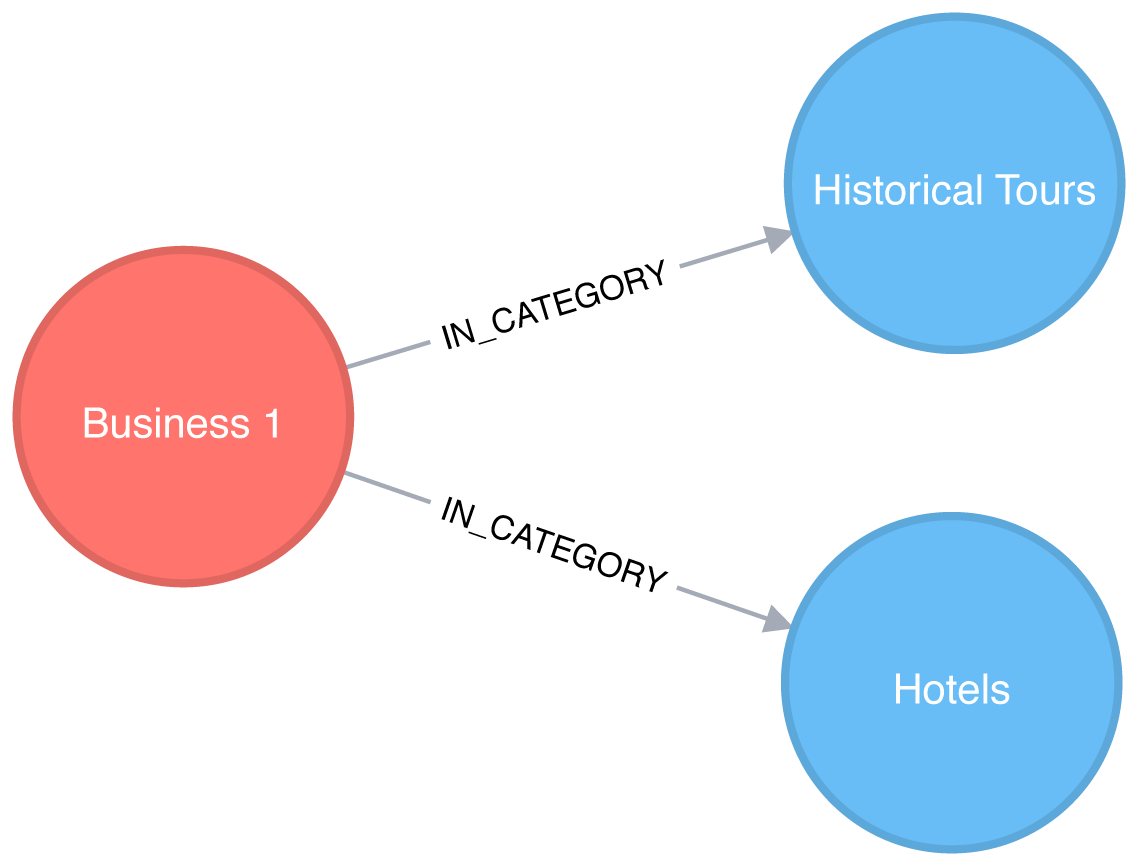
This would result in a projected graph that has a link between Hotels and Historical Tours with a weight of 1, as seen in Figure 7-9.
In this case, we don’t actually have to create the similarity graph – we can run a community detection algorithm, such as Label Propagation, over a projected similarity graph. Using Label Propagation will effectively cluster businesses around the super category they have most in common.
CALL algo.labelPropagation.stream('MATCH (c:Category) RETURN id(c) AS id','MATCH (c1:Category)<-[:IN_CATEGORY]-()-[:IN_CATEGORY]->(c2:Category)WHERE id(c1) < id(c2)RETURN id(c1) AS source, id(c2) AS target, count(*) AS weight',{graph:"cypher"})YIELD nodeId, labelMATCH(c:Category)WHEREid(c) = nodeIdMERGE (sc:SuperCategory {name:"SuperCategory-"+ label})MERGE (c)-[:IN_SUPER_CATEGORY]->(sc)
Let’s give those super categories a friendlier name - the name of their largest category works well here:
MATCH(sc:SuperCategory)<-[:IN_SUPER_CATEGORY]-(category)WITHsc, category, size((category)<-[:IN_CATEGORY]-())assizeORDER BYsizeDESCWITHsc,collect(category.name)[0]asbiggestCategorySETsc.friendlyName ="SuperCat "+ biggestCategory
We can see a sample of categories and super categories in Figure 7-10.
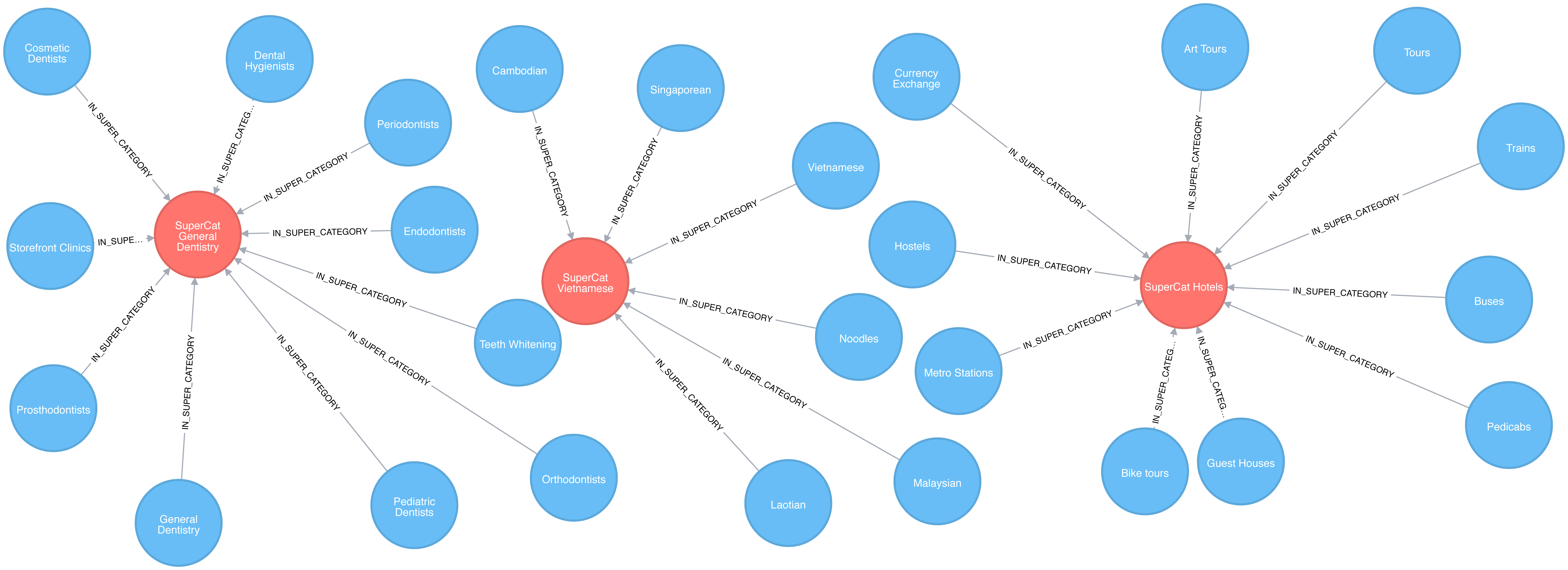
The following query find the most prevalent similar categories to Hotels in Las Vegas:
MATCH(hotels:Category {name:"Hotels"}),(lasVegas:City {name:"Las Vegas"}),(hotels)-[:IN_SUPER_CATEGORY]->()<-[:IN_SUPER_CATEGORY]-(otherCategory)RETURNotherCategory.nameASotherCategory,size((otherCategory)<-[:IN_CATEGORY]-(:Business)-[:IN_CITY]->(lasVegas))ASbusinessesORDER BYcountDESCLIMIT10
If we run that query we’ll see these results:
| otherCategory | businesses |
|---|---|
Tours |
189 |
Car Rental |
160 |
Limos |
84 |
Resorts |
73 |
Airport Shuttles |
52 |
Taxis |
35 |
Vacation Rentals |
29 |
Airports |
25 |
Airlines |
23 |
Motorcycle Rental |
19 |
Do these results seem odd? Obviously taxis and tours aren’t hotels but remember that this is based on self-reported catagorizations. What the Label Propagation is really showing us in this similiarity group are adjacent businesses and services.
Now let’s find some businesses with an above average rating in each of those categories.
// Find businesses in Las Vegas that have the same SuperCategory as HotelsMATCH(hotels:Category {name:"Hotels"}),(hotels)-[:IN_SUPER_CATEGORY]->()<-[:IN_SUPER_CATEGORY]-(otherCategory),(otherCategory)<-[:IN_CATEGORY]-(business)WHERE(business)-[:IN_CITY]->(:City {name:"Las Vegas"})// Select 10 random categories and calculate the 90th percentile star ratingWITHotherCategory,count(*)AScount,collect(business)ASbusinesses,percentileDisc(business.averageStars, 0.9)ASp90StarsORDER BYrand()DESCLIMIT10// Select businesses from each of those categories that have an average rating higher// than the 90th percentile using a pattern comprehensionWITHotherCategory, [binbusinesseswhereb.averageStars >= p90Stars]ASbusinesses// Select one business per categoryWITHotherCategory, businesses[toInteger(rand() * size(businesses))]ASbusinessRETURNotherCategory.nameASotherCategory,business.nameASbusiness,business.averageStarsASaverageStars
In this query we use a pattern comprehension 7 for the first time.
Pattern comprehension is a syntax construction for creating a list based on pattern matching. It finds a specified pattern using a MATCH clause with a WHERE clause for predicates and then yields a custom projection. This Cypher feature was added in 2016 with inspiration from GraphQL.
If we run that query we’ll see these results:
| otherCategory | business | averageStars |
|---|---|---|
Motorcycle Rental |
Adrenaline Rush Slingshot Rentals |
5.0 |
Snorkeling |
Sin City Scuba |
5.0 |
Guest Houses |
Hotel Del Kacvinsky |
5.0 |
Car Rental |
The Lead Team |
5.0 |
Food Tours |
Taste BUZZ Food Tours |
5.0 |
Airports |
Signature Flight Support |
5.0 |
Public Transportation |
JetSuiteX |
4.6875 |
Ski Resorts |
Trikke Las Vegas |
4.833333333333332 |
Town Car Service |
MW Travel Vegas |
4.866666666666665 |
Campgrounds |
McWilliams Campground |
3.875 |
We could then make real-time recommendations based on a user’s immediate app behavior. For example, while users are looking at Las Vegas hotels, we can now highlight a variety of Las Vegas businesses with good ratings that are all in the hotel super category.
We can generalize these approaches to any business category, such as restaurants or theaters, in any location.
Reader Exercises
Can you plot how the reviews for a city’s hotels vary over time?
What about for a particular hotel or other business?
Are there any trends (seasonal or otherwise) in popularity?
Do the most influential reviewers connect to (out-link) to only other influential reviewers?
In this section, we’ll use a different scenario to illustrate the analysis of U.S. airport data in Apaches Spark. Imagine we’re a data scientist with a considerable travel schedule and would like to dig into information about airline flights and delays. We’ll first explore airport and flight information and then look deeper into delays at two specific airports. Community detection will be used to analyze routes and find the best use of our frequent flyer points.
The U.S. Bureau of Transportation Statistics makes available a significant amount of transportation information 8. For our analysis, we’ll use their air travel on-time performance data from May 2018. This includes flights originating and ending in the U.S in that month. In order to add more detail about airports, such as location information, we’ll also load data from a separate source, OpenFlights 9.
Let’s load the data in Spark. As in the previous sections, our data is in CSV files which are available on the Github repository.
nodes=spark.read.csv("data/airports.csv",header=False)cleaned_nodes=(nodes.select("_c1","_c3","_c4","_c6","_c7").filter("_c3 = 'United States'").withColumnRenamed("_c1","name").withColumnRenamed("_c4","id").withColumnRenamed("_c6","latitude").withColumnRenamed("_c7","longitude").drop("_c3"))cleaned_nodes=cleaned_nodes[cleaned_nodes["id"]!="\\N"]relationships=spark.read.csv("data/188591317_T_ONTIME.csv",header=True)cleaned_relationships=(relationships.select("ORIGIN","DEST","FL_DATE","DEP_DELAY","ARR_DELAY","DISTANCE","TAIL_NUM","FL_NUM","CRS_DEP_TIME","CRS_ARR_TIME","UNIQUE_CARRIER").withColumnRenamed("ORIGIN","src").withColumnRenamed("DEST","dst").withColumnRenamed("DEP_DELAY","deptDelay").withColumnRenamed("ARR_DELAY","arrDelay").withColumnRenamed("TAIL_NUM","tailNumber").withColumnRenamed("FL_NUM","flightNumber").withColumnRenamed("FL_DATE","date").withColumnRenamed("CRS_DEP_TIME","time").withColumnRenamed("CRS_ARR_TIME","arrivalTime").withColumnRenamed("DISTANCE","distance").withColumnRenamed("UNIQUE_CARRIER","airline").withColumn("deptDelay",F.col("deptDelay").cast(FloatType())).withColumn("arrDelay",F.col("arrDelay").cast(FloatType())).withColumn("time",F.col("time").cast(IntegerType())).withColumn("arrivalTime",F.col("arrivalTime").cast(IntegerType())))g=GraphFrame(cleaned_nodes,cleaned_relationships)
We have to do some cleanup on the nodes as some airports don’t have valid airport codes.
We’ll give the columns more descriptive names and convert some items into appropriate numeric types.
We also need to make sure that we have columns named id, dst, and src as this is expected by Apache Spark’s GraphFrames library.
We’ll also create a separate DataFrame that maps airline codes to airline names. We’ll use this later in the chapter:
airlines_reference=(spark.read.csv("data/airlines.csv").select("_c1","_c3").withColumnRenamed("_c1","name").withColumnRenamed("_c3","code"))airlines_reference=airlines_reference[airlines_reference["code"]!="null"]
Let’s start with some exploratory analysis to see what the data looks like.
First let’s see how many airports we have:
g.vertices.count()
1435
And how many connections do we have between these airports?
g.edges.count()
616529
Which airports have the most departing flights? We can work out the number of outgoing flights from an airport using the Degree Centrality algorithm:
airports_degree=g.outDegrees.withColumnRenamed("id","oId")full_airports_degree=(airports_degree.join(g.vertices,airports_degree.oId==g.vertices.id).sort("outDegree",ascending=False).select("id","name","outDegree"))full_airports_degree.show(n=10,truncate=False)
If we run that code we’ll see the following output:
| id | name | outDegree |
|---|---|---|
ATL |
Hartsfield Jackson Atlanta International Airport |
33837 |
ORD |
Chicago O’Hare International Airport |
28338 |
DFW |
Dallas Fort Worth International Airport |
23765 |
CLT |
Charlotte Douglas International Airport |
20251 |
DEN |
Denver International Airport |
19836 |
LAX |
Los Angeles International Airport |
19059 |
PHX |
Phoenix Sky Harbor International Airport |
15103 |
SFO |
San Francisco International Airport |
14934 |
LGA |
La Guardia Airport |
14709 |
IAH |
George Bush Intercontinental Houston Airport |
14407 |
Most of the big US cities show up on this list - Chicago, Atlanta, Los Angeles, and New York all have popular airports. We can also create a visual representation of the outgoing flights using the following code:
plt.style.use('fivethirtyeight')ax=(full_airports_degree.toPandas().head(10).plot(kind='bar',x='id',y='outDegree',legend=None))ax.xaxis.set_label_text("")plt.xticks(rotation=45)plt.tight_layout()plt.show()
The resulting chart can be seen in Figure 7-11.
It’s quite striking how suddenly the number of flights drops off. Denver International Airport (DEN), the 5th most popular airport, has just over half as many outgoing fights as Hartsfield Jackson Atlanta International Airport (ATL) in 1st place.
In our scenario, we assume you frequently travel between the west coast and east coast and want to see delays through a midpoint hub like Chicago O’Hare International Airport (ORD). This dataset contains flight delay data so we can dive right in.
The following code finds the average delay of flights departing from ORD grouped by the destination airport:
delayed_flights=(g.edges.filter("src = 'ORD' and deptDelay > 0").groupBy("dst").agg(F.avg("deptDelay"),F.count("deptDelay")).withColumn("averageDelay",F.round(F.col("avg(deptDelay)"),2)).withColumn("numberOfDelays",F.col("count(deptDelay)")))(delayed_flights.join(g.vertices,delayed_flights.dst==g.vertices.id).sort(F.desc("averageDelay")).select("dst","name","averageDelay","numberOfDelays").show(n=10,truncate=False))
Once we’ve calculated the average delay grouped by destination we join the resulting Spark DataFrame with a DataFrame containing all vertices, so that we can print the full name of the destination airport.
If we execute this code we’ll see the results for the top ten worst delayed destinations:
| dst | name | averageDelay | numberOfDelays |
|---|---|---|---|
CKB |
North Central West Virginia Airport |
145.08 |
12 |
OGG |
Kahului Airport |
119.67 |
9 |
MQT |
Sawyer International Airport |
114.75 |
12 |
MOB |
Mobile Regional Airport |
102.2 |
10 |
TTN |
Trenton Mercer Airport |
101.18 |
17 |
AVL |
Asheville Regional Airport |
98.5 |
28 |
ISP |
Long Island Mac Arthur Airport |
94.08 |
13 |
ANC |
Ted Stevens Anchorage International Airport |
83.74 |
23 |
BTV |
Burlington International Airport |
83.2 |
25 |
CMX |
Houghton County Memorial Airport |
79.18 |
17 |
This is interesting but one data point really stands out.
There have been 12 flights from ORD to CKB, delayed by more than 2 hours on average!
Let’s find the flights between those airports and see what’s going on:
from_expr='id = "ORD"'to_expr='id = "CKB"'ord_to_ckb=g.bfs(from_expr,to_expr)ord_to_ckb=ord_to_ckb.select(F.col("e0.date"),F.col("e0.time"),F.col("e0.flightNumber"),F.col("e0.deptDelay"))
We can then plot the flights with the following code:
ax=(ord_to_ckb.sort("date").toPandas().plot(kind='bar',x='date',y='deptDelay',legend=None))ax.xaxis.set_label_text("")plt.tight_layout()plt.show()
If we run that code we’ll get the chart in Figure 7-12.
About half of the flights were delayed, but the delay of more than 14 hours on May 2nd 2018 has massively skewed the average.
What if we want to find delays coming into and going out of a coastal airport? Those airports are often affected by adverse weather conditions so we might be able to find some interesting delays.
Let’s consider delays at an airport known for fog-related, “low ceiling” issues: San Francisco International Airport (SFO). One method for analysis would be to look at motifs which are recurrent subgraphs or patterns.
The equivalent to motifs in Neo4j is graph patterns that are found using the MATCH clause or with pattern expressions in Cypher.
GraphFrames lets us search for motifs 10 so we can use the structure of flights as part of a query.
Let’s use motifs to find the most delayed flights going into and out of SFO on 11th May 2018. The following code will find these delays:
motifs=(g.find("(a)-[ab]->(b); (b)-[bc]->(c)").filter("""(b.id = 'SFO') and(ab.date = '2018-05-11' and bc.date = '2018-05-11') and(ab.arrDelay > 30 or bc.deptDelay > 30) and(ab.flightNumber = bc.flightNumber) and(ab.airline = bc.airline) and(ab.time < bc.time)"""))
The motif (a)-[ab]->(b); (b)-[bc]->(c) finds flights coming into and out from the same airport.
We then filter the resulting pattern to find flights that:
have the sequence of the first flight arriving at SFO and the second flight departing from SFO
have delays when arriving at SFO or departing from it of over 30 minutes
have the same flight number and airline
We can then take the result and select the columns we’re interested in:
result=(motifs.withColumn("delta",motifs.bc.deptDelay-motifs.ab.arrDelay).select("ab","bc","delta").sort("delta",ascending=False))result.select(F.col("ab.src").alias("a1"),F.col("ab.time").alias("a1DeptTime"),F.col("ab.arrDelay"),F.col("ab.dst").alias("a2"),F.col("bc.time").alias("a2DeptTime"),F.col("bc.deptDelay"),F.col("bc.dst").alias("a3"),F.col("ab.airline"),F.col("ab.flightNumber"),F.col("delta")).show()
We’re also calculating the delta between the arriving and departing flights to see which delays we can truly attribute to SFO.
If we execute this code we’ll see this output:
| airline | flightNumber | a1 | a1DeptTime | arrDelay | a2 | a2DeptTime | deptDelay | a3 | delta |
|---|---|---|---|---|---|---|---|---|---|
WN |
1454 |
PDX |
1130 |
-18.0 |
SFO |
1350 |
178.0 |
BUR |
196.0 |
OO |
5700 |
ACV |
1755 |
-9.0 |
SFO |
2235 |
64.0 |
RDM |
73.0 |
UA |
753 |
BWI |
700 |
-3.0 |
SFO |
1125 |
49.0 |
IAD |
52.0 |
UA |
1900 |
ATL |
740 |
40.0 |
SFO |
1110 |
77.0 |
SAN |
37.0 |
WN |
157 |
BUR |
1405 |
25.0 |
SFO |
1600 |
39.0 |
PDX |
14.0 |
DL |
745 |
DTW |
835 |
34.0 |
SFO |
1135 |
44.0 |
DTW |
10.0 |
WN |
1783 |
DEN |
1830 |
25.0 |
SFO |
2045 |
33.0 |
BUR |
8.0 |
WN |
5789 |
PDX |
1855 |
119.0 |
SFO |
2120 |
117.0 |
DEN |
-2.0 |
WN |
1585 |
BUR |
2025 |
31.0 |
SFO |
2230 |
11.0 |
PHX |
-20.0 |
The worst offender is shown on the top row, WN 1454, which arrived early but departed almost 3 hours late.
We can also see that there are some negative values in the arrDelay column; this means that the flight into SFO was early.
Also notice that a few flights, WN 5789 and WN 1585, made up time while on the ground in SFO.
Now let’s say you’ve traveled so much that you have expiring frequent flyer points you’re determined to use to see as many destinations as efficiently as possible. If you start from a specific U.S. airport how many different airports can you visit and come back to the starting airport using the same airline?
Let’s first identify all the airlines and work out how many flights there are on each of them:
airlines=(g.edges.groupBy("airline").agg(F.count("airline").alias("flights")).sort("flights",ascending=False))full_name_airlines=(airlines_reference.join(airlines,airlines.airline==airlines_reference.code).select("code","name","flights"))
And now let’s create a bar chart showing our airlines:
ax=(full_name_airlines.toPandas().plot(kind='bar',x='name',y='flights',legend=None))ax.xaxis.set_label_text("")plt.tight_layout()plt.show()
If we run that query we’ll get the output in Figure 7-13.
Now let’s write a function that uses the Strongly Connected Components algorithm to find airport groupings for each airline where all the airports have flights to and from all the other airports in that group:
deffind_scc_components(g,airline):# Create a sub graph containing only flights on the provided airlineairline_relationships=g.edges[g.edges.airline==airline]airline_graph=GraphFrame(g.vertices,airline_relationships)# Calculate the Strongly Connected Componentsscc=airline_graph.stronglyConnectedComponents(maxIter=10)# Find the size of the biggest component and return thatreturn(scc.groupBy("component").agg(F.count("id").alias("size")).sort("size",ascending=False).take(1)[0]["size"])
We can write the following code to create a DataFrame containing each airline and the number of airports of their largest Strongly Connected Component:
# Calculate the largest Strongly Connected Component for each airlineairline_scc=[(airline,find_scc_components(g,airline))forairlineinairlines.toPandas()["airline"].tolist()]airline_scc_df=spark.createDataFrame(airline_scc,['id','sccCount'])# Join the SCC DataFrame with the airlines DataFrame so that we can show the number of flights# an airline has alongside the number of airports reachable in its biggest componentairline_reach=(airline_scc_df.join(full_name_airlines,full_name_airlines.code==airline_scc_df.id).select("code","name","flights","sccCount").sort("sccCount",ascending=False))
And now let’s create a bar chart showing our airlines:
ax=(airline_reach.toPandas().plot(kind='bar',x='name',y='sccCount',legend=None))ax.xaxis.set_label_text("")plt.tight_layout()plt.show()
If we run that query we’ll get the output in Figure 7-14.
Skywest has the largest community with over 200 strongly connected airports. This might partially reflect their business model as an affiliate airline which operates aircraft used on flights for partner airlines. Southwest, on the other hand, has the highest number of flights but only connects around 80 airports.
Now let’s say you have a lot of airline points on DL that you want to use. Can we find airports that form communities within the network for the given airline carrier?
airline_relationships=g.edges.filter("airline = 'DL'")airline_graph=GraphFrame(g.vertices,airline_relationships)clusters=airline_graph.labelPropagation(maxIter=10)(clusters.sort("label").groupby("label").agg(F.collect_list("id").alias("airports"),F.count("id").alias("count")).sort("count",ascending=False).show(truncate=70,n=10))
If we run that query we’ll see this output:
| label | airports | count |
|---|---|---|
1606317768706 |
[IND, ORF, ATW, RIC, TRI, XNA, ECP, AVL, JAX, SYR, BHM, GSO, MEM, C… |
89 |
1219770712067 |
[GEG, SLC, DTW, LAS, SEA, BOS, MSN, SNA, JFK, TVC, LIH, JAC, FLL, M… |
53 |
17179869187 |
[RHV] |
1 |
25769803777 |
[CWT] |
1 |
25769803776 |
[CDW] |
1 |
25769803782 |
[KNW] |
1 |
25769803778 |
[DRT] |
1 |
25769803779 |
[FOK] |
1 |
25769803781 |
[HVR] |
1 |
42949672962 |
[GTF] |
1 |
Most of the airports DL uses have clustered into two groups, let’s drill down into those.
There are too many airports to show here so we’ll just show the airports with the biggest degree (ingoing and outgoing flights). We can write the following code to calculate airport degree:
all_flights=g.degrees.withColumnRenamed("id","aId")
We’ll then combine this with the airports that belong to the largest cluster:
(clusters.filter("label=1606317768706").join(all_flights,all_flights.aId==result.id).sort("degree",ascending=False).select("id","name","degree").show(truncate=False))
If we run that query we’ll see this output:
| id | name | degree |
|---|---|---|
DFW |
Dallas Fort Worth International Airport |
47514 |
CLT |
Charlotte Douglas International Airport |
40495 |
IAH |
George Bush Intercontinental Houston Airport |
28814 |
EWR |
Newark Liberty International Airport |
25131 |
PHL |
Philadelphia International Airport |
20804 |
BWI |
Baltimore/Washington International Thurgood Marshall Airport |
18989 |
MDW |
Chicago Midway International Airport |
15178 |
BNA |
Nashville International Airport |
12455 |
DAL |
Dallas Love Field |
12084 |
IAD |
Washington Dulles International Airport |
11566 |
STL |
Lambert St Louis International Airport |
11439 |
HOU |
William P Hobby Airport |
9742 |
IND |
Indianapolis International Airport |
8543 |
PIT |
Pittsburgh International Airport |
8410 |
CLE |
Cleveland Hopkins International Airport |
8238 |
CMH |
Port Columbus International Airport |
7640 |
SAT |
San Antonio International Airport |
6532 |
JAX |
Jacksonville International Airport |
5495 |
BDL |
Bradley International Airport |
4866 |
RSW |
Southwest Florida International Airport |
4569 |
In Figure 7-15 we can see that this cluster is actually focused on the east coast to midwest of the U.S
And now let’s do the same thing with the second largest cluster:
(clusters.filter("label=1219770712067").join(all_flights,all_flights.aId==result.id).sort("degree",ascending=False).select("id","name","degree").show(truncate=False))
If we run that query we’ll see this output:
| id | name | degree |
|---|---|---|
ATL |
Hartsfield Jackson Atlanta International Airport |
67672 |
ORD |
Chicago O’Hare International Airport |
56681 |
DEN |
Denver International Airport |
39671 |
LAX |
Los Angeles International Airport |
38116 |
PHX |
Phoenix Sky Harbor International Airport |
30206 |
SFO |
San Francisco International Airport |
29865 |
LGA |
La Guardia Airport |
29416 |
LAS |
McCarran International Airport |
27801 |
DTW |
Detroit Metropolitan Wayne County Airport |
27477 |
MSP |
Minneapolis-St Paul International/Wold-Chamberlain Airport |
27163 |
BOS |
General Edward Lawrence Logan International Airport |
26214 |
SEA |
Seattle Tacoma International Airport |
24098 |
MCO |
Orlando International Airport |
23442 |
JFK |
John F Kennedy International Airport |
22294 |
DCA |
Ronald Reagan Washington National Airport |
22244 |
SLC |
Salt Lake City International Airport |
18661 |
FLL |
Fort Lauderdale Hollywood International Airport |
16364 |
SAN |
San Diego International Airport |
15401 |
MIA |
Miami International Airport |
14869 |
TPA |
Tampa International Airport |
12509 |
In Figure 7-16 we can see that this cluster is apparently more hub-focused with some additional northwest stops along the way.
The code we used to generate these maps is available on the book’s GitHub repository 11.
When checking the DL website for frequent flyer programs, you notice a use-two-get-one-free promotion. If you use your points for two flights you get another for free – but only if you fly within one of the two clusters! Perhaps it’s a better use of your time, and certainly your points, to stay intra-cluster.
Reader Exercises
Use a Shortest Path algorithm to evaluate the number of flights from your home to the Bozeman Yellowstone International Airport (BZN)?
Are there any differences if you use relationship weigths?
In the last few chapters we’ve provided detail on how key graph algorithms for pathfinding, centrality, and community detection work in Apache Spark and Neo4j. In this chapter we walked through workflows that included using several algorithms in context with other tasks and analysis.
Next, we’ll look at a use for graph algorithms that’s becoming increasingly important, graph enhanced machine learning.
2 https://www.yelp.com/dataset/challenge
3 https://scholar.google.com/scholar?q=citation%3A+Yelp+Dataset&btnG=&hl=en&as_sdt=0%2C5
4 https://neo4j.com/docs/operations-manual/current/tools/import/
5 https://neo4j.com/developer/guide-import-csv/
6 https://neo4j.com/docs/developer-manual/current/drivers/
7 https://neo4j.com/docs/developer-manual/current/cypher/syntax/lists/#cypher-pattern-comprehension
8 https://www.transtats.bts.gov/DL_SelectFields.asp?Table_ID=236
9 https://openflights.org/data.html
10 https://graphframes.github.io/user-guide.html#motif-finding
11 https://github.com/neo4j-graph-analytics/book/blob/master/scripts/airports/draw_map.py
We’ve covered several algorithms that learn and update state at each iteration, such as Label Propagation, however up until this point, we’ve emphasized graph algorithms for general analytics. Since there’s increasing application of graphs in machine learning (ML), we now look at how graph algorithms can be used to enhance ML workflows.
In this chapter, our focus is on the most practical way to start improving ML predictions using graph algorithms: connected feature extraction and its use in predicting relationships. First, we’ll cover some basic ML concepts and the importance of contextual data for better predictions. Then there’s a quick survey of ways graph features are applied, including uses for spammer fraud, detection, and link prediction.
We’ll demonstrate how to create a machine learning pipeline and then train and evaluate a model for link prediction – integrating Neo4j and Spark in our workflow. We’ll use several models to predict whether research authors are likely to collaborate and show how graph algorithms improve results.
Machine learning is not artificial intelligence (AI), but a method for achieving AI. ML uses algorithms to train software through specific examples and progressive improvements based on expected outcome – without explicit programming of how to accomplish these better results. Training involves providing a lot of data to a model and enabling it to learn how to process and incorporate that information.
In this sense, learning means that algorithms iterate, continually making changes to get closer to an objective goal, such as reducing classification errors in comparison to the training data. ML is also dynamic with the ability to modify and optimize itself when presented with more data. This can take place in pre-usage training on many batches or as online-learning during usage.
Recent successes in ML predictions, accessibility of large datasets, and parallel compute power has made ML more practical for those developing probabilistic models for AI applications. As machine learning becomes more widespread, it’s important to remember the fundamental goal of ML: making choices similar to the way humans do. If we forget that, we may end up with just another version of highly targeted, rules-based software.
In order to increase machine learning accuracy while also making solutions more broadly applicable, we need to incorporate a lot of contextual information - just as people should use context for better decisions. Humans use their surrounding context, not just direct data points, to figure out what’s essential in a situation, estimate missing information, and how to apply learnings to new situations. Context helps us improve predictions.
Without peripheral and related information, solutions that attempt to predict behavior or make recommendations for varying circumstances require more exhaustive training and prescriptive rules. This is partly why AI is good at specific, well-defined tasks but struggles with ambiguity. Graph enhanced ML can help fill in that missing contextual information that is so important for better decisions.
We know from graph theory and from real-life that relationships are often the strongest predictors of behavior. For example, if one person votes, there’s an increased likelihood that their friends, family, and even coworkers will vote. Figure 8-1 illustrates a ripple effect based on reported voting and Facebook friends from the research paper, “A 61-million-person experiment in social influence and political mobilization”1 by R. Bond, C. Fariss, J. Jones, A. Kramer, C. Marlow, J. Settle, and J. Fowler.

The authors found that friends reporting voting influenced an additional 1.4% of users to also claim they voted and, interestingly, friends of friends added another 1.7%. Small percentages can have a significant impact and we can see in Figure 8-1 that people at 2 hops out had in total more impact than the direct friends alone. Voting and other examples of how our social network impact us are covered in the book, “Connected,”2 by Nicholas Christakis and James Fowler.
Adding graph features and context improves predictions, especially in situations where connections matter. For example, retail companies personalize product recommendations with not only historical data but with contextual data about customer similarities and online behavior. Amazon’s Alexa uses several layers of contextual models that demonstrate improved accuracy.3 Additionally in 2018, they introduced “context carryover” to incorporate previous references in a conversation when answering new questions.
Unfortunately, many machine learning approaches today miss a lot of rich contextual information. This stems from ML reliance on input data built from tuples, leaving out a lot of predictive relationships and network data. Furthermore, contextual information is not always readily available or is too difficult to access and process. Even finding connections that are 4 or more hops away can be a challenge at scale for traditional methods. Using graphs we can more easily reach and incorporate connected data.
Feature extraction and selection helps us take raw data and create a suitable subset and format for training our machine learning modeling. It’s a foundational step that when well-executed, leads to ML that produces more consistently accurate predictions.
Putting together the right mix of features can increase accuracy because it fundamentally influences how our models learn. Since even modest improvements can make a significant difference, our focus in this chapter is on connected features. And it’s not only important to get the right combination of features but also, eliminate unnecessary features to reduce the likelihood that our models will be hyper-targeted. This keeps us from creating models that only work well on our training data and significantly expands applicability.
Adding graph algorithms to traditional approaches can identify the most predictive elements within data based on relationships for connected feature extraction. We can further use graph algorithms to evaluate those features and determine which ones are most influential to our model for connected feature selection. For example, we can map features to nodes in a graph, create relationships based on similar features, and then compute the centrality of features. Features relationships can be defined by the ability to preserve cluster densities of data points. This method is described using datasets with high dimension and low sample size in “Unsupervised graph-based feature selection via subspace and pagerank centrality” 4 by K.Henniab, N.Mezghaniab and C.Gouin-Valleranda.
Now let’s look at some of the types of connected features and how they are used.
Graphy features include any number of connection-related metrics about our graph such as the number of relationships coming in or out of nodes, a count of potential triangles, and neighbors in common. In our example, we’ll start with these measures because they are simple to gather and a good test of early hypotheses.
In addition, when we know precisely what we’re looking for, we can use feature engineering. For instance, if we want to know how many people have a fraudulent account at up to four hops out. This approach uses graph traversal to very efficiently find deep paths of relationships, looking at things such as labels, attributes, counts, and inferred relationships.
We can also easily automate these processes and deliver those predictive graphy features into our existing pipeline. For example, we could abstract a count of fraudster relationships and add that number as a node attribute to be used for other machine learning tasks.
We can also use graph algorithms to find features where we know the general structure we’re looking for but not the exact pattern. As an illustration, let’s say we know certain types of community groupings are indicative of fraud; perhaps there’s a prototypical density or hierarchy of relationships. In this case, we don’t want a rigid feature of an exact organization but rather a flexible and globally relevant structure. We’ll use community detection algorithms to extract connected features in our example, but centrality algorithms, like PageRank, are also frequently applied.
Furthermore, approaches that combine several types of connected features seem to outperform sticking to one single method. For example, we could combine connected features to predict fraud with indicators based on communities found via the Louvain algorithm, influential nodes using PageRank, and the measure of known fraudsters at 3 hops out.
A combined approach is demonstrated in Figure 8-3, where the authors combine graph algorithms like PageRank and Coloring with graphy measure such as in-degree and out-degree. This diagram is taken from the paper “Collective Spammer Detection in Evolving Multi-Relational Social Networks.” 8
The Graph Structure section illustrates connected feature extraction using several graph algorithms. Interestingly, the authors found extracting connected features from multiple types of relationships even more predictive than simply adding more features. The Report Subgraph section shows how graph features are converted into features that the ML model can use. By combining multiple methods in a graph-enhanced ML workflow, the authors were able to improve prior detection methods and classify 70% of spammers that had previously required manual labeling–with 90% accuracy.
Even once we have extracted connected features, we can improve our training by using graph algorithms like PageRank to prioritize the features with the most influence. This enables us to adequately represent our data while eliminating noisy variables that could degrade results or slow processing. With this type of information, we can also identify features with high co-occurrence for further model tuning via feature reduction. This method is outlined in the research paper “Using PageRank in Feature Selection” by Dino Ienco, Rosa Meo, and Marco Botta.9
We’ve discussed how connected features are applied to scenarios involving fraud and spammer detection. In these situations, activities are often hidden in multiple layers of obfuscation and network relationships. Traditional feature extraction and selection methods may be unable to detect that behavior without the contextual information that graphs bring.
Another area where connected features enhance machine learning (and the focus of the rest of this chapter) is link prediction. Link prediction is a way to estimate how likely a relationship is to form in the future or whether it should already be in our graph but is missing due to incomplete data. Since networks are dynamic and can grow fairly quickly, being able to predict links that will soon be added has broad applicability from product recommendations to drug retargeting and even inferring criminal relationships.
Connected features from graphs are often used to improve link prediction using basic graphy features as well as features extracted from centrality and community algorithms. Link prediction based on node proximity or similarity is also standard, for example as presented in the paper, “The Link Prediction Problem for Social Networks” 10 by David Liben-Nowell and Jon Kleinberg. In this research, they suggest that the network structure alone may contain enough latent information to detect node proximity and outperform more direct measures.
At each layer, features can be retained or discarded depending on whether they add new, significant information. DeepGL provides a flexible method to discover node and relationship features with baseline feature customization and the avoidance of manual feature engineering.
Now that we’ve looked at ways connected features can enhance machine learning, let’s dive into our link prediction example and look at how we can apply graph algorithms and improve our predictions.
The rest of the chapter will demonstrate hands-on examples. First, we’ll set up the required tools and import data from a research citation network into Neo4j. Then we’ll cover how to properly balance data and split samples into Spark DataFrames for training and testing. After that, we explain our hypothesis and methods for link prediction before creating a machine learning pipeline in Spark. Finally, we’ll walk through training and evaluating various prediction models starting with basic graphy features and adding more graph algorithm features extracted using Neo4j.
Let’s get started by setting up our tools and data. Then we’ll explore our dataset and create a machine learning pipeline.
Before we do anything else, let’s set up the libraries used in this chapter:
py2neo is a Neo4j Python library that integrates well with the Python data science ecosystem.
pandas is a high-performance library for data wrangling outside of a database with easy-to-use data structures and data analysis tools.
Spark MLlib is Spark’s machine learning library.
We use MLlib as an example of a machine learning library. The approach shown in this chapter could be used in combination with other machine libraries, for example scikit-learn.
All the code shown will be run within the pyspark REPL. We can launch the REPL by running the following command:
exportSPARK_VERSION="spark-2.4.0-bin-hadoop2.7"./${SPARK_VERSION}/bin/pyspark\--driver-memory 2g\--executor-memory 6g\--packages julioasotodv:spark-tree-plotting:0.2
This is similar to the command we used to launch the REPL in Chapter 3, but instead of GraphFrames, we’re loading the spark-tree-plotting package.
At the time of writing the latest released version of Spark is spark-2.4.0-bin-hadoop2.7 but that may have changed by the time you read this so be sure to change the SPARK_VERSION environment variable appropriately.
Once we’ve launched that we’ll import the following libraries that we’ll use in this chapter:
frompy2neoimportGraphimportpandasaspdfromnumpy.randomimportrandintfrompyspark.mlimportPipelinefrompyspark.ml.classificationimportRandomForestClassifierfrompyspark.ml.featureimportStringIndexer,VectorAssemblerfrompyspark.ml.evaluationimportBinaryClassificationEvaluatorfrompyspark.sql.typesimport*frompyspark.sqlimportfunctionsasFfromsklearn.metricsimportroc_curve,aucfromcollectionsimportCounterfromcyclerimportcyclerimportmatplotlibmatplotlib.use('TkAgg')importmatplotlib.pyplotasplt
And now let’s create a connection to our Neo4j database:
graph=Graph("bolt://localhost:7687",auth=("neo4j","neo"))
We’ll be working with the Citation Network Dataset 11, a research dataset extracted from DBLP, ACM, and MAG (Microsoft Academic Graph). The dataset is described in Jie Tang, Jing Zhang, Limin Yao, Juanzi Li, Li Zhang, and Zhong Su’s paper “ArnetMiner: Extraction and Mining of Academic Social Networks” 12 Version 10 13 of the dataset contains 3,079,007 papers, 1,766,547 authors, 9,437,718 author relationships, and 25,166,994 citation relationships. We’ll be working with a subset focused on articles published in the following venues:
Lecture Notes in Computer Science
Communications of The ACM
International Conference on Software Engineering
Advances in Computing and Communications
Our resulting dataset contains 51,956 papers, 80,299 authors, 140,575 author relationships, and 28,706 citation relationships. We’ll create a co-authors graph based on authors who have collaborated on papers and then predict future collaborations between pairs of authors.
Now we’re ready to load the data into Neo4j and create a balanced split for our training and testing.
We need to download Version 10 of the dataset, unzip it, and place the contents in the import folder.
We should have the following files:
dblp-ref-0.json
dblp-ref-1.json
dblp-ref-2.json
dblp-ref-3.json
Once we have those files in the import folder, we need to add the following property to our Neo4j settings file so that we’ll be able to process them using the APOC library:
apoc.import.file.enabled=true
apoc.import.file.use_neo4j_config=true
First we’ll create some constraints to ensure that we don’t create duplicate articles or authors:
CREATECONSTRAINT ON (article:Article)ASSERT article.indexIS UNIQUE;CREATECONSTRAINT ON (author:Author)ASSERT author.nameIS UNIQUE;
Now we can run the following query to import the data from the JSON files:
CALL apoc.periodic.iterate('UNWIND ["dblp-ref-0.json","dblp-ref-1.json","dblp-ref-2.json","dblp-ref-3.json"] AS fileCALL apoc.load.json("file:///" + file)YIELD valueWHERE value.venue IN ["Lecture Notes in Computer Science", "Communications of The ACM","international conference on software engineering","advances in computing and communications"]return value','MERGE (a:Article {index:value.id})ON CREATE SET a += apoc.map.clean(value,["id","authors","references"],[0])WITH a,value.authors as authorsUNWIND authors as authorMERGE (b:Author{name:author})MERGE (b)<-[:AUTHOR]-(a)', {batchSize: 10000, iterateList:true});
This results in the graph schema as seen in Figure 8-4.
This is a simple graph that connects articles and authors, so we’ll add more information we can infer from relationships to help with predictions.
We want to predict future collaborations between authors, so we’ll start by creating a co-authorship graph.
The following Neo4j Cypher query will create a CO_AUTHOR relationship between every pair of authors that have collaborated on a paper:
MATCH(a1)<-[:AUTHOR]-(paper)-[:AUTHOR]->(a2:Author)WITHa1, a2, paperORDER BYa1, paper.yearWITHa1, a2,collect(paper)[0].yearASyear,count(*)AScollaborationsMERGE (a1)-[coauthor:CO_AUTHOR {year: year}]-(a2)SETcoauthor.collaborations = collaborations;
The year property is the earliest year when those two authors collaborated.
Figure 8-5 is in an example of part of the graph that gets created and we can already see some interesting community structures.
Now that we have our data loaded and a basic graph, let’s create the two datasets we’ll need for training and testing.
With link prediction problems we want to try and predict the future creation of links. This dataset works well for that because we have dates on the articles that we can use to split our data.
We need to work out which year we’ll use as our training/test split. We’ll train our model on everything before that year and then test it on the links created after that date.
Let’s start by finding out when the articles were published. We can write the following query to get a count of the number of articles, grouped by year:
query="""MATCH (article:Article)RETURN article.year AS year, count(*) AS countORDER BY year"""by_year=graph.run(query).to_data_frame()
Let’s visualize as a bar chart, with the following code:
plt.style.use('fivethirtyeight')ax=by_year.plot(kind='bar',x='year',y='count',legend=None,figsize=(15,8))ax.xaxis.set_label_text("")plt.tight_layout()plt.show()
We can see the chart generated by executing this code in Figure 8-6.
Very few articles were published before 1997, and then there were a lot published between 2001 and 2006, before a dip, and then a gradual climb since 2011 (excluding 2013). It looks like 2006 could be a good year to split our data between training our model and then making predictions. Let’s check how many papers there were before that year and how many during and after. We can write the following query to compute this:
MATCH(article:Article)RETURNarticle.year < 2006AStraining,count(*)AScount
We can see the result of this query in Table 8-1, where true means a paper was written before 2006.
| training | count |
|---|---|
false |
21059 |
true |
30897 |
Not bad! 60% of the papers were written before 2006 and 40% were written during or after 2006. This is a fairly balanced split of data for our training and testing.
So now that we have a good split of papers, let’s use the same 2006 split for co-authorship. We’ll create a CO_AUTHOR_EARLY relationship between pairs of authors whose first collaboration was before 2006:
MATCH(a1)<-[:AUTHOR]-(paper)-[:AUTHOR]->(a2:Author)WITHa1, a2, paperORDER BYa1, paper.yearWITHa1, a2,collect(paper)[0].yearASyear,count(*)AScollaborationsWHEREyear < 2006MERGE (a1)-[coauthor:CO_AUTHOR_EARLY {year: year}]-(a2)SETcoauthor.collaborations = collaborations;
And then we’ll create a CO_AUTHOR_LATE relationship between pairs of authors whose first collaboration was during or after 2006:
MATCH(a1)<-[:AUTHOR]-(paper)-[:AUTHOR]->(a2:Author)WITHa1, a2, paperORDER BYa1, paper.yearWITHa1, a2,collect(paper)[0].yearASyear,count(*)AScollaborationsWHEREyear >= 2006MERGE (a1)-[coauthor:CO_AUTHOR_LATE {year: year}]-(a2)SETcoauthor.collaborations = collaborations;
Before we build our training and test sets, let’s check how many pairs of nodes we have that do have links between them.
The following query will find the number of CO_AUTHOR_EARLY pairs:
MATCH()-[:CO_AUTHOR_EARLY]->()RETURNcount(*)AScount
Running that query will return the following count:
| count |
|---|
81096 |
And this query will find the number of CO_AUTHOR_LATE pairs:
MATCH()-[:CO_AUTHOR_LATE]->()RETURNcount(*)AScount
Running that query will return the following count:
| count |
|---|
74128 |
Now we’re ready to build our training and test datasets.
The pairs of nodes with CO_AUTHOR_EARLY and CO_AUTHOR_LATE relationships between them will act as our positive examples, but we’ll also need to create some negative examples.
Most real-world networks are sparse with concentrations of relationships, and this graph is no different. The number of examples where two nodes do not have a relationship is much larger than the number that do have a relationship.
If we query our CO_AUTHOR_EARLY data, we’ll find there are 45,018 authors with that type of relationship but only 81,096 relationships between authors. Although that might not sound imbalanced, it is: the potential maximum number of relationships that our graph could have is (45018 * 45017) / 2 = 1,013,287,653, which means there are a lot of negative examples (no links). If we used all the negative examples to train our model, we’d have a severe class imbalance problem.
A model could achieve extremely high accuracy by predicting that every pair of nodes doesn’t have a relationship – similar to our previous example predicting every image was a cat.
Ryan Lichtenwalter, Jake Lussier, and Nitesh Chawla describe several methods to address this challenge in their paper “New Perspectives and Methods in Link Prediction” 14. One of these approaches is to build negative examples by finding nodes within our neighborhood that we aren’t currently connected to.
We will build our negative examples by finding pairs of nodes that are a mix of between 2 and 3 hops away from each other, excluding those pairs that already have a relationship. We’ll then downsample those pairs of nodes so that we have an equal number of positive and negative examples.
We have 314,248 pairs of nodes that don’t have a relationship between each other at a distance of 2 hops. If we increase the distance to 3 hops, we have 967,677 pairs of nodes.
The following function will be used to down sample the negative examples:
defdown_sample(df):copy=df.copy()zero=Counter(copy.label.values)[0]un=Counter(copy.label.values)[1]n=zero-uncopy=copy.drop(copy[copy.label==0].sample(n=n,random_state=1).index)returncopy.sample(frac=1)
This function works out the difference between the number of positive and negative examples, and then samples the negative examples so that there are equal numbers. We can then run the following code to build a training set with balanced positive and negative examples:
train_existing_links=graph.run("""MATCH (author:Author)-[:CO_AUTHOR_EARLY]->(other:Author)RETURN id(author) AS node1, id(other) AS node2, 1 AS label""").to_data_frame()train_missing_links=graph.run("""MATCH (author:Author)WHERE (author)-[:CO_AUTHOR_EARLY]-()MATCH (author)-[:CO_AUTHOR_EARLY*2..3]-(other)WHERE not((author)-[:CO_AUTHOR_EARLY]-(other))RETURN id(author) AS node1, id(other) AS node2, 0 AS label""").to_data_frame()train_missing_links=train_missing_links.drop_duplicates()training_df=train_missing_links.append(train_existing_links,ignore_index=True)training_df['label']=training_df['label'].astype('category')training_df=down_sample(training_df)training_data=spark.createDataFrame(training_df)
We’ve now coerced the label column to be a category, where 1 indicates that there is a link between a pair of nodes, and 0 indicates that there is not a link.
We can look at the data in our DataFrame by running the following code and looking at the results in Table 8-4:
training_data.show(n=5)
| node1 | node2 | label |
|---|---|---|
10019 |
28091 |
1 |
10170 |
51476 |
1 |
10259 |
17140 |
0 |
10259 |
26047 |
1 |
10293 |
71349 |
1 |
Table 8-4 simple shows us a list of node pairs and wether they have a co-author relationship, for example nodes 10019 and 28091 have a 1 label indicating a collaboration.
Now let’s execute the following code to check the summary of contents for the DataFrame and look at the results in Table 8-5:
training_data.groupby("label").count().show()
| label | count |
|---|---|
0 |
81096 |
1 |
81096 |
We can see that we’ve created our training set with the same number of positive and negative samples. Now we need to do the same thing for the test set. The following code will build a test set with balanced positive and negative examples:
test_existing_links=graph.run("""MATCH (author:Author)-[:CO_AUTHOR_LATE]->(other:Author)RETURN id(author) AS node1, id(other) AS node2, 1 AS label""").to_data_frame()test_missing_links=graph.run("""MATCH (author:Author)WHERE (author)-[:CO_AUTHOR_LATE]-()MATCH (author)-[:CO_AUTHOR*2..3]-(other)WHERE not((author)-[:CO_AUTHOR]-(other))RETURN id(author) AS node1, id(other) AS node2, 0 AS label""").to_data_frame()test_missing_links=test_missing_links.drop_duplicates()test_df=test_missing_links.append(test_existing_links,ignore_index=True)test_df['label']=test_df['label'].astype('category')test_df=down_sample(test_df)test_data=spark.createDataFrame(test_df)
We can execute the following code to check the contents of the DataFrame and show the results in Table 8-6:
test_data.groupby("label").count().show()
| label | count |
|---|---|
0 |
74128 |
1 |
74128 |
Now that we have balanced training and test datasets, let’s look at our methods for predicting links.
We need to start with some basic assumptions about what elements in our data might predict whether two authors will become co-authors at a later date. Our hypothesis would vary by domain and problem, but in this case, we believe the most predictive features will be related to communities. We’ll begin with the assumption that the below elements increase the probability that authors become co-authors:
More co-authors in common
Potential triadic relationships between authors
Authors with more relationships
Authors in the same community
Authors in the same, tighter community
We’ll build graph features based on our assumptions and use those to train a binary classifier. Binary classification is a type of machine learning where the task of predicting which of two predefined groups an element belongs to based on a rule. We’re using the classifier for the task of predicting whether a pair of authors will have a link or not, based on a classification rule. For our examples, a value of 1 means there is a link (co-authorship), and a value of 0 means there isn’t a link (no co-authorship).
We’ll implement our binary classifier as a random forest in Spark. A random forest is an ensemble learning method for classification, regression and other tasks as illustrated in Figure 8-7.
Our random forest classifier will take the results from the multiple decision trees we train and then use voting to predict a classification; in our exmaple, whether there is a link (co-authorship) or not.
Now let’s create our workflow.
We’ll create our machine learning pipeline based on a random forest classifier in Spark. This method is well suited as our data set will be comprised of a mix of strong and weak features. While the weak features will sometimes be helpful, the random forest method will ensure we don’t create a model that only fits our training data.
To create our ML pipeline, we’ll pass in a list of features as the fields variables - these are the features that our classifier will use.
The classifier expects to receive those features as a single column called features, so we use the VectorAssembler to transform the data into the required format.
The below code creates a machine learning pipeline and sets up our parameters using MLlib:
defcreate_pipeline(fields):assembler=VectorAssembler(inputCols=fields,outputCol="features")rf=RandomForestClassifier(labelCol="label",featuresCol="features",numTrees=30,maxDepth=10)returnPipeline(stages=[assembler,rf])
The RandomForestClassifier uses the below parameters:
labelCol - the name of the field containing the variable we want to predict i.e. whether a pair of nodes have a link
featuresCol - the name of the field containing the variables that will be used to predict whether a pair of nodes have a link
numTrees - the number of decision trees that form the random forest
maxDepth - the maximum depth of the decision trees
We chose the number of decision trees and depth based on experimentation. We can think about hyperparameters like the settings of an algorithm that can be adjusted to optimize performance. The best hyperparameters are often difficult to determine ahead of time and tuning a model usually requires some trial and error.
We’ve covered the basics and set up our pipeline, so let’s dive into creating our model and evaluating how well it performs.
We’ll start by creating a simple model that tries to predict whether two authors will have a future collaboration based on features extracted from common authors, preferential attachment, and the total union of neighbors.
Common Authors - finds the number of potential triangles between two authors. This captures the idea that two authors who have co-authors in common may be introduced and collaborate in the future.
Preferential Attachment - produces a score for each pair of authors by multiplying the number of co-authors each has. The intuition is that authors are more likely to collaborate with someone who already co-authors a lot of papers.
Total Union of Neighbors - finds the total number of co-authors that each author has minus the duplicates.
In Neo4j, we can compute these values using Cypher queries. The following function will compute these measures for the training set:
defapply_graphy_training_features(data):query="""UNWIND $pairs AS pairMATCH (p1) WHERE id(p1) = pair.node1MATCH (p2) WHERE id(p2) = pair.node2RETURN pair.node1 AS node1,pair.node2 AS node2,size([(p1)-[:CO_AUTHOR_EARLY]-(a)-[:CO_AUTHOR_EARLY]-(p2) | a]) AS commonAuthors,size((p1)-[:CO_AUTHOR_EARLY]-()) * size((p2)-[:CO_AUTHOR_EARLY]-()) AS prefAttachment,size(apoc.coll.toSet([(p1)-[:CO_AUTHOR_EARLY]->(a) | id(a)] + [(p2)-[:CO_AUTHOR_EARLY]->(a) | id(a)])) AS totalNeighbours"""pairs=[{"node1":row["node1"],"node2":row["node2"]}forrowindata.collect()]features=spark.createDataFrame(graph.run(query,{"pairs":pairs}).to_data_frame())returndata.join(features,["node1","node2"])
And the following function will compute them for the test set:
defapply_graphy_test_features(data):query="""UNWIND $pairs AS pairMATCH (p1) WHERE id(p1) = pair.node1MATCH (p2) WHERE id(p2) = pair.node2RETURN pair.node1 AS node1,pair.node2 AS node2,size([(p1)-[:CO_AUTHOR]-(a)-[:CO_AUTHOR]-(p2) | a]) AS commonAuthors,size((p1)-[:CO_AUTHOR]-()) * size((p2)-[:CO_AUTHOR]-()) AS prefAttachment,size(apoc.coll.toSet([(p1)-[:CO_AUTHOR]->(a) | id(a)] + [(p2)-[:CO_AUTHOR]->(a) | id(a)])) AS totalNeighbours"""pairs=[{"node1":row["node1"],"node2":row["node2"]}forrowindata.collect()]features=spark.createDataFrame(graph.run(query,{"pairs":pairs}).to_data_frame())returndata.join(features,["node1","node2"])
Both of these functions take in a DataFrame that contains pairs of nodes in the columns node1 and node2.
We then build an array of maps containing these pairs and compute each of the measures for each pair of nodes.
The UNWIND clause is particularly useful in this chapter for taking a large collection of node-pairs and returning all their features in one query.
We apply these functions in Spark to our training and test DataFrames with the following code:
training_data=apply_graphy_training_features(training_data)test_data=apply_graphy_test_features(test_data)
Let’s explore the data in our training set.
The following code will plot a histogram of the frequency of commonAuthors:
plt.style.use('fivethirtyeight')fig,axs=plt.subplots(1,2,figsize=(18,7),sharey=True)charts=[(1,"have collaborated"),(0,"haven't collaborated")]forindex,chartinenumerate(charts):label,title=chartfiltered=training_data.filter(training_data["label"]==label)common_authors=filtered.toPandas()["commonAuthors"]histogram=common_authors.value_counts().sort_index()histogram/=float(histogram.sum())histogram.plot(kind="bar",x='Common Authors',color="darkblue",ax=axs[index],title=f"Authors who {title} (label={label})")axs[index].xaxis.set_label_text("Common Authors")plt.tight_layout()plt.show()
We can see the chart generated in Figure 8-8.
On the left we see the frequency of commonAuthors when authors have collaborated, and on the right we can see the frequency of commonAuthors when they haven’t.
For those who haven’t collaborated (right side) the maximum number of common authors is 9, but 95% of the values are 1 or 0. It’s not surprising that of the people who have not collaborated on a paper, most also do not have many other co-authors in common.
For those that have collaborated (left side), 70% have less than 5 co-authors in common with a spike between 1 and 2 other co-authos.
Now we want to train a model to predict missing links. The following function does this:
deftrain_model(fields,training_data):pipeline=create_pipeline(fields)model=pipeline.fit(training_data)returnmodel
We’ll start by creating a basic model that only uses the commonAuthors.
We can create that model by running this code:
basic_model=train_model(["commonAuthors"],training_data)
Now that we’ve trained our model, let’s quickly check how it performs against some dummy data.
The following code evaluates the code against different values for commonAuthors:
eval_df=spark.createDataFrame([(0,),(1,),(2,),(10,),(100,)],['commonAuthors'])(basic_model.transform(eval_df).select("commonAuthors","probability","prediction").show(truncate=False))
Running that code will give the results in Table 8-7:
| commonAuthors | probability | prediction |
|---|---|---|
0 |
[0.7540494940434322,0.24595050595656787] |
0.0 |
1 |
[0.7540494940434322,0.24595050595656787] |
0.0 |
2 |
[0.0536835525078107,0.9463164474921892] |
1.0 |
10 |
[0.0536835525078107,0.9463164474921892] |
1.0 |
If we have a commonAuthors value of less than 2 there’s a 75% probability that there won’t be a relationship between the authors, so our model predicts 0.
If we have a commonAuthors value of 2 or more there’s a 94% probability that there will be a relationship between the authors, so our model predicts 1.
Let’s now evaluate our model against the test set. Although there are several ways to evaluate how well a model performs, most are derived from a few baseline predictive metrics:
Fraction of predictions our model gets right, or the total number of correct predictions divided by the total number of predictions. Note that accuracy alone can be misleading, especially when our data is unbalanced. For example, if we have a dataset containing 95 cats and 5 dogs and our model predicts that every image is a cat we’ll have a 95% accuracy despite correctly identifying none of the dogs.
The proportion of positive identifications that are correct. A low precision score indicates more false positives. A model that produces no false positives has a precision of 1.0.
The proportion of actual positives that are identified correctly. A low recall score indicates more false negatives. A model that produces no false negatives has a recall of 1.0.
The proportion of incorrect positives that are identified. A high score indicates more false positives.
The receiver operating characteristic curve (ROC Curve) is the plot of the Recall(True Positive Rate) to the False Positive rate at different classification thresholds. The area under the ROC curve (AUC) measures the two-dimensional area underneath the ROC curve from an X-Y axis (0,0) to (1,1).
We’ll use Accuracy, Precision, Recall, and ROC curves to evaluate our models. Accuracy is coarse measure, so we’ll focus on increasing our overall Precision and Recall measures. We’ll use the ROC curves to compare how individual features change predictive rates.
Depending on our goals we may want to favor different measures. For example, we may want to eliminate all false negatives for disease indicators, but we wouldn’t want to push predictions of everything into a positive result. There may be multiple thresholds we set for different models that pass some results through to secondary inspection on the likelihood of false results.
Lowering classification thresholds results in more overall positive results, thus increasing both false positives and true positives.
Let’s use the following function to compute these predictive measures:
defevaluate_model(model,test_data):# Execute the model against the test setpredictions=model.transform(test_data)# Compute true positive, false positive, false negative countstp=predictions[(predictions.label==1)&(predictions.prediction==1)].count()fp=predictions[(predictions.label==0)&(predictions.prediction==1)].count()fn=predictions[(predictions.label==1)&(predictions.prediction==0)].count()# Compute recall and precision manuallyrecall=float(tp)/(tp+fn)precision=float(tp)/(tp+fp)# Compute accuracy using Spark MLLib's binary classification evaluatoraccuracy=BinaryClassificationEvaluator().evaluate(predictions)# Compute False Positive Rate and True Positive Rate using sklearn functionslabels=[row["label"]forrowinpredictions.select("label").collect()]preds=[row["probability"][1]forrowinpredictions.select("probability").collect()]fpr,tpr,threshold=roc_curve(labels,preds)roc_auc=auc(fpr,tpr)return{"fpr":fpr,"tpr":tpr,"roc_auc":roc_auc,"accuracy":accuracy,"recall":recall,"precision":precision}
We’ll then write a function to display the results in an easier to consume format:
defdisplay_results(results):results={k:vfork,vinresults.items()ifknotin["fpr","tpr","roc_auc"]}returnpd.DataFrame({"Measure":list(results.keys()),"Score":list(results.values())})
We can call the function with this code and see the results:
basic_results=evaluate_model(basic_model,test_data)display_results(basic_results)
| Measure | Score |
|---|---|
accuracy |
0.864457 |
recall |
0.753278 |
precision |
0.968670 |
This is not a bad start given we’re predicting future collaboration based only on the number of common authors our pairs of authors. However, we get a bigger picture if we consider these measures in context to each other. For example this model has a precision of 0.968670 which means it’s very good at prediciting that links exist. However, our recall is 0.753278 which means it’s not good at predicting when links do not exist.
We can also plot the ROC curve (correlation of True Positives and False Positives) using the following functions:
defcreate_roc_plot():plt.style.use('classic')fig=plt.figure(figsize=(13,8))plt.xlim([0,1])plt.ylim([0,1])plt.ylabel('True Positive Rate')plt.xlabel('False Positive Rate')plt.rc('axes',prop_cycle=(cycler('color',['r','g','b','c','m','y','k'])))plt.plot([0,1],[0,1],linestyle='--',label='Random score (AUC = 0.50)')returnplt,figdefadd_curve(plt,title,fpr,tpr,roc):plt.plot(fpr,tpr,label=f"{title} (AUC = {roc:0.2})")
We call it like this:
plt,fig=create_roc_plot()add_curve(plt,"Common Authors",basic_results["fpr"],basic_results["tpr"],basic_results["roc_auc"])plt.legend(loc='lower right')plt.show()
We can see the ROC curve for our basic model in Figure 8-9.
The common authors give us a 0.86 area under the curve (AUC). Although this gives us one overall predictive measure, we need the chart (or other measures) to evaluate whether this fits our goal. If we look at Figure 8-9 we can see that as soon as we get close to a 80% true positive rate (recall) our false positive rate would reach about 20%. That could be problematic for scenarios like fraud detection where false positives are expensive to chase.
Now let’s use the other graphy features to see if we can improve our predictions. Before we train our model, let’s see how the data is distributed. We can run the following code to show descriptive statistics for each of our graphy features:
(training_data.filter(training_data["label"]==1).describe().select("summary","commonAuthors","prefAttachment","totalNeighbours").show())
(training_data.filter(training_data["label"]==0).describe().select("summary","commonAuthors","prefAttachment","totalNeighbours").show())
We can see the results of running those bits of code in Table 8-9 and Table 8-10.
| summary | commonAuthors | prefAttachment | totalNeighbours |
|---|---|---|---|
count |
81096 |
81096 |
81096 |
mean |
3.5959233501035808 |
69.93537289138798 |
6.800569695176088 |
stddev |
4.715942231635516 |
171.47092255919472 |
7.18648361508341 |
min |
0 |
1 |
1 |
max |
44 |
3150 |
85 |
| summary | commonAuthors | prefAttachment | totalNeighbours |
|---|---|---|---|
count |
81096 |
81096 |
81096 |
mean |
0.37666469369635985 |
48.18137762651672 |
7.277042024267534 |
stddev |
0.6194576095461857 |
94.92635344980489 |
8.221620974228365 |
min |
0 |
1 |
0 |
max |
9 |
1849 |
85 |
Features with larger differences between linked (co-authorship) and no link (no co-authorship) should be more predictive because the divide is greater. The average value for prefAttachment is higher for authors who collaborated versus those that haven’t. That difference is even more substantial for commonAuthors.
We notice that there isn’t much difference in the values for totalNeighbours, which probably means this feature won’t be very predictive.
Also interesting is the large standard deviation and min/max for preferential attachment. This is inline with what we might expect for small-world networks with conncentrated hubs (super connectors).
Now let’s train a new model, adding Preferential Attachment and Total Union of Neighbors, by running the following code:
fields=["commonAuthors","prefAttachment","totalNeighbours"]graphy_model=train_model(fields,training_data)
And now let’s evaluate the model and see the results:
graphy_results=evaluate_model(graphy_model,test_data)display_results(graphy_results)
| Measure | Score |
|---|---|
accuracy |
0.982788 |
recall |
0.921379 |
precision |
0.949284 |
Our accuracy and recall have increased substantially, but the precision has dropped a bit and we’re still misclassifying about 8% of the links.
Let’s plot the ROC curve and compare our basic and graphy models by running the following code:
plt,fig=create_roc_plot()add_curve(plt,"Common Authors",basic_results["fpr"],basic_results["tpr"],basic_results["roc_auc"])add_curve(plt,"Graphy",graphy_results["fpr"],graphy_results["tpr"],graphy_results["roc_auc"])plt.legend(loc='lower right')plt.show()
We can see the output in Figure 8-10.
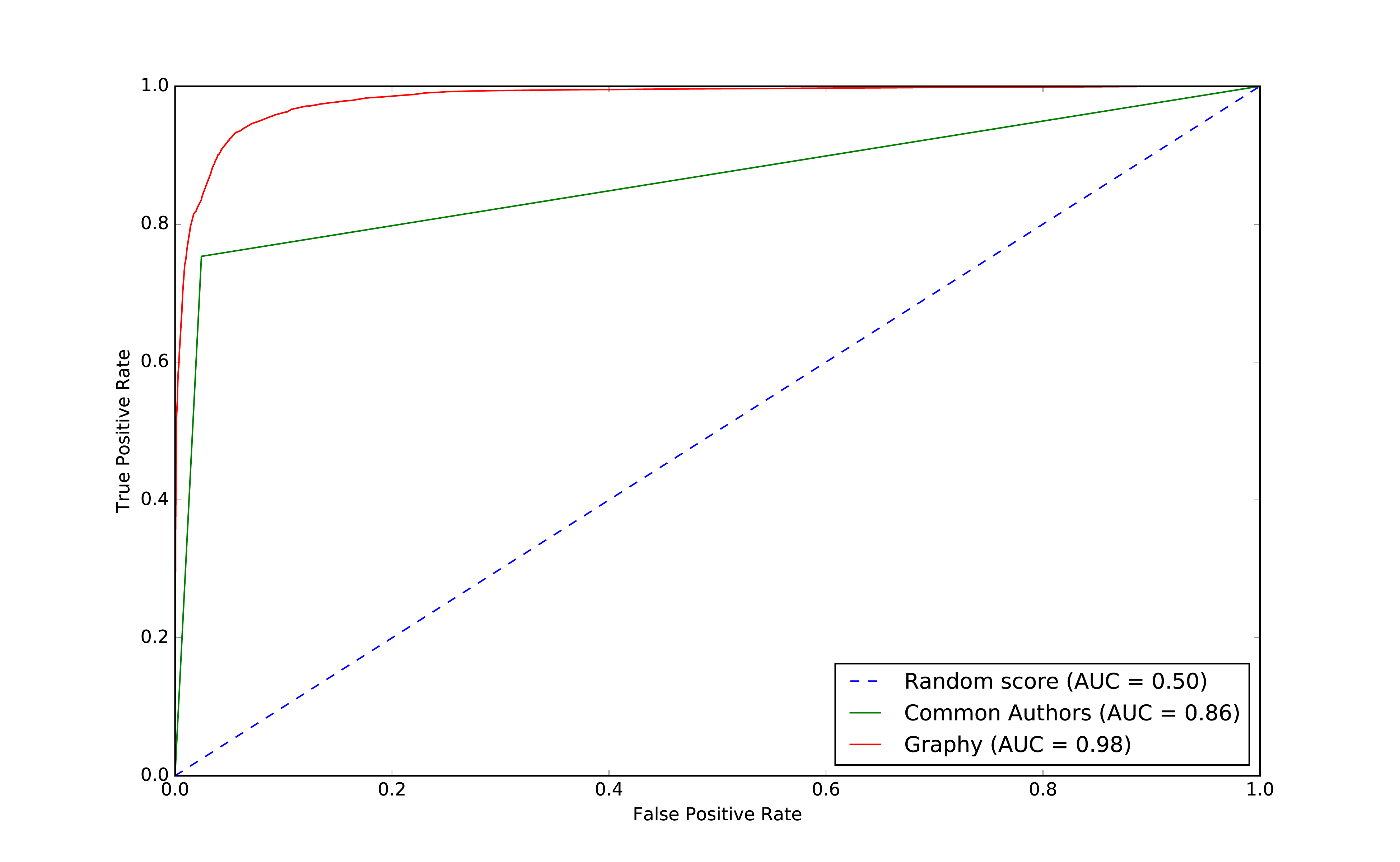
Overall it looks like we’re headed in the rigth direction and it’s helpful to visualize comparisons to get a feel for how different models impact our results.
Now that we have more than one feature, we want to evaluate which features are making the most difference. We’ll use feature importance to rank the impact of different features to our model’s prediction. This enables us to evaluate the influence on results that different algorithms and statistics have.
To compute feature importance, the random forest algorithm in Spark averages the reduction in impurity across all trees in the forest. The impurity is the frequency that randomly assigned labels are incorrect.
Feature rankings are in comparison to the group of features we’re evaluating, always normalized to 1. If we only rank one feature, its feature importance is 1.0 as it has 100% of the influence on the model.
The following function creates a chart showing the most influential features:
defplot_feature_importance(fields,feature_importances):df=pd.DataFrame({"Feature":fields,"Importance":feature_importances})df=df.sort_values("Importance",ascending=False)ax=df.plot(kind='bar',x='Feature',y='Importance',legend=None)ax.xaxis.set_label_text("")plt.tight_layout()plt.show()
And we call it like this:
rf_model=graphy_model.stages[-1]plot_feature_importance(fields,rf_model.featureImportances)
The results of running that function can be seen in Figure 8-11:
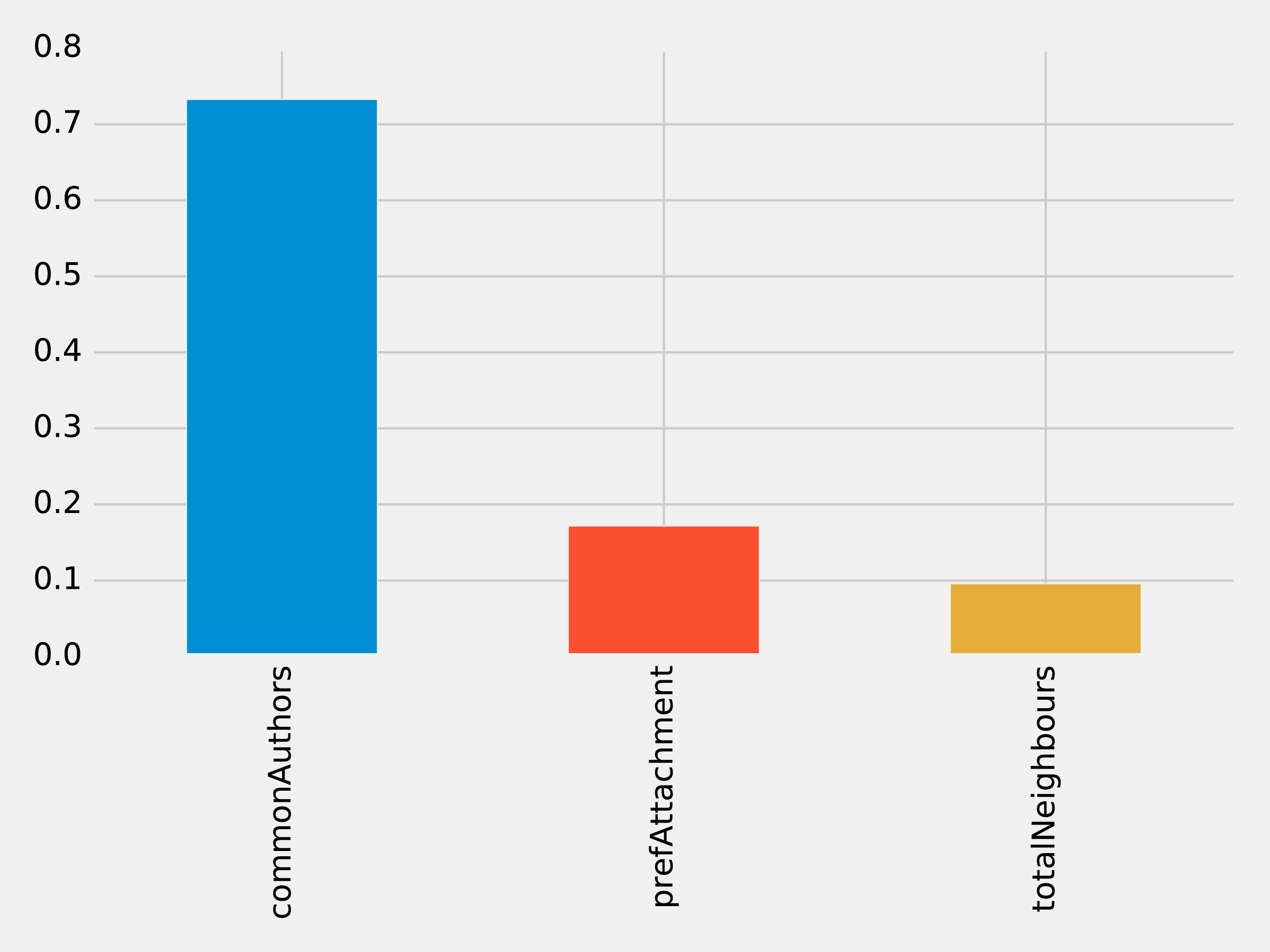
Of the three features we’ve used so far, commonAuthors is the most important feature by a large margin.
To understand how our predictive models are created, we can visualize one of the decision trees in our random forest using the spark-tree-plotting library 15. The following code generates a GraphViz 16 file of one of our decision trees:
fromspark_tree_plottingimportexport_graphvizdot_string=export_graphviz(rf_model.trees[0],featureNames=fields,categoryNames=[],classNames=["True","False"],filled=True,roundedCorners=True,roundLeaves=True)withopen("/tmp/rf.dot","w")asfile:file.write(dot_string)
We can then generate a visual representation of that file by running the following command from the terminal:
dot -Tpdf /tmp/rf.dot -o /tmp/rf.pdf
The output of that command can be seen in Figure 8-12:
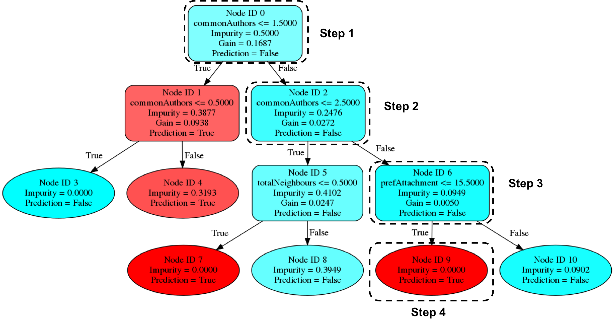
Imagine that we’re using this decision tree to predict whether a pair of nodes with the following features are linked:
| commonAuthors | prefAttachment | totalNeighbours |
|---|---|---|
10 |
12 |
5 |
Our random forest walks through several steps to create a prediction:
Start from Node ID 0, where we have more than 1.5 commonAuthors, so we follow the False branch down to Node ID 2.
We have more than 2.5 for commonAuthors, so we follow the False branch to Node ID 6.
We have less than 15.5 for prefAttachment, which takes us to Node ID 9.
Node ID 9 is a leaf node in this decision tree, which means that we don’t have to check any more conditions - the value of Prediction (i.e. True) on this node is the decision tree’s prediction.
Finally the random forest evaluates the item being predicted against a collection of these decisions trees and makes its prediction based on the most popular outcome.
Now let’s look at adding more graph features.
Recommendation solutions often base predictions on some form of triangle metric so let’s see if they further help with our example. We can compute the number of triangles that a node is a part of and its clustering coefficient by executing the following query:
CALL algo.triangleCount('Author','CO_AUTHOR_EARLY', { write:true,writeProperty:'trianglesTrain', clusteringCoefficientProperty:'coefficientTrain'});CALL algo.triangleCount('Author','CO_AUTHOR', { write:true,writeProperty:'trianglesTest', clusteringCoefficientProperty:'coefficientTest'});
The following function will add these features to our DataFrames:
def apply_triangles_features(data, triangles_prop, coefficient_prop):query ="""UNWIND $pairs AS pairMATCH (p1) WHERE id(p1) = pair.node1MATCH (p2) WHERE id(p2) = pair.node2RETURN pair.node1 AS node1,pair.node2 AS node2,apoc.coll.min([p1[$trianglesProp], p2[$trianglesProp]]) AS minTriangles,apoc.coll.max([p1[$trianglesProp], p2[$trianglesProp]]) AS maxTriangles,apoc.coll.min([p1[$coefficientProp], p2[$coefficientProp]]) AS minCoefficient,apoc.coll.max([p1[$coefficientProp], p2[$coefficientProp]]) AS maxCoefficient"""params = {"pairs": [{"node1": row["node1"],"node2": row["node2"]} for rowindata.collect()],"trianglesProp": triangles_prop,"coefficientProp": coefficient_prop}features = spark.createDataFrame(graph.run(query, params).to_data_frame())returndata.join(features, ["node1","node2"])
Notice that we’ve used Min and Max prefixes for our Triangle Count and Clustering Coefficient algorithms. We need a way to prevent our model from learning based on the order authors in pairs are passed in from our undirected graph. To do this, we’ve split these features by the authors with minimum and maximum counts.
We can apply this function to our training and test DataFrames with the following code:
training_data=apply_triangles_features(training_data,"trianglesTrain","coefficientTrain")test_data=apply_triangles_features(test_data,"trianglesTest","coefficientTest")
We can run the following code to show descriptive statistics for each of our triangles features:
(training_data.filter(training_data["label"]==1).describe().select("summary","minTriangles","maxTriangles","minCoefficient","maxCoefficient").show())
(training_data.filter(training_data["label"]==0).describe().select("summary","minTriangles","maxTriangles","minCoefficient","maxCoefficient").show())
We can see the results of running those bits of code in Table 8-13 and Table 8-14.
| summary | minTriangles | maxTriangles | minCoefficient | maxCoefficient |
|---|---|---|---|---|
count |
81096 |
81096 |
81096 |
81096 |
mean |
19.478260333431983 |
27.73590559337082 |
0.5703773654487051 |
0.8453786164620439 |
stddev |
65.7615282768483 |
74.01896188921927 |
0.3614610553659958 |
0.2939681857356519 |
min |
0 |
0 |
0.0 |
0.0 |
max |
622 |
785 |
1.0 |
1.0 |
| summary | minTriangles | maxTriangles | minCoefficient | maxCoefficient |
|---|---|---|---|---|
count |
81096 |
81096 |
81096 |
81096 |
mean |
5.754661142349808 |
35.651980368945445 |
0.49048921333297446 |
0.860283935358397 |
stddev |
20.639236521699 |
85.82843448272624 |
0.3684138346533951 |
0.2578219623967906 |
min |
0 |
0 |
0.0 |
0.0 |
max |
617 |
785 |
1.0 |
1.0 |
Notice in this comparison there isn’t as great a difference between the co-authoriship and no co-authorship data. This could mean that these feature aren’t as predicitve.
We can train another model by running the following code:
fields=["commonAuthors","prefAttachment","totalNeighbours","minTriangles","maxTriangles","minCoefficient","maxCoefficient"]triangle_model=train_model(fields,training_data)
And now let’s evaluate the model and display the results:
triangle_results=evaluate_model(triangle_model,test_data)display_results(triangle_results)
| Measure | Score |
|---|---|
accuracy |
0.993530 |
recall |
0.964467 |
precision |
0.960812 |
Our predicitive measures have increased well by adding each new feature to the previous model. Let’s add our triangles model to our ROC curve chart with the following code:
plt,fig=create_roc_plot()add_curve(plt,"Common Authors",basic_results["fpr"],basic_results["tpr"],basic_results["roc_auc"])add_curve(plt,"Graphy",graphy_results["fpr"],graphy_results["tpr"],graphy_results["roc_auc"])add_curve(plt,"Triangles",triangle_results["fpr"],triangle_results["tpr"],triangle_results["roc_auc"])plt.legend(loc='lower right')plt.show()
We can see the output in Figure 8-13.
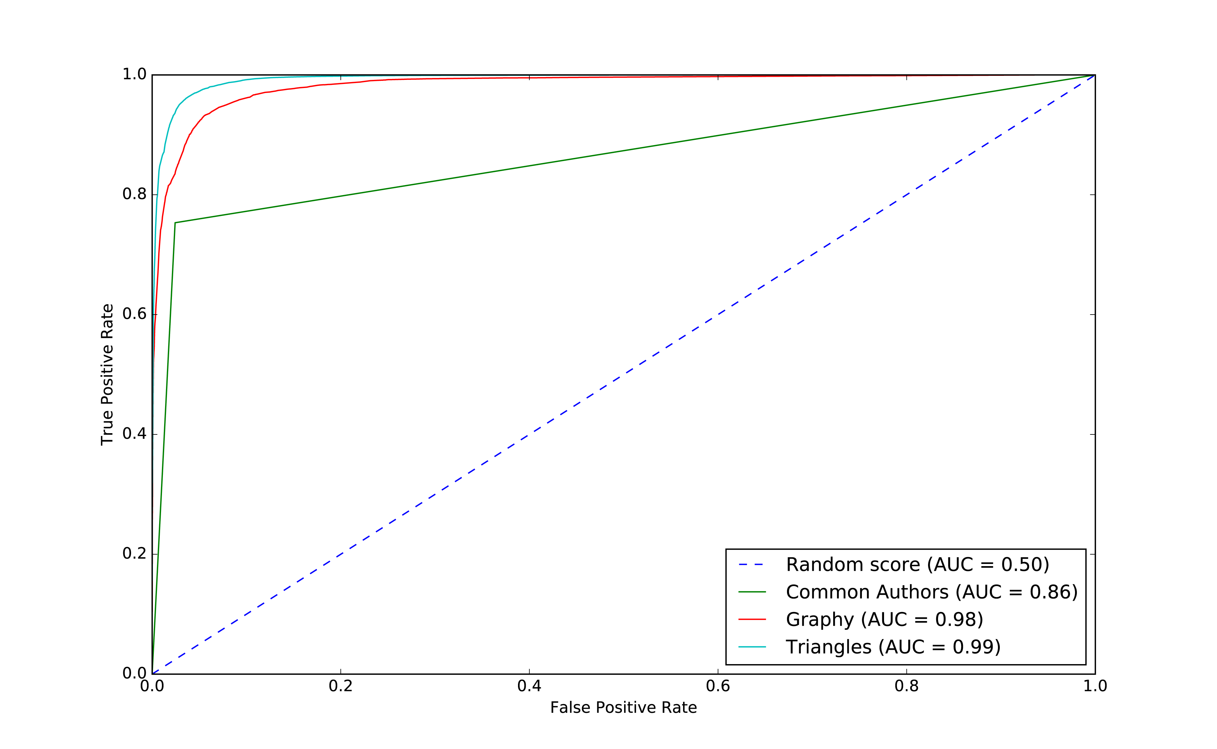
Our models have generally improved well and we’re in the high 90’s for our predicitive measures. And this is where things usually get difficult because the easiest gains have been made and yet there’s still room for improvement. Let’s look at how the important features have changed:
rf_model=triangle_model.stages[-1]plot_feature_importance(fields,rf_model.featureImportances)
The results of running that function can be seen in Figure 8-14:
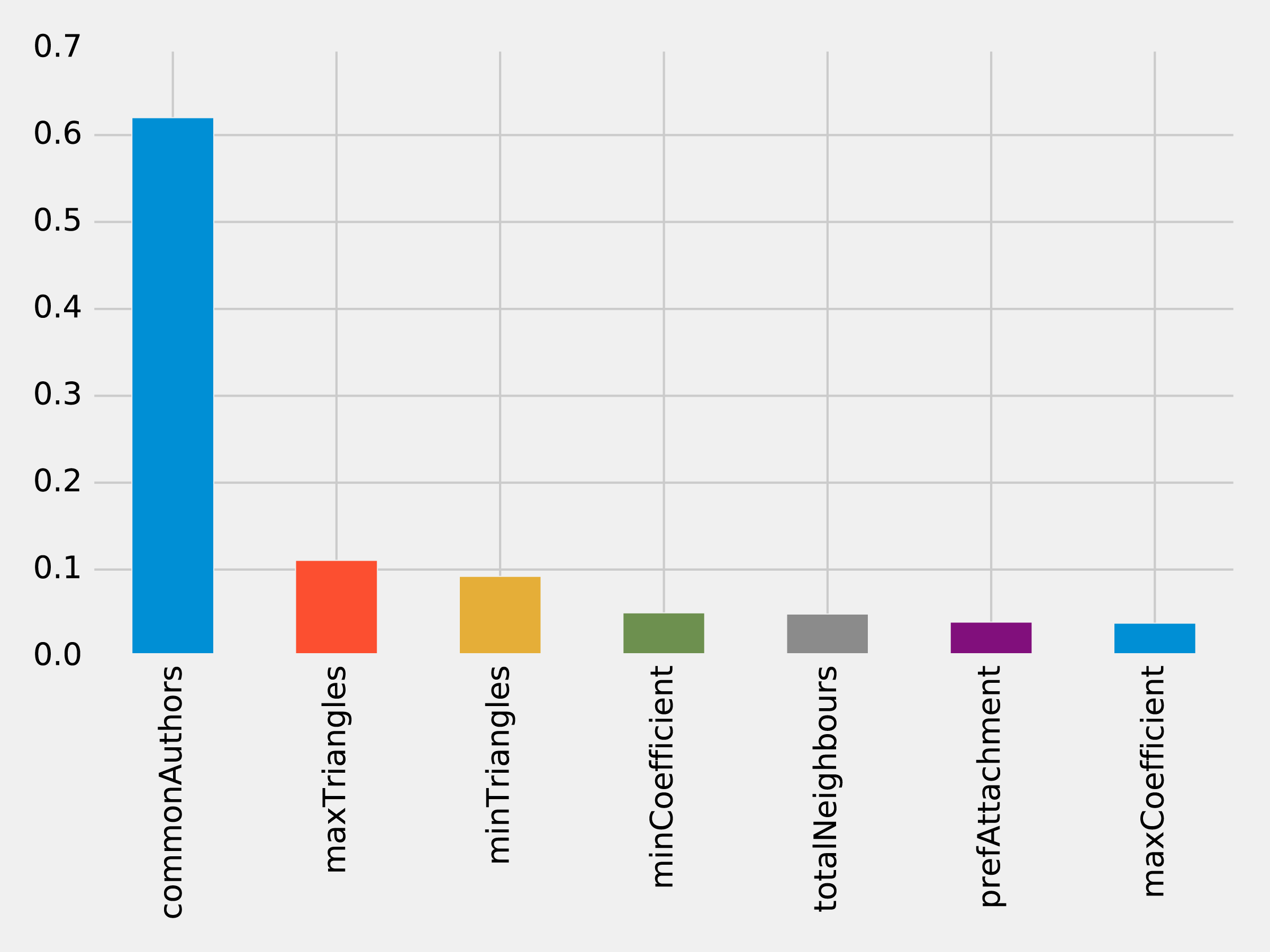
The common authors feature still has the most, single impact on our model. Perhaps we need to look at new areas and see what happens when we add in community information.
We hypothesize that nodes that are in the same community are more likely to have a link between them if they don’t already. Moreover, we believe that the tighter a community, the more likely links are.
First, we’ll compute more coarse-grained communities using the Label Propagation algorithm in Neo4j.
We can do this by running the following query, which will store the community in the property partitionTrain for the training set and partitionTest for the test set:
CALL algo.labelPropagation("Author","CO_AUTHOR_EARLY","BOTH",{partitionProperty:"partitionTrain"});CALL algo.labelPropagation("Author","CO_AUTHOR","BOTH",{partitionProperty:"partitionTest"});
We’ll also compute finer-grained groups using the Louvain algorithm.
The Louvain algorithm returns intermediate clusters, and we’ll store the smallest of these clusters in the property louvainTrain for the training set and louvainTest for the test set:
CALL algo.louvain.stream("Author","CO_AUTHOR_EARLY", {includeIntermediateCommunities:true})YIELD nodeId, community, communitiesWITHalgo.getNodeById(nodeId)AS node, communities[0]ASsmallestCommunitySET node.louvainTrain = smallestCommunity;CALL algo.louvain.stream("Author","CO_AUTHOR", {includeIntermediateCommunities:true})YIELD nodeId, community, communitiesWITHalgo.getNodeById(nodeId)AS node, communities[0]ASsmallestCommunitySET node.louvainTest = smallestCommunity;
We’ll now create the following function to return the values from these algorithms:
def apply_community_features(data, partition_prop, louvain_prop):query ="""UNWIND $pairs AS pairMATCH (p1) WHERE id(p1) = pair.node1MATCH (p2) WHERE id(p2) = pair.node2RETURN pair.node1 AS node1,pair.node2 AS node2,CASE WHEN p1[$partitionProp] = p2[$partitionProp] THEN 1 ELSE 0 END AS samePartition,CASE WHEN p1[$louvainProp] = p2[$louvainProp] THEN 1 ELSE 0 END AS sameLouvain"""params = {"pairs": [{"node1": row["node1"],"node2": row["node2"]} for rowindata.collect()],"partitionProp": partition_prop,"louvainProp": louvain_prop}features = spark.createDataFrame(graph.run(query, params).to_data_frame())returndata.join(features, ["node1","node2"])
We can apply this function to our training and test DataFrames in Spark with the following code:
training_data=apply_community_features(training_data,"partitionTrain","louvainTrain")test_data=apply_community_features(test_data,"partitionTest","louvainTest")
We can run the following code to see whether pairs of nodes belong in the same partition:
plt.style.use('fivethirtyeight')fig,axs=plt.subplots(1,2,figsize=(18,7),sharey=True)charts=[(1,"have collaborated"),(0,"haven't collaborated")]forindex,chartinenumerate(charts):label,title=chartfiltered=training_data.filter(training_data["label"]==label)values=(filtered.withColumn('samePartition',F.when(F.col("samePartition")==0,"False").otherwise("True")).groupby("samePartition").agg(F.count("label").alias("count")).select("samePartition","count").toPandas())values.set_index("samePartition",drop=True,inplace=True)values.plot(kind="bar",ax=axs[index],legend=None,title=f"Authors who {title} (label={label})")axs[index].xaxis.set_label_text("Same Partition")plt.tight_layout()plt.show()
We see the results of running that code in Figure 8-15.
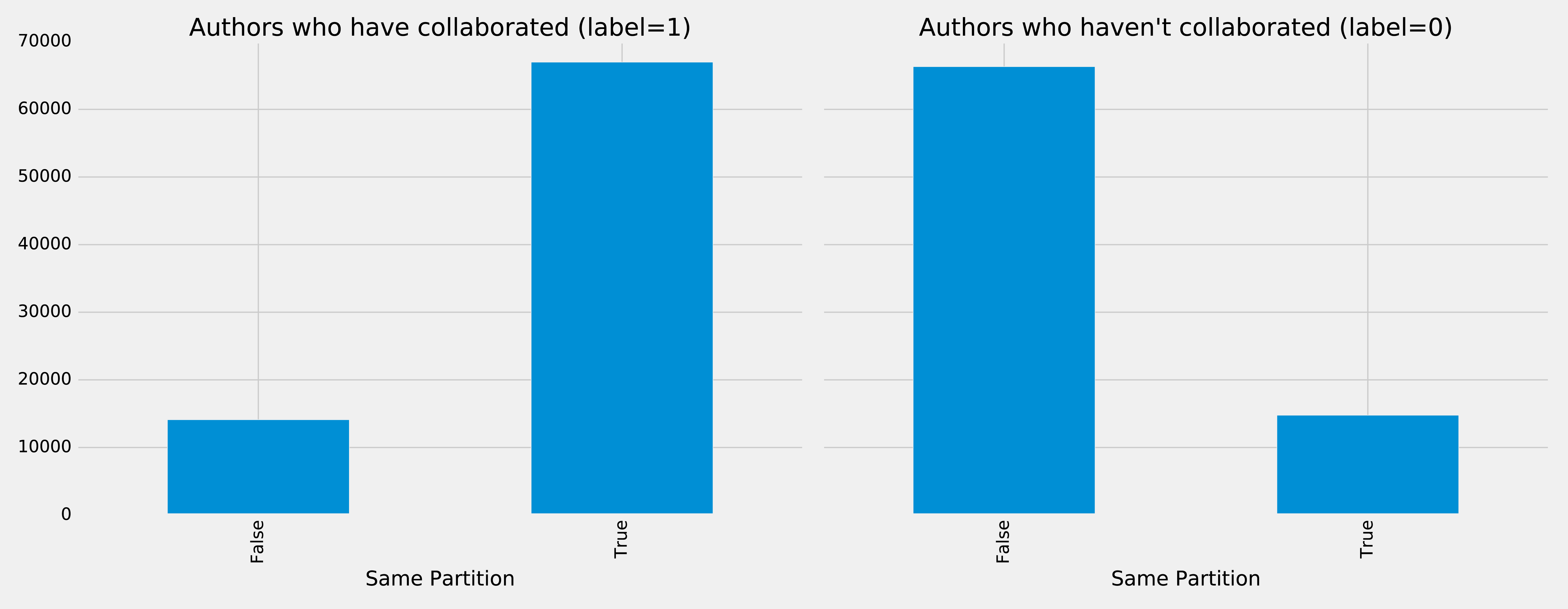
It looks like this feature could be quite predictive - authors who have collaborated are much more likely to be in the same partition than those that haven’t. We can do the same thing for the Louvain clusters by running the following code:
plt.style.use('fivethirtyeight')fig,axs=plt.subplots(1,2,figsize=(18,7),sharey=True)charts=[(1,"have collaborated"),(0,"haven't collaborated")]forindex,chartinenumerate(charts):label,title=chartfiltered=training_data.filter(training_data["label"]==label)values=(filtered.withColumn('sameLouvain',F.when(F.col("sameLouvain")==0,"False").otherwise("True")).groupby("sameLouvain").agg(F.count("label").alias("count")).select("sameLouvain","count").toPandas())values.set_index("sameLouvain",drop=True,inplace=True)values.plot(kind="bar",ax=axs[index],legend=None,title=f"Authors who {title} (label={label})")axs[index].xaxis.set_label_text("Same Louvain")plt.tight_layout()plt.show()
We see the results of running that code in Figure 8-16.
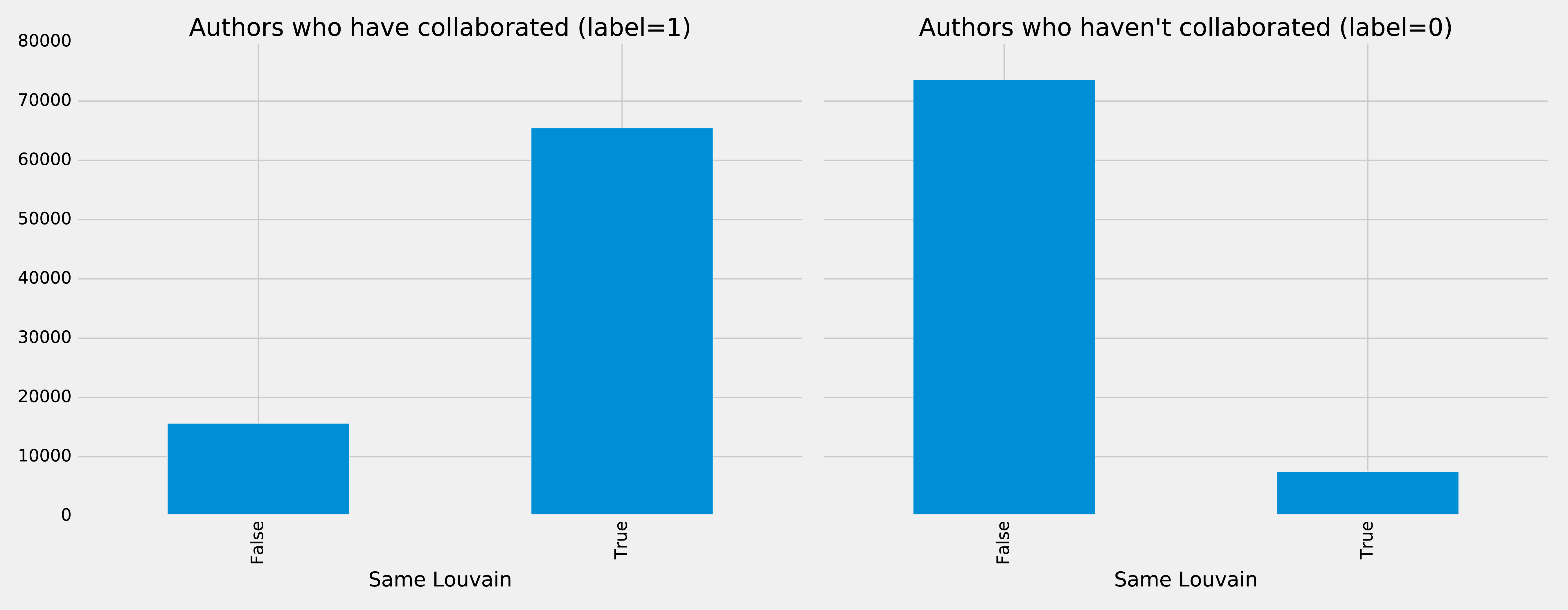
It looks like this feature could be quite predictive as well - authors who have collaborated are likely to be in the same cluster, and those that haven’t are very unlikely to be in the same cluster.
We can train another model by running the following code:
fields=["commonAuthors","prefAttachment","totalNeighbours","minTriangles","maxTriangles","minCoefficient","maxCoefficient","samePartition","sameLouvain"]community_model=train_model(fields,training_data)
And now let’s evaluate the model and disply the results:
community_results=evaluate_model(community_model,test_data)display_results(community_results)
| Measure | Score |
|---|---|
accuracy |
0.995780 |
recall |
0.956467 |
precision |
0.978444 |
Some of our measures have improved, so let’s plot the ROC curve for all our models by running the following code:
plt,fig=create_roc_plot()add_curve(plt,"Common Authors",basic_results["fpr"],basic_results["tpr"],basic_results["roc_auc"])add_curve(plt,"Graphy",graphy_results["fpr"],graphy_results["tpr"],graphy_results["roc_auc"])add_curve(plt,"Triangles",triangle_results["fpr"],triangle_results["tpr"],triangle_results["roc_auc"])add_curve(plt,"Community",community_results["fpr"],community_results["tpr"],community_results["roc_auc"])plt.legend(loc='lower right')plt.show()
We see the output in Figure 8-17.
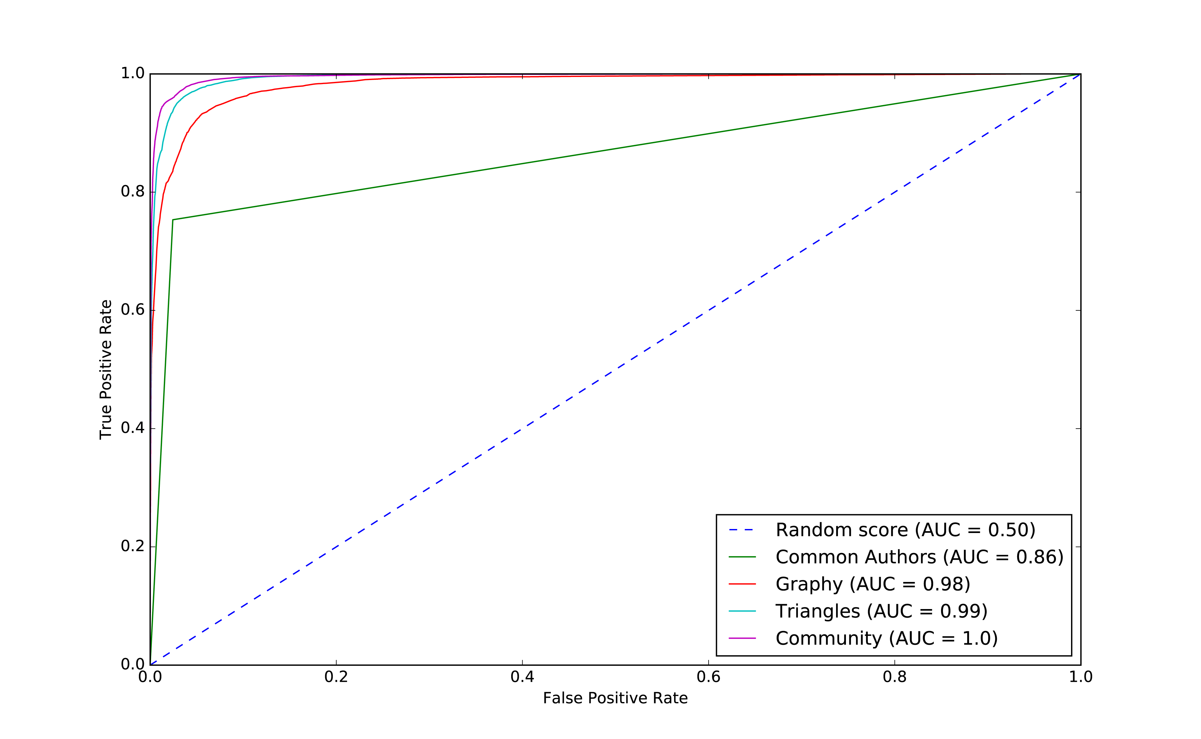
We can see improvements with the addition of the community model, so let’s see which are the most important features.
rf_model=community_model.stages[-1]plot_feature_importance(fields,rf_model.featureImportances)
The results of running that function can be seen in Figure 8-18:
Although the common authors model is overall very important, it’s good to avoid having an overly dominant element that might skew predictions on new data. Community detection algorithms had a lot of influence in our last model with all the features included and helps round out our predicitive approach.
We’ve seen in our examples that simple graph-based features are a good start and then as we add more graphy and graph algorithm based features, we continue to improve our predictive measures. We now have a good, balanced model for predicting co-authorship links.
Using graphs for connected features extraction can significantly improve our predictions. The ideal graph features and algorithms vary depending on the attributes of our data, including the network domain and graph shape. We suggest first considering the predictive elements within your data and testing hypotheses with different types of connected features before finetuning.
Reader Exercises
There are several areas we could investigate and ways to build other models. You’re encouraged to explore some of these ideas.
How predictive is our model on conference data we did not include?
When testing new data, what happens when we remove some features?
Does splitting the years differently for training and testing impact our predictions?
This dataset also has citations between papers, can we use that data to generate different features or predict future citations?
In this chapter, we looked at using graph features and algorithms to enhance machine learning. We covered a few preliminary concepts and then walked through a detailed example integrating Neo4j and Apache Spark for link prediction. We illustrated how to evaluate random forest classifier models and incorporate various types of connected features to improve results.
In this book, we’ve covered graph concepts as well as processing platforms and analytics. We then walked through many practical examples of how to use graph algorithms in Apache Spark and Neo4j. We finished with how graphs enhance machine learning.
Graph algorithms are the powerhouse behind the analysis of real-world systems – from preventing fraud and optimizing call routing to predicting the spread of the flu. We hope you join us and develop your own unique solutions that take advantage of today’s highly connected data.
1 https://www.nature.com/articles/nature11421
2 http://www.connectedthebook.com
3 https://developer.amazon.com/fr/blogs/alexa/post/37473f78-6726-4b8a-b08d-6b0d41c62753/Alexa%20Skills%20Kit
4 https://www.sciencedirect.com/science/article/pii/S0957417418304470?via%3Dihub
5 https://arxiv.org/abs/1706.02216
6 https://arxiv.org/abs/1403.6652
7 https://arxiv.org/abs/1704.08829
8 https://www.cs.umd.edu/~shobeir/papers/fakhraei_kdd_2015.pdf
9 https://pdfs.semanticscholar.org/398f/6844a99cf4e2c847c1887bfb8e9012deccb3.pdf
10 https://www.cs.cornell.edu/home/kleinber/link-pred.pdf
11 https://aminer.org/citation
12 http://keg.cs.tsinghua.edu.cn/jietang/publications/KDD08-Tang-et-al-ArnetMiner.pdf
13 https://lfs.aminer.cn/lab-datasets/citation/dblp.v10.zip
14 https://www3.nd.edu/~dial/publications/lichtenwalter2010new.pdf
Copyright © 2019 Amy E. Hodler and Mark Needham. All rights reserved.
Printed in the United States of America.
Published by O’Reilly Media, Inc., 1005 Gravenstein Highway North, Sebastopol, CA 95472.
O’Reilly books may be purchased for educational, business, or sales promotional use. Online editions are also available for most titles (http://oreilly.com/safari). For more information, contact our corporate/institutional sales department: 800-998-9938 or corporate@oreilly.com.
See http://oreilly.com/catalog/errata.csp?isbn=9781492047681 for release details.
The O’Reilly logo is a registered trademark of O’Reilly Media, Inc. Graphic Algorithms, the cover image, and related trade dress are trademarks of O’Reilly Media, Inc.
While the publisher and the authors have used good faith efforts to ensure that the information and instructions contained in this work are accurate, the publisher and the authors disclaim all responsibility for errors or omissions, including without limitation responsibility for damages resulting from the use of or reliance on this work. Use of the information and instructions contained in this work is at your own risk. If any code samples or other technology this work contains or describes is subject to open source licenses or the intellectual property rights of others, it is your responsibility to ensure that your use thereof complies with such licenses and/or rights.
978-1-492-04761-2
The world is driven by connections—from financial and communication systems to social and biological processes. Revealing the meaning behind these connections drives breakthroughs across industries in areas such as identifying fraud rings and optimizing recommendations to evaluating the strength of a group and predicting cascading failures.
As connectedness continues to accelerate, it’s not surprising that interest in graph algorithms has exploded because they are based on mathematics explicitly developed to gain insights from the relationships between data. Graph analytics can uncover the workings of intricate systems and networks at massive scales— for any organization.
We are passionate about the utility and importance of graph analytics as well as the joy of uncovering the inner workings of complex scenarios. Until recently, adopting graph analytics required significant expertise and determination since tools and integrations were difficult and few knew how to apply graph algorithms to their quandaries. It is our goal to help change this. We wrote this book to help organizations better leverage graph analytics so that they can make new discoveries and develop intelligent solutions faster.
We’ve chosen to focus practical examples on graph algorithms in Apache Spark and the Neo4j platform. However, this guide is helpful for understanding more general graph concepts regardless of what graph technology you use.
This book is written as a practical guide to getting started with graph algorithms for developers and data scientists who have Apache Spark or Neo4j experience. The first two chapters provide an introduction to graph analytics, algorithms, and theory. The third chapter briefly covers the platforms used in this book before we dive into three chapters focusing on classic graph algorithms: pathfinding, centrality, and community detections. We wrap up the book with two chapters showing how graph algorithms are used within workflows: one for general analysis and one for machine learning.
At the beginning of each category of algorithms, there is a reference table to help you quickly jump to the relevant algorithm. For each algorithm, you’ll find:
The following typographical conventions are used in this book:
Indicates new terms, URLs, email addresses, filenames, and file extensions.
Constant widthUsed for program listings, as well as within paragraphs to refer to program elements such as variable or function names, databases, data types, environment variables, statements, and keywords.
Constant width boldShows commands or other text that should be typed literally by the user.
Constant width italicShows text that should be replaced with user-supplied values or by values determined by context.
This element signifies a tip or suggestion.
This element signifies a general note.
This element indicates a warning or caution.
Supplemental material (code examples, exercises, etc.) is available for download at https://github.com/oreillymedia/graph_algorithms.
This book is here to help you get your job done. In general, if example code is offered with this book, you may use it in your programs and documentation. You do not need to contact us for permission unless you’re reproducing a significant portion of the code. For example, writing a program that uses several chunks of code from this book does not require permission. Selling or distributing a CD-ROM of examples from O’Reilly books does require permission. Answering a question by citing this book and quoting example code does not require permission. Incorporating a significant amount of example code from this book into your product’s documentation does require permission.
We appreciate, but do not require, attribution. An attribution usually includes the title, author, publisher, and ISBN. For example: “Graph Algorithms by Amy E. Hodler and Mark Needham (O’Reilly). Copyright 2019 Amy E. Hodler and Mark Needham, 978-1-492-04768-1.”
If you feel your use of code examples falls outside fair use or the permission given above, feel free to contact us at permissions@oreilly.com.
Safari (formerly Safari Books Online) is a membership-based training and reference platform for enterprise, government, educators, and individuals.
Members have access to thousands of books, training videos, Learning Paths, interactive tutorials, and curated playlists from over 250 publishers, including O’Reilly Media, Harvard Business Review, Prentice Hall Professional, Addison-Wesley Professional, Microsoft Press, Sams, Que, Peachpit Press, Adobe, Focal Press, Cisco Press, John Wiley & Sons, Syngress, Morgan Kaufmann, IBM Redbooks, Packt, Adobe Press, FT Press, Apress, Manning, New Riders, McGraw-Hill, Jones & Bartlett, and Course Technology, among others.
For more information, please visit http://oreilly.com/safari.
Please address comments and questions concerning this book to the publisher:
We have a web page for this book, where we list errata, examples, and any additional information. You can access this page at http://www.oreilly.com/catalog/.
To comment or ask technical questions about this book, send email to bookquestions@oreilly.com.
For more information about our books, courses, conferences, and news, see our website at http://www.oreilly.com.
Find us on Facebook: http://facebook.com/oreilly
Follow us on Twitter: http://twitter.com/oreillymedia
Watch us on YouTube: http://www.youtube.com/oreillymedia
We’ve thoroughly enjoyed putting together the material for this book and thank all those who assisted. We’d especially like to thank Michael Hunger for his guidance, Jim Webber for his valuable edits, and Tomaz Bratanic for his keen research. Finally, we greatly appreciate Yelp permitting us to use its rich dataset for powerful examples.
Today’s most pressing data challenges center around relationships, not just tabulating discrete data. Graph technologies and analytics provide powerful tools for connected data that are used in research, social initiatives, and business solutions such as:
As data becomes increasingly interconnected and systems increasingly sophisticated, it’s essential to make use of the rich and evolving relationships within our data.
This chapter provides an introduction to graph analysis and graph algorithms. We’ll start with a brief refresher about the origin of graphs, before introducing graph algorithms and explaining the difference between graph databases and graph processing. We’ll explore the nature of modern data itself, and how the information contained in connections is far more sophisticated than basic statistical methods permit. The chapter will conclude with a look at use cases where graph algorithms can be employed.
Graphs have a history dating back to 1736 when Leonhard Euler solved the “Seven Bridges of Königsberg” problem. The problem asked whether it was possible to visit all four areas of a city, connected by seven bridges, while only crossing each bridge once. It wasn’t.
With the insight that only the connections themselves were relevant, Euler set the groundwork for graph theory and its mathematics. Figure 1-1 depicts Euler’s progression with one of his original sketches, from the paper ‘Solutio problematis ad geometriam situs pertinentis‘.
While graphs came from mathematics, they are also a pragmatic and high fidelity way of modeling and analyzing data. The objects that make up a graph are called nodes or vertices and the links between them are known as relationships, links, or edges. We use the term node in this book and you can think of nodes as the nouns in sentences. We use the term relationships and think of those as verbs giving context to the nodes. To avoid any confusion, the graphs we talk about in this book have nothing to do with graphing an equation, graphics, or charts as in Figure 1-2.
Looking at the person graph in Figure 1-2, we can easily construct several sentences which describe it. For example, person A lives with person B who owns a car and person A drives a car that person B owns. This modeling approach is compelling because it maps easily to the real world and is very “whiteboard friendly.” This helps align data modeling and algorithmic analysis.
But modeling graphs is only half the story. We might also want to process them to reveal insight that isn’t immediately obvious. This is the domain of graph algorithms.
Graph algorithms are a subset of tools for graph analytics. Graph analytics is something we do–it’s the use of any graph-based approach to analyzing connected data. There are various methods we could use: We might query the graph data, use basic statistics, visually explore the graph, or incorporate graphs into our machine learning tasks. Graph algorithms provide one of the most potent approach to analyzing connected data because their mathematical calculations are specifically built to operate on relationships.
Graph algorithms describe steps to be taken to process a graph to discover its general qualities or specific quantities. Based on the mathematics of graph theory (also known as network science), graph algorithms use the relationships between nodes to infer the organization and dynamics of complex systems. Network scientists use these algorithms to uncover hidden information, test hypotheses, and make predictions about behavior.
For example, we might like to discover neighborhoods in the graph which correspond to congestion in a transport system. Or we might want to score particular nodes that could correspond to overload conditions in a power system. In fact graph algorithms have widespread potential: from preventing fraud and optimizing call routing to predicting the spread of the flu.
In 2010 U.S. air travel systems experienced two serious events involving multiple congested airports. Network scientists were able to use graph algorithms to confirm the events as part of systematic cascading delays and use this information for corrective advice. 1
Figure 1-3 illustrates the highly connected structure of air transportation clusters. Many transportation systems exhibit a concentrated distribution of links with clear hub-and-spoke patterns that influence delays.
Graphs help to uncover how very small interactions and dynamics lead to global mutations. They tie together the micro- and macro-scales by representing exactly which things are interacting with each other within global structures. These associations are used to forecast behavior and determine missing links. Figure 1-4 shows a food web of grassland species interactions that used graph analysis to evaluate the hierarchical organization and species interactions and then predict missing relationships.2
Graph algorithms provide a rich and varied set of analytical tools for distilling insight from connected data. Typically, graph algorithms are employed to find global patterns and structures. The input to the algorithm is the whole graph and the output can be an enriched graph or some aggregate values such as a score. We categorize such processing as Graph Global and it implies (iteratively) processing a graph’s structure. This approach sheds light on the overall nature of a network through its connections. Organizations tend to use graph algorithms to model systems and predict behavior based on how things disseminate, important components, group identification, and the overall robustness of a system.
Conversely, for most graph queries the input is specific parts of the graph (e.g. a starting node) and the work is usually focused in the surrounding subgraph. We term this Graph Local and it implies (declaratively) querying a graph’s structure (as our colleagues explain in O’Reilly’s Graph Databases book3). There may be some overlap in these definitions: sometimes we can use processing to answer a query and querying to perform processing, but simplistically speaking whole-graph operations are processed by algorithms and subgraph operations are queried in databases.
Traditionally transaction processing and analysis have been siloed. This was an unnatural split based on technology limitations. Our view is that graph analytics drives smarter transactions, which creates new data and opportunities for further analysis. More recently there has been a trend to integrate these silos for real-time decision making.
Online Transaction Processing (OLTP) operations are typically short activities like booking a ticket, crediting an account, booking a sale and so forth. OLTP implies voluminous low latency query processing and high data integrity. Although OLTP may involve only a smaller number of records per transaction, systems process many transactions concurrently.
Online Analytical Processing (OLAP) facilitates more complex queries and analysis over historical data. These analyses may include multiple data sources, formats, and types. Detecting trends, conducting “what-if” scenarios, making predictions, and uncovering structural patterns are typical OLAP use cases. Compared to OLTP, OLAP systems process fewer but longer-running transactions over many records. OLAP systems are biased towards faster reading without the expectation of transactional updates found in OLTP and batch-oriented operation is common.
Recently, however, the line between OLTP and OLAP started to blur. Modern data-intensive applications now combine real-time transactional operations with analytics. This merging of processing has been spurred by several advances in software such as more scalable transaction management, incremental stream processing, and in lower-cost, large-memory hardware.
Bringing together analytics and transactions enables continual analysis as a natural part of regular operations. As data is gathered–from point-of-sale (POS) machines, from manufacturing systems, or from IoT devices–analytics now supports the ability to make real-time recommendations and decisions while processing. This trend was observed several years ago, and terms to describe this merging include “Transalytics” and Hybrid Transactional and Analytical Processing (HTAP). Figure 1-5 illustrates how read-only replicas can be used to bring together these different types of processing.
“[HTAP] could potentially redefine the way some business processes are executed, as real-time advanced analytics (for example, planning, forecasting and what-if analysis) becomes an integral part of the process itself, rather than a separate activity performed after the fact. This would enable new forms of real-time business-driven decision-making process. Ultimately, HTAP will become a key enabling architecture for intelligent business operations.” –Gartner
OLTP and OLAP become more integrated and support functionality previously offered in only one silo, it’s no longer necessary to use different data products or systems for these workloads–we can simplify our architecture by using the same platform for both. This means our analytical queries can take advantage of real-time data and we can streamline the iterative process of analysis.
Graph algorithms are used to help make sense of connected data. We see relationships within real-world systems from protein interactions to social networks, from communication systems to power grids, and from retail experiences to Mars mission planning. Understanding networks and the connections within them offers incredible potential for insight and innovation.
Graph algorithms are uniquely suited to understanding structures and revealing patterns in datasets that are highly connected. Nowhere is the connectivity and interactivity so apparent than in big data. The amount of information that has been brought together, commingled, and dynamically updated is impressive. This is where graph algorithms can help make sense of our volumes of data: for both sophisticated analytics of the graph and to improve artificial intelligence by fuelling our models with structural context.
Scientists that study the growth of networks have noted that connectivity increases over time, but not uniformly. Preferential attachment is one theory on how the dynamics of growth impact structure. This idea, illustrated in Figure 1-6, describes the tendency of a node to link to other nodes that already have a lot of connections.
Regardless of the underlying causes, many researchers believe that how a network develops is inseparable from their resulting shapes and hierarchies. Highly dense groups and lumpy data networks tend to develop, in effect growing both data size and its complexity. Trying to “average out” the network, in general, won’t work well for investigating relationships. We see this clustering of relationships in most real-world networks today from the internet to social networks such as a gaming community shown in Figure 1-7.
This is significantly different than what an average distribution model would predict, where most nodes would have the same number of connections. For instance, if the World Wide Web had an average distribution of connections, all pages would have about the same number of links coming in and going out. Average distribution models assert that most nodes are equally connected but many types of graphs and many real networks exhibit concentrations. The Web, in common with graphs like travel and social networks, has a power-law distribution with few nodes being highly connected and most nodes being modestly connected.
We can readily see in Figure 1-8; how using an average of characteristics for data that is uneven, would lead to incorrect results.
This is important to recognize as most graph data does not adhere to an average distribution. Network scientists use graph analytics to search for and interpret structures and relationship distributions in real-world data.
There is no network in nature that we know of that would be described by the random network model. —Albert-László Barabási, director, Center for Complex Network Research Northeastern University, and author of numerous network science books
The challenge is that densely yet unevenly connected data is troublesome to analyze with traditional analytical tools. There might be a structure there but it’s hard to find. So, it’s tempting to take an averages approach to messy data but doing so will conceal patterns and ensure our results are not representing any real groups. For instance, if you average the demographic information of all your customers and offer an experience based solely on averages, you’d be guaranteed to miss most communities: communities tend to cluster around related factors like age and occupation or marital status and location.
Furthermore, dynamic behavior, particularly around sudden events and bursts, can’t be seen with a snapshot. To illustrate, if you imagine a social group with increasing relationships, you’d also expect increased communications. This could lead to a tipping point of coordination and a subsequent coalition or, alternatively, subgroup formation and polarization in, for example, elections. Sophisticated methods are required to forecast a network’s evolution over time but we can infer behavior if we understand the structures and interactions within our data. Graph analytics are used to predict group resiliency because of the focus on relationships.
At the most abstract level, graph analytics is applied to forecast behavior and prescribe action for dynamic groups. Doing this requires understanding the relationships and structure within that group. Graph algorithms accomplish this by examining the overall nature of networks through their connections. With this approach, you can understand the topology of connected systems and model their processes.
There are three general buckets of question that indicate graph analytics and algorithms are warranted, as shown in Figure 1-9.
Below are a few types of challenges where graph algorithms are employed. Are your challenges similar?
In this chapter, we’ve looked at how data today is extremely connected. Analysis of group dynamics and relationships has robust scientific practices, yet those tools are not always commonplace in businesses. As we evaluate advanced analytics techniques, we should consider the nature of our data and whether we need to understand community attributes or predict complex behavior. If our data represents a network, we should avoid the temptation to reduce factors to an average. Instead, we should use tools that match our data and the insights we’re seeking.
In the next chapter, we’ll cover graph concepts and terminology.
In this chapter, we go into more detail on the terminology of graph algorithms. The basics of graph theory are explained with a focus on the concepts that are most relevant to a practitioner.
We’ll describe how graphs are represented and then explain the different types of graphs and their attributes. This will be important later as our graph’s characteristics will inform our algorithm choices and help interpret results. We’ll finish the chapter with the types of graph algorithms available to us.
The labeled property graph is the dominant way of modeling graph data. An example can be seen in Figure 2-1.
A label marks a node as part of a group. Here we have two groups of nodes: Person and Car. (Although in classic graph theory, a label applies to a single node, it’s now commonly used to mean a node group.)
Relationships are classified based on relationship-type. Our example includes the relationship types of DRIVES, OWNS, LIVES_WITH, and MARRIED_TO.
Properties are synonymous with attributes and can contain a variety of data types from numbers and strings to spatial and temporal data. In Figure 2-1 , we assigned the properties as named value pairs where the name of the property comes first and then its value. For example, the Person node on the left has a property name: Dan and the MARRIED_TO relationship as a property of on: Jan, 1, 2013 .
A subgraph is a graph within a larger graph. Subgraphs are useful as a filter for our graph such as when we need a subset with particular characteristics for focused analysis.
A path is a group of nodes and their connecting relationships. An example of a simple path, based on Figure 2-1, could contain the nodes Dan, Ann and Car and the LIVES_WITH and OWNS relationships.
Graphs vary in type, shape and size as well the kind of attributes that can be used for analysis. In the next section, we’ll describe the kinds of graphs most suited for graph algorithms. Keep in mind that these explanations apply to graphs as well as subgraphs.
In classic graph theory, the term graph is equated with a simple (or strict) graph where nodes only have one relationship between them, as shown on the left side of Figure 2-2. Most real-world graphs, however, has many relationships between nodes and even self-referencing relationships. Today, the term graph is commonly used for all three graph types in Figure 2-2 and so we also use the term inclusively.
Graphs take on a variety of shapes. Figure 2-3 illustrates three representative network types:
These network types produce graphs with distinctive structures, distributions, and behaviors.
To get the most out of graph algorithms, it’s important to familiarize ourselves with the most characteristic graphs we’ll encounter.
| Graph Attributes | Key Factor | Algorithm Consideration |
|---|---|---|
| Connected versus Disconnected | Whether or not there is a path between any two nodes in the graph, irrespective of distance. | Islands of nodes can cause unexpected behavior such as getting stuck in or failing to process disconnected components. |
| Weighted versus Unweighted | Whether there are (domain-specific) values on relationships or nodes. | Many algorithms expect weights and we’ll see significant differences in performance and results when ignored. |
| Directed versus Undirected | Whether or not relationships explicitly define a start and end node. |
Adds rich context to infer additional meaning. In some algorithms, you can explicitly set the use of one, both, or no direction. |
| Cyclic versus Acyclic | Paths start and end at the same node | Cyclic is common but algorithms must be careful (typically by storing traversal state) or cycles may prevent termination. Acyclic graphs (or spanning trees) are the basis for many graph algorithms. |
| Sparse versus Dense | Relationship to node ratio | Extremely dense or extremely sparsely connected graphs can cause divergent results. Data modeling may help, assuming the domain is not inherently dense or sparse. |
| Monopartite, Bipartite, and K-Partite | Nodes connect to only one other node type (users like movies) versus many other node types (users like users who like movies) | Helpful for creating relationships to analyze and projecting more useful graphs. |
A graph is connected if there is a path from any node to every node and disconnected if there is not. If we have islands in our graph, it’s disconnected. If the nodes in those islands are connected, they are called components (or sometimes clusters) as shown in Figure 2-4.
Some algorithms struggle with disconnected graphs and can produce misleading results. If we have unexpected results, checking the structure of our graph is a good first step.
Unweighted graphs have no weight values assigned to their nodes or relationships. For weighted graphs, these values can represent a variety of measures such as cost, time, distance, capacity, or even a domain-specific prioritization. Figure 2-5 visualizes the difference.
Basic graph algorithms can use weights for processing as a representation for the strength or value of relationships. Many algorithms compute metrics which then can be used as weights for follow-up processing. Some algorithms update weight values as they proceed to find cumulative totals, lowest values, or optimums.
The classic use for weighted graphs is in pathfinding algorithms. Such algorithms underpin the mapping applications on our phones and compute the shortest/cheapest/fastest transport routes between locations. For example, Figure 2-6 uses two different methods of computing the shortest route.
Without weights, our shortest route is calculated in terms of the number of relationships (commonly called hops). A and E have a 2 hop shortest path, which indicates only 1 city (D) between them. However, the shortest weighted path from A to E takes us from A to C to D to E. If weights represent a physical distance in kilometers the total distance would be 50 km. In this case, the shortest path in terms of the number of hops would equate to a longer physical route of 70 km.
In an undirected graph, relationships are considered bi-directional, such as commonly used for friendships. In a directed graph, relationships have a specific direction. Relationships pointing to a node are referred to as in-links and, unsurprisingly, out-links are those originating from a node.
Direction adds another dimension of information. Relationships of the same type but in opposing directions carry different semantic meaning, as it expresses a dependency or indicates a flow. This may then be used as an indicator of credibility or group strength. Personal preferences and social relations are expressed very well with direction.
For example, if we assumed in Figure 2-7 that the directed graph was a network of students and the relationships were “likes” then we’d calculate that A and C are more popular.
Road networks illustrate why we might want to use both types of graphs. For example, highways between cities are often traveled in both directions. However, within cities, some roads are one-way streets. (The same is true for some information flows!)
We get different results running algorithms in an undirected fashion compared to directed. If we want an undirected graph, for example, we would assume highways or friendship always go both ways.
If we reimagine Figure 2-7 as a directed road network, you can drive to A from C and D but you can only leave through C. Furthermore if there were no relationships from A to C, that would indicate a dead-end. Perhaps that’s less likely for a one-way road network but not for a process or a webpage.
In graph theory, cycles are paths through relationships and nodes which start and end at the same node. An acyclic graph has no such cycles. As shown in Figure 2-8, directed and undirected graphs can have cycles but when directed, paths follow the relationship direction. A directed acyclic graph (DAG), shown in Graph 1, will by definition always have dead ends (leaf nodes).
Graphs 1 and 2 have no cycles as there’s no way to start and end on the same node without repeating a relationship. You might remember from chapter 1 that not repeating relationships was the Königsberg bridges problem that started graph theory! Graph 3 in Figure 2-8 shows a simple cycle with no repeated nodes of A-D-C-A. In graph 4, the undirected cyclic graph has been made more interesting by adding a node and relationship. There’s now a closed cycle with a repeated node (C), following B-F-C-D-A-C-B. There are actually multiple cycles in graph 4.
Cycles are common and we sometimes need to convert cyclic graphs to acyclic graphs (by cutting relationships) to eliminate processing problems. Directed acyclic graphs naturally arise in scheduling, genealogy, and version histories.
In classic graph theory, an acyclic graph that is undirected is called a tree. While, in computer science, trees can also be directed. A more inclusive definition would be a graph where any two nodes are connected by only one path. Trees are significant for understanding graph structures and many algorithms. They play a key role in designing networks, data structures, and search optimizations to improve categorization or organizational hierarchies.
Much has been written about trees and their variations, Figure 2-9 illustrates the common trees that we’re likely to encounter.
Of these variations, spanning trees are the most relevant for this book. A spanning tree is a subgraph, that includes all the nodes of a larger acyclic graph but not all the relationships. A minimum spanning tree connects all the nodes of a graph with the either the least number of hops or least weighted paths.
The sparsity of a graph is based on the number of relationships it has compared to the maximum possible number of relationships, which would occur if there was a relationship between every pair of nodes. A graph where every node has a relationship with every other node is called a complete graph, or a clique for components. For instance, if all my friends knew each other, that would be a clique.
The maximum density of a graph is calculated with the formula,[ where N is the number of nodes. Any graph that approaches the maximum density is considered dense, although there is no strict definition. In Figure 2-10 we can see three measures of density for undirected graphs which uses the formula, where R is the number of relationships.
Most graphs based on real networks tend toward sparseness with an approximately linear correlation of total nodes to total relationships. This is especially the case where physical elements come into play such as the practical limitations to how many wires, pipes, roads, or friendships you can join at one point.
Some algorithms will return nonsensical results when executed on very sparse or dense graphs. If a graph is very sparse there may not be enough relationships for algorithms to compute useful results. Alternatively, very densely connected nodes don’t add much additional information since they are so highly connected. Dense nodes may also skew some results or add computational complexity.
Most networks contain data with multiple node and relationship types. Graph algorithms, however, frequently consider only one node type and one relationship type. Graphs with one one node type and relationship type are sometimes referred to as monopartite
A bipartite graph is a graph whose nodes can be divided into two sets, such that relationships only connect a node from one set to a node from a different set. Figure 2-11 shows an example of such a graph. It has 2 sets of nodes: a viewer set and a TV-show set. There are only relationships between the two sets and no intra-set connections. In other words in Graph 1, TV shows are only related to viewers, not other TV shows and viewers are likewise not directly linked to other viewers.
Starting from our bipartite graph of viewers and TV-shows we created two monopartite projections: Graph 2 of viewer connections based on movies in common and Graph 3 of TV shows based on viewers in common. We can also filter based on relationship type such as watched, rated, or reviewed.
Projecting monopartite graphs with inferred connections is an important part of graph analysis. These type of projections help uncover indirect relationships and qualities. For example, in Figure 2-11 Graph 2, we’ve weighted relationship in the TV show graph by the aggregated views by viewers common. In this case, Bev and Ann have watched only one TV show in common whereas Bev and Evan have two shows in common. This, or other metrics such as similarity, can be used to infer meaning between activities like watching Battlestar Galactica and Firefly. That can inform our recommendation for someone similar to Evan who, in Figure 2-11, just finished watching the last episode of Firefly.
K-partite graphs reference the number of node-types our data has (k). For example, if we have 3 node types, we’d have a tripartite graph. This just extends bipartite and monopartite concepts to account for more node types. Many real-world graphs, especially knowledge graphs, have a large value for k, as they combine many different concepts and types of information. An example of using a larger number of node-types is creating new recipes by mapping a recipe set to an ingredient set to a chemical compound—and then deducing new mixes that connect popular preferences. We could also reduce the number of nodes-types by generalization such as treating many forms of a node, like spinach or collards, as just as a “leafy green.”
Now that we’ve reviewed the types of graphs we’re most likely to work with, let’s learn about the types of graph algorithms we can execute on those graphs.
Let’s look into the three areas of analysis that are at the heart of graph algorithms. These categories correspond to the chapters on algorithms for pathfinding and search, centrality computation and community detection.
Paths are fundamental to graph analytics and algorithms. Finding shortest paths is probably the most frequent task performed with graph algorithms and is a precursor for several different types of analysis. The shortest path is the traversal route with the fewest hops or lowest weight. If the graph is directed, then it’s the shortest path between two nodes as allowed by the relationship directions.
Centrality is all about understanding which nodes are more important in a network. But what do we mean by importance? There are different types of centrality algorithms created to measure different things such as the ability to quickly spread information versus bridge between distinct groups. In this book, we are mostly focused on topological analysis: looking at how nodes and relationships are structured.
Connectedness is a core concept of graph theory that enables a sophisticated network analysis such as finding communities. Most real-world networks exhibit sub-structures (often quasi-fractal) of more or less independent subgraphs.
Connectivity is used to find communities and quantify the quality of groupings. Evaluating different types of communities within a graph can uncover structures, like hubs and hierarchies, and tendencies of groups to attract or repel others. These techniques are used to study the phenomenon in modern social networks that lead to echo chambers and filter-bubble effects, which are prevalent in modern political science.
Graphs are intuitive. They align with how we think about and draw systems. The primary tenets of working with graphs can be quickly assimilated once we’ve unraveled some of the terminology and layers. In this chapter we’ve explained the ideas and expressions used later in this book and described flavors of graphs you’ll come across.
Next, we’ll look at graph processing and types of analysis before diving into how to use graph algorithms in Apache Spark and Neo4j.
In this chapter, we’ll quickly cover different methods for graph processing and the most common platform approaches. We’ll look closer at the two platforms, Apache Spark and Neo4j, used in this book and when they may be appropriate for different requirements. Platform installation guidelines are included to prepare us for the next several chapters.
Graph analytical processing has unique qualities such as computation that is structure-driven, globally focused, and difficult to parse. In this section we’ll look at the general considerations for graph platforms and processing.
There’s a debate as to whether it’s better to scale up or scale out graph processing. Should you use powerful multicore, large-memory machines and focus on efficient data-structures and multithreaded algorithms? Or are investments in distributed processing frameworks and related algorithms worthwhile?
A useful approach is the Configuration that Outperforms a Single Thread (COST) as described in the research paper, “Scalability! But at what COST?”1. The concept is that a well configured system using an optimized algorithm and data-structure can outperform current general-purpose scale-out solutions. COST provides us with a way to compare a system’s scalability with the overhead the system introduces. It’s a method for measuring performance gains without rewarding systems that mask inefficiencies through parallelization. Separating the ideas of scalability and efficient use of resources will help build a platform configured explicitly for our needs.
Some approaches to graph platforms include highly integrated solutions that optimize algorithms, processing, and memory retrieval to work in tighter coordination.
There are different approaches for expressing data processing; for example, stream or batch processing or the map-reduce paradigm for records-based data. However, for graph data, there also exist approaches which incorporate the data-dependencies inherent in graph structures into their processing.
A node-centric approach uses nodes as processing units having them accumulate and compute state and communicate state changes via messages to their neighbors. This model uses the provided transformation functions for more straightforward implementations of each algorithm.
A relationship-centric approach has similiarities with the node-centric model but may perform better for subgraph and sequential analysis.
Graph-centric models process nodes within a subgraph independently of other subgraphs while (mimimal) communication to other subgraphs happens via messaging.
Traversal-centric models use the accumulation of data by the traverser while navigating the graph as their means of computation.
Algorithm-centric approaches use various methods to optimize implementations per algorithm. This is a hybrid of previous models.
Most of these graph specific approaches require the presence of the entire graph for efficient cross-topological operations. This is because separating and distributing the graph data leads to extensive data transfers and reshuffling between worker instances. This can be difficult for the many algorithms that need to iteratively process the global graph structure.
To address the requirements of graph processing several platforms have emerged. Traditionally there was a separation between graph compute engines and graph databases, that required users to move their data depending on their process needs.
Graph compute engines are read-only, non-transactional engines that focus on efficient execution of iterative graph analytics and queries of the whole graph. Graph compute engines support different definition and processing paradigms for graph algorithms, like vertex-centric (Pregel, Gather-Apply-Scatter) or map-reduce based approaches (PACT). Examples of such engines are Giraph, GraphLab, Graph-Engine, and Apache Spark.
Graph databases come from a transactional background focussing on fast writes and reads using smaller queries that generally touch only a small fraction of a graph. Their strengths are in operational robustness and high concurrent scalability for many users.
Choosing a production platform has many considersations such as the type of analysis to be run, performance needs, the existing environment, and team preferences. We use Apache Spark and Neo4j to showcase graph algorithms in this book because they both offer unique advantages.
Spark is an example of scale-out and node-centric graph compute engine. Its popular computing framework and libraries suppport a variety of data science workflows. Spark may be the right platform when our:
Algorithms are fundamentally parallelizable or partitionable.
Algorithm workflows needs “multi-lingual” operations in multiple tools and languages.
Analysis can be run off-line in batch mode.
Graph analysis is on data not transformed into a graph format.
Team has the expertise to code and implement new algorithms.
Team uses graph algorithms infrequently.
Team prefers to keep all data and analysis within the Hadoop ecosystem.
The Neo4j Graph Platform is an example of a tightly integrated graph database and algorithm-centric processing, optimized for graphs. Its popular for building graph-based applications and includes a graph algorithms library tuned for the native graph database. Neo4j may be the right platform when our:
Algorithms are more iterative and require good memory locality.
Algorithms and results are performance sensitive.
Graph analysis is on complex graph data and / or requires deep path traversal.
Analysis / Results are tightly integrated with transactional workloads.
Results are used to enrich an existing graph.
Team needs to integrate with graph-based visualization tools.
Team prefers prepackaged and supported algorithms.
Finally, some organizations select both Neo4j and Spark for graph processing. Using Spark for the high-level filtering and pre-processing of massive datasets and data integration and then the leveraging Neo4j for more specific processing and integration with graph-based applications.
Apache Spark (henceforth just Spark) is a analytics engine for large-scale data processing. It uses a table abstraction called a DataFrame to represent and process data in rows of named and typed columns. The platform integrates diverse data sources and supports several languages such as Scala, Python, and R.
Spark supports a variety of analytics libraries as shown in Figure 3-1. It’s memory-based system uses efficiently distributed compute graphs for it’s operations.
GraphFrames is a graph processing library for Spark that succeeded GraphX in 2016, although it is still separate from the core Apache Spark. GraphFrames is based on GraphX, but uses DataFrames as its underlying data structure. GraphFrames has support for the Java, Scala, and Python programming languages. In this book our examples will be based on the Python API (PySpark).
Nodes and relationships are represented as DataFrames with a unique ID for each node and a source and destination node for each relationship.
We can see an example of a nodes DataFrame in Table 3-1 and a relationships DataFrame in Table 3-2.
A GraphFrame based on these DataFrames would have two nodes: JFK and SEA, and one relationship from JFK to SEA.
| id | city | state |
|---|---|---|
JFK |
New York |
NY |
SEA |
Seattle |
WA |
| src | dst | delay | tripId |
|---|---|---|---|
JFK |
SEA |
45 |
1058923 |
The nodes DataFrame must have an id column-the value in this column is used to uniquely identify that node.
The relationships DataFrame must have src and dst columns-the values in these columns describe which nodes are connected and should refer to entries that appear in the id column of the nodes DataFrame.
The nodes and relationships DataFrames can be loaded using any of the DataFrame data sources3, including Parquet, JSON, and CSV. Queries are described using a combination of the PySpark API and Spark SQL.
GraphFrames also provides users with an extension point4 to implement algorithms that aren’t available out of the box.
We can download Spark from the Apache Spark website5. Once we’ve downloaded Spark we need to install the following libraries to execute Spark jobs from Python:
pip install pyspark
pip install git+https://github.com/munro/graphframes.git@release-0.5.0#egg=graphframes
Once we’ve done that we can launch the pyspark REPL by executing the following command:
exportSPARK_VERSION="spark-2.4.0-bin-hadoop2.7"./${SPARK_VERSION}/bin/pyspark\--driver-memory 2g\--executor-memory 6g\--packages graphframes:graphframes:0.5.0-spark2.1-s_2.11
At the time of writing the latest released version of Spark is spark-2.4.0-bin-hadoop2.7 but that may have changed by the time you read this so be sure to change the SPARK_VERSION environment variable appropriately.
We’re now ready to learn how to run graph algorithms on Spark.
The Neo4j Graph Platform provides transactional processing and analytical processing of graph data. It includes graph storage and compute with data management and analytics tooling. The set of integrated tools sits on top of a common protocol, API, and query language (Cypher) to provide effective access for different uses as shown in Figure 3-2.
In this book we’ll be using the Neo4j Graph Algorithms library7, which was released in July 2017. The library can be installed as a plugin alongside the database, and provides a set of user defined procedures8 that can be executed via the Cypher query language.
The graph algorithm library includes parallel versions of algorithms supporting graph-analytics and machine-learning workflows. The algorithms are executed on top of a task based parallel computation framework and are optimized for the Neo4j platform. For different graph sizes there are internal implementations that scale up to tens of billions of nodes and relationships.
Results can be streamed to the client as a tuples stream and tabular results can be used as a driving table for further processing. Results can also be optionally written back to the database efficiently as node-properties or relationship types.
In this book, we’ll also be using the Neo4j APOC (Awesome Procedures On Cypher) library 9. APOC consists of more than 450 procedures and functions to help with common tasks such as data integration, data conversion, and model refactoring.
We can download the Neo4j desktop from the Neo4j website10. The Graph Algorithms and APOC libraries can be installed as plugins once we’ve installed and launched the Neo4j desktop.
Once we’ve created a project we need to select it on the left menu and click Manage on the database where we want to install the plugins.
Under the Plugins tab we’ll see options for several plugins and we need to click the Install button for Graph Algorithms and APOC.
See Figure 3-3 and Figure 3-4.
Jennifer Reif explains the installation process in more detail in her blog post “Explore New Worlds—Adding Plugins to Neo4j” 11. We’re now ready to learn how to run graph algorithms on Neo4j.
The last few chapters we’ve described why graph analytics is important to studying real-work networks and looked at fundamental graph concepts, processing, and analysis. This puts us on solid footing for understanding how to apply graph algorithms. In the next chapters we’ll discover how to run graph algorithms with examples in Apache Spark and Neo4j.
1 https://www.usenix.org/system/files/conference/hotos15/hotos15-paper-mcsherry.pdf
2 https://kowshik.github.io/JPregel/pregel_paper.pdf
3 http://spark.apache.org/docs/latest/sql-programming-guide.html#data-sources
4 https://graphframes.github.io/user-guide.html#message-passing-via-aggregatemessages
5 http://spark.apache.org/downloads.html
6 http://shop.oreilly.com/product/0636920034957.do
7 https://neo4j.com/docs/graph-algorithms/current/
8 https://neo4j.com/docs/developer-manual/current/extending-neo4j/procedures/
9 https://github.com/neo4j-contrib/neo4j-apoc-procedures
10 https://neo4j.com/download/
11 https://medium.com/neo4j/explore-new-worlds-adding-plugins-to-neo4j-26e6a8e5d37e
Pathfinding and Graph Search algorithms are used to identify optimal routes through a graph, and are often a required first step for many other types of analysis. In this chapter we’ll explain how these algorithms work and show examples in Spark and Neo4j. In cases where an algorithm is only available in one platform, we’ll provide just that one example or illustrate how you can customize your implementation.
Graph search algorithms explore a graph either for general discovery or explicit search. These algorithms carve paths through the graph, but there is no expectation that those paths are computationally optimal. In this chapter we will go into detail on the two types of of graph search algorithms, Breadth First Search and Depth First Search because they are so fundamental for traversing and searching a graph.
Pathfinding algorithms build on top of graph search algorithms and explore routes between nodes, starting at one node and traversing through relationships until the destination has been reached. These algorithms find the cheapest path in terms of the number of hops or weight. Weights can be anything measured, such as time, distance, capacity, or cost.
Specifically the algorithms we’ll cover are:
Shortest Path with 2 useful variations (A* and Yen’s) for finding the shortest path or paths between two chosen nodes
Single Source Shortest Path for finding the shortest path from a chosen node to all others
Minimum Spanning Tree for finding a connected tree structure with the smallest cost for visiting all nodes from a chosen node
Random Walk because it’s a useful pre-processing/sampling step for machine learning workflows and other graph algorithms
Figure 4-1 shows the key differences between these types of algorithms and Table 4-1 is a quick reference to what each algorithm computes with an example use.
| Algorithm Type | What It Does | Example Uses | Spark Example | Neo4j Example |
|---|---|---|---|---|
Traverses a tree structure by fanning out to explore the nearest neighbors and then their sub-level neighbors. |
Locate neighbor nodes in GPS systems to identify nearby places of interest. |
Yes |
No |
|
Traverses a tree structure by exploring as far as possible down each branch before backtracking. |
Discover an optimal solution path in gaming simulations with hierarchical choices. |
No |
No |
|
Calculates the shortest path between a pair of nodes. |
Find driving directions between two locations. |
Yes |
Yes |
|
Calculates the shortest path between all pairs of nodes in the graph. |
Evaluate alternate routes around a traffic jam. |
Yes |
Yes |
|
Calculates the shorest path between a single root node and all other nodes. |
Least cost routing of phone calls. |
Yes |
Yes |
|
Calculates the path in a connected tree structure with the smallest cost for visiting all nodes. |
Optimize connected routing such as laying cable or garbage collection. |
No |
Yes |
|
Returns a list of nodes along a path of specified size by randomly choosing relationships to traverse. |
Augment training for machine learning or data for graph algorithms. |
No |
Yes |
First we’ll take a look at the dataset for our examples and walk through how to import the data into Apache Spark and Neo4j. For each algorithm, we’ll start with a short description of the algorithm and any pertinent information on how it operates. Most sections also include guidance on when to use any related algorithms. Finally we provide working sample code using a sample dataset at the end of each section.
Let’s get started!
All connected data contains paths between nodes and transportation datasets show this in an intuitive and accessible way. The examples in this chapter run against a graph containing a subset of the European road network 1. You can download the nodes 2 and relationships 3 files from the book’s GitHub repository 4.
transport-nodes.csv
| id | latitude | longitude | population |
|---|---|---|---|
Amsterdam |
52.379189 |
4.899431 |
821752 |
Utrecht |
52.092876 |
5.104480 |
334176 |
Den Haag |
52.078663 |
4.288788 |
514861 |
Immingham |
53.61239 |
-0.22219 |
9642 |
Doncaster |
53.52285 |
-1.13116 |
302400 |
Hoek van Holland |
51.9775 |
4.13333 |
9382 |
Felixstowe |
51.96375 |
1.3511 |
23689 |
Ipswich |
52.05917 |
1.15545 |
133384 |
Colchester |
51.88921 |
0.90421 |
104390 |
London |
51.509865 |
-0.118092 |
8787892 |
Rotterdam |
51.9225 |
4.47917 |
623652 |
Gouda |
52.01667 |
4.70833 |
70939 |
transport-relationships.csv
| src | dst | relationship | cost |
|---|---|---|---|
Amsterdam |
Utrecht |
EROAD |
46 |
Amsterdam |
Den Haag |
EROAD |
59 |
Den Haag |
Rotterdam |
EROAD |
26 |
Amsterdam |
Immingham |
EROAD |
369 |
Immingham |
Doncaster |
EROAD |
74 |
Doncaster |
London |
EROAD |
277 |
Hoek van Holland |
Den Haag |
EROAD |
27 |
Felixstowe |
Hoek van Holland |
EROAD |
207 |
Ipswich |
Felixstowe |
EROAD |
22 |
Colchester |
Ipswich |
EROAD |
32 |
London |
Colchester |
EROAD |
106 |
Gouda |
Rotterdam |
EROAD |
25 |
Gouda |
Utrecht |
EROAD |
35 |
Den Haag |
Gouda |
EROAD |
32 |
Hoek van Holland |
Rotterdam |
EROAD |
33 |
Figure 4-2 shows the target graph that we want to construct:
For simplicity we consider the graph in Figure 4-2 to be undirected because most roads between cities are bidirectional. We’d get slightly different results if we evaluated the graph as directed because of the small number of one-way streets, but the overall approach remains similar. Conversely, both Apache Spark and Neo4j operate on directed graphs. In cases like this where we want to work with undirected graphs (bidirectional roads) there is an easy workaround:
For Apache Spark we’ll create two relationships for each row in transport-relationships.csv - one going from dst to src and one from src to dst.
For Neo4j we’ll create a single relationship and then ignore the relationship direction when we run the algorithms.
Having understood those little modeling workarounds, we can now get on with loading graphs into Apache Spark and Neo4j from the example CSV files.
Starting with Apache Spark, we’ll first import the packages we need from Spark and the GraphFrames package.
frompyspark.sql.typesimport*fromgraphframesimport*
The following function creates a GraphFrame from the example CSV files:
defcreate_transport_graph():node_fields=[StructField("id",StringType(),True),StructField("latitude",FloatType(),True),StructField("longitude",FloatType(),True),StructField("population",IntegerType(),True)]nodes=spark.read.csv("data/transport-nodes.csv",header=True,schema=StructType(node_fields))rels=spark.read.csv("data/transport-relationships.csv",header=True)reversed_rels=rels.withColumn("newSrc",rels.dst)\.withColumn("newDst",rels.src)\.drop("dst","src")\.withColumnRenamed("newSrc","src")\.withColumnRenamed("newDst","dst")\.select("src","dst","relationship","cost")relationships=rels.union(reversed_rels)returnGraphFrame(nodes,relationships)
Loading the nodes is easy, but for the relationships we need to do a little preprocessing so that we can create each relationship twice.
Now let’s call that function:
g=create_transport_graph()
Now for Neo4j. We’ll start by loading the nodes:
WITH"https://github.com/neo4j-graph-analytics/book/raw/master/data/transport-nodes.csv"ASuriLOAD CSVWITHHEADERS FROM uriASrowMERGE (place:Place {id:row.id})SETplace.latitude = toFloat(row.latitude),place.longitude = toFloat(row.latitude),place.population = toInteger(row.population)
And now the relationships:
WITH"https://github.com/neo4j-graph-analytics/book/raw/master/data/transport-relationships.csv"ASuriLOAD CSVWITHHEADERS FROM uriASrowMATCH(origin:Place {id: row.src})MATCH(destination:Place {id: row.dst})MERGE (origin)-[:EROAD {distance: toInteger(row.cost)}]->(destination)
Although we’re storing a directed relationship we’ll ignore the direction when we execute algorithms later in the chapter.
Breadth First Search (BFS) is one of the fundamental graph traversal algorithms. It starts from a chosen node and explores all of its neighbors at one hop away before visiting all neighbors at two hops away and so on.
The algorithm was first published in 1959 by Edward F. Moore who used it to find the shortest path out of a maze. It was later developed into a wire routing algorithm by C. Y. Lee in 1961 as described in “An Algorithm for Path Connections and Its Applications” 5
It is most commonly used as the basis for other more goal-oriented algorithms. For example Shortest Path, Connected Components, and Closeness Centrality all use the BFS algorithm. It can also be used to find the shortest path between nodes.
Figure 4-3 shows the order that we would visit the nodes of our transport graph if we were performing a breadth first search that started from Den Haag (in English, the Dutch city of The Hague). We first visit all of Den Haag’s direct neighbors, before visiting their neighbors, and their neighbors neighbors, until we’ve run out of relationships to traverse.
Apache Spark’s implementation of the Breadth First Search algorithm finds the shortest path between two nodes by the number of relationships (i.e. hops) between them. You can explicitly name your target node or add a criteria to be met.
For example, we can use the bfs function to find the first medium sized (by European standards) city that has a population of between 100,000 and 300,000 people.
Let’s first check which places have a population matching that criteria:
g.vertices\.filter("population > 100000 and population < 300000")\.sort("population")\.show()
This is the output we’ll see:
| id | latitude | longitude | population |
|---|---|---|---|
Colchester |
51.88921 |
0.90421 |
104390 |
Ipswich |
52.05917 |
1.15545 |
133384 |
There are only two places matching our criteria and we’d expect to reach Ipswich first based on a breadth first search.
The following code finds the shortest path from Den Haag to a medium-sized city:
from_expr="id='Den Haag'"to_expr="population > 100000 and population < 300000 and id <> 'Den Haag'"result=g.bfs(from_expr,to_expr)
result contains columns that describe the nodes and relationships between the two cities.
We can run the following code to see the list of columns returned:
(result.columns)
This is the output we’ll see:
['from', 'e0', 'v1', 'e1', 'v2', 'e2', 'to']
Columns beginning with e represent relationships (edges) and columns beginning with v represent nodes (vertices).
We’re only interested in the nodes so let’s filter out any columns that begin with e from the resulting DataFrame.
columns=[columnforcolumninresult.columnsifnotcolumn.startswith("e")]result.select(columns).show()
If we run the code in pyspark we’ll see this output:
| from | v1 | v2 | to |
|---|---|---|---|
[Den Haag, 52.078… |
[Hoek van Holland… |
[Felixstowe, 51.9… |
[Ipswich, 52.0591… |
As expected the bfs algorithm returns Ipswich!
Remember that this function is satisfied when it finds the first matching criteria and as you can see in Figure 4-3, Ipswich is evaluated before Colchester.
Depth First Search (DFS) is the other fundamental graph traversal algorithm. It was originally invented by French mathematician Charles Pierre Trémaux as a strategy for solving mazes. It starts from a chosen node, picks one of its neighbors and then traverses as far as it can along that path before backtracking.
Figure 4-4 shows the order that we would visit the nodes of our transport graph if we were performing a DFS that started from Den Haag. We start by traversing from Den Haag to Amsterdam, and are then able to get to every other node in the graph without needing to backtrack at all!
The Shortest Path algorithm calculates the shortest (weighted) path between a pair of nodes. It’s useful for user interactions and dynamic workflows because it works in real-time.
Pathfinding has a history dating back to the 19th century and is considered to be a classic graph problem. It gained prominence in the early 1950s in the context of alternate routing, that is, finding the second shortest route if the shortest route is blocked. In 1956, Edsger Dijkstra created the most well known of the shortest path algorithms.
Dijkstra’s Shortest Path operates by first finding the lowest weight relationship from the start node to directly connected nodes. It keeps track of those weights and moves to the “closest” node. It then performs the same calculation but now as a cumulative total from the start node. The algorithm continues to do this, evaluating a “wave” of cumulative weights and always choosing the lowest cumulative path to advance along. It reaches the destination node.
You’ll notice in graph analytics the use of the terms weight, cost, distance, and hop when describing relationships and paths. “Weight” is the numeric value of a particular property of a relationship. “Cost” is similarly used but is more often when considering the total weight of a path.
“Distance” is often used within an algorithm as the name of the relationship property that indicates the cost of traversing between a pair of nodes. It’s not required that this be an actual physical measure of distance. “Hop” is commonly used to express the number of relationships between two nodes. You may see some of these terms combined such as, “it’s a 5-hop distance to London,” or, “that’s the lowest cost for the distance.”
Use Shortest Path to find optimal routes between a pair of nodes, based on either the number of hops or any weighted relationship value. For example, it can provide real-time answers about degrees of separation, the shortest distance between points, or the least expensive route. You can also use this algorithm to simply explore the connections between particular nodes.
Example use cases include:
Finding directions between locations: Web mapping tools such as Google Maps use the Shortest Path algorithm, or a close variant, to provide driving directions.
Social networks to find the degrees of separation between people. For example, when you view someone’s profile on LinkedIn, it will indicate how many people separate you in the graph, as well as listing your mutual connections.
The Bacon Number to find the number of degrees of separation between an actor and Kevin Bacon based on the movies they’ve appeared in. An example of this can be seen on the Oracle of Bacon 6 website. The Erdős Number Project 7 provides a similar graph analysis based on collaboration with Paul Erdős, one of the most prolific mathematicians of the 20th century.
Dijkstra does not support negative weights. The algorithm assumes that adding a relationship to a path can never make a path shorter—an invariant that would be violated with negative weights.
In the Breadth First Search with Apache Spark section we learned how to find the shortest path between two nodes. That shortest path was based on hops and therefore isn’t the same as the shortest weighted path, which would tell us the shortest total distance between cities.
If we want to find the shortest weighted path (i.e. distance) we need to use the cost property, which is used for various types of weighting.
This option is not available out of the box with GraphFrames, so we need to write our own version of weighted shortest path using its aggregateMessages framework 8.
More information on aggregateMessages can be found in the Message passing via AggregateMessages 9 section of the GraphFrames user guide.
When available, we recommend you leverage pre-existing and tested libraries. Writing your own functions, especially for more complicated algorithms, require a deeper understanding of your data and calculations.
Before we create our function, we’ll import some libraries that we’ll use:
fromscripts.aggregate_messagesimportAggregateMessagesasAMfrompyspark.sqlimportfunctionsasF
The aggregate_messages module contains some useful helper functions.
It’s part of the GraphFrames library but isn’t available in a published artefact at the time of writing.
We’ve copied the module 10 into the book’s GitHub repository so that we can use it in our examples.
Now let’s write our function. We first create a User Defined Function that we’ll use to build the paths between our source and destination:
add_path_udf=F.udf(lambdapath,id:path+[id],ArrayType(StringType()))
And now for the main function which calculates the shortest path starting from an origin and returns as soon as the destination has been visited:
defshortest_path(g,origin,destination,column_name="cost"):ifg.vertices.filter(g.vertices.id==destination).count()==0:return(spark.createDataFrame(sc.emptyRDD(),g.vertices.schema).withColumn("path",F.array()))vertices=(g.vertices.withColumn("visited",F.lit(False)).withColumn("distance",F.when(g.vertices["id"]==origin,0).otherwise(float("inf"))).withColumn("path",F.array()))cached_vertices=AM.getCachedDataFrame(vertices)g2=GraphFrame(cached_vertices,g.edges)whileg2.vertices.filter('visited == False').first():current_node_id=g2.vertices.filter('visited == False').sort("distance").first().idmsg_distance=AM.edge[column_name]+AM.src['distance']msg_path=add_path_udf(AM.src["path"],AM.src["id"])msg_for_dst=F.when(AM.src['id']==current_node_id,F.struct(msg_distance,msg_path))new_distances=g2.aggregateMessages(F.min(AM.msg).alias("aggMess"),sendToDst=msg_for_dst)new_visited_col=F.when(g2.vertices.visited|(g2.vertices.id==current_node_id),True).otherwise(False)new_distance_col=F.when(new_distances["aggMess"].isNotNull()&(new_distances.aggMess["col1"]<g2.vertices.distance),new_distances.aggMess["col1"])\.otherwise(g2.vertices.distance)new_path_col=F.when(new_distances["aggMess"].isNotNull()&(new_distances.aggMess["col1"]<g2.vertices.distance),new_distances.aggMess["col2"].cast("array<string>"))\.otherwise(g2.vertices.path)new_vertices=(g2.vertices.join(new_distances,on="id",how="left_outer").drop(new_distances["id"]).withColumn("visited",new_visited_col).withColumn("newDistance",new_distance_col).withColumn("newPath",new_path_col).drop("aggMess","distance","path").withColumnRenamed('newDistance','distance').withColumnRenamed('newPath','path'))cached_new_vertices=AM.getCachedDataFrame(new_vertices)g2=GraphFrame(cached_new_vertices,g2.edges)ifg2.vertices.filter(g2.vertices.id==destination).first().visited:return(g2.vertices.filter(g2.vertices.id==destination).withColumn("newPath",add_path_udf("path","id")).drop("visited","path").withColumnRenamed("newPath","path"))return(spark.createDataFrame(sc.emptyRDD(),g.vertices.schema).withColumn("path",F.array()))
If we store references to any DataFrames in our functions we need to cache them using the AM.getCachedDataFrame function or we’ll encounter a memory leak when we execute the function.
In the shortest_path function we use this function to cache the vertices and new_vertices DataFrames.
If we want to find the shortest path between Amsterdam and Colchester we could call that function like so:
result=shortest_path(g,"Amsterdam","Colchester","cost")result.select("id","distance","path").show(truncate=False)
which would return the following results:
| id | distance | path |
|---|---|---|
Colchester |
347.0 |
[Amsterdam, Den Haag, Hoek van Holland, Felixstowe, Ipswich, Colchester] |
The total distance of the shortest path between Amsterdam and Colchester is 347 km and takes us via Den Haag, Hoek van Holland, Felixstowe, and Ipswich. By contrast the shortest path in terms of number of relationships between the locations, which we worked out with the Breadth First Search algorithm (refer back to Figure 4-4), would take us via Immingham, Doncaster, and London.
The Neo4j Graph Algorithms library also has a built-in shortest weighted path procedure that we can use.
All of Neo4j’s shortest path algorithms assume that the underlying graph is undirected.
You can override this by passing in the parameter direction: "OUTGOING" or direction: "INCOMING".
We can execute the weighted shortest path algorithm to find the shortest path between Amsterdam and London like this:
MATCH(source:Place {id:"Amsterdam"}),(destination:Place {id:"London"})CALL algo.shortestPath.stream(source, destination,"distance")YIELD nodeId, costRETURNalgo.getNodeById(nodeId).idASplace, cost
The parameters passed to this algorithm are:
source–the node where our shortest path search begins
destination–the node where our shortest path ends
distance–the name of the relationship property that indicates the cost of traversing between a pair of nodes.
The cost is the number of kilometers between two locations.
The query returns the following result:
| place | cost |
|---|---|
Amsterdam |
0.0 |
Den Haag |
59.0 |
Hoek van Holland |
86.0 |
Felixstowe |
293.0 |
Ipswich |
315.0 |
Colchester |
347.0 |
London |
453.0 |
The quickest route takes us via Den Haag, Hoek van Holland, Felixstowe, Ipswich, and Colchester! The cost shown is the cumulative total as we progress through cities. First, we go from Amsterdam to Den Haag, at a cost of 59. Then, we go from Den Haag to Hoek van Holland, at a cumulative cost of 86–and so on. Finally, we arrive from Colchester to London, for a total cost of 45 km.
We can also run an unweighted shortest path in Neo4j.
To have Neo4j’s shortest path algorithm do this we can pass null as the 3rd parameter to the procedure.
The algorithm will then assume a default weight of 1.0 for each relationship.
MATCH(source:Place {id:"Amsterdam"}),(destination:Place {id:"London"})CALL algo.shortestPath.stream(source, destination,null)YIELD nodeId, costRETURNalgo.getNodeById(nodeId).idASplace, cost
This query returns the following output:
| place | cost |
|---|---|
Amsterdam |
0.0 |
Immingham |
1.0 |
Doncaster |
2.0 |
London |
3.0 |
Here the cost is the cumulative total for relationships (or hops.) This is the same path as we would see using Breadth First Search in Spark.
We could even work out the total distance of following this path by writing a bit of post processing Cypher. The following procedure calculates the shortest unweighted path and then works out what the actual cost of that path would be:
MATCH(source:Place {id:"Amsterdam"}),(destination:Place {id:"London"})CALL algo.shortestPath.stream(source, destination,null)YIELD nodeId, costWITHcollect(algo.getNodeById(nodeId))ASpathUNWINDrange(0, size(path)-1)ASindexWITHpath[index]AScurrent, path[index+1]ASnextWITHcurrent, next, [(current)-[r:EROAD]-(next) | r.distance][0]ASdistanceWITHcollect({current: current, next:next, distance: distance})ASstopsUNWINDrange(0, size(stops)-1)ASindexWITHstops[index]ASlocation, stops, indexRETURNlocation.current.idASplace,reduce(acc=0.0,distancein[stopinstops[0..index] | stop.distance] |acc + distance)AScost
It’s a bit unwieldy-the tricky part is figuring out how to massage the data in such a way that we can see the cumulative cost over the whole journey. The query returns the following result:
| place | cost |
|---|---|
Amsterdam |
0.0 |
Immingham |
369.0 |
Doncaster |
443.0 |
London |
720.0 |
Figure 4-6 shows the unweighted shortest path from Amsterdam to London. It has a total cost of 720 km, routing us through the fewest number of cities. The weighted shortest path, however, had a total cost of 453 km even though we visited more towns.
The A* algorithm improves on Dijkstra’s algorithm, by finding shortest paths more quickly. It does this by allowing the inclusion of extra information that the algorithm can use, as part of a heuristic function, when determining which paths to explore next.
The algorithm was invented by Peter Hart, Nils Nilsson, and Bertram Raphael and described in their 1968 paper “A Formal Basis for the Heuristic Determination of Minimum Cost Paths” 11.
The A* algorithm operates by determining which of its partial paths to expand at each iteration of its main loop. It does so based on an estimate of the cost still to go to the goal node.
A* selects the path that minimizes the following function:
f(n) = g(n) + h(n)
where :
g(n) - the cost of the path from the starting point to node n.
h(n) - the estimated cost of the path from node n to the destination node, as computed by a heuristic.
In Neo4j’s implementation, geospatial distance is used as the heuristic. In our example transportation dataset we use the latitude and longitude of each location as part of the heuristic function.
The following query executes the A* algorithm to find the shortest path between Den Haag and London:
MATCH(source:Place {id:"Den Haag"}),(destination:Place {id:"London"})CALL algo.shortestPath.astar.stream(source, destination,"distance","latitude","longitude")YIELD nodeId, costRETURNalgo.getNodeById(nodeId).idASplace, cost
The parameters passed to this algorithm are:
source-the node where our shortest path search begins
destination-the node where our shortest path search ends
distance-the name of the relationship property that indicates the cost of traversing between a pair of nodes. The cost is the number of kilometers between two locations.
latitude-the name of the node property used to represent the latitude of each node as part of the geospatial heuristic calculation
longitude-the name of the node property used to represent the longitude of each node as part of the geospatial heuristic calculation
Running this procedure gives the following result:
| place | cost |
|---|---|
Den Haag |
0.0 |
Hoek van Holland |
27.0 |
Felixstowe |
234.0 |
Ipswich |
256.0 |
Colchester |
288.0 |
London |
394.0 |
We’d get the same result using the Shortest Path algorithm, but on more complex datasets the A* algorithm will be faster as it evaluates fewer paths.
Yen’s algorithm is similar to the shortest path algorithm, but rather than finding just the shortest path between two pairs of nodes, it also calculates the 2nd shortest path, 3rd shortest path, up to k-1 deviations of shortest paths.
Jin Y. Yen invented the algorithm in 1971 and described it in “Finding the K Shortest Loopless Paths in a Network” 12. This algorithm is useful for getting alternative paths when finding the absolute shortest path isn’t our only goal.
The following query executes the Yen’s algorithm to find the shortest paths between Gouda and Felixstowe.
MATCH(start:Place {id:"Gouda"}),(end:Place {id:"Felixstowe"})CALL algo.kShortestPaths.stream(start, end, 5,'distance')YIELD index, nodeIds, path, costsRETURNindex,[node inalgo.getNodesById(nodeIds[1..-1]) |node.id]ASvia,reduce(acc=0.0, costincosts | acc + cost)AStotalCost
The parameters passed to this algorithm are:
start-the node where our shortest path search begins
end-the node where our shortest path search ends
5-the maximum number of shortest paths to find
distance-the name of the relationship property that indicates the cost of traversing between a pair of nodes. The cost is the number of kilometers between two locations.
After we get back the shortest paths we look up the associated node for each node id and then we filter out the start and end nodes from the collection.
Running this procedure gives the following result:
| index | via | totalCost |
|---|---|---|
0 |
[Rotterdam, Hoek van Holland] |
265.0 |
1 |
[Den Haag, Hoek van Holland] |
266.0 |
2 |
[Rotterdam, Den Haag, Hoek van Holland] |
285.0 |
3 |
[Den Haag, Rotterdam, Hoek van Holland] |
298.0 |
4 |
[Utrecht, Amsterdam, Den Haag, Hoek van Holland] |
374.0 |
The shortest path between Gouda and Felixstowe in Figure 4-7 is interesting in comparison to the results ordered by total cost. It illustrates that sometimes you may want to consider several shortest paths or other parameters. In this example, the second shortest route is only 1 km longer than the shortest one. If we prefer the scenery, we might choose the slightly longer route.
The All Pairs Shortest Path (APSP) calculates the shortest (weighted) path between all pairs of nodes. The algorithm can do this more quickly than calling the Single Source Shortest Path algorithm for every pair of nodes in the graph.
It optimizes operations by keeping track of the distances calculated so far and running on nodes in parallel. Those known distances can then be reused when calculating the shortest path to an unseen node. You can follow the example in the next section to get a better understanding of how the algorithm works.
Some pairs of nodes might not be reachable from each other, which means that there is no shortest path between these nodes. The algorithm doesn’t return distances for these pairs of nodes.
The calculations for All Pairs Shortest Paths is easiest to understand when you follow a sequence of operations. The diagram in Figure 4-8 walks through the steps for A node calculations.
Initially the algorithm assumes an infinite distance to all nodes. When a start node is selected, then the distance to that node is set to 0.
From start node A we evaluate the cost of moving to the nodes we can reach and update those values. Looking for the smallest value, we have a choice of B (cost of 3) or C (cost of 1). C is selected for the next phase of traversal.
Now from node C, the algorithm updates the cumulative distances from A to nodes that can be reached directly from C. Values are only updated when a lower cost has been found:
A=0, B=3, C=1, D=8, E=∞
B is selected as the next closest node that hasn’t already been visited. B has relationships to nodes A, D, and E. The algorithm works out the distance to A, D, and E by summing the distance from A to B with the distance from B to those nodes. Note that the lowest cost from the start node (A) to the current node is always preserved as a sunk cost. The distance calculation results:
d(A,A) = d(A,B) + d(B,A) = 3 + 3 = 6
d(A,D) = d(A,B) + d(B,D) = 3 + 3 = 6
d(A,E) = d(A,B) + d(B,E) = 3 + 1 = 4
The distance for node A (6) – from node A to B and back – in this step is greater than the shortest distance already computed (0), so its value is not updated.
The distances for nodes D (6) and E (4) are less then the previously calculated distances, so their values are updated.
E is selected next and only the cumulative total for reaching D (5) is now lower and therefore is the only one updated. When D is finally evaluated, there are no new minimum path weights, nothign is updated, and the algorithm terminates.
Even though the All Pairs Shortest Paths algorithm is optimized to run calculations in parallel for each node, this can still add up for a very large graph. Consider using a subgraph if you only need to evaluate paths between a sub-category of nodes.
All Pairs Shortest Path is commonly used for understanding alternate routing when the shortest route is blocked or becomes suboptimal. For example, this algorithm is used in logical route planning to ensure the best multiple paths for diversity routing. Use All Pairs Shortest Path when you need to consider all possible routes between all or most of your nodes.
Example use cases include:
Urban service problems, such as the location of urban facilities and the distribution of goods. One example of this is determining the traffic load expected on different segments of a transportation grid. For more information, see Urban Operations Research 13.
Finding a network with maximum bandwidth and minimal latency as part of a data center design algorithm. There are more details about this approach in the following academic paper: REWIRE: An Optimization-based Framework for Data Center Network Design 14.
Apache Spark’s shortestPaths function is designed for finding the path from all nodes to a set of nodes they call landmarks.
If we want to find the shortest path from every location to Colchester, Berlin, and Hoek van Holland, we write the following query:
result=g.shortestPaths(["Colchester","Immingham","Hoek van Holland"])result.sort(["id"]).select("id","distances").show(truncate=False)
If we run that code in pyspark we’ll see this output:
| id | distances |
|---|---|
Amsterdam |
[Immingham → 1, Hoek van Holland → 2, Colchester → 4] |
Colchester |
[Colchester → 0, Hoek van Holland → 3, Immingham → 3] |
Den Haag |
[Hoek van Holland → 1, Immingham → 2, Colchester → 4] |
Doncaster |
[Immingham → 1, Colchester → 2, Hoek van Holland → 4] |
Felixstowe |
[Hoek van Holland → 1, Colchester → 2, Immingham → 4] |
Gouda |
[Hoek van Holland → 2, Immingham → 3, Colchester → 5] |
Hoek van Holland |
[Hoek van Holland → 0, Immingham → 3, Colchester → 3] |
Immingham |
[Immingham → 0, Colchester → 3, Hoek van Holland → 3] |
Ipswich |
[Colchester → 1, Hoek van Holland → 2, Immingham → 4] |
London |
[Colchester → 1, Immingham → 2, Hoek van Holland → 4] |
Rotterdam |
[Hoek van Holland → 1, Immingham → 3, Colchester → 4] |
Utrecht |
[Immingham → 2, Hoek van Holland → 3, Colchester → 5] |
The number next to each location in the distances column is the number of relationships (roads) between cities we need to traverse to get there from the source node. In our example, Colchester is one of our destination cities and you can see it has 0 roads to traverse to get to itself but 3 hops to make from Immigham and Hoek van Holland.
Neo4j has an implementation of All Pairs Shortest path which returns the distance between every pairs of nodes.
The first parameter to this procedure is the property to use to work out the shortest weighted path.
If we set this to null then the algorithm will calculate the non-weighted shortest path between all pairs of nodes.
The following query does this:
CALL algo.allShortestPaths.stream(null)YIELD sourceNodeId, targetNodeId, distanceWHEREsourceNodeId < targetNodeIdRETURNalgo.getNodeById(sourceNodeId).idASsource,algo.getNodeById(targetNodeId).idAStarget,distanceORDER BYdistanceDESCLIMIT10
This algorithm returns the shortest path between every pair of nodes twice - once with each of the nodes as the source node. This would be helpful if you were evaluting a directed graph of one way streets.
However, we don’t need to see each path twice so we filter the results to only keep one of them by using the sourceNodeId < targetNodeId predicate.
The query returns the following result:
| source | target | distance |
|---|---|---|
Colchester |
Utrecht |
5.0 |
London |
Rotterdam |
5.0 |
London |
Gouda |
5.0 |
Ipswich |
Utrecht |
5.0 |
Colchester |
Gouda |
5.0 |
Colchester |
Den Haag |
4.0 |
London |
Utrecht |
4.0 |
London |
Den Haag |
4.0 |
Colchester |
Amsterdam |
4.0 |
Ipswich |
Gouda |
4.0 |
This output shows the 10 pairs of locations that have the most relationships between them because we asked for results in descending order.
If we want to calculate the shortest weighted path, rather than passing in null as the first parameter, we can pass in the property name that contains the cost to be used in the shortest path calculation.
This property will then be evaluated to work out the shortest weighted path.
The following query does this:
CALL algo.allShortestPaths.stream("distance")YIELD sourceNodeId, targetNodeId, distanceWHEREsourceNodeId < targetNodeIdRETURNalgo.getNodeById(sourceNodeId).idASsource,algo.getNodeById(targetNodeId).idAStarget,distanceORDER BYdistanceDESCLIMIT10
The query returns the following result:
| source | target | distance |
|---|---|---|
Doncaster |
Hoek van Holland |
529.0 |
Rotterdam |
Doncaster |
528.0 |
Gouda |
Doncaster |
524.0 |
Felixstowe |
Immingham |
511.0 |
Den Haag |
Doncaster |
502.0 |
Ipswich |
Immingham |
489.0 |
Utrecht |
Doncaster |
489.0 |
London |
Utrecht |
460.0 |
Colchester |
Immingham |
457.0 |
Immingham |
Hoek van Holland |
455.0 |
Now we’re seeing the 10 pairs of locations furthest from each other in terms of the total distance between them.
Single Source Shortest Path (SSSP), which came into prominence at the same time as the Shortest Path algorithm and Dijkstra’s algorithm, acts as an implementation for both problems.
The SSSP algorithm calculates the shortest (weighted) path from a root node to all other nodes in the graph, by executing the following steps:
It begins with a root node from which all paths will be measured.
Then the relationship with smallest weight coming from that root node is selected and added to the tree (along with its connected node).
Then the next relationship with smallest cumulative weight from your root node to any unvisited node is selected and added to the tree in the same way.
When there are no more nodes to add, you have your single source shortest path.
Figure 4-9 provides an example sequence.
Use Single Source Shortest Path when you need to evaluate the optimal route from a fixed start point to all other individual nodes. Because the route is chosen based on the total path weight from the root, it’s useful for finding the best path to each nodes but not necessarily when all nodes need to be visited in a single trip.
For example, identifying the main routes used for emergency services where you don’t visit every location on each incident versus a single route for garbage collection where you need to visit each house. (In the latter case, you’d use the Minimum Spanning Tree algorithm covered later.)
Example use case:
We can adapt the shortest path function that we wrote to calculate the shortest path between two locations to instead return us the shortest path from one location to all others.
We’ll first import the same libraries as before:
fromscripts.aggregate_messagesimportAggregateMessagesasAMfrompyspark.sqlimportfunctionsasF
And we’ll use the same User Defined function to construct paths:
add_path_udf=F.udf(lambdapath,id:path+[id],ArrayType(StringType()))
Now for the main function which calculates the shortest path starting from an origin:
defsssp(g,origin,column_name="cost"):vertices=g.vertices\.withColumn("visited",F.lit(False))\.withColumn("distance",F.when(g.vertices["id"]==origin,0).otherwise(float("inf")))\.withColumn("path",F.array())cached_vertices=AM.getCachedDataFrame(vertices)g2=GraphFrame(cached_vertices,g.edges)whileg2.vertices.filter('visited == False').first():current_node_id=g2.vertices.filter('visited == False').sort("distance").first().idmsg_distance=AM.edge[column_name]+AM.src['distance']msg_path=add_path_udf(AM.src["path"],AM.src["id"])msg_for_dst=F.when(AM.src['id']==current_node_id,F.struct(msg_distance,msg_path))new_distances=g2.aggregateMessages(F.min(AM.msg).alias("aggMess"),sendToDst=msg_for_dst)new_visited_col=F.when(g2.vertices.visited|(g2.vertices.id==current_node_id),True).otherwise(False)new_distance_col=F.when(new_distances["aggMess"].isNotNull()&(new_distances.aggMess["col1"]<g2.vertices.distance),new_distances.aggMess["col1"])\.otherwise(g2.vertices.distance)new_path_col=F.when(new_distances["aggMess"].isNotNull()&(new_distances.aggMess["col1"]<g2.vertices.distance),new_distances.aggMess["col2"].cast("array<string>"))\.otherwise(g2.vertices.path)new_vertices=g2.vertices.join(new_distances,on="id",how="left_outer")\.drop(new_distances["id"])\.withColumn("visited",new_visited_col)\.withColumn("newDistance",new_distance_col)\.withColumn("newPath",new_path_col)\.drop("aggMess","distance","path")\.withColumnRenamed('newDistance','distance')\.withColumnRenamed('newPath','path')cached_new_vertices=AM.getCachedDataFrame(new_vertices)g2=GraphFrame(cached_new_vertices,g2.edges)returng2.vertices\.withColumn("newPath",add_path_udf("path","id"))\.drop("visited","path")\.withColumnRenamed("newPath","path")
If we want to find the shortest path from Amsterdam to all other locations we can call the function like this:
via_udf=F.udf(lambdapath:path[1:-1],ArrayType(StringType()))
result=sssp(g,"Amsterdam","cost")(result.withColumn("via",via_udf("path")).select("id","distance","via").sort("distance").show(truncate=False))
We define another User Defined Function to filter out the start and end nodes from the resulting path. If we run that code we’ll see the following output:
| id | distance | via |
|---|---|---|
Amsterdam |
0.0 |
[] |
Utrecht |
46.0 |
[] |
Den Haag |
59.0 |
[] |
Gouda |
81.0 |
[Utrecht] |
Rotterdam |
85.0 |
[Den Haag] |
Hoek van Holland |
86.0 |
[Den Haag] |
Felixstowe |
293.0 |
[Den Haag, Hoek van Holland] |
Ipswich |
315.0 |
[Den Haag, Hoek van Holland, Felixstowe] |
Colchester |
347.0 |
[Den Haag, Hoek van Holland, Felixstowe, Ipswich] |
Immingham |
369.0 |
[] |
Doncaster |
443.0 |
[Immingham] |
London |
453.0 |
[Den Haag, Hoek van Holland, Felixstowe, Ipswich, Colchester] |
In these results we see the physical distances in kilometers from the root node, Amsterdam, to all other cities in the graph, ordered by shortest distance.
Neo4j implements a variation of SSSP, the delta-stepping algorithm. The delta-stepping algorithm 17 divides Dijkstra’s algorithm into a number of phases that can be executed in parallel.
The following query executes the delta-stepping algorithm:
MATCH(n:Place {id:"London"})CALL algo.shortestPath.deltaStepping.stream(n,"distance", 1.0)YIELD nodeId, distanceWHEREalgo.isFinite(distance)RETURNalgo.getNodeById(nodeId).idASdestination, distanceORDER BYdistance
The query returns the following result:
| destination | distance |
|---|---|
London |
0.0 |
Colchester |
106.0 |
Ipswich |
138.0 |
Felixstowe |
160.0 |
Doncaster |
277.0 |
Immingham |
351.0 |
Hoek van Holland |
367.0 |
Den Haag |
394.0 |
Rotterdam |
400.0 |
Gouda |
425.0 |
Amsterdam |
453.0 |
Utrecht |
460.0 |
In these results we see the physical distances in kilometers from the root node, London, to all other cities in the graph, ordered by shortest distance.
The Minimum (Weight) Spanning Tree starts from a given node, and finds all its reachable nodes and the set of relationships that connect the nodes together with the minimum possible weight. It traverses to the next unvisited node with the lowest weight from any visited node, avoiding cycles.
The first known minimum weight spanning tree algorithm was developed by the Czech scientist Otakar Borůvka in 1926. tPrim’s algorithm, invented in 1957, is the simplest and best known.
Prim’s algorithm is similar to Dijkstra’s Shortest Path algorithm, but rather than minimizing the total length of a path ending at each relationship, it minimizes the length of each relationship individually. Unlike Dijkstra’s algorithm, it tolerates negative-weight relationships.
The Minimum Spanning Tree algorithm operates as demonstrated in Figure 4-10.
It begins with a tree containing only one node.
Then the relationship with smallest weight coming from that node is selected and added to the tree (along with its connected node).
This process is repeated, always choosing the minimal-weight relationship that joins any node not already in the tree
When there are no more nodes to add, the tree is a minimum spanning tree.
There are also variants of this algorithm that find the maximum weight spanning tree, where we find the highest cost tree, or k-spanning tree, where we limit the size of the resulting tree.
Use Minimum Spanning Tree when you need the best route to visit all nodes. Because the route is chosen based on the cost of each next step, it’s useful when you must visit all nodes in a single walk. (Review the previous section on Single Source Shortest Path if you don’t need a path for a single trip.)
You can use this algorithm for optimizing paths for connected systems like water pipes and circuit design. It’s also employed to approximate some problems with unknown compute times such as the traveling salesman problem and certain types of rounding.
Example use cases include:
Minimizing the travel cost of exploring a country. “An Application of Minimum Spanning Trees to Travel Planning” 18 describes how the algorithm analyzed airline and sea connections to do this.
Visualizing correlations between currency returns. This is described in “Minimum Spanning Tree Application in the Currency Market” 19.
Tracing the history of infection transmission in an outbreak. For more information, see “Use of the Minimum Spanning Tree Model for Molecular Epidemiological Investigation of a Nosocomial Outbreak of Hepatitis C Virus Infection” 20.
The Minimum Spanning Tree algorithm only gives meaningful results when run on a graph where the relationships have different weights. If the graph has no weights, or all relationships have the same weight, then any spanning tree is a minimum spanning tree.
Let’s see the Minimum Spanning Tree algorithm in action. The following query finds a spanning tree starting from Amsterdam:
MATCH(n:Place {id:"Amsterdam"})CALL algo.spanningTree.minimum("Place","EROAD","distance",id(n),{write:true, writeProperty:"MINST"})YIELD loadMillis, computeMillis, writeMillis, effectiveNodeCountRETURNloadMillis, computeMillis, writeMillis, effectiveNodeCount
The parameters passed to this algorithm are:
Place-the node labels to consider when computing the spanning tree
EROAD-the relationship types to consider when computing the spanning tree
distance-the name of the relationship property that indicates the cost of traversing between a pair of nodes
id(n)-the internal node id of the node from which the spanning tree should begin
This query stores its results in the graph. If we want to return the minimum weight spanning tree we can run the following query:
MATCHpath = (n:Place {id:"Amsterdam"})-[:MINST*]-()WITHrelationships(path)ASrelsUNWIND relsAS relWITH DISTINCT rel AS relRETURNstartNode(rel).idASsource, endNode(rel).idASdestination,rel.distanceAScost
And this is the output of the query:
| source | destination | cost |
|---|---|---|
Amsterdam |
Utrecht |
46.0 |
Utrecht |
Gouda |
35.0 |
Gouda |
Rotterdam |
25.0 |
Rotterdam |
Den Haag |
26.0 |
Den Haag |
Hoek van Holland |
27.0 |
Hoek van Holland |
Felixstowe |
207.0 |
Felixstowe |
Ipswich |
22.0 |
Ipswich |
Colchester |
32.0 |
Colchester |
London |
106.0 |
London |
Doncaster |
277.0 |
Doncaster |
Immingham |
74.0 |
If we were in Amsterdam and wanted to visit every other place in our dataset, Figure 4-11 demonstrates the shortest continuous route to do so.
The Random Walk algorithm that provides a set of nodes on a random path in a graph. The term was first mentioned by Karl Pearson in 1905 in a letter to Nature magazine titled “The Problem of the Random Walk” 21. Although the concept goes back even further, it’s only more recently that random walks have been applied to network science.
A random walk, in general, is sometimes described as being similar to how a drunk person traverses a city. They know what direction or end point they want to reach but may take a very circuitous route to get there.
The algorithm starts at one node and somewhat randomly follows one of the relationships forward or back to a neighbor node. It then does the same from that node and so on, until it reaches the set path length. (We say somewhat randomly because the number of relationships a node has, and its neighbors have, influences the probability a node will be walked through.)
Use the Random Walk algorithm as part of other algorithms or data pipelines when you need to generate a mostly random set of connected nodes.
Example use cases include:
It can be used as part of the node2vec and graph2vec algorithms, that create node embeddings. These node embeddings could then be used as the input to a neural network.
It can be used as part of the Walktrap and Infomap community detection* algorithms. If a random walk returns a small set of nodes repeatedly, then it indicates that those set of nodes may have a community structure.
The training process of machine learning models. This is described further in David Mack’s article “Review Prediction with Neo4j and TensorFlow” 22.
You can read about more use cases in Random walks and diffusion on networks 23.
Neo4j has an implementation of the Random Walk algorithm. It supports two modes for choosing the next relationship to follow at each stage of the algorithm:
random-randomly chooses a relationship to follow
node2vec-chooses relationship to follow based on computing a probability distribution of the previous neighbours
The following query does this:
MATCH(source:Place {id:"London"})CALL algo.randomWalk.stream(id(source), 5, 1)YIELD nodeIdsUNWIND algo.getNodesById(nodeIds)ASplaceRETURNplace.idASplace
The parameters passed to this algorithm are:
id(source)-the internal node id of the starting point for our random walk
5-the number of hops our random walk should take
1-the number of random walks we want to compute
It returns the following result:
| place |
|---|
London |
Doncaster |
Immingham |
Amsterdam |
Utrecht |
Amsterdam |
At each stage of the random walk the next relationship to follow is chosen randomly. This means that if we run the alogrithm again, even with the same parameters, we likely won’t get the exact same result. It’s also possible for a walk to go back on itself as we can see in Figure 4-12 where we go from Amsterdam to Den Haag and back again.
Pathfinding algorithms are useful for understanding the way that our data is connected. In this chapter we started out with the fundamental Breadth- and Depth-First algorithms, before moving onto Dijkstra and other shortest path algorithms.
We’ve also learnt about variants of the shortest path algorithms that are optimised for finding the shortest path from one node to all other nodes or between all pairs of nodes in a graph. We finished by learning about the random walk algorithm which can be used to find arbitrary sets of paths.
Next we’ll learn about Centrality algorithms that can be used to find influential nodes in a graph.
1 http://www.elbruz.org/e-roads/
2 https://github.com/neo4j-graph-analytics/book/blob/master/data/transport-nodes.csv
3 https://github.com/neo4j-graph-analytics/book/blob/master/data/transport-relationships.csv
4 https://github.com/neo4j-graph-analytics/book
5 https://ieeexplore.ieee.org/document/5219222/?arnumber=5219222
7 https://www.oakland.edu/enp/
8 https://github.com/graphframes/graphframes/issues/185
9 https://graphframes.github.io/user-guide.html#message-passing-via-aggregatemessages
10 https://github.com/neo4j-graph-analytics/book/blob/master/scripts/aggregate_messages/aggregate_messages.py
11 https://ieeexplore.ieee.org/document/4082128/
12 https://pubsonline.informs.org/doi/abs/10.1287/mnsc.17.11.712
13 http://web.mit.edu/urban_or_book/www/book/
14 https://cs.uwaterloo.ca/research/tr/2011/CS-2011-21.pdf
15 https://routing-bits.com/2009/08/06/ospf-convergence/
16 https://en.wikipedia.org/wiki/Open_Shortest_Path_First
17 https://arxiv.org/pdf/1604.02113v1.pdf
18 http://www.dwu.ac.pg/en/images/Research_Journal/2010_Vol_12/1_Fitina_et_al_spanning_trees_for_travel_planning.pdf
19 https://www.nbs.sk/_img/Documents/_PUBLIK_NBS_FSR/Biatec/Rok2013/07-2013/05_biatec13-7_resovsky_EN.pdf
20 https://www.ncbi.nlm.nih.gov/pmc/articles/PMC516344/
21 https://www.nature.com/physics/looking-back/pearson/index.html
22 https://medium.com/octavian-ai/review-prediction-with-neo4j-and-tensorflow-1cd33996632a
Centrality algorithms are used to understand the roles of particular nodes in a graph and their impact on that network. Centrality algorithms are useful because they identify the most important nodes and help us understand group dynamics such as credibility, accessibility, the speed at which things spread, and bridges between groups. Although many of these algorithms were invented for social network analysis, they have since found uses in many industries and fields.
We’ll cover the following algorithms:
Degree Centrality as a baseline metric of connectedness
Closeness Centrality for measuring how central a node is to the group, including two variations for disconnected groups
Betweenness Centrality for finding control points, including an alternative for approximation
PageRank for understanding the overall influence, including a popular option for personalization
Different centrality algorithms can produce significantly different results based on what they were created to measure. When we see sub-optimal answers, it’s best to check our algorithm use is in alignment with its intended purpose.
We’ll explain how these algorithms work and show examples in Spark and Neo4j. Where an algorithm is unavailable on one platform or where the differences are unimportant, we’ll provide just one platform example.
| Algorithm Type | What It Does | Example Uses | Spark Example | Neo4j Example |
|---|---|---|---|---|
Measures the number of relationships a node has. |
Estimate a person’s popularity by looking at their in-degree and use their out-degree for gregariousness. |
Yes |
No |
|
Variations: Wasserman and Faust, Harmonic Centrality |
Calculates which nodes have the shortest paths to all other nodes. |
Find the optimal location of new public services for maximum accessibility. |
Yes |
Yes |
Measures the number of shortest paths that pass through a node. |
Improve drug targeting by finding the control genes for specific diseases. |
No |
Yes |
|
Variation: Personalized PageRank |
Estimates a current node’s importance from its linked neighbors and their neighbors. Popularized by Google. |
Find the most influential features for extraction in machine learning and rank text for entity relevance in natural language processing. |
Yes |
Yes |
Figure 5-1 illustrates the graph that we want to construct:
We have one larger set of users with connections between them and a smaller set with no connections to that larger group.
Let’s create graphs in Apache Spark and Neo4j based on the contents of those CSV files.
First, we’ll import the required packages from Apache Spark and the GraphFrames package.
fromgraphframesimport*frompysparkimportSparkContext
We can write the following code to create a GraphFrame based on the contents of the above CSV files.
v=spark.read.csv("data/social-nodes.csv",header=True)e=spark.read.csv("data/social-relationships.csv",header=True)g=GraphFrame(v,e)
Next, we’ll load the data for Neo4j. The following query imports nodes:
WITH"https://github.com/neo4j-graph-analytics/book/raw/master/data/social-nodes.csv"ASuriLOAD CSVWITHHEADERS FROM uriASrowMERGE (:User {id: row.id})
And this query imports relationships:
WITH"https://github.com/neo4j-graph-analytics/book/raw/master/data/social-relationships.csv"ASuriLOAD CSVWITHHEADERS FROM uriASrowMATCH(source:User {id: row.src})MATCH(destination:User {id: row.dst})MERGE (source)-[:FOLLOWS]->(destination)
Now that our graphs are loaded, it’s onto the algorithms!
Degree Centrality is the simplest of the algorithms that we’ll cover in this book. It counts the number of incoming and outgoing relationships from a node, and is used to find popular nodes in a graph.
Degree Centrality was proposed by Linton C. Freeman in his 1979 paper Centrality in Social Networks Conceptual Clarification 1.
Understanding the reach of a node is a fair measure of importance. How many other nodes can it touch right now? The degree of a node is the number of direct relationships it has, calculated for in- degree and out-degree. You can think of this as the immediate reach of node. For example, a person with a high degree in an active social network would have a lot of immediate contacts and be more likely to catch a cold circulating in their network.
The average degree of a network is simply the total number of relationships divided by the total number of nodes; it can be heavily skewed by high degree nodes. Alternatively, the degree distribution is the probability that a randomly selected node will have a certain number of relationships.
Figure 5-2 illustrates the difference looking at the actual distribution of connections among subreddit topics. If you simply took the average, you’d assume most topics have 10 connections whereas, in fact, most topics only have 2 connections.
These measures are used to categorize network types such as the scale-free or small-world networks that were discussed in chapter 2. They also provide a quick measure to help estimate the potential for things to spread or ripple throughout a network.
Use Degree Centrality if you’re attempting to analyze influence by looking at the number of incoming and outgoing relationships, or find the “popularity” of individual nodes. It works well when you’re concerned with immediate connectedness or near-term probabilities. However, Degree Centrality is also applied to global analysis when you want to evaluate the minimum degree, maximum degree, mean degree, and standard deviation across the entire graph.
Example use cases include:
Degree Centrality is used to identify powerful individuals though their relationships, such as connections of people on a social network. For example, in BrandWatch’s most influential men and women on Twitter 2017 2, the top five people in each category have over 40 million followers each.
Weighted Degree Centrality has been applied to help separate fraudsters from legitimate users of an online auction. The weighted centrality of fraudsters tends to be significantly higher due collusion aimed at artificially increasing prices. Read more in Two Step graph-based semi-supervised Learning for Online Auction Fraud Detection. 3
Now we’ll execute the Degree Centrality algorithm with the following code:
total_degree=g.degreesin_degree=g.inDegreesout_degree=g.outDegreestotal_degree.join(in_degree,"id",how="left")\.join(out_degree,"id",how="left")\.fillna(0)\.sort("inDegree",ascending=False)\.show()
We first calculated the total, in, and out degrees. Then we joined those DataFrames together, using a left join to retain any nodes that don’t have incoming or outgoing relationships.
If nodes don’t have relationships we set that value to 0 using the fillna function.
Let’s run the code in pyspark:
| id | degree | inDegree | outDegree |
|---|---|---|---|
Doug |
6 |
5 |
1 |
Alice |
7 |
3 |
4 |
Michael |
5 |
2 |
3 |
Bridget |
5 |
2 |
3 |
Charles |
2 |
1 |
1 |
Mark |
3 |
1 |
2 |
David |
2 |
1 |
1 |
Amy |
1 |
1 |
0 |
James |
1 |
0 |
1 |
We can see in Figure 5-3 that Doug is the most popular user in our Twitter graph with five followers (in-links). All other users in that part of the graph follow him and he only follows one person back. In the real Twitter network, celebrities have high follower counts but tend to follow few people. We could therefore consider Doug a celebrity!
If we were creating a page showing the most followed users or wanted to suggest people to follow we would use this algorithm to identify those people.
Some data may contain very dense nodes with lots of relationships. These don’t add much additional information and can skew some results or add computational complexity. We may want to filter them with a subgraph or project the graph summarizes the relationships as a weight.
Closeness Centrality is a way of detecting nodes that are able to spread information efficiently through a subgraph.
The closeness centrality of a node measures its average farness (inverse distance) to all other nodes. Nodes with a high closeness score have the shortest distances to all other nodes.
For each node, the Closeness Centrality algorithm calculates the sum of its distances to all other nodes, based on calculating the shortest paths between all pairs of nodes. The resulting sum is then inverted to determine the closeness centrality score for that node.
The closeness centrality of a node is calculated using the formula:
where:
u is a node
n is the number of nodes in the graph
d(u,v) is the shortest-path distance between another node v and u
It is more common to normalize this score so that it represents the average length of the shortest paths rather than their sum. This adjustment allows comparisons of the closeness centrality of nodes of graphs of different sizes.
The formula for normalized closeness centrality is as follows:
Apply Closeness Centrality when you need to know which nodes disseminate things the fastest. Using weighted relationships can be especially helpful in evaluating interaction speeds in communication and behavioural analyses.
Example use cases include:
Closeness Centrality is used to uncover individuals in very favorable positions to control and acquire vital information and resources within an organization. One such study is Mapping Networks of Terrorist Cells 4 by Valdis E. Krebs.
Closeness Centrality is applied as a heuristic for estimating arrival time in telecommunications and package delivery where content flows through shortest paths to a predefined target. It is also used to shed light on propagation through all shortest paths simultaneously, such as infections spreading through a local community. Find more details in Centrality and Network Flow 5 by Stephen P. Borgatti.
Closeness Centrality also identifies the importance of words in a document, based on a graph-based keyphrase extraction process. This process is described by Florian Boudin in A Comparison of Centrality Measures for Graph-Based Keyphrase Extraction. 6
Closeness Centrality works best on connected graphs. When the original formula is applied to an unconnected graph, we end up with an infinite distance between two nodes where there is no path between them. This means that we’ll end up with an infinite closeness centrality score when we sum up all the distances from that node. To avoid this issue, a variation on the original formula will be shown after the next example.
Apache Spark doesn’t have a built in algorithm for Closeness Centrality, but we can write our own using the aggregateMessages framework that we introduced in the shortest weighted path section in the previous chapter.
Before we create our function, we’ll import some libraries that we’ll use:
fromscripts.aggregate_messagesimportAggregateMessagesasAMfrompyspark.sqlimportfunctionsasFfrompyspark.sql.typesimport*fromoperatorimportitemgetter
We’ll also create a few User Defined functions that we’ll need later:
defcollect_paths(paths):returnF.collect_set(paths)collect_paths_udf=F.udf(collect_paths,ArrayType(StringType()))paths_type=ArrayType(StructType([StructField("id",StringType()),StructField("distance",IntegerType())]))defflatten(ids):flat_list=[itemforsublistinidsforiteminsublist]returnlist(dict(sorted(flat_list,key=itemgetter(0))).items())flatten_udf=F.udf(flatten,paths_type)defnew_paths(paths,id):paths=[{"id":col1,"distance":col2+1}forcol1,col2inpathsifcol1!=id]paths.append({"id":id,"distance":1})returnpathsnew_paths_udf=F.udf(new_paths,paths_type)defmerge_paths(ids,new_ids,id):joined_ids=ids+(new_idsifnew_idselse[])merged_ids=[(col1,col2)forcol1,col2injoined_idsifcol1!=id]best_ids=dict(sorted(merged_ids,key=itemgetter(1),reverse=True))return[{"id":col1,"distance":col2}forcol1,col2inbest_ids.items()]merge_paths_udf=F.udf(merge_paths,paths_type)defcalculate_closeness(ids):nodes=len(ids)total_distance=sum([col2forcol1,col2inids])return0iftotal_distance==0elsenodes*1.0/total_distancecloseness_udf=F.udf(calculate_closeness,DoubleType())
And now for the main body that calculates the closeness centrality for each node:
vertices=g.vertices.withColumn("ids",F.array())cached_vertices=AM.getCachedDataFrame(vertices)g2=GraphFrame(cached_vertices,g.edges)foriinrange(0,g2.vertices.count()):msg_dst=new_paths_udf(AM.src["ids"],AM.src["id"])msg_src=new_paths_udf(AM.dst["ids"],AM.dst["id"])agg=g2.aggregateMessages(F.collect_set(AM.msg).alias("agg"),sendToSrc=msg_src,sendToDst=msg_dst)res=agg.withColumn("newIds",flatten_udf("agg")).drop("agg")new_vertices=g2.vertices.join(res,on="id",how="left_outer")\.withColumn("mergedIds",merge_paths_udf("ids","newIds","id"))\.drop("ids","newIds")\.withColumnRenamed("mergedIds","ids")cached_new_vertices=AM.getCachedDataFrame(new_vertices)g2=GraphFrame(cached_new_vertices,g2.edges)g2.vertices\.withColumn("closeness",closeness_udf("ids"))\.sort("closeness",ascending=False)\.show(truncate=False)
If we run that we’ll see the following output:
| id | ids | closeness |
|---|---|---|
Doug |
[[Charles, 1], [Mark, 1], [Alice, 1], [Bridget, 1], [Michael, 1]] |
1.0 |
Alice |
[[Charles, 1], [Mark, 1], [Bridget, 1], [Doug, 1], [Michael, 1]] |
1.0 |
David |
[[James, 1], [Amy, 1]] |
1.0 |
Bridget |
[[Charles, 2], [Mark, 2], [Alice, 1], [Doug, 1], [Michael, 1]] |
0.7142857142857143 |
Michael |
[[Charles, 2], [Mark, 2], [Alice, 1], [Doug, 1], [Bridget, 1]] |
0.7142857142857143 |
James |
[[Amy, 2], [David, 1]] |
0.6666666666666666 |
Amy |
[[James, 2], [David, 1]] |
0.6666666666666666 |
Mark |
[[Bridget, 2], [Charles, 2], [Michael, 2], [Doug, 1], [Alice, 1]] |
0.625 |
Charles |
[[Bridget, 2], [Mark, 2], [Michael, 2], [Doug, 1], [Alice, 1]] |
0.625 |
Alice, Doug, and David are the most closely connected nodes in the graph with a 1.0 score, which means each directly connects to all nodes in their part of the graph. Figure 5-4 illustrates that even though David has only a few connections, that’s significant within group of friends. In other words, this score represents their closeness to others within their subgraph but not the entire graph.
Neo4j’s implementation of Closeness Centrality uses the following formula:
where:
u is a node
n is the number of nodes in the same component (subgraph or group) as u
d(u,v) is the shortest-path distance between another node v and u
A call to the following procedure will calculate the closeness centrality for each of the nodes in our graph:
CALL algo.closeness.stream("User","FOLLOWS")YIELD nodeId, centralityRETURNalgo.getNodeById(nodeId).id, centralityORDER BYcentralityDESC
Running this procedure gives the following result:
| user | centrality |
|---|---|
Alice |
1.0 |
Doug |
1.0 |
David |
1.0 |
Bridget |
0.7142857142857143 |
Michael |
0.7142857142857143 |
Amy |
0.6666666666666666 |
James |
0.6666666666666666 |
Charles |
0.625 |
Mark |
0.625 |
We get the same results as with the Apache Spark algorithm but, as before, the score represents their closeness to others within their subgraph but not the entire graph.
In the strict interpretation of the Closeness Centrality algorithm all the nodes in our graph would have a score of ∞ because every node has at least one other node that it’s unable to reach.
Ideally we’d like to get an indication of closeness across the whole graph, and in the next two sections we’ll learn about a few variations of the Closeness Centrality algorithm that do this.
Stanley Wasserman and Katherine Faust came up with 7 an improved formula for calculating closeness for graphs with multiple subgraphs without connections between those groups. The result of this formula is a ratio of the fraction of nodes in the group that are reachable, to the average distance from the reachable nodes.
The formula is as follows:
where:
u is a node
N is the total node count
n is the number of nodes in the same component as u
d(u,v) is the shortest-path distance between another node v and u
We can tell the Closeness Centrality procedure to use this formula by passing the parameter improved: true.
The following query executes Closeness Centrality using the Wasserman Faust formula:
CALL algo.closeness.stream("User","FOLLOWS", {improved:true})YIELD nodeId, centralityRETURNalgo.getNodeById(nodeId).idASuser, centralityORDER BYcentralityDESC
The procedure gives the following result:
| user | centrality |
|---|---|
Alice |
0.5 |
Doug |
0.5 |
Bridget |
0.35714285714285715 |
Michael |
0.35714285714285715 |
Charles |
0.3125 |
Mark |
0.3125 |
David |
0.125 |
Amy |
0.08333333333333333 |
James |
0.08333333333333333 |
Now Figure 5-5 shows the results are more representative of the closeness of nodes to the entire graph. The scores for the members of the smaller subgraph (David, Amy, and James) have been dampened and now have the lowest scores of all users. This makes sense as they are the most isolated nodes. This formula is more useful for detecting the importance of a node across the entire graph rather than within their own subgraph.
In the next section we’ll learn about the Harmonic Centrality algorithm, which achieves similar results using another formula to calculate closeness.
Harmonic Centrality (also known as valued centrality) is a variant of Closeness Centrality, invented to solve the original problem with unconnected graphs. In “Harmony in a Small World” 8 Marchiori and Latora proposed this concept as a practical representation of an average shortest path.
When calculating the closeness score for each node, rather than summing the distances of a node to all other nodes, it sums the inverse of those distances. This means that infinite values become irrelevant.
The raw harmonic centrality for a node is calculated using the following formula:
where:
u is a node
n is the number of nodes in the graph
d(u,v) is the shortest-path distance between another node v and u
As with closeness centrality we also calculate a normalized harmonic centrality with the following formula:
In this formula, ∞ values are handled cleanly.
The following query executes the Harmonic Centrality algorithm:
CALL algo.closeness.harmonic.stream("User","FOLLOWS")YIELD nodeId, centralityRETURNalgo.getNodeById(nodeId).idASuser, centralityORDER BYcentralityDESC
Running this procedure gives the following result:
| user | centrality |
|---|---|
Alice |
0.625 |
Doug |
0.625 |
Bridget |
0.5 |
Michael |
0.5 |
Charles |
0.4375 |
Mark |
0.4375 |
David |
0.25 |
Amy |
0.1875 |
James |
0.1875 |
The results from this algorithm differ from the original Closeness Centrality but are similar to those from the Wasserman and Faust improvement. Either algorithm can be used when working with graphs with more than one connected component.
Sometimes the most important cog in the system is not the one with the most overt power or the highest status. Sometimes it’s the middlemen that connect groups or the brokers with the most control over resources or the flow of information. Betweenness Centrality is a way of detecting the amount of influence a node has over the flow of information in a graph. It is typically used to find nodes that serve as a bridge from one part of a graph to another.
The Betweenness Centrality algorithm first calculates the shortest (weighted) path between every pair of nodes in a connected graph. Each node receives a score, based on the number of these shortest paths that pass through the node. The more shortest paths that a node lies on, the higher its score.
Betweenness Centrality was considered one of the “three distinct intuitive conceptions of centrality” when it was introduced by Linton Freeman in his 1971 paper A Set of Measures of Centrality Based on Betweenness. 9
A bridge in a network can be a node or a relationship. In a very simple graph, you can find them by looking for the node or relationship that if removed, would cause a section of the graph to become disconnected. However, as that’s not practical in a typical graph, we use a betweenness centrality algorithm. We can also measure the betweenness of a cluster by treating the group as a node.
A node is considered pivotal for two other nodes if it lies on every shortest path between those nodes as shown in Figure 5-6.
Pivotal nodes play an important role in connecting other nodes - if you remove a pivotal node, the new shortest path for the original node pairs will be longer or more costly. This can be a consideration for evaluating single points of vulnerability.
The Betweenness Centrality of a node is calculated by adding the results of the below formula for all shortest-paths:
where:
u is a node
p is the total number of shortest-path between nodes s and t
p(u) is the number shortest-path between nodes s and t that pass through node u
Figure 5-7 describes the steps for working out Betweenness Centrality.
Betweenness Centrality applies to a wide range of problems in real-world networks. We use it to find bottlenecks, control points, and vulnerabilities.
Example use cases include:
Betweenness Centrality is used to identify influencers in various organizations. Powerful individuals are not necessarily in management positions, but can be found in “brokerage positions” using Betweenness Centrality. Removal of such influencers seriously destabilize the organization. This might be a welcome disruption by law enforcement if the organization is criminal, or may be a disaster if a business loses key staff it never knew about. More details are found in Brokerage qualifications in ringing operations 10 by Carlo Morselli and Julie Roy.
Betweenness Centrality uncovers key transfer points in networks such electrical grids. Counterintuitively, removal of specific bridges can actually improve overall robustness by “islanding” disturbances. Research details are included in Robustness of the European power grids under intentional attack 11 by Sol´e R., Rosas-Casals M., Corominas-Murtral B., and Valverde S.
Betweenness Centrality is also used to help microbloggers spread their reach on Twitter, with a recommendation engine for targeting influencers. This approach is described in Making Recommendations in a Microblog to Improve the Impact of a Focal User. 12
Betweenness Centrality makes the assumption that all communication between nodes happens along the shortest path and with the same frequency, which isn’t always the case in real life. Therefore, it doesn’t give us a perfect view of the most influential nodes in a graph, but rather a good representation. Newman explains in more detail on page 186 of Networks: An Introduction. 13
Apache Spark doesn’t have a built in algorithm for Betweenness Centrality so we’ll demonstrate this algorithm using Neo4j. A call to the following procedure will calculate the Betweenness Centrality for each of the nodes in our graph:
CALL algo.betweenness.stream("User","FOLLOWS")YIELD nodeId, centralityRETURNalgo.getNodeById(nodeId).idASuser, centralityORDER BYcentralityDESC
Running this procedure gives the following result:
| user | centrality |
|---|---|
Alice |
10.0 |
Doug |
7.0 |
Mark |
7.0 |
David |
1.0 |
Bridget |
0.0 |
Charles |
0.0 |
Michael |
0.0 |
Amy |
0.0 |
James |
0.0 |
As we can see in Figure 5-8, Alice is the main broker in this network, but Mark and Doug aren’t far behind. In the smaller sub graph all shortest paths go between David so he is important for information flow amongst those nodes.
For large graphs, exact centrality computation isn’t practical. The fastest known algorithm for exactly computing betweenness of all the nodes has a run time proportional to the product of the number of nodes and the number of relationships.
We may want to filter down to a subgraph first or use an approximation algorithm (shown later) that works with a subset of nodes.
We can now join our two disconnected components together by introducing a new user called Jason. Jason follows and is followed by people from both groups of users.
WITH["James","Michael","Alice","Doug","Amy"]ASexistingUsersMATCH(existing:User)WHEREexisting.idINexistingUsersMERGE (newUser:User {id:"Jason"})MERGE (newUser)<-[:FOLLOWS]-(existing)MERGE (newUser)-[:FOLLOWS]->(existing)
If we re-run the algorithm we’ll see this output:
| user | centrality |
|---|---|
Jason |
44.33333333333333 |
Doug |
18.333333333333332 |
Alice |
16.666666666666664 |
Amy |
8.0 |
James |
8.0 |
Michael |
4.0 |
Mark |
2.1666666666666665 |
David |
0.5 |
Bridget |
0.0 |
Charles |
0.0 |
Jason has the highest score because communication between the two sets of users will pass through him. Jason can be said to act as a local bridge between the two sets of users, which is illustrated in Figure 5-9.
Before we move onto the next section reset our graph by deleting Jason and his relationships:
MATCH(user:User {id:"Jason"})DETACHDELETEuser
Recall that calculating the exact betweenness centrality on large graphs can be very expensive. We could therefore choose to use an approximation algorithm that runs much quicker and still provides useful (albeit imprecise) information.
The Randomized-Approximate Brandes, or in short RA-Brandes, algorithm is the best-known algorithm for calculating an approximate score for betweenness centrality. Rather than calculating the shortest path between every pair of nodes, the RA-Brandes algorithm considers only a subset of nodes. Two common strategies for selecting the subset of nodes are:
Nodes are selected uniformly, at random, with defined probability of selection. The default probability is . If the probability is 1, the algorithm works the same way as the normal Betweenness Centrality algorithm, where all nodes are loaded.
Nodes are selected randomly, but those whose degree is lower than the mean are automatically excluded. (i.e. only nodes with a lot of relationships have a chance of being visited).
As a further optimization, you could limit the depth used by the Shortest Path algorithm, which will then provide a subset of all shortest paths.
The following query executes the RA-Brandes algorithm using the random selection method.
CALL algo.betweenness.sampled.stream("User","FOLLOWS", {strategy:"degree"})YIELD nodeId, centralityRETURNalgo.getNodeById(nodeId).idASuser, centralityORDER BYcentralityDESC
Running this procedure gives the following result:
| user | centrality |
|---|---|
Alice |
9.0 |
Mark |
9.0 |
Doug |
4.5 |
David |
2.25 |
Bridget |
0.0 |
Charles |
0.0 |
Michael |
0.0 |
Amy |
0.0 |
James |
0.0 |
Our top influencers are similar to before although Mark now has a higher ranking than Doug.
Due to the random nature of this algorithm we will see different results each time that we run it. On larger graphs this randomness will have less of an impact than it does on our small sample graph.
PageRank is the best known of the Centrality algorithms and measures the transitive (or directional) influence of nodes. All the other Centrality algorithms we discuss measure the direct influence of a node, whereas PageRank considers the influence of your neighbors and their neighbors. For example, having a few powerful friends can make you more influential than just having a lot of less powerful friends. PageRank is computed by either iteratively distributing one node’s rank over its neighbors or by randomly traversing the graph and counting the frequency of hitting each node during these walks.
PageRank is named after Google co-founder Larry Page, who created it to rank websites in Google’s search results. The basic assumption is that a page with more incoming and influential incoming links is a more likely a credible source. PageRank counts the number, and quality, of incoming relationships to a node, which determines an estimation of how important that node is. Nodes with more sway over a network are presumed to have more incoming relationships from other influential nodes.
The intuition behind influence is that relationships to more important nodes contribute more to the influence of the node in question than equivalent connections to less important nodes. Measuring influence usually involves scoring nodes, often with weighted relationships, and then updating scores over many iterations. Sometimes all nodes are scored and sometimes a random selection is used as a representative distribution.
Keep in mind that centrality measures the importance of a node in comparison to other nodes. It is a ranking among the potential impact of nodes, not a measure of actual impact. For example, you might identify the 2 people with the highest centrality in a network but perhaps set policies or cultural norms actually have more effect. Quantifying actual impact is an active research area to develop more node influence metrics.
PageRank is defined in the original Google paper as follows:
where:
we assume that a page u has citations from pages T1 to Tn
d is a damping factor which is set between 0 and 1. It is usually set to 0.85. You can think of this as the probability that a user will continue clicking. This helps minimize Rank Sink, explained below.
1-d is the probability that a node is reached directly without following any relationships
C(T) is defined as out-degree of a node T.
Figure 5-10 walks through a small example of how PageRank would continue to update the rank of a node until it converges or meets the set number of iterations.
PageRank is an iterative algorithm that runs either until scores converge or a simply for a set number of iterations.
Conceptually, PageRank assumes there is a web surfer visiting pages by following links or by using a random URL.
A damping factor d defines the probability that the next click will be through a link.
You can think of it as the probability that a surfer will become bored and randomly switches to a page.
A PageRank score represents the likelihood that a page is visited through an incoming link and not randomly.
A node, or group of nodes, without outgoing relationships (also called dangling nodes), can monopolize the PageRank score. This is a rank sink. You can imagine this as a surfer that gets stuck on a page, or a subset of pages, with no way out. Another difficulty is created by nodes that point only to each other in a group. Circular references cause the increase in their ranks as the surfer bounces back and forth among nodes. These situations are protrayed in Figure 5-11.
There are two strategies used to avoid rank sink.
First, when a node is reached with no outgoing relationships, PageRank assumes outgoing relationships to all nodes.
Traversing these invisible links is sometimes called teleportation.
Second, the dampening factor provides another opportunity to avoid sinks by introducing a probability for direct link versus random node visitation.
When you set d to 0.85, a completely random node is visited 15% of the time.
Although the original formula recommends a dampening factor of 0.85, its initial use was on the World Wide Web with a power law distribution of links where most pages have very few links and a few pages have many. Lowering our damping factor decreases the likelihood of following long relationship paths before taking a random jump. In turn this increases the contribution of immediate neighbors to a node’s score and rank.
If you see unexpected results from running the algorithm, it is worth doing some exploratory analysis of the graph to see if any of these problems are the cause. You can read “The Google PageRank Algorithm and How It Works”14 to learn more.
PageRank is now used in many domains outside Web indexing. Use this algorithm anytime you’re looking for broad influence over a network. For instance, if you’re looking to target a gene that has the highest overall impact to a biological function, it may not be the most connected one. It may, in fact, be the gene with relationships with other, more significant functions.
Example use cases include:
Twitter uses Personalized PageRank to present users with recommendations of other accounts that they may wish to follow. The algorithm is run over a graph that contains shared interests and common connections. Their approach is described in more detail in WTF: The Who to Follow Service at Twitter. 15
PageRank has been used to rank public spaces or streets, predicting traffic flow and human movement in these areas. The algorithm is run over a graph of road intersections, where the PageRank score reflects the tendency of people to park, or end their journey, on each street. This is described in more detail in Self-organized Natural Roads for Predicting Traffic Flow: A Sensitivity Study. 16
PageRank is also used as part of an anomaly and fraud detection system in the healthcare and insurance industries. It helps reveal doctors or providers that are behaving in an unusual manner and then feeds the score into a machine learning algorithm.
David Gleich describes many more uses for the algorithm in his paper, PageRank Beyond the Web. 17
Now we’re ready to execute the PageRank algorithm.
GraphFrames supports two implementations of PageRank:
The first implementation runs PageRank for a fixed number of iterations.
This can be run by setting the maxIter parameter.
The second implementation runs PageRank until convergence.
This can be run by setting the tol parameter.
Let’s see an example of the fixed iterations approach:
results=g.pageRank(resetProbability=0.15,maxIter=20)results.vertices.sort("pagerank",ascending=False).show()
Notice in Apache Spark, that the dampening factor is more intuitively called the reset probability with the inverse value.
In other words, resetProbability=0.15 in this example is equivalent to dampingFactor:0.85 in Neo4j.
If we run that code in pyspark we’ll see this output:
| id | pagerank |
|---|---|
Doug |
2.2865372087512252 |
Mark |
2.1424484186137263 |
Alice |
1.520330830262095 |
Michael |
0.7274429252585624 |
Bridget |
0.7274429252585624 |
Charles |
0.5213852310709753 |
Amy |
0.5097143486157744 |
David |
0.36655842368870073 |
James |
0.1981396884803788 |
As we might expect, Doug has the highest PageRank because he is followed by all other users in his sub graph. Although Mark only has one follower, that follower is Doug, so Mark is also considered important in this graph. It’s not only the number of followers that is important, but also the importance of those followers.
And now let’s try the convergence implementation which will run PageRank until it closes in on a solution within the set tolerance:
results=g.pageRank(resetProbability=0.15,tol=0.01)results.vertices.sort("pagerank",ascending=False).show()
If we run that code in pyspark we’ll see this output:
| id | pagerank |
|---|---|
Doug |
2.2233188859989745 |
Mark |
2.090451188336932 |
Alice |
1.5056291439101062 |
Michael |
0.733738785109624 |
Bridget |
0.733738785109624 |
Amy |
0.559446807245026 |
Charles |
0.5338811076334145 |
David |
0.40232326274180685 |
James |
0.21747203391449021 |
Although convergence on a perfect solution may sound ideal, in some scenarios PageRank cannot mathematically converge. For larger graphs, PageRank execution may be prohibitively long. A tolerance limit helps set an acceptable range for a converged result, but many choose to use or combine with the maximum iteration option instead. The maximum iteration setting will generally provide more performance consistency. Regardless of which option you choose, you may need to test several different limits to find what works for your dataset. Larger graphs typcially require more iterations or smaller tolerance than medium sized graphs for better accuracy.
We also can run PageRank in Neo4j. A call to the following procedure will calculate the PageRank for each of the nodes in our graph:
CALL algo.pageRank.stream('User','FOLLOWS', {iterations:20, dampingFactor:0.85})YIELD nodeId, scoreRETURNalgo.getNodeById(nodeId).idASpage, scoreORDER BYscoreDESC
Running this procedure gives the following result:
| page | score |
|---|---|
Doug |
1.6704119999999998 |
Mark |
1.5610085 |
Alice |
1.1106700000000003 |
Bridget |
0.535373 |
Michael |
0.535373 |
Amy |
0.385875 |
Charles |
0.3844895 |
David |
0.2775 |
James |
0.15000000000000002 |
As with the Apache Spark example, Doug is the most influential user and Mark follows closely after as the only user that Doug follows. We can see the importance of nodes relative to each other in Figure 5-12.
PageRank implementations vary.
This can produce different scoring even when ordering is the same.
Neo4j initializes nodes using a value of 1-the dampening factor whereas Spark uses a value of 1.
In this case, the relative rankings (the goal of PageRank) are identical but the underlying score values used to reach those results are different.
Personalized PageRank (PPR) is a variant of the PageRank algorithm which calculates the importance of nodes in a graph from the perspective of a specific node. For PPR, random jumps refer back to a given set of starting nodes. This biases results towards, or personalizes for, the start node. This bias and localization make it useful for hihgly targeted recommendations.
We can calculate the Personalized PageRank for a given node by passing in the sourceId parameter.
The following code calculates the Personalized PageRank for Doug:
me="Doug"results=g.pageRank(resetProbability=0.15,maxIter=20,sourceId=me)people_to_follow=results.vertices.sort("pagerank",ascending=False)already_follows=list(g.edges.filter(f"src = '{me}'").toPandas()["dst"])people_to_exclude=already_follows+[me]people_to_follow[~people_to_follow.id.isin(people_to_exclude)].show()
The results of this query could be used to make recommendations for people that Doug should follow. Notice that we’re also making sure that we exclude people that Doug already follows as well as himself from our final result.
If we run that code in pyspark we’ll see this output:
| id | pagerank |
|---|---|
Alice |
0.1650183746272782 |
Michael |
0.048842467744891996 |
Bridget |
0.048842467744891996 |
Charles |
0.03497796119878669 |
David |
0.0 |
James |
0.0 |
Amy |
0.0 |
Alice is the best suggestion for somebody that Doug should follow, but we might suggest Michael and Bridget as well.
Centrality algorithms are an excellent tool for identifying influencers in a network. In this chapter we’ve learned about the prototypical Centrality algorithms: Degree Centrality, Closeness Centrality, Betweenness Centrality, and PageRank. We’ve also covered several variations to deal with issues such as long run times and isolated components, as well as options for alternative uses.
There are many, wide-ranging uses for Centrality algorithms and we encourage you to put them to work in your analyses. Apply what you’ve learned to locate optimal touch points for disseminating information, find the hidden brokers that control the flow of resources, and uncover the indirect power players lurking in the shadows.
Next, we’ll turn to turn Community Detection algorithms that look at groups and partitions.
1 http://leonidzhukov.net/hse/2014/socialnetworks/papers/freeman79-centrality.pdf
2 https://www.brandwatch.com/blog/react-influential-men-and-women-2017/
3 https://link.springer.com/chapter/10.1007/978-3-319-23461-8_11
4 http://www.orgnet.com/MappingTerroristNetworks.pdf
5 http://www.analytictech.com/borgatti/papers/centflow.pdf
6 https://www.aclweb.org/anthology/I/I13/I13-1102.pdf
7 pg. 201 of Wasserman, S. and Faust, K., Social Network Analysis: Methods and Applications, 1994, Cambridge University Press.
8 https://arxiv.org/pdf/cond-mat/0008357.pdf
9 http://moreno.ss.uci.edu/23.pdf
10 http://archives.cerium.ca/IMG/pdf/Morselli_and_Roy_2008_.pdf
11 More https://arxiv.org/pdf/0711.3710.pdf
12 ftp://ftp.umiacs.umd.edu/incoming/louiqa/PUB2012/RecMB.pdf
13 https://global.oup.com/academic/product/networks-9780199206650?cc=us&lang=en&
14 http://www.cs.princeton.edu/~chazelle/courses/BIB/pagerank.htm
15 https://web.stanford.edu/~rezab/papers/wtf_overview.pdf
Community formation is common in complex networks for evaluating group behavior and emergent phenomena. The general principle in identifying communities is that a community will have more relationships within the group than with nodes outside their group. Identifying these related sets reveals clusters of nodes, isolated groups, and network structure. This information helps infer similar behavior or preferences of peer groups, estimate resiliency, find nested relationships, and prepare data for other analysis. Commonly community detection algorithms are also used to produce network visualization for general inspection.
We’ll provide detail on the most representative community detection algorithms:
Triangle Count and Clustering Coefficient for overall relationship density
Strongly Connected Components and Connected Components for finding connected clusters
Label Propagation for quickly inferring groups based on node labels
Louvain Modularity for looking at grouping quality and hierarchies
We’ll explain how the algorithms work and show examples in Apache Spark and Neo4j. In cases where an algorithm is only available in one platform, we’ll provide just one example. We use weighted relationships for these algorithms because they’re typically used to capture the significance of different relationships.
Figure 6-1 illustrates and overview of differences between the community detection algorithms covered and Table 6-1 provides a quick reference to what each algorithm calculates with example uses.
We use the terms “set,” “partition,” “cluster,” “group,” and “community” interchangeably. These terms are different ways to indicate that similar nodes can be grouped. Community Detection algorithms are also called clustering and partitioning algorithms. In each section, we use the terms that are most prominent in the literature for a particular algorithm.
| Algorithm Type | What It Does | Example Uses | Spark Example | Neo4j Example |
|---|---|---|---|---|
Measures how many nodes form triangles and the degree to which nodes tend to cluster together. |
Estimate group stability and whether the network might exhibit “small-world” behaviors seen in graphs with tightly knit clusters. |
Yes |
Yes |
|
Finds groups where each node is reachable from every other node in that same group following the direction of relationships. |
Make product recommendations based on group affiliation or similar items. |
Yes |
Yes |
|
Finds groups where each node is reachable from every other node in that same group, regardless of the direction of relationships. |
Perform fast grouping for other algorithms and identify islands. |
Yes |
Yes |
|
Infers clusters by spreading labels based on neighborhood majorities. |
Understand consensus in social communities or find dangerous combinations of possible co-prescribed drugs. |
Yes |
Yes |
|
Maximizes the presumed accuracy of groupings by comparing relationship weights and densities to a defined estimate or average. |
In fraud analysis, evaluate whether a group has just a few discrete bad behaviors or is acting as a fraud ring. |
No |
Yes |
First, we’ll describe the data for our examples and walk through importing data into Apache Spark and Neo4j. You’ll find each algorithm covered in the order listed in Table 6-1. Each algorithm has a short description and advice on when to use it. Most sections also include guidance on when to use any related algorithms. We demonstrate example code using a sample data at the end of each section.
When using community detection algorithms, be conscious of the density of the relationships.
If the graph is very dense, we may end up with all nodes congregating in one or just a few clusters. You can counteract this by filtering by degree, relationship-weights, or similarity metrics.
On the other hand, if it’s too sparse with few connected nodes, then we may end up with each node in its own cluster. In this case, try to incorporate additional relationship types that carry more relevant information.
Dependency graphs are particularly well suited for demonstrating the sometimes subtle differences between community detection algorithms because they tend to be densely connected and hierarchical. The examples in this chapter are run against a graph containing dependencies between Python libraries, although dependency graphs are used in various fields from software to energy grids. This kind of software dependency graph is used by developers to keep track of transitive interdependencies and conflicts in software projects. You can download the nodes1 and relationships2 files from the book’s GitHub repository3.
sw-nodes.csv
| id |
|---|
six |
pandas |
numpy |
python-dateutil |
pytz |
pyspark |
matplotlib |
spacy |
py4j |
jupyter |
jpy-console |
nbconvert |
ipykernel |
jpy-client |
jpy-core |
sw-relationships.csv
| src | dst | relationship |
|---|---|---|
pandas |
numpy |
DEPENDS_ON |
pandas |
pytz |
DEPENDS_ON |
pandas |
python-dateutil |
DEPENDS_ON |
python-dateutil |
six |
DEPENDS_ON |
pyspark |
py4j |
DEPENDS_ON |
matplotlib |
numpy |
DEPENDS_ON |
matplotlib |
python-dateutil |
DEPENDS_ON |
matplotlib |
six |
DEPENDS_ON |
matplotlib |
pytz |
DEPENDS_ON |
spacy |
six |
DEPENDS_ON |
spacy |
numpy |
DEPENDS_ON |
jupyter |
nbconvert |
DEPENDS_ON |
jupyter |
ipykernel |
DEPENDS_ON |
jupyter |
jpy-console |
DEPENDS_ON |
jpy-console |
jpy-client |
DEPENDS_ON |
jpy-console |
ipykernel |
DEPENDS_ON |
jpy-client |
jpy-core |
DEPENDS_ON |
nbconvert |
jpy-core |
DEPENDS_ON |
Figure 6-2 shows the graph that we want to construct. Just by looking at this graph we can clearly see that there are 3 clusters of libraries. We can use visualizations as a tool to help validate the clusters derived by community detection algorithms.
Let’s create graphs in Apache Spark and Neo4j from the example CSV files.
We’ll first import the packages we need from Apache Spark and the GraphFrames package.
fromgraphframesimport*
The following function creates a GraphFrame from the example CSV files:
defcreate_software_graph():nodes=spark.read.csv("data/sw-nodes.csv",header=True)relationships=spark.read.csv("data/sw-relationships.csv",header=True)returnGraphFrame(nodes,relationships)
Now let’s call that function:
g=create_software_graph()
Next we’ll do the same for Neo4j. The following query imports nodes:
WITH"https://github.com/neo4j-graph-analytics/book/raw/master/data/sw-nodes.csv"ASuriLOAD CSVWITHHEADERS FROM uriASrowMERGE (:Library {id: row.id})
And then the relationships:
WITH"https://github.com/neo4j-graph-analytics/book/raw/master/data/sw-relationships.csv"ASuriLOAD CSVWITHHEADERS FROM uriASrowMATCH(source:Library {id: row.src})MATCH(destination:Library {id: row.dst})MERGE (source)-[:DEPENDS_ON]->(destination)
Now that we’ve got our graphs loaded it’s onto the algorithms!
Triangle Count and Clustering Coefficient algorithms are presented together because they are so often used together. Triangle Count determines the number of triangles passing through each node in the graph. A triangle is a set of three nodes, where each node has a relationship to all other nodes. Triangle Count can also be run globally for evaluating our overall data set.
Networks with a high number of triangles are more likely to exhibit small-world structures and behaviors.
The goal of the Clustering Coefficient algorithm is to measure how tightly a group is clustered compared to how tightly it could be clustered. The algorithm uses Triangle count in its calucluations which provides a ratio of existing triangles to possible relationships. A maximun value of 1 indicates a clique where every node is connected to every other node.
There are two types of clustering coefficients:
The local clustering coefficient of a node is the likelihood that its neighbors are also connected. The computation of this score involves triangle counting.
The clustering coefficient of a node can be found by multiplying the number of triangles passing through a node by two and then diving that by the maximum number of relationships in the group, which is always the degree of that node, minus one. Examples of different triangles and clustering coefficients for a node with 5 relationships is protrayed in Figure 6-3.
The clustering coefficient for a node uses the formula:
where:
u is a node
R(u) is the number of relationships through the neighbors of u (this can be obtained by using the number of triangles passing through u.)
k(u) is the degree of u
The global clustering coefficient is the normalized sum of the local clustering coefficients.
Clustering coefficients give us an effective means to find obvious groups like cliques, where every node has a relationship with all other nodes, but also specify thresholds to set the levels, say where nodes are 40% connected.
Use Triangle Count when you need to determine the stability of a group or as part of calculating other network measures such as the clustering coefficient. Triangle counting gained popularity in social network analysis, where it is used to detect communities.
Clustering Coefficient can provide the probability that randomly chosen nodes will be connected. You can also use it to quickly evaluate the cohesiveness of a specific group or your overall network. Together these algorithms are used to estimate resiliency and look for network structures.
Example use cases include:
Identifying features for classifying a given website as spam content. This is described in Efficient Semi-streaming Algorithms for Local Triangle Counting in Massive Graphs 4.
Investigating the community structure of Facebook’s social graph, where researchers found dense neighborhoods of users in an otherwise sparse global graph. Find this study in The Anatomy of the Facebook Social Graph 5.
Exploring the thematic structure of the Web and detecting communities of pages with a common topics based on the reciprocal links between them. For more information, see Curvature of co-links uncovers hidden thematic layers in the World Wide Web 6.
Now we’re ready to execute the Triangle Count algorithm. We write the following code to do this:
result=g.triangleCount()result.sort("count",ascending=False)\.filter('count > 0')\.show()
If we run that code in pyspark we’ll see this output:
| count | id |
|---|---|
1 |
jupyter |
1 |
python-dateutil |
1 |
six |
1 |
ipykernel |
1 |
matplotlib |
1 |
jpy-console |
A triangle in this graph would indicate that two of a node’s neighbors are also neighbors. 6 of our libraries participate in such triangles.
What if we want to know which nodes are in those triangles? That’s where a triangle stream comes in.
Getting a stream of the triangles isn’t available using Apache Spark, but we can return it using Neo4j:
CALL algo.triangle.stream("Library","DEPENDS_ON")YIELD nodeA, nodeB, nodeCRETURNalgo.getNodeById(nodeA).idASnodeA,algo.getNodeById(nodeB).idASnodeB,algo.getNodeById(nodeC).idASnodeC
Running this procedure gives the following result:
| nodeA | nodeB | nodeC |
|---|---|---|
matplotlib |
six |
python-dateutil |
jupyter |
jpy-console |
ipykernel |
We see the same 6 libraries as we did before, but now we know how they’re connected. matplotlib, six, and python-dateutil form one triangle. jupyter, jpy-console, and ipykernel form the other.
We can see these triangles visually in Figure 6-4.
We can also work out the local clustering coefficient. The following query will calculate this for each node:
CALL algo.triangleCount.stream('Library','DEPENDS_ON')YIELD nodeId, triangles, coefficientWHEREcoefficient > 0RETURNalgo.getNodeById(nodeId).idASlibrary, coefficientORDER BYcoefficientDESC
Running this procedure gives the following result:
| library | coefficient |
|---|---|
ipykernel |
1.0 |
jupyter |
0.3333333333333333 |
jpy-console |
0.3333333333333333 |
six |
0.3333333333333333 |
python-dateutil |
0.3333333333333333 |
matplotlib |
0.16666666666666666 |
ipykernel has a score of 1, which means that all ipykernel’s neighbors are neighbors of each other. We can clearly see that in Figure 6-4. This tells us that the community directly around ipykernel is very cohesive.
We’ve filtered out nodes with a coefficient score of 0 in this code sample, but nodes with low coefficients may also be interesting. A low score can be an indicator that a node is a structural hole. 7 A structural hole is a node that is well connected to nodes in different communities that aren’t otherwise connected to each other. This is another method for finding potential bridges, that we discussed last chapter.
The Strongly Connected Components (SCC) algorithm is one of the earliest graph algorithms. SCC finds sets of connected nodes in a directed graph where each node is reachable in both directions from any other node in the same set. It’s run-time operations scale well, proportional to the number of nodes. In Figure 6-5 you can see that the nodes in an SCC group don’t need to be immediate neighbors, but there must be directional paths between all nodes in the set.
Decomposing a directed graph into its strongly connected components is a classic application of the Depth First Search algorithm. Neo4j uses DFS under the hood as part of its implementation of the SCC algorithm.
Use Strongly Connected Components as an early step in graph analysis to see how our graph is structured or to identify tight clusters that may warrant independent investigation. A component that is strongly connected can be used to profile similar behavior or inclinations in a group for applications such as recommendation engines.
Many community detection algorithms like SCC are used to find and collapse clusters into single nodes for further inter-cluster analysis. You can also use SCC to visualize cycles for analysis like finding processes that might deadlock because each sub-process is waiting for another member to take action.
Example use cases include:
Finding the set of firms in which every member directly owns and/or indirectly owns shares in every other member, in the analysis of powerful transnational corporations 8.
Computing the connectivity of different network configurations when measuring routing performance in multihop wireless networks. Read more in Routing performance in the presence of unidirectional links in multihop wireless networks 9.
Acting as the first step in many graph algorithms that work only on strongly connected graphs. In social networks we find many strongly connected groups. In these sets, people often have similar preferences and the SCC algorithm is used to find such groups and suggest liked pages or purchased products to the people in the group who have not yet liked those pages or purchased those products.
Some algorithms have strategies for escaping infinite loops but if we’re writing our own algorithms or finding non-terminating processes, we canuse SCC to check for cycles.
Starting with Apache Spark, we’ll first import the packages we need from Spark and the GraphFrames package.
fromgraphframesimport*frompyspark.sqlimportfunctionsasF
Now we’re ready to execute the Strongly Connected Components algorithm. We’ll use it to work out whether there are any circular dependencies in our graph.
Two nodes can only be in the same strongly connected component if there are paths between them in both directions.
We write the following code to do this:
result=g.stronglyConnectedComponents(maxIter=10)result.sort("component")\.groupby("component")\.agg(F.collect_list("id").alias("libraries"))\.show(truncate=False)
If we run that code in pyspark we’ll see this output:
| component | libraries |
|---|---|
180388626432 |
[jpy-core] |
223338299392 |
[spacy] |
498216206336 |
[numpy] |
523986010112 |
[six] |
549755813888 |
[pandas] |
558345748480 |
[nbconvert] |
661424963584 |
[ipykernel] |
721554505728 |
[jupyter] |
764504178688 |
[jpy-client] |
833223655424 |
[pytz] |
910533066752 |
[python-dateutil] |
936302870528 |
[pyspark] |
944892805120 |
[matplotlib] |
1099511627776 |
[jpy-console] |
1279900254208 |
[py4j] |
You might notice that every library node is assigned to a unique component. This is the partition or subgroup it belongs to and as we (hopefully!) expected, every node is in its own partition. This means our software project has no circular dependencies amongst these libraries.
Let’s run the same algorithm using Neo4j. Execute the following query to run the algorithm:
CALL algo.scc.stream("Library","DEPENDS_ON")YIELD nodeId, partitionRETURNpartition,collect(algo.getNodeById(nodeId))ASlibrariesORDER BYsize(libraries)DESC
The parameters passed to this algorithm are:
Library - the node label to load from the graph
DEPENDS_ON - the relationship type to load from the graph
This is the output we’ll see when we run the query:
| partition | libraries |
|---|---|
8 |
[ipykernel] |
11 |
[six] |
2 |
[matplotlib] |
5 |
[jupyter] |
14 |
[python-dateutil] |
13 |
[numpy] |
4 |
[py4j] |
7 |
[nbconvert] |
1 |
[pyspark] |
10 |
[jpy-core] |
9 |
[jpy-client] |
3 |
[spacy] |
12 |
[pandas] |
6 |
[jpy-console] |
0 |
[pytz] |
As with the Apache Spark example, every node is in it’s own partition.
So far the algorithm has only revealed that our Python libraries are very well behaved, but let’s create a circular dependency in the graph to make things more interesting. This should mean that we’ll end up with some nodes in the same partition.
The following query adds an extra library that creates a circular dependency between py4j and pyspark:
MATCH(py4j:Library {id:"py4j"})MATCH(pyspark:Library {id:"pyspark"})MERGE (extra:Library {id:"extra"})MERGE (py4j)-[:DEPENDS_ON]->(extra)MERGE (extra)-[:DEPENDS_ON]->(pyspark)
We can clearly see the circular dependency that got created in Figure 6-6
Now if we run the Strongly Connected Components algorithm again we’ll see a slightly different result:
| partition | libraries |
|---|---|
1 |
[pyspark, py4j, extra] |
8 |
[ipykernel] |
11 |
[six] |
2 |
[matplotlib] |
5 |
[jupyter] |
14 |
[numpy] |
13 |
[pandas] |
7 |
[nbconvert] |
10 |
[jpy-core] |
9 |
[jpy-client] |
3 |
[spacy] |
15 |
[python-dateutil] |
6 |
[jpy-console] |
0 |
[pytz] |
pyspark, py4j, and extra are all part of the same partition, and Strongly Connected Components has helped find the circular dependency!
Before we move onto the next algorithm we’ll delete the extra library and its relationships from the graph:
MATCH(extra:Library {id:"extra"})DETACHDELETEextra
The Connected Components algorithm finds sets of connected nodes in an undirected graph where each node is reachable from any other node in the same set (sometimes called Union Find or Weakly Connected Components). It differs from the Strongly Connected Components algorithm (SCC) because it only needs a path to exist between pairs of nodes in one direction, whereas SCC needs a path to exist in both directions.
Bernard A. Galler and Michael J. Fischer first described this algorithm in their 1964 paper, An improved equivalence algorithm 10.
As with SCC, Connected Components is often used early in an analysis to understand a graph’s structure. Because it scales efficiently, consider this algorithm for graphs requiring frequent updates. It can quickly show new nodes in common between groups which is useful for analysis such as fraud detection.
Make it a habit to run Connected Components to test whether a graph is connected as a preparatory step for all our graph algorithms. Performing this quick test can avoid accidentally running algorithms on only one disconnected component of a graph and getting incorrect results.
Example use cases include:
Keeping track of clusters of database records, as part of the de-duplication process. Deduplication is an important task in master data management applications, and the approach is described in more detail in An Efficient Domain-Independent Algorithm for Detecting Approximately Duplicate Database Records 11.
Analyzing citation networks. One study uses Connected Components to work out how well-connected the network is, and then to see whether the connectivity remains if “hub” or “authority” nodes are moved from the graph. This use case is explained further in Characterizing and Mining Citation Graph of Computer Science Literature 12.
Starting with Apache Spark, we’ll first import the packages we need from Spark and the GraphFrames package.
frompyspark.sqlimportfunctionsasF
Now we’re ready to execute the Connected Components algorithm.
Two nodes can be in the same connected component if there is a path between them in either direction.
We write the following code to do this:
result=g.connectedComponents()result.sort("component")\.groupby("component")\.agg(F.collect_list("id").alias("libraries"))\.show(truncate=False)
If we run that code in pyspark we’ll see this output:
| component | libraries |
|---|---|
180388626432 |
[jpy-core, nbconvert, ipykernel, jupyter, jpy-client, jpy-console] |
223338299392 |
[spacy, numpy, six, pandas, pytz, python-dateutil, matplotlib] |
936302870528 |
[pyspark, py4j] |
The results show three clusters of nodes, which can also be seen visually in Figure 6-7.
In this example it’s very easy to see that there are 3 components just by visual inspection. This algorithm shows its value more on larger graphs where visual inspection isn’t possible or is very time consuming.
We can also execute this algorithm in Neo4j by running the following query:
CALL algo.unionFind.stream("Library","DEPENDS_ON")YIELD nodeId,setIdRETURNsetId,collect(algo.getNodeById(nodeId))ASlibrariesORDER BYsize(libraries)DESC
The parameters passed to this algorithm are:
Library - the node label to load from the graph
DEPENDS_ON - the relationship type to load from the graph
This are the results:
| setId | libraries |
|---|---|
2 |
[pytz, matplotlib, spacy, six, pandas, numpy, python-dateutil] |
5 |
[jupyter, jpy-console, nbconvert, ipykernel, jpy-client, jpy-core] |
1 |
[pyspark, py4j] |
As expected, we get exactly the same results as we did with Apache Spark.
Both of the community detection algorithms that we’ve covered so far are deterministic: they return the same results each time we run them. Our next two algorithms are examples of non-deterministic algorithms, where we may see different results if we run them multiple times, even on the same data.
The Label Propagation algorithm (LPA) is a fast algorithm for finding communities in a graph. In LPA, nodes select their group based on their direct neighbors. This process is well suited where groupings are less clear and weights can be used to help determine which community to place itself within. It also lends itself well to semi-supervised learning because you can seed the process with pre-assigned, indicative node labels.
The intuition behind this algorithm is that a single label can quickly become dominant in a densely connected group of nodes, but it will have trouble crossing a sparsely connected region. Labels get trapped inside a densely connected group of nodes, and nodes that end up with the same label when the algorithm finishes are considered part of the same community. The algorithm resolves overlaps, where nodes are potentially part of multiple clusters, by assigning membership to the label neighbourhood with the highest combined relationship and node weight.
LPA is a relatively new algorithm and was only proposed by Raghavan et al., in 2007, in a paper titled Near linear time algorithm to detect community structures in large-scale networks 13.
Figure 6-8 depicts 2 variations of Label Propagation, a simple push method and the more typical pull method that relies on relationship weights. The pull method lends itself well to parallelization.
The steps for the Label Propagation pull method often used are:
Every node is initialized with a unique label (an identifier).
These labels propagate through the network.
At every propagation iteration, each node updates its label to match the one with the maximum weight, which is calculated based on the weights of neighbor nodes and their relationships. Ties are broken uniformly and randomly.
LPA reaches convergence when each node has the majority label of its neighbors.
As labels propagate, densely connected groups of nodes quickly reach a consensus on a unique label. At the end of the propagation, only a few labels will remain, and nodes that have the same label belong to the same community.
In contrast to other algorithms, Label Propagation can return different community structures when run multiple times on the same graph. The order in which LPA evaluates nodes can have an influence on the final communities it returns.
The range of solutions is narrowed when some nodes are given preliminary labels (i.e., seed labels), while others are unlabeled. Unlabeled nodes are more likely to adopt the preliminary labels.
This use of Label Propagation can be considered as a semi-supervised learning method to find communities. Semi-supervised learning is a class of machine learning tasks and techniques that operate on a small amount of labeled data, along with a larger amount of unlabeled data. We can also run the algorithm repeatedly on graphs as they evolve.
Finally, LPA sometimes doesn’t converge on a single solution. In this situation, our community results will continually flip between a few remarkably similar communities and would never complete. Seed labels help guide the algorithm towards a solution. Apache Spark and Neo4j set a maximum number of iterations to avoid never-ending execution. We should test the iteration setting for our data to balance accuracy and execution time.
Use Label Propagation in large-scale networks for initial community detection. This algorithm can be parallelised and is therefore extremely fast at graph partitioning.
Example use cases include:
Assigning polarity of tweets as a part of semantic analysis. In this scenario, positive and negative seed labels from a classifier are used in combination with the Twitter follower graph. For more information, see Twitter polarity classification with label propagation over lexical links and the follower graph 14.
Finding potentially dangerous combinations of possible co-prescribed drugs, based on the chemical similarity and side effect profiles. The study is found in Label Propagation Prediction of Drug-Drug Interactions Based on Clinical Side Effects 15.
Inferring dialogue features and user intention for a machine learning model. For more information, see Feature Inference Based on Label Propagation on Wikidata Graph for DST 16.
Starting with Apache Spark, we’ll first import the packages we need from Apache Spark and the GraphFrames package.
frompyspark.sqlimportfunctionsasF
Now we’re ready to execute the Label Propagation algorithm. We write the following code to do this:
result=g.labelPropagation(maxIter=10)result.sort("label").groupby("label").agg(F.collect_list("id")).show(truncate=False)
If we run that code in pyspark we’ll see this output:
| label | collect_list(id) |
|---|---|
180388626432 |
[jpy-core, jpy-console, jupyter] |
223338299392 |
[matplotlib, spacy] |
498216206336 |
[python-dateutil, numpy, six, pytz] |
549755813888 |
[pandas] |
558345748480 |
[nbconvert, ipykernel, jpy-client] |
936302870528 |
[pyspark] |
1279900254208 |
[py4j] |
Compared to Connected Components we have more clusters of libraries in this example. LPA is less strict than Connected Components with respect to how it determines clusters. Two neighbors (directly connected nodes) may be found to be in different clusters using Label Propagation. However, using Connected Components a node would always be in the same cluster as its neighbors because that algorithm bases grouping strictly on relationships.
In our example, the most obvious difference is that the Jupyter libraries have been split into two communities - one containing the core parts of the library and the other with the client facing tools.
Now let’s try the same algorithm with Neo4j. We can execute LPA by running the following query:
CALL algo.labelPropagation.stream("Library","DEPENDS_ON",{ iterations: 10 })YIELD nodeId, labelRETURNlabel,collect(algo.getNodeById(nodeId).id)ASlibrariesORDER BYsize(libraries)DESC
The parameters passed to this algorithm are:
Library - the node label to load from the graph
DEPENDS_ON - the relationship type to load from the graph
iterations: 10 - the maximum number of iterations to run
These are the results we’d see:
| label | libraries |
|---|---|
11 |
[matplotlib, spacy, six, pandas, python-dateutil] |
10 |
[jupyter, jpy-console, nbconvert, jpy-client, jpy-core] |
4 |
[pyspark, py4j] |
8 |
[ipykernel] |
13 |
[numpy] |
0 |
[pytz] |
The results, which can also be seen visually in Figure 6-9, are fairly similar to those we got with Apache Spark.
We can also run the algorithm assuming that the graph is undirected, which means that nodes will try and adopt the labels both of libraries they depend on as well as ones that depend on them.
To do this, we pass the DIRECTION:BOTH parameter to the algorithm:
CALL algo.labelPropagation.stream("Library","DEPENDS_ON",{ iterations: 10, direction:"BOTH"})YIELD nodeId, labelRETURNlabel,collect(algo.getNodeById(nodeId).id)ASlibrariesORDER BYsize(libraries)DESC
If we run that algorithm we’ll get the following output:
| label | libraries |
|---|---|
11 |
[pytz, matplotlib, spacy, six, pandas, numpy, python-dateutil] |
10 |
[nbconvert, jpy-client, jpy-core] |
6 |
[jupyter, jpy-console, ipykernel] |
4 |
[pyspark, py4j] |
The number of clusters has reduced from 6 to 4, and all the nodes in the matplotlib part of the graph are now grouped together. This can be seen more clearly in Figure 6-10.
Although the results of running Label Propagation on this data are similiar for undirected and directed calculation, on complicated graphs you will see more significant differences. This is because ignoring direction causes nodes to try and adopt the labels both of libraries they depend on as well as ones that depend on them.
The Louvain Modularity algorithm finds clusters by comparing community density as it assigns nodes to different groups. You can think of this as a “what if” analysis to try out various grouping with the goal of eventually reaching a global optimum.
The Louvain algorithm 17 was proposed in 2008, and is one of the fastest modularity-based algorithms. As well as detecting communities, it also reveals a hierarchy of communities at different scales. This is useful for understanding the structure of a network at different levels of granularity.
Lovain quantifies how well a node is assigned to group by looking at the density of connections within a cluster in comparison to an average or random sample. This measure of community assignment is called modularity.
Modularity is a technique for uncovering communities by partitioning a graph into more coarse-grained modules (or clusters) and then measuring the strength of the groupings. As opposed to just looking at the concentration of connections within a cluster, this method compares relationship densities in given clusters to densities between clusters. The measure of the quality of those groupings is called modularity.
Modularity algorithms optimize communities locally and then globally, using multiple iterations to test different groupings and increasing coarseness. This strategy identifies community hierarchies and provides a broad understanding of the overall structure. However, all modularity algorithms suffer from two drawbacks:
1) they merge smaller communities into larger ones 2) a plateau where several partition options with similar modularity forming local maxima and preventing progress.
For more information, see “The performance of modularity maximization in practical contexts .”18 Remember that communities evolve and change over time so comparative analysis can help predict whether your groups are growing, merging, splitting or shrinking.
1 https://github.com/neo4j-graph-analytics/book/blob/master/data/sw-nodes.csv
2 https://github.com/neo4j-graph-analytics/book/blob/master/data/sw-relationships.csv
3 https://github.com/neo4j-graph-analytics/book
4 http://chato.cl/papers/becchetti_2007_approximate_count_triangles.pdf
5 https://arxiv.org/pdf/1111.4503.pdf
6 http://www.pnas.org/content/99/9/5825
7 http://theory.stanford.edu/~tim/s14/l/l1.pdf
8 http://journals.plos.org/plosone/article/file?id=10.1371/journal.pone.0025995&type=printable
9 https://dl.acm.org/citation.cfm?id=513803
10 https://dl.acm.org/citation.cfm?doid=364099.364331
11 http://citeseerx.ist.psu.edu/viewdoc/summary?doi=10.1.1.28.8405
12 https://pdfs.semanticscholar.org/a8e0/5f803312032569688005acadaa4d4abf0136.pdf
13 https://arxiv.org/pdf/0709.2938.pdf
14 https://dl.acm.org/citation.cfm?id=2140465
15 https://www.nature.com/articles/srep12339
16 https://www.uni-ulm.de/fileadmin/website_uni_ulm/iui.iwsds2017/papers/IWSDS2017_paper_12.pdf
17 https://arxiv.org/pdf/0803.0476.pdf
18 https://arxiv.org/abs/0910.0165
19 https://docs.lib.purdue.edu/cgi/viewcontent.cgi?article=1871&context=open_access_theses
Our approach to graph analysis will evolve as we become more familiar with the behavior of different algorithms on specific datasets. In this chapter, we’ll run through several examples to give a better feeling for how to tackle large-scale graph data analysis using datasets from Yelp and the U.S. Department of Transportation. We’ll walk through Yelp data analysis in Neo4j that includes a general over of the data, combining algorithms to make trip recommendations, and mining user and business data for consulting. In Spark, we’ll look into U.S. Airline data for understanding traffic patterns and delays as well as how airports are connected by different airlines.
Since pathfinding algorithms are straightforward, our examples will use these centrality and community detection algorithms:
PageRank to find influential Yelp reviewers and then correlate their ratings for specific hotels
Betweenness Centrality to uncover reviewers connected to multiple groups and then extract their preferences
Label Propagation with a projection to create super-categories of similar Yelp businesses
Degree Centrality to quickly identify airport hubs in the U.S. transport dataset
Strongly Connected Components to look at clusters of airport routes in the U.S.
Yelp 1 helps people find local businesses based on reviews, preferences, and recommendations. Over 163 million reviews have been written on the platform as of the middle of 2018. Yelp has been running the Yelp Dataset challenge 2 since 2013, a competition that encourages people to explore and research Yelp’s open dataset.
As of Round 12 of the challenge, the open dataset contained:
Over 7 million reviews plus tips
Over 1.5 million users and 280,000 pictures
Over 188,000 businesses with 1.4 million attributes
10 metropolitan areas
Since its launch, the dataset has become popular, with hundreds of academic papers 3 written about it. The Yelp dataset represents real data that is very well structured and highly interconnected. It’s a great showcase for graph algorithms that you can also download and explore.
The Yelp dataset also includes a social network. Figure 7-1 is a print screen of the friends section of Mark’s Yelp profile.
Apart from the fact that Mark needs a few more friends, we’re all set to get started. For illustrating how we might analyse Yelp data in Neo4j, we’ll use a scenario where we work for a travel information business. First we’ll explore the Yelp data and then look at how to help people plan trips with our app. We walk through finding good recommendation for places to stay and things to do in major cities like Las Vegas. Another part of our business will involve consulting to travel-destination businesses. In one example we’ll help hotels identify influential visitors and then businesses that they should target for cross-promotion programs.
There are many different methods for importing data into Neo4j, including the import tool 4, the LOAD CSV 5 command that we’ve seen in earlier chapters, and Neo4j Drivers 6.
For the Yelp dataset we need to do a one-off import of a large amount of data so the import tool is the best choice.
The Yelp data is represented in a graph model as shown in Figure 7-2.
Our graph contains User labeled nodes, which have a FRIENDS relationship with other Users.
Users also WRITE Reviews and tips about Businesses.
All of the metadata is stored as properties of nodes, except for Categories of the Businesses, which are represented by separate nodes.
For location data we’ve extracted City, Area, and Country into the subgraph.
In other use cases it might make sense to extract other attributes to nodes such as date or collapse nodes to relationships such as reviews.
Once we have the data loaded in Neo4j, we’ll execute some exploratory queries. We’ll ask how many nodes are in each category or what types of relations exist, to get a feel for the Yelp data. Previously we’ve shown Cypher queries for our Neo4j examples, but we might be executing these from another programming language. Since Python is the go-to language for data scientists, we’ll use Neo4j’s Python driver in this section when we want to connect the results to other libraries from the Python ecosystem. If we just want to show the result of a query we’ll use Cypher directly.
We’ll also show how to combine Neo4j with the popular pandas library, which is effective for data wrangling outside of the database. We’ll see how to use the tabulate library to prettify the results we get from pandas, and how to create visual representations of data using matplotlib.
We’ll also be using Neo4j’s APOC library of procedues to help write even more powerful Cypher queries.
Let’s first install the Python libraries:
pip install neo4j-driver tabulate pandas matplotlib
Once we’ve done that we’ll import those libraries:
fromneo4j.v1importGraphDatabaseimportpandasaspdfromtabulateimporttabulate
Importing matplotlib can be fiddly on Mac OS X, but the following lines should do the trick:
importmatplotlibmatplotlib.use('TkAgg')importmatplotlib.pyplotasplt
If we’re running on another operating system, the middle line may not be required.
And now let’s create an instance of the Neo4j driver pointing at a local Neo4j database:
driver=GraphDatabase.driver("bolt://localhost",auth=("neo4j","neo"))
You’ll need to update the initialization of the driver to use your own host and credentials.
To get started, let’s look at some general numbers for nodes and relationships. The following code calculates the cardinalities of node labels (counts the number of nodes for each label) in the database:
result={"label":[],"count":[]}withdriver.session()assession:labels=[row["label"]forrowinsession.run("CALL db.labels()")]forlabelinlabels:query=f"MATCH (:`{label}`) RETURN count(*) as count"count=session.run(query).single()["count"]result["label"].append(label)result["count"].append(count)df=pd.DataFrame(data=result)(tabulate(df.sort_values("count"),headers='keys',tablefmt='psql',showindex=False))
If we run that code we’ll see how many nodes we have for each label:
| label | count |
|---|---|
Country |
17 |
Area |
54 |
City |
1093 |
Category |
1293 |
Business |
174567 |
User |
1326101 |
Review |
5261669 |
We could also create a visual representation of the cardinalities, with the following code:
plt.style.use('fivethirtyeight')ax=df.plot(kind='bar',x='label',y='count',legend=None)ax.xaxis.set_label_text("")plt.yscale("log")plt.xticks(rotation=45)plt.tight_layout()plt.show()
We can see the chart that gets generated by this code in Figure 7-3. Note that this chart is using log scale.
Similarly, we can calculate the cardinalities of relationships as well:
result={"relType":[],"count":[]}withdriver.session()assession:rel_types=[row["relationshipType"]forrowinsession.run("CALL db.relationshipTypes()")]forrel_typeinrel_types:query=f"MATCH ()-[:`{rel_type}`]->() RETURN count(*) as count"count=session.run(query).single()["count"]result["relType"].append(rel_type)result["count"].append(count)df=pd.DataFrame(data=result)(tabulate(df.sort_values("count"),headers='keys',tablefmt='psql',showindex=False))
If we run that code we’ll see the number of each type of relationship:
| relType | count |
|---|---|
IN_COUNTRY |
54 |
IN_AREA |
1154 |
IN_CITY |
174566 |
IN_CATEGORY |
667527 |
WROTE |
5261669 |
REVIEWS |
5261669 |
FRIENDS |
10645356 |
We can see a chart of the cardinalities in Figure 7-4. As with the node cardinalities chart, this chart is using log scale.
These queries shouldn’t reveal anything surprising, but it’s useful to get a general feel for what’s in the data. This can also serve as a quick check that the data imported correctly.
We assume Yelp has many hotels reviews but it makes sense to check before we focus on that sector. We can find out how many hotel businesses are in that data and how many reviews they have by running the following query.
MATCH(category:Category {name:"Hotels"})RETURNsize((category)<-[:IN_CATEGORY]-())ASbusinesses,size((:Review)-[:REVIEWS]->(:Business)-[:IN_CATEGORY]->(category))ASreviews
If we run that query we’ll see this output:
| businesses | reviews |
|---|---|
2683 |
183759 |
We have a good number of businesses to work with, and a lot of reviews! In the next section we’ll explore the data further with our business scenario.
To get started on adding well-liked recommendations to our app, we start by finding the most rated hotels as a heuristic for popular choices for reservations. We can add in how well they’ve been rated to understand the actual experience.
In order to look at the 10 hotels with the most reviews and plot their rating distributions, we use the following code:
# Find the top 10 hotels with the most reviewsquery="""MATCH (review:Review)-[:REVIEWS]->(business:Business),(business)-[:IN_CATEGORY]->(category:Category {name: $category}),(business)-[:IN_CITY]->(:City {name: $city})RETURN business.name AS business, collect(review.stars) AS allReviewsORDER BY size(allReviews) DESCLIMIT 10"""fig=plt.figure()fig.set_size_inches(10.5,14.5)fig.subplots_adjust(hspace=0.4,wspace=0.4)withdriver.session()assession:params={"city":"Las Vegas","category":"Hotels"}result=session.run(query,params)forindex,rowinenumerate(result):business=row["business"]stars=pd.Series(row["allReviews"])total=stars.count()average_stars=stars.mean().round(2)# Calculate the star distributionstars_histogram=stars.value_counts().sort_index()stars_histogram/=float(stars_histogram.sum())# Plot a bar chart showing the distribution of star ratingsax=fig.add_subplot(5,2,index+1)stars_histogram.plot(kind="bar",legend=None,color="darkblue",title=f"{business}\nAve: {average_stars}, Total: {total}")plt.tight_layout()plt.show()
You can see we’ve constrained by city and category to focus on Las Vegas hotels. If we run that code we’ll get the chart in Figure 7-5. Note that the X axis represents the number of stars the hotel was rated and the Y axis represents the overall precentage of each rating.
These hotels have lots of reviews, far more than anyone would be likely to read. It would be better to show our users the content from the most relevant reviews and make them more prominent on our app.
To do this analysis, we’ll move from basic graph exploration to using graph algorithms.
One way we can decide which reviews to post is by ordering reviews based on the influence of the reviewer on Yelp.
We’ll run the PageRank algorithm over the projected graph of all users that have reviewed at least 3 hotels. Remember from earlier chapters that a projection can help filter out unessential information as well add relationship data (sometimes inferred). We’ll use Yelp’s friend graph (introduced in ???) as the relationships between users. The PageRank algorithm will uncover those reviewers with more sway over more users, even if they are not direct friends.
If two people are Yelp friends there are two FRIENDS relationships between them.
For example, if A and B are friend there will be a FRIENDS relationship from A to B and another from B to A.
We need to write a query that projects a subgraph of users with more than 3 reviews and then executes the PageRank algorithm over that projected subgraph.
It’s easier to understand how the subgraph projection works with a small example. Figure 7-6 shows a graph of 3 mutual friends - Mark, Arya, and Praveena. Mark and Praveena have both reviewed 3 hotels and will be part of the projected graph. Arya, on the other hand, has only reviewed one hotel and will therefore be excluded from the projection.
Our projected graph will only include Mark and Praveena, as show in Figure 7-7.
Now that we’ve seen how graph projections works, let’s move forward. The following query executes the PageRank algorithm over our projected graph and stores the result in the hotelPageRank property on each node:
CALL algo.pageRank('MATCH (u:User)-[:WROTE]->()-[:REVIEWS]->()-[:IN_CATEGORY]->(:Category {name: $category})WITH u, count(*) AS reviewsWHERE reviews >= $cutOffRETURN id(u) AS id','MATCH (u1:User)-[:WROTE]->()-[:REVIEWS]->()-[:IN_CATEGORY]->(:Category {name: $category})MATCH (u1)-[:FRIENDS]->(u2)RETURN id(u1) AS source, id(u2) AS target',{graph:"cypher", write:true, writeProperty:"hotelPageRank",params: {category:"Hotels", cutOff: 3}})
You might notice that we didn’t set a dampening factor or maximum iteration limit that was discussed in chapter 5.
If not explicitly set, Neo4j defaults to a 0.85 dampening factor with max iterations set to 20.
Now let’s look at the distribution of the PageRank values so we’ll know how to filter our data:
MATCH(u:User)WHEREexists(u.hotelPageRank)RETURNcount(u.hotelPageRank)AScount,avg(u.hotelPageRank)ASave,percentileDisc(u.hotelPageRank, 0.5)AS`50%`,percentileDisc(u.hotelPageRank, 0.75)AS`75%`,percentileDisc(u.hotelPageRank, 0.90)AS`90%`,percentileDisc(u.hotelPageRank, 0.95)AS`95%`,percentileDisc(u.hotelPageRank, 0.99)AS`99%`,percentileDisc(u.hotelPageRank, 0.999)AS`99.9%`,percentileDisc(u.hotelPageRank, 0.9999)AS`99.99%`,percentileDisc(u.hotelPageRank, 0.99999)AS`99.999%`,percentileDisc(u.hotelPageRank, 1)AS`100%`
If we run that query we’ll see this output:
| count | ave | 50% | 75% | 90% | 95% | 99% | 99.9% | 99.99% | 99.999% | 100% |
|---|---|---|---|---|---|---|---|---|---|---|
1326101 |
0.1614898 |
0.15 |
0.15 |
0.157497 |
0.181875 |
0.330081 |
1.649511 |
6.825738 |
15.27376 |
22.98046 |
To interpret this percentile table, the 90% value of 0.157497 means that 90% of users had a lower PageRank score, which is close to the overall average. 99.99% reflects the influence rank for the top 0.0001% reviewers and 100% is simply the highest PageRank score.
It’s interesting that 90% of our users have a score of under 0.16, which is only marginally more than the 0.15 that they are initialized with by the PageRank algorithm. It seems like this data reflects a power-law distribution with a few very influential reviewers.
Since we’re interested in finding only the most influential users, we’ll write a query that only finds users with a PageRank score in the top 0.001% of all users. The following query finds reviewers with a higher than 1.64951 PageRank score (notice that correlates to the 99.9% group):
// Only find users that have a hotelPageRank score in the top 0.001% of usersMATCH(u:User)WHEREu.hotelPageRank > 1.64951// Find the top 10 of those usersWITHuORDER BYu.hotelPageRankDESCLIMIT10RETURNu.nameASname,u.hotelPageRankASpageRank,size((u)-[:WROTE]->()-[:REVIEWS]->()-[:IN_CATEGORY]->(:Category {name:"Hotels"}))AShotelReviews,size((u)-[:WROTE]->())AStotalReviews,size((u)-[:FRIENDS]-())ASfriends
If we run that query we’ll get these results:
| name | pageRank | hotelReviews | totalReviews | friends |
|---|---|---|---|---|
Phil |
17.361242 |
15 |
134 |
8154 |
Philip |
16.871013 |
21 |
620 |
9634 |
Carol |
12.416060999999997 |
6 |
119 |
6218 |
Misti |
12.239516000000004 |
19 |
730 |
6230 |
Joseph |
12.003887499999998 |
5 |
32 |
6596 |
Michael |
11.460049 |
13 |
51 |
6572 |
J |
11.431505999999997 |
103 |
1322 |
6498 |
Abby |
11.376136999999998 |
9 |
82 |
7922 |
Erica |
10.993773 |
6 |
15 |
7071 |
Randy |
10.748785999999999 |
21 |
125 |
7846 |
These results show us that Phil is the most credible reviewer, although he hasn’t reviewed a lot of hotels. He’s likely connected to some very influential people, but if we wanted a stream of new reviews, his profile wouldn’t be the best selection. Philip has a slightly lower score, but has the most friends and has written 5 times more reviews than Phil. While J has written the most reviews of all and has a reasonable number of friends, J’s PageRank score isn’t the highest – but it’s still in the top 10. For our app we choose to highlight hotel reviews from Phil, Philip, and J to give us the right mix of influencers and number of reviews.
Now that we’ve improved our in-app recommendations with relevant reviews, let’s turn to our other side of the business; consulting.
As part of our consulting, hotels subscribe to be alerted when an influential visitor writes about their stay so they can take any necessary action. First, we’ll look at ratings of the Bellagio sorted by the most influential reviewers. Then we’ll also help the Bellagio identify target partner businesses for cross-promotion programs.
query ="""\MATCH (b:Business {name: $hotel})MATCH (b)<-[:REVIEWS]-(review)<-[:WROTE]-(user)WHERE exists(user.hotelPageRank)RETURN user.name AS name,user.hotelPageRank AS pageRank,review.stars AS stars"""withdriver.session()assession:params = {"hotel":"Bellagio Hotel"}df = pd.DataFrame([dict(record) for recordinsession.run(query, params)])df = df.round(2)df = df[["name","pageRank","stars"]]top_reviews = df.sort_values(by=["pageRank"],ascending=False).head(10)print(tabulate(top_reviews, headers='keys', tablefmt='psql', showindex=False))
If we run that code we’ll get these results:
| name | pageRank | stars |
|---|---|---|
Misti |
12.239516000000004 |
5 |
Michael |
11.460049 |
4 |
J |
11.431505999999997 |
5 |
Erica |
10.993773 |
4 |
Christine |
10.740770499999998 |
4 |
Jeremy |
9.576763499999998 |
5 |
Connie |
9.118103499999998 |
5 |
Joyce |
7.621449000000001 |
4 |
Henry |
7.299146 |
5 |
Flora |
6.7570075 |
4 |
Note that these results are different than [tag=best-reviewers-query] because we are only looking at reviewers that have rated the Bellagio.
Things are looking good for the hotel customer service team at the Bellagio - the top 10 influencers all give their hotel good rankings. They may want to encourage these people to visit again and share their experience.
Are there any influential guests who haven’t had such a good experience? We can run the following code to find the guests with the highest PageRank that rated their experience with fewer than 4 stars:
query ="""\MATCH (b:Business {name: $hotel})MATCH (b)<-[:REVIEWS]-(review)<-[:WROTE]-(user)WHERE exists(user.hotelPageRank) AND review.stars < $goodRatingRETURN user.name AS name,user.hotelPageRank AS pageRank,review.stars AS stars"""withdriver.session()assession:params = {"hotel":"Bellagio Hotel","goodRating": 4 }df = pd.DataFrame([dict(record) for recordinsession.run(query, params)])df = df.round(2)df = df[["name","pageRank","stars"]]top_reviews = df.sort_values(by=["pageRank"],ascending=False).head(10)print(tabulate(top_reviews, headers='keys', tablefmt='psql', showindex=False))
If we run that code we’ll get these results:
| name | pageRank | stars |
|---|---|---|
Chris |
5.84 |
3 |
Lorrie |
4.95 |
2 |
Dani |
3.47 |
1 |
Victor |
3.35 |
3 |
Francine |
2.93 |
3 |
Rex |
2.79 |
2 |
Jon |
2.55 |
3 |
Rachel |
2.47 |
3 |
Leslie |
2.46 |
2 |
Benay |
2.46 |
3 |
Our highest ranked users, Chris and Lorrie, are amongst the top 1,000 most influential users (as per Table 7-4), so perhaps a personal outreach is warranted. Also, because many reviewers write during their stay, real-time alerts about influencers may facilitate even more positive interactions.
After helping with finding influential reviewers, the Bellagio has now asked us to help identify other businesses for cross promotion with help from well connected customers. In our scenario, we recommend they increase their customer base by attracting new guests from different types of communities as a green-field opportunity. We can use the Betweenness Centrality algorithm to work out which Bellagio reviewers are not only well connected across the whole Yelp network but also may act as a bridge between different groups.
We’re only interested in finding influencers in Las Vegas so we’ll first tag those users:
MATCH(u:User)WHEREexists((u)-[:WROTE]->()-[:REVIEWS]->()-[:IN_CITY]->(:City {name:"Las Vegas"}))SETu:LasVegas
It would take a long time to run the Betweenness Centrality algorithm over our Las Vegas users, so instead we’ll use the Approximate Betweenness Centrality variant. This algorithm calculates a betweenness score by sampling nodes and only exploring shortest paths to a certain depth.
After some experimentation, we improved results with a few parameters set differently than the default values. We’ll use shortest paths of up to 4 hops (maxDepth of 4) and we’ll sample 20% of the nodes (probability of 0.2).
The following query will execute the algorithm, and store the result in the between property:
CALL algo.betweenness.sampled('LasVegas','FRIENDS',{write:true, writeProperty:"between", maxDepth: 4, probability: 0.2})
Before we use these scores in our queries let’s write a quick exploratory query to see how the scores are distributed:
MATCH(u:User)WHEREexists(u.between)RETURNcount(u.between)AScount,avg(u.between)ASave,toInteger(percentileDisc(u.between, 0.5))AS`50%`,toInteger(percentileDisc(u.between, 0.75))AS`75%`,toInteger(percentileDisc(u.between, 0.90))AS`90%`,toInteger(percentileDisc(u.between, 0.95))AS`95%`,toInteger(percentileDisc(u.between, 0.99))AS`99%`,toInteger(percentileDisc(u.between, 0.999))AS`99.9%`,toInteger(percentileDisc(u.between, 0.9999))AS`99.99%`,toInteger(percentileDisc(u.between, 0.99999))AS`99.999%`,toInteger(percentileDisc(u.between, 1))ASp100
If we run that query we’ll see this output:
| count | ave | 50% | 75% | 90% | 95% | 99% | 99.9% | 99.99% | 99.999% | 100% |
|---|---|---|---|---|---|---|---|---|---|---|
506028 |
320538.6014 |
0 |
10005 |
318944 |
1001655 |
4436409 |
34854988 |
214080923 |
621434012 |
1998032952 |
Half our users have a score of 0 meaning they are not well connected at all. The top 1% (99%) are on at least 4 million shortest paths between our set of 500,000 users. Considered together, we know that most of our users are poorly connected, but a few exert a lot of control over information; this is a classic behavior of small-world networks.
We can find out who our super-connectors are by running the following query:
MATCH(u:User)-[:WROTE]->()-[:REVIEWS]->(:Business {name:"Bellagio Hotel"})WHEREexists(u.between)RETURNu.nameASuser,toInteger(u.between)ASbetweenness,u.hotelPageRankASpageRank,size((u)-[:WROTE]->()-[:REVIEWS]->()-[:IN_CATEGORY]->(:Category {name:"Hotels"}))AShotelReviewsORDER BYu.betweenDESCLIMIT10
If we run that query we’ll see this output:
| user | betweenness | pageRank | hotelReviews |
|---|---|---|---|
Misti |
841707563 |
12.239516000000004 |
19 |
Christine |
236269693 |
10.740770499999998 |
16 |
Erica |
235806844 |
10.993773 |
6 |
Mike |
215534452 |
NULL |
2 |
J |
192155233 |
11.431505999999997 |
103 |
Michael |
161335816 |
5.105143 |
31 |
Jeremy |
160312436 |
9.576763499999998 |
6 |
Michael |
139960910 |
11.460049 |
13 |
Chris |
136697785 |
5.838922499999999 |
5 |
Connie |
133372418 |
9.118103499999998 |
7 |
We see some of the same people that we saw earlier in our PageRank query - Mike being an interesting exception. He was excluded from that calculation because he hasn’t reviewed enough hotels (3 was the cut off), but it seems like he’s quite well connected in the world of Las Vegas Yelp users.
In an effort to reach a wider variety of customers, we’re going to look at other preferences these “connectors” display to see what we should promote. Many of these users have also reviewed restaurants, so we write the following query to find out which ones they like best:
// Find the top 50 users who have reviewed the BellagioMATCH(u:User)-[:WROTE]->()-[:REVIEWS]->(:Business {name:"Bellagio Hotel"})WHEREu.between > 4436409WITHuORDER BYu.betweenDESC LIMIT50// Find the restaurants those users have reviewed in Las VegasMATCH(u)-[:WROTE]->(review)-[:REVIEWS]-(business)WHERE(business)-[:IN_CATEGORY]->(:Category {name:"Restaurants"})AND(business)-[:IN_CITY]->(:City {name:"Las Vegas"})// Only include restaurants that have more than 3 reviews by these usersWITHbusiness,avg(review.stars)ASaverageReview,count(*)ASnumberOfReviewsWHEREnumberOfReviews >= 3RETURNbusiness.nameASbusiness, averageReview, numberOfReviewsORDER BYaverageReviewDESC, numberOfReviewsDESCLIMIT10
This query finds our top 50 influential connectors and finds the top 10 Las Vegas restaurants where at least 3 of them have rated the restaurant. If we run that query we’ll see the following output:
| business | averageReview | numberOfReviews |
|---|---|---|
Jean Georges Steakhouse |
5.0 |
6 |
Sushi House Goyemon |
5.0 |
6 |
Art of Flavors |
5.0 |
4 |
é by José Andrés |
5.0 |
4 |
Parma By Chef Marc |
5.0 |
4 |
Yonaka Modern Japanese |
5.0 |
4 |
Kabuto |
5.0 |
4 |
Harvest by Roy Ellamar |
5.0 |
3 |
Portofino by Chef Michael LaPlaca |
5.0 |
3 |
Montesano’s Eateria |
5.0 |
3 |
We can now recommend that the Bellagio run a joint promotion with these restaurants to attract new guests from groups they might not typically reach. Super-connectors who rate the Bellagio well become our proxy for estimating which restaurants would catch the eye of new types of target visitors.
Now that we have helped the Bellagio reach new groups, we’re going to see how we can use community detection to further improve our app.
While our end-users are using the app to find hotels, we want to showcase other businesses they might be interested in. The Yelp dataset contains more than 1,000 categories, and it seems likely that some of those categories are similar to each other. We’ll use that similarity to make in-app recommendations for new businesses that our users will likely find interesting.
Our graph model doesn’t have any relationships between categories, but we can use the ideas described in “Monopartite, Bipartite, and K-Partite Graphs” to build a category similarity graph based on how businesses categorize themselves.
For example, imagine that only one business categorizes itself under both Hotels and Historical Tours, as seen in Figure 7-8.
This would result in a projected graph that has a link between Hotels and Historical Tours with a weight of 1, as seen in Figure 7-9.
In this case, we don’t actually have to create the similarity graph – we can run a community detection algorithm, such as Label Propagation, over a projected similarity graph. Using Label Propagation will effectively cluster businesses around the super category they have most in common.
CALL algo.labelPropagation.stream('MATCH (c:Category) RETURN id(c) AS id','MATCH (c1:Category)<-[:IN_CATEGORY]-()-[:IN_CATEGORY]->(c2:Category)WHERE id(c1) < id(c2)RETURN id(c1) AS source, id(c2) AS target, count(*) AS weight',{graph:"cypher"})YIELD nodeId, labelMATCH(c:Category)WHEREid(c) = nodeIdMERGE (sc:SuperCategory {name:"SuperCategory-"+ label})MERGE (c)-[:IN_SUPER_CATEGORY]->(sc)
Let’s give those super categories a friendlier name - the name of their largest category works well here:
MATCH(sc:SuperCategory)<-[:IN_SUPER_CATEGORY]-(category)WITHsc, category, size((category)<-[:IN_CATEGORY]-())assizeORDER BYsizeDESCWITHsc,collect(category.name)[0]asbiggestCategorySETsc.friendlyName ="SuperCat "+ biggestCategory
We can see a sample of categories and super categories in Figure 7-10.
The following query find the most prevalent similar categories to Hotels in Las Vegas:
MATCH(hotels:Category {name:"Hotels"}),(lasVegas:City {name:"Las Vegas"}),(hotels)-[:IN_SUPER_CATEGORY]->()<-[:IN_SUPER_CATEGORY]-(otherCategory)RETURNotherCategory.nameASotherCategory,size((otherCategory)<-[:IN_CATEGORY]-(:Business)-[:IN_CITY]->(lasVegas))ASbusinessesORDER BYcountDESCLIMIT10
If we run that query we’ll see these results:
| otherCategory | businesses |
|---|---|
Tours |
189 |
Car Rental |
160 |
Limos |
84 |
Resorts |
73 |
Airport Shuttles |
52 |
Taxis |
35 |
Vacation Rentals |
29 |
Airports |
25 |
Airlines |
23 |
Motorcycle Rental |
19 |
Do these results seem odd? Obviously taxis and tours aren’t hotels but remember that this is based on self-reported catagorizations. What the Label Propagation is really showing us in this similiarity group are adjacent businesses and services.
Now let’s find some businesses with an above average rating in each of those categories.
// Find businesses in Las Vegas that have the same SuperCategory as HotelsMATCH(hotels:Category {name:"Hotels"}),(hotels)-[:IN_SUPER_CATEGORY]->()<-[:IN_SUPER_CATEGORY]-(otherCategory),(otherCategory)<-[:IN_CATEGORY]-(business)WHERE(business)-[:IN_CITY]->(:City {name:"Las Vegas"})// Select 10 random categories and calculate the 90th percentile star ratingWITHotherCategory,count(*)AScount,collect(business)ASbusinesses,percentileDisc(business.averageStars, 0.9)ASp90StarsORDER BYrand()DESCLIMIT10// Select businesses from each of those categories that have an average rating higher// than the 90th percentile using a pattern comprehensionWITHotherCategory, [binbusinesseswhereb.averageStars >= p90Stars]ASbusinesses// Select one business per categoryWITHotherCategory, businesses[toInteger(rand() * size(businesses))]ASbusinessRETURNotherCategory.nameASotherCategory,business.nameASbusiness,business.averageStarsASaverageStars
In this query we use a pattern comprehension 7 for the first time.
Pattern comprehension is a syntax construction for creating a list based on pattern matching. It finds a specified pattern using a MATCH clause with a WHERE clause for predicates and then yields a custom projection. This Cypher feature was added in 2016 with inspiration from GraphQL.
If we run that query we’ll see these results:
| otherCategory | business | averageStars |
|---|---|---|
Motorcycle Rental |
Adrenaline Rush Slingshot Rentals |
5.0 |
Snorkeling |
Sin City Scuba |
5.0 |
Guest Houses |
Hotel Del Kacvinsky |
5.0 |
Car Rental |
The Lead Team |
5.0 |
Food Tours |
Taste BUZZ Food Tours |
5.0 |
Airports |
Signature Flight Support |
5.0 |
Public Transportation |
JetSuiteX |
4.6875 |
Ski Resorts |
Trikke Las Vegas |
4.833333333333332 |
Town Car Service |
MW Travel Vegas |
4.866666666666665 |
Campgrounds |
McWilliams Campground |
3.875 |
We could then make real-time recommendations based on a user’s immediate app behavior. For example, while users are looking at Las Vegas hotels, we can now highlight a variety of Las Vegas businesses with good ratings that are all in the hotel super category.
We can generalize these approaches to any business category, such as restaurants or theaters, in any location.
Reader Exercises
Can you plot how the reviews for a city’s hotels vary over time?
What about for a particular hotel or other business?
Are there any trends (seasonal or otherwise) in popularity?
Do the most influential reviewers connect to (out-link) to only other influential reviewers?
In this section, we’ll use a different scenario to illustrate the analysis of U.S. airport data in Apaches Spark. Imagine we’re a data scientist with a considerable travel schedule and would like to dig into information about airline flights and delays. We’ll first explore airport and flight information and then look deeper into delays at two specific airports. Community detection will be used to analyze routes and find the best use of our frequent flyer points.
The U.S. Bureau of Transportation Statistics makes available a significant amount of transportation information 8. For our analysis, we’ll use their air travel on-time performance data from May 2018. This includes flights originating and ending in the U.S in that month. In order to add more detail about airports, such as location information, we’ll also load data from a separate source, OpenFlights 9.
Let’s load the data in Spark. As in the previous sections, our data is in CSV files which are available on the Github repository.
nodes=spark.read.csv("data/airports.csv",header=False)cleaned_nodes=(nodes.select("_c1","_c3","_c4","_c6","_c7").filter("_c3 = 'United States'").withColumnRenamed("_c1","name").withColumnRenamed("_c4","id").withColumnRenamed("_c6","latitude").withColumnRenamed("_c7","longitude").drop("_c3"))cleaned_nodes=cleaned_nodes[cleaned_nodes["id"]!="\\N"]relationships=spark.read.csv("data/188591317_T_ONTIME.csv",header=True)cleaned_relationships=(relationships.select("ORIGIN","DEST","FL_DATE","DEP_DELAY","ARR_DELAY","DISTANCE","TAIL_NUM","FL_NUM","CRS_DEP_TIME","CRS_ARR_TIME","UNIQUE_CARRIER").withColumnRenamed("ORIGIN","src").withColumnRenamed("DEST","dst").withColumnRenamed("DEP_DELAY","deptDelay").withColumnRenamed("ARR_DELAY","arrDelay").withColumnRenamed("TAIL_NUM","tailNumber").withColumnRenamed("FL_NUM","flightNumber").withColumnRenamed("FL_DATE","date").withColumnRenamed("CRS_DEP_TIME","time").withColumnRenamed("CRS_ARR_TIME","arrivalTime").withColumnRenamed("DISTANCE","distance").withColumnRenamed("UNIQUE_CARRIER","airline").withColumn("deptDelay",F.col("deptDelay").cast(FloatType())).withColumn("arrDelay",F.col("arrDelay").cast(FloatType())).withColumn("time",F.col("time").cast(IntegerType())).withColumn("arrivalTime",F.col("arrivalTime").cast(IntegerType())))g=GraphFrame(cleaned_nodes,cleaned_relationships)
We have to do some cleanup on the nodes as some airports don’t have valid airport codes.
We’ll give the columns more descriptive names and convert some items into appropriate numeric types.
We also need to make sure that we have columns named id, dst, and src as this is expected by Apache Spark’s GraphFrames library.
We’ll also create a separate DataFrame that maps airline codes to airline names. We’ll use this later in the chapter:
airlines_reference=(spark.read.csv("data/airlines.csv").select("_c1","_c3").withColumnRenamed("_c1","name").withColumnRenamed("_c3","code"))airlines_reference=airlines_reference[airlines_reference["code"]!="null"]
Let’s start with some exploratory analysis to see what the data looks like.
First let’s see how many airports we have:
g.vertices.count()
1435
And how many connections do we have between these airports?
g.edges.count()
616529
Which airports have the most departing flights? We can work out the number of outgoing flights from an airport using the Degree Centrality algorithm:
airports_degree=g.outDegrees.withColumnRenamed("id","oId")full_airports_degree=(airports_degree.join(g.vertices,airports_degree.oId==g.vertices.id).sort("outDegree",ascending=False).select("id","name","outDegree"))full_airports_degree.show(n=10,truncate=False)
If we run that code we’ll see the following output:
| id | name | outDegree |
|---|---|---|
ATL |
Hartsfield Jackson Atlanta International Airport |
33837 |
ORD |
Chicago O’Hare International Airport |
28338 |
DFW |
Dallas Fort Worth International Airport |
23765 |
CLT |
Charlotte Douglas International Airport |
20251 |
DEN |
Denver International Airport |
19836 |
LAX |
Los Angeles International Airport |
19059 |
PHX |
Phoenix Sky Harbor International Airport |
15103 |
SFO |
San Francisco International Airport |
14934 |
LGA |
La Guardia Airport |
14709 |
IAH |
George Bush Intercontinental Houston Airport |
14407 |
Most of the big US cities show up on this list - Chicago, Atlanta, Los Angeles, and New York all have popular airports. We can also create a visual representation of the outgoing flights using the following code:
plt.style.use('fivethirtyeight')ax=(full_airports_degree.toPandas().head(10).plot(kind='bar',x='id',y='outDegree',legend=None))ax.xaxis.set_label_text("")plt.xticks(rotation=45)plt.tight_layout()plt.show()
The resulting chart can be seen in Figure 7-11.
It’s quite striking how suddenly the number of flights drops off. Denver International Airport (DEN), the 5th most popular airport, has just over half as many outgoing fights as Hartsfield Jackson Atlanta International Airport (ATL) in 1st place.
In our scenario, we assume you frequently travel between the west coast and east coast and want to see delays through a midpoint hub like Chicago O’Hare International Airport (ORD). This dataset contains flight delay data so we can dive right in.
The following code finds the average delay of flights departing from ORD grouped by the destination airport:
delayed_flights=(g.edges.filter("src = 'ORD' and deptDelay > 0").groupBy("dst").agg(F.avg("deptDelay"),F.count("deptDelay")).withColumn("averageDelay",F.round(F.col("avg(deptDelay)"),2)).withColumn("numberOfDelays",F.col("count(deptDelay)")))(delayed_flights.join(g.vertices,delayed_flights.dst==g.vertices.id).sort(F.desc("averageDelay")).select("dst","name","averageDelay","numberOfDelays").show(n=10,truncate=False))
Once we’ve calculated the average delay grouped by destination we join the resulting Spark DataFrame with a DataFrame containing all vertices, so that we can print the full name of the destination airport.
If we execute this code we’ll see the results for the top ten worst delayed destinations:
| dst | name | averageDelay | numberOfDelays |
|---|---|---|---|
CKB |
North Central West Virginia Airport |
145.08 |
12 |
OGG |
Kahului Airport |
119.67 |
9 |
MQT |
Sawyer International Airport |
114.75 |
12 |
MOB |
Mobile Regional Airport |
102.2 |
10 |
TTN |
Trenton Mercer Airport |
101.18 |
17 |
AVL |
Asheville Regional Airport |
98.5 |
28 |
ISP |
Long Island Mac Arthur Airport |
94.08 |
13 |
ANC |
Ted Stevens Anchorage International Airport |
83.74 |
23 |
BTV |
Burlington International Airport |
83.2 |
25 |
CMX |
Houghton County Memorial Airport |
79.18 |
17 |
This is interesting but one data point really stands out.
There have been 12 flights from ORD to CKB, delayed by more than 2 hours on average!
Let’s find the flights between those airports and see what’s going on:
from_expr='id = "ORD"'to_expr='id = "CKB"'ord_to_ckb=g.bfs(from_expr,to_expr)ord_to_ckb=ord_to_ckb.select(F.col("e0.date"),F.col("e0.time"),F.col("e0.flightNumber"),F.col("e0.deptDelay"))
We can then plot the flights with the following code:
ax=(ord_to_ckb.sort("date").toPandas().plot(kind='bar',x='date',y='deptDelay',legend=None))ax.xaxis.set_label_text("")plt.tight_layout()plt.show()
If we run that code we’ll get the chart in Figure 7-12.
About half of the flights were delayed, but the delay of more than 14 hours on May 2nd 2018 has massively skewed the average.
What if we want to find delays coming into and going out of a coastal airport? Those airports are often affected by adverse weather conditions so we might be able to find some interesting delays.
Let’s consider delays at an airport known for fog-related, “low ceiling” issues: San Francisco International Airport (SFO). One method for analysis would be to look at motifs which are recurrent subgraphs or patterns.
The equivalent to motifs in Neo4j is graph patterns that are found using the MATCH clause or with pattern expressions in Cypher.
GraphFrames lets us search for motifs 10 so we can use the structure of flights as part of a query.
Let’s use motifs to find the most delayed flights going into and out of SFO on 11th May 2018. The following code will find these delays:
motifs=(g.find("(a)-[ab]->(b); (b)-[bc]->(c)").filter("""(b.id = 'SFO') and(ab.date = '2018-05-11' and bc.date = '2018-05-11') and(ab.arrDelay > 30 or bc.deptDelay > 30) and(ab.flightNumber = bc.flightNumber) and(ab.airline = bc.airline) and(ab.time < bc.time)"""))
The motif (a)-[ab]->(b); (b)-[bc]->(c) finds flights coming into and out from the same airport.
We then filter the resulting pattern to find flights that:
have the sequence of the first flight arriving at SFO and the second flight departing from SFO
have delays when arriving at SFO or departing from it of over 30 minutes
have the same flight number and airline
We can then take the result and select the columns we’re interested in:
result=(motifs.withColumn("delta",motifs.bc.deptDelay-motifs.ab.arrDelay).select("ab","bc","delta").sort("delta",ascending=False))result.select(F.col("ab.src").alias("a1"),F.col("ab.time").alias("a1DeptTime"),F.col("ab.arrDelay"),F.col("ab.dst").alias("a2"),F.col("bc.time").alias("a2DeptTime"),F.col("bc.deptDelay"),F.col("bc.dst").alias("a3"),F.col("ab.airline"),F.col("ab.flightNumber"),F.col("delta")).show()
We’re also calculating the delta between the arriving and departing flights to see which delays we can truly attribute to SFO.
If we execute this code we’ll see this output:
| airline | flightNumber | a1 | a1DeptTime | arrDelay | a2 | a2DeptTime | deptDelay | a3 | delta |
|---|---|---|---|---|---|---|---|---|---|
WN |
1454 |
PDX |
1130 |
-18.0 |
SFO |
1350 |
178.0 |
BUR |
196.0 |
OO |
5700 |
ACV |
1755 |
-9.0 |
SFO |
2235 |
64.0 |
RDM |
73.0 |
UA |
753 |
BWI |
700 |
-3.0 |
SFO |
1125 |
49.0 |
IAD |
52.0 |
UA |
1900 |
ATL |
740 |
40.0 |
SFO |
1110 |
77.0 |
SAN |
37.0 |
WN |
157 |
BUR |
1405 |
25.0 |
SFO |
1600 |
39.0 |
PDX |
14.0 |
DL |
745 |
DTW |
835 |
34.0 |
SFO |
1135 |
44.0 |
DTW |
10.0 |
WN |
1783 |
DEN |
1830 |
25.0 |
SFO |
2045 |
33.0 |
BUR |
8.0 |
WN |
5789 |
PDX |
1855 |
119.0 |
SFO |
2120 |
117.0 |
DEN |
-2.0 |
WN |
1585 |
BUR |
2025 |
31.0 |
SFO |
2230 |
11.0 |
PHX |
-20.0 |
The worst offender is shown on the top row, WN 1454, which arrived early but departed almost 3 hours late.
We can also see that there are some negative values in the arrDelay column; this means that the flight into SFO was early.
Also notice that a few flights, WN 5789 and WN 1585, made up time while on the ground in SFO.
Now let’s say you’ve traveled so much that you have expiring frequent flyer points you’re determined to use to see as many destinations as efficiently as possible. If you start from a specific U.S. airport how many different airports can you visit and come back to the starting airport using the same airline?
Let’s first identify all the airlines and work out how many flights there are on each of them:
airlines=(g.edges.groupBy("airline").agg(F.count("airline").alias("flights")).sort("flights",ascending=False))full_name_airlines=(airlines_reference.join(airlines,airlines.airline==airlines_reference.code).select("code","name","flights"))
And now let’s create a bar chart showing our airlines:
ax=(full_name_airlines.toPandas().plot(kind='bar',x='name',y='flights',legend=None))ax.xaxis.set_label_text("")plt.tight_layout()plt.show()
If we run that query we’ll get the output in Figure 7-13.
Now let’s write a function that uses the Strongly Connected Components algorithm to find airport groupings for each airline where all the airports have flights to and from all the other airports in that group:
deffind_scc_components(g,airline):# Create a sub graph containing only flights on the provided airlineairline_relationships=g.edges[g.edges.airline==airline]airline_graph=GraphFrame(g.vertices,airline_relationships)# Calculate the Strongly Connected Componentsscc=airline_graph.stronglyConnectedComponents(maxIter=10)# Find the size of the biggest component and return thatreturn(scc.groupBy("component").agg(F.count("id").alias("size")).sort("size",ascending=False).take(1)[0]["size"])
We can write the following code to create a DataFrame containing each airline and the number of airports of their largest Strongly Connected Component:
# Calculate the largest Strongly Connected Component for each airlineairline_scc=[(airline,find_scc_components(g,airline))forairlineinairlines.toPandas()["airline"].tolist()]airline_scc_df=spark.createDataFrame(airline_scc,['id','sccCount'])# Join the SCC DataFrame with the airlines DataFrame so that we can show the number of flights# an airline has alongside the number of airports reachable in its biggest componentairline_reach=(airline_scc_df.join(full_name_airlines,full_name_airlines.code==airline_scc_df.id).select("code","name","flights","sccCount").sort("sccCount",ascending=False))
And now let’s create a bar chart showing our airlines:
ax=(airline_reach.toPandas().plot(kind='bar',x='name',y='sccCount',legend=None))ax.xaxis.set_label_text("")plt.tight_layout()plt.show()
If we run that query we’ll get the output in Figure 7-14.
Skywest has the largest community with over 200 strongly connected airports. This might partially reflect their business model as an affiliate airline which operates aircraft used on flights for partner airlines. Southwest, on the other hand, has the highest number of flights but only connects around 80 airports.
Now let’s say you have a lot of airline points on DL that you want to use. Can we find airports that form communities within the network for the given airline carrier?
airline_relationships=g.edges.filter("airline = 'DL'")airline_graph=GraphFrame(g.vertices,airline_relationships)clusters=airline_graph.labelPropagation(maxIter=10)(clusters.sort("label").groupby("label").agg(F.collect_list("id").alias("airports"),F.count("id").alias("count")).sort("count",ascending=False).show(truncate=70,n=10))
If we run that query we’ll see this output:
| label | airports | count |
|---|---|---|
1606317768706 |
[IND, ORF, ATW, RIC, TRI, XNA, ECP, AVL, JAX, SYR, BHM, GSO, MEM, C… |
89 |
1219770712067 |
[GEG, SLC, DTW, LAS, SEA, BOS, MSN, SNA, JFK, TVC, LIH, JAC, FLL, M… |
53 |
17179869187 |
[RHV] |
1 |
25769803777 |
[CWT] |
1 |
25769803776 |
[CDW] |
1 |
25769803782 |
[KNW] |
1 |
25769803778 |
[DRT] |
1 |
25769803779 |
[FOK] |
1 |
25769803781 |
[HVR] |
1 |
42949672962 |
[GTF] |
1 |
Most of the airports DL uses have clustered into two groups, let’s drill down into those.
There are too many airports to show here so we’ll just show the airports with the biggest degree (ingoing and outgoing flights). We can write the following code to calculate airport degree:
all_flights=g.degrees.withColumnRenamed("id","aId")
We’ll then combine this with the airports that belong to the largest cluster:
(clusters.filter("label=1606317768706").join(all_flights,all_flights.aId==result.id).sort("degree",ascending=False).select("id","name","degree").show(truncate=False))
If we run that query we’ll see this output:
| id | name | degree |
|---|---|---|
DFW |
Dallas Fort Worth International Airport |
47514 |
CLT |
Charlotte Douglas International Airport |
40495 |
IAH |
George Bush Intercontinental Houston Airport |
28814 |
EWR |
Newark Liberty International Airport |
25131 |
PHL |
Philadelphia International Airport |
20804 |
BWI |
Baltimore/Washington International Thurgood Marshall Airport |
18989 |
MDW |
Chicago Midway International Airport |
15178 |
BNA |
Nashville International Airport |
12455 |
DAL |
Dallas Love Field |
12084 |
IAD |
Washington Dulles International Airport |
11566 |
STL |
Lambert St Louis International Airport |
11439 |
HOU |
William P Hobby Airport |
9742 |
IND |
Indianapolis International Airport |
8543 |
PIT |
Pittsburgh International Airport |
8410 |
CLE |
Cleveland Hopkins International Airport |
8238 |
CMH |
Port Columbus International Airport |
7640 |
SAT |
San Antonio International Airport |
6532 |
JAX |
Jacksonville International Airport |
5495 |
BDL |
Bradley International Airport |
4866 |
RSW |
Southwest Florida International Airport |
4569 |
In Figure 7-15 we can see that this cluster is actually focused on the east coast to midwest of the U.S
And now let’s do the same thing with the second largest cluster:
(clusters.filter("label=1219770712067").join(all_flights,all_flights.aId==result.id).sort("degree",ascending=False).select("id","name","degree").show(truncate=False))
If we run that query we’ll see this output:
| id | name | degree |
|---|---|---|
ATL |
Hartsfield Jackson Atlanta International Airport |
67672 |
ORD |
Chicago O’Hare International Airport |
56681 |
DEN |
Denver International Airport |
39671 |
LAX |
Los Angeles International Airport |
38116 |
PHX |
Phoenix Sky Harbor International Airport |
30206 |
SFO |
San Francisco International Airport |
29865 |
LGA |
La Guardia Airport |
29416 |
LAS |
McCarran International Airport |
27801 |
DTW |
Detroit Metropolitan Wayne County Airport |
27477 |
MSP |
Minneapolis-St Paul International/Wold-Chamberlain Airport |
27163 |
BOS |
General Edward Lawrence Logan International Airport |
26214 |
SEA |
Seattle Tacoma International Airport |
24098 |
MCO |
Orlando International Airport |
23442 |
JFK |
John F Kennedy International Airport |
22294 |
DCA |
Ronald Reagan Washington National Airport |
22244 |
SLC |
Salt Lake City International Airport |
18661 |
FLL |
Fort Lauderdale Hollywood International Airport |
16364 |
SAN |
San Diego International Airport |
15401 |
MIA |
Miami International Airport |
14869 |
TPA |
Tampa International Airport |
12509 |
In Figure 7-16 we can see that this cluster is apparently more hub-focused with some additional northwest stops along the way.
The code we used to generate these maps is available on the book’s GitHub repository 11.
When checking the DL website for frequent flyer programs, you notice a use-two-get-one-free promotion. If you use your points for two flights you get another for free – but only if you fly within one of the two clusters! Perhaps it’s a better use of your time, and certainly your points, to stay intra-cluster.
Reader Exercises
Use a Shortest Path algorithm to evaluate the number of flights from your home to the Bozeman Yellowstone International Airport (BZN)?
Are there any differences if you use relationship weigths?
In the last few chapters we’ve provided detail on how key graph algorithms for pathfinding, centrality, and community detection work in Apache Spark and Neo4j. In this chapter we walked through workflows that included using several algorithms in context with other tasks and analysis.
Next, we’ll look at a use for graph algorithms that’s becoming increasingly important, graph enhanced machine learning.
2 https://www.yelp.com/dataset/challenge
3 https://scholar.google.com/scholar?q=citation%3A+Yelp+Dataset&btnG=&hl=en&as_sdt=0%2C5
4 https://neo4j.com/docs/operations-manual/current/tools/import/
5 https://neo4j.com/developer/guide-import-csv/
6 https://neo4j.com/docs/developer-manual/current/drivers/
7 https://neo4j.com/docs/developer-manual/current/cypher/syntax/lists/#cypher-pattern-comprehension
8 https://www.transtats.bts.gov/DL_SelectFields.asp?Table_ID=236
9 https://openflights.org/data.html
10 https://graphframes.github.io/user-guide.html#motif-finding
11 https://github.com/neo4j-graph-analytics/book/blob/master/scripts/airports/draw_map.py
We’ve covered several algorithms that learn and update state at each iteration, such as Label Propagation, however up until this point, we’ve emphasized graph algorithms for general analytics. Since there’s increasing application of graphs in machine learning (ML), we now look at how graph algorithms can be used to enhance ML workflows.
In this chapter, our focus is on the most practical way to start improving ML predictions using graph algorithms: connected feature extraction and its use in predicting relationships. First, we’ll cover some basic ML concepts and the importance of contextual data for better predictions. Then there’s a quick survey of ways graph features are applied, including uses for spammer fraud, detection, and link prediction.
We’ll demonstrate how to create a machine learning pipeline and then train and evaluate a model for link prediction – integrating Neo4j and Spark in our workflow. We’ll use several models to predict whether research authors are likely to collaborate and show how graph algorithms improve results.
Machine learning is not artificial intelligence (AI), but a method for achieving AI. ML uses algorithms to train software through specific examples and progressive improvements based on expected outcome – without explicit programming of how to accomplish these better results. Training involves providing a lot of data to a model and enabling it to learn how to process and incorporate that information.
In this sense, learning means that algorithms iterate, continually making changes to get closer to an objective goal, such as reducing classification errors in comparison to the training data. ML is also dynamic with the ability to modify and optimize itself when presented with more data. This can take place in pre-usage training on many batches or as online-learning during usage.
Recent successes in ML predictions, accessibility of large datasets, and parallel compute power has made ML more practical for those developing probabilistic models for AI applications. As machine learning becomes more widespread, it’s important to remember the fundamental goal of ML: making choices similar to the way humans do. If we forget that, we may end up with just another version of highly targeted, rules-based software.
In order to increase machine learning accuracy while also making solutions more broadly applicable, we need to incorporate a lot of contextual information - just as people should use context for better decisions. Humans use their surrounding context, not just direct data points, to figure out what’s essential in a situation, estimate missing information, and how to apply learnings to new situations. Context helps us improve predictions.
Without peripheral and related information, solutions that attempt to predict behavior or make recommendations for varying circumstances require more exhaustive training and prescriptive rules. This is partly why AI is good at specific, well-defined tasks but struggles with ambiguity. Graph enhanced ML can help fill in that missing contextual information that is so important for better decisions.
We know from graph theory and from real-life that relationships are often the strongest predictors of behavior. For example, if one person votes, there’s an increased likelihood that their friends, family, and even coworkers will vote. Figure 8-1 illustrates a ripple effect based on reported voting and Facebook friends from the research paper, “A 61-million-person experiment in social influence and political mobilization”1 by R. Bond, C. Fariss, J. Jones, A. Kramer, C. Marlow, J. Settle, and J. Fowler.
The authors found that friends reporting voting influenced an additional 1.4% of users to also claim they voted and, interestingly, friends of friends added another 1.7%. Small percentages can have a significant impact and we can see in Figure 8-1 that people at 2 hops out had in total more impact than the direct friends alone. Voting and other examples of how our social network impact us are covered in the book, “Connected,”2 by Nicholas Christakis and James Fowler.
Adding graph features and context improves predictions, especially in situations where connections matter. For example, retail companies personalize product recommendations with not only historical data but with contextual data about customer similarities and online behavior. Amazon’s Alexa uses several layers of contextual models that demonstrate improved accuracy.3 Additionally in 2018, they introduced “context carryover” to incorporate previous references in a conversation when answering new questions.
Unfortunately, many machine learning approaches today miss a lot of rich contextual information. This stems from ML reliance on input data built from tuples, leaving out a lot of predictive relationships and network data. Furthermore, contextual information is not always readily available or is too difficult to access and process. Even finding connections that are 4 or more hops away can be a challenge at scale for traditional methods. Using graphs we can more easily reach and incorporate connected data.
Feature extraction and selection helps us take raw data and create a suitable subset and format for training our machine learning modeling. It’s a foundational step that when well-executed, leads to ML that produces more consistently accurate predictions.
Putting together the right mix of features can increase accuracy because it fundamentally influences how our models learn. Since even modest improvements can make a significant difference, our focus in this chapter is on connected features. And it’s not only important to get the right combination of features but also, eliminate unnecessary features to reduce the likelihood that our models will be hyper-targeted. This keeps us from creating models that only work well on our training data and significantly expands applicability.
Adding graph algorithms to traditional approaches can identify the most predictive elements within data based on relationships for connected feature extraction. We can further use graph algorithms to evaluate those features and determine which ones are most influential to our model for connected feature selection. For example, we can map features to nodes in a graph, create relationships based on similar features, and then compute the centrality of features. Features relationships can be defined by the ability to preserve cluster densities of data points. This method is described using datasets with high dimension and low sample size in “Unsupervised graph-based feature selection via subspace and pagerank centrality” 4 by K.Henniab, N.Mezghaniab and C.Gouin-Valleranda.
Now let’s look at some of the types of connected features and how they are used.
Graphy features include any number of connection-related metrics about our graph such as the number of relationships coming in or out of nodes, a count of potential triangles, and neighbors in common. In our example, we’ll start with these measures because they are simple to gather and a good test of early hypotheses.
In addition, when we know precisely what we’re looking for, we can use feature engineering. For instance, if we want to know how many people have a fraudulent account at up to four hops out. This approach uses graph traversal to very efficiently find deep paths of relationships, looking at things such as labels, attributes, counts, and inferred relationships.
We can also easily automate these processes and deliver those predictive graphy features into our existing pipeline. For example, we could abstract a count of fraudster relationships and add that number as a node attribute to be used for other machine learning tasks.
We can also use graph algorithms to find features where we know the general structure we’re looking for but not the exact pattern. As an illustration, let’s say we know certain types of community groupings are indicative of fraud; perhaps there’s a prototypical density or hierarchy of relationships. In this case, we don’t want a rigid feature of an exact organization but rather a flexible and globally relevant structure. We’ll use community detection algorithms to extract connected features in our example, but centrality algorithms, like PageRank, are also frequently applied.
Furthermore, approaches that combine several types of connected features seem to outperform sticking to one single method. For example, we could combine connected features to predict fraud with indicators based on communities found via the Louvain algorithm, influential nodes using PageRank, and the measure of known fraudsters at 3 hops out.
A combined approach is demonstrated in Figure 8-3, where the authors combine graph algorithms like PageRank and Coloring with graphy measure such as in-degree and out-degree. This diagram is taken from the paper “Collective Spammer Detection in Evolving Multi-Relational Social Networks.” 8
The Graph Structure section illustrates connected feature extraction using several graph algorithms. Interestingly, the authors found extracting connected features from multiple types of relationships even more predictive than simply adding more features. The Report Subgraph section shows how graph features are converted into features that the ML model can use. By combining multiple methods in a graph-enhanced ML workflow, the authors were able to improve prior detection methods and classify 70% of spammers that had previously required manual labeling–with 90% accuracy.
Even once we have extracted connected features, we can improve our training by using graph algorithms like PageRank to prioritize the features with the most influence. This enables us to adequately represent our data while eliminating noisy variables that could degrade results or slow processing. With this type of information, we can also identify features with high co-occurrence for further model tuning via feature reduction. This method is outlined in the research paper “Using PageRank in Feature Selection” by Dino Ienco, Rosa Meo, and Marco Botta.9
We’ve discussed how connected features are applied to scenarios involving fraud and spammer detection. In these situations, activities are often hidden in multiple layers of obfuscation and network relationships. Traditional feature extraction and selection methods may be unable to detect that behavior without the contextual information that graphs bring.
Another area where connected features enhance machine learning (and the focus of the rest of this chapter) is link prediction. Link prediction is a way to estimate how likely a relationship is to form in the future or whether it should already be in our graph but is missing due to incomplete data. Since networks are dynamic and can grow fairly quickly, being able to predict links that will soon be added has broad applicability from product recommendations to drug retargeting and even inferring criminal relationships.
Connected features from graphs are often used to improve link prediction using basic graphy features as well as features extracted from centrality and community algorithms. Link prediction based on node proximity or similarity is also standard, for example as presented in the paper, “The Link Prediction Problem for Social Networks” 10 by David Liben-Nowell and Jon Kleinberg. In this research, they suggest that the network structure alone may contain enough latent information to detect node proximity and outperform more direct measures.
At each layer, features can be retained or discarded depending on whether they add new, significant information. DeepGL provides a flexible method to discover node and relationship features with baseline feature customization and the avoidance of manual feature engineering.
Now that we’ve looked at ways connected features can enhance machine learning, let’s dive into our link prediction example and look at how we can apply graph algorithms and improve our predictions.
The rest of the chapter will demonstrate hands-on examples. First, we’ll set up the required tools and import data from a research citation network into Neo4j. Then we’ll cover how to properly balance data and split samples into Spark DataFrames for training and testing. After that, we explain our hypothesis and methods for link prediction before creating a machine learning pipeline in Spark. Finally, we’ll walk through training and evaluating various prediction models starting with basic graphy features and adding more graph algorithm features extracted using Neo4j.
Let’s get started by setting up our tools and data. Then we’ll explore our dataset and create a machine learning pipeline.
Before we do anything else, let’s set up the libraries used in this chapter:
py2neo is a Neo4j Python library that integrates well with the Python data science ecosystem.
pandas is a high-performance library for data wrangling outside of a database with easy-to-use data structures and data analysis tools.
Spark MLlib is Spark’s machine learning library.
We use MLlib as an example of a machine learning library. The approach shown in this chapter could be used in combination with other machine libraries, for example scikit-learn.
All the code shown will be run within the pyspark REPL. We can launch the REPL by running the following command:
exportSPARK_VERSION="spark-2.4.0-bin-hadoop2.7"./${SPARK_VERSION}/bin/pyspark\--driver-memory 2g\--executor-memory 6g\--packages julioasotodv:spark-tree-plotting:0.2
This is similar to the command we used to launch the REPL in Chapter 3, but instead of GraphFrames, we’re loading the spark-tree-plotting package.
At the time of writing the latest released version of Spark is spark-2.4.0-bin-hadoop2.7 but that may have changed by the time you read this so be sure to change the SPARK_VERSION environment variable appropriately.
Once we’ve launched that we’ll import the following libraries that we’ll use in this chapter:
frompy2neoimportGraphimportpandasaspdfromnumpy.randomimportrandintfrompyspark.mlimportPipelinefrompyspark.ml.classificationimportRandomForestClassifierfrompyspark.ml.featureimportStringIndexer,VectorAssemblerfrompyspark.ml.evaluationimportBinaryClassificationEvaluatorfrompyspark.sql.typesimport*frompyspark.sqlimportfunctionsasFfromsklearn.metricsimportroc_curve,aucfromcollectionsimportCounterfromcyclerimportcyclerimportmatplotlibmatplotlib.use('TkAgg')importmatplotlib.pyplotasplt
And now let’s create a connection to our Neo4j database:
graph=Graph("bolt://localhost:7687",auth=("neo4j","neo"))
We’ll be working with the Citation Network Dataset 11, a research dataset extracted from DBLP, ACM, and MAG (Microsoft Academic Graph). The dataset is described in Jie Tang, Jing Zhang, Limin Yao, Juanzi Li, Li Zhang, and Zhong Su’s paper “ArnetMiner: Extraction and Mining of Academic Social Networks” 12 Version 10 13 of the dataset contains 3,079,007 papers, 1,766,547 authors, 9,437,718 author relationships, and 25,166,994 citation relationships. We’ll be working with a subset focused on articles published in the following venues:
Lecture Notes in Computer Science
Communications of The ACM
International Conference on Software Engineering
Advances in Computing and Communications
Our resulting dataset contains 51,956 papers, 80,299 authors, 140,575 author relationships, and 28,706 citation relationships. We’ll create a co-authors graph based on authors who have collaborated on papers and then predict future collaborations between pairs of authors.
Now we’re ready to load the data into Neo4j and create a balanced split for our training and testing.
We need to download Version 10 of the dataset, unzip it, and place the contents in the import folder.
We should have the following files:
dblp-ref-0.json
dblp-ref-1.json
dblp-ref-2.json
dblp-ref-3.json
Once we have those files in the import folder, we need to add the following property to our Neo4j settings file so that we’ll be able to process them using the APOC library:
apoc.import.file.enabled=true apoc.import.file.use_neo4j_config=true
First we’ll create some constraints to ensure that we don’t create duplicate articles or authors:
CREATECONSTRAINT ON (article:Article)ASSERT article.indexIS UNIQUE;CREATECONSTRAINT ON (author:Author)ASSERT author.nameIS UNIQUE;
Now we can run the following query to import the data from the JSON files:
CALL apoc.periodic.iterate('UNWIND ["dblp-ref-0.json","dblp-ref-1.json","dblp-ref-2.json","dblp-ref-3.json"] AS fileCALL apoc.load.json("file:///" + file)YIELD valueWHERE value.venue IN ["Lecture Notes in Computer Science", "Communications of The ACM","international conference on software engineering","advances in computing and communications"]return value','MERGE (a:Article {index:value.id})ON CREATE SET a += apoc.map.clean(value,["id","authors","references"],[0])WITH a,value.authors as authorsUNWIND authors as authorMERGE (b:Author{name:author})MERGE (b)<-[:AUTHOR]-(a)', {batchSize: 10000, iterateList:true});
This results in the graph schema as seen in Figure 8-4.
This is a simple graph that connects articles and authors, so we’ll add more information we can infer from relationships to help with predictions.
We want to predict future collaborations between authors, so we’ll start by creating a co-authorship graph.
The following Neo4j Cypher query will create a CO_AUTHOR relationship between every pair of authors that have collaborated on a paper:
MATCH(a1)<-[:AUTHOR]-(paper)-[:AUTHOR]->(a2:Author)WITHa1, a2, paperORDER BYa1, paper.yearWITHa1, a2,collect(paper)[0].yearASyear,count(*)AScollaborationsMERGE (a1)-[coauthor:CO_AUTHOR {year: year}]-(a2)SETcoauthor.collaborations = collaborations;
The year property is the earliest year when those two authors collaborated.
Figure 8-5 is in an example of part of the graph that gets created and we can already see some interesting community structures.
Now that we have our data loaded and a basic graph, let’s create the two datasets we’ll need for training and testing.
With link prediction problems we want to try and predict the future creation of links. This dataset works well for that because we have dates on the articles that we can use to split our data.
We need to work out which year we’ll use as our training/test split. We’ll train our model on everything before that year and then test it on the links created after that date.
Let’s start by finding out when the articles were published. We can write the following query to get a count of the number of articles, grouped by year:
query="""MATCH (article:Article)RETURN article.year AS year, count(*) AS countORDER BY year"""by_year=graph.run(query).to_data_frame()
Let’s visualize as a bar chart, with the following code:
plt.style.use('fivethirtyeight')ax=by_year.plot(kind='bar',x='year',y='count',legend=None,figsize=(15,8))ax.xaxis.set_label_text("")plt.tight_layout()plt.show()
We can see the chart generated by executing this code in Figure 8-6.
Very few articles were published before 1997, and then there were a lot published between 2001 and 2006, before a dip, and then a gradual climb since 2011 (excluding 2013). It looks like 2006 could be a good year to split our data between training our model and then making predictions. Let’s check how many papers there were before that year and how many during and after. We can write the following query to compute this:
MATCH(article:Article)RETURNarticle.year < 2006AStraining,count(*)AScount
We can see the result of this query in Table 8-1, where true means a paper was written before 2006.
| training | count |
|---|---|
false |
21059 |
true |
30897 |
Not bad! 60% of the papers were written before 2006 and 40% were written during or after 2006. This is a fairly balanced split of data for our training and testing.
So now that we have a good split of papers, let’s use the same 2006 split for co-authorship. We’ll create a CO_AUTHOR_EARLY relationship between pairs of authors whose first collaboration was before 2006:
MATCH(a1)<-[:AUTHOR]-(paper)-[:AUTHOR]->(a2:Author)WITHa1, a2, paperORDER BYa1, paper.yearWITHa1, a2,collect(paper)[0].yearASyear,count(*)AScollaborationsWHEREyear < 2006MERGE (a1)-[coauthor:CO_AUTHOR_EARLY {year: year}]-(a2)SETcoauthor.collaborations = collaborations;
And then we’ll create a CO_AUTHOR_LATE relationship between pairs of authors whose first collaboration was during or after 2006:
MATCH(a1)<-[:AUTHOR]-(paper)-[:AUTHOR]->(a2:Author)WITHa1, a2, paperORDER BYa1, paper.yearWITHa1, a2,collect(paper)[0].yearASyear,count(*)AScollaborationsWHEREyear >= 2006MERGE (a1)-[coauthor:CO_AUTHOR_LATE {year: year}]-(a2)SETcoauthor.collaborations = collaborations;
Before we build our training and test sets, let’s check how many pairs of nodes we have that do have links between them.
The following query will find the number of CO_AUTHOR_EARLY pairs:
MATCH()-[:CO_AUTHOR_EARLY]->()RETURNcount(*)AScount
Running that query will return the following count:
| count |
|---|
81096 |
And this query will find the number of CO_AUTHOR_LATE pairs:
MATCH()-[:CO_AUTHOR_LATE]->()RETURNcount(*)AScount
Running that query will return the following count:
| count |
|---|
74128 |
Now we’re ready to build our training and test datasets.
The pairs of nodes with CO_AUTHOR_EARLY and CO_AUTHOR_LATE relationships between them will act as our positive examples, but we’ll also need to create some negative examples.
Most real-world networks are sparse with concentrations of relationships, and this graph is no different. The number of examples where two nodes do not have a relationship is much larger than the number that do have a relationship.
If we query our CO_AUTHOR_EARLY data, we’ll find there are 45,018 authors with that type of relationship but only 81,096 relationships between authors. Although that might not sound imbalanced, it is: the potential maximum number of relationships that our graph could have is (45018 * 45017) / 2 = 1,013,287,653, which means there are a lot of negative examples (no links). If we used all the negative examples to train our model, we’d have a severe class imbalance problem.
A model could achieve extremely high accuracy by predicting that every pair of nodes doesn’t have a relationship – similar to our previous example predicting every image was a cat.
Ryan Lichtenwalter, Jake Lussier, and Nitesh Chawla describe several methods to address this challenge in their paper “New Perspectives and Methods in Link Prediction” 14. One of these approaches is to build negative examples by finding nodes within our neighborhood that we aren’t currently connected to.
We will build our negative examples by finding pairs of nodes that are a mix of between 2 and 3 hops away from each other, excluding those pairs that already have a relationship. We’ll then downsample those pairs of nodes so that we have an equal number of positive and negative examples.
We have 314,248 pairs of nodes that don’t have a relationship between each other at a distance of 2 hops. If we increase the distance to 3 hops, we have 967,677 pairs of nodes.
The following function will be used to down sample the negative examples:
defdown_sample(df):copy=df.copy()zero=Counter(copy.label.values)[0]un=Counter(copy.label.values)[1]n=zero-uncopy=copy.drop(copy[copy.label==0].sample(n=n,random_state=1).index)returncopy.sample(frac=1)
This function works out the difference between the number of positive and negative examples, and then samples the negative examples so that there are equal numbers. We can then run the following code to build a training set with balanced positive and negative examples:
train_existing_links=graph.run("""MATCH (author:Author)-[:CO_AUTHOR_EARLY]->(other:Author)RETURN id(author) AS node1, id(other) AS node2, 1 AS label""").to_data_frame()train_missing_links=graph.run("""MATCH (author:Author)WHERE (author)-[:CO_AUTHOR_EARLY]-()MATCH (author)-[:CO_AUTHOR_EARLY*2..3]-(other)WHERE not((author)-[:CO_AUTHOR_EARLY]-(other))RETURN id(author) AS node1, id(other) AS node2, 0 AS label""").to_data_frame()train_missing_links=train_missing_links.drop_duplicates()training_df=train_missing_links.append(train_existing_links,ignore_index=True)training_df['label']=training_df['label'].astype('category')training_df=down_sample(training_df)training_data=spark.createDataFrame(training_df)
We’ve now coerced the label column to be a category, where 1 indicates that there is a link between a pair of nodes, and 0 indicates that there is not a link.
We can look at the data in our DataFrame by running the following code and looking at the results in Table 8-4:
training_data.show(n=5)
| node1 | node2 | label |
|---|---|---|
10019 |
28091 |
1 |
10170 |
51476 |
1 |
10259 |
17140 |
0 |
10259 |
26047 |
1 |
10293 |
71349 |
1 |
Table 8-4 simple shows us a list of node pairs and wether they have a co-author relationship, for example nodes 10019 and 28091 have a 1 label indicating a collaboration.
Now let’s execute the following code to check the summary of contents for the DataFrame and look at the results in Table 8-5:
training_data.groupby("label").count().show()
| label | count |
|---|---|
0 |
81096 |
1 |
81096 |
We can see that we’ve created our training set with the same number of positive and negative samples. Now we need to do the same thing for the test set. The following code will build a test set with balanced positive and negative examples:
test_existing_links=graph.run("""MATCH (author:Author)-[:CO_AUTHOR_LATE]->(other:Author)RETURN id(author) AS node1, id(other) AS node2, 1 AS label""").to_data_frame()test_missing_links=graph.run("""MATCH (author:Author)WHERE (author)-[:CO_AUTHOR_LATE]-()MATCH (author)-[:CO_AUTHOR*2..3]-(other)WHERE not((author)-[:CO_AUTHOR]-(other))RETURN id(author) AS node1, id(other) AS node2, 0 AS label""").to_data_frame()test_missing_links=test_missing_links.drop_duplicates()test_df=test_missing_links.append(test_existing_links,ignore_index=True)test_df['label']=test_df['label'].astype('category')test_df=down_sample(test_df)test_data=spark.createDataFrame(test_df)
We can execute the following code to check the contents of the DataFrame and show the results in Table 8-6:
test_data.groupby("label").count().show()
| label | count |
|---|---|
0 |
74128 |
1 |
74128 |
Now that we have balanced training and test datasets, let’s look at our methods for predicting links.
We need to start with some basic assumptions about what elements in our data might predict whether two authors will become co-authors at a later date. Our hypothesis would vary by domain and problem, but in this case, we believe the most predictive features will be related to communities. We’ll begin with the assumption that the below elements increase the probability that authors become co-authors:
More co-authors in common
Potential triadic relationships between authors
Authors with more relationships
Authors in the same community
Authors in the same, tighter community
We’ll build graph features based on our assumptions and use those to train a binary classifier. Binary classification is a type of machine learning where the task of predicting which of two predefined groups an element belongs to based on a rule. We’re using the classifier for the task of predicting whether a pair of authors will have a link or not, based on a classification rule. For our examples, a value of 1 means there is a link (co-authorship), and a value of 0 means there isn’t a link (no co-authorship).
We’ll implement our binary classifier as a random forest in Spark. A random forest is an ensemble learning method for classification, regression and other tasks as illustrated in Figure 8-7.
Our random forest classifier will take the results from the multiple decision trees we train and then use voting to predict a classification; in our exmaple, whether there is a link (co-authorship) or not.
Now let’s create our workflow.
We’ll create our machine learning pipeline based on a random forest classifier in Spark. This method is well suited as our data set will be comprised of a mix of strong and weak features. While the weak features will sometimes be helpful, the random forest method will ensure we don’t create a model that only fits our training data.
To create our ML pipeline, we’ll pass in a list of features as the fields variables - these are the features that our classifier will use.
The classifier expects to receive those features as a single column called features, so we use the VectorAssembler to transform the data into the required format.
The below code creates a machine learning pipeline and sets up our parameters using MLlib:
defcreate_pipeline(fields):assembler=VectorAssembler(inputCols=fields,outputCol="features")rf=RandomForestClassifier(labelCol="label",featuresCol="features",numTrees=30,maxDepth=10)returnPipeline(stages=[assembler,rf])
The RandomForestClassifier uses the below parameters:
labelCol - the name of the field containing the variable we want to predict i.e. whether a pair of nodes have a link
featuresCol - the name of the field containing the variables that will be used to predict whether a pair of nodes have a link
numTrees - the number of decision trees that form the random forest
maxDepth - the maximum depth of the decision trees
We chose the number of decision trees and depth based on experimentation. We can think about hyperparameters like the settings of an algorithm that can be adjusted to optimize performance. The best hyperparameters are often difficult to determine ahead of time and tuning a model usually requires some trial and error.
We’ve covered the basics and set up our pipeline, so let’s dive into creating our model and evaluating how well it performs.
We’ll start by creating a simple model that tries to predict whether two authors will have a future collaboration based on features extracted from common authors, preferential attachment, and the total union of neighbors.
Common Authors - finds the number of potential triangles between two authors. This captures the idea that two authors who have co-authors in common may be introduced and collaborate in the future.
Preferential Attachment - produces a score for each pair of authors by multiplying the number of co-authors each has. The intuition is that authors are more likely to collaborate with someone who already co-authors a lot of papers.
Total Union of Neighbors - finds the total number of co-authors that each author has minus the duplicates.
In Neo4j, we can compute these values using Cypher queries. The following function will compute these measures for the training set:
defapply_graphy_training_features(data):query="""UNWIND $pairs AS pairMATCH (p1) WHERE id(p1) = pair.node1MATCH (p2) WHERE id(p2) = pair.node2RETURN pair.node1 AS node1,pair.node2 AS node2,size([(p1)-[:CO_AUTHOR_EARLY]-(a)-[:CO_AUTHOR_EARLY]-(p2) | a]) AS commonAuthors,size((p1)-[:CO_AUTHOR_EARLY]-()) * size((p2)-[:CO_AUTHOR_EARLY]-()) AS prefAttachment,size(apoc.coll.toSet([(p1)-[:CO_AUTHOR_EARLY]->(a) | id(a)] + [(p2)-[:CO_AUTHOR_EARLY]->(a) | id(a)])) AS totalNeighbours"""pairs=[{"node1":row["node1"],"node2":row["node2"]}forrowindata.collect()]features=spark.createDataFrame(graph.run(query,{"pairs":pairs}).to_data_frame())returndata.join(features,["node1","node2"])
And the following function will compute them for the test set:
defapply_graphy_test_features(data):query="""UNWIND $pairs AS pairMATCH (p1) WHERE id(p1) = pair.node1MATCH (p2) WHERE id(p2) = pair.node2RETURN pair.node1 AS node1,pair.node2 AS node2,size([(p1)-[:CO_AUTHOR]-(a)-[:CO_AUTHOR]-(p2) | a]) AS commonAuthors,size((p1)-[:CO_AUTHOR]-()) * size((p2)-[:CO_AUTHOR]-()) AS prefAttachment,size(apoc.coll.toSet([(p1)-[:CO_AUTHOR]->(a) | id(a)] + [(p2)-[:CO_AUTHOR]->(a) | id(a)])) AS totalNeighbours"""pairs=[{"node1":row["node1"],"node2":row["node2"]}forrowindata.collect()]features=spark.createDataFrame(graph.run(query,{"pairs":pairs}).to_data_frame())returndata.join(features,["node1","node2"])
Both of these functions take in a DataFrame that contains pairs of nodes in the columns node1 and node2.
We then build an array of maps containing these pairs and compute each of the measures for each pair of nodes.
The UNWIND clause is particularly useful in this chapter for taking a large collection of node-pairs and returning all their features in one query.
We apply these functions in Spark to our training and test DataFrames with the following code:
training_data=apply_graphy_training_features(training_data)test_data=apply_graphy_test_features(test_data)
Let’s explore the data in our training set.
The following code will plot a histogram of the frequency of commonAuthors:
plt.style.use('fivethirtyeight')fig,axs=plt.subplots(1,2,figsize=(18,7),sharey=True)charts=[(1,"have collaborated"),(0,"haven't collaborated")]forindex,chartinenumerate(charts):label,title=chartfiltered=training_data.filter(training_data["label"]==label)common_authors=filtered.toPandas()["commonAuthors"]histogram=common_authors.value_counts().sort_index()histogram/=float(histogram.sum())histogram.plot(kind="bar",x='Common Authors',color="darkblue",ax=axs[index],title=f"Authors who {title} (label={label})")axs[index].xaxis.set_label_text("Common Authors")plt.tight_layout()plt.show()
We can see the chart generated in Figure 8-8.
On the left we see the frequency of commonAuthors when authors have collaborated, and on the right we can see the frequency of commonAuthors when they haven’t.
For those who haven’t collaborated (right side) the maximum number of common authors is 9, but 95% of the values are 1 or 0. It’s not surprising that of the people who have not collaborated on a paper, most also do not have many other co-authors in common.
For those that have collaborated (left side), 70% have less than 5 co-authors in common with a spike between 1 and 2 other co-authos.
Now we want to train a model to predict missing links. The following function does this:
deftrain_model(fields,training_data):pipeline=create_pipeline(fields)model=pipeline.fit(training_data)returnmodel
We’ll start by creating a basic model that only uses the commonAuthors.
We can create that model by running this code:
basic_model=train_model(["commonAuthors"],training_data)
Now that we’ve trained our model, let’s quickly check how it performs against some dummy data.
The following code evaluates the code against different values for commonAuthors:
eval_df=spark.createDataFrame([(0,),(1,),(2,),(10,),(100,)],['commonAuthors'])(basic_model.transform(eval_df).select("commonAuthors","probability","prediction").show(truncate=False))
Running that code will give the results in Table 8-7:
| commonAuthors | probability | prediction |
|---|---|---|
0 |
[0.7540494940434322,0.24595050595656787] |
0.0 |
1 |
[0.7540494940434322,0.24595050595656787] |
0.0 |
2 |
[0.0536835525078107,0.9463164474921892] |
1.0 |
10 |
[0.0536835525078107,0.9463164474921892] |
1.0 |
If we have a commonAuthors value of less than 2 there’s a 75% probability that there won’t be a relationship between the authors, so our model predicts 0.
If we have a commonAuthors value of 2 or more there’s a 94% probability that there will be a relationship between the authors, so our model predicts 1.
Let’s now evaluate our model against the test set. Although there are several ways to evaluate how well a model performs, most are derived from a few baseline predictive metrics:
Fraction of predictions our model gets right, or the total number of correct predictions divided by the total number of predictions. Note that accuracy alone can be misleading, especially when our data is unbalanced. For example, if we have a dataset containing 95 cats and 5 dogs and our model predicts that every image is a cat we’ll have a 95% accuracy despite correctly identifying none of the dogs.
The proportion of positive identifications that are correct. A low precision score indicates more false positives. A model that produces no false positives has a precision of 1.0.
The proportion of actual positives that are identified correctly. A low recall score indicates more false negatives. A model that produces no false negatives has a recall of 1.0.
The proportion of incorrect positives that are identified. A high score indicates more false positives.
The receiver operating characteristic curve (ROC Curve) is the plot of the Recall(True Positive Rate) to the False Positive rate at different classification thresholds. The area under the ROC curve (AUC) measures the two-dimensional area underneath the ROC curve from an X-Y axis (0,0) to (1,1).
We’ll use Accuracy, Precision, Recall, and ROC curves to evaluate our models. Accuracy is coarse measure, so we’ll focus on increasing our overall Precision and Recall measures. We’ll use the ROC curves to compare how individual features change predictive rates.
Depending on our goals we may want to favor different measures. For example, we may want to eliminate all false negatives for disease indicators, but we wouldn’t want to push predictions of everything into a positive result. There may be multiple thresholds we set for different models that pass some results through to secondary inspection on the likelihood of false results.
Lowering classification thresholds results in more overall positive results, thus increasing both false positives and true positives.
Let’s use the following function to compute these predictive measures:
defevaluate_model(model,test_data):# Execute the model against the test setpredictions=model.transform(test_data)# Compute true positive, false positive, false negative countstp=predictions[(predictions.label==1)&(predictions.prediction==1)].count()fp=predictions[(predictions.label==0)&(predictions.prediction==1)].count()fn=predictions[(predictions.label==1)&(predictions.prediction==0)].count()# Compute recall and precision manuallyrecall=float(tp)/(tp+fn)precision=float(tp)/(tp+fp)# Compute accuracy using Spark MLLib's binary classification evaluatoraccuracy=BinaryClassificationEvaluator().evaluate(predictions)# Compute False Positive Rate and True Positive Rate using sklearn functionslabels=[row["label"]forrowinpredictions.select("label").collect()]preds=[row["probability"][1]forrowinpredictions.select("probability").collect()]fpr,tpr,threshold=roc_curve(labels,preds)roc_auc=auc(fpr,tpr)return{"fpr":fpr,"tpr":tpr,"roc_auc":roc_auc,"accuracy":accuracy,"recall":recall,"precision":precision}
We’ll then write a function to display the results in an easier to consume format:
defdisplay_results(results):results={k:vfork,vinresults.items()ifknotin["fpr","tpr","roc_auc"]}returnpd.DataFrame({"Measure":list(results.keys()),"Score":list(results.values())})
We can call the function with this code and see the results:
basic_results=evaluate_model(basic_model,test_data)display_results(basic_results)
| Measure | Score |
|---|---|
accuracy |
0.864457 |
recall |
0.753278 |
precision |
0.968670 |
This is not a bad start given we’re predicting future collaboration based only on the number of common authors our pairs of authors. However, we get a bigger picture if we consider these measures in context to each other. For example this model has a precision of 0.968670 which means it’s very good at prediciting that links exist. However, our recall is 0.753278 which means it’s not good at predicting when links do not exist.
We can also plot the ROC curve (correlation of True Positives and False Positives) using the following functions:
defcreate_roc_plot():plt.style.use('classic')fig=plt.figure(figsize=(13,8))plt.xlim([0,1])plt.ylim([0,1])plt.ylabel('True Positive Rate')plt.xlabel('False Positive Rate')plt.rc('axes',prop_cycle=(cycler('color',['r','g','b','c','m','y','k'])))plt.plot([0,1],[0,1],linestyle='--',label='Random score (AUC = 0.50)')returnplt,figdefadd_curve(plt,title,fpr,tpr,roc):plt.plot(fpr,tpr,label=f"{title} (AUC = {roc:0.2})")
We call it like this:
plt,fig=create_roc_plot()add_curve(plt,"Common Authors",basic_results["fpr"],basic_results["tpr"],basic_results["roc_auc"])plt.legend(loc='lower right')plt.show()
We can see the ROC curve for our basic model in Figure 8-9.
The common authors give us a 0.86 area under the curve (AUC). Although this gives us one overall predictive measure, we need the chart (or other measures) to evaluate whether this fits our goal. If we look at Figure 8-9 we can see that as soon as we get close to a 80% true positive rate (recall) our false positive rate would reach about 20%. That could be problematic for scenarios like fraud detection where false positives are expensive to chase.
Now let’s use the other graphy features to see if we can improve our predictions. Before we train our model, let’s see how the data is distributed. We can run the following code to show descriptive statistics for each of our graphy features:
(training_data.filter(training_data["label"]==1).describe().select("summary","commonAuthors","prefAttachment","totalNeighbours").show())
(training_data.filter(training_data["label"]==0).describe().select("summary","commonAuthors","prefAttachment","totalNeighbours").show())
We can see the results of running those bits of code in Table 8-9 and Table 8-10.
| summary | commonAuthors | prefAttachment | totalNeighbours |
|---|---|---|---|
count |
81096 |
81096 |
81096 |
mean |
3.5959233501035808 |
69.93537289138798 |
6.800569695176088 |
stddev |
4.715942231635516 |
171.47092255919472 |
7.18648361508341 |
min |
0 |
1 |
1 |
max |
44 |
3150 |
85 |
| summary | commonAuthors | prefAttachment | totalNeighbours |
|---|---|---|---|
count |
81096 |
81096 |
81096 |
mean |
0.37666469369635985 |
48.18137762651672 |
7.277042024267534 |
stddev |
0.6194576095461857 |
94.92635344980489 |
8.221620974228365 |
min |
0 |
1 |
0 |
max |
9 |
1849 |
85 |
Features with larger differences between linked (co-authorship) and no link (no co-authorship) should be more predictive because the divide is greater. The average value for prefAttachment is higher for authors who collaborated versus those that haven’t. That difference is even more substantial for commonAuthors.
We notice that there isn’t much difference in the values for totalNeighbours, which probably means this feature won’t be very predictive.
Also interesting is the large standard deviation and min/max for preferential attachment. This is inline with what we might expect for small-world networks with conncentrated hubs (super connectors).
Now let’s train a new model, adding Preferential Attachment and Total Union of Neighbors, by running the following code:
fields=["commonAuthors","prefAttachment","totalNeighbours"]graphy_model=train_model(fields,training_data)
And now let’s evaluate the model and see the results:
graphy_results=evaluate_model(graphy_model,test_data)display_results(graphy_results)
| Measure | Score |
|---|---|
accuracy |
0.982788 |
recall |
0.921379 |
precision |
0.949284 |
Our accuracy and recall have increased substantially, but the precision has dropped a bit and we’re still misclassifying about 8% of the links.
Let’s plot the ROC curve and compare our basic and graphy models by running the following code:
plt,fig=create_roc_plot()add_curve(plt,"Common Authors",basic_results["fpr"],basic_results["tpr"],basic_results["roc_auc"])add_curve(plt,"Graphy",graphy_results["fpr"],graphy_results["tpr"],graphy_results["roc_auc"])plt.legend(loc='lower right')plt.show()
We can see the output in Figure 8-10.
Overall it looks like we’re headed in the rigth direction and it’s helpful to visualize comparisons to get a feel for how different models impact our results.
Now that we have more than one feature, we want to evaluate which features are making the most difference. We’ll use feature importance to rank the impact of different features to our model’s prediction. This enables us to evaluate the influence on results that different algorithms and statistics have.
To compute feature importance, the random forest algorithm in Spark averages the reduction in impurity across all trees in the forest. The impurity is the frequency that randomly assigned labels are incorrect.
Feature rankings are in comparison to the group of features we’re evaluating, always normalized to 1. If we only rank one feature, its feature importance is 1.0 as it has 100% of the influence on the model.
The following function creates a chart showing the most influential features:
defplot_feature_importance(fields,feature_importances):df=pd.DataFrame({"Feature":fields,"Importance":feature_importances})df=df.sort_values("Importance",ascending=False)ax=df.plot(kind='bar',x='Feature',y='Importance',legend=None)ax.xaxis.set_label_text("")plt.tight_layout()plt.show()
And we call it like this:
rf_model=graphy_model.stages[-1]plot_feature_importance(fields,rf_model.featureImportances)
The results of running that function can be seen in Figure 8-11:
Of the three features we’ve used so far, commonAuthors is the most important feature by a large margin.
To understand how our predictive models are created, we can visualize one of the decision trees in our random forest using the spark-tree-plotting library 15. The following code generates a GraphViz 16 file of one of our decision trees:
fromspark_tree_plottingimportexport_graphvizdot_string=export_graphviz(rf_model.trees[0],featureNames=fields,categoryNames=[],classNames=["True","False"],filled=True,roundedCorners=True,roundLeaves=True)withopen("/tmp/rf.dot","w")asfile:file.write(dot_string)
We can then generate a visual representation of that file by running the following command from the terminal:
dot -Tpdf /tmp/rf.dot -o /tmp/rf.pdf
The output of that command can be seen in Figure 8-12:
Imagine that we’re using this decision tree to predict whether a pair of nodes with the following features are linked:
| commonAuthors | prefAttachment | totalNeighbours |
|---|---|---|
10 |
12 |
5 |
Our random forest walks through several steps to create a prediction:
Start from Node ID 0, where we have more than 1.5 commonAuthors, so we follow the False branch down to Node ID 2.
We have more than 2.5 for commonAuthors, so we follow the False branch to Node ID 6.
We have less than 15.5 for prefAttachment, which takes us to Node ID 9.
Node ID 9 is a leaf node in this decision tree, which means that we don’t have to check any more conditions - the value of Prediction (i.e. True) on this node is the decision tree’s prediction.
Finally the random forest evaluates the item being predicted against a collection of these decisions trees and makes its prediction based on the most popular outcome.
Now let’s look at adding more graph features.
Recommendation solutions often base predictions on some form of triangle metric so let’s see if they further help with our example. We can compute the number of triangles that a node is a part of and its clustering coefficient by executing the following query:
CALL algo.triangleCount('Author','CO_AUTHOR_EARLY', { write:true,writeProperty:'trianglesTrain', clusteringCoefficientProperty:'coefficientTrain'});CALL algo.triangleCount('Author','CO_AUTHOR', { write:true,writeProperty:'trianglesTest', clusteringCoefficientProperty:'coefficientTest'});
The following function will add these features to our DataFrames:
def apply_triangles_features(data, triangles_prop, coefficient_prop):query ="""UNWIND $pairs AS pairMATCH (p1) WHERE id(p1) = pair.node1MATCH (p2) WHERE id(p2) = pair.node2RETURN pair.node1 AS node1,pair.node2 AS node2,apoc.coll.min([p1[$trianglesProp], p2[$trianglesProp]]) AS minTriangles,apoc.coll.max([p1[$trianglesProp], p2[$trianglesProp]]) AS maxTriangles,apoc.coll.min([p1[$coefficientProp], p2[$coefficientProp]]) AS minCoefficient,apoc.coll.max([p1[$coefficientProp], p2[$coefficientProp]]) AS maxCoefficient"""params = {"pairs": [{"node1": row["node1"],"node2": row["node2"]} for rowindata.collect()],"trianglesProp": triangles_prop,"coefficientProp": coefficient_prop}features = spark.createDataFrame(graph.run(query, params).to_data_frame())returndata.join(features, ["node1","node2"])
Notice that we’ve used Min and Max prefixes for our Triangle Count and Clustering Coefficient algorithms. We need a way to prevent our model from learning based on the order authors in pairs are passed in from our undirected graph. To do this, we’ve split these features by the authors with minimum and maximum counts.
We can apply this function to our training and test DataFrames with the following code:
training_data=apply_triangles_features(training_data,"trianglesTrain","coefficientTrain")test_data=apply_triangles_features(test_data,"trianglesTest","coefficientTest")
We can run the following code to show descriptive statistics for each of our triangles features:
(training_data.filter(training_data["label"]==1).describe().select("summary","minTriangles","maxTriangles","minCoefficient","maxCoefficient").show())
(training_data.filter(training_data["label"]==0).describe().select("summary","minTriangles","maxTriangles","minCoefficient","maxCoefficient").show())
We can see the results of running those bits of code in Table 8-13 and Table 8-14.
| summary | minTriangles | maxTriangles | minCoefficient | maxCoefficient |
|---|---|---|---|---|
count |
81096 |
81096 |
81096 |
81096 |
mean |
19.478260333431983 |
27.73590559337082 |
0.5703773654487051 |
0.8453786164620439 |
stddev |
65.7615282768483 |
74.01896188921927 |
0.3614610553659958 |
0.2939681857356519 |
min |
0 |
0 |
0.0 |
0.0 |
max |
622 |
785 |
1.0 |
1.0 |
| summary | minTriangles | maxTriangles | minCoefficient | maxCoefficient |
|---|---|---|---|---|
count |
81096 |
81096 |
81096 |
81096 |
mean |
5.754661142349808 |
35.651980368945445 |
0.49048921333297446 |
0.860283935358397 |
stddev |
20.639236521699 |
85.82843448272624 |
0.3684138346533951 |
0.2578219623967906 |
min |
0 |
0 |
0.0 |
0.0 |
max |
617 |
785 |
1.0 |
1.0 |
Notice in this comparison there isn’t as great a difference between the co-authoriship and no co-authorship data. This could mean that these feature aren’t as predicitve.
We can train another model by running the following code:
fields=["commonAuthors","prefAttachment","totalNeighbours","minTriangles","maxTriangles","minCoefficient","maxCoefficient"]triangle_model=train_model(fields,training_data)
And now let’s evaluate the model and display the results:
triangle_results=evaluate_model(triangle_model,test_data)display_results(triangle_results)
| Measure | Score |
|---|---|
accuracy |
0.993530 |
recall |
0.964467 |
precision |
0.960812 |
Our predicitive measures have increased well by adding each new feature to the previous model. Let’s add our triangles model to our ROC curve chart with the following code:
plt,fig=create_roc_plot()add_curve(plt,"Common Authors",basic_results["fpr"],basic_results["tpr"],basic_results["roc_auc"])add_curve(plt,"Graphy",graphy_results["fpr"],graphy_results["tpr"],graphy_results["roc_auc"])add_curve(plt,"Triangles",triangle_results["fpr"],triangle_results["tpr"],triangle_results["roc_auc"])plt.legend(loc='lower right')plt.show()
We can see the output in Figure 8-13.
Our models have generally improved well and we’re in the high 90’s for our predicitive measures. And this is where things usually get difficult because the easiest gains have been made and yet there’s still room for improvement. Let’s look at how the important features have changed:
rf_model=triangle_model.stages[-1]plot_feature_importance(fields,rf_model.featureImportances)
The results of running that function can be seen in Figure 8-14:
The common authors feature still has the most, single impact on our model. Perhaps we need to look at new areas and see what happens when we add in community information.
We hypothesize that nodes that are in the same community are more likely to have a link between them if they don’t already. Moreover, we believe that the tighter a community, the more likely links are.
First, we’ll compute more coarse-grained communities using the Label Propagation algorithm in Neo4j.
We can do this by running the following query, which will store the community in the property partitionTrain for the training set and partitionTest for the test set:
CALL algo.labelPropagation("Author","CO_AUTHOR_EARLY","BOTH",{partitionProperty:"partitionTrain"});CALL algo.labelPropagation("Author","CO_AUTHOR","BOTH",{partitionProperty:"partitionTest"});
We’ll also compute finer-grained groups using the Louvain algorithm.
The Louvain algorithm returns intermediate clusters, and we’ll store the smallest of these clusters in the property louvainTrain for the training set and louvainTest for the test set:
CALL algo.louvain.stream("Author","CO_AUTHOR_EARLY", {includeIntermediateCommunities:true})YIELD nodeId, community, communitiesWITHalgo.getNodeById(nodeId)AS node, communities[0]ASsmallestCommunitySET node.louvainTrain = smallestCommunity;CALL algo.louvain.stream("Author","CO_AUTHOR", {includeIntermediateCommunities:true})YIELD nodeId, community, communitiesWITHalgo.getNodeById(nodeId)AS node, communities[0]ASsmallestCommunitySET node.louvainTest = smallestCommunity;
We’ll now create the following function to return the values from these algorithms:
def apply_community_features(data, partition_prop, louvain_prop):query ="""UNWIND $pairs AS pairMATCH (p1) WHERE id(p1) = pair.node1MATCH (p2) WHERE id(p2) = pair.node2RETURN pair.node1 AS node1,pair.node2 AS node2,CASE WHEN p1[$partitionProp] = p2[$partitionProp] THEN 1 ELSE 0 END AS samePartition,CASE WHEN p1[$louvainProp] = p2[$louvainProp] THEN 1 ELSE 0 END AS sameLouvain"""params = {"pairs": [{"node1": row["node1"],"node2": row["node2"]} for rowindata.collect()],"partitionProp": partition_prop,"louvainProp": louvain_prop}features = spark.createDataFrame(graph.run(query, params).to_data_frame())returndata.join(features, ["node1","node2"])
We can apply this function to our training and test DataFrames in Spark with the following code:
training_data=apply_community_features(training_data,"partitionTrain","louvainTrain")test_data=apply_community_features(test_data,"partitionTest","louvainTest")
We can run the following code to see whether pairs of nodes belong in the same partition:
plt.style.use('fivethirtyeight')fig,axs=plt.subplots(1,2,figsize=(18,7),sharey=True)charts=[(1,"have collaborated"),(0,"haven't collaborated")]forindex,chartinenumerate(charts):label,title=chartfiltered=training_data.filter(training_data["label"]==label)values=(filtered.withColumn('samePartition',F.when(F.col("samePartition")==0,"False").otherwise("True")).groupby("samePartition").agg(F.count("label").alias("count")).select("samePartition","count").toPandas())values.set_index("samePartition",drop=True,inplace=True)values.plot(kind="bar",ax=axs[index],legend=None,title=f"Authors who {title} (label={label})")axs[index].xaxis.set_label_text("Same Partition")plt.tight_layout()plt.show()
We see the results of running that code in Figure 8-15.
It looks like this feature could be quite predictive - authors who have collaborated are much more likely to be in the same partition than those that haven’t. We can do the same thing for the Louvain clusters by running the following code:
plt.style.use('fivethirtyeight')fig,axs=plt.subplots(1,2,figsize=(18,7),sharey=True)charts=[(1,"have collaborated"),(0,"haven't collaborated")]forindex,chartinenumerate(charts):label,title=chartfiltered=training_data.filter(training_data["label"]==label)values=(filtered.withColumn('sameLouvain',F.when(F.col("sameLouvain")==0,"False").otherwise("True")).groupby("sameLouvain").agg(F.count("label").alias("count")).select("sameLouvain","count").toPandas())values.set_index("sameLouvain",drop=True,inplace=True)values.plot(kind="bar",ax=axs[index],legend=None,title=f"Authors who {title} (label={label})")axs[index].xaxis.set_label_text("Same Louvain")plt.tight_layout()plt.show()
We see the results of running that code in Figure 8-16.
It looks like this feature could be quite predictive as well - authors who have collaborated are likely to be in the same cluster, and those that haven’t are very unlikely to be in the same cluster.
We can train another model by running the following code:
fields=["commonAuthors","prefAttachment","totalNeighbours","minTriangles","maxTriangles","minCoefficient","maxCoefficient","samePartition","sameLouvain"]community_model=train_model(fields,training_data)
And now let’s evaluate the model and disply the results:
community_results=evaluate_model(community_model,test_data)display_results(community_results)
| Measure | Score |
|---|---|
accuracy |
0.995780 |
recall |
0.956467 |
precision |
0.978444 |
Some of our measures have improved, so let’s plot the ROC curve for all our models by running the following code:
plt,fig=create_roc_plot()add_curve(plt,"Common Authors",basic_results["fpr"],basic_results["tpr"],basic_results["roc_auc"])add_curve(plt,"Graphy",graphy_results["fpr"],graphy_results["tpr"],graphy_results["roc_auc"])add_curve(plt,"Triangles",triangle_results["fpr"],triangle_results["tpr"],triangle_results["roc_auc"])add_curve(plt,"Community",community_results["fpr"],community_results["tpr"],community_results["roc_auc"])plt.legend(loc='lower right')plt.show()
We see the output in Figure 8-17.
We can see improvements with the addition of the community model, so let’s see which are the most important features.
rf_model=community_model.stages[-1]plot_feature_importance(fields,rf_model.featureImportances)
The results of running that function can be seen in Figure 8-18:
Although the common authors model is overall very important, it’s good to avoid having an overly dominant element that might skew predictions on new data. Community detection algorithms had a lot of influence in our last model with all the features included and helps round out our predicitive approach.
We’ve seen in our examples that simple graph-based features are a good start and then as we add more graphy and graph algorithm based features, we continue to improve our predictive measures. We now have a good, balanced model for predicting co-authorship links.
Using graphs for connected features extraction can significantly improve our predictions. The ideal graph features and algorithms vary depending on the attributes of our data, including the network domain and graph shape. We suggest first considering the predictive elements within your data and testing hypotheses with different types of connected features before finetuning.
Reader Exercises
There are several areas we could investigate and ways to build other models. You’re encouraged to explore some of these ideas.
How predictive is our model on conference data we did not include?
When testing new data, what happens when we remove some features?
Does splitting the years differently for training and testing impact our predictions?
This dataset also has citations between papers, can we use that data to generate different features or predict future citations?
In this chapter, we looked at using graph features and algorithms to enhance machine learning. We covered a few preliminary concepts and then walked through a detailed example integrating Neo4j and Apache Spark for link prediction. We illustrated how to evaluate random forest classifier models and incorporate various types of connected features to improve results.
In this book, we’ve covered graph concepts as well as processing platforms and analytics. We then walked through many practical examples of how to use graph algorithms in Apache Spark and Neo4j. We finished with how graphs enhance machine learning.
Graph algorithms are the powerhouse behind the analysis of real-world systems – from preventing fraud and optimizing call routing to predicting the spread of the flu. We hope you join us and develop your own unique solutions that take advantage of today’s highly connected data.
1 https://www.nature.com/articles/nature11421
2 http://www.connectedthebook.com
3 https://developer.amazon.com/fr/blogs/alexa/post/37473f78-6726-4b8a-b08d-6b0d41c62753/Alexa%20Skills%20Kit
4 https://www.sciencedirect.com/science/article/pii/S0957417418304470?via%3Dihub
5 https://arxiv.org/abs/1706.02216
6 https://arxiv.org/abs/1403.6652
7 https://arxiv.org/abs/1704.08829
8 https://www.cs.umd.edu/~shobeir/papers/fakhraei_kdd_2015.pdf
9 https://pdfs.semanticscholar.org/398f/6844a99cf4e2c847c1887bfb8e9012deccb3.pdf
10 https://www.cs.cornell.edu/home/kleinber/link-pred.pdf
11 https://aminer.org/citation
12 http://keg.cs.tsinghua.edu.cn/jietang/publications/KDD08-Tang-et-al-ArnetMiner.pdf
13 https://lfs.aminer.cn/lab-datasets/citation/dblp.v10.zip
14 https://www3.nd.edu/~dial/publications/lichtenwalter2010new.pdf
Figure 5-1. Graph model