Table of Contents for
Angular: Up and Running
 Angular: Up and Running
Published by
O'Reilly Media, Inc., 2018
Angular: Up and Running
Published by
O'Reilly Media, Inc., 2018
- Cover
- nav
- Angular: Up and Running
- Angular: Up and Running
- Introduction
- 1. Introducing Angular
- 2. Hello Angular
- 3. Useful Built-In Angular Directives
- 4. Understanding and Using Angular Components
- 5. Testing Angular Components
- 6. Working with Template-Driven Forms
- 7. Working with Reactive Forms
- 8. Angular Services
- 9. Making HTTP Calls in Angular
- 10. Unit Testing Services
- 11. Routing in Angular
- 12. Productionizing an Angular App
- Index
- About the Author
- Colophon
Chapter 6. Working with Template-Driven Forms
In the chapters so far, we have worked on a basic Angular application, with the scaffolding in place and working with very simple components and user interactions. We have learned how to create components and do basic data and event binding, and took a look at the capabilities and extensions that this enables.
In this chapter, we will focus purely on how to handle user input, primarily via the use of forms. Forms are the mainstay for many web applications, and are used for everything from logging in and registering to more complex use cases. Creating and using forms is not simply about the template for the form, but also the data binding (both from UI to the code, and vice versa), form state tracking, validation, and error handling. There are two primary mechanisms to work with forms in Angular, and we will explore the template-driven approach in this chapter, followed by how we can create reactive forms in the following chapter.
Template-Driven Forms
Template-driven forms in Angular are an extension of how we have been creating and working with components so far. This approach is also reminiscent of how forms worked in AngularJS (1.x and below), as it uses a similar syntax and methodology. Anyone well-versed with that would have minimal problems adapting to this. In this section, we will create a simple form that allows us to add new stocks, and build our way up from there.
Template-driven forms, as the name suggests, start with the template, and use data binding to get the data to and from your components. It is template-first, and allows you to drive the logic of your application via your template.
Setting Up Forms
Before we dig into the actual form and the template and how it would work, we need to establish some basic groundwork with Angular. At this point, we still don’t know how to create multiple routes, so we will simply, for convenience, add a form on our main page itself.
We can use the same codebase from Chapter 5 as our base to build this in case you are not coding along with the book. You can get that from the chapter5/component-spec folder in the GitHub repository.
The very first thing we will do is extend our AppModule to import FormsModule into our main app.module.ts file if we have not already done so. The src/app/app.module.ts file should look like this:
import{BrowserModule}from'@angular/platform-browser';import{NgModule}from'@angular/core';import{FormsModule}from'@angular/forms';import{AppComponent}from'./app.component';import{StockItemComponent}from'./stock/stock-item/stock-item.component';@NgModule({declarations:[AppComponent,StockItemComponent],imports:[BrowserModule,FormsModule],providers:[],bootstrap:[AppComponent]})exportclassAppModule{}

The
FormsModulein theimportssection of yourAppModule
What this does is ensure that all the template-driven form features that are built into Angular are made available to your application. The reason form-specific logic and functionality is in a separate module is for performance and size, so that developers can decide whether or not they need form-specific features in their application.
The FormsModule adds the capability of using ngModel, which allows for two-way data binding in Angular. But before we use it, let’s explore what other ways we can accomplish this, so that we understand what ngModel does for us.
Alternative to ngModel—Event and Property Binding
At its core, what ngModel does for us is two-way data binding. That is, whenever a user enters any text in the UI, it binds that data back to the component. And whenever the value in our component changes (say as a response to a server call, or the initialization logic), then it updates that value in the UI.
If we break it down, the first one (the user entering a value in the UI) can be handled through event binding. We can listen for the input event, grab the value from the event property target, and update the value in the component class.
The second one similarly can be simply handled through data binding, in which we can bind the HTML element property value to the variable in our component.
Let’s first create a new component, called CreateStockComponent. We can use the Angular CLI to create it by running:
nggcomponentstock/create-stock
This will create the skeleton component along with its test. Now, let’s modify the app/stock/create-stock/create-stock.component.ts file as follows:
import{Component,OnInit}from'@angular/core';import{Stock}from'app/model/stock';@Component({selector:'app-create-stock',templateUrl:'./create-stock.component.html',styleUrls:['./create-stock.component.css']})exportclassCreateStockComponent{publicstock:Stock;constructor(){this.stock=newStock('test','',0,0);}}
We are using the generated template of the Angular CLI, but we have made two small changes. We added a stock member variable with visibility public, and then initialized it with some dummy values in the constructor. We have also cleaned up and removed the ngOnInit because it was unnecessary.
Next, let’s take a look at the template for the CreateStockComponent, which is where all the magic is. We will edit the file app/stock/create-stock/create-stock.component.html as follows:
<h2>Create Stock Form</h2><divclass="form-group"><form><divclass="stock-name"><inputtype="text"placeholder="Stock Name"[value]="stock.name"(input)="stock.name=$event.target.value"></div></form><button(click)="stock.name='test'">Reset stock name</button></div><h4>Stock Name is {{stock.name}}</h4>
We have added a header, followed by a simple form with one input element of type text. Finally, we have another header that is using interpolation to show the current value of name from the stock variable in the component class. Now let’s take a look at the input element in more detail. Other than the type and placeholder, we have two bindings that we need to talk about:
-
The
valuebinding is telling Angular to update the value property of theinputelement using thestock.namefield in the component class. If and when it changes, Angular will be responsible for updating the property as well. -
The
inputevent binding is instructing Angular to update thevalueofstock.namewith the value from the event. The$eventin this case is the underlying DOMInputEvent, through which we access the target and from it, the changed value.
Finally, we have a button that on click resets the value of stock.name to 'test'.
When you run this, you should see something like Figure 6-1 on your screen.
To really understand how this works, I would recommend removing one binding and keeping just the other, and then reversing it.
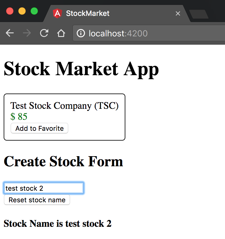
Figure 6-1. Angular template-driven form in action
When you remove just the value binding and run the application (ng serve, in case you forgot!), you will see that when you type into the text box, the value in the UI gets updated as you type. But when you click the Reset button, then while the header gets updated, the value in the text box does not. Thus, the component gets updated when the event happens, but because we don’t have the Component → UI binding, the UI doesn’t update if the component gets updated under the covers.
Similarly, we can turn off the input event binding. In this case, regardless of what we type in the text box, the underlying model does not get updated.
The combination of the two bindings is what gives us the look and feel of a two-way data binding.
ngModel
Of course, who among us remembers exactly which property is used by each form field? Who can remember what are the various events and where the values would be available? To simplify and abstract this particular information away for ease of use, Angular has the ngModel directive.
The ngModel directive and its special syntax abstracts away the internals of each and every input type from us developers, making it easier for us to quickly develop form-based applications. Let’s see how the code gets modified when we use ngModel instead of the input and value binding.
We will only modify the src/app/stock/create-stock/create-stock.component.html file as follows; the rest of the code remains the same:
<h2>Create Stock Form</h2><divclass="form-group"><form><divclass="stock-name"><inputtype="text"placeholder="Stock Name"name="stockName"[ngModel]="stock.name"(ngModelChange)="stock.name=$event"></div></form><button(click)="stock.name='test'">Reset stock name</button></div><h4>Stock Name is {{stock.name}}</h4>
Most of the HTML remains the same except for the following changes:
-
First, we added a name field to the input form element. This is necessary for the
ngModeldirective to work. If you remove this, you will see errors in the console. -
We added two bindings. The first one is
ngModeldata binding. This does the work of thevaluebinding we had previously, but abstracting out which property underneath needs to be bound. It points to the component member variable that it takes the value from. -
The second binding we added is the
ngModelChangeevent binding. In this, we update the underlying component member variable (stock.name) with the value of the$event, which is the changed value of the text field.
There is a simpler version of this, which is what we use in most normal cases, which is the [(ngModel)] banana-in-a-box syntax, as it is called. This encapsulates both of these statements into a single expression, like so:
<h2>Create Stock Form</h2><divclass="form-group"><form><divclass="stock-name"><inputtype="text"placeholder="Stock Name"name="stockName"[(ngModel)]="stock.name"></div></form><button(click)="stock.name='test'">Reset stock name</button></div><h4>Stock Name is {{stock.name}}</h4>
Why Is It Called Banana-in-a-Box?
When used together, a common confusion while using the ngModel directive could be the order of the types of parentheses, whether it is [()] or ([]). This is why the Angular team came up with a nickname to make it easy to remember. The () looks like a banana (yes, it’s a stretch, but roll with it!), and it is enclosed in a box []. Hence, the banana-in-a-box, which is [()].
In this, we replaced the two individual ngModel and ngModelChange bindings with the single banana-in-the-box [(ngModel)]. The end result will still be the same, as you should see the text value change as you type, as well as the value in the text box get reset when you press the Reset button.
When to Use the Expanded ngModel Variant
Given that we accomplished the same thing via both the expanded and the collapsed version of the ngModel syntax, is there a need for the expanded version at all?
The combined ngModel syntax only has the capability to set the data-bound property. If you need to do something more complicated (say convert the text into upper-case before setting the model variable), or set it in a different field itself (a calculated value maybe?), or do multiple things, then you might want to consider the expanded syntax. For all other needs, the banana-in-the-box combined syntax works great!
A Complete Form
Now that we have seen a basic form field, let’s extend this to a complete form that has different types of controls that are bound to our component along with handling submission of the form. We will continue building on the previous example, the code for which can be found in the chapter6/simple-ng-model folder in case you don’t have the codebase.
Let’s extend our example now to allow users to enter in the other information about a stock, including its code, price, and the exchange it is listed on. In addition, we will have a confirmation checkbox that needs to be checked before the form can be submitted. Finally, we will see how to handle the actual submission event.
First, we’ll add an additional field to our stock model (src/app/model/stock.ts), which we haven’t changed since the initial version, as follows:
exportclassStock{favorite=false;constructor(publicname:string,publiccode:string,publicprice:number,publicpreviousPrice:number,publicexchange:string){}isPositiveChange():boolean{returnthis.price>=this.previousPrice;}}
Next, let’s extend app/model/create-stock/create-stock.component.ts:
import{Component,OnInit}from'@angular/core';import{Stock}from'app/model/stock';@Component({selector:'app-create-stock',templateUrl:'./create-stock.component.html',styleUrls:['./create-stock.component.css']})exportclassCreateStockComponent{publicstock:Stock;publicconfirmed=false;constructor(){this.stock=newStock('test','',0,0,'NASDAQ');}setStockPrice(price){this.stock.price=price;this.stock.previousPrice=price;}createStock() {console.log('Creating stock ',this.stock);}}
We have added a few new pieces here, in particular:
-
We added to the stock initialization (an argument
'NASDAQ'in this case). -
We added
confirmed, abooleanmember variable, to the component class, with a default value offalse. -
We created a new function
setStockPrice, which takes a price and then sets both the current and previous price for thestock. -
Finally, we have a new
createStockmethod, which simply logs out the current stock variable to the console.
Now let’s see how these are used as we create and hook up the finished template for the form. We will change src/app/stock/create-stock/create-stock.component.html as follows :
<h2>Create Stock Form</h2><divclass="form-group"><form(ngSubmit)="createStock()"><divclass="stock-name"><inputtype="text"placeholder="Stock Name"name="stockName"[(ngModel)]="stock.name"></div><divclass="stock-code"><inputtype="text"placeholder="Stock Code"name="stockCode"[(ngModel)]="stock.code"></div><divclass="stock-code"><inputtype="number"placeholder="Stock Price"name="stockPrice"[ngModel]="stock.price"(ngModelChange)="setStockPrice($event)"></div><divclass="stock-exchange"><div><inputtype="radio"name="stockExchange"[(ngModel)]="stock.exchange"value="NYSE">NYSE</div><div><inputtype="radio"name="stockExchange"[(ngModel)]="stock.exchange"value="NASDAQ">NASDAQ</div><div><inputtype="radio"name="stockExchange"[(ngModel)]="stock.exchange"value="OTHER">OTHER</div></div><divclass="stock-confirm"><inputtype="checkbox"name="stockConfirm"[(ngModel)]="confirmed">I confirm that the information provided above is accurate!</div><button[disabled]="!confirmed"type="submit">Create</button></form></div><h4>Stock Name is {{stock | json}}</h4>
Handling the form submission via the
ngSubmitevent handler
Expanded version of
ngModelto handle setting both current and previous price
Handling radio buttons through
ngModel
Handling checkboxes through
ngModel
Disabling the form while the checkbox is unchecked
In the template, we have added a whole new set of form fields, from input boxes for stock code and price, to radio buttons to select the exchange and a checkbox to confirm if the data is correct. Let’s go through this step by step:
-
For the stock code, it remains similar to the stock name which we had. Nothing different other than, of course, the target variable.
-
For the stock price, we are using the expanded version of the
ngModelsyntax. This is because while we want the value in the text box to come fromstock.price, when the user sets it, we want both thepriceand thepreviousPriceto be set through the methodsetStockPrice. -
Next, we have a set of radio buttons that we are using to set the exchange. Each radio button has the same name (which is the standard HTML way of creating a radio group), and are bound to the same model variable (
stock.exchange) usingngModel. The value for each radio button is what defines what the value in thestock.exchangevariable is, and similarly, the value in thestock.exchangevariable defines which of the radio buttons are selected. -
We then have a checkbox, which is bound to the variable
confirmedon the component class. Since it is a checkbox, toggling the checkbox on and off sets the value of the variableconfirmedtotrueandfalse, respectively. -
Finally, we have a
buttonof typesubmit. This is only enabled when theconfirmedboolean is set totrue. On clicking this, it triggers a formsubmit, which is then intercepted by ourngSubmitevent handler at the form level. This will then trigger thecreateStockmethod on our component class.
Once you run this, you should see something like Figure 6-2 on your screen.
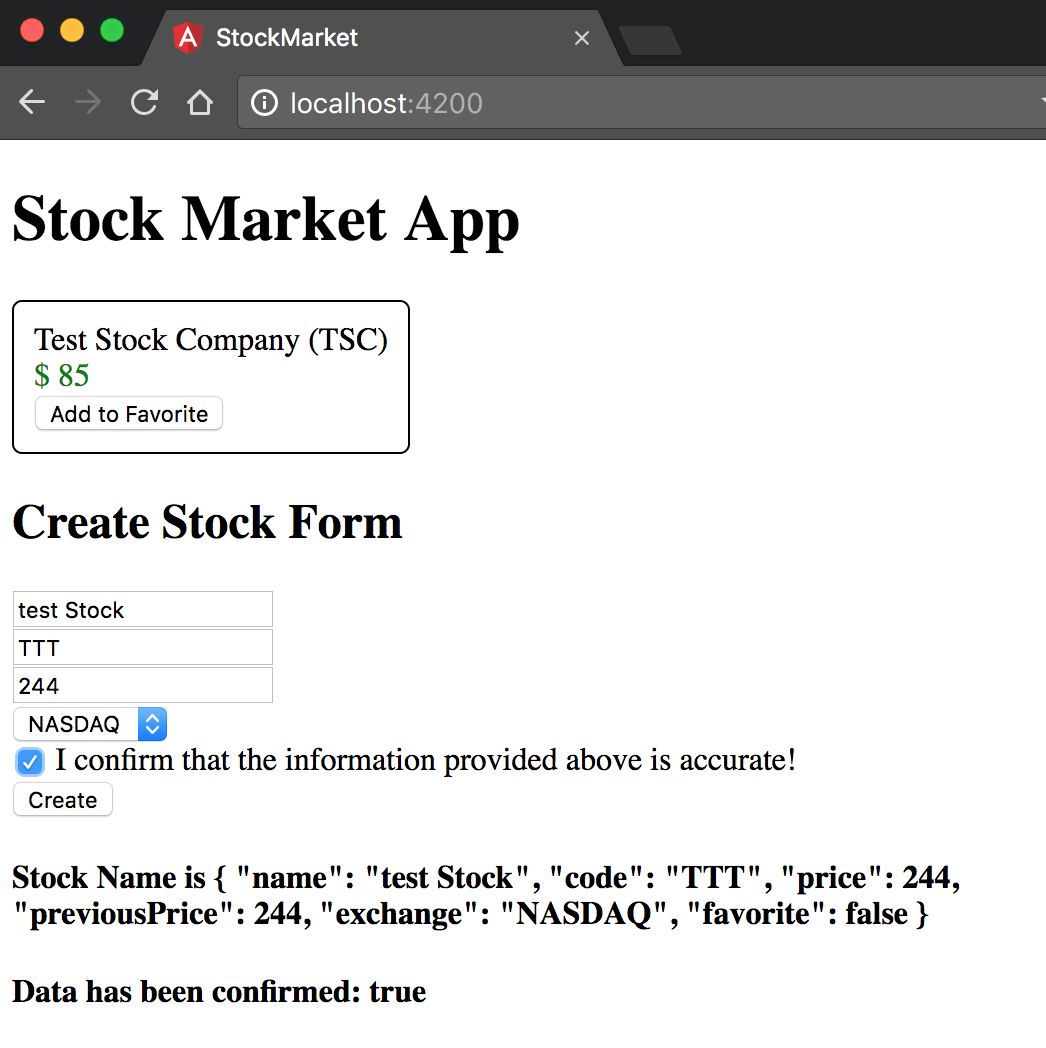
Figure 6-2. Angular form with data binding
We thus have a very simple form that handles different kinds of form elements and binds the value to the component, allowing us to get to the user input once he submits the form. To be fair, we haven’t handled any errors or requirements on the form, which we will do shortly in the next section.
What about SELECT Boxes?
One type of input we didn’t cover in the preceding example was a select drop-down/combo box. But we could have used it instead of the radio buttons, if we felt like it. How would our example have changed? We currently have the following HTML template code for displaying our radio buttons:
<inputtype="radio"name="stockExchange"[(ngModel)]="stock.exchange"value="NYSE">NYSE<inputtype="radio"name="stockExchange"[(ngModel)]="stock.exchange"value="NASDAQ">NASDAQ<inputtype="radio"name="stockExchange"[(ngModel)]="stock.exchange"value="OTHER">OTHER
We can replace this with a simple select HTML template as follows:
<selectname="stockExchange"[(ngModel)]="stock.exchange"><optionvalue="NYSE">NYSE</option><optionvalue="NASDAQ">NASDAQ</option><optionvalue="OTHER">OTHER</option></select>
Again, very similar to the other form elements, as long as we have a name and the ngModel directive, Angular internally handles the data binding for us. We could very easily replace the individual option tags with a single option tag and use ngFor to programmatically generate a list of options as well. In those cases, assuming our component has the following code in it:
publicexchanges=['NYSE','NASDAQ','OTHER'];
Then we could replace our template code to be as simple as:
<selectname="stockExchange"[(ngModel)]="stock.exchange"><option*ngFor="let exchange of exchanges"[ngValue]="exchange">{{exchange}}</option></select>
Note the *ngFor loop, and the usage of ngValue to ensure that the current value is used instead of a hardcoded value.
Control State
Angular form validation for template-driven forms relies and extends the native form validation from HTML. Thus, you can simply use most of the constraints that you already know and love out of the box, and they should work directly and cleanly with an Angular form. That said, Angular does the work of integrating these control states and validations with its own internal model (whether it is ngModel or ngForm), and it is up to us to use this internal model to then show the right kind of message to the user.
There are two aspects to this:
-
The state, which allows us to peek into the state of the form control, on whether the user has visited it, whether the user has changed it, and finally whether it is in a valid state.
-
The validity, which tells us whether a form control is valid or not, and if it is not valid, the underlying reason (or reasons) for which the form element is invalid.
Let’s first see how state is made available to us and how we can use it. The ngModel directive changes and adds CSS classes to the element it is on, based on the user’s interaction with it. There are three primary modes of interaction that it tracks, and two CSS classes per mode of interation associated with it. They are:
| Control state | CSS class if True | CSS class if False |
|---|---|---|
Visited |
|
|
Changed |
|
|
Valid |
|
|
In particular, these states allow you to present different experiences or views to users under various scenarios. We can use the code from the previous section as a base to work off, in case you are not coding along. The starting code can be found in chapter6/template-driven/full-form, which holds the completed code from the previous section.
Now, to use these control state classes, we actually don’t need to make any component class code changes. We only need to tweak the CSS a bit and then leverage that in the HTML template for the component.
Let’s first add the following CSS class definitions to the src/app/stock/create-stock/create-stock.component.css file:
.stock-name.ng-valid,.stock-code.ng-pristine,.stock-price.ng-untouched{background-color:green;}.stock-name.ng-invalid,.stock-code.ng-dirty,.stock-price.ng-touched{background-color:pink;}
Now, we will make minor tweaks (which are more for highlighting different elements rather than any functional changes) to the template HTML in src/app/stock/create-stock/create-stock.component.html:
<h2>Create Stock Form</h2><divclass="form-group"><form(ngSubmit)="createStock()"><div>The following element changes from green to red when it is invalid</div><divclass="stock-name"><inputtype="text"placeholder="Stock Name"requiredname="stockName"[(ngModel)]="stock.name"></div><div>The following element changes from green to red when it has been modified</div><divclass="stock-code"><inputtype="text"placeholder="Stock Code"name="stockCode"[(ngModel)]="stock.code"></div><div>The following element changes from green to red when it is visited by the user, regardless of change</div><divclass="stock-price"><inputtype="number"placeholder="Stock Price"name="stockPrice"[ngModel]="stock.price"(ngModelChange)="setStockPrice($event)"></div><divclass="stock-exchange"><div><selectname="stockExchange"[(ngModel)]="stock.exchange"><option*ngFor="let exchange of exchanges"[ngValue]="exchange">{{exchange}}</option></select></div></div><divclass="stock-confirm"><inputtype="checkbox"name="stockConfirm"[(ngModel)]="confirmed">I confirm that the information provided above is accurate!</div><button[disabled]="!confirmed"type="submit">Create</button></form></div><h4>Stock Name is {{stock | json}}</h4><h4>Data has been confirmed: {{confirmed}}</h4>
Adding a required attribute to the stock name
The only change we did to our component HTML is to make the stock name a required field. Angular’s Form Module is responsible for reading it and applying the form control state classes accordingly, without any other work on our side.
With these two changes, we now have an application that:
-
For the stock name, when it is valid (the class
ng-valid), we make the background color of the text box green, and when it is invalid (the classng-invalid), we change the background color of the text box to be pink. -
For the stock code, when the user has not made any changes to the field (the class
ng-pristine), we make the background color of the text box green, and whenever the user makes any change (the classng-dirty), regardless of whether he reverts the change or not, we change the background color of the text box to pink. -
Finally, for the stock price, the background color remains green as long as the field is not interacted with (the class
ng-untouched), and changes to pink as soon as the user interacts and then leaves it (the classng-touched). Note that the color remains green while the user is interacting/typing on it, and only changes once he moves away from it.
You can test it, of course, by:
-
Removing the default name of the stock (the background color should toggle from green to pink when there is no text in the field)
-
Typing any character in the stock code field (the background color should toggle from green to pink when you do)
-
Focusing and navigating away from the stock price field (the background color should toggle from green to pink when you do)
The end result if you do these actions in order is a screen that looks something like the image in Figure 6-3.
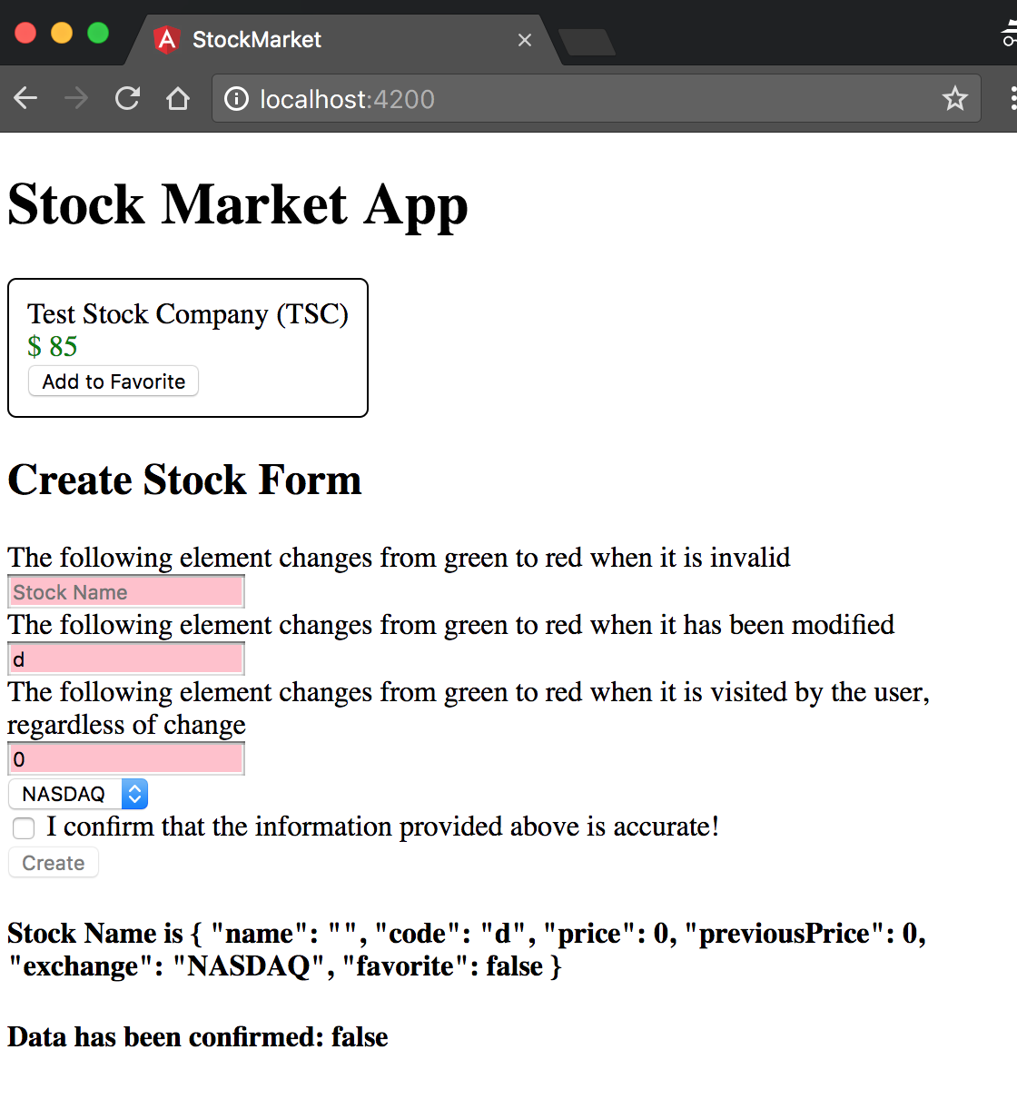
Figure 6-3. Angular form with control state bindings
Control Validity
Next, let’s take a look at how we can leverage the HTML form validation to create nice, meaningful errors for our users. We won’t get into custom validations just yet in this chapter, but will cover how to use multiple validations on the same elements, and how to display error messages for the same.
Internally, Angular has its own set of validators. These mirror the HTML Form validators that are then used to drive a similar behavior in the context of an Angular application. Once you add any validators to your form elements, Angular will take care of running them every time any of the form control changes. This would then be reflected at each control level, as well as at an aggregate level at the form.
Before we dig into this, you can take a look at the following sidebar to get a brief understanding of template reference variables, which are a major workhorse in how we execute and work with form control validity.
Once you have looked through the sidebar note, we’ll dig into how we can accomplish simple error handling via our template-driven forms. In case you are not coding along, you can use the codebase from the previous section (which is located in chapter6/template-driven/control-state) as a base.
We will undo some of the changes from the previous section and now focus purely on form validation. First, let’s change our CSS to reflect all invalid form controls with a pink background, by editing the src/app/stock/create-stock/create-stock.component.css file as follows:
.stock-name.ng-valid,.stock-code.ng-valid,.stock-price.ng-valid{background-color:green;}.stock-name.ng-invalid,.stock-code.ng-invalid,.stock-price.ng-invalid{background-color:pink;}
Next, we will make minor changes to the component class (src/app/stock/create-stock/create-stock.component.ts), simply to log out different values under certain conditions as follows:
import{Component,OnInit}from'@angular/core';import{Stock}from'app/model/stock';@Component({selector:'app-create-stock',templateUrl:'./create-stock.component.html',styleUrls:['./create-stock.component.css']})exportclassCreateStockComponent{publicstock:Stock;publicconfirmed=false;publicexchanges=['NYSE','NASDAQ','OTHER'];constructor(){this.stock=newStock('','',0,0,'NASDAQ');}setStockPrice(price){this.stock.price=price;this.stock.previousPrice=price;}createStock(stockForm){console.log('Stock form',stockForm);if(stockForm.valid){console.log('Creating stock ',this.stock);}else{console.error('Stock form is in an invalid state');}}}
We have made minor changes only to the createStock method:
-
We have now started taking the
stockFormas an argument to the function. This is thengFormobject representing the form we have in our template, including all its controls and states. We are also logging this out to the web console. -
We are checking if the form is valid using this passed-in object, and then only proceeding to create the stock (for what it’s worth, logging it out at this point).
-
We have also changed the constructor to initialize the stock with an empty name, unlike before.
Next, let’s see the changes made to the template in src/app/stock/create-stock/create-stock.component.html:
<h2>Create Stock Form</h2><divclass="form-group"><form(ngSubmit)="createStock(stockForm)"#stockForm="ngForm"><divclass="stock-name"><inputtype="text"placeholder="Stock Name"requiredname="stockName"#stockName="ngModel"[(ngModel)]="stock.name"></div><div*ngIf="stockName.errors && stockName.errors.required">Stock Name is Mandatory</div><divclass="stock-code"><inputtype="text"placeholder="Stock Code"requiredminlength="2"name="stockCode"#stockCode="ngModel"[(ngModel)]="stock.code"></div><div*ngIf="stockCode.dirty && stockCode.invalid"><div*ngIf="stockCode.errors.required">Stock Code is Mandatory</div><div*ngIf="stockCode.errors.minlength">Stock Code must be atleast of length 2</div></div><divclass="stock-price"><inputtype="number"placeholder="Stock Price"name="stockPrice"required#stockPrice="ngModel"[ngModel]="stock.price"(ngModelChange)="setStockPrice($event)"></div><div*ngIf="stockPrice.dirty && stockPrice.invalid"><div*ngIf="stockPrice.errors.required">Stock Price is Mandatory</div></div><divclass="stock-exchange"><div><selectname="stockExchange"[(ngModel)]="stock.exchange"><option*ngFor="let exchange of exchanges"[ngValue]="exchange">{{exchange}}</option></select></div></div><divclass="stock-confirm"><inputtype="checkbox"name="stockConfirm"required[(ngModel)]="confirmed">I confirm that the information provided above is accurate!</div><buttontype="submit">Create</button></form></div><h4>Stock Name is {{stock | json}}</h4><h4>Data has been confirmed: {{confirmed}}</h4>
Template reference variable
stockFormto work at the form model levelTemplate reference variable
stockNameto expose the namengModelCheck on the template reference variable for errors and presence
Template reference variable
stockCodeto expose the codengModelCheck on the
stockCodetemplate reference variable for dirty and invalid form controls
Check on the
stockCodefor errors
Template reference variable
stockPriceto expose the codengModel
Most of the template remains the same, but there are a few items worth calling out:
-
We added a template reference variable at the form level, and at each control level. The form-level template reference variable (
stockForm) gets theNgFormmodel object bound to it, which allows us to check on things like form and control validity and values through it. -
We added template reference variables (
stockName,stockPrice,stockCode) on each of the text boxes, and assigned theNgModelmodel object to it. This allows us to check the form field for all the control states that we were previously using through CSS classes (dirty/pristine, valid/invalid, and touched/untouched), in addition to errors. -
For the first form field (stock name), we added a div to show the error message that it is required, if the error exists.
-
For the second and third field messages, we enclosed the error message within another div, which first checks if the form field is dirty and invalid before looking for a particular error message.
-
On form submit we pass the
stockFormtemplate reference variable, which points to the form model, to thecreateStockmethod. This is another capability of template reference variables: you can pass them in as arguments to your component class.
This completed code is available in the chapter6/template-driven/control-validity folder. When you run this application, you should see something like Figure 6-4.
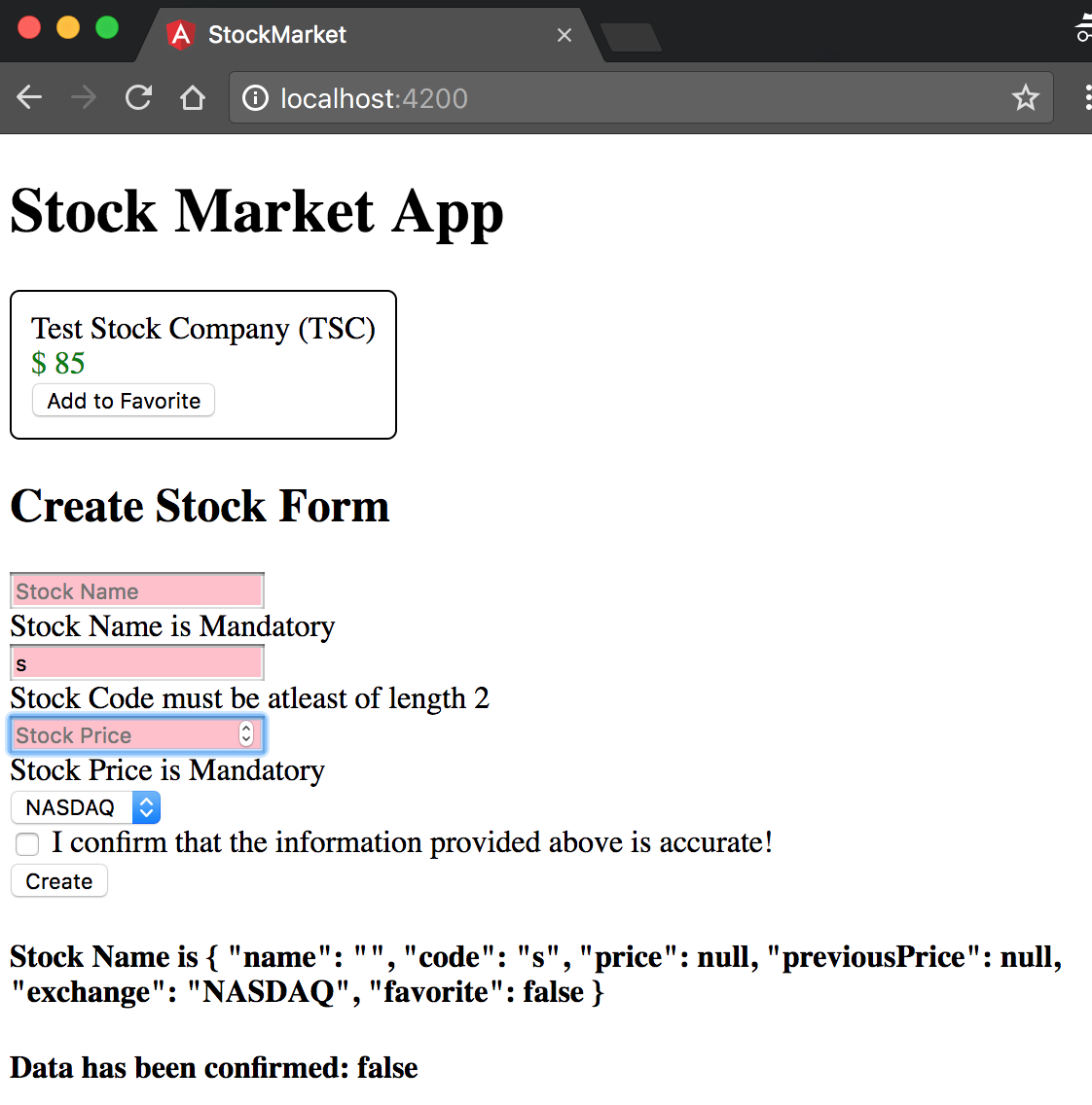
Figure 6-4. Angular form with form validity checks
A few interesting things worth noting:
-
Notice that the error message for the stock name is displayed by default, but the error message that the price and code are required is only displayed after we touch the field. This is the advantage of wrapping the error message under the control state (dirty and invalid). Otherwise, the field is invalid by default (because it is empty).
-
Most of the default validators (
required,minlength,maxlength) will add a corresponding entry on the errors field on the template reference variable, which you can use to display a relevant message. -
Note that for the stock price, the
minlengthandrequiredvalidators are not shown simultaneously. This is handled by the Angular built-in validators, but you need to be aware and handle multiple validators having errors simultaneously, and decide and show messages conditionally. -
Finally, we pass the
stockFormtemplate reference variable to thecreateStockmethod in the component class. This actually gives us access to the individual controls, as well as the value of the form model. We can use this (or similar template reference variables) to, for example, start showing error messages only after the first submit, instead of, say, as soon as the user types.
Thus, between the template reference variables and the validators, you get utmost control in how and when you want to show your validation messages. You can choose to do it completely in the template, or choose to have them in the template, but decide when and how to show them from your component class, or go to the extreme of creating your validation messages and drive it completely from your component class. It would be up to you which of the approaches you choose, as Angular gives you the tools and the complete flexibility to choose.
Working with FormGroups
Before we finish with this chapter, we will quickly introduce another method of working with template-driven forms and the ngModel directive. So far, we have been declaring a member variable in our component, and then using ngModel to bind to it. We can instead let the form model drive the entire form, and copy over or use the values from it once the form has been submitted.
We can use the same codebase from the previous section (chapter6/template-driven/control-validity) as the base to work off of.
Let’s first modify the CreateStockComponent class with minor changes to take the model value from the form instead of relying on it being updated via data binding:
import{Component,OnInit}from'@angular/core';import{Stock}from'app/model/stock';@Component({selector:'app-create-stock',templateUrl:'./create-stock.component.html',styleUrls:['./create-stock.component.css']})exportclassCreateStockComponent{publicstock:Stock;publicconfirmed=false;publicexchanges=['NYSE','NASDAQ','OTHER'];constructor(){this.stock=newStock('','',0,0,'NASDAQ');}createStock(stockForm){console.log('Stock form',stockForm.value);if(stockForm.valid){this.stock=stockForm.value.stock;console.log('Creating stock ',this.stock);}else{console.error('Stock form is in an invalid state');}}}
We have changed the createStock method, to copy over the stock object from the form value field. We have also dropped the setStockPrice method as we won’t be using it. Now, let’s take a look at the changes needed in the template to be able to support this:
<h2>Create Stock Form</h2><divclass="form-group"><form(ngSubmit)="createStock(stockForm)"#stockForm="ngForm"><divngModelGroup="stock"><divclass="stock-name"><inputtype="text"placeholder="Stock Name"requiredname="name"ngModel></div><divclass="stock-code"><inputtype="text"placeholder="Stock Code"requiredminlength="2"name="code"ngModel></div><divclass="stock-price"><inputtype="number"placeholder="Stock Price"name="price"requiredngModel></div><divclass="stock-exchange"><div><selectname="exchange"ngModel><option*ngFor="let exchange of exchanges"[ngValue]="exchange">{{exchange}}</option></select></div></div></div><buttontype="submit">Create</button></form></div><h4>Stock Name is {{stock | json}}</h4><h4>Data has been confirmed: {{confirmed}}</h4>
We have temporarily removed all validators, so as to not distract us from the core change. The major changes are as follows:
-
We have removed the banana-in-a-box syntax from all the
ngModelbindings, and just kept it as an attribute. When we usengModellike this, Angular uses the name field on the form element as the model name and creates a model object corresponding to it on the form. -
We have surrounded the form fields with another
div, and used an Angular directive calledngModelGroupon it, providing it a name (stockin this case). What this does is group the form elements, thus creating the name, price, code, and exchange fields as models under the common name stock. This is visible in the component when we access this entire set of values throughform.value.stock.
We can similarly create multiple form groups and use ngModel directly, and then finally copy over the entire values to a common field (or not copy it over at all) in our component on form submit. This is another way we can use ngModel and template-driven forms in our applications. The finished code for this is available in the chapter6/template-driven/form-groups/ folder in the GitHub repository.
Conclusion
In this chapter, we started exploring how to handle user input through the use of forms. In particular, we took a deep dive into how to create and work with template-driven forms, and leverage ngModel for two-way data binding. We further saw what control states Angular provides out of the box and how to leverage that as well as show and deal with validations and error messages.
In the next chapter, we will look at a different way of approaching this: reactive forms. We will discuss how to use reactive forms but will first review the ways they differ from template-driven forms and why you might choose one over the other.
Exercise
Take the finished exercise from the previous chapter (available in chapter5/exercise/ecommerce). Do the following:
-
Create a new component that allows us to add new products.
-
Create a form that takes in the product name, price, image URL, and whether or not it is on sale. Try to use the form groups approach rather than two-way binding through
ngModel. -
Make all the fields required, and see if you can add a basic Regex pattern validation for the image URL.
-
Display relevant error messages, but only after the user either edits the field or after the first submit.
-
Copy over the form and print it to the console after successful submission.
All of this can be accomplished using concepts covered in this chapter. You can check out the finished solution in chapter6/exercise/ecommerce.