Table of Contents for
Angular: Up and Running
 Angular: Up and Running
Published by
O'Reilly Media, Inc., 2018
Angular: Up and Running
Published by
O'Reilly Media, Inc., 2018
- Cover
- nav
- Angular: Up and Running
- Angular: Up and Running
- Introduction
- 1. Introducing Angular
- 2. Hello Angular
- 3. Useful Built-In Angular Directives
- 4. Understanding and Using Angular Components
- 5. Testing Angular Components
- 6. Working with Template-Driven Forms
- 7. Working with Reactive Forms
- 8. Angular Services
- 9. Making HTTP Calls in Angular
- 10. Unit Testing Services
- 11. Routing in Angular
- 12. Productionizing an Angular App
- Index
- About the Author
- Colophon
Chapter 2. Hello Angular
In the previous chapter, we got a very quick overview of Angular and its features, as well as a step-by-step guide on how to set up our local environment for developing any Angular application. In this chapter, we will go through the various parts of an Angular application by creating a very simple application from scratch. Through the use of this application, we will cover some of the basic terminologies and concepts like modules, components, data and event binding, and passing data to and from components.
We will start with a very simple stock market application, which allows us to see a list of stocks, each with its own name, stock code, and price. During the course of this chapter, we will see how to package rendering a stock into an individual, reusable component, and how to work with Angular event and data binding.
Starting Your First Angular Project
As mentioned in the previous chapter, we will heavily rely on the Angular CLI to help us bootstrap and develop our application. I will assume that you have already followed the initial setup instructions in the previous chapter and have Node.js, TypeScript, and the Angular CLI installed in your development environment.
Creating a new application is as simple as running the following command:
ng new stock-market
When you run this command, it will automatically generate a skeleton application under the folder stock-market with a bunch of files, and install all the necessary dependencies for the Angular application to work. This might take a while, but eventually, you should see the following line in your terminal:
Project 'stock-market' successfully created.
Congratulations, you have just created your first Angular application!
Tip
While we created our first application with the vanilla Angular CLI command, the ng new command takes a few arguments that allow you to customize the application generated to your preference. These include:
-
Whether you want to use vanilla CSS or SCSS or any other CSS framework (for example,
ng new --style=scss) -
Whether you want to generate a routing module (for example,
ng new --routing); we’ll discuss this further in Chapter 11. -
Whether you want a common prefix to all components (for example, to prefix
acmeto all components,ng new --prefix=acme)
And much more. It’s worth exploring these options by running ng help once you are a bit more familiar with the Angular framework to decide if you have specific preferences one way or the other.
Understanding the Angular CLI
While we have just created our first Angular application, the Angular CLI does a bit more than just the initial skeleton creation. In fact, it is useful throughout the development process for a variety of tasks, including:
-
Bootstrapping your application
-
Serving the application
-
Running the tests (both unit and end-to-end)
-
Creating a build for distribution
-
Generating new components, services, routes and more for your application
Each of these corresponds to one or more Angular CLI commands, and we will cover each one as and when we need or encounter them, instead of trying to cover each command and its uses upfront. Each command provides further flexibility with a variety of arguments and options, making the Angular CLI truly diverse and capable for a wide variety of uses.
Running the Application
Now that we have generated our application, the next part is to run it so that we can see our live running application in the browser. There are technically two ways to run it:
-
Running it in development mode, where the Angular CLI compiles the changes as it happens and refreshes our UI
-
Running it in production mode, with an optimal compiled build, served via static files
For now, we will run it in development mode, which is as simple as running
ng serve
from the root folder of the generated project, which is the stock-market folder in this case. After a little bit of processing and compilation, you should see something like the following in your terminal:
** NG Live Development Server is listening on localhost:4200,
   open your browser on http://localhost:4200/ **
Date: 2018-03-26T10:09:18.869Z
Hash: 0b730a52f97909e2d43a
Time: 11086ms
chunk {inline} inline.bundle.js (inline) 3.85 kB [entry] [rendered]
chunk {main} main.bundle.js (main) 17.9 kB [initial] [rendered]
chunk {polyfills} polyfills.bundle.js (polyfills) 549 kB [initial] [rendered]
chunk {styles} styles.bundle.js (styles) 41.5 kB [initial] [rendered]
chunk {vendor} vendor.bundle.js (vendor) 7.42 MB [initial] [rendered]

webpack: Compiled successfully.
The preceding output is a snapshot of all the files that the Angular CLI generates in order for your Angular application to be served successfully. It includes the main.bundle.js, which is the transpiled code that is specific to your application, and the vendor.bundle.js, which includes all the third-party libraries and frameworks you depend on (including Angular). styles.bundle.js is a compilation of all the CSS styles that are needed for your application, while polyfills.bundle.js includes all the polyfills needed for supporting some capabilities in older browsers (like advanced ECMAScript features not yet available in all browsers). Finally, inline.bundle.js is a tiny file with webpack utilities and loaders that is needed for bootstrapping the application.
ng serve starts a local development server on port 4200 for you to hit from your browser. Opening http://localhost:4200 in your browser should result in you seeing the live running Angular application, which should look like Figure 2-1.
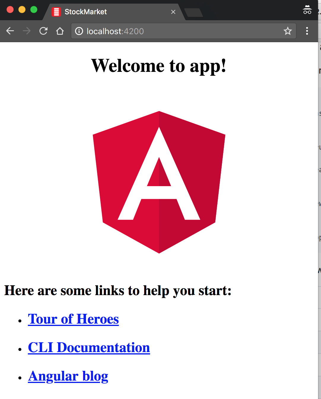
Figure 2-1. Hello Angular application in the browser
Tip
You can actually leave the ng serve command running in the terminal, and continue making changes. If you have the application opened in your browser, it will automatically refresh each time you save your changes. This makes the development quick and iterative.
In the following section, we will go into a bit more detail about what exactly happened under the covers to see how the generated Angular application works and what the various pieces are.
Basics of an Angular Application
At its core, any Angular application is still a Single-Page Application (SPA), and thus its loading is triggered by a main request to the server. When we open any URL in our browser, the very first request is made to our server (which is running within ng serve in this case). This initial request is satisfied by an HTML page, which then loads the necessary JavaScript files to load both Angular as well as our application code and templates.
One thing to note is that although we develop our Angular application in TypeScript, the web application works with transpiled JavaScript. The ng serve command is responsible for translating our TypeScript code into JavaScript for the browser to load.
If we look at the structure the Angular CLI has generated, it is something like this:
stock-market
+----e2e
+----src
+----app
+----app.component.css
+----app.component.html
+----app.component.spec.ts
+----app.component.ts  +----app.module.ts
  +----assets
+----environments
+----index.html
+----assets
+----environments
+----index.html  +----main.ts
  +----.angular-cli.json
Root component
Main module
Root HTML
Entry point
Angular CLI config
There are a few more files than listed here in the stock-market folder, but these are the major ones we are going to focus on in this chapter. In addition, there are unit tests, end-to-end (e2e) tests, the assets that support our application, configuration specific to various environments (dev, prod, etc.), and other general configuration that we will touch upon in Chapters 5, 10, and 12.
Root HTML—index.html
If you take a look at the index.html file, which is in the src folder, you will notice that it looks very clean and pristine, with no references to any scripts or dependencies:
<!doctype html><htmllang="en"><head><metacharset="utf-8"><title>StockMarket</title><basehref="/"><metaname="viewport"content="width=device-width, initial-scale=1"><linkrel="icon"type="image/x-icon"href="favicon.ico"></head><body><app-root></app-root></body></html>
Root component for our Angular application
The only thing of note in the preceding code is the <app-root> element in the HTML, which is the marker for loading our application code.
What about the part that loads the core Angular scripts and our application code? That is inserted dynamically at runtime by the ng serve command, which combines all the vendor libraries, our application code, the styles, and inline templates each into individual bundles and injects them into index.html to be loaded as soon as the page renders in our browser.
The Entry Point—main.ts
The second important part of our bootstrapping piece is the main.ts file. The index.html file is responsible for deciding which files are to be loaded. The main.ts file, on the other hand, identifies which Angular module (which we will talk a bit more about in the following section) is to be loaded when the application starts. It can also change application-level configuration (like turning off framework-level asserts and verifications using the enableProdMode() flag), which we will cover in Chapter 12:
import{enableProdMode}from'@angular/core';import{platformBrowserDynamic}from'@angular/platform-browser-dynamic';import{AppModule}from'./app/app.module';import{environment}from'./environments/environment';if(environment.production){enableProdMode();}platformBrowserDynamic().bootstrapModule(AppModule).catch(err=>console.log(err));
Bootstrap the main
AppModule
Most of the code in the main.ts file is generic, and you will rarely have to touch or change this entry point file. Its main aim is to point the Angular framework at the core module of your application and let it trigger the rest of your application source code from that point.
Main Module—app.module.ts
This is where your application-specific source code starts from. The application module file can be thought of as the core configuration of your application, from loading all the relevant and necessary dependencies, declaring which components will be used within your application, to marking which is the main entry point component of your application:
import{BrowserModule}from'@angular/platform-browser';import{NgModule}from'@angular/core';import{AppComponent}from'./app.component';@NgModule({declarations:[AppComponent],imports:[BrowserModule],providers:[],bootstrap:[AppComponent]})exportclassAppModule{}
NgModuleTypeScript annotation to mark this class definition as an Angular moduleDeclarations marking out which components and directives can be used within the application
Importing other modules that provide functionality needed in the application
The entry point component for starting the application
Tip
This is our first time dealing with a TypeScript-specific feature, which are decorators (you can think of them as annotations). Decorators allow us to decorate classes with annotations and properties as well as meta-functionality.
Angular heavily leverages this TypeScript feature across the board, such as using decorators for modules, components, and more.
You can read more about TypeScript decorators in the official documentation.
We will go over the details of each of these sections in the following chapters, but at its core:
declarations-
The
declarationsblock defines all the components that are allowed to be used in the scope of the HTML within this module. Any component that you create must be declared before it can be used. imports-
You will not create each and every functionality used in the application, and the
importsarray allows you to import other Angular application and library modules and thus leverage the components, services, and other capabilities that have already been created in those modules. bootstrap-
The
bootstraparray defines the component that acts as the entry point to your application. If the main component is not added here, your application will not kick-start, as Angular will not know what elements to look for in your index.html.
You usually end up needing (if you are not using the CLI for any reason!) to modify this file if and only if you add new components, services, or add/integrate with new libraries and modules.
Root Component—AppComponent
We finally get to the actual Angular code that drives the functionality of the application, and in this case, it is the main (and only) component we have, the AppComponent. The code for it looks something like this:
import{Component}from'@angular/core';@Component({selector:'app-root',templateUrl:'./app.component.html',styleUrls:['./app.component.css']})exportclassAppComponent{title='app';}
The DOM selector that gets translated into an instance of this component
The HTML template backing this component—in this case, the URL to it
Any component-specific styling, again pointing to a separate file in this case
The component class with its own members and functions
A component in Angular is nothing but a TypeScript class, decorated with some attributes and metadata. The class encapsulates all the data and functionality of the component, while the decorator specifies how it translates into the HTML.
The app-selector is a CSS selector that identifies how Angular finds this particular component in any HTML page. While we generally use element selectors (app-root in the preceding example, which translates to looking for <app-root> elements in the HTML), they can be any CSS selector, from a CSS class to an attribute as well.
The templateUrl is the path to the HTML used to render this component. We can also use inline templates instead of specifying a templateUrl like we have done in the example. In this particular case, the template we are referring to is app.component.html.
styleUrls is the styling counterpart to the template, encapsulating all the styles for this component. Angular ensures that the styles are encapsulated, so you don’t have to worry about your CSS classes from one component affecting another. Unlike templateUrl, styleUrls is an array.
The component class itself finally encapsulates all the functionality backing your component. It makes it easy to think of the responsibilities of the component class as twofold:
-
Load and hold all the data necessary for rendering the component
-
Handle and process any events that may arise from any element in the component
The data in the class will drive what can be displayed as part of the component. So let’s take a look at what the template for this component looks like:
<h1>{{title}}</h1>
Data-bound title from the component
Our HTML is as simple as can be for the component. All it has is one element, which is data-bound to a field in our component class. The double-curly ({{ }}) syntax is an indication to Angular to replace the value between the braces with the value of the variable from the corresponding class.
In this case, once the application loads, and the component is rendered, the {{title}} will be replaced with the text app works!. We will talk in more detail about data binding in “Understanding Data Binding”.
Creating a Component
So far, we have dealt with the basic skeleton code that the Angular CLI has generated for us. Let’s now look at adding new components, and what that entails. We will use the Angular CLI to generate a new component, but look underneath the covers to see what steps it takes. We will then walk through some very basic common tasks we try to accomplish with components.
Steps in Creating New Components
Using the Angular CLI, creating a new component is simply running a simple command. We will first try creating a stock widget, which displays the name of the stock, its stock code, the current price, and whether it has changed for the positive or negative.
We can simply create a new stock-item by running the following command from the main folder of the application:
ng generate component stock/stock-item
There are a few interesting things to note here:
-
The Angular CLI has a command called
generate, which can be used to generate components (like we did in the preceding example), and also to generate other Angular elements, such as interfaces, services, modules, and more. -
With the target type, we also specify the name (and the folder) within which the component has to be generated. Here, we are telling the Angular CLI to generate a component called
stock-itemwithin a folder called stock. If we don’t specifystock, it will create a component calledstock-itemin the app folder itself.
The command will generate all the relevant files for a new component, including:
-
The component definition (named stock-item.component.ts)
-
The corresponding template definition (named stock-item.component.html)
-
The styles for the component (in a file named stock-item.component.css)
-
The skeleton unit tests for the component (named stock-item.component.spec.ts)
In addition, it updated the original app module that we saw earlier so that our Angular application recognizes the new module.
This is the recommended convention to follow whenever you are working with components:
-
The filename starts with the name of the item you are creating
-
This is followed by the type of element it is (in this case, a component)
-
Finally, we have the relevant extension
This allows us to both group and easily identify relevant and related files in a simple manner.
When you run the command, you should see something like this:
  create src/app/stock/stock-item/stock-item.component.css
  create src/app/stock/stock-item/stock-item.component.html
  create src/app/stock/stock-item/stock-item.component.spec.ts
  create src/app/stock/stock-item/stock-item.component.ts
  update src/app/app.module.ts
The source for the component, HTML, and the CSS remain pretty much barebones, so I won’t repeat that here. What is important is how this new component that we create is hooked up and made available to our Angular application. Let’s take a look at the modified app.module.ts file:
import{BrowserModule}from'@angular/platform-browser';import{NgModule}from'@angular/core';import{AppComponent}from'./app.component';import{StockItemComponent}from'./stock/stock-item/stock-item.component';@NgModule({declarations:[AppComponent,StockItemComponent],imports:[BrowserModule],providers:[],bootstrap:[AppComponent]})exportclassAppModule{}
Importing the newly created
stock-itemcomponentAdding the new component to the
declarationssection
In the application module, we have to ensure that the new component is imported and added to the declarations array, before we can start using it in our Angular application.
Using Our New Component
Now that we have created a new component, let’s see how we can use it in our application. We will now try to use this skeleton in the app component. First, take a look at the generated stock-item.component.ts file:
import{Component,OnInit}from'@angular/core';@Component({selector:'app-stock-item',templateUrl:'./stock-item.component.html',styleUrls:['./stock-item.component.css']})exportclassStockItemComponentimplementsOnInit{constructor(){}ngOnInit() {}}
The selector for using this component. Note it is prefixed with
app, which is added by the Angular CLI by default unless otherwise specified.
The component has no data and does not provide any functionality at this point; it simply renders the template associated with it. The template at this point is also trivial, and just prints out a static message.
To use this component in our application, we can simply create an element that matches the selector defined anywhere inside our main app component. If we had more components and a deeper hierarchy of components, we could choose to use it in any of their templates as well. So let’s replace most of the placeholder content in app.component.html with the following, so that we can render the stock-item component:
<divstyle="text-align:center"><h1>Welcome to {{ title }}!</h1><app-stock-item></app-stock-item></div>
Adding our
stock-itemcomponent
All it takes is adding the <app-stock-item></app-stock-item> to our app.component.html file to use our component. We simply create an element using the selector we defined in our component. Then when the application loads, Angular recognizes that the element refers to a component, and triggers the relevant code path.
When you run this (or if your ng serve is still running), you should see both the original "app works" along with a new "stock-item works" in the UI.
Understanding Data Binding
Next, let’s focus on getting some data and figuring out how to display it as part of our component. What we are trying to build is a stock widget, which will take some stock information, and render it accordingly.
Let’s assume that we have a stock for a company named Test Stock Company, with a stock code of TSC. Its current price is $85, while the previous price it traded at was $80. In the widget, we want to show both the name and its code, as well as the current price, the percentage change since last time, and highlight the price and percentage change in green if it is an increment, or red if it is a decrement.
Let’s walk through this step by step. First, we will make sure we can display the name and code in the widget (we will hardcode the information for now, and we will build up the example to get the data from a different source later).
We would change our component code (the stock-item.component.ts file) as follows:
import{Component,OnInit}from'@angular/core';@Component({selector:'app-stock-item',templateUrl:'./stock-item.component.html',styleUrls:['./stock-item.component.css']})exportclassStockItemComponentimplementsOnInit{publicname:string;publiccode:string;publicprice:number;publicpreviousPrice:number;constructor(){}ngOnInit() {this.name='Test Stock Company';this.code='TSC';this.price=85;this.previousPrice=80;}}
Implement
OnInitinterface from Angular, which gives us a hook to when the component is initializedDefinition of the various fields we will want to access from the HTML
OnInitfunction that is triggered when a component is initializedInitializing the values for each of the fields
Angular gives us hooks into the lifecycle of a component to let us take certain actions when a component is initialized, when its view is rendered, when it is destroyed, and so on. We’ve extended our trivial component with a few notable things:
OnInit-
Angular’s
OnInithook is executed after the component is created by the Angular framework, after all the data fields are initialized. It is generally recommended to do any initialization work of a component in theOnInithook, so that it makes it easier to test the functionality of the rest of the component without necessarily triggering the initialization flow every time. We will cover the remaining lifecycle hooks in Chapter 4. ngOnInit-
When you want to hook on the initialization phase of a component, you need to implement the
OnInitinterface (as in the example) and then implement thengOnInitfunction in the component, which is where you write your initialization logic. We have initialized the basic information we need to render our stock widget in thengOnInitfunction. - Class member variables
-
We have declared a few public variables as class instance variables. This information will be used to render our template.
Now, let’s change the template (the stock-item.component.html file) to start rendering this information:
<divclass="stock-container"><divclass="name"><h3>{{name}}</h3>-<h4>({{code}})</h4></div><divclass="price">$ {{price}}</div></div>
and its corresponding CSS (the stock-item.component.css file), to make it look nice:
.stock-container{border:1pxsolidblack;border-radius:5px;display:inline-block;padding:10px;}.stock-container.nameh3,.stock-container.nameh4{display:inline-block;}
Note
Note that the CSS is purely from a visual perspective, and is not needed nor impacts our Angular application. You could skip it completely and still have a functional application.
Once we make these changes and refresh our application, we should see something like Figure 2-2 in our browser.
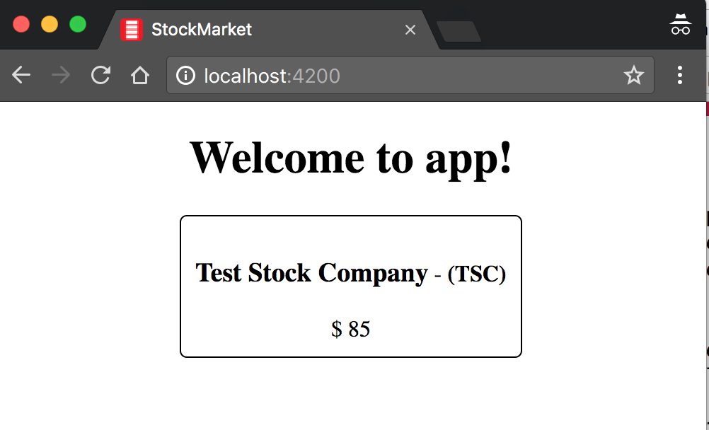
Figure 2-2. Angular app with stock component
We have just used one fundamental building block from Angular to render our data from our component into the HTML. We use the double-curly notation ({{ }}), which is also known as interpolation. Interpolation evaluates the expression between the curly braces as per the component backing it, and then renders the result as a string in place in the HTML. In this case, we render the name, code, and the price of the stock using interpolation. This picks up the values of name, code, and price, and then replaces the double-curly expression with its value, thus rendering our UI.
This is Angular’s one-way data binding at work. One-way data binding simply refers to Angular’s capability to automatically update the UI based on values in the component, and then keeping it updated as the value changes in the component. Without one-way binding, we would have to write code to take the value from our component, find the right element in HTML, and update its value. Then we would have to write listeners/watchers to keep track of when the value in the component changes, and then change the value in the HTML at that time. We can get rid of all of this extra code because of data binding.
In this particular case, we are binding to simple variables, but it is not necessarily restricted to simple variables. The expressions can be slightly more complex. For example, we could render the same UI by changing the binding expression as follows in stock-item.component.html:
<divclass="stock-container"><divclass="name">{{name + ' (' + code + ')'}}</div><divclass="price">$ {{price}}</div></div>
In this case, we replaced our multiple heading elements with a single div. The interpolation expression is now a combination of both the name and the code, with the code surrounded by parentheses. Angular will evaluate this like normal JavaScript, and return the value of it as a string to our UI.
Understanding Property Binding
So far, we used interpolation to get data from our component code to the HTML. But Angular also provides a way to bind not just text, but also DOM element properties. This allows us to modify the content and the behavior of the HTML that is rendered in the browser.
For example, let’s try to modify our stock widget to highlight the price in red if the price is less than the previous price, and in green if it is equal to or more than the previous price. We can first change our component (the stock-item.component.ts) to precalculate if the difference is positive or negative like so:
import{Component,OnInit}from'@angular/core';@Component({selector:'app-stock-item',templateUrl:'./stock-item.component.html',styleUrls:['./stock-item.component.css']})exportclassStockItemComponentimplementsOnInit{publicname:string;publiccode:string;publicprice:number;publicpreviousPrice:number;publicpositiveChange:boolean;constructor(){}ngOnInit() {this.name='Test Stock Company';this.code='TSC';this.price=85;this.previousPrice=80;this.positiveChange=this.price>=this.previousPrice;}}
In this code, we added a new public variable called positiveChange, which is of type boolean, and then set the value based on comparing the current price with the previous price. This gives us a singular boolean value that we can use to decide whether to highlight the price in red or green.
Next, let’s add some classes in the stock-item.component.css file to allow for changing the color of the text:
.stock-container{border:1pxsolidblack;border-radius:5px;display:inline-block;padding:10px;}.positive{color:green;}.negative{color:red;}
We simply added two classes, positive and negative, which change the color of the text to green and red, respectively. Now let’s tie this together to see how we can use this information and classes in our stock-item.component.html file:
<divclass="stock-container"><divclass="name">{{name + ' (' + code + ')'}}</div><divclass="price"[class]="positiveChange?'positive':'negative'">$ {{price}}</div></div>
We have added one new binding on the price div element, which reads as:
[class]="positiveChange ? 'positive' : 'negative'"
This is the Angular syntax for property binding, which binds the value of the expression to the DOM property between the square brackets. The [] is the general syntax that can be used with any property on an element to bind one-way from the component to the UI.
In this particular case, we are telling Angular to bind to the class property of the DOM element to the value of the expression. Angular will evaluate it like a normal JavaScript expression, and assign the value (positive in this case) to the class property of the div element.
Warning
When you bind to the class property like we did in the example, note that it overrides the existing value of the property. In our example, the "price" class is replaced with the class "positive", instead of appending to the existing value of the property. You can notice this for yourself if you inspect the rendered HTML in the browser. Be careful about this if you bind directly to the class property.
If the value of the variable positiveChange in the component changes, Angular will automatically re-evaluate the expression in the HTML and update it accordingly. Try changing the price so that there is a negative change and then refresh the UI to make sure it works.
Notice that we have been explicitly referring to the data binding working with DOM properties, and not HTML attributes. The following sidebar goes into more detail on the difference between the two, and why it is important to know and understand as you work on Angular. But simplifying it, Angular data binding only works with DOM properties, and not with HTML attributes.
Just like we did for the class property, depending on the use case, we can actually bind to other HTML properties like the src property of an img tag, or the disabled property of input and button. We will cover this in more depth in the next chapter. We will also cover a simpler and more specific way of binding CSS classes in the next chapter as well.
Understanding Event Binding
So far, we have worked on using the data in our component to both render values and change the look and feel of our component. In this section, we will start understanding how to handle user interactions, and work with events and event binding in Angular.
Say we wanted to have a button that allows users to add the stock to their list of favorite stocks. Generally, with a button like this, when the user clicks it, we would want to make some server call and then process the result. So far, since we are working with very simple examples, let’s just say we wanted to handle this click and get a hook to it in our component. Let’s see how we might accomplish that.
First, we can change our component code in stock-item.component.ts to add a function toggleFavorite, which should be triggered each time the click happens from the UI:
import{Component,OnInit}from'@angular/core';@Component({selector:'app-stock-item',templateUrl:'./stock-item.component.html',styleUrls:['./stock-item.component.css']})exportclassStockItemComponentimplementsOnInit{publicname:string;publiccode:string;publicprice:number;publicpreviousPrice:number;publicpositiveChange:boolean;publicfavorite:boolean;constructor(){}ngOnInit() {this.name='Test Stock Company';this.code='TSC';this.price=85;this.previousPrice=80;this.positiveChange=this.price>=this.previousPrice;this.favorite=false;}toggleFavorite() {console.log('We are toggling the favorite state for this stock');this.favorite=!this.favorite;}}
We have added a new public boolean member variable called favorite, which is initialized with a false value. We then added a new function called toggleFavorite(), which simply flips the boolean value of favorite. We are also printing a log in the console to ensure this is getting triggered.
Now, let’s update the UI to use this concept of a favorite and also allow users to toggle the state:
<divclass="stock-container"><divclass="name">{{name + ' (' + code + ')'}}</div><divclass="price"[class]="positiveChange?'positive':'negative'">$ {{price}}</div><button(click)="toggleFavorite()"[disabled]="favorite">Add to Favorite</button></div>
We have added a new button in the stock-item.component.html file to allow users to click and add the stock to their favorite set. We are using the data-binding concept from the previous section on the disabled property. Thus, we are disabling the button based on the boolean value favorite. If favorite is true, the button will be disabled, and if it is false, the button will be enabled. Thus, by default, the button is enabled.
The other major thing we have on the element is this fragment:
(click)="toggleFavorite()"
This syntax is called event binding in Angular. The left part of the equals symbol refers to the event we are binding to. In this case, it is the click event. Just like how the square-bracket notation refers to data flowing from the component to the UI, the parentheses notation refers to events. And the name between the parentheses is the name of the event we care about.
In this case, we are telling Angular that we are interested in the click event on this element. The right part of the equals symbol then refers to the template statement that Angular should execute whenever the event is triggered. In this case, we want it to execute the new function we created, toggleFavorite.
When we run this application in our browser, we can see the new button. Clicking it would render something like Figure 2-3.
Notice the other interesting thing, which is Angular data binding at play. When we click the button, our toggleFavorite function is executed. This flips the value of favorite from false to true. This in turn triggers the other Angular binding, which is the disabled property of the button, thus disabling the button after the first click. We don’t have to do anything extra to get these benefits, which is the beauty of data binding.
Figure 2-3. Handling events in an Angular app
There are times when we might also care about the actual event triggered. In those cases, Angular gives you access to the underlying DOM event by giving access to a special variable $event. You can access it or even pass it to your function as follows:
<divclass="stock-container"><divclass="name">{{name + ' (' + code + ')'}}</div><divclass="price"[class]="positiveChange?'positive':'negative'">$ {{price}}</div><button(click)="toggleFavorite($event)"[disabled]="favorite">Add to Favorite</button></div>
In the HTML, we simply add a reference to the variable $event, and pass it in as an argument to our toggleFavorite function. We can now refer to it in our component as follows:
import{Component,OnInit}from'@angular/core';@Component({selector:'app-stock-item',templateUrl:'./stock-item.component.html',styleUrls:['./stock-item.component.css']})exportclassStockItemComponentimplementsOnInit{publicname:string;publiccode:string;publicprice:number;publicpreviousPrice:number;publicpositiveChange:boolean;publicfavorite:boolean;constructor(){}ngOnInit() {this.name='Test Stock Company';this.code='TSC';this.price=85;this.previousPrice=80;this.positiveChange=this.price>=this.previousPrice;this.favorite=false;}toggleFavorite(event){console.log('We are toggling the favorite state for this stock',event);this.favorite=!this.favorite;}}
When you run the application, you will see that when you click the button, your console log now appends the actual MouseEvent that was triggered, in addition to our previous code.
In a similar manner, we can easily hook onto other standard DOM events that are triggered, like focus, blur, submit, and others like them.
Using Models for Cleaner Code
The last part of this chapter covers something that is more of a best practice, but it is worth adopting—especially as we aim to build large, maintainable web applications using Angular. We want to use encapsulation to ensure that our components don’t work with lower-level abstractions and properties, like we did previously where the stock widget gets an individual name, price, etc. At the same time, we want to leverage TypeScript to make it easier to understand and reason about our application and its behavior. To this extent, we should ideally model our stock itself as a type in TypeScript, and leverage that instead.
The way we would do it in TypeScript is to define an interface or a class with the definition for what belongs in a stock, and use that consistently throughout our application. In this case, since we might want additional logic in addition to just the values (calculating whether the price differential is positive or not, for example), we can use a class.
We can use the Angular CLI to quickly generate a skeleton class for us, by running:
ng generate class model/stock
This will generate an empty skeleton file called stock.ts in a folder called model. We can go ahead and change it as follows:
exportclassStock{favorite:boolean=false;constructor(publicname:string,publiccode:string,publicprice:number,publicpreviousPrice:number){}isPositiveChange():boolean{returnthis.price>=this.previousPrice;}}
This gives us a nice encapsulation while we work with stocks across our application. Note that we didn’t actually define the variables name, code, and so on as properties of the class. This is because we are using TypeScript’s syntactic sugar to automatically create the corresponding properties based on the constructor arguments by using the public keyword. To learn more about TypeScript classes, refer to the official documentation. In short, we have created a class with five properties, four coming through the constructor and one autoinitialized. Let’s see how we might use this now in our component:
import{Component,OnInit}from'@angular/core';import{Stock}from'../../model/stock';@Component({selector:'app-stock-item',templateUrl:'./stock-item.component.html',styleUrls:['./stock-item.component.css']})exportclassStockItemComponentimplementsOnInit{publicstock:Stock;constructor(){}ngOnInit() {this.stock=newStock('Test Stock Company','TSC',85,80);}toggleFavorite(event){console.log('We are toggling the favorite state for this stock',event);this.stock.favorite=!this.stock.favorite;}}
In stock-item.component.ts, we imported our new model definition at the top, and then replaced all the individual member variables with one variable of type Stock. This simplified the code in the component significantly, and encapsulated all the logic and underlying functionality within a proper TypeScript type. Now let’s see how stock-item.component.html changes to accommodate this change:
<divclass="stock-container"><divclass="name">{{stock.name + ' (' + stock.code + ')'}}</div><divclass="price"[class]="stock.isPositiveChange()?'positive':'negative'">$ {{stock.price}</div><button(click)="toggleFavorite($event)"[disabled]="stock.favorite">Add to Favorite</button></div>
We have made a few changes in the HTML for our stock item. First, most of our references to the variable are now through the stock variable, instead of directly accessing the variables in the component. So name became stock.name, code became stock.code, and so on.
Also, one more thing of note: our class property binding now refers to a function instead of a variable. This is acceptable, as a function is also a valid expression. Angular will just evaluate the function and use its return value to determine the final expression value.
Conclusion
In this chapter, we started building our very first Angular application. We learned how to bootstrap our Angular application, as well as understand the various pieces that the Angular skeleton application generates and their needs and uses. We then created our very first component, and looked at the steps involved in hooking it up to our application.
Following that, we added some very basic data to our component, and then used that to understand how basic Angular data binding works, using both interpolation as well as property binding. We then looked at how event binding works, and handled user interactions through it. Finally, we encapsulated some information in a TypeScript class to make our code cleaner and modular.
In the next chapter, we will go through some basic Angular directives that Angular provides out of the box and how it allows us to work with templates in an effective manner.
Exercise
Each chapter will have an optional exercise at the end to reinforce some of the concepts covered in the chapter, as well as give you some time to experiment and try your hand at Angular code. Over the course of the book, we will build on the same exercise and keep adding more features to it.
The finished source code for the exercise is available in the GitHub repository in each chapter’s folder. You can refer to it in case you are stuck or want to compare the final solution. Of course, there are multiple ways to solve every problem, so the solution in the repository is one possible way. You may arrive at a slightly different solution in the course of your attempts.
For the first exercise, try to accomplish the following:
-
Start a new project to build an ecommerce website.
-
Create a component to display a single product.
-
The product component should display a name, price, and image for the product. You can initialize the component with some defaults for the same. Use any placeholder image you want.
-
Highlight the entire element in a different color if the product is on sale. Whether the product is on sale can be an attribute of the product itself.
-
Add buttons to increase and decrease the quantity of the product in the cart. The quantity in the cart should be visible in the UI. Disable the button if the quantity is already zero.
All of this can be accomplished using concepts covered in this chapter. You can check out the finished solution in chapter2/exercise/ecommerce.