Table of Contents for
Learning PHP, MySQL & JavaScript, 5th Edition
 Learning PHP, MySQL & JavaScript, 5th Edition
Published by
O'Reilly Media, Inc., 2018
Learning PHP, MySQL & JavaScript, 5th Edition
Published by
O'Reilly Media, Inc., 2018
- Cover
- nav
- Learning PHP, MySQL & JavaScript
- Learning PHP, MySQL & JavaScript
- Dedication
- Preface
- 1. Introduction to Dynamic Web Content
- 2. Setting Up a Development Server
- 3. Introduction to PHP
- 4. Expressions and Control Flow in PHP
- 5. PHP Functions and Objects
- 6. PHP Arrays
- 7. Practical PHP
- 8. Introduction to MySQL
- 9. Mastering MySQL
- 10. Accessing MySQL Using PHP
- 11. Form Handling
- 12. Cookies, Sessions, and Authentication
- 13. Exploring JavaScript
- 14. Expressions and Control Flow in JavaScript
- 15. JavaScript Functions, Objects, and Arrays
- 16. JavaScript and PHP Validation and Error Handling
- 17. Using Asynchronous Communication
- 18. Introduction to CSS
- 19. Advanced CSS with CSS3
- 20. Accessing CSS from JavaScript
- 21. Introduction to jQuery
- 22. Introduction to jQuery Mobile
- 23. Introduction to HTML5
- 24. The HTML5 Canvas
- 25. HTML5 Audio and Video
- 26. Other HTML5 Features
- 27. Bringing It All Together
- A. Solutions to the Chapter Questions
- B. Online Resources
- C. MySQL’s FULLTEXT Stopwords
- D. MySQL Functions
- E. jQuery Selectors, Objects, and Methods
- Index
- About the Author
- Colophon
Chapter 22. Introduction to jQuery Mobile
Now that you’ve realized the time you can save and the tremendous power you can harness from jQuery, as discussed in Chapter 21, I think you’ll be delighted to learn that you can do even more with the jQuery Mobile library.
Created to complement jQuery, jQuery Mobile requires you to include both jQuery and jQuery Mobile in a web page (along with a CSS file and accompanying images you will also need) in order to transform it into a fully interactive experience when viewed on phones and other mobile devices.
The jQuery Mobile library enables you to adapt ordinary web pages to become mobile web pages using a technique called “progressive enhancement” (in which basic browser features are made to display well first, and then more and more functionality is added when more capability is encountered within a browser). It also features what is called “responsive web design” (in which web pages render well on a variety of devices and window or screen sizes).
The point of this chapter isn’t to teach you absolutely everything there is to know about jQuery Mobile—that could take up a whole book in itself! Rather, I want to give you enough information to let you refashion any not-too-large set of web pages into a coherent, fast, and good-looking web app, with all the page slides and other transitions you would expect from a modern touch device, as well as bigger and easier-to-use icons, input fields, and other enhanced aspects of input and navigation.
To this end, I introduce just a few of the main features of jQuery Mobile that will let you get up and running with a clean and workable solution that runs well on both desktop and mobile platforms. Along the way, I point out a few pitfalls that you may face when adapting web pages to mobile this way, and how to avoid them. Once you’ve mastered using jQuery Mobile, you’ll then find it a simple matter to peruse the online documentation to find just the features you need for your own projects.
Note
In addition to progressively enhancing the way your HTML displays, depending on the capabilities of the browser in which it finds itself running, jQuery Mobile also progressively enhances regular HTML markup based on the tags used and a set of custom data attributes. Some elements are automatically enhanced without the need for any data attributes (for example, select elements are automatically upgraded to menus), while other elements require the presence of a data attribute in order to be enhanced. The full list of supported data attributes can be viewed in the API documentation.
Including jQuery Mobile
There are two ways to include jQuery Mobile in your web pages. First, you can go to the download page, choose the version you need, download the files to your web server (including the stylesheet and accompanying images that go with the library), and serve them up from there.
For example, if you have downloaded jQuery Mobile 1.4.5 (the current version as I write) and its CSS file to the document root of your server, you could include them—and the accompanying jQuery JavaScript, which must be version 2.2.4 as I write, because jQuery Mobile doesn’t yet support version 3 (although jQuery Mobile 1.5 is planned to support jQuery 3)—in a web page like this:
<link href="http://myserver.com/jquery.mobile-1.4.5.min.css" rel="stylesheet">
<script src='http://myserver.com/jquery-2.2.4.min.js'></script>
<script src='http://myserver.com/jquery.mobile-1.4.5.min.js'></script>
Or, as with jQuery, you can take advantage of a free content delivery network (CDN) and simply link to the version(s) you require. There are three main CDNs to choose from (Max CDN, Google CDN, and Microsoft CDN), and you can retrieve the files you need from them in the following ways:
<!-- Retrieving jQuery & Mobile via Max CDN -->
<link rel="stylesheet"
  href="http://code.jquery.com/mobile/1.4.5/jquery.mobile-1.4.5.min.css">
<script src="http://code.jquery.com/jquery-2.2.4.min.js"></script>
<script src="http://code.jquery.com/mobile/1.4.5/jquery.mobile-1.4.5.min.js">
</script>
<!-- Retrieving jQuery & Mobile via Google CDN -->
<link rel="stylesheet" href=
 "http://ajax.googleapis.com/ajax/libs/jquerymobile/1.4.5/jquery.mobile.min.css">
<script src=
"http://ajax.googleapis.com/ajax/libs/jquery/2.2.4/jquery.min.js"></script>
<script src=
"http://ajax.googleapis.com/ajax/libs/jquerymobile/1.4.5/jquery.mobile.min.js">
</script>
<!-- Retrieving jQuery & Mobile via Microsoft CDN -->
<link rel="stylesheet" href=
  "http://ajax.aspnetcdn.com/ajax/jquery.mobile/1.4.5/jquery.mobile-1.4.5.min.css">
<script src=
"http://ajax.aspnetcdn.com/ajax/jQuery/jquery-2.2.4.min.js"></script>
<script src=
"http://ajax.aspnetcdn.com/ajax/jquery.mobile/1.4.5/jquery.mobile-1.4.5.min.js">
</script>
You will probably want to place one set of these statements within the <head> section of a page.
Note
To ensure you can use these examples when offline, I have downloaded all the required jQuery files and included them along with the archive of example files, which you may freely download from the book’s companion website. Therefore, all these examples show the files being served locally.
Getting Started
Let’s dive right in by seeing what a jQuery Mobile web page will generally look like, with Example 22-1. It’s really quite simple, and if you give it a quick once-over, it will help the rest of this chapter to fall quickly into place.
Example 22-1. A jQuery Mobile single page template
<!DOCTYPE html>
<html>
  <head>
    <meta charset="utf-8">
    <meta name="viewport" content="width=device-width, initial-scale=1">
    <title>Single page template</title>
    <link rel="stylesheet" href="jquery.mobile-1.4.5.min.css">
    <script src="jquery-2.2.4.min.js"></script>
    <script src="jquery.mobile-1.4.5.min.js"></script>
  </head>
  <body>
    <div data-role="page">
      <div data-role="header">
        <h1>Single page</h1>
      </div>
      <div data-role="content">
        <p>This is a single page boilerplate template</p>
      </div>
      <div data-role="footer">
        <h4>Footer content</h4>
      </div>
    </div>
  </body>
</html>
Upon examining the previous example, you’ll see that it starts with the standard HTML5 elements you would expect. The first unusual item you may notice is in the <head> section, namely the viewport setting within the <meta> tag. This line tells mobile browsers to set the width of the displayed document to that of the web browser, and to start off without the document zoomed either in or out. When displayed in a browser, the page looks like Figure 22-1.
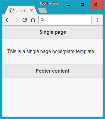
Figure 22-1. Displaying the jQuery Mobile single page template
After specifying a page title, the CSS for jQuery Mobile is loaded, followed by the jQuery 2.2.4 library and the jQuery Mobile 1.4.5 library. As explained in “Including jQuery Mobile”, these can all be downloaded from a CDN if you prefer.
Note
The examples accompanying this chapter contain a folder called images, which contains all the icons and other images required by the CSS. If you use a CDN to download the CSS and JavaScript library files, you may not need to include this folder in your own projects, as the CDN’s own images folder should be used instead.
Moving on to the <body> section, you’ll note that the main web page is contained within a <div> element, which bears the jQuery Mobile data-role property value of page and consists of three further <div> elements for the page’s header, content, and footer, each with data-role properties to match.
And there you have the basic structure of a jQuery Mobile web page. When you link between pages, new ones will be loaded in and added to the DOM using asynchronous communication. Once loaded, the page can then be transitioned into view in any number of ways, including instant replace, fade, dissolve, slide, and so on.
Linking Pages
With jQuery Mobile you can link to pages in the normal way, and it will automatically handle these page requests asynchronously (where possible) to ensure that any transitions you have selected will be applied.
This allows you to focus on simply creating your web pages and let jQuery Mobile deal with making them look good and display quickly and professionally.
To enable animated page transitions, all links that point to an external page will be loaded asynchronously. jQuery Mobile achieves this by transforming all <a href...> links into asynchronous communication (also known as Ajax) requests, and then displaying a loading spinner while the requests are made.
Note
The way jQuery Mobile achieves its page transitions when you click a link is via “hijacking” clicks by accessing the event.preventDefault event and then providing its special jQuery Mobile code.
If the request is successful, the new page content is added to the DOM, and the selected new page is then animated into view, using either a default page transition or one of your choosing.
Should the asynchronous request fail, a small and unobtrusive error message will briefly appear to let you know, but will not interfere with the navigational flow.
Linking Synchronously
Links that point to other domains or that have rel="external", data-ajax="false", or target attributes will be loaded synchronously, causing a full page refresh with no animated transition.
Both rel="external" and data-ajax="false" have the same effect, but the former is intended for linking to another site or domain, while the latter is useful for preventing any page from being loaded asynchronously.
Because of security restrictions, jQuery Mobile loads pages from all external domains synchronously.
Note
You will need to disable asynchronous page loading when using HTML file upload, because this way of fetching a web page conflicts with jQuery Mobile’s ability to receive an uploaded file. For this particular case, the best course is probably to place a data-ajax="false" attribute in the <form> element, like this:
<form data-ajax='false' method='post'
  action='dest_file' enctype='multipart/form-data'>
Linking Within a Multipage Document
A single HTML document can contain one or many pages. The latter involves stacking multiple <div> elements with a data-role of page. This allows you to build a small site or application within a single HTML document; jQuery Mobile will simply display the first page it finds in the source order when the page loads.
If a link in a multipage document points to an anchor (such as #page2), the framework will look for a page wrapper <div> with a data-role attribute of page and the given id (id="page2"). If found, it will transition the new page into view.
Users can seamlessly navigate between all types of web pages (whether internal, local, or external) in jQuery Mobile. All will look the same to the end user, except that external pages will display the Ajax spinner while loading. In all situations, jQuery Mobile updates the page’s URL hash to enable Back button support. This also means that jQuery Mobile pages are indexable by search engines, and not walled off somewhere in a native app.
Warning
When linking from a mobile page that was loaded asynchronously to one that contains multiple internal pages, you must add either rel="external" or data-ajax="false" to the link in order to force a full page reload, clearing out the asynchronous hash from the URL. Asynchronous pages use the hash (#) to track their history, while multiple internal pages use this symbol to indicate internal pages.
Page Transitions
By using CSS transitions, jQuery Mobile can apply effects to any page link or form submission, as long as asynchronous navigation is being used (the default).
To apply a transition, you use the data-transition attribute within an <a> or <form> tag, like this:
<a data-transition="slide" href="destination.html">Click me</a>
This attribute supports the values fade (the default since version 1.1), pop, flip, turn, flow, slidefade, slide (the default prior to version 1.1), slideup, slidedown, and none.
For example, the value slide causes the new page to slide in from the right, with the current one sliding off to the left at the same time. The other values are similarly obvious in their effect.
Loading a page as a dialog
You can display a new page as a dialog window using the data-rel attribute with a value of dialog, like this:
<a data-rel="dialog" href="dialog.html">Open dialog</a>
Example 22-2 demonstrates how to apply the various page transitions to both page loads and dialogs, loading the jQuery libraries locally rather than via a CDN. It consists of a bare-bones table with two columns, the first for loading a dialog and the other for loading a new page. Each of the available transition types is listed. To display the links as buttons, I’ve supplied the data-role attribute of each a value of button (buttons are covered in “Styling Buttons”).
Example 22-2. jQuery Mobile page transitions
<!DOCTYPE html>
<html>
  <head>
    <meta charset="utf-8">
    <meta name="viewport" content="width=device-width, initial-scale=1">
    <title>Page Transitions</title>
    <link rel="stylesheet" href="jquery.mobile-1.4.5.min.css">
    <script src="jquery-2.2.4.min.js"></script>
    <script src="jquery.mobile-1.4.5.min.js"></script>
  </head>
  <body>
    <div data-role="page">
      <div data-role="header">
        <h1>jQuery Mobile Page Transitions</h1>
      </div>
      <div data-role="content"><table>
        <tr><th><h3>fade</h3></th>
          <td><a href="page-template.html" data-rel="dialog"
           data-transition="fade" data-role='button'>dialog</a></td>
          <td><a href="page-template.html" data-transition="fade"
           data-role='button'>page</a></td>
        </tr><tr><th><h3>pop</h3></th>
          <td><a href="page-template.html" data-rel="dialog"
           data-transition="pop" data-role='button'>dialog</a></td>
          <td><a href="page-template.html" data-transition="pop"
           data-role='button'>page</a></td>
        </tr><tr><th><h3>flip</h3></th>
          <td><a href="page-template.html" data-rel="dialog"
           data-transition="flip" data-role='button'>dialog</a></td>
          <td><a href="page-template.html" data-transition="flip"
           data-role='button'>page</a></td>
        </tr><tr><th><h3>turn</h3></th>
          <td><a href="page-template.html" data-rel="dialog"
           data-transition="turn" data-role='button'>dialog</a></td>
          <td><a href="page-template.html" data-transition="turn"
           data-role='button'>page</a></td>
        </tr><tr><th><h3>flow</h3></th>
          <td><a href="page-template.html" data-rel="dialog"
           data-transition="flow" data-role='button'>dialog</a></td>
          <td><a href="page-template.html" data-transition="flow"
           data-role='button'>page</a></td>
        </tr><tr><th><h3>slidefade</h3></th>
          <td><a href="page-template.html" data-rel="dialog"
           data-transition="slidefade" data-role='button'>dialog</a></td>
          <td><a href="page-template.html" data-transition="slidefade"
           data-role='button'>page</a></td>
        </tr><tr><th><h3>slide</h3></th>
          <td><a href="page-template.html" data-rel="dialog"
           data-transition="slide" data-role='button'>dialog</a></td>
          <td><a href="page-template.html" data-transition="slide"
           data-role='button'>page</a></td>
        </tr><tr><th><h3>slideup</h3></th>
          <td><a href="page-template.html" data-rel="dialog"
           data-transition="slideup" data-role='button'>dialog</a></td>
          <td><a href="page-template.html" data-transition="slideup"
           data-role='button'>page</a></td>
        </tr><tr><th><h3>slidedown</h3></th>
          <td><a href="page-template.html" data-rel="dialog"
           data-transition="slidedown" data-role='button'>dialog</a></td>
          <td><a href="page-template.html" data-transition="slidedown"
           data-role='button'>page</a></td>
        </tr><tr><th><h3>none</h3></th>
          <td><a href="page-template.html" data-rel="dialog"
           data-transition="none" data-role='button'>dialog</a></td>
          <td><a href="page-template.html" data-transition="none"
           data-role='button'>page</a></td></tr></table>
      </div>
      <div data-role="footer">
        <h4><a href="http://tinyurl.com/jqm-trans">Official Demo</a></h4>
      </div>
    </div>
  </body>
</html>
Figure 22-2 shows the result of loading this example (saved using the filename page-template.html) into a browser, and Figure 22-3 demonstrates a flip transition in action. Incidentally, if you follow the link in the footer of the example it will take you to the official demo site, where you can explore these effects in greater detail.
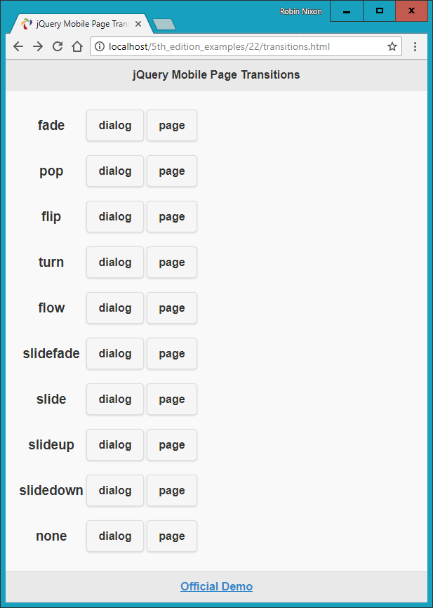
Figure 22-2. Applying transitions to pages and dialogs
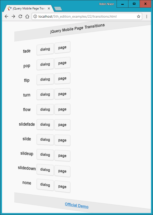
Figure 22-3. A flip transition in progress
Styling Buttons
You can easily display a simple link as a button without adding your own CSS. All you need to do is provide the value button to an element’s data-role attribute, like this:
<a data-role="button" href="news.html">Latest news</a>
You can decide whether to have such a button expand to the full width of the window (the default), like a <div> element, or opt to make the button display inline, like a <span> element. To display the button inline, supply the value true to the data-inline attribute, like this:
<a data-role="button" data-inline="true" href="news.html">Latest news</a>
And whether you create a button from a link or use one from a form, you can modify the way it displays by choosing between rounded corners (the default) or straight corners, and make it shadowed (the default) or non-shadowed. Turn these features off by supplying a value of false to the data-corners and data-shadow attributes, respectively, like this:
<a data-role="button" data-inline="true" data-corners="false"
   data-shadow="false" href="news.html">Latest news</a>
What’s more, you can even choose to add icons to your buttons with the data-icon attribute, like this:
<a data-role="button" data-inline="true" data-icon="home"
   href="home.html">Home page</a>
There are over 50 ready-made icons to choose from. They are all created using a powerful graphical language called Scalable Vector Graphics (SVG), and they fall back to PNG for devices that don’t support SVG, making the icons look great on Retina displays. Take a look at the Icons demo to see what’s available.
Icons appear to the left of button text by default, but you can choose to place them to the right, above, or below the text, or to remove any text by applying the values right, top, bottom, or notext to the data-iconpos attribute, like this:
<a data-role="button" data-inline="true" data-icon="home"
   data-iconpos="right" href="home.html">Home page</a>
If you choose not to display any button text, the icon displayed will be round by default.
Finally in this brief roundup of button styling, you can choose to display smaller buttons (including the button text) by supplying a value of true to the data-mini attribute, like this:
<a data-role="button" data-inline="true" data-icon="home"
   data-mini="true" href="home.html">Home page</a>
Example 22-3 demonstrates a selection of buttons being created with a variety of these button styles (with no href attributes for brevity), as shown in Figure 22-4.
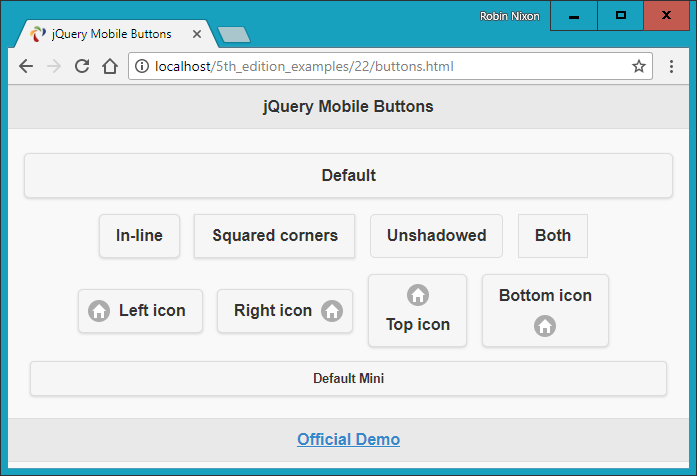
Figure 22-4. An assortment of button styles
There’s actually a great deal more styling you can do with buttons, and you can get all the details you need in the Buttons demo. But for now, this introduction will stand you in good stead.
List Handling
When it comes to list handling, jQuery Mobile really makes things easy for you with a wide range of easy-to-use features, all of which you can access by supplying a value of listview to the data-role attribute of a <ul> or <ol> element.
So, for example, to create a simple unordered list, you could use code such as this:
<ul data-role="listview">
  <li>Brocolli</li>
  <li>Carrots</li>
  <li>Lettuce</li>
</ul>
For an ordered list, simply replace the <ul> opening and closing tags with <ol>, and the list will be numbered.
Any links within a list will automatically have an arrow icon embedded and be displayed as buttons. You can also inset a list, to mix it with other content on a page, by giving the data-inset attribute a value of true.
Example 22-4 demonstrates how these various features work in practice; the result is displayed in Figure 22-5.
Example 22-4. A selection of lists
<ul data-role="listview">
  <li>An</li>
  <li>Unordered</li>
  <li>List</li>
</ul><br><br>

<ol data-role="listview">
  <li>An</li>
  <li>Ordered</li>
  <li>List</li>
</ol><br>

<ul data-role="listview" data-inset="true">
  <li>An</li>
  <li>Inset Unordered</li>
  <li>List</li>
</ul>

<ul data-role="listview" data-inset="true">
  <li><a href='#'>An</a></li>
  <li><a href='#'>Inset Unordered</a></li>
  <li><a href='#'>Linked List</a></li>
</ul>
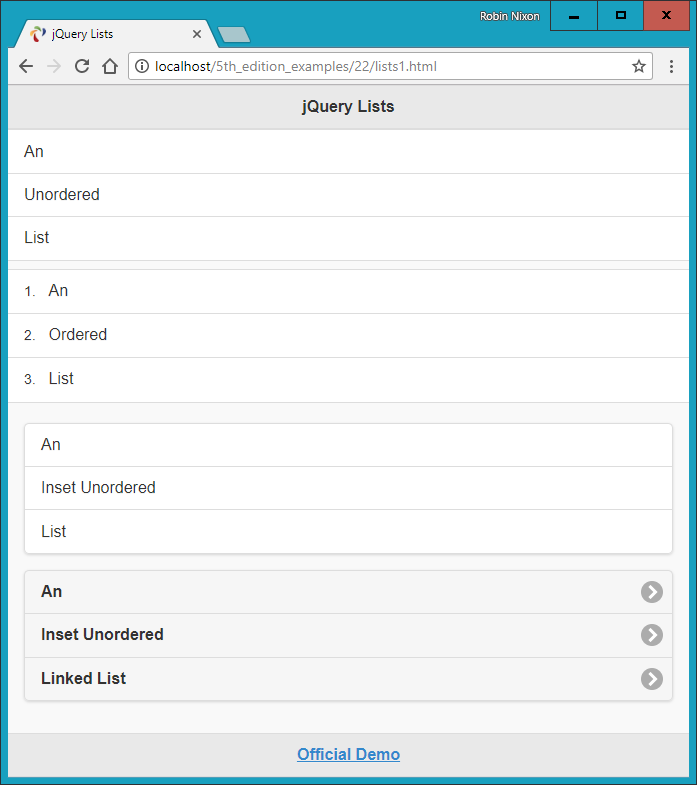
Figure 22-5. Ordered and unordered plain and inset lists
Filterable Lists
You can make lists filterable by setting the data-filter attribute to true, which will place a search box above the list and, as the user types, will automatically remove from view any list elements that do not match the search term being entered. You can also set data-filter-reveal to true so that no fields are displayed until at least one character of filter input has been entered, and only those fields that match the input are then displayed.
Example 22-5 demonstrates the use of these two types of filtered lists, which differ only by the addition of data-filter-reveal="true" to the latter.
Example 22-5. Filtered and filter-reveal lists
<ul data-role="listview" data-filter="true"
    data-filter-placeholder="Search big cats..." data-inset="true">
  <li>Cheetah</li>
  <li>Cougar</li>
  <li>Jaguar</li>
  <li>Leopard</li>
  <li>Lion</li>
  <li>Snow Leopard</li>
  <li>Tiger</li>
</ul>

<ul data-role="listview" data-filter="true" data-filter-reveal="true"
    data-filter-placeholder="Search big cats..." data-inset="true">
  <li>Cheetah</li>
  <li>Cougar</li>
  <li>Jaguar</li>
  <li>Leopard</li>
  <li>Lion</li>
  <li>Snow Leopard</li>
  <li>Tiger</li>
</ul>
Note the use of the data-filter-placeholder attribute to offer a prompt to the user when the input field is blank.
In Figure 22-6 you can see how the former list type has had the letter a entered into the filter field, so only those fields that have an a in them are currently displayed, while none of the fields in the second list are shown because nothing has yet been entered into the filter field.
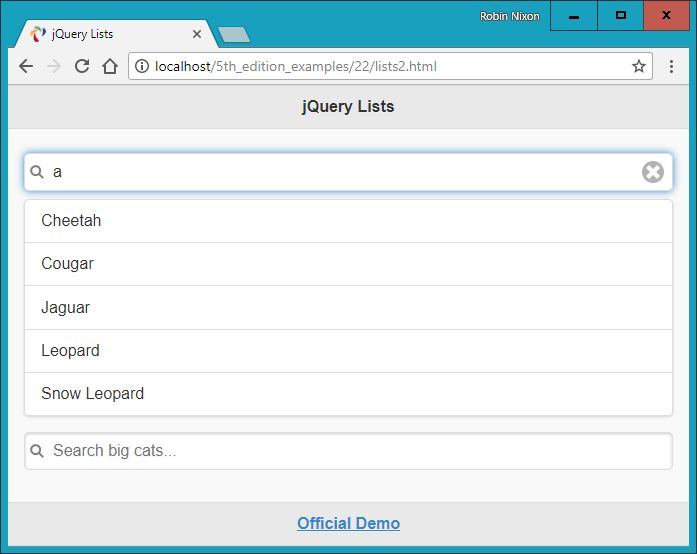
Figure 22-6. Displaying a filtered and a filter-reveal list
List Dividers
To enhance the way lists are displayed, you can also place manual or automatic dividers within them. You create manual list dividers by supplying a list element with a data-role attribute value of list-divider, as shown in Example 22-6, which displays as Figure 22-7.
Example 22-6. Manual list dividers
<ul data-role="listview" data-inset="true">
  <li data-role="list-divider">Big Cats</li>
  <li>Cheetah</li>
  <li>Cougar</li>
  <li>Jaguar</li>
  <li>Lion</li>
  <li>Snow Leopard</li>
  <li data-role="list-divider">Big Dogs</li>
  <li>Bloodhound</li>
  <li>Doberman Pinscher</li>
  <li>Great Dane</li>
  <li>Mastiff</li>
  <li>Rottweiler</li>
</ul>
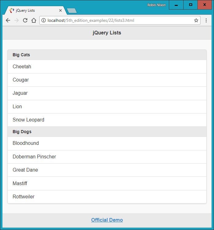
Figure 22-7. The list is divided into categories
To let jQuery Mobile determine the division in a convenient way, you can supply the value true to the data-autodividers attribute, as in Example 22-7, which divides the fields alphabetically and displays as Figure 22-8.
Example 22-7. Using autodividers
<ul data-role="listview" data-inset="true" data-autodividers="true">
   <li>Cheetah</li>
   <li>Cougar</li>
   <li>Jaguar</li>
   <li>Leopard</li>
   <li>Lion</li>
   <li>Snow Leopard</li>
   <li>Tiger</li>
</ul>
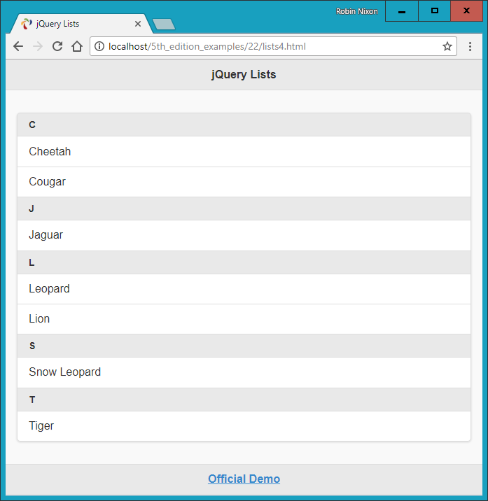
Figure 22-8. Automatically dividing a list alphabetically
As with buttons (see “Styling Buttons”), you can also add icons to linked list fields using the data-icon attribute along with a value representing the icon to display, like this:
<li data-icon="gear"><a href="settings.html">Settings</a></li>
In this example, the default right angle bracket of a linked list will be replaced with the icon you select (in this case, a gear icon).
In addition to all these great features, you can also add icons and thumbnails within list fields and they will be scaled to look good when displayed. For details on how to do this and on many other list features, please refer to the official documentation.
What Next?
As I mentioned at the start, the purpose of this chapter has been to get you up to speed quickly with jQuery Mobile, so that you can easily repackage websites into web apps that look good on all devices, whether desktop or mobile.
To this end, I have introduced only jQuery Mobile’s very best and most important features, so I’ve really only scratched the surface of what you can do with it. For example, there’s a tremendous variety of ways you can enhance and make forms work well on mobile devices. You can build responsive tables, create collapsible content, invoke pop-ups, design your own themes, and much more.
Note
You may be interested to learn that you can use jQuery Mobile in conjunction with a product by Adobe called PhoneGap to build standalone apps for Android and iOS. It’s not entirely straightforward, and doing so is outside the remit of this book to explain, but most of the hard work has already been done for you by the jQuery and PhoneGap teams. For more information, please refer to the jQuery Mobile guide to building PhoneGap apps.
Once you’ve got the hang of everything in this chapter, if you would like to see what else jQuery Mobile can do for you, I recommend you check out the official demos and documentation on the website.
Also, the example social networking app in Chapter 27 applies many of these features in a close-to-real-world scenario, and is a great way to really see how you can mobile up your web pages. Before we get to that, though, in the following chapters we’ll turn our gaze to all the goodies available in HTML5.
Questions
-
Name a couple of major benefits and one downside to using a CDN for delivering jQuery Mobile to a web browser.
-
What HTML would you use to define a page of content to jQuery Mobile?
-
What are the three main parts that make up a jQuery page, and how are they denoted?
-
How can you put more than one jQuery Mobile page within an HTML document?
-
How can you prevent a web page from being loaded asynchronously?
-
How would you set the page transition of an anchor to flip, rather than using the default of fade?
-
How can you load a page so that it displays as a dialog rather than a web page?
-
How can you easily make an anchor link display as a button?
-
How can you make a jQuery Mobile element display inline like a
<span>element, rather than full width like a<div>? -
How can you add an icon to a button?
See “Chapter 22 Answers” in Appendix A for the answers to these questions.