Everyone knows graphics are important for games, but gamers acknowledge that there’s something even more important than graphics: the game. A good game is a game that’s challenging and fun. Graphics, while important, don’t make a game.
But most modern players expect graphics in their games, and given that you’re programming for a graphical game engine, you do need graphics. And if you’re going to have graphics in your game, you want them to look as good as possible.
If you’re not a natural illustrator and don’t have access to one, making your graphics look good seems like a tall order. And if you’re not familiar with graphic applications on Linux, it seems impossible. This chapter teaches you the basics of a few of the best Linux graphics applications and provides you with some tips and tricks to make great graphics, even if you think you have no artistic skills.
Design by Genre
The word genre is an art term meaning a category or style. It’s a term meant to be broad and nonspecific. If you’re fortunate enough to be able to hire an artist to do artwork for your game, then a genre is useful to convey to the artist what they should be aiming for. When it’s entirely up to you to design the game’s graphics, a genre gives you a target to aim for when gathering and creating all the different artistic elements that you need.
Genre. Limit yourself to elements within your declared genre.
Consistency . Design once, and then duplicate. If you do anything consistently enough, it becomes your style.
Minimalism . Convey only the most vital information and let your players read between the lines. The less you do, the less you can mess up.
Before you sit down to create your game art, stop and think of a genre to serve as your central design theme. Your theme can be anything, just think about what appeals to you or to your intended audience. Think in terms of a broad genre. The more general your initial concept, the easier it is to hit your mark in the end. Much of the frustration that non-artists experience when they attempt to make art is because they see clearly in their mind what they want, but lack the artistic skills to make it happen. Protect yourself by avoiding specifics.
Retro 8-bit video games
Victorian England
Horror
Mysteries of the ancient world
Saturday morning cartoons
Anime or manga
Comic book
Fantasy
Urban
Cyberpunk
It can also be fun to mash up two different genres. Instead of settling for just a fantasy game, why not make rock-a-billy fantasy? Or cyberpunk in the Old West? Or a cartoon horror game? Mix it up. Force yourself to invent a rationale for an unlikely combination, and see what happens.
Let the Fonts Do the Talking
Once you have thought of a genre (or two) for your game, go on a font hunt. Fonts are a great way to convey a theme quickly, and since there are so many open source fonts out there, it’s one of the lowest investments of effort on your part (see Figure 6-1). There’s a font out there for every genre, so go find one and bring it into your project to kick-start your thematic vision.
Note
Fonts are just like everything else you find online or on most computers. They’re licensed for use, meaning that if you find a font you like on a Windows or Mac computer, it’s only licensed for you to use on that one computer. You’re not allowed to redistribute it with your game. So when looking for fonts, make sure its license permits it to be redistributed.
DaFont.com (use the site’s filters to view only free and open source fonts)
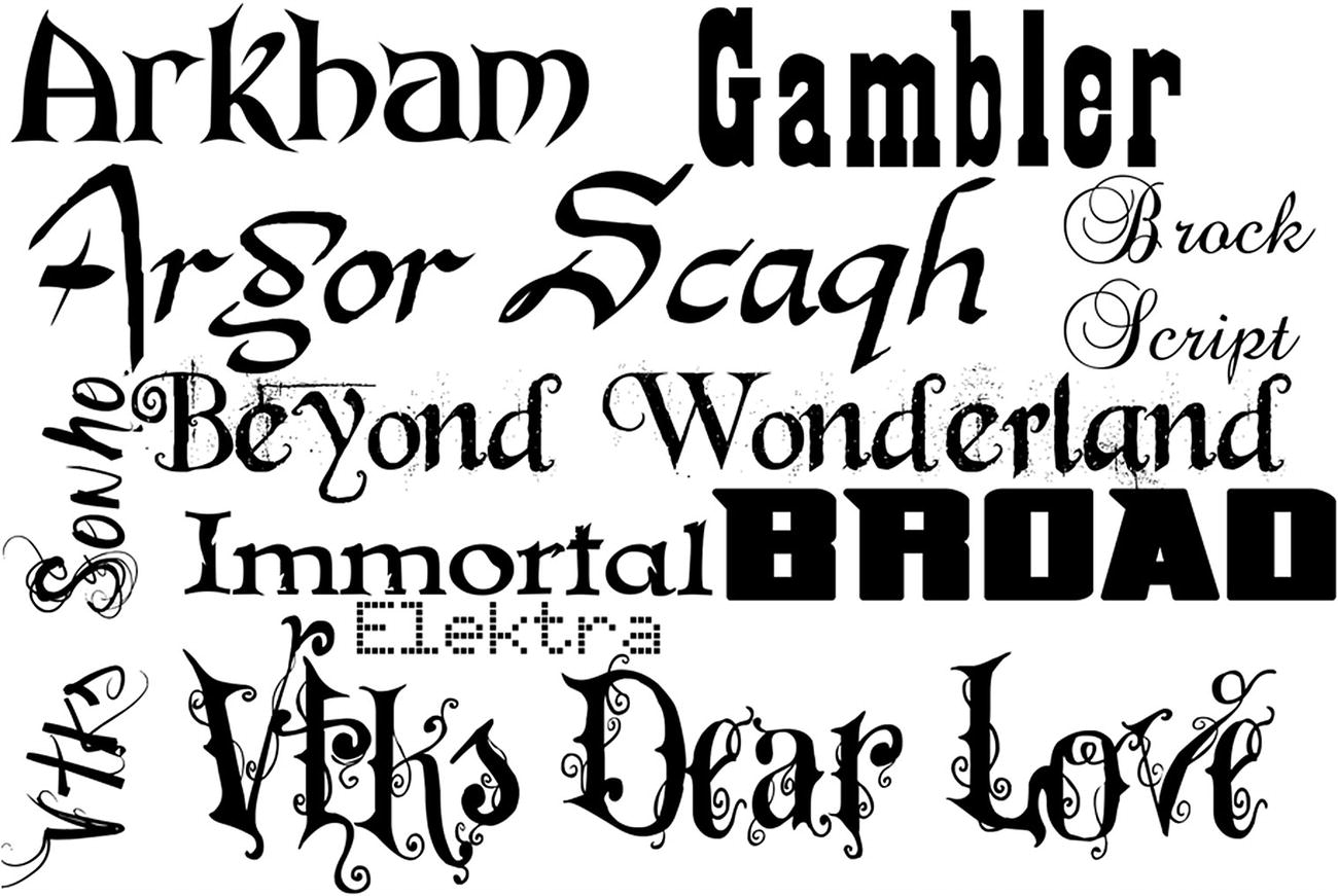
Fonts are worth 1000 words
The important thing is that the font or fonts you choose speak to your theme. It’s alright if your fonts are a little cliché as long as they enforce your genre. If you’re not sure of what type of font to use, go look at some movie posters or book covers to get an idea of how fonts are used to convey the genre of the story being told.
Before continuing, download a font or two to your Downloads folder. This example uses the Arkham font from DaFont.com ( www.dafont.com/arkham.font ), a free font with no restrictions on redistribution.
- 1.
Open a file manager window and navigate to your Downloads directory. Most font downloads are zipped, so you must unarchive them to install them.
- 2.
If you prefer to work with GUI tools, install xarchiver in dnfdragora.
- 3.
If you prefer to work in a terminal, install p7zip-full with apt .
- 4.
Next, create a local font folder located at ~/.local/share/fonts.
- 5.
To do this in the GUI, open a file manager by double-clicking the Home icon on your desktop. Right-click in any blank space in the file manager window. Select Options ➤ Show Hidden Files, and then navigate to .local/share. In the share directory, right-click any blank area and select New ➤ Directory. Name the new directory fonts.
- 6.
Create a subdirectory in ~/.local/share/fonts for the first letter of each font you are installing, and then copy the TTF or OTF files to the appropriate place.
- 7.To copy the files, you must unarchive your font downloads. Most font archives can be unarchived with p7zip, but you can also use other unarchiver tools as needed.$ cd Downloads$ 7z x arkhamfonts.zip$ tar xvf nouveau.tar.bz2
- 8.Once unarchived, you can copy the files to their destination.$ mkdir -p ~/.local/share/fonts/a$ cp ~/Downloads/arkhamfonts/ark*ttf ~/.local/share/fonts/a
In the GUI, right-click a font archive and select Open with ➤ xarchiver. Drag and drop font files from the xarchiver window to the directory matching the first letter of the font name.
Color Scheme
The last thematic element you must decide upon is a color scheme. While some genres have specific colors associated with them, there’s a lot of freedom in this aspect of design. While the Old West is often associated with browns and yellows, and a technical future world often is painted in black and neon green, you can use your own color palette in any genre as long as your colors are consistent and somehow relate to one another in a pleasing way.
The problem for non-artists is finding colors that match.
To solve this problem, all you have to do is generate a color palette from an existing image. Search the Internet or your own hard drive for an image that you like. It doesn’t have to be a free-licensed photo and it doesn’t have to match the genre for your game, because the image is only going to be used to generate colors. Just pick an image that you enjoy looking at.
- 1.
Install Image Magick.
- 2.
Download the image to your Pi.
- 3.
Run the following Image Magick command, adjusting ~/path/to/image.png to match whatever photo you have downloaded.
- 4.
Take a look at the resulting color scheme.
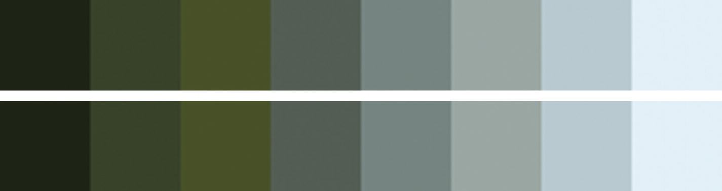
Color scheme
Graphics
When it comes to the actual graphics for a game, there are three areas of interest you must consider: the background, the foreground, and widgets.
Widgets and menu screens are where the theme is most obvious, because everything is largely static. You can use a thematic background and some genre-appropriate buttons, and the stage is set.
The background of each level is a good place to set mood and tone. It usually needs to be minimal so that it doesn’t take attention away from the elements that the player is interacting with, but it’s a good opportunity for you to convey elements of your theme. For instance, if your game is set in Victorian England, then decorating the corners of the background with a damask print or a regal design can help convey the setting. It’s also a good opportunity to use some of the colors of your primary scheme, which can also help set the mood: a bright and cheerful background sends a different message than a dark one.
The foreground consists of all the elements your player cares about, such as their player character, their enemies, loot, tutorial messages, and so on. These elements can also be themed to match your color scheme and game theme.
Itch.io/game-assets/free
Kenney.nl/assets
There’s a lot of flexibility in the foreground elements. As long as the game world matches your genre, you can drop characters—good or evil—into it, and gamers won’t think twice about it. After all, one of the most famous games of all time is ostensibly about the exciting world of plumbing, and yet the main enemies are sentient toadstools and turtles.
Even though you may gather game assets from the Creative Commons, you’re still probably going to find that you have to adapt or modify them. The Raspberry Pi comes fully equipped for game development, graphic design included.
Card Design with GIMP
GIMP (GNU Image Manipulation Program) is an all-purpose graphics creation application. You can use it to modify photographs, textures, and existing graphics, and combine them all together to provide you with your game assets, or you can create graphics from nothing but your own ideas.
The barrier to getting started with GIMP isn’t artistic skill so much as comprehending and learning the many tools that GIMP has to offer. Entire books have been written about it, there are tutorial websites dedicated to it, and it has thorough documentation, so this section steps you through the process of using the tools that apply to the current goal: creating playing cards for Battlejack. Stepping through this won’t teach you everything about GIMP, but it demonstrates the general process and some of the common tools.
Install
There are a few different ways to install GIMP. The easiest way gets you an old version of GIMP, and while there’s nothing wrong with that under normal circumstances, you’re a software developer now so there’s no reason to settle for second best. Instead of installing using the Synaptic application installer or the dnf command in a terminal, you can install the latest version, as described at www.gimp.org/downloads/ .
In the future (after a reboot), you can find GIMP in your application menu.
The GIMP interface consists of three main regions: the toolbox is full of all the tools that you use to compose graphics, the main window contains any graphics that you are working on, and the contextual docks provide extra options based on what you’re doing.
In the first part of this chapter, you defined a theme or a combination of themes, and collected suitable assets, such as fonts and clip art. GIMP allows you to composite them together.
New Document
- 1.
In the GIMP window, click File ➤ New.
- 2.
In the Create a New Image dialog box that appears, set the unit of measure to mm. Set the image width to 63.5mm and the height to 88.9mm. These measurements are those of a standard US poker playing card.
- 3.
Since screen size and printed size are different, click the Advanced Options link at the bottom of the window and set the resolution of your image to 100 DPI. Any lower, and your image may look too small or pixelated on standard displays. Any higher, and your image will be too large to fit on the screen.
Note
For serious design work, it’s not uncommon to design at a higher resolution, just in case you want to also print the designs you create for onscreen display or to account for the eventual increase in graphic resolution. For instance, as of this writing, it’s common for gamers to own 100 DPI monitors sized 1920×1080, but in a few years, 4K monitors and greater will be the default. If you design in higher resolutions, you safeguard against increasing resolution, but if you do that during this chapter, you have to scale the image down in LÖVE.
Color Scheme
So that you have it handy, open the scheme.png color scheme file you created earlier. If you didn’t create a color scheme file, that’s alright, just keep your color scheme in mind.
- 1.
To see your GIMP palettes, go to the Window menu ➤ Dockable Dialogs ➤ Palettes. This embeds a new panel displaying color palettes, including one called Colormap of Image, which is your color scheme imported as a palette (Figure 6-3).
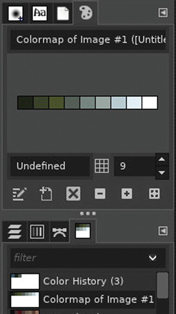
Creating a colormap in GIMP
- 2.
Right-click your palette and select Duplicate Palette to create an editable copy.
- 3.
Double-click the duplicate and give it a name, such as cardscheme . A named palette becomes permanent.
- 4.
You may now close the color scheme file so that only your blank card appears in your workspace.
- 5.
Your named color scheme remains. Right-click it and select Edit Palette to open the Palette Editor tab. This displays your color scheme so that you can use it as a reference when choosing the colors in your design.
- 6.
GIMP uses a tabbed interface to manage open files, so to get back to your card design, click the appropriate tab at the top of the window.
Text Elements
- 1.
Select the Text tool from the Tool Options panel, or press T on your keyboard.
- 2.
Click near the top-left corner of your card, but don’t start typing anything yet. When you click, a contextual tool-based panel appears below your toolbox. Since the text tool is active, you see options for text. Pick a font within your theme, and set the size to 60 or so.
- 3.
To set the color of your text, click the box labelled Color. A color picker window appears. Its default view is the GIMP color picker, but there are tabs along the top of window Figure 6-4.
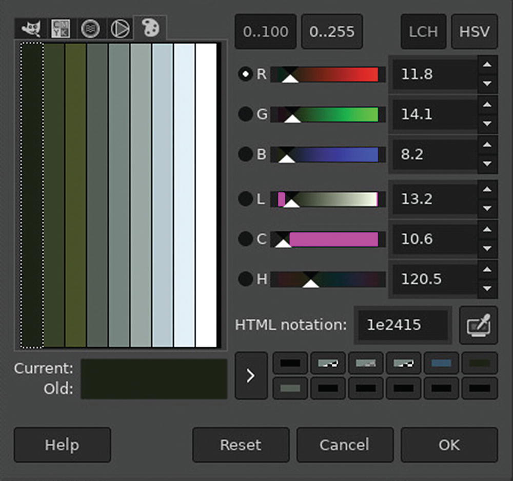
Viewing a color scheme in GIMP
- 4.
Click the right-most tab to view your custom palette and choose a color for your text.
- 5.
Click the OK button.
- 6.
Now that you have your tool configured, type the title of the card: Wizard. Don’ worry if you positioned your text too far to the right such that the whole word won’t fit; you can fix that later.
- 7.
Press the Esc key to exit text mode.
Time to Save
It’s never too early to start saving your work. To save your document, go to the File menu and select Save. You can save the document anywhere you please, but it’s best to keep project work together, so saving it into your battlejack directory is best.
- 1.
Using the GIMP save dialog, create a new directory, called src, in your battlejack project.
- 2.
In src, create another directory called img, and save your file into it with the name red-10-wizard.xcf.
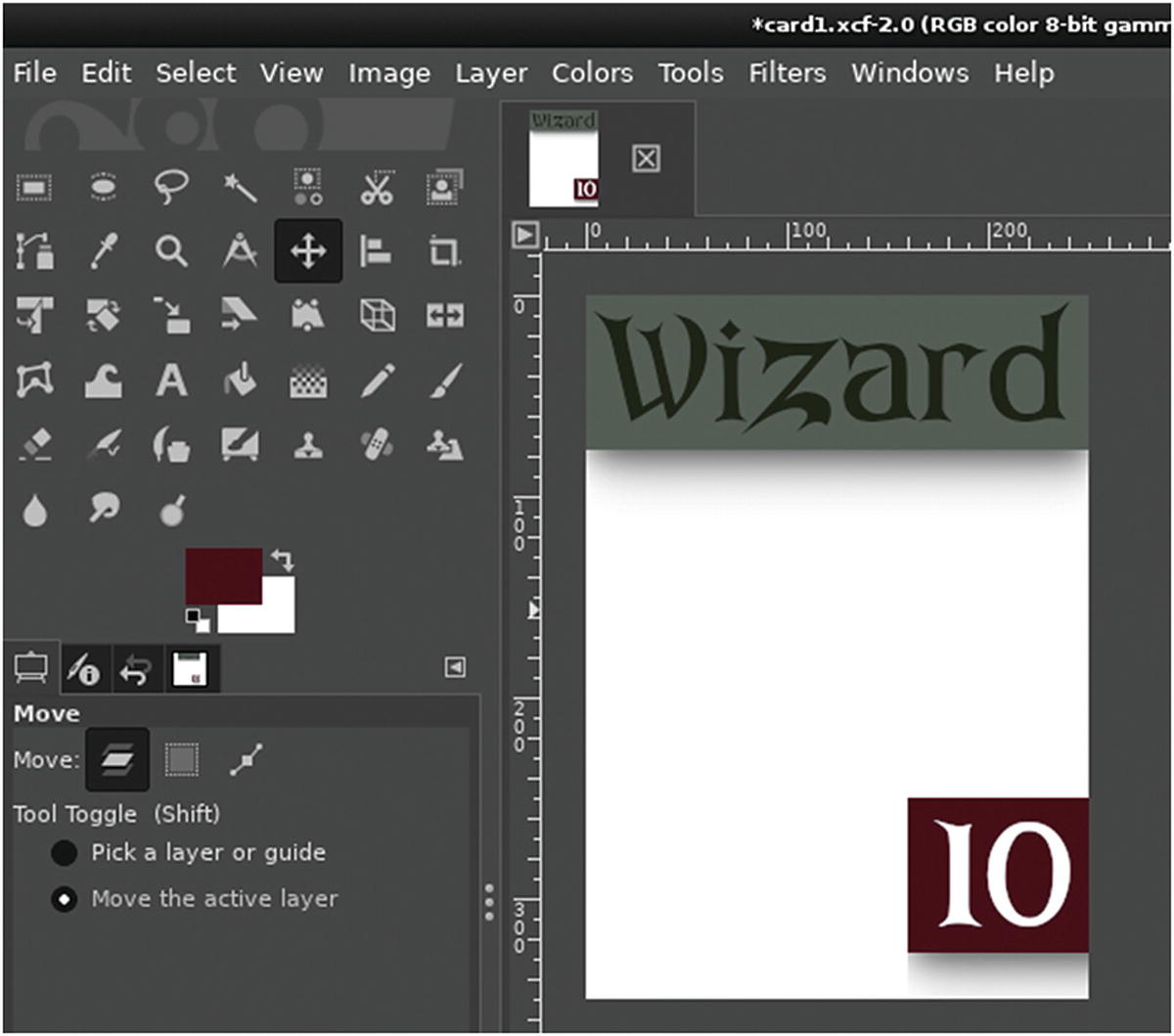
Moving Layers
When you typed text onto your card, you created a new layer. If you don’t see a Layers docker in your GIMP window, go to the Window ➤ Dockable Dialogs menu and select Layers to open it or bring it to the top of a docking panel.
Layers are like sheets of cellophane placed on top of a canvas. They’re transparent until you “paint” something on them, and even then you can always move or remove the layer entirely because you haven’t painted on your canvas, but on a transparent layer above it.
- 1.
To move a layer, select the Move tool in the Tool Options panel, or press M. As always, the Tool Options panel displays configuration choices for that tool. Select the “Move the active layer” option.
- 2.
Click your card and drag your mouse to move the active layer. Position your text where you think the title of each card looks best.
Backdrops
- 1.
To add a layer between the background and a foreground layer, right-click the background layer and select New Layer.
- 2.
In the New Layer window, name the layer backdrop and set the “Fill with” field to Transparency so that the layer is filled with a transparent alpha channel.
- 3.
Select the Rectangle Select tool from the Tool Options panel, or press R on your keyboard. Using this selection tool, select an area around the title. It might be hard to tell, but you’re not selecting the title text or the white background behind it. You’re selecting a portion of the invisible layer between them.
- 4.
Click the top color swatch under the toolbox. In the color picker that appears, select the Palette tab and select a color within your color scheme.
- 5.
Click the Edit menu at the top of the GIMP window, and select Fill with FG Color (FG stands for foreground).
- 6.
To exit selection mode, press the Esc key on your keyboard.
Color Code and Value
The card still needs a value. According to deck.ini, its value is 10. Repeat the previous process to create a value indicator.
Since Battlejack’s opposing sides are differentiated by color (red against black), use red as the backdrop color. If you don’t have red in your color scheme, you must adapt. You can still use your color scheme as a guide, though. RGB colors are defined by three numbers ranging from 0 to 255: the first number is for red, the second for green, and the third for blue. These values are visible in the right column of the GIMP color picker window. Look at a color in your palette and shift its numbers such that the highest number is in the color you want to create within the same scheme.
For instance, assume you have a green defined in your palette with these values: Red 11, Green 14, Blue 8. To produce a red similar in “feel”, shift each number one position to the left so that the number in the Blue slot now goes to Green, the number in the Green slot goes to Red, and the number in Red wraps around to Blue: Red 14, Green 8, Blue 11.
The resulting red shade may not be exactly what you want, but this trick produces something in the same mood as the rest of your color scheme, and you can adjust it manually with one of the color wheels in the color picker tabs.
Card design
Background Image
The card design is basically finished. It has the requisite information on it, so all it needs now is an image. Find an image that you feel might represent a wizard. Think abstractly. It’s easier to find an image that suggests wizardry than to find a free image of exactly what you see in your mind’s eye when you think of a wizard.
For example, you might be able to find a series of icons for fantasy roles consisting of wands, swords, battle axes, and so on. Even if you only find five or six icons, you could reuse those depending on the broad category of each card (a wand for each magic user, a sword for generic fighters, an axe for particularly powerful fighters, and so on.
Alternatively, you can borrow from Magic: the Gathering, which bases all player abilities on five different types of land. Backgrounds for video games or even landscape photography are easy to find. Add some “flavor text” on the card to explain how the land depicted has influenced the wizard that the card represents.
- 1.
To bring in an image, click the layer named Background. This layer is the base layer of your GIMP document.
- 2.
Click the File menu and select Open as layers.
- 3.
The image you choose from the file chooser is imported into your document above the Background layer but below your backdrops and text. The image may be too large, but you can fix that with the Scale tool.
- 4.
As needed, select the Scale tool from the toolbox, or press Shift+S on your keyboard.
- 5.
Click the image that you want to resize and use the selection bounding box or the dialog box to scale the image to better fit into your card design.
- 6.
Press the Return key or click the Scale button to accept the change.
Other tools you can use to fit an image into your design include the Rotate and Flip tools . Try them out and see what looks best.
Integration
To bring elements of the card design together, and as an excuse to learn more GIMP tricks, the final step is to make the card look more like an intentional design and less like something cobbled together from disparate sources. You can try one or none of these techniques, depending on what you like in card design.
- 1.
To add a drop shadow, select a backdrop layer and then click Filters ➤ Light and Shadow.
- 2.
There are currently two different drop shadow filters: one is permanent and the other (“legacy”) creates a new layer just for the drop shadow. Use either one, but remember: less is more. A subtle shadow says more than a big, bold shadow that draws attention to itself.
- 3.
Another integration technique is to merge the meta information of the card with the “flavor” (graphic). You can do that by blending text into the image. First, right-click the 10 layer in the Layers docker and select Text to Path.
- 4.
Locate the Paths docker by clicking the Windows menu and selecting Dockable Dialogs ➤ Paths.
- 5.
In the Paths palette, there is now an outline of the text element 10. The outline is a vector path— a mathematical formula that GIMP doesn’t see as a graphic but as a guide for graphical manipulation. Right-click the path and select Path to Selection. The text on the card is now selected.
- 6.
Navigate back to the Layers docker. Click the eye icon to the left of the 10 layer to hide the text, and then select the red backdrop layer.
- 7.
With the shape of the 10 still selected, press the Delete key on your keyboard, or go to the Edit menu and select Clear. This erases red from your backdrop in the shape of the number 10. You can see right through the backdrop to the image beneath.
- 8.
To remove the active selection, go to Select and choose None, or press Shift+Ctrl+A on your keyboard.
There’s a lot more you can do in GIMP, so try out some subtle effects, brushes, and composite modes. Work in layers, so that anything you do can’t be undone later if necessary. GIMP is a powerful tool, so investing in a good tutorial book or spending time on some tutorial sites is effort well spent.
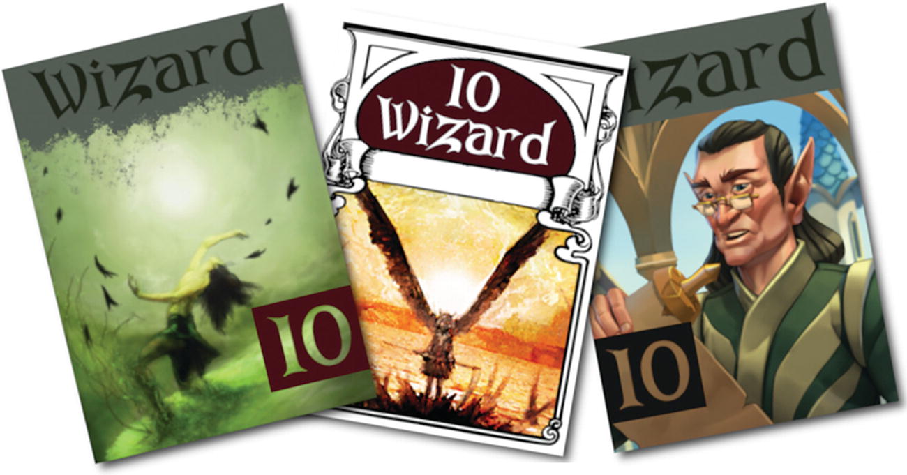
Art by Shiroikuro, Dogchicken, and Solkap
Exporting from GIMP
The native format of GIMP files is a multilayered and uncompressed .xcf file. It’s intended as a project file for use within GIMP. It wouldn’t make sense to use it anywhere else, especially not in a LÖVE game. After completing each card, you must export it to a common graphic format like PNG or JPEG.
To export an image from GIMP, go to the File menu and select Export as.
In the file chooser that appears, navigate to your battlejack project directory, name the file in a standard format, such as red-10-wizard.png, and then export the image to the img directory.
Homework
Getting to know GIMP is important if you plan on doing graphics work, whether you anticipate creating promotional web banners or all the graphics in your game. Spend some time getting to understand how GIMP works, and enjoy the freedom of doing complex graphical work without having to pay a “rental” fee each month the way that designers tied down to big-name competitors do.
There are several other excellent graphic applications on Linux. GIMP is good at collage (professionally known as compositing), and can be used for digital painting if you download a good set of brushes.
Inkscape is a vector drawing application, good for precision illustration, layout, and graphics that scale infinitely.
mtPaint is a bitmap drawing application good for pixel art. It’s a small application that runs very well on the Raspberry Pi.
Krita is a digital painting application. It’s a big application and doesn’t run well on the current Raspberry Pi.
MyPaint is a digital painting application for small drawings; it runs on the latest Pi.