Table of Contents for
Machine Learning for Hackers
 Machine Learning for Hackers
Published by
O'Reilly Media, Inc., 2012
Machine Learning for Hackers
Published by
O'Reilly Media, Inc., 2012
- Cover
- O'Reilly Strata Conference
- Machine Learning for Hackers
- Preface
- 1. Using R
- 2. Data Exploration
- 3. Classification: Spam Filtering
- 4. Ranking: Priority Inbox
- 5. Regression: Predicting Page Views
- 6. Regularization: Text Regression
- 7. Optimization: Breaking Codes
- 8. PCA: Building a Market Index
- 9. MDS: Visually Exploring US Senator Similarity
- 10. kNN: Recommendation Systems
- 11. Analyzing Social Graphs
- 12. Model Comparison
- Works Cited
- Index
- About the Authors
- Colophon
- Copyright
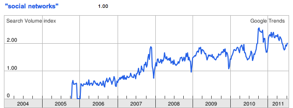
Social networks are everywhere. According to Wikipedia, there are over 200 active social networking websites on the Internet, excluding dating sites. As you can see from Figure 11-1, according to Google Trends there has been a steady and constant rise in global interest in “social networks” since 2005. This is perfectly reasonable: the desire for social interaction is a fundamental part of human nature, and it should come as no surprise that this innate social nature would manifest in our technologies. But the mapping and modeling of social networks is by no means news.
In the mathematics community, an example of social network analysis at work is the calculation of a person’s Erdős number, which measures her distance from the prolific mathematician Paul Erdős. Erdős was arguably the most prolific mathematician of the 20th century and published over 1,500 papers during his career. Many of these papers were coauthored, and Erdős numbers measure a mathematician’s distance from the circle of coauthors that Erdős enlisted. If a mathematician coauthored with Erdős on a paper, then she would have an Erdős number of one, i.e., her distance to Erdős in the network of 20th-century mathematics is one. If another author collaborated with one of Erdős’ coauthors but not with Erdős directly, then that author would have an Erdős number of two, and so on. This metric has been used, though rarely seriously, as a crude measure of a person’s prominence in mathematics. Erdős numbers allow us to quickly summarize the massive network of mathematicians orbiting around Paul Erdős.
Erving Goffman, one of the most celebrated intellectuals of the 20th century and very much the equivalent of Paul Erdős in the social sciences based on the overwhelming breadth of his contributions, provides one of the best statements on the nature of human interaction:
[W]hen persons are present to one another they can function not merely as physical instruments but also as communicative ones. This possibility, no less than the physical one, is fateful for everyone concerned and in every society appears to come under strict normative regulation, giving rise to a kind of communication traffic order.
—Erving Goffman, from Behavior in public places: notes on the social organization of gatherings (1966)
The “traffic order” that Goffman was referring to is exactly a social network. The by-product of our desire to interact and socialize with each other are highly structured graphs, which provide a sort of “map” of our identities and histories. Social networking services such as Facebook, Twitter, and LinkedIn simply provide highly stylized templates for engaging in this very natural behavior. The innovation of these services is not in their function, but rather the way in which they provide insight into the social cartography of a very large portion of humanity. To hackers like us, the data that social networking sites expose is a veritable geyser of awesome.
But the value of social graphs goes beyond social networking sites. There are several types of relationships that can be modeled as a network, and many of those are also captured by various Internet services. For example, we could map the relationships among movie watchers based on the movies they have watched on Netflix. Likewise, we could show how various music genres relate to one another based on the patterns of listeners using services such as Last.fm or Spotify. In a more basic way, we may also model the structure of a local computer network—or even the entire Internet—as a massive series of nodes and edges.
Although the study of social networks is very popular now, in large part due to the proliferation of social networking sites, what’s commonly referred to as “social network analysis” is a set of tools that has been used and developed over the past several decades. At its core, the study of networks relies on the language of graph theory to describe interconnected objects. As early as 1736, Leonhard Euler used the concept of nodes and edges to formalize the Königsberg Bridge problem.
Note
The Königsberg Bridge problem is an early variant of the Traveling Salesman Problem, in which you must devise a path through the city of Königsberg, Prussia (now Kaliningrad, Russia) by traversing each of its seven bridges exactly once. Euler solved the problem by converting a map of the city to a simple graph with four nodes (city sections) and seven edges (the bridges).
In the 1920s, famed psychologist Jacob L. Moreno developed a method for studying human relationships called “sociometry.” Moreno was interested in how people’s social interactions affected their well-being, so he asked people who their friends were and began mapping this structure. In 1937, anthropologist Joan Criswell used Moreno’s sociometric methods to study racial cleavages between black and white elementary school children JC37.
Most of what we consider to be contemporary social network analysis is a conglomeration of theory and methods from a wide array of disciplines. A large portion comes from sociology, including prominent scholars such as Linton Freeman, Harrison White, Mark Granovetter, and many others. Likewise, many contributions have also come from physics, economics, computer science, political science, psychology, and countless other disciplines and scholars. There are far too many authors and citations to list here, and tomes have been written that review the methods in this large area of study. Some of the most comprehensive include Social Network Analysis, by Stanley Wasserman and Katherine Faust WF94; Social and Economic Networks, by Matthew O. Jackson MJ10; and Networks, Crowds, and Markets, by David Easley and Jon Kleinberg EK10. In this brief introduction to social network analysis we will cover only a tiny portion of this topic. For those interested in learning more, we highly recommend any of the texts just mentioned.
That said, what will we cover in this chapter? As we have throughout this book, we will focus on a case study in social networks that takes us through the entire data-hacking cycle of acquiring social network data, cleaning and structuring it, and finally analyzing it. In this case we will focus on the preeminent “open” social network of the day: Twitter. The word “open” is in scare quotes because Twitter is not really open in the sense that we can freely access all of its data. Like many social networking sites, it has an API with a strict rate limit. For that reason, we will build a system for extracting data from Twitter without running into this rate limit and without violating Twitter’s terms of service. In fact, we won’t ever access Twitter’s API directly during this chapter.
Our project begins by building a local network, or ego-network, and snowballing from there in the same way that an Erdős number is calculated. For our first analysis, we will explore methods of community detection that attempt to partition social networks into cohesive subgroups. Within the context of Twitter, this can give us information about the different social groups that a given user belongs to. Finally, because this book is about machine learning, we will build our own “who to follow” recommendation engine using the structure of Twitter’s social graph.
We will try to avoid using jargon or niche academic terms to describe what we are doing here. There are, however, some terms that are worth using and learning for the purposes of this chapter. We have just introduced the term ego-network to describe a type of graph. As we will be referring to ego-networks many more times going forward, it will be useful to define this term. An ego-network always refers to the structure of a social graph immediately surrounding a single node in a network. Specifically, an ego-network is the subset of a network induced by a seed (or ego) and its neighbors, i.e., those nodes directly connected to the seed. Put another way, the ego-network for a given node includes that node’s neighbors, the connections between the seed and those neighbors, and the connections among the neighbors.
Before we can dive head first into hacking the Twitter social graph, it will be useful to take a step back and define a network. Mathematically, a network—or graph—is simply a set of nodes and edges. These sets have no context; they only serve the purpose of representing some world in which the edges connect the nodes to one another. In the most abstract formulation, these edges contain no information other than the fact that they connect two nodes. We can, however, see how this general vessel of organizing data can quickly become more complex. Consider the three graphs in Figure 11-2.
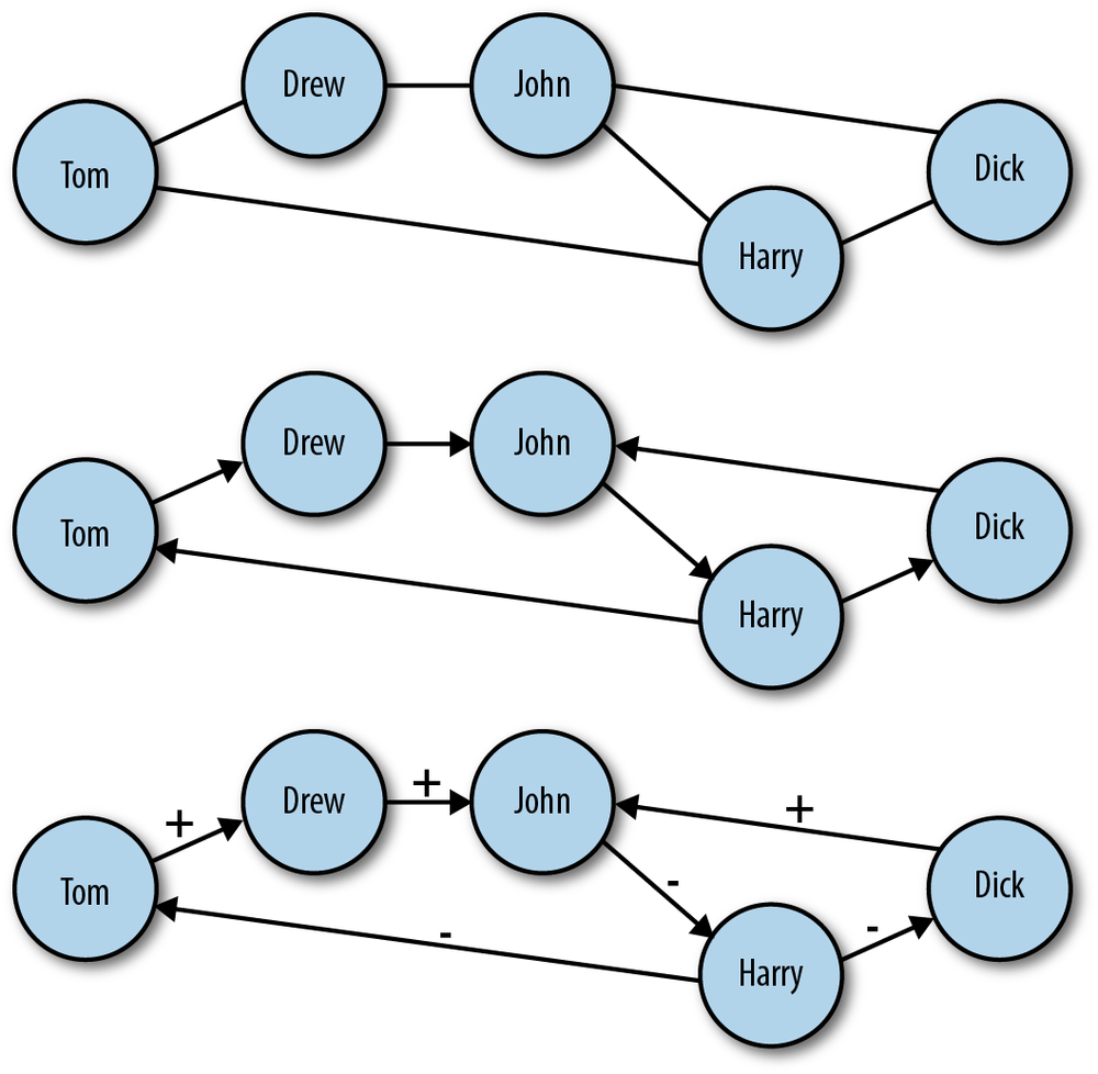
Figure 11-2. Different types of networks: A) undirected network; B) directed network; C) directed network with labeled edges
In the top panel of Figure 11-2 is an example of an undirected graph. In this case, the edges of the graph have no direction. Another way to think about it is that a connection between nodes in this case implies mutuality of the tie. For example, Dick and Harry share a connection, and because this graph is undirected, we can think of this as meaning they can exchange information, goods, etc. with one another over this tie. Also, because this is a very basic network setup, it is easy to overlook the fact that even in the undirected case we have increased the complexity of the graph beyond the most general case we mentioned earlier. In all the graphs in Figure 11-2, we have added labels to the nodes. This is additional information, which is quite useful here, but is important to consider when thinking about how we move from a network abstraction to one that describes real data.
Moving to the middle panel of Figure 11-2, we see a directed graph. In this visualization, the edges have arrows that denote the directionality of an edge. Now, edges are not mutual, but indicate instead a one-way tie. For example, Dick and Drew have ties to John, but John only has a tie to Harry. In the final panel of Figure 11-2, we have added edge labels to the graph. Specifically, we have added a positive or negative sign to each label. This could indicate a “like” or “dislike” relationship among the members of this network or some level of access. Just as node labels add information and context to a network, so too do edge labels. These labels can also be much more complex than a simple binary relationship. These labels could be weights indicating the strength or type of a relationship.
It is important to consider the differences among these different graph types because the social graph data we will encounter online comes in many different forms. Variation in how the graphs are structured can affect how people use the service and, consequently, how we might analyze the data. Consider two popular social networking sites that vary in the class of graphs they use: Facebook and Twitter. Facebook is a massive, undirected social graph. Because “friending” requires approval, all edges imply a mutual friendship. This has caused Facebook to evolve as a relatively more closed network with dense local network structures rather than the massive central hubs of a more open service. On the other hand, Twitter is a very large directed graph. The following dynamics on Twitter do not require mutuality, and therefore the service allows for large asymmetries in the directed graph in which celebrities, news outlets, and other high-profile users acts as major broadcast points for tweets.
Although the differences in how connections are made between the services may seem subtle, the resulting differences are very large. By changing the dynamic slightly, Twitter has created an entirely different kind of social graph and one that people use in a very different way than they use Facebook. Of course, the reasons for this difference go beyond the graph structures, including Twitter’s 140-character limit and the completely public nature of most Twitter accounts, but the graph structure powerfully affects how the entire network operates. We will focus on Twitter for the case study in this chapter, and we will therefore have to consider its directed graph structures during all aspects of the analysis. We begin with the challenge of collecting Twitter’s relationship data without exceeding the API rate limit or violating the terms of service.
At the time of this writing, Twitter provides two different kinds of access to its API. The first is unauthenticated, which allows for 150 requests per hour before getting cut off. Alternatively, OAuth authenticated calls to the API are limited to 350 per hour. Being limited to 150 API calls per hour is far too few to scrape the data we need in a reasonable amount of time. The second limit of 350 is also too few, and furthermore, we are not interested in building a Twitter application that requires authentication. We want to get the data quickly to build the networks so we can begin hacking the data.
Note
If you are not familiar with RESTful APIs or have never heard of OAuth, don’t worry. For the purposes of this exercise we will not worry about those details. If you are interested in learning more about any of them, we suggest reading the documentation for the specific service you are attempting to access. In the case of Twitter, the best reference is the API FAQ: https://dev.twitter.com/docs/api-faq.
Unfortunately, we won’t be able to do this if we use the API provided by Twitter. To get the data we want, we will have to use another source of Twitter’s social graph data: Google’s SocialGraph API (also called the SGA). Google introduced the SGA back in 2008 with the intention of creating a single online identity used across all social networking sites. For example, you may have accounts with several online services, all of which resolve to a single email address. The idea with SGA is to use that single bit of information to collate your entire social graph across multiple services. If you’re curious about how long your trail of digital exhaust is in Google, type the following in your favorite web browser:
https://socialgraph.googleapis.com/lookup?q=@EMAIL_ADDRESS&fme=1&pretty=1If you replace the EMAIL_ADDRESS
The primary advantage of using the SGA is that unlike the pittance
of hourly queries that Twitter provides, the SGA allows 50,000 queries per day. Even at Twitter’s
scale, this will be more than enough queries to build the social graph
for the vast majority of users. Of course, if you are Ashton Kutcher or
Tim O’Reilly, the method described in this case study will not work.
That said, if you are a celebrity and still interested in following
along with this exercise, you are welcome to use either of our Twitter
usernames: @johnmyleswhite or
@drewconway.
https://socialgraph.googleapis.com/lookup?q=http://twitter.com/
        drewconway&edo=1&edi=1&pretty=1
For example, let’s use Drew’s Twitter page to explore how SGA
structures the data. Type the preceding API query into your web browser
of choice. If you would like, you are welcome to query the SGA with your
own Twitter username. As before, the SGA will return raw JSON describing
Drew’s Twitter relationships. From the API query itself, we see three
important parameters: edo, edi, and pretty. The pretty parameter is useful only in this
browser view because it returns formatted JSON. When we are actually
parsing this JSON into a network, we will drop this parameter. edi and edo, however, correspond to the direction of
the Twitter relationships. The edo
parameter stands for “edges out,” i.e., Twitter friends, and edi means “edges in,” i.e., Twitter
followers.
In Example 11-1 we see an
abbreviated version of the formatted raw JSON returned for @drewconway. The JSON object we are most
interested is nodes. This contains
some descriptive information about the Twitter user—but more
importantly, the in- and outbound relationships. The nodes_referenced object contains all of the
Twitter friends for the node being queried. These are the other users
the node is following (out-degree). Likewise, the nodes_referenced_by object contains the
Twitter users following the queried node (in-degree).
Example 11-1. Structure of Google SocialGraph data in raw JSON
{
 "canonical_mapping": {
  "http://twitter.com/drewconway": "http://twitter.com/drewconway"
 },
 "nodes": {
  "http://twitter.com/drewconway": {
   "attributes": {
    "exists": "1",
    "bio": "Hopeful academic, data nerd, average hacker, student of conflict.",
    "profile": "http://twitter.com/drewconway",
    "rss": "http://twitter.com/statuses/user_timeline/drewconway.rss",
    "atom": "http://twitter.com/statuses/user_timeline/drewconway.atom",
    "url": "http://twitter.com/drewconway"
   },
   "nodes_referenced": {
      ...
   },
   "nodes_referenced_by": {
      ...
   }
  }
}
Warning
The SGA crawler simply scans Twitter for public links among
users and stores the relationships in its database. Private Twitter
accounts are therefore absent from the data. If you are examining your
own SGA data, you may notice that it does not reflect your exact
current Twitter relationships. Specifically, the nodes_referenced object may contain users
that you no longer follow. This is because SGA only periodically
crawls the active links, so its cached data does not always reflect
the most up-to-date data.
Of course, we do not want to work with SGA through the browser. This API is meant to be accessed programmatically, and the returned JSON needs to be parsed into a graph object so that we can build and analyze these Twitter networks. To build these graph objects, our strategy will be to use a single Twitter user as a seed (recall the Erdős number) and build out the network from that seed. We will use a method called snowball sampling, which begins with a single seed and then finds all in- and out-degree connections to that seed. Then we will use those connections as new seeds and repeat the process for a fixed number of rounds.
For this case study, we will perform only two rounds of sampling, which we do for two reasons. First, we are interested in mapping and analyzing the seed user’s local network structure to make recommendations about who the seed user should follow. Second, because of the scale of Twitter’s social graph, we might quickly exceed the SGA rate limit and our hard drive’s storage capacity if we used more rounds. With this limitation in mind, in the next section we begin by developing the foundational functions for working with the SGA and parsing the data.
We begin by loading the R packages we will need to generate the
Twitter graphs. We will be using three R packages for building these
graphs from the SGA. The RCurl package
provides an interface to the libcurl library, which we will use for
making HTTP requests to the SGA. Next, we will use RJSONIO to parse the JSON returned by the
SGA in the R lists. As it happens, both of these packages are developed by
Duncan Temple Lang, who has developed many indispensable R packages
(see http://www.omegahat.org/). Finally,
we will use igraph to
construct and store the network objects. The igraph package is a powerful R package for
creating and manipulating graph objects, and its flexibility will be
very valuable to us as we begin to work with our network data.
library(RCurl)
library(RJSONIO)
library(igraph)
The first function we will write works with the SGA at the
highest level. We will call the function twitter.network to query the SGA for a given
seed user, parse the JSON, and return a representation of that user’s
ego-network. This function takes a single parameter, user, which is a string corresponding to a
seed Twitter user. It then constructs the corresponding SGA GET
request URL and uses the getURL function in
RCurl to make an HTTP request.
Because the snowball search will require many HTTP requests at once,
we build in a while-loop that checks to make sure that the page
returned is not indicating a service outage. Without this, the script
would inadvertently skip those nodes in the snowball search, but with
this check it will just go back and attempt a new request until the
data is gathered. Once we know the API request has returned JSON, we
use the fromJSON function in
the RJSONIO package to parse the
JSON.
twitter.network <- function(user) {
	api.url <-
    paste("https://socialgraph.googleapis.com/lookup?q=http://twitter.com/",
                 user, "&edo=1&edi=1", sep="")
	api.get <- getURL(api.url)
	# To guard against web-request issues, we create this loop
	# to ensure we actually get something back from getURL.
	while(grepl("Service Unavailable. Please try again later.", api.get)) {
		api.get <- getURL(api.url)
	}
    api.json <- fromJSON(api.get)
    return(build.ego(api.json))
}
With the JSON parsed, we need to build the network from that
data. Recall that the data contains two types of relationships:
nodes_referenced (out-degree) and
nodes_referenced_by (in-degree). So
we will need to make two passes through the data to include both types
of edges. To do so, we will write the function build.ego, which takes parsed SGA JSON as a
list and builds the network. Before we can begin, however, we have to
clean the relational data returned by the SGA. If you inspect
carefully all of the nodes returned by the API request, you will
notice that some of the entries are not proper Twitter users. Included
in the results are relationships extraneous to this exercise. For
example, there are many Twitter lists as well as URLs that refer to
“account” redirects. Though all of these are part of the Twitter
social graph, we are not interested in including these nodes in our
graph, so we need to write a helper function to remove them.
find.twitter <- function(node.vector) {
	  twitter.nodes <- node.vector[grepl("http://twitter.com/", node.vector,
                                       fixed=TRUE)]
		if(length(twitter.nodes) > 0) {
				twitter.users <- strsplit(twitter.nodes, "/")
			  user.vec <- sapply(1:length(twitter.users),
			                function(i) (ifelse(twitter.users[[i]][4]=="account",
			                                    NA, twitter.users[[i]][4])))
		  	return(user.vec[which(!is.na(user.vec))])
		}
	  else {
				return(character(0))
	  }
}
The find.twitter function
does this by exploiting the structure of the URLs returned by the SGA
to verify that they are in fact Twitter users, rather than some other
part of the social graph. The first thing this function does is check
which nodes returned by the SGA are actually from Twitter by using
the grepl function to
check for the pattern http://twitter.com/. For those URLs that
match, we need to find out which ones correspond to actual accounts,
rather than lists or redirects. One way to do this is to split the
URLs by a backslash and then check for the word “account,” which
indicates a non-Twitter-user URL. Once we identify the indices that
match this non-Twitter pattern, we simply return those URLs that don’t
match this pattern. This will inform the build.ego function which nodes should be
added to the network.
build.ego <- function(json) {
      # Find the Twitter user associated with the seed user
	  ego <- find.twitter(names(json$nodes))
	  # Build the in- and out-degree edgelist for the user
	  nodes.out <- names(json$nodes[[1]]$nodes_referenced)
	  if(length(nodes.out) > 0) {
	    	# No connections, at all
		    twitter.friends <- find.twitter(nodes.out)
		    if(length(twitter.friends) > 0) {
		      	# No twitter connections
			      friends <- cbind(ego, twitter.friends)
		    }
		    else {
		      	friends <- c(integer(0), integer(0))
		    }
	  }
	  else {
	    	friends <- c(integer(0), integer(0))
	  }
	  nodes.in <- names(json$nodes[[1]]$nodes_referenced_by)
	  if(length(nodes.in) > 0) {
	    	twitter.followers <- find.twitter(nodes.in)
		    if(length(twitter.followers) > 0) {
		      	followers <- cbind(twitter.followers, ego)
		    }
		    else {
		      	followers <- c(integer(0), integer(0))
		    }
	  }
	  else {
	    	followers <- c(integer(0), integer(0))
	  }
	  ego.el <- rbind(friends, followers)
	  return(ego.el)
}
With the proper nodes identified in the list, we can now begin
building the network. To do so, we will use the build.ego to create an “edge list” to
describe the in- and out-degree
relationships of our seed user. An edge list is simply a two-column
matrix representing the relationships in a directional graph. The
first column contains the sources of edges, and the second column
contains the targets. You can think of this as nodes in the first
column linking to those in the second. Most often, edge lists will
contain either integer or string labels for the nodes. In this case,
we will use the the Twitter username string.
Though the build.ego function
is long in line-count, its functionality is actually quite simple.
Most of the code is used to organize and error-check the building of
the edge lists. As you can see, we first check that the API calls for
both nodes_referenced and nodes_referenced_by returned at least some
relationships. And then we check which nodes actually refer to Twitter
users. If either of these checks returns nothing, we will return a
special vector as the output of our function: c(integer(0), integer(0)). Through this
process we create two edge-list matrices, aptly named friends and followers.
In the final step, we use rbind to bind these two matrices into a
single edge list, called ego.el. We
used the special vector c(integer(0),
integer(0)) in the cases where there is no data because the
rbind will effectively ignore it
and our results will not be affected. You can see this for yourself by
typing the following at the R console:
 rbind(c(1,2), c(integer(0), integer(0)))
     [,1] [,2]
[1,]    1    2
Note
You may be wondering why we are building up only an edge list
of relationships rather than building the graph directly with
igraph. Because of the way igraph stores graphs in memory, it can be
difficult to iteratively build graphs in the way that a snowball
sample requires. As such, it is much easier to build out the entire
relational data set first (in this case as an edge list) and then
convert that data to a graph later.
We have now written the core of our graph-building script. The
build.ego function does the
difficult work of taking parsed JSON from the SGA and turning it into
something that igraph can turn into
a network. The final bit of functionality we will need to build is to
pull everything together in order to generate the snowball sample. We
will create the twitter.snowball
function to generate this sample and one small helper function,
get.seeds, to generate the list of
new seeds to visit. As in build.ego, the primary purpose of twitter.snowball is to generate an edge list
of the network relationships. In this case, however, we will be
binding together the results of many calls to build.ego and returning an igraph graph object. For simplicity, we
begin with the get.seeds function,
though it will refer to things generated in twitter.snowball.
get.seeds <- function(snowball.el, seed) {
    new.seeds <- unique(c(snowball.el[,1],snowball.el[,2]))
    return(new.seeds[which(new.seeds!=seed)])
}
The purpose of get.seeds is
to find the unique set of nodes from a edge list that are not the seed nodes. This is done very easily
by reducing the two-column matrix into a single vector and then
finding the unique elements of that vector. This clean vector is
called new.seeds, and from this,
only those elements that are not the seed are returned. This is a
simple and effective method, but there is one thing we must consider
when using this method.
The get.seeds function only
checks that the new seeds are not the same as the current seed. We
would like to include something to ensure that during our snowball
sample we do not revisit nodes in the network for which structure has
already been regenerated. From a technical perspective this is not
necessarily important, as we could very easily remove duplicate rows
in the final edge list. It is important, however, from a practical
perspective. By removing nodes that have already been visited from the
list of potential new seeds before building new structure, we cut down
on the the number of API calls that we must make. This in turn reduces
the likelihood of hitting up against the SGA’s rate limit and shortens
our script’s running time. Rather than having the get.seeds function handle this, we add this
functionality to twitter.snowball,
where the entire network edge list is already stored in memory. This
ensures that there are not multiple copies of the entire edge list in
memory as we are building out the entire snowball. Remember, at these
scales, we need to be very conscious of memory, especially in a
language like R.
twitter.snowball <- function(seed, k=2) {
    # Get the ego-net for the seed user. We will build onto
	# this network to create the full snowball search.
    snowball.el <- twitter.network(seed)

    # Use neighbors as seeds in the next round of the snowball
    new.seeds <- get.seeds(snowball.el, seed)
    rounds <- 1  # We have now completed the first round of the snowball!

    # A record of all nodes hit, this is done to reduce the amount of
    # API calls done.
    all.nodes <- seed

    # Begin the snowball search...
    while(rounds < k) {
        next.seeds <- c()
        for(user in new.seeds) {
          	# Only get network data if we haven't already visited this node
              if(!user %in% all.nodes) {
                	user.el <- twitter.network(user)
                	if(dim(user.el)[2] > 0) {
                	    snowball.el <- rbind(snowball.el, user.el)
        		        next.seeds <- c(next.seeds, get.seeds(user.el, user))
        		        all.nodes <- c(all.nodes, user)
                	}
              }
        }
        new.seeds <- unique(next.seeds)
        new.seeds <- new.seeds[!which(new.seeds %in% all.nodes)]
        rounds <- rounds + 1
    }
    # It is likely that this process has created duplicate rows.
    # As a matter of housekeeping we will remove them because
    # the true Twitter social graph does not contain parallel edges.
    snowball.el <- snowball.el[!duplicated(snowball.el),]
    return(graph.edgelist(snowball.el))
}
The functionality of the twitter.snowball function is as you might
expect. The function takes two parameters: seed and k. The first is a character string for a
Twitter user, and in our case, this could be “drewconway” or
“johnmyleswhite.” The k is an
integer greater than or equal to two and determines the number of
rounds for the snowball search. In network parlance, the k value generally refers to a degree or
distance within a graph. In this case, it corresponds to the distance
from the seed in the network the snowball sample will reach. Our first
step is to build the initial ego-network from the seed; from this, we
will get the new seeds for the next round.
We do this with calls to twitter.network and get.seeds. Now the iterative work of the
snowball sample can begin. The entire sampling occurs inside the
while-loop of twitter.snowball. The basic logical
structure of the loop is as follows. First, check that we haven’t
reached the end of our sample distance. If not, then proceed to build
another layer of the snowball. We do so by iteratively building the
ego-networks of each of our new seed users. The all.nodes object is used to keep track of
nodes that have already been visited; in other words, before we build
a node’s ego-network, we first check that it is not already in
all.nodes. If it is not, then we
add this user’s relationships to snowball.el, next.seeds, and all.nodes. Before we proceed to the next
round of the snowball, we check that the new new.seeds vector does not contain any
duplicates. Again, this is done to prevent revisiting nodes. Finally,
we increment the rounds
counter.
In the final step, we take the matrix snowball.el, which represents the edge list
of the entire snowball sample, and convert it into an igraph graph object using the graph.edgelist function. There is one final
bit of housekeeping we must do, however, before the conversion.
Because the data in the SGA is imperfect, occasionally there will be
duplicate relationships between the sample edges. Graphing
theoretically, we could leave these relationships in and use a special
class of graph called a “multi-graph” as our Twitter network. A
multi-graph is simply a graph with multiple edges between the same
nodes. Although this paradigm may be useful in some contexts, there
are very few social network analysis metrics that are valid for such a
model. Also, because in this case the extra edges are the result of
errors, we will remove those duplicated edges before converting to a
graph object.
We now have all the functionality we need to build out Twitter networks. In the next section we will build supplemental scripts that make it easy to quickly generate network structure from a given seed user and perform some basic structural analysis on these graphs to discover the local community structure in them.
It’s time to start building Twitter networks. By way of
introducing an alternative approach to building and running R scripts,
in this case we will build the code as a shell script to be run at the
command line. Up to this point we have been writing code to be run
inside the R console, which will likely be the dominant way in which you
will use the language. Occasionally, however, you may have a task or
program that you wish to perform many times with different inputs. In
this case, it can be easier to write a program that runs at the command
line and takes inputs from standard input. To do this we will use the Rscript command-line program that comes with
your R installation. Rather than run the code now, let’s first go
through it so we understand what it is doing before we fire up the
program.
Warning
Recall that due to a change in Google SocialGraph API that became apparent to us at the time of this writing, we can no longer generate new Twitter network data. As such, for the remainder of this chapter we will be using the Twitter network data for John (@johnmyleswhite) as it stood at the time we first collected it.
Because we may want to build Twitter networks for many different users, our program should be able to take different usernames and input and generate the data as needed. Once we have built the network object in memory, we will perform some basic network analysis on it to determine the underlying community structure, add this information to the graph object, and then export the networks as files to the disk. We begin by loading the igraph library as well as the functions built in the previous section, which we have placed in the google_sg.R file.
library(igraph)

source('google_sg.R')

user <- 'johnmyleswhite'

user.net <- read.graph(paste("data/",user, "/", user, "_net.graphml", sep =
""), format = "graphml")
We will again be using the igraph library to build and manipulate the
Twitter graph objects. We use the source
function to load in the functions written in the previous section.
Because we are not going to be generating new data for this case study,
we load data previously scraped for John’s Twitter network by loading
the data in the johnmyleswhite folder.
Warning
A note to Windows users: you
may not be able to run this script from the DOS shell. In this case,
you should just set the user
variable to whatever Twitter user you would like to build the network
for and run this script as you have done before. This is noted again
in the twitter_net.R file as well.
After having built all of the necessary support functions in the
previous section, we need only pass our seed user to the twitter.snowball function. Also, because in
this example we are interested in building the seed user’s ego-network,
we will have used only two rounds for the snowball sample. Later in this
chapter we will load the network files into the graph visualization
software Gephi, which will allow us to build beautiful
visualizations of our data. Gephi has some reserved variable names that
it uses for visualization. One of those is the Label variable, which is used to label nodes
in the graph. By default, igraph
stores label information as the name
vertex attribute, so we need to create a new vertex attribute called
Label that duplicates this
information. We use the set.vertex.attribute function to do this,
which takes the user.net graph object
created in the previous step, a new attribute, and a vector of data to
assign to that attribute.
user.net <- set.vertex.attribute(user.net, "Label",
    value = get.vertex.attribute(user.net, "name"))
Note
Gephi is an open source, multiplatform graph visualization and
manipulation platform. The built-in network visualization tools in R
and igraph are useful, but
insufficient for our needs. Gephi is specifically designed for network
visualizations and includes many useful features for creating
high-quality network graphics. If you do not have Gephi installed or
have an old version, we highly recommend installing the latest
version, available at http://gephi.org/.
With the graph object now built, we will perform some basic network analysis on it to both reduce its complexity and uncover some of its local community structure.
Our first step in the analytical process is extracting the
core elements of the graph. There are two useful subgraphs of the full
user.net object that we will want
to extract. First, we will perform a k-core analysis to extract the graph’s
2-core. By definition, a k-core
analysis will decompose a graph by node connectivity. To find
the “coreness” of a graph, we want to know how many nodes have a
certain degree. The k in k-core
describes the degree of the decomposition. So, a graph’s 2-core is a
subgraph of the nodes that have a degree of two or more. We are
interested in extracting the 2-core because a natural by-product of
doing a snowball search is having many pendant nodes at the exterior
of the network. These pendants contribute very little, if any, useful
information about the network’s structure, so we want to remove
them.
Recall, however, that the Twitter graph is directed, which means
that nodes have both an in- and out-degree. To find those nodes that
are more relevant to this analysis, we will use the graph.coreness function to calculate the
coreness of each node by its in-degree
by setting the mode="in"
parameter. We do this because we want to keep those nodes that receive
at least two edges, rather than those that give two edges. Those
pendants swept up in the snowball sample will likely have connectivity
into the network, but not from it; therefore, we use in-degree to find
them.
user.cores <- graph.coreness(user.net, mode="in")
user.clean <- subgraph(user.net, which(user.cores>1)-1)
The subgraph function
takes a graph object and a set of nodes as inputs and returns the
subgraph induced by those nodes on the passed graph. To extract the
2-core of the user.net graph, we
use the base R which function to
find those nodes with an in-degree coreness greater than one.
user.ego <- subgraph(user.net, c(0, neighbors(user.net, user, mode = "out")))
Warning
One of the most frustrating “gotchas” of working with
igraph is that igraph uses zero-indexing for nodes,
whereas R begins indexing at one. In the 2-core example you’ll
notice that we subtract one from the vector returned by the which function, lest we run into the
dreaded “off by one” error.
The second key subgraph we will extract is the seed’s
ego-network. Recall that this is the subgraph induced by the seed’s
neighbors. Thankfully, igraph has a
useful neighbors convenience function for
identifying these nodes. Again, however, we must be cognizant of
Twitter’s directed graph structure. A node’s neighbors be can either
in- or outbound, so we must tell the neighbors function which we would like. For
this example, we will examine the ego-network induced by the
out-degree neighbors, or those Twitter users that the seed follows,
rather than those that follow the seed. From an analytical perspective
it may be more interesting to examine those users someone follows,
particularly if you are examining your own data. That said, the
alternative may be interesting as well, and we welcome the reader to
rerun this code and look at the in-degree neighbors instead.
For the rest of this chapter we will focus on the ego-network, but the 2-core is very useful for other network analyses, so we will save it as part of our data pull. Now we are ready to analyze the ego-network to find local community structure. For this exercise we will be using one of the most basic methods for determining community membership: hierarchical clustering of node distances. This is a mouthful, but the concept is quite simple. We assume that nodes, in this case Twitter users, that are more closely connected, i.e., have less hops between them, are more similar. This make sense practically because we may believe that people with shared interests follow each other on Twitter and therefore have shorter distances between them. What is interesting is to see what that community structure looks like for a given user, as people may have several different communities within their ego-network.
user.sp <- shortest.paths(user.ego)
user.hc <- hclust(dist(user.sp))
The first step in performing such an analysis is to measure the
distances among all of the nodes in our graph. We use shortest.paths,
which returns an N-by-N matrix, where N is the number of nodes in the
graph and the shortest distance between each pair of nodes is the
entry for each position in the matrix. We will use these distances to
calculate node partitions based on the proximity of nodes to one
another. As the name suggests, “hierarchical” clustering has many
levels. The process creates these levels, or cuts, by attempting to
keep the closest nodes in the same partitions as the number of
partitions increases. For each layer further down the hierarchy, we
increase the number of partitions, or groups of nodes, by one. Using
this method, we can iteratively decompose a graph into more granular
node groupings, starting with all nodes in the same group and moving
down the hierarchy until all the nodes are in their own group.
R comes with many useful functions for doing clustering.
For this work we will use a combination of the dist and hclust functions. The dist function will create a distance matrix
from a matrix of observation. In our case, we have already calculated
the distances with the shortest.path function, so the dist function is there simply to convert
that matrix into something hclust
can work with. The hclust function
does the clustering and returns a special object that contains all of
the clustering information we need.
One useful thing to do once you have clustered something
hierarchically is to view the dendrogram of the
partition. A dendrogram produces a tree-like diagram that shows how
the clusters separate as you move further down the hierarchy. This
will give us our first peek into the community structure of our
ego-network. As an example, let’s inspect the dendrogram for John’s
Twitter ego-network, which is included in the
data/ directory for this chapter. To view his dendrogram, we will load his ego-network data,
perform the clustering, and then pass the hclust object to the plot function, which knows to draw the
dendrogram.
user.ego <- read.graph('data/johnmyleswhite/johnmyleswhite_ego.graphml', format =
                       'graphml')

user.sp <- shortest.paths(user.ego)
user.hc <- hclust(dist(user.sp))

plot(user.hc)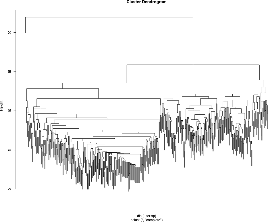
Looking at Figure 11-3, we can already see some really interesting community structure emerging from John’s Twitter network. There appears to be a relatively clean split between two high-level communities, and then within those are many smaller tightly knit subgroups. Of course, everyone’s data will be different, and the number of communities you see will be largely dependent on the size and density of your Twitter ego-network.
Although it is interesting from an academic standpoint to inspect the clusters using the dendrogram, we would really like to see them on the network. To do this, we will need to add the clustering partition data to the nodes, which we will do by using a simple loop to add the first 10 nontrivial partitions to our network. By nontrivial we mean we are skipping the first partition, because that partition assigns all of the nodes to the same group. Though important in terms of the overall hierarchy, it gives us no local community structure.
for(i in 2:10) {
    user.cluster <- as.character(cutree(user.hc, k=i))
    user.cluster[1] <- "0"
    user.ego <- set.vertex.attribute(user.ego, name=paste("HC",i,sep=""),
        value=user.cluster)
}
The cutree function
returns the partition assignment for each element in the hierarchy at
a given level, i.e., it “cuts the tree.” The clustering algorithm
doesn’t know that we have given it an ego-network where a single node
is the focal point, so it has grouped our seed in with other nodes at
every level of clustering. To make it easier to identify the seed user
later during visualization, we assign it to its own cluster:
"0". Finally, we use the set.vertex.attributes function again to add
this information to our graph object. We now have a graph object that
contains the Twitter names and the first 10 clustering partitions from
our analysis.
Before we can fire up Gephi and visualize the results, we need
to save the graph object to a file. We will use the write.graph function to export this data
as GraphML files. GraphML is one of many network file
formats and is XML-based. It is useful for our purposes because our
graph object contains a lot of metadata, such as node labels and
cluster partitions. As with most XML-based formats, GraphML files can
get large fast and are not ideal for simply storing relational data.
For more information on GraphML, see http://graphml.graphdrawing.org/.
write.graph(user.net, paste("data/", user, "/", user, "_net.graphml", sep=""),
    format="graphml")
write.graph(user.clean, paste("data/", user, "/", user, "_clean.graphml", sep=""),
    format="graphml")
write.graph(user.ego, paste("data/", user, "/", user, "_ego.graphml", sep=""),
    format="graphml")
We save all three graph objects generated during this process. In the next section we will visualize these results with Gephi using the example data included with this book.
As mentioned earlier, we will be using the Gephi program to visually explore our network data. If you have already downloaded and installed Gephi, the first thing to do is to open the application and load the Twitter data. For this example, we will be using Drew’s Twitter ego-network, which is located in the code/data/drewconway/ directory for this chapter. If, however, you have generated your own Twitter data, you are welcome to use that instead.
Note
This is by no means a complete or exhaustive introduction to visualizing networks in Gephi. This section will explain how to visually explore the local community structures of the Twitter ego-network data only. Gephi is a robust program for network visualization that includes many options for analyzing the data. We will use very few of these capabilities in this section, but we highly encourage you to play with the program and explore its many options. One great place to start is Gephi’s own Quick Start Tutorial, which is available online here: http://gephi.org/2010/quick-start-tutorial/.
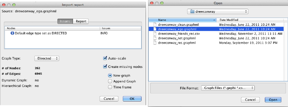
With Gephi open, you will load the the ego-network at the menu
bar with File→Open. Navigate to the
drewconway directory, and open the
drewconway_ego.graphml file, as shown in the top
panel of Figure 11-4. Once you
have loaded the graph, Gephi will report back some basic information
about the network file you have just loaded. The bottom panel of Figure 11-4 shows this report, which
includes the number of nodes (263) and edges (6,945). If you click the
Report tab in this window, you will also see all of the attribute data
we have added to this network. Of particular interest are the node
attributes HC*, which are the
hierarchical clustering partition labels for the first 10 nontrivial
partitions.
The first thing you’ll notice is that Gephi loads the network as a large mess of randomly placed nodes, the dreaded “network hairball.” Much of the community structure information in the network can be expressed by a more deliberate placement of these nodes. Methods and algorithms for node placement in large, complex networks are something of a cottage industry; as such, there are a tremendous number of ways in which we can rearrange the nodes. For our purposes, we want nodes with more shared connections to be placed closer together. Recall that our clustering method was based on placing nodes in groups based on their distance from each other. Nodes with shorter distances would be grouped together, and we want our visualization technique to mirror this.
One group of popular methods for placing nodes consists of “force-directed” algorithms. As the name suggests, these algorithms attempt to simulate how the nodes would be placed if a force of attraction and repulsion were placed on the network. Imagine that the garbled mess of edges among nodes that Gephi is currently displaying are actually elastic bands, and the nodes are ball bearings that could hold a magnetic charge. A force-directed algorithm attempts to calculate how the ball bearing nodes would repel away from each other as a result of the charge, but then be pulled back by the elastic edges. The result is a visualization that neatly places nodes together depending on their local community structure.
Gephi comes with many examples of force-directed layouts. In the Layout panel, the pull-down menu contains many different options, some of which are force-directed. For our purposes we will choose the Yifan Hu Proportional algorithm and use the default settings. After selecting this algorithm, click the Run button, and you will see Gephi rearranging the nodes in this force-directed manner. Depending on the size of your network and the particular hardware you are running, this may take some time. Once the nodes have stopped moving, the algorithm has optimized the placement of the nodes, and we are ready to move on.
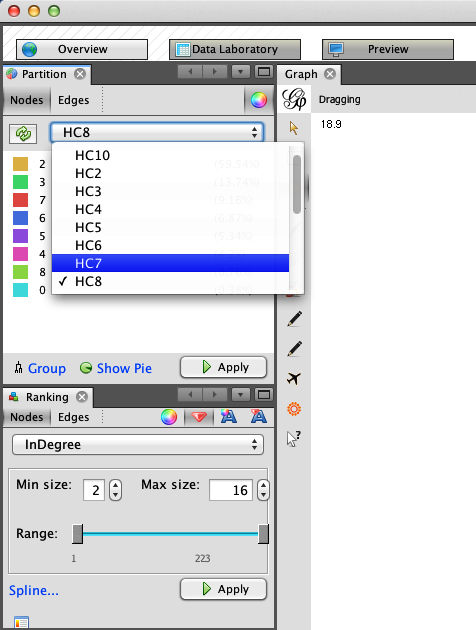
To more easily identify the local communities in the network and their members, we will resize and color the nodes. Because the network is a directed ego-network, we will set the node size as a function of the nodes’ in-degrees. This will make the seed node the largest because nearly every member of the network is following the seed, and it will also increase the size of other prominent users in the ego-network. In the Rankings panel, click the Nodes tab and select InDegree from the pull-down. Click the red diamond icon to set the size; you can set the min and max sizes to whatever you like. As you can see in the bottom half of Figure 11-5, we have chosen 2 and 16 respectively for Drew’s network, but other settings may work better for you. Once you have the values set, click the Apply button to resize the nodes.
The final step is to color the nodes by their community partitions. In the Partition panel, located above the Rankings panel, you will see an icon with two opposing arrows. Click this to refresh the list of partitions for this graph. After you’ve done that, the pull-down will include the node attribute data we included for these partitions. As shown in the top half of Figure 11-5, we have chosen HC8, or the eighth partition, which includes a partition for Drew (drewconway) and seven other nodes in his ego-network. Again, click the Apply button, and the nodes will be colored by their partition.
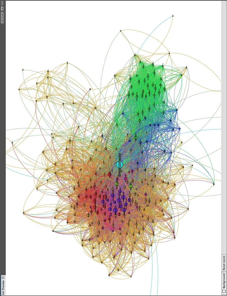
Immediately, you will see the underlying structure! One excellent way to see how a particular network begins to fracture into smaller subcommunities is to step through the partitions of a hierarchical cluster. As an exercise, we suggest doing that in Gephi by iteratively recoloring the nodes by increasingly granular partitions. Begin with HC2 and work your way to HC10, each time recoloring the nodes to see how larger groups begin to split. This will tell you a lot about the underlying structure of the network. Figure 11-6 shows Drew’s ego-network colored by HC8, which highlights beautifully the local community structure of his Twitter network.
Drew appears to have essentially four primary subcommunities. With Drew himself colored in teal at the center, we can see two tightly connected groups colored red and violet to his left; and two other less tightly connected subgroups to his right are in blue and green. There are, of course, other groups colored in orange, pink, and light green, but we will focus on the four primary groups.
In Figure 11-7 we have focused on the left side of the network and removed the edges to make it easier to view the node labels. Quickly looking over the Twitter names in this cluster, it is clear that this side of Drew’s network contains the data nerds Drew follows on Twitter. First, we see very high-profile data nerds, such as Tim O’Reilly (timoreilly) and Nathan Yau (flowingdata) colored in light green because they are somewhat in a “league of their own.” The purple and red groups are interesting as well, as they both contain data hackers, but are split by one key factor: Drew’s friends who are colored purple are prominent members of the data community, such as Hilary Mason (hmason), Pete Skomoroch (peteskomoroch), and Jake Hofman (jakehofman), but none of them are vocal members of the R community. On the other hand, the nodes colored in red are vocal members of the R community, including Hadley Wickham (hadleywickham), David Smith (revodavid), and Gary King (kinggary).
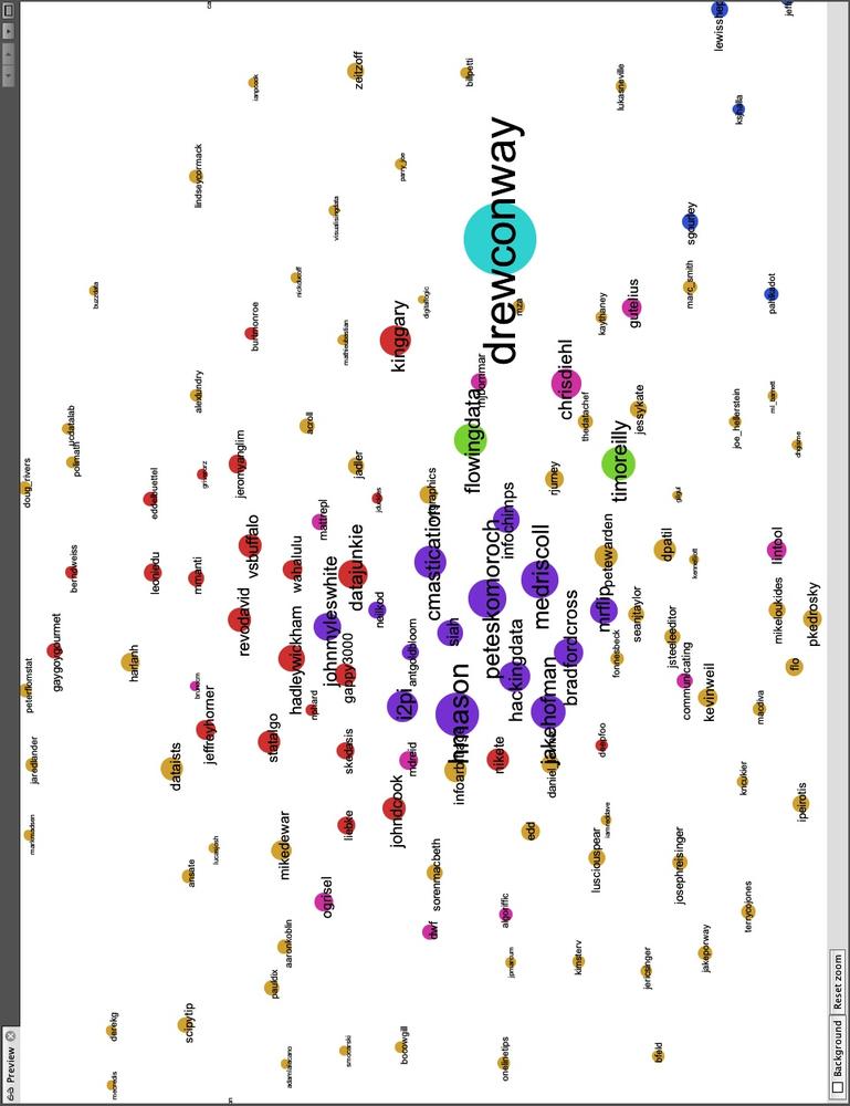
Moreover, the force-directed algorithm has succeed in placing these members close to each other and placed those that sit between these two communities at the edges. We can see John (johnmyleswhite) colored in purple, but placed in with many other red nodes. This is because John is prominent in both communities, and the data reflects this. Other examples of this include JD Long (cmastication) and Josh Reich (i2pi).
Although Drew spends a lot of time interacting with members of the data community—both R and non-R users alike—Drew also uses Twitter to interact with communities that satisfy his other interests. One interest in particular is his academic career, which focuses on national security technology and policy. In Figure 11-8 we highlight the right side of Drew’s network, which includes members from these communities. Similarly to the data nerds group, this includes two subgroups, one colored blue and the other green. As with the previous example, the partition color and placement of the node can illustrate much about their role in the network.
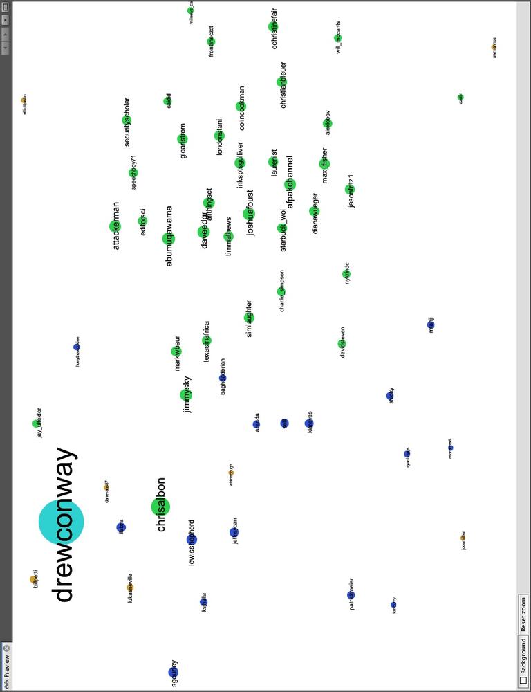
Twitter users in the blue partition are spread out: some are closer to Drew and the left side of the network, whereas others are farther to the right and near the green group. Those farther to the left are people who work or speak about the role of technology in national security, including Sean Gourley (sgourley), Lewis Shepherd (lewisshepherd), and Jeffrey Carr (Jeffrey Carr). Those closer to the green are more focused on national security policy, like the other members of the green group. In green, we see many high-profile members of the national security community on Twitter, including Andrew Exum (abumuqawama), Joshua Foust (joshua Foust), and Daveed Gartenstein-Ross (daveedgr). Interestingly, just as before, people who sit between these groups are placed close to the edges, such as Chris Albon (chrisalbon), who is prominent in both.
If you are exploring your own data, what local community structure do you see emerging? Perhaps the structure is quite obvious, as is the case with Drew’s network, or maybe the communities are more subtle. It can be quite interesting and informative to explore these structures in detail, and we encourage you to do so. In the next and final section, we will use these community structures to build our own “who to follow” recommendation engine for Twitter.
There are many ways that we might think about building our own friend recommendation engine for Twitter. Twitter has many dimensions of data in it, so we could think about recommending people based on what they “tweet” about. This would be an exercise in text mining and would require matching people based on some common set of words or topics within their corpus of tweets. Likewise, many tweets contain geo-location data, so we might recommend users who are active and in close proximity to you. Or we could combine these two approaches by taking the intersection of the top 100 recommendations from each. This, however, is a chapter on networks, so we will focus on building an engine based only on people’s relationships.
A good place to begin is with a simple theory about how useful relations evolve in a large social network. In his seminal work from 1958, Fritz Heider introduced the idea of “social balance theory.”
my friend’s friend is my friend
my friend’s enemy is my enemy
my enemy’s friend is my enemy
my enemy’s enemy is my friend
—Fritz Heider, The Psychology of Interpersonal Relations
The idea is quite simple and can be described in terms of closing and breaking up triangles in a social graph. One thing that Heider’s theory requires is the presence of signed relationships, i.e., my friend (positive) or my enemy (negative). Knowing that we do not have this information, how can we use his theory to build a recommendation engine for Twitter relationships? First, a successful recommendation Twitter engine might work to close open triangles, that is, finding my friends’ friends and making them my friends. Although we do not have fully signed relationships, we do know all of the positive relationships if we assume that enemies do not follow each other on Twitter.
When we did our initial data pull, we did a two-round snowball search. This data contains our friends and our friends’ friends. So we can use this data to identify triangles that need closing. The question then is: which of the many potential triangles should I recommend closing first? Again, we can look to social balance theory. By looking for those nodes in our initial snowball search that the seed is not following, but which many of their friends are following, we may have good candidates for recommendations. This extends Heider’s theory to the following: the friend of many of my friends is likely to be a good friend for me. In essence, we want to close the most obvious triangle in the set of the seed’s Twitter relationships.
From a technical perspective, this solution is also much easier than attempting to do text mining or geospatial analysis to recommend friends. Here, we simply need to count who of our friends’ friends the majority of our friends are following. To do this, we begin by loading in the full network data we collected earlier. As before, we will use Drew’s data in this example, but we encourage you to follow along with your own data if you have it.
user <- "drewconway"

user.graph <- read.graph(paste("data/", user, "/", user, "_net.graphml",sep=""),
    format="graphml")
Our first step is to get the Twitter names of all of the
seed’s friends. We can use the neighbors function to get the indices of the
neighbors, but recall that because of igraph’s different indexing defaults in
relation to R’s, we need to add one to all of these values. Then we
pass those values to the special V
function, which will return a node attribute for the graph, which in
this case is name. Next,
we will generate the full edge list of the graph as a
large N-by-2 matrix with the get.edgelist function.
friends <- V(user.graph)$name[neighbors(user.graph, user, mode="out")+1]
user.el <- get.edgelist(user.graph)
We now have all the data we will need to count the number of my
friends that are following all users who are not currently being
followed by the seed. First, we need to identify the rows in the
user.el that contain links from the
seed’s friends to users that the seed is currently not following. As
we have in previous chapters, we will use the vectorized sapply function to run a function that
contains a fairly complex logical test over each row of the matrix. We
want to generate a vector of TRUE
and FALSE values to determine which
rows contain the seed’s friends’ friends who the seed is not
following.
We use the ifelse function to
set up the test, which itself is vectorized. The initial test asks if
any element of the row is the user and if the first element (the
source) is not one of the seed’s friends. We use the any function to test whether either of these
statements is true. If so, we will want to ignore that row. The other
test checks that the second element of the row (the target) is not one
of the seed’s friends. We care about who our friends’ friends are, not
who follows our friends, so we also ignore these. This process can
take a minute or two, depending on the number of rows, but once it is
done we extract the appropriate rows into non.friends.el and create a count of the names using the table function.
non.friends <- sapply(1:nrow(user.el), function(i) ifelse(any(user.el[i,]==user |
    !user.el[i,1] %in% friends) | user.el[i,2] %in% friends, FALSE, TRUE))

non.friends.el <- user.el[which(non.friends==TRUE),]
friends.count <- table(non.friends.el[,2])
Next, we want to report the results. We want to find the most
“obvious” triangle to close, so we want to find the users in this data
that show up the most. We create a data frame from the vector created
by the table function. We will also
add a normalized measure of the best users to recommend for following
by calculating the percentage of the seed’s friends that follow each
potential recommendation. In the final step, we can sort the data
frame in descending order by highest percentage of friends following
each user.
friends.followers <- data.frame(list(Twitter.Users=names(friends.count),
    Friends.Following=as.numeric(friends.count)), stringsAsFactors=FALSE)

friends.followers$Friends.Norm <- friends.followers$Friends.Following/length(friends)
friends.followers <- friends.followers[with(friends.followers, order(-Friends.Norm)),]
To report the results, we can inspect the first 10 rows, or our
top 10 best recommendations for whom to follow, by running friends.followers[1:10,]. In Drew’s case,
the results are in Table 11-1.
Table 11-1. Social graph
| Twitter user | # of friends following | % of friends following |
|---|---|---|
| cshirky | 80 | 0.3053435 |
| bigdata | 57 | 0.2175573 |
| fredwilson | 57 | 0.2175573 |
| dangerroom | 56 | 0.2137405 |
| shitmydadsays | 55 | 0.2099237 |
| al3x | 53 | 0.2022901 |
| fivethirtyeight | 52 | 0.1984733 |
| theeconomist | 52 | 0.1984733 |
| zephoria | 52 | 0.1984733 |
| cdixon | 51 | 0.1946565 |
If you know Drew, these names will make a lot of sense. Drew’s best recommendation is to follow Clay Shirky (cshirky), a professor at NYU who studies and writes on the role of technology and the Internet in society. Given what we have already learned about Drew’s bifurcated brain, this seems like a good match. Keeping this in mind, the rest of the recommendations fit one or both of Drew’s general interests. There is Danger Room (dangerroom); Wired’s National Security blog; Big Data (bigdata); and 538 (fivethirtyeight), the New York Times’ election forecasting blog by Nate Silver. And, of course, shitmydadsays.
Although these recommendations are good—and since the writing of the first draft of this book, Drew has enjoyed following the names this engine presented—perhaps there is a better way to recommend people. Because we already know that a given seed user’s network has a lot of emergent structure, it might be useful to use this structure to recommend users that fit into those groups. Rather than recommending the best friends of friends, we can recommend friends of friends who are like the seed on a given dimension. In Drew’s case, we could recommend triangles to close in his national security and policy community or in the data or R communities.
user.ego <- read.graph(paste("data/", user, "/", user, "_ego.graphml", sep=""),
    format="graphml")
friends.partitions <- cbind(V(user.ego)$HC8, V(user.ego)$name)
The first thing we’ll need to do is load back in our ego-network
that contains the partition data. Because we have already explored the
HC8 partition, we’ll stick to that one for this final tweak of the
recommendation engine. Once the network is loaded, we’ll create the
friends.partitions matrix, which
now has the partition number in the first column and the username in
the second. For Drew’s data, it looks like this:
> head(friends.partitions)
     [,1] [,2]
[1,] "0"  "drewconway"
[2,] "2"  "311nyc"
[3,] "2"  "aaronkoblin"
[4,] "3"  "abumuqawama"
[5,] "2"  "acroll"
[6,] "2"  "adamlaiacano"
Now all we have to do is calculate the most obvious triangles to
close within each subcommunity. So we build the function partition.follows that takes a partition
number and finds those users. All of the data has already been
calculated, so the function simply looks up the users in each
partition and then returns the one with the most followers among the
seed’s friends. The only bit of error checking in this function that
may stick out is the if-statement to check that the number of rows in
a given subset is less than two. We do this because we know one
partition will have only one user, the seed, and we do not want to
make recommendations out of that hand-coded partition.
partition.follows <- function(i) {
	friends.in <- friends.partitions[which(friends.partitions[,1]==i),2]
	partition.non.follow <- non.friends.el[which(!is.na(match(non.friends.el[,1],
	    friends.in))),]
	if(nrow(partition.non.follow) < 2) {
		return(c(i, NA))
	}
	else {
		partition.favorite <- table(partition.non.follow[,2])
		partition.favorite <- partition.favorite[order(-partition.favorite)]
		return(c(i,names(partition.favorite)[1]))
	}
}

partition.recs <- t(sapply(unique(friends.partitions[,1]), partition.follows))
partition.recs <- partition.recs[!is.na(partition.recs[,2]) &
	!duplicated(partition.recs[,2]),]
We can now look at those recommendations by partition. As we mentioned, the “0” partition for the seed has no recommendations, but the others do. What’s interesting is that for some partitions we see some of the same names from the previous step, but for many we do not.
> partition.recs
  [,1] [,2]
0 "0"  NA
2 "2"  "cshirky"
3 "3"  "jeremyscahill"
4 "4"  "nealrichter"
5 "5"  "jasonmorton"
6 "6"  "dangerroom"
7 "7"  "brendan642"
8 "8"  "adrianholovaty"
Of course, it is much more satisfying to see these recommendations inside the network. This will make it easier to see who is recommended for which subcommunity. The code included in this chapter will add these recommendations to a new graph file that includes these nodes and the partition numbers. We have excluded the code here because it is primarily an exercise in housekeeping, but we encourage you to look through it within the code available through O’Reilly for this book. As a final step, we will visualize this data for Drew’s recommendations. See Figure 11-9 for the results.
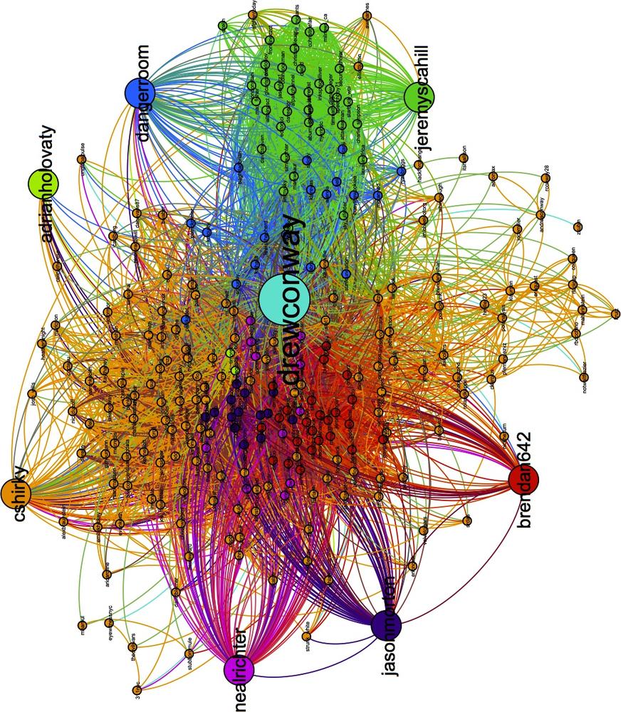
These results are quite good! Recall that the blue nodes are those Twitter users in Drew’s network that sit between his interest in technology and national security. The engine has recommended the Danger Room blog, which covers both of these things exactly. And the green nodes are those people tweeting about national security policy; among them, our engine has recommended Jeremy Scahill (jeremyscahill). Jeremy is the national security reporter for The Nation magazine, which fits in perfectly with this group and perhaps informs us a bit about Drew’s own political perspectives.
On the other side, the red nodes are those in the R community. The recommender suggests Brendan O’Connor (brendan642), a PhD student in machine learning at Carnegie Mellon. He is also someone who tweets and blogs about R. Finally, the violet group contains others from the data community. Here, the suggestion is Jason Morton (jasonmorton), an assistant professor of mathematics and statistics at Pennsylvania State. All of these recommendations match Drew’s interests, but are perhaps more useful because we now know precisely how they fit into his interest.
There are many more ways to hack the recommendation engine, and we hope that you will play with the code and tweak it to get better recommendations for your own data.