Table of Contents for
Machine Learning for Hackers
 Machine Learning for Hackers
Published by
O'Reilly Media, Inc., 2012
Machine Learning for Hackers
Published by
O'Reilly Media, Inc., 2012
- Cover
- O'Reilly Strata Conference
- Machine Learning for Hackers
- Preface
- 1. Using R
- 2. Data Exploration
- 3. Classification: Spam Filtering
- 4. Ranking: Priority Inbox
- 5. Regression: Predicting Page Views
- 6. Regularization: Text Regression
- 7. Optimization: Breaking Codes
- 8. PCA: Building a Market Index
- 9. MDS: Visually Exploring US Senator Similarity
- 10. kNN: Recommendation Systems
- 11. Analyzing Social Graphs
- 12. Model Comparison
- Works Cited
- Index
- About the Authors
- Colophon
- Copyright
While we told you the truth in Chapter 5 when we said that linear regression assumes that the relationship between two variables is a straight line, it turns out you can also use linear regression to capture relationships that aren’t well-described by a straight line. To show you what we mean, imagine that you have the data shown in panel A of Figure 6-1.
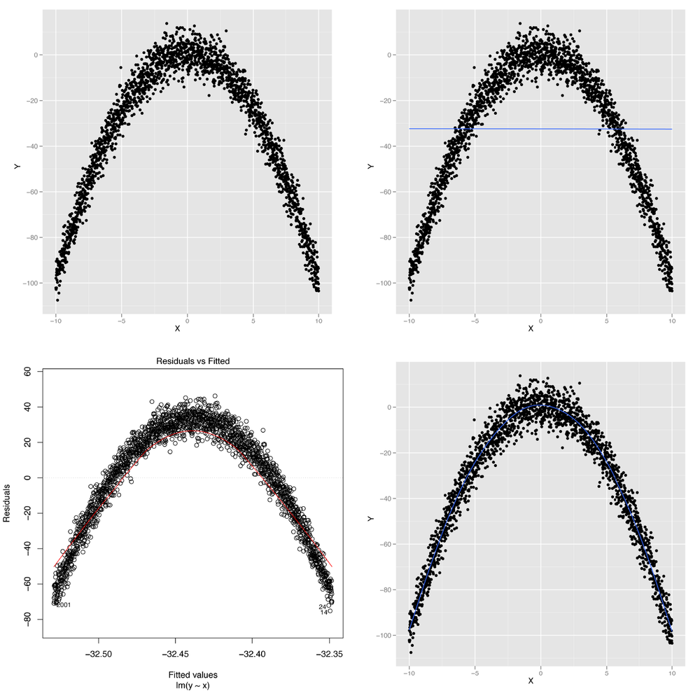
Figure 6-1. Modeling nonlinear data: (A) visualizing nonlinear relationships; (B) nonlinear relationships and linear regression; (C) structured residuals; (D) results from a generalized additive model
It’s obvious from looking at this scatterplot that the relationship between X and Y isn’t well-described by a straight line. Indeed, plotting the regression line shows us exactly what will go wrong if we try to use a line to capture the pattern in this data; panel B of Figure 6-1 shows the result.
We can see that we make systematic errors in our predictions if we
use a straight line: at small and large values of x, we
overpredict y, and we underpredict y for
medium values of x. This is easiest to see in a residuals
plot, as shown in panel C of Figure 6-1.
In this plot, you can see all of the structure of the original data set,
as none of the structure is captured by the default linear regression
model.
Using ggplot2’s geom_smooth function
without any method argument, we can fit a more complex
statistical model called a Generalized Additive Model (or GAM for short)
that provides a smooth, nonlinear representation of the structure in our
data:
set.seed(1)

x <- seq(-10, 10, by = 0.01)
y <- 1 - x ⋀ 2 + rnorm(length(x), 0, 5)
ggplot(data.frame(X = x, Y = y), aes(x = X, y = Y)) +
  geom_point() +
  geom_smooth(se = FALSE)
The result, shown in panel D of Figure 6-1, lets us immediately see that we want to fit a curved line instead of a straight line to this data set.
So how can we fit some sort of curved line to our data? This is
where the subtleties of linear regression come up: linear regression can
only fit lines in the input, but you can create new inputs that are
nonlinear functions of your original inputs. For example, you can use
the following code in R to produce a new input based on the raw input
x that is the square of the raw input:
x.squared <- x ^ 2
You can then plot y against the new input,
x.squared, to see a very different shape emerge from your
data:
ggplot(data.frame(XSquared = x.squared, Y = y), aes(x = XSquared, y = Y)) +
  geom_point() +
  geom_smooth(method = 'lm', se = FALSE)
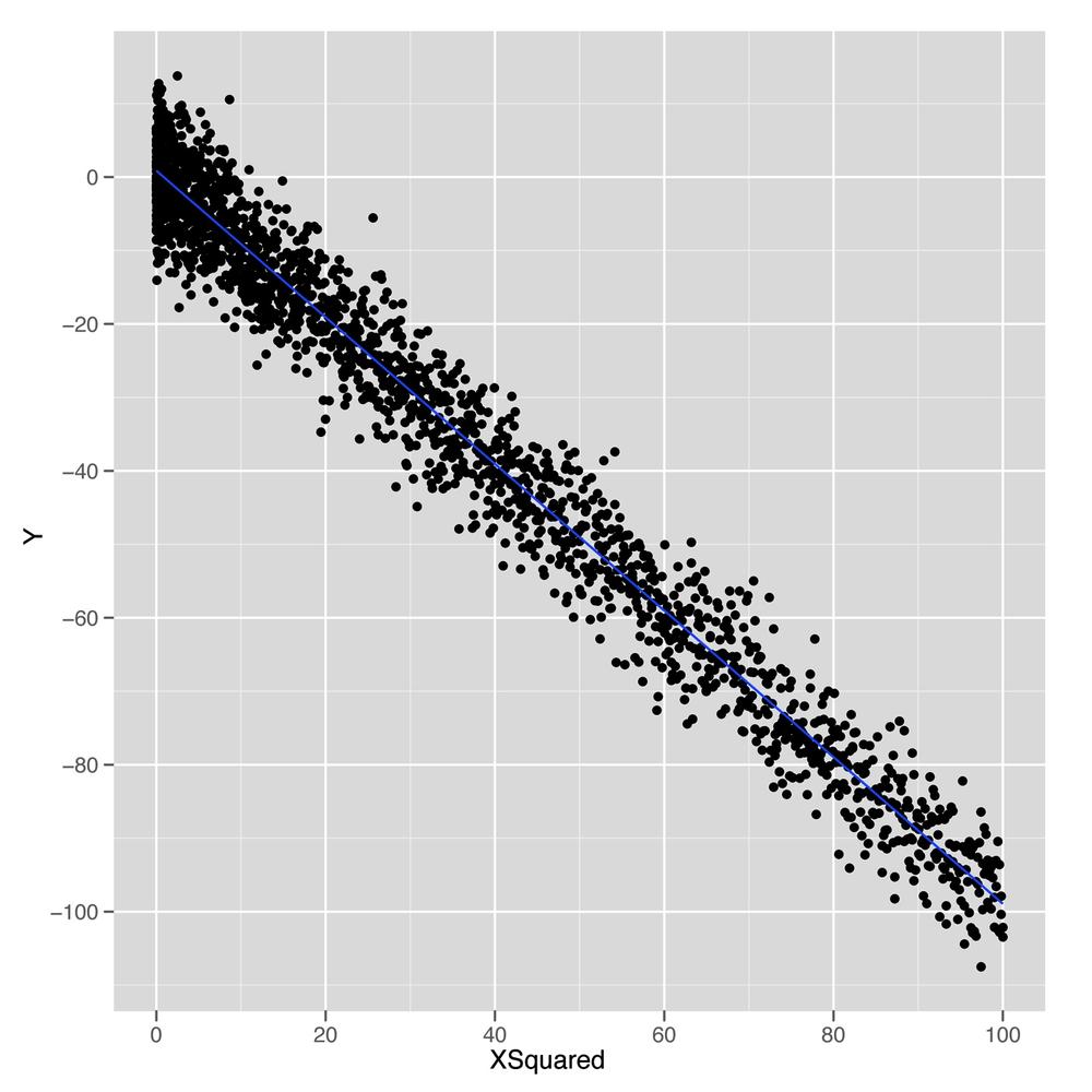
As shown in Figure 6-2, plotting
y against this new x.squared input gives us a
fit that looks exactly like a straight line. Essentially, we’ve
transformed our original nonlinear problem into a new problem in which
the relationship between the two inputs really satisfies the linearity
assumption of linear regression. This idea of replacing a complicated
nonlinear problem with a simpler linear one using a transformation of
the inputs comes up again and again in machine learning. Indeed, this
intuition is the essence of the kernel trick that we’ll discuss in Chapter 12. To see how much this simple squaring transformation improves
our prediction quality, we can compare the R2
values for linear regressions using x and
x.squared:
summary(lm(y ~ x))$r.squared
#[1] 2.973e-06

summary(lm(y ~ x.squared))$r.squared
#[1] 0.9707
We’ve gone from accounting for 0% of the variance to accounting for 97%. That’s a pretty huge jump for such a simple change in our model. In general, we might wonder how much more predictive power we can get from using more expressive models with more complicated shapes than lines. For mathematical reasons that are beyond the scope of this book, it turns out that you can capture essentially any type of relationship that might exist between two variables using more complex curved shapes. One approach to building up more complicated shapes is called polynomial regression, which we’ll describe in the next part of this chapter. But the flexibility that polynomial regression provides is not a purely good thing, because it encourages us to mimic the noise in our data with our fitted model, rather than just the true underlying pattern we want to uncover. So the rest of this chapter will focus on the additional forms of discipline we need to exercise if we’re going to use more complex tools such as polynomial regression instead of a simple tool like linear regression.
With our earlier caveats in mind, let’s start working with
polynomial regression in R, which is implemented in the poly function. The easiest way to
see how poly works is to build up from a simple example
and show what happens as we give our model more expressive power to
mimic the structure in our data.
We’ll use a sine wave to create a data set in which the relationship between x and y could never be described by a simple line.
set.seed(1)

x <- seq(0, 1, by = 0.01)
y <- sin(2 * pi * x) + rnorm(length(x), 0, 0.1)

df <- data.frame(X = x, Y = y)

ggplot(df, aes(x = X, y = Y)) +
  geom_point()
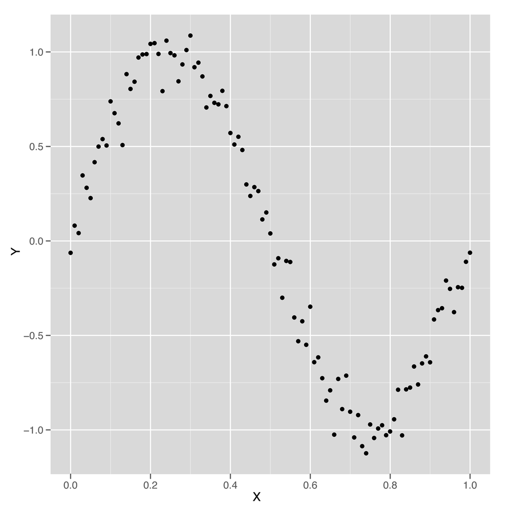
Just looking at this data, which is shown in Figure 6-3, it’s clear that using a simple linear regression model won’t work. But let’s run a simple linear model and see how it performs.
summary(lm(Y ~ X, data = df))

#Call:
#lm(formula = Y ~ X, data = df)
#
#Residuals:
#     Min       1Q   Median       3Q      Max
#-1.00376 -0.41253 -0.00409  0.40664  0.85874
#
#Coefficients:
#            Estimate Std. Error t value Pr(>|t|)
#(Intercept)  0.94111    0.09057   10.39   <2e-16 ***
#X           -1.86189    0.15648  -11.90   <2e-16 ***
#---
#Signif. codes:  0 ‘***’ 0.001 ‘**’ 0.01 ‘*’ 0.05 ‘.’ 0.1 ‘ ’ 1
#
#Residual standard error: 0.4585 on 99 degrees of freedom
#Multiple R-squared: 0.5885,  Adjusted R-squared: 0.5843
#F-statistic: 141.6 on 1 and 99 DF,  p-value: < 2.2e-16
Surprisingly, we’re able to explain 60% of the variance in this
data set using a linear model—despite the fact that we know the naive
linear regression model is a bad model of wave data. We also know that
a good model should be able to explain more than 90% of the variance
in this data set, but we’d still like to figure out what the linear
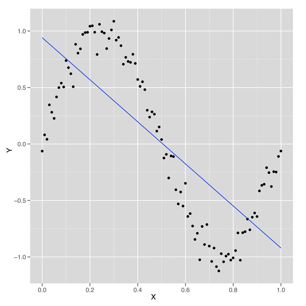
model did to produce such a good fit to the data. To answer our question, it’s best to plot the results of
fitting a linear regression using our preferred variant of
geom_smooth in which we force geom_smooth to
use a linear model by setting the option method =
'lm':
ggplot(data.frame(X = x, Y = y), aes(x = X, y = Y)) +
  geom_point() +
  geom_smooth(method = 'lm', se = FALSE)
Looking at Figure 6-4, we can see that the linear model finds a way to capture half of the sine wave’s structure using a downward-sloping line. But this is not a great strategy, because you’re systematically neglecting the parts of the data that aren’t described by that downward-sloping line. If the sine wave were extended through another period, the R2 for this model would suddenly drop closer and closer to 0%.
We can conclude that the default linear regression model overfits the quirks of our specific data set and fails to find its true underlying wave structure. But what if we give the linear regression algorithm more inputs to work with? Will it find a structure that’s actually a wave?
One way to do this is to follow the logic we exploited at the
start of this chapter and add new features to our data set. This time
we’ll add both the second power of x and the third power
of x to give ourselves more wiggle room. As you see here,
this change improves our predictive power considerably:
df <- transform(df, X2 = X ^ 2)
df <- transform(df, X3 = X ^ 3)

summary(lm(Y ~ X + X2 + X3, data = df))

#Call:
#lm(formula = Y ~ X + X2 + X3, data = df)
#
#Residuals:
#     Min       1Q   Median       3Q      Max
#-0.32331 -0.08538  0.00652  0.08320  0.20239
#
#Coefficients:
#             Estimate Std. Error t value Pr(>|t|)
#(Intercept)  -0.16341    0.04425  -3.693 0.000367 ***
#X            11.67844    0.38513  30.323  < 2e-16 ***
#X2          -33.94179    0.89748 -37.819  < 2e-16 ***
#X3           22.59349    0.58979  38.308  < 2e-16 ***
#---
#Signif. codes:  0 ‘***’ 0.001 ‘**’ 0.01 ‘*’ 0.05 ‘.’ 0.1 ‘ ’ 1
#
#Residual standard error: 0.1153 on 97 degrees of freedom
#Multiple R-squared: 0.9745,  Adjusted R-squared: 0.9737
#F-statistic:  1235 on 3 and 97 DF,  p-value: < 2.2e-16
By adding two more inputs, we went from an
R2 of 60% to an
R2 of 97%. That’s a huge increase. And, in
principle, there’s no reason why we can’t follow this logic out as
long as we want and keep adding more powers of X to our
data set. But as we add more powers, we’ll eventually start to have
more inputs than data points. That’s usually worrisome, because it
means that we could, in principle, fit our data perfectly. But a more
subtle problem with this strategy will present itself before then: the
new columns we add to our data are so similar in value to the original
columns that lm will simply stop working. In the output
from summary shown next, you’ll see this problem referred to as a “singularity.”
df <- transform(df, X4 = X ^ 4)
df <- transform(df, X5 = X ^ 5)
df <- transform(df, X6 = X ^ 6)
df <- transform(df, X7 = X ^ 7)
df <- transform(df, X8 = X ^ 8)
df <- transform(df, X9 = X ^ 9)
df <- transform(df, X10 = X ^ 10)
df <- transform(df, X11 = X ^ 11)
df <- transform(df, X12 = X ^ 12)
df <- transform(df, X13 = X ^ 13)
df <- transform(df, X14 = X ^ 14)
df <- transform(df, X15 = X ^ 15)

summary(lm(Y ~ X + X2 + X3 + X4 + X5 + X6 + X7 + X8 + X9 + X10 + X11 + X12 + X13 +
           X14, data = df))

#Call:
#lm(formula = Y ~ X + X2 + X3 + X4 + X5 + X6 + X7 + X8 + X9 +
#    X10 + X11 + X12 + X13 + X14, data = df)
#
#Residuals:
#      Min        1Q    Median        3Q       Max
#-0.242662 -0.038179  0.002771  0.052484  0.210917
#
#Coefficients: (1 not defined because of singularities)
#              Estimate Std. Error t value Pr(>|t|)
#(Intercept) -6.909e-02  8.413e-02  -0.821    0.414
#X            1.494e+01  1.056e+01   1.415    0.161
#X2          -2.609e+02  4.275e+02  -0.610    0.543
#X3           3.764e+03  7.863e+03   0.479    0.633
#X4          -3.203e+04  8.020e+04  -0.399    0.691
#X5           1.717e+05  5.050e+05   0.340    0.735
#X6          -6.225e+05  2.089e+06  -0.298    0.766
#X7           1.587e+06  5.881e+06   0.270    0.788
#X8          -2.889e+06  1.146e+07  -0.252    0.801
#X9           3.752e+06  1.544e+07   0.243    0.809
#X10         -3.398e+06  1.414e+07  -0.240    0.811
#X11          2.039e+06  8.384e+06   0.243    0.808
#X12         -7.276e+05  2.906e+06  -0.250    0.803
#X13          1.166e+05  4.467e+05   0.261    0.795
#X14                 NA         NA      NA       NA
#
#Residual standard error: 0.09079 on 87 degrees of freedom
#Multiple R-squared: 0.9858,  Adjusted R-squared: 0.9837
#F-statistic: 465.2 on 13 and 87 DF,  p-value: < 2.2e-16
The problem here is that the new columns we’re adding with
larger and larger powers of X are so correlated
with the old columns that the linear regression algorithm breaks down
and can’t find coefficients for all of the columns separately.
Thankfully, there is a solution to this problem that can be found in
the mathematical literature: instead of naively adding simple powers
of x, we add more complicated variants of x
that work like successive powers of x, but aren’t
correlated with each other in the way that x and
x^2 are. These variants on the powers of x are called
orthogonal polynomials,[10] and you can easily generate them using the
poly function in R. Instead of adding 14 powers of
x to your data frame directly, you simply type
poly(X, degree = 14) to transform x into
something similar to X + X^2 + X^3 + ... + X^14, but with
orthogonal columns that won’t generate a singularity when running
lm.
To confirm for yourself that the poly black box
works properly, you can run lm with the output from
poly and see that lm will, in fact, give you
proper coefficients for all 14 powers of X:
summary(lm(Y ~ poly(X, degree = 14), data = df))

#Call:
#lm(formula = Y ~ poly(X, degree = 14), data = df)
#
#Residuals:
#      Min        1Q    Median        3Q       Max
#-0.232557 -0.042933  0.002159  0.051021  0.209959
#
#Coefficients:
#                        Estimate Std. Error t value Pr(>|t|)
#(Intercept)             0.010167   0.009038   1.125   0.2638
#poly(X, degree = 14)1  -5.455362   0.090827 -60.063  < 2e-16 ***
#poly(X, degree = 14)2  -0.039389   0.090827  -0.434   0.6656
#poly(X, degree = 14)3   4.418054   0.090827  48.642  < 2e-16 ***
#poly(X, degree = 14)4  -0.047966   0.090827  -0.528   0.5988
#poly(X, degree = 14)5  -0.706451   0.090827  -7.778 1.48e-11 ***
#poly(X, degree = 14)6  -0.204221   0.090827  -2.248   0.0271 *
#poly(X, degree = 14)7  -0.051341   0.090827  -0.565   0.5734
#poly(X, degree = 14)8  -0.031001   0.090827  -0.341   0.7337
#poly(X, degree = 14)9   0.077232   0.090827   0.850   0.3975
#poly(X, degree = 14)10  0.048088   0.090827   0.529   0.5979
#poly(X, degree = 14)11  0.129990   0.090827   1.431   0.1560
#poly(X, degree = 14)12  0.024726   0.090827   0.272   0.7861
#poly(X, degree = 14)13  0.023706   0.090827   0.261   0.7947
#poly(X, degree = 14)14  0.087906   0.090827   0.968   0.3358
#---
#Signif. codes:  0 ‘***’ 0.001 ‘**’ 0.01 ‘*’ 0.05 ‘.’ 0.1 ‘ ’ 1
#
#Residual standard error: 0.09083 on 86 degrees of freedom
#Multiple R-squared: 0.986,  Adjusted R-squared: 0.9837
#F-statistic: 431.7 on 14 and 86 DF,  p-value: < 2.2e-16
In general, poly gives you a lot of expressive
power. Mathematicians have shown that polynomial regression will let
you capture a huge variety of complicated shapes in your data.
But that isn’t necessarily a good thing. One way to see that the
added power provided by poly can be a source of trouble
is to look at the shape of the models that poly generates
as you increase the degree parameter. In the
following example, we generate models using poly with
degrees of 1, 3, 5, and 25. The results are shown in the panels of
Figure 6-5.
poly.fit <- lm(Y ~ poly(X, degree = 1), data = df)
df <- transform(df, PredictedY = predict(poly.fit))

ggplot(df, aes(x = X, y = PredictedY)) +
  geom_point() +
  geom_line()

poly.fit <- lm(Y ~ poly(X, degree = 3), data = df)
df <- transform(df, PredictedY = predict(poly.fit))

ggplot(df, aes(x = X, y = PredictedY)) +
  geom_point() +
  geom_line()

poly.fit <- lm(Y ~ poly(X, degree = 5), data = df)
df <- transform(df, PredictedY = predict(poly.fit))

ggplot(df, aes(x = X, y = PredictedY)) +
  geom_point() +
  geom_line()

poly.fit <- lm(Y ~ poly(X, degree = 25), data = df)
df <- transform(df, PredictedY = predict(poly.fit))

ggplot(df, aes(x = X, y = PredictedY)) +
  geom_point() +
  geom_line()
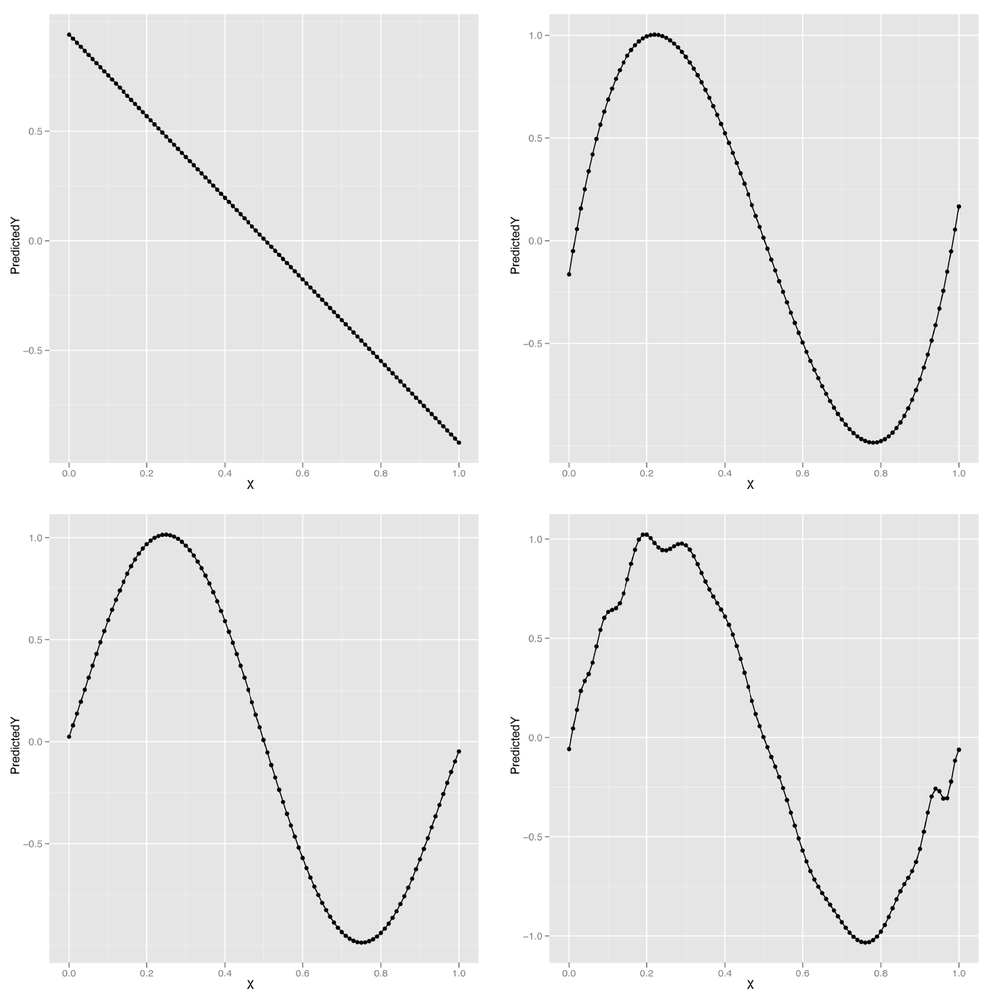
We can continue this process indefinitely, but looking at the predicted values for our model makes it clear that eventually the shape we’re fitting doesn’t resemble a wave anymore, but starts to become distorted by kinks and spikes. The problem is that we’re using a model that’s more powerful than the data can support. Things work fine for smaller degrees such as 1, 3, or 5, but they start to break around degree 25. The problem we’re seeing is the essence of overfitting. As our data grows in number of observations, we can let ourselves use more powerful models. But for any specific data set, there are always some models that are too powerful. How can we do something to stop this? And how we can get a better sense of what’s going to go wrong if we give ourselves enough rope to hang ourselves with? The answer we’ll propose is a mixture of cross-validation and regularization, two of the most important tools in the entire machine learning toolkit.
Before we can prevent overfitting, we need to give the term a rigorous meaning. We’ve talked about a model being overfit when it matches part of the noise in a data set rather than the true underlying signal. But if we don’t know the truth, how can we tell that we’re getting further away from it rather than closer?
The trick is to make clear what we mean by truth. For our purposes, a predictive model is close to the truth when its predictions about future data are accurate. But of course we don’t have access to future data; we only have data from the past. Thankfully, we can simulate what it would be like to have access to future data by splitting up our past data into two parts.
A simple example will make our general strategy clear: imagine that we’re trying to build a model to predict temperatures in the future. We have data for January through June and want to make predictions for July. We can see which of our models is best by fitting them to data from January through May and then testing these models against the data for June. If we had done this model-fitting step in May, we really would have been testing our model against future data. So we can use this data-splitting strategy to make a completely realistic simulation of the experience of testing our model against unseen data.
Cross-validation, at its core, simply refers to this ability of ours to simulate testing our model on future data by ignoring part of our historical data during the model-fitting process.
Note
If you went through the cases in Chapters 3 and 4, you’ll remember that we did exactly this then. In each case we split our data to train and test our classification and ranking models.
Arguably, it’s simply an instantiation of the scientific method that we were all taught as children: (1) formulate a hypothesis, (2) gather data, and (3) test it. There’s just a bit of sleight of hand because we don’t formulate a hypothesis based on existing data and then go out and gather more data. Instead, we ignore part of our data while formulating our hypotheses, so that we can magically rediscover that missing data when it comes time to test our predictions.
Before using cross-validation in a complex application, let’s go through a toy example of how we might use cross-validation to select a degree for polynomial regression for the sine wave data we had before.
First, we’ll recreate our sine wave data:
set.seed(1)

x <- seq(0, 1, by = 0.01)
y <- sin(2 * pi * x) + rnorm(length(x), 0, 0.1)
Then we need to split our data into two parts: a training set that we’ll use to fit our model and a test set that we’ll use to test the model’s performance. The training set can be thought of as past data, whereas the test set is future data. For this example, we’ll split the data exactly in half. For some applications, it’s better to use more data for the training set (say, 80%) and less data for the test set (say, 20%) because the more data you have during model fitting, the better the fitted model will tend to be. As always, your mileage will vary, so experiment when facing any real-world problem. Let’s do the split and then talk about the details:
n <- length(x)

indices <- sort(sample(1:n, round(0.5 * n)))

training.x <- x[indices]
training.y <- y[indices]

test.x <- x[-indices]
test.y <- y[-indices]

training.df <- data.frame(X = training.x, Y = training.y)
test.df <- data.frame(X = test.x, Y = test.y)
Here we’ve constructed a random vector of indices that defines the
training set. It’s always a good idea to randomly split the data when
making a training set/test set split because you don’t want the training
set and test set to differ systematically—as might happen, for example,
if you put only the smallest values for x into the training
set and the largest values into the test set. The randomness comes from the use of R’s sample
function, which produces a random sample from a given vector. In our
case we provide a vector of integers, 1 through n, and
sample half of them. Once we’ve set the values for indices,
we pull the training and test sets apart using R’s vector indexing
rules. Finally, we construct a data frame to store the data because it’s
easier to work with lm when using data frames.
Once we’ve split our data into a training set and test set, we
want to test various degrees for our polynomial regression to see which
works best. We’ll use RMSE to measure our performance. To make our code
a bit easier to read, we’ll create a special rmse
function:
rmse <- function(y, h)
{
  return(sqrt(mean((y - h) ^ 2)))
}
Then we’ll loop over a set of polynomial degrees, which are the integers between 1 and 12:
performance <- data.frame()

for (d in 1:12)
{
  poly.fit <- lm(Y ~ poly(X, degree = d), data = training.df)

  performance <- rbind(performance,
                        data.frame(Degree = d,
                                   Data = 'Training',
                                   RMSE = rmse(training.y, predict(poly.fit))))

  performance <- rbind(performance,
                        data.frame(Degree = d,
                                   Data = 'Test',
                                   RMSE = rmse(test.y, predict(poly.fit,
                                               newdata = test.df))))
}
During each iteration of this loop, we’re fitting a polynomial
regression of degree d to the data in
training.df and then assessing its performance on both
training.df and test.df. We store the results
in a data frame so that we can quickly analyze the results after
finishing the loop.
Warning
Here we use a slightly different data frame construction
technique than we have in the past. We begin by assigning an empty
data frame to the variable performance, to which we then
iteratively add rows with the rbind function. As we have
mentioned before, there are often many ways to accomplish the same
data manipulation task in R, but rarely is a loop of this nature the
most efficient. We use it here because the data is quite small and it
allows the process of the algorithm to be understood most clearly, but
keep this in mind when writing your own cross-validation tests.
Once the loop’s finished executing, we can plot the performance of the polynomial regression models for all the degrees we’ve tried:
ggplot(performance, aes(x = Degree, y = RMSE, linetype = Data)) +
  geom_point() +
  geom_line()
The result, shown in Figure 6-6, makes it clear that using a degree in the middle of the range we’ve experimented with gives us the best performance on our test data. When the degree is as low as 1 or 2, the model doesn’t capture the real pattern in the data, and we see very poor predictive performance on both the training and the test data. When a model isn’t complex enough to fit even the training data, we call that underfitting.
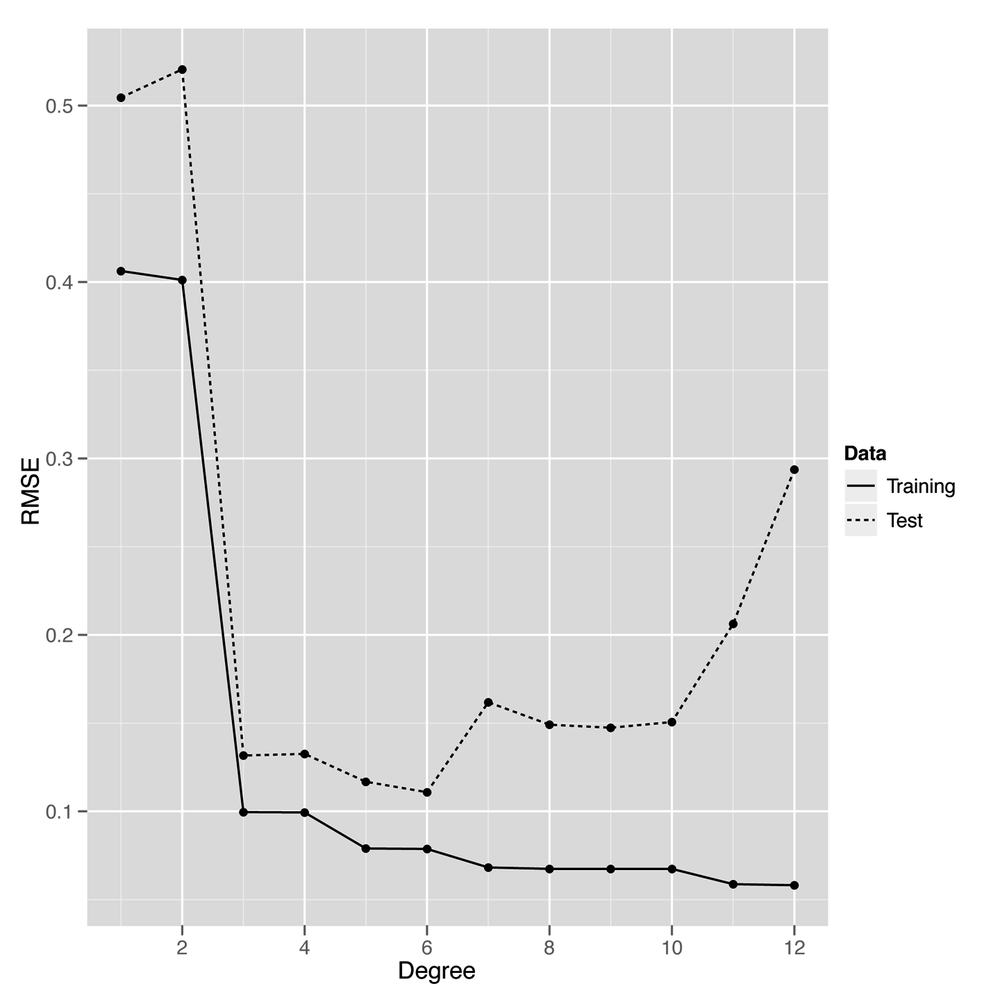
On the opposite end of our graph near degrees 11 and 12, we see the predictions for the model start to get worse again on the test data. That’s because the model is becoming too complex and noisy, and it fits quirks in the training data that aren’t present in the test data. When you start to model quirks of chance in your data, that’s what we call overfitting. Another way of thinking of overfitting is to notice that our performance on the training set and test set start to diverge as we go farther to the right in Figure 6-6: the training set error rate keeps going down, but the test set performance starts going up. Our model doesn’t generalize to any data beyond the specific points it was trained on—and that makes it overfit.
Thankfully, our plot lets us know how to set the degree of our regression to get the best performance from our model. This intermediate point, which is neither underfit nor overfit, would be very hard to discover without using cross-validation.
Having given a quick explanation of how we can use cross-validation to deal with overfitting, we’ll switch to discussing another approach to preventing overfitting, which is called regularization. Regularization is quite different from cross-validation in spirit, even though we’ll end up using cross-validation to provide a demonstration that regularization is able to prevent overfitting. We’ll also have to use cross-validation to calibrate our regularization algorithm, so the two ideas will ultimately become intimately connected.
Throughout this chapter we’ve talked about models being too complex, but never gave a formal definition of complexity. One approach when working with polynomial regression would be to say that models are more complex when the degree is larger; a polynomial of degree 2 is more complex than a polynomial of degree 1, for example.
But that doesn’t help us for linear regression in general. So
we’ll use an alternative measure of complexity: we’ll say that a model
is complicated when the coefficients are large. For example, we would
say that the model y ~ 5 * x + 2 is more complicated
than the model y ~ 3 * x + 2. By the same logic, we’ll
say that the model y ~ 1 * x^2 + 1 * x + 1 is more
complicated than the model y ~ 1 * x + 1. To use this
definition in practice, we can fit a model using lm and
then measure its complexity by summing over the values returned by
coef:
lm.fit <- lm(y ~ x)
model.complexity <- sum(coef(lm.fit) ^ 2)
Here we’ve squared the coefficients before summing them so that they don’t cancel each other out when we add them all together. This squaring step is often called the L2 norm. An alternative approach to squaring the coefficients is to take the absolute value of the coefficients instead; this second approach is called the L1 norm. Here we compute the two of them in R:
lm.fit <- lm(y ~ x)
l2.model.complexity <- sum(coef(lm.fit) ^ 2)
l1.model.complexity <- sum(abs(coef(lm.fit)))
These measures of model complexity might seem strange at first, but you’ll see in a moment that they really are helpful when trying to prevent overfitting. The reason is that we can use this measure of complexity to force our model to be simpler during model fitting. We’ll talk about the details of how this occurs in Chapter 7, but the big idea for the time being is that we trade off making the model fit the training data as well as possible against a measure of the model’s complexity. This brings us to one of the most critical decision criteria when modeling data: because we make a trade-off between fitting the data and model complexity, we’ll end up selecting a simpler model that fits worse over a more complex model that fits better. This trade-off, which is what we mean by regularization, ultimately prevents overfitting by restraining our model from matching noise in the training data we use to fit it.
For now, let’s talk about the tools you can use to work
with regularization in R. For this chapter, we’ll stick to using the
glmnet package, which provides a
function called glmnet that fits linear models using
regularization. To see how glmnet
works, let’s go back one last time to our sine wave data:
set.seed(1)

x <- seq(0, 1, by = 0.01)
y <- sin(2 * pi * x) + rnorm(length(x), 0, 0.1)
To use glmnet, we first have to convert our vector
copy of x to a matrix using the matrix
function. After that, we call glmnet in the reverse order
than the one you would use with lm and its
~-operator syntax:
x <- matrix(x)

library('glmnet')
glmnet(x, y)

#Call:  glmnet(x = x, y = y)
#
#      Df    %Dev   Lambda
# [1,]  0 0.00000 0.542800
# [2,]  1 0.09991 0.494600
# [3,]  1 0.18290 0.450700
# [4,]  1 0.25170 0.410600
# [5,]  1 0.30890 0.374200
...
#[51,]  1 0.58840 0.005182
#[52,]  1 0.58840 0.004721
#[53,]  1 0.58850 0.004302
#[54,]  1 0.58850 0.003920
#[55,]  1 0.58850 0.003571
When you call glmnet in this way, you get back an
entire set of possible regularizations of the regression you’ve asked
it to perform. At the top of the list is the strongest regularization that glmnet
performed, and at the bottom of the list is the weakest regularization
that was calculated. In the output we’ve quoted here, we show the
first five rows and the last five.
Let’s talk about the interpretation of each of the columns of
the output for those 10 rows we’ve shown. Each row of the output
contains three columns: (1) Df, (2)
%Dev, and (3) Lambda. The first column, Df, tells you how many coefficients in the
model ended up being nonzero. You should note that this does not
include the intercept term, which you don’t want to penalize for its
size. Knowing the number of nonzero coefficients is useful because
many people would like to be able to assert that only a few inputs
really matter, and we can assert this more confidently if the model
performs well even when assigning zero weight to many of the inputs.
When the majority of the inputs to a statistical model are assigned
zero coefficients, we say that the model is sparse. Developing tools
for promoting sparsity in statistical models is a major topic in
contemporary machine learning research.
The second column, %Dev, is
essentially the R2 for this model. For the
top row, it’s 0% because you have a zero coefficient for the one input
variable and therefore can’t get better performance than just using a
constant intercept. For the bottom row, the Dev is 59%, which is the value you’d get
from using lm directly, because lm doesn’t
do any regularization at all. In between these two extremes of
regularizing the model down to only an intercept and doing no
regularization at all, you’ll see values for Dev that range from 9% to 58%.
The last column, Lambda,
is the most important piece of information for someone learning about
regularization. Lambda is a
parameter of the regularization algorithm that controls how complex
the model you fit is allowed to be. Because it controls the values
you’ll eventually get for the main parameters of the model, Lambda is often referred to as a
hyperparameter.
We’ll talk about the detailed meaning of Lambda in Chapter 7, but we can easily give you
the main intuition. When Lambda is
very large, you penalize your model very heavily for being complex,
and this penalization pushes all of the coefficients toward zero. When
Lambda is very small, you don’t
penalize your model much at all. At the farthest end of this spectrum
toward weaker regularization, we can set Lambda to 0 and get results like those from
an unregularized linear regression of the sort we’d fit using
lm.
But it’s generally somewhere inside of these two extremes that
we can find a setting for Lambda
that gives the best possible model. How can you find this value for
Lambda? This is where we employ
cross-validation as part of the process of working with
regularization. Instead of playing with the degree of a polynomial
regression, we can set the degree to a high value, such as 10, right
at the start. And then we would fit the model with different values
for Lambda on a training set and
see how it performs on a held-out test set. After doing this for many
values of Lambda, we would be able
to see which value of Lambda gives
us the best performance on the test data.
Warning
You absolutely must assess the quality of your regularization on held-out test data. Increasing the strength of regularization can only worsen your performance on the training data, so there is literally zero information you can learn from looking at your performance on the training data.
With that approach in mind, let’s go through an example now. As before, we’ll set up our data and split it into a training set and a test set:
set.seed(1)

x <- seq(0, 1, by = 0.01)
y <- sin(2 * pi * x) + rnorm(length(x), 0, 0.1)

n <- length(x)

indices <- sort(sample(1:n, round(0.5 * n)))

training.x <- x[indices]
training.y <- y[indices]

test.x <- x[-indices]
test.y <- y[-indices]

df <- data.frame(X = x, Y = y)
training.df <- data.frame(X = training.x, Y = training.y)
test.df <- data.frame(X = test.x, Y = test.y)

rmse <- function(y, h)
{
  return(sqrt(mean((y - h) ^ 2)))
}
But this time we’ll loop over values of Lambda instead of degrees. Thankfully, we
don’t have to refit the model each time, because glmnet
stores the fitted model for many values of Lambda after a single fitting step.
library('glmnet')

glmnet.fit <- with(training.df, glmnet(poly(X, degree = 10), Y))

lambdas <- glmnet.fit$lambda

performance <- data.frame()

for (lambda in lambdas)
{
  performance <- rbind(performance,
    data.frame(Lambda = lambda,
               RMSE = rmse(test.y, with(test.df, predict(glmnet.fit, poly(X,
                           degree = 10), s = lambda)))))
}
Having computed the model’s performance for different values of
Lambda, we can construct a plot to see where in the range
of lambdas we’re testing we can get the best performance on new
data:
ggplot(performance, aes(x = Lambda, y = RMSE)) +
  geom_point() +
  geom_line()
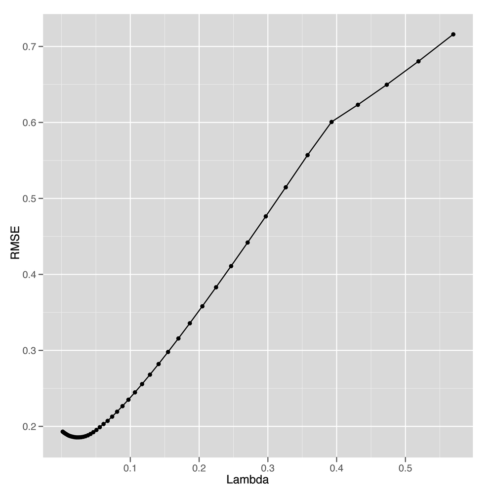
Looking at Figure 6-7, it seems like we
get the best possible performance with Lambda near 0.05.
So to fit a model to the full data, we can select that value and train
our model on the entire data set. Here we do just that:
best.lambda <- with(performance, Lambda[which(RMSE == min(RMSE))])

glmnet.fit <- with(df, glmnet(poly(X, degree = 10), Y))
After fitting our final model to the whole data set, we can
use coef to examine the structure of our regularized
model:
coef(glmnet.fit, s = best.lambda)
#11 x 1 sparse Matrix of class "dgCMatrix"
#                     1
#(Intercept)  0.0101667
#1           -5.2132586
#2            0.0000000
#3            4.1759498
#4            0.0000000
#5           -0.4643476
#6            0.0000000
#7            0.0000000
#8            0.0000000
#9            0.0000000
#10           0.0000000
As you can see from looking at this table, we end up using only 3 nonzero coefficients, even though the model has the ability to use 10. Selecting a simpler model like this one, even when more complicated models are possible, is the major strategy behind regularization. And with regularization in our toolkit, we can employ polynomial regression with a large degree and still keep ourselves from overfitting the data.
With the basic ideas behind regularization in place, let’s look at a practical application in this chapter’s case study.
Cross-validation and regularization are both powerful tools that allow us to use complex models that can mimic very intricate patterns in our data without overfitting. One of the most interesting cases in which we can employ regularization is when we use text to predict some continuous output; for example, we might try to predict how volatile a stock will be based on its IPO filings. When using text as an input for a regression problem, we almost always have far more inputs (words) than observations (documents). If we have more observations than 1-grams (single words), we can simply consider 2-grams (pairs of words) or 3-grams (triplets of words) until we have more n-grams than documents. Because our data set has more columns than rows, unregularized linear regression will always produce an overfit model. For that reason, we have to use some form of regularization to get any meaningful results.
To give you a sense of this problem, we’ll work through a simple case study in which we try to predict the relative popularity of the top-100-selling books that O’Reilly has ever published using only the descriptions of those books from their back covers as input. To transform these text descriptions into a useful set of inputs, we’ll convert each book’s description into a vector of word counts so that we can see how often words such as “the” and “Perl” occur in each description. The results of our analysis will be, in theory, a list of the words in a book’s description that predict high sales.
Warning
Of course, it’s always possible that the prediction task simply can’t be achieved. This may be the result of the model assigning high coefficients to words that are essentially arbitrary. That is, it may be that there are very few common words in the descriptions of popular O’Reilly books, but because the model does not know this it will still attempt to fit the data and assign value to some words. In this case, however, the results would provide little to no new information about what makes these words useful. This problem will not come up explicitly in this example, but it is very important to keep this in mind when performing text regression.
To get started, let’s load in our raw data set and transform
it into a document term matrix using the tm package that we
introduced in Chapter 3:
ranks <- read.csv('data/oreilly.csv', stringsAsFactors = FALSE)

library('tm')

documents <- data.frame(Text = ranks$Long.Desc.)
row.names(documents) <- 1:nrow(documents)

corpus <- Corpus(DataframeSource(documents))
corpus <- tm_map(corpus, tolower)
corpus <- tm_map(corpus, stripWhitespace)
corpus <- tm_map(corpus, removeWords, stopwords('english'))

dtm <- DocumentTermMatrix(corpus)
Here we’ve loaded in the ranks data set from a CSV
file, created a data frame that contains the descriptions of the books
in a format that tm understands,
created a corpus from this data frame, standardized the case of the
text, stripped whitespace, removed the most common words in English, and
built our document term matrix. With that work done, we’ve finished all
of the substantive transformations we need to make to our data.
With those finished, we can manipulate our variables a little
bit to make it easier to describe our regression problem to
glmnet:
x <- as.matrix(dtm)
y <- rev(1:100)
Here we’ve converted the document term matrix into a simple
numeric matrix that’s easier to work with. And we’ve encoded the ranks
in a reverse encoding so that the highest-ranked book has a
y-value of 100 and the lowest-ranked book has a
y-value of 1. We do this so that the coefficients that
predict the popularity of a book are positive when they signal an
increase in popularity; if we used the raw ranks instead, the
coefficients for those same words would have to be negative. We find
that less intuitive, even though there’s no substantive difference
between the two coding systems.
Finally, before running our regression analysis, we need to
initialize our random seed and load the glmnet
package:
set.seed(1)

library('glmnet')
Having done that setup work, we can loop over several possible
values for Lambda to see which gives the best results on
held-out data. Because we don’t have a lot of data, we do this split 50
times for each value of Lambda to get a better sense of the
accuracy we get from different levels of regularization. In the
following code, we set a value for Lambda, split the data
into a training set and test set 50 times, and then assess our model’s
performance on each split.
performance <- data.frame()

for (lambda in c(0.1, 0.25, 0.5, 1, 2, 5))
{
  for (i in 1:50)
  {
    indices <- sample(1:100, 80)
    training.x <- x[indices, ]
    training.y <- y[indices]

    test.x <- x[-indices, ]
    test.y <- y[-indices]

    glm.fit <- glmnet(training.x, training.y)
    predicted.y <- predict(glm.fit, test.x, s = lambda)
    rmse <- sqrt(mean((predicted.y - test.y) ^ 2))

    performance <- rbind(performance,
                         data.frame(Lambda = lambda,
                                    Iteration = i,
                                    RMSE = rmse))
  }
}
After computing the performance of the model for these different
values of Lambda, we can compare them to see where the
model does best:
ggplot(performance, aes(x = Lambda, y = RMSE)) +
  stat_summary(fun.data = 'mean_cl_boot', geom = 'errorbar') +
  stat_summary(fun.data = 'mean_cl_boot', geom = 'point')
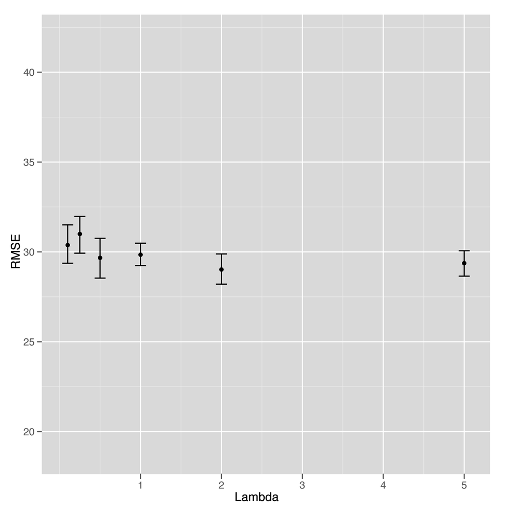
Unfortunately, looking at Figure 6-8 suggests that this is our first
example of a failed attempt to apply a statistical method to data. It’s
clear that the model gets better and better with higher values of
Lambda, but that occurs exactly when the model reduces to
nothing more than an intercept. At that point, we’re not using any text
data at all. In short, there’s no signal here that our text regression
can find. Everything we see turns out to be noise when you test the
model against held-out data.
Although that means we don’t have a better idea of how to write a back cover description for a book to make sure it sells well, it’s a valuable lesson for anyone working in machine learning to absorb: sometimes there’s just no signal to be found in the data you’re working with. The following quote summarizes the problem well:
The data may not contain the answer. The combination of some data and an aching desire for an answer does not ensure that a reasonable answer can be extracted from a given body of data.
—John Tukey
But we don’t have to give up on this data set completely yet. Although we haven’t succeeded at building a tool that predicts ranks from texts, we might try to do something simpler and see if we can predict whether a book appears in the top 50 or not.
To do that, we’re going to switch our regression problem to a classification problem. Instead of predicting one of infinitely many possible ranks, we’re switching to a simple categorical judgment: is this book in the top 50 or not?
Because this distinction is so much broader and simpler, we can hope that it will be easier to extract a signal from our small data set. To start, let’s add class labels to our data set:
y <- rep(c(1, 0), each = 50)
Here we’ve used the 0/1 dummy coding we discussed in Chapter 2, where a 1 indicates that a book is in the top 50, and a 0 indicates that a book is not in the top 50. With that coding in place, we can use the logistic regression classification algorithm we demonstrated at the end of Chapter 2 to predict presence in the list of top 50 books.
Logistic regression is, deep down, essentially a form of regression in which one predicts the probability that an item belongs to one of two categories. Because probabilities are always between 0 and 1, we can threshold them at 0.5 to construct a classification algorithm. Other than the fact that the outputs are between 0 and 1, logistic regression behaves essentially identically to linear regression. The only difference is that you need to threshold the outputs to produce class predictions. We’ll go through that thresholding step after we show you how easy it is to fit a logistic regression in R.
To start, we’ll fit a logistic regression to the entire data set just so you can see how it’s done:
regularized.fit <- glmnet(x, y, family = 'binomial')
The only difference between this call to
glmnet and the call we made earlier to perform linear
regression is that we set an additional parameter,
family, which controls the type of errors you expect to
see when making predictions. We didn’t discuss this in Chapter 5, but linear regression
assumes that the errors you see have a Gaussian distribution, whereas
logistic regression assumes that the errors are binomially
distributed. We won’t discuss the details of the binomial
distribution, but you should know that it’s the statistical
distribution of data you’d get from flipping a coin. For that reason,
the binomial distribution produces errors that are all 0s or 1s,
which, of course, is what we need for classification.
To elaborate on that, let’s show you three calls you could make
to glmnet:
regularized.fit <- glmnet(x, y)

regularized.fit <- glmnet(x, y, family = 'gaussian')

regularized.fit <- glmnet(x, y, family = 'binomial')
The first call is the one we made earlier in this chapter to
perform linear regression. The second call is actually equivalent to
the first call, except that we’ve made explicit the default value of
the family parameter, which is set to
'gaussian' automatically. The third call is the way we
perform logistic regression. As you can see, switching an analysis
from linear regression to logistic regression is just a matter of
switching the error
family.[11]
Having fit a logistic regression to the entire data set, let’s
see what the predictions from our model look like using the
predict function:
predict(regularized.fit, newx = x, s = 0.001)

#1    4.884576
#2    6.281354
#3    4.892129
...
#98  -5.958003
#99  -5.677161
#100 -4.956271
As you can see, the output contains both positive and negative values, even though we’re hoping to get predictions that are 0 or 1. There are two things we can do with these raw predictions.
The first is to threshold them at 0 and make 0/1 predictions
using the ifelse function:
ifelse(predict(regularized.fit, newx = x, s = 0.001) > 0, 1, 0)

#1   1
#2   1
#3   1
...
#98  0
#99  0
#100 0
The second is to convert these raw predictions into
probabilities, which we can more easily interpret—though we’d have to
do the thresholding again at 0.5 to get the 0/1 predictions we
generated previously. To convert raw logistic regression predictions
into probabilities, we’ll use the inv.logit function from
the boot package:
library('boot')

inv.logit(predict(regularized.fit, newx = x, s = 0.001))
#1   0.992494427
#2   0.998132627
#3   0.992550485
...
#98  0.002578403
#99  0.003411583
#100 0.006989922
If you want to know the details of how inv.logit
works, we recommend looking at the source code for that function to
figure out the mathematical transformation that it’s computing. For
our purposes, we just want you to understand that logistic regression
expects its outputs to be transformed through the inverse logit
function before you can produce probabilities as outputs. For that
reason, logistic regression is often called the logit model.
Whichever way you decide to transform the raw outputs from a logistic regression, what really matters is that logistic regression provides you with a tool that does classification just as readily as we performed linear regression in Chapter 5. So let’s try using logistic regression to see how well we can classify books into the top 50 or below. As you’ll notice, the code to do this is essentially identical to the code we used earlier to fit our rank prediction model using linear regression:
set.seed(1)

performance <- data.frame()

for (i in 1:250)
{
  indices <- sample(1:100, 80)
  training.x <- x[indices, ]
  training.y <- y[indices]

  test.x <- x[-indices, ]
  test.y <- y[-indices]

  for (lambda in c(0.0001, 0.001, 0.0025, 0.005, 0.01, 0.025, 0.5, 0.1))
  {
    glm.fit <- glmnet(training.x, training.y, family = 'binomial')
    predicted.y <- ifelse(predict(glm.fit, test.x, s = lambda) > 0, 1, 0)
    error.rate <- mean(predicted.y != test.y)

    performance <- rbind(performance,
                         data.frame(Lambda = lambda,
                                    Iteration = i,
                                    ErrorRate = error.rate))
  }
}
The algorithmic changes in this code snippet relative to the one
we used for linear regression are few: (1) the calls to
glmnet, where we use the binomial error family parameter
for logistic regression; (2) the thresholding step that produces 0/1
predictions from the raw logistic predictions; and (3) the use of
error rates rather than RMSE as our measure of model performance.
Another change you might notice is that we’ve chosen to perform 250
splits of the data rather than 50 so that we can get a better sense of
our mean error rate for each setting of lambda. We’ve
done this because the error rates end up being very close to 50%, and
we wanted to confirm that we’re truly doing better than chance when
making predictions. To make this increased splitting more efficient,
we’ve reversed the order of the splitting and lambda
loops so that we don’t redo the split for every single value of
lambda. This saves a lot of time and serves as a reminder that writing
effective machine learning code requires that you behave like a good
programmer who cares about writing efficient code.
But we’re more interested in our performance on this data set,
so let’s graph our error rate as we sweep through values of
lambda:
  ggplot(performance, aes(x = Lambda, y = ErrorRate)) +
    stat_summary(fun.data = 'mean_cl_boot', geom = 'errorbar') +
    stat_summary(fun.data = 'mean_cl_boot', geom = 'point') +
    scale_x_log10()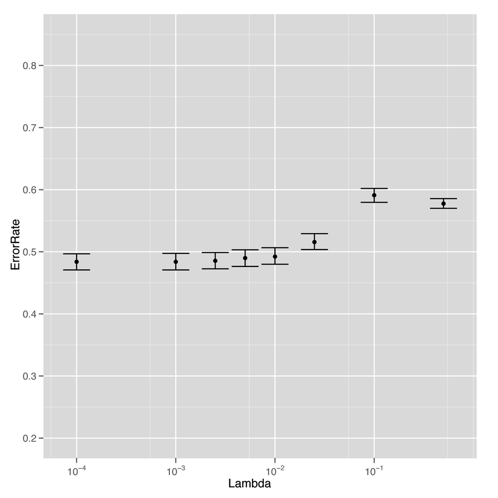
The results tell us that we’ve had real success replacing
regression with classification. For low values of lambda,
we’re able to get better than chance performance when predicting
whether a book will be among the top 50, which is a relief. Although
this data was just not sufficient to fit a sophisticated rank
prediction regression, it turns out to be large enough to fit a much
simpler binary distinction that splits books into the top 50 and
below.
And that’s a general lesson we’ll close this chapter on: sometimes simpler things are better. Regularization forces us to use simpler models so that we get higher performance on our test data. And switching from a regression model to a classification model can give you much better performance because the requirements for a binary distinction are generally much weaker than the requirements for predicting ranks directly.