Table of Contents for
Machine Learning for Hackers
 Machine Learning for Hackers
Published by
O'Reilly Media, Inc., 2012
Machine Learning for Hackers
Published by
O'Reilly Media, Inc., 2012
- Cover
- O'Reilly Strata Conference
- Machine Learning for Hackers
- Preface
- 1. Using R
- 2. Data Exploration
- 3. Classification: Spam Filtering
- 4. Ranking: Priority Inbox
- 5. Regression: Predicting Page Views
- 6. Regularization: Text Regression
- 7. Optimization: Breaking Codes
- 8. PCA: Building a Market Index
- 9. MDS: Visually Exploring US Senator Similarity
- 10. kNN: Recommendation Systems
- 11. Analyzing Social Graphs
- 12. Model Comparison
- Works Cited
- Index
- About the Authors
- Colophon
- Copyright
So far, all of our work with data has been based on prediction tasks: we’ve tried to classify emails or web page views where we had a training set of examples for which we knew the correct answer. As we mentioned early on in this book, learning from data when we have a training sample with the correct answer is called supervised learning: we find structure in our data using a signal that tells us whether or not we’re doing a good job of discovering real patterns.
But often we want to find structure without having any answers available to us about how well we’re doing; we call this unsupervised learning. For example, we might want to perform dimensionality reduction, which happens when we shrink a table with a huge number of columns into a table with a small number of columns. If you have too many columns to deal with, this dimensionality reduction goes a long way toward making your data set comprehensible. Although you clearly lose information when you replace many columns with a single column, the gains in understanding are often valuable, especially when you’re exploring a new data set.
One place where this type of dimensionality reduction is particularly helpful is when dealing with stock market data. For example, we might have data that looks like the real historical prices shown in Table 8-1 for 25 stocks over the period from January 2, 2002 until May 25, 2011.
Table 8-1. Historical stock prices
| Date | ADC | AFL | ... | UTR |
|---|---|---|---|---|
| 2002-01-02 | 17.7 | 23.78 | ... | 39.34 |
| 2002-01-03 | 16.14 | 23.52 | ... | 39.49 |
| ... | ... | ... | ... | ... |
| 2011-05-25 | 22.76 | 49.3 | ... | 29.47 |
Though we’ve only shown 3 columns, there are actually 25, which is far too many columns to deal with in a thoughtful way. We want to create a single column that tells us how the market is doing on each day by combining information in the 25 columns that we have access to; we’ll call that single column an index of the market. So how can we construct one?
The simplest approach is called principal components analysis, or PCA. The main idea of PCA is to create a new set of 25 columns that are ordered based on how much of the raw information in our data set they contain. The first new column, called the first principal component, or just the principal component for short, will often contain the vast majority of the structure in the entire data set. PCA is particularly effective when the columns in our data set are all strongly correlated. In that case, you can replace the correlated columns with a single column that matches an underlying pattern that accounts for the correlation between both columns.
So let’s test whether or not PCA will work by seeing how correlated the columns in our data set are. To do that, we first need to load our raw data set into R:
prices <- read.csv('data/stock_prices.csv')

prices[1,]
#        Date Stock Close
#1 2011-05-25   DTE 51.12
Our raw data set isn’t in the format we’d like to work with, so we
need to do some preprocessing. The first step is to translate all of the
raw datestamps in our data set to properly encoded date variables.
To do that, we use the lubridate package from
CRAN. This package provides a nice function called ymd that
translates strings in year-month-day format into date
objects:
library('lubridate')

prices <- transform(prices, Date = ymd(Date))
Once we’ve done this, we can use the cast
function in the reshape library to create a data matrix
like the table we saw earlier in this chapter. In this table, the rows
will be days and the columns will be separate stocks. We do this as
follows:
library('reshape')

date.stock.matrix <- cast(prices, Date ~ Stock, value = 'Close')
The cast function has you specify which column
should be used to define the rows in the output matrix on the lefthand
side of the tilde, and the columns of the result are specified after the
tilde. The actual entries in the result are specified using
value.
After exploring the result of producing this big date-stock
matrix, we notice that there are some missing entries. So we go back to
the prices data set, remove missing entries, and then rerun
cast:
prices <- subset(prices, Date != ymd('2002-02-01'))
prices <- subset(prices, Stock != 'DDR')

date.stock.matrix <- cast(prices, Date ~ Stock, value = 'Close')
Having removed the missing entries, we use cast again
to produce the matrix we want. Once that’s done, we can find the
correlations between all of the numeric columns in the matrix using the
cor function. After doing that, we turn the correlation matrix into a single
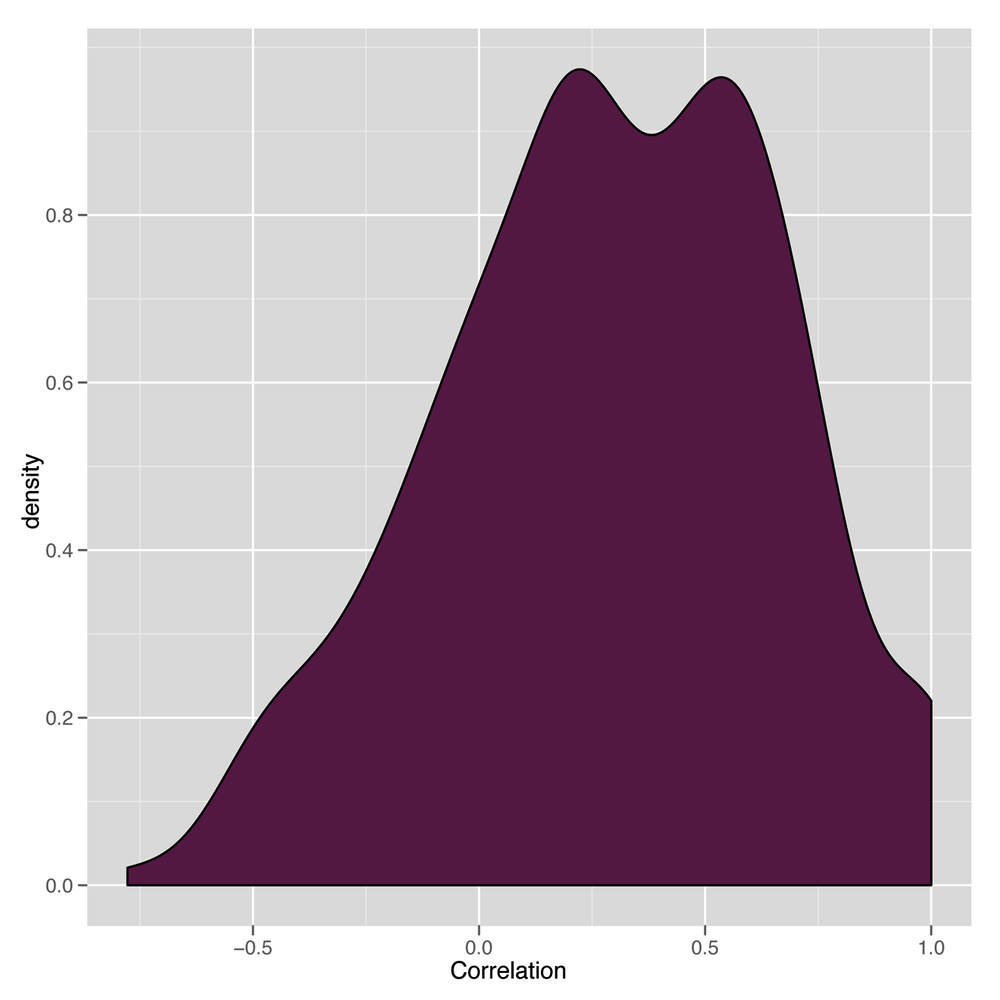
numeric vector and create a density plot of the correlations to get a
sense of both a) the mean correlation, and b) the frequency with which
low correlations occur:
cor.matrix <- cor(date.stock.matrix[,2:ncol(date.stock.matrix)])

correlations <- as.numeric(cor.matrix)

ggplot(data.frame(Correlation = correlations),
            aes(x = Correlation, fill = 1)) +
  geom_density() +
  opts(legend.position = 'none')
The resulting density plot is shown in Figure 8-1. As we can see, the vast majority of the correlations are positive, so PCA will probably work well on this data set.
Having convinced ourselves that we can use PCA, how do we do
that in R? Again, this is a place where R shines: the entirety of PCA
can be done in one line of code. We use the princomp
function to run PCA:
pca <- princomp(date.stock.matrix[,2:ncol(date.stock.matrix)])
If we just type pca into R, we’ll see a quick summary
of the principal components:
Call:
princomp(x = date.stock.matrix[, 2:ncol(date.stock.matrix)])

Standard deviations:
    Comp.1     Comp.2     Comp.3     Comp.4     Comp.5     Comp.6     Comp.7
29.1001249 20.4403404 12.6726924 11.4636450  8.4963820  8.1969345  5.5438308
    Comp.8     Comp.9    Comp.10    Comp.11    Comp.12    Comp.13    Comp.14
 5.1300931  4.7786752  4.2575099  3.3050931  2.6197715  2.4986181  2.1746125
   Comp.15    Comp.16    Comp.17    Comp.18    Comp.19    Comp.20    Comp.21
 1.9469475  1.8706240  1.6984043  1.6344116  1.2327471  1.1280913  0.9877634
   Comp.22    Comp.23    Comp.24
 0.8583681  0.7390626  0.4347983

 24  variables and  2366 observations.
In this summary, the standard deviations tell us how much of the
variance in the data set is accounted for by the different principal
components. The first component, called Comp.1, accounts
for 29% of the variance, while the next component accounts for 20%. By
the end, the last component, Comp.24, accounts for less
than 1% of the variance. This suggests that we can learn a lot about our
data by just looking at the first principal component.
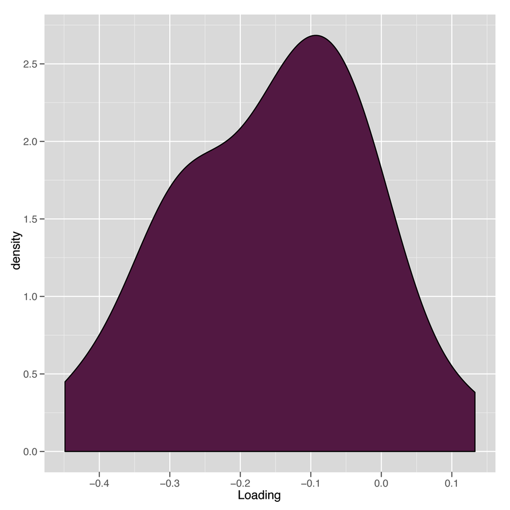
We can examine the first principal component in more detail by
looking at its loadings, which tell us how much weight it gives to each
of the columns. We get those by extracting the loadings
element of the princomp object stored in pca.
Extracting loadings
gives us a big matrix that tells us how much each of the 25
columns gets puts into each of the principal components. We’re really
only interested in the first principal component, so we pull out the
first column of the pca loadings:
principal.component <- pca$loadings[,1]
Having done that, we can examine a density plot of the loadings to get a sense of how the first principal component is formed:
loadings <- as.numeric(principal.component)

ggplot(data.frame(Loading = loadings),
            aes(x = Loading, fill = 1)) +
  geom_density() +
  opts(legend.position = 'none')
This can be seen in Figure 8-2. The results are a little suspicious because there’s a nice distribution of loadings, but they’re overwhelmingly negative. We’ll see what this leads to in a bit; it’s actually a trivial nuisance that a single line of code will fix.
Now that we have our principal component, we might want to
generate our one-column summary of our data set. We can do that using
the predict function:
market.index <- predict(pca)[,1]
How can we tell whether these predictions are any good? Thankfully, this is a case where it’s easy to decide whether we like our results because there are famous market indices that we can compare our results against. For this chapter, we’ll use the Dow Jones Index, which we’ll refer to as just the DJI.
We load the DJI into R as follows:
dji.prices <- read.csv('data/DJI.csv')
dji.prices <- transform(dji.prices, Date = ymd(Date))
Because the DJI runs for so much longer than we want, we need to do some subsetting to get only the dates we’re interested in:
dji.prices <- subset(dji.prices, Date > ymd('2001-12-31'))
dji.prices <- subset(dji.prices, Date != ymd('2002-02-01'))
After doing that, we extract the parts of the DJI we’re interested
in, which are the daily closing prices and the dates on which they were
recorded. Because they’re in the opposite order of our current data set,
we use the rev function to reverse them:
dji <- with(dji.prices, rev(Close))
dates <- with(dji.prices, rev(Date))
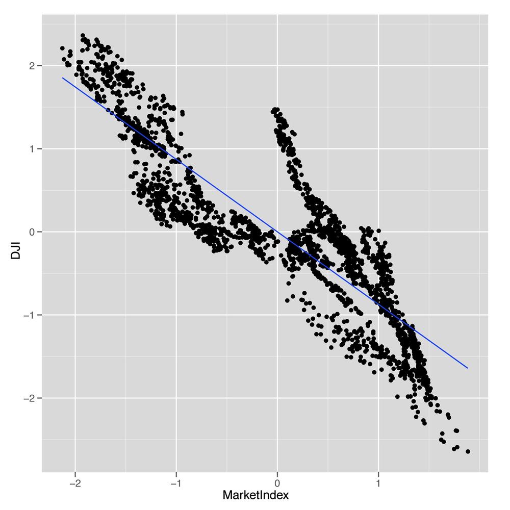
Now we can make some simple graphical plots to compare our market index generated using PCA with the DJI:
comparison <- data.frame(Date = dates, MarketIndex = market.index, DJI = dji)

ggplot(comparison, aes(x = MarketIndex, y = DJI)) +
  geom_point() +
  geom_smooth(method = 'lm', se = FALSE)
This first plot is shown in Figure 8-3. As you can see, those negative loadings that seemed suspicious before turn out to be a real source of trouble for our data set: our index is negatively correlated with the DJI.
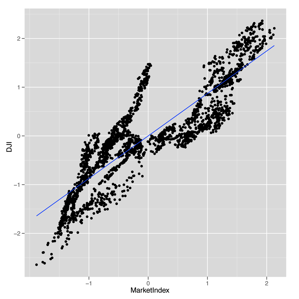
But that’s something we can easily fix. We just multiply our index
by -1 to produce an index that’s correlated in the right
direction with the DJI:
comparison <- transform(comparison, MarketIndex = -1 * MarketIndex)
Now we can try out our comparison again:
ggplot(comparison, aes(x = MarketIndex, y = DJI)) +
  geom_point() +
  geom_smooth(method = 'lm', se = FALSE)
As you can see in Figure 8-4, we’ve fixed the direction of our index, and it looks like it matches the DJI really well. The only thing that’s missing is to get a sense of how well our index tracks the DJI over time.
We can easily make that comparison. First, we use the
melt function to get a data.frame that’s easy
to work with for visualizing both indices at once. Then we make a line
plot in which the x-axis is the date and the y-axis is the price of each
index.
alt.comparison <- melt(comparison, id.vars = 'Date')
names(alt.comparison) <- c('Date', 'Index', 'Price')

ggplot(alt.comparison, aes(x = Date, y = Price, group = Index, color = Index)) +
  geom_point() +
  geom_line()
Our first pass doesn’t look so good, because the DJI takes on
very high values, whereas our index takes on very small values. But we
can fix that using scale, which puts both indices on a
common scale:
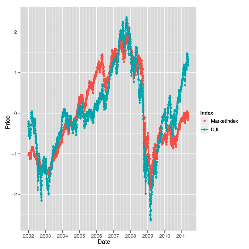
comparison <- transform(comparisonMarketIndex = -scale(MarketIndex))
comparison <- transform(comparisonDJI = scale(DJI))

alt.comparison <- melt(comparison, id.vars = 'Date')
names(alt.comparison) <- c('Date', 'Index', 'Price')

p <- ggplot(alt.comparison, aes(x = Date, y = Price, group = Index, color = Index)) +
  geom_point() +
  geom_line()

print(p)
After doing that, we recreate our line plot and check the results, which are shown in Figure 8-5. This plot makes it seem like our market index, which was created entirely with PCA and didn’t require any domain knowledge about the stock market, tracks the DJI incredibly well. In short, PCA really works to produce a reduced representation of stock prices that looks just like something we might create with more careful thought about how to express the general well-being of the stock market. We think that’s pretty amazing.
Hopefully this example convinces you that PCA is a powerful tool for simplifying your data and that you can actually do a lot to discover structure in your data even when you’re not trying to predict something. If you’re interested in this topic, we’d encourage looking into independent component analysis (ICA), which is an alternative to PCA that works well in some circumstances where PCA breaks down.