Table of Contents for
Machine Learning for Hackers
 Machine Learning for Hackers
Published by
O'Reilly Media, Inc., 2012
Machine Learning for Hackers
Published by
O'Reilly Media, Inc., 2012
- Cover
- O'Reilly Strata Conference
- Machine Learning for Hackers
- Preface
- 1. Using R
- 2. Data Exploration
- 3. Classification: Spam Filtering
- 4. Ranking: Priority Inbox
- 5. Regression: Predicting Page Views
- 6. Regularization: Text Regression
- 7. Optimization: Breaking Codes
- 8. PCA: Building a Market Index
- 9. MDS: Visually Exploring US Senator Similarity
- 10. kNN: Recommendation Systems
- 11. Analyzing Social Graphs
- 12. Model Comparison
- Works Cited
- Index
- About the Authors
- Colophon
- Copyright
In the abstract, regression is a very simple concept: you want to predict one set of numbers given another set of numbers. For example, actuaries might want to predict how long a person will live given their smoking habits, while meteorologists might want to predict the next day’s temperature given the previous day’s temperature. In general, we’ll call the numbers you’re given inputs and the numbers you want to predict outputs. You’ll also sometimes hear people refer to the inputs as predictors or features.
What makes regression different from classification is that the outputs are really numbers. In classification problems like those we described in Chapter 3, you might use numbers as a dummy code for a categorical distinction so that 0 represents ham and 1 represents spam. But these numbers are just symbols; we’re not exploiting the “numberness” of 0 or 1 when we use dummy variables. In regression, the essential fact about the outputs is that they really are numbers: you want to predict things like temperatures, which could be 50 degrees or 71 degrees. Because you’re predicting numbers, you want to be able to make strong statements about the relationship between the inputs and the outputs: you might want to say, for example, that when the number of packs of cigarettes a person smokes per day doubles, their predicted life span gets cut in half.
The problem, of course, is that wanting to make precise numerical predictions isn’t the same thing as actually being able to make predictions. To make quantitative predictions, we need to come up with some rule that can leverage the information we have access to. The various regression algorithms that statisticians have developed over the last 200 years all provide different ways to make predictions by turning inputs into outputs. In this chapter, we’ll cover the workhorse regression model, which is called linear regression.
It might seem silly to say this, but the simplest possible way to use the information we have as inputs is to ignore the inputs entirely and to predict future outcomes based only on the mean value of the output we’ve seen in the past. In the example of an actuary, we could completely ignore a person’s health records and simply guess that they’ll live as long as the average person lives.
Guessing the mean outcome for every case isn’t as naive as it might seem: if we’re interested in making predictions that are as close to the truth as possible without using any other information, guessing the mean output turns out to be the best guess we can possibly make.
Note
A little bit of work has to go into defining “best” to give this claim a definite meaning. If you’re uncomfortable with us throwing around the word “best” without saying what we mean, we promise that we’ll give a formal definition soon.
Before we discuss how to make the best possible guess, let’s suppose that we have data from an imaginary actuarial database, a portion of which is shown in Table 5-1.
Because this is a totally new data set, it’s a good idea to follow our suggestions in Chapter 2 and explore the data a bit before doing any formal analysis. We have one numeric column and another column that’s a dummy-coded factor, and so it’s natural to make density plots to compare smokers with nonsmokers (see the resulting plot in Figure 5-1):
ages <- read.csv('data/longevity.csv')

ggplot(ages, aes(x = AgeAtDeath, fill = factor(Smokes))) +
  geom_density() +
  facet_grid(Smokes ~ .)
The resulting plot makes it seem reasonable to believe that smoking matters for longevity because the center of the nonsmokers’ life span distribution is shifted to the right of the center of the smokers’ life spans. In other words, the average life span of a nonsmoker is longer than the average life span of a smoker. But before we describe how you can use the information we have about a person’s smoking habits to make predictions about her longevity, let’s pretend for a minute that you didn’t have any of this information. In that case, you’d need to pick a single number as your prediction for every new person, regardless of her smoking habits. So what number should you pick?
That question isn’t a trivial one, because the number you should
pick depends on what you think it means to make good predictions.
There are a lot of reasonable ways to define the accuracy of
predictions, but there is a single measure of quality that’s been
dominant for virtually the entire history of statistics.
This measure is called squared error. If you’re trying to
predict a value y (the true output) and you guess
h (your hypothesis about y), then the
squared error of your guess is simply (y - h) ^ 2.
Beyond the value inherent in following conventions that others will understand, there are a lot of good reasons for why you might want to use squared error to measure the quality of your guesses. We won’t get into them now, but we will talk a little bit more about the ways one can measure error in Chapter 7, when we talk about optimization algorithms in machine learning. For now, we’ll just try to convince you of something fundamental: if we’re using squared error to measure the quality of our predictions, then the best guess we can possibly make about a person’s life span—without any additional information about a person’s habits—is the average person’s longevity.
To convince you of this claim, let’s see what happens if we use
other guesses instead of the mean. With the longevity data set, the
mean AgeAtDeath is 72.723, which we’ll round up to 73 for
the time being. We can then ask: “How badly would we have predicted
the ages of the people in our data set if we’d guessed that they all
lived to be 73?”
To answer that question in R, we can use the following code, which combines all of the squared errors for each person in our data set by computing the mean of the squared errors, which we’ll call the mean squared error (or MSE for short):
ages <- read.csv('data/longevity.csv')

guess <- 73

with(ages, mean((AgeAtDeath - guess) ^ 2))
#[1] 32.991
After running this code, we find that the mean squared error we make by guessing 73 for every person in our data set is 32.991. But that, by itself, shouldn’t be enough to convince you that we’d do worse with a guess that’s not 73. To convince you that 73 is the best guess, we need to consider how we’d perform if we made some of the other possible guesses. To compute those other values in R, we loop over a sequence of possible guesses ranging from 63 to 83:
ages <- read.csv('data/longevity.csv')

guess.accuracy <- data.frame()

for (guess in seq(63, 83, by = 1))
{
  prediction.error <- with(ages,
                           mean((AgeAtDeath - guess) ^ 2))
  guess.accuracy <- rbind(guess.accuracy,
                          data.frame(Guess = guess,
                                     Error = prediction.error))
}

ggplot(guess.accuracy, aes(x = Guess, y = Error)) +
  geom_point() +
  geom_line()
As you can see from looking at Figure 5-2, using any guess other than 73 gives us worse predictions for our data set. This is actually a general theoretical result that can be proven mathematically: to minimize squared error, you want to predict the mean value in your data set. One important implication of this is that the predictive value of having information about smoking should be measured in terms of the amount of improvement you get from using this information over just using the mean value as your guess for every person you see.
So how can we use that information? Let’s start with a simple case before we tackle the broader problem. How can we use information about whether or not people smoke to make better guesses about their longevity?
One simple idea is to estimate the mean age at death for smokers and nonsmokers separately and then to use these two separate values as our guesses for future cases, depending on whether or not a new person smokes. This time, instead of using the MSE, we’ll use the root mean squared error (RMSE), which is more popular in the machine learning literature.
Here’s one way to compute the RMSE in R after splitting up smokers and nonsmokers into two groups that are modeled separately (the results are listed in Table 5-2):
ages <- read.csv('data/longevity.csv')

constant.guess <- with(ages, mean(AgeAtDeath))
with(ages, sqrt(mean((AgeAtDeath - constant.guess) ^ 2)))

smokers.guess <- with(subset(ages, Smokes == 1),
                      mean(AgeAtDeath))
non.smokers.guess <- with(subset(ages, Smokes == 0),
                          mean(AgeAtDeath))
ages <- transform(ages,
                  NewPrediction = ifelse(Smokes == 0,
                                         non.smokers.guess,
                                         smokers.guess))
with(ages, sqrt(mean((AgeAtDeath - NewPrediction) ^ 2)))
Table 5-2. Prediction errors with more information
| Information | Root mean squared error |
|---|---|
| Error without smoking information | 5.737096 |
| Error with smoking information | 5.148622 |
As you can see by looking at the RMSE we get, our predictions really do get better after we include more information about the people we’re studying: our prediction error when estimating people’s life spans becomes 10% smaller when we include information about people’s smoking habits. In general, we can do better than using just the mean value whenever we have binary distinctions that separate two types of data points—assuming that those binary distinctions are related to the output we’re trying to predict. Some simple examples where binary distinctions might help are contrasting men with women or contrasting Democrats with Republicans in American political discourse.
So now we have a mechanism for incorporating dummy variables into our predictions. But how can we use richer information about the objects in our data? By richer, we mean two things: first, we want to know how we can use inputs that aren’t binary distinctions, but instead continuous values such as heights or weights; second, we want to know how we can use multiple sources of information all at once to improve our estimates. In our actuarial example, suppose that we knew (a) whether or not someone was a smoker and (b) the age at which his parents died. Our intuition is that having these two separate sources of information should tell us more than either of those variables in isolation.
But making use of all of the information we have isn’t an easy task. In practice, we need to make some simplifying assumptions to get things to work. The assumptions we’ll describe are those that underlie linear regression, which is the only type of regression we’ll describe in this chapter. Using only linear regression is less of a restriction than it might seem, as linear regression is used in at least 90% of practical regression applications and can be hacked to produce more sophisticated forms of regression with only a little bit of work.
The two biggest assumptions we make when using linear regression to predict outputs are the following:
- Separability/additivity
If there are multiple pieces of information that would affect our guesses, we produce our guess by adding up the effects of each piece of information as if each piece of information were being used in isolation. For example, if alcoholics live one year less than nonalcoholics and smokers live five years less than nonsmokers, then an alcoholic who’s also a smoker should live 1 + 5 = 6 years less than a nonalcoholic nonsmoker. The assumption that the effects of things in isolation add up when they happen together is a very big assumption, but it’s a good starting place for lots of applications of regression. Later on we’ll talk about the idea of interactions, which is a technique for working around the separability assumption in linear regression when, for example, you know that the effect of excessive drinking is much worse if you also smoke.
- Monotonicity/linearity
A model is monotonic when changing one of the inputs always makes the predicted output go up or go down. For example, if you’re predicting weights using heights as an input and your model is monotonic, then you’re assuming that every time somebody’s height increases, your prediction of their weight will go up. Monotonicity is a strong assumption because you can imagine lots of examples where the output goes up for a bit with an input and then starts to go down, but the monotonicity assumption is actually much less strong than the full assumption of the linear regression algorithm, which is called linearity. Linearity is a technical term with a very simple meaning: if you graph the input and the output on a scatterplot, you should see a line that relates the inputs to the outputs, and not something with a more complicated shape, such as a curve or a wave. For those who think less visually, linearity means that changing the input by one unit always adds N units to the output or always subtracts N units from the output. Every linear model is monotonic, but curves can be monotonic without being linear. For that reason, linearity is more restrictive than monotonicity.
Note
Let’s be perfectly clear about what we mean when we say line, curve, and wave by looking at examples of all three in Figure 5-3. Both curves and lines are monotonic, but waves are not monotonic, because they go up at times and down at other times.
Standard linear regression will work only if the data looks like a line when you plot the output against each of the inputs. It’s actually possible to use linear regression to fit curves and waves, but that’s a more advanced topic that we’ll hold off discussing until Chapter 6.
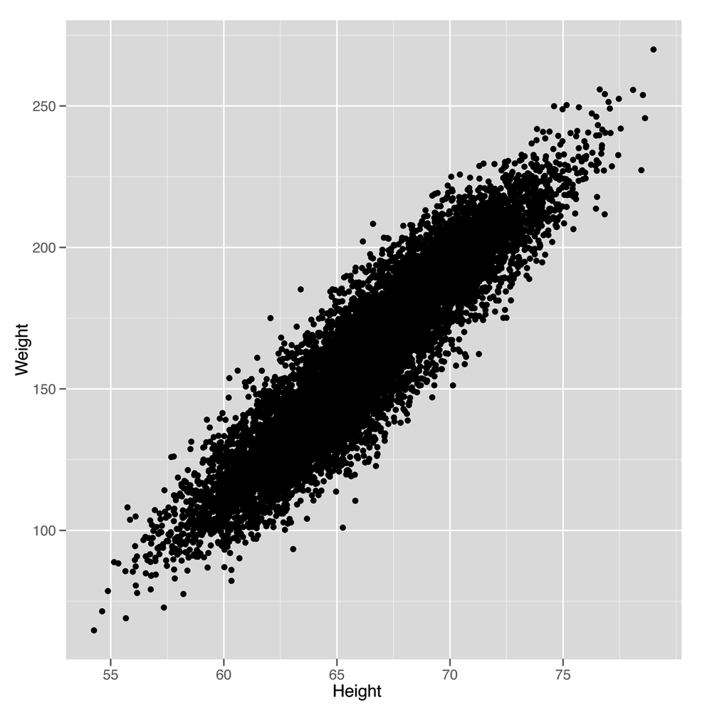
Keeping the additivity and linearity assumptions in mind, let’s
start working through a simple example of linear regression. Let’s go
back to using our heights and weights data set one more time to show
how linear regression works in this context. In Figure 5-4, we see the scatterplot that we’ve
drawn so many times before. A small change to our plotting code will
show us the line that a linear regression model will produce as a
method for predicting weights using heights, as shown in Figure 5-5.
We simply need to add a call to the
geom_smooth function while specifying that we want to use
the lm method, which implements
“linear models.”
library('ggplot2')

heights.weights <- read.csv('data/01_heights_weights_genders.csv',
                            header = TRUE,
                            sep = ',')

ggplot(heights.weights, aes(x = Height, y = Weight)) +
  geom_point() +
  geom_smooth(method = 'lm')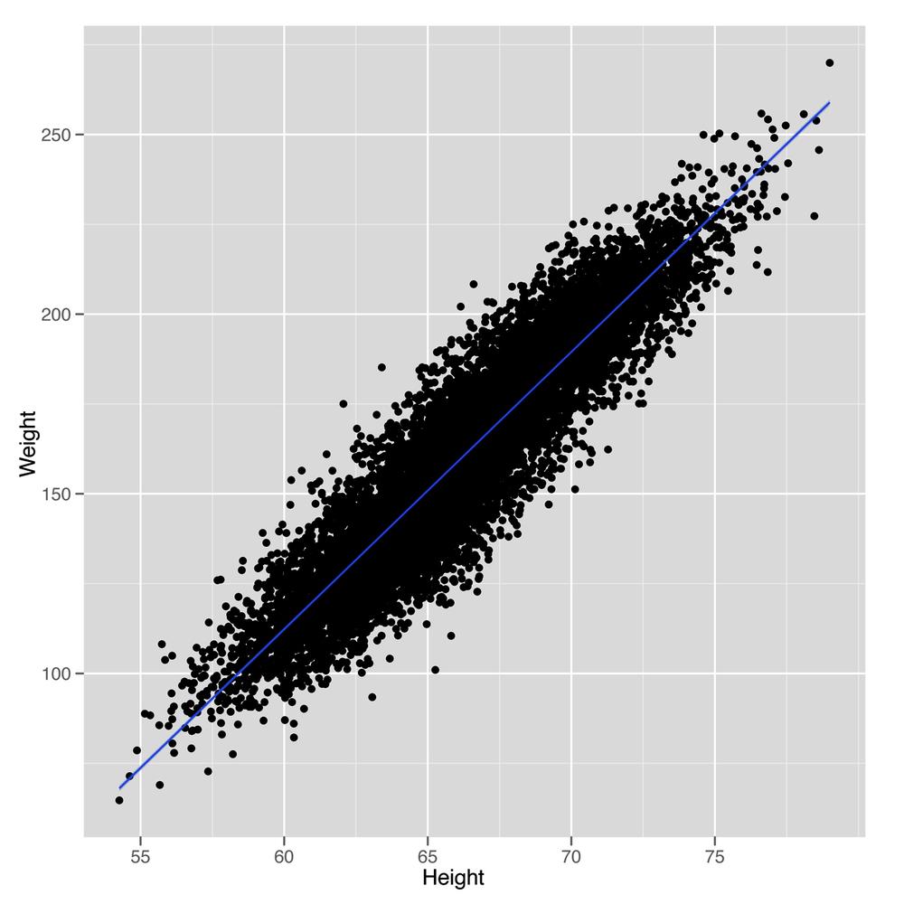
Looking at this plot should convince you that using a line to predict a person’s weight given her height could work pretty well. For example, the line we see says that we should predict a weight of 105 pounds for someone who’s 60 inches tall, and we should predict a weight of 225 pounds for someone who’s 75 inches tall. So it seems reasonable to accept that using a line to make predictions is a smart thing to do. With that, the question we need to answer becomes: “How can we find the numbers that define the line we see in this plot?”
This is where R really shines as a language for doing
machine learning: there’s a simple function called lm in
R that will do all of the work for us. To use lm, we need
to specify a regression formula using the ~ operator. In
our example, we’re going to predict weight from height, so we write
Weight ~ Height. If we were going to make predictions in
the opposite direction, we’d write Height ~ Weight. If
you want a way to pronounce these formulas, we personally like to say
that Height ~ Weight means “height as a function of
weight.”
In addition to a specification of the regression, we need to tell R where the data we’re using is stored. If the variables in your regression are global variables, you can skip this, but global variables of that sort are frowned upon by the R community.
Warning
Storing global variables in R is considered a bad practice because it is easy to lose track of what has been loaded into memory and what has not. This can cause unintentional consequences in coding, as it is easy to lose track of what it is in and out of memory. Further, it reduces the ease with which code can be shared. If global variables are not explicitly defined in code, someone who is less familiar with the data-loading process may miss something, and consequently the code may not work, because some data set or variable is missing.
It’s better for you to explicitly specify the data source
using the data parameter. Putting these together, we run
a linear regression in R as follows:
fitted.regression <- lm(Weight ~ Height,
                       data = heights.weights)
Once you’ve run this call to lm, you can pull
out the intercept of the regression line with a call to the
coef function, which returns the coefficients for a
linear model that relates inputs to outputs. We say “linear model”
because regression can work in more than two dimensions. In two
dimensions, we’re fitting lines (hence the “linear” part), but in
three dimensions we fit planes, and in more than three dimensions we
fit hyperplanes.
Note
If those terms don’t mean anything to you, the intuition is simple: a flat surface in two dimensions is a line, whereas in three dimensions it’s a plane, and in more than three dimensions, a flat surface is called a hyperplane. If that’s not clear enough, we’d suggest reading Flatland Abb92.
coef(fitted.regression)
#(Intercept)      Height
#-350.737192    7.717288
Understanding this output is, in some sense, what it means to
understand linear regression. The simplest way to make sense of the
output from coef is to write out explicitly the
relationship that its output implies:
intercept <- coef(fitted.regression)[1]
slope <- coef(fitted.regression)[2]

# predicted.weight <- intercept + slope * observed.height
# predicted.weight == -350.737192 + 7.717288 * observed.height
This means that every increase of 1 inch in someone’s height leads to an increase of 7.7 pounds in his weight. That strikes us as pretty reasonable. In contrast, the intercept is a bit weirder because it tells you how much a person who is 0 inches tall would weigh. According to R, she would weigh –350 pounds. If you’re willing to do some algebra, you can deduce that a person has to be 45 inches tall for our prediction algorithm to say that he will weigh 0 pounds. In short, our regression model isn’t so great for children or extremely short adults.
This is actually a systematic problem for linear regression in general: predictive models usually are not very good at predicting outputs for inputs that are very far removed from all of the inputs you’ve seen in the past.[9] Often you can do some work to improve the quality of your guesses outside of the range of data you use to train a model, but in this case there’s probably no need because you’re usually only going to make predictions for people who are over 4’ tall and under 8’ tall.
Beyond just running regressions and looking at the resulting coefficients, there’s a lot more you can do in R to understand the results of a linear regression. Going through all of the different outputs that R can produce would take a whole book, so we’ll just focus on a few of the most important parts after extracting the coefficients. When you’re making predictions in a practical context, the coefficients are all that you need to know.
First, we want to get a sense of where our model is wrong. We
do this by computing the model’s predictions and comparing them
against the inputs. To find the model’s predictions, we use the
predict function in R:
predict(fitted.regression)
Once we have our predictions in hand, we can calculate the difference between our predictions and the truth with a simple subtraction:
true.values <- with(heights.weights,Weight)
errors <- true.values - predict(fitted.regression)
The errors we calculate this way are called
residuals because they’re the part of our data
that’s left over after accounting for the part that a line can
explain. You can get these residuals directly in R without the
predict function by using the residuals
function instead:
residuals(fitted.regression)
A common way to diagnose any obvious mistakes we’re making when using linear regression is to plot the residuals against the truth:
plot(fitted.regression, which = 1)
Note
Here we’ve asked R to plot only the first regression
diagnostic plot by specifying which = 1. There are
other plots you can get, and we encourage you to experiment to see
if you find any of the others helpful.
In this example, we can tell that our linear model works well because there’s no systematic structure in the residuals. But here’s a different example where a line isn’t appropriate:
x <- 1:10
y <- x ^ 2

fitted.regression <- lm(y ~ x)
plot(fitted.regression, which = 1)
We can see obvious structure in the residuals for this problem.
That’s generally a bad thing when modeling data: a model should divide
the world into signal (which predict gives you) and noise
(which residuals gives you). If you can see signal in the
residuals using your naked eye, then your model isn’t powerful enough
to extract all of the signal and leave behind only real noise as
residuals. To solve this problem, Chapter 6 will talk about more
powerful models for regression than the simple linear regression model
we’re working with now. But because great power brings with it great
responsibility, Chapter 6 will
actually focus on the unique problems that arise when we use models
that are so powerful that they’re actually too powerful to be used
without caution.
For now, let’s talk more carefully about how well we’re doing with linear regression. Having the residuals is great, but there are so many of them that they can be overwhelming to work with. We’d like a single number to summarize the quality of our results.
The simplest measurement of error is to (1) take all the residuals, (2) square them to get the squared errors for our model, and (3) sum them together.
x <- 1:10
y <- x ^ 2

fitted.regression <- lm(y ~ x)

errors <- residuals(fitted.regression)
squared.errors <- errors ^ 2
sum(squared.errors)
#[1] 528
This simple sum of squared errors quantity is useful for comparing different models, but it has some quirks that most people end up disliking.
First, the sum of squared errors is larger for big data sets than for small data sets. To convince yourself of this, imagine a fixed data set and the sum of squared errors for that data set. Now add one more data point that isn’t predicted perfectly. This new data point has to push the sum of squared errors up because adding a number to the previous sum of squared errors can only make the sum larger.
But there’s a simple way to solve that problem: take the mean of the squared errors rather than the sum. That gives us the MSE measure we used earlier in this chapter. Although MSE won’t grow consistently as we get more data the way that the raw sum of squared errors will, MSE still has a problem: if the average prediction is only off by 5, then the mean squared error will be 25. That’s because we’re squaring the errors before taking their mean.
x <- 1:10
y <- x ^ 2

fitted.regression <- lm(y ~ x)

errors <- residuals(fitted.regression)
squared.errors <- errors ^ 2
mse <- mean(squared.errors)
mse
#[1] 52.8
The solution to this problem of scale is trivial: we take the square root of the mean squared error to get the root mean squared error, which is the RMSE measurement we also tried out earlier in this chapter. RMSE is a very popular measure of performance for assessing machine learning algorithms, including algorithms that are far more sophisticated than linear regression. For just one example, the Netflix Prize was scored using RMSE as the definitive metric of how well the contestants’ algorithms performed.
x <- 1:10
y <- x ^ 2

fitted.regression <- lm(y ~ x)

errors <- residuals(fitted.regression)
squared.errors <- errors ^ 2
mse <- mean(squared.errors)
rmse <- sqrt(mse)
rmse
#[1] 7.266361
One complaint that people have with RMSE is that it’s not immediately clear what mediocre performance is. Perfect performance clearly gives you an RMSE of 0, but the pursuit of perfection is not a realistic goal in these tasks. Likewise, it isn’t easy to recognize when a model is performing very poorly. For example, if everyone’s heights are 5’ and you predict 5,000', you’ll get a huge value for RMSE. And you can do worse than that by predicting 50,000', and still worse by predicting 5,000,000’. The unbounded values that RMSE can take on make it difficult to know whether your model’s performance is reasonable.
When you’re running linear regressions, the solution to this problem is to use R2 (pronounced “R squared”). The idea of R2 is to see how much better your model does than we’d do if we were just using the mean. To make it easy to interpret, R2 will always be between 0 and 1. If you’re doing no better than the mean, it will be 0. And if you predict every data point perfectly, R2 will be 1.
Because R2 is always between 0 and 1, people tend to multiply it by 100 and say that it’s the percent of the variance in the data you’ve explained with your model. This is a handy way to build up an intuition for how accurate a model is, even in a new domain where you don’t have any experience about the standard values for RMSE.
To calculate R2, you need to compute the RMSE for a model that uses only the mean output to make predictions for all of your example data. Then you need to compute the RMSE for your model. After that, it’s just a simple arithmetic operation to produce R2, which we’ve described in code here:
mean.rmse <- 1.09209343
model.rmse <- 0.954544

r2 <- 1 - (model.rmse / mean.rmse)
r2
#[1] 0.1259502
Now that we’ve prepared you to work with regressions, this chapter’s case study will focus on using regression to predict the amount of page views for the top 1,000 websites on the Internet as of 2011. The top five rows of this data set, which was provided to us by Neil Kodner, are shown in Table 5-3.
For our purposes, we’re going to work with only a subset of the
columns of this data set. We’ll focus on five columns:
Rank, PageViews, UniqueVisitors,
HasAdvertising, and IsEnglish.
The Rank column tells us the website’s position in
the top 1,000 list. As you can see, Facebook is the number one site in
this data set, and YouTube is the second. Rank is an
interesting sort of measurement because it’s an ordinal value in which
numbers are used not for their true values, but simply for their order.
One way to realize that the values don’t matter is to realize that
there’s no real answer to questions like, “What’s the 1.578th website in
this list?” This sort of question would have an answer if the numbers being used
were cardinal values. Another way to emphasize this distinction is to
note that we could replace the ranks 1, 2, 3, and 4 with A, B, C, and D
and not lose any information.
Table 5-3. Top websites data set
| Rank | Site | Category | UniqueVisitors | Reach | PageViews | HasAdvertising | InEnglish | TLD |
|---|---|---|---|---|---|---|---|---|
| 1 | facebook.com | Social Networks | 880000000 | 47.2 | 9.1e+11 | Yes | Yes | com |
| 2 | youtube.com | Online Video | 800000000 | 42.7 | 1.0e+11 | Yes | Yes | com |
| 3 | yahoo.com | Web Portals | 660000000 | 35.3 | 7.7e+10 | Yes | Yes | com |
| 4 | live.com | Search Engines | 550000000 | 29.3 | 3.6e+10 | Yes | Yes | com |
| 5 | wikipedia.org | Dictionaries & Encyclopedias | 490000000 | 26.2 | 7.0e+09 | No | Yes | org |
The next column, PageViews, is the output we want to
predict in this case study, and it tells us how many times the website
was seen that year. This is a good way of measuring the popularity of
sites such as Facebook with repeated visitors who tend to return many
times.
Note
After you’ve finished reading this chapter, a good exercise to
work on would be comparing PageViews with
UniqueVisitors to find a way to tell which sorts of
sites have lots of repeat visits and which sorts of sites have very
few repeat visits.
The UniqueVisitors column tells us how many different
people came to the website during the month when these measurements were
taken. If you think that PageViews are easily inflated by
having people refresh pages needlessly, the UniqueVisitors
is a good way to measure how many different
people see a site.
The HasAdvertising column tells us whether or not a
website has ads on it. You might think that ads would be annoying and
that people would, all else being equal, tend to avoid sites that have
ads. We can explicitly test for this using regression. In fact, one of
the great values of regression is that it lets us try to answer
questions in which we have to talk about “all else being equal.” We say
“try” because the quality of a regression is only as good as the inputs
we have. If there’s an important variable that’s missing from our
inputs, the results of a regression can be very far from the truth. For
that reason, you should always assume that the results of a regression
are tentative: “If the inputs we had were sufficient to answer this
question, then the answer would be….”
The IsEnglish column tells us whether a website is
primarily in English. Looking through the list, it’s clear that most of
the top sites are primarily either English-language sites or
Chinese-language sites. We’ve included this column because it’s
interesting to ask whether being in English is a positive thing or not.
We’re also including this column because it’s an example in which the
direction of causality isn’t at all clear from a regression; does being
written in English make a site more popular, or do more popular sites
decide to convert to English because it’s the lingua franca of the
Internet? A regression model can tell you that two things are related,
but it can’t tell you whether one thing causes the other thing or
whether things actually work the other way around.
Now that we’ve described the inputs we have and decided that
PageViews is going to be our output, let’s start to get a
sense of how these things relate to one another. We’ll start by making a scatterplot that relates
PageViews with UniqueVisitors. We always
suggest drawing scatterplots for numerical variables before you try to
relate them by using regression because a scatterplot can make it clear
when the linearity assumption of regression isn’t satisfied.
top.1000.sites <- read.csv('data/top_1000_sites.tsv',
                           sep = '\t',
                           stringsAsFactors = FALSE)

ggplot(top.1000.sites, aes(x = PageViews, y = UniqueVisitors)) +
  geom_point()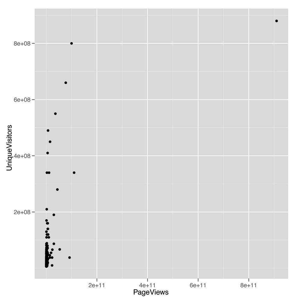
The scatterplot we get from this call to ggplot
(shown in Figure 5-6) looks
terrible: almost all the values are bunched together on the x-axis, and
only a very small number jump out from the pack. This is a common
problem when working with data that’s not normally distributed, because
using a scale that’s large enough to show the full range of values tends
to place the majority of data points so close to each other that they
can’t be separated visually. To confirm that the shape of the data is the problem with
this plot, we can look at the distribution of PageViews by
itself:
ggplot(top.1000.sites, aes(x = PageViews)) +
  geom_density()
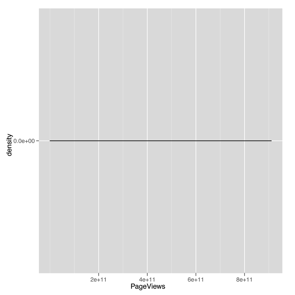
This density plot (shown in Figure 5-7) looks as completely
impenetrable as the earlier scatterplot. When you see nonsensical
density plots, it’s a good idea to try taking the log of the values
you’re trying to analyze and make a density plot of those
log-transformed values. We can do that with a simple call to R’s
log function:
ggplot(top.1000.sites, aes(x = log(PageViews))) +
  geom_density()
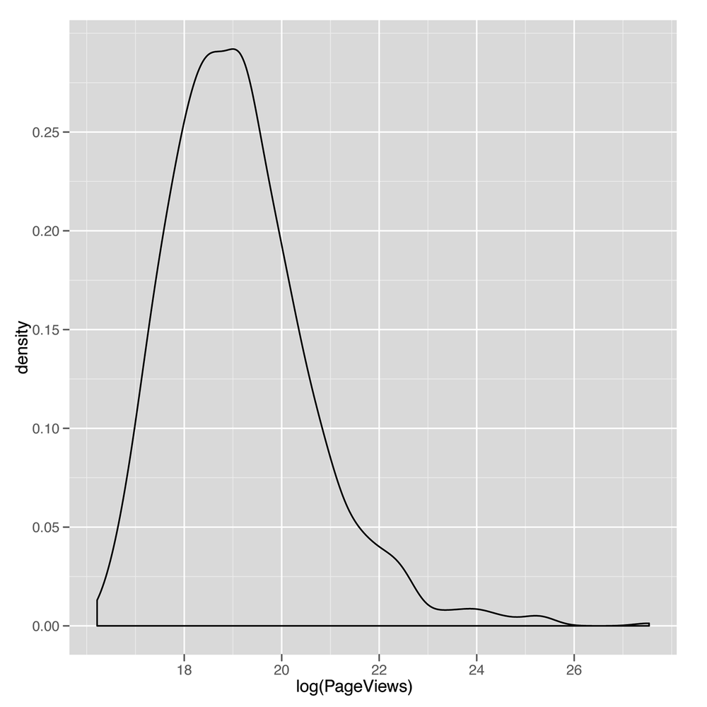
This density plot (shown in Figure 5-8) looks much
more reasonable. For that reason, we’ll start using the
log-transformed PageViews and UniqueVisitors
from now on. Recreating our
earlier scatterplot on a log scale is easy:
ggplot(top.1000.sites, aes(x = log(PageViews), y = log(UniqueVisitors))) +
  geom_point()
Note
The ggplot2 package also contains a convenience function to change
the scale of an axis to the log. You can use the
scale_x_log or scale_y_log in this case.
Also, recall from our discussion in Chapter 4 that in some cases you will want
to use the logp function in R to avoid the errors related
to taking the log of zero. In this case, however, that is not a
problem.
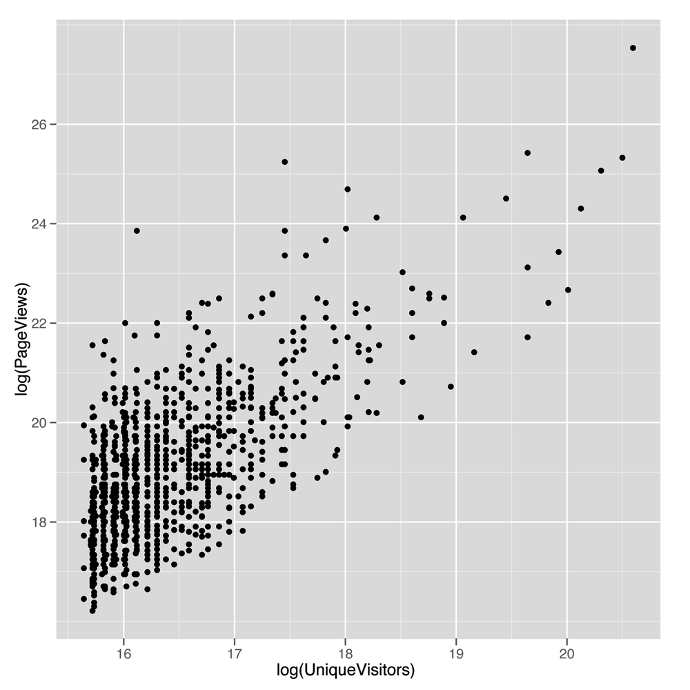
The resulting scatterplot shown in Figure 5-9 looks
like there’s a potential line to be drawn using regression.
Before we use lm to fit a regression line, let’s
use geom_smooth with the method = 'lm'
argument to see what the regression line will look like:
ggplot(top.1000.sites, aes(x = log(PageViews), y = log(UniqueVisitors))) +
  geom_point() +
  geom_smooth(method = 'lm', se = FALSE)
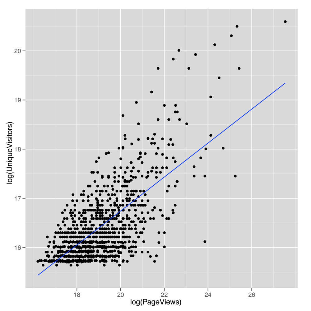
The resulting line, shown in Figure 5-10,
looks promising, so let’s find the values that define its slope and
intercept by calling lm:
lm.fit <- lm(log(PageViews) ~ log(UniqueVisitors),
            data = top.1000.sites)
Now that we’ve fit the line, we’d like to get a quick summary of
it. We could look at the coefficients using coef, or we
could look at the RMSE by using residuals. But we’ll introduce another function that produces a much
more complex summary that we can walk through step by step. That
function is conveniently called summary:
summary(lm.fit)

#Call:
#lm(formula = log(PageViews) ~ log(UniqueVisitors), data = top.1000.sites)
#
#Residuals:
#    Min      1Q  Median      3Q     Max
#-2.1825 -0.7986 -0.0741  0.6467  5.1549
#
#Coefficients:
#                    Estimate Std. Error t value Pr(>|t|)
#(Intercept)         -2.83441    0.75201  -3.769 0.000173 ***
#log(UniqueVisitors)  1.33628    0.04568  29.251  < 2e-16 ***
#---
#Signif. codes:  0 ‘***’ 0.001 ‘**’ 0.01 ‘*’ 0.05 ‘.’ 0.1 ‘ ’ 1
#
#Residual standard error: 1.084 on 998 degrees of freedom
#Multiple R-squared: 0.4616,	Adjusted R-squared: 0.4611
#F-statistic: 855.6 on 1 and 998 DF,  p-value: < 2.2e-16
The first thing that summary tells us is the call we
made to lm. This isn’t very useful when you’re working at
the console, but it can be helpful when you’re working in larger scripts
that make multiple calls to lm. When this is the case, this
information helps you keep all of the models organized so you have a
clear understanding of what data and variables went into each
model.
The next thing that summary tells us are the
quantiles of the residuals that you would compute if you called
quantile(residuals(lm.fit)). Personally, we don’t find this
very helpful, although others may prefer looking for symmetry in the
minimum and maximum residual, rather than looking at a scatterplot of
the data. However, we almost always find graphical plots more
informative than numerical summaries.
Next, summary tells us the coefficients of the
regression in much more detail than coef would. The output
from coef ends up in this table as the “Estimate” column.
After that, there are columns for the “Std. Error,” the “t value,” and
the p-value of each coefficient. These values are used to assess the
uncertainty we have in the estimates we’ve computed; in other words,
they’re meant to be measurements of our confidence that the values we’ve
computed from a specific data set are accurate descriptions of the real
world that generated the data. The “Std. Error”, for instance, can be
used to produce a 95% confidence interval for the coefficient. The
interpretation of this interval can be confusing, and it is occasionally
presented in a misleading way. The interval indicates the bounds for
which we can say, “95% of the time, the algorithm we use to construct
intervals will include the true coefficient inside of the intervals it
produces.” If that’s unclear to you, that’s normal: the analysis of
uncertainty is profoundly important, but far more difficult than the
other material we’re covering in this book. If you really want to
understand this material, we’d recommend buying a proper statistics
textbook such as All of Statistics
Wa03 or Data Analysis Using
Regression and Multilevel/Hierarchical Models
GH06, and working through them in detail.
Thankfully, the sort of qualitative distinctions that require attention
to standard errors usually aren’t necessary if you’re just trying to
hack together models to predict something.
The “t-value” and the p-value (written as “Pr(>|t|)” in
the output from summary) are both measures of how confident
we are that the true coefficient isn’t zero. This is used to say that we
are confident that there is a real relationship between the output and
the input we’re currently examining. For example, here we can use the “t
value” column to assess how sure we are that PageViews
really are related to UniqueVisitors. In our minds, these
two numbers can be useful if you understand how to work with them, but
they are sufficiently complicated that their usage has helped to
encourage people to assume they’ll never fully understand statistics. If
you care whether you’re confident that two variables are related, you
should check whether the estimate is at least two standard errors away
from zero. For example, the coefficient for
log(UniqueVisitors) is 1.33628 and the standard error is
0.04568. That means that the coefficient is 1.33628 / 0.04568 ==
29.25306 standard errors away from zero. If you’re more than
three standard errors away from zero, you can feel reasonably confident
that your two variables are related.
Warning
t-values and p-values are useful for deciding whether a relationship between two columns in your data is real or just an accident of chance. Deciding that a relationship exists is valuable, but understanding the relationship is another matter entirely. Regressions can’t help you do that. People try to force them to, but in the end, if you want to understand the reasons why two things are related, you need more information than a simple regression can ever provide.
The traditional cutoff for being confident that an input is related to your output is to find a coefficient that’s at least two standard errors away from zero.
The next piece of information that summary spits
out are the significance codes for the coefficients. These are asterisks
shown along the side that are meant to indicate how large the “t value”
is or how small the p-value is. Specifically, the asterisks tell you
whether you’re passed a series of arbitrary cutoffs at which the p-value
is less than 0.1, less than 0.05, less than 0.01, or less than 0.001.
Please don’t worry about these values; they’re disturbingly popular in
academia, but are really holdovers from a time when statistical analysis
was done by hand rather than on a computer. There is literally no
interesting content in these numbers that’s not found in asking how many
standard errors your estimate is away from 0. Indeed, you might have
noticed in our earlier calculation that the “t value” for
log(UniqueVisitors) was exactly the number of standard
errors away from 0 that the coefficient for
log(UniqueVisitors) was. That relationship between t-values
and the number of standard errors away from 0 you are is generally true,
so we suggest that you don’t work with p-values at all.
The final pieces of information we get are related to the
predictive power of the linear model we’ve fit to our data. The first
piece, the “Residual standard error,” is simply the RMSE of the model
that we could compute using
sqrt(mean(residuals(lm.fit) ^ 2)). The “degrees of
freedom” refers to the notion that we’ve effectively used up two data
points in our analysis by fitting two coefficients: the intercept and
the coefficient for log(UniqueVisitors). This number, 998,
is relevant because it’s not very impressive to have a low RMSE if
you’ve used 500 coefficients in your model to fit 1,000 data points.
Using lots of coefficients when you have very little data is a form of
overfitting that we’ll talk about more in Chapter 6.
After that, we see the “Multiple R-squared”. This is the standard “R-squared” we described earlier, which tells us what percentage of the variance in our data was explained by our model. Here we’re explaining 46% of the variance using our model, which is pretty good. The “Adjusted R-squared” is a second measure that penalizes the “Multiple R-squared” for the number of coefficients you’ve used. In practice, we personally tend to ignore this value because we think it’s slightly ad hoc, but there are many people who are very fond of it.
Finally, the last piece of information you’ll see is the “F-statistic.” This is a measure of the improvement of your model over using just the mean to make predictions. It’s an alternative to “R-squared” that allows one to calculate a “p-value.” Because we think that a “p-value” is usually deceptive, we encourage you to not put too much faith in the F-statistic. “p-values” have their uses if you completely understand the mechanism used to calculate them, but otherwise they can provide a false sense of security that will make you forget that the gold standard of model performance is predictive power on data that wasn’t used to fit your model, rather than the performance of your model on the data that it was fit to. We’ll talk about methods for assessing your model’s ability to predict new data in Chapter 6.
Those pieces of output from summary get us quite far,
but we’d like to include some other sorts of information beyond just
relating PageViews to UniqueVisitors. We’ll
also include HasAdvertising and IsEnglish to
see what happens when we give our model more inputs to work with:
lm.fit <- lm(log(PageViews) ~ HasAdvertising + log(UniqueVisitors) + InEnglish,
             data = top.1000.sites)
summary(lm.fit)

#Call:
#lm(formula = log(PageViews) ~ HasAdvertising + log(UniqueVisitors) +
#    InEnglish, data = top.1000.sites)
#
#Residuals:
#    Min      1Q  Median      3Q     Max
#-2.4283 -0.7685 -0.0632  0.6298  5.4133
#
#Coefficients:
#                    Estimate Std. Error t value Pr(>|t|)
#(Intercept)         -1.94502    1.14777  -1.695  0.09046 .
#HasAdvertisingYes    0.30595    0.09170   3.336  0.00088 ***
#log(UniqueVisitors)  1.26507    0.07053  17.936  < 2e-16 ***
#InEnglishNo          0.83468    0.20860   4.001 6.77e-05 ***
#InEnglishYes        -0.16913    0.20424  -0.828  0.40780
#---
#Signif. codes:  0 ‘***’ 0.001 ‘**’ 0.01 ‘*’ 0.05 ‘.’ 0.1 ‘ ’ 1
#
#Residual standard error: 1.067 on 995 degrees of freedom
#Multiple R-squared: 0.4798,	Adjusted R-squared: 0.4777
#F-statistic: 229.4 on 4 and 995 DF,  p-value: < 2.2e-16
Again, we see that summary echoes our call to
lm and prints out the residuals. What’s new in this summary
are the coefficients for all of the variables we’ve included in our more
complicated regression model. Again, we see the intercept printed out as
(Intercept). The next entry is quite different from
anything we saw before because our model now includes a factor. When you
use a factor in a regression, the model has to decide to include one
level as part of the intercept and the other level as something to model
explicitly. Here you can see that HasAdvertising was
modeled so that sites for which HasAdvertising == 'Yes' are
separated from the intercept, whereas sites for which
HasAdvertising == 'No' are folded into the intercept.
Another way to describe this is to say that the intercept is the
prediction for a website that has no advertising and has zero
log(UniqueVisitors), which actually occurs when you have
one UniqueVisitor.
We can see the same logic play out for InEnglish,
except that this factor has many NA values, so there are
really three levels of this dummy variable: NA,
'No', and 'Yes'. In this case, R treats the
NA value as the default to fold into the regression
intercept and fits separate coefficients for the 'No' and
'Yes' levels.
Now that we’ve considered how we can use these factors as inputs to our regression model, let’s compare each of the three inputs we’ve used in isolation to see which has the most predictive power when used on its own. To do that, we can extract the R-squared for each summary in isolation:
lm.fit <- lm(log(PageViews) ~ HasAdvertising,
             data = top.1000.sites)
summary(lm.fit)$r.squared
#[1] 0.01073766

lm.fit <- lm(log(PageViews) ~ log(UniqueVisitors),
             data = top.1000.sites)
summary(lm.fit)$r.squared
#[1] 0.4615985

lm.fit <- lm(log(PageViews) ~ InEnglish,
             data = top.1000.sites)
summary(lm.fit)$r.squared
#[1] 0.03122206
As you can see, HasAdvertising explains only 1% of
the variance, UniqueVisitors explains 46%, and
InEnglish explains 3%. In practice, it’s worth including
all of the inputs in a predictive model when they’re cheap to acquire,
but if HasAdvertising were difficult to acquire
programmatically, we’d advocate dropping it in a model with other inputs
that have so much more predictive power.
Now that we’ve introduced linear regression, let’s take a quick digression to discuss in more detail the word “correlation.” In the strictest sense, two variables are correlated if the relationship between them can be described using a straight line. In other words, correlation is just a measure of how well linear regression could be used to model the relationship between two variables. 0 correlation indicates that there’s no interesting line that relates the two variables. A correlation of 1 indicates that there’s a perfectly positive straight line (going up) that relates the two variables. And a correlation of –1 indicates that there’s a perfectly negative straight line (going down) that relates the two variables.
To make all of that precise, let’s work through a short example. First, we’ll generate some data that isn’t strictly linear and then plot it:
x <- 1:10
y <- x ^ 2

ggplot(data.frame(X = x, Y = y), aes(x = X, y = Y)) +
    geom_point() +
    geom_smooth(method = 'lm', se = FALSE)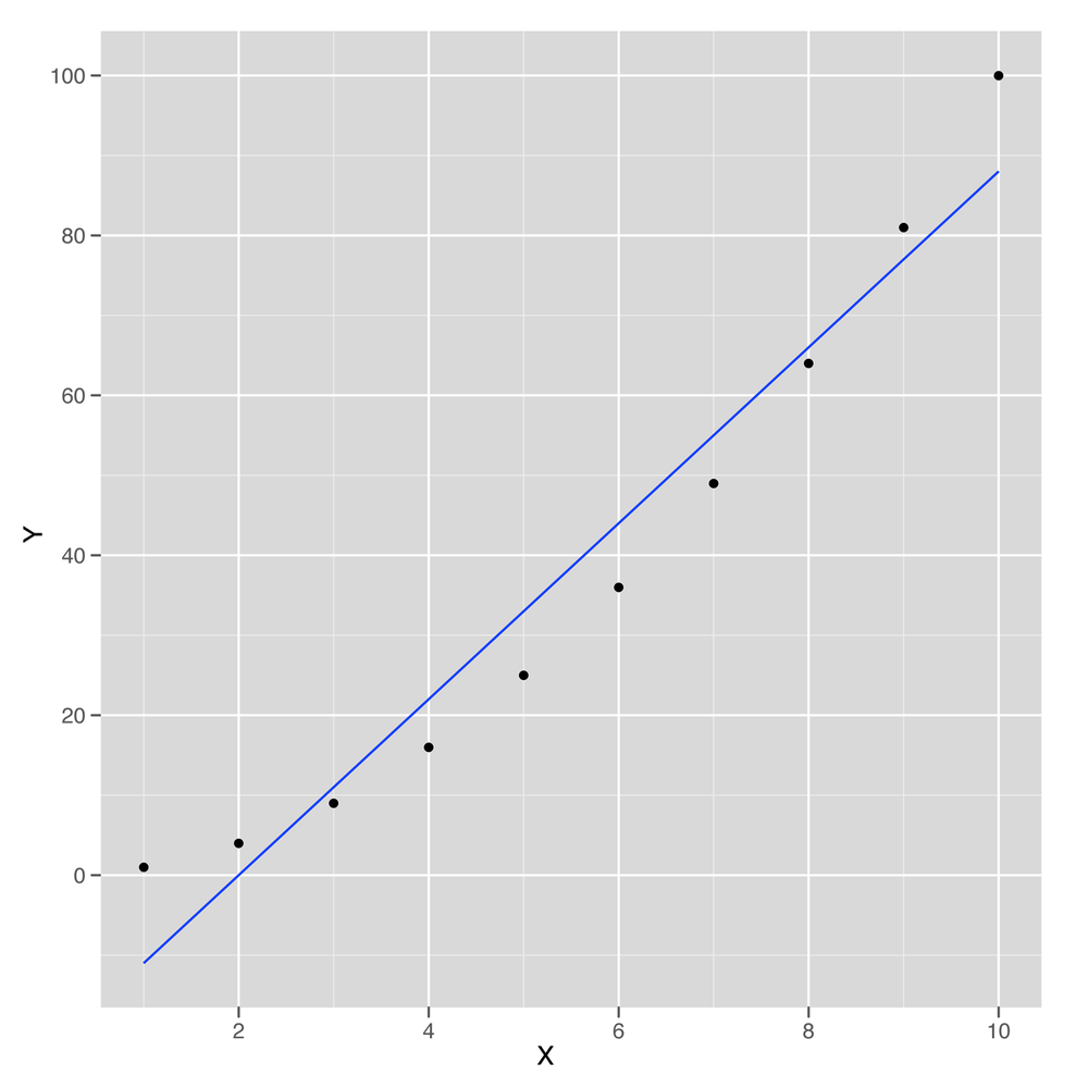
This sample data is shown in Figure 5-11. As you can see, the line drawn using
geom_smooth doesn’t pass through all of the points, so the
relationship between x and y can’t be
perfectly linear. But how close is it? To answer that, we compute the
correlation in R using the cor function:
cor(x, y)
#[1] 0.9745586
Here we can see that x and y can be
related pretty well using a straight line. The cor function
gives us an estimate of how strong this relationship is. In this case
it’s 0.97, which is almost 1.
How could we compute the correlation for ourselves rather
than using cor? We can do that using lm, but
first we need to scale both x and y. Scaling
involves subtracting the mean of both variables and then dividing out by
the standard deviation. You can perform scaling in R using the
scale function:
coef(lm(scale(y) ~ scale(x)))
#  (Intercept)      scale(x)
#-1.386469e-16  9.745586e-01
As you can see, in this case the correlation between
x and y is exactly equal to the coefficient
relating the two in linear regression after scaling both of them. This
is a general fact about how correlations work, so you can always use
linear regression to help you envision exactly what it means for two
variables to be correlated.
Because correlation is just a measure of how linear the relationship between two variables is, it tells us nothing about causality. This leads to the maxim that “correlation is not causation.” Nevertheless, it’s very important to know whether two things are correlated if you want to use one of them to make predictions about the other.
That concludes our introduction to linear regression and the concept of correlation. In the next chapter, we’ll show how to run much more sophisticated regression models that can handle nonlinear patterns in data and simultaneously prevent overfitting.
[9] One technical way to describe this is to say that regressions are good at interpolation but not very good at extrapolation.