Table of Contents for
Machine Learning for Hackers
 Machine Learning for Hackers
Published by
O'Reilly Media, Inc., 2012
Machine Learning for Hackers
Published by
O'Reilly Media, Inc., 2012
- Cover
- O'Reilly Strata Conference
- Machine Learning for Hackers
- Preface
- 1. Using R
- 2. Data Exploration
- 3. Classification: Spam Filtering
- 4. Ranking: Priority Inbox
- 5. Regression: Predicting Page Views
- 6. Regularization: Text Regression
- 7. Optimization: Breaking Codes
- 8. PCA: Building a Market Index
- 9. MDS: Visually Exploring US Senator Similarity
- 10. kNN: Recommendation Systems
- 11. Analyzing Social Graphs
- 12. Model Comparison
- Works Cited
- Index
- About the Authors
- Colophon
- Copyright
There are many situations where we might want to know how similar the members of a group of people are to one another. For instance, suppose that we were a brand marketing company that had just completed a research survey on a potential new brand. In the survey, we showed a group of people several features of the brand and asked them to rank the brand on each of these features using a five-point scale. We also collected a bunch of socioeconomic data from the subjects, such as age, gender, race, what zip code they live in, and their approximate annual income.
From this survey, we want to understand how the brand appeals across all of these socioeconomic variables. Most importantly, we want to know whether the brand has broad appeal. An alternative way of thinking about this problem is we want to see whether individuals who like most of the brand features have diverse socioeconomic features. A useful means of doing this would be to visualize how the survey respondents cluster. We could then use various visual cues to indicate their memberships in different socioeconomic categories. That is, we would want to see a large amount of mixing between gender, as well as among races and economic stratification.
Likewise, we could use this knowledge to see how close groups clustered based on the brand’s appeal. We could also see how many people were in one cluster as compared to others, or how far away other clusters were. This might tell us what features of the brand to target at different socioeconomic categories. When phrasing these questions, we use words such as “close” and “far,” which have an inherent notion of distance. To visualize the distance among clusters, therefore, we need some spatial concept of how individuals congregate.
The primary focus of this chapter is to begin to understand how to use notions of distance among a set of observations to illustrate their similarities and dissimilarities. This will require the definition of some metric for distance relevant to the type of data being analyzed. For example, in the hypothetical brand marketing situation, we could use the ordinal nature of the survey’s scale to find the distances among respondents in a very straightforward way: simply calculate the absolute differences.
It is not enough, however, to only calculate these distances. In this chapter we will introduce a technique known as multidimensional scaling (MDS) for clustering observations based on a measure of distance among the observations. Applying MDS will allow us to visualize our data using only a measure of the distance between all of the points. We will first introduce the basic principles of MDS using a toy example of customer ratings for products with simulated data. Then we will move on to use real data on roll call voting in the US Senate to show how its members cluster based on these votes.
To begin, let’s suppose that we have a very simple data set in which there are four customers who have rated six products. Each customer was asked to give each product a thumbs up or a thumbs down, but she could skip a product if she had no opinion about it. There are many rating systems that work this way, including Pandora’s and YouTube’s. Using this ratings data, we would like to measure how similar the customers are to one another.
In this simple example we will set up a 4×6 matrix in which the
rows represent customers and the columns represent products. We’ll
fill this matrix with simulated ratings by randomly selecting a thumbs
up (1), a thumbs down (–1), or a skip (0) rating for each
customer/product pair. To do this, we will use the sample function, which will allow us to
randomly select values from the vector c(1,
0, -1) six times with replacement. Because we will be accessing R’s random number generator to
simulate data, it’s important that you set the seed for your generator
to the same value we have used so that your outputs end up being equal
to those shown in the examples. To set the seed, we’ll call set.seed() to set the generator’s seed to
the number 851982.
 set.seed(851982)
 ex.matrix <- matrix(sample(c(-1,0,1), 24, replace=TRUE), nrow=4, ncol=6)
 row.names(ex.matrix) <- c('A','B','C','D')
 colnames(ex.matrix) <- c('P1','P2','P3','P4','P5','P6')
This code will create a 4×6 matrix, where each entry corresponds
to the row-users rating of a column-product. We use the row.names and colnames functions just to keep things clear
in this example: customers A–D and products 1–6. When we inspect the
matrix, we can see exactly what our toy data set looks like. For
example, customer A gave products 2 and 3 a thumbs down and did not
rate any other products. On the other hand, customer B gave a thumbs
down to product 1, but gave a thumbs up to products 3, 4, and 5. Now
we need to use these differences to generate a distance metric among
all the customers.
 ex.matrix
  P1 P2 P3 P4 P5 P6
A  0 -1  0 -1  0  0
B -1  0  1  1  1  0
C  0  0  0  1 -1  1
D  1  0  1 -1  0  0
The first step in taking this data and generating a distance metric is to summarize the customer ratings for each product as they relate to all other customers, that is, rather than only to the products in the current form. Another way to think about this is that we need to convert the N-by-M matrix into an N-by-N matrix, wherein the elements of the new matrix provide summaries of the relation among users based on product rating. One way to do this is to multiply our matrix by its transpose. The effect of this multiplication is to compute the correlation between every pair of columns in the original matrix.
Matrix transposition and multiplication is something you would learn in the first few weeks of an undergraduate discrete mathematics or linear algebra class. Depending on the instructor’s temperament, you may have painstakingly made these transformations by hand. Thankfully, R is perfectly happy to perform these transformations for you.
Note
Here we provide a brief introduction to matrix operations and their use in constructing a distance metric for ratings data. If you are already familiar with matrix operations, you may skip this section.
Matrix transposition inverts a matrix so that the rows become
the columns and the columns become the rows. Visually, transposition
turns a matrix 90 degrees clockwise and then flips it vertically. For
example, in the previous code block we can see our customer-by-review
matrix, ex.matrix, but in the
following code block we use the t function to
transpose it. We now have a review-by-customer matrix:
 t(ex.matrix)
    A  B  C  D
P1  0 -1  0  1
P2 -1  0  0  0
P3  0  1  0  1
P4 -1  1  1 -1
P5  0  1 -1  0
P6  0  0  1  0
Matrix multiplication is slightly more complicated, but
involves only basic arithmetic. To multiply two matrices, we loop over
the rows of the first matrix and the columns of the second matrix. For
each row-column pair, we multiply each pair of entries and sum them
together. We will go over a brief example in a second, but there are a
few important things to keep in mind when performing matrix
multiplication. First, because we are multiplying the row elements of
the first matrix by the column elements of the second, these
dimensions must conform across the two matrices. In our case, we could
not simply multiply ex.matrix by a
2×2 matrix; as we’ll see, the arithmetic would not work out. As such,
the result of a matrix multiplication will always have the same number
of rows as the first matrix and the same number of columns as the
second matrix.
An immediate consequence of this is that order matters in matrix multiplication. In our case, we want a matrix that summarizes differences among customers, so we multiply our customer-by-review matrix by its transpose to get a customer-by-customer matrix as the product. If we did the inverse, i.e., multiply the review-by-customer matrix by itself, we would have the differences among the reviews. This might be interesting in another situation, but it is not useful right now.
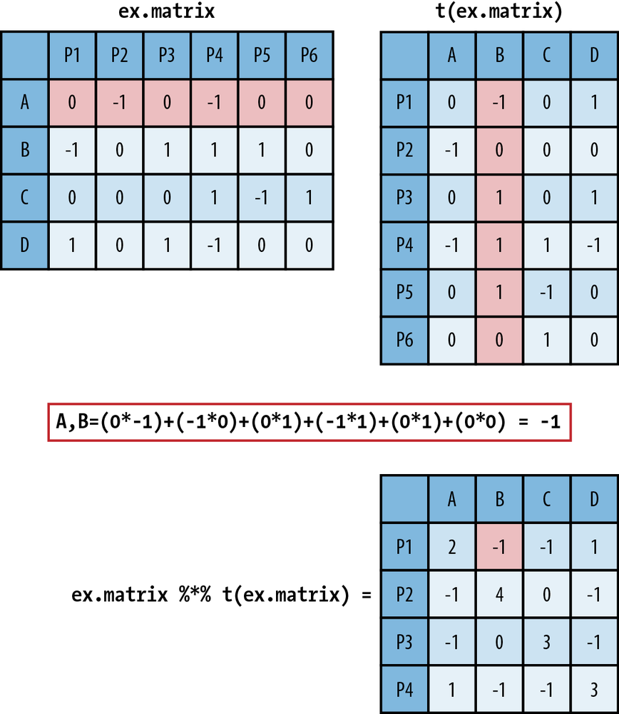
In Figure 9-1 we walk
through how matrix multiplication works. In the top left is ex.matrix, and in the top right is its
transpose. These are the two matrices we are going to multiply, and we
will multiply them in that order. As an example of the multiplication
process, we have highlighted row A in ex.matrix and column B in its transpose.
Directly below the matrices we show exactly how the arithmetic of the
matrix multiplication proceeds. It is as simple as taking a row
element of the first matrix and multiplying it by the corresponding
column element from the second matrix. You then take these products
and sum them. As you can see, in the resulting customer-by-customer
matrix the A,B element is –1, the result of a row-by-column
summation.
 ex.mult <- ex.matrix %*% t(ex.matrix)
 ex.mult
   A  B  C  D
A  2 -1 -1  1
B -1  4  0 -1
C -1  0  3 -1
D  1 -1 -1  3
We have also introduced some R notation in Figure 9-1, which is repeated in
the preceding code block that
produces the matrix multiplication. In R, you use the %*% operator
to perform matrix multiplication. The interpretation of the new matrix
is fairly straightforward. Because we have used the 1, –1, and 0
coding scheme, the off-diagonal values summarize their overall
agreement (positive value) or disagreement (negative value) on product
reviews, given those products they have both reviewed, i.e., nonzero
entries. The more positive the off-diagonal element, the more
agreement, and likewise, the more negative, the less agreement.
Because the entries are random, there is very little divergence among
the customers, with no value taking on a value greater than 1 or less
than –1. The diagonal values simply represent the number of products
each user reviewed.
We now have a somewhat useful summary of the differences among users. For example, customers A and D both gave product 4 a thumbs down; however, customer D liked products 1 and 3, whereas customer A did not review them. So, for the products for which we have information, we might say that they are similar, and thus have a 1 corresponding to their relationship. Unfortunately, this is very limiting because we can only say something about the overlap. We would rather have a method for extrapolating these differences into a richer representation.
To do this, we will use the concept of Euclidean distance in a multidimensional space. In one, two, or three dimensions, Euclidean distance is a formalization of our intuitions about distance. To calculate the Euclidean distance between two points in space, we measure the shortest direct path between them. For our example we want to calculate the Euclidean distance among all customers based on the measures of overall similarities and differences defined by the matrix multiplication.
To do this, we will treat each customer’s ratings as a vector. To compare customer A with customer B, we can subtract the vectors, square the differences, sum them, and then take the square root. This gives us the Euclidean distance between customer A’s ratings and customer B’s ratings.
We can do this “by hand” in R using the base functions sum and sqrt. In the following code block we show
this calculation for customers A and D, which is about 2.236.
Thankfully, calculating all of the pairwise distance between the
rows of a matrix is such a common operation that R has a base function
called dist that does exactly this
and returns a matrix of the distances, which we call a distance matrix. The dist function can use several different
distance metrics to produce a distance matrix, but we will stick to
the Euclidean distance, which is the default.
 sqrt(sum((ex.mult[1,]-ex.mult[4,])^2))
[1] 2.236068

 ex.dist <- dist(ex.mult)
 ex.dist
         A        B        C
B 6.244998
C 5.477226 5.000000
D 2.236068 6.782330 6.082763
The ex.dist variable now
holds our distance matrix. As you can see from this code block, this
matrix is actually only the lower triangle of the entire distance
matrix. It is very common to show only the lower triangle for a
distance matrix because the distance matrix must be symmetric, as the
distance between row X and row Y is equal to the distance between row
Y and row X. Showing the upper triangle of the distance matrix is
therefore redundant and generally not done. But you can override this
default when calling the dist
function by setting upper=TRUE.
As we can see from the values in the lower triangle of ex.dist, customers A and D are the closest,
and customers D and B are the farthest. We now have a clearer sense of
the similarities among the users based on their product reviews;
however, it would be better if we could get a visual sense of these
dissimilarities. This is where MDS can be used to produce a spatial
layout of our customers based on the distances we just
calculated.
MDS is a set of statistical techniques used to visually depict the similarities and differences from set of distances. For classical MDS, which we will use in this chapter, the process takes a distance matrix that specifies the distance between every pair of points in our data set and returns a set of coordinates for those two points that approximates those distances. The reason we need to create an approximation is that it may not be possible to find points in two dimensions that are all separated by a specific set of distances. For example, it isn’t possible to find four points in two dimensions that are all at a distance of 1 from each other. (To convince yourself of this, note that three points that are all at a distance of 1 from each other are the tips of a triangle. Convince yourself that there isn’t any way to find another point that’s at a distance of 1 from all three points on this triangle.)
Classical MDS uses a specific approximation to the distance matrix and is therefore another example of an optimization algorithm being used for machine learning. Of course, the approximation algorithm behind classical MDS can be used in three dimensions or four, but our goal is to obtain a representation of our data that’s easy to visualize.
Note
For all cases in this chapter, we will be using MDS to scale data in two dimensions. This is the most common way of using MDS because it allows for very simple visualizations of the data on a coordinate plot. It is perfectly reasonable, however, to use MDS to scale data into higher-order dimensions. For example, a three-dimensional visualization might reveal different levels of clustering among observations as points move into the third dimension.
The classical MDS procedure is part of R’s base functions as
cmdscale, and its only required
input is a distance matrix, such as ex.dist. By default, cmdscale will compute an MDS in two
dimensions, but you can set this using the k parameter. We are only interested in
scaling our distance data into two dimensions, so in the following
code block we use the default settings and plot the results using R’s
base graphics.
 ex.mds <- cmdscale(ex.dist)
 plot(ex.mds, type='n')
 text(ex.mds, c('A','B','C','D'))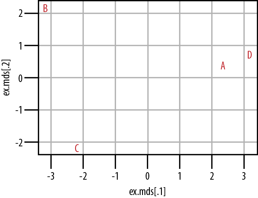
From Figure 9-2 we can see that customers A and D do cluster together in the center-right of the plot. Customers B and C, however, do not cluster at all. From our data, then, we can see that customers A and D have somewhat similar tastes, but we would need to acquire much more data and/or customers before we could hope to understand how customers B and C cluster. It is also important to note that although we can see how A and D cluster, and likewise how B and C do not, we cannot say anything substantive about how to interpret these distances. That is, we know that A and D are more similar because of their proximity in the coordinate plane, but we cannot use the numeric distance between them to interpret how similar they are, nor how dissimilar they are from B or C. The exact numeric distance produced by MDS is an artifact of the MDS algorithm and allows only a very limited substantive interpretation.
In the following section we will work through a case study similar to the toy example we’ve just used, but now we will use real data from roll call votes from the US Senate. This data is considerably larger than the toy data set, and we will use it to show how members of the United States Senate cluster over chronological Congresses. In this case we will use these records of roll call votes in the Senate to generate our distance metric. Then we will use MDS to cluster senators in two dimensions.
The current Congress—the 111th—is the most ideologically polarized in modern history. In both the House and the Senate, the most conservative Democrat is more liberal than the most liberal Republican. If one defines the congressional “center” as the overlap between the two parties, the center has disappeared.
We often hear remarks like the one here from William A. Galston, a Senior Fellow in Governance Studies at the Brookings Institute, claiming that polarization in the US Congress is at an all-time high WA10. It is easy to understand why. Such portraits are often made in the popular press, and mainstream media outlets in the United States often work to amplify these differences. If we think of legislative morass as a by-product of this polarization, then we could look to legislative outcomes as a rough measure of polarization. In the 110th Congress nearly 14,000 pieces of legislation were introduced, but only 449 bills, or 3.3%, actually became law PS08. In fact, of those 449 bills, 144 simply changed the name of a federal building.
But is the US Congress actually more polarized now than ever before? Although we may believe this to be true—and we have anecdotal evidence like the quote from Professor Galston—we would prefer a more principled means of answering this question. Here our approach will be to use MDS to visualize the clustering of senators across party lines to see whether any mixing exists between members of the two parties. Before we can do this, however, we need a metric for measuring the distance among senators.
Fortunately, the US Congress is one of the most open legislative bodies in the world. We can use the public records of legislators to construct a reasonable distance metric. Here we will use legislator voting records. As in the example in the previous section, we can use roll call voting records as a means of measuring the legislators’ approval or disapproval of a proposed bill. Just as the customers in the previous examples gave thumbs-up or thumbs-down votes, legislators vote with Yeas (approve) or Nays (disapprove) for bills.
For those unfamiliar with the US legislative process, a roll call vote is one of the most basic parliamentary procedures in either chamber of the US Congress. As the name suggests, it is the process by which members of the House of Representatives and Senate vote for any proposal brought before the floor. Each house has a different mechanism by which a roll call vote can be initiated, but the results are basically equivalent. A roll call vote is the record of each legislator’s action on a given proposal. As mentioned earlier, this typically takes the form of a Yea or Nay, but we’ll see later that the results are slightly more complicated than that.
This roll call data is a great resource for measuring similarities and differences among legislators and is an invaluable resource for political scientists who study the US Congress. The data is so valuable that two political scientists have created a unified resource for downloading it. Keith Poole (University of Georgia) and Howard Rosenthal (New York University) maintain http://www.voteview.com/, which is a repository for all US roll call data from the very first Congress to the most recent at the time of this writing, i.e., the 111th. There are also many other data sets available on this website, but for our purposes we will examine the roll call voting data from the US Senate for the 101st through 111th Congresses. These data files are included in the data directory for this chapter.
In the following sections we will work through the code used to perform MDS on this roll call data. Once the scaling has been calculated, we will visualize the results to address the question: do senators from different parties mix when clustered by roll call vote records?
As mentioned, we have collected all of the data for Senate roll
call votes for the 101st through 111th Congresses and placed them in
the data directory for this chapter. As we have
done throughout this text, we will begin this case study by loading
the data and inspecting it. In the process, we will use two R
libraries: first, the foreign library,
which we will discuss in a moment; and second, ggplot2, which we will use to visualize the
results of the MDS algorithm. The files are located at
data/roll_call/, so we use the list.files function to generate a character
vector called data.files with all
of the data filenames in it.
library(foreign)
library(ggplot2)

data.dir <- "data/roll_call/"
data.files <- list.files(data.dir)
When we inspect the data.files variable, we see that the
extension for the datafiles is different from the text files we have
been using for our case studies in the previous chapters.
The .dta extension corresponds to a
Stata datafile. Stata is a commercial statistical computing program
that happens to be very popular among academics, particularly
political scientists. Because Poole and Rosenthal decided to
disseminate the data in this format, so we will need a way of loading
this data into R.
 data.files
 [1] "sen101kh.dta"      "sen102kh.dta"
 [3] "sen103kh.dta"      "sen104kh.dta"
 [5] "sen105kh.dta"      "sen106kh.dta"
 [7] "sen107kh.dta"      "sen108kh_7.dta"
 [9] "sen109kh.dta"      "sen110kh_2008.dta"
[11] "sen111kh.dta"
Enter the foreign package,
which is designed to read a large number of exotic datafiles into R
data frames, including S, SAS, SPSS, Systat, dBase, and many others.
For our purposes, we will use the read.dta function, which is designed to read
Stata files. For this analysis, we want to analyze the data for 10
Congresses, from the 101st to the 111th.[16] We’ll store all this data in a single object that can be
manipulated at once. As we’ll see, these data sets are relatively
small, so we do not have any concern about memory in this case. To
combine our data sets, we will use the lapply function in conjunction with read.dta.
rollcall.data <- lapply(data.files,
    function(f) read.dta(paste(data.dir, f, sep=""), convert.factors=FALSE))
We now have all 10 data frames of roll call votes stored in the
rollcall.data variable. When we
check the dimension of the first data frame, the 101st Congress, we
see that it has 103 rows and 647 columns. When we further check the
head of this data frame, we can see what are in these rows and
columns. There are two important things to note while inspecting the
data’s head. First, each row corresponds to a voter in the US Senate.
Second, the first nine columns of the data frame include
identification information for those voters, and the remaining columns
are the actual votes. Before we can proceed, we need to make sense of
this identification information.
 dim(rollcall.data[[1]])
[1] 103 647

 head(rollcall.data[[1]])
  cong    id state dist  lstate party eh1 eh2        name V1 V2 V3 ... V638
1  101 99908    99    0 USA       200   0   0 BUSH         1  1  1 ...    1
2  101 14659    41    0 ALABAMA   100   0   1 SHELBY, RIC  1  1  1 ...    6
3  101 14705    41    0 ALABAMA   100   0   1 HEFLIN, HOW  1  1  1 ...    6
4  101 12109    81    0 ALASKA    200   0   1 STEVENS, TH  1  1  1 ...    1
5  101 14907    81    0 ALASKA    200   0   1 MURKOWSKI,   1  1  1 ...    6
6  101 14502    61    0 ARIZONA   100   0   1 DECONCINI,   1  1  1 ...    6
Some of the column are quite obvious, such as lstate and name, but what about eh1 and eh2? Thankfully, Poole and Rosenthal provide
a codebook for all of the roll call data. The codebook for the 101st Congress is located at http://www.voteview.com/senate101.htm and is replicated
in Example 9-1. This
codebook is particularly helpful because it not only explains what is
contained in each of the first nine columns, but also how each of the
votes are coded, which we will need to pay attention to
shortly.
Example 9-1. Codebook for roll call data from Poole and Rosenthal
1. Congress Number
2. ICPSR ID Number: 5 digit code assigned by the ICPSR as
corrected by Howard Rosenthal and myself.
3. State Code: 2 digit ICPSR State Code.
4. Congressional District Number (0 if Senate)
5. State Name
6. Party Code: 100 = Dem., 200 = Repub. (See PARTY3.DAT)
7. Occupancy: ICPSR Occupancy Code -- 0=only occupant; 1=1st occupant; 2=2nd occupant; etc.
8. Last Means of Attaining Office: ICPSR Attain-Office Code -- 1=general election;
2=special election; 3=elected by state legislature; 5=appointed
9. Name
10 - to the number of roll calls + 10: Roll Call Data --
0=not a member, 1=Yea, 2=Paired Yea, 3=Announced Yea,
4=Announced Nay, 5=Paired Nay, 6=Nay,
7=Present (some Congresses, also not used some Congresses),
8=Present (some Congresses, also not used some Congresses),
9=Not Voting
For our purposes we are only interested in the names of the voters, their party affiliations, and their actual votes. For that reason, our first step is to get the roll call vote data in a form from which we can create a reasonable distance metric from the votes. As we can see in Example 9-1, roll call votes in the Senate are not simply Yeas or Nays; there are Announced and Paired forms of Yea and Nay votes, as well as Present votes, that is, votes in which a senator abstained from voting on a specific bill but was present at the time of the vote. There are also times when the senators were simply not present to cast a vote or had not yet even been elected to the Senate. Given the variety of possible votes, how do we take this data and transform it into something we can easily use to measure distance between the senators?
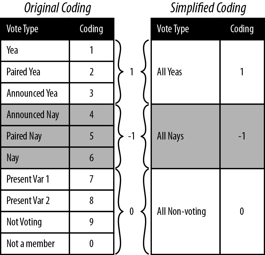
One approach is to simplify the data coding by aggregating like vote types. For example, Paired voting is a procedure whereby members of Congress know they will not be present for a given roll call can have their vote “paired” with another member who is going to vote the opposite. This, along with Announced votes, are Parliamentary means for the Senate or House to a establish a quorum for a vote to be held. For our purposes, however, we are less concerned with the mechanism by which the vote occurred, but rather the intended outcome of the vote, i.e., for or against. As such, one method for aggregating would be to group all Yea and Nay types together. By the same logic, we could group all of the non-vote-casting types together.
rollcall.simplified <- function(df) {
    no.pres <- subset(df, state < 99)
    for(i in 10:ncol(no.pres)) {
        no.pres[,i] <- ifelse(no.pres[,i] > 6, 0, no.pres[,i])
        no.pres[,i] <- ifelse(no.pres[,i] > 0 & no.pres[,i] < 4, 1, no.pres[,i])
        no.pres[,i] <- ifelse(no.pres[,i] > 1, -1, no.pres[,i])
    }
    return(as.matrix(no.pres[,10:ncol(no.pres)]))
}

rollcall.simple <- lapply(rollcall.data, rollcall.simplified)
Figure 9-3 illustrates the procedure we will use to simplify the coding from Poole and Rosenthal to be used in our analysis. As in the simulated example in the previous section, we will code all Yeas as +1, all Nays as –1, and all nonvoting observations as 0. This allows for a very straightforward application of the data coding to a distance metric. We now need to convert the data to our new coding. We also need to extract only the votes from the data frame so that we can do the necessary matrix manipulation.
To do this, we define the rollcall.simplified function, which takes a
roll call data frame as its only argument and returns a
senator-by-votes matrix with our simplified coding. You’ll notice that
the first step in this function removes all observations where the
state column is equal to 99. The 99
state code corresponds to the Vice
President of the United States, and because the Vice President very
rarely votes, we remove him. We then use the ifelse command to perform a vectorized
numeric comparison for all of the columns in the remaining matrix.
Note that the order in which we do this comparison matters. We begin
by setting all of the nonvotes (everything greater than 6) to zero. We
can then look for votes coded greater than 0 and less than 4, the
Yeas, and convert them to 1. Finally, everything greater than 4 is a
Nay, so we code those as a –1.
We now have the roll call data in the same form as we started with for our simulated data from the previous section, and we can proceed with this data in exactly the same way we did with the simulated consumer review data. In the next and final section of this chapter, we will generate the MDS of this data and explore it visually.
As before, the first step is to use the senator-by-votes
matrix to create a senator-by-senator distance matrix on
which we will perform MDS. We will use the lapply function to perform the conversion
steps for each Congress separately. We begin by performing the
matrix multiplication and storing the results in the rollcall.dist variable. We then perform
MDS using the cmdscale function
via another call to lapply. There
are two things to notice about the MDS operation. First, by default cmdscale
computes the MDS for two dimensions, so we are being redundant by
setting k=2. It is useful,
however, to be explicit when performing this operation when sharing
code, so we add it here as a best practice. Second, notice that we
are multiplying all points by –1. This is done strictly for
visualization, flipping the x-axis positioning of all points, and as
we will see, puts Democrats on the left side and Republicans on the
right. In the American context this is a useful visual cue, as we
typically think of Democrats as being ideologically left and
Republicans as toward the right.
Note
As you may have guessed, we only noticed that the Democrats would end up on the right and Republicans on the left side of the x-axis points for the MDS after we visualized it. Part of doing data analysis well is being flexible and thinking critically about how you can improve either your method or your presentation of the results after you have completed them. So, although we are presenting this linearly here, be aware that in practice the decision to flip the x-axis in the visualization came only after we had run through the exercise the first time.
rollcall.dist <- lapply(rollcall.simple, function(m) dist(m %*% t(m)))

rollcall.mds <- lapply(rollcall.dist,
    function(d) as.data.frame((cmdscale(d, k=2)) * -1))
Next, we need to add back in the appropriate identification
data to the coordinate points data frames in rollcall.mds so that we can visualize them
in the context of party affiliation. In the next code block we will
do this using a simple for-loop over the rollcall.mds list. First, we set the names
of the coordinate points columns to x and y. Next, we access the original roll call
data frames in rollcall.data and
extract the senator names column. Recall, that we must first remove
the Vice President. Also, some of the senators names include first
and last names, but most only the last. For consistency, we strip
out the first names by splitting the name character vector by a comma and store
that vector in the congress.names
variable. Finally, we use the transform function to add in the party
affiliation as a factor and add
the Congress number.
congresses <- 101:111
for(i in 1:length(rollcall.mds)) {
	names(rollcall.mds[[i]]) <- c("x", "y")
	congress <- subset(rollcall.data[[i]], state < 99)
	congress.names <- sapply(as.character(congress$name),
	    function(n) strsplit(n, "[, ]")[[1]][1])
	rollcall.mds[[i]] <- transform(rollcall.mds[[i]], name=congress.names,
	    party=as.factor(congress$party), congress=congresses[i])
}

 head(rollcall.mds[[1]])
           x        y      name party congress
2  -11.44068 293.0001    SHELBY   100      101
3  283.82580 132.4369    HEFLIN   100      101
4  885.85564 430.3451   STEVENS   200      101
5 1714.21327 185.5262 MURKOWSKI   200      101
6 -843.58421 220.1038 DECONCINI   100      101
7 1594.50998 225.8166    MCCAIN   200      101
By inspecting the head of the first element in rollcall.mds after the contextual data is
added, we can see the data frame we will use for the visualization.
In the R code file included for this chapter, we have a lengthy set
of commands for looping over this list of data frames to create
individual visualizations for all Congresses. For brevity, however,
we include only a portion of this code here. The code provided will
plot the data for the 110th Senate, but could easily be modified to
plot any other Congress.
cong.110 <- rollcall.mds[[9]]
base.110 <- ggplot(cong.110, aes(x=x, y=y))+scale_size(to=c(2,2), legend=FALSE)+
    scale_alpha(legend=FALSE)+theme_bw()+
    opts(axis.ticks=theme_blank(), axis.text.x=theme_blank(),
        axis.text.y=theme_blank(),
        title="Roll Call Vote MDS Clustering for 110th U.S. Senate",
        panel.grid.major=theme_blank())+
    xlab("")+ylab("")+scale_shape(name="Party", breaks=c("100","200","328"),
        labels=c("Dem.", "Rep.", "Ind."), solid=FALSE)+
    scale_color_manual(name="Party", values=c("100"="black","200"="dimgray",
                       "328"="grey"),
        breaks=c("100","200","328"), labels=c("Dem.", "Rep.", "Ind."))


print(base.110+geom_point(aes(shape=party, alpha=0.75, size=2)))
print(base.110+geom_text(aes(color=party, alpha=0.75, label=cong.110$name, size=2)))
Much of what we are doing with ggplot2 should be familiar to you by now.
However, we are using one slight variation in how we are building up
the graphics in this case. The typical procedure is to create a
ggplot object and then add a
geom or stat layer, but in this case, we create a
base object called case.110,
which contains all of the formatting particularities for these
plots. This includes size,
alpha, shape, color, and opts layers.
We do this because we want to make two plots: first, a plot of
the points themselves where the shape corresponds to party
affiliation; and second, a plot where the senators’ names are used
as points and the text color corresponds to party affiliation. By
adding all of these formatting layers to base.110 first, we can then
simply add either sgeom_point or geom_text layer to the base to get the
plot we want. Figure 9-4 shows
the results of these plots.
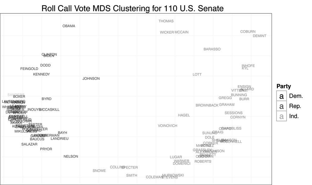
We begin by addressing our initial question: do senators from different parties mix when clustered by roll call vote records? From Figure 9-4, the answer is clearly no. There appears to be quite a large gap between Democrats and Republicans. The data also confirms that those senators often thought to be most extreme are in fact outliers. We can see Senator Sanders, the Independent for Vermont, at the far left, and Senators Coburn and DeMint at the far right. Likewise, Senators Collins and Snowe are tightly clustered at the center for the 111th Congress. As you may recall, it was these moderate Republican senators who became central figures in many of the most recent large legislative battles in the US Senate.
Another interesting result of this analysis is the positioning of Senators Obama and McCain in the 110th Senate. Obama appears singled out in the upper-left quadrant of the plot, whereas McCain is clustered with Senators Wicker and Thomas, closer to the center. Although it might be tempting to interpret this as meaning the two senators had very complementary voting records, given the nature of the data’s coding, it is more likely a result of the two missing many of the same votes due to campaigning. That is, when they did vote on the same bill, they may have had relatively different voting habits, although not extremely different voting records, but when they missed votes, it was often for the same piece of legislation. Of course, this begs the question: how do we interpret the position of Wicker and Thomas?
For our final visualization, we will examine the MDS plots for
all Congresses in chronological time. This should give us some
indication as to the overall mixing of senators by party over time,
and this will give us a more principled perspective on the statement
that the Senate is more polarized now than it has ever been. In the
previous code block we generate a single plot from all of the data
by collapsing rollcall.mds into a
single data frame using do.call
and rbind. We then build up the
exact same plot we produced in the previous step, except we add a facet_wrap
to display the MDS plots in a chronological grid by Congress. Figure 9-5 displays the results of
this visualization.
        all.mds <- do.call(rbind, rollcall.mds)
        all.plot <- ggplot(all.mds, aes(x=x, y=y))+
            geom_point(aes(shape=party, alpha=0.75, size=2))+
            scale_size(to=c(2,2), legend=FALSE)+
            scale_alpha(legend=FALSE)+theme_bw()+
            opts(axis.ticks=theme_blank(), axis.text.x=theme_blank(),
                axis.text.y=theme_blank(),
                title="Roll Call Vote MDS Clustering for U.S. Senate
                (101st - 111th Congress)",
                panel.grid.major=theme_blank())+
            xlab("")+ylab("")+
            scale_shape(name="Party", breaks=c("100","200","328"),
                labels=c("Dem.", "Rep.", "Ind."),
                solid=FALSE)+facet_wrap(~ congress)
        all.plot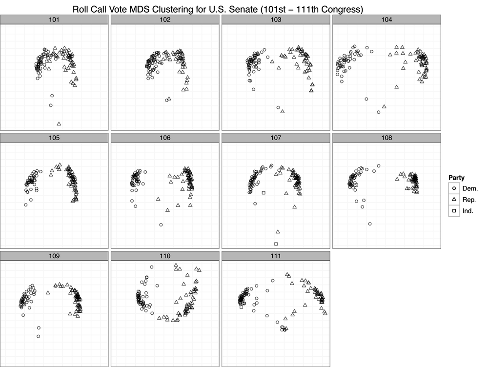
By using roll call voting as a measure of difference among senators, it seems from these results that the US Senate is in fact just as partisan as it has ever been. By and large, we can see only large groups of triangles and circles clustered together with very few exceptions in each Congress. One might say that the 101st and 102nd Congresses were less polarized because the clusters seem closer. But this is an artifact of the axis scales. Recall that the MDS procedure is simply attempting to minimize a cost function based on the computed distance matrix among all observations. Just because the scales for the 101st and 102nd Congress are smaller than those of many of the other plots does not mean that those Congresses are less polarized. These differences can result for many reasons, such as the number of observations. However, because we have visualized them in a single plot, the scales must be uniform across all panels, which can cause some to appear squeezed or others stretched.
The important takeaway from this plot is that there is very little mixing of parties when you cluster them by roll call voting. Although there may be slight variation within parties, as we can see by the stratification of either the circles or triangle points, there is very little variation between parties. In nearly all cases, we see Democrats clustered with Democrats and Republicans with Republicans. Of course, there are many other pieces of information beyond party affiliation that would be interesting to add to this plot. For instance, we might wonder if senators from the same geographic region cluster together. Or we might wonder if committee comembership leads to clustering. These are all interesting questions, and we encourage the reader to move beyond this initial analysis to dig deeper into this data.
[16] There is also a specific R function for reading the
.ord data types provided by Poole and
Rosenthal called readKH. For
more information, see http://rss.acs.unt.edu/Rdoc/library/pscl/html/readKH.html.