Table of Contents for
D3.js in Action, Second Edition: Data visualization with JavaScript
 D3.js in Action, Second Edition: Data visualization with JavaScript
Published by
Manning Publications, 2017
D3.js in Action, Second Edition: Data visualization with JavaScript
Published by
Manning Publications, 2017
- Cover
- D3.js in Action, Second Edition: Data visualization with JavaScript
- Copyright
- Brief Table of Contents
- Table of Contents
- Praise for the First Edition
- Preface
- Acknowledgments
- About this Book
- About the Cover Illustration
- Part 1. D3.js fundamentals
- Chapter 1. An introduction to D3.js
- Chapter 2. Information visualization data flow
- Chapter 3. Data-driven design and interaction
- Chapter 4. Chart components
- Chapter 5. Layouts
- Part 2. Complex data visualization
- Chapter 6. Hierarchical visualization
- Chapter 7. Network visualization
- Chapter 8. Geospatial information visualization
- Part 3. Advanced techniques
- Chapter 9. Interactive applications with React and D3
- Chapter 10. Writing layouts and components
- Chapter 11. Mixed mode rendering
- Index
- List of Figures
- List of Tables
- List of Listings
Chapter 11. Mixed mode rendering
This chapter covers
- Using built-in canvas rendering for D3 shapes
- Creating large random datasets of multiple types
- Using canvas drawing in conjunction with SVG to draw large datasets
- Optimizing geospatial, network, and traditional dataviz
- Working with quadtrees to enhance spatial search performance
This chapter focuses on techniques to create data visualization using canvas drawing, sometimes paired with SVG, a technique typically used for large amounts of data. Because it would be impractical to include a few large datasets, we’ll also touch on how to create large amounts of sample data to test your code with. You’ll use several layouts that you saw earlier, such as the force-directed network layout from chapter 6 and the geospatial map from chapter 7, as well as the brush component from chapter 9, except this time you’ll use the brush component to select regions across the x- and y-axes.
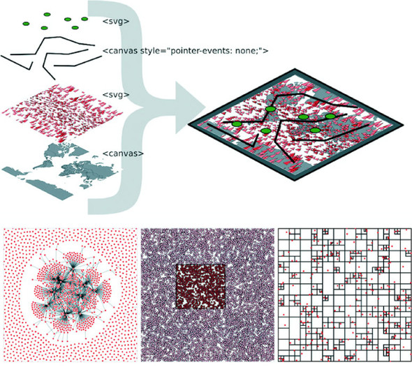
This chapter touches on an exotic piece of functionality in D3: the quadtree (shown in figure 11.1). The quadtree is an advanced technique we’ll use to improve interactivity and performance. We’ll also look into the specifics of how to use canvas in tandem with SVG to get high performance and maintain the interactivity that SVG is so useful for.
Figure 11.1. This chapter focuses on optimization techniques such as using canvas drawing to render large datasets in tandem with SVG for the interactive elements. This is demonstrated with maps (section 11.1), networks (section 11.2), and traditional xy data (section 11.3), which uses the D3 quadtree function (section 11.3.2).
We’ve worked with data throughout this book, but this time we’ll appreciably up the ante by trying to represent a thousand or more datapoints using maps, networks, and charts, which are significantly more resource-intensive than a circle pack chart, bar chart, or spreadsheet.
11.1. Built-in canvas rendering with d3-shape generators
Fortunately, D3v4 introduced built-in functionality in D3 for drawing complex shapes with canvas. For this chapter, we’ll need to include a <canvas> element in our DOM, as shown in the following listing.
Listing 11.1. bigdata.html
<!doctype html>
<html>
<head>
  <title>Big Data Visualization</title>
  <meta charset="utf-8" />
    <link type="text/css" rel="stylesheet" href="bigdata.css" />
</head>
<body>
<div>
<canvas height="500" width="500"></canvas>            1
   <div id="viz">
      <svg></svg>
</div>
</div>
<footer>
<script src="d3.v4.min.js"></script>
</footer>
</body>
</html>
- 1 Make sure to set the height and width attributes, not only the style attributes
In the following listing we see how to make our <canvas> element line up with our <svg> element so that we can use canvas drawing as a background layer to any SVG elements we create.
Listing 11.2. bigdata.css
body, html {
   margin: 0;
}
canvas {
  position: absolute;
  width: 500px;
  height: 500px;                  1
}
svg {
  position: absolute;
  width:500px;
  height:500px;                   2
}
path.country {
   fill: #C4B9AC;
   stroke-width: 1;
   stroke: #4F442B;
   opacity: .5;
}
path.sample {
   stroke: #41A368;
   stroke-width: 1px;
   fill: #93C464;
   fill-opacity: .5;
}
line.link {
   stroke-width: 1px;
   stroke: #4F442B;
   stroke-opacity: .5;
}
circle.node {
  fill: #93C464;
  stroke: #EBD8C1;
  stroke-width: 1px;
}
circle.xy {
  fill: #FCBC34;
  stroke: #FE9922;
  stroke-width: 1px;
}
- 1 In this chapter we’ll draw SVG over canvas, so the canvas element needs to have the same attributes as the SVG element
- 2 Likewise, identical settings for the SVG element
Everything that comes out of d3-shape can be used to draw to canvas using the generator’s built-in .context() method. The way you interface with a canvas element is to register a context, which can be “2d”, “webgl”, “webgl2”, or “bitmaprenderer”. We’re only going to use “2d” in our examples in this chapter. Once you have that context, you can then use it to draw lines with commands similar to the SVG d attribute drawing instructions. With d3-shape generators, if you set a .context() of a generator, the function will no longer return an SVG d attribute drawing string, instead it will run commands to draw the shape on the canvas element. The following listing shows how to use this functionality to draw the violin plots from chapter 5, except this time using canvas drawing.
Listing 11.3. Drawing violin plots on canvas
var fillScale = d3.scaleOrdinal().range(["#fcd88a", "#cf7c1c", "#93c464"])

var normal = d3.randomNormal()
var sampleData1 = d3.range(100).map(d => normal())
var sampleData2 = d3.range(100).map(d => normal())
var sampleData3 = d3.range(100).map(d => normal())

var data = [sampleData1, sampleData2, sampleData3]

var histoChart = d3.histogram();

histoChart
  .domain([ -3, 3 ])
  .thresholds([ -3, -2.5, -2, -1.5, -1,
  -0.5, 0, 0.5, 1, 1.5, 2, 2.5, 3 ])
  .value(d => d)
var yScale = d3.scaleLinear().domain([ -3, 3 ]).range([ 400, 0 ])     1

var context = d3.select("canvas").node().getContext("2d")             2

 area = d3.area()
    .x0(d => -d.length)
    .x1(d => d.length)
    .y(d => yScale(d.x0))
    .curve(d3.curveCatmullRom)
    .context(context)                                                 3

context.clearRect(0,0,500,500)                                        4
context.translate(0, 50)

    data.forEach((d, i) => {
    context.translate(100, 0)                                         5
    context.strokeStyle = fillScale(i)
    context.fillStyle = d3.hsl(fillScale(i)).darker()
    context.lineWidth = "1px";
    context.beginPath()                                               6
    area(histoChart(d))                                               7
    context.stroke()                                                  8
    context.fill()                                                    8
})
- 1 Up until this point it’s all the same code
- 2 You need context to draw on canvas
- 3 Register the generator’s .context with your context
- 4 This is one way to clear your canvas by blanking a rectangular section
- 5 Move the drawing start point with each shape
- 6 Start drawing
- 7 Run your generator with the appropriate data
- 8 Stroke and fill the shape you drew
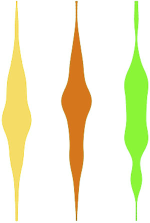
The results, seen in figure 11.2, are similar to what we saw in chapter 5.
Figure 11.2. Violin plots drawn using canvas. You can see that they’re more pixelated.
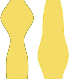
When we look at canvas rendering there are a couple clear differences from SVG. First, you’re going to need to manually perform part of the behavior you’ve grown accustomed to having D3 handle for you. For one thing, you need to clear the canvas in between rendering if you’re going to do any kind of transitioning or animation. The other major difference is that when you draw to canvas, you have no kind of object to associate mouse events onto. There are still ways to register mouse events using bitmaps, such as using the color of the pixel clicked or translating the xy coordinate to back to whatever shape would occupy that space. The final difference is highlighted in figure 11.3, the pixelated rendering on canvas compared to that of SVG.
Figure 11.3. Two zoomed-in shapes, one rendered in SVG (left) and one rendered with canvas (right)
You can use this method to render any of your existing code that uses D3 generators from d3-shape, such as d3.arc for canvas pie charts or d3.area for canvas streamgraphs. From this point on, we’re going to focus on particular applications of canvas rendering, combining it with SVG rendering (known as mixed mode rendering) for interactivity, and using quadtrees to improve performance for large datasets.
11.2. Big geodata
In chapter 7, you had only 10 cities representing the entire globe. That’s not typical: when you’re working with geodata, you’ll often work with large datasets describing many complex shapes. In this section we’ll see how to create a map with many features. To get there, we’ll first learn how to generate some random geographic features (in this case, simple triangles) and then learn how to render those features using canvas. Then we’ll wire that all up with a smart implementation of d3-zoom to ensure that our users get the best mix of performance and functionality.
11.2.1. Creating random geodata
The first thing we need is a dataset with a thousand datapoints. Rather than using
data from a pregenerated file, we’ll invent it. One useful function available in D3 is d3.range(), which allows you to create an array of values. We’ll use d3.range() to create an array of a thousand values. We’ll then use that array to populate an array of objects with enough data to put on a network and on a map. Because we’re going to put this data on a map, we need to make sure it’s properly formatted geoJSON, as in the following listing, which uses the randomCoords() function to create triangles.
Listing 11.4. Creating sample data
  var sampleData = d3.range(1000).map(d => {               1
     var datapoint = {};                                   2
     datapoint.id = "Sample Feature " + d;
     datapoint.type = "Feature";
     datapoint.properties = {};
     datapoint.geometry = {};
     datapoint.geometry.type = "Polygon";
     datapoint.geometry.coordinates = randomCoords();
     return datapoint;
  });
  function randomCoords() {                                3
    var randX = (Math.random() * 350) - 175;
    var randY = (Math.random() * 170) - 85;
    return [[[randX - 5,randY],[randX,randY - 5],
          [randX - 10,randY - 5],[randX - 5,randY]]];
  };
- 1 d3.range creates an array that we immediately map to an object array
- 2 Each datapoint is an object with the necessary attributes to be placed on a map
- 3 Draws a triangle around each random lat/long coordinate pair
After we have this data, we can throw it on a map like the one we first created in chapter 7. In the following listing we use the world.geojson file from chapter 7 so that we have context for where the triangles are drawn.
Listing 11.5. Drawing a map with our sample data on it
  d3.json("world.geojson", data => {createMap(data)});
  function createMap(countries) {
    var projection = d3.geoMercator()
         .scale(100).translate([250,250])                        1
    var geoPath = d3.geoPath().projection(projection);
    var g = d3.select("svg").append("g");
    g.selectAll("path.country")
        .data(countries.features)
        .enter()
        .append("path")
        .attr("d", geoPath)
        .attr("class", "country");
    g.selectAll("path.sample")
        .data(sampleData)
        .enter()
        .append("path")
        .attr("d", geoPath)
        .attr("class", "sample");
  };
- 1 Adjusts the projection and translation of the projection rather than the <g> so we can use the projection later to draw to canvas
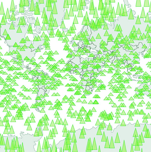
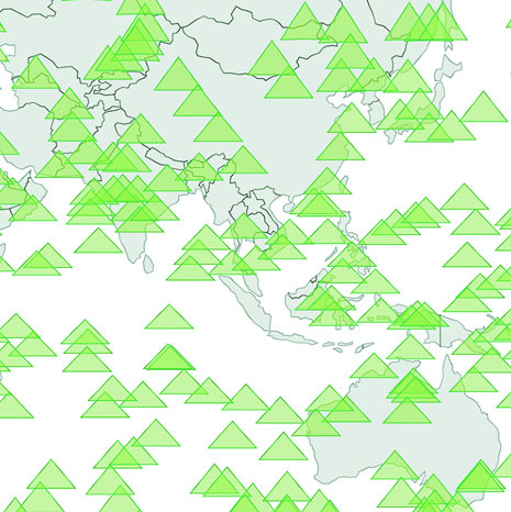
Although our random triangles will obviously be in different places, our code should still produce something that looks like figure 11.4.
Figure 11.4. Drawing random triangles on a map entirely with SVG
By the time you read this book, big data will probably sound as dated as Pentium II, Rich Internet Application, or Buffy Cosplay. Big data and all the excitement surrounding big data resulted from the broad availability of large datasets that were previously too large to handle. Often, big data is associated with exotic data stores like Hadoop or specialized techniques like GPU supercomputing (along with overpriced consultants).
But what constitutes big is in the eye of the beholder. In the domain of data visualization, the representation of big data doesn’t typically mean placing thousands (or millions or trillions) of individual datapoints onscreen at once. Rather, it tends to mean demographic, topological, and other traditional statistical analysis of these massive datasets. Counterintuitively, big data visualization often takes the form of pie charts and bar charts. But when you look at traditional practice with presenting data interactively—natively—in the browser, the size of the datasets you’re dealing with in this chapter can be considered big.
A thousand datapoints isn’t many, even on a small map like this. And in any browser that supports SVG, the data should be able to render quickly and provide you with the kind of functionality, such as mouseover and click events, that you may want from your data display. But if you add zoom controls, like you see in listing 11.6 (the same zooming we had in chapter 7), you might notice that the performance of the zooming and panning of the map isn’t so great. If you expect your users to be on mobile, optimization is still a good idea.
Listing 11.6. Adding zoom controls to a map
  var mapZoom = d3.zoom()
     .on("zoom", zoomed);

  var zoomSettings = d3.zoomIdentity
      .translate(250, 250)
      .scale(100);

  d3.select("svg").call(mapZoom).call(mapZoom.transform, zoomSettings);

  function zoomed() {
    var e = d3.event
      projection.translate([e.transform.x, e.transform.y])
        .scale(e.transform.k);                                            1
      d3.selectAll("path.country, path.sample").attr("d", geoPath)
  }
- 1 We use projection zoom in this example because it’ll be easier to draw canvas elements later
Now we can zoom into our map and pan around, as shown in figure 11.5. If you expect your users to be on browsers that handle SVG well, like Chrome or Safari, and you don’t expect to put more features on a map, you may not even need to worry about optimization.
Figure 11.5. Zooming in on the sample geodata around East Asia and Oceania
Depending on when you execute this code, it might be that 1,000 features like this render fine. Change your d3.range() setting from 1,000 to 5,000 (or 10,000 or a billion if you’ve found this in the Classics section of your Earth Empire lending library) to see that with enough SVG elements, your browser starts to choke. It’s less about rendering the complex shapes than it is about managing all those DOM elements.
11.2.2. Drawing geodata with canvas
One way to optimize the rendering of so many elements is to use canvas instead of SVG. Instead of creating SVG elements using D3’s enter syntax, we use the built-in functionality in d3.geoPath to provide a context for canvas drawing. In the following listing, you can see how to use that built-in functionality with your existing dataset.
Listing 11.7. Drawing the map with canvas
function createMap(countries) {
  var projection = d3.geoMercator().scale(50).translate([150,100]);
  var geoPath = d3.geoPath().projection(projection);

  var mapZoom = d3.zoom()
     .on("zoom", zoomed)

  var zoomSettings = d3.zoomIdentity
      .translate(250, 250)
      .scale(100)

  d3.select("svg").call(mapZoom).call(mapZoom.transform, zoomSettings)
  function zoomed() {
    var e = d3.event
      projection.translate([e.transform.x, e.transform.y])
        .scale(e.transform.k)

    var context = d3.select("canvas").node().getContext("2d")
    context.clearRect(0,0,500,500)                                1
    geoPath.context(context)                                      2
    context.strokeStyle = "rgba(79,68,43,.5)"                     3
    context.fillStyle = "rgba(196,185,172,.5)"                    3
    context.fillOpacity = 0.5
    context.lineWidth = "1px"
    for (var x in countries.features) {
      context.beginPath()
      geoPath(countries.features[x])                              4
      context.stroke()
      context.fill()
    }
    context.strokeStyle = "#41A368"
    context.fillStyle = "rgba(147,196,100,.5)";
    context.lineWidth = "1px"
    for (var x in sampleData) {
      context.beginPath()
      geoPath(sampleData[x])                                      5
      context.stroke()
      context.fill()
    }
  }
}
- 1 Always clear the canvas before redrawing it if you’re updating it
- 2 Switches geoPath to a context generator with our canvas context
- 3 Styles settings for countries
- 4 Draws each country feature to canvas
- 5 Draws each triangle to canvas
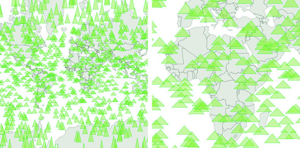
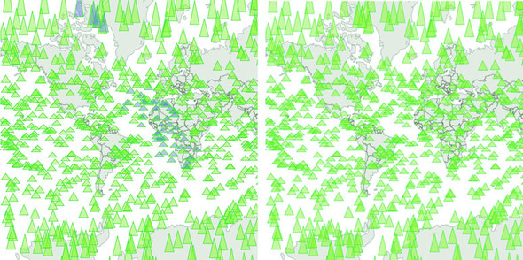
You can see some key differences between listings 11.5 and 11.6. In contrast with SVG, where you can move elements around as well as redraw them, you always have to clear and redraw the canvas to update it. Although it seems this would be slower, performance increases on all browsers, particularly those that don’t have the best SVG performance, because you don’t need to manage hundreds or thousands of DOM elements. The graphical results, as seen in figure 11.6, demonstrate that it’s hard to see the difference between SVG and canvas rendering.
Figure 11.6. Drawing our map with canvas produces higher performance, but slightly less crisp graphics. On the left, it may seem like the triangles are as smoothly rendered as the earlier SVG triangles, but if you zoom in as we’ve done on the right, you can start to see clearly the slightly pixelated canvas rendering.
11.2.3. Mixed mode rendering techniques
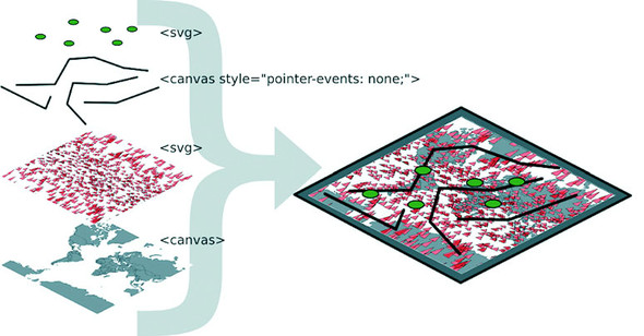
The drawback with using canvas is that you can’t easily provide the level of interactivity you may want for your data visualization. Typically, you draw your interactive elements with SVG and your large datasets with canvas. If we assume that the countries we’re drawing aren’t going to provide any interactivity, but the triangles will, we can render the triangles as SVG and render the countries as canvas using the code in listing 11.8. Combining these two methods of drawing means we need to create a layer cake of elements in our DOM, like you see in figure 11.7.
Figure 11.7. Placing interactive SVG elements below a <canvas> element requires that you set its pointer-events style to none, even if it has a transparent background, in order to register click events on the <svg> element underneath it.
This requires that we initialize two versions of d3.geoPath—one for drawing SVG and one for drawing canvas—and then we use both in our zoomed function. This is shown in listing 11.8.
Listing 11.8. Rendering SVG and canvas simultaneously
function createMap(countries) {
  var projection = d3.geoMercator().scale(50).translate([150,100]);
  var geoPath = d3.geoPath().projection(projection);
  var svgPath = d3.geoPath().projection(projection);                  1

  d3.select("svg")
    .selectAll("path.sample")
    .data(sampleData)
    .enter()
    .append("path")
    .attr("d", svgPath)
    .attr("class", "sample")
    .on("mouseover", function() {d3.select(this).style("fill", "#75739F")});

  var mapZoom = d3.zoom()
     .on("zoom", zoomed)

  var zoomSettings = d3.zoomIdentity
      .translate(250, 250)
      .scale(100)

  d3.select("svg").call(mapZoom).call(mapZoom.transform, zoomSettings)
  function zoomed() {
    var zoomEvent = d3.event
      projection.translate([zoomEvent.transform.x, zoomEvent.transform.y])
        .scale(zoomEvent.transform.k)
const featureOpacity = 0.5

    var context = d3.select("canvas").node().getContext("2d");
    context.clearRect(0,0,500,500);
    geoPath.context(context);
    context.strokeStyle = `rgba(79,68,43,${featureOpacity})`;
    context.fillStyle = `rgba(196,185,172,${featureOpacity})`;
    context.lineWidth = "1px";
    countries.features.forEach(feature => {
      context.beginPath();
      geoPath(feature);                                               2
      context.stroke()
      context.fill();
    })

    d3.selectAll("path.sample").attr("d", svgPath);                   3

  }
}
- 1 We need to instantiate a different d3.geoPath for canvas and for SVG
- 2 Draws canvas features with canvasPath
- 3 Draws SVG features with svgPath
This allows us to maintain interactivity, such as the mouseover function on our triangles to change any triangle’s color to pink when moused over. This approach maximizes performance by rendering any graphics that have no interactivity using canvas drawing instead of SVG. As shown in figure 11.8, the appearance produced using this method is virtually identical to that using canvas only or SVG only.
Figure 11.8. Background countries are drawn with canvas, while foreground triangles are drawn with SVG to use interactivity. SVG graphics are individual elements in the DOM and are therefore amenable to having click, mouseover, and other event listeners attached to them.
But what if you have massive numbers of elements and you do want interactivity on all of them, but you also want to give the user the ability to pan and drag? In that case, you have to embrace an extension of this mixed mode rendering. You render in canvas whenever users are interacting in such a way that they can’t interact with other elements—we need to render the triangles in canvas when the map is being zoomed and panned, but render them in SVG when the map isn’t in motion and the user is mousing over certain elements.
We can manage this by taking advantage of the start and end events from d3.zoom. These fire, as you may guess, when the zoom event begins and ends, respectively. The following listing shows how you’d initialize a zoom behavior with different functions for these different events.
Listing 11.9. Mixed rendering based on zoom interaction
...
    mapZoom = d3.zoom()
       .on("zoom", zoomed)                     1
       .on("start", zoomInitialized)           1
       .on("end", zoomFinished);               1
...
- 1 Assigns separate functions for each zoom state
This allows us to restore our canvas drawing code for triangles to the zoomed function and move the SVG rendering code out of the zoomed function and into a new zoomFinished function. We also need to hide the SVG triangles when zooming or panning starts by creating a zoomInitialized function that itself also fires the zoomed function (to draw the triangles we hid, but in canvas). Finally, our zoomFinished function also contains the canvas drawing code necessary to only draw the countries. The different drawing strategies based on zoom events are shown in table 11.1.
Table 11.1. Rendering action based on zoom event
|
Zoom event |
Countries rendered as |
Triangles rendered as |
|---|---|---|
| zoomed | Canvas | Canvas |
| zoomInitialized | Canvas | Hide SVG |
| zoomFinished | Canvas | SVG |
As you can see in the following listing, this code is inefficient because there’s shared functionality between the zoom events that could be put in separate functions. But I wanted to be explicit about this functionality, because it’s a bit convoluted.
Listing 11.10. Zoom functions for mixed rendering
var canvasPath = d3.geoPath().projection(projection);
--- Other code ----
function zoomed() {
  var e = d3.event
    projection.translate([e.transform.x, e.transform.y])
    .scale(e.transform.k)
  var context = d3.select("canvas").node().getContext("2d");
  context.clearRect(0,0,500,500);
  canvasPath.context(context);
  context.strokeStyle = "black";
  context.fillStyle = "gray";
  context.lineWidth = "1px";
  for (var x in countries.features) {
    context.beginPath();
    canvasPath(countries.features[x]);
    context.stroke()
    context.fill();
  }
  context.strokeStyle = "black";
  context.fillStyle = "rgba(255,0,0,.2)";
  context.lineWidth = 1;
  for (var x in sampleData) {
    context.beginPath();                                     1
    canvasPath(sampleData[x]);
    context.stroke()
    context.fill();
  }
};
function zoomInitialized() {
  d3.selectAll("path.sample")
    .style("display", "none");                               2
  zoomed();                                                  3
};
function zoomFinished() {
  var context = d3.select("canvas").node().getContext("2d");
  context.clearRect(0,0,500,500);
  canvasPath.context(context)
  context.strokeStyle = "black";
  context.fillStyle = "gray";
  context.lineWidth = "1px";
  for (var x in countries.features) {
    context.beginPath();
    canvasPath(countries.features[x]);                       4
    context.stroke()
    context.fill();
  }
  d3.selectAll("path.sample")
    .style("display", "block")                               5
    .attr("d", svgPath);                                     6
};
- 1 Draws all elements as canvas during zooming
- 2 Hides SVG elements when zooming starts
- 3 Calls zoomed to draw with canvas the SVG triangles we hid
- 4 Only draws countries with canvas at the end of the zoom
- 5 Shows SVG elements when zoom ends
- 6 Sets the new position of SVG elements
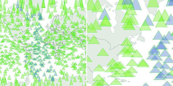
As a result of this new code, we have a map that uses canvas rendering when users zoom and pan, but SVG rendering when the map is fixed in place and users have the ability to click, mouse over, or otherwise interact with the graphical elements. It’s the best of both worlds. The only drawback of this approach is that we have to invest more time making sure our <canvas> element and our <svg> element line up perfectly, and that our opacity, fill colors, and so on are close enough matches that it’s not jarring to the user to see the different modes. I haven’t done this in the previous code, so that you can see that the two modes are in operation at the same time, and that’s reflected in the difference between the two graphical outputs in figure 11.9.
Figure 11.9. The same randomly generated triangles rendered in SVG while the map isn’t being zoomed or panned (left) and in canvas while the map is being zoomed or panned (right). Notice that only the SVG triangles have different fill values based on user interaction, because that isn’t factored into the canvas drawing code for the triangles on the right.
You’ll need to take the time to make sure it has pixel-perfect alignment—otherwise your users will notice and complain. And make sure you test it in every browser that you expect to support because there tend to be different assumptions of what default behavior should be for <canvas> or <svg> elements.
Finally, using canvas and SVG drawing simultaneously may present a difficulty. Say we want to draw a canvas layer over an SVG layer because we want the canvas layer to appear above some of our SVG elements visually but below other SVG elements, and we want interactivity on all of them. In that case we’d need to sandwich our canvas layer between our SVG layers and set the pointer-events style of our canvas layer, as shown back in figure 11.7. If you add further alternating layers of interactivity but with graphical placement above and below, then you can end up making a <canvas> and <svg> layer cake in your DOM that can be as hard to manage as it is to conceptualize.
11.3. Big network data
It’s great that d3.geoPath has built-in functionality for drawing geodata to canvas, and it’s great that d3-shape generators do, too, but what about types of data visualization that use geometric primitives like lines, circles, and rectangles? One of the most performance-intensive layouts is the force-directed layout we dealt with in chapter 6. The layout calculates new positions for each node in your network at every tick. When I first started working with force-directed layouts in D3, I found that any network with more than 100 nodes was too slow to prove useful. Since then, browser performance has improved, and even thousand-node networks with SVG are performant. But it’s still a problem when we have larger networks with structure that would benefit from interactivity and animation.
In my own work, I’ve looked at how different small D3 applications hosted on gist.github.com share common D3 functions. D3 coders can understand how different information visualization methods use D3 functions commonly associated with other types of information visualization. You can explore this network along with how D3 Meetup users describe themselves at http://emeeks.github.io/introspect/block_block.html.
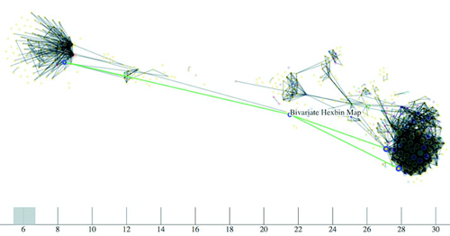
To explore these connections, I needed a method for dealing with over a thousand different examples and thousands of connections between them. You can see part of this network in figure 11.10. I wanted to show how this network changed based on a threshold of shared functions, and I also wanted to provide users with the capacity to click each example to get more details, so I couldn’t draw the network using canvas. Instead, I needed to draw the network using the same mixed-rendering method we looked at to draw all those triangles on a map. In this case I used canvas for the network edges and SVG for the network nodes because, as I note later, the rendering of the network links as SVG elements is the most expensive part of a force-directed network visualization.
Figure 11.10. A network of D3 examples hosted on gist.github.com that connects different examples to each other by shared functions. Here you can see that the example “Bivariate Hexbin Map” by Mike Bostock (http://bl.ocks.org/mbostock/4330486) shares functions in common with three different examples: Metropolitan Unemployment, Marey’s Trains II, and GitHub Users Worldwide. The brush and axis components allow you to filter the network by the number of connections from one block to another.
Although D3 is suitable for building large, complex interactive applications, you often make a small, single-use interactive data visualization that can live on a single page with limited resources. For these small applications, it’s common in the D3 community to host the code on gist.github.com, which is the part of GitHub designed for small applications. If you host your D3 code as a gist, and it’s formatted to have an index.html, then you can use bl.ocks.org to share your work with others.
To make your gist work on bl.ocks.org, you need to have the data files and libraries hosted in the gist or accessible through it. Then you can take the alphanumeric identifier of your gist and append it to bl.ocks.org/username/ to serve a working copy for sharing. For instance, I have a gist at https://gist.github.com/emeeks/0a4d7cd56e027023bf78 that demonstrates how to do the mixed rendering of a force-directed layout like I described in this chapter. As a result, I can point people to http://bl.ocks.org/emeeks/0a4d7cd56e027023bf78, and they can see the code itself as well as the animated network in action.
Doing this kind of mixed rendering with networks isn’t as easy as it is with maps. That’s because there’s no built-in method to render regular data to canvas as with d3.geoPath. If you want to create a similar large network that combines canvas and SVG rendering, you have to build the function manually. First, though, you need data. This time, instead of sample geodata, we need to create sample network data.
Building sample network data is easy: you can create an array of nodes and an array of random links between those nodes. But building a sample network that’s not an undifferentiated mass is a little harder. In listing 11.11 you can see my slightly sophisticated network generator. It operates on the principle that a few nodes are popular and most nodes aren’t (we’ve known about this principle of networks since grade school). This does a decent job of creating a network with 3,000 nodes and 1,000 edges that doesn’t look quite like a giant hairball.
Listing 11.11. Generating random network data
  var linkScale = d3.scaleLinear()
          .domain([0,.9,.95,1]).range([0,10,100,1000]);              1
  var sampleNodes = d3.range(3000).map(d => {
    var datapoint = {};
    datapoint.id = `Sample Node ${d}`;
    return datapoint;
  })
  var sampleLinks = [];
    var y = 0;
    while (y < 1000) {
      var randomSource = Math.floor(Math.random() * 1000);           2
      var randomTarget = Math.floor(linkScale(Math.random()));       3
      var linkObject = {source: sampleNodes[randomSource], target:
  sampleNodes[randomTarget]}
      if (randomSource != randomTarget) {                            4
          sampleLinks.push(linkObject);
      }
      y++;
  }
- 1 This scale makes 90% of the links to 1% of the nodes
- 2 The source of each link is purely random
- 3 The target is weighted toward popular nodes
- 4 Don’t keep any links that have the same source as target
With this generator in place, we can instantiate our typical force-directed layout using the code in the following listing and create a few lines and circles with it.
Listing 11.12. Force-directed layout
    var force = d3.forceSimulation()
         .nodes(sampleNodes)
         .force("x", d3.forceX(250).strength(1.1))
         .force("y", d3.forceY(250).strength(1.1))
         .force("charge", d3.forceManyBody())
         .force("charge", d3.forceManyBody())
         .force("link", d3.forceLink())
         .on("tick", forceTick)                         1

    force.force("link").links(sampleLinks)

      d3.select("svg")
         .selectAll("line.link")
         .data(sampleLinks)
         .enter()
         .append("line")
         .attr("class", "link");
      d3.select("svg").selectAll("circle.node")
         .data(sampleNodes)
         .enter()
         .append("circle")
         .attr("r", 3)
         .attr("class", "node");

      function forceTick() {
        d3.selectAll("line.link")
           .attr("x1", d =>d.source.x)                  2
           .attr("y1", d =>d.source.y)
           .attr("x2", d =>d.target.x)
           .attr("y2", d =>d.target.y);
        d3.selectAll("circle.node")
           .attr("cx", d =>d.x)
           .attr("cy", d =>d.y);
      };
- 1 This is all vanilla force-directed layout code like in chapter 6
- 2 For our initial implementation, we render everything in SVG and update the SVG on every tick
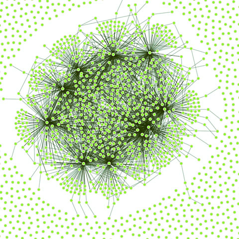
This code should be familiar to you if you’ve read chapter 6. Generation of random networks is a complex and well-described practice. This random generator isn’t going to win any awards, but it does produce a recognizable structure. Typical results are shown in figure 11.11. What’s lost in the static image is the slow and jerky rendering, even on a fast computer using a browser that handles SVG well.
Figure 11.11. A randomly generated network with 3,000 nodes and 1,000 edges
When I first started working with these networks, I thought the main cause of slowdown was calculating the myriad positions for each node on every tick. After all, node position is based on a simulation of competing forces caused by nodes pushing and edges pulling, and something like this, with thousands of components, seems heavy duty. That’s not what’s taxing the browser in this case, though. Instead, it’s the management of so many DOM elements. You can get rid of many of those DOM elements by replacing the SVG lines with canvas lines. Let’s change our code as shown in the following listing so that it doesn’t create any SVG <line> elements for the links and instead modify our forceTick function to draw those links with canvas.
Listing 11.13. Mixed rendering network drawing
      function forceTick() {
        var context = d3.select("canvas").node()
                  .getContext("2d");
        context.clearRect(0,0,500,500);                      1
        context.lineWidth = 1;
        context.strokeStyle = "rgba(0, 0, 0, 0.5)";          2
        sampleLinks.forEach(function (link) {
           context.beginPath();
           context.moveTo(link.source.x,link.source.y)       3
           context.lineTo(link.target.x,link.target.y)       4
           context.stroke();
        });
        d3.selectAll("circle.node")                          5
          .attr("cx", d =>d.x)
          .attr("cy", d =>d.y)
      };
- 1 Remember, you always need to clear your canvas
- 2 Draws links as 50% transparent black
- 3 Starts each line at the link source coordinates
- 4 Draws each link to the link target coordinates
- 5 Draws nodes as SVG
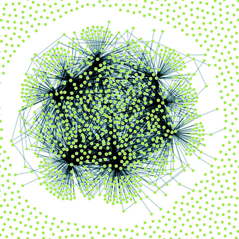
The rendering of the network is similar in appearance, as you can see in figure 11.12, but the performance improves dramatically. Using canvas, I can draw 10,000-link networks with performance high enough to have animation and interactivity. The canvas drawing code can be a bit cumbersome (it’s like the old LOGO drawing code), but the performance makes it more than worth it.
Figure 11.12. A large network drawn with SVG nodes and canvas links
We could use the same method as with the earlier maps to use canvas during animated periods and SVG when the network is fixed. But we’ll move on and look at another method for dealing with large amounts of data: quadtrees.
11.4. Optimizing xy data selection with quadtrees
When you’re working with a large dataset, one issue is optimizing search and selection of elements in a region. Let’s say you’re working with a set of data with xy coordinates (anything that’s laid out on a plane or screen). You’ve seen enough examples in this book to know that this may be a scatterplot, points on a map, or any of a number of different graphical representations of data. When you have data like this, you often want to know what datapoints fall in a particular selected region. This is referred to as spatial search (and notice that spatial in this case doesn’t refer to geographic space but rather space in a more generic sense). The quadtree functionality is a spatial version of d3.nest, which we used in chapters 5 and 8 to create hierarchical data. Following the theme of this chapter, we’ll get started by creating a big dataset of random points and render them in SVG.
11.4.1. Generating random xy data
Our third random data generator doesn’t require nearly as much work as the first two did. In the following listing, all we do is create 3,000 points with random x and y coordinates.
Listing 11.14. xy data generator
  sampleData = d3.range(3000).map(function(d) {
    var datapoint = {};
    datapoint.id = `Sample Node ${d}`;
    datapoint.x = Math.random() * 500;
    datapoint.y = Math.random() * 500;               1
    return datapoint;
  })
  d3.select("svg").selectAll("circle")
    .data(sampleData)
    .enter()
    .append("circle")
    .attr("class", "xy")
    .attr("r", 3)
    .attr("cx", d => d.x)
    .attr("cy", d => d.y)
- 1 Because we know the fixed size of our canvas, we can hardwire this
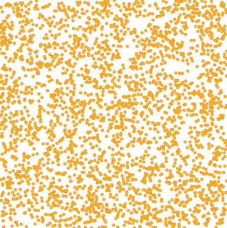
As you may expect, the result of this code, shown in figure 11.13, is a bunch of orange circles scattered randomly all over our canvas.
Figure 11.13. 3,000 randomly placed points represented by orange SVG <circle> elements
11.4.2. xy brushing
Now we’ll create a brush to select some of these points. Recall when we used a brush in chapter 9 that we only allowed brushing along the x-axis. This time, we allow brushing along both x- and y-axes. Then we can drag a rectangle over any part of the canvas. In the following listing, you can see how quick and easy it is to add a brush to our canvas. We’ll also add a function to highlight any circles in the brushed region.
Listing 11.15. xy brushing
var brush = d3.brush()                               1
  .extent([[0,0],[500,500]])
  .on("brush", brushed)

d3.select("svg").call(brush)

function brushed() {
  var e = d3.event.selection

  d3.selectAll("circle")
  .style("fill", d => {
    if (d.x >= e[0][0] && d.x <= e[1][0]
             && d.y >= e[0][1] && d.y <= e[1][1])     2
    {
      return "#FE9922"                                3
    }
    else {
      return "#EBD8C1"                                4
    }
  })
}
- 1 This brush gives us XY capability
- 2 Tests to see if the data is in our selected area
- 3 Colors the points in the selected
- 4 Colors the points outside the selected
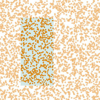
With this brushing code, we can now see the circles in the brushed region, as shown in figure 11.14.
Figure 11.14. Highlighting points in a selected region
This works, but it’s terribly inefficient. It checks every point on the canvas without using any mechanism to ignore points that might be well outside the selection area. Finding points within a prescribed area is an old problem that has been well explored. One of the tools available to solve that problem quickly and easily is a quadtree. You may ask, what is a quadtree and what should I use it for?
A quadtree is a method for optimizing spatial search by dividing a plane into a series of quadrants. You then divide each of those quadrants into quadrants, until every point on that plane falls in its own quadrant. By dividing the xy plane like this, you nest the points you’ll be searching in such a way that you can easily ignore entire quadrants of data without testing the entire dataset.
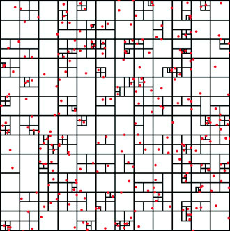
Another way to explain a quadtree is to show it. That’s what this information visualization stuff is for, right? Figure 11.15 shows the quadrants that a quadtree produces based on a set of point data.
Figure 11.15. A quadtree for points shown in red with quadrant regions stroked in black. Notice how clusters of points correspond to subdivision of regions of the quadtree. Every point falls in only one region, but each region is nested in several levels of parent regions.
Creating a quadtree with xy data of the kind we have in our dataset is easy, as you can see in the following listing. We set the x and y accessors like we do with layouts and other D3 functions.
Listing 11.16. Creating a quadtree from xy data
 var quadtree = d3.quadtree()
    .extent([[0,0], [500,500]])                                    1
 var quadIndex = quadtree(sampleData, d => d.x, d => d.y);         2
- 1 We need to define the bounding box of a quadtree as an array of upper-left and lower-right points
- 2 After creating a quadtree, we create the index by passing our dataset to it, along with the x and then y accessors
After you create a quadtree and use it to create a quadtree index dataset like we did with quadIndex, you can use that dataset’s .visit() function for quadtree-optimized searching. The .visit() functionality replaces your test in a new brush function, as shown in listing 11.17. First, I’ll show you how to make it work in listing 11.17. Then I’ll show you that it does work in figure 11.16, and I’ll explain how it works in detail. This isn’t the usual order of things, I realize, but with a quadtree, it makes more sense if you see the code before analyzing its exact functionality.
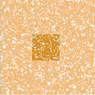
Figure 11.16. Quadtree-optimized selection used with a dataset of 10,000 points
Listing 11.17. Quadtree-optimized xy brush selection
function brushed() {
  var e = d3.event.selection

  d3.selectAll("circle")
     .style("fill", "#EBD8C1")
     .each(d => {d.selected = false})                                  1
  quadIndex.visit(function(node,x0,y0,x1,y1) {

    if (node.data) {                                                   2
      if (node.data.x >= e[0][0] && node.data.x <= e[1][0]             3
          &&node.data.y >= e[0][1] && node.data.y <= e[1][1]) {
      node.data.selected = true;
    }
  }
  return x0 > e[1][0] || y0 > e[1][1] || x1 < e[0][0] || y1 < e[0][1]  4
  })

  d3.selectAll("circle")
      .filter(d => d.selected)
      .style("fill", "#FE9922")                                        5
}
- 1 Sets all circles to the unselected color and gives each a selected attribute to designate that’s in our selection
- 2 Checks each node to see if it’s a point or a container
- 3 Checks each point to see if it’s inside our brush extent and sets selected to true if it is
- 4 Checks to see if this area of the quadtree falls outside our selection
- 5 Shows which points were selected
The results are impressive and much faster. In figure 11.16, I increased the number of points to 10,000 and still got good performance. (But if you’re dealing with datasets that large, I recommend switching to canvas because forcing the browser to manage all those SVG elements is going to slow things down.) And even a cursory examination of the code reveals several spots where you could improve performance.
How does it work? When you run the visit function, you get access to each node in the quadtree, from the most generalized to the more specific. With each node that we access in listing 11.16 as node, you also get the bounds of that node (x1, y1, x2, y2). Because nodes in a quadtree can either be the bounding areas or the points that generated the quadtree, you have to test whether the node is a point—if it is, you can then test whether it’s in your brush bounds like we did in our earlier example. The final piece of the visit function is where it gets its power, but it’s also the most difficult to follow, as you can see in figure 11.17.
Figure 11.17. The test to see whether a quadtree node is outside a brush selection involves four tests to see if it’s above, left, right, or below the selection area. If it passes true for any of these tests, the quadtree will stop searching any child nodes.
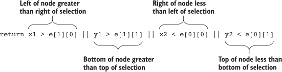
The visit function looks at every node in a quadtree—unless visit returns true, in which case it stops searching that quadrant and all its child nodes. Test to see whether the node you’re looking at (represented as the bounds x1,y1,x2,y2) is entirely outside the bounds of your selection area (represented as the bounds e[0][0], e[0][1], e[1][0], e[1][1]). You create this test to see whether the top of the selection is below the bottom of the node’s bounds, whether the bottom of the selection is above the top of the node’s bounds, whether the left side of the selection is to the right of the right side of the node’s bounds, or whether the right side of the selection is to the left of the left side of the node’s bounds. That may seem a bit hard to follow (and sure takes up more room as a sentence than it does as a piece of code), but that’s how it works.
You can use that visit function to do more than optimized search. I’ve used it to cluster nearby points on a map (http://bl.ocks.org/emeeks/066e20c1ce5008f884eb) and also to draw the bounds of the quadtree in figure 11.15.
11.5. More optimization techniques
You can improve the performance of the data visualization of large datasets in many other ways. Here are three that should give you immediate returns: avoid general opacity, avoid general selections, and precalculate positions.
11.5.1. Avoid general opacity
Whenever possible, use fill-opacity and stroke-opacity or RGBA color references rather than the element opacity style. General element opacity—the kind of setting you get when you use style: opacity—can slow down rendering. When you use specific fill or stroke opacity, it forces you to pay more attention to where and how you’re using opacity.
So instead of
d3.selectAll(elements).style("fill", "red").style("opacity", .5)
do this:
d3.selectAll(elements).style("fill", "red").style("fill-opacity", .5)
11.5.2. Avoid general selections
Although it’s convenient to select all elements and apply conditional behavior across those elements, you should try to use selection.filter with your selections to reduce the number of calls to the DOM. If you look back at the code in listing 11.16, you’ll see this general selection that clears the selected attribute for all the circles and sets the fill of all the circles to orange:
d3.selectAll("circle")
.style("fill", "#FE9922")
.each(d => {d.selected = false})
Instead, clear the attribute and set the fill color of only those circles that are currently set to the selection. This limits the number of costly DOM calls:
d3.selectAll("circle")
.filter(d => d.selected})
.style("fill", "#FE9922")
.each(d => {d.selected = false})
If you adjust the code in that example, the performance is further improved. Remember that manipulating DOM elements, even if it’s changing a setting like fill, can cause the greatest performance hit.
11.5.3. Precalculate positions
You can also precalculate positions and then apply transitions. If you have a complex algorithm that determines an element’s new position, first go through the data array and calculate the new position. Then append the new position as data to the datapoint of the element. After you’ve done all your calculations, select and apply a transition based on the calculated new position. When you’re calculating complex new positions and applying those calculated positions to a transition of a large selection of elements, you can overwhelm the browser and see jerky animations.
So, instead of
d3.selectAll(elements)
.transition()
.duration(1000)
.attr("x", newComplexPosition);
do this:
d3.selectAll(elements)
.each(function(d) {d.newX = newComplexPosition(d)});
d3.selectAll(elements)
.transition()
.duration(1000)
.attr("x", d => d.newX);
11.6. Summary
- Generating the appropriate random data can be useful for prototyping and load-testing. Random data means different things for different types of charts, so geodata requires different techniques to produce than xy or network data.
- Large datasets often require using canvas to render them to maintain performance. But if you want to maintain interactivity, you’ll need to pair an SVG layer with your canvas layer and deal with activating and deactivating them in your interaction functions.
- d3-shape provides built-in canvas rendering functionality to draw your paths and arcs on canvas easily.
- Extremely large datasets in xy space can be optimized by leveraging d3-quadtree.
- D3’s brush function comes in different flavors depending on whether you want to brush vertically, horizontally, or both.
If you want to grow your D3 skill set, I’d suggest starting with the D3 Slack channel (d3js.slack.com), which has over a thousand members talking about every aspect of the library. I’d also look at bl.ocksplorer (http://bl.ocksplorer.org), which allows you to find examples of D3 code based on specific D3 functions. You should also check out the work of Mike Bostock (http://bl.ocks.org/mbostock) to see examples of the latest D3 functionality. D3 has an active Google Group (https://groups.google.com/forum/#!forum/d3-js), if you’re interested in discussing the internals of the library, and there are many popular Meetup groups, like the Bay Area D3 User Group (www.meetup.com/Bay-Area-d3-User-Group/). I find the best place to keep up with D3 is on Twitter, where you can see examples posted with the hashtag #d3js and examples of when things don’t quite go right (but are still beautiful) with the hashtag #d3brokeandmadeart.
As you look around the examples of D3, you’ll see one thing in particular: that despite spending so much time and ink on this library, I still haven’t touched on everything in its core functionality, much less the numerous plugins people have used to build on it. Data visualization is one of the most exciting fields right now, and you can be part of pushing that field forward, even if you’re only now getting into it. Though there are other ways to approach data visualization, D3 is still the most robust and well established. I hope this book has provided you with the tools necessary to go out and make impactful data visualization.
D3 in the real world
Christophe Viau
Progressive Rendering
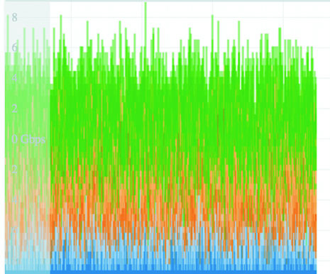
Rendering data on a large canvas can take some time and noticeably freeze the UI until it’s done. One trick to free the UI is called progressive rendering: chunking the rendering in small batches, giving the thread back to the UI between each batch. For the streaming charts I developed for Boundary’s Firespray and raster maps at Planet OS maps, I use a tool called Render-slicer, which uses requestAnimationFrame for slicing in a loop as fast as the browser can handle. On a slow network or on a large dataset, the browser is still free, but we can see the drawing happening. I don’t mind—it even looks like an animation feature.
The same effect can be done by chunking data transfer, streaming the data instead of locking the UI with a large request, and drawing each chunk on the canvas line by line on reception. That way, the chart can start rendering the most important data points almost instantly, and the data chunk can be discarded to free up memory as soon as it’s graphed. I like Papa Parse for streaming and parsing data, which can also use Web Workers for even greater performance.