Table of Contents for
D3.js in Action, Second Edition: Data visualization with JavaScript
 D3.js in Action, Second Edition: Data visualization with JavaScript
Published by
Manning Publications, 2017
D3.js in Action, Second Edition: Data visualization with JavaScript
Published by
Manning Publications, 2017
- Cover
- D3.js in Action, Second Edition: Data visualization with JavaScript
- Copyright
- Brief Table of Contents
- Table of Contents
- Praise for the First Edition
- Preface
- Acknowledgments
- About this Book
- About the Cover Illustration
- Part 1. D3.js fundamentals
- Chapter 1. An introduction to D3.js
- Chapter 2. Information visualization data flow
- Chapter 3. Data-driven design and interaction
- Chapter 4. Chart components
- Chapter 5. Layouts
- Part 2. Complex data visualization
- Chapter 6. Hierarchical visualization
- Chapter 7. Network visualization
- Chapter 8. Geospatial information visualization
- Part 3. Advanced techniques
- Chapter 9. Interactive applications with React and D3
- Chapter 10. Writing layouts and components
- Chapter 11. Mixed mode rendering
- Index
- List of Figures
- List of Tables
- List of Listings
Chapter 4. Chart components
- Creating and formatting axis components
- Creating legends
- Using line and area generators for charts
- Creating complex shapes consisting of multiple types of SVG elements
D3 provides an enormous library of examples of charts, and GitHub is also packed with implementations. It’s easy to format your data to match the existing data used in an implementation—and voilà, you have a chart. Likewise, D3 includes layouts that allow you to create complex data visualizations from a properly formatted dataset. But before you get started with default layouts—which allow you to create basic charts like pie charts, as well as more exotic charts—you should first understand the basics of creating the elements that typically make up a chart. This chapter focuses on widely used pieces of charts created with D3, such as a labeled axis or a line. It also touches on the formatting, data modeling, and analytical methods most closely tied to creating charts.
If you’re reading this book in order, then this isn’t your first exposure to charts, because we created a scatterplot and bar chart in chapter 2. This chapter introduces you to components and generators. A D3 component, like an axis, is a function for drawing all the graphical elements necessary for an axis. A generator, like d3.line(), lets you draw a straight or curved line across many points. The chapter begins by showing you how to add axes to scatterplots as well as create line charts, but before the end you’ll create an exotic yet simple chart: the streamgraph. By understanding how D3 generators and components work, you’ll be able do more than re-create the charts that other people have made and posted online (many of which they’re re-creating from somewhere else).
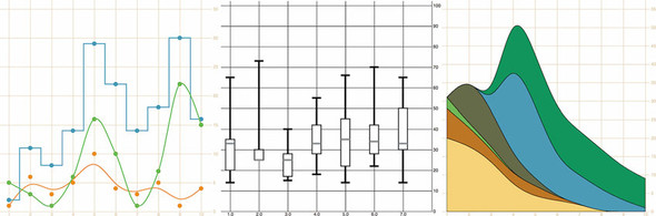
A chart (and notice here that I don’t use the term graph because that’s a synonym for network) refers to any flat layout of data in a graphical manner. The datapoints, which can be individual values or objects in arrays, may contain categorical, quantitative, topological, or unstructured data. In this chapter we’ll use several datasets to create the charts shown in figure 4.1. Although it may seem more useful to use a single dataset for the various charts, as the old saying goes, “Horses for courses,” which is to say that different charts are more suitable to different kinds of datasets, as you’ll see in this chapter.
Figure 4.1. The charts we’ll create in this chapter using D3 generators and components. From left to right: a line chart, a boxplot, and a streamgraph.
4.1. General charting principles
All charts consist of several graphical elements that are drawn or derived from the dataset being represented. These graphical elements may be graphical primitives, like circles or rectangles, or more complex, multipart, graphical objects like the boxplots we’ll look at later in the chapter. Or they may be supplemental pieces like axes and labels. Although you use the same general processes you explored in previous chapters to create any of these elements in D3, it’s important to differentiate between the methods available in D3 to create graphics for charts.
You’ve learned how to directly create simple and complex elements with data-binding. You’ve also learned how to measure your data and transform it for display. Along with these two types of functions, D3 functionality can be placed into three broader categories: generators, components, and layouts, which are shown in figure 4.2 along with a general overview of how they’re used.
Figure 4.2. The three main types of functions found in D3 can be classified as generators, components, and layouts. You’ll see components and generators in this chapter and layouts in the next chapter.
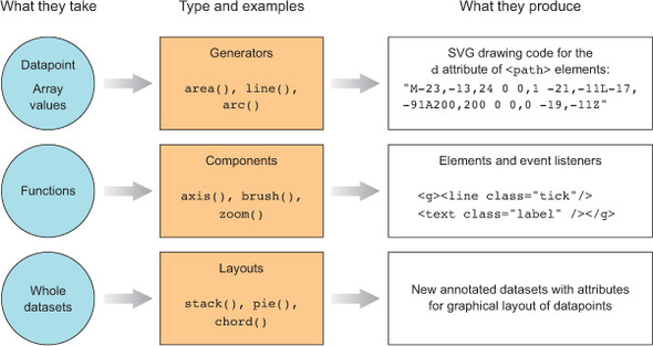
4.1.1. Generators
D3 generators consist of functions that take data and return the necessary SVG drawing code to create a graphical object based on that data. For instance, if you have an array of points and you want to draw a line from one point to another, or turn it into a polygon or an area, a few D3 functions can help you with this process. These generators simplify the process of creating a complex SVG <path> by abstracting the process needed to write a <path> d attribute. In this chapter, we’ll look at d3.line and d3.area, and in the next chapter you’ll see d3.arc, which is used to create the pie pieces of pie charts. Another generator that you’ll see in chapter 6 is d3.diagonal, used for drawing curved connecting lines in dendrograms.
4.1.2. Components
In contrast with generators, which produce the d attribute string necessary for a <path> element, components create an entire set of graphical objects necessary for a particular chart component. The most commonly used D3 component (which you’ll see in this chapter) is d3.axis, which creates a bunch of <line>, <path>, <g>, and <text> elements that are needed for an axis based on the scale and settings you provide the function. Another component is d3.brush (which you’ll see later), which creates all the graphical elements necessary for a brush selector.
4.1.3. Layouts
In contrast to generators and components, D3 layouts can be rather straightforward, like the pie chart layout, or complex, like a force-directed network layout. Layouts take in one or more arrays of data, and sometimes generators, and append attributes to the data necessary to draw it in certain positions or sizes, either statically or dynamically. You’ll see several of the simpler layouts in chapter 5 and then focus on more complex layouts in part 2 (chapters 6, 7, and 8).
4.2. Creating an axis
Scatterplots, which you worked with in chapters 1 and 2, are a simple and extremely effective charting method for displaying data. For most line charts, the x position is a point in time, and the y position is magnitude. For example, in chapter 2 you placed your tweets along the x-axis according to when the tweets were made and along the y-axis according to their impact factor. In contrast, a scatterplot places a single symbol on a chart with its xy position determined by quantitative data for that datapoint. For instance, you can place a tweet on the y-axis based on the number of favorites and on the x-axis based on the number of retweets, allowing you to see if certain tweets get higher ratios of retweets to favorites. Scatterplots are common in scientific discourse and have grown increasingly common in journalism and public discourse for presenting data such as cost compared to quality of health care. Because they encode numerical values along each axis, they’re the ultimate “show me the data” chart, easily highlighting outliers.
4.2.1. Plotting data
Scatterplots needs to have more than one piece of data associated with them, and for a scatterplot that data must be numerical. You need only an array of data in which each entry has at least two different numerical values for a scatterplot to work. We’ll use an array where every object represents a person for whom we know the number of friends they have and the amount of money they make. We can see if having more or less friends positively correlates to a high salary associated with it, and for a scatterplot that data must be numerical. You need only an array of data with two different numerical values for a scatterplot to work. We’ll use an array where every object represents a person for whom we know the number of friends they have and the amount of money they make. We can see if having more or fewer friends positively correlates to a high salary:
var scatterData = [{friends: 5, salary: 22000},
{friends: 3, salary: 18000}, {friends: 10, salary: 88000},
{friends: 0, salary: 180000}, {friends: 27, salary: 56000},
{friends: 8, salary: 74000}];
If you think these salary numbers are too high or too low, pretend they’re in a foreign currency with an exchange rate that would make them more reasonable.
Representing this data graphically using circles is easy. You’ve done it several times:
d3.select("svg").selectAll("circle")
   .data(scatterData).enter()
   .append("circle")
   .attr("r", 5)
   .attr("cx", (d,i) => i * 10)
   .attr("cy", d => d.friends)
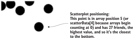
By designating d.friends for the cy position, we get circles placed with their depth based on the value of the friends attribute. Circles placed lower in the chart represent people in our dataset who have more friends. Circles are arranged from left to right using the old array-position trick you learned earlier in chapter 2. In figure 4.3, you can see that it’s not much of a scatterplot.
Figure 4.3. Circle positions indicate the number of friends and the array position of each datapoint.
Next, we need to build scales to make this fit better on our SVG canvas:
var xExtent = d3.extent(scatterData, d => d.salary)
var yExtent = d3.extent(scatterData, d => d.friends)
var xScale = d3.scaleLinear().domain(xExtent).range([0,500]);
var yScale = d3.scaleLinear().domain(yExtent).range([0,500]);
d3.select("svg").selectAll("circle")
  .data(scatterData).enter().append("circle")
  .attr("r", 5).attr("cx", d => xScale(d.salary))
  .attr("cy", d => yScale(d.friends));
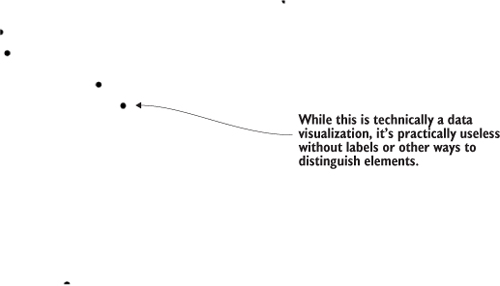
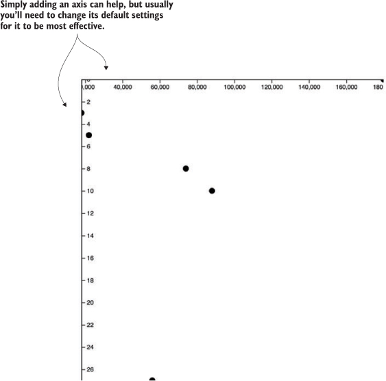
The result, in figure 4.4, is a true scatterplot, with points representing people arranged by number of friends along the y-axis and amount of salary along the x-axis. This chart, like most charts, is practically useless without a way of expressing to the reader what the position of the elements means. One way of accomplishing this is using well-formatted axis labels. Although we could use the same method for binding data and appending elements to create lines and ticks (which are lines representing equidistant points along an axis) and labels for an axis, D3 provides d3.axisLeft(), d3.axisRight(), d3.axisBottom(), and d3.axisTop()selection’s .call() method from a selection on a <g> element where we want these graphical elements to be drawn:
var yAxis = d3.axisRight().scale(yScale);
d3.select("svg").append("g").attr("id", "yAxisG").call(yAxis)
var xAxis = d3.axisBottom().scale(xScale)
d3.select("svg").append("g").attr("id", "xAxisG").call(xAxis)
Figure 4.4. Any point closer to the bottom has more friends, and any point closer to the right has a higher salary. But that’s not clear at all without labels, which we’re going to make.
Notice that the .call() method of a selection invokes a function with the selection that’s active in the method chain, and is the equivalent of writing
xAxis(d3.select("svg").append("g").attr("id", "xAxisG"))
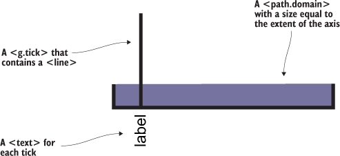
Figure 4.5 shows the pieces of an axis component.
Figure 4.5. Elements of an axis created from d3.axis are 1 a <path.domain> with a size equal to the extent of the axis, 2 a <g.tick > that contains a <line> and 3 a <text> for each tick. Not shown, because it’s invisible, is the <g> element that’s called, and in which these elements are created. By default, a path like the domain is with black (this figure shows that fill area in purple), but the axis components have some default styles built in to prevent this. SVG line elements don’t have stroke by default, but the elements created by D3 axes also have default styles in place to make them visible.
4.2.2. Styling axes
The g.tick, line, text, and path.domain elements are standard SVG elements created by the axis function, but they have default styles so you don’t need to have styles in your CSS, and should appear as shown in figure 4.6. You may still want to go back and adjust your axis styles to match your application.
Figure 4.6. Default styles for an axis display the ticks and don’t fill the domain area.
If we use axisLeft() or axisTop(), it seems like they aren’t drawn. That’s because they’re drawn outside the canvas, like our earlier rectangles. To move our axes around, we need to adjust the .attr("translate") of their parent <g> elements, either when we draw them or later. This is why it’s important to assign an ID to our elements when we append them to the canvas. We can move the x-axis to the bottom of this drawing easily:
d3.selectAll("#xAxisG").attr("transform","translate(0,500)")
Here’s our updated code. It uses the .tickSize() function to change the ticks to lines and manually sets the number of ticks using the ticks() function:
var scatterData = [{friends: 5, salary: 22000},
   {friends: 3, salary: 18000}, {friends: 10, salary: 88000},
   {friends: 0, salary: 180000}, {friends: 27, salary: 56000},
   {friends: 8, salary: 74000}];
var xScale = d3.scaleLinear().domain([0,180000]).range([0,500])        1
var yScale = d3.scaleLinear().domain([0,27]).range([0,500])
xAxis = d3.axisBottom().scale(xScale)
   .tickSize(500).ticks(4)                                             2
d3.select("svg").append("g").attr("id", "xAxisG").call(xAxis)
yAxis = d3.axisRight().scale(yScale)
   .ticks(16).tickSize(500)
d3.select("svg").append("g").attr("id", "yAxisG").call(yAxis)          3
d3.select("svg").selectAll("circle")
   .data(scatterData).enter()
   .append("circle").attr("r", 5)
   .attr("cx", d => xScale(d.salary))
   .attr("cy", d => yScale(d.friends))
- 1 Creates a pair of scales to map the values in our dataset to the canvas
- 2 Uses method chaining to create an axis and explicitly set its orientation, tick size, and number of ticks
- 3 Appends a <g> element to the canvas, and calls the axis from that <g> to create the necessary graphics for the axis
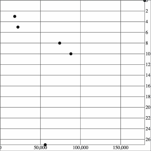
With this in place, we get something a bit more legible, as shown in figure 4.7.
Figure 4.7. With CSS settings corresponding to the tick <line> elements, we can draw a rather attractive grid based on our two axes.
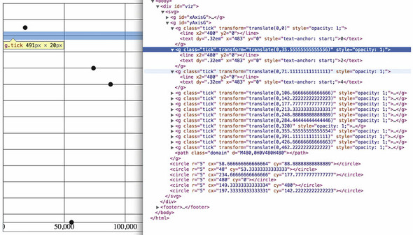
Take a look at the elements created by the axisRight() or axisBottom() function in figure 4.8 and see how the CSS classes are associated with those elements.
Figure 4.8. The DOM shows how tick <line> elements are appended along with a <text> element for the label to one of a set of <g.tick.major> elements corresponding to the number of ticks.
As you create more complex information visualization, you’ll get used to creating your own elements with classes referenced by your style sheet. You’ll also learn where D3 components create elements in the DOM and how they’re classed so that you can style them properly.
4.3. Complex graphical objects
Using circles or rectangles for your data won’t work with some datasets—for example, if an important aspect of your data has to do with distribution, such as user demographics or statistical data. Often, the distribution of data gets lost in information visualization or is only noted with a reference to standard deviation or other first-year statistics terms that indicate the average doesn’t tell the whole story. One particularly useful way of representing data that has a distribution (such as a fluctuating stock price) is the use of a boxplot in place of a traditional scatterplot. The boxplot uses a complex graphic that encodes distribution in its shape. The box in a boxplot typically looks like the one shown in figure 4.9. It uses quartiles that have been preprocessed, but you could easily use d3.scaleQuartile() to create your own values from your own dataset.
Figure 4.9. A box from a boxplot consists of five pieces of information encoded in a single shape: (1) the maximum value, (2) the high value of some distribution, such as the third quartile, (3) the median or mean value, (4) the corresponding low value of the distribution, such as the first quartile, and (5) the minimum value.
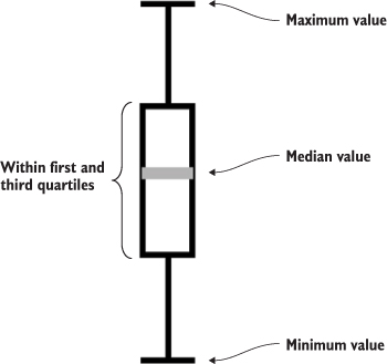
Take a moment to examine the amount of data that’s encoded in the graphic in figure 4.9. The median value is represented as a gray line. The rectangle shows the amount of whatever you’re measuring that falls in a set range that represents the majority of the data. The two lines above and below the rectangle indicate the minimum and maximum values. Everything except the information in the gray line is lost when you map only the average or median value at a datapoint.
To build a reasonable boxplot, we’ll need a set of data with interesting variation in those areas. Let’s assume we want to plot the number of registered visitors coming to our website by day of the week so that we can compare our stats week to week. We have the data for the age of the visitors (based on their registration details) and derived the quartiles from that. Maybe we used Excel, Python, or d3.scaleQuartile(), or maybe it was part of a dataset we downloaded. As you work with data, you’ll be exposed to common statistical summaries like this and you’ll have to represent them as part of your charts, so don’t be too intimidated by it. We’ll use a CSV format for the information.
The following listing shows our dataset with the number of registered users that visit the site each day, and the quartiles of their ages.
Listing 4.1. boxplots.csv
day,min,max,median,q1,q3,number
1,14,65,33,20,35,22
2,25,73,25,25,30,170
3,15,40,25,17,28,185
4,18,55,33,28,42,135
5,14,66,35,22,45,150
6,22,70,34,28,42,170
7,14,65,33,30,50,28
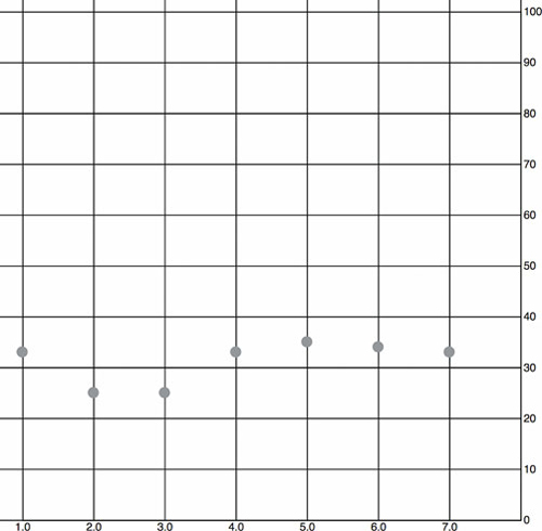
When we map the median age as a scatterplot as shown in the code in listing 4.2 and seen in figure 4.10, it looks like there’s not too much variation in our user base throughout the week. We do that by drawing scatterplot points for each day at the median age of the visitor for that day. We’ll also invert the y-axis so that it makes a bit more sense.
Figure 4.10. The median age of visitors (y-axis) by day of the week (x-axis) as represented by a scatterplot. It shows a slight dip in age on the second and third days.
Listing 4.2. Scatterplot of average age
d3.csv("boxplot.csv", scatterplot)                                          1
const tickSize = 470
function scatterplot(data) {
   const xScale = d3.scaleLinear().domain([1,8]).range([20,tickSize])
   const yScale = d3.scaleLinear().domain([0,100]).range([tickSize + 10,20])2
   const yAxis = d3.axisRight()
   .scale(yScale)
   .ticks(8)
   .tickSize(tickSize)
   d3.select("svg").append("g")
      .attr("transform", `translate(${tickSize},0)`)                        3
      .attr("id", "yAxisG")
      .call(yAxis)
   const xAxis = d3.axisBottom()
      .scale(xScale)
      .tickSize(-tickSize)
      .tickValues([1,2,3,4,5,6,7])                                          4
   d3.select("svg").append("g")
      .attr("transform", `translate(0,${tickSize + 10})`)
      .attr("id", "xAxisG")
      .call(xAxis)
   d3.select("svg").selectAll("circle.median")
      .data(data)
      .enter()
      .append("circle")
      .attr("class", "tweets")
      .attr("r", 5)
      .attr("cx", d => xScale(d.day))
      .attr("cy", d => yScale(d.median))
      .style("fill", "darkgray")
}
- 1 Any value that you use more than once should be stored in a constant, so that you only have to change it once later and so others can read your code
- 2 Scale is inverted, so higher values are drawn higher up and lower values toward the bottom
- 3 Offsets the <g> containing the axis
- 4 Specifies the exact tick values to correspond with the numbered days of the week
To get a better view of this data, we’ll need to create a boxplot. Building a boxplot is similar to building a scatterplot, but instead of appending circles for each point of data, you append a <g> element. It’s a good rule to always use <g> elements for your charts, because they allow you to apply labels or other important information to your graphical representations. That means you’ll need to use the transform attribute, which is how <g> elements are positioned on the canvas. Elements appended to a <g> base their coordinates off of the coordinates of their parent. When applying x and y attributes to child elements, you need to set them relative to the parent <g>.
Rather than selecting all the <g> elements and appending child elements one at a time, as we did in earlier chapters, we’ll use the .each() function of a selection, which allows us to perform the same code on each element in a selection to create the new elements. Like any D3 selection function, .each() allows you to access the bound data, array position, and DOM element. In chapter 1 we achieved the same functionality by using selectAll to select the <g> elements and directly append <circle> and <text> elements. That’s a clean method, and the only reasons to use .each() to add child elements are if you prefer the syntax, you plan on doing complex operations involving each data element, or you want to add conditional tests to change whether or what child elements you’re appending. You can see how to use .each() to add child elements in action in the following listing, which takes advantage of the scales we created in listing 4.3 and draws rectangles on top of the circles we’ve already drawn.
Listing 4.3. Initial boxplot drawing code
d3.select("svg").selectAll("g.box")
  .data(data).enter()
  .append("g")
  .attr("class", "box")
  .attr("transform", d =>
        "translate(" + xScale(d.day) +"," + yScale(d.median) + ")"
    ).each(function(d,i) {                                          1
       d3.select(this)                                              2
         .append("rect")
         .attr("width", 20)
         .attr("height", yScale(d.q1) - yScale(d.q3));              3
    })
- 1 Your latest reminder that to get the this context you can’t use arrow functions
- 2 Because we’re inside the .each(), we can select(this) to append new child elements
- 3 The d and i variables are declared in the .each() anonymous function, so each time we access it, we get the data bound to the original element
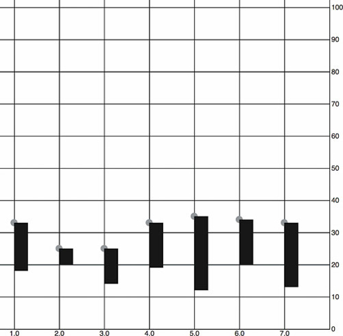
The new rectangles indicating the distribution of visitor ages, as shown in figure 4.11, aren’t only offset to the right, but also showing the wrong values. Day 7, for instance, should range in value from 30 to 50, but instead is shown as ranging from 13 to 32. We know it’s doing that because that’s the way SVG draws rectangles. We have to update our code a bit to make it accurately reflect the distribution of visitor ages, as shown in figure 4.11.
Figure 4.11. The <rect> elements represent the scaled range of the first and third quartiles of visitor age. They’re placed on top of a gray <circle> in each <g> element, which is placed on the chart at the median age. The rectangles are drawn, as per SVG convention, from the <g> down and to the right.
...
.each(function(d,i) {
    d3.select(this)
      .append("rect")
      .attr("width", 20)
      .attr("x", -10)                                      1
      .attr("y", yScale(d.q3) - yScale(d.median))          2
      .attr("height", yScale(d.q1) - yScale(d.q3))
      .style("fill", "white")
      .style("stroke", "black");
});
- 1 Sets a negative offset of half the width to center a rectangle horizontally
- 2 The height of the rectangle is equal to the difference between its q1 and q3 values, which means we need to offset the rectangle by the difference between the middle of the rectangle (the median) and the high end of the distribution—q3
We’ll use the same technique we used to create the chart in figure 4.12 to add the remaining elements of the boxplot (described in detail in figure 4.13) by including several append functions in the .each() function, as shown in listing 4.4. They all select the parent <g> element created during the data-binding process and append the shapes necessary to build a boxplot.
Figure 4.12. The <rect> elements are now properly placed so that their top and bottom correspond with the visitor age between the first and third quartiles of visitors for each day. The circles are completely covered, except for the second rectangle where the first quartile value is the same as the median age, so we can see half the gray circle peeking out from underneath it.
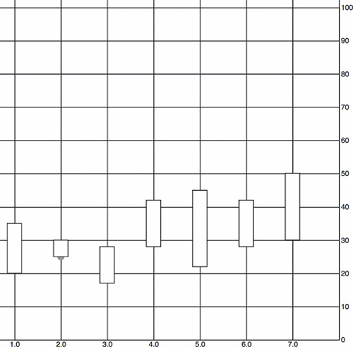
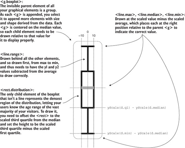
Figure 4.13. How a boxplot can be drawn in D3. Pay particular attention to the relative positioning necessary to draw child elements of a <g>. The 0 positions for all elements are where the parent <g> has been placed, so that <line.max>, <rect.distribution>, and <line.range> all need to be drawn with an offset placing their top-left corner above this center, whereas <line.min> is drawn below the center and <line.median> has a 0 y-value, because our center is the median value.
Listing 4.4. The .each() function of the boxplot drawing five child elements
...
.each(function(d,i) {
    d3.select(this)
      .append("line")
      .attr("class", "range")
      .attr("x1", 0)
      .attr("x2", 0)
      .attr("y1", yScale(d.max) - yScale(d.median))             1
      .attr("y2", yScale(d.min) - yScale(d.median))             1
      .style("stroke", "black")
      .style("stroke-width", "4px");
    d3.select(this)
      .append("line")
      .attr("class", "max")
      .attr("x1", -10)
      .attr("x2", 10)
      .attr("y1", yScale(d.max) - yScale(d.median))              2
      .attr("y2", yScale(d.max) - yScale(d.median))              2
      .style("stroke", "black")
      .style("stroke-width", "4px")
    d3.select(this)
      .append("line")
      .attr("class", "min")
      .attr("x1", -10)
      .attr("x2", 10)
      .attr("y1", yScale(d.min) - yScale(d.median))              3
      .attr("y2", yScale(d.min) - yScale(d.median))              3
      .style("stroke", "black")
      .style("stroke-width", "4px")
    d3.select(this)
      .append("rect")
      .attr("class", "range")
      .attr("width", 20)
      .attr("x", -10)
      .attr("y", yScale(d.q3) - yScale(d.median))                4
      .attr("height", yScale(d.q1) - yScale(d.q3))               4
      .style("fill", "white")
      .style("stroke", "black")
      .style("stroke-width", "2px")
    d3.select(this)
      .append("line")
      .attr("x1", -10)                                           5
      .attr("x2", 10)                                            5
      .attr("y1", 0)
      .attr("y2", 0)
      .style("stroke", "darkgray")
      .style("stroke-width", "4px")
});
- 1 Draws the line from the max to the min value
- 2 The top bar of the min-max line
- 3 The bottom bar of the min-max line
- 4 The offset so that the rectangle is centered on the median value
- 5 Median line doesn’t need to be moved, because the parent <g> is centered on the median value
Listing 4.5 fulfills the requirement that we should also add an x-axis to remind us which day each box is associated with. This takes advantage of the explicit .tick-Values() function you saw earlier. It also uses a negative value passed to tickSize() and the corresponding offset of the <g> that we use to call the axis function.
Listing 4.5. Adding an axis using tickValues
const tickSize = 470
var xAxis = d3.axisBottom().scale(xScale)
.tickSize(-tickSize)                                                  1
.tickValues([1,2,3,4,5,6,7]);                                         2
    d3.select("svg").append("g")
      .attr("transform", `translate(0,${tickSize})`)
      .attr("id", "xAxisG").call(xAxis);                              3
    d3.select("#xAxisG > path.domain").style("display", "none");      4
- 1 A negative tickSize draws the lines above the axis, but we need to make sure to offset the axis by the same value
- 2 Setting specific tickValues forces the axis to only show the corresponding values, which is useful when we want to override the automatic ticks created by the axis
- 3 Offsets the axis to correspond with our negative tickSize
- 4 We can hide this, because it has extra ticks on the ends that distract our readers
The end result of all this is a chart where each of our datapoints is represented, not by a single circle, but by a multipart graphical element designed to emphasize distribution.
The boxplot in figure 4.14 encodes not only the median age of visitors for that day, but the minimum, maximum, and distribution of the age of the majority of visitors. This expresses in detail the demographics of visitorship clearly and cleanly. It doesn’t include the number of visitors, but we could encode that with color, make it available on a click of each boxplot, or make the width of the boxplot correspond to the number of visitors.
Figure 4.14. Our final boxplot chart. Each day now shows not only the median age of visitors but also the range of visiting ages, allowing for a more extensive examination of the demographics of site visitorship.
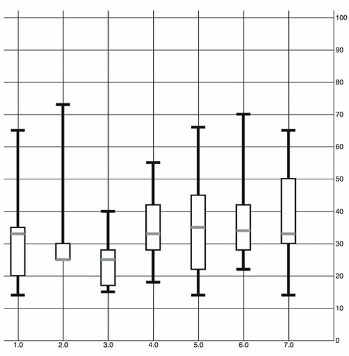
We looked at boxplots because a boxplot allows you to explore the creation of multipart objects while using lines and rectangles. But what’s the value of a visualization like this that shows distribution? It encodes a graphical summary of the data, providing information about visitor age for the site on Wednesday, such as, “Most visitors were between the ages of 18 and 28. The oldest was 40. The youngest was 15. The median age was 25.” It also allows you to quickly perform visual queries, checking to see whether the median age of one day was within the majority of visitor ages of another day.
We’ll stop exploring boxplots, and look at a different kind of complex graphical object: an interpolated line.
4.4. Line charts and interpolations
You create line charts by drawing connections between points. A line that connects points and the shaded regions inside or outside the area constrained by the line tell a story about the data. Although a line chart is technically a static data visualization, it’s also a representation of change, typically over time.
We’ll start with a new dataset in listing 4.6 that better represents change over time. Let’s imagine we have a Twitter account and we’ve been tracking the number of tweets, favorites, and retweets to determine at what time we have the greatest response to our social media. Although we’ll ultimately deal with this kind of data as JSON, we’ll want to start with a comma-delimited file, because it’s the most efficient for this kind of data.
Listing 4.6. tweetdata.csv
day,tweets,retweets,favorites
1,1,2,5
2,6,11,3
3,3,0,1
4,5,2,6
5,10,29,16
6,4,22,10
7,3,14,1
8,5,7,7
9,1,35,22
10,4,16,15
First we pull this CSV in using d3.csv() as we did in chapter 2 and then we create circles for each datapoint. We do this for each variation on the data, with the .day attribute determining x position and the other datapoint determining y position. We create the usual x and y scales to draw the shapes in the confines of our canvas. We also have a couple of axes to frame our results. Notice that we differentiated between the three datatypes by coloring them differently. See the following listing.
Listing 4.7. Callback function to draw a scatterplot from tweetdata
d3.csv("../data/tweetdata.csv", lineChart);
function lineChart(data) {

   const blue = "#5eaec5", green = "#92c463", orange = "#fe9a22"
   xScale = d3.scaleLinear().domain([1,10.5]).range([20,480])         1
   yScale = d3.scaleLinear().domain([0,35]).range([480,20])           1
   xAxis = d3.axisBottom()
      .scale(xScale)
      .tickSize(480)
      .tickValues([1,2,3,4,5,6,7,8,9,10])                             2

   d3.select("svg").append("g").attr("id", "xAxisG").call(xAxis)
   yAxis = d3.axisRight()
      .scale(yScale)
      .ticks(10)
      .tickSize(480)
   d3.select("svg").append("g").attr("id", "yAxisG").call(yAxis)

   d3.select("svg").selectAll("circle.tweets")
      .data(data)                                                     3
      .enter()
      .append("circle")
      .attr("class", "tweets")
      .attr("r", 5)
      .attr("cx", d => xScale(d.day))
      .attr("cy", d => yScale(d.tweets))                              3
      .style("fill", blue)

   d3.select("svg").selectAll("circle.retweets")
      .data(data)                                                     3
      .enter()
      .append("circle")
      .attr("class", "retweets")
      .attr("r", 5)
      .attr("cx", d => xScale(d.day))
      .attr("cy", d => yScale(d.retweets))                            3
      .style("fill", green)

   d3.select("svg").selectAll("circle.favorites")
      .data(data)                                                     3
      .enter()
      .append("circle")
      .attr("class", "favorites")
      .attr("r", 5)
      .attr("cx", d => xScale(d.day))
      .attr("cy", d => yScale(d.favorites))                           3
      .style("fill", orange)
}
- 1 Our scales, as usual, have margins built in
- 2 Fixes the ticks of the x-axis to correspond to the days
- 3 Each of these uses the same dataset but bases the y position on tweets, retweets, and favorites values, respectively
The graphical results of this code, as shown in figure 4.15—which take advantage of the CSS rules we defined earlier—aren’t easily interpreted.
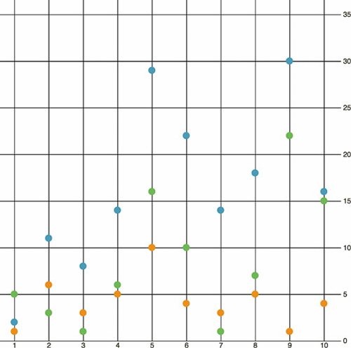
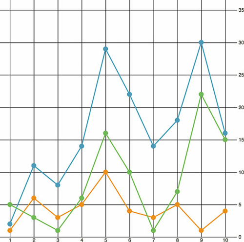
Figure 4.15. A scatterplot showing the datapoints for 10 days of activity on Twitter, with the number of tweets in blue, the number of retweets in green, and the number of favorites in orange.
4.4.1. Drawing a line from points
By drawing a line that intersects each point of the same category, we can compare the number of tweets, retweets, and favorites. We can start by drawing a line for tweets using d3.line(). This line generator expects an array of points as data, and we’ll need to tell the generator what values constitute the x and y coordinates for each point. By default, this generator expects a two-part array, where the first part is the x value and the second part is the y value. Because our x value is based on the day of the activity and our y value is based on the amount of activity, we need to set specific accessor functions.
The .x() accessor function of the line generator needs to point at the scaled day value, while the .y() accessor function needs to point to the scaled value of the appropriate activity. The line function itself takes the entire dataset that we loaded from tweetdata.csv and returns the SVG drawing code necessary for a line between the points in that dataset. To generate three lines, we use the dataset three times, with a slightly different generator for each. We not only need to write the generator function and define how it accesses the data it uses to draw the line, but we also need to append a <path> to our canvas and set its d attribute to equal the generator function we defined.
A more advanced feature of d3.line() is the defined method, as shown in listing 4.8. By default, line.defined() returns true, which means that every datapoint indicates a real section in the line. However, if you have gaps in your data, and you don’t want the line to interpolate them, you can use defined() to create a multipart line with gaps where you don’t have data. To be clear, you still need a datapoint at that place in the line, but it should be able to return false from the function you’ve sent to defined. For instance, if you set defined as
d3.line().defined(d => d.y !== null)
then D3 will draw a gap in your line at any point where the y value of that point is null. We’re not using this feature in the lines drawn here, which don’t have any gaps in their data, but if you’re drawing lines with gaps, it will make it easier on you.
Listing 4.8. New line generator code inside the callback function
    var tweetLine = d3.line()
   .x(d => xScale(d.day))                  1
   .y(d => yScale(d.tweets))               2
    d3.select("svg")
   .append("path")
   .attr("d", tweetLine(data))             3
   .attr("fill", "none")
   .attr("stroke", "#fe9a22")
   .attr("stroke-width", 2)
- 1 Defines an accessor for data like ours—in this case we take the day attribute and pass it to xScale first
- 2 This accessor does the same for the number of tweets
- 3 The appended path is drawn according to the generator with the loaded tweetdata variable passed to it
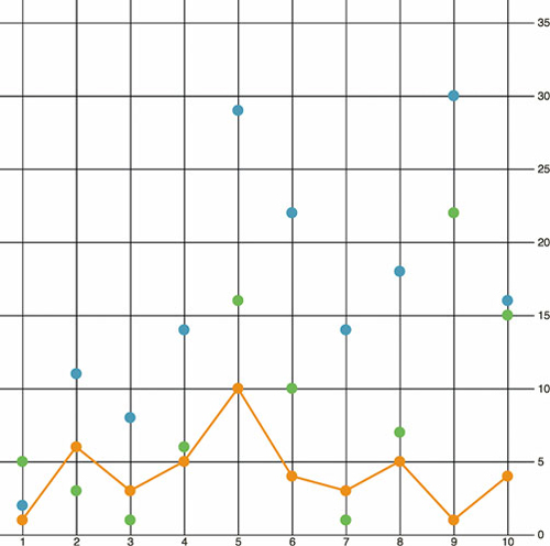
We draw the line above the circles we already drew, and the line generator produces the plot shown in figure 4.16.
Figure 4.16. The line generator takes the entire dataset and draws a line where the x,y position of every point on the canvas is based on its accessor. In this case, each point on the line corresponds to the day, and tweets are scaled to fit the x and y scales we created to display the data on the canvas.
4.4.2. Drawing many lines with multiple generators
If we build a line constructor for each datatype in our set and call each with its own path, as shown in the following listing, then you can see the variation over time for each of your datapoints. Listing 4.9 demonstrates how to build those generators with our dataset, and figure 4.17 shows the results of that code.
Figure 4.17. The dataset is first used to draw a set of circles, which creates the scatterplot from the beginning of this section. The dataset is then used three more times to draw each line.
Listing 4.9. Line generators for each tweetdata
const lambdaXScale = d => xScale(d.day)           1
   var tweetLine = d3.line()                      2
     .x(lambdaXScale)
     .y(d => yScale(d.tweets))
   var retweetLine = d3.line()
     .x(lambdaXScale)
     .y(d => yScale(d.retweets))                  3
   var favLine = d3.line()
     .x(lambdaXScale)
     .y(d => yScale(d.favorites))
   d3.select("svg")
     .append("path")                              4
     .attr("d", tweetLine(data))
     .attr("fill", "none")
     .attr("stroke", blue)
     .attr("stroke-width", 2)
   d3.select("svg")
     .append("path")
     .attr("d", retweetLine(data))
     .attr("fill", "none")
     .attr("stroke", green)
     .attr("stroke-width", 2)
   d3.select("svg")
     .append("path")
     .attr("d", favLine(data))
     .attr("fill", "none")
     .attr("stroke", orange)
     .attr("stroke-width", 2)
- 1 Naming and reusing functions is also a good use of const.
- 2 A more efficient way to do this would be to define one line generator and then modify the .y() accessor on the fly as we call it for each line, but it’s easier to see the functionality this way
- 3 Notice how only the y accessor is different between each line generator.
- 4 Each line generator needs to be called by a corresponding new <path> element.
4.4.3. Exploring line interpolation
D3 provides a number of interpolation methods with which to draw these lines (as well as areas and diagonals and radial lines), exposed as the .curve method. In cases like tweetdata, where you have discrete points that represent data accurately and not samples, then the default “linear” method shown in figure 4.19 is appropriate. But in other cases, a different interpolation method for the lines, like the ones shown in figure 4.18, may be appropriate. Here’s the same data but with the d3.line() generator using different interpolation methods. You’ll notice I’ve also lightened the axis ticks and labels quite significantly. Don’t be afraid to use very light tick marks, and don’t feel like your ticks need to only be black or grayscale.
Figure 4.18. Three common curve methods you’ll see in charts. Orange is a “basis” interpolation that provides an organic curve averaged by the points (and therefore rarely touching them); a blue “step” interpolation changes the position of the line at right angles; and a green “cardinal” interpolation provides a curve that touches each sample point.
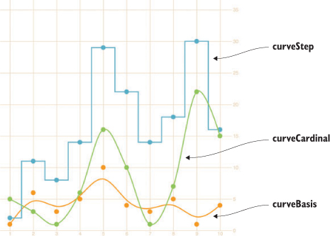
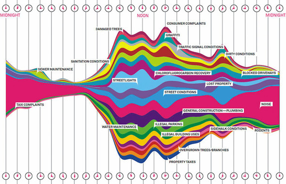
Figure 4.19. Behold the glory of the streamgraph. Look on my works, ye mighty, and despair! (Figure by Pitch Interactive from Wired, November 1, 2010, www.wired.com/2010/11/ff_311_new_york/all/1.) (Wesley Grubbs/WIRED © Condé Nast)
tweetLine.curve(d3.curveBasis)              1
retweetLine.curve(d3.curveStep)
favLine.curve(d3.curveCardinal)
- 1 We can add this code right after we create our line generators and before we call them to change the interpolate method, or we can set .curve() as we’re defining the generator
Interpolation modifies the representation of data. Experiment with this drawing code to see how the different interpolation settings show different information than other interpolators. Data can be visualized in different ways, all correct from a programming perspective, and it’s up to you to make sure the information you’re visualizing reflects the actual phenomena.
Data visualization deals with the visual representation of statistical principles, which means it’s subject to all the dangers of the misuse of statistics. The interpolation of lines is particularly vulnerable to misuse, because it changes a clunky-looking line into a smooth, “natural” line.
4.5. Complex accessor functions
All the previous chart types we built were based on points. The scatterplot is points on a grid, the boxplot consists of complex graphical objects in place of points, and line charts use points as the basis for drawing a line. In this and earlier chapters, we’ve dealt with rather staid examples of information visualization that we might easily create in any traditional spreadsheet. But you didn’t get into this business to make Excel charts. You want to wow your audience with beautiful data, win awards for your aesthetic je ne sais quoi, and evoke deep emotional responses with your representation of change over time. You want to make streamgraphs like the one in figure 4.19.
The streamgraph is a sublime piece of information visualization that represents variation and change, like the boxplot. It may seem like a difficult thing to create, until you start to put the pieces together. Ultimately, a streamgraph is a variant of what’s known as a stacked chart. The layers accrete upon each other and adjust the area of the elements above and below, based on the space taken up by the components closer to the center. It appears organic because that accretive nature mimics the way many organisms grow, and seems to imply the kinds of emergent properties that govern the growth and decay of organisms. We’ll interpret its appearance later, but first let’s figure out how to build it.
The reason we’re looking at a streamgraph is because it’s not that exotic. A streamgraph is a stacked graph, which means it’s fundamentally similar to your earlier line charts. We’re going to make a simple stacked graph by hand in this last section but we won’t make a streamgraph (though you’ll learn how in the next chapter). By learning how to write the function to create a stacked graph, you can better understand another kind of generator, d3.area(). The first thing you need is data that’s amenable to this kind of visualization. Let’s follow work with the gross earnings for six movies over the course of nine days. Each datapoint is therefore the amount of money a movie made on a particular day.
Listing 4.10. movies.csv
day,titanic,avatar,akira,frozen,deliverance,avengers
1,20,8,3,0,0,0
2,18,5,1,13,0,0
3,14,3,1,10,0,0
4,7,3,0,5,27,15
5,4,3,0,2,20,14
6,3,1,0,0,10,13
7,2,0,0,0,8,12
8,0,0,0,0,6,11
9,0,0,0,0,3,9
10,0,0,0,0,1,8
To build a stacked graph, you need to get more sophisticated with the way you access data and feed it to generators when drawing lines. In our earlier example, we created three different line generators for our dataset, but that’s terribly inefficient. We also used simple functions to draw the lines. But we’ll need more than that to draw something like a streamgraph. Even if you think you won’t want to draw streamgraphs (and there are reasons why you may not, which we’ll get into at the end of this section), the important thing to focus on when you look at the following listing is how you use accessors with D3’s line and, later, area generators.
Listing 4.11. The callback function to draw movies.csv as a line chart
var xScale = d3.scaleLinear().domain([ 1, 8 ]).range([ 20, 470 ]);
var yScale = d3.scaleLinear().domain([ 0, 40 ]).range([ 480, 20 ]);
Object.keys(data[0]).forEach(key => {
   if (key != "day") {                                     1
      var movieArea = d3.line()                            2
        .x(d => xScale(d.day))                             3
        .y(d => yScale(d[key]))                            4
        .curve(d3.curveCardinal);
      d3.select("svg")
        .append("path")
        .style("id", key + "Area")
        .attr("d", movieArea(data))
        .attr("fill", "none")
        .attr("stroke", "#75739F")
        .attr("stroke-width", 3)
        .style("opacity", .75);

   };
});
- 1 Iterates through our data attributes with forEach, where x is the name of each column from our data (“day”, “movie1”, “movie2”, and so on), which allows us to dynamically create and call generators
- 2 Instantiates a line generator for each movie
- 3 Every line uses the day column for its x value
- 4 Dynamically sets the y-accessor function of our line generator to grab the data from the appropriate movie for our y variable
The line-drawing code produces a cluttered line chart, as shown in figure 4.20. As you learned in chapter 1, lines and filled areas are almost exactly the same thing in SVG. You can differentiate them by a Z at the end of the drawing code that indicates the shape is closed, or the presence or absence of a "fill" style. D3 provides d3.line and d3.area generators to draw lines or areas. Both of these constructors produce <path> elements, but d3.area, which you can see in use in listing 4.12, provides helper functions to bound the lower end of your path to produce areas in charts. We need to define a .y0() accessor that corresponds to our y accessor and determines the shape of the bottom of our area. Let’s see how d3.area() works.
Figure 4.20. Each movie column is drawn as a separate line. Notice how the “cardinal” interpolation creates a graphical artifact, where it seems several movies made negative money.
Listing 4.12. Area accessors
  var xScale = d3.scaleLinear().domain([ 1, 8 ]).range([ 20, 470 ]);
  var yScale = d3.scaleLinear().domain([ -40, 40 ]).range([ 480, 20 ]);

  Object.keys(data[0]).forEach(key => {
     if (key != "day") {
        var movieArea = d3.area()
        .x(d => xScale(d.day))
        .y0(d => yScale(d[key]))
        .y1(d => yScale(-d[key]))                   1
        .curve(d3.curveCardinal);
     d3.select("svg")
       .append("path")
       .style("id", key + "Area")
       .attr("d", movieArea(data))
       .attr("fill", "#75739F")
       .attr("stroke", "#75739F")
       .attr("stroke-width", 2)
       .style("stroke-opacity", .75)
       .style("fill-opacity", .5);
     };
})
- 1 This new accessor provides the ability to define where the bottom of the path is—in this case, we start by making the bottom equal to the inverse of the top, which mirrors the shape
No. Counterintuitively, you should use d3.line to draw filled areas. To do so, though, you need to append Z to the created d attribute. This indicates that the path is closed.
|
Closed path changes |
|
|---|---|
movieArea = d3.svg.line()
       .x(function(d) {
         return xScale(d.day)
       })
       .y(function(d) {
         return yScale(d[x])
       })
       .interpolate("cardinal");
|
|
You write the con structor for the line-drawing code the same regardless of whether you want a line or shape, filled or unfilled.
d3.select("svg")
    .append("path")
    .attr("d",movieArea(data))
    .attr("fill", "none")
    .attr("stroke", "black")
    .attr("stroke-width", 3);
|
d3.select("svg")
   .append("path")
   .attr("d", movieArea(data) + "Z")
   .attr("fill", "none")
   .attr("stroke", "black")
   .attr("stroke-width", 3);
|
When you call theconstructor, you append a <path> element. You specify whether the line is “closed” by concate nating a Z to the string created by your line constructor for the attribute of the <path>.
When you add a Z to the end of an SVG <path> element’s attribute, it draws a line connecting the two end points.
d3.select("svg")
    .append("path")
    .attr("d", movieArea(data))
    .attr("fill", "none")
    .attr("stroke", "black")
    .attr("stroke-width", 3);
|
d3.select("svg")
    .append("path")
    .attr("d", movieArea(data) + "Z")
    .attr("fill", "gray")
    .attr("stroke", "black")
    .attr("stroke-width", 3);
|
You may think that only a closed path could be filled, but the fill of a path is the same whether or not you close the line by appending Z.
The area of a path filled is always the same, whether it’s closed or not.
You use d3.line when you want to draw most shapes and lines, whether filled or unfilled, or closed or open. You should use d3.area when you want to draw a shape where the bottom of the shape can be calculated based on the top of the shape as you’re drawing it. It’s suitable for drawing bands of data, such as that found in a stacked area chart or streamgraph.
By defining the y0 function of d3.area, as in listing 4.13, we’ve mirrored the path created and filled it, as shown in figure 4.21, which is a step in the right direction. Notice that we’re presenting inaccurate data now, because the area of the path is twice the area of the data. We want our areas to draw one on top of the other, so we need .y0() to point to a complex stacking function that makes the bottom of an area equal to the top of the previously drawn area. D3 comes with a stacking function, d3.stack(), which we’ll look at later, but for the purpose of our example, we’ll write our own.
Figure 4.21. By using an area generator and defining the bottom of the area as the inverse of the top, we can mirror our lines to create an area chart. Here they’re drawn with semitransparent fills, so that we can see how they overlap.
Listing 4.13. Callback function for drawing stacked areas
var fillScale = d3.scaleOrdinal()
.domain(["titanic", "avatar", "akira", "frozen", "deliverance", "avengers"])
.range(["#fcd88a", "#cf7c1c", "#93c464", "#75734F", "#5eafc6", "#41a368"]) 1
   var xScale = d3.scaleLinear().domain([ 1, 8 ]).range([ 20, 470 ]);
   var yScale = d3.scaleLinear().domain([0, 55]).range([ 480, 20 ])

   Object.keys(data[0]).forEach(key => {
       if (key != "day") {                                                 2
           var movieArea = d3.area()                                       3
               .x(d => xScale(d.day))
               .y0(d => yScale(simpleStacking(d, key) - d[key]))
               .y1(d => yScale(simpleStacking(d, key)))
               .curve(d3.curveBasis)
           d3.select("svg")                                                4
               .append("path")
               .style("id", key + "Area")
               .attr("d", movieArea(data))
               .attr("fill", fillScale(key))
               .attr("stroke", "black")
               .attr("stroke-width", 1)
       }
   })
   function simpleStacking( lineData, lineKey) {                           5
         var newHeight = 0
         Object.keys(lineData).every(key => {
           if (key !== "day") {
             newHeight += parseInt(lineData[key]);
             if (key === lineKey) {
               return false
             }
           }
               return true
      })
      return newHeight
}
- 1 Creates a color ramp that corresponds to the six different movies
- 2 We won’t draw a line for the day value of each object, because this is what provides us with our x coordinate
- 3 A d3.area() generator for each iteration through the object that corresponds to one of our movies using the day value for the x coordinate, but iterating through the values for each movie for the y coordinates
- 4 Draws a path using the current constructor. We’ll have one for each attribute not named “day”. Give it a unique ID based on which attribute we’re drawing an area for. Fill the area with a color based on the color ramp we built.
- 5 This function takes the incoming bound data and the name of the attribute and loops through the incoming data, adding each value until it reaches the current named attribute. As a result, it returns the total value for every movie during this day up to the movie we’ve sent.
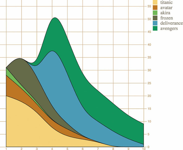
The stacked area chart in figure 4.22 is already complex. To make it a proper streamgraph, the stacks need to alternate. This requires a more complicated stacking function like the kind you’ll see in chapter 5.
Figure 4.22. Our stacked area code represents a movie by drawing an area, where the bottom of that area equals the total amount of money made by any movies drawn earlier for that day.
The purpose of this section is to focus on building complex accessor functions to create, from scratch, the kinds of data visualization you’ve seen and likely thought of as exotic. Let’s assume this data is correct and take a moment to analyze the effectiveness of this admittedly attractive method of visualizing data. Is this really a better way to show movie grosses than a simpler line chart? That depends on the scale of the questions being addressed by the chart. If you’re trying to discover overall patterns of variation in movie grosses, as well as spot interactions between them (for instance, seeing if a particularly high-grossing-over-time movie interferes with the opening of another movie), then it may be useful. If you’re trying to impress an audience with a complex-looking chart, it would also be useful. Otherwise, you’ll be better off with something simpler than this. But even if you only build less-visually impressive charts, you’ll still use the same techniques we’ve gone over in this section.
4.6. Using third-party D3 modules to create legends
Unlike axes, there isn’t anything in core D3 that allows you to easily generate a legend for your charts, which is a shame because every chart needs a legend. Fortunately, there are additional generators and components created by other software developers to extend the D3 library, using the same metaphors and functions. One of those is d3-svg-legend created by Susie Lu, which you can read more about at http://d3-legend.susielu.com. If you’re using NPM you can add it to your project the way you would any other D3 module, npm i d3-svg-legend or, if you’re building flat untranspiled code like we have in our examples, you can use a script tag in your header to include it:
<script src="https://cdnjs.cloudflare.com/ajax/libs/d3-legend/2.21.0/d3-legend.min.js"></script>
The d3-svg-legend module exposes three kinds of legends that you’d use for data visualization: legends that describe items by size, color, or symbol. We’ll look at legendColor for our example, but you should explore the documentation for d3-svg-legend to see how the other legends work, because you’ll undoubtedly have use cases for them. Building off the code from the last section, add what you see in the following listing. We’re also changing the SVG width parameter to 1000px so we have space to place the legend.
Listing 4.14. Adding a color legen
var legendA = d3.legendColor().scale(fillScale)
d3.select("svg")
  .style("width", "1000px")

d3.select("svg")
  .append("g")
  .attr("transform", "translate(500, 0)")
  .call(legendA)
It’s exactly the same way you deal with the axis component, and the result as we see in figure 4.23 is that you’ve immediately shown your reader which color corresponds to which value you’ve mapped that color to. That’s one of the things you should look for when evaluating third-party modules for D3—that it exposes an API similar to the existing generators, components, and layouts in core D3. The other things you should look for are wide adoption (number of installs on NPM, stars on GitHub) and good documentation. D3-svg-legend checks all these boxes.
Figure 4.23. Our stacked chart with a legend telling the reader which color corresponds to which movie
Another sign that d3-svg-legend is a good module—and one to look for in other modules—is that it exposes a number of customization options. By default we get the vertical legend with squares like you see in figure 4.23, but we can adjust several of its options, like orient and shapePadding, as seen in the following listing, and we’ll get a different legend that looks like figure 4.24.
Figure 4.24. A horizontal oriented colorLegend from d3-svg-legend rendered with custom settings for shapePadding, shapeWidth, and shapeHeight.

Listing 4.15. Adjusted legend settings
legendA.orient("horizontal")
    .shapePadding(60)
    .shapeWidth(12)
.shapeHeight(30)
4.7. Summary
- Generators such as line() and area() in d3-shape are the necessary building blocks to create the most common and powerful charts available: line charts and stacked area charts.
- Create multipart graphical objects for charts like boxplots to encode several different datapoints into a single object.
- Implement built-in D3 components such as axis() and legend() to make your chart more legible.
- Don’t be afraid to experiment with custom functionality like a new stacking algorithm for complex charts that might better suit your needs than out-of-the-box implementations.