Table of Contents for
D3.js in Action, Second Edition: Data visualization with JavaScript
 D3.js in Action, Second Edition: Data visualization with JavaScript
Published by
Manning Publications, 2017
D3.js in Action, Second Edition: Data visualization with JavaScript
Published by
Manning Publications, 2017
- Cover
- D3.js in Action, Second Edition: Data visualization with JavaScript
- Copyright
- Brief Table of Contents
- Table of Contents
- Praise for the First Edition
- Preface
- Acknowledgments
- About this Book
- About the Cover Illustration
- Part 1. D3.js fundamentals
- Chapter 1. An introduction to D3.js
- Chapter 2. Information visualization data flow
- Chapter 3. Data-driven design and interaction
- Chapter 4. Chart components
- Chapter 5. Layouts
- Part 2. Complex data visualization
- Chapter 6. Hierarchical visualization
- Chapter 7. Network visualization
- Chapter 8. Geospatial information visualization
- Part 3. Advanced techniques
- Chapter 9. Interactive applications with React and D3
- Chapter 10. Writing layouts and components
- Chapter 11. Mixed mode rendering
- Index
- List of Figures
- List of Tables
- List of Listings
Chapter 6. Hierarchical visualization
- Understanding hierarchical data principles
- Using dendrograms
- Learning about circle packs
- Working with treemaps
- Employing partitions
Complex data visualization is defined by its encoding of data types other than numerical data. We’ll start with dealing with hierarchical data, which encodes how things are related to other things, whether through dependency, lineage, or categorization. There are four different layouts we’ll look at in this chapter, each of which uses different methods to show a node and indicate the parent-child relationships between those nodes. For two of those charting methods—circle packing and treemaps—the way we signal parent-child relationship is via enclosure, which is to say that the parent graphical mark is drawn around the child graphical mark. In the other two charts, parent-child relationship is signaled by adjacency (in the case of the partition layout) or via connection (using lines in the dendrogram). See figure 6.1.
Figure 6.1. Some of the hierarchical diagrams we’ll look at in this chapter. The dendrogram (left), the icicle chart (middle), and a treemap (right) showing a radial projection that’s popular with hierarchical diagrams.
6.1. Hierarchical patterns
When you’re designing and building data visualization products, it’s easy to think about visualizing numerical data. We grew up learning about bar charts and line charts, and the people we build dashboards and data visualization for are used to seeing them. When most people talk about data, they mean numerical data, and when they talk about data visualization, they mean visualizing numerical data so that they can precisely measure the heights and slopes and differences. It can be a tough sell to tell them that you want to obscure the numerical precision of the data in favor of showing other patterns. That’s one of the challenges of using complex data visualization like hierarchical layouts and one that you’re going to have to tackle head on.
Hierarchical data, which is any data that maps the parent to child relationships, exists in every system: people in family trees, business org charts, and even categories like the food pyramid. If you only show the numerical patterns, then the best charts you can use are the ones that encode using length, which means bar charts and line charts. But if you only make decisions based on what you can measure with bar charts and line charts, then you hamstring your organization. A classic example of the value of hierarchical data visualization comes from data dashboards with their innumerable filters.
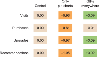
A/B testing is used everywhere now, and visualization of A/B test results is a key requirement of data visualization. The people using those A/B testing visualizations are obsessed with numbers, particularly the scores that a test gets across a set of key metrics, which is almost always tied to another number: the statistical significance between that cell’s score and the control cell’s score. Imagine an A/B testing dashboard for your data visualization firm that shows test results and which you could slice and dice by country, gender, or the subscription level of the user. Your latest test rolls out changes to user experience so that certain clients get all their results as pie charts, while other clients only get results in animated gifs.
Let’s put the results of each test cell on a tabular chart, with the change in each metric so people can see the numbers. We’ll use color to highlight whether a particular metric in a particular cell is a “win” or a “loss” because, hey, we’re data visualization professionals. Here you can see how the test cells did in a traditional tabular view (figure 6.2). Looks like GIFs everywhere is the right way to go, right?
Figure 6.2. Typical A/B testing results in a tabular view, showing several metrics and the change versus the control cell. Positive changes are denoted with a plus symbol, and statistically significant changes are shown with green for a statistically signficant positive change and orange for a statistically significant negative change.
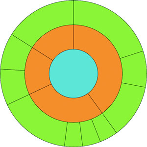
If we nest the test results hierarchically, we can’t use a data visualization that shows numeric values well. We’ll be left with the color we were using to encode statistically significant wins and losses in metrics. But though we lose numerical precision, we gain the ability to see the pattern of wins and losses across our dimensions. Three cells, 4 subscription categories, 20 countries, 5 metrics = 1200 different combinations. That would be a pretty long table, but in a hierarchical data visualization like a circle pack, it looks like figure 6.3.
Figure 6.3. A circle pack of A/B testing results, showing the nested results by cell, metric, subscription level, and country. Green shows statistically significant wins, and orange shows statistically significant losses.
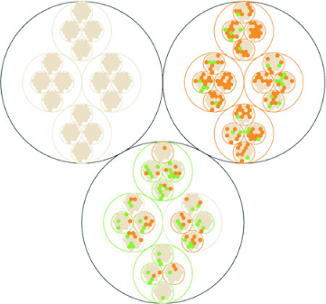
This kind of quick overview gives us a sense of the hierarchical pattern in the wins and losses. Each black circle represents a cell, the control cell is in the top left, the top right is our Only Pie Charts cell, and the bottom circle is our GIFs Everywhere cell. We can see that like our summary table, it’s clear that Only Pie Charts isn’t working across countries or subscription levels, but it does seem like GIFs Everywhere has more losses than we might expect. It also highlights one of the issues we need to address when deploying hierarchical data visualization, the order of the hierarchy can highlight or obscure patterns.
If we order the hierarchy differently and put countries under cells, we get a more interesting pattern (figure 6.4).
Figure 6.4. Hierarchical viz of A/B testing results ordered by cell, country, subscription, and then metric
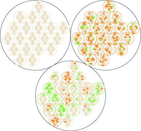
Although this doesn’t change our view of Only Pie Charts, which is still a miserable failure (Sorry, Robert![1]), we can see that the GIFs Everywhere losses seem to map to certain countries. They should. When I built the model that generated this random data, I made sure that Only Pie Charts showed statistically significant losses across the board, whereas GIFs Everywhere was supposed to be a success in certain countries, bad in others, and a wash otherwise. In a traditional dashboard, maybe an analyst would have stumbled on this by filtering down to those countries, or maybe they would have seen the overall success (you showed them the numbers, after all, the way they wanted) and rolled out the new features, even though it could have caused critical damage to your firm’s success in some of those countries.
Robert Kosara, chief scientist at Tableau, published a famous paper saying that pie charts aren’t so bad. See https://eagereyes.org/pie-charts.
6.2. Working with hierarchical data
In order to make hierarchical data visualization products, we need hierarchical data. While hierarchical data is everywhere, D3 expects it in a particular format for its hierarchical layouts. That formatting is accomplished by using d3.hierarchy and passing to d3.hierarchy a hierarchical JavaScript object along with settings for how the child nodes are accessed and any numerical value assigned to the nodes. Let’s assume that we have hierarchical data that looks like this:
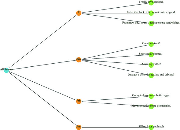
var root = {id: "All Tweets", children: [
{id: "Al's Tweets", children: [{id: "tweet1"}, {id: "tweet2"}]},
{id: "Roy's Tweets", children: [{id: "tweet1"}, {id: "tweet2"}]}
...
We’d need to pass that data to d3.hierarchy to create the kind of hierarchical data that D3 expects for its hierarchical layouts:
var root = d3.hierarchy(root, function (d) {return d.children})
The resulting object is extended to include methods for each of the nodes that allow you to access descendants and ancestors so that you can filter your hierarchical data easily in tandem or separate from passing it to hierarchical layouts.
6.2.1. Hierarchical JSON and hierarchical objects
Hierarchical JSON or hierarchical objects refer to any JSON or JavaScript object that acts as a root node with properties (typically called children or values) that are arrays of more objects, typically with the same properties as the root node. In hierarchical terminology, the root node is the top-most parent, and a leaf node is a child with no children.
6.2.2. D3.nest
We’ve seen d3.nest many times already, where we’ve used it to flatten data. The other use, which reflects the name of the function, is to create hierarchical datasets out of flat data. If, for instance, we had an array of objects that looked like this
{
   cell: "gifs everywhere",
   country:"Norway",
   metric:"recommendations",
   significance:0.07408233813305311,
   subscription:"deluxe",
   value:0.4472930460902817
}
and we passed that array to a d3.nest function that referenced all of its categorical attributes as keys, like this
var nestedDataset = d3.nest()
  .key(d => d.cell)
  .key(d => d.metric)
  .key(d => d.subscription)
  .key(d => d.country)
  .entries(dataset)
the result would be nested hierarchical JavaScript object almost ready to be visualized by a D3 hierarchical layout. The only step remaining is that we want a hierarchical object and d3.nest returns an array, so we need to put the results of the array inside an object, as you’ll see in all the following examples.
6.2.3. D3.stratify
Version 4 of D3 introduces a new piece of functionality for building hierarchical data from tabular data: d3.stratify. Much of our hierarchical data comes in the form of tabular data indicating the parent-child relationship via columns. Let’s say you downloaded your family tree from your favorite genealogy package and it gave you data that looked like the following listing.
Listing 6.1. Some common hierarchical data in tabular format
child, parent
you, your mom
you, your dad
your dad, your paternal grandfather
your dad, your maternal grandmother
your mom, your maternal grandfather
your mom, your maternal grandmother
, you
You could pass this data to a d3.stratify function formatted like this:
d3.stratify()
  .parentID(d => d.child)
  .id(d => d.parent)
And it will give you back a hierarchy with “you” as the root node. I know what you’re thinking: “You’re setting the parentID as the child—your example dataset is backward.” But it’s not; I formatted it like that on purpose because I want to highlight that in a hierarchical dataset, the parent refers to the hierarchical parent, and it has to terminate at a single node. In this case, because the family tree grows out from “you” that makes “you” the root node and “your mom” and “your dad” as the first child nodes of that root node. If you want to represent hierarchies that don’t terminate in a single node, you’ll have to wait for chapter 7 and use network visualization techniques.
6.3. Pack layouts
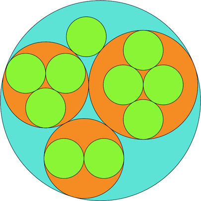
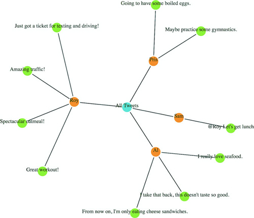
Hierarchical data is amenable to an entire family of layouts. One of the most popular is circle packing, shown in figure 6.5. Each object is placed graphically inside the hierarchical parent of that object. You can see the hierarchical relationship. As with all hierarchical layouts, the pack layout expects a data representation of data that may not align with the data you’re working with. Specifically, pack expects a JavaScript object array where the child elements in a hierarchy are stored in a children attribute that points to an array. In examples of layout implementations on the web, the data is typically formatted to match the expected data format. In our case, we’d format our tweets like figure 6.5.
Figure 6.5. Pack layouts are useful for representing nested data. They can be flattened (top) or they can visually represent hierarchy (bottom).
But it’s better to get accustomed to adjusting the accessor function of d3.hierarchy to match our data. This doesn’t mean we don’t have to do any data formatting when we use d3.nest, for instance, or get our data from an external source where child nodes are denoted by another key.
6.3.1. Drawing the circle pack
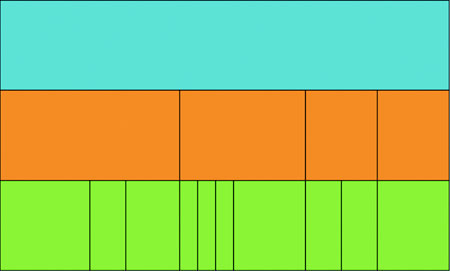
We still need to create a root node for circle packing to work (what’s referred to as “All Tweets” in the previous code). But we’ll adjust the accessor function to match the structure of the data as it’s represented in nestedTweets, which stores the child elements on the values key. In the following listing, we also update the .sum() method that determines the size of circles and set it to a fixed value, as shown in figure 6.6.
Figure 6.6. Each tweet is represented by a green circle nested inside an orange circle that represents the user who made the tweet. One of those green circles is exactly the same size as its parent orange circle, which we address below. The users are all nested inside a blue circle that represents our “root” node.
Listing 6.2. Circle packing of nested tweets data
d3.json("tweets.json", viz)

function viz(data) {
var depthScale = d3.scaleOrdinal()
  .range(["#5EAFC6", "#FE9922", "#93c464", "#75739F"])

var nestedTweets = d3.nest()
  .key(d => d.user)
  .entries(data.tweets);
var packableTweets = {id: "All Tweets", values: nestedTweets};       1
var packChart = d3.pack();                                           2

packChart.size([500,500])                                            3

var root = d3.hierarchy(packableTweets, d => d.values)               4
  .sum(() => 1)                                                      5

d3.select("svg")
  .append("g")
  .attr("transform", "translate(100,20)")
     selectAll("circle")
     .data(packChart(root).descendants())                            6
     .enter()
     .append("circle")
     .attr("r", d => d.r)                                            7
     .attr("cx", d => d.x)
     .attr("cy", d => d.y)
     .style("fill", d => depthScale(d.depth))                        8
     .style("stroke", "black")
}
- 1 Puts the array that d3.nest creates inside a “root” object that acts as the top-level parent
- 2 Initialize the pack layout
- 3 Sets the size of the circle-packing chart
- 4 Process the hierarchy with an accessor function for child elements to look for values, which matches the data created by d3.nest
- 5 Creates a function that returns 1 when determining the size of leaf nodes
- 6 Processes the hierarchy with the pack layout and then flattens it using descendants to get a flattened array
- 7 Radius and xy coordinates are all computed by the pack layout
- 8 The pack layout also gives each node a depth attribute that we can use to color them distinctly by depth
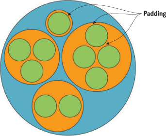
Keep in mind that the .descendants method of a node processed by d3.hierarchy is going to include the parent node that you’ve sent. Also, when the pack layout has a single child (as in the case of Sam, who only made one tweet), the size of the child node is the same as the size of the parent. This can visually seem like Sam is at the same hierarchical level as the other Twitter users who made more tweets. To correct this, we can modify the pack layout’s padding method to set a padding around each circle:
packChart.padding(10)
This will give you margins like you see in figure 6.7. You can experiment with implementing padding as a function dependent on the depth of the node.
Figure 6.7. An example of a fixed margin based on hierarchical depth. We can create this by reducing the circle size of each node based on its computed depth value.
I glossed over the .sum() setting of d3.hierarchy earlier. If you have a numerical measurement for your leaf nodes, you can use that measurement to set their size using .sum() and therefore influence the size of their parent nodes. In our case, we can base the size of our leaf nodes (tweets) on the number of favorites and retweets each has received (the same value we used in chapter 4 as our “impact factor”). The results in figure 6.8 reflect this new setting.
Figure 6.8. A circle-packing layout with the size of the leaf nodes set to the impact factor of those nodes
d3.hierarchy(packableTweets, d => d.values)
.sum(d => d.retweets ? d.retweets.length +
d.favorites.length + 1 : undefined)                1
- 1 Adds 1 so that tweets with no retweets or favorites still have a value greater than zero and are displayed along with checking to make sure it has a retweets property
Layouts, like generators and components, are amenable to method chaining. You’ll see examples where the settings and data are all strung together in long chains. As with the pie chart, you could assign interactivity to the nodes or adjust the colors, but this chapter focuses on the general structure of layouts. Notice that circle packing is similar to another hierarchical layout known as treemaps. Treemaps pack space more effectively because they’re built out of rectangles, but they can be harder to read. The next layout is another hierarchical layout, known as a dendrogram, that more explicitly draws the hierarchical connections in your data.
6.3.2. When to use circle packing
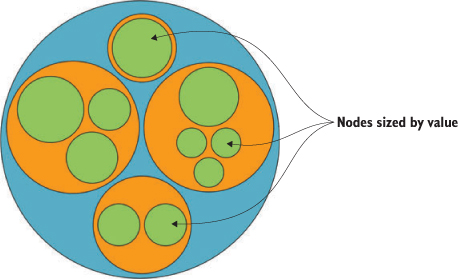
Circle packs don’t use space efficiently—there’s a lot of screen real estate that’s left outside of round objects being shown on rectangular screens. There’s also a big difference between the way you see a circle when it’s being used to enclose other circles versus when it’s floating there on its own. With that in mind, you should use circle packing when you’re trying to focus on the thing at the bottom of the circle pack, the leaf nodes, and how they’re sorted by the various categories you’ve nested them by, which will be all the other circles you see. Because circles are so bad at encoding numerical value with their radius, you should avoid anything where those leaf nodes encode size with any precision. The best circle packs have leaf nodes that map well to individual things of the same type and that we don’t think of as varying in size, like a person. While human beings do vary in size, they’re often put in charts represented by individual marks of the same size, like circles in a network diagram or little person icons in an infographic. But if you want to encode some value to each person, such as their wealth or number of D3.js books in their library, then you probably don’t want to use a circle pack.
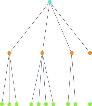
6.4. Trees
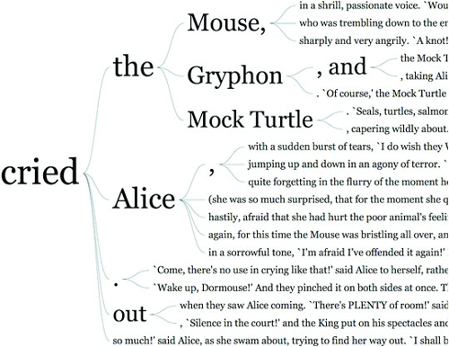
Another way to show hierarchical data is to lay it out like a family tree, with the parent nodes connected to the child nodes in a dendrogram (figure 6.9).
Figure 6.9. Tree layouts are another useful method for expressing hierarchical relationships and are often laid out vertically (top), horizontally (middle), or radially (bottom). (Examples from Mike Bostock at d3js.org.)
6.4.1. Drawing a dendrogram
The prefix dendro means “tree,” and in D3 the layout is d3.tree. It follows much the same setup as the pack layout, except that to draw the lines connecting the nodes, we need to use svg:line or svg:path elements. We process the data using d3.nest and d3.hierarchy in exactly the same manner as we do for the circle pack, and then use the code in the following listing to draw our first dendrogram.
Listing 6.3. Callback function to draw a dendrogram
var treeChart = d3.tree();
treeChart.size([500,500])

  var treeData = treeChart(root).descendants()

d3.select("svg")
  .append("g")
  .attr("id", "treeG")
  .attr("transform", "translate(60,20)")
  .selectAll("g")
  .data(treeData)
  .enter()
  .append("g")
  .attr("class", "node")
  .attr("transform", d => `translate(${d.x},${d.y})`)           1

d3.selectAll("g.node")
  .append("circle")
  .attr("r", 10)
  .style("fill", d => depthScale(d.depth))                      2
  .style("stroke", "white")
  .style("stroke-width", "2px");                                3

d3.select("#treeG").selectAll("line")
  .data(treeData.filter(d => d.parent))                         4
  .enter().insert("line","g")
  .attr("x1", d => d.parent.x)                                  5
  .attr("y1", d => d.parent.y)
  .attr("x2", d => d.x)                                         6
  .attr("y2", d => d.y)
  .style("stroke", "black")
- 1 Draw a <g> element for each node so we can put a circle in it now and add a label later
- 2 Fill based on the depth calculated by d3.hierarchy
- 3 Add a white halo around each node to give the connecting lines an offset appearance
- 4 Draw links using the same data except filter out any nodes that don’t have parents (which won’t have links)
- 5 Draw the link ending at the child node location
- 6 Draw the link starting at the parent node location
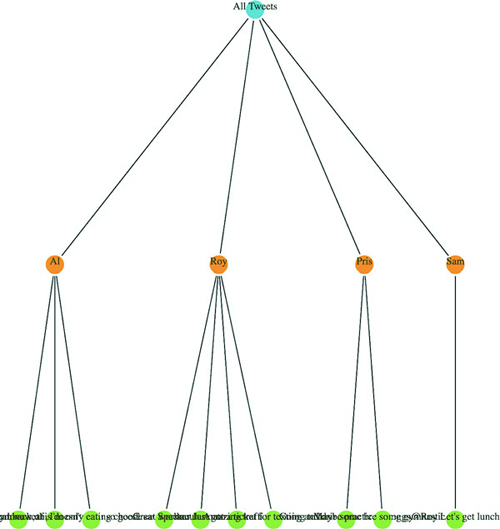
The resulting dendrogram shows the hierarchical structure of our tweets and tweeters using circles, like the circle pack, but using lines and rank position to indicate who the parents and children are as you can see in figure 6.10 is a bit hard to read.
Figure 6.10. A dendrogram laid out vertically using data from tweets.json. The level 0 “root” node (which we created to contain the users) is in blue, the level 1 nodes (which represent users) are in orange, and the level 2 “leaf” nodes (which represent tweets) are in green.
We can add labels pretty easily; the only thing we have to take into account is that the label for each node is going to be a different kind of data depending on which node in the hierarchy we’re labeling (the root node or one of the users or one of the individual tweets). Append a <text> element like so:
     d3.selectAll("g.node")
       .append("text")
       .style("text-anchor", "middle")
       .style("fill", "#4f442b")
       .text(d => d.data.id || d.data.key || d.data.content)
You’ll get the results you see in figure 6.11.
Figure 6.11. A dendrogram with labels for each of the nodes
Because the tweet labels are the content of the tweet, it’s pretty hard to read the labels drawing the dendrogram vertically like that. To turn it on its side, we need to adjust the positioning of the <g> elements by flipping the x and y coordinates, which orients the nodes horizontally. We also need to flip the x1, x2, y1, and y2 references for the svg:line element to orient the lines horizontally:
    .append("g")
...
       .append("g")
       .attr("class", "node")
       .attr("transform", d => `translate(${d.y},${d.x})`)
...
       .enter().insert("line","g")
       .attr("x1", d => d.parent.y)
       .attr("y1", d => d.parent.x)
       .attr("x2", d => d.y)
       .attr("y2", d => d.x)
The result, shown in figure 6.12, is more legible because the text isn’t overlapping on the bottom of the canvas. But critical aspects of the chart are still drawn off the canvas without adjusting the margins of the container <g>.
Figure 6.12. The same dendrogram as figure 6.11 but laid out horizontally
We could try to create margins along the height and width of the layout as we did earlier. Or we could provide information about each node as an information box that opens when we click it, as with the soccer data. But a better option is to give the user the ability to drag the canvas up and down and left and right to see more of the visualization.
To do this, we use the D3 zoom behavior, d3.zoom, which creates a set of event listeners. A behavior is like a component, but instead of creating graphical objects, it registers events (in this case for drag, mousewheel, and double-click) and ties those events to the element that calls the behavior. With each of these events, a zoom object changes its .translate() and/or .scale() values to correspond to the traditional dragging and zooming interaction. You’ll use these changed values to adjust the position of graphical elements in response to user interaction. Like a component, the zoom behavior needs to be called by the element to which you want these events attached. Typically, you call the zoom from the base <svg> element because then it fires whenever you click anything in your graphical area. When creating the zoom component, you need to define what functions are called on zoomstart, zoom, and zoomend, which correspond (as you might imagine) to the beginning of a zoom event, the event itself, and the end of the event, respectively. Because zoom fires continuously as a user drags the mouse, you may want resource-intensive functions only at the beginning or end of the zoom event. You’ll see more complicated zoom strategies, as well as the use of scale, in chapter 8 when we look at geospatial mapping, which uses zooming extensively.
As with other components, to start a zoom component you create a new instance and set any attributes of it you may need. In our case, we only want the default zoom component, with the zoom event triggering a new function, zoomed(). This function changes the position of the <g> element that holds our chart and allows the user to drag it around:
treeZoom = d3.zoom()                                              1
treeZoom.on("zoom", zoomed)                                       2
d3.select("svg").call(treeZoom)                                   3
function zoomed() {
d3.select("#treeG").attr("transform",
`translate(${d3.event.transform.x},${d3.event.transform.y})`)     4
}
- 1 Creates a new zoom component
- 2 Keys the “zoom” event to the zoomed() function
- 3 Calls our zoom component with the SVG canvas
- 4 Updating the <g> to set it to the same translate setting of the zoom component updates the position of the <g> and all its child elements
Now we can drag and pan our entire chart left and right and up and down. The ability to zoom and pan gives you powerful interactivity to enhance your charts. It may seem odd that you learned how to use something called zoom and haven’t even dealt with zooming in and out, but panning tends to be more universally useful with charts like these, whereas changing scale becomes a necessity when dealing with maps.
6.4.2. Radial tree diagrams
We have other choices besides drawing our tree from top to bottom and left to right. If we tie the position of each node to an angle, we can draw our tree diagrams in a radial pattern. To make this work well, we need to reduce the size of our chart, because the radial drawing of a tree layout in D3 uses the size to determine the maximum radius, and is drawn out from the 0,0 point of its container like a <circle> element:
treeChart.size([200,200])
With these changes in place, we need to create a projection function to translate the xy coordinates into a radial coordinate system:
function project(x, y) {
   var angle = x / 90 * Math.PI
   var radius = y
   return [radius * Math.cos(angle), radius * Math.sin(angle)];
}
Then we use that function to calculate new coordinates for our nodes and lines:
   .append("g")
   .attr("id", "treeG")
   .attr("transform", "translate(250,250)")
   .selectAll("g")
...
   .append("g")
   .attr("class", "node")
   .attr("transform", d => `translate(${project(d.x, d.y)})`)
...
   .enter().insert("line","g")
   .attr("x1", d => project(d.parent.x, d.parent.y)[0])
   .attr("y1", d => project(d.parent.x, d.parent.y)[1])
   .attr("x2", d => project(d.x, d.y)[0])
   .attr("y2", d => project(d.x, d.y)[1])
Figure 6.13 shows the results of these changes.
Figure 6.13. The same dendrogram laid out in a radial manner.
The dendrogram is a generic way of displaying information. It can be repurposed for menus or information you may not think of as traditionally hierarchical. One example (figure 6.14) is from the work of Jason Davies, who used the dendrogram functionality in D3 to create word trees. A few hierarchical structures that follow this pattern are genealogies, sentence trees, and decision trees.
Figure 6.14. Example of using a dendrogram in a word tree by Jason Davies (www.jasondavies.com/wordtree/).
6.4.3. d3.cluster vs d3.tree
In this example we used the d3.tree layout. You can also use the d3.cluster layout, which forces leaf nodes to all be drawn at the same level. That’s not so apparent with our dataset, because all of our hierarchical data has the same depth (all the leaf nodes are depth 3) but with leaf nodes with uneven depth, like in figure 6.15, you can see the difference between d3.cluster rendering and d3.tree rendering.
Figure 6.15. The same dataset rendered using d3.tree (left) and d3.cluster (right)
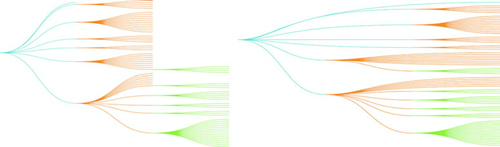
As a general rule, you should use d3.tree unless you have a good reason for lining up all your leaf nodes on the same level. When you use d3.cluster you’re increasing the amount of ink you’re using to represent your links, even though those links aren’t any different in what they represent. This means your ink-to-data ratio is worse, and if you’re going to make your ink-to-data ratio worse, it better be for a good reason.
6.4.4. When to use dendrograms
In contrast to the circle pack, which emphasizes the leaf nodes, the dendrogram shows each node using the same symbology. The use of lines to demonstrate connections between the nodes places gives more visual structure to the lineage rather than the links or the nodes separately. Dendrograms should be used when each parent and child is of the same type (like a word or sentence fragment in a word tree) and the focus is on paths and forks in the path.
6.5. Partition
I started this chapter by noting that most methods of representing hierarchical data don’t encode numerical data in a way that allows for precise comparison. One layout in D3 encodes parent and children nodes using length, and that’s the partition layout. Partition charts, commonly referred to as icicle charts, are like stacked bar charts.
6.5.1. Drawing an icicle chart
As with the other hierarchical charts, we need to first nest and process our data using d3.nest and d3.hierarchy. Unlike with the dendrogram we should use the partition layout’s sum function to set the size of the individual pieces to reflect the value of the underlying data (as we did with the final circle pack piece). After we pass the processed data to d3.partition, we can draw the rectangles, as described in the following listing.
Listing 6.4. Drawing a simple partition layout
var root = d3.hierarchy(packableTweets, d => d.values)
   .sum(d => d.retweets ? d.retweets.length + d.favorites.length + 1 :
   undefined)

var partitionLayout = d3.partition()
   .size([500,300])

partitionLayout(root)                          1

d3.select("svg")
  .selectAll("rect")
  .data(root.descendants())
  .enter()
  .append("rect")
  .attr("x", d => d.x0)                        2
  .attr("y", d => d.y0)                        2
  .attr("width", d => d.x1 - d.x0)             3
  .attr("height", d => d.y1 - d.y0)            3
  .style("fill", d => depthScale(d.depth))
  .style("stroke", "black")
- 1 The code is all much the same as our earlier hierarchical layouts
- 2 Position is given back as a bounding box where the upper left corner in x0/y0
- 3 Size can be derived by subtracting the bottom right corner (x1/y1) from the upper left
The result of that code is shown in figure 6.16, which shows the nodes in our hierarchical dataset in a new visual metaphor. Instead of parents being connected to children by lines like we see with dendrograms, or being visually enclosed in their parent like the circle packing does, the parent is stacked on top of its children and has a length equal to the sum of lengths of its children (which in our case is based on the number of retweets and favorites of a tweet).
Figure 6.16. A partition layout of our data, showing tweets at the bottom in green, sized by “impact” with users in orange sized by the total impact of their tweets and the root node (in this case “All Tweets”) in blue.
I know what you’re thinking: “That doesn’t look like an icicle at all—people who name charts are dumb.” And you’re not wrong; chart naming has some serious issues. I mean, what is a line chart? Everything that’s drawn is made of lines, right? But the icicle chart gets its name from how it looks when we have data that’s not all the same depth, and this partition layout visually makes a bit more sense as an “icicle chart” when you see it with data like what we used to compare the cluster and tree layouts, as we see in figure 6.17.
Figure 6.17. Icicle charts look like melting icicles hanging from the gutter when you have hierarchical data of uneven depth, as you have in this example.
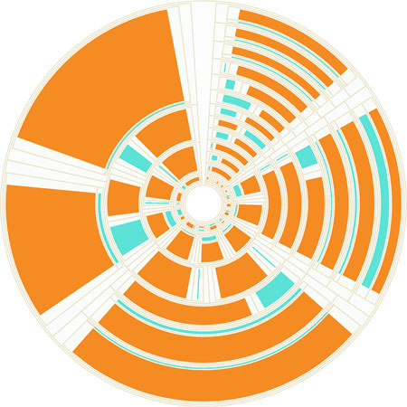
6.5.2. Sunburst: radial icicle chart
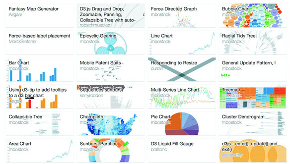
Like the dendrogram, we can draw a radial partition layout, and it’s considered one of the most popular “impressive data visualization techniques.” There are always several examples at the top of the list on bl.ocks.org showing the most popular D3 code examples, as you can see in figure 6.18.
Figure 6.18. The most popular blocks on October 20, 2016, which include not one or two but four different sunburst diagrams
It’s so popular, in fact, that it’s not called a radial partition chart or radial icicle chart but rather has its own fancy name: a sunburst diagram. Even though it has its own fancy name, drawing it only requires us to use the same technique we used to create a radial dendrogram: we adjust the size to more suit our rendering method and change the way we render the pieces. In the case of a sunburst this means changing the size so that the width is in degrees and changing the rendering method so we’re using the d3.arc generator rather than svg:rect. It’s not that big of a difference, even though the code in the following listing is almost completely different—if you look closely you can see that it’s fundamentally the same logic but applied to a different scale and passed to arcs instead of rectangles.
Listing 6.5. Using the partition layout to create a sunburst
var partitionLayout = d3.partition()
   .size([2 * Math.PI,250])                            1

partitionLayout(root)

var arc = d3.arc()
   .innerRadius(d => d.y0)
   .outerRadius(d => d.y1)                             2

d3.select("svg")
  .append("g")
  .attr("transform", "translate(255,255)")             3
  .selectAll("path")
  .data(root.descendants())
  .enter()
  .append("path")
  .attr("d", ({ y0, y1, x0, x1 }) => arc({y0, y1,
        startAngle: x0, endAngle: x1}))                4
  .style("fill", d => depthScale(d.depth))
  .style("stroke", "black")
- 1 Set the size of the layout to be 2PI for with width and whatever radius we want of the total chart for the height
- 2 We’ll use y0 and y1 to determine the upper and lower bounds of the arcs we draw so that they stack on top of each other radially
- 3 Remember we need to re-center the chart because the arc generator will draw out from 0,0
- 4 Create a properly formatted object of the kind that arc() expects using object destructuring and object literal shorthand
Our simple sunburst version of our data is in figure 6.19. As I pointed out in the last chapter when we used d3.histogram to draw violin plots, I think it’s important to pause and dwell on how simple it is to draw a partition layout as a sunburst with D3. Now, naturally, you have to understand how the arc generator works and what the layout is doing, but once you do, you can use D3 to create charts that you imagine rather than recreating the charts that you’ve seen online.
Figure 6.19. A sunburst version of our nested tweets.
6.5.3. Flame graph
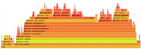
Before we move on to the next hierarchical visualization type, I want to draw your attention to a different use of the partition layout for a specialized data visualization chart: the flame graph. Developed to see what processes are burning up your applications, the flame graph is a fully featured application that consumes profiled data and returns an orange-formatted icicle chart has been ported as d3-flame-graph, an example of which you can see in figure 6.20.
Figure 6.20. An example of d3-flame-graph, which implements the flame graph first developed by Brandon Gregg. Note that the value of the children (in this case the higher bars) often adds up to less than the value of the parents.
The major difference between the way the flame graph is presenting data and your typical partition layouts is that in most partition layouts, and most hierarchical data visualization, when you’re representing the size of the parent it’s typically as a sum of the size of its children. But in a flame chart, the parent is a process that takes up its own amount of time plus the time of its child processes. It would be too involved to recreate the entire parsing of profiled data, but remember that the sum method in d3.hierarchy is a convenience function and can be replaced with your own complex value setting function, so you could easily assign every node a value equal to the sum of its children plus its own value and achieve something like a flame graph.
6.5.4. When to use the partition layout
In comparison to the dendrogram and the circle pack, the partition layout has great data-to-ink ratio. Literally no space is wasted on links, and the value of each node is encoded in the length of the node, facilitating good ability on the part of the reader to evaluate the numerical difference between the nodes. It’s great for use in applications where you need to give your readers the ability to quickly and effectively measure the values encoded in the nodes. But it’s the ultimate rich-get-richer visual representation of hierarchies, because the value at each depth accretes into the parent node’s value, which can make it hard to make out interesting breaks in the hierarchy that would be readily apparent in a dendrogram or clustering by category, like we saw with the countries in our A/B testing example at the start of the chapter. The best use case for partition layouts is the kind of data that drives the flame graph, where the accretion of time or processing power is exactly what you want to emphasize to software developers looking to optimize their code.
6.6. Treemaps
The last hierarchical data visualization method we’ll look at is the treemap, which was developed to show stock performance while at the same time showing parts of the market into which those stocks were categorized. Because of this serious business--oriented pedigree, the treemap is a well-received way of showing hierarchical data. The treemap is a mix of circle packing and partition, using rectangles to represent nodes and enclosing those rectangles within their parent rectangles. Unlike circle packing, it has the benefit of using rectilinear shapes on a rectilinear screen, so we don’t see a lot of wasted space like we do with circle packing.
6.6.1. Building
By now you should know how to make hierarchical data visualization products in D3. You need to have your hierarchical data, but you may have acquired it or processed it and passed it to d3.hierarchy. You’ll use the sum method of d3.hierarchy because we want to show the value of our tweet data in our charts. This time, the only difference is you’ll send all that to d3.treemap, as we see in the following listing.
Listing 6.6. Drawing a treemap
var treemapLayout = d3.treemap()
   .size([500,500])

treemapLayout(root)                                          1

d3.select("svg")
  .selectAll("rect")
  .data(root.descendants(),
     d => d.data.content || d.data.user || d.data.key)       2
  .enter()
   append("rect")
  .attr("x", d => d.x0)
  .attr("y", d => d.y0)
  .attr("width", d => d.x1 - d.x0)
  .attr("height", d => d.y1 - d.y0)                          3
  .style("fill", d => depthScale(d.depth))
  .style("stroke", "black")
- 1 Because the layout mutates root, you can run it without assigning it to a variable
- 2 Set a key so we can filter-zoom later
- 3 All the hierarchical layouts that are typically represented with rectangles expose x1,x0 and y1,y0 because it’s easy to derive height/width from that and still use it for other projections
We’re doing almost exactly the same thing with treemap that we’ve done with d3.partition. The results that you see in figure 6.21 are a bit different, though, despite the fact that we’re still using svg:rect to represent our nodes.
Figure 6.21. A treemap without padding will only show the leaf nodes.
The rectangles have filled the space efficiently—a bit too efficiently. We’ve lost our hierarchical data—in this case, which nodes were tweeted by which people. That’s because without putting in padding on treemap we end up with our leaf nodes perfectly abutting each other in the rectangle we describe with the size array. Let’s add padding:
var treemapLayout = d3.treemap()
  .size([500,500])
  .padding(d => d.depth * 5 + 5]
By adding padding, we restore that enclosure signal that indicates which nodes are the children of which other nodes, as you can see in figure 6.22. Padding can take a function, like we have in figure 6.21. But be careful with dynamic padding because your reader is trying to evaluate the data encoded using the area of the shapes represented, so if you’re changing the calculation of the area of that shape based on its depth in the hierarchy, don’t expect that to be readily apparent to your reader’s visual processing. In the case of a hierarchical dataset like our tweets, we’re not causing too much harm because it’s equal depth, but in one of those datasets where the depth is not equal, you may be setting your readers up to misunderstand the data you’re visualizing.
Figure 6.22. A treemap with the padding method set. Notice that padding determines the space between children and not siblings.
6.6.2. Filtering
When you want to zoom into a hierarchical data visualization, what you’re doing is laying it out anew with the node you’ve clicked on as your root node. Because your data is hierarchically structured, this is easier than it sounds. We’ll add the click event in the following listing to all our rectangles, as in the following listing.
Listing 6.7. Filter zoom example
...
      .style("fill", d => depthScale(d.depth))
      .style("stroke", "black")
      .on("click", filterTreemap)

function filterTreemap(d) {
    var newRoot = d3.hierarchy(d.data, p => p.values)                    1
    .sum(p => p.retweets ? p.retweets.length + p.favorites.length + 1 : undefined)

     treemapLayout(newRoot)

  d3.select("svg")
    .selectAll("rect")
    .data(newRoot.descendants(), p => p.data.content || p.data.user || p.data.key)
    .enter()
    .append("rect")                                                      2
    .style("fill", p => depthScale(p.depth))
    .style("stroke", "black")

  d3.select("svg")
    .selectAll("rect")
    .data(newRoot.descendants(), p => p.data.content || p.data.user || p.data.key)
    .exit()
    .remove()                                                            3

  d3.select("svg")
    .selectAll("rect")
    .on("click", d === root ?
    p => filterTreemap(p) : () => filterTreemap(root))                   4
    .transition()
    .duration(1000)
    .attr("x", p => p.x0)                                                5
    .attr("y", p => p.y0)                                                5
    .attr("width", p => p.x1 - p.x0)                                     5
    .attr("height", p => p.y1 - p.y0)                                    5
}
- 1 Build a new hierarchy using the currently clicked node as the root node
- 2 Add any new nodes (when we’re zooming out)
- 3 Remove any trimmed nodes (when we’re zooming in)
- 4 Update the filter function so it zooms out if we’re zoomed in and zooms in if we’re zoomed out
- 5 Redraw any remaining nodes to the new scale
And that’s all there is to it when you’re introducing zoom functionality to hierarchical data visualization products. If we click the blue area of the viz, nothing will happen (because that’s our root node) and if we click the green then we’ll zoom all the way down to a leaf node. If we click the orange area, we’ll zoom to a single user as a node and all their tweets, like we see in figure 6.23, with a nice animated transition to the new view.
Figure 6.23. The “zoomed in” view of our treemap, showing only the leaf nodes in one of the intermediary node views. Note that the recalculated treemap has adjusted the padding because the orange node is now the root node.
6.6.3. Radial treemap
For the sake of completeness, yes, you can project a treemap radially, as seen in figure 6.24.
Figure 6.24. A radial treemap accomplished by taking the drawing instructions from d3.treemap and using them to draw paths using d3.arc instead of svg:rect elements.
It’s not considered a popular data visualization charting method. It might be because people have a hard time evaluating the area of arcs. I think people don’t use it because it looks like the schematics of the Death Star.
6.6.4. When to use treemaps
Unlike the length of rectangles, people have a hard time evaluating the area of rectangles and understanding the value mapped to that area, so treemaps aren’t going to be as effective as icicle charts for allowing precise comparison of values. However, because they encode parent-child relationship using enclosure, they don’t spend as much ink on the parent nodes that partition charts do, and they encode value better than circle packs do using radius. They’re a good kind of chart for hierarchical data that’s numerical and that you want to compare the rough value and aggregated value across categories. Another example is demographic data, where each leaf node represents items that vary numerically, like counties or census blocks, and for which you might want to see the breakdown by demographics aggregated by their hierarchical parents.
6.7. Summary
- Hierarchical data visualization can be achieved using several different methods, such as circle packing, tree maps, or tree diagrams. Methods share many of the same functions (like padding in pack(), and treemap()) is suited for different types and densities of hierarchical data.
- Hierarchical layouts in D3 all start with using hierarchy() to process a hierarchical dataset. Once processed, this dataset can be hierarchically filtered or sorted, as well as flattened for display.
- Certain hierarchical layouts are particularly amenable to radial display, such as the dendrogram or partition layout. When a partition layout is displayed hierarchically, it’s called a sunburst.
- Even though all hierarchical layouts use the same kind of data doesn’t mean you should pick one randomly or use the one you’re most familiar with. Instead, you should think about the aspect of the hierarchical data you want to present to your users and choose the hierarchical layout that best emphasizes it.
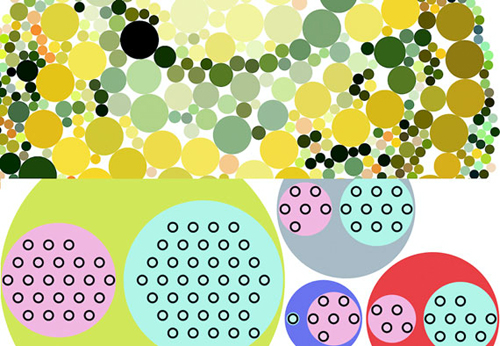
D3.js in the real world
Nadieh Bremer Data Visualization Consultant
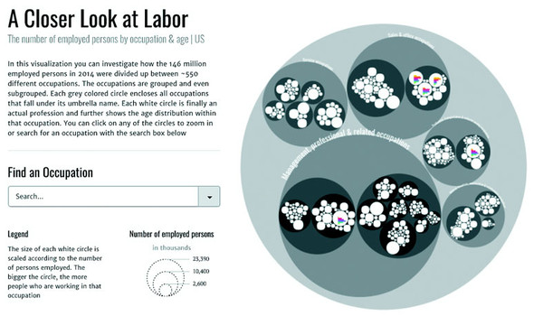
A Closer Look at Labor
The visual shows the ~550 different occupations as defined by the Bureau of Labor Statistics in their hierarchical groupings. Each white circle represents an occupation and these circles are scaled according to the total number of people working in the occupation. Within each circle there is a bar chart further detailing the division between age groups in the occupation. It’s possible to zoom into any level of hierarchy and the visual only shows the bar charts in those circles that have become large enough to readably fit the bar chart.
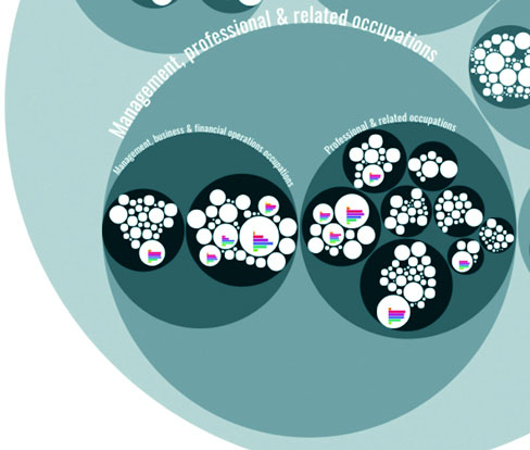
The data that’s available in this visual amounts to at least 7 (age groups) times 550 (occupations) = 3850 data points. By using the hierarchical approach I could prevent overwhelming the viewers with too much data and instead let them dive into the occupational areas they would find most interesting. The deeper they dive into the different hierarchical levels of occupations, from service occupations to food preparation to cooks, the more information that becomes available to them due to more bar charts being drawn within each white circle. This is a details-on-demand approach.