Table of Contents for
D3.js in Action, Second Edition: Data visualization with JavaScript
 D3.js in Action, Second Edition: Data visualization with JavaScript
Published by
Manning Publications, 2017
D3.js in Action, Second Edition: Data visualization with JavaScript
Published by
Manning Publications, 2017
- Cover
- D3.js in Action, Second Edition: Data visualization with JavaScript
- Copyright
- Brief Table of Contents
- Table of Contents
- Praise for the First Edition
- Preface
- Acknowledgments
- About this Book
- About the Cover Illustration
- Part 1. D3.js fundamentals
- Chapter 1. An introduction to D3.js
- Chapter 2. Information visualization data flow
- Chapter 3. Data-driven design and interaction
- Chapter 4. Chart components
- Chapter 5. Layouts
- Part 2. Complex data visualization
- Chapter 6. Hierarchical visualization
- Chapter 7. Network visualization
- Chapter 8. Geospatial information visualization
- Part 3. Advanced techniques
- Chapter 9. Interactive applications with React and D3
- Chapter 10. Writing layouts and components
- Chapter 11. Mixed mode rendering
- Index
- List of Figures
- List of Tables
- List of Listings
Chapter 9. Interactive applications with React and D3
- Using D3 with React
- Linking multiple charts
- Automatically resizing graphics based on screen size change
- Creating and using brush controls
Throughout this book, you’ve seen how data can be measured and transformed to produce charts highlighting one or another aspect of the data. Even though you’ve used the same dataset in different layouts and with different methods, you haven’t presented different charts simultaneously. In this chapter, you’ll learn how to tie multiple views of your data together using React. This type of application is typically referred to as a dashboard in data visualization terminology (an example of which will be built in this chapter, as shown in figure 9.1). You’ll need to create and manage multiple <svg> elements as well as implement the brush component, which allows you to easily select part of a dataset. You’ll also need to more clearly understand how data-binding and D3’s enter/exit/update pattern work so that you can effectively integrate D3 with external frameworks.
Figure 9.1. Throughout this chapter, we’ll build toward this fully operational data dashboard, first creating the individual chart elements (section 9.1), then adding interactivity (section 9.2), and finally adding a brush to filter the data (section 9.3).
Multiple charts combined into a single application have been around since the 1970s and were traditionally associated with decision support systems. Dashboards provide the kind of multiple views into a dataset that you’ll see in this chapter and are often the selling point of charting libraries like NVD3.
Although they’re typically presented as several charts sharing screen space, the principles of data dashboards can also be applied to web mapping and text-based applications through modal pop-ups or any website that provides several different charts simultaneously. In those cases, the act of highlighting datapoints may be a response to the scrolling of text or zooming in on a map, rather than mousing over a data visualization element.
9.1. One data source, many perspectives
We start with a design for our dashboard. Designs can be rough sketches or detailed sets of user requirements. Let’s imagine you work for the leading European online seller of table mats, MatFlicks, and you’re in charge of creating a dashboard showing their rollout to North America and South America. The genius CEO of MatFlicks, Matt Flick, decided the rollout strategy would be alphabetical, so Argentina gets access on Day 0, and every day one more country gets access to the amazing MatFlicks inventory. They need to see how the rollout is progressing geographically, over time and in total per country. Figure 9.2 shows a simple sketch to achieve this using several of the charts we’ve explored in previous chapters. We’re going to randomly generate MatFlicks data like we’ve done before, with each country only generating random data after its rollout and then after that one data point representing amount of sales (in billions of euros) per day.
Figure 9.2. A sketch of a dashboard, showing a map, bar chart, and stacked area chart that display our data
With a data dashboard like this, we want to provide a user with multiple perspectives into the data as well as the ability to drill down into the data and see individual datapoints. We’ll use a line chart to see the change over time, a bar chart for raw total changes, and a map so that users can see the geographic distribution of our data. We also want to let users slice and dice their data, so later we’ll add that functionality with a brush.
From the sketch, you can easily imagine interaction possibilities and changes that you may want to see based on user activity—for instance, highlighting which elements in each chart correspond to elements in other charts, or giving more detail on a particular element based on a click.
By the time you’re done with this chapter, you’ll have created the data dashboard shown in figure 9.1, with interactivity and dynamic filtering. The CSS for the dashboard is in listing 9.1. It’s simple and necessary for the brush component we’ll see later; most of the other styles will be inline.
Listing 9.1. Dashboard CSS
rect.overlay {
  opacity: 0;
}

rect.selection {
  fill: #FE9922;
  opacity: 0.5;
}

rect.handle {
  fill: #FE9922;
  opacity: 0.25;
}

path.countries {
   stroke-width: 1;
   stroke: #75739F;
   fill: #5EAFC6;
}
Any application we design needs to be responsive so that it adjusts how it’s drawn based on the size of the screen. We could also use the viewport attribute of an SVG element to automatically resize the graphics, but we’ll want more fine-grained control of our graphics when creating data visualization applications (recall the distinction between graphical and semantic zoom discussed in chapter 7).
You’ve seen arrow functions and promises up until this point, but in the following code you’re going to see more ES2015 than you might have before. I hope by the time you read this that the functionality here is familiar to you and common to JS development. But if you see something strange, that’s probably ES2015. I can’t highlight every difference, but here are a few new pieces that you’ll see:
const and let are new declarations that are cleaner than var and that make a read-only constant (const) or variable (let) and are scoped much more cleanly than var. If you replaced them all with var, the code would run the same; they make your code more hygienic because they require you to know what you’re doing with your identifiers.
[...array], {...object} are spread operators that allow you to turn arrays and objects into sets of variables or properties. You can use it to combine arrays or objects without using Object.assign or Array.concat. Note that the rest parameter syntax also looks the same but is used to send an array of variables to a function without using function.apply.
You can instantiate identifiers from passed objects like this:
const { data, style } = { data: [1,2], style: {fontSize: "12px", color:
             "red"}, beer: "no" }
ES6 and node lets you include pieces of JavaScript or other code from other files using the import/export syntax.
function({ a: 1, b: 2 }): Functions could always take objects that you could destructure on your own, but now you can directly pass the object without any intermediate code. You don’t have to think about undefined or null values in your list of variables you send to a function; instead, you send an object with those properties.
9.2. Getting started with React
React is a view lifecycle management system that’s part of a popular MVC framework and development pattern. React is the view layer and lets you define HTML components with custom behavior, which is super useful for composing applications. It uses a JavaScript + HTML language called JSX that disgusted me when I first saw it, but now I love it. I didn’t like it because I always felt like JavaScript and HTML should live in totally separate worlds, but I found out later that writing HTML inside JavaScript could be incredibly useful when you’re manipulating the DOM like we’ve been with vanilla D3 throughout this book.
Typically when you see examples of React, they pair it with a kind of state management system like Flux or Redux. We won’t be doing that in this chapter. This is a single chapter, and you can find entire books about React.
Whereas the rest of this book has focused on core HTML and JavaScript, this section is going to rely on new technologies. You’re going to need node and node package manager (npm) that comes with node installed on your system as well as a slight amount of comfort with the command line. There are great books on React, such as React Quickly, so this will only scratch the surface, but you can create a fully self--contained React data visualization application.
9.2.1. Why React, why not X?
React is obviously the best library ever made, and if you like Angular, you’re dumb, bro (and don’t even get me started on Ember). No, not really. That’s horrible, and it’s too bad that people get so invested in the righteousness of their particular library.
I wanted to show people how to deal with D3 in a modern MVC environment and I know React best. Even if you never use React, you’ll probably see patterns in this chapter that apply to other frameworks. And even if you hate MVC frameworks, you can use most of the code in this chapter in your own custom, hand-rolled, beautifully opaque bespoke dashboard.
Fundamentally, React consists of a component creation framework that lets you build self-contained elements (like div or svg:rect) that have custom rendering methods, properties, state, and lifecycle methods.
Render
One of the major features of React is that it keeps track of a copy of the DOM, known as the virtual DOM, which it can use to only render elements that need to change based on receiving new data-saving cycles and speeding up your web applications. This was React’s big selling point when it first dropped, but it’s become popular with other view rendering systems. The render() function in each React component returns the elements that will be created by React (typically described using JSX, which is introduced in this chapter).
Props
Attributes of a component are sent to it when it’s created—known as props. These props of a React component are typically available in the component functions via the this context as this.props. In certain cases, such as stateless components or constructors, you won’t use this to access them, but we won’t do that in this chapter, so you’ll need a book dedicated to React to get to know the other patterns. This structure lets you send data down from parent components to child components, and you can use that data to modify how the component is rendered. You’ll see this in detail when we get into the code.
State
Whereas props are sent down to a component, the state of a component is stored and modified internally within the component. Like this.props, there’s a corresponding this.state that will give you the current state. When you modify state (using this.setState in a component) it will automatically trigger a re-render unless you’ve modified shouldComponentUpdate (a lifecycle method dealt with in the next section).
Lifecycle methods
React components expose lifecycle methods that fire as the component is created and updated and receives its props. They are incredibly useful and even necessary in certain use cases, as we’ll see later. You have, for instance, shouldComponentUpdate, which lets you specify the logic for whether or not the component re-renders when it receives new props or state. There’s also willComponentUpdate and didComponentUpdate to add functionality to your component before or after it updates, along with similar methods for when the component first mounts or exits (and a few more). I’ll get into these methods as they apply to our data visualization needs but I won’t touch on all of them.
9.2.2. react-create-app: setting up your application
One of the challenges of modern development is getting your environment set up. Fortunately, there’s a command line tool that gets you started, and it’s supported by the React team: create-react-app
In OS X you can open your terminal window and run the following commands:
npm install -g create-react-app
create-react-app d3ia
cd d3ia/
npm start
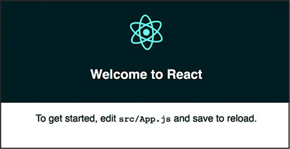
Setting up your React app is that easy. If you navigate to localhost:3000, you’ll see the boilerplate create-react-app page in figure 9.3. If you have any issues or need instructions for Windows, see https://github.com/facebookincubator/create-react-app.
Figure 9.3. The default page that create-react-app deploys with
Along with starting your node server running the code, this will create all the structure you need to build and deploy a React application that we’re going to use to build our dashboard. That structure contains a package.json file that references all the modules included in your project and to which we need to add a couple more modules to make our dashboard. We add modules using NPM and while we could include the entire D3 library and keep coding like we have, you’re better off installing the individual modules and understanding how importing those modules works. In your project directory run the following to install the d3-scale module:
npm i –SE d3-scale
This command (npm i is short for npm install) installs the latest version of d3-scale (which gives us access to all those wonderful scales we’ve been using in the last eight chapters), and the –SE tag saves the exact version to your package.json so that when you want to deploy this application elsewhere, d3-scale is installed. Along with d3-scale, do the same thing with the following modules:
react-dom
d3-shape
d3-svg-legend
d3-array
d3-geo
d3-selection
d3-transition
d3-brush
d3-axis
By installing modules individually like this, you reduce the amount of code you’ll deploy with your application, decreasing load time and improving maintainability.
9.2.3. JSX
JSX refers to JavaScript + XML, an integrated JavaScript and HTML coding language that lets you write HTML inline with your JavaScript code. It requires that the code be transpiled to plain JavaScript—your browser can’t natively run JSX—but as long as you have your transpiling set up (which react-create-app already does for you), you can write code like this:
const data = [ "one", "two", "three" ]
const divs = data.map((d,i) => <div key={i}>{d}</div>)
const wrap = <div style={{ marginLeft: "20px" }}
    className="wrapper">{divs}</div>
And you can create an array of three div elements, each of which will have the corresponding string from your array as content. Notice a few things going on here. One, when we start writing in HTML, we have to use curly braces (bolded for emphasis in preceding code) to get out of it if we want to put JavaScript there. If I hadn’t put curly braces around the d, for instance, then all my divs would have had the letter d as their content. Another is that style is an object passed to an element and that object needs CSS keys that usually are snake case (like margin-left) turned into camelcase (-marginLeft). When we’re making an array of elements, each needs a “key” property that gives it a unique key (like the optional key when we’re using .data() with D3). Finally, when you want to set an element’s CSS class, you need to use className, because class is reserved.
There’s more to JSX, but that should be enough to let you make sense of the code you’re going to see. When I first saw JSX, as I already mentioned, I was convinced it was a horrible idea and planned to only use the pure JavaScript rendering functions that React has (you don’t need to use JSX to use React), but after a couple weeks, I fell in love with JSX. The ability to create elements on the fly from data appealed to me because of my experience with D3.
9.3. Traditional D3 rendering with React
The challenge of integrating D3 with React is that React and D3 both want to control the DOM. The entire select/enter/exit/update pattern with D3 is in direct conflict with React and its virtual DOM. If you’re coming to React from D3, giving up your grip on the DOM is one of those “cold, dead hands” moments. The way most people use D3 with React is to use React to build the structure of the application, and to render traditional HTML elements, and then when it comes to the data visualization section, they pass a DOM container (typically an <svg>) over to D3 and use D3 to create and destroy and update elements. In a way, it’s similar to the way we used to use Java applets or Flash to run a black box in your page while the rest of your page is rendered separately. The benefit of this method of integrating React and D3 is that you can use all the same kind of code you see in all the core D3 examples. The main difficulty is that you need to create functions in various React lifecycle events to make sure your viz updates.
Listing 9.2 shows a simple bar chart component built using this method. Create this component in your src/ directory and save it as BarChart.js. In React, component filenames and function names are typically differentiated from other code files and functions by using camelcase and capitalizing the first letter.
Listing 9.2. BarChart.js
import React, { Component } from 'react'
import './App.css'
import { scaleLinear } from 'd3-scale'                               1
import { max } from 'd3-array'                                       1
import { select } from 'd3-selection'                                1

class BarChart extends Component {
  constructor(props){
    super(props)
    this.createBarChart = this.createBarChart.bind(this)             2
  }

  componentDidMount() {                                              3
    this.createBarChart()
  }

  componentDidUpdate() {                                             3
    this.createBarChart()
  }

  createBarChart() {
    const node = this.node                                           4
    const dataMax = max(this.props.data)                             5
    const yScale = scaleLinear()
      .domain([0, dataMax])
      .range([0, this.props.size[1]])                                5

    select(node)
      .selectAll("rect")
      .data(this.props.data)
      .enter()
      .append("rect")

    select(node)
      .selectAll("rect")
      .data(this.props.data)
      .exit()
      .remove()

    select(node)
      .selectAll("rect")
      .data(this.props.data)
      .style("fill", "#fe9922")
      .attr("x", (d,i) => i * 25)
      .attr("y", d => this.props.size[1] - yScale(d))
      .attr("height", d => yScale(d))
      .attr("width", 25)
  }

  render() {                                                        6
    return <svg ref={node => this.node = node}                      7
            width={500} height={500}>
    </svg>
  }
}

export default BarChart
- 1 Because we’re importing these functions from the modules, they will not have the d3. prefix
- 2 You need to bind the component as the context to any new internal functions—this doesn’t need to be done for any existing lifecycle functions
- 3 Fire your bar chart function whenever the component first mounts or receives new props/state
- 4 The element itself is referenced in the component when you render so you can use it to hand over to D3
- 5 Use the passed size and data to calculate your scale
- 6 Render is returning an SVG element waiting for your D3 code
- 7 Pass a reference to the node for D3 to use
Making these changes and saving them won’t show any immediate effect because you’re not importing and rendering this component in App.js, which is the component initially rendered by your app. Change App.js to match the following listing.
Listing 9.3. Referencing BarChart.js in App.js
import React, { Component } from 'react'
import './App.css'
import BarChart from './BarChart'                              1

class App extends Component {
  render() {
    return (
      <div className="App">
        <div className="App-header">
          <h2>d3ia dashboard</h2>
        </div>
        <div>
        <BarChart data={[5,10,1,3]} size={[500,500]} />        2
        </div>
      </div>
    )
  }
}

export default App
- 1 We need to import our newly created component
- 2 This is how we can get those props.data and props.size to use to render our bar chart in BarChart.js
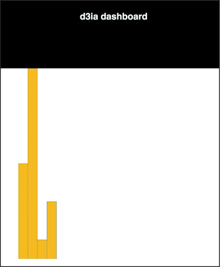
When you save App.js with these changes, you’ll see something pretty cool if you have your server running: it automatically updates the page to show you what’s in figure 9.4. That’s one of the magic tricks of Webpack—the module bundler included in create-react-app that will automatically update your app based on changes in your code.
Figure 9.4. Your first React + D3 app, with a simple bar chart rendered in your app
You can already imagine optimizations of your code, for instance, to scale the bars to fit the width, which we’ll see later. But for now let’s move on to the other method of rendering data visualization using D3 and React.
9.4. React for element creation, D3 as the visualization kernel
Rather than passing your DOM node off to D3, you can use D3 to generate all the necessary drawing instructions and use React to create the DOM elements. One of the challenges with this approach is animated transitions, which require a deeper investment in the React ecosystem, but otherwise this approach is going to leave you with code that will be more maintainable by your less D3-inclined colleagues.
Listing 9.4 shows how we can do this to recreate one of our maps from the last chapter. It’s mostly the same as our earlier code, but in this case, I’m importing world.js here, instead of world.geojson. I’ve transformed it into a .js file by adding a little ES6 export syntax to the beginning of the JSON object. The code in the following listing is similar to what we’ve seen before, except now we’re using it to create JSX elements to represent each country and we’re including the geodata rather than using an XHR request (like the d3.json function we used before).
Listing 9.4. WorldMap.js and associated world.js
import React, { Component } from 'react'
import './App.css'
import worlddata from './world'                          1
import { geoMercator, geoPath } from 'd3-geo'

class WorldMap extends Component {
  render() {
    const projection = geoMercator()
    const pathGenerator = geoPath().projection(projection)
    const countries = worlddata.features
      .map((d,i) => <path                                2
        key={"path" + i}                                 3
        d={pathGenerator(d)}
        className="countries"                            4
      />)

    return <svg width={500} height={500}>
      {countries}                                        5
    </svg>
  }
}

export default WorldMap
- 1 Rather than fiddling with asynch calls, we can import the map data because it won’t be changing
- 2 Map the arrays to svg:path elements
- 3 Make sure they each have a unique
- 4 Remember className not class with JSX
- 5 Nest the array of paths within the svg element
You can see the first couple lines of world.js in the following listing—the rest of it resembles the original world.geojson. You can do this to any JSON file if you want to bring it in using import.
Listing 9.5. world.js
export default {"type":"FeatureCollection","features":[
{"type":"Feature","id":"AFG","properties":{"name":"Afghanistan"},"geometry":{
     "type":"Polygon","coordinates":[[[61.210817,35.650072],...
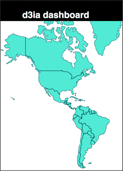
It’s almost exactly the same as the data-binding pattern we see in D3, except that we use native Array.map and map the individual data elements to DOM elements because of the magic of JSX. The results in figure 9.5 should be familiar to you, because it’s the same thing we saw in the last chapter.
Figure 9.5. The basic map we saw in chapter 8 but now rendered via React and JSX with D3 providing the drawing instructions
In my own practice I prefer to use this method, because I find the lifecycle events in React and the way it creates and updates and destroys elements to be more comprehensive than dealing with it via D3.
9.5. Data dashboard basics
Before we draw anything, we need to have data to send it to our charts. We’ll accomplish that by extending App.js and including in it a function for creating randomized data for our countries. As shown in the following listing, we’re going to color the countries by launch day—which, remember, is alphabetical because it’s made up (or because Matt Flick, rakish billionaire CEO of MatFlicks, thought that was a good idea, whichever explanation you prefer).
Listing 9.6. Updated App.js with sample data
  ...import the existing app.js imports...
  import WorldMap from './WorldMap'
   mport worlddata from './world'
  import { range, sum } from 'd3-array'                               1
  import { scaleThreshold } from 'd3-scale'                           1
  import { geoCentroid } from 'd3-geo'                                1

  const appdata = worlddata.features
  .filter(d => geoCentroid(d)[0] < -20)                               2

  appdata
  .forEach((d,i) => {
    const offset = Math.random()
    d.launchday = i
    d.data = range(30).map((p,q) =>
      q < i ? 0 : Math.random() * 2 + offset) })                      3

  class App extends Component {

    render() {

const colorScale = scaleThreshold().domain([5,10,20,30,50])
   range(["#75739F", "#5EAFC6", "#41A368", "#93C464", "#FE9922"])     4
      return (
        <div className="App">
          <div className="App-header">
            <h2>d3ia dashboard</h2>
          </div>
          <div>
            <WorldMap colorScale={colorScale} data={appdata} size={[500,400]} />
         </div>
      </div>
    )
  }
}

export default App
- 1 We’ll need these functions to build our sample data
- 2 Constrain our map to only North and South America for simplicity’s sake
- 3 Generate some fake data with relatively interesting patterns—the “launch day” of each country is its array position
- 4 Color each country by its launch date
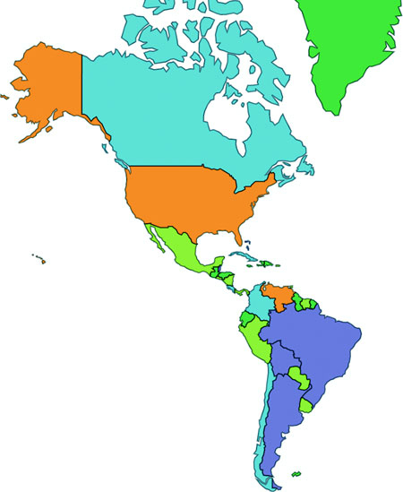
We’re sending our color scale down to our WorldMap component along with our data. Because we’ll want to share colors and data across our dashboard like you can see in Figure 9.6, this will make it easier to manage any changes and update patterns. But to take advantage of it, we need to modify our WorldMap.js file to expect those things to come from its parent, as shown in the following listing.
Figure 9.6. Our rendered WorldMap component, with countries colored by launch day
Listing 9.7. Updated WorldMap.js getting data and color scale from parent
import React, { Component } from 'react'
import './App.css'
import { geoMercator, geoPath } from 'd3-geo'

class WorldMap extends Component {
  render() {
    const projection = geoMercator()
      .scale(120)
      .translate([430,250])                                                1
    const pathGenerator = geoPath().projection(projection)
    const countries = this.props.data
      .map((d,i) => <path
        key={"path" + i}
        d={pathGenerator(d)}
        style={{fill: this.props.colorScale(d.launchday),                  2
            stroke: "black", strokeOpacity: 0.5 }}
        className="countries"
      />)
    return <svg width={this.props.size[0]} height={this.props.size[1]}>    3
      {countries}
    </svg>
  }
}

export default WorldMap
- 1 Updated translate and scale because we’ve constrained our geodata
- 2 Use the color scale passed via props
- 3 Base height and width on size prop so that we can make the chart responsive later
Now let’s bring back our bar chart and rewire it so that it deals with the data being passed in the form it is and colored according to our scale, as in the following listing.
Listing 9.8. App.js updates for adding the bar chart
import BarChart from './BarChart'
...
        <BarChart colorScale={colorScale} data={appdata}
size={[500,400]} />
...
Our original barChart code wasn’t expecting data in this format, and wasn’t receiving size and style information from its parent, so listing 9.9 shows how we’ll need to update that code to match the changes. Those changes are mostly in the create BarChart() function but also include new code to change the size of the <svg> element to match the passed size.
Listing 9.9. Updated BarChart.js
  createBarChart() {
    const node = this.node
    const dataMax = max(this.props.data.map(d => sum(d.data)))
    const barWidth = this.props.size[0] / this.props.data.length      1
    const yScale = scaleLinear()
      .domain([0, dataMax])
      .range([0, this.props.size[1]])

...nothing else changed in createBarChart until we create rectangles...

    select(node)
      .selectAll("rect")
      .data(this.props.data)
      .attr("x", (d,i) => i * barWidth)
      .attr("y", d => this.props.size[1] - yScale(sum(d.data)))
      .attr("height", d => yScale(sum(d.data)))
      .attr("width", barWidth)
      .style("fill", (d,i) => this.props.colorScale(d.launchday))
      .style("stroke", "black")
      .style("stroke-opacity", 0.25)

    }

    render() {
      return <svg ref={node => this.node = node}
              width={this.props.size[0]} height={this.props.size[1]}>
     </svg>
  }
- 1 Dynamically calculate bar width to make the chart more responsive in the future
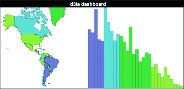
And now our dashboard gets a little more dashing. We have our countries colored by release day, and a bar chart shows the total amount of sales by country, also colored (and arranged) by release day. Because the data is randomized, your screenshot won’t look exactly like figure 9.7 but it should be close. You can already see several cool patterns when a country with a much later release date is already showing higher sales than an earlier launched country. Maybe Matt shouldn’t have determined release day based on alphabetical order?
Figure 9.7. A rudimentary dashboard with two views into the data. The bars are ordered by our fake “Launch Day,” and sometimes the randomized data shows interesting patterns like the dark green bar showing a higher total sales than countries that launched 10 days earlier.
We’re almost to the point where we’ve got all the features requested for the dashboard. The only thing left is amount of sales per day since launch. Obviously it should be a kind of time series chart, so why not that streamgraph you learned how to make in that amazing book about D3.js by that brilliant author whom you feel great about giving a five-star review for? Showing you how to give this book a glowing review would take up too much space, but the following listing shows what we’ll need for a StreamGraph component.
Listing 9.10. A React streamgraph
import React, { Component } from 'react'
import './App.css'
import { stack, area, curveBasis, stackOrderInsideOut, stackOffsetSilhouette } from 'd3-shape'
import { range } from 'd3-array'
import { scaleLinear } from 'd3-scale'

class StreamGraph extends Component {
  render() {

    const stackData = range(30).map(() => ({}))                          1
    for (let x = 0; x<30; x++) {
      this.props.data.forEach(country => {
        stackData[x][country.id] = country.data[x]                       2
      })
    }
    const xScale = scaleLinear().domain([0, 30])
      .range([0, this.props.size[0]])

    const yScale = scaleLinear().domain([0, 60])
      .range([this.props.size[1], 0])

    const stackLayout = stack()
      .offset(stackOffsetSilhouette)
      .order(stackOrderInsideOut)
      .keys(Object.keys(stackData[0]))                                   3
    const stackArea = area()
      .x((d, i) => xScale(i))
      .y0(d => yScale(d[0]))
      .y1(d => yScale(d[1]))
      .curve(curveBasis)

    const stacks = stackLayout(stackData).map((d, i) => <path
        key={"stack" + i}
        d={stackArea(d)}
        style={{ fill: this.props.colorScale(this.props.data[i].launchday),
            stroke: "black", strokeOpacity: 0.25 }}
    />)

    return <svg width={this.props.size[0]} height={this.props.size[1]}>
      <g transform={"translate(0," + (-this.props.size[1] / 2) + ")"}>   4
      {stacks}
      </g>
    </svg>
  }
}

export default StreamGraph
- 1 This will be our blank array of objects for our reprocessed streamgraph data
- 2 Transform our original data into a format amenable for stack
- 3 Each key maps to a country from our data
- 4 We need to do this offset because our streamgraph runs along the 0 axis—if you’re drawing a regular stacked area or line graph, it’s not necessary
And after we reference it in our App.js:
...other imports...
import StreamGraph from './StreamGraph'
...the rest of your existing app.js behavior...
   <StreamGraph colorScale={colorScale} data={appdata} size={[1000,250]} />
...
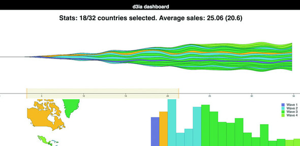
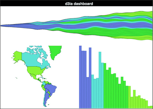
We have our initial dashboard, as we see in figure 9.8, satisfying our user requirements. We’re not done yet, but we have a dashboard taking our data and presenting it geographically, summed up in a bar chart and over time on a streamgraph. Now, one of the issues we run into when we’re building any data visualization product including when we’re building dashboards is that we can get so caught up in delivering what our users request that we don’t think to provide them with views into the data that they might not imagine, because they’re not as experienced with data visualization as we are.
Figure 9.8. A typical dashboard, with three views into the same dataset. In this case, it shows MatFlicks launch waves geographically while summing up sales in the bar chart and showing sales over time in the streamgraph.
There’s no easy way to address this. Remember when you’re building data visualization products like this dashboard that your users are constrained in the way they see the data, and it’s your job to show them the views they want, but also other views. If they’re primarily interested in numerical characteristics of the data, try to show it to them in hierarchical ways as well. If they’re focused on a map, maybe there’s a network view they could use as contrast.
9.6. Dashboard upgrades
You finish your dashboard, check off all the requirements, and demo it to your clients. I bet you can guess what their responses might be:
“This looks terrible on the tiny screen on my tablet and on the giant screen on my giant TV.”
“I don’t know what the colors mean.”
“I want to see a bar or trend highlight when I hover over a country and vice versa.”
“I need to narrow it down to countries that launched within a certain period.”
“Show me the numbers.”
I almost didn’t include the last one, because there’s no reason to write it down, because everyone always says that. If you don’t want to hear people say, “Show me the numbers” and “Slice and dice the data,” you’re in the wrong field. Let’s boil that down to a few more concrete features:
- Make it responsive.
- Add a legend.
- Cross-highlight on bars, countries, and trends.
- Brush based on launch day.
- Show numbers.
More features are available for a dashboard like this, and although there will always be more features, this chapter can’t go on forever.
9.6.1. Responsiveness
To make the dashboard respond to changes in the size of the display, we need to first listen for when the display changes and then make an update that trickles down to all our components, as shown in listing 9.11. The listener will be in App.js, which will also store the data in state, which will be used to trickle down to its components (remember, React re-renders whenever state changes, and because App will be sending new size values down to its children, they’ll re-render automatically).
Listing 9.11. App.js state and resize listener
...import necessary modules...
class App extends Component {
  constructor(props){
    super(props)
    this.onResize = this.onResize.bind(this)
    this.state = { screenWidth: 1000, screenHeight: 500 }                 1

  }

  componentDidMount() {
    window.addEventListener('resize', this.onResize, false)               2
    this.onResize()
  }

  onResize() {
    this.setState({ screenWidth: window.innerWidth,
    screenHeight: window.innerHeight - 70 })                              3
  }

  render() {
...existing render behavior...
<StreamGraph colorScale={colorScale} data={appdata}
     size={[this.state.screenWidth, this.state.screenHeight / 2]} />      4

<WorldMap colorScale={colorScale} data={appdata}
     size={[this.state.screenWidth / 2, this.state.screenHeight / 2]} />
<BarChart colorScale={colorScale} data={appdata}
     size={[this.state.screenWidth / 2, this.state.screenHeight / 2]} />
- 1 Initialize state with some sensible defaults
- 2 Register a listener for the resize event
- 3 Update state with the new window width and height (minus the size of the header)
- 4 Send height and width from the component state
And that’s all it takes to make our dashboard responsive. Remember that the code in this book is designed to run on Chrome, so it may be that on other browsers you’ll need to use different window attributes. Also, in production you’ll want to throttle or debounce your resize event so it doesn’t fire continuously as someone drags the window to a new size. Finally, making things larger and smaller to fit the screen doesn’t mean you’ve created responsive data visualization. Chapter 12 gets into how different sizes of screens and different kinds of input are better suited to different data visualization methods. That said, in figure 9.9 we can see the effects of our new code.
Figure 9.9. The same dashboard on a large screen and a small screen
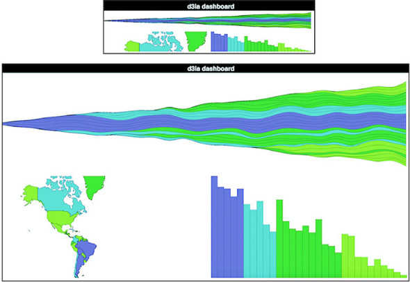
I’m not recalculating the scale and translate on the map because that’s a more involved process that I already got into in the last chapter when we explored zooming in and out.
9.6.2. Legends
As we’ve learned, legends are straightforward. Pass your scale over to d3-svg-legend in your bar chart code, as shown in the following listing.
Listing 9.12. Adding a legend
import { legendColor } from 'd3-svg-legend'
import { transition } from 'd3-transition'                                  1
...
  createBarChart() {
    const dataMax = max(this.props.data.map(d => sum(d.data)))
    const barWidth = this.props.size[0] / this.props.data.length
    const node = this.node

    const legend = legendColor()
      .scale(this.props.colorScale)
      .labels(["Wave 1", "Wave 2", "Wave 3", "Wave 4"])                     2

    select(node)
      .selectAll("g.legend")
      .data([0])                                                            3
      .enter()
      .append("g")
      .attr("class", "legend")
      .call(legend)

    select(node)
      .select("g.legend")
      .attr("transform", "translate(" + (this.props.size[0] - 100) + ", 20)"4
...
- 1 You need to import transition so that d3-svg-legend can use it
- 2 Although we could use threshold values, it’s better to use semantically meaningful names for your categories
- 3 We bind a single value array of data to ensure that we append one <g> element only and then during later refreshes we update it
- 4 Make the transform change happen during every refresh, so the legend is responsive in its placement
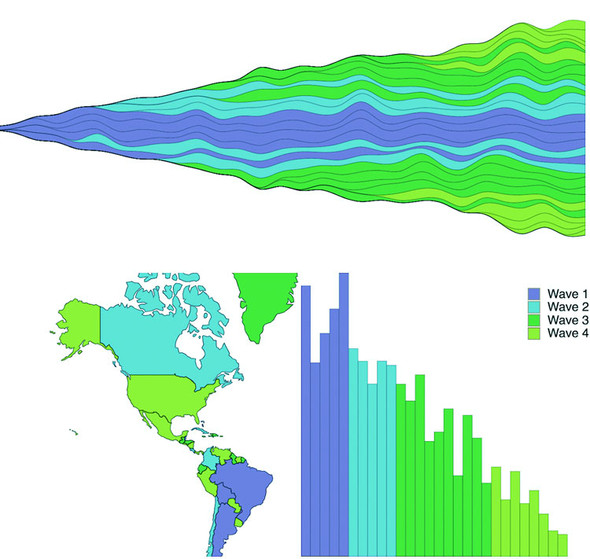
And with that, we finally have an explanation for what those colors are, as shown in figure 9.10.
Figure 9.10. Our MatFlicks table mat rollout dashboard, now with a legend to show your users which countries are in which wave of launches
9.6.3. Cross-highlighting
In each of our three views in this dashboard, we’re showing the same data and even coloring it in the same way, so it’s only natural that someone using it would like to see which bar associates with which country and which trend associates with which bar. To handle that, we need to add a spot in the state of our application that knows what we’re hovering over and mouse events on all the elements that update that state. After that, we can pass down that new state and if it corresponds to an element’s ID in the rendering, we visually highlight it. React refers to events a bit differently, but otherwise it’s straightforward. First, in the following listing, we’ll update the main app so that we can pass down a function and the current state that this function modifies.
Listing 9.13. App.js updates
this.onHover = this.onHover.bind(this)                                  1
this.state = { screenWidth: 1000, screenHeight: 500, hover: "none" }
...
onHover(d) {
    this.setState({ hover: d.id })                                      2
}
...
<StreamGraph hoverElement={this.state.hover} onHover={this.onHover}     3
     colorScale={colorScale} data={appdata} size={[this.state.screenWidth,
this.state.screenHeight / 2]} />
<WorldMap hoverElement={this.state.hover} onHover={this.onHover}        3
     colorScale={colorScale} data={appdata}
size={[this.state.screenWidth / 2, this.state.screenHeight / 2]} />
<BarChart hoverElement={this.state.hover} onHover={this.onHover}        3
     colorScale={colorScale} data={appdata}
size={[this.state.screenWidth / 2, this.state.screenHeight / 2]} />
- 1 We’re going to store the currently hovered on element in state so we need to initialize our state with a hover property
- 2 The hover function will expect us to send the data object
- 3 We need to send to the components both the hover function and the current hover state for them to interact properly
In the following listing we see how we can reference the passed function by tying it to traditional D3 development patterns, like using .on() and .style().
Listing 9.14. BarChart.js updates
...
    select(node)
      .selectAll("rect")
      .data(this.props.data)
      .enter()
      .append("rect")
      .attr("class", "bar")
      .on("mouseover", this.props.onHover)                          1
...
    select(node)
      .selectAll("rect.bar")
      .data(this.props.data)
      .attr("x", (d,i) => i * barWidth)
      .attr("y", d => this.props.size[1] - yScale(sum(d.data)))
      .attr("height", d => yScale(sum(d.data)))
      .attr("width", barWidth)
      .style("fill", (d,i) => this.props.hoverElement === d.id ?    2
            "#FCBC34" : this.props.colorScale(i))
...
- 1 Bind the hover function we’ve passed down like we would any other function in a D3 chart
- 2 Fill with the usual colorScale value unless we’re hovering on this element, in this case orange
Finally, in listings 9.15 and 9.16 we see how to use the function with the slightly different JSX React syntax (using onMouseEnter as the property, which is different than the normal HTML property, which would be onmouseover). We also pass the check to change the color on through to the style object instead of using .style().
Listing 9.15. WorldMap.js Updates
.map((d,i) => <path
    key={"path" + i}
    d={pathGenerator(d)}
    onMouseEnter={() => {this.props.onHover(d)}}                       1
    style={{fill: this.props.hoverElement === d.id ? "#FCBC34" :
        this.props.colorScale(i), stroke: "black",
        strokeOpacity: 0.5 }}                                          2
    className="countries"
/>)
- 1 In React, it’s called onMouseEnter and it doesn’t automatically send the bound data
- 2 Same as with the D3 method, except in React syntax
Listing 9.16. StreamGraph.js Updates
const stacks = stackLayout(stackData).map((d, i) => <path
     key={"stack" + i}
     d={stackArea(d)}
     onMouseEnter={() => {this.props.onHover(this.props.data[i])}}         1
     style={{fill: this.props.hoverElement === this.props.data[i]["id"] ?
     "#FCBC34" : this.props.colorScale(this.props.data[i]["id"].launchday),
     stroke: "black", strokeOpacity: 0.5 }}

/>)
- 1 Because stackData is the transformed data, we need to reference the original data to send the right object
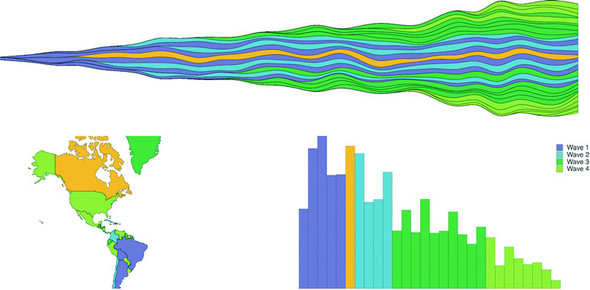
Now that we can cross-highlight, we can easily see which countries correspond to which trends and which bars on the bar chart. Here’s Canada in figure 9.11.
Figure 9.11. Canada as our cross-highlighting example. It was earlier in the alphabet and as a result millions of Canadians were enjoying high quality European mats long before citizens of the United States could.
9.7. Brushing
The brush component d3.brush() (or brush() when we use it from the d3-brush module) is like the axis component because it creates SVG elements when called (typically by a <g> element). But it’s also like the zoom behavior because brush has interactions that update a data element that you can use for interactivity. Brushes are valuable interactive components that allow users to intuitively slice up their data. For our dashboard, we’ll add a brush that lets users show countries that were launched during particular periods.
9.7.1. Creating the brush
A brush in D3 creates a region where the user can select by clicking and dragging. Because we call the brush from a <g> there’s no way to use Brush with the second React+D3 method; you’re going to have to hand over a DOM element for brush to call. We’ll still be passing the results of our brush interactions to the App state for it to distribute to the various other elements. First, let’s get a Brush.js component up and running. In the following listing is the hopefully by-now familiar code for including reference to our new component from App.js. We’re only sending it a size to begin with.
Listing 9.17. App.js updates for a brush
...
import Brush from './Brush'
...

<Brush size={[this.state.screenWidth, 50]} />
This is why our CSS has references to a rect.selection and rect.handle. These are the pieces of the brush that afford interactivity, as you can see in figure 9.12.
Figure 9.12. Components of a brush
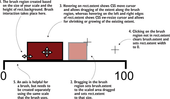
A brush is an interactive collection of components that allows a user to drag one end of the brush to designate an extent or to move that extent to a different range. Typical brush aspects are explained in figure 9.12. In this chapter we only create a brush that allows selection along the x-axis, but if you want to see a brush that selects along the x- and y-axes, you can check out chapter 11, where we use it to select points laid out on an xy plane.
It’s also helpful to create an axis to go along with our brush. The brush is created as a region of interactivity, and clicking on that region produces a rectangle in response. But before any interaction, the area looks blank. By including an axis, we inform the user of the range attached to this brush.
The scale you use to drive your axis will likely also be necessary to do any translation of the brushed area to a data range that we want to use for filtering. Our brush is going to be the width of our dashboard, which is a variable pixel size, and the region designated by your brush interaction doesn’t correspond to our data (the launch day of each country), so we’ll need that scale to translate the brushed extent to a data extent.
After that, we’ll create a brushX brush and assign this.props.size of the component as the second argument of the brush’s .extent() method, which is a bounding box like we saw in the last chapter for geo regions (a two-part array where the first part is the coordinates of the top-left corner and the second part is the coordinates of the bottom-right corner). We can also create brushes that are vertical using the brushY brush or allow for selecting a region by using the brush brush (the one we’ll use in chapter 11). We’ll assign an event listener that listens for the custom event "brush" to call the function brushed(). Code to create the brush is shown in listing 9.18, whereas code for the behavior when the brush is used is explained in listing 9.19. The brush event happens any time the user drags the mouse along the brush region after clicking the region. As with zoom, a brushstart and brushend event is associated with brushing, which you can use to fire performance-intensive functions that you may not want to trigger on every little move of the brush.
Listing 9.18. Brush.js component
import React, { Component } from 'react'
import './App.css'
import { select, event } from 'd3-selection'
import { scaleLinear } from 'd3-scale'
import { brushX } from 'd3-brush'
import { axisBottom } from 'd3-axis'

class Brush extends Component {
  constructor(props){
    super(props)
    this.createBrush = this.createBrush.bind(this)             1
  }

  componentDidMount() {
    this.createBrush()                                         1
  }

  componentDidUpdate() {
    this.createBrush()                                         1
  }
  createBrush() {
  const node = this.node
  const scale = scaleLinear().domain([0,30])
    .range([0,this.props.size[0]])                             2

  const dayBrush = brushX()
                  .extent([[0, 0], this.props.size])
                  .on("brush", brushed)                        3

  const dayAxis = axisBottom()
    .scale(scale)                                              4

  select(node)
    .selectAll("g.brushaxis")
    .data([0])
    .enter()
    .append("g")
    .attr("class", "brushaxis")                                4
    .attr("transform", "translate(0,25)")

  select(node)
    .select("g.brushaxis")
    .call(dayAxis)

  select(node)
    .selectAll("g.brush")
    .data([0])
    .enter()
    .append("g")
    .attr("class", "brush")

  select(node)
    .select("g.brush")
    .call(dayBrush)                                            5

  function brushed() {
    console.log(event)
     // brushed code                                           6
  };

  }

  render() {
    return <svg  ref={node => this.node = node}
width={this.props.size[0]} height={50}></svg>
  }
}

export default Brush
- 1 Standard stuff for a React component that has D3 handle element creation and updating
- 2 For our axis and later for our brushed function
- 3 Initialize the brush and associate it with our brushed function
- 4 Nothing new here, only creating an axis
- 5 Call the brush with our <g> to create it
- 6 We’ll handle this below
Again we see that we’re binding a couple single-item arrays so we can use D3’s enter-exit-update syntax in a way that doesn’t recreate the elements every time the component fires a render. The results in figure 9.13 are of a draggable, adjustable brush and brush region that when we drag and adjust it, doesn’t do anything but move around.
Figure 9.13. Here’s our brush, though without any function associated with the brush events, so it’s little more than a toy. A boring, boring toy.
The brushed() function that we previously defined in the createBrush function gets the current extent of the brush using event from d3-selection and sends it back up to App, where it’s used to filter the base dataset, which automatically changes the displayed data for the other views, as in the following listing.
Listing 9.19. The brushed function in Brush.js
const brushFn = this.props.changeBrush                                    1
function brushed() {
    const selectedExtent = event.selection.map(d => scale.invert(d))      2
    brushFn(selectedExtent)
}
- 1 We need to bind this function to a variable since the context of brushed will be different (we could also use function.bind or function.apply but that’s more cumbersome in this case)
- 2 Invert will return the domain for the range for a scale
This means we’ll need to pass a kind of changeBrush function from App that, as you might guess, will update state which will itself be taken into account when we calculate the data we send to our components, as in the following listing.
Listing 9.20. App.js changes to listen for a brush
...
this.onBrush = this.onBrush.bind(this)
this.state = { screenWidth: 1000, screenHeight: 500, hover: "none",
    brushExtent: [0,40] }

...
onBrush(d) {
    this.setState({ brushExtent: d })
}
render() {
    const filteredAppdata = appdata.filter((d,i) =>
        d.launchday >= this.state.brushExtent[0] &&
        d.launchday <= this.state.brushExtent[1])
...
<StreamGraph hoverElement={this.state.hover} onHover={this.onHover}
     colorScale={colorScale} data={filterdAppdata}
     size={[this.state.screenWidth, this.state.screenHeight / 2]} />
<Brush changeBrush={this.onBrush} size={[this.state.screenWidth, 50]} />
<WorldMap hoverElement={this.state.hover} onHover={this.onHover}
     colorScale={colorScale} data={filterdAppdata}
     size={[this.state.screenWidth / 2, this.state.screenHeight / 2]} />
<BarChart hoverElement={this.state.hover} onHover={this.onHover}
     colorScale={colorScale} data={filterdAppdata}
     size={[this.state.screenWidth / 2, this.state.screenHeight / 2]} />
...
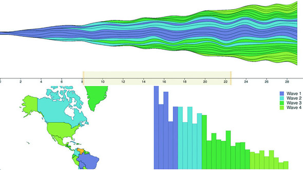
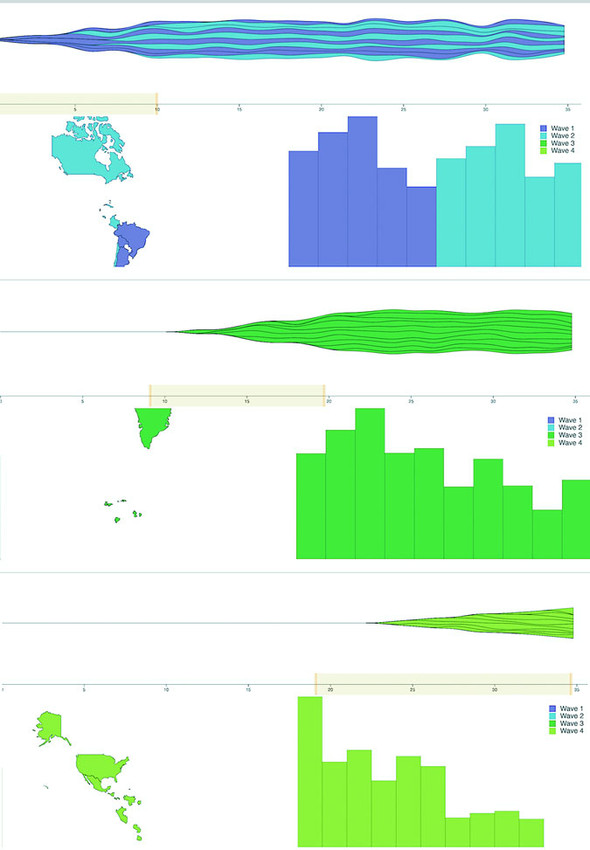
This brush allows users to designate a block of days to see the launch numbers for countries that were launched during those. Figure 9.14 shows three different brushed regions and the corresponding changes to the dashboard.
Figure 9.14. The results of our brushed() function showing only wave 1 and 2, then wave 3, and finally wave 4 countries.
9.7.2. Understanding brush events
Activity on the brush region fires three separate custom events: brush, brushstart, and brushend. You’ve probably figured them out based on their names, but for clarity, brushstart is fired when you mousedown on the brush region, brush is fired continuously as you drag your mouse after brushstart and before mouseup, and brushend is fired on mouseup. In most implementations of a brush, it makes sense to wire it up so that whatever function you want applied with user activity only happens on the brush event. But you may have functions that are more expensive, such as redrawing an entire map or querying a database. In that case you could use brushstart to cause a visual change in your map (turning elements gray or transparent) and wait until brushend to run more heavy-duty activity.
We’ll stop there. You could replace any of the charts with one of the charts we looked at earlier, such as a pie chart, network visualization, or circle pack. Controls like the brush can be powerful, but it’s also important to make such controls accessible to your users.
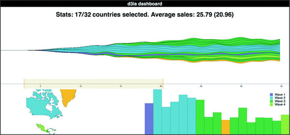
9.8. Show me the numbers
Maybe you haven’t noticed my thinly disguised dislike of that phrase. It’s pernicious, and it’s all over the field. Clients will often assume that there’s only one view of the information they want and it’s your job to give it to them and if you produce a chart that doesn’t highlight numerical differences precisely, they consider it a failure. It’s a challenge, one I discussed a bit in chapter 6, and one you’ll have to wrestle with in your work.
But with that said, there is a place for literally showing numbers. Sometimes numbers are the best way to visualize data. In the case of dashboards, there should almost always be a statline: a single readable line of the overall statistics of your data, to give them some context and allow them to reason about whether an individual piece of data is unusual or not. It’s not the sexiest way to visualize data but it’s useful. I’m not going to get into the weeds of how to format the data, because this chapter has already gotten long; instead, I’m going to use this as an opportunity to introduce you to one more React concept: the pure render component. If you have a component that takes props and returns a render function, then your entire component can be one function, as in the following listing.
Listing 9.21. Pure Render StatLine.js
import React from 'react'
import { mean, sum } from 'd3-array'

export default (props) => {                                            1
  const allLength = props.allData.length                               2
  const filteredLength = props.filteredData.length
  let allSales = mean(props.allData.map(d => sum(d.data)))
  allSales = Math.floor(allSales * 100)/100                            3
  let filteredSales = mean(props.filteredData.map(d => sum(d.data)))
  filteredSales = Math.floor(filteredSales * 100)/100
  return <div>                                                         4
  <h1><span>Stats: </span>
  <span>{filteredLength}/{allLength} countries selected. </span>
  <span>Average sales: </span>
  <span>{filteredSales} ({allSales})</span>
  </h1>
</div>
}
- 1 We’re exporting a function that takes props
- 2 Notice we’re using props, not this.props, because there is no this, and props is being passed to the function when it’s a pure render function
- 3 This is a simple way to round to two decimal places
- 4 Pure render components return a DOM elements
One thing that may jump out at you is that I rolled my own formatter to round my average sales to two decimal places, rather than using d3-format as you might expect. That’s because I didn’t want to include d3-format. When I first started with D3, I used it for everything, but since then I’ve come to rely on other libraries that I find better designed for the functionality I need, and in the case of formatting that means numeral.js for numbers and moment.js for dates (moment is also great for time functionality more generally). That shouldn’t be too surprising, because the whole point of this chapter is to leverage React instead of D3.js for creating, updating, and destroying elements, because it’s a better technology for that purpose. Our final version of our dashboard is in figure 9.15.
Figure 9.15. Our final dashboard, showing a statline at the top indicating the number of countries we’ve selected out of the total number of countries in the data as well as the average sales of the selected countries compared to the average sales overall. Here it’s resized to be smaller and because we don’t resize the map, we only see North America.
9.9. Summary
- Integrating D3 with MVC frameworks or view rendering libraries like React means you need to only use the parts of D3 that don’t overlap with your other libraries.
- You have two fundamentally different ways to integrate D3: pass the DOM node to D3 and work on it separately from the rest of your application using traditional D3 select/enter/exit/update, or only use D3 to generate data and drawing instructions to pass to your other libraries.
- NPM-based projects are better served by using individual D3 modules.
- The brush() component lets you select a range of data in an intuitive way.
- Cross-highlighting behavior is useful and expected when creating dashboards.
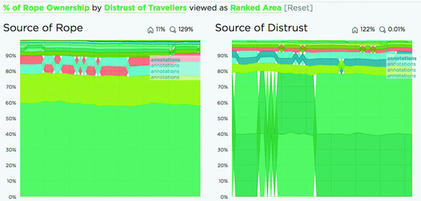
D3 in the real world
Elijah Meeks Senior Data Visualization Engineer
Netflix Algorithm and New Member Dashboards
Netflix needs to understand billions of events from tens of millions of users watching thousands of unique titles. To do this, Netflix uses dashboards. The more complex ones are custom applications made with D3, React, and Redux.
To build a dashboard like the one in the next figure, which tracks algorithm performance, or the one in the previous figure, which looks at the membership funnel, we use the techniques you see in this chapter.
Along with those, we get animation and performance tuning using the React lifecycle events. The custom D3 charts built in these dashboards are often the only way we can leverage high-powered big data backends to surface the billions of events that Netflix deals with.