Table of Contents for
D3.js in Action, Second Edition: Data visualization with JavaScript
 D3.js in Action, Second Edition: Data visualization with JavaScript
Published by
Manning Publications, 2017
D3.js in Action, Second Edition: Data visualization with JavaScript
Published by
Manning Publications, 2017
- Cover
- D3.js in Action, Second Edition: Data visualization with JavaScript
- Copyright
- Brief Table of Contents
- Table of Contents
- Praise for the First Edition
- Preface
- Acknowledgments
- About this Book
- About the Cover Illustration
- Part 1. D3.js fundamentals
- Chapter 1. An introduction to D3.js
- Chapter 2. Information visualization data flow
- Chapter 3. Data-driven design and interaction
- Chapter 4. Chart components
- Chapter 5. Layouts
- Part 2. Complex data visualization
- Chapter 6. Hierarchical visualization
- Chapter 7. Network visualization
- Chapter 8. Geospatial information visualization
- Part 3. Advanced techniques
- Chapter 9. Interactive applications with React and D3
- Chapter 10. Writing layouts and components
- Chapter 11. Mixed mode rendering
- Index
- List of Figures
- List of Tables
- List of Listings
Chapter 5. Layouts
This chapter covers
- Understanding histogram and pie chart layouts
- Learning about simple tweening
- Working with stack layouts
- Using Sankey diagrams and word clouds
D3 contains a variety of functions, referred to as layouts, that help you format your data so that it can be presented using a popular charting method. In this chapter we’ll look at several different layouts so that you can understand general layout functionality, learn how to deal with D3’s layout structure, and deploy one of these layouts (several of which are shown in figure 5.1) with your data.
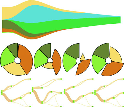
Figure 5.1. Multiple layouts are demonstrated in this chapter, including the circle pack (section 5.3), tree (section 5.4), stack (section 5.5), and Sankey (section 5.6.1), as well as tweening to properly animate shapes like the arcs in pie charts (section 5.2.3).
In each case, as you’ll see with upcoming examples, when a dataset is associated with a layout, each of the objects in the dataset has attributes that allow for drawing the data. Layouts don’t draw the data, nor are they called like components or referred to in the drawing code like generators. Rather, they’re a preprocessing step that formats your data so that it’s ready to be displayed in the form you’ve chosen. You can update a layout and then if you rebind that altered data to your graphical objects, you can use the D3 enter/update/exit syntax you encountered in chapter 2 to update your layout. Paired with animated transitions, this can provide you with the framework for an interactive, dynamic chart.
This chapter gives an overview of layout structure by implementing popular layouts such as the histogram, pie chart, tree, and circle packing. Other layouts, such as the chord layout and more exotic ones, follow the same principles and should be easy to understand after looking at these. We’ll get started with a kind of chart you’ve already worked with, the bar chart or histogram, which has its own layout that helps abstract the process of building this kind of chart.
5.1. Histograms
Before we get into charts that you’ll need layouts for, first we’ll create a chart that we easily made without a layout. In chapter 2, we made a bar chart based on our Twitter data by using d3.nest(). But D3 has a layout, d3.histogram(), that bins values automatically and provides us with the necessary settings to draw a bar chart based on a scale that we’ve defined. Many people who get started with D3 think it’s a charting library and that they’ll find a function like d3.histogram that creates a bar chart in a <div> when it’s run. But D3 layouts don’t result in charts; they result in the settings necessary for charts. You have to put in a bit of extra work for charts, but you have enormous flexibility (as you’ll see in this and later chapters) that allows you to make diagrams and charts that you can’t find in other libraries.
5.1.1. Drawing a histogram
Listing 5.1 shows the code to create a histogram layout and associate it with a particular scale. I’ve also included an example of how you can use interactivity to adjust the original layout and rebind the data to your shapes. This changes the histogram from showing the number of tweets that were favorited to the number of tweets that were retweeted.
Listing 5.1. Histogram code
d3.json("tweets.json", function(error, data) { histogram(data.tweets) })
function histogram(tweetsData) {
   var xScale = d3.scaleLinear().domain([ 0, 5 ]).range([ 0, 500 ]);
   var yScale = d3.scaleLinear().domain([ 0, 10 ]).range([ 400, 0 ]);
   var xAxis = d3.axisBottom().scale(xScale).ticks(5)
   var histoChart = d3.histogram();                          1

   histoChart
    .domain([ 0, 5 ])
    .thresholds([ 0, 1, 2, 3, 4, 5 ])
    .value(d => d.favorites.length)                          2

histoData = histoChart(tweetsData);                          3

  d3.select("svg")
    .selectAll("rect")
    .data(histoData).enter()
    .append("rect")
    .attr("x", d => xScale(d.x0))
    .attr("y", d => yScale(d.length))
    .attr("width", d => xScale(d.x1 - d.x0) - 2)
    .attr("height", d => 400 - yScale(d.length))             4
    .style("fill", "#FCD88B")

  d3.select("svg").append("g").attr("class", "x axis")
    .attr("transform", "translate(0,400)").call(xAxis);
  d3.select("g.axis").selectAll("text").attr("dx", 50);      5
}
- 1 Creates a new layout function
- 2 Determines the values the histogram bins for
- 3 Formats the data
- 4 Formatted data is used to draw the bars
- 5 Centers the axis labels under the bars
You pass d3.histogram an array of data, a number of bins, and a scale, and it returns to you an array of bins filled with the data that falls into a particular bin at a particular scale, which you can then bind to elements and create a bar chart like the one in figure 5.2. In this context, a bin is the label for data that falls within a certain range, and you’ll hear the term binning used to refer to aggregating data points into discrete groups of data points based on value. Second, you’re still using the same generators and components that you needed when you created a bar chart from raw data without the help of a layout. The axisBottom component is in this case being sent five ticks. Third, the histogram is useful because it automatically bins data, whether it’s whole numbers like this or it falls in a range of values in a scale. Finally, if you want to change a chart using a different dimension of your data, you don’t need to remove the original. You need to reformat your data using the layout and rebind it to the original elements, preferably with a transition. You’ll see this in more detail in your next example, which uses another type of chart: pie charts.
Figure 5.2. The histogram in its initial state before we change the measure from favorites to retweets by clicking on one of the bars
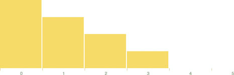
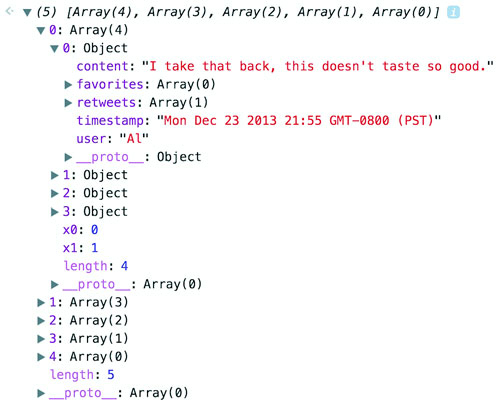
Let’s look at the data that histogram produces. One way to do this is by console.log(histoData) after you process it. You’ll see the array in figure 5.3. The array has been extended so that each array item has an x0 and x1 value that corresponds to the top and bottom thresholds of that bin. The array length indicates the number of items in that bin. And that’s all there is to that function, but it’s enough to provide us with sufficient drawing instructions to render the chart in figure 5.2.
Figure 5.3. The processed data from d3.histogram returns an array where each array item also has an x0 and x1 field.
5.1.2. Interactivity
We can add interactivity to change the chart to render another view of the data when we click it. Because the data we used has more than one dimension to it, we can re-run d3.histogram to bin on another dimension and get updated drawing instructions that we can use for a new chart, as in the following listing.
Listing 5.2. Histogram interactivity
...
            .attr("height", d => 400 - yScale(d.length))
            .on("click", retweets);

   function retweets() {
      histoChart.value(d => d.retweets.length)                       1
      histoData = histoChart(tweetsData);
      d3.selectAll("rect").data(histoData)                           2
      .transition().duration(500).attr("x", d => xScale(d.x0))
      .attr("y", d => yScale(d.length))
         .attr("height", d => 400 - yScale(d.length))
  };
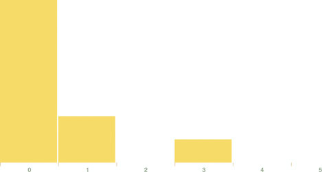
We’re adding the click event to the individual rect elements out of convenience here. In a finished application you’d probably want to assign this to a button or other UI element. But for our purposes, this is fine, and clicking a rect produces the new chart of retweets in figure 5.4.
Figure 5.4. The histogram chart we’ve built will make an animated transition to display tweets binned by the number of retweets instead of the number of favorites.
5.1.3. Drawing violin plots
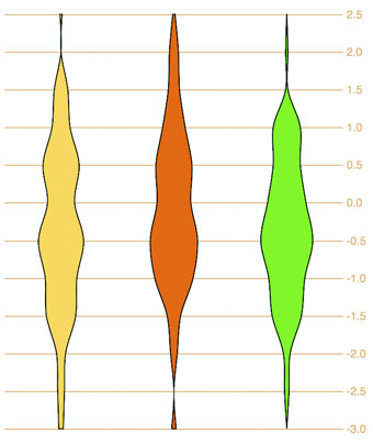
I’ve taught D3 many people in different environments, and every time someone will ask me, “Why do D3 layouts provide such abstract data?” It’s a good question. After all, if you have a function called “histogram” shouldn’t it just, you know, make a histogram? What good is it to give you this intermediary piece on your way to a visualization? The answer is that there are more ways to visualize data than there are ways to process data, by the definition of the problem space. Using rectangles like I have in this chapter is only one way to show distribution data. Another is what we call a violin plot, and we’re going to use d3.histogram to create one right now.
A violin plot is a mirrored curved area that bulges where many datapoints exist and tapers where few exist. They’re commonly seen in medical diagrams dealing with dosage and efficacy but also used more generally to show distributions, and unlike a boxplot that only shows sample points, the violin plot encodes the entire distribution. First, though, we need to generate random data. D3 includes a few random number generators, because when you’re generating random numbers, counterintuitively, you don’t usually want truly random numbers, particularly when you want to look at distributions. We’ll use d3.randomNormal to provide normally distributed random numbers.
If we use d3.histogram to bin those random numbers, and then feed the results into a d3.area generator like we see in the following listing used in the last chapter, you’ll get violin plots like the kind you see in figure 5.5.
Figure 5.5. Three violin plots based on the data produced by d3.histogram
Listing 5.3. Generating violin plots with d3.histogram
  var fillScale = d3.scaleOrdinal().range(["#fcd88a", "#cf7c1c", "#93c464"])

  var normal = d3.randomNormal()
  var sampleData1 = d3.range(100).map(d => normal())
  var sampleData2 = d3.range(100).map(d => normal())
  var sampleData3 = d3.range(100).map(d => normal())           1
  var histoChart = d3.histogram();

  histoChart
   .domain([ -3, 3 ])
   .thresholds([ -3, -2.5, -2, -1.5, -1,
           -0.5, 0, 0.5, 1, 1.5, 2, 2.5, 3 ])                  2
   .value(d => d)

   var yScale = d3.scaleLinear().domain([ -3, 3 ]).range([ 400, 0 ]);
   var yAxis = d3.axisRight().scale(yScale)
    .tickSize(300)
   d3.select("svg").append("g").call(yAxis)

   var area = d3.area()
      .x0(d => -d.length)
      .x1(d => d.length)                                       3
      .y(d => yScale(d.x0))
      .curve(d3.curveCatmullRom)                               4

  d3.select("svg")
    .selectAll("g.violin")
    .data([sampleData1, sampleData2, sampleData3])
    .enter()
    .append("g")
    .attr("class", "violin")
    .attr("transform", (d,i) => `translate(${50 + i * 100},0)`)
    .append("path")
    .style("stroke", "black")
    .style("fill", (d,i) => fillScale(i))
    .attr("d", d => area(histoChart(d)))                       5
- 1 Generate three sample distributions
- 2 The more thresholds, the smoother any distribution chart will look
- 3 Unlike in the last chapter, we’ll draw these vertically
- 4 Use a Catmull–Rom spline interpolation for the area generator
- 5 We’re going to generate the area based on the data transformed by the histogram function
You see, because D3 provides you with that intermediary transformed data, you can decide how you might want to draw the final data visualization.
5.2. Pie charts
In this section you’ll learn how to create a pie chart and transform it into a ring chart. You’ll also learn how to use tweening to properly transition it when you change its data source. After you create it, you can pass it an array of values (which I’ll call a dataset), and it will compute the necessary starting and ending angles for each of those values to draw a pie chart. When we pass an array of numbers as our dataset to a pie layout in the console, as in the following code, it doesn’t produce any kind of graphics like those seen in figure 5.6 but rather results in the response shown in figure 5.7.
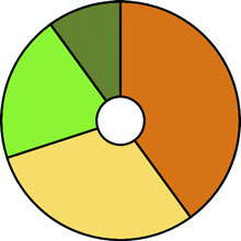
Figure 5.6. The traditional pie chart (bottom right) represents proportion as an angled slice of a circle. With slight modification, it can be turned into a donut or ring chart (top) or an exploded pie chart (bottom left).
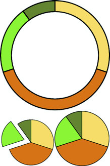
Figure 5.7. A pie layout applied to an array of [1,1,2] shows objects created with a start angle, end angle, and value attribute corresponding to the dataset, as well as the original data, which in this case is a number.
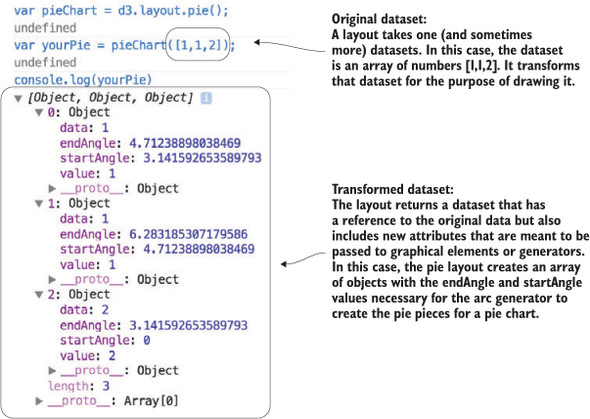
var pieChart = d3.pie();
var yourPie = pieChart([1,1,2]);
Our pieChart function created a new array of three objects. The startAngle and endAngle for each of the data values draw a pie chart with one piece from 0 radians to pi radians, the next from pi to 1.5 pi radians, and the last from 1.5 pi radians to 2 pi radians. But this isn’t a drawing or SVG code like the line and area generators produced. It doesn’t even have the virtue of the histogram response, which at least seems to map directly to coordinates (or coordinates we can pass to a scale).
5.2.1. Drawing the pie layout
These are settings that need to be passed to a generator to make each of the pieces of our pie chart. This particular generator is d3.arc and it’s instantiated like the D3 generators we worked with in chapter 4. As an aside, JavaScript has a whole class of functions known as generators, so keep in mind I’m referring to D3 functions that “generate” drawing instructions for paths. d3.arc has a few settings, but the only one we need for this first example is the outerRadius, which allows us to set a dynamic or fixed radius for our arcs:
var newArc = d3.arc();
newArc.innerRadius(0)
    .outerRadius(100)                      1
console.log(newArc(yourPie[0]));           2
- 1 Gives our arcs and resulting pie chart a radius of 100 px
- 2 Returns the d attribute necessary to draw this arc as a <path> element: “M6.123031769111886e-15,100A100,100 0 0,1 -100,1.2246063538223773e-14L0,0Z”
Now that you know how the arc constructor works and that it works with our data, all we need to do is bind the data created by our pie layout and pass it to <path> elements to draw our pie chart. The pie layout is centered on the 0,0 point in the same way as a circle. If we want to draw it at the center of our canvas, we need to create a new <g> element to hold the <path> elements we’ll draw and then move the <g> to the center of the canvas:
var fillScale = d3.scaleOrdinal()
   .range(["#fcd88a", "#cf7c1c", "#93c464", "#75734F"])
d3.select("svg")
  .append("g")                                          1
  .attr("transform","translate(250,250)")
  .selectAll("path")
  .data(yourPie)                                        2
  .enter()
  .append("path")
  .attr("d", newArc)                                    3
  .style("fill", (d,i) => fillScale(i))
  .style("stroke", "black")
  .style("stroke-width", "2px");
- 1 Appends a new <g> and moves it to the middle of the canvas so that it’ll be easier to see the results
- 2 Binds the array that was created using the pie layout, not our original array or the pie layout itself
- 3 Each path drawn based on that array needs to pass through the newArc function, which sees the startAngle and endAngle attributes of the objects and produces the commensurate SVG drawing code
Figure 5.8 shows our pie chart. The pie chart layout, like most layouts, grows more complicated when you want to work with JSON object arrays rather than number arrays. Let’s bring back our tweets.json from chapter 2. We can nest and measure it to transform it from an array of tweets into an array of Twitter users with their number of tweets computed.
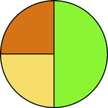
Figure 5.8. A pie chart showing three pie pieces that subdivide the circle between the values in the array [1,1,2]
We get there by using d3.nest() with keys based on the user attribute of tweets. After nesting the tweets, we can measure their attributes and use those numerical measures for charts like these:
d3.json("tweets.json", pieChart)
function pieChart(data) {
   var nestedTweets = d3.nest()
      .key(d => d.user)
      .entries(data.tweets);
   nestedTweets.forEach(d => {
      d.numTweets = d.values.length;
      d.numFavorites = d3.sum(d.values, p => p.favorites.length)         1
      d.numRetweets = d3.sum(d.values, p => p.retweets.length)           2
   });
}
- 1 Gives the total number of favorites by summing the favorites array length of all the tweets
- 2 Gives the total number of retweets by doing the same for the retweets array length
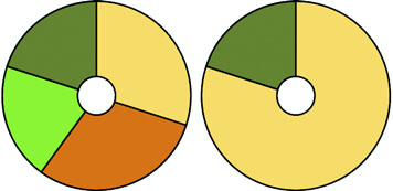
5.2.2. Creating a ring chart
If we execute pieChart(nestedTweets)as with the earlier array illustrated in figure 5.7, it will fail, because it doesn’t know that the numbers we should be using to size our pie pieces come from the .numTweets attribute. Most layouts, pie included, can define where the values are in your array by defining an accessor function to get to those values. In the case of nestedTweets, we define pieChart.value() to point at the numTweets attribute of the dataset it’s being used on. While we’re at it, let’s set a value for our arc generator’s innerRadius so that we create a donut chart instead of a pie chart:
pieChart.value(d => d.numTweets);
newArc.innerRadius(20)
var yourPie = pieChart(nestedTweets);
With those changes in place, we can use the same code as before to draw the pie chart in figure 5.9.
Figure 5.9. A donut chart showing the number of tweets from our four users represented in the nestedTweets dataset.
5.2.3. Transitioning
You’ll notice that for each value in nestedTweets, we totaled the number of tweets and also used d3.sum()to total the number of retweets and favorites (if any). Because we have this data, we can adjust our pie chart to show pie pieces based not on the number of tweets but on those other values. One of the core uses of a layout in D3 is to update the graphical chart. All we need to do is make changes to the data or layout and then rebind the data to the existing graphical elements. By using a transition, we can see the pie chart change from one form to the other. Running the following code first transforms the pie chart to represent the number of favorites instead of the number of tweets. The next block causes the pie chart to represent the number of retweets. The final forms of the pie chart after running that code are shown in figure 5.10:
pieChart.value(d => d.numFavorites)
d3.selectAll("path").data(pieChart(nestedTweets))
  .transition().duration(1000).attr("d", newArc);
pieChart.value(d => d.numRetweets);
d3.selectAll("path").data(pieChart(nestedTweets))
  .transition().duration(1000).attr("d", newArc);
Figure 5.10. The pie charts representing, on the left, the total number of favorites and, on the right, the total number of retweets
Although the results are what we want, the transition can leave a lot to be desired. Figure 5.11 shows snapshots of the pie chart transitioning from representing the number of tweets to representing the number of favorites. As you’ll see by running the code and comparing these snapshots, the pie chart doesn’t smoothly transition from one state to another but instead distorts significantly.
Figure 5.11. Snapshots of the transition of the pie chart representing the number of tweets to the number of favorites. This transition highlights the need to assign key values for data binding and to use tweens for some types of graphical transition, such as that used for arcs.
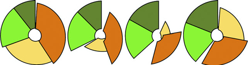
The reason you see this wonky transition is because, as you learned earlier, the default data-binding key is array position. When the pie layout measures data, it also sorts it in order from largest to smallest to create a more readable chart. But when you recall the layout, it re-sorts the dataset. The data objects are bound to different pieces in the pie chart, and when you transition between them graphically, you see the effect shown in figure 5.11. To prevent this from happening, we need to disable this sort:
pieChart.sort(null);
The result is a smooth graphical transition between numTweets and numRetweets, because the object position in the array remains unchanged, and so the transition in the drawn shapes is straightforward. But if you look closely, you’ll notice that the circle deforms a bit because the default transition() behavior doesn’t deal with arcs well. It’s not transitioning the radians in our arcs; instead, it’s treating each arc as a geometric shape and transitioning from one to another.
This becomes obvious when you look at the transition from either of those versions of our pie chart to one that shows numFavorites, because several of the objects in our dataset have 0 values for that attribute, and one of them changes size dramatically. To clean this all up and make our pie chart transition properly, we need to change the code. Some of this you’ve already dealt with, such as using key values for your created elements and using them in conjunction with exit and update behavior. But to make our pie slices transition in a smooth, graphical manner, we need to extend our transitions, as shown in the following listing, to include a custom tween to define how an arc can grow or shrink graphically into a different arc.
Listing 5.4. Updated binding and transitioning for pie layout
pieChart
    .value(d => d.numTweets)
    .sort(null)                                         1

  var tweetsPie = pieChart(nestedTweets)

  pieChart.value(d => d.numRetweets)
  var retweetsPie = pieChart(nestedTweets)

  nestedTweets.forEach((d,i) => {
    d.tweetsSlice = tweetsPie[i]
    d.retweetsSlice = retweetsPie[i]
})                                                      2

...
.selectAll("path")
.data(nestedTweets, d => d.key)                         3
.enter()
.append("path")
.attr("d", d => newArc(d.tweetsSlice))
.style("fill", (d,i) => fillScale(i))
...

d3.selectAll("path")
  .transition()
  .duration(1000)
  .attrTween("d", arcTween)                             4

function arcTween(d) {
  return t => {                                         5
    var interpolateStartAngle = d3
    .interpolate(d.tweetsSlice.startAngle, d.retweetsSlice.startAngle);
    var interpolateEndAngle = d3
    .interpolate(d.tweetsSlice.endAngle, d.retweetsSlice.endAngle);
      d.startAngle = interpolateStartAngle(t);
      d.endAngle = interpolateEndAngle(t);
       return newArc(d);                                6
  }
}
- 1 Don’t sort the pie results so that they stay in the same order as the array you send
- 2 Take the original dataset and add to each object the results of the pie layout
- 3 Notice we’re appending the original dataset because it has the drawing instructions now
- 4 I’m only using a named function here instead of an arrow function because it’s longer and so it’s easier to read as a separate function
- 5 attrTween expects a function that takes the current transition value (a float between 0 and 1) and returns the interpolated value, in this case an arc drawn from the interpolated start and interpolated end angles
- 6 Because this is going into a d attribute, make sure to return the drawing instructions for the intermediary arc
The result of the code in listing 5.4 is a pie chart that cleanly transitions the individual arcs.
We could label each pie piece <path> element, color it according to a measurement or category, or add interactivity. But rather than spend a chapter creating the greatest pie chart application you’ve ever seen, we’ll move on to another kind of layout that’s often used: the stack layout.
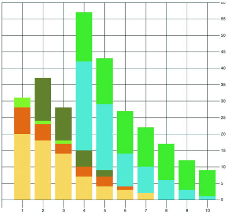
5.3. Stack layout
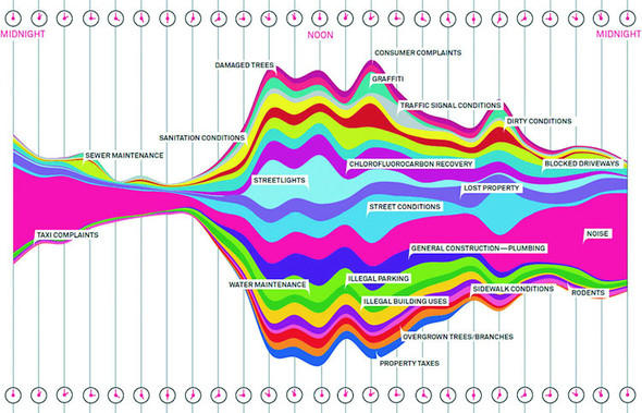
You saw the effects of the stack layout in the last chapter when we created a stacked area chart, and which we introduced by referring to the Wired streamgraph that we see again in figure 5.12. This time, we’ll make a streamgraph, but we’ll begin with a simple stacking function and then use it in more complex ways. The d3.stack layout formats your data so that it can be easily passed to d3.area to draw a stacked graph or streamgraph.
Figure 5.12. The streamgraph by Pitch Interactive used in a Wired piece describing the subject of calls to 311 (a city service for reporting problems) in New York (November 1, 2010; https://www.wired.com/2010/11/ff_311_new_york/all/1)
To implement this, we’ll use the area generator in tandem with the stack layout in listing 5.5. This general pattern should be familiar to you by now:
- Process the data to match the requirements of the layout.
- Set the accessor functions of the layout to align it with the dataset.
- Use the layout to format the data for display.
- Send the modified data either directly to SVG elements or paired with a generator like d3.diagonal, d3.arc, or d3.area.
The first step is to take our original movies.csv data and transform it into an array of movie objects that each have an array of values at points that correspond to the thickness of the section of the streamgraph that they represent.
Listing 5.5. Stack layout example
d3.csv("movies.csv", dataViz);
function dataViz(data) {

  var xScale = d3.scaleLinear().domain([0, 10]).range([0, 500]);
  var yScale = d3.scaleLinear().domain([0, 100]).range([500, 0]);
  var movies = ["titanic", "avatar", "akira", "frozen", "deliverance", "avengers"]

  var fillScale = d3.scaleOrdinal()
    .domain(movies)
    .range(["#fcd88a", "#cf7c1c", "#93c464", "#75734F", "#5eafc6", "#41a368"])

  stackLayout = d3.stack()
     .keys(movies)                                 1

  var stackArea = d3.area()
    .x((d, i) => xScale(i))
    .y0(d => yScale(d[0]))
    .y1(d => yScale(d[1]));                        2

  d3.select("svg").selectAll("path")
    .data(stackLayout(data))
    .enter().append("path")
    .style("fill", d => fillScale(d.key))          3
    .attr("d", d => stackArea(d));
}
- 1 The movies dataset happens to be perfectly suited to the default stack formatting—all you need to do is pass an array of keys for each object, which happens to also be the domain of our colorScale
- 2 The stack layout is going to return an array of two item arrays, the first is the lower bound and the second is the upper bound, and the index position can be used for the x-position
- 3 Each array of stacked data has a key property that corresponds to the keys you sent in your layout generator
After our stackLayout function processes our dataset, we can get the results by running stackLayout(stackData). The layout creates an array of [ y0, y1 ] values corresponding to the top and bottom of the object at the position of the item in the parent array. If we use the stack layout to create a streamgraph, it requires a corresponding area generator:
   var stackArea = d3.area()
   .x((d,i) => xScale(i))                 1
   .y0(d => yScale(d[0]))
   .y1(d => yScale(d[1]));
- 1 When your index position is sufficient, use that—otherwise d.data still has the original data, so if you need access to it for your scale, you can use that
After we have our data, layout, and area generator in order, we can call them all as part of the selection and binding process. This gives a set of SVG <path> elements the necessary shapes to make our chart. The result, as shown in figure 5.13, isn’t a streamgraph but rather a stacked area chart of the kind we made manually in the last chapter. This isn’t that different from a streamgraph, as you’ll soon find out.
Figure 5.13. The stack layout default settings, when tied to an area generator, produce a stacked area chart like this one.
The stack layout has an .offset() function that determines the relative positions of the areas that make up the chart. Although we can write our own offset functions to create exotic charts, D3 includes several functions to achieve the typical effects we’re looking for. We’ll use the d3.stackOffsetSilhouette keyword, which centers the drawing of the stacked areas around the middle. Another method you’ll need to take advantage of for creating streamgraphs is .order(), which determines the order in which areas are drawn so that you can alternate them like in a streamgraph. We’ll use d3.stackOrderInsideOut because that produces the best streamgraph effect. We can change the area constructor to use the basis interpolator because that gave the best look in our earlier streamgraph example and finally update the domain of our yScale to match up with the centered baseline around which the streamgraph is drawn:
stackLayout.offset(d3.stackOffsetSilhouette).order(d3.stackOrderInsideOut)
stackArea.curve(d3.curveBasis)
yScale.domain([-50, 50])
This results in a cleaner streamgraph than our example from chapter 4 and is shown in figure 5.14.
Figure 5.14. The streamgraph effect from a stack layout with basis interpolation for the areas and using the silhouette and inside-out settings for the stack layout. This is similar to our hand-built example from chapter 4 and shows the same graphical artifacts from the basis interpolation.
Is it useful? Well, it is useful, for various reasons, not least of which is because the area in the chart corresponds graphically to the aggregate profit of each movie.
But sometimes a simple stacked bar graph is better. Layouts can be used for various types of charts, and the stack layout is no different. If we restore the .offset() and .order() back to the default settings, we can use the stack layout to create a set of rectangles that makes a traditional stacked bar chart:
var xScale = d3.scaleLinear().domain([0, 10]).range([0, 500])
var yScale = d3.scaleLinear().domain([0, 60]).range([480, 0])
var heightScale = d3.scaleLinear().domain([0, 60]).range([0, 480])

stackLayout = d3.stack().keys(movies)

d3.select("svg").selectAll("g.bar")
  .data(stackLayout(data))
  .enter()
  .append("g")
  .attr("class", "bar")
  .each(function(d) {                                    1
     d3.select(this).selectAll("rect")
       .data(d)
       .enter()
       .append("rect")
       .attr("x", (p,q) => xScale(q) + 30)               2
       .attr("y", p => yScale(p[1]))                     2
       .attr("height", p => heightScale(p[1] - p[0]))
       .attr("width", 40)                                3
       .style("fill", fillScale(d.key));
    });
- 1 The stacked data is returned in a way so that we iterate through drawing each movie’s bars, rather than each day
- 2 This function is using p,q instead of d,i as a conventional approach for nested arrow functions
- 3 Because it’s an SVG:rect, we want it to be placed where its top position would be, and then we draw down from there
In many ways, the stacked bar chart in figure 5.15 is much more readable than the streamgraph. It presents the same information, but the y-axis tells us exactly how much money a movie made. There’s a reason why bar charts, line charts, and pie charts are the standard chart types found in your spreadsheet. Streamgraph, stacked bar charts, and stacked area charts are fundamentally the same thing and rely on the stack layout to format your dataset to draw it. Because you can deploy them equally easily, your decision whether to use one or the other can be based on user testing rather than your ability to create awesome dataviz.
Figure 5.15. A stacked bar chart using the stack layout to determine the position of the rectangles that make up each day’s stacked bar
The layouts we’ve looked at so far, as well as the associated methods and generators, have broad applicability. Now we’ll look at a pair of layouts that don’t come with D3 which are designed for more specific kinds of data: the Sankey diagram and the word cloud. Even though these layouts aren’t as generic as the layouts included in the core D3 library that we’ve looked at, they have some prominent examples and can come in handy.
5.4. Plugins to add new layouts
The examples we’ve touched on in this chapter are a few of the layouts that come with the core D3 library. You’ll see a few more in later chapters, and we’ll focus specifically on the force layout in chapter 7. But layouts outside of core D3 may also be useful to you. These layouts tend to use specifically formatted datasets or different terminology for layout functions.
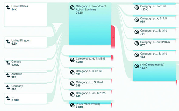
5.4.1. Sankey diagram
Sankey diagrams consist of two types of objects: nodes and edges. In this case, the nodes are the web pages or events, and the edges are the traffic between them. This differs from the hierarchical data you worked with before, because nodes can have many overlapping connections (figure 5.16) to show event flow or user flow from one part of your website to another.
Figure 5.16. Google Analytics uses Sankey diagrams to chart event and user flow for website visitors.
The D3 version of the Sankey layout is a plugin written by Mike Bostock a couple years ago and later updated for D3v4 by Kshitij Aranke. You can find it at https://github.com/d3/d3-sankey. The Sankey layout has a few examples and sparse documentation—one of the drawbacks of non-core layouts. Another minor drawback is that non-core layouts don’t always follow the patterns of the core layouts in D3. To understand the Sankey layout, you need to examine the format of the data, the examples, and the code itself.
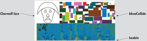
The core D3 library comes with a number of layouts and useful functions, but you can find even more at https://github.com/d3/d3-plugins or by searching NPM. Besides the two non-core layouts discussed in this chapter, we’ll look at the geo plugins in chapter 7 when we deal with maps. Also available is a fisheye distortion lens, a canned boxplot layout, a layout for horizon charts, and more exotic plugins for Chernoff faces and implementing the superformula (a mathematical expression that allows you to create thousands of different shape types by modifying variables).
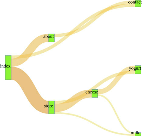
The data is a JSON array of nodes and a second JSON array of links. Get used to this format, because it’s the format of most of the network data we’ll use in chapter 7. For our example, we’ll look at the traffic flow in a website that sells milk and milk-based products. We want to see how visitors move through the site from the home page to the store page to the various product pages, as shown in the following listing. In the parlance of the data format we need to work with, the nodes are the web pages, the links are the visitors who go from one page to another (if any), and the value of each link is the total number of visitors who move from that page to the next.
Listing 5.6. sitestats.json
{
  "nodes":[                                   1
    {"name":"index"},
    {"name":"about"},
    {"name":"contact"},
    {"name":"store"},
    {"name":"cheese"},
    {"name":"yoghurt"},
    {"name":"milk"}
  ],
  "links":[
    {"source":0,"target":1,"value":25},       2
    {"source":0,"target":2,"value":10},
    {"source":0,"target":3,"value":40},
    {"source":1,"target":2,"value":10},
    {"source":3,"target":4,"value":25},
    {"source":3,"target":5,"value":10},
    {"source":3,"target":6,"value":5},
    {"source":4,"target":6,"value":5},
    {"source":4,"target":5,"value":15}
  ]
}
- 1 Each entry in this array represents a web page
- 2 Each entry in this array represents the number of times someone navigated from the “source” page to the “target” page
The nodes array is clear—each object represents a web page. The links array is a bit more opaque, until you realize the numbers represent the array position of nodes in the node array. When links[0] reads "source": 0, it means that the source is nodes[0], which is the index page of the site. It connects to "target": 1 so to nodes[1], the about page, and "value": 25 indicates that 25 people navigated from the home page to the about page. That defines our flow—the flow of traffic through a site.
Depending on how your project is structured, you can install d3-sankey using npm I d3-sankey or download the latest release and include it in your HTML using script tags.
The Sankey layout is initialized like any layout:
var sankey = d3.sankey()
   .nodeWidth(20)                        1
   .nodePadding(200)                     2
   .size([460, 460])
   .nodes(data.nodes)
   .links(data.links)
   .layout(200);                         3
- 1 Where to start and stop drawing the flows between nodes
- 2 The distance between nodes vertically—a lower value creates longer bars representing our web pages
- 3 The number of times to run the layout to optimize placement of flows
Until now, you’ve only seen .size(). It controls the graphical extent that the layout uses. The rest you’d need to figure out by looking at the example, experimenting with different values, or reading the sankey.js code itself. Most of it will quickly make sense, in particular if you’re familiar with the .nodes() and .links() convention used in D3 network visualizations. The .layout() setting is pretty hard to understand without diving into the code, but I’ll explain that next.
After we define our Sankey layout as in listing 5.7, we need to draw the chart by selecting and binding the necessary SVG elements. In this case, that typically consists of <rect> elements for the nodes and <path> elements for the flows. We’ll also add <text> elements to label the nodes.
Listing 5.7. Sankey drawing code
var sankey = d3.sankey()
   .nodeWidth(20)
   .nodePadding(200)
   .size([460, 460])
   .nodes(data.nodes)
   .links(data.links)
   .layout(200)

var intensityRamp = d3.scaleLinear()
   .domain([0,d3.max(data.links, d => d.value) ])
   .range(["#fcd88b", "#cf7d1c"])
d3.select("svg").append("g")
   .attr("transform", "translate(20,20)").attr("id", "sankeyG");          1
d3.select("#sankeyG").selectAll(".link")
   .data(data.links)
   .enter().append("path")
   .attr("class", "link")
   .attr("d", sankey.link())                                              2
   .style("stroke-width", d => d.dy)                                      3
   .style("stroke-opacity", .5)
   .style("fill", "none")
   .style("stroke", d => intensityRamp(d.value))                          4
   .sort((a, b) => b.dy - a.dy)
   .on("mouseover", function() {
       d3.select(this).style("stroke-opacity", .8); })                    5
   .on("mouseout", () => {
d3.selectAll("path.link").style("stroke-opacity", .5); })

d3.select("#sankeyG").selectAll(".node")
   .data(data.nodes)
   .enter().append("g")
   .attr("class", "node")
   .attr("transform", d => `translate(${d.x},${d.y})`)                    6
d3.selectAll(".node").append("rect")
   .attr("height", d => d.dy)
   .attr("width", 20)
   .style("fill", "#93c464")
   .style("stroke", "gray")
d3.selectAll(".node").append("text")
   .attr("x", 0)
   .attr("y", d => d.dy / 2)
   .attr("text-anchor", "middle")
   .style("fill", "black")
   .text(d => d.name)
- 1 Offsets the parent <g> of the entire chart
- 2 Sankey layout’s link() function is a path generator
- 3 Note that layout expects us to use a thick stroke and not a filled area
- 4 Sets the stroke color using our intensity ramp, black to red indicating weak to strong
- 5 Emphasizes the link when we mouse over it by making it less transparent
- 6 Calculates node position as x and y coordinates from our data
The implementation of this layout has interactivity, as shown in figure 5.17. Diagrams like these, with wavy paths overlapping other wavy paths, need interaction to make them legible to your site visitor. In this case, it differentiates one flow from another.
Figure 5.17. A Sankey diagram where the number of visitors is represented in the color of the path. The flow between index and contact has an increased opacity as the result of a mouseover event.
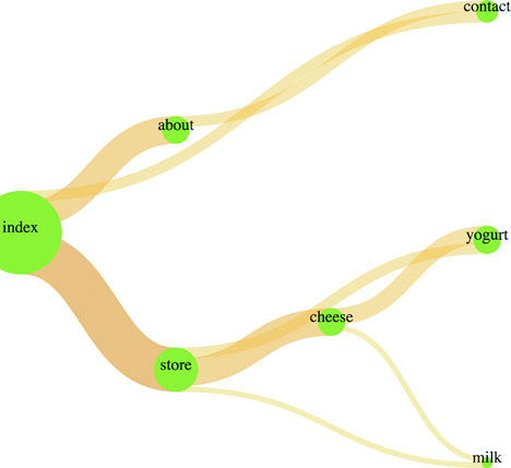
With a Sankey diagram like this at your disposal, you can track the flow of goods, visitors, or anything else through your organization, website, or other system. Although you could expand on this example in any number of ways, I think one of the most useful is also one of the simplest. Remember, layouts aren’t tied to particular shape elements. In certain cases, like with the flows in the Sankey diagram, you’ll have a hard time adapting the layout data to any element other than a <path>, but the nodes don’t need to be <rect> elements. If we adjust our code, we can easily make nodes that are circles:
  sankey.nodeWidth(1);
 d3.selectAll(".node").append("circle")
   .attr("height", d => d.dy)
   .attr("r", d => d.dy / 2)
   .attr("cy", d => d.dy / 2)
   .style("fill", "#93c464")
Don’t shy away from experimenting with tweaks to traditional charting methods. Using circles instead of rectangles, like in figure 5.18, may seem frivolous, but it may be a better fit visually, or it may distinguish your Sankey from all the boring sharp-edged Sankeys out there. In the same vein, don’t be afraid of leveraging D3’s capacity for information visualization to teach yourself how a layout works. You’ll remember that d3.sankey has a layout() function. It adjusts and attracts and relaxes the pull of each connected node to each other to achieve the most efficient arrangement of nodes and edges. You can see how it does that by reading the code, but there’s another, more visual way to see how this function works: by using transitions and creating a function that updates the .layout().property dynamically. This allows you to “see” the layout function in action.
Figure 5.18. A squid-like Sankey diagram
Although you may think of data visualization as all the graphics in this book, it’s also simultaneously a graphical representation of the methods you used to process the data. In certain cases, like the Sankey diagram here or the force-directed network visualization you’ll see in the next chapter, the algorithm used to sort and arrange the graphical elements is front and center. After you have a layout that displays properly, you can play with the settings and update the elements as you’ve done with the Sankey diagram to better understand how the algorithm works visually.
First, we need to add an onclick function to make the chart interactive, as shown in listing 5.8. We’ll attach this function to the <svg> element itself, but you could as easily add a button the way we did in chapter 3.
The runMoreLayouts() function does two things. It updates the sankey.layout() property by incrementing a variable and setting it to the new value of that variable. It also selects the graphical elements that make up your chart (the <g> and <path> elements) and redraws them with the updated settings. By using transition() and delay(), you’ll see the chart dynamically adjust.
Listing 5.8. Visual layout function for the Sankey diagram
var numLayouts = 1;
d3.select("svg").on("click", runMoreLayouts);
sankey.layout(numLayouts);                         1
function runMoreLayouts() {
   numLayouts += 20;                               2
   sankey.layout(numLayouts);
   d3.selectAll(".link")
      .transition()
      .duration(500)
      .attr("d", sankey.link())                    3
   d3.selectAll(".node")
      .transition()
      .duration(500)
      .attr("transform", d => "translate(" + d.x + "," + d.y + ")")
}
- 1 Initializes the Sankey with only a single layout pass
- 2 I chose 20 passes because it shows some change without requiring us to click too much
- 3 Because the layout updates the dataset, we have to call the drawing functions again and they automatically update
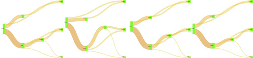
The end result is a visual experience of the effect of the .layout() function. This function specifies the number of passes that d3.sankey makes to determine the best position of the lines representing flow. You can see snapshots of this in figure 5.19 showing the lines sort out and get out of each other’s way. This kind of position optimization is a common technique in information visualization and drives the force-directed network layout that you’ll see in chapter 6. In the case of our Sankey example, even one pass of the layout provides good positioning. That’s because this is a simple dataset and it stabilizes quickly. As you can see as you click your chart, and in figure 5.19, the layout doesn’t change much with progressively higher numbers of passes in the layout() setting.
Figure 5.19. The Sankey layout algorithm attempts to optimize the positioning of nodes to reduce overlap. The chart reflects the position of nodes after (from left to right) 1 pass, 20 passes, 100 passes, and 200 passes.
It should be clear by this example that when you update the settings of the layout, you can also update the visual display of the layout. You can use animations and transitions by calling the elements and setting their drawing code or position to reflect the changed data. You’ll see much more of this in later chapters.
5.4.2. Word clouds
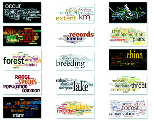
One of the most popular information visualization charts is also one of the most maligned: the word cloud. Also known as a tag cloud, the word cloud uses text and text size to represent the importance or frequency of words. Figure 5.20 shows a thumbnail gallery of 15 word clouds derived from text in a species biodiversity database. Word clouds often rotate the words to set them at right angles or jumble them at random angles to improve the appearance of the graphics. Word clouds, like streamgraphs, receive criticism for being hard to read or presenting too little information, but both are surprisingly popular with audiences.
Figure 5.20. A word or tag cloud uses the size of a word to indicate its importance or frequency in a text, creating a visual summary of text. These word clouds were created by the popular online word cloud generator Wordle (www.wordle.net).
I created these word clouds using my data with the popular Java applet Wordle, which provides an easy UI and a few aesthetic customization choices. Wordle has flooded the Internet with word clouds because it lets anyone create visually arresting but problematic graphics by dropping text onto a page. This has caused much consternation among data visualization experts, who think word clouds are evil because they embed no analysis in the visualization and only highlight superficial data such as the quantity of words in a blog post.
But word clouds aren’t evil. First of all, they’re popular with audiences. But more than that, words are remarkably effective graphical objects. If you can identify a numerical attribute that indicates the significance of a word, then scaling the size of a word in a word cloud relays that significance to your reader.
Let’s start by assuming we have the right kind of data for a word cloud. Fortunately, we do: the top 20 words used in this chapter, with the number of each word, as shown in the following listing.
Listing 5.9. worddata.csv
text,frequency
layout,63
function,61
data,47
return,36
attr,29
chart,28
array,24
style,24
layouts,22
values,22
need,21
nodes,21

pie,21
use,21
figure,20
circle,19
we'll,19
zoom,19
append,17
elements,17
To create a word cloud with D3, you have to use another layout that isn’t in the core library, created by Jason Davies (who created the sentence trees using the tree layout shown in chapter 6) that implements an algorithm written by Jonathan Feinberg (http://static.mrfeinberg.com/bv_ch03.pdf). The layout, d3.cloud(), is available on GitHub updated for v4 at https://github.com/sly7-7/d3-cloud. It requires that you define what attribute will determine word size and what size you want the word cloud to lay out for, as shown in listing 5.10.
Unlike most other layouts, cloud()fires a custom event end that indicates it’s done calculating the most efficient use of space to generate the word cloud. The layout then passes to this event the processed dataset with the position, rotation, and size of the words. We can then run the cloud layout without ever referring to it again, and we don’t even need to assign it to a variable, as we do in the following listing. If we plan to reuse the cloud layout and adjust the settings, we assign it to a variable like with any other layout.
Listing 5.10. Creating a word cloud with d3.cloud
   var wordScale=d3.scaleLinear().domain([0,75]).range([10,120]);        1
   d3.cloud()
     .size([500, 500])
     .words(data)                                                        2
     .rotate(0)
     .fontSize(d => wordScale(d.frequency))                              3
     .on("end", draw)
     .start();                                                           4
   function draw(words) {                                                5
     var wordG = d3.select("svg").append("g")
       .attr("id", "wordCloudG")
       .attr("transform","translate(250,250)");
     wordG.selectAll("text")
       .data(words)
       .enter()
       .append("text")
       .style("font-size", d => d.size + "px")
       .style("fill", "#4F442B")
       .attr("text-anchor", "middle")
       .attr("transform", d =>
            "translate(" + [d.x, d.y] + ")rotate(" + d.rotate + ")")     6
       .text(d => d.text);
  };
- 1 Use a scale rather than raw values for the font size (if you scale a word too large, the layout won’t draw it)
- 2 Assigns data to the cloud layout using .words()
- 3 Sets the size of each word using our scale
- 4 The cloud layout needs to be initialized—when it’s done it fires “end” and runs whatever function “end” is associated with
- 5 We’ve assigned draw() to “end”, which automatically passes the processed dataset as the words variable
- 6 Translation and rotation are calculated by the cloud layout
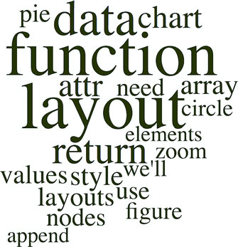
This code creates an SVG <text> element that’s rotated and placed according to the code. None of our words is rotated, so we get the staid word cloud shown in figure 5.21.
Figure 5.21. A word cloud with words that are arranged horizontally
It’s simple enough to define rotation, and we only need to set a rotation value in the cloud layout’s .rotate() function:
   randomRotate=d3.scaleLinear().domain([0,1]).range([-20,20]);       1
    d3.cloud()
      .size([500, 500])
      .words(data)
      .rotate( () => randomRotate(Math.random()))                     2
      .fontSize(d => wordScale(d.frequency))
      .on("end", draw)
      .start();
- 1 This scale takes a random number between 0 and 1 and returns an angle between –20 degrees and 20 degrees
- 2 Sets the rotation for each word
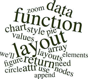
At this point, we have your traditional word cloud (figure 5.22), and we can tweak the settings and colors to create anything you’ve seen on Wordle. But now let’s look at why word clouds get such a bad reputation. We’ve taken an interesting dataset, the most common words in this chapter, and other than size them by their frequency, done little more than place them on screen and jostle them a bit. We have different channels for expressing data visually, and in this case the best channels that we have, besides size, are color and rotation.
Figure 5.22. A word cloud using the same worddata.csv but with words slightly perturbed by randomizing the rotation property of each word.
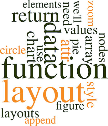
With that in mind, let’s create a keyword list for the words that are in the index in the back of the book. We’ll place those keywords in an array and use them to highlight the words in our word cloud that appear in the glossary. The code in the following listing also rotates shorter words 90 degrees and leaves the longer words unrotated so that they’ll be easier to read.
Listing 5.11. Word cloud layout with key word highlighting
var keywords = ["layout", "zoom", "circle", "style", "append", "attr"]          1
d3.cloud()
  .size([500, 500])
  .words(data)
  .rotate(d => d.text.length > 5 ? 0 : 90)                                    2
  .fontSize(d => wordScale(d.frequency))
  .on("end", draw)
  .start();
function draw(words) {
  var wordG = d3.select("svg").append("g")
    .attr("id", "wordCloudG").attr("transform","translate(250,250)");
  wordG.selectAll("text")
     .data(words)
     .enter()
     .append("text")
     .style("font-size", d => d.size + "px")
     .style("fill", d => keywords.indexOf(d.text) > -1 ? "#FE9922" : "#4F442B") 3
     .style("opacity", .75)
     .attr("text-anchor", "middle")
     .attr("transform", d => "translate(" + [d.x, d.y] + ") rotate(" + d.rotate + ")")
.text(d => d.text);
 };
- 1 Our array of keywords
- 2 The rotate function rotates by 90 degrees every word with five or fewer characters
- 3 If the word appears in the keyword list, color it orange—otherwise, color it black
The word cloud in figure 5.23 is fundamentally the same, but instead of using color and rotation for aesthetics, we used them to encode information in the dataset. You can read about more controls over the format of your word cloud, including selecting fonts and padding, in the layout’s documentation at www.jasondavies.com/wordcloud/about/.
Figure 5.23. This word cloud highlights keywords and places longer words horizontally and shorter words vertically.
Layouts like the word cloud aren’t suitable for as wide a variety of data as other layouts, but because they’re so easy to deploy and customize, you can combine them with other charts to represent the multiple facets of your data. You’ll see this kind of synchronized chart in chapter 9.
5.5. Summary
- Layout structure is mostly shared between D3 layouts, and the output of the layouts doesn’t necessarily need to be expressed with the same graphics or charts.
- Animation can rely on default transition behavior or custom-defined tweens using attrTween or styleTween.
- The stack() layout can be used to produce a variety of charts, including stacked area charts, stacked bar charts, and streamgraphs.
- Third-party layouts like sankey() and wordcloud() are available to deploy less common charts, such as diagrams of flow or text.
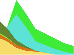
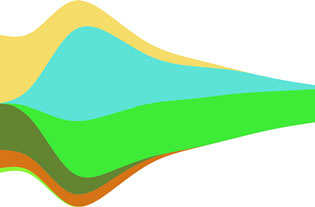
D3.js in the real world
Adam Pearce Graphics Editor, New York Times
Trump Has Spent a Fraction of What Clinton Has on Ads
I started this piece thinking I’d remake Alicia’s classic stacked area chart showing presidential ad buys by state. Graphing the 2016 data presented a problem though—Trump spent several weeks during the summer spending little or no money on television ads.
Rather than using a smaller time scale or visualizing the percentage allocation of a small amount of money, I decided focus more on the total amount of money spent. A streamgraph let me do that while still showing part of each campaign’s state by state strategy.
To smooth over variations in spending between different days of the week and reduce the data sent to the client, I aggregated spending by week and used the d3.curveMonotoneX interpolater to stop neighboring curves from overlapping each other.
My editor and I went back and forth a bit on the form of the small multiple charts at the top. Initially, they were bar charts, but we switched to area charts to introduce the rorschach blot form. It isn’t exactly the outline of the streamgraph, but d3.area().y1(d => -y(d.val)).y2(d => y(d.val)) gets close.
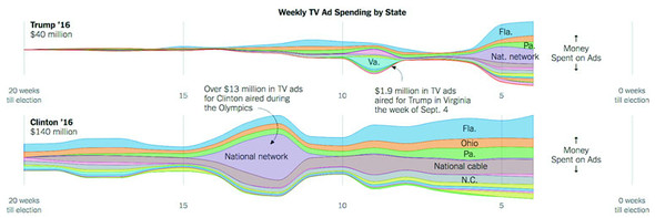
Figure from The New York Times, October 21 ©2016 The New York Times. All rights reserved. Used by permission and protected by the Copyright Laws of the United States. The printing, copying, redistribution, or retransmission of this content without express written permission is prohibited.