
![]()
For online information and ordering of this and other Manning books, please visit www.manning.com. The publisher offers discounts on this book when ordered in quantity. For more information, please contact
       Special Sales Department
       Manning Publications Co.
       20 Baldwin Road
       PO Box 761
       Shelter Island, NY 11964
       Email: orders@manning.com
©2018 by Manning Publications Co. All rights reserved.
No part of this publication may be reproduced, stored in a retrieval system, or transmitted, in any form or by means electronic, mechanical, photocopying, or otherwise, without prior written permission of the publisher.
Many of the designations used by manufacturers and sellers to distinguish their products are claimed as trademarks. Where those designations appear in the book, and Manning Publications was aware of a trademark claim, the designations have been printed in initial caps or all caps.
 Recognizing the importance of preserving what has been written, it is Manning’s policy to have the books we publish printed
on acid-free paper, and we exert our best efforts to that end. Recognizing also our responsibility to conserve the resources
of our planet, Manning books are printed on paper that is at least 15 percent recycled and processed without the use of elemental
chlorine.
Recognizing the importance of preserving what has been written, it is Manning’s policy to have the books we publish printed
on acid-free paper, and we exert our best efforts to that end. Recognizing also our responsibility to conserve the resources
of our planet, Manning books are printed on paper that is at least 15 percent recycled and processed without the use of elemental
chlorine.
 |
Manning Publications Co. 20 Baldwin Road PO Box 761 Shelter Island, NY 11964 |
Development editor: Susanna Kline
Technical development editor: James Womack
Project editors: Kevin Sullivan and Janet Vail
Copyeditor: Katie Petito
Proofreader: Corbin Collins
Technical proofreader: Jon Borgman
Typesetter: Dottie Marsico
Cover designer: Marija Tudor
ISBN 9781617294488
Printed in Canada
1 2 3 4 5 6 7 8 9 10 – TC – 22 21 20 19 18 17
Chapter 1. An introduction to D3.js
Chapter 2. Information visualization data flow
Chapter 6. Hierarchical visualization
Chapter 9. Interactive applications with React and D3
Chapter 1. An introduction to D3.js
1.2.1. Data visualization is more than charts
1.2.2. D3 is about selecting and binding
1.2.3. D3 is about deriving the appearance of web page elements from bound data
1.2.4. Web page elements can now be divs, countries, and flowcharts
1.5. Infoviz standards expressed in D3
Chapter 2. Information visualization data flow
2.3. Data presentation style, attributes, and content
Chapter 3. Data-driven design and interaction
3.2. Interactive style and DOM
4.1. General charting principles
4.3. Complex graphical objects
4.4. Line charts and interpolations
4.4.1. Drawing a line from points
4.5. Complex accessor functions
5.4. Plugins to add new layouts
Chapter 6. Hierarchical visualization
6.2. Working with hierarchical data
6.5.1. Drawing an icicle chart
Chapter 7. Network visualization
7.2.2. Creating a force-directed network diagram
7.2.7. Removing and adding nodes and links
Chapter 8. Geospatial information visualization
8.4. TopoJSON data and functionality
8.5. Further reading for web mapping
Chapter 9. Interactive applications with React and D3
9.1. One data source, many perspectives
9.2. Getting started with React
9.3. Traditional D3 rendering with React
9.4. React for element creation, D3 as the visualization kernel
Chapter 10. Writing layouts and components
10.2. Writing your own components
10.4. Linking components to scales
Chapter 11. Mixed mode rendering
11.1. Built-in canvas rendering with d3-shape generators
11.2.1. Creating random geodata
11.4. Optimizing xy data selection with quadtrees
11.5. More optimization techniques
Quickly gets you coding amazing visualizations.
Ntino Krampis, PhD City University of New York
A remarkable exploration of the world of dataviz possibilities with D3.
Arun Noronha Directworks
One of the most comprehensive books about data visualization I have ever read.
Andrea Mostosi The Fool s.r.l.
This book is required reading for anyone looking to get using D3. A mandatory introduction to a very complex and powerful library.
Stephen Wakely Thomson Reuters
Excellent guide which handholds the reader for fast-tracking D3.js expertise effectively.
Prashanth Babu NTT DATA
A remarkable exploration into the world of data viz possibilities with D3.
Arun Noronha Directworks
I found this book to be inspiring!
M.B., Amazon reader
A must-have book.
Arif Shaikh Sony Pictures Entertainment
When I wrote the first edition of D3.js in Action, I did it mostly as a way to learn the library. I knew D3 well enough to do cool things with it, but like many people, I didn’t know the breadth and depth of it, nor did I really understand the structure of layouts and generators and its other aspects. I agreed to write the book as a sort of graduate school in D3, to become an expert in the library, and to become better at data visualization more generally. I came at the second edition from a different perspective. I knew D3 as well as most anyone could, and the changes from V3 to V4, while significant, were straightforward enough to explain. But in the last two and a half years, I’ve been a professional software developer, and I better understand where D3 sits in an ecosystem of applications and libraries. This time I didn’t set out to write a book to learn D3; this time I set out to write a book to teach people how to use D3, not only on its own but in reference to other libraries and to JavaScript.
One of the things I want to teach now is how to create impactful data visualization using D3 rather than pushing your limits on how to generate the most complex charts. That doesn’t mean I don’t get into the ambitious data visualization methods that D3 allows—I still explore how to create network data visualization and geospatial maps with D3—but it does mean the code and the text better reflect the needs of people who want to learn how to make effective data visualization more than they want to learn how to use D3.
That’s why the second edition has sections on D3.js in the real world written by experts who’ve used D3 for analysis, storytelling, and journalism. That’s also why I pulled out the extraneous bits from the first edition that showed you how to use D3 like JQuery, and replaced those with more in-depth analysis of how to create hierarchical data visualization and how to integrate D3 with popular frameworks.
The code is much cleaner in the second edition, which is as much a result of my own experience as it is a result of the advances in JavaScript in the last couple years. Because I’ve grown more professional in my practice doesn’t mean I’ve grown less ambitious in how I use D3 and how I think people should use D3. This is still a long book, and it has to be because it’s an exhaustive look at the ins and outs of an important library in an exciting and fast-growing field.
I’d like to thank my wife, Hajra, who always inspires me.
I’d also like to thank Manning Publications for a new opportunity to approach this topic. Everyone says you don’t make much money off technical books, but the success of the first edition of D3.js in Action was instrumental in advancing my career. Getting a chance to revisit my old code and my old text and update it for the new version of the library and the changes in the industry has been a boon. In the process, I was lucky enough to work with the same editor, Susanna Kline, who has been as sharp and insightful as she was before, and any success of this edition is in large part due to her. I’d also like to thank the rest of the team at Manning who made this process as smooth as it could possibly be.
The following reviewers provided feedback on the manuscript at various stages of its development, and I thank them for their time and effort: Jonathan Rioux, Claudio Rodriguez, Felipe Vildoso-Castillo, Rohit Sharma, Scott McKissock, Iain Shigeoka, George Gaines, Michael Haller, Giancarlo Massari, Prashanth Babu, Piotr Kopszak, and Nat Luengnaruemitchai. Thanks also to technical editor James Womack and technical proofreader Jon Borgman for making me better at code and gently correcting me over and over again.
Last, I’d like to thank Netflix, for its great culture, for the coworkers who have pushed me and made me better at the practical and professional aspects of software development, and specifically for letting me take off for a month to rewrite this book.
People come to data visualization, and D3 particularly, from three different areas. The first is traditional JavaScript development, where they assume D3 is a charting library or, less commonly, a mapping library. The second is more traditional software development, such as Java, where D3 is part of the transition into frontend or node development. The last area is a trajectory that involves statistical analysis using R, Python, or desktop apps.
For all these folks, D3 represents a transition into two major new areas: web development and data visualization. I touch on aspects of both that may give readers more grounding in what I expect to be new and strange fields. Someone who’s intimately familiar with JavaScript may find that many of these subjects are already well understood, and others who know data visualization may well feel the same way about several of the general principles, such as graphical primitives.
Although I do provide an introduction to D3, the focus of this book is on a more exhaustive explanation of key principles of the library. Whether you’re getting started with D3 or looking to develop more advanced skills, this book provides you with the tools you need to create whatever data visualization you can think of.
This book is split into three parts. The first three chapters focus on the fundamentals of D3 and data visualization generally. You’ll see data-binding, loading data, and creating graphical elements from data in a variety of different ways. It also deals with scales, color, and other important aspects of data visualization. Some of the core technologies used by D3, such as JavaScript, CSS, and SVG, are explained throughout these chapters.
The next four chapters use D3 in the ways we typically think of. Chapter 4 teaches you how to create simple graphics from data, such as line charts, axes, and boxplots. Chapter 5 gives an in-depth exploration of various traditional data visualization layouts such as pie charts, violin plots, and histograms as well as more exotic charts such as Sankey diagrams and word clouds. Chapter 6 is devoted to hierarchical data visualizations such as treemaps and dendrograms, suitable for nested data such as organizational charts or economic sectors of the stock market. Chapter 7 focuses on network data visualization, which might seem exotic, but is being used more and more in a variety of domains. Chapter 8 dives into the rich mapping capabilities in D3, and includes using TopoJSON to do interesting geodata manipulation in the browser.
The last three chapters cover topics that can be considered deep dives into D3. Chapter 9 focuses on integrating D3 into another framework, in this case the popular React library. Chapter 10 teaches you about creating your own D3 layouts and components. Chapter 11 is all about optimizing data visualization for large datasets. Even if you don’t think you’ll ever use D3 in these ways, each of these chapters still touches on key aspects of using D3.
If you’re getting started with D3, I suggest going through chapters 1 through 4 in order. Each chapter builds on its predecessor and establishes the basic principles not only of D3 but also of data visualization. After that, it depends on what you plan to use D3 for. If your data is mostly geographic, then you can jump to chapter 8. If your data is mostly network data, you can jump to chapter 7. If you’re doing traditional data visualization, then I suggest going to chapters 5 and 6 and then on to chapter 9 to start thinking about dashboards, which are a key component of traditional data visualization.
If you’ve been using D3 for a while and want to improve your skills, I suggest skimming the first three chapters. The parts that I think might be of particular interest are in chapter 3, and deal with color and loading external resources such as SVG icons or HTML content. You might also want to review generators and components in chapter 4 to fill in any gaps you might have dealing with these common, but often underexamined, parts of D3. After that, it depends on what you see as your strengths and goals for using D3. If you want to maximize traditional data visualization, look at chapters 5 and 6 to see the layouts, and then look at chapter 9 for dashboards in a modern JavaScript development environment. If you’re familiar with most of the content there, look at chapter 11 for optimization techniques you might want to bring into your data visualization, or look at chapter 10 and think about how you might use the D3 tricks you know to build new layouts or reusable components.
Much of the value of this book comes in chapters 7 and 8, which go into great detail about using D3 for two major areas of data visualization: networks and maps. Along those lines, the use of HTML5 canvas in chapter 11 is an area that even experienced D3 developers might not be familiar with.
Regardless of your level of experience with D3, I recommend you spend time with chapter 10, which deals with the structure of layouts and components while showing you how to build your own. Beginning to build modular, reusable components and layouts will allow you to create not only effective data visualization, but also an effective career in visualizing data.
Initial code examples in chapters are complete, with later code examples that extend an initial example only showing the code
that has changed. It’s best to use the source code and online examples alongside the text. The line lengths of some of the
examples exceed the page width, and in cases like these, the  marker is used to indicate that a line has been wrapped for formatting.
All source code in listings or in text is in a fixed-width font like this to separate it from ordinary text. Code annotations accompany many of the listings, highlighting important concepts.
The source code for the examples in this book is available for download from www.manning.com/books/d3js-in-action-second-edition and is also online at https://github.com/emeeks/d3_in_action_2.
D3.js requires a browser to run, and you should have a local web server installed on your computer to host your code. The environment I develop in is macOS, so several of the screenshots or commands may not apply in a Windows environment.
Purchase of D3.js in Action, Second Edition includes free access to a private web forum run by Manning Publications where you can make comments about the book, ask technical questions, and receive help from the author and from other users. To access the forum, go to https://forums.manning.com/forums/d3js-in-action-second-edition. You can also learn more about Manning’s forums and the rules of conduct at https://forums.manning.com/forums/about.
Manning’s commitment to our readers is to provide a venue where a meaningful dialogue between individual readers and between readers and the author can take place. It’s not a commitment to any specific amount of participation on the part of the author, whose contribution to the forum remains voluntary (and unpaid). We suggest you try asking the author some challenging questions lest his interest stray! The forum and the archives of previous discussions will be accessible from the publisher’s website as long as the book is in print.
The figure on the cover of D3.js in Action, Second Edition is captioned “Habit of a Moorish Pilgrim Returning from Mecca in 1586.” The illustration is taken from Thomas Jefferys’ A Collection of the Dresses of Different Nations, Ancient and Modern (four volumes), London, published between 1757 and 1772. The title page states that these are hand-colored copperplate engravings, heightened with gum arabic. Thomas Jefferys (1719–1771) was called “Geographer to King George III.” He was an English cartographer who was the leading map supplier of his day. He engraved and printed maps for government and other official bodies and produced a wide range of commercial maps and atlases, especially of North America. His work as a mapmaker sparked an interest in local dress customs of the lands he surveyed and mapped, an interest that’s brilliantly displayed in this four-volume collection.
Fascination with faraway lands and travel for pleasure were relatively new phenomena in the late eighteenth century, and collections such as this one were popular, introducing both the tourist as well as the armchair traveler to the inhabitants of other countries. The diversity of the drawings in Jefferys’ volumes speaks vividly of the uniqueness and individuality of the world’s nations some 200 years ago. Dress codes have changed since then, and the diversity by region and country, so rich at the time, has faded away. It’s now often hard to tell the inhabitant of one continent from another. Perhaps, trying to view it optimistically, we’ve traded a cultural and visual diversity for a more varied personal life, or a more varied and interesting intellectual and technical life.
At a time when it’s hard to tell one computer book from another, Manning celebrates the inventiveness and initiative of the computer business with book covers based on the rich diversity of regional life of two centuries ago, brought back to life by Jeffreys’ pictures.
The first three chapters introduce you to the fundamental aspects of D3 and get you started with creating graphical elements in SVG using data. Chapter 1 lays out how D3 relates to the DOM, HTML, CSS, and JavaScript, and provides a few examples of how to use D3 to create elements on a web page. Chapter 2 focuses on loading, measuring, processing, and transforming your data in preparation for data visualization using the various functions D3 includes for data manipulation. Chapter 3 turns toward design and explains how you can use D3 color functions for more effective data visualization, as well as load external elements such as HTML for modal dialogs or icons in raster and vector formats. Chapter 4 deals with the fundamental usage of D3.js to create individual chart components with an emphasis on generating scatterplots and line charts. Chapter 5 shows off the basic data visualization layouts that you’ll need to create common data visualization products such as pie charts and bar charts. In all, part 1 shows you how to load, process, and visually represent data in SVG without relying on built-in layouts or components, which is critical for visualizing data.
D3 is behind nearly all the most innovative and exciting information visualization on the web today. D3 stands for data-driven documents. It’s a brand name, but also a class of applications that have been offered on the web in one form or another for years. In my career, I’ve made many things that could be considered data-driven documents. These include everything from one-off dynamic maps or social network diagrams to robust visual explorations of time and place. You’ll be using D3 whether you’re building data visualization prototypes for research or big data dashboards at the top tech companies.
D3.js was created to fill a pressing need for web-accessible, sophisticated data visualization. Let’s say your company has used Business Intelligence tools for a while, but they don’t show you the kind of patterns in the data that your team needs. You need to build a custom dashboard that shows exactly how your customers are behaving, tailored for your specific domain. That dashboard needs to be fast, interactive, and shareable around the organization. You’re going to use D3 for that.
D3.js’s creator, Mike Bostock, originally created D3 to take advantage of emerging web standards, which, as he puts it, “avoids proprietary representation and affords extraordinary flexibility, exposing the full capabilities of web standards such as CSS3, HTML5, and SVG” (http://d3js.org). D3.js version 4, the latest iteration of this popular library, continues this trend by modularizing the various pieces of D3 to make it more useful in modern application development.
D3 provides developers with the ability to create rich interactive and animated content based on data and tie that content to existing web page elements. It gives you the tools to create high-performance data dashboards and sophisticated data visualization, and to dynamically update traditional web content.
You might have already experimented with D3 and found that it isn’t easy to get into. Maybe that’s because you expected it to be a simple charting library. A case in point is the pie chart layout, which you’ll see in chapter 5. D3 doesn’t have one single function to create a pie chart. Rather, it has a function that processes your dataset with the necessary angles so that if you pass the dataset to D3’s arc function, you get the drawing code necessary to represent those angles. And you need to use yet another function to create the paths necessary for that code. It’s a much longer process than using dedicated charting libraries, but the explicit manner in which D3 deals with data and graphics is also its strength. Although other charting libraries conveniently allow you to make line graphs and pie charts, they quickly break down when you want to make something different than that. Not D3, which allows you to build whatever data-driven graphics and interactivity you can imagine.
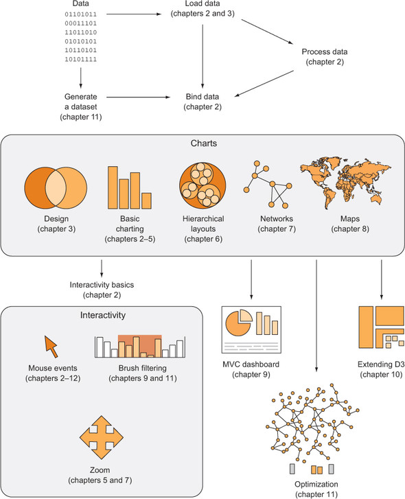
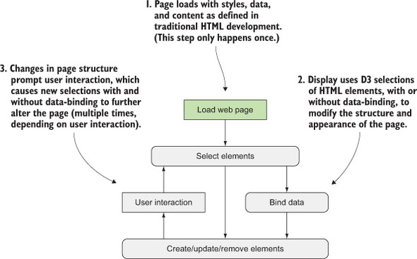
Let’s look at the principles of data visualization, as well as how D3 works in general. In figure 1.1 you see a rough map of how you might start with data and use D3 to process and represent that data, as well as add interactivity and optimize the data visualization you’ve created. In this chapter, we’ll start by establishing the principles of how D3 selections and data-binding work and learning how D3 interacts with SVG and HTML in the DOM. Then we’ll look at data types that you’ll commonly encounter. Finally, we’ll use D3 to create simple DOM and SVG elements.
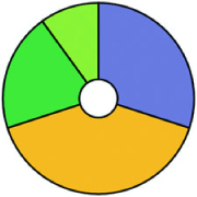
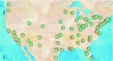
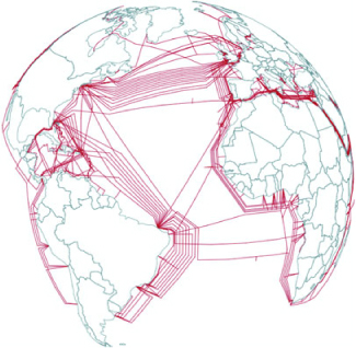
You may think of data visualization as limited to pie charts, line charts, and the variety of charting methods popularized by Edward Tufte and deployed in research. It’s much more than that. One of the core strengths of D3.js is that it allows for the creation of vector graphics for traditional charting, but also the creation of geospatial and network visualizations, as well as rich animation and interactivity. This broad-based approach to data visualization, where a map or a network graph or a table is another kind of representation of data, is the core of the D3.js library’s appeal for application development.
Figures 1.2 through 1.8 show data visualization pieces that I’ve created with D3. They include maps and networks, along with more traditional pie charts and completely custom data visualization layouts based on the specific needs of my clients.
Although the ability to create rich and varied graphics is one of D3’s strong points, more important for modern web development is the ability to embed the high level of interactivity that users expect. With D3, every element of every chart, from a spinning globe to a single, thin slice of a pie chart, is made interactive in the same way. And because D3 was written by someone well versed in data visualization practice, it includes interactive components and behaviors that are standard in data visualization and web development.
You don’t invest your time learning D3 so that you can deploy Excel-style charts on the web. For that, easier, more convenient libraries exist. You learn D3 because it gives you the ability to implement almost every major data visualization technique. It also gives you the power to create your own data visualization techniques, something a more general library can’t do. To see the variety of possibilities available with D3, look at http://blockbuilder.org/search.
D3.js affords developers the capacity to make not only richly interactive applications but also applications that are styled and served like traditional web content. This makes them more portable, more amenable to the growing, linked data web, and more easily maintained by large teams where other team members don’t know the specific syntax of D3 but, for instance, can use CSS to style the data visualization elements.
The decision on Bostock’s part to deal broadly with data and to create a library capable of presenting maps as easily as charts, as easily as networks, as easily as ordered lists, also means that a developer doesn’t need to try to understand the abstractions and syntax of one library for maps, and another for dynamic text content, and another for data visualization. Instead, the code for running an interactive, force-directed network layout is close to pure JavaScript and also similar to the code representing dynamic points of interest (POIs) on a D3.js map. Not only are the methods the same, but the data also could be the same, formulated in one way for lists and paragraphs and spans, while formulated in another way for geospatial representation.
Throughout this chapter, you’ll see code snippets that you can run in your browser to make changes to the graphical appearance of elements on your website. At the end of the chapter is an application written in D3 that explains the basics of the code we’re running in JavaScript. But before that we’ll explore the principles of web development using D3, and you’ll see this pattern of code over and over again: selecting.
Imagine we have a set of data, such as the price and size of a few houses, and a set of web page elements, whether graphics or <div> elements, and that we want to represent the dataset, whether with text or through size and color. A selection is the group of the data and elements together. We perform actions on the elements in the group, such as moving them or changing their color. We can likewise update the values in the data. Though we can work with the data and the web page elements separately, the real power of D3 comes from using selections to combine data and web page elements.
Here’s a selection without any data:
d3.selectAll("circle.a").style("fill", "red").attr("cx", 100);
This takes each circle on our page with the CSS class of a, turns it red, and moves it so that its center is 100 pixels to the right of the left side of our <svg> canvas. Likewise, this code turns every div on our web page red and changes its class to b:
d3.selectAll("div").style("background", "red").attr("class", "b");
But before we can change our circles and divs, we’ll need to create them, and before we do that, it’s best to understand what’s happening in this pattern.
Later in chapter 11 you’ll see how to use D3 with React, a view renderer. Typically, MVC libraries like Angular or view rendering libraries like React are responsible for creating and destroying HTML elements and associating them with certain data-points. In those cases, you might stop using D3 to create and update elements and use it purely as a visualization kernel for your application.
The first part of that line of code, d3.selectAll(), is part of the core functionality necessary for understanding D3: selections. Selections can be made with d3.select(), which selects the first single element found, but more often you’ll use d3.select-All(), which can be used to select multiple elements. Selections are groups of one or more web page elements that may be associated with a set of data, like the following code, which binds the elements in the array [1,5,11,3] to <div> elements with the class of market:
d3.selectAll("div.market").data([1,5,11,3])
This association is known in D3 as binding data, and you can think of a selection as a set of web page elements and a corresponding, associated set of data. Sometimes more data elements exist than DOM elements, or vice versa, in which case D3 has functions designed to create or remove elements that you can use to generate content. Chapter 2 covers selections and data binding in detail. Selections might not include any data binding, and won’t for most of the examples in this chapter, but the inclusion allows the powerful information visualization techniques of D3. You can make a selection on any elements in a web page, including items in a list, circles, or even regions on a map of Africa. The same way the elements can take a number of shapes, the data associated with those elements (where applicable) can take many forms.
After you have a selection, you can then use D3 to modify the appearance of web page elements to reflect differences in the data. You may want to make the length of a line equal to the value of the data, or change the color to one that corresponds to a class of data. You may want to hide or show elements as they correspond to a user’s navigation of a dataset. As you can see in figure 1.9, after the page has loaded, you use D3 to select elements and bind data for creating, removing, or changing DOM elements. You continue to use this process in response to user interaction.
You modify the appearance of elements by using selections to reference the data bound to an element in a selection. D3 iterates through the elements in your selection and performs the same action using the bound data, which results in different graphical effects. Although the action you perform is the same, the effect is different because it’s based on the variation in the data. You’ll see data binding first at the end of this chapter, and in much more detail throughout this book.
We’ve grown accustomed to thinking of web pages as consisting of text elements with containers for pictures, videos, or embedded applications. But as you grow more familiar with D3, you’ll begin to recognize that every element on the page can be treated with the same high-level abstractions. The most basic element on a web page, a <div> that represents a rectangle into which you can drop paragraphs, lists, and tables, can be selected and modified in the same way you can select and modify a country on a web map, or individual circles and lines that make up a complex data visualization.
We’ve come a long way from the days when animated GIFs and frames were the pinnacle of dynamic content on the web. In figure 1.10, you can see why GIFs never caught on for robust data visualization on the web. GIFs, like the infoviz libraries designed to use VML, were necessary for earlier browsers, but D3 is designed for the modern browsers that no longer need backward compatibility.
SVG knowledge is foundational to understanding D3.js, but if you’re already experienced with the DOM, SVG, and CSS, you can skim this section to refresh your memory, or skip ahead to section 1.3.6 or 1.4.
A modern browser typically can not only display SVG graphics and obey CSS3 rules, but also has great performance. Along with Cascading Style Sheets (CSS) and Scalable Vector Graphics (SVG), the other elements you need to know about for web development are the DOM (Document Object Model) and JavaScript. The following sections deal with each of them broadly and include code you can run to see how D3 uses their functionality to create interactive and dynamic web content.
A web page is structured according to the DOM. You need a passing familiarity with the DOM to do web development, so we’ll take a quick look at DOM elements and structure in a simple web page in your browser and touch on the basics of the DOM. To get started, you’ll need a web server that you can access from the computer that you’re using to code. With that in place, you can download the D3 library from d3js.org (d3.js or d3.min.js for the minified version) and place that in the directory where you’ll make your web page. You’ll create a page called d3ia.html in the text editor with the contents in the following listing.
<!doctype html>
<html>
<head>
  <script src="d3.v4.min.js"></script>                                       1
</head>                                                                      1
<body>                                                                       1
  <div id="someDiv" style="width:200px;height:100px;border:black 1px solid;"> 2
<input id="someCheckbox" type="checkbox" />                                  3
  </div>
</body>
</html>
Basic HTML like this follows the DOM. It defines a set of nested elements, starting with an <html> element with all its child elements and their child elements and so on. In this example, the <script> and <body> elements are children of the <html> element, and the <div> element is a child of the <body> element. The <script> element loads the D3 library here, or it can have inline JavaScript code, whereas any content in the <body> element shows up onscreen when you navigate to this page.
Three categories of information about each element determine its behavior and appearance: styles, attributes, and properties. Styles can determine transparency, color, size, borders, and so on. Attributes include classes, IDs, and interactive behavior, though certain attributes can also determine appearance, depending on which type of element you’re dealing with. Properties typically refer to states, such as the “checked” property of a check box, which is true if the box is checked and false if the box is unchecked. D3 has three corresponding functions to modify these values. If we wanted to modify the HTML elements in the previous example, we could use D3 functions that abstract this process:
d3.select("#someDiv").style("border", "5px darkgray dashed");
d3.select("#someDiv").attr("id", "newID");
d3.select("#someCheckbox").property("checked", true);
Like many D3 functions of this kind, if you don’t signify a new value, then the function returns the existing value. This way of exposing getter/setter behavior in JavaScript was popularized in JQuery and shows up in most of the D3 examples. You’ll see this in action throughout this book, and later in the chapter as you write more code, but for now remember that these three functions allow you to change how an element appears and interacts.
The DOM also determines the onscreen drawing order of elements, with child elements drawn after and inside parent elements. Although you have partial control over drawing elements above or below each other with traditional HTML using z-index, this won’t be available with SVG elements until the SVG2 spec is implemented.
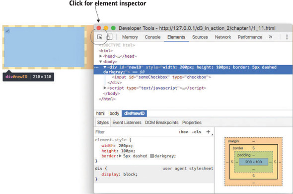
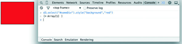
Navigate to d3ia.html, and you can get exposure to how D3 works. The page isn’t too impressive, with only a single, black-outlined rectangle. You could modify the look and feel of this web page by updating d3ia.html, but you’ll find that it’s easy to modify the page by using your web browser’s developer console. This is useful for testing changes to classes or elements before implementing them in your code. Open the developer console, and you’ll have two useful screens, shown in figures 1.11 and 1.12, which we’ll go back to again and again.
You’ll see the console in this first chapter, but in chapter 2, once you’re familiar with it, I’ll show only the output.
The element inspector allows you to look at the elements that make up your web page by navigating through the DOM (represented as nested text, where each child element is shown indented). You can also select an element onscreen graphically, typically represented as a magnifying glass or cursor icon.
The other screen you’ll want to use quite often is the console (figure 1.12), which allows you to write and run JavaScript code right on your web page. The developer tools have other valuable features, such as setting breakpoints and the ability to inspect network calls, but we’re going to focus on using the console to change elements and run code.
The examples in this book use Google Chrome and its developer console, but you could use Safari’s or Firefox’s developer tools with the same functionality and slightly different look-and-feel, or use your code editor and refresh the page. You can see and manipulate DOM elements such as <div> or <body> by clicking the element inspector or looking at the DOM as represented in HTML. You can click one of these elements and change its appearance by modifying it in the console.
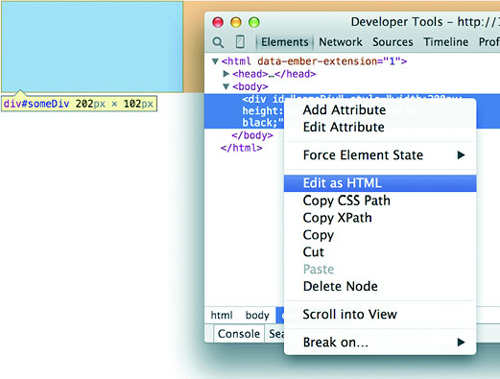
You can even delete elements in the console. Give it a try: select the div either in the DOM or visually and press Delete. Now your web page is lonely. Press Refresh so your page reloads the HTML and your div comes back. You can adjust the size and color of your div by adding new styles or changing the existing one, so you can increase the width of the border and make it dashed by changing the border style to Black 5px Dashed. You can add content to the div in the form of other elements, or you can add text by right-clicking on the element and selecting Edit as HTML, as shown in figures 1.13 and 1.14.
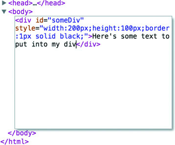
You can then write whatever you like in between the opening and closing HTML.
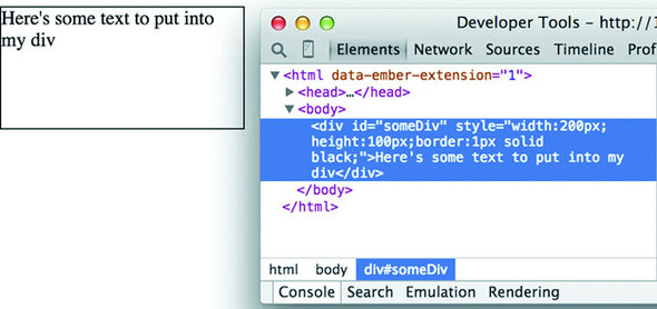
Any changes you make, regardless of whether they’re well structured or not, will be reflected on the web page. In figure 1.15 you see the results of modifying the HTML, which is rendered immediately on your page.
In this way, you could slowly and painstakingly create a web page in the console. We’re not going to do that. Instead, we’ll use D3 to create elements on the fly with size, position, shape, and content based on our data.
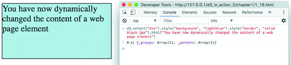
You’ll do most your coding in the IDE or text editor of your choice, but one of the great things about web development is that you can test JavaScript code changes by using your console. Later you’ll focus on writing JavaScript, but for now, to demonstrate how the console works, copy the following code into your console and press Enter:
d3.select("div").style("background", "lightblue").style("border", "solid
black 1px").html("You have now dynamically changed the content of a web page
element");
You should see the effect shown in figure 1.16.
You’ll see a few more uses of traditional HTML elements in this chapter, and then again in chapter 3, but then you won’t see traditional DOM elements again in great detail. You can use D3 to create complex, data-driven spreadsheets and galleries using <div>, <table>, and <select> elements, but that’s not a common use case in the real world. If all D3 could do was select HTML elements and change their style and content like this, then it wouldn’t be that useful for data visualization. To do more, we have to move away from traditional HTML and focus on a special type of element in the DOM: SVG.
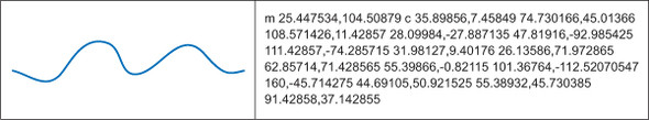
A major value of HTML5 is the integrated support for Scalable Vector Graphics (SVG). SVG allows for simple mathematical representation of images that scale and are amenable to animation and interaction. Part of the attractiveness of D3 is that it provides an abstraction layer for drawing SVG, because SVG drawing can be a little confusing. SVG drawing instructions for complex shapes, known as <path> elements, are written a bit like the old LOGO programming language. You start at a point on a canvas and draw a line from that point to another. If you want it to curve, you can give the SVG drawing code coordinates on which to make that curve. If you want to draw the line on the left, you’d create a <path> element in an <svg> canvas element in your web page, and all those drawing instructions (that’s what they look like on the left of figure 1.17) go into the d attribute of that <path> element.
But you’d almost never want to create SVG by manually writing drawing instructions like this. Instead, you’ll want to use D3 to do the drawing with a variety of helper functions, or rely on other SVG elements that represent simple shapes (known as geometric or graphical primitives) using more readable attributes. You’ll start doing that in chapter 4, where you’ll use d3.svg.line and d3.svg.area to create line and area charts. For now, you’ll update d3ia.html to look like the following listing, which includes the necessary code for displaying SVG, as well as examples of the various shapes you might use.
<!doctype html>
<html>
   <script src="d3.v4.min.js">
</script>
<body>
  <div id="infovizDiv">
  <svg style="width:500px;height:500px;border:1px lightgray solid;">
    <path d="M 10,60 40,30 50,50 60,30 70,80"
       style="fill:black;stroke:gray;stroke-width:4px;" />
    <polygon style="fill:gray;"
       points="80,400 120,400 160,440 120,480 60,460" />
  <g>
  <line x1="200" y1="100" x2="450" y2="225"
  style="stroke:black;stroke-width:2px;"/>
  <circle cy="100" cx="200" r="30"/>
  <rect x="410" y="200" width="100" height="50"
       style="fill:pink;stroke:black;stroke-width:1px;" />
  </g>
  </svg>
  </div>
</body>
</html>
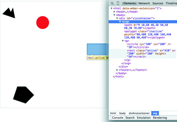
You can inspect the elements like you would the traditional elements we looked at earlier, as you can see in figure 1.18, and you can manipulate these elements using traditional JavaScript selectors like document.getElementById or with D3, removing them or changing the style like so.
d3.select("circle").remove()                    1
d3.select("rect").style("fill", "purple")       2
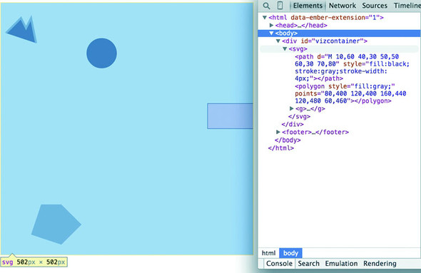
Now refresh your page and let’s look at the new elements. You’re familiar with divs, and it’s useful to put an SVG canvas in a div so you can access the parent container for layout and styling. Let’s look at each of the elements we’ve added.
This is your canvas on which everything is drawn. The top-left corner is 0,0, and the canvas clips anything drawn beyond its defined height and width of 500,500 (the rectangle in our example). An <svg> element can be styled with CSS to have different borders and backgrounds. The <svg> element can also be dynamically resized using the viewBox attribute, which is more complex and beyond the scope of the overview here.
You can use CSS (which we’ll touch on later in this chapter) to style your SVG canvas or use D3 to add inline styles like this:
d3.select("svg").style("background", "darkgray"); 1
The x-axis is drawn left to right, but the y-axis is drawn top-to-bottom, so you’ll see that the circle is set 200 pixels to the right and 100 pixels down.
There’s a second mode of drawing available with HTML5 using <canvas> elements to draw bitmaps. We won’t go into detail here, but you’ll see this method used in chapter 11 for its rendering performance. The <canvas> element creates static graphics drawn in a manner similar to SVG that can then be saved as images. Here are three main reasons to use canvas:
WebGL—The <canvas> element allows you to use WebGL to draw, so that you can create 3D objects. You can also create 3D objects like globes and polyhedrons using SVG, which we’ll get into a bit in chapter 8 as we examine geospatial information visualization.
SVG provides a set of common shapes, each of which has attributes that determine their size and position to make them easier to deal with than the generic d attribute you saw earlier. These attributes vary depending on the element you’re dealing with, so that <rect> has x and y attributes that determine the shape’s top-left corner, as well as height and width attributes that determine its overall form. In comparison, the <circle> element has cx and cy attributes that determine the center of the circle, and an r attribute that determines the radius of the circle. The <line> element has x1 and y1 attributes that determine the starting point of the line and x2 and y2 attributes that determine its end point. Other simple shapes are similar to these, such as the <ellipse>, and other more complex shapes, like the <polygon> with a points attribute that holds a set of comma-separated xy coordinates, in clockwise order, determine the area bounded by the polygon.
Accomplished artists can draw anything with vector graphics, but you’re probably not looking at D3 because you’re an artist. Instead, you’re dealing with graphics and have more pragmatic goals in mind. From that perspective, it’s important to understand the concept of geometric primitives (also known as graphical primitives). Geometric primitives are simple shapes such as points, lines, circles, and rectangles. These shapes, which can be combined to make more complex graphics, are particularly useful for visually displaying information.
Primitives are also useful for understanding complex information visualizations that you see out in the real world. Dendrograms, like the one shown in figure 1.20, are far less intimidating when you realize they’re only circles and lines. Interactive timelines are easier to understand and create when you think of them as collections of rectangles and points. Even geographic data, which primarily comes in the form of polygons, points, and lines, is less confusing when you break it down into its most basic graphical structures.
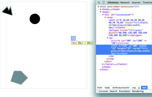
Each of these attributes can be hand-edited in HTML to adjust its size, form, and position. Open your element inspector and click the <rect>. Change its width to 25 and its height to 25, as shown in figure 1.19.
Now you’ve learned why there’s no SVG <square>. The color, stroke, and transparency of any shape can be changed by adjusting the style of the shape, with fill determining the color of the area of the shape and stroke, stroke-width, stroke-dasharray determining its outline.
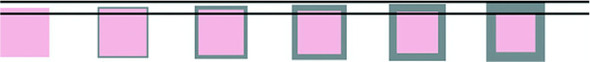
Notice, though, that the inspected element has a measurement of 27 px x 27 px. That’s because the 1-px stroke is drawn on the outside of the shape. That makes sense, once you know the rule, but if you change the stroke-width to 2px it will still be 27 px x 27 px. That’s because the stroke is drawn evenly over the inside and outside borders, as seen in figure 1.20. This may not seem too big a deal, but it’s something to remember when you’re trying to line up your shapes later.
Change the style parameters of the rectangle to the following:
"fill:purple;stroke-width:5px;stroke:cornflowerblue;"
Congratulations! You’ve now successfully visualized the complex and ambiguous phenomenon known as “ugly.”
SVG provides the capacity to write text as well as shapes. SVG text, though, doesn’t have the formatting support found in HTML elements, so it’s primarily used for labels. If you do want to do basic formatting, you can nest <tspan> elements in <text>
The <g> or group element is distinct from the SVG elements we’ve discussed in that it has no graphical representation and doesn’t exist as a bounded space. Instead, it’s a logical grouping of elements. You’ll want to use <g> elements extensively when creating graphical objects that are made up of several shapes and text. For instance, if you wanted to have a circle with a label above it and move the label and the circle at the same time, then you’d place them inside a <g> element:
<g>
<circle r="2"/>
<text>This circle's Label</text>
</g>
Moving a <g> around your canvas requires you to adjust the transform attribute of the <g> element. The transform attribute is more intimidating than the various xy attributes of shapes because it accepts a structured description in text of how you want to transform a shape. One of those structures is translate(), which accepts a pair of coordinates that move the element to the xy position defined by the values in translate (x,y). If you want to move a <g> element 100 pixels to the right and 50 pixels down, then you need to set its transform attribute to transform="translate (100,50)". The transform attribute also accepts a scale() setting so you can change the rendered scale of the shape as you can see in the example in listing 1.3. You can see these settings in action by modifying the previous example with the results shown in figure 1.21.
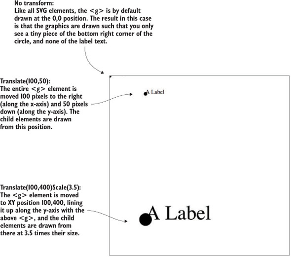
<g>
   <circle r="2"/>
   <text>This circle's Label</text>
</g>
<g transform="translate(100,50)">
   <circle r="2" />
   <text>This circle's Label</text>
</g>
<g transform="translate(100,400) scale(2.5)">
   <circle r="2"/>
   <text>This circle's Label</text>
</g>
A path is an area determined by its d attribute. Paths can be open or closed, meaning the last point connects to the first if closed and doesn’t if open. The open or closed nature of a path is determined by the absence or presence of the letter Z at the end of the text string in the d attribute. It can still be filled either way. You can see the difference in figure 1.22 (the code for which is shown in the following listing).
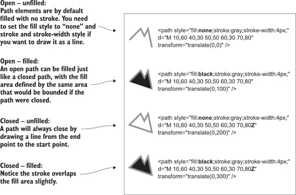
<path style="fill:none;stroke:gray;stroke-width:4px;"
     d="M 10,60 40,30 50,50 60,30 70,80" transform="translate(0,0)" />
<path style="fill:black;stroke:gray;stroke-width:4px;"
     d="M 10,60 40,30 50,50 60,30 70,80" transform="translate(0,100)" />
<path style="fill:none;stroke:gray;stroke-width:4px;"
     d="M 10,60 40,30 50,50 60,30 70,80Z" transform="translate(0,200)" />
<path style="fill:black;stroke:gray;stroke-width:4px;"
     d="M 10,60 40,30 50,50 60,30 70,80Z" transform="translate(0,300)" />
Although sometimes you may want to write that d attribute yourself, it’s more likely that your experience crafting SVG will come in one of three ways: using geometric primitives such as circles, rectangles, or polygons, drawing SVG using a vector graphics editor like Adobe Illustrator or Inkscape, or drawing SVG parametrically using handwritten constructors or built-in constructors in D3. Most of this book focuses on using D3 to create SVG, but don’t overlook the possibility of creating SVG using an external application or another library and then manipulating them using D3, like we’ll do using d3.html in chapter 3.
CSS are used to style the elements in the DOM. A style sheet can exist as a separate .css file that you include in your HTML page or can be embedded directly in the HTML page. Style sheets refer to an ID, class, or type of element and determine the appearance of that element. The terminology used to define the style is a CSS selector and is the same type of selector used in the d3.select() syntax. You can set inline styles (that are applied to only a single element) by using d3.select(#someElement).style(opacity, .5) to set the opacity of an element to 50%. Let’s update your d3ia.html to include a style sheet, as shown in the following listing.
<!doctype html>
<html>
<script src="d3.v4.min.js"></script>                1
<style>
.inactive, .tentative {                             2
  stroke: darkgray;
  stroke-width: 2px;
  stroke-dasharray: 5 5;
}
.tentative {
  opacity: .5;
}
.active {
  stroke: black;
  stroke-width: 4px;
  stroke-dasharray: 1;
}
circle {
  fill: red;
}
rect {
  fill: darkgray;
}
</style>
<body>                                              3
  <div id="infovizDiv">
  <svg style="width:500px;height:500px;border:1px lightgray solid;">
    <path d="M 10,60 40,30 50,50 60,30 70,80" />
    <polygon class="inactive" points="80,400 120,400 160,440 120,480 60,460" />
  <g>
  <circle class="active tentative" cy="100" cx="200" r="30"/>
  <rect class="active" x="410" y="200" width="100" height="50" />
  </g>
  </svg>
  </div>
</body>
</html>
The results stack on each other, so when you examine the rectangle element, as shown in figure 1.23, you see that its style is set by the reference to rect in the style sheet as well as the class attribute of active.
Style sheets can also refer to a state of the element, so with :hover you can change the way an element looks when the user mouses over that element. You can learn about other complex CSS selectors in more detail in a book devoted to that subject. For this book, we’ll focus mostly on using CSS classes and IDs for selection and to change style. The most useful way to do this is to have CSS classes associated with particular stylistic changes and then change the class of an element. You can change the class of an element, which is an attribute of an element, by selecting and modifying the class attribute. The circle shown in figure 1.24 is affected by two overlapping classes: .active and .tentative.

In listing 1.5 we see a couple of possibly overlapping classes, with tentative, active, and inactive all applying different style changes to your shape (such as the highlighted circle in figure 1.23). When an element needs only be assigned to one of these classes, you can overwrite the class attribute entirely:
d3.select("circle").attr("class", "tentative");
The results, as shown in figure 1.25, are what we’d expect. This overwrites the entire class attribute to the value you set. But elements can have multiple classes, and sometimes an element is both active and tentative or inactive and tentative, so let’s reload the page and take advantage of the helper function d3.classed(), which allows you to add or remove a class from the classes in an element.
d3.select("circle").classed("active", true);
By using .classed(), you don’t overwrite the existing attribute, but rather append or remove the named class from the list. You can see the results of two classes with conflicting styles defined. The active style overwrites the tentative style because it occurs later in the style sheet. Another rule to remember is that more specific rules overwrite more general rules. There’s more to CSS, but this book won’t go into that.
By defining style in your style sheet and changing appearance based on class membership, you create code that’s more maintainable and readable. You’ll need to use inline styles to set the graphical appearance of a set of elements to a variety of different values, for example, changing the fill color to correspond to a color ramp based on the data bound to that set of elements. You’ll see that functionality in action later when you deal with bound data. But as a general rule, setting inline styles should only be used when you can’t use traditional classes and states defined in a style sheet.
D3, like many information visualization libraries in JavaScript, provides functions to abstract the process of creating and modifying web page elements. On top of that, it provides mechanisms to link data and web page elements in a way that makes the drawing and updating of these SVG elements reusable and maintainable. But these mechanisms are also applicable to more traditional HTML elements such as paragraphs and divs.
When writing JavaScript with D3, you should familiarize yourself with two subjects: method chaining and arrays.
D3 examples, like many examples written in JavaScript, use method chaining extensively. Method chaining, also known as function chaining, is facilitated by returning the method itself with the successful completion of functions associated with a method. One way to think of method chaining is to think of how we talk and refer to each other. Imagine you were talking to someone at a party, and you asked about another guest:
“What’s her name?”
“Her name is Lindsay.”
“Where does she work?”
“She works at Tesla.”
“Where does she live?”
“She lives in Cupertino.”
“Does she have any children?”
“Yes, she has a daughter.”
“What’s her name?”
Do you think the answer to that last question would be “Lindsay”? Of course not. You’d expect the answer to refer to Lindsay’s daughter, even though all the previous questions referred to Lindsay. Method chaining is like that. It returns the same function as long as you use getter and setter methods of that function and returns the new function when you call a method that creates something new. Method chaining is used a lot in D3 examples, which means you’ll see something like this written on one line or formatted (but functionally identical) to something written on multiple lines:
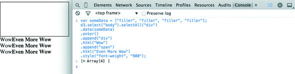
d3.selectAll("div").data(someData).enter().append("div").html("Wow").append("span").html("Even More Wow").style("font-weight", "900");
That line is the same as the following code. The only change is in the use of line breaks, which JavaScript ignores:
d3.selectAll("div")                         1
  .data(someData)                           2
  .enter()                                  3
  .append("div")                            4
  .html("Wow")                              5
  .append("span")                           6
  .html("Even More Wow")                    7
  .style("font-weight", "900");             8
You could write each line separately, declaring the different variables as you go, and achieve the same effect. That might make more sense if you haven’t been exposed to method chaining before:
var function1 = d3.selectAll("div");
var function1withData = function1.data(someData);
var function2 = function1withData.enter();
var function3 = function2.append("div");
function3.html("Wow");
var function4 = function3.append("span");
function4.html("Even More Wow");
function4.style("font-weight", "900");
You can see this when you run the code in your console. This is the first time you’ve used the .data() function, which along with .select() is at the core of developing with D3. When you use .data(array), you bind each element in your selection to each item in an array (if you don’t pass anything to .data() you get back the items bound to your selection). When binding data, if you have more items in your array than elements in your selection, then you can use the .enter() function to define what to do with each extra element. In the previous function, you select all the <div> elements in the <body> and the .enter() function tells D3 to .append() a new div when there are more elements in the array than elements in the selection. Given that your d3ia.html page already has one div, if you bind an array with more than one value, D3 appends, or adds, a div for each value in the array beyond the first.
A corresponding .exit() function defines how to respond when an array has fewer values than a selection. For now, you’ll run the code as it appears in the examples, and in later chapters we’ll get into much more detail on the way selections and binding work.
With this example, you’re not doing anything with the data in the array and only creating elements based on the size of the array (one <div> for each element in the array). This example assumes that you already have a <div> in your HTML with a gray border (as seen in figure 1.25). Here’s the HTML that would get that done:
<!doctype html>
<html>
<script src="d3.v4.min.js"></script>
<style>
   #borderdiv {
   width: 200px;
   height: 50px;
border: 1px solid gray;
}
</style>
<body>
   <div id="borderdiv"></div>
   </body>
</html>
For this to work, you need to give someData a value. With that in place, you can run your code:
var someData = ["filler", "filler", "filler", "filler"];
d3.select("body").selectAll("div")
  .data(someData)
  .enter()
  .append("div")
  .html("Wow")
  .append("span")
  .html("Even More Wow")
  .style("font-weight", "900");
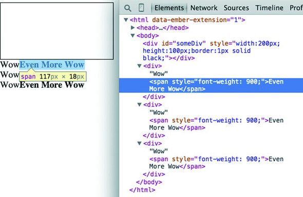
The result, as shown in figure 1.26, is the addition of three lines of text. It might surprise you that this code is three lines, given that the array has four values. Although the data was bound to the existing <div> element on the page, the actions that changed the contents were only applied to the .enter() function. This means they were only applied to the newly created <div> elements that were “entering” the DOM for the first time.
When you inspect the DOM, as shown in figure 1.27, you see that the method chaining operated in the manner previously described. A <div> was added, and its HTML content was set to Wow. A <span> element with a different style was appended to the <div>, and its HTML content was set to Even More Wow. There’s more you can do, but first you need to examine the array object you’re binding and focus on JavaScript arrays and array functions.
D3 is all about arrays, and so it’s important to understand the structure of arrays and the options available to you to prepare those arrays for binding to data. Your array might be an array of string or number literals, such as this:
someNumbers = [17, 82, 9, 500, 40];
someColors = ["blue", "red", "chartreuse", "orange"];
Or it may be an array of JavaScript objects, which will become more common as you do more interesting things with D3:
somePeople = [{name: "Peter", age: 27}, {name: "Sulayman", age: 24},
{name: "K.C.", age: 49}];
One example of a useful array function is .filter(), which returns an array whose elements satisfy a test you provide. For instance, here’s how to create an array out of someNumbers that had values greater than 40:
someNumbers.filter(function(d) {return d >= 40});
Likewise, here’s how you could create an array out of someColors with names shorter than five letters:
someColors.filter(function(d) {return d.length < 5});
The function .filter() is a method of an array and accepts a function that iterates through the array with the variable you’ve named. In this function, you name that variable d, and the function runs a test on each value by testing on d. When that test evaluates true, the element is kept in our new array.
The result of this .filter() function, which you can see in figure 1.28, returns either the element or nothing (depending on if it satisfies the test), building a new array consisting only of the elements that do:
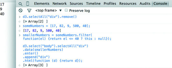
smallerNumbers = someNumbers.filter(
  function(el) {return d <= 40});
d3.select("body").selectAll("div")
  .data(smallerNumbers)
  .enter()
  .append("div")
  .html(function (d) {return d});
The resulting code creates two new divs from your three-value array smallerNumbers. (Remember that one div already exists, and so the .enter() function doesn’t trigger even though data is bound to that existing div.) The contents of the div are the values in your array. This is done through an anonymous function (sometimes referred to in D3 examples as an accessor) in your .html() function and is another key aspect of D3. Any anonymous function called when setting the .style(), .attr(), .property(), .html(), or other function of a selection can provide you with the data bound to that selection. As you explore examples, you’ll see this function deployed again and again:
.style("background", function(d) {return d})
.attr("cx", function(d,i) {return i})
.html(function(d) {return d})
In every case, the first variable (typically represented with the letter d, but you can declare it as whatever you want) contains the data value bound to that element, and the second variable returns the array position (known as an index, hence the variable name i) of the value bound to that element. This may seem a bit strange, but you’ll get used to it as you see it used in a variety of ways in the upcoming chapters.
JavaScript has many other array functions, and you can do much more than I’ve covered here, but that’s the subject of several other books. It’s time to look at the kinds of data you’ll work with.
JavaScript has seen some major changes in the last couple years. The two biggest trends in modern JS are the rise of node.js and the broad implementation among browsers and through transpilers for EcmaScript 6 (Known as ES2015). What that means for you is that with Node servers you can write code that runs in the front end or on the server without any changes. This is known as isomorphic or universal Java-Script. We’re not going to do that in this book, but it provides incredible flexibility for JavaScript applications.
For this book, the major Node technology that we want to be aware of is NPM, or Node Package Manager. NPM allows you to install “modules” or small libraries of JS code for use in your applications. You don’t have to include a bunch of <script> tag references to individual files and, if the module has been built so that it’s not one monolithic structure, you can reduce the amount of code you’re including in your applications.
D3.js version 4, which came out in mid-2016, is structured to take advantage of module importing. Throughout this book, you’ll see examples of using D3 in one of two ways. Either we’ll include the entire D3 file, as we have with examples in this chapter, or we’ll include only the individual parts of D3 that we need, as you’ll see in later examples. For the examples in this book, we’ll mostly see this done with script tags, but remember that if you use NPM in your coding, you can require or import individual D3v4 modules into your code as you need them. There isn’t enough space in this book to get into this in detail but it’s considered more and more to be standard practice in JavaScript development, so you’ll need to be familiar with it.
The import syntax is one new piece of ES2015’s advanced functionality. It also includes support for classes, promises, string templating, spread operators, symbols, and a host of new functionality that JS developers should know if they want to succeed. Because ES2015 isn’t yet fully supported, you’ll need to use a transpiler to transform ES2015 code into ES5 code. I’m not going to include much ES2015 in this book, so that if you’re not yet familiar with ES2015 that won’t stop you from learning D3, but one thing you’ll see are arrow functions, which are a more terse way of writing functions. Instead of
function (d) {return d}
an arrow function would be written as follows:
d => d
The parameter after the arrow is returned unless surrounded by brackets, and arrow functions in their cleaner form can be used anywhere, such as in an array forEach:
someArray.forEach(d => {
   console.log(d)
})
|
someArray.forEach(function (d) {
   console.log(d)
})
|
One thing to remember with arrow functions is that the context of the function (this) is whatever the context it’s created in. If that sounds arcane, don’t worry about it—the important thing to remember is that when you see examples in this book or online where this is being used in a D3 function, typically as a reference to the HTML node to which data is attached, that you won’t have access to the same this in an arrow function as you would with the older function declaration type.
One reason we have the freedom to make so many amazing kinds of data visualization is because we’ve settled on regular ways of representing different kinds of data. Data can be formatted in a variety of manners for a variety of purposes, but it tends to fall into a few recognizable classes: tabular data, nested data, network data, geographic data, raw data, and objects.
Tabular data appears in columns and rows typically found in a spreadsheet or a table in a database. Although you invariably end up creating arrays of objects in D3, it’s often more efficient and easier to pull in data in tabular format. Tabular data is delimited with a particular character, and that delimiter determines its format. You can have Comma-Separated Values (CSV), where the delimiter is a comma, or tab-delimited values, or a semicolon or a pipe symbol acting as the delimiter. For instance, you may have a spreadsheet of user information that includes age and salary. If you export it in a delimited form, it will look like table 1.1. Here a dataset stores name, age, and salary of two people using commas, spaces, or the bar symbol to delimit the different fields.
D3 provides three different functions to pull in tabular data: d3.csv(), d3.tsv(), and d3.dsv(). The only difference between them is that d3.csv() is built for comma-delimited files, d3.tsv() is built for tab-delimited files, and d3.dsv() allows you to declare the delimiter. You’ll see them in action throughout the book.
|
Name Age Salary |
Name|Age|Salary |
|
|---|---|---|
| 1.1.1 d3.csv | 1.1.2 d3.tsv | 1.1.3 d3.dsv |
| 1.1.4 Sal,34,50000 | 1.1.5 Sal 34 50000 | 1.1.6 Sal|34|50000 |
| 1.1.7 Nan,22,75000 | 1.1.8 Nan 22 75000 | 1.1.9 Nan|22|75000 |
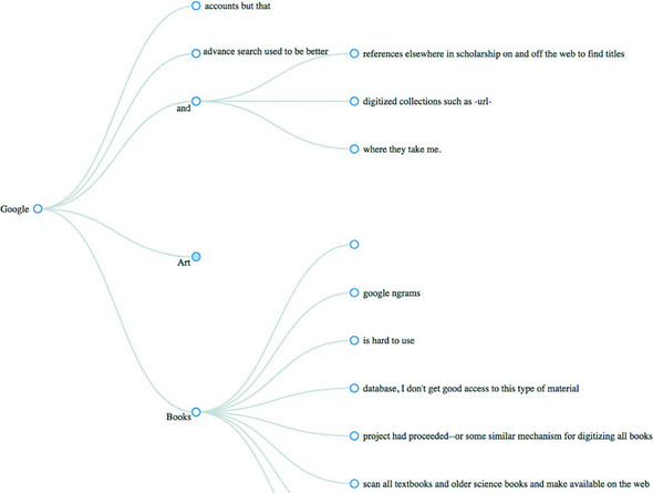
Data that’s nested, with objects existing as children of objects recursively, is common. Many of the most intuitive layouts in D3 are based on nested data, which can be represented as trees, such as the one in figure 1.29, or packed in circles or boxes. Data isn’t often output in such a format, and requires a bit of scripting to organize it as such, but the flexibility of this representation is worth the effort. You’ll see hierarchical data in detail in chapter 6.
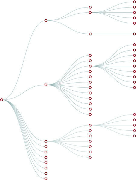
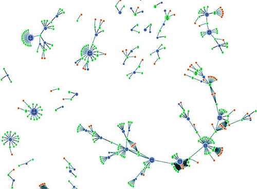
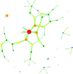
Networks are everywhere. Whether they’re the raw output of social networking streams, transportation networks, or a flowchart, networks are a powerful method of delivering an understanding of complex systems. Networks are often represented as node-link diagrams, as shown in figure 1.30. Like geographic data, network data has many standards, but this text focuses only on two forms: node/edge lists and connected arrays. Network data can also be easily transformed into these data types by using a freely available network analysis tool like Gephi (available at gephi.org). We’ll examine network data and network data standards when we deal with network visualization in chapter 7.
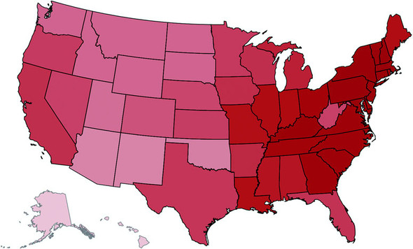
Geographic data refers to locations either as points or shapes, and is used to create the variety of online maps seen on the web today, such as the map of the United States in figure 1.31. The incredible popularity of web mapping means that you can get access to a massive amount of publicly accessible geodata for any project. Geographic data has a few standards, but the focus in this book is on two: the GeoJSON and Topo-JSON standards. Although geodata may come in many forms, readily available geographic information systems (GIS) tools such as Quantum GIS allow developers to transform it into GIS format for ready delivery to the web. We’ll look at geographic data closely in chapter 8.
As you’ll see in chapter 2, everything is data, including images or blocks of text. Although information visualization typically uses shapes encoded by color and size to represent data, sometimes the best way to represent it in D3 is with linear narrative text, an image, or a video. If you develop applications for an audience that needs to understand complex systems, but you consider the manipulation of text or images to be somehow separate from the representation of numerical or categorical data as shapes, then you arbitrarily reduce your capability to communicate. The layouts and formatting used when dealing with text and images, typically tied to older modes of web publication, are possible in D3, and we’ll deal with that throughout this book.
You’ll use two types of data points with D3: literals and objects. A literal, such as a string literal like Apple or beer or a number literal like 64273 or 5.44, is straightforward. A JavaScript object, or the equivalent JSON (JavaScript Object Notation—a way of expressing data similar to JavaScript objects), isn’t so straightforward, but is something that you need to understand if you plan to do sophisticated data visualization.
Let’s say you have a dataset that consists of individuals from an insurance database, and you need to know how old someone is, whether they’re employed, their name, and their children, if any. A JavaScript object that represents each individual in such a database would be expressed as follows:
{name: "Charlie", age: 55, employed: true, childrenNames: ["Ruth", "Charlie Jr."]}
Each object is surround by braces {}, and has attributes that have a string, number, array, Boolean, or object as their value. You can assign an object to a variable and access its attributes by referring to them, like so:
var person = {name: "Charlie", age: 55, employed: true, childrenNames: ["Ruth", "Charlie Jr."]};
person.name // Charlie
person["name"] // Charlie
person.name = "Charles" // Sets name to Charles
person["name"] = "Charles" // Sets name to Charles
person.age < 65 // true
person.childrenNames // ["Ruth", "Charlie Jr."]
person.childrenNames[0] // "Ruth"
Objects can be stored in arrays and associated with elements using d3.select() syntax. But objects can also be iterated through like arrays using a for loop:
for (x in person) {console.log(x); console.log(person[x]);}
The x in the loop represents each attribute in the person object. Each x will be one of the attributes such as name, age, and so on This allows you to iterate through the attributes using person[x] to show the value of that attribute of the object.
Another way to access keys would be to use Object.keys(person) and then iterate through that array.
If your data is stored as JSON, then you can import it using d3.json(), which you’ll see many times in later chapters. But remember that whenever you use d3.csv(), D3 imports the data as an array of JSON objects. We’ll look at objects more extensively as we use them later.
Information visualization (infoviz) has never been so popular as it is today. The wealth of maps, charts, and complex representations of systems and datasets isn’t present only in the workplace, but also in our entertainment and our everyday lives. With this popularity comes a growing library of classes and subclasses of representation of data and information using visual means, as well as aesthetic rules to promote legibility and comprehension. Your audience, whether the general public, academics, or decision makers, has grown accustomed to what we once considered incredibly abstract and complicated representations of trends in data. This makes libraries such as D3 popular not only among data scientists, but also among journalists, artists, scholars, IT professionals, and even fan communities.
But the wealth of options can seem overwhelming, and the relative ease of modifying a dataset to appear in a streamgraph, treemap, or histogram tends to promote the idea that information visualization is more about style than substance. Fortunately, well-established rules dictate what charts and methods to use for different types of data from different systems. Although I can’t cover every rule in the book, I’ll touch on ones that are useful to consider as we create more complicated information visualizations. Although developers use D3 to revolutionize the use of color and layout, most want to create visual representations of data that support practical concerns. Because D3 is being developed in this mature information visualization environment, it contains numerous helper functions to let developers worry about interface and design rather than color and axes.
Still, to properly deploy information visualization, you should know what to do and what not to do. The best way to learn this is to review the work of established designers and information visualization practitioners, and you need to have a firm understanding not only of your data but of your audience. Although an entire library of works deals with these issues, here are a few that I’ve found useful and can get you oriented on the basics:
These are by no means the only texts for learning data visualization, but I’ve found them useful for getting started. You should pare down and establish fundamental, even basic, data visualization practices that clearly represent the trends that are salient to your audience. When in doubt, simplify—it’s often better to present a histogram than a streamgraph, or a hierarchical network layout (like a dendrogram) than a force-directed one. The more visually complex methods of displaying data tend to inspire more excitement, but can also lead an audience to see what they want to see or focus on the aesthetics of the graphics rather than the data.
One of the best pieces of advice when it comes to working in information visualization comes from the practice of writing: “Kill your darlings.” The same way writers may become enamored of certain scenes or characters, you can become enamored of a particularly elegant or sophisticated-looking graphic. Your love of a cool chart or animation can distract you from the goal of communicating the structure and patterns in the data. Remember to save your harshest criticism for your most beloved pieces, because you may find, much to your chagrin, that they’re not as useful and informative as you think they are.
One thing to keep in mind while reading about data visualization is that the literature is often focused on static charts. With D3 you’ll be making interactive and dynamic visualizations and not only static ones. You’ll make a dynamic (or animated) data visualization before you finish this chapter, and using D3 to make a chart interactive is incredibly simple. A few interactive touches can make a visualization not only more readable but significantly more engaging. Users who feel like they’re exploring rather than reading, even if only with a few mouseover events or a simple click to zoom, will find the content of the visualization more compelling than in a static page. But this added complexity requires an investment in learning principles of interface design and user experience. We’ll get into this in more detail in chapter 9.
Throughout this chapter, you’ve seen various lines of code and the effect of those lines of code on the growing d3ia.html sample page you’ve been building. But I’ve avoided explaining the code in too much detail so that you could concentrate on the principles at work in D3. It’s simple to build an application from scratch that uses D3 to create and modify elements. Let’s put it all together and see how it works. First, let’s start with a clean HTML page that doesn’t have any defined styles or existing divs, as shown in the following listing.
<!doctype html>
<html>
<head>
   <script src="d3.v4.min.js"></script>
</head>
<body>
</body>
</html>
We can use D3 as an abstraction layer for adding traditional content to the page. Although we can write JavaScript inside our .html file or in its own .js file, let’s put code in the console and see how it works. Later, we’ll focus on the various commands in more detail for layouts and interfaces. We can get started with a piece of code that uses D3 to write to our web page, as in the next listing.
d3.select("body").append("div")
  .style("border", "1px black solid")
  .html("hello world");
We can adjust the element on the page and give it interactivity with the inclusion of the .on() function, show in the next listing.
d3.select("div")
  .style("background-color", "pink")
  .style("font-size", "24px")
  .attr("id", "newDiv")
  .attr("class", "d3div")
  .on("click", () => {console.log("You clicked a div")});
The .on() function allows us to create an event listener for the currently selected element or set of elements. It accepts the variety of events that can happen to an element, such as click, mouseover, mouseout, and so on. If you click your div, you’ll notice that it gives a response in your console, as shown in figure 1.32.
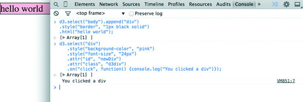
You didn’t pick up this book to learn how to add divs to a web page, but you likely want to deal with graphics like lines and circles. To append shapes to a page with D3, you need to have an SVG canvas element somewhere in your page’s DOM. You could either add this SVG canvas to the page as you write the HTML, or you could append it using the D3 syntax you’ve learned:
d3.select("body").append("svg");
Let’s adjust our d3ia.html page to start with an SVG canvas, as shown in the following listing.
<html>
<head>
   <script src="d3.v4.min.js"></script>
</head>
<body>
   <div id="vizcontainer">
   <svg style="width:500px;height:500px;border:1px lightgray solid;" />
   </div>
</body>
</html>
After we have an SVG canvas on our page, we can append various shapes to it using the same select() and append() syntax we’ve been using in section 1.6.1 for <div> elements, as shown in the following listing.
d3.select("svg")
  .append("line")
  .attr("x1", 20)
  .attr("y1", 20)
  .attr("x2",400)
  .attr("y2",400)
  .style("stroke", "black")
  .style("stroke-width","2px");
d3.select("svg")
  .append("text")
  .attr("x",20)
  .attr("y",20)
  .text("HELLO");
d3.select("svg")
  .append("circle")
  .attr("r", 20)
  .attr("cx",20)
  .attr("cy",20)
  .style("fill","red");
d3.select("svg")
  .append("circle")
  .attr("r", 100)
  .attr("cx",400)
  .attr("cy",400)
  .style("fill","lightblue");
d3.select("svg")
  .append("text")
  .attr("x",400)
  .attr("y",400)
  .text("WORLD");
Notice that your circles are drawn over the line, and the text is drawn above or below the circle, depending on the order in which you run your commands, as you can see in figure 1.33. This happened because the draw order of SVG is based on its DOM order. Later you’ll learn methods to adjust that order.
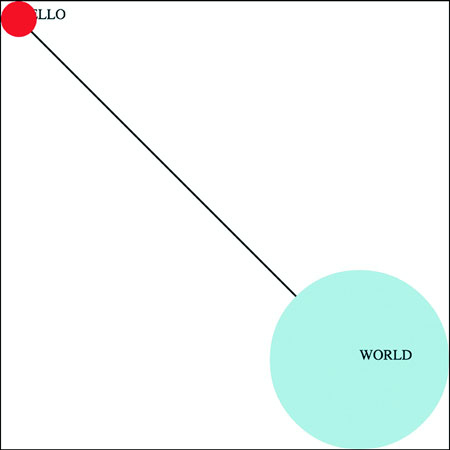
Writing Hello World with languages is such a common example that I thought we should give the world a chance to respond. Let’s add the same big circle and little circle from before, but this time, when we add text, we’ll include the .style (opacity) setting that makes our text invisible, as shown in the following listing. We’ll also give each text element a .attr(id) setting so that the text near the small circle has an id attribute with the value of a, and the text near the large circle has an id attribute with the value of b.
d3.select("svg")
  .append("circle")
  .attr("r", 20)
  .attr("cx",20)
  .attr("cy",20)
  .style("fill","red");
d3.select("svg")
  .append("text")
  .attr("id", "a")
  .attr("x",20)
  .attr("y",20)
  .style("opacity", 0)
  .text("HELLO WORLD");
d3.select("svg")
  .append("circle")
  .attr("r", 100)
  .attr("cx",400)
  .attr("cy",400)
  .style("fill","lightblue");
d3.select("svg")
  .append("text")
  .attr("id", "b")
  .attr("x",400)
  .attr("y",400)
  .style("opacity", 0)
  .text("Uh, hi.");
Two circles, no line, and no text. Now you make the text appear using the .transition() method with the .delay() method, and you should have an end state like the one shown in figure 1.34.

d3.select("#a").transition().delay(1000).style("opacity", 1);
d3.select("#b").transition().delay(3000).style("opacity", .75);
Congratulations! You’ve made your first dynamic data visualization. The .transition() method indicates that you don’t want your change to be instantaneous. By chaining it with the .delay() method, you indicate how many milliseconds to wait before implementing the style or attribute changes that appear in the chain after that .delay() setting.
We’ll get a bit more ambitious later, but before we finish here, let’s look at another .transition() setting. You can set a .delay() before applying the new style or attribute, but you can also set a .duration() over which the change is applied. The results in your browser should move the shapes in the direction of the arrows in figure 1.35:
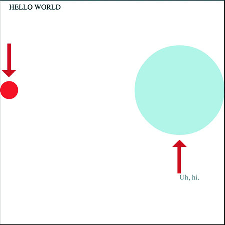
d3.selectAll("circle").transition().duration(2000).attr("cy", 200);
The .duration() method, as you can see, adjusts the setting over the course of the amount of time (again, in milliseconds) that you set it for.
That covers the basics of how D3 works and how it’s designed, and these fundamental concepts will surface again and again throughout the following chapters, where you’ll learn more complicated variations on representing and manipulating data.
— by Jeffrey Heer, associate professor, Paul G. Allen School of Computer Science & Engineering, University of Washington, former Stanford University PhD advisor of D3 creator Mike Bostock
With a wealth of existing charting libraries and business intelligence tools out there, you might wonder: why learn D3? When you’re first building simple charts and graphs, D3 may feel low-level and verbose, perhaps with some unfamiliar programming constructs to boot! The critical thing to keep in mind is that D3 is not a charting library (though it can be used as such). D3 is a framework for building an expressive range of customized and interactive web-based graphics. D3 provides fundamental building blocks for creating just about any visualization you can imagine. Rather than try to shoehorn your data into a more limited set of application-sanctioned options, by learning D3 you will be able to create interactive web pages tailored to the specifics of your data and use cases.
There are also additional benefits to learning D3. D3 leverages web standards such as the browser Document Object Model (DOM), Scalable Vector Graphics (SVG), and Cascading Style Sheets (CSS). These technologies form part of D3’s learning curve but are also invaluable above and beyond D3 itself. Learning D3 thus reaps extra dividends on your time investment, helping you to become a more fluent and seasoned web developer. D3 is also steeped in visualization design concepts and best practices, including facilities for visual encoding, spatial layout, animation, and color design. Rather than limit your consideration to a fixed palette of bar charts, line charts, and scatter plots, the process of learning D3 can help kickstart your journey into the larger world of visualization, introducing you to terms, techniques, and examples that will help you think both more deeply and more creatively about the craft of information visualization.
You should always strive to pick the right tool for the job. In some cases, that may be a business intelligence tool or plotting library (many of which are built on top of D3 itself). Ideally you pick one that supports rapid generation and exploration of visualizations to aid exploration and understanding. But in other cases you need customized design, at which point the limitations of other tools rapidly becomes apparent. Consider whether novel visual designs or interaction techniques might enable more effective communication and engagement with your data. Do you seek to build improved tools to help people explore data in new ways? Are you tasked with creating a unique look and feel for your organization? Would you like to engage with a large and supportive community of visualization designers and innovators? If so, learn D3!
Toy examples and online demos sometimes present data in the format of a Java-Script-defined array, the same way we did in chapter 1. But in the real world, your data is going to come from an API or an external file, and you’re going to need to load it, format it, and transform it before you start creating web elements based on that data. This chapter describes this process of getting data into a suitable form and touches on the basic structures that you’ll use again and again in D3: loading data from an external source, formatting that data, and creating graphical representations of that data, like you see in figure 2.1.
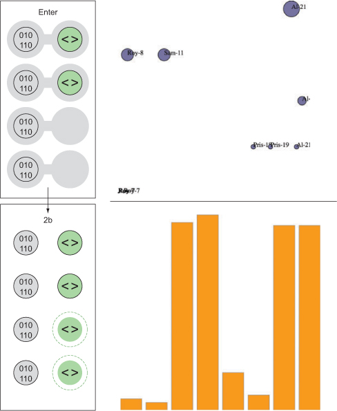
We’ll deal with two small datasets in this chapter and take them through a simplified five-step process (figure 2.2) that will touch on everything you need to do with and to data to turn it into a data visualization product with D3. One dataset consists of a few cities and their geographic location and population. The other has a few fictional tweets with information about who made them and who reacted to them. This is the kind of data you’re often presented with. You’re tasked with finding out which tweets have more of an impact than others or which cities are more susceptible to natural disasters than others. In this chapter you’ll learn how to measure data in D3 in a number of ways and how to use those methods to create charts.

Out in the real world, you’ll deal with much larger datasets, with hundreds of cities and thousands of tweets, but you’ll use the same principles outlined in this chapter. This chapter doesn’t teach you how to create complex data visualizations, but it does explain in detail several of the most important core processes in D3 that you’ll need.
As we touched on in chapter 1, our data will typically be formatted in various but standardized ways. Regardless of the source of the data, it will likely be formatted as single-document data files in XML, CSV, or JSON format. D3 provides several functions for importing and working with this data (the first step shown in figure 2.3). One core difference between these formats is how they model data. JSON and XML provide the capacity to encode nested relationships in a way that delimited formats like CSV don’t. Another difference is that d3.csv() and d3.json()produce an array of JSON objects, whereas d3.xml()creates an XML document that needs to be accessed in a different manner.
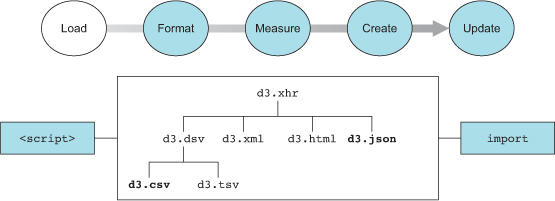
D3 has five functions typically used for loading data that correspond to the five types of files you’ll likely encounter: d3.text(), d3.xml(), d3.json(), d3.csv(), and d3.html(). These abstract the same XHR requests that a library like fetch does. We’ll spend most of our time working with d3.csv() and d3.json(). You’ll see d3.html() in the next chapter, where we’ll use it to create complex DOM elements that are written as templates. You may find d3.xml() and d3.text() more useful depending on how you typically deal with data. You may be comfortable with XML rather than JSON, in which case you can rely on d3.xml() and format your data functions accordingly. If you prefer working with text strings, you can use d3.text() to pull in the data and process it using another library or code.
Both d3.csv() and d3.json() use the same format when calling the function, by declaring the path to the file being loaded and defining the callback function:
d3.csv("cities.csv", (error,data) => {console.log(error,data)});
The error variable is optional, and if we only declare a single variable with the callback function, it will be the data:
d3.csv("cities.csv", d => console.log(d));
One of the major patterns you see in D3 examples is the use of d3.csv or d3.json to bring data into your application. But asynchronous loading of data isn’t necessary if your data is never going to change during the course of the application being used. Instead of relying on d3.json or d3.csv, you could as easily format your data as Java-Script data and include it using a <script> tag or import/require the data if you’re working with Node or ES2015.
It’s not either/or; you might have some data that never changes (such as the geodata you’re using to draw a basemap) and some that does change (the polling data you’re using to change the color of your map). In that case, you can include the static data and use XHR for the dynamic content.
You first get access to the data in the callback function, and you may want to declare the data as a global variable so that you can use it elsewhere. Global variables are bad practice out in the real world, but we’ll use them in examples because it makes it easier to follow along. To get started, you need a data file. For this chapter we’ll be working with two data files: a CSV file that contains data about cities and a JSON file that contains data about tweets, as shown in the following listings.
"label","population","country","x","y"
"San Francisco", 750000,"USA",122,-37
"Fresno", 500000,"USA",119,-36
"Lahore",12500000,"Pakistan",74,31
"Karachi",13000000,"Pakistan",67,24
"Rome",2500000,"Italy",12,41
"Naples",1000000,"Italy",14,40
"Rio",12300000,"Brazil",-43,-22
"Sao Paolo",12300000,"Brazil",-46,-23
{
"tweets": [
{"user": "Al", "content": "I really love seafood.",
   "timestamp": " Mon Dec 23 2013 21:30 GMT-0800 (PST)",
   "retweets": ["Raj","Pris","Roy"], "favorites": ["Sam"]},
{"user": "Al", "content": "I take that back, this doesn't taste so good.",
   "timestamp": "Mon Dec 23 2013 21:55 GMT-0800 (PST)",
   "retweets": ["Roy"], "favorites": []},
{"user": "Al",
   "content": "From now on, I'm only eating cheese sandwiches.",
   "timestamp": "Mon Dec 23 2013 22:22 GMT-0800 (PST)",
   "retweets": [],"favorites": ["Roy","Sam"]},
{"user": "Roy", "content": "Great workout!",
   "timestamp": " Mon Dec 23 2013 7:20 GMT-0800 (PST)",
   "retweets": [],"favorites": []},
{"user": "Roy", "content": "Spectacular oatmeal!",
   "timestamp": " Mon Dec 23 2013 7:23 GMT-0800 (PST)",
   "retweets": [],"favorites": []},
{"user": "Roy", "content": "Amazing traffic!",
   "timestamp": " Mon Dec 23 2013 7:47  GMT-0800 (PST)",
   "retweets": [],"favorites": []},
{"user": "Roy", "content": "Just got a ticket for texting and driving!",
   "timestamp": " Mon Dec 23 2013 8:05 GMT-0800 (PST)",
   "retweets": [],"favorites": ["Sam", "Sally", "Pris"]},
{"user": "Pris", "content": "Going to have some boiled eggs.",
   "timestamp": " Mon Dec 23 2013 18:23 GMT-0800 (PST)",
   "retweets": [],"favorites": ["Sally"]},
{"user": "Pris", "content": "Maybe practice some gymnastics.",
   "timestamp": " Mon Dec 23 2013 19:47  GMT-0800 (PST)",
   "retweets": [],"favorites": ["Sally"]},
{"user": "Sam", "content": "@Roy Let's get lunch",
   "timestamp": " Mon Dec 23 2013 11:05 GMT-0800 (PST)",
   "retweets": ["Pris"], "favorites": ["Sally", "Pris"]}
]
}
With these two files, we can access the data by using the appropriate function to load them:
d3.csv("cities.csv", data => console.log(data));
d3.json("tweets.json", data => console.log(data));           1
In both cases, the data file is loaded as an array of JSON objects. For tweets.json, this array is found at data.tweets, whereas for cities.csv, this array is data. The function d3.json() allows you to load a JSON-formatted file, which can have objects and attributes in a way that a loaded CSV can’t. When you load a CSV, it returns an array of objects. When you load a JSON file, it will return an object with one or more key/value pairs (known as entries). In this case, the object that’s initialized as data has a key of tweets that corresponds to an array of data. That’s why we need to refer to data.tweets after we’ve loaded tweets.json, but refer directly to data when we load cities.csv.
Both d3.csv and d3.json are asynchronous, and will return after the request to open the file and not after processing the file. Loading a file, which is typically an operation that takes more time than most other functions, won’t be complete by the time other functions are called. If you call functions that require the loaded data before it’s loaded, then they’ll fail. You can get around this asynchronous behavior in two ways. You can nest the functions operating on the data in the data-loading function:
d3.csv("somefiles.csv", function(data) {doSomethingWithData(data)});
Or you can use promises (which we’ll use in chapter 7) to trigger events upon completion of the loading of one or more files. You’ll see queue.js in action in later chapters. Note that d3.csv() has a method .parse() that you can use on a block of text rather than an external file. If you need more direct control over getting data, you should review the documentation for d3-request, which allows for more fine-grained control of sending and receiving data.
After you load the datasets, you’ll need to define methods so that the attributes of the data directly relate to settings for color, size, and position graphical elements. If you want to display the cities in the CSV, you probably want to use circles, size those circles based on population, and then place them according to their geographic coordinates. We have long-established conventions for representing cities on maps graphically, but the same can’t be said about tweets. What graphical symbol to use to represent a single tweet, how to size it, and where to place it are all open questions. To answer these questions, you need to understand the forms of data you’ll encounter when doing data visualization. Programming languages and ontologies define numerous datatypes, but it’s useful to think of them as quantitative, categorical, geometric, temporal, topological, or raw.
You’ll typically need to format quantitative data (the second step in creating data visualization shown in figure 2.4) by defining scales using d3.scale* functions (such as d3.scaleLinear and d3.scaleTime), as explained in section 2.1.3, or by transforming your quantitative data into categorical data using techniques like quantiles, which group numeric values.
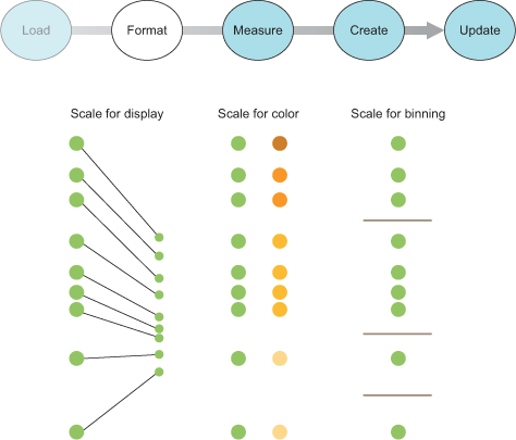
Numerical or quantitative data is the most common type in data visualization. Quantitative data can be effectively represented with size, position, or color.
For one of our datasets, we have readily accessible quantitative data: the population figures in the cities.csv table. For the tweets dataset, though, it seems like we don’t have any quantitative data available, which is why we’ll spend time in section 2.1.3 looking at how to transform data.
Categorical data falls into discrete groups, typically represented by text, such as nationality or gender. Categorical data is often represented using shape or color. You map the categories to distinct colors or shapes to identify the pattern of the groups of elements positioned according to other attributes.
The tweets data has categorical data in the form of the user data, which you can recognize by intuitively thinking of coloring the tweets by the user who made them. Later, we’ll discuss methods to derive categorical data.
Topological data describes the relationship of one piece of data with another, which can also be another form of location data. The genealogical connection between two people or the distance of a shop from a train station each represents a way of defining relationships between objects. Topological attributes can be represented with text referring to unique ID values or with pointers to the other objects. Later in this chapter we’ll create topological data in the form of nested hierarchies.
For the cities data, it seems like we don’t have topological data. However, we could easily produce it by designating one city, such as San Francisco, to be our frame of reference. We could then create a distance-to-San-Francisco measure that would give us topological data if we needed it. The tweets data has its topological component in the favorites and retweets arrays, which provide the basis for a social network.
Geometric data is most commonly associated with the boundaries and tracks of geographic data, such as countries, rivers, cities, and roads. Geometric data might also be the SVG code to draw a particular icon that you want to use, the text for a class of shape, or a numerical value indicating the size of the shape. Geometric data is, not surprisingly, most often represented using shape and size, but can also be transformed like other data, for example, into quantitative data by measuring area and perimeter.
The cities data has obvious geometric data in the form of traditional latitude and longitude coordinates that allow the points to be placed on a map. The tweets data, on the other hand, has no readily accessible geometric data.
Dates and time can be represented using numbers for days, years, or months, or with specific date-time encoding for more complex calculations. The most common format is ISO 8601, and if your data comes formatted that way as a string, it’s easy to turn it into a date datatype in JavaScript, as you’ll see in section 2.1.4. You’ll work with dates and times often. Fortunately, both the built-in functions in JavaScript and a few helper functions in D3 are available to handle data that’s tricky to measure and represent.
Although the cities dataset has no temporal data, keep in mind that temporal data for common entities like cities and countries is often available. In situations where you can easily expand your dataset like this, you need to ask yourself if it makes sense given the scope of your project. In contrast, the tweets data has a string that conforms to RFC 2822 (supported by JavaScript for representing dates along with ISO 8601) and can easily be turned into a date datatype in JavaScript.
Raw, free, or unstructured data is typically text and image content. Raw data can be transformed by measuring it or using sophisticated text and image analysis to derive attributes more suited to data visualization. In its unaltered form, raw data is used in the content fields of graphical elements, such as in labels or snippets.
The city names provide convenient labels for that dataset, but how would we label the individual tweets? One way is to use the entire content of the tweet as a label, as we’ll do in chapter 5, but when dealing with raw data, the most difficult and important task is coming up with ways of summarizing and measuring it effectively.
As you deal with different forms of data, you’ll change data from one type to another to better represent it. You can transform data in many ways. Here we’ll look at casting, normalizing (or scaling), binning (or grouping), and nesting data.
The act of casting data refers to turning one datatype into another from the perspective of your programming language, which in this case is JavaScript. When you load data, it will often be in a string format, even if it’s a date, integer, floating-point number, or array. The date string in the tweets data, for instance, needs to be changed from a string into a date datatype if you want to work with the date methods available in JavaScript. You should familiarize yourself with the JavaScript functions that allow you to transform data. Here are a few:
parseInt("77"); +"77";                                 1
parseFloat("3.14"); +"3.14"                            2
Date.parse("Sun, 22 Dec 2013 08:00:00 GMT");           3
text = "alpha,beta,gamma"; text.split(",");            4
JavaScript defaults to type conversion when using the == test, whereas it forces no type conversion when using === and the like, so you’ll find your code will often work fine without casting. But this will come back to haunt you in situations where it doesn’t default to the type you expect, for example, when you try to sort an array and JavaScript sorts your numbers alphabetically.
Numerical data rarely corresponds directly to the position and size of graphical elements onscreen. You can use d3.scale() functions to normalize your data for presentation on a screen (among other things). The first scale we’ll look at is d3.scale().linear(), which makes a direct relationship between one range of numbers and another. Scales have a domain setting and a range setting that accept arrays, with the domain determining the ramp of values being transformed and the range referring to the ramp to which those values are being transformed. For example, if you take the smallest population figure in cities.csv and the largest population figure, you can create a ramp that scales from the smallest to the largest so that you can display the difference between them easily on a 500-px canvas. In figure 2.5 and the code that follows, you can see that the same linear rate of change from 500,000 to 13,000,000 maps to a linear rate of change from 0 to 500.
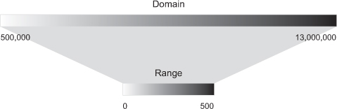
You create this ramp by instantiating a new scale object and setting its domain and range values:
var newRamp = d3.scaleLinear().domain([500000,13000000]).range([0, 500]);
newRamp(1000000);                       1
newRamp(9000000);                       2
newRamp.invert(313);                    3
You can also create a color ramp by referencing CSS color names, RGB colors, or hex colors in the range field. The effect is a linear mapping of a band of colors to the band of values defined in the domain, as shown in figure 2.6.
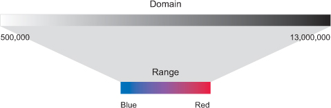
The code to create this ramp is the same, except for the reference to colors in the range array:
var newRamp = d3.scaleLinear().domain([500000,13000000]).range(["blue", "red"]);
newRamp(1000000);                                 1
newRamp(9000000);                                 2
newRamp.invert("#ad0052");                        3
You can also use d3.scaleLog(), d3.scalePow(), d3.scaleOrdinal(), and other less-common scales to map data where these scales are more appropriate to your dataset. You’ll see these in action later in the book as we deal with those kinds of datasets. Finally, d3.scaleTime() provides a linear scale that’s designed to deal with date datatypes, as you’ll see later in this chapter.
It’s useful to sort quantitative data into categories, placing the values in a range or “bin” to group them together. One method is to use quantiles, by splitting the array into equal-sized parts. The quantile scale in D3 is, not surprisingly, called d3.scaleQuantile(), and it has the same settings as other scales. The number of parts and their labels are determined by the .range() setting. Unlike other scales, it gives no error if there’s a mismatch between the number of .domain() values and the number of .range() values in a quantile scale, because it automatically sorts and bins the values in the domain into a smaller number of values in the range.
The scale sorts the array of numbers in its .domain() from smallest to largest and automatically splits the values at the appropriate point to create the necessary categories. Any number passed into the quantile scale function returns one of the set categories based on these break points:
var sampleArray = [423,124,66,424,58,10,900,44,1];
var qScale = d3.scaleQuantile().domain(sampleArray).range([0,1,2]);
qScale(423);                                                        1
qScale(20);                                                         2
qScale(10000);                                                      3
Notice that the range values in figure 2.7 are fixed and can accept text that may correspond to a particular CSS class, color, or other arbitrary value.
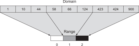
var qScaleName =
d3.scaleQuantile()
   .domain(sampleArray).range(["small","medium","large"]);
qScaleName (68);                                             1
qScaleName (20);                                             2
qScaleName (10000);                                          3
Hierarchical representations of data are useful and aren’t limited to data with more traditional or explicit hierarchies, such as a dataset of parents and their children. We’ll get into hierarchical data and representation in more detail in chapters 4 and 5, but in this chapter we’ll use the D3 nesting function, which you can probably guess is called d3.nest().
The concept behind nesting is that shared attributes of data can be used to sort them into discrete categories and subcategories. For instance, if we want to group tweets by the user who made them, then we’d use nesting:
d3.json("tweets.json", data => {
  var tweetData = data.tweets;
  var nestedTweets = d3.nest()
    .key(d => d.user)
    .entries(tweetData);
});
This nesting function combines the tweets into arrays under new objects labeled by the unique user attribute values, as shown in figure 2.8.
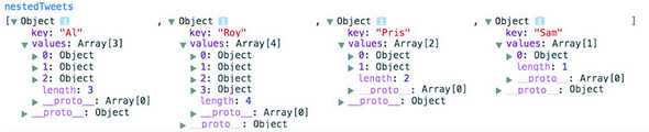
Now that we’ve loaded our data and transformed it into types that are accessible, we’ll investigate the patterns of that data by measuring the data (the third step shown in figure 2.9).
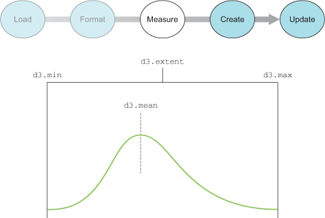
After loading your data array, one of the first things you should do is measure and sort it. It’s particularly important to know the distribution of values of particular attributes, as well as the minimum and maximum values and the names of the attributes. D3 provides a set of array functions that can help you understand your data.
You’ll always have arrays filled with data that you’ll want to size and position based on the relative value of an attribute compared to the distribution of the values in the array. You should therefore familiarize yourself with the ways to determine the distributions of values in an array in D3. You’ll work with an array of numbers first before you see these functions in operation with more complex and more data-rich JSON object arrays:
var testArray = [88,10000,1,75,12,35];
Nearly all the D3 measuring functions follow the same pattern. First, you need to designate the array and an accessor function for the value that you want to measure. In our case, we’re working with an array of numbers and not an array of objects, so the accessor only needs to point at the element itself:
   d3.min(testArray, el => el);                1
   d3.max(testArray, el => el);                2
   d3.mean(testArray, el => el);               3
If you’re dealing with a more complex JSON object array, you’ll need to designate the attribute you want to measure. For instance, if we’re working with the array of JSON objects from cities.csv, we may want to derive the minimum, maximum, and average populations:
d3.csv("cities.csv", data => {
d3.min(data, el => +el.population);            1
d3.max(data, el => +el.population);            2
d3.mean(data, el => +el.population);           3
});
Finally, because dealing with minimum and maximum values is a common occurrence, d3.extent() conveniently returns d3.min() and d3.max() in a two-piece array:
d3.extent(data, el => +el.population); 1
You can also measure nonnumerical data like text by using the JavaScript .length() function for strings and arrays. When dealing with topological data, you need more robust mechanisms to measure network structure, such as centrality and clustering. When dealing with geometric data, you can calculate the area and perimeter of shapes mathematically, which can become rather difficult with complex shapes.
Now that we’ve loaded, formatted, and measured our data, we can create data visualizations. This requires us to use selections and the functions that come with them, which we’ll examine in more detail in the next section.
We touched on data-binding in chapter 1, but here we’ll go into it in more detail, explaining how selections work with data-binding to create elements (the fourth step shown in figure 2.10) and to change those elements after they’ve been created. Our first example uses the data from cities.csv. After that we’ll see the process using this data as well as simple numerical arrays, and later we’ll do more interesting things with the tweets data.
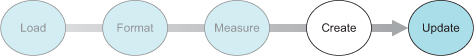
You use selections to make changes to the structure and appearance of your web page with D3. Remember that a selection consists of one or more elements in the DOM as well as the data, if any, associated with them. You can also create or delete elements using selections, and change the style and content. You’ve seen how to use d3.select() to change a DOM element, and now we’ll focus on creating and removing elements based on data. For this example, we’ll use cities.csv as our data source. In it are a list of all the cities I’ve lived or always wanted to visit, and Fresno. Later we’ll put these cities on a map, but for now we’re going to use them as non-map data. First, we need to load cities.csv and trigger our data visualization function in the callback to create a set of new <div> elements on the page using this code, with the results shown in figure 2.11.
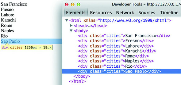
d3.csv("cities.csv", (error,data) => {
   if (error) {
   console.error(error)
   }
   else {
   dataViz(data)
   }
   });
function dataViz(incomingData) {
  d3.select("body").selectAll("div.cities")            1
    .data(incomingData)                                2
    .enter()                                           3
    .append("div")                                     4
    .attr("class","cities")                            5
    .html(d => d.label);                               6
}
The selection and binding procedure shown here is a common pattern throughout the rest of this book. A subselection is created when you first select one element and then select the elements underneath it, which you’ll see in more detail later. First, let’s look at each individual part of this example. See figure 2.11.
The first part of any selection is d3.select() or d3.selectAll() with a CSS identifier that corresponds to a part of the DOM. Often no elements match the identifier, which is referred to as an empty selection, because you want to create new elements on the page using the .enter() function. You can make a selection on a selection to designate how to create and modify child elements of a specific DOM element. Note that a subselection won’t automatically generate a parent. The parent must already exist, or you’ll need to create one using .append().
Here you associate an array with the DOM elements you selected. Each city in our dataset is associated with a DOM element in the selection, and that associated data is stored in a data attribute of the element. We could access these values manually using Java-Script like so:
document.getElementsByClassName("cities")[0].__data__ 1
Later in this chapter we’ll work with those values in a more sophisticated way using D3.
When binding data to selections, there will be either more, less, or the same number of DOM elements as there are data values. When you have more data values than DOM elements in the selection, you trigger the .enter() function, which allows you to define behavior to perform for every value that doesn’t have a corresponding DOM element in the selection. In our case, .enter() fires eight times, because no DOM elements correspond to "div.cities" and our incomingData array contains eight values. When fewer data elements exist, then .exit() behavior is triggered, and when data values and DOM elements are equal in a selection, then neither .exit() nor .enter() is fired. You’ll notice I didn’t use .exit() in the previous code. That’s because I knew there weren’t going to be fewer data elements than DOM elements. In an application where you know that you’re not going to deal with .exit() you don’t need to write the behavior for it.
Enter and exit often confuse people when they first get started with D3 but the pattern, where you make a diff of the current state of the DOM and the data being bound, and creating or removing elements as a result, is commonly deployed in modern Model-View-Controller (MVC) frameworks. The difference is that when you’re using something like React, it abstracts it more, and so you don’t have to write separate logic for enter, exit, and update.
You’ll almost always want to add elements to the DOM when there are more data values than DOM elements. The .append() function allows you to add more elements and define which elements to add. In our example, we add <div> elements, but later in this chapter we’ll add SVG shapes, and in other chapters we’ll add tables and buttons and any other element type supported in HTML. The .insert() function is a sister function to .append(), but .insert() gives you control over where in the DOM you add the new element. You can also perform an append or insert directly on a selection, which adds one DOM element of the kind you specify for each DOM element in your selection.
You’re familiar with changing styles and attributes using D3 syntax. The only thing to note is that each of the functions you define here will be applied to each new element added to the page. In our example, each of our eight new <div> elements will be created with class="cities". Remember that even though our selection referenced "div.cities", we still have to manually declare that we’re creating <div> elements and also manually set their class to "cities".
For traditional DOM elements, you set the content with a .html() function. In the next section, you’ll see how to set content based on the data bound to the particular DOM element.
If you ran the code in the previous example, you saw that each <div> element was set with different content derived from the data array that you bound to the selection. You did this using an inline anonymous function in your selection that automatically provides access to two variables that are critical to representing data graphically: the data value itself and the array position of the data. In most examples you’ll see these represented as d for data and i for array index, but they could be declared using any available variable name.
The best way to see this in action is to use our data to create a simple data visualization. We’ll keep working with d3ia.html, which we created in chapter 1, and which is a simple HTML page with minimal DOM elements and styles. A histogram or bar chart is one of the most simple and effective ways of expressing numerical data broken down by category. We’ll avoid the more complex datasets for now and start with a simple array of numbers:
[15, 50, 22, 8, 100, 10]
If we bind this array to a selection, we can use the values to determine the height of the rectangles (our bars in a bar chart). We need to set a width based on the space available for the chart, and we’ll start by setting it to 10 px:
d3.select("svg")
  .selectAll("rect")
  .data([15, 50, 22, 8, 100, 10])
  .enter()
  .append("rect")
  .attr("width", 10)                      1
  .attr("height", d => d);                2
When we used the label values of our array to create <div> content with labels in section 2.2.1, we pointed to the object’s label attribute. Here, because we’re dealing with an array of number literals, we use the inline function to point directly at the value in the array to determine the height of our rectangles. The result, shown in figure 2.12, isn’t nearly as interesting as you might expect.

All the rectangles overlap each other—they have the same default x and y positions. The drawing is easier to see by adjusting their opacity style, as shown in figure 2.13.

d3.select("svg")
  .selectAll("rect")
  .data([15, 50, 22, 8, 100, 10])
  .enter()
  .append("rect")
  .attr("width", 10)
  .attr("height", d => d)
  .style("opacity", .25);
You may wonder about practical use of the second variable in the inline function, typically represented as i. One use of the array position of a data value is to place visual elements. If we set the x position of each rectangle based on the i value (multiplied by the width of the rectangle), then we get a step closer to a bar chart:
...
.style("opacity", .25)
  .attr("x", (d,i) => i * 10);
Our histogram seems to be drawn from top to bottom, as seen in figure 2.14, because SVG draws rectangles down and to the right from the 0,0 point that we specify. To adjust this, we need to move each rectangle so that its y position corresponds to a position that is offset based on its height. We know that the tallest rectangle will be 100. The y position is measured based on the distance from the top left of the canvas, so if we set the y attribute of each rectangle equal to 100 minus its length, then the histogram is drawn in the manner we’d expect, as shown in figure 2.15. Now that the rectangles aren’t overlapping, they also appear to be a light gray color—their default black fill with 75% transparency. We’ll lose the opacity and also add fill and stroke color to differentiate them.

...
  .attr("height", d => d)
  .style("fill", "#FE9922")
  .style("stroke", "#9A8B7A")
  .style("stroke-width", "1px")
  .attr("x", (d,i) => i * 10)
  .attr("y", d => 100 - d);
This way of building a chart works fine if you’re dealing with an array of values that correspond directly to the height of the rectangles relative to the height and width of your <svg> element. But if you have real data, it tends to have widely divergent values that don’t correspond directly to the size of the shape you want to draw. Let’s say you need to show the number of social media followers of some of your business accounts. Several of these are technical accounts with only a handful of followers, and others are public-facing accounts with thousands of followers. The previous code doesn’t deal with an array of values like this:
[14, 68, 24500, 430, 19, 1000, 5555]
You can see how poorly it works in figure 2.16.
...
  .selectAll("rect")
  .data([14, 68, 24500, 430, 19, 1000, 5555])
  .enter()
 ...
And it works no better if you set a y offset equal to the maximum:
...
  .selectAll("rect")
  .data([14, 68, 24500, 430, 19, 1000, 5555])
  .enter()
  .append("rect")
  .attr("y", d => 24500 - d)
...
There’s no need to bother with a screenshot. It’s a single bar running vertically across your canvas. In this case, it’s best to use D3’s scaling functions to normalize the values for display. We’ll use the relatively straightforward d3.scaleLinear() for this bar chart. A D3 scale has two primary functions: .domain() and .range(), both of which expect arrays and must have arrays of the same length to get the right results. The array in .domain() indicates the series of values being mapped to .range(), which will make more sense in practice. First, we make a scale for the y-axis:
var yScale = d3.scaleLinear().domain([0,24500]).range([0,100]);
yScale(0);                                                       1
yScale(100);                                                     2
yScale(24000);                                                   3
As you can see, yScale now allows us to map the values in a way suitable for display. If we then use yScale to determine the height and y position of the rectangles, we end up with a bar chart that’s more legible, as shown in figure 2.17.
var yScale = d3.scaleLinear() .domain([0,24500]).range([0,100]);
...
  .attr("width", 10)
  .attr("height", d => yScale(d))
  .attr("y", d => 100 - yScale(d));
  .style("fill", "#FE9922")
...
When you deal with such widely diverging values, it often makes more sense to use a polylinear scale. A polylinear scale is a linear scale with multiple points in the domain and range. Let’s suppose that for our dataset, we’re particularly interested in values between 1 and 100, while recognizing that sometimes we get interesting values between 100 and 1000, and occasionally we get outliers that can be quite large. We could express this in a polylinear scale as follows:
var yScale = d3.scaleLinear().domain([0,100,1000,24500]).range([0,50,75,100]);
The previous draw code produces a different chart with this scale, as shown in figure 2.18.
There may be a cutoff value, after which it isn’t so important to express how large a datapoint is. For instance, let’s say these datapoints represent the number of responses for a survey, and it’s deemed a success if you receive more than 500 responses. We may only want to show the range of the data values between 0 and 500, while emphasizing the variation at the 0 to 100 level with a scale like this:
var yScale = d3.scaleLinear().domain([0,100,500]).range([0,50,100]);
You may think that’s enough to draw a new chart that caps the bars at a maximum height of 100 if the datapoint has a value over 500. This isn’t the default behavior for scales in D3, though. In figure 2.19 you can see what would happen running the draw code with that scale.
Notice the rectangles are still drawn above the canvas, as evidenced by the lack of a border on the top of the four rectangles with values over 500. We can confirm this is happening by putting a value greater than 500 into the scale function we’ve created:
yScale(1000); 1
By default, a D3 scale continues to extrapolate values greater than the maximum domain value and less than the minimum domain value. If we want it to set all such values to the maximum (for greater) or minimum (for lesser) range value, we need to use the .clamp() function:
var yScale = d3.scaleLinear()
               .domain([0,100,500])
               .range([0,50,100])
               .clamp(true);
Running the draw code now produces rectangles that have a maximum value of 100 for height and position, as shown in figure 2.20.
We can confirm this by plugging a value into yScale() that’s greater than 500:
yScale(1000); 1
Scale functions are key to determining position, size, and color of elements in data visualization. As you’ll see later in this chapter and throughout the book, this is the basic process for using scales in D3.
It’s finally time to start visualizing real data and not only undifferentiated arrays like we’ve used so far. First we’ll look at the size of those beautiful cities (and Fresno) as well as learn how to measure our social media success by measuring the number of tweets in the tweets data combining the techniques you’ve learned in this chapter and chapter 1. After that, we’ll deal with the more complicated methods necessary to represent the tweets data in a simple data visualization. Along the way, you’ll learn how to set styles and attributes based on the data bound to the elements and explore how D3 creates, removes, and changes elements based on changes in the data.
A bar chart based on the cities.csv data is straightforward, requiring only a scale based on the maximum population value, which we can determine using d3.max(), as shown in the following listing. This bar chart (shown annotated in figure 2.21) shows you the distribution of population sizes of the cities in our dataset.
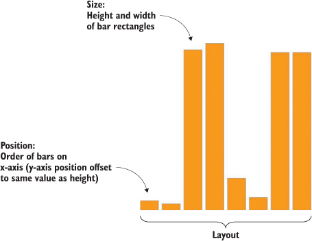
d3.csv("cities.csv",(error, data) => {dataViz(data)});
function dataViz(incomingData) {
 var maxPopulation = d3.max(incomingData, d => parseInt(d.population))     1
 var yScale = d3.scaleLinear().domain([0,maxPopulation]).range([0,460]);
 d3.select("svg").attr("style","height: 480px; width: 600px;");
 d3.select("svg")
   .selectAll("rect")
   .data(incomingData)
   .enter()
   .append("rect")
   .attr("width", 50)
   .attr("height", d => yScale(parseInt(d.population)))
   .attr("x", (d,i) => i * 60)
   .attr("y", d => 480 - yScale(parseInt(d.population)))
   .style("fill", "#FE9922")
   .style("stroke", "#9A8B7A")
   .style("stroke-width", "1px")
}
Creating a bar chart out of the Twitter data requires a bit more transformation. As shown in listing 2.4, we use d3.nest() to gather the tweets under the person making them, and then use the length of that array to create a bar chart of the number of tweets (shown annotated in figure 2.22).
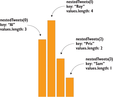
d3.json("tweets.json",(error, data) => {dataViz(data.tweets)});         1
function dataViz(incomingData) {
var nestedTweets = d3.nest()
  .key(d => d.user)
  .entries(incomingData);

nestedTweets.forEach(d => {
  d.numTweets = d.values.length;                                        2
})
var maxTweets = d3.max(nestedTweets, d => d.numTweets);
var yScale = d3.scaleLinear().domain([0,maxTweets]).range([0,500]);
d3.select("svg")
  .selectAll("rect")
  .data(nestedTweets)
  .enter()
  .append("rect")
  .attr("width", 50)
  .attr("height", d => yScale(d.numTweets))
  .attr("x", (d,i) => i * 60)
  .attr("y", d => 500 - yScale(d.numTweets))
  .style("fill", "#FE9922")
  .style("stroke", "#9A8B7A")
  .style("stroke-width", "1px");
}
Up to now we’ve only used the height of a rectangle to correspond to a point of data, and in cases where you’re dealing with one piece of quantitative data, that’s all you need. That’s why bar charts are so popular in spreadsheet applications. But most of the time you’ll use multivariate data, such as census data for counties or medical data for patients.
Multivariate is another way of saying that each datapoint has multiple data characteristics. For instance, your medical history isn’t a single score between 0 and 100. Instead, it consists of multiple measures that explain different aspects of your health. In cases with multivariate data like that, you need to develop techniques to represent multiple data points in the same shape. The technical term for how a shape visually expresses data is channel, and depending on the data you’re working with, different channels are better suited to express data graphically.
When you represent data using graphics, you need to consider the best visual methods to represent the types of data you’re working with. Each graphical object, as well as the whole display, can be broken down into component channels that relay information visually. These channels, such as height, width, area, color, position, and shape, are particularly well suited to represent different classes of information. For instance, if you represent magnitude by changing the size of a circle, and if you create a direct correspondence between radius and magnitude, then your readers will be confused, because we tend to recognize the area of a circle rather than its radius. Channels also exist at multiple levels, and several techniques use hue, saturation, and value to represent three different pieces of information, rather than using color more generically.
The important thing here is to avoid using too many channels, and instead focus on using the channels most suitable to your data. If you aren’t varying shape, for instance, if you’re using a bar chart where all the shapes are rectangles, then you can use color for category and value (lightness) to represent magnitude.
Going back to the tweets.json data, it may seem like there’s not much data available to put on a chart, but depending on what factors we want to measure and display, we can take a couple different approaches. Let’s imagine we want to measure the impact factor of tweets, treating tweets that are favorited or retweeted as more important than tweets that aren’t. This time, instead of a bar chart, we’ll create a scatterplot, and instead of using array position to place it along the x-axis, let’s use time, because there’s good evidence that tweets made at certain times are more likely to be favorited or retweeted. We’ll place each tweet along the y-axis using a scale based on the maximum impact factor of our set of tweets. From this point on, we’ll focus on the dataViz() function as in the following listing, because you should be familiar now with getting your data in and sending it to such a function.
function dataViz(incomingData) {
incomingData.forEach(d => {
  d.impact = d.favorites.length + d.retweets.length;                     1
  d.tweetTime = new Date(d.timestamp);                                   2
})
var maxImpact = d3.max(incomingData, d => d.impact);
var startEnd = d3.extent(incomingData, d => d.tweetTime);                3
var timeRamp = d3.scaleTime().domain(startEnd).range([20,480]);          4
var yScale = d3.scaleLinear().domain([0,maxImpact]).range([0,460]);
var radiusScale = d3.scaleLinear()
                    .domain([0,maxImpact]).range([1,20]);
var colorScale = d3.scaleLinear()
                   .domain([0,maxImpact]).range(["white","#75739F"]);    5
d3.select("svg")
  .selectAll("circle")
  .data(incomingData)
  .enter()
  .append("circle")
  .attr("r", d => radiusScale(d.impact))                                 6
  .attr("cx", d => timeRamp(d.tweetTime))
  .attr("cy", d => 480 - yScale(d.impact))
  .style("fill", d => colorScale(d.impact))
  .style("stroke", "black")
  .style("stroke-width", "1px");
};
As shown in figure 2.23, each tweet is positioned vertically based on impact and horizontally based on time. Each tweet is also sized by impact and colored darker red based on impact. Later on we’ll want to use color, size, and position for different attributes of the data, but for now we’ll tie most of them to impact.
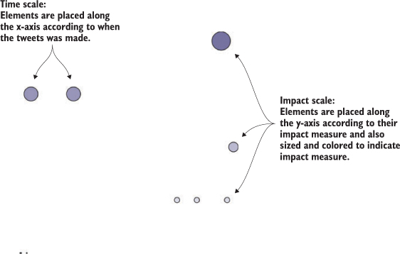
You’ve used the .enter() behavior of a selection many times already. Now let’s take a closer look at it and its counterpart, .exit(). Both functions operate when a mismatch exists between the number of data values bound to a selection and the number of DOM elements in the selection. If more data values exist than DOM elements, then .enter() fires, whereas if fewer data values exist than DOM elements, then .exit() fires, as in figure 2.24. You use selection.enter() to define how you want to create new elements based on the data you’re working with, and you use selection.exit() to define how you want to remove existing elements in a selection when the data that corresponds to them has been deleted. Updating data, as you’ll see in the next example, is accomplished through reapplying the functions you used to create the graphical elements based on your data.
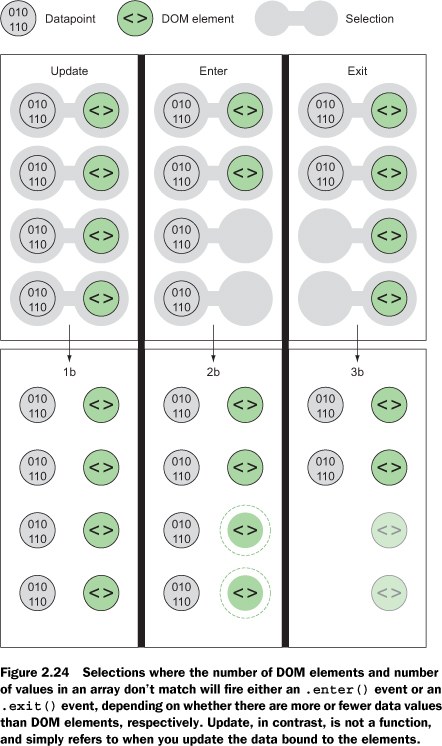
Each .enter() or .exit() event can include actions taken on child elements. This is mostly useful with .enter() events, where you use the .append() function to add new elements. If you declare this new appended element as a variable, and if that element is amenable to child elements, like a <g> element is, you can include any number of child elements. In the case of SVG elements, only <svg>, <g>, and <text> can have child elements, but if you’re using D3 with traditional DOM manipulation, you can use this method to add <p> elements to <div> elements and so on.
For example, let’s say we want to show a bar chart based on our newly measured impact score, and we want the bars on the bar chart to have labels. We need to append <g> elements, and not shapes, to the <svg> canvas in our initial selection. Because the data is bound to these elements, we can use the same syntax when we add child elements. Because we’re using <g> elements, we need to set the position using the transform attribute. We add child elements using the .append() function, and we need to declare the returned selection as a variable tweetG. This allows tweetG to stand in for d3.select("svg").selectAll("g") so we don’t have to retype it throughout the example. The following listing uses all the same scales to determine size and position as the previous example.
var tweetG = d3.select("svg")
  .selectAll("g")
  .data(incomingData)
  .enter()
  .append("g")
  .attr("transform", d =>
  "translate(" +
    timeRamp(d.tweetTime) + "," + (480 - yScale(d.impact))          1
    + ")"
  );
tweetG.append("circle")
  .attr("r", d => radiusScale(d.impact))
  .style("fill", "#75739F")
  .style("stroke", "black")
  .style("stroke-width", "1px");
tweetG.append("text")
  .text(d => d.user + "-" + d.tweetTime.getHours());                2
In figure 2.25 you can see the result of our code, along with some annotation. The same circles in the same position show that translate works much like changing cx and cy for circles, but now we can add other SVG elements, like <text> for labels.
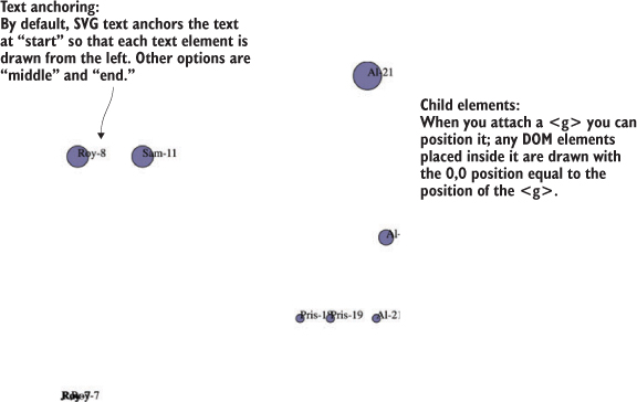
The labels are illegible in the bottom left, but they’re not much better for the rest. Later on, you’ll learn how to make better labels. The inline functions such as .text(d => d.user + "-" + d.tweetTime.getHours()) set the label to be the name of the person making the tweet, followed by a dash, followed by the hour of the tweet. These functions all refer to the same data elements, because the child elements inherit their parents’ data functions. If one of your data elements is an array, you may think you could bind it to a selection on the child element, and you’d be right. You’ll see that in the next chapter and later in the book.
Corresponding to the .append() function is the .remove() function available with .exit(). To see .exit() in action, you need to have some elements in the DOM, which could already exist, depending on what you put in your HTML, or which could have been added with D3. Let’s stick with the state that the previous code creates, which provides us with ample opportunity to test the .exit() function. DOM element styles and attributes aren’t updated if we make a change to the array unless we call the necessary .style() and .attr() functions. If we bind any array to the existing <g> elements in your DOM, then we can use .exit() to remove them:
d3.selectAll("g").data([1,2,3,4]).exit().remove();
This code deleted all but four of our <g> elements, because we have only four values in our array. In most of the explanations of D3’s .enter() and .exit() behavior, you won’t see this kind of binding of an entirely different array to a selection. Instead, you’ll see a rebinding of the initial data array after it’s been filtered to represent a change via user interaction or other behavior. You’ll see an example like this next, and throughout the book. But it’s important to understand the difference between your data, your selection, and your DOM elements. The data that’s bound to our DOM elements has been overwritten, so our data-rich objects from tweets.csv have now been replaced with boring numbers. But the only change to the visual representation is that the number has been reduced to reflect the size of the array we’ve bound. D3 doesn’t follow the convention that when the data changes, the corresponding display is updated; you need to build that functionality yourself. Because it doesn’t follow that convention, it gives you greater flexibility that we’ll explore in later chapters.
D3v4 introduces a new piece of functionality, d3.merge(), which allows you to combine two selections so that you can act on them both at the same time. This way you can use an enter selection to set the attributes of your newly created elements and then combine that selection with existing elements so you can operate on them all at once.
You can see how the visual attributes of an element can change to reflect changes in data by updating the <text> elements in each g to reflect the newly bound data:
d3.selectAll("g").select("text").text(d => d);
We have to .selectAll() the parent elements and then subselect the child elements to re-initialize the data-binding for the child elements. Whenever you bind new data to a selection that utilizes child elements, you’ll need to follow this pattern. You can see that, because we didn’t update the <circle> elements, they still have the old data bound to each element:
d3.selectAll("g").each(d => console.log(d));                 1
d3.selectAll("text").each(d => console.log(d));              2
d3.selectAll("circle").each(d => console.log(d));            3
The .exit() function isn’t intended to be used for binding a new array of completely different values like this. Instead, it’s meant to update the page based on the removal of elements from the array that’s been bound to the selection. But if you plan to do this, you need to specify how the .data() function binds data to your selected elements. By default, .data() binds based on the array position of the data value. This means, in the previous example, that the first four elements in our selection are maintained and bound to the new data, while the rest are subject to the .exit() function. In general, though, you don’t want to rely on array position as your binding key. Rather, you should use something meaningful, such as the value of the data object itself. The key requires a string or number, so if you pass a JSON object without using JSON.stringify, it treats all objects as "[object object]" and only returns one unique value. To manually set the binding key, we use the second setting in the .data() function and use the inline syntax typical in D3.
function dataViz(incomingData) {
incomingData.forEach(d => {
   d.impact = d.favorites.length + d.retweets.length;
   d.tweetTime = new Date(d.timestamp);
})
var maxImpact = d3.max(incomingData, d => d.impact)
var startEnd = d3.extent(incomingData, d => d.tweetTime)
var timeRamp = d3.scaleTime().domain(startEnd).range([ 50, 450 ]);
var yScale = d3.scaleLinear().domain([ 0, maxImpact ]).range([ 0, 460 ]);
var radiusScale = d3.scaleLinear()
   .domain([ 0, maxImpact ])
   .range([ 1, 20 ]);
d3.select("svg").selectAll("circle")
  .data(incomingData, JSON.stringify)                 1
  .enter().append("circle")
  .attr("r", d => radiusScale(d.impact))
  .attr("cx", d => timeRamp(d.tweetTime))
  .attr("cy", d => 480 - yScale(d.impact))
  .style("fill", "#75739F ")
  .style("stroke", "black")
  .style("stroke-width", "1px");
}
The visual results are the same as our earlier scatterplot with the same settings, but now if we filter the array we used for the data, and bind that to the selection, we can get to the state shown in figure 2.26 by defining useful .exit() behavior:
var filteredData = incomingData.filter(d => d.impact > 0)
d3.selectAll("circle")
  .data(filteredData, d => JSON.stringify(d))
  .exit()
  .remove();
Using the stringified object won’t work if you change the data in the object, because then it no longer corresponds with the original binding string. If you plan to do significant changing and updating, you’ll need a unique ID for your objects to use as your binding key.
This chapter covers
D3 creates data visualization elements that are part of your web page. It gives you the opportunity to integrate the design of your data visualization with the design of your more traditional web elements.
You can and should style content you generate with D3 with all the same CSS settings as traditional HTML content. You can easily maintain those styles and have a consistent look and feel. This is done by using the same style sheet classes for what you create with D3 as the ones you use with your traditional page elements when possible, and with thoughtful use of color and interactivity for the graphics you create using D3.
This chapter deals with design broadly speaking, touching not only on graphical design but on interaction design, project architecture, and the integration of pregenerated content. It highlights the connections between D3 and other methods of development, whether we’re identifying libraries typically used alongside D3 or integrating HTML and SVG resources created using other tools. We can’t cover all the principles of design (which isn’t one field, but many). Instead, we’ll focus on how to use particular D3 functionality to follow the best practices established by design professionals to create a simple data visualization based on the statistics associated with the 2014 World Cup, as seen in figure 3.1. If you’re not a fan of soccer, or football, pretend it’s the results of the World Dota2 Finals, or if that’s not your thing, that it’s the 2016 Olympic competitive eating event.
When you create a single web page with an interesting visualization on it, you don’t need to think too much about where all your files are going to live. But if you build an application that provides multiple points of interaction and different states, you should identify the resources that you need and plan your project accordingly.
Your data will tend to come in one of two forms: either dynamically delivered via server/API or in static files. If you’re pulling data dynamically from a server or API, it’s possible that you’ll have static files as well. A good example of this is building maps, where the base data layer (such as a map of countries) is from a static file and the dynamic data layer (such as the places where tweets are made) comes from a server. For this chapter, we’ll use the file worldcup.csv to represent statistics for the 2014 World Cup:
"team","region","win","loss","draw","points","gf","ga","cs","yc","rc"
Germany,UEFA,7,6,0,1,19,18,4,14,4,6,0
Argentina,CONMEBOL,7,5,1,1,16,8,4,4,4,8,0
Netherlands,UEFA,7,5,0,2,17,15,4,11,4,11,0
Belgium,UEFA,5,4,1,0,12,6,3,3,2,7,1
Colombia,CONMEBOL,5,4,1,0,12,12,4,8,2,5,0
Brazil,CONMEBOL,7,3,2,2,11,11,14,-3,1,14,0
Japan,AFC,3,0,2,1,1,2,6,-4,1,4,0
United States,CONCACAF,4,1,2,1,4,5,6,-1,0,4,0
That’s a lot of data for each team. We could try to come up with a graphical object that encodes all nine data points simultaneously (plus labels), but instead we’ll use interactive and dynamic methods to provide access to the data.
Pregenerated content, like hand-drawn SVG and HTML components, comes as an external file that you’ll need to know how to load. You’ll see examples of these later in the chapter. Each file contains enough code to draw the shape or traditional DOM elements we’ll add to our page. We’ll spend more time with the contents of this folder later in sections 3.3.2 and 3.3.3 when we deal with loading pregenerated content. In more advanced projects, this can take the form of templates or resources that are imported or rolled up into your project using more sophisticated methods involving a build process. And once you get down that road and start integrating applications like Webpack, the boundary between static and dynamic resources becomes much fuzzier. We’ll see some of that in chapter 9 when we integrate D3 and React.
Later on in this chapter, we’ll use Portable Network Graphics (PNG) images with the flags of each team represented in your dataset. The PNGs are named with the same as the teams so that it’s more convenient to reference the images in the code, as you’ll see later. Every digital file consists of code, but we think of images as fundamentally different. This distinction breaks down when you work with SVG and you’re accustomed to treating SVG as static images no different than raster formats like JPEG and PNG. If you’re working with SVG images as static images and not as code that you want to manipulate in D3 (for instance changing the fill or stroke), you should put them in your image directory and keep the SVG files that you intend to deal with as code in a separate directory.
Although we won’t focus on CSS in this chapter too much, you should be aware that you can use CSS preprocessors like LESS for greater functionality, and both LESS and the later versions of CSS have support for variables. I won’t be dealing with these advanced features in this book, but it’s common to take advantage of these features in industry. Instead, we’ll use basic CSS here. Our style sheet shown in listing 3.1 has classes for the different states of the SVG elements we’re dealing with, including SVG text elements. Remember that regular text in CSS uses color while SVG <text> uses fill to set its color.
text {
  font-size: 10px;
  text-anchor: middle;
  fill: #4f442b;                 1

}
g > text.active {
  font-size: 30px;
}
circle {
  fill: #75739F;
  stroke: black;
  stroke-width: 1px;
}
circle.active {
  fill: #FE9922;
}
circle.inactive {
  fill: #C4B9AC;
}
For the example in this chapter, we’ll use two more .js files besides d3.min.js, which is the minified D3 library. The first is soccerviz.js, where we’ll put the functions we’ll build and use in this chapter. The second is colorbrewer.js, which is available at http://d3js.org/colorbrewer.v1.min.js and provides a set of predefined color palettes that we’ll find useful. You include CSS files using the link tag in your HTML header, and the external .js files are included with script tags.
We reference these files in the much cleaner d3ia_2.html.
<html>
<head>
  <title>D3 in Action Examples</title>
  <meta charset="utf-8" />
  <link type="text/css" rel="stylesheet" href="d3ia.css" />
</head>
<script src="d3.v4.min.js"></script>
<script src="colorbrewer.js"></script>
<script src="soccerviz.js"></script>
<body onload="createSoccerViz()">
<div id="viz">
<svg style="width:500px;height:500px;border:1px lightgray solid;" />
</div>
<div id="controls" />
</body>
</html>
The <body> has two <div> elements, one with the ID viz and the other with the ID controls. Notice that the <body> element has an onload property that runs create-SoccerViz(), one of our functions in soccerviz.js (shown in the following listing). This loads the data and binds it to create a labeled circle for each team. It’s not much, as you can see in figure 3.2, but it’s a start.
function createSoccerViz() {
  d3.csv("worldcup.csv", data => {overallTeamViz(data)})                 1

function overallTeamViz(incomingData) {
  d3.select("svg")
    .append("g")                                                         2
    .attr("id", "teamsG")
    .attr("transform", "translate(50,300)")
    .selectAll("g")
    .data(incomingData)
    .enter()
    .append("g")
    .attr("class", "overallG")
    .attr("transform", (d, i) =>"translate(" + (i * 50) + ", 0)")        3
  var teamG = d3.selectAll("g.overallG");                                4
  teamG
    .append("circle")
    .attr("r", 20)
   teamG
    .append("text")
    .attr("y", 30)
    .text(d => d.team)
    }
}
Although you might write an application entirely with D3 and your own custom code, for large-scale maintainable projects you’ll have to integrate more external libraries. We’ll only use one of those, colorbrewer.js, which isn’t intimidating. The colorbrewer library is a set of arrays of colors, which are useful in information visualization and mapping. You’ll see this library in action in section 3.3.2.
Creating interactive data visualization is necessary for your users to deal with large and complex datasets. And the key to building interactivity into your D3 projects is the use of events, which define behaviors based on user activity. After you learn how to make your elements interactive, you’ll need to understand D3 transitions, which allow you to animate the change from one color or size to another. With that in place, you’ll turn to learning how to make changes to an element’s position in the DOM so that you can draw your graphics properly. Finally, we’ll look more closely at color, which you’ll use often in response to user interaction.
To get started, let’s update our visualization to add buttons that change the appearance of our graphics to correspond with different data. We could handcode the buttons in HTML and tie them to functions as in traditional web development, but we can also discover and examine the attributes in the data and create buttons dynamically. This has the added benefit of scaling to the data, so that if we add more attributes to our dataset, this function automatically creates the necessary buttons. Notice how we’re using Object.keys on the first element in the data, so if you had elements with different kinds of keys, you would have to iterate through the whole array:
const dataKeys = Object.keys(incomingData[0])
  .filter(d => d !== "team" && d !== "region")                          1
d3.select("#controls").selectAll("button.teams")
   .data(dataKeys).enter()                                              2
   .append("button")
   .on("click", buttonClick)                                            3
.html(d => d);                                                          4
function buttonClick(datapoint) {                                       5
  var maxValue = d3.max(incomingData, d => parseFloat(d[datapoint]))
var radiusScale = d3.scaleLinear()
  .domain([ 0, maxValue ]).range([ 2, 20 ])
d3.selectAll("g.overallG").select("circle")
   .attr("r", d => radiusScale(d[datapoint]))
}
We use Object.keys and pass it one of the objects from our array. The Object.keys function returns the names of the attributes of an object as an array. We’ve filtered this array to remove the team and region attributes because these have nonnumerical data and won’t be suitable for the buttonClick functionality we define. Obviously, in a larger or more complex system, we’ll want to have more robust methods for designating attributes than listing them by hand like this. You’ll see that later when we deal with more complex datasets. In this case, we bind this filtered array to a selection to create buttons for all the remaining attributes and give the buttons labels for each of the attributes, as shown in figure 3.3.
The .on function is a wrapper for the traditional HTML mouse events, and accepts "click", "mouseover", "mouseout", and so on. We can also access those same events using .attr, for example, using .attr("onclick", "console.log('click')"), but notice that we’re passing a string in the same way we’d use traditional HTML. There’s a D3-specific reason to use the .on function: it sends the bound data to the function automatically and in the same format as the anonymous inline functions we’ve been using to set style and attribute.
We can create buttons based on the attributes of the data and dynamically measure the data based on the attribute bound to the button. Then we can resize the circles representing each team to reflect the teams with the highest and lowest values in each category, as shown in figure 3.4.
We can use .on() to tie events to any object, so let’s add interactivity to the circles by having them indicate whether teams are in the same FIFA region:
teamG.on("mouseover", highlightRegion);
function highlightRegion(d) {
   d3.selectAll("g.overallG").select("circle")
     .attr("class", p => p.region === d.region ? "active" : "inactive")
}
Here you see what some people call an ifsie, an inline if statement that compares the region of each element in the selection to the region of the element that you moused over, and if true returns “active” and if false returns “inactive” as the class of the circle, with results like those in figure 3.5.

Restoring the circles to their initial color on mouseout is simple enough that the function can be declared inline with the .on function using a selection’s built-in classed method, which allows you to selectively turn on or off classes of an element by setting it to true or false:
teamG.on("mouseout", function() {
  d3.selectAll("g.overallG")
  .select("circle").classed("inactive", false).classed("active", false)
})
If you want to define custom event handling, you would use d3.dispatch, which you’ll see in action in chapter 9.
One of the challenges of highly interactive, graphics-rich web pages is to ensure that the experience of graphical change isn’t jarring. The instantaneous change in size or color that we’ve implemented doesn’t only look clumsy, it can prevent a reader from understanding the information we’re trying to relay. To smooth things out a bit, I’ll introduce transitions, which you saw briefly at the end of chapter 1.
Transitions are defined for a selection and can be set to occur after a certain delay using delay() or to occur over a set period of time using duration(). We can easily implement a transition in our buttonClick function:
d3.selectAll("g.overallG").select("circle").transition().duration(1000)
  .attr("r", d => radiusScale(d[datapoint]))
Now when we click our buttons, the sizes of the circles change, and the change is also animated. This isn’t only for show. We’re encoding new data in the size of the circle, indicating the change between two datapoints using animation. When there was no animation, the reader had to remember if there was a difference between the ranking in draws and wins for Germany. Now the reader has an animated indication that shows Germany visibly shrink or grow to indicate the difference between these two datapoints.
The use of transitions also allows us to delay the change through the .delay() function. Like the .duration() function, .delay() is set with the wait in milliseconds before implementing the change. Slight delays in the firing of an event from an interaction can be useful to improve the legibility of information visualization, allowing users a moment to reorient themselves to shift from interaction to reading. But long delays will usually be misinterpreted as poor web performance.
Why else would you delay the firing of an animation? Delays can also draw attention to visual elements when they first appear. By making the elements pulse when they arrive onscreen, you let users know that these are dynamic objects and tempt users to click or otherwise interact with them. Delays, like duration, can be dynamically set based on the bound data for each element. You can use delays with another feature: transition chaining. This sets multiple transitions one after another, and each is activated after the last transition has finished. If we amend the code in overallTeamViz() that first appends the <circle> elements to our <g> elements, we can see transitions of the kind that produce the screenshot in figure 3.6.
   teamG
   .append("circle").attr("r", 0)
   .transition()
   .delay((d, i) => i * 100)
   .duration(500)
   .attr("r", 40)
   .transition()
   .duration(500)
   .attr("r", 20)
This causes a pulse because it uses transition chaining to set one transition, followed by a second after the completion of the first. You start by drawing the circles with a radius of 0, so they’re invisible. Each element has a delay set to its array position i times 0.1 seconds (100 ms), after which the transition causes the circle to grow to a radius of 40 px. After each circle grows to that size, a second transition shrinks the circles to 20 px. The effect, which isn’t easy to present with a screenshot, causes the circles to pulse sequentially.
Because these visual elements and buttons are all living in the DOM, it’s important to know how to access and work with them both with D3 and using built-in JavaScript functionality.
Although D3 selections are extremely powerful, you sometimes want to deal specifically with the DOM element that’s bound to the data. These DOM elements come with a rich set of built-in functionality in JavaScript. Getting access to the actual DOM element in the selection can be accomplished in one of two ways:
Inline functions always have access to the DOM element along with the datapoint and array position of that datapoint in the bound data. The DOM element, in this case, is represented by the this context within the scope of the function. That context isn’t available in arrow functions. We can see it in action using the .each() function of a selection, which performs the same code for each element in a selection. We’ll make a selection of one of our circles and then use .each() to send d, i, and this to the console to see what each corresponds to (which should look similar to the results in figure 3.7).
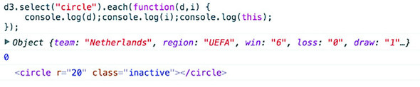
d3.select("circle").each((d,i) => {
    console.log(d);console.log(i);console.log(this);
})
Unpacking this a bit, we can see the first thing echoed, d, is the data bound to the circle, which is a JSON object representing the Netherlands team. The second thing echoed, i, is the array index position of that object in the selection, which in this case is 0 and means that incomingData[0] is the Netherlands JSON object. The last thing echoed to the console, this, is the <circle> DOM element itself.
We can also access this DOM element using the .node() function of a selection:
d3.select("circle").node();
Getting to the DOM element, as shown in figure 3.8, lets you take advantage of built-in JavaScript functionality to do things like measure the length of a <path> element or clone an element. One of the most useful built-in functions of nodes when working with SVG is the ability to re-append a child element. Remember that SVG has no Z-levels, which means that the drawing order of elements is determined by their DOM order. Drawing order is important because you don’t want the graphical objects you interact with to look like they’re behind the objects that you don’t interact with. To see what this means, let’s first adjust our highlighting function so that it increases the size of the label when we mouse over each element, as in figure 3.8.
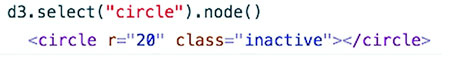
teamG.on("mouseover", highlightRegion)
function highlightRegion(d,i) {
   d3.select(this).select("text").classed("active", true).attr("y", 10)
   d3.selectAll("g.overallG").select("circle").each(function (p) {
    p.region == d.region ?
       d3.select(this).classed("active",true) :
       d3.select(this).classed("inactive",true)
   })                                              1
}
Because we’re doing a bit more, we should change the mouseout event to point to a function, which we’ll call unHighlight:
teamG.on("mouseout", unHighlight)
function unHighlight() {
  d3.selectAll("g.overallG").select("circle").attr("class", "")
  d3.selectAll("g.overallG").select("text")
  .classed("active", false).attr("y", 30)
}
As shown in figure 3.9, Netherlands was appended to the DOM before Belgium. As a result, when we increase the size of the graphics associated with Netherlands, those graphics remain behind any graphics for Belgium, creating a visual artifact that looks unfinished and distracting. We can rectify this by re-appending the node to the parent <g> during that same highlighting event, which results in the label being displayed above the other elements, as shown in figure 3.10.


function highlightRegion (d) {
 d3.select(this).select("text").classed("active", true).attr("y", 10);
    d3.selectAll("g.overallG").select("circle")
       .each(function (p) {
         p.region == d.region ?
              d3.select(this).classed("active", true) :
              d3.select(this).classed("inactive", true);
       });
 this.parentElement.appendChild(this);
}
New in D3v4 are several helper functions to let you bump elements up and down in the DOM: selection.raise and selection.lower. These functions will move your selected element to the end of the list of its siblings in the DOM or move them to the beginning, respectively. This will have the effect of moving them forward or backward onscreen (above or below overlapping sibling elements):
d3.select("g.overallG").raise()
d3.select("g.overallG").lower()
You’ll see in this example that the mouseout event becomes less intuitive because the event is attached to the <g> element, which includes not only the circle but the text as well. As a result, mousing over the circle or the text fires the event. When you increase the size of the text, and it overlaps a neighboring circle, it doesn’t trigger a mouseout event. We’ll get into event propagation later, but one thing we can do to easily disable mouse events on elements is set the style property "pointer-events" of those elements to "none" inline or in your CSS:
teamG.select("text").style("pointer-events","none");
Color seems like a small and dull subject, but when you’re representing data with graphics, color selection is of primary importance. There’s good research on the use of color in cognitive science and design, but that’s an entire library. Here, we’ll deal with a few fundamental issues: mixing colors in color ramps, using discrete colors for categorical data, and designing for accessibility factors related to colorblindness. We’re going to see a few strategies that will help you deal with deploying color wisely later in the chapter.
Artists, scholars, and psychologists have thought critically about the use of color for centuries. Among them, Josef Albers—who has influenced modern information visualization leaders like Edward Tufte—noted that in the visual realm, one plus one can equal three. The study of color, referred to as color theory, has proved that placing certain colors and shapes next to each other has optical consequences, resulting in simultaneous and successive contrast as well as accidental color.
It’s worth studying the properties of color—hue, value, intensity, and temperature—to ensure the most harmonious color relationships in your work. Leonardo da Vinci organized colors into psychological primaries, the colors the eye sees unmixed, but the modern exploration of color theory, as with many other phenomena in physics, can be attributed to Newton. Newton observed the separation of sunlight into bands of color via a prism in 1666 and called it a color spectrum. Newton also devised a color circle of seven hues, a precursor to the many future charts of color that would organize colors and their relationships. About a century later, J. C. Le Blon identified the primary colors as red, yellow, and blue, and their mixes as the secondaries. The work of other more modern color theoreticians such as Josef Albers, who emphasized the effects of color juxtaposition, influences the standards for presentation in print and on the web.
Color is typically represented on the web in red, green, and blue coordinates, or RGB, using one of three formats: hex, RGB, or CSS color name. The first two represent the same information, the level of red, green, and blue in the color, but do so with either hexadecimal or comma-delimited decimal notation. CSS color names use vernacular names for its 140 colors (you can read all about them at http://en.wikipedia.org/wiki/Web_colors#X11_color_names). Red, for instance, can be represented like this:
"rgb(255,0,0)"                  1
"#ff0000"                       2
"red"                           3
D3 has a few helper functions for working with colors. The first is d3.rgb(), which allows us to create a more feature-rich color object suitable for data visualization. To use d3.rgb(), we need to give it the red, green, and blue values of our color:
teamColor = d3.rgb("red");
teamColor = d3.rgb("#ff0000");
teamColor = d3.rgb("rgb(255,0,0)");
teamColor = d3.rgb(255,0,0);
These color objects have two useful methods: .darker() and .brighter(). They do exactly what you’d expect: return a color that’s darker or brighter than the color you started with. In our case, we can replace the gray and red that we’ve been using to highlight similar teams with darker and brighter versions of pink, the color we started with:
function highlightRegion(d,i) {
  var teamColor = d3.rgb("#75739F")
  d3.select(this).select("text").classed("active", true).attr("y", 10)
  d3.selectAll("g.overallG").select("circle")
    .style("fill", p => p.region === d.region ?
        teamColor.darker(.75) : teamColor.brighter(.5))
  this.parentElement.appendChild(this);
}
Notice that you can set the intensity for how much brighter or darker you want the color to be. Our new version (shown in figure 3.11) now maintains the palette during highlighting, with darker colors coming to the foreground and lighter colors receding. Unfortunately, you lose the ability to style with CSS because you’re back to using inline styles. As a rule, you should use CSS whenever you can, but if you want access to things like dynamic colors and transparency using D3 functions, then you’ll need to use inline styling.

D3 allows you to represent colors in different color spaces, using d3.hsl, d3.lab, d3.cubehelix, d3.hcl and other non-core color libraries such as d3.hcg. in other ways with various benefits, but we’ll only deal with HSL, which stands for hue, saturation, and lightness. The corresponding d3.hsl() allows you to create HSL color objects in the same way that you would with d3.rgb(). The reason you may want to use HSL is to avoid the muddying of colors that can happen when you build color ramps and mix colors using D3 functions that are going to use RGB by default.
In chapter 2, we mapped a color ramp to numerical data to generate a spectrum of color representing our datapoints. But the interpolated values for colors created by these ramps can be quite poor. As a result, a ramp that includes yellow can end up interpolating values that are muddy and hard to distinguish. You may think this isn’t important, but when you’re using a color ramp to indicate a value and your color ramp doesn’t interpolate the color in a way that your reader expects, then you can end up showing wrong information to your users. Though we should avoid color ramps, we’re forced to use them, whether because of expediency or requirement from users, and so you need to know how to deploy them with the least amount of damage to your visualization. You would be amazed at how quickly someone can lose confidence in your data visualization when the colors aren’t mapping the way they expect.
In the next section we’re going to explore how color interpolation works and see how interpolating colors along a ramp can have unintended consequences. The way you encode color (RGB/Hex, HSL, HCL, LAB) doesn’t matter when it comes to a single color—you can get different codes for the same display color. It matters when you try to come up with the colors in between. When you’re doing that, different interpolation methods will result in different in-between colors, and if you need to use a ramp, you can be prepared to use the right interpolation method. Let’s add a color ramp to our button-Click function and use the color ramp to show the same information we did with the radius.
var ybRamp = d3.scaleLinear()
  .domain([0,maxValue]).range(["blue", "yellow"])            1

d3.selectAll("g.overallG").select("circle")
   .attr("r", d => radiusScale(d[datapoint]))
   .style("fill", d => ybRamp(d[datapoint]))
You’d be forgiven if you expected the colors in figure 3.12 to range from yellow to green to blue. The problem is that the default interpolator in the scale we used is mixing the red, green, and blue channels numerically. We can change the interpolator in the scale by designating one specifically, for instance, using the HSL representation of color (figure 3.13) that we looked at earlier.
var ybRamp = d3.scaleLinear()
  .interpolate(d3.interpolateHsl)                          1
  .domain([0,maxValue]).range(["yellow", "blue"]);
D3 supports two other color interpolators, HCL (figure 3.14) and LAB (figure 3.15), which each deal in a different manner with the question of what colors are between blue and yellow. First, the HCL ramp and then the LAB ramp:
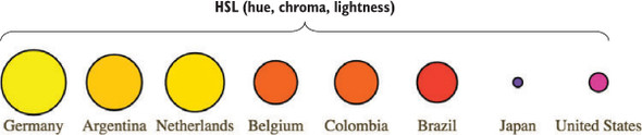
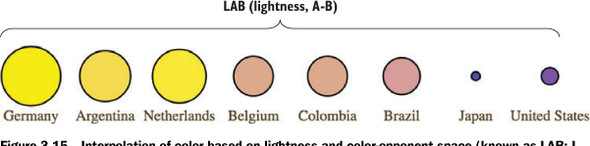
var ybRamp = d3.scaleLinear()
  .interpolate(d3.interpolateHcl)
  .domain([0,maxValue]).range(["yellow", "blue"]);
var ybRamp = d3.scaleLinear()
  .interpolate(d3.interpolateLab)
  .domain([0,maxValue]).range(["yellow", "blue"]);
As a general rule, you’ll find that the colors interpolated in RGB tend toward muddy and gray, unless you break the color ramp into multiple stops. You can experiment with different color ramps or stick to ramps that emphasize hue or saturation (by using HSL). Or you can rely on experts by using the built-in D3 functions for color ramps that are proven to be easier for a reader to distinguish, which we’ll look at now.
Oftentimes, we use color ramps to try to map colors to categorical elements. It’s better to use the discrete color scales available in D3 for this purpose. The popularity of these scales is the reason why so many D3 examples have the same palette. D3 includes four collections of discrete color categories: d3.schemeCategory10, d3.schemeCategory20, d3.schemeCategory20b, and d3.schemeCategory20c. These are arrays of colors meant to be passed to d3.scaleOrdinal, which can be used to map categorical values to particular colors. In our case, we want to distinguish the various regions in our dataset, which consists of the top eight FIFA teams from the 2010 World Cup, representing four global regions. We want to represent these as different colors, and to do so, we need to create a scale with those values in an array:
function buttonClick(datapoint) {
   var maxValue = d3.max(incomingData, function(el) {
       return parseFloat(el[datapoint ])
   })
   var tenColorScale = d3.scaleOrdinal()
       .domain(["UEFA", "CONMEBOL", "CAF",  "AFC"])
       .range(d3.schemeCategory10)
   var radiusScale = d3.scaleLinear().domain([0,maxValue]).range([2,20])
   d3.selectAll("g.overallG").select("circle").transition().duration(1000)
       .style("fill", p => tenColorScale(p.region))
       .attr("r", p => radiusScale(p[datapoint ]))
}
The application of this scale is visible when we click one of our buttons, which now resizes the circles as it always has, but also applies one of these distinct colors to each team (figure 3.16).
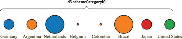
A useful feature of scaleOrdinal for situations like these is its .unknown method, which allows you to return a value when passed a value that doesn’t exist within the domain, so that you can color using an “unknown” color like we see in figure 3.17 with gray. You don’t always need to use gray as your unknown color.

...
var tenColorScale = d3.scaleOrdinal()
  .domain(["UEFA", "CONMEBOL"])
  .range(d3.schemeCategory10)
  .unknown("#c4b9ac")
Another option is to use color schemes based on the work of Cynthia Brewer, who has led the way in defining effective color use in cartography. Helpfully, d3js.org provides colorbrewer.js and colorbrewer.css for this purpose. Each array in colorbrewer.js corresponds to one of Brewer’s color schemes, designed for a set number of colors. For instance, the reds scale looks like this:
Reds: {
3: ["#fee0d2","#fc9272","#de2d26"],
4: ["#fee5d9","#fcae91","#fb6a4a","#cb181d"],
5: ["#fee5d9","#fcae91","#fb6a4a","#de2d26","#a50f15"],
6: ["#fee5d9","#fcbba1","#fc9272","#fb6a4a","#de2d26","#a50f15"],
7: ["#fee5d9","#fcbba1","#fc9272","#fb6a4a","#ef3b2c","#cb181d","#99000d"],
8: ["#fff5f0","#fee0d2","#fcbba1","#fc9272",
    "#fb6a4a","#ef3b2c","#cb181d","#99000d"],
9: ["#fff5f0","#fee0d2","#fcbba1","#fc9272","#fb6a4a",
    "#ef3b2c","#cb181d","#a50f15","#67000d"]
}
This provides high-legibility, discrete colors in the red spectrum for our elements. Again, we’ll color your circles by region, but this time, we’ll color them by their magnitude using our buttonClick function. We need to use the quantize scale that you saw earlier in chapter 2, because the colorbrewer scales, despite being discrete scales, are designed for quantitative data that has been separated into categories. In other words, they’re built for numerical data, but numerical data that has been sorted into ranges, such as when you break down all the ages of adults in a census into categories of 18–35, 36–50, 51–65, and 65+:
function buttonClick(datapoint) {                                         1
  var maxValue = d3.max(incomingData, d => parseFloat(d[datapoint]));
  var colorQuantize = d3.scaleQuantize()
    .domain([0,maxValue]).range(colorbrewer.Reds[3]);                     2
  var radiusScale = d3.scaleLinear()
    .domain([0,maxValue]).range([2,20]);
  d3.selectAll("g.overallG").select("circle").transition().duration(1000)
    .style("fill", d => colorQuantize(d[datapoint]))
    .attr("r", d => radiusScale(d[datapoint]))
}
One of the conveniences of using colorbrewer.js dynamically paired to a quantizing scale is that if we adjust the number of colors—for instance, from colorbrewer.Reds[3] (shown in figure 3.18) to colorbrewer.Reds[5]—the range of numerical data is represented with five colors instead of three.
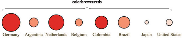
Color is important, and it can behave strangely on the web. Colorblindness, for instance, is a key accessibility issue that most of the colorbrewer scales address. But even though color use and deployment is complex, smart people have been thinking about color for a while, and D3 takes advantage of that. I’ve given you several of the tools you need to be successful with color, but the most important key to success with color is to not simply ignore it or pretend it to be something that’s either too hard or already solved.
It’s neither fun nor smart to create all your HTML elements using D3 syntax with nested selections and appending. More importantly, there’s an entire ecosystem of tools out there for creating HTML, SVG, and static images that you’d be foolish to ignore because you’re using D3 for your general DOM manipulation and information visualization. Fortunately, it’s straightforward and easy to load externally generated resources—like images, HTML fragments, and pregenerated SVG—and tie them into your graphical elements.
Chapter 1 noted that GIFs, despite their resurgent popularity, aren’t useful for a rich interactive site. But that doesn’t mean you should get rid of images entirely. You’ll find that adding images to your data visualizations can vastly improve them. In SVG, the image element is <image>, and its source is defined using the xlink:href attribute if it’s located in your directory structure. Another way to work with images is to use HTML5 Canvas, which you can see in chapter 11.
We have files in our images directory that are PNGs of the respective flags of each national team. To add them to our data visualization, select the <g> elements that have the team data already bound to them and add an SVG image:
d3.selectAll("g.overallG").insert("image", "text")
  .attr("xlink:href", d => `images/${d.team}.png`)
  .attr("width", "45px").attr("height", "20px")
  .attr("x", -22).attr("y", -10)
To make the images show up successfully, use insert() instead of append() because that gives you the capacity to tell D3 to insert the images before the text elements. This keeps the labels from being drawn behind the newly added images. Because each image name is the same as the team name of each data point, we can use an inline function to point to that value, combined with strings for the directory and file extension. We also need to define the height and width of the images because SVG images, by default, have no setting for height and width and won’t display until these are set. We also need to manually center SVG images—here the x and y attributes are set to a negative value of one-half the respective height and width, which centers the images in their respective circles, as shown in figure 3.19.

You can tie image resizing to the button events, but raster images don’t resize particularly well, and so you’ll want to use them at fixed sizes.
Now that you’re learning how to add images and icons to everything, let’s remember that because you can do something doesn’t mean you should. When building information visualization, the key aesthetic principle is to avoid cluttering your charts and interfaces with distracting and useless “chartjunk,” such as unnecessary icons, decoration, or skeuomorphic paneling. Remember, simplicity is force.
The term chartjunk comes from Tufte, and in general refers to the kind of generic and useless clip art that typifies PowerPoint presentations. Although icons and images are useful and powerful in many situations, and thus shouldn’t be avoided only to maintain an austere appearance, you should always make sure that your graphical representations of data are as uncluttered as you can make them.
We’ve created traditional DOM elements in this chapter using D3 data-binding for our buttons. If you want to, you can use the D3 pattern of selecting and appending to create complex HTML objects, such as forms and tables, on the fly. You’ll likely be working with designers and other developers who want to use those tools and require that those HTML components be included in your application. This isn’t a common practice, because most HTML generation is going to be handled by other templating libraries or frameworks, but you can use D3 to import and add them. For instance, let’s build a dialog box into which we can put the numbers associated with the teams. Say we want to see the stats on our teams—one of the best ways to do this is to have a dialog box that pops up as you click each team. We can write only the HTML we need for the table itself in a separate file, as shown in the following listing.
<table>
    <tr>
        <th>Statistics</th>
    </tr>
    <tr><td>Team Name</td><td class="data"></td></tr>
    <tr><td>Region</td><td class="data"></td></tr>
    <tr><td>Wins</td><td class="data"></td></tr>
    <tr><td>Losses</td><td class="data"></td></tr>
    <tr><td>Draws</td><td class="data"></td></tr>
    <tr><td>Points</td><td class="data"></td></tr>
    <tr><td>Goals For</td><td class="data"></td></tr>
    <tr><td>Goals Against</td><td class="data"></td></tr>
    <tr><td>Clean Sheets</td><td class="data"></td></tr>
    <tr><td>Yellow Cards</td><td class="data"></td></tr>
    <tr><td>Red Cards</td><td class="data"></td></tr>
</table>
And now we’ll add CSS rules for the table and the div that we want to put it in. As you see in the following listing, we can use the position and z-index CSS styles because this is a traditional DOM element.
  #infobox {
    position: fixed;
    left: 150px;
    top: 20px;
    z-index: 1;
    background: white;
    border: 1px black solid;
    box-shadow: 10px 10px 5px #888888;
  }
  tr {
    border: 1px gray solid;
  }
  td {
    font-size: 10px;
  }
  td.data {
    font-weight: 900;
  }
Now that we have the table, all we need to do is add a click listener and associated function to populate this dialog, as well as a function to create a div with ID "infobox" into which we add the loaded HTML code using the .html() function. To do this we use d3.text to load the raw text of the file:
d3.text("resources/infobox.html", html => {
d3.select("body").append("div").attr("id", "infobox").html(html)
})                                                                  1
teamG.on("click", teamClick)
function teamClick (d) {
d3.selectAll("td.data").data(d3.values(d))                          2
  .html(p => p)
}                                                                   3
The results are immediately apparent when you reload the page. A div with the defined table in infobox.html is created, and when you click it, it populates the div with values from the data bound to the element you click (figure 3.20).
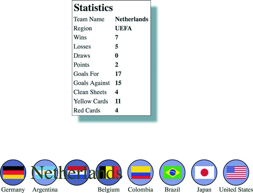
We used d3.text() in this case because when working with HTML, it can be more convenoient to load the raw HTML code like this and drop it into the .html() function of a selected element that you’ve created. If you use d3.html(),you get HTML nodes that allow you to do more sophisticated manipulation, which you’ll see now as we work with pregenerated SVG.
SVG has been around for a while, and there are, not surprisingly, robust tools for drawing SVG, such as Adobe Illustrator and the open source tool Inkscape. You might want pregenerated SVG for icons, interface elements, and other components of your work. If you’re interested in icons, The Noun Project (http://thenounproject.com) has an extensive repository of SVG icons, including the football (soccer ball) in figure 3.21.
When you download an icon from The Noun Project, you get it in two forms: SVG and PNG. You’ve already learned how to reference images, and you can do the same with SVG by pointing the xlink:href attribute of an <image> element at an SVG file. But loading SVG directly into the DOM gives you the capacity to manipulate it like any SVG elements that you create in the browser with D3.
Let’s say we decide to replace our boring circles with balls, and we don’t want them to be static images because we want the ability to modify their color and shape like other SVG. In that case, we’ll need to find a suitable ball icon and download it. For downloads from The Noun Project, this means we’ll need to go through the hassle of creating an account, and we’ll need to properly attribute the creator of the icon or pay a fee to use the icon without attribution (not a hassle, but rather The Right Thing To Do™). Regardless of where we get our icon, we might need to modify it before using it in our data visualization. In the case of the soccer ball icon in this example, we need to make it smaller and center the icon on the 0,0 point of the canvas. This kind of preparation is going to be different for every icon, depending on how it was originally drawn and saved.
With the table in the dialog box we used earlier, we assumed that we pulled in all the code found in infobox.html, and so we could bring it in using d3.text() and drop the raw HTML as text into the .html() function of a selection. But in the case of SVG, especially SVG that you’ve downloaded, you often want to ignore the verbose settings in the document, which will include its own <svg> canvas as well as any <g> elements that have been not-so-helpfully added. You probably want to deal only with the graphical elements. With our soccer ball, we want to get only the <path> elements. If we load the file using d3.html(),the results are DOM nodes loaded into a document fragment that we can access and move around using D3 selection syntax. Using d3.html() is the same as using any of the other loading functions, where you designate the file to be loaded and the callback. You can see the results of this command in figure 3.22.
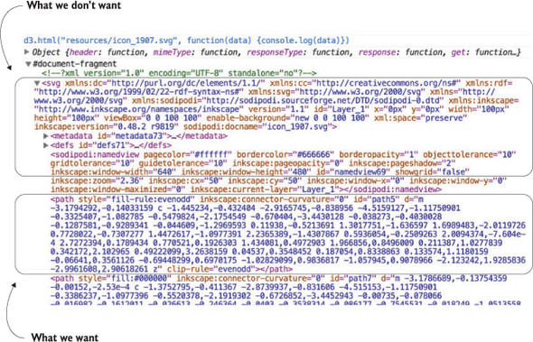
d3.html("resources/icon_1907.svg", data => {console.log(data)});
After we load the SVG into the fragment, we can loop through the fragment to get all the paths easily using the .empty() function of a selection. The .empty() function checks to see if a selection still has any elements inside it and eventually fires true after we’ve moved the paths out of the fragment into our main SVG. By including .empty() in a while statement, we can move all the path elements out of the document fragment and load them directly onto the SVG canvas:
d3.html("resources/icon_1907.svg", loadSVG);                       1
function loadSVG(svgData) {
  while(!d3.select(svgData).selectAll("path").empty()) {
    d3.select("svg").node().appendChild(
        d3.select(svgData).select("path").node());
   }
    d3.selectAll("path").attr("transform", "translate(50,50)");
}
Notice how we’ve added a transform attribute to offset the paths so that they won’t be clipped in the top-right corner. Instead, you clearly see a soccer ball in the top corner of your <svg> canvas. Document fragments aren’t a normal part of your DOM, so you don’t have to worry about accidentally selecting the <svg> canvas in the document fragment, or any other elements.
A while loop like this is sometimes necessary, but typically the best and most efficient method is to use .each() with your selection. Remember, .each() runs the same code on every element of a selection. In this case, we want to select our <svg> canvas and append the path to that canvas:
function loadSVG(svgData) {
  d3.select(svgData).selectAll("path").each(function() {
    d3.select("svg").node().appendChild(this);
  });
  d3.selectAll("path").attr("transform", "translate(50,50)");
}
We end up with a soccer ball floating in the top-left corner of our canvas, as shown in figure 3.23.
Loading elements from external data sources like this is useful if you want to move individual nodes out of your loaded document fragment, but if you want to bind the externally loaded SVG elements to data, it’s an added step that you can skip. We can’t set the .html() of a <g> element to the text of our incoming elements like we did with the <div> when we populated it with the contents of infobox.html. That’s because SVG doesn’t have a corresponding property to innerHTML, and therefore the .html() function on a selection of SVG elements has no effect. Instead, we have to clone the paths and append them to each <g> element representing our teams:
d3.html("resources/icon_1907.svg", loadSVG);
function loadSVG(svgData) {
  d3.selectAll("g").each(function() {                          1
  var gParent = this;
  d3.select(svgData).selectAll("path").each(function() {       1
      gParent.appendChild(this.cloneNode(true))
  });
});
};
It may seem backwards to select each <g> and then select each loaded <path>, until you think about how .cloneNode() and .appendChild() work. We need to take each <g> element and go through the <path>-cloning process for every path in the loaded icon, which means we use nested .each() statements (one for each <g> element in our DOM and one for each <path> element in the icon). By setting gParent to the actual <g> node (the this variable), we can then append a cloned version of each path in order. The results are soccer balls for each team, as shown in figure 3.24.
We can easily do the same thing using the <image> syntax from the first example in this section, but with our SVG elements individually added to each. And now we can style them in the same way as any path element. We could use the national colors for each ball, but we’ll settle for making them green, with the results shown in figure 3.25.

d3.selectAll("path").style("fill", "#93C464")
  .style("stroke", "black").style("stroke-width", "1px");
One drawback to this method is that the paths can’t take advantage of the D3 .insert() method’s ability to place the elements behind the labels or other visual elements. To get around this, we’ll need to either append icons to <g> elements that have been placed in the proper order, or use the selection.lower() and selection.raise() functions to move the paths around the DOM, as described earlier in this chapter.
The other drawback is that because these paths were added using cloneNode and not selection#append syntax, they have no data bound to them. We looked at rebinding data back in chapter 1. If we select the <g> elements and then select the <path> element, this will rebind data. But we have numerous <path> elements under each <g> element, and selectAll doesn’t rebind data. As a result, we have to take a more involved approach to bind the data from the parent <g> elements to the child <path> elements that have been loaded in this manner. The first thing we do is select all the <g> elements and then use .each() to select all the path elements under each <g>. Then, we separately bind the data from the <g> to each <path> using .datum(). What’s .datum()? Well, datum is the singular of data, so a piece of data is a datum. The datum function is what you use when you’re binding just one piece of data to an element. It’s the equivalent of wrapping your variable in an array and binding it to .data(). After we perform this action, we can dust off our old scaleOrdinal with a new set of colors and apply it to our new <path> elements. We can run this code in the console to see the effects, which should look like figure 3.26.

d3.selectAll("g.overallG").each(function(d) {
    d3.select(this).selectAll("path").datum(d)
});
var fourColorScale = d3.scaleOrdinal()
    .domain(["UEFA", "CONMEBOL", "CAF", "AFC"])
    .range(["#5eafc6", "#FE9922", "#93C464", "#fcbc34" ])
d3.selectAll("path").style("fill", p => fourColorScale(p.region))
.style("stroke", "black").style("stroke-width", "2px");
Now you have data-driven icons. Use them wisely.
How do you visualize the “health of the Internet”? This was the challenge posed to the Data Vis team at Bocoup by our client Measurement Lab, a nonprofit that collects millions of Internet speed tests a month from around the world. This data is invaluable to policy makers, researchers, and the general public for understanding how Internet speeds are changing over time, and to highlight and understand the impact of service disruptions. But with petabytes of individual speed test data reports as a data source, it can be difficult to make a visualization tool that’s engaging and useful for such a broad audience.
Design in data visualization is a process that, to be successful, should be focused on how best to shape the tool to address the needs of the users of that tool. We contacted potential users from both policy and research domains and performed a series of interviews with them. These interviews started with a few leading questions about how the interviewee uses, or could use, the existing data and what types of aggregations and groupings would be most insightful. The point of the process was to get them talking about their day-to-day needs and listen for places where we could facilitate understanding or improve their process. We also listened for patterns and permutations that were repeated by multiple individuals.
The result was an ordered list of features and functions. We refined this list with our stakeholders and it served as a reference point for building and iterating on sketches and mockups of the tool. The interviews provided a path through the infinite design space toward solutions that packaged the data into useful, high-impact visualizations.
We arrived at a design that focuses on two ways for users to interact with the data: a zoomed-in view of ISP speeds for a particular location and a comparison view between locations and ISPs. In both spots, we focused on aggregating individual speed tests by ISP to provide a viewpoint in the data that was granular enough to be relatable, but could still show meaningful patterns. Simple chart forms populate the tool—with a focus on familiarity and functionality. We wanted people to spend time browsing the data instead of learning how to read our visualizations. Color is used to distinguish different ISPs from one another and is kept consistent throughout the site. With so many different ISPs, many colors are repeated, but it was important to us that the specific color associated with an ISP stays consistent even across users and sessions. This makes sharing and exporting the visualizations, which was another critical component of the tool, much less confusing.
D3 provides an enormous library of examples of charts, and GitHub is also packed with implementations. It’s easy to format your data to match the existing data used in an implementation—and voilà, you have a chart. Likewise, D3 includes layouts that allow you to create complex data visualizations from a properly formatted dataset. But before you get started with default layouts—which allow you to create basic charts like pie charts, as well as more exotic charts—you should first understand the basics of creating the elements that typically make up a chart. This chapter focuses on widely used pieces of charts created with D3, such as a labeled axis or a line. It also touches on the formatting, data modeling, and analytical methods most closely tied to creating charts.
If you’re reading this book in order, then this isn’t your first exposure to charts, because we created a scatterplot and bar chart in chapter 2. This chapter introduces you to components and generators. A D3 component, like an axis, is a function for drawing all the graphical elements necessary for an axis. A generator, like d3.line(), lets you draw a straight or curved line across many points. The chapter begins by showing you how to add axes to scatterplots as well as create line charts, but before the end you’ll create an exotic yet simple chart: the streamgraph. By understanding how D3 generators and components work, you’ll be able do more than re-create the charts that other people have made and posted online (many of which they’re re-creating from somewhere else).
A chart (and notice here that I don’t use the term graph because that’s a synonym for network) refers to any flat layout of data in a graphical manner. The datapoints, which can be individual values or objects in arrays, may contain categorical, quantitative, topological, or unstructured data. In this chapter we’ll use several datasets to create the charts shown in figure 4.1. Although it may seem more useful to use a single dataset for the various charts, as the old saying goes, “Horses for courses,” which is to say that different charts are more suitable to different kinds of datasets, as you’ll see in this chapter.
All charts consist of several graphical elements that are drawn or derived from the dataset being represented. These graphical elements may be graphical primitives, like circles or rectangles, or more complex, multipart, graphical objects like the boxplots we’ll look at later in the chapter. Or they may be supplemental pieces like axes and labels. Although you use the same general processes you explored in previous chapters to create any of these elements in D3, it’s important to differentiate between the methods available in D3 to create graphics for charts.
You’ve learned how to directly create simple and complex elements with data-binding. You’ve also learned how to measure your data and transform it for display. Along with these two types of functions, D3 functionality can be placed into three broader categories: generators, components, and layouts, which are shown in figure 4.2 along with a general overview of how they’re used.
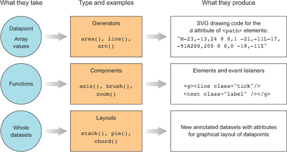
D3 generators consist of functions that take data and return the necessary SVG drawing code to create a graphical object based on that data. For instance, if you have an array of points and you want to draw a line from one point to another, or turn it into a polygon or an area, a few D3 functions can help you with this process. These generators simplify the process of creating a complex SVG <path> by abstracting the process needed to write a <path> d attribute. In this chapter, we’ll look at d3.line and d3.area, and in the next chapter you’ll see d3.arc, which is used to create the pie pieces of pie charts. Another generator that you’ll see in chapter 6 is d3.diagonal, used for drawing curved connecting lines in dendrograms.
In contrast with generators, which produce the d attribute string necessary for a <path> element, components create an entire set of graphical objects necessary for a particular chart component. The most commonly used D3 component (which you’ll see in this chapter) is d3.axis, which creates a bunch of <line>, <path>, <g>, and <text> elements that are needed for an axis based on the scale and settings you provide the function. Another component is d3.brush (which you’ll see later), which creates all the graphical elements necessary for a brush selector.
In contrast to generators and components, D3 layouts can be rather straightforward, like the pie chart layout, or complex, like a force-directed network layout. Layouts take in one or more arrays of data, and sometimes generators, and append attributes to the data necessary to draw it in certain positions or sizes, either statically or dynamically. You’ll see several of the simpler layouts in chapter 5 and then focus on more complex layouts in part 2 (chapters 6, 7, and 8).
Scatterplots, which you worked with in chapters 1 and 2, are a simple and extremely effective charting method for displaying data. For most line charts, the x position is a point in time, and the y position is magnitude. For example, in chapter 2 you placed your tweets along the x-axis according to when the tweets were made and along the y-axis according to their impact factor. In contrast, a scatterplot places a single symbol on a chart with its xy position determined by quantitative data for that datapoint. For instance, you can place a tweet on the y-axis based on the number of favorites and on the x-axis based on the number of retweets, allowing you to see if certain tweets get higher ratios of retweets to favorites. Scatterplots are common in scientific discourse and have grown increasingly common in journalism and public discourse for presenting data such as cost compared to quality of health care. Because they encode numerical values along each axis, they’re the ultimate “show me the data” chart, easily highlighting outliers.
Scatterplots needs to have more than one piece of data associated with them, and for a scatterplot that data must be numerical. You need only an array of data in which each entry has at least two different numerical values for a scatterplot to work. We’ll use an array where every object represents a person for whom we know the number of friends they have and the amount of money they make. We can see if having more or less friends positively correlates to a high salary associated with it, and for a scatterplot that data must be numerical. You need only an array of data with two different numerical values for a scatterplot to work. We’ll use an array where every object represents a person for whom we know the number of friends they have and the amount of money they make. We can see if having more or fewer friends positively correlates to a high salary:
var scatterData = [{friends: 5, salary: 22000},
{friends: 3, salary: 18000}, {friends: 10, salary: 88000},
{friends: 0, salary: 180000}, {friends: 27, salary: 56000},
{friends: 8, salary: 74000}];
If you think these salary numbers are too high or too low, pretend they’re in a foreign currency with an exchange rate that would make them more reasonable.
Representing this data graphically using circles is easy. You’ve done it several times:
d3.select("svg").selectAll("circle")
   .data(scatterData).enter()
   .append("circle")
   .attr("r", 5)
   .attr("cx", (d,i) => i * 10)
   .attr("cy", d => d.friends)
By designating d.friends for the cy position, we get circles placed with their depth based on the value of the friends attribute. Circles placed lower in the chart represent people in our dataset who have more friends. Circles are arranged from left to right using the old array-position trick you learned earlier in chapter 2. In figure 4.3, you can see that it’s not much of a scatterplot.
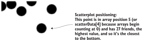
Next, we need to build scales to make this fit better on our SVG canvas:
var xExtent = d3.extent(scatterData, d => d.salary)
var yExtent = d3.extent(scatterData, d => d.friends)
var xScale = d3.scaleLinear().domain(xExtent).range([0,500]);
var yScale = d3.scaleLinear().domain(yExtent).range([0,500]);
d3.select("svg").selectAll("circle")
  .data(scatterData).enter().append("circle")
  .attr("r", 5).attr("cx", d => xScale(d.salary))
  .attr("cy", d => yScale(d.friends));
The result, in figure 4.4, is a true scatterplot, with points representing people arranged by number of friends along the y-axis and amount of salary along the x-axis. This chart, like most charts, is practically useless without a way of expressing to the reader what the position of the elements means. One way of accomplishing this is using well-formatted axis labels. Although we could use the same method for binding data and appending elements to create lines and ticks (which are lines representing equidistant points along an axis) and labels for an axis, D3 provides d3.axisLeft(), d3.axisRight(), d3.axisBottom(), and d3.axisTop()selection’s .call() method from a selection on a <g> element where we want these graphical elements to be drawn:
var yAxis = d3.axisRight().scale(yScale);
d3.select("svg").append("g").attr("id", "yAxisG").call(yAxis)
var xAxis = d3.axisBottom().scale(xScale)
d3.select("svg").append("g").attr("id", "xAxisG").call(xAxis)
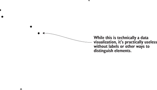
Notice that the .call() method of a selection invokes a function with the selection that’s active in the method chain, and is the equivalent of writing
xAxis(d3.select("svg").append("g").attr("id", "xAxisG"))
Figure 4.5 shows the pieces of an axis component.
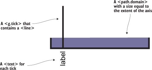
The g.tick, line, text, and path.domain elements are standard SVG elements created by the axis function, but they have default styles so you don’t need to have styles in your CSS, and should appear as shown in figure 4.6. You may still want to go back and adjust your axis styles to match your application.
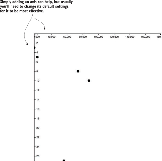
If we use axisLeft() or axisTop(), it seems like they aren’t drawn. That’s because they’re drawn outside the canvas, like our earlier rectangles. To move our axes around, we need to adjust the .attr("translate") of their parent <g> elements, either when we draw them or later. This is why it’s important to assign an ID to our elements when we append them to the canvas. We can move the x-axis to the bottom of this drawing easily:
d3.selectAll("#xAxisG").attr("transform","translate(0,500)")
Here’s our updated code. It uses the .tickSize() function to change the ticks to lines and manually sets the number of ticks using the ticks() function:
var scatterData = [{friends: 5, salary: 22000},
   {friends: 3, salary: 18000}, {friends: 10, salary: 88000},
   {friends: 0, salary: 180000}, {friends: 27, salary: 56000},
   {friends: 8, salary: 74000}];
var xScale = d3.scaleLinear().domain([0,180000]).range([0,500])        1
var yScale = d3.scaleLinear().domain([0,27]).range([0,500])
xAxis = d3.axisBottom().scale(xScale)
   .tickSize(500).ticks(4)                                             2
d3.select("svg").append("g").attr("id", "xAxisG").call(xAxis)
yAxis = d3.axisRight().scale(yScale)
   .ticks(16).tickSize(500)
d3.select("svg").append("g").attr("id", "yAxisG").call(yAxis)          3
d3.select("svg").selectAll("circle")
   .data(scatterData).enter()
   .append("circle").attr("r", 5)
   .attr("cx", d => xScale(d.salary))
   .attr("cy", d => yScale(d.friends))
With this in place, we get something a bit more legible, as shown in figure 4.7.
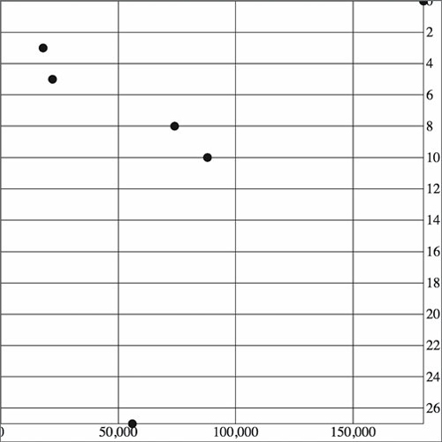
Take a look at the elements created by the axisRight() or axisBottom() function in figure 4.8 and see how the CSS classes are associated with those elements.
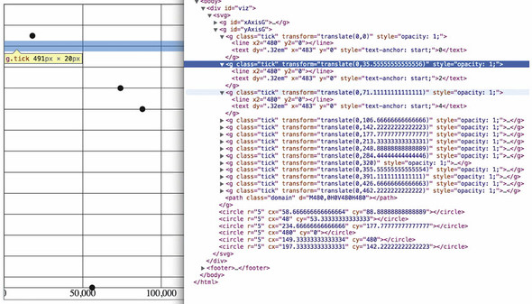
As you create more complex information visualization, you’ll get used to creating your own elements with classes referenced by your style sheet. You’ll also learn where D3 components create elements in the DOM and how they’re classed so that you can style them properly.
Using circles or rectangles for your data won’t work with some datasets—for example, if an important aspect of your data has to do with distribution, such as user demographics or statistical data. Often, the distribution of data gets lost in information visualization or is only noted with a reference to standard deviation or other first-year statistics terms that indicate the average doesn’t tell the whole story. One particularly useful way of representing data that has a distribution (such as a fluctuating stock price) is the use of a boxplot in place of a traditional scatterplot. The boxplot uses a complex graphic that encodes distribution in its shape. The box in a boxplot typically looks like the one shown in figure 4.9. It uses quartiles that have been preprocessed, but you could easily use d3.scaleQuartile() to create your own values from your own dataset.
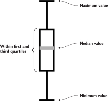
Take a moment to examine the amount of data that’s encoded in the graphic in figure 4.9. The median value is represented as a gray line. The rectangle shows the amount of whatever you’re measuring that falls in a set range that represents the majority of the data. The two lines above and below the rectangle indicate the minimum and maximum values. Everything except the information in the gray line is lost when you map only the average or median value at a datapoint.
To build a reasonable boxplot, we’ll need a set of data with interesting variation in those areas. Let’s assume we want to plot the number of registered visitors coming to our website by day of the week so that we can compare our stats week to week. We have the data for the age of the visitors (based on their registration details) and derived the quartiles from that. Maybe we used Excel, Python, or d3.scaleQuartile(), or maybe it was part of a dataset we downloaded. As you work with data, you’ll be exposed to common statistical summaries like this and you’ll have to represent them as part of your charts, so don’t be too intimidated by it. We’ll use a CSV format for the information.
The following listing shows our dataset with the number of registered users that visit the site each day, and the quartiles of their ages.
day,min,max,median,q1,q3,number
1,14,65,33,20,35,22
2,25,73,25,25,30,170
3,15,40,25,17,28,185
4,18,55,33,28,42,135
5,14,66,35,22,45,150
6,22,70,34,28,42,170
7,14,65,33,30,50,28
When we map the median age as a scatterplot as shown in the code in listing 4.2 and seen in figure 4.10, it looks like there’s not too much variation in our user base throughout the week. We do that by drawing scatterplot points for each day at the median age of the visitor for that day. We’ll also invert the y-axis so that it makes a bit more sense.
d3.csv("boxplot.csv", scatterplot)                                          1
const tickSize = 470
function scatterplot(data) {
   const xScale = d3.scaleLinear().domain([1,8]).range([20,tickSize])
   const yScale = d3.scaleLinear().domain([0,100]).range([tickSize + 10,20])2
   const yAxis = d3.axisRight()
   .scale(yScale)
   .ticks(8)
   .tickSize(tickSize)
   d3.select("svg").append("g")
      .attr("transform", `translate(${tickSize},0)`)                        3
      .attr("id", "yAxisG")
      .call(yAxis)
   const xAxis = d3.axisBottom()
      .scale(xScale)
      .tickSize(-tickSize)
      .tickValues([1,2,3,4,5,6,7])                                          4
   d3.select("svg").append("g")
      .attr("transform", `translate(0,${tickSize + 10})`)
      .attr("id", "xAxisG")
      .call(xAxis)
   d3.select("svg").selectAll("circle.median")
      .data(data)
      .enter()
      .append("circle")
      .attr("class", "tweets")
      .attr("r", 5)
      .attr("cx", d => xScale(d.day))
      .attr("cy", d => yScale(d.median))
      .style("fill", "darkgray")
}
To get a better view of this data, we’ll need to create a boxplot. Building a boxplot is similar to building a scatterplot, but instead of appending circles for each point of data, you append a <g> element. It’s a good rule to always use <g> elements for your charts, because they allow you to apply labels or other important information to your graphical representations. That means you’ll need to use the transform attribute, which is how <g> elements are positioned on the canvas. Elements appended to a <g> base their coordinates off of the coordinates of their parent. When applying x and y attributes to child elements, you need to set them relative to the parent <g>.
Rather than selecting all the <g> elements and appending child elements one at a time, as we did in earlier chapters, we’ll use the .each() function of a selection, which allows us to perform the same code on each element in a selection to create the new elements. Like any D3 selection function, .each() allows you to access the bound data, array position, and DOM element. In chapter 1 we achieved the same functionality by using selectAll to select the <g> elements and directly append <circle> and <text> elements. That’s a clean method, and the only reasons to use .each() to add child elements are if you prefer the syntax, you plan on doing complex operations involving each data element, or you want to add conditional tests to change whether or what child elements you’re appending. You can see how to use .each() to add child elements in action in the following listing, which takes advantage of the scales we created in listing 4.3 and draws rectangles on top of the circles we’ve already drawn.
d3.select("svg").selectAll("g.box")
  .data(data).enter()
  .append("g")
  .attr("class", "box")
  .attr("transform", d =>
        "translate(" + xScale(d.day) +"," + yScale(d.median) + ")"
    ).each(function(d,i) {                                          1
       d3.select(this)                                              2
         .append("rect")
         .attr("width", 20)
         .attr("height", yScale(d.q1) - yScale(d.q3));              3
    })
The new rectangles indicating the distribution of visitor ages, as shown in figure 4.11, aren’t only offset to the right, but also showing the wrong values. Day 7, for instance, should range in value from 30 to 50, but instead is shown as ranging from 13 to 32. We know it’s doing that because that’s the way SVG draws rectangles. We have to update our code a bit to make it accurately reflect the distribution of visitor ages, as shown in figure 4.11.
...
.each(function(d,i) {
    d3.select(this)
      .append("rect")
      .attr("width", 20)
      .attr("x", -10)                                      1
      .attr("y", yScale(d.q3) - yScale(d.median))          2
      .attr("height", yScale(d.q1) - yScale(d.q3))
      .style("fill", "white")
      .style("stroke", "black");
});
We’ll use the same technique we used to create the chart in figure 4.12 to add the remaining elements of the boxplot (described in detail in figure 4.13) by including several append functions in the .each() function, as shown in listing 4.4. They all select the parent <g> element created during the data-binding process and append the shapes necessary to build a boxplot.
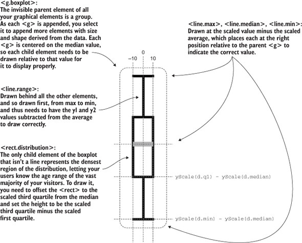
...
.each(function(d,i) {
    d3.select(this)
      .append("line")
      .attr("class", "range")
      .attr("x1", 0)
      .attr("x2", 0)
      .attr("y1", yScale(d.max) - yScale(d.median))             1
      .attr("y2", yScale(d.min) - yScale(d.median))             1
      .style("stroke", "black")
      .style("stroke-width", "4px");
    d3.select(this)
      .append("line")
      .attr("class", "max")
      .attr("x1", -10)
      .attr("x2", 10)
      .attr("y1", yScale(d.max) - yScale(d.median))              2
      .attr("y2", yScale(d.max) - yScale(d.median))              2
      .style("stroke", "black")
      .style("stroke-width", "4px")
    d3.select(this)
      .append("line")
      .attr("class", "min")
      .attr("x1", -10)
      .attr("x2", 10)
      .attr("y1", yScale(d.min) - yScale(d.median))              3
      .attr("y2", yScale(d.min) - yScale(d.median))              3
      .style("stroke", "black")
      .style("stroke-width", "4px")
    d3.select(this)
      .append("rect")
      .attr("class", "range")
      .attr("width", 20)
      .attr("x", -10)
      .attr("y", yScale(d.q3) - yScale(d.median))                4
      .attr("height", yScale(d.q1) - yScale(d.q3))               4
      .style("fill", "white")
      .style("stroke", "black")
      .style("stroke-width", "2px")
    d3.select(this)
      .append("line")
      .attr("x1", -10)                                           5
      .attr("x2", 10)                                            5
      .attr("y1", 0)
      .attr("y2", 0)
      .style("stroke", "darkgray")
      .style("stroke-width", "4px")
});
Listing 4.5 fulfills the requirement that we should also add an x-axis to remind us which day each box is associated with. This takes advantage of the explicit .tick-Values() function you saw earlier. It also uses a negative value passed to tickSize() and the corresponding offset of the <g> that we use to call the axis function.
const tickSize = 470
var xAxis = d3.axisBottom().scale(xScale)
.tickSize(-tickSize)                                                  1
.tickValues([1,2,3,4,5,6,7]);                                         2
    d3.select("svg").append("g")
      .attr("transform", `translate(0,${tickSize})`)
      .attr("id", "xAxisG").call(xAxis);                              3
    d3.select("#xAxisG > path.domain").style("display", "none");      4
The end result of all this is a chart where each of our datapoints is represented, not by a single circle, but by a multipart graphical element designed to emphasize distribution.
The boxplot in figure 4.14 encodes not only the median age of visitors for that day, but the minimum, maximum, and distribution of the age of the majority of visitors. This expresses in detail the demographics of visitorship clearly and cleanly. It doesn’t include the number of visitors, but we could encode that with color, make it available on a click of each boxplot, or make the width of the boxplot correspond to the number of visitors.
We looked at boxplots because a boxplot allows you to explore the creation of multipart objects while using lines and rectangles. But what’s the value of a visualization like this that shows distribution? It encodes a graphical summary of the data, providing information about visitor age for the site on Wednesday, such as, “Most visitors were between the ages of 18 and 28. The oldest was 40. The youngest was 15. The median age was 25.” It also allows you to quickly perform visual queries, checking to see whether the median age of one day was within the majority of visitor ages of another day.
We’ll stop exploring boxplots, and look at a different kind of complex graphical object: an interpolated line.
You create line charts by drawing connections between points. A line that connects points and the shaded regions inside or outside the area constrained by the line tell a story about the data. Although a line chart is technically a static data visualization, it’s also a representation of change, typically over time.
We’ll start with a new dataset in listing 4.6 that better represents change over time. Let’s imagine we have a Twitter account and we’ve been tracking the number of tweets, favorites, and retweets to determine at what time we have the greatest response to our social media. Although we’ll ultimately deal with this kind of data as JSON, we’ll want to start with a comma-delimited file, because it’s the most efficient for this kind of data.
day,tweets,retweets,favorites
1,1,2,5
2,6,11,3
3,3,0,1
4,5,2,6
5,10,29,16
6,4,22,10
7,3,14,1
8,5,7,7
9,1,35,22
10,4,16,15
First we pull this CSV in using d3.csv() as we did in chapter 2 and then we create circles for each datapoint. We do this for each variation on the data, with the .day attribute determining x position and the other datapoint determining y position. We create the usual x and y scales to draw the shapes in the confines of our canvas. We also have a couple of axes to frame our results. Notice that we differentiated between the three datatypes by coloring them differently. See the following listing.
d3.csv("../data/tweetdata.csv", lineChart);
function lineChart(data) {

   const blue = "#5eaec5", green = "#92c463", orange = "#fe9a22"
   xScale = d3.scaleLinear().domain([1,10.5]).range([20,480])         1
   yScale = d3.scaleLinear().domain([0,35]).range([480,20])           1
   xAxis = d3.axisBottom()
      .scale(xScale)
      .tickSize(480)
      .tickValues([1,2,3,4,5,6,7,8,9,10])                             2

   d3.select("svg").append("g").attr("id", "xAxisG").call(xAxis)
   yAxis = d3.axisRight()
      .scale(yScale)
      .ticks(10)
      .tickSize(480)
   d3.select("svg").append("g").attr("id", "yAxisG").call(yAxis)

   d3.select("svg").selectAll("circle.tweets")
      .data(data)                                                     3
      .enter()
      .append("circle")
      .attr("class", "tweets")
      .attr("r", 5)
      .attr("cx", d => xScale(d.day))
      .attr("cy", d => yScale(d.tweets))                              3
      .style("fill", blue)

   d3.select("svg").selectAll("circle.retweets")
      .data(data)                                                     3
      .enter()
      .append("circle")
      .attr("class", "retweets")
      .attr("r", 5)
      .attr("cx", d => xScale(d.day))
      .attr("cy", d => yScale(d.retweets))                            3
      .style("fill", green)

   d3.select("svg").selectAll("circle.favorites")
      .data(data)                                                     3
      .enter()
      .append("circle")
      .attr("class", "favorites")
      .attr("r", 5)
      .attr("cx", d => xScale(d.day))
      .attr("cy", d => yScale(d.favorites))                           3
      .style("fill", orange)
}
The graphical results of this code, as shown in figure 4.15—which take advantage of the CSS rules we defined earlier—aren’t easily interpreted.
By drawing a line that intersects each point of the same category, we can compare the number of tweets, retweets, and favorites. We can start by drawing a line for tweets using d3.line(). This line generator expects an array of points as data, and we’ll need to tell the generator what values constitute the x and y coordinates for each point. By default, this generator expects a two-part array, where the first part is the x value and the second part is the y value. Because our x value is based on the day of the activity and our y value is based on the amount of activity, we need to set specific accessor functions.
The .x() accessor function of the line generator needs to point at the scaled day value, while the .y() accessor function needs to point to the scaled value of the appropriate activity. The line function itself takes the entire dataset that we loaded from tweetdata.csv and returns the SVG drawing code necessary for a line between the points in that dataset. To generate three lines, we use the dataset three times, with a slightly different generator for each. We not only need to write the generator function and define how it accesses the data it uses to draw the line, but we also need to append a <path> to our canvas and set its d attribute to equal the generator function we defined.
A more advanced feature of d3.line() is the defined method, as shown in listing 4.8. By default, line.defined() returns true, which means that every datapoint indicates a real section in the line. However, if you have gaps in your data, and you don’t want the line to interpolate them, you can use defined() to create a multipart line with gaps where you don’t have data. To be clear, you still need a datapoint at that place in the line, but it should be able to return false from the function you’ve sent to defined. For instance, if you set defined as
d3.line().defined(d => d.y !== null)
then D3 will draw a gap in your line at any point where the y value of that point is null. We’re not using this feature in the lines drawn here, which don’t have any gaps in their data, but if you’re drawing lines with gaps, it will make it easier on you.
    var tweetLine = d3.line()
   .x(d => xScale(d.day))                  1
   .y(d => yScale(d.tweets))               2
    d3.select("svg")
   .append("path")
   .attr("d", tweetLine(data))             3
   .attr("fill", "none")
   .attr("stroke", "#fe9a22")
   .attr("stroke-width", 2)
We draw the line above the circles we already drew, and the line generator produces the plot shown in figure 4.16.
If we build a line constructor for each datatype in our set and call each with its own path, as shown in the following listing, then you can see the variation over time for each of your datapoints. Listing 4.9 demonstrates how to build those generators with our dataset, and figure 4.17 shows the results of that code.
const lambdaXScale = d => xScale(d.day)           1
   var tweetLine = d3.line()                      2
     .x(lambdaXScale)
     .y(d => yScale(d.tweets))
   var retweetLine = d3.line()
     .x(lambdaXScale)
     .y(d => yScale(d.retweets))                  3
   var favLine = d3.line()
     .x(lambdaXScale)
     .y(d => yScale(d.favorites))
   d3.select("svg")
     .append("path")                              4
     .attr("d", tweetLine(data))
     .attr("fill", "none")
     .attr("stroke", blue)
     .attr("stroke-width", 2)
   d3.select("svg")
     .append("path")
     .attr("d", retweetLine(data))
     .attr("fill", "none")
     .attr("stroke", green)
     .attr("stroke-width", 2)
   d3.select("svg")
     .append("path")
     .attr("d", favLine(data))
     .attr("fill", "none")
     .attr("stroke", orange)
     .attr("stroke-width", 2)
D3 provides a number of interpolation methods with which to draw these lines (as well as areas and diagonals and radial lines), exposed as the .curve method. In cases like tweetdata, where you have discrete points that represent data accurately and not samples, then the default “linear” method shown in figure 4.19 is appropriate. But in other cases, a different interpolation method for the lines, like the ones shown in figure 4.18, may be appropriate. Here’s the same data but with the d3.line() generator using different interpolation methods. You’ll notice I’ve also lightened the axis ticks and labels quite significantly. Don’t be afraid to use very light tick marks, and don’t feel like your ticks need to only be black or grayscale.
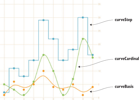
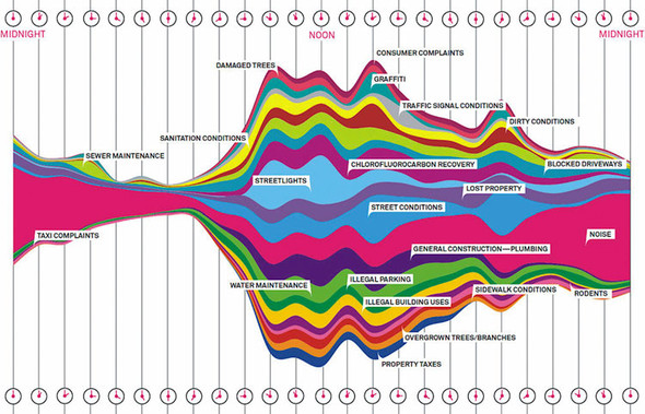
tweetLine.curve(d3.curveBasis)              1
retweetLine.curve(d3.curveStep)
favLine.curve(d3.curveCardinal)
Interpolation modifies the representation of data. Experiment with this drawing code to see how the different interpolation settings show different information than other interpolators. Data can be visualized in different ways, all correct from a programming perspective, and it’s up to you to make sure the information you’re visualizing reflects the actual phenomena.
Data visualization deals with the visual representation of statistical principles, which means it’s subject to all the dangers of the misuse of statistics. The interpolation of lines is particularly vulnerable to misuse, because it changes a clunky-looking line into a smooth, “natural” line.
All the previous chart types we built were based on points. The scatterplot is points on a grid, the boxplot consists of complex graphical objects in place of points, and line charts use points as the basis for drawing a line. In this and earlier chapters, we’ve dealt with rather staid examples of information visualization that we might easily create in any traditional spreadsheet. But you didn’t get into this business to make Excel charts. You want to wow your audience with beautiful data, win awards for your aesthetic je ne sais quoi, and evoke deep emotional responses with your representation of change over time. You want to make streamgraphs like the one in figure 4.19.
The streamgraph is a sublime piece of information visualization that represents variation and change, like the boxplot. It may seem like a difficult thing to create, until you start to put the pieces together. Ultimately, a streamgraph is a variant of what’s known as a stacked chart. The layers accrete upon each other and adjust the area of the elements above and below, based on the space taken up by the components closer to the center. It appears organic because that accretive nature mimics the way many organisms grow, and seems to imply the kinds of emergent properties that govern the growth and decay of organisms. We’ll interpret its appearance later, but first let’s figure out how to build it.
The reason we’re looking at a streamgraph is because it’s not that exotic. A streamgraph is a stacked graph, which means it’s fundamentally similar to your earlier line charts. We’re going to make a simple stacked graph by hand in this last section but we won’t make a streamgraph (though you’ll learn how in the next chapter). By learning how to write the function to create a stacked graph, you can better understand another kind of generator, d3.area(). The first thing you need is data that’s amenable to this kind of visualization. Let’s follow work with the gross earnings for six movies over the course of nine days. Each datapoint is therefore the amount of money a movie made on a particular day.
day,titanic,avatar,akira,frozen,deliverance,avengers
1,20,8,3,0,0,0
2,18,5,1,13,0,0
3,14,3,1,10,0,0
4,7,3,0,5,27,15
5,4,3,0,2,20,14
6,3,1,0,0,10,13
7,2,0,0,0,8,12
8,0,0,0,0,6,11
9,0,0,0,0,3,9
10,0,0,0,0,1,8
To build a stacked graph, you need to get more sophisticated with the way you access data and feed it to generators when drawing lines. In our earlier example, we created three different line generators for our dataset, but that’s terribly inefficient. We also used simple functions to draw the lines. But we’ll need more than that to draw something like a streamgraph. Even if you think you won’t want to draw streamgraphs (and there are reasons why you may not, which we’ll get into at the end of this section), the important thing to focus on when you look at the following listing is how you use accessors with D3’s line and, later, area generators.
var xScale = d3.scaleLinear().domain([ 1, 8 ]).range([ 20, 470 ]);
var yScale = d3.scaleLinear().domain([ 0, 40 ]).range([ 480, 20 ]);
Object.keys(data[0]).forEach(key => {
   if (key != "day") {                                     1
      var movieArea = d3.line()                            2
        .x(d => xScale(d.day))                             3
        .y(d => yScale(d[key]))                            4
        .curve(d3.curveCardinal);
      d3.select("svg")
        .append("path")
        .style("id", key + "Area")
        .attr("d", movieArea(data))
        .attr("fill", "none")
        .attr("stroke", "#75739F")
        .attr("stroke-width", 3)
        .style("opacity", .75);

   };
});
The line-drawing code produces a cluttered line chart, as shown in figure 4.20. As you learned in chapter 1, lines and filled areas are almost exactly the same thing in SVG. You can differentiate them by a Z at the end of the drawing code that indicates the shape is closed, or the presence or absence of a "fill" style. D3 provides d3.line and d3.area generators to draw lines or areas. Both of these constructors produce <path> elements, but d3.area, which you can see in use in listing 4.12, provides helper functions to bound the lower end of your path to produce areas in charts. We need to define a .y0() accessor that corresponds to our y accessor and determines the shape of the bottom of our area. Let’s see how d3.area() works.
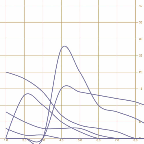
  var xScale = d3.scaleLinear().domain([ 1, 8 ]).range([ 20, 470 ]);
  var yScale = d3.scaleLinear().domain([ -40, 40 ]).range([ 480, 20 ]);

  Object.keys(data[0]).forEach(key => {
     if (key != "day") {
        var movieArea = d3.area()
        .x(d => xScale(d.day))
        .y0(d => yScale(d[key]))
        .y1(d => yScale(-d[key]))                   1
        .curve(d3.curveCardinal);
     d3.select("svg")
       .append("path")
       .style("id", key + "Area")
       .attr("d", movieArea(data))
       .attr("fill", "#75739F")
       .attr("stroke", "#75739F")
       .attr("stroke-width", 2)
       .style("stroke-opacity", .75)
       .style("fill-opacity", .5);
     };
})
No. Counterintuitively, you should use d3.line to draw filled areas. To do so, though, you need to append Z to the created d attribute. This indicates that the path is closed.
|
Closed path changes |
|
|---|---|
movieArea = d3.svg.line()
       .x(function(d) {
         return xScale(d.day)
       })
       .y(function(d) {
         return yScale(d[x])
       })
       .interpolate("cardinal");
|
|
You write the con structor for the line-drawing code the same regardless of whether you want a line or shape, filled or unfilled.
d3.select("svg")
    .append("path")
    .attr("d",movieArea(data))
    .attr("fill", "none")
    .attr("stroke", "black")
    .attr("stroke-width", 3);
|
d3.select("svg")
   .append("path")
   .attr("d", movieArea(data) + "Z")
   .attr("fill", "none")
   .attr("stroke", "black")
   .attr("stroke-width", 3);
|
When you call theconstructor, you append a <path> element. You specify whether the line is “closed” by concate nating a Z to the string created by your line constructor for the attribute of the <path>.
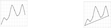
When you add a Z to the end of an SVG <path> element’s attribute, it draws a line connecting the two end points.
d3.select("svg")
    .append("path")
    .attr("d", movieArea(data))
    .attr("fill", "none")
    .attr("stroke", "black")
    .attr("stroke-width", 3);
|
d3.select("svg")
    .append("path")
    .attr("d", movieArea(data) + "Z")
    .attr("fill", "gray")
    .attr("stroke", "black")
    .attr("stroke-width", 3);
|
You may think that only a closed path could be filled, but the fill of a path is the same whether or not you close the line by appending Z.
The area of a path filled is always the same, whether it’s closed or not.
You use d3.line when you want to draw most shapes and lines, whether filled or unfilled, or closed or open. You should use d3.area when you want to draw a shape where the bottom of the shape can be calculated based on the top of the shape as you’re drawing it. It’s suitable for drawing bands of data, such as that found in a stacked area chart or streamgraph.
By defining the y0 function of d3.area, as in listing 4.13, we’ve mirrored the path created and filled it, as shown in figure 4.21, which is a step in the right direction. Notice that we’re presenting inaccurate data now, because the area of the path is twice the area of the data. We want our areas to draw one on top of the other, so we need .y0() to point to a complex stacking function that makes the bottom of an area equal to the top of the previously drawn area. D3 comes with a stacking function, d3.stack(), which we’ll look at later, but for the purpose of our example, we’ll write our own.
var fillScale = d3.scaleOrdinal()
.domain(["titanic", "avatar", "akira", "frozen", "deliverance", "avengers"])
.range(["#fcd88a", "#cf7c1c", "#93c464", "#75734F", "#5eafc6", "#41a368"]) 1
   var xScale = d3.scaleLinear().domain([ 1, 8 ]).range([ 20, 470 ]);
   var yScale = d3.scaleLinear().domain([0, 55]).range([ 480, 20 ])

   Object.keys(data[0]).forEach(key => {
       if (key != "day") {                                                 2
           var movieArea = d3.area()                                       3
               .x(d => xScale(d.day))
               .y0(d => yScale(simpleStacking(d, key) - d[key]))
               .y1(d => yScale(simpleStacking(d, key)))
               .curve(d3.curveBasis)
           d3.select("svg")                                                4
               .append("path")
               .style("id", key + "Area")
               .attr("d", movieArea(data))
               .attr("fill", fillScale(key))
               .attr("stroke", "black")
               .attr("stroke-width", 1)
       }
   })
   function simpleStacking( lineData, lineKey) {                           5
         var newHeight = 0
         Object.keys(lineData).every(key => {
           if (key !== "day") {
             newHeight += parseInt(lineData[key]);
             if (key === lineKey) {
               return false
             }
           }
               return true
      })
      return newHeight
}
The stacked area chart in figure 4.22 is already complex. To make it a proper streamgraph, the stacks need to alternate. This requires a more complicated stacking function like the kind you’ll see in chapter 5.
The purpose of this section is to focus on building complex accessor functions to create, from scratch, the kinds of data visualization you’ve seen and likely thought of as exotic. Let’s assume this data is correct and take a moment to analyze the effectiveness of this admittedly attractive method of visualizing data. Is this really a better way to show movie grosses than a simpler line chart? That depends on the scale of the questions being addressed by the chart. If you’re trying to discover overall patterns of variation in movie grosses, as well as spot interactions between them (for instance, seeing if a particularly high-grossing-over-time movie interferes with the opening of another movie), then it may be useful. If you’re trying to impress an audience with a complex-looking chart, it would also be useful. Otherwise, you’ll be better off with something simpler than this. But even if you only build less-visually impressive charts, you’ll still use the same techniques we’ve gone over in this section.
Unlike axes, there isn’t anything in core D3 that allows you to easily generate a legend for your charts, which is a shame because every chart needs a legend. Fortunately, there are additional generators and components created by other software developers to extend the D3 library, using the same metaphors and functions. One of those is d3-svg-legend created by Susie Lu, which you can read more about at http://d3-legend.susielu.com. If you’re using NPM you can add it to your project the way you would any other D3 module, npm i d3-svg-legend or, if you’re building flat untranspiled code like we have in our examples, you can use a script tag in your header to include it:
<script src="https://cdnjs.cloudflare.com/ajax/libs/d3-legend/2.21.0/d3-legend.min.js"></script>
The d3-svg-legend module exposes three kinds of legends that you’d use for data visualization: legends that describe items by size, color, or symbol. We’ll look at legendColor for our example, but you should explore the documentation for d3-svg-legend to see how the other legends work, because you’ll undoubtedly have use cases for them. Building off the code from the last section, add what you see in the following listing. We’re also changing the SVG width parameter to 1000px so we have space to place the legend.
var legendA = d3.legendColor().scale(fillScale)
d3.select("svg")
  .style("width", "1000px")

d3.select("svg")
  .append("g")
  .attr("transform", "translate(500, 0)")
  .call(legendA)
It’s exactly the same way you deal with the axis component, and the result as we see in figure 4.23 is that you’ve immediately shown your reader which color corresponds to which value you’ve mapped that color to. That’s one of the things you should look for when evaluating third-party modules for D3—that it exposes an API similar to the existing generators, components, and layouts in core D3. The other things you should look for are wide adoption (number of installs on NPM, stars on GitHub) and good documentation. D3-svg-legend checks all these boxes.
Another sign that d3-svg-legend is a good module—and one to look for in other modules—is that it exposes a number of customization options. By default we get the vertical legend with squares like you see in figure 4.23, but we can adjust several of its options, like orient and shapePadding, as seen in the following listing, and we’ll get a different legend that looks like figure 4.24.

legendA.orient("horizontal")
    .shapePadding(60)
    .shapeWidth(12)
.shapeHeight(30)
This chapter covers
D3 contains a variety of functions, referred to as layouts, that help you format your data so that it can be presented using a popular charting method. In this chapter we’ll look at several different layouts so that you can understand general layout functionality, learn how to deal with D3’s layout structure, and deploy one of these layouts (several of which are shown in figure 5.1) with your data.
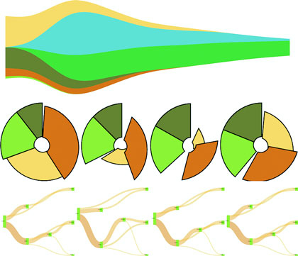
In each case, as you’ll see with upcoming examples, when a dataset is associated with a layout, each of the objects in the dataset has attributes that allow for drawing the data. Layouts don’t draw the data, nor are they called like components or referred to in the drawing code like generators. Rather, they’re a preprocessing step that formats your data so that it’s ready to be displayed in the form you’ve chosen. You can update a layout and then if you rebind that altered data to your graphical objects, you can use the D3 enter/update/exit syntax you encountered in chapter 2 to update your layout. Paired with animated transitions, this can provide you with the framework for an interactive, dynamic chart.
This chapter gives an overview of layout structure by implementing popular layouts such as the histogram, pie chart, tree, and circle packing. Other layouts, such as the chord layout and more exotic ones, follow the same principles and should be easy to understand after looking at these. We’ll get started with a kind of chart you’ve already worked with, the bar chart or histogram, which has its own layout that helps abstract the process of building this kind of chart.
Before we get into charts that you’ll need layouts for, first we’ll create a chart that we easily made without a layout. In chapter 2, we made a bar chart based on our Twitter data by using d3.nest(). But D3 has a layout, d3.histogram(), that bins values automatically and provides us with the necessary settings to draw a bar chart based on a scale that we’ve defined. Many people who get started with D3 think it’s a charting library and that they’ll find a function like d3.histogram that creates a bar chart in a <div> when it’s run. But D3 layouts don’t result in charts; they result in the settings necessary for charts. You have to put in a bit of extra work for charts, but you have enormous flexibility (as you’ll see in this and later chapters) that allows you to make diagrams and charts that you can’t find in other libraries.
Listing 5.1 shows the code to create a histogram layout and associate it with a particular scale. I’ve also included an example of how you can use interactivity to adjust the original layout and rebind the data to your shapes. This changes the histogram from showing the number of tweets that were favorited to the number of tweets that were retweeted.
d3.json("tweets.json", function(error, data) { histogram(data.tweets) })
function histogram(tweetsData) {
   var xScale = d3.scaleLinear().domain([ 0, 5 ]).range([ 0, 500 ]);
   var yScale = d3.scaleLinear().domain([ 0, 10 ]).range([ 400, 0 ]);
   var xAxis = d3.axisBottom().scale(xScale).ticks(5)
   var histoChart = d3.histogram();                          1

   histoChart
    .domain([ 0, 5 ])
    .thresholds([ 0, 1, 2, 3, 4, 5 ])
    .value(d => d.favorites.length)                          2

histoData = histoChart(tweetsData);                          3

  d3.select("svg")
    .selectAll("rect")
    .data(histoData).enter()
    .append("rect")
    .attr("x", d => xScale(d.x0))
    .attr("y", d => yScale(d.length))
    .attr("width", d => xScale(d.x1 - d.x0) - 2)
    .attr("height", d => 400 - yScale(d.length))             4
    .style("fill", "#FCD88B")

  d3.select("svg").append("g").attr("class", "x axis")
    .attr("transform", "translate(0,400)").call(xAxis);
  d3.select("g.axis").selectAll("text").attr("dx", 50);      5
}
You pass d3.histogram an array of data, a number of bins, and a scale, and it returns to you an array of bins filled with the data that falls into a particular bin at a particular scale, which you can then bind to elements and create a bar chart like the one in figure 5.2. In this context, a bin is the label for data that falls within a certain range, and you’ll hear the term binning used to refer to aggregating data points into discrete groups of data points based on value. Second, you’re still using the same generators and components that you needed when you created a bar chart from raw data without the help of a layout. The axisBottom component is in this case being sent five ticks. Third, the histogram is useful because it automatically bins data, whether it’s whole numbers like this or it falls in a range of values in a scale. Finally, if you want to change a chart using a different dimension of your data, you don’t need to remove the original. You need to reformat your data using the layout and rebind it to the original elements, preferably with a transition. You’ll see this in more detail in your next example, which uses another type of chart: pie charts.
Let’s look at the data that histogram produces. One way to do this is by console.log(histoData) after you process it. You’ll see the array in figure 5.3. The array has been extended so that each array item has an x0 and x1 value that corresponds to the top and bottom thresholds of that bin. The array length indicates the number of items in that bin. And that’s all there is to that function, but it’s enough to provide us with sufficient drawing instructions to render the chart in figure 5.2.
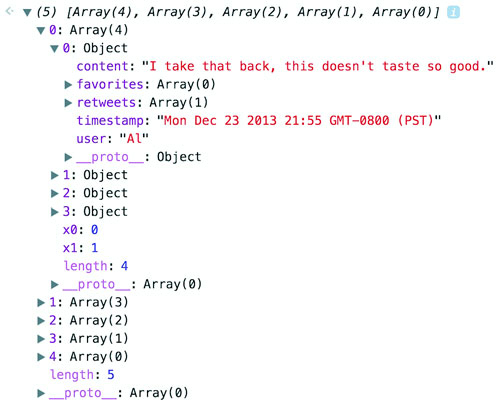
We can add interactivity to change the chart to render another view of the data when we click it. Because the data we used has more than one dimension to it, we can re-run d3.histogram to bin on another dimension and get updated drawing instructions that we can use for a new chart, as in the following listing.
...
            .attr("height", d => 400 - yScale(d.length))
            .on("click", retweets);

   function retweets() {
      histoChart.value(d => d.retweets.length)                       1
      histoData = histoChart(tweetsData);
      d3.selectAll("rect").data(histoData)                           2
      .transition().duration(500).attr("x", d => xScale(d.x0))
      .attr("y", d => yScale(d.length))
         .attr("height", d => 400 - yScale(d.length))
  };
We’re adding the click event to the individual rect elements out of convenience here. In a finished application you’d probably want to assign this to a button or other UI element. But for our purposes, this is fine, and clicking a rect produces the new chart of retweets in figure 5.4.
I’ve taught D3 many people in different environments, and every time someone will ask me, “Why do D3 layouts provide such abstract data?” It’s a good question. After all, if you have a function called “histogram” shouldn’t it just, you know, make a histogram? What good is it to give you this intermediary piece on your way to a visualization? The answer is that there are more ways to visualize data than there are ways to process data, by the definition of the problem space. Using rectangles like I have in this chapter is only one way to show distribution data. Another is what we call a violin plot, and we’re going to use d3.histogram to create one right now.
A violin plot is a mirrored curved area that bulges where many datapoints exist and tapers where few exist. They’re commonly seen in medical diagrams dealing with dosage and efficacy but also used more generally to show distributions, and unlike a boxplot that only shows sample points, the violin plot encodes the entire distribution. First, though, we need to generate random data. D3 includes a few random number generators, because when you’re generating random numbers, counterintuitively, you don’t usually want truly random numbers, particularly when you want to look at distributions. We’ll use d3.randomNormal to provide normally distributed random numbers.
If we use d3.histogram to bin those random numbers, and then feed the results into a d3.area generator like we see in the following listing used in the last chapter, you’ll get violin plots like the kind you see in figure 5.5.
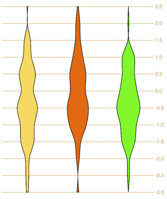
  var fillScale = d3.scaleOrdinal().range(["#fcd88a", "#cf7c1c", "#93c464"])

  var normal = d3.randomNormal()
  var sampleData1 = d3.range(100).map(d => normal())
  var sampleData2 = d3.range(100).map(d => normal())
  var sampleData3 = d3.range(100).map(d => normal())           1
  var histoChart = d3.histogram();

  histoChart
   .domain([ -3, 3 ])
   .thresholds([ -3, -2.5, -2, -1.5, -1,
           -0.5, 0, 0.5, 1, 1.5, 2, 2.5, 3 ])                  2
   .value(d => d)

   var yScale = d3.scaleLinear().domain([ -3, 3 ]).range([ 400, 0 ]);
   var yAxis = d3.axisRight().scale(yScale)
    .tickSize(300)
   d3.select("svg").append("g").call(yAxis)

   var area = d3.area()
      .x0(d => -d.length)
      .x1(d => d.length)                                       3
      .y(d => yScale(d.x0))
      .curve(d3.curveCatmullRom)                               4

  d3.select("svg")
    .selectAll("g.violin")
    .data([sampleData1, sampleData2, sampleData3])
    .enter()
    .append("g")
    .attr("class", "violin")
    .attr("transform", (d,i) => `translate(${50 + i * 100},0)`)
    .append("path")
    .style("stroke", "black")
    .style("fill", (d,i) => fillScale(i))
    .attr("d", d => area(histoChart(d)))                       5
You see, because D3 provides you with that intermediary transformed data, you can decide how you might want to draw the final data visualization.
In this section you’ll learn how to create a pie chart and transform it into a ring chart. You’ll also learn how to use tweening to properly transition it when you change its data source. After you create it, you can pass it an array of values (which I’ll call a dataset), and it will compute the necessary starting and ending angles for each of those values to draw a pie chart. When we pass an array of numbers as our dataset to a pie layout in the console, as in the following code, it doesn’t produce any kind of graphics like those seen in figure 5.6 but rather results in the response shown in figure 5.7.
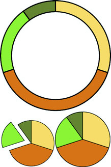
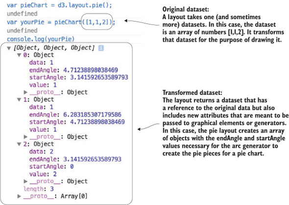
var pieChart = d3.pie();
var yourPie = pieChart([1,1,2]);
Our pieChart function created a new array of three objects. The startAngle and endAngle for each of the data values draw a pie chart with one piece from 0 radians to pi radians, the next from pi to 1.5 pi radians, and the last from 1.5 pi radians to 2 pi radians. But this isn’t a drawing or SVG code like the line and area generators produced. It doesn’t even have the virtue of the histogram response, which at least seems to map directly to coordinates (or coordinates we can pass to a scale).
These are settings that need to be passed to a generator to make each of the pieces of our pie chart. This particular generator is d3.arc and it’s instantiated like the D3 generators we worked with in chapter 4. As an aside, JavaScript has a whole class of functions known as generators, so keep in mind I’m referring to D3 functions that “generate” drawing instructions for paths. d3.arc has a few settings, but the only one we need for this first example is the outerRadius, which allows us to set a dynamic or fixed radius for our arcs:
var newArc = d3.arc();
newArc.innerRadius(0)
    .outerRadius(100)                      1
console.log(newArc(yourPie[0]));           2
Now that you know how the arc constructor works and that it works with our data, all we need to do is bind the data created by our pie layout and pass it to <path> elements to draw our pie chart. The pie layout is centered on the 0,0 point in the same way as a circle. If we want to draw it at the center of our canvas, we need to create a new <g> element to hold the <path> elements we’ll draw and then move the <g> to the center of the canvas:
var fillScale = d3.scaleOrdinal()
   .range(["#fcd88a", "#cf7c1c", "#93c464", "#75734F"])
d3.select("svg")
  .append("g")                                          1
  .attr("transform","translate(250,250)")
  .selectAll("path")
  .data(yourPie)                                        2
  .enter()
  .append("path")
  .attr("d", newArc)                                    3
  .style("fill", (d,i) => fillScale(i))
  .style("stroke", "black")
  .style("stroke-width", "2px");
Figure 5.8 shows our pie chart. The pie chart layout, like most layouts, grows more complicated when you want to work with JSON object arrays rather than number arrays. Let’s bring back our tweets.json from chapter 2. We can nest and measure it to transform it from an array of tweets into an array of Twitter users with their number of tweets computed.
We get there by using d3.nest() with keys based on the user attribute of tweets. After nesting the tweets, we can measure their attributes and use those numerical measures for charts like these:
d3.json("tweets.json", pieChart)
function pieChart(data) {
   var nestedTweets = d3.nest()
      .key(d => d.user)
      .entries(data.tweets);
   nestedTweets.forEach(d => {
      d.numTweets = d.values.length;
      d.numFavorites = d3.sum(d.values, p => p.favorites.length)         1
      d.numRetweets = d3.sum(d.values, p => p.retweets.length)           2
   });
}
If we execute pieChart(nestedTweets)as with the earlier array illustrated in figure 5.7, it will fail, because it doesn’t know that the numbers we should be using to size our pie pieces come from the .numTweets attribute. Most layouts, pie included, can define where the values are in your array by defining an accessor function to get to those values. In the case of nestedTweets, we define pieChart.value() to point at the numTweets attribute of the dataset it’s being used on. While we’re at it, let’s set a value for our arc generator’s innerRadius so that we create a donut chart instead of a pie chart:
pieChart.value(d => d.numTweets);
newArc.innerRadius(20)
var yourPie = pieChart(nestedTweets);
With those changes in place, we can use the same code as before to draw the pie chart in figure 5.9.
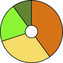
You’ll notice that for each value in nestedTweets, we totaled the number of tweets and also used d3.sum()to total the number of retweets and favorites (if any). Because we have this data, we can adjust our pie chart to show pie pieces based not on the number of tweets but on those other values. One of the core uses of a layout in D3 is to update the graphical chart. All we need to do is make changes to the data or layout and then rebind the data to the existing graphical elements. By using a transition, we can see the pie chart change from one form to the other. Running the following code first transforms the pie chart to represent the number of favorites instead of the number of tweets. The next block causes the pie chart to represent the number of retweets. The final forms of the pie chart after running that code are shown in figure 5.10:
pieChart.value(d => d.numFavorites)
d3.selectAll("path").data(pieChart(nestedTweets))
  .transition().duration(1000).attr("d", newArc);
pieChart.value(d => d.numRetweets);
d3.selectAll("path").data(pieChart(nestedTweets))
  .transition().duration(1000).attr("d", newArc);
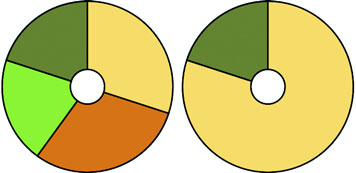
Although the results are what we want, the transition can leave a lot to be desired. Figure 5.11 shows snapshots of the pie chart transitioning from representing the number of tweets to representing the number of favorites. As you’ll see by running the code and comparing these snapshots, the pie chart doesn’t smoothly transition from one state to another but instead distorts significantly.
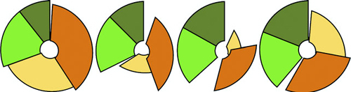
The reason you see this wonky transition is because, as you learned earlier, the default data-binding key is array position. When the pie layout measures data, it also sorts it in order from largest to smallest to create a more readable chart. But when you recall the layout, it re-sorts the dataset. The data objects are bound to different pieces in the pie chart, and when you transition between them graphically, you see the effect shown in figure 5.11. To prevent this from happening, we need to disable this sort:
pieChart.sort(null);
The result is a smooth graphical transition between numTweets and numRetweets, because the object position in the array remains unchanged, and so the transition in the drawn shapes is straightforward. But if you look closely, you’ll notice that the circle deforms a bit because the default transition() behavior doesn’t deal with arcs well. It’s not transitioning the radians in our arcs; instead, it’s treating each arc as a geometric shape and transitioning from one to another.
This becomes obvious when you look at the transition from either of those versions of our pie chart to one that shows numFavorites, because several of the objects in our dataset have 0 values for that attribute, and one of them changes size dramatically. To clean this all up and make our pie chart transition properly, we need to change the code. Some of this you’ve already dealt with, such as using key values for your created elements and using them in conjunction with exit and update behavior. But to make our pie slices transition in a smooth, graphical manner, we need to extend our transitions, as shown in the following listing, to include a custom tween to define how an arc can grow or shrink graphically into a different arc.
pieChart
    .value(d => d.numTweets)
    .sort(null)                                         1

  var tweetsPie = pieChart(nestedTweets)

  pieChart.value(d => d.numRetweets)
  var retweetsPie = pieChart(nestedTweets)

  nestedTweets.forEach((d,i) => {
    d.tweetsSlice = tweetsPie[i]
    d.retweetsSlice = retweetsPie[i]
})                                                      2

...
.selectAll("path")
.data(nestedTweets, d => d.key)                         3
.enter()
.append("path")
.attr("d", d => newArc(d.tweetsSlice))
.style("fill", (d,i) => fillScale(i))
...

d3.selectAll("path")
  .transition()
  .duration(1000)
  .attrTween("d", arcTween)                             4

function arcTween(d) {
  return t => {                                         5
    var interpolateStartAngle = d3
    .interpolate(d.tweetsSlice.startAngle, d.retweetsSlice.startAngle);
    var interpolateEndAngle = d3
    .interpolate(d.tweetsSlice.endAngle, d.retweetsSlice.endAngle);
      d.startAngle = interpolateStartAngle(t);
      d.endAngle = interpolateEndAngle(t);
       return newArc(d);                                6
  }
}
The result of the code in listing 5.4 is a pie chart that cleanly transitions the individual arcs.
We could label each pie piece <path> element, color it according to a measurement or category, or add interactivity. But rather than spend a chapter creating the greatest pie chart application you’ve ever seen, we’ll move on to another kind of layout that’s often used: the stack layout.
You saw the effects of the stack layout in the last chapter when we created a stacked area chart, and which we introduced by referring to the Wired streamgraph that we see again in figure 5.12. This time, we’ll make a streamgraph, but we’ll begin with a simple stacking function and then use it in more complex ways. The d3.stack layout formats your data so that it can be easily passed to d3.area to draw a stacked graph or streamgraph.
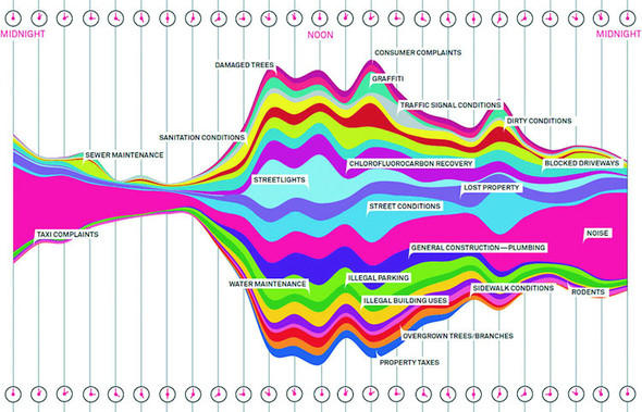
To implement this, we’ll use the area generator in tandem with the stack layout in listing 5.5. This general pattern should be familiar to you by now:
The first step is to take our original movies.csv data and transform it into an array of movie objects that each have an array of values at points that correspond to the thickness of the section of the streamgraph that they represent.
d3.csv("movies.csv", dataViz);
function dataViz(data) {

  var xScale = d3.scaleLinear().domain([0, 10]).range([0, 500]);
  var yScale = d3.scaleLinear().domain([0, 100]).range([500, 0]);
  var movies = ["titanic", "avatar", "akira", "frozen", "deliverance", "avengers"]

  var fillScale = d3.scaleOrdinal()
    .domain(movies)
    .range(["#fcd88a", "#cf7c1c", "#93c464", "#75734F", "#5eafc6", "#41a368"])

  stackLayout = d3.stack()
     .keys(movies)                                 1

  var stackArea = d3.area()
    .x((d, i) => xScale(i))
    .y0(d => yScale(d[0]))
    .y1(d => yScale(d[1]));                        2

  d3.select("svg").selectAll("path")
    .data(stackLayout(data))
    .enter().append("path")
    .style("fill", d => fillScale(d.key))          3
    .attr("d", d => stackArea(d));
}
After our stackLayout function processes our dataset, we can get the results by running stackLayout(stackData). The layout creates an array of [ y0, y1 ] values corresponding to the top and bottom of the object at the position of the item in the parent array. If we use the stack layout to create a streamgraph, it requires a corresponding area generator:
   var stackArea = d3.area()
   .x((d,i) => xScale(i))                 1
   .y0(d => yScale(d[0]))
   .y1(d => yScale(d[1]));
After we have our data, layout, and area generator in order, we can call them all as part of the selection and binding process. This gives a set of SVG <path> elements the necessary shapes to make our chart. The result, as shown in figure 5.13, isn’t a streamgraph but rather a stacked area chart of the kind we made manually in the last chapter. This isn’t that different from a streamgraph, as you’ll soon find out.
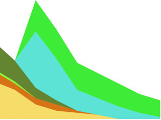
The stack layout has an .offset() function that determines the relative positions of the areas that make up the chart. Although we can write our own offset functions to create exotic charts, D3 includes several functions to achieve the typical effects we’re looking for. We’ll use the d3.stackOffsetSilhouette keyword, which centers the drawing of the stacked areas around the middle. Another method you’ll need to take advantage of for creating streamgraphs is .order(), which determines the order in which areas are drawn so that you can alternate them like in a streamgraph. We’ll use d3.stackOrderInsideOut because that produces the best streamgraph effect. We can change the area constructor to use the basis interpolator because that gave the best look in our earlier streamgraph example and finally update the domain of our yScale to match up with the centered baseline around which the streamgraph is drawn:
stackLayout.offset(d3.stackOffsetSilhouette).order(d3.stackOrderInsideOut)
stackArea.curve(d3.curveBasis)
yScale.domain([-50, 50])
This results in a cleaner streamgraph than our example from chapter 4 and is shown in figure 5.14.
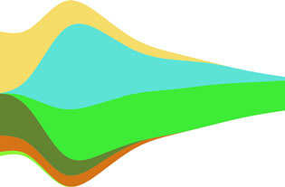
Is it useful? Well, it is useful, for various reasons, not least of which is because the area in the chart corresponds graphically to the aggregate profit of each movie.
But sometimes a simple stacked bar graph is better. Layouts can be used for various types of charts, and the stack layout is no different. If we restore the .offset() and .order() back to the default settings, we can use the stack layout to create a set of rectangles that makes a traditional stacked bar chart:
var xScale = d3.scaleLinear().domain([0, 10]).range([0, 500])
var yScale = d3.scaleLinear().domain([0, 60]).range([480, 0])
var heightScale = d3.scaleLinear().domain([0, 60]).range([0, 480])

stackLayout = d3.stack().keys(movies)

d3.select("svg").selectAll("g.bar")
  .data(stackLayout(data))
  .enter()
  .append("g")
  .attr("class", "bar")
  .each(function(d) {                                    1
     d3.select(this).selectAll("rect")
       .data(d)
       .enter()
       .append("rect")
       .attr("x", (p,q) => xScale(q) + 30)               2
       .attr("y", p => yScale(p[1]))                     2
       .attr("height", p => heightScale(p[1] - p[0]))
       .attr("width", 40)                                3
       .style("fill", fillScale(d.key));
    });
In many ways, the stacked bar chart in figure 5.15 is much more readable than the streamgraph. It presents the same information, but the y-axis tells us exactly how much money a movie made. There’s a reason why bar charts, line charts, and pie charts are the standard chart types found in your spreadsheet. Streamgraph, stacked bar charts, and stacked area charts are fundamentally the same thing and rely on the stack layout to format your dataset to draw it. Because you can deploy them equally easily, your decision whether to use one or the other can be based on user testing rather than your ability to create awesome dataviz.
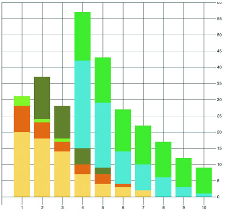
The layouts we’ve looked at so far, as well as the associated methods and generators, have broad applicability. Now we’ll look at a pair of layouts that don’t come with D3 which are designed for more specific kinds of data: the Sankey diagram and the word cloud. Even though these layouts aren’t as generic as the layouts included in the core D3 library that we’ve looked at, they have some prominent examples and can come in handy.
The examples we’ve touched on in this chapter are a few of the layouts that come with the core D3 library. You’ll see a few more in later chapters, and we’ll focus specifically on the force layout in chapter 7. But layouts outside of core D3 may also be useful to you. These layouts tend to use specifically formatted datasets or different terminology for layout functions.
Sankey diagrams consist of two types of objects: nodes and edges. In this case, the nodes are the web pages or events, and the edges are the traffic between them. This differs from the hierarchical data you worked with before, because nodes can have many overlapping connections (figure 5.16) to show event flow or user flow from one part of your website to another.
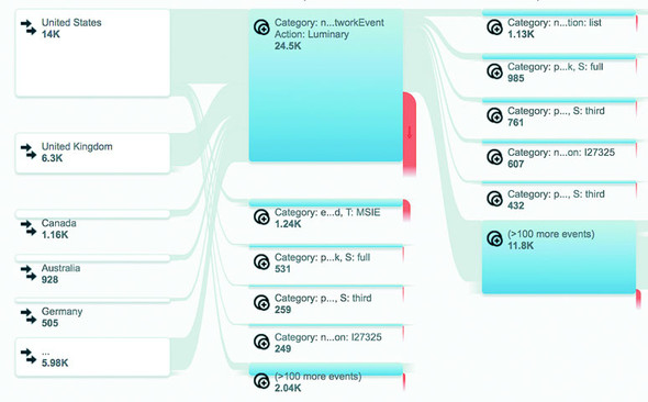
The D3 version of the Sankey layout is a plugin written by Mike Bostock a couple years ago and later updated for D3v4 by Kshitij Aranke. You can find it at https://github.com/d3/d3-sankey. The Sankey layout has a few examples and sparse documentation—one of the drawbacks of non-core layouts. Another minor drawback is that non-core layouts don’t always follow the patterns of the core layouts in D3. To understand the Sankey layout, you need to examine the format of the data, the examples, and the code itself.
The core D3 library comes with a number of layouts and useful functions, but you can find even more at https://github.com/d3/d3-plugins or by searching NPM. Besides the two non-core layouts discussed in this chapter, we’ll look at the geo plugins in chapter 7 when we deal with maps. Also available is a fisheye distortion lens, a canned boxplot layout, a layout for horizon charts, and more exotic plugins for Chernoff faces and implementing the superformula (a mathematical expression that allows you to create thousands of different shape types by modifying variables).
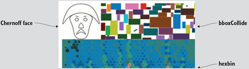
The data is a JSON array of nodes and a second JSON array of links. Get used to this format, because it’s the format of most of the network data we’ll use in chapter 7. For our example, we’ll look at the traffic flow in a website that sells milk and milk-based products. We want to see how visitors move through the site from the home page to the store page to the various product pages, as shown in the following listing. In the parlance of the data format we need to work with, the nodes are the web pages, the links are the visitors who go from one page to another (if any), and the value of each link is the total number of visitors who move from that page to the next.
{
  "nodes":[                                   1
    {"name":"index"},
    {"name":"about"},
    {"name":"contact"},
    {"name":"store"},
    {"name":"cheese"},
    {"name":"yoghurt"},
    {"name":"milk"}
  ],
  "links":[
    {"source":0,"target":1,"value":25},       2
    {"source":0,"target":2,"value":10},
    {"source":0,"target":3,"value":40},
    {"source":1,"target":2,"value":10},
    {"source":3,"target":4,"value":25},
    {"source":3,"target":5,"value":10},
    {"source":3,"target":6,"value":5},
    {"source":4,"target":6,"value":5},
    {"source":4,"target":5,"value":15}
  ]
}
The nodes array is clear—each object represents a web page. The links array is a bit more opaque, until you realize the numbers represent the array position of nodes in the node array. When links[0] reads "source": 0, it means that the source is nodes[0], which is the index page of the site. It connects to "target": 1 so to nodes[1], the about page, and "value": 25 indicates that 25 people navigated from the home page to the about page. That defines our flow—the flow of traffic through a site.
Depending on how your project is structured, you can install d3-sankey using npm I d3-sankey or download the latest release and include it in your HTML using script tags.
The Sankey layout is initialized like any layout:
var sankey = d3.sankey()
   .nodeWidth(20)                        1
   .nodePadding(200)                     2
   .size([460, 460])
   .nodes(data.nodes)
   .links(data.links)
   .layout(200);                         3
Until now, you’ve only seen .size(). It controls the graphical extent that the layout uses. The rest you’d need to figure out by looking at the example, experimenting with different values, or reading the sankey.js code itself. Most of it will quickly make sense, in particular if you’re familiar with the .nodes() and .links() convention used in D3 network visualizations. The .layout() setting is pretty hard to understand without diving into the code, but I’ll explain that next.
After we define our Sankey layout as in listing 5.7, we need to draw the chart by selecting and binding the necessary SVG elements. In this case, that typically consists of <rect> elements for the nodes and <path> elements for the flows. We’ll also add <text> elements to label the nodes.
var sankey = d3.sankey()
   .nodeWidth(20)
   .nodePadding(200)
   .size([460, 460])
   .nodes(data.nodes)
   .links(data.links)
   .layout(200)

var intensityRamp = d3.scaleLinear()
   .domain([0,d3.max(data.links, d => d.value) ])
   .range(["#fcd88b", "#cf7d1c"])
d3.select("svg").append("g")
   .attr("transform", "translate(20,20)").attr("id", "sankeyG");          1
d3.select("#sankeyG").selectAll(".link")
   .data(data.links)
   .enter().append("path")
   .attr("class", "link")
   .attr("d", sankey.link())                                              2
   .style("stroke-width", d => d.dy)                                      3
   .style("stroke-opacity", .5)
   .style("fill", "none")
   .style("stroke", d => intensityRamp(d.value))                          4
   .sort((a, b) => b.dy - a.dy)
   .on("mouseover", function() {
       d3.select(this).style("stroke-opacity", .8); })                    5
   .on("mouseout", () => {
d3.selectAll("path.link").style("stroke-opacity", .5); })

d3.select("#sankeyG").selectAll(".node")
   .data(data.nodes)
   .enter().append("g")
   .attr("class", "node")
   .attr("transform", d => `translate(${d.x},${d.y})`)                    6
d3.selectAll(".node").append("rect")
   .attr("height", d => d.dy)
   .attr("width", 20)
   .style("fill", "#93c464")
   .style("stroke", "gray")
d3.selectAll(".node").append("text")
   .attr("x", 0)
   .attr("y", d => d.dy / 2)
   .attr("text-anchor", "middle")
   .style("fill", "black")
   .text(d => d.name)
The implementation of this layout has interactivity, as shown in figure 5.17. Diagrams like these, with wavy paths overlapping other wavy paths, need interaction to make them legible to your site visitor. In this case, it differentiates one flow from another.
With a Sankey diagram like this at your disposal, you can track the flow of goods, visitors, or anything else through your organization, website, or other system. Although you could expand on this example in any number of ways, I think one of the most useful is also one of the simplest. Remember, layouts aren’t tied to particular shape elements. In certain cases, like with the flows in the Sankey diagram, you’ll have a hard time adapting the layout data to any element other than a <path>, but the nodes don’t need to be <rect> elements. If we adjust our code, we can easily make nodes that are circles:
  sankey.nodeWidth(1);
 d3.selectAll(".node").append("circle")
   .attr("height", d => d.dy)
   .attr("r", d => d.dy / 2)
   .attr("cy", d => d.dy / 2)
   .style("fill", "#93c464")
Don’t shy away from experimenting with tweaks to traditional charting methods. Using circles instead of rectangles, like in figure 5.18, may seem frivolous, but it may be a better fit visually, or it may distinguish your Sankey from all the boring sharp-edged Sankeys out there. In the same vein, don’t be afraid of leveraging D3’s capacity for information visualization to teach yourself how a layout works. You’ll remember that d3.sankey has a layout() function. It adjusts and attracts and relaxes the pull of each connected node to each other to achieve the most efficient arrangement of nodes and edges. You can see how it does that by reading the code, but there’s another, more visual way to see how this function works: by using transitions and creating a function that updates the .layout().property dynamically. This allows you to “see” the layout function in action.
Although you may think of data visualization as all the graphics in this book, it’s also simultaneously a graphical representation of the methods you used to process the data. In certain cases, like the Sankey diagram here or the force-directed network visualization you’ll see in the next chapter, the algorithm used to sort and arrange the graphical elements is front and center. After you have a layout that displays properly, you can play with the settings and update the elements as you’ve done with the Sankey diagram to better understand how the algorithm works visually.
First, we need to add an onclick function to make the chart interactive, as shown in listing 5.8. We’ll attach this function to the <svg> element itself, but you could as easily add a button the way we did in chapter 3.
The runMoreLayouts() function does two things. It updates the sankey.layout() property by incrementing a variable and setting it to the new value of that variable. It also selects the graphical elements that make up your chart (the <g> and <path> elements) and redraws them with the updated settings. By using transition() and delay(), you’ll see the chart dynamically adjust.
var numLayouts = 1;
d3.select("svg").on("click", runMoreLayouts);
sankey.layout(numLayouts);                         1
function runMoreLayouts() {
   numLayouts += 20;                               2
   sankey.layout(numLayouts);
   d3.selectAll(".link")
      .transition()
      .duration(500)
      .attr("d", sankey.link())                    3
   d3.selectAll(".node")
      .transition()
      .duration(500)
      .attr("transform", d => "translate(" + d.x + "," + d.y + ")")
}
The end result is a visual experience of the effect of the .layout() function. This function specifies the number of passes that d3.sankey makes to determine the best position of the lines representing flow. You can see snapshots of this in figure 5.19 showing the lines sort out and get out of each other’s way. This kind of position optimization is a common technique in information visualization and drives the force-directed network layout that you’ll see in chapter 6. In the case of our Sankey example, even one pass of the layout provides good positioning. That’s because this is a simple dataset and it stabilizes quickly. As you can see as you click your chart, and in figure 5.19, the layout doesn’t change much with progressively higher numbers of passes in the layout() setting.
It should be clear by this example that when you update the settings of the layout, you can also update the visual display of the layout. You can use animations and transitions by calling the elements and setting their drawing code or position to reflect the changed data. You’ll see much more of this in later chapters.
One of the most popular information visualization charts is also one of the most maligned: the word cloud. Also known as a tag cloud, the word cloud uses text and text size to represent the importance or frequency of words. Figure 5.20 shows a thumbnail gallery of 15 word clouds derived from text in a species biodiversity database. Word clouds often rotate the words to set them at right angles or jumble them at random angles to improve the appearance of the graphics. Word clouds, like streamgraphs, receive criticism for being hard to read or presenting too little information, but both are surprisingly popular with audiences.
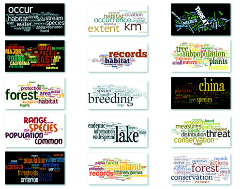
I created these word clouds using my data with the popular Java applet Wordle, which provides an easy UI and a few aesthetic customization choices. Wordle has flooded the Internet with word clouds because it lets anyone create visually arresting but problematic graphics by dropping text onto a page. This has caused much consternation among data visualization experts, who think word clouds are evil because they embed no analysis in the visualization and only highlight superficial data such as the quantity of words in a blog post.
But word clouds aren’t evil. First of all, they’re popular with audiences. But more than that, words are remarkably effective graphical objects. If you can identify a numerical attribute that indicates the significance of a word, then scaling the size of a word in a word cloud relays that significance to your reader.
Let’s start by assuming we have the right kind of data for a word cloud. Fortunately, we do: the top 20 words used in this chapter, with the number of each word, as shown in the following listing.
text,frequency
layout,63
function,61
data,47
return,36
attr,29
chart,28
array,24
style,24
layouts,22
values,22
need,21
nodes,21

pie,21
use,21
figure,20
circle,19
we'll,19
zoom,19
append,17
elements,17
To create a word cloud with D3, you have to use another layout that isn’t in the core library, created by Jason Davies (who created the sentence trees using the tree layout shown in chapter 6) that implements an algorithm written by Jonathan Feinberg (http://static.mrfeinberg.com/bv_ch03.pdf). The layout, d3.cloud(), is available on GitHub updated for v4 at https://github.com/sly7-7/d3-cloud. It requires that you define what attribute will determine word size and what size you want the word cloud to lay out for, as shown in listing 5.10.
Unlike most other layouts, cloud()fires a custom event end that indicates it’s done calculating the most efficient use of space to generate the word cloud. The layout then passes to this event the processed dataset with the position, rotation, and size of the words. We can then run the cloud layout without ever referring to it again, and we don’t even need to assign it to a variable, as we do in the following listing. If we plan to reuse the cloud layout and adjust the settings, we assign it to a variable like with any other layout.
   var wordScale=d3.scaleLinear().domain([0,75]).range([10,120]);        1
   d3.cloud()
     .size([500, 500])
     .words(data)                                                        2
     .rotate(0)
     .fontSize(d => wordScale(d.frequency))                              3
     .on("end", draw)
     .start();                                                           4
   function draw(words) {                                                5
     var wordG = d3.select("svg").append("g")
       .attr("id", "wordCloudG")
       .attr("transform","translate(250,250)");
     wordG.selectAll("text")
       .data(words)
       .enter()
       .append("text")
       .style("font-size", d => d.size + "px")
       .style("fill", "#4F442B")
       .attr("text-anchor", "middle")
       .attr("transform", d =>
            "translate(" + [d.x, d.y] + ")rotate(" + d.rotate + ")")     6
       .text(d => d.text);
  };
This code creates an SVG <text> element that’s rotated and placed according to the code. None of our words is rotated, so we get the staid word cloud shown in figure 5.21.
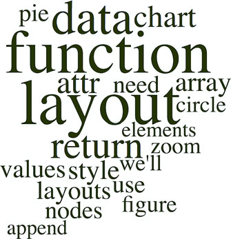
It’s simple enough to define rotation, and we only need to set a rotation value in the cloud layout’s .rotate() function:
   randomRotate=d3.scaleLinear().domain([0,1]).range([-20,20]);       1
    d3.cloud()
      .size([500, 500])
      .words(data)
      .rotate( () => randomRotate(Math.random()))                     2
      .fontSize(d => wordScale(d.frequency))
      .on("end", draw)
      .start();
At this point, we have your traditional word cloud (figure 5.22), and we can tweak the settings and colors to create anything you’ve seen on Wordle. But now let’s look at why word clouds get such a bad reputation. We’ve taken an interesting dataset, the most common words in this chapter, and other than size them by their frequency, done little more than place them on screen and jostle them a bit. We have different channels for expressing data visually, and in this case the best channels that we have, besides size, are color and rotation.
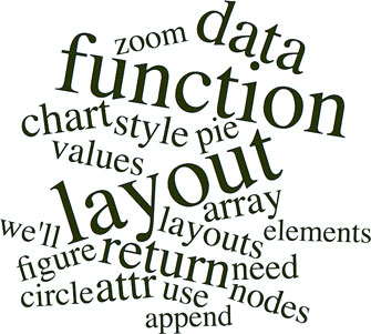
With that in mind, let’s create a keyword list for the words that are in the index in the back of the book. We’ll place those keywords in an array and use them to highlight the words in our word cloud that appear in the glossary. The code in the following listing also rotates shorter words 90 degrees and leaves the longer words unrotated so that they’ll be easier to read.
var keywords = ["layout", "zoom", "circle", "style", "append", "attr"]          1
d3.cloud()
  .size([500, 500])
  .words(data)
  .rotate(d => d.text.length > 5 ? 0 : 90)                                    2
  .fontSize(d => wordScale(d.frequency))
  .on("end", draw)
  .start();
function draw(words) {
  var wordG = d3.select("svg").append("g")
    .attr("id", "wordCloudG").attr("transform","translate(250,250)");
  wordG.selectAll("text")
     .data(words)
     .enter()
     .append("text")
     .style("font-size", d => d.size + "px")
     .style("fill", d => keywords.indexOf(d.text) > -1 ? "#FE9922" : "#4F442B") 3
     .style("opacity", .75)
     .attr("text-anchor", "middle")
     .attr("transform", d => "translate(" + [d.x, d.y] + ") rotate(" + d.rotate + ")")
.text(d => d.text);
 };
The word cloud in figure 5.23 is fundamentally the same, but instead of using color and rotation for aesthetics, we used them to encode information in the dataset. You can read about more controls over the format of your word cloud, including selecting fonts and padding, in the layout’s documentation at www.jasondavies.com/wordcloud/about/.
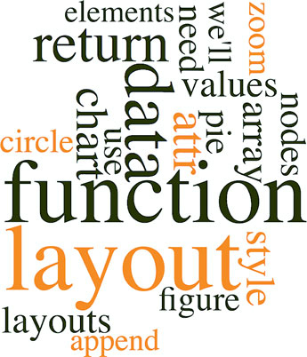
Layouts like the word cloud aren’t suitable for as wide a variety of data as other layouts, but because they’re so easy to deploy and customize, you can combine them with other charts to represent the multiple facets of your data. You’ll see this kind of synchronized chart in chapter 9.
Trump Has Spent a Fraction of What Clinton Has on Ads
I started this piece thinking I’d remake Alicia’s classic stacked area chart showing presidential ad buys by state. Graphing the 2016 data presented a problem though—Trump spent several weeks during the summer spending little or no money on television ads.
Rather than using a smaller time scale or visualizing the percentage allocation of a small amount of money, I decided focus more on the total amount of money spent. A streamgraph let me do that while still showing part of each campaign’s state by state strategy.
To smooth over variations in spending between different days of the week and reduce the data sent to the client, I aggregated spending by week and used the d3.curveMonotoneX interpolater to stop neighboring curves from overlapping each other.
My editor and I went back and forth a bit on the form of the small multiple charts at the top. Initially, they were bar charts, but we switched to area charts to introduce the rorschach blot form. It isn’t exactly the outline of the streamgraph, but d3.area().y1(d => -y(d.val)).y2(d => y(d.val)) gets close.
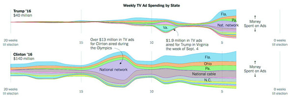
Figure from The New York Times, October 21 ©2016 The New York Times. All rights reserved. Used by permission and protected by the Copyright Laws of the United States. The printing, copying, redistribution, or retransmission of this content without express written permission is prohibited.
The next three chapters deal with the three families of data visualization that fall under the auspices of “complex” data visualization. These three forms—hierarchical, network, and geospatial—all vary from traditional numerical data visualization in that they try to encode something besides numerical precision. You will hear, when presenting data in this way, more resistance to these forms in industry, because your audience assumes that numerical precision is the only reason for data visualization. This is often expressed as “show me the data,” when the data itself has no raw form. Data visualization is about how we decide to surface insights, and those insights cannot all be shown with one chart type. As a result, your decision to preference the network structure will cause the geospatial patterns to suffer, the same way your decision to show the numerical structure will cause the hierarchical patterns to suffer. In chapter 6 we start with hierarchical data visualization, which is the representation of how data is nested into categories and bands. Chapter 7 deals with network data visualization, which emphasizes the relationships between data. Chapter 8 deals with geospatial data visualization and therefore focuses on how spatial distribution influences the pattern of the data.
Complex data visualization is defined by its encoding of data types other than numerical data. We’ll start with dealing with hierarchical data, which encodes how things are related to other things, whether through dependency, lineage, or categorization. There are four different layouts we’ll look at in this chapter, each of which uses different methods to show a node and indicate the parent-child relationships between those nodes. For two of those charting methods—circle packing and treemaps—the way we signal parent-child relationship is via enclosure, which is to say that the parent graphical mark is drawn around the child graphical mark. In the other two charts, parent-child relationship is signaled by adjacency (in the case of the partition layout) or via connection (using lines in the dendrogram). See figure 6.1.
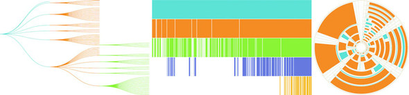
When you’re designing and building data visualization products, it’s easy to think about visualizing numerical data. We grew up learning about bar charts and line charts, and the people we build dashboards and data visualization for are used to seeing them. When most people talk about data, they mean numerical data, and when they talk about data visualization, they mean visualizing numerical data so that they can precisely measure the heights and slopes and differences. It can be a tough sell to tell them that you want to obscure the numerical precision of the data in favor of showing other patterns. That’s one of the challenges of using complex data visualization like hierarchical layouts and one that you’re going to have to tackle head on.
Hierarchical data, which is any data that maps the parent to child relationships, exists in every system: people in family trees, business org charts, and even categories like the food pyramid. If you only show the numerical patterns, then the best charts you can use are the ones that encode using length, which means bar charts and line charts. But if you only make decisions based on what you can measure with bar charts and line charts, then you hamstring your organization. A classic example of the value of hierarchical data visualization comes from data dashboards with their innumerable filters.
A/B testing is used everywhere now, and visualization of A/B test results is a key requirement of data visualization. The people using those A/B testing visualizations are obsessed with numbers, particularly the scores that a test gets across a set of key metrics, which is almost always tied to another number: the statistical significance between that cell’s score and the control cell’s score. Imagine an A/B testing dashboard for your data visualization firm that shows test results and which you could slice and dice by country, gender, or the subscription level of the user. Your latest test rolls out changes to user experience so that certain clients get all their results as pie charts, while other clients only get results in animated gifs.
Let’s put the results of each test cell on a tabular chart, with the change in each metric so people can see the numbers. We’ll use color to highlight whether a particular metric in a particular cell is a “win” or a “loss” because, hey, we’re data visualization professionals. Here you can see how the test cells did in a traditional tabular view (figure 6.2). Looks like GIFs everywhere is the right way to go, right?
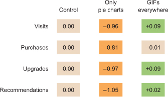
If we nest the test results hierarchically, we can’t use a data visualization that shows numeric values well. We’ll be left with the color we were using to encode statistically significant wins and losses in metrics. But though we lose numerical precision, we gain the ability to see the pattern of wins and losses across our dimensions. Three cells, 4 subscription categories, 20 countries, 5 metrics = 1200 different combinations. That would be a pretty long table, but in a hierarchical data visualization like a circle pack, it looks like figure 6.3.
This kind of quick overview gives us a sense of the hierarchical pattern in the wins and losses. Each black circle represents a cell, the control cell is in the top left, the top right is our Only Pie Charts cell, and the bottom circle is our GIFs Everywhere cell. We can see that like our summary table, it’s clear that Only Pie Charts isn’t working across countries or subscription levels, but it does seem like GIFs Everywhere has more losses than we might expect. It also highlights one of the issues we need to address when deploying hierarchical data visualization, the order of the hierarchy can highlight or obscure patterns.
If we order the hierarchy differently and put countries under cells, we get a more interesting pattern (figure 6.4).
Although this doesn’t change our view of Only Pie Charts, which is still a miserable failure (Sorry, Robert![1]), we can see that the GIFs Everywhere losses seem to map to certain countries. They should. When I built the model that generated this random data, I made sure that Only Pie Charts showed statistically significant losses across the board, whereas GIFs Everywhere was supposed to be a success in certain countries, bad in others, and a wash otherwise. In a traditional dashboard, maybe an analyst would have stumbled on this by filtering down to those countries, or maybe they would have seen the overall success (you showed them the numbers, after all, the way they wanted) and rolled out the new features, even though it could have caused critical damage to your firm’s success in some of those countries.
Robert Kosara, chief scientist at Tableau, published a famous paper saying that pie charts aren’t so bad. See https://eagereyes.org/pie-charts.
In order to make hierarchical data visualization products, we need hierarchical data. While hierarchical data is everywhere, D3 expects it in a particular format for its hierarchical layouts. That formatting is accomplished by using d3.hierarchy and passing to d3.hierarchy a hierarchical JavaScript object along with settings for how the child nodes are accessed and any numerical value assigned to the nodes. Let’s assume that we have hierarchical data that looks like this:
var root = {id: "All Tweets", children: [
{id: "Al's Tweets", children: [{id: "tweet1"}, {id: "tweet2"}]},
{id: "Roy's Tweets", children: [{id: "tweet1"}, {id: "tweet2"}]}
...
We’d need to pass that data to d3.hierarchy to create the kind of hierarchical data that D3 expects for its hierarchical layouts:
var root = d3.hierarchy(root, function (d) {return d.children})
The resulting object is extended to include methods for each of the nodes that allow you to access descendants and ancestors so that you can filter your hierarchical data easily in tandem or separate from passing it to hierarchical layouts.
Hierarchical JSON or hierarchical objects refer to any JSON or JavaScript object that acts as a root node with properties (typically called children or values) that are arrays of more objects, typically with the same properties as the root node. In hierarchical terminology, the root node is the top-most parent, and a leaf node is a child with no children.
We’ve seen d3.nest many times already, where we’ve used it to flatten data. The other use, which reflects the name of the function, is to create hierarchical datasets out of flat data. If, for instance, we had an array of objects that looked like this
{
   cell: "gifs everywhere",
   country:"Norway",
   metric:"recommendations",
   significance:0.07408233813305311,
   subscription:"deluxe",
   value:0.4472930460902817
}
and we passed that array to a d3.nest function that referenced all of its categorical attributes as keys, like this
var nestedDataset = d3.nest()
  .key(d => d.cell)
  .key(d => d.metric)
  .key(d => d.subscription)
  .key(d => d.country)
  .entries(dataset)
the result would be nested hierarchical JavaScript object almost ready to be visualized by a D3 hierarchical layout. The only step remaining is that we want a hierarchical object and d3.nest returns an array, so we need to put the results of the array inside an object, as you’ll see in all the following examples.
Version 4 of D3 introduces a new piece of functionality for building hierarchical data from tabular data: d3.stratify. Much of our hierarchical data comes in the form of tabular data indicating the parent-child relationship via columns. Let’s say you downloaded your family tree from your favorite genealogy package and it gave you data that looked like the following listing.
child, parent
you, your mom
you, your dad
your dad, your paternal grandfather
your dad, your maternal grandmother
your mom, your maternal grandfather
your mom, your maternal grandmother
, you
You could pass this data to a d3.stratify function formatted like this:
d3.stratify()
  .parentID(d => d.child)
  .id(d => d.parent)
And it will give you back a hierarchy with “you” as the root node. I know what you’re thinking: “You’re setting the parentID as the child—your example dataset is backward.” But it’s not; I formatted it like that on purpose because I want to highlight that in a hierarchical dataset, the parent refers to the hierarchical parent, and it has to terminate at a single node. In this case, because the family tree grows out from “you” that makes “you” the root node and “your mom” and “your dad” as the first child nodes of that root node. If you want to represent hierarchies that don’t terminate in a single node, you’ll have to wait for chapter 7 and use network visualization techniques.
Hierarchical data is amenable to an entire family of layouts. One of the most popular is circle packing, shown in figure 6.5. Each object is placed graphically inside the hierarchical parent of that object. You can see the hierarchical relationship. As with all hierarchical layouts, the pack layout expects a data representation of data that may not align with the data you’re working with. Specifically, pack expects a JavaScript object array where the child elements in a hierarchy are stored in a children attribute that points to an array. In examples of layout implementations on the web, the data is typically formatted to match the expected data format. In our case, we’d format our tweets like figure 6.5.
But it’s better to get accustomed to adjusting the accessor function of d3.hierarchy to match our data. This doesn’t mean we don’t have to do any data formatting when we use d3.nest, for instance, or get our data from an external source where child nodes are denoted by another key.
We still need to create a root node for circle packing to work (what’s referred to as “All Tweets” in the previous code). But we’ll adjust the accessor function to match the structure of the data as it’s represented in nestedTweets, which stores the child elements on the values key. In the following listing, we also update the .sum() method that determines the size of circles and set it to a fixed value, as shown in figure 6.6.
d3.json("tweets.json", viz)

function viz(data) {
var depthScale = d3.scaleOrdinal()
  .range(["#5EAFC6", "#FE9922", "#93c464", "#75739F"])

var nestedTweets = d3.nest()
  .key(d => d.user)
  .entries(data.tweets);
var packableTweets = {id: "All Tweets", values: nestedTweets};       1
var packChart = d3.pack();                                           2

packChart.size([500,500])                                            3

var root = d3.hierarchy(packableTweets, d => d.values)               4
  .sum(() => 1)                                                      5

d3.select("svg")
  .append("g")
  .attr("transform", "translate(100,20)")
     selectAll("circle")
     .data(packChart(root).descendants())                            6
     .enter()
     .append("circle")
     .attr("r", d => d.r)                                            7
     .attr("cx", d => d.x)
     .attr("cy", d => d.y)
     .style("fill", d => depthScale(d.depth))                        8
     .style("stroke", "black")
}
Keep in mind that the .descendants method of a node processed by d3.hierarchy is going to include the parent node that you’ve sent. Also, when the pack layout has a single child (as in the case of Sam, who only made one tweet), the size of the child node is the same as the size of the parent. This can visually seem like Sam is at the same hierarchical level as the other Twitter users who made more tweets. To correct this, we can modify the pack layout’s padding method to set a padding around each circle:
packChart.padding(10)
This will give you margins like you see in figure 6.7. You can experiment with implementing padding as a function dependent on the depth of the node.
I glossed over the .sum() setting of d3.hierarchy earlier. If you have a numerical measurement for your leaf nodes, you can use that measurement to set their size using .sum() and therefore influence the size of their parent nodes. In our case, we can base the size of our leaf nodes (tweets) on the number of favorites and retweets each has received (the same value we used in chapter 4 as our “impact factor”). The results in figure 6.8 reflect this new setting.
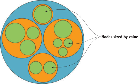
d3.hierarchy(packableTweets, d => d.values)
.sum(d => d.retweets ? d.retweets.length +
d.favorites.length + 1 : undefined)                1
Layouts, like generators and components, are amenable to method chaining. You’ll see examples where the settings and data are all strung together in long chains. As with the pie chart, you could assign interactivity to the nodes or adjust the colors, but this chapter focuses on the general structure of layouts. Notice that circle packing is similar to another hierarchical layout known as treemaps. Treemaps pack space more effectively because they’re built out of rectangles, but they can be harder to read. The next layout is another hierarchical layout, known as a dendrogram, that more explicitly draws the hierarchical connections in your data.
Circle packs don’t use space efficiently—there’s a lot of screen real estate that’s left outside of round objects being shown on rectangular screens. There’s also a big difference between the way you see a circle when it’s being used to enclose other circles versus when it’s floating there on its own. With that in mind, you should use circle packing when you’re trying to focus on the thing at the bottom of the circle pack, the leaf nodes, and how they’re sorted by the various categories you’ve nested them by, which will be all the other circles you see. Because circles are so bad at encoding numerical value with their radius, you should avoid anything where those leaf nodes encode size with any precision. The best circle packs have leaf nodes that map well to individual things of the same type and that we don’t think of as varying in size, like a person. While human beings do vary in size, they’re often put in charts represented by individual marks of the same size, like circles in a network diagram or little person icons in an infographic. But if you want to encode some value to each person, such as their wealth or number of D3.js books in their library, then you probably don’t want to use a circle pack.
Another way to show hierarchical data is to lay it out like a family tree, with the parent nodes connected to the child nodes in a dendrogram (figure 6.9).
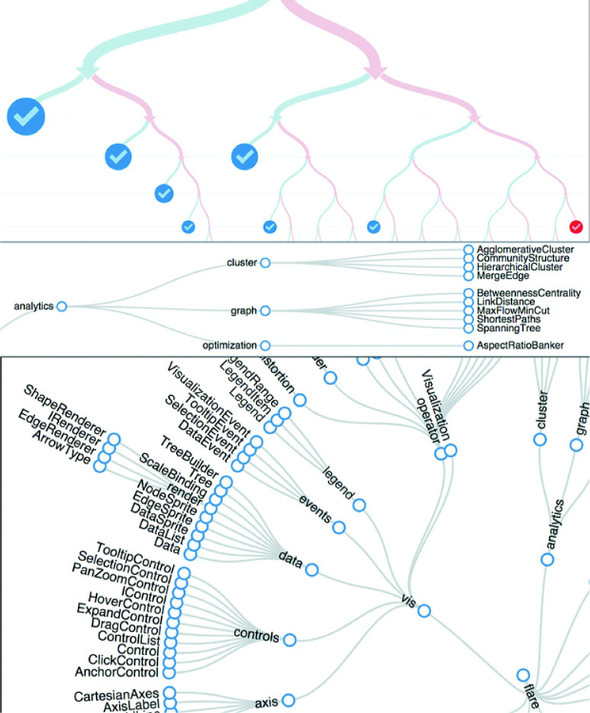
The prefix dendro means “tree,” and in D3 the layout is d3.tree. It follows much the same setup as the pack layout, except that to draw the lines connecting the nodes, we need to use svg:line or svg:path elements. We process the data using d3.nest and d3.hierarchy in exactly the same manner as we do for the circle pack, and then use the code in the following listing to draw our first dendrogram.
var treeChart = d3.tree();
treeChart.size([500,500])

  var treeData = treeChart(root).descendants()

d3.select("svg")
  .append("g")
  .attr("id", "treeG")
  .attr("transform", "translate(60,20)")
  .selectAll("g")
  .data(treeData)
  .enter()
  .append("g")
  .attr("class", "node")
  .attr("transform", d => `translate(${d.x},${d.y})`)           1

d3.selectAll("g.node")
  .append("circle")
  .attr("r", 10)
  .style("fill", d => depthScale(d.depth))                      2
  .style("stroke", "white")
  .style("stroke-width", "2px");                                3

d3.select("#treeG").selectAll("line")
  .data(treeData.filter(d => d.parent))                         4
  .enter().insert("line","g")
  .attr("x1", d => d.parent.x)                                  5
  .attr("y1", d => d.parent.y)
  .attr("x2", d => d.x)                                         6
  .attr("y2", d => d.y)
  .style("stroke", "black")
The resulting dendrogram shows the hierarchical structure of our tweets and tweeters using circles, like the circle pack, but using lines and rank position to indicate who the parents and children are as you can see in figure 6.10 is a bit hard to read.
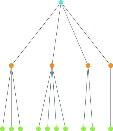
We can add labels pretty easily; the only thing we have to take into account is that the label for each node is going to be a different kind of data depending on which node in the hierarchy we’re labeling (the root node or one of the users or one of the individual tweets). Append a <text> element like so:
     d3.selectAll("g.node")
       .append("text")
       .style("text-anchor", "middle")
       .style("fill", "#4f442b")
       .text(d => d.data.id || d.data.key || d.data.content)
You’ll get the results you see in figure 6.11.
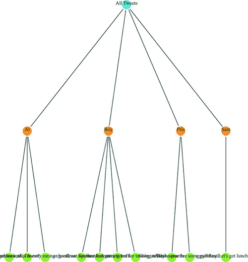
Because the tweet labels are the content of the tweet, it’s pretty hard to read the labels drawing the dendrogram vertically like that. To turn it on its side, we need to adjust the positioning of the <g> elements by flipping the x and y coordinates, which orients the nodes horizontally. We also need to flip the x1, x2, y1, and y2 references for the svg:line element to orient the lines horizontally:
    .append("g")
...
       .append("g")
       .attr("class", "node")
       .attr("transform", d => `translate(${d.y},${d.x})`)
...
       .enter().insert("line","g")
       .attr("x1", d => d.parent.y)
       .attr("y1", d => d.parent.x)
       .attr("x2", d => d.y)
       .attr("y2", d => d.x)
The result, shown in figure 6.12, is more legible because the text isn’t overlapping on the bottom of the canvas. But critical aspects of the chart are still drawn off the canvas without adjusting the margins of the container <g>.
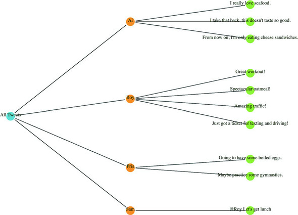
We could try to create margins along the height and width of the layout as we did earlier. Or we could provide information about each node as an information box that opens when we click it, as with the soccer data. But a better option is to give the user the ability to drag the canvas up and down and left and right to see more of the visualization.
To do this, we use the D3 zoom behavior, d3.zoom, which creates a set of event listeners. A behavior is like a component, but instead of creating graphical objects, it registers events (in this case for drag, mousewheel, and double-click) and ties those events to the element that calls the behavior. With each of these events, a zoom object changes its .translate() and/or .scale() values to correspond to the traditional dragging and zooming interaction. You’ll use these changed values to adjust the position of graphical elements in response to user interaction. Like a component, the zoom behavior needs to be called by the element to which you want these events attached. Typically, you call the zoom from the base <svg> element because then it fires whenever you click anything in your graphical area. When creating the zoom component, you need to define what functions are called on zoomstart, zoom, and zoomend, which correspond (as you might imagine) to the beginning of a zoom event, the event itself, and the end of the event, respectively. Because zoom fires continuously as a user drags the mouse, you may want resource-intensive functions only at the beginning or end of the zoom event. You’ll see more complicated zoom strategies, as well as the use of scale, in chapter 8 when we look at geospatial mapping, which uses zooming extensively.
As with other components, to start a zoom component you create a new instance and set any attributes of it you may need. In our case, we only want the default zoom component, with the zoom event triggering a new function, zoomed(). This function changes the position of the <g> element that holds our chart and allows the user to drag it around:
treeZoom = d3.zoom()                                              1
treeZoom.on("zoom", zoomed)                                       2
d3.select("svg").call(treeZoom)                                   3
function zoomed() {
d3.select("#treeG").attr("transform",
`translate(${d3.event.transform.x},${d3.event.transform.y})`)     4
}
Now we can drag and pan our entire chart left and right and up and down. The ability to zoom and pan gives you powerful interactivity to enhance your charts. It may seem odd that you learned how to use something called zoom and haven’t even dealt with zooming in and out, but panning tends to be more universally useful with charts like these, whereas changing scale becomes a necessity when dealing with maps.
We have other choices besides drawing our tree from top to bottom and left to right. If we tie the position of each node to an angle, we can draw our tree diagrams in a radial pattern. To make this work well, we need to reduce the size of our chart, because the radial drawing of a tree layout in D3 uses the size to determine the maximum radius, and is drawn out from the 0,0 point of its container like a <circle> element:
treeChart.size([200,200])
With these changes in place, we need to create a projection function to translate the xy coordinates into a radial coordinate system:
function project(x, y) {
   var angle = x / 90 * Math.PI
   var radius = y
   return [radius * Math.cos(angle), radius * Math.sin(angle)];
}
Then we use that function to calculate new coordinates for our nodes and lines:
   .append("g")
   .attr("id", "treeG")
   .attr("transform", "translate(250,250)")
   .selectAll("g")
...
   .append("g")
   .attr("class", "node")
   .attr("transform", d => `translate(${project(d.x, d.y)})`)
...
   .enter().insert("line","g")
   .attr("x1", d => project(d.parent.x, d.parent.y)[0])
   .attr("y1", d => project(d.parent.x, d.parent.y)[1])
   .attr("x2", d => project(d.x, d.y)[0])
   .attr("y2", d => project(d.x, d.y)[1])
Figure 6.13 shows the results of these changes.
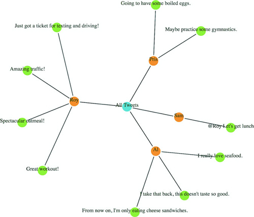
The dendrogram is a generic way of displaying information. It can be repurposed for menus or information you may not think of as traditionally hierarchical. One example (figure 6.14) is from the work of Jason Davies, who used the dendrogram functionality in D3 to create word trees. A few hierarchical structures that follow this pattern are genealogies, sentence trees, and decision trees.
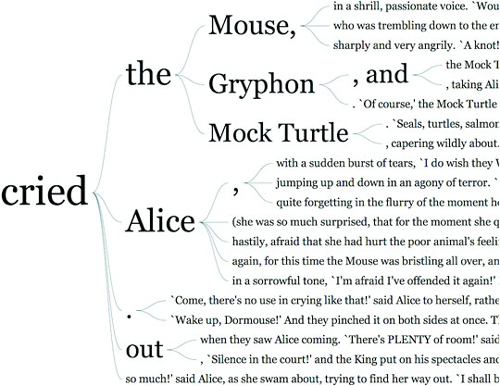
In this example we used the d3.tree layout. You can also use the d3.cluster layout, which forces leaf nodes to all be drawn at the same level. That’s not so apparent with our dataset, because all of our hierarchical data has the same depth (all the leaf nodes are depth 3) but with leaf nodes with uneven depth, like in figure 6.15, you can see the difference between d3.cluster rendering and d3.tree rendering.
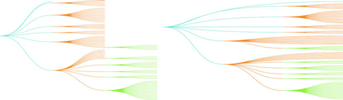
As a general rule, you should use d3.tree unless you have a good reason for lining up all your leaf nodes on the same level. When you use d3.cluster you’re increasing the amount of ink you’re using to represent your links, even though those links aren’t any different in what they represent. This means your ink-to-data ratio is worse, and if you’re going to make your ink-to-data ratio worse, it better be for a good reason.
In contrast to the circle pack, which emphasizes the leaf nodes, the dendrogram shows each node using the same symbology. The use of lines to demonstrate connections between the nodes places gives more visual structure to the lineage rather than the links or the nodes separately. Dendrograms should be used when each parent and child is of the same type (like a word or sentence fragment in a word tree) and the focus is on paths and forks in the path.
I started this chapter by noting that most methods of representing hierarchical data don’t encode numerical data in a way that allows for precise comparison. One layout in D3 encodes parent and children nodes using length, and that’s the partition layout. Partition charts, commonly referred to as icicle charts, are like stacked bar charts.
As with the other hierarchical charts, we need to first nest and process our data using d3.nest and d3.hierarchy. Unlike with the dendrogram we should use the partition layout’s sum function to set the size of the individual pieces to reflect the value of the underlying data (as we did with the final circle pack piece). After we pass the processed data to d3.partition, we can draw the rectangles, as described in the following listing.
var root = d3.hierarchy(packableTweets, d => d.values)
   .sum(d => d.retweets ? d.retweets.length + d.favorites.length + 1 :
   undefined)

var partitionLayout = d3.partition()
   .size([500,300])

partitionLayout(root)                          1

d3.select("svg")
  .selectAll("rect")
  .data(root.descendants())
  .enter()
  .append("rect")
  .attr("x", d => d.x0)                        2
  .attr("y", d => d.y0)                        2
  .attr("width", d => d.x1 - d.x0)             3
  .attr("height", d => d.y1 - d.y0)            3
  .style("fill", d => depthScale(d.depth))
  .style("stroke", "black")
The result of that code is shown in figure 6.16, which shows the nodes in our hierarchical dataset in a new visual metaphor. Instead of parents being connected to children by lines like we see with dendrograms, or being visually enclosed in their parent like the circle packing does, the parent is stacked on top of its children and has a length equal to the sum of lengths of its children (which in our case is based on the number of retweets and favorites of a tweet).
I know what you’re thinking: “That doesn’t look like an icicle at all—people who name charts are dumb.” And you’re not wrong; chart naming has some serious issues. I mean, what is a line chart? Everything that’s drawn is made of lines, right? But the icicle chart gets its name from how it looks when we have data that’s not all the same depth, and this partition layout visually makes a bit more sense as an “icicle chart” when you see it with data like what we used to compare the cluster and tree layouts, as we see in figure 6.17.
Like the dendrogram, we can draw a radial partition layout, and it’s considered one of the most popular “impressive data visualization techniques.” There are always several examples at the top of the list on bl.ocks.org showing the most popular D3 code examples, as you can see in figure 6.18.
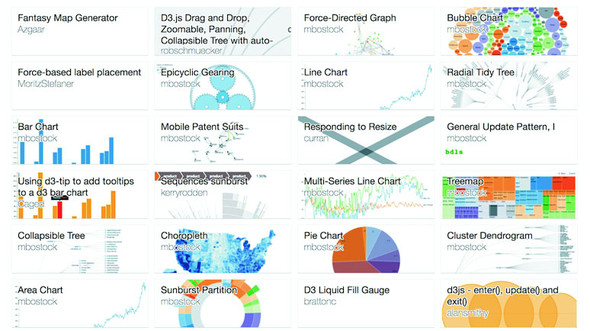
It’s so popular, in fact, that it’s not called a radial partition chart or radial icicle chart but rather has its own fancy name: a sunburst diagram. Even though it has its own fancy name, drawing it only requires us to use the same technique we used to create a radial dendrogram: we adjust the size to more suit our rendering method and change the way we render the pieces. In the case of a sunburst this means changing the size so that the width is in degrees and changing the rendering method so we’re using the d3.arc generator rather than svg:rect. It’s not that big of a difference, even though the code in the following listing is almost completely different—if you look closely you can see that it’s fundamentally the same logic but applied to a different scale and passed to arcs instead of rectangles.
var partitionLayout = d3.partition()
   .size([2 * Math.PI,250])                            1

partitionLayout(root)

var arc = d3.arc()
   .innerRadius(d => d.y0)
   .outerRadius(d => d.y1)                             2

d3.select("svg")
  .append("g")
  .attr("transform", "translate(255,255)")             3
  .selectAll("path")
  .data(root.descendants())
  .enter()
  .append("path")
  .attr("d", ({ y0, y1, x0, x1 }) => arc({y0, y1,
        startAngle: x0, endAngle: x1}))                4
  .style("fill", d => depthScale(d.depth))
  .style("stroke", "black")
Our simple sunburst version of our data is in figure 6.19. As I pointed out in the last chapter when we used d3.histogram to draw violin plots, I think it’s important to pause and dwell on how simple it is to draw a partition layout as a sunburst with D3. Now, naturally, you have to understand how the arc generator works and what the layout is doing, but once you do, you can use D3 to create charts that you imagine rather than recreating the charts that you’ve seen online.
Before we move on to the next hierarchical visualization type, I want to draw your attention to a different use of the partition layout for a specialized data visualization chart: the flame graph. Developed to see what processes are burning up your applications, the flame graph is a fully featured application that consumes profiled data and returns an orange-formatted icicle chart has been ported as d3-flame-graph, an example of which you can see in figure 6.20.
The major difference between the way the flame graph is presenting data and your typical partition layouts is that in most partition layouts, and most hierarchical data visualization, when you’re representing the size of the parent it’s typically as a sum of the size of its children. But in a flame chart, the parent is a process that takes up its own amount of time plus the time of its child processes. It would be too involved to recreate the entire parsing of profiled data, but remember that the sum method in d3.hierarchy is a convenience function and can be replaced with your own complex value setting function, so you could easily assign every node a value equal to the sum of its children plus its own value and achieve something like a flame graph.
In comparison to the dendrogram and the circle pack, the partition layout has great data-to-ink ratio. Literally no space is wasted on links, and the value of each node is encoded in the length of the node, facilitating good ability on the part of the reader to evaluate the numerical difference between the nodes. It’s great for use in applications where you need to give your readers the ability to quickly and effectively measure the values encoded in the nodes. But it’s the ultimate rich-get-richer visual representation of hierarchies, because the value at each depth accretes into the parent node’s value, which can make it hard to make out interesting breaks in the hierarchy that would be readily apparent in a dendrogram or clustering by category, like we saw with the countries in our A/B testing example at the start of the chapter. The best use case for partition layouts is the kind of data that drives the flame graph, where the accretion of time or processing power is exactly what you want to emphasize to software developers looking to optimize their code.
The last hierarchical data visualization method we’ll look at is the treemap, which was developed to show stock performance while at the same time showing parts of the market into which those stocks were categorized. Because of this serious business--oriented pedigree, the treemap is a well-received way of showing hierarchical data. The treemap is a mix of circle packing and partition, using rectangles to represent nodes and enclosing those rectangles within their parent rectangles. Unlike circle packing, it has the benefit of using rectilinear shapes on a rectilinear screen, so we don’t see a lot of wasted space like we do with circle packing.
By now you should know how to make hierarchical data visualization products in D3. You need to have your hierarchical data, but you may have acquired it or processed it and passed it to d3.hierarchy. You’ll use the sum method of d3.hierarchy because we want to show the value of our tweet data in our charts. This time, the only difference is you’ll send all that to d3.treemap, as we see in the following listing.
var treemapLayout = d3.treemap()
   .size([500,500])

treemapLayout(root)                                          1

d3.select("svg")
  .selectAll("rect")
  .data(root.descendants(),
     d => d.data.content || d.data.user || d.data.key)       2
  .enter()
   append("rect")
  .attr("x", d => d.x0)
  .attr("y", d => d.y0)
  .attr("width", d => d.x1 - d.x0)
  .attr("height", d => d.y1 - d.y0)                          3
  .style("fill", d => depthScale(d.depth))
  .style("stroke", "black")
We’re doing almost exactly the same thing with treemap that we’ve done with d3.partition. The results that you see in figure 6.21 are a bit different, though, despite the fact that we’re still using svg:rect to represent our nodes.
The rectangles have filled the space efficiently—a bit too efficiently. We’ve lost our hierarchical data—in this case, which nodes were tweeted by which people. That’s because without putting in padding on treemap we end up with our leaf nodes perfectly abutting each other in the rectangle we describe with the size array. Let’s add padding:
var treemapLayout = d3.treemap()
  .size([500,500])
  .padding(d => d.depth * 5 + 5]
By adding padding, we restore that enclosure signal that indicates which nodes are the children of which other nodes, as you can see in figure 6.22. Padding can take a function, like we have in figure 6.21. But be careful with dynamic padding because your reader is trying to evaluate the data encoded using the area of the shapes represented, so if you’re changing the calculation of the area of that shape based on its depth in the hierarchy, don’t expect that to be readily apparent to your reader’s visual processing. In the case of a hierarchical dataset like our tweets, we’re not causing too much harm because it’s equal depth, but in one of those datasets where the depth is not equal, you may be setting your readers up to misunderstand the data you’re visualizing.
When you want to zoom into a hierarchical data visualization, what you’re doing is laying it out anew with the node you’ve clicked on as your root node. Because your data is hierarchically structured, this is easier than it sounds. We’ll add the click event in the following listing to all our rectangles, as in the following listing.
...
      .style("fill", d => depthScale(d.depth))
      .style("stroke", "black")
      .on("click", filterTreemap)

function filterTreemap(d) {
    var newRoot = d3.hierarchy(d.data, p => p.values)                    1
    .sum(p => p.retweets ? p.retweets.length + p.favorites.length + 1 : undefined)

     treemapLayout(newRoot)

  d3.select("svg")
    .selectAll("rect")
    .data(newRoot.descendants(), p => p.data.content || p.data.user || p.data.key)
    .enter()
    .append("rect")                                                      2
    .style("fill", p => depthScale(p.depth))
    .style("stroke", "black")

  d3.select("svg")
    .selectAll("rect")
    .data(newRoot.descendants(), p => p.data.content || p.data.user || p.data.key)
    .exit()
    .remove()                                                            3

  d3.select("svg")
    .selectAll("rect")
    .on("click", d === root ?
    p => filterTreemap(p) : () => filterTreemap(root))                   4
    .transition()
    .duration(1000)
    .attr("x", p => p.x0)                                                5
    .attr("y", p => p.y0)                                                5
    .attr("width", p => p.x1 - p.x0)                                     5
    .attr("height", p => p.y1 - p.y0)                                    5
}
And that’s all there is to it when you’re introducing zoom functionality to hierarchical data visualization products. If we click the blue area of the viz, nothing will happen (because that’s our root node) and if we click the green then we’ll zoom all the way down to a leaf node. If we click the orange area, we’ll zoom to a single user as a node and all their tweets, like we see in figure 6.23, with a nice animated transition to the new view.
For the sake of completeness, yes, you can project a treemap radially, as seen in figure 6.24.
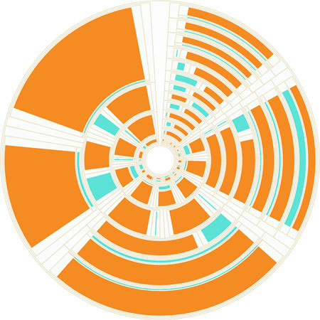
It’s not considered a popular data visualization charting method. It might be because people have a hard time evaluating the area of arcs. I think people don’t use it because it looks like the schematics of the Death Star.
Unlike the length of rectangles, people have a hard time evaluating the area of rectangles and understanding the value mapped to that area, so treemaps aren’t going to be as effective as icicle charts for allowing precise comparison of values. However, because they encode parent-child relationship using enclosure, they don’t spend as much ink on the parent nodes that partition charts do, and they encode value better than circle packs do using radius. They’re a good kind of chart for hierarchical data that’s numerical and that you want to compare the rough value and aggregated value across categories. Another example is demographic data, where each leaf node represents items that vary numerically, like counties or census blocks, and for which you might want to see the breakdown by demographics aggregated by their hierarchical parents.
A Closer Look at Labor
The visual shows the ~550 different occupations as defined by the Bureau of Labor Statistics in their hierarchical groupings. Each white circle represents an occupation and these circles are scaled according to the total number of people working in the occupation. Within each circle there is a bar chart further detailing the division between age groups in the occupation. It’s possible to zoom into any level of hierarchy and the visual only shows the bar charts in those circles that have become large enough to readably fit the bar chart.
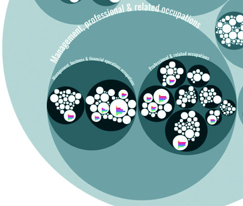
The data that’s available in this visual amounts to at least 7 (age groups) times 550 (occupations) = 3850 data points. By using the hierarchical approach I could prevent overwhelming the viewers with too much data and instead let them dive into the occupational areas they would find most interesting. The deeper they dive into the different hierarchical levels of occupations, from service occupations to food preparation to cooks, the more information that becomes available to them due to more bar charts being drawn within each white circle. This is a details-on-demand approach.
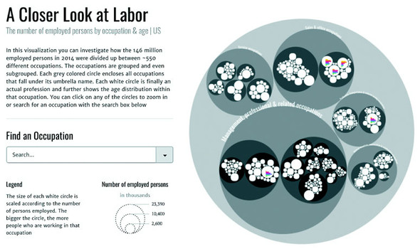
This chapter covers
Network analysis and network visualization are more common now with the growth of online social networks like Twitter and Facebook, as well as social media and linked data, all of which are commonly represented with network structures. Network visualizations like the kind you’ll see in this chapter, some of which are shown in figure 7.1, are particularly interesting because they focus on how things are related. They represent systems more accurately than the traditional flat data seen in more common data visualizations.
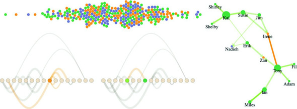
This chapter focuses on representing networks, so it’s important that you understand a little network terminology as we get started. In general, when dealing with networks you refer to the things being connected (like people) as nodes and the connections between them (such as being a friend on Facebook) as edges or links. Networks may also be referred to as graphs, because that’s what they’re called in mathematics.
Networks aren’t only a data format—they’re a perspective on data. When you work with network data, you typically try to discover and display patterns of the network or of parts of the network, and not of individual nodes in the network. Although you may use a network visualization because it makes a cool graphical index, like a mind map or a network map of a website, in general you’ll find that the typical information visualization techniques are designed to showcase network structure, not individual nodes.
Network data is different from hierarchical data. Networks present the possibility of many-to-many connections, like the Sankey layout from chapter 5, whereas in hierarchical data a node can have many children but only one parent, like the tree and pack layouts from chapter 5. A network doesn’t have to be a social network. This format can represent many different structures, such as transportation networks and linked open data. In this chapter, we’ll look at four common forms for representing networks: as data, as adjacency matrices, as arc diagrams, and using force-directed network diagrams.
In each case, the graphical representation will be quite different. For instance, in the case of a force-directed layout, we’ll represent the nodes as circles and the edges as lines. But in the case of the adjacency matrix, nodes will be positioned on x- and y-axes, and the edges will be filled squares. Networks don’t have a default representation, but the examples you’ll see in this chapter are the most common.
Network data stores nodes, which can be companies or nucleotides or, in our case, people, and the links that connect them. Those links could be anything, from Facebook friends to molecular interaction. In this chapter, we’re going to get into People Analytics, an exciting new trend in human resources to try to analyze and visualize data related to how organizations perform. It’s data-driven HR, and because HR is all about people, we deal with more interesting datasets than usual—such as text analysis for written reviews or, in our case, network analysis to see team dynamics.
Imagine we have three teams and a couple contractors and every six months they do a 360 review where they give feedback to the people that they worked with over the last six months. At the end of each review, the team member gives a numerical score indicating whether they have confidence in the person they’re reviewing, from 0 (indicating no confidence) to 5 (indicating total confidence). Many Silicon Valley companies do this kind of review, and you can take the reviews that each employee gives and make it a link in a network to create interesting social network analysis graphs. These networks can show us how teams are or aren’t working together as we’d want them to be and allow us to map out key contributors and ways in which we might make our teams stronger.
Although you can store networks in several data formats, the most straightforward is known as an edge list. An edge list is typically represented as a CSV like that shown in listing 7.1, with a source column and a target column, and a string or number to indicate which nodes are connected, resulting in connections and networks like those described in figure 7.2. Each edge may also have other attributes, indicating the type of connection or its strength, the time period when the connection is valid, its color, or any other information you want to store about a connection. The important thing is that only the source and target columns are necessary. It’s hard to indicate negative links (like people who are connected to each other by their deep and abiding hatred, like how you might connect Harry Potter and Voldemort, or Romeo and Tybalt), so we’re only looking at links in our made-up people analytics network where the score is 1 or greater.
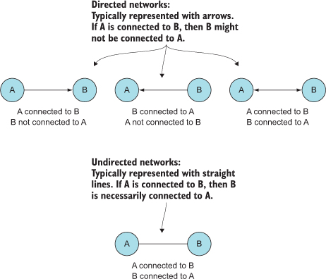
In the case of directed networks, the source and target columns indicate the direction of connection between nodes. A directed network means that nodes may be connected in one direction but not in the other. For instance, you could follow a user on Twitter, but that doesn’t necessarily mean the user follows you. Undirected networks still typically have the columns listed as “source” and “target,” but the connection is the same in both directions. Take the example of a network made up of connections indicating people who have shared classes. If I’m in a class with you, you’re likewise in a class with me. You’ll see directed and weighted networks represented throughout this chapter because our sample dataset will be one person’s rating of another, and just because they rated them doesn’t mean they were rated in return (maybe they got a 0 in return, or maybe the other person does a worse job of filling out their 360 reviews).
source,target,weight
Jim,Irene,5
Susie,Irene,5
Jim,Susie,5
Susie,Kai,5
Shirley,Kai,5
Shelby,Kai,5
Kai,Susie,5
Kai,Shirley,5
Kai,Shelby,5
Erik,Zan,5
Tony,Zan,5
Tony,Fil,5
Tony,Ian,5
Tony,Adam,5
Fil,Tony,4
Ian,Miles,1
Adam,Tony,3
Miles,Ian,2
Miles,Ian,3
Erik,Kai,2
Erik,Nadieh,2
Jim,Nadieh,2
Reading this dataset, you can see that Jim and Susie both have total confidence in Irene, whereas Irene either gave anyone connected to her a 0 or didn’t get around to doing her 360 reviews (which happens a lot, and the lack of connection is itself something key to visualize with datasets like this). This is a weighted network because the edges have a value. It’s a directed network because the edges have direction. Therefore, we have a weighted directed network, and we need to account for both weight and direction in our network visualizations.
Technically, you only need an edge list to create a network, because you can derive a list of nodes from the unique values in the edge list. This is done by traditional network analysis software packages like Gephi. Although you can derive a node list with JavaScript, it’s more common to have a corresponding node list that provides more information about the nodes in your network, like we have in the following listing.
id,role,salary
Irene,manager,300000
Zan,manager,380000
Jim,employee,150000
Susie,employee,90000
Kai,employee,135000
Shirley,employee,60000
Erik,employee,90000
Shelby,employee,150000
Tony,employee,72000
Fil,employee,35000
Adam,employee,85000
Ian,employee,83000
Miles,employee,99000
Sarah,employee,160000
Nadieh,contractor,240000
Hajra,contractor,280000
Because these are employees, we have a bit more information about them besides their links—in this case, their role and their salary. As with the edge list, it’s not necessary to have more than an ID. But having access to more data gives you the chance to modify your network visualization to reflect the node attributes. We’ll use role to color the later networks (managers in orange, employees in green, and contractors in purple).
How you represent a network depends on its size and nature. If a network doesn’t represent discrete connections between similar things, but rather the flow of goods or information or traffic, then you could use a Sankey diagram as we did in chapter 5. Recall that the data format for the Sankey is exactly the same as what we have here: a table of nodes and a table of edges. The Sankey diagram is only suitable for specific kinds of network data. Other chart types, such as an adjacency matrix, are more generically useful for network data.
Before we get started with code to create a network visualizations, let’s put together a CSS page so that we can set color based on class and use inline styles as little as possible. Listing 7.3 gives the CSS necessary for all the examples in this chapter. Keep in mind that we’ll still need to set some inline styles when we want the numerical value of an attribute to relate to the data bound to that graphical element—for example, when we base the stroke-width of a line on the strength of that line.
.grid {
  stroke: #9A8B7A;
  stroke-width: 1px;
  fill: #CF7D1C;
}
.arc {
  stroke: #9A8B7A;
  fill: none;
}
.node {                             1
  fill: #EBD8C1;
  stroke: #9A8B7A;
  stroke-width: 1px;
}
circle.active {
  fill: #FE9922;
}
path.active {
  stroke: #FE9922;
}
circle.source {
  fill: #93C464;
}
circle.target {
  fill: #41A368;
}
As you see more and more networks represented graphically, it seems like the only way to represent a network is with a circle or square that represents the node and a line (whether straight or curvy) that represents the edge. It may surprise you that one of the most effective network visualizations has no connecting lines at all. Instead, the adjacency matrix uses a grid to represent connections between nodes, with the graphical rules of the chart as described in figure 7.3.
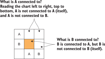
The principle of an adjacency matrix (a two-node example is seen in the figure) is simple: you place the nodes along the x-axis and then place the same nodes along the y-axis. If two nodes are connected, then the corresponding grid square is filled; otherwise, it’s left blank. In our case, because it’s a directed network, the nodes along the y-axis are considered the source, and the nodes along the x-axis are considered the target, as you’ll see in a few pages. Because our people analytics network is also weighted, we’ll use saturation to indicate weight, with lighter colors indicating a weaker connection and darker colors indicating a stronger connection.
The only problem with building an adjacency matrix in D3 is that it doesn’t have an existing layout, which means you have to build it by hand like we did with the bar chart, scatterplot, and boxplot. Mike Bostock has an impressive example at http://bost.ocks.org/mike/miserables/, but you can make something that’s functional without too much code, which we’ll do with the function in listing 7.4. In doing so, though, we need to process the two arrays of JavaScript objects that are created from our CSVs and format the data so that it’s easy to work with. This is getting close to writing our own layout, something we’ll do in chapter 10, and a good idea generally.
One thing you’ll notice in listing 7.4 that might intimidate you is the Promise API. Promises are asynchronous functions that fire a resolve or reject event when the asynchronous call finishes. We’re not using them for fancy async behavior—we’re using them so that we can fire Promise.all, which lets us pass an array of promises and only fires a function once all those promises have been resolved or one of them has been rejected. The simple promise wrapper we see in the listing 7.4 is how you might wrap a callback function like d3.csv so that it resolves as a promise. It’s better to use core ES6 functionality like this, which you will run into in industry, than helper libraries like, say, d3.queue. I decided to use promises for any example where we need to wait for the asynchronous behavior of two or more functions because I think it’s going to serve you best to get exposed to and familiar with promises rather than a D3-specific approach.
function adjacency() {
  var PromiseWrapper = d => new Promise(resolve => d3.csv(d, p => resolve(p)))1
     Promise.all([PromiseWrapper("nodelist.csv"),
            PromiseWrapper("edgelist.csv")])
         .then(resolve => {
           createAdjacencyMatrix(resolve[0], resolve[1])                      2
         })

     function createAdjacencyMatrix(nodes, edges) {
       var edgeHash = {};
       edges.forEach(edge => {
         var id = edge.source + "-" + edge.target;
         edgeHash[id] = edge;                                                 3
       })

       var matrix = [];
       nodes.forEach((source, a) => {
         nodes.forEach((target, b) => {                                       4
         var grid =
           {id: source.id + "-" + target.id,
                x: b, y: a, weight: 0};                                       5
          if (edgeHash[grid.id]) {
            grid.weight = edgeHash[grid.id].weight;                           6
          }
          matrix.push(grid);
        })
      })

      d3.select("svg")
        .append("g")
        .attr("transform", "translate(50,50)")
        .attr("id", "adjacencyG")
        .selectAll("rect")
        .data(matrix)
        .enter()
        .append("rect")
        .attr("class", "grid")
        .attr("width", 25)
        .attr("height", 25)
        .attr("x", d => d.x * 25)
        .attr("y", d => d.y * 25)
        .style("fill-opacity", d => d.weight * .2)

      d3.select("svg")                                                        7
        .append("g")
        .attr("transform", "translate(50,45)")
        .selectAll("text")
        .data(nodes)
        .enter()
        .append("text")
        .attr("x", (d,i) => i * 25 + 12.5)
        .text(d => d.id)
        .style("text-anchor", "middle")

      d3.select("svg")                                                        8
        .append("g")
        .attr("transform", "translate(45,50)")
        .selectAll("text")
        .data(nodes)
        .enter()
        .append("text")
        .attr("y", (d,i) => i * 25 + 12.5)
        .text(d => d.id)
        .style("text-anchor", "end")
    };
  };
We’re building this matrix array of objects that may seem obscure. But if you examine it in your console, you’ll see, as in figure 7.4, that it’s a list of every possible connection and the strength of that connection, if it exists.
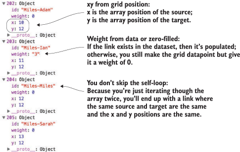
Figure 7.5 shows the resulting adjacency matrix based on the node list and edge list.
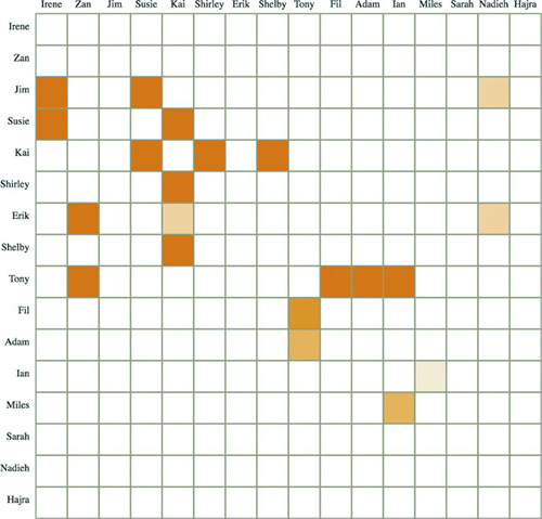
You’ll notice in many adjacency matrices that the square indicating the connection from a node to itself is always filled. In network parlance this is a self-loop, and it occurs when a node is connected to itself. In our case, it would mean that someone gave themselves positive feedback, and fortunately no one in our dataset is a big enough loser to do that.
If we want, we can add interactivity to help make the matrix more readable. Grids can be hard to read without something to highlight the row and column of a square. It’s simple to add highlighting to our matrix. All we have to do is add a mouseover event listener that fires a gridOver function to highlight all rectangles that have the same x or y value:
d3.selectAll("rect.grid").on("mouseover", gridOver);
function gridOver(d) {
  d3.selectAll("rect").style("stroke-width", p =>
  p.x == d.x || p.y == d.y ? "4px" : "1px");
};
Now you can see in figure 7.6 how moving your cursor over a grid square highlights the row and column of that grid square.
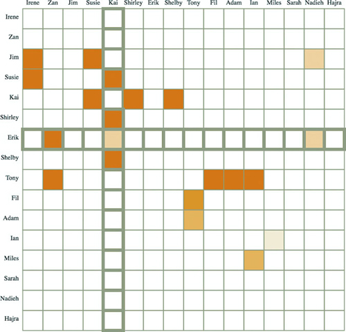
Another way to graphically represent networks is by using an arc diagram. An arc diagram arranges the nodes along a line and draws the links as arcs above and/or below that line (as seen in figure 7.7). Whereas adjacency matrices let you see edge dynamics quickly, arc diagrams let you see node dynamics quickly. You can see which nodes are isolated and which nodes have many connections, as well as get a ready sense of the directionality of those connections.
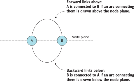
Again, there isn’t a layout available for arc diagrams, and there are even fewer examples, but the principle is rather simple after you see the code. We build another pseudo-layout like we did with the adjacency matrix, but this time we need to process the nodes as well as the links, as shown in listing 7.5.
  function createArcDiagram(nodes,edges) {                         1
   var nodeHash = {};
   nodes.forEach((node, x) => {
     nodeHash[node.id] = node;                                     2
     node.x = parseInt(x) * 30;                                    2
   })
   edges.forEach(edge => {
     edge.weight = parseInt(edge.weight);
     edge.source = nodeHash[edge.source];                          3
     edge.target = nodeHash[edge.target];                          3
   })

   var arcG = d3.select("svg").append("g").attr("id", "arcG")
        .attr("transform", "translate(50,250)");

   arcG.selectAll("path")
      .data(edges)
      .enter()
      .append("path")
      .attr("class", "arc")
      .style("stroke-width", d => d.weight * 2)
      .style("opacity", .25)
      .attr("d", arc)
   arcG.selectAll("circle")
      .data(nodes)
      .enter()
      .append("circle")
      .attr("class", "node")
      .attr("r", 10)
      .attr("cx", d => d.x)

   function arc(d,i) {                                             4
     var draw = d3.line().curve(d3.curveBasis)
     var midX = (d.source.x + d.target.x) / 2
     var midY = (d.source.x - d.target.x)
     return draw([[d.source.x,0],[midX,midY],[d.target.x,0]])
   }
 }
Notice that the edges array that we built uses a hash with the ID value of our edges to create object references. By building objects that have references to the source and target nodes, we can easily calculate the graphical attributes of the <line> or <path> element we’re using to represent the connection. This is the same method used in the force layout that we’ll look at later in the chapter. The result of the code is your first arc diagram, shown in figure 7.8.
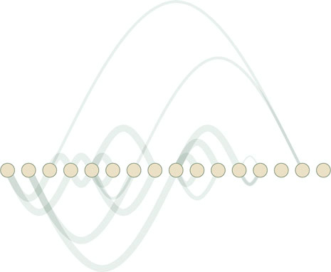
With abstract charts like these, you’re getting to the point where interactivity is no longer optional. Even though the links follow rules, and you’re not dealing with too many nodes or edges, it can be hard to make out what’s connected to what and how. You can add useful interactivity by having the edges highlight the connecting nodes on mouseover. You can also have the nodes highlight connected edges on mouseover by adding two new functions, as shown in listing 7.6, with the results in figure 7.9.
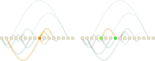
d3.selectAll("circle").on("mouseover", nodeOver)
d3.selectAll("path").on("mouseover", edgeOver)
function nodeOver(d) {
   d3.selectAll("circle").classed("active", p => p === d)          1
   d3.selectAll("path").classed("active", p => p.source === d
          || p.target === d)                                       2
}
function edgeOver(d) {
   d3.selectAll("path").classed("active", p => p === d)
   d3.selectAll("circle")
      .classed("source", p => p === d.source)                      3
      .classed("target", p => p === d.target)                      3
}
If you’re interested in exploring arc diagrams further and want to use them for larger datasets, you’ll also want to look into hive plots, which are arc diagrams arranged on spokes. We won’t deal with hive plots in this book, but there’s a plugin layout for hive plots that you can see at https://github.com/d3/d3-plugins/tree/master/hive. Both the adjacency matrix and arc diagram benefit from the control you have over sorting and placing the nodes, as well as the linear manner in which they’re laid out.
The next method for network visualization, which is our focus for the rest of the chapter, uses entirely different principles for determining how and where to place nodes and edges.
The force layout gets its name from the method by which it determines the most optimal graphical representation of a network (yet another instance of bad naming in data visualization). Like the word cloud and the Sankey diagram from chapter 5, the force() layout dynamically updates the positions of its elements to find the best fit. Unlike those layouts, it does it continuously in real time rather than as a preprocessing step before rendering. The principle behind a force layout is the interplay between three forces, shown in figure 7.10. These forces push nodes away from each other, attract connected nodes to each other, and keep nodes from flying out of sight.
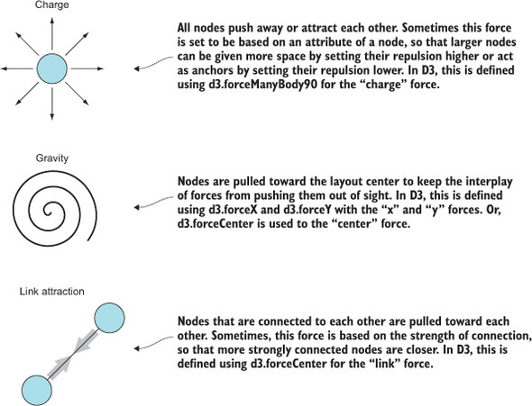
In this section, you’ll learn how force-directed layouts work, how to make them, and general principles from network analysis that will help you better understand them. You’ll also learn how to add and remove nodes and edges, as well as adjust the settings of the layout on the fly.
Before we get into networks with links, let’s look at a couple of forces to start with: x, y, charge, and collision. To initialize forces, you have to first initialize d3.forceSimulation, which calculates the effects of your forces and from which you draw your network. With the code in listing 7.7, we’ll initialize a random dataset to play with and create a simple forceSimulation with only the manyBody force attracting nodes to each other.
var roleScale = d3.scaleOrdinal()
  .range(["#75739F", "#41A368", "#FE9922"])

var sampleData = d3.range(100).map((d,i) => ({r: 50 - i * .5}))      1

var manyBody = d3.forceManyBody().strength(10)                       2
var center = d3.forceCenter().x(250).y(250)                          3

var.force("charge", manyBody)                                        4
   .force("center", center)                                          4
   .nodes(sampleData)                                                5
   .on("tick", updateNetwork)                                        6

d3.select("svg")
   .selectAll("circle")
   .data(sampleData)                                                 7
   .enter()
   .append("circle")
   .style("fill", (d, i) => roleScale(i))
   .attr("r", d => d.r)

function updateNetwork() {
   d3.selectAll("circle")
     .attr("cx", d => d.x)                                           8
     .attr("cy", d => d.y)
}
Your first implementation of forceSimulation is going to be pretty unimpressive, though, with results looking something like figure 7.11. The circles will bounce around a bit and finally settle on top of each other—which, if you think about it, is exactly what you might expect if you made all the circles attractive to each other.
To make this a bit more interesting, let’s register a “collide” force using d3.force-Collide and setting it to base the collision detection off the size of each node (its .r attribute):
.force("collision", d3.forceCollide(d => d.r))
With this in place, we get a simple bubble chart of our data, as we see in figure 7.12.
The last thing we want to look at is using x- and y-constraints to lay out our nodes. If we replace our random data with normally distributed random data and add an x-constraint to keep it in a line and a y-constraint to have its y position correspond to its value, we can produce a beeswarm plot, as in the following listing.
var sampleData = d3.range(300).map(() =>
({r: 2, value: 200 + d3.randomNormal()() * 50}))                 1
...
  var force = d3.forceSimulation()
    .force("collision", d3.forceCollide(d => d.r))
    .force("x", d3.forceX(100))                                  2
    .force("y", d3.forceY(d => d.value).strength(3))             3
    .nodes(sampleData)
    .on("tick", updateNetwork)
The result of your simulation this time tries to arrange each node in a way that they’re laid out along a shared x-axis but positioned to show their value. This beeswarm plot, as you see in figure 7.13, is pretty popular and allows you to show distributions while maintaining individual sample points.
The forceSimulation()layout that you’ve been using and which you see initialized in listing 7.9 has even more settings. The nodes() method that we already used is similar to the one you saw in the Sankey layout in chapter 5, but links in forceSimulation are registered with a “link” force that takes, as you’d expect, the settings for how the links describe source and target as well as an array of those links. We need to take the links from edges.csv and change the source and target into objects like we did with the arc diagram. That’s the formatting that forceSimulation() expects. It also accepts integer values where the integer values correspond to the array position of a node in the nodes array, like the formatting of data for the Sankey diagram links array from chapter 5. Other than the links force, the only new setting we have is to use forceManyBody with a negative value, meaning that nodes will push each other away. This will result in connected nodes attracted to connected nodes and create the kind of network diagram people are familiar with.
function createForceLayout(nodes,edges) {
var roleScale = d3.scaleOrdinal()
  .domain(["contractor", "employee", "manager"])
  .range(["#75739F", "#41A368", "#FE9922"])

     var nodeHash = nodes.reduce((hash, node) => {hash[node.id] = node;
return hash;
}, {})

     edges.forEach(edge => {
        edge.weight = parseInt(edge.weight)
        edge.source = nodeHash[edge.source]
        edge.target = nodeHash[edge.target]
      })

    var linkForce = d3.forceLink()

    var simulation = d3.forceSimulation()
     .force("charge", d3.forceManyBody().strength(-40))         1
     .force("center", d3.forceCenter().x(300).y(300))
     .force("link", linkForce)
     .nodes(nodes)
     .on("tick", forceTick)

   simulation.force("link").links(edges)

   d3.select("svg").selectAll("line.link")
      .data(edges, d => `${d.source.id}-${d.target.id}`)        2
      .enter()
      .append("line")
      .attr("class", "link")
      .style("opacity", .5)
      .style("stroke-width", d => d.weight);

   var nodeEnter = d3.select("svg").selectAll("g.node")         2
      .data(nodes, d => d.id)
      .enter()
      .append("g")
      .attr("class", "node");
   nodeEnter.append("circle")
      .attr("r", 5)
      .style("fill", d => roleScale(d.role))
   nodeEnter.append("text")
      .style("text-anchor", "middle")
      .attr("y", 15)
      .text(d => d.id);

   function forceTick() {
     d3.selectAll("line.link")
        .attr("x1", d => d.source.x)
        .attr("x2", d => d.target.x)
        .attr("y1", d => d.source.y)
        .attr("y2", d => d.target.y)
     d3.selectAll("g.node")
        .attr("transform", d => `translate(${d.x},${d.y})`)
   }
}
The animated nature of the force layout is lost on the page, but you can see in figure 7.14 general network structure that’s less prominent in an adjacency matrix or arc diagram. It’s readily apparent that there are dense and sparse parts of the network, with key brokers like Zan who connect two different groups. We can also see that two people aren’t connected to anyone, having neither given nor received feedback. The only reason those nodes are still onscreen is because the layout’s gravity pulls unconnected pieces toward the center. We can see that our two managers both gave feedback to only two people, but that they have different positions in the structure of our two teams. If Irene quit tomorrow, there wouldn’t be much change in this network, but if Zan quit, then the two teams wouldn’t have any communication with each other.
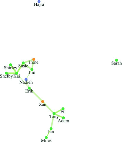
The thickness of the lines corresponds to the strength of connection. But although we have edge strength, we’ve lost the direction of the edges in this layout. You can tell that the network is directed only because the links are drawn as semitransparent, so you can see when two links of different weights overlap each other. We need to use a method to show if these links are to or from a node. One way to do this is to turn our lines into arrows using SVG markers.
Sometimes you want to place a symbol, such as an arrowhead, on a line or path that you’ve drawn. In that case, you have to define a marker in your svg:defs and then associate that marker with the element on which you want it to draw. You can define your marker statically in HTML or create it dynamically like any SVG element, as we’ll do next. The marker we define can be any sort of SVG shape, but we’ll use a path because it lets us draw an arrowhead. A marker can be drawn at the start, end, or middle of a line, and has settings to determine its direction relative to its parent element. See the following listing.
var marker = d3.select("svg").append('defs')
   .append('marker')
   .attr("id", "triangle")
   .attr("refX", 12)
   .attr("refY", 6)
   .attr("markerUnits", 'userSpaceOnUse')                     1
   .attr("markerWidth", 12)
   .attr("markerHeight", 18)
   .attr("orient", 'auto')
   .append('path')
   .attr("d", 'M 0 0 12 6 0 12 3 6');
d3.selectAll("line").attr("marker-end", "url(#triangle)");    2
With the markers defined in listing 7.10, you can now read the network (as shown in figure 7.15) more effectively. You see how the nodes are connected to each other and you can spot which nodes have reciprocal ties with each other (where nodes are connected in both directions). Reciprocation is important to identify, because there’s a big difference between people who favorite Katy Perry’s tweets and people whose tweets are favorited by Katy Perry (the current Twitter user with the most followers). Direction of edges is important, but you can represent direction in other ways, such as using curved edges or edges that grow fatter on one end than the other. To do something like that, you’d need to use a <path> rather than a <line> for the edges like we did with the Sankey layout or the arc diagram.

If you’ve run this code on your own, your network should look exactly like figure 7.15. That’s because even though network visualizations created with force-directed layouts are the result of the interplay of forces, D3’s force simulation is deterministic as long as the inputs don’t change. However, if your network inputs are constantly changing, one way to help your readers is to generate a network using a force-directed layout and then fix it in place to create a network basemap. You can then apply any later graphical changes to that fixed network. The concept of a basemap comes from geography and in network visualization refers to the use of the same layout with differently sized and/or colored nodes and edges. It allows readers to identify regions of the network that are significantly different according to different measures. You can see this concept of a basemap in use in figure 7.16, which shows how one network can be measured in multiple ways.
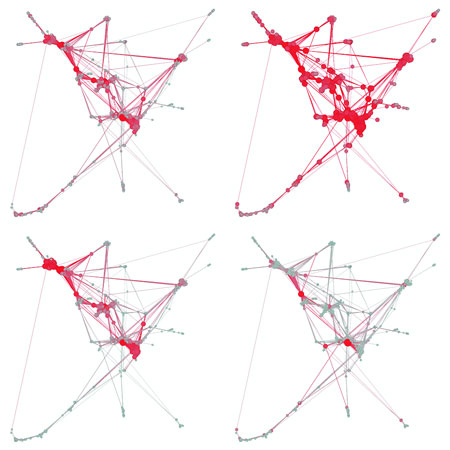
Network visualizations are impressive, but they can also be so complex that they’re unreadable. For this reason, you’ll encounter critiques of networks that are too dense to be readable. These network visualizations are often referred to as hairballs due to extensive overlap of edges that make them resemble a mass of unruly hair.
If you think a force-directed layout is hard to read, you can pair it with another network visualization such as an adjacency matrix and highlight both as the user navigates either visualization. You’ll see techniques for pairing visualizations like this in chapter 11.
The force-directed layout provides the added benefit of seeing larger structures. Depending on the size and complexity of your network, they may be enough. But you may need to represent other network measurements when working with network data.
Networks have been studied for a long time—at least for decades; if you consider graph theory in mathematics, for centuries. As a result, you may encounter a few terms and measures when working with networks. This is only meant to be a brief overview. If you want to learn more about networks, I would suggest reading the excellent introduction to networks and network analysis by S. Weingart, I. Milligan, and S. Graham at www.themacroscope.org/?page_id=337.
You’ll notice that our dataset contains a weight value for each link. This represents the strength of the connection between two nodes. In our case, we assume that the more favorites, the stronger a connection that one Twitter user has. I drew thicker lines for a higher weight, but we can also adjust the way the force layout works based on that weight, as you’ll see next.
Networks are representations of systems, and one of the things you want to know about the nodes in a system is which ones are more important than the others, referred to as centrality. Central nodes are considered to have more power or influence in a network. There are many different measurements of centrality, a few of which are shown in figure 7.16, and different measures more accurately assess centrality in different network types.
Degree, also known as degree centrality, is the total number of links that are connected to a node. In our example data, Mo has a degree of 6, because he’s the source or target of 6 links. Degree is a rough measure of the importance of a node in a network, because you assume that people or things with more connections have more power or influence in a network. Weighted degree is used to refer to the total value of the connections to a node, which would give Mo a value of 18. Further, you can differentiate degree into in degree and out degree, which are used to distinguish between incoming and outgoing links, and which for Mo’s case would be 4 and 2, respectively.
You can calculate degree centrality easily by filtering the edges array to show only links that involve that node:
nodes.forEach(d => {
  d.degreeCentrality = edges.filter(
    p => p.source === d || p.target === d).length
})
We’ll use that to affect the way the force layout runs. For now, let’s add a button that resizes the nodes based on their weight attribute:
d3.select("#controls").append("button")
  .on("click", sizeByDegree).html("Degree Size")
function sizeByDegree() {
  simulation.stop()
  simulation.force("charge", d3.forceManyBody()
    .strength(d => -d.degreeCentrality * 20))
  simulation.restart()
  d3.selectAll("circle")
    .attr("r", d => d.degreeCentrality * 2)
}
Figure 7.17 shows the value of the degree centrality measure. Although you can see and easily count the connections and nodes in this small network, being able to spot at a glance the most and least connected nodes is extremely valuable. Notice that we’re counting links in both directions, so that even though Kai and Tony are connected to the same number of people, Kai’s circle is slightly larger because he’s involved in more connections total (to and from).
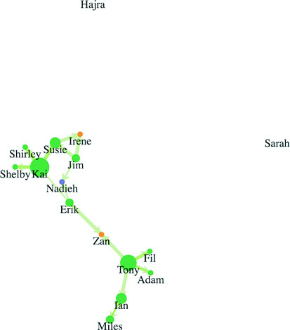
One of the most important things to find out about a network is whether any communities exist in that network and what they look like. This is done by looking at whether certain nodes are more connected to each other than to the rest of the network, known as modularity. You can also look at whether nodes are interconnected, known as clustering. Cliques, mentioned earlier, are part of the same measurement, and clique is a term for a group of nodes that are fully connected to each other.
Notice that this interconnectedness and community structure are supposed to arise visually out of a force-directed layout. You see the four highly connected users in a cluster and the other users farther away. If you’d prefer to measure your networks to try to reveal these structures, you can see an implementation of a community detection algorithm implemented in libraries like jLouvain at https://github.com/upphiminn/jLouvain. This algorithm runs in the browser and can be integrated with your network quite easily to color your network based on community membership or even organize the network visually based on module as you can see here:
http://bl.ocks.org/emeeks/302096884d5fbc1817062492605b50dd.
When we initialized our force layout, we started out with a charge setting of –1000. Charge and a few other settings give you more control over the way the force layout runs.
Charge sets the rate at which nodes push each other away or attract each other. If you don’t set the charge strength, then it has a default setting of –30. Along with setting fixed values for charge, you can use an accessor function to base the charge values on an attribute of the node. For instance, you could base the charge on the weight (the degree centrality) of the node so that nodes with many connections push nodes away more, giving them more space on the chart.
Negative charge values represent repulsion in a force-directed layout, but you could set them to positive if you wanted your nodes to exert an attractive force. This would cause problems with a traditional network visualization but may come in handy for a more complicated visualization.
With This used to be a universal gravity setting that has now been replaced by independent x- and y-constraints. The other way to center your network, which we’ve been using, is to visually center it using the center constraint. You’ll want to experiment with gravity when that visual centering isn’t enough.
Attraction between nodes is determined by setting the strength property of the “link” force. Setting your link.strength() parameter too high causes your network to fold back in on itself, which you can identify by the presence of prominent triangles in the network visualization.
You can set link.strength to be a function and associate it with edge weight so that edges with higher or lower weight values have lower or higher distance settings. A force layout is a physical simulation, meaning it uses physical metaphors to arrange the network to its optimal graphical shape. If your network has stronger and weaker links, as our example does, then it makes sense to have those edges exert stronger and weaker effects on the controlling nodes. As a result, people who have rated their confidence in their coworkers higher will be visually closer to those coworkers than people who have rated their confidence as lower:
    var linkForce = d3.forceLink().strength(d => d.weight * .1)

    var simulation = d3.forceSimulation()
      .force("charge", d3.forceManyBody().strength(-500))
      .force("x", d3.forceX(250))
      .force("y", d3.forceY(250))
We’re ramping up the repulsive charge because we’re increasing the maximum link strength to 10. We’re also using canvas gravity with x and y forces because that repulsive charge will push nodes offscreen. Figure 7.18 dramatically demonstrates the results, which reflect the weak nature of several of the connections.
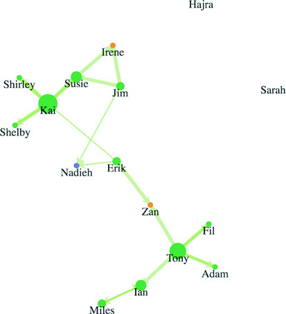
When you create a network, you want to provide your users with the ability to add or remove nodes to the network, or drag them around. You may also want to adjust the various settings dynamically rather than changing them when you first create the force layout.
The force layout is designed to “cool off” and eventually stop after the network is laid out well enough that the nodes no longer move to new positions. When the layout has stopped like this, you’ll need to restart it if you want it to animate again. Also, if you’ve made any changes to the force settings or want to add or remove parts of the network, then you’ll need to stop it and restart it.
You can turn off the force interaction by using simulation.stop(), which stops running the simulation. It’s good to stop the network when there’s an interaction with a component elsewhere on your web page or a change in the styling of the network, and then restart it once that interaction is over.
To begin or restart the animation of the layout, use simulation.restart(). You don’t have to start the simulation when you first create it, it’s started automatically.
Finally, if you want to move the layout forward one step, you can use simulation.tick(). Force layouts can be resource-intensive, and you may want to use one for a few seconds rather than let it run continuously. You can also precalculate your chart if you don’t need the fancy animation, so you could simulation.tick(120) to precalculate your beeswarm plot before you lay it out. Simulating the network without graphically animating it is much faster, and you can use D3 transitions to animate the movement of the nodes to their final precalculated position.
With traditional network analysis programs, the user can drag nodes to new positions. This is implemented using the behavior d3.drag(). A behavior is like a component in that it’s called by an element using .call(), but instead of creating SVG elements, it creates a set of event listeners.
In the case of d3.drag(), those event listeners correspond to dragging events that give you the ability to click and drag your nodes around while the force layout runs. You can enable dragging on all your nodes by selecting them and calling d3.drag() on that selection. See the following listing.
var drag = d3.drag()
drag
     .on("drag", dragging)                   1

function dragging(d) {
    var e = d3.event                         2
    d.fx = e.x                               3
    d.fy = e.y
    if (simulation.alpha() < 0.1) {
      simulation.alpha(0.1)                  4
      simulation.restart()
    }
}

d3.selectAll("g.node").call(drag);           5
As a force layout runs, it checks to see if each node has .fx or .fy attributes and doesn’t adjust the x and/or y position of nodes that have them. One effective interaction technique is to set a node as fixed when the user interacts with it. This allows users to drag nodes to a position on the canvas so they can visually sort the important nodes. The effect of dragging some of our nodes is shown in figure 7.19.
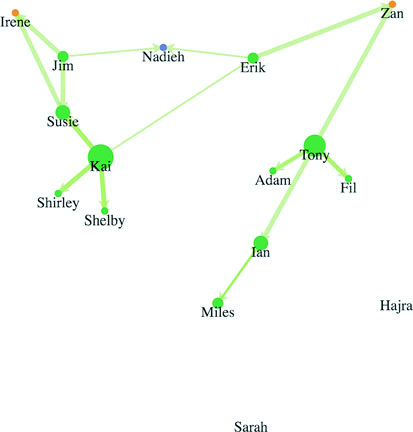
When dealing with networks, you may want to filter the networks or give the user the ability to add or remove nodes. To filter a network, you need to stop() it, remove any nodes and links that are no longer part of the network, rebind those arrays to the force layout, and then restart() the layout.
This can be done as a filter on the array that makes up your nodes. For instance, we may want to only see the network without contractors and managers, so we can see who the most influential peers are and how only the employee network looks.
If we got rid of the nodes, we’d still have links in our layout that reference nodes which no longer exist. We’ll need a more involved filter for our links array. By using the .indexOf function of an array, though, we can easily create our filtered links by checking to see if the source and target are both in our filtered nodes array. Because we used key values when we first bound our arrays to our selection in listing 7.12, we can use the selection.exit() behavior to easily update our network. You can see how to do this in the following listing and the effects in figure 7.20.
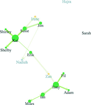
function filterNetwork() {
   simulation.stop()
   var originalNodes = simulation.nodes()                                  1
   var originalLinks = simulation.force("link").links()                    1

   var influentialNodes = originalNodes.filter(d => d.role === "employee") 2
   var influentialLinks = originalLinks.filter(d =>
        influentialNodes.includes(d.source) &&
        influentialNodes.includes(d.target))                               2

   d3.selectAll("g.node")
      .data(influentialNodes, d => d.id)
      .exit()
      .transition()
      .duration(4000)
      .style("opacity", 0)
      .remove()

   d3.selectAll("line.link")
      .data(influentialLinks, d => `${d.source.id}-${d.target.id}`)
      .exit()
      .transition()
      .duration(3000)
      .style("opacity", 0)                                                 3
      .remove()

   simulation
      .nodes(influentialNodes)                                             4
   simulation.force("link")
      .links(influentialLinks)
   simulation.alpha(0.1)
   simulation.restart()
}
Because the force algorithm is restarted after the filtering, you can see how the shape of the network changes with the removal of so many nodes. That animation is important because it reveals structural changes in the network.
Putting more nodes and edges into the network is easy, as long as you properly format your data. You stop the force layout, add the properly formatted nodes or edges to the respective arrays, and rebind the data as you’ve done in the past. Let’s say we want to convince Irene to work more closely with someone from Zan’s team. We’d probably suggest Tony, because he’s so well connected on our diagram. If, for instance, we want to add an edge between Irene and Tony, as shown in figure 7.21, we need to stop the force layout like we did earlier, create a new datapoint for that edge, and add it to the array we’re using for the links, as shown in listing 7.13. Then we rebind the data and append a new line element for that edge before we restart the force layout.
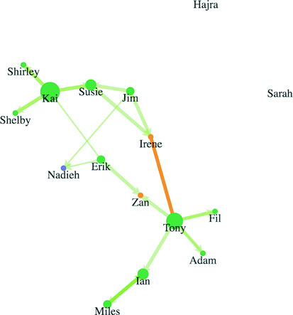
Now Irene can see visually that she’s occupying a more central position in the network, and the organization as a whole can see that the network is more resilient to any personnel changes that may happen. See the following listing.
function addEdge() {
    simulation.stop()
    var links = simulation.force("link").links()
    var nodes = simulation.nodes()
    var newEdge = {source: nodes[0], target: nodes[8], weight: 5}
    links.push(newEdge)
    simulation.force("link").links(links)
    d3.select("svg").selectAll("line.link")
    .data(links, d => `${d.source.id}-${d.target.id}`)
    .enter()
    .insert("line", "g.node")
    .attr("class", "link")
    .style("stroke", "#FE9922")
    .style("stroke-width", 5)

    simulation.alpha(0.1)
    simulation.restart()
}
Now let’s imagine that Shirley wants to bring in a pair of contractors to work on a new project, so we have two new nodes and the corresponding links we need to add, as shown in figure 7.22. The code and process, which you can see in listing 7.14, should look familiar to you by now.
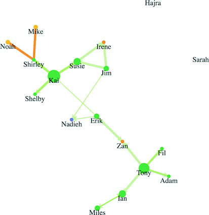
function addNodesAndEdges() {
   simulation.stop()
   var oldEdges = simulation.force("link").links()
   var oldNodes = simulation.nodes()
   var newNode1 = {id: "Mike", role: "contractor", team: "none"}          1
   var newNode2 = {id: "Noah", role: "contractor", team: "none"}          1
   var newEdge1 = {source: oldNodes[5], target: newNode1, weight: 5}      2
   var newEdge2 = {source: oldNodes[5], target: newNode2, weight: 5}      2
   oldEdges.push(newEdge1,newEdge2)                                       3
   oldNodes.push(newNode1,newNode2)                                       3
   simulation.force("link").links(oldEdges)
   simulation.nodes(oldNodes)
   d3.select("svg").selectAll("line.link")
      .data(oldEdges, d => d.source.id + "-" + d.target.id)
    .enter()
    .insert("line", "g.node")
    .attr("class", "link")
    .style("stroke", "#FE9922")
    .style("stroke-width", 5)

 var nodeEnter = d3.select("svg").selectAll("g.node")
    .data(oldNodes, d => d.id)
    .enter()
    .append("g")
    .attr("class", "node")
 nodeEnter.append("circle")
    .attr("r", 5)
    .style("fill", "#FCBC34")
 nodeEnter.append("text")
    .style("text-anchor", "middle")
    .attr("y", 15)
    .text(d => d.id)
    simulation.alpha(0.1)
    simulation.restart()
}
The force-directed layout doesn’t move your elements. Instead, it calculates the position of elements based on the x and y attributes of those elements in relation to each other. During each tick, it updates those x and y attributes. The tick function selects the <line> and <g> elements and moves them to these updated x and y values.
When you want to move your elements manually, you can do so like you normally would in listing 7.15. But first you need to stop the force so that you prevent that tick function from overwriting your elements’ positions. Maybe the CEO has seen some of these network charts and wants to know if we’re properly rewarding people for being so central to the networks they’re in. Let’s lay out our nodes like a scatterplot, looking at the degree centrality (number of links) by the salary of each node. We’ll also add axes to make it readable. You can see the code in the following listing and the results in figure 7.23.
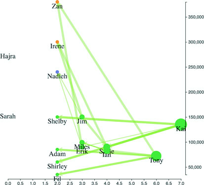
function manuallyPositionNodes() {
   var xExtent = d3.extent(simulation.nodes(), d =>
   parseInt(d.degreeCentrality))
   var yExtent = d3.extent(simulation.nodes(), d => parseInt(d.salary))   1
   var xScale = d3.scaleLinear().domain(xExtent).range([50,450])
   var yScale = d3.scaleLinear().domain(yExtent).range([450,50])
   simulation.stop()
   d3.selectAll("g.node")
       .transition()
       .duration(1000)
       .attr("transform", d => `translate(${xScale(d.degreeCentrality)
                          },${yScale(d.salary) })`)                       2
   d3.selectAll("line.link")
        .transition()
        .duration(1000)
        .attr("x1", d => xScale(d.source.degreeCentrality))               3
        .attr("y1", d => yScale(d.source.salary))
        .attr("x2", d => xScale(d.target.degreeCentrality))
        .attr("y2", d => yScale(d.target.salary))
   var xAxis = d3.axisBottom().scale(xScale).tickSize(4)
   var yAxis = d3.axisRight().scale(yScale).tickSize(4)
   d3.select("svg").append("g").attr("transform",
             "translate(0,460)").call(xAxis)
   d3.select("svg").append("g").attr("transform",
             "translate(460,0)").call(yAxis)
   d3.selectAll("g.node").each(d => {
      d.x = xScale(d.degreeCentrality)                                    4
      d.vx = 0                                                            5
      d.y = yScale(d.salary)                                              4
      d.vy = 0                                                            5
    })
}
Notice that you need to update the x and y attributes of each node, but you also need to update the vx and vy attributes of each node. The vx and vy attributes are the current velocity along the x- and y-axes of the node before the last tick. If you don’t update them, the force layout might think that the nodes have high velocity and will violently move them from their new position.
If you didn’t update the x, y, vx, and vy attributes, the next time you started the force layout, the nodes would immediately return to their positions before you moved them. This way, when you restart the force layout with simulation.restart(), the nodes and edges animate from their current position.
The force layout is extremely resource-intensive. That’s why it cools off and stops running by design. And if you have a large network running with the force layout, you can tax a user’s computer until it becomes practically unusable. The first tip to optimization, then, is to limit the number of nodes in your network, as well as the number of edges. A general rule is no more than 500 nodes, but that limit used to be 100 and gets higher as browsers increase in performance, so use profiling and understand the minimum performance of the browsers that your audience will likely be using.
But if you have to present more nodes and want to improve the performance, you can use forceManyBody.chargeDistance() to set a maximum distance when computing the repulsive charge for each node. The lower this setting, the less structured the force layout will be, but the faster it will run. Because networks vary so much, you’ll have to experiment with different values for chargeDistance to find the best one for your network.
An Interactive Visualization of Every Line in Hamilton
http://polygraph.cool/hamilton/
When we think of force layouts, we immediately think of node-and-link graphs, of Les Miserables characters connected by their co-appearances. And D3’s implementation of the force-directed graph is certainly well suited to calculating node positions on a screen, but I think animation is where it shines. Those few seconds before the simulation cools down enough to converge on a layout, when the nodes are still bouncing around on the screen—they have a playfulness that no amount of custom transitions can replicate.
When I started on my project visualizing Hamilton, I knew that I wanted it to reach a wide audience, one that might not be as intimately familiar with data visualizations. To keep their attention, I needed a way to delight, and what better way than for the dots (each representing a set of lines by a character) to burst out of their initial positions and then regroup to the next configuration? The animation happens as the user scrolls between sections, introducing the next topic with a wave of confetti-like dots zipping around the screen. It’s an effect only the force layout can accomplish, adds absolutely zero insights to the data, but is fun and slightly silly and keeps the user scrolling.
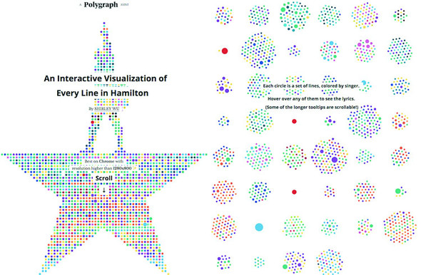
This chapter covers
One of the most common categories of data you’ll encounter is geospatial data. This can come in the form of administrative regions like states or counties, points that represent cities or the location of a person when sending a tweet, or satellite imagery of the surface of the earth.
D3 provides enough core functionality to make any kind of map you’ve seen on the web (examples of maps created in this chapter using D3 can be seen in figure 8.1). Because you’re already working with D3, you can make that map far more sophisticated and distinctive than the out-of-the-box maps you typically see. The major reason to use a dedicated library like Google Maps API is because of the added functionality that comes from being in that ecosystem, such as Street View. Another reason is if you want to do the cool 3D mapping you can accomplish with WebGL-based mapping libraries like MapboxGL. But if you’re not looking for those features, then it may be a smarter move to build the map with D3. You won’t have to invest in learning a different syntax and abstraction layer, and you’ll have the greater flexibility D3 mapping affords.
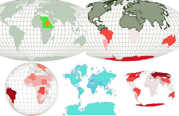
Because mapmaking and geographic information systems and science (known as GIS and GIScience, respectively) have been in practice for so long, well-developed methods exist for representing this kind of data. D3 has built-in robust functionality to load and display geospatial data. A related library that you’ll get to know in this chapter, TopoJSON, provides more functionality for geospatial information visualization.
In this chapter, we’ll start by making maps that combine points, lines, and polygons using data from CSV- and GeoJSON-formatted sources. You’ll learn how to style those maps and provide interactive zooming by revisiting d3.zoom() and exploring it in more detail. After that, we’ll look at the TopoJSON data format, its built-in functionality that uses topology, and why it provides significantly smaller data files. Finally, you’ll learn how to make maps using tiles to show terrain and satellite imagery.
Before you explore the boundaries of mapping possibilities, you need to make a simple map. In D3, the simplest map you can make is a vector map using SVG <path> and <circle> elements to represent countries and cities. We can bring back cities.csv, which we used in chapter 2, and finally take advantage of its coordinates, but we need to look a bit further to find the data necessary to represent those countries. After we have that data, we can render it as areas, lines, or points on a map. Then we can add interactivity, such as highlighting a region when you move your mouse over it or computing and showing its center.
Before we get started, though, let’s look at the CSS for this chapter, as shown in the following listing.
path.countries {
   stroke-width: 1;
   stroke: #75739F;
   fill: #5EAFC6;
}
circle.cities {
   stroke-width: 1;
   stroke: #4F442B;
   fill: #FCBC34;
}
circle.centroid {                   1
   fill: #75739F;
   pointer-events: none;
}
rect.bbox {
   fill: none;
   stroke-dasharray: 5 5;
   stroke: #75739F;
   stroke-width: 2;
   pointer-events: none;
}
path.graticule {                    2
   fill: none;
   stroke-width: 1;
   stroke: #9A8B7A;
}
path.graticule.outline {
   stroke: #9A8B7A;
}

path.merged {
   fill: #9A8B7A;
   stroke: #4F442B;
   stroke-width: 2px;
}
Making a map requires data, and you have an enormous amount of data available. Geographic data can come in several forms. If you’re familiar with GIS, then you’ll be familiar with one of the most common forms for complex geodata, the shapefile, which is a format developed by Esri and is most commonly found in desktop GIS applications. But the most human-readable form of geodata is latitude and longitude (or xy coordinates like we list in our file) when dealing with points like cities, often in a CSV. We’ll use cities.csv, shown in the following listing. This is the same CSV we measured in chapter 2 that had the locations of eight cities from around the world.
"label","population","country","x","y"
"San Francisco", 750000,"USA",-122.431,37.773
"Fresno", 500000,"USA",-119.772,36.746
"Lahore",12500000,"Pakistan",74.329,31.582
"Karachi",13000000,"Pakistan",67.005,24.946
"Rome",2500000,"Italy",12.492,41.890
"Naples",1000000,"Italy",14.305,40.853
"Rio",12300000,"Brazil",-42.864,-22.752
"Sao Paolo",12300000,"Brazil",-46.330,-23.944
If you only have city names or addresses and need to get latitude and longitude, you can take advantage of geocoding services that provide latitude and longitude from addresses. These exist as APIs and are available on the web for small batches. You can see an example of these services maintained by Texas A&M at http://geoservices.tamu.edu/Services/Geocode/.
When dealing with more complex geodata like shapes or lines, you’ll necessarily deal with more complex data formats. You’ll want to use GeoJSON, which has become the standard for web-mapping data.
GeoJSON (geojson.org) is, like it sounds, a way of encoding geodata in JSON format. Each feature in a featureCollection is a JSON object that stores the border of the feature in a coordinates array as well as metadata about the feature in a properties hash object. For instance, if you wanted to draw a square that went around the island of Manhattan, it would have corners at [–74.0479, 40.6829], [–74.0479, 40.8820], [-73.9067, 40.8820], and [–73.9067, 40.6829], as shown in figure 8.2. You can easily export shapefiles into GeoJSON using QGIS (a desktop GIS application, qgis.org), PostGIS (a spatial database run on Postgres, postgis.net), GDAL (a library for manipulation of geospatial data, gdal.org), and other tools and libraries.
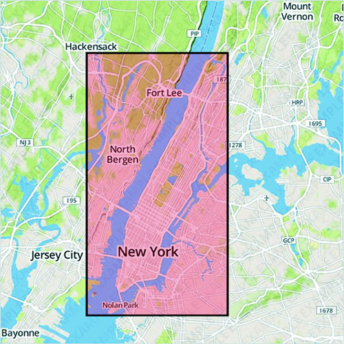
A rectangle drawn over a geographic feature like this is known as a bounding box. It’s often represented with only two coordinate pairs: the upper-left and bottom-right corners. But any polygon data, such as the irregular border of a state or coastline, can be represented by an array of coordinates like this. In the following listing, we have a fully compliant GeoJSON "FeatureCollection" with only one feature: the simplified borders of the small nation of Luxembourg.
{
   "type": "FeatureCollection",
   "features": [
        {
            "type": "Feature",
            "id": "LUX",
            "properties": {
                "name": "Luxembourg"
            },
            "geometry": {
                "type": "Polygon",
                "coordinates": [
                    [
                        [
                            6.043073,
                            50.128052
                        ],
                        [
                            6.242751,
                            49.902226
                        ],
                        [
                            6.18632,
                            49.463803
                        ],
                        [
                            5.897759,
                            49.442667
                        ],
                        [
                            5.674052,
                            49.529484
                        ],
                        [
                            5.782417,
                            50.090328
                        ],
                        [
                            6.043073,
                            50.128052
                        ]
                    ]
                ]
            }
        }
    ]
}
We’re not going to create our own GeoJSON in this chapter, and unless you get into serious GIS, you may never create your own GeoJSON. Instead, you can get by with downloading existing geodata and either use it without editing it or edit it in a GIS application and export it. In our examples in this chapter, we’ll use world.geojson (available at https://github.com/emeeks/d3_in_action_2/blob/master/data/world.geojson), a file that consists of the countries of the world in the same simplified, low-resolution representation that you see in figure 8.3.
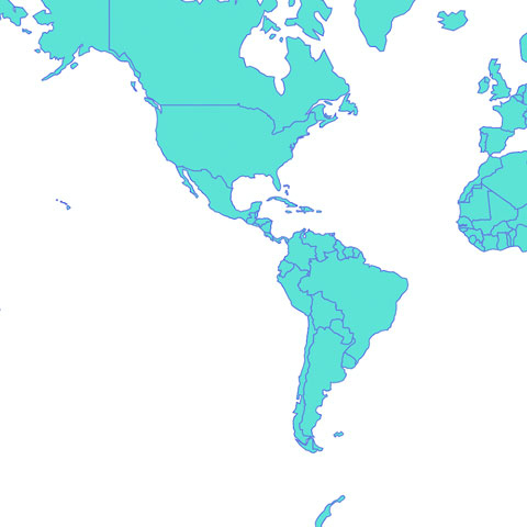
Entire books have been written on creating web maps, and an entire book could be written on using D3.js for crafting maps. Because this is only one chapter, I’ll gloss over many deep issues. One of these is projection. In GIS, projection refers to the process of rendering points on a globe, like the earth, onto a flat plane, like your computer monitor. You can project geographic data in many different ways for representation on your screen, and in this chapter we’ll look at a few different methods.
To start, we’ll use one of the most common geographic projections, the Mercator projection, which is used in most web maps. It became the de facto standard because it’s the projection used by Google Maps. To use the Mercator projection, you have to include an extension of D3, d3.geo.projection.js, which you’ll want for the more interesting work you’ll do later in the chapter. By defining a projection, you can take advantage of d3.geoPath, which draws geodata onscreen based on your selected projection. After we’ve defined a projection and have geo.path() ready, the entire code in listing 8.4 is all we need to draw the map shown in figure 8.3.
  d3.json("world.geojson", createMap);
  function createMap(countries) {
    var aProjection = d3.geoMercator();                             1
    var geoPath = d3.geoPath().projection(aProjection);             2
    d3.select("svg").selectAll("path").data(countries.features)
      .enter()
      .append("path")
      .attr("d", geoPath)                                           3
      .attr("class", "countries");
    };
Why do you only see part of the world in figure 8.3? Because the default scale and transform of the Mercator projection show only part of the world in your SVG canvas. If you want to center the map on a different part of the world, you need to change the scale and transform, as we will shortly. Each projection has a .translate() and .scale() that follow the syntax of the transform convention in SVG, but have different effects with different projections.
You have to do several tricks to set the right scale for certain projects. For instance, with our Mercator projection, if we divide the width of the available space by 2 and divide the quotient by Math.pi, then the result will be the proper scale to display the entire world in the available space. Figuring out the right scale for your map and your projection is typically done through experimenting with different values, but it’s easier when you include zooming, as you’ll see in section 8.2.2.
Different families of projections have different scale defaults. The d3.geo.albers-Usa projection defaults to 1070, whereas d3.geo.mercator defaults to 150. As with most D3 functions like this, you can see the default by calling the function without passing it a value:
d3.geoMercator().scale()          1
d3.geoAlbersUsa().scale()         2
By adjusting the translate and scale as in listing 8.5, we can adjust the projection to show different parts of the geodata we’re working with—in our case, the world. The result in figure 8.4 shows that we now see the entire world rendered.

  function createMap(countries) {
     var aProjection = d3.geoMercator()
    .scale(80)                                                      1
    .translate([250, 250]);                                         2
    var geoPath = d3.geoPath().projection(aProjection);
    d3.select("svg").selectAll("path").data(countries.features)
     .enter()
     .append("path")
     .attr("d", geoPath)
     .attr("class", "countries");
  };
Projection isn’t used only to display areas; it’s also used to place individual points. Typically, you think of cities or people as represented not by their spatial footprint (though you do this with particularly large cities) but with a single point on a map, which is sized based on a variable such as population. A D3 projection can be used not only in a geo.path() but also as a function on its own. When you pass it an array with a pair of latitude and longitude coordinates, it returns the screen coordinates necessary to place that point. For instance, if we want to know where to place a point representing San Francisco (roughly speaking, –122 latitude, 37 longitude), we could pass those values to our projection. This code segment will return xy screen coordinates (roughly [79.65, 194.32]:
aProjection([-122,37])
We can use this to add cities to our map along with loading the data from cities.csv, as in listing 8.6 and which you see in figure 8.5.
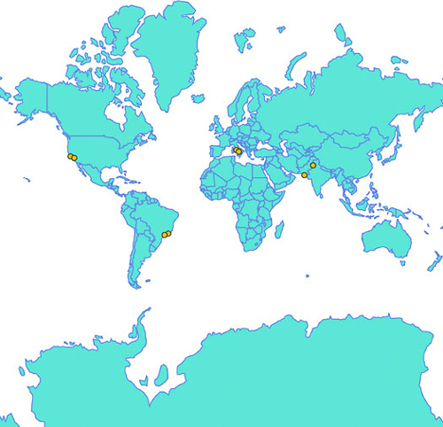
var PromiseWrapper = (xhr, d) => new
    Promise(resolve => xhr(d, (p) => resolve(p)))                 1

Promise.all([PromiseWrapper(d3.json, "world.geojson"),
    PromiseWrapper(d3.csv, "cities.csv")])
.then(resolve => {
    createMap(resolve[0], resolve[1])
})

function createMap(countries, cities) {
    var projection = d3.geoMercator()
        .scale(80)
        .translate([250, 250]);
    var geoPath = d3.geoPath().projection(projection);
    d3.select("svg").selectAll("path").data(countries.features)
        .enter()
        .append("path")
        .attr("class", "countries")
        .attr("d", geoPath)
    d3.select("svg").selectAll("circle").data(cities)             2
        .enter()
        .append("circle")
        .attr("class", "cities")
        .attr("r", 3)
        .attr("cx", d => projection([d.x,d.y])[0])                3
        .attr("cy", d => projection([d.x,d.y])[1])
}
One thing to note from listing 8.6 is that coordinates are often given in the real world in the order of “latitude, longitude.” Because latitude corresponds to the y-axis and longitude corresponds to the x-axis, you have to flip them to provide the x, y coordinates necessary for GeoJSON and D3.
Depending on what projection you use, the graphical size of your geographic objects will appear different. That’s because it’s impossible to perfectly display spherical coordinates on a flat surface. Different projections are designed to visually display the geographic area of land or ocean regions, or the measurable distance, or particular shapes. Because we included d3.geo.projection.js, we have access to quite a few more projections to play with, one of which is the Mollweide projection. In the code in listing 8.7, you can see the settings necessary to properly display a Mollweide projection of our geodata. We’ll use the calculated area of the countries (the graphical area, not their physical area) to color each country. The results are quite distinct from the same code running on our Mercator projection, as shown in figure 8.6. The world as displayed with Mollweide curves the edges, rather than stretching them into a rectangle like Mercator does.
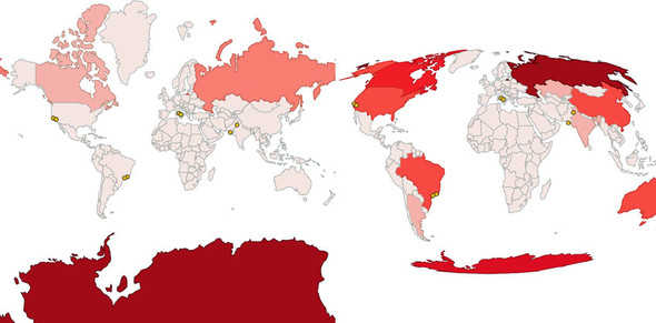
function createMap(countries, cities) {
var projection = d3.geoMollweide()
 .scale(120) #A
 .translate([250, 250]);                                                  1
var geoPath = d3.geoPath().projection(projection);
var featureSize = d3.extent(countries.features, d => geoPath.area(d))     2
var countryColor = d3.scaleQuantize()                                     2
              .domain(featureSize).range(colorbrewer.Reds[7]);
d3.select("svg").selectAll("path").data(countries.features)
   .enter()
   .append("path")
   .attr("d", geoPath)
   .attr("class", "countries")
   .style("fill", d => countryColor(geoPath.area(d)))                     3
   .style("stroke", d => d3.rgb(countryColor(geoPath.area(d))).darker())
d3.select("svg").selectAll("circle").data(cities)
   .enter()
   .append("circle")
   .attr("class", "cities")
   .attr("r", 3)
   .attr("cx", d => projection([d.x,d.y])[0])
   .attr("cy", d => projection([d.x,d.y])[1]);
};
Picking the right projection is never easy, and depends on the goals of the map you’re making. If you’re working with traditional tile mapping (the kind of map you see on Google Maps or Apple Maps, where the map consists of tiled images stitched together), then you’ll probably stick with Mercator. If you’re working on the world scale, it’s usually best to use an equal-area projection like Mollweide that doesn’t distort the visual area of geographic features. But because D3 has so many different projections available, you should experiment to see which best suits the particular map you’re creating.
As you encounter more mapmaking, you’ll come across the term choropleth map used to refer to a map that encodes data using the color of a region. You can use the existing geographic features—in this case, countries—to display statistical data, such as the GDP of a country, its population, or its most widely used language. You can do this in D3 either by getting geodata where the properties field has that information or by linking a table of data to your geodata where they both have the same unique ID values in common.
Keep in mind that choropleth maps, though useful, are subject to what’s known as the areal unit problem, which is what happens when you draw boundaries or select existing features in such a way that they disproportionately represent your statistics. This is the case with gerrymandering, when political districts are drawn in such a way as to create majorities for one political party or another.
Much of the geospatial data-related code in D3 comes with built-in functionality that you’ll typically need when working with geodata. In addition to determining the area like we did to color our features, D3 has other useful functions. Two that are commonly used in mapping are the ability to quickly calculate the center of a geographic area (known as a centroid) and its bounding box, like you see in figure 8.7. In listing 8.8, you can see how to add mouseover events to the paths we created and draw a circle at the center of each geographic area, as well as a bounding box around it.
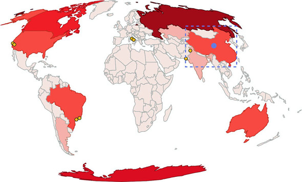
d3.selectAll("path.countries")
  .on("mouseover", centerBounds)
  .on("mouseout", clearCenterBounds);
function centerBounds(d) {
  var thisBounds = geoPath.bounds(d);                              1
  var thisCenter = geoPath.centroid(d);                            1
  d3.select("svg")
    .append("rect")
    .attr("class", "bbox")
    .attr("x", thisBounds[0][0])                                   2
    .attr("y", thisBounds[0][1])                                   2
    .attr("width", thisBounds[1][0] - thisBounds[0][0])            2
    .attr("height", thisBounds[1][1] - thisBounds[0][1])           2
  d3.select("svg")
    .append("circle")
    .attr("class", "centroid")
    .attr("r", 5)
    .attr("cx", thisCenter[0]).attr("cy", thisCenter[1])           3
}

function clearCenterBounds() {
  d3.selectAll("circle.centroid").remove();                        4
  d3.selectAll("rect.bbox").remove();
}
You’ve learned the core geo functions that allow you to make maps with D3: projections and geoPath. By using these functions, you can create maps with a distinct look and feel and provide your users with the ability to interact with them as shapes and as geographic features. D3 provides more functionality, and we’ll dive into it now.
To make your maps more readable, you can use built-in features from D3: the graticule generator and the zoom behavior. One provides grid lines that make it easier to read a map, and the other allows you to pan and zoom around your map. Both follow the same format and functionality of other behaviors and generators in D3, but are particularly useful for maps.
A graticule is a grid line on a map. The same way D3 has generators for lines, areas, and arcs, it has a generator for graticules to make your maps more beautiful. The graticule generator creates gridlines (you can specify where and how many, or use the default) and creates an outline that can provide a useful border. Listing 8.9 shows how to draw a graticule beneath the countries we’ve already drawn. Instead of .data we use .datum, which is a convenience function that allows us to bind a single datapoint to a selection so it doesn’t need to be in an array—.datum(yourDatapoint) is the same as .data([yourDatapoint]).
var graticule = d3.geoGraticule();
d3.select("svg").insert("path", "path.countries")
  .datum(graticule)
  .attr("class", "graticule line")
  .attr("d", geoPath)
d3.select("svg").insert("path", "path.countries")
  .datum(graticule.outline)
  .attr("class", "graticule outline")
  .attr("d", geoPath)
But how are we drawing so many graticule lines in figure 8.8 from a single datapoint? The geo.graticule function creates a feature known as a multilinestring. A multilinestring, as you may have figured out, is an array of arrays of coordinates, each corresponding to separate individual components of a feature. Multilinestrings and their counterparts, multipolygons, have always been a part of GIS because countries like the United States or Indonesia are made up of disconnected features such as states and regions, and that information needed to be stored in the data. As a result, when d3.geoPath gets a multipolygon or multilinestring, it draws a <path> element made up of multiple, disconnected pieces.
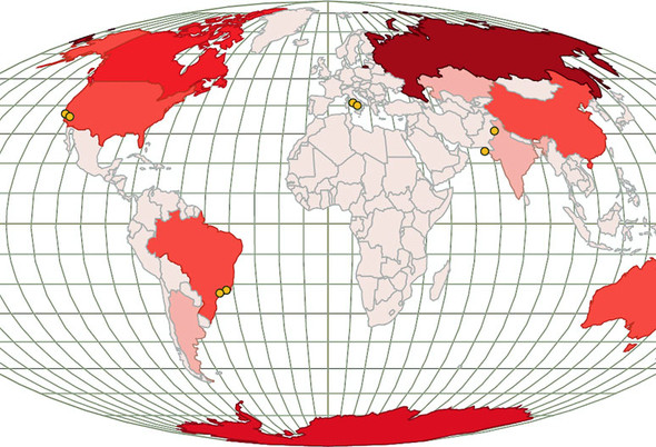
You dealt with zoom a little bit in chapter 5, when you saw how the zoom behavior can easily allow you to pan a chart around the screen. Now it’s time you start zooming with zoom. When we first looked at the zoom behavior, we used it to adjust the transform attribute of a <g> element that held our chart. This time, we’ll use the scale and translate values of the zoom behavior to update the settings of our projection, which will give us the ability to zoom and pan our map.
Create a zoom behavior and call it from the <svg> element. Whenever you have a drag event on anything in the <svg>, a mousewheel event, or a double-click, it triggers zoom. When we worked with zoom before, we only dealt with the dragging, which updates the zoom.translate() value and which you can use to update the translate value of whatever element you want to update. This time, we’ll also use the zoom.scale() value, which gives us an increasing (when you double-click or roll your mousewheel forward) or decreasing (when you roll your mousewheel backward) value. To use zoom with a projection, we’ll want to overwrite the initial zoom.scale() value with the scale value of the projection and do the same with the zoom translate value. After that, any time we have an event that triggers zoom, we’ll use the new values to update our projection, as shown in listing 8.10 and in figure 8.9.
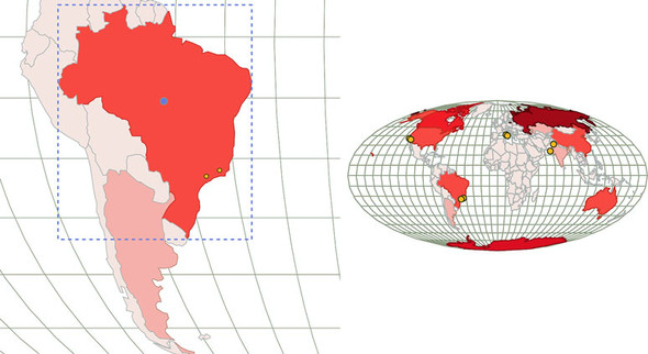
var mapZoom = d3.zoom()
   .on("zoom", zoomed)

var zoomSettings = d3.zoomIdentity                                        1
   .translate(250, 250)
   .scale(120)

d3.select("svg").call(mapZoom).call(mapZoom.transform, zoomSettings)      1

function zoomed() {
  var e = d3.event                                                        2
    projection.translate([e.transform.x, e.transform.y])                  3
      .scale(e.transform.k)                                               3
    d3.selectAll("path.graticule").attr("d", geoPath)
    d3.selectAll("path.countries").attr("d", geoPath)                     4
    d3.selectAll("circle.cities")
   .attr("cx", d => projection([d.x,d.y])[0])                             5
   .attr("cy", d => projection([d.x,d.y])[1])
}
The zoom behavior updates its .transform object in reference to your behavior, updating transform.x and transform.y from dragging and changing transform.k (scale) in reference to your mousewheel and double-click behavior. Because it’s designed to work with SVG transform and D3 geographic projections, d3.zoom is all you need for pan-and-zoom functionality.
When you think about zooming in on things, you naturally think about increasing their size. But from working with mapping, you know that you don’t merely increase the size or resolution as you zoom in—you also change the kind of data that you present to the reader. This is known as semantic zoom in contrast to graphical zoom. It’s clearest when you look at a zoomed-out map and see only country boundaries and a few major cities, but as you zoom in you see roads, smaller cities, parks, and so on.
You should try to use semantic zoom whenever you’re letting your user zoom in and out of any data visualization, not only charts. It allows you to present strategic or global information when zoomed out, and high-resolution data when zoomed in.
The default zoom behavior assumes a user knows that the mousewheel and double-clicking are associated with zooming. But sometimes you want zoom buttons, because you can’t assume the user knows that interaction or because you want to constrain or control the zooming process in a more complicated manner. The code in listing 8.11 creates a zoom function and adds the necessary buttons, as seen in figure 8.10.
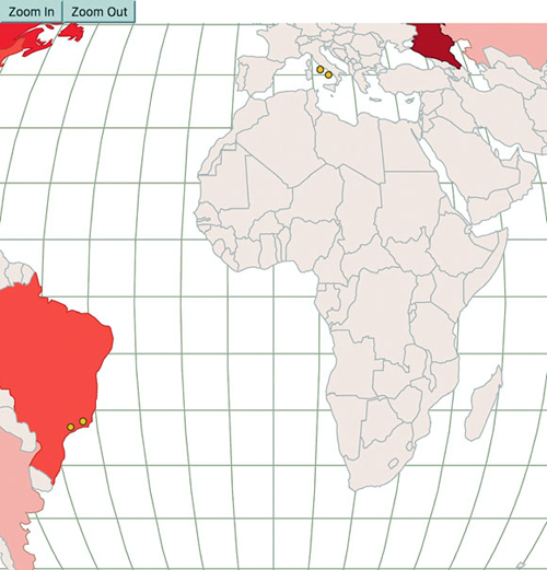
function zoomButton(zoomDirection) {
  var width = 500
  var height = 500
  if (zoomDirection == "in") {
    var newZoom = projection.scale() * 1.5;                                1
    var newX =
      ((projection.translate()[0] - (width / 2)) * 1.5) + width / 2;       2
    var newY =
      ((projection.translate()[1] - (height / 2)) * 1.5) + height / 2;
  }
  else if (zoomDirection == "out") {
    var newZoom = projection.scale() * .75;
    var newX = ((projection.translate()[0] - (width / 2)) * .75) + width / 2;
    var newY = ((projection.translate()[1] - (height / 2)) * .75) + height / 2;
  }

  var newZoomSettings = d3.zoomIdentity
    .translate(newX, newY)                                                 3
    .scale(newZoom)

  d3.select("svg").transition().duration(500).call(mapZoom.transform, newZoomSettings)                                                      4

}d3.select("#controls").append("button").on("click", () => {
                      zoomButton("in")}).html("Zoom In");
d3.select("#controls").append("button").on("click", () => {
                      zoomButton("out")}).html("Zoom Out");
With this kind of styling and interactivity in place, you can make a map for most any application. Zooming and panning is important for maps because users expect to zoom in and out, and they also expect the details of the map to change when they do so. In that way, geospatial is one of the most powerful forms of information visualization because users have a high level of literacy when it comes to reading and interacting with maps. But users also expect a map to have certain features and functionality, and when those are missing they think it’s broken. Make sure that when you create your map, it either includes this functionality or you have a good reason to leave it out.
We’ve covered the aspects of creating maps that you’ll likely end up using with all your maps. You could explore many variations. You may want to scale your <circle> elements based on population, or use <g> elements so that you can also provide labels like we did earlier. But if you’re making a map, it will probably have polygons and points and take advantage of bounding boxes or centroids, and will likely be tied to a zoom behavior. The exciting thing about D3 is that it lets you explore more complex ways of representing geography, with a little more effort.
We’ll do only one thing in 3D in this entire book and that’s create a globe. We don’t need to use three.js or learn WebGL. Instead, we’ll take advantage of a trick of one of the geographic projections available in D3: the orthographic projection, which renders geographic data as it would appear from a distant point viewing the entire globe. We need to update our projection to refer to the orthographic projection and have a slightly different scale, as shown in the following listing.
    projection = d3.geoOrthographic()
       .scale(200)
       .translate([250, 250])
       .center([0,0]);
With this new projection, you can see what looks like a globe in figure 8.11.
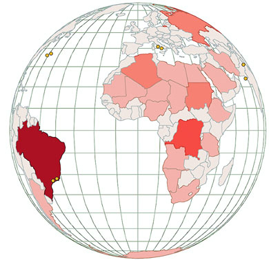
To make it rotate, we need to use d3.mouse, which returns the current position of the mouse on the SVG canvas. Pair this with event listeners to turn on and off a mousemove listener on the canvas. This simulates dragging the globe, which we’ll use only to rotate it along the x-axis. Because we’re introducing new behavior and it’s been a while since we looked at the full code, the following listing has the entire code for creating the globe.
var zoomSettings = d3.zoomIdentity
    .translate(0, 0)                                                      1
    .scale(200)

var rotateScale = d3.scaleLinear()                                        2
  .domain([-500, 0, 500])
  .range([-180, 0, 180]);

d3.select("svg")
  .call(mapZoom)
  .call(mapZoom.transform, zoomSettings)

function zoomed() {
  var e = d3.event
  var currentRotate = rotateScale(e.transform.x) % 360                    3

  projection
    .rotate([currentRotate, 0])                                           4
    .scale(e.transform.k)

  d3.selectAll("path.graticule").attr("d", geoPath);
  d3.selectAll("path.countries").attr("d", geoPath)                       5
     .style("fill", d => countryColor(geoPath.area(d)))                   6
     .style("stroke", d => d3.rgb(countryColor(geoPath.area(d))).darker())

  d3.selectAll("circle.cities")
     .each(function (d, i) {
      var projectedPoint = projection([d.x,d.y])
      var x = parseInt(d.x)
      var display = x + currentRotate < 90 && x + currentRotate > -90
|| (x + currentRotate < -270 && x + currentRotate > -450)
|| (x + currentRotate > 270 && x + currentRotate < 450)
? "block" : "none"                                                        7
      d3.select(this)
        .attr("cx", projectedPoint[0])
        .attr("cy", projectedPoint[1])
        .style("display", display)
    })
  }
A more sophisticated dragging approach is known as Versor Dragging, an example of which you can see at: https://bl.ocks.org/mbostock/7ea1dde508cec6d2d95306f92642bc42.
We’re drawing all the countries using geoPath.area(), which returns the area as the shape is drawn, has even worse issues than the Mercator projection had. For instance, in figure 8.12, Australia is colored as if it were smaller than India and had an area similar to Madagascar. Fortunately, D3 also includes d3.geoArea(), which determines the spherical area of a shape corresponding to its geographic area, as in figure 8.13.
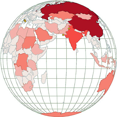
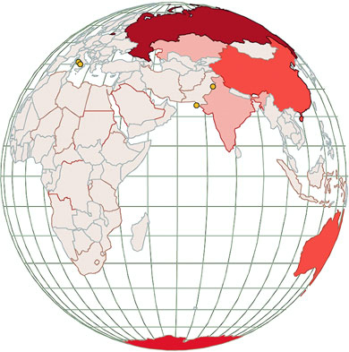
We could rewrite the draw code to use d3.geoArea, but instead let’s recolor our existing globe. But how do we get the data? Until now, we’ve assumed that the data array was exposed somewhere our functions could get to, but what if it’s outside our current scope? In this case, we can use selectAll.data() and get an array of data associated with whatever we select (which includes undefined elements if we select HTML elements that aren’t bound with data):
var featureData = d3.selectAll("path.countries").data();
var realFeatureSize =
d3.extent(featureData, d => d3.geoArea(d))
var newFeatureColor =
d3.scaleQuantize().domain(realFeatureSize).range(colorbrewer.Reds[7]);
d3.selectAll("path.countries")
.style("fill", d => newFeatureColor(d3.geoArea(d)));
The spherical area of a shape as measured by d3.geoArea() is given in steradians (spherical radians, used to measure area on the surface of a sphere), and so it’s only a roughly proportionate area. If you want the square kilometers of a country or other shape, you’ll still need to calculate that in a GIS package like QGIS or get that information from another source.
Isometric views of the world are powerful tools for storytelling. Imagine you had to create a map related to how the Middle East has a changing view of Europe. By crafting a satellite view looking out over the Mediterranean from the Middle East as shown in figure 8.14, you invite your map reader to see a distant Europe from a geographical perspective in the Middle East.
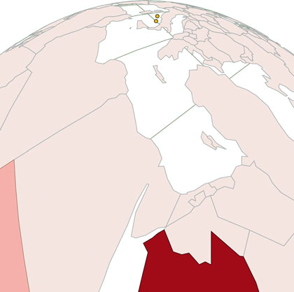
This is a projection like the orthographic, Mercator, and Mollweide projections we previously used, but as you see in the following listing, it has specific settings for scale and rotate. It also uses new settings, tilt and distance, to determine the angle of the satellite projection.
    projection = d3.geoSatellite()
       .scale(1330)
       .translate([250,250])
       .rotate([-30.24, -31, -56])
       .tilt(30)                                 1
       .distance(1.199)                          2
       .clipAngle(45);
Tilt is the angle of the perspective on the data, whereas distance is the percentage of the radius of the earth (so 1.119 is 11.9% of the radius of the earth above the earth). How do you come up with such exact settings? You have two options. The first is to understand how to describe a tilted projection like this mathematically. If you have a degree in math or geography, you can look into literature for calculating this. If, like me, you don’t have that kind of background, then I would suggest building a tool, using the code we explored in this chapter, to adjust the rotation, tilt, distance, and scale settings interactively. That’s how I did it, and you can play with my satellite projection tool here: http://bl.ocks.org/emeeks/10173187.
Recall my advice in Chapter 5 for understanding how the Sankey layout works. Use information visualization to visualize how the functions work so you can better understand them and find the right settings. Otherwise, you’re going to need to take a course in GIS or wait for someone to write D3.js Mapping in Action.
Now we’ll shift gears away from visualization and back to geodata structure to explore a library that was developed by Mike Bostock and is intimately tied to D3 mapping: TopoJSON.
TopoJSON (https://github.com/mbostock/topojson) is fundamentally three different things. First of all, it’s a data standard for geographic data, and an extension of GeoJSON. Secondly, it’s a library that runs in node.js to create TopoJSON-formatted files from GeoJSON files. Thirdly, it’s a JavaScript library that processes TopoJSON--formatted files to create the data objects necessary to render them with libraries like D3. You won’t deal with the second form at all, and you’ll only examine the first in a cursory manner as you learn about rendering TopoJSON data, merging it, and using it to find a feature’s neighbors.
The difference between GeoJSON files and TopoJSON files is that whereas GeoJSON records for each feature an array of longitude and latitude coordinates that describe a point, line, or polygon, TopoJSON stores for each feature an array of arcs. An arc is any distinct segment of a line shared by one or more features in your dataset. As you can see in figure 8.15, the shared border between the state of California and the state of Nevada is a single arc that’s referred to in the arcs array of the feature for California and the arcs array of the feature for Nevada.
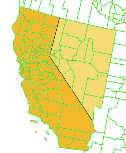
Most datasets have shared segments, so TopoJSON often produces significantly smaller datasets. This is part of its appeal. Another part is that if you know what segments are shared, then you can do interesting things with the data, like easily calculating the neighboring features or the shared border, or merging features.
TopoJSON stores the arcs as a reference to a particular arc in a master list of arcs that defines the coordinates of that arc. You need the Topojson.js library included in any website you’re using to create maps with TopoJSON, because it changes TopoJSON into a format that D3 can read and create graphics from.
Because TopoJSON stores its data in a format different from the GeoJSON structure that’s expected by d3.geoPath(), we need to include Topojson.js and use it to process TopoJSON data to produce GeoJSON features. This is rather straightforward and can be done in a call to our new datafile, as shown in listing 8.15. Figure 8.16 shows the properly formatted features in your console.
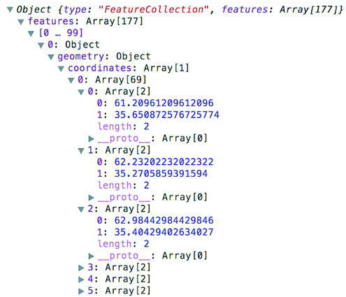
var PromiseWrapper = (xhr, d) => new Promise(resolve => xhr(d, p =>
   resolve(p)))
Promise.all([PromiseWrapper(d3.json, "world.topojson"),
   PromiseWrapper(d3.csv, "cities.csv")])
  .then(resolve => {
    createMap(resolve[0], resolve[1])
  })

function createMap(countries, cities) {
  var worldFeatures = topojson.feature(countries, countries.objects.countries)                                          1
  console.log(worldFeatures)
}
Now that it’s in the format we want, we can send it to our existing code and draw this array of features like we did with the features we loaded from world.geojson. We replace our earlier countries with the worldFeatures variable declared in listing 8.15. That’s all that most people do with TopoJSON, and they’re happy for it because TopoJSON data is significantly smaller than GeoJSON data. But because we know the topology of the features in a TopoJSON data file, we do interesting geographic tricks with it.
The TopoJSON library provides you with the capacity to create new features by merging existing features. You can create a new feature for “North America” by merging the countries in North America, or create “The United States in 1912” by merging the states that were part of the United States in 1912. Listing 8.16 shows the code to draw a map using our new TopoJSON data file and merge all the countries that have a center west of 0° longitude. The results, shown in figure 8.17, show that merging combines not only contiguous features but also separate features into a multipolygon.
function createMap(topoCountries) {
    var countries =
       topojson.feature(topoCountries, topoCountries.objects.countries)    1

    var projection = d3.geoMollweide()
       .scale(120)
       .translate([250, 250])
       .center([20,0])
    var geoPath = d3.geoPath().projection(projection);
    var featureSize =
       d3.extent(countries.features, d => geoPath.area(d))
    var countryColor = d3.scaleQuantize()
               .domain(featureSize).range(colorbrewer.Reds[7]);
    var graticule = d3.geoGraticule();
    d3.select("svg").append("path")
       .datum(graticule)
       .attr("class", "graticule line")
       .attr("d", geoPath)
    d3.select("svg").append("path")
       .datum(graticule.outline)
       .attr("class", "graticule outline")
       .attr("d", geoPath)
    d3.select("svg").selectAll("path.countries")
       .data(countries.features)
       .enter()
       .append("path")
       .attr("d", geoPath)
       .attr("class", "countries")
       .style("fill", d => countryColor(geoPath.area(d)))
       .style("stroke", "none")
    mergeAt(0)
    function mergeAt(mergePoint) {                                         2
      var filteredCountries = topoCountries.objects.countries.geometries   3
          .filter(d => {
            var thisCenter = d3.geoCentroid(
              topojson.feature(topoCountries, d) );                        4
            return thisCenter[1] > mergePoint? true : null;
           })                                                              5
       d3.select("svg").append("g")
        .datum(topojson.merge(topoCountries, filteredCountries))           6
        .insert("path")
        .attr("class", "merged")
        .attr("d", geoPath)
    }
 }
We can adjust the mergeAt test slightly to look at the x coordinate or to see features that have greater values of mergeAt. As shown in figure 8.18, this creates a single feature in each of four cases: less than or greater than 0° latitude and less than or greater than 0° longitude. Notice in each case that it’s a single feature but not a single polygon.
A quick note for those who may want to continue working in topologies: Topojson.merge has a sister function, mergeArcs, that allows you to merge shapes but keep them in TopoJSON format. Why would you want to maintain arcs? Because then you could continue to use TopoJSON functionality like merging, creating meshes, or finding neighbors of your newly merged features.
Because we know when features share arcs, we also know what features neighbor each other. The function Topojson.neighbors builds an array of all the features that share a border. We can use this array to easily identify neighboring countries in our dataset using the code in listing 8.17. The results of the interaction provided by this code are shown in figure 8.19.
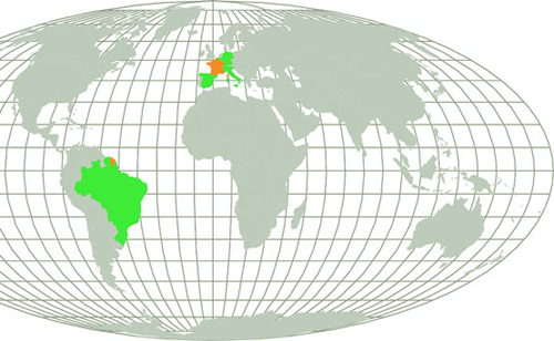
var neighbors =
  topojson.neighbors(topoCountries.objects.countries.geometries)       1
d3.selectAll("path.countries")
  .on("mouseover", findNeighbors)
  .on("mouseout", clearNeighbors)
function findNeighbors (d,i) {
  d3.select(this).style("fill", "#FE9922")                             2
  d3.selectAll("path.countries")
    .filter((p,q) => neighbors[i].includes(q))                         3
    .style("fill", "#41A368")
}
function clearNeighbors () {
  d3.selectAll("path.countries").style("fill", "#C4B9AC")              4
}
TopoJSON is a powerful technology that provides tremendous opportunity for web map development. Understanding how it models data and the functionality it provides are key to creating maps that impress users. Keep in mind that the same topological functionality is available in d3.voronoi.
As I said in the beginning of this chapter, the things you can do with D3’s mapping capabilities would fill an entire book. This section touches on a few other capabilities we didn’t cover in this chapter.
D3 can be used in conjunction with other web libraries or the d3.geoTile module to overlay vector features on raster tiles. If you’re serious about developing tile-based maps, though, you’re probably better off working with dedicated libraries, like mapboxGL, which you can find at www.mapbox.com/mapbox-gl-js/api/.
The method we used for our zoom behavior in this chapter, known as projection zoom, recalculates mathematically the shape of features based on a change in scale and translation. But if you’re using a projection that’s flat, like Mercator, you can achieve faster performance by tying the change in scale and translate of the zoom behavior to your features’ SVG transform.
The .context function of d3.geoPath allows you to easily draw your vector data to a <canvas> element, which can dramatically improve speed in certain cases. It also allows you to use .toDataURL() to dynamically create a PNG for users to save or share on social media. We’ll see this in chapter 11.
Jason Davies and Mike Bostock have both provided examples of reprojecting not only vector data, but the tile data used in tile maps (see bl.ocks.org/mbostock/ and www.jasondavies.com/maps/raster/satellite/). You can use this to show a satellite--projected terrain map or a terrain map with the Mollweide projection we used earlier.
The d3.hexbin plugin allows you to easily create hexbin overlays for your maps like that seen in figure 8.20. This can be effective when you have quantitative data in point form and you want to aggregate it by area.
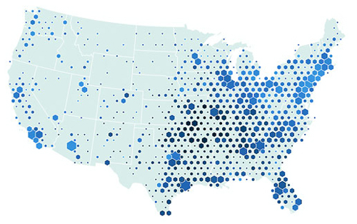
As with hexbins, if you only have point data and want to create area data from it, you can use the d3.geom.voronoi function to derive polygons from points like the kind seen in figure 8.21.
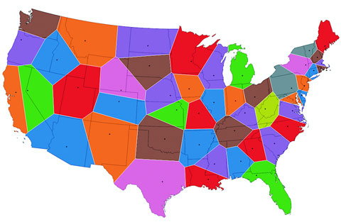
Distorting the area or length of a geographic object to show other information creates a cartogram. For example, you could distort the streets of your city based on the time it takes to drive along them, or make the size of countries on a world map bulge or shrink based on population. Although no simple functions exist to create cartograms, examples of how to create them in D3 include one created by Jason Davies (www.jasondavies.com/maps/dorling-world/), one created by Mike Bostock (http://bl.ocks.org/mbostock/4055908), and the cost cartogram I built (orbis.stanford.edu).
Visionscarto
Visionscarto.net is a small independent research center with a special interest in the intersection of art, geography, and social justice. To create maps, our toolset includes crayons and watercolor, paper and vector graphic software, and geographic information systems. We use D3 to prototype, create first images from datasets, and to try various algorithms, for example when we need to place labels automatically on thematic maps.
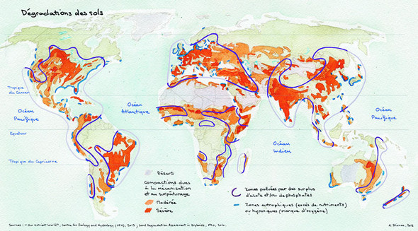
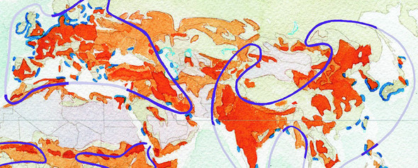
What drew us to D3 was its amazing set of geographic projections. Being able, with a simple code change, to choose the relevant projection (be it a classical Robinson, or a polar projection when necessary), and rotate it at will, was a killer feature. Web-Mercator no more! This also lead us down the rabbit hole of researching new projections—with lots of difficulties...and lots of delight.
Toy as much as possible with all the examples given by the community, try to modify them in unplanned ways, and by practicing a lot, you’ll find your own voice. The beautiful thing with D3 is that it models all the abstractions at the right level: scales are not only a means to transfer data to pixels, but a solid way of designing your graphs; countries are not only shapes on a map, but a meaningful topology in which they share borders with neighbors.
The final four chapters are focused on moving beyond small-scale and one-off data visualization products toward creating interactive applications and the reusable code they require. Chapter 9 integrates React to tie together multiple charts using different layouts with brush-based filtering to produce a data dashboard. Chapter 10 focuses on the structure of components and layouts in D3 by walking you through the creation of a simple grid layout and legend component. Chapter 11 tackles the problem of representing thousands of datapoints graphically onscreen while maintaining performance and interactivity. Overall, part 3 gives you the skills necessary to build your own framework or application on top of D3, with high performance in a big data environment.
Throughout this book, you’ve seen how data can be measured and transformed to produce charts highlighting one or another aspect of the data. Even though you’ve used the same dataset in different layouts and with different methods, you haven’t presented different charts simultaneously. In this chapter, you’ll learn how to tie multiple views of your data together using React. This type of application is typically referred to as a dashboard in data visualization terminology (an example of which will be built in this chapter, as shown in figure 9.1). You’ll need to create and manage multiple <svg> elements as well as implement the brush component, which allows you to easily select part of a dataset. You’ll also need to more clearly understand how data-binding and D3’s enter/exit/update pattern work so that you can effectively integrate D3 with external frameworks.
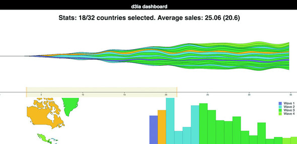
Multiple charts combined into a single application have been around since the 1970s and were traditionally associated with decision support systems. Dashboards provide the kind of multiple views into a dataset that you’ll see in this chapter and are often the selling point of charting libraries like NVD3.
Although they’re typically presented as several charts sharing screen space, the principles of data dashboards can also be applied to web mapping and text-based applications through modal pop-ups or any website that provides several different charts simultaneously. In those cases, the act of highlighting datapoints may be a response to the scrolling of text or zooming in on a map, rather than mousing over a data visualization element.
We start with a design for our dashboard. Designs can be rough sketches or detailed sets of user requirements. Let’s imagine you work for the leading European online seller of table mats, MatFlicks, and you’re in charge of creating a dashboard showing their rollout to North America and South America. The genius CEO of MatFlicks, Matt Flick, decided the rollout strategy would be alphabetical, so Argentina gets access on Day 0, and every day one more country gets access to the amazing MatFlicks inventory. They need to see how the rollout is progressing geographically, over time and in total per country. Figure 9.2 shows a simple sketch to achieve this using several of the charts we’ve explored in previous chapters. We’re going to randomly generate MatFlicks data like we’ve done before, with each country only generating random data after its rollout and then after that one data point representing amount of sales (in billions of euros) per day.
With a data dashboard like this, we want to provide a user with multiple perspectives into the data as well as the ability to drill down into the data and see individual datapoints. We’ll use a line chart to see the change over time, a bar chart for raw total changes, and a map so that users can see the geographic distribution of our data. We also want to let users slice and dice their data, so later we’ll add that functionality with a brush.
From the sketch, you can easily imagine interaction possibilities and changes that you may want to see based on user activity—for instance, highlighting which elements in each chart correspond to elements in other charts, or giving more detail on a particular element based on a click.
By the time you’re done with this chapter, you’ll have created the data dashboard shown in figure 9.1, with interactivity and dynamic filtering. The CSS for the dashboard is in listing 9.1. It’s simple and necessary for the brush component we’ll see later; most of the other styles will be inline.
rect.overlay {
  opacity: 0;
}

rect.selection {
  fill: #FE9922;
  opacity: 0.5;
}

rect.handle {
  fill: #FE9922;
  opacity: 0.25;
}

path.countries {
   stroke-width: 1;
   stroke: #75739F;
   fill: #5EAFC6;
}
Any application we design needs to be responsive so that it adjusts how it’s drawn based on the size of the screen. We could also use the viewport attribute of an SVG element to automatically resize the graphics, but we’ll want more fine-grained control of our graphics when creating data visualization applications (recall the distinction between graphical and semantic zoom discussed in chapter 7).
You’ve seen arrow functions and promises up until this point, but in the following code you’re going to see more ES2015 than you might have before. I hope by the time you read this that the functionality here is familiar to you and common to JS development. But if you see something strange, that’s probably ES2015. I can’t highlight every difference, but here are a few new pieces that you’ll see:
const and let are new declarations that are cleaner than var and that make a read-only constant (const) or variable (let) and are scoped much more cleanly than var. If you replaced them all with var, the code would run the same; they make your code more hygienic because they require you to know what you’re doing with your identifiers.
[...array], {...object} are spread operators that allow you to turn arrays and objects into sets of variables or properties. You can use it to combine arrays or objects without using Object.assign or Array.concat. Note that the rest parameter syntax also looks the same but is used to send an array of variables to a function without using function.apply.
You can instantiate identifiers from passed objects like this:
const { data, style } = { data: [1,2], style: {fontSize: "12px", color:
             "red"}, beer: "no" }
ES6 and node lets you include pieces of JavaScript or other code from other files using the import/export syntax.
function({ a: 1, b: 2 }): Functions could always take objects that you could destructure on your own, but now you can directly pass the object without any intermediate code. You don’t have to think about undefined or null values in your list of variables you send to a function; instead, you send an object with those properties.
React is a view lifecycle management system that’s part of a popular MVC framework and development pattern. React is the view layer and lets you define HTML components with custom behavior, which is super useful for composing applications. It uses a JavaScript + HTML language called JSX that disgusted me when I first saw it, but now I love it. I didn’t like it because I always felt like JavaScript and HTML should live in totally separate worlds, but I found out later that writing HTML inside JavaScript could be incredibly useful when you’re manipulating the DOM like we’ve been with vanilla D3 throughout this book.
Typically when you see examples of React, they pair it with a kind of state management system like Flux or Redux. We won’t be doing that in this chapter. This is a single chapter, and you can find entire books about React.
Whereas the rest of this book has focused on core HTML and JavaScript, this section is going to rely on new technologies. You’re going to need node and node package manager (npm) that comes with node installed on your system as well as a slight amount of comfort with the command line. There are great books on React, such as React Quickly, so this will only scratch the surface, but you can create a fully self--contained React data visualization application.
React is obviously the best library ever made, and if you like Angular, you’re dumb, bro (and don’t even get me started on Ember). No, not really. That’s horrible, and it’s too bad that people get so invested in the righteousness of their particular library.
I wanted to show people how to deal with D3 in a modern MVC environment and I know React best. Even if you never use React, you’ll probably see patterns in this chapter that apply to other frameworks. And even if you hate MVC frameworks, you can use most of the code in this chapter in your own custom, hand-rolled, beautifully opaque bespoke dashboard.
Fundamentally, React consists of a component creation framework that lets you build self-contained elements (like div or svg:rect) that have custom rendering methods, properties, state, and lifecycle methods.
One of the major features of React is that it keeps track of a copy of the DOM, known as the virtual DOM, which it can use to only render elements that need to change based on receiving new data-saving cycles and speeding up your web applications. This was React’s big selling point when it first dropped, but it’s become popular with other view rendering systems. The render() function in each React component returns the elements that will be created by React (typically described using JSX, which is introduced in this chapter).
Attributes of a component are sent to it when it’s created—known as props. These props of a React component are typically available in the component functions via the this context as this.props. In certain cases, such as stateless components or constructors, you won’t use this to access them, but we won’t do that in this chapter, so you’ll need a book dedicated to React to get to know the other patterns. This structure lets you send data down from parent components to child components, and you can use that data to modify how the component is rendered. You’ll see this in detail when we get into the code.
Whereas props are sent down to a component, the state of a component is stored and modified internally within the component. Like this.props, there’s a corresponding this.state that will give you the current state. When you modify state (using this.setState in a component) it will automatically trigger a re-render unless you’ve modified shouldComponentUpdate (a lifecycle method dealt with in the next section).
React components expose lifecycle methods that fire as the component is created and updated and receives its props. They are incredibly useful and even necessary in certain use cases, as we’ll see later. You have, for instance, shouldComponentUpdate, which lets you specify the logic for whether or not the component re-renders when it receives new props or state. There’s also willComponentUpdate and didComponentUpdate to add functionality to your component before or after it updates, along with similar methods for when the component first mounts or exits (and a few more). I’ll get into these methods as they apply to our data visualization needs but I won’t touch on all of them.
One of the challenges of modern development is getting your environment set up. Fortunately, there’s a command line tool that gets you started, and it’s supported by the React team: create-react-app
In OS X you can open your terminal window and run the following commands:
npm install -g create-react-app create-react-app d3ia cd d3ia/ npm start
Setting up your React app is that easy. If you navigate to localhost:3000, you’ll see the boilerplate create-react-app page in figure 9.3. If you have any issues or need instructions for Windows, see https://github.com/facebookincubator/create-react-app.
Along with starting your node server running the code, this will create all the structure you need to build and deploy a React application that we’re going to use to build our dashboard. That structure contains a package.json file that references all the modules included in your project and to which we need to add a couple more modules to make our dashboard. We add modules using NPM and while we could include the entire D3 library and keep coding like we have, you’re better off installing the individual modules and understanding how importing those modules works. In your project directory run the following to install the d3-scale module:
npm i –SE d3-scale
This command (npm i is short for npm install) installs the latest version of d3-scale (which gives us access to all those wonderful scales we’ve been using in the last eight chapters), and the –SE tag saves the exact version to your package.json so that when you want to deploy this application elsewhere, d3-scale is installed. Along with d3-scale, do the same thing with the following modules:
react-dom d3-shape d3-svg-legend d3-array d3-geo d3-selection d3-transition d3-brush d3-axis
By installing modules individually like this, you reduce the amount of code you’ll deploy with your application, decreasing load time and improving maintainability.
JSX refers to JavaScript + XML, an integrated JavaScript and HTML coding language that lets you write HTML inline with your JavaScript code. It requires that the code be transpiled to plain JavaScript—your browser can’t natively run JSX—but as long as you have your transpiling set up (which react-create-app already does for you), you can write code like this:
const data = [ "one", "two", "three" ]
const divs = data.map((d,i) => <div key={i}>{d}</div>)
const wrap = <div style={{ marginLeft: "20px" }}
className="wrapper">{divs}</div>
And you can create an array of three div elements, each of which will have the corresponding string from your array as content. Notice a few things going on here. One, when we start writing in HTML, we have to use curly braces (bolded for emphasis in preceding code) to get out of it if we want to put JavaScript there. If I hadn’t put curly braces around the d, for instance, then all my divs would have had the letter d as their content. Another is that style is an object passed to an element and that object needs CSS keys that usually are snake case (like margin-left) turned into camelcase (-marginLeft). When we’re making an array of elements, each needs a “key” property that gives it a unique key (like the optional key when we’re using .data() with D3). Finally, when you want to set an element’s CSS class, you need to use className, because class is reserved.
There’s more to JSX, but that should be enough to let you make sense of the code you’re going to see. When I first saw JSX, as I already mentioned, I was convinced it was a horrible idea and planned to only use the pure JavaScript rendering functions that React has (you don’t need to use JSX to use React), but after a couple weeks, I fell in love with JSX. The ability to create elements on the fly from data appealed to me because of my experience with D3.
The challenge of integrating D3 with React is that React and D3 both want to control the DOM. The entire select/enter/exit/update pattern with D3 is in direct conflict with React and its virtual DOM. If you’re coming to React from D3, giving up your grip on the DOM is one of those “cold, dead hands” moments. The way most people use D3 with React is to use React to build the structure of the application, and to render traditional HTML elements, and then when it comes to the data visualization section, they pass a DOM container (typically an <svg>) over to D3 and use D3 to create and destroy and update elements. In a way, it’s similar to the way we used to use Java applets or Flash to run a black box in your page while the rest of your page is rendered separately. The benefit of this method of integrating React and D3 is that you can use all the same kind of code you see in all the core D3 examples. The main difficulty is that you need to create functions in various React lifecycle events to make sure your viz updates.
Listing 9.2 shows a simple bar chart component built using this method. Create this component in your src/ directory and save it as BarChart.js. In React, component filenames and function names are typically differentiated from other code files and functions by using camelcase and capitalizing the first letter.
import React, { Component } from 'react'
import './App.css'
import { scaleLinear } from 'd3-scale' 1
import { max } from 'd3-array' 1
import { select } from 'd3-selection' 1
class BarChart extends Component {
constructor(props){
super(props)
this.createBarChart = this.createBarChart.bind(this) 2
}
componentDidMount() { 3
this.createBarChart()
}
componentDidUpdate() { 3
this.createBarChart()
}
createBarChart() {
const node = this.node 4
const dataMax = max(this.props.data) 5
const yScale = scaleLinear()
.domain([0, dataMax])
.range([0, this.props.size[1]]) 5
select(node)
.selectAll("rect")
.data(this.props.data)
.enter()
.append("rect")
select(node)
.selectAll("rect")
.data(this.props.data)
.exit()
.remove()
select(node)
.selectAll("rect")
.data(this.props.data)
.style("fill", "#fe9922")
.attr("x", (d,i) => i * 25)
.attr("y", d => this.props.size[1] - yScale(d))
.attr("height", d => yScale(d))
.attr("width", 25)
}
render() { 6
return <svg ref={node => this.node = node} 7
width={500} height={500}>
</svg>
}
}
export default BarChart
Making these changes and saving them won’t show any immediate effect because you’re not importing and rendering this component in App.js, which is the component initially rendered by your app. Change App.js to match the following listing.
import React, { Component } from 'react'
import './App.css'
import BarChart from './BarChart' 1
class App extends Component {
render() {
return (
<div className="App">
<div className="App-header">
<h2>d3ia dashboard</h2>
</div>
<div>
<BarChart data={[5,10,1,3]} size={[500,500]} /> 2
</div>
</div>
)
}
}
export default App
When you save App.js with these changes, you’ll see something pretty cool if you have your server running: it automatically updates the page to show you what’s in figure 9.4. That’s one of the magic tricks of Webpack—the module bundler included in create-react-app that will automatically update your app based on changes in your code.
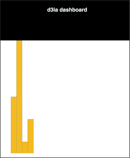
You can already imagine optimizations of your code, for instance, to scale the bars to fit the width, which we’ll see later. But for now let’s move on to the other method of rendering data visualization using D3 and React.
Rather than passing your DOM node off to D3, you can use D3 to generate all the necessary drawing instructions and use React to create the DOM elements. One of the challenges with this approach is animated transitions, which require a deeper investment in the React ecosystem, but otherwise this approach is going to leave you with code that will be more maintainable by your less D3-inclined colleagues.
Listing 9.4 shows how we can do this to recreate one of our maps from the last chapter. It’s mostly the same as our earlier code, but in this case, I’m importing world.js here, instead of world.geojson. I’ve transformed it into a .js file by adding a little ES6 export syntax to the beginning of the JSON object. The code in the following listing is similar to what we’ve seen before, except now we’re using it to create JSX elements to represent each country and we’re including the geodata rather than using an XHR request (like the d3.json function we used before).
import React, { Component } from 'react'
import './App.css'
import worlddata from './world' 1
import { geoMercator, geoPath } from 'd3-geo'
class WorldMap extends Component {
render() {
const projection = geoMercator()
const pathGenerator = geoPath().projection(projection)
const countries = worlddata.features
.map((d,i) => <path 2
key={"path" + i} 3
d={pathGenerator(d)}
className="countries" 4
/>)
return <svg width={500} height={500}>
{countries} 5
</svg>
}
}
export default WorldMap
You can see the first couple lines of world.js in the following listing—the rest of it resembles the original world.geojson. You can do this to any JSON file if you want to bring it in using import.
export default {"type":"FeatureCollection","features":[
{"type":"Feature","id":"AFG","properties":{"name":"Afghanistan"},"geometry":{
"type":"Polygon","coordinates":[[[61.210817,35.650072],...
It’s almost exactly the same as the data-binding pattern we see in D3, except that we use native Array.map and map the individual data elements to DOM elements because of the magic of JSX. The results in figure 9.5 should be familiar to you, because it’s the same thing we saw in the last chapter.
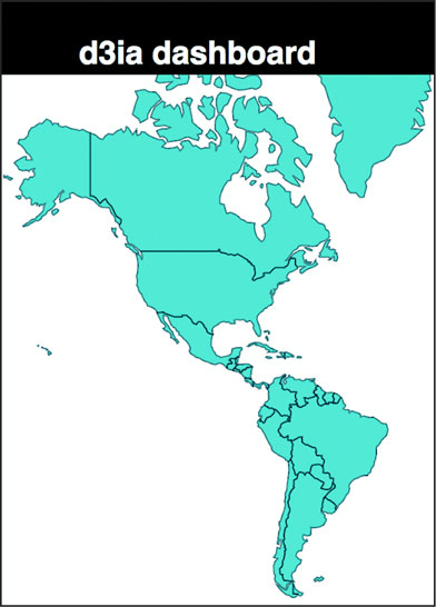
In my own practice I prefer to use this method, because I find the lifecycle events in React and the way it creates and updates and destroys elements to be more comprehensive than dealing with it via D3.
Before we draw anything, we need to have data to send it to our charts. We’ll accomplish that by extending App.js and including in it a function for creating randomized data for our countries. As shown in the following listing, we’re going to color the countries by launch day—which, remember, is alphabetical because it’s made up (or because Matt Flick, rakish billionaire CEO of MatFlicks, thought that was a good idea, whichever explanation you prefer).
...import the existing app.js imports...
import WorldMap from './WorldMap'
mport worlddata from './world'
import { range, sum } from 'd3-array' 1
import { scaleThreshold } from 'd3-scale' 1
import { geoCentroid } from 'd3-geo' 1
const appdata = worlddata.features
.filter(d => geoCentroid(d)[0] < -20) 2
appdata
.forEach((d,i) => {
const offset = Math.random()
d.launchday = i
d.data = range(30).map((p,q) =>
q < i ? 0 : Math.random() * 2 + offset) }) 3
class App extends Component {
render() {
const colorScale = scaleThreshold().domain([5,10,20,30,50])
range(["#75739F", "#5EAFC6", "#41A368", "#93C464", "#FE9922"]) 4
return (
<div className="App">
<div className="App-header">
<h2>d3ia dashboard</h2>
</div>
<div>
<WorldMap colorScale={colorScale} data={appdata} size={[500,400]} />
</div>
</div>
)
}
}
export default App
We’re sending our color scale down to our WorldMap component along with our data. Because we’ll want to share colors and data across our dashboard like you can see in Figure 9.6, this will make it easier to manage any changes and update patterns. But to take advantage of it, we need to modify our WorldMap.js file to expect those things to come from its parent, as shown in the following listing.
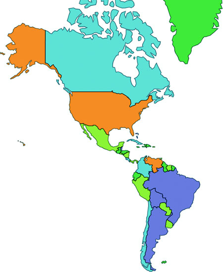
import React, { Component } from 'react'
import './App.css'
import { geoMercator, geoPath } from 'd3-geo'
class WorldMap extends Component {
render() {
const projection = geoMercator()
.scale(120)
.translate([430,250]) 1
const pathGenerator = geoPath().projection(projection)
const countries = this.props.data
.map((d,i) => <path
key={"path" + i}
d={pathGenerator(d)}
style={{fill: this.props.colorScale(d.launchday), 2
stroke: "black", strokeOpacity: 0.5 }}
className="countries"
/>)
return <svg width={this.props.size[0]} height={this.props.size[1]}> 3
{countries}
</svg>
}
}
export default WorldMap
Now let’s bring back our bar chart and rewire it so that it deals with the data being passed in the form it is and colored according to our scale, as in the following listing.
import BarChart from './BarChart'
...
<BarChart colorScale={colorScale} data={appdata}
size={[500,400]} />
...
Our original barChart code wasn’t expecting data in this format, and wasn’t receiving size and style information from its parent, so listing 9.9 shows how we’ll need to update that code to match the changes. Those changes are mostly in the create BarChart() function but also include new code to change the size of the <svg> element to match the passed size.
createBarChart() {
const node = this.node
const dataMax = max(this.props.data.map(d => sum(d.data)))
const barWidth = this.props.size[0] / this.props.data.length 1
const yScale = scaleLinear()
.domain([0, dataMax])
.range([0, this.props.size[1]])
...nothing else changed in createBarChart until we create rectangles...
select(node)
.selectAll("rect")
.data(this.props.data)
.attr("x", (d,i) => i * barWidth)
.attr("y", d => this.props.size[1] - yScale(sum(d.data)))
.attr("height", d => yScale(sum(d.data)))
.attr("width", barWidth)
.style("fill", (d,i) => this.props.colorScale(d.launchday))
.style("stroke", "black")
.style("stroke-opacity", 0.25)
}
render() {
return <svg ref={node => this.node = node}
width={this.props.size[0]} height={this.props.size[1]}>
</svg>
}
And now our dashboard gets a little more dashing. We have our countries colored by release day, and a bar chart shows the total amount of sales by country, also colored (and arranged) by release day. Because the data is randomized, your screenshot won’t look exactly like figure 9.7 but it should be close. You can already see several cool patterns when a country with a much later release date is already showing higher sales than an earlier launched country. Maybe Matt shouldn’t have determined release day based on alphabetical order?
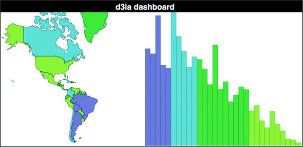
We’re almost to the point where we’ve got all the features requested for the dashboard. The only thing left is amount of sales per day since launch. Obviously it should be a kind of time series chart, so why not that streamgraph you learned how to make in that amazing book about D3.js by that brilliant author whom you feel great about giving a five-star review for? Showing you how to give this book a glowing review would take up too much space, but the following listing shows what we’ll need for a StreamGraph component.
import React, { Component } from 'react'
import './App.css'
import { stack, area, curveBasis, stackOrderInsideOut, stackOffsetSilhouette } from 'd3-shape'
import { range } from 'd3-array'
import { scaleLinear } from 'd3-scale'
class StreamGraph extends Component {
render() {
const stackData = range(30).map(() => ({})) 1
for (let x = 0; x<30; x++) {
this.props.data.forEach(country => {
stackData[x][country.id] = country.data[x] 2
})
}
const xScale = scaleLinear().domain([0, 30])
.range([0, this.props.size[0]])
const yScale = scaleLinear().domain([0, 60])
.range([this.props.size[1], 0])
const stackLayout = stack()
.offset(stackOffsetSilhouette)
.order(stackOrderInsideOut)
.keys(Object.keys(stackData[0])) 3
const stackArea = area()
.x((d, i) => xScale(i))
.y0(d => yScale(d[0]))
.y1(d => yScale(d[1]))
.curve(curveBasis)
const stacks = stackLayout(stackData).map((d, i) => <path
key={"stack" + i}
d={stackArea(d)}
style={{ fill: this.props.colorScale(this.props.data[i].launchday),
stroke: "black", strokeOpacity: 0.25 }}
/>)
return <svg width={this.props.size[0]} height={this.props.size[1]}>
<g transform={"translate(0," + (-this.props.size[1] / 2) + ")"}> 4
{stacks}
</g>
</svg>
}
}
export default StreamGraph
And after we reference it in our App.js:
...other imports...
import StreamGraph from './StreamGraph'
...the rest of your existing app.js behavior...
<StreamGraph colorScale={colorScale} data={appdata} size={[1000,250]} />
...
We have our initial dashboard, as we see in figure 9.8, satisfying our user requirements. We’re not done yet, but we have a dashboard taking our data and presenting it geographically, summed up in a bar chart and over time on a streamgraph. Now, one of the issues we run into when we’re building any data visualization product including when we’re building dashboards is that we can get so caught up in delivering what our users request that we don’t think to provide them with views into the data that they might not imagine, because they’re not as experienced with data visualization as we are.
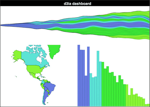
There’s no easy way to address this. Remember when you’re building data visualization products like this dashboard that your users are constrained in the way they see the data, and it’s your job to show them the views they want, but also other views. If they’re primarily interested in numerical characteristics of the data, try to show it to them in hierarchical ways as well. If they’re focused on a map, maybe there’s a network view they could use as contrast.
You finish your dashboard, check off all the requirements, and demo it to your clients. I bet you can guess what their responses might be:
“This looks terrible on the tiny screen on my tablet and on the giant screen on my giant TV.”
“I don’t know what the colors mean.”
“I want to see a bar or trend highlight when I hover over a country and vice versa.”
“I need to narrow it down to countries that launched within a certain period.”
“Show me the numbers.”
I almost didn’t include the last one, because there’s no reason to write it down, because everyone always says that. If you don’t want to hear people say, “Show me the numbers” and “Slice and dice the data,” you’re in the wrong field. Let’s boil that down to a few more concrete features:
More features are available for a dashboard like this, and although there will always be more features, this chapter can’t go on forever.
To make the dashboard respond to changes in the size of the display, we need to first listen for when the display changes and then make an update that trickles down to all our components, as shown in listing 9.11. The listener will be in App.js, which will also store the data in state, which will be used to trickle down to its components (remember, React re-renders whenever state changes, and because App will be sending new size values down to its children, they’ll re-render automatically).
...import necessary modules...
class App extends Component {
constructor(props){
super(props)
this.onResize = this.onResize.bind(this)
this.state = { screenWidth: 1000, screenHeight: 500 } 1
}
componentDidMount() {
window.addEventListener('resize', this.onResize, false) 2
this.onResize()
}
onResize() {
this.setState({ screenWidth: window.innerWidth,
screenHeight: window.innerHeight - 70 }) 3
}
render() {
...existing render behavior...
<StreamGraph colorScale={colorScale} data={appdata}
size={[this.state.screenWidth, this.state.screenHeight / 2]} /> 4
<WorldMap colorScale={colorScale} data={appdata}
size={[this.state.screenWidth / 2, this.state.screenHeight / 2]} />
<BarChart colorScale={colorScale} data={appdata}
size={[this.state.screenWidth / 2, this.state.screenHeight / 2]} />
And that’s all it takes to make our dashboard responsive. Remember that the code in this book is designed to run on Chrome, so it may be that on other browsers you’ll need to use different window attributes. Also, in production you’ll want to throttle or debounce your resize event so it doesn’t fire continuously as someone drags the window to a new size. Finally, making things larger and smaller to fit the screen doesn’t mean you’ve created responsive data visualization. Chapter 12 gets into how different sizes of screens and different kinds of input are better suited to different data visualization methods. That said, in figure 9.9 we can see the effects of our new code.
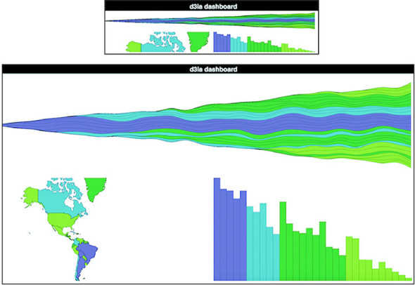
I’m not recalculating the scale and translate on the map because that’s a more involved process that I already got into in the last chapter when we explored zooming in and out.
As we’ve learned, legends are straightforward. Pass your scale over to d3-svg-legend in your bar chart code, as shown in the following listing.
import { legendColor } from 'd3-svg-legend'
import { transition } from 'd3-transition' 1
...
createBarChart() {
const dataMax = max(this.props.data.map(d => sum(d.data)))
const barWidth = this.props.size[0] / this.props.data.length
const node = this.node
const legend = legendColor()
.scale(this.props.colorScale)
.labels(["Wave 1", "Wave 2", "Wave 3", "Wave 4"]) 2
select(node)
.selectAll("g.legend")
.data([0]) 3
.enter()
.append("g")
.attr("class", "legend")
.call(legend)
select(node)
.select("g.legend")
.attr("transform", "translate(" + (this.props.size[0] - 100) + ", 20)"4
...
And with that, we finally have an explanation for what those colors are, as shown in figure 9.10.
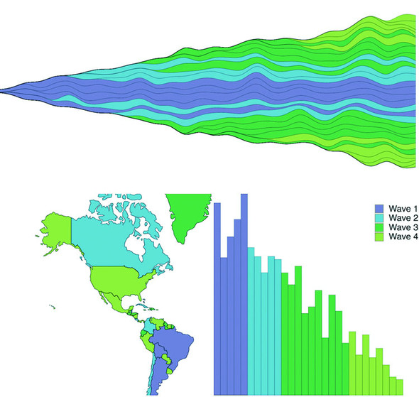
In each of our three views in this dashboard, we’re showing the same data and even coloring it in the same way, so it’s only natural that someone using it would like to see which bar associates with which country and which trend associates with which bar. To handle that, we need to add a spot in the state of our application that knows what we’re hovering over and mouse events on all the elements that update that state. After that, we can pass down that new state and if it corresponds to an element’s ID in the rendering, we visually highlight it. React refers to events a bit differently, but otherwise it’s straightforward. First, in the following listing, we’ll update the main app so that we can pass down a function and the current state that this function modifies.
this.onHover = this.onHover.bind(this) 1
this.state = { screenWidth: 1000, screenHeight: 500, hover: "none" }
...
onHover(d) {
this.setState({ hover: d.id }) 2
}
...
<StreamGraph hoverElement={this.state.hover} onHover={this.onHover} 3
colorScale={colorScale} data={appdata} size={[this.state.screenWidth,
this.state.screenHeight / 2]} />
<WorldMap hoverElement={this.state.hover} onHover={this.onHover} 3
colorScale={colorScale} data={appdata}
size={[this.state.screenWidth / 2, this.state.screenHeight / 2]} />
<BarChart hoverElement={this.state.hover} onHover={this.onHover} 3
colorScale={colorScale} data={appdata}
size={[this.state.screenWidth / 2, this.state.screenHeight / 2]} />
In the following listing we see how we can reference the passed function by tying it to traditional D3 development patterns, like using .on() and .style().
...
select(node)
.selectAll("rect")
.data(this.props.data)
.enter()
.append("rect")
.attr("class", "bar")
.on("mouseover", this.props.onHover) 1
...
select(node)
.selectAll("rect.bar")
.data(this.props.data)
.attr("x", (d,i) => i * barWidth)
.attr("y", d => this.props.size[1] - yScale(sum(d.data)))
.attr("height", d => yScale(sum(d.data)))
.attr("width", barWidth)
.style("fill", (d,i) => this.props.hoverElement === d.id ? 2
"#FCBC34" : this.props.colorScale(i))
...
Finally, in listings 9.15 and 9.16 we see how to use the function with the slightly different JSX React syntax (using onMouseEnter as the property, which is different than the normal HTML property, which would be onmouseover). We also pass the check to change the color on through to the style object instead of using .style().
.map((d,i) => <path
key={"path" + i}
d={pathGenerator(d)}
onMouseEnter={() => {this.props.onHover(d)}} 1
style={{fill: this.props.hoverElement === d.id ? "#FCBC34" :
this.props.colorScale(i), stroke: "black",
strokeOpacity: 0.5 }} 2
className="countries"
/>)
const stacks = stackLayout(stackData).map((d, i) => <path
key={"stack" + i}
d={stackArea(d)}
onMouseEnter={() => {this.props.onHover(this.props.data[i])}} 1
style={{fill: this.props.hoverElement === this.props.data[i]["id"] ?
"#FCBC34" : this.props.colorScale(this.props.data[i]["id"].launchday),
stroke: "black", strokeOpacity: 0.5 }}
/>)
Now that we can cross-highlight, we can easily see which countries correspond to which trends and which bars on the bar chart. Here’s Canada in figure 9.11.
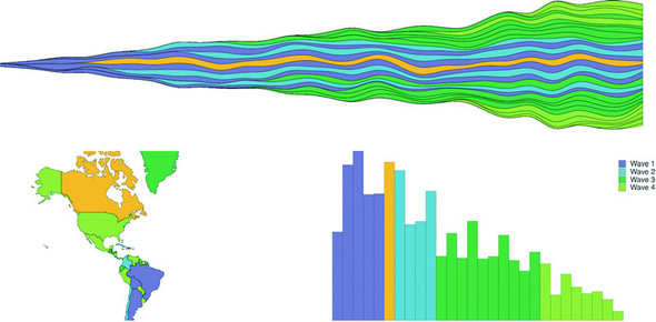
The brush component d3.brush() (or brush() when we use it from the d3-brush module) is like the axis component because it creates SVG elements when called (typically by a <g> element). But it’s also like the zoom behavior because brush has interactions that update a data element that you can use for interactivity. Brushes are valuable interactive components that allow users to intuitively slice up their data. For our dashboard, we’ll add a brush that lets users show countries that were launched during particular periods.
A brush in D3 creates a region where the user can select by clicking and dragging. Because we call the brush from a <g> there’s no way to use Brush with the second React+D3 method; you’re going to have to hand over a DOM element for brush to call. We’ll still be passing the results of our brush interactions to the App state for it to distribute to the various other elements. First, let’s get a Brush.js component up and running. In the following listing is the hopefully by-now familiar code for including reference to our new component from App.js. We’re only sending it a size to begin with.
...
import Brush from './Brush'
...
<Brush size={[this.state.screenWidth, 50]} />
This is why our CSS has references to a rect.selection and rect.handle. These are the pieces of the brush that afford interactivity, as you can see in figure 9.12.
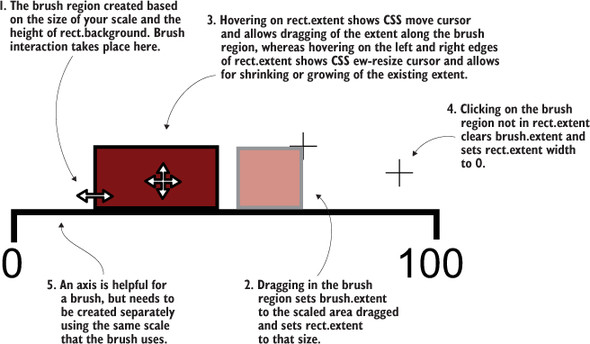
A brush is an interactive collection of components that allows a user to drag one end of the brush to designate an extent or to move that extent to a different range. Typical brush aspects are explained in figure 9.12. In this chapter we only create a brush that allows selection along the x-axis, but if you want to see a brush that selects along the x- and y-axes, you can check out chapter 11, where we use it to select points laid out on an xy plane.
It’s also helpful to create an axis to go along with our brush. The brush is created as a region of interactivity, and clicking on that region produces a rectangle in response. But before any interaction, the area looks blank. By including an axis, we inform the user of the range attached to this brush.
The scale you use to drive your axis will likely also be necessary to do any translation of the brushed area to a data range that we want to use for filtering. Our brush is going to be the width of our dashboard, which is a variable pixel size, and the region designated by your brush interaction doesn’t correspond to our data (the launch day of each country), so we’ll need that scale to translate the brushed extent to a data extent.
After that, we’ll create a brushX brush and assign this.props.size of the component as the second argument of the brush’s .extent() method, which is a bounding box like we saw in the last chapter for geo regions (a two-part array where the first part is the coordinates of the top-left corner and the second part is the coordinates of the bottom-right corner). We can also create brushes that are vertical using the brushY brush or allow for selecting a region by using the brush brush (the one we’ll use in chapter 11). We’ll assign an event listener that listens for the custom event "brush" to call the function brushed(). Code to create the brush is shown in listing 9.18, whereas code for the behavior when the brush is used is explained in listing 9.19. The brush event happens any time the user drags the mouse along the brush region after clicking the region. As with zoom, a brushstart and brushend event is associated with brushing, which you can use to fire performance-intensive functions that you may not want to trigger on every little move of the brush.
import React, { Component } from 'react'
import './App.css'
import { select, event } from 'd3-selection'
import { scaleLinear } from 'd3-scale'
import { brushX } from 'd3-brush'
import { axisBottom } from 'd3-axis'
class Brush extends Component {
constructor(props){
super(props)
this.createBrush = this.createBrush.bind(this) 1
}
componentDidMount() {
this.createBrush() 1
}
componentDidUpdate() {
this.createBrush() 1
}
createBrush() {
const node = this.node
const scale = scaleLinear().domain([0,30])
.range([0,this.props.size[0]]) 2
const dayBrush = brushX()
.extent([[0, 0], this.props.size])
.on("brush", brushed) 3
const dayAxis = axisBottom()
.scale(scale) 4
select(node)
.selectAll("g.brushaxis")
.data([0])
.enter()
.append("g")
.attr("class", "brushaxis") 4
.attr("transform", "translate(0,25)")
select(node)
.select("g.brushaxis")
.call(dayAxis)
select(node)
.selectAll("g.brush")
.data([0])
.enter()
.append("g")
.attr("class", "brush")
select(node)
.select("g.brush")
.call(dayBrush) 5
function brushed() {
console.log(event)
// brushed code 6
};
}
render() {
return <svg ref={node => this.node = node}
width={this.props.size[0]} height={50}></svg>
}
}
export default Brush
Again we see that we’re binding a couple single-item arrays so we can use D3’s enter-exit-update syntax in a way that doesn’t recreate the elements every time the component fires a render. The results in figure 9.13 are of a draggable, adjustable brush and brush region that when we drag and adjust it, doesn’t do anything but move around.
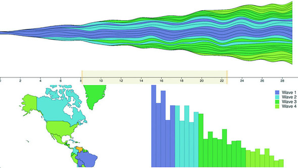
The brushed() function that we previously defined in the createBrush function gets the current extent of the brush using event from d3-selection and sends it back up to App, where it’s used to filter the base dataset, which automatically changes the displayed data for the other views, as in the following listing.
const brushFn = this.props.changeBrush 1
function brushed() {
const selectedExtent = event.selection.map(d => scale.invert(d)) 2
brushFn(selectedExtent)
}
This means we’ll need to pass a kind of changeBrush function from App that, as you might guess, will update state which will itself be taken into account when we calculate the data we send to our components, as in the following listing.
...
this.onBrush = this.onBrush.bind(this)
this.state = { screenWidth: 1000, screenHeight: 500, hover: "none",
brushExtent: [0,40] }
...
onBrush(d) {
this.setState({ brushExtent: d })
}
render() {
const filteredAppdata = appdata.filter((d,i) =>
d.launchday >= this.state.brushExtent[0] &&
d.launchday <= this.state.brushExtent[1])
...
<StreamGraph hoverElement={this.state.hover} onHover={this.onHover}
colorScale={colorScale} data={filterdAppdata}
size={[this.state.screenWidth, this.state.screenHeight / 2]} />
<Brush changeBrush={this.onBrush} size={[this.state.screenWidth, 50]} />
<WorldMap hoverElement={this.state.hover} onHover={this.onHover}
colorScale={colorScale} data={filterdAppdata}
size={[this.state.screenWidth / 2, this.state.screenHeight / 2]} />
<BarChart hoverElement={this.state.hover} onHover={this.onHover}
colorScale={colorScale} data={filterdAppdata}
size={[this.state.screenWidth / 2, this.state.screenHeight / 2]} />
...
This brush allows users to designate a block of days to see the launch numbers for countries that were launched during those. Figure 9.14 shows three different brushed regions and the corresponding changes to the dashboard.
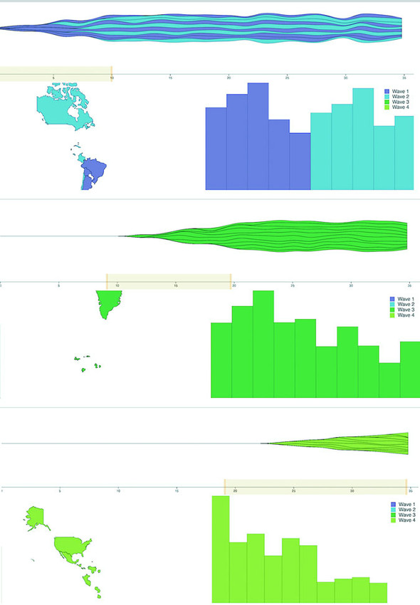
Activity on the brush region fires three separate custom events: brush, brushstart, and brushend. You’ve probably figured them out based on their names, but for clarity, brushstart is fired when you mousedown on the brush region, brush is fired continuously as you drag your mouse after brushstart and before mouseup, and brushend is fired on mouseup. In most implementations of a brush, it makes sense to wire it up so that whatever function you want applied with user activity only happens on the brush event. But you may have functions that are more expensive, such as redrawing an entire map or querying a database. In that case you could use brushstart to cause a visual change in your map (turning elements gray or transparent) and wait until brushend to run more heavy-duty activity.
We’ll stop there. You could replace any of the charts with one of the charts we looked at earlier, such as a pie chart, network visualization, or circle pack. Controls like the brush can be powerful, but it’s also important to make such controls accessible to your users.
Maybe you haven’t noticed my thinly disguised dislike of that phrase. It’s pernicious, and it’s all over the field. Clients will often assume that there’s only one view of the information they want and it’s your job to give it to them and if you produce a chart that doesn’t highlight numerical differences precisely, they consider it a failure. It’s a challenge, one I discussed a bit in chapter 6, and one you’ll have to wrestle with in your work.
But with that said, there is a place for literally showing numbers. Sometimes numbers are the best way to visualize data. In the case of dashboards, there should almost always be a statline: a single readable line of the overall statistics of your data, to give them some context and allow them to reason about whether an individual piece of data is unusual or not. It’s not the sexiest way to visualize data but it’s useful. I’m not going to get into the weeds of how to format the data, because this chapter has already gotten long; instead, I’m going to use this as an opportunity to introduce you to one more React concept: the pure render component. If you have a component that takes props and returns a render function, then your entire component can be one function, as in the following listing.
import React from 'react'
import { mean, sum } from 'd3-array'
export default (props) => { 1
const allLength = props.allData.length 2
const filteredLength = props.filteredData.length
let allSales = mean(props.allData.map(d => sum(d.data)))
allSales = Math.floor(allSales * 100)/100 3
let filteredSales = mean(props.filteredData.map(d => sum(d.data)))
filteredSales = Math.floor(filteredSales * 100)/100
return <div> 4
<h1><span>Stats: </span>
<span>{filteredLength}/{allLength} countries selected. </span>
<span>Average sales: </span>
<span>{filteredSales} ({allSales})</span>
</h1>
</div>
}
One thing that may jump out at you is that I rolled my own formatter to round my average sales to two decimal places, rather than using d3-format as you might expect. That’s because I didn’t want to include d3-format. When I first started with D3, I used it for everything, but since then I’ve come to rely on other libraries that I find better designed for the functionality I need, and in the case of formatting that means numeral.js for numbers and moment.js for dates (moment is also great for time functionality more generally). That shouldn’t be too surprising, because the whole point of this chapter is to leverage React instead of D3.js for creating, updating, and destroying elements, because it’s a better technology for that purpose. Our final version of our dashboard is in figure 9.15.
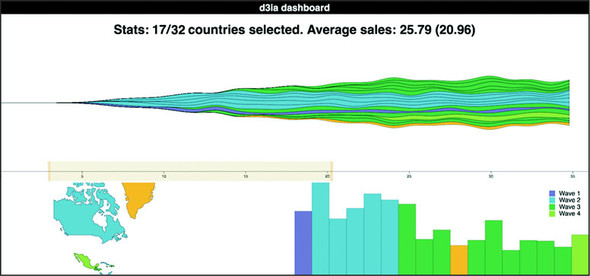
Netflix Algorithm and New Member Dashboards
Netflix needs to understand billions of events from tens of millions of users watching thousands of unique titles. To do this, Netflix uses dashboards. The more complex ones are custom applications made with D3, React, and Redux.
To build a dashboard like the one in the next figure, which tracks algorithm performance, or the one in the previous figure, which looks at the membership funnel, we use the techniques you see in this chapter.
Along with those, we get animation and performance tuning using the React lifecycle events. The custom D3 charts built in these dashboards are often the only way we can leverage high-powered big data backends to surface the billions of events that Netflix deals with.
This chapter covers
Throughout this book, we’ve dealt with D3 components and layouts. In this chapter we’ll write them. After you’ve created your own layout and your own component, you’ll better understand the structure and function of layouts. You’ll be able to use that layout, and other layouts that you create in the same fashion, in the charts and applications that you build with D3 later on.
In this chapter we’ll create a custom layout that places a dataset on a grid. For most of the chapter, we’ll use our people analytics dataset, but the advantage of a layout is that the dataset doesn’t matter. The purpose of this chapter isn’t to create a grid, but rather to help you understand how layouts work. We’ll create a grid layout because it’s simple and allows us to focus on layout structure rather than on the particulars of any data visualization layout. We’ll follow that up by extending the layout so it can have a set size that we can change. You’ll also see how the layout annotates the dataset we send so that individual datapoints can be drawn as circles or rectangles. A grid isn’t the sexiest or most useful layout, but it can teach you the basics of layouts. After that, we’ll build a legend component that tells users the meaning of the color of our elements. We’ll do this by basing the graphical components of the legend on the scale we’ve used to color our chart elements.
Recall from chapter 5 that a layout is a function that modifies a dataset for graphical representation. Here, we’ll build that function. Later, we’ll give it the capacity to modify the settings of the layout in the same manner that built-in D3 layouts operate. This layout will allow us to place discrete datapoints on a grid, allowing for easy comparison. You could use this to show a single circle or rectangle, as we have, or you could use these grids to hold individual charts to generate small multiples charts, as some D3 users have since the first edition of this book was released.
You’ll see this in more detail later, but first we need to create a function that processes our data. After we create this function, we’ll use it to implement the calls that a layout needs. In the following listing, you can see the function and a test where we instantiate it and pass it data.
d3.gridLayout = () => {
function processGrid(data) {
console.log(data)
}
return processGrid
}
var grid = d3.gridLayout()
grid([1,2,3,4,5]) 1
That’s not an exciting layout, but it works. We don’t need to name our layout d3.-layoutX or any other particular name, but using a thoughtful name will make it more readable in the future (and you don’t want to be heckled in a book on the subject in coming years, where you’re asked how your treemap is neither a tree nor a map).
Before we start working on the functions that will create our grid, we have to define what this layout does. We know we want to put the data on a grid, but what else do we want? Here’s a simple spec:
First, we need to initialize all the variables that this grid needs to access to make it happen. We also need to define getter and setter functions to let the user access those variables, because we want to keep them scoped to the d3.gridLayout function. The first thing we can do is update the processGrid function to look like it does in listing 10.2. It takes an array of objects and updates them with x and y data based on grid positions. We derive the size of the grid from the number of data objects sent to processGrid. It turns out this isn’t a difficult mathematical problem. We take the square root of the number of datapoints and round it up to the nearest whole number to get the right number of rows and columns for our grid. This makes sense when you think about how a grid is a set of rows and columns that allows you to place a cell on one of those rows and columns for each datapoint. The number of rows times columns needs to be at least the number of cells (the number of datapoints). If we decide to have the same number of rows as columns, then it’s that number squared.
function processGrid(data) {
var rows = Math.ceil(Math.sqrt(data.length)); 1
var columns = rows;
var cell = 0; 2
for (var rowNumber = 0; rowNumber < rows; rowNumber++) {
for (var cellNumber = 0; cellNumber < columns; cellNumber ++) { 3
if (data[cell]) { cellNumber 4
data[cell].y = rowNumber 5
cell++ 6
}
else {
break
}
}
}
return data
}
To test our nascent grid layout, we can load our people analytics team using nodelist .csv from chapter 7 and then pass that data to the grid. The grid function displays the graphical elements onscreen based on their computed grid position. In the following listing, you can see how we’d pass data from nodelist.csv to our grid layout and size each person by their salary.
d3.csv("nodelist.csv", makeAGrid)
function makeAGrid(data) {
var scale =
d3.scaleLinear().domain([0,5]).range([100,400]); 1
var salaryScale = d3.scaleLinear().domain([0,300000])
.range([1,30]).clamp(true)
var grid = d3.gridLayout();
var griddedData = grid(data);
d3.select("svg").selectAll("circle")
.data(griddedData)
.enter()
.append("circle")
.attr("cx", d => scale(d.x)) 2
.attr("cy", d => scale(d.y))
.attr("r", d => salaryScale(d.salary))
.style("fill", "#93C464");
}
The results in figure 10.1 show how the grid function has correctly appended x and y coordinates to draw the employees as circles on a grid.
The benefit of building this as a layout is that if we add more data to it, it automatically adjusts and allows us to use transitions to animate that adjustment. To do that, we need more data. Listing 10.4 includes a few lines to create a raft of new employees. We also use the .concat() function of an array in native JavaScript that, when given the state shown in figure 10.1, should produce the results in figure 10.2.

var newEmployees = d3.range(14).map(d => {
var newPerson = {id: "New Person " + d, salary: d * 20000} 1
return newPerson
})
var doubledArray = data.concat(newEmployees); 2
var newGriddedData = grid(doubledArray);
d3.select("svg").selectAll("circle")
.data(newGriddedData)
.enter()
.append("circle") 3
.attr("cx", 0)
.attr("cy", 0)
.attr("r", d => salaryScale(d.salary))
.style("fill", "#41A368");
d3.select("svg").selectAll("circle")
.transition() 4
.duration(1000)
.attr("cx", d => scale(d.x))
.attr("cy", d => scale(d.y))
The results in figure 10.2 show snapshots of the animation from the old position to the new position of the circles.
Calculating a scale based on what you know to be the grid size results in an inefficient piece of code. That wouldn’t be useful if someone put in a different dataset. Instead, when designing layouts, you’ll want to provide functionality so that the layout size can be declared, and then any adjustments necessary happen within the code of the layout that processes data. To do this, we need to add a scoped size variable and then add a function to our processGrid function to allow the user to change that size variable. Sending a variable sets the value, and sending no variable returns the value. We achieve this by checking for the presence of arguments using the arguments object in native JavaScript. The updated function is shown in the following listing.
d3.gridLayout = function() {
var gridSize = [0,10]; 1
var gridXScale = d3.scaleLinear(); 2
var gridYScale = d3.scaleLinear();
function processGrid(data) {
var rows = Math.ceil(Math.sqrt(data.length));
var columns = rows;
gridXScale.domain([1,columns]).range([0,gridSize[0]]) 3
gridYScale.domain([1,rows]).range([0,gridSize[1]])
var cell = 0
for (var rowNum = 1; rowNum <= rows; rowNum++) {
for (var cellNum = 1; cellNum <= columns; cellNum++) {
if (data[cell]) {
data[cell].x = gridXScale(cellNum) 4
data[cell].y = gridYScale(rowNum)
cell++
}
else {
break
}
}
}
return data;
}
processGrid.size = (newSize) => { 5
if (!arguments.length) return gridSize
gridSize = newSize
return this
}
return processGrid
}
You can see the updated grid layout in action by slightly changing our code for calling the layout, as shown in the following listing. We set the size, and when we create our circles, we use the x and y values directly instead of using scaled values.
var grid = d3.gridLayout();
grid.size([400,400]); 1
var griddedData = grid(data);
d3.select("svg")
.append("g")
.attr("transform", "translate(50,50)")
.selectAll("circle").data(griddedData)
.enter()
.append("circle")
.attr("cx", d => d.x) 2
.attr("cy", d => d.y)
.attr("r", d => salaryScale(d.salary))
var newEmployees = [];
for (var x = 0;x < 14;x++) {
var newPerson = {id: "New Person " + x, salary: x * 20000};
newEmployees.push(newPerson);
}
var doubledArray = data.concat(newEmployees)
var newGriddedData = grid(doubledArray)
d3.select("g").selectAll("circle").data(newGriddedData)
.enter()
.append("circle")
.attr("cx", 0)
.attr("cy", 0)
.attr("r", d => salaryScale(d.salary))
.style("fill", "#41A368")
d3.select("g").selectAll("circle")
.transition()
.duration(1000)
.attr("cx", d => d.x)
.attr("cy", d => d.y)
.on("end", resizeGrid1) 3
This code refers to a resizeGrid1() function, shown in the following listing, that’s chained to a resizeGrid2() function. These functions use the ability to update the size setting on our layout to update the graphical display of the elements created by the layout.
function resizeGrid1() {
grid.size([200,400]); 1
grid(doubledArray);
d3.select("g").selectAll("circle")
.transition()
.duration(1000)
.attr("cx", d => d.x)
.attr("cy", d => d.y)
.on("end", resizeGrid2)
};
function resizeGrid2() {
grid.size([400,200]) 2
grid(doubledArray)
d3.select("g").selectAll("circle")
.transition()
.duration(1000)
.attr("cx", d => d.x)
.attr("cy", d => d.y)
}
This creates a grid that fits our defined space perfectly, as shown in figure 10.3, and with no need to create a scale to place the elements.
Figure 10.4 shows a pair of animations where the grid changes in size as we adjust the size setting. The grid changes to fit a smaller or an elongated area. This is done using the transition’s end event. It calls a new function that uses our original grid layout but updates its size and reapplies it to our dataset.
Before we move on, it’s important that we extend our layout a bit more so that you can better understand how layouts work. In D3 a layout isn’t meant to create something as specific as a grid full of circles. Rather, it’s supposed to annotate a dataset so you can represent it using different graphical methods.
Let’s say we want our layout to also handle squares, which would be a desired feature when dealing with grids. To handle squares, or more specifically rectangles (because we want them to stretch out if someone uses our layout and sets the height and width to different values), we need the capacity to calculate height and width values. That’s easy to add to our existing layout function, as shown in the following listing.
var gridCellWidth = gridSize[0] / columns;
var gridCellHeight = gridSize[1] / rows;
//other code
for (var i = 1; i <= rows; i++) {
for (var j = 1; j <= columns; j++) {
if (data[cell]) {
data[cell].x = gridXScale(j);
data[cell].y = gridYScale(i);
data[cell].height = gridCellHeight; 1
data[cell].width = gridCellWidth; 1
cell++;
}
else {
break;
}
}
}
With that in place, we can call our layout and append <rect> elements instead of circle elements. We can update our code, as in the following listing, to offset the x and y attributes (because <rect> elements are drawn from the top left and not from the center like <circle> elements) and also apply the width and height values that our layout computes.
d3.select("svg")
.append("g")
.attr("transform", "translate(50,50)")
.selectAll("circle").data(griddedData)
.enter()
.append("rect")
.attr("x", d => d.x - (d.width / 2)) 1
.attr("y", d => d.y - (d.height / 2)) 1
.attr("width", d => d.width) 1
.attr("height", d => d.height) 1
.style("fill", "#93C464")
...
d3.select("g").selectAll("rect").data(newGriddedData)
.enter()
.append("rect")
.style("fill", "#41A368")
d3.select("g").selectAll("rect")
.transition()
.duration(1000)
.attr("x", d => d.x - (d.width / 2)) 2
.attr("y", d => d.y - (d.height / 2)) 2
.attr("width", d => d.width) 2
.attr("height", d => d.height) 2
.on("end", resizeGrid1); 3
function resizeGrid1() { 4
grid.size([200,400]);
grid(doubledArray);
d3.select("g").selectAll("rect")
.transition()
.duration(1000)
.attr("x", d => d.x - (d.width / 2))
.attr("y", d => d.y - (d.height / 2))
.attr("width", d => d.width)
.attr("height", d => d.height)
.on("end", resizeGrid2);
};
function resizeGrid2() { 4
grid.size([400,200]);
grid(doubledArray);
d3.select("g").selectAll("rect")
.transition()
.duration(1000)
.attr("x", d => d.x - (d.width / 2))
.attr("y", d => d.y - (d.height / 2))
.attr("width", d => d.width)
.attr("height", d => d.height)
};
If we update the rest of our code accordingly, the result is the same animated transition of our layout between different sizes, but now with rectangles that grow and distort based on those sizes, as shown in figure 10.5.
This is a simple example of a layout and doesn’t do nearly as much as the kinds of layouts we’ve used throughout this book, but even a simple layout like this provides reusable, animatable content. Now we’ll look at another reusable pattern in D3—the component—which creates graphical elements automatically.
You’ve seen components in action, particularly the axis component. You can also think of the brush as a component, because it creates graphical elements. But it tends to be described as a “control” because it also loads with built-in interactivity.
The component that we’ll build is a simple legend. Legends are a necessity when working with data visualization, and they all share some things in common. First, we’ll need a more interesting dataset to consider, though we’ll continue to use our grid layout. The legend component that we’ll create will consist eventually of labeled rectangles, each with a color corresponding to the color assigned to our datapoints by a D3 scale. This way our users can tell at a glance which colors correspond to which values in our data visualization.
Instead of the nodelist.csv data, we’ll use world.geojson, except we’ll use the features as datapoints on our custom grid layout from section 10.1 without putting them on a map. Listing 10.10 shows the corresponding code, which produces figure 10.6. You may find it strange to load geodata and represent it not as geographic shapes but in an entirely different way. Presenting data in an untraditional manner can often be a useful technique to draw a user’s attention to the patterns in that data.
d3.json("world.geojson ", data => {
makeAGrid(data);
})
function makeAGrid(data) {
var grid = d3.gridLayout();
grid.size([300,300]);
var griddedData = grid(data.features);
griddedData.forEach(country => {
country.size = d3.geoArea(country); 1
});
d3.select("svg")
.append("g")
.attr("transform", "translate(50,50)")
.selectAll("circle")
.data(griddedData)
.enter()
.append("circle") 2
.attr("cx", d => d.x)
.attr("cy", d => d.y)
.attr("r", 10)
.style("fill", "#75739F")
.style("stroke", "#4F442B")
.style("stroke-width", "1px");
};
We’ll focus on only one attribute of our data: the size of each country. We’ll color the circles according to that size using a quantize scale that puts each country into one of several discrete categories. In our case, we’ll use the colorbrewer.Reds[7] (remember, this means you’ll need to include a link to the colorbrewer.js file) array of light-to-dark reds as our bins. The quantize scale will split the countries into seven different groups. In listing 10.11, you can see how to set that up, and figure 10.7 shows the result of our new color scale.
var griddedData = d3.selectAll("circle").data(); 1
var sizeExtent = d3.extent(griddedData, d => d.size)
var countryColor = d3.scaleQuantize()
.domain(sizeExtent).range(colorbrewer.Reds[7])
d3.selectAll("circle").style("fill", d => countryColor(d.size))
For a more complete data visualization, we’d want to add labels for the countries or other elements to identify the continent or region of the country. But we’ll focus on explaining what the color indicates. We don’t want to get bogged down with other details from the data that could be explained, for example, using modal windows, as we did for our World Cup example in chapter 4, or using other labeling methods discussed throughout this book. For our legend to be useful, it needs to account for the different categories of coloration and indicate which color is associated with which band of values. But before we get to that, let’s build a component that creates graphical elements when we call it. Remember that the d3.select(#something).call (someFunction) function of a selection is the equivalent of someFunction(d3.select (#something)). With that in mind, we’ll create a function that expects a selection and operates on it, as in the following listing.
d3.simpleLegend = () => {
function legend(gSelection) { 1
var testData = [1,2,3,4,5];
gSelection.selectAll("rect") 2
.data(testData)
.enter()
.append("rect")
.attr("height", 20)
.attr("width", 20)
.attr("x", (d,i) => i *25)
.style("fill", "red")
return this;
}
return legend;
};
We can then append a <g> element to our chart and call this component, with the results shown in figure 10.8:
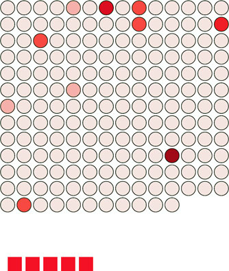
var newLegend = d3.simpleLegend();
d3.select("svg").append("g")
.attr("id","legend")
.attr("transform", "translate(50,400)")
.call(newLegend);
And now that we have the structure of our component, we can add functionality to it, such as allowing the user to define a custom size, as we did with our grid layout. We also need to think about where this legend is going to get its data. Following the pattern of the axis component, it would make the most sense for the legend to refer directly to the scale we’re using and derive, from that scale, the color and values associated with the color of each band in the scale.
To do that, we have to write a new function for our legend that takes a scale and derives the necessary range bands to be useful. The scale we send it will be the same countryColor scale that we use to color our grid circles. Because this is a quantize scale, we’ll make our legend component hardcoded to handle only quantize scales. If we wanted to make this a more robust component, we’d need to make it identify and handle the various scales that D3 uses.
The way all scales have an invert function, they also have the ability to tell you what domain values are mapped to what range values. First, we need to know the range of values of our quantize scale as they appear to the scale. We can easily get that range by using scaleQuantize.range():
countryColor.range() 1
We can pass those values to scaleQuantize.invertExtent to get the numerical domain mapped to each color value:
countryColor.invertExtent("#fee5d9") 1
Armed with these two functions, all we need to do now is give our legend component the capacity to have a scale assigned to it and then update the legend function itself to derive from that scale the dataset necessary for our legend. Listing 10.13 shows both the new d3.simpleLegend.scale() function that uses a quantize scale to create the necessary dataset, and the updated legend() function that uses that data to draw a more meaningful set of <rect> elements.
d3.simpleLegend = function() {
var data = [];
var size = [300,20]; 1
var xScale = d3.scaleLinear(); 2
var scale; 3
function legend(gSelection) {
createLegendData(scale); 4
var xMin = d3.min(data, d => d.domain[0]) 5
var xMax = d3.max(data, d => d.domain[1])
xScale.domain([xMin,xMax]).range([0,size[0]]) 6
gSelection.selectAll("rect")
.data(data)
.enter()
.append("rect")
.attr("height", size[1]) 7
.attr("width", d => xScale(d.domain[1]) - xScale(d.domain[0]))
.attr("x", d => xScale(d.domain[0]))
.style("fill", d => d.color);
return this;
};
function createLegendData(incScale) { 8
var rangeArray = incScale.range();
data = [];
for (var x in rangeArray) {
var colorValue = rangeArray[x];
var domainValues = incScale.invertExtent(colorValue);
data.push({color: colorValue, domain: domainValues})
}
};
legend.scale = function(newScale) { 9
if (!newScale) return scale;
scale = newScale;
return this;
};
return legend;
};
We call this updated legend and set it up:
var newLegend = d3.simpleLegend().scale(countryColor);
d3.select("svg").append("g")
.attr("transform","translate(50,400)")
.attr("id", "legend").call(newLegend);
This new legend now creates a rect for each band in our scale and colors it accordingly, as shown in figure 10.9.
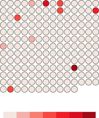
If we want to add interactivity, it’s a simple process because we know that each rect in the legend corresponds to a two-piece array of values from our quantize scale showing the value of the bands in that cell. The following listing shows that function and the call to make the legend interactive.
d3.select("#legend").selectAll("rect").on("mouseover", legendOver);
function legendOver(d) {
d3.selectAll("circle")
.style("opacity", p => {
if (p.size >= d.domain[0] && p.size <= d.domain[1]) {
return 1;
} else {
return .25;
}
});
};
Notice that this function isn’t defined inside our legend component. Instead, it’s defined and called after the legend is created, because after it’s created our legend component is a set of SVG elements with data bound to it like any other part of our charts. This interactivity allows us to mouseover the legend and see which circles fall in a particular range of values, as shown in figure 10.10.
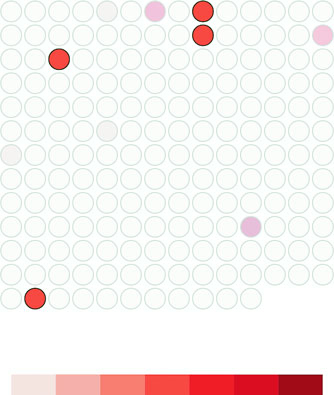
Finally, before we can call our legend done, we need to add an indication of what those colored bands mean. We can call an axis component and allow that to label the bands, or we can label the break points by appending text elements for each. In our case, because the numbers provided for d3.geo.area are so small, we’ll also need to rotate and shrink those labels quite a bit for them to fit on the page. To do that, we can add the code in the following listing to our legend function in d3.simpleLegend
gSelection.selectAll("text")
.data(data)
.enter()
.append("g") 1
.attr("transform", d => "translate(" + xScale(d.domain[0]) + ","
+ size[1] + ")")
.append("text")
.attr("transform", "rotate(90)")
.text(d => d.domain[0]);
As shown in figure 10.11, they aren’t the prettiest labels. We could adjust their positioning, font, and style to make them more effective. They also need functions like the grid layout has to define size or other elements of the component.
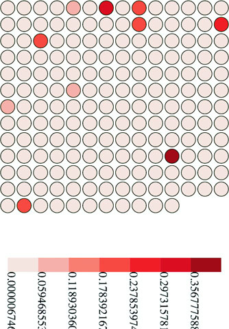
This is usually the point where I say that the purpose of this chapter is to show you that the structure of components and layouts, and that making the most effective layout or component is a long and involved process that we won’t get into. But this is an ugly legend. The break points are hard to read, and it’s missing pieces that the component needs, such as a title and an explanation of units.
Let’s add those features to the legend and create ways to access them, as shown in the following listing. We’re using d3.format, which allows us to set a number-formatting rule based on the popular Python number-formatting mini-language (found at https://docs.python.org/release/3.1.3/library/string.html#formatspec).
var title = "Legend";
var numberFormat = d3.format(".4n");
var units = "Units"; 1
//other code
legend.title = function(newTitle) {
if (!arguments.length) return title;
title = newTitle;
return this;
}; 2
legend.unitLabel = function(newUnits) {
if (!arguments.length) return units;
units = newUnits;
return this;
};
legend.formatter = function(newFormatter) {
if (!arguments.length) return numberFormat;
numberFormat = newFormatter;
return this;
};
We’ll use these new properties in our updated legend drawing code shown in listing 10.17. This new code draws SVG <line> elements at each breakpoint and foregoes the rotated text in favor of more readable, shortened text labels at each breakpoint. It also adds two new <text> elements, one above the legend that corresponds to the value of the title variable and one at the far right of the legend that corresponds to the units variable.
gSelection.selectAll("line") 1
.data(data)
.enter()
.append("line")
.attr("x1", d => xScale(d.domain[0])) 2
.attr("x2", d => xScale(d.domain[0]))
.attr("y1", 0)
.attr("y2", size[1] + 5)
.style("stroke", "black")
.style("stroke-width", "2px");
gSelection.selectAll("text")
.data(data)
.enter()
.append("g")
.attr("transform",
d => `translate(${(xScale(d.domain[0]))},${(size[1] + 20)})`)
.append("text")
.style("text-anchor", "middle")
.text(d => numberFormat(d.domain[0])); 3
gSelection.append("text")
.attr("transform",
d => `translate(${(xScale(xMin))},${(size[1] - 30)})`)
.text(title); 4
gSelection.append("text")
.attr("transform",
d => `translate(${(xScale(xMax))},${(size[1] + 20)})`)
.text(units); 5
This requires that we set these new values using the code in the following listing before we call the legend.
var newLegend = d3.simpleLegend()
.scale(countryColor)
.title("Country Size")
.formatter(d3.format(".2f"))
.unitLabel("Steradians"); 1
d3.select("svg").append("g").attr("transform", "translate(50,400)")
.attr("id", "legend")
.call(newLegend); 2
And now, as shown in figure 10.12, we have a label that’s eminently more readable, still interactive, and useful in any situation where the data visualization uses a similar scale.
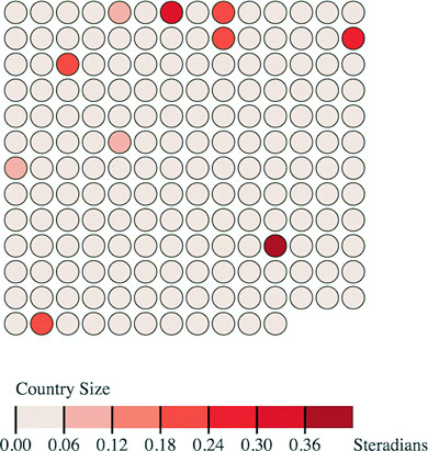
By building components and layouts, you understand better how D3 works, but there’s another reason why they’re so valuable: reusability. You’ve built a chart using a layout and component (no matter how simple) that you wrote yourself. You could use either in tandem with another layout or component, or on its own, with any data visualization charts you use elsewhere.
After you’ve worked with components, layouts, and controls in D3, you may start to wonder if there’s a higher level of abstraction available that could combine layouts and controls in a reusable fashion. That level of abstraction has been referred to as a chart, and the creation of reusable charts has been of great interest to the D3 community.
This has led to the development of several APIs on top of D3, such as NVD3, D4 (for generic charts), and my own d3.carto.map (for web mapping, not surprisingly). It’s also led The Miso Project to develop d3.chart, a framework for reusable charts. If you’re interested in using or developing reusable charts, you may want to check these out:
You may also try your hand at building more responsive components that automatically update when you call them again, like the axis and brushes we dealt with in the last chapter. Or you may try creating controls like d3.brush and behaviors like d3.behavior.drag. Regardless of how extensively you follow this pattern, I recommend that you look for instances when your information visualization can be abstracted into layouts and components and try to create those instead of building another one-off visualization. By doing that, you’ll develop a higher level of skill with D3 and fill your toolbox with your own pieces for later work.
When you’re done building your plugin, you probably want to let other people use it. Mike Bostock wrote an excellent tutorial on how to publish your D3 plugins so that they behave like other D3 plug-ins. You can find the tutorial at https://bost.ocks.org/mike/d3-plugin/.
Making legends in D3 was something I had done multiple times and grew tired of implementing in a custom way over and over. After enough repetition, I decided it would be valuable to create a library to solve the use case.
My main priority was to make it as easy to create a legend as possible, something that I’d want to use. The biggest factor to meet this requirement was to provide full documentation including plenty of examples. Using examples was one of the main avenues I used to learn D3 and wanted to also provide those code snippets for users of d3-legend.
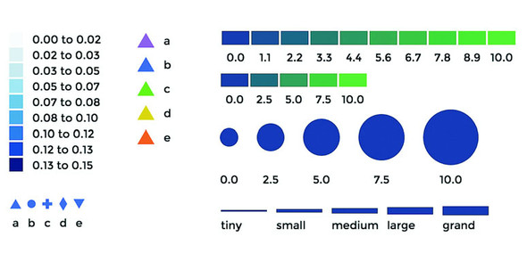
This chapter covers
This chapter focuses on techniques to create data visualization using canvas drawing, sometimes paired with SVG, a technique typically used for large amounts of data. Because it would be impractical to include a few large datasets, we’ll also touch on how to create large amounts of sample data to test your code with. You’ll use several layouts that you saw earlier, such as the force-directed network layout from chapter 6 and the geospatial map from chapter 7, as well as the brush component from chapter 9, except this time you’ll use the brush component to select regions across the x- and y-axes.
This chapter touches on an exotic piece of functionality in D3: the quadtree (shown in figure 11.1). The quadtree is an advanced technique we’ll use to improve interactivity and performance. We’ll also look into the specifics of how to use canvas in tandem with SVG to get high performance and maintain the interactivity that SVG is so useful for.
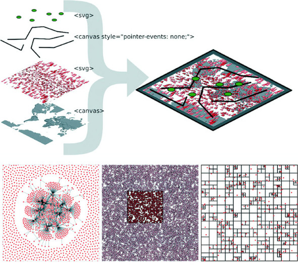
We’ve worked with data throughout this book, but this time we’ll appreciably up the ante by trying to represent a thousand or more datapoints using maps, networks, and charts, which are significantly more resource-intensive than a circle pack chart, bar chart, or spreadsheet.
Fortunately, D3v4 introduced built-in functionality in D3 for drawing complex shapes with canvas. For this chapter, we’ll need to include a <canvas> element in our DOM, as shown in the following listing.
<!doctype html>
<html>
<head>
<title>Big Data Visualization</title>
<meta charset="utf-8" />
<link type="text/css" rel="stylesheet" href="bigdata.css" />
</head>
<body>
<div>
<canvas height="500" width="500"></canvas> 1
<div id="viz">
<svg></svg>
</div>
</div>
<footer>
<script src="d3.v4.min.js"></script>
</footer>
</body>
</html>
In the following listing we see how to make our <canvas> element line up with our <svg> element so that we can use canvas drawing as a background layer to any SVG elements we create.
body, html {
margin: 0;
}
canvas {
position: absolute;
width: 500px;
height: 500px; 1
}
svg {
position: absolute;
width:500px;
height:500px; 2
}
path.country {
fill: #C4B9AC;
stroke-width: 1;
stroke: #4F442B;
opacity: .5;
}
path.sample {
stroke: #41A368;
stroke-width: 1px;
fill: #93C464;
fill-opacity: .5;
}
line.link {
stroke-width: 1px;
stroke: #4F442B;
stroke-opacity: .5;
}
circle.node {
fill: #93C464;
stroke: #EBD8C1;
stroke-width: 1px;
}
circle.xy {
fill: #FCBC34;
stroke: #FE9922;
stroke-width: 1px;
}
Everything that comes out of d3-shape can be used to draw to canvas using the generator’s built-in .context() method. The way you interface with a canvas element is to register a context, which can be “2d”, “webgl”, “webgl2”, or “bitmaprenderer”. We’re only going to use “2d” in our examples in this chapter. Once you have that context, you can then use it to draw lines with commands similar to the SVG d attribute drawing instructions. With d3-shape generators, if you set a .context() of a generator, the function will no longer return an SVG d attribute drawing string, instead it will run commands to draw the shape on the canvas element. The following listing shows how to use this functionality to draw the violin plots from chapter 5, except this time using canvas drawing.
var fillScale = d3.scaleOrdinal().range(["#fcd88a", "#cf7c1c", "#93c464"])
var normal = d3.randomNormal()
var sampleData1 = d3.range(100).map(d => normal())
var sampleData2 = d3.range(100).map(d => normal())
var sampleData3 = d3.range(100).map(d => normal())
var data = [sampleData1, sampleData2, sampleData3]
var histoChart = d3.histogram();
histoChart
.domain([ -3, 3 ])
.thresholds([ -3, -2.5, -2, -1.5, -1,
-0.5, 0, 0.5, 1, 1.5, 2, 2.5, 3 ])
.value(d => d)
var yScale = d3.scaleLinear().domain([ -3, 3 ]).range([ 400, 0 ]) 1
var context = d3.select("canvas").node().getContext("2d") 2
area = d3.area()
.x0(d => -d.length)
.x1(d => d.length)
.y(d => yScale(d.x0))
.curve(d3.curveCatmullRom)
.context(context) 3
context.clearRect(0,0,500,500) 4
context.translate(0, 50)
data.forEach((d, i) => {
context.translate(100, 0) 5
context.strokeStyle = fillScale(i)
context.fillStyle = d3.hsl(fillScale(i)).darker()
context.lineWidth = "1px";
context.beginPath() 6
area(histoChart(d)) 7
context.stroke() 8
context.fill() 8
})
The results, seen in figure 11.2, are similar to what we saw in chapter 5.
When we look at canvas rendering there are a couple clear differences from SVG. First, you’re going to need to manually perform part of the behavior you’ve grown accustomed to having D3 handle for you. For one thing, you need to clear the canvas in between rendering if you’re going to do any kind of transitioning or animation. The other major difference is that when you draw to canvas, you have no kind of object to associate mouse events onto. There are still ways to register mouse events using bitmaps, such as using the color of the pixel clicked or translating the xy coordinate to back to whatever shape would occupy that space. The final difference is highlighted in figure 11.3, the pixelated rendering on canvas compared to that of SVG.
You can use this method to render any of your existing code that uses D3 generators from d3-shape, such as d3.arc for canvas pie charts or d3.area for canvas streamgraphs. From this point on, we’re going to focus on particular applications of canvas rendering, combining it with SVG rendering (known as mixed mode rendering) for interactivity, and using quadtrees to improve performance for large datasets.
In chapter 7, you had only 10 cities representing the entire globe. That’s not typical: when you’re working with geodata, you’ll often work with large datasets describing many complex shapes. In this section we’ll see how to create a map with many features. To get there, we’ll first learn how to generate some random geographic features (in this case, simple triangles) and then learn how to render those features using canvas. Then we’ll wire that all up with a smart implementation of d3-zoom to ensure that our users get the best mix of performance and functionality.
The first thing we need is a dataset with a thousand datapoints. Rather than using
data from a pregenerated file, we’ll invent it. One useful function available in D3 is d3.range(), which allows you to create an array of values. We’ll use d3.range() to create an array of a thousand values. We’ll then use that array to populate an array of objects with enough data to put on a network and on a map. Because we’re going to put this data on a map, we need to make sure it’s properly formatted geoJSON, as in the following listing, which uses the randomCoords() function to create triangles.
var sampleData = d3.range(1000).map(d => { 1
var datapoint = {}; 2
datapoint.id = "Sample Feature " + d;
datapoint.type = "Feature";
datapoint.properties = {};
datapoint.geometry = {};
datapoint.geometry.type = "Polygon";
datapoint.geometry.coordinates = randomCoords();
return datapoint;
});
function randomCoords() { 3
var randX = (Math.random() * 350) - 175;
var randY = (Math.random() * 170) - 85;
return [[[randX - 5,randY],[randX,randY - 5],
[randX - 10,randY - 5],[randX - 5,randY]]];
};
After we have this data, we can throw it on a map like the one we first created in chapter 7. In the following listing we use the world.geojson file from chapter 7 so that we have context for where the triangles are drawn.
d3.json("world.geojson", data => {createMap(data)});
function createMap(countries) {
var projection = d3.geoMercator()
.scale(100).translate([250,250]) 1
var geoPath = d3.geoPath().projection(projection);
var g = d3.select("svg").append("g");
g.selectAll("path.country")
.data(countries.features)
.enter()
.append("path")
.attr("d", geoPath)
.attr("class", "country");
g.selectAll("path.sample")
.data(sampleData)
.enter()
.append("path")
.attr("d", geoPath)
.attr("class", "sample");
};
Although our random triangles will obviously be in different places, our code should still produce something that looks like figure 11.4.
By the time you read this book, big data will probably sound as dated as Pentium II, Rich Internet Application, or Buffy Cosplay. Big data and all the excitement surrounding big data resulted from the broad availability of large datasets that were previously too large to handle. Often, big data is associated with exotic data stores like Hadoop or specialized techniques like GPU supercomputing (along with overpriced consultants).
But what constitutes big is in the eye of the beholder. In the domain of data visualization, the representation of big data doesn’t typically mean placing thousands (or millions or trillions) of individual datapoints onscreen at once. Rather, it tends to mean demographic, topological, and other traditional statistical analysis of these massive datasets. Counterintuitively, big data visualization often takes the form of pie charts and bar charts. But when you look at traditional practice with presenting data interactively—natively—in the browser, the size of the datasets you’re dealing with in this chapter can be considered big.
A thousand datapoints isn’t many, even on a small map like this. And in any browser that supports SVG, the data should be able to render quickly and provide you with the kind of functionality, such as mouseover and click events, that you may want from your data display. But if you add zoom controls, like you see in listing 11.6 (the same zooming we had in chapter 7), you might notice that the performance of the zooming and panning of the map isn’t so great. If you expect your users to be on mobile, optimization is still a good idea.
var mapZoom = d3.zoom()
.on("zoom", zoomed);
var zoomSettings = d3.zoomIdentity
.translate(250, 250)
.scale(100);
d3.select("svg").call(mapZoom).call(mapZoom.transform, zoomSettings);
function zoomed() {
var e = d3.event
projection.translate([e.transform.x, e.transform.y])
.scale(e.transform.k); 1
d3.selectAll("path.country, path.sample").attr("d", geoPath)
}
Now we can zoom into our map and pan around, as shown in figure 11.5. If you expect your users to be on browsers that handle SVG well, like Chrome or Safari, and you don’t expect to put more features on a map, you may not even need to worry about optimization.
Depending on when you execute this code, it might be that 1,000 features like this render fine. Change your d3.range() setting from 1,000 to 5,000 (or 10,000 or a billion if you’ve found this in the Classics section of your Earth Empire lending library) to see that with enough SVG elements, your browser starts to choke. It’s less about rendering the complex shapes than it is about managing all those DOM elements.
One way to optimize the rendering of so many elements is to use canvas instead of SVG. Instead of creating SVG elements using D3’s enter syntax, we use the built-in functionality in d3.geoPath to provide a context for canvas drawing. In the following listing, you can see how to use that built-in functionality with your existing dataset.
function createMap(countries) {
var projection = d3.geoMercator().scale(50).translate([150,100]);
var geoPath = d3.geoPath().projection(projection);
var mapZoom = d3.zoom()
.on("zoom", zoomed)
var zoomSettings = d3.zoomIdentity
.translate(250, 250)
.scale(100)
d3.select("svg").call(mapZoom).call(mapZoom.transform, zoomSettings)
function zoomed() {
var e = d3.event
projection.translate([e.transform.x, e.transform.y])
.scale(e.transform.k)
var context = d3.select("canvas").node().getContext("2d")
context.clearRect(0,0,500,500) 1
geoPath.context(context) 2
context.strokeStyle = "rgba(79,68,43,.5)" 3
context.fillStyle = "rgba(196,185,172,.5)" 3
context.fillOpacity = 0.5
context.lineWidth = "1px"
for (var x in countries.features) {
context.beginPath()
geoPath(countries.features[x]) 4
context.stroke()
context.fill()
}
context.strokeStyle = "#41A368"
context.fillStyle = "rgba(147,196,100,.5)";
context.lineWidth = "1px"
for (var x in sampleData) {
context.beginPath()
geoPath(sampleData[x]) 5
context.stroke()
context.fill()
}
}
}
You can see some key differences between listings 11.5 and 11.6. In contrast with SVG, where you can move elements around as well as redraw them, you always have to clear and redraw the canvas to update it. Although it seems this would be slower, performance increases on all browsers, particularly those that don’t have the best SVG performance, because you don’t need to manage hundreds or thousands of DOM elements. The graphical results, as seen in figure 11.6, demonstrate that it’s hard to see the difference between SVG and canvas rendering.
The drawback with using canvas is that you can’t easily provide the level of interactivity you may want for your data visualization. Typically, you draw your interactive elements with SVG and your large datasets with canvas. If we assume that the countries we’re drawing aren’t going to provide any interactivity, but the triangles will, we can render the triangles as SVG and render the countries as canvas using the code in listing 11.8. Combining these two methods of drawing means we need to create a layer cake of elements in our DOM, like you see in figure 11.7.
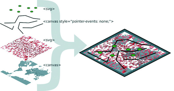
This requires that we initialize two versions of d3.geoPath—one for drawing SVG and one for drawing canvas—and then we use both in our zoomed function. This is shown in listing 11.8.
function createMap(countries) {
var projection = d3.geoMercator().scale(50).translate([150,100]);
var geoPath = d3.geoPath().projection(projection);
var svgPath = d3.geoPath().projection(projection); 1
d3.select("svg")
.selectAll("path.sample")
.data(sampleData)
.enter()
.append("path")
.attr("d", svgPath)
.attr("class", "sample")
.on("mouseover", function() {d3.select(this).style("fill", "#75739F")});
var mapZoom = d3.zoom()
.on("zoom", zoomed)
var zoomSettings = d3.zoomIdentity
.translate(250, 250)
.scale(100)
d3.select("svg").call(mapZoom).call(mapZoom.transform, zoomSettings)
function zoomed() {
var zoomEvent = d3.event
projection.translate([zoomEvent.transform.x, zoomEvent.transform.y])
.scale(zoomEvent.transform.k)
const featureOpacity = 0.5
var context = d3.select("canvas").node().getContext("2d");
context.clearRect(0,0,500,500);
geoPath.context(context);
context.strokeStyle = `rgba(79,68,43,${featureOpacity})`;
context.fillStyle = `rgba(196,185,172,${featureOpacity})`;
context.lineWidth = "1px";
countries.features.forEach(feature => {
context.beginPath();
geoPath(feature); 2
context.stroke()
context.fill();
})
d3.selectAll("path.sample").attr("d", svgPath); 3
}
}
This allows us to maintain interactivity, such as the mouseover function on our triangles to change any triangle’s color to pink when moused over. This approach maximizes performance by rendering any graphics that have no interactivity using canvas drawing instead of SVG. As shown in figure 11.8, the appearance produced using this method is virtually identical to that using canvas only or SVG only.
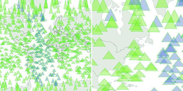
But what if you have massive numbers of elements and you do want interactivity on all of them, but you also want to give the user the ability to pan and drag? In that case, you have to embrace an extension of this mixed mode rendering. You render in canvas whenever users are interacting in such a way that they can’t interact with other elements—we need to render the triangles in canvas when the map is being zoomed and panned, but render them in SVG when the map isn’t in motion and the user is mousing over certain elements.
We can manage this by taking advantage of the start and end events from d3.zoom. These fire, as you may guess, when the zoom event begins and ends, respectively. The following listing shows how you’d initialize a zoom behavior with different functions for these different events.
...
mapZoom = d3.zoom()
.on("zoom", zoomed) 1
.on("start", zoomInitialized) 1
.on("end", zoomFinished); 1
...
This allows us to restore our canvas drawing code for triangles to the zoomed function and move the SVG rendering code out of the zoomed function and into a new zoomFinished function. We also need to hide the SVG triangles when zooming or panning starts by creating a zoomInitialized function that itself also fires the zoomed function (to draw the triangles we hid, but in canvas). Finally, our zoomFinished function also contains the canvas drawing code necessary to only draw the countries. The different drawing strategies based on zoom events are shown in table 11.1.
|
Zoom event |
Countries rendered as |
Triangles rendered as |
|---|---|---|
| zoomed | Canvas | Canvas |
| zoomInitialized | Canvas | Hide SVG |
| zoomFinished | Canvas | SVG |
As you can see in the following listing, this code is inefficient because there’s shared functionality between the zoom events that could be put in separate functions. But I wanted to be explicit about this functionality, because it’s a bit convoluted.
var canvasPath = d3.geoPath().projection(projection);
--- Other code ----
function zoomed() {
var e = d3.event
projection.translate([e.transform.x, e.transform.y])
.scale(e.transform.k)
var context = d3.select("canvas").node().getContext("2d");
context.clearRect(0,0,500,500);
canvasPath.context(context);
context.strokeStyle = "black";
context.fillStyle = "gray";
context.lineWidth = "1px";
for (var x in countries.features) {
context.beginPath();
canvasPath(countries.features[x]);
context.stroke()
context.fill();
}
context.strokeStyle = "black";
context.fillStyle = "rgba(255,0,0,.2)";
context.lineWidth = 1;
for (var x in sampleData) {
context.beginPath(); 1
canvasPath(sampleData[x]);
context.stroke()
context.fill();
}
};
function zoomInitialized() {
d3.selectAll("path.sample")
.style("display", "none"); 2
zoomed(); 3
};
function zoomFinished() {
var context = d3.select("canvas").node().getContext("2d");
context.clearRect(0,0,500,500);
canvasPath.context(context)
context.strokeStyle = "black";
context.fillStyle = "gray";
context.lineWidth = "1px";
for (var x in countries.features) {
context.beginPath();
canvasPath(countries.features[x]); 4
context.stroke()
context.fill();
}
d3.selectAll("path.sample")
.style("display", "block") 5
.attr("d", svgPath); 6
};
As a result of this new code, we have a map that uses canvas rendering when users zoom and pan, but SVG rendering when the map is fixed in place and users have the ability to click, mouse over, or otherwise interact with the graphical elements. It’s the best of both worlds. The only drawback of this approach is that we have to invest more time making sure our <canvas> element and our <svg> element line up perfectly, and that our opacity, fill colors, and so on are close enough matches that it’s not jarring to the user to see the different modes. I haven’t done this in the previous code, so that you can see that the two modes are in operation at the same time, and that’s reflected in the difference between the two graphical outputs in figure 11.9.
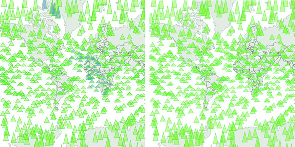
You’ll need to take the time to make sure it has pixel-perfect alignment—otherwise your users will notice and complain. And make sure you test it in every browser that you expect to support because there tend to be different assumptions of what default behavior should be for <canvas> or <svg> elements.
Finally, using canvas and SVG drawing simultaneously may present a difficulty. Say we want to draw a canvas layer over an SVG layer because we want the canvas layer to appear above some of our SVG elements visually but below other SVG elements, and we want interactivity on all of them. In that case we’d need to sandwich our canvas layer between our SVG layers and set the pointer-events style of our canvas layer, as shown back in figure 11.7. If you add further alternating layers of interactivity but with graphical placement above and below, then you can end up making a <canvas> and <svg> layer cake in your DOM that can be as hard to manage as it is to conceptualize.
It’s great that d3.geoPath has built-in functionality for drawing geodata to canvas, and it’s great that d3-shape generators do, too, but what about types of data visualization that use geometric primitives like lines, circles, and rectangles? One of the most performance-intensive layouts is the force-directed layout we dealt with in chapter 6. The layout calculates new positions for each node in your network at every tick. When I first started working with force-directed layouts in D3, I found that any network with more than 100 nodes was too slow to prove useful. Since then, browser performance has improved, and even thousand-node networks with SVG are performant. But it’s still a problem when we have larger networks with structure that would benefit from interactivity and animation.
In my own work, I’ve looked at how different small D3 applications hosted on gist.github.com share common D3 functions. D3 coders can understand how different information visualization methods use D3 functions commonly associated with other types of information visualization. You can explore this network along with how D3 Meetup users describe themselves at http://emeeks.github.io/introspect/block_block.html.
To explore these connections, I needed a method for dealing with over a thousand different examples and thousands of connections between them. You can see part of this network in figure 11.10. I wanted to show how this network changed based on a threshold of shared functions, and I also wanted to provide users with the capacity to click each example to get more details, so I couldn’t draw the network using canvas. Instead, I needed to draw the network using the same mixed-rendering method we looked at to draw all those triangles on a map. In this case I used canvas for the network edges and SVG for the network nodes because, as I note later, the rendering of the network links as SVG elements is the most expensive part of a force-directed network visualization.
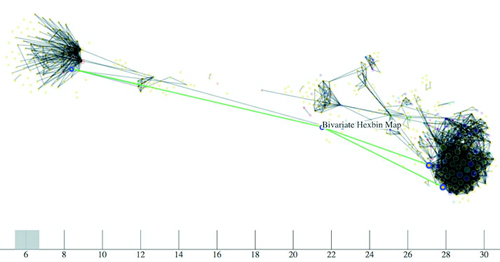
Although D3 is suitable for building large, complex interactive applications, you often make a small, single-use interactive data visualization that can live on a single page with limited resources. For these small applications, it’s common in the D3 community to host the code on gist.github.com, which is the part of GitHub designed for small applications. If you host your D3 code as a gist, and it’s formatted to have an index.html, then you can use bl.ocks.org to share your work with others.
To make your gist work on bl.ocks.org, you need to have the data files and libraries hosted in the gist or accessible through it. Then you can take the alphanumeric identifier of your gist and append it to bl.ocks.org/username/ to serve a working copy for sharing. For instance, I have a gist at https://gist.github.com/emeeks/0a4d7cd56e027023bf78 that demonstrates how to do the mixed rendering of a force-directed layout like I described in this chapter. As a result, I can point people to http://bl.ocks.org/emeeks/0a4d7cd56e027023bf78, and they can see the code itself as well as the animated network in action.
Doing this kind of mixed rendering with networks isn’t as easy as it is with maps. That’s because there’s no built-in method to render regular data to canvas as with d3.geoPath. If you want to create a similar large network that combines canvas and SVG rendering, you have to build the function manually. First, though, you need data. This time, instead of sample geodata, we need to create sample network data.
Building sample network data is easy: you can create an array of nodes and an array of random links between those nodes. But building a sample network that’s not an undifferentiated mass is a little harder. In listing 11.11 you can see my slightly sophisticated network generator. It operates on the principle that a few nodes are popular and most nodes aren’t (we’ve known about this principle of networks since grade school). This does a decent job of creating a network with 3,000 nodes and 1,000 edges that doesn’t look quite like a giant hairball.
var linkScale = d3.scaleLinear()
.domain([0,.9,.95,1]).range([0,10,100,1000]); 1
var sampleNodes = d3.range(3000).map(d => {
var datapoint = {};
datapoint.id = `Sample Node ${d}`;
return datapoint;
})
var sampleLinks = [];
var y = 0;
while (y < 1000) {
var randomSource = Math.floor(Math.random() * 1000); 2
var randomTarget = Math.floor(linkScale(Math.random())); 3
var linkObject = {source: sampleNodes[randomSource], target:
sampleNodes[randomTarget]}
if (randomSource != randomTarget) { 4
sampleLinks.push(linkObject);
}
y++;
}
With this generator in place, we can instantiate our typical force-directed layout using the code in the following listing and create a few lines and circles with it.
var force = d3.forceSimulation()
.nodes(sampleNodes)
.force("x", d3.forceX(250).strength(1.1))
.force("y", d3.forceY(250).strength(1.1))
.force("charge", d3.forceManyBody())
.force("charge", d3.forceManyBody())
.force("link", d3.forceLink())
.on("tick", forceTick) 1
force.force("link").links(sampleLinks)
d3.select("svg")
.selectAll("line.link")
.data(sampleLinks)
.enter()
.append("line")
.attr("class", "link");
d3.select("svg").selectAll("circle.node")
.data(sampleNodes)
.enter()
.append("circle")
.attr("r", 3)
.attr("class", "node");
function forceTick() {
d3.selectAll("line.link")
.attr("x1", d =>d.source.x) 2
.attr("y1", d =>d.source.y)
.attr("x2", d =>d.target.x)
.attr("y2", d =>d.target.y);
d3.selectAll("circle.node")
.attr("cx", d =>d.x)
.attr("cy", d =>d.y);
};
This code should be familiar to you if you’ve read chapter 6. Generation of random networks is a complex and well-described practice. This random generator isn’t going to win any awards, but it does produce a recognizable structure. Typical results are shown in figure 11.11. What’s lost in the static image is the slow and jerky rendering, even on a fast computer using a browser that handles SVG well.
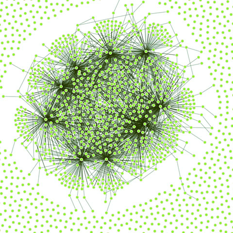
When I first started working with these networks, I thought the main cause of slowdown was calculating the myriad positions for each node on every tick. After all, node position is based on a simulation of competing forces caused by nodes pushing and edges pulling, and something like this, with thousands of components, seems heavy duty. That’s not what’s taxing the browser in this case, though. Instead, it’s the management of so many DOM elements. You can get rid of many of those DOM elements by replacing the SVG lines with canvas lines. Let’s change our code as shown in the following listing so that it doesn’t create any SVG <line> elements for the links and instead modify our forceTick function to draw those links with canvas.
function forceTick() {
var context = d3.select("canvas").node()
.getContext("2d");
context.clearRect(0,0,500,500); 1
context.lineWidth = 1;
context.strokeStyle = "rgba(0, 0, 0, 0.5)"; 2
sampleLinks.forEach(function (link) {
context.beginPath();
context.moveTo(link.source.x,link.source.y) 3
context.lineTo(link.target.x,link.target.y) 4
context.stroke();
});
d3.selectAll("circle.node") 5
.attr("cx", d =>d.x)
.attr("cy", d =>d.y)
};
The rendering of the network is similar in appearance, as you can see in figure 11.12, but the performance improves dramatically. Using canvas, I can draw 10,000-link networks with performance high enough to have animation and interactivity. The canvas drawing code can be a bit cumbersome (it’s like the old LOGO drawing code), but the performance makes it more than worth it.
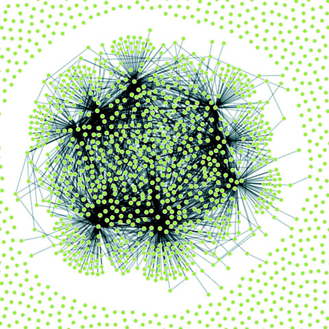
We could use the same method as with the earlier maps to use canvas during animated periods and SVG when the network is fixed. But we’ll move on and look at another method for dealing with large amounts of data: quadtrees.
When you’re working with a large dataset, one issue is optimizing search and selection of elements in a region. Let’s say you’re working with a set of data with xy coordinates (anything that’s laid out on a plane or screen). You’ve seen enough examples in this book to know that this may be a scatterplot, points on a map, or any of a number of different graphical representations of data. When you have data like this, you often want to know what datapoints fall in a particular selected region. This is referred to as spatial search (and notice that spatial in this case doesn’t refer to geographic space but rather space in a more generic sense). The quadtree functionality is a spatial version of d3.nest, which we used in chapters 5 and 8 to create hierarchical data. Following the theme of this chapter, we’ll get started by creating a big dataset of random points and render them in SVG.
Our third random data generator doesn’t require nearly as much work as the first two did. In the following listing, all we do is create 3,000 points with random x and y coordinates.
sampleData = d3.range(3000).map(function(d) {
var datapoint = {};
datapoint.id = `Sample Node ${d}`;
datapoint.x = Math.random() * 500;
datapoint.y = Math.random() * 500; 1
return datapoint;
})
d3.select("svg").selectAll("circle")
.data(sampleData)
.enter()
.append("circle")
.attr("class", "xy")
.attr("r", 3)
.attr("cx", d => d.x)
.attr("cy", d => d.y)
As you may expect, the result of this code, shown in figure 11.13, is a bunch of orange circles scattered randomly all over our canvas.
Now we’ll create a brush to select some of these points. Recall when we used a brush in chapter 9 that we only allowed brushing along the x-axis. This time, we allow brushing along both x- and y-axes. Then we can drag a rectangle over any part of the canvas. In the following listing, you can see how quick and easy it is to add a brush to our canvas. We’ll also add a function to highlight any circles in the brushed region.
var brush = d3.brush() 1
.extent([[0,0],[500,500]])
.on("brush", brushed)
d3.select("svg").call(brush)
function brushed() {
var e = d3.event.selection
d3.selectAll("circle")
.style("fill", d => {
if (d.x >= e[0][0] && d.x <= e[1][0]
&& d.y >= e[0][1] && d.y <= e[1][1]) 2
{
return "#FE9922" 3
}
else {
return "#EBD8C1" 4
}
})
}
With this brushing code, we can now see the circles in the brushed region, as shown in figure 11.14.
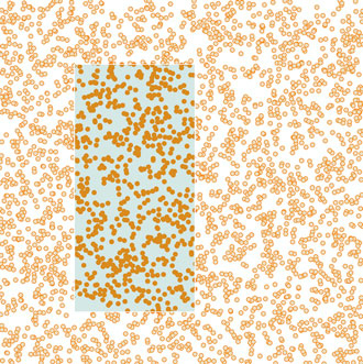
This works, but it’s terribly inefficient. It checks every point on the canvas without using any mechanism to ignore points that might be well outside the selection area. Finding points within a prescribed area is an old problem that has been well explored. One of the tools available to solve that problem quickly and easily is a quadtree. You may ask, what is a quadtree and what should I use it for?
A quadtree is a method for optimizing spatial search by dividing a plane into a series of quadrants. You then divide each of those quadrants into quadrants, until every point on that plane falls in its own quadrant. By dividing the xy plane like this, you nest the points you’ll be searching in such a way that you can easily ignore entire quadrants of data without testing the entire dataset.
Another way to explain a quadtree is to show it. That’s what this information visualization stuff is for, right? Figure 11.15 shows the quadrants that a quadtree produces based on a set of point data.
Creating a quadtree with xy data of the kind we have in our dataset is easy, as you can see in the following listing. We set the x and y accessors like we do with layouts and other D3 functions.
var quadtree = d3.quadtree()
.extent([[0,0], [500,500]]) 1
var quadIndex = quadtree(sampleData, d => d.x, d => d.y); 2
After you create a quadtree and use it to create a quadtree index dataset like we did with quadIndex, you can use that dataset’s .visit() function for quadtree-optimized searching. The .visit() functionality replaces your test in a new brush function, as shown in listing 11.17. First, I’ll show you how to make it work in listing 11.17. Then I’ll show you that it does work in figure 11.16, and I’ll explain how it works in detail. This isn’t the usual order of things, I realize, but with a quadtree, it makes more sense if you see the code before analyzing its exact functionality.
function brushed() {
var e = d3.event.selection
d3.selectAll("circle")
.style("fill", "#EBD8C1")
.each(d => {d.selected = false}) 1
quadIndex.visit(function(node,x0,y0,x1,y1) {
if (node.data) { 2
if (node.data.x >= e[0][0] && node.data.x <= e[1][0] 3
&&node.data.y >= e[0][1] && node.data.y <= e[1][1]) {
node.data.selected = true;
}
}
return x0 > e[1][0] || y0 > e[1][1] || x1 < e[0][0] || y1 < e[0][1] 4
})
d3.selectAll("circle")
.filter(d => d.selected)
.style("fill", "#FE9922") 5
}
The results are impressive and much faster. In figure 11.16, I increased the number of points to 10,000 and still got good performance. (But if you’re dealing with datasets that large, I recommend switching to canvas because forcing the browser to manage all those SVG elements is going to slow things down.) And even a cursory examination of the code reveals several spots where you could improve performance.
How does it work? When you run the visit function, you get access to each node in the quadtree, from the most generalized to the more specific. With each node that we access in listing 11.16 as node, you also get the bounds of that node (x1, y1, x2, y2). Because nodes in a quadtree can either be the bounding areas or the points that generated the quadtree, you have to test whether the node is a point—if it is, you can then test whether it’s in your brush bounds like we did in our earlier example. The final piece of the visit function is where it gets its power, but it’s also the most difficult to follow, as you can see in figure 11.17.
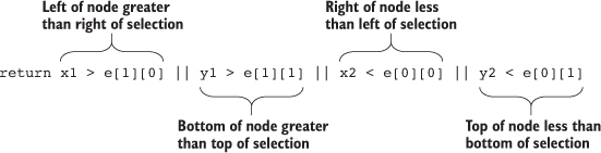
The visit function looks at every node in a quadtree—unless visit returns true, in which case it stops searching that quadrant and all its child nodes. Test to see whether the node you’re looking at (represented as the bounds x1,y1,x2,y2) is entirely outside the bounds of your selection area (represented as the bounds e[0][0], e[0][1], e[1][0], e[1][1]). You create this test to see whether the top of the selection is below the bottom of the node’s bounds, whether the bottom of the selection is above the top of the node’s bounds, whether the left side of the selection is to the right of the right side of the node’s bounds, or whether the right side of the selection is to the left of the left side of the node’s bounds. That may seem a bit hard to follow (and sure takes up more room as a sentence than it does as a piece of code), but that’s how it works.
You can use that visit function to do more than optimized search. I’ve used it to cluster nearby points on a map (http://bl.ocks.org/emeeks/066e20c1ce5008f884eb) and also to draw the bounds of the quadtree in figure 11.15.
You can improve the performance of the data visualization of large datasets in many other ways. Here are three that should give you immediate returns: avoid general opacity, avoid general selections, and precalculate positions.
Whenever possible, use fill-opacity and stroke-opacity or RGBA color references rather than the element opacity style. General element opacity—the kind of setting you get when you use style: opacity—can slow down rendering. When you use specific fill or stroke opacity, it forces you to pay more attention to where and how you’re using opacity.
So instead of
d3.selectAll(elements).style("fill", "red").style("opacity", .5)
do this:
d3.selectAll(elements).style("fill", "red").style("fill-opacity", .5)
Although it’s convenient to select all elements and apply conditional behavior across those elements, you should try to use selection.filter with your selections to reduce the number of calls to the DOM. If you look back at the code in listing 11.16, you’ll see this general selection that clears the selected attribute for all the circles and sets the fill of all the circles to orange:
d3.selectAll("circle")
.style("fill", "#FE9922")
.each(d => {d.selected = false})
Instead, clear the attribute and set the fill color of only those circles that are currently set to the selection. This limits the number of costly DOM calls:
d3.selectAll("circle")
.filter(d => d.selected})
.style("fill", "#FE9922")
.each(d => {d.selected = false})
If you adjust the code in that example, the performance is further improved. Remember that manipulating DOM elements, even if it’s changing a setting like fill, can cause the greatest performance hit.
You can also precalculate positions and then apply transitions. If you have a complex algorithm that determines an element’s new position, first go through the data array and calculate the new position. Then append the new position as data to the datapoint of the element. After you’ve done all your calculations, select and apply a transition based on the calculated new position. When you’re calculating complex new positions and applying those calculated positions to a transition of a large selection of elements, you can overwhelm the browser and see jerky animations.
So, instead of
d3.selectAll(elements)
.transition()
.duration(1000)
.attr("x", newComplexPosition);
do this:
d3.selectAll(elements)
.each(function(d) {d.newX = newComplexPosition(d)});
d3.selectAll(elements)
.transition()
.duration(1000)
.attr("x", d => d.newX);
If you want to grow your D3 skill set, I’d suggest starting with the D3 Slack channel (d3js.slack.com), which has over a thousand members talking about every aspect of the library. I’d also look at bl.ocksplorer (http://bl.ocksplorer.org), which allows you to find examples of D3 code based on specific D3 functions. You should also check out the work of Mike Bostock (http://bl.ocks.org/mbostock) to see examples of the latest D3 functionality. D3 has an active Google Group (https://groups.google.com/forum/#!forum/d3-js), if you’re interested in discussing the internals of the library, and there are many popular Meetup groups, like the Bay Area D3 User Group (www.meetup.com/Bay-Area-d3-User-Group/). I find the best place to keep up with D3 is on Twitter, where you can see examples posted with the hashtag #d3js and examples of when things don’t quite go right (but are still beautiful) with the hashtag #d3brokeandmadeart.
As you look around the examples of D3, you’ll see one thing in particular: that despite spending so much time and ink on this library, I still haven’t touched on everything in its core functionality, much less the numerous plugins people have used to build on it. Data visualization is one of the most exciting fields right now, and you can be part of pushing that field forward, even if you’re only now getting into it. Though there are other ways to approach data visualization, D3 is still the most robust and well established. I hope this book has provided you with the tools necessary to go out and make impactful data visualization.
Progressive Rendering
Rendering data on a large canvas can take some time and noticeably freeze the UI until it’s done. One trick to free the UI is called progressive rendering: chunking the rendering in small batches, giving the thread back to the UI between each batch. For the streaming charts I developed for Boundary’s Firespray and raster maps at Planet OS maps, I use a tool called Render-slicer, which uses requestAnimationFrame for slicing in a loop as fast as the browser can handle. On a slow network or on a large dataset, the browser is still free, but we can see the drawing happening. I don’t mind—it even looks like an animation feature.
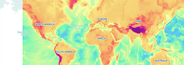
The same effect can be done by chunking data transfer, streaming the data instead of locking the UI with a large request, and drawing each chunk on the canvas line by line on reception. That way, the chart can start rendering the most important data points almost instantly, and the data chunk can be discarded to free up memory as soon as it’s graphed. I like Papa Parse for streaming and parsing data, which can also use Web Workers for even greater performance.
[SYMBOL][A][B][C][D][E][F][G][H][I][J][L][M][N][O][P][Q][R][S][T][U][V][W][X][Y][Z]
{} (curly braces)
=== operator
abstract charts
accessor
accessor functions
complex
overview
.active class
adjacency matrices
.append() function, 2nd
appendChild() function
arc diagrams
area accessors
area() function, 2nd
arguments object
array functions, JavaScript
Array.concat
arrays, JavaScript
arrow functions
attr() function, 2nd
axes
creating
plotting data
styling
axisBottom
axisLeft() function
axisRight() function
axisTop() function, 2nd
barChart code
basemap
beeswarm plot
behavior
big data visualization
binding data.
See data-binding.
binning, 2nd
<body> element
bounding box
boxplot
brighter() function
brushing
brush events
creating brushes
xy brushing
buttonClick function, 2nd, 3rd
call() method
callback function, 2nd
camelcase
canvas drawing
<canvas> element, 2nd, 3rd
cartograms
Cascading Style Sheets.
See CSS.
casting data
categorical data, formatting
centrality
centroid
changeBrush function
channels
defined
setting
charge
chartjunk
charts
axes
creating
plotting data
styling
complex accessor functions
complex graphical objects
general principles of
components
generators
layouts
geospatial information visualization
canvas drawing
cartograms
drawing points
globes
graticules
hexbins
interactivity
mapping data
projections and areas
raster reprojection
satellite projection
tile mapping
TopoJSON
transform zoom
Voronoi diagrams
zoom
hierarchical visualization
circle packing
dendrograms
hierarchical data
hierarchical patterns
icicle charts
treemaps
layouts
histograms
pie charts
plugins for
stack layout
legends
line charts
drawing line from points
drawing many lines with multiple generators
line interpolation
network visualization
force-directed layout
static network diagrams
children
choropleth map
<circle> elements, 2nd, 3rd, 4th, 5th
circle packing
drawing
overview, 2nd
when to use
clamp() function
className
clean methods
cloneNode() function
clustering
color
color mixing
color ramps for numerical data
discrete colors
color categories
color ramps, for numerical data
color spectrum
color theory
ColorBrewer 3-red scale
colorbrewer library
colorbrewer scales
colorbrewer.Reds
complex accessor functions
components
connection
console.log() function
context() method
coordinates array
countryColor scale
createBarChart() function
createBrush function
create-react-app
createSoccerViz() function
cross-highlighting
CSS (Cascading Style Sheets), 2nd, 3rd
csv() function
curly braces
curve method
custom layouts and components
adding component labels
designing layouts
extending layouts
implementing layouts
linking components to scales
loading sample data
testing layouts
writing components
cx attribute
cy attribute
d attribute
d3.cluster layout, d3.tree layout vs.
d3.geom.voronoi function
d3.geoTile module
d3.gridLayout function
D3.js
data standards
geographic data
nested data
network data
objects
raw data
tabular data
defined
function of
data visualization
selecting and binding
web page elements
Hellow World! app
with elements, 2nd
HTML5
coding in console
CSS
DOM
ES6 and Node
JavaScript
SVG
infoviz standards expressed in D3
d3.json function
d3.merge() function
d3.nest.key function
d3.nest() function
d3.queue library
d3.range() function
d3.selectAll() function
d3.simpleLegend.scale() function
d3.stratify() function
d3.svg.area
d3.svg.line
d3.tree layout, d3.cluster layout vs..
See also dendrograms.
d3.zoom() function
D3v4 modules
darker() function
dashboards
basics of
upgrades for
cross-highlighting
legends
responsiveness
data array
data flow
binning
casting data
data presentation
.append() function
.remove() function
d3.merge() function
setting channels
updating
visualization from loaded data
data-binding
accessing data with inline functions
integrating scales
selections and
formatting data
categorical
geometric
quantitative
raw
temporal
topological
loading data
measuring data
nesting
scales and scaling
data standards
geographic data
nested data
network data
objects
raw data
tabular data
data() function, 2nd
data-binding, 2nd, 3rd
accessing data with inline functions
integrating scales
selections and
.append() function
.attr() function
.data() function
.enter() function
.exit() function
.html() function
.insert() function
d3.selectAll() function
data-driven design
pregenerated content
HTML fragments
images
SVG
project architecture
data
external libraries
images
resources
style sheets
data-driven interaction
color
color mixing
color ramps for numerical data
discrete colors
DOM manipulation
events
graphical transitions
datapoints, 2nd, 3rd
dataset
dataViz() function
datum() function
day attribute
defined() function
degree (degree centrality)
delay() function, 2nd
delimited data
dendrograms
d3.cluster vs. d3.tree layouts
drawing
overview, 2nd
radial tree diagrams
when to use
descendants method
didComponentUpdate method
directed network, 2nd
discrete colors
distance
<div> elements, Hellow World! app with
document.getElementById selector
DOM (Document Object Model)
element manipulation
examining in console
domain() function
drag() function
duration() function, 2nd
each() function, 2nd, 3rd
EcmaScript 6 (ES6; ES2015)
edge list
edge weight
edges
<ellipse>element
empty() function
enclosure
end event
endAngle
.enter() function
append() function
overview
entries
ES2015
Esri
events
exit() function
overview, 2nd
remove() function
extent() method
favorites array
FeatureCollection
fill setting
flame graphs
forceCollide
force-directed network layout
creating
drag() function
fixed node positions
forces
manually positioning nodes
measures
centrality
clustering
degree
edge weight
modularity
optimization
removing and adding nodes and links
settings
charge
gravity
link force
stopping and restarting
restart() function
stop() function
SVG markers
tick() function
updating
forceManyBody
forceSimulation, 2nd
forceTick function
forEach array
formatting data
categorical data
geometric data
quantitative data
raw data
temporal data
topological data
friends attribute
function.apply
<g> element, 2nd, 3rd, 4th, 5th, 6th
ga attribute
generators, 2nd
geo.graticule function
geo.path() function, 2nd
geodata
geographic data
GeoJSON
geometric data, formatting
geoPath.area() function
geospatial information visualization (mapping)
canvas drawing
cartograms
drawing points
globes
graticules
hexbins
interactivity
mapping data
GeoJSON
projection
scale
projections and areas
raster reprojection
satellite projection
tile mapping
TopoJSON
file format
merging
neighbors
rendering
transform zoom
Voronoi diagrams
zoom
global variables
globes, creating and rotating
gParent
graphical objects, complex
graphical transitions
graphs
graticules
gravity
gridOver function
HCL (hue, chroma, and luminosity)
Hellow World! app
with elements, 2nd
hexbins
hierarchical visualization
circle packing
drawing
when to use
dendrograms
d3.cluster vs. d3.tree layouts
drawing
radial tree diagrams
when to use
hierarchical data
d3.nest() function
d3.stratify() function
hierarchical JSON and objects
hierarchical patterns
icicle charts
drawing
flame graphs
sunburst diagrams
when to use
treemaps
building
filtering
radial treemaps
when to use
highlightRegion
histograms
drawing
interactivity
violin plots
hive plots
HSL (hue, saturation, and lightness)
hsl() function
<html> element
HTML fragments, pregenerated
html() function, 2nd, 3rd
HTML5
coding in console
CSS
DOM
ES6 and Node
JavaScript
arrays and array functions
method chaining
SVG
<circle> element
<g> grouping element
<line> element
<path> element
<polygon> element
<rect> element
<svg> element
<text> element
hue, chroma, and luminosity.
See HCL.
hue, saturation, and lightness.
See HSL.
i value
icicle charts
drawing
flame graphs
sunburst diagrams
when to use
id attribute
if statement
ifsie
images
overview
pregenerated
import syntax
in degree
incomingData array
infobox
infoviz (information visualization) standards, 2nd
inline functions, accessing data with
innerHTML
insert() function, 2nd, 3rd
inside-out settings
interactivity, mapping visualiz-ation
interpolation
isomorphic JavaScript
JavaScript
arrays and array functions
method chaining
jLouvain library
JSON (JavaScript Object Notation)
hierarchical
overview
json() function
JSX
LAB (lightness A-B)
label attribute
labels, creating for components
layout() function
layouts, 2nd
histograms
drawing
interactivity
violin plots
pie charts
drawing
ring charts
transitioning
plugins for
Sankey diagrams
word clouds
stack layout
leaf node
legendColor
legendOver
legends
adding
overview
using third-party D3 modules to create
lifecycle methods, React
lighter() function
line charts
drawing line from points
drawing many lines with multiple generators
line interpolation
<line> elements, 2nd
line interpolation
line() function, 2nd
linear() function
link force
link.strength() parameter
links, 2nd
loading data
file formats
visualization from loaded data
makeAGrid function
manyBody
MapboxGL
mapping data (geodata), 2nd
creating random
drawing with canvas
GeoJSON
mixed mode rendering techniques
projection
scale
MatFlicks
max() function
measuring data
Mercator
mergeArcs function
mergeAt test
method chaining, JavaScript
mode rendering
avoiding general opacity
avoiding general selections
geodata
creating random
drawing with canvas
rendering techniques
network data
precalculating positions
quadtrees
generating random xy data
xy brushing
shape generators
modularity
Mollweide, 2nd, 3rd
mouseout event, 2nd
mouseover event, 2nd, 3rd
multipolygons
multivariate
neighbor function
nest() function, 2nd, 3rd
nested data
nestedTweets, 2nd
nesting
network data
mixed mode rendering
overview, 2nd
networks
force-directed layout
creating
drag() function
fixed node positions
forces
manually positioning nodes
measures
optimization
removing and adding nodes and links
settings
stopping and restarting
SVG markers
tick() function
updating
static network diagrams
adjacency matrices
arc diagrams
network data
Node
node() function
nodes
Noun Project
npm (node package manager)
numFavorites attribute
numRetweets attribute
numTweets attribute, 2nd
Object.assign
Object.keys function
objects
offset() function
on() function
onclick event, 2nd
onload property
onMouseEnter property
orient option
out degree
outerRadius
overallTeamViz() function
package.json file
parentID
parse() method
partition charts.
See icicle charts.
<path> elements, 2nd, 3rd, 4th, 5th
pie charts
drawing
ring charts
transitioning
pieChart function
plugins, 2nd
PNG (Portable Network Graphics)
pointer-events property
pointer-events style
points attribute
<polygon> element
polylinear scale
pregenerated content, 2nd
HTML fragments
images
SVG
processGrid function, 2nd
progressive rendering
projections
areas and
satellite
properties object
props, React
pure render component
quadIndex
quadtrees, 2nd
generating random xy data
xy brushing
quantile scale
quantitative data, formatting
radial tree diagrams
radial treemaps
randomCoords() function
range() function
raster reprojection
raw data
formatting
overview
React
brushing
brush events
creating brushes
create-react-app
dashboard
dashboards
basics of
upgrades for
element creation
JSX
lifecycle methods
props
rendering
stat lines
state
traditional D3 rendering with
<rect> elements, 2nd, 3rd, 4th
rect elements
rect.handle
rect.selection
red-green-blue.
See RGB.
region attribute
remove() function
render() function
rendering mixed mode
avoiding general opacity
avoiding general selections
geodata
creating random
drawing with canvas
rendering techniques
network data
precalculating positions
quadtrees
generating random xy data
xy brushing
shape generators
requestAnimationFrame
resizeGrid1() function
resizeGrid2() function
restart() function, 2nd
retweets array
RGB (red-green-blue)
rgb() function
ring charts
root node
runMoreLayouts() function
Sankey diagrams, 2nd
sankey() function
satellite projection
scale, mapping visualization
scale() function, 2nd, 3rd
scaleLinear() function, 2nd
scaleLog() function
scaleOrdinal() function, 2nd, 3rd
scalePow() function
scaleQuantile() function
scaleQuartile() function
scales
and scaling
integrating scales
linking components to
scaleTime function
scatterplot, 2nd, 3rd, 4th
<script> element, 2nd
–SE tag
secondaries
selectAll.data() function
selection.exit() function
selection.filter() function
selection.lower() function, 2nd
selection.raise() function, 2nd
semantic zoom
shape generators
shapefile
shapeHeight
shapePadding
shapeWidth
shouldComponentUpdate method
simulation.restart() function
simulation.stop() function
simulation.tick() function
smallerNumbers array
someData variable
<span> element
spatial search
<square> element
stack layout
stackLayout function
stackOffsetSilhouette keyword
stackOrderInsideOut
start event
startAngle
stat lines
state, React
static images
static network diagrams
adjacency matrices
arc diagrams
network data
statline
steradians (spherical radians)
stop() function
streamgraph
StreamGraph component
sum() method
sunburst diagrams
SVG (Scalable Vector Graphics)
<text> element
<circle> element
<g> grouping element
<line> element
<path> element
<polygon> element
pregenerated
<rect> element
<svg> canvas
<svg> element, 2nd, 3rd, 4th, 5th, 6th, 7th, 8th
tabular data
tag cloud
team attribute
temporal data, formatting
.tentative class
<text> elements, 2nd
text() function, 2nd
third-party D3 modules
this variable
tick() function
tickSize() function, 2nd
tick-Values() function
tile mapping
tilt
title variable
TopoJSON
file format
merging
neighbors
rendering
Topojson.feature() function
topological data, formatting
transform attribute, 2nd, 3rd, 4th
transform zoom
translate() function
transpiler
tree diagrams.
See dendrograms.
treemaps, 2nd, 3rd
building
filtering
radial treemaps
when to use
<tspan> element
Tufte, Edward
tweening, 2nd
tweetdata
tweetG variable
type conversion
undirected network
unHighlight function
units variable
universal JavaScript
unknown method
untranspiled code
user attribute
values, 2nd
values key
Versor Dragging
viewBox attribute
violin plots
visit() function
visualizing algorithms
viz ID
Voronoi diagrams
vx attribute
vy attribute
web page elements
deriving appearance of from bound data
variety of
weighted directed network
weighted network
while loop
while statement
willComponentUpdate method
wired streamgraph
word clouds
Wordle
worldFeatures variable
WorldMap component
x() function
x2 attribute
XHR requests, 2nd
xlink:href attribute, 2nd
xml() function
y() function
y2 attribute
yScale() function, 2nd
Zamyslianskyj, James
z-index property, 2nd
zoom
mapping visualization
overview
zoom.scale() function
zoom.translate() function
zoomed function
zoomend
zoomFinished function
zoomInitialized function
zoomstart
Chapter 1. An introduction to D3.js
Figure 1.2. D3 can be used for simple charts, such as this donut chart (explained in chapter 5).
Figure 1.17. The commands to draw an SVG path (right) and the resulting graphic (left)
Chapter 2. Information visualization data flow
Figure 2.10. To create graphics in D3, you use selections that bind data to DOM elements.
Figure 2.13. By changing the opacity settings, you can see the overlapping rectangles.
Figure 2.14. SVG rectangles are drawn from top to bottom.
Figure 2.16. SVG shapes will continue to be drawn offscreen.
Figure 2.17. A bar chart drawn using a linear scale
Figure 2.18. The same bar chart from figure 2.17 drawn with a polylinear scale
Chapter 3. Data-driven design and interaction
Figure 3.2. Circles and labels created from a CSV representing 2014 World Cup statistics.
Figure 3.25. Football icons with a fill and stroke set by D3
Chapter 4. Chart components
Figure 4.6. Default styles for an axis display the ticks and don’t fill the domain area.
Chapter 5. Layouts
Figure 5.5. Three violin plots based on the data produced by d3.histogram
Figure 5.18. A squid-like Sankey diagram
Figure 5.21. A word cloud with words that are arranged horizontally
Chapter 6. Hierarchical visualization
Figure 6.11. A dendrogram with labels for each of the nodes
Figure 6.12. The same dendrogram as figure 6.11 but laid out horizontally
Figure 6.13. The same dendrogram laid out in a radial manner.
Figure 6.15. The same dataset rendered using d3.tree (left) and d3.cluster (right)
Figure 6.19. A sunburst version of our nested tweets.
Figure 6.21. A treemap without padding will only show the leaf nodes.
Chapter 7. Network visualization
Figure 7.13. A beeswarm plot created with our code (rotated to better fit on the page)
Figure 7.21. Network with a new edge added
Figure 7.22. Network with two new nodes added (Mike and Noah), both with links to Sam
Chapter 8. Geospatial information visualization
Figure 8.14. A satellite projection of data from the Middle East facing Europe
Chapter 9. Interactive applications with React and D3
Figure 9.3. The default page that create-react-app deploys with
Figure 9.4. Your first React + D3 app, with a simple bar chart rendered in your app
Figure 9.6. Our rendered WorldMap component, with countries colored by launch day
Figure 9.9. The same dashboard on a large screen and a small screen
Chapter 10. Writing layouts and components
Figure 10.3. The grid layout run with a 400 x 400 size setting
Figure 10.5. The three states of the grid layout using rectangles for the grid cells
Figure 10.6. The countries of the world as a grid
Figure 10.7. Circles representing countries colored by area
Chapter 11. Mixed mode rendering
Figure 11.2. Violin plots drawn using canvas. You can see that they’re more pixelated.
Figure 11.3. Two zoomed-in shapes, one rendered in SVG (left) and one rendered with canvas (right)
Figure 11.4. Drawing random triangles on a map entirely with SVG
Figure 11.5. Zooming in on the sample geodata around East Asia and Oceania
Figure 11.11. A randomly generated network with 3,000 nodes and 1,000 edges
Figure 11.12. A large network drawn with SVG nodes and canvas links
Figure 11.13. 3,000 randomly placed points represented by orange SVG <circle> elements
Figure 11.14. Highlighting points in a selected region
Figure 11.16. Quadtree-optimized selection used with a dataset of 10,000 points
Chapter 1. An introduction to D3.js
Table 1.1. Delimited data can be expressed in different forms
Chapter 11. Mixed mode rendering
Chapter 1. An introduction to D3.js
Listing 1.1. A simple web page demonstrating the DOM
Listing 1.2. A sample web page with SVG elements
Listing 1.3. Grouping SVG elements
Listing 1.4. SVG path fill and closing
Listing 1.5. A sample web page with a style sheet
Listing 1.7. Using d3.select to set style and HTML content
Listing 1.8. Using d3.select to set attributes and event listeners
Listing 1.9. A simple web page with an SVG canvas
Listing 1.10. Creating lines and circles with select and append
Chapter 2. Information visualization data flow
Listing 2.1. File contents of cities.csv
Listing 2.2. File contents of tweets.json
Listing 2.3. Loading data, casting it, measuring it, and displaying it as a bar chart
Listing 2.4. Loading, nesting, measuring, and representing data
Listing 2.5. Creating a scatterplot
Chapter 3. Data-driven design and interaction
Chapter 4. Chart components
Listing 4.2. Scatterplot of average age
Listing 4.3. Initial boxplot drawing code
Listing 4.4. The .each() function of the boxplot drawing five child elements
Listing 4.5. Adding an axis using tickValues
Listing 4.7. Callback function to draw a scatterplot from tweetdata
Listing 4.8. New line generator code inside the callback function
Listing 4.9. Line generators for each tweetdata
Listing 4.11. The callback function to draw movies.csv as a line chart
Listing 4.13. Callback function for drawing stacked areas
Chapter 5. Layouts
Listing 5.2. Histogram interactivity
Listing 5.3. Generating violin plots with d3.histogram
Listing 5.4. Updated binding and transitioning for pie layout
Listing 5.5. Stack layout example
Listing 5.7. Sankey drawing code
Listing 5.8. Visual layout function for the Sankey diagram
Chapter 6. Hierarchical visualization
Listing 6.1. Some common hierarchical data in tabular format
Listing 6.2. Circle packing of nested tweets data
Listing 6.3. Callback function to draw a dendrogram
Listing 6.4. Drawing a simple partition layout
Listing 6.5. Using the partition layout to create a sunburst
Chapter 7. Network visualization
Listing 7.4. The adjacency matrix function
Listing 7.6. Arc diagram interactivity
Listing 7.7. An initial force simulation with no links or collision detection
Listing 7.8. Code modifications for a beeswarm plot
Listing 7.9. Force layout function
Listing 7.10. Marker definition and application
Listing 7.11. Setting up drag for networks
Listing 7.12. Filtering a network
Listing 7.13. A function for adding edges
Chapter 8. Geospatial information visualization
Listing 8.3. GeoJSON example of Luxembourg
Listing 8.4. Initial mapping function
Listing 8.5. Simple map with scale and translate settings
Listing 8.6. Loading point and polygon geodata
Listing 8.7. Mollweide projected world
Listing 8.8. Rendering bounding boxes with geodata
Listing 8.9. Adding a graticule
Listing 8.10. Zoom and pan with maps
Listing 8.11. Manual zoom controls for maps
Listing 8.12. Creating a simple globe
Listing 8.13. A draggable globe in D3
Listing 8.14. Satellite projection settings
Listing 8.15. Loading TopoJSON
Listing 8.16. Rendering and merging TopoJSON
Listing 8.17. Calculating neighbors and interactive highlighting
Chapter 9. Interactive applications with React and D3
Listing 9.3. Referencing BarChart.js in App.js
Listing 9.4. WorldMap.js and associated world.js
Listing 9.6. Updated App.js with sample data
Listing 9.7. Updated WorldMap.js getting data and color scale from parent
Listing 9.8. App.js updates for adding the bar chart
Listing 9.9. Updated BarChart.js
Listing 9.10. A React streamgraph
Listing 9.11. App.js state and resize listener
Listing 9.14. BarChart.js updates
Listing 9.15. WorldMap.js Updates
Listing 9.16. StreamGraph.js Updates
Listing 9.17. App.js updates for a brush
Listing 9.18. Brush.js component
Listing 9.19. The brushed function in Brush.js
Chapter 10. Writing layouts and components
Listing 10.1. d3.gridLayout.js
Listing 10.2. Updated processGrid function
Listing 10.3. Using our grid layout
Listing 10.4. Update the grid with more elements
Listing 10.5. d3.gridLayout with size functionality
Listing 10.6. Calling the new grid layout
Listing 10.7. The resizeGrid1() func
Listing 10.8. Layout code for calculating height and width of grid cells
Listing 10.9. Appending rectangles with our layout
Listing 10.10. Loading the countries of the world into a grid
Listing 10.11. Changing the color of our grid
Listing 10.12. A simple component
Listing 10.13. Updated legend function
Listing 10.14. Legend interactivity
Listing 10.15. Text labels for legend
Listing 10.16. Title and unit attributes of a legend
Listing 10.17. Updated legend drawing code
Listing 10.18. Calling the legend with title and unit setting
Chapter 11. Mixed mode rendering
Listing 11.3. Drawing violin plots on canvas
Listing 11.4. Creating sample data
Listing 11.5. Drawing a map with our sample data on it
Listing 11.6. Adding zoom controls to a map
Listing 11.7. Drawing the map with canvas
Listing 11.8. Rendering SVG and canvas simultaneously
Listing 11.9. Mixed rendering based on zoom interaction
Listing 11.10. Zoom functions for mixed rendering
Listing 11.11. Generating random network data
Listing 11.12. Force-directed layout
Listing 11.13. Mixed rendering network drawing
Listing 11.14. xy data generator
![]()
For online information and ordering of this and other Manning books, please visit www.manning.com. The publisher offers discounts on this book when ordered in quantity. For more information, please contact
Special Sales Department Manning Publications Co. 20 Baldwin Road PO Box 761 Shelter Island, NY 11964 Email: orders@manning.com
©2018 by Manning Publications Co. All rights reserved.
No part of this publication may be reproduced, stored in a retrieval system, or transmitted, in any form or by means electronic, mechanical, photocopying, or otherwise, without prior written permission of the publisher.
Many of the designations used by manufacturers and sellers to distinguish their products are claimed as trademarks. Where those designations appear in the book, and Manning Publications was aware of a trademark claim, the designations have been printed in initial caps or all caps.
Recognizing the importance of preserving what has been written, it is Manning’s policy to have the books we publish printed
on acid-free paper, and we exert our best efforts to that end. Recognizing also our responsibility to conserve the resources
of our planet, Manning books are printed on paper that is at least 15 percent recycled and processed without the use of elemental
chlorine.
|
Manning Publications Co. 20 Baldwin Road PO Box 761 Shelter Island, NY 11964 |
Development editor: Susanna Kline Technical development editor: James Womack Project editors: Kevin Sullivan and Janet Vail Copyeditor: Katie Petito Proofreader: Corbin Collins Technical proofreader: Jon Borgman Typesetter: Dottie Marsico Cover designer: Marija Tudor
ISBN 9781617294488
Printed in Canada
1 2 3 4 5 6 7 8 9 10 – TC – 22 21 20 19 18 17
Chapter 1. An introduction to D3.js
Chapter 2. Information visualization data flow
Chapter 6. Hierarchical visualization
Chapter 9. Interactive applications with React and D3
Chapter 1. An introduction to D3.js
1.2.1. Data visualization is more than charts
1.2.2. D3 is about selecting and binding
1.2.3. D3 is about deriving the appearance of web page elements from bound data
1.2.4. Web page elements can now be divs, countries, and flowcharts
1.5. Infoviz standards expressed in D3
Chapter 2. Information visualization data flow
2.3. Data presentation style, attributes, and content
Chapter 3. Data-driven design and interaction
3.2. Interactive style and DOM
4.1. General charting principles
4.3. Complex graphical objects
4.4. Line charts and interpolations
4.4.1. Drawing a line from points
4.5. Complex accessor functions
5.4. Plugins to add new layouts
Chapter 6. Hierarchical visualization
6.2. Working with hierarchical data
6.5.1. Drawing an icicle chart
Chapter 7. Network visualization
7.2.2. Creating a force-directed network diagram
7.2.7. Removing and adding nodes and links
Chapter 8. Geospatial information visualization
8.4. TopoJSON data and functionality
8.5. Further reading for web mapping
Chapter 9. Interactive applications with React and D3
9.1. One data source, many perspectives
9.2. Getting started with React
9.3. Traditional D3 rendering with React
9.4. React for element creation, D3 as the visualization kernel
Chapter 10. Writing layouts and components
10.2. Writing your own components
10.4. Linking components to scales
Chapter 11. Mixed mode rendering
11.1. Built-in canvas rendering with d3-shape generators
11.2.1. Creating random geodata
11.4. Optimizing xy data selection with quadtrees
11.5. More optimization techniques
Quickly gets you coding amazing visualizations.
Ntino Krampis, PhD City University of New York
A remarkable exploration of the world of dataviz possibilities with D3.
Arun Noronha Directworks
One of the most comprehensive books about data visualization I have ever read.
Andrea Mostosi The Fool s.r.l.
This book is required reading for anyone looking to get using D3. A mandatory introduction to a very complex and powerful library.
Stephen Wakely Thomson Reuters
Excellent guide which handholds the reader for fast-tracking D3.js expertise effectively.
Prashanth Babu NTT DATA
A remarkable exploration into the world of data viz possibilities with D3.
Arun Noronha Directworks
I found this book to be inspiring!
M.B., Amazon reader
A must-have book.
Arif Shaikh Sony Pictures Entertainment
When I wrote the first edition of D3.js in Action, I did it mostly as a way to learn the library. I knew D3 well enough to do cool things with it, but like many people, I didn’t know the breadth and depth of it, nor did I really understand the structure of layouts and generators and its other aspects. I agreed to write the book as a sort of graduate school in D3, to become an expert in the library, and to become better at data visualization more generally. I came at the second edition from a different perspective. I knew D3 as well as most anyone could, and the changes from V3 to V4, while significant, were straightforward enough to explain. But in the last two and a half years, I’ve been a professional software developer, and I better understand where D3 sits in an ecosystem of applications and libraries. This time I didn’t set out to write a book to learn D3; this time I set out to write a book to teach people how to use D3, not only on its own but in reference to other libraries and to JavaScript.
One of the things I want to teach now is how to create impactful data visualization using D3 rather than pushing your limits on how to generate the most complex charts. That doesn’t mean I don’t get into the ambitious data visualization methods that D3 allows—I still explore how to create network data visualization and geospatial maps with D3—but it does mean the code and the text better reflect the needs of people who want to learn how to make effective data visualization more than they want to learn how to use D3.
That’s why the second edition has sections on D3.js in the real world written by experts who’ve used D3 for analysis, storytelling, and journalism. That’s also why I pulled out the extraneous bits from the first edition that showed you how to use D3 like JQuery, and replaced those with more in-depth analysis of how to create hierarchical data visualization and how to integrate D3 with popular frameworks.
The code is much cleaner in the second edition, which is as much a result of my own experience as it is a result of the advances in JavaScript in the last couple years. Because I’ve grown more professional in my practice doesn’t mean I’ve grown less ambitious in how I use D3 and how I think people should use D3. This is still a long book, and it has to be because it’s an exhaustive look at the ins and outs of an important library in an exciting and fast-growing field.
I’d like to thank my wife, Hajra, who always inspires me.
I’d also like to thank Manning Publications for a new opportunity to approach this topic. Everyone says you don’t make much money off technical books, but the success of the first edition of D3.js in Action was instrumental in advancing my career. Getting a chance to revisit my old code and my old text and update it for the new version of the library and the changes in the industry has been a boon. In the process, I was lucky enough to work with the same editor, Susanna Kline, who has been as sharp and insightful as she was before, and any success of this edition is in large part due to her. I’d also like to thank the rest of the team at Manning who made this process as smooth as it could possibly be.
The following reviewers provided feedback on the manuscript at various stages of its development, and I thank them for their time and effort: Jonathan Rioux, Claudio Rodriguez, Felipe Vildoso-Castillo, Rohit Sharma, Scott McKissock, Iain Shigeoka, George Gaines, Michael Haller, Giancarlo Massari, Prashanth Babu, Piotr Kopszak, and Nat Luengnaruemitchai. Thanks also to technical editor James Womack and technical proofreader Jon Borgman for making me better at code and gently correcting me over and over again.
Last, I’d like to thank Netflix, for its great culture, for the coworkers who have pushed me and made me better at the practical and professional aspects of software development, and specifically for letting me take off for a month to rewrite this book.
People come to data visualization, and D3 particularly, from three different areas. The first is traditional JavaScript development, where they assume D3 is a charting library or, less commonly, a mapping library. The second is more traditional software development, such as Java, where D3 is part of the transition into frontend or node development. The last area is a trajectory that involves statistical analysis using R, Python, or desktop apps.
For all these folks, D3 represents a transition into two major new areas: web development and data visualization. I touch on aspects of both that may give readers more grounding in what I expect to be new and strange fields. Someone who’s intimately familiar with JavaScript may find that many of these subjects are already well understood, and others who know data visualization may well feel the same way about several of the general principles, such as graphical primitives.
Although I do provide an introduction to D3, the focus of this book is on a more exhaustive explanation of key principles of the library. Whether you’re getting started with D3 or looking to develop more advanced skills, this book provides you with the tools you need to create whatever data visualization you can think of.
This book is split into three parts. The first three chapters focus on the fundamentals of D3 and data visualization generally. You’ll see data-binding, loading data, and creating graphical elements from data in a variety of different ways. It also deals with scales, color, and other important aspects of data visualization. Some of the core technologies used by D3, such as JavaScript, CSS, and SVG, are explained throughout these chapters.
The next four chapters use D3 in the ways we typically think of. Chapter 4 teaches you how to create simple graphics from data, such as line charts, axes, and boxplots. Chapter 5 gives an in-depth exploration of various traditional data visualization layouts such as pie charts, violin plots, and histograms as well as more exotic charts such as Sankey diagrams and word clouds. Chapter 6 is devoted to hierarchical data visualizations such as treemaps and dendrograms, suitable for nested data such as organizational charts or economic sectors of the stock market. Chapter 7 focuses on network data visualization, which might seem exotic, but is being used more and more in a variety of domains. Chapter 8 dives into the rich mapping capabilities in D3, and includes using TopoJSON to do interesting geodata manipulation in the browser.
The last three chapters cover topics that can be considered deep dives into D3. Chapter 9 focuses on integrating D3 into another framework, in this case the popular React library. Chapter 10 teaches you about creating your own D3 layouts and components. Chapter 11 is all about optimizing data visualization for large datasets. Even if you don’t think you’ll ever use D3 in these ways, each of these chapters still touches on key aspects of using D3.
If you’re getting started with D3, I suggest going through chapters 1 through 4 in order. Each chapter builds on its predecessor and establishes the basic principles not only of D3 but also of data visualization. After that, it depends on what you plan to use D3 for. If your data is mostly geographic, then you can jump to chapter 8. If your data is mostly network data, you can jump to chapter 7. If you’re doing traditional data visualization, then I suggest going to chapters 5 and 6 and then on to chapter 9 to start thinking about dashboards, which are a key component of traditional data visualization.
If you’ve been using D3 for a while and want to improve your skills, I suggest skimming the first three chapters. The parts that I think might be of particular interest are in chapter 3, and deal with color and loading external resources such as SVG icons or HTML content. You might also want to review generators and components in chapter 4 to fill in any gaps you might have dealing with these common, but often underexamined, parts of D3. After that, it depends on what you see as your strengths and goals for using D3. If you want to maximize traditional data visualization, look at chapters 5 and 6 to see the layouts, and then look at chapter 9 for dashboards in a modern JavaScript development environment. If you’re familiar with most of the content there, look at chapter 11 for optimization techniques you might want to bring into your data visualization, or look at chapter 10 and think about how you might use the D3 tricks you know to build new layouts or reusable components.
Much of the value of this book comes in chapters 7 and 8, which go into great detail about using D3 for two major areas of data visualization: networks and maps. Along those lines, the use of HTML5 canvas in chapter 11 is an area that even experienced D3 developers might not be familiar with.
Regardless of your level of experience with D3, I recommend you spend time with chapter 10, which deals with the structure of layouts and components while showing you how to build your own. Beginning to build modular, reusable components and layouts will allow you to create not only effective data visualization, but also an effective career in visualizing data.
Initial code examples in chapters are complete, with later code examples that extend an initial example only showing the code
that has changed. It’s best to use the source code and online examples alongside the text. The line lengths of some of the
examples exceed the page width, and in cases like these, the marker is used to indicate that a line has been wrapped for formatting.
All source code in listings or in text is in a fixed-width font like this to separate it from ordinary text. Code annotations accompany many of the listings, highlighting important concepts.
The source code for the examples in this book is available for download from www.manning.com/books/d3js-in-action-second-edition and is also online at https://github.com/emeeks/d3_in_action_2.
D3.js requires a browser to run, and you should have a local web server installed on your computer to host your code. The environment I develop in is macOS, so several of the screenshots or commands may not apply in a Windows environment.
Purchase of D3.js in Action, Second Edition includes free access to a private web forum run by Manning Publications where you can make comments about the book, ask technical questions, and receive help from the author and from other users. To access the forum, go to https://forums.manning.com/forums/d3js-in-action-second-edition. You can also learn more about Manning’s forums and the rules of conduct at https://forums.manning.com/forums/about.
Manning’s commitment to our readers is to provide a venue where a meaningful dialogue between individual readers and between readers and the author can take place. It’s not a commitment to any specific amount of participation on the part of the author, whose contribution to the forum remains voluntary (and unpaid). We suggest you try asking the author some challenging questions lest his interest stray! The forum and the archives of previous discussions will be accessible from the publisher’s website as long as the book is in print.
The figure on the cover of D3.js in Action, Second Edition is captioned “Habit of a Moorish Pilgrim Returning from Mecca in 1586.” The illustration is taken from Thomas Jefferys’ A Collection of the Dresses of Different Nations, Ancient and Modern (four volumes), London, published between 1757 and 1772. The title page states that these are hand-colored copperplate engravings, heightened with gum arabic. Thomas Jefferys (1719–1771) was called “Geographer to King George III.” He was an English cartographer who was the leading map supplier of his day. He engraved and printed maps for government and other official bodies and produced a wide range of commercial maps and atlases, especially of North America. His work as a mapmaker sparked an interest in local dress customs of the lands he surveyed and mapped, an interest that’s brilliantly displayed in this four-volume collection.
Fascination with faraway lands and travel for pleasure were relatively new phenomena in the late eighteenth century, and collections such as this one were popular, introducing both the tourist as well as the armchair traveler to the inhabitants of other countries. The diversity of the drawings in Jefferys’ volumes speaks vividly of the uniqueness and individuality of the world’s nations some 200 years ago. Dress codes have changed since then, and the diversity by region and country, so rich at the time, has faded away. It’s now often hard to tell the inhabitant of one continent from another. Perhaps, trying to view it optimistically, we’ve traded a cultural and visual diversity for a more varied personal life, or a more varied and interesting intellectual and technical life.
At a time when it’s hard to tell one computer book from another, Manning celebrates the inventiveness and initiative of the computer business with book covers based on the rich diversity of regional life of two centuries ago, brought back to life by Jeffreys’ pictures.
The first three chapters introduce you to the fundamental aspects of D3 and get you started with creating graphical elements in SVG using data. Chapter 1 lays out how D3 relates to the DOM, HTML, CSS, and JavaScript, and provides a few examples of how to use D3 to create elements on a web page. Chapter 2 focuses on loading, measuring, processing, and transforming your data in preparation for data visualization using the various functions D3 includes for data manipulation. Chapter 3 turns toward design and explains how you can use D3 color functions for more effective data visualization, as well as load external elements such as HTML for modal dialogs or icons in raster and vector formats. Chapter 4 deals with the fundamental usage of D3.js to create individual chart components with an emphasis on generating scatterplots and line charts. Chapter 5 shows off the basic data visualization layouts that you’ll need to create common data visualization products such as pie charts and bar charts. In all, part 1 shows you how to load, process, and visually represent data in SVG without relying on built-in layouts or components, which is critical for visualizing data.
D3 is behind nearly all the most innovative and exciting information visualization on the web today. D3 stands for data-driven documents. It’s a brand name, but also a class of applications that have been offered on the web in one form or another for years. In my career, I’ve made many things that could be considered data-driven documents. These include everything from one-off dynamic maps or social network diagrams to robust visual explorations of time and place. You’ll be using D3 whether you’re building data visualization prototypes for research or big data dashboards at the top tech companies.
D3.js was created to fill a pressing need for web-accessible, sophisticated data visualization. Let’s say your company has used Business Intelligence tools for a while, but they don’t show you the kind of patterns in the data that your team needs. You need to build a custom dashboard that shows exactly how your customers are behaving, tailored for your specific domain. That dashboard needs to be fast, interactive, and shareable around the organization. You’re going to use D3 for that.
D3.js’s creator, Mike Bostock, originally created D3 to take advantage of emerging web standards, which, as he puts it, “avoids proprietary representation and affords extraordinary flexibility, exposing the full capabilities of web standards such as CSS3, HTML5, and SVG” (http://d3js.org). D3.js version 4, the latest iteration of this popular library, continues this trend by modularizing the various pieces of D3 to make it more useful in modern application development.
D3 provides developers with the ability to create rich interactive and animated content based on data and tie that content to existing web page elements. It gives you the tools to create high-performance data dashboards and sophisticated data visualization, and to dynamically update traditional web content.
You might have already experimented with D3 and found that it isn’t easy to get into. Maybe that’s because you expected it to be a simple charting library. A case in point is the pie chart layout, which you’ll see in chapter 5. D3 doesn’t have one single function to create a pie chart. Rather, it has a function that processes your dataset with the necessary angles so that if you pass the dataset to D3’s arc function, you get the drawing code necessary to represent those angles. And you need to use yet another function to create the paths necessary for that code. It’s a much longer process than using dedicated charting libraries, but the explicit manner in which D3 deals with data and graphics is also its strength. Although other charting libraries conveniently allow you to make line graphs and pie charts, they quickly break down when you want to make something different than that. Not D3, which allows you to build whatever data-driven graphics and interactivity you can imagine.
Let’s look at the principles of data visualization, as well as how D3 works in general. In figure 1.1 you see a rough map of how you might start with data and use D3 to process and represent that data, as well as add interactivity and optimize the data visualization you’ve created. In this chapter, we’ll start by establishing the principles of how D3 selections and data-binding work and learning how D3 interacts with SVG and HTML in the DOM. Then we’ll look at data types that you’ll commonly encounter. Finally, we’ll use D3 to create simple DOM and SVG elements.
You may think of data visualization as limited to pie charts, line charts, and the variety of charting methods popularized by Edward Tufte and deployed in research. It’s much more than that. One of the core strengths of D3.js is that it allows for the creation of vector graphics for traditional charting, but also the creation of geospatial and network visualizations, as well as rich animation and interactivity. This broad-based approach to data visualization, where a map or a network graph or a table is another kind of representation of data, is the core of the D3.js library’s appeal for application development.
Figures 1.2 through 1.8 show data visualization pieces that I’ve created with D3. They include maps and networks, along with more traditional pie charts and completely custom data visualization layouts based on the specific needs of my clients.
Although the ability to create rich and varied graphics is one of D3’s strong points, more important for modern web development is the ability to embed the high level of interactivity that users expect. With D3, every element of every chart, from a spinning globe to a single, thin slice of a pie chart, is made interactive in the same way. And because D3 was written by someone well versed in data visualization practice, it includes interactive components and behaviors that are standard in data visualization and web development.
You don’t invest your time learning D3 so that you can deploy Excel-style charts on the web. For that, easier, more convenient libraries exist. You learn D3 because it gives you the ability to implement almost every major data visualization technique. It also gives you the power to create your own data visualization techniques, something a more general library can’t do. To see the variety of possibilities available with D3, look at http://blockbuilder.org/search.
D3.js affords developers the capacity to make not only richly interactive applications but also applications that are styled and served like traditional web content. This makes them more portable, more amenable to the growing, linked data web, and more easily maintained by large teams where other team members don’t know the specific syntax of D3 but, for instance, can use CSS to style the data visualization elements.
The decision on Bostock’s part to deal broadly with data and to create a library capable of presenting maps as easily as charts, as easily as networks, as easily as ordered lists, also means that a developer doesn’t need to try to understand the abstractions and syntax of one library for maps, and another for dynamic text content, and another for data visualization. Instead, the code for running an interactive, force-directed network layout is close to pure JavaScript and also similar to the code representing dynamic points of interest (POIs) on a D3.js map. Not only are the methods the same, but the data also could be the same, formulated in one way for lists and paragraphs and spans, while formulated in another way for geospatial representation.
Throughout this chapter, you’ll see code snippets that you can run in your browser to make changes to the graphical appearance of elements on your website. At the end of the chapter is an application written in D3 that explains the basics of the code we’re running in JavaScript. But before that we’ll explore the principles of web development using D3, and you’ll see this pattern of code over and over again: selecting.
Imagine we have a set of data, such as the price and size of a few houses, and a set of web page elements, whether graphics or <div> elements, and that we want to represent the dataset, whether with text or through size and color. A selection is the group of the data and elements together. We perform actions on the elements in the group, such as moving them or changing their color. We can likewise update the values in the data. Though we can work with the data and the web page elements separately, the real power of D3 comes from using selections to combine data and web page elements.
Here’s a selection without any data:
d3.selectAll("circle.a").style("fill", "red").attr("cx", 100);
This takes each circle on our page with the CSS class of a, turns it red, and moves it so that its center is 100 pixels to the right of the left side of our <svg> canvas. Likewise, this code turns every div on our web page red and changes its class to b:
d3.selectAll("div").style("background", "red").attr("class", "b");
But before we can change our circles and divs, we’ll need to create them, and before we do that, it’s best to understand what’s happening in this pattern.
Later in chapter 11 you’ll see how to use D3 with React, a view renderer. Typically, MVC libraries like Angular or view rendering libraries like React are responsible for creating and destroying HTML elements and associating them with certain data-points. In those cases, you might stop using D3 to create and update elements and use it purely as a visualization kernel for your application.
The first part of that line of code, d3.selectAll(), is part of the core functionality necessary for understanding D3: selections. Selections can be made with d3.select(), which selects the first single element found, but more often you’ll use d3.select-All(), which can be used to select multiple elements. Selections are groups of one or more web page elements that may be associated with a set of data, like the following code, which binds the elements in the array [1,5,11,3] to <div> elements with the class of market:
d3.selectAll("div.market").data([1,5,11,3])
This association is known in D3 as binding data, and you can think of a selection as a set of web page elements and a corresponding, associated set of data. Sometimes more data elements exist than DOM elements, or vice versa, in which case D3 has functions designed to create or remove elements that you can use to generate content. Chapter 2 covers selections and data binding in detail. Selections might not include any data binding, and won’t for most of the examples in this chapter, but the inclusion allows the powerful information visualization techniques of D3. You can make a selection on any elements in a web page, including items in a list, circles, or even regions on a map of Africa. The same way the elements can take a number of shapes, the data associated with those elements (where applicable) can take many forms.
After you have a selection, you can then use D3 to modify the appearance of web page elements to reflect differences in the data. You may want to make the length of a line equal to the value of the data, or change the color to one that corresponds to a class of data. You may want to hide or show elements as they correspond to a user’s navigation of a dataset. As you can see in figure 1.9, after the page has loaded, you use D3 to select elements and bind data for creating, removing, or changing DOM elements. You continue to use this process in response to user interaction.
You modify the appearance of elements by using selections to reference the data bound to an element in a selection. D3 iterates through the elements in your selection and performs the same action using the bound data, which results in different graphical effects. Although the action you perform is the same, the effect is different because it’s based on the variation in the data. You’ll see data binding first at the end of this chapter, and in much more detail throughout this book.
We’ve grown accustomed to thinking of web pages as consisting of text elements with containers for pictures, videos, or embedded applications. But as you grow more familiar with D3, you’ll begin to recognize that every element on the page can be treated with the same high-level abstractions. The most basic element on a web page, a <div> that represents a rectangle into which you can drop paragraphs, lists, and tables, can be selected and modified in the same way you can select and modify a country on a web map, or individual circles and lines that make up a complex data visualization.
We’ve come a long way from the days when animated GIFs and frames were the pinnacle of dynamic content on the web. In figure 1.10, you can see why GIFs never caught on for robust data visualization on the web. GIFs, like the infoviz libraries designed to use VML, were necessary for earlier browsers, but D3 is designed for the modern browsers that no longer need backward compatibility.
SVG knowledge is foundational to understanding D3.js, but if you’re already experienced with the DOM, SVG, and CSS, you can skim this section to refresh your memory, or skip ahead to section 1.3.6 or 1.4.
A modern browser typically can not only display SVG graphics and obey CSS3 rules, but also has great performance. Along with Cascading Style Sheets (CSS) and Scalable Vector Graphics (SVG), the other elements you need to know about for web development are the DOM (Document Object Model) and JavaScript. The following sections deal with each of them broadly and include code you can run to see how D3 uses their functionality to create interactive and dynamic web content.
A web page is structured according to the DOM. You need a passing familiarity with the DOM to do web development, so we’ll take a quick look at DOM elements and structure in a simple web page in your browser and touch on the basics of the DOM. To get started, you’ll need a web server that you can access from the computer that you’re using to code. With that in place, you can download the D3 library from d3js.org (d3.js or d3.min.js for the minified version) and place that in the directory where you’ll make your web page. You’ll create a page called d3ia.html in the text editor with the contents in the following listing.
<!doctype html> <html> <head> <script src="d3.v4.min.js"></script> 1 </head> 1 <body> 1 <div id="someDiv" style="width:200px;height:100px;border:black 1px solid;"> 2 <input id="someCheckbox" type="checkbox" /> 3 </div> </body> </html>
Basic HTML like this follows the DOM. It defines a set of nested elements, starting with an <html> element with all its child elements and their child elements and so on. In this example, the <script> and <body> elements are children of the <html> element, and the <div> element is a child of the <body> element. The <script> element loads the D3 library here, or it can have inline JavaScript code, whereas any content in the <body> element shows up onscreen when you navigate to this page.
Three categories of information about each element determine its behavior and appearance: styles, attributes, and properties. Styles can determine transparency, color, size, borders, and so on. Attributes include classes, IDs, and interactive behavior, though certain attributes can also determine appearance, depending on which type of element you’re dealing with. Properties typically refer to states, such as the “checked” property of a check box, which is true if the box is checked and false if the box is unchecked. D3 has three corresponding functions to modify these values. If we wanted to modify the HTML elements in the previous example, we could use D3 functions that abstract this process:
d3.select("#someDiv").style("border", "5px darkgray dashed");
d3.select("#someDiv").attr("id", "newID");
d3.select("#someCheckbox").property("checked", true);
Like many D3 functions of this kind, if you don’t signify a new value, then the function returns the existing value. This way of exposing getter/setter behavior in JavaScript was popularized in JQuery and shows up in most of the D3 examples. You’ll see this in action throughout this book, and later in the chapter as you write more code, but for now remember that these three functions allow you to change how an element appears and interacts.
The DOM also determines the onscreen drawing order of elements, with child elements drawn after and inside parent elements. Although you have partial control over drawing elements above or below each other with traditional HTML using z-index, this won’t be available with SVG elements until the SVG2 spec is implemented.
Navigate to d3ia.html, and you can get exposure to how D3 works. The page isn’t too impressive, with only a single, black-outlined rectangle. You could modify the look and feel of this web page by updating d3ia.html, but you’ll find that it’s easy to modify the page by using your web browser’s developer console. This is useful for testing changes to classes or elements before implementing them in your code. Open the developer console, and you’ll have two useful screens, shown in figures 1.11 and 1.12, which we’ll go back to again and again.
You’ll see the console in this first chapter, but in chapter 2, once you’re familiar with it, I’ll show only the output.
The element inspector allows you to look at the elements that make up your web page by navigating through the DOM (represented as nested text, where each child element is shown indented). You can also select an element onscreen graphically, typically represented as a magnifying glass or cursor icon.
The other screen you’ll want to use quite often is the console (figure 1.12), which allows you to write and run JavaScript code right on your web page. The developer tools have other valuable features, such as setting breakpoints and the ability to inspect network calls, but we’re going to focus on using the console to change elements and run code.
The examples in this book use Google Chrome and its developer console, but you could use Safari’s or Firefox’s developer tools with the same functionality and slightly different look-and-feel, or use your code editor and refresh the page. You can see and manipulate DOM elements such as <div> or <body> by clicking the element inspector or looking at the DOM as represented in HTML. You can click one of these elements and change its appearance by modifying it in the console.
You can even delete elements in the console. Give it a try: select the div either in the DOM or visually and press Delete. Now your web page is lonely. Press Refresh so your page reloads the HTML and your div comes back. You can adjust the size and color of your div by adding new styles or changing the existing one, so you can increase the width of the border and make it dashed by changing the border style to Black 5px Dashed. You can add content to the div in the form of other elements, or you can add text by right-clicking on the element and selecting Edit as HTML, as shown in figures 1.13 and 1.14.
You can then write whatever you like in between the opening and closing HTML.
Any changes you make, regardless of whether they’re well structured or not, will be reflected on the web page. In figure 1.15 you see the results of modifying the HTML, which is rendered immediately on your page.
In this way, you could slowly and painstakingly create a web page in the console. We’re not going to do that. Instead, we’ll use D3 to create elements on the fly with size, position, shape, and content based on our data.
You’ll do most your coding in the IDE or text editor of your choice, but one of the great things about web development is that you can test JavaScript code changes by using your console. Later you’ll focus on writing JavaScript, but for now, to demonstrate how the console works, copy the following code into your console and press Enter:
d3.select("div").style("background", "lightblue").style("border", "solid
black 1px").html("You have now dynamically changed the content of a web page
element");
You should see the effect shown in figure 1.16.
You’ll see a few more uses of traditional HTML elements in this chapter, and then again in chapter 3, but then you won’t see traditional DOM elements again in great detail. You can use D3 to create complex, data-driven spreadsheets and galleries using <div>, <table>, and <select> elements, but that’s not a common use case in the real world. If all D3 could do was select HTML elements and change their style and content like this, then it wouldn’t be that useful for data visualization. To do more, we have to move away from traditional HTML and focus on a special type of element in the DOM: SVG.
A major value of HTML5 is the integrated support for Scalable Vector Graphics (SVG). SVG allows for simple mathematical representation of images that scale and are amenable to animation and interaction. Part of the attractiveness of D3 is that it provides an abstraction layer for drawing SVG, because SVG drawing can be a little confusing. SVG drawing instructions for complex shapes, known as <path> elements, are written a bit like the old LOGO programming language. You start at a point on a canvas and draw a line from that point to another. If you want it to curve, you can give the SVG drawing code coordinates on which to make that curve. If you want to draw the line on the left, you’d create a <path> element in an <svg> canvas element in your web page, and all those drawing instructions (that’s what they look like on the left of figure 1.17) go into the d attribute of that <path> element.
But you’d almost never want to create SVG by manually writing drawing instructions like this. Instead, you’ll want to use D3 to do the drawing with a variety of helper functions, or rely on other SVG elements that represent simple shapes (known as geometric or graphical primitives) using more readable attributes. You’ll start doing that in chapter 4, where you’ll use d3.svg.line and d3.svg.area to create line and area charts. For now, you’ll update d3ia.html to look like the following listing, which includes the necessary code for displaying SVG, as well as examples of the various shapes you might use.
<!doctype html>
<html>
<script src="d3.v4.min.js">
</script>
<body>
<div id="infovizDiv">
<svg style="width:500px;height:500px;border:1px lightgray solid;">
<path d="M 10,60 40,30 50,50 60,30 70,80"
style="fill:black;stroke:gray;stroke-width:4px;" />
<polygon style="fill:gray;"
points="80,400 120,400 160,440 120,480 60,460" />
<g>
<line x1="200" y1="100" x2="450" y2="225"
style="stroke:black;stroke-width:2px;"/>
<circle cy="100" cx="200" r="30"/>
<rect x="410" y="200" width="100" height="50"
style="fill:pink;stroke:black;stroke-width:1px;" />
</g>
</svg>
</div>
</body>
</html>
You can inspect the elements like you would the traditional elements we looked at earlier, as you can see in figure 1.18, and you can manipulate these elements using traditional JavaScript selectors like document.getElementById or with D3, removing them or changing the style like so.
d3.select("circle").remove() 1
d3.select("rect").style("fill", "purple") 2
Now refresh your page and let’s look at the new elements. You’re familiar with divs, and it’s useful to put an SVG canvas in a div so you can access the parent container for layout and styling. Let’s look at each of the elements we’ve added.
This is your canvas on which everything is drawn. The top-left corner is 0,0, and the canvas clips anything drawn beyond its defined height and width of 500,500 (the rectangle in our example). An <svg> element can be styled with CSS to have different borders and backgrounds. The <svg> element can also be dynamically resized using the viewBox attribute, which is more complex and beyond the scope of the overview here.
You can use CSS (which we’ll touch on later in this chapter) to style your SVG canvas or use D3 to add inline styles like this:
d3.select("svg").style("background", "darkgray"); 1
The x-axis is drawn left to right, but the y-axis is drawn top-to-bottom, so you’ll see that the circle is set 200 pixels to the right and 100 pixels down.
There’s a second mode of drawing available with HTML5 using <canvas> elements to draw bitmaps. We won’t go into detail here, but you’ll see this method used in chapter 11 for its rendering performance. The <canvas> element creates static graphics drawn in a manner similar to SVG that can then be saved as images. Here are three main reasons to use canvas:
WebGL—The <canvas> element allows you to use WebGL to draw, so that you can create 3D objects. You can also create 3D objects like globes and polyhedrons using SVG, which we’ll get into a bit in chapter 8 as we examine geospatial information visualization.
SVG provides a set of common shapes, each of which has attributes that determine their size and position to make them easier to deal with than the generic d attribute you saw earlier. These attributes vary depending on the element you’re dealing with, so that <rect> has x and y attributes that determine the shape’s top-left corner, as well as height and width attributes that determine its overall form. In comparison, the <circle> element has cx and cy attributes that determine the center of the circle, and an r attribute that determines the radius of the circle. The <line> element has x1 and y1 attributes that determine the starting point of the line and x2 and y2 attributes that determine its end point. Other simple shapes are similar to these, such as the <ellipse>, and other more complex shapes, like the <polygon> with a points attribute that holds a set of comma-separated xy coordinates, in clockwise order, determine the area bounded by the polygon.
Accomplished artists can draw anything with vector graphics, but you’re probably not looking at D3 because you’re an artist. Instead, you’re dealing with graphics and have more pragmatic goals in mind. From that perspective, it’s important to understand the concept of geometric primitives (also known as graphical primitives). Geometric primitives are simple shapes such as points, lines, circles, and rectangles. These shapes, which can be combined to make more complex graphics, are particularly useful for visually displaying information.
Primitives are also useful for understanding complex information visualizations that you see out in the real world. Dendrograms, like the one shown in figure 1.20, are far less intimidating when you realize they’re only circles and lines. Interactive timelines are easier to understand and create when you think of them as collections of rectangles and points. Even geographic data, which primarily comes in the form of polygons, points, and lines, is less confusing when you break it down into its most basic graphical structures.
Each of these attributes can be hand-edited in HTML to adjust its size, form, and position. Open your element inspector and click the <rect>. Change its width to 25 and its height to 25, as shown in figure 1.19.
Now you’ve learned why there’s no SVG <square>. The color, stroke, and transparency of any shape can be changed by adjusting the style of the shape, with fill determining the color of the area of the shape and stroke, stroke-width, stroke-dasharray determining its outline.
Notice, though, that the inspected element has a measurement of 27 px x 27 px. That’s because the 1-px stroke is drawn on the outside of the shape. That makes sense, once you know the rule, but if you change the stroke-width to 2px it will still be 27 px x 27 px. That’s because the stroke is drawn evenly over the inside and outside borders, as seen in figure 1.20. This may not seem too big a deal, but it’s something to remember when you’re trying to line up your shapes later.
Change the style parameters of the rectangle to the following:
"fill:purple;stroke-width:5px;stroke:cornflowerblue;"
Congratulations! You’ve now successfully visualized the complex and ambiguous phenomenon known as “ugly.”
SVG provides the capacity to write text as well as shapes. SVG text, though, doesn’t have the formatting support found in HTML elements, so it’s primarily used for labels. If you do want to do basic formatting, you can nest <tspan> elements in <text>
The <g> or group element is distinct from the SVG elements we’ve discussed in that it has no graphical representation and doesn’t exist as a bounded space. Instead, it’s a logical grouping of elements. You’ll want to use <g> elements extensively when creating graphical objects that are made up of several shapes and text. For instance, if you wanted to have a circle with a label above it and move the label and the circle at the same time, then you’d place them inside a <g> element:
<g> <circle r="2"/> <text>This circle's Label</text> </g>
Moving a <g> around your canvas requires you to adjust the transform attribute of the <g> element. The transform attribute is more intimidating than the various xy attributes of shapes because it accepts a structured description in text of how you want to transform a shape. One of those structures is translate(), which accepts a pair of coordinates that move the element to the xy position defined by the values in translate (x,y). If you want to move a <g> element 100 pixels to the right and 50 pixels down, then you need to set its transform attribute to transform="translate (100,50)". The transform attribute also accepts a scale() setting so you can change the rendered scale of the shape as you can see in the example in listing 1.3. You can see these settings in action by modifying the previous example with the results shown in figure 1.21.
<g> <circle r="2"/> <text>This circle's Label</text> </g> <g transform="translate(100,50)"> <circle r="2" /> <text>This circle's Label</text> </g> <g transform="translate(100,400) scale(2.5)"> <circle r="2"/> <text>This circle's Label</text> </g>
A path is an area determined by its d attribute. Paths can be open or closed, meaning the last point connects to the first if closed and doesn’t if open. The open or closed nature of a path is determined by the absence or presence of the letter Z at the end of the text string in the d attribute. It can still be filled either way. You can see the difference in figure 1.22 (the code for which is shown in the following listing).
<path style="fill:none;stroke:gray;stroke-width:4px;"
d="M 10,60 40,30 50,50 60,30 70,80" transform="translate(0,0)" />
<path style="fill:black;stroke:gray;stroke-width:4px;"
d="M 10,60 40,30 50,50 60,30 70,80" transform="translate(0,100)" />
<path style="fill:none;stroke:gray;stroke-width:4px;"
d="M 10,60 40,30 50,50 60,30 70,80Z" transform="translate(0,200)" />
<path style="fill:black;stroke:gray;stroke-width:4px;"
d="M 10,60 40,30 50,50 60,30 70,80Z" transform="translate(0,300)" />
Although sometimes you may want to write that d attribute yourself, it’s more likely that your experience crafting SVG will come in one of three ways: using geometric primitives such as circles, rectangles, or polygons, drawing SVG using a vector graphics editor like Adobe Illustrator or Inkscape, or drawing SVG parametrically using handwritten constructors or built-in constructors in D3. Most of this book focuses on using D3 to create SVG, but don’t overlook the possibility of creating SVG using an external application or another library and then manipulating them using D3, like we’ll do using d3.html in chapter 3.
CSS are used to style the elements in the DOM. A style sheet can exist as a separate .css file that you include in your HTML page or can be embedded directly in the HTML page. Style sheets refer to an ID, class, or type of element and determine the appearance of that element. The terminology used to define the style is a CSS selector and is the same type of selector used in the d3.select() syntax. You can set inline styles (that are applied to only a single element) by using d3.select(#someElement).style(opacity, .5) to set the opacity of an element to 50%. Let’s update your d3ia.html to include a style sheet, as shown in the following listing.
<!doctype html>
<html>
<script src="d3.v4.min.js"></script> 1
<style>
.inactive, .tentative { 2
stroke: darkgray;
stroke-width: 2px;
stroke-dasharray: 5 5;
}
.tentative {
opacity: .5;
}
.active {
stroke: black;
stroke-width: 4px;
stroke-dasharray: 1;
}
circle {
fill: red;
}
rect {
fill: darkgray;
}
</style>
<body> 3
<div id="infovizDiv">
<svg style="width:500px;height:500px;border:1px lightgray solid;">
<path d="M 10,60 40,30 50,50 60,30 70,80" />
<polygon class="inactive" points="80,400 120,400 160,440 120,480 60,460" />
<g>
<circle class="active tentative" cy="100" cx="200" r="30"/>
<rect class="active" x="410" y="200" width="100" height="50" />
</g>
</svg>
</div>
</body>
</html>
The results stack on each other, so when you examine the rectangle element, as shown in figure 1.23, you see that its style is set by the reference to rect in the style sheet as well as the class attribute of active.
Style sheets can also refer to a state of the element, so with :hover you can change the way an element looks when the user mouses over that element. You can learn about other complex CSS selectors in more detail in a book devoted to that subject. For this book, we’ll focus mostly on using CSS classes and IDs for selection and to change style. The most useful way to do this is to have CSS classes associated with particular stylistic changes and then change the class of an element. You can change the class of an element, which is an attribute of an element, by selecting and modifying the class attribute. The circle shown in figure 1.24 is affected by two overlapping classes: .active and .tentative.
In listing 1.5 we see a couple of possibly overlapping classes, with tentative, active, and inactive all applying different style changes to your shape (such as the highlighted circle in figure 1.23). When an element needs only be assigned to one of these classes, you can overwrite the class attribute entirely:
d3.select("circle").attr("class", "tentative");
The results, as shown in figure 1.25, are what we’d expect. This overwrites the entire class attribute to the value you set. But elements can have multiple classes, and sometimes an element is both active and tentative or inactive and tentative, so let’s reload the page and take advantage of the helper function d3.classed(), which allows you to add or remove a class from the classes in an element.
d3.select("circle").classed("active", true);
By using .classed(), you don’t overwrite the existing attribute, but rather append or remove the named class from the list. You can see the results of two classes with conflicting styles defined. The active style overwrites the tentative style because it occurs later in the style sheet. Another rule to remember is that more specific rules overwrite more general rules. There’s more to CSS, but this book won’t go into that.
By defining style in your style sheet and changing appearance based on class membership, you create code that’s more maintainable and readable. You’ll need to use inline styles to set the graphical appearance of a set of elements to a variety of different values, for example, changing the fill color to correspond to a color ramp based on the data bound to that set of elements. You’ll see that functionality in action later when you deal with bound data. But as a general rule, setting inline styles should only be used when you can’t use traditional classes and states defined in a style sheet.
D3, like many information visualization libraries in JavaScript, provides functions to abstract the process of creating and modifying web page elements. On top of that, it provides mechanisms to link data and web page elements in a way that makes the drawing and updating of these SVG elements reusable and maintainable. But these mechanisms are also applicable to more traditional HTML elements such as paragraphs and divs.
When writing JavaScript with D3, you should familiarize yourself with two subjects: method chaining and arrays.
D3 examples, like many examples written in JavaScript, use method chaining extensively. Method chaining, also known as function chaining, is facilitated by returning the method itself with the successful completion of functions associated with a method. One way to think of method chaining is to think of how we talk and refer to each other. Imagine you were talking to someone at a party, and you asked about another guest:
“What’s her name?”
“Her name is Lindsay.”
“Where does she work?”
“She works at Tesla.”
“Where does she live?”
“She lives in Cupertino.”
“Does she have any children?”
“Yes, she has a daughter.”
“What’s her name?”
Do you think the answer to that last question would be “Lindsay”? Of course not. You’d expect the answer to refer to Lindsay’s daughter, even though all the previous questions referred to Lindsay. Method chaining is like that. It returns the same function as long as you use getter and setter methods of that function and returns the new function when you call a method that creates something new. Method chaining is used a lot in D3 examples, which means you’ll see something like this written on one line or formatted (but functionally identical) to something written on multiple lines:
d3.selectAll("div").data(someData).enter().append("div").html("Wow").append("span").html("Even More Wow").style("font-weight", "900");
That line is the same as the following code. The only change is in the use of line breaks, which JavaScript ignores:
d3.selectAll("div") 1
.data(someData) 2
.enter() 3
.append("div") 4
.html("Wow") 5
.append("span") 6
.html("Even More Wow") 7
.style("font-weight", "900"); 8
You could write each line separately, declaring the different variables as you go, and achieve the same effect. That might make more sense if you haven’t been exposed to method chaining before:
var function1 = d3.selectAll("div");
var function1withData = function1.data(someData);
var function2 = function1withData.enter();
var function3 = function2.append("div");
function3.html("Wow");
var function4 = function3.append("span");
function4.html("Even More Wow");
function4.style("font-weight", "900");
You can see this when you run the code in your console. This is the first time you’ve used the .data() function, which along with .select() is at the core of developing with D3. When you use .data(array), you bind each element in your selection to each item in an array (if you don’t pass anything to .data() you get back the items bound to your selection). When binding data, if you have more items in your array than elements in your selection, then you can use the .enter() function to define what to do with each extra element. In the previous function, you select all the <div> elements in the <body> and the .enter() function tells D3 to .append() a new div when there are more elements in the array than elements in the selection. Given that your d3ia.html page already has one div, if you bind an array with more than one value, D3 appends, or adds, a div for each value in the array beyond the first.
A corresponding .exit() function defines how to respond when an array has fewer values than a selection. For now, you’ll run the code as it appears in the examples, and in later chapters we’ll get into much more detail on the way selections and binding work.
With this example, you’re not doing anything with the data in the array and only creating elements based on the size of the array (one <div> for each element in the array). This example assumes that you already have a <div> in your HTML with a gray border (as seen in figure 1.25). Here’s the HTML that would get that done:
<!doctype html>
<html>
<script src="d3.v4.min.js"></script>
<style>
#borderdiv {
width: 200px;
height: 50px;
border: 1px solid gray;
}
</style>
<body>
<div id="borderdiv"></div>
</body>
</html>
For this to work, you need to give someData a value. With that in place, you can run your code:
var someData = ["filler", "filler", "filler", "filler"];
d3.select("body").selectAll("div")
.data(someData)
.enter()
.append("div")
.html("Wow")
.append("span")
.html("Even More Wow")
.style("font-weight", "900");
The result, as shown in figure 1.26, is the addition of three lines of text. It might surprise you that this code is three lines, given that the array has four values. Although the data was bound to the existing <div> element on the page, the actions that changed the contents were only applied to the .enter() function. This means they were only applied to the newly created <div> elements that were “entering” the DOM for the first time.
When you inspect the DOM, as shown in figure 1.27, you see that the method chaining operated in the manner previously described. A <div> was added, and its HTML content was set to Wow. A <span> element with a different style was appended to the <div>, and its HTML content was set to Even More Wow. There’s more you can do, but first you need to examine the array object you’re binding and focus on JavaScript arrays and array functions.
D3 is all about arrays, and so it’s important to understand the structure of arrays and the options available to you to prepare those arrays for binding to data. Your array might be an array of string or number literals, such as this:
someNumbers = [17, 82, 9, 500, 40]; someColors = ["blue", "red", "chartreuse", "orange"];
Or it may be an array of JavaScript objects, which will become more common as you do more interesting things with D3:
somePeople = [{name: "Peter", age: 27}, {name: "Sulayman", age: 24},
{name: "K.C.", age: 49}];
One example of a useful array function is .filter(), which returns an array whose elements satisfy a test you provide. For instance, here’s how to create an array out of someNumbers that had values greater than 40:
someNumbers.filter(function(d) {return d >= 40});
Likewise, here’s how you could create an array out of someColors with names shorter than five letters:
someColors.filter(function(d) {return d.length < 5});
The function .filter() is a method of an array and accepts a function that iterates through the array with the variable you’ve named. In this function, you name that variable d, and the function runs a test on each value by testing on d. When that test evaluates true, the element is kept in our new array.
The result of this .filter() function, which you can see in figure 1.28, returns either the element or nothing (depending on if it satisfies the test), building a new array consisting only of the elements that do:
smallerNumbers = someNumbers.filter(
function(el) {return d <= 40});
d3.select("body").selectAll("div")
.data(smallerNumbers)
.enter()
.append("div")
.html(function (d) {return d});
The resulting code creates two new divs from your three-value array smallerNumbers. (Remember that one div already exists, and so the .enter() function doesn’t trigger even though data is bound to that existing div.) The contents of the div are the values in your array. This is done through an anonymous function (sometimes referred to in D3 examples as an accessor) in your .html() function and is another key aspect of D3. Any anonymous function called when setting the .style(), .attr(), .property(), .html(), or other function of a selection can provide you with the data bound to that selection. As you explore examples, you’ll see this function deployed again and again:
.style("background", function(d) {return d})
.attr("cx", function(d,i) {return i})
.html(function(d) {return d})
In every case, the first variable (typically represented with the letter d, but you can declare it as whatever you want) contains the data value bound to that element, and the second variable returns the array position (known as an index, hence the variable name i) of the value bound to that element. This may seem a bit strange, but you’ll get used to it as you see it used in a variety of ways in the upcoming chapters.
JavaScript has many other array functions, and you can do much more than I’ve covered here, but that’s the subject of several other books. It’s time to look at the kinds of data you’ll work with.
JavaScript has seen some major changes in the last couple years. The two biggest trends in modern JS are the rise of node.js and the broad implementation among browsers and through transpilers for EcmaScript 6 (Known as ES2015). What that means for you is that with Node servers you can write code that runs in the front end or on the server without any changes. This is known as isomorphic or universal Java-Script. We’re not going to do that in this book, but it provides incredible flexibility for JavaScript applications.
For this book, the major Node technology that we want to be aware of is NPM, or Node Package Manager. NPM allows you to install “modules” or small libraries of JS code for use in your applications. You don’t have to include a bunch of <script> tag references to individual files and, if the module has been built so that it’s not one monolithic structure, you can reduce the amount of code you’re including in your applications.
D3.js version 4, which came out in mid-2016, is structured to take advantage of module importing. Throughout this book, you’ll see examples of using D3 in one of two ways. Either we’ll include the entire D3 file, as we have with examples in this chapter, or we’ll include only the individual parts of D3 that we need, as you’ll see in later examples. For the examples in this book, we’ll mostly see this done with script tags, but remember that if you use NPM in your coding, you can require or import individual D3v4 modules into your code as you need them. There isn’t enough space in this book to get into this in detail but it’s considered more and more to be standard practice in JavaScript development, so you’ll need to be familiar with it.
The import syntax is one new piece of ES2015’s advanced functionality. It also includes support for classes, promises, string templating, spread operators, symbols, and a host of new functionality that JS developers should know if they want to succeed. Because ES2015 isn’t yet fully supported, you’ll need to use a transpiler to transform ES2015 code into ES5 code. I’m not going to include much ES2015 in this book, so that if you’re not yet familiar with ES2015 that won’t stop you from learning D3, but one thing you’ll see are arrow functions, which are a more terse way of writing functions. Instead of
function (d) {return d}
an arrow function would be written as follows:
d => d
The parameter after the arrow is returned unless surrounded by brackets, and arrow functions in their cleaner form can be used anywhere, such as in an array forEach:
someArray.forEach(d => {
console.log(d)
})
|
someArray.forEach(function (d) {
console.log(d)
})
|
One thing to remember with arrow functions is that the context of the function (this) is whatever the context it’s created in. If that sounds arcane, don’t worry about it—the important thing to remember is that when you see examples in this book or online where this is being used in a D3 function, typically as a reference to the HTML node to which data is attached, that you won’t have access to the same this in an arrow function as you would with the older function declaration type.
One reason we have the freedom to make so many amazing kinds of data visualization is because we’ve settled on regular ways of representing different kinds of data. Data can be formatted in a variety of manners for a variety of purposes, but it tends to fall into a few recognizable classes: tabular data, nested data, network data, geographic data, raw data, and objects.
Tabular data appears in columns and rows typically found in a spreadsheet or a table in a database. Although you invariably end up creating arrays of objects in D3, it’s often more efficient and easier to pull in data in tabular format. Tabular data is delimited with a particular character, and that delimiter determines its format. You can have Comma-Separated Values (CSV), where the delimiter is a comma, or tab-delimited values, or a semicolon or a pipe symbol acting as the delimiter. For instance, you may have a spreadsheet of user information that includes age and salary. If you export it in a delimited form, it will look like table 1.1. Here a dataset stores name, age, and salary of two people using commas, spaces, or the bar symbol to delimit the different fields.
D3 provides three different functions to pull in tabular data: d3.csv(), d3.tsv(), and d3.dsv(). The only difference between them is that d3.csv() is built for comma-delimited files, d3.tsv() is built for tab-delimited files, and d3.dsv() allows you to declare the delimiter. You’ll see them in action throughout the book.
|
Name Age Salary |
Name|Age|Salary |
|
|---|---|---|
| 1.1.1 d3.csv | 1.1.2 d3.tsv | 1.1.3 d3.dsv |
| 1.1.4 Sal,34,50000 | 1.1.5 Sal 34 50000 | 1.1.6 Sal|34|50000 |
| 1.1.7 Nan,22,75000 | 1.1.8 Nan 22 75000 | 1.1.9 Nan|22|75000 |
Data that’s nested, with objects existing as children of objects recursively, is common. Many of the most intuitive layouts in D3 are based on nested data, which can be represented as trees, such as the one in figure 1.29, or packed in circles or boxes. Data isn’t often output in such a format, and requires a bit of scripting to organize it as such, but the flexibility of this representation is worth the effort. You’ll see hierarchical data in detail in chapter 6.
Networks are everywhere. Whether they’re the raw output of social networking streams, transportation networks, or a flowchart, networks are a powerful method of delivering an understanding of complex systems. Networks are often represented as node-link diagrams, as shown in figure 1.30. Like geographic data, network data has many standards, but this text focuses only on two forms: node/edge lists and connected arrays. Network data can also be easily transformed into these data types by using a freely available network analysis tool like Gephi (available at gephi.org). We’ll examine network data and network data standards when we deal with network visualization in chapter 7.
Geographic data refers to locations either as points or shapes, and is used to create the variety of online maps seen on the web today, such as the map of the United States in figure 1.31. The incredible popularity of web mapping means that you can get access to a massive amount of publicly accessible geodata for any project. Geographic data has a few standards, but the focus in this book is on two: the GeoJSON and Topo-JSON standards. Although geodata may come in many forms, readily available geographic information systems (GIS) tools such as Quantum GIS allow developers to transform it into GIS format for ready delivery to the web. We’ll look at geographic data closely in chapter 8.
As you’ll see in chapter 2, everything is data, including images or blocks of text. Although information visualization typically uses shapes encoded by color and size to represent data, sometimes the best way to represent it in D3 is with linear narrative text, an image, or a video. If you develop applications for an audience that needs to understand complex systems, but you consider the manipulation of text or images to be somehow separate from the representation of numerical or categorical data as shapes, then you arbitrarily reduce your capability to communicate. The layouts and formatting used when dealing with text and images, typically tied to older modes of web publication, are possible in D3, and we’ll deal with that throughout this book.
You’ll use two types of data points with D3: literals and objects. A literal, such as a string literal like Apple or beer or a number literal like 64273 or 5.44, is straightforward. A JavaScript object, or the equivalent JSON (JavaScript Object Notation—a way of expressing data similar to JavaScript objects), isn’t so straightforward, but is something that you need to understand if you plan to do sophisticated data visualization.
Let’s say you have a dataset that consists of individuals from an insurance database, and you need to know how old someone is, whether they’re employed, their name, and their children, if any. A JavaScript object that represents each individual in such a database would be expressed as follows:
{name: "Charlie", age: 55, employed: true, childrenNames: ["Ruth", "Charlie Jr."]}
Each object is surround by braces {}, and has attributes that have a string, number, array, Boolean, or object as their value. You can assign an object to a variable and access its attributes by referring to them, like so:
var person = {name: "Charlie", age: 55, employed: true, childrenNames: ["Ruth", "Charlie Jr."]};
person.name // Charlie
person["name"] // Charlie
person.name = "Charles" // Sets name to Charles
person["name"] = "Charles" // Sets name to Charles
person.age < 65 // true
person.childrenNames // ["Ruth", "Charlie Jr."]
person.childrenNames[0] // "Ruth"
Objects can be stored in arrays and associated with elements using d3.select() syntax. But objects can also be iterated through like arrays using a for loop:
for (x in person) {console.log(x); console.log(person[x]);}
The x in the loop represents each attribute in the person object. Each x will be one of the attributes such as name, age, and so on This allows you to iterate through the attributes using person[x] to show the value of that attribute of the object.
Another way to access keys would be to use Object.keys(person) and then iterate through that array.
If your data is stored as JSON, then you can import it using d3.json(), which you’ll see many times in later chapters. But remember that whenever you use d3.csv(), D3 imports the data as an array of JSON objects. We’ll look at objects more extensively as we use them later.
Information visualization (infoviz) has never been so popular as it is today. The wealth of maps, charts, and complex representations of systems and datasets isn’t present only in the workplace, but also in our entertainment and our everyday lives. With this popularity comes a growing library of classes and subclasses of representation of data and information using visual means, as well as aesthetic rules to promote legibility and comprehension. Your audience, whether the general public, academics, or decision makers, has grown accustomed to what we once considered incredibly abstract and complicated representations of trends in data. This makes libraries such as D3 popular not only among data scientists, but also among journalists, artists, scholars, IT professionals, and even fan communities.
But the wealth of options can seem overwhelming, and the relative ease of modifying a dataset to appear in a streamgraph, treemap, or histogram tends to promote the idea that information visualization is more about style than substance. Fortunately, well-established rules dictate what charts and methods to use for different types of data from different systems. Although I can’t cover every rule in the book, I’ll touch on ones that are useful to consider as we create more complicated information visualizations. Although developers use D3 to revolutionize the use of color and layout, most want to create visual representations of data that support practical concerns. Because D3 is being developed in this mature information visualization environment, it contains numerous helper functions to let developers worry about interface and design rather than color and axes.
Still, to properly deploy information visualization, you should know what to do and what not to do. The best way to learn this is to review the work of established designers and information visualization practitioners, and you need to have a firm understanding not only of your data but of your audience. Although an entire library of works deals with these issues, here are a few that I’ve found useful and can get you oriented on the basics:
These are by no means the only texts for learning data visualization, but I’ve found them useful for getting started. You should pare down and establish fundamental, even basic, data visualization practices that clearly represent the trends that are salient to your audience. When in doubt, simplify—it’s often better to present a histogram than a streamgraph, or a hierarchical network layout (like a dendrogram) than a force-directed one. The more visually complex methods of displaying data tend to inspire more excitement, but can also lead an audience to see what they want to see or focus on the aesthetics of the graphics rather than the data.
One of the best pieces of advice when it comes to working in information visualization comes from the practice of writing: “Kill your darlings.” The same way writers may become enamored of certain scenes or characters, you can become enamored of a particularly elegant or sophisticated-looking graphic. Your love of a cool chart or animation can distract you from the goal of communicating the structure and patterns in the data. Remember to save your harshest criticism for your most beloved pieces, because you may find, much to your chagrin, that they’re not as useful and informative as you think they are.
One thing to keep in mind while reading about data visualization is that the literature is often focused on static charts. With D3 you’ll be making interactive and dynamic visualizations and not only static ones. You’ll make a dynamic (or animated) data visualization before you finish this chapter, and using D3 to make a chart interactive is incredibly simple. A few interactive touches can make a visualization not only more readable but significantly more engaging. Users who feel like they’re exploring rather than reading, even if only with a few mouseover events or a simple click to zoom, will find the content of the visualization more compelling than in a static page. But this added complexity requires an investment in learning principles of interface design and user experience. We’ll get into this in more detail in chapter 9.
Throughout this chapter, you’ve seen various lines of code and the effect of those lines of code on the growing d3ia.html sample page you’ve been building. But I’ve avoided explaining the code in too much detail so that you could concentrate on the principles at work in D3. It’s simple to build an application from scratch that uses D3 to create and modify elements. Let’s put it all together and see how it works. First, let’s start with a clean HTML page that doesn’t have any defined styles or existing divs, as shown in the following listing.
<!doctype html> <html> <head> <script src="d3.v4.min.js"></script> </head> <body> </body> </html>
We can use D3 as an abstraction layer for adding traditional content to the page. Although we can write JavaScript inside our .html file or in its own .js file, let’s put code in the console and see how it works. Later, we’ll focus on the various commands in more detail for layouts and interfaces. We can get started with a piece of code that uses D3 to write to our web page, as in the next listing.
d3.select("body").append("div")
.style("border", "1px black solid")
.html("hello world");
We can adjust the element on the page and give it interactivity with the inclusion of the .on() function, show in the next listing.
d3.select("div")
.style("background-color", "pink")
.style("font-size", "24px")
.attr("id", "newDiv")
.attr("class", "d3div")
.on("click", () => {console.log("You clicked a div")});
The .on() function allows us to create an event listener for the currently selected element or set of elements. It accepts the variety of events that can happen to an element, such as click, mouseover, mouseout, and so on. If you click your div, you’ll notice that it gives a response in your console, as shown in figure 1.32.
You didn’t pick up this book to learn how to add divs to a web page, but you likely want to deal with graphics like lines and circles. To append shapes to a page with D3, you need to have an SVG canvas element somewhere in your page’s DOM. You could either add this SVG canvas to the page as you write the HTML, or you could append it using the D3 syntax you’ve learned:
d3.select("body").append("svg");
Let’s adjust our d3ia.html page to start with an SVG canvas, as shown in the following listing.
<html> <head> <script src="d3.v4.min.js"></script> </head> <body> <div id="vizcontainer"> <svg style="width:500px;height:500px;border:1px lightgray solid;" /> </div> </body> </html>
After we have an SVG canvas on our page, we can append various shapes to it using the same select() and append() syntax we’ve been using in section 1.6.1 for <div> elements, as shown in the following listing.
d3.select("svg")
.append("line")
.attr("x1", 20)
.attr("y1", 20)
.attr("x2",400)
.attr("y2",400)
.style("stroke", "black")
.style("stroke-width","2px");
d3.select("svg")
.append("text")
.attr("x",20)
.attr("y",20)
.text("HELLO");
d3.select("svg")
.append("circle")
.attr("r", 20)
.attr("cx",20)
.attr("cy",20)
.style("fill","red");
d3.select("svg")
.append("circle")
.attr("r", 100)
.attr("cx",400)
.attr("cy",400)
.style("fill","lightblue");
d3.select("svg")
.append("text")
.attr("x",400)
.attr("y",400)
.text("WORLD");
Notice that your circles are drawn over the line, and the text is drawn above or below the circle, depending on the order in which you run your commands, as you can see in figure 1.33. This happened because the draw order of SVG is based on its DOM order. Later you’ll learn methods to adjust that order.
Writing Hello World with languages is such a common example that I thought we should give the world a chance to respond. Let’s add the same big circle and little circle from before, but this time, when we add text, we’ll include the .style (opacity) setting that makes our text invisible, as shown in the following listing. We’ll also give each text element a .attr(id) setting so that the text near the small circle has an id attribute with the value of a, and the text near the large circle has an id attribute with the value of b.
d3.select("svg")
.append("circle")
.attr("r", 20)
.attr("cx",20)
.attr("cy",20)
.style("fill","red");
d3.select("svg")
.append("text")
.attr("id", "a")
.attr("x",20)
.attr("y",20)
.style("opacity", 0)
.text("HELLO WORLD");
d3.select("svg")
.append("circle")
.attr("r", 100)
.attr("cx",400)
.attr("cy",400)
.style("fill","lightblue");
d3.select("svg")
.append("text")
.attr("id", "b")
.attr("x",400)
.attr("y",400)
.style("opacity", 0)
.text("Uh, hi.");
Two circles, no line, and no text. Now you make the text appear using the .transition() method with the .delay() method, and you should have an end state like the one shown in figure 1.34.
d3.select("#a").transition().delay(1000).style("opacity", 1);
d3.select("#b").transition().delay(3000).style("opacity", .75);
Congratulations! You’ve made your first dynamic data visualization. The .transition() method indicates that you don’t want your change to be instantaneous. By chaining it with the .delay() method, you indicate how many milliseconds to wait before implementing the style or attribute changes that appear in the chain after that .delay() setting.
We’ll get a bit more ambitious later, but before we finish here, let’s look at another .transition() setting. You can set a .delay() before applying the new style or attribute, but you can also set a .duration() over which the change is applied. The results in your browser should move the shapes in the direction of the arrows in figure 1.35:
d3.selectAll("circle").transition().duration(2000).attr("cy", 200);
The .duration() method, as you can see, adjusts the setting over the course of the amount of time (again, in milliseconds) that you set it for.
That covers the basics of how D3 works and how it’s designed, and these fundamental concepts will surface again and again throughout the following chapters, where you’ll learn more complicated variations on representing and manipulating data.
— by Jeffrey Heer, associate professor, Paul G. Allen School of Computer Science & Engineering, University of Washington, former Stanford University PhD advisor of D3 creator Mike Bostock
With a wealth of existing charting libraries and business intelligence tools out there, you might wonder: why learn D3? When you’re first building simple charts and graphs, D3 may feel low-level and verbose, perhaps with some unfamiliar programming constructs to boot! The critical thing to keep in mind is that D3 is not a charting library (though it can be used as such). D3 is a framework for building an expressive range of customized and interactive web-based graphics. D3 provides fundamental building blocks for creating just about any visualization you can imagine. Rather than try to shoehorn your data into a more limited set of application-sanctioned options, by learning D3 you will be able to create interactive web pages tailored to the specifics of your data and use cases.
There are also additional benefits to learning D3. D3 leverages web standards such as the browser Document Object Model (DOM), Scalable Vector Graphics (SVG), and Cascading Style Sheets (CSS). These technologies form part of D3’s learning curve but are also invaluable above and beyond D3 itself. Learning D3 thus reaps extra dividends on your time investment, helping you to become a more fluent and seasoned web developer. D3 is also steeped in visualization design concepts and best practices, including facilities for visual encoding, spatial layout, animation, and color design. Rather than limit your consideration to a fixed palette of bar charts, line charts, and scatter plots, the process of learning D3 can help kickstart your journey into the larger world of visualization, introducing you to terms, techniques, and examples that will help you think both more deeply and more creatively about the craft of information visualization.
You should always strive to pick the right tool for the job. In some cases, that may be a business intelligence tool or plotting library (many of which are built on top of D3 itself). Ideally you pick one that supports rapid generation and exploration of visualizations to aid exploration and understanding. But in other cases you need customized design, at which point the limitations of other tools rapidly becomes apparent. Consider whether novel visual designs or interaction techniques might enable more effective communication and engagement with your data. Do you seek to build improved tools to help people explore data in new ways? Are you tasked with creating a unique look and feel for your organization? Would you like to engage with a large and supportive community of visualization designers and innovators? If so, learn D3!
Toy examples and online demos sometimes present data in the format of a Java-Script-defined array, the same way we did in chapter 1. But in the real world, your data is going to come from an API or an external file, and you’re going to need to load it, format it, and transform it before you start creating web elements based on that data. This chapter describes this process of getting data into a suitable form and touches on the basic structures that you’ll use again and again in D3: loading data from an external source, formatting that data, and creating graphical representations of that data, like you see in figure 2.1.
We’ll deal with two small datasets in this chapter and take them through a simplified five-step process (figure 2.2) that will touch on everything you need to do with and to data to turn it into a data visualization product with D3. One dataset consists of a few cities and their geographic location and population. The other has a few fictional tweets with information about who made them and who reacted to them. This is the kind of data you’re often presented with. You’re tasked with finding out which tweets have more of an impact than others or which cities are more susceptible to natural disasters than others. In this chapter you’ll learn how to measure data in D3 in a number of ways and how to use those methods to create charts.
Out in the real world, you’ll deal with much larger datasets, with hundreds of cities and thousands of tweets, but you’ll use the same principles outlined in this chapter. This chapter doesn’t teach you how to create complex data visualizations, but it does explain in detail several of the most important core processes in D3 that you’ll need.
As we touched on in chapter 1, our data will typically be formatted in various but standardized ways. Regardless of the source of the data, it will likely be formatted as single-document data files in XML, CSV, or JSON format. D3 provides several functions for importing and working with this data (the first step shown in figure 2.3). One core difference between these formats is how they model data. JSON and XML provide the capacity to encode nested relationships in a way that delimited formats like CSV don’t. Another difference is that d3.csv() and d3.json()produce an array of JSON objects, whereas d3.xml()creates an XML document that needs to be accessed in a different manner.
D3 has five functions typically used for loading data that correspond to the five types of files you’ll likely encounter: d3.text(), d3.xml(), d3.json(), d3.csv(), and d3.html(). These abstract the same XHR requests that a library like fetch does. We’ll spend most of our time working with d3.csv() and d3.json(). You’ll see d3.html() in the next chapter, where we’ll use it to create complex DOM elements that are written as templates. You may find d3.xml() and d3.text() more useful depending on how you typically deal with data. You may be comfortable with XML rather than JSON, in which case you can rely on d3.xml() and format your data functions accordingly. If you prefer working with text strings, you can use d3.text() to pull in the data and process it using another library or code.
Both d3.csv() and d3.json() use the same format when calling the function, by declaring the path to the file being loaded and defining the callback function:
d3.csv("cities.csv", (error,data) => {console.log(error,data)});
The error variable is optional, and if we only declare a single variable with the callback function, it will be the data:
d3.csv("cities.csv", d => console.log(d));
One of the major patterns you see in D3 examples is the use of d3.csv or d3.json to bring data into your application. But asynchronous loading of data isn’t necessary if your data is never going to change during the course of the application being used. Instead of relying on d3.json or d3.csv, you could as easily format your data as Java-Script data and include it using a <script> tag or import/require the data if you’re working with Node or ES2015.
It’s not either/or; you might have some data that never changes (such as the geodata you’re using to draw a basemap) and some that does change (the polling data you’re using to change the color of your map). In that case, you can include the static data and use XHR for the dynamic content.
You first get access to the data in the callback function, and you may want to declare the data as a global variable so that you can use it elsewhere. Global variables are bad practice out in the real world, but we’ll use them in examples because it makes it easier to follow along. To get started, you need a data file. For this chapter we’ll be working with two data files: a CSV file that contains data about cities and a JSON file that contains data about tweets, as shown in the following listings.
"label","population","country","x","y" "San Francisco", 750000,"USA",122,-37 "Fresno", 500000,"USA",119,-36 "Lahore",12500000,"Pakistan",74,31 "Karachi",13000000,"Pakistan",67,24 "Rome",2500000,"Italy",12,41 "Naples",1000000,"Italy",14,40 "Rio",12300000,"Brazil",-43,-22 "Sao Paolo",12300000,"Brazil",-46,-23
{
"tweets": [
{"user": "Al", "content": "I really love seafood.",
"timestamp": " Mon Dec 23 2013 21:30 GMT-0800 (PST)",
"retweets": ["Raj","Pris","Roy"], "favorites": ["Sam"]},
{"user": "Al", "content": "I take that back, this doesn't taste so good.",
"timestamp": "Mon Dec 23 2013 21:55 GMT-0800 (PST)",
"retweets": ["Roy"], "favorites": []},
{"user": "Al",
"content": "From now on, I'm only eating cheese sandwiches.",
"timestamp": "Mon Dec 23 2013 22:22 GMT-0800 (PST)",
"retweets": [],"favorites": ["Roy","Sam"]},
{"user": "Roy", "content": "Great workout!",
"timestamp": " Mon Dec 23 2013 7:20 GMT-0800 (PST)",
"retweets": [],"favorites": []},
{"user": "Roy", "content": "Spectacular oatmeal!",
"timestamp": " Mon Dec 23 2013 7:23 GMT-0800 (PST)",
"retweets": [],"favorites": []},
{"user": "Roy", "content": "Amazing traffic!",
"timestamp": " Mon Dec 23 2013 7:47 GMT-0800 (PST)",
"retweets": [],"favorites": []},
{"user": "Roy", "content": "Just got a ticket for texting and driving!",
"timestamp": " Mon Dec 23 2013 8:05 GMT-0800 (PST)",
"retweets": [],"favorites": ["Sam", "Sally", "Pris"]},
{"user": "Pris", "content": "Going to have some boiled eggs.",
"timestamp": " Mon Dec 23 2013 18:23 GMT-0800 (PST)",
"retweets": [],"favorites": ["Sally"]},
{"user": "Pris", "content": "Maybe practice some gymnastics.",
"timestamp": " Mon Dec 23 2013 19:47 GMT-0800 (PST)",
"retweets": [],"favorites": ["Sally"]},
{"user": "Sam", "content": "@Roy Let's get lunch",
"timestamp": " Mon Dec 23 2013 11:05 GMT-0800 (PST)",
"retweets": ["Pris"], "favorites": ["Sally", "Pris"]}
]
}
With these two files, we can access the data by using the appropriate function to load them:
d3.csv("cities.csv", data => console.log(data));
d3.json("tweets.json", data => console.log(data)); 1
In both cases, the data file is loaded as an array of JSON objects. For tweets.json, this array is found at data.tweets, whereas for cities.csv, this array is data. The function d3.json() allows you to load a JSON-formatted file, which can have objects and attributes in a way that a loaded CSV can’t. When you load a CSV, it returns an array of objects. When you load a JSON file, it will return an object with one or more key/value pairs (known as entries). In this case, the object that’s initialized as data has a key of tweets that corresponds to an array of data. That’s why we need to refer to data.tweets after we’ve loaded tweets.json, but refer directly to data when we load cities.csv.
Both d3.csv and d3.json are asynchronous, and will return after the request to open the file and not after processing the file. Loading a file, which is typically an operation that takes more time than most other functions, won’t be complete by the time other functions are called. If you call functions that require the loaded data before it’s loaded, then they’ll fail. You can get around this asynchronous behavior in two ways. You can nest the functions operating on the data in the data-loading function:
d3.csv("somefiles.csv", function(data) {doSomethingWithData(data)});
Or you can use promises (which we’ll use in chapter 7) to trigger events upon completion of the loading of one or more files. You’ll see queue.js in action in later chapters. Note that d3.csv() has a method .parse() that you can use on a block of text rather than an external file. If you need more direct control over getting data, you should review the documentation for d3-request, which allows for more fine-grained control of sending and receiving data.
After you load the datasets, you’ll need to define methods so that the attributes of the data directly relate to settings for color, size, and position graphical elements. If you want to display the cities in the CSV, you probably want to use circles, size those circles based on population, and then place them according to their geographic coordinates. We have long-established conventions for representing cities on maps graphically, but the same can’t be said about tweets. What graphical symbol to use to represent a single tweet, how to size it, and where to place it are all open questions. To answer these questions, you need to understand the forms of data you’ll encounter when doing data visualization. Programming languages and ontologies define numerous datatypes, but it’s useful to think of them as quantitative, categorical, geometric, temporal, topological, or raw.
You’ll typically need to format quantitative data (the second step in creating data visualization shown in figure 2.4) by defining scales using d3.scale* functions (such as d3.scaleLinear and d3.scaleTime), as explained in section 2.1.3, or by transforming your quantitative data into categorical data using techniques like quantiles, which group numeric values.
Numerical or quantitative data is the most common type in data visualization. Quantitative data can be effectively represented with size, position, or color.
For one of our datasets, we have readily accessible quantitative data: the population figures in the cities.csv table. For the tweets dataset, though, it seems like we don’t have any quantitative data available, which is why we’ll spend time in section 2.1.3 looking at how to transform data.
Categorical data falls into discrete groups, typically represented by text, such as nationality or gender. Categorical data is often represented using shape or color. You map the categories to distinct colors or shapes to identify the pattern of the groups of elements positioned according to other attributes.
The tweets data has categorical data in the form of the user data, which you can recognize by intuitively thinking of coloring the tweets by the user who made them. Later, we’ll discuss methods to derive categorical data.
Topological data describes the relationship of one piece of data with another, which can also be another form of location data. The genealogical connection between two people or the distance of a shop from a train station each represents a way of defining relationships between objects. Topological attributes can be represented with text referring to unique ID values or with pointers to the other objects. Later in this chapter we’ll create topological data in the form of nested hierarchies.
For the cities data, it seems like we don’t have topological data. However, we could easily produce it by designating one city, such as San Francisco, to be our frame of reference. We could then create a distance-to-San-Francisco measure that would give us topological data if we needed it. The tweets data has its topological component in the favorites and retweets arrays, which provide the basis for a social network.
Geometric data is most commonly associated with the boundaries and tracks of geographic data, such as countries, rivers, cities, and roads. Geometric data might also be the SVG code to draw a particular icon that you want to use, the text for a class of shape, or a numerical value indicating the size of the shape. Geometric data is, not surprisingly, most often represented using shape and size, but can also be transformed like other data, for example, into quantitative data by measuring area and perimeter.
The cities data has obvious geometric data in the form of traditional latitude and longitude coordinates that allow the points to be placed on a map. The tweets data, on the other hand, has no readily accessible geometric data.
Dates and time can be represented using numbers for days, years, or months, or with specific date-time encoding for more complex calculations. The most common format is ISO 8601, and if your data comes formatted that way as a string, it’s easy to turn it into a date datatype in JavaScript, as you’ll see in section 2.1.4. You’ll work with dates and times often. Fortunately, both the built-in functions in JavaScript and a few helper functions in D3 are available to handle data that’s tricky to measure and represent.
Although the cities dataset has no temporal data, keep in mind that temporal data for common entities like cities and countries is often available. In situations where you can easily expand your dataset like this, you need to ask yourself if it makes sense given the scope of your project. In contrast, the tweets data has a string that conforms to RFC 2822 (supported by JavaScript for representing dates along with ISO 8601) and can easily be turned into a date datatype in JavaScript.
Raw, free, or unstructured data is typically text and image content. Raw data can be transformed by measuring it or using sophisticated text and image analysis to derive attributes more suited to data visualization. In its unaltered form, raw data is used in the content fields of graphical elements, such as in labels or snippets.
The city names provide convenient labels for that dataset, but how would we label the individual tweets? One way is to use the entire content of the tweet as a label, as we’ll do in chapter 5, but when dealing with raw data, the most difficult and important task is coming up with ways of summarizing and measuring it effectively.
As you deal with different forms of data, you’ll change data from one type to another to better represent it. You can transform data in many ways. Here we’ll look at casting, normalizing (or scaling), binning (or grouping), and nesting data.
The act of casting data refers to turning one datatype into another from the perspective of your programming language, which in this case is JavaScript. When you load data, it will often be in a string format, even if it’s a date, integer, floating-point number, or array. The date string in the tweets data, for instance, needs to be changed from a string into a date datatype if you want to work with the date methods available in JavaScript. You should familiarize yourself with the JavaScript functions that allow you to transform data. Here are a few:
parseInt("77"); +"77"; 1
parseFloat("3.14"); +"3.14" 2
Date.parse("Sun, 22 Dec 2013 08:00:00 GMT"); 3
text = "alpha,beta,gamma"; text.split(","); 4
JavaScript defaults to type conversion when using the == test, whereas it forces no type conversion when using === and the like, so you’ll find your code will often work fine without casting. But this will come back to haunt you in situations where it doesn’t default to the type you expect, for example, when you try to sort an array and JavaScript sorts your numbers alphabetically.
Numerical data rarely corresponds directly to the position and size of graphical elements onscreen. You can use d3.scale() functions to normalize your data for presentation on a screen (among other things). The first scale we’ll look at is d3.scale().linear(), which makes a direct relationship between one range of numbers and another. Scales have a domain setting and a range setting that accept arrays, with the domain determining the ramp of values being transformed and the range referring to the ramp to which those values are being transformed. For example, if you take the smallest population figure in cities.csv and the largest population figure, you can create a ramp that scales from the smallest to the largest so that you can display the difference between them easily on a 500-px canvas. In figure 2.5 and the code that follows, you can see that the same linear rate of change from 500,000 to 13,000,000 maps to a linear rate of change from 0 to 500.
You create this ramp by instantiating a new scale object and setting its domain and range values:
var newRamp = d3.scaleLinear().domain([500000,13000000]).range([0, 500]); newRamp(1000000); 1 newRamp(9000000); 2 newRamp.invert(313); 3
You can also create a color ramp by referencing CSS color names, RGB colors, or hex colors in the range field. The effect is a linear mapping of a band of colors to the band of values defined in the domain, as shown in figure 2.6.
The code to create this ramp is the same, except for the reference to colors in the range array:
var newRamp = d3.scaleLinear().domain([500000,13000000]).range(["blue", "red"]);
newRamp(1000000); 1
newRamp(9000000); 2
newRamp.invert("#ad0052"); 3
You can also use d3.scaleLog(), d3.scalePow(), d3.scaleOrdinal(), and other less-common scales to map data where these scales are more appropriate to your dataset. You’ll see these in action later in the book as we deal with those kinds of datasets. Finally, d3.scaleTime() provides a linear scale that’s designed to deal with date datatypes, as you’ll see later in this chapter.
It’s useful to sort quantitative data into categories, placing the values in a range or “bin” to group them together. One method is to use quantiles, by splitting the array into equal-sized parts. The quantile scale in D3 is, not surprisingly, called d3.scaleQuantile(), and it has the same settings as other scales. The number of parts and their labels are determined by the .range() setting. Unlike other scales, it gives no error if there’s a mismatch between the number of .domain() values and the number of .range() values in a quantile scale, because it automatically sorts and bins the values in the domain into a smaller number of values in the range.
The scale sorts the array of numbers in its .domain() from smallest to largest and automatically splits the values at the appropriate point to create the necessary categories. Any number passed into the quantile scale function returns one of the set categories based on these break points:
var sampleArray = [423,124,66,424,58,10,900,44,1]; var qScale = d3.scaleQuantile().domain(sampleArray).range([0,1,2]); qScale(423); 1 qScale(20); 2 qScale(10000); 3
Notice that the range values in figure 2.7 are fixed and can accept text that may correspond to a particular CSS class, color, or other arbitrary value.
var qScaleName = d3.scaleQuantile() .domain(sampleArray).range(["small","medium","large"]); qScaleName (68); 1 qScaleName (20); 2 qScaleName (10000); 3
Hierarchical representations of data are useful and aren’t limited to data with more traditional or explicit hierarchies, such as a dataset of parents and their children. We’ll get into hierarchical data and representation in more detail in chapters 4 and 5, but in this chapter we’ll use the D3 nesting function, which you can probably guess is called d3.nest().
The concept behind nesting is that shared attributes of data can be used to sort them into discrete categories and subcategories. For instance, if we want to group tweets by the user who made them, then we’d use nesting:
d3.json("tweets.json", data => {
var tweetData = data.tweets;
var nestedTweets = d3.nest()
.key(d => d.user)
.entries(tweetData);
});
This nesting function combines the tweets into arrays under new objects labeled by the unique user attribute values, as shown in figure 2.8.
Now that we’ve loaded our data and transformed it into types that are accessible, we’ll investigate the patterns of that data by measuring the data (the third step shown in figure 2.9).
After loading your data array, one of the first things you should do is measure and sort it. It’s particularly important to know the distribution of values of particular attributes, as well as the minimum and maximum values and the names of the attributes. D3 provides a set of array functions that can help you understand your data.
You’ll always have arrays filled with data that you’ll want to size and position based on the relative value of an attribute compared to the distribution of the values in the array. You should therefore familiarize yourself with the ways to determine the distributions of values in an array in D3. You’ll work with an array of numbers first before you see these functions in operation with more complex and more data-rich JSON object arrays:
var testArray = [88,10000,1,75,12,35];
Nearly all the D3 measuring functions follow the same pattern. First, you need to designate the array and an accessor function for the value that you want to measure. In our case, we’re working with an array of numbers and not an array of objects, so the accessor only needs to point at the element itself:
d3.min(testArray, el => el); 1 d3.max(testArray, el => el); 2 d3.mean(testArray, el => el); 3
If you’re dealing with a more complex JSON object array, you’ll need to designate the attribute you want to measure. For instance, if we’re working with the array of JSON objects from cities.csv, we may want to derive the minimum, maximum, and average populations:
d3.csv("cities.csv", data => {
d3.min(data, el => +el.population); 1
d3.max(data, el => +el.population); 2
d3.mean(data, el => +el.population); 3
});
Finally, because dealing with minimum and maximum values is a common occurrence, d3.extent() conveniently returns d3.min() and d3.max() in a two-piece array:
d3.extent(data, el => +el.population); 1
You can also measure nonnumerical data like text by using the JavaScript .length() function for strings and arrays. When dealing with topological data, you need more robust mechanisms to measure network structure, such as centrality and clustering. When dealing with geometric data, you can calculate the area and perimeter of shapes mathematically, which can become rather difficult with complex shapes.
Now that we’ve loaded, formatted, and measured our data, we can create data visualizations. This requires us to use selections and the functions that come with them, which we’ll examine in more detail in the next section.
We touched on data-binding in chapter 1, but here we’ll go into it in more detail, explaining how selections work with data-binding to create elements (the fourth step shown in figure 2.10) and to change those elements after they’ve been created. Our first example uses the data from cities.csv. After that we’ll see the process using this data as well as simple numerical arrays, and later we’ll do more interesting things with the tweets data.
You use selections to make changes to the structure and appearance of your web page with D3. Remember that a selection consists of one or more elements in the DOM as well as the data, if any, associated with them. You can also create or delete elements using selections, and change the style and content. You’ve seen how to use d3.select() to change a DOM element, and now we’ll focus on creating and removing elements based on data. For this example, we’ll use cities.csv as our data source. In it are a list of all the cities I’ve lived or always wanted to visit, and Fresno. Later we’ll put these cities on a map, but for now we’re going to use them as non-map data. First, we need to load cities.csv and trigger our data visualization function in the callback to create a set of new <div> elements on the page using this code, with the results shown in figure 2.11.
d3.csv("cities.csv", (error,data) => {
if (error) {
console.error(error)
}
else {
dataViz(data)
}
});
function dataViz(incomingData) {
d3.select("body").selectAll("div.cities") 1
.data(incomingData) 2
.enter() 3
.append("div") 4
.attr("class","cities") 5
.html(d => d.label); 6
}
The selection and binding procedure shown here is a common pattern throughout the rest of this book. A subselection is created when you first select one element and then select the elements underneath it, which you’ll see in more detail later. First, let’s look at each individual part of this example. See figure 2.11.
The first part of any selection is d3.select() or d3.selectAll() with a CSS identifier that corresponds to a part of the DOM. Often no elements match the identifier, which is referred to as an empty selection, because you want to create new elements on the page using the .enter() function. You can make a selection on a selection to designate how to create and modify child elements of a specific DOM element. Note that a subselection won’t automatically generate a parent. The parent must already exist, or you’ll need to create one using .append().
Here you associate an array with the DOM elements you selected. Each city in our dataset is associated with a DOM element in the selection, and that associated data is stored in a data attribute of the element. We could access these values manually using Java-Script like so:
document.getElementsByClassName("cities")[0].__data__ 1
Later in this chapter we’ll work with those values in a more sophisticated way using D3.
When binding data to selections, there will be either more, less, or the same number of DOM elements as there are data values. When you have more data values than DOM elements in the selection, you trigger the .enter() function, which allows you to define behavior to perform for every value that doesn’t have a corresponding DOM element in the selection. In our case, .enter() fires eight times, because no DOM elements correspond to "div.cities" and our incomingData array contains eight values. When fewer data elements exist, then .exit() behavior is triggered, and when data values and DOM elements are equal in a selection, then neither .exit() nor .enter() is fired. You’ll notice I didn’t use .exit() in the previous code. That’s because I knew there weren’t going to be fewer data elements than DOM elements. In an application where you know that you’re not going to deal with .exit() you don’t need to write the behavior for it.
Enter and exit often confuse people when they first get started with D3 but the pattern, where you make a diff of the current state of the DOM and the data being bound, and creating or removing elements as a result, is commonly deployed in modern Model-View-Controller (MVC) frameworks. The difference is that when you’re using something like React, it abstracts it more, and so you don’t have to write separate logic for enter, exit, and update.
You’ll almost always want to add elements to the DOM when there are more data values than DOM elements. The .append() function allows you to add more elements and define which elements to add. In our example, we add <div> elements, but later in this chapter we’ll add SVG shapes, and in other chapters we’ll add tables and buttons and any other element type supported in HTML. The .insert() function is a sister function to .append(), but .insert() gives you control over where in the DOM you add the new element. You can also perform an append or insert directly on a selection, which adds one DOM element of the kind you specify for each DOM element in your selection.
You’re familiar with changing styles and attributes using D3 syntax. The only thing to note is that each of the functions you define here will be applied to each new element added to the page. In our example, each of our eight new <div> elements will be created with class="cities". Remember that even though our selection referenced "div.cities", we still have to manually declare that we’re creating <div> elements and also manually set their class to "cities".
For traditional DOM elements, you set the content with a .html() function. In the next section, you’ll see how to set content based on the data bound to the particular DOM element.
If you ran the code in the previous example, you saw that each <div> element was set with different content derived from the data array that you bound to the selection. You did this using an inline anonymous function in your selection that automatically provides access to two variables that are critical to representing data graphically: the data value itself and the array position of the data. In most examples you’ll see these represented as d for data and i for array index, but they could be declared using any available variable name.
The best way to see this in action is to use our data to create a simple data visualization. We’ll keep working with d3ia.html, which we created in chapter 1, and which is a simple HTML page with minimal DOM elements and styles. A histogram or bar chart is one of the most simple and effective ways of expressing numerical data broken down by category. We’ll avoid the more complex datasets for now and start with a simple array of numbers:
[15, 50, 22, 8, 100, 10]
If we bind this array to a selection, we can use the values to determine the height of the rectangles (our bars in a bar chart). We need to set a width based on the space available for the chart, and we’ll start by setting it to 10 px:
d3.select("svg")
.selectAll("rect")
.data([15, 50, 22, 8, 100, 10])
.enter()
.append("rect")
.attr("width", 10) 1
.attr("height", d => d); 2
When we used the label values of our array to create <div> content with labels in section 2.2.1, we pointed to the object’s label attribute. Here, because we’re dealing with an array of number literals, we use the inline function to point directly at the value in the array to determine the height of our rectangles. The result, shown in figure 2.12, isn’t nearly as interesting as you might expect.
All the rectangles overlap each other—they have the same default x and y positions. The drawing is easier to see by adjusting their opacity style, as shown in figure 2.13.
d3.select("svg")
.selectAll("rect")
.data([15, 50, 22, 8, 100, 10])
.enter()
.append("rect")
.attr("width", 10)
.attr("height", d => d)
.style("opacity", .25);
You may wonder about practical use of the second variable in the inline function, typically represented as i. One use of the array position of a data value is to place visual elements. If we set the x position of each rectangle based on the i value (multiplied by the width of the rectangle), then we get a step closer to a bar chart:
...
.style("opacity", .25)
.attr("x", (d,i) => i * 10);
Our histogram seems to be drawn from top to bottom, as seen in figure 2.14, because SVG draws rectangles down and to the right from the 0,0 point that we specify. To adjust this, we need to move each rectangle so that its y position corresponds to a position that is offset based on its height. We know that the tallest rectangle will be 100. The y position is measured based on the distance from the top left of the canvas, so if we set the y attribute of each rectangle equal to 100 minus its length, then the histogram is drawn in the manner we’d expect, as shown in figure 2.15. Now that the rectangles aren’t overlapping, they also appear to be a light gray color—their default black fill with 75% transparency. We’ll lose the opacity and also add fill and stroke color to differentiate them.
...
.attr("height", d => d)
.style("fill", "#FE9922")
.style("stroke", "#9A8B7A")
.style("stroke-width", "1px")
.attr("x", (d,i) => i * 10)
.attr("y", d => 100 - d);
This way of building a chart works fine if you’re dealing with an array of values that correspond directly to the height of the rectangles relative to the height and width of your <svg> element. But if you have real data, it tends to have widely divergent values that don’t correspond directly to the size of the shape you want to draw. Let’s say you need to show the number of social media followers of some of your business accounts. Several of these are technical accounts with only a handful of followers, and others are public-facing accounts with thousands of followers. The previous code doesn’t deal with an array of values like this:
[14, 68, 24500, 430, 19, 1000, 5555]
You can see how poorly it works in figure 2.16.
...
.selectAll("rect")
.data([14, 68, 24500, 430, 19, 1000, 5555])
.enter()
...
And it works no better if you set a y offset equal to the maximum:
...
.selectAll("rect")
.data([14, 68, 24500, 430, 19, 1000, 5555])
.enter()
.append("rect")
.attr("y", d => 24500 - d)
...
There’s no need to bother with a screenshot. It’s a single bar running vertically across your canvas. In this case, it’s best to use D3’s scaling functions to normalize the values for display. We’ll use the relatively straightforward d3.scaleLinear() for this bar chart. A D3 scale has two primary functions: .domain() and .range(), both of which expect arrays and must have arrays of the same length to get the right results. The array in .domain() indicates the series of values being mapped to .range(), which will make more sense in practice. First, we make a scale for the y-axis:
var yScale = d3.scaleLinear().domain([0,24500]).range([0,100]); yScale(0); 1 yScale(100); 2 yScale(24000); 3
As you can see, yScale now allows us to map the values in a way suitable for display. If we then use yScale to determine the height and y position of the rectangles, we end up with a bar chart that’s more legible, as shown in figure 2.17.
var yScale = d3.scaleLinear() .domain([0,24500]).range([0,100]);
...
.attr("width", 10)
.attr("height", d => yScale(d))
.attr("y", d => 100 - yScale(d));
.style("fill", "#FE9922")
...
When you deal with such widely diverging values, it often makes more sense to use a polylinear scale. A polylinear scale is a linear scale with multiple points in the domain and range. Let’s suppose that for our dataset, we’re particularly interested in values between 1 and 100, while recognizing that sometimes we get interesting values between 100 and 1000, and occasionally we get outliers that can be quite large. We could express this in a polylinear scale as follows:
var yScale = d3.scaleLinear().domain([0,100,1000,24500]).range([0,50,75,100]);
The previous draw code produces a different chart with this scale, as shown in figure 2.18.
There may be a cutoff value, after which it isn’t so important to express how large a datapoint is. For instance, let’s say these datapoints represent the number of responses for a survey, and it’s deemed a success if you receive more than 500 responses. We may only want to show the range of the data values between 0 and 500, while emphasizing the variation at the 0 to 100 level with a scale like this:
var yScale = d3.scaleLinear().domain([0,100,500]).range([0,50,100]);
You may think that’s enough to draw a new chart that caps the bars at a maximum height of 100 if the datapoint has a value over 500. This isn’t the default behavior for scales in D3, though. In figure 2.19 you can see what would happen running the draw code with that scale.
Notice the rectangles are still drawn above the canvas, as evidenced by the lack of a border on the top of the four rectangles with values over 500. We can confirm this is happening by putting a value greater than 500 into the scale function we’ve created:
yScale(1000); 1
By default, a D3 scale continues to extrapolate values greater than the maximum domain value and less than the minimum domain value. If we want it to set all such values to the maximum (for greater) or minimum (for lesser) range value, we need to use the .clamp() function:
var yScale = d3.scaleLinear()
.domain([0,100,500])
.range([0,50,100])
.clamp(true);
Running the draw code now produces rectangles that have a maximum value of 100 for height and position, as shown in figure 2.20.
We can confirm this by plugging a value into yScale() that’s greater than 500:
yScale(1000); 1
Scale functions are key to determining position, size, and color of elements in data visualization. As you’ll see later in this chapter and throughout the book, this is the basic process for using scales in D3.
It’s finally time to start visualizing real data and not only undifferentiated arrays like we’ve used so far. First we’ll look at the size of those beautiful cities (and Fresno) as well as learn how to measure our social media success by measuring the number of tweets in the tweets data combining the techniques you’ve learned in this chapter and chapter 1. After that, we’ll deal with the more complicated methods necessary to represent the tweets data in a simple data visualization. Along the way, you’ll learn how to set styles and attributes based on the data bound to the elements and explore how D3 creates, removes, and changes elements based on changes in the data.
A bar chart based on the cities.csv data is straightforward, requiring only a scale based on the maximum population value, which we can determine using d3.max(), as shown in the following listing. This bar chart (shown annotated in figure 2.21) shows you the distribution of population sizes of the cities in our dataset.
d3.csv("cities.csv",(error, data) => {dataViz(data)});
function dataViz(incomingData) {
var maxPopulation = d3.max(incomingData, d => parseInt(d.population)) 1
var yScale = d3.scaleLinear().domain([0,maxPopulation]).range([0,460]);
d3.select("svg").attr("style","height: 480px; width: 600px;");
d3.select("svg")
.selectAll("rect")
.data(incomingData)
.enter()
.append("rect")
.attr("width", 50)
.attr("height", d => yScale(parseInt(d.population)))
.attr("x", (d,i) => i * 60)
.attr("y", d => 480 - yScale(parseInt(d.population)))
.style("fill", "#FE9922")
.style("stroke", "#9A8B7A")
.style("stroke-width", "1px")
}
Creating a bar chart out of the Twitter data requires a bit more transformation. As shown in listing 2.4, we use d3.nest() to gather the tweets under the person making them, and then use the length of that array to create a bar chart of the number of tweets (shown annotated in figure 2.22).
d3.json("tweets.json",(error, data) => {dataViz(data.tweets)}); 1
function dataViz(incomingData) {
var nestedTweets = d3.nest()
.key(d => d.user)
.entries(incomingData);
nestedTweets.forEach(d => {
d.numTweets = d.values.length; 2
})
var maxTweets = d3.max(nestedTweets, d => d.numTweets);
var yScale = d3.scaleLinear().domain([0,maxTweets]).range([0,500]);
d3.select("svg")
.selectAll("rect")
.data(nestedTweets)
.enter()
.append("rect")
.attr("width", 50)
.attr("height", d => yScale(d.numTweets))
.attr("x", (d,i) => i * 60)
.attr("y", d => 500 - yScale(d.numTweets))
.style("fill", "#FE9922")
.style("stroke", "#9A8B7A")
.style("stroke-width", "1px");
}
Up to now we’ve only used the height of a rectangle to correspond to a point of data, and in cases where you’re dealing with one piece of quantitative data, that’s all you need. That’s why bar charts are so popular in spreadsheet applications. But most of the time you’ll use multivariate data, such as census data for counties or medical data for patients.
Multivariate is another way of saying that each datapoint has multiple data characteristics. For instance, your medical history isn’t a single score between 0 and 100. Instead, it consists of multiple measures that explain different aspects of your health. In cases with multivariate data like that, you need to develop techniques to represent multiple data points in the same shape. The technical term for how a shape visually expresses data is channel, and depending on the data you’re working with, different channels are better suited to express data graphically.
When you represent data using graphics, you need to consider the best visual methods to represent the types of data you’re working with. Each graphical object, as well as the whole display, can be broken down into component channels that relay information visually. These channels, such as height, width, area, color, position, and shape, are particularly well suited to represent different classes of information. For instance, if you represent magnitude by changing the size of a circle, and if you create a direct correspondence between radius and magnitude, then your readers will be confused, because we tend to recognize the area of a circle rather than its radius. Channels also exist at multiple levels, and several techniques use hue, saturation, and value to represent three different pieces of information, rather than using color more generically.
The important thing here is to avoid using too many channels, and instead focus on using the channels most suitable to your data. If you aren’t varying shape, for instance, if you’re using a bar chart where all the shapes are rectangles, then you can use color for category and value (lightness) to represent magnitude.
Going back to the tweets.json data, it may seem like there’s not much data available to put on a chart, but depending on what factors we want to measure and display, we can take a couple different approaches. Let’s imagine we want to measure the impact factor of tweets, treating tweets that are favorited or retweeted as more important than tweets that aren’t. This time, instead of a bar chart, we’ll create a scatterplot, and instead of using array position to place it along the x-axis, let’s use time, because there’s good evidence that tweets made at certain times are more likely to be favorited or retweeted. We’ll place each tweet along the y-axis using a scale based on the maximum impact factor of our set of tweets. From this point on, we’ll focus on the dataViz() function as in the following listing, because you should be familiar now with getting your data in and sending it to such a function.
function dataViz(incomingData) {
incomingData.forEach(d => {
d.impact = d.favorites.length + d.retweets.length; 1
d.tweetTime = new Date(d.timestamp); 2
})
var maxImpact = d3.max(incomingData, d => d.impact);
var startEnd = d3.extent(incomingData, d => d.tweetTime); 3
var timeRamp = d3.scaleTime().domain(startEnd).range([20,480]); 4
var yScale = d3.scaleLinear().domain([0,maxImpact]).range([0,460]);
var radiusScale = d3.scaleLinear()
.domain([0,maxImpact]).range([1,20]);
var colorScale = d3.scaleLinear()
.domain([0,maxImpact]).range(["white","#75739F"]); 5
d3.select("svg")
.selectAll("circle")
.data(incomingData)
.enter()
.append("circle")
.attr("r", d => radiusScale(d.impact)) 6
.attr("cx", d => timeRamp(d.tweetTime))
.attr("cy", d => 480 - yScale(d.impact))
.style("fill", d => colorScale(d.impact))
.style("stroke", "black")
.style("stroke-width", "1px");
};
As shown in figure 2.23, each tweet is positioned vertically based on impact and horizontally based on time. Each tweet is also sized by impact and colored darker red based on impact. Later on we’ll want to use color, size, and position for different attributes of the data, but for now we’ll tie most of them to impact.
You’ve used the .enter() behavior of a selection many times already. Now let’s take a closer look at it and its counterpart, .exit(). Both functions operate when a mismatch exists between the number of data values bound to a selection and the number of DOM elements in the selection. If more data values exist than DOM elements, then .enter() fires, whereas if fewer data values exist than DOM elements, then .exit() fires, as in figure 2.24. You use selection.enter() to define how you want to create new elements based on the data you’re working with, and you use selection.exit() to define how you want to remove existing elements in a selection when the data that corresponds to them has been deleted. Updating data, as you’ll see in the next example, is accomplished through reapplying the functions you used to create the graphical elements based on your data.
Each .enter() or .exit() event can include actions taken on child elements. This is mostly useful with .enter() events, where you use the .append() function to add new elements. If you declare this new appended element as a variable, and if that element is amenable to child elements, like a <g> element is, you can include any number of child elements. In the case of SVG elements, only <svg>, <g>, and <text> can have child elements, but if you’re using D3 with traditional DOM manipulation, you can use this method to add <p> elements to <div> elements and so on.
For example, let’s say we want to show a bar chart based on our newly measured impact score, and we want the bars on the bar chart to have labels. We need to append <g> elements, and not shapes, to the <svg> canvas in our initial selection. Because the data is bound to these elements, we can use the same syntax when we add child elements. Because we’re using <g> elements, we need to set the position using the transform attribute. We add child elements using the .append() function, and we need to declare the returned selection as a variable tweetG. This allows tweetG to stand in for d3.select("svg").selectAll("g") so we don’t have to retype it throughout the example. The following listing uses all the same scales to determine size and position as the previous example.
var tweetG = d3.select("svg")
.selectAll("g")
.data(incomingData)
.enter()
.append("g")
.attr("transform", d =>
"translate(" +
timeRamp(d.tweetTime) + "," + (480 - yScale(d.impact)) 1
+ ")"
);
tweetG.append("circle")
.attr("r", d => radiusScale(d.impact))
.style("fill", "#75739F")
.style("stroke", "black")
.style("stroke-width", "1px");
tweetG.append("text")
.text(d => d.user + "-" + d.tweetTime.getHours()); 2
In figure 2.25 you can see the result of our code, along with some annotation. The same circles in the same position show that translate works much like changing cx and cy for circles, but now we can add other SVG elements, like <text> for labels.
The labels are illegible in the bottom left, but they’re not much better for the rest. Later on, you’ll learn how to make better labels. The inline functions such as .text(d => d.user + "-" + d.tweetTime.getHours()) set the label to be the name of the person making the tweet, followed by a dash, followed by the hour of the tweet. These functions all refer to the same data elements, because the child elements inherit their parents’ data functions. If one of your data elements is an array, you may think you could bind it to a selection on the child element, and you’d be right. You’ll see that in the next chapter and later in the book.
Corresponding to the .append() function is the .remove() function available with .exit(). To see .exit() in action, you need to have some elements in the DOM, which could already exist, depending on what you put in your HTML, or which could have been added with D3. Let’s stick with the state that the previous code creates, which provides us with ample opportunity to test the .exit() function. DOM element styles and attributes aren’t updated if we make a change to the array unless we call the necessary .style() and .attr() functions. If we bind any array to the existing <g> elements in your DOM, then we can use .exit() to remove them:
d3.selectAll("g").data([1,2,3,4]).exit().remove();
This code deleted all but four of our <g> elements, because we have only four values in our array. In most of the explanations of D3’s .enter() and .exit() behavior, you won’t see this kind of binding of an entirely different array to a selection. Instead, you’ll see a rebinding of the initial data array after it’s been filtered to represent a change via user interaction or other behavior. You’ll see an example like this next, and throughout the book. But it’s important to understand the difference between your data, your selection, and your DOM elements. The data that’s bound to our DOM elements has been overwritten, so our data-rich objects from tweets.csv have now been replaced with boring numbers. But the only change to the visual representation is that the number has been reduced to reflect the size of the array we’ve bound. D3 doesn’t follow the convention that when the data changes, the corresponding display is updated; you need to build that functionality yourself. Because it doesn’t follow that convention, it gives you greater flexibility that we’ll explore in later chapters.
D3v4 introduces a new piece of functionality, d3.merge(), which allows you to combine two selections so that you can act on them both at the same time. This way you can use an enter selection to set the attributes of your newly created elements and then combine that selection with existing elements so you can operate on them all at once.
You can see how the visual attributes of an element can change to reflect changes in data by updating the <text> elements in each g to reflect the newly bound data:
d3.selectAll("g").select("text").text(d => d);
We have to .selectAll() the parent elements and then subselect the child elements to re-initialize the data-binding for the child elements. Whenever you bind new data to a selection that utilizes child elements, you’ll need to follow this pattern. You can see that, because we didn’t update the <circle> elements, they still have the old data bound to each element:
d3.selectAll("g").each(d => console.log(d)); 1
d3.selectAll("text").each(d => console.log(d)); 2
d3.selectAll("circle").each(d => console.log(d)); 3
The .exit() function isn’t intended to be used for binding a new array of completely different values like this. Instead, it’s meant to update the page based on the removal of elements from the array that’s been bound to the selection. But if you plan to do this, you need to specify how the .data() function binds data to your selected elements. By default, .data() binds based on the array position of the data value. This means, in the previous example, that the first four elements in our selection are maintained and bound to the new data, while the rest are subject to the .exit() function. In general, though, you don’t want to rely on array position as your binding key. Rather, you should use something meaningful, such as the value of the data object itself. The key requires a string or number, so if you pass a JSON object without using JSON.stringify, it treats all objects as "[object object]" and only returns one unique value. To manually set the binding key, we use the second setting in the .data() function and use the inline syntax typical in D3.
function dataViz(incomingData) {
incomingData.forEach(d => {
d.impact = d.favorites.length + d.retweets.length;
d.tweetTime = new Date(d.timestamp);
})
var maxImpact = d3.max(incomingData, d => d.impact)
var startEnd = d3.extent(incomingData, d => d.tweetTime)
var timeRamp = d3.scaleTime().domain(startEnd).range([ 50, 450 ]);
var yScale = d3.scaleLinear().domain([ 0, maxImpact ]).range([ 0, 460 ]);
var radiusScale = d3.scaleLinear()
.domain([ 0, maxImpact ])
.range([ 1, 20 ]);
d3.select("svg").selectAll("circle")
.data(incomingData, JSON.stringify) 1
.enter().append("circle")
.attr("r", d => radiusScale(d.impact))
.attr("cx", d => timeRamp(d.tweetTime))
.attr("cy", d => 480 - yScale(d.impact))
.style("fill", "#75739F ")
.style("stroke", "black")
.style("stroke-width", "1px");
}
The visual results are the same as our earlier scatterplot with the same settings, but now if we filter the array we used for the data, and bind that to the selection, we can get to the state shown in figure 2.26 by defining useful .exit() behavior:
var filteredData = incomingData.filter(d => d.impact > 0)
d3.selectAll("circle")
.data(filteredData, d => JSON.stringify(d))
.exit()
.remove();
Using the stringified object won’t work if you change the data in the object, because then it no longer corresponds with the original binding string. If you plan to do significant changing and updating, you’ll need a unique ID for your objects to use as your binding key.
This chapter covers
D3 creates data visualization elements that are part of your web page. It gives you the opportunity to integrate the design of your data visualization with the design of your more traditional web elements.
You can and should style content you generate with D3 with all the same CSS settings as traditional HTML content. You can easily maintain those styles and have a consistent look and feel. This is done by using the same style sheet classes for what you create with D3 as the ones you use with your traditional page elements when possible, and with thoughtful use of color and interactivity for the graphics you create using D3.
This chapter deals with design broadly speaking, touching not only on graphical design but on interaction design, project architecture, and the integration of pregenerated content. It highlights the connections between D3 and other methods of development, whether we’re identifying libraries typically used alongside D3 or integrating HTML and SVG resources created using other tools. We can’t cover all the principles of design (which isn’t one field, but many). Instead, we’ll focus on how to use particular D3 functionality to follow the best practices established by design professionals to create a simple data visualization based on the statistics associated with the 2014 World Cup, as seen in figure 3.1. If you’re not a fan of soccer, or football, pretend it’s the results of the World Dota2 Finals, or if that’s not your thing, that it’s the 2016 Olympic competitive eating event.
When you create a single web page with an interesting visualization on it, you don’t need to think too much about where all your files are going to live. But if you build an application that provides multiple points of interaction and different states, you should identify the resources that you need and plan your project accordingly.
Your data will tend to come in one of two forms: either dynamically delivered via server/API or in static files. If you’re pulling data dynamically from a server or API, it’s possible that you’ll have static files as well. A good example of this is building maps, where the base data layer (such as a map of countries) is from a static file and the dynamic data layer (such as the places where tweets are made) comes from a server. For this chapter, we’ll use the file worldcup.csv to represent statistics for the 2014 World Cup:
"team","region","win","loss","draw","points","gf","ga","cs","yc","rc" Germany,UEFA,7,6,0,1,19,18,4,14,4,6,0 Argentina,CONMEBOL,7,5,1,1,16,8,4,4,4,8,0 Netherlands,UEFA,7,5,0,2,17,15,4,11,4,11,0 Belgium,UEFA,5,4,1,0,12,6,3,3,2,7,1 Colombia,CONMEBOL,5,4,1,0,12,12,4,8,2,5,0 Brazil,CONMEBOL,7,3,2,2,11,11,14,-3,1,14,0 Japan,AFC,3,0,2,1,1,2,6,-4,1,4,0 United States,CONCACAF,4,1,2,1,4,5,6,-1,0,4,0
That’s a lot of data for each team. We could try to come up with a graphical object that encodes all nine data points simultaneously (plus labels), but instead we’ll use interactive and dynamic methods to provide access to the data.
Pregenerated content, like hand-drawn SVG and HTML components, comes as an external file that you’ll need to know how to load. You’ll see examples of these later in the chapter. Each file contains enough code to draw the shape or traditional DOM elements we’ll add to our page. We’ll spend more time with the contents of this folder later in sections 3.3.2 and 3.3.3 when we deal with loading pregenerated content. In more advanced projects, this can take the form of templates or resources that are imported or rolled up into your project using more sophisticated methods involving a build process. And once you get down that road and start integrating applications like Webpack, the boundary between static and dynamic resources becomes much fuzzier. We’ll see some of that in chapter 9 when we integrate D3 and React.
Later on in this chapter, we’ll use Portable Network Graphics (PNG) images with the flags of each team represented in your dataset. The PNGs are named with the same as the teams so that it’s more convenient to reference the images in the code, as you’ll see later. Every digital file consists of code, but we think of images as fundamentally different. This distinction breaks down when you work with SVG and you’re accustomed to treating SVG as static images no different than raster formats like JPEG and PNG. If you’re working with SVG images as static images and not as code that you want to manipulate in D3 (for instance changing the fill or stroke), you should put them in your image directory and keep the SVG files that you intend to deal with as code in a separate directory.
Although we won’t focus on CSS in this chapter too much, you should be aware that you can use CSS preprocessors like LESS for greater functionality, and both LESS and the later versions of CSS have support for variables. I won’t be dealing with these advanced features in this book, but it’s common to take advantage of these features in industry. Instead, we’ll use basic CSS here. Our style sheet shown in listing 3.1 has classes for the different states of the SVG elements we’re dealing with, including SVG text elements. Remember that regular text in CSS uses color while SVG <text> uses fill to set its color.
text {
font-size: 10px;
text-anchor: middle;
fill: #4f442b; 1
}
g > text.active {
font-size: 30px;
}
circle {
fill: #75739F;
stroke: black;
stroke-width: 1px;
}
circle.active {
fill: #FE9922;
}
circle.inactive {
fill: #C4B9AC;
}
For the example in this chapter, we’ll use two more .js files besides d3.min.js, which is the minified D3 library. The first is soccerviz.js, where we’ll put the functions we’ll build and use in this chapter. The second is colorbrewer.js, which is available at http://d3js.org/colorbrewer.v1.min.js and provides a set of predefined color palettes that we’ll find useful. You include CSS files using the link tag in your HTML header, and the external .js files are included with script tags.
We reference these files in the much cleaner d3ia_2.html.
<html> <head> <title>D3 in Action Examples</title> <meta charset="utf-8" /> <link type="text/css" rel="stylesheet" href="d3ia.css" /> </head> <script src="d3.v4.min.js"></script> <script src="colorbrewer.js"></script> <script src="soccerviz.js"></script> <body onload="createSoccerViz()"> <div id="viz"> <svg style="width:500px;height:500px;border:1px lightgray solid;" /> </div> <div id="controls" /> </body> </html>
The <body> has two <div> elements, one with the ID viz and the other with the ID controls. Notice that the <body> element has an onload property that runs create-SoccerViz(), one of our functions in soccerviz.js (shown in the following listing). This loads the data and binds it to create a labeled circle for each team. It’s not much, as you can see in figure 3.2, but it’s a start.
function createSoccerViz() {
d3.csv("worldcup.csv", data => {overallTeamViz(data)}) 1
function overallTeamViz(incomingData) {
d3.select("svg")
.append("g") 2
.attr("id", "teamsG")
.attr("transform", "translate(50,300)")
.selectAll("g")
.data(incomingData)
.enter()
.append("g")
.attr("class", "overallG")
.attr("transform", (d, i) =>"translate(" + (i * 50) + ", 0)") 3
var teamG = d3.selectAll("g.overallG"); 4
teamG
.append("circle")
.attr("r", 20)
teamG
.append("text")
.attr("y", 30)
.text(d => d.team)
}
}
Although you might write an application entirely with D3 and your own custom code, for large-scale maintainable projects you’ll have to integrate more external libraries. We’ll only use one of those, colorbrewer.js, which isn’t intimidating. The colorbrewer library is a set of arrays of colors, which are useful in information visualization and mapping. You’ll see this library in action in section 3.3.2.
Creating interactive data visualization is necessary for your users to deal with large and complex datasets. And the key to building interactivity into your D3 projects is the use of events, which define behaviors based on user activity. After you learn how to make your elements interactive, you’ll need to understand D3 transitions, which allow you to animate the change from one color or size to another. With that in place, you’ll turn to learning how to make changes to an element’s position in the DOM so that you can draw your graphics properly. Finally, we’ll look more closely at color, which you’ll use often in response to user interaction.
To get started, let’s update our visualization to add buttons that change the appearance of our graphics to correspond with different data. We could handcode the buttons in HTML and tie them to functions as in traditional web development, but we can also discover and examine the attributes in the data and create buttons dynamically. This has the added benefit of scaling to the data, so that if we add more attributes to our dataset, this function automatically creates the necessary buttons. Notice how we’re using Object.keys on the first element in the data, so if you had elements with different kinds of keys, you would have to iterate through the whole array:
const dataKeys = Object.keys(incomingData[0])
.filter(d => d !== "team" && d !== "region") 1
d3.select("#controls").selectAll("button.teams")
.data(dataKeys).enter() 2
.append("button")
.on("click", buttonClick) 3
.html(d => d); 4
function buttonClick(datapoint) { 5
var maxValue = d3.max(incomingData, d => parseFloat(d[datapoint]))
var radiusScale = d3.scaleLinear()
.domain([ 0, maxValue ]).range([ 2, 20 ])
d3.selectAll("g.overallG").select("circle")
.attr("r", d => radiusScale(d[datapoint]))
}
We use Object.keys and pass it one of the objects from our array. The Object.keys function returns the names of the attributes of an object as an array. We’ve filtered this array to remove the team and region attributes because these have nonnumerical data and won’t be suitable for the buttonClick functionality we define. Obviously, in a larger or more complex system, we’ll want to have more robust methods for designating attributes than listing them by hand like this. You’ll see that later when we deal with more complex datasets. In this case, we bind this filtered array to a selection to create buttons for all the remaining attributes and give the buttons labels for each of the attributes, as shown in figure 3.3.
The .on function is a wrapper for the traditional HTML mouse events, and accepts "click", "mouseover", "mouseout", and so on. We can also access those same events using .attr, for example, using .attr("onclick", "console.log('click')"), but notice that we’re passing a string in the same way we’d use traditional HTML. There’s a D3-specific reason to use the .on function: it sends the bound data to the function automatically and in the same format as the anonymous inline functions we’ve been using to set style and attribute.
We can create buttons based on the attributes of the data and dynamically measure the data based on the attribute bound to the button. Then we can resize the circles representing each team to reflect the teams with the highest and lowest values in each category, as shown in figure 3.4.
We can use .on() to tie events to any object, so let’s add interactivity to the circles by having them indicate whether teams are in the same FIFA region:
teamG.on("mouseover", highlightRegion);
function highlightRegion(d) {
d3.selectAll("g.overallG").select("circle")
.attr("class", p => p.region === d.region ? "active" : "inactive")
}
Here you see what some people call an ifsie, an inline if statement that compares the region of each element in the selection to the region of the element that you moused over, and if true returns “active” and if false returns “inactive” as the class of the circle, with results like those in figure 3.5.
Restoring the circles to their initial color on mouseout is simple enough that the function can be declared inline with the .on function using a selection’s built-in classed method, which allows you to selectively turn on or off classes of an element by setting it to true or false:
teamG.on("mouseout", function() {
d3.selectAll("g.overallG")
.select("circle").classed("inactive", false).classed("active", false)
})
If you want to define custom event handling, you would use d3.dispatch, which you’ll see in action in chapter 9.
One of the challenges of highly interactive, graphics-rich web pages is to ensure that the experience of graphical change isn’t jarring. The instantaneous change in size or color that we’ve implemented doesn’t only look clumsy, it can prevent a reader from understanding the information we’re trying to relay. To smooth things out a bit, I’ll introduce transitions, which you saw briefly at the end of chapter 1.
Transitions are defined for a selection and can be set to occur after a certain delay using delay() or to occur over a set period of time using duration(). We can easily implement a transition in our buttonClick function:
d3.selectAll("g.overallG").select("circle").transition().duration(1000)
.attr("r", d => radiusScale(d[datapoint]))
Now when we click our buttons, the sizes of the circles change, and the change is also animated. This isn’t only for show. We’re encoding new data in the size of the circle, indicating the change between two datapoints using animation. When there was no animation, the reader had to remember if there was a difference between the ranking in draws and wins for Germany. Now the reader has an animated indication that shows Germany visibly shrink or grow to indicate the difference between these two datapoints.
The use of transitions also allows us to delay the change through the .delay() function. Like the .duration() function, .delay() is set with the wait in milliseconds before implementing the change. Slight delays in the firing of an event from an interaction can be useful to improve the legibility of information visualization, allowing users a moment to reorient themselves to shift from interaction to reading. But long delays will usually be misinterpreted as poor web performance.
Why else would you delay the firing of an animation? Delays can also draw attention to visual elements when they first appear. By making the elements pulse when they arrive onscreen, you let users know that these are dynamic objects and tempt users to click or otherwise interact with them. Delays, like duration, can be dynamically set based on the bound data for each element. You can use delays with another feature: transition chaining. This sets multiple transitions one after another, and each is activated after the last transition has finished. If we amend the code in overallTeamViz() that first appends the <circle> elements to our <g> elements, we can see transitions of the kind that produce the screenshot in figure 3.6.
teamG
.append("circle").attr("r", 0)
.transition()
.delay((d, i) => i * 100)
.duration(500)
.attr("r", 40)
.transition()
.duration(500)
.attr("r", 20)
This causes a pulse because it uses transition chaining to set one transition, followed by a second after the completion of the first. You start by drawing the circles with a radius of 0, so they’re invisible. Each element has a delay set to its array position i times 0.1 seconds (100 ms), after which the transition causes the circle to grow to a radius of 40 px. After each circle grows to that size, a second transition shrinks the circles to 20 px. The effect, which isn’t easy to present with a screenshot, causes the circles to pulse sequentially.
Because these visual elements and buttons are all living in the DOM, it’s important to know how to access and work with them both with D3 and using built-in JavaScript functionality.
Although D3 selections are extremely powerful, you sometimes want to deal specifically with the DOM element that’s bound to the data. These DOM elements come with a rich set of built-in functionality in JavaScript. Getting access to the actual DOM element in the selection can be accomplished in one of two ways:
Inline functions always have access to the DOM element along with the datapoint and array position of that datapoint in the bound data. The DOM element, in this case, is represented by the this context within the scope of the function. That context isn’t available in arrow functions. We can see it in action using the .each() function of a selection, which performs the same code for each element in a selection. We’ll make a selection of one of our circles and then use .each() to send d, i, and this to the console to see what each corresponds to (which should look similar to the results in figure 3.7).
d3.select("circle").each((d,i) => {
console.log(d);console.log(i);console.log(this);
})
Unpacking this a bit, we can see the first thing echoed, d, is the data bound to the circle, which is a JSON object representing the Netherlands team. The second thing echoed, i, is the array index position of that object in the selection, which in this case is 0 and means that incomingData[0] is the Netherlands JSON object. The last thing echoed to the console, this, is the <circle> DOM element itself.
We can also access this DOM element using the .node() function of a selection:
d3.select("circle").node();
Getting to the DOM element, as shown in figure 3.8, lets you take advantage of built-in JavaScript functionality to do things like measure the length of a <path> element or clone an element. One of the most useful built-in functions of nodes when working with SVG is the ability to re-append a child element. Remember that SVG has no Z-levels, which means that the drawing order of elements is determined by their DOM order. Drawing order is important because you don’t want the graphical objects you interact with to look like they’re behind the objects that you don’t interact with. To see what this means, let’s first adjust our highlighting function so that it increases the size of the label when we mouse over each element, as in figure 3.8.
teamG.on("mouseover", highlightRegion)
function highlightRegion(d,i) {
d3.select(this).select("text").classed("active", true).attr("y", 10)
d3.selectAll("g.overallG").select("circle").each(function (p) {
p.region == d.region ?
d3.select(this).classed("active",true) :
d3.select(this).classed("inactive",true)
}) 1
}
Because we’re doing a bit more, we should change the mouseout event to point to a function, which we’ll call unHighlight:
teamG.on("mouseout", unHighlight)
function unHighlight() {
d3.selectAll("g.overallG").select("circle").attr("class", "")
d3.selectAll("g.overallG").select("text")
.classed("active", false).attr("y", 30)
}
As shown in figure 3.9, Netherlands was appended to the DOM before Belgium. As a result, when we increase the size of the graphics associated with Netherlands, those graphics remain behind any graphics for Belgium, creating a visual artifact that looks unfinished and distracting. We can rectify this by re-appending the node to the parent <g> during that same highlighting event, which results in the label being displayed above the other elements, as shown in figure 3.10.
function highlightRegion (d) {
d3.select(this).select("text").classed("active", true).attr("y", 10);
d3.selectAll("g.overallG").select("circle")
.each(function (p) {
p.region == d.region ?
d3.select(this).classed("active", true) :
d3.select(this).classed("inactive", true);
});
this.parentElement.appendChild(this);
}
New in D3v4 are several helper functions to let you bump elements up and down in the DOM: selection.raise and selection.lower. These functions will move your selected element to the end of the list of its siblings in the DOM or move them to the beginning, respectively. This will have the effect of moving them forward or backward onscreen (above or below overlapping sibling elements):
d3.select("g.overallG").raise()
d3.select("g.overallG").lower()
You’ll see in this example that the mouseout event becomes less intuitive because the event is attached to the <g> element, which includes not only the circle but the text as well. As a result, mousing over the circle or the text fires the event. When you increase the size of the text, and it overlaps a neighboring circle, it doesn’t trigger a mouseout event. We’ll get into event propagation later, but one thing we can do to easily disable mouse events on elements is set the style property "pointer-events" of those elements to "none" inline or in your CSS:
teamG.select("text").style("pointer-events","none");
Color seems like a small and dull subject, but when you’re representing data with graphics, color selection is of primary importance. There’s good research on the use of color in cognitive science and design, but that’s an entire library. Here, we’ll deal with a few fundamental issues: mixing colors in color ramps, using discrete colors for categorical data, and designing for accessibility factors related to colorblindness. We’re going to see a few strategies that will help you deal with deploying color wisely later in the chapter.
Artists, scholars, and psychologists have thought critically about the use of color for centuries. Among them, Josef Albers—who has influenced modern information visualization leaders like Edward Tufte—noted that in the visual realm, one plus one can equal three. The study of color, referred to as color theory, has proved that placing certain colors and shapes next to each other has optical consequences, resulting in simultaneous and successive contrast as well as accidental color.
It’s worth studying the properties of color—hue, value, intensity, and temperature—to ensure the most harmonious color relationships in your work. Leonardo da Vinci organized colors into psychological primaries, the colors the eye sees unmixed, but the modern exploration of color theory, as with many other phenomena in physics, can be attributed to Newton. Newton observed the separation of sunlight into bands of color via a prism in 1666 and called it a color spectrum. Newton also devised a color circle of seven hues, a precursor to the many future charts of color that would organize colors and their relationships. About a century later, J. C. Le Blon identified the primary colors as red, yellow, and blue, and their mixes as the secondaries. The work of other more modern color theoreticians such as Josef Albers, who emphasized the effects of color juxtaposition, influences the standards for presentation in print and on the web.
Color is typically represented on the web in red, green, and blue coordinates, or RGB, using one of three formats: hex, RGB, or CSS color name. The first two represent the same information, the level of red, green, and blue in the color, but do so with either hexadecimal or comma-delimited decimal notation. CSS color names use vernacular names for its 140 colors (you can read all about them at http://en.wikipedia.org/wiki/Web_colors#X11_color_names). Red, for instance, can be represented like this:
"rgb(255,0,0)" 1 "#ff0000" 2 "red" 3
D3 has a few helper functions for working with colors. The first is d3.rgb(), which allows us to create a more feature-rich color object suitable for data visualization. To use d3.rgb(), we need to give it the red, green, and blue values of our color:
teamColor = d3.rgb("red");
teamColor = d3.rgb("#ff0000");
teamColor = d3.rgb("rgb(255,0,0)");
teamColor = d3.rgb(255,0,0);
These color objects have two useful methods: .darker() and .brighter(). They do exactly what you’d expect: return a color that’s darker or brighter than the color you started with. In our case, we can replace the gray and red that we’ve been using to highlight similar teams with darker and brighter versions of pink, the color we started with:
function highlightRegion(d,i) {
var teamColor = d3.rgb("#75739F")
d3.select(this).select("text").classed("active", true).attr("y", 10)
d3.selectAll("g.overallG").select("circle")
.style("fill", p => p.region === d.region ?
teamColor.darker(.75) : teamColor.brighter(.5))
this.parentElement.appendChild(this);
}
Notice that you can set the intensity for how much brighter or darker you want the color to be. Our new version (shown in figure 3.11) now maintains the palette during highlighting, with darker colors coming to the foreground and lighter colors receding. Unfortunately, you lose the ability to style with CSS because you’re back to using inline styles. As a rule, you should use CSS whenever you can, but if you want access to things like dynamic colors and transparency using D3 functions, then you’ll need to use inline styling.
D3 allows you to represent colors in different color spaces, using d3.hsl, d3.lab, d3.cubehelix, d3.hcl and other non-core color libraries such as d3.hcg. in other ways with various benefits, but we’ll only deal with HSL, which stands for hue, saturation, and lightness. The corresponding d3.hsl() allows you to create HSL color objects in the same way that you would with d3.rgb(). The reason you may want to use HSL is to avoid the muddying of colors that can happen when you build color ramps and mix colors using D3 functions that are going to use RGB by default.
In chapter 2, we mapped a color ramp to numerical data to generate a spectrum of color representing our datapoints. But the interpolated values for colors created by these ramps can be quite poor. As a result, a ramp that includes yellow can end up interpolating values that are muddy and hard to distinguish. You may think this isn’t important, but when you’re using a color ramp to indicate a value and your color ramp doesn’t interpolate the color in a way that your reader expects, then you can end up showing wrong information to your users. Though we should avoid color ramps, we’re forced to use them, whether because of expediency or requirement from users, and so you need to know how to deploy them with the least amount of damage to your visualization. You would be amazed at how quickly someone can lose confidence in your data visualization when the colors aren’t mapping the way they expect.
In the next section we’re going to explore how color interpolation works and see how interpolating colors along a ramp can have unintended consequences. The way you encode color (RGB/Hex, HSL, HCL, LAB) doesn’t matter when it comes to a single color—you can get different codes for the same display color. It matters when you try to come up with the colors in between. When you’re doing that, different interpolation methods will result in different in-between colors, and if you need to use a ramp, you can be prepared to use the right interpolation method. Let’s add a color ramp to our button-Click function and use the color ramp to show the same information we did with the radius.
var ybRamp = d3.scaleLinear()
.domain([0,maxValue]).range(["blue", "yellow"]) 1
d3.selectAll("g.overallG").select("circle")
.attr("r", d => radiusScale(d[datapoint]))
.style("fill", d => ybRamp(d[datapoint]))
You’d be forgiven if you expected the colors in figure 3.12 to range from yellow to green to blue. The problem is that the default interpolator in the scale we used is mixing the red, green, and blue channels numerically. We can change the interpolator in the scale by designating one specifically, for instance, using the HSL representation of color (figure 3.13) that we looked at earlier.
var ybRamp = d3.scaleLinear() .interpolate(d3.interpolateHsl) 1 .domain([0,maxValue]).range(["yellow", "blue"]);
D3 supports two other color interpolators, HCL (figure 3.14) and LAB (figure 3.15), which each deal in a different manner with the question of what colors are between blue and yellow. First, the HCL ramp and then the LAB ramp:
var ybRamp = d3.scaleLinear() .interpolate(d3.interpolateHcl) .domain([0,maxValue]).range(["yellow", "blue"]);
var ybRamp = d3.scaleLinear() .interpolate(d3.interpolateLab) .domain([0,maxValue]).range(["yellow", "blue"]);
As a general rule, you’ll find that the colors interpolated in RGB tend toward muddy and gray, unless you break the color ramp into multiple stops. You can experiment with different color ramps or stick to ramps that emphasize hue or saturation (by using HSL). Or you can rely on experts by using the built-in D3 functions for color ramps that are proven to be easier for a reader to distinguish, which we’ll look at now.
Oftentimes, we use color ramps to try to map colors to categorical elements. It’s better to use the discrete color scales available in D3 for this purpose. The popularity of these scales is the reason why so many D3 examples have the same palette. D3 includes four collections of discrete color categories: d3.schemeCategory10, d3.schemeCategory20, d3.schemeCategory20b, and d3.schemeCategory20c. These are arrays of colors meant to be passed to d3.scaleOrdinal, which can be used to map categorical values to particular colors. In our case, we want to distinguish the various regions in our dataset, which consists of the top eight FIFA teams from the 2010 World Cup, representing four global regions. We want to represent these as different colors, and to do so, we need to create a scale with those values in an array:
function buttonClick(datapoint) {
var maxValue = d3.max(incomingData, function(el) {
return parseFloat(el[datapoint ])
})
var tenColorScale = d3.scaleOrdinal()
.domain(["UEFA", "CONMEBOL", "CAF", "AFC"])
.range(d3.schemeCategory10)
var radiusScale = d3.scaleLinear().domain([0,maxValue]).range([2,20])
d3.selectAll("g.overallG").select("circle").transition().duration(1000)
.style("fill", p => tenColorScale(p.region))
.attr("r", p => radiusScale(p[datapoint ]))
}
The application of this scale is visible when we click one of our buttons, which now resizes the circles as it always has, but also applies one of these distinct colors to each team (figure 3.16).
A useful feature of scaleOrdinal for situations like these is its .unknown method, which allows you to return a value when passed a value that doesn’t exist within the domain, so that you can color using an “unknown” color like we see in figure 3.17 with gray. You don’t always need to use gray as your unknown color.
...
var tenColorScale = d3.scaleOrdinal()
.domain(["UEFA", "CONMEBOL"])
.range(d3.schemeCategory10)
.unknown("#c4b9ac")
Another option is to use color schemes based on the work of Cynthia Brewer, who has led the way in defining effective color use in cartography. Helpfully, d3js.org provides colorbrewer.js and colorbrewer.css for this purpose. Each array in colorbrewer.js corresponds to one of Brewer’s color schemes, designed for a set number of colors. For instance, the reds scale looks like this:
Reds: {
3: ["#fee0d2","#fc9272","#de2d26"],
4: ["#fee5d9","#fcae91","#fb6a4a","#cb181d"],
5: ["#fee5d9","#fcae91","#fb6a4a","#de2d26","#a50f15"],
6: ["#fee5d9","#fcbba1","#fc9272","#fb6a4a","#de2d26","#a50f15"],
7: ["#fee5d9","#fcbba1","#fc9272","#fb6a4a","#ef3b2c","#cb181d","#99000d"],
8: ["#fff5f0","#fee0d2","#fcbba1","#fc9272",
"#fb6a4a","#ef3b2c","#cb181d","#99000d"],
9: ["#fff5f0","#fee0d2","#fcbba1","#fc9272","#fb6a4a",
"#ef3b2c","#cb181d","#a50f15","#67000d"]
}
This provides high-legibility, discrete colors in the red spectrum for our elements. Again, we’ll color your circles by region, but this time, we’ll color them by their magnitude using our buttonClick function. We need to use the quantize scale that you saw earlier in chapter 2, because the colorbrewer scales, despite being discrete scales, are designed for quantitative data that has been separated into categories. In other words, they’re built for numerical data, but numerical data that has been sorted into ranges, such as when you break down all the ages of adults in a census into categories of 18–35, 36–50, 51–65, and 65+:
function buttonClick(datapoint) { 1
var maxValue = d3.max(incomingData, d => parseFloat(d[datapoint]));
var colorQuantize = d3.scaleQuantize()
.domain([0,maxValue]).range(colorbrewer.Reds[3]); 2
var radiusScale = d3.scaleLinear()
.domain([0,maxValue]).range([2,20]);
d3.selectAll("g.overallG").select("circle").transition().duration(1000)
.style("fill", d => colorQuantize(d[datapoint]))
.attr("r", d => radiusScale(d[datapoint]))
}
One of the conveniences of using colorbrewer.js dynamically paired to a quantizing scale is that if we adjust the number of colors—for instance, from colorbrewer.Reds[3] (shown in figure 3.18) to colorbrewer.Reds[5]—the range of numerical data is represented with five colors instead of three.
Color is important, and it can behave strangely on the web. Colorblindness, for instance, is a key accessibility issue that most of the colorbrewer scales address. But even though color use and deployment is complex, smart people have been thinking about color for a while, and D3 takes advantage of that. I’ve given you several of the tools you need to be successful with color, but the most important key to success with color is to not simply ignore it or pretend it to be something that’s either too hard or already solved.
It’s neither fun nor smart to create all your HTML elements using D3 syntax with nested selections and appending. More importantly, there’s an entire ecosystem of tools out there for creating HTML, SVG, and static images that you’d be foolish to ignore because you’re using D3 for your general DOM manipulation and information visualization. Fortunately, it’s straightforward and easy to load externally generated resources—like images, HTML fragments, and pregenerated SVG—and tie them into your graphical elements.
Chapter 1 noted that GIFs, despite their resurgent popularity, aren’t useful for a rich interactive site. But that doesn’t mean you should get rid of images entirely. You’ll find that adding images to your data visualizations can vastly improve them. In SVG, the image element is <image>, and its source is defined using the xlink:href attribute if it’s located in your directory structure. Another way to work with images is to use HTML5 Canvas, which you can see in chapter 11.
We have files in our images directory that are PNGs of the respective flags of each national team. To add them to our data visualization, select the <g> elements that have the team data already bound to them and add an SVG image:
d3.selectAll("g.overallG").insert("image", "text")
.attr("xlink:href", d => `images/${d.team}.png`)
.attr("width", "45px").attr("height", "20px")
.attr("x", -22).attr("y", -10)
To make the images show up successfully, use insert() instead of append() because that gives you the capacity to tell D3 to insert the images before the text elements. This keeps the labels from being drawn behind the newly added images. Because each image name is the same as the team name of each data point, we can use an inline function to point to that value, combined with strings for the directory and file extension. We also need to define the height and width of the images because SVG images, by default, have no setting for height and width and won’t display until these are set. We also need to manually center SVG images—here the x and y attributes are set to a negative value of one-half the respective height and width, which centers the images in their respective circles, as shown in figure 3.19.
You can tie image resizing to the button events, but raster images don’t resize particularly well, and so you’ll want to use them at fixed sizes.
Now that you’re learning how to add images and icons to everything, let’s remember that because you can do something doesn’t mean you should. When building information visualization, the key aesthetic principle is to avoid cluttering your charts and interfaces with distracting and useless “chartjunk,” such as unnecessary icons, decoration, or skeuomorphic paneling. Remember, simplicity is force.
The term chartjunk comes from Tufte, and in general refers to the kind of generic and useless clip art that typifies PowerPoint presentations. Although icons and images are useful and powerful in many situations, and thus shouldn’t be avoided only to maintain an austere appearance, you should always make sure that your graphical representations of data are as uncluttered as you can make them.
We’ve created traditional DOM elements in this chapter using D3 data-binding for our buttons. If you want to, you can use the D3 pattern of selecting and appending to create complex HTML objects, such as forms and tables, on the fly. You’ll likely be working with designers and other developers who want to use those tools and require that those HTML components be included in your application. This isn’t a common practice, because most HTML generation is going to be handled by other templating libraries or frameworks, but you can use D3 to import and add them. For instance, let’s build a dialog box into which we can put the numbers associated with the teams. Say we want to see the stats on our teams—one of the best ways to do this is to have a dialog box that pops up as you click each team. We can write only the HTML we need for the table itself in a separate file, as shown in the following listing.
<table>
<tr>
<th>Statistics</th>
</tr>
<tr><td>Team Name</td><td class="data"></td></tr>
<tr><td>Region</td><td class="data"></td></tr>
<tr><td>Wins</td><td class="data"></td></tr>
<tr><td>Losses</td><td class="data"></td></tr>
<tr><td>Draws</td><td class="data"></td></tr>
<tr><td>Points</td><td class="data"></td></tr>
<tr><td>Goals For</td><td class="data"></td></tr>
<tr><td>Goals Against</td><td class="data"></td></tr>
<tr><td>Clean Sheets</td><td class="data"></td></tr>
<tr><td>Yellow Cards</td><td class="data"></td></tr>
<tr><td>Red Cards</td><td class="data"></td></tr>
</table>
And now we’ll add CSS rules for the table and the div that we want to put it in. As you see in the following listing, we can use the position and z-index CSS styles because this is a traditional DOM element.
#infobox {
position: fixed;
left: 150px;
top: 20px;
z-index: 1;
background: white;
border: 1px black solid;
box-shadow: 10px 10px 5px #888888;
}
tr {
border: 1px gray solid;
}
td {
font-size: 10px;
}
td.data {
font-weight: 900;
}
Now that we have the table, all we need to do is add a click listener and associated function to populate this dialog, as well as a function to create a div with ID "infobox" into which we add the loaded HTML code using the .html() function. To do this we use d3.text to load the raw text of the file:
d3.text("resources/infobox.html", html => {
d3.select("body").append("div").attr("id", "infobox").html(html)
}) 1
teamG.on("click", teamClick)
function teamClick (d) {
d3.selectAll("td.data").data(d3.values(d)) 2
.html(p => p)
} 3
The results are immediately apparent when you reload the page. A div with the defined table in infobox.html is created, and when you click it, it populates the div with values from the data bound to the element you click (figure 3.20).
We used d3.text() in this case because when working with HTML, it can be more convenoient to load the raw HTML code like this and drop it into the .html() function of a selected element that you’ve created. If you use d3.html(),you get HTML nodes that allow you to do more sophisticated manipulation, which you’ll see now as we work with pregenerated SVG.
SVG has been around for a while, and there are, not surprisingly, robust tools for drawing SVG, such as Adobe Illustrator and the open source tool Inkscape. You might want pregenerated SVG for icons, interface elements, and other components of your work. If you’re interested in icons, The Noun Project (http://thenounproject.com) has an extensive repository of SVG icons, including the football (soccer ball) in figure 3.21.
When you download an icon from The Noun Project, you get it in two forms: SVG and PNG. You’ve already learned how to reference images, and you can do the same with SVG by pointing the xlink:href attribute of an <image> element at an SVG file. But loading SVG directly into the DOM gives you the capacity to manipulate it like any SVG elements that you create in the browser with D3.
Let’s say we decide to replace our boring circles with balls, and we don’t want them to be static images because we want the ability to modify their color and shape like other SVG. In that case, we’ll need to find a suitable ball icon and download it. For downloads from The Noun Project, this means we’ll need to go through the hassle of creating an account, and we’ll need to properly attribute the creator of the icon or pay a fee to use the icon without attribution (not a hassle, but rather The Right Thing To Do™). Regardless of where we get our icon, we might need to modify it before using it in our data visualization. In the case of the soccer ball icon in this example, we need to make it smaller and center the icon on the 0,0 point of the canvas. This kind of preparation is going to be different for every icon, depending on how it was originally drawn and saved.
With the table in the dialog box we used earlier, we assumed that we pulled in all the code found in infobox.html, and so we could bring it in using d3.text() and drop the raw HTML as text into the .html() function of a selection. But in the case of SVG, especially SVG that you’ve downloaded, you often want to ignore the verbose settings in the document, which will include its own <svg> canvas as well as any <g> elements that have been not-so-helpfully added. You probably want to deal only with the graphical elements. With our soccer ball, we want to get only the <path> elements. If we load the file using d3.html(),the results are DOM nodes loaded into a document fragment that we can access and move around using D3 selection syntax. Using d3.html() is the same as using any of the other loading functions, where you designate the file to be loaded and the callback. You can see the results of this command in figure 3.22.
d3.html("resources/icon_1907.svg", data => {console.log(data)});
After we load the SVG into the fragment, we can loop through the fragment to get all the paths easily using the .empty() function of a selection. The .empty() function checks to see if a selection still has any elements inside it and eventually fires true after we’ve moved the paths out of the fragment into our main SVG. By including .empty() in a while statement, we can move all the path elements out of the document fragment and load them directly onto the SVG canvas:
d3.html("resources/icon_1907.svg", loadSVG); 1
function loadSVG(svgData) {
while(!d3.select(svgData).selectAll("path").empty()) {
d3.select("svg").node().appendChild(
d3.select(svgData).select("path").node());
}
d3.selectAll("path").attr("transform", "translate(50,50)");
}
Notice how we’ve added a transform attribute to offset the paths so that they won’t be clipped in the top-right corner. Instead, you clearly see a soccer ball in the top corner of your <svg> canvas. Document fragments aren’t a normal part of your DOM, so you don’t have to worry about accidentally selecting the <svg> canvas in the document fragment, or any other elements.
A while loop like this is sometimes necessary, but typically the best and most efficient method is to use .each() with your selection. Remember, .each() runs the same code on every element of a selection. In this case, we want to select our <svg> canvas and append the path to that canvas:
function loadSVG(svgData) {
d3.select(svgData).selectAll("path").each(function() {
d3.select("svg").node().appendChild(this);
});
d3.selectAll("path").attr("transform", "translate(50,50)");
}
We end up with a soccer ball floating in the top-left corner of our canvas, as shown in figure 3.23.
Loading elements from external data sources like this is useful if you want to move individual nodes out of your loaded document fragment, but if you want to bind the externally loaded SVG elements to data, it’s an added step that you can skip. We can’t set the .html() of a <g> element to the text of our incoming elements like we did with the <div> when we populated it with the contents of infobox.html. That’s because SVG doesn’t have a corresponding property to innerHTML, and therefore the .html() function on a selection of SVG elements has no effect. Instead, we have to clone the paths and append them to each <g> element representing our teams:
d3.html("resources/icon_1907.svg", loadSVG);
function loadSVG(svgData) {
d3.selectAll("g").each(function() { 1
var gParent = this;
d3.select(svgData).selectAll("path").each(function() { 1
gParent.appendChild(this.cloneNode(true))
});
});
};
It may seem backwards to select each <g> and then select each loaded <path>, until you think about how .cloneNode() and .appendChild() work. We need to take each <g> element and go through the <path>-cloning process for every path in the loaded icon, which means we use nested .each() statements (one for each <g> element in our DOM and one for each <path> element in the icon). By setting gParent to the actual <g> node (the this variable), we can then append a cloned version of each path in order. The results are soccer balls for each team, as shown in figure 3.24.
We can easily do the same thing using the <image> syntax from the first example in this section, but with our SVG elements individually added to each. And now we can style them in the same way as any path element. We could use the national colors for each ball, but we’ll settle for making them green, with the results shown in figure 3.25.
d3.selectAll("path").style("fill", "#93C464")
.style("stroke", "black").style("stroke-width", "1px");
One drawback to this method is that the paths can’t take advantage of the D3 .insert() method’s ability to place the elements behind the labels or other visual elements. To get around this, we’ll need to either append icons to <g> elements that have been placed in the proper order, or use the selection.lower() and selection.raise() functions to move the paths around the DOM, as described earlier in this chapter.
The other drawback is that because these paths were added using cloneNode and not selection#append syntax, they have no data bound to them. We looked at rebinding data back in chapter 1. If we select the <g> elements and then select the <path> element, this will rebind data. But we have numerous <path> elements under each <g> element, and selectAll doesn’t rebind data. As a result, we have to take a more involved approach to bind the data from the parent <g> elements to the child <path> elements that have been loaded in this manner. The first thing we do is select all the <g> elements and then use .each() to select all the path elements under each <g>. Then, we separately bind the data from the <g> to each <path> using .datum(). What’s .datum()? Well, datum is the singular of data, so a piece of data is a datum. The datum function is what you use when you’re binding just one piece of data to an element. It’s the equivalent of wrapping your variable in an array and binding it to .data(). After we perform this action, we can dust off our old scaleOrdinal with a new set of colors and apply it to our new <path> elements. We can run this code in the console to see the effects, which should look like figure 3.26.
d3.selectAll("g.overallG").each(function(d) {
d3.select(this).selectAll("path").datum(d)
});
var fourColorScale = d3.scaleOrdinal()
.domain(["UEFA", "CONMEBOL", "CAF", "AFC"])
.range(["#5eafc6", "#FE9922", "#93C464", "#fcbc34" ])
d3.selectAll("path").style("fill", p => fourColorScale(p.region))
.style("stroke", "black").style("stroke-width", "2px");
Now you have data-driven icons. Use them wisely.
How do you visualize the “health of the Internet”? This was the challenge posed to the Data Vis team at Bocoup by our client Measurement Lab, a nonprofit that collects millions of Internet speed tests a month from around the world. This data is invaluable to policy makers, researchers, and the general public for understanding how Internet speeds are changing over time, and to highlight and understand the impact of service disruptions. But with petabytes of individual speed test data reports as a data source, it can be difficult to make a visualization tool that’s engaging and useful for such a broad audience.
Design in data visualization is a process that, to be successful, should be focused on how best to shape the tool to address the needs of the users of that tool. We contacted potential users from both policy and research domains and performed a series of interviews with them. These interviews started with a few leading questions about how the interviewee uses, or could use, the existing data and what types of aggregations and groupings would be most insightful. The point of the process was to get them talking about their day-to-day needs and listen for places where we could facilitate understanding or improve their process. We also listened for patterns and permutations that were repeated by multiple individuals.
The result was an ordered list of features and functions. We refined this list with our stakeholders and it served as a reference point for building and iterating on sketches and mockups of the tool. The interviews provided a path through the infinite design space toward solutions that packaged the data into useful, high-impact visualizations.
We arrived at a design that focuses on two ways for users to interact with the data: a zoomed-in view of ISP speeds for a particular location and a comparison view between locations and ISPs. In both spots, we focused on aggregating individual speed tests by ISP to provide a viewpoint in the data that was granular enough to be relatable, but could still show meaningful patterns. Simple chart forms populate the tool—with a focus on familiarity and functionality. We wanted people to spend time browsing the data instead of learning how to read our visualizations. Color is used to distinguish different ISPs from one another and is kept consistent throughout the site. With so many different ISPs, many colors are repeated, but it was important to us that the specific color associated with an ISP stays consistent even across users and sessions. This makes sharing and exporting the visualizations, which was another critical component of the tool, much less confusing.
D3 provides an enormous library of examples of charts, and GitHub is also packed with implementations. It’s easy to format your data to match the existing data used in an implementation—and voilà, you have a chart. Likewise, D3 includes layouts that allow you to create complex data visualizations from a properly formatted dataset. But before you get started with default layouts—which allow you to create basic charts like pie charts, as well as more exotic charts—you should first understand the basics of creating the elements that typically make up a chart. This chapter focuses on widely used pieces of charts created with D3, such as a labeled axis or a line. It also touches on the formatting, data modeling, and analytical methods most closely tied to creating charts.
If you’re reading this book in order, then this isn’t your first exposure to charts, because we created a scatterplot and bar chart in chapter 2. This chapter introduces you to components and generators. A D3 component, like an axis, is a function for drawing all the graphical elements necessary for an axis. A generator, like d3.line(), lets you draw a straight or curved line across many points. The chapter begins by showing you how to add axes to scatterplots as well as create line charts, but before the end you’ll create an exotic yet simple chart: the streamgraph. By understanding how D3 generators and components work, you’ll be able do more than re-create the charts that other people have made and posted online (many of which they’re re-creating from somewhere else).
A chart (and notice here that I don’t use the term graph because that’s a synonym for network) refers to any flat layout of data in a graphical manner. The datapoints, which can be individual values or objects in arrays, may contain categorical, quantitative, topological, or unstructured data. In this chapter we’ll use several datasets to create the charts shown in figure 4.1. Although it may seem more useful to use a single dataset for the various charts, as the old saying goes, “Horses for courses,” which is to say that different charts are more suitable to different kinds of datasets, as you’ll see in this chapter.
All charts consist of several graphical elements that are drawn or derived from the dataset being represented. These graphical elements may be graphical primitives, like circles or rectangles, or more complex, multipart, graphical objects like the boxplots we’ll look at later in the chapter. Or they may be supplemental pieces like axes and labels. Although you use the same general processes you explored in previous chapters to create any of these elements in D3, it’s important to differentiate between the methods available in D3 to create graphics for charts.
You’ve learned how to directly create simple and complex elements with data-binding. You’ve also learned how to measure your data and transform it for display. Along with these two types of functions, D3 functionality can be placed into three broader categories: generators, components, and layouts, which are shown in figure 4.2 along with a general overview of how they’re used.
D3 generators consist of functions that take data and return the necessary SVG drawing code to create a graphical object based on that data. For instance, if you have an array of points and you want to draw a line from one point to another, or turn it into a polygon or an area, a few D3 functions can help you with this process. These generators simplify the process of creating a complex SVG <path> by abstracting the process needed to write a <path> d attribute. In this chapter, we’ll look at d3.line and d3.area, and in the next chapter you’ll see d3.arc, which is used to create the pie pieces of pie charts. Another generator that you’ll see in chapter 6 is d3.diagonal, used for drawing curved connecting lines in dendrograms.
In contrast with generators, which produce the d attribute string necessary for a <path> element, components create an entire set of graphical objects necessary for a particular chart component. The most commonly used D3 component (which you’ll see in this chapter) is d3.axis, which creates a bunch of <line>, <path>, <g>, and <text> elements that are needed for an axis based on the scale and settings you provide the function. Another component is d3.brush (which you’ll see later), which creates all the graphical elements necessary for a brush selector.
In contrast to generators and components, D3 layouts can be rather straightforward, like the pie chart layout, or complex, like a force-directed network layout. Layouts take in one or more arrays of data, and sometimes generators, and append attributes to the data necessary to draw it in certain positions or sizes, either statically or dynamically. You’ll see several of the simpler layouts in chapter 5 and then focus on more complex layouts in part 2 (chapters 6, 7, and 8).
Scatterplots, which you worked with in chapters 1 and 2, are a simple and extremely effective charting method for displaying data. For most line charts, the x position is a point in time, and the y position is magnitude. For example, in chapter 2 you placed your tweets along the x-axis according to when the tweets were made and along the y-axis according to their impact factor. In contrast, a scatterplot places a single symbol on a chart with its xy position determined by quantitative data for that datapoint. For instance, you can place a tweet on the y-axis based on the number of favorites and on the x-axis based on the number of retweets, allowing you to see if certain tweets get higher ratios of retweets to favorites. Scatterplots are common in scientific discourse and have grown increasingly common in journalism and public discourse for presenting data such as cost compared to quality of health care. Because they encode numerical values along each axis, they’re the ultimate “show me the data” chart, easily highlighting outliers.
Scatterplots needs to have more than one piece of data associated with them, and for a scatterplot that data must be numerical. You need only an array of data in which each entry has at least two different numerical values for a scatterplot to work. We’ll use an array where every object represents a person for whom we know the number of friends they have and the amount of money they make. We can see if having more or less friends positively correlates to a high salary associated with it, and for a scatterplot that data must be numerical. You need only an array of data with two different numerical values for a scatterplot to work. We’ll use an array where every object represents a person for whom we know the number of friends they have and the amount of money they make. We can see if having more or fewer friends positively correlates to a high salary:
var scatterData = [{friends: 5, salary: 22000},
{friends: 3, salary: 18000}, {friends: 10, salary: 88000},
{friends: 0, salary: 180000}, {friends: 27, salary: 56000},
{friends: 8, salary: 74000}];
If you think these salary numbers are too high or too low, pretend they’re in a foreign currency with an exchange rate that would make them more reasonable.
Representing this data graphically using circles is easy. You’ve done it several times:
d3.select("svg").selectAll("circle")
.data(scatterData).enter()
.append("circle")
.attr("r", 5)
.attr("cx", (d,i) => i * 10)
.attr("cy", d => d.friends)
By designating d.friends for the cy position, we get circles placed with their depth based on the value of the friends attribute. Circles placed lower in the chart represent people in our dataset who have more friends. Circles are arranged from left to right using the old array-position trick you learned earlier in chapter 2. In figure 4.3, you can see that it’s not much of a scatterplot.
Next, we need to build scales to make this fit better on our SVG canvas:
var xExtent = d3.extent(scatterData, d => d.salary)
var yExtent = d3.extent(scatterData, d => d.friends)
var xScale = d3.scaleLinear().domain(xExtent).range([0,500]);
var yScale = d3.scaleLinear().domain(yExtent).range([0,500]);
d3.select("svg").selectAll("circle")
.data(scatterData).enter().append("circle")
.attr("r", 5).attr("cx", d => xScale(d.salary))
.attr("cy", d => yScale(d.friends));
The result, in figure 4.4, is a true scatterplot, with points representing people arranged by number of friends along the y-axis and amount of salary along the x-axis. This chart, like most charts, is practically useless without a way of expressing to the reader what the position of the elements means. One way of accomplishing this is using well-formatted axis labels. Although we could use the same method for binding data and appending elements to create lines and ticks (which are lines representing equidistant points along an axis) and labels for an axis, D3 provides d3.axisLeft(), d3.axisRight(), d3.axisBottom(), and d3.axisTop()selection’s .call() method from a selection on a <g> element where we want these graphical elements to be drawn:
var yAxis = d3.axisRight().scale(yScale);
d3.select("svg").append("g").attr("id", "yAxisG").call(yAxis)
var xAxis = d3.axisBottom().scale(xScale)
d3.select("svg").append("g").attr("id", "xAxisG").call(xAxis)
Notice that the .call() method of a selection invokes a function with the selection that’s active in the method chain, and is the equivalent of writing
xAxis(d3.select("svg").append("g").attr("id", "xAxisG"))
Figure 4.5 shows the pieces of an axis component.
The g.tick, line, text, and path.domain elements are standard SVG elements created by the axis function, but they have default styles so you don’t need to have styles in your CSS, and should appear as shown in figure 4.6. You may still want to go back and adjust your axis styles to match your application.
If we use axisLeft() or axisTop(), it seems like they aren’t drawn. That’s because they’re drawn outside the canvas, like our earlier rectangles. To move our axes around, we need to adjust the .attr("translate") of their parent <g> elements, either when we draw them or later. This is why it’s important to assign an ID to our elements when we append them to the canvas. We can move the x-axis to the bottom of this drawing easily:
d3.selectAll("#xAxisG").attr("transform","translate(0,500)")
Here’s our updated code. It uses the .tickSize() function to change the ticks to lines and manually sets the number of ticks using the ticks() function:
var scatterData = [{friends: 5, salary: 22000},
{friends: 3, salary: 18000}, {friends: 10, salary: 88000},
{friends: 0, salary: 180000}, {friends: 27, salary: 56000},
{friends: 8, salary: 74000}];
var xScale = d3.scaleLinear().domain([0,180000]).range([0,500]) 1
var yScale = d3.scaleLinear().domain([0,27]).range([0,500])
xAxis = d3.axisBottom().scale(xScale)
.tickSize(500).ticks(4) 2
d3.select("svg").append("g").attr("id", "xAxisG").call(xAxis)
yAxis = d3.axisRight().scale(yScale)
.ticks(16).tickSize(500)
d3.select("svg").append("g").attr("id", "yAxisG").call(yAxis) 3
d3.select("svg").selectAll("circle")
.data(scatterData).enter()
.append("circle").attr("r", 5)
.attr("cx", d => xScale(d.salary))
.attr("cy", d => yScale(d.friends))
With this in place, we get something a bit more legible, as shown in figure 4.7.
Take a look at the elements created by the axisRight() or axisBottom() function in figure 4.8 and see how the CSS classes are associated with those elements.
As you create more complex information visualization, you’ll get used to creating your own elements with classes referenced by your style sheet. You’ll also learn where D3 components create elements in the DOM and how they’re classed so that you can style them properly.
Using circles or rectangles for your data won’t work with some datasets—for example, if an important aspect of your data has to do with distribution, such as user demographics or statistical data. Often, the distribution of data gets lost in information visualization or is only noted with a reference to standard deviation or other first-year statistics terms that indicate the average doesn’t tell the whole story. One particularly useful way of representing data that has a distribution (such as a fluctuating stock price) is the use of a boxplot in place of a traditional scatterplot. The boxplot uses a complex graphic that encodes distribution in its shape. The box in a boxplot typically looks like the one shown in figure 4.9. It uses quartiles that have been preprocessed, but you could easily use d3.scaleQuartile() to create your own values from your own dataset.
Take a moment to examine the amount of data that’s encoded in the graphic in figure 4.9. The median value is represented as a gray line. The rectangle shows the amount of whatever you’re measuring that falls in a set range that represents the majority of the data. The two lines above and below the rectangle indicate the minimum and maximum values. Everything except the information in the gray line is lost when you map only the average or median value at a datapoint.
To build a reasonable boxplot, we’ll need a set of data with interesting variation in those areas. Let’s assume we want to plot the number of registered visitors coming to our website by day of the week so that we can compare our stats week to week. We have the data for the age of the visitors (based on their registration details) and derived the quartiles from that. Maybe we used Excel, Python, or d3.scaleQuartile(), or maybe it was part of a dataset we downloaded. As you work with data, you’ll be exposed to common statistical summaries like this and you’ll have to represent them as part of your charts, so don’t be too intimidated by it. We’ll use a CSV format for the information.
The following listing shows our dataset with the number of registered users that visit the site each day, and the quartiles of their ages.
day,min,max,median,q1,q3,number 1,14,65,33,20,35,22 2,25,73,25,25,30,170 3,15,40,25,17,28,185 4,18,55,33,28,42,135 5,14,66,35,22,45,150 6,22,70,34,28,42,170 7,14,65,33,30,50,28
When we map the median age as a scatterplot as shown in the code in listing 4.2 and seen in figure 4.10, it looks like there’s not too much variation in our user base throughout the week. We do that by drawing scatterplot points for each day at the median age of the visitor for that day. We’ll also invert the y-axis so that it makes a bit more sense.
d3.csv("boxplot.csv", scatterplot) 1
const tickSize = 470
function scatterplot(data) {
const xScale = d3.scaleLinear().domain([1,8]).range([20,tickSize])
const yScale = d3.scaleLinear().domain([0,100]).range([tickSize + 10,20])2
const yAxis = d3.axisRight()
.scale(yScale)
.ticks(8)
.tickSize(tickSize)
d3.select("svg").append("g")
.attr("transform", `translate(${tickSize},0)`) 3
.attr("id", "yAxisG")
.call(yAxis)
const xAxis = d3.axisBottom()
.scale(xScale)
.tickSize(-tickSize)
.tickValues([1,2,3,4,5,6,7]) 4
d3.select("svg").append("g")
.attr("transform", `translate(0,${tickSize + 10})`)
.attr("id", "xAxisG")
.call(xAxis)
d3.select("svg").selectAll("circle.median")
.data(data)
.enter()
.append("circle")
.attr("class", "tweets")
.attr("r", 5)
.attr("cx", d => xScale(d.day))
.attr("cy", d => yScale(d.median))
.style("fill", "darkgray")
}
To get a better view of this data, we’ll need to create a boxplot. Building a boxplot is similar to building a scatterplot, but instead of appending circles for each point of data, you append a <g> element. It’s a good rule to always use <g> elements for your charts, because they allow you to apply labels or other important information to your graphical representations. That means you’ll need to use the transform attribute, which is how <g> elements are positioned on the canvas. Elements appended to a <g> base their coordinates off of the coordinates of their parent. When applying x and y attributes to child elements, you need to set them relative to the parent <g>.
Rather than selecting all the <g> elements and appending child elements one at a time, as we did in earlier chapters, we’ll use the .each() function of a selection, which allows us to perform the same code on each element in a selection to create the new elements. Like any D3 selection function, .each() allows you to access the bound data, array position, and DOM element. In chapter 1 we achieved the same functionality by using selectAll to select the <g> elements and directly append <circle> and <text> elements. That’s a clean method, and the only reasons to use .each() to add child elements are if you prefer the syntax, you plan on doing complex operations involving each data element, or you want to add conditional tests to change whether or what child elements you’re appending. You can see how to use .each() to add child elements in action in the following listing, which takes advantage of the scales we created in listing 4.3 and draws rectangles on top of the circles we’ve already drawn.
d3.select("svg").selectAll("g.box")
.data(data).enter()
.append("g")
.attr("class", "box")
.attr("transform", d =>
"translate(" + xScale(d.day) +"," + yScale(d.median) + ")"
).each(function(d,i) { 1
d3.select(this) 2
.append("rect")
.attr("width", 20)
.attr("height", yScale(d.q1) - yScale(d.q3)); 3
})
The new rectangles indicating the distribution of visitor ages, as shown in figure 4.11, aren’t only offset to the right, but also showing the wrong values. Day 7, for instance, should range in value from 30 to 50, but instead is shown as ranging from 13 to 32. We know it’s doing that because that’s the way SVG draws rectangles. We have to update our code a bit to make it accurately reflect the distribution of visitor ages, as shown in figure 4.11.
...
.each(function(d,i) {
d3.select(this)
.append("rect")
.attr("width", 20)
.attr("x", -10) 1
.attr("y", yScale(d.q3) - yScale(d.median)) 2
.attr("height", yScale(d.q1) - yScale(d.q3))
.style("fill", "white")
.style("stroke", "black");
});
We’ll use the same technique we used to create the chart in figure 4.12 to add the remaining elements of the boxplot (described in detail in figure 4.13) by including several append functions in the .each() function, as shown in listing 4.4. They all select the parent <g> element created during the data-binding process and append the shapes necessary to build a boxplot.
...
.each(function(d,i) {
d3.select(this)
.append("line")
.attr("class", "range")
.attr("x1", 0)
.attr("x2", 0)
.attr("y1", yScale(d.max) - yScale(d.median)) 1
.attr("y2", yScale(d.min) - yScale(d.median)) 1
.style("stroke", "black")
.style("stroke-width", "4px");
d3.select(this)
.append("line")
.attr("class", "max")
.attr("x1", -10)
.attr("x2", 10)
.attr("y1", yScale(d.max) - yScale(d.median)) 2
.attr("y2", yScale(d.max) - yScale(d.median)) 2
.style("stroke", "black")
.style("stroke-width", "4px")
d3.select(this)
.append("line")
.attr("class", "min")
.attr("x1", -10)
.attr("x2", 10)
.attr("y1", yScale(d.min) - yScale(d.median)) 3
.attr("y2", yScale(d.min) - yScale(d.median)) 3
.style("stroke", "black")
.style("stroke-width", "4px")
d3.select(this)
.append("rect")
.attr("class", "range")
.attr("width", 20)
.attr("x", -10)
.attr("y", yScale(d.q3) - yScale(d.median)) 4
.attr("height", yScale(d.q1) - yScale(d.q3)) 4
.style("fill", "white")
.style("stroke", "black")
.style("stroke-width", "2px")
d3.select(this)
.append("line")
.attr("x1", -10) 5
.attr("x2", 10) 5
.attr("y1", 0)
.attr("y2", 0)
.style("stroke", "darkgray")
.style("stroke-width", "4px")
});
Listing 4.5 fulfills the requirement that we should also add an x-axis to remind us which day each box is associated with. This takes advantage of the explicit .tick-Values() function you saw earlier. It also uses a negative value passed to tickSize() and the corresponding offset of the <g> that we use to call the axis function.
const tickSize = 470
var xAxis = d3.axisBottom().scale(xScale)
.tickSize(-tickSize) 1
.tickValues([1,2,3,4,5,6,7]); 2
d3.select("svg").append("g")
.attr("transform", `translate(0,${tickSize})`)
.attr("id", "xAxisG").call(xAxis); 3
d3.select("#xAxisG > path.domain").style("display", "none"); 4
The end result of all this is a chart where each of our datapoints is represented, not by a single circle, but by a multipart graphical element designed to emphasize distribution.
The boxplot in figure 4.14 encodes not only the median age of visitors for that day, but the minimum, maximum, and distribution of the age of the majority of visitors. This expresses in detail the demographics of visitorship clearly and cleanly. It doesn’t include the number of visitors, but we could encode that with color, make it available on a click of each boxplot, or make the width of the boxplot correspond to the number of visitors.
We looked at boxplots because a boxplot allows you to explore the creation of multipart objects while using lines and rectangles. But what’s the value of a visualization like this that shows distribution? It encodes a graphical summary of the data, providing information about visitor age for the site on Wednesday, such as, “Most visitors were between the ages of 18 and 28. The oldest was 40. The youngest was 15. The median age was 25.” It also allows you to quickly perform visual queries, checking to see whether the median age of one day was within the majority of visitor ages of another day.
We’ll stop exploring boxplots, and look at a different kind of complex graphical object: an interpolated line.
You create line charts by drawing connections between points. A line that connects points and the shaded regions inside or outside the area constrained by the line tell a story about the data. Although a line chart is technically a static data visualization, it’s also a representation of change, typically over time.
We’ll start with a new dataset in listing 4.6 that better represents change over time. Let’s imagine we have a Twitter account and we’ve been tracking the number of tweets, favorites, and retweets to determine at what time we have the greatest response to our social media. Although we’ll ultimately deal with this kind of data as JSON, we’ll want to start with a comma-delimited file, because it’s the most efficient for this kind of data.
day,tweets,retweets,favorites 1,1,2,5 2,6,11,3 3,3,0,1 4,5,2,6 5,10,29,16 6,4,22,10 7,3,14,1 8,5,7,7 9,1,35,22 10,4,16,15
First we pull this CSV in using d3.csv() as we did in chapter 2 and then we create circles for each datapoint. We do this for each variation on the data, with the .day attribute determining x position and the other datapoint determining y position. We create the usual x and y scales to draw the shapes in the confines of our canvas. We also have a couple of axes to frame our results. Notice that we differentiated between the three datatypes by coloring them differently. See the following listing.
d3.csv("../data/tweetdata.csv", lineChart);
function lineChart(data) {
const blue = "#5eaec5", green = "#92c463", orange = "#fe9a22"
xScale = d3.scaleLinear().domain([1,10.5]).range([20,480]) 1
yScale = d3.scaleLinear().domain([0,35]).range([480,20]) 1
xAxis = d3.axisBottom()
.scale(xScale)
.tickSize(480)
.tickValues([1,2,3,4,5,6,7,8,9,10]) 2
d3.select("svg").append("g").attr("id", "xAxisG").call(xAxis)
yAxis = d3.axisRight()
.scale(yScale)
.ticks(10)
.tickSize(480)
d3.select("svg").append("g").attr("id", "yAxisG").call(yAxis)
d3.select("svg").selectAll("circle.tweets")
.data(data) 3
.enter()
.append("circle")
.attr("class", "tweets")
.attr("r", 5)
.attr("cx", d => xScale(d.day))
.attr("cy", d => yScale(d.tweets)) 3
.style("fill", blue)
d3.select("svg").selectAll("circle.retweets")
.data(data) 3
.enter()
.append("circle")
.attr("class", "retweets")
.attr("r", 5)
.attr("cx", d => xScale(d.day))
.attr("cy", d => yScale(d.retweets)) 3
.style("fill", green)
d3.select("svg").selectAll("circle.favorites")
.data(data) 3
.enter()
.append("circle")
.attr("class", "favorites")
.attr("r", 5)
.attr("cx", d => xScale(d.day))
.attr("cy", d => yScale(d.favorites)) 3
.style("fill", orange)
}
The graphical results of this code, as shown in figure 4.15—which take advantage of the CSS rules we defined earlier—aren’t easily interpreted.
By drawing a line that intersects each point of the same category, we can compare the number of tweets, retweets, and favorites. We can start by drawing a line for tweets using d3.line(). This line generator expects an array of points as data, and we’ll need to tell the generator what values constitute the x and y coordinates for each point. By default, this generator expects a two-part array, where the first part is the x value and the second part is the y value. Because our x value is based on the day of the activity and our y value is based on the amount of activity, we need to set specific accessor functions.
The .x() accessor function of the line generator needs to point at the scaled day value, while the .y() accessor function needs to point to the scaled value of the appropriate activity. The line function itself takes the entire dataset that we loaded from tweetdata.csv and returns the SVG drawing code necessary for a line between the points in that dataset. To generate three lines, we use the dataset three times, with a slightly different generator for each. We not only need to write the generator function and define how it accesses the data it uses to draw the line, but we also need to append a <path> to our canvas and set its d attribute to equal the generator function we defined.
A more advanced feature of d3.line() is the defined method, as shown in listing 4.8. By default, line.defined() returns true, which means that every datapoint indicates a real section in the line. However, if you have gaps in your data, and you don’t want the line to interpolate them, you can use defined() to create a multipart line with gaps where you don’t have data. To be clear, you still need a datapoint at that place in the line, but it should be able to return false from the function you’ve sent to defined. For instance, if you set defined as
d3.line().defined(d => d.y !== null)
then D3 will draw a gap in your line at any point where the y value of that point is null. We’re not using this feature in the lines drawn here, which don’t have any gaps in their data, but if you’re drawing lines with gaps, it will make it easier on you.
var tweetLine = d3.line()
.x(d => xScale(d.day)) 1
.y(d => yScale(d.tweets)) 2
d3.select("svg")
.append("path")
.attr("d", tweetLine(data)) 3
.attr("fill", "none")
.attr("stroke", "#fe9a22")
.attr("stroke-width", 2)
We draw the line above the circles we already drew, and the line generator produces the plot shown in figure 4.16.
If we build a line constructor for each datatype in our set and call each with its own path, as shown in the following listing, then you can see the variation over time for each of your datapoints. Listing 4.9 demonstrates how to build those generators with our dataset, and figure 4.17 shows the results of that code.
const lambdaXScale = d => xScale(d.day) 1
var tweetLine = d3.line() 2
.x(lambdaXScale)
.y(d => yScale(d.tweets))
var retweetLine = d3.line()
.x(lambdaXScale)
.y(d => yScale(d.retweets)) 3
var favLine = d3.line()
.x(lambdaXScale)
.y(d => yScale(d.favorites))
d3.select("svg")
.append("path") 4
.attr("d", tweetLine(data))
.attr("fill", "none")
.attr("stroke", blue)
.attr("stroke-width", 2)
d3.select("svg")
.append("path")
.attr("d", retweetLine(data))
.attr("fill", "none")
.attr("stroke", green)
.attr("stroke-width", 2)
d3.select("svg")
.append("path")
.attr("d", favLine(data))
.attr("fill", "none")
.attr("stroke", orange)
.attr("stroke-width", 2)
D3 provides a number of interpolation methods with which to draw these lines (as well as areas and diagonals and radial lines), exposed as the .curve method. In cases like tweetdata, where you have discrete points that represent data accurately and not samples, then the default “linear” method shown in figure 4.19 is appropriate. But in other cases, a different interpolation method for the lines, like the ones shown in figure 4.18, may be appropriate. Here’s the same data but with the d3.line() generator using different interpolation methods. You’ll notice I’ve also lightened the axis ticks and labels quite significantly. Don’t be afraid to use very light tick marks, and don’t feel like your ticks need to only be black or grayscale.
tweetLine.curve(d3.curveBasis) 1 retweetLine.curve(d3.curveStep) favLine.curve(d3.curveCardinal)
Interpolation modifies the representation of data. Experiment with this drawing code to see how the different interpolation settings show different information than other interpolators. Data can be visualized in different ways, all correct from a programming perspective, and it’s up to you to make sure the information you’re visualizing reflects the actual phenomena.
Data visualization deals with the visual representation of statistical principles, which means it’s subject to all the dangers of the misuse of statistics. The interpolation of lines is particularly vulnerable to misuse, because it changes a clunky-looking line into a smooth, “natural” line.
All the previous chart types we built were based on points. The scatterplot is points on a grid, the boxplot consists of complex graphical objects in place of points, and line charts use points as the basis for drawing a line. In this and earlier chapters, we’ve dealt with rather staid examples of information visualization that we might easily create in any traditional spreadsheet. But you didn’t get into this business to make Excel charts. You want to wow your audience with beautiful data, win awards for your aesthetic je ne sais quoi, and evoke deep emotional responses with your representation of change over time. You want to make streamgraphs like the one in figure 4.19.
The streamgraph is a sublime piece of information visualization that represents variation and change, like the boxplot. It may seem like a difficult thing to create, until you start to put the pieces together. Ultimately, a streamgraph is a variant of what’s known as a stacked chart. The layers accrete upon each other and adjust the area of the elements above and below, based on the space taken up by the components closer to the center. It appears organic because that accretive nature mimics the way many organisms grow, and seems to imply the kinds of emergent properties that govern the growth and decay of organisms. We’ll interpret its appearance later, but first let’s figure out how to build it.
The reason we’re looking at a streamgraph is because it’s not that exotic. A streamgraph is a stacked graph, which means it’s fundamentally similar to your earlier line charts. We’re going to make a simple stacked graph by hand in this last section but we won’t make a streamgraph (though you’ll learn how in the next chapter). By learning how to write the function to create a stacked graph, you can better understand another kind of generator, d3.area(). The first thing you need is data that’s amenable to this kind of visualization. Let’s follow work with the gross earnings for six movies over the course of nine days. Each datapoint is therefore the amount of money a movie made on a particular day.
day,titanic,avatar,akira,frozen,deliverance,avengers 1,20,8,3,0,0,0 2,18,5,1,13,0,0 3,14,3,1,10,0,0 4,7,3,0,5,27,15 5,4,3,0,2,20,14 6,3,1,0,0,10,13 7,2,0,0,0,8,12 8,0,0,0,0,6,11 9,0,0,0,0,3,9 10,0,0,0,0,1,8
To build a stacked graph, you need to get more sophisticated with the way you access data and feed it to generators when drawing lines. In our earlier example, we created three different line generators for our dataset, but that’s terribly inefficient. We also used simple functions to draw the lines. But we’ll need more than that to draw something like a streamgraph. Even if you think you won’t want to draw streamgraphs (and there are reasons why you may not, which we’ll get into at the end of this section), the important thing to focus on when you look at the following listing is how you use accessors with D3’s line and, later, area generators.
var xScale = d3.scaleLinear().domain([ 1, 8 ]).range([ 20, 470 ]);
var yScale = d3.scaleLinear().domain([ 0, 40 ]).range([ 480, 20 ]);
Object.keys(data[0]).forEach(key => {
if (key != "day") { 1
var movieArea = d3.line() 2
.x(d => xScale(d.day)) 3
.y(d => yScale(d[key])) 4
.curve(d3.curveCardinal);
d3.select("svg")
.append("path")
.style("id", key + "Area")
.attr("d", movieArea(data))
.attr("fill", "none")
.attr("stroke", "#75739F")
.attr("stroke-width", 3)
.style("opacity", .75);
};
});
The line-drawing code produces a cluttered line chart, as shown in figure 4.20. As you learned in chapter 1, lines and filled areas are almost exactly the same thing in SVG. You can differentiate them by a Z at the end of the drawing code that indicates the shape is closed, or the presence or absence of a "fill" style. D3 provides d3.line and d3.area generators to draw lines or areas. Both of these constructors produce <path> elements, but d3.area, which you can see in use in listing 4.12, provides helper functions to bound the lower end of your path to produce areas in charts. We need to define a .y0() accessor that corresponds to our y accessor and determines the shape of the bottom of our area. Let’s see how d3.area() works.
var xScale = d3.scaleLinear().domain([ 1, 8 ]).range([ 20, 470 ]);
var yScale = d3.scaleLinear().domain([ -40, 40 ]).range([ 480, 20 ]);
Object.keys(data[0]).forEach(key => {
if (key != "day") {
var movieArea = d3.area()
.x(d => xScale(d.day))
.y0(d => yScale(d[key]))
.y1(d => yScale(-d[key])) 1
.curve(d3.curveCardinal);
d3.select("svg")
.append("path")
.style("id", key + "Area")
.attr("d", movieArea(data))
.attr("fill", "#75739F")
.attr("stroke", "#75739F")
.attr("stroke-width", 2)
.style("stroke-opacity", .75)
.style("fill-opacity", .5);
};
})
No. Counterintuitively, you should use d3.line to draw filled areas. To do so, though, you need to append Z to the created d attribute. This indicates that the path is closed.
|
Closed path changes |
|
|---|---|
movieArea = d3.svg.line()
.x(function(d) {
return xScale(d.day)
})
.y(function(d) {
return yScale(d[x])
})
.interpolate("cardinal");
|
|
You write the con structor for the line-drawing code the same regardless of whether you want a line or shape, filled or unfilled.
d3.select("svg")
.append("path")
.attr("d",movieArea(data))
.attr("fill", "none")
.attr("stroke", "black")
.attr("stroke-width", 3);
|
d3.select("svg")
.append("path")
.attr("d", movieArea(data) + "Z")
.attr("fill", "none")
.attr("stroke", "black")
.attr("stroke-width", 3);
|
When you call theconstructor, you append a <path> element. You specify whether the line is “closed” by concate nating a Z to the string created by your line constructor for the attribute of the <path>.
When you add a Z to the end of an SVG <path> element’s attribute, it draws a line connecting the two end points.
d3.select("svg")
.append("path")
.attr("d", movieArea(data))
.attr("fill", "none")
.attr("stroke", "black")
.attr("stroke-width", 3);
|
d3.select("svg")
.append("path")
.attr("d", movieArea(data) + "Z")
.attr("fill", "gray")
.attr("stroke", "black")
.attr("stroke-width", 3);
|
You may think that only a closed path could be filled, but the fill of a path is the same whether or not you close the line by appending Z.
The area of a path filled is always the same, whether it’s closed or not.
You use d3.line when you want to draw most shapes and lines, whether filled or unfilled, or closed or open. You should use d3.area when you want to draw a shape where the bottom of the shape can be calculated based on the top of the shape as you’re drawing it. It’s suitable for drawing bands of data, such as that found in a stacked area chart or streamgraph.
By defining the y0 function of d3.area, as in listing 4.13, we’ve mirrored the path created and filled it, as shown in figure 4.21, which is a step in the right direction. Notice that we’re presenting inaccurate data now, because the area of the path is twice the area of the data. We want our areas to draw one on top of the other, so we need .y0() to point to a complex stacking function that makes the bottom of an area equal to the top of the previously drawn area. D3 comes with a stacking function, d3.stack(), which we’ll look at later, but for the purpose of our example, we’ll write our own.
var fillScale = d3.scaleOrdinal()
.domain(["titanic", "avatar", "akira", "frozen", "deliverance", "avengers"])
.range(["#fcd88a", "#cf7c1c", "#93c464", "#75734F", "#5eafc6", "#41a368"]) 1
var xScale = d3.scaleLinear().domain([ 1, 8 ]).range([ 20, 470 ]);
var yScale = d3.scaleLinear().domain([0, 55]).range([ 480, 20 ])
Object.keys(data[0]).forEach(key => {
if (key != "day") { 2
var movieArea = d3.area() 3
.x(d => xScale(d.day))
.y0(d => yScale(simpleStacking(d, key) - d[key]))
.y1(d => yScale(simpleStacking(d, key)))
.curve(d3.curveBasis)
d3.select("svg") 4
.append("path")
.style("id", key + "Area")
.attr("d", movieArea(data))
.attr("fill", fillScale(key))
.attr("stroke", "black")
.attr("stroke-width", 1)
}
})
function simpleStacking( lineData, lineKey) { 5
var newHeight = 0
Object.keys(lineData).every(key => {
if (key !== "day") {
newHeight += parseInt(lineData[key]);
if (key === lineKey) {
return false
}
}
return true
})
return newHeight
}
The stacked area chart in figure 4.22 is already complex. To make it a proper streamgraph, the stacks need to alternate. This requires a more complicated stacking function like the kind you’ll see in chapter 5.
The purpose of this section is to focus on building complex accessor functions to create, from scratch, the kinds of data visualization you’ve seen and likely thought of as exotic. Let’s assume this data is correct and take a moment to analyze the effectiveness of this admittedly attractive method of visualizing data. Is this really a better way to show movie grosses than a simpler line chart? That depends on the scale of the questions being addressed by the chart. If you’re trying to discover overall patterns of variation in movie grosses, as well as spot interactions between them (for instance, seeing if a particularly high-grossing-over-time movie interferes with the opening of another movie), then it may be useful. If you’re trying to impress an audience with a complex-looking chart, it would also be useful. Otherwise, you’ll be better off with something simpler than this. But even if you only build less-visually impressive charts, you’ll still use the same techniques we’ve gone over in this section.
Unlike axes, there isn’t anything in core D3 that allows you to easily generate a legend for your charts, which is a shame because every chart needs a legend. Fortunately, there are additional generators and components created by other software developers to extend the D3 library, using the same metaphors and functions. One of those is d3-svg-legend created by Susie Lu, which you can read more about at http://d3-legend.susielu.com. If you’re using NPM you can add it to your project the way you would any other D3 module, npm i d3-svg-legend or, if you’re building flat untranspiled code like we have in our examples, you can use a script tag in your header to include it:
<script src="https://cdnjs.cloudflare.com/ajax/libs/d3-legend/2.21.0/d3-legend.min.js"></script>
The d3-svg-legend module exposes three kinds of legends that you’d use for data visualization: legends that describe items by size, color, or symbol. We’ll look at legendColor for our example, but you should explore the documentation for d3-svg-legend to see how the other legends work, because you’ll undoubtedly have use cases for them. Building off the code from the last section, add what you see in the following listing. We’re also changing the SVG width parameter to 1000px so we have space to place the legend.
var legendA = d3.legendColor().scale(fillScale)
d3.select("svg")
.style("width", "1000px")
d3.select("svg")
.append("g")
.attr("transform", "translate(500, 0)")
.call(legendA)
It’s exactly the same way you deal with the axis component, and the result as we see in figure 4.23 is that you’ve immediately shown your reader which color corresponds to which value you’ve mapped that color to. That’s one of the things you should look for when evaluating third-party modules for D3—that it exposes an API similar to the existing generators, components, and layouts in core D3. The other things you should look for are wide adoption (number of installs on NPM, stars on GitHub) and good documentation. D3-svg-legend checks all these boxes.
Another sign that d3-svg-legend is a good module—and one to look for in other modules—is that it exposes a number of customization options. By default we get the vertical legend with squares like you see in figure 4.23, but we can adjust several of its options, like orient and shapePadding, as seen in the following listing, and we’ll get a different legend that looks like figure 4.24.
legendA.orient("horizontal")
.shapePadding(60)
.shapeWidth(12)
.shapeHeight(30)
This chapter covers
D3 contains a variety of functions, referred to as layouts, that help you format your data so that it can be presented using a popular charting method. In this chapter we’ll look at several different layouts so that you can understand general layout functionality, learn how to deal with D3’s layout structure, and deploy one of these layouts (several of which are shown in figure 5.1) with your data.
In each case, as you’ll see with upcoming examples, when a dataset is associated with a layout, each of the objects in the dataset has attributes that allow for drawing the data. Layouts don’t draw the data, nor are they called like components or referred to in the drawing code like generators. Rather, they’re a preprocessing step that formats your data so that it’s ready to be displayed in the form you’ve chosen. You can update a layout and then if you rebind that altered data to your graphical objects, you can use the D3 enter/update/exit syntax you encountered in chapter 2 to update your layout. Paired with animated transitions, this can provide you with the framework for an interactive, dynamic chart.
This chapter gives an overview of layout structure by implementing popular layouts such as the histogram, pie chart, tree, and circle packing. Other layouts, such as the chord layout and more exotic ones, follow the same principles and should be easy to understand after looking at these. We’ll get started with a kind of chart you’ve already worked with, the bar chart or histogram, which has its own layout that helps abstract the process of building this kind of chart.
Before we get into charts that you’ll need layouts for, first we’ll create a chart that we easily made without a layout. In chapter 2, we made a bar chart based on our Twitter data by using d3.nest(). But D3 has a layout, d3.histogram(), that bins values automatically and provides us with the necessary settings to draw a bar chart based on a scale that we’ve defined. Many people who get started with D3 think it’s a charting library and that they’ll find a function like d3.histogram that creates a bar chart in a <div> when it’s run. But D3 layouts don’t result in charts; they result in the settings necessary for charts. You have to put in a bit of extra work for charts, but you have enormous flexibility (as you’ll see in this and later chapters) that allows you to make diagrams and charts that you can’t find in other libraries.
Listing 5.1 shows the code to create a histogram layout and associate it with a particular scale. I’ve also included an example of how you can use interactivity to adjust the original layout and rebind the data to your shapes. This changes the histogram from showing the number of tweets that were favorited to the number of tweets that were retweeted.
d3.json("tweets.json", function(error, data) { histogram(data.tweets) })
function histogram(tweetsData) {
var xScale = d3.scaleLinear().domain([ 0, 5 ]).range([ 0, 500 ]);
var yScale = d3.scaleLinear().domain([ 0, 10 ]).range([ 400, 0 ]);
var xAxis = d3.axisBottom().scale(xScale).ticks(5)
var histoChart = d3.histogram(); 1
histoChart
.domain([ 0, 5 ])
.thresholds([ 0, 1, 2, 3, 4, 5 ])
.value(d => d.favorites.length) 2
histoData = histoChart(tweetsData); 3
d3.select("svg")
.selectAll("rect")
.data(histoData).enter()
.append("rect")
.attr("x", d => xScale(d.x0))
.attr("y", d => yScale(d.length))
.attr("width", d => xScale(d.x1 - d.x0) - 2)
.attr("height", d => 400 - yScale(d.length)) 4
.style("fill", "#FCD88B")
d3.select("svg").append("g").attr("class", "x axis")
.attr("transform", "translate(0,400)").call(xAxis);
d3.select("g.axis").selectAll("text").attr("dx", 50); 5
}
You pass d3.histogram an array of data, a number of bins, and a scale, and it returns to you an array of bins filled with the data that falls into a particular bin at a particular scale, which you can then bind to elements and create a bar chart like the one in figure 5.2. In this context, a bin is the label for data that falls within a certain range, and you’ll hear the term binning used to refer to aggregating data points into discrete groups of data points based on value. Second, you’re still using the same generators and components that you needed when you created a bar chart from raw data without the help of a layout. The axisBottom component is in this case being sent five ticks. Third, the histogram is useful because it automatically bins data, whether it’s whole numbers like this or it falls in a range of values in a scale. Finally, if you want to change a chart using a different dimension of your data, you don’t need to remove the original. You need to reformat your data using the layout and rebind it to the original elements, preferably with a transition. You’ll see this in more detail in your next example, which uses another type of chart: pie charts.
Let’s look at the data that histogram produces. One way to do this is by console.log(histoData) after you process it. You’ll see the array in figure 5.3. The array has been extended so that each array item has an x0 and x1 value that corresponds to the top and bottom thresholds of that bin. The array length indicates the number of items in that bin. And that’s all there is to that function, but it’s enough to provide us with sufficient drawing instructions to render the chart in figure 5.2.
We can add interactivity to change the chart to render another view of the data when we click it. Because the data we used has more than one dimension to it, we can re-run d3.histogram to bin on another dimension and get updated drawing instructions that we can use for a new chart, as in the following listing.
...
.attr("height", d => 400 - yScale(d.length))
.on("click", retweets);
function retweets() {
histoChart.value(d => d.retweets.length) 1
histoData = histoChart(tweetsData);
d3.selectAll("rect").data(histoData) 2
.transition().duration(500).attr("x", d => xScale(d.x0))
.attr("y", d => yScale(d.length))
.attr("height", d => 400 - yScale(d.length))
};
We’re adding the click event to the individual rect elements out of convenience here. In a finished application you’d probably want to assign this to a button or other UI element. But for our purposes, this is fine, and clicking a rect produces the new chart of retweets in figure 5.4.
I’ve taught D3 many people in different environments, and every time someone will ask me, “Why do D3 layouts provide such abstract data?” It’s a good question. After all, if you have a function called “histogram” shouldn’t it just, you know, make a histogram? What good is it to give you this intermediary piece on your way to a visualization? The answer is that there are more ways to visualize data than there are ways to process data, by the definition of the problem space. Using rectangles like I have in this chapter is only one way to show distribution data. Another is what we call a violin plot, and we’re going to use d3.histogram to create one right now.
A violin plot is a mirrored curved area that bulges where many datapoints exist and tapers where few exist. They’re commonly seen in medical diagrams dealing with dosage and efficacy but also used more generally to show distributions, and unlike a boxplot that only shows sample points, the violin plot encodes the entire distribution. First, though, we need to generate random data. D3 includes a few random number generators, because when you’re generating random numbers, counterintuitively, you don’t usually want truly random numbers, particularly when you want to look at distributions. We’ll use d3.randomNormal to provide normally distributed random numbers.
If we use d3.histogram to bin those random numbers, and then feed the results into a d3.area generator like we see in the following listing used in the last chapter, you’ll get violin plots like the kind you see in figure 5.5.
var fillScale = d3.scaleOrdinal().range(["#fcd88a", "#cf7c1c", "#93c464"])
var normal = d3.randomNormal()
var sampleData1 = d3.range(100).map(d => normal())
var sampleData2 = d3.range(100).map(d => normal())
var sampleData3 = d3.range(100).map(d => normal()) 1
var histoChart = d3.histogram();
histoChart
.domain([ -3, 3 ])
.thresholds([ -3, -2.5, -2, -1.5, -1,
-0.5, 0, 0.5, 1, 1.5, 2, 2.5, 3 ]) 2
.value(d => d)
var yScale = d3.scaleLinear().domain([ -3, 3 ]).range([ 400, 0 ]);
var yAxis = d3.axisRight().scale(yScale)
.tickSize(300)
d3.select("svg").append("g").call(yAxis)
var area = d3.area()
.x0(d => -d.length)
.x1(d => d.length) 3
.y(d => yScale(d.x0))
.curve(d3.curveCatmullRom) 4
d3.select("svg")
.selectAll("g.violin")
.data([sampleData1, sampleData2, sampleData3])
.enter()
.append("g")
.attr("class", "violin")
.attr("transform", (d,i) => `translate(${50 + i * 100},0)`)
.append("path")
.style("stroke", "black")
.style("fill", (d,i) => fillScale(i))
.attr("d", d => area(histoChart(d))) 5
You see, because D3 provides you with that intermediary transformed data, you can decide how you might want to draw the final data visualization.
In this section you’ll learn how to create a pie chart and transform it into a ring chart. You’ll also learn how to use tweening to properly transition it when you change its data source. After you create it, you can pass it an array of values (which I’ll call a dataset), and it will compute the necessary starting and ending angles for each of those values to draw a pie chart. When we pass an array of numbers as our dataset to a pie layout in the console, as in the following code, it doesn’t produce any kind of graphics like those seen in figure 5.6 but rather results in the response shown in figure 5.7.
var pieChart = d3.pie(); var yourPie = pieChart([1,1,2]);
Our pieChart function created a new array of three objects. The startAngle and endAngle for each of the data values draw a pie chart with one piece from 0 radians to pi radians, the next from pi to 1.5 pi radians, and the last from 1.5 pi radians to 2 pi radians. But this isn’t a drawing or SVG code like the line and area generators produced. It doesn’t even have the virtue of the histogram response, which at least seems to map directly to coordinates (or coordinates we can pass to a scale).
These are settings that need to be passed to a generator to make each of the pieces of our pie chart. This particular generator is d3.arc and it’s instantiated like the D3 generators we worked with in chapter 4. As an aside, JavaScript has a whole class of functions known as generators, so keep in mind I’m referring to D3 functions that “generate” drawing instructions for paths. d3.arc has a few settings, but the only one we need for this first example is the outerRadius, which allows us to set a dynamic or fixed radius for our arcs:
var newArc = d3.arc();
newArc.innerRadius(0)
.outerRadius(100) 1
console.log(newArc(yourPie[0])); 2
Now that you know how the arc constructor works and that it works with our data, all we need to do is bind the data created by our pie layout and pass it to <path> elements to draw our pie chart. The pie layout is centered on the 0,0 point in the same way as a circle. If we want to draw it at the center of our canvas, we need to create a new <g> element to hold the <path> elements we’ll draw and then move the <g> to the center of the canvas:
var fillScale = d3.scaleOrdinal()
.range(["#fcd88a", "#cf7c1c", "#93c464", "#75734F"])
d3.select("svg")
.append("g") 1
.attr("transform","translate(250,250)")
.selectAll("path")
.data(yourPie) 2
.enter()
.append("path")
.attr("d", newArc) 3
.style("fill", (d,i) => fillScale(i))
.style("stroke", "black")
.style("stroke-width", "2px");
Figure 5.8 shows our pie chart. The pie chart layout, like most layouts, grows more complicated when you want to work with JSON object arrays rather than number arrays. Let’s bring back our tweets.json from chapter 2. We can nest and measure it to transform it from an array of tweets into an array of Twitter users with their number of tweets computed.
We get there by using d3.nest() with keys based on the user attribute of tweets. After nesting the tweets, we can measure their attributes and use those numerical measures for charts like these:
d3.json("tweets.json", pieChart)
function pieChart(data) {
var nestedTweets = d3.nest()
.key(d => d.user)
.entries(data.tweets);
nestedTweets.forEach(d => {
d.numTweets = d.values.length;
d.numFavorites = d3.sum(d.values, p => p.favorites.length) 1
d.numRetweets = d3.sum(d.values, p => p.retweets.length) 2
});
}
If we execute pieChart(nestedTweets)as with the earlier array illustrated in figure 5.7, it will fail, because it doesn’t know that the numbers we should be using to size our pie pieces come from the .numTweets attribute. Most layouts, pie included, can define where the values are in your array by defining an accessor function to get to those values. In the case of nestedTweets, we define pieChart.value() to point at the numTweets attribute of the dataset it’s being used on. While we’re at it, let’s set a value for our arc generator’s innerRadius so that we create a donut chart instead of a pie chart:
pieChart.value(d => d.numTweets); newArc.innerRadius(20) var yourPie = pieChart(nestedTweets);
With those changes in place, we can use the same code as before to draw the pie chart in figure 5.9.
You’ll notice that for each value in nestedTweets, we totaled the number of tweets and also used d3.sum()to total the number of retweets and favorites (if any). Because we have this data, we can adjust our pie chart to show pie pieces based not on the number of tweets but on those other values. One of the core uses of a layout in D3 is to update the graphical chart. All we need to do is make changes to the data or layout and then rebind the data to the existing graphical elements. By using a transition, we can see the pie chart change from one form to the other. Running the following code first transforms the pie chart to represent the number of favorites instead of the number of tweets. The next block causes the pie chart to represent the number of retweets. The final forms of the pie chart after running that code are shown in figure 5.10:
pieChart.value(d => d.numFavorites)
d3.selectAll("path").data(pieChart(nestedTweets))
.transition().duration(1000).attr("d", newArc);
pieChart.value(d => d.numRetweets);
d3.selectAll("path").data(pieChart(nestedTweets))
.transition().duration(1000).attr("d", newArc);
Although the results are what we want, the transition can leave a lot to be desired. Figure 5.11 shows snapshots of the pie chart transitioning from representing the number of tweets to representing the number of favorites. As you’ll see by running the code and comparing these snapshots, the pie chart doesn’t smoothly transition from one state to another but instead distorts significantly.
The reason you see this wonky transition is because, as you learned earlier, the default data-binding key is array position. When the pie layout measures data, it also sorts it in order from largest to smallest to create a more readable chart. But when you recall the layout, it re-sorts the dataset. The data objects are bound to different pieces in the pie chart, and when you transition between them graphically, you see the effect shown in figure 5.11. To prevent this from happening, we need to disable this sort:
pieChart.sort(null);
The result is a smooth graphical transition between numTweets and numRetweets, because the object position in the array remains unchanged, and so the transition in the drawn shapes is straightforward. But if you look closely, you’ll notice that the circle deforms a bit because the default transition() behavior doesn’t deal with arcs well. It’s not transitioning the radians in our arcs; instead, it’s treating each arc as a geometric shape and transitioning from one to another.
This becomes obvious when you look at the transition from either of those versions of our pie chart to one that shows numFavorites, because several of the objects in our dataset have 0 values for that attribute, and one of them changes size dramatically. To clean this all up and make our pie chart transition properly, we need to change the code. Some of this you’ve already dealt with, such as using key values for your created elements and using them in conjunction with exit and update behavior. But to make our pie slices transition in a smooth, graphical manner, we need to extend our transitions, as shown in the following listing, to include a custom tween to define how an arc can grow or shrink graphically into a different arc.
pieChart
.value(d => d.numTweets)
.sort(null) 1
var tweetsPie = pieChart(nestedTweets)
pieChart.value(d => d.numRetweets)
var retweetsPie = pieChart(nestedTweets)
nestedTweets.forEach((d,i) => {
d.tweetsSlice = tweetsPie[i]
d.retweetsSlice = retweetsPie[i]
}) 2
...
.selectAll("path")
.data(nestedTweets, d => d.key) 3
.enter()
.append("path")
.attr("d", d => newArc(d.tweetsSlice))
.style("fill", (d,i) => fillScale(i))
...
d3.selectAll("path")
.transition()
.duration(1000)
.attrTween("d", arcTween) 4
function arcTween(d) {
return t => { 5
var interpolateStartAngle = d3
.interpolate(d.tweetsSlice.startAngle, d.retweetsSlice.startAngle);
var interpolateEndAngle = d3
.interpolate(d.tweetsSlice.endAngle, d.retweetsSlice.endAngle);
d.startAngle = interpolateStartAngle(t);
d.endAngle = interpolateEndAngle(t);
return newArc(d); 6
}
}
The result of the code in listing 5.4 is a pie chart that cleanly transitions the individual arcs.
We could label each pie piece <path> element, color it according to a measurement or category, or add interactivity. But rather than spend a chapter creating the greatest pie chart application you’ve ever seen, we’ll move on to another kind of layout that’s often used: the stack layout.
You saw the effects of the stack layout in the last chapter when we created a stacked area chart, and which we introduced by referring to the Wired streamgraph that we see again in figure 5.12. This time, we’ll make a streamgraph, but we’ll begin with a simple stacking function and then use it in more complex ways. The d3.stack layout formats your data so that it can be easily passed to d3.area to draw a stacked graph or streamgraph.
To implement this, we’ll use the area generator in tandem with the stack layout in listing 5.5. This general pattern should be familiar to you by now:
The first step is to take our original movies.csv data and transform it into an array of movie objects that each have an array of values at points that correspond to the thickness of the section of the streamgraph that they represent.
d3.csv("movies.csv", dataViz);
function dataViz(data) {
var xScale = d3.scaleLinear().domain([0, 10]).range([0, 500]);
var yScale = d3.scaleLinear().domain([0, 100]).range([500, 0]);
var movies = ["titanic", "avatar", "akira", "frozen", "deliverance", "avengers"]
var fillScale = d3.scaleOrdinal()
.domain(movies)
.range(["#fcd88a", "#cf7c1c", "#93c464", "#75734F", "#5eafc6", "#41a368"])
stackLayout = d3.stack()
.keys(movies) 1
var stackArea = d3.area()
.x((d, i) => xScale(i))
.y0(d => yScale(d[0]))
.y1(d => yScale(d[1])); 2
d3.select("svg").selectAll("path")
.data(stackLayout(data))
.enter().append("path")
.style("fill", d => fillScale(d.key)) 3
.attr("d", d => stackArea(d));
}
After our stackLayout function processes our dataset, we can get the results by running stackLayout(stackData). The layout creates an array of [ y0, y1 ] values corresponding to the top and bottom of the object at the position of the item in the parent array. If we use the stack layout to create a streamgraph, it requires a corresponding area generator:
var stackArea = d3.area() .x((d,i) => xScale(i)) 1 .y0(d => yScale(d[0])) .y1(d => yScale(d[1]));
After we have our data, layout, and area generator in order, we can call them all as part of the selection and binding process. This gives a set of SVG <path> elements the necessary shapes to make our chart. The result, as shown in figure 5.13, isn’t a streamgraph but rather a stacked area chart of the kind we made manually in the last chapter. This isn’t that different from a streamgraph, as you’ll soon find out.
The stack layout has an .offset() function that determines the relative positions of the areas that make up the chart. Although we can write our own offset functions to create exotic charts, D3 includes several functions to achieve the typical effects we’re looking for. We’ll use the d3.stackOffsetSilhouette keyword, which centers the drawing of the stacked areas around the middle. Another method you’ll need to take advantage of for creating streamgraphs is .order(), which determines the order in which areas are drawn so that you can alternate them like in a streamgraph. We’ll use d3.stackOrderInsideOut because that produces the best streamgraph effect. We can change the area constructor to use the basis interpolator because that gave the best look in our earlier streamgraph example and finally update the domain of our yScale to match up with the centered baseline around which the streamgraph is drawn:
stackLayout.offset(d3.stackOffsetSilhouette).order(d3.stackOrderInsideOut) stackArea.curve(d3.curveBasis) yScale.domain([-50, 50])
This results in a cleaner streamgraph than our example from chapter 4 and is shown in figure 5.14.
Is it useful? Well, it is useful, for various reasons, not least of which is because the area in the chart corresponds graphically to the aggregate profit of each movie.
But sometimes a simple stacked bar graph is better. Layouts can be used for various types of charts, and the stack layout is no different. If we restore the .offset() and .order() back to the default settings, we can use the stack layout to create a set of rectangles that makes a traditional stacked bar chart:
var xScale = d3.scaleLinear().domain([0, 10]).range([0, 500])
var yScale = d3.scaleLinear().domain([0, 60]).range([480, 0])
var heightScale = d3.scaleLinear().domain([0, 60]).range([0, 480])
stackLayout = d3.stack().keys(movies)
d3.select("svg").selectAll("g.bar")
.data(stackLayout(data))
.enter()
.append("g")
.attr("class", "bar")
.each(function(d) { 1
d3.select(this).selectAll("rect")
.data(d)
.enter()
.append("rect")
.attr("x", (p,q) => xScale(q) + 30) 2
.attr("y", p => yScale(p[1])) 2
.attr("height", p => heightScale(p[1] - p[0]))
.attr("width", 40) 3
.style("fill", fillScale(d.key));
});
In many ways, the stacked bar chart in figure 5.15 is much more readable than the streamgraph. It presents the same information, but the y-axis tells us exactly how much money a movie made. There’s a reason why bar charts, line charts, and pie charts are the standard chart types found in your spreadsheet. Streamgraph, stacked bar charts, and stacked area charts are fundamentally the same thing and rely on the stack layout to format your dataset to draw it. Because you can deploy them equally easily, your decision whether to use one or the other can be based on user testing rather than your ability to create awesome dataviz.
The layouts we’ve looked at so far, as well as the associated methods and generators, have broad applicability. Now we’ll look at a pair of layouts that don’t come with D3 which are designed for more specific kinds of data: the Sankey diagram and the word cloud. Even though these layouts aren’t as generic as the layouts included in the core D3 library that we’ve looked at, they have some prominent examples and can come in handy.
The examples we’ve touched on in this chapter are a few of the layouts that come with the core D3 library. You’ll see a few more in later chapters, and we’ll focus specifically on the force layout in chapter 7. But layouts outside of core D3 may also be useful to you. These layouts tend to use specifically formatted datasets or different terminology for layout functions.
Sankey diagrams consist of two types of objects: nodes and edges. In this case, the nodes are the web pages or events, and the edges are the traffic between them. This differs from the hierarchical data you worked with before, because nodes can have many overlapping connections (figure 5.16) to show event flow or user flow from one part of your website to another.
The D3 version of the Sankey layout is a plugin written by Mike Bostock a couple years ago and later updated for D3v4 by Kshitij Aranke. You can find it at https://github.com/d3/d3-sankey. The Sankey layout has a few examples and sparse documentation—one of the drawbacks of non-core layouts. Another minor drawback is that non-core layouts don’t always follow the patterns of the core layouts in D3. To understand the Sankey layout, you need to examine the format of the data, the examples, and the code itself.
The core D3 library comes with a number of layouts and useful functions, but you can find even more at https://github.com/d3/d3-plugins or by searching NPM. Besides the two non-core layouts discussed in this chapter, we’ll look at the geo plugins in chapter 7 when we deal with maps. Also available is a fisheye distortion lens, a canned boxplot layout, a layout for horizon charts, and more exotic plugins for Chernoff faces and implementing the superformula (a mathematical expression that allows you to create thousands of different shape types by modifying variables).
The data is a JSON array of nodes and a second JSON array of links. Get used to this format, because it’s the format of most of the network data we’ll use in chapter 7. For our example, we’ll look at the traffic flow in a website that sells milk and milk-based products. We want to see how visitors move through the site from the home page to the store page to the various product pages, as shown in the following listing. In the parlance of the data format we need to work with, the nodes are the web pages, the links are the visitors who go from one page to another (if any), and the value of each link is the total number of visitors who move from that page to the next.
{
"nodes":[ 1
{"name":"index"},
{"name":"about"},
{"name":"contact"},
{"name":"store"},
{"name":"cheese"},
{"name":"yoghurt"},
{"name":"milk"}
],
"links":[
{"source":0,"target":1,"value":25}, 2
{"source":0,"target":2,"value":10},
{"source":0,"target":3,"value":40},
{"source":1,"target":2,"value":10},
{"source":3,"target":4,"value":25},
{"source":3,"target":5,"value":10},
{"source":3,"target":6,"value":5},
{"source":4,"target":6,"value":5},
{"source":4,"target":5,"value":15}
]
}
The nodes array is clear—each object represents a web page. The links array is a bit more opaque, until you realize the numbers represent the array position of nodes in the node array. When links[0] reads "source": 0, it means that the source is nodes[0], which is the index page of the site. It connects to "target": 1 so to nodes[1], the about page, and "value": 25 indicates that 25 people navigated from the home page to the about page. That defines our flow—the flow of traffic through a site.
Depending on how your project is structured, you can install d3-sankey using npm I d3-sankey or download the latest release and include it in your HTML using script tags.
The Sankey layout is initialized like any layout:
var sankey = d3.sankey() .nodeWidth(20) 1 .nodePadding(200) 2 .size([460, 460]) .nodes(data.nodes) .links(data.links) .layout(200); 3
Until now, you’ve only seen .size(). It controls the graphical extent that the layout uses. The rest you’d need to figure out by looking at the example, experimenting with different values, or reading the sankey.js code itself. Most of it will quickly make sense, in particular if you’re familiar with the .nodes() and .links() convention used in D3 network visualizations. The .layout() setting is pretty hard to understand without diving into the code, but I’ll explain that next.
After we define our Sankey layout as in listing 5.7, we need to draw the chart by selecting and binding the necessary SVG elements. In this case, that typically consists of <rect> elements for the nodes and <path> elements for the flows. We’ll also add <text> elements to label the nodes.
var sankey = d3.sankey()
.nodeWidth(20)
.nodePadding(200)
.size([460, 460])
.nodes(data.nodes)
.links(data.links)
.layout(200)
var intensityRamp = d3.scaleLinear()
.domain([0,d3.max(data.links, d => d.value) ])
.range(["#fcd88b", "#cf7d1c"])
d3.select("svg").append("g")
.attr("transform", "translate(20,20)").attr("id", "sankeyG"); 1
d3.select("#sankeyG").selectAll(".link")
.data(data.links)
.enter().append("path")
.attr("class", "link")
.attr("d", sankey.link()) 2
.style("stroke-width", d => d.dy) 3
.style("stroke-opacity", .5)
.style("fill", "none")
.style("stroke", d => intensityRamp(d.value)) 4
.sort((a, b) => b.dy - a.dy)
.on("mouseover", function() {
d3.select(this).style("stroke-opacity", .8); }) 5
.on("mouseout", () => {
d3.selectAll("path.link").style("stroke-opacity", .5); })
d3.select("#sankeyG").selectAll(".node")
.data(data.nodes)
.enter().append("g")
.attr("class", "node")
.attr("transform", d => `translate(${d.x},${d.y})`) 6
d3.selectAll(".node").append("rect")
.attr("height", d => d.dy)
.attr("width", 20)
.style("fill", "#93c464")
.style("stroke", "gray")
d3.selectAll(".node").append("text")
.attr("x", 0)
.attr("y", d => d.dy / 2)
.attr("text-anchor", "middle")
.style("fill", "black")
.text(d => d.name)
The implementation of this layout has interactivity, as shown in figure 5.17. Diagrams like these, with wavy paths overlapping other wavy paths, need interaction to make them legible to your site visitor. In this case, it differentiates one flow from another.
With a Sankey diagram like this at your disposal, you can track the flow of goods, visitors, or anything else through your organization, website, or other system. Although you could expand on this example in any number of ways, I think one of the most useful is also one of the simplest. Remember, layouts aren’t tied to particular shape elements. In certain cases, like with the flows in the Sankey diagram, you’ll have a hard time adapting the layout data to any element other than a <path>, but the nodes don’t need to be <rect> elements. If we adjust our code, we can easily make nodes that are circles:
sankey.nodeWidth(1);
d3.selectAll(".node").append("circle")
.attr("height", d => d.dy)
.attr("r", d => d.dy / 2)
.attr("cy", d => d.dy / 2)
.style("fill", "#93c464")
Don’t shy away from experimenting with tweaks to traditional charting methods. Using circles instead of rectangles, like in figure 5.18, may seem frivolous, but it may be a better fit visually, or it may distinguish your Sankey from all the boring sharp-edged Sankeys out there. In the same vein, don’t be afraid of leveraging D3’s capacity for information visualization to teach yourself how a layout works. You’ll remember that d3.sankey has a layout() function. It adjusts and attracts and relaxes the pull of each connected node to each other to achieve the most efficient arrangement of nodes and edges. You can see how it does that by reading the code, but there’s another, more visual way to see how this function works: by using transitions and creating a function that updates the .layout().property dynamically. This allows you to “see” the layout function in action.
Although you may think of data visualization as all the graphics in this book, it’s also simultaneously a graphical representation of the methods you used to process the data. In certain cases, like the Sankey diagram here or the force-directed network visualization you’ll see in the next chapter, the algorithm used to sort and arrange the graphical elements is front and center. After you have a layout that displays properly, you can play with the settings and update the elements as you’ve done with the Sankey diagram to better understand how the algorithm works visually.
First, we need to add an onclick function to make the chart interactive, as shown in listing 5.8. We’ll attach this function to the <svg> element itself, but you could as easily add a button the way we did in chapter 3.
The runMoreLayouts() function does two things. It updates the sankey.layout() property by incrementing a variable and setting it to the new value of that variable. It also selects the graphical elements that make up your chart (the <g> and <path> elements) and redraws them with the updated settings. By using transition() and delay(), you’ll see the chart dynamically adjust.
var numLayouts = 1;
d3.select("svg").on("click", runMoreLayouts);
sankey.layout(numLayouts); 1
function runMoreLayouts() {
numLayouts += 20; 2
sankey.layout(numLayouts);
d3.selectAll(".link")
.transition()
.duration(500)
.attr("d", sankey.link()) 3
d3.selectAll(".node")
.transition()
.duration(500)
.attr("transform", d => "translate(" + d.x + "," + d.y + ")")
}
The end result is a visual experience of the effect of the .layout() function. This function specifies the number of passes that d3.sankey makes to determine the best position of the lines representing flow. You can see snapshots of this in figure 5.19 showing the lines sort out and get out of each other’s way. This kind of position optimization is a common technique in information visualization and drives the force-directed network layout that you’ll see in chapter 6. In the case of our Sankey example, even one pass of the layout provides good positioning. That’s because this is a simple dataset and it stabilizes quickly. As you can see as you click your chart, and in figure 5.19, the layout doesn’t change much with progressively higher numbers of passes in the layout() setting.
It should be clear by this example that when you update the settings of the layout, you can also update the visual display of the layout. You can use animations and transitions by calling the elements and setting their drawing code or position to reflect the changed data. You’ll see much more of this in later chapters.
One of the most popular information visualization charts is also one of the most maligned: the word cloud. Also known as a tag cloud, the word cloud uses text and text size to represent the importance or frequency of words. Figure 5.20 shows a thumbnail gallery of 15 word clouds derived from text in a species biodiversity database. Word clouds often rotate the words to set them at right angles or jumble them at random angles to improve the appearance of the graphics. Word clouds, like streamgraphs, receive criticism for being hard to read or presenting too little information, but both are surprisingly popular with audiences.
I created these word clouds using my data with the popular Java applet Wordle, which provides an easy UI and a few aesthetic customization choices. Wordle has flooded the Internet with word clouds because it lets anyone create visually arresting but problematic graphics by dropping text onto a page. This has caused much consternation among data visualization experts, who think word clouds are evil because they embed no analysis in the visualization and only highlight superficial data such as the quantity of words in a blog post.
But word clouds aren’t evil. First of all, they’re popular with audiences. But more than that, words are remarkably effective graphical objects. If you can identify a numerical attribute that indicates the significance of a word, then scaling the size of a word in a word cloud relays that significance to your reader.
Let’s start by assuming we have the right kind of data for a word cloud. Fortunately, we do: the top 20 words used in this chapter, with the number of each word, as shown in the following listing.
text,frequency layout,63 function,61 data,47 return,36 attr,29 chart,28 array,24 style,24 layouts,22 values,22 need,21 nodes,21 pie,21 use,21 figure,20 circle,19 we'll,19 zoom,19 append,17 elements,17
To create a word cloud with D3, you have to use another layout that isn’t in the core library, created by Jason Davies (who created the sentence trees using the tree layout shown in chapter 6) that implements an algorithm written by Jonathan Feinberg (http://static.mrfeinberg.com/bv_ch03.pdf). The layout, d3.cloud(), is available on GitHub updated for v4 at https://github.com/sly7-7/d3-cloud. It requires that you define what attribute will determine word size and what size you want the word cloud to lay out for, as shown in listing 5.10.
Unlike most other layouts, cloud()fires a custom event end that indicates it’s done calculating the most efficient use of space to generate the word cloud. The layout then passes to this event the processed dataset with the position, rotation, and size of the words. We can then run the cloud layout without ever referring to it again, and we don’t even need to assign it to a variable, as we do in the following listing. If we plan to reuse the cloud layout and adjust the settings, we assign it to a variable like with any other layout.
var wordScale=d3.scaleLinear().domain([0,75]).range([10,120]); 1
d3.cloud()
.size([500, 500])
.words(data) 2
.rotate(0)
.fontSize(d => wordScale(d.frequency)) 3
.on("end", draw)
.start(); 4
function draw(words) { 5
var wordG = d3.select("svg").append("g")
.attr("id", "wordCloudG")
.attr("transform","translate(250,250)");
wordG.selectAll("text")
.data(words)
.enter()
.append("text")
.style("font-size", d => d.size + "px")
.style("fill", "#4F442B")
.attr("text-anchor", "middle")
.attr("transform", d =>
"translate(" + [d.x, d.y] + ")rotate(" + d.rotate + ")") 6
.text(d => d.text);
};
This code creates an SVG <text> element that’s rotated and placed according to the code. None of our words is rotated, so we get the staid word cloud shown in figure 5.21.
It’s simple enough to define rotation, and we only need to set a rotation value in the cloud layout’s .rotate() function:
randomRotate=d3.scaleLinear().domain([0,1]).range([-20,20]); 1
d3.cloud()
.size([500, 500])
.words(data)
.rotate( () => randomRotate(Math.random())) 2
.fontSize(d => wordScale(d.frequency))
.on("end", draw)
.start();
At this point, we have your traditional word cloud (figure 5.22), and we can tweak the settings and colors to create anything you’ve seen on Wordle. But now let’s look at why word clouds get such a bad reputation. We’ve taken an interesting dataset, the most common words in this chapter, and other than size them by their frequency, done little more than place them on screen and jostle them a bit. We have different channels for expressing data visually, and in this case the best channels that we have, besides size, are color and rotation.
With that in mind, let’s create a keyword list for the words that are in the index in the back of the book. We’ll place those keywords in an array and use them to highlight the words in our word cloud that appear in the glossary. The code in the following listing also rotates shorter words 90 degrees and leaves the longer words unrotated so that they’ll be easier to read.
var keywords = ["layout", "zoom", "circle", "style", "append", "attr"] 1
d3.cloud()
.size([500, 500])
.words(data)
.rotate(d => d.text.length > 5 ? 0 : 90) 2
.fontSize(d => wordScale(d.frequency))
.on("end", draw)
.start();
function draw(words) {
var wordG = d3.select("svg").append("g")
.attr("id", "wordCloudG").attr("transform","translate(250,250)");
wordG.selectAll("text")
.data(words)
.enter()
.append("text")
.style("font-size", d => d.size + "px")
.style("fill", d => keywords.indexOf(d.text) > -1 ? "#FE9922" : "#4F442B") 3
.style("opacity", .75)
.attr("text-anchor", "middle")
.attr("transform", d => "translate(" + [d.x, d.y] + ") rotate(" + d.rotate + ")")
.text(d => d.text);
};
The word cloud in figure 5.23 is fundamentally the same, but instead of using color and rotation for aesthetics, we used them to encode information in the dataset. You can read about more controls over the format of your word cloud, including selecting fonts and padding, in the layout’s documentation at www.jasondavies.com/wordcloud/about/.
Layouts like the word cloud aren’t suitable for as wide a variety of data as other layouts, but because they’re so easy to deploy and customize, you can combine them with other charts to represent the multiple facets of your data. You’ll see this kind of synchronized chart in chapter 9.
Trump Has Spent a Fraction of What Clinton Has on Ads
I started this piece thinking I’d remake Alicia’s classic stacked area chart showing presidential ad buys by state. Graphing the 2016 data presented a problem though—Trump spent several weeks during the summer spending little or no money on television ads.
Rather than using a smaller time scale or visualizing the percentage allocation of a small amount of money, I decided focus more on the total amount of money spent. A streamgraph let me do that while still showing part of each campaign’s state by state strategy.
To smooth over variations in spending between different days of the week and reduce the data sent to the client, I aggregated spending by week and used the d3.curveMonotoneX interpolater to stop neighboring curves from overlapping each other.
My editor and I went back and forth a bit on the form of the small multiple charts at the top. Initially, they were bar charts, but we switched to area charts to introduce the rorschach blot form. It isn’t exactly the outline of the streamgraph, but d3.area().y1(d => -y(d.val)).y2(d => y(d.val)) gets close.
Figure from The New York Times, October 21 ©2016 The New York Times. All rights reserved. Used by permission and protected by the Copyright Laws of the United States. The printing, copying, redistribution, or retransmission of this content without express written permission is prohibited.
The next three chapters deal with the three families of data visualization that fall under the auspices of “complex” data visualization. These three forms—hierarchical, network, and geospatial—all vary from traditional numerical data visualization in that they try to encode something besides numerical precision. You will hear, when presenting data in this way, more resistance to these forms in industry, because your audience assumes that numerical precision is the only reason for data visualization. This is often expressed as “show me the data,” when the data itself has no raw form. Data visualization is about how we decide to surface insights, and those insights cannot all be shown with one chart type. As a result, your decision to preference the network structure will cause the geospatial patterns to suffer, the same way your decision to show the numerical structure will cause the hierarchical patterns to suffer. In chapter 6 we start with hierarchical data visualization, which is the representation of how data is nested into categories and bands. Chapter 7 deals with network data visualization, which emphasizes the relationships between data. Chapter 8 deals with geospatial data visualization and therefore focuses on how spatial distribution influences the pattern of the data.
Complex data visualization is defined by its encoding of data types other than numerical data. We’ll start with dealing with hierarchical data, which encodes how things are related to other things, whether through dependency, lineage, or categorization. There are four different layouts we’ll look at in this chapter, each of which uses different methods to show a node and indicate the parent-child relationships between those nodes. For two of those charting methods—circle packing and treemaps—the way we signal parent-child relationship is via enclosure, which is to say that the parent graphical mark is drawn around the child graphical mark. In the other two charts, parent-child relationship is signaled by adjacency (in the case of the partition layout) or via connection (using lines in the dendrogram). See figure 6.1.
When you’re designing and building data visualization products, it’s easy to think about visualizing numerical data. We grew up learning about bar charts and line charts, and the people we build dashboards and data visualization for are used to seeing them. When most people talk about data, they mean numerical data, and when they talk about data visualization, they mean visualizing numerical data so that they can precisely measure the heights and slopes and differences. It can be a tough sell to tell them that you want to obscure the numerical precision of the data in favor of showing other patterns. That’s one of the challenges of using complex data visualization like hierarchical layouts and one that you’re going to have to tackle head on.
Hierarchical data, which is any data that maps the parent to child relationships, exists in every system: people in family trees, business org charts, and even categories like the food pyramid. If you only show the numerical patterns, then the best charts you can use are the ones that encode using length, which means bar charts and line charts. But if you only make decisions based on what you can measure with bar charts and line charts, then you hamstring your organization. A classic example of the value of hierarchical data visualization comes from data dashboards with their innumerable filters.
A/B testing is used everywhere now, and visualization of A/B test results is a key requirement of data visualization. The people using those A/B testing visualizations are obsessed with numbers, particularly the scores that a test gets across a set of key metrics, which is almost always tied to another number: the statistical significance between that cell’s score and the control cell’s score. Imagine an A/B testing dashboard for your data visualization firm that shows test results and which you could slice and dice by country, gender, or the subscription level of the user. Your latest test rolls out changes to user experience so that certain clients get all their results as pie charts, while other clients only get results in animated gifs.
Let’s put the results of each test cell on a tabular chart, with the change in each metric so people can see the numbers. We’ll use color to highlight whether a particular metric in a particular cell is a “win” or a “loss” because, hey, we’re data visualization professionals. Here you can see how the test cells did in a traditional tabular view (figure 6.2). Looks like GIFs everywhere is the right way to go, right?
If we nest the test results hierarchically, we can’t use a data visualization that shows numeric values well. We’ll be left with the color we were using to encode statistically significant wins and losses in metrics. But though we lose numerical precision, we gain the ability to see the pattern of wins and losses across our dimensions. Three cells, 4 subscription categories, 20 countries, 5 metrics = 1200 different combinations. That would be a pretty long table, but in a hierarchical data visualization like a circle pack, it looks like figure 6.3.
This kind of quick overview gives us a sense of the hierarchical pattern in the wins and losses. Each black circle represents a cell, the control cell is in the top left, the top right is our Only Pie Charts cell, and the bottom circle is our GIFs Everywhere cell. We can see that like our summary table, it’s clear that Only Pie Charts isn’t working across countries or subscription levels, but it does seem like GIFs Everywhere has more losses than we might expect. It also highlights one of the issues we need to address when deploying hierarchical data visualization, the order of the hierarchy can highlight or obscure patterns.
If we order the hierarchy differently and put countries under cells, we get a more interesting pattern (figure 6.4).
Although this doesn’t change our view of Only Pie Charts, which is still a miserable failure (Sorry, Robert![1]), we can see that the GIFs Everywhere losses seem to map to certain countries. They should. When I built the model that generated this random data, I made sure that Only Pie Charts showed statistically significant losses across the board, whereas GIFs Everywhere was supposed to be a success in certain countries, bad in others, and a wash otherwise. In a traditional dashboard, maybe an analyst would have stumbled on this by filtering down to those countries, or maybe they would have seen the overall success (you showed them the numbers, after all, the way they wanted) and rolled out the new features, even though it could have caused critical damage to your firm’s success in some of those countries.
Robert Kosara, chief scientist at Tableau, published a famous paper saying that pie charts aren’t so bad. See https://eagereyes.org/pie-charts.
In order to make hierarchical data visualization products, we need hierarchical data. While hierarchical data is everywhere, D3 expects it in a particular format for its hierarchical layouts. That formatting is accomplished by using d3.hierarchy and passing to d3.hierarchy a hierarchical JavaScript object along with settings for how the child nodes are accessed and any numerical value assigned to the nodes. Let’s assume that we have hierarchical data that looks like this:
var root = {id: "All Tweets", children: [
{id: "Al's Tweets", children: [{id: "tweet1"}, {id: "tweet2"}]},
{id: "Roy's Tweets", children: [{id: "tweet1"}, {id: "tweet2"}]}
...
We’d need to pass that data to d3.hierarchy to create the kind of hierarchical data that D3 expects for its hierarchical layouts:
var root = d3.hierarchy(root, function (d) {return d.children})
The resulting object is extended to include methods for each of the nodes that allow you to access descendants and ancestors so that you can filter your hierarchical data easily in tandem or separate from passing it to hierarchical layouts.
Hierarchical JSON or hierarchical objects refer to any JSON or JavaScript object that acts as a root node with properties (typically called children or values) that are arrays of more objects, typically with the same properties as the root node. In hierarchical terminology, the root node is the top-most parent, and a leaf node is a child with no children.
We’ve seen d3.nest many times already, where we’ve used it to flatten data. The other use, which reflects the name of the function, is to create hierarchical datasets out of flat data. If, for instance, we had an array of objects that looked like this
{
cell: "gifs everywhere",
country:"Norway",
metric:"recommendations",
significance:0.07408233813305311,
subscription:"deluxe",
value:0.4472930460902817
}
and we passed that array to a d3.nest function that referenced all of its categorical attributes as keys, like this
var nestedDataset = d3.nest() .key(d => d.cell) .key(d => d.metric) .key(d => d.subscription) .key(d => d.country) .entries(dataset)
the result would be nested hierarchical JavaScript object almost ready to be visualized by a D3 hierarchical layout. The only step remaining is that we want a hierarchical object and d3.nest returns an array, so we need to put the results of the array inside an object, as you’ll see in all the following examples.
Version 4 of D3 introduces a new piece of functionality for building hierarchical data from tabular data: d3.stratify. Much of our hierarchical data comes in the form of tabular data indicating the parent-child relationship via columns. Let’s say you downloaded your family tree from your favorite genealogy package and it gave you data that looked like the following listing.
child, parent you, your mom you, your dad your dad, your paternal grandfather your dad, your maternal grandmother your mom, your maternal grandfather your mom, your maternal grandmother , you
You could pass this data to a d3.stratify function formatted like this:
d3.stratify() .parentID(d => d.child) .id(d => d.parent)
And it will give you back a hierarchy with “you” as the root node. I know what you’re thinking: “You’re setting the parentID as the child—your example dataset is backward.” But it’s not; I formatted it like that on purpose because I want to highlight that in a hierarchical dataset, the parent refers to the hierarchical parent, and it has to terminate at a single node. In this case, because the family tree grows out from “you” that makes “you” the root node and “your mom” and “your dad” as the first child nodes of that root node. If you want to represent hierarchies that don’t terminate in a single node, you’ll have to wait for chapter 7 and use network visualization techniques.
Hierarchical data is amenable to an entire family of layouts. One of the most popular is circle packing, shown in figure 6.5. Each object is placed graphically inside the hierarchical parent of that object. You can see the hierarchical relationship. As with all hierarchical layouts, the pack layout expects a data representation of data that may not align with the data you’re working with. Specifically, pack expects a JavaScript object array where the child elements in a hierarchy are stored in a children attribute that points to an array. In examples of layout implementations on the web, the data is typically formatted to match the expected data format. In our case, we’d format our tweets like figure 6.5.
But it’s better to get accustomed to adjusting the accessor function of d3.hierarchy to match our data. This doesn’t mean we don’t have to do any data formatting when we use d3.nest, for instance, or get our data from an external source where child nodes are denoted by another key.
We still need to create a root node for circle packing to work (what’s referred to as “All Tweets” in the previous code). But we’ll adjust the accessor function to match the structure of the data as it’s represented in nestedTweets, which stores the child elements on the values key. In the following listing, we also update the .sum() method that determines the size of circles and set it to a fixed value, as shown in figure 6.6.
d3.json("tweets.json", viz)
function viz(data) {
var depthScale = d3.scaleOrdinal()
.range(["#5EAFC6", "#FE9922", "#93c464", "#75739F"])
var nestedTweets = d3.nest()
.key(d => d.user)
.entries(data.tweets);
var packableTweets = {id: "All Tweets", values: nestedTweets}; 1
var packChart = d3.pack(); 2
packChart.size([500,500]) 3
var root = d3.hierarchy(packableTweets, d => d.values) 4
.sum(() => 1) 5
d3.select("svg")
.append("g")
.attr("transform", "translate(100,20)")
selectAll("circle")
.data(packChart(root).descendants()) 6
.enter()
.append("circle")
.attr("r", d => d.r) 7
.attr("cx", d => d.x)
.attr("cy", d => d.y)
.style("fill", d => depthScale(d.depth)) 8
.style("stroke", "black")
}
Keep in mind that the .descendants method of a node processed by d3.hierarchy is going to include the parent node that you’ve sent. Also, when the pack layout has a single child (as in the case of Sam, who only made one tweet), the size of the child node is the same as the size of the parent. This can visually seem like Sam is at the same hierarchical level as the other Twitter users who made more tweets. To correct this, we can modify the pack layout’s padding method to set a padding around each circle:
packChart.padding(10)
This will give you margins like you see in figure 6.7. You can experiment with implementing padding as a function dependent on the depth of the node.
I glossed over the .sum() setting of d3.hierarchy earlier. If you have a numerical measurement for your leaf nodes, you can use that measurement to set their size using .sum() and therefore influence the size of their parent nodes. In our case, we can base the size of our leaf nodes (tweets) on the number of favorites and retweets each has received (the same value we used in chapter 4 as our “impact factor”). The results in figure 6.8 reflect this new setting.
d3.hierarchy(packableTweets, d => d.values) .sum(d => d.retweets ? d.retweets.length + d.favorites.length + 1 : undefined) 1
Layouts, like generators and components, are amenable to method chaining. You’ll see examples where the settings and data are all strung together in long chains. As with the pie chart, you could assign interactivity to the nodes or adjust the colors, but this chapter focuses on the general structure of layouts. Notice that circle packing is similar to another hierarchical layout known as treemaps. Treemaps pack space more effectively because they’re built out of rectangles, but they can be harder to read. The next layout is another hierarchical layout, known as a dendrogram, that more explicitly draws the hierarchical connections in your data.
Circle packs don’t use space efficiently—there’s a lot of screen real estate that’s left outside of round objects being shown on rectangular screens. There’s also a big difference between the way you see a circle when it’s being used to enclose other circles versus when it’s floating there on its own. With that in mind, you should use circle packing when you’re trying to focus on the thing at the bottom of the circle pack, the leaf nodes, and how they’re sorted by the various categories you’ve nested them by, which will be all the other circles you see. Because circles are so bad at encoding numerical value with their radius, you should avoid anything where those leaf nodes encode size with any precision. The best circle packs have leaf nodes that map well to individual things of the same type and that we don’t think of as varying in size, like a person. While human beings do vary in size, they’re often put in charts represented by individual marks of the same size, like circles in a network diagram or little person icons in an infographic. But if you want to encode some value to each person, such as their wealth or number of D3.js books in their library, then you probably don’t want to use a circle pack.
Another way to show hierarchical data is to lay it out like a family tree, with the parent nodes connected to the child nodes in a dendrogram (figure 6.9).
The prefix dendro means “tree,” and in D3 the layout is d3.tree. It follows much the same setup as the pack layout, except that to draw the lines connecting the nodes, we need to use svg:line or svg:path elements. We process the data using d3.nest and d3.hierarchy in exactly the same manner as we do for the circle pack, and then use the code in the following listing to draw our first dendrogram.
var treeChart = d3.tree();
treeChart.size([500,500])
var treeData = treeChart(root).descendants()
d3.select("svg")
.append("g")
.attr("id", "treeG")
.attr("transform", "translate(60,20)")
.selectAll("g")
.data(treeData)
.enter()
.append("g")
.attr("class", "node")
.attr("transform", d => `translate(${d.x},${d.y})`) 1
d3.selectAll("g.node")
.append("circle")
.attr("r", 10)
.style("fill", d => depthScale(d.depth)) 2
.style("stroke", "white")
.style("stroke-width", "2px"); 3
d3.select("#treeG").selectAll("line")
.data(treeData.filter(d => d.parent)) 4
.enter().insert("line","g")
.attr("x1", d => d.parent.x) 5
.attr("y1", d => d.parent.y)
.attr("x2", d => d.x) 6
.attr("y2", d => d.y)
.style("stroke", "black")
The resulting dendrogram shows the hierarchical structure of our tweets and tweeters using circles, like the circle pack, but using lines and rank position to indicate who the parents and children are as you can see in figure 6.10 is a bit hard to read.
We can add labels pretty easily; the only thing we have to take into account is that the label for each node is going to be a different kind of data depending on which node in the hierarchy we’re labeling (the root node or one of the users or one of the individual tweets). Append a <text> element like so:
d3.selectAll("g.node")
.append("text")
.style("text-anchor", "middle")
.style("fill", "#4f442b")
.text(d => d.data.id || d.data.key || d.data.content)
You’ll get the results you see in figure 6.11.
Because the tweet labels are the content of the tweet, it’s pretty hard to read the labels drawing the dendrogram vertically like that. To turn it on its side, we need to adjust the positioning of the <g> elements by flipping the x and y coordinates, which orients the nodes horizontally. We also need to flip the x1, x2, y1, and y2 references for the svg:line element to orient the lines horizontally:
.append("g")
...
.append("g")
.attr("class", "node")
.attr("transform", d => `translate(${d.y},${d.x})`)
...
.enter().insert("line","g")
.attr("x1", d => d.parent.y)
.attr("y1", d => d.parent.x)
.attr("x2", d => d.y)
.attr("y2", d => d.x)
The result, shown in figure 6.12, is more legible because the text isn’t overlapping on the bottom of the canvas. But critical aspects of the chart are still drawn off the canvas without adjusting the margins of the container <g>.
We could try to create margins along the height and width of the layout as we did earlier. Or we could provide information about each node as an information box that opens when we click it, as with the soccer data. But a better option is to give the user the ability to drag the canvas up and down and left and right to see more of the visualization.
To do this, we use the D3 zoom behavior, d3.zoom, which creates a set of event listeners. A behavior is like a component, but instead of creating graphical objects, it registers events (in this case for drag, mousewheel, and double-click) and ties those events to the element that calls the behavior. With each of these events, a zoom object changes its .translate() and/or .scale() values to correspond to the traditional dragging and zooming interaction. You’ll use these changed values to adjust the position of graphical elements in response to user interaction. Like a component, the zoom behavior needs to be called by the element to which you want these events attached. Typically, you call the zoom from the base <svg> element because then it fires whenever you click anything in your graphical area. When creating the zoom component, you need to define what functions are called on zoomstart, zoom, and zoomend, which correspond (as you might imagine) to the beginning of a zoom event, the event itself, and the end of the event, respectively. Because zoom fires continuously as a user drags the mouse, you may want resource-intensive functions only at the beginning or end of the zoom event. You’ll see more complicated zoom strategies, as well as the use of scale, in chapter 8 when we look at geospatial mapping, which uses zooming extensively.
As with other components, to start a zoom component you create a new instance and set any attributes of it you may need. In our case, we only want the default zoom component, with the zoom event triggering a new function, zoomed(). This function changes the position of the <g> element that holds our chart and allows the user to drag it around:
treeZoom = d3.zoom() 1
treeZoom.on("zoom", zoomed) 2
d3.select("svg").call(treeZoom) 3
function zoomed() {
d3.select("#treeG").attr("transform",
`translate(${d3.event.transform.x},${d3.event.transform.y})`) 4
}
Now we can drag and pan our entire chart left and right and up and down. The ability to zoom and pan gives you powerful interactivity to enhance your charts. It may seem odd that you learned how to use something called zoom and haven’t even dealt with zooming in and out, but panning tends to be more universally useful with charts like these, whereas changing scale becomes a necessity when dealing with maps.
We have other choices besides drawing our tree from top to bottom and left to right. If we tie the position of each node to an angle, we can draw our tree diagrams in a radial pattern. To make this work well, we need to reduce the size of our chart, because the radial drawing of a tree layout in D3 uses the size to determine the maximum radius, and is drawn out from the 0,0 point of its container like a <circle> element:
treeChart.size([200,200])
With these changes in place, we need to create a projection function to translate the xy coordinates into a radial coordinate system:
function project(x, y) {
var angle = x / 90 * Math.PI
var radius = y
return [radius * Math.cos(angle), radius * Math.sin(angle)];
}
Then we use that function to calculate new coordinates for our nodes and lines:
.append("g")
.attr("id", "treeG")
.attr("transform", "translate(250,250)")
.selectAll("g")
...
.append("g")
.attr("class", "node")
.attr("transform", d => `translate(${project(d.x, d.y)})`)
...
.enter().insert("line","g")
.attr("x1", d => project(d.parent.x, d.parent.y)[0])
.attr("y1", d => project(d.parent.x, d.parent.y)[1])
.attr("x2", d => project(d.x, d.y)[0])
.attr("y2", d => project(d.x, d.y)[1])
Figure 6.13 shows the results of these changes.
The dendrogram is a generic way of displaying information. It can be repurposed for menus or information you may not think of as traditionally hierarchical. One example (figure 6.14) is from the work of Jason Davies, who used the dendrogram functionality in D3 to create word trees. A few hierarchical structures that follow this pattern are genealogies, sentence trees, and decision trees.
In this example we used the d3.tree layout. You can also use the d3.cluster layout, which forces leaf nodes to all be drawn at the same level. That’s not so apparent with our dataset, because all of our hierarchical data has the same depth (all the leaf nodes are depth 3) but with leaf nodes with uneven depth, like in figure 6.15, you can see the difference between d3.cluster rendering and d3.tree rendering.
As a general rule, you should use d3.tree unless you have a good reason for lining up all your leaf nodes on the same level. When you use d3.cluster you’re increasing the amount of ink you’re using to represent your links, even though those links aren’t any different in what they represent. This means your ink-to-data ratio is worse, and if you’re going to make your ink-to-data ratio worse, it better be for a good reason.
In contrast to the circle pack, which emphasizes the leaf nodes, the dendrogram shows each node using the same symbology. The use of lines to demonstrate connections between the nodes places gives more visual structure to the lineage rather than the links or the nodes separately. Dendrograms should be used when each parent and child is of the same type (like a word or sentence fragment in a word tree) and the focus is on paths and forks in the path.
I started this chapter by noting that most methods of representing hierarchical data don’t encode numerical data in a way that allows for precise comparison. One layout in D3 encodes parent and children nodes using length, and that’s the partition layout. Partition charts, commonly referred to as icicle charts, are like stacked bar charts.
As with the other hierarchical charts, we need to first nest and process our data using d3.nest and d3.hierarchy. Unlike with the dendrogram we should use the partition layout’s sum function to set the size of the individual pieces to reflect the value of the underlying data (as we did with the final circle pack piece). After we pass the processed data to d3.partition, we can draw the rectangles, as described in the following listing.
var root = d3.hierarchy(packableTweets, d => d.values)
.sum(d => d.retweets ? d.retweets.length + d.favorites.length + 1 :
undefined)
var partitionLayout = d3.partition()
.size([500,300])
partitionLayout(root) 1
d3.select("svg")
.selectAll("rect")
.data(root.descendants())
.enter()
.append("rect")
.attr("x", d => d.x0) 2
.attr("y", d => d.y0) 2
.attr("width", d => d.x1 - d.x0) 3
.attr("height", d => d.y1 - d.y0) 3
.style("fill", d => depthScale(d.depth))
.style("stroke", "black")
The result of that code is shown in figure 6.16, which shows the nodes in our hierarchical dataset in a new visual metaphor. Instead of parents being connected to children by lines like we see with dendrograms, or being visually enclosed in their parent like the circle packing does, the parent is stacked on top of its children and has a length equal to the sum of lengths of its children (which in our case is based on the number of retweets and favorites of a tweet).
I know what you’re thinking: “That doesn’t look like an icicle at all—people who name charts are dumb.” And you’re not wrong; chart naming has some serious issues. I mean, what is a line chart? Everything that’s drawn is made of lines, right? But the icicle chart gets its name from how it looks when we have data that’s not all the same depth, and this partition layout visually makes a bit more sense as an “icicle chart” when you see it with data like what we used to compare the cluster and tree layouts, as we see in figure 6.17.
Like the dendrogram, we can draw a radial partition layout, and it’s considered one of the most popular “impressive data visualization techniques.” There are always several examples at the top of the list on bl.ocks.org showing the most popular D3 code examples, as you can see in figure 6.18.
It’s so popular, in fact, that it’s not called a radial partition chart or radial icicle chart but rather has its own fancy name: a sunburst diagram. Even though it has its own fancy name, drawing it only requires us to use the same technique we used to create a radial dendrogram: we adjust the size to more suit our rendering method and change the way we render the pieces. In the case of a sunburst this means changing the size so that the width is in degrees and changing the rendering method so we’re using the d3.arc generator rather than svg:rect. It’s not that big of a difference, even though the code in the following listing is almost completely different—if you look closely you can see that it’s fundamentally the same logic but applied to a different scale and passed to arcs instead of rectangles.
var partitionLayout = d3.partition()
.size([2 * Math.PI,250]) 1
partitionLayout(root)
var arc = d3.arc()
.innerRadius(d => d.y0)
.outerRadius(d => d.y1) 2
d3.select("svg")
.append("g")
.attr("transform", "translate(255,255)") 3
.selectAll("path")
.data(root.descendants())
.enter()
.append("path")
.attr("d", ({ y0, y1, x0, x1 }) => arc({y0, y1,
startAngle: x0, endAngle: x1})) 4
.style("fill", d => depthScale(d.depth))
.style("stroke", "black")
Our simple sunburst version of our data is in figure 6.19. As I pointed out in the last chapter when we used d3.histogram to draw violin plots, I think it’s important to pause and dwell on how simple it is to draw a partition layout as a sunburst with D3. Now, naturally, you have to understand how the arc generator works and what the layout is doing, but once you do, you can use D3 to create charts that you imagine rather than recreating the charts that you’ve seen online.
Before we move on to the next hierarchical visualization type, I want to draw your attention to a different use of the partition layout for a specialized data visualization chart: the flame graph. Developed to see what processes are burning up your applications, the flame graph is a fully featured application that consumes profiled data and returns an orange-formatted icicle chart has been ported as d3-flame-graph, an example of which you can see in figure 6.20.
The major difference between the way the flame graph is presenting data and your typical partition layouts is that in most partition layouts, and most hierarchical data visualization, when you’re representing the size of the parent it’s typically as a sum of the size of its children. But in a flame chart, the parent is a process that takes up its own amount of time plus the time of its child processes. It would be too involved to recreate the entire parsing of profiled data, but remember that the sum method in d3.hierarchy is a convenience function and can be replaced with your own complex value setting function, so you could easily assign every node a value equal to the sum of its children plus its own value and achieve something like a flame graph.
In comparison to the dendrogram and the circle pack, the partition layout has great data-to-ink ratio. Literally no space is wasted on links, and the value of each node is encoded in the length of the node, facilitating good ability on the part of the reader to evaluate the numerical difference between the nodes. It’s great for use in applications where you need to give your readers the ability to quickly and effectively measure the values encoded in the nodes. But it’s the ultimate rich-get-richer visual representation of hierarchies, because the value at each depth accretes into the parent node’s value, which can make it hard to make out interesting breaks in the hierarchy that would be readily apparent in a dendrogram or clustering by category, like we saw with the countries in our A/B testing example at the start of the chapter. The best use case for partition layouts is the kind of data that drives the flame graph, where the accretion of time or processing power is exactly what you want to emphasize to software developers looking to optimize their code.
The last hierarchical data visualization method we’ll look at is the treemap, which was developed to show stock performance while at the same time showing parts of the market into which those stocks were categorized. Because of this serious business--oriented pedigree, the treemap is a well-received way of showing hierarchical data. The treemap is a mix of circle packing and partition, using rectangles to represent nodes and enclosing those rectangles within their parent rectangles. Unlike circle packing, it has the benefit of using rectilinear shapes on a rectilinear screen, so we don’t see a lot of wasted space like we do with circle packing.
By now you should know how to make hierarchical data visualization products in D3. You need to have your hierarchical data, but you may have acquired it or processed it and passed it to d3.hierarchy. You’ll use the sum method of d3.hierarchy because we want to show the value of our tweet data in our charts. This time, the only difference is you’ll send all that to d3.treemap, as we see in the following listing.
var treemapLayout = d3.treemap()
.size([500,500])
treemapLayout(root) 1
d3.select("svg")
.selectAll("rect")
.data(root.descendants(),
d => d.data.content || d.data.user || d.data.key) 2
.enter()
append("rect")
.attr("x", d => d.x0)
.attr("y", d => d.y0)
.attr("width", d => d.x1 - d.x0)
.attr("height", d => d.y1 - d.y0) 3
.style("fill", d => depthScale(d.depth))
.style("stroke", "black")
We’re doing almost exactly the same thing with treemap that we’ve done with d3.partition. The results that you see in figure 6.21 are a bit different, though, despite the fact that we’re still using svg:rect to represent our nodes.
The rectangles have filled the space efficiently—a bit too efficiently. We’ve lost our hierarchical data—in this case, which nodes were tweeted by which people. That’s because without putting in padding on treemap we end up with our leaf nodes perfectly abutting each other in the rectangle we describe with the size array. Let’s add padding:
var treemapLayout = d3.treemap() .size([500,500]) .padding(d => d.depth * 5 + 5]
By adding padding, we restore that enclosure signal that indicates which nodes are the children of which other nodes, as you can see in figure 6.22. Padding can take a function, like we have in figure 6.21. But be careful with dynamic padding because your reader is trying to evaluate the data encoded using the area of the shapes represented, so if you’re changing the calculation of the area of that shape based on its depth in the hierarchy, don’t expect that to be readily apparent to your reader’s visual processing. In the case of a hierarchical dataset like our tweets, we’re not causing too much harm because it’s equal depth, but in one of those datasets where the depth is not equal, you may be setting your readers up to misunderstand the data you’re visualizing.
When you want to zoom into a hierarchical data visualization, what you’re doing is laying it out anew with the node you’ve clicked on as your root node. Because your data is hierarchically structured, this is easier than it sounds. We’ll add the click event in the following listing to all our rectangles, as in the following listing.
...
.style("fill", d => depthScale(d.depth))
.style("stroke", "black")
.on("click", filterTreemap)
function filterTreemap(d) {
var newRoot = d3.hierarchy(d.data, p => p.values) 1
.sum(p => p.retweets ? p.retweets.length + p.favorites.length + 1 : undefined)
treemapLayout(newRoot)
d3.select("svg")
.selectAll("rect")
.data(newRoot.descendants(), p => p.data.content || p.data.user || p.data.key)
.enter()
.append("rect") 2
.style("fill", p => depthScale(p.depth))
.style("stroke", "black")
d3.select("svg")
.selectAll("rect")
.data(newRoot.descendants(), p => p.data.content || p.data.user || p.data.key)
.exit()
.remove() 3
d3.select("svg")
.selectAll("rect")
.on("click", d === root ?
p => filterTreemap(p) : () => filterTreemap(root)) 4
.transition()
.duration(1000)
.attr("x", p => p.x0) 5
.attr("y", p => p.y0) 5
.attr("width", p => p.x1 - p.x0) 5
.attr("height", p => p.y1 - p.y0) 5
}
And that’s all there is to it when you’re introducing zoom functionality to hierarchical data visualization products. If we click the blue area of the viz, nothing will happen (because that’s our root node) and if we click the green then we’ll zoom all the way down to a leaf node. If we click the orange area, we’ll zoom to a single user as a node and all their tweets, like we see in figure 6.23, with a nice animated transition to the new view.
For the sake of completeness, yes, you can project a treemap radially, as seen in figure 6.24.
It’s not considered a popular data visualization charting method. It might be because people have a hard time evaluating the area of arcs. I think people don’t use it because it looks like the schematics of the Death Star.
Unlike the length of rectangles, people have a hard time evaluating the area of rectangles and understanding the value mapped to that area, so treemaps aren’t going to be as effective as icicle charts for allowing precise comparison of values. However, because they encode parent-child relationship using enclosure, they don’t spend as much ink on the parent nodes that partition charts do, and they encode value better than circle packs do using radius. They’re a good kind of chart for hierarchical data that’s numerical and that you want to compare the rough value and aggregated value across categories. Another example is demographic data, where each leaf node represents items that vary numerically, like counties or census blocks, and for which you might want to see the breakdown by demographics aggregated by their hierarchical parents.
A Closer Look at Labor
The visual shows the ~550 different occupations as defined by the Bureau of Labor Statistics in their hierarchical groupings. Each white circle represents an occupation and these circles are scaled according to the total number of people working in the occupation. Within each circle there is a bar chart further detailing the division between age groups in the occupation. It’s possible to zoom into any level of hierarchy and the visual only shows the bar charts in those circles that have become large enough to readably fit the bar chart.
The data that’s available in this visual amounts to at least 7 (age groups) times 550 (occupations) = 3850 data points. By using the hierarchical approach I could prevent overwhelming the viewers with too much data and instead let them dive into the occupational areas they would find most interesting. The deeper they dive into the different hierarchical levels of occupations, from service occupations to food preparation to cooks, the more information that becomes available to them due to more bar charts being drawn within each white circle. This is a details-on-demand approach.
This chapter covers
Network analysis and network visualization are more common now with the growth of online social networks like Twitter and Facebook, as well as social media and linked data, all of which are commonly represented with network structures. Network visualizations like the kind you’ll see in this chapter, some of which are shown in figure 7.1, are particularly interesting because they focus on how things are related. They represent systems more accurately than the traditional flat data seen in more common data visualizations.
This chapter focuses on representing networks, so it’s important that you understand a little network terminology as we get started. In general, when dealing with networks you refer to the things being connected (like people) as nodes and the connections between them (such as being a friend on Facebook) as edges or links. Networks may also be referred to as graphs, because that’s what they’re called in mathematics.
Networks aren’t only a data format—they’re a perspective on data. When you work with network data, you typically try to discover and display patterns of the network or of parts of the network, and not of individual nodes in the network. Although you may use a network visualization because it makes a cool graphical index, like a mind map or a network map of a website, in general you’ll find that the typical information visualization techniques are designed to showcase network structure, not individual nodes.
Network data is different from hierarchical data. Networks present the possibility of many-to-many connections, like the Sankey layout from chapter 5, whereas in hierarchical data a node can have many children but only one parent, like the tree and pack layouts from chapter 5. A network doesn’t have to be a social network. This format can represent many different structures, such as transportation networks and linked open data. In this chapter, we’ll look at four common forms for representing networks: as data, as adjacency matrices, as arc diagrams, and using force-directed network diagrams.
In each case, the graphical representation will be quite different. For instance, in the case of a force-directed layout, we’ll represent the nodes as circles and the edges as lines. But in the case of the adjacency matrix, nodes will be positioned on x- and y-axes, and the edges will be filled squares. Networks don’t have a default representation, but the examples you’ll see in this chapter are the most common.
Network data stores nodes, which can be companies or nucleotides or, in our case, people, and the links that connect them. Those links could be anything, from Facebook friends to molecular interaction. In this chapter, we’re going to get into People Analytics, an exciting new trend in human resources to try to analyze and visualize data related to how organizations perform. It’s data-driven HR, and because HR is all about people, we deal with more interesting datasets than usual—such as text analysis for written reviews or, in our case, network analysis to see team dynamics.
Imagine we have three teams and a couple contractors and every six months they do a 360 review where they give feedback to the people that they worked with over the last six months. At the end of each review, the team member gives a numerical score indicating whether they have confidence in the person they’re reviewing, from 0 (indicating no confidence) to 5 (indicating total confidence). Many Silicon Valley companies do this kind of review, and you can take the reviews that each employee gives and make it a link in a network to create interesting social network analysis graphs. These networks can show us how teams are or aren’t working together as we’d want them to be and allow us to map out key contributors and ways in which we might make our teams stronger.
Although you can store networks in several data formats, the most straightforward is known as an edge list. An edge list is typically represented as a CSV like that shown in listing 7.1, with a source column and a target column, and a string or number to indicate which nodes are connected, resulting in connections and networks like those described in figure 7.2. Each edge may also have other attributes, indicating the type of connection or its strength, the time period when the connection is valid, its color, or any other information you want to store about a connection. The important thing is that only the source and target columns are necessary. It’s hard to indicate negative links (like people who are connected to each other by their deep and abiding hatred, like how you might connect Harry Potter and Voldemort, or Romeo and Tybalt), so we’re only looking at links in our made-up people analytics network where the score is 1 or greater.
In the case of directed networks, the source and target columns indicate the direction of connection between nodes. A directed network means that nodes may be connected in one direction but not in the other. For instance, you could follow a user on Twitter, but that doesn’t necessarily mean the user follows you. Undirected networks still typically have the columns listed as “source” and “target,” but the connection is the same in both directions. Take the example of a network made up of connections indicating people who have shared classes. If I’m in a class with you, you’re likewise in a class with me. You’ll see directed and weighted networks represented throughout this chapter because our sample dataset will be one person’s rating of another, and just because they rated them doesn’t mean they were rated in return (maybe they got a 0 in return, or maybe the other person does a worse job of filling out their 360 reviews).
source,target,weight Jim,Irene,5 Susie,Irene,5 Jim,Susie,5 Susie,Kai,5 Shirley,Kai,5 Shelby,Kai,5 Kai,Susie,5 Kai,Shirley,5 Kai,Shelby,5 Erik,Zan,5 Tony,Zan,5 Tony,Fil,5 Tony,Ian,5 Tony,Adam,5 Fil,Tony,4 Ian,Miles,1 Adam,Tony,3 Miles,Ian,2 Miles,Ian,3 Erik,Kai,2 Erik,Nadieh,2 Jim,Nadieh,2
Reading this dataset, you can see that Jim and Susie both have total confidence in Irene, whereas Irene either gave anyone connected to her a 0 or didn’t get around to doing her 360 reviews (which happens a lot, and the lack of connection is itself something key to visualize with datasets like this). This is a weighted network because the edges have a value. It’s a directed network because the edges have direction. Therefore, we have a weighted directed network, and we need to account for both weight and direction in our network visualizations.
Technically, you only need an edge list to create a network, because you can derive a list of nodes from the unique values in the edge list. This is done by traditional network analysis software packages like Gephi. Although you can derive a node list with JavaScript, it’s more common to have a corresponding node list that provides more information about the nodes in your network, like we have in the following listing.
id,role,salary Irene,manager,300000 Zan,manager,380000 Jim,employee,150000 Susie,employee,90000 Kai,employee,135000 Shirley,employee,60000 Erik,employee,90000 Shelby,employee,150000 Tony,employee,72000 Fil,employee,35000 Adam,employee,85000 Ian,employee,83000 Miles,employee,99000 Sarah,employee,160000 Nadieh,contractor,240000 Hajra,contractor,280000
Because these are employees, we have a bit more information about them besides their links—in this case, their role and their salary. As with the edge list, it’s not necessary to have more than an ID. But having access to more data gives you the chance to modify your network visualization to reflect the node attributes. We’ll use role to color the later networks (managers in orange, employees in green, and contractors in purple).
How you represent a network depends on its size and nature. If a network doesn’t represent discrete connections between similar things, but rather the flow of goods or information or traffic, then you could use a Sankey diagram as we did in chapter 5. Recall that the data format for the Sankey is exactly the same as what we have here: a table of nodes and a table of edges. The Sankey diagram is only suitable for specific kinds of network data. Other chart types, such as an adjacency matrix, are more generically useful for network data.
Before we get started with code to create a network visualizations, let’s put together a CSS page so that we can set color based on class and use inline styles as little as possible. Listing 7.3 gives the CSS necessary for all the examples in this chapter. Keep in mind that we’ll still need to set some inline styles when we want the numerical value of an attribute to relate to the data bound to that graphical element—for example, when we base the stroke-width of a line on the strength of that line.
.grid {
stroke: #9A8B7A;
stroke-width: 1px;
fill: #CF7D1C;
}
.arc {
stroke: #9A8B7A;
fill: none;
}
.node { 1
fill: #EBD8C1;
stroke: #9A8B7A;
stroke-width: 1px;
}
circle.active {
fill: #FE9922;
}
path.active {
stroke: #FE9922;
}
circle.source {
fill: #93C464;
}
circle.target {
fill: #41A368;
}
As you see more and more networks represented graphically, it seems like the only way to represent a network is with a circle or square that represents the node and a line (whether straight or curvy) that represents the edge. It may surprise you that one of the most effective network visualizations has no connecting lines at all. Instead, the adjacency matrix uses a grid to represent connections between nodes, with the graphical rules of the chart as described in figure 7.3.
The principle of an adjacency matrix (a two-node example is seen in the figure) is simple: you place the nodes along the x-axis and then place the same nodes along the y-axis. If two nodes are connected, then the corresponding grid square is filled; otherwise, it’s left blank. In our case, because it’s a directed network, the nodes along the y-axis are considered the source, and the nodes along the x-axis are considered the target, as you’ll see in a few pages. Because our people analytics network is also weighted, we’ll use saturation to indicate weight, with lighter colors indicating a weaker connection and darker colors indicating a stronger connection.
The only problem with building an adjacency matrix in D3 is that it doesn’t have an existing layout, which means you have to build it by hand like we did with the bar chart, scatterplot, and boxplot. Mike Bostock has an impressive example at http://bost.ocks.org/mike/miserables/, but you can make something that’s functional without too much code, which we’ll do with the function in listing 7.4. In doing so, though, we need to process the two arrays of JavaScript objects that are created from our CSVs and format the data so that it’s easy to work with. This is getting close to writing our own layout, something we’ll do in chapter 10, and a good idea generally.
One thing you’ll notice in listing 7.4 that might intimidate you is the Promise API. Promises are asynchronous functions that fire a resolve or reject event when the asynchronous call finishes. We’re not using them for fancy async behavior—we’re using them so that we can fire Promise.all, which lets us pass an array of promises and only fires a function once all those promises have been resolved or one of them has been rejected. The simple promise wrapper we see in the listing 7.4 is how you might wrap a callback function like d3.csv so that it resolves as a promise. It’s better to use core ES6 functionality like this, which you will run into in industry, than helper libraries like, say, d3.queue. I decided to use promises for any example where we need to wait for the asynchronous behavior of two or more functions because I think it’s going to serve you best to get exposed to and familiar with promises rather than a D3-specific approach.
function adjacency() {
var PromiseWrapper = d => new Promise(resolve => d3.csv(d, p => resolve(p)))1
Promise.all([PromiseWrapper("nodelist.csv"),
PromiseWrapper("edgelist.csv")])
.then(resolve => {
createAdjacencyMatrix(resolve[0], resolve[1]) 2
})
function createAdjacencyMatrix(nodes, edges) {
var edgeHash = {};
edges.forEach(edge => {
var id = edge.source + "-" + edge.target;
edgeHash[id] = edge; 3
})
var matrix = [];
nodes.forEach((source, a) => {
nodes.forEach((target, b) => { 4
var grid =
{id: source.id + "-" + target.id,
x: b, y: a, weight: 0}; 5
if (edgeHash[grid.id]) {
grid.weight = edgeHash[grid.id].weight; 6
}
matrix.push(grid);
})
})
d3.select("svg")
.append("g")
.attr("transform", "translate(50,50)")
.attr("id", "adjacencyG")
.selectAll("rect")
.data(matrix)
.enter()
.append("rect")
.attr("class", "grid")
.attr("width", 25)
.attr("height", 25)
.attr("x", d => d.x * 25)
.attr("y", d => d.y * 25)
.style("fill-opacity", d => d.weight * .2)
d3.select("svg") 7
.append("g")
.attr("transform", "translate(50,45)")
.selectAll("text")
.data(nodes)
.enter()
.append("text")
.attr("x", (d,i) => i * 25 + 12.5)
.text(d => d.id)
.style("text-anchor", "middle")
d3.select("svg") 8
.append("g")
.attr("transform", "translate(45,50)")
.selectAll("text")
.data(nodes)
.enter()
.append("text")
.attr("y", (d,i) => i * 25 + 12.5)
.text(d => d.id)
.style("text-anchor", "end")
};
};
We’re building this matrix array of objects that may seem obscure. But if you examine it in your console, you’ll see, as in figure 7.4, that it’s a list of every possible connection and the strength of that connection, if it exists.
Figure 7.5 shows the resulting adjacency matrix based on the node list and edge list.
You’ll notice in many adjacency matrices that the square indicating the connection from a node to itself is always filled. In network parlance this is a self-loop, and it occurs when a node is connected to itself. In our case, it would mean that someone gave themselves positive feedback, and fortunately no one in our dataset is a big enough loser to do that.
If we want, we can add interactivity to help make the matrix more readable. Grids can be hard to read without something to highlight the row and column of a square. It’s simple to add highlighting to our matrix. All we have to do is add a mouseover event listener that fires a gridOver function to highlight all rectangles that have the same x or y value:
d3.selectAll("rect.grid").on("mouseover", gridOver);
function gridOver(d) {
d3.selectAll("rect").style("stroke-width", p =>
p.x == d.x || p.y == d.y ? "4px" : "1px");
};
Now you can see in figure 7.6 how moving your cursor over a grid square highlights the row and column of that grid square.
Another way to graphically represent networks is by using an arc diagram. An arc diagram arranges the nodes along a line and draws the links as arcs above and/or below that line (as seen in figure 7.7). Whereas adjacency matrices let you see edge dynamics quickly, arc diagrams let you see node dynamics quickly. You can see which nodes are isolated and which nodes have many connections, as well as get a ready sense of the directionality of those connections.
Again, there isn’t a layout available for arc diagrams, and there are even fewer examples, but the principle is rather simple after you see the code. We build another pseudo-layout like we did with the adjacency matrix, but this time we need to process the nodes as well as the links, as shown in listing 7.5.
function createArcDiagram(nodes,edges) { 1
var nodeHash = {};
nodes.forEach((node, x) => {
nodeHash[node.id] = node; 2
node.x = parseInt(x) * 30; 2
})
edges.forEach(edge => {
edge.weight = parseInt(edge.weight);
edge.source = nodeHash[edge.source]; 3
edge.target = nodeHash[edge.target]; 3
})
var arcG = d3.select("svg").append("g").attr("id", "arcG")
.attr("transform", "translate(50,250)");
arcG.selectAll("path")
.data(edges)
.enter()
.append("path")
.attr("class", "arc")
.style("stroke-width", d => d.weight * 2)
.style("opacity", .25)
.attr("d", arc)
arcG.selectAll("circle")
.data(nodes)
.enter()
.append("circle")
.attr("class", "node")
.attr("r", 10)
.attr("cx", d => d.x)
function arc(d,i) { 4
var draw = d3.line().curve(d3.curveBasis)
var midX = (d.source.x + d.target.x) / 2
var midY = (d.source.x - d.target.x)
return draw([[d.source.x,0],[midX,midY],[d.target.x,0]])
}
}
Notice that the edges array that we built uses a hash with the ID value of our edges to create object references. By building objects that have references to the source and target nodes, we can easily calculate the graphical attributes of the <line> or <path> element we’re using to represent the connection. This is the same method used in the force layout that we’ll look at later in the chapter. The result of the code is your first arc diagram, shown in figure 7.8.
With abstract charts like these, you’re getting to the point where interactivity is no longer optional. Even though the links follow rules, and you’re not dealing with too many nodes or edges, it can be hard to make out what’s connected to what and how. You can add useful interactivity by having the edges highlight the connecting nodes on mouseover. You can also have the nodes highlight connected edges on mouseover by adding two new functions, as shown in listing 7.6, with the results in figure 7.9.
d3.selectAll("circle").on("mouseover", nodeOver)
d3.selectAll("path").on("mouseover", edgeOver)
function nodeOver(d) {
d3.selectAll("circle").classed("active", p => p === d) 1
d3.selectAll("path").classed("active", p => p.source === d
|| p.target === d) 2
}
function edgeOver(d) {
d3.selectAll("path").classed("active", p => p === d)
d3.selectAll("circle")
.classed("source", p => p === d.source) 3
.classed("target", p => p === d.target) 3
}
If you’re interested in exploring arc diagrams further and want to use them for larger datasets, you’ll also want to look into hive plots, which are arc diagrams arranged on spokes. We won’t deal with hive plots in this book, but there’s a plugin layout for hive plots that you can see at https://github.com/d3/d3-plugins/tree/master/hive. Both the adjacency matrix and arc diagram benefit from the control you have over sorting and placing the nodes, as well as the linear manner in which they’re laid out.
The next method for network visualization, which is our focus for the rest of the chapter, uses entirely different principles for determining how and where to place nodes and edges.
The force layout gets its name from the method by which it determines the most optimal graphical representation of a network (yet another instance of bad naming in data visualization). Like the word cloud and the Sankey diagram from chapter 5, the force() layout dynamically updates the positions of its elements to find the best fit. Unlike those layouts, it does it continuously in real time rather than as a preprocessing step before rendering. The principle behind a force layout is the interplay between three forces, shown in figure 7.10. These forces push nodes away from each other, attract connected nodes to each other, and keep nodes from flying out of sight.
In this section, you’ll learn how force-directed layouts work, how to make them, and general principles from network analysis that will help you better understand them. You’ll also learn how to add and remove nodes and edges, as well as adjust the settings of the layout on the fly.
Before we get into networks with links, let’s look at a couple of forces to start with: x, y, charge, and collision. To initialize forces, you have to first initialize d3.forceSimulation, which calculates the effects of your forces and from which you draw your network. With the code in listing 7.7, we’ll initialize a random dataset to play with and create a simple forceSimulation with only the manyBody force attracting nodes to each other.
var roleScale = d3.scaleOrdinal()
.range(["#75739F", "#41A368", "#FE9922"])
var sampleData = d3.range(100).map((d,i) => ({r: 50 - i * .5})) 1
var manyBody = d3.forceManyBody().strength(10) 2
var center = d3.forceCenter().x(250).y(250) 3
var.force("charge", manyBody) 4
.force("center", center) 4
.nodes(sampleData) 5
.on("tick", updateNetwork) 6
d3.select("svg")
.selectAll("circle")
.data(sampleData) 7
.enter()
.append("circle")
.style("fill", (d, i) => roleScale(i))
.attr("r", d => d.r)
function updateNetwork() {
d3.selectAll("circle")
.attr("cx", d => d.x) 8
.attr("cy", d => d.y)
}
Your first implementation of forceSimulation is going to be pretty unimpressive, though, with results looking something like figure 7.11. The circles will bounce around a bit and finally settle on top of each other—which, if you think about it, is exactly what you might expect if you made all the circles attractive to each other.
To make this a bit more interesting, let’s register a “collide” force using d3.force-Collide and setting it to base the collision detection off the size of each node (its .r attribute):
.force("collision", d3.forceCollide(d => d.r))
With this in place, we get a simple bubble chart of our data, as we see in figure 7.12.
The last thing we want to look at is using x- and y-constraints to lay out our nodes. If we replace our random data with normally distributed random data and add an x-constraint to keep it in a line and a y-constraint to have its y position correspond to its value, we can produce a beeswarm plot, as in the following listing.
var sampleData = d3.range(300).map(() =>
({r: 2, value: 200 + d3.randomNormal()() * 50})) 1
...
var force = d3.forceSimulation()
.force("collision", d3.forceCollide(d => d.r))
.force("x", d3.forceX(100)) 2
.force("y", d3.forceY(d => d.value).strength(3)) 3
.nodes(sampleData)
.on("tick", updateNetwork)
The result of your simulation this time tries to arrange each node in a way that they’re laid out along a shared x-axis but positioned to show their value. This beeswarm plot, as you see in figure 7.13, is pretty popular and allows you to show distributions while maintaining individual sample points.
The forceSimulation()layout that you’ve been using and which you see initialized in listing 7.9 has even more settings. The nodes() method that we already used is similar to the one you saw in the Sankey layout in chapter 5, but links in forceSimulation are registered with a “link” force that takes, as you’d expect, the settings for how the links describe source and target as well as an array of those links. We need to take the links from edges.csv and change the source and target into objects like we did with the arc diagram. That’s the formatting that forceSimulation() expects. It also accepts integer values where the integer values correspond to the array position of a node in the nodes array, like the formatting of data for the Sankey diagram links array from chapter 5. Other than the links force, the only new setting we have is to use forceManyBody with a negative value, meaning that nodes will push each other away. This will result in connected nodes attracted to connected nodes and create the kind of network diagram people are familiar with.
function createForceLayout(nodes,edges) {
var roleScale = d3.scaleOrdinal()
.domain(["contractor", "employee", "manager"])
.range(["#75739F", "#41A368", "#FE9922"])
var nodeHash = nodes.reduce((hash, node) => {hash[node.id] = node;
return hash;
}, {})
edges.forEach(edge => {
edge.weight = parseInt(edge.weight)
edge.source = nodeHash[edge.source]
edge.target = nodeHash[edge.target]
})
var linkForce = d3.forceLink()
var simulation = d3.forceSimulation()
.force("charge", d3.forceManyBody().strength(-40)) 1
.force("center", d3.forceCenter().x(300).y(300))
.force("link", linkForce)
.nodes(nodes)
.on("tick", forceTick)
simulation.force("link").links(edges)
d3.select("svg").selectAll("line.link")
.data(edges, d => `${d.source.id}-${d.target.id}`) 2
.enter()
.append("line")
.attr("class", "link")
.style("opacity", .5)
.style("stroke-width", d => d.weight);
var nodeEnter = d3.select("svg").selectAll("g.node") 2
.data(nodes, d => d.id)
.enter()
.append("g")
.attr("class", "node");
nodeEnter.append("circle")
.attr("r", 5)
.style("fill", d => roleScale(d.role))
nodeEnter.append("text")
.style("text-anchor", "middle")
.attr("y", 15)
.text(d => d.id);
function forceTick() {
d3.selectAll("line.link")
.attr("x1", d => d.source.x)
.attr("x2", d => d.target.x)
.attr("y1", d => d.source.y)
.attr("y2", d => d.target.y)
d3.selectAll("g.node")
.attr("transform", d => `translate(${d.x},${d.y})`)
}
}
The animated nature of the force layout is lost on the page, but you can see in figure 7.14 general network structure that’s less prominent in an adjacency matrix or arc diagram. It’s readily apparent that there are dense and sparse parts of the network, with key brokers like Zan who connect two different groups. We can also see that two people aren’t connected to anyone, having neither given nor received feedback. The only reason those nodes are still onscreen is because the layout’s gravity pulls unconnected pieces toward the center. We can see that our two managers both gave feedback to only two people, but that they have different positions in the structure of our two teams. If Irene quit tomorrow, there wouldn’t be much change in this network, but if Zan quit, then the two teams wouldn’t have any communication with each other.
The thickness of the lines corresponds to the strength of connection. But although we have edge strength, we’ve lost the direction of the edges in this layout. You can tell that the network is directed only because the links are drawn as semitransparent, so you can see when two links of different weights overlap each other. We need to use a method to show if these links are to or from a node. One way to do this is to turn our lines into arrows using SVG markers.
Sometimes you want to place a symbol, such as an arrowhead, on a line or path that you’ve drawn. In that case, you have to define a marker in your svg:defs and then associate that marker with the element on which you want it to draw. You can define your marker statically in HTML or create it dynamically like any SVG element, as we’ll do next. The marker we define can be any sort of SVG shape, but we’ll use a path because it lets us draw an arrowhead. A marker can be drawn at the start, end, or middle of a line, and has settings to determine its direction relative to its parent element. See the following listing.
var marker = d3.select("svg").append('defs')
.append('marker')
.attr("id", "triangle")
.attr("refX", 12)
.attr("refY", 6)
.attr("markerUnits", 'userSpaceOnUse') 1
.attr("markerWidth", 12)
.attr("markerHeight", 18)
.attr("orient", 'auto')
.append('path')
.attr("d", 'M 0 0 12 6 0 12 3 6');
d3.selectAll("line").attr("marker-end", "url(#triangle)"); 2
With the markers defined in listing 7.10, you can now read the network (as shown in figure 7.15) more effectively. You see how the nodes are connected to each other and you can spot which nodes have reciprocal ties with each other (where nodes are connected in both directions). Reciprocation is important to identify, because there’s a big difference between people who favorite Katy Perry’s tweets and people whose tweets are favorited by Katy Perry (the current Twitter user with the most followers). Direction of edges is important, but you can represent direction in other ways, such as using curved edges or edges that grow fatter on one end than the other. To do something like that, you’d need to use a <path> rather than a <line> for the edges like we did with the Sankey layout or the arc diagram.
If you’ve run this code on your own, your network should look exactly like figure 7.15. That’s because even though network visualizations created with force-directed layouts are the result of the interplay of forces, D3’s force simulation is deterministic as long as the inputs don’t change. However, if your network inputs are constantly changing, one way to help your readers is to generate a network using a force-directed layout and then fix it in place to create a network basemap. You can then apply any later graphical changes to that fixed network. The concept of a basemap comes from geography and in network visualization refers to the use of the same layout with differently sized and/or colored nodes and edges. It allows readers to identify regions of the network that are significantly different according to different measures. You can see this concept of a basemap in use in figure 7.16, which shows how one network can be measured in multiple ways.
Network visualizations are impressive, but they can also be so complex that they’re unreadable. For this reason, you’ll encounter critiques of networks that are too dense to be readable. These network visualizations are often referred to as hairballs due to extensive overlap of edges that make them resemble a mass of unruly hair.
If you think a force-directed layout is hard to read, you can pair it with another network visualization such as an adjacency matrix and highlight both as the user navigates either visualization. You’ll see techniques for pairing visualizations like this in chapter 11.
The force-directed layout provides the added benefit of seeing larger structures. Depending on the size and complexity of your network, they may be enough. But you may need to represent other network measurements when working with network data.
Networks have been studied for a long time—at least for decades; if you consider graph theory in mathematics, for centuries. As a result, you may encounter a few terms and measures when working with networks. This is only meant to be a brief overview. If you want to learn more about networks, I would suggest reading the excellent introduction to networks and network analysis by S. Weingart, I. Milligan, and S. Graham at www.themacroscope.org/?page_id=337.
You’ll notice that our dataset contains a weight value for each link. This represents the strength of the connection between two nodes. In our case, we assume that the more favorites, the stronger a connection that one Twitter user has. I drew thicker lines for a higher weight, but we can also adjust the way the force layout works based on that weight, as you’ll see next.
Networks are representations of systems, and one of the things you want to know about the nodes in a system is which ones are more important than the others, referred to as centrality. Central nodes are considered to have more power or influence in a network. There are many different measurements of centrality, a few of which are shown in figure 7.16, and different measures more accurately assess centrality in different network types.
Degree, also known as degree centrality, is the total number of links that are connected to a node. In our example data, Mo has a degree of 6, because he’s the source or target of 6 links. Degree is a rough measure of the importance of a node in a network, because you assume that people or things with more connections have more power or influence in a network. Weighted degree is used to refer to the total value of the connections to a node, which would give Mo a value of 18. Further, you can differentiate degree into in degree and out degree, which are used to distinguish between incoming and outgoing links, and which for Mo’s case would be 4 and 2, respectively.
You can calculate degree centrality easily by filtering the edges array to show only links that involve that node:
nodes.forEach(d => {
d.degreeCentrality = edges.filter(
p => p.source === d || p.target === d).length
})
We’ll use that to affect the way the force layout runs. For now, let’s add a button that resizes the nodes based on their weight attribute:
d3.select("#controls").append("button")
.on("click", sizeByDegree).html("Degree Size")
function sizeByDegree() {
simulation.stop()
simulation.force("charge", d3.forceManyBody()
.strength(d => -d.degreeCentrality * 20))
simulation.restart()
d3.selectAll("circle")
.attr("r", d => d.degreeCentrality * 2)
}
Figure 7.17 shows the value of the degree centrality measure. Although you can see and easily count the connections and nodes in this small network, being able to spot at a glance the most and least connected nodes is extremely valuable. Notice that we’re counting links in both directions, so that even though Kai and Tony are connected to the same number of people, Kai’s circle is slightly larger because he’s involved in more connections total (to and from).
One of the most important things to find out about a network is whether any communities exist in that network and what they look like. This is done by looking at whether certain nodes are more connected to each other than to the rest of the network, known as modularity. You can also look at whether nodes are interconnected, known as clustering. Cliques, mentioned earlier, are part of the same measurement, and clique is a term for a group of nodes that are fully connected to each other.
Notice that this interconnectedness and community structure are supposed to arise visually out of a force-directed layout. You see the four highly connected users in a cluster and the other users farther away. If you’d prefer to measure your networks to try to reveal these structures, you can see an implementation of a community detection algorithm implemented in libraries like jLouvain at https://github.com/upphiminn/jLouvain. This algorithm runs in the browser and can be integrated with your network quite easily to color your network based on community membership or even organize the network visually based on module as you can see here:
http://bl.ocks.org/emeeks/302096884d5fbc1817062492605b50dd.
When we initialized our force layout, we started out with a charge setting of –1000. Charge and a few other settings give you more control over the way the force layout runs.
Charge sets the rate at which nodes push each other away or attract each other. If you don’t set the charge strength, then it has a default setting of –30. Along with setting fixed values for charge, you can use an accessor function to base the charge values on an attribute of the node. For instance, you could base the charge on the weight (the degree centrality) of the node so that nodes with many connections push nodes away more, giving them more space on the chart.
Negative charge values represent repulsion in a force-directed layout, but you could set them to positive if you wanted your nodes to exert an attractive force. This would cause problems with a traditional network visualization but may come in handy for a more complicated visualization.
With This used to be a universal gravity setting that has now been replaced by independent x- and y-constraints. The other way to center your network, which we’ve been using, is to visually center it using the center constraint. You’ll want to experiment with gravity when that visual centering isn’t enough.
Attraction between nodes is determined by setting the strength property of the “link” force. Setting your link.strength() parameter too high causes your network to fold back in on itself, which you can identify by the presence of prominent triangles in the network visualization.
You can set link.strength to be a function and associate it with edge weight so that edges with higher or lower weight values have lower or higher distance settings. A force layout is a physical simulation, meaning it uses physical metaphors to arrange the network to its optimal graphical shape. If your network has stronger and weaker links, as our example does, then it makes sense to have those edges exert stronger and weaker effects on the controlling nodes. As a result, people who have rated their confidence in their coworkers higher will be visually closer to those coworkers than people who have rated their confidence as lower:
var linkForce = d3.forceLink().strength(d => d.weight * .1)
var simulation = d3.forceSimulation()
.force("charge", d3.forceManyBody().strength(-500))
.force("x", d3.forceX(250))
.force("y", d3.forceY(250))
We’re ramping up the repulsive charge because we’re increasing the maximum link strength to 10. We’re also using canvas gravity with x and y forces because that repulsive charge will push nodes offscreen. Figure 7.18 dramatically demonstrates the results, which reflect the weak nature of several of the connections.
When you create a network, you want to provide your users with the ability to add or remove nodes to the network, or drag them around. You may also want to adjust the various settings dynamically rather than changing them when you first create the force layout.
The force layout is designed to “cool off” and eventually stop after the network is laid out well enough that the nodes no longer move to new positions. When the layout has stopped like this, you’ll need to restart it if you want it to animate again. Also, if you’ve made any changes to the force settings or want to add or remove parts of the network, then you’ll need to stop it and restart it.
You can turn off the force interaction by using simulation.stop(), which stops running the simulation. It’s good to stop the network when there’s an interaction with a component elsewhere on your web page or a change in the styling of the network, and then restart it once that interaction is over.
To begin or restart the animation of the layout, use simulation.restart(). You don’t have to start the simulation when you first create it, it’s started automatically.
Finally, if you want to move the layout forward one step, you can use simulation.tick(). Force layouts can be resource-intensive, and you may want to use one for a few seconds rather than let it run continuously. You can also precalculate your chart if you don’t need the fancy animation, so you could simulation.tick(120) to precalculate your beeswarm plot before you lay it out. Simulating the network without graphically animating it is much faster, and you can use D3 transitions to animate the movement of the nodes to their final precalculated position.
With traditional network analysis programs, the user can drag nodes to new positions. This is implemented using the behavior d3.drag(). A behavior is like a component in that it’s called by an element using .call(), but instead of creating SVG elements, it creates a set of event listeners.
In the case of d3.drag(), those event listeners correspond to dragging events that give you the ability to click and drag your nodes around while the force layout runs. You can enable dragging on all your nodes by selecting them and calling d3.drag() on that selection. See the following listing.
var drag = d3.drag()
drag
.on("drag", dragging) 1
function dragging(d) {
var e = d3.event 2
d.fx = e.x 3
d.fy = e.y
if (simulation.alpha() < 0.1) {
simulation.alpha(0.1) 4
simulation.restart()
}
}
d3.selectAll("g.node").call(drag); 5
As a force layout runs, it checks to see if each node has .fx or .fy attributes and doesn’t adjust the x and/or y position of nodes that have them. One effective interaction technique is to set a node as fixed when the user interacts with it. This allows users to drag nodes to a position on the canvas so they can visually sort the important nodes. The effect of dragging some of our nodes is shown in figure 7.19.
When dealing with networks, you may want to filter the networks or give the user the ability to add or remove nodes. To filter a network, you need to stop() it, remove any nodes and links that are no longer part of the network, rebind those arrays to the force layout, and then restart() the layout.
This can be done as a filter on the array that makes up your nodes. For instance, we may want to only see the network without contractors and managers, so we can see who the most influential peers are and how only the employee network looks.
If we got rid of the nodes, we’d still have links in our layout that reference nodes which no longer exist. We’ll need a more involved filter for our links array. By using the .indexOf function of an array, though, we can easily create our filtered links by checking to see if the source and target are both in our filtered nodes array. Because we used key values when we first bound our arrays to our selection in listing 7.12, we can use the selection.exit() behavior to easily update our network. You can see how to do this in the following listing and the effects in figure 7.20.
function filterNetwork() {
simulation.stop()
var originalNodes = simulation.nodes() 1
var originalLinks = simulation.force("link").links() 1
var influentialNodes = originalNodes.filter(d => d.role === "employee") 2
var influentialLinks = originalLinks.filter(d =>
influentialNodes.includes(d.source) &&
influentialNodes.includes(d.target)) 2
d3.selectAll("g.node")
.data(influentialNodes, d => d.id)
.exit()
.transition()
.duration(4000)
.style("opacity", 0)
.remove()
d3.selectAll("line.link")
.data(influentialLinks, d => `${d.source.id}-${d.target.id}`)
.exit()
.transition()
.duration(3000)
.style("opacity", 0) 3
.remove()
simulation
.nodes(influentialNodes) 4
simulation.force("link")
.links(influentialLinks)
simulation.alpha(0.1)
simulation.restart()
}
Because the force algorithm is restarted after the filtering, you can see how the shape of the network changes with the removal of so many nodes. That animation is important because it reveals structural changes in the network.
Putting more nodes and edges into the network is easy, as long as you properly format your data. You stop the force layout, add the properly formatted nodes or edges to the respective arrays, and rebind the data as you’ve done in the past. Let’s say we want to convince Irene to work more closely with someone from Zan’s team. We’d probably suggest Tony, because he’s so well connected on our diagram. If, for instance, we want to add an edge between Irene and Tony, as shown in figure 7.21, we need to stop the force layout like we did earlier, create a new datapoint for that edge, and add it to the array we’re using for the links, as shown in listing 7.13. Then we rebind the data and append a new line element for that edge before we restart the force layout.
Now Irene can see visually that she’s occupying a more central position in the network, and the organization as a whole can see that the network is more resilient to any personnel changes that may happen. See the following listing.
function addEdge() {
simulation.stop()
var links = simulation.force("link").links()
var nodes = simulation.nodes()
var newEdge = {source: nodes[0], target: nodes[8], weight: 5}
links.push(newEdge)
simulation.force("link").links(links)
d3.select("svg").selectAll("line.link")
.data(links, d => `${d.source.id}-${d.target.id}`)
.enter()
.insert("line", "g.node")
.attr("class", "link")
.style("stroke", "#FE9922")
.style("stroke-width", 5)
simulation.alpha(0.1)
simulation.restart()
}
Now let’s imagine that Shirley wants to bring in a pair of contractors to work on a new project, so we have two new nodes and the corresponding links we need to add, as shown in figure 7.22. The code and process, which you can see in listing 7.14, should look familiar to you by now.
function addNodesAndEdges() {
simulation.stop()
var oldEdges = simulation.force("link").links()
var oldNodes = simulation.nodes()
var newNode1 = {id: "Mike", role: "contractor", team: "none"} 1
var newNode2 = {id: "Noah", role: "contractor", team: "none"} 1
var newEdge1 = {source: oldNodes[5], target: newNode1, weight: 5} 2
var newEdge2 = {source: oldNodes[5], target: newNode2, weight: 5} 2
oldEdges.push(newEdge1,newEdge2) 3
oldNodes.push(newNode1,newNode2) 3
simulation.force("link").links(oldEdges)
simulation.nodes(oldNodes)
d3.select("svg").selectAll("line.link")
.data(oldEdges, d => d.source.id + "-" + d.target.id)
.enter()
.insert("line", "g.node")
.attr("class", "link")
.style("stroke", "#FE9922")
.style("stroke-width", 5)
var nodeEnter = d3.select("svg").selectAll("g.node")
.data(oldNodes, d => d.id)
.enter()
.append("g")
.attr("class", "node")
nodeEnter.append("circle")
.attr("r", 5)
.style("fill", "#FCBC34")
nodeEnter.append("text")
.style("text-anchor", "middle")
.attr("y", 15)
.text(d => d.id)
simulation.alpha(0.1)
simulation.restart()
}
The force-directed layout doesn’t move your elements. Instead, it calculates the position of elements based on the x and y attributes of those elements in relation to each other. During each tick, it updates those x and y attributes. The tick function selects the <line> and <g> elements and moves them to these updated x and y values.
When you want to move your elements manually, you can do so like you normally would in listing 7.15. But first you need to stop the force so that you prevent that tick function from overwriting your elements’ positions. Maybe the CEO has seen some of these network charts and wants to know if we’re properly rewarding people for being so central to the networks they’re in. Let’s lay out our nodes like a scatterplot, looking at the degree centrality (number of links) by the salary of each node. We’ll also add axes to make it readable. You can see the code in the following listing and the results in figure 7.23.
function manuallyPositionNodes() {
var xExtent = d3.extent(simulation.nodes(), d =>
parseInt(d.degreeCentrality))
var yExtent = d3.extent(simulation.nodes(), d => parseInt(d.salary)) 1
var xScale = d3.scaleLinear().domain(xExtent).range([50,450])
var yScale = d3.scaleLinear().domain(yExtent).range([450,50])
simulation.stop()
d3.selectAll("g.node")
.transition()
.duration(1000)
.attr("transform", d => `translate(${xScale(d.degreeCentrality)
},${yScale(d.salary) })`) 2
d3.selectAll("line.link")
.transition()
.duration(1000)
.attr("x1", d => xScale(d.source.degreeCentrality)) 3
.attr("y1", d => yScale(d.source.salary))
.attr("x2", d => xScale(d.target.degreeCentrality))
.attr("y2", d => yScale(d.target.salary))
var xAxis = d3.axisBottom().scale(xScale).tickSize(4)
var yAxis = d3.axisRight().scale(yScale).tickSize(4)
d3.select("svg").append("g").attr("transform",
"translate(0,460)").call(xAxis)
d3.select("svg").append("g").attr("transform",
"translate(460,0)").call(yAxis)
d3.selectAll("g.node").each(d => {
d.x = xScale(d.degreeCentrality) 4
d.vx = 0 5
d.y = yScale(d.salary) 4
d.vy = 0 5
})
}
Notice that you need to update the x and y attributes of each node, but you also need to update the vx and vy attributes of each node. The vx and vy attributes are the current velocity along the x- and y-axes of the node before the last tick. If you don’t update them, the force layout might think that the nodes have high velocity and will violently move them from their new position.
If you didn’t update the x, y, vx, and vy attributes, the next time you started the force layout, the nodes would immediately return to their positions before you moved them. This way, when you restart the force layout with simulation.restart(), the nodes and edges animate from their current position.
The force layout is extremely resource-intensive. That’s why it cools off and stops running by design. And if you have a large network running with the force layout, you can tax a user’s computer until it becomes practically unusable. The first tip to optimization, then, is to limit the number of nodes in your network, as well as the number of edges. A general rule is no more than 500 nodes, but that limit used to be 100 and gets higher as browsers increase in performance, so use profiling and understand the minimum performance of the browsers that your audience will likely be using.
But if you have to present more nodes and want to improve the performance, you can use forceManyBody.chargeDistance() to set a maximum distance when computing the repulsive charge for each node. The lower this setting, the less structured the force layout will be, but the faster it will run. Because networks vary so much, you’ll have to experiment with different values for chargeDistance to find the best one for your network.
An Interactive Visualization of Every Line in Hamilton
http://polygraph.cool/hamilton/
When we think of force layouts, we immediately think of node-and-link graphs, of Les Miserables characters connected by their co-appearances. And D3’s implementation of the force-directed graph is certainly well suited to calculating node positions on a screen, but I think animation is where it shines. Those few seconds before the simulation cools down enough to converge on a layout, when the nodes are still bouncing around on the screen—they have a playfulness that no amount of custom transitions can replicate.
When I started on my project visualizing Hamilton, I knew that I wanted it to reach a wide audience, one that might not be as intimately familiar with data visualizations. To keep their attention, I needed a way to delight, and what better way than for the dots (each representing a set of lines by a character) to burst out of their initial positions and then regroup to the next configuration? The animation happens as the user scrolls between sections, introducing the next topic with a wave of confetti-like dots zipping around the screen. It’s an effect only the force layout can accomplish, adds absolutely zero insights to the data, but is fun and slightly silly and keeps the user scrolling.
This chapter covers
One of the most common categories of data you’ll encounter is geospatial data. This can come in the form of administrative regions like states or counties, points that represent cities or the location of a person when sending a tweet, or satellite imagery of the surface of the earth.
D3 provides enough core functionality to make any kind of map you’ve seen on the web (examples of maps created in this chapter using D3 can be seen in figure 8.1). Because you’re already working with D3, you can make that map far more sophisticated and distinctive than the out-of-the-box maps you typically see. The major reason to use a dedicated library like Google Maps API is because of the added functionality that comes from being in that ecosystem, such as Street View. Another reason is if you want to do the cool 3D mapping you can accomplish with WebGL-based mapping libraries like MapboxGL. But if you’re not looking for those features, then it may be a smarter move to build the map with D3. You won’t have to invest in learning a different syntax and abstraction layer, and you’ll have the greater flexibility D3 mapping affords.
Because mapmaking and geographic information systems and science (known as GIS and GIScience, respectively) have been in practice for so long, well-developed methods exist for representing this kind of data. D3 has built-in robust functionality to load and display geospatial data. A related library that you’ll get to know in this chapter, TopoJSON, provides more functionality for geospatial information visualization.
In this chapter, we’ll start by making maps that combine points, lines, and polygons using data from CSV- and GeoJSON-formatted sources. You’ll learn how to style those maps and provide interactive zooming by revisiting d3.zoom() and exploring it in more detail. After that, we’ll look at the TopoJSON data format, its built-in functionality that uses topology, and why it provides significantly smaller data files. Finally, you’ll learn how to make maps using tiles to show terrain and satellite imagery.
Before you explore the boundaries of mapping possibilities, you need to make a simple map. In D3, the simplest map you can make is a vector map using SVG <path> and <circle> elements to represent countries and cities. We can bring back cities.csv, which we used in chapter 2, and finally take advantage of its coordinates, but we need to look a bit further to find the data necessary to represent those countries. After we have that data, we can render it as areas, lines, or points on a map. Then we can add interactivity, such as highlighting a region when you move your mouse over it or computing and showing its center.
Before we get started, though, let’s look at the CSS for this chapter, as shown in the following listing.
path.countries {
stroke-width: 1;
stroke: #75739F;
fill: #5EAFC6;
}
circle.cities {
stroke-width: 1;
stroke: #4F442B;
fill: #FCBC34;
}
circle.centroid { 1
fill: #75739F;
pointer-events: none;
}
rect.bbox {
fill: none;
stroke-dasharray: 5 5;
stroke: #75739F;
stroke-width: 2;
pointer-events: none;
}
path.graticule { 2
fill: none;
stroke-width: 1;
stroke: #9A8B7A;
}
path.graticule.outline {
stroke: #9A8B7A;
}
path.merged {
fill: #9A8B7A;
stroke: #4F442B;
stroke-width: 2px;
}
Making a map requires data, and you have an enormous amount of data available. Geographic data can come in several forms. If you’re familiar with GIS, then you’ll be familiar with one of the most common forms for complex geodata, the shapefile, which is a format developed by Esri and is most commonly found in desktop GIS applications. But the most human-readable form of geodata is latitude and longitude (or xy coordinates like we list in our file) when dealing with points like cities, often in a CSV. We’ll use cities.csv, shown in the following listing. This is the same CSV we measured in chapter 2 that had the locations of eight cities from around the world.
"label","population","country","x","y" "San Francisco", 750000,"USA",-122.431,37.773 "Fresno", 500000,"USA",-119.772,36.746 "Lahore",12500000,"Pakistan",74.329,31.582 "Karachi",13000000,"Pakistan",67.005,24.946 "Rome",2500000,"Italy",12.492,41.890 "Naples",1000000,"Italy",14.305,40.853 "Rio",12300000,"Brazil",-42.864,-22.752 "Sao Paolo",12300000,"Brazil",-46.330,-23.944
If you only have city names or addresses and need to get latitude and longitude, you can take advantage of geocoding services that provide latitude and longitude from addresses. These exist as APIs and are available on the web for small batches. You can see an example of these services maintained by Texas A&M at http://geoservices.tamu.edu/Services/Geocode/.
When dealing with more complex geodata like shapes or lines, you’ll necessarily deal with more complex data formats. You’ll want to use GeoJSON, which has become the standard for web-mapping data.
GeoJSON (geojson.org) is, like it sounds, a way of encoding geodata in JSON format. Each feature in a featureCollection is a JSON object that stores the border of the feature in a coordinates array as well as metadata about the feature in a properties hash object. For instance, if you wanted to draw a square that went around the island of Manhattan, it would have corners at [–74.0479, 40.6829], [–74.0479, 40.8820], [-73.9067, 40.8820], and [–73.9067, 40.6829], as shown in figure 8.2. You can easily export shapefiles into GeoJSON using QGIS (a desktop GIS application, qgis.org), PostGIS (a spatial database run on Postgres, postgis.net), GDAL (a library for manipulation of geospatial data, gdal.org), and other tools and libraries.
A rectangle drawn over a geographic feature like this is known as a bounding box. It’s often represented with only two coordinate pairs: the upper-left and bottom-right corners. But any polygon data, such as the irregular border of a state or coastline, can be represented by an array of coordinates like this. In the following listing, we have a fully compliant GeoJSON "FeatureCollection" with only one feature: the simplified borders of the small nation of Luxembourg.
{
"type": "FeatureCollection",
"features": [
{
"type": "Feature",
"id": "LUX",
"properties": {
"name": "Luxembourg"
},
"geometry": {
"type": "Polygon",
"coordinates": [
[
[
6.043073,
50.128052
],
[
6.242751,
49.902226
],
[
6.18632,
49.463803
],
[
5.897759,
49.442667
],
[
5.674052,
49.529484
],
[
5.782417,
50.090328
],
[
6.043073,
50.128052
]
]
]
}
}
]
}
We’re not going to create our own GeoJSON in this chapter, and unless you get into serious GIS, you may never create your own GeoJSON. Instead, you can get by with downloading existing geodata and either use it without editing it or edit it in a GIS application and export it. In our examples in this chapter, we’ll use world.geojson (available at https://github.com/emeeks/d3_in_action_2/blob/master/data/world.geojson), a file that consists of the countries of the world in the same simplified, low-resolution representation that you see in figure 8.3.
Entire books have been written on creating web maps, and an entire book could be written on using D3.js for crafting maps. Because this is only one chapter, I’ll gloss over many deep issues. One of these is projection. In GIS, projection refers to the process of rendering points on a globe, like the earth, onto a flat plane, like your computer monitor. You can project geographic data in many different ways for representation on your screen, and in this chapter we’ll look at a few different methods.
To start, we’ll use one of the most common geographic projections, the Mercator projection, which is used in most web maps. It became the de facto standard because it’s the projection used by Google Maps. To use the Mercator projection, you have to include an extension of D3, d3.geo.projection.js, which you’ll want for the more interesting work you’ll do later in the chapter. By defining a projection, you can take advantage of d3.geoPath, which draws geodata onscreen based on your selected projection. After we’ve defined a projection and have geo.path() ready, the entire code in listing 8.4 is all we need to draw the map shown in figure 8.3.
d3.json("world.geojson", createMap);
function createMap(countries) {
var aProjection = d3.geoMercator(); 1
var geoPath = d3.geoPath().projection(aProjection); 2
d3.select("svg").selectAll("path").data(countries.features)
.enter()
.append("path")
.attr("d", geoPath) 3
.attr("class", "countries");
};
Why do you only see part of the world in figure 8.3? Because the default scale and transform of the Mercator projection show only part of the world in your SVG canvas. If you want to center the map on a different part of the world, you need to change the scale and transform, as we will shortly. Each projection has a .translate() and .scale() that follow the syntax of the transform convention in SVG, but have different effects with different projections.
You have to do several tricks to set the right scale for certain projects. For instance, with our Mercator projection, if we divide the width of the available space by 2 and divide the quotient by Math.pi, then the result will be the proper scale to display the entire world in the available space. Figuring out the right scale for your map and your projection is typically done through experimenting with different values, but it’s easier when you include zooming, as you’ll see in section 8.2.2.
Different families of projections have different scale defaults. The d3.geo.albers-Usa projection defaults to 1070, whereas d3.geo.mercator defaults to 150. As with most D3 functions like this, you can see the default by calling the function without passing it a value:
d3.geoMercator().scale() 1 d3.geoAlbersUsa().scale() 2
By adjusting the translate and scale as in listing 8.5, we can adjust the projection to show different parts of the geodata we’re working with—in our case, the world. The result in figure 8.4 shows that we now see the entire world rendered.
function createMap(countries) {
var aProjection = d3.geoMercator()
.scale(80) 1
.translate([250, 250]); 2
var geoPath = d3.geoPath().projection(aProjection);
d3.select("svg").selectAll("path").data(countries.features)
.enter()
.append("path")
.attr("d", geoPath)
.attr("class", "countries");
};
Projection isn’t used only to display areas; it’s also used to place individual points. Typically, you think of cities or people as represented not by their spatial footprint (though you do this with particularly large cities) but with a single point on a map, which is sized based on a variable such as population. A D3 projection can be used not only in a geo.path() but also as a function on its own. When you pass it an array with a pair of latitude and longitude coordinates, it returns the screen coordinates necessary to place that point. For instance, if we want to know where to place a point representing San Francisco (roughly speaking, –122 latitude, 37 longitude), we could pass those values to our projection. This code segment will return xy screen coordinates (roughly [79.65, 194.32]:
aProjection([-122,37])
We can use this to add cities to our map along with loading the data from cities.csv, as in listing 8.6 and which you see in figure 8.5.
var PromiseWrapper = (xhr, d) => new
Promise(resolve => xhr(d, (p) => resolve(p))) 1
Promise.all([PromiseWrapper(d3.json, "world.geojson"),
PromiseWrapper(d3.csv, "cities.csv")])
.then(resolve => {
createMap(resolve[0], resolve[1])
})
function createMap(countries, cities) {
var projection = d3.geoMercator()
.scale(80)
.translate([250, 250]);
var geoPath = d3.geoPath().projection(projection);
d3.select("svg").selectAll("path").data(countries.features)
.enter()
.append("path")
.attr("class", "countries")
.attr("d", geoPath)
d3.select("svg").selectAll("circle").data(cities) 2
.enter()
.append("circle")
.attr("class", "cities")
.attr("r", 3)
.attr("cx", d => projection([d.x,d.y])[0]) 3
.attr("cy", d => projection([d.x,d.y])[1])
}
One thing to note from listing 8.6 is that coordinates are often given in the real world in the order of “latitude, longitude.” Because latitude corresponds to the y-axis and longitude corresponds to the x-axis, you have to flip them to provide the x, y coordinates necessary for GeoJSON and D3.
Depending on what projection you use, the graphical size of your geographic objects will appear different. That’s because it’s impossible to perfectly display spherical coordinates on a flat surface. Different projections are designed to visually display the geographic area of land or ocean regions, or the measurable distance, or particular shapes. Because we included d3.geo.projection.js, we have access to quite a few more projections to play with, one of which is the Mollweide projection. In the code in listing 8.7, you can see the settings necessary to properly display a Mollweide projection of our geodata. We’ll use the calculated area of the countries (the graphical area, not their physical area) to color each country. The results are quite distinct from the same code running on our Mercator projection, as shown in figure 8.6. The world as displayed with Mollweide curves the edges, rather than stretching them into a rectangle like Mercator does.
function createMap(countries, cities) {
var projection = d3.geoMollweide()
.scale(120) #A
.translate([250, 250]); 1
var geoPath = d3.geoPath().projection(projection);
var featureSize = d3.extent(countries.features, d => geoPath.area(d)) 2
var countryColor = d3.scaleQuantize() 2
.domain(featureSize).range(colorbrewer.Reds[7]);
d3.select("svg").selectAll("path").data(countries.features)
.enter()
.append("path")
.attr("d", geoPath)
.attr("class", "countries")
.style("fill", d => countryColor(geoPath.area(d))) 3
.style("stroke", d => d3.rgb(countryColor(geoPath.area(d))).darker())
d3.select("svg").selectAll("circle").data(cities)
.enter()
.append("circle")
.attr("class", "cities")
.attr("r", 3)
.attr("cx", d => projection([d.x,d.y])[0])
.attr("cy", d => projection([d.x,d.y])[1]);
};
Picking the right projection is never easy, and depends on the goals of the map you’re making. If you’re working with traditional tile mapping (the kind of map you see on Google Maps or Apple Maps, where the map consists of tiled images stitched together), then you’ll probably stick with Mercator. If you’re working on the world scale, it’s usually best to use an equal-area projection like Mollweide that doesn’t distort the visual area of geographic features. But because D3 has so many different projections available, you should experiment to see which best suits the particular map you’re creating.
As you encounter more mapmaking, you’ll come across the term choropleth map used to refer to a map that encodes data using the color of a region. You can use the existing geographic features—in this case, countries—to display statistical data, such as the GDP of a country, its population, or its most widely used language. You can do this in D3 either by getting geodata where the properties field has that information or by linking a table of data to your geodata where they both have the same unique ID values in common.
Keep in mind that choropleth maps, though useful, are subject to what’s known as the areal unit problem, which is what happens when you draw boundaries or select existing features in such a way that they disproportionately represent your statistics. This is the case with gerrymandering, when political districts are drawn in such a way as to create majorities for one political party or another.
Much of the geospatial data-related code in D3 comes with built-in functionality that you’ll typically need when working with geodata. In addition to determining the area like we did to color our features, D3 has other useful functions. Two that are commonly used in mapping are the ability to quickly calculate the center of a geographic area (known as a centroid) and its bounding box, like you see in figure 8.7. In listing 8.8, you can see how to add mouseover events to the paths we created and draw a circle at the center of each geographic area, as well as a bounding box around it.
d3.selectAll("path.countries")
.on("mouseover", centerBounds)
.on("mouseout", clearCenterBounds);
function centerBounds(d) {
var thisBounds = geoPath.bounds(d); 1
var thisCenter = geoPath.centroid(d); 1
d3.select("svg")
.append("rect")
.attr("class", "bbox")
.attr("x", thisBounds[0][0]) 2
.attr("y", thisBounds[0][1]) 2
.attr("width", thisBounds[1][0] - thisBounds[0][0]) 2
.attr("height", thisBounds[1][1] - thisBounds[0][1]) 2
d3.select("svg")
.append("circle")
.attr("class", "centroid")
.attr("r", 5)
.attr("cx", thisCenter[0]).attr("cy", thisCenter[1]) 3
}
function clearCenterBounds() {
d3.selectAll("circle.centroid").remove(); 4
d3.selectAll("rect.bbox").remove();
}
You’ve learned the core geo functions that allow you to make maps with D3: projections and geoPath. By using these functions, you can create maps with a distinct look and feel and provide your users with the ability to interact with them as shapes and as geographic features. D3 provides more functionality, and we’ll dive into it now.
To make your maps more readable, you can use built-in features from D3: the graticule generator and the zoom behavior. One provides grid lines that make it easier to read a map, and the other allows you to pan and zoom around your map. Both follow the same format and functionality of other behaviors and generators in D3, but are particularly useful for maps.
A graticule is a grid line on a map. The same way D3 has generators for lines, areas, and arcs, it has a generator for graticules to make your maps more beautiful. The graticule generator creates gridlines (you can specify where and how many, or use the default) and creates an outline that can provide a useful border. Listing 8.9 shows how to draw a graticule beneath the countries we’ve already drawn. Instead of .data we use .datum, which is a convenience function that allows us to bind a single datapoint to a selection so it doesn’t need to be in an array—.datum(yourDatapoint) is the same as .data([yourDatapoint]).
var graticule = d3.geoGraticule();
d3.select("svg").insert("path", "path.countries")
.datum(graticule)
.attr("class", "graticule line")
.attr("d", geoPath)
d3.select("svg").insert("path", "path.countries")
.datum(graticule.outline)
.attr("class", "graticule outline")
.attr("d", geoPath)
But how are we drawing so many graticule lines in figure 8.8 from a single datapoint? The geo.graticule function creates a feature known as a multilinestring. A multilinestring, as you may have figured out, is an array of arrays of coordinates, each corresponding to separate individual components of a feature. Multilinestrings and their counterparts, multipolygons, have always been a part of GIS because countries like the United States or Indonesia are made up of disconnected features such as states and regions, and that information needed to be stored in the data. As a result, when d3.geoPath gets a multipolygon or multilinestring, it draws a <path> element made up of multiple, disconnected pieces.
You dealt with zoom a little bit in chapter 5, when you saw how the zoom behavior can easily allow you to pan a chart around the screen. Now it’s time you start zooming with zoom. When we first looked at the zoom behavior, we used it to adjust the transform attribute of a <g> element that held our chart. This time, we’ll use the scale and translate values of the zoom behavior to update the settings of our projection, which will give us the ability to zoom and pan our map.
Create a zoom behavior and call it from the <svg> element. Whenever you have a drag event on anything in the <svg>, a mousewheel event, or a double-click, it triggers zoom. When we worked with zoom before, we only dealt with the dragging, which updates the zoom.translate() value and which you can use to update the translate value of whatever element you want to update. This time, we’ll also use the zoom.scale() value, which gives us an increasing (when you double-click or roll your mousewheel forward) or decreasing (when you roll your mousewheel backward) value. To use zoom with a projection, we’ll want to overwrite the initial zoom.scale() value with the scale value of the projection and do the same with the zoom translate value. After that, any time we have an event that triggers zoom, we’ll use the new values to update our projection, as shown in listing 8.10 and in figure 8.9.
var mapZoom = d3.zoom()
.on("zoom", zoomed)
var zoomSettings = d3.zoomIdentity 1
.translate(250, 250)
.scale(120)
d3.select("svg").call(mapZoom).call(mapZoom.transform, zoomSettings) 1
function zoomed() {
var e = d3.event 2
projection.translate([e.transform.x, e.transform.y]) 3
.scale(e.transform.k) 3
d3.selectAll("path.graticule").attr("d", geoPath)
d3.selectAll("path.countries").attr("d", geoPath) 4
d3.selectAll("circle.cities")
.attr("cx", d => projection([d.x,d.y])[0]) 5
.attr("cy", d => projection([d.x,d.y])[1])
}
The zoom behavior updates its .transform object in reference to your behavior, updating transform.x and transform.y from dragging and changing transform.k (scale) in reference to your mousewheel and double-click behavior. Because it’s designed to work with SVG transform and D3 geographic projections, d3.zoom is all you need for pan-and-zoom functionality.
When you think about zooming in on things, you naturally think about increasing their size. But from working with mapping, you know that you don’t merely increase the size or resolution as you zoom in—you also change the kind of data that you present to the reader. This is known as semantic zoom in contrast to graphical zoom. It’s clearest when you look at a zoomed-out map and see only country boundaries and a few major cities, but as you zoom in you see roads, smaller cities, parks, and so on.
You should try to use semantic zoom whenever you’re letting your user zoom in and out of any data visualization, not only charts. It allows you to present strategic or global information when zoomed out, and high-resolution data when zoomed in.
The default zoom behavior assumes a user knows that the mousewheel and double-clicking are associated with zooming. But sometimes you want zoom buttons, because you can’t assume the user knows that interaction or because you want to constrain or control the zooming process in a more complicated manner. The code in listing 8.11 creates a zoom function and adds the necessary buttons, as seen in figure 8.10.
function zoomButton(zoomDirection) {
var width = 500
var height = 500
if (zoomDirection == "in") {
var newZoom = projection.scale() * 1.5; 1
var newX =
((projection.translate()[0] - (width / 2)) * 1.5) + width / 2; 2
var newY =
((projection.translate()[1] - (height / 2)) * 1.5) + height / 2;
}
else if (zoomDirection == "out") {
var newZoom = projection.scale() * .75;
var newX = ((projection.translate()[0] - (width / 2)) * .75) + width / 2;
var newY = ((projection.translate()[1] - (height / 2)) * .75) + height / 2;
}
var newZoomSettings = d3.zoomIdentity
.translate(newX, newY) 3
.scale(newZoom)
d3.select("svg").transition().duration(500).call(mapZoom.transform, newZoomSettings) 4
}d3.select("#controls").append("button").on("click", () => {
zoomButton("in")}).html("Zoom In");
d3.select("#controls").append("button").on("click", () => {
zoomButton("out")}).html("Zoom Out");
With this kind of styling and interactivity in place, you can make a map for most any application. Zooming and panning is important for maps because users expect to zoom in and out, and they also expect the details of the map to change when they do so. In that way, geospatial is one of the most powerful forms of information visualization because users have a high level of literacy when it comes to reading and interacting with maps. But users also expect a map to have certain features and functionality, and when those are missing they think it’s broken. Make sure that when you create your map, it either includes this functionality or you have a good reason to leave it out.
We’ve covered the aspects of creating maps that you’ll likely end up using with all your maps. You could explore many variations. You may want to scale your <circle> elements based on population, or use <g> elements so that you can also provide labels like we did earlier. But if you’re making a map, it will probably have polygons and points and take advantage of bounding boxes or centroids, and will likely be tied to a zoom behavior. The exciting thing about D3 is that it lets you explore more complex ways of representing geography, with a little more effort.
We’ll do only one thing in 3D in this entire book and that’s create a globe. We don’t need to use three.js or learn WebGL. Instead, we’ll take advantage of a trick of one of the geographic projections available in D3: the orthographic projection, which renders geographic data as it would appear from a distant point viewing the entire globe. We need to update our projection to refer to the orthographic projection and have a slightly different scale, as shown in the following listing.
projection = d3.geoOrthographic()
.scale(200)
.translate([250, 250])
.center([0,0]);
With this new projection, you can see what looks like a globe in figure 8.11.
To make it rotate, we need to use d3.mouse, which returns the current position of the mouse on the SVG canvas. Pair this with event listeners to turn on and off a mousemove listener on the canvas. This simulates dragging the globe, which we’ll use only to rotate it along the x-axis. Because we’re introducing new behavior and it’s been a while since we looked at the full code, the following listing has the entire code for creating the globe.
var zoomSettings = d3.zoomIdentity
.translate(0, 0) 1
.scale(200)
var rotateScale = d3.scaleLinear() 2
.domain([-500, 0, 500])
.range([-180, 0, 180]);
d3.select("svg")
.call(mapZoom)
.call(mapZoom.transform, zoomSettings)
function zoomed() {
var e = d3.event
var currentRotate = rotateScale(e.transform.x) % 360 3
projection
.rotate([currentRotate, 0]) 4
.scale(e.transform.k)
d3.selectAll("path.graticule").attr("d", geoPath);
d3.selectAll("path.countries").attr("d", geoPath) 5
.style("fill", d => countryColor(geoPath.area(d))) 6
.style("stroke", d => d3.rgb(countryColor(geoPath.area(d))).darker())
d3.selectAll("circle.cities")
.each(function (d, i) {
var projectedPoint = projection([d.x,d.y])
var x = parseInt(d.x)
var display = x + currentRotate < 90 && x + currentRotate > -90
|| (x + currentRotate < -270 && x + currentRotate > -450)
|| (x + currentRotate > 270 && x + currentRotate < 450)
? "block" : "none" 7
d3.select(this)
.attr("cx", projectedPoint[0])
.attr("cy", projectedPoint[1])
.style("display", display)
})
}
A more sophisticated dragging approach is known as Versor Dragging, an example of which you can see at: https://bl.ocks.org/mbostock/7ea1dde508cec6d2d95306f92642bc42.
We’re drawing all the countries using geoPath.area(), which returns the area as the shape is drawn, has even worse issues than the Mercator projection had. For instance, in figure 8.12, Australia is colored as if it were smaller than India and had an area similar to Madagascar. Fortunately, D3 also includes d3.geoArea(), which determines the spherical area of a shape corresponding to its geographic area, as in figure 8.13.
We could rewrite the draw code to use d3.geoArea, but instead let’s recolor our existing globe. But how do we get the data? Until now, we’ve assumed that the data array was exposed somewhere our functions could get to, but what if it’s outside our current scope? In this case, we can use selectAll.data() and get an array of data associated with whatever we select (which includes undefined elements if we select HTML elements that aren’t bound with data):
var featureData = d3.selectAll("path.countries").data();
var realFeatureSize =
d3.extent(featureData, d => d3.geoArea(d))
var newFeatureColor =
d3.scaleQuantize().domain(realFeatureSize).range(colorbrewer.Reds[7]);
d3.selectAll("path.countries")
.style("fill", d => newFeatureColor(d3.geoArea(d)));
The spherical area of a shape as measured by d3.geoArea() is given in steradians (spherical radians, used to measure area on the surface of a sphere), and so it’s only a roughly proportionate area. If you want the square kilometers of a country or other shape, you’ll still need to calculate that in a GIS package like QGIS or get that information from another source.
Isometric views of the world are powerful tools for storytelling. Imagine you had to create a map related to how the Middle East has a changing view of Europe. By crafting a satellite view looking out over the Mediterranean from the Middle East as shown in figure 8.14, you invite your map reader to see a distant Europe from a geographical perspective in the Middle East.
This is a projection like the orthographic, Mercator, and Mollweide projections we previously used, but as you see in the following listing, it has specific settings for scale and rotate. It also uses new settings, tilt and distance, to determine the angle of the satellite projection.
projection = d3.geoSatellite()
.scale(1330)
.translate([250,250])
.rotate([-30.24, -31, -56])
.tilt(30) 1
.distance(1.199) 2
.clipAngle(45);
Tilt is the angle of the perspective on the data, whereas distance is the percentage of the radius of the earth (so 1.119 is 11.9% of the radius of the earth above the earth). How do you come up with such exact settings? You have two options. The first is to understand how to describe a tilted projection like this mathematically. If you have a degree in math or geography, you can look into literature for calculating this. If, like me, you don’t have that kind of background, then I would suggest building a tool, using the code we explored in this chapter, to adjust the rotation, tilt, distance, and scale settings interactively. That’s how I did it, and you can play with my satellite projection tool here: http://bl.ocks.org/emeeks/10173187.
Recall my advice in Chapter 5 for understanding how the Sankey layout works. Use information visualization to visualize how the functions work so you can better understand them and find the right settings. Otherwise, you’re going to need to take a course in GIS or wait for someone to write D3.js Mapping in Action.
Now we’ll shift gears away from visualization and back to geodata structure to explore a library that was developed by Mike Bostock and is intimately tied to D3 mapping: TopoJSON.
TopoJSON (https://github.com/mbostock/topojson) is fundamentally three different things. First of all, it’s a data standard for geographic data, and an extension of GeoJSON. Secondly, it’s a library that runs in node.js to create TopoJSON-formatted files from GeoJSON files. Thirdly, it’s a JavaScript library that processes TopoJSON--formatted files to create the data objects necessary to render them with libraries like D3. You won’t deal with the second form at all, and you’ll only examine the first in a cursory manner as you learn about rendering TopoJSON data, merging it, and using it to find a feature’s neighbors.
The difference between GeoJSON files and TopoJSON files is that whereas GeoJSON records for each feature an array of longitude and latitude coordinates that describe a point, line, or polygon, TopoJSON stores for each feature an array of arcs. An arc is any distinct segment of a line shared by one or more features in your dataset. As you can see in figure 8.15, the shared border between the state of California and the state of Nevada is a single arc that’s referred to in the arcs array of the feature for California and the arcs array of the feature for Nevada.
Most datasets have shared segments, so TopoJSON often produces significantly smaller datasets. This is part of its appeal. Another part is that if you know what segments are shared, then you can do interesting things with the data, like easily calculating the neighboring features or the shared border, or merging features.
TopoJSON stores the arcs as a reference to a particular arc in a master list of arcs that defines the coordinates of that arc. You need the Topojson.js library included in any website you’re using to create maps with TopoJSON, because it changes TopoJSON into a format that D3 can read and create graphics from.
Because TopoJSON stores its data in a format different from the GeoJSON structure that’s expected by d3.geoPath(), we need to include Topojson.js and use it to process TopoJSON data to produce GeoJSON features. This is rather straightforward and can be done in a call to our new datafile, as shown in listing 8.15. Figure 8.16 shows the properly formatted features in your console.
var PromiseWrapper = (xhr, d) => new Promise(resolve => xhr(d, p =>
resolve(p)))
Promise.all([PromiseWrapper(d3.json, "world.topojson"),
PromiseWrapper(d3.csv, "cities.csv")])
.then(resolve => {
createMap(resolve[0], resolve[1])
})
function createMap(countries, cities) {
var worldFeatures = topojson.feature(countries, countries.objects.countries) 1
console.log(worldFeatures)
}
Now that it’s in the format we want, we can send it to our existing code and draw this array of features like we did with the features we loaded from world.geojson. We replace our earlier countries with the worldFeatures variable declared in listing 8.15. That’s all that most people do with TopoJSON, and they’re happy for it because TopoJSON data is significantly smaller than GeoJSON data. But because we know the topology of the features in a TopoJSON data file, we do interesting geographic tricks with it.
The TopoJSON library provides you with the capacity to create new features by merging existing features. You can create a new feature for “North America” by merging the countries in North America, or create “The United States in 1912” by merging the states that were part of the United States in 1912. Listing 8.16 shows the code to draw a map using our new TopoJSON data file and merge all the countries that have a center west of 0° longitude. The results, shown in figure 8.17, show that merging combines not only contiguous features but also separate features into a multipolygon.
function createMap(topoCountries) {
var countries =
topojson.feature(topoCountries, topoCountries.objects.countries) 1
var projection = d3.geoMollweide()
.scale(120)
.translate([250, 250])
.center([20,0])
var geoPath = d3.geoPath().projection(projection);
var featureSize =
d3.extent(countries.features, d => geoPath.area(d))
var countryColor = d3.scaleQuantize()
.domain(featureSize).range(colorbrewer.Reds[7]);
var graticule = d3.geoGraticule();
d3.select("svg").append("path")
.datum(graticule)
.attr("class", "graticule line")
.attr("d", geoPath)
d3.select("svg").append("path")
.datum(graticule.outline)
.attr("class", "graticule outline")
.attr("d", geoPath)
d3.select("svg").selectAll("path.countries")
.data(countries.features)
.enter()
.append("path")
.attr("d", geoPath)
.attr("class", "countries")
.style("fill", d => countryColor(geoPath.area(d)))
.style("stroke", "none")
mergeAt(0)
function mergeAt(mergePoint) { 2
var filteredCountries = topoCountries.objects.countries.geometries 3
.filter(d => {
var thisCenter = d3.geoCentroid(
topojson.feature(topoCountries, d) ); 4
return thisCenter[1] > mergePoint? true : null;
}) 5
d3.select("svg").append("g")
.datum(topojson.merge(topoCountries, filteredCountries)) 6
.insert("path")
.attr("class", "merged")
.attr("d", geoPath)
}
}
We can adjust the mergeAt test slightly to look at the x coordinate or to see features that have greater values of mergeAt. As shown in figure 8.18, this creates a single feature in each of four cases: less than or greater than 0° latitude and less than or greater than 0° longitude. Notice in each case that it’s a single feature but not a single polygon.
A quick note for those who may want to continue working in topologies: Topojson.merge has a sister function, mergeArcs, that allows you to merge shapes but keep them in TopoJSON format. Why would you want to maintain arcs? Because then you could continue to use TopoJSON functionality like merging, creating meshes, or finding neighbors of your newly merged features.
Because we know when features share arcs, we also know what features neighbor each other. The function Topojson.neighbors builds an array of all the features that share a border. We can use this array to easily identify neighboring countries in our dataset using the code in listing 8.17. The results of the interaction provided by this code are shown in figure 8.19.
var neighbors =
topojson.neighbors(topoCountries.objects.countries.geometries) 1
d3.selectAll("path.countries")
.on("mouseover", findNeighbors)
.on("mouseout", clearNeighbors)
function findNeighbors (d,i) {
d3.select(this).style("fill", "#FE9922") 2
d3.selectAll("path.countries")
.filter((p,q) => neighbors[i].includes(q)) 3
.style("fill", "#41A368")
}
function clearNeighbors () {
d3.selectAll("path.countries").style("fill", "#C4B9AC") 4
}
TopoJSON is a powerful technology that provides tremendous opportunity for web map development. Understanding how it models data and the functionality it provides are key to creating maps that impress users. Keep in mind that the same topological functionality is available in d3.voronoi.
As I said in the beginning of this chapter, the things you can do with D3’s mapping capabilities would fill an entire book. This section touches on a few other capabilities we didn’t cover in this chapter.
D3 can be used in conjunction with other web libraries or the d3.geoTile module to overlay vector features on raster tiles. If you’re serious about developing tile-based maps, though, you’re probably better off working with dedicated libraries, like mapboxGL, which you can find at www.mapbox.com/mapbox-gl-js/api/.
The method we used for our zoom behavior in this chapter, known as projection zoom, recalculates mathematically the shape of features based on a change in scale and translation. But if you’re using a projection that’s flat, like Mercator, you can achieve faster performance by tying the change in scale and translate of the zoom behavior to your features’ SVG transform.
The .context function of d3.geoPath allows you to easily draw your vector data to a <canvas> element, which can dramatically improve speed in certain cases. It also allows you to use .toDataURL() to dynamically create a PNG for users to save or share on social media. We’ll see this in chapter 11.
Jason Davies and Mike Bostock have both provided examples of reprojecting not only vector data, but the tile data used in tile maps (see bl.ocks.org/mbostock/ and www.jasondavies.com/maps/raster/satellite/). You can use this to show a satellite--projected terrain map or a terrain map with the Mollweide projection we used earlier.
The d3.hexbin plugin allows you to easily create hexbin overlays for your maps like that seen in figure 8.20. This can be effective when you have quantitative data in point form and you want to aggregate it by area.
As with hexbins, if you only have point data and want to create area data from it, you can use the d3.geom.voronoi function to derive polygons from points like the kind seen in figure 8.21.
Distorting the area or length of a geographic object to show other information creates a cartogram. For example, you could distort the streets of your city based on the time it takes to drive along them, or make the size of countries on a world map bulge or shrink based on population. Although no simple functions exist to create cartograms, examples of how to create them in D3 include one created by Jason Davies (www.jasondavies.com/maps/dorling-world/), one created by Mike Bostock (http://bl.ocks.org/mbostock/4055908), and the cost cartogram I built (orbis.stanford.edu).
Visionscarto
Visionscarto.net is a small independent research center with a special interest in the intersection of art, geography, and social justice. To create maps, our toolset includes crayons and watercolor, paper and vector graphic software, and geographic information systems. We use D3 to prototype, create first images from datasets, and to try various algorithms, for example when we need to place labels automatically on thematic maps.
What drew us to D3 was its amazing set of geographic projections. Being able, with a simple code change, to choose the relevant projection (be it a classical Robinson, or a polar projection when necessary), and rotate it at will, was a killer feature. Web-Mercator no more! This also lead us down the rabbit hole of researching new projections—with lots of difficulties...and lots of delight.
Toy as much as possible with all the examples given by the community, try to modify them in unplanned ways, and by practicing a lot, you’ll find your own voice. The beautiful thing with D3 is that it models all the abstractions at the right level: scales are not only a means to transfer data to pixels, but a solid way of designing your graphs; countries are not only shapes on a map, but a meaningful topology in which they share borders with neighbors.
The final four chapters are focused on moving beyond small-scale and one-off data visualization products toward creating interactive applications and the reusable code they require. Chapter 9 integrates React to tie together multiple charts using different layouts with brush-based filtering to produce a data dashboard. Chapter 10 focuses on the structure of components and layouts in D3 by walking you through the creation of a simple grid layout and legend component. Chapter 11 tackles the problem of representing thousands of datapoints graphically onscreen while maintaining performance and interactivity. Overall, part 3 gives you the skills necessary to build your own framework or application on top of D3, with high performance in a big data environment.
Throughout this book, you’ve seen how data can be measured and transformed to produce charts highlighting one or another aspect of the data. Even though you’ve used the same dataset in different layouts and with different methods, you haven’t presented different charts simultaneously. In this chapter, you’ll learn how to tie multiple views of your data together using React. This type of application is typically referred to as a dashboard in data visualization terminology (an example of which will be built in this chapter, as shown in figure 9.1). You’ll need to create and manage multiple <svg> elements as well as implement the brush component, which allows you to easily select part of a dataset. You’ll also need to more clearly understand how data-binding and D3’s enter/exit/update pattern work so that you can effectively integrate D3 with external frameworks.
Multiple charts combined into a single application have been around since the 1970s and were traditionally associated with decision support systems. Dashboards provide the kind of multiple views into a dataset that you’ll see in this chapter and are often the selling point of charting libraries like NVD3.
Although they’re typically presented as several charts sharing screen space, the principles of data dashboards can also be applied to web mapping and text-based applications through modal pop-ups or any website that provides several different charts simultaneously. In those cases, the act of highlighting datapoints may be a response to the scrolling of text or zooming in on a map, rather than mousing over a data visualization element.
We start with a design for our dashboard. Designs can be rough sketches or detailed sets of user requirements. Let’s imagine you work for the leading European online seller of table mats, MatFlicks, and you’re in charge of creating a dashboard showing their rollout to North America and South America. The genius CEO of MatFlicks, Matt Flick, decided the rollout strategy would be alphabetical, so Argentina gets access on Day 0, and every day one more country gets access to the amazing MatFlicks inventory. They need to see how the rollout is progressing geographically, over time and in total per country. Figure 9.2 shows a simple sketch to achieve this using several of the charts we’ve explored in previous chapters. We’re going to randomly generate MatFlicks data like we’ve done before, with each country only generating random data after its rollout and then after that one data point representing amount of sales (in billions of euros) per day.
With a data dashboard like this, we want to provide a user with multiple perspectives into the data as well as the ability to drill down into the data and see individual datapoints. We’ll use a line chart to see the change over time, a bar chart for raw total changes, and a map so that users can see the geographic distribution of our data. We also want to let users slice and dice their data, so later we’ll add that functionality with a brush.
From the sketch, you can easily imagine interaction possibilities and changes that you may want to see based on user activity—for instance, highlighting which elements in each chart correspond to elements in other charts, or giving more detail on a particular element based on a click.
By the time you’re done with this chapter, you’ll have created the data dashboard shown in figure 9.1, with interactivity and dynamic filtering. The CSS for the dashboard is in listing 9.1. It’s simple and necessary for the brush component we’ll see later; most of the other styles will be inline.
rect.overlay {
opacity: 0;
}
rect.selection {
fill: #FE9922;
opacity: 0.5;
}
rect.handle {
fill: #FE9922;
opacity: 0.25;
}
path.countries {
stroke-width: 1;
stroke: #75739F;
fill: #5EAFC6;
}
Any application we design needs to be responsive so that it adjusts how it’s drawn based on the size of the screen. We could also use the viewport attribute of an SVG element to automatically resize the graphics, but we’ll want more fine-grained control of our graphics when creating data visualization applications (recall the distinction between graphical and semantic zoom discussed in chapter 7).
You’ve seen arrow functions and promises up until this point, but in the following code you’re going to see more ES2015 than you might have before. I hope by the time you read this that the functionality here is familiar to you and common to JS development. But if you see something strange, that’s probably ES2015. I can’t highlight every difference, but here are a few new pieces that you’ll see:
const and let are new declarations that are cleaner than var and that make a read-only constant (const) or variable (let) and are scoped much more cleanly than var. If you replaced them all with var, the code would run the same; they make your code more hygienic because they require you to know what you’re doing with your identifiers.
[...array], {...object} are spread operators that allow you to turn arrays and objects into sets of variables or properties. You can use it to combine arrays or objects without using Object.assign or Array.concat. Note that the rest parameter syntax also looks the same but is used to send an array of variables to a function without using function.apply.
You can instantiate identifiers from passed objects like this:
const { data, style } = { data: [1,2], style: {fontSize: "12px", color:
"red"}, beer: "no" }
ES6 and node lets you include pieces of JavaScript or other code from other files using the import/export syntax.
function({ a: 1, b: 2 }): Functions could always take objects that you could destructure on your own, but now you can directly pass the object without any intermediate code. You don’t have to think about undefined or null values in your list of variables you send to a function; instead, you send an object with those properties.
React is a view lifecycle management system that’s part of a popular MVC framework and development pattern. React is the view layer and lets you define HTML components with custom behavior, which is super useful for composing applications. It uses a JavaScript + HTML language called JSX that disgusted me when I first saw it, but now I love it. I didn’t like it because I always felt like JavaScript and HTML should live in totally separate worlds, but I found out later that writing HTML inside JavaScript could be incredibly useful when you’re manipulating the DOM like we’ve been with vanilla D3 throughout this book.
Typically when you see examples of React, they pair it with a kind of state management system like Flux or Redux. We won’t be doing that in this chapter. This is a single chapter, and you can find entire books about React.
Whereas the rest of this book has focused on core HTML and JavaScript, this section is going to rely on new technologies. You’re going to need node and node package manager (npm) that comes with node installed on your system as well as a slight amount of comfort with the command line. There are great books on React, such as React Quickly, so this will only scratch the surface, but you can create a fully self--contained React data visualization application.
React is obviously the best library ever made, and if you like Angular, you’re dumb, bro (and don’t even get me started on Ember). No, not really. That’s horrible, and it’s too bad that people get so invested in the righteousness of their particular library.
I wanted to show people how to deal with D3 in a modern MVC environment and I know React best. Even if you never use React, you’ll probably see patterns in this chapter that apply to other frameworks. And even if you hate MVC frameworks, you can use most of the code in this chapter in your own custom, hand-rolled, beautifully opaque bespoke dashboard.
Fundamentally, React consists of a component creation framework that lets you build self-contained elements (like div or svg:rect) that have custom rendering methods, properties, state, and lifecycle methods.
One of the major features of React is that it keeps track of a copy of the DOM, known as the virtual DOM, which it can use to only render elements that need to change based on receiving new data-saving cycles and speeding up your web applications. This was React’s big selling point when it first dropped, but it’s become popular with other view rendering systems. The render() function in each React component returns the elements that will be created by React (typically described using JSX, which is introduced in this chapter).
Attributes of a component are sent to it when it’s created—known as props. These props of a React component are typically available in the component functions via the this context as this.props. In certain cases, such as stateless components or constructors, you won’t use this to access them, but we won’t do that in this chapter, so you’ll need a book dedicated to React to get to know the other patterns. This structure lets you send data down from parent components to child components, and you can use that data to modify how the component is rendered. You’ll see this in detail when we get into the code.
Whereas props are sent down to a component, the state of a component is stored and modified internally within the component. Like this.props, there’s a corresponding this.state that will give you the current state. When you modify state (using this.setState in a component) it will automatically trigger a re-render unless you’ve modified shouldComponentUpdate (a lifecycle method dealt with in the next section).
React components expose lifecycle methods that fire as the component is created and updated and receives its props. They are incredibly useful and even necessary in certain use cases, as we’ll see later. You have, for instance, shouldComponentUpdate, which lets you specify the logic for whether or not the component re-renders when it receives new props or state. There’s also willComponentUpdate and didComponentUpdate to add functionality to your component before or after it updates, along with similar methods for when the component first mounts or exits (and a few more). I’ll get into these methods as they apply to our data visualization needs but I won’t touch on all of them.
One of the challenges of modern development is getting your environment set up. Fortunately, there’s a command line tool that gets you started, and it’s supported by the React team: create-react-app
In OS X you can open your terminal window and run the following commands:
npm install -g create-react-app create-react-app d3ia cd d3ia/ npm start
Setting up your React app is that easy. If you navigate to localhost:3000, you’ll see the boilerplate create-react-app page in figure 9.3. If you have any issues or need instructions for Windows, see https://github.com/facebookincubator/create-react-app.
Along with starting your node server running the code, this will create all the structure you need to build and deploy a React application that we’re going to use to build our dashboard. That structure contains a package.json file that references all the modules included in your project and to which we need to add a couple more modules to make our dashboard. We add modules using NPM and while we could include the entire D3 library and keep coding like we have, you’re better off installing the individual modules and understanding how importing those modules works. In your project directory run the following to install the d3-scale module:
npm i –SE d3-scale
This command (npm i is short for npm install) installs the latest version of d3-scale (which gives us access to all those wonderful scales we’ve been using in the last eight chapters), and the –SE tag saves the exact version to your package.json so that when you want to deploy this application elsewhere, d3-scale is installed. Along with d3-scale, do the same thing with the following modules:
react-dom d3-shape d3-svg-legend d3-array d3-geo d3-selection d3-transition d3-brush d3-axis
By installing modules individually like this, you reduce the amount of code you’ll deploy with your application, decreasing load time and improving maintainability.
JSX refers to JavaScript + XML, an integrated JavaScript and HTML coding language that lets you write HTML inline with your JavaScript code. It requires that the code be transpiled to plain JavaScript—your browser can’t natively run JSX—but as long as you have your transpiling set up (which react-create-app already does for you), you can write code like this:
const data = [ "one", "two", "three" ]
const divs = data.map((d,i) => <div key={i}>{d}</div>)
const wrap = <div style={{ marginLeft: "20px" }}
className="wrapper">{divs}</div>
And you can create an array of three div elements, each of which will have the corresponding string from your array as content. Notice a few things going on here. One, when we start writing in HTML, we have to use curly braces (bolded for emphasis in preceding code) to get out of it if we want to put JavaScript there. If I hadn’t put curly braces around the d, for instance, then all my divs would have had the letter d as their content. Another is that style is an object passed to an element and that object needs CSS keys that usually are snake case (like margin-left) turned into camelcase (-marginLeft). When we’re making an array of elements, each needs a “key” property that gives it a unique key (like the optional key when we’re using .data() with D3). Finally, when you want to set an element’s CSS class, you need to use className, because class is reserved.
There’s more to JSX, but that should be enough to let you make sense of the code you’re going to see. When I first saw JSX, as I already mentioned, I was convinced it was a horrible idea and planned to only use the pure JavaScript rendering functions that React has (you don’t need to use JSX to use React), but after a couple weeks, I fell in love with JSX. The ability to create elements on the fly from data appealed to me because of my experience with D3.
The challenge of integrating D3 with React is that React and D3 both want to control the DOM. The entire select/enter/exit/update pattern with D3 is in direct conflict with React and its virtual DOM. If you’re coming to React from D3, giving up your grip on the DOM is one of those “cold, dead hands” moments. The way most people use D3 with React is to use React to build the structure of the application, and to render traditional HTML elements, and then when it comes to the data visualization section, they pass a DOM container (typically an <svg>) over to D3 and use D3 to create and destroy and update elements. In a way, it’s similar to the way we used to use Java applets or Flash to run a black box in your page while the rest of your page is rendered separately. The benefit of this method of integrating React and D3 is that you can use all the same kind of code you see in all the core D3 examples. The main difficulty is that you need to create functions in various React lifecycle events to make sure your viz updates.
Listing 9.2 shows a simple bar chart component built using this method. Create this component in your src/ directory and save it as BarChart.js. In React, component filenames and function names are typically differentiated from other code files and functions by using camelcase and capitalizing the first letter.
import React, { Component } from 'react'
import './App.css'
import { scaleLinear } from 'd3-scale' 1
import { max } from 'd3-array' 1
import { select } from 'd3-selection' 1
class BarChart extends Component {
constructor(props){
super(props)
this.createBarChart = this.createBarChart.bind(this) 2
}
componentDidMount() { 3
this.createBarChart()
}
componentDidUpdate() { 3
this.createBarChart()
}
createBarChart() {
const node = this.node 4
const dataMax = max(this.props.data) 5
const yScale = scaleLinear()
.domain([0, dataMax])
.range([0, this.props.size[1]]) 5
select(node)
.selectAll("rect")
.data(this.props.data)
.enter()
.append("rect")
select(node)
.selectAll("rect")
.data(this.props.data)
.exit()
.remove()
select(node)
.selectAll("rect")
.data(this.props.data)
.style("fill", "#fe9922")
.attr("x", (d,i) => i * 25)
.attr("y", d => this.props.size[1] - yScale(d))
.attr("height", d => yScale(d))
.attr("width", 25)
}
render() { 6
return <svg ref={node => this.node = node} 7
width={500} height={500}>
</svg>
}
}
export default BarChart
Making these changes and saving them won’t show any immediate effect because you’re not importing and rendering this component in App.js, which is the component initially rendered by your app. Change App.js to match the following listing.
import React, { Component } from 'react'
import './App.css'
import BarChart from './BarChart' 1
class App extends Component {
render() {
return (
<div className="App">
<div className="App-header">
<h2>d3ia dashboard</h2>
</div>
<div>
<BarChart data={[5,10,1,3]} size={[500,500]} /> 2
</div>
</div>
)
}
}
export default App
When you save App.js with these changes, you’ll see something pretty cool if you have your server running: it automatically updates the page to show you what’s in figure 9.4. That’s one of the magic tricks of Webpack—the module bundler included in create-react-app that will automatically update your app based on changes in your code.
You can already imagine optimizations of your code, for instance, to scale the bars to fit the width, which we’ll see later. But for now let’s move on to the other method of rendering data visualization using D3 and React.
Rather than passing your DOM node off to D3, you can use D3 to generate all the necessary drawing instructions and use React to create the DOM elements. One of the challenges with this approach is animated transitions, which require a deeper investment in the React ecosystem, but otherwise this approach is going to leave you with code that will be more maintainable by your less D3-inclined colleagues.
Listing 9.4 shows how we can do this to recreate one of our maps from the last chapter. It’s mostly the same as our earlier code, but in this case, I’m importing world.js here, instead of world.geojson. I’ve transformed it into a .js file by adding a little ES6 export syntax to the beginning of the JSON object. The code in the following listing is similar to what we’ve seen before, except now we’re using it to create JSX elements to represent each country and we’re including the geodata rather than using an XHR request (like the d3.json function we used before).
import React, { Component } from 'react'
import './App.css'
import worlddata from './world' 1
import { geoMercator, geoPath } from 'd3-geo'
class WorldMap extends Component {
render() {
const projection = geoMercator()
const pathGenerator = geoPath().projection(projection)
const countries = worlddata.features
.map((d,i) => <path 2
key={"path" + i} 3
d={pathGenerator(d)}
className="countries" 4
/>)
return <svg width={500} height={500}>
{countries} 5
</svg>
}
}
export default WorldMap
You can see the first couple lines of world.js in the following listing—the rest of it resembles the original world.geojson. You can do this to any JSON file if you want to bring it in using import.
export default {"type":"FeatureCollection","features":[
{"type":"Feature","id":"AFG","properties":{"name":"Afghanistan"},"geometry":{
"type":"Polygon","coordinates":[[[61.210817,35.650072],...
It’s almost exactly the same as the data-binding pattern we see in D3, except that we use native Array.map and map the individual data elements to DOM elements because of the magic of JSX. The results in figure 9.5 should be familiar to you, because it’s the same thing we saw in the last chapter.
In my own practice I prefer to use this method, because I find the lifecycle events in React and the way it creates and updates and destroys elements to be more comprehensive than dealing with it via D3.
Before we draw anything, we need to have data to send it to our charts. We’ll accomplish that by extending App.js and including in it a function for creating randomized data for our countries. As shown in the following listing, we’re going to color the countries by launch day—which, remember, is alphabetical because it’s made up (or because Matt Flick, rakish billionaire CEO of MatFlicks, thought that was a good idea, whichever explanation you prefer).
...import the existing app.js imports...
import WorldMap from './WorldMap'
mport worlddata from './world'
import { range, sum } from 'd3-array' 1
import { scaleThreshold } from 'd3-scale' 1
import { geoCentroid } from 'd3-geo' 1
const appdata = worlddata.features
.filter(d => geoCentroid(d)[0] < -20) 2
appdata
.forEach((d,i) => {
const offset = Math.random()
d.launchday = i
d.data = range(30).map((p,q) =>
q < i ? 0 : Math.random() * 2 + offset) }) 3
class App extends Component {
render() {
const colorScale = scaleThreshold().domain([5,10,20,30,50])
range(["#75739F", "#5EAFC6", "#41A368", "#93C464", "#FE9922"]) 4
return (
<div className="App">
<div className="App-header">
<h2>d3ia dashboard</h2>
</div>
<div>
<WorldMap colorScale={colorScale} data={appdata} size={[500,400]} />
</div>
</div>
)
}
}
export default App
We’re sending our color scale down to our WorldMap component along with our data. Because we’ll want to share colors and data across our dashboard like you can see in Figure 9.6, this will make it easier to manage any changes and update patterns. But to take advantage of it, we need to modify our WorldMap.js file to expect those things to come from its parent, as shown in the following listing.
import React, { Component } from 'react'
import './App.css'
import { geoMercator, geoPath } from 'd3-geo'
class WorldMap extends Component {
render() {
const projection = geoMercator()
.scale(120)
.translate([430,250]) 1
const pathGenerator = geoPath().projection(projection)
const countries = this.props.data
.map((d,i) => <path
key={"path" + i}
d={pathGenerator(d)}
style={{fill: this.props.colorScale(d.launchday), 2
stroke: "black", strokeOpacity: 0.5 }}
className="countries"
/>)
return <svg width={this.props.size[0]} height={this.props.size[1]}> 3
{countries}
</svg>
}
}
export default WorldMap
Now let’s bring back our bar chart and rewire it so that it deals with the data being passed in the form it is and colored according to our scale, as in the following listing.
import BarChart from './BarChart'
...
<BarChart colorScale={colorScale} data={appdata}
size={[500,400]} />
...
Our original barChart code wasn’t expecting data in this format, and wasn’t receiving size and style information from its parent, so listing 9.9 shows how we’ll need to update that code to match the changes. Those changes are mostly in the create BarChart() function but also include new code to change the size of the <svg> element to match the passed size.
createBarChart() {
const node = this.node
const dataMax = max(this.props.data.map(d => sum(d.data)))
const barWidth = this.props.size[0] / this.props.data.length 1
const yScale = scaleLinear()
.domain([0, dataMax])
.range([0, this.props.size[1]])
...nothing else changed in createBarChart until we create rectangles...
select(node)
.selectAll("rect")
.data(this.props.data)
.attr("x", (d,i) => i * barWidth)
.attr("y", d => this.props.size[1] - yScale(sum(d.data)))
.attr("height", d => yScale(sum(d.data)))
.attr("width", barWidth)
.style("fill", (d,i) => this.props.colorScale(d.launchday))
.style("stroke", "black")
.style("stroke-opacity", 0.25)
}
render() {
return <svg ref={node => this.node = node}
width={this.props.size[0]} height={this.props.size[1]}>
</svg>
}
And now our dashboard gets a little more dashing. We have our countries colored by release day, and a bar chart shows the total amount of sales by country, also colored (and arranged) by release day. Because the data is randomized, your screenshot won’t look exactly like figure 9.7 but it should be close. You can already see several cool patterns when a country with a much later release date is already showing higher sales than an earlier launched country. Maybe Matt shouldn’t have determined release day based on alphabetical order?
We’re almost to the point where we’ve got all the features requested for the dashboard. The only thing left is amount of sales per day since launch. Obviously it should be a kind of time series chart, so why not that streamgraph you learned how to make in that amazing book about D3.js by that brilliant author whom you feel great about giving a five-star review for? Showing you how to give this book a glowing review would take up too much space, but the following listing shows what we’ll need for a StreamGraph component.
import React, { Component } from 'react'
import './App.css'
import { stack, area, curveBasis, stackOrderInsideOut, stackOffsetSilhouette } from 'd3-shape'
import { range } from 'd3-array'
import { scaleLinear } from 'd3-scale'
class StreamGraph extends Component {
render() {
const stackData = range(30).map(() => ({})) 1
for (let x = 0; x<30; x++) {
this.props.data.forEach(country => {
stackData[x][country.id] = country.data[x] 2
})
}
const xScale = scaleLinear().domain([0, 30])
.range([0, this.props.size[0]])
const yScale = scaleLinear().domain([0, 60])
.range([this.props.size[1], 0])
const stackLayout = stack()
.offset(stackOffsetSilhouette)
.order(stackOrderInsideOut)
.keys(Object.keys(stackData[0])) 3
const stackArea = area()
.x((d, i) => xScale(i))
.y0(d => yScale(d[0]))
.y1(d => yScale(d[1]))
.curve(curveBasis)
const stacks = stackLayout(stackData).map((d, i) => <path
key={"stack" + i}
d={stackArea(d)}
style={{ fill: this.props.colorScale(this.props.data[i].launchday),
stroke: "black", strokeOpacity: 0.25 }}
/>)
return <svg width={this.props.size[0]} height={this.props.size[1]}>
<g transform={"translate(0," + (-this.props.size[1] / 2) + ")"}> 4
{stacks}
</g>
</svg>
}
}
export default StreamGraph
And after we reference it in our App.js:
...other imports...
import StreamGraph from './StreamGraph'
...the rest of your existing app.js behavior...
<StreamGraph colorScale={colorScale} data={appdata} size={[1000,250]} />
...
We have our initial dashboard, as we see in figure 9.8, satisfying our user requirements. We’re not done yet, but we have a dashboard taking our data and presenting it geographically, summed up in a bar chart and over time on a streamgraph. Now, one of the issues we run into when we’re building any data visualization product including when we’re building dashboards is that we can get so caught up in delivering what our users request that we don’t think to provide them with views into the data that they might not imagine, because they’re not as experienced with data visualization as we are.
There’s no easy way to address this. Remember when you’re building data visualization products like this dashboard that your users are constrained in the way they see the data, and it’s your job to show them the views they want, but also other views. If they’re primarily interested in numerical characteristics of the data, try to show it to them in hierarchical ways as well. If they’re focused on a map, maybe there’s a network view they could use as contrast.
You finish your dashboard, check off all the requirements, and demo it to your clients. I bet you can guess what their responses might be:
“This looks terrible on the tiny screen on my tablet and on the giant screen on my giant TV.”
“I don’t know what the colors mean.”
“I want to see a bar or trend highlight when I hover over a country and vice versa.”
“I need to narrow it down to countries that launched within a certain period.”
“Show me the numbers.”
I almost didn’t include the last one, because there’s no reason to write it down, because everyone always says that. If you don’t want to hear people say, “Show me the numbers” and “Slice and dice the data,” you’re in the wrong field. Let’s boil that down to a few more concrete features:
More features are available for a dashboard like this, and although there will always be more features, this chapter can’t go on forever.
To make the dashboard respond to changes in the size of the display, we need to first listen for when the display changes and then make an update that trickles down to all our components, as shown in listing 9.11. The listener will be in App.js, which will also store the data in state, which will be used to trickle down to its components (remember, React re-renders whenever state changes, and because App will be sending new size values down to its children, they’ll re-render automatically).
...import necessary modules...
class App extends Component {
constructor(props){
super(props)
this.onResize = this.onResize.bind(this)
this.state = { screenWidth: 1000, screenHeight: 500 } 1
}
componentDidMount() {
window.addEventListener('resize', this.onResize, false) 2
this.onResize()
}
onResize() {
this.setState({ screenWidth: window.innerWidth,
screenHeight: window.innerHeight - 70 }) 3
}
render() {
...existing render behavior...
<StreamGraph colorScale={colorScale} data={appdata}
size={[this.state.screenWidth, this.state.screenHeight / 2]} /> 4
<WorldMap colorScale={colorScale} data={appdata}
size={[this.state.screenWidth / 2, this.state.screenHeight / 2]} />
<BarChart colorScale={colorScale} data={appdata}
size={[this.state.screenWidth / 2, this.state.screenHeight / 2]} />
And that’s all it takes to make our dashboard responsive. Remember that the code in this book is designed to run on Chrome, so it may be that on other browsers you’ll need to use different window attributes. Also, in production you’ll want to throttle or debounce your resize event so it doesn’t fire continuously as someone drags the window to a new size. Finally, making things larger and smaller to fit the screen doesn’t mean you’ve created responsive data visualization. Chapter 12 gets into how different sizes of screens and different kinds of input are better suited to different data visualization methods. That said, in figure 9.9 we can see the effects of our new code.
I’m not recalculating the scale and translate on the map because that’s a more involved process that I already got into in the last chapter when we explored zooming in and out.
As we’ve learned, legends are straightforward. Pass your scale over to d3-svg-legend in your bar chart code, as shown in the following listing.
import { legendColor } from 'd3-svg-legend'
import { transition } from 'd3-transition' 1
...
createBarChart() {
const dataMax = max(this.props.data.map(d => sum(d.data)))
const barWidth = this.props.size[0] / this.props.data.length
const node = this.node
const legend = legendColor()
.scale(this.props.colorScale)
.labels(["Wave 1", "Wave 2", "Wave 3", "Wave 4"]) 2
select(node)
.selectAll("g.legend")
.data([0]) 3
.enter()
.append("g")
.attr("class", "legend")
.call(legend)
select(node)
.select("g.legend")
.attr("transform", "translate(" + (this.props.size[0] - 100) + ", 20)"4
...
And with that, we finally have an explanation for what those colors are, as shown in figure 9.10.
In each of our three views in this dashboard, we’re showing the same data and even coloring it in the same way, so it’s only natural that someone using it would like to see which bar associates with which country and which trend associates with which bar. To handle that, we need to add a spot in the state of our application that knows what we’re hovering over and mouse events on all the elements that update that state. After that, we can pass down that new state and if it corresponds to an element’s ID in the rendering, we visually highlight it. React refers to events a bit differently, but otherwise it’s straightforward. First, in the following listing, we’ll update the main app so that we can pass down a function and the current state that this function modifies.
this.onHover = this.onHover.bind(this) 1
this.state = { screenWidth: 1000, screenHeight: 500, hover: "none" }
...
onHover(d) {
this.setState({ hover: d.id }) 2
}
...
<StreamGraph hoverElement={this.state.hover} onHover={this.onHover} 3
colorScale={colorScale} data={appdata} size={[this.state.screenWidth,
this.state.screenHeight / 2]} />
<WorldMap hoverElement={this.state.hover} onHover={this.onHover} 3
colorScale={colorScale} data={appdata}
size={[this.state.screenWidth / 2, this.state.screenHeight / 2]} />
<BarChart hoverElement={this.state.hover} onHover={this.onHover} 3
colorScale={colorScale} data={appdata}
size={[this.state.screenWidth / 2, this.state.screenHeight / 2]} />
In the following listing we see how we can reference the passed function by tying it to traditional D3 development patterns, like using .on() and .style().
...
select(node)
.selectAll("rect")
.data(this.props.data)
.enter()
.append("rect")
.attr("class", "bar")
.on("mouseover", this.props.onHover) 1
...
select(node)
.selectAll("rect.bar")
.data(this.props.data)
.attr("x", (d,i) => i * barWidth)
.attr("y", d => this.props.size[1] - yScale(sum(d.data)))
.attr("height", d => yScale(sum(d.data)))
.attr("width", barWidth)
.style("fill", (d,i) => this.props.hoverElement === d.id ? 2
"#FCBC34" : this.props.colorScale(i))
...
Finally, in listings 9.15 and 9.16 we see how to use the function with the slightly different JSX React syntax (using onMouseEnter as the property, which is different than the normal HTML property, which would be onmouseover). We also pass the check to change the color on through to the style object instead of using .style().
.map((d,i) => <path
key={"path" + i}
d={pathGenerator(d)}
onMouseEnter={() => {this.props.onHover(d)}} 1
style={{fill: this.props.hoverElement === d.id ? "#FCBC34" :
this.props.colorScale(i), stroke: "black",
strokeOpacity: 0.5 }} 2
className="countries"
/>)
const stacks = stackLayout(stackData).map((d, i) => <path
key={"stack" + i}
d={stackArea(d)}
onMouseEnter={() => {this.props.onHover(this.props.data[i])}} 1
style={{fill: this.props.hoverElement === this.props.data[i]["id"] ?
"#FCBC34" : this.props.colorScale(this.props.data[i]["id"].launchday),
stroke: "black", strokeOpacity: 0.5 }}
/>)
Now that we can cross-highlight, we can easily see which countries correspond to which trends and which bars on the bar chart. Here’s Canada in figure 9.11.
The brush component d3.brush() (or brush() when we use it from the d3-brush module) is like the axis component because it creates SVG elements when called (typically by a <g> element). But it’s also like the zoom behavior because brush has interactions that update a data element that you can use for interactivity. Brushes are valuable interactive components that allow users to intuitively slice up their data. For our dashboard, we’ll add a brush that lets users show countries that were launched during particular periods.
A brush in D3 creates a region where the user can select by clicking and dragging. Because we call the brush from a <g> there’s no way to use Brush with the second React+D3 method; you’re going to have to hand over a DOM element for brush to call. We’ll still be passing the results of our brush interactions to the App state for it to distribute to the various other elements. First, let’s get a Brush.js component up and running. In the following listing is the hopefully by-now familiar code for including reference to our new component from App.js. We’re only sending it a size to begin with.
...
import Brush from './Brush'
...
<Brush size={[this.state.screenWidth, 50]} />
This is why our CSS has references to a rect.selection and rect.handle. These are the pieces of the brush that afford interactivity, as you can see in figure 9.12.
A brush is an interactive collection of components that allows a user to drag one end of the brush to designate an extent or to move that extent to a different range. Typical brush aspects are explained in figure 9.12. In this chapter we only create a brush that allows selection along the x-axis, but if you want to see a brush that selects along the x- and y-axes, you can check out chapter 11, where we use it to select points laid out on an xy plane.
It’s also helpful to create an axis to go along with our brush. The brush is created as a region of interactivity, and clicking on that region produces a rectangle in response. But before any interaction, the area looks blank. By including an axis, we inform the user of the range attached to this brush.
The scale you use to drive your axis will likely also be necessary to do any translation of the brushed area to a data range that we want to use for filtering. Our brush is going to be the width of our dashboard, which is a variable pixel size, and the region designated by your brush interaction doesn’t correspond to our data (the launch day of each country), so we’ll need that scale to translate the brushed extent to a data extent.
After that, we’ll create a brushX brush and assign this.props.size of the component as the second argument of the brush’s .extent() method, which is a bounding box like we saw in the last chapter for geo regions (a two-part array where the first part is the coordinates of the top-left corner and the second part is the coordinates of the bottom-right corner). We can also create brushes that are vertical using the brushY brush or allow for selecting a region by using the brush brush (the one we’ll use in chapter 11). We’ll assign an event listener that listens for the custom event "brush" to call the function brushed(). Code to create the brush is shown in listing 9.18, whereas code for the behavior when the brush is used is explained in listing 9.19. The brush event happens any time the user drags the mouse along the brush region after clicking the region. As with zoom, a brushstart and brushend event is associated with brushing, which you can use to fire performance-intensive functions that you may not want to trigger on every little move of the brush.
import React, { Component } from 'react'
import './App.css'
import { select, event } from 'd3-selection'
import { scaleLinear } from 'd3-scale'
import { brushX } from 'd3-brush'
import { axisBottom } from 'd3-axis'
class Brush extends Component {
constructor(props){
super(props)
this.createBrush = this.createBrush.bind(this) 1
}
componentDidMount() {
this.createBrush() 1
}
componentDidUpdate() {
this.createBrush() 1
}
createBrush() {
const node = this.node
const scale = scaleLinear().domain([0,30])
.range([0,this.props.size[0]]) 2
const dayBrush = brushX()
.extent([[0, 0], this.props.size])
.on("brush", brushed) 3
const dayAxis = axisBottom()
.scale(scale) 4
select(node)
.selectAll("g.brushaxis")
.data([0])
.enter()
.append("g")
.attr("class", "brushaxis") 4
.attr("transform", "translate(0,25)")
select(node)
.select("g.brushaxis")
.call(dayAxis)
select(node)
.selectAll("g.brush")
.data([0])
.enter()
.append("g")
.attr("class", "brush")
select(node)
.select("g.brush")
.call(dayBrush) 5
function brushed() {
console.log(event)
// brushed code 6
};
}
render() {
return <svg ref={node => this.node = node}
width={this.props.size[0]} height={50}></svg>
}
}
export default Brush
Again we see that we’re binding a couple single-item arrays so we can use D3’s enter-exit-update syntax in a way that doesn’t recreate the elements every time the component fires a render. The results in figure 9.13 are of a draggable, adjustable brush and brush region that when we drag and adjust it, doesn’t do anything but move around.
The brushed() function that we previously defined in the createBrush function gets the current extent of the brush using event from d3-selection and sends it back up to App, where it’s used to filter the base dataset, which automatically changes the displayed data for the other views, as in the following listing.
const brushFn = this.props.changeBrush 1
function brushed() {
const selectedExtent = event.selection.map(d => scale.invert(d)) 2
brushFn(selectedExtent)
}
This means we’ll need to pass a kind of changeBrush function from App that, as you might guess, will update state which will itself be taken into account when we calculate the data we send to our components, as in the following listing.
...
this.onBrush = this.onBrush.bind(this)
this.state = { screenWidth: 1000, screenHeight: 500, hover: "none",
brushExtent: [0,40] }
...
onBrush(d) {
this.setState({ brushExtent: d })
}
render() {
const filteredAppdata = appdata.filter((d,i) =>
d.launchday >= this.state.brushExtent[0] &&
d.launchday <= this.state.brushExtent[1])
...
<StreamGraph hoverElement={this.state.hover} onHover={this.onHover}
colorScale={colorScale} data={filterdAppdata}
size={[this.state.screenWidth, this.state.screenHeight / 2]} />
<Brush changeBrush={this.onBrush} size={[this.state.screenWidth, 50]} />
<WorldMap hoverElement={this.state.hover} onHover={this.onHover}
colorScale={colorScale} data={filterdAppdata}
size={[this.state.screenWidth / 2, this.state.screenHeight / 2]} />
<BarChart hoverElement={this.state.hover} onHover={this.onHover}
colorScale={colorScale} data={filterdAppdata}
size={[this.state.screenWidth / 2, this.state.screenHeight / 2]} />
...
This brush allows users to designate a block of days to see the launch numbers for countries that were launched during those. Figure 9.14 shows three different brushed regions and the corresponding changes to the dashboard.
Activity on the brush region fires three separate custom events: brush, brushstart, and brushend. You’ve probably figured them out based on their names, but for clarity, brushstart is fired when you mousedown on the brush region, brush is fired continuously as you drag your mouse after brushstart and before mouseup, and brushend is fired on mouseup. In most implementations of a brush, it makes sense to wire it up so that whatever function you want applied with user activity only happens on the brush event. But you may have functions that are more expensive, such as redrawing an entire map or querying a database. In that case you could use brushstart to cause a visual change in your map (turning elements gray or transparent) and wait until brushend to run more heavy-duty activity.
We’ll stop there. You could replace any of the charts with one of the charts we looked at earlier, such as a pie chart, network visualization, or circle pack. Controls like the brush can be powerful, but it’s also important to make such controls accessible to your users.
Maybe you haven’t noticed my thinly disguised dislike of that phrase. It’s pernicious, and it’s all over the field. Clients will often assume that there’s only one view of the information they want and it’s your job to give it to them and if you produce a chart that doesn’t highlight numerical differences precisely, they consider it a failure. It’s a challenge, one I discussed a bit in chapter 6, and one you’ll have to wrestle with in your work.
But with that said, there is a place for literally showing numbers. Sometimes numbers are the best way to visualize data. In the case of dashboards, there should almost always be a statline: a single readable line of the overall statistics of your data, to give them some context and allow them to reason about whether an individual piece of data is unusual or not. It’s not the sexiest way to visualize data but it’s useful. I’m not going to get into the weeds of how to format the data, because this chapter has already gotten long; instead, I’m going to use this as an opportunity to introduce you to one more React concept: the pure render component. If you have a component that takes props and returns a render function, then your entire component can be one function, as in the following listing.
import React from 'react'
import { mean, sum } from 'd3-array'
export default (props) => { 1
const allLength = props.allData.length 2
const filteredLength = props.filteredData.length
let allSales = mean(props.allData.map(d => sum(d.data)))
allSales = Math.floor(allSales * 100)/100 3
let filteredSales = mean(props.filteredData.map(d => sum(d.data)))
filteredSales = Math.floor(filteredSales * 100)/100
return <div> 4
<h1><span>Stats: </span>
<span>{filteredLength}/{allLength} countries selected. </span>
<span>Average sales: </span>
<span>{filteredSales} ({allSales})</span>
</h1>
</div>
}
One thing that may jump out at you is that I rolled my own formatter to round my average sales to two decimal places, rather than using d3-format as you might expect. That’s because I didn’t want to include d3-format. When I first started with D3, I used it for everything, but since then I’ve come to rely on other libraries that I find better designed for the functionality I need, and in the case of formatting that means numeral.js for numbers and moment.js for dates (moment is also great for time functionality more generally). That shouldn’t be too surprising, because the whole point of this chapter is to leverage React instead of D3.js for creating, updating, and destroying elements, because it’s a better technology for that purpose. Our final version of our dashboard is in figure 9.15.
Netflix Algorithm and New Member Dashboards
Netflix needs to understand billions of events from tens of millions of users watching thousands of unique titles. To do this, Netflix uses dashboards. The more complex ones are custom applications made with D3, React, and Redux.
To build a dashboard like the one in the next figure, which tracks algorithm performance, or the one in the previous figure, which looks at the membership funnel, we use the techniques you see in this chapter.
Along with those, we get animation and performance tuning using the React lifecycle events. The custom D3 charts built in these dashboards are often the only way we can leverage high-powered big data backends to surface the billions of events that Netflix deals with.
This chapter covers
Throughout this book, we’ve dealt with D3 components and layouts. In this chapter we’ll write them. After you’ve created your own layout and your own component, you’ll better understand the structure and function of layouts. You’ll be able to use that layout, and other layouts that you create in the same fashion, in the charts and applications that you build with D3 later on.
In this chapter we’ll create a custom layout that places a dataset on a grid. For most of the chapter, we’ll use our people analytics dataset, but the advantage of a layout is that the dataset doesn’t matter. The purpose of this chapter isn’t to create a grid, but rather to help you understand how layouts work. We’ll create a grid layout because it’s simple and allows us to focus on layout structure rather than on the particulars of any data visualization layout. We’ll follow that up by extending the layout so it can have a set size that we can change. You’ll also see how the layout annotates the dataset we send so that individual datapoints can be drawn as circles or rectangles. A grid isn’t the sexiest or most useful layout, but it can teach you the basics of layouts. After that, we’ll build a legend component that tells users the meaning of the color of our elements. We’ll do this by basing the graphical components of the legend on the scale we’ve used to color our chart elements.
Recall from chapter 5 that a layout is a function that modifies a dataset for graphical representation. Here, we’ll build that function. Later, we’ll give it the capacity to modify the settings of the layout in the same manner that built-in D3 layouts operate. This layout will allow us to place discrete datapoints on a grid, allowing for easy comparison. You could use this to show a single circle or rectangle, as we have, or you could use these grids to hold individual charts to generate small multiples charts, as some D3 users have since the first edition of this book was released.
You’ll see this in more detail later, but first we need to create a function that processes our data. After we create this function, we’ll use it to implement the calls that a layout needs. In the following listing, you can see the function and a test where we instantiate it and pass it data.
d3.gridLayout = () => {
function processGrid(data) {
console.log(data)
}
return processGrid
}
var grid = d3.gridLayout()
grid([1,2,3,4,5]) 1
That’s not an exciting layout, but it works. We don’t need to name our layout d3.-layoutX or any other particular name, but using a thoughtful name will make it more readable in the future (and you don’t want to be heckled in a book on the subject in coming years, where you’re asked how your treemap is neither a tree nor a map).
Before we start working on the functions that will create our grid, we have to define what this layout does. We know we want to put the data on a grid, but what else do we want? Here’s a simple spec:
First, we need to initialize all the variables that this grid needs to access to make it happen. We also need to define getter and setter functions to let the user access those variables, because we want to keep them scoped to the d3.gridLayout function. The first thing we can do is update the processGrid function to look like it does in listing 10.2. It takes an array of objects and updates them with x and y data based on grid positions. We derive the size of the grid from the number of data objects sent to processGrid. It turns out this isn’t a difficult mathematical problem. We take the square root of the number of datapoints and round it up to the nearest whole number to get the right number of rows and columns for our grid. This makes sense when you think about how a grid is a set of rows and columns that allows you to place a cell on one of those rows and columns for each datapoint. The number of rows times columns needs to be at least the number of cells (the number of datapoints). If we decide to have the same number of rows as columns, then it’s that number squared.
function processGrid(data) {
var rows = Math.ceil(Math.sqrt(data.length)); 1
var columns = rows;
var cell = 0; 2
for (var rowNumber = 0; rowNumber < rows; rowNumber++) {
for (var cellNumber = 0; cellNumber < columns; cellNumber ++) { 3
if (data[cell]) { cellNumber 4
data[cell].y = rowNumber 5
cell++ 6
}
else {
break
}
}
}
return data
}
To test our nascent grid layout, we can load our people analytics team using nodelist .csv from chapter 7 and then pass that data to the grid. The grid function displays the graphical elements onscreen based on their computed grid position. In the following listing, you can see how we’d pass data from nodelist.csv to our grid layout and size each person by their salary.
d3.csv("nodelist.csv", makeAGrid)
function makeAGrid(data) {
var scale =
d3.scaleLinear().domain([0,5]).range([100,400]); 1
var salaryScale = d3.scaleLinear().domain([0,300000])
.range([1,30]).clamp(true)
var grid = d3.gridLayout();
var griddedData = grid(data);
d3.select("svg").selectAll("circle")
.data(griddedData)
.enter()
.append("circle")
.attr("cx", d => scale(d.x)) 2
.attr("cy", d => scale(d.y))
.attr("r", d => salaryScale(d.salary))
.style("fill", "#93C464");
}
The results in figure 10.1 show how the grid function has correctly appended x and y coordinates to draw the employees as circles on a grid.
The benefit of building this as a layout is that if we add more data to it, it automatically adjusts and allows us to use transitions to animate that adjustment. To do that, we need more data. Listing 10.4 includes a few lines to create a raft of new employees. We also use the .concat() function of an array in native JavaScript that, when given the state shown in figure 10.1, should produce the results in figure 10.2.
var newEmployees = d3.range(14).map(d => {
var newPerson = {id: "New Person " + d, salary: d * 20000} 1
return newPerson
})
var doubledArray = data.concat(newEmployees); 2
var newGriddedData = grid(doubledArray);
d3.select("svg").selectAll("circle")
.data(newGriddedData)
.enter()
.append("circle") 3
.attr("cx", 0)
.attr("cy", 0)
.attr("r", d => salaryScale(d.salary))
.style("fill", "#41A368");
d3.select("svg").selectAll("circle")
.transition() 4
.duration(1000)
.attr("cx", d => scale(d.x))
.attr("cy", d => scale(d.y))
The results in figure 10.2 show snapshots of the animation from the old position to the new position of the circles.
Calculating a scale based on what you know to be the grid size results in an inefficient piece of code. That wouldn’t be useful if someone put in a different dataset. Instead, when designing layouts, you’ll want to provide functionality so that the layout size can be declared, and then any adjustments necessary happen within the code of the layout that processes data. To do this, we need to add a scoped size variable and then add a function to our processGrid function to allow the user to change that size variable. Sending a variable sets the value, and sending no variable returns the value. We achieve this by checking for the presence of arguments using the arguments object in native JavaScript. The updated function is shown in the following listing.
d3.gridLayout = function() {
var gridSize = [0,10]; 1
var gridXScale = d3.scaleLinear(); 2
var gridYScale = d3.scaleLinear();
function processGrid(data) {
var rows = Math.ceil(Math.sqrt(data.length));
var columns = rows;
gridXScale.domain([1,columns]).range([0,gridSize[0]]) 3
gridYScale.domain([1,rows]).range([0,gridSize[1]])
var cell = 0
for (var rowNum = 1; rowNum <= rows; rowNum++) {
for (var cellNum = 1; cellNum <= columns; cellNum++) {
if (data[cell]) {
data[cell].x = gridXScale(cellNum) 4
data[cell].y = gridYScale(rowNum)
cell++
}
else {
break
}
}
}
return data;
}
processGrid.size = (newSize) => { 5
if (!arguments.length) return gridSize
gridSize = newSize
return this
}
return processGrid
}
You can see the updated grid layout in action by slightly changing our code for calling the layout, as shown in the following listing. We set the size, and when we create our circles, we use the x and y values directly instead of using scaled values.
var grid = d3.gridLayout();
grid.size([400,400]); 1
var griddedData = grid(data);
d3.select("svg")
.append("g")
.attr("transform", "translate(50,50)")
.selectAll("circle").data(griddedData)
.enter()
.append("circle")
.attr("cx", d => d.x) 2
.attr("cy", d => d.y)
.attr("r", d => salaryScale(d.salary))
var newEmployees = [];
for (var x = 0;x < 14;x++) {
var newPerson = {id: "New Person " + x, salary: x * 20000};
newEmployees.push(newPerson);
}
var doubledArray = data.concat(newEmployees)
var newGriddedData = grid(doubledArray)
d3.select("g").selectAll("circle").data(newGriddedData)
.enter()
.append("circle")
.attr("cx", 0)
.attr("cy", 0)
.attr("r", d => salaryScale(d.salary))
.style("fill", "#41A368")
d3.select("g").selectAll("circle")
.transition()
.duration(1000)
.attr("cx", d => d.x)
.attr("cy", d => d.y)
.on("end", resizeGrid1) 3
This code refers to a resizeGrid1() function, shown in the following listing, that’s chained to a resizeGrid2() function. These functions use the ability to update the size setting on our layout to update the graphical display of the elements created by the layout.
function resizeGrid1() {
grid.size([200,400]); 1
grid(doubledArray);
d3.select("g").selectAll("circle")
.transition()
.duration(1000)
.attr("cx", d => d.x)
.attr("cy", d => d.y)
.on("end", resizeGrid2)
};
function resizeGrid2() {
grid.size([400,200]) 2
grid(doubledArray)
d3.select("g").selectAll("circle")
.transition()
.duration(1000)
.attr("cx", d => d.x)
.attr("cy", d => d.y)
}
This creates a grid that fits our defined space perfectly, as shown in figure 10.3, and with no need to create a scale to place the elements.
Figure 10.4 shows a pair of animations where the grid changes in size as we adjust the size setting. The grid changes to fit a smaller or an elongated area. This is done using the transition’s end event. It calls a new function that uses our original grid layout but updates its size and reapplies it to our dataset.
Before we move on, it’s important that we extend our layout a bit more so that you can better understand how layouts work. In D3 a layout isn’t meant to create something as specific as a grid full of circles. Rather, it’s supposed to annotate a dataset so you can represent it using different graphical methods.
Let’s say we want our layout to also handle squares, which would be a desired feature when dealing with grids. To handle squares, or more specifically rectangles (because we want them to stretch out if someone uses our layout and sets the height and width to different values), we need the capacity to calculate height and width values. That’s easy to add to our existing layout function, as shown in the following listing.
var gridCellWidth = gridSize[0] / columns;
var gridCellHeight = gridSize[1] / rows;
//other code
for (var i = 1; i <= rows; i++) {
for (var j = 1; j <= columns; j++) {
if (data[cell]) {
data[cell].x = gridXScale(j);
data[cell].y = gridYScale(i);
data[cell].height = gridCellHeight; 1
data[cell].width = gridCellWidth; 1
cell++;
}
else {
break;
}
}
}
With that in place, we can call our layout and append <rect> elements instead of circle elements. We can update our code, as in the following listing, to offset the x and y attributes (because <rect> elements are drawn from the top left and not from the center like <circle> elements) and also apply the width and height values that our layout computes.
d3.select("svg")
.append("g")
.attr("transform", "translate(50,50)")
.selectAll("circle").data(griddedData)
.enter()
.append("rect")
.attr("x", d => d.x - (d.width / 2)) 1
.attr("y", d => d.y - (d.height / 2)) 1
.attr("width", d => d.width) 1
.attr("height", d => d.height) 1
.style("fill", "#93C464")
...
d3.select("g").selectAll("rect").data(newGriddedData)
.enter()
.append("rect")
.style("fill", "#41A368")
d3.select("g").selectAll("rect")
.transition()
.duration(1000)
.attr("x", d => d.x - (d.width / 2)) 2
.attr("y", d => d.y - (d.height / 2)) 2
.attr("width", d => d.width) 2
.attr("height", d => d.height) 2
.on("end", resizeGrid1); 3
function resizeGrid1() { 4
grid.size([200,400]);
grid(doubledArray);
d3.select("g").selectAll("rect")
.transition()
.duration(1000)
.attr("x", d => d.x - (d.width / 2))
.attr("y", d => d.y - (d.height / 2))
.attr("width", d => d.width)
.attr("height", d => d.height)
.on("end", resizeGrid2);
};
function resizeGrid2() { 4
grid.size([400,200]);
grid(doubledArray);
d3.select("g").selectAll("rect")
.transition()
.duration(1000)
.attr("x", d => d.x - (d.width / 2))
.attr("y", d => d.y - (d.height / 2))
.attr("width", d => d.width)
.attr("height", d => d.height)
};
If we update the rest of our code accordingly, the result is the same animated transition of our layout between different sizes, but now with rectangles that grow and distort based on those sizes, as shown in figure 10.5.
This is a simple example of a layout and doesn’t do nearly as much as the kinds of layouts we’ve used throughout this book, but even a simple layout like this provides reusable, animatable content. Now we’ll look at another reusable pattern in D3—the component—which creates graphical elements automatically.
You’ve seen components in action, particularly the axis component. You can also think of the brush as a component, because it creates graphical elements. But it tends to be described as a “control” because it also loads with built-in interactivity.
The component that we’ll build is a simple legend. Legends are a necessity when working with data visualization, and they all share some things in common. First, we’ll need a more interesting dataset to consider, though we’ll continue to use our grid layout. The legend component that we’ll create will consist eventually of labeled rectangles, each with a color corresponding to the color assigned to our datapoints by a D3 scale. This way our users can tell at a glance which colors correspond to which values in our data visualization.
Instead of the nodelist.csv data, we’ll use world.geojson, except we’ll use the features as datapoints on our custom grid layout from section 10.1 without putting them on a map. Listing 10.10 shows the corresponding code, which produces figure 10.6. You may find it strange to load geodata and represent it not as geographic shapes but in an entirely different way. Presenting data in an untraditional manner can often be a useful technique to draw a user’s attention to the patterns in that data.
d3.json("world.geojson ", data => {
makeAGrid(data);
})
function makeAGrid(data) {
var grid = d3.gridLayout();
grid.size([300,300]);
var griddedData = grid(data.features);
griddedData.forEach(country => {
country.size = d3.geoArea(country); 1
});
d3.select("svg")
.append("g")
.attr("transform", "translate(50,50)")
.selectAll("circle")
.data(griddedData)
.enter()
.append("circle") 2
.attr("cx", d => d.x)
.attr("cy", d => d.y)
.attr("r", 10)
.style("fill", "#75739F")
.style("stroke", "#4F442B")
.style("stroke-width", "1px");
};
We’ll focus on only one attribute of our data: the size of each country. We’ll color the circles according to that size using a quantize scale that puts each country into one of several discrete categories. In our case, we’ll use the colorbrewer.Reds[7] (remember, this means you’ll need to include a link to the colorbrewer.js file) array of light-to-dark reds as our bins. The quantize scale will split the countries into seven different groups. In listing 10.11, you can see how to set that up, and figure 10.7 shows the result of our new color scale.
var griddedData = d3.selectAll("circle").data(); 1
var sizeExtent = d3.extent(griddedData, d => d.size)
var countryColor = d3.scaleQuantize()
.domain(sizeExtent).range(colorbrewer.Reds[7])
d3.selectAll("circle").style("fill", d => countryColor(d.size))
For a more complete data visualization, we’d want to add labels for the countries or other elements to identify the continent or region of the country. But we’ll focus on explaining what the color indicates. We don’t want to get bogged down with other details from the data that could be explained, for example, using modal windows, as we did for our World Cup example in chapter 4, or using other labeling methods discussed throughout this book. For our legend to be useful, it needs to account for the different categories of coloration and indicate which color is associated with which band of values. But before we get to that, let’s build a component that creates graphical elements when we call it. Remember that the d3.select(#something).call (someFunction) function of a selection is the equivalent of someFunction(d3.select (#something)). With that in mind, we’ll create a function that expects a selection and operates on it, as in the following listing.
d3.simpleLegend = () => {
function legend(gSelection) { 1
var testData = [1,2,3,4,5];
gSelection.selectAll("rect") 2
.data(testData)
.enter()
.append("rect")
.attr("height", 20)
.attr("width", 20)
.attr("x", (d,i) => i *25)
.style("fill", "red")
return this;
}
return legend;
};
We can then append a <g> element to our chart and call this component, with the results shown in figure 10.8:
var newLegend = d3.simpleLegend();
d3.select("svg").append("g")
.attr("id","legend")
.attr("transform", "translate(50,400)")
.call(newLegend);
And now that we have the structure of our component, we can add functionality to it, such as allowing the user to define a custom size, as we did with our grid layout. We also need to think about where this legend is going to get its data. Following the pattern of the axis component, it would make the most sense for the legend to refer directly to the scale we’re using and derive, from that scale, the color and values associated with the color of each band in the scale.
To do that, we have to write a new function for our legend that takes a scale and derives the necessary range bands to be useful. The scale we send it will be the same countryColor scale that we use to color our grid circles. Because this is a quantize scale, we’ll make our legend component hardcoded to handle only quantize scales. If we wanted to make this a more robust component, we’d need to make it identify and handle the various scales that D3 uses.
The way all scales have an invert function, they also have the ability to tell you what domain values are mapped to what range values. First, we need to know the range of values of our quantize scale as they appear to the scale. We can easily get that range by using scaleQuantize.range():
countryColor.range() 1
We can pass those values to scaleQuantize.invertExtent to get the numerical domain mapped to each color value:
countryColor.invertExtent("#fee5d9") 1
Armed with these two functions, all we need to do now is give our legend component the capacity to have a scale assigned to it and then update the legend function itself to derive from that scale the dataset necessary for our legend. Listing 10.13 shows both the new d3.simpleLegend.scale() function that uses a quantize scale to create the necessary dataset, and the updated legend() function that uses that data to draw a more meaningful set of <rect> elements.
d3.simpleLegend = function() {
var data = [];
var size = [300,20]; 1
var xScale = d3.scaleLinear(); 2
var scale; 3
function legend(gSelection) {
createLegendData(scale); 4
var xMin = d3.min(data, d => d.domain[0]) 5
var xMax = d3.max(data, d => d.domain[1])
xScale.domain([xMin,xMax]).range([0,size[0]]) 6
gSelection.selectAll("rect")
.data(data)
.enter()
.append("rect")
.attr("height", size[1]) 7
.attr("width", d => xScale(d.domain[1]) - xScale(d.domain[0]))
.attr("x", d => xScale(d.domain[0]))
.style("fill", d => d.color);
return this;
};
function createLegendData(incScale) { 8
var rangeArray = incScale.range();
data = [];
for (var x in rangeArray) {
var colorValue = rangeArray[x];
var domainValues = incScale.invertExtent(colorValue);
data.push({color: colorValue, domain: domainValues})
}
};
legend.scale = function(newScale) { 9
if (!newScale) return scale;
scale = newScale;
return this;
};
return legend;
};
We call this updated legend and set it up:
var newLegend = d3.simpleLegend().scale(countryColor);
d3.select("svg").append("g")
.attr("transform","translate(50,400)")
.attr("id", "legend").call(newLegend);
This new legend now creates a rect for each band in our scale and colors it accordingly, as shown in figure 10.9.
If we want to add interactivity, it’s a simple process because we know that each rect in the legend corresponds to a two-piece array of values from our quantize scale showing the value of the bands in that cell. The following listing shows that function and the call to make the legend interactive.
d3.select("#legend").selectAll("rect").on("mouseover", legendOver);
function legendOver(d) {
d3.selectAll("circle")
.style("opacity", p => {
if (p.size >= d.domain[0] && p.size <= d.domain[1]) {
return 1;
} else {
return .25;
}
});
};
Notice that this function isn’t defined inside our legend component. Instead, it’s defined and called after the legend is created, because after it’s created our legend component is a set of SVG elements with data bound to it like any other part of our charts. This interactivity allows us to mouseover the legend and see which circles fall in a particular range of values, as shown in figure 10.10.
Finally, before we can call our legend done, we need to add an indication of what those colored bands mean. We can call an axis component and allow that to label the bands, or we can label the break points by appending text elements for each. In our case, because the numbers provided for d3.geo.area are so small, we’ll also need to rotate and shrink those labels quite a bit for them to fit on the page. To do that, we can add the code in the following listing to our legend function in d3.simpleLegend
gSelection.selectAll("text")
.data(data)
.enter()
.append("g") 1
.attr("transform", d => "translate(" + xScale(d.domain[0]) + ","
+ size[1] + ")")
.append("text")
.attr("transform", "rotate(90)")
.text(d => d.domain[0]);
As shown in figure 10.11, they aren’t the prettiest labels. We could adjust their positioning, font, and style to make them more effective. They also need functions like the grid layout has to define size or other elements of the component.
This is usually the point where I say that the purpose of this chapter is to show you that the structure of components and layouts, and that making the most effective layout or component is a long and involved process that we won’t get into. But this is an ugly legend. The break points are hard to read, and it’s missing pieces that the component needs, such as a title and an explanation of units.
Let’s add those features to the legend and create ways to access them, as shown in the following listing. We’re using d3.format, which allows us to set a number-formatting rule based on the popular Python number-formatting mini-language (found at https://docs.python.org/release/3.1.3/library/string.html#formatspec).
var title = "Legend";
var numberFormat = d3.format(".4n");
var units = "Units"; 1
//other code
legend.title = function(newTitle) {
if (!arguments.length) return title;
title = newTitle;
return this;
}; 2
legend.unitLabel = function(newUnits) {
if (!arguments.length) return units;
units = newUnits;
return this;
};
legend.formatter = function(newFormatter) {
if (!arguments.length) return numberFormat;
numberFormat = newFormatter;
return this;
};
We’ll use these new properties in our updated legend drawing code shown in listing 10.17. This new code draws SVG <line> elements at each breakpoint and foregoes the rotated text in favor of more readable, shortened text labels at each breakpoint. It also adds two new <text> elements, one above the legend that corresponds to the value of the title variable and one at the far right of the legend that corresponds to the units variable.
gSelection.selectAll("line") 1
.data(data)
.enter()
.append("line")
.attr("x1", d => xScale(d.domain[0])) 2
.attr("x2", d => xScale(d.domain[0]))
.attr("y1", 0)
.attr("y2", size[1] + 5)
.style("stroke", "black")
.style("stroke-width", "2px");
gSelection.selectAll("text")
.data(data)
.enter()
.append("g")
.attr("transform",
d => `translate(${(xScale(d.domain[0]))},${(size[1] + 20)})`)
.append("text")
.style("text-anchor", "middle")
.text(d => numberFormat(d.domain[0])); 3
gSelection.append("text")
.attr("transform",
d => `translate(${(xScale(xMin))},${(size[1] - 30)})`)
.text(title); 4
gSelection.append("text")
.attr("transform",
d => `translate(${(xScale(xMax))},${(size[1] + 20)})`)
.text(units); 5
This requires that we set these new values using the code in the following listing before we call the legend.
var newLegend = d3.simpleLegend()
.scale(countryColor)
.title("Country Size")
.formatter(d3.format(".2f"))
.unitLabel("Steradians"); 1
d3.select("svg").append("g").attr("transform", "translate(50,400)")
.attr("id", "legend")
.call(newLegend); 2
And now, as shown in figure 10.12, we have a label that’s eminently more readable, still interactive, and useful in any situation where the data visualization uses a similar scale.
By building components and layouts, you understand better how D3 works, but there’s another reason why they’re so valuable: reusability. You’ve built a chart using a layout and component (no matter how simple) that you wrote yourself. You could use either in tandem with another layout or component, or on its own, with any data visualization charts you use elsewhere.
After you’ve worked with components, layouts, and controls in D3, you may start to wonder if there’s a higher level of abstraction available that could combine layouts and controls in a reusable fashion. That level of abstraction has been referred to as a chart, and the creation of reusable charts has been of great interest to the D3 community.
This has led to the development of several APIs on top of D3, such as NVD3, D4 (for generic charts), and my own d3.carto.map (for web mapping, not surprisingly). It’s also led The Miso Project to develop d3.chart, a framework for reusable charts. If you’re interested in using or developing reusable charts, you may want to check these out:
You may also try your hand at building more responsive components that automatically update when you call them again, like the axis and brushes we dealt with in the last chapter. Or you may try creating controls like d3.brush and behaviors like d3.behavior.drag. Regardless of how extensively you follow this pattern, I recommend that you look for instances when your information visualization can be abstracted into layouts and components and try to create those instead of building another one-off visualization. By doing that, you’ll develop a higher level of skill with D3 and fill your toolbox with your own pieces for later work.
When you’re done building your plugin, you probably want to let other people use it. Mike Bostock wrote an excellent tutorial on how to publish your D3 plugins so that they behave like other D3 plug-ins. You can find the tutorial at https://bost.ocks.org/mike/d3-plugin/.
Making legends in D3 was something I had done multiple times and grew tired of implementing in a custom way over and over. After enough repetition, I decided it would be valuable to create a library to solve the use case.
My main priority was to make it as easy to create a legend as possible, something that I’d want to use. The biggest factor to meet this requirement was to provide full documentation including plenty of examples. Using examples was one of the main avenues I used to learn D3 and wanted to also provide those code snippets for users of d3-legend.
This chapter covers
This chapter focuses on techniques to create data visualization using canvas drawing, sometimes paired with SVG, a technique typically used for large amounts of data. Because it would be impractical to include a few large datasets, we’ll also touch on how to create large amounts of sample data to test your code with. You’ll use several layouts that you saw earlier, such as the force-directed network layout from chapter 6 and the geospatial map from chapter 7, as well as the brush component from chapter 9, except this time you’ll use the brush component to select regions across the x- and y-axes.
This chapter touches on an exotic piece of functionality in D3: the quadtree (shown in figure 11.1). The quadtree is an advanced technique we’ll use to improve interactivity and performance. We’ll also look into the specifics of how to use canvas in tandem with SVG to get high performance and maintain the interactivity that SVG is so useful for.
We’ve worked with data throughout this book, but this time we’ll appreciably up the ante by trying to represent a thousand or more datapoints using maps, networks, and charts, which are significantly more resource-intensive than a circle pack chart, bar chart, or spreadsheet.
Fortunately, D3v4 introduced built-in functionality in D3 for drawing complex shapes with canvas. For this chapter, we’ll need to include a <canvas> element in our DOM, as shown in the following listing.
<!doctype html>
<html>
<head>
<title>Big Data Visualization</title>
<meta charset="utf-8" />
<link type="text/css" rel="stylesheet" href="bigdata.css" />
</head>
<body>
<div>
<canvas height="500" width="500"></canvas> 1
<div id="viz">
<svg></svg>
</div>
</div>
<footer>
<script src="d3.v4.min.js"></script>
</footer>
</body>
</html>
In the following listing we see how to make our <canvas> element line up with our <svg> element so that we can use canvas drawing as a background layer to any SVG elements we create.
body, html {
margin: 0;
}
canvas {
position: absolute;
width: 500px;
height: 500px; 1
}
svg {
position: absolute;
width:500px;
height:500px; 2
}
path.country {
fill: #C4B9AC;
stroke-width: 1;
stroke: #4F442B;
opacity: .5;
}
path.sample {
stroke: #41A368;
stroke-width: 1px;
fill: #93C464;
fill-opacity: .5;
}
line.link {
stroke-width: 1px;
stroke: #4F442B;
stroke-opacity: .5;
}
circle.node {
fill: #93C464;
stroke: #EBD8C1;
stroke-width: 1px;
}
circle.xy {
fill: #FCBC34;
stroke: #FE9922;
stroke-width: 1px;
}
Everything that comes out of d3-shape can be used to draw to canvas using the generator’s built-in .context() method. The way you interface with a canvas element is to register a context, which can be “2d”, “webgl”, “webgl2”, or “bitmaprenderer”. We’re only going to use “2d” in our examples in this chapter. Once you have that context, you can then use it to draw lines with commands similar to the SVG d attribute drawing instructions. With d3-shape generators, if you set a .context() of a generator, the function will no longer return an SVG d attribute drawing string, instead it will run commands to draw the shape on the canvas element. The following listing shows how to use this functionality to draw the violin plots from chapter 5, except this time using canvas drawing.
var fillScale = d3.scaleOrdinal().range(["#fcd88a", "#cf7c1c", "#93c464"])
var normal = d3.randomNormal()
var sampleData1 = d3.range(100).map(d => normal())
var sampleData2 = d3.range(100).map(d => normal())
var sampleData3 = d3.range(100).map(d => normal())
var data = [sampleData1, sampleData2, sampleData3]
var histoChart = d3.histogram();
histoChart
.domain([ -3, 3 ])
.thresholds([ -3, -2.5, -2, -1.5, -1,
-0.5, 0, 0.5, 1, 1.5, 2, 2.5, 3 ])
.value(d => d)
var yScale = d3.scaleLinear().domain([ -3, 3 ]).range([ 400, 0 ]) 1
var context = d3.select("canvas").node().getContext("2d") 2
area = d3.area()
.x0(d => -d.length)
.x1(d => d.length)
.y(d => yScale(d.x0))
.curve(d3.curveCatmullRom)
.context(context) 3
context.clearRect(0,0,500,500) 4
context.translate(0, 50)
data.forEach((d, i) => {
context.translate(100, 0) 5
context.strokeStyle = fillScale(i)
context.fillStyle = d3.hsl(fillScale(i)).darker()
context.lineWidth = "1px";
context.beginPath() 6
area(histoChart(d)) 7
context.stroke() 8
context.fill() 8
})
The results, seen in figure 11.2, are similar to what we saw in chapter 5.
When we look at canvas rendering there are a couple clear differences from SVG. First, you’re going to need to manually perform part of the behavior you’ve grown accustomed to having D3 handle for you. For one thing, you need to clear the canvas in between rendering if you’re going to do any kind of transitioning or animation. The other major difference is that when you draw to canvas, you have no kind of object to associate mouse events onto. There are still ways to register mouse events using bitmaps, such as using the color of the pixel clicked or translating the xy coordinate to back to whatever shape would occupy that space. The final difference is highlighted in figure 11.3, the pixelated rendering on canvas compared to that of SVG.
You can use this method to render any of your existing code that uses D3 generators from d3-shape, such as d3.arc for canvas pie charts or d3.area for canvas streamgraphs. From this point on, we’re going to focus on particular applications of canvas rendering, combining it with SVG rendering (known as mixed mode rendering) for interactivity, and using quadtrees to improve performance for large datasets.
In chapter 7, you had only 10 cities representing the entire globe. That’s not typical: when you’re working with geodata, you’ll often work with large datasets describing many complex shapes. In this section we’ll see how to create a map with many features. To get there, we’ll first learn how to generate some random geographic features (in this case, simple triangles) and then learn how to render those features using canvas. Then we’ll wire that all up with a smart implementation of d3-zoom to ensure that our users get the best mix of performance and functionality.
The first thing we need is a dataset with a thousand datapoints. Rather than using
data from a pregenerated file, we’ll invent it. One useful function available in D3 is d3.range(), which allows you to create an array of values. We’ll use d3.range() to create an array of a thousand values. We’ll then use that array to populate an array of objects with enough data to put on a network and on a map. Because we’re going to put this data on a map, we need to make sure it’s properly formatted geoJSON, as in the following listing, which uses the randomCoords() function to create triangles.
var sampleData = d3.range(1000).map(d => { 1
var datapoint = {}; 2
datapoint.id = "Sample Feature " + d;
datapoint.type = "Feature";
datapoint.properties = {};
datapoint.geometry = {};
datapoint.geometry.type = "Polygon";
datapoint.geometry.coordinates = randomCoords();
return datapoint;
});
function randomCoords() { 3
var randX = (Math.random() * 350) - 175;
var randY = (Math.random() * 170) - 85;
return [[[randX - 5,randY],[randX,randY - 5],
[randX - 10,randY - 5],[randX - 5,randY]]];
};
After we have this data, we can throw it on a map like the one we first created in chapter 7. In the following listing we use the world.geojson file from chapter 7 so that we have context for where the triangles are drawn.
d3.json("world.geojson", data => {createMap(data)});
function createMap(countries) {
var projection = d3.geoMercator()
.scale(100).translate([250,250]) 1
var geoPath = d3.geoPath().projection(projection);
var g = d3.select("svg").append("g");
g.selectAll("path.country")
.data(countries.features)
.enter()
.append("path")
.attr("d", geoPath)
.attr("class", "country");
g.selectAll("path.sample")
.data(sampleData)
.enter()
.append("path")
.attr("d", geoPath)
.attr("class", "sample");
};
Although our random triangles will obviously be in different places, our code should still produce something that looks like figure 11.4.
By the time you read this book, big data will probably sound as dated as Pentium II, Rich Internet Application, or Buffy Cosplay. Big data and all the excitement surrounding big data resulted from the broad availability of large datasets that were previously too large to handle. Often, big data is associated with exotic data stores like Hadoop or specialized techniques like GPU supercomputing (along with overpriced consultants).
But what constitutes big is in the eye of the beholder. In the domain of data visualization, the representation of big data doesn’t typically mean placing thousands (or millions or trillions) of individual datapoints onscreen at once. Rather, it tends to mean demographic, topological, and other traditional statistical analysis of these massive datasets. Counterintuitively, big data visualization often takes the form of pie charts and bar charts. But when you look at traditional practice with presenting data interactively—natively—in the browser, the size of the datasets you’re dealing with in this chapter can be considered big.
A thousand datapoints isn’t many, even on a small map like this. And in any browser that supports SVG, the data should be able to render quickly and provide you with the kind of functionality, such as mouseover and click events, that you may want from your data display. But if you add zoom controls, like you see in listing 11.6 (the same zooming we had in chapter 7), you might notice that the performance of the zooming and panning of the map isn’t so great. If you expect your users to be on mobile, optimization is still a good idea.
var mapZoom = d3.zoom()
.on("zoom", zoomed);
var zoomSettings = d3.zoomIdentity
.translate(250, 250)
.scale(100);
d3.select("svg").call(mapZoom).call(mapZoom.transform, zoomSettings);
function zoomed() {
var e = d3.event
projection.translate([e.transform.x, e.transform.y])
.scale(e.transform.k); 1
d3.selectAll("path.country, path.sample").attr("d", geoPath)
}
Now we can zoom into our map and pan around, as shown in figure 11.5. If you expect your users to be on browsers that handle SVG well, like Chrome or Safari, and you don’t expect to put more features on a map, you may not even need to worry about optimization.
Depending on when you execute this code, it might be that 1,000 features like this render fine. Change your d3.range() setting from 1,000 to 5,000 (or 10,000 or a billion if you’ve found this in the Classics section of your Earth Empire lending library) to see that with enough SVG elements, your browser starts to choke. It’s less about rendering the complex shapes than it is about managing all those DOM elements.
One way to optimize the rendering of so many elements is to use canvas instead of SVG. Instead of creating SVG elements using D3’s enter syntax, we use the built-in functionality in d3.geoPath to provide a context for canvas drawing. In the following listing, you can see how to use that built-in functionality with your existing dataset.
function createMap(countries) {
var projection = d3.geoMercator().scale(50).translate([150,100]);
var geoPath = d3.geoPath().projection(projection);
var mapZoom = d3.zoom()
.on("zoom", zoomed)
var zoomSettings = d3.zoomIdentity
.translate(250, 250)
.scale(100)
d3.select("svg").call(mapZoom).call(mapZoom.transform, zoomSettings)
function zoomed() {
var e = d3.event
projection.translate([e.transform.x, e.transform.y])
.scale(e.transform.k)
var context = d3.select("canvas").node().getContext("2d")
context.clearRect(0,0,500,500) 1
geoPath.context(context) 2
context.strokeStyle = "rgba(79,68,43,.5)" 3
context.fillStyle = "rgba(196,185,172,.5)" 3
context.fillOpacity = 0.5
context.lineWidth = "1px"
for (var x in countries.features) {
context.beginPath()
geoPath(countries.features[x]) 4
context.stroke()
context.fill()
}
context.strokeStyle = "#41A368"
context.fillStyle = "rgba(147,196,100,.5)";
context.lineWidth = "1px"
for (var x in sampleData) {
context.beginPath()
geoPath(sampleData[x]) 5
context.stroke()
context.fill()
}
}
}
You can see some key differences between listings 11.5 and 11.6. In contrast with SVG, where you can move elements around as well as redraw them, you always have to clear and redraw the canvas to update it. Although it seems this would be slower, performance increases on all browsers, particularly those that don’t have the best SVG performance, because you don’t need to manage hundreds or thousands of DOM elements. The graphical results, as seen in figure 11.6, demonstrate that it’s hard to see the difference between SVG and canvas rendering.
The drawback with using canvas is that you can’t easily provide the level of interactivity you may want for your data visualization. Typically, you draw your interactive elements with SVG and your large datasets with canvas. If we assume that the countries we’re drawing aren’t going to provide any interactivity, but the triangles will, we can render the triangles as SVG and render the countries as canvas using the code in listing 11.8. Combining these two methods of drawing means we need to create a layer cake of elements in our DOM, like you see in figure 11.7.
This requires that we initialize two versions of d3.geoPath—one for drawing SVG and one for drawing canvas—and then we use both in our zoomed function. This is shown in listing 11.8.
function createMap(countries) {
var projection = d3.geoMercator().scale(50).translate([150,100]);
var geoPath = d3.geoPath().projection(projection);
var svgPath = d3.geoPath().projection(projection); 1
d3.select("svg")
.selectAll("path.sample")
.data(sampleData)
.enter()
.append("path")
.attr("d", svgPath)
.attr("class", "sample")
.on("mouseover", function() {d3.select(this).style("fill", "#75739F")});
var mapZoom = d3.zoom()
.on("zoom", zoomed)
var zoomSettings = d3.zoomIdentity
.translate(250, 250)
.scale(100)
d3.select("svg").call(mapZoom).call(mapZoom.transform, zoomSettings)
function zoomed() {
var zoomEvent = d3.event
projection.translate([zoomEvent.transform.x, zoomEvent.transform.y])
.scale(zoomEvent.transform.k)
const featureOpacity = 0.5
var context = d3.select("canvas").node().getContext("2d");
context.clearRect(0,0,500,500);
geoPath.context(context);
context.strokeStyle = `rgba(79,68,43,${featureOpacity})`;
context.fillStyle = `rgba(196,185,172,${featureOpacity})`;
context.lineWidth = "1px";
countries.features.forEach(feature => {
context.beginPath();
geoPath(feature); 2
context.stroke()
context.fill();
})
d3.selectAll("path.sample").attr("d", svgPath); 3
}
}
This allows us to maintain interactivity, such as the mouseover function on our triangles to change any triangle’s color to pink when moused over. This approach maximizes performance by rendering any graphics that have no interactivity using canvas drawing instead of SVG. As shown in figure 11.8, the appearance produced using this method is virtually identical to that using canvas only or SVG only.
But what if you have massive numbers of elements and you do want interactivity on all of them, but you also want to give the user the ability to pan and drag? In that case, you have to embrace an extension of this mixed mode rendering. You render in canvas whenever users are interacting in such a way that they can’t interact with other elements—we need to render the triangles in canvas when the map is being zoomed and panned, but render them in SVG when the map isn’t in motion and the user is mousing over certain elements.
We can manage this by taking advantage of the start and end events from d3.zoom. These fire, as you may guess, when the zoom event begins and ends, respectively. The following listing shows how you’d initialize a zoom behavior with different functions for these different events.
...
mapZoom = d3.zoom()
.on("zoom", zoomed) 1
.on("start", zoomInitialized) 1
.on("end", zoomFinished); 1
...
This allows us to restore our canvas drawing code for triangles to the zoomed function and move the SVG rendering code out of the zoomed function and into a new zoomFinished function. We also need to hide the SVG triangles when zooming or panning starts by creating a zoomInitialized function that itself also fires the zoomed function (to draw the triangles we hid, but in canvas). Finally, our zoomFinished function also contains the canvas drawing code necessary to only draw the countries. The different drawing strategies based on zoom events are shown in table 11.1.
|
Zoom event |
Countries rendered as |
Triangles rendered as |
|---|---|---|
| zoomed | Canvas | Canvas |
| zoomInitialized | Canvas | Hide SVG |
| zoomFinished | Canvas | SVG |
As you can see in the following listing, this code is inefficient because there’s shared functionality between the zoom events that could be put in separate functions. But I wanted to be explicit about this functionality, because it’s a bit convoluted.
var canvasPath = d3.geoPath().projection(projection);
--- Other code ----
function zoomed() {
var e = d3.event
projection.translate([e.transform.x, e.transform.y])
.scale(e.transform.k)
var context = d3.select("canvas").node().getContext("2d");
context.clearRect(0,0,500,500);
canvasPath.context(context);
context.strokeStyle = "black";
context.fillStyle = "gray";
context.lineWidth = "1px";
for (var x in countries.features) {
context.beginPath();
canvasPath(countries.features[x]);
context.stroke()
context.fill();
}
context.strokeStyle = "black";
context.fillStyle = "rgba(255,0,0,.2)";
context.lineWidth = 1;
for (var x in sampleData) {
context.beginPath(); 1
canvasPath(sampleData[x]);
context.stroke()
context.fill();
}
};
function zoomInitialized() {
d3.selectAll("path.sample")
.style("display", "none"); 2
zoomed(); 3
};
function zoomFinished() {
var context = d3.select("canvas").node().getContext("2d");
context.clearRect(0,0,500,500);
canvasPath.context(context)
context.strokeStyle = "black";
context.fillStyle = "gray";
context.lineWidth = "1px";
for (var x in countries.features) {
context.beginPath();
canvasPath(countries.features[x]); 4
context.stroke()
context.fill();
}
d3.selectAll("path.sample")
.style("display", "block") 5
.attr("d", svgPath); 6
};
As a result of this new code, we have a map that uses canvas rendering when users zoom and pan, but SVG rendering when the map is fixed in place and users have the ability to click, mouse over, or otherwise interact with the graphical elements. It’s the best of both worlds. The only drawback of this approach is that we have to invest more time making sure our <canvas> element and our <svg> element line up perfectly, and that our opacity, fill colors, and so on are close enough matches that it’s not jarring to the user to see the different modes. I haven’t done this in the previous code, so that you can see that the two modes are in operation at the same time, and that’s reflected in the difference between the two graphical outputs in figure 11.9.
You’ll need to take the time to make sure it has pixel-perfect alignment—otherwise your users will notice and complain. And make sure you test it in every browser that you expect to support because there tend to be different assumptions of what default behavior should be for <canvas> or <svg> elements.
Finally, using canvas and SVG drawing simultaneously may present a difficulty. Say we want to draw a canvas layer over an SVG layer because we want the canvas layer to appear above some of our SVG elements visually but below other SVG elements, and we want interactivity on all of them. In that case we’d need to sandwich our canvas layer between our SVG layers and set the pointer-events style of our canvas layer, as shown back in figure 11.7. If you add further alternating layers of interactivity but with graphical placement above and below, then you can end up making a <canvas> and <svg> layer cake in your DOM that can be as hard to manage as it is to conceptualize.
It’s great that d3.geoPath has built-in functionality for drawing geodata to canvas, and it’s great that d3-shape generators do, too, but what about types of data visualization that use geometric primitives like lines, circles, and rectangles? One of the most performance-intensive layouts is the force-directed layout we dealt with in chapter 6. The layout calculates new positions for each node in your network at every tick. When I first started working with force-directed layouts in D3, I found that any network with more than 100 nodes was too slow to prove useful. Since then, browser performance has improved, and even thousand-node networks with SVG are performant. But it’s still a problem when we have larger networks with structure that would benefit from interactivity and animation.
In my own work, I’ve looked at how different small D3 applications hosted on gist.github.com share common D3 functions. D3 coders can understand how different information visualization methods use D3 functions commonly associated with other types of information visualization. You can explore this network along with how D3 Meetup users describe themselves at http://emeeks.github.io/introspect/block_block.html.
To explore these connections, I needed a method for dealing with over a thousand different examples and thousands of connections between them. You can see part of this network in figure 11.10. I wanted to show how this network changed based on a threshold of shared functions, and I also wanted to provide users with the capacity to click each example to get more details, so I couldn’t draw the network using canvas. Instead, I needed to draw the network using the same mixed-rendering method we looked at to draw all those triangles on a map. In this case I used canvas for the network edges and SVG for the network nodes because, as I note later, the rendering of the network links as SVG elements is the most expensive part of a force-directed network visualization.
Although D3 is suitable for building large, complex interactive applications, you often make a small, single-use interactive data visualization that can live on a single page with limited resources. For these small applications, it’s common in the D3 community to host the code on gist.github.com, which is the part of GitHub designed for small applications. If you host your D3 code as a gist, and it’s formatted to have an index.html, then you can use bl.ocks.org to share your work with others.
To make your gist work on bl.ocks.org, you need to have the data files and libraries hosted in the gist or accessible through it. Then you can take the alphanumeric identifier of your gist and append it to bl.ocks.org/username/ to serve a working copy for sharing. For instance, I have a gist at https://gist.github.com/emeeks/0a4d7cd56e027023bf78 that demonstrates how to do the mixed rendering of a force-directed layout like I described in this chapter. As a result, I can point people to http://bl.ocks.org/emeeks/0a4d7cd56e027023bf78, and they can see the code itself as well as the animated network in action.
Doing this kind of mixed rendering with networks isn’t as easy as it is with maps. That’s because there’s no built-in method to render regular data to canvas as with d3.geoPath. If you want to create a similar large network that combines canvas and SVG rendering, you have to build the function manually. First, though, you need data. This time, instead of sample geodata, we need to create sample network data.
Building sample network data is easy: you can create an array of nodes and an array of random links between those nodes. But building a sample network that’s not an undifferentiated mass is a little harder. In listing 11.11 you can see my slightly sophisticated network generator. It operates on the principle that a few nodes are popular and most nodes aren’t (we’ve known about this principle of networks since grade school). This does a decent job of creating a network with 3,000 nodes and 1,000 edges that doesn’t look quite like a giant hairball.
var linkScale = d3.scaleLinear()
.domain([0,.9,.95,1]).range([0,10,100,1000]); 1
var sampleNodes = d3.range(3000).map(d => {
var datapoint = {};
datapoint.id = `Sample Node ${d}`;
return datapoint;
})
var sampleLinks = [];
var y = 0;
while (y < 1000) {
var randomSource = Math.floor(Math.random() * 1000); 2
var randomTarget = Math.floor(linkScale(Math.random())); 3
var linkObject = {source: sampleNodes[randomSource], target:
sampleNodes[randomTarget]}
if (randomSource != randomTarget) { 4
sampleLinks.push(linkObject);
}
y++;
}
With this generator in place, we can instantiate our typical force-directed layout using the code in the following listing and create a few lines and circles with it.
var force = d3.forceSimulation()
.nodes(sampleNodes)
.force("x", d3.forceX(250).strength(1.1))
.force("y", d3.forceY(250).strength(1.1))
.force("charge", d3.forceManyBody())
.force("charge", d3.forceManyBody())
.force("link", d3.forceLink())
.on("tick", forceTick) 1
force.force("link").links(sampleLinks)
d3.select("svg")
.selectAll("line.link")
.data(sampleLinks)
.enter()
.append("line")
.attr("class", "link");
d3.select("svg").selectAll("circle.node")
.data(sampleNodes)
.enter()
.append("circle")
.attr("r", 3)
.attr("class", "node");
function forceTick() {
d3.selectAll("line.link")
.attr("x1", d =>d.source.x) 2
.attr("y1", d =>d.source.y)
.attr("x2", d =>d.target.x)
.attr("y2", d =>d.target.y);
d3.selectAll("circle.node")
.attr("cx", d =>d.x)
.attr("cy", d =>d.y);
};
This code should be familiar to you if you’ve read chapter 6. Generation of random networks is a complex and well-described practice. This random generator isn’t going to win any awards, but it does produce a recognizable structure. Typical results are shown in figure 11.11. What’s lost in the static image is the slow and jerky rendering, even on a fast computer using a browser that handles SVG well.
When I first started working with these networks, I thought the main cause of slowdown was calculating the myriad positions for each node on every tick. After all, node position is based on a simulation of competing forces caused by nodes pushing and edges pulling, and something like this, with thousands of components, seems heavy duty. That’s not what’s taxing the browser in this case, though. Instead, it’s the management of so many DOM elements. You can get rid of many of those DOM elements by replacing the SVG lines with canvas lines. Let’s change our code as shown in the following listing so that it doesn’t create any SVG <line> elements for the links and instead modify our forceTick function to draw those links with canvas.
function forceTick() {
var context = d3.select("canvas").node()
.getContext("2d");
context.clearRect(0,0,500,500); 1
context.lineWidth = 1;
context.strokeStyle = "rgba(0, 0, 0, 0.5)"; 2
sampleLinks.forEach(function (link) {
context.beginPath();
context.moveTo(link.source.x,link.source.y) 3
context.lineTo(link.target.x,link.target.y) 4
context.stroke();
});
d3.selectAll("circle.node") 5
.attr("cx", d =>d.x)
.attr("cy", d =>d.y)
};
The rendering of the network is similar in appearance, as you can see in figure 11.12, but the performance improves dramatically. Using canvas, I can draw 10,000-link networks with performance high enough to have animation and interactivity. The canvas drawing code can be a bit cumbersome (it’s like the old LOGO drawing code), but the performance makes it more than worth it.
We could use the same method as with the earlier maps to use canvas during animated periods and SVG when the network is fixed. But we’ll move on and look at another method for dealing with large amounts of data: quadtrees.
When you’re working with a large dataset, one issue is optimizing search and selection of elements in a region. Let’s say you’re working with a set of data with xy coordinates (anything that’s laid out on a plane or screen). You’ve seen enough examples in this book to know that this may be a scatterplot, points on a map, or any of a number of different graphical representations of data. When you have data like this, you often want to know what datapoints fall in a particular selected region. This is referred to as spatial search (and notice that spatial in this case doesn’t refer to geographic space but rather space in a more generic sense). The quadtree functionality is a spatial version of d3.nest, which we used in chapters 5 and 8 to create hierarchical data. Following the theme of this chapter, we’ll get started by creating a big dataset of random points and render them in SVG.
Our third random data generator doesn’t require nearly as much work as the first two did. In the following listing, all we do is create 3,000 points with random x and y coordinates.
sampleData = d3.range(3000).map(function(d) {
var datapoint = {};
datapoint.id = `Sample Node ${d}`;
datapoint.x = Math.random() * 500;
datapoint.y = Math.random() * 500; 1
return datapoint;
})
d3.select("svg").selectAll("circle")
.data(sampleData)
.enter()
.append("circle")
.attr("class", "xy")
.attr("r", 3)
.attr("cx", d => d.x)
.attr("cy", d => d.y)
As you may expect, the result of this code, shown in figure 11.13, is a bunch of orange circles scattered randomly all over our canvas.
Now we’ll create a brush to select some of these points. Recall when we used a brush in chapter 9 that we only allowed brushing along the x-axis. This time, we allow brushing along both x- and y-axes. Then we can drag a rectangle over any part of the canvas. In the following listing, you can see how quick and easy it is to add a brush to our canvas. We’ll also add a function to highlight any circles in the brushed region.
var brush = d3.brush() 1
.extent([[0,0],[500,500]])
.on("brush", brushed)
d3.select("svg").call(brush)
function brushed() {
var e = d3.event.selection
d3.selectAll("circle")
.style("fill", d => {
if (d.x >= e[0][0] && d.x <= e[1][0]
&& d.y >= e[0][1] && d.y <= e[1][1]) 2
{
return "#FE9922" 3
}
else {
return "#EBD8C1" 4
}
})
}
With this brushing code, we can now see the circles in the brushed region, as shown in figure 11.14.
This works, but it’s terribly inefficient. It checks every point on the canvas without using any mechanism to ignore points that might be well outside the selection area. Finding points within a prescribed area is an old problem that has been well explored. One of the tools available to solve that problem quickly and easily is a quadtree. You may ask, what is a quadtree and what should I use it for?
A quadtree is a method for optimizing spatial search by dividing a plane into a series of quadrants. You then divide each of those quadrants into quadrants, until every point on that plane falls in its own quadrant. By dividing the xy plane like this, you nest the points you’ll be searching in such a way that you can easily ignore entire quadrants of data without testing the entire dataset.
Another way to explain a quadtree is to show it. That’s what this information visualization stuff is for, right? Figure 11.15 shows the quadrants that a quadtree produces based on a set of point data.
Creating a quadtree with xy data of the kind we have in our dataset is easy, as you can see in the following listing. We set the x and y accessors like we do with layouts and other D3 functions.
var quadtree = d3.quadtree()
.extent([[0,0], [500,500]]) 1
var quadIndex = quadtree(sampleData, d => d.x, d => d.y); 2
After you create a quadtree and use it to create a quadtree index dataset like we did with quadIndex, you can use that dataset’s .visit() function for quadtree-optimized searching. The .visit() functionality replaces your test in a new brush function, as shown in listing 11.17. First, I’ll show you how to make it work in listing 11.17. Then I’ll show you that it does work in figure 11.16, and I’ll explain how it works in detail. This isn’t the usual order of things, I realize, but with a quadtree, it makes more sense if you see the code before analyzing its exact functionality.
function brushed() {
var e = d3.event.selection
d3.selectAll("circle")
.style("fill", "#EBD8C1")
.each(d => {d.selected = false}) 1
quadIndex.visit(function(node,x0,y0,x1,y1) {
if (node.data) { 2
if (node.data.x >= e[0][0] && node.data.x <= e[1][0] 3
&&node.data.y >= e[0][1] && node.data.y <= e[1][1]) {
node.data.selected = true;
}
}
return x0 > e[1][0] || y0 > e[1][1] || x1 < e[0][0] || y1 < e[0][1] 4
})
d3.selectAll("circle")
.filter(d => d.selected)
.style("fill", "#FE9922") 5
}
The results are impressive and much faster. In figure 11.16, I increased the number of points to 10,000 and still got good performance. (But if you’re dealing with datasets that large, I recommend switching to canvas because forcing the browser to manage all those SVG elements is going to slow things down.) And even a cursory examination of the code reveals several spots where you could improve performance.
How does it work? When you run the visit function, you get access to each node in the quadtree, from the most generalized to the more specific. With each node that we access in listing 11.16 as node, you also get the bounds of that node (x1, y1, x2, y2). Because nodes in a quadtree can either be the bounding areas or the points that generated the quadtree, you have to test whether the node is a point—if it is, you can then test whether it’s in your brush bounds like we did in our earlier example. The final piece of the visit function is where it gets its power, but it’s also the most difficult to follow, as you can see in figure 11.17.
The visit function looks at every node in a quadtree—unless visit returns true, in which case it stops searching that quadrant and all its child nodes. Test to see whether the node you’re looking at (represented as the bounds x1,y1,x2,y2) is entirely outside the bounds of your selection area (represented as the bounds e[0][0], e[0][1], e[1][0], e[1][1]). You create this test to see whether the top of the selection is below the bottom of the node’s bounds, whether the bottom of the selection is above the top of the node’s bounds, whether the left side of the selection is to the right of the right side of the node’s bounds, or whether the right side of the selection is to the left of the left side of the node’s bounds. That may seem a bit hard to follow (and sure takes up more room as a sentence than it does as a piece of code), but that’s how it works.
You can use that visit function to do more than optimized search. I’ve used it to cluster nearby points on a map (http://bl.ocks.org/emeeks/066e20c1ce5008f884eb) and also to draw the bounds of the quadtree in figure 11.15.
You can improve the performance of the data visualization of large datasets in many other ways. Here are three that should give you immediate returns: avoid general opacity, avoid general selections, and precalculate positions.
Whenever possible, use fill-opacity and stroke-opacity or RGBA color references rather than the element opacity style. General element opacity—the kind of setting you get when you use style: opacity—can slow down rendering. When you use specific fill or stroke opacity, it forces you to pay more attention to where and how you’re using opacity.
So instead of
d3.selectAll(elements).style("fill", "red").style("opacity", .5)
do this:
d3.selectAll(elements).style("fill", "red").style("fill-opacity", .5)
Although it’s convenient to select all elements and apply conditional behavior across those elements, you should try to use selection.filter with your selections to reduce the number of calls to the DOM. If you look back at the code in listing 11.16, you’ll see this general selection that clears the selected attribute for all the circles and sets the fill of all the circles to orange:
d3.selectAll("circle")
.style("fill", "#FE9922")
.each(d => {d.selected = false})
Instead, clear the attribute and set the fill color of only those circles that are currently set to the selection. This limits the number of costly DOM calls:
d3.selectAll("circle")
.filter(d => d.selected})
.style("fill", "#FE9922")
.each(d => {d.selected = false})
If you adjust the code in that example, the performance is further improved. Remember that manipulating DOM elements, even if it’s changing a setting like fill, can cause the greatest performance hit.
You can also precalculate positions and then apply transitions. If you have a complex algorithm that determines an element’s new position, first go through the data array and calculate the new position. Then append the new position as data to the datapoint of the element. After you’ve done all your calculations, select and apply a transition based on the calculated new position. When you’re calculating complex new positions and applying those calculated positions to a transition of a large selection of elements, you can overwhelm the browser and see jerky animations.
So, instead of
d3.selectAll(elements)
.transition()
.duration(1000)
.attr("x", newComplexPosition);
do this:
d3.selectAll(elements)
.each(function(d) {d.newX = newComplexPosition(d)});
d3.selectAll(elements)
.transition()
.duration(1000)
.attr("x", d => d.newX);
If you want to grow your D3 skill set, I’d suggest starting with the D3 Slack channel (d3js.slack.com), which has over a thousand members talking about every aspect of the library. I’d also look at bl.ocksplorer (http://bl.ocksplorer.org), which allows you to find examples of D3 code based on specific D3 functions. You should also check out the work of Mike Bostock (http://bl.ocks.org/mbostock) to see examples of the latest D3 functionality. D3 has an active Google Group (https://groups.google.com/forum/#!forum/d3-js), if you’re interested in discussing the internals of the library, and there are many popular Meetup groups, like the Bay Area D3 User Group (www.meetup.com/Bay-Area-d3-User-Group/). I find the best place to keep up with D3 is on Twitter, where you can see examples posted with the hashtag #d3js and examples of when things don’t quite go right (but are still beautiful) with the hashtag #d3brokeandmadeart.
As you look around the examples of D3, you’ll see one thing in particular: that despite spending so much time and ink on this library, I still haven’t touched on everything in its core functionality, much less the numerous plugins people have used to build on it. Data visualization is one of the most exciting fields right now, and you can be part of pushing that field forward, even if you’re only now getting into it. Though there are other ways to approach data visualization, D3 is still the most robust and well established. I hope this book has provided you with the tools necessary to go out and make impactful data visualization.
Progressive Rendering
Rendering data on a large canvas can take some time and noticeably freeze the UI until it’s done. One trick to free the UI is called progressive rendering: chunking the rendering in small batches, giving the thread back to the UI between each batch. For the streaming charts I developed for Boundary’s Firespray and raster maps at Planet OS maps, I use a tool called Render-slicer, which uses requestAnimationFrame for slicing in a loop as fast as the browser can handle. On a slow network or on a large dataset, the browser is still free, but we can see the drawing happening. I don’t mind—it even looks like an animation feature.
The same effect can be done by chunking data transfer, streaming the data instead of locking the UI with a large request, and drawing each chunk on the canvas line by line on reception. That way, the chart can start rendering the most important data points almost instantly, and the data chunk can be discarded to free up memory as soon as it’s graphed. I like Papa Parse for streaming and parsing data, which can also use Web Workers for even greater performance.
[SYMBOL][A][B][C][D][E][F][G][H][I][J][L][M][N][O][P][Q][R][S][T][U][V][W][X][Y][Z]
{} (curly braces)
=== operator
abstract charts
accessor
accessor functions
complex
overview
.active class
adjacency matrices
.append() function, 2nd
appendChild() function
arc diagrams
area accessors
area() function, 2nd
arguments object
array functions, JavaScript
Array.concat
arrays, JavaScript
arrow functions
attr() function, 2nd
axes
creating
plotting data
styling
axisBottom
axisLeft() function
axisRight() function
axisTop() function, 2nd
barChart code
basemap
beeswarm plot
behavior
big data visualization
binding data.
See data-binding.
binning, 2nd
<body> element
bounding box
boxplot
brighter() function
brushing
brush events
creating brushes
xy brushing
buttonClick function, 2nd, 3rd
call() method
callback function, 2nd
camelcase
canvas drawing
<canvas> element, 2nd, 3rd
cartograms
Cascading Style Sheets.
See CSS.
casting data
categorical data, formatting
centrality
centroid
changeBrush function
channels
defined
setting
charge
chartjunk
charts
axes
creating
plotting data
styling
complex accessor functions
complex graphical objects
general principles of
components
generators
layouts
geospatial information visualization
canvas drawing
cartograms
drawing points
globes
graticules
hexbins
interactivity
mapping data
projections and areas
raster reprojection
satellite projection
tile mapping
TopoJSON
transform zoom
Voronoi diagrams
zoom
hierarchical visualization
circle packing
dendrograms
hierarchical data
hierarchical patterns
icicle charts
treemaps
layouts
histograms
pie charts
plugins for
stack layout
legends
line charts
drawing line from points
drawing many lines with multiple generators
line interpolation
network visualization
force-directed layout
static network diagrams
children
choropleth map
<circle> elements, 2nd, 3rd, 4th, 5th
circle packing
drawing
overview, 2nd
when to use
clamp() function
className
clean methods
cloneNode() function
clustering
color
color mixing
color ramps for numerical data
discrete colors
color categories
color ramps, for numerical data
color spectrum
color theory
ColorBrewer 3-red scale
colorbrewer library
colorbrewer scales
colorbrewer.Reds
complex accessor functions
components
connection
console.log() function
context() method
coordinates array
countryColor scale
createBarChart() function
createBrush function
create-react-app
createSoccerViz() function
cross-highlighting
CSS (Cascading Style Sheets), 2nd, 3rd
csv() function
curly braces
curve method
custom layouts and components
adding component labels
designing layouts
extending layouts
implementing layouts
linking components to scales
loading sample data
testing layouts
writing components
cx attribute
cy attribute
d attribute
d3.cluster layout, d3.tree layout vs.
d3.geom.voronoi function
d3.geoTile module
d3.gridLayout function
D3.js
data standards
geographic data
nested data
network data
objects
raw data
tabular data
defined
function of
data visualization
selecting and binding
web page elements
Hellow World! app
with elements, 2nd
HTML5
coding in console
CSS
DOM
ES6 and Node
JavaScript
SVG
infoviz standards expressed in D3
d3.json function
d3.merge() function
d3.nest.key function
d3.nest() function
d3.queue library
d3.range() function
d3.selectAll() function
d3.simpleLegend.scale() function
d3.stratify() function
d3.svg.area
d3.svg.line
d3.tree layout, d3.cluster layout vs..
See also dendrograms.
d3.zoom() function
D3v4 modules
darker() function
dashboards
basics of
upgrades for
cross-highlighting
legends
responsiveness
data array
data flow
binning
casting data
data presentation
.append() function
.remove() function
d3.merge() function
setting channels
updating
visualization from loaded data
data-binding
accessing data with inline functions
integrating scales
selections and
formatting data
categorical
geometric
quantitative
raw
temporal
topological
loading data
measuring data
nesting
scales and scaling
data standards
geographic data
nested data
network data
objects
raw data
tabular data
data() function, 2nd
data-binding, 2nd, 3rd
accessing data with inline functions
integrating scales
selections and
.append() function
.attr() function
.data() function
.enter() function
.exit() function
.html() function
.insert() function
d3.selectAll() function
data-driven design
pregenerated content
HTML fragments
images
SVG
project architecture
data
external libraries
images
resources
style sheets
data-driven interaction
color
color mixing
color ramps for numerical data
discrete colors
DOM manipulation
events
graphical transitions
datapoints, 2nd, 3rd
dataset
dataViz() function
datum() function
day attribute
defined() function
degree (degree centrality)
delay() function, 2nd
delimited data
dendrograms
d3.cluster vs. d3.tree layouts
drawing
overview, 2nd
radial tree diagrams
when to use
descendants method
didComponentUpdate method
directed network, 2nd
discrete colors
distance
<div> elements, Hellow World! app with
document.getElementById selector
DOM (Document Object Model)
element manipulation
examining in console
domain() function
drag() function
duration() function, 2nd
each() function, 2nd, 3rd
EcmaScript 6 (ES6; ES2015)
edge list
edge weight
edges
<ellipse>element
empty() function
enclosure
end event
endAngle
.enter() function
append() function
overview
entries
ES2015
Esri
events
exit() function
overview, 2nd
remove() function
extent() method
favorites array
FeatureCollection
fill setting
flame graphs
forceCollide
force-directed network layout
creating
drag() function
fixed node positions
forces
manually positioning nodes
measures
centrality
clustering
degree
edge weight
modularity
optimization
removing and adding nodes and links
settings
charge
gravity
link force
stopping and restarting
restart() function
stop() function
SVG markers
tick() function
updating
forceManyBody
forceSimulation, 2nd
forceTick function
forEach array
formatting data
categorical data
geometric data
quantitative data
raw data
temporal data
topological data
friends attribute
function.apply
<g> element, 2nd, 3rd, 4th, 5th, 6th
ga attribute
generators, 2nd
geo.graticule function
geo.path() function, 2nd
geodata
geographic data
GeoJSON
geometric data, formatting
geoPath.area() function
geospatial information visualization (mapping)
canvas drawing
cartograms
drawing points
globes
graticules
hexbins
interactivity
mapping data
GeoJSON
projection
scale
projections and areas
raster reprojection
satellite projection
tile mapping
TopoJSON
file format
merging
neighbors
rendering
transform zoom
Voronoi diagrams
zoom
global variables
globes, creating and rotating
gParent
graphical objects, complex
graphical transitions
graphs
graticules
gravity
gridOver function
HCL (hue, chroma, and luminosity)
Hellow World! app
with elements, 2nd
hexbins
hierarchical visualization
circle packing
drawing
when to use
dendrograms
d3.cluster vs. d3.tree layouts
drawing
radial tree diagrams
when to use
hierarchical data
d3.nest() function
d3.stratify() function
hierarchical JSON and objects
hierarchical patterns
icicle charts
drawing
flame graphs
sunburst diagrams
when to use
treemaps
building
filtering
radial treemaps
when to use
highlightRegion
histograms
drawing
interactivity
violin plots
hive plots
HSL (hue, saturation, and lightness)
hsl() function
<html> element
HTML fragments, pregenerated
html() function, 2nd, 3rd
HTML5
coding in console
CSS
DOM
ES6 and Node
JavaScript
arrays and array functions
method chaining
SVG
<circle> element
<g> grouping element
<line> element
<path> element
<polygon> element
<rect> element
<svg> element
<text> element
hue, chroma, and luminosity.
See HCL.
hue, saturation, and lightness.
See HSL.
i value
icicle charts
drawing
flame graphs
sunburst diagrams
when to use
id attribute
if statement
ifsie
images
overview
pregenerated
import syntax
in degree
incomingData array
infobox
infoviz (information visualization) standards, 2nd
inline functions, accessing data with
innerHTML
insert() function, 2nd, 3rd
inside-out settings
interactivity, mapping visualiz-ation
interpolation
isomorphic JavaScript
JavaScript
arrays and array functions
method chaining
jLouvain library
JSON (JavaScript Object Notation)
hierarchical
overview
json() function
JSX
LAB (lightness A-B)
label attribute
labels, creating for components
layout() function
layouts, 2nd
histograms
drawing
interactivity
violin plots
pie charts
drawing
ring charts
transitioning
plugins for
Sankey diagrams
word clouds
stack layout
leaf node
legendColor
legendOver
legends
adding
overview
using third-party D3 modules to create
lifecycle methods, React
lighter() function
line charts
drawing line from points
drawing many lines with multiple generators
line interpolation
<line> elements, 2nd
line interpolation
line() function, 2nd
linear() function
link force
link.strength() parameter
links, 2nd
loading data
file formats
visualization from loaded data
makeAGrid function
manyBody
MapboxGL
mapping data (geodata), 2nd
creating random
drawing with canvas
GeoJSON
mixed mode rendering techniques
projection
scale
MatFlicks
max() function
measuring data
Mercator
mergeArcs function
mergeAt test
method chaining, JavaScript
mode rendering
avoiding general opacity
avoiding general selections
geodata
creating random
drawing with canvas
rendering techniques
network data
precalculating positions
quadtrees
generating random xy data
xy brushing
shape generators
modularity
Mollweide, 2nd, 3rd
mouseout event, 2nd
mouseover event, 2nd, 3rd
multipolygons
multivariate
neighbor function
nest() function, 2nd, 3rd
nested data
nestedTweets, 2nd
nesting
network data
mixed mode rendering
overview, 2nd
networks
force-directed layout
creating
drag() function
fixed node positions
forces
manually positioning nodes
measures
optimization
removing and adding nodes and links
settings
stopping and restarting
SVG markers
tick() function
updating
static network diagrams
adjacency matrices
arc diagrams
network data
Node
node() function
nodes
Noun Project
npm (node package manager)
numFavorites attribute
numRetweets attribute
numTweets attribute, 2nd
Object.assign
Object.keys function
objects
offset() function
on() function
onclick event, 2nd
onload property
onMouseEnter property
orient option
out degree
outerRadius
overallTeamViz() function
package.json file
parentID
parse() method
partition charts.
See icicle charts.
<path> elements, 2nd, 3rd, 4th, 5th
pie charts
drawing
ring charts
transitioning
pieChart function
plugins, 2nd
PNG (Portable Network Graphics)
pointer-events property
pointer-events style
points attribute
<polygon> element
polylinear scale
pregenerated content, 2nd
HTML fragments
images
SVG
processGrid function, 2nd
progressive rendering
projections
areas and
satellite
properties object
props, React
pure render component
quadIndex
quadtrees, 2nd
generating random xy data
xy brushing
quantile scale
quantitative data, formatting
radial tree diagrams
radial treemaps
randomCoords() function
range() function
raster reprojection
raw data
formatting
overview
React
brushing
brush events
creating brushes
create-react-app
dashboard
dashboards
basics of
upgrades for
element creation
JSX
lifecycle methods
props
rendering
stat lines
state
traditional D3 rendering with
<rect> elements, 2nd, 3rd, 4th
rect elements
rect.handle
rect.selection
red-green-blue.
See RGB.
region attribute
remove() function
render() function
rendering mixed mode
avoiding general opacity
avoiding general selections
geodata
creating random
drawing with canvas
rendering techniques
network data
precalculating positions
quadtrees
generating random xy data
xy brushing
shape generators
requestAnimationFrame
resizeGrid1() function
resizeGrid2() function
restart() function, 2nd
retweets array
RGB (red-green-blue)
rgb() function
ring charts
root node
runMoreLayouts() function
Sankey diagrams, 2nd
sankey() function
satellite projection
scale, mapping visualization
scale() function, 2nd, 3rd
scaleLinear() function, 2nd
scaleLog() function
scaleOrdinal() function, 2nd, 3rd
scalePow() function
scaleQuantile() function
scaleQuartile() function
scales
and scaling
integrating scales
linking components to
scaleTime function
scatterplot, 2nd, 3rd, 4th
<script> element, 2nd
–SE tag
secondaries
selectAll.data() function
selection.exit() function
selection.filter() function
selection.lower() function, 2nd
selection.raise() function, 2nd
semantic zoom
shape generators
shapefile
shapeHeight
shapePadding
shapeWidth
shouldComponentUpdate method
simulation.restart() function
simulation.stop() function
simulation.tick() function
smallerNumbers array
someData variable
<span> element
spatial search
<square> element
stack layout
stackLayout function
stackOffsetSilhouette keyword
stackOrderInsideOut
start event
startAngle
stat lines
state, React
static images
static network diagrams
adjacency matrices
arc diagrams
network data
statline
steradians (spherical radians)
stop() function
streamgraph
StreamGraph component
sum() method
sunburst diagrams
SVG (Scalable Vector Graphics)
<text> element
<circle> element
<g> grouping element
<line> element
<path> element
<polygon> element
pregenerated
<rect> element
<svg> canvas
<svg> element, 2nd, 3rd, 4th, 5th, 6th, 7th, 8th
tabular data
tag cloud
team attribute
temporal data, formatting
.tentative class
<text> elements, 2nd
text() function, 2nd
third-party D3 modules
this variable
tick() function
tickSize() function, 2nd
tick-Values() function
tile mapping
tilt
title variable
TopoJSON
file format
merging
neighbors
rendering
Topojson.feature() function
topological data, formatting
transform attribute, 2nd, 3rd, 4th
transform zoom
translate() function
transpiler
tree diagrams.
See dendrograms.
treemaps, 2nd, 3rd
building
filtering
radial treemaps
when to use
<tspan> element
Tufte, Edward
tweening, 2nd
tweetdata
tweetG variable
type conversion
undirected network
unHighlight function
units variable
universal JavaScript
unknown method
untranspiled code
user attribute
values, 2nd
values key
Versor Dragging
viewBox attribute
violin plots
visit() function
visualizing algorithms
viz ID
Voronoi diagrams
vx attribute
vy attribute
web page elements
deriving appearance of from bound data
variety of
weighted directed network
weighted network
while loop
while statement
willComponentUpdate method
wired streamgraph
word clouds
Wordle
worldFeatures variable
WorldMap component
x() function
x2 attribute
XHR requests, 2nd
xlink:href attribute, 2nd
xml() function
y() function
y2 attribute
yScale() function, 2nd
Zamyslianskyj, James
z-index property, 2nd
zoom
mapping visualization
overview
zoom.scale() function
zoom.translate() function
zoomed function
zoomend
zoomFinished function
zoomInitialized function
zoomstart
Chapter 1. An introduction to D3.js
Figure 1.2. D3 can be used for simple charts, such as this donut chart (explained in chapter 5).
Figure 1.17. The commands to draw an SVG path (right) and the resulting graphic (left)
Chapter 2. Information visualization data flow
Figure 2.10. To create graphics in D3, you use selections that bind data to DOM elements.
Figure 2.13. By changing the opacity settings, you can see the overlapping rectangles.
Figure 2.14. SVG rectangles are drawn from top to bottom.
Figure 2.16. SVG shapes will continue to be drawn offscreen.
Figure 2.17. A bar chart drawn using a linear scale
Figure 2.18. The same bar chart from figure 2.17 drawn with a polylinear scale
Chapter 3. Data-driven design and interaction
Figure 3.2. Circles and labels created from a CSV representing 2014 World Cup statistics.
Figure 3.25. Football icons with a fill and stroke set by D3
Chapter 4. Chart components
Figure 4.6. Default styles for an axis display the ticks and don’t fill the domain area.
Chapter 5. Layouts
Figure 5.5. Three violin plots based on the data produced by d3.histogram
Figure 5.18. A squid-like Sankey diagram
Figure 5.21. A word cloud with words that are arranged horizontally
Chapter 6. Hierarchical visualization
Figure 6.11. A dendrogram with labels for each of the nodes
Figure 6.12. The same dendrogram as figure 6.11 but laid out horizontally
Figure 6.13. The same dendrogram laid out in a radial manner.
Figure 6.15. The same dataset rendered using d3.tree (left) and d3.cluster (right)
Figure 6.19. A sunburst version of our nested tweets.
Figure 6.21. A treemap without padding will only show the leaf nodes.
Chapter 7. Network visualization
Figure 7.13. A beeswarm plot created with our code (rotated to better fit on the page)
Figure 7.21. Network with a new edge added
Figure 7.22. Network with two new nodes added (Mike and Noah), both with links to Sam
Chapter 8. Geospatial information visualization
Figure 8.14. A satellite projection of data from the Middle East facing Europe
Chapter 9. Interactive applications with React and D3
Figure 9.3. The default page that create-react-app deploys with
Figure 9.4. Your first React + D3 app, with a simple bar chart rendered in your app
Figure 9.6. Our rendered WorldMap component, with countries colored by launch day
Figure 9.9. The same dashboard on a large screen and a small screen
Chapter 10. Writing layouts and components
Figure 10.3. The grid layout run with a 400 x 400 size setting
Figure 10.5. The three states of the grid layout using rectangles for the grid cells
Figure 10.6. The countries of the world as a grid
Figure 10.7. Circles representing countries colored by area
Chapter 11. Mixed mode rendering
Figure 11.2. Violin plots drawn using canvas. You can see that they’re more pixelated.
Figure 11.3. Two zoomed-in shapes, one rendered in SVG (left) and one rendered with canvas (right)
Figure 11.4. Drawing random triangles on a map entirely with SVG
Figure 11.5. Zooming in on the sample geodata around East Asia and Oceania
Figure 11.11. A randomly generated network with 3,000 nodes and 1,000 edges
Figure 11.12. A large network drawn with SVG nodes and canvas links
Figure 11.13. 3,000 randomly placed points represented by orange SVG <circle> elements
Figure 11.14. Highlighting points in a selected region
Figure 11.16. Quadtree-optimized selection used with a dataset of 10,000 points
Chapter 1. An introduction to D3.js
Table 1.1. Delimited data can be expressed in different forms
Chapter 11. Mixed mode rendering
Chapter 1. An introduction to D3.js
Listing 1.1. A simple web page demonstrating the DOM
Listing 1.2. A sample web page with SVG elements
Listing 1.3. Grouping SVG elements
Listing 1.4. SVG path fill and closing
Listing 1.5. A sample web page with a style sheet
Listing 1.7. Using d3.select to set style and HTML content
Listing 1.8. Using d3.select to set attributes and event listeners
Listing 1.9. A simple web page with an SVG canvas
Listing 1.10. Creating lines and circles with select and append
Chapter 2. Information visualization data flow
Listing 2.1. File contents of cities.csv
Listing 2.2. File contents of tweets.json
Listing 2.3. Loading data, casting it, measuring it, and displaying it as a bar chart
Listing 2.4. Loading, nesting, measuring, and representing data
Listing 2.5. Creating a scatterplot
Chapter 3. Data-driven design and interaction
Chapter 4. Chart components
Listing 4.2. Scatterplot of average age
Listing 4.3. Initial boxplot drawing code
Listing 4.4. The .each() function of the boxplot drawing five child elements
Listing 4.5. Adding an axis using tickValues
Listing 4.7. Callback function to draw a scatterplot from tweetdata
Listing 4.8. New line generator code inside the callback function
Listing 4.9. Line generators for each tweetdata
Listing 4.11. The callback function to draw movies.csv as a line chart
Listing 4.13. Callback function for drawing stacked areas
Chapter 5. Layouts
Listing 5.2. Histogram interactivity
Listing 5.3. Generating violin plots with d3.histogram
Listing 5.4. Updated binding and transitioning for pie layout
Listing 5.5. Stack layout example
Listing 5.7. Sankey drawing code
Listing 5.8. Visual layout function for the Sankey diagram
Chapter 6. Hierarchical visualization
Listing 6.1. Some common hierarchical data in tabular format
Listing 6.2. Circle packing of nested tweets data
Listing 6.3. Callback function to draw a dendrogram
Listing 6.4. Drawing a simple partition layout
Listing 6.5. Using the partition layout to create a sunburst
Chapter 7. Network visualization
Listing 7.4. The adjacency matrix function
Listing 7.6. Arc diagram interactivity
Listing 7.7. An initial force simulation with no links or collision detection
Listing 7.8. Code modifications for a beeswarm plot
Listing 7.9. Force layout function
Listing 7.10. Marker definition and application
Listing 7.11. Setting up drag for networks
Listing 7.12. Filtering a network
Listing 7.13. A function for adding edges
Chapter 8. Geospatial information visualization
Listing 8.3. GeoJSON example of Luxembourg
Listing 8.4. Initial mapping function
Listing 8.5. Simple map with scale and translate settings
Listing 8.6. Loading point and polygon geodata
Listing 8.7. Mollweide projected world
Listing 8.8. Rendering bounding boxes with geodata
Listing 8.9. Adding a graticule
Listing 8.10. Zoom and pan with maps
Listing 8.11. Manual zoom controls for maps
Listing 8.12. Creating a simple globe
Listing 8.13. A draggable globe in D3
Listing 8.14. Satellite projection settings
Listing 8.15. Loading TopoJSON
Listing 8.16. Rendering and merging TopoJSON
Listing 8.17. Calculating neighbors and interactive highlighting
Chapter 9. Interactive applications with React and D3
Listing 9.3. Referencing BarChart.js in App.js
Listing 9.4. WorldMap.js and associated world.js
Listing 9.6. Updated App.js with sample data
Listing 9.7. Updated WorldMap.js getting data and color scale from parent
Listing 9.8. App.js updates for adding the bar chart
Listing 9.9. Updated BarChart.js
Listing 9.10. A React streamgraph
Listing 9.11. App.js state and resize listener
Listing 9.14. BarChart.js updates
Listing 9.15. WorldMap.js Updates
Listing 9.16. StreamGraph.js Updates
Listing 9.17. App.js updates for a brush
Listing 9.18. Brush.js component
Listing 9.19. The brushed function in Brush.js
Chapter 10. Writing layouts and components
Listing 10.1. d3.gridLayout.js
Listing 10.2. Updated processGrid function
Listing 10.3. Using our grid layout
Listing 10.4. Update the grid with more elements
Listing 10.5. d3.gridLayout with size functionality
Listing 10.6. Calling the new grid layout
Listing 10.7. The resizeGrid1() func
Listing 10.8. Layout code for calculating height and width of grid cells
Listing 10.9. Appending rectangles with our layout
Listing 10.10. Loading the countries of the world into a grid
Listing 10.11. Changing the color of our grid
Listing 10.12. A simple component
Listing 10.13. Updated legend function
Listing 10.14. Legend interactivity
Listing 10.15. Text labels for legend
Listing 10.16. Title and unit attributes of a legend
Listing 10.17. Updated legend drawing code
Listing 10.18. Calling the legend with title and unit setting
Chapter 11. Mixed mode rendering
Listing 11.3. Drawing violin plots on canvas
Listing 11.4. Creating sample data
Listing 11.5. Drawing a map with our sample data on it
Listing 11.6. Adding zoom controls to a map
Listing 11.7. Drawing the map with canvas
Listing 11.8. Rendering SVG and canvas simultaneously
Listing 11.9. Mixed rendering based on zoom interaction
Listing 11.10. Zoom functions for mixed rendering
Listing 11.11. Generating random network data
Listing 11.12. Force-directed layout
Listing 11.13. Mixed rendering network drawing
Listing 11.14. xy data generator