Table of Contents for
R Cookbook, 2nd Edition
 R Cookbook, 2nd Edition
Published by
O'Reilly Media, Inc., 2019
R Cookbook, 2nd Edition
Published by
O'Reilly Media, Inc., 2019
Chapter 12. df[.]
Our pipe chain assigns the resulting data frame into best_pred. We can
then use best_pred as the predictor variables in our regression and we
can use df$dep_var as the response
mod<-lm(df$dep_var~as.matrix(best_pred))
Discussion
We can combine the mapping functions discussed in recpie @ref(recipe-id157): “Applying a Function to Every Column” and create a recipe to remove low-correlation variables from a set of predictors and use the high correlation predictors in a regression.
We have an example data frame that contains 6 predictor variables named
pred1 through pred6. The response variable is named resp. Let’s
walk that data frame through our logic and see how it works.
Loading the data and dropping the resp variable is pretty straight
forward. So let’s look at the result of mapping the cor function:
# loads the pred data frameload("./data/pred.rdata")pred%>%select(-resp)%>%map_dbl(cor,y=pred$resp)#> pred1 pred2 pred3 pred4 pred5 pred6#> 0.573 0.279 0.753 0.799 0.322 0.607
The output is a named vector of values where the names are the variable
names and the values are the pairwise correlations between each
predictor variable and resp, the response variable.
If we sort this vector, we get the correlations in decreasing order:
pred%>%select(-resp)%>%map_dbl(cor,y=pred$resp)%>%sort(decreasing=TRUE)#> pred4 pred3 pred6 pred1 pred5 pred2#> 0.799 0.753 0.607 0.573 0.322 0.279
Using subsetting allows us to select the top 4 records. The . operator
is a special operator that tells the pipe where to put the result of the
prior step.
pred%>%select(-resp)%>%map_dbl(cor,y=pred$resp)%>%sort(decreasing=TRUE)%>%.[1:4]#> pred4 pred3 pred6 pred1#> 0.799 0.753 0.607 0.573
We then use the names function to extract the names from our vector.
The names are the names of the columns we ultimatly want to use as our
independent variables:
pred%>%select(-resp)%>%map_dbl(cor,y=pred$resp)%>%sort(decreasing=TRUE)%>%.[1:4]%>%names#> [1] "pred4" "pred3" "pred6" "pred1"
When we pass the vecotr of names into pred[.] the names are used to
select columns from the pred data frame. We then use head to select
only the top 6 rows for easier illustration:
pred%>%select(-resp)%>%map_dbl(cor,y=pred$resp)%>%sort(decreasing=TRUE)%>%.[1:4]%>%names%>%pred[.]%>%head#> pred4 pred3 pred6 pred1#> 1 7.252 1.5127 0.560 0.206#> 2 2.076 0.2579 -0.124 -0.361#> 3 -0.649 0.0884 0.657 0.758#> 4 1.365 -0.1209 0.122 -0.727#> 5 -5.444 -1.1943 -0.391 -1.368#> 6 2.554 0.6120 1.273 0.433
Now let’s bring it all together and pass the resulting data into the regression:
best_pred<-pred%>%select(-resp)%>%map_dbl(cor,y=pred$resp)%>%sort(decreasing=TRUE)%>%.[1:4]%>%names%>%pred[.]mod<-lm(pred$resp~as.matrix(best_pred))summary(mod)#>#> Call:#> lm(formula = pred$resp ~ as.matrix(best_pred))#>#> Residuals:#> Min 1Q Median 3Q Max#> -1.485 -0.619 0.189 0.562 1.398#>#> Coefficients:#> Estimate Std. Error t value Pr(>|t|)#> (Intercept) 1.117 0.340 3.28 0.0051 **#> as.matrix(best_pred)pred4 0.523 0.207 2.53 0.0231 *#> as.matrix(best_pred)pred3 -0.693 0.870 -0.80 0.4382#> as.matrix(best_pred)pred6 1.160 0.682 1.70 0.1095#> as.matrix(best_pred)pred1 0.343 0.359 0.95 0.3549#> ---#> Signif. codes: 0 '***' 0.001 '**' 0.01 '*' 0.05 '.' 0.1 ' ' 1#>#> Residual standard error: 0.927 on 15 degrees of freedom#> Multiple R-squared: 0.838, Adjusted R-squared: 0.795#> F-statistic: 19.4 on 4 and 15 DF, p-value: 8.59e-06
Performing Linear Regression with Interaction Terms
Problem
You want to include an interaction term in your regression.
Solution
The R syntax for regression formulas lets you specify interaction terms.
The interaction of two variables, u and v, is indicated by
separating their names with an asterisk (*):
lm(y~u*v)
This corresponds to the model yi = β0 + β1ui
β2vi + β3uivi + εi, which includes the
first-order interaction term β3uivi.
Discussion
In regression, an interaction occurs when the product of two predictor variables is also a significant predictor (i.e., in addition to the predictor variables themselves). Suppose we have two predictors, u and v, and want to include their interaction in the regression. This is expressed by the following equation:
- yi = β0 + β1ui + β2vi + β3uivi + εi
Here the product term, β3uivi, is called the interaction term. The R formula for that equation is:
y~u*v
When you write y ~ u*v, R automatically includes u, v, and
their product in the model. This is for a good reason. If a model
includes an interaction term, such as β3uivi, then
regression theory tells us the model should also contain the constituent
variables ui and vi.
Likewise, if you have three predictors (u, v, and w) and want to include all their interactions, separate them by asterisks:
y~u*v*w
This corresponds to the regression equation:
- yi = β0 + β1ui + β2vi + β3wi + β4uivi + β5uiwi + β6viwi + β7uiviwi + εi
Now we have all the first-order interactions and a second-order interaction (β7uiviwi).
Sometimes, however, you may not want every possible interaction. You can
explicitly specify a single product by using the colon operator (:).
For example, u:v:w denotes the product term βuiviwi
but without all possible interactions. So the R formula:
y~u+v+w+u:v:w
corresponds to the regression equation:
- yi = β0 + β1ui + β2vi + β3wi + β4uiviwi + εi
It might seem odd that colon (:) means pure multiplication while
asterisk (*) means both multiplication and inclusion of constituent
terms. Again, this is because we normally incorporate the constituents
when we include their interaction, so making that the default for
asterisk makes sense.
There is some additional syntax for easily specifying many interactions:
(u + v + ... + w)^2
: Include all variables (u, v, …, w) and all their first-order interactions.
(u + v + ... + w)^3
: Include all variables, all their first-order interactions, and all their second-order interactions.
(u + v + ... + w)^4
: And so forth.
Both the asterisk (*) and the colon (:) follow a “distributive law”,
so the following notations are also allowed:
x*(u + v + ... + w)
: Same as x*u + x*v + ... + x*w (which is the same
as x + u + v + ... + w + x:u + x:v + ... + x:w).
x:(u + v + ... + w)
: Same as x:u + x:v + ... + x:w.
All this syntax gives you some flexibility in writing your formula. For example, these three formulas are equivalent:
y~u*vy~u+v+u:vy~(u+v)^2
They all define the same regression equation, yi = β0
β1ui + β2vi + β3uivi + εi .
See Also
The full syntax for formulas is richer than described here. See R in a Nutshell (O’Reilly) or the R Language Definition for more details.
Selecting the Best Regression Variables
Problem
You are creating a new regression model or improving an existing model. You have the luxury of many regression variables, and you want to select the best subset of those variables.
Solution
The step function can perform stepwise regression, either forward or
backward. Backward stepwise regression starts with many variables and
removes the underperformers:
full.model<-lm(y~x1+x2+x3+x4)reduced.model<-step(full.model,direction="backward")
Forward stepwise regression starts with a few variables and adds new ones to improve the model until it cannot be improved further:
min.model<-lm(y~1)fwd.model<-step(min.model,direction="forward",scope=(~x1+x2+x3+x4))
Discussion
When you have many predictors, it can be quite difficult to choose the best subset. Adding and removing individual variables affects the overall mix, so the search for “the best” can become tedious.
The step function automates that search. Backward stepwise regression
is the easiest approach. Start with a model that includes all the
predictors. We call that the full model. The model summary, shown here,
indicates that not all predictors are statistically significant:
# example dataset.seed(4)n<-150x1<-rnorm(n)x2<-rnorm(n,1,2)x3<-rnorm(n,3,1)x4<-rnorm(n,-2,2)e<-rnorm(n,0,3)y<-4+x1+5*x3+e# build the modelfull.model<-lm(y~x1+x2+x3+x4)summary(full.model)#>#> Call:#> lm(formula = y ~ x1 + x2 + x3 + x4)#>#> Residuals:#> Min 1Q Median 3Q Max#> -8.032 -1.774 0.158 2.032 6.626#>#> Coefficients:#> Estimate Std. Error t value Pr(>|t|)#> (Intercept) 3.40224 0.80767 4.21 4.4e-05 ***#> x1 0.53937 0.25935 2.08 0.039 *#> x2 0.16831 0.12291 1.37 0.173#> x3 5.17410 0.23983 21.57 < 2e-16 ***#> x4 -0.00982 0.12954 -0.08 0.940#> ---#> Signif. codes: 0 '***' 0.001 '**' 0.01 '*' 0.05 '.' 0.1 ' ' 1#>#> Residual standard error: 2.92 on 145 degrees of freedom#> Multiple R-squared: 0.77, Adjusted R-squared: 0.763#> F-statistic: 121 on 4 and 145 DF, p-value: <2e-16
We want to eliminate the insignificant variables, so we use step to
incrementally eliminate the underperformers. The result is called the
reduced model:
reduced.model<-step(full.model,direction="backward")#> Start: AIC=327#> y ~ x1 + x2 + x3 + x4#>#> Df Sum of Sq RSS AIC#> - x4 1 0 1240 325#> - x2 1 16 1256 327#> <none> 1240 327#> - x1 1 37 1277 329#> - x3 1 3979 5219 540#>#> Step: AIC=325#> y ~ x1 + x2 + x3#>#> Df Sum of Sq RSS AIC#> - x2 1 16 1256 325#> <none> 1240 325#> - x1 1 37 1277 327#> - x3 1 3988 5228 539#>#> Step: AIC=325#> y ~ x1 + x3#>#> Df Sum of Sq RSS AIC#> <none> 1256 325#> - x1 1 44 1300 328#> - x3 1 3974 5230 537
The output from step shows the sequence of models that it explored. In
this case, step removed x2 and x4 and left only x1 and x3 in
the final (reduced) model. The summary of the reduced model shows that
it contains only significant predictors:
summary(reduced.model)#>#> Call:#> lm(formula = y ~ x1 + x3)#>#> Residuals:#> Min 1Q Median 3Q Max#> -8.148 -1.850 -0.055 2.026 6.550#>#> Coefficients:#> Estimate Std. Error t value Pr(>|t|)#> (Intercept) 3.648 0.751 4.86 3e-06 ***#> x1 0.582 0.255 2.28 0.024 *#> x3 5.147 0.239 21.57 <2e-16 ***#> ---#> Signif. codes: 0 '***' 0.001 '**' 0.01 '*' 0.05 '.' 0.1 ' ' 1#>#> Residual standard error: 2.92 on 147 degrees of freedom#> Multiple R-squared: 0.767, Adjusted R-squared: 0.763#> F-statistic: 241 on 2 and 147 DF, p-value: <2e-16
Backward stepwise regression is easy, but sometimes it’s not feasible to start with “everything” because you have too many candidate variables. In that case use forward stepwise regression, which will start with nothing and incrementally add variables that improve the regression. It stops when no further improvement is possible.
A model that “starts with nothing” may look odd at first:
min.model<-lm(y~1)
This is a model with a response variable (y) but no predictor variables. (All the fitted values for y are simply the mean of y, which is what you would guess if no predictors were available.)
We must tell step which candidate variables are available for
inclusion in the model. That is the purpose of the scope argument. The
scope is a formula with nothing on the lefthand side of the tilde
(~) and candidate variables on the righthand side:
fwd.model<-step(min.model,direction="forward",scope=(~x1+x2+x3+x4),trace=0)
Here we see that x1, x2, x3, and x4 are all candidates for
inclusion. (We also included trace=0 to inhibit the voluminous output
from step.) The resulting model has two significant predictors and no
insignificant predictors:
summary(fwd.model)#>#> Call:#> lm(formula = y ~ x3 + x1)#>#> Residuals:#> Min 1Q Median 3Q Max#> -8.148 -1.850 -0.055 2.026 6.550#>#> Coefficients:#> Estimate Std. Error t value Pr(>|t|)#> (Intercept) 3.648 0.751 4.86 3e-06 ***#> x3 5.147 0.239 21.57 <2e-16 ***#> x1 0.582 0.255 2.28 0.024 *#> ---#> Signif. codes: 0 '***' 0.001 '**' 0.01 '*' 0.05 '.' 0.1 ' ' 1#>#> Residual standard error: 2.92 on 147 degrees of freedom#> Multiple R-squared: 0.767, Adjusted R-squared: 0.763#> F-statistic: 241 on 2 and 147 DF, p-value: <2e-16
The step-forward algorithm reached the same model as the step-backward
model by including x1 and x3 but excluding x2 and x4. This is a
toy example, so that is not surprising. In real applications, we suggest
trying both the forward and the backward regression and then comparing
the results. You might be surprised.
Finally, don’t get carried away by stepwise regression. It is not a
panacea, it cannot turn junk into gold, and it is definitely not a
substitute for choosing predictors carefully and wisely. You might
think: “Oh boy! I can generate every possible interaction term for my
model, then let step choose the best ones! What a model I’ll get!”
You’d be thinking of something like this, which starts with all possible
interactions then tries to reduce the model:
full.model<-lm(y~(x1+x2+x3+x4)^4)reduced.model<-step(full.model,direction="backward")#> Start: AIC=337#> y ~ (x1 + x2 + x3 + x4)^4#>#> Df Sum of Sq RSS AIC#> - x1:x2:x3:x4 1 0.0321 1145 335#> <none> 1145 337#>#> Step: AIC=335#> y ~ x1 + x2 + x3 + x4 + x1:x2 + x1:x3 + x1:x4 + x2:x3 + x2:x4 +#> x3:x4 + x1:x2:x3 + x1:x2:x4 + x1:x3:x4 + x2:x3:x4#>#> Df Sum of Sq RSS AIC#> - x2:x3:x4 1 0.76 1146 333#> - x1:x3:x4 1 8.37 1154 334#> <none> 1145 335#> - x1:x2:x4 1 20.95 1166 336#> - x1:x2:x3 1 25.18 1170 336#>#> Step: AIC=333#> y ~ x1 + x2 + x3 + x4 + x1:x2 + x1:x3 + x1:x4 + x2:x3 + x2:x4 +#> x3:x4 + x1:x2:x3 + x1:x2:x4 + x1:x3:x4#>#> Df Sum of Sq RSS AIC#> - x1:x3:x4 1 8.74 1155 332#> <none> 1146 333#> - x1:x2:x4 1 21.72 1168 334#> - x1:x2:x3 1 26.51 1172 334#>#> Step: AIC=332#> y ~ x1 + x2 + x3 + x4 + x1:x2 + x1:x3 + x1:x4 + x2:x3 + x2:x4 +#> x3:x4 + x1:x2:x3 + x1:x2:x4#>#> Df Sum of Sq RSS AIC#> - x3:x4 1 0.29 1155 330#> <none> 1155 332#> - x1:x2:x4 1 23.24 1178 333#> - x1:x2:x3 1 31.11 1186 334#>#> Step: AIC=330#> y ~ x1 + x2 + x3 + x4 + x1:x2 + x1:x3 + x1:x4 + x2:x3 + x2:x4 +#> x1:x2:x3 + x1:x2:x4#>#> Df Sum of Sq RSS AIC#> <none> 1155 330#> - x1:x2:x4 1 23.4 1178 331#> - x1:x2:x3 1 31.5 1187 332
This does not work well. Most of the interaction terms are meaningless.
The step function becomes overwhelmed, and you are left with many
insignificant terms.
See Also
Regressing on a Subset of Your Data
Problem
You want to fit a linear model to a subset of your data, not to the entire dataset.
Solution
The lm function has a subset parameter that specifies which data
elements should be used for fitting. The parameter’s value can be any
index expression that could index your data. This shows a fitting that
uses only the first 100 observations:
lm(y~x1,subset=1:100)# Use only x[1:100]
Discussion
You will often want to regress only a subset of your data. This can happen, for example, when using in-sample data to create the model and out-of-sample data to test it.
The lm function has a parameter, subset, that selects the
observations used for fitting. The value of subset is a vector. It can
be a vector of index values, in which case lm selects only the
indicated observations from your data. It can also be a logical vector,
the same length as your data, in which case lm selects the
observations with a corresponding TRUE.
Suppose you have 1,000 observations of (x, y) pairs and want to fit
your model using only the first half of those observations. Use a
subset parameter of 1:500, indicating lm should use observations 1
through 500:
## example datan<-1000x<-rnorm(n)e<-rnorm(n,0,.5)y<-3+2*x+elm(y~x,subset=1:500)#>#> Call:#> lm(formula = y ~ x, subset = 1:500)#>#> Coefficients:#> (Intercept) x#> 3 2
More generally, you can use the expression 1:floor(length(x)/2) to
select the first half of your data, regardless of size:
lm(y~x,subset=1:floor(length(x)/2))#>#> Call:#> lm(formula = y ~ x, subset = 1:floor(length(x)/2))#>#> Coefficients:#> (Intercept) x#> 3 2
Let’s say your data was collected in several labs and you have a factor,
lab, that identifies the lab of origin. You can limit your regression
to observations collected in New Jersey by using a logical vector that
is TRUE only for those observations:
load('./data/lab_df.rdata')lm(y~x,subset=(lab=="NJ"),data=lab_df)#>#> Call:#> lm(formula = y ~ x, data = lab_df, subset = (lab == "NJ"))#>#> Coefficients:#> (Intercept) x#> 2.58 5.03
Using an Expression Inside a Regression Formula
Problem
You want to regress on calculated values, not simple variables, but the syntax of a regression formula seems to forbid that.
Solution
Embed the expressions for the calculated values inside the I(...)
operator. That will force R to calculate the expression and use the
calculated value for the regression.
Discussion
If you want to regress on the sum of u and v, then this is your regression equation:
- yi = β0 + β1(ui + vi) + εi
How do you write that equation as a regression formula? This won’t work:
lm(y~u+v)# Not quite right
Here R will interpret u and v as two separate predictors, each with
its own regression coefficient. Likewise, suppose your regression
equation is:
- yi = β0 + β1ui + β2ui2 + εi
This won’t work:
lm(y~u+u^2)# That's an interaction, not a quadratic term
R will interpret u^2 as an interaction term
(“Performing Linear Regression with Interaction Terms”) and not as the square of u.
The solution is to surround the expressions by the I(...) operator,
which inhibits the expressions from being interpreted as a regression
formula. Instead, it forces R to calculate the expression’s value and
then incorporate that value directly into the regression. Thus the first
example becomes:
lm(y~I(u+v))
In response to that command, R computes u + v and then regresses y on the sum.
For the second example we use:
lm(y~u+I(u^2))
Here R computes the square of u and then regresses on the sum u
u2.
All the basic binary operators (+, -, *, /, ^) have special
meanings inside a regression formula. For this reason, you must use the
I(...) operator whenever you incorporate calculated values into a
regression.
A beautiful aspect of these embedded transformations is that R remembers
the transformations and applies them when you make predictions from the
model. Consider the quadratic model described by the second example. It
uses u and u^2, but we supply the value of u only and R does the
heavy lifting. We don’t need to calculate the square of u ourselves:
load('./data/df_squared.rdata')m<-lm(y~u+I(u^2),data=df_squared)predict(m,newdata=data.frame(u=13.4))#> 1#> 877
See Also
See “Regressing on a Polynomial” for the special case of regression on a polynomial. See “Regressing on Transformed Data” for incorporating other data transformations into the regression.
Regressing on a Polynomial
Problem
You want to regress y on a polynomial of x.
Solution
Use the poly(x,n) function in your regression formula to regress on an
n-degree polynomial of x. This example models y as a cubic
function of x:
lm(y~poly(x,3,raw=TRUE))
The example’s formula corresponds to the following cubic regression equation:
- yi = β0 + β1xi + β2xi2 + β3xi3 + εi
Discussion
When a person first uses a polynomial model in R, they often do something clunky like this:
x_sq<-x^2x_cub<-x^3m<-lm(y~x+x_sq+x_cub)
Obviously, this was quite annoying, and it littered my workspace with extra variables.
It’s much easier to write:
m<-lm(y~poly(x,3,raw=TRUE))
The raw=TRUE is necessary. Without it, the poly function computes
orthogonal polynomials instead of simple polynomials.
Beyond the convenience, a huge advantage is that R will calculate all those powers of x when you make predictions from the model (“Predicting New Values”). Without that, you are stuck calculating x2 and x3 yourself every time you employ the model.
Here is another good reason to use poly. You cannot write your
regression formula in this way:
lm(y~x+x^2+x^3)# Does not do what you think!
R will interpret x^2 and x^3 as interaction terms, not as powers of
x. The resulting model is a one-term linear regression, completely
unlike your expectation. You could write the regression formula like
this:
lm(y~x+I(x^2)+I(x^3))
But that’s getting pretty verbose. Just use poly.
-
JDL note: we don’t give a runnable example here… that OK?
See Also
See “Performing Linear Regression with Interaction Terms” for more about interaction terms. See “Regressing on Transformed Data” for other transformations on regression data.
Regressing on Transformed Data
Problem
You want to build a regression model for x and y, but they do not have a linear relationship.
Solution
You can embed the needed transformation inside the regression formula. If, for example, y must be transformed into log(y), then the regression formula becomes:
lm(log(y)~x)
Discussion
A critical assumption behind the lm function for regression is that
the variables have a linear relationship. To the extent this assumption
is false, the resulting regression becomes meaningless.
Fortunately, many datasets can be transformed into a linear relationship
before applying lm.
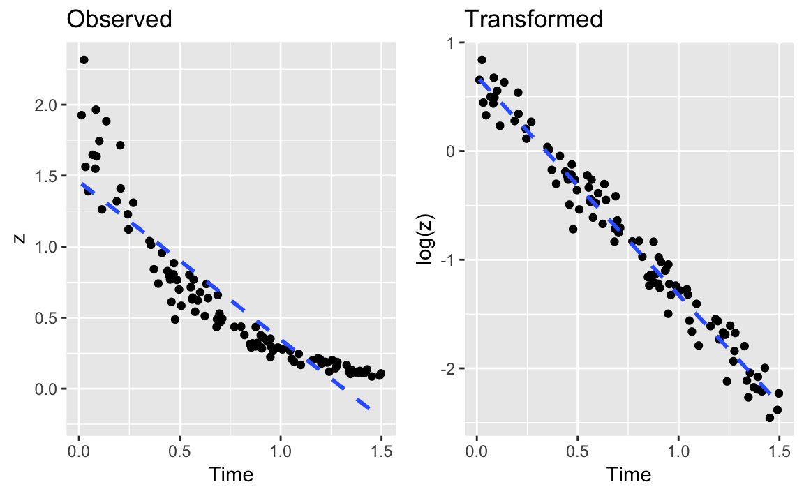
Figure 12-1. Example of a Data Transform
Figure 12-1 shows an example of exponential decay. The left panel shows the original data, z. The dotted line shows a linear regression on the original data; clearly, it’s a lousy fit. If the data is really exponential, then a possible model is:
- z = exp[β0 + β1t + ε]
where t is time and exp[⋅] is the exponential function (ex). This is not linear, of course, but we can linearize it by taking logarithms:
- log(z) = β0 + β1t + ε
In R, that regression is simple because we can embed the log transform directly into the regression formula:
# read in our example dataload(file='./data/df_decay.rdata')z<-df_decay$zt<-df_decay$time# transform and modelm<-lm(log(z)~t)summary(m)#>#> Call:#> lm(formula = log(z) ~ t)#>#> Residuals:#> Min 1Q Median 3Q Max#> -0.4479 -0.0993 0.0049 0.0978 0.2802#>#> Coefficients:#> Estimate Std. Error t value Pr(>|t|)#> (Intercept) 0.6887 0.0306 22.5 <2e-16 ***#> t -2.0118 0.0351 -57.3 <2e-16 ***#> ---#> Signif. codes: 0 '***' 0.001 '**' 0.01 '*' 0.05 '.' 0.1 ' ' 1#>#> Residual standard error: 0.148 on 98 degrees of freedom#> Multiple R-squared: 0.971, Adjusted R-squared: 0.971#> F-statistic: 3.28e+03 on 1 and 98 DF, p-value: <2e-16
The right panel of Figure X-X shows the plot of log(z) versus time. Superimposed on that plot is their regression line. The fit appears to be much better; this is confirmed by the R2 = 0.97, compared with 0.82 for the linear regression on the original data.
You can embed other functions inside your formula. If you thought the relationship was quadratic, you could use a square-root transformation:
lm(sqrt(y)~month)
You can apply transformations to variables on both sides of the formula, of course. This formula regresses y on the square root of x:
lm(y~sqrt(x))
This regression is for a log-log relationship between x and y:
lm(log(y)~log(x))
Finding the Best Power Transformation (Box–Cox Procedure)
Problem
You want to improve your linear model by applying a power transformation to the response variable.
Solution
Use the Box–Cox procedure, which is implemented by the boxcox function
of the MASS package. The procedure will identify a power, λ, such
that transforming y into yλ will improve the fit of your model:
library(MASS)m<-lm(y~x)boxcox(m)
Discussion
To illustrate the Box–Cox transformation, let’s create some artificial data using the equation y−1.5 = x + ε, where ε is an error term:
set.seed(9)x<-10:100eps<-rnorm(length(x),sd=5)y<-(x+eps)^(-1/1.5)
Then we will (mistakenly) model the data using a simple linear regression and derive an adjusted R2 of 0.6374:
m<-lm(y~x)summary(m)#>#> Call:#> lm(formula = y ~ x)#>#> Residuals:#> Min 1Q Median 3Q Max#> -0.04032 -0.01633 -0.00792 0.00996 0.14516#>#> Coefficients:#> Estimate Std. Error t value Pr(>|t|)#> (Intercept) 0.166885 0.007078 23.6 <2e-16 ***#> x -0.001465 0.000116 -12.6 <2e-16 ***#> ---#> Signif. codes: 0 '***' 0.001 '**' 0.01 '*' 0.05 '.' 0.1 ' ' 1#>#> Residual standard error: 0.0291 on 89 degrees of freedom#> Multiple R-squared: 0.641, Adjusted R-squared: 0.637#> F-statistic: 159 on 1 and 89 DF, p-value: <2e-16
When plotting the residuals against the fitted values, we get a clue that something is wrong:
plot(m,which=1)# Plot only the fitted vs residuals
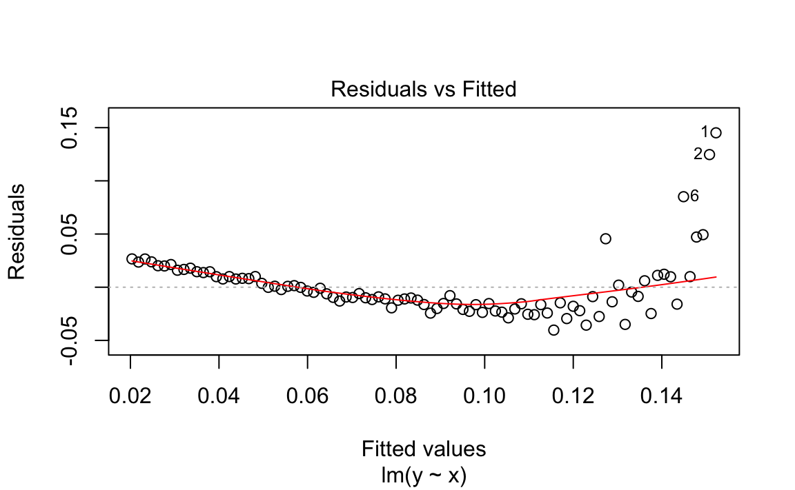
Figure 12-2. Fitted Values vs Residuals
We used the Base R plot function to plot the residuals vs the fitted
values in Figure 12-2. We can see this plot has a clear
parabolic shape. A possible fix is a power transformation on y, so we
run the Box–Cox procedure:
library(MASS)#>#> Attaching package: 'MASS'#> The following object is masked from 'package:dplyr':#>#> selectbc<-boxcox(m)
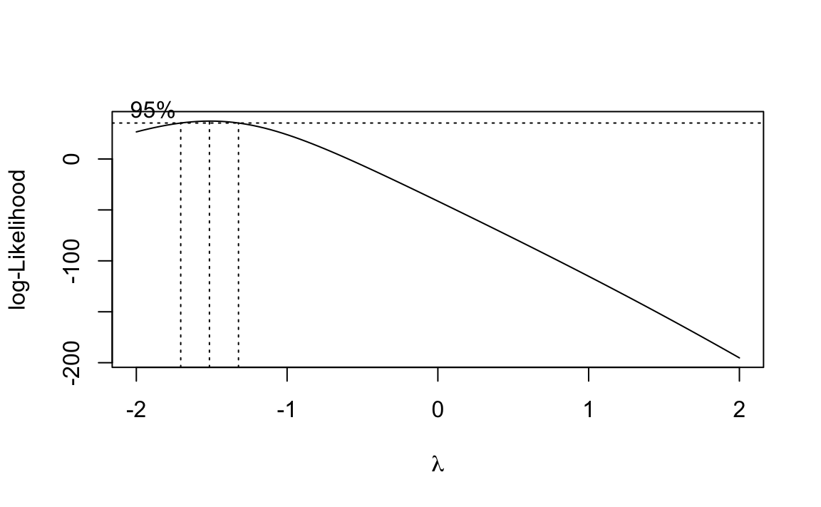
Figure 12-3. Output of boxcox on the Model (m)
The boxcox function plots values of λ against the log-likelihood of
the resulting model as shown in Figure 12-3. We want to maximize
that log-likelihood, so the function draws a line at the best value and
also draws lines at the limits of its confidence interval. In this case,
it looks like the best value is around −1.5, with a confidence interval
of about (−1.75, −1.25).
Oddly, the boxcox function does not return the best value of λ.
Rather, it returns the (x, y) pairs displayed in the plot. It’s
pretty easy to find the values of λ that yield the largest
log-likelihood y. We use the which.max function:
which.max(bc$y)#> [1] 13
Then this gives us the position of the corresponding λ:
lambda<-bc$x[which.max(bc$y)]lambda#> [1] -1.52
The function reports that the best λ is −1.515. In an actual application, We would urge you to interpret this number and choose the power that makes sense to you—rather than blindly accepting this “best” value. Use the graph to assist you in that interpretation. Here, We’ll go with −1.515.
We can apply the power transform to y and then fit the revised model; this gives a much better R2 of 0.9668:
z<-y^lambdam2<-lm(z~x)summary(m2)#>#> Call:#> lm(formula = z ~ x)#>#> Residuals:#> Min 1Q Median 3Q Max#> -13.459 -3.711 -0.228 2.206 14.188#>#> Coefficients:#> Estimate Std. Error t value Pr(>|t|)#> (Intercept) -0.6426 1.2517 -0.51 0.61#> x 1.0514 0.0205 51.20 <2e-16 ***#> ---#> Signif. codes: 0 '***' 0.001 '**' 0.01 '*' 0.05 '.' 0.1 ' ' 1#>#> Residual standard error: 5.15 on 89 degrees of freedom#> Multiple R-squared: 0.967, Adjusted R-squared: 0.967#> F-statistic: 2.62e+03 on 1 and 89 DF, p-value: <2e-16
For those who prefer one-liners, the transformation can be embedded right into the revised regression formula:
m2<-lm(I(y^lambda)~x)
By default, boxcox searches for values of λ in the range −2 to +2.
You can change that via the lambda argument; see the help page for
details.
We suggest viewing the Box–Cox result as a starting point, not as a definitive answer. If the confidence interval for λ includes 1.0, it may be that no power transformation is actually helpful. As always, inspect the residuals before and after the transformation. Did they really improve?
See Also
See Recipes “Regressing on Transformed Data” and “Diagnosing a Linear Regression”.
Forming Confidence Intervals for Regression Coefficients
Problem
You are performing linear regression and you need the confidence intervals for the regression coefficients.
Solution
Save the regression model in an object; then use the confint function
to extract confidence intervals:
load(file='./data/conf.rdata')m<-lm(y~x1+x2)confint(m)#> 2.5 % 97.5 %#> (Intercept) -3.90 6.47#> x1 -2.58 6.24#> x2 4.67 5.17
Discussion
The Solution uses the model y = β0 + β1(x1)i
β2(x2)i + εi. The confint function returns the
confidence intervals for the intercept (β0), the coefficient of
x1 (β1), and the coefficient of x2 (β2):
confint(m)#> 2.5 % 97.5 %#> (Intercept) -3.90 6.47#> x1 -2.58 6.24#> x2 4.67 5.17
By default, confint uses a confidence level of 95%. Use the level
parameter to select a different level:
confint(m,level=0.99)#> 0.5 % 99.5 %#> (Intercept) -5.72 8.28#> x1 -4.12 7.79#> x2 4.58 5.26
See Also
The coefplot function of the arm package can plot confidence
intervals for regression coefficients.
Plotting Regression Residuals
Problem
You want a visual display of your regression residuals.
Solution
You can plot the model object by selecting the residuals plot from the available plots:
m<-lm(y~x1+x2)plot(m,which=1)
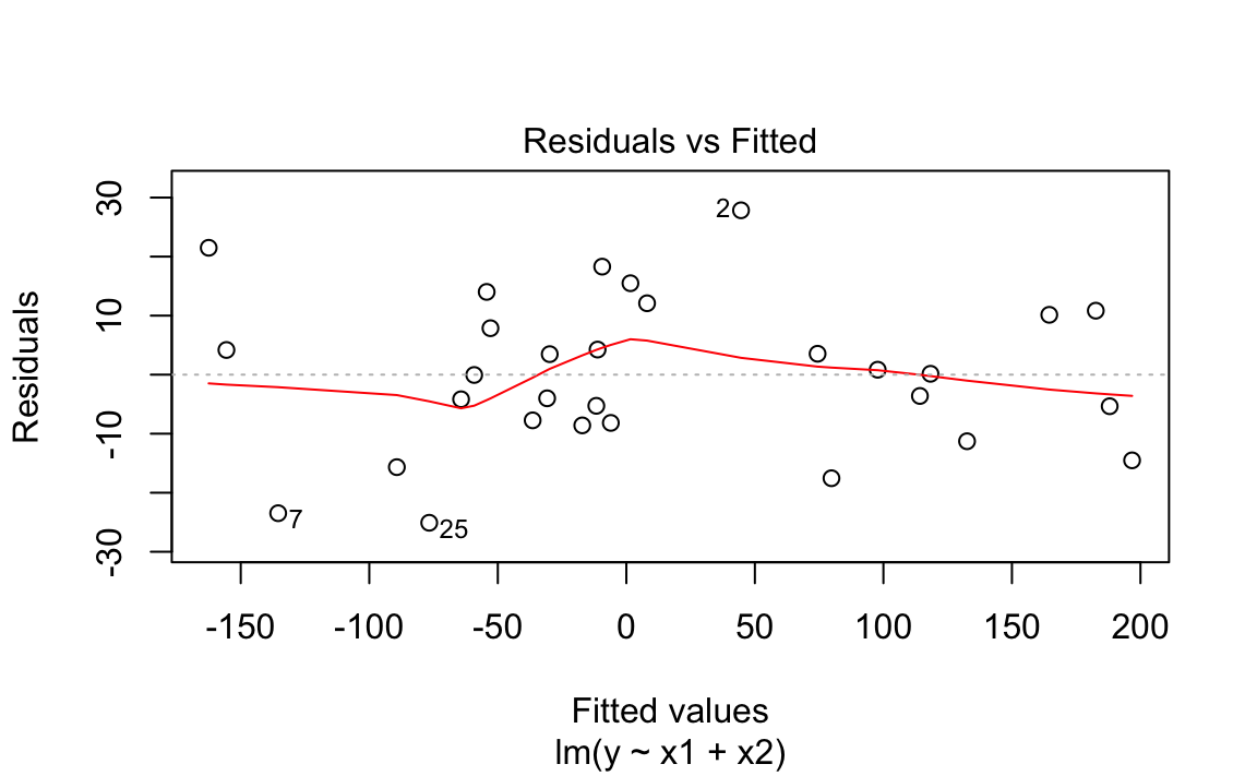
Figure 12-4. Model Residual Plot
The output is shown in Figure 12-4.
Discussion
Normally, plotting a regression model object produces several diagnostic
plots. You can select just the residuals plot by specifying which=1.
The graph above shows a plot of the residuals from “Performing Simple Linear Regression”. R draws a smoothed line through the residuals as a visual aid to finding significant patterns—for example, a slope or a parabolic shape.
See Also
See “Diagnosing a Linear Regression”, which contains examples of residuals plots and other diagnostic plots.
Diagnosing a Linear Regression
Problem
You have performed a linear regression. Now you want to verify the model’s quality by running diagnostic checks.
Solution
Start by plotting the model object, which will produce several diagnostic plots:
m<-lm(y~x1+x2)plot(m)
Next, identify possible outliers either by looking at the diagnostic
plot of the residuals or by using the outlierTest function of the
car package:
library(car)#> Loading required package: carData#>#> Attaching package: 'car'#> The following object is masked from 'package:dplyr':#>#> recode#> The following object is masked from 'package:purrr':#>#> someoutlierTest(m)#> No Studentized residuals with Bonferonni p < 0.05#> Largest |rstudent|:#> rstudent unadjusted p-value Bonferonni p#> 2 2.27 0.0319 0.956
Finally, identify any overly influential observations (“Identifying Influential Observations”).
Discussion
R fosters the impression that linear regression is easy: just use the
lm function. Yet fitting the data is only the beginning. It’s your job
to decide whether the fitted model actually works and works well.
Before anything else, you must have a statistically significant model. Check the F statistic from the model summary (“Understanding the Regression Summary”) and be sure that the p-value is small enough for your purposes. Conventionally, it should be less than 0.05 or else your model is likely not very meaningful.
Simply plotting the model object produces several useful diagnostic plots, shown in Figure 12-5:
length(x1)#> [1] 30length(x2)#> [1] 30length(y)#> [1] 30m<-lm(y~x1+x2)par(mfrow=(c(2,2)))# this gives us a 2x2 plotplot(m)
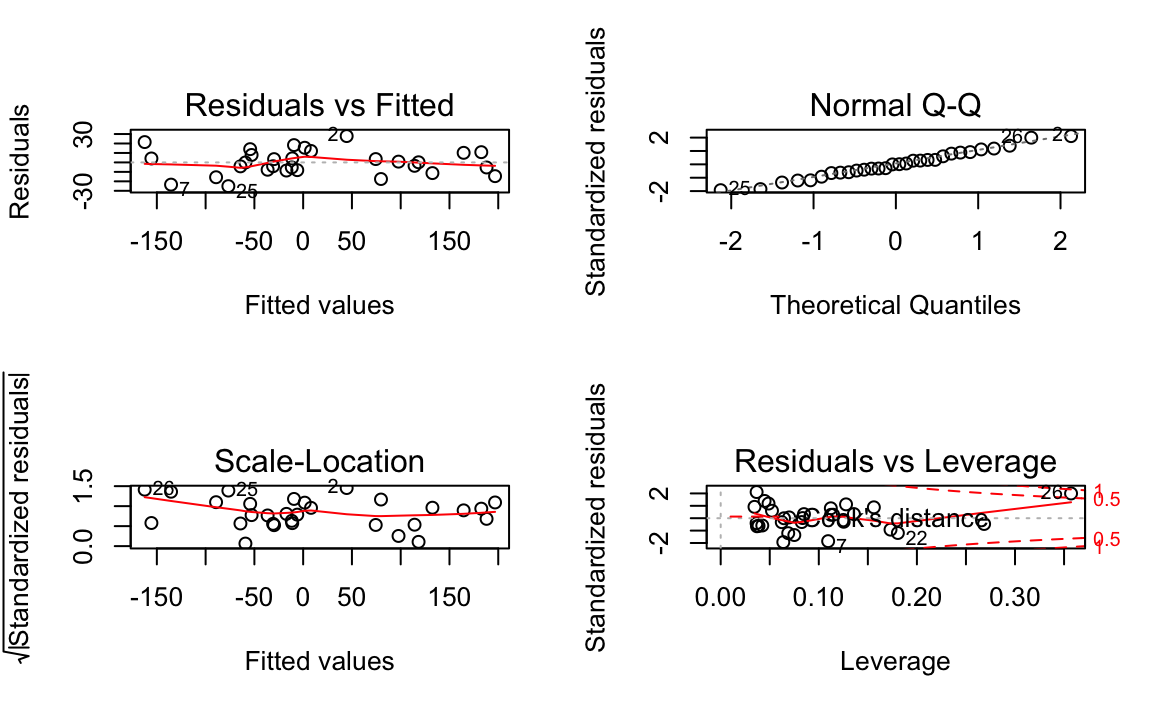
Figure 12-5. Diagnostics of a Good Fit
Figure 12-5 shows diagnostic plots for a pretty good regression:
-
The points in the Residuals vs Fitted plot are randomly scattered with no particular pattern.
-
The points in the Normal Q–Q plot are more-or-less on the line, indicating that the residuals follow a normal distribution.
-
In both the Scale–Location plot and the Residuals vs Leverage plots, the points are in a group with none too far from the center.
In contrast, the series of graphs shown in Figure 12-6 show the diagnostics for a not-so-good regression:
load(file='./data/bad.rdata')m<-lm(y2~x3+x4)par(mfrow=(c(2,2)))# this gives us a 2x2 plotplot(m)
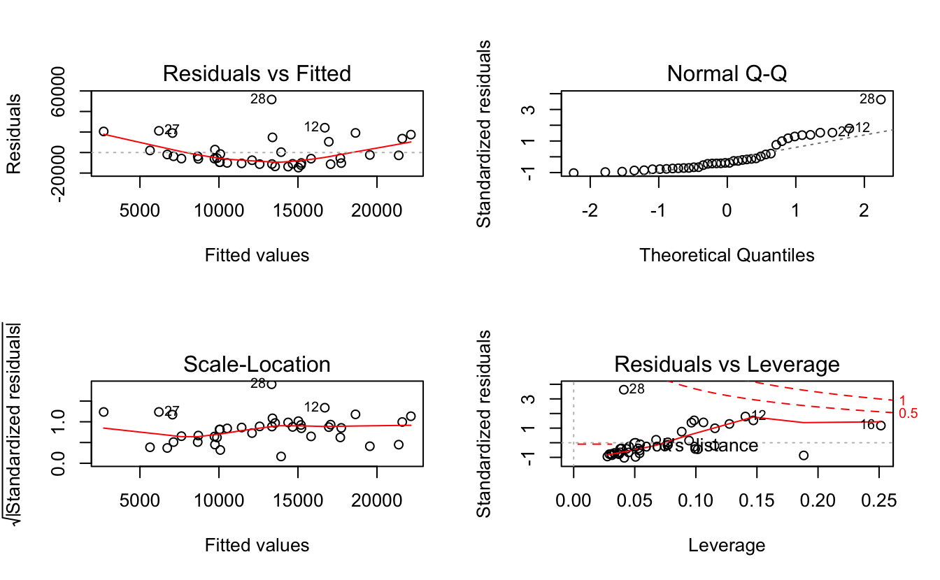
Figure 12-6. Diagnostics of a Poor Fit
Observe that the Residuals vs Fitted plot has a definite parabolic shape. This tells us that the model is incomplete: a quadratic factor is missing that could explain more variation in y. Other patterns in residuals would be suggestive of additional problems: a cone shape, for example, may indicate nonconstant variance in y. Interpreting those patterns is a bit of an art, so we suggest reviewing a good book on linear regression while evaluating the plot of residuals.
There are other problems with the not-so-good diagnostics above. The Normal Q–Q plot has more points off the line than it does for the good regression. Both the Scale–Location and Residuals vs Leverage plots show points scattered away from the center, which suggests that some points have excessive leverage.
Another pattern is that point number 28 sticks out in every plot. This
warns us that something is odd with that observation. The point could be
an outlier, for example. We can check that hunch with the outlierTest
function of the car package:
outlierTest(m)#> rstudent unadjusted p-value Bonferonni p#> 28 4.46 7.76e-05 0.0031
The outlierTest identifies the model’s most outlying observation. In
this case, it identified observation number 28 and so confirmed that it
could be an outlier.
See Also
See recipes “Understanding the Regression Summary” and “Identifying Influential Observations”. The car
package is not part of the standard distribution of R; see “Installing Packages from CRAN”.
Identifying Influential Observations
Problem
You want to identify the observations that are having the most influence on the regression model. This is useful for diagnosing possible problems with the data.
Solution
The influence.measures function reports several useful statistics for
identifying influential observations, and it flags the significant ones
with an asterisk (*). Its main argument is the model object from your
regression:
influence.measures(m)
Discussion
The title of this recipe could be “Identifying Overly Influential Observations”, but that would be redundant. All observations influence the regression model, even if only a little. When a statistician says that an observation is influential, it means that removing the observation would significantly change the fitted regression model. We want to identify those observations because they might be outliers that distort our model; we owe it to ourselves to investigate them.
The influence.measures function reports several statistics: DFBETAS,
DFFITS, covariance ratio, Cook’s distance, and hat matrix values. If any
of these measures indicate that an observation is influential, the
function flags that observation with an asterisk (*) along the
righthand side:
influence.measures(m)#> Influence measures of#> lm(formula = y2 ~ x3 + x4) :#>#> dfb.1_ dfb.x3 dfb.x4 dffit cov.r cook.d hat inf#> 1 -0.18784 0.15174 0.07081 -0.22344 1.059 1.67e-02 0.0506#> 2 0.27637 -0.04367 -0.39042 0.45416 1.027 6.71e-02 0.0964#> 3 -0.01775 -0.02786 0.01088 -0.03876 1.175 5.15e-04 0.0772#> 4 0.15922 -0.14322 0.25615 0.35766 1.133 4.27e-02 0.1156#> 5 -0.10537 0.00814 -0.06368 -0.13175 1.078 5.87e-03 0.0335#> 6 0.16942 0.07465 0.42467 0.48572 1.034 7.66e-02 0.1062etc...
-
JDL NOTE: the output above does not seem to be respecting the output.lines=10 setting. Debug. We also use output.lines=5 in ch4. Go see if that is working
This is the model from “Diagnosing a Linear Regression”, where we suspected that observation 28 was an outlier. An asterisk is flagging that observation, confirming that it’s overly influential.
This recipe can identify influential observations, but you shouldn’t reflexively delete them. Some judgment is required here. Are those observations improving your model or damaging it?
See Also
See “Diagnosing a Linear Regression”. Use help(influence.measures) to get a list of influence
measures and some related functions. See a regression textbook for
interpretations of the various influence measures.
Testing Residuals for Autocorrelation (Durbin–Watson Test)
Problem
You have performed a linear regression and want to check the residuals for autocorrelation.
Solution
The Durbin—Watson test can check the residuals for autocorrelation. The
test is implemented by the dwtest function of the lmtest package:
library(lmtest)m<-lm(y~x)# Create a model objectdwtest(m)# Test the model residuals
The output includes a p-value. Conventionally, if p < 0.05 then the residuals are significantly correlated whereas p > 0.05 provides no evidence of correlation.
You can perform a visual check for autocorrelation by graphing the autocorrelation function (ACF) of the residuals:
acf(m)# Plot the ACF of the model residuals
Discussion
The Durbin–Watson test is often used in time series analysis, but it was originally created for diagnosing autocorrelation in regression residuals. Autocorrelation in the residuals is a scourge because it distorts the regression statistics, such as the F statistic and the t statistics for the regression coefficients. The presence of autocorrelation suggests that your model is missing a useful predictor variable or that it should include a time series component, such as a trend or a seasonal indicator.
This first example builds a simple regression model and then tests the residuals for autocorrelation. The test returns a p-value well above zero, which indicates that there is no significant autocorrelation:
library(lmtest)#> Loading required package: zoo#>#> Attaching package: 'zoo'#> The following objects are masked from 'package:base':#>#> as.Date, as.Date.numericload(file='./data/ac.rdata')m<-lm(y1~x)dwtest(m)#>#> Durbin-Watson test#>#> data: m#> DW = 2, p-value = 0.4#> alternative hypothesis: true autocorrelation is greater than 0
This second example exhibits autocorrelation in the residuals. The p-value is near 0, so the autocorrelation is likely positive:
m<-lm(y2~x)dwtest(m)#>#> Durbin-Watson test#>#> data: m#> DW = 2, p-value = 0.01#> alternative hypothesis: true autocorrelation is greater than 0
By default, dwtest performs a one-sided test and answers this
question: Is the autocorrelation of the residuals greater than zero? If
your model could exhibit negative autocorrelation (yes, that is
possible), then you should use the alternative option to perform a
two-sided test:
dwtest(m,alternative="two.sided")
The Durbin–Watson test is also implemented by the durbinWatsonTest
function of the car package. We suggested the dwtest function
primarily because we think the output is easier to read.
See Also
Neither the lmtest package nor the car package are included in the
standard distribution of R; see recipes @ref(recipe-id013) “Accessing the Functions in a Package” and @ref(recipe-id012) “Installing Packages from CRAN”.
See recipes @ref(recipe-id082) X-X and X-X
for more regarding tests of autocorrelation.
Predicting New Values
Problem
You want to predict new values from your regression model.
Solution
Save the predictor data in a data frame. Use the predict function,
setting the newdata parameter to the data frame:
load(file='./data/pred2.rdata')m<-lm(y~u+v+w)preds<-data.frame(u=3.1,v=4.0,w=5.5)predict(m,newdata=preds)#> 1#> 45
Discussion
Once you have a linear model, making predictions is quite easy because
the predict function does all the heavy lifting. The only annoyance is
arranging for a data frame to contain your data.
The predict function returns a vector of predicted values with one
prediction for every row in the data. The example in the Solution
contains one row, so predict returned one value.
If your predictor data contains several rows, you get one prediction per row:
preds<-data.frame(u=c(3.0,3.1,3.2,3.3),v=c(3.9,4.0,4.1,4.2),w=c(5.3,5.5,5.7,5.9))predict(m,newdata=preds)#> 1 2 3 4#> 43.8 45.0 46.3 47.5
In case it’s not obvious: the new data needn’t contain values for response variables, only predictor variables. After all, you are trying to calculate the response, so it would be unreasonable of R to expect you to supply it.
See Also
These are just the point estimates of the predictions. See “Forming Prediction Intervals” for the confidence intervals.
Forming Prediction Intervals
Problem
You are making predictions using a linear regression model. You want to know the prediction intervals: the range of the distribution of the prediction.
Solution
Use the predict function and specify interval="prediction":
predict(m,newdata=preds,interval="prediction")
Discussion
This is a continuation of “Predicting New Values”,
which described packaging your data into a data frame for the predict
function. We are adding interval="prediction" to obtain prediction
intervals.
Here is the example from “Predicting New Values”, now
with prediction intervals. The new lwr and upr columns are the lower
and upper limits, respectively, for the interval:
predict(m,newdata=preds,interval="prediction")#> fit lwr upr#> 1 43.8 38.2 49.4#> 2 45.0 39.4 50.7#> 3 46.3 40.6 51.9#> 4 47.5 41.8 53.2
By default, predict uses a confidence level of 0.95. You can change
this via the level argument.
A word of caution: these prediction intervals are extremely sensitive to deviations from normality. If you suspect that your response variable is not normally distributed, consider a nonparametric technique, such as the bootstrap (Recipe X-X), for prediction intervals.
Performing One-Way ANOVA
Problem
Your data is divided into groups, and the groups are normally distributed. You want to know if the groups have significantly different means.
Solution
Use a factor to define the groups. Then apply the oneway.test
function:
oneway.test(x~f)
Here, x is a vector of numeric values and f is a factor that
identifies the groups. The output includes a p-value. Conventionally,
a p-value of less than 0.05 indicates that two or more groups have
significantly different means whereas a value exceeding 0.05 provides no
such evidence.
Discussion
Comparing the means of groups is a common task. One-way ANOVA performs that comparison and computes the probability that they are statistically identical. A small p-value indicates that two or more groups likely have different means. (It does not indicate that all groups have different means.)
The basic ANOVA test assumes that your data has a normal distribution or that, at least, it is pretty close to bell-shaped. If not, use the Kruskal–Wallis test instead (“Performing Robust ANOVA (Kruskal–Wallis Test)”).
We can illustrate ANOVA with stock market historical data. Is the stock
market more profitable in some months than in others? For instance, a
common folk myth says that October is a bad month for stock market
investors.1 We explored this question by creating a
data frame GSPC_df containing two columns, r and mon. r, is the
daily returns in the Standard & Poor’s 500 index, a broad measure of
stock market performance. The factor, mon, indicates the calendar
month in which that change occurred: Jan, Feb, Mar, and so forth. The
data covers the period 1950 though 2009.
The one-way ANOVA shows a p-value of 0.03347:
load(file='./data/anova.rdata')oneway.test(r~mon,data=GSPC_df)#>#> One-way analysis of means (not assuming equal variances)#>#> data: r and mon#> F = 2, num df = 10, denom df = 7000, p-value = 0.03
We can conclude that stock market changes varied significantly according to the calendar month.
Before you run to your broker and start flipping your portfolio monthly,
however, we should check something: did the pattern change recently? We
can limit the analysis to recent data by specifying a subset
parameter. This works for oneway.test just as it does for the lm
function. The subset contains the indexes of observations to be
analyzed; all other observations are ignored. Here, we give the indexes
of the 2,500 most recent observations, which is about 10 years of data:
oneway.test(r~mon,data=GSPC_df,subset=tail(seq_along(r),2500))#>#> One-way analysis of means (not assuming equal variances)#>#> data: r and mon#> F = 0.7, num df = 10, denom df = 1000, p-value = 0.8
Uh-oh! Those monthly differences evaporated during the past 10 years. The large p-value, 0.7608, indicates that changes have not recently varied according to calendar month. Apparently, those differences are a thing of the past.
Notice that the oneway.test output says “(not assuming equal
variances)”. If you know the groups have equal variances, you’ll get a
less conservative test by specifying var.equal=TRUE:
oneway.test(x~f,var.equal=TRUE)
You can also perform one-way ANOVA by using the aov function like
this:
m<-aov(x~f)summary(m)
However, the aov function always assumes equal variances and so is
somewhat less flexible than oneway.test.
See Also
If the means are significantly different, use “Finding Differences Between Means of Groups” to see the actual differences. Use “Performing Robust ANOVA (Kruskal–Wallis Test)” if your data is not normally distributed, as required by ANOVA.
Creating an Interaction Plot
Problem
You are performing multiway ANOVA: using two or more categorical variables as predictors. You want a visual check of possible interaction between the predictors.
Solution
Use the interaction.plot function:
interaction.plot(pred1,pred2,resp)
Here, pred1 and pred2 are two categorical predictors and resp is
the response variable.
Discussion
ANOVA is a form of linear regression, so ideally there is a linear relationship between every predictor and the response variable. One source of nonlinearity is an interaction between two predictors: as one predictor changes value, the other predictor changes its relationship to the response variable. Checking for interaction between predictors is a basic diagnostic.
The faraway package contains a dataset called rats. In it, treat
and poison are categorical variables and time is the response
variable. When plotting poison against time we are looking for
straight, parallel lines, which indicate a linear relationship. However,
using the interaction.plot function produces Figure 12-7 which reveals that something is not right:
library(faraway)data(rats)interaction.plot(rats$poison,rats$treat,rats$time)
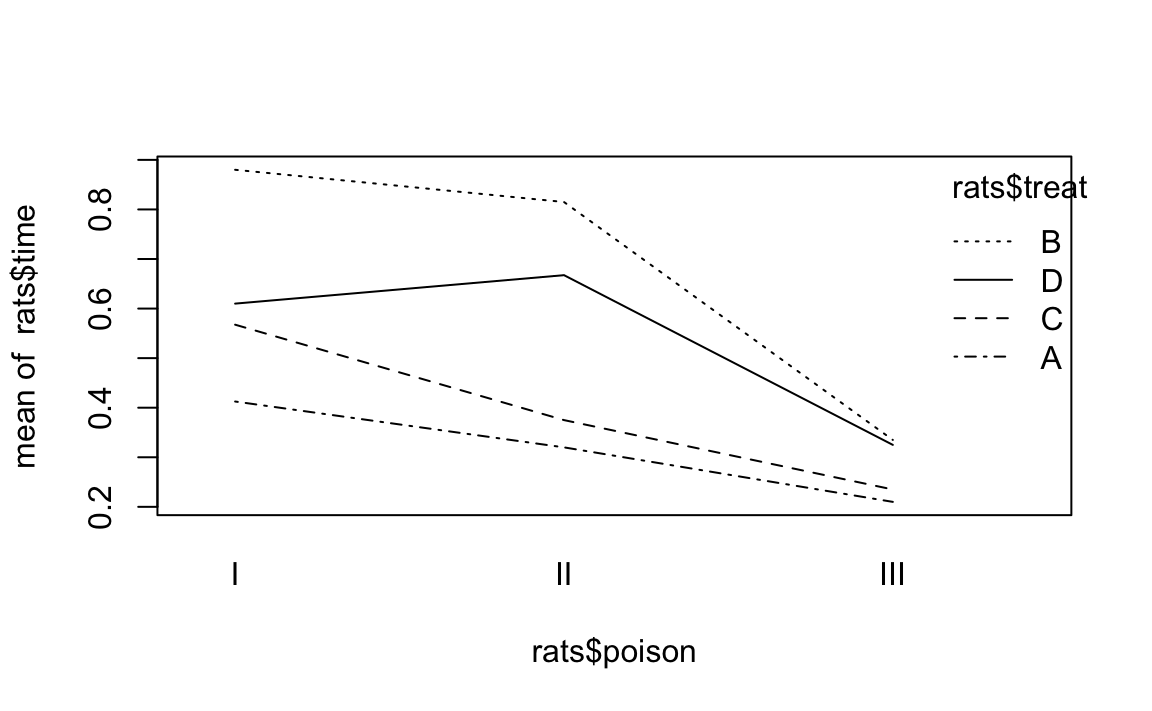
Figure 12-7. Interaction Plot Example
Each line graphs time against poison. The difference between lines
is that each line is for a different value of treat. The lines should
be parallel, but the top two are not exactly parallel. Evidently,
varying the value of treat “warped” the lines, introducing a
nonlinearity into the relationship between poison and time.
This signals a possible interaction that we should check. For this data it just so happens that yes, there is an interaction but no, it is not statistically significant. The moral is clear: the visual check is useful, but it’s not foolproof. Follow up with a statistical check.
See Also
Finding Differences Between Means of Groups
Problem
Your data is divided into groups, and an ANOVA test indicates that the groups have significantly different means. You want to know the differences between those means for all groups.
Solution
Perform the ANOVA test using the aov function, which returns a model
object. Then apply the TukeyHSD function to the model object:
m<-aov(x~f)TukeyHSD(m)
Here, x is your data and f is the grouping factor. You can plot the
TukeyHSD result to obtain a graphical display of the differences:
plot(TukeyHSD(m))
Discussion
The ANOVA test is important because it tells you whether or not the groups’ means are different. But the test does not identify which groups are different, and it does not report their differences.
The TukeyHSD function can calculate those differences and help you
identify the largest ones. It uses the “honest significant differences”
method invented by John Tukey.
We’ll illustrate TukeyHSD by continuing the example from
“Performing One-Way ANOVA”, which grouped daily stock
market changes by month. Here, we group them by weekday instead, using a
factor called wday that identifies the day of the week (Mon, …, Fri)
on which the change occurred. We’ll use the first 2,500 observations,
which roughly cover the period from 1950 to 1960:
load(file='./data/anova.rdata')oneway.test(r~wday,subset=1:2500,data=GSPC_df)#>#> One-way analysis of means (not assuming equal variances)#>#> data: r and wday#> F = 10, num df = 4, denom df = 1000, p-value = 5e-10
The p-value is essentially zero, indicating that average changes
varied significantly depending on the weekday. To use the TukeyHSD
function, We first perform the ANOVA test using the aov function,
which returns a model object, and then apply the TukeyHSD function to
the object:
m<-aov(r~wday,subset=1:2500,data=GSPC_df)TukeyHSD(m)#> Tukey multiple comparisons of means#> 95% family-wise confidence level#>#> Fit: aov(formula = r ~ wday, data = GSPC_df, subset = 1:2500)#>#> $wday#> diff lwr upr p adj#> Mon-Fri -0.003153 -4.40e-03 -0.001911 0.000#> Thu-Fri -0.000934 -2.17e-03 0.000304 0.238#> Tue-Fri -0.001855 -3.09e-03 -0.000618 0.000#> Wed-Fri -0.000783 -2.01e-03 0.000448 0.412#> Thu-Mon 0.002219 9.79e-04 0.003460 0.000#> Tue-Mon 0.001299 5.85e-05 0.002538 0.035#> Wed-Mon 0.002370 1.14e-03 0.003605 0.000#> Tue-Thu -0.000921 -2.16e-03 0.000314 0.249#> Wed-Thu 0.000151 -1.08e-03 0.001380 0.997#> Wed-Tue 0.001072 -1.57e-04 0.002300 0.121
Each line in the output table includes the difference between the means
of two groups (diff) as well as the lower and upper bounds of the
confidence interval (lwr and upr) for the difference. The first line
in the table, for example,compares the Mon group and the Fri group: the
difference of their means is 0.003 with a confidence interval of
(-0.0044 -0.0019).
Scanning the table, we see that the Wed-Mon comparison had the largest difference, which was 0.00237.
A cool feature of TukeyHSD is that it can display these differences
visually, too. Simply plot the function’s return value to get output as
is shown in Figure 12-8.
plot(TukeyHSD(m))
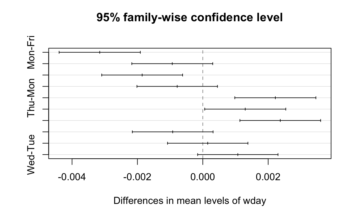
Figure 12-8. TukeyHSD Plot
The horizontal lines plot the confidence intervals for each pair. With this visual representation you can quickly see that several confidence intervals cross over zero, indicating that the difference is not necessarily significant. You can also see that the Wed-Mon pair has the largest difference because their confidence interval is farthest to the right.
See Also
Performing Robust ANOVA (Kruskal–Wallis Test)
Problem
Your data is divided into groups. The groups are not normally distributed, but their distributions have similar shapes. You want to perform a test similar to ANOVA—you want to know if the group medians are significantly different.
Solution
Create a factor that defines the groups of your data. Use the
kruskal.test function, which implements the Kruskal–Wallis test.
Unlike the ANOVA test, this test does not depend upon the normality of
the data:
kruskal.test(x~f)
Here, x is a vector of data and f is a grouping factor. The output
includes a p-value. Conventionally, p < 0.05 indicates that there is
a significant difference between the medians of two or more groups
whereas p > 0.05 provides no such evidence.
Discussion
Regular ANOVA assumes that your data has a Normal distribution. It can tolerate some deviation from normality, but extreme deviations will produce meaningless p-values.
The Kruskal–Wallis test is a nonparametric version of ANOVA, which means that it does not assume normality. However, it does assume same-shaped distributions. You should use the Kruskal–Wallis test whenever your data distribution is nonnormal or simply unknown.
The null hypothesis is that all groups have the same median. Rejecting the null hypothesis (with p < 0.05) does not indicate that all groups are different, but it does suggest that two or more groups are different.
One year, Paul taught Business Statistics to 94 undergraduate students. The class included a midterm examination, and there were four homework assignments prior to the exam. He wanted to know: What is the relationship between completing the homework and doing well on the exam? If there is no relation, then the homework is irrelevant and needs rethinking.
He created a vector of grades, one per student and he also created a
parallel factor that captured the number of homework assignments
completed by that student. The data are in a data frame named
student_data:
load(file='./data/student_data.rdata')head(student_data)#> # A tibble: 6 x 4#> att.fact hw.mean midterm hw#> <fct> <dbl> <dbl> <fct>#> 1 3 0.808 0.818 4#> 2 3 0.830 0.682 4#> 3 3 0.444 0.511 2#> 4 3 0.663 0.670 3#> 5 2 0.9 0.682 4#> 6 3 0.948 0.954 4
Notice that the hw variable—although it appears to be numeric—is
actually a factor. It assigns each midterm grade to one of five groups
depending upon how many homework assignments the student completed.
The distribution of exam grades is definitely not Normal: the students have a wide range of math skills, so there are an unusual number of A and F grades. Hence regular ANOVA would not be appropriate. Instead we used the Kruskal–Wallis test and obtained a p-value of essentially zero (3.99 × 10⁻⁵, or 0.00003669):
kruskal.test(midterm~hw,data=student_data)#>#> Kruskal-Wallis rank sum test#>#> data: midterm by hw#> Kruskal-Wallis chi-squared = 30, df = 4, p-value = 4e-05
Obviously, there is a significant performance difference between students who complete their homework and those who do not. But what could Paul actually conclude? At first, Paul was pleased that the homework appeared so effective. Then it dawned on him that this was a classic error in statistical reasoning: He assumed that correlation implied causality. It does not, of course. Perhaps strongly motivated students do well on both homework and exams whereas lazy students do not. In that case, the causal factor is degree of motivation, not the brilliance of my homework selection. In the end, he could only conclude something very simple: students who complete the homework will likely do well on the midterm exam, but he still doesn’t really know why.
Comparing Models by Using ANOVA
Problem
You have two models of the same data, and you want to know whether they produce different results.
Solution
The anova function can compare two models and report if they are
significantly different:
anova(m1,m2)
Here, m1 and m2 are both model objects returned by lm. The output
from anova includes a p-value. Conventionally, a p-value of less
than 0.05 indicates that the models are significantly different whereas
a value exceeding 0.05 provides no such evidence.
Discussion
In “Getting Regression Statistics”, we used the
anova function to print the ANOVA table for one regression model. Now
we are using the two-argument form to compare two models.
The anova function has one strong requirement when comparing two
models: one model must be contained within the other. That is, all the
terms of the smaller model must appear in the larger model. Otherwise,
the comparison is impossible.
The ANOVA analysis performs an F test that is similar to the F test for a linear regression. The difference is that this test is between two models whereas the regression F test is between using the regression model and using no model.
Suppose we build three models of y, adding terms as we go:
load(file='./data/anova2.rdata')m1<-lm(y~u)m2<-lm(y~u+v)m3<-lm(y~u+v+w)
Is m2 really different from m1? We can use anova to compare them,
and the result is a p-value of 0.009066:
anova(m1,m2)#> Analysis of Variance Table#>#> Model 1: y ~ u#> Model 2: y ~ u + v#> Res.Df RSS Df Sum of Sq F Pr(>F)#> 1 18 197#> 2 17 130 1 66.4 8.67 0.0091 **#> ---#> Signif. codes: 0 '***' 0.001 '**' 0.01 '*' 0.05 '.' 0.1 ' ' 1
The small p-value indicates that the models are significantly
different. Comparing m2 and m3, however, yields a p-value of
0.05527:
anova(m2,m3)#> Analysis of Variance Table#>#> Model 1: y ~ u + v#> Model 2: y ~ u + v + w#> Res.Df RSS Df Sum of Sq F Pr(>F)#> 1 17 130#> 2 16 103 1 27.5 4.27 0.055 .#> ---#> Signif. codes: 0 '***' 0.001 '**' 0.01 '*' 0.05 '.' 0.1 ' ' 1
This is right on the edge. Strictly speaking, it does not pass our requirement to be smaller than 0.05; however, it’s close enough that you might judge the models to be “different enough.”
This example is a bit contrived, so it does not show the larger power of
anova. We use anova when, while experimenting with complicated
models by adding and deleting multiple terms, we need to know whether or
not the new model is really different from the original one. In other
words: if we add terms and the new model is essentially unchanged, then
the extra terms are not worth the additional complications.
1 In the words of Mark Twain, “October: This is one of the peculiarly dangerous months to speculate in stocks in. The others are July, January, September, April, November, May, March, June, December, August and February.”