Table of Contents for
Python for Data Analysis, 2nd Edition
 Python for Data Analysis, 2nd Edition
Published by
O'Reilly Media, Inc., 2017
Python for Data Analysis, 2nd Edition
Published by
O'Reilly Media, Inc., 2017
- nav
- Cover
- Python for Data Analysis
- Python for Data Analysis
- Preface
- Preliminaries
- Python Language Basics, IPython, and Jupyter Notebooks
- Built-in Data Structures, Functions, and Files
- NumPy Basics: Arrays and Vectorized Computation
- Getting Started with pandas
- Data Loading, Storage, and File Formats
- Data Cleaning and Preparation
- Data Wrangling: Join, Combine, and Reshape
- Plotting and Visualization
- Data Aggregation and Group Operations
- Time Series
- Advanced pandas
- Introduction to Modeling Libraries in Python
- Data Analysis Examples
- Advanced NumPy
- More on the IPython System
- Index
- About the Author
- Colophon
Chapter 14. Data Analysis Examples
Now that we’ve reached the end of this book’s main chapters, we’re going to take a look at a number of real-world datasets. For each dataset, we’ll use the techniques presented in this book to extract meaning from the raw data. The demonstrated techniques can be applied to all manner of other datasets, including your own. This chapter contains a collection of miscellaneous example datasets that you can use for practice with the tools in this book.
The example datasets are found in the book’s accompanying GitHub repository.
14.1 1.USA.gov Data from Bitly
In 2011, URL shortening service Bitly partnered with the US government website USA.gov to provide a feed of anonymous data gathered from users who shorten links ending with .gov or .mil. In 2011, a live feed as well as hourly snapshots were available as downloadable text files. This service is shut down at the time of this writing (2017), but we preserved one of the data files for the book’s examples.
In the case of the hourly snapshots, each line in each file contains a common form of web data known as JSON, which stands for JavaScript Object Notation. For example, if we read just the first line of a file we may see something like this:
In[5]:path='datasets/bitly_usagov/example.txt'In[6]:open(path).readline()Out[6]:'{ "a": "Mozilla\\/5.0 (Windows NT 6.1; WOW64) AppleWebKit\\/535.11(KHTML,likeGecko)Chrome\\/17.0.963.78Safari\\/535.11", "c": "US", "nk": 1,"tz":"America\\/New_York","gr":"MA","g":"A6qOVH","h":"wfLQtf","l":"orofrog","al":"en-US,en;q=0.8","hh":"1.usa.gov","r":"http:\\/\\/www.facebook.com\\/l\\/7AQEFzjSi\\/1.usa.gov\\/wfLQtf","u":"http:\\/\\/www.ncbi.nlm.nih.gov\\/pubmed\\/22415991","t":1331923247,"hc":1331822918,"cy":"Danvers","ll":[42.576698,-70.954903]}\n'
Python has both built-in and third-party libraries for converting a
JSON string into a Python dictionary object. Here we’ll use the json module and its loads function invoked on each line in the
sample file we downloaded:
importjsonpath='datasets/bitly_usagov/example.txt'records=[json.loads(line)forlineinopen(path)]
The resulting object records is
now a list of Python dicts:
In[18]:records[0]Out[18]:{'a':'Mozilla/5.0 (Windows NT 6.1; WOW64) AppleWebKit/535.11 (KHTML, like Gecko)Chrome/17.0.963.78Safari/535.11','al':'en-US,en;q=0.8','c':'US','cy':'Danvers','g':'A6qOVH','gr':'MA','h':'wfLQtf','hc':1331822918,'hh':'1.usa.gov','l':'orofrog','ll':[42.576698,-70.954903],'nk':1,'r':'http://www.facebook.com/l/7AQEFzjSi/1.usa.gov/wfLQtf','t':1331923247,'tz':'America/New_York','u':'http://www.ncbi.nlm.nih.gov/pubmed/22415991'}
Counting Time Zones in Pure Python
Suppose we were interested in finding the most often-occurring time zones in the dataset (the
tz field). There are many ways we
could do this. First, let’s extract a list of time zones again using a
list comprehension:
In[12]:time_zones=[rec['tz']forrecinrecords]---------------------------------------------------------------------------KeyErrorTraceback(mostrecentcalllast)<ipython-input-12-f3fbbc37f129>in<module>()---->1time_zones=[rec['tz']forrecinrecords]<ipython-input-12-f3fbbc37f129>in<listcomp>(.0)---->1time_zones=[rec['tz']forrecinrecords]KeyError:'tz'
Oops! Turns out that not all of the records have a time zone
field. This is easy to handle, as we can add the check if 'tz' in rec at the end of the list
comprehension:
In[13]:time_zones=[rec['tz']forrecinrecordsif'tz'inrec]In[14]:time_zones[:10]Out[14]:['America/New_York','America/Denver','America/New_York','America/Sao_Paulo','America/New_York','America/New_York','Europe/Warsaw','','','']
Just looking at the first 10 time zones, we see that some of them are unknown (empty string). You can filter these out also, but I’ll leave them in for now. Now, to produce counts by time zone I’ll show two approaches: the harder way (using just the Python standard library) and the easier way (using pandas). One way to do the counting is to use a dict to store counts while we iterate through the time zones:
defget_counts(sequence):counts={}forxinsequence:ifxincounts:counts[x]+=1else:counts[x]=1returncounts
Using more advanced tools in the Python standard library, you can write the same thing more briefly:
fromcollectionsimportdefaultdictdefget_counts2(sequence):counts=defaultdict(int)# values will initialize to 0forxinsequence:counts[x]+=1returncounts
I put this logic in a function just to make it more reusable. To
use it on the time zones, just pass the time_zones list:
In[17]:counts=get_counts(time_zones)In[18]:counts['America/New_York']Out[18]:1251In[19]:len(time_zones)Out[19]:3440
If we wanted the top 10 time zones and their counts, we can do a bit of dictionary acrobatics:
deftop_counts(count_dict,n=10):value_key_pairs=[(count,tz)fortz,countincount_dict.items()]value_key_pairs.sort()returnvalue_key_pairs[-n:]
We have then:
In[21]:top_counts(counts)Out[21]:[(33,'America/Sao_Paulo'),(35,'Europe/Madrid'),(36,'Pacific/Honolulu'),(37,'Asia/Tokyo'),(74,'Europe/London'),(191,'America/Denver'),(382,'America/Los_Angeles'),(400,'America/Chicago'),(521,''),(1251,'America/New_York')]
If you search the Python standard library, you may find the
collections.Counter class, which
makes this task a lot easier:
In[22]:fromcollectionsimportCounterIn[23]:counts=Counter(time_zones)In[24]:counts.most_common(10)Out[24]:[('America/New_York',1251),('',521),('America/Chicago',400),('America/Los_Angeles',382),('America/Denver',191),('Europe/London',74),('Asia/Tokyo',37),('Pacific/Honolulu',36),('Europe/Madrid',35),('America/Sao_Paulo',33)]
Counting Time Zones with pandas
Creating a DataFrame from the original set of records is as easy
as passing the list of records to
pandas.DataFrame:
In[25]:importpandasaspdIn[26]:frame=pd.DataFrame(records)In[27]:frame.info()<class'pandas.core.frame.DataFrame'>RangeIndex:3560entries,0to3559Datacolumns(total18columns):_heartbeat_120non-nullfloat64a3440non-nullobjectal3094non-nullobjectc2919non-nullobjectcy2919non-nullobjectg3440non-nullobjectgr2919non-nullobjecth3440non-nullobjecthc3440non-nullfloat64hh3440non-nullobjectkw93non-nullobjectl3440non-nullobjectll2919non-nullobjectnk3440non-nullfloat64r3440non-nullobjectt3440non-nullfloat64tz3440non-nullobjectu3440non-nullobjectdtypes:float64(4),object(14)memoryusage:500.7+KBIn[28]:frame['tz'][:10]Out[28]:0America/New_York1America/Denver2America/New_York3America/Sao_Paulo4America/New_York5America/New_York6Europe/Warsaw789Name:tz,dtype:object
The output shown for the frame
is the summary view, shown for large DataFrame
objects. We can then use the value_counts method for Series:
In[29]:tz_counts=frame['tz'].value_counts()In[30]:tz_counts[:10]Out[30]:America/New_York1251521America/Chicago400America/Los_Angeles382America/Denver191Europe/London74Asia/Tokyo37Pacific/Honolulu36Europe/Madrid35America/Sao_Paulo33Name:tz,dtype:int64
We can visualize this data using matplotlib. You can do a bit of
munging to fill in a substitute value for unknown and missing time zone
data in the records. We replace the missing values with the fillna method and use boolean array indexing
for the empty strings:
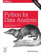
In[31]:clean_tz=frame['tz'].fillna('Missing')In[32]:clean_tz[clean_tz=='']='Unknown'In[33]:tz_counts=clean_tz.value_counts()In[34]:tz_counts[:10]Out[34]:America/New_York1251Unknown521America/Chicago400America/Los_Angeles382America/Denver191Missing120Europe/London74Asia/Tokyo37Pacific/Honolulu36Europe/Madrid35Name:tz,dtype:int64
At this point, we can use the seaborn package to make a horizontal bar plot (see Figure 14-1 for the resulting visualization):
In[36]:importseabornassnsIn[37]:subset=tz_counts[:10]In[38]:sns.barplot(y=subset.index,x=subset.values)
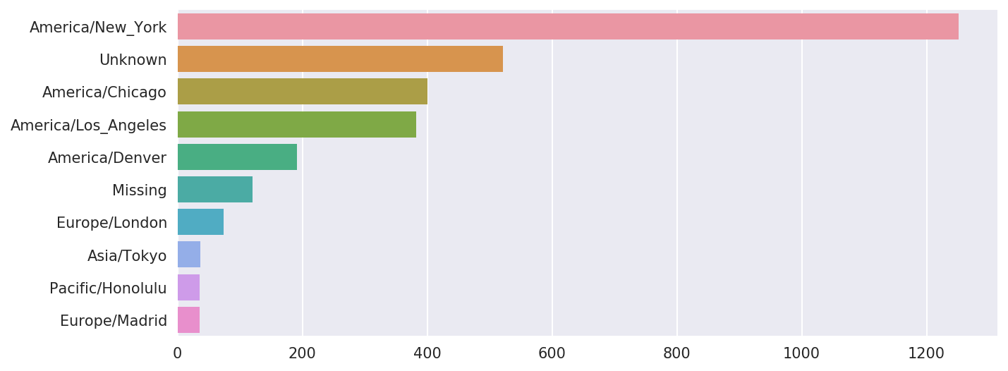
Figure 14-1. Top time zones in the 1.usa.gov sample data
The a field contains
information about the browser, device, or application used to perform
the URL shortening:
In[39]:frame['a'][1]Out[39]:'GoogleMaps/RochesterNY'In[40]:frame['a'][50]Out[40]:'Mozilla/5.0 (Windows NT 5.1; rv:10.0.2) Gecko/20100101 Firefox/10.0.2'In[41]:frame['a'][51][:50]# long lineOut[41]:'Mozilla/5.0 (Linux; U; Android 2.2.2; en-us; LG-P9'
Parsing all of the interesting information in these “agent” strings may seem like a daunting task. One possible strategy is to split off the first token in the string (corresponding roughly to the browser capability) and make another summary of the user behavior:
In[42]:results=pd.Series([x.split()[0]forxinframe.a.dropna()])In[43]:results[:5]Out[43]:0Mozilla/5.01GoogleMaps/RochesterNY2Mozilla/4.03Mozilla/5.04Mozilla/5.0dtype:objectIn[44]:results.value_counts()[:8]Out[44]:Mozilla/5.02594Mozilla/4.0601GoogleMaps/RochesterNY121Opera/9.8034TEST_INTERNET_AGENT24GoogleProducer21Mozilla/6.05BlackBerry8520/5.0.0.6814dtype:int64
Now, suppose you wanted to decompose the top time zones into
Windows and non-Windows users. As a simplification, let’s say that a
user is on Windows if the string 'Windows' is in the agent string. Since some
of the agents are missing, we’ll exclude these from the data:
In[45]:cframe=frame[frame.a.notnull()]
We want to then compute a value for whether each row is Windows or not:
In[47]:cframe['os']=np.where(cframe['a'].str.contains('Windows'),....:'Windows','Not Windows')In[48]:cframe['os'][:5]Out[48]:0Windows1NotWindows2Windows3NotWindows4WindowsName:os,dtype:object
Then, you can group the data by its time zone column and this new list of operating systems:
In[49]:by_tz_os=cframe.groupby(['tz','os'])
The group counts, analogous to the value_counts function, can be computed with
size. This result is then reshaped
into a table with unstack:
In[50]:agg_counts=by_tz_os.size().unstack().fillna(0)In[51]:agg_counts[:10]Out[51]:osNotWindowsWindowstz245.0276.0Africa/Cairo0.03.0Africa/Casablanca0.01.0Africa/Ceuta0.02.0Africa/Johannesburg0.01.0Africa/Lusaka0.01.0America/Anchorage4.01.0America/Argentina/Buenos_Aires1.00.0America/Argentina/Cordoba0.01.0America/Argentina/Mendoza0.01.0
Finally, let’s select the top overall time zones. To do so, I
construct an indirect index array from the row counts in agg_counts:
# Use to sort in ascending orderIn[52]:indexer=agg_counts.sum(1).argsort()In[53]:indexer[:10]Out[53]:tz24Africa/Cairo20Africa/Casablanca21Africa/Ceuta92Africa/Johannesburg87Africa/Lusaka53America/Anchorage54America/Argentina/Buenos_Aires57America/Argentina/Cordoba26America/Argentina/Mendoza55dtype:int64
I use take to select the
rows in that order, then slice off the last 10 rows (largest
values):
In[54]:count_subset=agg_counts.take(indexer[-10:])In[55]:count_subsetOut[55]:osNotWindowsWindowstzAmerica/Sao_Paulo13.020.0Europe/Madrid16.019.0Pacific/Honolulu0.036.0Asia/Tokyo2.035.0Europe/London43.031.0America/Denver132.059.0America/Los_Angeles130.0252.0America/Chicago115.0285.0245.0276.0America/New_York339.0912.0
pandas has a convenience method called nlargest
that does the same thing:
In[56]:agg_counts.sum(1).nlargest(10)Out[56]:tzAmerica/New_York1251.0521.0America/Chicago400.0America/Los_Angeles382.0America/Denver191.0Europe/London74.0Asia/Tokyo37.0Pacific/Honolulu36.0Europe/Madrid35.0America/Sao_Paulo33.0dtype:float64
Then, as shown in the preceding code block, this can be plotted in
a bar plot; I’ll make it a stacked bar plot by passing an additional
argument to seaborn’s barplot function (see Figure 14-2):
# Rearrange the data for plottingIn[58]:count_subset=count_subset.stack()In[59]:count_subset.name='total'In[60]:count_subset=count_subset.reset_index()In[61]:count_subset[:10]Out[61]:tzostotal0America/Sao_PauloNotWindows13.01America/Sao_PauloWindows20.02Europe/MadridNotWindows16.03Europe/MadridWindows19.04Pacific/HonoluluNotWindows0.05Pacific/HonoluluWindows36.06Asia/TokyoNotWindows2.07Asia/TokyoWindows35.08Europe/LondonNotWindows43.09Europe/LondonWindows31.0In[62]:sns.barplot(x='total',y='tz',hue='os',data=count_subset)
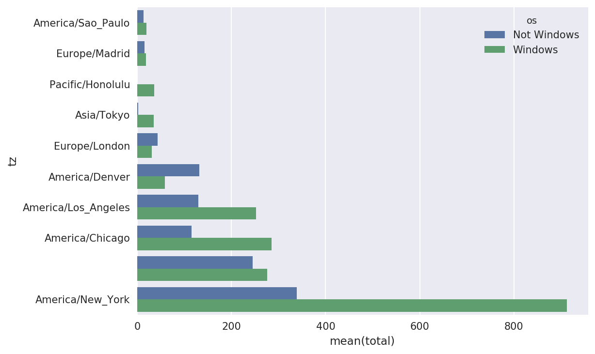
Figure 14-2. Top time zones by Windows and non-Windows users
The plot doesn’t make it easy to see the relative percentage of Windows users in the smaller groups, so let’s normalize the group percentages to sum to 1:
defnorm_total(group):group['normed_total']=group.total/group.total.sum()returngroupresults=count_subset.groupby('tz').apply(norm_total)
Then plot this in Figure 14-3:
In[65]:sns.barplot(x='normed_total',y='tz',hue='os',data=results)
Figure 14-3. Percentage Windows and non-Windows users in top-occurring time zones
We could have computed the normalized sum more efficiently
by using the transform method with
groupby:
In[66]:g=count_subset.groupby('tz')In[67]:results2=count_subset.total/g.total.transform('sum')
14.2 MovieLens 1M Dataset
GroupLens Research provides a number of collections of movie ratings data collected from users of MovieLens in the late 1990s and early 2000s. The data provide movie ratings, movie metadata (genres and year), and demographic data about the users (age, zip code, gender identification, and occupation). Such data is often of interest in the development of recommendation systems based on machine learning algorithms. While we do not explore machine learning techniques in detail in this book, I will show you how to slice and dice datasets like these into the exact form you need.
The MovieLens 1M dataset contains 1 million ratings collected from
6,000 users on 4,000 movies. It’s spread across three tables: ratings,
user information, and movie information. After extracting the data from
the ZIP file, we can load each table into a pandas DataFrame object
using pandas.read_table:
importpandasaspd# Make display smallerpd.options.display.max_rows=10unames=['user_id','gender','age','occupation','zip']users=pd.read_table('datasets/movielens/users.dat',sep='::',header=None,names=unames)rnames=['user_id','movie_id','rating','timestamp']ratings=pd.read_table('datasets/movielens/ratings.dat',sep='::',header=None,names=rnames)mnames=['movie_id','title','genres']movies=pd.read_table('datasets/movielens/movies.dat',sep='::',header=None,names=mnames)
You can verify that everything succeeded by looking at the first few rows of each DataFrame with Python’s slice syntax:
In[69]:users[:5]Out[69]:user_idgenderageoccupationzip01F1104806712M56167007223M25155511734M4570246045M252055455In[70]:ratings[:5]Out[70]:user_idmovie_idratingtimestamp011193597830076011661397830210921914397830196831340849783002754123555978824291In[71]:movies[:5]Out[71]:movie_idtitlegenres01ToyStory(1995)Animation|Children's|Comedy12Jumanji(1995)Adventure|Children's|Fantasy23GrumpierOldMen(1995)Comedy|Romance34WaitingtoExhale(1995)Comedy|Drama45FatheroftheBridePartII(1995)ComedyIn[72]:ratingsOut[72]:user_idmovie_idratingtimestamp011193597830076011661397830210921914397830196831340849783002754123555978824291...............1000204604010911956716541100020560401094595670488710002066040562595670474610002076040109649567156481000208604010974956715569[1000209rowsx4columns]
Note that ages and occupations are coded as integers indicating
groups described in the dataset’s README file.
Analyzing the data spread across three tables is not a simple task; for
example, suppose you wanted to compute mean ratings for a particular movie
by sex and age. As you will see, this is much easier to do with all of the
data merged together into a single table. Using pandas’s merge function, we first merge ratings with users and then merge that result with the movies data. pandas infers which columns to use
as the merge (or join) keys based on overlapping
names:
In[73]:data=pd.merge(pd.merge(ratings,users),movies)In[74]:dataOut[74]:user_idmovie_idratingtimestampgenderageoccupationzip\0111935978300760F110480671211935978298413M56167007221211934978220179M25123279331511934978199279M2572290341711935978158471M50195350...........................1000204594921985958846401M1817479011000205567527033976029116M3514300301000206578028451958153068M1817928861000207585136075957756608F1820554101000208593829094957273353M25135401titlegenres0OneFlewOvertheCuckoo's Nest (1975) Drama1OneFlewOvertheCuckoo's Nest (1975) Drama2OneFlewOvertheCuckoo's Nest (1975) Drama3OneFlewOvertheCuckoo's Nest (1975) Drama4OneFlewOvertheCuckoo's Nest (1975) Drama.........1000204Modulations(1998)Documentary1000205BrokenVessels(1998)Drama1000206WhiteBoys(1999)Drama1000207OneLittleIndian(1973)Comedy|Drama|Western1000208FiveWives,ThreeSecretariesandMe(1998)Documentary[1000209rowsx10columns]In[75]:data.iloc[0]Out[75]:user_id1movie_id1193rating5timestamp978300760genderFage1occupation10zip48067titleOneFlewOvertheCuckoo's Nest (1975)genresDramaName:0,dtype:object
To get mean movie ratings for each film grouped by gender, we can
use the pivot_table method:
In[76]:mean_ratings=data.pivot_table('rating',index='title',....:columns='gender',aggfunc='mean')In[77]:mean_ratings[:5]Out[77]:genderFMtitle$1,000,000Duck(1971)3.3750002.761905'Night Mother (1986) 3.388889 3.352941'Til There Was You (1997) 2.675676 2.733333'burbs, The (1989) 2.793478 2.962085...AndJusticeforAll(1979)3.8285713.689024
This produced another DataFrame containing mean ratings with movie
titles as row labels (the “index”) and gender as column labels. I first
filter down to movies that received at least 250 ratings (a completely
arbitrary number); to do this, I then group the data by title and use
size() to get a Series of group sizes
for each title:
In[78]:ratings_by_title=data.groupby('title').size()In[79]:ratings_by_title[:10]Out[79]:title$1,000,000Duck(1971)37'Night Mother (1986) 70'Til There Was You (1997) 52'burbs, The (1989) 303...AndJusticeforAll(1979)1991-900(1994)210ThingsIHateAboutYou(1999)700101Dalmatians(1961)565101Dalmatians(1996)36412AngryMen(1957)616dtype:int64In[80]:active_titles=ratings_by_title.index[ratings_by_title>=250]In[81]:active_titlesOut[81]:Index([''burbs,The(1989)', '10ThingsIHateAboutYou(1999)','101 Dalmatians (1961)','101 Dalmatians (1996)','12 Angry Men (1957)','13th Warrior, The (1999)','2 Days in the Valley (1996)','20,000 Leagues Under the Sea (1954)','2001: A Space Odyssey (1968)','2010 (1984)',...'X-Men (2000)','Year of Living Dangerously (1982)','Yellow Submarine (1968)','You'veGot(1998)','Young Frankenstein (1974)','Young Guns (1988)','Young Guns II (1990)','Young Sherlock Holmes (1985)','Zero Effect (1998)','eXistenZ (1999)'],dtype='object',name='title',length=1216)
The index of titles receiving at least 250 ratings can then be used
to select rows from mean_ratings:
# Select rows on the indexIn[82]:mean_ratings=mean_ratings.loc[active_titles]In[83]:mean_ratingsOut[83]:genderFMtitle'burbs, The (1989) 2.793478 2.96208510ThingsIHateAboutYou(1999)3.6465523.311966101Dalmatians(1961)3.7914443.500000101Dalmatians(1996)3.2400002.91121512AngryMen(1957)4.1843974.328421.........YoungGuns(1988)3.3717953.425620YoungGunsII(1990)2.9347832.904025YoungSherlockHolmes(1985)3.5147063.363344ZeroEffect(1998)3.8644073.723140eXistenZ(1999)3.0985923.289086[1216rowsx2columns]
To see the top films among female viewers, we can sort by the
F column in descending order:
In[85]:top_female_ratings=mean_ratings.sort_values(by='F',ascending=False)In[86]:top_female_ratings[:10]Out[86]:genderFMtitleCloseShave,A(1995)4.6444444.473795WrongTrousers,The(1993)4.5882354.478261SunsetBlvd.(a.k.a.SunsetBoulevard)(1950)4.5726504.464589Wallace&Gromit:TheBestofAardmanAnimation...4.5631074.385075Schindler's List (1993) 4.562602 4.491415ShawshankRedemption,The(1994)4.5390754.560625GrandDayOut,A(1992)4.5378794.293255ToKillaMockingbird(1962)4.5366674.372611CreatureComforts(1990)4.5138894.272277UsualSuspects,The(1995)4.5133174.518248
Measuring Rating Disagreement
Suppose you wanted to find the movies that are most divisive
between male and female viewers. One way is to add a column to mean_ratings containing the difference in
means, then sort by that:
In[87]:mean_ratings['diff']=mean_ratings['M']-mean_ratings['F']
Sorting by 'diff' yields the
movies with the greatest rating difference so that we can see which ones
were preferred by women:
In[88]:sorted_by_diff=mean_ratings.sort_values(by='diff')In[89]:sorted_by_diff[:10]Out[89]:genderFMdifftitleDirtyDancing(1987)3.7903782.959596-0.830782Jumpin' Jack Flash (1986) 3.254717 2.578358 -0.676359Grease(1978)3.9752653.367041-0.608224LittleWomen(1994)3.8705883.321739-0.548849SteelMagnolias(1989)3.9017343.365957-0.535777Anastasia(1997)3.8000003.281609-0.518391RockyHorrorPictureShow,The(1975)3.6730163.160131-0.512885ColorPurple,The(1985)4.1581923.659341-0.498851AgeofInnocence,The(1993)3.8270683.339506-0.487561FreeWilly(1993)2.9213482.438776-0.482573
Reversing the order of the rows and again slicing off the top 10 rows, we get the movies preferred by men that women didn’t rate as highly:
# Reverse order of rows, take first 10 rowsIn[90]:sorted_by_diff[::-1][:10]Out[90]:genderFMdifftitleGood,TheBadandTheUgly,The(1966)3.4949494.2213000.726351KentuckyFriedMovie,The(1977)2.8787883.5551470.676359Dumb&Dumber(1994)2.6979873.3365950.638608LongestDay,The(1962)3.4117654.0314470.619682CableGuy,The(1996)2.2500002.8637870.613787EvilDeadII(DeadByDawn)(1987)3.2972973.9092830.611985Hidden,The(1987)3.1379313.7450980.607167RockyIII(1982)2.3617022.9435030.581801Caddyshack(1980)3.3961353.9697370.573602ForaFewDollarsMore(1965)3.4090913.9537950.544704
Suppose instead you wanted the movies that elicited the most disagreement among viewers, independent of gender identification. Disagreement can be measured by the variance or standard deviation of the ratings:
# Standard deviation of rating grouped by titleIn[91]:rating_std_by_title=data.groupby('title')['rating'].std()# Filter down to active_titlesIn[92]:rating_std_by_title=rating_std_by_title.loc[active_titles]# Order Series by value in descending orderIn[93]:rating_std_by_title.sort_values(ascending=False)[:10]Out[93]:titleDumb&Dumber(1994)1.321333BlairWitchProject,The(1999)1.316368NaturalBornKillers(1994)1.307198TankGirl(1995)1.277695RockyHorrorPictureShow,The(1975)1.260177EyesWideShut(1999)1.259624Evita(1996)1.253631BillyMadison(1995)1.249970FearandLoathinginLasVegas(1998)1.246408BicentennialMan(1999)1.245533Name:rating,dtype:float64
You may have noticed that movie genres are given as a
pipe-separated (|) string. If you
wanted to do some analysis by genre, more work would be required to
transform the genre information into a more usable form.
14.3 US Baby Names 1880–2010
The United States Social Security Administration (SSA) has made available data on the frequency of baby names from 1880 through the present. Hadley Wickham, an author of several popular R packages, has often made use of this dataset in illustrating data manipulation in R.
We need to do some data wrangling to load this dataset, but once we do that we will have a DataFrame that looks like this:
In[4]:names.head(10)Out[4]:namesexbirthsyear0MaryF706518801AnnaF260418802EmmaF200318803ElizabethF193918804MinnieF174618805MargaretF157818806IdaF147218807AliceF141418808BerthaF132018809SarahF12881880
There are many things you might want to do with the dataset:
Visualize the proportion of babies given a particular name (your own, or another name) over time
Determine the relative rank of a name
Determine the most popular names in each year or the names whose popularity has advanced or declined the most
Analyze trends in names: vowels, consonants, length, overall diversity, changes in spelling, first and last letters
Analyze external sources of trends: biblical names, celebrities, demographic changes
With the tools in this book, many of these kinds of analyses are within reach, so I will walk you through some of them.
As of this writing, the US Social Security Administration makes available data files, one per year, containing the total number of births for each sex/name combination. The raw archive of these files can be obtained from http://www.ssa.gov/oact/babynames/limits.html.
In the event that this page has been moved by the time you’re
reading this, it can most likely be located again by an internet search.
After downloading the “National data” file names.zip
and unzipping it, you will have a directory containing a series of files
like yob1880.txt. I use the Unix head command to look at the first 10 lines of
one of the files (on Windows, you can use the more command or open it in a text
editor):
In[94]:!head-n10datasets/babynames/yob1880.txtMary,F,7065Anna,F,2604Emma,F,2003Elizabeth,F,1939Minnie,F,1746Margaret,F,1578Ida,F,1472Alice,F,1414Bertha,F,1320Sarah,F,1288
As this is already in a nicely comma-separated form, it can be
loaded into a DataFrame with pandas.read_csv:
In[95]:importpandasaspdIn[96]:names1880=pd.read_csv('datasets/babynames/yob1880.txt',....:names=['name','sex','births'])In[97]:names1880Out[97]:namesexbirths0MaryF70651AnnaF26042EmmaF20033ElizabethF19394MinnieF1746...........1995WoodieM51996WorthyM51997WrightM51998YorkM51999ZachariahM5[2000rowsx3columns]
These files only contain names with at least five occurrences in each year, so for simplicity’s sake we can use the sum of the births column by sex as the total number of births in that year:
In[98]:names1880.groupby('sex').births.sum()Out[98]:sexF90993M110493Name:births,dtype:int64
Since the dataset is split into files by year, one of the first
things to do is to assemble all of the data into a single DataFrame and
further to add a year field. You can do
this using pandas.concat:
years=range(1880,2011)pieces=[]columns=['name','sex','births']foryearinyears:path='datasets/babynames/yob%d.txt'%yearframe=pd.read_csv(path,names=columns)frame['year']=yearpieces.append(frame)# Concatenate everything into a single DataFramenames=pd.concat(pieces,ignore_index=True)
There are a couple things to note here. First, remember that
concat glues the DataFrame objects
together row-wise by default. Secondly, you have to pass ignore_index=True because we’re not interested
in preserving the original row numbers returned from read_csv. So we now have a very large DataFrame
containing all of the names data:
In[100]:namesOut[100]:namesexbirthsyear0MaryF706518801AnnaF260418802EmmaF200318803ElizabethF193918804MinnieF17461880..............1690779ZymaireM520101690780ZyonneM520101690781ZyquariusM520101690782ZyranM520101690783ZzyzxM52010[1690784rowsx4columns]
With this data in hand, we can already start aggregating the data at
the year and sex level using groupby or
pivot_table (see Figure 14-4):
In[101]:total_births=names.pivot_table('births',index='year',.....:columns='sex',aggfunc=sum)In[102]:total_births.tail()Out[102]:sexFMyear200618964682050234200719168882069242200818836452032310200918276431973359201017590101898382In[103]:total_births.plot(title='Total births by sex and year')
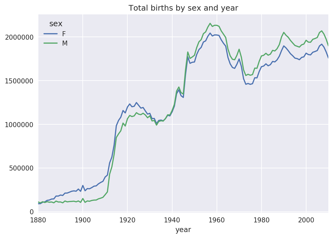
Figure 14-4. Total births by sex and year
Next, let’s insert a column prop
with the fraction of babies given each name relative to the total number
of births. A prop value of 0.02 would indicate that 2 out of every 100
babies were given a particular name. Thus, we group the data by year and
sex, then add the new column to each group:
defadd_prop(group):group['prop']=group.births/group.births.sum()returngroupnames=names.groupby(['year','sex']).apply(add_prop)
The resulting complete dataset now has the following columns:
In[105]:namesOut[105]:namesexbirthsyearprop0MaryF706518800.0776431AnnaF260418800.0286182EmmaF200318800.0220133ElizabethF193918800.0213094MinnieF174618800.019188.................1690779ZymaireM520100.0000031690780ZyonneM520100.0000031690781ZyquariusM520100.0000031690782ZyranM520100.0000031690783ZzyzxM520100.000003[1690784rowsx5columns]
When performing a group operation like this, it’s often valuable to
do a sanity check, like verifying that the prop column sums to 1 within all the
groups:
In[106]:names.groupby(['year','sex']).prop.sum()Out[106]:yearsex1880F1.0M1.01881F1.0M1.01882F1.0...2008M1.02009F1.0M1.02010F1.0M1.0Name:prop,Length:262,dtype:float64
Now that this is done, I’m going to extract a subset of the data to facilitate further analysis: the top 1,000 names for each sex/year combination. This is yet another group operation:
defget_top1000(group):returngroup.sort_values(by='births',ascending=False)[:1000]grouped=names.groupby(['year','sex'])top1000=grouped.apply(get_top1000)# Drop the group index, not neededtop1000.reset_index(inplace=True,drop=True)
If you prefer a do-it-yourself approach, try this instead:
pieces=[]foryear,groupinnames.groupby(['year','sex']):pieces.append(group.sort_values(by='births',ascending=False)[:1000])top1000=pd.concat(pieces,ignore_index=True)
The resulting dataset is now quite a bit smaller:
In[108]:top1000Out[108]:namesexbirthsyearprop0MaryF706518800.0776431AnnaF260418800.0286182EmmaF200318800.0220133ElizabethF193918800.0213094MinnieF174618800.019188.................261872CamiloM19420100.000102261873DestinM19420100.000102261874JaquanM19420100.000102261875JaydanM19420100.000102261876MaxtonM19320100.000102[261877rowsx5columns]
We’ll use this Top 1,000 dataset in the following investigations into the data.
Analyzing Naming Trends
With the full dataset and Top 1,000 dataset in hand, we can start analyzing various naming trends of interest. Splitting the Top 1,000 names into the boy and girl portions is easy to do first:
In[109]:boys=top1000[top1000.sex=='M']In[110]:girls=top1000[top1000.sex=='F']
Simple time series, like the number of Johns or Marys for each year, can be plotted but require a bit of munging to be more useful. Let’s form a pivot table of the total number of births by year and name:
In[111]:total_births=top1000.pivot_table('births',index='year',.....:columns='name',.....:aggfunc=sum)
Now, this can be plotted for a handful of names with DataFrame’s
plot method (Figure 14-5 shows the result):
In[112]:total_births.info()<class'pandas.core.frame.DataFrame'>Int64Index:131entries,1880to2010Columns:6868entries,AadentoZuridtypes:float64(6868)memoryusage:6.9MBIn[113]:subset=total_births[['John','Harry','Mary','Marilyn']]In[114]:subset.plot(subplots=True,figsize=(12,10),grid=False,.....:title="Number of births per year")
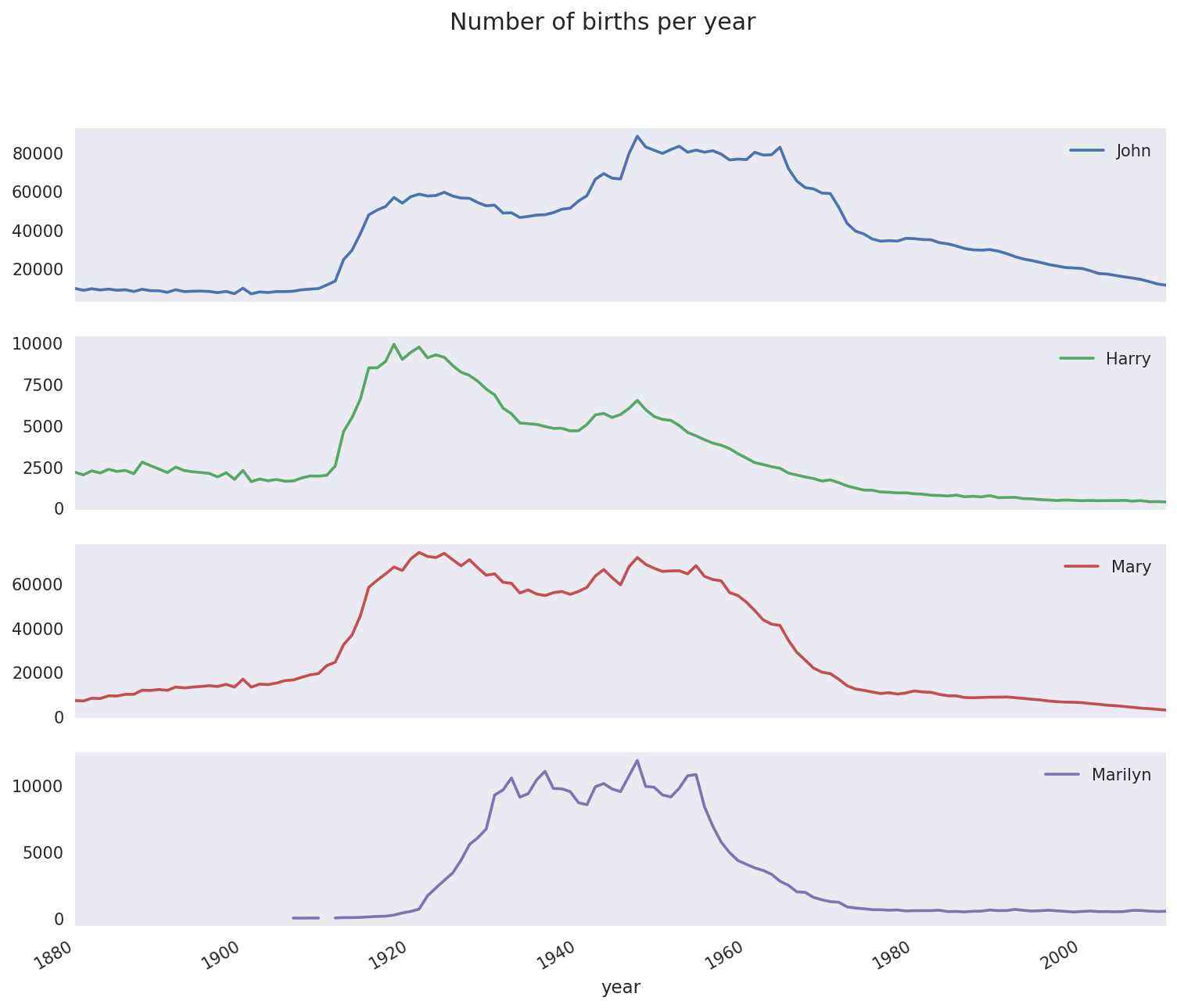
Figure 14-5. A few boy and girl names over time
On looking at this, you might conclude that these names have grown out of favor with the American population. But the story is actually more complicated than that, as will be explored in the next section.
Measuring the increase in naming diversity
One explanation for the decrease in plots is that fewer parents are choosing common names for their children. This hypothesis can be explored and confirmed in the data. One measure is the proportion of births represented by the top 1,000 most popular names, which I aggregate and plot by year and sex (Figure 14-6 shows the resulting plot):
In[116]:table=top1000.pivot_table('prop',index='year',.....:columns='sex',aggfunc=sum)In[117]:table.plot(title='Sum of table1000.prop by year and sex',.....:yticks=np.linspace(0,1.2,13),xticks=range(1880,2020,10))
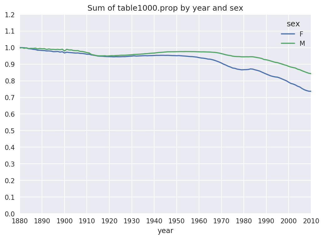
Figure 14-6. Proportion of births represented in top 1000 names by sex
You can see that, indeed, there appears to be increasing name diversity (decreasing total proportion in the top 1,000). Another interesting metric is the number of distinct names, taken in order of popularity from highest to lowest, in the top 50% of births. This number is a bit more tricky to compute. Let’s consider just the boy names from 2010:
In[118]:df=boys[boys.year==2010]In[119]:dfOut[119]:namesexbirthsyearprop260877JacobM2187520100.011523260878EthanM1786620100.009411260879MichaelM1713320100.009025260880JaydenM1703020100.008971260881WilliamM1687020100.008887.................261872CamiloM19420100.000102261873DestinM19420100.000102261874JaquanM19420100.000102261875JaydanM19420100.000102261876MaxtonM19320100.000102[1000rowsx5columns]
After sorting prop in
descending order, we want to know how many of the most popular names
it takes to reach 50%. You could write a for loop to do this, but a vectorized NumPy
way is a bit more clever. Taking the cumulative sum, cumsum, of prop and then calling the method searchsorted returns the position in the
cumulative sum at which 0.5 would
need to be inserted to keep it in sorted order:
In[120]:prop_cumsum=df.sort_values(by='prop',ascending=False).prop.cumsum()In[121]:prop_cumsum[:10]Out[121]:2608770.0115232608780.0209342608790.0299592608800.0389302608810.0478172608820.0565792608830.0651552608840.0734142608850.0815282608860.089621Name:prop,dtype:float64In[122]:prop_cumsum.values.searchsorted(0.5)Out[122]:116
Since arrays are zero-indexed, adding 1 to this result gives you a result of 117. By contrast, in 1900 this number was much smaller:
In[123]:df=boys[boys.year==1900]In[124]:in1900=df.sort_values(by='prop',ascending=False).prop.cumsum()In[125]:in1900.values.searchsorted(0.5)+1Out[125]:25
You can now apply this operation to each year/sex combination,
groupby those fields, and apply a function returning the count for
each group:
defget_quantile_count(group,q=0.5):group=group.sort_values(by='prop',ascending=False)returngroup.prop.cumsum().values.searchsorted(q)+1diversity=top1000.groupby(['year','sex']).apply(get_quantile_count)diversity=diversity.unstack('sex')
This resulting DataFrame diversity now has two time series, one for
each sex, indexed by year. This can be inspected in IPython and
plotted as before (see Figure 14-7):
In[128]:diversity.head()Out[128]:sexFMyear1880381418813814188238151883391518843916In[129]:diversity.plot(title="Number of popular names in top 50%")
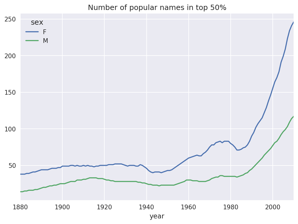
Figure 14-7. Plot of diversity metric by year
As you can see, girl names have always been more diverse than boy names, and they have only become more so over time. Further analysis of what exactly is driving the diversity, like the increase of alternative spellings, is left to the reader.
The “last letter” revolution
In 2007, baby name researcher Laura Wattenberg pointed out on her website that the distribution of boy names by final letter has changed significantly over the last 100 years. To see this, we first aggregate all of the births in the full dataset by year, sex, and final letter:
# extract last letter from name columnget_last_letter=lambdax:x[-1]last_letters=names.name.map(get_last_letter)last_letters.name='last_letter'table=names.pivot_table('births',index=last_letters,columns=['sex','year'],aggfunc=sum)
Then we select out three representative years spanning the history and print the first few rows:
In[131]:subtable=table.reindex(columns=[1910,1960,2010],level='year')In[132]:subtable.head()Out[132]:sexFMyear191019602010191019602010last_lettera108376.0691247.0670605.0977.05204.028438.0bNaN694.0450.0411.03912.038859.0c5.049.0946.0482.015476.023125.0d6750.03729.02607.022111.0262112.044398.0e133569.0435013.0313833.028655.0178823.0129012.0
Next, normalize the table by total births to compute a new table containing proportion of total births for each sex ending in each letter:
In[133]:subtable.sum()Out[133]:sexyearF1910396416.019602022062.020101759010.0M1910194198.019602132588.020101898382.0dtype:float64In[134]:letter_prop=subtable/subtable.sum()In[135]:letter_propOut[135]:sexFMyear191019602010191019602010last_lettera0.2733900.3418530.3812400.0050310.0024400.014980bNaN0.0003430.0002560.0021160.0018340.020470c0.0000130.0000240.0005380.0024820.0072570.012181d0.0170280.0018440.0014820.1138580.1229080.023387e0.3369410.2151330.1784150.1475560.0838530.067959.....................vNaN0.0000600.0001170.0001130.0000370.001434w0.0000200.0000310.0011820.0063290.0077110.016148x0.0000150.0000370.0007270.0039650.0018510.008614y0.1109720.1525690.1168280.0773490.1609870.058168z0.0024390.0006590.0007040.0001700.0001840.001831[26rowsx6columns]
With the letter proportions now in hand, we can make bar plots for each sex broken down by year (see Figure 14-8):
importmatplotlib.pyplotaspltfig,axes=plt.subplots(2,1,figsize=(10,8))letter_prop['M'].plot(kind='bar',rot=0,ax=axes[0],title='Male')letter_prop['F'].plot(kind='bar',rot=0,ax=axes[1],title='Female',legend=False)
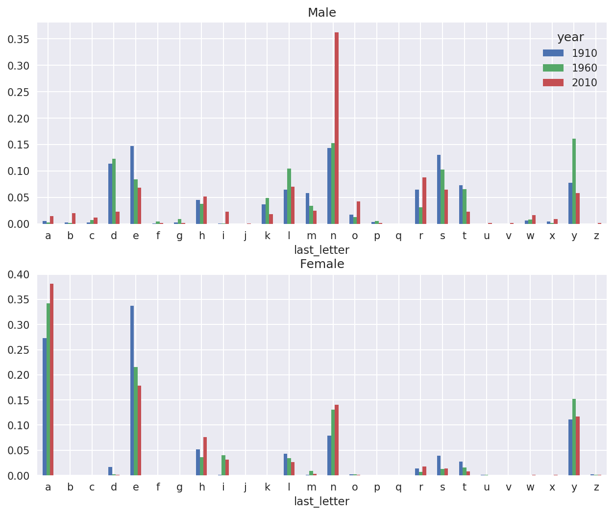
Figure 14-8. Proportion of boy and girl names ending in each letter
As you can see, boy names ending in n have experienced significant growth since the 1960s. Going back to the full table created before, I again normalize by year and sex and select a subset of letters for the boy names, finally transposing to make each column a time series:
In[138]:letter_prop=table/table.sum()In[139]:dny_ts=letter_prop.loc[['d','n','y'],'M'].TIn[140]:dny_ts.head()Out[140]:last_letterdnyyear18800.0830550.1532130.07576018810.0832470.1532140.07745118820.0853400.1495600.07753718830.0840660.1516460.07914418840.0861200.1499150.080405
With this DataFrame of time series in hand, I can make a plot of
the trends over time again with its plot method (see Figure 14-9):
In[143]:dny_ts.plot()
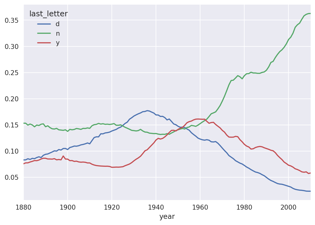
Figure 14-9. Proportion of boys born with names ending in d/n/y over time
Boy names that became girl names (and vice versa)
Another fun trend is looking at boy names that were more popular
with one sex earlier in the sample but have “changed sexes” in the
present. One example is the name Lesley or Leslie. Going back to the
top1000 DataFrame, I compute a list
of names occurring in the dataset starting with “lesl”:
In[144]:all_names=pd.Series(top1000.name.unique())In[145]:lesley_like=all_names[all_names.str.lower().str.contains('lesl')]In[146]:lesley_likeOut[146]:632Leslie2294Lesley4262Leslee4728Lesli6103Leslydtype:object
From there, we can filter down to just those names and sum births grouped by name to see the relative frequencies:
In[147]:filtered=top1000[top1000.name.isin(lesley_like)]In[148]:filtered.groupby('name').births.sum()Out[148]:nameLeslee1082Lesley35022Lesli929Leslie370429Lesly10067Name:births,dtype:int64
Next, let’s aggregate by sex and year and normalize within year:
In[149]:table=filtered.pivot_table('births',index='year',.....:columns='sex',aggfunc='sum')In[150]:table=table.div(table.sum(1),axis=0)In[151]:table.tail()Out[151]:sexFMyear20061.0NaN20071.0NaN20081.0NaN20091.0NaN20101.0NaN
Lastly, it’s now possible to make a plot of the breakdown by sex over time (Figure 14-10):
In[153]:table.plot(style={'M':'k-','F':'k--'})
Figure 14-10. Proportion of male/female Lesley-like names over time
14.4 USDA Food Database
The US Department of Agriculture makes available a database of food nutrient information. Programmer Ashley Williams made available a version of this database in JSON format. The records look like this:
{"id":21441,"description":"KENTUCKY FRIED CHICKEN, Fried Chicken, EXTRA CRISPY,Wing, meat and skin with breading","tags":["KFC"],"manufacturer":"Kentucky Fried Chicken","group":"Fast Foods","portions":[{"amount":1,"unit":"wing, with skin","grams":68.0},...],"nutrients":[{"value":20.8,"units":"g","description":"Protein","group":"Composition"},...]}
Each food has a number of identifying attributes along with two lists of nutrients and portion sizes. Data in this form is not particularly amenable to analysis, so we need to do some work to wrangle the data into a better form.
After downloading and extracting the data from the link, you can
load it into Python with any JSON library of your choosing. I’ll use the
built-in Python json module:
In[154]:importjsonIn[155]:db=json.load(open('datasets/usda_food/database.json'))In[156]:len(db)Out[156]:6636
Each entry in db is a dict
containing all the data for a single food. The 'nutrients' field is a list of dicts, one for
each nutrient:
In[157]:db[0].keys()Out[157]:dict_keys(['id','description','tags','manufacturer','group','portions', 'nutrients'])In[158]:db[0]['nutrients'][0]Out[158]:{'description':'Protein','group':'Composition','units':'g','value':25.18}In[159]:nutrients=pd.DataFrame(db[0]['nutrients'])In[160]:nutrients[:7]Out[160]:descriptiongroupunitsvalue0ProteinCompositiong25.181Totallipid(fat)Compositiong29.202Carbohydrate,bydifferenceCompositiong3.063AshOtherg3.284EnergyEnergykcal376.005WaterCompositiong39.286EnergyEnergykJ1573.00
When converting a list of dicts to a DataFrame, we can specify a list of fields to extract. We’ll take the food names, group, ID, and manufacturer:
In[161]:info_keys=['description','group','id','manufacturer']In[162]:info=pd.DataFrame(db,columns=info_keys)In[163]:info[:5]Out[163]:descriptiongroupid\0Cheese,carawayDairyandEggProducts10081Cheese,cheddarDairyandEggProducts10092Cheese,edamDairyandEggProducts10183Cheese,fetaDairyandEggProducts10194Cheese,mozzarella,partskimmilkDairyandEggProducts1028manufacturer01234In[164]:info.info()<class'pandas.core.frame.DataFrame'>RangeIndex:6636entries,0to6635Datacolumns(total4columns):description6636non-nullobjectgroup6636non-nullobjectid6636non-nullint64manufacturer5195non-nullobjectdtypes:int64(1),object(3)memoryusage:207.5+KB
You can see the distribution of food groups with value_counts:
In[165]:pd.value_counts(info.group)[:10]Out[165]:VegetablesandVegetableProducts812BeefProducts618BakedProducts496BreakfastCereals403LegumesandLegumeProducts365FastFoods365Lamb,Veal,andGameProducts345Sweets341PorkProducts328FruitsandFruitJuices328Name:group,dtype:int64
Now, to do some analysis on all of the nutrient data, it’s easiest
to assemble the nutrients for each food into a single large table. To do
so, we need to take several steps. First, I’ll convert each list of food
nutrients to a DataFrame, add a column for the food id, and append the DataFrame to a list. Then,
these can be concatenated together with concat:
If all goes well, nutrients
should look like this:
In[167]:nutrientsOut[167]:descriptiongroupunitsvalueid0ProteinCompositiong25.18010081Totallipid(fat)Compositiong29.20010082Carbohydrate,bydifferenceCompositiong3.06010083AshOtherg3.28010084EnergyEnergykcal376.0001008..................389350VitaminB-12,addedVitaminsmcg0.00043546389351CholesterolOthermg0.00043546389352Fattyacids,totalsaturatedOtherg0.07243546389353Fattyacids,totalmonounsaturatedOtherg0.02843546389354Fattyacids,totalpolyunsaturatedOtherg0.04143546[389355rowsx5columns]
I noticed that there are duplicates in this DataFrame, so it makes things easier to drop them:
In[168]:nutrients.duplicated().sum()# number of duplicatesOut[168]:14179In[169]:nutrients=nutrients.drop_duplicates()
Since 'group' and 'description' are in both DataFrame objects, we
can rename for clarity:
In[170]:col_mapping={'description':'food',.....:'group':'fgroup'}In[171]:info=info.rename(columns=col_mapping,copy=False)In[172]:info.info()<class'pandas.core.frame.DataFrame'>RangeIndex:6636entries,0to6635Datacolumns(total4columns):food6636non-nullobjectfgroup6636non-nullobjectid6636non-nullint64manufacturer5195non-nullobjectdtypes:int64(1),object(3)memoryusage:207.5+KBIn[173]:col_mapping={'description':'nutrient',.....:'group':'nutgroup'}In[174]:nutrients=nutrients.rename(columns=col_mapping,copy=False)In[175]:nutrientsOut[175]:nutrientnutgroupunitsvalueid0ProteinCompositiong25.18010081Totallipid(fat)Compositiong29.20010082Carbohydrate,bydifferenceCompositiong3.06010083AshOtherg3.28010084EnergyEnergykcal376.0001008..................389350VitaminB-12,addedVitaminsmcg0.00043546389351CholesterolOthermg0.00043546389352Fattyacids,totalsaturatedOtherg0.07243546389353Fattyacids,totalmonounsaturatedOtherg0.02843546389354Fattyacids,totalpolyunsaturatedOtherg0.04143546[375176rowsx5columns]
With all of this done, we’re ready to merge info with nutrients:
In[176]:ndata=pd.merge(nutrients,info,on='id',how='outer')In[177]:ndata.info()<class'pandas.core.frame.DataFrame'>Int64Index:375176entries,0to375175Datacolumns(total8columns):nutrient375176non-nullobjectnutgroup375176non-nullobjectunits375176non-nullobjectvalue375176non-nullfloat64id375176non-nullint64food375176non-nullobjectfgroup375176non-nullobjectmanufacturer293054non-nullobjectdtypes:float64(1),int64(1),object(6)memoryusage:25.8+MBIn[178]:ndata.iloc[30000]Out[178]:nutrientGlycinenutgroupAminoAcidsunitsgvalue0.04id6158foodSoup,tomatobisque,canned,condensedfgroupSoups,Sauces,andGraviesmanufacturerName:30000,dtype:object
We could now make a plot of median values by food group and nutrient type (see Figure 14-11):
In[180]:result=ndata.groupby(['nutrient','fgroup'])['value'].quantile(0.5)In[181]:result['Zinc, Zn'].sort_values().plot(kind='barh')
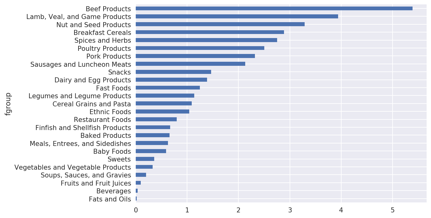
Figure 14-11. Median zinc values by nutrient group
With a little cleverness, you can find which food is most dense in each nutrient:
by_nutrient=ndata.groupby(['nutgroup','nutrient'])get_maximum=lambdax:x.loc[x.value.idxmax()]get_minimum=lambdax:x.loc[x.value.idxmin()]max_foods=by_nutrient.apply(get_maximum)[['value','food']]# make the food a little smallermax_foods.food=max_foods.food.str[:50]
The resulting DataFrame is a bit too large to display in the book;
here is only the 'Amino Acids'
nutrient group:
In[183]:max_foods.loc['Amino Acids']['food']Out[183]:nutrientAlanineGelatins,drypowder,unsweetenedArginineSeeds,sesameflour,low-fatAsparticacidSoyproteinisolateCystineSeeds,cottonseedflour,lowfat(glandless)GlutamicacidSoyproteinisolate...SerineSoyproteinisolate,PROTEINTECHNOLOGIESINTE...ThreonineSoyproteinisolate,PROTEINTECHNOLOGIESINTE...TryptophanSealion,Steller,meatwithfat(AlaskaNative)TyrosineSoyproteinisolate,PROTEINTECHNOLOGIESINTE...ValineSoyproteinisolate,PROTEINTECHNOLOGIESINTE...Name:food,Length:19,dtype:object
14.5 2012 Federal Election Commission Database
The US Federal Election Commission publishes data on contributions to political
campaigns. This includes contributor names, occupation and employer,
address, and contribution amount. An interesting dataset is from the
2012 US presidential election. A version of the dataset I downloaded in
June 2012 is a 150 megabyte CSV file
P00000001-ALL.csv (see the book’s data
repository), which can be loaded with pandas.read_csv:
In[184]:fec=pd.read_csv('datasets/fec/P00000001-ALL.csv')In[185]:fec.info()<class'pandas.core.frame.DataFrame'>RangeIndex:1001731entries,0to1001730Datacolumns(total16columns):cmte_id1001731non-nullobjectcand_id1001731non-nullobjectcand_nm1001731non-nullobjectcontbr_nm1001731non-nullobjectcontbr_city1001712non-nullobjectcontbr_st1001727non-nullobjectcontbr_zip1001620non-nullobjectcontbr_employer988002non-nullobjectcontbr_occupation993301non-nullobjectcontb_receipt_amt1001731non-nullfloat64contb_receipt_dt1001731non-nullobjectreceipt_desc14166non-nullobjectmemo_cd92482non-nullobjectmemo_text97770non-nullobjectform_tp1001731non-nullobjectfile_num1001731non-nullint64dtypes:float64(1),int64(1),object(14)memoryusage:122.3+MB
A sample record in the DataFrame looks like this:
In[186]:fec.iloc[123456]Out[186]:cmte_idC00431445cand_idP80003338cand_nmObama,Barackcontbr_nmELLMAN,IRAcontbr_cityTEMPE...receipt_descNaNmemo_cdNaNmemo_textNaNform_tpSA17Afile_num772372Name:123456,Length:16,dtype:object
You may think of some ways to start slicing and dicing this data to extract informative statistics about donors and patterns in the campaign contributions. I’ll show you a number of different analyses that apply techniques in this book.
You can see that there are no political party affiliations in the
data, so this would be useful to add. You can get a list of all the unique
political candidates using unique:
In[187]:unique_cands=fec.cand_nm.unique()In[188]:unique_candsOut[188]:array(['Bachmann, Michelle','Romney, Mitt','Obama, Barack',"Roemer, Charles E. 'Buddy' III",'Pawlenty, Timothy','Johnson, Gary Earl','Paul, Ron','Santorum, Rick','Cain, Herman','Gingrich, Newt','McCotter, Thaddeus G','Huntsman, Jon','Perry, Rick'],dtype=object)In[189]:unique_cands[2]Out[189]:'Obama, Barack'
One way to indicate party affiliation is using a dict:1
parties={'Bachmann, Michelle':'Republican','Cain, Herman':'Republican','Gingrich, Newt':'Republican','Huntsman, Jon':'Republican','Johnson, Gary Earl':'Republican','McCotter, Thaddeus G':'Republican','Obama, Barack':'Democrat','Paul, Ron':'Republican','Pawlenty, Timothy':'Republican','Perry, Rick':'Republican',"Roemer, Charles E. 'Buddy' III":'Republican','Romney, Mitt':'Republican','Santorum, Rick':'Republican'}
Now, using this mapping and the map method on Series objects, you can compute an
array of political parties from the candidate names:
In[191]:fec.cand_nm[123456:123461]Out[191]:123456Obama,Barack123457Obama,Barack123458Obama,Barack123459Obama,Barack123460Obama,BarackName:cand_nm,dtype:objectIn[192]:fec.cand_nm[123456:123461].map(parties)Out[192]:123456Democrat123457Democrat123458Democrat123459Democrat123460DemocratName:cand_nm,dtype:object# Add it as a columnIn[193]:fec['party']=fec.cand_nm.map(parties)In[194]:fec['party'].value_counts()Out[194]:Democrat593746Republican407985Name:party,dtype:int64
A couple of data preparation points. First, this data includes both contributions and refunds (negative contribution amount):
In[195]:(fec.contb_receipt_amt>0).value_counts()Out[195]:True991475False10256Name:contb_receipt_amt,dtype:int64
To simplify the analysis, I’ll restrict the dataset to positive contributions:
In[196]:fec=fec[fec.contb_receipt_amt>0]
Since Barack Obama and Mitt Romney were the main two candidates, I’ll also prepare a subset that just has contributions to their campaigns:
In[197]:fec_mrbo=fec[fec.cand_nm.isin(['Obama, Barack','Romney, Mitt'])]
Donation Statistics by Occupation and Employer
Donations by occupation is another oft-studied statistic. For example, lawyers (attorneys) tend to donate more money to Democrats, while business executives tend to donate more to Republicans. You have no reason to believe me; you can see for yourself in the data. First, the total number of donations by occupation is easy:
In[198]:fec.contbr_occupation.value_counts()[:10]Out[198]:RETIRED233990INFORMATIONREQUESTED35107ATTORNEY34286HOMEMAKER29931PHYSICIAN23432INFORMATIONREQUESTEDPERBESTEFFORTS21138ENGINEER14334TEACHER13990CONSULTANT13273PROFESSOR12555Name:contbr_occupation,dtype:int64
You will notice by looking at the occupations that many refer to
the same basic job type, or there are several variants of the same
thing. The following code snippet illustrates a technique for cleaning
up a few of them by mapping from one occupation to another; note the
“trick” of using dict.get to allow
occupations with no mapping to “pass through”:
occ_mapping={'INFORMATION REQUESTED PER BEST EFFORTS':'NOT PROVIDED','INFORMATION REQUESTED':'NOT PROVIDED','INFORMATION REQUESTED (BEST EFFORTS)':'NOT PROVIDED','C.E.O.':'CEO'}# If no mapping provided, return xf=lambdax:occ_mapping.get(x,x)fec.contbr_occupation=fec.contbr_occupation.map(f)
I’ll also do the same thing for employers:
emp_mapping={'INFORMATION REQUESTED PER BEST EFFORTS':'NOT PROVIDED','INFORMATION REQUESTED':'NOT PROVIDED','SELF':'SELF-EMPLOYED','SELF EMPLOYED':'SELF-EMPLOYED',}# If no mapping provided, return xf=lambdax:emp_mapping.get(x,x)fec.contbr_employer=fec.contbr_employer.map(f)
Now, you can use pivot_table to
aggregate the data by party and occupation, then filter down to the
subset that donated at least $2 million overall:
In[201]:by_occupation=fec.pivot_table('contb_receipt_amt',.....:index='contbr_occupation',.....:columns='party',aggfunc='sum')In[202]:over_2mm=by_occupation[by_occupation.sum(1)>2000000]In[203]:over_2mmOut[203]:partyDemocratRepublicancontbr_occupationATTORNEY11141982.977.477194e+06CEO2074974.794.211041e+06CONSULTANT2459912.712.544725e+06ENGINEER951525.551.818374e+06EXECUTIVE1355161.054.138850e+06.........PRESIDENT1878509.954.720924e+06PROFESSOR2165071.082.967027e+05REALESTATE528902.091.625902e+06RETIRED25305116.382.356124e+07SELF-EMPLOYED672393.401.640253e+06[17rowsx2columns]
It can be easier to look at this data graphically as a bar plot
('barh' means horizontal bar plot;
see Figure 14-12):
In[205]:over_2mm.plot(kind='barh')
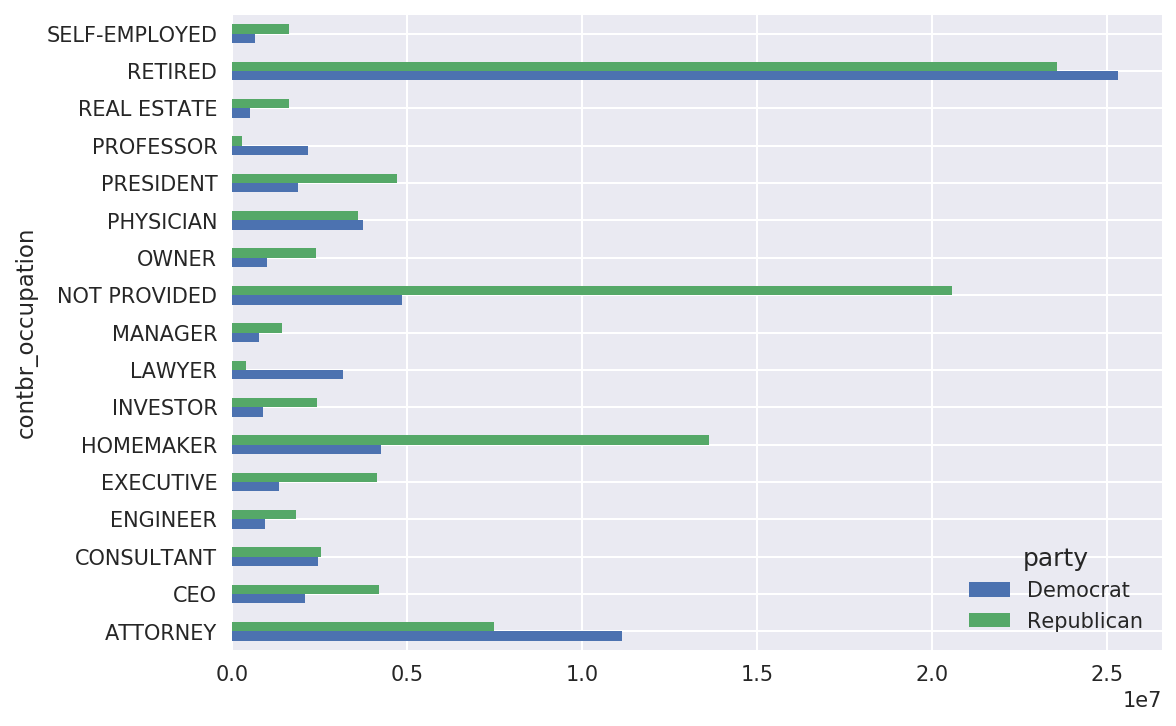
Figure 14-12. Total donations by party for top occupations
You might be interested in the top donor occupations or top
companies that donated to Obama and Romney. To do this, you can group by
candidate name and use a variant of the top method from earlier in the chapter:
defget_top_amounts(group,key,n=5):totals=group.groupby(key)['contb_receipt_amt'].sum()returntotals.nlargest(n)
Then aggregate by occupation and employer:
In[207]:grouped=fec_mrbo.groupby('cand_nm')In[208]:grouped.apply(get_top_amounts,'contbr_occupation',n=7)Out[208]:cand_nmcontbr_occupationObama,BarackRETIRED25305116.38ATTORNEY11141982.97INFORMATIONREQUESTED4866973.96HOMEMAKER4248875.80PHYSICIAN3735124.94...Romney,MittHOMEMAKER8147446.22ATTORNEY5364718.82PRESIDENT2491244.89EXECUTIVE2300947.03C.E.O.1968386.11Name:contb_receipt_amt,Length:14,dtype:float64In[209]:grouped.apply(get_top_amounts,'contbr_employer',n=10)Out[209]:cand_nmcontbr_employerObama,BarackRETIRED22694358.85SELF-EMPLOYED17080985.96NOTEMPLOYED8586308.70INFORMATIONREQUESTED5053480.37HOMEMAKER2605408.54...Romney,MittCREDITSUISSE281150.00MORGANSTANLEY267266.00GOLDMANSACH&CO.238250.00BARCLAYSCAPITAL162750.00H.I.G.CAPITAL139500.00Name:contb_receipt_amt,Length:20,dtype:float64
Bucketing Donation Amounts
A useful way to analyze this data is to use the cut function to discretize the contributor
amounts into buckets by contribution size:
In[210]:bins=np.array([0,1,10,100,1000,10000,.....:100000,1000000,10000000])In[211]:labels=pd.cut(fec_mrbo.contb_receipt_amt,bins)In[212]:labelsOut[212]:411(10,100]412(100,1000]413(100,1000]414(10,100]415(10,100]...701381(10,100]701382(100,1000]701383(1,10]701384(10,100]701385(100,1000]Name:contb_receipt_amt,Length:694282,dtype:categoryCategories(8,interval[int64]):[(0,1]<(1,10]<(10,100]<(100,1000]<(1000,10000]<(10000,100000]<(100000,1000000]<(1000000,10000000]]
We can then group the data for Obama and Romney by name and bin label to get a histogram by donation size:
In[213]:grouped=fec_mrbo.groupby(['cand_nm',labels])In[214]:grouped.size().unstack(0)Out[214]:cand_nmObama,BarackRomney,Mittcontb_receipt_amt(0,1]493.077.0(1,10]40070.03681.0(10,100]372280.031853.0(100,1000]153991.043357.0(1000,10000]22284.026186.0(10000,100000]2.01.0(100000,1000000]3.0NaN(1000000,10000000]4.0NaN
This data shows that Obama received a significantly larger number of small donations than Romney. You can also sum the contribution amounts and normalize within buckets to visualize percentage of total donations of each size by candidate (Figure 14-13 shows the resulting plot):
In[216]:bucket_sums=grouped.contb_receipt_amt.sum().unstack(0)In[217]:normed_sums=bucket_sums.div(bucket_sums.sum(axis=1),axis=0)In[218]:normed_sumsOut[218]:cand_nmObama,BarackRomney,Mittcontb_receipt_amt(0,1]0.8051820.194818(1,10]0.9187670.081233(10,100]0.9107690.089231(100,1000]0.7101760.289824(1000,10000]0.4473260.552674(10000,100000]0.8231200.176880(100000,1000000]1.000000NaN(1000000,10000000]1.000000NaNIn[219]:normed_sums[:-2].plot(kind='barh')
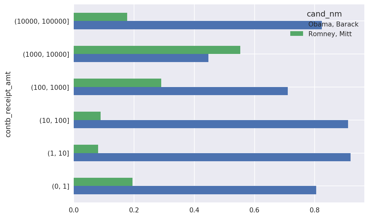
Figure 14-13. Percentage of total donations received by candidates for each donation size
I excluded the two largest bins as these are not donations by individuals.
This analysis can be refined and improved in many ways. For example, you could aggregate donations by donor name and zip code to adjust for donors who gave many small amounts versus one or more large donations. I encourage you to download and explore the dataset yourself.
Donation Statistics by State
Aggregating the data by candidate and state is a routine affair:
In[220]:grouped=fec_mrbo.groupby(['cand_nm','contbr_st'])In[221]:totals=grouped.contb_receipt_amt.sum().unstack(0).fillna(0)In[222]:totals=totals[totals.sum(1)>100000]In[223]:totals[:10]Out[223]:cand_nmObama,BarackRomney,Mittcontbr_stAK281840.1586204.24AL543123.48527303.51AR359247.28105556.00AZ1506476.981888436.23CA23824984.2411237636.60CO2132429.491506714.12CT2068291.263499475.45DC4373538.801025137.50DE336669.1482712.00FL7318178.588338458.81
If you divide each row by the total contribution amount, you get the relative percentage of total donations by state for each candidate:
In[224]:percent=totals.div(totals.sum(1),axis=0)In[225]:percent[:10]Out[225]:cand_nmObama,BarackRomney,Mittcontbr_stAK0.7657780.234222AL0.5073900.492610AR0.7729020.227098AZ0.4437450.556255CA0.6794980.320502CO0.5859700.414030CT0.3714760.628524DC0.8101130.189887DE0.8027760.197224FL0.4674170.532583
14.6 Conclusion
We’ve reached the end of the book’s main chapters. I have included some additional content you may find useful in the appendixes.
In the five years since the first edition of this book was published, Python has become a popular and widespread language for data analysis. The programming skills you have developed here will stay relevant for a long time into the future. I hope the programming tools and libraries we’ve explored serve you well in your work.
1 This makes the simplifying assumption that Gary Johnson is a Republican even though he later became the Libertarian party candidate.