Table of Contents for
Python for Data Analysis, 2nd Edition
 Python for Data Analysis, 2nd Edition
Published by
O'Reilly Media, Inc., 2017
Python for Data Analysis, 2nd Edition
Published by
O'Reilly Media, Inc., 2017
- nav
- Cover
- Python for Data Analysis
- Python for Data Analysis
- Preface
- Preliminaries
- Python Language Basics, IPython, and Jupyter Notebooks
- Built-in Data Structures, Functions, and Files
- NumPy Basics: Arrays and Vectorized Computation
- Getting Started with pandas
- Data Loading, Storage, and File Formats
- Data Cleaning and Preparation
- Data Wrangling: Join, Combine, and Reshape
- Plotting and Visualization
- Data Aggregation and Group Operations
- Time Series
- Advanced pandas
- Introduction to Modeling Libraries in Python
- Data Analysis Examples
- Advanced NumPy
- More on the IPython System
- Index
- About the Author
- Colophon
Chapter 9. Plotting and Visualization
Making informative visualizations (sometimes called plots) is one of the most important tasks in data analysis. It may be a part of the exploratory process—for example, to help identify outliers or needed data transformations, or as a way of generating ideas for models. For others, building an interactive visualization for the web may be the end goal. Python has many add-on libraries for making static or dynamic visualizations, but I’ll be mainly focused on matplotlib and libraries that build on top of it.
matplotlib is a desktop plotting package designed for creating (mostly two-dimensional) publication-quality plots. The project was started by John Hunter in 2002 to enable a MATLAB-like plotting interface in Python. The matplotlib and IPython communities have collaborated to simplify interactive plotting from the IPython shell (and now, Jupyter notebook). matplotlib supports various GUI backends on all operating systems and additionally can export visualizations to all of the common vector and raster graphics formats (PDF, SVG, JPG, PNG, BMP, GIF, etc.). With the exception of a few diagrams, nearly all of the graphics in this book were produced using matplotlib.
Over time, matplotlib has spawned a number of add-on toolkits for data visualization that use matplotlib for their underlying plotting. One of these is seaborn, which we explore later in this chapter.
The simplest way to follow the code examples in the chapter is to use interactive plotting in the Jupyter notebook. To set this up, execute the following statement in a Jupyter notebook:
%matplotlib notebook
9.1 A Brief matplotlib API Primer
With matplotlib, we use the following import convention:
In[11]:importmatplotlib.pyplotasplt
After running %matplotlib notebook in Jupyter (or
simply %matplotlib in IPython), we can
try creating a simple plot. If everything is set up right, a line plot
like Figure 9-1 should appear:
In[12]:importnumpyasnpIn[13]:data=np.arange(10)In[14]:dataOut[14]:array([0,1,2,3,4,5,6,7,8,9])In[15]:plt.plot(data)
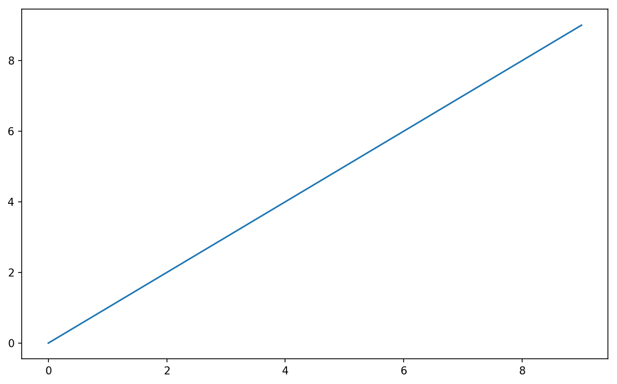
Figure 9-1. Simple line plot
While libraries like seaborn and pandas’s built-in plotting functions will deal with many of the mundane details of making plots, should you wish to customize them beyond the function options provided, you will need to learn a bit about the matplotlib API.
Note
There is not enough room in the book to give a comprehensive treatment to the breadth and depth of functionality in matplotlib. It should be enough to teach you the ropes to get up and running. The matplotlib gallery and documentation are the best resource for learning advanced features.
Figures and Subplots
Plots in matplotlib reside within a Figure object. You
can create a new figure with plt.figure:
In[16]:fig=plt.figure()
In IPython, an empty plot window will appear, but in Jupyter nothing will
be shown until we use a few more commands. plt.figure has a number of options; notably,
figsize will guarantee the figure has
a certain size and aspect ratio if saved to disk.
You can’t make a plot with a blank figure. You have to create one or more
subplots using add_subplot:
In[17]:ax1=fig.add_subplot(2,2,1)
This means that the figure should be 2 × 2 (so up to four plots in total), and we’re selecting the first of four subplots (numbered from 1). If you create the next two subplots, you’ll end up with a visualization that looks like Figure 9-2:
In[18]:ax2=fig.add_subplot(2,2,2)In[19]:ax3=fig.add_subplot(2,2,3)
Figure 9-2. An empty matplotlib figure with three subplots
Tip
One nuance of using Jupyter notebooks is that plots are reset after each cell is evaluated, so for more complex plots you must put all of the plotting commands in a single notebook cell.
Here we run all of these commands in the same cell:
fig=plt.figure()ax1=fig.add_subplot(2,2,1)ax2=fig.add_subplot(2,2,2)ax3=fig.add_subplot(2,2,3)
When you issue a plotting command like plt.plot([1.5, 3.5, -2, 1.6]), matplotlib
draws on the last figure and subplot used (creating one if necessary),
thus hiding the figure and subplot creation. So if we add the following
command, you’ll get something like Figure 9-3:
In[20]:plt.plot(np.random.randn(50).cumsum(),'k--')
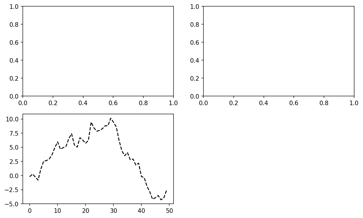
Figure 9-3. Data visualization after single plot
The 'k--' is a
style option instructing matplotlib to plot a black
dashed line. The objects returned by fig.add_subplot here are AxesSubplot
objects, on which you can directly plot on the other empty subplots by
calling each one’s instance method (see Figure 9-4):
In[21]:_=ax1.hist(np.random.randn(100),bins=20,color='k',alpha=0.3)In[22]:ax2.scatter(np.arange(30),np.arange(30)+3*np.random.randn(30))
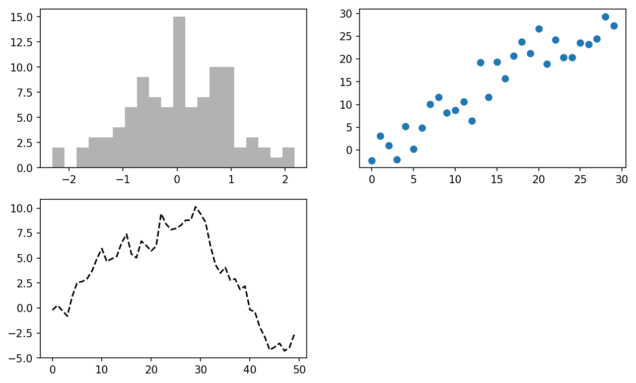
Figure 9-4. Data visualization after additional plots
You can find a comprehensive catalog of plot types in the matplotlib documentation.
Creating a figure with a grid of subplots is a very common task,
so matplotlib includes a convenience method, plt.subplots, that creates a new figure and returns a NumPy array containing
the created subplot objects:
In[24]:fig,axes=plt.subplots(2,3)In[25]:axesOut[25]:array([[<matplotlib.axes._subplots.AxesSubplotobjectat0x7f435346c668>,<matplotlib.axes._subplots.AxesSubplotobjectat0x7f435338c780>,<matplotlib.axes._subplots.AxesSubplotobjectat0x7f43533c37f0>],[<matplotlib.axes._subplots.AxesSubplotobjectat0x7f435337d8d0>,<matplotlib.axes._subplots.AxesSubplotobjectat0x7f4353336908>,<matplotlib.axes._subplots.AxesSubplotobjectat0x7f43532ea400>]],dtype=object)
This is very useful, as the axes
array can be easily indexed like a two-dimensional array; for example,
axes[0, 1]. You can also indicate
that subplots should have the same x- or y-axis using sharex and sharey, respectively. This is especially
useful when you’re comparing data on the same scale; otherwise, matplotlib
autoscales plot limits independently. See Table 9-1 for more on this method.
| Argument | Description |
|---|---|
nrows | Number of rows of subplots |
ncols | Number of columns of subplots |
sharex | All subplots should use the same x-axis ticks (adjusting
the xlim will affect all
subplots) |
sharey | All subplots should use the same y-axis ticks (adjusting
the ylim will affect all
subplots) |
subplot_kw | Dict of keywords passed to add_subplot call used to create each
subplot |
**fig_kw | Additional keywords to subplots are used when creating the
figure, such as plt.subplots(2, 2, figsize=(8, 6)) |
Adjusting the spacing around subplots
By default matplotlib leaves a certain amount of padding around
the outside of the subplots and spacing between subplots. This spacing
is all specified relative to the height and width of the plot, so that
if you resize the plot either programmatically or manually using the
GUI window, the plot will dynamically adjust itself. You can change the spacing using the subplots_adjust method on Figure objects, also available as a
top-level function:
subplots_adjust(left=None, bottom=None, right=None, top=None,
                wspace=None, hspace=None)
wspace and hspace controls the percent of the figure
width and figure height, respectively, to use as spacing between
subplots. Here is a small example where I shrink the spacing all the
way to zero (see Figure 9-5):
fig,axes=plt.subplots(2,2,sharex=True,sharey=True)foriinrange(2):forjinrange(2):axes[i,j].hist(np.random.randn(500),bins=50,color='k',alpha=0.5)plt.subplots_adjust(wspace=0,hspace=0)
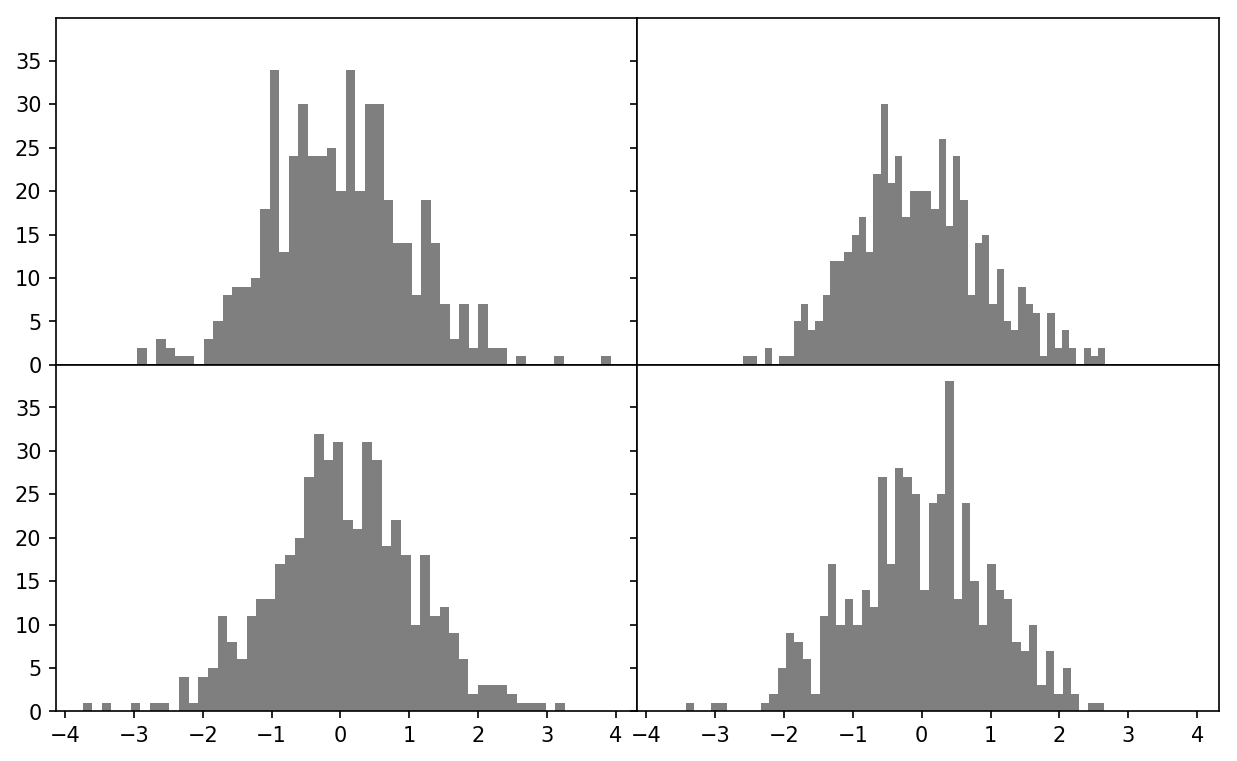
Figure 9-5. Data visualization with no inter-subplot spacing
You may notice that the axis labels overlap. matplotlib doesn’t check whether the labels overlap, so in a case like this you would need to fix the labels yourself by specifying explicit tick locations and tick labels (we’ll look at how to do this in the following sections).
Colors, Markers, and Line Styles
Matplotlib’s main plot function
accepts arrays of x and y coordinates and optionally a
string abbreviation indicating color and line style. For example, to
plot x versus y with green dashes, you would execute:
ax.plot(x,y,'g--')
This way of specifying both color and line style in a string is provided as a convenience; in practice if you were creating plots programmatically you might prefer not to have to munge strings together to create plots with the desired style. The same plot could also have been expressed more explicitly as:
ax.plot(x,y,linestyle='--',color='g')
There are a number of color abbreviations provided for commonly
used colors, but you can use any color on the spectrum by specifying its
hex code (e.g., '#CECECE'). You can
see the full set of line styles by looking at the docstring for plot (use plot? in IPython
or Jupyter).
Line plots can additionally have markers to highlight the actual data points. Since matplotlib creates a continuous line plot, interpolating between points, it can occasionally be unclear where the points lie. The marker can be part of the style string, which must have color followed by marker type and line style (see Figure 9-6):
In[30]:fromnumpy.randomimportrandnIn[31]:plt.plot(randn(30).cumsum(),'ko--')
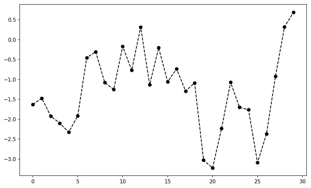
Figure 9-6. Line plot with markers
This could also have been written more explicitly as:
plot(randn(30).cumsum(),color='k',linestyle='dashed',marker='o')
For line plots, you will notice that subsequent points are
linearly interpolated by default. This can be altered with the drawstyle option (Figure 9-7):
In[33]:data=np.random.randn(30).cumsum()In[34]:plt.plot(data,'k--',label='Default')Out[34]:[<matplotlib.lines.Line2Dat0x7f43502adcf8>]In[35]:plt.plot(data,'k-',drawstyle='steps-post',label='steps-post')Out[35]:[<matplotlib.lines.Line2Dat0x7f43502b62e8>]In[36]:plt.legend(loc='best')
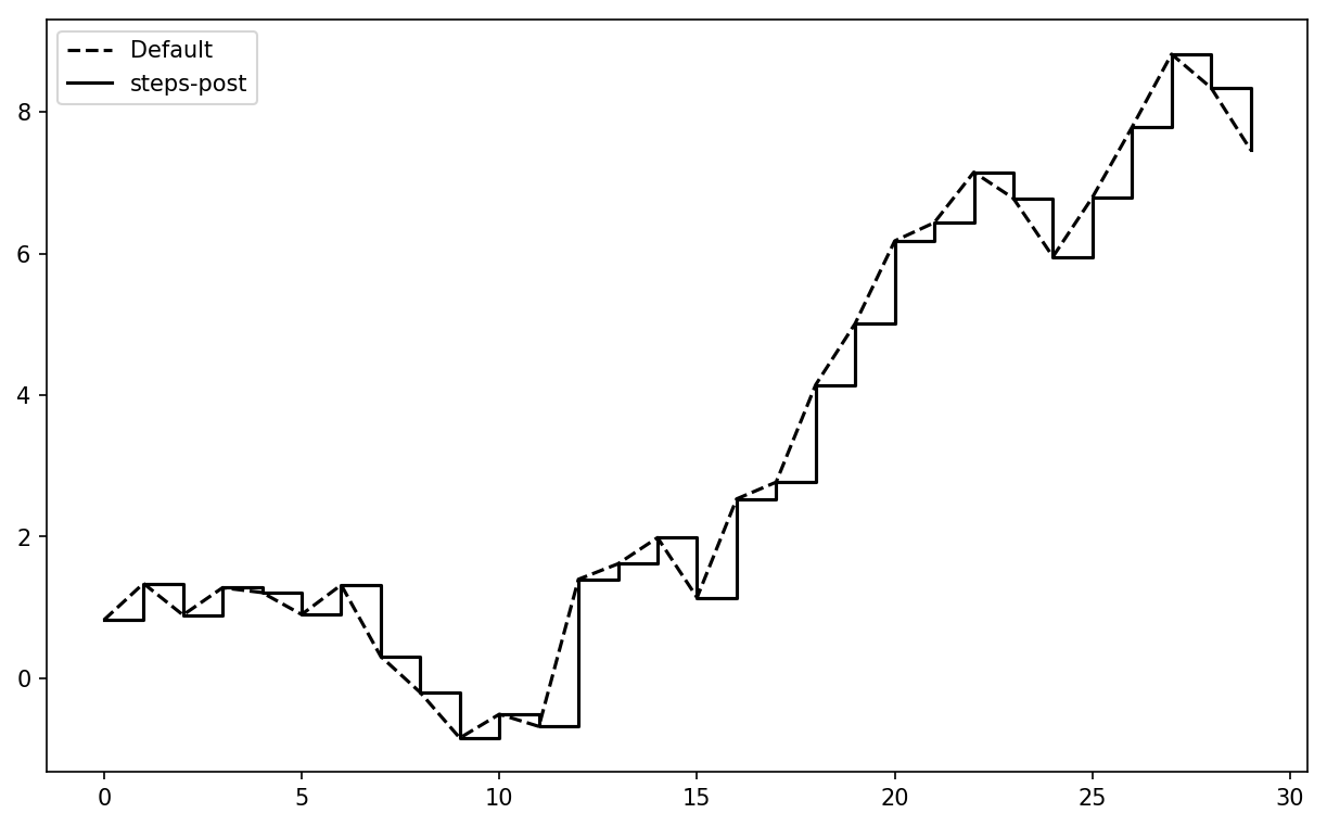
Figure 9-7. Line plot with different drawstyle options
You may notice output like <matplotlib.lines.Line2D at
...> when you run this. matplotlib returns objects that
reference the plot subcomponent that was just added. A lot of the time
you can safely ignore this output. Here, since we passed the
label arguments to plot, we are
able to create a plot legend to identify each line using plt.legend.
Note
You must call plt.legend (or
ax.legend, if you have a reference to the axes) to
create the legend, whether or not you passed the
label options when plotting the data.
Ticks, Labels, and Legends
For most kinds of plot decorations, there are two main ways to do things: using
the procedural pyplot
interface (i.e., matplotlib.pyplot) and the more
object-oriented native matplotlib API.
The pyplot interface, designed
for interactive use, consists of methods like xlim, xticks, and xticklabels. These control the plot range,
tick locations, and tick labels, respectively. They can be used in two
ways:
Called with no arguments returns the current parameter value (e.g.,
plt.xlim()returns the current x-axis plotting range)Called with parameters sets the parameter value (e.g.,
plt.xlim([0, 10]), sets the x-axis range to 0 to 10)
All such methods act on the active or most recently created AxesSubplot.
Each of them corresponds to two methods on the subplot object itself; in the case of
xlim these are ax.get_xlim and ax.set_xlim. I prefer to use the subplot
instance methods myself in the interest of being explicit (and
especially when working with multiple subplots), but you can certainly
use whichever you find more convenient.
Setting the title, axis labels, ticks, and ticklabels
To illustrate customizing the axes, I’ll create a simple figure and plot of a random walk (see Figure 9-8):
In[37]:fig=plt.figure()In[38]:ax=fig.add_subplot(1,1,1)In[39]:ax.plot(np.random.randn(1000).cumsum())
Figure 9-8. Simple plot for illustrating xticks (with label)
To change the x-axis ticks, it’s easiest to use set_xticks and
set_xticklabels. The former
instructs matplotlib where to place the ticks along the data range; by
default these locations will also be the labels. But we can set any
other values as the labels using set_xticklabels:
In[40]:ticks=ax.set_xticks([0,250,500,750,1000])In[41]:labels=ax.set_xticklabels(['one','two','three','four','five'],....:rotation=30,fontsize='small')
The rotation option sets the x tick labels at
a 30-degree rotation. Lastly, set_xlabel gives
a name to the x-axis and set_title the
subplot title (see Figure 9-9 for the resulting
figure):
In[42]:ax.set_title('My first matplotlib plot')Out[42]:Text(0.5,1,'My first matplotlib plot')In[43]:ax.set_xlabel('Stages')
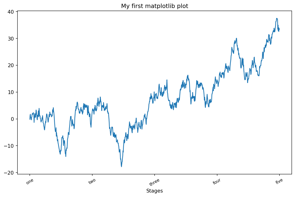
Figure 9-9. Simple plot for illustrating xticks
Modifying the y-axis consists of the same process, substituting
y for x in the above. The axes class has a set method that allows
batch setting of plot properties. From the prior example, we could
also have written:
props={'title':'My first matplotlib plot','xlabel':'Stages'}ax.set(**props)
Adding legends
Legends are another critical element for identifying plot
elements. There are a couple of ways to add one. The easiest is to
pass the label argument when adding
each piece of the plot:
In[44]:fromnumpy.randomimportrandnIn[45]:fig=plt.figure();ax=fig.add_subplot(1,1,1)In[46]:ax.plot(randn(1000).cumsum(),'k',label='one')Out[46]:[<matplotlib.lines.Line2Dat0x7f4350204da0>]In[47]:ax.plot(randn(1000).cumsum(),'k--',label='two')Out[47]:[<matplotlib.lines.Line2Dat0x7f435020e390>]In[48]:ax.plot(randn(1000).cumsum(),'k.',label='three')Out[48]:[<matplotlib.lines.Line2Dat0x7f435020e828>]
Once you’ve done this, you can either call ax.legend() or
plt.legend() to automatically
create a legend. The resulting plot is in Figure 9-10:
In[49]:ax.legend(loc='best')
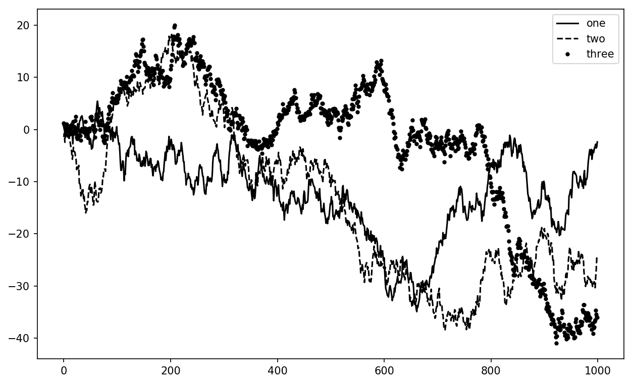
Figure 9-10. Simple plot with three lines and legend
The legend method has several other choices
for the location loc argument. See the docstring
(with ax.legend?) for more information.
The loc tells matplotlib where to place the plot. If you aren’t picky,
'best' is a good option, as it will
choose a location that is most out of the way. To exclude one or more
elements from the legend, pass no label or label='_nolegend_'.
Annotations and Drawing on a Subplot
In addition to the standard plot types, you may wish to draw your own plot
annotations, which could consist of text, arrows, or other
shapes. You can add annotations and text using the text,
arrow, and annotate functions. text draws text at given coordinates (x, y) on the plot with optional custom
styling:
ax.text(x,y,'Hello world!',family='monospace',fontsize=10)
Annotations can draw both text and arrows arranged appropriately. As an example, let’s plot the closing S&P 500 index price since 2007 (obtained from Yahoo! Finance) and annotate it with some of the important dates from the 2008–2009 financial crisis. You can most easily reproduce this code example in a single cell in a Jupyter notebook. See Figure 9-11 for the result:
fromdatetimeimportdatetimefig=plt.figure()ax=fig.add_subplot(1,1,1)data=pd.read_csv('examples/spx.csv',index_col=0,parse_dates=True)spx=data['SPX']spx.plot(ax=ax,style='k-')crisis_data=[(datetime(2007,10,11),'Peak of bull market'),(datetime(2008,3,12),'Bear Stearns Fails'),(datetime(2008,9,15),'Lehman Bankruptcy')]fordate,labelincrisis_data:ax.annotate(label,xy=(date,spx.asof(date)+75),xytext=(date,spx.asof(date)+225),arrowprops=dict(facecolor='black',headwidth=4,width=2,headlength=4),horizontalalignment='left',verticalalignment='top')# Zoom in on 2007-2010ax.set_xlim(['1/1/2007','1/1/2011'])ax.set_ylim([600,1800])ax.set_title('Important dates in the 2008-2009 financial crisis')
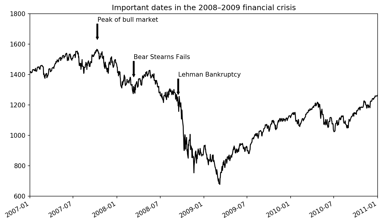
Figure 9-11. Important dates in the 2008–2009 financial crisis
There are a couple of important points to highlight in this plot:
the ax.annotate method can draw labels at the
indicated x and y coordinates. We use the set_xlim and
set_ylim methods to manually set the start and end
boundaries for the plot rather than using matplotlib’s default. Lastly,
ax.set_title adds a main title to the plot.
See the online matplotlib gallery for many more annotation examples to learn from.
Drawing shapes requires some more care. matplotlib has objects
that represent many common shapes, referred to as patches. Some of these, like
Rectangle and Circle, are found in matplotlib.pyplot, but the full set is located
in matplotlib.patches.
To add a shape to a plot, you create the patch object shp and add it to a subplot by calling ax.add_patch(shp) (see Figure 9-12):
fig=plt.figure()ax=fig.add_subplot(1,1,1)rect=plt.Rectangle((0.2,0.75),0.4,0.15,color='k',alpha=0.3)circ=plt.Circle((0.7,0.2),0.15,color='b',alpha=0.3)pgon=plt.Polygon([[0.15,0.15],[0.35,0.4],[0.2,0.6]],color='g',alpha=0.5)ax.add_patch(rect)ax.add_patch(circ)ax.add_patch(pgon)
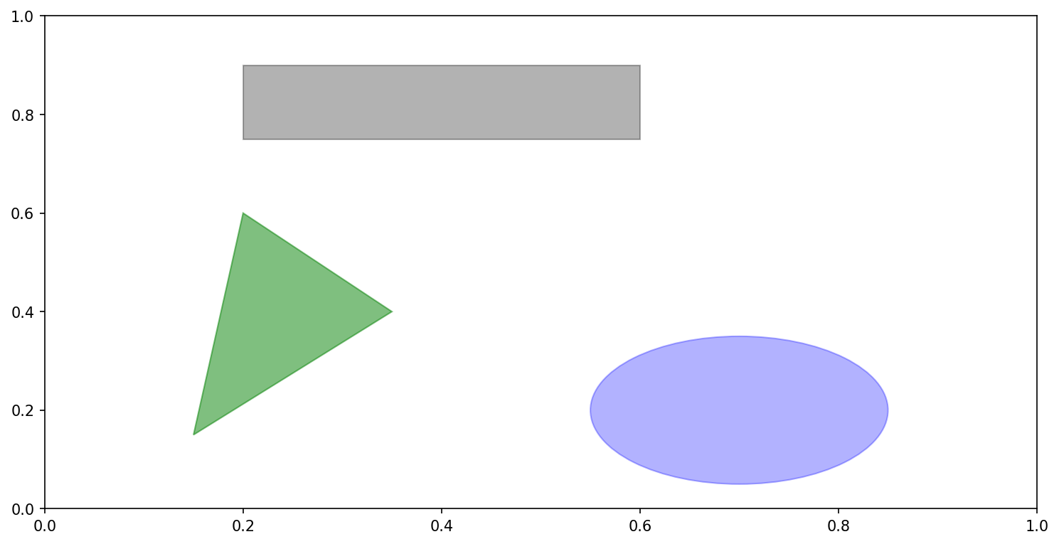
Figure 9-12. Data visualization composed from three different patches
If you look at the implementation of many familiar plot types, you will see that they are assembled from patches.
Saving Plots to File
You can save the active figure to file using plt.savefig. This method is equivalent to the
figure object’s savefig instance
method. For example, to save an SVG version of a figure,
you need only type:
plt.savefig('figpath.svg')
The file type is inferred from the file extension. So if you used
.pdf instead, you would get a PDF.
There are a couple of important options that I use frequently for
publishing graphics: dpi, which
controls the dots-per-inch resolution, and bbox_inches, which can trim the whitespace around the actual figure. To get the same plot
as a PNG with minimal whitespace around the plot and at 400 DPI, you
would do:
plt.savefig('figpath.png',dpi=400,bbox_inches='tight')
savefig doesn’t have to write
to disk; it can also write to any file-like object, such as a BytesIO:
fromioimportBytesIObuffer=BytesIO()plt.savefig(buffer)plot_data=buffer.getvalue()
See Table 9-2 for a list of some other
options for savefig.
| Argument | Description |
|---|---|
fname | String containing a filepath or a Python file-like
object. The figure format is inferred from the file extension
(e.g., .pdf for PDF or
.png for PNG) |
dpi | The figure resolution in dots per inch; defaults to 100 out of the box but can be configured |
facecolor, edgecolor | The color of the figure background outside of the
subplots; 'w' (white), by
default |
format | The explicit file format to use ('png', 'pdf', 'svg', 'ps', 'eps', ...) |
bbox_inches | The portion of the figure to save; if 'tight' is passed, will attempt to
trim the empty space around the figure |
matplotlib Configuration
matplotlib comes configured with color schemes and defaults that are geared
primarily toward preparing figures for publication. Fortunately, nearly
all of the default behavior can be customized via an extensive set of
global parameters governing figure size, subplot spacing, colors, font
sizes, grid styles, and so on. One way to modify the configuration
programmatically from Python is to use the rc method; for
example, to set the global default figure size to be 10 × 10, you could
enter:
plt.rc('figure',figsize=(10,10))
The first argument to rc is the
component you wish to customize, such as 'figure', 'axes', 'xtick', 'ytick', 'grid', 'legend', or many
others. After that can follow a sequence of keyword arguments indicating
the new parameters. An easy way to write down the options in your
program is as a dict:
font_options={'family':'monospace','weight':'bold','size':'small'}plt.rc('font',**font_options)
For more extensive customization and to see a list of all the options, matplotlib comes with a configuration file matplotlibrc in the matplotlib/mpl-data directory. If you customize this file and place it in your home directory titled .matplotlibrc, it will be loaded each time you use matplotlib.
As we’ll see in the next section, the seaborn package has several built-in plot themes or styles that use matplotlib’s configuration system internally.
9.2 Plotting with pandas and seaborn
matplotlib can be a fairly low-level tool. You assemble a plot from its base components: the data display (i.e., the type of plot: line, bar, box, scatter, contour, etc.), legend, title, tick labels, and other annotations.
In pandas we may have multiple columns of data, along with row and
column labels. pandas itself has built-in methods that simplify creating
visualizations from DataFrame and Series objects. Another library is
seaborn, a
statistical graphics library created by Michael Waskom. Seaborn simplifies creating many common
visualization types.
Tip
Importing seaborn modifies the default matplotlib color schemes and plot styles to improve readability and aesthetics. Even if you do not use the seaborn API, you may prefer to import seaborn as a simple way to improve the visual aesthetics of general matplotlib plots.
Line Plots
Series and DataFrame each have a plot attribute for making some basic plot
types. By default, plot() makes line plots (see Figure 9-13):
In[60]:s=pd.Series(np.random.randn(10).cumsum(),index=np.arange(0,100,10))In[61]:s.plot()
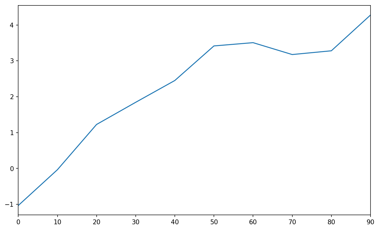
Figure 9-13. Simple Series plot
The Series object’s index is passed to matplotlib for plotting on
the x-axis, though you can disable this by passing use_index=False. The x-axis ticks and limits
can be adjusted with the xticks and
xlim options, and y-axis respectively
with yticks and ylim. See Table 9-3
for a full listing of plot options.
I’ll comment on a few more of them throughout this section and leave the
rest to you to explore.
Most of pandas’s plotting methods accept an optional ax parameter, which can be a matplotlib
subplot object. This gives you more flexible placement of subplots in a
grid layout.
DataFrame’s plot method plots
each of its columns as a different line on the same subplot, creating a
legend automatically (see Figure 9-14):
In[62]:df=pd.DataFrame(np.random.randn(10,4).cumsum(0),....:columns=['A','B','C','D'],....:index=np.arange(0,100,10))In[63]:df.plot()
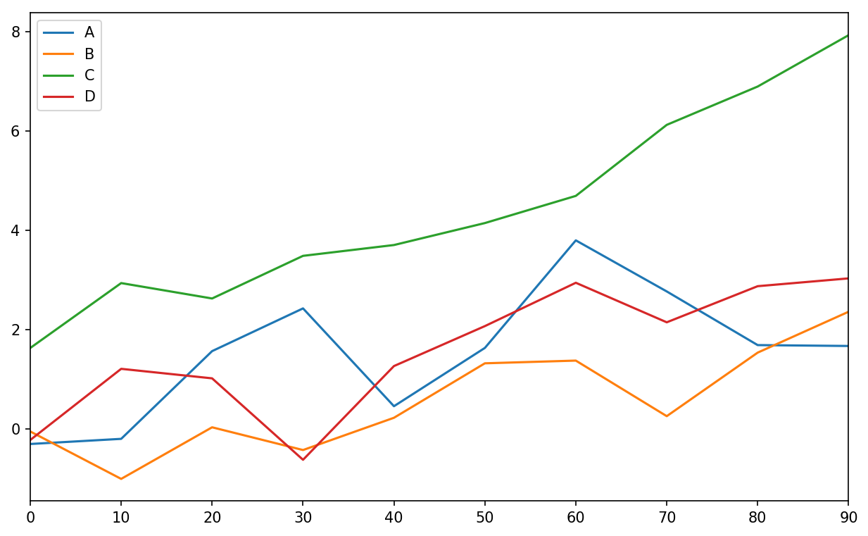
Figure 9-14. Simple DataFrame plot
The plot attribute contains a “family” of
methods for different plot types. For example,
df.plot() is equivalent to
df.plot.line(). We’ll explore some of these methods
next.
Note
Additional keyword arguments to plot are passed through to the respective
matplotlib plotting function, so you can further customize these plots
by learning more about the matplotlib API.
DataFrame has a number of options allowing some flexibility with how the columns are handled; for example, whether to plot them all on the same subplot or to create separate subplots. See Table 9-4 for more on these.
Note
For time series plotting, see Chapter 11.
Bar Plots
The plot.bar() and
plot.barh() make vertical and horizontal bar plots, respectively. In this
case, the Series or DataFrame index will be used as the x (bar) or y (barh) ticks (see Figure 9-15):
In[64]:fig,axes=plt.subplots(2,1)In[65]:data=pd.Series(np.random.rand(16),index=list('abcdefghijklmnop'))In[66]:data.plot.bar(ax=axes[0],color='k',alpha=0.7)Out[66]:<matplotlib.axes._subplots.AxesSubplotat0x7f43500afc18>In[67]:data.plot.barh(ax=axes[1],color='k',alpha=0.7)
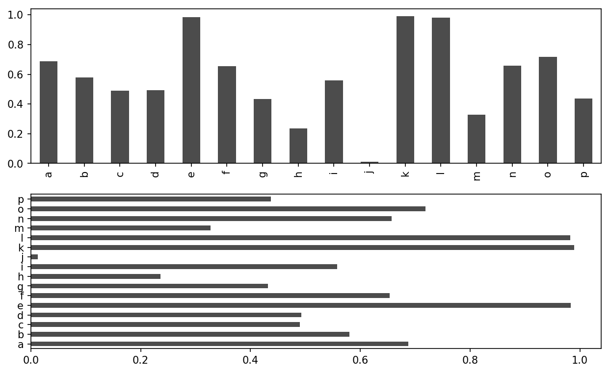
Figure 9-15. Horizonal and vertical bar plot
The options color='k' and
alpha=0.7 set the color of the plots to black and use
partial transparency on the filling.
With a DataFrame, bar plots group the values in each row together in a group in bars, side by side, for each value. See Figure 9-16:
In[69]:df=pd.DataFrame(np.random.rand(6,4),....:index=['one','two','three','four','five','six'],....:columns=pd.Index(['A','B','C','D'],name='Genus'))In[70]:dfOut[70]:GenusABCDone0.3706700.6027920.2291590.486744two0.4200820.5716530.0490240.880592three0.8145680.2771600.8803160.431326four0.3740200.8994200.4603040.100843five0.4332700.1251070.4946750.961825six0.6016480.4785760.2056900.560547In[71]:df.plot.bar()
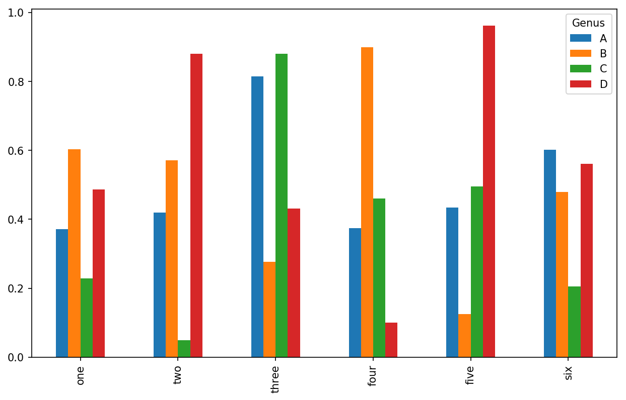
Figure 9-16. DataFrame bar plot
Note that the name “Genus” on the DataFrame’s columns is used to title the legend.
We create stacked bar plots from a DataFrame by passing stacked=True, resulting in the value in each
row being stacked together (see Figure 9-17):
In[73]:df.plot.barh(stacked=True,alpha=0.5)
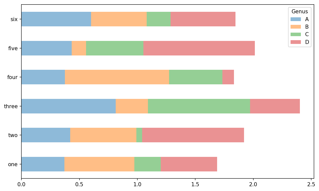
Figure 9-17. DataFrame stacked bar plot
Note
A useful recipe for bar plots is to visualize a Series’s value
frequency using value_counts:
s.value_counts().plot.bar().
Returning to the tipping dataset used earlier in the book, suppose
we wanted to make a stacked bar plot showing the percentage of data
points for each party size on each day. I load the data using read_csv and make
a cross-tabulation by day and party size:
In[75]:tips=pd.read_csv('examples/tips.csv')In[76]:party_counts=pd.crosstab(tips['day'],tips['size'])In[77]:party_countsOut[77]:size123456dayFri1161100Sat253181310Sun039151831Thur1484513# Not many 1- and 6-person partiesIn[78]:party_counts=party_counts.loc[:,2:5]
Then, normalize so that each row sums to 1 and make the plot (see Figure 9-18):
# Normalize to sum to 1In[79]:party_pcts=party_counts.div(party_counts.sum(1),axis=0)In[80]:party_pctsOut[80]:size2345dayFri0.8888890.0555560.0555560.000000Sat0.6235290.2117650.1529410.011765Sun0.5200000.2000000.2400000.040000Thur0.8275860.0689660.0862070.017241In[81]:party_pcts.plot.bar()
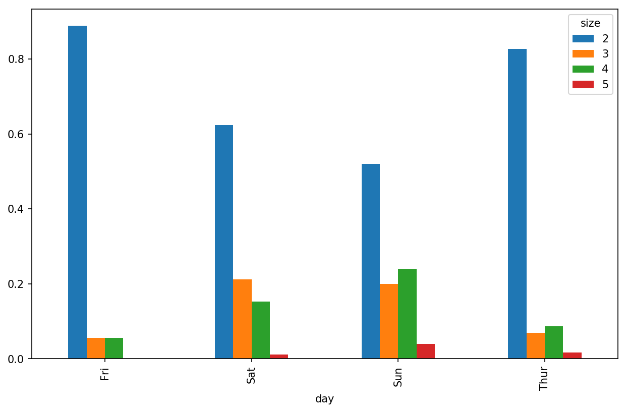
Figure 9-18. Fraction of parties by size on each day
So you can see that party sizes appear to increase on the weekend in this dataset.
With data that requires aggregation or summarization before making
a plot, using the seaborn package can make things
much simpler. Let’s look now at the tipping percentage by day with
seaborn (see Figure 9-19 for the resulting
plot):
In[83]:importseabornassnsIn[84]:tips['tip_pct']=tips['tip']/(tips['total_bill']-tips['tip'])In[85]:tips.head()Out[85]:total_billtipsmokerdaytimesizetip_pct016.991.01NoSunDinner20.063204110.341.66NoSunDinner30.191244221.013.50NoSunDinner30.199886323.683.31NoSunDinner20.162494424.593.61NoSunDinner40.172069In[86]:sns.barplot(x='tip_pct',y='day',data=tips,orient='h')
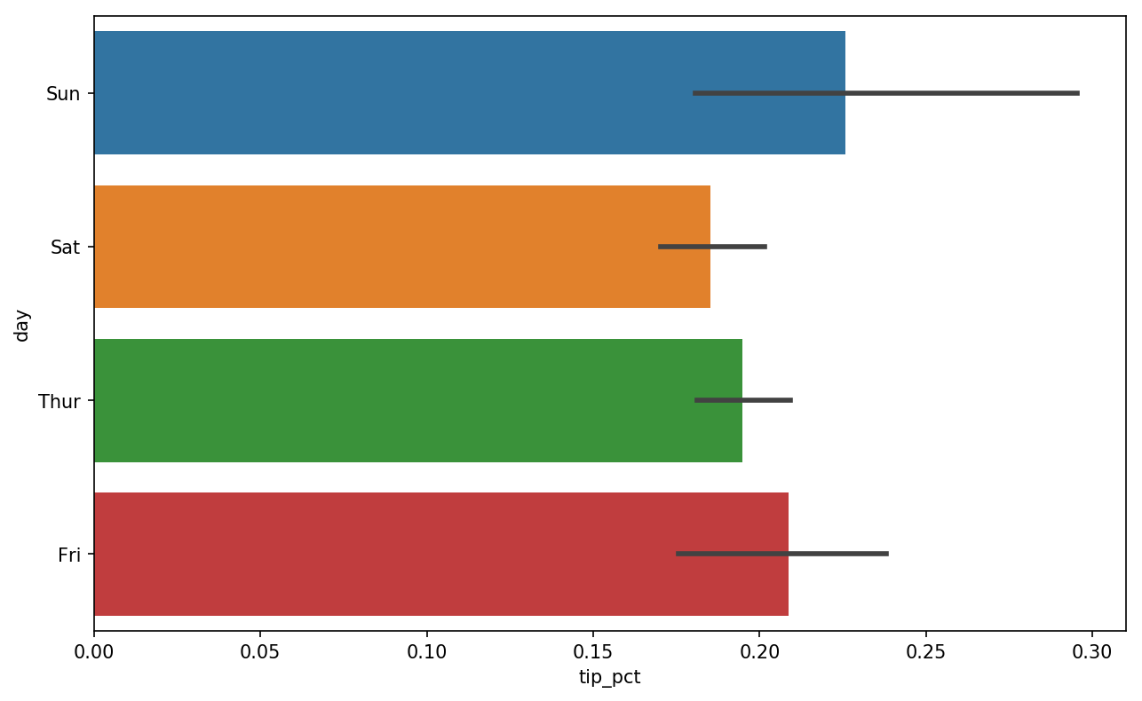
Figure 9-19. Tipping percentage by day with error bars
Plotting functions in seaborn take a data
argument, which can be a pandas DataFrame. The other arguments refer to
column names. Because there are multiple observations for each value in
the day, the bars are the average value of
tip_pct. The black lines drawn on the bars represent
the 95% confidence interval (this can be configured through optional
arguments).
seaborn.barplot has a hue option that enables us to
split by an additional categorical value (Figure 9-20):
In[88]:sns.barplot(x='tip_pct',y='day',hue='time',data=tips,orient='h')
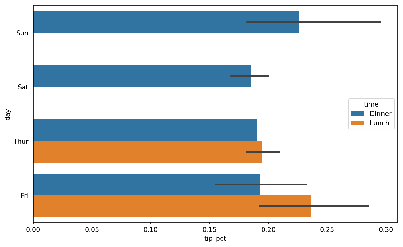
Figure 9-20. Tipping percentage by day and time
Notice that seaborn has automatically changed the aesthetics of
plots: the default color palette, plot background, and grid line colors.
You can switch between different plot appearances using seaborn.set:
In[90]:sns.set(style="whitegrid")
Histograms and Density Plots
A histogram is a kind of bar plot that gives a discretized display of value
frequency. The data points are split into discrete, evenly spaced bins,
and the number of data points in each bin is plotted. Using the tipping
data from before, we can make a histogram of tip percentages of the
total bill using the plot.hist method
on the Series (see Figure 9-21):
In[92]:tips['tip_pct'].plot.hist(bins=50)
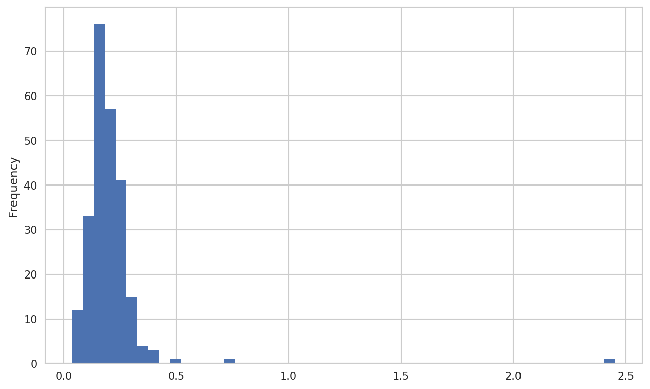
Figure 9-21. Histogram of tip percentages
A related plot type is a density plot, which
is formed by computing an estimate of a continuous probability
distribution that might have generated the observed data. The usual
procedure is to approximate this distribution as a mixture of “kernels”—that is, simpler distributions like the normal distribution. Thus,
density plots are also known as kernel density estimate (KDE) plots. Using plot.kde makes a density plot using the
conventional mixture-of-normals estimate (see Figure 9-22):
In[94]:tips['tip_pct'].plot.density()
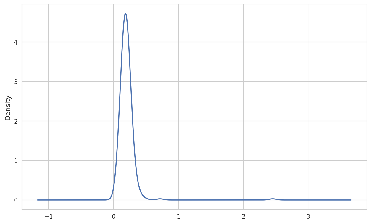
Figure 9-22. Density plot of tip percentages
Seaborn makes histograms and density plots even easier through its distplot method, which can
plot both a histogram and a continuous density estimate simultaneously.
As an example, consider a bimodal distribution consisting of draws from
two different standard normal distributions (see Figure 9-23):
In[96]:comp1=np.random.normal(0,1,size=200)In[97]:comp2=np.random.normal(10,2,size=200)In[98]:values=pd.Series(np.concatenate([comp1,comp2]))In[99]:sns.distplot(values,bins=100,color='k')
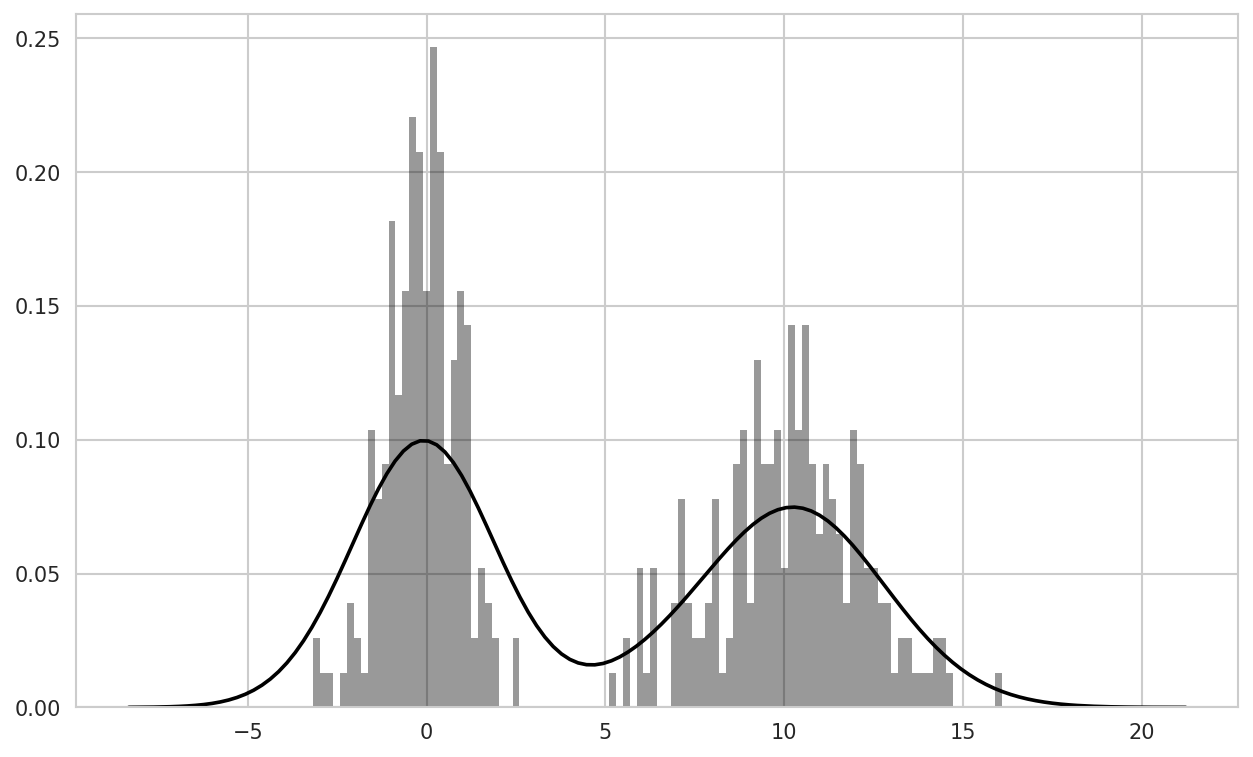
Figure 9-23. Normalized histogram of normal mixture with density estimate
Scatter or Point Plots
Point plots or scatter plots can be a useful way of examining the
relationship between two one-dimensional data series. For example, here
we load the macrodata dataset from
the statsmodels project, select a few variables, then compute log
differences:
In[100]:macro=pd.read_csv('examples/macrodata.csv')In[101]:data=macro[['cpi','m1','tbilrate','unemp']]In[102]:trans_data=np.log(data).diff().dropna()In[103]:trans_data[-5:]Out[103]:cpim1tbilrateunemp198-0.0079040.045361-0.3968810.105361199-0.0219790.066753-2.2772670.1397622000.0023400.0102860.6061360.1603432010.0084190.037461-0.2006710.1273392020.0088940.012202-0.4054650.042560
We can then use seaborn’s regplot method, which makes a
scatter plot and fits a linear regression line (see Figure 9-24):
In[105]:sns.regplot('m1','unemp',data=trans_data)Out[105]:<matplotlib.axes._subplots.AxesSubplotat0x7f4341097cf8>In[106]:plt.title('Changes in log%sversus log%s'%('m1','unemp'))

Figure 9-24. A seaborn regression/scatter plot
In exploratory data analysis it’s helpful to be able to look at
all the scatter plots among a group of variables; this is known
as a pairs plot or scatter
plot matrix. Making such a plot from scratch is a bit of
work, so seaborn has a convenient pairplot function, which
supports placing histograms or density estimates of each variable along
the diagonal (see Figure 9-25 for the resulting
plot):
In[107]:sns.pairplot(trans_data,diag_kind='kde',plot_kws={'alpha':0.2})
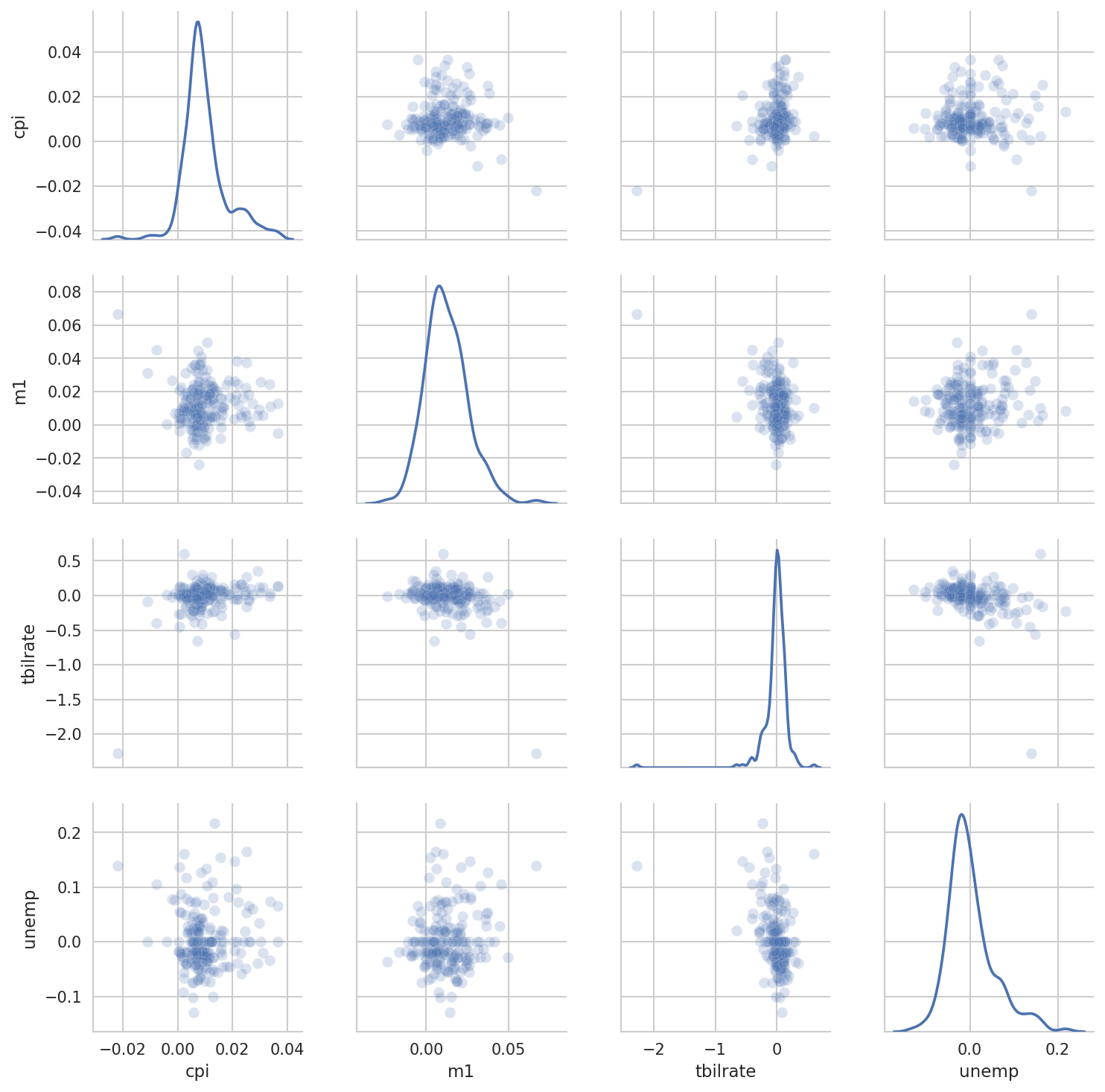
Figure 9-25. Pair plot matrix of statsmodels macro data
You may notice the plot_kws argument. This
enables us to pass down configuration options to the individual plotting
calls on the off-diagonal elements. Check out the
seaborn.pairplot docstring for more granular
configuration options.
Facet Grids and Categorical Data
What about datasets where we have additional grouping dimensions? One way to
visualize data with many categorical variables is to use a
facet grid. Seaborn has a useful built-in function
factorplot that simplifies making many kinds of faceted plots (see Figure 9-26 for the resulting plot):
In[108]:sns.factorplot(x='day',y='tip_pct',hue='time',col='smoker',.....:kind='bar',data=tips[tips.tip_pct<1])
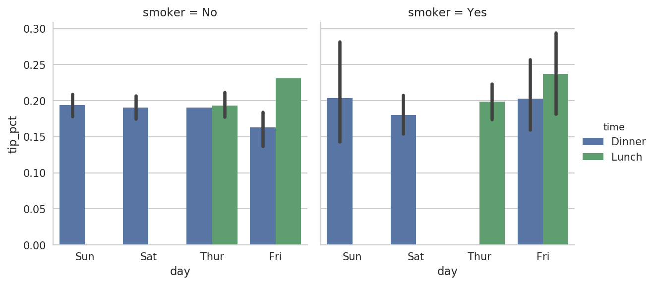
Figure 9-26. Tipping percentage by day/time/smoker
Instead of grouping by 'time' by different bar
colors within a facet, we can also expand the facet grid by adding one
row per time value (Figure 9-27):
In[109]:sns.factorplot(x='day',y='tip_pct',row='time',.....:col='smoker',.....:kind='bar',data=tips[tips.tip_pct<1])
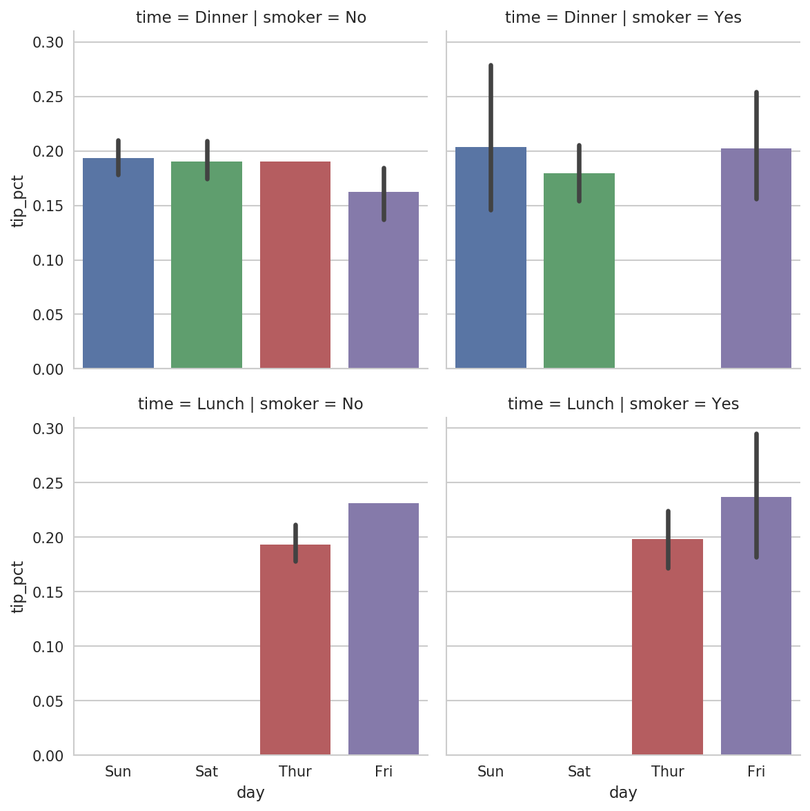
Figure 9-27. tip_pct by day; facet by time/smoker
factorplot supports other plot types that may
be useful depending on what you are trying to display. For example, box
plots (which show the median, quartiles, and outliers) can be an
effective visualization type (Figure 9-28):
In[110]:sns.factorplot(x='tip_pct',y='day',kind='box',.....:data=tips[tips.tip_pct<0.5])
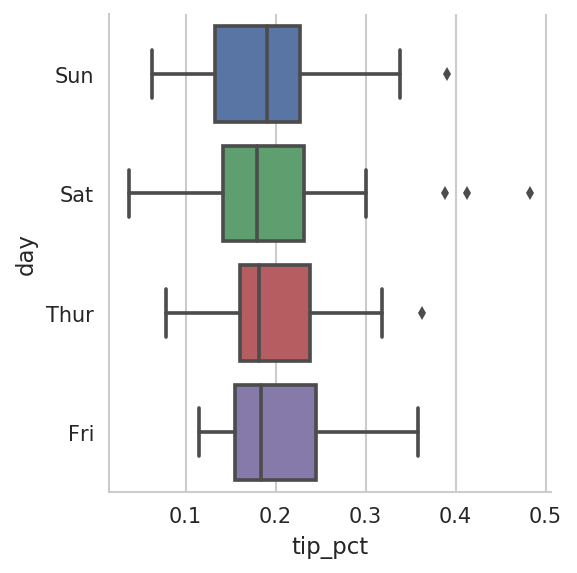
Figure 9-28. Box plot of tip_pct by day
You can create your own facet grid plots using the more general seaborn.FacetGrid class. See
the seaborn
documentation for more.
9.3 Other Python Visualization Tools
As is common with open source, there are a plethora of options for creating graphics in Python (too many to list). Since 2010, much development effort has been focused on creating interactive graphics for publication on the web. With tools like Bokeh and Plotly, it’s now possible to specify dynamic, interactive graphics in Python that are destined for a web browser.
For creating static graphics for print or web, I recommend defaulting to matplotlib and add-on libraries like pandas and seaborn for your needs. For other data visualization requirements, it may be useful to learn one of the other available tools out there. I encourage you to explore the ecosystem as it continues to involve and innovate into the future.
9.4 Conclusion
The goal of this chapter was to get your feet wet with some basic data visualization using pandas, matplotlib, and seaborn. If visually communicating the results of data analysis is important in your work, I encourage you to seek out resources to learn more about effective data visualization. It is an active field of research and you can practice with many excellent learning resources available online and in print form.
In the next chapter, we turn our attention to data aggregation and group operations with pandas.