Table of Contents for
JavaScript Web Applications
 JavaScript Web Applications
Published by
O'Reilly Media, Inc., 2011
JavaScript Web Applications
Published by
O'Reilly Media, Inc., 2011
- Cover
- JavaScript Web Applications
- JavaScript Web Applications
- Preface
- 1. MVC and Classes
- 2. Events and Observing
- 3. Models and Data
- 4. Controllers and State
- 5. Views and Templating
- 6. Dependency Management
- 7. Working with Files
- 8. The Real-Time Web
- 9. Testing and Debugging
- 10. Deploying
- 11. The Spine Library
- 12. The Backbone Library
- 13. EmberJS
- A. jQuery Primer
- B. CSS Extensions
- C. CSS3 Reference
- Index
- About the Author
- Colophon
- Copyright
Appendix C. CSS3 Reference
Producing beautiful interfaces in CSS2.1 was pretty tricky because it usually involved a lot of extra markup, images, and JavaScript. CSS3 attempts to solve these problems, providing a variety of really useful attributes and selectors to help you create amazing user interfaces.
Often, when designing web applications, I skip Photoshop and jump straight into CSS3 and HTML5. Now that there are these powerful technologies, designing static PSD mockups seems a bit redundant. Clients also tend to appreciate this because they can interact with an HTML prototype of the product, getting a much better feel for the user experience.
“But what about older browsers?” I hear you cry! Surely CSS3 isn’t ready for prime time yet? Well, the answer to that is graceful degradation. Older browsers will ignore your CSS3 styles, falling back to the standard ones. For example, in Chrome, your users will see the application in its full glory, gradients and all, whereas in IE7, the application will be just as functional, only a lot less pretty.
As for Internet Explorer 6, I advocate you to drop support altogether. Facebook, Amazon, and Google are all starting to drop support, and the small percentage of IE6 users just doesn’t make the effort to support it viable. The Web is moving on, and older technologies need to be dropped.
The major browsers are IE, Firefox, Chrome, and Safari. Chrome and Safari have a different JavaScript engine, but they share the same rendering engine, WebKit. Although there are subtle differences between the two browsers—they use different graphics libraries—fixes to Chrome are pushed upstream to WebKit, and vice versa.
Microsoft released IE9 as this book was being written. Hopefully it will be widely adopted before too long, because it’s quite an improvement on its previous browsers, and it includes a lot of CSS3 support.
It’s an incredibly exciting time to be a frontend developer, and you should consider using these new technologies immediately.
Prefixes
The browser vendors were implementing CSS3 before it had
been completely standardized. For that reason, while the syntax is still
in flux, some CSS3 styles have a browser-specific prefix. For example, the
CSS3 gradient style is different in Firefox and Safari. Firefox uses -moz-linear-gradient, and Safari (WebKit) uses
-webkit-gradient; both
syntaxes are prefixed with the vendor type.
The different prefixes used are:
Chrome:
-webkit-Safari:
-webkit-Firefox:
-moz-IE:
-ms-Opera:
-o-
For the moment, you should specify styles with the vendor prefix and then without. This is to ensure that when the browsers remove the prefix and switch over to the standardized CSS3 specification, your styles will still work:
#prefix-example {
  -moz-box-shadow: 0 3px 5px #FFF;
  -webkit-box-shadow: 0 3px 5px #FFF;
  box-shadow: 0 3px 5px #FFF;
}
Colors
CSS3 gives you some new ways of specifying colors, including alpha transparency.
The old way of creating transparent colors was using 1px × 1px background images, but you can put that behind you now.
The rgb style lets you specify colors with red, green, and blue fills—the
primary colors—rather than the
traditional hex values. You can convert between the two easily by using
Safari’s Web Inspector—just click on a color in the Styles section.
The example below is equivalent to the #FFF hex
value—i.e., white:
#rgb-example {
  //     rgb(red, green, blue);
  color: rgb(255, 255, 255);
}
You can also use the hsl style,
which stands for hue, saturation, and lightness.
HSL takes three values:
- Hue
A degree on the color wheel; 0 (or 360) is red, 120 is green, 240 is blue. Numbers in between create different shades.
- Saturation
A percentage value; 100% shows the full color.
- Lightness
Also a percentage; 0% is dark (black), 100% is light (white), and 50% is the average.
Adding alpha transparency to rgb or hsl is simple—just use rgba and hsla, respectively. Alpha transparency is
specified as a number between 0
(transparent) and 1 (opaque).
#alpha-example {
  background: hsla(324, 100%, 50%, .5);
  border: 1em solid rgba(0, 0, 0, .3);
  color: rgba(255, 255, 255, .8);
}
Browser support:
Firefox: full support
Chrome: full support
Safari: full support
IE: full support
Opera: full support
Rounded Corners
Rounding corners in CSS 2.1 was quite a slog, often involving a lot of extra markup, multiple images, and even JavaScript.
Now it’s much easier—just use the border-radius style. As with the padding and margin styles, you can specify
multiple radii to target different corners, two to target the horizontal
and vertical radii, or one radius to target all of them. By providing a
large-enough radius, you can even create a circle:
border-radius: 20px;

// horizonal, vertical
border-radius: 20px 20px;

// top left, top right, bottom right, bottom left
border-radius: 20px 20px 20px 20px;
Browser support:
Firefox: full support
Chrome: full support
Safari: with
-webkit-IE >= 9.0: full support
Opera: full support
Drop Shadows
Prior to CSS3, a lot of people didn’t bother with drop
shadows because it was such a hassle. However, CSS3 gives you box-shadow style, which makes implementing them a breeze. Just don’t go overboard in
addition to creating a potential eyesore; drop shadows can be quite
performance-intensive.
box-shadow takes a few options: the horizontal
offset, vertical offset, blur radius, optional spread distance, and color.
By providing the inset option, the
shadow will be drawn inside the element; otherwise, the default is
outside. You can also include multiple shadows by comma-separating them,
as in the examples below:
// horizonal offset, vertical offset, blur radius, color
box-shadow: 10px 5px 15px #000;

// inset shadows
box-shadow: 10px 5px 15px #000 inset;

// horizonal offset, vertical offset, blur radius, spread distance, color
box-shadow: 10px 5px 15px 15px #000;

// multiple shadows
box-shadow: 0 1px 1px #FFF inset, 5px 5px 10px #000;
Designers often specify a light source in their designs, which makes
the interface seem a bit more tangible and interactive. You can do that
easily with box-shadow—just specify a 1px, white inset
shadow. In this case, the light source is from the top of the page; we’ll
need to keep that consistent across all our styles:
#shadow-example {
  -moz-box-shadow: 0 1px 1px #FFF inset;
  -webkit-box-shadow: 0 1px 1px #FFF inset;
  box-shadow: 0 1px 1px #FFF inset;
}
Browser support:
Firefox: full support
Chrome: with
-webkit-Safari: with
-webkit-IE >= 9.0: full support
Opera: full support
Text Shadow
Before CSS3, the only way to do text shadows was to replace
the text with images—a nasty workaround. CSS3 lets you add shadows to text
with the text-shadow style. Just pass
it the horizontal offset, vertical offset, optional blur radius, and
color:
// horizonal offset, vertical offset, color
text-shadow: 1px 1px #FFF;

// horizonal offset, vertical offset, blur radius, color
text-shadow: 1px 1px .3em rgba(255, 255, 255, .8);
Text shadows are different from box-shadows because as there is no support for
spread distances or inset shadows. However, you can trick the eye to
believe that a text shadow is inset or outset with the shadow position. If
the shadow has a negative vertical offset and is above the text, it
appears inset. Accordingly, if the shadow is below the text, it looks
outset.
Browser support:
Firefox: full support
Chrome: full support
Safari: full support
IE: no support
Opera: full support
Gradients
Previously, gradients were implemented by using repeating background images. This meant they had a fixed width or height, and you needed to open up an image editor to alter them.
CSS3 adds support for linear and radial gradients, which is one of its most useful features. There are a few CSS functions you call to generate the gradients, and you can use them wherever you would normally use a color.
For linear gradients, just pass the linear-gradient function a list of colors you
want to transition through:
linear-gradient(#CCC, #DDD, white)
By default, the gradients are vertical; however, you can change that by passing in a position:
// horizontal gradient
linear-gradient(left, #CCC, #DDD, #FFF);

// or with a specific angle
linear-gradient(-45deg , #CCC , #FFF)
If you want more control over where a gradient transition begins, you can use color stops. Just specify a percentage or pixel value along with the color:
linear-gradient(white , #DDD 20% , black)
You can also transition to and from a transparency:
radial-gradient( rgba(255, 255, 255, .8) , transparent )
Safari currently has a markedly different syntax. It will soon align with the standard, but, for now, here’s how to use it:
// -webkit-gradient(<type>, <point> [, <radius>]?, <point> [, <radius>]?
//[, <stop>]*);
-webkit-gradient(linear, left top, left bottom,
from(#FFF), color-stop(10%, #DDD), to(#CCC));
Although most major browsers support the CSS gradient standard, each prefixes the syntax with its own vendor name:
Firefox: with
-moz-Chrome: with
-webkit-Safari: alternative implementation
IE >= 10: with
-ms-Opera >= 11.1: with
-o-
So, a gradient that works cross-browser looks like this:
#gradient-example {
  /* Fallback */
  background: #FFF;
  /* Chrome < 10, Safari < 5.1 */
  background: -webkit-gradient(linear, left top, left bottom, from(#FFF), to(#CCC));
  /* Chrome >= 10, Safari >= 5.1 */
  background: -webkit-linear-gradient(#FFF, #CCC);
  /* Firefox >= 3.6 */
  background: -moz-linear-gradient(#FFF, #CCC);
  /* Opera >= 11.1 */
  background: -o-linear-gradient(#FFF, #CCC);
  /* IE >= 10 */
  background: -ms-linear-gradient(#FFF, #CCC);
  /* The standard */
  background: linear-gradient(#FFF, #CCC);
}
Phew, that’s quite a mouthful! Luckily, projects like Less and Sass take the pain out of it, which I’ll elaborate on later in this chapter.
Multiple Backgrounds
Just as you can specify multiple shadows in CSS3, you can specify multiple backgrounds. Previously, to have many background images, you’d have to create a lot of nested elements—i.e., too much extraneous markup. CSS3 lets you give a comma-separated list to the background style, greatly reducing the amount of markup required:
background: url(snowflakes.png) top repeat-x,
  url(chimney.png) bottom no-repeat,
  -moz-linear-gradient(white, #CCC),
  #CCC;
Browser support:
Firefox: full support
Chrome: full support
Safari: full support
IE >= 9.0: full support
Opera: full support
Selectors
CSS3 gives you a bunch of new selectors for targeting elements:
- :
first-child Selects the first item in the selector
- :
last-child Selects the last item in the selector
- :
only-child Selects elements with only one child
- :
target Selects elements targeted in the current URL’s hash
- :
checked Selects checked checkboxes
Selectors I want to cover in greater detail are listed below.
Nth Child
:nth-child lets you alternate styling for every
n children. For example, this selects every third
child:
#example:nth-child( 3n ) { /* ... */ }You can use this to select even or odd children:
/* Even children */
#example:nth-child( 2n )   { /* ... */ }
#example:nth-child( even ) { /* ... */ }

/* Odd children */
#example:nth-child( 2n+1 ) { /* ... */ }
#example:nth-child( odd )  { /* ... */ }
You can also reverse the selector:
 /* Last child */
 #example:nth-last-child( 1 )
In fact, :first-child is equivalent to
:nth-child(1), and :last-child is
equivalent to :nth-last-child(1).
Direct Descendants
You can limit the selector to only directly descendant
children by using the greater-than symbol,
>:
/* Only directly descendant divs */
#example > div { }
Selector Negation
You can negate selectors by using :not, which you can pass a simple selector. At
the moment, negation doesn’t support the more complex selectors, like
p:not(h1 + p):
/* Only directly descendant children, except ones with the "current" class */
#example > *:not(.current) {
  display: none
}
Browser support:
Firefox: full support
Chrome: full support
Safari: full support
IE >= 9.0: full support
Opera: full support
Transitions
CSS3 adds transition support, letting you create simple
animations when a style changes. You need to pass a duration, property,
and optional animation type to the transition property. You can specify the
duration in seconds (s) or milliseconds (ms):
/* duration, property, animation type (optional) */
transition: 1.5s opacity ease-out

/* Multiple transitions */
transition: 2s opacity , .5s height ease-in
transition: .5s height , .5s .5s width
In the first example, when the opacity changes (say, a style gets applied inline), the original and new values will be animated between.
There are various types of timing functions:
linearease-inease-outease-in-out
Or, you can specify a custom timing sequence using a cubic bezier curve, which describes the animation speed, such as this bouncing animation:
#transition-example {
  position: absolute;
  /* cubic-bezier(x1, y1, x2, y2) */
  transition: 5s left cubic-bezier(0.0, 0.35, .5, 1.3);
}
In Safari and Chrome, once the transition is complete, a WebKitTransitionEvent will be fired on the element. In Firefox, the event is called transitionend. Unfortunately, there are several caveats to using CSS3 transitions: you get little control over playback and not all values are transitionable. That said, transitions are very useful for simple animations, and some browsers (such as Safari) even hardware-accelerate them:
#transition-example {
  width: 50px;
  height: 50px;
  background: red;
  -webkit-transition: 2s background ease-in-out;
  -moz-transition: 2s background ease-in-out;
  -o-transition: 2s background ease-in-out;
  transition: 2s background ease-in-out;
}

#transition-example:hover {
  background: blue;
}
For one reason or another, you can only transition between gradients
if at least one gradient has a touch of alpha transparency. You also can’t
transition between some values, like height:0 to
height:auto.
Browser support:
Firefox: with
-moz-Chrome: with
-webkit-Safari: with
-webkit-IE >= 10.0: with
-ms-Opera: with
-o-
Border Images
With border-image, you can use an image
for the border of an element. The first argument specifies the image’s
URL; the subsequent ones describe how the image is sliced. The last part
is the stretch value, which describes how the slices for the sides and the
middle are scaled and tiled. Available stretch values are round, repeat, and stretch:
border-image: url(border.png) 14 14 14 14 round round;

border-image: url(border.png) 14 14 14 14 stretch stretch;
Browser support:
Firefox: with
-moz-Chrome: with
-webkit-Safari: with
-webkit-IE: no support
Opera: with
-o-
Box Sizing
Have you ever wanted to make an element with 100% width but still have padding or margins? Using the traditional box model, CSS calculates percentage widths using the parent element’s width, and then adds on margins and padding. In other words, a 100% width element with padding, margins, or a border will always overflow.
However, by setting box-sizing to
border-box—instead of its default value
content-box—you can change the
way the size is measured, taking into account borders, margins, padding,
and content:
.border-box {
  -webkit-box-sizing: border-box;
  -moz-box-sizing: border-box;
  box-sizing: border-box;
}
This has great support among the major browsers, and it can be used safely unless you plan to support any browsers prior to Internet Explorer 8.
Transformations
With CSS3, we get basic 2D transformations, which lets elements be translated, rotated, scaled, and skewed. For example, we can rotate an element 30 degrees counterclockwise:
transform: rotate( -30deg );
You can also skew the element around the x and y axes by the specified angles:
transform: skew( 30deg , -10deg );
An element’s position can be transformed in the x or y axis using
translateX or translateY:
translateX(30px);
translateY(50opx);
You can increase or decrease an element’s size using the scale transform. By default, an element’s scale
is set to 1:
transform: scale(1.2);
You can specify multiple transformations by concatenating them:
transform: rotate(30deg) skewX(30deg);
Browser support:
Firefox: with
-moz-Chrome: with
-webkit-Safari: with
-webkit-IE >= 9: with
-ms-Opera: with
-o-
Flexible Box Model
CSS3 introduces the flexible box model, a new way of displaying content. It’s really useful, as it brings some features to CSS that GUI frameworks, such as Adobe Flex, have had for a while. Traditionally, if you wanted a list aligned horizontally, you used floats. The flexible box model lets you do that and more. Let’s take a look at the code:
.hbox {
  display: -webkit-box;
  -webkit-box-orient: horizontal;
  -webkit-box-align: stretch;
  -webkit-box-pack: left;

  display: -moz-box;
  -moz-box-orient: horizontal;
  -moz-box-align: stretch;
  -moz-box-pack: left;
}

.vbox {
  display: -webkit-box;
  -webkit-box-orient: vertical;
  -webkit-box-align: stretch;

  display: -moz-box;
  -moz-box-orient: vertical;
  -moz-box-align: stretch;
}
We’re setting the display to -webkit-box or -moz-box, and then setting the direction in
which the children will be laid out. By default, all the children will
expand equally to fit their parent. However, you can alter this behavior
by setting the box-flex
attribute.
By setting box-flex to 0, you’re
specifying that an element shouldn’t expand, whereas if you set the flex
to 1 or higher, the element will expand to fit the available content. For
example, a sidebar may have a flex attribute of 0, and the main content
may have a flex attribute of 1:
#sidebar {
  -webkit-box-flex: 0;
  -moz-box-flex: 0;
  box-flex: 0;

  width: 200px;
}

#content {
  -webkit-box-flex: 1;
  -moz-box-flex: 1;
  box-flex: 1;
}
Browser support:
Firefox: with
-moz-Chrome: with
-webkit-Safari: with
-webkit-IE >= 10: with
-ms-Opera: no support
Fonts
@font-face allows you to use custom fonts to display text on your web
pages. So, you no longer need to depend on a limited number of system
fonts users have installed.
Supported font formats are TrueType and OpenType. Fonts are subject to the same domain policy restriction—the files must be on the same domain as the page using them.
You can specify a @font-face like this, giving it
a font-family and the URL location where the font is
located:
@font-face {
  font-family: "Bitstream Vera Serif Bold";
  src: url("/fonts/VeraSeBd.ttf");
}
Then, you can use it as you would any other font:
#font-example {
  font-family: "Bitstream Vera Serif Bold";
}
Fonts will be downloaded asynchronously and applied when they’ve finished downloading. This means a user will see one of her system’s default fonts until the custom font has downloaded. Therefore, it’s a good idea to specify a fallback font that’s available locally.
Browser support:
Firefox: full support
Chrome: full support
Safari: full support
IE >= 9: full support
Opera: full support
Graceful Degradation
If you write your CSS correctly, your application will degrade gracefully. It will be functional in browsers that don’t support CSS3—it just won’t be very pretty.
The key to graceful degradation is that browsers ignore things they
don’t understand, such as unknown CSS properties, values, and selectors.
CSS properties override one another,
so if one is defined twice in the same rule, the first property will be
overridden. You should put the
property that’s CSS 2.1-compliant first, so it will be overridden if
rgba is supported:
#example-gd {
  background: white;
  background: rgba(255, 255, 255, .75);
}
What about vendor prefixes? Well, the same rule applies. Just include prefixes for each browser—it will use the one it understands. You should put the prefixless version last, as it will be used when the browser’s CSS3 support is standardized and prefixes are removed:
#example-gd {
  background: #FFF;
  background: -webkit-gradient(linear, left top, left bottom, from(#FFF), to(#CCC));
  background: -webkit-linear-gradient(#FFF, #CCC);
  background: -moz-linear-gradient(#FFF, #CCC);
  background: linear-gradient(#FFF, #CCC);
}
Modernizr
Modernizr detects support for various CSS3 properties, letting you target specific browser behavior in your stylesheet:
.multiplebgs div p {
  /* properties for browsers that
     support multiple backgrounds */
}
.no-multiplebgs div p {
  /* optional fallback properties
     for browsers that don't */
}
Some of the features Modernizr detects support for are:
@font-facergba()hsla()border-image:border-radius:box-shadow:text-shadow:Multiple backgrounds
Flexible box model
CSS animations
CSS gradients
CSS 2D transforms
CSS transitions
To see a full list or to download Modernizr, visit the project page.
Using Modernizr is very simple—just include the JavaScript file
and add a class of no-js to the
<html> tag:
<script src="/javascripts/modernizr.js"></script>
<html class="no-js">
Modernizr then adds some classes to the <html> tag, which you can use in your
selectors to target specific browser behaviors:
/* Alternate layout when the Flexible Box Model is not available */
.no-flexbox #content {
  float: left;
}
Google Chrome Frame
Google Chrome Frame (GCF) is an Internet Explorer extension that lets you switch IE’s renderer to Google Chrome’s renderer, Chromium.
Once the extension is installed, you can enable GCF with a
meta tag in the page’s head:
<meta http-equiv="X-UA-Compatible" content="chrome=1">
Or, an alternative is to add the setting to the response’s header:
X-UA-Compatible: chrome=1
That’s all that’s required to enable GCF rendering for your web page. However, GCF has some more features, like prompting users to install it if they’re running IE (and it’s not already installed). The prompt can just overlay on top of the page and will refresh automatically when GCF is installed—no browser restart is necessary.
The first step is to include the GCF JavaScript:
<script src="http://ajax.googleapis.com/ajax/libs/chrome-frame/1/CFInstall.min.js"
Then, in a page load handler or at the bottom of the page, we need to invoke CFInstall:
<script>
  jQuery(function(){
    CFInstall.check({
      mode: "overlay",
    });
  });
</script>
CFInstall takes several options:
-
mode Inline, overlay, or popup
-
destination The address to navigate to on installation, usually the current page
-
node The ID of an element that will contain the installation prompt
Once GCF is installed, the browser’s User-Agent
header will be extended with the string chromeframe.
GCF cleverly uses Internet Explorer’s network stack to perform URL
requests. This ensures that requests have the same cookies, history, and
SSL state when using GCF, which basically preserves the user’s existing
sessions.
For further information, see the getting started guide.
Creating a Layout
Let’s take what we’ve learned and apply it to creating a simple layout, inspired by Holla.
First, let’s create the basic page markup. We’re going to have a
header and two columns—a
sidebar with fixed width and a main
content container:
<body>
  <header id="title">
    <h1>Holla</h1>
  </header>

  <div id="content">
    <div class="sidebar"></div>
    <div class="main"></div>
  </div>
</body>
Next, let’s add the basic reset and body styles:
body, html {
  margin: 0;
  padding: 0;
}

body {
  font-family: Helvetica, Arial, "MS Trebuchet", sans-serif;
  font-size: 16px;
  color: #363636;
  background: #D2D2D2;
  line-height: 1.2em;
}
And now the h tags:
h1, h2 {
  font-weight: bold;
  text-shadow: 0 1px 1px #ffffff;
}

h1 {
  font-size: 21pt;
  color: #404040;
}

h2 {
  font-size: 24pt;
  color: #404040;
  margin: 1em 0 0.7em 0;
}

h3 {
  font-size: 15px;
  color: #404040;
  text-shadow: 0 1px 1px #ffffff;
}
Now let’s define a header for our layout. We’re using the CSS3 background gradients, but we’re defaulting back to a plain hex code color if they’re not supported:
#title {
border-bottom: 1px solid #535353;
overflow: hidden;
height: 50px;
line-height: 50px;
background: #575859;
background: -webkit-gradient(linear, left top, left bottom,
from(#575859), to(#272425));
background: -webkit-linear-gradient(top, #575859, #272425);
background: -moz-linear-gradient(top, #575859, #272425);
background: linear-gradient(top, #575859, #272425);
}
#title h1 {
color: #ffffff;
text-shadow: 0 1px 1px #000000;
margin: 0 10px;
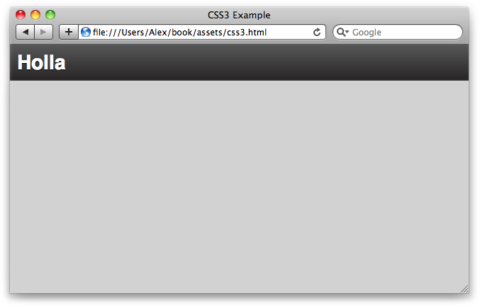
}Now, if we look in the browser, there’s a dark header with our application’s name, as shown in Figure C-1.
Let’s create a #content div that
will contain the main part of the application. We want it stretched across
the page in both the x and y directions, so we’ll make its position
absolute. Its immediate children are aligned horizontally, so we’ll set
its display to the flexible box type:
#content {
  overflow: hidden;

  /*
    The content div will cover the whole page,
    but leave enough room for the header.
  */
  position: absolute;
  left: 0;
  right: 0;
  top: 50px;
  bottom: 0;

  /* The children are horizontally aligned */
  display: -webkit-box;
  -webkit-box-orient: horizontal;
  -webkit-box-align: stretch;
  -webkit-box-pack: left;

  display: -moz-box;
  -moz-box-orient: horizontal;
  -moz-box-align: stretch;
  -moz-box-pack: left;
}
Now let’s create a lefthand column called .sidebar. It’s got a fixed width, so we’re
setting box-flex to 0:
#content .sidebar {
  background: #EDEDED;
  width: 200px;

  /* It's got a fixed width, we don't want it to expand */
  -webkit-box-flex: 0;
  -moz-box-flex: 0;
  box-flex: 0;
}
Let’s create a list of menu items inside .sidebar. Each menu is separated by an
h3, the menu header. As you can see, we’re using a
lot of CSS3, which—due to the vendor prefixes—is rather repetitive. We can
clean it up using Less mixins:
#content .sidebar ul {
  margin: 0;
  padding: 0;
  list-style: none;
}

#content .sidebar ul li {
  display: block;
  padding: 10px 10px 7px 20px;
  border-bottom: 1px solid #cdcdcc;
  cursor: pointer;

  -moz-box-shadow: 0 1px 1px #fcfcfc;
  -webkit-box-shadow: 0 1px 1px #fcfcfc;
  box-shadow: 0 1px 1px #fcfcfc;
}

#content .sidebar ul li.active {
  color: #ffffff;
  text-shadow: 0 1px 1px #46677f;

  -webkit-box-shadow: none;
  -moz-box-shadow: none;

  background: #7bb5db;
  background: -webkit-gradient(linear, left top, left bottom,
  from(#7bb5db), to(#4775b8));
  background: -webkit-linear-gradient(top, #7bb5db, #4775b8);
  background: -moz-linear-gradient(top, #7bb5db, #4775b8);
  background: linear-gradient(top, #7bb5db, #4775b8);
}
Let’s add some example menus to the HTML markup:
<div class="sidebar">
  <h3>Channels</h3>
  <ul>
    <li class="active">Developers</li>
    <li>Sales</li>
    <li>Marketing</li>
    <li>Ops</li>
  </ul>
</div>
All the CSS that’s left is the .main div, which stretches right across the
page:
#content .main {
-moz-box-shadow: inset 0 1px 3px #7f7f7f;
-webkit-box-shadow: inset 0 1px 3px #7f7f7f;
box-shadow: inset 0 1px 3px #7f7f7f;
/* We want .main to expand as far as possible */
-webkit-box-flex: 1;
-moz-box-flex: 1;
box-flex: 1;
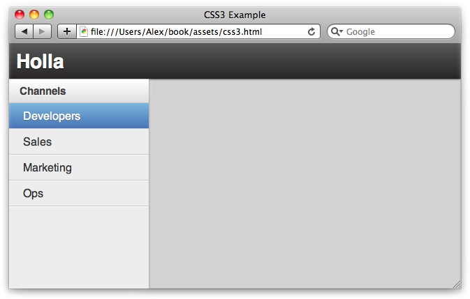
}Let’s take another look; as Figure C-2 shows, we’ve now got a basic application layout upon which we can expand.
As I mentioned before, the CSS3 syntax is rather verbose and repetitive due to the vendor prefixes we have to use. We can clean it up using Less mixins. For example:
#content .sidebar h3 {
  .vbg-gradient(#FFF, #DEDFE0);
  .box-shadow(0, -5px, 10px, #E4E4E4);
}
See Appendix B for more information, and view the Holla stylesheets for some good examples.