Table of Contents for
Foundations for Analytics with Python
 Foundations for Analytics with Python
Published by
O'Reilly Media, Inc., 2016
Foundations for Analytics with Python
Published by
O'Reilly Media, Inc., 2016
- Cover
- nav
- Foundations for Analyticswith Python
- Dedication
- Foundations for Analytics with Python
- Preface
- 1. Python Basics
- 2. Comma-Separated Values (CSV) Files
- 3. Excel Files
- 4. Databases
- 5. Applications
- 6. Figures and Plots
- 7. Descriptive Statistics and Modeling
- 8. Scheduling Scripts to Run Automatically
- 9. Where to Go from Here
- A. Download Instructions
- B. Answers to Exercises
- Bibliography
- Index
- About the Author
- Colophon
Chapter 7. Descriptive Statistics and Modeling
The earlier chapters in this book focused on a variety of data processing techniques that enable you to transform raw data into a dataset that’s ready for statistical analysis. In this chapter, we turn our attention to some of these basic statistical analysis and modeling techniques. We’ll focus on exploring and summarizing datasets with plots and summary statistics and conducting regression and classification analyses with multivariate linear regression and logistic regression.
This chapter isn’t meant to be a comprehensive treatment of statistical analysis techniques or pandas functionality. Instead, the goal is to demonstrate how you can produce some standard descriptive statistics and models with pandas and statsmodels.
Datasets
Instead of creating datasets with thousands of rows from scratch, let’s download them from the Internet. One of the datasets we’ll use is the Wine Quality dataset, which is available at the UC Irvine Machine Learning Repository. The other dataset is the Customer Churn dataset, which has been featured in several analytics blog posts.
Wine Quality
The Wine Quality dataset consists of two files, one for red wines and one for white wines, for variants of the Portuguese “Vinho Verde” wine. The red wines file contains 1,599 observations and the white wines file contains 4,898 observations. Both files contain one output variable and eleven input variables. The output variable is quality, which is a score between 0 (low quality) and 10 (high quality). The input variables are physicochemical characteristics of the wine, including fixed acidity, volatile acidity, citric acid, residual sugar, chlorides, free sulfur dioxide, total sulfur dioxide, density, pH, sulphates, and alcohol.
The two datasets are available for download at the following URLs:
Rather than analyze these two datasets separately, let’s combine them into one dataset. After you combine the red and white files into one file, the resulting dataset should have one header row and 6,497 observations. It is also helpful to add a column that indicates whether the wine is red or white. The dataset we’ll use looks as shown in Figure 7-1 (note the row numbers on the lefthand side and the additional “type” variable in column A).
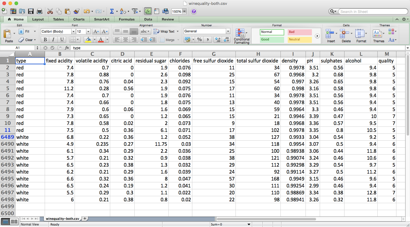
Figure 7-1. The dataset that is the result of concatenating the red and white wine datasets and adding an additional column, type, which indicates which dataset the row originated from
Customer Churn
The Customer Churn dataset is one file that contains 3,333 observations of current and former telecommunications company customers. The file has one output variable and twenty input variables. The output variable, Churn?, is a Boolean (True/False) variable that indicates whether the customer had churned (i.e., was no longer a customer) by the time of the data collection.
The input variables are characteristics of the customer’s phone plan and calling behavior, including state, account length, area code, phone number, has an international plan, has a voice mail plan, number of voice mail messages, daytime minutes, number of daytime calls, daytime charges, evening minutes, number of evening calls, evening charges, nighttime minutes, number of nighttime calls, nighttime charges, international minutes, number of international calls, international charges, and number of customer service calls.
The dataset is available for download at Churn.
The dataset looks as shown in Figure 7-2.
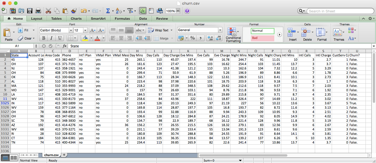
Figure 7-2. The top and bottom of the Customer Churn dataset
Wine Quality
Descriptive Statistics
Let’s analyze the Wine Quality dataset first. To start, let’s display overall descriptive statistics for each column, the unique values in the quality column, and observation counts for each of the unique values in the quality column. To do so, create a new script, wine_quality.py, and add the following initial lines of code:
#!/usr/bin/env python3importnumpyasnpimportpandasaspdimportseabornassnsimportmatplotlib.pyplotaspltimportstatsmodels.apiassmimportstatsmodels.formula.apiassmffromstatsmodels.formula.apiimportols,glm# Read the dataset into a pandas DataFramewine=pd.read_csv('winequality-both.csv',sep=',',header=0)wine.columns=wine.columns.str.replace(' ','_')(wine.head())# Display descriptive statistics for all variables(wine.describe())# Identify unique values(sorted(wine.quality.unique()))# Calculate value frequencies(wine.quality.value_counts())
After the import statements, the first thing we do is use the pandas read_csv function to read the text file winequality-both.csv into a pandas DataFrame. The extra arguments indicate that the field separator is a comma and the column headings are in the first row. Some of the column headings contain spaces (e.g., “fixed acidity”), so in the next line we replace the spaces with underscores. Next, we use the head function to view the header row and the first five rows of data to check that the data is loaded correctly.
Line 14 uses the pandas describe function to print summary statistics for each of the numeric variables in the dataset. The statistics it reports are count, mean, standard deviation, minimum value, 25th percentile value, median value, 75th percentile value, and maximum value. For example, there are 6,497 observations of quality scores. The scores range from 3 to 9, and the mean quality score is 5.8 with a standard deviation of 0.87.
The following line identifies the unique values in the quality column and prints them to the screen in ascending order. The output shows that the unique values in the quality column are 3, 4, 5, 6, 7, 8, and 9.
Finally, the last line in this section counts the number of times each unique value in the quality column appears in the dataset and prints them to the screen in descending order. The output shows that 2,836 observations have a quality score of 6; 2,138 observations have a score of 5; 1,079 observations have a score of 7; 216 observations have a score of 4; 193 observations have a score of 8; 30 observations have a score of 3; and 5 observations have a score of 9.
Grouping, Histograms, and t-tests
The preceding statistics are for the entire dataset, which combines both the red and white wines. Let’s see if the statistics remain similar when we evaluate the red and white wines separately:
# Display descriptive statistics for quality by wine type(wine.groupby('type')[['quality']].describe().unstack('type'))# Display specific quantile values for quality by wine type(wine.groupby('type')[['quality']].quantile([0.25,0.75]).unstack('type'))# Look at the distribution of quality by wine typered_wine=wine.loc[wine['type']=='red','quality']white_wine=wine.loc[wine['type']=='white','quality']sns.set_style("dark")(sns.distplot(red_wine,\norm_hist=True,kde=False,color="red",label="Red wine"))(sns.distplot(white_wine,\norm_hist=True,kde=False,color="white",label="White wine"))sns.axlabel("Quality Score","Density")plt.title("Distribution of Quality by Wine Type")plt.legend()plt.show()# Test whether mean quality is different between red and white wines(wine.groupby(['type'])[['quality']].agg(['std']))tstat,pvalue,df=sm.stats.ttest_ind(red_wine,white_wine)('tstat:%.3fpvalue:%.4f'%(tstat,pvalue))
The first line in this section prints the summary statistics for red and white wines separately. The groupby function uses the type column to separate the data into two groups based on the two values in this column. The square brackets enable us to list the set of columns for which we want to produce output. In this case, we only want to apply the describe function to the quality column. The result of these commands is a single column of statistics where the results for red and white wines are stacked vertically on top of one another. The unstack function reformats the results so the statistics for the red and white wines are displayed horizontally in two separate columns.
The next line is very similar to the preceding line, but instead of using the describe function to display several descriptive statistics, it uses the quantile function to display the 25th and 75th percentile values from the quality column.
Next, we use seaborn to create a plot of two histograms, as shown in Figure 7-3: one for the red wines and one for the white wines.
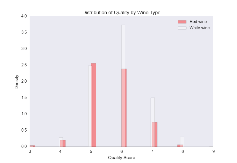
Figure 7-3. A figure with two density histograms that display the distribution of quality scores by wine type
The red bars are for the red wines and the white bars are for the white wines. Because there are more white wines than red wines (4,898 white compared to 1,599 red), the plot displays normalized/density distributions instead of frequency distributions. The plot shows that quality scores for both red and white wines are approximately normally distributed. Compared to the raw summary statistics, the histograms make it easier to see the distributions of quality scores for the two types of wines.
Finally, we conduct a t-test to evaluate whether the mean quality scores for the red and white wines are different. This code illustrates how to use the groupby and agg functions to calculate a set of statistics for separate groups in a dataset. In this case, we want to know whether the standard deviations of the quality scores for the red and white wines are similar, in which case we can use pooled variance in the t-test. The t-statistic is –9.69 and the p-value is 0.00, which indicates that the mean quality score for white wines is statistically greater than the mean quality score for red wines.
Pairwise Relationships and Correlation
Now that we’ve examined the output variable, let’s briefly explore the input variables. Let’s calculate the correlation between all pairs of variables and also create a few scatter plots with regression lines for a subset of the variables:
# Calculate correlation matrix for all variables(wine.corr())# Take a "small" sample of red and white wines for plottingdeftake_sample(data_frame,replace=False,n=200):returndata_frame.loc[np.random.choice(data_frame.index,\replace=replace,size=n)]reds_sample=take_sample(wine.loc[wine['type']=='red',:])whites_sample=take_sample(wine.loc[wine['type']=='white',:])wine_sample=pd.concat([reds_sample,whites_sample])wine['in_sample']=np.where(wine.index.isin(wine_sample.index),1.,0.)(pd.crosstab(wine.in_sample,wine.type,margins=True))# Look at relationship between pairs of variablessns.set_style("dark")g=sns.pairplot(wine_sample,kind='reg',plot_kws={"ci":False,\"x_jitter":0.25,"y_jitter":0.25},hue='type',diag_kind='hist',\diag_kws={"bins":10,"alpha":1.0},palette=dict(red="red",white="white"),\markers=["o","s"],vars=['quality','alcohol','residual_sugar'])(g)plt.suptitle('Histograms and Scatter Plots of Quality, Alcohol, and Residual\Sugar',fontsize=14,horizontalalignment='center',verticalalignment='top',\x=0.5,y=0.999)plt.show()
The corr function calculates the linear correlation between all pairs of variables in the dataset. Based on the sign of the coefficients, the output suggests that alcohol, sulphates, pH, free sulfur dioxide, and citric acid are positively correlated with quality, whereas fixed acidity, volatile acidity, residual sugar, chlorides, total sulfur dioxide, and density are negatively correlated with quality.
There are over 6,000 points in the dataset, so it will be difficult to see distinct points if we plot all of them. To address this issue, the second section defines a function, take_sample, which we’ll use to create a small sample of points that we can use in plots. The function uses pandas DataFrame indexing and numpy’s random.choice function to select a random subset of rows. We use this function to take a sample of red wines and a sample of white wines, and then we concatenate these DataFrames into a single DataFrame. Then we create a new column in our wine DataFrame named in_sample and use numpy’s where function and the pandas isin function to fill the column with ones and zeros depending on whether the row’s index value is one of the index values in the sample. Finally, we use the pandas crosstab function to confirm that the in_sample column contains 400 ones (200 red wines and 200 white wines) and 6,097 zeros.
seaborn’s pairplot function creates a matrix of plots. The plots along the main diagonal display the univariate distributions for each of the variables either as densities or histograms. The plots on the off-diagonal display the bivariate distributions between each pair of variables as scatter plots either with or without regression lines.
The pairwise plot in Figure 7-4 shows the relationships between quality, alcohol, and residual sugar. The red bars and dots are for the red wines and the white bars and dots are for the white wines. Because the quality scores only take on integer values, I’ve slightly jittered them so it’s easier to see where they’re concentrated.
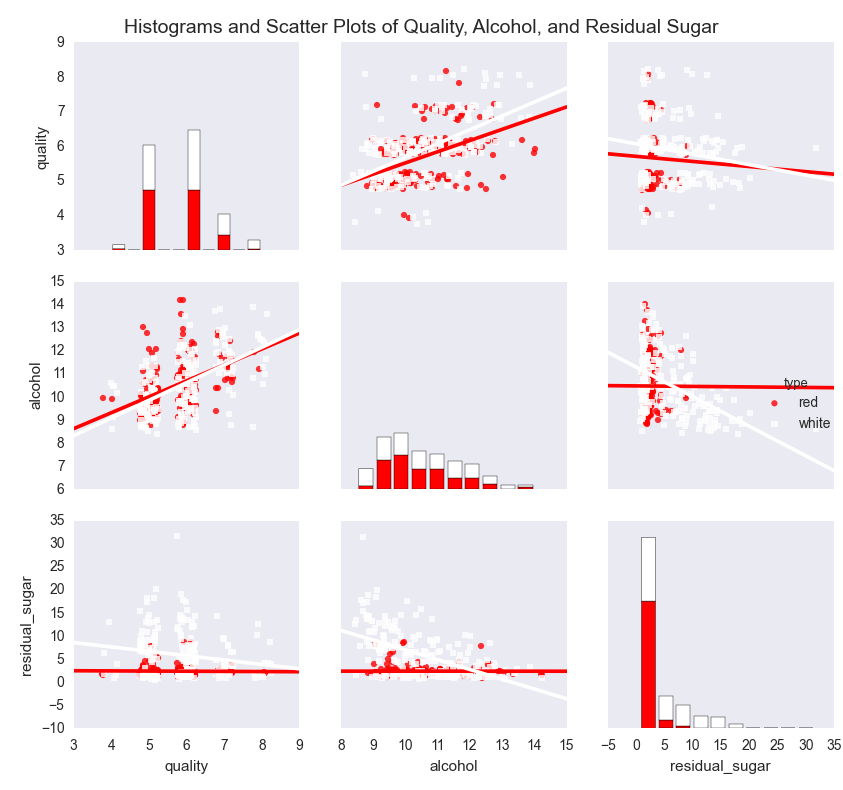
Figure 7-4. A figure with pairwise scatter plots, regression lines, and histograms for three variables—quality, alcohol, and residual sugar—by wine type
The plots show that the mean and standard deviation values of alcohol for red and white wines are similar, whereas the mean and standard deviation values of residual sugar for white wines are greater than the corresponding values for red wines. The regression lines suggest that quality increases as alcohol increases for both red and white wines, whereas quality decreases as residual sugar increases for both red and white wines. In both cases, the effect appears to be greater for white wines than for red wines.
Linear Regression with Least-Squares Estimation
Correlation coefficients and pairwise plots and are helpful for quantifying and visualizing the bivariate relationships between variables, but they don’t measure the relationships between the dependent variable and each independent variable while controlling for the other independent variables. Linear regression addresses this issue.
Linear regression refers to the following model:
-
yi ~ N(μi, σ2),
-
μi = β0 + β1xi1 + β2xi2 + ... + βpxip
for i = 1, 2, ..., n observations and p independent variables.
This model indicates that observation yi is drawn from a normal (Gaussian) distribution with a mean μi, which depends on the independent variables, and a constant variance σ2. That is, given an observation’s values for the independent variables, we observe a specific quality score. On another day with the same values for the independent variables, we might observe a different quality score. However, over many days with the same values for the independent variables (i.e., in the long run), the quality score would fall in the range defined by μi ± σ.
Now that we understand the linear regression model, let’s use the statsmodels package to run a linear regression:
my_formula='quality ~ alcohol + chlorides + citric_acid + density\+ fixed_acidity + free_sulfur_dioxide + pH + residual_sugar + sulphates\+ total_sulfur_dioxide + volatile_acidity'lm=ols(my_formula,data=wine).fit()## Alternatively, a linear regression using generalized linear model (glm) syntax## lm = glm(my_formula, data=wine, family=sm.families.Gaussian()).fit()(lm.summary())("\nQuantities you can extract from the result:\n%s"%dir(lm))("\nCoefficients:\n%s"%lm.params)("\nCoefficient Std Errors:\n%s"%lm.bse)("\nAdj. R-squared:\n%.2f"%lm.rsquared_adj)("\nF-statistic:%.1fP-value:%.2f"%(lm.fvalue,lm.f_pvalue))("\nNumber of obs:%dNumber of fitted values:%d"%(lm.nobs,\len(lm.fittedvalues)))
The first line assigns a string to a variable named my_formula. The string contains R-style syntax for specifying a regression formula. The variable to the left of the tilde (~), quality, is the dependent variable and the variables to the right of the tilde are the independent explanatory variables.
The second line fits an ordinary least-squares regression model using the formula and data and assigns the results to a variable named lm. To demonstrate a similar formulation, the next (commented-out) line fits the same model using the generalized linear model (glm) syntax instead of the ordinary least-squares syntax.
The next seven lines print specific model quantities to the screen. The first line prints a summary of the results to the screen. This summary is helpful because it displays the coefficients, their standard errors and confidence intervals, the adjusted R-squared, the F-statistic, and additional model details in one display.
The next line prints a list of all of the quantities you can extract from lm, the model object. Reviewing this list, I’m interested in extracting the coefficients, their standard errors, the adjusted R-squared, the F-statistic and its p-value, and the fitted values.
The next four lines extract these values. lm.params returns the coefficient values as a Series, so you can extract individual coefficients by position or name. For example, to extract the coefficient for alcohol, 0.267, you can use lm.params[1] or lm.params['alcohol']. Similarly, lm.bse returns the coefficients’ standard errors as a Series. lm.rsquared_adj returns the adjusted R-squared and lm.fvalue and lm.f_pvalue return the F-statistic and its p-value, respectively. Finally, lm.fittedvalues returns the fitted values. Rather than display all of the fitted values, I display the number of them next to the number of observations, lm.nobs, to confirm that they’re the same length. The output is shown in Figure 7-5.
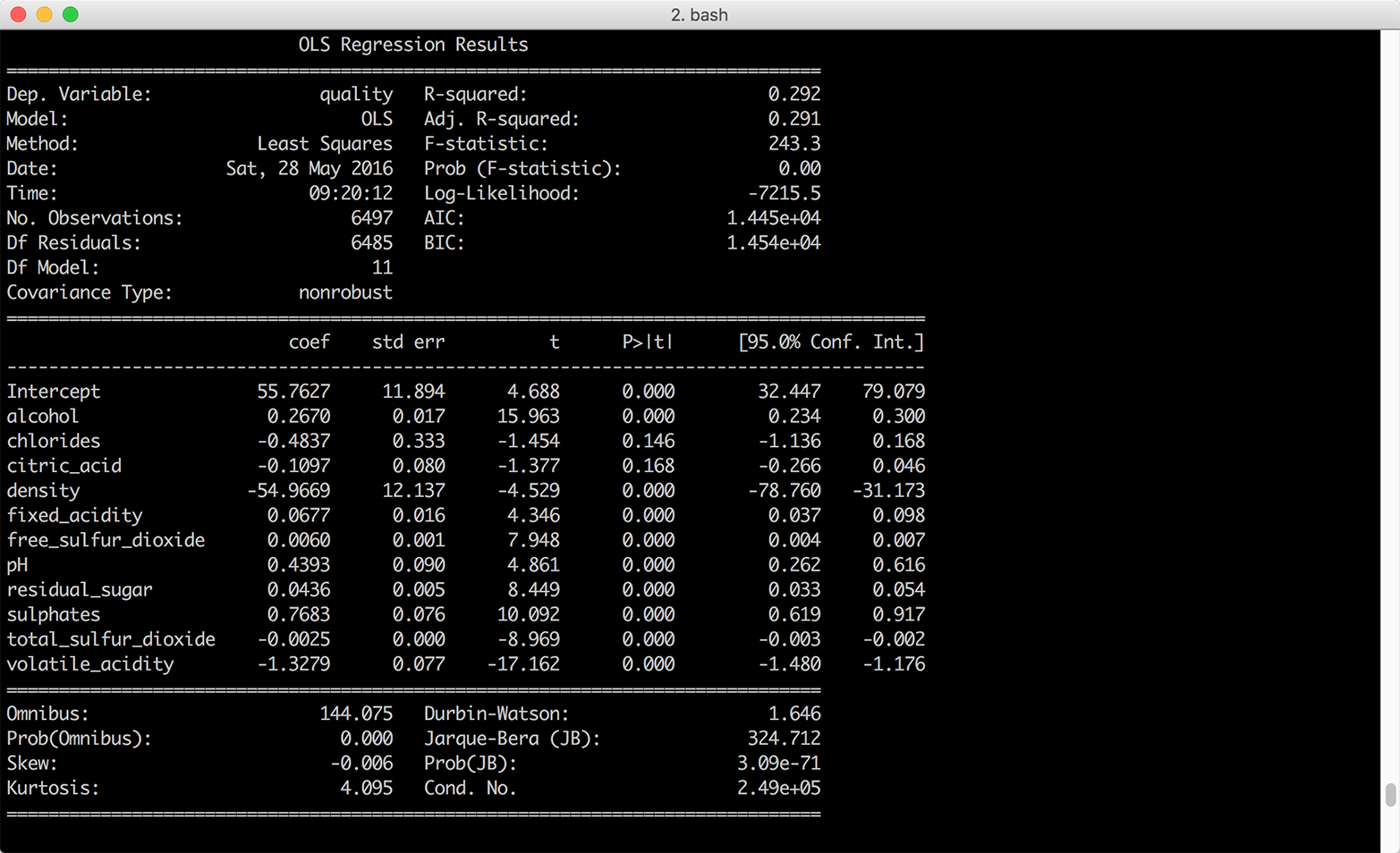
Figure 7-5. Multivariate linear regression of wine quality on eleven wine characteristics
Interpreting Coefficients
If you were going to use this model to understand the relationships between the dependent variable, wine quality, and the independent variables, the eleven wine characteristics, you would want to interpret the coefficients. Each coefficient represents the average difference in wine quality, comparing wines that differ by one unit on the specific independent variable and are otherwise identical. For example, the coefficient for alcohol suggests that, on average, comparing two wines that have the same values for all of the remaining independent variables, the quality score of the wine with one more unit of alcohol will be 0.27 points greater than that of the wine with less alcohol content.
It isn’t always worthwhile to interpret all of the coefficients. For example, the coefficient on the intercept represents the expected quality score when the values for all of the independent variables are set to zero. Because there aren’t any wines with zeros for all of their wine characteristics, the coefficient on the intercept isn’t meaningful.
Standardizing Independent Variables
Another aspect of the model to keep in mind is that ordinary least-squares regression estimates the values for the unknown β parameters by minimizing the sum of the squared residuals, the deviations of the dependent variable observations from the fitted function. Because the sizes of the residuals depend on the units of measurement of the independent variables, if the units of measurement vary greatly you can make it easier to interpret the model by standardizing the independent variables. You standardize a variable by subtracting the variable’s mean from each observation and dividing each result by the variable’s standard deviation. By standardizing a variable, you make its mean 0 and its standard deviation 1.1
Using wine.describe(), we can see that chlorides varies from 0.009 to 0.661 while total sulfur dioxide varies from 6.0 to 440.0. The remaining variables have similar differences between their minimum and maximum values. Given the disparity between the ranges of values for each of the independent variables, it’s worthwhile to standardize the independent variables to see if doing so makes it easier to interpret the results.
pandas makes it very easy to standardize variables in a DataFrame. You write the equation you would write for one observation, and pandas broadcasts it across all of the rows and columns to standardize all of the variables. The following lines of code create a new DataFrame, wine_standardized, with independent variables:
# Create a Series named dependent_variable to hold the quality datadependent_variable=wine['quality']# Create a DataFrame named independent variables to hold all of the variables# from the original wine dataset except quality, type, and in_sampleindependent_variables=wine[wine.columns.difference(['quality','type',\'in_sample'])]# Standardize the independent variables. For each variable,# subtract the variable's mean from each observation and# divide each result by the variable's standard deviationindependent_variables_standardized=(independent_variables-\independent_variables.mean())/independent_variables.std()# Add the dependent variable, quality, as a column in the DataFrame of# independent variables to create a new dataset with# standardized independent variableswine_standardized=pd.concat([dependent_variable,independent_variables\_standardized],axis=1)
Now that we have a dataset with standardized independent variables, let’s rerun the regression and view the summary (Figure 7-6):
lm_standardized = ols(my_formula, data=wine_standardized).fit()
print(lm_standardized.summary())
Standardizing the independent variables changes how we interpret the coefficients. Now each coefficient represents the average standard deviation difference in wine quality, comparing wines that differ by one standard deviation on the specific independent variable and are otherwise identical. For example, the coefficient for alcohol suggests that, on average, comparing two wines that have the same values for all of the remaining independent variables, the quality score of the wine with one standard deviation more alcohol will be 0.32 standard deviations greater than that of the wine with less alcohol content.
Using wine.describe() again, we can see that the mean and standard deviation values for alcohol are 10.5 and 1.2 and the mean and standard deviation values for quality are 5.8 and 0.9. Therefore, comparing two wines that are otherwise identical, we would expect the quality score of the one that has alcohol content 11.7 (10.5 + 1.2) to be 0.32 standard deviations greater than that of the one with mean alcohol content, on average.
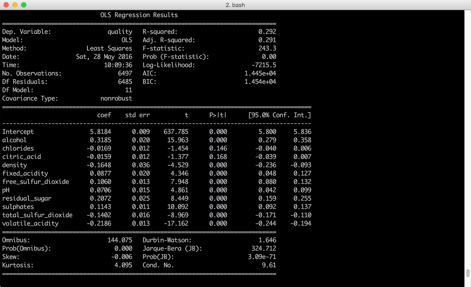
Figure 7-6. Multivariate linear regression of wine quality on 11 wine characteristics—the independent variables were standardized into z-scores prior to the regression
Standardizing the independent variables also changes how we interpret the intercept. With standardized explanatory variables, the intercept represents the mean of the dependent variable when all of the independent variables are at their mean values. In our model summary, the coefficient on the intercept suggests that when all of the wine characteristics are at their mean values we should expect the mean quality score to be 5.8 with a standard error of 0.009.
Making Predictions
In some situations, you may be interested in making predictions for new data that wasn’t used to fit the model. For example, you may receive new observations of wine characteristics, and you want to predict the wine quality scores for the wines based on their characteristics. Let’s illustrate making predictions for new data by selecting the first 10 observations of our existing dataset and predicting their quality scores based on their wine characteristics.
To be clear, we’re using observations we used to fit the model for convenience and illustration purposes only. Outside of this example, you will want to evaluate your model on data you didn’t use to fit the model, and you’ll make predictions on new observations. With this caveat in mind, let’s create a set of “new” observations and predict the quality scores for these observations:
# Create 10 "new" observations from the first 10 observations in the wine dataset# The new observations should only contain the independent variables used in the# modelnew_observations=wine.ix[wine.index.isin(range(10)),\independent_variables.columns]# Predict quality scores based on the new observations' wine characteristicsy_predicted=lm.predict(new_observations)# Round the predicted values to two decimal placess and print them to the screeny_predicted_rounded=[round(score,2)forscoreiny_predicted](y_predicted_rounded)
The variable y_predicted contains the 10 predicted values. I round the predicted values to two decimal places simply to make the output easier to read. If the observations we used in this example were genuinely new, we could use the predicted values to evaluate the model. In any case, we have predicted values we can assess and use for other purposes.
Customer Churn
Now let’s analyze the Customer Churn dataset. To start, let’s read the data into a DataFrame, reformat the column headings, create a numeric binary churn variable, and view the first few rows of data. To do so, create a new script, customer_churn.py, and add the following initial lines of code:
#!/usr/bin/env python3importnumpyasnpimportpandasaspdimportseabornassnsimportmatplotlib.pyplotaspltimportstatsmodels.apiassmimportstatsmodels.formula.apiassmfchurn=pd.read_csv('churn.csv',sep=',',header=0)churn.columns=[heading.lower()forheadingin\churn.columns.str.replace(' ','_').str.replace("\'","").str.strip('?')]churn['churn01']=np.where(churn['churn']=='True.',1.,0.)(churn.head())
After the import statements, the first line reads the data into a DataFrame named churn. The next line uses the replace function twice to replace spaces with underscores and delete embedded single quotes in the column headings. Note that the second replace function has a backslashed single quote between double quotes followed by a comma and then a pair of double quotes. This line uses the strip function to remove the question mark at the end of the Churn? column heading. Finally, the line uses a list comprehension to convert all of the column headings to lowercase.
The next line creates a new column named churn01 and uses numpy’s where function to fill it with ones and zeros based on the values in the churn column. The churn column contains the values True and False, so the churn01 column contains a one where the value in the churn column is True and a zero where the value is False.
The last line uses the head function to display the header row and the first five rows of data so we can check that the data is loaded correctly and the column headings are formatted correctly.
Now that we’ve loaded the data into a DataFrame, let’s see if we can find any differences between people who churned and people who didn’t churn by calculating descriptive statistics for the two groups. This code groups the data into two groups, those who churned and those who didn’t churn, based on the values in the churn column. Then it calculates three statistics—count, mean, and standard deviation—for each of the listed columns separately for the two groups:
# Calculate descriptive statistics for grouped data(churn.groupby(['churn'])[['day_charge','eve_charge','night_charge',\'intl_charge','account_length','custserv_calls']].agg(['count','mean',\'std']))
The following line illustrates how you can calculate different sets of statistics for different variables. It calculates the mean and standard deviation for four variables and the count, minimum, and maximum for two variables. We group by the churn column again, so it calculates the statistics separately for those who churned and those who didn’t churn:
# Specify different statistics for different variables(churn.groupby(['churn']).agg({'day_charge':['mean','std'],'eve_charge':['mean','std'],'night_charge':['mean','std'],'intl_charge':['mean','std'],'account_length':['count','min','max'],'custserv_calls':['count','min','max']}))
The next section of code summarizes the customer service calls data with five statistics—count, minimum, mean, maximum, and standard deviation—after grouping the data into five equal-width bins based on the values in a new total_charges variable. To do so, the first line creates a new variable, total_charges, which is the sum of the day, evening, night, and international charges. The next line uses the cut function to split total_charges into five equal-width groups. Then I define a function, get_stats, which will return a dictionary of statistics for each group. The next line groups the customer service calls data into the five total_charges groups. Finally, I apply the get_stats function to the grouped data to calculate the statistics for the five groups:
# Create total_charges, split it into 5 groups, and# calculate statistics for each of the groupschurn['total_charges']=churn['day_charge']+churn['eve_charge']+\churn['night_charge']+churn['intl_charge']factor_cut=pd.cut(churn.total_charges,5,precision=2)defget_stats(group):return{'min':group.min(),'max':group.max(),'count':group.count(),'mean':group.mean(),'std':group.std()}grouped=churn.custserv_calls.groupby(factor_cut)(grouped.apply(get_stats).unstack())
Like the previous section, this next section summarizes the customer service calls data with five statistics. However, this section uses the qcut function to split account_length into four equal-sized bins (i.e., quantiles), instead of equal-width bins:
# Split account_length into quantiles and# calculate statistics for each of the quantilesfactor_qcut=pd.qcut(churn.account_length,[0.,0.25,0.5,0.75,1.])grouped=churn.custserv_calls.groupby(factor_qcut)(grouped.apply(get_stats).unstack())
By splitting account_length into quantiles, we ensure that each group contains approximately the same number of observations. The equal-width bins in the previous section did not contain the same number of observations in each group. The qcut function takes an integer or an array of quantiles to specify the number of quantiles, so you can use the number 4 instead of [0., 0.25, 0.5, 0.75, 1.] to specify quartiles or 10 to specify deciles.
The following code illustrates how to use the pandas get_dummies function to create binary indicator variables and add them to a DataFrame. The first two lines create binary indicator variables for the intl_plan and vmail_plan columns and prefix the new columns with the original variable names. The next line uses the join command to merge the churn column with the new binary indicator columns and assigns the result into a new DataFrame named churn_with_dummies. The new DataFrame has five columns, churn, intl_plan_no, intl_plan_yes, vmail_plan_no, and vmail_plan_yes:
# Create binary/dummy indicator variables for intl_plan and vmail_plan# and join them with the churn column in a new DataFrameintl_dummies=pd.get_dummies(churn['intl_plan'],prefix='intl_plan')vmail_dummies=pd.get_dummies(churn['vmail_plan'],prefix='vmail_plan')churn_with_dummies=churn[['churn']].join([intl_dummies,vmail_dummies])(churn_with_dummies.head())
This code illustrates how to split a column into quartiles, create binary indicator variables for each of the quartiles, and add the new columns to the original DataFrame. The qcut function splits the total_charges column into quartiles and labels each quartile with the names listed in qcut_names. The get_dummies function creates four binary indicator variables for the quartiles and prefixes the new columns with total_charges. The result is four new dummy variables, total_charges_1st_quartile, total_charges_2nd_quartile, total_charges_3rd_quartile, and total_charges_4th_quartile. The join function appends these four variables into the churn DataFrame:
# Split total_charges into quartiles, create binary indicator variables# for each of the quartiles, and add them to the churn DataFrameqcut_names=['1st_quartile','2nd_quartile','3rd_quartile','4th_quartile']total_charges_quartiles=pd.qcut(churn.total_charges,4,labels=qcut_names)dummies=pd.get_dummies(total_charges_quartiles,prefix='total_charges')churn_with_dummies=churn.join(dummies)(churn_with_dummies.head())
The final section of code creates three pivot tables. The first line calculates the mean value for total_charges after pivoting, or grouping, on churn and the number of customer service calls. The result is a long column of numbers for each of the churn and number of customer service calls buckets. The second line specifies that the output should be reformatted so that churn defines the rows and number of customer service calls defines the columns. Finally, the third line uses the number of customer service calls for the rows, churn for the columns, and demonstrates how to specify the statistic you want to calculate, the value to use for missing values, and whether to display margin values:
# Create pivot tables(churn.pivot_table(['total_charges'],index=['churn','custserv_calls']))(churn.pivot_table(['total_charges'],index=['churn'],\columns=['custserv_calls']))(churn.pivot_table(['total_charges'],index=['custserv_calls'],\columns=['churn'],aggfunc='mean',fill_value='NaN',margins=True))
Logistic Regression
In this dataset, the dependent variable is binary. It indicates whether the customer churned and is no longer a customer. Linear regression isn’t appropriate in this case because it can produce predicted values that are less than 0 and greater than 1, which doesn’t make sense for probabilities. Because the dependent variable is binary, we need to constrain the predicted values to be between 0 and 1. Logistic regression produces this result.
Logistic regression refers to the following model:
-
Pr(yi = 1) = logit–1(β0 + β1xi1 + β2xi2 + ... + βpxip)
for i = 1, 2, ..., n observations and p input variables.
Equivalently:
-
Pr(yi = 1) = pi
-
logit(pi) = β0 + β1xi1 + β2xi2 + ... + βpxip
Logistic regression measures the relationships between the binary dependent variable and the independent variables by estimating probabilities using the inverse logit (or logistic) function. The function transforms continuous values into values between 0 and 1, which is imperative since the predicted values represent probabilities and probabilities must be between 0 and 1. In this way, logistic regression predicts the probability of a particular outcome, such as churning.
Logistic regression estimates the values for the unknown β parameters by applying an iterative algorithm that solves for the maximum likelihood estimates.
The syntax we need to use for a logistic regression is slightly different from the syntax for a linear regression. For a logistic regression we specify the dependent variable and independent variables separately instead of in a formula:
dependent_variable=churn['churn01']independent_variables=churn[['account_length','custserv_calls',\'total_charges']]independent_variables_with_constant=sm.add_constant(independent_variables,\prepend=True)logit_model=sm.Logit(dependent_variable,independent_variables_with_constant)\.fit()(logit_model.summary())("\nQuantities you can extract from the result:\n%s"%dir(logit_model))("\nCoefficients:\n%s"%logit_model.params)("\nCoefficient Std Errors:\n%s"%logit_model.bse)
The first line creates a variable named dependent_variable and assigns it the series of values in the churn01 column.
Similarly, the second line specifies the three columns we’ll use as the independent variables and assigns them to a variable named independent_variables.
Next, we add a column of ones to the input variables with statsmodels’s add_constant function.
The next line fits a logistic regression model and assigns the results to a variable named logit_model.
The last four lines print specific model quantities to the screen. The first line prints a summary of the results to the screen. This summary is helpful because it displays the coefficients, their standard errors and confidence intervals, the pseudo R-squared, and additional model details in one display.
The next line prints a list of all of the quantities you can extract from logit_model, the model object. Reviewing this list, I’m interested in extracting the coefficients and their standard errors.
The next two lines extract these values. logit_model.params returns the coefficient values as a Series, so you can extract individual coefficients by position or name. Similarly, logit_model.bse returns the coefficients’ standard errors as a Series. The output is shown in Figure 7-7.
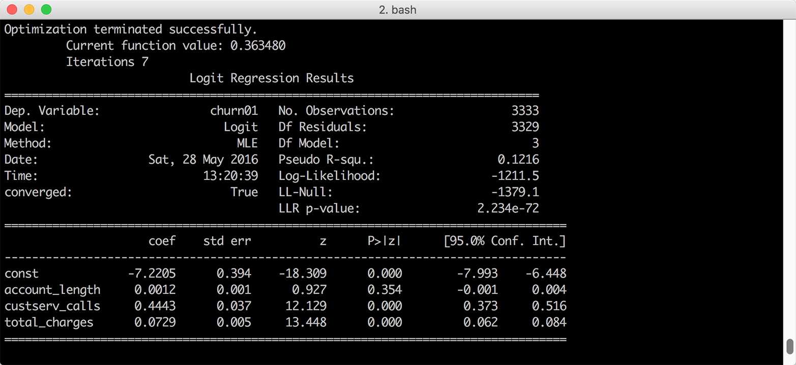
Figure 7-7. Multivariate logistic regression of customer churn on three account characteristics
Interpreting Coefficients
Interpreting the regression coefficients for a logistic regression isn’t as straightforward as it is for a linear regression because the inverse logistic function is curved, which means the expected difference in the dependent variable for a one-unit change in an independent variable isn’t constant.
Because the inverse logistic function is curved, we have to select where to evaluate the function to assess the impact on the probability of success. As with linear regression, the coefficient for the intercept represents the probability of success when all of the independent variables are zero. Sometimes zero values don’t make sense, so an alternative is to evaluate the function with all of the independent variables set to their mean values:
definverse_logit(model_value):frommathimportexpreturn(1.0/(1.0+exp(-model_value)))at_means=float(logit_model.params[0])+\float(logit_model.params[1])*float(churn['account_length'].mean())+\float(logit_model.params[2])*float(churn['custserv_calls'].mean())+\float(logit_model.params[3])*float(churn['total_charges'].mean())("Probability of churn at mean values:%.2f"%inverse_logit(at_means))
The first block of code defines a function named inverse_logit that transforms the continuous predicted values from the linear model into probabilities between 0 and 1.
The second block of code estimates the predicted value for an observation where all of the independent variables are set to their mean values. The four logit_model.params[...] values are the model coefficients and the three churn['...'].mean() values are the mean values of the account length, customer service calls, and total charges columns. Given the model coefficients and the mean values, this equation is approximately –7.2 + (0.001 * 101.1) + (0.444 * 1.6) + (0.073 * 59.5), so the value in the variable at_means is –2.068.
The last line of code prints the inverse logit of the value in at_means, formatted to two decimal places, to the screen. The inverse logit of –2.068 is 0.112, so the probability of a person churning whose account length, customer service calls, and total charges are equal to the average values for these variables is 11.2 percent.
Similarly, to evaluate the change in the dependent variable for a one-unit change in one of the dependent variables, we can evaluate the difference in the probability by changing one of the dependent variables by one unit close to its mean value.
For example, let’s evaluate the impact of a one-unit change in the number of customer service calls, close to this variable’s mean value, on the probability of churning:
cust_serv_mean=float(logit_model.params[0])+\float(logit_model.params[1])*float(churn['account_length'].mean())+\float(logit_model.params[2])*float(churn['custserv_calls'].mean())+\float(logit_model.params[3])*float(churn['total_charges'].mean())cust_serv_mean_minus_one=float(logit_model.params[0])+\float(logit_model.params[1])*float(churn['account_length'].mean())+\float(logit_model.params[2])*float(churn['custserv_calls'].mean()-1.0)+\float(logit_model.params[3])*float(churn['total_charges'].mean())("Probability of churn when account length changes by 1:%.2f"%\(inverse_logit(cust_serv_mean)-inverse_logit(cust_serv_mean_minus_one)))
The first block of code is identical to the code for at_means. The second block of code is nearly identical, except we’re subtracting one from the mean number of customer service calls.
Finally, in the last line of code we’re subtracting the inverse logit of the estimated value when two of the variables are at their mean values and the value for number of customer service calls is set to its mean value minus one from the inverse logit of the estimated value when all of the independent variables are set to their mean values.
In this case, the value in cust_serv_mean is the same as the value in at_means, –2.068. The value in cust_serv_means_minus_one is –2.512. The result of the inverse logit of –2.068 minus the inverse logit of –2.512 is 0.0372, so one additional customer service call near the mean number of calls corresponds to a 3.7 percent higher probability of churning.
Making Predictions
As we did in the section “Making Predictions”, we can also use the fitted model to make predictions for “new” observations:
# Create 10 "new" observations from the first 10 observations# in the churn datasetnew_observations=churn.ix[churn.index.isin(range(10)),\independent_variables.columns]new_observations_with_constant=sm.add_constant(new_observations,prepend=True)# Predict probability of churn based on the new observations'# account characteristicsy_predicted=logit_model.predict(new_observations_with_constant)# Round the predicted values to two decimal places and print them to the screeny_predicted_rounded=[round(score,2)forscoreiny_predicted](y_predicted_rounded)
Again, the variable y_predicted contains the 10 predicted values and I’ve rounded the predicted values to two decimal places to make the output easier to read. Now we have predicted values we can use, and if the observations we used in this example were genuinely new we could use the predicted values to evaluate the model.
1 In Data Analysis Using Regression and Multilevel/Hierarchical Models (Cambridge University Press, 2007, p. 56), Gelman and Hill suggest dividing by two standard deviations instead of one standard deviation in situations where your dataset contains both binary and continuous independent variables so that a one-unit change in your standardized variables corresponds to a change from one standard deviation below to one standard deviation above the mean. Because the wine quality dataset doesn’t contain binary independent variables, I standardize the independent variables into z-scores by dividing by one standard deviation.