Table of Contents for
Foundations for Analytics with Python
 Foundations for Analytics with Python
Published by
O'Reilly Media, Inc., 2016
Foundations for Analytics with Python
Published by
O'Reilly Media, Inc., 2016
- Cover
- nav
- Foundations for Analyticswith Python
- Dedication
- Foundations for Analytics with Python
- Preface
- 1. Python Basics
- 2. Comma-Separated Values (CSV) Files
- 3. Excel Files
- 4. Databases
- 5. Applications
- 6. Figures and Plots
- 7. Descriptive Statistics and Modeling
- 8. Scheduling Scripts to Run Automatically
- 9. Where to Go from Here
- A. Download Instructions
- B. Answers to Exercises
- Bibliography
- Index
- About the Author
- Colophon
Chapter 6. Figures and Plots
Creating figures and plots is an important step in many analytics projects, usually part of the exploratory data analysis (EDA) phase at the beginning of a project or the reporting phase, where you make your data analysis useful to others. Data visualization enables you to see your variables’ distributions, to see the relationships between your variables, and to check your modeling assumptions.
There are several plotting packages for Python, including matplotlib, pandas, ggplot, and seaborn. Because matplotlib is the most established package—and provides some of the underlying plotting concepts and syntax for the pandas and seaborn packages—we’ll cover it first. Then we’ll see some examples of how the other packages either simplify the plotting syntax or provide additional functionality.
matplotlib
matplotlib is a plotting package designed to create publication-quality figures. It has functions for creating common statistical graphs, including bar plots, box plots, line plots, scatter plots, and histograms. It also has add-in toolkits such as basemap and cartopy for mapping and mplot3d for 3D plotting.
matplotlib provides functions for customizing each component of a figure. For example, it enables you to specify the shape and size of the figure, the limits and scales of the x- and y-axes, the tick marks and labels of the x- and y-axes, the legend, and the title for the figure. You can learn more about customizing figures by perusing the matplotlib beginner’s guide and API.
The following examples demonstrate how to create some of the most common statistical graphs with matplotlib.
Bar Plot
Bar plots represent numerical values, such as counts, for a set of categories. Common bar plots include vertical and horizontal plots, stacked plots, and grouped plots. The following script, bar_plot.py, illustrates how to create a vertical bar plot:
1#!/usr/bin/env python32importmatplotlib.pyplotasplt3plt.style.use('ggplot')4customers=['ABC','DEF','GHI','JKL','MNO']5customers_index=range(len(customers))6sale_amounts=[127,90,201,111,232]7fig=plt.figure()8ax1=fig.add_subplot(1,1,1)9ax1.bar(customers_index,sale_amounts,align='center',color='darkblue')10ax1.xaxis.set_ticks_position('bottom')11ax1.yaxis.set_ticks_position('left')12plt.xticks(customers_index,customers,rotation=0,fontsize='small')13plt.xlabel('Customer Name')14plt.ylabel('Sale Amount')15plt.title('Sale Amount per Customer')16plt.savefig('bar_plot.png',dpi=400,bbox_inches='tight')17plt.show()
Line 2 shows the customary import statement. Line 3 uses the ggplot stylesheet to emulate the aesthetics of ggplot2, a popular plotting package for R.
Lines 4, 5, and 6 create the data for the bar plot. I create a list of index values for the customers because the xticks function needs both the index locations and the labels to set the labels.
To create a plot in matplotlib, first you create a figure and then you create one or more subplots within the figure. Line 7 in this script creates a figure. Line 8 adds a subplot to the figure. Because it’s possible to add more than one subplot to a figure, you have to specify how many row and columns of subplots to create and which subplot to use. 1,1,1 indicates one row, one column, and the first and only subplot.
Line 9 creates the bar plot. customers_index specifies the x coordinates of the left sides of the bars. sale_amounts specifies the heights of the bars. align='center' specifies that the bars should be centered over their labels. color='darkblue' specifies the color of the bars.
Lines 10 and 11 remove the tick marks from the top and right of the plot by specifying that the tick marks should be on the bottom and left.
Line 12 changes the bars’ tick mark labels from the customers’ index numbers to their actual names. rotation=0 specifies that the tick labels should be horizontal instead of angled. fontsize='small' reduces the size of the tick labels.
Lines 13, 14, and 15 add the x-axis label, y-axis label, and title to the plot.
Line 16 saves the plot as bar_plot.png in the current folder. dpi=400 specifies the dots per inch for the saved plot, and bbox_inches='tight' trims empty whitespace around the saved plot.
Line 17 instructs matplotlib to display the plot in a new window on your screen. The result should look like Figure 6-1.
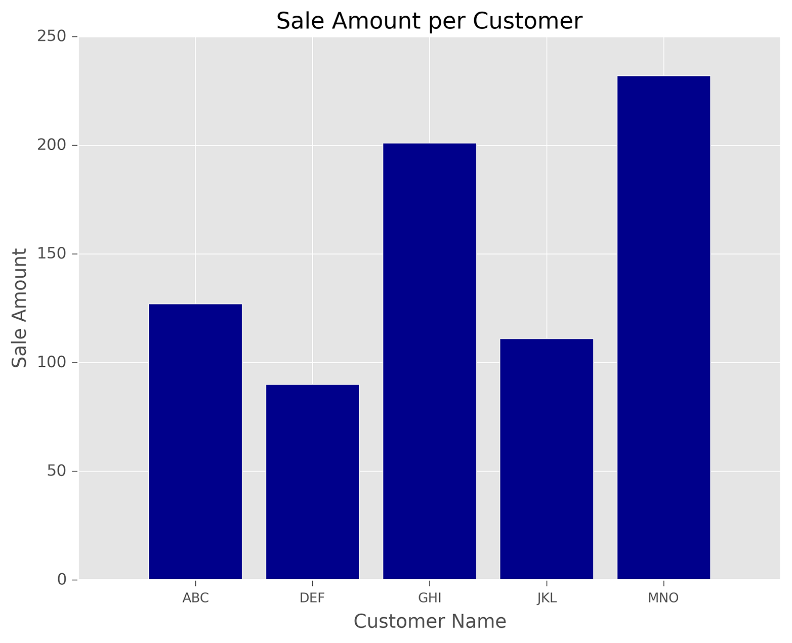
Figure 6-1. A figure with a bar plot created with matplotlib
Histogram
Histograms represent distributions of numerical values. Common histograms include frequency distributions, frequency density distributions, probability distributions, and probability density distributions. The following script, histogram.py, illustrates how to create a frequency distribution:
1#!/usr/bin/env python32importnumpyasnp3importmatplotlib.pyplotasplt4plt.style.use('ggplot')5mu1,mu2,sigma=100,130,156x1=mu1+sigma*np.random.randn(10000)7x2=mu2+sigma*np.random.randn(10000)8fig=plt.figure()9ax1=fig.add_subplot(1,1,1)10n,bins,patches=ax1.hist(x1,bins=50,normed=False,color='darkgreen')11n,bins,patches=ax1.hist(x2,bins=50,normed=False,color='orange',alpha=0.5)12ax1.xaxis.set_ticks_position('bottom')13ax1.yaxis.set_ticks_position('left')14plt.xlabel('Bins')15plt.ylabel('Number of Values in Bin')16fig.suptitle('Histograms',fontsize=14,fontweight='bold')17ax1.set_title('Two Frequency Distributions')18plt.savefig('histogram.png',dpi=400,bbox_inches='tight')19plt.show()
Lines 6 and 7 here use Python’s random-number generator to create two normally distributed variables, x1 and x2. The mean of x1 is 100 and the mean of x2 is 130, so the distributions will overlap but won’t lie on top of one another. Lines 10 and 11 create two histograms, or frequency distributions, for the variables. bins=50 means the values should be binned into 50 bins. normed=False means the histogram should display a frequency distribution instead of a probability density. The first histogram is dark green, and the second one is orange. alpha=0.5 means the second histogram should be more transparent so we can see the dark green bars where the two histograms overlap.
Line 16 adds a centered title to the figure, sets the font size to 14, and bolds the font. Line 17 adds a centered title to the subplot, beneath the figure’s title. We use these two lines to create a title and subtitle for the plot. Figure 6-2.
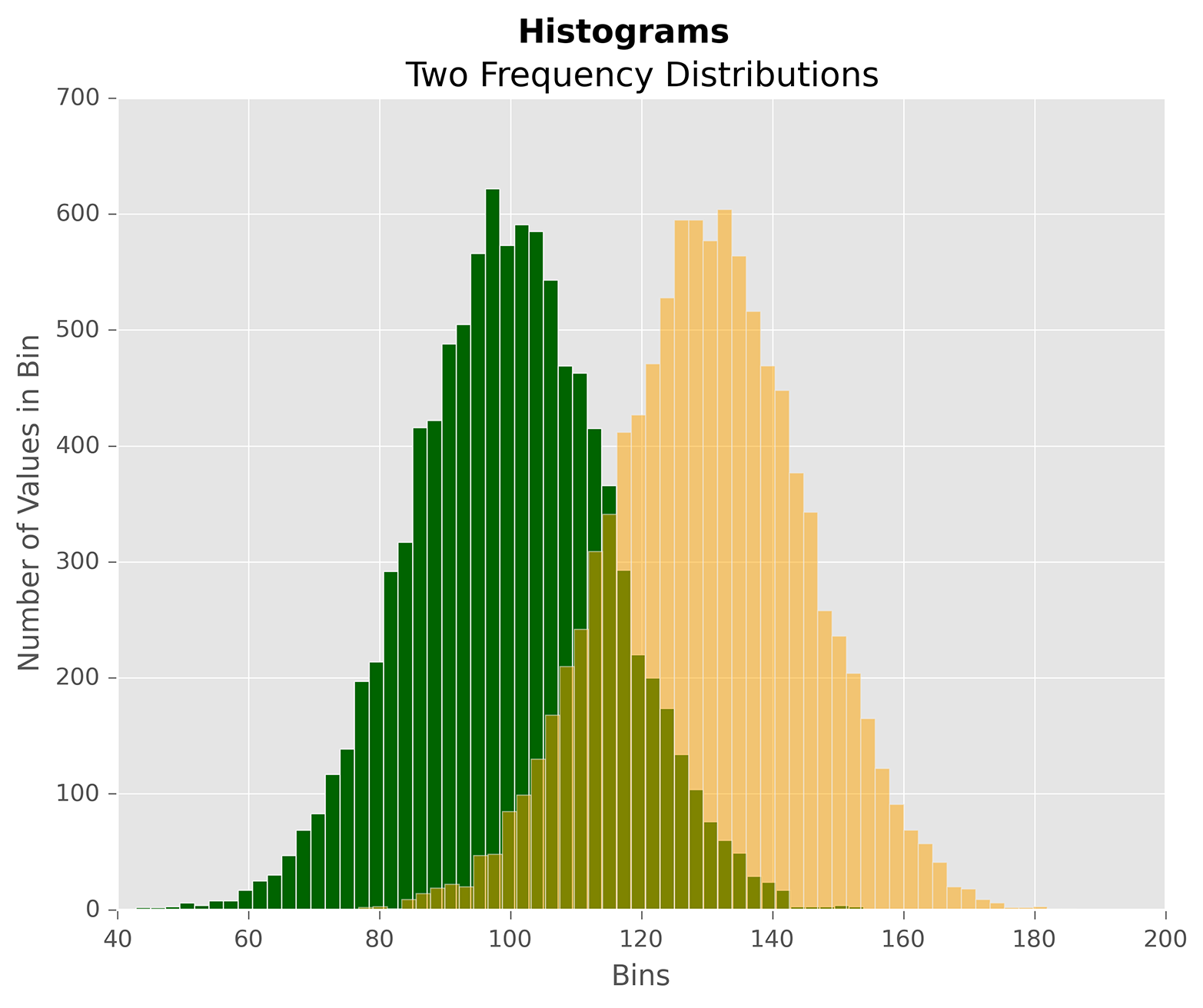
Figure 6-2. A figure with two histograms created with matplotlib
Line Plot
Line plots represent numerical values along a number line. It’s common to use line plots to show data over time. The following script, line_plot.py, illustrates how to create a line plot:
1#!/usr/bin/env python32fromnumpy.randomimportrandn3importmatplotlib.pyplotasplt4plt.style.use('ggplot')5plot_data1=randn(50).cumsum()6plot_data2=randn(50).cumsum()7plot_data3=randn(50).cumsum()8plot_data4=randn(50).cumsum()9fig=plt.figure()10ax1=fig.add_subplot(1,1,1)11ax1.plot(plot_data1,marker=r'o',color=u'blue',linestyle='-',\ 12label='Blue Solid')13ax1.plot(plot_data2,marker=r'+',color=u'red',linestyle='--',\ 14label='Red Dashed')15ax1.plot(plot_data3,marker=r'*',color=u'green',linestyle='-.',\ 16label='Green Dash Dot')17ax1.plot(plot_data4,marker=r's',color=u'orange',linestyle=':',\ 18label='Orange Dotted')19ax1.xaxis.set_ticks_position('bottom')20ax1.yaxis.set_ticks_position('left')21ax1.set_title('Line Plots: Markers, Colors, and Linestyles')22plt.xlabel('Draw')23plt.ylabel('Random Number')24plt.legend(loc='best')25plt.savefig('line_plot.png',dpi=400,bbox_inches='tight')26plt.show()
Again, we’re using randn to create (random) data to plot in lines 5–8. Lines 11–18 create four line plots. The lines use different types of data point markers, line colors, and line styles to illustrate some of the options. The label arguments ensure the lines are properly labeled in the legend.
Line 24 creates a legend for the plot. loc='best' instructs matplotlib to place the legend in the best location based on the open space in the plot. Alternatively, you can use this argument to specify a specific location for the legend. Figure 6-3 shows the line plots created by this script.
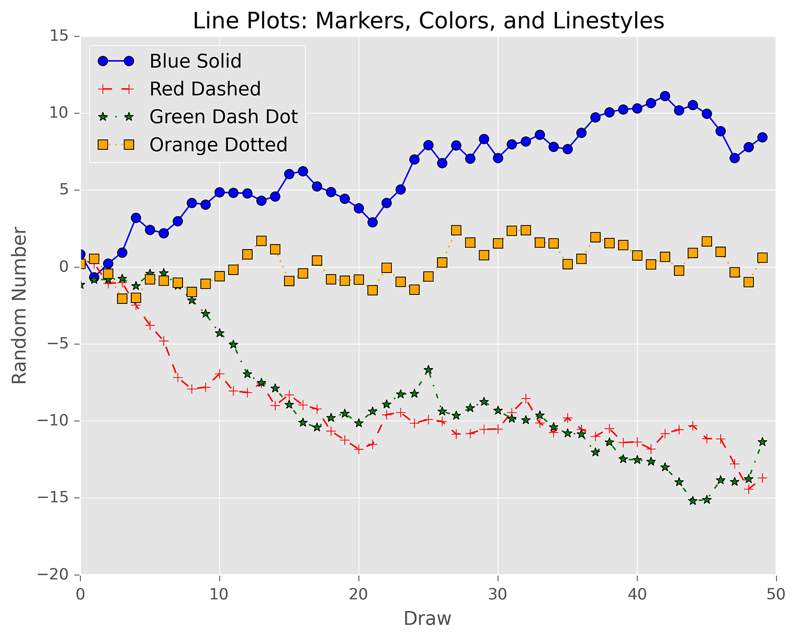
Figure 6-3. A figure with four line plots created with matplotlib
Scatter Plot
Scatter plots represent the values of two numerical variables along two axes—for example, height versus weight or supply versus demand. Scatter plots provide some indication of whether the variables are positively correlated (i.e., the points are concentrated in a specific configuration) or negatively correlated (i.e., the points are spread out like a diffuse cloud). You can also draw a regression line, the line that minimizes the squared error, through the points to make predictions for one variable based on values of the other variable.
The following script, scatter_plot.py, illustrates how to create a scatter plot with a regression line through the points:
1#!/usr/bin/env python32importnumpyasnp3importmatplotlib.pyplotasplt4plt.style.use('ggplot')5x=np.arange(start=1.,stop=15.,step=1.)6y_linear=x+5.*np.random.randn(14.)7y_quadratic=x**2+10.*np.random.randn(14.)8fn_linear=np.poly1d(np.polyfit(x,y_linear,deg=1))9fn_quadratic=np.poly1d(np.polyfit(x,y_quadratic,deg=2))10fig=plt.figure()11ax1=fig.add_subplot(1,1,1)12ax1.plot(x,y_linear,'bo',x,y_quadratic,'go',\13x,fn_linear(x),'b-',x,fn_quadratic(x),'g-',linewidth=2.)14ax1.xaxis.set_ticks_position('bottom')15ax1.yaxis.set_ticks_position('left')16ax1.set_title('Scatter Plots Regression Lines')17plt.xlabel('x')18plt.ylabel('f(x)')19plt.xlim((min(x)-1.,max(x)+1.))20plt.ylim((min(y_quadratic)-10.,max(y_quadratic)+10.))21plt.savefig('scatter_plot.png',dpi=400,bbox_inches='tight')22plt.show()
We cheat a little bit here by creating data (in lines 6 and 7) that uses random numbers to deviate just a bit from a linear and a quadratic polynomial equation—and then, in lines 8 and 9, we use numpy’s polyfit and poly1d functions to create linear and quadratic polynomial equations for the line and curve through the two sets of points (x, y_linear) and (x, y_quadratic). On real-world data, you can use the polyfit function to calculate the coefficients of the polynomial of fit based on the specified degree. The poly1d function uses the coefficients to create the actual polynomial equation.
Line 12 creates the scatter plot with the two regression lines. 'bo' means the (x, y_linear) points are blue circles, and 'go' means the (x, y_quadratic) points are green circles. Similarly, 'b-' means the line through the (x, y_linear) points is a solid blue line, and 'g-' means the line through the (x, y_quadratic) points is a solid green line. You specify the width of lines with linewidth.
Play around with these display variables to see what makes a chart with the aesthetic you’re looking for!
Lines 19 and 20 set the limits of the x-axis and y-axis. The lines use the min and max functions to create the axis limits based on the actual data values. You can also use specific numbers—for example, xlim(0, 20) and ylim(0, 200). If you don’t specify axis limits, matplotlib sets the limits for you. Figure 6-4 shows the result of running this script.
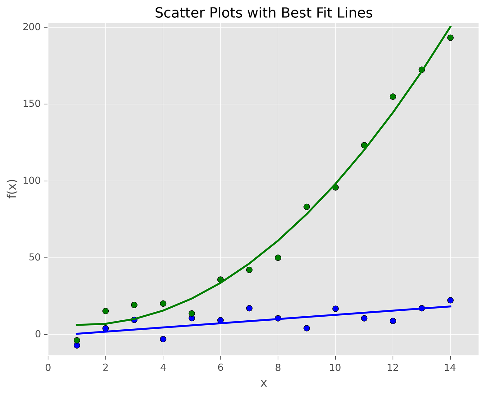
Figure 6-4. A figure with two scatterplots and linear and quadratic fits created with matplotlib
Box Plot
Box plots represent data based on its minimum, first quartile, median, third quartile, and maximum values. The bottom and top of the box show the first and third quartile values, and the line through the middle of the box shows the median value. The lines, called whiskers, that extend from the ends of the box show the smallest and largest non-outlier values, and the points beyond the whiskers represent outliers.
The following script, box_plot.py, illustrates how to create a box plot:
1#!/usr/bin/env python32importnumpyasnp3importmatplotlib.pyplotasplt4plt.style.use('ggplot')5N=5006normal=np.random.normal(loc=0.0,scale=1.0,size=N)7lognormal=np.random.lognormal(mean=0.0,sigma=1.0,size=N)8index_value=np.random.random_integers(low=0,high=N-1,size=N)9normal_sample=normal[index_value]10lognormal_sample=lognormal[index_value]11box_plot_data=[normal,normal_sample,lognormal,lognormal_sample]12fig=plt.figure()13ax1=fig.add_subplot(1,1,1)14box_labels=['normal','normal_sample','lognormal','lognormal_sample']15ax1.boxplot(box_plot_data,notch=False,sym='.',vert=True,whis=1.5,\16showmeans=True,labels=box_labels)17ax1.xaxis.set_ticks_position('bottom')18ax1.yaxis.set_ticks_position('left')19ax1.set_title('Box Plots: Resampling of Two Distributions')20ax1.set_xlabel('Distribution')21ax1.set_ylabel('Value')22plt.savefig('box_plot.png',dpi=400,bbox_inches='tight')23plt.show()
Line 14 creates a list named box_labels that contains labels for each of the box plots. We use this list in the boxplot function in the next line.
Line 15 uses the boxplot function to create the four box plots. notch=False means the boxes should be rectangular instead of notched in the middle. sym='.' means the flier points, the points beyond the whiskers, are dots instead of the default + symbol. vert=True means the boxes are vertical instead of horizontal. whis=1.5 specifies the reach of the whiskers beyond the first and third quartiles (e.g., Q3 + whis*IQR, IQR = interquartile range, Q3-Q1). showmeans=True specifies that the boxes should also show the mean value in addition to the median value. labels=box_labels means to use the values in box_labels to label the box plots.
Figure 6-5 shows the result of running this script.
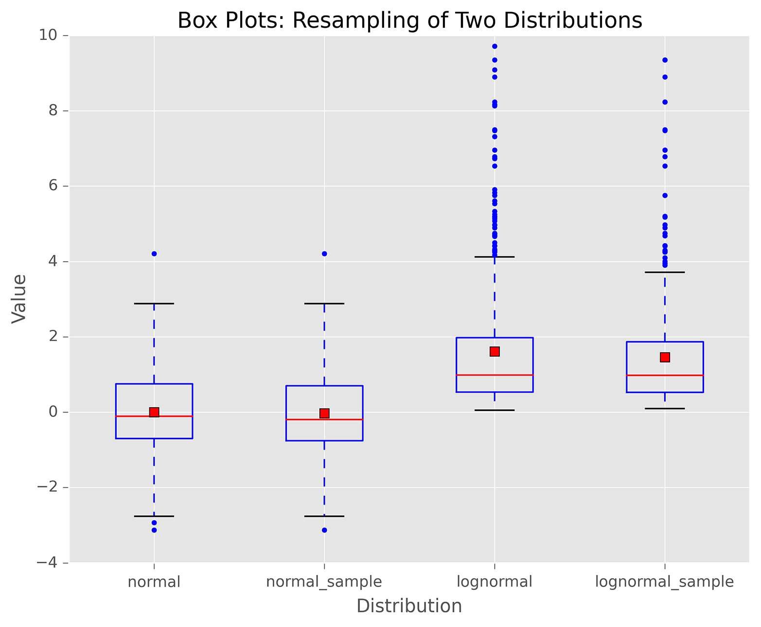
Figure 6-5. A figure with box plots of data from normal and lognormal distributions, as well as samples of data from these two distributions, created with matplotlib
pandas
pandas simplifies the process of creating figures and plots based on data in Series and DataFrames by providing a plot function that operates on Series and DataFrames. By default, the plot function creates line plots, but you can use the kind argument to create different types of plots.
For example, in addition to the standard statistical plots you can create with matplotlib, pandas enables you to create other types of plots, such as hexagonal bin plots, scatter matrix plots, density plots, Andrews curves, parallel coordinates, lag plots, autocorrelation plots, and bootstrap plots. pandas also makes it straightforward to add a secondary y-axis, error bars, and a data table to a plot.
To illustrate how to create plots with pandas, the following script, pandas_plots.py, demonstrates how to create a pair of bar and box plots, side by side, based on data in a DataFrame:
1#!/usr/bin/env python32importpandasaspd3importnumpyasnp4importmatplotlib.pyplotasplt5plt.style.use('ggplot')6fig,axes=plt.subplots(nrows=1,ncols=2)7ax1,ax2=axes.ravel()8data_frame=pd.DataFrame(np.random.rand(5,3),9index=['Customer 1','Customer 2','Customer 3','Customer 4','Customer 5'],10columns=pd.Index(['Metric 1','Metric 2','Metric 3'],name='Metrics'))11data_frame.plot(kind='bar',ax=ax1,alpha=0.75,title='Bar Plot')12plt.setp(ax1.get_xticklabels(),rotation=45,fontsize=10)13plt.setp(ax1.get_yticklabels(),rotation=0,fontsize=10)14ax1.set_xlabel('Customer')15ax1.set_ylabel('Value')16ax1.xaxis.set_ticks_position('bottom')17ax1.yaxis.set_ticks_position('left')18colors=dict(boxes='DarkBlue',whiskers='Gray',medians='Red',caps='Black')19data_frame.plot(kind='box',color=colors,sym='r.',ax=ax2,title='Box Plot')20plt.setp(ax2.get_xticklabels(),rotation=45,fontsize=10)21plt.setp(ax2.get_yticklabels(),rotation=0,fontsize=10)22ax2.set_xlabel('Metric')23ax2.set_ylabel('Value')24ax2.xaxis.set_ticks_position('bottom')25ax2.yaxis.set_ticks_position('left')26plt.savefig('pandas_plots.png',dpi=400,bbox_inches='tight')27plt.show()
Line 6 creates a figure and a pair of side-by-side subplots. Line 7 uses the ravel function to separate the subplots into two variables, ax1 and ax2, so we don’t have to refer to the subplots with row and column indexing (e.g., axes[0,0] and axes[0,1]).
Line 12 uses the pandas plot function to create a bar plot in the lefthand subplot. Lines 13 and 14 use matplotlib functions to rotate and specify the size of the x- and y-axis labels.
Line 18 creates a dictionary of colors for individual box plot components. Line 19 creates the box plot in the righthand subplot, uses the colors variable to color the box plot components, and changes the symbol for outlier points to red dots.
Figure 6-6 shows the bar and box plots generated by this script. You can learn more about the types of plots you can create and how to customize them by perusing the pandas plotting documentation.
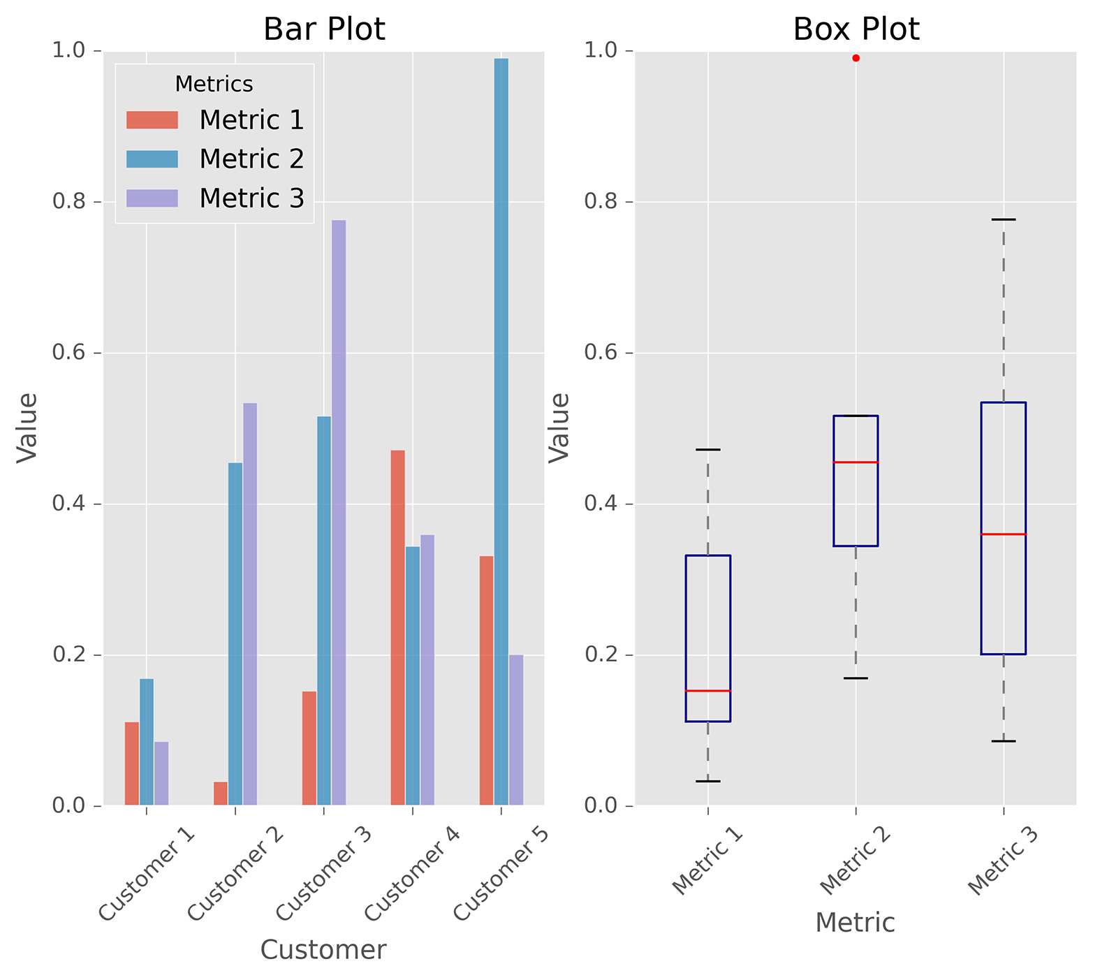
Figure 6-6. A figure with side-by-side bar and box plots created with pandas
ggplot
ggplot is a plotting package for Python based on R’s ggplot2 package and the Grammar of Graphics. One of the key differences between ggplot and other plotting packages is that its grammar makes a clear distinction between the data and what is actually displayed on the screen. To enable you to create a visual representation of your data, ggplot provides a few basic elements: geometries, aesthetics, and scales. It also provides some additional elements for more advanced plots: statistical transformations, coordinate systems, facets, and visual themes. Read Hadley Wickham’s ggplot2: Elegant Graphics for Data Analysis, Second Edition (Springer), for details on ggplot; you can also check out Grammar of Graphics, Second Edition (Springer), by Leland Wilkinson.
The ggplot package for Python isn’t as mature as R’s ggplot2 package, so it doesn’t have all of ggplot2’s features—that is, it doesn’t have as many geometries, statistics, or scales, and it doesn’t have any of the coordinate system, annotation, or fortify features (yet). You can also run into issues when developers upgrade and change packages that interact with ggplot. For example, I ran into an issue when I tried to create a histogram with ggplot because the pandas pivot_table’s rows and cols keywords were removed in favor of index and columns. Searching online for a solution, I discovered I had to change the word “rows” to the word “index” in a line in the file ggplot/stats/stat_bin.py to work around the issue.
Because ggplot has shortcomings relative to the other Python plotting packages I discuss in this chapter, I recommend you use one of the other packages to create your plots. However, I wanted to include this section on ggplot because I’m a fan of R’s ggplot2 package, and if you’re coming from R and you’re familiar with ggplot2, then you’ll immediately be able to use ggplot to create your graphs as long as it has the features you need.
The following script, ggplot_plots.py, demonstrates how to create a few basic plots with ggplot using datasets included in the ggplot package:
#!/usr/bin/env python3fromggplotimport*(mtcars.head())plt1=ggplot(aes(x='mpg'),data=mtcars)+\geom_histogram(fill='darkblue',binwidth=2)+\xlim(10,35)+ylim(0,10)+\xlab("MPG")+ylab("Frequency")+\ggtitle("Histogram of MPG")+\theme_matplotlib()(plt1)(meat.head())plt2=ggplot(aes(x='date',y='beef'),data=meat)+\geom_line(color='purple',size=1.5,alpha=0.75)+\stat_smooth(colour='blue',size=2.0,span=0.15)+\xlab("Year")+ylab("Head of Cattle Slaughtered")+\ggtitle("Beef Consumption Over Time")+\theme_seaborn()(plt2)(diamonds.head())plt3=ggplot(diamonds,aes(x='carat',y='price',colour='cut'))+\geom_point(alpha=0.5)+\scale_color_gradient(low='#05D9F6',high='#5011D1')+\xlim(0,6)+ylim(0,20000)+\xlab("Carat")+ylab("Price")+\ggtitle("Diamond Price by Carat and Cut")+\theme_gray()(plt3)ggsave(plt3,"ggplot_plots.png")
The three plots rely on the mtcars, meat, and diamonds datasets, which are included in ggplot. I print the head (first few lines) of each dataset to the screen before creating a plot to see the names of the variables and the initial data values.
The ggplot function takes as arguments the name of the dataset and the aesthetics, which specify how to use specific variables in the plot. The ggplot function is like matplotlib’s figure function in that it collects information to prepare for a plot but doesn’t actually display graphical elements like dots, bars, or lines. The next element in each plotting command, a geom, adds a graphical representation of the data to the plot. The three geoms add a histogram, line, and dots, respectively, to the plots. The remaining plotting functions add a title, axis limits and labels, and an overall layout and color theme to each plot.
Figure 6-7 shows the scatter plot this script creates. You can learn more about the types of plots you can create and how to customize them by perusing ggplot’s documentation.
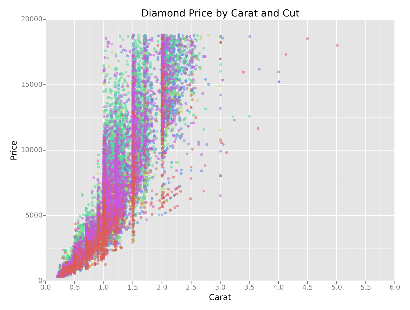
Figure 6-7. A figure with a scatter plot created with ggplot
seaborn
seaborn simplifies the process of creating informative statistical graphs and plots in Python. It is built on top of matplotlib, supports numpy and pandas data structures, and incorporates scipy and statsmodels statistical routines.
seaborn provides functions for creating standard statistical plots, including histograms, density plots, bar plots, box plots, and scatter plots. It has functions for visualizing pairwise bivariate relationships, linear and nonlinear regression models, and uncertainty around estimates. It enables you to inspect a relationship between variables while conditioning on other variables, and to build grids of plots to display complex relationships. It has built-in themes and color palettes you can use to make beautiful graphs. Finally, because it’s built on matplotlib, you can further customize your plots with matplotlib commands.
The following script, seaborn_plots.py, demonstrates how to create a variety of statistical plots with seaborn:
#!/usr/bin/env python3importseabornassnsimportnumpyasnpimportpandasaspdimportmatplotlib.pyplotaspltfrompylabimportsavefigsns.set(color_codes=True)# Histogramx=np.random.normal(size=100)sns.distplot(x,bins=20,kde=False,rug=True,label="Histogram w/o Density")sns.axlabel("Value","Frequency")plt.title("Histogram of a Random Sample from a Normal Distribution")plt.legend()# Scatter plot with regression line and univariate graphsmean,cov=[5,10],[(1,.5),(.5,1)]data=np.random.multivariate_normal(mean,cov,200)data_frame=pd.DataFrame(data,columns=["x","y"])sns.jointplot(x="x",y="y",data=data_frame,kind="reg")\.set_axis_labels("x","y")plt.suptitle("Joint Plot of Two Variables with Bivariate and Univariate Graphs")# Pairwise bivariate scatter plots with univariate histogramsiris=sns.load_dataset("iris")sns.pairplot(iris)# Box plots conditioning on several variablestips=sns.load_dataset("tips")sns.factorplot(x="time",y="total_bill",hue="smoker",\col="day",data=tips,kind="box",size=4,aspect=.5)# Linear regression model with bootstrap confidence intervalsns.lmplot(x="total_bill",y="tip",data=tips)# Logistic regression model with bootstrap confidence intervaltips["big_tip"]=(tips.tip/tips.total_bill)>.15sns.lmplot(x="total_bill",y="big_tip",data=tips,logistic=True,y_jitter=.03)\.set_axis_labels("Total Bill","Big Tip")plt.title("Logistic Regression of Big Tip vs. Total Bill")plt.show()savefig("seaborn_plots.png")
The first plot, shown in Figure 6-8, uses the distplot function to display a histogram. The example shows how you can specify the number of bins, display or not display the Gaussian kernel density estimate (kde), display a rugplot on the support axis, create axis labels and a title, and create a label for a legend.
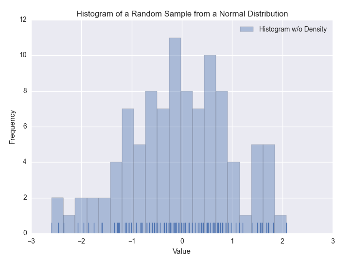
Figure 6-8. A figure with a histogram of a random sample of data from a Normal distribution created with seaborn
The second plot, shown in Figure 6-9, uses the jointplot function to display a scatter plot of two variables with a regression line through the points and histograms for each of the variables.
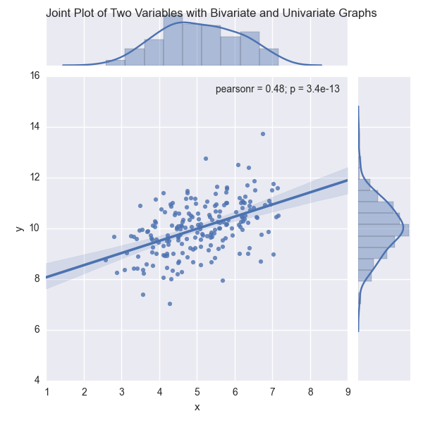
Figure 6-9. A figure with a scatter plot and regression line, and two histograms, created with seaborn
The third plot, shown in Figure 6-10, uses the pairplot function to display pairwise bivariate scatter plots and histograms for all of the variables in the dataset.
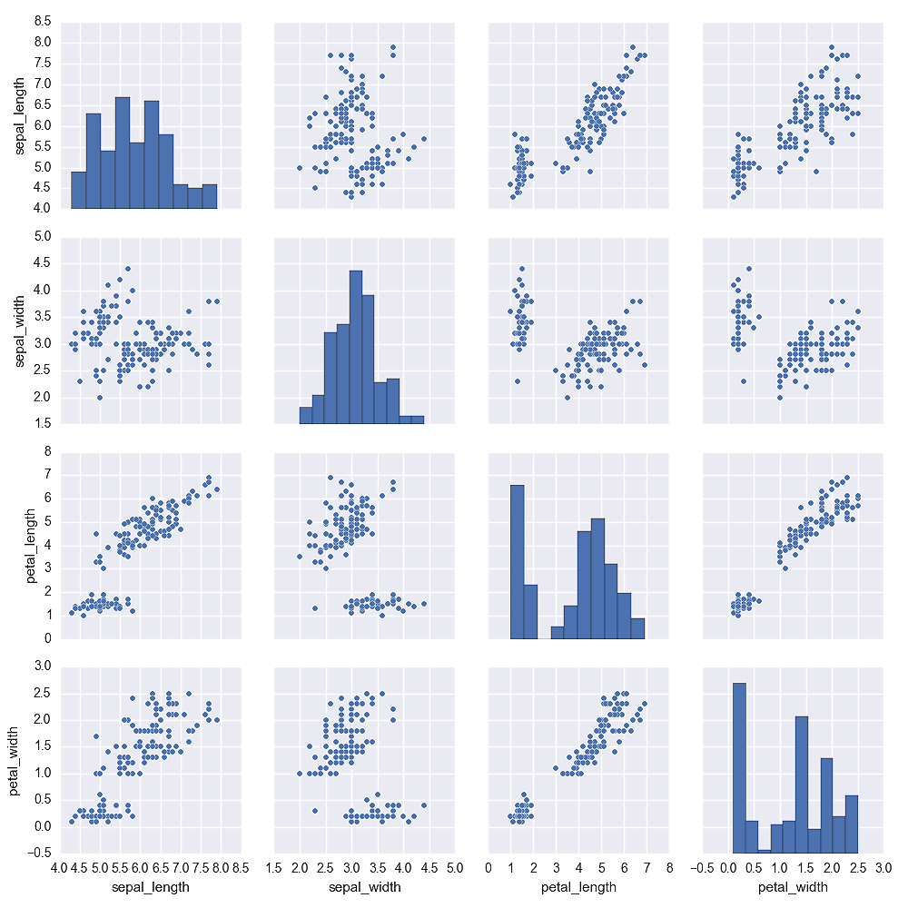
Figure 6-10. A figure with pairwise scatter plots and histograms for all of the variables in the iris dataset created with seaborn
The fourth plot, shown in Figure 6-11, uses the factorplot function to display box plots of the relationship between two variables for different values of a third variable, while conditioning on another variable.
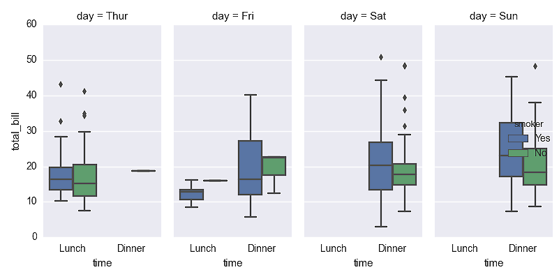
Figure 6-11. A figure with box plots to display total bill size by day of the week, time of the day, and whether the individual is a smoker created with seaborn
The fifth plot, shown in Figure 6-12, uses the lmplot function to display a scatter plot and linear regression model through the points. It also displays a bootstrap confidence interval around the line.
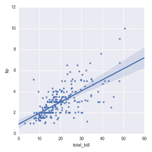
Figure 6-12. A figure with a scatter plot and a regression line between tip size and total bill size created with seaborn
The sixth plot, shown in Figure 6-13, uses the lmplot function to display a logistic regression model for a binary dependent variable. The function uses the y_jitter argument to slightly jitter the ones and zeros so it’s easier to see where the points cluster along the x-axis.
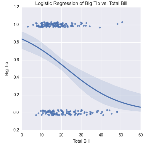
Figure 6-13. A figure with a logistic regression curve between a big tip and the total bill size created with seaborn
These examples are meant to give you an idea of the types of plots you can create with seaborn, but they only scratch the surface of seaborn’s functionality. You can learn more about the types of plots you can create and how to customize them by perusing seaborn’s documentation.