Developers come to the world of web app development via many paths and are not always grounded in the basic technologies that web apps rely on. In this chapter, I provide a brief primer for HTML and introduce the Bootstrap CSS library, which I use to style the examples in this book. In Chapters 5 and 6, I introduce the basics of JavaScript and TypeScript and give you the information you need to understand the examples in the rest of the book. If you are an experienced developer, you can skip these primer chapters and jump right to Chapter 7, where I use Angular to create a more complex and realistic application.
Preparing the Example Project
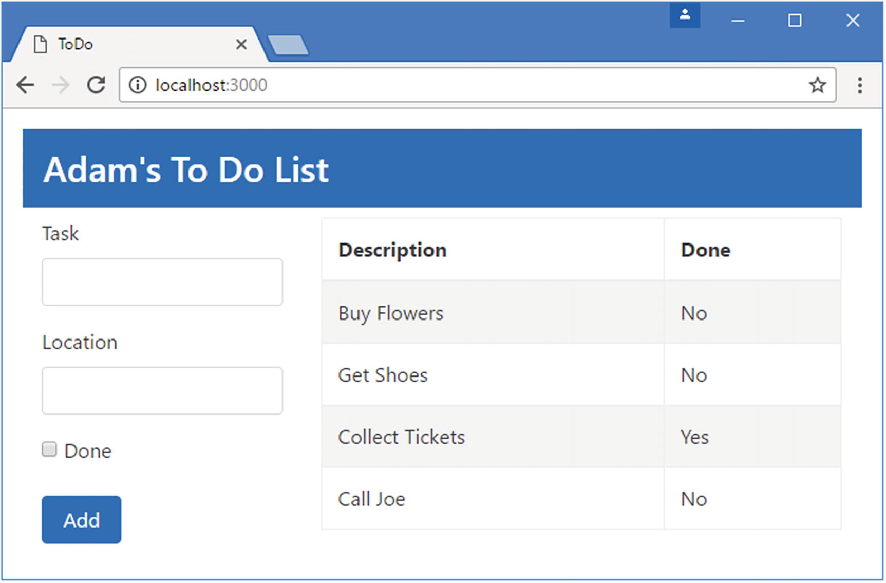
For this chapter, I need only a simple example project. I started by creating a folder called HtmlCssPrimer, created a file called package.json within it, and added the content shown in Listing 4-1.
Tip
You can download the example project for this chapter—and for all the other chapters in this book—from https://github.com/Apress/pro-angular-6 .
The Contents of the package.json File in the HtmlCssPrimer Folder
The Contents of the index.html File in the HtmlCssPrimer Folder
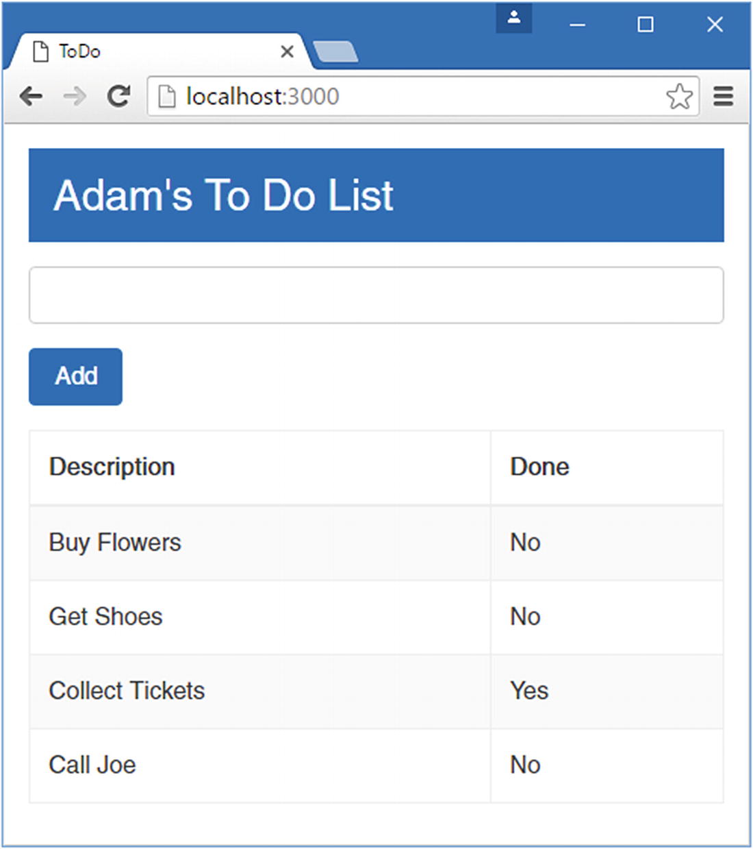
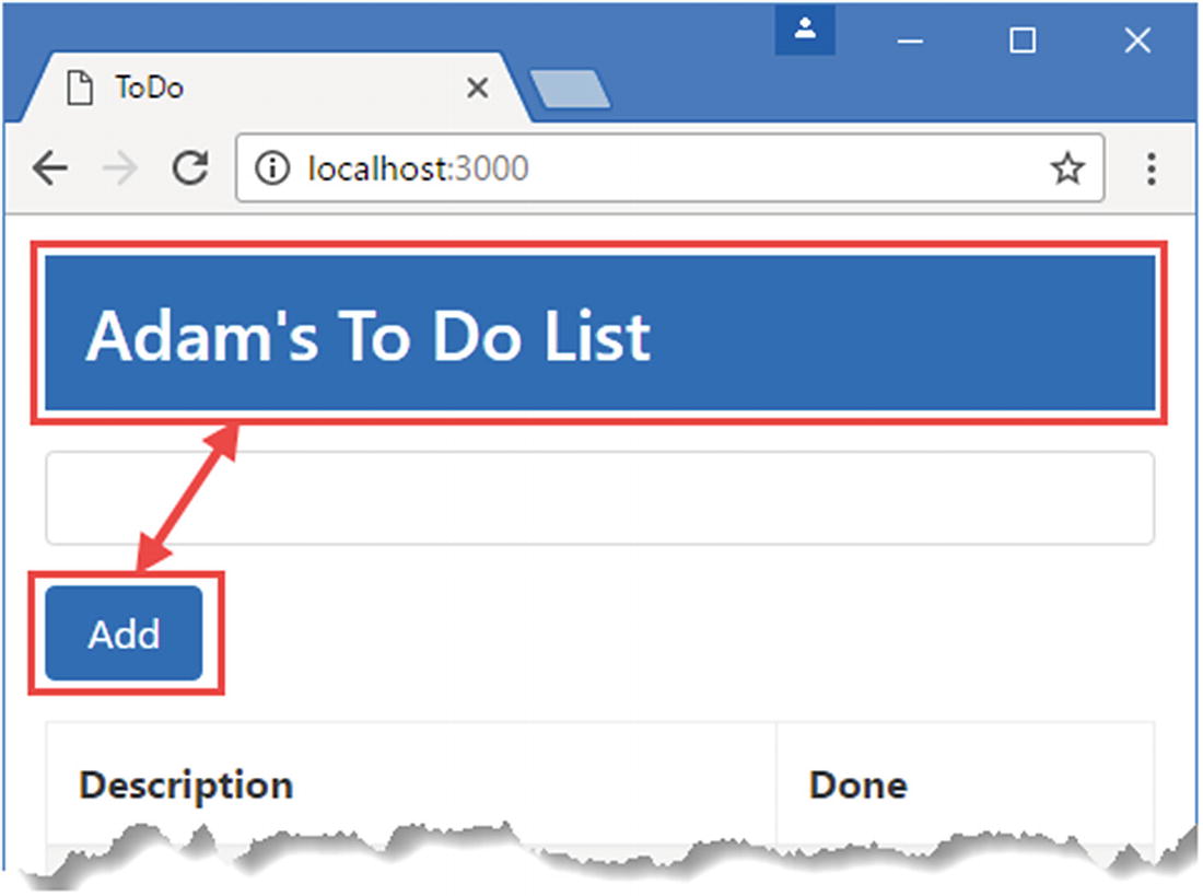
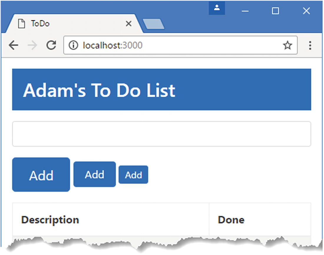
Running the example application
Understanding HTML
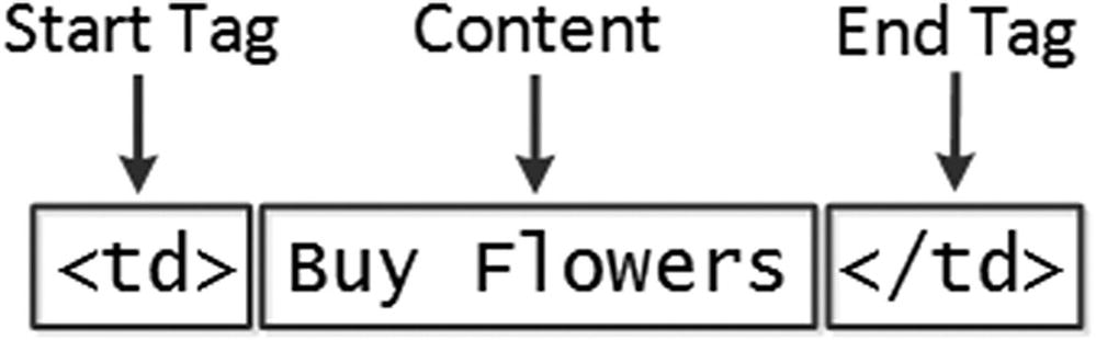
The anatomy of a simple HTML element
The name of this element (also referred to as the tag name or just the tag) is td, and it tells the browser that the content between the tags should be treated as a table cell. You start an element by placing the tag name in angle brackets (the < and > characters) and end an element by using the tag in a similar way, except that you also add a / character after the left-angle bracket (<). Whatever appears between the tags is the element’s content, which can be text (such as Buy Flowers in this case) or other HTML elements.
Understanding Void Elements
A void element is defined in a single tag, and you add a / character before the last angle bracket (the > character). The input element is the most commonly used void element, and its purpose is to allow the user to provide input, through a text field, radio button, or checkbox. You will see lots of examples of working with this element in later chapters.
Understanding Attributes
This is a link element, and it imports content into the document. There are two attributes, which I have emphasized so they are easier to see. Attributes are always defined as part of the start tag, and these attributes have a name and a value.
The names of the two attributes in this example are href and rel. For the link element, the href attribute specifies the content to import, and the rel attribute tells the browser what kind of content it is. The attributes on this link element tell the browser to import the bootstrap.min.css file and to treat it as a style sheet, which is a file that contains CSS styles.
Applying Attributes Without Values
This element has two attributes. The first is class, which is assigned a value just like the previous example. The other attribute is just the word required. This is an example of an attribute that doesn’t need a value.
Quoting Literal Values in Attributes
The attribute value contains the string Apples, which is quoted in both single and double quotes. When Angular evaluates the attribute value, it will see the single quotes and process the value as a literal string.
Understanding Element Content
The elements in an HTML document form a hierarchy. The html element contains the body element, which contains content elements, each of which can contain other elements, and so on. In the listing, the thead element contains tr elements that, in turn, contain th elements. Arranging elements is a key concept in HTML because it imparts the significance of the outer element to those contained within.
Understanding the Document Structure
The html element denotes the region of the document that contains the HTML content. This element always contains the other two key structural elements: head and body. As I explained at the start of the chapter, I am not going to cover the individual HTML elements. There are too many of them, and describing HTML5 completely took me more than 1,000 pages in my HTML book. That said, Table 4-1 provides brief descriptions of the elements I used in the index.html file in Listing 4-2 to help you understand how elements tell the browser what kind of content they represent.
Understanding the Document Object Model
When the browser loads and processes an HTML document, it creates the Document Object Model (DOM). The DOM is a model in which JavaScript objects are used to represent each element in the document, and the DOM is the mechanism by which you can programmatically engage with the content of an HTML document.
You rarely work directly with the DOM in Angular, but it is important to understand that the browser maintains a live model of the HTML document represented by JavaScript objects. When Angular modifies these objects, the browser updates the content it displays to reflect the modifications. This is one of the key foundations of web applications. If we were not able to modify the DOM, we would not be able to create client-side web apps.
HTML Elements Used in the Example Document
Element | Description |
|---|---|
DOCTYPE | Indicates the type of content in the document |
body | Denotes the region of the document that contains content elements |
button | Denotes a button; often used to submit a form to the server |
div | A generic element; often used to add structure to a document for presentation purposes |
h3 | Denotes a header |
head | Denotes the region of the document that contains metadata |
html | Denotes the region of the document that contains HTML (which is usually the entire document) |
input | Denotes a field used to gather a single data item from the user |
link | Imports content into the HTML document |
meta | Provides descriptive data about the document, such as the character encoding |
table | Denotes a table, used to organize content into rows and columns |
tbody | Denotes the body of the table (as opposed to the header or footer) |
td | Denotes a content cell in a table row |
th | Denotes a header cell in a table row |
thead | Denotes the header of a table |
title | Denotes the title of the document; used by the browser to set the title of the window or tab |
tr | Denotes a row in a table |
Understanding Bootstrap
HTML elements tell the browser what kind of content they represent, but they don’t provide any information about how that content should be displayed. The information about how to display elements is provided using Cascading Style Sheets (CSS). CSS consists of a comprehensive set of properties that can be used to configure every aspect of an element’s appearance and a set of selectors that allow those properties to be applied.
One of the main problems with CSS is that some browsers interpret properties slightly differently, which can lead to variations in the way that HTML content is displayed on different devices. It can be difficult to track down and correct these problems, and CSS frameworks have emerged to help web app developers style their HTML content in a simple and consistent way.
The most widely used framework is Bootstrap, which consists of a set of CSS classes that can be applied to elements to style them consistently and JavaScript code that performs additional enhancement. I use the Bootstrap CSS styles in this book because they let me style my examples without having to define custom styles in each chapter. I don’t use the Bootstrap JavaScript features at all in this book.
I don’t want to get into too much detail about Bootstrap because it isn’t the topic of this book, but I do want to give you enough information so you can tell which parts of an example are Angular features and which are Bootstrap styling. See http://getbootstrap.com for full details of the features that Bootstrap provides.
Applying Basic Bootstrap Classes
The Three Button Element Classes
Name | Description |
|---|---|
btn | This class applies the basic styling for a button. It can be applied to button or a elements to provide a consistent appearance. |
btn-primary | This class applies a style context to provide a visual cue about the purpose of the button. See the “Using Contextual Classes” section. |
mt-1 | This class adds a gap between the top of the element and the content that surrounds it. See the “Using Margin and Padding” section. |
Using Contextual Classes
The Bootstrap Style Contexts
Name | Description |
|---|---|
primary | This context is used to indicate the main action or area of content. |
secondary | This context is used to indicate the supporting areas of content. |
success | This context is used to indicate a successful outcome. |
info | This context is used to present additional information. |
warning | This context is used to present warnings. |
danger | This context is used to present serious warnings. |
muted | This context is used to de-emphasize content. |
dark | This context is used to increase contrast by using a dark color. |
white | This context is used to increase contrast by using white. |
Using style contexts for consistency
Using Margin and Padding
Bootstrap includes a set of utility classes that are used to add padding (space between an element’s inner edge and its content) and margin (space between an element’s edge and the surrounding elements). The benefit of using these classes is that they apply a consistent amount of spacing throughout the application.
The classes that apply margin and padding to elements follow a well-defined naming schema: first, the letter m (for margin) or p (for padding), then a hyphen, and then a number indicating how much space should be applied (0 for no spacing, or 1, 2, or 3 for increasing amounts). You can also add a letter to apply spacing only to specific sides, so t for top, b for bottom, l for left, r for right, x for left and right, and y for top and bottom).
Sample Bootstrap Margin and Padding Classes
Name | Description |
|---|---|
p-1 | This class applies padding to all edges of an element. |
m-1 | This class applies margin to all edges of an element. |
mt-1 | This class applies margin to the top edge of an element. |
mb-1 | This class applies margin to the bottom edge of an element. |
Changing Element Sizes
Using Button Size Modification Classes in the index.html File in the HtmlCssPrimer Folder
Changing element size
Using Bootstrap to Style Tables
The Bootstrap CSS Classes for Tables
Name | Description |
|---|---|
table | Applies general styling to a table element and its rows |
table-striped | Applies alternate-row striping to the rows in the table body |
table-bordered | Applies borders to all rows and columns |
table-hover | Displays a different style when the mouse hovers over a row in the table |
table-sm | Reduces the spacing in the table to create a more compact layout |
Using Bootstrap to Style Tables
Tip
Notice that I have used the thead element when defining the tables in Listing 4-4. Browsers will automatically add any tr elements that are direct descendants of table elements to a tbody element if one has not been used. You will get odd results if you rely on this behavior when working with Bootstrap because most of the CSS classes that are applied to the table element cause styles to be added to the descendants of the tbody element.
Using Bootstrap to Create Forms
Defining Additional Form Elements in the index.html File in the HtmlCssPrimer Folder
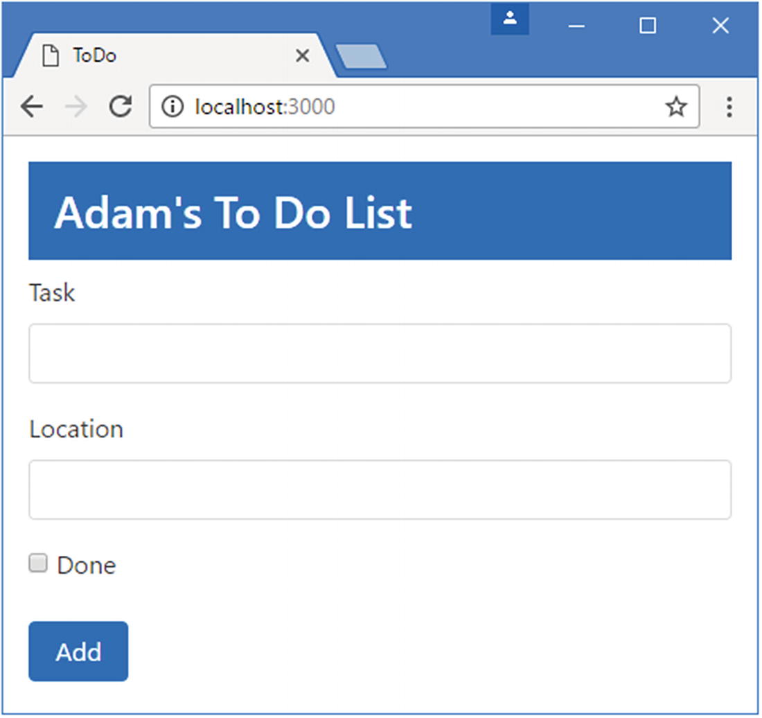
Styling form elements
Using Bootstrap to Create Grids
Using a Bootstrap Grid in the index.html File in the HtmlCssPrimer Folder
The Bootstrap grid layout system is simple to use. A top-level div element is assigned to the container class (or the container-fluid class if you want it to span the available space). You specify a column by applying the row class to a div element, which has the effect of setting up the grid layout for the content that the div element contains.
Each row defines 12 columns, and you specify how many columns each child element will occupy by assigning a class whose name is col- followed by the number of columns. For example, the class col-1 specifies that an element occupies one column, col-2 specifies two columns, and so on, right through to col-12, which specifies that an element fills the entire row. In the listing, I have created a series of div elements with the row class, each of which contains further div elements to which I have applied col-* classes. You can see the effect in the browser in Figure 4-6.
Tip
Bootstrap doesn’t apply any styling to the elements within a row, which I why I have used a style element to create a custom CSS style that sets a background color, sets up some spacing between rows, and adds a border.
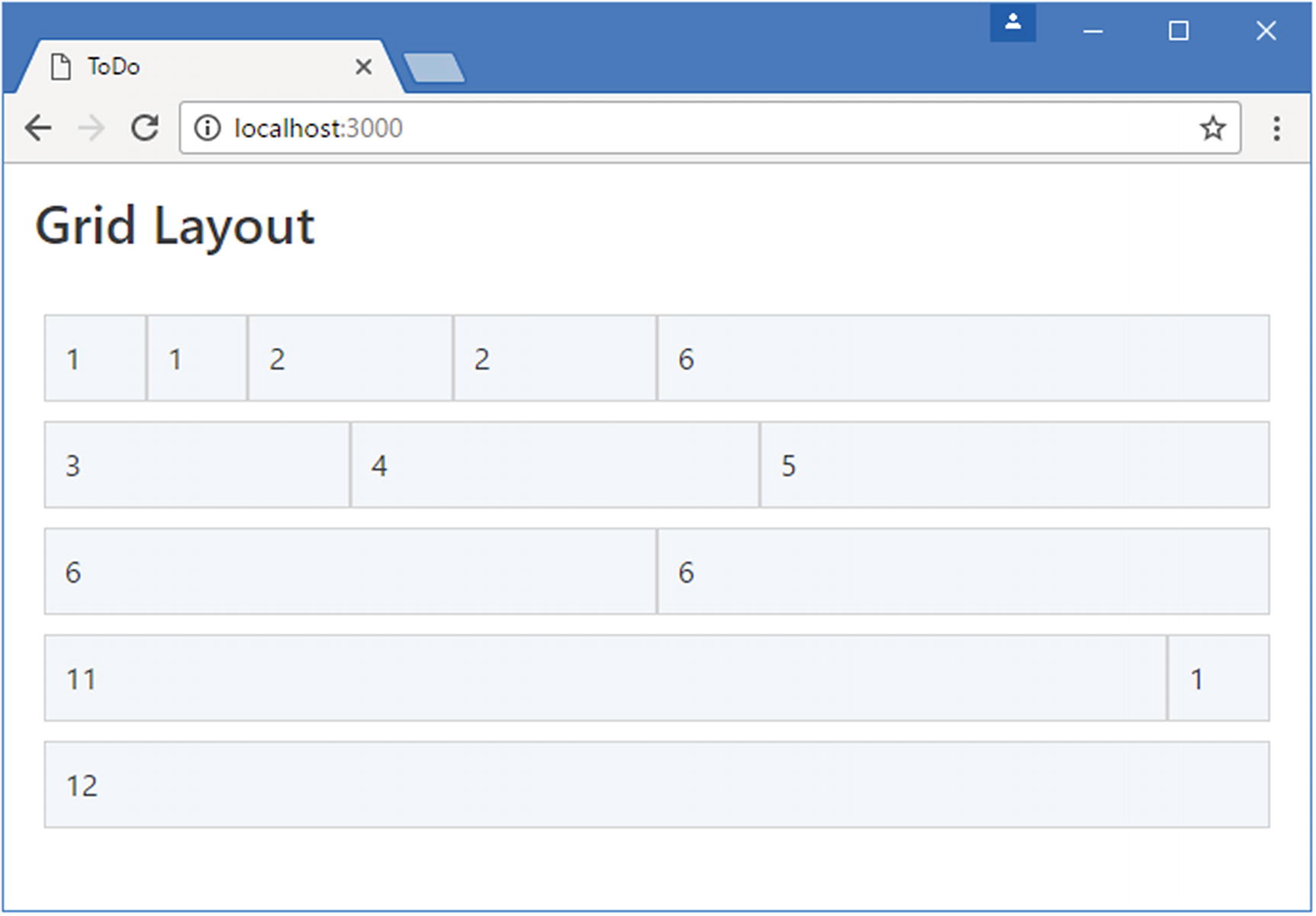
Creating a Bootstrap grid layout
Creating Responsive Grids
The Bootstrap CSS Classes for Responsive Grids
Bootstrap Class | Description |
|---|---|
col-sm-* | Grid cells are displayed horizontally when the screen width is greater than 576 pixels. |
col-md-* | Grid cells are displayed horizontally when the screen width is greater than 768 pixels. |
col-lg-* | Grid cells are displayed horizontally when the screen width is greater than 992 pixels. |
col-xl-* | Grid cells are displayed horizontally when the screen width is greater than 1200 pixels. |
Creating a Responsive Grid in the index.html File in the HtmlCssPrimer Folder
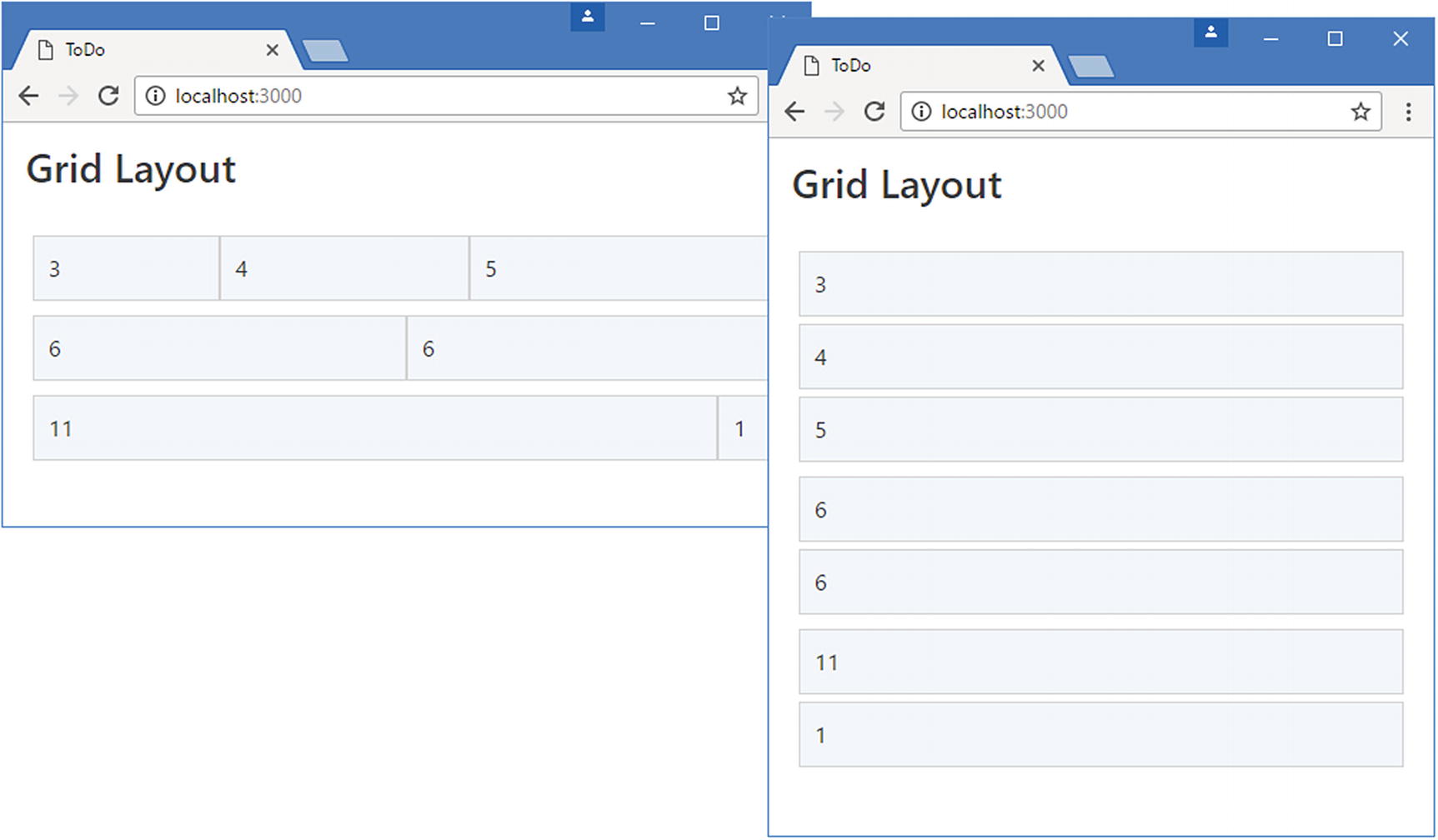
Creating a responsive grid layout
Creating a Simplified Grid Layout
Using a Simplified Grid Layout in the index.html File in the HtmlCssPrimer Folder
Using a simplified grid layout
Summary
In this chapter, I provided a brief overview of HTML and the Bootstrap CSS framework. You need to have a good grasp of HTML and CSS to be truly effective in web application development, but the best way to learn is by firsthand experience, and the descriptions and examples in this chapter will be enough to get you started and provide just enough background information for the examples ahead. In the next chapter, I continue the primer theme and introduce the basic features of JavaScript that I use in this book.