The best way to get started with Angular is to dive in and create a web application. In this chapter, I show you how to set up your development environment and take you through the process of creating a basic application, starting with a static mock-up of the functionality and applying Angular features to create a dynamic web application, albeit a simple one. In Chapters 7–10, I show you how to create a more complex and realistic Angular application, but for now, a simple example will suffice to demonstrate the major components of an Angular app and set the scene for the other chapters in this part of the book.
Don’t worry if you don’t follow everything that happens in this chapter. Angular has a steep learning curve, so the purpose of this chapter is just to introduce the basic flow of Angular development and give you a sense of how things fit together. It won’t all make sense right now, but by the time you have finished reading this book, you will understand every step I take in this chapter and much more besides.
Preparing the Development Environment
There is some preparation required for Angular development. In the sections that follow, I explain how to get set up and ready to create your first project. There is wide support for Angular in popular development tools, and you can pick your favorites.
Installing Node.js
Many of the tools used for Angular development rely on Node.js—also known as Node—which was created in 2009 as a simple and efficient runtime for server-side applications written in JavaScript. Node.js is based on the JavaScript engine used in the Chrome browser and provides an API for executing JavaScript code outside of the browser environment.
Node.js has enjoyed success as an application server, but for this book, it is interesting because it has provided the foundation for a new generation of cross-platform development and build tools. Some smart design decisions by the Node.js team and the cross-platform support provided by the Chrome JavaScript runtime have created an opportunity that has been seized upon by enthusiastic tool writers. In short, Node.js has become essential for web application development.
It is important that you download the same version of Node.js that I use throughout this book. Although Node.js is relatively stable, there are still breaking API changes from time to time that may stop the examples I include in the chapters from working.
The version I have used is 8.11.3, which is the current Long-Term Support release at the time of writing. There may be a later version available by the time you read this, but you should stick to the 8.11.3 release for the examples in this book. A complete set of 8.11.3 releases, with installers for Windows and macOS and binary packages for other platforms, is available at https://nodejs.org/dist/v8.11.3 .
Installing the angular-cli Package
Installing Git
The Git revision control tool is required to manage some of the packages required for Angular development. If you are using Windows or macOS, then download and run the installer from https://git-scm.com/downloads . (On macOS, you may have to change your security settings to open the installer, which has not been signed by the developers.)
This command prints out the version of the Git package that has been installed. At the time of writing, the latest version of Git for Windows and Linux is 2.17, and the latest version of Git for macOS is 2.16.3.
Installing an Editor
Popular Angular-Enabled Editors
Name | Description |
|---|---|
Sublime Text | Sublime Text is a commercial cross-platform editor that has packages to support most programming languages, frameworks, and platforms. See www.sublimetext.com for details. |
Atom | Atom is a free, open source, cross-platform editor that has a particular emphasis on customization and extensibility. See atom.io for details. |
Brackets | Brackets is a free open source editor developed by Adobe. See brackets.io for details. |
WebStorm | WebStorm is a paid-for cross-platform editor that integrates many tools so that you don’t have to use the command line during development. See www.jetbrains.com/webstorm for details. |
Visual Studio Code | Visual Studio Code is a free, open source, cross-platform editor from Microsoft, with an emphasis on extensibility. See code.visualstudio.com for details. |
Visual Studio | Visual Studio is Microsoft’s flagship developer tool. There are free and commercial editions available, and it comes with a wide range of additional tools that integrate into the Microsoft ecosystem. |
When choosing an editor, one of the most important considerations is the ability to filter the content of the project so that you can focus on a subset of the files. There can be a lot of files in an Angular project, and many have similar names, so being able to find and edit the right file is essential. Editors make this possible in different ways, either by presenting a list of the files that are open for editing or by providing the ability to exclude files with specific extensions.
Installing a Browser
The final choice to make is the browser that you will use to check your work during development. All the current-generation browsers have good developer support and work well with Angular. I have used Google Chrome throughout this book, and this is the browser I recommend you use as well.
Creating and Preparing the Project
Once you have Node.js, angular-cli, an editor, and a browser, you have enough of a foundation to start the development process.
Creating the Project
The ng command is provided by the angular-cli package, and ng new sets up a new project. The installation process creates a folder called todo that contains all of the configuration files that are needed to start Angular development, some placeholder files to start development, and the NPM packages required for developing, running, and deploying Angular applications. (There are a large number of NPM packages, which means that project creation can take a while.)
Tip
You can download the example project for this chapter—and for all the other chapters in this book—from https://github.com/Apress/pro-angular-6 .
Adding the Bootstrap CSS Package
Configuring CSS in the angular.json File in the todo Folder
As I explain in Chapter 11, the angular.json file is used to configure the project tools, and the statement shown in the listing incorporates the Bootstrap CSS file into the project so that it will be included in the content sent to the browser.
Starting the Development Tools
Don’t worry if you see slightly different output, just as long as you see the “compiled successfully” message once the preparations are complete.
The placeholder HTML content
Editing the HTML File
The Contents of the index.html File in the src Folder
The Angular development tools include a feature that automatically updates the browser when there is a change in the project. As soon as you save the index.html file, the server will detect the change and update the application, reflecting the new content, as shown in Figure 2-2.
Tip
When you are making changes to a series of files, there may be times when the browser won’t be able to load and execute the example application, especially in later chapters where the examples are more complex. For the most part, the development HTTP server will trigger a reload in the browser, and everything will be fine, but if it gets stuck, you may have to manually reload the browser to get going again.
Editing the contents of the HTML file
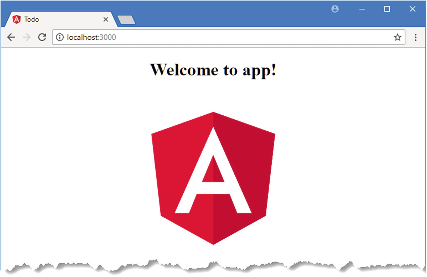
The HTML elements in the index.html file show how the simple Angular application I create in this chapter will look. The key elements are a banner with the user’s name, an input element and an Add button that add a new to-do item to the list, and a table that contains all the to-do items and indicates whether they have been completed.
This h3 element has been assigned to three classes. The bg-primary class sets the background color of the element to the primary color of the Bootstrap theme. There are other theme colors available, including bg-secondary, bg-info, and bg-danger. The p-1 class adds a fixed amount of padding to all edges of the element, ensuring that the text has some space around it. The text-white class sets the text color to white, which increases the contrast with the background color. You will see HTML elements added to these classes and others throughout this book as I apply Bootstrap, and I provide a brief overview of the classes that I use most in Chapter 4.
In the next section, I’ll remove the HTML from the file, cut it up into smaller pieces, and use it to create a simple Angular application.
Adding Angular Features to the Project
The static HTML in the index.html file acts as a placeholder for the basic application. The user should be able to see the list of to-do items, check off items that are complete, and create new items. In the sections that follow, I add basic Angular features to the project to bring the to-do application to life. To keep the application simple, I assume that there is only one user and that I don’t have to worry about preserving the state of the data in the application, which means that changes to the to-do list will be lost if the browser window is closed or reloaded. (Later examples, including the SportsStore application developed in Chapters 7–10, demonstrate persistent data storage.)
Preparing the HTML File
Preparing for Angular in the index.html File in the src Folder
Preparing the HTML file
Creating a Data Model
The next task is to pull all the data together to create a data model. Separating the data from the way it is presented to the user is one of the key ideas in the MVC pattern, as I explain in Chapter 3.
Tip
I am simplifying here. The model can also contain the logic required to create, load, store, and modify data objects. In an Angular app, this logic is often at the server and is accessed by a web service. See Chapter 3 for further details and Chapter 24 for examples.
Angular applications are typically written in TypeScript. I introduce TypeScript in Chapter 6 and explain how it works and why it is useful. TypeScript is a superscript of JavaScript, but one of its main advantages is that it lets you write code using the latest JavaScript language specification with features that are not yet supported in all of the browsers that can run Angular applications. One of the packages that angular-cli added to the project in the previous section was the TypeScript compiler, which is set up to generate browser-friendly JavaScript files automatically when a change to a TypeScript file is detected.
The Contents of the model.ts File in the src/app Folder
One of the most important features of TypeScript is that you can just write “normal” JavaScript code as though you were targeting the browser directly. In Listing 2-4, I used the JavaScript object literal syntax to assign a value to a global variable called model. The data model object has a user property, which provides the name of the application’s user, and an items property, which is set to an array of objects with action and done properties, each of which represents a task in the to-do list.
This is the most important aspect of using TypeScript: you don’t have to use the features it provides, and you can write entire Angular applications using just the JavaScript features that are supported by all browsers, like the code in Listing 2-4.
Using ES6 Features in the model.ts File in the src/app Folder
This is still standard JavaScript code, but the class keyword was introduced in a later version of the language than most web application developers are familiar with because it is not supported by older browsers. The class keyword is used to define types that can be instantiated with the new keyword to create objects that have well-defined data and behavior.
Many of the features added in recent versions of the JavaScript language are syntactic sugar to help programmers avoid some of the most common JavaScript pitfalls, such as the unusual type system. The class keyword doesn’t change the way that JavaScript handles types; it just makes it more familiar and easier to use for programmers experienced in other languages, such as C# or Java. I like the JavaScript type system, which is dynamic and expressive, but I find working with classes more predictable and less error-prone, and they simplify working with Angular, which has been designed around the latest JavaScript features.
Tip
Don’t worry if you are not familiar with the features that have been added in recent versions of the JavaScript specification. Chapters 5 and 6 provide a primer for writing JavaScript using the features that make Angular easier to work with, and Chapter 6 also describes some useful TypeScript-specific features.
The export keyword relates to JavaScript modules. When using modules, each TypeScript or JavaScript file is considered to be a self-contained unit of functionality, and the export keyword is used to identify data or types that you want to use elsewhere in the application. JavaScript modules are used to manage the dependencies that arise between files in a project and avoid having to manually manage a complex set of script elements in the HTML file. See Chapter 7 for details of how modules work.
Preparing the Template
The Contents of the app.component.html File in the src/app Folder
I’ll add more elements to this file shortly, but a single h3 element is enough to get started. Including a data value in a template is done using double braces—{{ and }}—and Angular evaluates whatever you put between the double braces to get the value to display.
The {{ and }} characters are an example of a data binding, which means they create a relationship between the template and a data value. Data bindings are an important Angular feature, and you will see more of them in this chapter as I add features to the example application (and I describe them in detail in Part 2 of this book). In this case, the data binding tells Angular to invoke a function called getName and use the result as the contents of the h3 element. The getName function doesn’t exist anywhere in the application at the moment, but I’ll create it in the next section.
Preparing the Component
An Angular component is responsible for managing a template and providing it with the data and logic it needs. If that seems like a broad statement, it is because components are the part of an Angular application that does most of the heavy lifting. As a consequence, they can be used for all sorts of tasks.
The Contents of the app.component.ts File in the src/app Folder
This is still JavaScript, but it relies on features that you may not have encountered before but that underpin Angular development. The code in the listing can be broken into three main sections, as described in the following sections.
Understanding the Imports
The first import statement is used in the Listing to load the @angular/core module, which contains the key Angular functionality, including support for components. When working with modules, the import statement specifies the types that are imported between curly braces. In this case, the import statement is used to load the Component type from the module. The @angular/core module contains many classes that have been packaged together so that the browser can load them all in a single JavaScript file.
The second import statement is used to load the Model class from a file in the project. The target for this kind of import starts with ./, which indicates that the module is defined relative to the current file.
Notice that neither import statement includes a file extension. This is because the relationship between the target of an import statement and the file that is loaded by the browser is managed by a module loader, which I configure in the “Putting the Application Together” section.
Understanding the Decorator
This is an example of a decorator, which provides metadata about a class. This is the @Component decorator, and, as its name suggests, it tells Angular that this is a component. The decorator provides configuration information through its properties, which in the case of @Component includes properties called selector and templateUrl.
The selector property specifies a CSS selector that matches the HTML element to which the component will be applied: in this case, I have specified the todo-app element, which I added to the index.html file in Listing 2-3. When an Angular application starts, Angular scans the HTML in the current document and looks for elements that correspond to components. It will find the todo-app element and know that it should be placed under the control of this component.
The templateUrl property is to specify the component’s template, which is the app.component.html file for this component. In Part 2, I describe the other properties that can be used with the @Component decorator and the other decorators that Angular supports.
Understanding the Class
These statements define a class called AppComponent that has a model property and a getName function, which provide the functionality required to support the data binding in the template from Listing 2-6.
When a new instance of the AppComponent class is created, the model property will be set to a new instance of the Model class defined in Listing 2-5. The getName function returns the value of the user property defined by the Model object.
Putting the Application Together
Simple Angular functionality in the example application
One advantage of using angular-cli to create a project is that you don’t have to worry about creating the basic files required by an Angular application. The drawback is that skipping over these files means you will miss out on some important details that are worth exploring.
Angular applications require a module. Through an unfortunate naming choice, there are two types of module used in Angular development. A JavaScript module is a file that contains JavaScript functionality that is used through the import keyword, which I describe in Chapter 6. The other type of module is an Angular module, which is used to describe an application or a group of related features. And just to complicate matters, every application has a root module, which is the Angular module that provides Angular with the information that it needs to start the application.
The Default Contents of the app.module.ts File in the src/app Folder
The purpose of the Angular module is to provide configuration information through the properties defined by the @NgModule decorator. I explain how Angular modules work in detail in Chapter 21, but for the moment, it is enough to know that the decorator’s imports property tells Angular that the application depends on features required to run an application in the browser and that the declarations and bootstrap properties tell Angular about the components in the application and which one should be used to start the application (there is only one component in this simple example application, which is why it is the only value for both properties).
Enabling Forms Supports in the app.module.ts File in the src/app Folder
The Contents of the main.ts File in the src Folder
Although this book focuses on applications that run in a web browser, Angular is intended to work in a range of environments. The code statements in the bootstrap file select the platform that will be used and load the root module, which is the entry point into the application.
Tip
Calling the platformBrowserDynamic().bootstrapModule method is for browser-based applications, which is what I focus on in this book. If you are working on different platforms, such as the Ionic mobile development framework, then you will have to use a different bootstrap method specific to the platform you are working with. The developers of each platform that supports Angular provide details of their platform-specific bootstrap method.
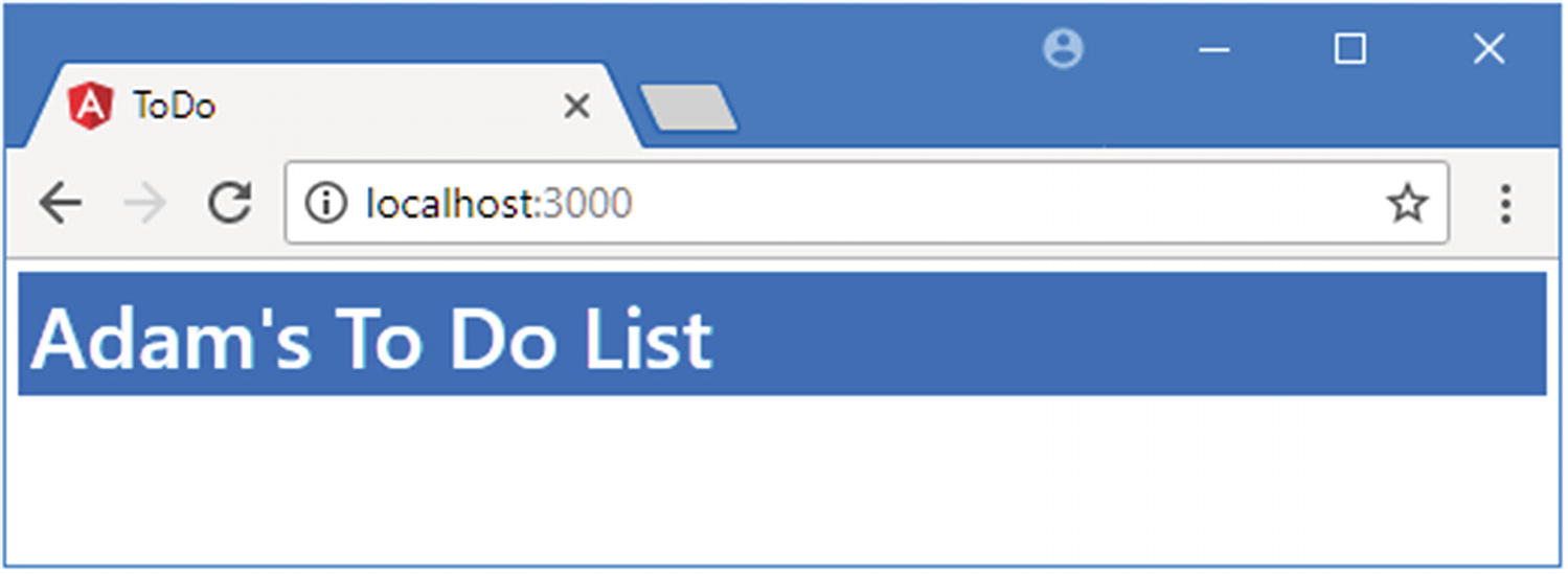
The browser executed the code in the bootstrap file, which fired up Angular, which in turn processed the HTML document and discovered the todo-app element. The selector property used to define the component matches the todo-app element, which allowed Angular to remove the placeholder content and replace it with the component’s template, which was loaded automatically from the app.component.html file. The template was parsed; the {{ and }} data binding was discovered, and the expression it contains was evaluated, calling the getName method and displaying the result shown in the figure. It may not be that impressive, but it is a good start, and it provides a foundation on which to add more features.
Tip
In any Angular project, there is a period where you have to define the main parts of the application and plumb them together. During this period, it can feel like you are doing a lot of work for little return. This period of initial investment will ultimately pay off, I promise. You will see a larger example of this in Chapter 7 when I start to build a more complex and realistic Angular application; there is a lot of initial setup and configuration required, but then the features start to quickly snap into place.
Adding Features to the Example Application
Now that the basic structure of the application is in place, I can add the remaining features that I mocked up with static HTML at the start of the chapter. In the sections that follow, I add the table containing the list of to-do items and the input element and button for creating new items.
Adding the To-Do Table
Adding a Method in the app.component.ts File in the src/app Folder
Displaying the To-Do Items in the app.component.html File in the src/app Folder
This expression tells Angular to treat the tr element to which it has been applied as a template that should be repeated for every object returned by the component’s getTodoItems method. The let item part of the expression specifies that each object should be assigned to a variable called item so that it can be referred to within the template.
The result is that the tr element and its contents will be duplicated and inserted into the HTML document for each object returned by the getTodoItems method; for each iteration, the current to-do object can be accessed through the variable called item, and the position of the object in the array can be accessed through the variable called i.
Tip
It is important to remember the * character when using *ngFor. I explain what it means in Chapter 16.
These bindings refer to the variables that are created by the *ngFor expression. Bindings are not just used to refer to property and method names; they can also be used to perform simple JavaScript operations. You can see an example of this in the first binding, where I sum the i variable and 1.
Tip
For simple transformations, you can embed your JavaScript expressions directly in bindings like this, but for more complex operations, Angular has a feature called pipes, which I describe in Chapter 18.
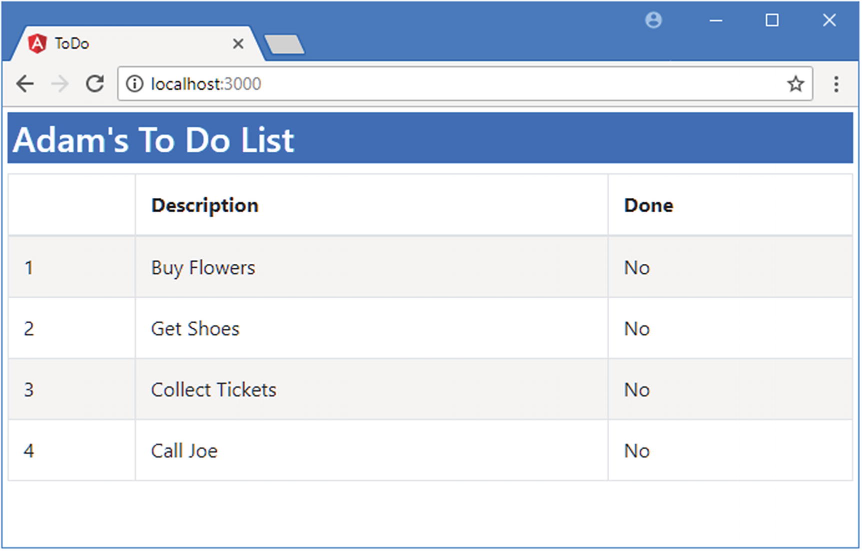
Displaying the table of to-do items
If you use the browser’s F12 developer tools, you will be able to see the HTML content that the template has generated. (You can’t do this looking at the page source, which just shows the HTML sent by the server and not the changes made by Angular using the DOM API.)
Creating a Two-Way Data Binding
Adding a Two-Way Binding in the app.component.html File in the src/app Folder
The ngModel template expression creates a two-way binding between a data value (the item.done property in this case) and a form element. When you save the changes to the template, you will see a new column that contains checkboxes appear in the table. The initial value of the checkbox is set using the item.done property, just like a regular one-way binding, but when the user toggles the checkbox, Angular responds by updating the specified model property.
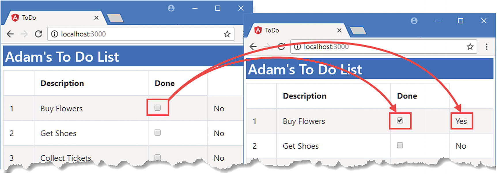
Changing a model value using a two-way data binding
This reveals an important Angular feature: the data model is live. This means that data bindings—even one-way data bindings—are updated when the data model is changed. This simplifies web application development because it means you don’t have to worry about ensuring that you display updates when the application state changes.
Filtering To-Do Items
Filtering To-Do Items in the app.component.ts File in the src/app Folder
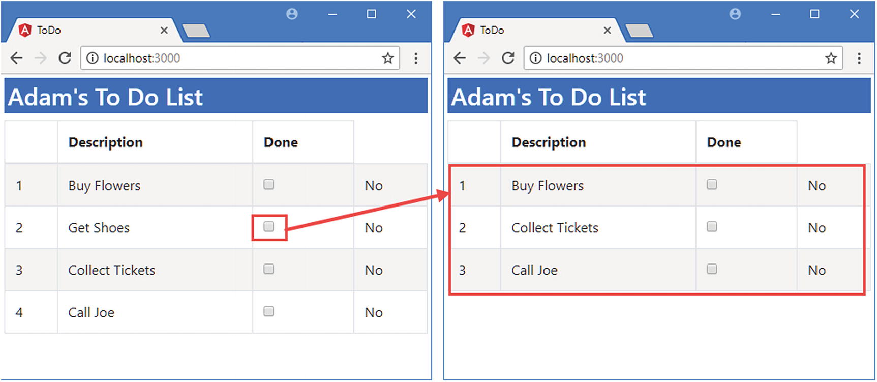
Filtering the to-do items
Adding To-Do Items
Adding Elements in the app.component.html File in the src/app Folder
This is an example of an event binding, and it tells Angular to invoke a component method called addItem, using the value property of the input element as the method argument. Listing 2-16 implements the addItem method in the component.
Tip
Don’t worry about telling the bindings apart at the moment. I explain the different types of binding that Angular supports in Part 2 and the meaning of the different types of brackets or parentheses that each requires. They are not as complicated as they first appear, especially once you have seen how they fit into the rest of the Angular framework.
Adding a Method in the app.component.ts File in the src/app Folder
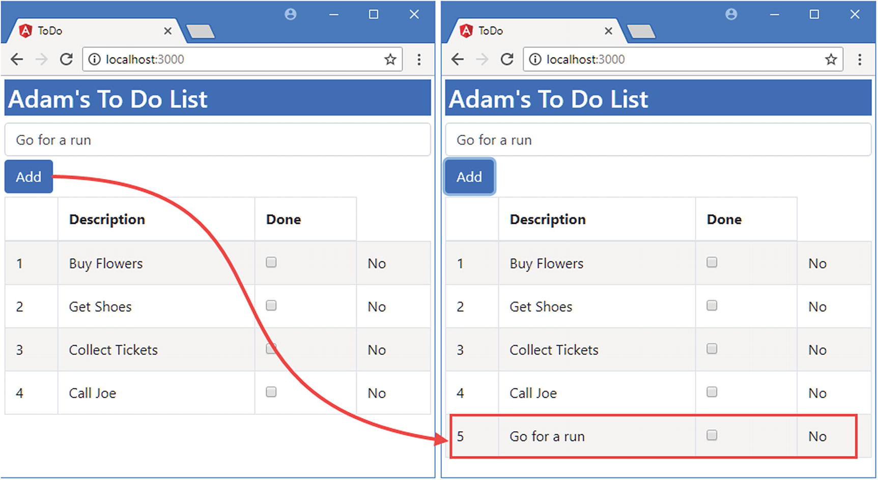
Creating a to-do item
Summary
In this chapter, I showed you how to create your first simple Angular app, moving from an HTML mock-up of the application to a dynamic app that lets the user create new to-do items and mark existing items as complete.
Don’t worry if not everything in this chapter makes sense. What’s important to understand at this stage is the general shape of an Angular application, which is built around a data model, components, and templates. If you keep these three key building blocks in mind, then you will have a context for everything that follows. In the next chapter, I put Angular in context.