Components are directives that have their own templates, rather than relying on content provided from elsewhere. Components have access to all the directive features described in earlier chapters and still have a host element, can still define input and output properties, and so on. But they also define their own content.
It can be easy to underestimate the importance of the template, but attribute and structural directives have limitations. Directives can do useful and powerful work, but they don’t have much insight into the elements they are applied to. Directives are most useful when they are general-purpose tools, such the ngModel directive, which can be applied to any data model property and any form element, without regard to what the data or the element is being used for.
Components, by contrast, are closely tied to the contents of their templates. Components provide the data and logic that will be used by the data bindings that are applied to the HTML elements in the template, which provide the context used to evaluate data binding expressions and act as the glue between the directives and the rest of the application. Components are also a useful tool in allowing large Angular projects to be broken up into manageable chunks.
In this chapter, I explain how components work and explain how to restructure an application by introducing some additional components. Table 17-1 puts components in context.
Table 17-1
Putting Components in Context
Question
Answer
What are they?
Components are directives that define their own HTML content and, optionally, CSS styles.
Why are they useful?
Components make it possible to define self-contained blocks of functionality, which makes projects more manageable and allows for functionality to be more readily reused.
How are they used?
The @Component decorator is applied to a class, which is registered in the application’s Angular module.
Are there any pitfalls or limitations?
No. Components provide all the functionality of directives, with the addition of providing their own templates.
Are there any alternatives?
An Angular application must contain at least one component, which is used in the bootstrap process. Aside from this, you don’t have to add additional components, although the resulting application becomes unwieldy and difficult to manage.
Display content in an element to which a component has been applied
Project the host element’s content
17–21
Style component content
Create component styles
22–30
Query the content in the component’s template
Use the @ViewChildren decorator
31
Preparing the Example Project
In this chapter, I continue using the example project that I created in Chapter 11 and have been modifying since. No changes are required to prepare for this chapter.
Run the following command in the example folder to start the Angular development tools:
ng serve
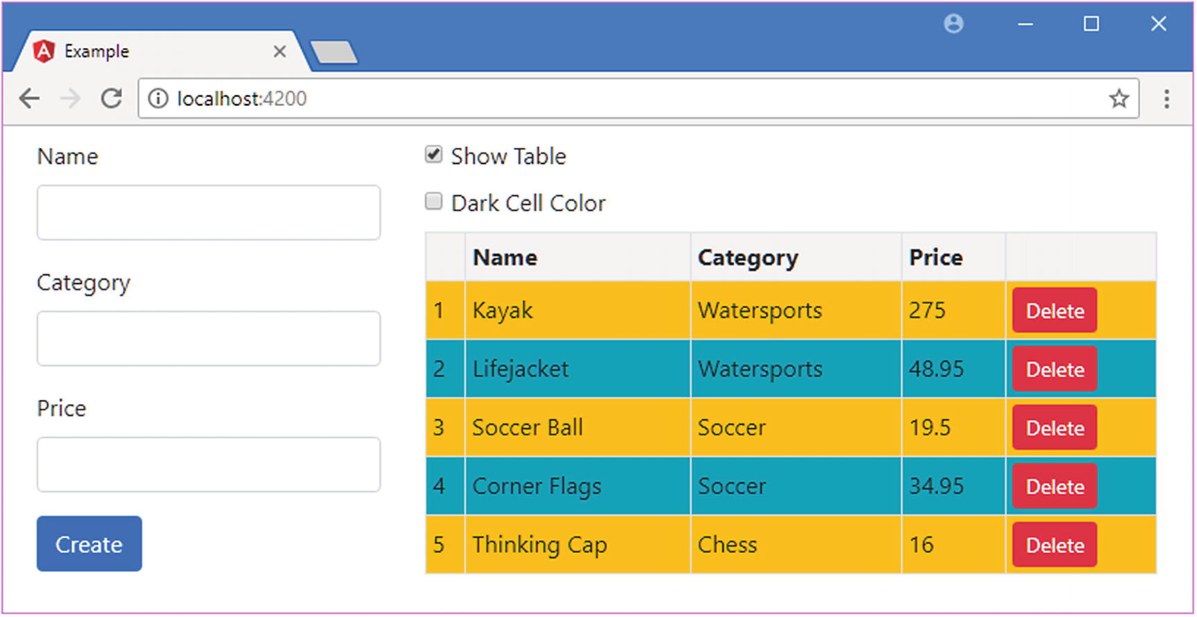
Open a new browser and navigate to http://localhost:4200 to see the content in Figure 17-1.
Figure 17-1
Running the example project
Structuring an Application with Components
At the moment, the example project contains only one component and one template. Angular applications require at least one component, known as the root component, which is the entry point specified in the Angular module.
The problem with having only one component is that it ends up containing the logic required for all the application’s features, with its template containing all the markup required to expose those features to the user. The result is that a single component and its template are responsible for handling a lot of tasks. The component in the example application is responsible for the following:
Providing Angular with an entry point into the application, as the root component
Providing access to the application’s data model so that it can be used in data bindings
Defining the HTML form used to create new products
Defining the HTML table used to display products
Defining the layout that contains the form and the table
Checking that the form data is valid when a new product is created
Maintaining state information used to prevent invalid data being used to create data
Maintaining state information about whether the table should be displayed
There is a lot going on for such a simple application, and not all of these tasks are related. This effect tends to creep up gradually as development proceeds, but it means that the application is harder to test because individual features can’t be isolated effectively and is harder to enhance and maintain because the code and markup become increasingly complex.
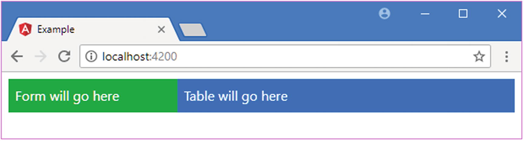
Adding components to the application allows features to be separated into building blocks that can be used repeatedly in different parts of the application and tested in isolation. In the sections that follow, I create components that break up the functionality contained in the example application into manageable, reusable, and self-contained units. Along the way, I’ll explain the different features that components provide beyond those available to directives. To prepare for these changes, I have simplified the existing component’s template, as shown in Listing 17-1.
<div class="row text-white m-2">
<div class="col-4 p-2 bg-success">
Form will go here
</div>
<div class="col-8 p-2 bg-primary">
Table will go here
</div>
</div>
Listing 17-1
Simplifying the Content of the template.html File in the src/app Folder
When you save the changes to the template, you will see the content in Figure 17-2. The placeholders will be replaced with application functionality as I develop the new components and add them to the application.
Figure 17-2
Simplifying the existing template
Creating New Components
To create a new component, I added a file called productTable.component.ts to the src/app folder and used it to define the component shown in Listing 17-2.
import { Component } from "@angular/core";
@Component({
selector: "paProductTable",
template: "<div>This is the table component</div>"
})
export class ProductTableComponent {
}
Listing 17-2
The Contents of the productTable.component.ts File in the src/app Folder
A component is a class to which the @Component decorator has been applied. This is as simple as a component can get, and it provides just enough functionality to count as a component without yet doing anything useful.
The naming convention for the files that define components is to use a descriptive name that suggests the purpose of the component, followed by a period and then component.ts. For this component, which will be used to generate the table of products, the file name is productTable.component.ts. The name of the class should be equally descriptive. This component’s class is named ProductTableComponent.
The @Component decorator describes and configures the component. The most useful decorator properties are described in Table 17-3, which also includes details of where they are described (not all of them are covered in this chapter).
Table 17-3
The Component Decorator Properties
Name
Description
animations
This property is used to configuration animations, as described in Chapter 28.
encapsulation
This property is used to change the view encapsulation settings, which control how component styles are isolated from the rest of the HTML document. See the “Setting View Encapsulation” section for details.
selector
This property is used to specify the CSS selector used to match host elements, as described after the table.
styles
This property is used to define CSS styles that are applied only to the component’s template. The styles are defined inline, as part of the TypeScript file. See the “Using Component Styles” section for details.
styleUrls
This property is used to define CSS styles that are applied only to the component’s template. The styles are defined in separate CSS files. See the “Using Component Styles” section for details.
template
This property is used to specify an inline template, as described in the “Defining Templates” section.
templateUrl
This property is used to specify an external template, as described in the “Defining Templates” section.
providers
This property is used to create local providers for services, as described in Chapter 19.
viewProviders
This property is used to create local providers for services that are available only to view children, as described in Chapter 20.
For the second component, I created a file called productForm.component.ts in the src/app folder and added the code shown in Listing 17-3.
import { Component } from "@angular/core";
@Component({
selector: "paProductForm",
template: "<div>This is the form component</div>"
})
export class ProductFormComponent {
}
Listing 17-3
The Contents of the productForm.component.ts File in the src/app Folder
This component is equally simple and is just a placeholder for the moment. Later in the chapter, I’ll add some more useful features. To enable the components, they must be declared in the application’s Angular module, as shown in Listing 17-4.
import { NgModule } from "@angular/core";
import { BrowserModule } from "@angular/platform-browser";
import { ProductComponent } from "./component";
import { FormsModule, ReactiveFormsModule } from "@angular/forms";
import { PaAttrDirective } from "./attr.directive";
import { PaModel } from "./twoway.directive";
import { PaStructureDirective } from "./structure.directive";
import { PaIteratorDirective } from "./iterator.directive";
import { PaCellColor } from "./cellColor.directive";
import { PaCellColorSwitcher } from "./cellColorSwitcher.directive";
import { ProductTableComponent } from "./productTable.component";
import { ProductFormComponent } from "./productForm.component";
Enabling New Components in the app.module.ts File in the src/app Folder
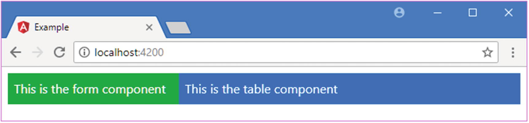
The component class is brought into scope using an import statement and added to the NgModule decorator’s declarations array. The final step is to add an HTML element that matches the component’s selector property, as shown in Listing 17-5, which will provide the component with its host element.
<div class="row text-white m-2">
<div class="col-4 p-2 bg-success">
<paProductForm></paProductForm>
</div>
<div class="col-8 p-2 bg-primary">
<paProductTable></paProductTable>
</div>
</div>
Listing 17-5
Adding a Host Element in the template.html File in the src/app Folder
When all the changes have been saved, the browser will display the content shown in Figure 17-3, which shows that parts of the HTML document are now under the management of the new components.
Figure 17-3
Adding new components
Understanding the New Application Structure
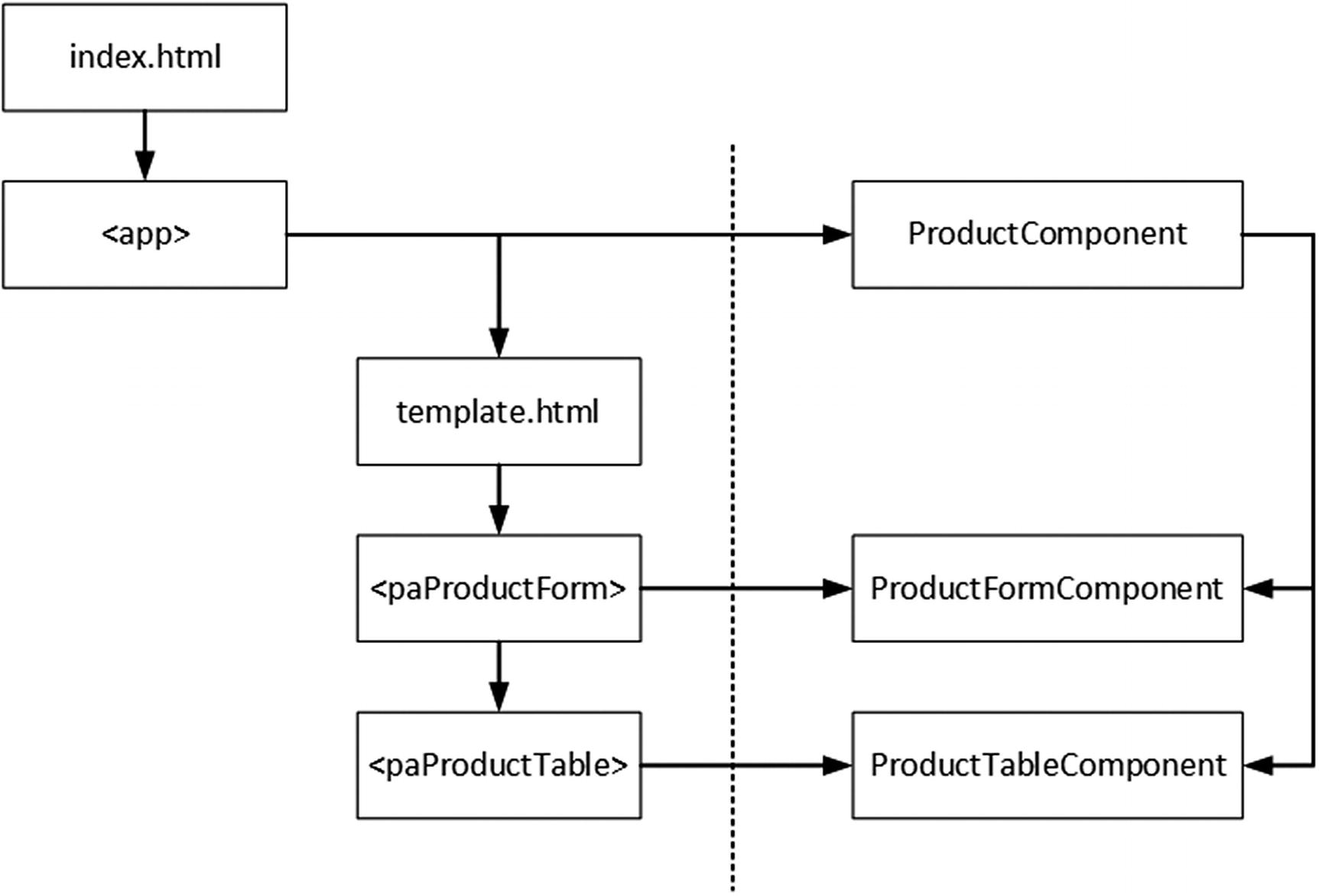
The new components have changed the structure of the application. Previously, the root component was responsible for all the HTML content displayed by the application. Now, however, there are three components, and responsibility for some of the HTML content has been delegated to the new additions, as illustrated in Figure 17-4.
Figure 17-4
The new application structure
When the browser loads the index.html file, the Angular bootstrap process starts and Angular processes the application’s module, which provides a list of the components that the application requires. Angular inspects the decorator for each component in its configuration, including the value of the selector property, which is used to identify which elements will be hosts.
Angular then begins processing the body of the index.html file and finds the app element, which is specified by the selector property of the ProductComponent component. Angular populates the app element with the component’s template, which is contained in the template.html file. Angular inspects the contents of the template.html file and finds the paProductForm and paProductTable elements, which match the selector properties of the newly added components. Angular populates these elements with each component’s template, producing the placeholder content shown in Figure 17-3.
There are some important new relationships to understand. First, the HTML content that is displayed in the browser window is now composed of several templates, each of which is managed by a component. Second, the ProductComponent is now the parent component to the ProductFormComponent and ProductTableComponent objects, a relationship that is formed by the fact that the host elements for the new components are defined in the template.html file, which is the ProductComponent template. Equally, the new components are children of the ProductComponent. The parent-child relationship is an important one when it comes to Angular components, as you will see as I describe how components work in later sections.
Defining Templates
Although there are new components in the application, they don’t have much impact at the moment because they display only placeholder content. Each component has its own template, which defines the content that will be used to replace its host element in the HTML document. There are two different ways to define templates: inline within the @Component decorator or externally in an HTML file.
The new components that I added use templates, where a fragment of HTML is assigned to the template property of the @Component decorator, like this:
...
template: "<div>This is the form component</div>"
...
The advantage of this approach is simplicity: the component and the template are defined in a single file, and there is no way that the relationship between them can be confused. The drawback of inline templates is that they can get out of control and be hard to read if they contain more than a few HTML elements.
Note
Another problem is that editors that highlight syntax errors as you type usually rely on the file extension to figure out what type of checking should be performed and won’t realize that the value of the template property is HTML and will simply treat it as a string.
If you are using TypeScript, then you can use multiline strings to make inline templates more readable. Multiline strings are denoted with the backtick character (the ` character, which is also known as the grave accent), and they allow strings to spread over multiple lines, as shown in Listing 17-6.
import { Component } from "@angular/core";
@Component({
selector: "paProductTable",
template: `<div class='bg-info p-2'>
This is a multiline template
</div>`
})
export class ProductTableComponent {
}
Listing 17-6
Using a Multiline String in the productTable.component.ts File in the src/app Folder
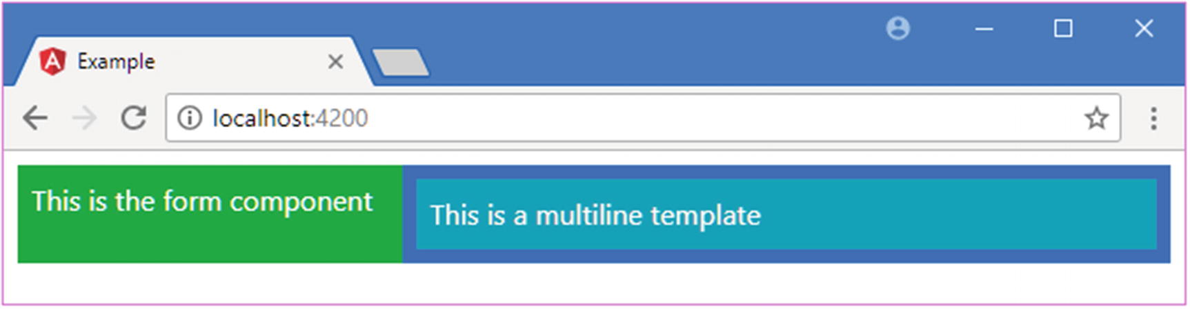
Multiline strings allow the structure of the HTML elements in a template to be preserved, which make it easier to read and increase the size of template that can be practically included inline before it becomes too unwieldy to manage. Figure 17-5 shows the effect of the template in Listing 17-6.
Figure 17-5
Using a multiline inline template
Tip
My advice is to use external templates (explained in the next section) for any template that contains more than two or three simple elements, largely to take advantage of the HTML editing and syntax highlighting features that modern editors provide, which can go a long way to reduce the number of errors you discover when running the application.
Defining External Templates
External templates are defined in a different file from the rest of the component. The advantage of this approach is that the code and HTML are not mixed together, which makes both easier to read and unit test, and it also means that code editors will know they are working with HTML content when you are working on a template file, which can help reduce coding-time errors by highlighting errors.
The drawback of external templates is that you have to manage more files in the project and ensure that each component is associated with the correct template file. The best way to do this is to follow a consistent file naming strategy so that it is immediately obvious that a file contains a template for a given component. The convention for Angular is to create pairs of files using the convention <componentname>.component.<type> so that when you see a file called productTable.component.ts, you know it contains a component called Products written in TypeScript, and when you see a file called productTable.component.html, you know that it contains an external template for the Products component.
Tip
The syntax and features for both types of template are the same, and the only difference is where the content is stored, either in the same file as the component code or in a separate file.
To define an external template using the naming convention, I created a file called productTable.component.html in the src/app folder and added the markup shown in Listing 17-7.
<div class="bg-info p-2">
This is an external template
</div>
Listing 17-7
The Contents of the productTable.component.html File in the src/app Folder
This is the kind of template that I have been using for the root component since Chapter 11. To specify an external template, the templateURL property is used in the @Component decorator, as shown in Listing 17-8.
import { Component } from "@angular/core";
@Component({
selector: "paProductTable",
templateUrl: "productTable.component.html"
})
export class ProductTableComponent {
}
Listing 17-8
Using an External Template in the productTable.component.html File in the src/app Folder
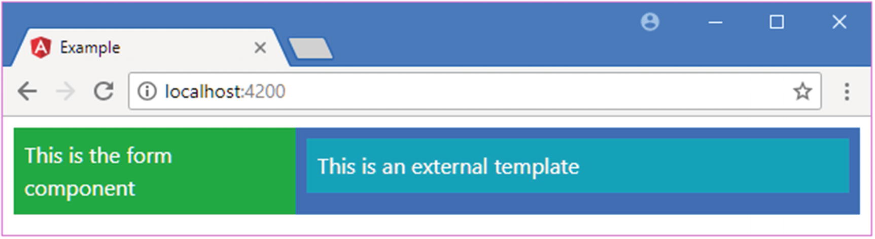
Notice that different properties are used: template is for inline templates, and templateUrl is for external templates. Figure 17-6 shows the effect of using an external template.
Figure 17-6
Using an external template
Using Data Bindings in Component Templates
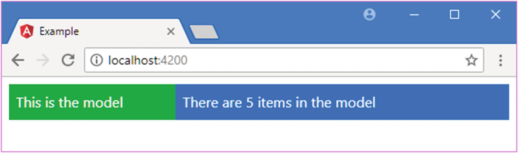
A component’s template can contain the full range of data bindings and target any of the built-in directives or custom directives that have been registered in the application’s Angular module. Each component class provides the context for evaluating the data binding expressions in its template, and, by default, each component is isolated from the others. This means that the component doesn’t have to worry about using the same property and method names that other components use and can rely on Angular to keep everything separate. As an example, Listing 17-9 shows the addition of a property called model to the form child component, which would conflict with the property of the same name in the root component were they not kept separate.
import { Component } from "@angular/core";
@Component({
selector: "paProductForm",
template: "<div>{{model}}</div>"
})
export class ProductFormComponent {
model: string = "This is the model";
}
Listing 17-9
Adding a Property in the productForm.component.ts File in the src/app Folder
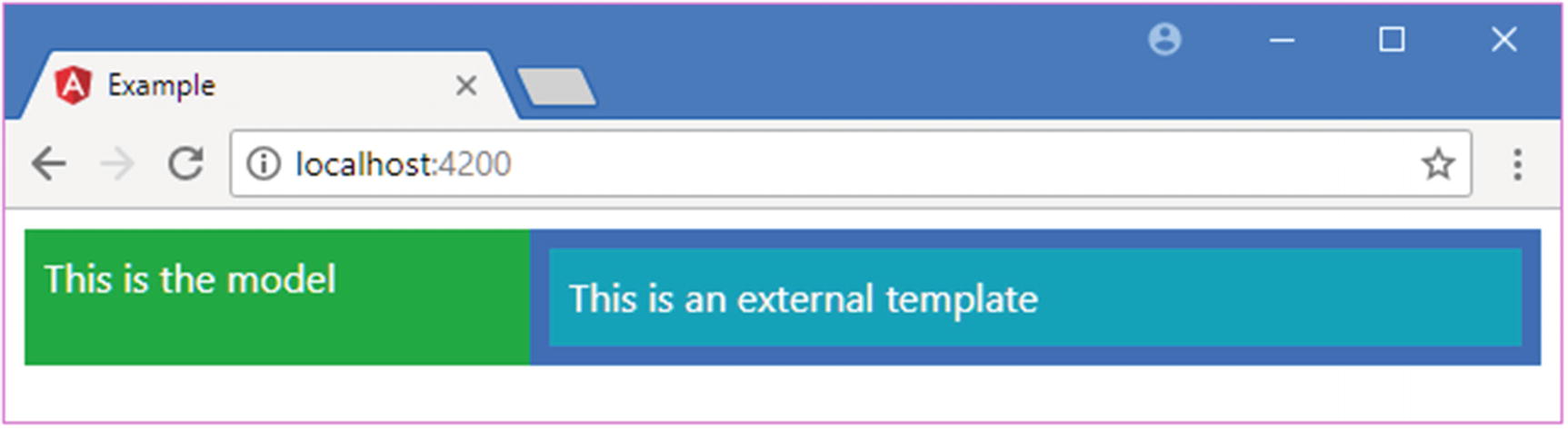
The component class uses the model property to store a message that is displayed in the template using a string interpolation binding. Figure 17-7 shows the result.
Figure 17-7
Using a data binding in a child component
Using Input Properties to Coordinate Between Components
Few components exist in isolation and need to share data with other parts of the application. Components can define input properties to receive the value of data binding expressions on their host elements. The expression will be evaluated in the context of the parent component, but the result will be passed to the child component’s property.
To demonstrate, Listing 17-10 adds an input property to the table component, which it will use to receive the model data that it should display.
import { Component, Input } from "@angular/core";
import { Model } from "./repository.model";
import { Product } from "./product.model";
@Component({
selector: "paProductTable",
templateUrl: "productTable.component.html"
})
export class ProductTableComponent {
@Input("model")
dataModel: Model;
getProduct(key: number): Product {
return this.dataModel.getProduct(key);
}
getProducts(): Product[] {
return this.dataModel.getProducts();
}
deleteProduct(key: number) {
this.dataModel.deleteProduct(key);
}
showTable: boolean = true;
}
Listing 17-10
Defining an Input Property in the productTable.component.ts File in the src/app Folder
The component now defines an input property that will be assigned the value expression assigned to the model attribute on the host element. The getProduct, getProducts, and deleteProduct methods use the input property to provide access to the data model to bindings in the component’s template, which is modified in Listing 17-11. The showTable property is used when I enhance the template in Listing 17-14 later in the chapter.
There are {{getProducts().length}} items in the model
Listing 17-11
Adding a Data Binding in the productTable.component.html File
To provide the child component with the data that it requires means adding a binding to its host element, which is defined in the template of the parent component, as shown in Listing 17-12.
<div class="row text-white m-2">
<div class="col-4 p-2 bg-success">
<paProductForm></paProductForm>
</div>
<div class="col-8 p-2 bg-primary">
<paProductTable [model]="model"></paProductTable>
</div>
</div>
Listing 17-12
Adding a Data Binding in the template.html File in the src/app Folder
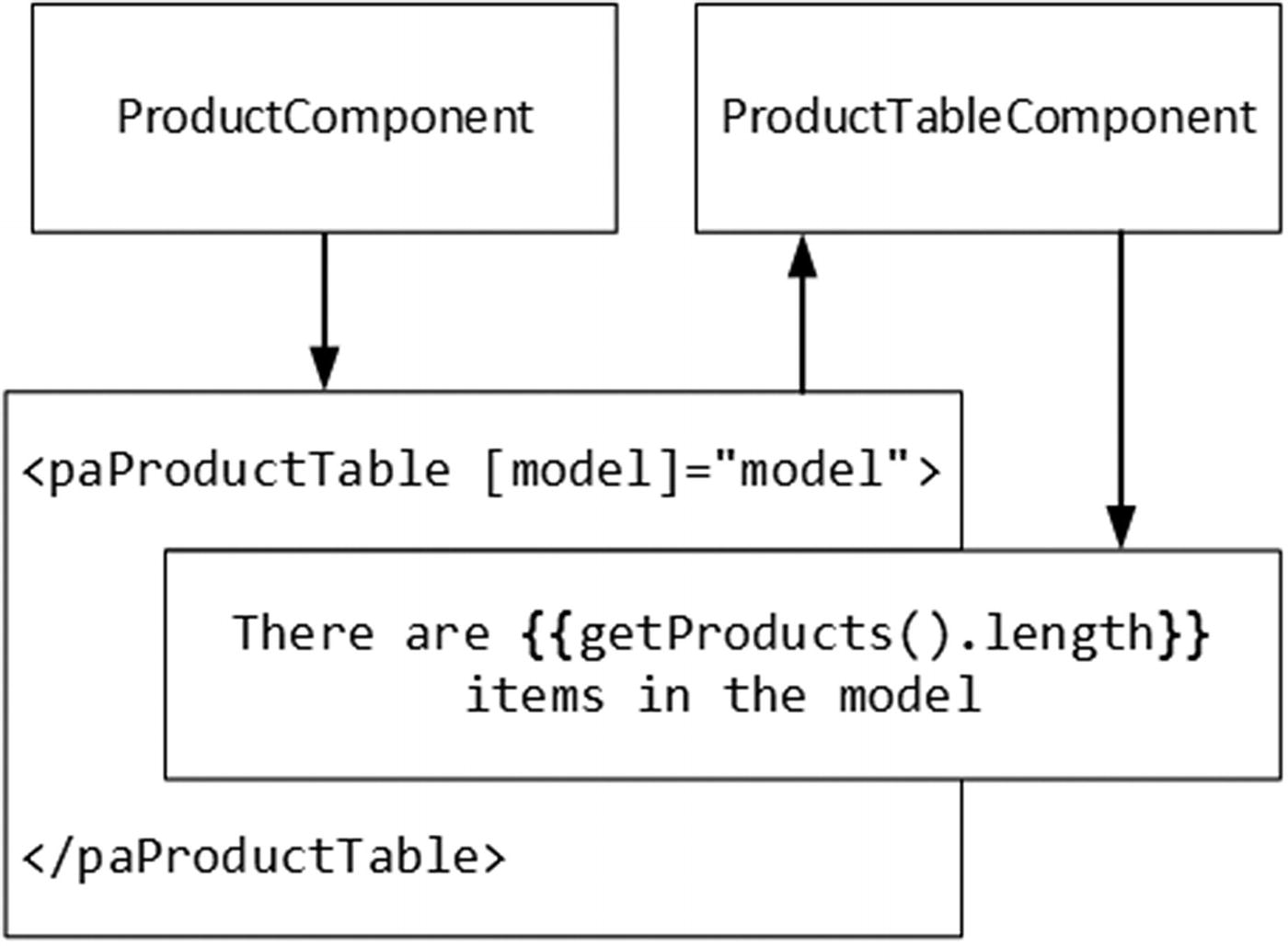
The effect of this binding is to provide the child component with access to the parent component’s model property. This can be a confusing feature because it relies on the fact that the host element is defined in the parent component’s template but that the input property is defined by the child component, as illustrated by Figure 17-8.
Figure 17-8
Sharing data between parent and child components
The child component’s host element acts as the bridge between the parent and child components, and the input property allows the component to provide the child with the data it needs, producing the result shown in Figure 17-9.
Figure 17-9
Sharing data from a parent to a child component
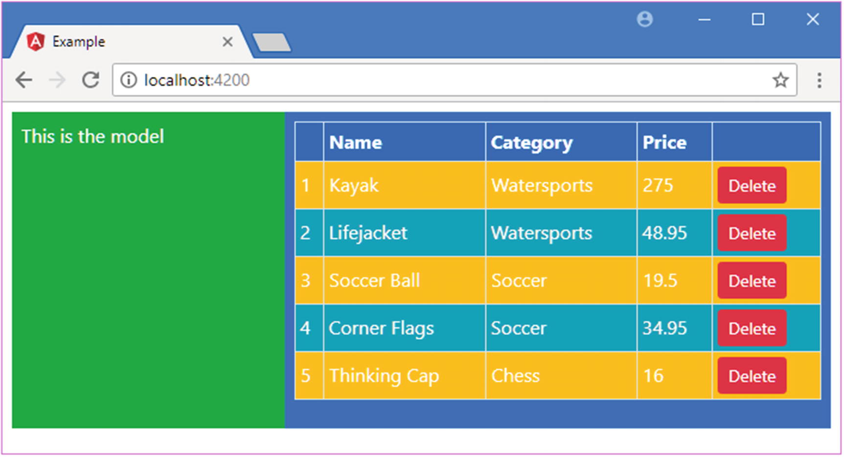
Using Directives in a Child Component Template
Once the input property has been defined, the child component can use the full range of data bindings and directives, either by using the data provided through the parent component or by defining its own. In Listing 17-13, I have restored the original table functionality from earlier chapters that displays a list of the Product objects in the data model, along with a checkbox that determines whether the table is displayed. This was functionality that was previously managed by the root component and its template.
Restoring the Table in the productTable.component.html File in the src/app Folder
The same HTML elements, data bindings, and directives (including custom directives like paIf and paFor) are used, producing the result shown in Figure 17-10. The key difference is not in the appearance of the table but in the way that it is now managed by a dedicated component.
Figure 17-10
Restoring the table display
Using Output Properties to Coordinate Between Components
Child components can use output properties that define custom events that signal important changes and that allow the parent component to respond when they occur. Listing 17-14 shows the addition of an output property to the form component, which will be triggered when the user creates a new Product object.
import { Component, Output, EventEmitter } from "@angular/core";
import { Product } from "./product.model";
import { ProductFormGroup } from "./form.model";
@Component({
selector: "paProductForm",
templateUrl: "productForm.component.html"
})
export class ProductFormComponent {
form: ProductFormGroup = new ProductFormGroup();
newProduct: Product = new Product();
formSubmitted: boolean = false;
@Output("paNewProduct")
newProductEvent = new EventEmitter<Product>();
submitForm(form: any) {
this.formSubmitted = true;
if (form.valid) {
this.newProductEvent.emit(this.newProduct);
this.newProduct = new Product();
this.form.reset();
this.formSubmitted = false;
}
}
}
Listing 17-14
Defining an Output Property in the productForm.component.ts File in the src/app Folder
The output property is called newProductEvent, and the component triggers it when the submitForm method is called. Aside from the output property, the additions in the listing are based on the logic in the root controller, which previously managed the form. I also removed the inline template and created a file called productForm.component.html in the src/app folder, with the content shown in Listing 17-15.
The Contents of the productForm.component.html File in the src/app Folder
As with the input property, the child component’s host element acts as the bridge to the parent component, which can register interest in the custom event, as shown in Listing 17-16.
Registering for the Custom Event in the template.html File in the src/app Folder
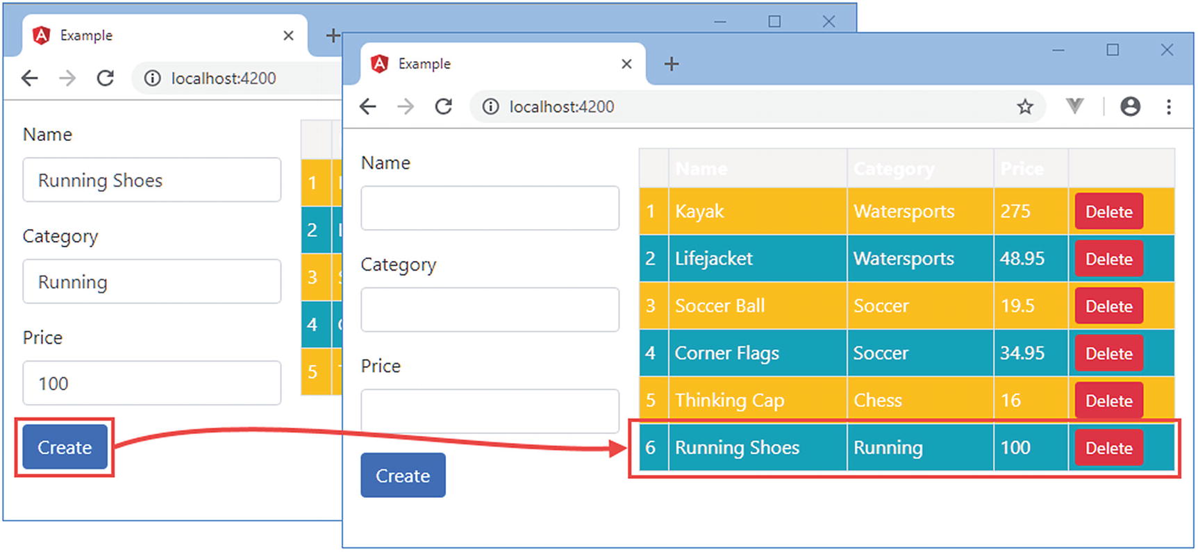
The new binding handles the custom event by passing the event object to the addProduct method. The child component is responsible for managing the form elements and validating their contents. When the data passes validation, the custom event is triggered, and the data binding expression is evaluated in the context of the parent component, whose addProduct method adds the new object to the model. Since the model has been shared with the table child component through its input property, the new data is displayed to the user, as shown in Figure 17-11.
Figure 17-11
Using a custom event in a child component
Projecting Host Element Content
If the host element for a component contains content, it can be included in the template using the special ng-content element. This is known as content projection, and it allows components to be created that combine the content in their template with the content in the host element. To demonstrate, I added a file called toggleView.component.ts to the src/app folder and used it to define the component shown in Listing 17-17.
import { Component } from "@angular/core";
@Component({
selector: "paToggleView",
templateUrl: "toggleView.component.html"
})
export class PaToggleView {
showContent: boolean = true;
}
Listing 17-17
The Contents of the toggleView.component.ts File in the src/app Folder
This component defines a showContent property that will be used to determine whether the host element’s content will be displayed within the template. To provide the template, I added a file called toggleView.component.html to the src/app folder and added the elements shown in Listing 17-18.
The Contents of the toggleView.component.html File in the src/app Folder
The important element is ng-content, which Angular will replace with the content of the host element. The ngIf directive has been applied to the ng-content element so that it will be visible only if the checkbox in the template is checked. Listing 17-19 registers the component with the Angular module.
import { NgModule } from "@angular/core";
import { BrowserModule } from "@angular/platform-browser";
import { ProductComponent } from "./component";
import { FormsModule, ReactiveFormsModule } from "@angular/forms";
import { PaAttrDirective } from "./attr.directive";
import { PaModel } from "./twoway.directive";
import { PaStructureDirective } from "./structure.directive";
import { PaIteratorDirective } from "./iterator.directive";
import { PaCellColor } from "./cellColor.directive";
import { PaCellColorSwitcher } from "./cellColorSwitcher.directive";
import { ProductTableComponent } from "./productTable.component";
import { ProductFormComponent } from "./productForm.component";
import { PaToggleView } from "./toggleView.component";
Adding a Host Element with Content in the template.html File in the src/app Folder
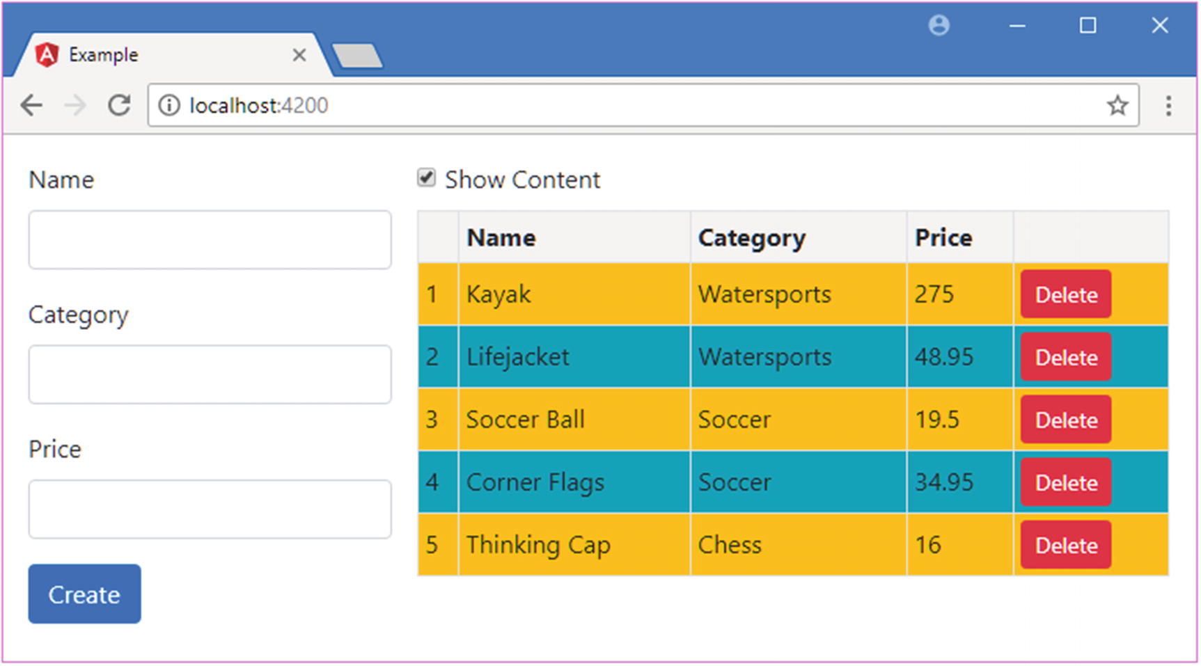
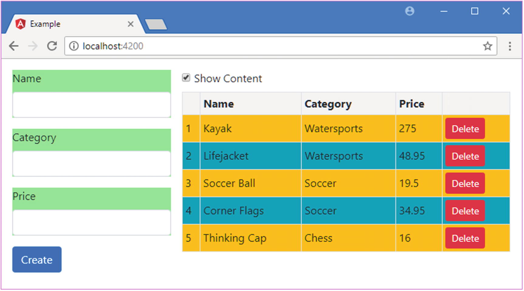
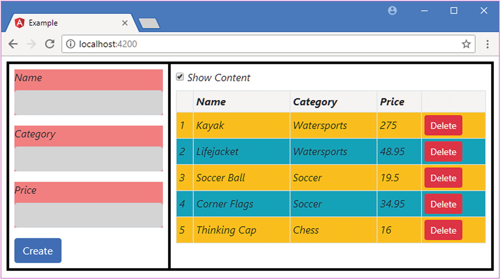
The paToggleView element is the host for the new component, and it contains the paProductTable element, which applies the component that creates the product table. The result is that there is a checkbox that controls the visibility of the table, as shown in Figure 17-12. The new component has no knowledge of the content of its host element, and its inclusion in the template is possible only through the ng-content element.
Figure 17-12
Including host element content in the template
Completing the Component Restructure
The functionality that was previously contained in the root component has been distributed to the new child components. All that remains is to tidy up the root component to remove the code that is no longer required, as shown in Listing 17-21.
import { ApplicationRef, Component } from "@angular/core";
import { Model } from "./repository.model";
import { Product } from "./product.model";
import { ProductFormGroup } from "./form.model";
@Component({
selector: "app",
templateUrl: "template.html"
})
export class ProductComponent {
model: Model = new Model();
addProduct(p: Product) {
this.model.saveProduct(p);
}
}
Listing 17-21
Removing Obsolete Code in the component.ts File in the src/app Folder
Many of the responsibilities of the root component have been moved elsewhere in the application. Of the original list from the start of the chapter, only the following remain the responsibility of the root component:
Providing Angular with an entry point into the application, as the root component
Providing access to the application’s data model so that it can be used in data bindings
The child components have assumed the rest of the responsibilities, providing self-contained blocks of functionality that are simpler, easier to develop, and easier to maintain and that can be reused as required.
Using Component Styles
Components can define styles that apply only to the content in their templates, which allows content to be styled by a component without it being affected by the styles defined by its parents or other antecedents and without affecting the content in its child and other descendant components. Styles can be defined inline using the styles property of the @Component decorator, as shown in Listing 17-22.
import { Component, Output, EventEmitter } from "@angular/core";
import { Product } from "./product.model";
import { ProductFormGroup } from "./form.model";
@Component({
selector: "paProductForm",
templateUrl: "productForm.component.html",
styles: ["div { background-color: lightgreen }"]
})
export class ProductFormComponent {
form: ProductFormGroup = new ProductFormGroup();
newProduct: Product = new Product();
formSubmitted: boolean = false;
@Output("paNewProduct")
newProductEvent = new EventEmitter<Product>();
submitForm(form: any) {
this.formSubmitted = true;
if (form.valid) {
this.newProductEvent.emit(this.newProduct);
this.newProduct = new Product();
this.form.reset();
this.formSubmitted = false;
}
}
}
Listing 17-22
Defining Inline Styles in the productForm.component.ts File in the src/app Folder
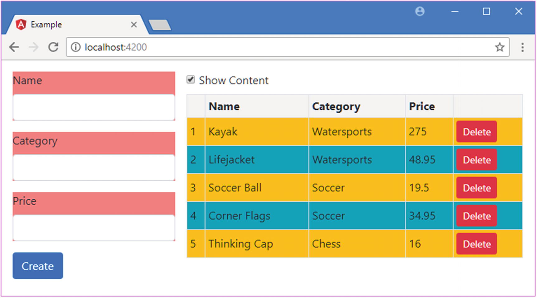
The styles property is set to an array, where each item contains a CSS selector and one or more properties. In the listing, I have specified styles that set the background color of div elements to lightgreen. Even though there are div elements throughout the combined HTML document, this style will affect only the elements in the template of the component that defines them, which is the form component in this case, as shown in Figure 17-13.
Figure 17-13
Defining inline component styles
Tip
The styles included in the bundles created by the development tools are still applied, which is why the elements are still styled using Bootstrap.
Defining External Component Styles
Inline styles offer the same benefits and drawbacks as inline templates: they are simple and keep everything in one file, but they can be hard to read, can be hard to manage, and can confuse code editors.
The alternative is to define styles in a separate file and associate them with a component using the styleUrls property in its decorator. External style files follow the same naming convention as templates and code files. I added a file called productForm.component.css to the src/app folder and used it to define the styles shown in Listing 17-23.
div {
background-color: lightcoral;
}
Listing 17-23
The Contents of the productForm.component.css File in the src/app Folder
This is the same style that was defined inline but with a different color value to confirm that this is the CSS being used by the component. In Listing 17-24, the component’s decorator has been updated to specify the styles file.
import { Component, Output, EventEmitter } from "@angular/core";
import { Product } from "./product.model";
import { ProductFormGroup } from "./form.model";
@Component({
selector: "paProductForm",
templateUrl: "productForm.component.html",
styleUrls: ["productForm.component.css"]
})
export class ProductFormComponent {
form: ProductFormGroup = new ProductFormGroup();
newProduct: Product = new Product();
formSubmitted: boolean = false;
@Output("paNewProduct")
newProductEvent = new EventEmitter<Product>();
submitForm(form: any) {
this.formSubmitted = true;
if (form.valid) {
this.newProductEvent.emit(this.newProduct);
this.newProduct = new Product();
this.form.reset();
this.formSubmitted = false;
}
}
}
Listing 17-24
Using External Styles in the productForm.component.ts File in the src/app Folder
The styleUrls property is set to an array of strings, each of which specifies a CSS file. Figure 17-14 shows the effect of adding the external styles file.
Figure 17-14
Defining external component styles
Using Advanced Style Features
Defining styles in components is a useful feature, but you won’t always get the results you expect. Some advanced features allow you to take control of how component styles work.
Setting View Encapsulation
By default, component-specific styles are implemented by writing the CSS that has been applied to the component so that it targets special attributes, which Angular then adds to all of the top-level elements contained in the component’s template. If you inspect the DOM using the browser’s F12 developer tools, you will see that the contents of the external CSS file in Listing 17-23 have been rewritten like this:
...
<style>
div[_ngcontent-c0] {
background-color: lightcoral;
}
</style>
...
The selector has been modified so that it matches div elements with an attribute called _ngcontent-c0 although you may see a different name in your browser since the name of the attribute is generated dynamically by Angular.
To ensure that the CSS in the style element affects only the HTML elements managed by the component, the elements in the template are modified so they have the same dynamically generated attribute, like this:
This is known as the component’s view encapsulation behavior, and what Angular is doing is emulating a feature known as the shadow DOM, which allows sections of the Domain Object Model to be isolated so they have their own scope, meaning that JavaScript, styles, and templates can be applied to part of the HTML document. The reason that Angular emulates this behavior is that it is implemented by only a small number of browsers (at the time of writing, only Google Chrome and the latest versions of Safari and Opera support the shadow DOM feature), but there are two other encapsulation options, which are set using the encapsulation property in the @Component decorator.
The encapsulation property is assigned a value from the ViewEncapsulation enumeration, which is defined in the @angular/core module, and it defines the values described in Table 17-4.
Table 17-4
The ViewEncapsulation Values
Name
Description
Emulated
When this value is specified, Angular emulates the shadow DOM by writing content and styles to add attributes, as described earlier. This is the default behavior if no encapsulation value is specified in the @Component decorator.
Native
When this value is specified, Angular uses the browser’s shadow DOM feature. This will work only if the browser implements the shadow DOM or if you are using a polyfill.
None
When this value is specified, Angular simply adds the unmodified CSS styles to the head section of the HTML document and lets the browser figure out how to apply the styles using the normal CSS precedence rules.
The Native and None values should be used with caution. Browser support for the shadow DOM feature is so limited that using the Native option is sensible only if you are using a polyfill library that provides compatibility for other browsers.
The None option adds all the styles defined by components to the head section of the HTML document and lets the browser figure out how to apply them. This has the benefit of working in all browsers, but the results are unpredictable, and there is no isolation between the styles defined by different components.
For completeness, Listing 17-25 shows the encapsulation property being set to Emulated, which is the default value and which works in all the browsers that Angular supports, without the need for polyfills.
import { Component, Output, EventEmitter, ViewEncapsulation } from "@angular/core";
import { Product } from "./product.model";
import { ProductFormGroup } from "./form.model";
@Component({
selector: "paProductForm",
templateUrl: "productForm.component.html",
styleUrls: ["productForm.component.css"],
encapsulation: ViewEncapsulation.Emulated
})
export class ProductFormComponent {
form: ProductFormGroup = new ProductFormGroup();
newProduct: Product = new Product();
formSubmitted: boolean = false;
@Output("paNewProduct")
newProductEvent = new EventEmitter<Product>();
submitForm(form: any) {
this.formSubmitted = true;
if (form.valid) {
this.newProductEvent.emit(this.newProduct);
this.newProduct = new Product();
this.form.reset();
this.formSubmitted = false;
}
}
}
Listing 17-25
Setting View Encapsulation in the productForm.component.ts File in the src/app Folder
Using the Shadow DOM CSS Selectors
Using the shadow DOM means that there are boundaries that regular CSS selectors do not operate across. To help address this, there are a number of special CSS selectors that are useful when using styles that rely on the shadow DOM (even when it is being emulated), as described in Table 17-5 and demonstrated in the sections that follow.
Table 17-5
The Shadow DOM CSS Selectors
Name
Description
:host
This selector is used to match the component’s host element.
:host-context(classSelector)
This selector is used to match the ancestors of the host element that are members of a specific class.
/deep/ or >>>
This selector is used by a parent component to define styles that affect the elements in child component templates. This selector should be used only when the @Component decorator’s encapsulation property is set to emulated, as described in the “Setting View Encapsulation” section.
Selecting the Host Element
A component’s host element appears outside of its template, which means that the selectors in its styles apply only to elements that the host element contains and not the element itself. This can be addressed by using the :host selector, which matches the host element. Listing 17-26 defines a style that is applied only when the mouse pointer is hovering over the host element, which is specified by combining the :host and :hover selectors.
div {
background-color: lightcoral;
}
:host:hover {
font-size: 25px;
}
Listing 17-26
Matching the Host Element in the productForm.component.css File in the src/app Folder
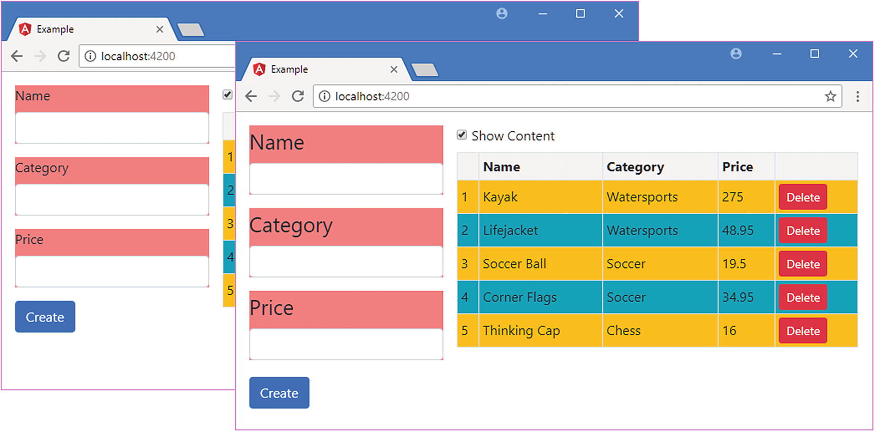
When the mouse pointer is over the host element, its font-size property will be set to 25px, which increases the text size to 25 points for all the elements in the form, as shown in Figure 17-15.
Figure 17-15
Selecting the host element in a component style
Selecting the Host Element’s Ancestors
The :host-context selector is used to style elements within the component’s template based on the class membership of the host element’s ancestors (which are outside the template). This is a more limited selector than :host and cannot be used to specify anything other than a class selector, without support for matching tag types, attributes, or any other selector. Listing 17-27 shows the use of the :host-context selector.
div {
background-color: lightcoral;
}
:host:hover {
font-size: 25px;
}
:host-context(.angularApp) input {
background-color: lightgray;
}
Listing 17-27
Selecting Ancestors in the productForm.component.css File in the src/app Folder
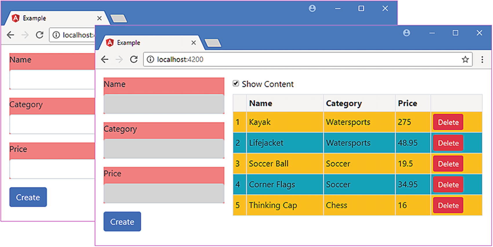
The selector in the listing sets the background-color property of input elements within the component’s template to lightgrey only if one of the host element’s ancestor elements is a member of a class called angularApp. In Listing 17-28, I have added the app element in the index.html file, which is the host element for the root component, to the angularApp class.
Adding the Host Element to a Class in the index.html File in the src/app Folder
Figure 17-16 shows the effect of the selector before and after the changes in Listing 17-28.
Figure 17-16
Selecting the host element’s ancestors
Pushing a Style into the Child Component’s Template
Styles defined by a component are not automatically applied to the elements in the child component’s templates. As a demonstration, Listing 17-29 adds a style to the @Component decorator of the root component.
import { ApplicationRef, Component } from "@angular/core";
import { Model } from "./repository.model";
import { Product } from "./product.model";
import { ProductFormGroup } from "./form.model";
@Component({
selector: "app",
templateUrl: "template.html",
styles: ["div { border: 2px black solid; font-style:italic }"]
})
export class ProductComponent {
model: Model = new Model();
addProduct(p: Product) {
this.model.saveProduct(p);
}
}
Listing 17-29
Defining Styles in the component.ts File in the src/app Folder
The selector matches all div elements and applies a border and changes the font style. Figure 17-17 shows the result.
Figure 17-17
Applying regular CSS styles
Some CSS style properties, such as font-style, are inherited by default, which means that setting such a property in a parent component will affect the elements in child component templates because the browser automatically applies the style.
Other properties, such as border, are not inherited by default, and setting such a property in a parent component has no effect on child component templates, unless the /deep/ or >>> selectors are used, as shown in Listing 17-30. (These selectors are aliases of one another and have the same effect.)
import { ApplicationRef, Component } from "@angular/core";
import { Model } from "./repository.model";
import { Product } from "./product.model";
import { ProductFormGroup } from "./form.model";
@Component({
selector: "app",
templateUrl: "template.html",
styles: ["/deep/ div { border: 2px black solid; font-style:italic }"]
})
export class ProductComponent {
model: Model = new Model();
addProduct(p: Product) {
this.model.saveProduct(p);
}
}
Listing 17-30
Pushing a Style into Child Templates in the component.ts File in the src/app Folder
The selector for the style uses /deep/ to push the styles into the child components’ templates, which means that all the div elements are given a border, as shown in Figure 17-18.
Figure 17-18
Pushing a style into child component templates
Querying Template Content
Components can query the content of their templates to locate instances of directives or components, which are known as view children. These are similar to the directive content children queries that were described in Chapter 16 but with some important differences.
In Listing 17-31, I have added some code to the component that manages the table that queries for the PaCellColor directive that was created to demonstrate directive content queries. This directive is still registered in the Angular module and selects td elements, so Angular will have applied it to the cells in the table component’s content.
import { Component, Input, ViewChildren, QueryList } from "@angular/core";
import { Model } from "./repository.model";
import { Product } from "./product.model";
import { PaCellColor } from "./cellColor.directive";
@Component({
selector: "paProductTable",
templateUrl: "productTable.component.html"
})
export class ProductTableComponent {
@Input("model")
dataModel: Model;
getProduct(key: number): Product {
return this.dataModel.getProduct(key);
}
getProducts(): Product[] {
return this.dataModel.getProducts();
}
deleteProduct(key: number) {
this.dataModel.deleteProduct(key);
}
showTable: boolean = true;
@ViewChildren(PaCellColor)
viewChildren: QueryList<PaCellColor>;
ngAfterViewInit() {
this.viewChildren.changes.subscribe(() => {
this.updateViewChildren();
});
this.updateViewChildren();
}
private updateViewChildren() {
setTimeout(() => {
this.viewChildren.forEach((child, index) => {
child.setColor(index % 2 ? true : false);
})
}, 0);
}
}
Listing 17-31
Selecting View Children in the productTable.component.ts File in the src/app Folder
There are two property decorators that are used to query for directives or components defined in the template, as described in Table 17-6.
Table 17-6
The View Children Query Property Decorators
Name
Description
@ViewChild(class)
This decorator tells Angular to query for the first directive or component object of the specified type and assign it to the property. The class name can be replaced with a template variable. Multiple classes or templates can be separated by commas.
@ViewChildren(class)
This decorator assigns all the directive and component objects of the specified type to the property. Template variables can be used instead of classes, and multiple values can be separated by commas. The results are provided in a QueryList object, described in Chapter 16.
In the listing, I used the @ViewChildren decorator to select all the PaCellColor objects from the component’s template. Aside from the different property decorators, components have two different lifecycle methods that are used to provide information about how the template has been processed, as described in Table 17-7.
Table 17-7
The Additional Component Lifecycle Methods
Name
Description
ngAfterViewInit
This method is called when the component’s view has been initialized. The results of the view queries are set before this method is invoked.
ngAfterViewChecked
This method is called after the component’s view has been checked as part of the change detection process.
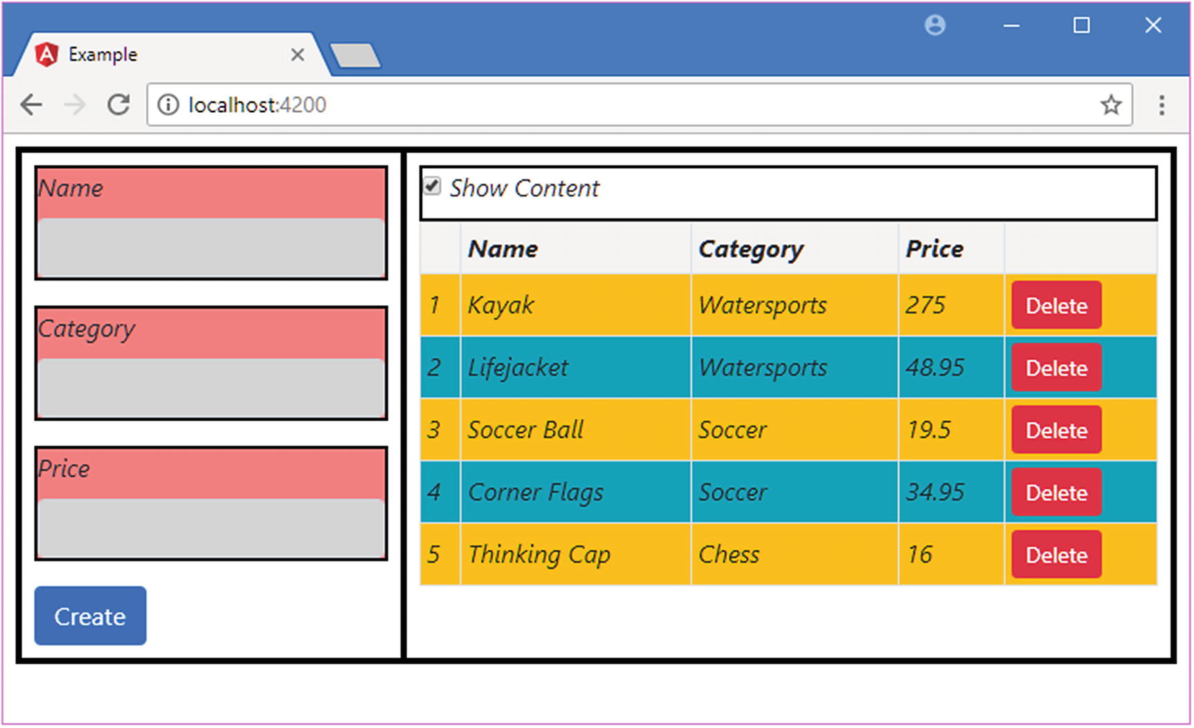
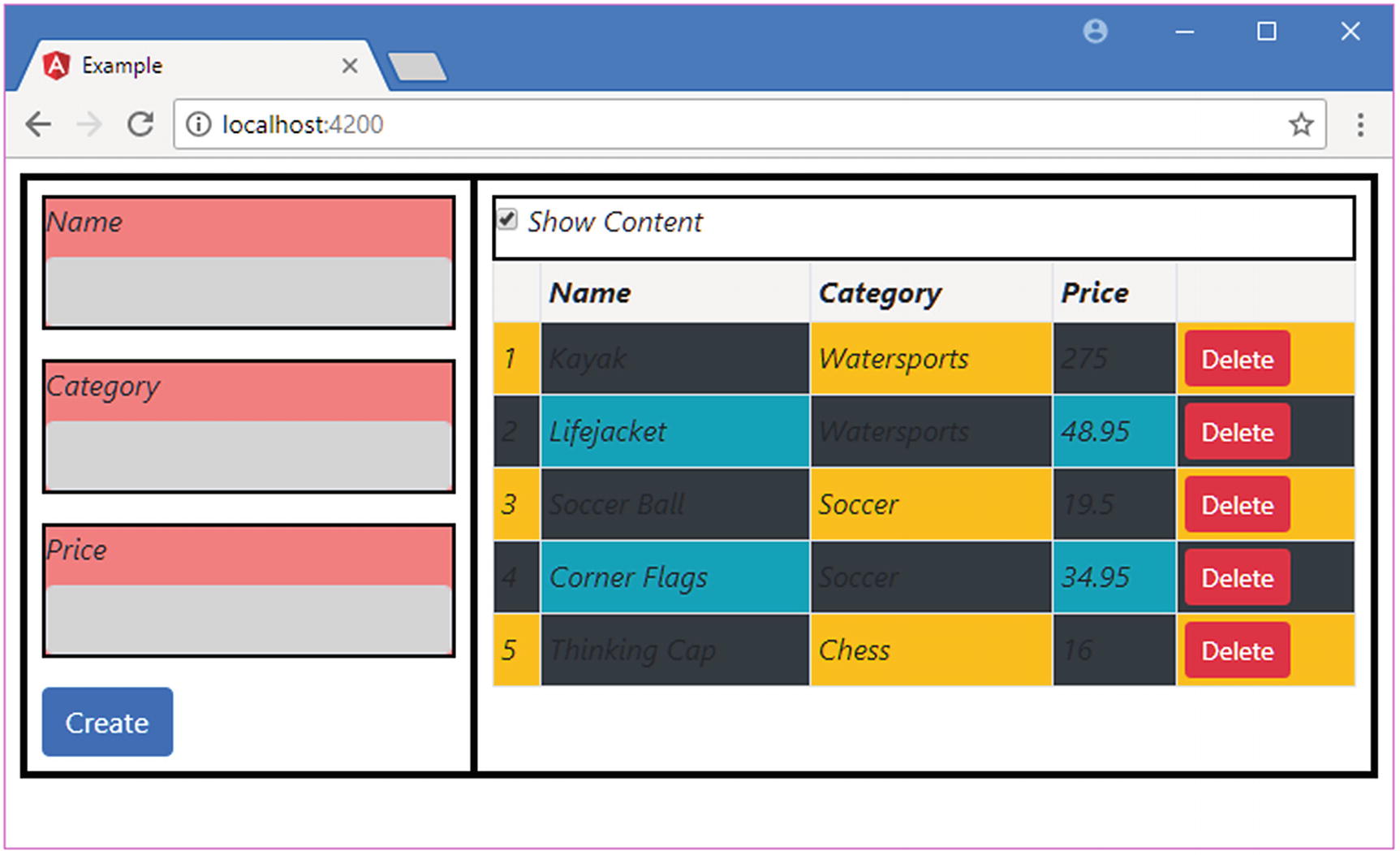
In the listing, I implement the ngAfterViewInit method to ensure that Angular has processed the component’s template and set the result of the query. Within the method I perform the initial call to the updateViewChildren method, which operates on the PaCellColor objects, and set up the function that will be called when the query results change, using the QueryList.changes property, as described in Chapter 16. The view children are updated within a call to the setTimeout function, as explained in Chapter 16. The result is that the color of every second table cell is changed, as shown in Figure 17-19.
Figure 17-19
Querying for view children
Tip
You may need to combine view child and content child queries if you have used the ng-content element. The content defined in the template is queried using the technique shown in Listing 17-31, but the project content—which replaces the ng-content element—is queried using the child queries described in Chapter 16.
Summary
In this chapter, I revisited the topic of components and explained how to combine all of the features of directives with the ability to provide their own templates. I explained how to structure an application to create small module components and how components can coordinate between themselves using input and output properties. I also showed you how components can define CSS styles that are applied only to their templates and no other parts of the application. In the next chapter, I introduce pipes, which are used to prepare data for display in templates.