In this chapter, I describe how custom directives can be used to supplement the functionality provided by the built-in ones provided by Angular. The focus of this chapter is attribute directives, which are the simplest type that can be created and that change the appearance or behavior of a single element. In Chapter 16, I explain how to create structural directives, which are used to change the layout of the HTML document. Components are also a type of directive, and I explain how they work in Chapter 17.
Throughout these chapters, I describe how custom directives work by re-creating the features provided by some of the built-in directives. This isn’t something you would typically do in a real project, but it provides a useful baseline against which the process can be explained. Table 15-1 puts attribute directives into context.
Table 15-1
Putting Attribute Directives in Context
Question
Answer
What are they?
Attribute directives are classes that are able to modify the behavior or appearance of the element they are applied to. The style and class bindings described in Chapter 12 are examples of attribute directives.
Why are they useful?
The built-in directives cover the most common tasks required in web application development but don’t deal with every situation. Custom directives allow application-specific features to be defined.
How are they used?
Attribute directives are classes to which the @Directive decorator has been applied. They are enabled in the directives property of the component responsible for a template and applied using a CSS selector.
Are there any pitfalls or limitations?
The main pitfall when creating a custom directive is the temptation to write code to perform tasks that can be better handled using directive features such as input and output properties and host element bindings.
Are there any alternatives?
Angular supports two other types of directive—structural directives and components—that may be more suitable for a given task. You can sometimes combine the built-in directives to create a specific effect If you prefer to avoid writing custom code, although the result can be brittle and leads to complex HTML that is hard to read and maintain.
Apply the @Attribute decorator to a constructor parameter
6–9
Create a data-bound input property
Apply the @Input decorator to a class property
10–11
Receive a notification when a data-bound input property value changes
Implement the ngOnChanges method
12
Define an event
Apply the @Output decorator
13, 14
Create a property binding or event binding on the host element
Apply the @HostBinding or @HostListener decorators
15–19
Export a directive’s functionality for use in the template
Use the exportAs property of the @Directive decorator
20, 21
Preparing the Example Project
As I have been doing throughout this part of the book, I will continue using the example project from the previous chapter. To prepare for this chapter, I have added a table to the template that displays the products in the data model and removed the form-level validation messages, as shown in Listing 15-1.
<tr *ngFor="let item of getProducts(); let i = index">
<td>{{i + 1}}</td>
<td>{{item.name}}</td>
<td>{{item.category}}</td>
<td>{{item.price}}</td>
</tr>
</table>
</div>
</div>
Listing 15-1
Preparing the Template in the template.html File in the src/app Folder
This listing uses the Bootstrap grid layout to position the form and the table side by side. Listing 15-2 removes the jsonProperty property and updates the component’s addProduct method so that it adds a new object to the data model.
import { ApplicationRef, Component } from "@angular/core";
import { NgForm } from "@angular/forms";
import { Model } from "./repository.model";
import { Product } from "./product.model";
import { ProductFormGroup } from "./form.model";
@Component({
selector: "app",
templateUrl: "template.html"
})
export class ProductComponent {
model: Model = new Model();
form: ProductFormGroup = new ProductFormGroup();
getProduct(key: number): Product {
return this.model.getProduct(key);
}
getProducts(): Product[] {
return this.model.getProducts();
}
newProduct: Product = new Product();
addProduct(p: Product) {
this.model.saveProduct(p);
}
formSubmitted: boolean = false;
submitForm(form: NgForm) {
this.formSubmitted = true;
if (form.valid) {
this.addProduct(this.newProduct);
this.newProduct = new Product();
form.reset();
this.formSubmitted = false;
}
}
}
Listing 15-2
Modifying the Data Model in the component.ts File in the src/app Folder
To start the application, navigate to the example project folder and run the following command:
ng serve
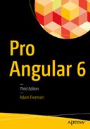
Open a new browser window and navigate to http://localhost:4200 to see the form in Figure 15-1. When you submit the form, the data will be validated, and either error messages will be displayed or a new item will be added to the data model and displayed in the table.
Figure 15-1
Running the example application
Creating a Simple Attribute Directive
The best place to start is to jump in and create a directive to see how they work. I added a file called attr.directive.ts to the src/app folder with the code shown in Listing 15-3. The name of the file indicates that it contains a directive. I set the first part of the file name to attr to indicate that this is an example of an attribute directive.
import { Directive, ElementRef } from "@angular/core";
The Contents of the attr.directive.ts File in the src/app Folder
Directives are classes to which the @Directive decorator has been applied. The decorator requires the selector property, which is used to specify how the directive is applied to elements, expressed using a standard CSS style selector. The selector I used is [pa-attr], which will match any element that has an attribute called pa-attr, regardless of the element type or the value assigned to the attribute.
Custom directives are given a distinctive prefix so they can be easily recognized. The prefix can be anything that is meaningful to your application. I have chosen the prefix Pa for my directive, reflecting the title of this book, and this prefix is used in the attribute specified by the selector decorator property and the name of the attribute class. The case of the prefix is changed to reflect its use so that an initial lowercase character is used for the selector attribute name (pa-attr) and an initial uppercase character is used in the name of the directive class (PaAttrDirective).
Note
The prefix Ng/ng is reserved for use for built-in Angular features and should not be used.
The directive constructor defines a single ElementRef parameter, which Angular provides when it creates a new instance of the directive and which represents the host element. The ElementRef class defines a single property, nativeElement, which returns the object used by the browser to represent the element in the Domain Object Model. This object provides access to the methods and properties that manipulate the element and its contents, including the classList property, which can be used to manage the class membership of the element, like this:
To summarize, the PaAttrDirective class is a directive that is applied to elements that have a pa-attr attribute and adds those elements to the bg-success and text-white classes, which the Bootstrap CSS library uses to assign background and text colors to elements.
Applying a Custom Directive
There are two steps to apply a custom directive. The first is to update the template so that there are one or more elements that match the selector that the directive uses. In the case of the example directive, this means adding the pa-attr attribute to an element, as shown in Listing 15-4.
<tr *ngFor="let item of getProducts(); let i = index" pa-attr>
<td>{{i + 1}}</td>
<td>{{item.name}}</td>
<td>{{item.category}}</td>
<td>{{item.price}}</td>
</tr>
</table>
...
Listing 15-4
Adding a Directive Attribute in the template.html File in the src/app Folder
The directive’s selector matches any element that has the attribute, regardless of whether a value has been assigned to it or what that value is. The second step to applying a directive is to change the configuration of the Angular module, as shown in Listing 15-5.
import { NgModule } from "@angular/core";
import { BrowserModule } from "@angular/platform-browser";
import { ProductComponent } from "./component";
import { FormsModule, ReactiveFormsModule } from "@angular/forms";
import { PaAttrDirective } from "./attr.directive";
Configuring the Component in the app.module.ts File in the src/app Folder
The declarations property of the NgModule decorator declares the directives and components that the application will use. Don’t worry if the relationship and differences between directives and components seem muddled at the moment; it will become clear in Chapter 17.
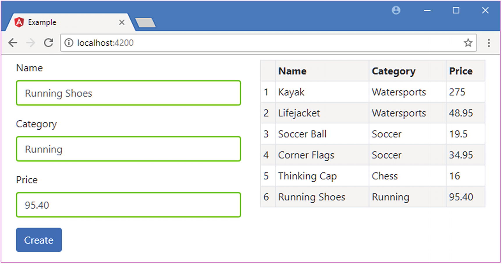
Once both steps have been completed, the effect is that the pa-attr attribute applied to the tr element in the template will trigger the custom directive, which uses the DOM API to add the element to the bg-success and text-white classes. Since the tr element is part of the micro-template used by the ngFor directive, all the rows in the table are affected, as shown in Figure 15-2.
Figure 15-2
Applying a custom directive
Accessing Application Data in a Directive
The example in the previous section shows the basic structure of a directive, but it doesn’t do anything that couldn’t be performed just by using a class property binding on the tr element. Directives become useful when they can interact with the host element and with the rest of the application.
Reading Host Element Attributes
The simplest way to make a directive more useful is to configure it using attributes applied to the host element, which allows each instance of the directive to be provided with its own configuration information and to adapt its behavior accordingly.
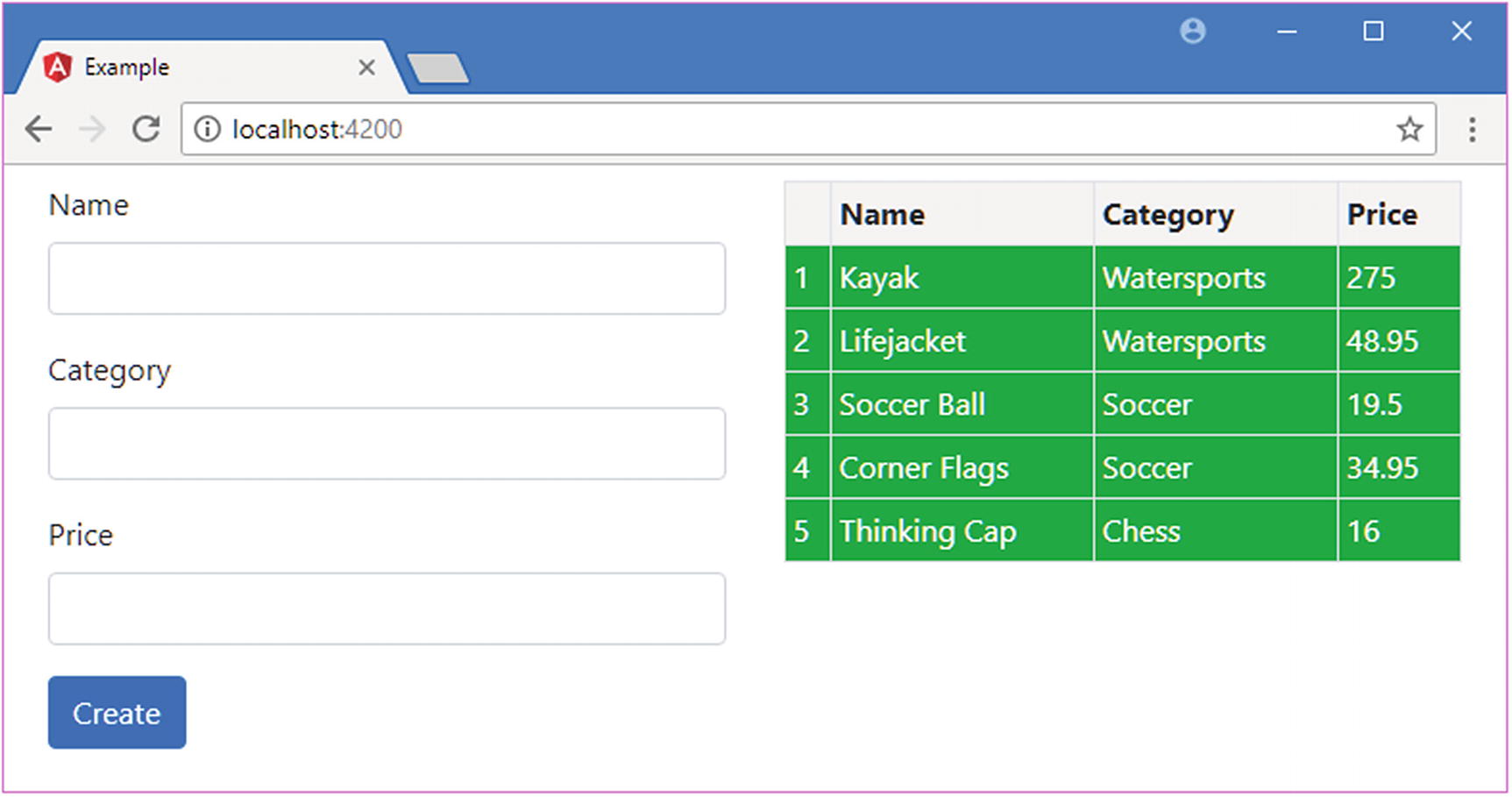
As an example, Listing 15-6 applies the directive to some of the td elements in the template table and adds an attribute that specifies the class that the host element should be added to. The directive’s selector means that it will match any element that has the pa-attr attribute, regardless of the tag type, and will work as well on td elements as it does on tr elements.
Adding Attributes in the template.html File in the src/app Folder
The pa-attr attribute has been applied to two of the td elements, along with a new attribute called pa-attr-class, which has been used to specify the class to which the directive should add the host element. Listing 15-7 shows the changes required to the directive to get the value of the pa-attr-class attribute and use it to change the element.
import { Directive, ElementRef, Attribute } from "@angular/core";
Reading an Attribute in the attr.directive.ts File in the src/app Folder
To receive the value of the pa-attr-class attribute, I added a new constructor parameter called bgClass, to which the @Attribute decorator has been applied. This decorator is defined in the @angular/core module, and it specifies the name of the attribute that should be used to provide a value for the constructor parameter when a new instance of the directive class is created. Angular creates a new instance of the decorator for each element that matches the selector and uses that element’s attributes to provide the values for the directive constructor arguments that have been decorated with @Attribute.
Within the constructor, the value of the attribute is passed to the classList.add method, with a default value that allows the directive to be applied to elements that have the pa-attr attribute but not the pa-attr-class attribute.
The result is that the class to which elements are added can now be specified using an attribute, producing the result shown in Figure 15-3.
Figure 15-3
Configuring a directive using a host element attribute
Using a Single Host Element Attribute
Using one attribute to apply a directive and another to configure it is redundant, and it makes more sense to make a single attribute do double duty, as shown in Listing 15-8.
import { Directive, ElementRef, Attribute } from "@angular/core";
Reusing an Attribute in the attr.directive.ts File in the src/app Folder
The @Attribute decorator now specifies the pa-attr attribute as the source of the bgClass parameter value. In Listing 15-9, I have updated the template to reflect the dual-purpose attribute.
<tr *ngFor="let item of getProducts(); let i = index" pa-attr>
<td>{{i + 1}}</td>
<td>{{item.name}}</td>
<td pa-attr="bg-warning">{{item.category}}</td>
<td pa-attr="bg-info">{{item.price}}</td>
</tr>
</table>
...
Listing 15-9
Applying a Directive in the template.html File in the src/app Folder
There is no visual change in the result produced by this example, but it has simplified the way that the directive is applied in the HTML template.
Creating Data-Bound Input Properties
The main limitation of reading attributes with @Attribute is that values are static. The real power in Angular directives comes through support for expressions that are updated to reflect changes in the application state and that can respond by changing the host element.
Directives receive expressions using data-bound input properties, also known as input properties or, simply, inputs. Listing 15-10 changes the application’s template so that the pa-attr attributes applied to the tr and td elements contain expressions, rather than just static class names.
Using Expressions in the template.html File in the src/app Folder
There are three expressions in the listing. The first, which is applied to the tr element, uses the number of objects returned by the component’s getProducts method to select a class.
...
<tr *ngFor="let item of getProducts(); let i = index"
The second expression, which is applied to the td element for the Category column, specifies the bg-info class for Product objects whose Category property returns Soccer and null for all other values.
The third and final expression returns a fixed string value, which I have enclosed in single quotes, since this is an expression and not a static attribute value.
...
<td [pa-attr]="'bg-info'">{{item.price}}</td>
...
Notice that the attribute name is enclosed in square brackets. That’s because the way to receive an expression in a directive is to create a data binding, just like the built-in directives that are described in Chapters 13 and 14.
Tip
Forgetting to use the square brackets is a common mistake. Without them, Angular will just pass the raw text of the expression to the directive without evaluating it. This is the first thing to check if you encounter an error when applying a custom directive.
Implementing the other side of the data binding means creating an input property in the directive class and telling Angular how to manage its value, as shown in Listing 15-11.
import { Directive, ElementRef, Attribute, Input } from "@angular/core";
Defining an Input Property in the attr.directive.ts File in the src/app Folder
Input properties are defined by applying the @Input decorator to a property and using it to specify the name of the attribute that contains the expression. This listing defines a single input property, which tells Angular to set the value of the directive’s bgClass property to the value of the expression contained in the pa-attr attribute.
Tip
You don’t need to provide an argument to the @Input decorator if the name of the property corresponds to the name of the attribute on the host element. So, if you apply @Input() to a property called myVal, then Angular will look for a myVal attribute on the host element.
The role of the constructor has changed in this example. When Angular creates a new instance of a directive class, the constructor is invoked to create a new directive object and only then is the value of the input property set. This means that the constructor cannot access the input property value because its value will not be set by Angular until after the constructor has completed and the new directive object has been produced. To address this, directives can implement lifecycle hook methods, which Angular uses to provide directives with useful information after they have been created and while the application is running, as described in Table 15-3.
Table 15-3
The Directive Lifecycle Hook Methods
Name
Description
ngOnInit
This method is called after Angular has set the initial value for all the input properties that the directive has declared.
ngOnChanges
This method is called when the value of an input property has changed and also just before the ngOnInit method is called.
ngDoCheck
This method is called when Angular runs its change detection process so that directives have an opportunity to update any state that isn’t directly associated with an input property.
ngAfterContentInit
This method is called when the directive’s content has been initialized. See the “Receiving Query Change Notifications” section in Chapter 16 for an example that uses this method.
ngAfterContentChecked
This method is called after the directive’s content has been inspected as part of the change detection process.
ngOnDestroy
This method is called immediately before Angular destroys a directive.
To set the class on the host element, the directive in Listing 15-11 implements the ngOnInit method, which is called after Angular has set the value of the bgClass property. The constructor is still needed to receive the ElementRef object that provides access to the host element, which is assigned to a property called element.
The result is that Angular will create a directive object for each tr element, evaluate the expressions specified in the pa-attr attribute, use the results to set the value of the input properties, and then call the ngOnInit methods, which allows the directives to respond to the new input property values.
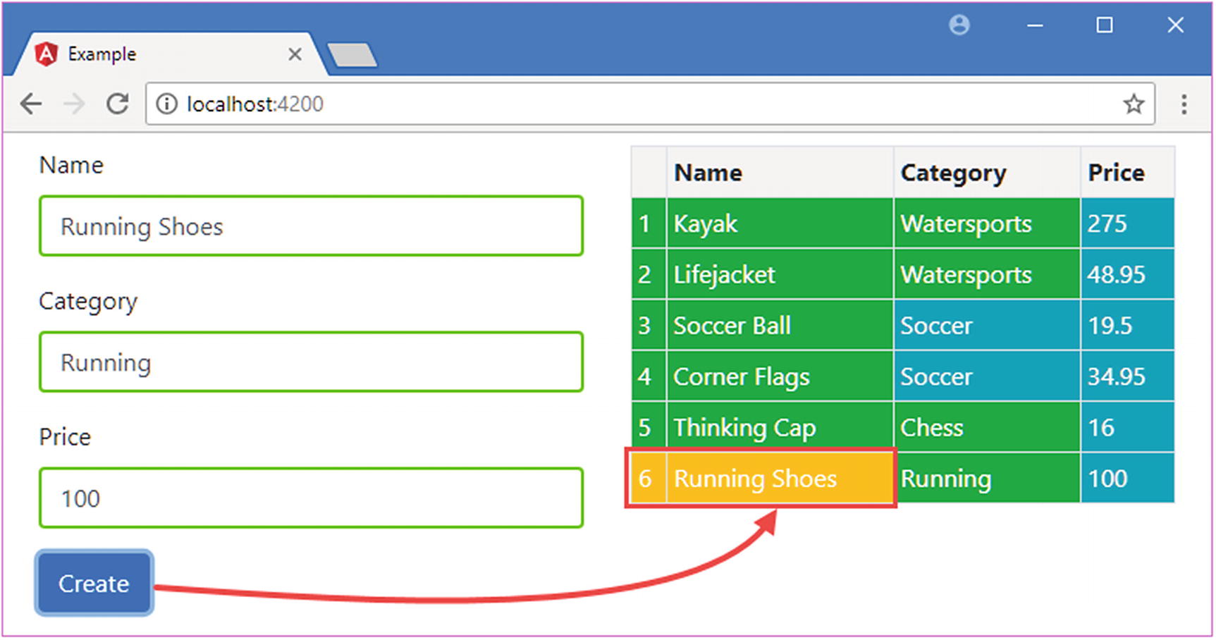
To see the effect, use the form to add a new product to the example application. Since there are initially five items in the model, the expression for the tr element will select the bg-success class. When you add a new item, Angular will create another instance of the directive class and evaluate the expression to set the value of the input property; since there are now six items in the model, the expression will select the bg-warning class, which provides the new row with a different background color, as shown in Figure 15-4.
Figure 15-4
Using an input property in a custom directive
Responding to Input Property Changes
Something odd happened in the previous example: adding a new item affected the appearance of the new elements but not the existing elements. Behind the scenes, Angular has updated the value of the bgClass property for each of the directives that it created—one for each td element in the table column—but the directives didn’t notice because changing a property value doesn’t automatically cause directives to respond.
To handle changes, a directive must implement the ngOnChanges method to receive notifications when the value of an input property changes, as shown in Listing 15-12.
let classList = this.element.nativeElement.classList;
if (!change.isFirstChange() && classList.contains(change.previousValue)) {
classList.remove(change.previousValue);
}
if (!classList.contains(change.currentValue)) {
classList.add(change.currentValue);
}
}
}
Listing 15-12
Receiving Change Notifications in the attr.directive.ts File in the src/app Folder
The ngOnChanges method is called once before the ngOnInit method and then called again each time there are changes to any of a directive’s input properties. The ngOnChanges parameter is an object whose property names refer to each changed input property and whose values are SimpleChange objects, which are defined in the @angular/core module. TypeScript represents this data structure as follows:
The SimpleChange class defines the members shown in Table 15-4.
Table 15-4
The Properties and Method of the SimpleChange Class
Name
Description
previousValue
This property returns the previous value of the input property.
currentValue
This property returns the current value of the input property.
isFirstChange()
This method returns true if this is the call to the ngOnChanges method that occurs before the ngOnInit method.
The easiest way to understand the way that changes are presented to the ngOnChanges method is to serialize the object as JSON and look at it then.
...
{
"target": {
"previousValue":"bg-success",
"currentValue":"bg-warning"
}
}
...
This strips out the isFirstChange method, but it does help show the way that each property in the argument object is used to indicate a change to an input property.
When responding to changes to the input property value, a directive has to make sure to undo the effect of previous updates. In the case of the example directive, this means removing the element from the previousValue class and adding it to the currentValue class instead.
It is important to use the isFirstChange method so that you don’t undo a value that hasn’t actually been applied since the ngOnChanges method is called the first time a value is assigned to the input property.
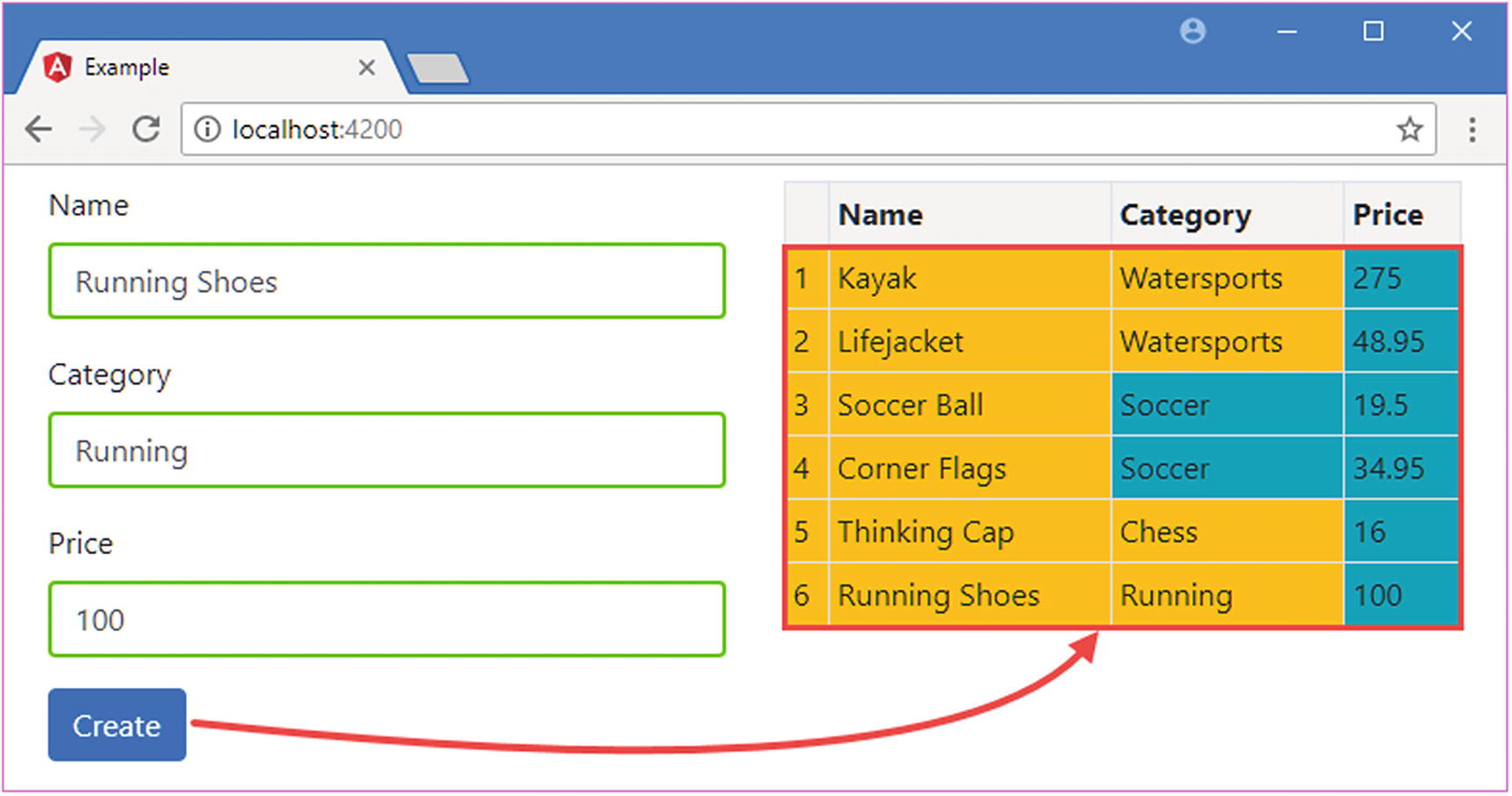
The result of handling these change notifications is that the directive responds when Angular reevaluates the expressions and updates the input properties. Now when you add a new product to the application, the background colors for all the tr elements are updated, as shown in Figure 15-5.
Figure 15-5
Responding to input property changes
Creating Custom Events
Output properties are the Angular feature that allows directives to add custom events to their host elements, through which details of important changes can be sent to the rest of the application. Output properties are defined using the @Output decorator, which is defined in the @angular/core module, as shown in Listing 15-13.
import { Directive, ElementRef, Attribute, Input,
SimpleChange, Output, EventEmitter } from "@angular/core";
import { Product } from "./product.model";
@Directive({
selector: "[pa-attr]"
})
export class PaAttrDirective {
constructor(private element: ElementRef) {
this.element.nativeElement.addEventListener("click", e => {
let classList = this.element.nativeElement.classList;
if (!change.isFirstChange() && classList.contains(change.previousValue)) {
classList.remove(change.previousValue);
}
if (!classList.contains(change.currentValue)) {
classList.add(change.currentValue);
}
}
}
Listing 15-13
Defining an Output Property in the attr.directive.ts File in the src/app Folder
The EventEmitter class provides the event mechanism for Angular directives. The listing creates an EventEmitter object and assigns it to a variable called click, like this:
...
@Output("pa-category")
click = new EventEmitter<string>();
...
The string type parameter indicates that listeners to the event will receive a string when the event is triggered. Directives can provide any type of object to their event listeners, but common choices are string and number values, data model objects, and JavaScript Event objects.
The custom event in the listing is triggered when the mouse button is clicked on the host element, and the event provides its listeners with the category of the Product object that was used to create the table row using the ngFor directive. The effect is that the directive is responding to a DOM event on the host element and generating its own custom event in response. The listener for the DOM event is set up in the directive class constructor using the browser’s standard addEventListener method, like this:
...
constructor(private element: ElementRef) {
this.element.nativeElement.addEventListener("click", e => {
if (this.product != null) {
this.click.emit(this.product.category);
}
});
}
...
The directive defines an input property to receive the Product object whose category will be sent in the event. (The directive is able to refer to the value of the input property value in the constructor because Angular will have set the property value before the function assigned to handle the DOM event is invoked.)
The most important statement in the listing is the one that uses the EventEmitter object to send the event, which is done using the EventEmitter.emit method, which is described in Table 15-5 for quick reference. The argument to the emit method is the value that you want the event listeners to receive, which is the value of the category property for this example.
Table 15-5
The EventEmitter Method
Name
Description
emit(value)
This method triggers the custom event associated with the EventEmitter, providing the listeners with the object or value received as the method argument.
Tying everything together is the @Output decorator, which creates a mapping between the directive class EventEmitter property and the name that will be used to bind to the event in the template, like this:
...
@Output("pa-category")
click = new EventEmitter<string>();
...
The argument to the decorator specifies the attribute name that will be used in event bindings applied to the host element. You can omit the argument if the TypeScript property name is also the name you want for the custom event. I have specified pa-category in the listing, which allows me to refer to the event as click within the directive class but require a more meaningful name externally.
Binding to a Custom Event
Angular makes it easy to bind to custom events in templates by using the same binding syntax that is used for built-in events, which was described in Chapter 14. Listing 15-14 adds the pa-product attribute to the tr element in the template to provide the directive with its Product object and adds a binding for the pa-category event.
Binding to a Custom Event in the template.html File in the src/app Folder
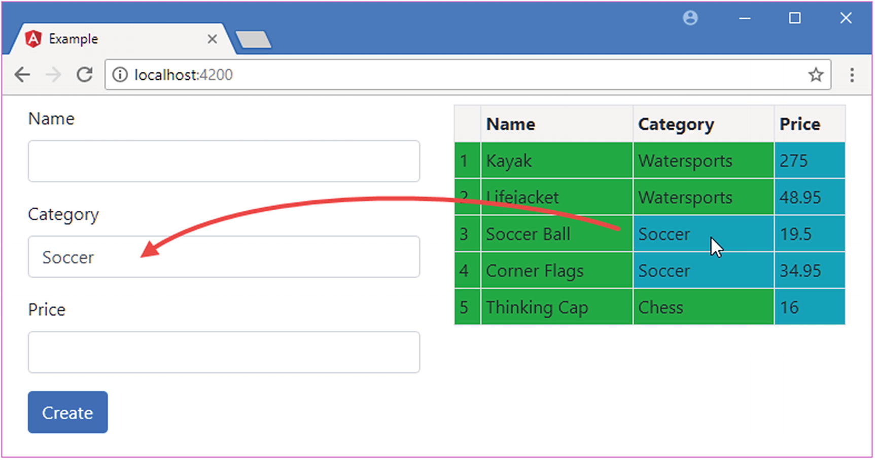
The term $event is used to access the value the directive passed to the EventEmitter.emit method. That means $event will be a string value containing the product category in this example. The value received from the event is assigned to the component’s newProduct.category property, which causes the data binding for one of the input elements to be updated, meaning that clicking a row in the table displays the product’s category in the form, as shown in Figure 15-6.
Figure 15-6
Defining and receiving a custom event using an output property
Creating Host Element Bindings
The example directive relies on the browser’s DOM API to manipulate its host element, both to add and remove class memberships and to receive the click event. Working with the DOM API in an Angular application is a useful technique, but it does mean that your directive can be used only in applications that are run in a web browser. Angular is intended to be run in a range of different execution environments, and not all of them can be assumed to provide the DOM API.
Even if you are sure that a directive will have access to the DOM, the same results can be achieved in a more elegant way using standard Angular directive features: property and event bindings. Rather than use the DOM to add and remove classes, a class binding can be used on the host element. And rather than use the addEventListener method, an event binding can be used to deal with the mouse click.
Behind the scenes, Angular implements these features using the DOM API when the directive is used in a web browser—or some equivalent mechanism when the directive is used in a different environment.
Bindings on the host element are defined using two decorators, @HostBinding and @HostListener, both of which are defined in the @angular/core module, as shown in Listing 15-15.
Creating Host Bindings in the attr.directive.ts File in the src/app Folder
The @HostBinding decorator is used to set up a property binding on the host element and is applied to a directive property. The listing sets up a binding between the class property on the host element and the decorator’s bgClass property.
Tip
If you want to manage the contents of an element, you can use the @HostBinding decorator to bind to the textContent property. See Chapter 19 for an example.
The @HostListener decorator is used to set up an event binding on the host element and is applied to a method. The listing creates an event binding for the click event that invokes the triggerCustomEvent method when the mouse button is pressed and released. As its name suggests, the triggerCustomEvent method uses the EventEmitter.emit method to dispatch the custom event through the output property.
Using the host element bindings means that the directive constructor can be removed since there is no longer any need to access the HTML element via the ElementRef object. Instead, Angular takes care of setting up the event listener and setting the element’s class membership through the property binding.
Although the directive code is much simpler, the effect of the directive is the same: clicking a table row sets the value of one of the input elements, and adding a new item using the form triggers a change in the background color of the table cells for products that are not part of the Soccer category.
Creating a Two-Way Binding on the Host Element
Angular provides special support for creating directives that support two-way bindings so they can be used with the banana-in-a-box bracket style that ngModel uses and can bind to a model property in both directions.
The two-way binding feature relies on a naming convention. To demonstrate how it works, Listing 15-16 adds some new elements and bindings to the template.html file.
Applying a Directive in the template.html File in the src/app Folder
I am going to create a directive that supports two one-way bindings. The binding whose target is paModel will be updated when the value of the newProduct.name property changes, which provides a flow of data from the application to the directive and will be used to update the contents of the input element. The custom event, paModelChange, will be triggered when the user changes the contents of the input element and will provide a flow of data from the directive to the rest of the application.
To implement the directive, I added a file called twoway.directive.ts to the src/app folder and used it to define the directive shown in Listing 15-17.
import { Input, Output, EventEmitter, Directive,
HostBinding, HostListener, SimpleChange } from "@angular/core";
The Contents of the twoway.directive.ts File in the src/app Folder
This directive uses features that have been described previously. The selector property for this directive specifies that it will match input elements that have a paModel attribute. The built-in ngModel two-way directive has support for a range of form elements and knows which events and properties each of them uses, but I want to keep this example simple, so I am going to support just input elements, which define a value property that gets and sets the element content.
The paModel binding is implemented using an input property and the ngOnChanges method, which responds to changes in the expression value by updating the contents of the input element through a host binding on the input element’s value property.
The paModelChange event is implemented using a host listener on the input event, which then sends an update through an output property. Notice that the method invoked by the event is able to receive the event object by specifying an additional argument to the @HostListener decorator, like this:
...
@HostListener("input", ["$event.target.value"])
updateValue(newValue: string) {
...
The first argument to the @HostListener decorator specifies the name of the event that will be handled by the listener. The second argument is an array that will be used to provide the decorated methods with arguments. In this example, the input event will be handled by the listener, and when the updateValue method is invoked, its newValue argument will be set to the target.value property of the Event object, which is referred to using $event.
To enable the directive, I added it to the Angular module, as shown in Listing 15-18.
import { NgModule } from "@angular/core";
import { BrowserModule } from "@angular/platform-browser";
import { ProductComponent } from "./component";
import { FormsModule, ReactiveFormsModule } from "@angular/forms";
import { PaAttrDirective } from "./attr.directive";
Registering the Directive in the app.module.ts File in the src/app Folder
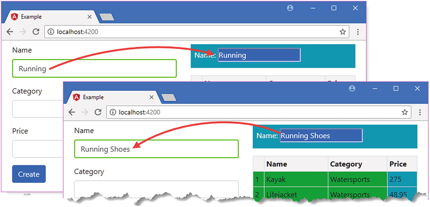
When you save the changes and the browser has reloaded, you will see a new input element that responds to changes to a model property and updates the model property if its host element’s content is changed. The expressions in the bindings specify the same model property used by the Name field in the form on the left side of the HTML document, which provides a convenient way to test the relationship between them, as shown in Figure 15-7.
Figure 15-7
Testing the two-way flow of data
The final step is to simplify the bindings and apply the banana-in-a-box style of brackets, as shown in Listing 15-19.
Simplifying the Bindings in the template.html File in the src/app Folder
When Angular encounters the [()] brackets, it expands the binding to match the format used in Listing 15-16, targeting the paModel input property and setting up the paModelChange event. As long as a directive exposes these to Angular, it can be targeted using the banana-in-a-box brackets, producing a simpler template syntax.
Exporting a Directive for Use in a Template Variable
In earlier chapters, I used template variables to access functionality provided by built-in directives, such as ngForm. As an example, here is an element from Chapter 14:
The form template variable is assigned ngForm, which is then used to access validation information for the HTML form. This is an example of how a directive can provide access to its properties and methods so they can be used in data bindings and expressions.
Listing 15-20 modifies the directive from the previous section so that it provides details of whether it has expanded the text in its host element.
import { Input, Output, EventEmitter, Directive,
HostBinding, HostListener, SimpleChange } from "@angular/core";
Exporting a Directive in the twoway.directive.ts File in the src/app Folder
The exportAs property of the @Directive decorator specifies a name that will be used to refer to the directive in template variables. This example uses paModel as the value for the exportAs property, and you should try to use names that make it clear which directive is providing the functionality.
The listing adds a property called direction to the directive, which used to indicate when data is flowing from the model to the element or from the element to the model.
When you use the exportAs decorator, you are providing access to all the methods and properties defined by the directive to be used in template expressions and data bindings. Some developers prefix the names of the methods and properties that are not for use outside of the directive with an underscore (the _ character) or to apply the private keyword. This is an indication to other developers that some methods and properties should not be used but isn’t enforced by Angular. Listing 15-21 creates a template variable for the directive’s exported functionality and uses it in a style binding.
Using Exported Directive Functionality in the template.html File in the src/app Folder
The template variable is called paModel, and its value is the name used in the directive’s exportAs property.
...
#paModel="paModel"
...
Tip
You don’t have to use the same names for the variable and the directive, but it does help to make the source of the functionality clear.
Once the template variable has been defined, it can be used in interpolation bindings or as part of a binding expression. I opted for a string interpolation binding whose expression uses the value of the directive’s direction property.
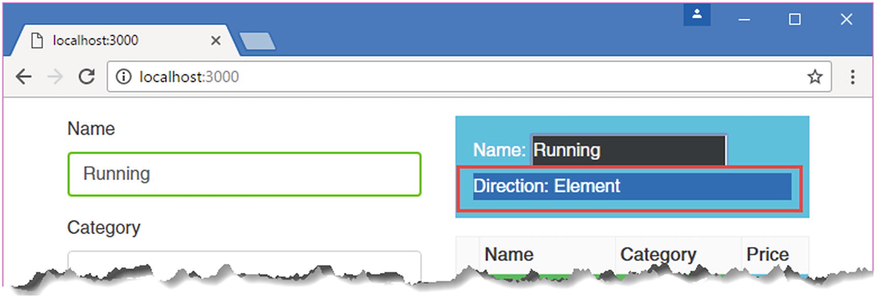
The result is that you can see the effect of typing text into the two input elements that are bound to the newProduct.name model property. When you type into the one that uses the ngModel directive, then the string interpolation binding will display Model. When you type into the element that uses the paModel directive, the string interpolation binding will display Element, as shown in Figure 15-8.
Figure 15-8
Exporting functionality from a directive
Summary
In this chapter, I described how to define and use attribute directives, including the use of input and output properties and host bindings. In the next chapter, I explain how structural directives work and how they can be used to change the layout or structure of the HTML document.