Table of Contents for
Beginning Android Programming with Android Studio, Fourth Edition
 Beginning Android Programming with Android Studio, Fourth Edition
Published by
Wrox, 2016
Beginning Android Programming with Android Studio, Fourth Edition
Published by
Wrox, 2016
- Cover
- Contents
- Title Page
- Introduction
- Chapter 1: Getting Started with Android Programming
- Chapter 2: Using Android Studio for Android Development
- Chapter 3: Activities, Fragments, and Intents
- Chapter 4: Getting to Know the Android User Interface
- Chapter 5: Designing Your User Interface with Views
- Chapter 6: Displaying Pictures and Menus with Views
- Chapter 7: Data Persistence
- Chapter 8: Content Providers
- Chapter 9: Messaging
- Chapter 10: Location-Based Services
- Chapter 11: Networking
- Chapter 12: Developing Android Services
- Appendix: Answers to Exercises
- Copyright
- Dedication
- Credits
- About the Author
- About the Technical Editor
- Acknowledgments
- End User License Agreement
Chapter 4
Getting to Know the Android User Interface
Chapter 3 discusses activities and their life cycles. An activity is a means by which users interact with the application. However, an activity by itself does not have a presence on the screen. Instead, it has to draw the screen using views and ViewGroups. In this chapter, you find out how to create user interfaces (UIs) in Android and how users interact with the UIs. In addition, you discover how to handle changes in screen orientation on your Android devices.
UNDERSTANDING THE COMPONENTS OF A SCREEN
As explained in Chapter 3, the basic unit of an Android application is an activity, which displays the UI of your application. The activity may contain widgets such as buttons, labels, textboxes, and so on. Typically, you define your UI using an XML file (for example, the activity_main.xml file located in the res/layout folder of your project), which looks similar to what is shown in here.
<?xml version="1.0" encoding="utf-8"?>
<android.support.design.widget.CoordinatorLayout
xmlns:android="http://schemas.android.com/apk/res/android"
    xmlns:app="http://schemas.android.com/apk/res-auto"
    xmlns:tools="http://schemas.android.com/tools"
    android:layout_width="match_parent"
    android:layout_height="match_parent"
    android:fitsSystemWindows="true"
    tools:context="com.jfdimarzio.helloworld.MainActivity">
    <android.support.design.widget.AppBarLayout
        android:layout_width="match_parent"
        android:layout_height="wrap_content"
        android:theme="@style/AppTheme.AppBarOverlay">
        <android.support.v7.widget.Toolbar
            android:id="@+id/toolbar"
            android:layout_width="match_parent"
            android:layout_height="?attr/actionBarSize"
            android:background="?attr/colorPrimary"
            app:popupTheme="@style/AppTheme.PopupOverlay"/>
    </android.support.design.widget.AppBarLayout>
    <include layout="@layout/content_main"/>
    <android.support.design.widget.FloatingActionButton
        android:id="@+id/fab"
        android:layout_width="wrap_content"
        android:layout_height="wrap_content"
        android:layout_gravity="bottom|end"
        android:layout_margin="@dimen/fab_margin"
        android:src="@android:drawable/ic_dialog_email"/>
</android.support.design.widget.CoordinatorLayout>
During runtime, you load the XML UI in the onCreate() method handler in your Activity class, using the setContentView() method of the Activity class:
    @Override
    public void onCreate(Bundle savedInstanceState) {
        super.onCreate(savedInstanceState);
        setContentView(R.layout.main);
    }
During compilation, each element in the XML file is compiled into its equivalent Android GUI (Graphical User Interface) class, with attributes represented by methods. The Android system then creates the activity's UI when the activity is loaded.
Views and ViewGroups
An activity contains views and ViewGroups. A view is a widget that has an appearance on screen. Examples of views are buttons, labels, and text boxes. A view derives from the base class android.view.View.
One or more views can be grouped into a ViewGroup. A ViewGroup (which is itself a special type of view) provides the layout in which you can order the appearance and sequence of views. Examples of ViewGroups include RadioGroup and ScrollView. A ViewGroup derives from the base class android.view.ViewGroup.
Another type of ViewGroup is a Layout. A Layout is another container that derives from android.view.ViewGroup and is used as a container for other views. However, whereas the purpose of a ViewGroup is to group views logically—such as a group of buttons with a similar purpose—a Layout is used to group and arrange views visually on the screen. The Layouts available to you in Android are as follows:
FrameLayoutLinearLayout(Horizontal)LinearLayout(Vertical)TableLayoutTableRowGridLayoutRelativeLayout
The following sections describe each of these Layouts in more detail.
FrameLayout
The FrameLayout is the most basic of the Android layouts. FrameLayouts are built to hold one view. As with all things related to development, there is no hard rule that FrameLayouts can't be used to hold multiple views. However, there is a reason why FrameLayouts were built the way they were.
Given that there are myriad screen sizes and resolutions, you have little control over the specifications of the devices that install your application. Therefore, when your application is resized and reformatted to fit any number of different devices you want to make sure it still looks as close to your initial design as possible.
The FrameLayout is used to help you control the stacking of single views as the screen is resized. In the following Try It Out, you add a TextView to a FrameLayout in your HelloWorld application.
LinearLayout (Horizontal) and LinearLayout (Vertical)
The LinearLayout arranges views in a single column or a single row. Child views can be arranged either horizontally or vertically, which explains the need for two different layouts—one for horizontal rows of views and one for vertical columns of views.
To see how LinearLayout works, consider the following elements typically contained in the activity_main.xml file:
<?xml version="1.0" encoding="utf-8"?>
<LinearLayout xmlns:android="http://schemas.android.com/apk/res/android"
    android:layout_width="fill_parent"
    android:layout_height="fill_parent"
    android:orientation="vertical" >
    <TextView
        android:layout_width="fill_parent"
        android:layout_height="wrap_content"
        android:text="@string/hello"/>
</LinearLayout>
In the activity_main.xml file, observe that the root element is <LinearLayout> and it has a <TextView> element contained within it. The <LinearLayout> element controls the order in which the views contained within it appear.
Each view and ViewGroup has a set of common attributes, some of which are described in Table 4.1.
Table 4.1 Common Attributes Used in Views and ViewGroups
| Attribute | Description |
layout_width |
Specifies the width of the view or ViewGroup |
layout_height |
Specifies the height of the view or ViewGroup |
layout_marginTop |
Specifies extra space on the top side of the view or ViewGroup |
layout_marginBottom |
Specifies extra space on the bottom side of the view or ViewGroup |
layout_marginLeft |
Specifies extra space on the left side of the view or ViewGroup |
layout_marginRight |
Specifies extra space on the right side of the view or ViewGroup |
layout_gravity |
Specifies how child views are positioned |
layout_weight |
Specifies how much of the extra space in the layout should be allocated to the view |
layout_x |
Specifies the x-coordinate of the view or ViewGroup |
layout_y |
Specifies the y-coordinate of the view or ViewGroup |
For example, the width of the <TextView> element fills the entire width of its parent (which is the screen in this case) using the fill_parent constant. Its height is indicated by the wrap_content constant, which means that its height is the height of its content (in this case, the text contained within it). If you don't want the <TextView> view to occupy the entire row, you can set its layout_width attribute to wrap_content, like this:
<TextView
        android:layout_width="wrap_content"
        android:layout_height="wrap_content"
        android:text="@string/hello"/>
The preceding code sets the width of the view to be equal to the width of the text contained within it. Consider the layout in the next code snippet, which shows two views with their width explicitly stated as a measurement, and their heights set to the height of their contents.
<?xml version="1.0" encoding="utf-8"?>
<LinearLayout xmlns:android="http://schemas.android.com/apk/res/android"
    android:layout_width="fill_parent"
    android:layout_height="fill_parent"
    android:orientation="vertical" >
<TextView
    android:layout_width="100dp"
    android:layout_height="wrap_content"
    android:text="@string/hello"/>
<Button
    android:layout_width="160dp"
    android:layout_height="wrap_content"
    android:text="Button"
    android:onClick="onClick"/>
</LinearLayout>Here, you set the width of both the TextView and Button views to an absolute value. In this case, the width for the TextView is set to 100 density-independent pixels wide, and the Button to 160 density-independent pixels wide. Before you see how the views look on different screens with different pixel densities, it is important to understand how Android recognizes screens of varying sizes and densities.
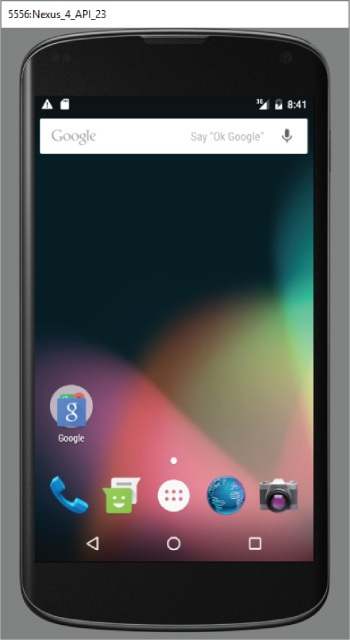
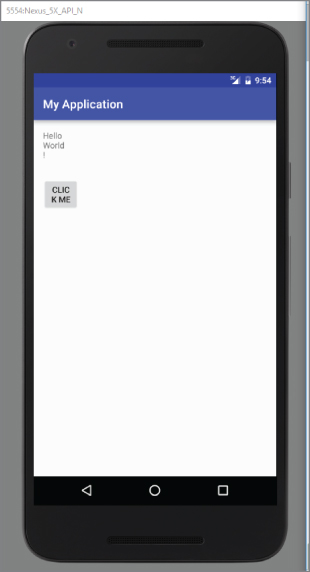
Figure 4.1 shows the screen of the Nexus 5 (from the emulator). It has a 5-inch screen (diagonally), with a screen width of 2.72 inches. Its resolution is 1080 (width) × 1920 (height) pixels. The pixel density of a screen varies according to screen size and resolution.
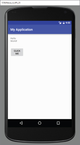
To test how the views defined in the XML file look when displayed on screens of different densities, create two Android Virtual Devices (AVDs) with different screen resolutions and abstracted LCD densities. Figure 4.2 shows an AVD with 1080 × 1920 resolution and LCD density of 480.
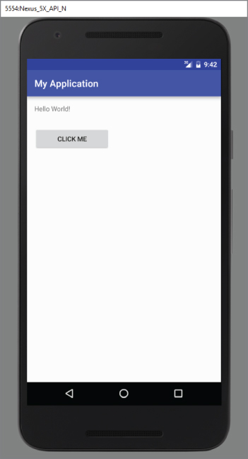
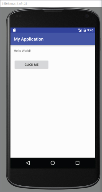
Figure 4.3 shows another AVD with 768 × 1280 resolution and LCD density of 320.
Using the dp unit ensures that your views are always displayed in the right proportion regardless of the screen density. Android automatically scales the size of the view depending on the density of the screen.
What if instead of using dp you now specify the size using pixels (px)?
<TextView
android:layout_width="100px"
android:layout_height="wrap_content"
android:text="@string/hello"/>
<Button
android:layout_width="160px"
android:layout_height="wrap_content"
android:text="Click Me"
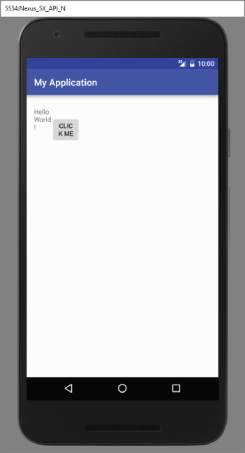
android:onClick="onClick"/>Figure 4.4 shows how the Label and Button appear on a 480 dpi screen. Figure 4.5 shows the same views on a 320 dpi screen. In this case, Android does not perform any conversion because all the sizes are specified in pixels. If you use pixels for view sizes, the views appear smaller on a device with a high dpi screen than a screen with a lower dpi (assuming screen sizes are the same).
The preceding example also specifies that the orientation of the layout is vertical:
<LinearLayout xmlns:android="http://schemas.android.com/apk/res/android"
android:layout_width="fill_parent"
android:layout_height="fill_parent"
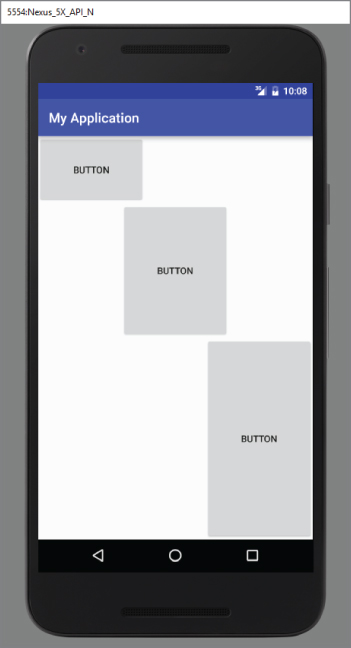
android:orientation="vertical" >The default orientation layout is horizontal, so if you omit the android:orientation attribute, the views appear as shown in Figure 4.6.
In LinearLayout, you can apply the layout_weight and layout_gravity attributes to views contained within it, as the modifications to activity_main.xml in the following code snippet show:
<?xml version="1.0" encoding="utf-8"?>
<LinearLayout xmlns:android="http://schemas.android.com/apk/res/android"
android:layout_width="fill_parent"
android:layout_height="fill_parent"
android:orientation="vertical" >
<Button
android:layout_width="160dp"
android:layout_height="0dp"
android:text="Button"
android:layout_gravity="left"
android:layout_weight="1"/>
<Button
android:layout_width="160dp"
android:layout_height="0dp"
android:text="Button"
android:layout_gravity="center"
android:layout_weight="2"/>
<Button
android:layout_width="160dp"
android:layout_height="0dp"
android:text="Button"
android:layout_gravity="right"
android:layout_weight="3"/>
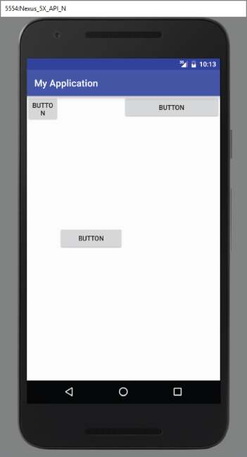
</LinearLayout>Figure 4.7 shows the positioning of the views as well as their heights. The layout_gravity attribute indicates the positions the views should gravitate toward, whereas the layout_weight attribute specifies the distribution of available space. In the preceding example, the three buttons occupy about 16.6 percent (1/(1+2+3) * 100), 33.3 percent (2/(1+2+3) * 100), and 50 percent (3/(1+2+3) * 100) of the available height, respectively.
If you change the orientation of the LinearLayout to horizontal (as shown in the following code snippet), you need to change the width of each view to 0 dp. The views display as shown in Figure 4.8:
<LinearLayout xmlns:android="http://schemas.android.com/apk/res/android"
    android:layout_width="fill_parent"
    android:layout_height="fill_parent"
    android:orientation="horizontal" >
<Button
    android:layout_width="0dp"
    android:layout_height="wrap_content"
    android:text="Button"
    android:layout_gravity="left"
    android:layout_weight="1"/>
<Button
    android:layout_width="0dp"
    android:layout_height="wrap_content"
    android:text="Button"
    android:layout_gravity="center_horizontal"
    android:layout_weight="2"/>
<Button
    android:layout_width="0dp"
    android:layout_height="wrap_content"
    android:text="Button"
    android:layout_gravity="right"
    android:layout_weight="3"/>
</LinearLayout>
In the following Try It Out, you combine multiple LinearLayouts to create an L-shaped configuration of views.
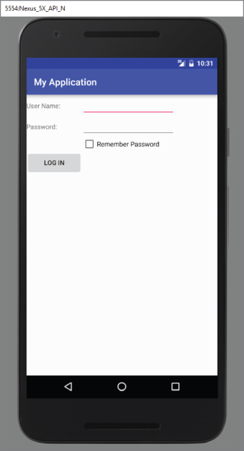
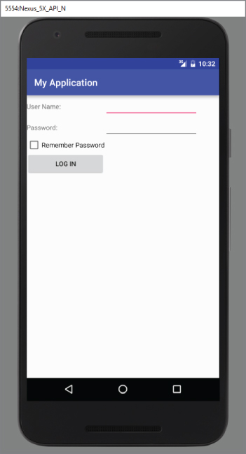
TableLayout
The TableLayout Layout groups views into rows and columns. You use the <TableRow> element to designate a row in the table. Each row can contain one or more views. Each view you place within a row forms a cell. The width of each column is determined by the largest width of each cell in that column.
Consider the content of activity_main.xml shown here:
<TableLayout
    xmlns:android="http://schemas.android.com/apk/res/android"
    android:layout_height="fill_parent"
    android:layout_width="fill_parent" >
    <TableRow>
        <TextView
            android:text="User Name:"
            android:width ="120dp"
            />
        <EditText
            android:id="@+id/txtUserName"
            android:width="200dp"/>
    </TableRow>
    <TableRow>
        <TextView
            android:text="Password:"
            />
        <EditText
            android:id="@+id/txtPassword"
            android:inputType="textPassword"
            />
    </TableRow>
    <TableRow>
        <TextView/>
        <CheckBox android:id="@+id/chkRememberPassword"
            android:layout_width="fill_parent"
            android:layout_height="wrap_content"
            android:text="Remember Password"
            />
    </TableRow>
    <TableRow>
        <Button
            android:id="@+id/buttonSignIn"
            android:text="Log In"/>
    </TableRow>
</TableLayout>
Figure 4.10 shows how the preceding code appears when rendered on the Android emulator.
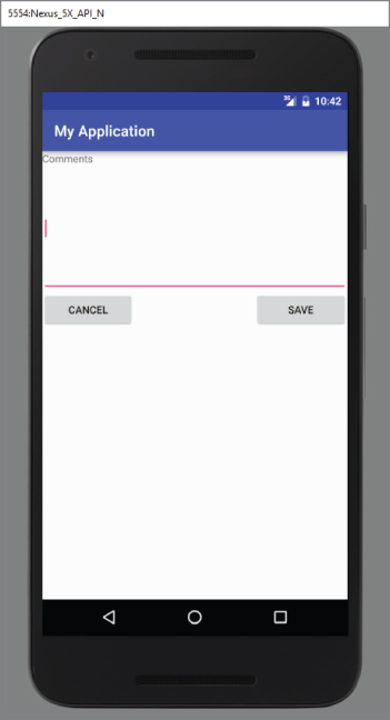
RelativeLayout
The RelativeLayout layout enables you to specify how child views are positioned relative to each other. Consider the following activity_main.xml file:
<?xml version="1.0" encoding="utf-8"?>
<RelativeLayout
    android:id="@+id/RLayout"
    android:layout_width="fill_parent"
    android:layout_height="fill_parent"
    xmlns:android="http://schemas.android.com/apk/res/android" >
    <TextView
        android:id="@+id/lblComments"
        android:layout_width="wrap_content"
        android:layout_height="wrap_content"
        android:text="Comments"
        android:layout_alignParentTop="true"
        android:layout_alignParentStart="true"/>
    <EditText
        android:id="@+id/txtComments"
        android:layout_width="fill_parent"
        android:layout_height="170dp"
        android:textSize="18sp"
        android:layout_alignStart="@+id/lblComments"
        android:layout_below="@+id/lblComments"
        android:layout_centerHorizontal="true"/>
    <Button
        android:id="@+id/btnSave"
        android:layout_width="125dp"
        android:layout_height="wrap_content"
        android:text="Save"
        android:layout_below="@+id/txtComments"
        android:layout_alignEnd="@+id/txtComments"/>
    <Button
        android:id="@+id/btnCancel"
        android:layout_width="124dp"
        android:layout_height="wrap_content"
        android:text="Cancel"
        android:layout_below="@+id/txtComments"
        android:layout_alignStart="@+id/txtComments"/>
</RelativeLayout>
Notice that each view embedded within the RelativeLayout has attributes that enable it to align with another view. These attributes are as follows:
layout_alignParentToplayout_alignParentStartlayout_alignStartlayout_alignEndlayout_belowlayout_centerHorizontal
The value for each of these attributes is the ID for the view that you are referencing. The preceding XML UI creates the screen shown in Figure 4.12.
FrameLayout
The FrameLayout layout is a placeholder on screen that you can use to display a single view. Views that you add to a FrameLayout are always anchored to the top left of the layout. Consider the following content in main.xml:
<?xml version="1.0" encoding="utf-8"?>
<RelativeLayout
android:id="@+id/RLayout"
android:layout_width="fill_parent"
android:layout_height="fill_parent"
xmlns:android="http://schemas.android.com/apk/res/android" >
<TextView
android:id="@+id/lblComments"
android:layout_width="wrap_content"
android:layout_height="wrap_content"
android:text="Hello, Android!"
android:layout_alignParentTop="true"
android:layout_alignParentStart="true"/>
<FrameLayout
android:layout_width="wrap_content"
android:layout_height="wrap_content"
android:layout_alignStart="@+id/lblComments"
android:layout_below="@+id/lblComments"
android:layout_centerHorizontal="true" >
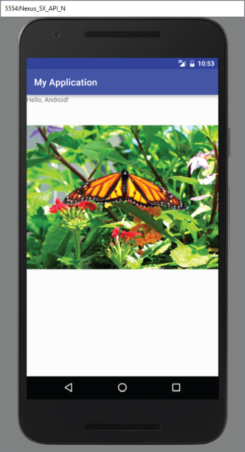
<ImageView
android:src="@mipmap/butterfly"
android:layout_width="wrap_content"
android:layout_height="wrap_content"/>
</FrameLayout>
</RelativeLayout>Here, you have a FrameLayout within a RelativeLayout. Within the FrameLayout, you embed an ImageView. The UI is shown in Figure 4.13.
If you add another view (such as a Button view) within the FrameLayout, the view overlaps the previous view (see Figure 4.14):
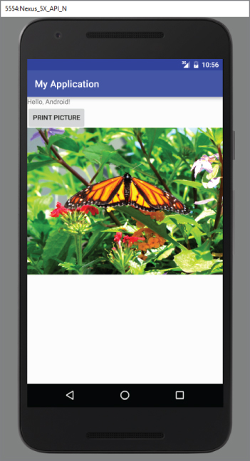
<?xml version="1.0" encoding="utf-8"?>
<RelativeLayout
    android:id="@+id/RLayout"
    android:layout_width="fill_parent"
    android:layout_height="fill_parent"
    xmlns:android="http://schemas.android.com/apk/res/android" >
    <TextView
        android:id="@+id/lblComments"
        android:layout_width="wrap_content"
        android:layout_height="wrap_content"
        android:text="Hello, Android!"
        android:layout_alignParentTop="true"
        android:layout_alignParentStart="true"/>
    <FrameLayout
        android:layout_width="wrap_content"
        android:layout_height="wrap_content"
        android:layout_alignStart="@+id/lblComments"
        android:layout_below="@+id/lblComments"
        android:layout_centerHorizontal="true" >
        <ImageView
            android:src="@mipmap/butterfly"
        android:layout_width="wrap_content"
        android:layout_height="wrap_content"/>
        <Button
            android:layout_width="124dp"
            android:layout_height="wrap_content"
            android:text="Print Picture"/>
</FrameLayout>ScrollView
A ScrollView is a special type of FrameLayout in that it enables users to scroll through a list of views that occupy more space than the physical display. The ScrollView can contain only one child view or ViewGroup, which normally is a LinearLayout.
The following main.xml content shows a ScrollView containing a LinearLayout, which in turn contains some Button and EditText views:
<ScrollView
android:layout_width="fill_parent"
android:layout_height="fill_parent"
xmlns:android="http://schemas.android.com/apk/res/android" >
<LinearLayout
android:layout_width="fill_parent"
android:layout_height="wrap_content"
android:orientation="vertical" >
<Button
android:id="@+id/button1"
android:layout_width="fill_parent"
android:layout_height="wrap_content"
android:text="Button 1"/>
<Button
android:id="@+id/button2"
android:layout_width="fill_parent"
android:layout_height="wrap_content"
android:text="Button 2"/>
<Button
android:id="@+id/button3"
android:layout_width="fill_parent"
android:layout_height="wrap_content"
android:text="Button 3"/>
<EditText
android:id="@+id/txt"
android:layout_width="fill_parent"
android:layout_height="600dp"/>
<Button
android:id="@+id/button4"
android:layout_width="fill_parent"
android:layout_height="wrap_content"
android:text="Button 4"/>
<Button
android:id="@+id/button5"
android:layout_width="fill_parent"
android:layout_height="wrap_content"
android:text="Button 5"/>
</LinearLayout>
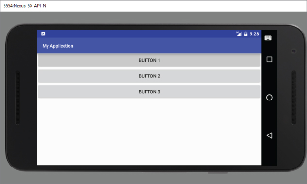
</ScrollView>If you load the preceding code on the Android emulator, you see something like what's shown in Figure 4.15.
Because the EditText automatically gets the focus, it fills up the entire activity (as the height was set to 600dp). To prevent it from getting the focus, add the following two bolded attributes to the <LinearLayout> element:
    <LinearLayout
        android:layout_width="fill_parent"
        android:layout_height="wrap_content"
        android:orientation="vertical"
        android:focusable="true"
        android:focusableInTouchMode="true" >
Now you are able to view the buttons and scroll through the list of views (see Figure 4.16).
Sometimes you might want EditText to automatically get the focus, but you do not want the soft input panel (keyboard) to appear automatically (which happens on a real device). To prevent the keyboard from appearing, add the following bolded attribute to the <activity> element in the AndroidManifest.xml file:
        <activity
            android:label="@string/app_name"
            android:name=".LayoutsActivity"
            android:windowSoftInputMode="stateHidden" >
            <intent-filter >
                <action android:name="android.intent.action.MAIN"/>
                <category android:name="android.intent.category.LAUNCHER"/>
            </intent-filter>
        </activity>
ADAPTING TO DISPLAY ORIENTATION
One of the key features of modern smartphones is their ability to switch screen orientation, and Android is no exception. Android supports two screen orientations: portrait and landscape. By default, when you change the display orientation of your Android device, the current activity automatically redraws its content in the new orientation. This is because the onCreate() method of the activity is fired whenever there is a change in display orientation.
However, when the views are redrawn, they may be drawn in their original locations (depending on the layout selected). Figure 4.17 shows the previous example displayed in landscape mode.
In general, you can employ two techniques to handle changes in screen orientation:
- Anchoring—The easiest way is to “anchor” your views to the four edges of the screen. When the screen orientation changes, the views can anchor neatly to the edges.
- Resizing and repositioning—Whereas anchoring and centralizing are simple techniques to ensure that views can handle changes in screen orientation, the ultimate technique is resizing each and every view according to the current screen orientation.
Anchoring Views
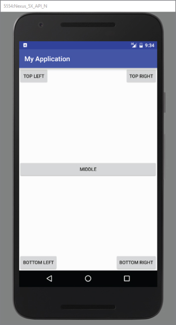
Anchoring can be easily achieved by using RelativeLayout. Consider the following main.xml file, which contains five Button views embedded within the <RelativeLayout> element:
<RelativeLayout
    android:layout_width="fill_parent"
    android:layout_height="fill_parent"
    xmlns:android="http://schemas.android.com/apk/res/android">
    <Button
        android:id="@+id/button1"
        android:layout_width="wrap_content"
        android:layout_height="wrap_content"
        android:text="Top Left"
        android:layout_alignParentStart="true"
        android:layout_alignParentTop="true"/>
    <Button
        android:id="@+id/button2"
        android:layout_width="wrap_content"
        android:layout_height="wrap_content"
        android:text="Top Right"
        android:layout_alignParentTop="true"
        android:layout_alignParentEnd="true"/>
    <Button
        android:id="@+id/button3"
        android:layout_width="wrap_content"
        android:layout_height="wrap_content"
        android:text="Bottom Left"
        android:layout_alignParentStart="true"
        android:layout_alignParentBottom="true"/>
    <Button
        android:id="@+id/button4"
        android:layout_width="wrap_content"
        android:layout_height="wrap_content"
        android:text="Bottom Right"
        android:layout_alignParentEnd="true"
        android:layout_alignParentBottom="true"/>
    <Button
        android:id="@+id/button5"
        android:layout_width="fill_parent"
        android:layout_height="wrap_content"
        android:text="Middle"
        android:layout_centerVertical="true"
        android:layout_centerHorizontal="true"/>
</RelativeLayout>
Note the following attributes found in the various Button views:
layout_alignParentStart—Aligns the view to the left of the parent viewlayout_alignParentEnd—Aligns the view to the right of the parent viewlayout_alignParentTop—Aligns the view to the top of the parent viewlayout_alignParentBottom—Aligns the view to the bottom of the parent viewlayout_centerVertical—Centers the view vertically within its parent viewlayout_centerHorizontal—Centers the view horizontally within its parent view
Figure 4.18 shows the activity when viewed in portrait mode.
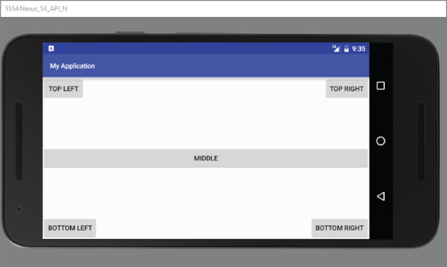
When the screen orientation changes to landscape mode, the four buttons are aligned to the four edges of the screen, and the center button is centered in the middle of the screen with its width fully stretched (see Figure 4.19).
MANAGING CHANGES TO SCREEN ORIENTATION
Now that you have looked at screen orientation changes, let's explore what happens to an activity's state when the device changes orientation.
The following Try It Out demonstrates the behavior of an activity when the device changes orientation.
Persisting State Information During Changes in Configuration
So far, you have learned that changing screen orientation destroys an activity and re-creates it. Keep in mind that when an activity is re-created, its current state might be lost. When an activity is killed, it fires one or both of the following methods:
onPause()—This method is always fired whenever an activity is killed or pushed into the background.onSaveInstanceState()—This method is also fired whenever an activity is about to be killed or put into the background (just like theonPause()method). However, unlike theonPause()method, theonSaveInstanceState()method is not fired when an activity is being unloaded from the stack (such as when the user pressed the back button) because there is no need to restore its state later.
In short, to preserve the state of an activity, you could always implement the onPause() method and then use your own ways to preserve the state of your activity, such as using a database, internal or external file storage, and so on.
If you simply want to preserve the state of an activity so that it can be restored later when the activity is re-created (such as when the device changes orientation), a much simpler way is to implement the onSaveInstanceState() method, as it provides a Bundle object as an argument so that you can use it to save your activity's state. The following code shows that you can save the string ID into the Bundle object during the onSaveInstanceState() method:
    @Override
    public void onSaveInstanceState(Bundle outState) {
        //---save whatever you need to persist---
        outState.putString("ID", "1234567890");
        super.onSaveInstanceState(outState);
    }
When an activity is re-created, the onCreate() method is first fired, followed by the onRestoreInstanceState() method, which enables you to retrieve the state that you saved previously in the onSaveInstanceState() method through the Bundle object in its argument:
    @Override
    public void onRestoreInstanceState(Bundle savedInstanceState) {
        super.onRestoreInstanceState(savedInstanceState);
        //---retrieve the information persisted earlier---
        String ID = savedInstanceState.getString("ID");
    }
}Detecting Orientation Changes
Sometimes you need to know the device's current orientation during runtime. To determine that, you can use the getResources() method. The following code snippet demonstrates how you can programmatically detect the current orientation of your activity:
    @Override
    protected void onCreate(Bundle savedInstanceState) {
        super.onCreate(savedInstanceState);
        setContentView(R.layout.activity_main);
        if(getResources().getConfiguration().orientation == Configuration.ORIENTATION_LANDSCAPE){
            Log.d("StateInfo", "Landscape");
        }else if(getResources().getConfiguration().orientation == Configuration.ORIENTATION_PORTRAIT){
            Log.d("StateInfo", "Portrait");
        }
    }
The getConfiguration() method contains an orientation object representing the screen of the device. You can then test this against the Configuration set of constants to determine the orientation.
Controlling the Orientation of the Activity
Occasionally, you might want to ensure that your application is displayed in only a certain orientation. For example, you may be writing a game that should be viewed only in landscape mode. In this case, you can programmatically force a change in orientation using the setRequestOrientation() method of the Activity class:
import android.content.pm.ActivityInfo;
    @Override
    public void onCreate(Bundle savedInstanceState) {
        super.onCreate(savedInstanceState);
        setContentView(R.layout.main);
        //---change to landscape mode---
        setRequestedOrientation(ActivityInfo.SCREEN_ORIENTATION_LANDSCAPE);
    }
To change to portrait mode, use the ActivityInfo.SCREEN_ORIENTATION_PORTRAIT constant.
Besides using the setRequestOrientation() method, you can also use the android:screenOrientation attribute on the <activity> element in AndroidManifest.xml as follows to constrain the activity to a certain orientation:
<?xml version="1.0" encoding="utf-8"?>
<manifest xmlns:android="http://schemas.android.com/apk/res/android"
    package="com.jfdimarzio.orientations">
    <application
        android:allowBackup="true"
        android:icon="@mipmap/ic_launcher"
        android:label="@string/app_name"
        android:supportsRtl="true"
        android:theme="@style/AppTheme">
        <activity android:name=".MainActivity"
            android:screenOrientation="landscape" >
            <intent-filter>
                <action android:name="android.intent.action.MAIN"/>
                <category android:name="android.intent.category.LAUNCHER"/>
            </intent-filter>
        </activity>
    </application>
</manifest>
The preceding example constrains the activity to a certain orientation (landscape in this case) and prevents the activity from being destroyed; that is, the activity will not be destroyed and the onCreate() method will not be fired again when the orientation of the device changes.
Following are two other values that you can specify in the android:screenOrientation attribute:
portrait—Portrait modesensor—Based on the accelerometer (default)
UTILIZING THE ACTION BAR
Besides fragments, another feature of Android is the Action Bar. In place of the traditional title bar located at the top of the device's screen, the Action Bar displays the application icon and the activity title. Optionally, on the right side of the Action Bar are action items. The next section discusses action items in more detail.
The following Try It Out shows how you can programmatically hide or display the Action Bar.
Adding Action Items to the Action Bar
Besides displaying the application icon and the activity title on the left of the Action Bar, you can also display additional items on the Action Bar. These additional items are called action items. Action items are shortcuts to some of the commonly performed operations in your application. For example, you might be building an RSS reader application, in which case some of the action items might be Refresh Feed, Delete Feed, and Add New Feed.
The following Try It Out shows how you can add action items to the Action Bar.
CREATING THE USER INTERFACE PROGRAMMATICALLY
So far, all the UIs you have seen in this chapter are created using XML. As mentioned earlier, besides using XML you can also create the UI using code. This approach is useful if your UI needs to be dynamically generated during runtime. For example, suppose you are building a cinema ticket reservation system and your application displays the seats of each cinema using buttons. In this case, you need to dynamically generate the UI based on the cinema selected by the user.
The following Try It Out demonstrates the code needed to dynamically build the UI in your activity.
LISTENING FOR UI NOTIFICATIONS
Users interact with your UI at two levels: the activity level and the view level. At the activity level, the Activity class exposes methods that you can override. Some common methods that you can override in your activities include the following:
onKeyDown—Called when a key was pressed and not handled by any of the views contained within the activityonKeyUp—Called when a key was released and not handled by any of the views contained within the activityonMenuItemSelected—Called when a panel's menu item has been selected by the user (covered in Chapter 6)onMenuOpened—Called when a panel's menu is opened by the user (covered in Chapter 6)
SUMMARY
In this chapter, you have learned how user interfaces are created in Android. You have also learned about the different layouts that you can use to position the views in your Android UI. Because Android devices support more than one screen orientation, you need to take special care to ensure that your UI can adapt to changes in screen orientation.
EXERCISES
- What is the difference between the
dpunit and thepxunit? Which one should you use to specify the dimension of a view? - Why is the
AbsoluteLayoutnot recommended for use? - What is the difference between the
onPause()method and theonSaveInstanceState()method? - Name the three methods you can override to save an activity's state. In what instances should you use the various methods?
- How do you add action items to the Action Bar?
You can find answers to the exercises in the appendix.
WHAT YOU LEARNED IN THIS CHAPTER
| Topic | Key Concepts |
LinearLayout |
Arranges views in a single column or single row. |
AbsoluteLayout |
Enables you to specify the exact location of its children. |
TableLayout |
Groups views into rows and columns. |
RelativeLayout |
Enables you to specify how child views are positioned relative to each other. |
FrameLayout |
A placeholder on screen that you can use to display a single view. |
ScrollView |
A special type of FrameLayout in that it enables users to scroll through a list of views that occupy more space than the physical display allows. |
| Unit of Measure | Use dp for specifying the dimension of views and sp for font size. |
| Two ways to adapt to changes in orientation | Anchoring, and resizing and repositioning. |
| Using different XML files for different orientations | Use the layout folder for portrait UI, and layout-land for landscape UI. |
| Three ways to persist activity state | Use the onPause() method.Use the onSaveInstanceState() method.Use the onRetainNonConfigurationInstance() method. |
| Getting the dimension of the current device | Use the WindowManager class's getDefaultDisplay() method. |
| Constraining the activity's orientation | Use the setRequestOrientation() method or the android:screenOrientation attribute in the AndroidManifest.xml file. |
| Action Bar | Replaces the traditional title bar for older versions of Android. |
| Action items | Action items are displayed on the right of the Action Bar. They are created just like options menus. |
| Application icon | Usually used to return to the “home” activity of an application. It is advisable to use the Intent object with the Intent.FLAG_ACTIVITY_CLEAR_TOP flag. |