Table of Contents for
CSS Secrets
 CSS Secrets
Published by
O'Reilly Media, Inc., 2015
CSS Secrets
Published by
O'Reilly Media, Inc., 2015
- Cover Page
- CSS Secrets
- Title Page
- Copyright Page
- Dedication
- CSS Secrets
- Secrets by Specification
- Foreword
- Preface
- Words of thanks
- CSS Secrets
- Making of
- About this book
- Chapter 1. Introduction
- Chapter 2. Backgrounds & Borders
- Chapter 3. Shapes
- Chapter 4. Visual Effects
- Chapter 5. Typography
- Chapter 6. User Experience
- Chapter 7. Structure & Layout
- Chapter 8. Transitions & Animations
- Index
- Footnotes
8 Transitions & Animations
42 Elastic transitions
The problem
Elastic transitions and animations (i.e., transitions that “bounce”) are a popular way to make an interface feel more playful and realistic—when objects are moving in real life, they rarely go from A to B with no elasticity.
From a technical point of view, a bouncing effect is when a transition reaches the final value, then rewinds for a little bit, then reaches the final value again, one or more times diminishingly, until it reaches the end for good. For example, let’s assume we are animating an element styled like a falling ball (see Figure 8.1), by transitioning transform from none to translateY(350px).
Why use transforms and not some other CSS property, like top or margin-top? At the time of writing, transforms tend to be smoother, whereas other CSS properties often snap to pixel boundaries.
Of course, bounces are not just about positional movement. They can greatly enhance almost any kind of transition, including:
Size transitions (e.g., making an element larger on :hover, displaying a popup that grows from transform: scale(0), animating the bars in a bar chart)
Angular movement (e.g., rotations, a pie chart whose slices grow from 0 via an animation)
Quite a few JavaScript libraries offer animation capabilities with bounce built in. However, these days we don’t need scripting for animations and transitions any longer. However, what’s the best way to code a bounce in CSS?
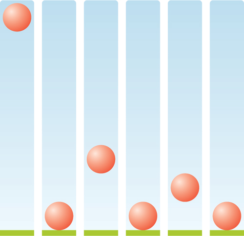
FIGURE 8.1 A real-life bouncing movement
Bouncing animations
Our first hunch might be to use a CSS animation, with keyframes such as the following:
@keyframes bounce {
    60%, 80%, to { transform: translateY(350px); }
    70% { transform: translateY(250px); }
    90% { transform: translateY(300px); }
}

.ball {
    /* Dimensions, colors, etc. */
    animation: bounce 3s;
}
The keyframes in the preceding code specify exactly the same steps as in Figure 8.1. However, if you run this animation, you will notice that it looks very artificial. One of the reasons for this is that every time the ball changes direction, it continues accelerating, which looks unnatural. The reason is that its timing function is the same across all these keyframes.
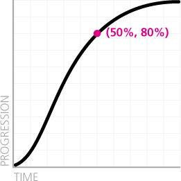
FIGURE 8.2 The default timing function (ease) for all transitions and animations
“Its timing…what?” you might ask. Every transition and animation is associated with a curve that specifies how it progresses over time (also known as “easing” in some contexts). If you don’t specify a timing function, it will get the default one, which unlike what you might expect is not linear and is shown in Figure 8.2. Note (as shown by the pink point in Figure 8.2) how when half of the time has elapsed, the transition is about 80% along the way!
The default timing function can also be explicitly specified with the keyword ease, either in the animation/transition shorthand or the animation-timing-function/transition-timing-function longhands. However, because ease is the default timing function, it’s not very useful. There are four more pre-baked curves you can use to change the way the animation progresses, shown in Figure 8.3.
As you can see, ease-out is the reverse of ease-in. This is exactly what we wanted for our bounce effect: we want to reverse the timing function every time the direction reverses. We can therefore specify a main timing function in the animation property and override it in the keyframes. We want the timing function of the main direction to be the accelerating one (ease-out) and the one of the reverse direction to be decelerating (ease-in):
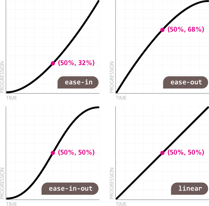
FIGURE 8.3 The available keywords that correspond to predetermined timing functions
@keyframes bounce {
    60%, 80%, to {
        transform: translateY(400px);
        animation-timing-function: ease-out;
    }
    70% { transform: translateY(300px); }
    90% { transform: translateY(360px); }
}

.ball {

    /* Rest of styling here */
    animation: bounce 3s ease-in;
}
If you test the code out, you will see that even this simple change instantly results in a considerably more realistic bounce. However, restricting ourselves to these five predetermined curves is extremely limiting. If we could pick arbitrary timing functions, we would be able to achieve much more realistic results. For example, if the bounce animation is for a falling object, then a higher acceleration (such as the one provided by ease) would create a more realistic result. But how could we create the inverse of ease, when there is no keyword for it?
All five of these curves are specified through (cubic) Bézier curves. Bézier curves are the kinds of curves you work with in any vector application (e.g., Adobe Illustrator). They are defined by a number of path segments, with a handle on each end to control their curvature (these handles are often called control points). Complex curves contain a large number of such segments, which are joined at their endpoints (Figure 8.4). CSS timing functions are Bézier curves with only one segment, so they only have two control points. As an example, you can see the default timing function (ease) with its control points exposed in Figure 8.5.
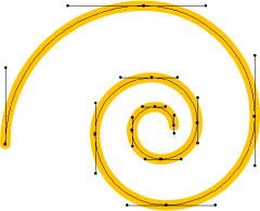
FIGURE 8.4 A cubic Bézier curve for a spiral, with its nodes and control points showing
In addition to the five predefined curves we discussed in the previous section, there is also a cubic-bezier() function that allows us to specify a custom timing function. It takes four arguments, which are the coordinates of the two control points, to create the Bézier curve we are specifying, with the form cubic-bezier(x1, y1, x2, y2) where (x1, y1) are the coordinates of the first control point and (x2, y2) of the second. The endpoints of the line segment are fixed at (0,0), which is the beginning of the transition (zero elapsed time, zero progression) and (1,1), which is its end (100% elapsed time, 100% progression).
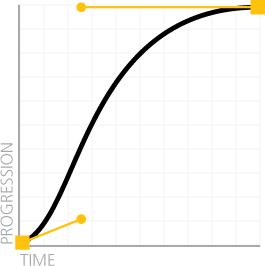
FIGURE 8.5 The ease timing function with its nodes and control points displayed
Note that the restriction on having a single segment whose endpoints are fixed is not the only one. The x values of both control points are restricted to the [0, 1] range (i.e., we cannot move the handles outside of the graph horizontally). This restriction is not arbitrary. As we cannot (yet?) travel through time, we cannot specify a transition that begins before it is triggered or ends after its duration. The only real limitation here is the number of nodes: restricting the curve to only two nodes limits the result quite considerably, but it also makes the cubic-bezier() function simpler to use. Despite these limitations, cubic-bezier() allows us to create a very diverse set of timing functions.
It logically follows that we can reverse any timing function by swapping the horizontal with the vertical coordinates for both its control points. This applies to keywords too; all five keywords we discussed correspond to cubic-bezier() values. For example, ease is equivalent to cubic-bezier(.25,.1,.25,1), so its reverse is cubic-bezier(. 1,.25,1,.25) and is shown in Figure 8.6. This way, our bounce animation can now use ease and look even more realistic:
@keyframes bounce {
    60%, 80%, to {
        transform: translateY(400px);
        animation-timing-function: ease;
    }
    70% { transform: translateY(300px); }
    90% { transform: translateY(360px); }
}
.ball {
    /* Styling */
    animation: bounce 3s cubic-bezier(.1,.25,1,.25);
}
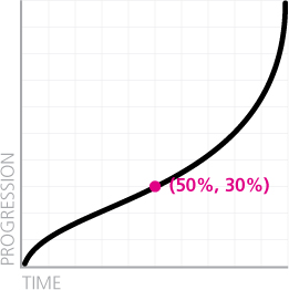
FIGURE 8.6 The reverse timing function for ease
Using a graphical tool like cubic-bezier.com (Figure 8.7) we can experiment further and improve our bounce animation even more.
 PLAY! play.csssecrets.io/bounce
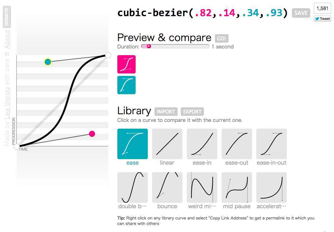
FIGURE 8.7 Cubic Bézier curves are notoriously hard to specify and understand without a visualization, especially when they are acting as timing functions for a transition; thankfully, there are quite a few online tools for this, such as cubic-bezier.com (shown here), made by yours truly
In the animate.css animation library by Dan Eden (daneden.me), the timing function used is cubic-bezier(.215,.61,.355,1) and cubic-bezier(.755,.05,.855,.06) instead of its reverse, which is steeper, for increased realism.

Elastic transitions
Suppose we want to show a callout every time a text field is focused, to supply additional information, such as allowed values. The markup could look like this:
TIP! If you were using a height and not a transform to show the callout, you would notice that transitions from height: 0 (or any other) to height: auto do not work, because auto is a keyword and cannot be expressed as an animatable value. In those cases, use max-height instead with a sufficiently large height.
HTML
<label>
    Your username: <input id="username" />
    <span class="callout">Only letters, numbers,
    underscores (_) and hyphens (-) allowed!</span>
</label>
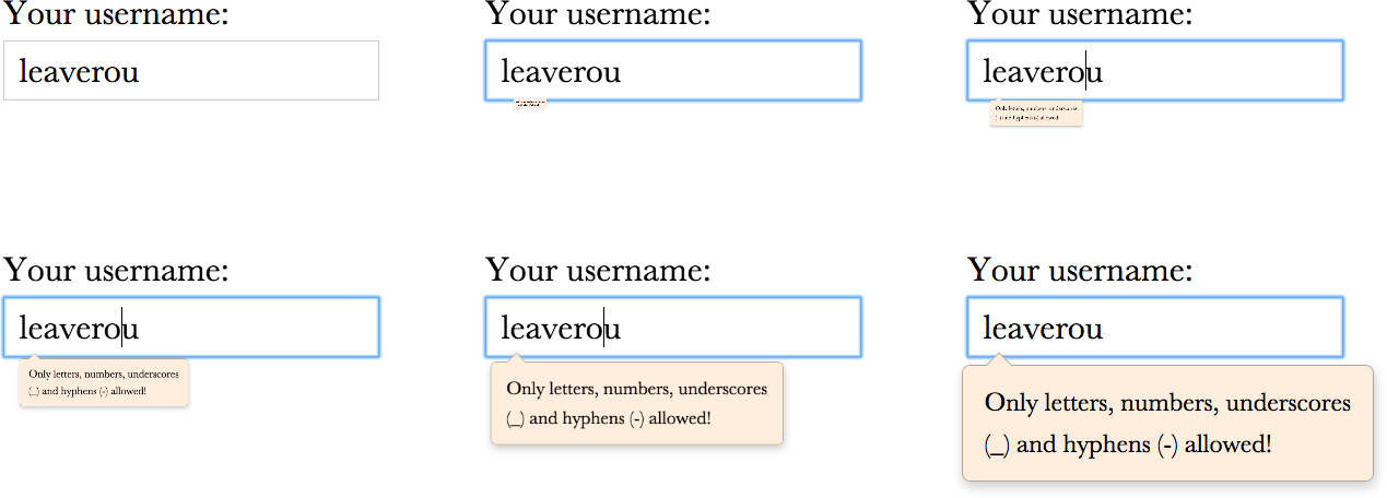
FIGURE 8.8 How our transition looks initially
And the CSS for toggling the display could look like the following (we have omitted everything related to styling or layout):
input:not(:focus) + .callout {
    transform: scale(0);
}

.callout {
    transition: .5s transform;
    transform-origin: 1.4em -.4em;
}
As it currently stands, when the user focuses on our text field, there is a half-second transition that looks like Figure 8.8. Nothing wrong with that, but it would look more natural and playful if it overshot a bit at the end (e.g., if it grew to 110% its size, and then snapped back to 100%). We can do this by converting the transition to an animation, and applying what we learned in the previous section:
@keyframes elastic-grow {
    from { transform: scale(0); }
    70% {
        transform: scale(1.1);
        animation-timing-function:
            cubic-bezier(.1,.25,1,.25); /* Reverse ease */

    }
}

input:not(:focus) + .callout { transform: scale(0); }

input:focus + .callout { animation: elastic-grow .5s; }

.callout { transform-origin: 1.4em -.4em; }
If we try it out, we will see that it does indeed work. You can see how it looks in Figure 8.9 and compare it with the previous transition. However, we’ve essentially used an animation when we really needed a transition. Animations might be very powerful, but in a case like this where all we needed was to add some elasticity to our transition, it feels a bit overkill, like using a chainsaw to cut ourselves a slice of bread. Is there a way to accomplish something like this with a transition?
The solution lies again in custom cubic-bezier() timing functions. So far, we have only discussed curves whose control points were in the 0– 1 range. As we mentioned in the previous section, we cannot exceed this range horizontally, although this might change in the future if time machines are ever invented. However, we are allowed to exceed the 0–1 range vertically and get our transition to go below 0% progression or above 100%. Can you guess what that means? It means that if we are moving from a scale(0) transform to a scale(1) transform, we can make it go further than the final value, and reach values like scale(1.1), or even more, depending on how steep we make the timing function.
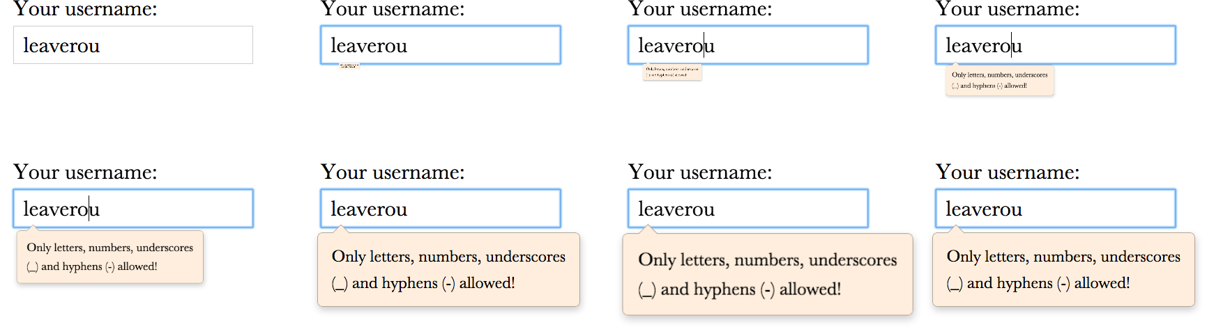
FIGURE 8.9 Our UI feels more realistic and playful if we add some elasticity to our transition
In this case, we only want very little elasticity, so we want our timing function to reach 110% progression (which corresponds to scale(1.1)) and then start transitioning back to 100%. Let’s start from the initial ease timing function (cubic-bezier(.25,.1,.25,1)) and move the second control point toward the top until we reach something like cubic-bezier(.25,.1,.3,1.5). As you can see in Figure 8.10, the transition now reaches 100% progression at roughly 50% of its total duration. However, it does not stop there; it continues moving past the end value until it reaches 110% progression at the 70% time mark and then spends the remaining 30% of its available time transitioning back to the final value, resulting in a transition that is very similar to our animation, but is achieved with only one line of code. For the sake of comparison, our code is now:
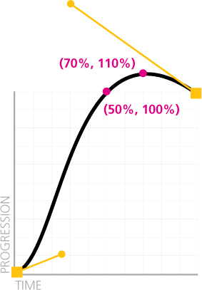
FIGURE 8.10 A custom timing function with vertical coordinates outside the 0–1 range
input:not(:focus) + .callout { transform: scale(0); }

.callout {
    transform-origin: 1.4em -.4em;
    transition: .5s cubic-bezier(.25,.1,.3,1.5);
}
However, although our transition looks as expected when we focus on the text field and the callout shows up, the results might not be exactly what one would expect when the text field loses focus and the callout shrinks and disappears (Figure 8.11). What happened here?! Odd as the result might look, it’s actually expected: when we tab out of the input field, the transition that fires has scale(1) as its starting value and scale(0) as it’s final value. Therefore, because the same timing function is applied, the transition will still reach 110% progression after 350ms. Only this time, 110% progression does not translate to scale(1.1), but to scale(-0.1)!
Don’t give up just yet though, because fixing this issue only adds one more line of code. Assuming we just want a regular ease timing function when the callout shrinks, we can do it by overriding the current timing function in the CSS rule that defines its closed state:
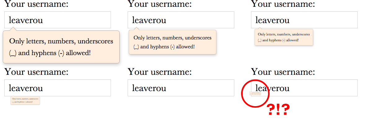
FIGURE 8.11 What happened here?!
input:not(:focus) + .callout {
    transform: scale(0);
    transition-timing-function: ease;
}

.callout {
    transform-origin: 1.4em -.4em;
    transition: .5s cubic-bezier(.25,.1,.3,1.5);
}
If you try it again, you will see that it now closes in exactly the same way as it did before our custom cubic-bezier() function, but when it opens, it has the nice elastic effect we were going for.
The most vigilant of readers will also notice another issue: closing the callout feels very slow. Why is that? Think about it. When it’s growing, it reaches 100% of its final size at 50% progression (i.e., after 250ms). However, when it is shrinking, going from 0% to 100% takes up all of the time we specified for the transition (500ms), so it feels half as fast.
To fix that last issue, we can just override the duration as well, either by using transition-duration or by using the transition shorthand and overriding everything. If we do the latter, we don’t have to explicitly specify ease, because it is the initial value:
input:not(:focus) + .callout {
    transform: scale(0);
    transition: .25s;
}

.callout {
    transform-origin: 1.4em -.4em;
    transition: .5s cubic-bezier(.25,.1,.3,1.5);
}

FIGURE 8.12 An elastic color transition from  rgb(100%, 0%, 40%) to
  gray (rgb(50%, 50%, 50%)) with a timing function of cubic-bezier(.25,.1,.2,3). Each RGB coordinate interpolates individually, so we reach weird colors like
  rgb(0%, 100%, 60%). Check out play.csssecrets.io/elastic-color.
While elastic transitions can be a nice touch in many kinds of transitions (some of which we mentioned in the “The problem” section of this secret), they are a terrible idea for others. The typical case where you don’t want elastic transitions is colors. Although elastic transitions on colors can be quite amusing (see Figure 8.12), they are usually not desirable for a UI.
To guard against accidentally applying elastic transitions to colors, try to restrict transitions to specific properties, instead of not specifying any like we did before. When we don’t specify any properties in the transition shorthand, transition-property gets its default value: all. This means that anything that can be transitioned, will be transitioned. Therefore, if we later add a background change on the rule that is applied to open callouts, the elastic transition will now be applied to that too. The final code looks like this:
input:not(:focus) + .callout {

    transform: scale(0);
    transition: .25s transform;
}

.callout {
    transform-origin: 1.4em -.4em;
    transition: .5s cubic-bezier(.25,.1,.3,1.5) transform;
}
TIP Speaking of restricting transitions to specific properties, you can even queue the transitions for the different properties, via transition-delay, which is the second time value in the transition shorthand. For example, if both width and height are transitioning and you want the height to go first and the width second (an effect popularized by many lightbox scripts), you could do it with something like transition: .5s height, .8s .5s width; (i.e., the delay of the width transition is equal to the duration of the height transition).
PLAY! play.csssecrets.io/elastic
43 Frame-by-frame animations
The problem
Quite often, we need an animation that is difficult or impossible to achieve by transitioning CSS properties on elements. For example, a cartoon moving or a complex progress indicator. In this case, image-based frame-by-frame animations are perfect, but surprisingly challenging to accomplish on the Web in a flexible manner.
At this point, you might be wondering, “Can’t we just use animated GIFs?” The answer is yes, for many cases, animated GIFs are perfect. However, they have a few shortcomings that might be a dealbreaker for certain use cases:
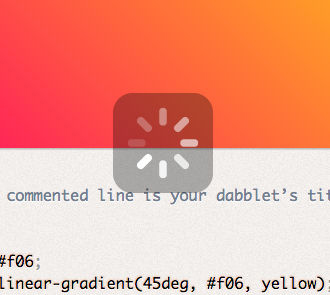
FIGURE 8.13 A semi-transparent progress indicator (on dabblet.com); this is impossible to achieve with animated GIFs
They are limited to a 256 color palette, shared across all frames.
They cannot have alpha transparency, which can be a big problem when we don’t know what will be underneath our animated GIF. For example, this is very common with progress indicators (see Figure 8.13).
There is no way to modify certain aspects from within CSS, such as duration, repetitions, pausing, and so on. Once the GIF is generated, everything is baked into the file and can only be changed by using an image editor and generating another file. This is great for portability, but not for experimentation.
Back in 2004, there was an effort by Mozilla to address the first two issues by allowing frame-by-frame animation in PNG files, akin to the way we can have both static and animated GIF files. It was called APNG and was designed to be backward compatible with non-supporting PNG viewers, by encoding the first frame in the same way as traditional PNG files, so old viewers would at least display that. Promising as it was, APNG never got enough traction and to this day, has very limited browser and image editor support.
For more information about APNG, see wikipedia.org/wiki/APNG.
Developers have even used JavaScript to achieve flexible frame-by-frame animations in the browser, by using an image sprite and animating its background-position with JS. You can even find small libraries to facilitate this! Is there a straightforward way to achieve this with only nice, readable CSS code?
The solution
Let’s assume we have all frames of our animation in a PNG sprite like the one shown in Figure 8.14.

FIGURE 8.14 Our spinner’s eight frames (dimensions: 800×100)
We also have an element that will hold the loader (don’t forget to include some text, for accessibility!), to which we have already applied the dimensions of a single frame:
HTML
<div class="loader">Loading…</div>
.loader {
    width: 100px; height: 100px;

    background: url(img/loader.png) 0 0;

    /* Hide text */
    text-indent: 200%;
    white-space: nowrap;
    overflow: hidden;
}
Currently, the result looks like Figure 8.15: the first frame is displayed, but there is no animation. However, if we play with different background-position values, we will notice that -100px 0 gives us the second frame, -200px 0 gives us the third frame, and so on. Our first thought could be to apply an animation like this:

FIGURE 8.15 The first frame of our loader shows, but there is no animation yet
@keyframes loader {
    to { background-position: -800px 0; }
}

.loader {
    width: 100px; height: 100px;
    background: url(img/loader.png) 0 0;
    animation: loader 1s infinite linear;

    /* Hide text */
    text-indent: 200%;
    white-space: nowrap;
    overflow: hidden;
}
However, as you can see in the following stills (taken every 167ms), this doesn’t really work:
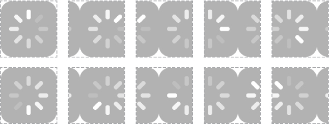
FIGURE 8.16 Our initial attempt for a frame-by-frame animation failed, as we did not need interpolation between keyframes
It might seem like we’re going nowhere, but we are actually very close to the solution. The secret here is to use the steps() timing function, instead of a Bézier-based one.
“The what timing function?!” you might ask. As we saw in the previous chapter, all Bézier-based timing functions interpolate between keyframes to give us smooth transitions. This is great; usually, smooth transitions are exactly the reason we are using CSS transitions or animations. However, in this case, this smoothness is destroying our sprite animation.
Very unlike Bézier timing functions, steps() divides the whole animation in frames by the number of steps you specify and abruptly switches between them with no interpolation. Usually this kind of abruptness is undesirable, so steps() is not talked about much. As far as CSS timing functions go, Bézier-based ones are the popular kids that get invited to all the parties and steps() is the ugly duckling that nobody wants to have lunch with, sadly. However, in this case, it’s exactly what we need. Once we convert our animation to the following, our loader suddenly starts working the way we wanted it to:
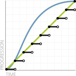
FIGURE 8.17 A comparison of steps(8), linear and the default timing function, ease
animation: loader 1s infinite steps(8);
Keep in mind that steps() also accepts an optional second parameter, start or end (default) that specifies when the switch happens on every interval (see Figure 8.17 for the default behavior of end), but that is rarely needed. If we only need a single step, there are also shortcuts: step-start and step-end, which are equivalent to steps(1, start) and steps(1, end), respectively.
PLAY! play.csssecrets.io/frame-by-frame
Hat tip to Simurai (simurai.com/) for coming up with this useful technique in Sprite sheet animation with steps() (simurai.com/blog/2012/12/03/step-animation).
44 Blinking
The problem
Remember the old <blink> tag? Of course you do. It has become a cultural symbol in our industry, reminding us of the humble, clumsy beginnings of our discipline, and always willing to serve as an inside joke between old-timers. It is universally despised, both because it violated separation of structure and style, but mainly because its overuse made it a pain for anyone browsing the Web in the late 90s. Even its own inventor, Lou Montulli, has said “[I consider] the blink tag to be the worst thing I’ve ever done for the Internet.”
However, now that the nightmare of the <blink> tag is long behind us, we sometimes still find ourselves needing a blinking animation. It feels weird at first, a bit like discovering some sort of strange perversion inside us that we never knew we had. The identity crisis stops when we realize that there are a few use cases in which blinking can enhance usability, rather than reduce it.
A common UX pattern is blinking a few times (no more than three!) to indicate that a change has been applied somewhere in the UI or to highlight the current link target (the element whose id matches the URL #hash). Used in such a limited way, blinking can be very effective to draw the user’s attention to an area, but due to the limited number of iterations, it doesn’t have the adverse effects the <blink> tag did. Another way to keep the good of blinking (directing user attention) without the bad (distracting, annoying, seizure inducing) is to “smoothe” it out (i.e., instead of alternating between an abrupt “on” and “off” state, to have a smooth progression between the two).
However, how do we implement all this? The CSS-only replacement for the <blink> tag, text-decoration: blink, is too limited to allow us to do what we want, and even if it was powerful enough, its browser support is very poor. Can we use CSS animations for this, or is JS our only hope?
The solution
There are actually multiple ways to use CSS animations to achieve any kind of blinking: on the whole element (via opacity), on the text color (via color), on its border (via border-color), and so on. In the rest of this section, we will assume that we want to blink the text only, as that is the most common use case. However, the solution for other parts of an element is analogous.
Achieving a smooth blink is rather easy. Our first attempt would probably look like this:
@keyframes blink-smooth { to { color: transparent } }

.highlight { animation: 1s blink-smooth 3; }
This almost works. Our text smoothly fades from its text color to transparent, however it then abruptly jumps back to the original text color. Plotting the change of text color over time helps us figure out why this happens (Figure 8.18).

FIGURE 8.18 The progression of our text color over three seconds (three iterations)
This might actually be desirable. In that case, we are done! However, when we want the blinking to be smooth both when the text fades out and when it fades in, we have a bit more work to do. One way to achieve this would be by changing the keyframes to make the switch happen in the middle of each iteration:
@keyframes blink-smooth { 50% { color: transparent } }

.highlight {
    animation: 1s blink-smooth 3;
}
This looks like the result we wanted. However, although it doesn’t show in this particular animation (because it’s difficult to differentiate between timing functions with color/opacity transitions), it’s important to keep in mind that the animation is accelerating both when it fades in and when it fades out, which could look unnatural for certain animations (e.g., pulsating animations). In that case, we can pull a different tool out of our toolbox: animation-direction.
The only purpose of animation-direction is to reverse either all iterations (reverse), every even one (alternate) or every odd one (alternate-reverse). What is great about it is that it also reverses the timing function, creating far more realistic animations. We could try it on our blinking element like so:
@keyframes blink-smooth { to { color: transparent } }

.highlight {
    animation: .5s blink-smooth 6 alternate;
}
Note that we had to double the number of iterations (instead of the duration, like the previous method), as now one fade-in/fade-out pair consists of two iterations. For the same reason, we also cut animation-duration in half.
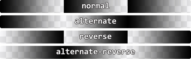
FIGURE 8.19 All four values of animation-direction and their effect on a color animation from black to transparent over three iterations
If we want a smooth blink animation, we’re done at this point. However, what if we want a classic one? How do we go about it? Our first attempt might look like this:
@keyframes blink { to { color: transparent } }

.highlight {
    animation: 1s blink 3 steps(1);
}
However, this will fail spectacularly: absolutely nothing will happen. The reason is that steps(1) is essentially equivalent to steps(1, end), which means that the transition between the current color and transparent will happen in one step, and the value switch will occur at the end (Figure 8.20). Therefore, we will see the start value for the entire length of the animation, except one infinitesimally short point in time at the end. If we change it to steps(1, start) the opposite will happen: the switch will occur at the start, so we will only see transparent text, with no animation or blinking.
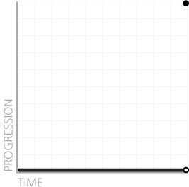
FIGURE 8.20 What steps(1) actually does to our animation
A logical next step would be to try steps(2) in both its flavors (start and end). Now we do see some blinking, but it’s between semi-transparent text and transparent or semi-transparent and normal respectively, for the same reason. Unfortunately, because we cannot configure steps() to make the switch in the middle, but only at the start and end, the only solution here would be to adjust the animation keyframes to make the switch at 50%, like we did earlier:
@keyframes blink { 50% { color: transparent } }

.highlight {
    animation: 1s blink 3 steps(1); /* or step-end */
}
This finally works! Who would have guessed that a classic abrupt blink would have been harder to accomplish than a modern, smooth one? CSS never ceases to surprise….
PLAY! play.csssecrets.io/blink
45 Typing animation
The problem
Sometimes we want to make text appear one by one character, to simulate typing. This effect is especially popular on tech websites, using monospace fonts to resemble a terminal command prompt. Used right, it can really contribute to the rest of the design.
Usually, this is done with long, hacky, complicated JS code. Even though this is pure presentation, using CSS for this kind of effect seems like a pipe dream. Or could it be possible?
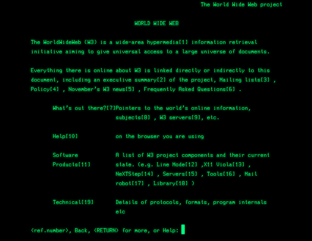
FIGURE 8.21 We used a variation of this kind of animation at CERN, when creating a web-based simulation of the first line mode browser (line-mode.cern.ch)
The solution
The main idea is to animate the width of the element that contains our text from 0 to its content width one by one character. You might have already realized what the limitation of this approach is: it will not work for multiline text. Thankfully, most of the time, you only want to use such styling on single-line text anyway, such as headings.
Theoretically, we could make this work for multiline text, but it would involve wrapping each line in its own element and maintaining the appropriate animation delays (i.e., it’s the kind of solution that is worse than the problem).
Another thing to keep in mind is that every animation effect has diminishing returns as its duration increases: short duration animations make an interface appear more polished and in some cases can even improve usability. However, the longer the duration of the animation, the more it starts becoming annoying for the user. Therefore, even if the technique could be used on longer, multiline text, in most cases that would not be a good idea.
Let’s get started with the code! Assume we want to apply this to a top-level heading (<h1>) that we’ve already styled with monospace text, and that looks like the following:

FIGURE 8.22 Our starting point
HTML
<h1>CSS is awesome!</h1>
We can easily add an animation that goes from 0 to the final width of the heading, like so:
@keyframes typing {
    from { width: 0 }
}

h1 {
    width: 7.7em; /* Width of text */
    animation: typing 8s;
}
It makes perfect sense, right? However, as you can see in Figure 8.23, it’s a trainwreck that has nothing to do with what we wanted.
You might have guessed what the problems are. First, we forgot to apply white-space: nowrap; to prevent text wrapping, so as the width grows, its number of lines changes. Second, we forgot to apply overflow: hidden;, so there is no clipping. If we fix these issues, the real issues with our animation get uncovered (Figure 8.24). Namely:
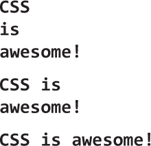
FIGURE 8.23 Our first attempt at a typing animation does not resemble typing at all
The obvious problem is that the animation is smooth instead of revealing the text character by character.
The less obvious problem is that so far we have been specifying the width in ems, which is better than doing it in pixels, but still suboptimal. Where did this 7.7 come from? How do we calculate it?
We can fix the first issue by using steps(), just like in the “Frame-by-frame animations” secret on page 308 and the “Blinking” secret on page 314. Unfortunately, the number of steps we need is the number of characters in our string, which is difficult to maintain or downright impossible for dynamic text. However, we will see later on that we can automate this with a tiny snippet of JavaScript code.
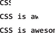
FIGURE 8.24 Our second attempt is closer, but still not quite there
The second issue could be alleviated by using the ch unit. The ch unit is one of the new units introduced in CSS Values and Units Level 3 (w3.org/TR/css3-values), and represents the width of the “0” glyph. It’s one of the most unknown new units, because in most cases, we don’t care about sizing things relative to the width of the 0 glyph. However, monospace fonts are special. In monospace fonts, the width of the “0” glyph is the same as the width of every glyph. Therefore, the width in ch is the number of characters: 15 in our example.
Let’s put all this together:
@keyframes typing {
    from { width: 0; }
}

h1 {
    width: 15ch; /* Width of text */
    overflow: hidden;
    white-space: nowrap;
    animation: typing 6s steps(15);
}
As you can see in the frames in Figure 8.25, now we finally got the expected result: our text is revealed character by character. However, it still doesn’t look realistic. Can you spot what’s missing?
The last touch that will make this way more realistic is adding a blinking caret. We have already seen how to create blinking animations in the “Blinking” secret on page 314. In this case, we could either implement the caret via a pseudo-element, and use opacity for the blinking, or we could save our limited pseudo-elements in case we need them for something else, and use a right border instead:
FIGURE 8.25 Now the text is revealed character by character, but something is still missing
@keyframes typing {
    from { width: 0 }
}

@keyframes caret {
    50% { border-color: transparent; }
}

h1 {
    width: 15ch; /* Width of text */
    overflow: hidden;
    white-space: nowrap;
    border-right: .05em solid;
    animation: typing 6s steps(15),
               caret 1s steps(1) infinite;
}
Note that unlike the text revealing animation, the caret needs to blink indefinitely (even after all of the text has been revealed), hence the infinite keyword. Also, we did not have to specify a border color, as we want it to automatically get the text color. You can see a few stills from the result on Figure 8.26.
Now our animation works perfectly, although it’s still not very maintainable: it requires setting different styles on every heading, depending on the number of characters in the content, and having to update them every time we edit said content. This is exactly the kind of task that JS is perfect for:
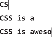
FIGURE 8.26 Our animation is now complete with a realistic blinking caret
JS
$$('h1').forEach(function(h1) {
    var len = h1.textContent.length, s = h1.style;

    s.width = len + 'ch';
    s.animationTimingFunction = "steps("+len+"),steps(1)";
});
Just with these few lines of JS we can now have our cake and eat it too: our animation is not only realistic, but maintainable as well!
All this is nice and dandy, but what happens with browsers that don’t support CSS animations? They will essentially drop all animation-related stuff, so they will only read this:
h1 {
    width: 15ch; /* Width of text */
    overflow: hidden;
    white-space: nowrap;
    border-right: .05em solid;
}
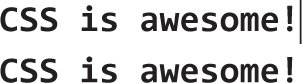
FIGURE 8.27 The potential fallbacks for browsers with no CSS animation support (top: with ch unit support, bottom: without ch unit support)
Depending on whether or not they support the ch unit, they will see one of the fallbacks in Figure 8.27. If you want to avoid the bottom one, you can provide a fallback in em units as well. If you do not want a non-blinking caret in your fallback, you could change the caret animation to include the border in the keyframes, so that when it’s dropped you only get an invisible transparent border, like so:
@keyframes caret {
    50% { border-color: currentColor; }
}

h1 {
    /* ... */
    border-right: .05em solid transparent;
    animation: typing 6s steps(15),
               caret 1s steps(1) infinite;
}
This is pretty much as good as fallbacks get: in older browsers, there is no animation, but nothing breaks at all and the text is perfectly accessible and even styled the same way.
PLAY! play.csssecrets.io/typing
46 Smooth state animations
The problem
Animations do not always start on page load. More often than not, we want to use animations in response to a user action, such as hovering over an element or holding the mouse down on it (:active). In that case, we might not have control over the actual number of iterations, as user activity might force the animation to stop before it gets a chance to finish the number of iterations we have specified. For example, the user might trigger a fancy :hover animation and mouse out of the element before the animation finishes. What do you expect should happen in these cases?
If you answered something along the lines of “the animation should stay at its current state” or “it should smoothly transition to the pre-animation state” you are in for a nasty surprise. By default, the animation will just stop and abruptly jump back to the pre-animation state. This might sometimes be acceptable in the case of very subtle animations. However, in most cases it just results in very choppy user experience. Can we change this behavior?
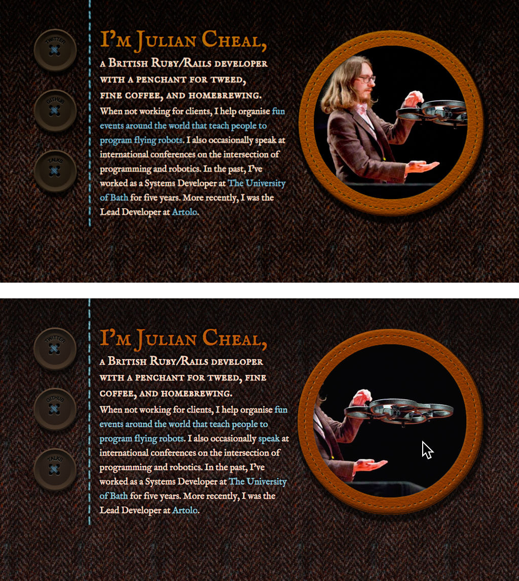
FIGURE 8.28 I finally decided to find a solution to this problem when working on a simple one-page website as a birthday gift for my friend Julian (juliancheal.co.uk). Notice the circular picture on the right. The image file I had was actually landscape. The circle crops its right part, but when the user hovers over it, it slowly starts scrolling to the left, revealing the cropped part. By default, when the user moved their cursor away, it abruptly snapped back to its original position, which made the UI feel broken. Because this was a tiny website, and this picture the centerpiece, I decided I couldn’t turn a blind eye to the issue.
This is yet another reason to use transitions when possible. Instead of abruptly jumping to the pre-animation state, transitions play in reverse to smoothly transition back to the original value.
The solution
Assume we have a very long landscape photo, such as the one in Figure 8.29, but the space we have available to display it is a 150 × 150 pixel square. One way to solve the problem is animation: show the left edge of the image by default, and make it scroll to reveal the rest when the user is interacting with it (e.g., hovering over it). We will use a single element for the image and animate its background position:
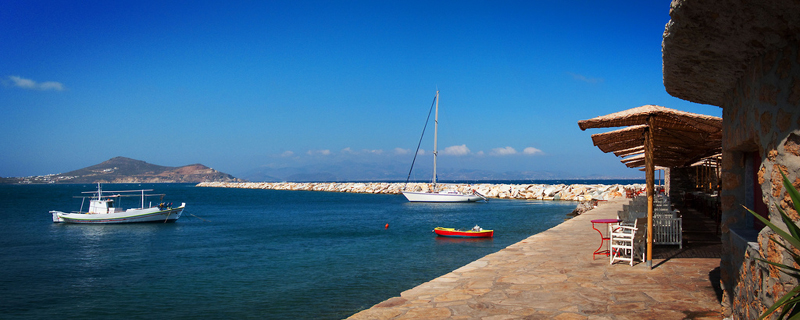
FIGURE 8.29 The entire naxos-greece.jpg image file, used in the examples throughout this secret (photo taken by Chris Hutchison)
.panoramic {
    width: 150px; height: 150px;
    background: url("img/naxos-greece.jpg");
    background-size: auto 100%;
}
Currently, it looks like Figure 8.30 and there is no animation or interactivity. If we experiment however, we can see that manually changing background-position from the original 0 0 to 100% 0 scrolls through the entire image. We just found our keyframes!

FIGURE 8.30 Our image is cropped
@keyframes panoramic {
    to { background-position: 100% 0; }
}

.panoramic {
    width: 150px; height: 150px;
    background: url("img/naxos-greece.jpg");
    background-size: auto 100%;
    animation: panoramic 10s linear infinite alternate;
}
This works great. It sort of resembles a panoramic view and it almost feels like being in the place and looking left or right. However, the animation is triggered on page load, which could be distracting in the context of, for example, a travel web page, where the user might be trying to focus on reading the text about Naxos, instead of looking at the beautiful panoramic picture. It would be better to enable the animation when the user hovers over the image. So, our first thought would be this:
.panoramic {
    width: 150px; height: 150px;
    background: url("img/naxos-greece.jpg");
    background-size: auto 100%;
}

.panoramic:hover, .panoramic:focus {
    animation: panoramic 10s linear infinite alternate;
}
This does work as expected when we hover over the image: it starts from the initial state of showing the leftmost part of the image and slowly scrolls to reveal the right part of it. However, when we mouse out, it abruptly jumps to the left position again (Figure 8.31). We’ve just stumbled on the problem this secret is about!
FIGURE 8.31 Mousing over is very smooth, but mousing out is abrupt and feels broken
To fix this, we need to think differently about what we are trying to achieve here. What we need is not to apply an animation on :hover, as this implies no memory of its previous position. What we need is to pause it when there is no :hover happening. Thankfully, we have a property just for the purpose of pausing an existing animation: animation-play-state!
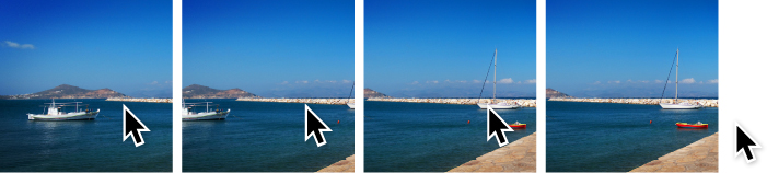
FIGURE 8.32 Now mousing out just pauses the animation—no abrupt jumps anymore
Therefore, we are going to apply our original animation to .panoramic, but have it paused initially, until :hover applies. Because it’s no longer a matter of applying and canceling an animation, but just pausing and resuming an existing animation, there is no abrupt rewinding. The final code looks like this and you can see the result in Figure 8.32:
@keyframes panoramic {
    to { background-position: 100% 0; }
}

.panoramic {
    width: 150px; height: 150px;
    background: url("img/naxos-greece.jpg");
    background-size: auto 100%;
    animation: panoramic 10s linear infinite alternate;
    animation-play-state: paused;
}

.panoramic:hover, .panoramic:focus {
    animation-play-state: running;
}
PLAY! play.csssecrets.io/state-animations
47 Animation along a circular path
The problem
A few years ago, back when basic CSS animations were still new and exciting, Chris Coyier (css-tricks.com) asked me if I could think of any way to animate an element on a circular path with CSS animations. At the time, it was just a fun CSS exercise, but in the future I stumbled on many real use cases. For example, Google+ uses such an animation when a new member is added to a circle with more than 11 members: the existing avatars animate on a circular path to make space for the new one.
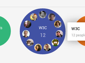
FIGURE 8.33 Google+ uses animation on a circular path to show that a new member was added to a “circle”
A different, fun example can be seen on the popular Russian tech website habrahabr.ru (Figure 8.34). As is often a good practice with 404 pages, it offers a navigation menu to a few main areas of the website.
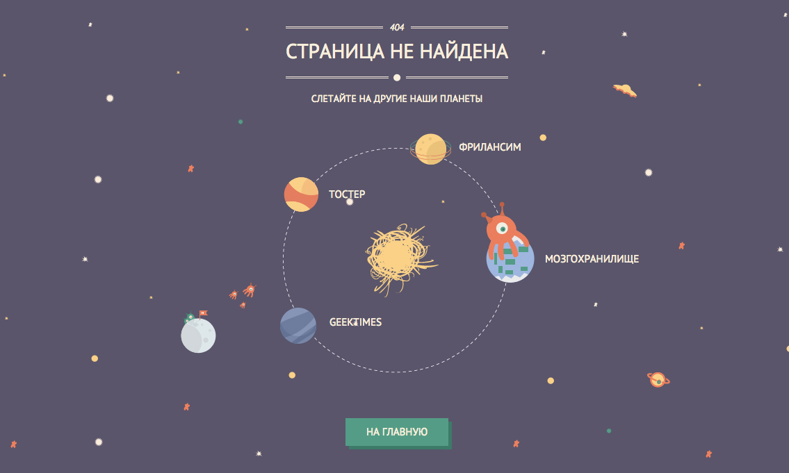
FIGURE 8.34 The 404 page of popular Russian tech website habrahabr.ru
However, each menu item is presented as a planet orbiting on a circle and the text above reads “Fly to other planets of our universe.” Of course, it makes sense to just move the planets on a circular path and not also rotate them, which would make their text almost impossible to read. These are only a few out of many possible examples. But how can we achieve such an effect with CSS animations?
We are going to work on a very simple example of an avatar animating on a circular path, a bit like a simplified version of the aforementioned Google+ effect. The markup would look like this:
HTML
<div class="path">
    <img src="lea.jpg" class="avatar" />
</div>
Before we start thinking about our animation, we will apply some basic styling to it (sizes, backgrounds, margins, etc.), so that it looks like Figure 8.35. Because this styling is pretty basic, it is not included here, but if you are having difficulty with it, you can find it in the live example. The main thing to keep in mind is that the diameter of the path is 300px, ergo the radius is 150px.
FIGURE 8.35 Our starting point, after applying some basic styling—now we can get our hands dirty with some CSS animation!
After we’re done with basic styling, we can start thinking about our animation. We want to move the avatar in a circle, along the orange path. How could we possibly use CSS animations to do this? When presented with this problem, some are quick to reply with something like this:
@keyframes spin {
    to { transform: rotate(1turn); }
}

.avatar {
    animation: spin 3s infinite linear;
    transform-origin: 50% 150px; /* 150px = path radius */
}
If you’re unsure about how to make circular shapes with CSS, take a look at the “Flexible ellipses” secret on page 76.
While this is a step in the right direction, it does not only move the avatar on a circular path, it also rotates it around itself (Figure 8.36). For example, notice how when the avatar is halfway through, it is also upside down. If it had text, the text would also be upside down, which can be quite a readability issue. We only wanted it to move along the circle, while still maintaining the same orientation relative to itself.
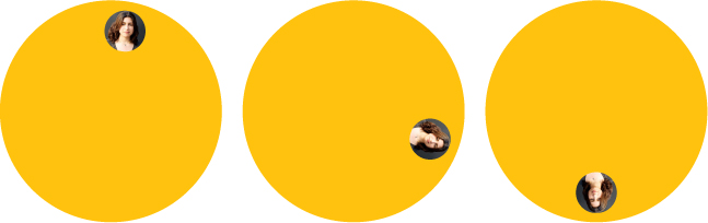
FIGURE 8.36 A few stills from our failed attempt at animating on a circular path
Back then, neither me nor Chris could think of a reasonable way. The best way we could come up with was specifying multiple keyframes to approximate a circle, which is obviously not a good idea by any possible definition of one. There must be a better way, right?
Two element solution
I finally came up with a solution to Chris’ challenge a few months later, after thinking about the problem as a background process for quite some time. The main idea behind this solution is the same as in the “Parallelograms” secret on page 84 or the “Diamond images” secret on page 90: nested transforms canceling each other. However, instead of doing this statically, in this case it happens on every single frame of the animation. The caveat is that, just like the aforementioned secrets, this requires two elements. Therefore, we need to amend our original clean HTML with an extra wrapper div:
HTML
<div class="path">
    <div class="avatar">
        <img src="lea.jpg" />
    </div>
</div>
Let’s apply the initial animation we tried earlier to the .avatar wrapper. Now, as we’ve seen in Figure 8.36, this doesn’t work because it also rotates the element itself. But what if we applied another rotation to the avatar, and rotate it around itself by the same amount of degrees in the opposite direction? Then the two rotations would cancel each other, and we would only see the circular movement created by the difference in transform origins!
There is one problem though: we don’t have a static rotation that we can cancel, but an animation that goes through a range of angles. For example, if it was 60deg, we would cancel it with -60deg (or 300deg), if it was 70deg we would cancel it with -70deg (or 290deg). But now that it’s anything between 0-360deg (or 0-1turn, which is the same thing), what do we cancel it with? The answer is much easier than it might seem. We just animate over the reverse range (360-0deg), like so:
@keyframes spin {
    to { transform: rotate(1turn); }
}
@keyframes spin-reverse {
    from { transform: rotate(1turn); }
}

.avatar {
    animation: spin 3s infinite linear;
    transform-origin: 50% 150px; /* 150px = path radius */
}

.avatar > img {
    animation: spin-reverse 3s infinite linear;
}
Now, at any point, when the first animation is rotated by x degrees, the second one is rotated by 360 – x degrees, because one of them is increasing and the other is decreasing. This is exactly what we wanted and as you can see in Figure 8.37, it produces the desired effect.
The code, however, could use some improvement. For one, we are repeating all parameters of the animation twice. If we need to adjust its duration, we would need to do it twice, which is not very DRY. We can easily solve this by inheriting all animation properties from the parent, and overriding the animation name:
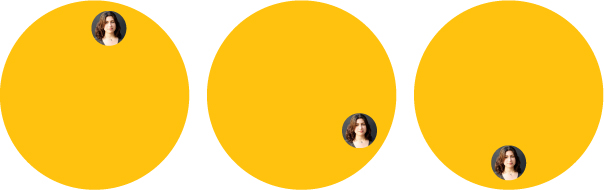
FIGURE 8.37 We have now achieved the animation we wanted, but the code is unwieldy
@keyframes spin {
    to { transform: rotate(1turn); }
}
@keyframes spin-reverse {
    from { transform: rotate(1turn); }
}

.avatar {
    animation: spin 3s infinite linear;
    transform-origin: 50% 150px; /* 150px = path radius */
}

.avatar > img {
    animation: inherit;
    animation-name: spin-reverse;
}
However, we shouldn’t need a whole new animation just to reverse our initial one. Remember the animation-direction property from the “Blinking” secret on page 314? In that secret, we saw why the alternate value is useful. Here we are going to use the reverse value, to get a reversed copy of our original animation, thus eliminating the need for a second one:
@keyframes spin {
    to { transform: rotate(1turn); }
}

.avatar {
    animation: spin 3s infinite linear;
    transform-origin: 50% 150px; /* 150px = path radius */
}

.avatar > img {

    animation: inherit;
    animation-direction: reverse;
}
And there we go! It might not be ideal, due to the extra element requirement, but we’ve achieved a rather complex animation, with fewer than 10 lines of CSS!
PLAY! play.csssecrets.io/circular-2elements
Single element solution
The technique described in the previous section works, but is suboptimal, as it requires HTML modifications. When I first came up with that technique, I wrote to the mailing list of the CSS Working Group (of which I was not a part of, at the time) and suggested that it should be possible to specify multiple transform origins for the same element. That should make it possible to implement something like this with a single element, and it seemed like a reasonable thing to ask for in general.
You can read the whole discussion at lists.w3.org/Archives/Public/www-style/2012Feb/0201.html.
The discussion was in high gear, when at some point Aryeh Gregor, one of the editors of the CSS Transforms specification at the time, made a statement that seemed confusing at first:
“transform-origin is just syntactic sugar. You should always be able to use translate() instead.”
— Aryeh Gregor
However, it turns out that every transform-origin can be simulated with two translate() transforms. For example, the following two code snippets are equivalent:
transform: rotate(30deg);
transform-origin: 200px 300px;

transform: translate(200px, 300px)
           rotate(30deg)
           translate(-200px, -300px);
transform-origin: 0 0;
This seems strange at first, but becomes more clear if we keep in mind that transform functions are not independent. Each of them doesn’t just transform the element it is applied on, it transforms the entire coordinate system of that element, thus affecting all transforms that come after it. This is exactly why transform order matters, and different orderings of the same transforms can produce entirely different results. If this is still unclear, Figure 8.38 should help eliminate any confusion.
Therefore, we can use the same transform-origin for both our previous animations by using this idea (we are going to use separate animations again as their keyframes are now completely different):
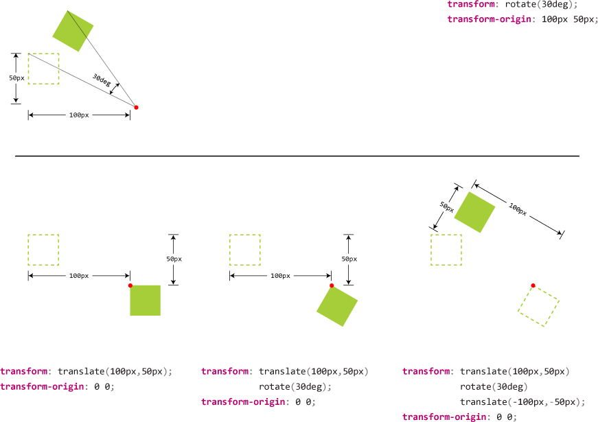
FIGURE 8.38 How we can substitute a transform origin with two translations. The red dot represents the transform origin each time. Top: Using transform-origin. Bottom: Using two translations, step by step.
@keyframes spin {
    from {
        transform: translate(50%, 150px)
                   rotate(0turn)
                   translate(-50%, -150px);
    }
    to {
        transform: translate(50%, 150px)
                   rotate(1turn)
                   translate(-50%, -150px);
    }
}
@keyframes spin-reverse {
    from {
        transform: translate(50%,50%)
                   rotate(1turn)
                   translate(-50%,-50%);
    }
    to {
        transform: translate(50%,50%)
                   rotate(0turn)
                   translate(-50%, -50%);
    }
}

.avatar {
    animation: spin 3s infinite linear;
}

.avatar > img {
    animation: inherit;
    animation-name: spin-reverse;
}
This looks awfully unwieldy, but do not worry, as we will improve it a lot by the end of this section. Notice that we now no longer have different transform origins, which was the only reason we needed two elements and two animations earlier. Now that everything uses the same origin, we can combine the two animations into one and only work with .avatar:
@keyframes spin {
    from {
        transform: translate(50%, 150px)
                   rotate(0turn)
                   translate(-50%, -150px)
                   translate(50%,50%)
                   rotate(1turn)
                   translate(-50%,-50%)
    }
    to {
        transform: translate(50%, 150px)
                   rotate(1turn)
                   translate(-50%, -150px)
                   translate(50%,50%)
                   rotate(0turn)
                   translate(-50%, -50%);
    }
}

.avatar { animation: spin 3s infinite linear; }
The code is definitely improving, but is still long and confusing. Can we make it a bit more concise? There are a few potential improvements.
Note that we don’t need two HTML elements anymore: we can just apply the avatar class to the image itself, as we’re not styling them separately any longer.
The low-hanging fruit is to combine consecutive translate() transforms, specifically translate(-50%, -150px) and translate(50%, 50%). Unfortunately, percentages and absolute lengths cannot be combined (unless we use calc() which is also quite unwieldy). However, the horizontal translations cancel each other, so we basically have two translations on the Y axis (translateY(-150px) translateY(50%)). Also, because the rotations cancel each other, we can remove the horizontal translations before and after as well and combine the vertical ones. We currently have these keyframes:
@keyframes spin {
    from {
        transform: translateY(150px) translateY(-50%)
                   rotate(0turn)
                   translateY(-150px) translateY(50%)
                   rotate(1turn);
    }
    to {
        transform: translateY(150px) translateY(-50%)
                   rotate(1turn)
                   translateY(-150px) translateY(50%)
                   rotate(0turn);
    }
}

.avatar { animation: spin 3s infinite linear; }
This is a bit shorter and less repetitive, but still not great. Can we do any better? If we start from the avatar in the center of the circle (like in Figure 8.39), we can eliminate the first two translations, which essentially just place it at the center. Then the animation becomes:
@keyframes spin {
    from {
        transform: rotate(0turn)
                   translateY(-150px) translateY(50%)
                   rotate(1turn);
    }
    to {
        transform: rotate(1turn)
                   translateY(-150px) translateY(50%)
                   rotate(0turn);
    }
}

.avatar { animation: spin 3s infinite linear; }
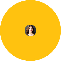
FIGURE 8.39 If we center the avatar as the starting point, our keyframes become a bit shorter; however, note that this state will also be our fallback in case animations are not supported, which may or may not be desirable
This seems to be the best we can do today. It’s not the DRY-est possible code, but it’s quite short. There is now minimal repetition and no redundant HTML elements. To make it completely DRY and avoid repeating the path radius, we could use a preprocessor, which is left as an exercise for the reader.