Table of Contents for
CSS Secrets
 CSS Secrets
Published by
O'Reilly Media, Inc., 2015
CSS Secrets
Published by
O'Reilly Media, Inc., 2015
- Cover Page
- CSS Secrets
- Title Page
- Copyright Page
- Dedication
- CSS Secrets
- Secrets by Specification
- Foreword
- Preface
- Words of thanks
- CSS Secrets
- Making of
- About this book
- Chapter 1. Introduction
- Chapter 2. Backgrounds & Borders
- Chapter 3. Shapes
- Chapter 4. Visual Effects
- Chapter 5. Typography
- Chapter 6. User Experience
- Chapter 7. Structure & Layout
- Chapter 8. Transitions & Animations
- Index
- Footnotes
3 Shapes
9 Flexible ellipses
The problem
You have probably noticed at some point that any square element with a sufficiently large border-radius can turn into a circle, with CSS code akin to the following:
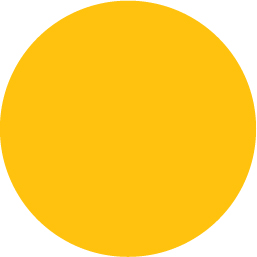
FIGURE 3.1 A circle, generated by fixed dimensions and a border-radius of half that
background: #fb3;
width: 200px;
height: 200px;
border-radius: 100px; /* >= half the side */
You might have also noticed that you could specify any radius larger than 100px and it will still result in a circle. The reason is outlined in the specification:
“When the sum of any two adjacent border radii exceeds the size of the border box, user agents must proportionally reduce the used values of all border radii until none of them overlap.”
— CSS Backgrounds & Borders Level 3 (w3.org/TR/css3-background/#corner-overlap)
However, we often cannot provide a specific width and height on an element, as we want it to adjust to its content, which may not be known ahead of time. Even if we are designing a static website and its exact content is predetermined, we might want to modify it at some point, or it could be displayed in a fallback font with different metrics. In that case, we usually want it to be an ellipse when the width and height are not exactly equal and a circle when they are. However, with our previous code, that is not the case. The resulting shape when the width is larger than the height is shown in Figure 3.2. Can we even use border-radius to make an ellipse, let alone a flexible one?
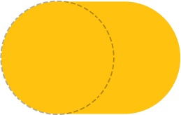
FIGURE 3.2 Our previous circle example, when the height is smaller than the width; the border-radius circle is shown here with dashed lines
The solution
One lesser known fact is that border-radius accepts different horizontal and vertical radii, if you use a slash (/) to separate the two. This allows us to create elliptical rounding at the corners (Figure 3.3). So, if we had an element with dimensions of 200px × 150px, for example, we could turn it into an ellipse with radii equal to half its width and height, respectively:
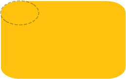
FIGURE 3.3 A box with unequal horizontal and vertical border-radius; our corner curving now follows an ellipse with horizontal and vertical radii equal to the border-radius we specified, shown here with dashed lines
border-radius: 100px / 75px;
You can see the result in Figure 3.4.
However, this has a major flaw: if the dimensions change, the border-radius values need to change as well. You can see in Figure 3.5 how the border-radius looks when you have a 200px × 300px element instead. When our dimensions vary depending on content, we have a problem.
Or, do we? Another lesser known feature of border-radius is that it accepts percentages, not just lengths. The percentage resolves to the corresponding dimension, width for the horizontal radius and height for the vertical one. This means the same percentage can compute to different horizontal and vertical radii. Therefore, to create a flexible ellipse, we can replace both radii with 50%:
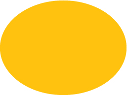
FIGURE 3.4 Irregular border-radius curves used to create an ellipse
border-radius: 50% / 50%;
And because the parts before and after the slash are now the same (even though they don’t compute to the same value), we can further simplify it to:
border-radius: 50%;
The result is a flexible ellipse with just one line of CSS, regardless of width and height.
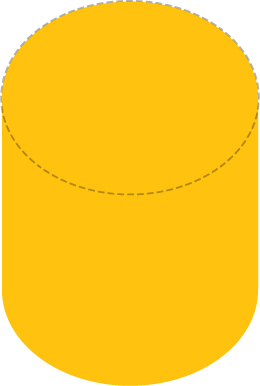
FIGURE 3.5 Our ellipse breaks when the dimensions change; the silver lining though is that this shape would be super useful for some sort of cylinder!
 PLAY! play.csssecrets.io/ellipse
Half ellipses
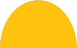
Now that we know how to make a flexible ellipse with CSS, it naturally follows to wonder if we can make other common shapes, like fractions of an ellipse. Let’s take a moment to think about a half ellipse (e.g., the one in Figure 3.6).
A half ellipse can become a semicircle when the width is double the height (or when the height is double the width, for ellipses cut down the vertical axis).
It’s symmetrical across the vertical axis, but not across the horizontal one. Even if we can’t know the exact border-radius values (or if it’s at all possible) yet, it starts to become obvious that we will need different radii per corner. However, the values we’ve examined so far only allow for one value for all four corners.
Fortunately, the border-radius syntax is more flexible than that. You might be surprised to find that border-radius is actually a shorthand. We can provide different values for each corner, and there are two different ways to do that. One way would be to use the longhand properties it’s comprised of:
border-top-left-radius
border-top-right-radius
border-bottom-right-radius
border-bottom-left-radius
However, the more concise way is to use the border-radius shorthand and to provide multiple whitespace-separated values. If we provide four values, they each apply to one corner, in clockwise order, starting from the top left. If we provide fewer than four values, they are multiplied in the usual CSS way, akin to properties like border-width. Three values mean the fourth is the same as the second. Two values mean the third is the same as the first. Figure 3.7 provides a visual explanation of how this works. We can even provide different horizontal and vertical radii for all four corners, by specifying 1–4 values before the slash and 1–4 different values after it. Note that these are expanded into four values individually. For example, a border-radius value of 10px / 5px 20px is equivalent to 10px 10px 10px 10px / 5px 20px 5px 20px.
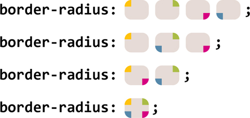
FIGURE 3.7 The rounding of which corner is specified with a border-radius of 4, 3, 2, or 1 whitespace-separated values (note that for elliptical radii, there could be up to four arguments before and after the slash, and they refer to the same corners, regarding the horizontal radii before the slash and the vertical radii after it)
Let’s now examine the half ellipse problem again with this newfound knowledge. Is it possible to specify such border-radius values that would generate a shape like this? We cannot know until we’ve tried. Let’s start by making a few observations:
The shape is symmetrical horizontally, which means both the top left and top right radii should be the same; likewise, the bottom left and bottom right radii should also match.
There are no straight horizontal edges at the top (i.e., the entire top side is curved), which means the top left and top right radii together should total 100% of the shape’s width.
From the previous two observations, we can deduce that the horizontal left and right radii should be 50%.
Vertically, it seems that the rounding for the two top corners occupies the entire element’s height and there is no rounding at the bottom corners. Therefore, it seems that a reasonable value for the vertical part of the border-radius would be 100% 100% 0 0.
Because the vertical rounding of the bottom corners is zero, it doesn’t matter what horizontal rounding they have, as that will always compute to zero anyway. (Can you imagine a corner with zero vertical rounding and positive horizontal rounding? Yup, neither could the spec writers.)
Putting all this together, we can come up with the CSS code for the flexible half ellipse in Figure 3.6 pretty easily:
border-radius: 50% / 100% 100% 0 0;
It’s equally simple to come up with values that create half ellipses cut down the vertical axis instead, like the one shown in Figure 3.8:
border-radius: 100% 0 0 100% / 50%;
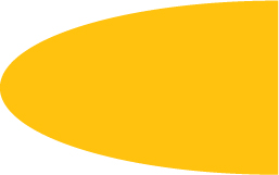
FIGURE 3.8 A half ellipse cut down the vertical axis
As an exercise, try to write CSS code for the other half of the ellipse.
PLAY! play.csssecrets.io/half-ellipse
Quarter ellipses
Similarly to the half ellipse example, when the width and height are equal, this will be a quarter circle.
After creating a whole ellipse and a half ellipse, the natural next question is whether we can make a quarter ellipse, like the one shown in Figure 3.9. Following a similar thought process as before, we can notice that to create a quarter ellipse, one of the corners needs to have a 100% radius both horizontally and vertically, and the other four will have no rounding. Because the percentage will be the same for both horizontal and vertical radii of all four corners, no slash notation is needed. The code would look like this:

border-radius: 100% 0 0 0;
Unfortunately, in case you are now wondering what other fractions of ellipses are possible with border-radius (e.g., is  th of an ellipse possible? One third?), I’m afraid you will be disappointed, because there are no possible border-radius values to generate that.
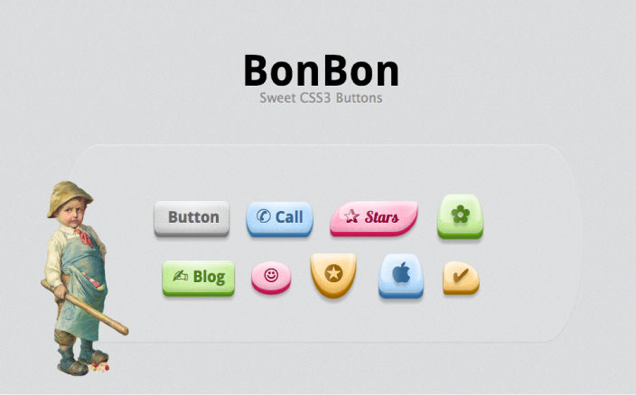
FIGURE 3.10 Simurai masterfully used border-radius to its full extent to create all sorts of shapes for his BonBon buttons (simurai.com/archive/buttons)
PLAY! play.csssecrets.io/quarter-ellipse
10 Parallelograms
The problem
Parallelograms are a superset of rectangles: their sides are parallel but their corners are not necessarily straight (see Figure 3.11). In visual design, they’re often useful to make the design appear more dynamic and convey a sense of movement (Figure 3.12).

Let’s try to create a button-style link with that style in CSS. Our starting point will be a plain flat button, with some simple styling, like the one in Figure 3.13. Then, we can create the skewed rectangle shape with a skew() transform, like so:
transform: skewX(-45deg);

FIGURE 3.12 Parallelograms in web design (design by Martina Pitakova)
However, this also results in the content being skewed, which makes it ugly and unreadable (Figure 3.14). Is there a way to only skew the container shape without skewing the contents?

FIGURE 3.13 Our button, before any transforms are applied
Nested elements solution
We can apply an opposite skew() transform to the content, which will cancel out the outer transform, effectively giving us the result we want. Unfortunately, that means we will have to use an extra HTML element to wrap around the content, such as a div:

FIGURE 3.14 Our skewed button, making the text hard to read

HTML
<a href="#yolo" class="button">
    <div>Click me</div>
</a>

.button { transform: skewX(-45deg); }
.button > div { transform: skewX(45deg); }
 If you’re applying this effect to an element that is inline by default, don’t forget to set its display property to something else, like inline-block or block, otherwise transforms will not apply. Same goes for the inner element.
As you can see in Figure 3.15 it works quite well, but it means we have to use an extra HTML element. If markup changes are not an option or you really want markup purity, fear not, as there’s also a pure CSS solution.
PLAY! play.csssecrets.io/parallelograms
Pseudo-element solution
Another idea is to use a pseudo-element to apply all styling to (backgrounds, borders, etc.), and then transform that. Because our content is not contained in the pseudo-element, it is not affected by the transformation. Let’s try to use this technique to style a link in the same way as in the previous section.
We need our pseudo-element box to remain flexible and automatically inherit the dimensions of its parent, even when they are determined by its contents. An easy way to do that is to apply position: relative to the parent, position: absolute to the generated content, and set all offsets to zero so that it stretches horizontally and vertically to the size of its parent. This is how this code would look:
.button {
    position: relative;
    /* text color, paddings, etc. */
}
.button::before {
    content: '';
    position: absolute;
    top: 0; right: 0; bottom: 0; left: 0;
}
At this point, the generated box is above the content and once we apply some background to it, it will obscure the contents (Figure 3.16). To fix this, we can apply z-index: -1 to the pseudo-element, so that it moves underneath its parent.
Now it’s finally time to apply transforms to our heart’s content on it and enjoy the result. The finished code would look like this and produce exactly the same visual result as the previous technique:

FIGURE 3.16 Our pseudo-element is currently above the contents, so applying background: #58a to it obscures them
.button {
    position: relative;
    /* text color, paddings, etc. */
}
.button::before {
    content: ''; /* To generate the box */
    position: absolute;
    top: 0; right: 0; bottom: 0; left: 0;
    z-index: -1;
    background: #58a;
    transform: skew(45deg);
}
These techniques are not only useful for skew() transforms. They can also be used with any other transformation, in order to transform an element’s shape without transforming its contents. For example, using a variation of this technique with a rotate() transform on a square element would easily give us a diamond (rhombus) shape.
Also, the idea of using pseudo-elements and positioning to generate a box that is then styled and placed underneath its parent can be used in a number of cases, for very different types of effects, such as:
It was a common workaround for multiple backgrounds in IE8, discovered by Nicolas Gallagher (nicolasgallagher.com/multiple-backgrounds-and-borders-with-css2).
It could be another solution to effects like the “Inner rounding” secret on page 36. Can you guess how?
It could be used to independently apply properties like opacity to a “background,” pioneered by Nicolas Gallagher (nicolasgallagher.com/css-background-image-hacks).
It can be used to emulate multiple borders in a more flexible way, in case we can’t use the techniques in the “Multiple borders” secret on page 28. For example, when we need multiple dashed borders or multiple borders with spacing and transparency between them.
PLAY! play.csssecrets.io/parallelograms-pseudo
11 Diamond images
The problem
Cropping images in a diamond shape is rather common in visual design, but still not quite straightforward to do in CSS. In fact, until recently, it was basically impossible. Therefore, when web designers want to follow this style, they more often than not pre-crop their images via an image editor. Of course, it goes without saying that this is really not a maintainable way to apply any effect and ends up being a mess if one wants to change the image styling in the future.
Surely, these days there must be a better way, right? Actually, there are two!
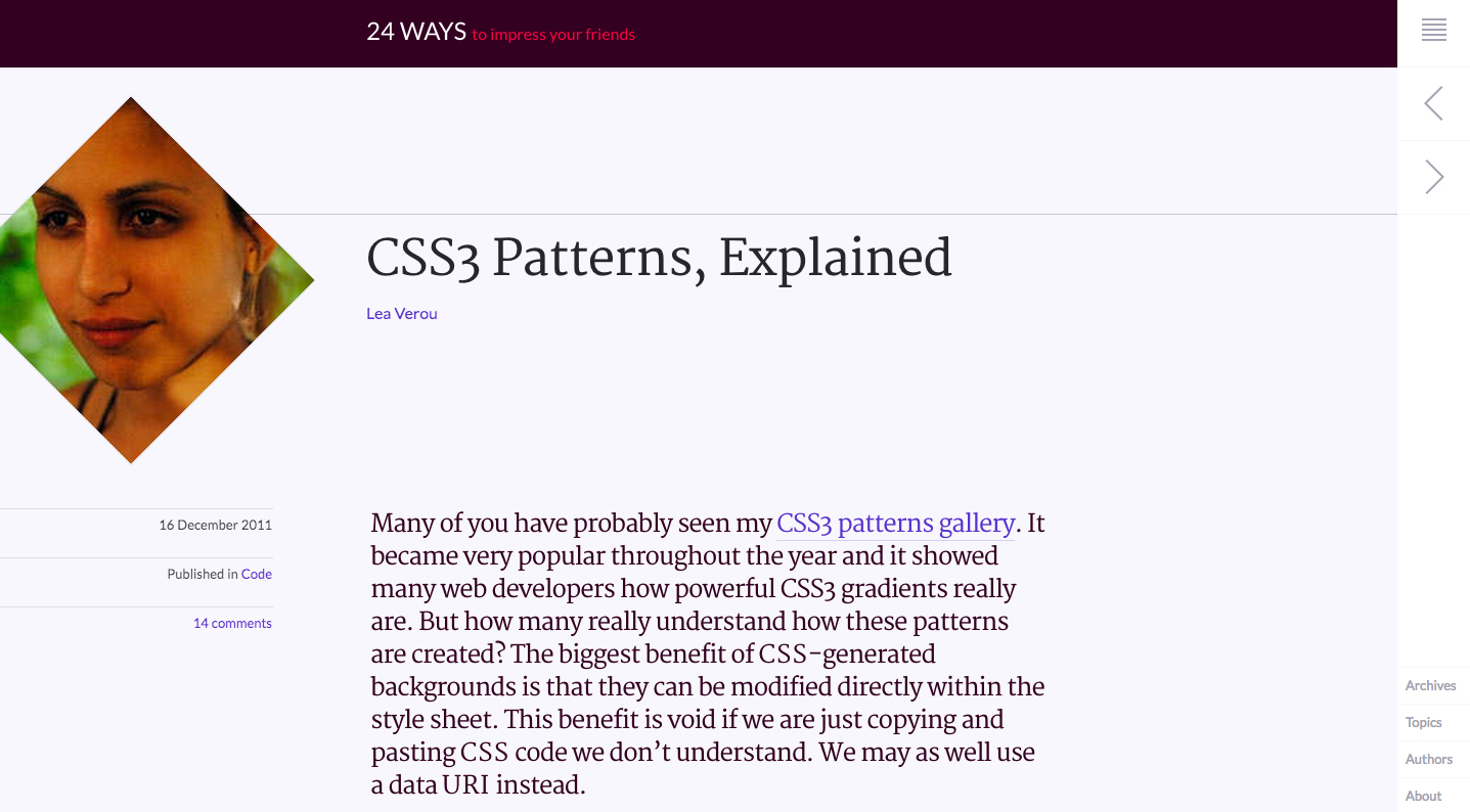
FIGURE 3.17 Following its 2013 redesign, 24ways.org now displays author profile pictures cropped in a diamond shape, using the technique discussed here
transform-based solution
The main idea is the same as the first solution discussed in the previous secret (the “Parallelograms” secret on page 84)—we need to wrap our image with a <div>, then apply opposite rotate() transforms to them:
HTML
<div class="picture">
    <img src="adam-catlace.jpg" alt="…" />
</div>

FIGURE 3.18 Our original image, which we are going to crop in a diamond shape
.picture {
    width: 400px;
    transform: rotate(45deg);
    overflow: hidden;
}
.picture > img {
    max-width: 100%;
    transform: rotate(-45deg);
}
However, as you can see in Figure 3.19, this doesn’t quite work out of the box and accomplish what we are trying to achieve. Unless, of course, we were trying to crop the image in an octagon shape, in which case we can stop now and go do something else with our time. To crop it to a diamond shape, however, there’s still some more sweating in order.
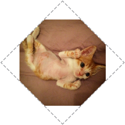
FIGURE 3.19 Opposite rotate() transforms are not enough to achieve this effect (.picture div is shown with a dashed outline)
The main issue is the max-width: 100% declaration. 100% refers to the side of our .picture container. However, we want our image to be as wide as its diagonal, not its side. You might have guessed that yes, we need the Pythagorean theorem again (if you need a refresher, there is one in the “Diagonal stripes” section on page 43). As the theorem tells us, the diagonal of a square is equal to its side multiplied by 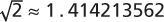 . Therefore, it makes sense to set max-width to
  , or round it up to 142%, as we don’t want it to be smaller under any circumstances (but slightly larger is OK, as we’re cropping our image anyway).
Actually, it makes even more sense to enlarge the image through a scale() transform, for a couple of reasons:
We want the size of the image to remain 100% if CSS transforms are not supported.
Enlarging an image through a scale() transform will scale it from the center (unless a different transform-origin is specified). Enlarging it via its width property will scale it from the top-left corner, so we will end up having to use negative margins to move it.
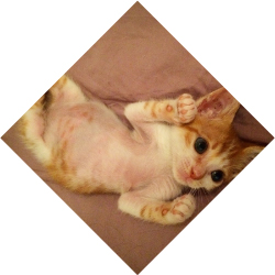
FIGURE 3.20 Our final cropped image
Putting it all together, our final code looks like this:
.picture {
    width: 400px;
    transform: rotate(45deg);
    overflow: hidden;
}
.picture > img {
    max-width: 100%;
    transform: rotate(-45deg) scale(1.42);
}
As you can verify in Figure 3.20, this finally gives us the result we wanted.
PLAY! play.csssecrets.io/diamond-images

Clipping path solution
The previous solution works, but it’s basically a hack. It requires an extra HTML element, and it’s messy, convoluted, and fragile: if we happen to be dealing with non-square images, it will break miserably (Figure 3.21).
Actually, there is a much better way to do it. The main idea is to use the clip-path property, another feature borrowed from SVG, that these days can be applied to HTML content too (at least in supporting browsers) with a nice, readable syntax, unlike its SVG counterpart, which is known to have driven people to madness. Its main caveat is its (at the time of writing) limited browser support. However, it degrades gracefully (no clipping), so it’s an alternative that should at least be considered.
You might be familiar with clipping paths from image editing apps like Adobe Photoshop. Clipping paths allow us to clip the element in the shape that we please. In this case, we’re going to use a polygon() shape to specify a diamond, which allows us to specify any polygon shape as a series of comma-separated points. We can even use percentages, and they refer to the dimensions of the element. The code is as simple as:
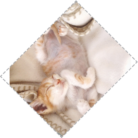
FIGURE 3.21 The transform-based solution breaks badly when dealing with non-square images
clip-path: polygon(50% 0, 100% 50%, 50% 100%, 0 50%);
That’s it, believe it or not! The result is identical to Figure 3.20, but instead of requiring two HTML elements and eight lines of cryptic CSS code, it’s now created with only one simple line.
The wonders of clip-path don’t stop here. The property is even animatable, as long as we animate between the same shape functions (polygon(), in our case), with the same number of points. Therefore, if we want to smoothly uncover the whole image on mouseover, we would do something like this:
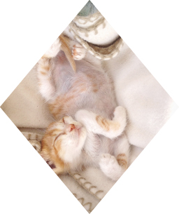
FIGURE 3.22 The clip-path method adjusts nicely to non-square images
img {
    clip-path: polygon(50% 0, 100% 50%,
                       50% 100%, 0 50%);
    transition: 1s clip-path;
}

img:hover {
    clip-path: polygon(0 0, 100% 0,
                       100% 100%, 0 100%);
}
Furthermore, this method adjusts nicely to non-square images, as you can verify in Figure 3.22. Ah, the joys of modern CSS…
PLAY! play.csssecrets.io/diamond-clip
12 Cutout corners
The problem

FIGURE 3.23 A button with cutout corners, creating an arrow shape that emphasizes its meaning
Cutting corners is not just a way to save money, but also a rather popular style in both print and web design. It usually involves cutting out one or more of an element’s corners in a 45° angle (also known as beveled corners). Especially lately, with flat design winning over skeuomorphism, there has been an increase in the popularity of this effect. When the cutout corners are only on one side and occupy 50% of the element’s height each, it creates an arrow shape that is very popular for buttons and breadcrumb navigation—see Figure 3.23.
However, CSS is still not well equipped for creating this effect in an easy, straightforward one-liner. This leads most authors toward using background images to achieve it, either by obscuring the cutout corners with triangles (when the backdrop is a solid color), or by using one or more images for the entire background, with the corner(s) already cut.
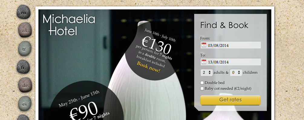
FIGURE 3.24 An example of a website where a cutout corner (bottom-left of the semi-transparent “Find & Book” box) really adds to the design
Such methods are clearly inflexible, difficult to maintain, and add latency, both by increasing HTTP requests and the total filesize of the website. Is there a better way?
The solution
One solution comes in the form of the omnipotent CSS gradients. Let’s assume we only want one cutout corner, say the bottom-right one. The main trick is to take advantage of the fact that gradients can accept an angle direction (e.g., 45deg) and color stop positions in absolute lengths, both of which are not affected by changes in the dimensions of the element the background is on.
Putting it all together, all we need is one linear gradient. It would need a transparent color stop for the cutout corner and another color stop in the same position, with the color we want for our background. The CSS looks like this (for a 15px size corner):
FIGURE 3.25 An element with the bottom right corner cut off, through a simple CSS gradient
background: #58a;
background:
    linear-gradient(-45deg, transparent 15px, #58a 0);
TIP! We are using separate colors ( #58a and
  #655) for easier debugging. In practice, both gradients would be the same color.
Simple, wasn’t it? You can see the result in Figure 3.25. Technically, we don’t even need the first declaration. We only included it as a fallback: if CSS gradients are not supported, the second declaration will be dropped, so we still want to get at least a solid color background.
Now, let’s assume we want two cutout corners, say the two bottom ones. We can’t achieve this with only one gradient, so we will need two. Our first thought might be something like this:
background: #58a;
background:
    linear-gradient(-45deg, transparent 15px, #58a 0),
    linear-gradient(45deg, transparent 15px, #655 0);
However, as you can see in Figure 3.26, this doesn’t work. By default, both gradients occupy the entire element, so they obscure each other. We need to make them smaller, by using background-size to make each gradient occupy only half the element:
background: #58a;
background:
    linear-gradient(-45deg, transparent 15px, #58a 0)
        right,
    linear-gradient(45deg, transparent 15px, #655 0)
        left;
background-size: 50% 100%;
FIGURE 3.26 Failed attempt to apply the cutout effect to both bottom corners
You can see what happens in Figure 3.27. As you can see, although background-size was applied, the gradients are still covering each other. The reason for this is that we forgot to turn background-repeat off, so each of our backgrounds is repeated twice. Therefore, our backgrounds are still obscuring each other—by repetition this time. The new code would look like this:
FIGURE 3.27 background-size is not enough
background: #58a;
background:
    linear-gradient(-45deg, transparent 15px, #58a 0)
        right,
    linear-gradient(45deg, transparent 15px, #655 0)
        left;
background-size: 50% 100%;
background-repeat: no-repeat;
You can see the result in Figure 3.28 and verify that—finally—it works! At this point, you are probably able to figure out how to apply this effect to all four corners. You will need four gradients, and the code looks like this:
FIGURE 3.28 Our bottom-left and bottom-right cutout corners work now
background: #58a;
background:
    linear-gradient(135deg, transparent 15px, #58a 0)
        top left,
    linear-gradient(-135deg, transparent 15px, #655 0)
        top right,
    linear-gradient(-45deg, transparent 15px, #58a 0)
        bottom right,
    linear-gradient(45deg, transparent 15px, #655 0)
        bottom left;
background-size: 50% 50%;
background-repeat: no-repeat;
You can see the result in Figure 3.29. One issue with the preceding code is that it’s not particularly maintainable. It requires five edits to change the background color and four to change the corner size. A preprocessor mixin could help reduce the repetition. Here’s how the code could look with SCSS:
FIGURE 3.29 The effect applied to all four corners, with four gradients
SCSS
@mixin beveled-corners($bg,
         $tl:0, $tr:$tl, $br:$tl, $bl:$tr) {
    background: $bg;
    background:
        linear-gradient(135deg, transparent $tl, $bg 0)
            top left,
        linear-gradient(225deg, transparent $tr, $bg 0)
            top right,
        linear-gradient(-45deg, transparent $br, $bg 0)
            bottom right,
        linear-gradient(45deg, transparent $bl, $bg 0)
            bottom left;
    background-size: 50% 50%;
    background-repeat: no-repeat;
}
Then, where needed, it would be used like this, with 2–5 arguments:
SCSS
@include beveled-corners(#58a, 15px, 5px);
In this example, the element we will get a 15px top-left and bottom-right cutout corner and a 5px top-right and bottom-left one, similar to how border-radius works when we provide fewer than four lengths. This is due to the fact that we provided default values for the arguments in our SCSS mixin, and yes, these default values can refer to other arguments as well.
PLAY! play.csssecrets.io/bevel-corners-gradients
Curved cutout corners
A variation of the gradient method works to create curved cutout corners, an effect many people refer to as “inner border radius,” as it looks like an inverse version of rounded corners. The only difference is using radial gradients instead of linear ones:

FIGURE 3.30 An excellent use of curved cutout corners in g2geogeske.com; the designer has made them the central design element, as they are present in the navigation, the content, and even the footer
background: #58a;
background:
    radial-gradient(circle at top left,
             transparent 15px, #58a 0) top left,
    radial-gradient(circle at top right,
             transparent 15px, #58a 0) top right,
    radial-gradient(circle at bottom right,
             transparent 15px, #58a 0) bottom right,
    radial-gradient(circle at bottom left,
             transparent 15px, #58a 0) bottom left;
background-size: 50% 50%;
background-repeat: no-repeat;
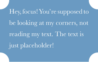
FIGURE 3.31 Curved cutout corners, with radial gradients
You can see the result in Figure 3.31. Just like in the previous technique, the corner size can be controlled through the color stop positions and a mixin would make the code more maintainable here as well.
PLAY! play.csssecrets.io/scoop-corners
Inline SVG & border-image solution
While the gradient-based solution works, it has quite a few issues:
The code is very long and repetitive. In the common case, where we want the same corner size on all four corners, we need to make four edits to modify it. Similarly, we need to make four edits to modify the background color, five counting the fallback.
It is messy to downright impossible (depending on the browser) to animate between different corner sizes.
Thankfully, there are a couple different methods we could use, depending on our needs. One of them is to use border-image with an inline SVG that generates the corners. Given how border-image works (if you don’t remember, take a look at the quick primer in Figure 2.58), can you imagine how our SVG would look?
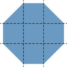
FIGURE 3.32 Our SVG-based border image, with its slicing
Because dimensions don’t matter (border-image takes care of scaling and SVGs scale perfectly regardless of dimensons—ah, the joy of vector graphics!), every measurement could be 1, for easier, shorter, numbers. The corners would be of length 1, and the straight edges would also be 1. The result (zoomed) would look like Figure 3.32. The code would look like this:
border: 15px solid transparent;
border-image: 1 url('data:image/svg+xml,\
    <svg xmlns="http://www.w3.org/2000/svg"
         width="3" height="3" fill="%2358a">\
    <polygon points="0,1 1,0 2,0 3,1 3,2 2,3 1,3 0,2"/>\
    </svg>');
Note that we used a slice size of 1. This does not mean 1 pixel; it is referring to the coordinate system of the SVG file (hence the lack of units). If we had specified it in percentages, we would need to approximate  of the image with something like 33.34%. Approximating numbers is always risky, because not all browsers use the same level of precision. However, by using units of the coordinate system of the SVG file, we’re saved from precision headaches.
The result is shown in Figure 3.33. As you can see, our cutout corners are there, but there is no background. We can solve that in two ways: either by specifying a background, or by adding the keyword fill to our border-image declaration, so that it doesn’t discard the middle slice. In this case, we are going to go with specifying a background, because it will also act as a fallback.
FIGURE 3.33 Applying our SVG on the border-image property
In addition, you may have noticed that our corners are smaller than with the previous technique, which can be baffling. But we specified a 15px border width! The reason is that with the gradient, the 15px was along the gradient line, which is perpendicular to the direction of the gradient. The border width, however, is not measured diagonally, but horizontally/vertically. Can you see where this is going? Yup, it’s the ubiquitous Pythagorean theorem again, that we also saw in the “Striped backgrounds” secret on page 40. Figure 3.34 should help make things clearer. Long story short, to achieve the same size, we need to use a border width that is  times larger than the size we would use with the gradient method. In this case, that would be
  pixels, which is sensible to approximate to 20px, unless we really, absolutely need the diagonal size to be as close to 15px as possible:
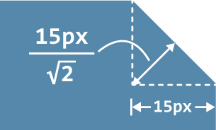
FIGURE 3.34 Specifying a border-width of 15px, results in a (diagonally measured) corner size of  , which is why our corners looked smaller
border: 20px solid transparent;
border-image: 1 url('data:image/svg+xml,\
    <svg xmlns="http://www.w3.org/2000/svg"
         width="3" height="3" fill="%2358a">\
    <polygon points="0,1 1,0 2,0 3,1 3,2 2,3 1,3 0,2"/>\
    </svg>');
background: #58a;
However, as you can see in Figure 3.35, this doesn’t exactly have the expected result. Where did our laboriously created cutout corners go? Fear not, young padawan, for our corners are still there. You can understand what’s happening if you set the background to a different color, such as  #655.
#655.
FIGURE 3.35 Where did our nice corners go?!
As you can see in Figure 3.36, the reason our corners disappeared was that the background we specified was obscuring them. All we need to do to fix this is to use background-clip to prevent the background from extending to the border area:
border: 20px solid transparent;
border-image: 1 url('data:image/svg+xml,\
    <svg xmlns="http://www.w3.org/2000/svg"\
         width="3" height="3" fill="%2358a">\
    <polygon points="0,1 1,0 2,0 3,1 3,2 2,3 1,3 0,2"/>\
    </svg>');
background: #58a;
background-clip: padding-box;
FIGURE 3.36 Changing our background to another color solves the … disappearing corners mystery
The issue is now fixed and our box now looks exactly like Figure 3.29. However, we can easily change the corner size in only one place: we just modify the border width. We can even animate it, because border-width is animatable! We can also change the background with only two edits instead of five. In addition, because our background is now independent of the corner effect, we can even specify a gradient on it, or any other pattern, as long as it’s still #58a toward the edges. For example, check out Figure 3.37 for an example using a radial gradient from hsla(0,0%,100%,.2) to transparent.
FIGURE 3.37 Our cutout corners with a radial gradient background
There is only one small issue remaining. If border-image is not supported, the fallback is not only the absence of corners. Due to background clipping, it also looks like there is less spacing between the box edge and its content. To fix that, we could just give our border a color that is identical to the background:
border: 20px solid #58a;
border-image: 1 url('data:image/svg+xml,\
    <svg xmlns="http://www.w3.org/2000/svg"\
         width="3" height="3" fill="%2358a">\
    <polygon points="0,1 1,0 2,0 3,1 3,2 2,3 1,3 0,2"/>\
    </svg>');
background: #58a;
background-clip: padding-box;
This color is ignored when border-image applies, but will provide a more graceful fallback when it doesn’t, which will look like Figure 3.35. As a drawback, this increases the number of edits we need to make to change the background color to three.
PLAY! play.csssecrets.io/bevel-corners
Hat tip to Martijn Saly (twitter.com/martijnsaly) for coming up with the initial idea of using border-image and inline SVG as a solution for beveled corners, in a tweet of his from January 5, 2015 (twitter.com/martijnsaly/status/552152520114855936).

Clipping path solution
While the border-image solution is very compact and relatively DRY, it still has its limitations. For example, we still need to have either a solid color background, or a background that is a solid color toward the edges. What if we want a different kind of background, such as a texture, a pattern, or a linear gradient?
There is another way that doesn’t have these limitations, though it of course has other limitations of its own. Remember the clip-path property from the “Diamond images” secret on page 90? The amazing thing about CSS clipping paths is that we can mix percentages (which refer to the element dimensions) with absolute lengths, offering us tremendous flexibility.
For example, the code for the clipping path to clip an element in a rectangle with beveled corners of 20px size (measured horizontally) would look like this:
background: #58a;
clip-path: polygon(
    20px 0, calc(100% - 20px) 0, 100% 20px,
    100% calc(100% - 20px), calc(100% - 20px) 100%,
    20px 100%, 0 calc(100% - 20px), 0 20px
);
Despite the code being short, this doesn’t mean it’s DRY, which is one of its biggest issues if you’re not using a preprocessor. In fact, it’s the most WET of the pure CSS solutions we presented, with eight (!) edits required to change the corner size. On the other hand, we can change the background in only one place, so there’s that.
Among its benefits is that we can have any background we want, or even clip replaced elements such as images. Check out Figure 3.38 for an image styled with beveled corners. None of the previous methods can do this. In addition, it is also animatable, not only to different corner sizes, but different shapes altogether. All we need to do is use a different clipping path.
FIGURE 3.38 An image styled with beveled corners, via clip-path
Beyond its WETness and its limited browser support, it also has the drawback that it will clip text, if there is no sufficient padding, as it just clips the element without distinguishing between its parts. In contrast, the gradient method will just let the text overflow beyond the corners (because they’re just a background) and the border-image method will act just like a border and make the text wrap.
PLAY! play.csssecrets.io/bevel-corners-clipped
13 Trapezoid tabs
The problem
Trapezoids are even more generalized than parallelograms: only two of their sides are parallel. The other two can be at any angle. Traditionally, they have been notoriously difficult shapes to create in CSS, although they are also very frequently useful, especially for tabs. When authors were not emulating them through carefully crafted background images, they were usually created as a rectangle with two triangles on each side, faked through borders (Figure 3.39).

FIGURE 3.39 Trapezoid shapes, faked through borders on pseudo-elements (for clarity, the pseudo-elements are shown here in darker blue)
Although this technique saves us the extra HTTP request we would spend on an image, and can easily adjust to different widths, it’s still suboptimal. It wastes both available pseudo-elements, and is also very inflexible styling-wise. For example, good luck adding a border, a background texture, or some rounding on that tab.
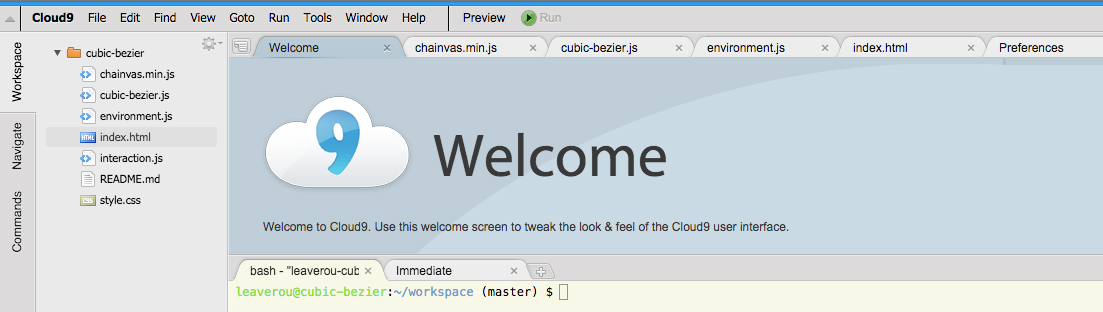
FIGURE 3.40 Cloud9 IDE (c9.io) features trapezoid tabs for each open document
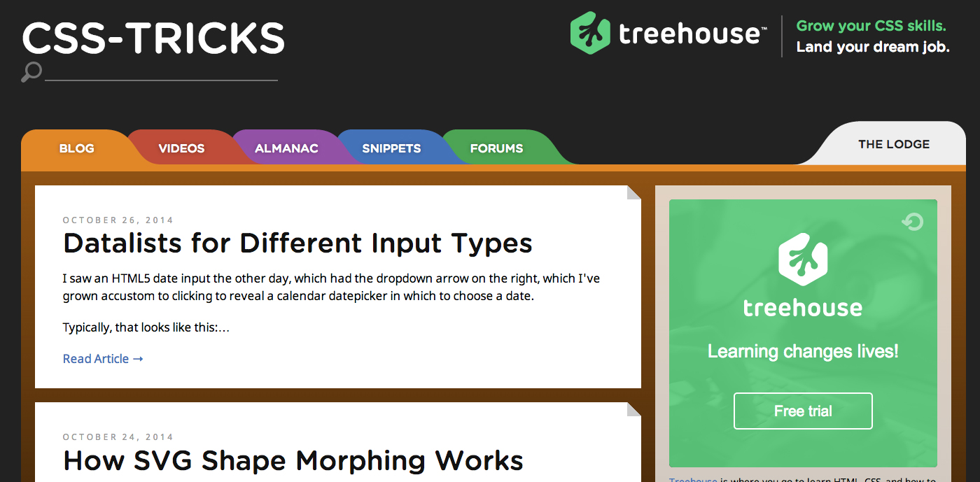
FIGURE 3.41 An earlier redesign of css-tricks.com featured trapezoid tabs, although they were only slanted in one direction
Because all of the well-known techniques for trapezoids are quite messy and/or difficult to maintain, most tabs we see on the Web are not slanted, although real-life tabs usually are. Is there a sane, flexible way to make trapezoid tabs?
The solution
If a combination of 2D transforms existed that could create a trapezoid shape, we could just apply a variation of the solutions discussed in the “Parallelograms” secret on page 84 and be done with it. Unfortunately, there isn’t.
However, think about rotating a rectangle in the physical, three-dimensional world. The two-dimensional image we usually end up seeing is a trapezoid, due to perspective! Thankfully, we can emulate this effect in CSS by using a 3D rotation:
transform: perspective(.5em) rotateX(5deg);
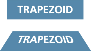
FIGURE 3.42 Creating a trapezoid shape through 3D rotation
Top: Before
Bottom: After
You can see how this creates a trapezoid shape in Figure 3.42. Of course, because we applied the 3D transform to our entire element, the text is also distorted. 3D transforms cannot be “canceled” inside the element in the same way as 2D transforms can (i.e., via an opposite transform). Canceling them on the inner element is technically possible, but very complicated. Therefore, the only pragmatic way to take advantage of 3D transforms to create a trapezoid shape is to apply the transform to a pseudo-element, akin to the approach taken for parallelograms in the “Parallelograms” secret on page 84:

FIGURE 3.43 Applying the 3D transform to the box generated by the pseudo-element, so that our text is not affected
.tab {
    position: relative;
    display: inline-block;
    padding: .5em 1em .35em;
    color: white;
}

.tab::before {
    content: ''; /* To generate the box */
    position: absolute;
    top: 0; right: 0; bottom: 0; left: 0;
    z-index: -1;
    background: #58a;
    transform: perspective(.5em) rotateX(5deg);
}
As you can see in Figure 3.43, this works to create a basic trapezoid shape. There is still one issue, though. When we apply a transform without setting a transform-origin, the element is rotated in space around its center. Therefore, its dimensions on the 2D projection in our screen change in many ways, as Figure 3.44 highlights: its width increases, it shifts a bit to the top, there is a small decrease in its height, and so on, which makes it hard to design around.

FIGURE 3.44 Our trapezoid overlaid on its pre-transform version, to highlight the changes its metrics go through
To make its metrics a bit more manageable, we can specify transform-origin: bottom; so that its base remains fixed as it rotates in space. You can see the difference in Figure 3.45. Now it’s much more predictable: only its height decreased. However, the decrease in height is much sharper, because the entire element rotates away from the viewer, whereas before, half of it rotated “behind” the screen and the other half above it, so the entire element was closer to the viewer in the three-dimensional space. To fix this, we might think of applying some extra top padding. However, the result will then look awful in browsers with no 3D transforms support (Figure 3.46). Instead, we will increase its size via a transform as well, so that the entire thing is dropped when 3D transforms are not supported. With a little experimentation, we find that some vertical scaling (i.e., the scaleY() transform) of about 130% is sufficient to make up for the lost space:

FIGURE 3.45 Our trapezoid overlaid on its pre-transform version, to highlight the changes its metrics go through when using transform-origin: bottom;
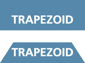
FIGURE 3.46 Fixing the issue with extra padding results in a very weird-looking fallback (shown at the top)
transform: scaleY(1.3) perspective(.5em)
           rotateX(5deg);
transform-origin: bottom;
You can see both the result and the fallback in Figure 3.47. At this point, the result is visually equivalent to the old border-based technique discussed earlier; it’s only the syntax that is considerably more concise. However, the superiority of this technique begins to emerge when you start applying some styling to the tabs. For example, take a look at the following code, which is used for styling the tabs in Figure 3.48:
FIGURE 3.47 Making up the lost height with scale() provides a much better fallback (shown at the top)
nav > a {
    position: relative;
    display: inline-block;
    padding: .3em 1em 0;
}

nav > a::before {
    content: '';
    position: absolute;
    top: 0; right: 0; bottom: 0; left: 0;
    z-index: -1;
    background: #ccc;
    background-image: linear-gradient(
                        hsla(0,0%,100%,.6),
                        hsla(0,0%,100%,0));
    border: 1px solid rgba(0,0,0,.4);
    border-bottom: none;
    border-radius: .5em .5em 0 0;
    box-shadow: 0 .15em white inset;
    transform: perspective(.5em) rotateX(5deg);
    transform-origin: bottom;
}
As you can see, we’ve applied backgrounds, borders, rounded corners, and box shadows—and they just worked, no questions asked! Furthermore, by merely changing the transform-origin to bottom left or bottom right, we can get left- or right-slanted tabs, respectively! (For an example, see Figure 3.49.)
FIGURE 3.48 The advantage of this technique is its flexibility regarding styling
FIGURE 3.49 Slanted tabs by changing the transform-origin
Despite all its virtues, this technique is not perfect by any means. It involves a pretty major drawback: the angle of the sides depends on the width of the element. Therefore, it’s tricky to get trapezoids with the same angles when dealing with variable content. However, this works great for elements that involve small width variations, such as a navigation menu. In those cases, the difference is hardly noticeable.
PLAY! play.csssecrets.io/trapezoid-tabs
14 Simple pie charts
The problem
Pie charts, even in their simplest two-color form, have traditionally been anything but simple to create with web technologies, despite being incredibly common for things ranging from simple stats to progress indicators and timers.
Implementations usually involved either using an external image editor to create multiple images for multiple values of the pie chart, or large JavaScript frameworks designed for much more complex charts.
Although the feat is not as impossible as it once was, there’s still no simple one-liner for it. However, there are many better, more maintainable ways to achieve it today.
transform-based solution
This solution is the best in terms of markup: it only needs one element and the rest is done with pseudo-elements, transforms, and CSS gradients. Let’s start with a simple element:
HTML
<div class="pie"></div>
For now, let’s assume we want a pie chart that displays the hardcoded percentage 20%. We will work on making it flexible later. Let’s first style the element as a circle, which will be our background (Figure 3.50):
FIGURE 3.50 Our starting point (or, a pie chart showing 0%)
.pie {
    width: 100px; height: 100px;
    border-radius: 50%;
    background: yellowgreen;
}
Our pie chart will be green (specifically  yellowgreen) with brown ( #655) showing the percentage. We might be tempted to use skew transforms for the percentage part, but as a little experimentation shows, they prove to be a very messy solution. Instead, we will color the left and right parts of our circle in our two colors, and use a rotating pseudo-element to uncover only the percentage we need.
To color the right part of our circle brown, we will use a simple linear gradient:
background-image:
    linear-gradient(to right, transparent 50%, #655 0);
As you can see in Figure 3.51, this is all that’s needed. Now, we can proceed to styling the pseudo-element that will act as a mask:
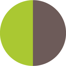
FIGURE 3.51 Coloring the right part of our circle brown, with a simple linear gradient
.pie::before {
    content: '';
    display: block;
    margin-left: 50%;
    height: 100%;
}
You can see in Figure 3.52 where our pseudo-element currently lies relative to the pie element. Currently, it’s not styled and it doesn’t cover anything. It’s merely an invisible rectangle. To start styling it, let’s make a few observations:
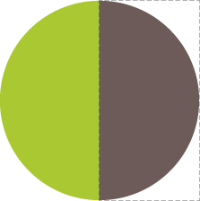
FIGURE 3.52 The pseudo-element that will act as a mask is shown here with dashed lines
Because we want it to cover the brown part of our circle, we need to apply a green background to it, using background-color: inherit to avoid duplication, as we want it to have the same background color as its parent.
We want it to rotate around the circle’s center, which is on the middle of the pseudo-element’s left side, so we should apply a transform-origin of 0 50% to it, or just left.
We don’t want it to be a rectangle, as it makes it bleed past the edges of the pie chart, so we need to either apply overflow: hidden to the .pie, or an appropriate border-radius to make it a semicircle.
Careful not to use background: inherit;, instead of the background-color: inherit;, otherwise the gradient will be inherited too!
Putting it all together, our pseudo-element’s CSS will look like this:
.pie::before {
    content: '';
    display: block;
    margin-left: 50%;
    height: 100%;
    border-radius: 0 100% 100% 0 / 50%;
    background-color: inherit;
    transform-origin: left;
}
Our pie currently looks like Figure 3.54. This is where the fun begins! We can start rotating the pseudo-element, by applying a rotate() transform. For the 20% we were trying to achieve, we can use a value of 72deg (0.2 × 360 = 72), or .2turn, which is much more readable. You can see how it looks for a few other values as well, in Figure 3.53.
We might be tempted to think we’re done, but unfortunately it’s not that simple. Our pie chart works great for displaying percentages from 0 to 50%, but if we try to depict a 60% percentage (by applying a .6turn rotation), Figure 3.55 happens. Don’t lose hope yet though, as we can—and we will—fix this!
If we think about 50%–100% percentages as a separate problem, we might notice that we can use an inverted version of the previous solution for them: a brown pseudo-element, rotating from 0 to .5turn, respectively. So, for a 60% pie, the pseudo-element code would look like this:
.pie::before {
    content: '';
    display: block;
    margin-left: 50%;
    height: 100%;
    border-radius: 0 100% 100% 0 / 50%;
    background: #655;
    transform-origin: left;
    transform: rotate(.1turn);
}
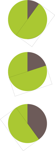
FIGURE 3.53 Our simple pie chart showing different percentages; from top to bottom: 10% (36deg or .1turn), 20% (72deg or .2turn), 40% (144deg or .4turn)
You can see this in action in Figure 3.56. Because we’ve now figured out a way to depict any percentage, we could even animate the pie chart from 0% to 100% with CSS animations, creating a fancy progress indicator:
@keyframes spin {
    to { transform: rotate(.5turn); }
}

@keyframes bg {
    50% { background: #655; }
}

.pie::before {
    content: '';
    display: block;
    margin-left: 50%;
    height: 100%;
    border-radius: 0 100% 100% 0 / 50%;
    background-color: inherit;
    transform-origin: left;
    animation: spin 3s linear infinite,
               bg 6s step-end infinite;
}
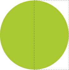
FIGURE 3.54 Our pseudo-element (shown here with a dashed outline) after we finished styling it
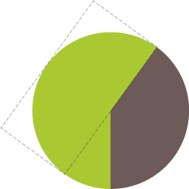
FIGURE 3.55 Our pie chart breaks for percentages greater than 50% (shown here: 60%)
PLAY! play.csssecrets.io/pie-animated
All this is good, but how do we style multiple static pie charts with different percentages, which is the most common use case? Ideally, we want to be able to type something like this:
HTML
<div class="pie">20%</div>
<div class="pie">60%</div>
...and get two pie charts, one showing 20%, and the other one showing 60%. First, we will explore how we can do it with inline styles, and then we could always write a short script to parse the text content and add said inline styles, for code elegance, encapsulation, maintainability, and perhaps most importantly, accessibility.
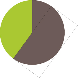
FIGURE 3.56 Our now correct 60% pie
The challenge to controlling the pie chart percentage with inline styles is that the CSS code that is responsible for setting the percentage is set on the pseudo-element. As you already know, we cannot set inline styles on pseudo-elements, so we need to be inventive.
The solution comes from one of the most unlikely places. We are going to use the animation we already presented, but it will be paused. Instead of running it like a normal animation, we are going to use negative animation delays to step through to any point in the animation statically and stay there. Confused? Yes, a negative animation-delay is not only allowed by the specification, but is very useful for cases like this:
TIP! You can use the same technique for other cases where you want to use values from a spectrum without repetition and complex calculations, as well as for debugging animations by stepping through them. For a simpler, isolated example of the technique, check out play.csssecrets.io/static-interpolation.
“A negative delay is valid. Similar to a delay of 0s, it means that the animation executes immediately, but is automatically progressed by the absolute value of the delay, as if the animation had started the specified time in the past, and so it appears to start partway through its active duration.”
— CSS Animations Level 1 (w3.org/TR/css-animations/#animation-delay)
Because our animation is paused, the first frame of it (defined by our negative animation-delay), will be the only one displayed. The percentage shown on the pie chart will be the percentage of the total duration our animation-delay is. For example, with the current duration of 6s, we would need an animation-delay of -1.2s to display a 20% percentage. To simplify the math, we will set a duration of 100s. Keep in mind that because the animation is paused forever, the duration we specify has no other effect.
There is one last issue: the animation is on the pseudo-element, but we want to set an inline style on the .pie element. However, because there is no animation on the <div>, we can set the animation-delay on that as an inline style, and then use animation-delay: inherit; on the pseudo-element. To put it together, our markup for the 20% and 60% pie charts will look like this:
HTML
<div class="pie"
     style="animation-delay: -20s"></div>

<div class="pie"
     style="animation-delay: -60s"></div>
And the CSS code we just presented for this animation would now become (not including the .pie rule, as that stays the same):
@keyframes spin {
    to { transform: rotate(.5turn); }
}

@keyframes bg {
    50% { background: #655; }
}

.pie::before {
    /* [Rest of styling stays the same] */
    animation: spin 50s linear infinite,
               bg 100s step-end infinite;
    animation-play-state: paused;
    animation-delay: inherit;
}
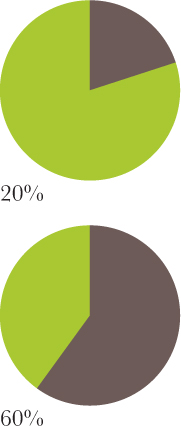
FIGURE 3.57 Our text, before we hide it
At this point, we can convert the markup to use percentages as content, like what we originally aimed for, and add the animation-delay inline styles via a simple script:
JS
$$('.pie').forEach(function(pie) {
    var p = parseFloat(pie.textContent);
    pie.style.animationDelay = '-' + p + 's';
});
Note that we left the text intact, because we need it for accessibility and usability reasons. Currently, our pie charts look like Figure 3.57. We need to hide the text, which we can do accessibly via color: transparent, so that it remains selectable and printable. As extra polish, we can center the percentage in the pie chart, so that it’s not in a random place when the user selects it. To do that, we need to:
Convert the pie’s height to line-height (or add a line-height equal to the height, but that’s pointless code duplication, because line-height would set the computed height to that as well).
Size and position the pseudo-element via absolute positioning, so that it doesn’t push the text down.
Add text-align: center; to horizontally center the text.
The final code looks like this:
.pie {
    position: relative;
    width: 100px;
    line-height: 100px;
    border-radius: 50%;
    background: yellowgreen;
    background-image:
        linear-gradient(to right, transparent 50%, #655 0);
    color: transparent;
    text-align: center;
}

@keyframes spin {
    to { transform: rotate(.5turn); }
}
@keyframes bg {
    50% { background: #655; }
}

.pie::before {
    content: '';
    position: absolute;
    top: 0; left: 50%;
    width: 50%; height: 100%;
    border-radius: 0 100% 100% 0 / 50%;
    background-color: inherit;
    transform-origin: left;
    animation: spin 50s linear infinite,
               bg 100s step-end infinite;
    animation-play-state: paused;
    animation-delay: inherit;
}
PLAY! play.csssecrets.io/pie-static
SVG solution
SVG makes a lot of graphical tasks easier, and pie charts are no exception. However, instead of creating a pie chart with paths, which would require complex math, we are going to use a little trick instead.
Let’s start from a circle:
SVG
<svg width="100" height="100">
<circle r="30" cx="50" cy="50" />
</svg>
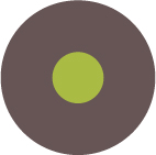
FIGURE 3.58 Our starting point: a green SVG circle with a fat  #655 stroke
Now, let’s apply some basic styling to it:
circle {
    fill: yellowgreen;
    stroke: #655;
    stroke-width: 30;
}
As you might know, these CSS properties are also available as attributes on the SVG element, which might be convenient if portability is a concern.
You can see our stroked circle in Figure 3.58. SVG strokes don’t just consist of the stroke and stroke-width properties. There are many other less popular stroke-related properties to fine-tune strokes. One of them is stroke-dasharray, intended for creating dashed strokes. For example, we could use it like this:
stroke-dasharray: 20 10;

FIGURE 3.59 A simple dashed stroke, created with stroke-dasharray
This means we want dashes of length 20 with gaps of length 10, like the ones in Figure 3.59. At this point, you might have started wondering what on Earth this SVG stroke primer has to do with pie charts. It starts getting clearer when we apply a stroke with a dash width of 0 and a gap width greater than or equal to the circumference of our circle (C = 2πr, so in our case C = 2π × 30 ≈ 189):
stroke-dasharray: 0 189;
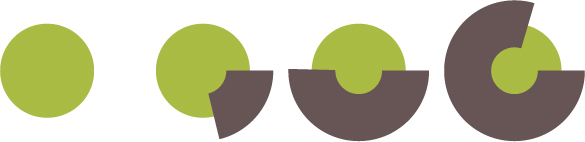
FIGURE 3.60 Multiple stroke-dasharray values and their effect; from left to right:
0 189
40 189
95 189
150 189
As you can see in the first circle in Figure 3.60, this completely removes any stroke, and we’re left with just a green circle. However, the fun begins when we start increasing the first value (Figure 3.60): because the gap is so long, we no longer get a dashed stroke, just a stroke that covers the percentage of the circle’s circumference that we specify.
You might have started to figure out where this is going: if we reduce the radius of our circle enough that it’s completely covered by its stroke, we end up with something that resembles a pie chart quite closely. For example, you can see in Figure 3.61 how that looks when applied to a circle with a radius of 25 and a stroke-width of 50, like what’s produced by the following code:

FIGURE 3.61 Our SVG graphic is starting to resemble a pie chart
SVG
<svg width="100" height="100">
    <circle r="25" cx="50" cy="50" />
</svg>
circle {
    fill: yellowgreen;
    stroke: #655;
    stroke-width: 50;
    stroke-dasharray: 60 158; /* 2π × 25 ≈ 158 */
}
Remember: SVG strokes are always half inside and half outside the element they’re applied to. In the future, we will be able to control this behavior.
Now, turning it into a pie chart like the ones we made with in the previous solution is rather easy: we just need to add a larger green circle underneath the stroke, and rotate it 90° counterclockwise so that it starts from the top middle. Because the <svg> element is also an HTML element, we can just style that:
svg {
    transform: rotate(-90deg);
    background: yellowgreen;
    border-radius: 50%;
}
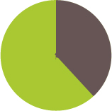
FIGURE 3.62 The final SVG pie chart
You can see the final result in Figure 3.62. This technique makes it even easier to animate the pie chart from 0% to 100%. We just need to create a CSS animation that animates stroke-dasharray from 0 158 to 158 158:
@keyframes fillup {
    to { stroke-dasharray: 158 158; }
}

circle {
    fill: yellowgreen;
    stroke: #655;
    stroke-width: 50;
    stroke-dasharray: 0 158;
    animation: fillup 5s linear infinite;
}
As an additional improvement, we can specify a certain radius on the circle so that the length of its circumference is (infinitesimally close to) 100, so that we can specify the stroke-dasharray lengths as percentages, without having to make calculations. Because the circumference is 2πr, our radius needs to be 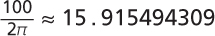 , which for our needs could be rounded up to 16. We will also specify the SVG’s dimensions in the viewBox attribute instead of the width and height attributes, to make it adjust to the size of its container.
After these modifications, the markup for the pie chart of Figure 3.62 would now become:
SVG
<svg viewBox="0 0 32 32">
    <circle r="16" cx="16" cy="16" />
</svg>
And the CSS would become:
svg {
    width: 100px; height: 100px;
    transform: rotate(-90deg);
    background: yellowgreen;
    border-radius: 50%;
}

circle {
    fill: yellowgreen;
    stroke: #655;
    stroke-width: 32;
    stroke-dasharray: 38 100; /* for 38% */
}
Note how easy it now is to change the percentage. Of course, even with this simplification, we don’t want to have to repeat all this SVG markup for every pie chart. It’s time for JavaScript to lend us its helping hand for a little bit of automation. We will write a small script to take simple HTML markup like the following…
HTML
<div class="pie">20%</div>
<div class="pie">60%</div>
…and add an inline SVG inside every .pie element, with all necessary elements and attributes. It will also add a <title> element, for accessibility, so that screen reader users can also know what percentage is displayed. The final script will look like this:
JS
$$('.pie').forEach(function(pie) {
    var p = parseFloat(pie.textContent);
    var NS = "http://www.w3.org/2000/svg";
    var svg = document.createElementNS(NS, "svg");
    var circle = document.createElementNS(NS, "circle");
    var title = document.createElementNS(NS, "title");
    circle.setAttribute("r", 16);
    circle.setAttribute("cx", 16);
    circle.setAttribute("cy", 16);
    circle.setAttribute("stroke-dasharray", p + " 100");
    svg.setAttribute("viewBox", "0 0 32 32");
    title.textContent = pie.textContent;
    pie.textContent = '';
    svg.appendChild(title);
    svg.appendChild(circle);
    pie.appendChild(svg);
});
Remember conical gradients from the “Checkerboards” section on page 55? They would be immensely helpful here too. All it would take for a pie chart would be a circular element, with a conical gradient of two color stops. For example, the 40% pie chart in Figure 3.53 would be as simple as:
.pie {
    width: 100px; height: 100px;
    border-radius: 50%;
    background: conic-gradient(#655 40%, yellowgreen 0);
}
Furthermore, once the updated attr() function defined in CSS Values Level 3 (w3.org/TR/css3-values/#attr-notation) is widely implemented, you will be able to control the percentage with a simple HTML attribute:
background: conic-gradient(#655 attr(data-value %), yellowgreen 0);
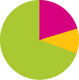
This also makes it incredibly easy to add a third color. For example, for a pie chart like the one shown on the top right of this box, we would just add two more color stops:
background: conic-gradient(deeppink 20%, #fb3 0, #fb3 30%, yellowgreen 0);
That’s it! You might be thinking that the CSS method is better, because its code is simpler and less alien. However, the SVG method has certain benefits that the pure CSS solution lacks:
It’s very easy to add a third color: just add another stroked circle and shift its stroke with stroke-dashoffset. Alternatively, add its stroke length to the stroke length of the circle before (underneath) it. How exactly do you picture adding a third color to pie charts made with the first solution?
We don’t have to take any extra care for printing, as SVG elements are considered content and are printed, just like <img> elements. The first solution depends on backgrounds, and thus, will not print.
We can change the colors with inline styles, which means we can easily change them via scripting (e.g., depending on user input). The first solution relies on pseudo-elements, which cannot take inline styles except via inheritance, which is not always convenient.