Table of Contents for
CSS Secrets
 CSS Secrets
Published by
O'Reilly Media, Inc., 2015
CSS Secrets
Published by
O'Reilly Media, Inc., 2015
- Cover Page
- CSS Secrets
- Title Page
- Copyright Page
- Dedication
- CSS Secrets
- Secrets by Specification
- Foreword
- Preface
- Words of thanks
- CSS Secrets
- Making of
- About this book
- Chapter 1. Introduction
- Chapter 2. Backgrounds & Borders
- Chapter 3. Shapes
- Chapter 4. Visual Effects
- Chapter 5. Typography
- Chapter 6. User Experience
- Chapter 7. Structure & Layout
- Chapter 8. Transitions & Animations
- Index
- Footnotes
2 Backgrounds & Borders
1 Translucent borders
The problem
By now, you’ve probably dabbled quite a bit with semi-transparent colors in CSS, such as rgba() and hsla(). They were a huge revolution back in 2009, when we were finally able to use them in our designs, despite the required fallbacks, shims, and even ugly IE filter hacks for the daring. However, their uses in the wild were mostly centered around backgrounds. There were a few reasons for this:
Some early adopters hadn’t quite realized that these new color formats were actually colors just like
 #ff0066 or
  orange, and treated them like images, using them only in backgrounds.
It was much easier to provide fallbacks for backgrounds than for other properties. For example, the fallback for a semi-transparent background could be a single pixel semi-transparent image. For other properties, the only possible fallback was a solid color.
Using them in other properties, such as borders, wasn’t always as straightforward. We’ll see why next.
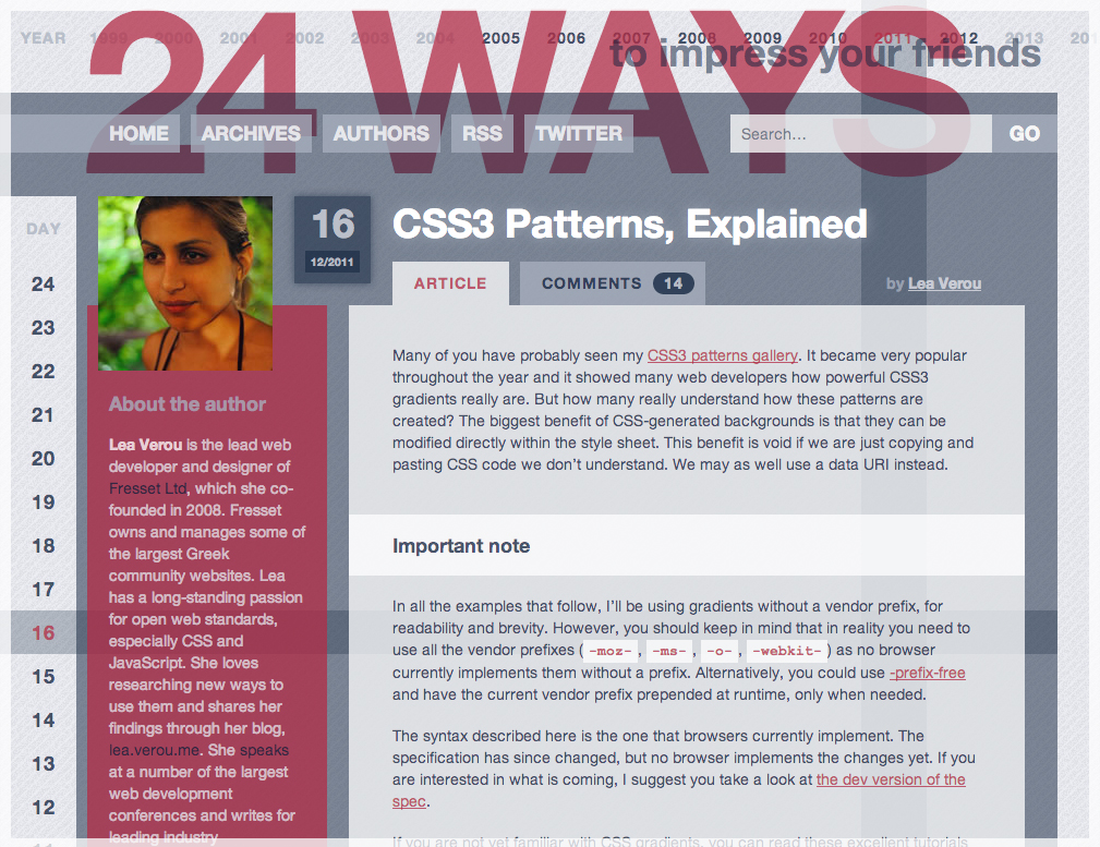
FIGURE 2.1 24ways.org was one of the first websites to really utilize semi-transparent colors in its design, as early as 2008, although they were also mostly backgrounds (design by Tim Van Damme)
Suppose we want to style a container with a white background and a semi-transparent white border, through which our body background shows. Our first attempt would probably look like this:
border: 10px solid hsla(0,0%,100%,.5);
background: white;
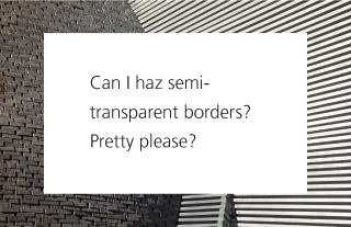
FIGURE 2.2 Our initial attempt to achieve semi-transparent borders
Unless you have a good understanding of how backgrounds and borders work, the result (shown in Figure 2.2) can be quite baffling. Where did our border go? And if we cannot achieve semi-transparent borders by using a semi-transparent color for the border, then how can we do it?!
The solution
Although it might not look like it, our border is still there. By default, backgrounds extend underneath the border area, which you can easily check by applying a good ol’ dashed border to an element with a background (Figure 2.3). This doesn’t make much of a difference when you’re using solid opaque borders, but in this case, it completely changes our design. Instead of having a semi-transparent white border through which our nice body background shows, we ended up having semi-transparent white borders on opaque white, which are indistinguishable from plain white borders.
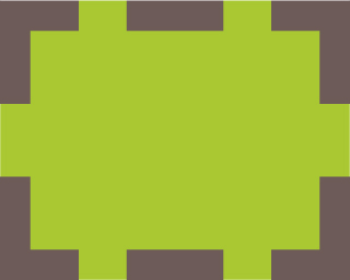
FIGURE 2.3 By default, backgrounds extend underneath the border area
In CSS 2.1, this was just how backgrounds worked. We just had to accept it and move on. Thankfully, since Backgrounds & Borders Level 3 (w3.org/TR/css3-background), we are able to adjust this behavior when it’s not convenient, through the background-clip property. Its initial value is border-box, which means that backgrounds are clipped at the edge of the element’s border box. If we want our background to not extend underneath the border, all we have to do is to give it the value padding-box, which tells the browser to clip the background at the padding edge:
border: 10px solid hsla(0,0%,100%,.5);
background: white;
background-clip: padding-box;
The much nicer result can be seen in Figure 2.4.
FIGURE 2.4 Fixing the issue with background-clip
 PLAY! play.csssecrets.io/translucent-borders
2 Multiple borders
The problem
Back in the day, when Backgrounds & Borders Level 3 (w3.org/TR/css3-background) was still a draft, there was a lot of discussion in the CSS WG about whether multiple borders should be allowed, just like multiple background images. Unfortunately, the consensus at the time was that there weren’t enough use cases, and authors could always use border-image to achieve the same effect. However, what the Working Group missed is that we usually want the flexibility of being able to adjust borders in CSS code, so developers ended up resorting to ugly hacks such as using multiple elements to emulate multiple borders. However, there are better ways to solve this without polluting our markup with useless extra elements.
box-shadow solution
By now, most of us have probably (over)used box-shadow to create shadows. However, it is little known that it accepts a fourth parameter (called “spread radius”), which makes the shadow larger (positive lengths) or smaller (negative lengths) by the amount you specify. A positive spread radius combined with zero offsets and zero blur creates a “shadow” that looks more like a solid border (Figure 2.5):

FIGURE 2.5 Emulating an outline with box-shadow
background: yellowgreen;
box-shadow: 0 0 0 10px #655;
This is not particularly impressive, as you can create the same kind of border by using the border property. However, the good thing about box-shadow is that we can have as many of them as we want, comma separated. So, we can pretty easily add a second  deeppink “border” to the previous example:
background: yellowgreen;
box-shadow: 0 0 0 10px #655, 0 0 0 15px deeppink;
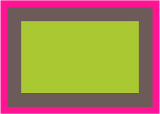
FIGURE 2.6 Emulating two outlines with box-shadow
The only thing to keep in mind is that box-shadows are overlaid one on top of the other, with the first one being the topmost. Therefore, you need to adjust the spread radius accordingly. For example, in the preceding code, we wanted a 5px outer border, so we specified a spread radius of 15px (10px + 5px). You can even specify a regular shadow after all the “outlines,” if you want:
background: yellowgreen;
box-shadow: 0 0 0 10px #655,
            0 0 0 15px deeppink,
            0 2px 5px 15px rgba(0,0,0,.6);
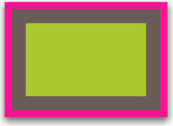
FIGURE 2.7 Including an actual shadow after the “outlines”
The shadow solution works quite well in most cases, but has a few caveats:
Shadows don’t work exactly like borders, as they don’t affect layout and are oblivious to the box-sizing property. However, you can emulate the extra space a border would occupy via padding or margins (depending on whether the shadow is inset or not).
The method we demonstrated creates fake “borders” on the outside of elements. These do not capture mouse events such as hovering or clicking. If this is important, you can add the inset keyword to make the shadows be drawn on the inside of your element. Note that you will need to add extra padding to produce sufficient spacing.
PLAY! play.csssecrets.io/multiple-borders
outline solution
In some cases, if we only need two borders, we can use a regular border and the outline property for the outer one. This also gives us flexibility regarding the border style (what if we want a dashed second border?), whereas with the box-shadow method, we can only emulate solid borders. Here is how the code for Figure 2.6 would look with this method:
background: yellowgreen;
border: 10px solid #655;
outline: 15px solid deeppink;
Another good thing about outlines is that you can control their distance from the boundaries of the element, via outline-offset, which even accepts negative values. This can be useful for a number of effects. For example, check out Figure 2.8 for a basic stitching effect.
However, this method has a few limitations:
As mentioned, it only works for two “borders,” as outline does not accept a comma-separated list of outlines. If we need more, the previous technique is our only option.
Outlines do not have to follow rounding (through border-radius), so even if your corners are round, the outline may have straight corners (Figure 2.9). Note this behavior is considered a bug by the CSS WG, and is likely to be changed to match the border-radius in the future.
Per the CSS User Interface Level 3 specification (w3.org/TR/css3-ui), “Outlines may be non-rectangular.” Although in most cases they tend to be rectangular, if you use this method, make a mental note to test the result thoroughly in different browsers.
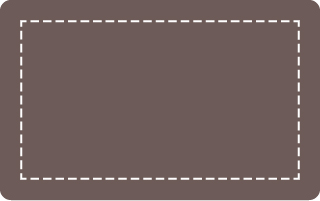
FIGURE 2.8 Using negative outline-offset with a dashed outline, for a basic stitching effect
FIGURE 2.9 Outlines created through the outline property do not follow the element’s rounding, although that could change in the future
3 Flexible background positioning
The problem

FIGURE 2.10 background-position: bottom right; doesn’t usually yield very aesthetically pleasing results, as the image has no spacing from the sides
Fairly often, we want to position a background image with offsets from a different corner than the top-left one, such as the bottom right. In CSS 2.1, we could only specify offsets from the top-left corner or keywords for the other three corners. However, we often want to leave some space (akin to padding) between the background image and the corner it’s on, to avoid things that look like Figure 2.10.
For containers with fixed dimensions, this is possible with CSS 2.1, but it’s messy: we can calculate what offset your background image would have from the top-left corner based on its dimensions and the offset we want from the bottom-right corner, and apply that. However, on elements with variable dimensions (due to variable contents), this is not possible. Developers often end up approximating it by setting the background position to some percentage that is slightly smaller than 100%, such as 95%. Surely, with modern CSS, there must be a better way!
Extended background-position solution
The background-position property was extended to allow specifying offsets from any corner in CSS Backgrounds & Borders Level 3 (w3.org/TR/css3-background), by providing keywords before the offsets. For example, if we want our background image to have a 20px offset from the right side and a 10px offset from the bottom side, we can do this:

FIGURE 2.11 Specifying offsets from different sides; the background image is shown here with a dashed outline, to make it clearer how the offsets work
background: url(code-pirate.svg) no-repeat #58a;
background-position: right 20px bottom 10px;
You can see the result in Figure 2.11. The last step is to provide a decent fallback. As it currently stands, on browsers that don’t support the extended background-position syntax, the background image will be stuck on the top-left corner (the default position) and will look awful, not to mention it will render the text unreadable (Figure 2.12). Providing a fallback is as easy as including a good ol’ bottom right position in the background shorthand:
background: url(code-pirate.svg)
            no-repeat bottom right #58a;
background-position: right 20px bottom 10px;
PLAY! play.csssecrets.io/extended-bg-position

FIGURE 2.12 We need to specify a fallback, if we don’t want users of older browsers to see this
background-origin solution
One of the most common cases for wanting to apply offsets from a corner is to make the background image follow padding. With the extended background position we just described, the code would look like this:

FIGURE 2.13 Applying offsets to the background image that are equal to the padding value
padding: 10px;
background: url(code-pirate.svg) no-repeat #58a;
background-position: right 10px bottom 10px;
You can see the result in Figure 2.13. As you can see, it works, but it’s not very DRY: every time we change the padding value, we need to update it in three different places! Thankfully, there is a simpler way to do this, which automatically follows the padding we specify, without the need to redeclare the offsets.
You’ve probably written things like background-position: top left; quite a few times over the course of your web development career. Have you ever wondered: which top-left corner? As you may know, there are three boxes in every element (Figure 2.14): the border box, the padding box, and the content box. Which box’s top left corner does background-position refer to?
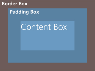
By default, background-position refers to the padding box, so that borders don’t end up obscuring background images. Therefore, top left is by default the top-left outer corner of the padding box. In Backgrounds & Borders Level 3 (w3.org/TR/css3-background), however, we got a new property that we can use to change this behavior: background-origin. By default, its value is (quite predictably) padding-box. If we change it to content-box, as in the following code, the side and corner keywords we use in background-position will refer to the edge of the content box (effectively, this means that any background images will be offset from the sides/corners as much as our padding is):
padding: 10px;
background: url("code-pirate.svg") no-repeat #58a
            bottom right; /* or 100% 100% */
background-origin: content-box;
The visual result is exactly the same as in Figure 2.13, just with more DRY code. Keep in mind that you can also combine the two techniques we showed if needed! If you want offsets that generally vary with the padding, but are inset/outset a little more than that, you can use background-origin: content-box together with additional offsets via the extended background-position.
PLAY! play.csssecrets.io/background-origin
calc() solution
Let’s revisit our original challenge: we want to position our background image 10px from the bottom and 20px from the right side. However, if we think of it in terms of offsets from the top-left corner, we basically want an offset of 100% - 20px horizontally and 100% - 10px vertically. Thankfully, the calc() function allows us to do exactly that sort of calculation and it works perfectly with background-position:
background: url("code-pirate.svg") no-repeat;
background-position: calc(100% - 20px) calc(100%-10px);
 Don’t forget to include white-space around any - and + operators in calc(), otherwise it’s a parsing error! The reason for this weird rule is forward compatibility: in the future, keywords might be allowed inside calc(), and they can contain hyphens.
PLAY! play.csssecrets.io/background-position-calc
4 Inner rounding
The problem
Sometimes we want a container that is only rounded on the inside, but the outer corners of its border/outline are sharp, such as the one in Figure 2.15. It’s an interesting effect that’s not overdone yet. It’s trivial to achieve this effect with two elements:
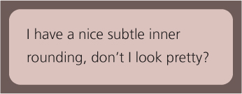
FIGURE 2.15 A container with an outline and rounding only on the inside
HTML
<div class="something-meaningful"><div>
    I have a nice subtle inner rounding,
    don't I look pretty?
</div></div>
.something-meaningful {
    background: #655;
    padding: .8em;
}

.something-meaningful > div {
    background: tan;
    border-radius: .8em;
    padding: 1em;
}
This works fine, but it forces us to use two elements when we only need one. Is there a way to achieve the same effect with only one element?
The solution
The previous solution is more flexible, as it allows us to use the full power of backgrounds. For example, if we want our “border” to not just be a solid color, but have a noise texture as well, it’s pretty easy to do. However, when we’re dealing with good ol’ solid colors, there is a way to do this, with just one element (granted it is a bit hacky). Take a look at the following CSS:
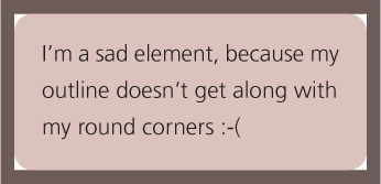
FIGURE 2.16 Using the outline property on a rounded element
background: tan;
border-radius: .8em;
padding: 1em;
box-shadow: 0 0 0 .6em #655;
outline: .6em solid #655;
Can you guess what the visual result is? It produces the effect in Figure 2.15. We basically took advantage of the fact that outlines do not follow the element’s rounding (and thus, have sharp corners) but box-shadows do (Figure 2.16 and Figure 2.17). Therefore, if we overlay one on top of the other, the box-shadow covers the gaps that the outline leaves on the corners (Figure 2.18), so their combination gives us the desired effect. Figure 2.18 displays the shadow and outline with different colors, to provide a clearer visual explanation.
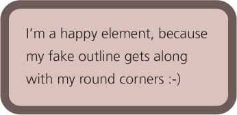
FIGURE 2.17 Using the box-shadow property with no offsets and no blur on an element with rounded corners
Note that we didn’t really need to specify a box-shadow spread that is equal to the outline, we only need to specify a large enough spread to cover those “gaps.” In fact, specifying a spread equal to our outline width can cause rendering artifacts in some browsers, so I would recommend something a bit smaller. This begs the question: what is the smallest spread we could specify that covers these gaps?
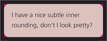
FIGURE 2.18 Here the outline is shown in black and the shadow in magenta, to make it clearer what is going on; notice that the outline is the one drawn on top
To answer this question, we need to remember the Pythagorean theorem we learned at school about calculating the lengths of the sides of right triangles. The theorem states that the hypotenuse (the longest, diagonal side of the triangle) is equal to  where a and b are the lengths of its legs. When both legs are of equal length, the formula becomes
 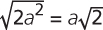 .
.
Why is this hacky? Because it depends on the fact that outlines do not follow corner rounding, but there is no guarantee this will stay that way. The spec currently gives browsers a lot of leeway in outline drawing, but in the future it will explicitly recommend following rounding, per a recent CSS WG decision. Whether browsers will honor that decision remains to be seen.
You might be wondering how on Earth middle school geometry is relevant to our inner rounding effect. Check out Figure 2.19 for a visual explanation of how it can be used to calculate the minimum spread we need. In our case, border-radius is .8em, so the minimum spread is  . All we need is to round it up a little and specify a spread radius of .34em. To avoid having to make the calculation every time, you can just use half of your corner radius, which is guaranteed to be large enough, because
 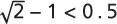 .
.
Note that these calculations uncover another constraint of this method: for this effect to work, our spread radius needs to be smaller than our outline width, but it also needs to be larger than  , where r is our border-radius. This means that if our outline width is smaller than
  , this is not possible and we cannot apply this effect.
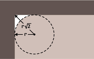
FIGURE 2.19 When our border radius is r, the length from the center of the border-radius circle to the corner of the outline rectangle is  , which means the minimum possible spread is
PLAY! play.csssecrets.io/inner-rounding
5 Striped backgrounds
The problem
Stripes of all sizes, colors, and angles are at least as ubiquitous on the Web as in any other medium of visual design, from magazines to wallpaper. However, the workflow of implementing them is far from ideal. Usually, we would create a separate bitmap image and need an image editor every time we needed to make changes. Some might use SVG instead, but it’s still a separate file and the syntax is far from friendly. Wouldn’t it be awesome if we could create stripes directly in our CSS? You might be surprised to find that we actually can.
The solution
Assume we have a basic vertical linear gradient, from  #fb3 to
  #58a (Figure 2.20):

FIGURE 2.20 Our starting point
background: linear-gradient(#fb3, #58a);
Now let’s try to bring the color stops a little closer together (Figure 2.21):
FIGURE 2.21 Gradient now occupies 60% of total height, the rest being solid colors; color stop positions are shown with dashed lines
background: linear-gradient(#fb3 20%, #58a 80%);
Now the top 20% of our container is filled with solid  #fb3 and the bottom 20% with solid
  #58a. The actual gradient only occupies 60% of our container height. If we bring the color stops even closer together (40% and 60% respectively, seen in Figure 2.22), the actual gradient becomes even smaller. One starts to wonder, what happens if the color stops meet at the exact same position?
FIGURE 2.22 Gradient now occupies 20% of total height, the rest being solid colors; color stop positions are shown with dashed lines
background: linear-gradient(#fb3 50%, #58a 50%);
“If multiple color stops have the same position, they produce an infinitesimal transition from the one specified first in the rule to the one specified last. In effect, the color suddenly changes at that position rather than smoothly transitioning.”
—CSS Image Values Level 3 (w3.org/TR/css3-images)
As you can see in Figure 2.23, there is no longer any gradient, just two solid colors, each occupying half of our background-image. Essentially, we have already created two big horizontal stripes.
Because gradients are just generated background images, we can treat them the same as any other background image and adjust their size with background-size:
background: linear-gradient(#fb3 50%, #58a 50%);
background-size: 100% 30px;

FIGURE 2.23 Both stops are now at 50%
As you can see in Figure 2.24, we shrunk the size of our two stripes to 15px height each. Because our background is repeated, we now have our whole container filled with horizontal stripes (Figure 2.25).
We can similarly create stripes with unequal widths, by adjusting the color stop positions (Figure 2.26):
background: linear-gradient(#fb3 30%, #58a 30%);
background-size: 100% 30px;
To avoid having to adjust two numbers every time we want to change the stripe width, we can take advantage of the specification:
FIGURE 2.24 Our generated background without the repetition
“If a color stop has a position that is less than the specified position of any color stop before it in the list, set its position to be equal to the largest specified position of any color stop before it.”
—CSS Images Level 3 (w3.org/TR/css3-images)
FIGURE 2.25 The final horizontal stripes
This means that if we set the second color’s position at 0, its position will be adjusted by the browser to be equal to the position of the previous color stop, which is what we wanted anyway. Therefore, the following code also creates the exact same gradient we saw in Figure 2.26, but is a little more DRY:
FIGURE 2.26 Stripes with unequal widths
background: linear-gradient(#fb3 30%, #58a 0);
background-size: 100% 30px;
It’s just as easy to create stripes with more than two colors. For example, the following snippet will produce horizontal stripes of three colors (Figure 2.27):
background: linear-gradient(#fb3 33.3%,
            #58a 0, #58a 66.6%, yellowgreen 0);
background-size: 100% 45px;
PLAY! play.csssecrets.io/horizontal-stripes
FIGURE 2.27 Stripes with three colors
Vertical stripes
Horizontal stripes are the easiest to code, but not all striped backgrounds we see on the Web are horizontal. Just as many are vertical stripes (Figure 2.28), and probably the most popular and visually interesting are some form of diagonal stripes. Thankfully, CSS gradients can help us recreate those too, with varying degrees of difficulty.
The code for vertical stripes is almost the same, with one main difference: an extra first argument that specifies the gradient direction. We could have specified it for horizontal stripes too, but the default (to bottom) was exactly what we needed for them. We also need to set a different background-size, for obvious reasons:
background: linear-gradient(to right, /* or 90deg */
              #fb3 50%, #58a 0);
background-size: 30px 100%;
PLAY! play.csssecrets.io/vertical-stripes
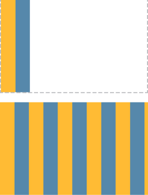
FIGURE 2.28 Our vertical stripes
Top: Our background tile without the repetition
Bottom: The repeated stripes
Diagonal stripes
After creating horizontal and vertical stripes, we might attempt to create diagonal stripes (45°) by just changing the background-size and direction of the gradient again, like so:
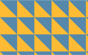
FIGURE 2.29 Our first failed attempt for diagonal stripes
background: linear-gradient(45deg,
              #fb3 50%, #58a 0);
background-size: 30px 30px;
However, as you can see in Figure 2.29, this doesn’t work. The reason is that we just rotated the gradient inside each tile by 45 degrees, not the repeated background as a whole. Try to remember the bitmap images we usually use to create diagonal stripes, such as the one in Figure 2.30. They include four stripes instead of two, so that they tile seamlessly. This is the kind of tile we need to recreate in CSS, so we will need quite a few more color stops:
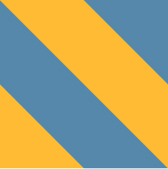
FIGURE 2.30 The kind of image that tiles seamlessly to create diagonal stripes; does it look familiar?
background: linear-gradient(45deg,
              #fb3 25%, #58a 0, #58a 50%,
              #fb3 0, #fb3 75%, #58a 0);
background-size: 30px 30px;
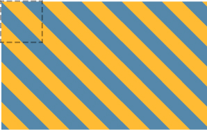
FIGURE 2.31 Our 45° stripes; the dashed lines indicate the repeating tile
You can see the result in Figure 2.31. As you can see, we were successful at creating diagonal stripes, but they look thinner than our horizontal and vertical ones. To understand why this happened, we need to remember the Pythagorean theorem we learned at school about calculating the lengths of the sides of right triangles. The theorem states that the hypotenuse (the longest, diagonal side of the triangle) is equal to  where a and b are the lengths of its legs. On a 45° right triangle, both its legs are of the same length, so the formula becomes
 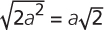 . In our diagonal stripes, the background size specifies the length of the hypotenuse, but the stripe width is actually the length of the leg. Check out Figure 2.32 for a visual explanation.
This means that to get our original stripe width of 15px, we need to specify a background size of  pixels:
background: linear-gradient(45deg,
              #fb3 25%, #58a 0, #58a 50%,
              #fb3 0, #fb3 75%, #58a 0);
background-size: 42.426406871px 42.426406871px;
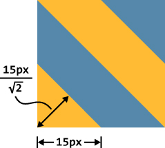
FIGURE 2.32 A background size of 30px results in a stripe width of 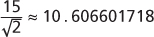 pixels
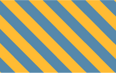
FIGURE 2.33 Our final 45° stripes; note that now the stripe width is the same as our other examples
You can see the final result in Figure 2.33. However, unless somebody is pointing a gun at your head threatening to kill you unless you are able to produce diagonal stripes that are exactly 15 pixels wide (in which case, you would die anyway, because  is not a rational number, so even this is an approximation—though a very high-precision one), I would strongly recommend rounding this unwieldy number, to something like 42.4px or even 42px.
PLAY! play.csssecrets.io/diagonal-stripes
Better diagonal stripes
The method shown in the previous section is not very flexible. What if we want stripes that are 60° instead of 45°? Or 30°? Or 3.1415926535°? If we just try to change the angle of the gradient, the result looks awful (check out Figure 2.34 for a failed attempt at 60° stripes).
Thankfully, there is a better way to create diagonal stripes. A little-known fact is that linear-gradient() and radial-gradient() also have repeating versions: repeating-linear-gradient() and repeating-radial-gradient(). These work exactly the same way, with one difference: the color stops are repeated indefinitely, until they fill up the whole image. So, for example, this repeating gradient (shown in Figure 2.35):
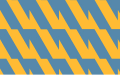
FIGURE 2.34 Our failed naïve attempt at 60° stripes
background: repeating-linear-gradient(45deg,
              #fb3, #58a 30px);
would be equivalent to this simple linear gradient:
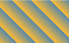
FIGURE 2.35 A repeating linear gradient
background: linear-gradient(45deg,
              #fb3, #58a 30px,
              #fb3 30px, #58a 60px,
              #fb3 60px, #58a 90px,
              #fb3 90px, #58a 120px,
              #fb3 120px, #58a 150px, ...);
Repeating linear gradients are perfect for—you guessed it—stripes! Due to their repeating nature, it means our whole background can be in the generated gradient image. Therefore, we don’t need to worry about creating seamless tiles that can be repeated.
For comparison, the background we created in Figure 2.33 could have been produced by this repeating gradient:
background: repeating-linear-gradient(45deg,
              #fb3, #fb3 15px, #58a 0, #58a 30px);
The first obvious benefit is reduced repetition: we can change any of the colors with two edits instead of three. Also note that our measurements are now in the gradient color stops instead of background-size. The background size is the initial one, which for gradients is the size of the element. This means that the lengths are also more straightforward, as they are measured on the gradient line, which is perpendicular to our stripes. No more clunky  calculations!
However, the biggest benefit is that now we can just change the angle to whatever we want, and it just works without having to think hard and long about how to make a seamless tile. For example, here are our 60° stripes (Figure 2.36):
background: repeating-linear-gradient(60deg,
              #fb3, #fb3 15px, #58a 0, #58a 30px);
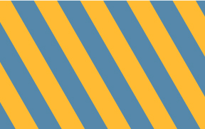
FIGURE 2.36 Our actual 60° stripes
It was as easy as just changing the angle! Note that with this method we need four color stops for two stripe colors, regardless of the stripe angle. This means it’s usually better to use the first method for horizontal and vertical stripes and this one for diagonal stripes. If we’re dealing with 45° stripes, we could even combine the two methods, by essentially using repeating linear gradients to simplify the code that creates our repeating tile:
background: repeating-linear-gradient(45deg,
              #fb3 0, #fb3 25%, #58a 0, #58a 50%);
background-size: 42.426406871px 42.426406871px;
PLAY! play.csssecrets.io/diagonal-stripes-60deg
Flexible subtle stripes
More often than not, our stripes are not completely different colors but subtle brightness variations of the same color. For example, take a look at these stripes:
background: repeating-linear-gradient(30deg,
              #79b, #79b 15px, #58a 0, #58a 30px);
You can see in Figure 2.37 that they are stripes of one color ( #58a) and a lighter variant of that. However, that relationship between the colors is not easy to tell by reading the code. Moreover, if we wanted to change the base color, we would have to make four (!) edits.
Thankfully, there is a better way: instead of specifying separate colors for every stripe, we can specify our darkest color as the background color, which will show through stripes with semi-transparent white:

FIGURE 2.37 Stripes with subtle lightness variation
background: #58a;
background-image: repeating-linear-gradient(30deg,
                    hsla(0,0%,100%,.1),
                    hsla(0,0%,100%,.1) 15px,
                    transparent 0, transparent 30px);
The result looks exactly the same as Figure 2.37, but we can now change the color in only one place. We also get the added benefit of our base color functioning as a fallback color for browsers that don’t support CSS gradients. Furthermore, as we will see in the next secret, gradient patterns with transparent regions allow us to create very complex patterns by superimposing multiple different ones.
PLAY! play.csssecrets.io/subtle-stripes
6 Complex background patterns
The problem
In the previous section, we learned how to use CSS gradients to create all sorts of stripes. However, stripes are not the be-all and end-all of background patterns or even just geometric patterns. We quite often need many other different types, such as grids, polka dots, checkerboards, and many others.
Thankfully, CSS gradients can help with many of these too. It’s possible to create almost any kind of geometric pattern with CSS gradients, although it’s not always practical. If we’re not careful, we might end up with an insane amount of unmaintainable code. CSS patterns are also one case where it really pays off to use a CSS preprocessor, such as Sass (sass-lang.com) to reduce repetition, as the more complex they get, the less DRY they become.
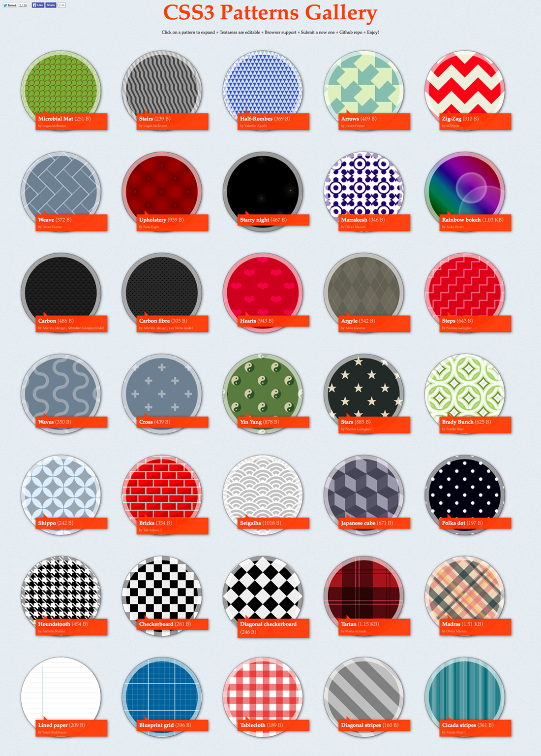
FIGURE 2.38 My CSS3 Patterns Gallery (found at lea.verou.me/css3patterns) showed what is possible with CSS gradients as early as 2011. It was included in almost every article, book, and conference talk that mentioned CSS gradients between 2011 and 2012 and was used by several browser vendors to fine-tune their CSS gradients implementations. However, not every pattern showcased in it would be a good use case for a production website. Some of them are included only to show what is possible, but their code is extremely long and repetitive. For those cases, SVG is a better choice. For some examples of SVG patterns, visit philbit.com/svgpatterns, which was created as the SVG answer to the CSS Patterns Gallery.
In this secret, we will focus on creating some of the easiest and commonly needed patterns.
Grids
When using only one gradient, there aren’t that many patterns we can create. The magic starts to unfold when we combine multiple gradients, having them show through each other’s transparent regions. Perhaps the easiest such pattern is overlaying horizontal and vertical stripes to create various types of grids. For example, the following code creates the tablecloth-reminiscent (gingham) pattern shown in Figure 2.39:
background: white;
background-image: linear-gradient(90deg,
                    rgba(200,0,0,.5) 50%, transparent 0),
                  linear-gradient(
                    rgba(200,0,0,.5) 50%, transparent 0);
background-size: 30px 30px;
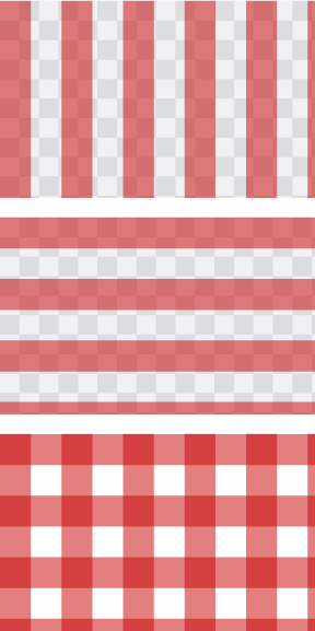
FIGURE 2.39 Our tablecloth (gingham) pattern, as well as the two gradients that comprise it (transparency shown here as the conventional gray checkerboard)
In some cases, we want to be able to adjust the cell size of the grid, and have the width of its lines remain constant—for example, to create grid lines that serve as guides. This is a great use case for using lengths instead of percentages as gradient color stops:
background: #58a;
background-image:
    linear-gradient(white 1px, transparent 0),
    linear-gradient(90deg, white 1px, transparent 0);
background-size: 30px 30px;
The result (seen on Figure 2.40) is a grid of 1px white lines with a grid cell size of 30px. Just like in the “Flexible subtle stripes” section on page 48, the base color is also functioning as a fallback color.
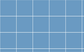
FIGURE 2.40 A basic blueprint grid CSS pattern whose lines remain 1px regardless of the size of the grid
This grid is a good example of a pattern that can be made with reasonably maintainable (though not completely DRY) CSS code:
It’s quite easy to figure out what to edit if we need to change the grid size, line thickness, or any of the colors.
We don’t have to make tons of edits to change any of this; we only need to edit one or two values.
It’s also quite short, at only four lines of code and 170 bytes. An SVG would not have been shorter.
We can even overlay two grids with different line widths and colors to create a more realistic blueprint grid (Figure 2.41):
TIP! To calculate the file size of your CSS pattern, paste the code in bytesizematters.com.
background: #58a;
background-image:
    linear-gradient(white 2px, transparent 0),
    linear-gradient(90deg, white 2px, transparent 0),
    linear-gradient(hsla(0,0%,100%,.3) 1px,
      transparent 0),
    linear-gradient(90deg, hsla(0,0%,100%,.3) 1px,
      transparent 0);
background-size: 75px 75px, 75px 75px,
                 15px 15px, 15px 15px;
PLAY! play.csssecrets.io/blueprint
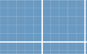
FIGURE 2.41 A more complex blueprint grid, comprised of two grids with different parameters
Polka dot
So far, we have only used linear gradients to make patterns. However, radial gradients can be very useful as well, as they allow us to create circles, ellipses, or parts thereof. The simplest pattern we can create with a radial gradient is an array of dots (Figure 2.42):
background: #655;
background-image: radial-gradient(tan 30%, transparent 0);
background-size: 30px 30px;
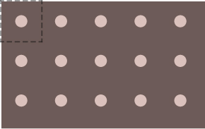
FIGURE 2.42 An array of dots; the repeating tile is shown with dashed lines
Admittedly, this is not very useful on its own. However, we can combine two of those gradients and give them different background positions, to create a polka dot pattern (Figure 2.43):
background: #655;
background-image: radial-gradient(tan 30%, transparent 0),
                  radial-gradient(tan 30%, transparent 0);
background-size: 30px 30px;
background-position: 0 0, 15px 15px;
PLAY! play.csssecrets.io/polka
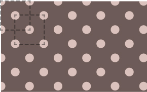
FIGURE 2.43 Polka dot pattern; both repeating tiles are shown with dashed lines
Note that for the effect to work, the second background position must be half of the tile size. Unfortunately, this means that to change the tile size, we need to make four edits. This is on the brink of being unmaintainable, although whether it has crossed the line is debatable. If you are using a preprocessor, you may want to convert it into a mixin:
SCSS
@mixin polka($size, $dot, $base, $accent) {
    background: $base;
    background-image:
        radial-gradient($accent $dot, transparent 0),
        radial-gradient($accent $dot, transparent 0);
    background-size: $size $size;
    background-position: 0 0, $size/2 $size/2;
}
Then, to create the polka dot pattern, we would call it like this:
SCSS
@include polka(30px, 30%, #655, tan);
Checkerboards
Checkerboard patterns are used in a number of cases. For instance, subtle checkerboards can be an interesting alternative to a bland solid color background. Also, a gray checkerboard pattern is the de facto standard way to depict transparency, which is required in a number of different UIs. Making a checkerboard pattern in CSS is possible, but considerably trickier than one might expect.
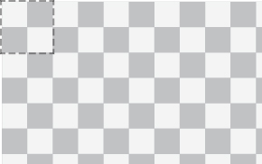
FIGURE 2.44 A gray checkerboard pattern to indicate transparency; if this was created by repeating an image, the tile would be the one denoted by the dashed line
The typical tile that generates a checkerboard when repeated consists of two squares from each color, like the one indicated in Figure 2.44. It looks like it should be easy to recreate with CSS: we would just create two squares with different background positions, right? Not exactly. Yes, we can technically create squares with CSS gradients, but with no spacing around them, the result will look like a solid color. However, there is no way to create squares with space around them with one CSS gradient. If you’re having doubts, try to find a gradient that, when repeated, produces the image in Figure 2.45.
The trick is to compose the square from two right triangles. We already know how to create right triangles (remember our failed attempt at diagonal stripes in Figure 2.29?). To refresh your memory, the code looked like this (here with different colors and transparency):
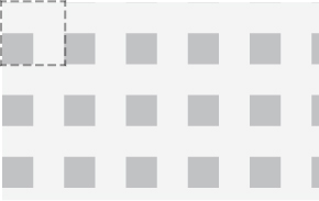
FIGURE 2.45 Repeating a square with space around it; the tile is shown with dashed lines
background: #eee;
background-image:
    linear-gradient(45deg, #bbb 50%, transparent 0);
background-size: 30px 30px;
You might be wondering how this helps with anything. Sure, if we tried to compose squares from two triangles like the ones in Figure 2.29, we would end up with a solid color. However, what if we reduce the legs of these triangles to half their original size, so that they occupy  of the tile, instead of the current
  ? We can easily do that by changing the color stop position to 25% instead of 50%. Then we would end up with something like Figure 2.46.
Similarly, we can create triangles of the opposite direction if we flip the color stops (Figure 2.47):

FIGURE 2.46 Right triangles with a lot of spacing around them
In the future, we won’t have to resort to meticulously overlaying triangles to create checkerboards. CSS Image Values Level 4 (w3.org/TR/css4-images) defines a new set of gradient functions to generate conical gradients (a.k.a. “angle gradients”). These gradients often look like a cone observed from above, hence the name “conical.” They are generated by a line that gradually changes color as it rotates around a fixed point. For example, the hue wheel shown here would be created with the following gradient:
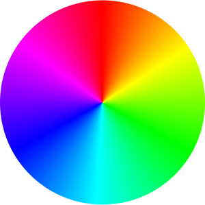
background: conic-gradient(red, yellow, lime, aqua, blue, fuchsia, red);
Conical gradients are useful for far more things than hue wheels: starbursts, brushed metal effects, and many other kinds of backgrounds, including (you guessed it!) checkerboards. They would enable us to create the repeating tile of Figure 2.44 in just one gradient:
background: repeating-conic-gradient(#bbb 0, #bbb 25%, #eee 0, #eee 50%);
background-size: 30px 30px;
Unfortunately, there is no browser support for conical gradients at the time of writing, but you can find a polyfill at leaverou.github.io/conic-gradient.
background: #eee;
background-image:
    linear-gradient(45deg, transparent 75%, #bbb 0);
background-size: 30px 30px;

FIGURE 2.47 If we flip the color stops, we get triangles in the opposite direction
Can you guess what happens if we combine the two? The code would look like this:
background: #eee;
background-image:
    linear-gradient(45deg, #bbb 25%, transparent 0),
    linear-gradient(45deg, transparent 75%, #bbb 0);
background-size: 30px 30px;
At first, the result in Figure 2.48 doesn’t look like we’re getting anywhere. However, we just need to move the second gradient by half the tile size, in order to combine them into a square:
background: #eee;
background-image:
    linear-gradient(45deg, #bbb 25%, transparent 0),
    linear-gradient(45deg, transparent 75%, #bbb 0);
background-position: 0 0, 15px 15px;
background-size: 30px 30px;
Can you guess what the result looks like? It’s exactly what we were trying to achieve earlier, and looks like Figure 2.49. Notice that this is essentially half a checkerboard. All we need to turn this into a full checkerboard is to repeat the two gradients to create another set of squares and offset their positions again, a bit like applying the polka dot technique twice:
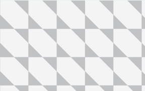
FIGURE 2.48 Combining the two triangles
background: #eee;

background-image:
    linear-gradient(45deg, #bbb 25%, transparent 0),
    linear-gradient(45deg, transparent 75%, #bbb 0),
    linear-gradient(45deg, #bbb 25%, transparent 0),
    linear-gradient(45deg, transparent 75%, #bbb 0);
background-position: 0 0, 15px 15px,
                     15px 15px, 30px 30px;
background-size: 30px 30px;
The result is a checkerboard, identical to the one in Figure 2.44. We can improve the code a bit by combining the opposite facing triangles (i.e., the first with the second and the third with the fourth) and making the darker gray semi-transparent black, so that we can change the base color without always having to adjust the top color accordingly:
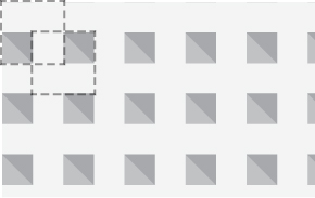
FIGURE 2.49 Our combined triangles now form squares with space around them; the two tiles are shown with dashed lines and the second gradient is shown slightly darker
background: #eee;
background-image:
    linear-gradient(45deg,
        rgba(0,0,0,.25) 25%, transparent 0,
        transparent 75%, rgba(0,0,0,.25) 0),
    linear-gradient(45deg,
        rgba(0,0,0,.25) 25%, transparent 0,
        transparent 75%, rgba(0,0,0,.25) 0);
background-position: 0 0, 15px 15px;
background-size: 30px 30px;
Now we have two gradients instead of four, but the code is almost as WET as before. To change the accent color or the cell size, we need to make four edits. At this point, it might be a good idea to use a preprocessor mixin to reduce duplication. For example, in Sass it would look like this:
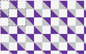
FIGURE 2.50 This is a complex pattern and it’s often difficult to wrap one’s head around how it works, especially after reducing it to two gradients. It usually aids understanding of how a pattern works to give a random color to one of the gradients or color stops. For example, here the first gradient is shown with  rebeccapurple instead of the semi-transparent black and the two tiles are outlined with dashed lines.
WET stands for “We Enjoy Typing” and is the opposite of DRY code (i.e., it refers to repetitive, unmaintainable code).
SCSS
@mixin checkerboard($size, $base,
                    $accent: rgba(0,0,0,.25)) {

background: $base;
background-image:
    linear-gradient(45deg,
        $accent 25%, transparent 0,
        transparent 75%, $accent 0),
    linear-gradient(45deg,
        $accent 25%, transparent 0,
        transparent 75%, $accent 0);
background-position: 0 0, $size $size,
background-size: 2*$size 2*$size;
}

/* Used like… */
@include checkerboard(15px, #58a, tan);
In any case, this is so much code that it might actually be better to go the SVG route. An SVG tile for Figure 2.44 would be as small and simple as:
SVG
<svg xmlns="http://www.w3.org/2000/svg"
     width="100" height="100" fill-opacity=".25" >
    <rect x="50" width="50" height="50" />
    <rect y="50" width="50" height="50" />
</svg>
One could reply, “But CSS gradients save us HTTP requests!” However, with modern browsers, we can embed the SVG file in our stylesheet as a data URI, and we don’t even need to base64 or URLencode most of it:
background: #eee url('data:image/svg+xml,\
            <svg xmlns="http://www.w3.org/2000/svg" \
                 width="100" height="100"
                 fill-opacity=".25">\
            <rect x="50" width="50" height="50" /> \

            <rect y="50" width="50" height="50" /> \
            </svg>');
background-size: 30px 30px;
TIP! Note how you can break a CSS string into multiple lines for readability, by just escaping the line breaks with a backslash (\)!
The SVG version is not only 40 characters shorter, but also considerably less repetitive. For example, we can change the colors in only one place and the size with two edits.
PLAY! play.csssecrets.io/checkerboard-svg

FIGURE 2.51 Combining these techniques with blending modes (w3.org/TR/compositing-1), by using background-blend-mode with values other than normal for some (or even all) of the layers a background pattern is made of can yield very interesting results, as this pattern gallery by Bennett Feely (bennettfeely.com/gradients) demonstrates. Most of these patterns only use the multiply blending mode, but other values such as overlay, screen, or difference can be very useful too.
7 (Pseudo)random backgrounds
The problem
Repeating geometric patterns are nice, but can be a bit boring. Hardly anything in nature ever repeats in identical tiles. Even in repetition, there is always variation and randomness. Look at a field with flowers: while it’s uniform enough to be beautiful, it is also random enough to be interesting. No two flowers are ever exactly the same. This is why when we are trying to make background patterns appear as natural as possible, we are also trying to have as few and as hard to notice “seams” between the repeating tiles as possible, which directly conflicts with our desire to keep the filesize low.
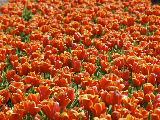
FIGURE 2.52 Nature doesn’t repeat itself in “seamless” tiles
“[W]hen you notice a distinctive feature—for instance, a knot in some woodgrain—repeating at regular intervals, it really breaks the illusion of organic randomness.”
— Alex Walker, The Cicada Principle and Why It Matters to Web Designers (sitepoint.com/the-cicada-principle-and-why-it-matters-to-web-designers)
Replicating randomness can be challenging, because CSS does not offer any inherent randomness capabilities. Let’s take the example of stripes. Assume we want vertical stripes of various colors and widths (let’s keep it simple and say four colors), with no visible “seams” of repeating tiles. Our first thought might be to create one gradient with all four stripes, like so:
background: linear-gradient(90deg,
              #fb3 15%, #655 0, #655 40%,
              #ab4 0, #ab4 65%, hsl(20, 40%, 90%) 0);
background-size: 80px 100%;
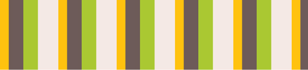
FIGURE 2.53 Our original attempt at pseudorandom stripes, with all the colors generated by the same linear gradient
As you can see in Figure 2.53, the repetition is obvious, as the pattern repeats itself every 80px (our background-size). Can we do better?
The solution
One first idea might be to enhance the illusion of randomness by splitting the flat stripe tile into layers: one base color and three layers of stripes, repeating in different intervals. We can easily achieve this by hardcoding the stripe width in the color stops and using background-size to control their spacing. The code might look like this:
background: hsl(20, 40%, 90%);
background-image:
    linear-gradient(90deg, #fb3 10px, transparent 0),
    linear-gradient(90deg, #ab4 20px, transparent 0),
    linear-gradient(90deg, #655 20px, transparent 0);
background-size: 80px 100%, 60px 100%, 40px 100%;
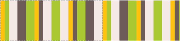
FIGURE 2.54 Our second attempt, involving overlaying different gradients with different background sizes; the (perceived) repeating tile is shown with dashed lines
Because the repetition in the topmost tile will be most noticeable (as it’s not covered by anything), we want to put the tile with the largest repeat interval on top (in this case, the orange stripes).
As you can see in Figure 2.54, these look significantly more random, but if we look closely, we can still see the repeating tile every 240px. The end of the first repeating tile of such a composition is the offset at which all our individual background images have repeated an integer amount of times. As you might remember from school, if we have a few numbers, the minimum number that can contain any of them an integer amount of times is their least common multiple (often abbreviated as LCM). Therefore, here the size of the tile is the LCM of the background sizes and the LCM of 40, 60, and 80 is 240.
Note that here “tile” is used a bit liberally: it’s not referring to the repeated image of any individual gradient, but the perceived repeating tile of their composition (i.e., if we weren’t using multiple backgrounds, what size would our repeated background image have to be to achieve the same result?).
It logically follows that to increase perceived randomness, we need to maximize the size of the repeating tile. Thanks to math, we don’t have to think long and hard about how to achieve this, because we already know the answer. To achieve maximum LCM, the numbers need to be relatively prime.* In that case, their LCM is their product. For example, 3, 4, and 5 are relatively prime, so their LCM is 3 × 4 × 5 = 60. An easy way to achieve this is to choose prime numbers, because they’re always relatively prime with any other number. Lists of primes up to very large numbers are widely available on the Web.
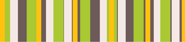
FIGURE 2.55 Our final stripes, using prime numbers to increase perceived randomness
To maximize randomness even further, we can even use prime numbers for the stripe widths. This is what our code would look like:
background: hsl(20, 40%, 90%);
background-image:
    linear-gradient(90deg, #fb3 11px, transparent 0),
    linear-gradient(90deg, #ab4 23px, transparent 0),
    linear-gradient(90deg, #655 41px, transparent 0);
background-size: 41px 100%, 61px 100%, 83px 100%;
Yes, the code is not pretty, but good luck trying to find any seams in Figure 2.55. The size of our repeating tile is now 41 × 61 × 83 = 207, 583 pixels, larger than any screen resolution one could possibly imagine!
This technique was dubbed “The Cicada Principle” by Alex Walker, who first had the idea of using primes to increase perceived randomness of backgrounds. Note that this is not only useful for backgrounds, but also for anything that involves repetition. Other applications include:
Applying small pseudorandom rotations on the images in a photo gallery, with multiple :nth-child(an) selectors where a is a prime.
Making an animation that doesn’t seem to ever repeat exactly in the same way, by applying multiple animations with prime durations. (Check out play.csssecrets.io/cicanimation for an example.)
PLAY! play.csssecrets.io/cicada-stripes

Hat tip to Alex Walker for coming up with an idea that inspired this technique in “The Cicada Principle and Why It Matters to Web Designers” (sitepoint.com/the-cicada-principle-and-why-it-matters-to-web-designers). Eric Meyer (meyerweb.com) later had the idea of creating something called “Cicadients” (meyerweb.com/eric/thoughts/2012/06/22/cicadients), which involves applying the technique on background images generated via CSS gradients. Dudley Storey has also written a very informative piece on this concept (demosthenes.info/blog/840/Brood-X-Visualizing-The-Cicada-Principle-In-CSS).
8 Continuous image borders
The problem
Sometimes we want to apply a pattern or image not as a background, but as a border. For example, check out Figure 2.57 for an element with a decorative border that is basically an image clipped to the border area. In addition, we want the image to resize to cover the entire border area regardless of the dimensions of our element. How would we attempt to do something like this with CSS?
FIGURE 2.56 Our stone art image, used throughout this secret
At this point, there might be a very loud voice in your head screaming, “border-image, border-image, we can use border-image, that’s not a problem anymore!!!11.” Not so fast, young padawan. Recall how border-image actually works: it’s basically 9-slice scaling. You slice the image into nine boxes and apply them to the corners and sides accordingly. Figure 2.58 offers a visual reminder of how this works.
How could we possibly slice our image via border-image to create the example in Figure 2.57? Even if we meticulously get it right for specific dimensions and border width, it wouldn’t adjust properly for different ones. The issue is that there is no specific part of the image that we want to be at the corners; the part of the image shown in the corner squares changes with the dimensions of the element and border width. If you try it for a bit, you will likely also conclude that this is not possible with border-image. But then what can we do?
The easiest way is to use two HTML elements: one using a background with our stone art image, and one with a white background covering it for our content area:
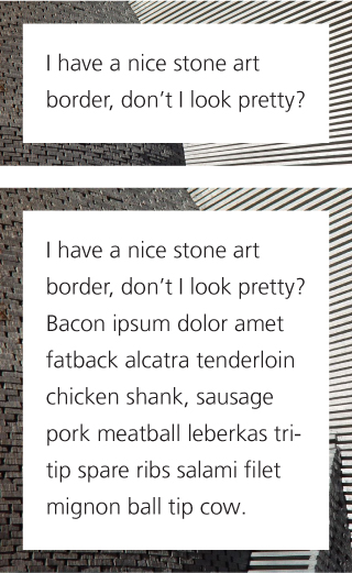
FIGURE 2.57 Our image used as a border with varying heights
HTML
<div class="something-meaningful"><div>
    I have a nice stone art border,
    don't I look pretty?
</div></div>
.something-meaningful {
    background: url(stone-art.jpg);
    background-size: cover;
    padding: 1em;
}

.something-meaningful > div {
    background: white;
    padding: 1em;
}
This works fine to create the “border” shown in Figure 2.57, but it requires an extra HTML element. This is suboptimal: not only does it mix presentation and structure, but modifying the HTML is simply not an option in certain cases. Can we do this with only one element?
The solution
Thanks to CSS gradients and the background extensions introduced in Backgrounds & Borders Level 3 (w3.org/TR/css3-background), we can achieve the exact same effect with only one element. The main idea is to use a second background of pure white, covering the stone art image. However, to make the second image show through the border area, we should apply different values of background-clip to them. One last thing is that we can only have a background color on the last layer, so we need to fake the white via a CSS gradient from white to white.
This is how our first attempt to apply this idea might look:
padding: 1em;
border: 1em solid transparent;
background: linear-gradient(white, white),
            url(stone-art.jpg);
background-size: cover;
background-clip: padding-box, border-box;
As we can see in Figure 2.59, the result is very close to what we wanted, but there is some weird repetition. The reason is that the default background-origin is padding-box, and thus, the image is sized based on the padding box and placed on the 0,0 point on the padding box. The rest is just repetitions of that first background tile. To correct this, we just need to set background-origin to border-box as well:
FIGURE 2.58 A quick primer on border-image
Top: Our sliced image; the dashed lines indicate its slicing
Middle: border-image: 33.34% url(…) stretch;
Bottom: border-image: 33.34% url(…) round; Play with the code at play.csssecrets.io/borderimage
padding: 1em;
border: 1em solid transparent;
background: linear-gradient(white, white),
            url(stone-art.jpg);
background-size: cover;
background-clip: padding-box, border-box;
background-origin: border-box;
These new properties are also available on the background shorthand, which can help us reduce our code significantly here:
padding: 1em;
border: 1em solid transparent;
background:
    linear-gradient(white, white) padding-box,
    url(stone-art.jpg) border-box 0 / cover;
PLAY! play.csssecrets.io/continuous-image-borders
Of course, we can use the same technique with gradient-based patterns. For example, take a look at the following code, which generates a vintage envelope themed border:
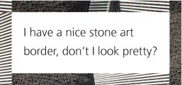
FIGURE 2.59 Our first attempt is very close to what we wanted
padding: 1em;
border: 1em solid transparent;
background: linear-gradient(white, white) padding-box,
            repeating-linear-gradient(-45deg,
              red 0, red 12.5%,
              transparent 0, transparent 25%,
              #58a 0, #58a 37.5%,
              transparent 0, transparent 50%)
             0 / 5em 5em;
You can see the result in Figure 2.61. You can easily change the width of the stripes via the background-size and the thickness of the border via the border declaration. Unlike our stone art border example, this effect is doable with border-image too:
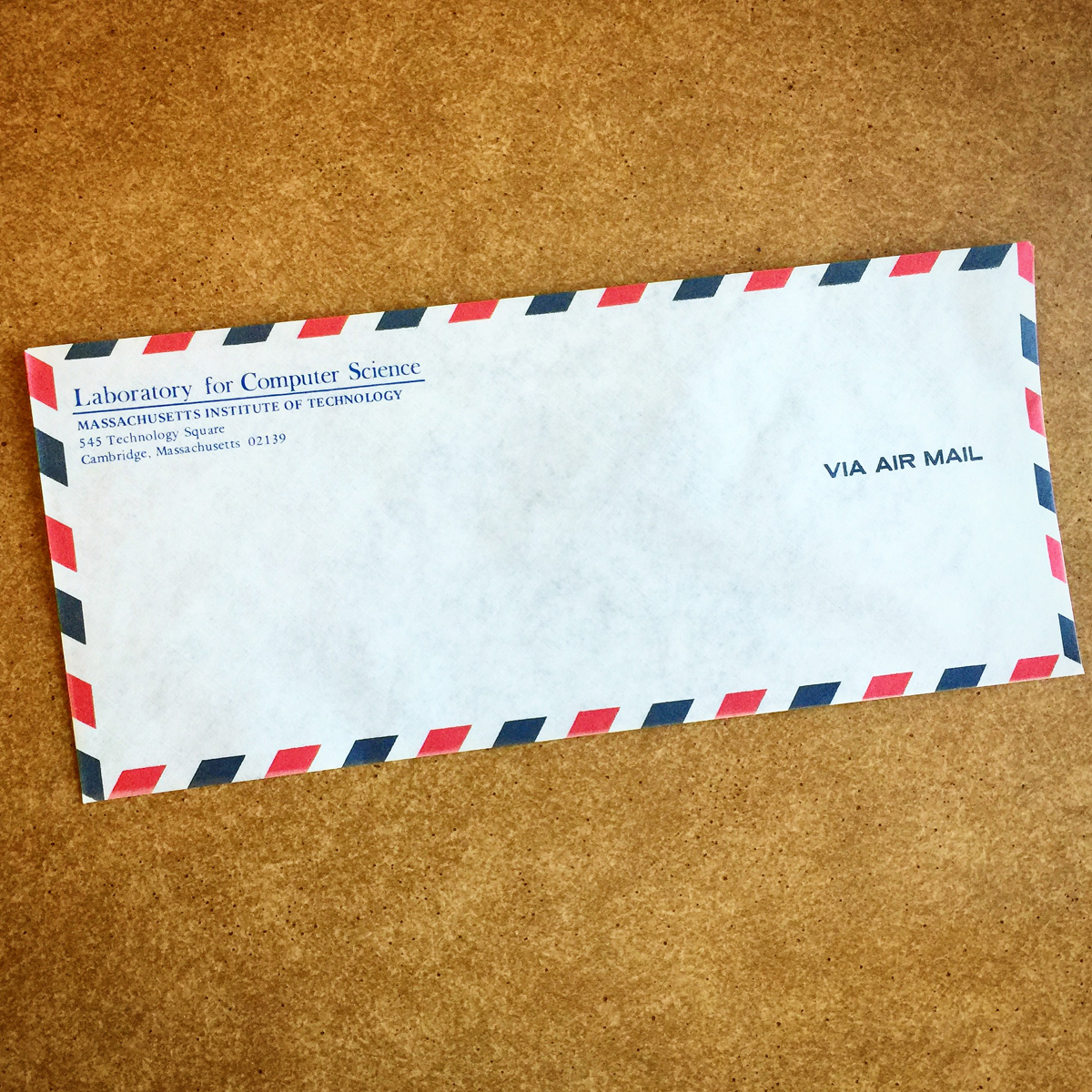
FIGURE 2.60 An actual vintage envelope
TIP! To see these issues in action, visit play.csssecrets.io/vintage-envelope-border-image and experiment with changing values.
padding: 1em;
border: 16px solid transparent;
border-image: 16 repeating-linear-gradient(-45deg,
                   red 0, red 1em,
                   transparent 0, transparent 2em,
                   #58a 0, #58a 3em,
                   transparent 0, transparent 4em);
However, the border-image approach has several issues:
We need to update border-image-slice every time we change the border-width and make them match.
Because we cannot use ems in border-image-slice, we are restricted to only pixels for the border thickness.
The stripe thickness needs to be encoded in the color stop positions, so we need to make four edits to change it.
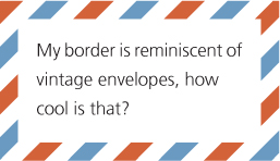
FIGURE 2.61 Our “vintage envelope” border
PLAY! play.csssecrets.io/vintage-envelope
Another fun application of this technique is using it to make marching ants borders! Marching ants borders are dashed borders that seem to scroll like marching ants (if you imagine that the dashes are ants). These are incredibly common in GUIs; image editors use them almost always to indicate area selection (Figure 2.62).
To create marching ants, we are going to use a variation of the “vintage envelope” effect. We will convert the stripes to just black and white, reduce the width of the border to 1px (notice how the stripes now turn to a dashed border?), and change the background-size to something appropriate. Then, we animate the background-position to 100% to make it scroll:
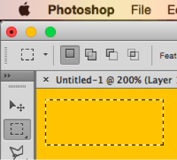
FIGURE 2.62 Marching ants are also used in Adobe Photoshop to indicate area selection
@keyframes ants { to { background-position: 100% } }

.marching-ants {
    padding: 1em;

    border: 1px solid transparent;
    background:
        linear-gradient(white, white) padding-box,
        repeating-linear-gradient(-45deg,
          black 0, black 25%, white 0, white 50%
        ) 0 / .6em .6em;
    animation: ants 12s linear infinite;
}
You can see a still of the result in Figure 2.63. Obviously, this is not only useful for marching ants, but also for creating all sorts of custom dashed borders, with different color dashes and custom dash-gap width.
Currently, the only way to achieve a similar effect via border-image is to use an animated GIF for border-image-source, as shown in chrisdanford.com/blog/2014/04/28/marching-ants-animated-selection-rectangle-in-css. When browsers start supporting gradient interpolation, we will also be able to do it with gradients, though in a messy, WET way.
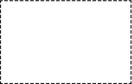
FIGURE 2.63 It’s not really possible to show marching ants in a book (a still just looks like dashed borders); visit the live example—it’s fun!
PLAY! play.csssecrets.io/marching-ants

FIGURE 2.64 Top border clipping, to mimic traditional footnotes
However, border-image can also be quite powerful, and even more when used with gradients. For example, assume we want a clipped top border, like the one commonly used in footnotes. All it takes is border-image and a vertical gradient, with the clipping length hardcoded. The border width is controlled by …border-width. The code would look like this:
border-top: .2em solid transparent;
border-image: 100% 0 0 linear-gradient(90deg,
                         currentColor 4em,
                         transparent 0);
padding-top: 1em;
The result is identical to Figure 2.64. In addition, because we specified everything in ems, the effect will adjust with font-size changes, and because we used currentColor, it will also adapt to color changes (assuming we want the border to be the same color as the text).