Table of Contents for
CSS Secrets
 CSS Secrets
Published by
O'Reilly Media, Inc., 2015
CSS Secrets
Published by
O'Reilly Media, Inc., 2015
- Cover Page
- CSS Secrets
- Title Page
- Copyright Page
- Dedication
- CSS Secrets
- Secrets by Specification
- Foreword
- Preface
- Words of thanks
- CSS Secrets
- Making of
- About this book
- Chapter 1. Introduction
- Chapter 2. Backgrounds & Borders
- Chapter 3. Shapes
- Chapter 4. Visual Effects
- Chapter 5. Typography
- Chapter 6. User Experience
- Chapter 7. Structure & Layout
- Chapter 8. Transitions & Animations
- Index
- Footnotes
5 Typography
20 Hyphenation
The problem
Designers love text justification. If you look at any stunningly designed magazine or book, you will see it everywhere. However, on the Web, justification is very sparingly used, and even less so by skilled designers. Why is that, given that we’ve had text-align: justify; since CSS 1?
The reason becomes apparent if you look at Figure 5.1. Look at all the “rivers of white” created by adjusting spacing to justify the text. Not only does this look bad, it also hinders readability. In print, justification always goes hand in hand with hyphenation. Because hyphenation allows words to be broken down into syllables, much less white-space adjustment is needed, resulting in the text looking much more natural.
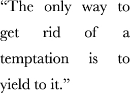
FIGURE 5.1 The default effect of CSS justification
Until recently, there were ways to hyphenate text on the Web, but they were the kind of solution that is worse than the problem. The usual way involved using server-side code, JavaScript, online generators, or even just our bare hands and lots of patience to insert soft hyphens (­) between syllables, so that the browser knows where each word could be broken. Usually, such an overhead was not worth it so the designer decided to go with a different kind of text alignment instead.
The solution
In CSS Text Level 3, a new property came along: hyphens. It accepts three values: none, manual, and auto. Its initial value is manual, to match the existing behavior: we could always hyphenate manually, with soft hyphens. Obviously, hyphens: none; would disable this behavior, but the truly magical results are achieved with this very simple line of CSS:
hyphens: auto;
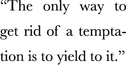
FIGURE 5.2 The result of hyphens: auto
That’s all it takes. You can see the result in Figure 5.2. Of course, for this to work, you need to have declared a language through the lang HTML attribute, but that’s something you should have done regardless.
If you want more fine-grained control over hyphenation (e.g., in short intro text), you can still use a few soft hyphens (­) to help the browser. The hyphens property will prioritize them, and then figure out where else it can break words.
CSS hyphenation degrades very gracefully. If the hyphens property is not supported, you just get text justification that looks like Figure 5.1. Sure, it’s not pretty or particularly pleasant to read, but is still perfectly accessible.
 PLAY! play.csssecrets.io/hyphenation
21 Inserting line breaks
The problem
The need to insert line breaks via CSS usually arises with definition lists (Figure 5.3), but also in several other cases. More often than not, we use a definition list because we want to be good netizens and use proper, semantic markup, even when what we visually wanted was just a few lines of name/value pairs. For example, consider this markup:
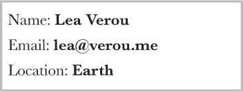
FIGURE 5.3 A definition list with a name/value pair on each line
HTML
<dl>
    <dt>Name:</dt>
    <dd>Lea Verou</dd>

    <dt>Email:</dt>
    <dd>lea@verou.me</dd>

    <dt>Location:</dt>
    <dd>Earth</dd>
</dl>
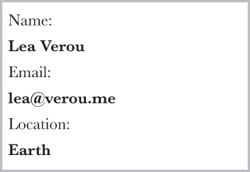
FIGURE 5.4 The default styling of our definition list
The visual result we wanted was something like the simple styling shown in Figure 5.3. The first step is usually to apply some basic CSS like the following:
dd {
    margin: 0;
    font-weight: bold;
}
However, because <dt>s and <dd>s are block elements, we end up with something that looks more like Figure 5.4, with both names and values on their own line. The next attempt usually involves trying different values of the display property on <dt>s, <dd>s, or both, often even at random as we slowly become more desperate. However, that way, we usually end up with something like Figure 5.5.
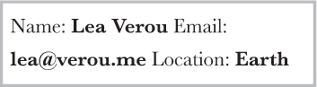
FIGURE 5.5 display: inline just breaks everything even worse
Before we start pulling our hair out, cursing at the CSS gods, or giving up separation of concerns and modifying our markup, is there a way to keep both our sanity and our (coding) morals?
The solution
Basically, what we need to do is add line breaks at the end of every <dd>. If we didn’t mind presentational markup, we could have done it with good ol’ <br> elements, like so:
HTML
<!-- If you do this, kittens die -->
<dt>Name:</dt>
<dd>Lea Verou<br /></dd>
...
Then, we would apply display:inline; to both <dt>s and <dd>s and we’d be done with it. Of course, not only is this a bad practice for maintainability, but it also bloats our markup. If only we could use generated content to add line breaks that work like <br> elements, then our problem would be solved! But we can’t do that, right? …Or can we?
Technically, 0x000A corresponds to “Line Feed” characters, which is what we get in JavaScript with "\n". There is also the “Carriage Return” character ("\r" in JS, "\D" in CSS), but that is not needed in modern browsers.
There is actually a Unicode character that corresponds to line breaks: 0x000A. In CSS, this would be written as "\000A", or more simply "\A". We could use it as the content of our ::after pseudo-element in order to add it at the end of every <dd>, like so:
dd::after {
    content: "\A";
}
This looks like it could work, but if we try it out, the results are disappointing: nothing changed from Figure 5.5. However, this doesn’t mean we’re not on the right track; it just means we forgot something. What we effectively did with this CSS code is equivalent to adding line breaks in our HTML markup, right before the closing </dd> tags. Remember what happens with line breaks in HTML code? By default, they’re collapsed along with the rest of our white-space. This is usually a great thing, otherwise we’d have to format our entire HTML page as one line! However, sometimes we want to retain white-space and line breaks, such as in code blocks. Remember what we usually do in such cases? We apply white-space: pre;. We can do exactly the same here, and apply it only to the generated line break.
We only have one line break character, so we don’t really care whether white-space will be preserved or not (because there is none), so any pre value would work (pre, pre-line, pre-wrap). I would recommend pre, for its wider browser support. Let’s put it all together:
dt, dd { display: inline; }

dd {
    margin: 0;
    font-weight: bold;
}

dd::after {
    content: "\A";
    white-space: pre;
}
If you test this, you will see that it actually works and it renders exactly like Figure 5.3! However, is it really flexible? Assume we want to add a second email to the user our definition list was describing:
HTML
...
<dt>Email:</dt>
<dd>lea@verou.me</dd>
<dd>leaverou@mit.edu</dd>
...
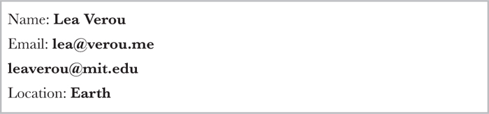
FIGURE 5.6 Our solution breaks with multiple <dd>s
Now the result looks like Figure 5.6, which is really confusing. Because we have a line break after every <dd>, every value is on a separate line, even when there’s no need to wrap. It would be much better if the multiple values were separated by commas, and on the same line (provided there is sufficient space).
Ideally, we would want to target the last <dd> before a <dt> and only add line breaks in that one, not in all <dd>s. However, this is still not possible with the current state of CSS selectors, because they cannot look ahead to elements after the subject in the DOM tree. We need to think of a different way. One idea would be to try adding the line breaks before <dt>s instead of after <dd>s:
dt::before {
    content: '\A';
    white-space: pre;
}
However, this leads to a blank first line, as the selector applies to the first <dt> too. To mitigate this, we could try using any of the following selectors instead of dt:
dt:not(:first-child)
dt ~ dt
dd + dt
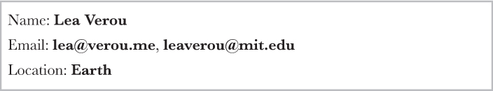
We are going to use the latter, as it also works when there are multiple <dt>s for the same value, unlike the first two selectors which would break in that case. We also need to separate the multiple <dd>s somehow, unless we’re fine with multiple values being space separated (which is perfectly fine for some cases, but not others). Ideally, we want to be able to tell the browser “add a comma after every <dd> that precedes another <dd>,” but again, that’s not possible with CSS selectors today. So, we will have to resort to adding a comma before every <dd> that follows another <dd>. Here’s the CSS we end up with (you can see the result in Figure 5.7):
dd + dt::before {
    content: '\A';
    white-space: pre;
}

dd + dd::before {
    content: ', ';
    font-weight: normal;
}
Keep in mind that if your markup includes (uncommented) white-space between the multiple consecutive <dd>s, there will be a space before the comma. There are many ways to fix this, none perfect. For example, negative margins:
dd + dd::before {
    content: ', ';
    margin-left: -.25em;
    font-weight: normal;
}
This would work, but it’s quite flimsy. If your content is displayed on a different font, with different metrics, the space might be wider or narrower than 0.25em, in which case the result could look a little off. However, with most fonts, the difference is negligible.
PLAY! play.csssecrets.io/line-breaks
22 Zebra-striped text lines
The problem
When we first got the :nth-child()/:nth-of-type() pseudo-classes a few years ago, one of the most common use cases was “zebra-striping” tables (Figure 5.8). While this previously required server-side code, clientside scripts, or tedious handcoding, it had now become as simple as these lines of code:
tr:nth-child(even) {
    background: rgba(0,0,0,.2);
}
FIGURE 5.8 Tables with zebra-striped rows have always been common both in UI design (such as the Mac OS X Yosemite file listing shown here) as well as print design, as the zebra striping helps our eyes follow a long line more easily
However, we were still left powerless when it came to applying the same effect to lines of text, instead of rows in a table. This is especially useful for making snippets of code more readable. Many authors ended up using JavaScript to wrap every line in its own <div> so they can follow the same :nth-child() technique, often abstracting this ugliness away in the syntax highlighters. Not only is this suboptimal for theoretical purity reasons (JS should not be concerned with styling), but also because too many DOM elements can slow down the page and it’s a fragile solution anyway (what happens when you increase the text size and one of the “lines” wraps?). Is there a better way?
Many authors even ended up requesting an :nth-line() pseudo-class from the CSS Working Group, which was rejected for performance reasons.
The solution
Instead of applying a darker background to elements that represent rows, let’s think about the problem in a different way. Why not apply a background image to the whole element, and have the zebra striping baked in it? This might sound like an terrible idea at first, but remember that we can generate backgrounds directly in CSS, through CSS gradients, and size them in ems, so that they automatically adapt to font-size changes.
Let’s give this idea a spin to make the code in Figure 5.9 zebra striped. First, we need to create horizontal stripes, in the way described in the “Striped backgrounds” secret on page 40. The background-size needs to be twice the line-height, as each stripe accounts for two lines. The code for our first attempt would look like this:
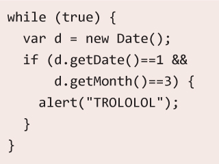
FIGURE 5.9 A snippet of code, without any zebra striping, just a plain ol’ solid color background
padding: .5em;
line-height: 1.5;
background: beige;
background-image: linear-gradient(
                  rgba(0,0,0,.2) 50%, transparent 0);
background-size: auto 3em;
As Figure 5.10 demonstrates, the result is very close to what we wanted. We can even try to change the font size, and the stripes shrink or grow as necessary! However, there’s a bit of a serious issue: the lines are misaligned, which kind of defeats the purpose. Why is that?
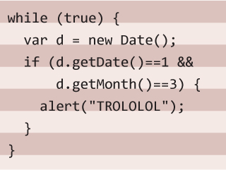
FIGURE 5.10 Our first attempt at zebra-striping our code snippet
If you look more closely at Figure 5.10, you will notice that the first stripe begins at the top of our container, as we would expect from a background image. However, our code doesn’t start there, as then it would look ugly. As you can see, we have applied a .5em padding to it, which is exactly the offset our stripes have from where they should be.
One way to solve this would be to use background-position to move the stripes .5em to the bottom. However, if we decide to later adjust the padding, we would also need to adjust the background position as well, which is not very DRY. Can we make the background automatically follow the padding length?
Let’s remember background-origin from the “Flexible background positioning” secret on page 32. This is exactly what we need: a way to tell the browser to use the content box edge as the reference for resolving background-position, instead of the default, which is the padding box edge. Let’s add that to the mix as well:
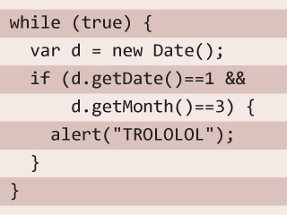
padding: .5em;
line-height: 1.5;
background: beige;
background-size: auto 3em;
background-origin: content-box;
background-image: linear-gradient(rgba(0,0,0,.2) 50%,
                                  transparent 0);
As you can see in Figure 5.11, this was exactly what we needed to achieve the zebra-striped effect! Because we used semi-transparent colors in the stripes, we can even adjust the background color, and the zebra striping will still work. Basically, it’s so flexible that the only way to break it* would be to change the line-height, without changing the background-size accordingly.
Why did we not just use the background shorthand for all our background-related values? Because then we would need a separate fallback declaration for older browsers, so we would need to include beige twice, making our code WET.
PLAY! play.csssecrets.io/zebra-lines
23 Adjusting tab width
The problem
Code-heavy web pages, such as documentation or tutorials, come with their own styling challenges. The <pre> and <code> elements that we use to display code do come with some default styling by the user agent, which looks like this:
FIGURE 5.12 Code displayed with the default tab width of eight characters
pre, code {
    font-family: monospace;
}

pre {
    display: block;
    margin: 1em 0;
    white-space: pre;
}
However, this is hardly sufficient to account for all the unique challenges of displaying code. One of the biggest issues is that while tabs are ideal for indenting code, they are often avoided on the Web because browsers display them with a width of eight characters (!). Take a look at Figure 5.12 and see how bad such wide indents look and how wasteful they are: our code didn’t even fit in its box!
Did you just wince at the mention of tabs for indentation? The topic is out of scope for this book, but you can find my reasoning here (lea.verou.me/2012/01/why-tabs-are-clearly-superior).
The solution
Thankfully, in CSS Text Level 3, we got a new CSS property to control that: tab-size. It accepts a number (of characters) or a length (which is rarely useful). We would usually want to set it at 4 (meaning four characters wide), or 2, which seems to be the latest trend in indent sizes:
pre {
    tab-size: 4;
}
FIGURE 5.13 The same code as Figure 5.12, displayed with a tab width of two characters
As you can verify in Figure 5.13, it now looks much easier to read. You could even set tab-size to 0 to completely disable tabs, but that’s rarely (if ever) a good idea, as you can see for yourself in Figure 5.14. If the property is not supported, nothing breaks—we just get the default awfully wide tabs that we’ve learned to live with all these years.
FIGURE 5.14 Code displayed with a tab size of 0, making all tab-based indents disappear—don’t do this!
PLAY! play.csssecrets.io/tab-size
24 Ligatures
The problem
Just like people, not all glyphs go naturally well together. For example, take f and i in most serif fonts. The dot in the i often clashes with the ascender of the f, making the pair look clumsy (first example in Figure 5.15).
To mitigate this, type designers often include extra glyphs in their fonts, called ligatures. These are individually designed pairs and triplets of glyphs, destined to be used by the typesetting program when their equivalent characters are next to each other. For example, look at Figure 5.15 for some common ligatures and how much better they look than their equivalent glyphs put together.
There are also the so-called discretionary ligatures (Figure 5.16), which are designed as a stylistic alternative, and not because there is an issue when their equivalent pairs of characters are next to each other.
However, browsers never use discretionary ligatures by default (which is the correct behavior) and often don’t even utilize common ligatures (which is a bug). In fact, until recently, the only way to explicitly use any ligature was to use its equivalent Unicode character—for example, typing fi for the fi ligature. This method brings more problems than it solves:
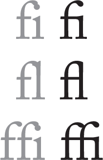
FIGURE 5.15 Common ligatures found in most serif typefaces
In fact, the humble ampersand (&) we all know and love started off as a ligature of the letters E and t (“et” is latin for “and”).
Obviously, it makes the markup difficult to read and even more difficult to write (good luck figuring out what word define is!).
If the current font doesn’t include this ligature character, the result will resemble ransom notes (Figure 5.17).
Not every ligature has an equivalent, standardized, Unicode character. For example, the ct ligature does not correspond to any Unicode character and any fonts that include it need to place it in the Unicode PUA (Private Use Area) block.
It can break accessibility of the text, including copy/paste, searches, and voice. Many applications are smart enough to handle this well, but not all. It even breaks search in some browsers.
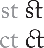
FIGURE 5.16 Discretionary ligatures found in many professionally designed serif typefaces
Surely, at this time and age, there ought to be a better way, right?
The solution
In CSS Fonts Level 3 (w3.org/TR/css3-fonts), the good ol’ font-variant was converted to a shorthand, comprised of many new longhand properties. One of them is font-variant-ligatures, designed specifically for the purpose of turning ligatures on and off. To turn on all possible ligatures, you would have to use three identifiers:

FIGURE 5.17 Using hardcoded ligatures can often have awful results, when the used font doesn’t have a glyph for our ligature
font-variant-ligatures: common-ligatures
                        discretionary-ligatures
                        historical-ligatures;
The property is inherited. You might find that discretionary ligatures can hinder readability and you might want to turn them off. In that case, you might want to only turn on common ligatures:
font-variant-ligatures: common-ligatures;
You can even explicitly turn the other two kinds off:
font-variant-ligatures: common-ligatures
                        no-discretionary-ligatures
                        no-historical-ligatures;
font-variant-ligatures also accepts the value none, which turns off ligatures altogether. Don’t use none unless you absolutely know what you’re doing. To reset font-variant-ligatures to its initial value, you should use normal, not none.
PLAY! play.csssecrets.io/ligatures
25 Fancy ampersands
The problem
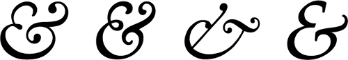
FIGURE 5.18 A few nice ampersands in fonts that are readily available in most computers; from left to right: Baskerville, Goudy Old Style, Garamond, Palatino (all italic)
You will find many hymns to the humble ampersand in typographic literature. No other character can instantly add the elegance a nicely designed ampersand has the power to add. Entire websites have been devoted to finding the font with the best looking ampersands. However, the font with the nicest ampersand is not necessarily the one you want for the rest of your text. After all, a really beautiful and elegant effect for headlines is the contrast between a nice sans serif font and beautiful, intricate serif ampersands.
Web designers realized this a while ago, but the techniques employed to achieve it are rather crude and tedious. They usually involve wrapping every ampersand with a <span>, through a script or manually, like so:
HTML
HTML <span class="amp">&</span> CSS
Then, we apply the font styling we want to just the .amp class:
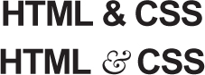
FIGURE 5.19 Our “HTML & CSS” headline, before and after the ampersand treatment
.amp {
    font-family: Baskerville, "Goudy Old Style",
                 Garamond, Palatino, serif;
    font-style: italic;
}
This works fine and you can see the before and after in Figure 5.19. However, the technique to achieve it is rather messy and sometimes even downright impossible, when we cannot easily modify the HTML markup (e.g., when using a CMS). Can’t we just tell CSS to style certain characters differently?
The solution
It turns out that we can, indeed, style certain characters (or even ranges of characters) with a different font, but the way to do it is not as straightforward as you might have hoped.
We usually specify multiple fonts (font stacks) in font-family declarations so that in case our top preference is not available, the browser can fall back to other fonts that would also fit our design. However, many authors forget that this works on a per-character basis as well. If a font is available, but only contains a few characters, it will be used for those characters and the browser will fall back to the other fonts for the rest. This applies to both local and embedded fonts included through @font-face rules.
It follows that if we have a font with only one character (guess which one!), it will only be used for that one character, and all others will get the second, third, etc. font from our font stack. So, we have an easy way to only style ampersands: create a web font with just the ampersand we want, include it through @font-face, then use it first in your font stack:
@font-face {
    font-family: Ampersand;
    src: url("fonts/ampersand.woff");
}

h1 {
    font-family: Ampersand, Helvetica, sans-serif;
}

FIGURE 5.20 Including local fonts through @font-face results in them being applied to the whole text by default
While this is very flexible, it’s suboptimal if all we wanted was to style ampersands with one of the built-in fonts. Not only is it a hassle to create a font file, it also adds an extra HTTP request, not to mention the potential legal issues, if the font you were going for forbids subsetting. Is there a way to use local fonts for this?
You might know that the src descriptor in @font-face rules also accepts a local() function, for specifying local font names. Therefore, instead of a separate web font, you could instead specify a font stack of local fonts:
@font-face {
    font-family: Ampersand;
    src: local('Baskerville'),
         local('Goudy Old Style'),
         local('Garamond'),
         local('Palatino');
}
However, if you try to apply the Ampersand font now, you will notice that our serif font was applied to the entire text (Figure 5.20), as these fonts include all characters. This doesn’t mean we’re going the wrong way; it just means we are missing a descriptor to declare that we are only interested in the ampersand glyph from these local fonts. Such a descriptor exists, and its name is unicode-range.
The unicode-range descriptor only works inside @font-face rules (hence the term descriptor; it is not a CSS property) and limits the characters used to a subset. It works with both local and remote fonts. Some browsers are even smart enough to not download remote fonts if those characters are not used in the page!
Unfortunately, unicode-range is as cryptic in its syntax as it is useful in its application. It works with Unicode codepoints, not literal characters. Therefore, before using it, you need to find the hexadecimal codepoint of the character(s) you want to specify. There are numerous online sources for that, or you can just use the following snippet of JS in the console:
JS
"&".charCodeAt(0).toString(16); // returns 26
 String#charCodeAt() returns incorrect results for Unicode characters beyond the BMP (Basic Multilingual Plane). However, 99.9% of the characters you will need to look up will be in it. If the result you get is in the D800-DFFF range, it means you have an “astral” character and you’re better off using a proper online tool to figure out what its Unicode codepoint is. The ES6 method String#codePointAt() will solve this issue.
Now that you have the hex codepoint(s), you can prepend them with U+ and you’ve already specified a single character! Here’s how the declaration would look for our ampersand use case:
unicode-range: U+26;
If you wanted to specify a range of characters, you would still need one U+, like so: U+400-4FF. In fact, for that kind of range, you could have used wildcards and specified it as U+4?? instead. Multiple characters or ranges are also allowed, separated by commas, such as U+26, U+4??, U+2665-2670. In this case, however, a single character is all we need. Our code now looks like this:
@font-face {
    font-family: Ampersand;
    src: local('Baskerville'),
         local('Goudy Old Style'),
         local('Palatino'),
         local('Book Antiqua');
    unicode-range: U+26;
}

h1 {
    font-family: Ampersand, Helvetica, sans-serif;
}

FIGURE 5.21 Applying a different font to our ampersands, with the help of font stacks and the unicode-range descriptor
If you try it out (Figure 5.21), you will see that we did, in fact, apply a different font to our ampersands! However, the result is still not exactly what we want. The ampersand in Figure 5.19 was from the italic variant of the Baskerville font, as in general, italic serif fonts tend to have much nicer ampersands. We’re not styling the ampersands directly, so how can we italicize them?
Our first thought might be to use the font-style descriptor in the @font-face rule. However, this does not have the effect we want at all. It merely tells the browser to use these fonts in italic text. Therefore, it will make our Ampersand font be completely ignored, unless the whole headline is italic (in which case, we will indeed get the nice italic ampersand).
Unfortunately, the only solution here is a bit of a hacky one: instead of using the font family name, we need to use the PostScript Name of the individual font style/weight we want. So, to get the italic versions of the fonts we used, the final code would look like this:
To find a font’s PostScript Name in Mac OS X, select it in the FontBook application and press  I.
I.
@font-face {
    font-family: Ampersand;
    src: local('Baskerville-Italic'),
         local('GoudyOldStyleT-Italic'),
         local('Palatino-Italic'),
         local('BookAntiqua-Italic');
    unicode-range: U+26;
}

h1 {
    font-family: Ampersand, Helvetica, sans-serif;
}
And this finally works great to give us the ampersands we wanted, just like in Figure 5.19. Unfortunately, if we need to customize their styling even more (e.g., to increase their font size, reduce their opacity, or anything else), we would need to go the HTML element route. However, if we only want a different font and font style/weight, this trick works wonders. You can use the same general idea to also style numbers with a different font, symbols, punctuation—the possibilities are endless!
PLAY! play.csssecrets.io/ampersands
Hat tip to Drew McLellan (allinthehead.com) for coming up with the first version of this effect (24ways.org/2011/creating-custom-font-stacks-with-unicode-range).

26 Custom underlines
The problem
Designers are a picky bunch. We always strive to customize things and carefully craft them to closely match our vision and make our designs more intuitive and easier to use. The default is rarely good enough.
Text underlines are one of those things we’d love to customize. Although the default is useful, it’s usually too intrusive, not to mention it’s rendered differently in every browser. Although text underlines have been with us since the dawn of the Web, we never really got more ways to customize them. Even after CSS came along, it merely gave us an on/off switch for them:
text-decoration: underline;
As usual, when we are not given the tools we need, we hack them together. We had no way to customize text underlines, so we started faking them with borders, probably one of the first CSS tricks we ever came up with:
FIGURE 5.22 Fake underlines created with border-bottom
a[href] {
    border-bottom: 1px solid gray;
    text-decoration: none;
}
While emulating a text underline with border-bottom gave us control over color, thickness, and style, it wasn’t perfect. As you can see in Figure 5.22, these “underlines” have a very large distance from the text, being even underneath the descenders of the glyphs! We could attempt to fix the issue by giving the links a display of inline-block and a smaller line-height, like so:
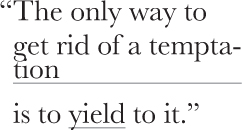
FIGURE 5.23 Trying to fix the issue with border-based “underlines” works, until the text needs to wrap—then hell breaks loose
display: inline-block;
border-bottom: 1px solid gray;
line-height: .9;
This works to bring the underline closer to the text, but it prevents proper text wrapping, as you can see in Figure 5.23.
These days, we might try to use an inset box-shadow to emulate an underline:
box-shadow: 0 -1px gray inset;
How much closer? As much as the line thickness, as the only difference of this method is that it’s drawn inside the box.
However, this has the same issues as border-bottom, except that it’s drawn slightly closer to the text. Is there any way to get proper, flexible, custom underlines?
The solution
Often the best solutions come from the most unexpected places. In this case, it comes in the form of background-image and related properties. You might think this is insane, but bear with me for a bit. Backgrounds follow wrapped text perfectly, and with the new background-related properties we got in CSS Backgrounds & Borders Level 3 such as background-size, we have very fine-grained control over them. We don’t even need a separate HTTP request for them, as we can generate the image on the fly, through CSS gradients:
background: linear-gradient(gray, gray) no-repeat;
background-size: 100% 1px;
background-position: 0 1.15em;
You can see how elegant and unobtrusive the result looks in Figure 5.24. However, we can still make one small improvement. Notice how our underlines cross the descenders of letters like p and y. Wouldn’t it look so much nicer if there was some breathing space around them? If our background is a solid color, we can fake that with two solid text-shadows in the same color as our background (Figure 5.25):
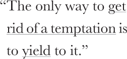
FIGURE 5.24 Our carefully crafted custom underlines, through CSS gradients
background: linear-gradient(gray, gray) no-repeat;
background-size: 100% 1px;
background-position: 0 1.15em;
text-shadow: .05em 0 white, -.05em 0 white;
The brilliant thing about using gradients for this is that they are extremely flexible. For example, to create a dashed underline, you could do something like (Figure 5.26):
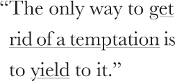
FIGURE 5.25 Our custom underlines, treated with text-shadow to not cross our descenders
background: linear-gradient(90deg,
            gray 66%, transparent 0) repeat-x;
background-size: .2em 2px;
background-position: 0 1em;
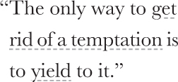
FIGURE 5.26 Fully customized dashed underlines, with CSS gradients
Then you could control the dash and gap proportion via the color stop positions and their size via background-size.
PLAY! play.csssecrets.io/underlines
As an exercise, you could try to create wavy red underlines, such as the ones used for highlighting spelling mistakes. (Hint: You will need two gradients.) You will find the solution in the following Play! example, but try to avoid peeking at the solution without giving it a shot—it’s more fun that way!
PLAY! play.csssecrets.io/wavy-underlines
Hat tip to Marcin Wichary (aresluna.org) for coming up with the first version of this effect (medium.com/designing-medium/crafting-link-underlines-on-medium-7c03a9274f9).
27 Realistic text effects
The problem
Sometimes, certain text treatments become very widespread on the Web. For example, letterpress text, blurring text on mouseover, extruded (pseudo-3D) text, and so on. These usually depend on a combination of carefully crafted text shadows, and some knowledge of how our eyes work, as many of these are based on optical illusions to some degree. They are easy to make, once you know the tricks involved, but not always as easy to reverse engineer through developer tools.
This secret is devoted to creating such effects, so that you never again find yourself wondering, “How on Earth does this effect work?”
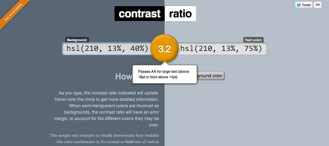
FIGURE 5.27 It’s easy to forgo accessibility when using such effects, but never forget to test your contrast ratios (a useful tool for this is leaverou.github.io/contrast-ratio, as it accepts any supported CSS color format)
Letterpress
The letterpress effect is one of the most popular text treatments on skeuomorphic design websites. While skeuomorphic design is not as trendy as it used to be, it will always have its devoted fans.
This effect works best with a medium lightness background with darker text, but it can also be used with lighter text on darker backgrounds, as long as the text is not black and the background is not completely white or black.
It’s based on the same premise that has been used since the very first GUIs to create the impression of pressed or extruded buttons: a lighter shadow at the bottom (or a darker one at the top) creates the illusion that an object is “carved in” the main surface. Similarly, a darker shadow at the bottom (or a lighter one at the top), creates the illusion that an object is extruded from the main surface. The reason this works is that we usually assume that the light source is above us, so an extruded object would create a shadow underneath it, and an embossed object would be lit at the bottom.
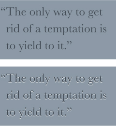
FIGURE 5.28 The letterpress effect on dark text on a lighter background (top: before, bottom: after)
Let’s use the colors in Figure 5.28 as a starting point. The text color is  hsl(210, 13%, 30%) and
  hsl(210, 13%, 60%) is the background color:
background: hsl(210, 13%, 60%);
color: hsl(210, 13%, 30%);
When we have darker text on lighter background (like in our example here), a lighter shadow at the bottom usually works best. How light depends on the exact colors you have and how subtle you want the effect to be, so you need to experiment a bit with the alpha parameter until it looks good. In this case, we settled on 80% white, but your mileage may vary:
background: hsl(210, 13%, 60%);
color: hsl(210, 13%, 30%);
text-shadow: 0 1px 1px hsla(0,0%,100%,.8);
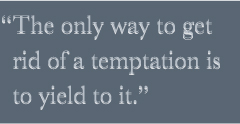
FIGURE 5.29 Letterpress gone wrong: applying the previous effect on text that is lighter than its background
You can see the result in Figure 5.28. In this case, we used pixels instead of ems for the effect, but if you have text that could be any size, from tiny to very large, ems might suit your case better:
text-shadow: 0 .03em .03em hsla(0,0%,100%,.8);
What happens when we have lighter text on a darker background? Our shadow above would yield awful results if the colors were reversed (Figure 5.29), making our text blurry. Does this mean we cannot apply a letterpress effect in this case? No, it just means we need to adjust our approach. In these cases, a darker shadow on the top works best, as you can verify in Figure 5.30. The CSS code would look like this:
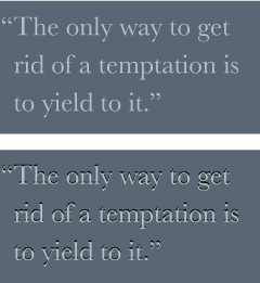
FIGURE 5.30 Letterpress effect when using lighter text on darker background (top: before, bottom: after)
background: hsl(210, 13%, 40%);
color: hsl(210, 13%, 75%);
text-shadow: 0 -1px 1px black;
PLAY! play.csssecrets.io/letterpress
Stroked text
In the future, outlined/stroked text will be quite easy, as we will be able to just use the spread parameter of text-shadows to make them larger so that they look like a stroke, akin to how we use box-shadow spread to emulate outlines. Unfortunately, browser support for this is currently very limited, so we have to resort to other ways to emulate it, with more or less satisfying results.
FIGURE 5.31 True stroked text, via text-shadow spread
The most widespread way is to layer multiple text-shadows with slightly different offsets, like so (Figure 5.32):
background: deeppink;
color: white;
text-shadow: 1px 1px black, -1px -1px black,
             1px -1px black, -1px 1px black;
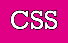
FIGURE 5.32 Fake 1px outline by layering multiple text-shadows
Alternatively, you could layer multiple slightly blurred shadows, with no offsets:
text-shadow: 0 0 1px black, 0 0 1px black,
             0 0 1px black, 0 0 1px black,
             0 0 1px black, 0 0 1px black;
However, this doesn’t always produce great results and is more expensive performance-wise, due to blurring.
Unfortunately, the thicker the stroke, the worse the result both of these ideas produce. For example, see how bad a 3px outline looks (Figure 5.33):
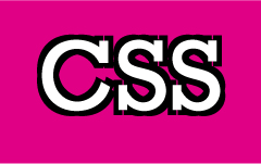
FIGURE 5.33 An (awful) 3px outline, created with multiple text-shadows with slightly different offsets
background: deeppink;
color: white;
text-shadow: 3px 3px black, -3px -3px black,
             3px -3px black, -3px 3px black;
There is always the solution of using SVG, but it adds a lot of cruft to our markup. For example, assume we wanted to use it in a first-level heading. The HTML would look like this:
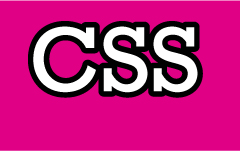
FIGURE 5.34 Using SVG for proper thick outlines
SVG
<h1><svg width="2em" height="1.2em">
    <use xlink:href="#css" />
    <text id="css" y="1em">CSS</text>
</svg></h1>
Then in our CSS, we’d write something like:
h1 {
    font: 500%/1 Rockwell, serif;
    background: deeppink;
    color: white;
}

h1 text {
    fill: currentColor;
}

h1 svg { overflow: visible }

h1 use {
    stroke: black;
    stroke-width: 6;
    stroke-linejoin: round;
}
Certainly not ideal, but it produces the best visual results (Figure 5.34), and even in ancient browsers where SVG is not supported, the text is still readable, styled, and crawlable.
PLAY! play.csssecrets.io/stroked-text
Glowing text
Glowing text is a rather common effect for hovering over links, or headlines in certain types of websites. It’s one of the easiest effects to create. In its simplest form you just use a couple layered text-shadows, with no offsets and the same color as the text (Figure 5.35):

FIGURE 5.35 Glowing text with only two simple text-shadows
background: #203;
color: #ffc;
text-shadow: 0 0 .1em, 0 0 .3em;
If used as a hover effect, you should also include a transition, like so:
a {
    background: #203;
    color: white;
    transition: 1s;
}
a:hover {
    text-shadow: 0 0 .1em, 0 0 .3em;
}

FIGURE 5.36 Pseudo-blurred text, by hiding the text and showing only its shadows
You can create an even more interesting effect by hiding the text itself on :hover, effectively making it appear like it’s slowly blurring (see Figure 5.36):
a {
    background: #203;
    color: white;
    transition: 1s;
}
a:hover {
    color: transparent;
    text-shadow: 0 0 .1em white, 0 0 .3em white;
}
However, keep in mind that depending on text-shadow for text to appear does not degrade gracefully: if text-shadow is not supported, no text will show up. So, you need to be careful to only apply this in environments that support text-shadow. Alternatively, you can blur the text through CSS filters:
a {
    background: #203;
    color: white;
    transition: 1s;
}
a:hover {
    filter: blur(.1em);
}
It may have worse browser support this way, but at least nothing will break when it’s not supported.
PLAY! play.csssecrets.io/glow
Extruded text
Another popular (and perhaps overused) effect in skeuomorphically designed websites is extruded (pseudo-3D) text (Figure 5.37). The main idea is having lots of stacked shadows, with no blur and only 1px difference, getting progressively darker, with a highly blurred dark shadow at the end, emulating the shade the whole thing would create.
Let’s use the text on Figure 5.38 as a starting point, which is styled through this simple CSS code:

FIGURE 5.37 Extruded text through multiple CSS text-shadows
background: #58a;
color: white;

FIGURE 5.38 Our starting point
Now let’s add a few progressively darker text-shadows:
background: #58a;
color: white;
text-shadow: 0 1px hsl(0,0%,85%),
             0 2px hsl(0,0%,80%),
             0 3px hsl(0,0%,75%),
             0 4px hsl(0,0%,70%),
             0 5px hsl(0,0%,65%);
As you can see in Figure 5.39, we’re getting there, but the result still looks quite unrealistic. Believe it or not, all we need to go from this to the finished result in Figure 5.37 is one more shadow at the bottom:

FIGURE 5.39 Almost there, but still looks unrealistic
background: #58a;
color: white;
text-shadow: 0 1px hsl(0,0%,85%),
             0 2px hsl(0,0%,80%),
             0 3px hsl(0,0%,75%),
             0 4px hsl(0,0%,70%),
             0 5px hsl(0,0%,65%),
             0 5px 10px black;
PLAY! play.csssecrets.io/extruded
This kind of repetitive, unwieldy code is a prime candidate for a preprocessor mixin. Here is one way we could do this in SCSS:
SCSS
@mixin text-3d($color: white, $depth: 5) {
    $shadows: ();
    $shadow-color: $color;

    @for $i from 1 through $depth {
        $shadow-color: darken($shadow-color, 10%);
        $shadows: append($shadows,
                    0 ($i * 1px) $shadow-color, comma);
    }

    color: $color;
    text-shadow: append($shadows,
                   0 ($depth * 1px) 10px black, comma);
}

h1 { @include text-3d(#eee, 4); }
There are many variations of this effect. For example, by having all shadows be  black and removing the last blurry shadow, you can emulate a typography effect commonly found in old/retro signage (Figure 5.40):

FIGURE 5.40 Retro-style typography
color: white;
background: hsl(0,50%,45%);
text-shadow: 1px 1px black, 2px 2px black,
             3px 3px black, 4px 4px black,
             5px 5px black, 6px 6px black,
             7px 7px black, 8px 8px black;
This one is even easier to convert to a mixin, or — more appropriately for this case — a function:
SCSS
@function text-retro($color: black, $depth: 8) {
    $shadows: (1px 1px $color,);

    @for $i from 2 through $depth {
        $shadows: append($shadows,
                    ($i*1px) ($i*1px) $color, comma);
    }

    @return $shadows;
}

h1 {
    color: white;
    background: hsl(0,50%,45%);
    text-shadow: text-retro();
}
28 Circular text
The problem
Although it’s not a particularly common effect, sometimes the need arises to have a short line of text follow a circular path. When that time comes, CSS leaves us in the cold. There is no CSS property or feature to achieve this and the only CSS ways we can think of are so hacky they make us feel dirty just for thinking about them. Is there any way to achieve such a type treatment without resorting to images and without losing our sanity and self-respect?
The solution
There are a few scripts out there to accomplish this. They rely on wrapping each letter in a separate <span> element and rotating them separately to form a circle. Not only is this extremely hacky, it also adds a lot of bloat and dozens of DOM elements to our page for no good reason.
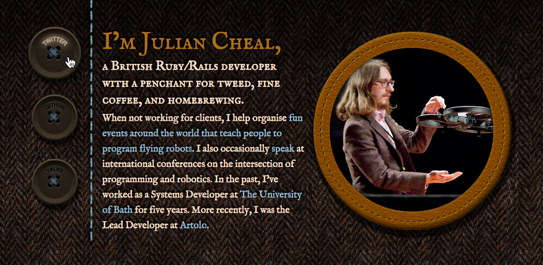
FIGURE 5.41 Circular text used on juliancheal.co.uk for the buttons (see what I did there?) on the left side; note that circular text here was the only way to avoid breaking the button metaphor, as the center of the button shape is taken by the holes and thread
Although there is currently no better way to accomplish this with pure CSS, we can easily do it with a little inline SVG. SVG natively supports text on any path, and circles are just a special case of a path. Let’s give it a shot!
The basic way text on a path works in SVG is by having a <textPath> element containing our text, inside a <text> element. The <textPath> element also references a <path> element defining our path by its id. Text within inline SVG also inherits most of our font styling (except line-height, as that’s manual in SVG), so we don’t have to worry about that, like we do with an external SVG image.
Unfortunately, <textPath> only works with <path> elements, which is why we cannot use the much more readable <circle> element for our circle.
Let’s assume we want to style the phrase “circular reasoning works because” as circular text, occupying the entire circumference of a circle, like it looks in Figure 5.42. We start by adding an inline SVG inside our HTML element, and defining a path for our circle:
SVG
<div class="circular">
    <svg viewBox="0 0 100 100">
        <path d="M 0,50 a 50,50 0 1,1 0,1 z"
              id="circle" />
    </svg>
</div>
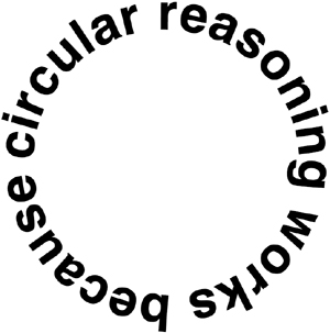
FIGURE 5.42 The final result we want to accomplish
Note that we defined its units via viewBox and not the width and height attributes. This enables us to set the coordinate system and aspect ratio of the graphic, without it having an intrinsic size. Not only is this more compact, it also saves us a few lines of CSS, as we no longer need to apply a width and height of 100% to the <svg> element—it just naturally adjusts to the size of its container.
If you do not understand the path syntax, do not worry. Hardly anyone does, and even those initiated into the secret art of SVG path syntax tend to forget about it in a matter of minutes. If you are curious, the three commands this exceedingly cryptic syntax includes are:
Why is the SVG path syntax so cryptic? Back when it was designed, it was believed that nobody would author SVG by hand, so the SVG WG went for the most compact syntax possible, to reduce filesize.
M 0,50: Move to the point (0,50)
a 50,50 0 1,1 0,1: Draw an arc from the point you are at currently, to a point that is 0 units to the right and 1 unit to the bottom of your current position. The arc should have a radius of 50, both horizontally and vertically. Out of the two possible angles, pick the largest and out of those two possible arcs, pick the one on the right of the two points, not the one on the left.
z: Close the path via a straight line segment.
Currently, our path is just a black circle (Figure 5.43). We add the text via the <text> and <textPath> elements and link it to our circle via the xlink:href property, like so:
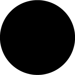
FIGURE 5.43 Our path is currently a circle, with the default  black fill
SVG
<div class="circular">
    <svg viewBox="0 0 100 100">
        <path d="M 0,50 a 50,50 0 1,1 0,1 z"
              id="circle" />
        <text><textPath xlink:href="#circle">
            circular reasoning works because
        </textPath></text>
    </svg>
</div>
As you can see in Figure 5.44, although we still have a lot of work to do to make this presentable and readable, we’ve already achieved something that we could not in a million years have done with CSS!
The next step would be to remove the black fill from our circle path. We don’t want the circle to be visible in any way; we only want it to act as a guide for our text. There are many ways to do that, such as nesting it into a <defs> element (which is designed for this very purpose). However, here we want to minimize the amount of SVG markup we need for this effect, so we are going to apply a fill: none via CSS:
.circular path { fill: none; }

FIGURE 5.44 Although there is a lot left to do, we have already achieved something that CSS simply cannot do
Now that the black circle is gone (Figure 5.45), we can study the other problems more carefully. The next biggest issue is that most of our text is outside the SVG element, and clipped by it. To correct this, we need to make our containing element smaller, and apply overflow: visible to the SVG element, so that it doesn’t clip any content outside its viewport:
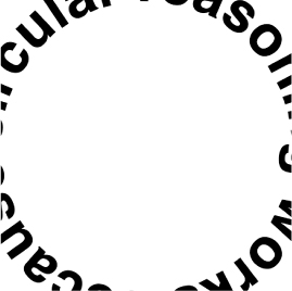
FIGURE 5.45 After making our path invisible, the other issues become easier to see
.circular {
    width: 30em;
    height: 30em;
}

.circular svg {
    display: block;
    overflow: visible;
}
You can see the result in Figure 5.46. Note that we are almost there, but some text is still clipped. The reason is that the SVG element affects flow only based on its dimensions, not its overflow. Therefore, the fact that there is text overflowing outside the box the <svg> element creates does not push the SVG element down. We need to do that manually, via a margin:
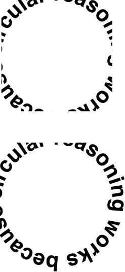
FIGURE 5.46 Top: Applying a width and height to our container element Bottom: Adding overflow: visible to the mix
.circular {
    width: 30em;
    height: 30em;
    margin: 3em auto 0;
}

.circular svg {
    display: block;
    overflow: visible;
}
That’s it! Our example now looks exactly like Figure 5.42, and the text is perfectly accessible. If we only have one instance of circular text (e.g., a website logo), then we are done. However, if we have more than one instance of this type treatment, we don’t want to have to repeat this SVG markup every time. To avoid that, we can write a short script that generates the necessary SVG elements automatically, from markup like this:
HTML
<div class="circular">
    circular reasoning works because
</div>
The code would go through all elements with a class of “circular”, remove their text and store it in a variable, and add the necessary SVG elements to it:
JS
$$('.circular').forEach(function(el) {
    var NS = "http://www.w3.org/2000/svg";
    var xlinkNS = "http://www.w3.org/1999/xlink";
    var svg = document.createElementNS(NS, "svg");
    var circle = document.createElementNS(NS, "path");
    var text = document.createElementNS(NS, "text");
    var textPath = document.createElementNS(NS, "textPath");


    svg.setAttribute("viewBox", "0 0 100 100");

    circle.setAttribute("d", "M0,50 a50,50 0 1,1 0,1z");
    circle.setAttribute("id", "circle");

    textPath.textContent = el.textContent;
    textPath.setAttributeNS(xlinkNS, "xlink:href", "#circle");

    text.appendChild(textPath);
    svg.appendChild(circle);
    svg.appendChild(text);
    el.textContent = '';
    el.appendChild(svg);
});