Table of Contents for
CSS Secrets
 CSS Secrets
Published by
O'Reilly Media, Inc., 2015
CSS Secrets
Published by
O'Reilly Media, Inc., 2015
- Cover Page
- CSS Secrets
- Title Page
- Copyright Page
- Dedication
- CSS Secrets
- Secrets by Specification
- Foreword
- Preface
- Words of thanks
- CSS Secrets
- Making of
- About this book
- Chapter 1. Introduction
- Chapter 2. Backgrounds & Borders
- Chapter 3. Shapes
- Chapter 4. Visual Effects
- Chapter 5. Typography
- Chapter 6. User Experience
- Chapter 7. Structure & Layout
- Chapter 8. Transitions & Animations
- Index
- Footnotes
7 Structure & Layout
36 Intrinsic sizing
The problem
As we all know, if we don’t set a specific height on an element, it automatically adjusts to its contents. What if we want a similar behavior for the width as well? For example, let’s assume we have HTML5 figures, with markup like the following:
HTML
<p>Some text […]</p>
<figure>
    <img src="adamcatlace.jpg" />
    <figcaption>
        The great Sir Adam Catlace was named after
        Countess Ada Lovelace, the first programmer.
    </figcaption>
</figure>
<p>More text […].</p>
Let’s also assume we’re applying some basic styling to them, such as a border around the figures. By default, this looks like Figure 7.1. We want to make the figures as wide as the image they contain (which could vary in size) and center them horizontally. The current rendering is quite far from what we want: the lines of text are much longer than the image. How do we make the width of the figure determined by the width of the image it contains instead of the width of its parent?* Over the course of our career, we have probably built our own list of CSS styles that result in such width behavior, usually as a side effect:
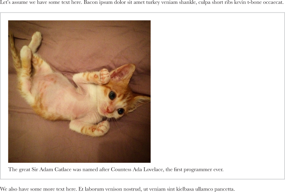
FIGURE 7.1 The default way our markup is rendered, after a bit of CSS for borders and padding
Floating the <figure> gives us the right width, but also drastically alters the layout of the figure, in ways we might not want (Figure 7.2).
Applying display: inline-block to the figure does size it based on its contents, but not in the way we want (Figure 7.3). In addition, even if the width computation was on par with our expectations, it would be very tricky to horizontally center figures this way. We would need to apply text-align: center to its parent and text-align: left to any possible child of that parent (p, ul, ol, dl, ...).
As a last resort, developers often apply a fixed width or max-width to figures, and apply max-width: 100% to figure > img. However, this underutilizes the available space, might still be off for overly small figures, and is not responsive.
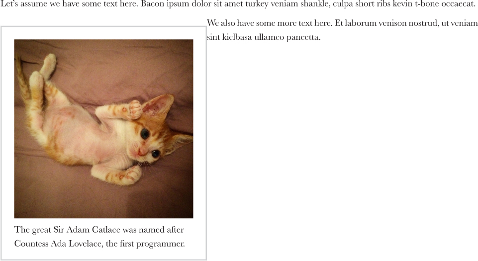
FIGURE 7.2 Trying to solve the width issue by floating creates new issues
Is there any decent CSS solution to this problem or should we give up and start coding a script to dynamically set the figure widths?

FIGURE 7.3 Contrary to our expectations, display: inline-block does not result in the width we wanted
The solution
A relatively new specification, CSS Intrinsic & Extrinsic Sizing Module Level 3 (w3.org/TR/css3-sizing), defined several new width and height keywords, one of the most useful of which was min-content. This keyword gives us the width of the largest unbreakable element inside the box (i.e., the widest word or image or fixed-width box). This is exactly what we need! Now, giving our figures an appropriate width and horizontally centering them as simple is two lines of code:
Another value, max-content, would give us the same width as we saw with display: inline-block earlier. And fit-content gives us the same behavior as floats (which is often the same as min-content, but not always).
figure {
    width: min-content;
    margin: auto;
}
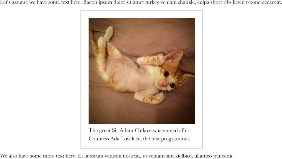
You can see the result in Figure 7.4. To offer a graceful fallback for older browsers, we could combine this technique with a fixed max-width, like so:
figure {
    max-width: 300px;
    max-width: min-content;
    margin: auto;
}

figure > img { max-width: inherit; }
On a modern browser, the latter max-width declaration would override the former and if the figure is sized intrinsically, max-width: inherit has no effect.
 PLAY! play.csssecrets.io/intrinsic-sizing

Hat tip to Dudley Storey (demosthenes.info) for coming up with this use case (demosthenes.info/blog/662/Design-From-the-Inside-Out-With-CSS-MinContent).
37 Taming table column widths
The problem
Although we stopped using tables for layout long ago, tables still have their place on modern websites, for tabular data such as statistics, emails, listings of items with lots of metadata, and many other things. Also, we can make other elements behave like table-related elements, by using the table-related keywords for the display property. However, convenient as they may seem at times, their layout is very unpredictable for dynamic content. This is due to the fact that column dimensions are adjusted based on their contents and even explicit width declarations are treated more like hints, as Figure 7.5 illustrates.
For this reason, we often end up using different elements even for tabular data or we just accept the unpredictability of it all. Is there any way we could get tables to just behave?
The solution
The solution comes in the form of a little-known CSS 2.1 property called table-layout. Its default value is auto, which results in the so-called automatic table layout algorithm, with the familiar behavior shown in Figure 7.5. However, there is a second value, fixed, which results in more predictable behavior. It leaves more up to the author (you, that is!) and less up to the rendering engine. Styling is respected and not treated like some sort of hint, overflow behaves the same way as any other element (including text-overflow), and table contents only affect the height of each row and nothing else.
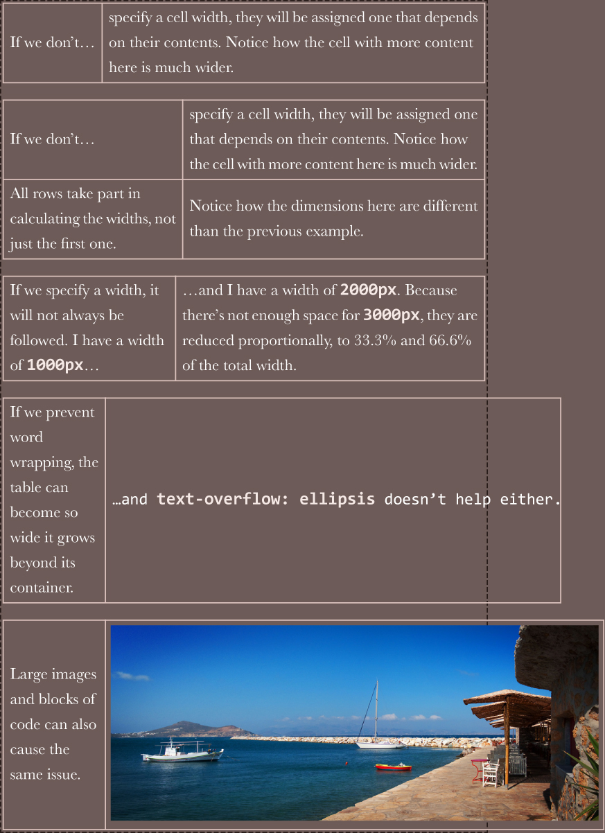
FIGURE 7.5 The default table layout algorithm for tables with 2 columns and varied contents (the container of these tables is shown with a dashed border)
In addition to being more predictable and convenient, the fixed table layout algorithm is also considerably faster. Because table contents do not affect cell widths, no redraws/repaints are needed while the page is downloading. We are all familiar with the disruptive image of a table that keeps readjusting the widths of its columns as the page is downloading. This never happens with fixed table layouts.
To use it, we apply the property to <table> elements and elements with display: table. Note that you need to specify a width to these tables (even if it’s 100%) for the magic to happen. Also, for text-overflow: ellipsis to work, we need to set a width to that column as well. That’s all! You can see the results in Figure 7.6:
table {
    table-layout: fixed;
    width: 100%;
}
PLAY! play.csssecrets.io/table-column-widths
Hat tip to Chris Coyier (css-tricks.com) for coming up with this technique (css-tricks.com/fixing-tables-long-strings).
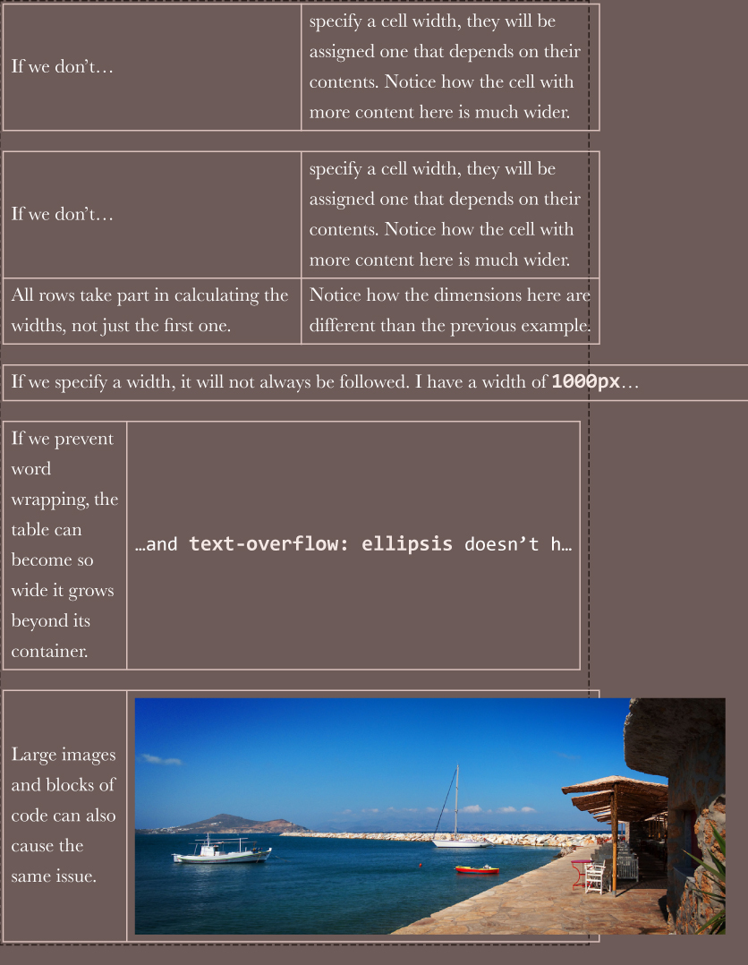
FIGURE 7.6 The same tables as in Figure 7.5, but with table-layout: fixed applied. Note the following, in order:
When we don’t define any widths, all columns get the same width.
A second row does not affect the column widths.
Large widths are applied as-is, not shrunk down.
The overflow and text-overflow properties are respected.
Content can overflow table cells (if overflow is visible)
38 Styling by sibling count
The problem
There are many cases when we need to style elements differently based on how many siblings they have total. The main use case is improving UX and conserving screen real estate in an expanding list, by hiding controls or making them more compact as the list grows. Here are a few examples:
A list of emails or similar text-based items. If we only have a handful of items, we can display a long preview. As the list grows, we reduce the lines of preview we can show. When the length of the list is longer than the viewport height, we might opt to hide previews completely and make any buttons smaller, to minimize scrolling.
A to-do list app, where we show every item with a large font when there are fewer items, but progressively make the font size smaller (for all items) as the total number of items increases.
A color palette app, with controls displayed on every color. One might want to make these controls more compact as the number of colors increases and the space they occupy decreases accordingly (Figure 7.7).
An app with multiple <textarea>s where every time we add a new one, we make them all smaller (like in bytesizematters.com).
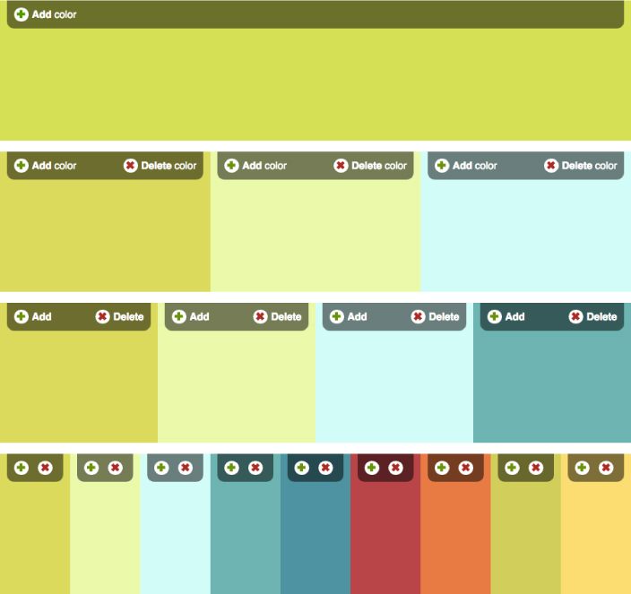
FIGURE 7.7 Progressively making controls smaller as the number of colors increases and the available space shrinks. Note the special handling on the case where we only have one color: We then hide the delete button.
Colors are taken from the Adobe Color (color.adobe.com) palettes:
Sushi Maki (color.adobe.com/Sushi-Maki-color-theme-350205)
However, targeting elements based on their total number of siblings is not trivial with CSS selectors. For example, suppose we want to apply certain styles to a list’s items when their total count is 4. We could use li:nth-child(4) to select the fourth item in the list, but this is not what we needed; we needed to select every item, but only when their total count is 4.
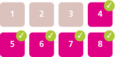
FIGURE 7.8 Which elements get selected with li:nth-child(4), li:nth-child(4) ~ li
Our next idea might be to use the generalized sibling combinator (~) together with :nth-child(), like li:nth-child(4), li:nth-child(4) ~ li. However, this only targets the fourth child and items after it (Figure 7.8), regardless of the total count. Because there is no combinator that can “look backward” and select previous siblings, is attempting to accomplish this with CSS doomed to fail? Let’s not lose hope just yet.
The solution
For the special case of having exactly one item, there is an obvious solution: :only-child, which was created exactly for this purpose. This is not only useful as a starting point, but there are several use cases for it, which is why it was added to the specification. For example, note in Figure 7.7 that we are hiding the delete button when we only have one color; this could be done by a CSS selector using :only-child:
li:only-child {
    /* Styles for when we only have 1 item */
}
However, :only-child is equivalent to :first-child:last-child, for obvious reasons: if the first item is also the last item, it logically follows that it is the only item. However, :last-child is also a shortcut, to :nth-last-child(1):
We will use :nth-child() selectors throughout this section, but everything discussed applies to :nth-of-type() selectors equally, which are often a better fit, as we usually have siblings of different types and we are only concerned with one type. We will be using list items in the examples, but what we discuss is applicable to elements of any type.
li:first-child:nth-last-child(1) {
    /* Same as li:only-child */
}
However, now 1 is a parameter, and we can tweak it to our liking. Can you guess what li:first-child:nth-last-child(4) targets? If you answered that it generalizes :only-child by targeting list items when their total count is four, you might be overdoing it a bit with the optimism. We’re not there yet, but we are on the right track. Think about both pseudo-classes separately: we are looking for elements that match both :first-child and :nth-last-child(4). Therefore, elements who are—at the same time—the first child of their parent counting from the start, and the fourth child counting from the end. Which elements would fulfill this criteria?
The answer is the first element in a list with exactly four elements (Figure 7.9). This is not quite what we wanted, but it’s very close: because we now have a way to target the first child of such a list, we can use the general sibling combinator (~) to target every sibling that follows such a first child, effectively targeting every list item in a list if and only if it contains four items total, which is exactly what we were trying to accomplish:
li:first-child:nth-last-child(4),
li:first-child:nth-last-child(4) ~ li {
    /* Target list items if the list
       contains exactly four items */
}
To avoid the verbosity and repetition of the solution just shown, a preprocessor, such as SCSS, could be used, although the syntax of existing preprocessors for this is rather clumsy:
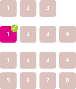
FIGURE 7.9 Which elements get selected with li:first-child:nth-last-child(4) in lists of three, four, and eight elements
SCSS
/* Define mixin */
@mixin n-items($n) {
    &:first-child:nth-last-child(#{$n}),
    &:first-child:nth-last-child(#{$n}) ~ & {
        @content;
    }
}

/* Use it like so: */
li {
    @include n-items(4) {
        /* Properties and values */
    }
}
Hat tip to André Luís (andr3.net) for coming up with an idea that inspired this technique (andr3.net/blog/post/142).
Selecting by range of sibling count
In most practical applications, we do not want to target specific numbers of items, but ranges thereof. There is a handy trick that we can use to make :nth-child() selectors target ranges such as “select everything after the fourth child.” Besides simple numbers as parameters, we can also use an+b expressions (e.g., :nth-child(2n+1)), where n stands for a variable that ranges from 0 to +∞ in theory (in practice, values after a certain point don’t select anything anymore because the number of elements we have is finite). If we use an expression of the form n+b (where a is implied to be 1), then there is no positive integer for n that could give us a value smaller than b. Therefore, expressions of the form n+b can be used to select every child from the bth onward; for example, :nth-child(n+4) selects every child except the first, second, and third (Figure 7.10).
TIP! It can be hard to wrap one’s head around :nth-* selectors. If you’re having trouble, you could use an online tester to experiment with a few expressions. I’ve written one at lea.verou.me/demos/nth.html, but there are plenty of others around.
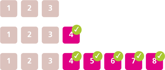
FIGURE 7.10 Which elements get selected with li:nth-child(n+4) in lists of three, four, and eight elements
We can take advantage of this to select list items when the total number of items is four or more (Figure 7.11). In this case, we could use n+4 as the expression inside :nth-last-child():
li:first-child:nth-last-child(n+4),
li:first-child:nth-last-child(n+4) ~ li {
    /* Target list items if the list
       contains at least four items */
}
Similarly, expressions of the form -n+b can be used to select the first b elements. Therefore, to select all list items if and only if there are four or fewer of them in the same list (Figure 7.12), we would write:
li:first-child:nth-last-child(-n+4),
li:first-child:nth-last-child(-n+4) ~ li {
    /* Target list items if the list
       contains at most four items */
}
Of course, we could combine the two, but the code now gets even more unwieldy. Assume we want to target list items when the list contains between 2–6 items:
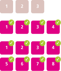
FIGURE 7.11 Which elements get selected with li:first-child:nth-last-child(n+4), li:first-child:nth-last-child(n+4) ~ li in lists of three, four, and eight elements
li:first-child:nth-last-child(n+2):nth-last-child(-n+6),
li:first-child:nth-last-child(n+2):nth-last-child(-n+6) ~ li {
    /* Target list items if the list
       contains 2-6 items */
}
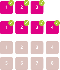
FIGURE 7.12 Which elements get selected with li:first-child:nth-last-child(-n+4), li:first-child:nth-last-child(-n+4) ~ li in lists of three, four, and eight elements
PLAY! play.csssecrets.io/styling-sibling-count
39 Fluid background, fixed content
The problem
In the past few years, there is a certain web design trend that has been growing in popularity: it’s what I call “fluid background width, fixed content width.” The typical characteristics of this pattern are:

FIGURE 7.13 Popular home-sharing website airbnb.com uses this pattern in its footer
There are multiple sections, each occupying the entire width of the viewport and each with a different background.
The content is of fixed width, even if that width varies in different resolutions because said fixed width is modified by media queries. In some cases, different sections have different content widths as well.
Sometimes the entire website is comprised of sections styled this way (Figure 7.15, or, more subtly, Figure 7.14). More frequently, only specific sections follow this pattern, especially footers (Figure 7.13).

FIGURE 7.14 Popular travel booking website kayak.com uses this pattern throughout its homepage, in a very subtle way
The most common way to accomplish something like this is using two elements for each section, one for the fluid background and one for the fixed content width. The latter is centered horizontally via margin: auto. For example, the markup for such a footer could look like this:
HTML
<footer>
    <div class="wrapper">
        <!-- Footer content here -->
    </div>
</footer>
The CSS usually involves rules of this general structure:
footer {
    background: #333;
}
.wrapper {
    max-width: 900px;
    margin: 1em auto;
}
Looks familiar? Most web designers/developers have written similar code at some point. Are the extra elements a necessary evil, or can we use modern CSS to avoid them?
The solution
Let’s think for a bit about what margin: auto does in this case. The margin it produces is equal to half of the viewport width, minus half of our page width. Because percentages here refer to the viewport width (assuming there is no ancestor with an explicit width), we could express this in our case as 50% - 450px. However, the calc() function, defined in CSS Values and Units Level 3 (w3.org/TR/css-values-3/#calc), allows us to specify this kind of simple math directly in our stylesheet. By substituting auto with calc(), our wrapper rule will become:
.wrapper {
    max-width: 900px;
    margin: 1em calc(50% - 450px);
}
The only reason we had to use a second wrapper element was to be able to apply the magic auto keyword on its margin. However, now we removed the magic and replaced it with calc(), so it’s just another CSS length value that can be used in any property that accepts lengths. This means that if we want, we can now apply it to the parent instead as padding:
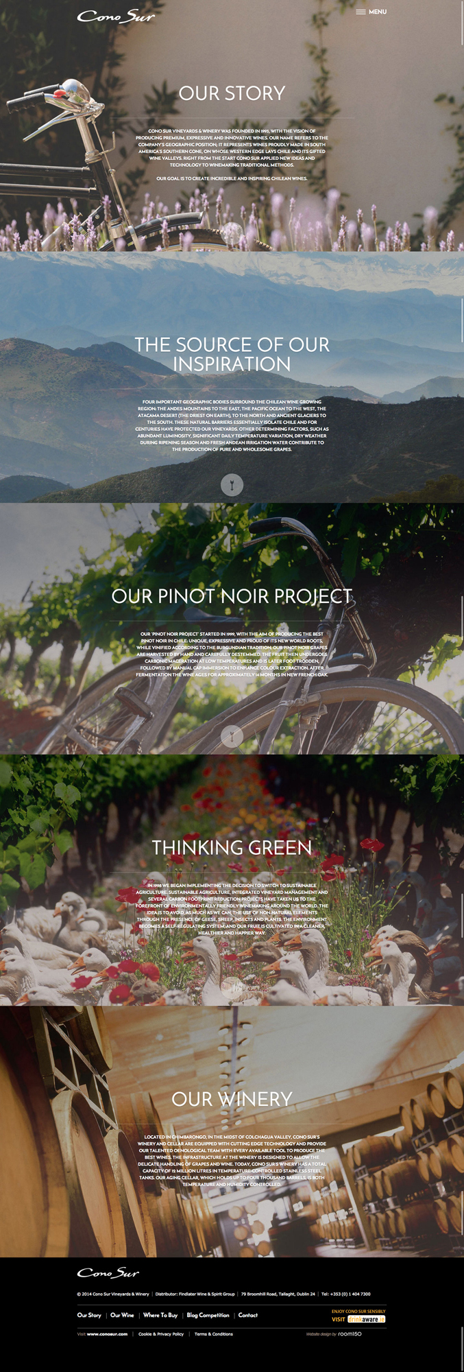
FIGURE 7.15 The beautiful Irish website of Cono Sur Vineyards and Winery (conosur.ie) makes extensive use of this pattern
footer {
    max-width: 900px;
    padding: 1em calc(50% - 450px);
    background: #333;
}
.wrapper {}
 Don’t forget to include white-space around any - and + operators in calc(), otherwise it’s a parsing error! The reason for this weird rule is forward compatibility: in the future, identifiers might be allowed inside calc(), and they can contain hyphens.
As you can see, by doing that, we’ve eliminated any CSS code from the wrapper, which means we don’t really need it anymore and we can safely get rid of it from our markup. We have now achieved the style we wanted with no redundant HTML. Can we improve it even further? As usual, the answer to this question is yes.
Notice that if we comment out the width declaration, nothing happens. The visual result is exactly the same, and behaves the same regardless of viewport size. Why is that? Because a padding of 50% - 450px only leaves 900px (2 × 450px) of available space anyway. We would see a difference if width was anything other than 900px, smaller or larger. But 900px is the space we get anyway, so it’s redundant and we can remove it, which results in DRY-er code.
Another improvement we can make is to improve backward compatibility, by adding a fallback so that we at least get some padding if calc() is not supported:
footer {
    padding: 1em;
    padding: 1em calc(50% - 450px);
    background: #333;
}
This is it: we’ve achieved a flexible, DRY, backward-compatible result in only three lines of CSS and no extra markup!

FIGURE 7.16 Popular Mac OS productivity application Alfred (alfredapp.com) also uses this style throughout its website
PLAY! play.csssecrets.io/fluid-fixed
This solution could end up with no padding if the screen got narrower than the content width! We can fix that with media queries.
40 Vertical centering
The problem
“44 years ago we put a man on the moon, yet we still can’t vertically centre things in CSS.”
— James Anderson (twitter.com/jsa/status/358603820516917249)
Centering an element horizontally in CSS is very straightforward: if it’s an inline element, we apply text-align: center to its parent, if it’s a block element, we apply margin: auto to it. However, just the thought of vertically centering an element is enough to make our skin crawl.
Over the years, vertical centering has become the holy grail of CSS, as well as a popular inside joke between frontend professionals. The reason being that it has all of the following properties at the same time:
It’s very frequently needed.
It sounds exceedingly easy and simple in theory.
It used to be incredibly difficult in practice, especially for elements of variable dimensions.
Frontend developers over the years have exhausted their creativity in coming up with solutions to this conundrum, most of them disturbingly hacky. In this secret, we are going to explore some of the best modern techniques to achieve vertical centering for all needs. Note that there are a few popular techniques that are not discussed here, for various reasons:
The table layout method (using table display modes) is not included, as it requires several redundant HTML elements.
The inline-block method is not included, as it’s too hacky for my taste.
However, if you are interested, you can read about both of these techniques on Chris Coyier’s excellent article “Centering in the Unknown” (css-tricks.com/centering-in-the-unknown).
Unless otherwise noted, we will use the following markup right inside the <body> element, although the solutions we will explore should work regardless of container:
HTML
<main>
    <h1>Am I centered yet?</h1>
    <p>Center me, please!</p>
</main>
We also apply some basic CSS for backgrounds, padding, and so on, in order to get to the starting point shown in Figure 7.17.
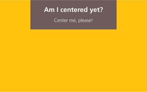
FIGURE 7.17 Our starting point
The absolute positioning solution
One of the earliest vertical centering techniques was the following, which required a fixed width and height:
main {
    position: absolute;
    top: 50%;
    left: 50%;
    margin-top: -3em; /* 6/2 = 3 */
    margin-left: -9em; /* 18/2 = 9 */

    width: 18em;
    height: 6em;
}
Essentially, it places the element’s top-left corner at the center of the viewport (or the closest positioned ancestor) and then uses negative margins of half its width and height to move it up and left so that the element’s center is at the center of the viewport. With calc() it could be simplified to use two declarations fewer:
main {
    position: absolute;
    top: calc(50% - 3em);
    left: calc(50% - 9em);
    width: 18em;
    height: 6em;
}
Obviously, the biggest problem with this technique is that it requires fixed dimensions, while we often need to center elements whose dimensions are determined by their contents. If only we had a way to use percentages that resolve to the element’s dimensions, our issue would be solved! Unfortunately, for most CSS properties (including margin), percentages resolve relative to the dimensions of their parent.
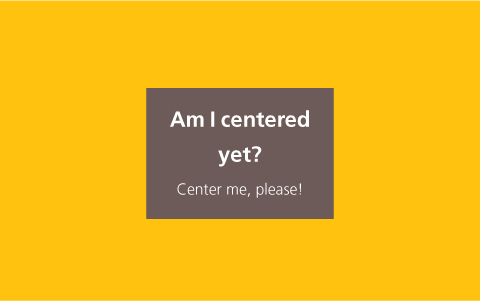
FIGURE 7.18 Vertical centering with unspecified dimensions via our CSS transforms trick
As is common with CSS, often solutions come from the most unlikely places. In this case, CSS transforms. When we use percentages in translate() transforms, we are moving the element relative to its own width and height, which is exactly what we need here. We can thus replace the negative offsets that hardcode our elements dimensions with percentage-based CSS transforms and get rid of the hardcoded dimensions:
main {
    position: absolute;
    top: 50%;
    left: 50%;
    transform: translate(-50%, -50%);
}
You can see the result in Figure 7.18, but there aren’t really any surprises there: our container is perfectly centered, just like what we’d expect.
Of course, no technique is perfect, and this one has a few caveats:
Absolute positioning is often not an option as its effects on the whole layout are quite drastic.
If the element to be centered is taller than the viewport, its top is clipped (Figure 7.19). There are ways to work around this, but they are incredibly hacky.
In some browsers, this can cause elements to appear slightly blurry, due to them being placed on a half pixel. This can be fixed by applying transform-style: preserve-3d, although this is a hack and is not guaranteed to be future-proof.
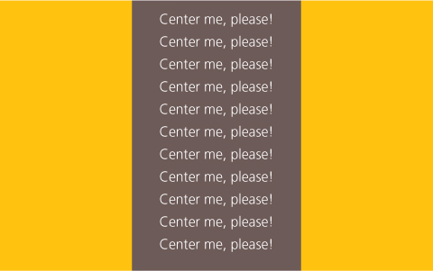
FIGURE 7.19 If the element we are trying to center is taller than the viewport, its top is clipped
PLAY! play.csssecrets.io/vertical-centering-abs
It proved quite difficult to track down who originally came up with this helpful trick, but the earliest source seems to be the StackOverflow (stackoverflow.com) user “Charlie” (stackoverflow.com/users/479836/charlie) as a response to the question “Align vertically using CSS 3?” (stackoverflow.com/a/16026893/90826) on April 16, 2013.
The viewport unit solution
Assuming we want to avoid absolute positioning, we could still use the translate() trick to move the element by half its width and height. However, how do we give it the initial offsets of 50% from the top and left corner of the container, without left and top?
Our first thought might be to use percentages in the margin property, like so:
main {
    width: 18em;
    padding: 1em 1.5em;
    margin: 50% auto 0;
    transform: translateY(-50%);
}
However, as you can see in Figure 7.20, this produces rather odd results. The reason is that percentages in margin are computed relative to the width of the parent. Yes, even percentages for margin-top and margin-bottom!
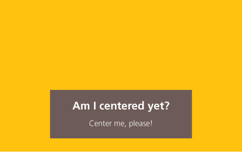
FIGURE 7.20 Using percentages in margin to refer to the viewport dimensions does not produce the expected results
Thankfully, if we are trying to center an element on the viewport, there is still hope. CSS Values and Units Level 3 (w3.org/TR/css-values-3/#viewport-relative-lengths) defined a family of new units, called viewport-relative lengths:
vw is relative to the viewport width. Contrary to many expectations, 1vw stands for 1% of the viewport width, not 100%.
Similarly to vw, 1vh represents 1% of the viewport height.
1vmin is equal to 1vw if the viewport width is smaller than the height, otherwise it is equal to 1vh.
1vmax is equal to 1vw if the viewport width is larger than the height, otherwise it is equal to 1vh.
In this case, what we need is vh for our margins:
Note that you can also use viewport-relative lengths to create full-screen sections with no scripting. For more details, see “Make full screen sections with 1 line of CSS” by Andrew Ckor (medium.com/@ckor/make-full-screen-sections-with-1-line-of-css-b82227c75cbd).
main {
    width: 18em;
    padding: 1em 1.5em;
    margin: 50vh auto 0;
    transform: translateY(-50%);
}
As you can see in Figure 7.21, this works flawlessly. Of course, the usefulness of this technique is severely limited due to the fact that it only works for vertically centering in the viewport.
PLAY! play.csssecrets.io/vertical-centering-vh
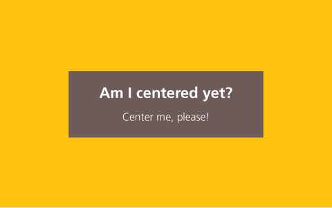
FIGURE 7.21 Using 50vh as the top margin solved our problem and now our box is vertically centered
The Flexbox solution
This is undoubtedly the best solution available, as Flexbox (w3.org/TR/css-flexbox) was designed precisely to help with issues like this. The only reason other solutions are still discussed is because other methods have better browser support, although these days browser support for Flexbox in modern browsers is very good.
All it takes is two declarations: display: flex on the parent of the centered element (the <body> element in our example) and our familiar margin: auto on the child to be centered (<main> in our example):
body {
    display: flex;
    min-height: 100vh;
    margin: 0;
}

main {
    margin: auto;
}
Note that when using Flexbox, margin: auto doesn’t only center the element horizontally, but vertically as well. Also note that we didn’t even have to set a width (though we could, if we wanted to): the assigned width is equivalent to max-content (remember the intrinsic sizing keywords from the “Intrinsic sizing” secret on page 262?).
If Flexbox is not supported, the result would look like our starting point in Figure 7.17 (if we set a width), which is perfectly acceptable, even if not vertically centered.
Another advantage of Flexbox is that it can be used to vertically center anonymous containers (i.e., text without any wrapper). For example, if our markup was the following:
HTML
<main>Center me, please!</main>
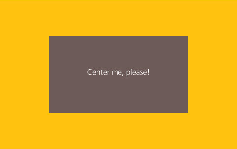
FIGURE 7.22 Using Flexbox to center anonymous text boxes
We could specify fixed dimensions to main and center the text inside it too, via the align-items and justify-content properties that Flexbox introduced (Figure 7.22):
We could have used the same properties on <body> to center the <main> element, but the margin: auto approach is more elegant and doubles as a fallback.
main {
    display: flex;
    align-items: center;
    justify-content: center;
    width: 18em;
    height: 10em;
}
PLAY! play.csssecrets.io/vertical-centering
41 Sticky footers
The problem
Specifically, the issue appears on pages whose content is shorter than the viewport height minus the footer height.
This is one of the oldest and most common problems in web design, so common that most of us have experienced it at one point or another. It can be summarized as follows: a footer with any block-level styling, such as a background or shadow, works fine when the content is sufficiently long, but breaks on shorter pages (such as error messages). The breakage in this case being that the footer does not “stick” at the bottom of the viewport like we would want it to, but at the bottom of the content.
It is not only its ubiquity that made it popular, but also how deceptively easy it looks at first. It’s a textbook case of the type of problem that requires significantly more time to solve than expected. In addition, this is still not a solved problem in CSS 2.1: almost all classic solutions require a fixed height for the footer, which is flimsy and rarely feasible. Furthermore, all of them are overly complicated, hacky, and have specific markup requirements. Back then, this was the best we could do, given the limitations of CSS 2.1. But can we do better with modern CSS, and if so, how?
If you’ve never had the pleasure of pulling your hair out and diving in the existing literature for this problem, here are a few popular links with existing, widely used solutions that have served many a web developer before CSS Level 3 specs were conceived:
The last two are the most minimal in the lot, but still have their own limitations.
Fixed height solution
We will work with an extremely bare-bones page with the following markup inside the <body> element:
HTML
<header>
    <h1>Site name</h1>
</header>
<main>
    <p>Bacon Ipsum dolor sit amet…
    <!-- Filler text from baconipsum.com --></p>
</main>
<footer>
    <p>© 2015 No rights reserved.</p>
    <p>Made with ♥ by an anonymous pastafarian.</p>
</footer>
We have also applied some basic styling to it, including a background on the footer. You can see how it looks in Figure 7.23. Now, let’s reduce the content a bit. You can see what happens then, in Figure 7.24. This is the sticky footer problem in all its glory! Great, we have recreated the problem, but how do we solve it?
If we assume that our footer text will never wrap, we can deduce a CSS length for its height:
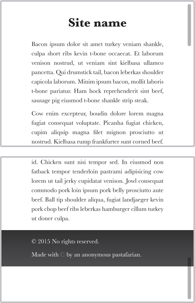
FIGURE 7.23 How our simple page looks when its content is sufficiently long
2 lines × line height + 3 × paragraph margin + vertical padding = 2 × 1.5em + 3 × 1em + 1em = 7em
Similarly, the header height is 2.5em. Therefore, by using viewport-relative units and calc(), we can “stick” our footer to the bottom with essentially one line of CSS:
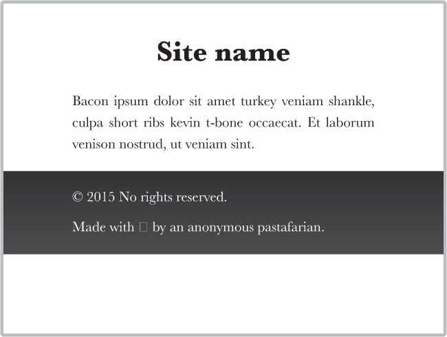
FIGURE 7.24 The sticky footer problem in all its glory
main {
    min-height: calc(100vh - 2.5em - 7em);
    /* Avoid padding/borders screwing up our height: */
    box-sizing: border-box;
}
Be careful when using calc() with subtraction or addition: the + and - operators require spaces around them. This very odd decision was made for future compatibility. If at some point keywords are allowed in calc(), the CSS parser needs to be able to distinguish between a hyphen in a keyword and a minus operator.
Alternatively, we could apply a wrapper around our <header> and <main> elements so that we only need to calculate the footer height:
#wrapper {
    min-height: calc(100vh - 7em);
}
This works (Figure 7.25) and it seems to be slightly better than the existing fixed height solutions, mainly due to its minimalism. However, except for very simple layouts, this is not practical at all. It requires us to assume that the footer text will never wrap, we need to edit the min-height every time we change the footer metrics (i.e., it is not DRY), and unless we’re willing to add a wrapper HTML element around our header and content, we need to do the same calculations and modifications for the header as well. Surely, in this day and age we can do better, right?
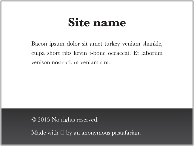
FIGURE 7.25 The footer after we’ve applied CSS to make it stick
PLAY! play.csssecrets.io/sticky-footer-fixed
Flexible solution
Flexbox is perfect for these kinds of problems. We can achieve perfect flexibility with only a few lines of CSS and there is no need for weird calculations or extra HTML elements. First, we need to apply display: flex to the <body> element, as it’s the parent of all three of our main blocks, to toggle Flexible Box Layout (Flexbox) for all three of them. We also need to set flex-flow to column, otherwise they will be all laid out horizontally on a single row (Figure 7.26):
body {
    display: flex;
    flex-flow: column;
}
FIGURE 7.26 Applying flex without applying anything else arranges the children of our element horizontally
At this point, our page looks about the same as it did before all the Flexbox stuff, as every element occupies the entire width of the viewport and its size is determined by its contents. Ergo, we haven’t really taken advantage of Flexbox yet.
To make the magic happen, we need to specify a min-height of 100vh on <body>, so that it occupies at least the entire height of the viewport. At this point, the layout still looks exactly like Figure 7.24, because even though we have specified a minimum height for the entire body element, the heights of each box are still determined by their contents (i.e., they are intrinsically determined, in CSS spec parlance).
What we need here is for the height of the header and footer to be intrinsically determined, but the height of the content should flexibly stretch to all the leftover space. We can do that by applying a flex value that is larger than 0 (1 will work) to the <main> container:
body {
    display: flex;
    flex-flow: column;
    min-height: 100vh;
}

main { flex: 1; }
TIP! The flex property is actually a shorthand of flex-grow, flex-shrink, and flex-basis. Any element with a flex value greater than 0 becomes flexible and flex controls the ratio between the dimensions of different flexible elements. For example, in our case, if <main> had flex: 2 and <footer> had flex: 1, the height of the footer would be twice the height of the content. Same if the values were 4 and 2 instead of 2 and 1, because it’s their relationship that matters.
That’s it, no more code required! The perfect sticky footer (same visual result as in Figure 7.25), with only four simple lines of code. Isn’t Flexbox beautiful?
PLAY! play.csssecrets.io/sticky-footer
Hat tip to Philip Walton (philipwalton.com) for coming up with this technique (philipwalton.github.io/solved-by-flexbox/demos/sticky-footer).