Table of Contents for
CSS Secrets
 CSS Secrets
Published by
O'Reilly Media, Inc., 2015
CSS Secrets
Published by
O'Reilly Media, Inc., 2015
- Cover Page
- CSS Secrets
- Title Page
- Copyright Page
- Dedication
- CSS Secrets
- Secrets by Specification
- Foreword
- Preface
- Words of thanks
- CSS Secrets
- Making of
- About this book
- Chapter 1. Introduction
- Chapter 2. Backgrounds & Borders
- Chapter 3. Shapes
- Chapter 4. Visual Effects
- Chapter 5. Typography
- Chapter 6. User Experience
- Chapter 7. Structure & Layout
- Chapter 8. Transitions & Animations
- Index
- Footnotes
6 User Experience
29 Picking the right cursor
The problem
The purpose of a mouse pointer is not just to display where the cursor is on the screen, but also to communicate which actions are possible to the user. This common UX practice in desktop applications often gets forgotten in web apps.
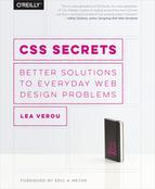
Authors are not the only ones to blame for this. Back in the days of CSS 2.1, we didn’t really have access to many built-in cursors. We mainly used the cursor property to indicate that something is clickable, with a pointer cursor, or sometimes to indicate tooltips with a help cursor. Some also utilized the wait or progress cursors instead of (or alongside) a loader. But that was about it. However, although in CSS User Interface Level 3 (w3.org/TR/css3-ui/#cursor) we got a boatload of new built-in cursors to utilize, most authors comfortably stayed in their old cursor habits. Like many UX improvements, you don’t really realize there is a problem, until you reach the solution. Let’s advance to that then!
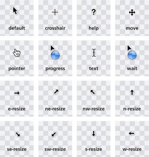
FIGURE 6.1 The set of built-in cursors in CSS 2.1 was rather limited (cursors shown as they’re displayed in OS X)
The solution
You can see the full list of new built-in cursors in Figure 6.2 and read about their purpose in the specification, but as you can imagine, not all of them are useful for most web apps. For example, there’s even a cell cursor, which “indicates that a cell or set of cells may be selected.” As you can imagine, there aren’t many use cases for that beyond spreadsheets and editable grids.
This secret is not aiming to be an exhaustive reference of the potential use cases of all these new cursors. However, a few of them stand out, as they can instantly improve the usability of a large number of web apps, with very little code.
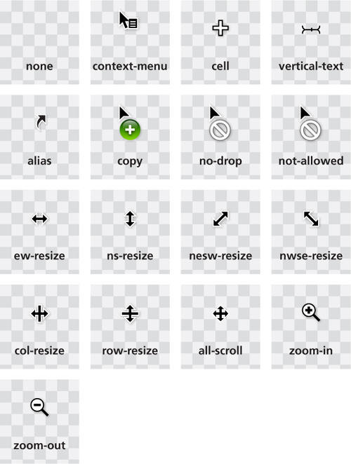
FIGURE 6.2 The new built-in cursors we got in CSS User Interface Level 3 (w3.org/TR/css3-ui/#cursor) (cursors shown as they’re displayed in OS X)
Indicating disabled state
Arguably, the most widely applicable addition is the not-allowed cursor (Figure 6.3). It’s incredibly useful to hint that interaction with a certain control is not possible for whatever reason — usually because said control is disabled. Especially these days, where most forms are extremely stylized, it can often be difficult to tell whether a form control is enabled or not, and this is a welcome aid. You could use it in a quite generic way, like so:
FIGURE 6.3 Using a not-allowed cursor to hint that a control is disabled
:disabled, [disabled], [aria-disabled="true"] {
    cursor: not-allowed;
}
 PLAY! play.csssecrets.io/disabled
Hiding the cursor
Hiding the cursor sounds like a usability nightmare, doesn’t it? Why on Earth would somebody want to do that and why would web standards make it easier for them? Before you get angry at all these people that clearly have some unresolved issues against usability, remember all those times when you used one of those awful public touchscreens (e.g., those used for information booths or in-flight entertainment) and the developers forgot to hide the mouse cursor, so there was one lingering on the screen in weird places. Or those times when you had to move your mouse to the right of the screen while watching a video, because your cursor was in the way.
Clearly, there are multiple use cases where hiding the cursor can actually improve usability. This is why one of the new cursor keywords is none. Hiding the cursor was possible in CSS 2.1, but it involved using a transparent 1×1 GIF, like so:
video {
    cursor: url(transparent.gif);
}
These days, we don’t need this, as we can just use cursor: none. However, you might still want to provide a fallback, for browsers that haven’t caught up with Level 3 cursors yet. We can easily do that with the cascade:
 If you hide the cursor over videos, make sure you don’t accidentally also hide it over playback controls as well, otherwise you will be causing more harm than good.
cursor: url('transparent.gif');
cursor: none;
30 Extending the clickable area
The problem
If you are interested in user experience, you have likely heard of Fitts’ Law. First proposed by American psychologist Paul Fitts in as early as 1954, Fitts’ law is the idea that the time required to rapidly move to a target area is a logarithmic function of the ratio between the distance to the target and the width of the target. Its most commonly used mathematical formulation is expressed as 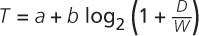 where T is the time taken, D is the distance to the center of the target, W is the width of the target, and a and b are constants.
TIP! See Fitts’ Law in action, via the interactive visualization at simonwallner.at/ext/fitts.
Although graphical user interfaces did not exist at the time, Fitts’ Law applies perfectly to pointing devices and has now become the most widely known HCI (Human-Computer Interaction) principle. This may sound surprising at first, but keep in mind that Fitts’ Law has more to do with human motor control than with specific hardware.
An obvious corollary is that the bigger the target, the easier it is to reach. Therefore, it often increases usability to extend the clickable area (hit area) around smaller controls that might otherwise be difficult to reach, if enlarging them is not an option. With the increasing popularity of touch screens, this has become even more important. Nobody wants to tap a dozen times trying to get that pesky little button and yet, this is still an everyday occurrence.
Other times, we want an element to slide in when we hover over a side of the window—for example, an auto-hiding header that slides from the top when the mouse is near, which also involves increasing its hit area (toward one direction only). Can we do this with plain CSS?
The solution
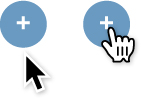
FIGURE 6.4 Our starting point in two states: with the cursor on the button (right) or further down (left)
Let’s assume we have a simple button like the one shown on Figure 6.4 and we want to increase its hit area by 10px in all four directions. We have already applied some simple styling to it, as well as cursor: pointer, which both provides an affordance* for mouse interaction, but also helps us test where the hit area actually is.
The easiest way to extend our hit area is a transparent solid border, as mouse interaction on borders triggers these mouse events on the element, unlike outlines and shadows. For example, extending an element’s hit area by 10px toward all directions is as simple as this:
border: 10px solid transparent;
However, as you can see in Figure 6.5, this is no good, as it also makes our button larger! The reason is that backgrounds extend underneath borders by default. Good ol’ background-clip can help constrain the background where it should be:
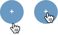
FIGURE 6.5 Oops! Extending our hit area with border also made our button larger
border: 10px solid transparent;
background-clip: padding-box;
As you can see in Figure 6.6, this works fine. Until you end up needing an actual border around the button and realize you’ve already used up the only one you get to extend the hit area. What happens then? Easy, you could emulate a (solid) border with an inset shadow (Figure 6.7):
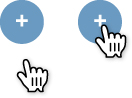
FIGURE 6.6 Getting our button size back to normal with background-clip
border: 10px solid transparent;
box-shadow: 0 0 0 1px rgba(0,0,0,.3) inset;
background-clip: padding-box;
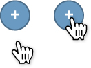
FIGURE 6.7 Using an inset box-shadow to emulate a border
PLAY! play.csssecrets.io/hit-area-border
Unlike borders, you don’t only get one box-shadow, so if you need more, you can just use a comma-separated list of shadows instead. However, if we combine inset and outset (non-inset) shadows, we get a very weird effect, because outset shadows are drawn outside the border box. For example, we might think of doing something like this to add an actual blurred shadow to make the button “pop out” of the page, which is another affordance for clicking:
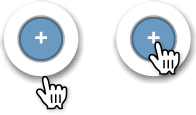
FIGURE 6.8 Adding an actual shadow as well doesn’t work well with this solution
box-shadow: 0 0 0 1px rgba(0,0,0,.3) inset,
            0 .1em .2em -.05em rgba(0,0,0,.5);
However, if we try that, we see that the result is very different from what we might expect (Figure 6.8). This solution is not perfect for other reasons too. Borders affect layout, and that might be out of the question in certain cases. What do we do then? We remove the border and take advantage of the fact that pseudo-elements also capture mouse interaction for their parent element.
We can then overlay a transparent pseudo-element on our button that is 10px larger on every direction:
button {
    position: relative;
    /* [rest of styling] */
}

button::before {
    content: '';
    position: absolute;
    top: -10px; right: -10px;
    bottom: -10px; left: -10px;
}
This just works, and as long as we don’t need both pseudo-elements, it doesn’t really interfere with anything. The pseudo-element solution is incredibly flexible—we could basically make the hit area be any size, place, or shape we want, even completely disconnected from the element itself!
PLAY! play.csssecrets.io/hit-area
31 Custom checkboxes
The problem
Designers always wanted more control over every element in a web page. When a graphic designer with limited CSS experience is tasked to create a website mockup, they almost always produce one with customized form elements, making the developer tasked to convert it to CSS want to pull their hair out.
For readability, we will refer to “checkboxes” throughout this secret, but everything discussed applies to both checkboxes and radio buttons unless otherwise noted.
When CSS was first introduced, form styling was extremely limited and is still not clearly defined in any of the various CSS specifications. However, browsers got more and more permissive over the years about what CSS properties they allow on form controls, enabling us to style most of them quite extensively.
Unfortunately, checkboxes and radio buttons are not among those form controls. To this day, most browsers allow little to no styling when it comes to them. As a result, authors end up either coming to terms with their default look or employing awful, inaccessible hacks, such as recreating them with divs and JS.
Is there a way to get around these restrictions and customize the look of our checkboxes, without bloat and without giving up on semantics and accessibility?
The solution
Until a few years ago, this task was impossible without scripting. However, in Selectors Level 3 (w3.org/TR/css3-selectors), we got a new pseudo-class: :checked. This pseudo-class only matches when the checkbox is checked, whether that is done through user interaction, or through script.
It’s not very useful when applied directly to checkboxes, as — like we previously mentioned — there aren’t many properties we can successfully apply to them. However, we can always use combinators to style other elements based on a checkbox state.
TIP! Wondering what the difference is between :checked and the attribute selector [checked]? The latter doesn’t update based on user interaction, as user interaction doesn’t affect the HTML attribute.
You might be wondering what other elements we may want to style based on whether a checkbox is checked or not. Well, there is one kind of element that has special behavior around checkboxes: <label>s. A <label> that is associated with a checkbox also acts as a toggle for it.
Because labels—unlike checkboxes—are not replaced elements,* we can add generated content to them and style that based on checkbox state. Then, we could hide the real checkbox in a way that doesn’t remove it from the tabbing order, and have the generated content act as a styled checkbox instead!
Let’s see this in action. We will start from the following simple markup:
HTML
<input type="checkbox" id="awesome" />
<label for="awesome">Awesome!</label>
Nesting the checkbox in the label would free us from using ids, but then we wouldn’t be able to target the label based on the checkbox status, because we do not yet have parent selectors.
The next step is to generate a pseudo-element that will be used as our styled checkbox, and apply some basic styling to it:
input[type="checkbox"] + label::before {
    content: '\a0'; /* non-break space */
    display: inline-block;
    vertical-align: .2em;
    width: .8em;
    height: .8em;
    margin-right: .2em;
    border-radius: .2em;
    background: silver;
    text-indent: .15em;
    line-height: .65;
}
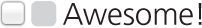
FIGURE 6.9 Our rudimentary custom checkbox alongside the original checkbox
The style we will apply to our checkboxes in these examples is pretty basic, but the possibilities are endless. You could even skip CSS styling altogether and use images for all different checkbox states!
You can see how our checkbox and label currently look in Figure 6.9. The original checkbox is still visible, but we will hide it later. Now we need to apply a different style to our checkbox when it’s checked. This could be as simple as applying a different color and adding a checkmark as content:
input[type="checkbox"]:checked + label::before {
    content: '\2713';
    background: yellowgreen;
}
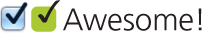
FIGURE 6.10 Styling our pseudo-element as a customized checked checkbox
As you can see in Figure 6.10, this is already functioning as a rudimentary styled checkbox. Now, we need to hide the original checkbox in an accessible way, which means we can’t use display: none, as that would remove it from the keyboard tabbing order entirely. Instead, we could use something like this:
Be careful when using such permissive selectors. Using input[type="checkbox"] will also hide checkboxes without a label after them (e.g., those nested in a label), essentially making them unusable.
input[type="checkbox"] {
    position: absolute;
    clip: rect(0,0,0,0);
}
That’s it, we’ve made a very basic custom checkbox! We could of course improve it further—for example, by changing its style when it’s focused or disabled, which you can see in Figure 6.11:
input[type="checkbox"]:focus + label::before {
    box-shadow: 0 0 .1em .1em #58a;
}

input[type="checkbox"]:disabled + label::before {
    background: gray;
    box-shadow: none;
    color: #555;
}
You could even make these effects smoother by applying transitions or animations or go nuts and create things like skeuomorphic switches. The possibilities really are endless!
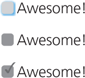
FIGURE 6.11 Top to bottom: customized focused checkbox, customized disabled checkbox, and checked checkbox
Although the possibilities are endless, avoid styling checkboxes as circles: most users associate round toggles with radio buttons. Same applies to square radio buttons.
PLAY! play.csssecrets.io/checkboxes

Hat tip to Ryan Seddon for coming up with the first version of this effect, now known as “the checkbox hack” (thecssninja.com/css/custominputs-using-css). Ryan has since used this idea to implement all sorts of widgets that require state persistence (labs.thecssninja.com/bootleg), such as modal dialogs, dropdown menus, tabs, and carousels, though abusing checkboxes this much results in accessibility problems.
Toggle buttons
You could use a variation of “the checkbox hack” to emulate toggle buttons, as HTML does not provide a native way to create them. Toggle buttons are push buttons that act like checkboxes: they are used to toggle a setting on or off, and look pressed when checked and unpressed when unchecked. Semantically, there is no real difference between toggle buttons and checkboxes, so you can both use this trick and maintain semantic purity.
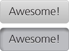
FIGURE 6.12 A toggle button in both its states
To create toggle buttons with this trick, you would just style the labels as buttons, instead of using pseudo-elements. For example, to create the toggle buttons shown in Figure 6.12, the code would look like this:
input[type="checkbox"] {
    position: absolute;
    clip: rect(0,0,0,0);
}

input[type="checkbox"] + label {
    display: inline-block;
    padding: .3em .5em;
    background: #ccc;
    background-image: linear-gradient(#ddd, #bbb);
    border: 1px solid rgba(0,0,0,.2);
    border-radius: .3em;
    box-shadow: 0 1px white inset;
    text-align: center;
    text-shadow: 0 1px 1px white;
}

input[type="checkbox"]:checked + label,
input[type="checkbox"]:active + label {
    box-shadow: .05em .1em .2em rgba(0,0,0,.6) inset;
    border-color: rgba(0,0,0,.3);
    background: #bbb;
}
However, be wary about using toggle buttons. In most cases, toggle buttons hinder usability as they can easily be confused with regular buttons that perform an action when pressed.
PLAY! play.csssecrets.io/toggle-buttons
32 De-emphasize by dimming
The problem
Quite often, we need to dim everything behind an element through a semitransparent dark overlay, to emphasize and draw user attention to a certain UI element. For example, lightboxes (Figure 6.13) and interface “quick tours” often benefit from this effect. The most common technique to do this is to add an extra HTML element for the dimming and apply some CSS that looks like this:
.overlay { /* For dimming */
    position: fixed;
    top: 0;
    right: 0;
    bottom: 0;
    left: 0;
    background: rgba(0,0,0,.8);
}

.lightbox { /* The element to draw attention to */
    position: absolute;
    z-index: 1;
    /* [rest of styling] */
}
The overlay is responsible for dimming everything behind the element we want to draw attention to. The .lightbox then gets a higher z-index to be drawn above the overlay. All this is fine and dandy, but it requires an extra HTML element, which means the effect cannot be applied with CSS alone. This is not a major problem, but it’s an inconvenience that we’d rather avoid, if possible. Thankfully, in most cases we can.

FIGURE 6.13 Twitter is using this effect for its popup dialogs
Pseudo-element solution
We can use pseudoelements to eliminate the need for an extra HTML element, like so:
body.dimmed::before {
    position: fixed;
    top: 0;
    right: 0;
    bottom: 0;
    left: 0;
    z-index: 1;
    background: rgba(0,0,0,.8);
}
This is a slightly better solution, as it means we can now apply this effect directly from CSS. However, the problem is that it’s not very portable, as the <body> element might already have something else applied on its ::before pseudo-element. Also, it means that to apply this effect we usually need some sort of JavaScript to apply the dimmed class.
We could solve this by applying the overlay on the element’s own ::before pseudo-element and giving it a z-index: -1; so that it’s underneath our element. Although this solves the portability issue, it doesn’t give us very fine-grained control over the overlay’s Z axis placement. It might end up being underneath our element (which is desirable) or underneath our element and several of its ancestors.
Another issue with this is that pseudo-elements cannot have their own JavaScript event handlers. When using a separate element for an overlay, we could assign event handlers to it so that — for example — the lightbox closes when the user clicks on the overlay. When using pseudoelements on the same element we want to highlight, it becomes trickier to detect whether the user clicked on the overlay or the element.
box-shadow solution
The pseudo-element solution is more flexible and usually fits what most people expect from an overlay. However, for simpler use cases or prototyping, we can take advantage of the fact that a box-shadow’s spread radius enlarges it by the amount you specify on every side. This means we can create an extremely large shadow with zero offsets and zero blur, to emulate an overlay the quick-and-dirty way:
box-shadow: 0 0 0 999px rgba(0,0,0,.8);
One obvious problem with this first pass solution is that it won’t work with very large resolutions (> 2000px). We can mitigate this either by using a larger number, or solve it completely by using viewport units, so that we can be sure that the “overlay” is always larger than our viewport. Because we can’t use different horizontal and vertical spread radius values, the viewport unit that makes the most sense to use is vmax. In case you’re not familiar with the vmax unit, 1vmax is equivalent to either 1vw or 1vh, whichever is larger. 100vw is equal to the viewport’s width and, similarly, 100vh is equivalent to its height. Therefore, the minimum value that covers our needs is 50vmax, as it will be added on each side, so our overlay’s final dimensions will be 100vmax + our element’s dimensions:
box-shadow: 0 0 0 50vmax rgba(0,0,0,.8);
This technique is very quick and easy to apply, but it has two rather serious issues that limit its usefulness. Can you spot them?
First, because the dimensions of our element are viewport related and not page related, we will see the boundaries of the overlay when we scroll, unless the element has position: fixed; or the page isn’t long enough for scrolling. Furthermore, because pages can be really long, it wouldn’t be wise to attempt to overcome this by just increasing the spread radius even more. Instead, I’d recommend limiting your use of this technique to elements with fixed positioning or pages with minimal to no scrolling.
Second, using a separate element (or a pseudo-element) as the overlay doesn’t only visually guide the user’s focus to the element we want. It also prevents them from using the mouse to interact with the rest of the page, because it captures pointer events. A box-shadow does not have this property. Therefore, it only visually helps draw the user’s attention to a particular element, but it will not capture any mouse interaction by itself. Whether this is acceptable or not depends on your specific use case.
PLAY! play.csssecrets.io/dimming-box-shadow
backdrop solution
If the element you want to bring into focus is a modal <dialog> (a <dialog> element displayed via its showModal() method), it already has an overlay, via the User Agent stylesheet. This native overlay can also be styled via the ::backdrop pseudo-element, for example, to make it darker:

dialog::backdrop {
  background: rgba(0, 0, 0, .8);
}
The only caveat of this method is that at the time of writing, browser support for it is very limited, so make sure to check its current status before using it. Keep in mind, however, that even if it’s not supported, nothing will break if a dialog has no overlay because it’s just a UX improvement.
PLAY! play.csssecrets.io/native-modal
33 De-emphasize by blurring
The problem
In the “De-emphasize by dimming” secret on page 234, we saw a way to de-emphasize parts of a web app by dimming them, through a semi-transparent black overlay. However, when there is a lot going on the page, we need to dim it quite a lot to provide sufficient contrast for text to appear on it, or to draw attention to a lightbox or other element. A more elegant way, shown in Figure 6.14, is to blur everything else in addition to (or instead of) dimming it. This is also more realistic, as it creates depth by mimicking how our vision treats objects that are physically closer to us when we are focusing on them.
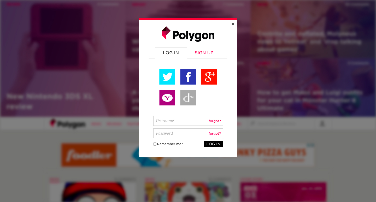
FIGURE 6.14 The gaming website polygon.com features an excellent example of drawing user attention to a dialog box by blurring everything else behind it
However, this is a far more difficult effect to achieve. Until Filter Effects (w3.org/TR/filter-effects), it was impossible, but even with the blur() filter, it is quite difficult. What do we apply the blur filter to, if we want to apply it to everything except a certain element? If we apply it to the <body> element, everything in the page will be blurred, including the element we want to draw attention to. It’s very similar to the problem we addressed in the “Frosted glass effect” secret on page 146, but we cannot apply the same solution here, as anything could be behind our dialog box, not just a background image. What do we do?
The solution
Unfortunately, we will need an extra HTML element for this effect: we will need to wrap everything in our page except the elements that shouldn’t be blurred in a wrapper element, so that we can apply the blurring to it. The <main> element is perfect for this, because it serves a double purpose: it both marks up the main content of the page (dialogs aren’t usually main content) and gives us the styling hook we need. The markup could look like this:
HTML
<main>Bacon Ipsum dolor sit amet…</main>
<dialog>

    O HAI, I'm a dialog. Click on me to dismiss.
</dialog>
<!-- any other dialogs go here too -->
We assume that all <dialog> elements will be initially hidden and at most one of them will be visible at any time.
You can see how this looks with no overlay in Figure 6.15. Then, we need to apply a class to the <main> element every time we make a dialog appear and apply the blur filter then, like so:
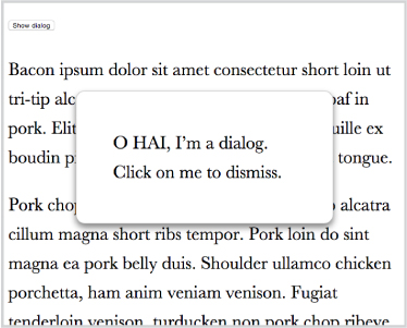
FIGURE 6.15 A plain dialog with no overlay to de-emphasize the rest of the page
main.de-emphasized {
    filter: blur(5px);
}
As you can see in Figure 6.16, this already is a huge improvement. However, right now the blurring is applied immediately, which doesn’t look very natural and feels like rather awkward UX. Because CSS filters are animatable, we can instead smoothly transition to the blurred page:
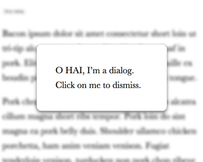
FIGURE 6.16 Blurring the <main> element when the dialog is visible
main {
    transition: .6s filter;
}

main.de-emphasized {
    filter: blur(5px);
}
It’s often a good idea to combine the two de-emphasizing effects (dimming and blurring). One way to do this is using the brightness() and/or contrast() filters:
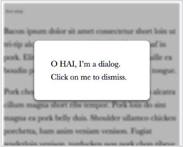
FIGURE 6.17 Applying both blurring and dimming, both via CSS filters
main.de-emphasized {
    filter: blur(3px) contrast(.8) brightness(.8);
}
You can see the result in Figure 6.17. Dimming via CSS filters means that if they are not supported, there is no fallback. It might be a better idea to perform the dimming via some other method, which can also serve as a fallback (e.g., the box-shadow method we saw in the previous secret). This would also save us from the “halo effect” you can see on the edges of Figure 6.17. Notice how in Figure 6.18 where we used a shadow for the dimming, this issue is gone.
PLAY! play.csssecrets.io/deemphasizing-blur
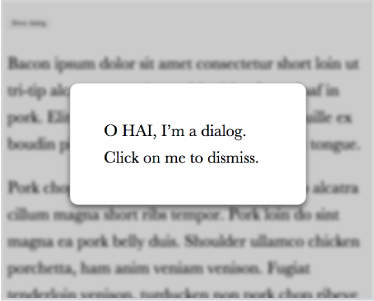
FIGURE 6.18 Applying blurring via CSS filters and dimming via a box-shadow, which also serves as a fallback
Hat tip to Hakim El Hattab (hakim.se) for coming up with a similar effect (lab.hakim.se/avgrund). In addition, in Hakim’s version of the effect, the content also becomes smaller via a scale() transform, to further enhance the illusion that the dialog is getting physically closer to us.
34 Scrolling hints
The problem
Scrollbars are the primary control to indicate that there is more content in an element than meets the eye. However, they are often clunky and visually distracting, so modern operating systems have started to streamline them, often hiding them completely until the user is actually interacting with the scrollable element.
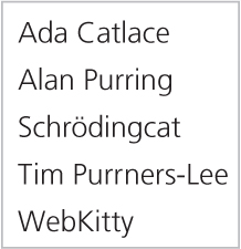
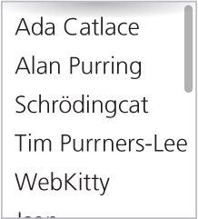
FIGURE 6.19 This box has more content and is scrollable, but unless you interact with it, you won’t know
While scrollbars are rarely used to control scrolling these days (users tend to scroll via gestures instead), indicating that there is more content in an element than what meets the eye is very useful information that is helpful to convey in a subtle way, even for elements the user is not currently interacting with.
The UX designers working on Google Reader, a (now discontinued) feed reader by Google, found a very elegant way to indicate this: when there was more content, a subtle shadow was displayed on the top and/or bottom side of the sidebar (Figure 6.20).

FIGURE 6.20 Google Reader’s elegant UX pattern to indicate that scrolling is needed to view the full contents of the sidebar
Left: Scrolled all the way up
Middle: Scrolled to the middle of the feed list
Right: Scrolled all the way to the bottom
However, to achieve this effect in Google Reader, quite a bit of scripting was used. Was that really needed, or can we achieve the same effect with CSS?
The solution
Let’s first start with some simple markup, a plain unordered list with some placeholder content (geeky cat names!):
HTML
<ul>
    <li>Ada Catlace</li>
    <li>Alan Purring</li>
    <li>Schrödingcat</li>
    <li>Tim Purrners-Lee</li>
    <li>WebKitty</li>
    <li>Json</li>
    <li>Void</li>
    <li>Neko</li>
    <li>NaN</li>
    <li>Cat5</li>
    <li>Vector</li>
</ul>
We can then apply some basic styling to the <ul> to make it smaller than its contents and scrollable:
overflow: auto;
width: 10em;
height: 8em;
padding: .3em .5em;
border: 1px solid silver;
This is where things start to get interesting. Let’s apply a shadow at the top, with a radial gradient:
background: radial-gradient(at top, rgba(0,0,0,.2),
                           transparent 70%) no-repeat;
background-size: 100% 15px;
You can see the result in Figure 6.21. Currently it stays in the same place when we scroll. This is on par with how background images work by default: their position is fixed relative to the element, regardless of how far the element is scrolled. This also applies to images with background-attachment: fixed. Their only difference is that they also stay in place when the page itself scrolls. Is there any way to get a background image to scroll with an element’s contents?
Until a few years ago, this simple thing was impossible. However, the problem was pretty obvious and a new background-attachment keyword was added in Backgrounds & Borders Level 3 (w3.org/TR/css3-background/#local0) to address it: local.
However, background-attachment: local doesn’t solve our use case out of the box. If we apply it to our shadow gradient, it gives us the exact opposite result: we get a shadow when we scroll all the way to the top, but when we scroll down, the shadow disappears. It is a start, though—we’re starting to get somewhere.
The trick is to use two backgrounds: one for the shadow, and one that is basically a white rectangle to cover the shadow, acting as a mask. The background that generates the shadow will have the default background-attachment (scroll), because we want it to stay in place at all times. However, we will give the masking background a background-attachment of local, so that it covers the shadow when we are scrolled all the way up, but scrolls with the contents when we scroll down, thus revealing the shadow.
We will use a linear gradient to create the masking rectangle, with the same color as the element’s background (in our case, white):
background: linear-gradient(white, white),
            radial-gradient(at top, rgba(0,0,0,.2),
                            transparent 70%);
background-repeat: no-repeat;
background-size: 100% 15px;
background-attachment: local, scroll;
You can see how this looks in different stages of scrolling in Figure 6.22. You may notice that this seems to produce the desired effect, but it has one significant drawback: when we are only slightly scrolled, the way the shadow is revealed is very choppy and awkward. Is there any way to make it smoother?
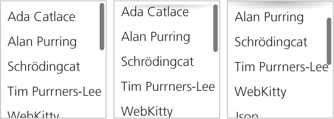
FIGURE 6.22 Our two backgrounds in different stages of scrolling
Left: Scrolled all the way to the top
Middle: Slightly scrolled down
Right: Scrolled down significantly
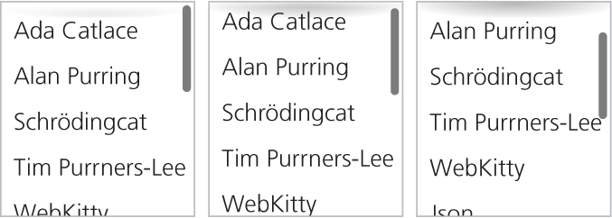
FIGURE 6.23 Using a gradient of white to transparent as a first attempt to fade the shadow in smoothly
We can take advantage of the fact that our “mask” is a (degenerate) linear gradient and convert it to a real gradient from white to transparent white (hsla(0,0%,100%,0) or rgba(255,255,255,0)), so that it smoothly reveals our shadow:
Why transparent white and not just transparent? The latter is actually an alias of rgba(0,0,0,0), so the gradient might include shades of gray as it transitions from opaque white to transparent black. If brows-ers are interpolating colors in what is called a premultiplied RGBA space per the specification, this shouldn’t happen. Different interpolation algorithms are outside the scope of this book, but there is a lot of material on this online.
background: linear-gradient(white, hsla(0,0%,100%,0)),
            radial-gradient(at top, rgba(0,0,0,.2),
                            transparent 70%);
This is a step in the right direction. As you can see in Figure 6.23, it does progressively reveal the shadow, like we wanted. However, it currently has a pretty serious flaw: it no longer completely obscures the shadow when we are scrolled all the way to the top. We can fix this by moving the white color stop a little lower down (15px to be precise, equal to our shadow height), so that we get an area of solid white before the fading starts. Furthermore, we need to increase the size of the “mask” to be larger than the shadow, otherwise we would get no gradient. The exact height depends on how smooth we want the effect to be (i.e., how quickly should shadow be revealed when we scroll?). After some experimentation, it seems that 50px is a reasonable value. The final code looks as follows, and you can see the result in Figure 6.24:
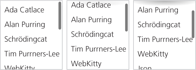
background: linear-gradient(white 30%, transparent),
            radial-gradient(at 50% 0, rgba(0,0,0,.2),
                            transparent 70%);
background-repeat: no-repeat;
background-size: 100% 50px, 100% 15px;
background-attachment: local, scroll;
Of course, to achieve the original effect, we need two more gradients for the bottom shadow and its mask, but the logic is exactly the same, so this can be left as an exercise for the reader (or check out the following Play! example for the solution).
PLAY! play.csssecrets.io/scrolling-hints
Hat tip to Roman Komarov for coming up with an early version of this effect (kizu.ru/en/fun/shadowscroll). His version used pseudoelements and positioning instead of background images, and might be an interesting alternative for certain use cases.
35 Interactive image comparison
The problem
Sometimes the need arises to showcase the visual differences between two images, usually as a before-and-after comparison. For example, demonstrating the effects of photo manipulation in a portfolio, the results of certain beauty treatments in a beautician’s website or the visible results of a catastrophic event in a geographical area.
The most common solution would be to just place the images side by side. However, this way the human eye only notices very conspicuous differences and misses the smaller ones. This is fine if the comparison is unimportant or the differences are large, but in all other cases, we need something more helpful.
There are many solutions to this problem from a UX perspective. A common solution is to show both images in the same place in quick succession, through an animated GIF or a CSS animation. This is much better than showing the images next to each other, but it’s time consuming for the user to notice all the differences as they have to wait for several iterations, fixating their eyes at a different area of the images every time.
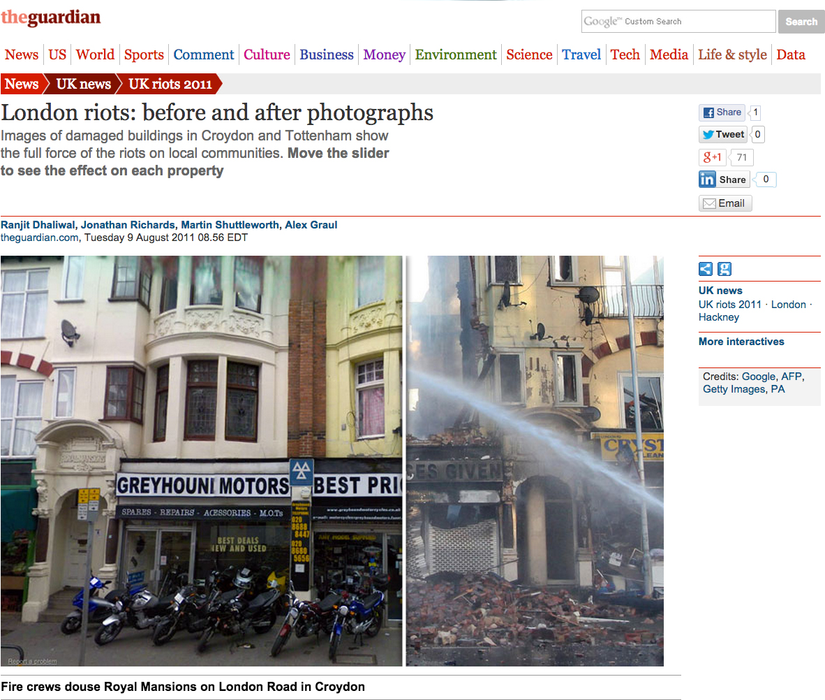
FIGURE 6.25 An example of an interactive image comparison widget, enabling users to compare the catastrophic results of the 2011 London riots, from major UK news outlet The Guardian. The user is supposed to drag the white bar separating the two images, but there is no affordance to indicate the bar is draggable, which is why the help text (“Move the slider…”) was needed. Ideally, a good, learnable, interface doesn’t need help text.
Source: theguardian.com/uk/interactive/2011/aug/09/london-riots-before-after-photographs
A solution that is much more usable is what is known as an “image comparison slider.” This control superimposes both images and lets the user drag the divisor to reveal one or the other. Of course, such a control does not actually exist in HTML. We have to emulate it via the elements we do have, and there have been many such implementations over the years, usually requiring JavaScript frameworks and a boatload of JS code.
Is there a simpler way to implement such a control? Actually, there are two!
In some variations, the user just moves the mouse instead of dragging. This has the benefit of being easier to notice and use, but the experience can be quite irritating.
CSS resize solution
If we think about it, an image comparison slider basically includes an image and a horizontally resizable element that progressively reveals another image. This is where the JavaScript frameworks usually come in: to make the top image horizontally resizable. However, we don’t really need scripting to make an element resizable. In CSS User Interface Level 3 (w3.org/TR/css3-ui/#resize), we got a property for that: the humble resize!
It’s usually a good idea to apply resize: vertical to <textarea>s to maintain resizability but disable horizontal resizing, which usually breaks layouts.
Even if you’ve never heard of this property, you’ve probably experienced its behavior as it’s set to both by default on <textarea>s, which makes them resizable in both directions. However, it can actually be set on any element, as long as its overflow property is not visible. In almost every element resize is set to none by default, which disables resizing. Besides both, it also accepts the values horizontal and vertical, which restrict the direction of the resizing.
Once object-fit and object-position gain more widespread browser support, this won’t be an issue, as we’ll be able to control how images scale in the same way as we’re able to control background image scaling.
This might make one wonder: could we perhaps use this property to implement our image slider? We can’t know until we give it a shot!
Our first thought might be to just include two <img> elements. However, applying resize directly to an <img> would look awful, as resizing an image directly distorts it. It makes more sense to apply it to a container <div>. Therefore, we end up with markup like the following:
HTML
<div class="image-slider">
    <div>
        <img src="adamcatlace-before.jpg" alt="Before" />
    </div>
    <img src="adamcatlace-after.jpg" alt="After" />
</div>
Then we need to apply some basic CSS for positioning and dimensions:
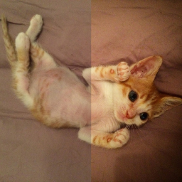
FIGURE 6.26 After some basic styling, this is already starting to resemble an image slider, but we can’t change the width of the top image yet
.image-slider {
    position:relative;
    display: inline-block;
}

.image-slider > div {
    position: absolute;
    top: 0; bottom: 0; left: 0;
    width: 50%; /* Initial width */
    overflow: hidden; /* Make it clip the image */
}
.image-slider img { display: block; }
Right now the result looks like Figure 6.26 but is still static. If we manually change the width, we can see it going through all stages that a user would resize it to. To make the width change dynamically with user interaction, through the resize property, we need two more declarations:
.image-slider > div {
    position: absolute;
    top: 0; bottom: 0; left: 0;
    width: 50%;
    overflow: hidden;
    resize: horizontal;
}
The only visual change is that a resize handler now appears at the bottom-right corner of the before image (Figure 6.27), but we can now drag it and resize it to our heart’s content! However, playing with our widget a little reveals a few weaknesses:
We can resize the <div> past the width of the images.
The resize handler is difficult to spot.

FIGURE 6.27 Our image slider now actually functions like an image slider, but still has a few issues
The first issue is very easy to solve. All we need is to specify a max-width of 100%. However, the second issue is a bit more complicated. Unfortunately, there is still no standard way to style the resize handler. Some rendering engines support proprietary pseudoelements (such as ::-webkitresizer) for this, but their results are limited, both in terms of browser support, as well as styling flexibility. However, hope is not lost: it turns out that overlaying a pseudo-element on the resize handle doesn’t interfere with its function, even without pointer-events: none. So, a cross-browser solution to style the resize handler would be to just …overlay another on top of it. Let’s do that:
.image-slider > div::before {
    content: '';
    position: absolute;
    bottom: 0; right: 0;
    width: 12px; height: 12px;
    background: white;
    cursor: ew-resize;
}
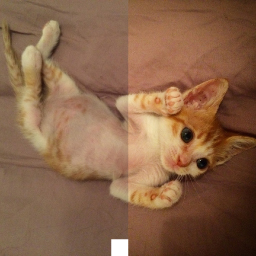
FIGURE 6.28 Styling the resize handler as a white square, by overlaying a pseudo-element on it
Note the cursor: ew-resize declaration: this adds an extra affordance, as it hints to the user that they can use this area as a resize handler. However, we should not depend on cursor changes as our only affordance, because they are only visible when the user is already interacting with a control.
Right now, our resize handler will appear as a white square (see Figure 6.28). At this point, we can go ahead and style it to our liking. For example, to make it a white triangle with 5px spacing from the sides of the image (Figure 6.29), we could write:
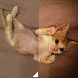
FIGURE 6.29 Styling the fake resizer pseudo-element as a triangle with 5px spacing from the edges of the image
padding: 5px;
background:
    linear-gradient(-45deg, white 50%, transparent 0);
background-clip: content-box;
As an additional improvement, we could apply user-select: none to both images, so that failing to grab the resize handler would not result in them pointlessly being selected. To sum up, the full code would look like this:
.image-slider {
    position:relative;
    display: inline-block;
}
.image-slider > div {
    position: absolute;
    top: 0; bottom: 0; left: 0;
    width: 50%;
    max-width: 100%;
    overflow: hidden;
    resize: horizontal;
}

.image-slider > div::before {
    content: '';
    position: absolute;
    bottom: 0; right: 0;
    width: 12px; height: 12px;
    padding: 5px;
    background:
        linear-gradient(-45deg, white 50%, transparent 0);
    background-clip: content-box;
    cursor: ew-resize;
}

.image-slider img {
    display: block;
    user-select: none;
}
PLAY! play.csssecrets.io/image-slider
Range input solution
The CSS resize method described in the previous section works great and involves very little code. However, it has a few shortcomings:
It’s not keyboard accessible.
Dragging is the only way to resize the top image, which can be tedious for large images or motor-impaired users. Being able to also click to a point and have the image resize to that point offers a much better experience.
The user can only resize the top image from its bottom-right corner, which might be hard to notice, even if we style it in the way previously described.
If we are willing to use a little scripting, we could use a slider control (HTML range input) overlaid on top of the images to control the resizing, which solves all three issues. Because we’re using JS anyway, we can add all extra elements via scripting, so we can start with the cleanest possible markup:
HTML
<div class="image-slider">
    <img src="adamcatlace-before.jpg" alt="Before" />
    <img src="adamcatlace-after.jpg" alt="After" />
</div>
Then, our JS code will convert it to the following, and add an event on the slider so that it also sets the div’s width:
HTML
<div class="image-slider">
    <div>
        <img src="adamcatlace-before.jpg" alt="Before" />
    </div>
    <img src="adamcatlace-after.jpg" alt="After" />
    <input type="range" />
</div>
The JavaScript code is fairly straightforward:
JS
$$('.image-slider').forEach(function(slider) {
    // Create the extra div and
    // wrap it around the first image
    var div = document.createElement('div');
    var img = slider.querySelector('img');
    slider.insertBefore(img, div);
    div.appendChild(img);

    // Create the slider
    var range = document.createElement('input');
    range.type = 'range';
    range.oninput = function() {
        div.style.width = this.value + '%';
    };
    slider.appendChild(range);
});
The CSS we will use as a starting point is basically the same as in the previous solution. We will only delete the parts we no longer need:
We don’t need the resize property.
We don’t need the .image-slider > div::before rule, because we no longer have a resizer.
We don’t need max-width because the slider will control that.
Here’s how our CSS code will look after these modifications:
.image-slider {
    position:relative;
    display: inline-block;
}

.image-slider > div {
    position: absolute;
    top: 0; bottom: 0; left: 0;
    width: 50%;
    overflow: hidden;
}

.image-slider img {
    display: block;
    user-select: none;
}
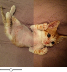
FIGURE 6.30 Our control now works, but we still need to style that range input
If we test this code now, you will see that it already works, but it looks awful: there’s a range input just randomly placed under our images (Figure 6.30). We need to apply some CSS to position it on top of them, and make it as wide as they are:
.image-slider input {
    position: absolute;
    left: 0;
    bottom: 10px;
    width: 100%;
    margin: 0;
}
TIP! Use input:in-range instead of just input to only style the range input if range inputs are supported. Then you could use the cascade to hide it or style it differently in older browsers.
As you can see in Figure 6.31, this already looks decent. There are several proprietary pseudoelements to style range inputs exactly how we want them. These include ::-moz-range-track, ::-ms-track, ::-webkit-slider-thumb, ::-moz-range-thumb, and ::-ms-thumb. Like most proprietary features, their results are inconsistent, flimsy, and unpredictable, so I would recommend against using them, unless you really have to. You’ve been warned.
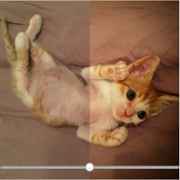
FIGURE 6.31 Our range input styled to be overlaid on the images
However, if we just want to visually unify the range input with the control a bit more, we could use a blending mode and/or a filter. The blending modes multiply, screen, or luminosity seem to produce good results. Also, filter: contrast(4) would make the slider black and white and a contrast value lower than 1 would make it more gray. The possibilities are endless, and there’s no universally optimal choice here. You could even combine blending modes and filters, like so:
filter: contrast(.5);
mix-blend-mode: luminosity;
We could also increase the area the user can use for resizing to make it a more pleasant experience (per Fitts’ Law), by reducing the width and making up the difference with CSS transforms:
width: 50%;
transform: scale(2);
transform-origin: left bottom;
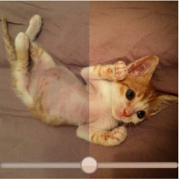
FIGURE 6.32 Using blending modes and filters to visually unify the range input with our control and CSS transforms to make it larger
You can see the result of both treatments in Figure 6.32. Another benefit of this approach—albeit a transient one—is that range inputs currently have better browser support than the resize property.
Hat tip to Dudley Storey for coming up with the first version of this solution (demosthenes.info/blog/819/A-Before-And-After-Image-Comparison-Slide-Control-in-HTML5).