Table of Contents for
Learning React Native, 2nd Edition
 Learning React Native, 2nd Edition
Published by
O'Reilly Media, Inc., 2017
Learning React Native, 2nd Edition
Published by
O'Reilly Media, Inc., 2017
- nav
- Cover
- Learning React Native
- Learning React Native
- Preface
- 1. What Is React Native?
- 2. Working with React Native
- 3. Building Your First Application
- 4. Components for Mobile
- 5. Styles
- 6. Platform APIs
- 7. Modules and Native Code
- 8. Platform-Specific Code
- 9. Debugging and Developer Tools
- 10. Navigation and Structure in Larger Applications
- 11. State Management in Larger Applications
- Conclusion
- A. Modern JavaScript Syntax
- B. Deploying Your Application
- C. Working with Expo Applications
- Index
- About the Author
- Colophon
Chapter 10. Navigation and Structure in Larger Applications
Now that we’ve covered many of the pieces you need to build your own React Native applications, let’s put everything together. Up until now, we’ve mostly dealt with small examples. In this chapter, we’ll look at the structure of a larger application. We’ll cover how to use the <StackNavigation> component from react-navigation to handle transitions between different screens in an application.
The example application from this chapter will also be used in Chapter 11, where we’ll look at how to integrate the state management library Redux into our application.
The Flashcard Application
In this chapter, we’re going to be building a flashcard application that allows users to create decks of cards and then review them. The flashcard application is more complex than the sample applications we’ve been building so far. It’s meant to model what a more fleshed-out application might look like. All the code is available on GitHub. This application is entirely JavaScript-based and cross-platform: it will work on iOS or Android, and is compatible with Expo (meaning you can use the Create React Native App).
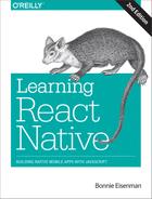
As illustrated in Figure 10-1, the Flashcard app has three main views:
-
The home page, which lists available decks and allows you to create new decks
-
The card creation screen
-
The review screen
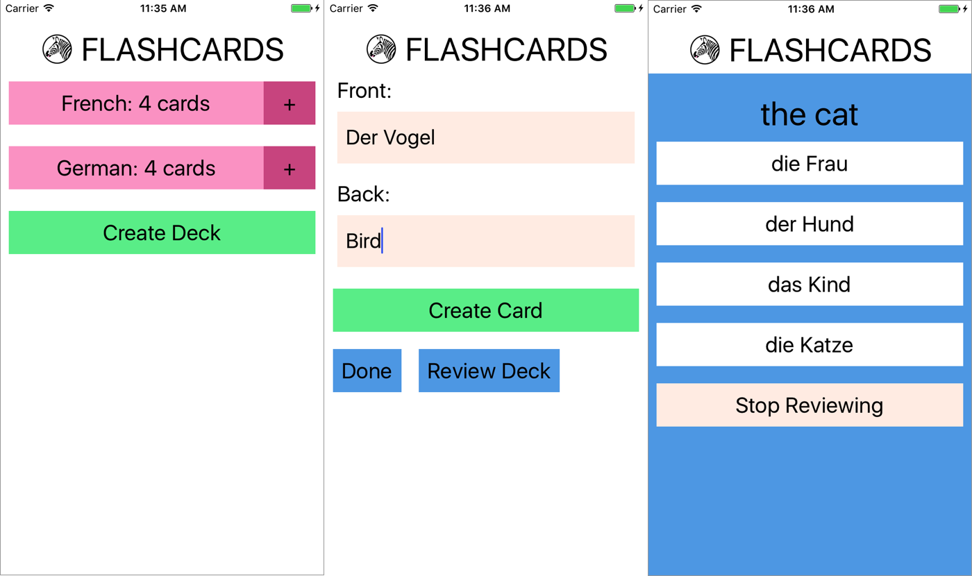
Figure 10-1. Viewing decks, card creation, and card review
Users of the app go through two main interaction flows. The first deals with content creation (i.e., the creation of decks as well as cards). The content creation process works as follows (illustrated in Figure 10-2):
-
The user taps Create Deck.
-
The user enters a deck name, then either taps the Return button or Create Deck again.
-
The user enters values for Front and Back, and then taps Create Card.
-
After entering zero or more cards, the user may tap Done, bringing him or her back to the original screen. Alternatively, the user may tap Review Deck and begin reviewing.
The user may also initiate card creation at a later date by tapping the + buttons on the home screen.
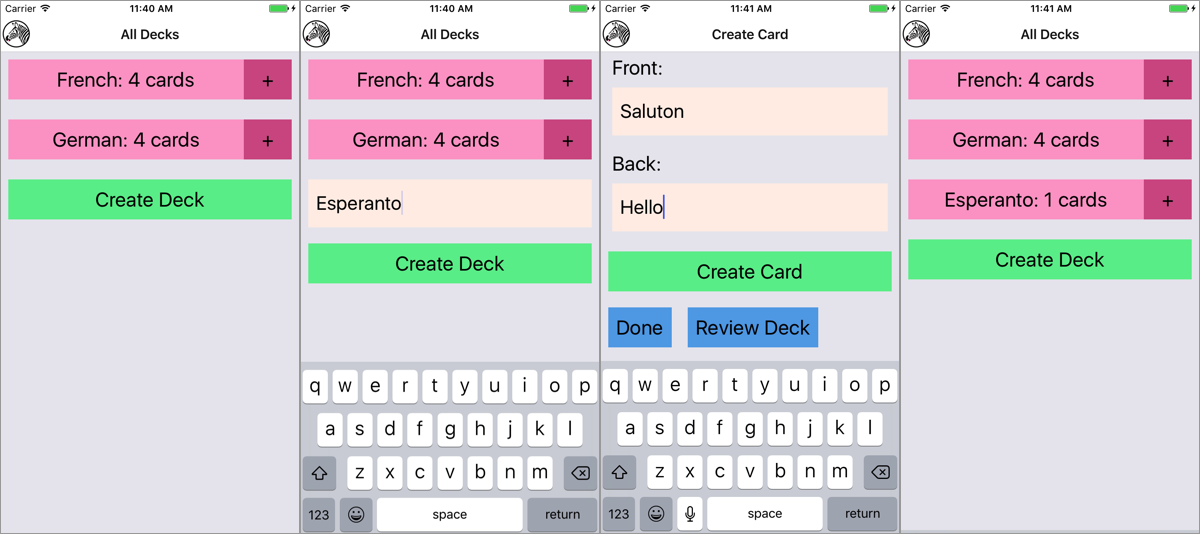
Figure 10-2. Creating a deck
The second main interaction flow deals with card review (illustrated in Figure 10-3):
-
The user taps the deck’s name that he/she wishes to review.
-
The user is presented with the question screen.
-
The user taps one of the provided options.
-
The user receives feedback based on whether the guess was correct.
-
To view the next review, the user taps Continue.
-
Once all reviews are completed, the user reaches the “Reviews cleared!” screen.
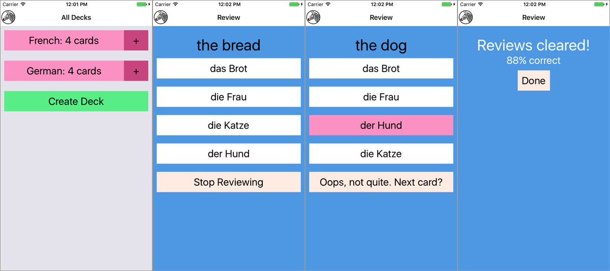
Figure 10-3. Reviewing cards
We’ll be using the flashcard app, and in particular the features just described, to talk through some of the patterns and problems that emerge when building a more complete application.
Project Structure
Here’s the structure of the flashcard application:
flashcards
 ├── icon.png
 ├── index.js
 ├── src_checkpoint_01
      ├── components
      │   ├── Button.js
      │   ├── DeckScreen
      │   ├── Flashcards.js
      │   ├── Header
      │   ├── HeadingText.js
      │   ├── Input.js
      │   ├── LabeledInput.js
      │   ├── NewCardScreen
      │   ├── NormalText.js
      │   └── ReviewScreen
      ├── data
      │   ├── Card.js
      │   ├── Deck.js
      │   ├── Mocks.js
      │   └── QuizCardView.js
      └── styles
          ├── colors.js
          └── fonts.js
 ├── src_checkpoint_02
      ├── ...
 ├── src_checkpoint_03
      ├── ...
 ├── src_checkpoint_04
       ├── ...
You’ll notice that within the flashcards directory, there are actually four folders: src_checkpoint_01, src_checkpoint_02, src_checkpoint_03, and src_checkpoint_04. These each represent the state of the application as we work through the development process. We’re going to begin with src_checkpoint_01.
- components/
-
All of our React components live here.
- data/
-
This is where you’ll find our data models, representing cards, decks, and reviews.
- styles/
-
Here you’ll find stylesheet objects, which are reused elsewhere.
Application Screens
There are three main scenes that may be displayed at any given time.
First, we have deck creation, from the main deck screen. This screen will display as many decks as currently exist in the app, as shown in Figure 10-4.
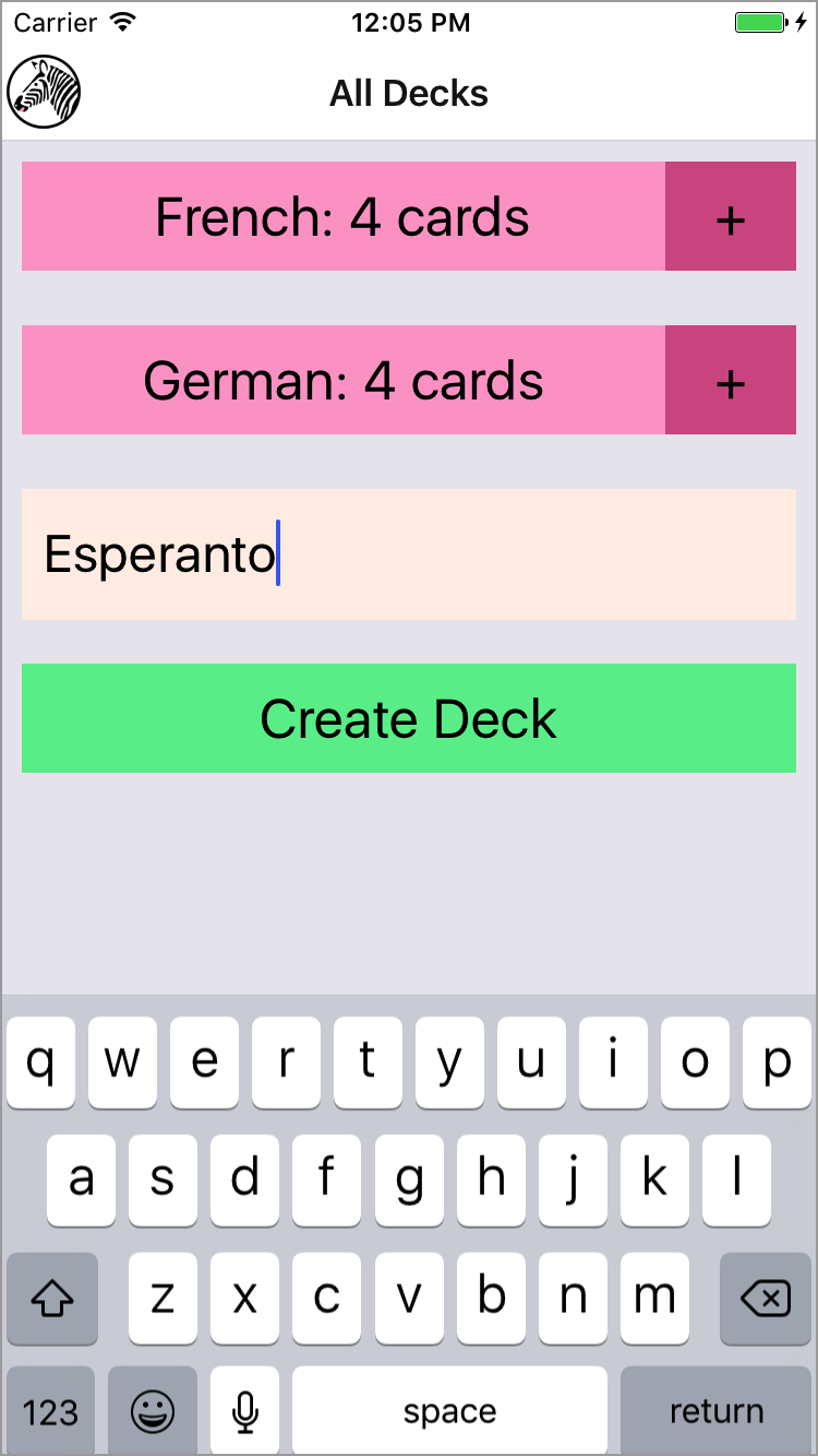
Figure 10-4. Creating a deck from the main deck screen
In the code we’re starting with, each of these screens is implemented as a component, but they aren’t connected yet. If you try to interact with the application, it shows a “Not implemented” warning (see Figure 10-5).
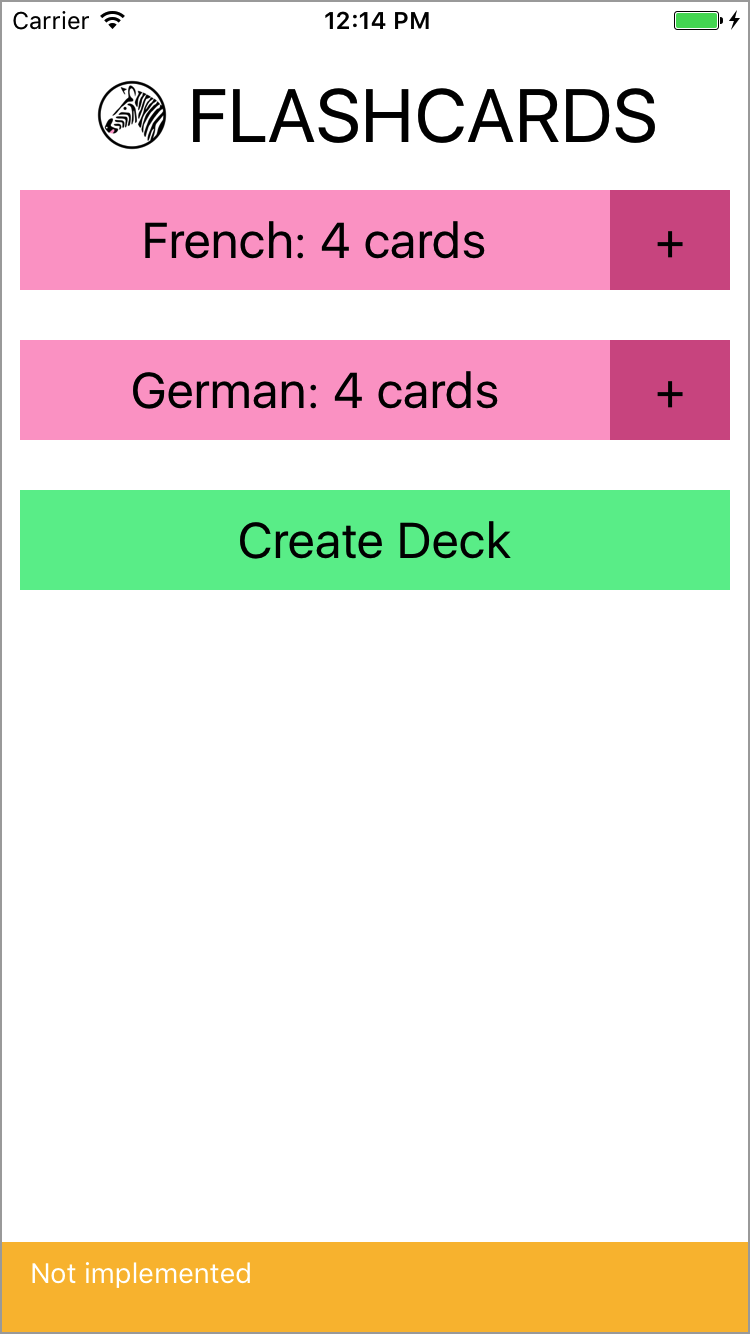
Figure 10-5. If you try to interact with the application, you get a warning
The root component for the application is located in components/Flashcards.js (see Example 10-1).
Example 10-1. src_checkpoint_01/components/Flashcards.js
importReact,{Component}from"react";import{StyleSheet,View}from"react-native";importHeadingfrom"./Header";importDeckScreenfrom"./DeckScreen";importNewCardScreenfrom"./NewCardScreen";importReviewScreenfrom"./ReviewScreen";classFlashcardsextendsComponent{_renderScene(){// return <ReviewScreen />;// return <NewCardScreen />;return<DeckScreen/>;}render(){return(<Viewstyle={styles.container}><Heading/>{this._renderScene()}</View>);}}conststyles=StyleSheet.create({container:{flex:1,marginTop:30}});exportdefaultFlashcards;
The deck screen, card creation screen, and review screen are implemented as the <DeckScreen>, <NewCardScreen>, and <ReviewScreen> components, respectively.
<DeckScreen>, shown in Example 10-2, renders existing decks and a button for creating new decks.
Example 10-2. src_checkpoint_01/components/DeckScreen/index.js
importReact,{Component}from"react";import{View}from"react-native";import{MockDecks}from"./../../data/Mocks";importDeckfrom"./Deck";importDeckCreationfrom"./DeckCreation";classDecksScreenextendsComponent{staticdisplayName="DecksScreen";constructor(props){super(props);this.state={decks:MockDecks};}_mkDeckViews(){if(!this.state.decks){returnnull;}returnthis.state.decks.map(deck=>{return<Deckdeck={deck}count={deck.cards.length}key={deck.id}/>;});}render(){return(<View>{this._mkDeckViews()}<DeckCreation/></View>);}}exportdefaultDecksScreen;
<NewCard>, shown in Example 10-3, has input fields for creating new cards. The callbacks for handling actual card creation are not yet implemented.
Example 10-3. src_checkpoint_01/components/NewCardScreen/index.js
importReact,{Component}from"react";import{StyleSheet,View}from"react-native";importDeckModelfrom"./../../data/Deck";importButtonfrom"../Button";importLabeledInputfrom"../LabeledInput";importNormalTextfrom"../NormalText";importcolorsfrom"./../../styles/colors";classNewCardextendsComponent{constructor(props){super(props);this.state={font:"",back:""};}_handleFront=text=>{this.setState({front:text});};_handleBack=text=>{this.setState({back:text});};_createCard=()=>{console.warn("Not implemented");};_reviewDeck=()=>{console.warn("Not implemented");};_doneCreating=()=>{console.warn("Not implemented");};render(){return(<View><LabeledInputlabel="Front"clearOnSubmit={false}onEntry={this._handleFront}onChange={this._handleFront}/><LabeledInputlabel="Back"clearOnSubmit={false}onEntry={this._handleBack}onChange={this._handleBack}/><Buttonstyle={styles.createButton}onPress={this._createCard}><NormalText>CreateCard</NormalText></Button><Viewstyle={styles.buttonRow}><Buttonstyle={styles.secondaryButton}onPress={this._doneCreating}><NormalText>Done</NormalText></Button><Buttonstyle={styles.secondaryButton}onPress={this._reviewDeck}><NormalText>ReviewDeck</NormalText></Button></View></View>);}}conststyles=StyleSheet.create({createButton:{backgroundColor:colors.green},secondaryButton:{backgroundColor:colors.blue},buttonRow:{flexDirection:"row"}});exportdefaultNewCard;
<ReviewScreen>, shown in Example 10-4, displays a series of reviews in a multiple-choice style format. Once the user selects an answer, it renders the next review.
Example 10-4. src_checkpoint_01/components/ReviewScreen/index.js
importReact,{Component}from"react";import{StyleSheet,View}from"react-native";importViewCardfrom"./ViewCard";import{MockReviews}from"./../../data/Mocks";import{mkReviewSummary}from"./ReviewSummary";importcolorsfrom"./../../styles/colors";classReviewScreenextendsComponent{staticdisplayName="ReviewScreen";constructor(props){super(props);this.state={numReviewed:0,numCorrect:0,currentReview:0,reviews:MockReviews};}onReview=correct=>{if(correct){this.setState({numCorrect:this.state.numCorrect+1});}this.setState({numReviewed:this.state.numReviewed+1});};_nextReview=()=>{this.setState({currentReview:this.state.currentReview+1});};_quitReviewing=()=>{console.warn("Not implemented");};_contents(){if(!this.state.reviews||this.state.reviews.length===0){returnnull;}if(this.state.currentReview<this.state.reviews.length){return(<ViewCardonReview={this.onReview}continue={this._nextReview}quit={this._quitReviewing}{...this.state.reviews[this.state.currentReview]}/>);}else{letpercent=this.state.numCorrect/this.state.numReviewed;returnmkReviewSummary(percent,this._quitReviewing);}}render(){return(<Viewstyle={styles.container}>{this._contents()}</View>);}}conststyles=StyleSheet.create({container:{backgroundColor:colors.blue,flex:1,paddingTop:24}});exportdefaultReviewScreen;
You’ll notice that many of the components used by these screens are not built-in React Native components, but rather reusable components provided for the purposes of building out the flashcard app. Let’s take a look at them now.
Reusable Components
As mentioned earlier, when you’re building larger applications it’s useful to have some styled components that you can reuse over and over again. You may have noticed that the preceding components do not use <Text> in order to render text: instead, they use <HeadingText> and <NormalText>. Similarly, the <Button> component is reused frequently, as are the <Input> and <LabeledInput> components. This helps with code readability, makes creating new components easier, and makes it easy to restyle the application.
The following components are reusable components. We’ll use them throughout the flashcard application as we flesh out the starter code and turn it into a working application.
The first of these components is a simple <Button>, shown in Example 10-5. It wraps an arbitrary component (i.e., this.props.children) in a <TouchableOpacity> component. It takes an onPress callback and also allows you to override the style via props.
Next up is the <NormalText> component, shown in Example 10-6. It’s mostly an ordinary <Text> component with some styles applied to scale the font size based on the window dimensions.
Example 10-6. src_checkpoint_01/components/NormalText.js
importReact,{Component}from"react";import{StyleSheet,Text,View}from"react-native";import{fonts,scalingFactors}from"./../styles/fonts";importDimensionsfrom"Dimensions";let{width}=Dimensions.get("window");classNormalTextextendsComponent{staticdisplayName="NormalText";render(){return(<Textstyle={[this.props.style,fonts.normal,scaled.normal]}>{this.props.children}</Text>);}}constscaled=StyleSheet.create({normal:{fontSize:width*1.0/scalingFactors.normal}});exportdefaultNormalText;
<HeadingText>, shown in Example 10-7, is much the same as <NormalText>, but with a larger font size.
Example 10-7. src_checkpoint_01/components/HeadingText.js
importReact,{Component}from"react";import{StyleSheet,Text,View}from"react-native";import{fonts,scalingFactors}from"./../styles/fonts";importDimensionsfrom"Dimensions";let{width}=Dimensions.get("window");classHeadingTextextendsComponent{staticdisplayName="HeadingText";render(){return(<Textstyle={[this.props.style,fonts.big,scaled.big]}>{this.props.children}</Text>);}}constscaled=StyleSheet.create({big:{fontSize:width/scalingFactors.big}});exportdefaultHeadingText;
<Input>, shown in Example 10-8, provides some sensible default props around the built-in <TextInput> component and handles updating state as well as triggering callbacks.
Example 10-8. src_checkpoint_01/components/Input.js
importReact,{Component}from"react";import{StyleSheet,TextInput,View}from"react-native";importcolorsfrom"./../styles/colors";import{fonts}from"./../styles/fonts";classInputextendsComponent{constructor(props){super(props);this.state={text:""};}_create=()=>{this.props.onEntry(this.state.text);this.setState({text:""});};_onSubmit=ev=>{this.props.onEntry(ev.nativeEvent.text);if(this.props.clearOnSubmit){this.setState({text:""});}};_onChange=text=>{this.setState({text:text});if(this.props.onChange){this.props.onChange(text);}};render(){return(<TextInputstyle={[styles.nameField,styles.wideButton,fonts.normal,this.props.style]}ref="newDeckInput"multiline={false}autoCorrect={false}onChangeText={this._onChange}onSubmitEditing={this._onSubmit}/>);}}// Default props are used if not otherwise specifiedInput.defaultProps={clearOnSubmit:true};exportdefaultInput;conststyles=StyleSheet.create({nameField:{backgroundColor:colors.tan,height:60},wideButton:{justifyContent:"center",padding:10,margin:10}});
<LabledInput>, shown in Example 10-9, combines an <Input> with a <NormalText> component.
Example 10-9. src_checkpoint_01/components/LabeledInput.js
importReact,{Component}from"react";import{StyleSheet,View}from"react-native";importInputfrom"./Input";importNormalTextfrom"./NormalText";classLabeledInputextendsComponent{render(){return(<Viewstyle={styles.wrapper}><NormalTextstyle={styles.label}>{this.props.label}:</NormalText><InputonEntry={this.props.onEntry}onChange={this.props.onChange}clearOnSubmit={this.props.clearOnSubmit}style={this.props.inputStyle}/></View>);}}conststyles=StyleSheet.create({label:{paddingLeft:10},wrapper:{padding:5}});exportdefaultLabeledInput;
Styles
In addition to the reusable components, there are a couple of stylesheets located in the styles directory that are reused throughout the flashcard application. These files won’t be modified as we develop the flashcard application.
The first, fonts.js, sets some default font sizes and colors (see Example 10-10).
Example 10-10. src_checkpoint_01/styles/fonts.js
import{StyleSheet}from"react-native";exportconstfonts=StyleSheet.create({normal:{fontSize:24},alternate:{fontSize:50,color:"#FFFFFF"},big:{fontSize:32,alignSelf:"center"}});exportconstscalingFactors={normal:15,big:10};
The second, colors.js, defines some of the color values used in the application (see Example 10-11).
Example 10-11. src_checkpoint_01/styles/colors.js
exportdefault(palette={pink:"#FDA6CD",pink2:"#d35d90",green:"#65ed99",tan:"#FFEFE8",blue:"#5DA9E9",gray1:"#888888"});
Data Models
Now that we’ve seen a bit about how our flashcard application handles rendering, how does it handle data? What data do we need to keep track of, and how do we do so?
We are concerned with two basic models: cards and decks. Reviews are constructed on the basis of cards and decks, but we won’t need to store them. The following classes provide some convenient methods for working with decks and cards so that we don’t need to deal with plain JavaScript objects.
The Deck class, shown in Example 10-12, lets you construct a deck based on a name. Each Deck contains an array of Cards. It also provides a convenience method for adding a card to a deck.
In Example 10-12, we’re using the md5 module to generate simple IDs for cards and decks, based on their data.
Example 10-12. src_checkpoint_01/data/Deck.js
importmd5from"md5";classDeck{constructor(name){this.name=name;this.id=md5("deck:"+name);this.cards=[];}setFromObject(ob){this.name=ob.name;this.cards=ob.cards;this.id=ob.id;}staticfromObject(ob){letd=newDeck(ob.name);d.setFromObject(ob);returnd;}addCard(card){this.cards=this.cards.concat(card);}}exportdefaultDeck;
A card has two sides and belongs to a deck. The Card class is shown in Example 10-13.
Example 10-13. src_checkpoint_01/data/Card.js
importmd5from"md5";classCard{constructor(front,back,deckID){this.front=front;this.back=back;this.deckID=deckID;this.id=md5(front+back+deckID);}setFromObject(ob){this.front=ob.front;this.back=ob.back;this.deckID=ob.deckID;this.id=ob.id;}staticfromObject(ob){letc=newCard(ob.front,ob.back,ob.deckID);c.setFromObject(ob);returnc;}}exportdefaultCard;
A QuizCardView, shown in Example 10-14, is really a partial review, comprising a question, several possible answers, and a correct answer, as well as the card’s orientation (whether it’s from English to Spanish or Spanish to English, for example). This class also includes a method for generating reviews from a set of cards.
Example 10-14. src_checkpoint_01/data/QuizCardView.js
import_from"lodash";classQuizCardView{constructor(orientation,cardID,prompt,correctAnswer,answers){this.orientation=orientation;this.cardID=cardID;this.prompt=prompt;this.correctAnswer=correctAnswer;this.answers=answers;}}functionmkReviews(cards){letmakeReviews=function(sideOne,sideTwo){returncards.map(card=>{letothers=cards.filter(other=>{returnother.id!==card.id;});letanswers=_.shuffle([card[sideTwo]].concat(_.sampleSize(_.map(others,sideTwo),3)));returnnewQuizCardView(sideOne,card.id,card[sideOne],card[sideTwo],answers);});};letreviews=makeReviews("front","back").concat(makeReviews("back","front"));return_.shuffle(reviews);}export{mkReviews,QuizCardView};
Finally, the Mocks class provides some mock data, which is useful for testing and developing our application (see Example 10-15).
Example 10-15. src_checkpoint_01/data/Mocks.js
importCardModelfrom"./Card";importDeckModelfrom"./Deck";import{mkReviews}from"./QuizCardView";letMockCards=[newCardModel("der Hund","the dog","fakeDeckID"),newCardModel("das Kind","the child","fakeDeckID"),newCardModel("die Frau","the woman","fakeDeckID"),newCardModel("die Katze","the cat","fakeDeckID")];letMockCard=MockCards[0];letMockReviews=mkReviews(MockCards);letMockDecks=[newDeckModel("French"),newDeckModel("German")];MockDecks.map(deck=>{deck.addCard(newCardModel("der Hund","the dog",deck.id));deck.addCard(newCardModel("die Katze","the cat",deck.id));deck.addCard(newCardModel("das Brot","the bread",deck.id));deck.addCard(newCardModel("die Frau","the woman",deck.id));returndeck;});letMockDeck=MockDecks[0];export{MockReviews,MockCards,MockCard,MockDecks,MockDeck};
The files in the data directory won’t change as we develop our flashcard application.
Using React-Navigation
Right now we have a skeletal application with much of the rendering taken care of, but it’s not functional. Let’s make it so that we can navigate through the app.
Mobile applications usually involve several screens and provide ways to transition between them. Navigation libraries handle those transitions and give developers a way to express the relationships between screens. There are several libraries available for use with React Native. We’re going to use React Navigation, which is a library provided by the react-community GitHub project.
Creating a StackNavigator
Let’s start by adding react-navigation to our project.
npm install --save react-navigation
React Navigation actually provides several navigators. Navigators render common, configurable UI elements, such as headers. They also determine your application’s navigation structure. We’re going to use the StackNavigator, which renders a single screen at a time and provides transitions between a “stack” of screens. This is probably the most common UI pattern for mobile applications.
Other navigators provided by React Navigation, such as the TabNavigator and the DrawerNavigator, provide slightly different perspectives on application structure. You can also combine several navigators within a single application.
For now, let’s import the StackNavigator in components/Flashcards.js.
import{StackNavigator}from"react-navigation"
In order to use the StackNavigator, we need to create it with information about the available screens.
letnavigator=StackNavigator({Home:{screen:DeckScreen},Review:{screen:ReviewScreen},CardCreation:{screen:NewCardScreen}});
Then, instead of exporting the <Flashcards> component from Flashcards.js, we can export the navigator.
exportdefaultnavigator;
Using navigation.navigate to Transition Between Screens
What does creating a StackNavigator get us? Well, now each screen included in the StackNavigator will be rendered with a special navigation prop. If we call:
this.props.navigation.navigate("SomeRoute");
The navigator will attempt to find the appropriately named screen to render.
Additionally, we can navigate one step backward in the stack:
this.props.navigation.goBack();
Let’s modify the <DeckScreen> component so that tapping on a deck brings us to the <ReviewScreen>.
First, let’s look at the <Deck> component, which is used by <DeckScreen> (see Example 10-16).
Example 10-16. src_checkpoint_01/components/DeckScreen/Deck.js
importReact,{Component}from"react";import{StyleSheet,View}from"react-native";importDeckModelfrom"./../../data/Deck";importButtonfrom"./../Button";importNormalTextfrom"./../NormalText";importcolorsfrom"./../../styles/colors";classDeckextendsComponent{staticdisplayName="Deck";_review=()=>{console.warn("Not implemented");};_addCards=()=>{console.warn("Not implemented");};render(){return(<Viewstyle={styles.deckGroup}><Buttonstyle={styles.deckButton}onPress={this._review}><NormalText>{this.props.deck.name}:{this.props.count}cards</NormalText></Button><Buttonstyle={styles.editButton}onPress={this._addCards}><NormalText>+</NormalText></Button></View>);}}conststyles=StyleSheet.create({deckGroup:{flexDirection:"row",alignItems:"stretch",padding:10,marginBottom:5},deckButton:{backgroundColor:colors.pink,padding:10,margin:0,flex:1},editButton:{width:60,backgroundColor:colors.pink2,justifyContent:"center",alignItems:"center",alignSelf:"center",padding:0,paddingTop:10,paddingBottom:10,margin:0,flex:0}});exportdefaultDeck;
Let’s modify _review() in Deck.js to invoke a review prop:
_review=()=>{this.props.review();}
Now this prop will be invoked when someone taps the button associated with a deck.
Next, we need to update DeckScreen/index.js.
Let’s add a _review function here as well:
_review=()=>{console.warn("Actual reviews not implemented");this.props.navigation.navigate("Review");}
Note that we use the fat-arrow function declaration syntax in order to properly bind the function to the component class. While React lifecycle methods are automatically bound to the component instance, other methods are not.
Then, update the rendered <Deck> component to include the appropriate prop:
_mkDeckViews(){if(!this.state.decks){returnnull;}returnthis.state.decks.map((deck)=>{return(<Deckdeck={deck}count={deck.cards.length}key={deck.id}review={this._review}/>);});}
Run the application. When you tap on a deck, it should bring you to the review screen. Nice!
Configuring the Header with navigationOptions
We can also pass in navigationOptions to the StackNavigator in order to configure what gets rendered in the header.
Let’s update the Flashcards.js file to set some basic header style options (see Example 10-17).
Example 10-17. src_checkpoint_02/components/Flashcards.js
importReact,{Component}from"react";import{StyleSheet,View}from"react-native";import{StackNavigator}from"react-navigation";importLogofrom"./Header/Logo";importDeckScreenfrom"./DeckScreen";importNewCardScreenfrom"./NewCardScreen";importReviewScreenfrom"./ReviewScreen";letheaderOptions={headerStyle:{backgroundColor:"#FFFFFF"},headerLeft:<Logo/>};letnavigator=StackNavigator({Home:{screen:DeckScreen,navigationOptions:headerOptions},Review:{screen:ReviewScreen,navigationOptions:headerOptions},CardCreation:{screen:NewCardScreen,navigationOptions:headerOptions}});exportdefaultnavigator;
Additionally, in the DeckScreen/index.js file, let’s set some more navigationOptions.
classDecksScreenextendsComponent{staticnavigationOptions={title:'All Decks'};...}
Setting a title will change the rendered title in the StackNavigator header.
If we look at our application again, we can see the changes take effect (Figure 10-6).
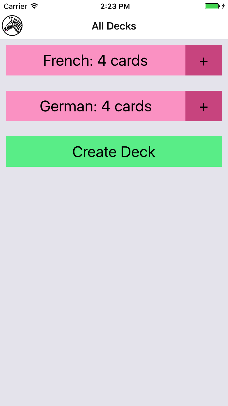
Figure 10-6. Setting the title via navigationOptions
Implementing the Rest
Now that we have the StackNavigator in place, we need to wire it up to the rest of the application. Specifically, the following interactions should work:
-
Tapping a deck from the
<DeckScreen>should navigate to the<ReviewScreen> -
Tapping the plus button from the
<DeckScreen>should navigate to the<NewCardScreen> -
Tapping Done from the
<NewCardScreen>should navigate back to the<DeckScreen> -
Tapping Create Card from the
<NewCardScreen>should navigate to a fresh<NewCardScreen> -
Tapping Review Deck from the
<NewCardScreen>should navigate to the<ReviewScreen> -
Tapping Stop Reviewing from the
<ReviewScreen>should navigate back to the<DeckScreen> -
Tapping Done from the
<ReviewScreen>should navigate back to the<DeckScreen> -
Creating a deck from the
<DeckScreen>should navigate to the<NewCardScreen>
The updated code for this section is located on GitHub. The following files will be updated:
-
components/DeckScreen/Deck.js
-
components/DeckScreen/DeckCreation.js
-
components/DeckScreen/index.js
-
components/NewCardScreen/index.js
-
components/ReviewScreen/index.js
-
components/Flashcards.js
-
components/Header/Logo.js
Summary
Organizing larger applications in React Native is sometimes a challenge. While we’ve looked at the pieces necessary to build React Native applications in previous chapters, the flashcards application is a meatier example of how it all fits together. By using the React Navigation library, we can combine many disparate screens of an app into a cohesive user experience.
In the next section, we’ll improve upon the flashcards application by adding Redux, a state management library, and integrating it with AsyncStorage to persist state between application launches.