Table of Contents for
Learning React Native, 2nd Edition
 Learning React Native, 2nd Edition
Published by
O'Reilly Media, Inc., 2017
Learning React Native, 2nd Edition
Published by
O'Reilly Media, Inc., 2017
- nav
- Cover
- Learning React Native
- Learning React Native
- Preface
- 1. What Is React Native?
- 2. Working with React Native
- 3. Building Your First Application
- 4. Components for Mobile
- 5. Styles
- 6. Platform APIs
- 7. Modules and Native Code
- 8. Platform-Specific Code
- 9. Debugging and Developer Tools
- 10. Navigation and Structure in Larger Applications
- 11. State Management in Larger Applications
- Conclusion
- A. Modern JavaScript Syntax
- B. Deploying Your Application
- C. Working with Expo Applications
- Index
- About the Author
- Colophon
Chapter 4. Components for Mobile
In Chapter 3, we built a simple weather app. In doing so, we touched upon the basics of building interfaces with React Native. In this chapter, we will take a closer look at the mobile-based components used for React Native, and how they compare to basic HTML elements. Mobile interfaces are based on different primitive UI elements than web pages, and thus we need to use different components.
This chapter starts with a more detailed overview of the most basic components: <View>, <Image>, and <Text>. Then, we will discuss how touch and gestures factor into React Native components, and how to handle touch events. Next, we will cover higher-level components, such as the tab bars, navigators, and lists, which allow you to combine other views into standard mobile interface patterns.
Analogies Between HTML Elements and Native Components
When developing for the web, we make use of a variety of basic HTML elements. These include <div>, <span>, and <img>, as well as organizational elements such as <ol>, <ul>, and <table>. (We could include a consideration of elements such as <audio>, <svg>, <canvas>, and so on, but we’ll ignore them for now.)
When dealing with React Native, we don’t use these HTML elements, but we use a variety of components that are nearly analogous to them (Table 4-1).
| HTML | React Native |
|---|---|
|
|
|
|
|
|
|
|
Although these elements serve roughly the same purposes, they are not interchangeable. Let’s take a look at how these components work on mobile with React Native and how they differ from their browser-based counterparts.
The <Text> Component
Rendering text is a deceptively basic function; nearly any application will need to render text somewhere. However, text within the context of React Native and mobile development works differently from text rendering for the web.
When working with text in HTML, you can include raw text strings in a variety of elements. Furthermore, you can style them with child tags such as <strong> and <em>. So, you might end up with an HTML snippet that looks like this:
<p>The quick<em>brown</em>fox jumped over the lazy<strong>dog</strong>.</p>
In React Native, only <Text> components may have plain-text nodes as children. In other words, this is not valid:
<View>Text doesn't go here!</View>
Instead, wrap your text in a <Text> component:
<View><Text>This is OK!</Text></View>
When dealing with <Text> components in React Native, you no longer have access to subtags such as <strong> and <em>, though you can apply styles to achieve similar effects by using attributes such as fontWeight and fontStyle. Here’s how you might achieve a similar effect by making use of inline styles:
<Text>Thequick<Textstyle={{fontStyle:"italic"}}>brown</Text>foxjumpedoverthelazy<Textstyle={{fontWeight:"bold"}}>dog</Text>.</Text>
This approach could quickly become verbose. You’ll likely want to create styled components as a sort of shorthand when dealing with text, as shown in Example 4-1.
Example 4-1. Creating reusable components for styling text
conststyles=StyleSheet.create({bold:{fontWeight:"bold"},italic:{fontStyle:"italic"}});classStrongextendsComponent{render(){return(<Textstyle={styles.bold}>{this.props.children}</Text>);}}classEmextendsComponent{render(){return(<Textstyle={styles.italic}>{this.props.children}</Text>);}}
Once you have declared these styled components, you can freely make use of styled nesting. Now the React Native version looks quite similar to the HTML version (see Example 4-2).
Example 4-2. Using styled components for rendering text
<Text>Thequick<Em>brown</Em>foxjumpedoverthelazy<Strong>dog</Strong>.</Text>
Similarly, React Native does not inherently have any concept of header elements (h1, h2, etc.), but it’s easy to declare your own styled <Text> elements and use them as needed.
In general, when dealing with styled text, React Native forces you to change your approach. Style inheritance is limited, so you lose the ability to have default font settings for all text nodes in the tree. Once again, the React Native documentation recommends solving this by using styled components:
You also lose the ability to set up a default font for an entire subtree. The recommended way to use consistent fonts and sizes across your application is to create a component MyAppText that includes them and use this component across your app. You can also use this component to make more specific components like
MyAppHeaderTextfor other kinds of text.
The <Text> component documentation has more details on this.
You’ve probably noticed a pattern here: React Native is very opinionated in its preference for reusing styled components over inheriting or reusing styles. While it can be time-consuming initially, this approach leads to better isolation so that you can render a component anywhere in your application and get the same result. This in turn makes it easier to maintain the styling code in your application. We’ll discuss this approach further in the next chapter.
The <Image> Component
If text is the most basic element in an application, images are a close contender for both mobile and the web. When writing HTML and CSS for the web, we include images in a variety of ways: sometimes we use the <img> tag whereas at other times we apply images via CSS, such as when we use the background-image property. In React Native, we have a similar <Image> component, but it behaves a little differently.
The basic usage of the <Image> component is straightforward; just set the source prop:
<Imagesource={require("./puppies.png")}/>
The image path is resolved exactly as JavaScript modules are resolved. So, in the preceding example, puppies.png should be provided in the same folder as the component that requires it.
There’s some filename magic going on here, too. If you provide puppies.ios.png and puppies.android.png, the appropriate file will be rendered on each platform. Similarly, if you provide images with suffixes @2x and @3x, the React Native packager will select the appropriate image for the device’s screen density.
It is also possible to include web-based image sources instead of bundling your assets with your application. For example:
<Imagesource={{uri:"https://facebook.github.io/react/img/logo_og.png"}}style={{width:400,height:400}}/>
When utilizing network resources, you will need to specify dimensions manually.
Downloading images via the network rather than including them as assets has some advantages. During development, for instance, it may be easier to use this approach while prototyping rather than carefully importing all of your assets ahead of time. It also reduces the size of your bundled mobile application so that users do not need to download all of your assets. However, it means that instead you’ll be relying on their data plan whenever they access your application in the future. For most cases, you’ll want to avoid using the URI-based method.
If you’re wondering about working with the user’s own images, we’ll cover the camera roll in Chapter 6.
Because React Native emphasizes a component-based approach, images must be included as <Image> components instead of being referenced via styles. For instance, in Chapter 3, we wanted to use an image as a background for our weather application. Whereas in plain HTML and CSS you would likely use the background-image property to apply a background image, in React Native you instead use the <Image> as a container component, like so:
<Imagesource={require("./puppies.png")}>{/* Your content here... */}</Image>
Styling the images themselves is fairly straightforward. In addition to applying styles, you’ll use certain props to control how the image will be rendered. You’ll often make use of the resizeMode prop, for instance, which can be set to contain, cover, or stretch. The UIExplorer app demonstrates this well (Figure 4-1).
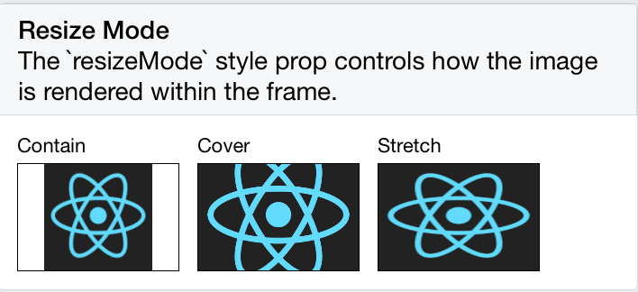
Figure 4-1. The difference between resize, cover, and contain
The <Image> component is very flexible. You will likely make extensive use of it in your own applications.
Working with Touch and Gestures
Web-based interfaces are usually designed for mouse-based controllers. We use things like hover state to indicate interactivity and respond to user interaction. For mobile, it’s touch that matters. Mobile platforms have their own norms around interactions that you’ll want to design for. This varies somewhat from platform to platform: iOS behaves differently from Android, which behaves differently yet again from Windows Phone.
React Native provides a number of APIs for you to leverage as you build touch-ready interfaces. In this section, we’ll look at the humble <Button> component and the <TouchableHighlight> container component, as well as lower-level APIs that give you direct access to touch events.
Creating Basic Interactions with <Button>
If you’re just getting started and need a basic, interactive button, the default <Button> component has you covered. It provides a simple API, which allows you to set the color, label text, and callback function.
<ButtononPress={this._onPress}title="Press me"color="#841584"accessibilityLabel="Press this button"/>
This <Button> component is a decent starting point, but you’ll probably want to create your own interactive components. For that, we’ll need to use <TouchableHighlight>.
Using the <TouchableHighlight> Component
Any interface elements that respond to user touch (buttons, control elements, etc.) should usually have a <TouchableHighlight> wrapper. <TouchableHighlight> causes an overlay to appear when the view is touched, giving the user visual feedback. This is one of the key interactions that causes a mobile application to feel native, as opposed to a mobile-optimized website, where touch feedback is limited. As a general rule of thumb, you should use <TouchableHighlight> anywhere there would be a button or a link on the web.
At its most basic usage, you just need to wrap your component in a <TouchableHighlight>, which will add a simple overlay when pressed. The <TouchableHighlight> component also gives you hooks for events such as onPressIn, onPressOut, onLongPress, and the like, so you can use these events in your React applications.
Example 4-3 shows how you can wrap a component in a <TouchableHighlight> in order to give the user feedback.
Example 4-3. Using the <TouchableHighlight> component
<TouchableHighlightonPressIn={this._onPressIn}onPressOut={this._onPressOut}accessibilityLabel={'PUSH ME'}style={styles.touchable}><Viewstyle={styles.button}><Textstyle={styles.welcome}>{this.state.pressing?"EEK!":"PUSH ME"}</Text></View></TouchableHighlight>
When the user taps the button, an overlay appears, and the text changes (Figure 4-2).
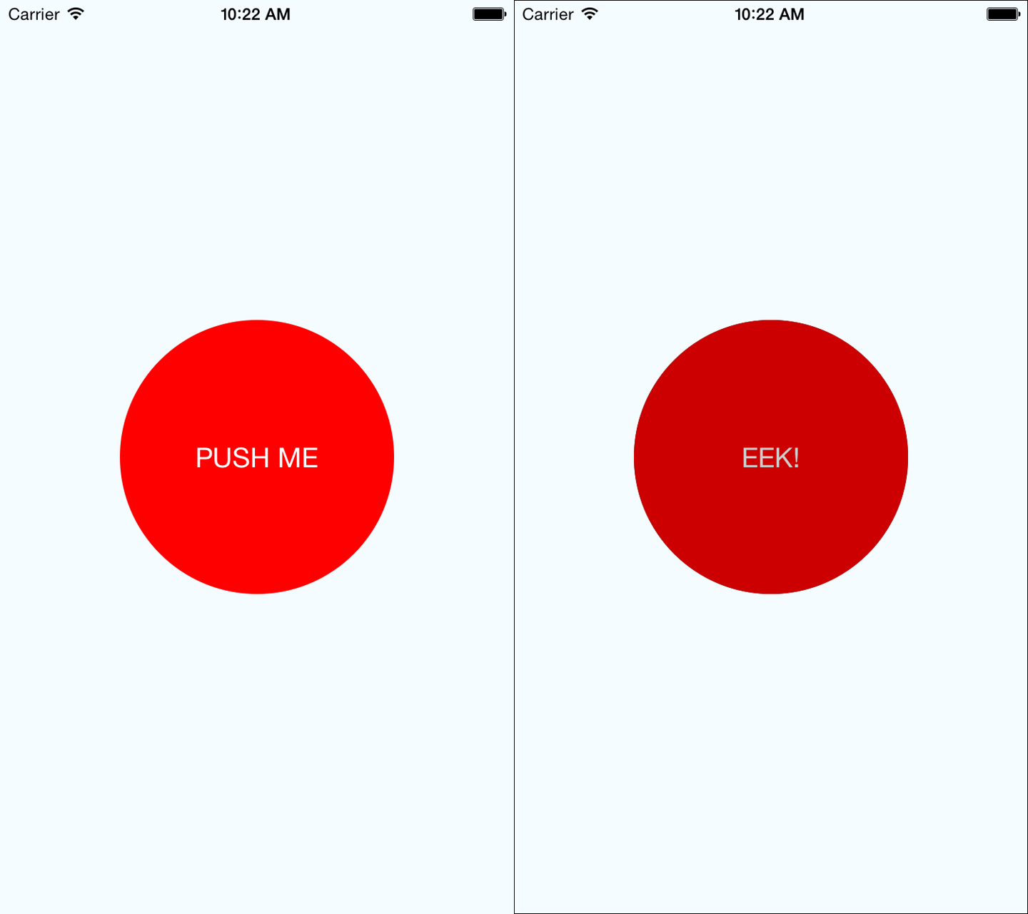
Figure 4-2. Using <TouchableHighlight> to give the user visual feedback—the unpressed state (left) and the pressed state, with highlight (right)
This is a contrived example, but it illustrates the basic interactions that make a button “feel” touchable on mobile. The overlay is a key piece of feedback that informs the user that an element can be pressed. Note that in order to apply the overlay, we don’t need to apply any logic to our styles; the <TouchableHighlight> handles the logic of that for us.
Example 4-4 shows the full code for this button component.
Example 4-4. PressDemo.js illustrates the use of <TouchableHighlight>
importReact,{Component}from"react";import{StyleSheet,Text,View,TouchableHighlight}from"react-native";classButtonextendsComponent{constructor(props){super(props);this.state={pressing:false};}_onPressIn=()=>{this.setState({pressing:true});};_onPressOut=()=>{this.setState({pressing:false});};render(){return(<Viewstyle={styles.container}><TouchableHighlightonPressIn={this._onPressIn}onPressOut={this._onPressOut}style={styles.touchable}><Viewstyle={styles.button}><Textstyle={styles.welcome}>{this.state.pressing?"EEK!":"PUSH ME"}</Text></View></TouchableHighlight></View>);}}conststyles=StyleSheet.create({container:{flex:1,justifyContent:"center",alignItems:"center",backgroundColor:"#F5FCFF"},welcome:{fontSize:20,textAlign:"center",margin:10,color:"#FFFFFF"},touchable:{borderRadius:100},button:{backgroundColor:"#FF0000",borderRadius:100,height:200,width:200,justifyContent:"center"}});exportdefaultButton;
Try editing this button to respond to other events, by using hooks like onPress and onLongPress. The best way to get a sense for how these events map onto user interactions is to experiment using a real device.
Using the PanResponder Class
Unlike <TouchableHighlight>, PanResponder is not a component but rather a class provided by React Native. A PanResponder gestureState object gives you access to raw position data as well as information such as velocity and accumulated distance of the current gesture.
To make use of PanResponder in a React component, we need to create a PanResponder object and then attach it to a component’s render method.
Creating a PanResponder requires us to specify the proper handlers for PanResponder events (Example 4-5).
Example 4-5. Creating a PanResponder requires us to register several callbacks
this._panResponder=PanResponder.create({onStartShouldSetPanResponder:this._handleStartShouldSetPanResponder,onMoveShouldSetPanResponder:this._handleMoveShouldSetPanResponder,onPanResponderGrant:this._handlePanResponderGrant,onPanResponderMove:this._handlePanResponderMove,onPanResponderRelease:this._handlePanResponderEnd,onPanResponderTerminate:this._handlePanResponderEnd,});
These six functions give us access to the full lifecycle of a touch event. onStartShouldSetPanResponder and onMoveShouldSetPanResponder determine whether or not we should respond to a given touch event. onPanResponderGrant will be invoked when a touch event begins, and onPanResponderRelease and onPanResponderTerminate will be invoked when a touch event ends. We’ll be able to access data about the ongoing touch event during onPanResponderMove.
We use spread syntax to attach the PanResponder to the view in our component’s render method (Example 4-6).
Example 4-6. Attaching the PanResponder using spread sytax
render:function(){return(<View{...this._panResponder.panHandlers}>{/* View contents here */}</View>);}
After this, the handlers that you passed to the PanResponder.create call will be invoked during the appropriate move events if the touch originates within this view.
Figure 4-3 renders a circle that you can drag around the screen. Its coordinates will be updated as you move it.
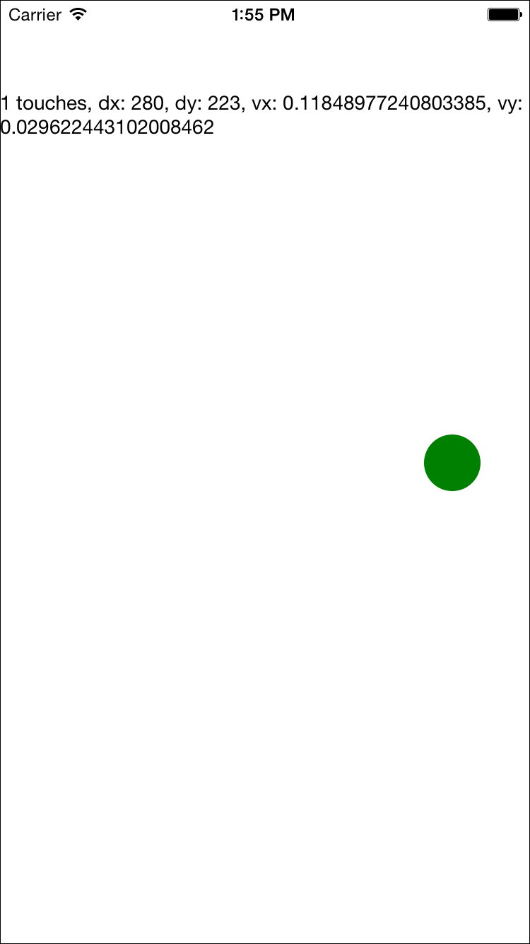
Figure 4-3. PanResponder demo
In order to implement this, let’s flesh out our PanResponder callbacks now. The first two are straightforward: by implementing _handleStartShouldSetPanResponder and _handleMoveShouldSetPanResponder, we can declare that we want this responder to receive touch events (Example 4-7).
Example 4-7. For the first two callbacks, we simply return true
_handleStartShouldSetPanResponder=(event,gestureState)=>{// Should we become active when the user presses down on the circle?returntrue;};_handleMoveShouldSetPanResponder=(event,gestureState)=>{// Should we become active when the user moves a touch over the circle?returntrue;};
Then we’ll want to use the location data in _handlePanResponderMove to update the coordinates of our circle view (Example 4-8).
Example 4-8. Updating the circle’s position in _handlePanResponderMove
_handlePanResponderMove=(event,gestureState)=>{// Calculate current position using deltasthis._circleStyles.style.left=this._previousLeft+gestureState.dx;this._circleStyles.style.top=this._previousTop+gestureState.dy;this._updatePosition();};_updatePosition=()=>{this.circle&&this.circle.setNativeProps(this._circleStyles);};
Note that we’re calling setNativeProps here in order to update the position of the circle view.
Tip
When working with animations, you can use setNativeProps to directly modify a component instead of the typical approach of setting state and props. This lets you bypass the overhead of re-rendering the component hierarchy, but it should be used sparingly.
Next, let’s implement _handlePanResponderGrant and _handlePanResponderEnd so that the circle changes color when a touch is active (Example 4-9).
Example 4-9. Implementing highlight behavior
_highlight=()=>{this.circle&&this.circle.setNativeProps({style:{backgroundColor:"blue"}});};_unHighlight=()=>{this.circle&&this.circle.setNativeProps({style:{backgroundColor:"green"}});};_handlePanResponderGrant=(event,gestureState)=>{this._highlight();};_handlePanResponderEnd=(event,gestureState)=>{this._unHighlight();};
Let’s put it all together to build an interactive view using PanResponder, as shown in Example 4-10.
Example 4-10. PanDemo.js illustrates the use of PanResponder
// Adapted from https://github.com/facebook/react-native/blob/master/// Examples/UIExplorer/PanResponderExample.js"use strict";importReact,{Component}from"react";import{StyleSheet,PanResponder,View,Text}from"react-native";constCIRCLE_SIZE=40;constCIRCLE_COLOR="blue";constCIRCLE_HIGHLIGHT_COLOR="green";classPanResponderExampleextendsComponent{// Set some initial values._panResponder={};_previousLeft=0;_previousTop=0;_circleStyles={};circle=null;constructor(props){super(props);this.state={numberActiveTouches:0,moveX:0,moveY:0,x0:0,y0:0,dx:0,dy:0,vx:0,vy:0};}componentWillMount(){this._panResponder=PanResponder.create({onStartShouldSetPanResponder:this._handleStartShouldSetPanResponder,onMoveShouldSetPanResponder:this._handleMoveShouldSetPanResponder,onPanResponderGrant:this._handlePanResponderGrant,onPanResponderMove:this._handlePanResponderMove,onPanResponderRelease:this._handlePanResponderEnd,onPanResponderTerminate:this._handlePanResponderEnd});this._previousLeft=20;this._previousTop=84;this._circleStyles={style:{left:this._previousLeft,top:this._previousTop}};}componentDidMount(){this._updatePosition();}render(){return(<Viewstyle={styles.container}><Viewref={circle=>{this.circle=circle;}}style={styles.circle}{...this._panResponder.panHandlers}/><Text>{this.state.numberActiveTouches}touches,dx:{this.state.dx},dy:{this.state.dy},vx:{this.state.vx},vy:{this.state.vy}</Text></View>);}// _highlight and _unHighlight get called by PanResponder methods,// providing visual feedback to the user._highlight=()=>{this.circle&&this.circle.setNativeProps({style:{backgroundColor:CIRCLE_HIGHLIGHT_COLOR}});};_unHighlight=()=>{this.circle&&this.circle.setNativeProps({style:{backgroundColor:CIRCLE_COLOR}});};// We're controlling the circle's position directly with setNativeProps._updatePosition=()=>{this.circle&&this.circle.setNativeProps(this._circleStyles);};_handleStartShouldSetPanResponder=(event,gestureState)=>{// Should we become active when the user presses down on the circle?returntrue;};_handleMoveShouldSetPanResponder=(event,gestureState)=>{// Should we become active when the user moves a touch over the circle?returntrue;};_handlePanResponderGrant=(event,gestureState)=>{this._highlight();};_handlePanResponderMove=(event,gestureState)=>{this.setState({stateID:gestureState.stateID,moveX:gestureState.moveX,moveY:gestureState.moveY,x0:gestureState.x0,y0:gestureState.y0,dx:gestureState.dx,dy:gestureState.dy,vx:gestureState.vx,vy:gestureState.vy,numberActiveTouches:gestureState.numberActiveTouches});// Calculate current position using deltasthis._circleStyles.style.left=this._previousLeft+gestureState.dx;this._circleStyles.style.top=this._previousTop+gestureState.dy;this._updatePosition();};_handlePanResponderEnd=(event,gestureState)=>{this._unHighlight();this._previousLeft+=gestureState.dx;this._previousTop+=gestureState.dy;};}conststyles=StyleSheet.create({circle:{width:CIRCLE_SIZE,height:CIRCLE_SIZE,borderRadius:CIRCLE_SIZE/2,backgroundColor:CIRCLE_COLOR,position:"absolute",left:0,top:0},container:{flex:1,paddingTop:64}});exportdefaultPanResponderExample;
If you plan on implementing your own gesture recognizers, I suggest experimenting with this application on a real device so that you can get a feel for how these values respond. Figure 4-3 shows a screenshot, but you’ll want to experience it on a device with a real touchscreen.
Choosing how to handle touch
How should you decide when to use the touch and gesture APIs discussed in this section? It depends on what you want to build.
In order to provide the user with basic feedback and indicate that a button or another element is “tappable,” use the <TouchableHighlight> component.
In order to implement your own custom touch interfaces, you can use PanResponder. If you are designing a game, or an application with an unusual interface, you’ll need to spend some time building out the custom touch interactions you want.
For many applications, you won’t need to implement any custom touch handling. In the next section, we’ll look at some of the higher-level components that implement common UI patterns for you.
Working with Lists
Many mobile user interfaces feature lists as a central element. You can see this interaction pattern in the Dropbox, Twitter, and iOS Settings apps (Figure 4-4). At its heart, a list is just a scrolling container with some child views. This deceptively simple design pattern is integral to many mobile interfaces.
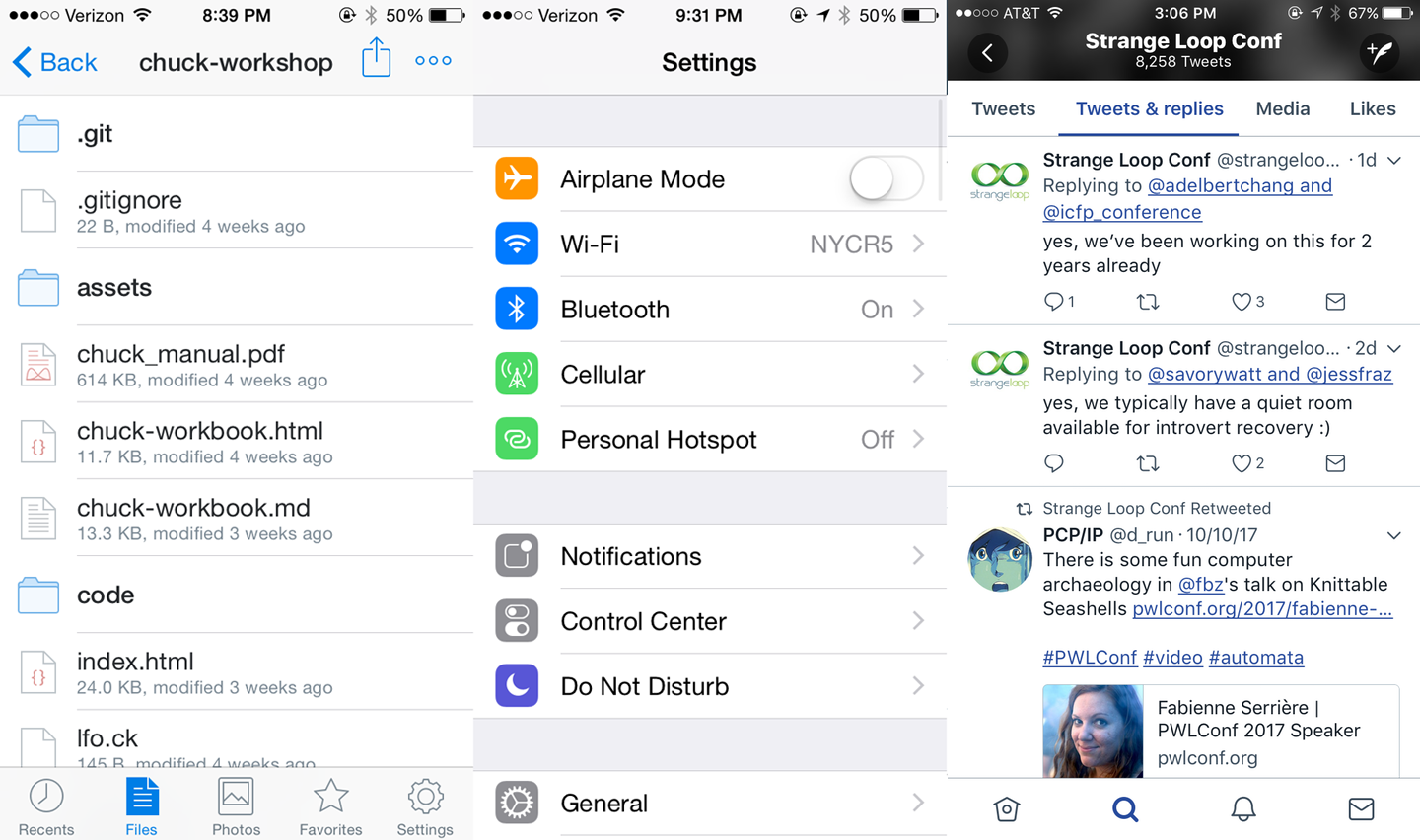
Figure 4-4. Lists as used by Dropbox, Twitter, and the iOS Settings app
React Native provides two list components with convenient APIs. The <FlatList> component is designed to work with long scrolling lists of changing but similarly structured data. It has several performance optimizations baked in. The <SectionList> component is designed for data that is broken into logical sections, usually with section headings, similar to the iOS UITableView. Together, <FlatList> and <SectionList> cover most common use cases but if you need to peek under the hood and add some custom list handling, take a look at <VirtualizedList>.
Tip
Optimizing list-rendering performance is a notoriously tricky problem because different use cases call for different approaches. Is your user swiping hastily through a contacts list to find a particular person or are they slowly perusing a feed of images? Do you have a homogeneous list or is every child view different? If you hit performance issues, pay attention to your lists.
In this section, we are going to build an app that displays the New York Times Best Sellers list and lets us view data about each book, as shown in Figure 4-5. We’ll build two versions, one with <FlatList> and the other with <SectionList>.
If you’d like, you can grab your own API token from the New York Times. Otherwise, use the API token included in the sample code.
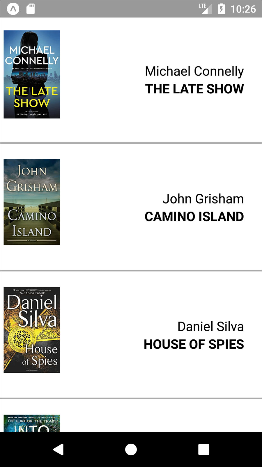
Figure 4-5. The BookList application we’ll be building
Using the Basic <FlatList> Component
We’re going to start with the basic <FlatList> component, which requires two props: data and renderItem.
<FlatListdata={this.state.data}renderItem={this._renderItem}/>
data is, as the name implies, the data that your <FlatList> will render. It should be an array where each element has a unique key property, plus whatever other properties you find useful.
renderItem should be a function that returns a component based on the data from one element of the data array.
The basic usage of a <FlatList> is demonstrated in Example 4-11.
Example 4-11. src/bestsellers/SimpleList.js
importReact,{Component}from"react";import{StyleSheet,Text,View,FlatList}from"react-native";classSimpleListextendsComponent{constructor(props){super(props);this.state={data:[{key:"a"},{key:"b"},{key:"c"},{key:"d"},{key:"a longer example"},{key:"e"},{key:"f"},{key:"g"},{key:"h"},{key:"i"},{key:"j"},{key:"k"},{key:"l"},{key:"m"},{key:"n"},{key:"o"},{key:"p"}]};}_renderItem=data=>{return<Textstyle={styles.row}>{data.item.key}</Text>;};render(){return(<Viewstyle={styles.container}><FlatListdata={this.state.data}renderItem={this._renderItem}/></View>);}}conststyles=StyleSheet.create({container:{flex:1,justifyContent:"center",alignItems:"center",backgroundColor:"#F5FCFF"},row:{fontSize:24,padding:42,borderWidth:1,borderColor:"#DDDDDD"}});exportdefaultSimpleList;
One of the common “gotchas” of working with <FlatList> is that renderItem gets passed an object with the actual data accessible via the item property.
_renderItem=data=>{return<Textstyle={styles.row}>{data.item.key}</Text>;};
We could simplify this with destructuring shorthand:
_renderItem=({item})=>{return<Textstyle={styles.row}>{item.key}</Text>;};
The app should look like Figure 4-6.
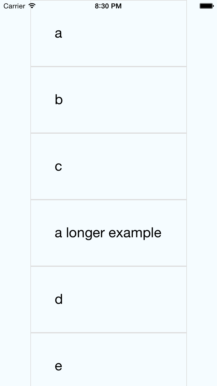
Figure 4-6. The SimpleList component renders a bare-bones <FlatList>
Updating the <FlatList> Contents
What if we want to do something a little more interesting? Let’s create a <FlatList> with more complex data. We will be using the New York Times API to create a simple Best Sellers application, which renders the New York Times Best Sellers list.
To begin with, we’ll use fake data to represent an example response from the New York Times API, as shown in Example 4-12.
Example 4-12. Mock data based on the expected API response
constmockBooks=[{rank:1,title:"GATHERING PREY",author:"John Sandford",book_image:"http://du.ec2.nytimes.com.s3.amazonaws.com/prd/books/9780399168796.jpg"},{rank:2,title:"MEMORY MAN",author:"David Baldacci",book_image:"http://du.ec2.nytimes.com.s3.amazonaws.com/prd/books/9781455586387.jpg"}];
Then we’ll add a component that can render this data. The <BookItem> component, shown in Example 4-13, uses a combination of <View>, <Text>, and <Image> to display basic information about each book.
Example 4-13. src/bestsellers/BookItem.js
importReact,{Component}from"react";import{StyleSheet,Text,View,Image,ListView}from"react-native";conststyles=StyleSheet.create({bookItem:{flexDirection:"row",backgroundColor:"#FFFFFF",borderBottomColor:"#AAAAAA",borderBottomWidth:2,padding:5,height:175},cover:{flex:1,height:150,resizeMode:"contain"},info:{flex:3,alignItems:"flex-end",flexDirection:"column",alignSelf:"center",padding:20},author:{fontSize:18},title:{fontSize:18,fontWeight:"bold"}});classBookItemextendsComponent{render(){return(<Viewstyle={styles.bookItem}><Imagestyle={styles.cover}source=/><Viewstyle={styles.info}><Textstyle={styles.author}>{this.props.author}</Text><Textstyle={styles.title}>{this.props.title}</Text></View></View>);}}exportdefaultBookItem;
In order to use the <BookItem> component, we need to update our _renderItem function. A <BookItem> expects three props: coverURL, title, and author.
_renderItem=({item})=>{return(<BookItemcoverURL={item.book_image}title={item.key}author={item.author}/>);};
Remember that in a <FlatList>, each element in the data array must have a unique key property defined. So, we’ll add a helper method that takes an array of objects and adds a key property to them, as shown in Example 4-14.
Example 4-14. The _addKeysToBooks method adds a key to each object in the books array
_addKeysToBooks=books=>{returnbooks.map(book=>{returnObject.assign(book,{key:book.title});});};
Now that we have this helper method, we can update our initial state using the mock data from Example 4-12:
constructor(props){super(props);this.state={data:this._addKeysToBooks(mockBooks)};}
Once we put it all together, our mocked-out Best Sellers application code should look like Example 4-15, with the resulting app displayed in Figure 4-7.
Example 4-15. src/bestsellers/MockBookList.js
importReact,{Component}from"react";import{StyleSheet,Text,View,Image,FlatList}from"react-native";importBookItemfrom"./BookItem";constmockBooks=[{rank:1,title:"GATHERING PREY",author:"John Sandford",book_image:"http://du.ec2.nytimes.com.s3.amazonaws.com/prd/books/9780399168796.jpg"},{rank:2,title:"MEMORY MAN",author:"David Baldacci",book_image:"http://du.ec2.nytimes.com.s3.amazonaws.com/prd/books/9781455586387.jpg"}];classBookListextendsComponent{constructor(props){super(props);this.state={data:this._addKeysToBooks(mockBooks)};}_renderItem=({item})=>{return(<BookItemcoverURL={item.book_image}title={item.key}author={item.author}/>);};_addKeysToBooks=books=>{// Takes the API response from the NYTimes// and adds a key property to the object// for rendering purposesreturnbooks.map(book=>{returnObject.assign(book,{key:book.title});});};render(){return<FlatListdata={this.state.data}renderItem={this._renderItem}/>;}}conststyles=StyleSheet.create({container:{flex:1,paddingTop:22}});exportdefaultBookList;
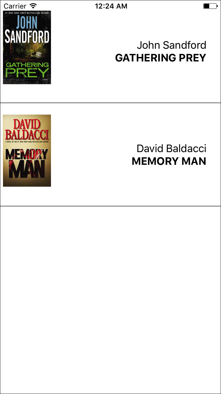
Figure 4-7. Mock data displayed using <FlatList>
Integrating Real Data
Hardcoded data is well and good, but let’s test the real thing. The actual code to access the New York Times API is provided in Example 4-16.
Example 4-16. src/bestsellers/NYT.js
constAPI_KEY="73b19491b83909c7e07016f4bb4644f9:2:60667290";constLIST_NAME="hardcover-fiction";constAPI_STEM="https://api.nytimes.com/svc/books/v3/lists";functionfetchBooks(list_name=LIST_NAME){leturl=`${API_STEM}/${LIST_NAME}?response-format=json&api-key=${API_KEY}`;returnfetch(url).then(response=>response.json()).then(responseJson=>{returnresponseJson.results.books;}).catch(error=>{console.error(error);});}exportdefault{fetchBooks:fetchBooks};
Let’s import that library into our component now.
importNYTfrom"./NYT";
Now let’s add a _refreshData method that invokes the New York Times API:
_refreshData=()=>{NYT.fetchBooks().then(books=>{this.setState({data:this._addKeysToBooks(books)});});};
Finally, we need to set our initial state to an empty array and call _refreshData in componentDidMount. Once we do that, our application will render live data from the New York Times Best Sellers list! The full code is shown in Example 4-17, and you can see the updated app in Figure 4-8.
Example 4-17. src/bestsellers/BookList.js
importReact,{Component}from"react";import{StyleSheet,Text,View,Image,FlatList}from"react-native";importBookItemfrom"./BookItem";importNYTfrom"./NYT";classBookListextendsComponent{constructor(props){super(props);this.state={data:[]};}componentDidMount(){this._refreshData();}_renderItem=({item})=>{return(<BookItemcoverURL={item.book_image}title={item.key}author={item.author}/>);};_addKeysToBooks=books=>{// Takes the API response from the NYTimes// and adds a key property to the object// for rendering purposesreturnbooks.map(book=>{returnObject.assign(book,{key:book.title});});};_refreshData=()=>{NYT.fetchBooks().then(books=>{this.setState({data:this._addKeysToBooks(books)});});};render(){return(<Viewstyle={styles.container}><FlatListdata={this.state.data}renderItem={this._renderItem}/></View>);}}conststyles=StyleSheet.create({container:{flex:1,paddingTop:22}});exportdefaultBookList;
Figure 4-8. Viewing current best sellers, with <FlatList>
As you can see, working with the <FlatList> component is straightforward as long as you remember to structure your data properly. In addition to handling scrolling and touch interactions, <FlatList> also includes many performance optimizations to speed up rendering and reduce memory usage.
Working with <SectionList>
The <SectionList> component is designed for data sets where you have mostly homogeneous items plus optional section headings. For example, if we wanted to render several different kinds of best sellers lists with headings between them, a <SectionList> would be a good choice.
A <SectionList> expects the props sections, renderItem, and renderSectionHeader. We’ll start with sections, which should be an array where each object contains section data. Each section object must have the title and data keys. The data must look similar to data in a <FlatList>: it should be an array where each element has a unique key property.
Let’s update our _renderData method to fetch both the fiction and nonfiction best sellers lists, and update our component’s state accordingly.
_refreshData=()=>{Promise.all([NYT.fetchBooks("hardcover-fiction"),NYT.fetchBooks("hardcover-nonfiction")]).then(results=>{if(results.length!==2){console.error("Unexpected results");}this.setState({sections:[{title:"Hardcover Fiction",data:this._addKeysToBooks(results[0])},{title:"Hardcover NonFiction",data:this._addKeysToBooks(results[1])}]});});};
We don’t need to update our _renderItem method, but we do need to add a new _renderHeader method. Let’s do that next.
_renderHeader=({section})=>{return(<Textstyle={styles.headingText}>{section.title}</Text>);};
Finally, we need to update our render method to return a <SectionList> instead of a <FlatList>.
<SectionListsections={this.state.sections}renderItem={this._renderItem}renderSectionHeader={this._renderHeader}/>
When we put everything together, our usage of <SectionList> should look like Example 4-18, resulting in the updated app shown in Figure 4-9.
Example 4-18. src/bestsellers/BookSectionList.js
importReact,{Component}from"react";import{StyleSheet,Text,View,Image,SectionList}from"react-native";importBookItemfrom"./BookItem";importNYTfrom"./NYT";classBookListextendsComponent{constructor(props){super(props);this.state={sections:[]};}componentDidMount(){this._refreshData();}_addKeysToBooks=books=>{// Takes the API response from the NYTimes// and adds a key property to the object// for rendering purposesreturnbooks.map(book=>{returnObject.assign(book,{key:book.title});});};_refreshData=()=>{Promise.all([NYT.fetchBooks("hardcover-fiction"),NYT.fetchBooks("hardcover-nonfiction")]).then(results=>{if(results.length!==2){console.error("Unexpected results");}this.setState({sections:[{title:"Hardcover Fiction",data:this._addKeysToBooks(results[0])},{title:"Hardcover NonFiction",data:this._addKeysToBooks(results[1])}]});});};_renderItem=({item})=>{return(<BookItemcoverURL={item.book_image}title={item.key}author={item.author}/>);};_renderHeader=({section})=>{return(<Textstyle={styles.headingText}>{section.title}</Text>);};render(){return(<Viewstyle={styles.container}><SectionListsections={this.state.sections}renderItem={this._renderItem}renderSectionHeader={this._renderHeader}/></View>);}}conststyles=StyleSheet.create({container:{flex:1,paddingTop:22},headingText:{fontSize:24,alignSelf:"center",backgroundColor:"#FFF",fontWeight:"bold",paddingLeft:20,paddingRight:20,paddingTop:2,paddingBottom:2}});exportdefaultBookList;
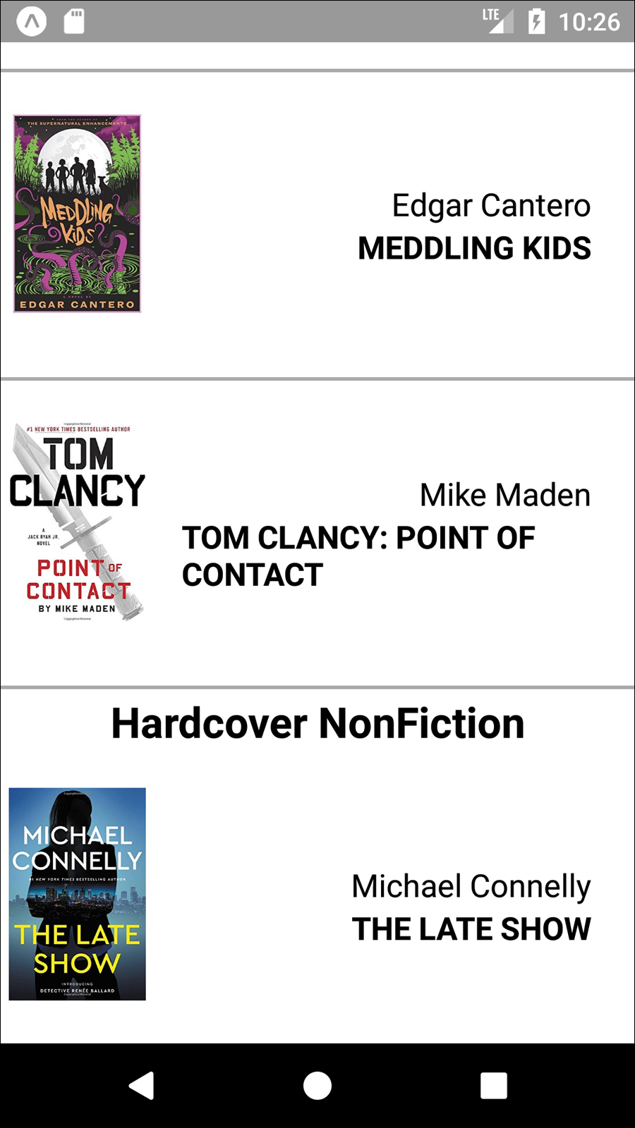
Figure 4-9. Viewing current best sellers, with <SectionList>
Navigation
Navigation in the context of mobile apps refers, roughly, to the code that allows users to transition from one screen to another. On the web, this is part of the window.history API, which provides concepts such as “backward” and “forward.”
Commonly used components for navigation in React Native include the built-in <Navigator> and <NavigatorIOS> components, as well as community solutions like <StackNavigator> (provided by the react-navigation library).
Navigation logic is necessary in order to move between screens in your mobile application. It also enables “deep linking,” so that users can jump from a URL into a particular screen within your app.
We’ll cover navigation in depth in Chapter 10.
Other Organizational Components
There are plenty of other organizational components, too. A few useful ones include <TabBarIOS> and <SegmentedControlIOS> (illustrated in Figure 4-10) and <DrawerLayoutAndroid> and <ToolbarAndroid> (illustrated in Figure 4-11).
You’ll notice that these are all named with platform-specific suffixes. That’s because they wrap native APIs for platform-specific UI elements.
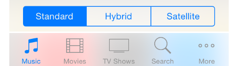
Figure 4-10. An iOS segmented control (top) and an iOS tab bar (bottom)
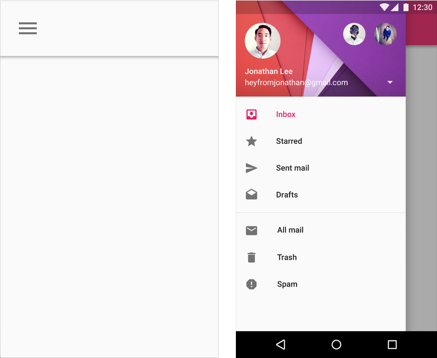
Figure 4-11. An Android toolbar (left) and an Android drawer (right)
These components are very useful for organizing multiple screens within your application. <TabBarIOS> and <DrawerLayoutAndroid>, for example, give you an easy way to switch between multiple modes or functions. <SegmentedControlIOS> and <ToolbarAndroid> are better suited for more fine-grained controls.
You’ll want to refer to the platform-specific design guidelines for how best to use these components:
We’ll cover how to use platform-specific components in more depth in Chapter 7.
Summary
In this chapter, we dug into the specifics of a variety of the most important components in React Native. We discussed how to use basic low-level components, like <Text> and <Image>, as well as more abstract components like <FlatList>, <SectionList>, and <TabBarIOS>. We also looked at how to use various touch-focused APIs and components in case you want to build your own custom touch handlers.
At this point, you should be equipped to build basic functional applications using React Native! Now that you’ve acquainted yourself with the components discussed in this chapter, building upon them and combining them to create your own applications should feel remarkably similar to working with React on the web.
Of course, building up basic functioning applications is only part of the battle. In the next chapter, we’ll focus on styling and how to use React Native’s implementation of styles to get the look and feel you want on mobile.