Table of Contents for
Adaptive Web Design: Crafting Rich Experiences with Progressive Enhancement, Second Edition
 Adaptive Web Design: Crafting Rich Experiences with Progressive Enhancement, Second Edition
Published by
New Riders, 2015
Adaptive Web Design: Crafting Rich Experiences with Progressive Enhancement, Second Edition
Published by
New Riders, 2015
- Cover Page
- Title Page
- Copyright Page
- Dedication Page
- Acknowledgments
- About the Author
- Contents
- Foreword
- Introduction
- Chapter 1. Designing Experiences for People
- Chapter 2. Content Is the Foundation
- Chapter 3. Markup Is an Enhancement
- Chapter 4. Visual Design Is an Enhancement
- Chapter 5. Interaction Is an Enhancement
- Chapter 6. Crafting a Continuum
- Progressive Enhancement Checklist
- Further Reading
- Index
- Code Snippets
- Images
- Images
- Images
Chapter 6. Crafting a Continuum
“The web’s greatest strength, I believe, is often seen as a limitation, as a defect. It is the nature of the web to be flexible, and it should be our role as designers and developers to embrace this flexibility, and produce pages which, by being flexible, are accessible to all.”
—JOHN ALLSOPP
As you’ve seen over the course of the previous chapters, not only does progressive enhancement enable more users to access your website, it can also make the development process much easier on you. It all starts by shifting the way you view experience.
When you see experience as a single thing, you devote all your effort toward realizing that one single experience. With such laser-focus on that one goal, it’s easy to lose sight of the fact that that one experience may not be what’s best for a good number of your users. Designing a single monolithic experience is a form of arrogance.
The reality is that everyone is different and everyone has special needs—some permanent, some transitory, some contextual. Rather than striving to produce one identical, inflexible experience that serves only a subset of the incredibly vast spectrum of web-enabled devices and the users who rely on them, you should embrace the inherent adaptability of the Web and design malleable experiences that bend and flex without compromising their purpose. You can’t possibly know all the places your site will go, but with a little planning, you can empower it to shine, no matter what. You can even prepare your sites for whatever devices and interaction methods the future may have in store.
Map the Experience
One of the greatest challenges of progressive enhancement lies not with the coding but with the planning. It can be incredibly challenging to articulate how a single interface might adapt to a wide variety of situations. Ix Maps (Interface Experience Maps) are a great tool for helping with this.
In 2007, I was presented with a challenge while putting together a talk called Ruining the User Experience. In the talk, I discussed treating JavaScript as an enhancement and what happens when you don’t.
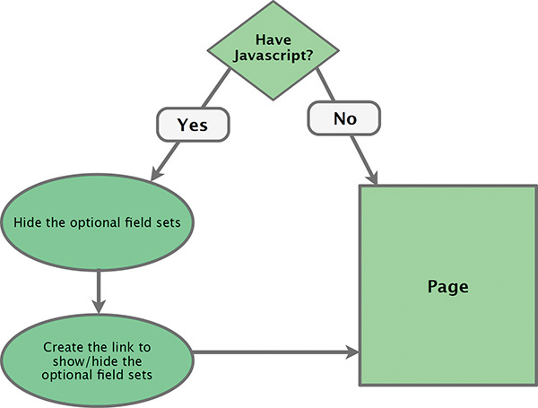
While preparing the talk, I struggled with the best way to convey the various decision points and interface adjustments that would need to happen as a result of those decisions. With the help of my co-presenter, UX strategist Sarah B. Nelson, I decided to use a flowchart, and it worked marvelously. Not only are flowcharts simple to create, but they’re also incredibly easy to understand. Figure 6.1 is the first one I did. It was pretty rudimentary (and failed to properly capitalize the S in JavaScript), but it got the point across.
In future iterations of the talk, I expounded upon the idea of flowcharts for describing how interfaces might adapt to different circumstances and browser capabilities (Figure 6.2). Over the years, I found more and more ways to put these artifacts to use. And, at a certain point, the term flowchart didn’t seem to cut it, so I began calling them UI construction flows1—which, admittedly, was a mouthful—and then finally settled on the name Interface Experience Maps or Ix Maps, with the help of a client.
1 I used the term “UI Construction Flow” in my chapter “Designing Adaptive Interfaces” in Smashing Book 4 (http://perma.cc/68XV-HFQD).
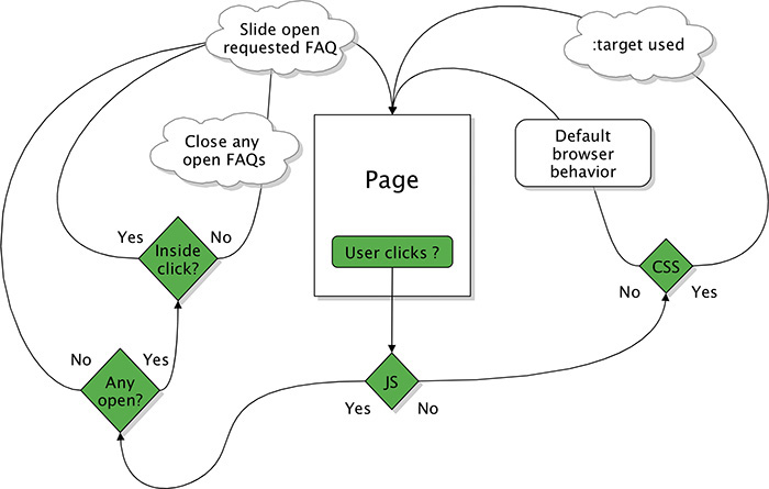
Figure 6.2 A later pass on the flowchart, this one describing the progressive enhancement and interaction options for an FAQ.
The Benefits of Ix Maps
An Ix Map is a pretty simple concept for anyone to grasp. This makes it a fantastic tool for enabling mixed teams—designers, developers, content folks, business strategists—to come together, brainstorm ideas, and build a strategy around progressive enhancement. Time and time again, I’ve seen these simple diagrams bring a diverse team together and help them quickly and easily come up with creative ways to address complex interface problems.
Ix Maps have become a useful tool to me and the teams I’ve worked with. They excel at articulating the different ways in which a given interface might adapt and what the end results of each adaptation might be. The clear documentation they provide is invaluable to just about everyone on the team.
• Copywriters get a clear picture of the different experience possibilities so they can craft the copy accordingly.
• Designers can see the different experience possibilities and can create wireframes and visual designs that account for each.
• Developers get a clear outline of what functionality is expected and know exactly what features and capability detection to employ in generating each experience.
• The quality assurance team has a clear picture of what they should be looking for in each component of an interface.
In short, Ix Maps ensure everyone on the team has an understanding of what’s expected so they can work toward a common goal. One company I worked with found Ix Maps so useful that they created one for every pattern in their pattern library. Then they included the drawings as part of each pattern’s documentation.
Because they are so basic, Ix Maps can be sketched out quickly on paper, on a whiteboard, or in software like OmniGraffle. Their simplicity also makes it quite easy to explore different ideas of how to adapt a particular interface without having to worry about throwing away an idea that doesn’t pan out. It’s only a few boxes and arrows...you haven’t invested any time in design or production.
Example: Lazy Loading Images
In Chapter 2, I said that you must evaluate each piece of content you consider including in your website with one question: Does this content actually add to the experience? A relevant example I gave was thumbnail images on the New York Times and Guardian websites.
In reviewing those examples, I conceded that having thumbnail images for certain article teasers can help to draw a user’s eye. This is particularly helpful on large screens where information density is high and there is a lot of competition for the user’s attention (please refer to Figure 2.4). That said, on smaller screens, the same level of competition does not exist. Furthermore, thumbnail images can, in some cases, cause your text to wrap oddly (Figure 2.5). Finally, for all the benefits in terms of visual interest and gaze-attraction, these images carry some heavy baggage: They greatly increase the overall size of the page and each one needs to be downloaded individually.2
2 At least until HTTP2 rolls out far and wide: http://perma.cc/QPA9-FWUW.
For these reasons, I would label the thumbnail images a “nice-to-have” feature, not a necessity. Let’s walk through an Ix Map that illustrates the different scenarios and then discuss how it might be implemented in terms of code.
To serve the most users the most appropriate experience, you should always start with a sensible baseline. In this particular interface, the images are optional; therefore, no img elements should exist in the markup. As you may recall from Chapter 4, hiding images with CSS does not guarantee they won’t be downloaded. You can only guarantee that the browser will not download the extra images if you don’t have markup for them in the HTML.
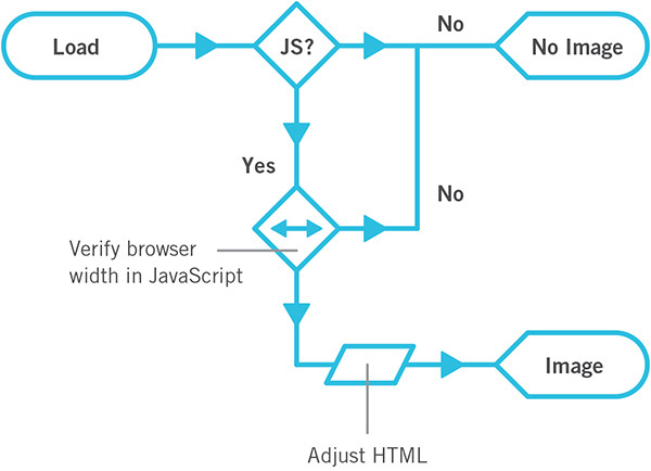
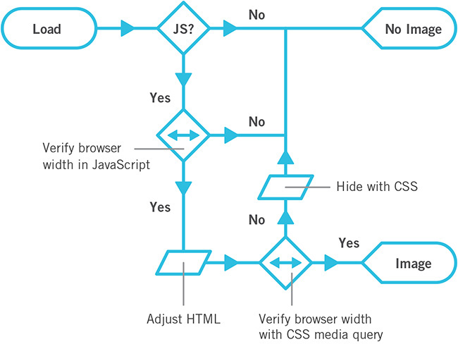
As no img elements will exist in the markup, you will need to dynamically inject them into the page after the page finishes loading. That requires JavaScript. As you’ll recall from Chapter 5, JavaScript enhancements are never guaranteed, so you will need to come to terms with the fact that some users, even on a large screen, may never get your JavaScript-based enhancement. Putting these bits together in an Ix Map results in Figure 6.3.

Figure 6.3 Before JavaScript runs and in the absence of JavaScript, users will not get the thumbnail images.
With the “no JavaScript” scenario accounted for, let’s go down the “with JavaScript” path. If the JavaScript enhancement can run, you want to load the images, but if you just left it at that, any small-screen browser would load the images too, which is not what you want. So, you need to insert a test before you load the images. A good rule of thumb when it comes to allowing text to wrap around an image is that the screen width should be at least twice the image width. Since your thumbnail images are likely a consistent size (or at least a consistent series of sizes), you could use twice that width as a threshold, beyond which JavaScript will lazy load the images but beneath which it doesn’t. Adding this bit of logic into the Ix Map results in Figure 6.4.
As you can see, Ix Maps enable easy iteration. Using this document as a guide, you can begin to consider implementation details. For example, if you don’t use img, how do you get the image in there? Nichols College, which I’ve mentioned a few times in this book, has an elegant solution.
<div class="image--lazy"
data-image="/path/to/image.jpg"></div>
It opted to use a non-semantic division with a data attribute to carry the image path information. This approach offers two key benefits.
• The div has no default padding or margins when rendered in a document, so it will occupy no space on the page when it has no contents.
• The data attribute makes a declarative statement about the div, indicating its purpose and offering the path that should be used to generate the image.
From a CSS standpoint, Nichols College defensively ensures the div is not displayed by default, just in case some styles from elsewhere in the style sheets might give it some display properties.
.image--lazy {
display: none;
}
The JavaScript it uses to lazy load images is pretty straightforward. The site uses jQuery and compresses the JavaScript, but I will transcribe the meat of it to normal JavaScript with some explanatory comments so you can follow what the developers did.
var
// look for any lazy images
$lazy_images = document.querySelectorAll(
‘[data-image]’ ),
// create a model img to clone
$img = document.createElement(‘img’),
// instantiate the other variables used
len, i, $container, $image, src;
// loop through each lazy image
for ( i=0, len=$lazy_images.length; i < len; i++ ) {
// get the container
$container = $lazy_images[i];
// only run once per container
if ( $container.dataset.imaged != null ) {
continue;
}
// make the image and insert it
$image = $img.cloneNode();
$image.src = $container.dataset.image;
$image.alt = "";
$container.appendChild( $image );
// mark this one as loaded
$container.setAttribute( ‘data-imaged’, ‘’ );
}
In Nichols College’s case, rather than tying the lazy load to a particular screen width, it opted to have the JavaScript pay attention to the current CSS media query in effect. It managed this synchronization using a technique based on the work of web designer Adam Bradley.3 Using JavaScript, the developers inject a hidden div into the page.
3 http://perma.cc/DPW5-2CVV. Jeremy Keith did a round-up of techniques like this at https://perma.cc/MM4V-EGPR.
var $watcher = document.createElement(‘div’);
$watcher.setAttribute( ‘id’, ‘getActiveMQ-watcher’ );
$watcher.style.display = ‘none’;
document.body.appendChild( $watcher );
In the CSS, they have a series of rules that assign a breakpoint keyword to div#getActiveMQ-watcher as a font-family value. The default is “default” (naturally). They follow this with “tiny,” “small,” “medium,” and “full,” each within its corresponding breakpoint, like this:
#getActiveMQ-watcher {
font-family: "default";
}
@media only screen and (min-width:20em) {
#getActiveMQ-watcher {
font-family: "tiny";
}
}
@media only screen and (min-width:28.75em) {
#getActiveMQ-watcher {
font-family: "small";
}
}
/* and so on... */
Using JavaScript’s getComputedStyle, the developers then created a custom function to pluck the corresponding breakpoint keyword from the CSS and return it.
window.getActiveMQ = function() {
return window.getComputedStyle( $watcher, null )
.getPropertyValue( ‘font-family’ )
.replace( /[‘"]/g, ‘’ );
};
(That call to replace strips any single or double quotation marks that might be around the keyword.)
They wrap the lazy loading program you saw earlier within a conditional that uses their custom function getActiveMQ to test for the active media query before applying the logic. They let it run only if the breakpoint is “medium” or “full”. The whole thing is then passed to another custom function called watchResize4 that, as you’d expect, watches for resize events and then triggers any functions passed into it to run.
window.watchResize( function(){
var active_media_query = window.getActiveMQ();
if ( active_media_query == ‘medium’ ||
active_media_query == ‘full’ ) {
// their lazy loading code goes here
}
} );
It’s worth noting that watchResize also runs the passed function once when the page loads. It does this to ensure the function runs at least once in case a user never resizes the browser.
Taken together, all this JavaScript and CSS realizes the Ix Map as I’ve built it thus far, but Nichols takes things a step further. Since watchResize will run on load and whenever a user resizes the browser (an event that also occurs when she rotates her device), Nichols wanted to make sure any loaded images never caused problems when a user went from a widescreen view to a narrow one. A perfect example of this use case is a 7-inch tablet—they tend to be tall and narrow in portrait orientation and short and wide in landscape. To prevent an awkward reading experience, Nichols shows the lazy loaded images only in the medium breakpoint or larger.
// this is their "medium" size
@media only screen and (min-width: 43.125em) {
.image--lazy[data-imaged] {
display: block;
}
}
Updating the Ix Map for parity with Nichols College’s implementation, I can simply say that the decision point based on width is actually a live test (Figure 6.5). It tests for enough width via JavaScript—using watchResize and getActiveMQ—and either loads the image or doesn’t. If JavaScript has loaded the image, the page then uses CSS to enforce the rule—embodied by a media query—governing whether it should be displayed. Clever stuff.5
5 I have built a reduced version of this whole setup for you to dissect and explore: http://perma.cc/F6Y3-7XKJ.
Example: Tabbed Interface
We’ve looked at tabbed interfaces a lot and dissected them in great detail, so I won’t rehash all of that. I do want to run through an Ix Map for one, however, so I can show you how this tool can be incredibly useful for iterating on an interface.
Let’s say you start with the basic tabbed interface. I mentioned in Chapter 5 that you can build a tabbed interface from linear content, using the document outline as your guide. This approach is documented in the fairly simple Ix Map shown in Figure 6.6.
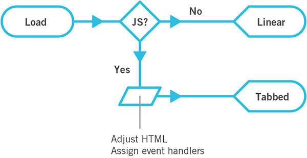
Figure 6.6 Pass 1: If JavaScript is available, make a tabbed interface out of linear content. If not, leave it as it was.
You may also recall that tabbed interfaces aren’t necessarily the best way to interact with content on narrow screens. Maybe it makes sense to switch to an alternate interface, such as an accordion if the screen is below a specific width or if there isn’t enough room for the tabs to fit horizontally. You can incorporate that option into the Ix Map and get Figure 6.7.
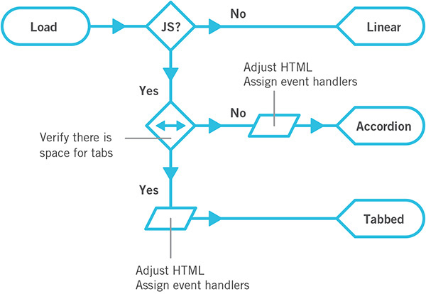
Figure 6.7 Pass 2: Add a live width test into the mix to see whether there’s enough room for the tabs and make it an accordion if the screen is too narrow.
There is also a native element combination for creating an accordion: details and summary. You could avoid having to load a lot of extra JavaScript code if you allowed for that as an option in supporting browsers. Revisiting the Ix Map to include this as an alternate path would result in Figure 6.8.
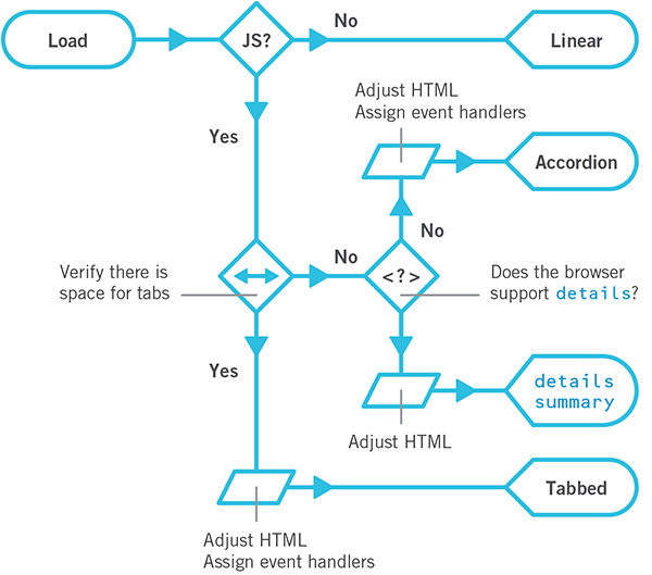
Figure 6.8 Pass 3: Test for native details/summary support and use the native functionality if available.
As you can see, iteration on an interface is incredibly easy with Ix Maps.
Ix Maps allow you to explore innovative ways to solve design challenges using progressive enhancement without getting bogged down in the minutia of implementation details. They are a tool any member of the project can easily understand, discuss, and contribute to. They are also a great touchstone to refer to as a project continues because they help you focus on purpose and intended outcomes. They help you visualize progressive enhancement.
Learn From the Past, Look to the Future
When discussing progressive enhancement, I’ve encountered a lot of designers and developers who have a hard time understanding why this philosophy’s focus on supporting older browsers matters in the modern browser era. As I’ve mentioned at length in the previous chapters, starting with a universally accessible baseline and enhancing it based on browser and device capabilities has many benefits for the people who are coming to your site today, but it does more than that. Progressive enhancement’s focus on supporting the past also ensures your customers will always be able to do what they came to your site to do, even on devices not yet imagined.
That may seem like a bold claim, but if you look at how our relationships with computers, and thereby the Web, are evolving, you’ll see that looking at the past actually helps us prepare for the future.
Mobile Is the New Dial-Up
If you’ve been on the Web for a long time, you probably remember early dial-up modems and their sluggish 14.4Kbps, 28.8Kbps, or even 56Kbps speeds. As web designers in that era, we went to great pains to reduce the size of our web pages to deliver a speedy experience. With the shift from hard-line to mobile data connections, performance optimization has again become critical.
It seems that every day we find new and clever ways to wring a few bytes here and there from CSS, JavaScript, and images. These tactics have their roots in lessons we learned during the early days of dial-up: Keep your files light. Optimize your images. Load only what’s necessary.
As dial-up access has been overtaken by broadband in our homes and offices, we’ve allowed our page sizes to balloon and the number of assets we request to skyrocket. We lost this knowledge until search engines started penalizing our sites for poor performance.6 Performance matters, even if you happen to be on a high-speed mobile connection—which most of the world isn’t. Progressive enhancement honors your users by prioritizing your website’s core experience. Its focus on your website’s true purpose will help your content reach your users wherever they are.
Small Is Big Again
When I first got online, I browsed the Web on a 640×480, 8-bit color display. It was incredibly limited. The jump to 800×600 on my next computer was huge. By the time I graduated to a 1024×768 monitor, I had no idea what to do with the space. Since that time, screens on our laps and desks have largely continued the trend of getting bigger with each successive generation. The computer I am writing this on boasts a high-definition 2880×1800, 32-bit color display, and it’s not uncommon to see designers working on 42-inch screens. As technology has improved, we’ve been granted more real estate, so it might seem there’s not much we have to learn from those small desktop screens of yore. There is.
Sales of mobile and wearable devices are quickly eclipsing those of traditional desktop and laptop computers. It turns out having a computer in your pocket is far more convenient than having to go back to your desk to look something up. Carrying around a large screen isn’t terribly convenient, so the screens we have with us are smaller and more manageable. They may boast high resolutions, but they are typically packed into 6 inches or less in smartphones. Tablets get a bit bigger but not much. And wearables offer the tiniest screens of all—the Apple Watch and Pebble Time offer resolutions of 312×390 and 144×168, respectively.
Optimizing our users’ experience on a small screen—a lesson we learned in the early days of the Web—is relevant again. Your copywriting should be straightforward and to the point while still being personable and human. Your font sizes and margins need to provide a good reading experience in narrow viewports. And your imagery (if it even makes sense to include any) needs to be appropriate and focused. Progressive enhancement, with its laser-like focus on the content that matters, will help your website be successful on these tiny screens.
Text-Only Is Back in a Big Way
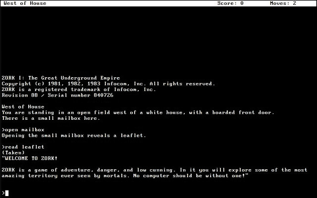
When I first started using a computer, few programs sported fancy graphical interfaces like we see today. The first nonconsole video game I played was no exception. Zork7 (Figure 6.9) was entirely text-based. Much like the “gamemaster” role in a tabletop role-playing game like Dungeons & Dragons or Vampire: The Masquerade, the game acted as a guide for you, the adventurer. It was purely text-based, so you read about the setting you were in and typed commands like open mailbox or read leaflet to interact with the environment and play the game. When compared to the latest Xbox or PlayStation title, this kind of gameplay may seem like something that would be more interesting in a museum than on the Web. In some ways, it is. But it’s also the future.
Science fiction has often been a strong predictor of our technological future. HAL 9000 from 2001: A Space Odyssey is probably the most (in)famous example of a computer that interacts with its users largely via voice. As a concept, the “talking computer” has appeared time and time again in space-age fiction—everything from Red Dwarf to Interstellar. To function in the real world like they do on TV and in movies, computers need two capabilities: natural-language processing (to understand what we say) and speech synthesis (to communicate, aurally, back to us).
Natural-language processing has its roots in the 1950s. In 1954, the “Georgetown experiment” demonstrated that it was possible to automatically translate a couple dozen written, romanized Russian sentences into English. In the 1960s, ELIZA began mapping text-based conversations to scripts and sometimes responded in an uncannily human manner. The 1970s saw the rise of chat bots that could engage in basic small talk, most of which were experiments attempting to pass the Turing Test8 by convincing a human that they were also human. Around the same time, the first speech recognition prototypes were being developed.
Many of these models were limited because they were built around a series of hard-coded rules that the computers followed. In the 1980s, however, machine learning and real-time statistical analysis became possible. As hardware capabilities continued to improve and computers became more powerful, they got better at recognizing the words we were saying to them, leading to automatic transcription software like DragonDictate. Eventually, with enough processing power, they also began to assign meaning to words and could react accordingly.
Listening is great, but true communication is bidirectional. Early experiments in speech synthesis began in 1779 with Christian Kratzenstein’s models of a human vocal tract capable of producing vowel sounds. Electronic experiments in the 1930s–1950s yielded some pretty unintelligible synthesized speech, but it was a start. In the 1980s, Dennis Klatt came up with an algorithm called MITalk, which was eventually implemented within the DECtalk software notably used by Stephen Hawking for a number of years. By the 1990s, reasonably intelligible text-to-speech software was being rolled out alongside most operating systems as a cornerstone component of assistive technology: the “screen reader.” Notable screen readers include Apple’s VoiceOver, Freedom Scientific’s JAWS, GNOME’s Orca, Google’s ChromeVox, Microsoft’s Narrator, and the NonVisual Data Access project’s NVDA.
When combined, these two technologies eventually gave rise to virtual personal assistants. The most prevalent are found in popular operating systems: Siri in iOS, Google Now as part of Android, and Cortana predominantly on Windows but available on iOS and Android as well. But they aren’t limited to smartphones. Amazon’s Echo is a stand-alone virtual assistant that can control your lights and thermostat and order you more toilet paper. Many cars are also coming with personal assistant features. It makes sense in context: A driver’s hands should be placed firmly on the wheel, and their eyes should remain on the road while driving.
Practice the Fundamentals
Over time, your users will become more accustomed to and reliant on voice-based interactions with their computers—and, thereby, the Web. Enabling them to complete critical tasks without a visual user interface will be crucial for the long-term success of your website.
So, how do you design a “headless” UI? That’s easy: You design the text.
As I covered in Chapter 2, conversation is at the root of every interaction we have, be it with another human being, with a game, or with a website. Design every experience as a conversation you want to have with your users.
As a video game, playing Zork may seem crude and unnatural to you, but it’s not. It’s simply unfamiliar. Language is the root of how we, as humans, communicate, and it’s likely to become a big part of how we interact with computers in the future—though via voice rather than typing. Treat that conversation as sacred and make sure that the technological decisions you make with respect to HTML, CSS, and JavaScript respect and support it. That’s progressive enhancement.
Be Ready for Anything
When you use progressive enhancement to build a website, everyone reaps the rewards. Your users benefit because the products you build reach them where they are, in the most appropriate way possible. You benefit because you avoid tearing your hair out trying to give the same experience to every user who comes to your website. And your clients (or managers) benefit by reaching more users for far less money and in less time.
Embracing this web design philosophy will make you a better web designer, too. When you truly understand your medium, you can embrace its constraints and work with them rather than against them. In his piece “The Web’s Grain,” designer Frank Chimero nailed the beauty of progressive enhancement.
Most of the solidified techniques about our practice come from the natural ways of the web that have been there since the start. The answer is right there in front of us, in the website itself, and each step we take away from its intentions makes our creations weaker.9
Progressive enhancement sees the Web as it is. It embraces the Web’s solid foundation and inherent adaptability, enabling you to craft interfaces that can work for anyone, no matter what device they are on, network they connect to, or browser they use. It helps you avoid fixating on highly variable factors such as screen dimensions or specific browsers. It keeps your designs flexible enough to reach your users on the devices they actually use rather than ones you happen to be familiar with. It increases the potential reach of your site dramatically by giving everyone a good experience, even if it isn’t an identical one. And it reduces your testing and browser support annoyances by selectively delivering only the code and instruction each browser can handle. Beyond all that, the progressive enhancement philosophy enables you to capitalize on the awesomeness of the Web, both today and in the future.