Table of Contents for
Adaptive Web Design: Crafting Rich Experiences with Progressive Enhancement, Second Edition
 Adaptive Web Design: Crafting Rich Experiences with Progressive Enhancement, Second Edition
Published by
New Riders, 2015
Adaptive Web Design: Crafting Rich Experiences with Progressive Enhancement, Second Edition
Published by
New Riders, 2015
- Cover Page
- Title Page
- Copyright Page
- Dedication Page
- Acknowledgments
- About the Author
- Contents
- Foreword
- Introduction
- Chapter 1. Designing Experiences for People
- Chapter 2. Content Is the Foundation
- Chapter 3. Markup Is an Enhancement
- Chapter 4. Visual Design Is an Enhancement
- Chapter 5. Interaction Is an Enhancement
- Chapter 6. Crafting a Continuum
- Progressive Enhancement Checklist
- Further Reading
- Index
- Code Snippets
- Images
- Images
- Images
Chapter 2. Content Is the Foundation
“Content precedes design. Design in the absence of content is not design, it’s decoration.”
—JEFFREY ZELDMAN
Over the 2011 holidays, Facebook users uploaded photos like crazy. In just a few days, Facebook processed more photo uploads than are contained in the entirety of Flickr. Seriously, that’s a lot of photos.
One unintended consequence of this deluge of photo uploads was a significant uptick in people asking Facebook to remove specific ones. Facebook received millions of these “photo reports,” but they made no sense: moms holding babies reported for harassment, pictures of puppies reported for hate speech, and so on. Roughly 97 percent of these photo reports were dramatically miscategorized.
Facebook’s engineers reached out to some of the users who had reported these photos to get a bit more background regarding their submissions. At the time Facebook’s photo-reporting interface provided a list of reasons users could choose from if they wanted a photo removed, but, as Facebook soon discovered, many of the reports were made because users didn’t want the photo posted for reasons other than those provided. In some cases, it was because they didn’t like how they looked in the photo. In others, it was because the photo was of an ex-partner or even a beloved pet they’d shared with an ex-boyfriend or ex-girlfriend.
The existing photo-reporting tool had not done a good job of accounting for these more personal reasons for wanting a photo removed, so the Facebook engineers went to work. They added a step that asked, “How does this photo make you feel?” The options were simple.
• Embarrassing
• Upsetting
• Saddening
• Bad photo
• Other
The Other option also provided a free-response text field to fill in.
With this system in place, Facebook engineers found that 50 percent of reporters who answered the new question chose one of the provided options. That was pretty helpful, but there was still a problem: 34 percent of the respondents who chose Other were writing “It’s embarrassing” in the blank rather than choosing the Embarrassing option already provided.
What the Facebook team realized was that people were not identifying with the Embarrassing option (or may have even thought it was referring to them rather than assuming the implied “It’s”). A subtle shift in language was needed, so they changed the label to “Please describe the photo,” and they updated the options to mirror how people actually talk.
• It’s embarrassing
• It’s a bad photo of me
• It makes me sad
With this subtle change, they were able to increase the percentage of photo reporters who chose one of the options provided to a whopping 78 percent.1
1 This story appeared in RadioLab’s episode “The Trust Engineers.” You can listen to it at http://perma.cc/WZJ7-AK9X.
Words matter. Even in something as simple and banal as a form, the words you choose set the tone for your users’ experiences and often have an effect on what they do, or fail to do.
The text of your interfaces—especially form labels and responses—is just one small part of the content picture. There are many other types of content, such as product descriptions, marketing copy, legal statements, photography, illustrations, visualizations, video, audio, and more. However, when we think about “content,” we often equate it with “copy.” This is no doubt a carry-over from the marketing world where “copywriters” were tasked with authoring the text for an advertisement or campaign.
“Content,” as a word, kinda sucks. It feels dry, mechanical, boring, tedious. It’s generic and nonspecific. No one ever jumped out of bed in the morning shouting “Today I’m going to make content!” In fact, it fits perfectly as a blanket term for that lifeless corporate communications drivel we endure on a day-to-day basis.
And yet, “content” is where experience begins. We often lose sight of that.
The role of the traditional copywriter was to collaborate with an art director on the message and purpose of a campaign. How should it make someone feel? What actions should it prompt them to take? Copywriters created a conversation with their audience that was so much larger than the words they employed.
Words, as they say, are cheap. Without a message, a purpose, words become weak. We can (and often do) author page upon page of flowery prose without saying anything. To write effective copy, it’s important to know what the words need to be doing. To employ progressive enhancement, it’s crucial to understand the role that content plays—it’s the foundation upon which experiences are built.
Avoid Zombie Copy
At the center of every interface is a conversation. You engage your users directly in an effort to inform them, entertain them, or persuade them to act in a particular way. How this conversation goes will directly affect the experience your users have.
When you speak to a friend or even a stranger, you speak with enthusiasm, interest, and...well...like a human. YOU DO NOT RESPOND TO YOUR HUMAN COMPANION'S QUERIES WITH A SERIES OF WORDS THAT ARE OF A LIFELESS AND ROBOTIC NATURE. And yet, that’s the way scads of sites on the Web sound. Just because your content is managed in, delivered via, and displayed by a computer doesn’t mean it needs to sound like it was written by one.
In her article “Attack of the Zombie Copy,” content strategist Erin Kissane highlighted a real-world example of this.2
Incorporating our corporate culture into our business processes and customer needs, we continue to leverage our exceptional and effective work practices, improve operational effectiveness to meet business objectives and create win-win situations for our employees and shareholders.
Wow. Now I’m not a violent man, but if someone said that to me at a cocktail party, I might have to slap them. Don’t tell me you wouldn’t.
We don’t speak like that in person, so why should we speak like that online (or anywhere for that matter)? It’s impossible to connect with content that reads like this. How do you have a conversation with a robot (or a zombie)?
Conversation is the basis for every user interaction. Don’t believe me? Here are a few examples:
• Home page: You’ve just met someone and are explaining what you do (and, in some cases, why it matters). It goes best if you can find a way to relate what you do to something they’ve experienced.
• Contact form: You are trying to understand what someone needs in order to help them. Managing their expectations is key; let them know how long it may take you to get back to them.
• Product page: You are explaining what this object or service is, what it does, and how it will benefit them. If you know the type of person you’ll be having this conversation with ahead of time, you’d plan ahead so you’re ready to answer their questions quickly and easily.
• Status update: You’re there to help someone open up... and then you shut up and listen (and mine their data for marketing purposes).
When you approach interfaces as conversations, it humanizes the interactions and improves your users’ experiences. It also helps you focus on the important stuff so you don’t get caught up in the act of writing.
Design Meaningful Content
Diving into etymology for a moment here, design comes from the Latin designare, meaning “to mark out or indicate.” The purpose of design is not to make something pretty; it’s to clarify.
Words are powerful. They can obscure just as easily as they can illuminate. When you author content, you need to consider not only what you write but how you write it. Are you being unnecessarily vague? Are you using too much jargon or assuming too much domain-specific knowledge from your readers? Are you writing to the appropriate reading level? Are you being respectful? Are you writing in a way that connects your readers with your products or your brand? Is your content serving a purpose?
Asking these questions may be second nature to you, but I’ve encountered countless projects where content was clearly an afterthought, something that was stubbed out with nonsensical Latin text and gray boxes. We often take these shortcuts in our eagerness to tuck into “design” as quickly as possible, but that very decision undermines what it means to be a designer in the first place.
Content strategist Liam King was dead-on when he said this:
The problem with Lorem Ipsum is it conveniently fills the available space like an expanding gas. Unfortunately, it is inert, meaningless and lacks context, revealing very little about the relationship between the design and the content.3
We often use fake text—a.k.a. Lorem Ipsum—as a tool to help us make some progress on designing an interface while we are waiting for “final, approved copy” (as though such a thing exists). We’re not etching this stuff in marble tablets, folks—we’re writing software. Start by writing the kind of copy you want to read. You can always change things later.4
4 Lorem Ipsum isn’t always the worst thing in the world. If you find that real copy is a distraction in design review meetings, for instance—Bob keeps nitpicking the copywriting—you can always sub in Lorem Ipsum for that specific context. Content strategist Karen MacGrane discusses this and other uses for Lorem Ipsum at http://perma.cc/N9UR-PHDJ.
An added bonus of authoring real copy early is that even if you forget to replace it, you end up with something that’s halfway decent rather than something horribly embarrassing (Figure 2.1).5
5 Product designer Rian van der Merwe has amassed quite a collection of “placeholder” texts that have made it out into the wild: http://perma.cc/MT48-NQPH.

By focusing on how your interfaces read, you can gauge how well the copy you’ve written helps or hinders users to accomplish their goals. Words are the core of virtually every experience on the Web, and if you don’t consider that from the beginning, no amount of breathtaking visual design or incredible JavaScript gymnastics are going to salvage it.
Craft the Conversation
Content strategist Stephanie Hay is a proponent of copy-driven interfaces and has seen great success with this approach. She begins collaboratively authoring real copy early in the process—even at kickoff!6
6 Stephanie Hay’s template for kicking off new projects is publicly available at http://perma.cc/X532-Q8LH.
To do so effectively, she offers the following guidelines:
1. Focus on writing actual content for the most sought-after content FIRST.
2. Ignore structure and flow—focus entirely on:
• What is a realistic conversation we have with users on specific topics?
• How can we clearly anticipate or answer their questions?
• What’s the end result of that conversation—a sign-up? A referral?
3. Create content that describes a realistic conversation you have with the target audience.
These guidelines are invaluable for keeping copy clear and focused. They also do wonders for clarifying the purpose of a project, which is all too easy to lose sight of in the rush to get it done and out the door.
A solid product or project strategy acknowledges the myriad moving pieces and looks for ways to connect them in support of the project’s purpose. Without this orchestration, every facet of the project is left to chance and can cause the whole thing to fall apart. Copywriting is a powerful tool for tying it all together.
Another benefit of using copywriting in this way is that it forms a narrative but doesn’t dictate design or interaction. It becomes a touchstone that each and every member of the team can reference to keep them mindful of the conversation they’re having.
If the purpose of your site is to get a potential customer (let’s call him Ben) to purchase a craft dog biscuit, your conversation with him might go a little something like this:
1. Explain what’s in most dog biscuits. Eeew!
2. Talk about the dog-appropriate, natural ingredients in your dog biscuits. Yum!
3. Offer Ben a free sample pack or free shipping on a trial order. Nice!
4. Let Ben know that you believe so much in your biscuits that if his dog doesn’t like them, you’ll refund his order in full. That’s reassuring.
5. If he tries the biscuits, you’ll follow up a week after shipping to see how it’s going. You’ll offer him an easy way to start a subscription or a painless way to get a refund. Wow, that’s easy!
6. If Ben goes for a subscription, you’ll throw a few sample packs in there and ask him to share them with his friends. Awesome! I’ll pass these around at the dog park.
While bare-bones—forgive the pun—this is a simple way to outline the experience you want Ben to have. It’s also the perfect framework for fleshing out the real copy for your pages, emails, and so on, because you know what you want to say and what sort of reaction you are hoping to elicit from Ben. And you’ve even accounted for what happens if Ben is unhappy with the product, ensuring his experience of the company is always a positive one.
Mapping out user experience as a conversation can be invaluable for ensuring every decision you make in strategy, design, and production offers a positive contribution to that conversation. It isn’t prescriptive about the way the page should be designed or what technology choices should be made. It does, however, make it clear that burying the “request a refund” button would be a no-no. Similarly, it helps you prioritize the content of your pages and informs you of what is crucial (and what’s not).
Prepare for Problems
It’s great when things go well, but what about when things go badly? As a user, there are few worse feelings than having a form you just filled out spit back to you because it contained errors.
Errors are one of those things you hope no one ever encounters, but someone always does. As users, they catch us off-guard and make us feel vulnerable and uneasy. As copywriters, it’s your job to be there for your users to ease the tension, reassure them that it’s not the end of the world, and help them quickly and easily remedy the issue.
Email marketing platform MailChimp does a fantastic job integrating this sort of thinking into its process. In fact, MailChimp’s content director, Kate Kiefer Lee, created a whole site, Voice and Tone,7 that details how copywriters should be speaking to their customers in various situations, with a clear focus on their users’ mental state and instructions on how to author copy that helps the situation rather than making it worse (Figure 2.2).
7 http://perma.cc/PAW2-LYCA. See also MailChimp’s fantastic Style Guide: http://perma.cc/GQK6-79CM.
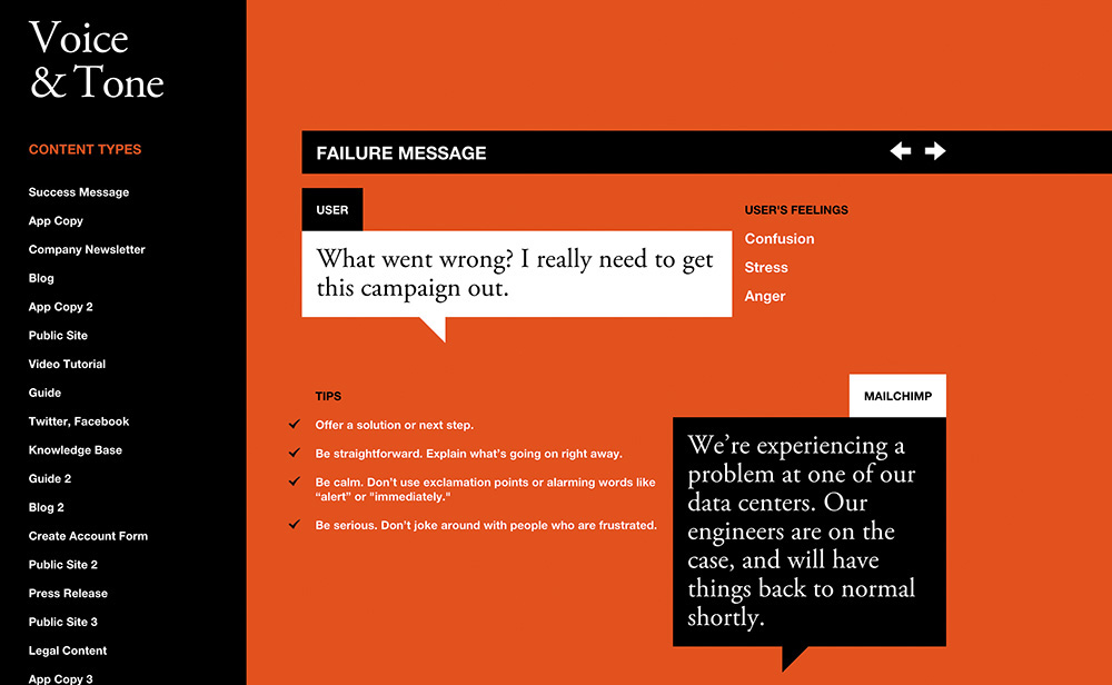
For instance, when something goes wrong, the site acknowledges that the user is likely feeling confusion, stress, and possibly even anger. It offers what the user might be thinking—“What went wrong? I really need to get this campaign out.”—and then offers some tips on how to author copy that will be helpful rather than harmful:
• Offer a solution or next step.
• Be straightforward. Explain what’s going on right away.
• Be calm. Don’t use exclamation points or alarming words like alert or immediately.
• Be serious. Don’t joke around with people who are frustrated.
The guide even offers a good example that follows these guidelines: “We’re experiencing a problem at one of our data centers. Our engineers are on the case and will have things back to normal shortly.”
Simple. Direct. Clear. Conversational.
This level of care for their users shows them respect. It creates a reassuring experience for them, and consequently, MailChimp stands out as a company that cares about its customers.
It’s also worth noting that putting together a guide like this helps you scale your content creation to more individual contributors as your project grows and your customer touchpoints become more diverse. It’s a great way to keep everyone on the team speaking with a unified voice, further solidifying your brand’s personality in the mind of your users.
Plan for the Unknown
While the vast majority of web projects can use real content to drive a project, there are many project types (or portions of projects) where this is simply not feasible. Some projects need to be designed to handle a constant influx of new content, such as a blog, a news site, or your Twitter feed.
But even if you don’t have all the content that will find a home on your site from the outset, all is not lost. You just need to think about the types of content you will need to support.
Thinking about the content you write in a systematic way can help ensure the words you author are assembled in a manner that best realizes their purpose. Designer Mark Boulton put it beautifully.8
You can create good experiences without knowing the content. What you can’t do is create good experiences without knowing the structure. What is your content made from, not what your content is. An important distinction.
Content is hard. In my 20 years building websites, content has been the number-one factor that has put those projects at risk. But as Mark says, the content, while important, doesn’t need to be complete. You don’t need “final, approved copy” to begin designing, coding, or developing. What you need to know is what the content is, all the bits it comprises, and which of those bits are optional. This forms the basis of a site’s information architecture.
If you are building a blog, for instance, you can’t write all the copy before you launch the site; that would be absurd. What you can do, however, is take stock of the kinds of content you will be posting and use that to establish a consistent structure for each post.
For instance, you might know that every blog post will have a title and a body. But maybe every post needs a teaser sentence or two as well. That content could be used on an aggregation page (for example, the home page), or it might be used when the post is shared on a social network or found in search results.
Maybe you want all blog posts to have a unique image for use in the header, or maybe that’s a “nice-to-have” feature that’s optional.
If this blog is a solo undertaking, you may not need to capture the author, but if you might consider guest posts in the future, perhaps you should allow for that but make it optional. Tags, pull quotes, references, and more might be appropriate to some posts but not others.
Taken together, these bits form a blog post, but you don’t need to know what every blog post that you will ever write is in order to design a blog template. You simply need to know what bits constitute a blog post and which of those are optional. It also helps to have a rough idea of how many words, images, videos, and so on, to expect in each.
You can repeat this process for each unique content type on the site, and it will give you a clear picture of what you are dealing with. All of this information can also be taken into account when designing the CMS (content management system) that powers the blog (Figure 2.3).
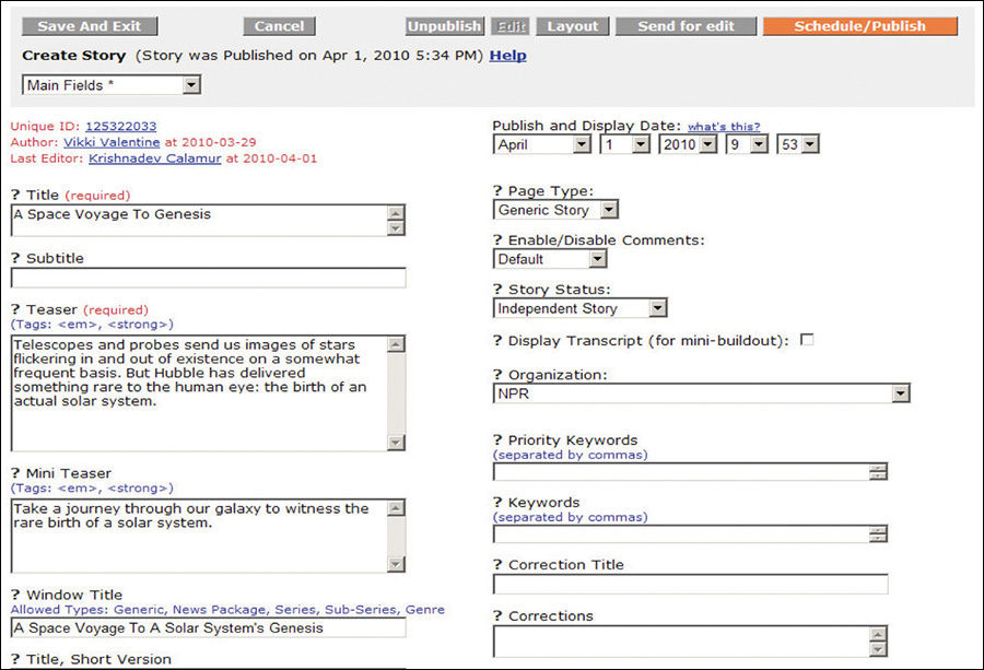
Figure 2.3 NPR’s CMS showing a handful of the component pieces of a story (from a presentation by Zach Brand of NPR, available at http://perma.cc/398N-5572).
Thinking of content in this way creates the structure that is the fundamental first step in creating any experience. You need to know what Lego bricks you have in your pile before you can even hope to assemble them into something that makes any sense.
But I Don’t Know the First Thing About Structured Content!
Thinking about structured content like this can be tough at first, so don’t worry if it doesn’t come naturally to you. If you find it challenging to think about it all in the abstract, find some examples of similar content that you can use as a reference.
If you are working on a blog or news site, you can go to a similar site and dissect one of its posts, teasing out the component pieces. You can compare different posts on the same blog and see whether some of the bits are optional. You can view the source of the page to unearth things such as teasers that might be hiding in meta tags. Then you can do it all over again for another site.
If you are working on an e-commerce site, you can view a competitor’s site and perform the same sort of audit on its product listings. You can check the product page information against what you see for that same product in search results and on category landing pages. Are there multiple descriptions of varying lengths for different contexts? Are there abbreviated feature lists and full ones? Noting subtle differences like this helps you understand how your competitor is structuring things under the hood. Then you can go to another competitor and repeat the process.
Once you have the content structure nailed, it will be the roadmap for building out the CMS. And while you’re waiting on real content to get entered into the system, you can use the representative content you found in your research (at least the bits you like) as the content that drives the experience. It’s way better than Lorem Ipsum.
Write for Real People
In addition to helping you to stay true to your purpose, using the “content first” approach to designing experiences also ensures that your content is accessible to every potential user.
When I speak of accessibility, it’s easy to get quickly overwhelmed by all the considerations—as I discussed in Chapter 1, everyone has special needs. It’s daunting to even consider how to address a fraction of these many and varied concerns. This is when it helps to come back to thinking of experience as a continuum. That continuum needs to start somewhere, and it starts with your content.
When you craft content (or work with someone who does), think about how the interface reads. How straightforward is the writing? Is it lousy with jargon? Are you speaking to your audience the way they speak to you or to each other? Are you addressing your users as equals? Clear, well-written, and audience-appropriate prose is accessible to anyone. When you consider how your interfaces read, first you create a solid foundation on which to build a great experience.
Consider Content Beyond Copy
When I discuss “content,” I’m often speaking of the written word. But content isn’t limited to copy. Photos, videos, audio files, PDFs, tables, interactive charts, iconography...those are all content too. They deserve as much consideration as the prose you author.
Pictures, sound, and video content can greatly enhance the experience of an interface. They can bring copy to life and, when done well, can provide clarity for your users that would be a struggle with words alone. And they can do so much more succinctly in the same way a single frame of HBO’s Game of Thrones can convey as much information as a dozen pages of George R. R. Martin’s prose.
But media can also be an unnecessary distraction. When you begin to consider the concrete experience of downloading a web page on a mobile device over a 3G or slower connection, the giant, beautiful, high-resolution imagery you loved so much becomes problematic. It’s often the same when accessing content in an airport, train station, or hotel over wifi—it’s never fast enough, and waiting for images to download can be a drag when you’re rushing to catch your flight. There are also occasions where images themselves are not a problem from a download standpoint, but they cause the text content you’re trying to read to break in odd ways on smaller screens, disrupting the reading experience.
Conduct a Cost-Benefit Analysis
When working with media, you need to ask the hard question: “Does this content actually add to the experience?” The answer doesn’t need to be a binary “yes” or “no.” It can be more nuanced than that. As with many factors that affect your decisions regarding how to build a website, it depends. It’s important to weigh the pros and cons of including each photo, video, chart, or PDF in light of what you are trying to achieve on a given page.
How much time does a given image add to the download and rendering of the page? Will that time reduce the effectiveness of the page? Will it result in lost sales or leads? Or is the image so compelling that it will increase purchases or make a page more effective? Are the answers to those questions universal, or do they differ when the screen sizes do? What about over mobile networks?
As an example, consider the World News page of the New York Times (Figure 2.4). This page is brimming with teasers for full stories, each hoping to catch your eye. Our eyes are naturally drawn to contrasting elements on the page, so coupling an image with the text can increase that story’s visibility amid a sea of competing prose.
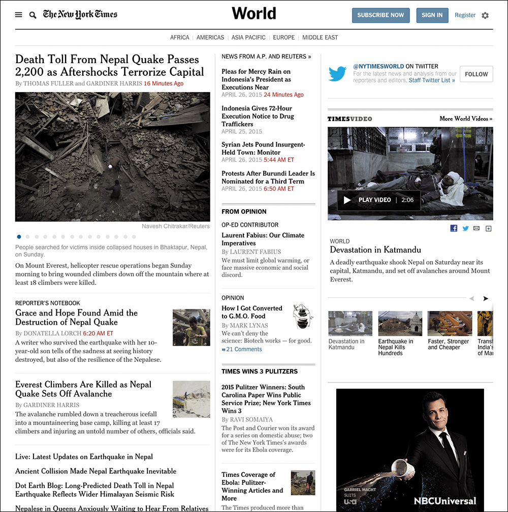
Figure 2.4 The New York Times’ World News landing page. Note the numerous tiny thumbnails that don’t add much to the story.
Given the priority of stories on the page, these images could be beneficial, helping to guide users to the most important stories of the day. That’s a UX win!
And yet, these images can be problematic too. Depending on the size of the image, a thumbnail could cause the text to flow oddly when viewed on a small screen. When the natural flow of content is interrupted, it makes the reading experience unpleasant and awkward. As an example of this, consider the Guardian’s website,9 as shown in Opera Mobile on an HTC Wildfire (Figure 2.5). Sure, layout is something that the page designers should be thinking about, but that’s not the only potential issue with these images.
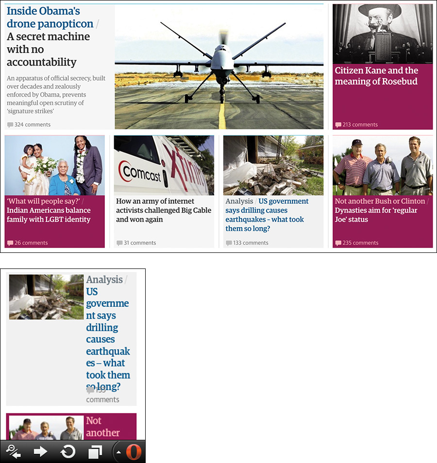
Figure 2.5 Compare a section of the Guardian as rendered at “full size” on a large desktop screen in Chrome with an individual teaser as rendered by Opera Mobile on an HTC Wildfire at a resolution of 240×320. Note the text wrapping and awkward layout on the small screen.
Consider page performance. Each of those images must be requested from the server and downloaded. On slower connections, that can significantly increase the time required to render the page. In the case of the Guardian example, the page weighs about 1.5MB and takes 1.6 seconds to begin rendering on Chrome over a 3G connection. It takes 27 seconds to fully load. Nearly half the requests from the browser are for images, and they also account for a third of the page weight.10
Performance and user experience are intrinsically linked. And while performance may seem like something the server admin should be concerned with, your decisions at the content level can limit your team’s options when it comes to performance-tuning a site. You need to consider performance from the beginning of a project.
As web developer Tim Kadlec said, it all starts with the content.11
At first glance, it seems unlikely that content strategy would be a performance consideration. Frequently the people doing content strategy seem to be as far removed from the process of performance optimization as we could possibly imagine. But content decisions can have powerful, and long-lasting, impacts on performance.
Performance matters to your users, even if it is (as Tim also says) “a lot like plumbing: No one talks about it until it’s busted.”12
Then there’s the cost in terms of real money. On a metered connection, users are paying by the bit to download our content. Using Tim’s insightful tool What Does My Site Cost?,13 you can see that the Guardian home page would cost the average American about 11 cents to download on the least expensive mobile data plan. By contrast, a user in Vanuatu will pay about 50 cents in U.S. dollars for the same content (more than 6 percent of their daily income).14
These may seem like technical challenges to solve, but content strategy dictates experience. Does it make sense to not have the images and have the large-screen usability suffer because you can’t draw your users’ eyes effectively? Or should you force your mobile users to suffer slow render times and costly downloads only to get images that don’t add much to the experience?
The answer, as I’ve said, is it depends. Each situation is different, but when you are looking at your content, you need to be prepared to make a judgment call on whether a particular piece of content adds to the experience.
I will say that it is possible to have it both ways in certain circumstances. For instance, if you decide that thumbnails are valuable but not the most valuable content on the page, you could deem them “nice to have.” In other words, you could deem them an enhancement. Once you make that call, there are technical means of having just the text content on small screens and having images on larger displays. I’ll discuss this concept, called lazy loading, in Chapter 5.
All of this ignores the elephant in the room, of course: the actual monetary cost and time required to produce imagery, videos, and the like. Does the cost of licensing photographs—or of producing your own photoshoots and doing the follow-up editing and retouching—outweigh any potential increase in sales (if you can even make the case that your photos will increase sales)? Video and animation can increase engagement, but they take time to storyboard, script, capture, and produce (particularly on an ongoing basis). That can be a significant time-suck and dramatically increase the cost of a project. Will you see a return on those investments?
Avoid Trapping Content
When you are working with media—especially rich media such as interactive charts, videos, and the like—it can be quite easy to view the content of those media as pointless in any other form. This could not be further from the truth.
When you create an interactive chart, for example, it is the visualization of information. That visualization might be charting something specific such as sales data. That’s information that could also be easily conveyed in a table.15
15 In fact, the data probably exists in some sort of database table (or maybe a few), which hints at another way it can be represented.
Sometimes, however, a literal translation from one medium to another is unnecessary. Take the graph Vanguard uses to highlight how much its customers save in fees (Figure 2.6). This graphic, though interactive, is simply an approximation and is not meant to be taken literally. The text paired with it does a great job of conveying the spirit of the graphic.
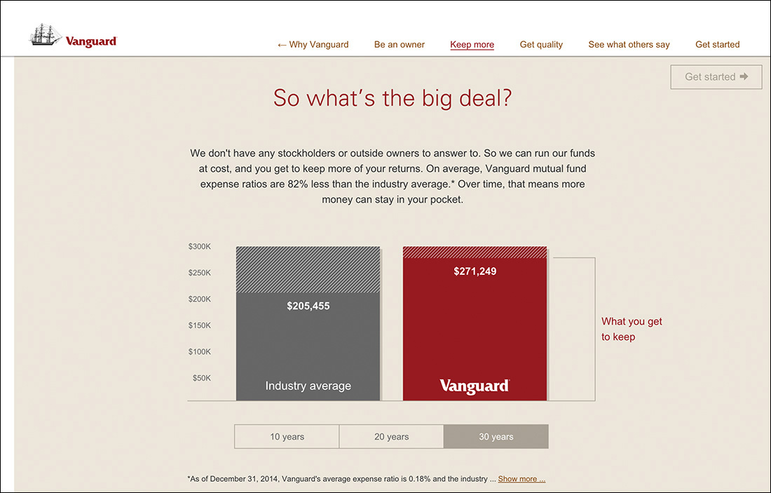
Figure 2.6 This animated graph from Vanguard goes into detail about how much you stand to save by investing with the company, but the text above it perfectly conveys the spirit of the graphic.
We don’t have any stockholders or outside owners to answer to. So we can run our funds at cost, and you get to keep more of your returns. On average, Vanguard mutual fund expense ratios are 82% less than the industry average.* Over time, that means more money can stay in your pocket.
Sometimes that’s all you need. In other cases, that wouldn’t be enough. For instance, consider a stock performance chart.
From a technical standpoint, it might make sense to store the content of the chart in an HTML table and convert it into a chart using JavaScript. Or it might make more sense to provide a link below the interactive chart to take users to a separate page containing the data tables. Depending on the situation, you may want to outline which is preferred as part of the content strategy, or it might be something that can be left up to the development team.
As with many things, it all depends on the purpose the media is serving. But providing access to an alternate content form increases the accessibility of your content. The most important thing is that the content exists, is accounted for, and is made available to your users. It isn’t trapped in some proprietary format that requires a user to have a specific technology or capability in order to access it.
Some folks might look at the Vanguard example and think the text is redundant in light of the graphic, but the reality is that it supports the graphic in numerous ways. We all learn and process stimuli differently—some of us are visual learners, some are verbal, and so on—and presenting the key information in multiple ways addresses this by providing alternate means of getting your messages across. Moreover, it ensures that no part of your message is lost.
Exploring Alternatives
The content embedded in any media type can and should be made available in an open, universally accessible format. For video and audio files, a transcript is often appropriate.16 Videos can also be captioned.17 For charts and graphs, it’s typically data tables. For timelines and such, it’s probably lists.
16 There are a ton of reasonably priced services that do this. YouTube will even do it for you automatically, though the quality varies.
17 Accessibility expert Joe Clark has put together an amazing list of online captioning best practices: http://perma.cc/X4UT-Y6V8.
Images should be called out and have alternative text if they are important enough to warrant being called content. If they are purely decorative, leave their alt attributes blank or consider adding them via CSS. Icons can be meaningful. If they are, they need alternative text.
The PDF Conundrum
One major challenge on the Web is PDF (Portable Document Format). PDFs are often deployed on the Web when someone on the project thinks the content needs to be delivered in that one special format. But that’s generally a weak argument. Few documents, apart from some legally restricted ones perhaps, require their content and layout be intrinsically tied the way they are in a PDF.
Have you ever tried reading a PDF on a mobile phone? Sure, it can be done, but it’s not fun. Lots of pinching and zooming. It’s also not fun to use 2.5MB of data to download a restaurant menu in PDF format that could easily have been good old fashioned HTML. And don’t even get me started on PDF accessibility.18
18 Accessibility expert Shawn Henry maintains a wealth of information about PDF accessibility and the accessibility of text in general at the TAdER project: http://perma.cc/2G39-9MV5.
Tying up your content in formats such as PDF is like tethering it to a giant anchor: It can’t go anywhere easily or quickly. And anything you want to do with it requires a great deal of effort. When your content is rendered in HTML, however, it can travel hither and thither with the greatest of ease. It weighs little, it works on any device that can access the Web, and the content reflows to meet the user’s needs. For free.
Spending a few moments thinking about making your content as broadly accessible as you can will pay huge dividends in the long run. It increases the accessibility of your content, improves the usability of your interfaces, and ensures the products you create will be able to reach your customers on any device, over any connection, anywhere in the world.
Keep Data Entry Conversational
When it comes to copy, few things are as boring, dry, or robotic as forms.
We often feel compelled to create forms that are very clinical. Perhaps it’s because in the world of surveys we know too much “personality” can influence responses. But there’s a difference between being personable and having an aggressive personality. In fact, I’d say there’s a pretty wide chasm there.
You need to remember that you’re authoring interfaces that will be used by real, honest-to-goodness people. When you’re creating forms that don’t require scientific rigor, you can (and should) do whatever you can to make the interaction more human. More conversational.
You should ask real questions: “What’s your name?” and “What’s your email?” and “How would you prefer we contact you?” are far more friendly than Name, Email, and Contact Preference. They’re also completely unambiguous. Sure, it’s unlikely, but it’s entirely possible that someone could read Contact Preference and be unclear on what you want to know.
Clarity is important, and the words you choose matter. The Facebook story I shared earlier in this chapter is a perfect example of this. You need to think about how your interfaces read. You need to be deliberate in your word choices to avoid confusing your users. You need to know your audience and speak to them as they speak to you. That is the foundation of a great user experience.
Don’t Fill Space
They say nature abhors a vacuum, but nature has nothing on a website design committee.
Ever since the beginning of the Web, we have looked for ways to fill space. It was tougher when we were on 640×480 screens, but when we moved to 800×600, by golly we filled it up. 1024×768? Oh, we packed it in. 1920×1080? To the brim! Give us a vacant inch of screen real estate, and we’ll find something to go there.
We know we shouldn’t do it. Studies have shown that empty space helps refocus attention where you want it.19 And yet, we cram more and more onto the page, all of which competes for attention. The more competition, the more exhausting the experience is for your users. When the distractions obscure the content, most users will just give up.
Thankfully, it doesn’t have to be this way. By focusing on the purpose of your pages at every decision point, you can keep things from getting out of hand.
Some additional page bits are immutable: branding, navigation, copyright information, advertising. But then there’s the other stuff we chuck into the page because we feel compelled to: social media buttons, possibly related articles, internal promotions, more advertising, newsletter sign-up forms, and even more advertising.
You need to take a hard look at what you put on the page and ask yourself that age-old question: Does this content actually add to the experience?
In some cases, it legitimately might. For instance, when someone finishes reading an article, it makes sense to offer them some related content options they might enjoy. Or maybe that’s a place it makes sense to offer them a quick way to share the content on their social media network of choice. There’s some consideration of the experience in those decisions.
By contrast, it makes no sense to put those sharing options right below the title of the article. The user hasn’t even had a chance to read it; they don’t even know if it’s worth sharing yet!
By evaluating each page component through the lens of how it contributes to the page’s purpose, you can keep your pages lean and give your users a more focused experience. Typically, this is an easy sell on mobile, where screen real estate is at a premium, but users on larger screens will benefit as well.
For a great example of how a company can shift from cluttered to clear, consider Forbes. In 2007, an article page on Forbes.com was more distraction than content (Figure 2.7). In 2015, its layout is far more focused (Figure 2.8). It’s absolutely clear that the purpose of the page is getting their users to the content and making it a pleasure to read.
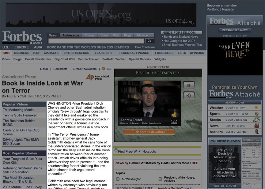
Figure 2.7 An article in Forbes circa 2007 (as captured for posterity by Merlin Mann). Everything that is not the content is grayed out.
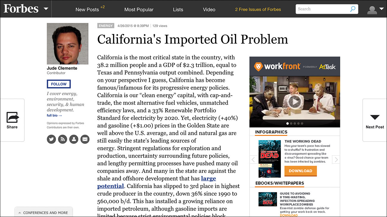
A design revolution like this doesn’t happen by accident. A lot of thoughtful consideration went into designing an interface that is “less”—less cluttered, less disorienting, and less aggravating. The team was clearly focused and let content drive the experience.
Let Content Lead the Way
Every website has a purpose, and every decision you make with respect to it should support that purpose. What do your users need to be able to do? How can you help them do that as easily and painlessly as possible? How can you ensure their experience is a good one? Experience starts with your content. All the technology in the world won’t make your web project successful if the content lacks focus, clarity, and purpose.
Your interfaces are a conversation with your users, so you should always begin by thinking about how you want it to go. You need to think about how your contributions to the conversation can get your users the information they need in a way they can easily understand. And then you need to get out of the way.
Clear, well-written, and audience-appropriate content is the necessary baseline for progressive enhancement. Taking time to think it through early on will help you make better decisions down the road.