Table of Contents for
Adaptive Web Design: Crafting Rich Experiences with Progressive Enhancement, Second Edition
 Adaptive Web Design: Crafting Rich Experiences with Progressive Enhancement, Second Edition
Published by
New Riders, 2015
Adaptive Web Design: Crafting Rich Experiences with Progressive Enhancement, Second Edition
Published by
New Riders, 2015
- Cover Page
- Title Page
- Copyright Page
- Dedication Page
- Acknowledgments
- About the Author
- Contents
- Foreword
- Introduction
- Chapter 1. Designing Experiences for People
- Chapter 2. Content Is the Foundation
- Chapter 3. Markup Is an Enhancement
- Chapter 4. Visual Design Is an Enhancement
- Chapter 5. Interaction Is an Enhancement
- Chapter 6. Crafting a Continuum
- Progressive Enhancement Checklist
- Further Reading
- Index
- Code Snippets
- Images
- Images
- Images
Chapter 3. Markup Is an Enhancement
“HTML is the unifying language of the World Wide Web. Using just the simple tags it contains, the human race has created an astoundingly diverse network of hyperlinked documents, from Amazon, eBay, and Wikipedia, to personal blogs and websites dedicated to cats that look like Hitler.”
—JEREMY KEITH
In 2005, when I was just starting to come to grips with web standards, I was tasked with leading the development end of a regional bank’s website redesign. I was in charge of all the implementation details, from the content management system on the back end to the HTML templates, CSS, and JavaScript on the front end. It wasn’t my first time overseeing a big project like that, but it was the first time I’d been given the opportunity to make every implementation decision...for better or for worse.
Web standards were by no means a new concept—the Web Standards Project had been advocating for them since 1998—but standards were only beginning to gain traction in the corporate world in the early 2000s. Wired News underwent a web standards–based redesign in 2002,1 and ESPN.com shifted in 2003.2 The idea of jettisoning table-based layouts and spacer GIFs in favor of meaningful markup and CSS was only beginning to catch on.
1 Designer Doug Bowman blogged about the project at http://perma.cc/G5KQ-4HDN.
2 Eric Meyer interviewed designer Mike Davidson about the project at http://perma.cc/6QEA-TYS2.
I had been sold on the concept relatively early on, but I—like most of our industry—had been caught in the quicksand of corporate spaghetti code and Dreamweaver-driven templates, unable to drag myself out of the mire, at least not until this project came along.
I jumped headlong into the project and did everything I was supposed to do: semantic markup, CSS for layouts, optimized images, content-first source ordering, JavaScript for enhancement, and so on. No one else on the project seemed to care as much as I did about the “purity” of the code, but a few of my fellow developers thought it was cool how much CSS could do, even back then.
In the end, we delivered the project—on time and within budget, mind you—and our agency moved on to the next project. Sure, I felt the self-satisfaction of a job well done, but I doubt anyone else even noticed.
Then, about six months later, we were told that the bank had gone from page 10 in a Google search for “Connecticut bank” to the first page. In fact, it was the second result. The client—and our marketing team—was eager to know what wizardry we’d worked in the meta tags.
The answer: nothing.
In fact, I had forgotten to include the keyword and description meta tags entirely. And yet here we were with an astounding jump in the organic search rankings.
What was the secret sauce? Progressive enhancement.
Before the redesign, the site was a bit of a markup nightmare: Content was buried in deeply nested tables, much of the actual text of the site was trapped within images that lacked appropriate alt text, any actual text content was font-wrapped and bereft of meaning, and JavaScript was required for the primary navigation on the home page.
We turned this on its head and produced a series of clean and lean templates that used semantic elements such as heading levels and lists, paid attention to source order and the document outline, moved all the design into CSS, and used JavaScript to enhance the experience. Yeah, I forgot the meta tags, but it didn’t matter because search engines love meaningful markup.3
In this chapter, you’ll learn how to use markup to enhance your web pages. You’ll see the importance of semantically appropriate elements, source order, the document outline, and accessibility. You’ll also explore how you can use markup to supercharge your pages, delivering your content beyond the browser.
Learn from the Past
When we first began building web pages, many of us didn’t understand the purpose of markup. Those of us who came to the Web from a programming background often considered learning HTML beneath us, so we never put in the time to come to grips with the semantics it provided.
Those of us who came to the Web from a design background didn’t understand the importance of semantics either. We thought only of the presentational aspect of a web page and latched on to the table element as a means of laying out pages in columns (CSS didn’t exist at the time). Once we saw how table elements could be used to control layout, we found other ways to use them, often supplanting existing (and well-supported) semantic elements, such as lists and paragraphs (Figure 3.1).
Figure 3.1 We used table elements for everything back in the day. On top is a list, as displayed in the browser. Below shows the underlying table with the table cells outlined so you can see the structure. We should have just used an unordered list (ul).
In offices across the globe, advocacy for using meaningful markup and CSS for presentation fell on deaf ears. The argument was seen as a largely idealistic one because, first, the fact remained that table-based layouts still worked in modern browsers and, second, the case for greater web accessibility was lost on many people who had no firsthand experience of using the Web with a disability. Then Google came along and changed everything. Suddenly, semantic markup was important.
Google was the first search engine to take semantics into account when indexing web pages. Starting with the humble anchor (a) element, which was the cornerstone of its original PageRank algorithm,4 Google pioneered the use of semantic markup to infer meaning and relevancy.
4 So-named for Google cofounder Larry Page, not because it ranked pages.
The other search engines soon followed. As search engine spiders began hunting for other meaningful HTML elements on web pages (for example, the h1 element, which indicates the most important content on a page), semantic markup became more important to the business world. Proper semantics meant better search rankings and, thereby, a greater opportunity to attract new customers.
Illuminate Your Content
If content were soil, semantic markup would be the compost you’d add to ensure a productive garden. It enriches the content, providing your users with clues about intent and context, as well as supplementary information about the content itself.
Take, for example, the humble abbreviation element (abbr). It’s used to denote abbreviations and acronyms.
Chattanooga, <abbr title="Tennessee">TN</abbr>
In this simple HTML snippet from my website, you can see how the abbreviation enhances the letters TN by informing the user that they stand for “Tennessee.”
As HTML has evolved, its vocabulary has steadily expanded to offer more options for describing the content it encapsulates. The advent of HTML5 ushered in a slew of new semantic options (such as the main element, which is to denote the primary content of a page) and even augmented a few existing ones (such as the aforementioned abbr that took over for the ousted acronym).
As I mentioned in Chapter 2, the purpose of design is not to make something pretty; it’s to clarify content or an idea. HTML excels at that. It takes the clear well-written prose that is the foundation of every online experience, and it illuminates the role each element plays in the interface. In short, the HTML you write matters.
Mean What You Say
Every choice you make in building a website affects your users’ experience. If you’ve worked on the Web for any amount of time, however, you’re also well aware that there are always multiple ways to accomplish the same goal. For example, to create a button that can submit a form, you could use an input, a button, an a, or a div (or just about any other element). But not all these “buttons” are created equal.
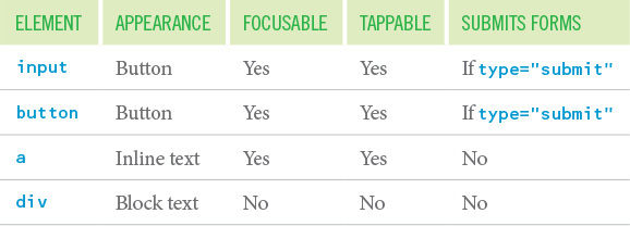
Compare the button-ness of these different elements in terms of how they are handled by default in a browser (Table 3.1).
As you can see, these elements act very differently in their default states. The input element and the button are as you would expect: They look like a button, they are focusable via the keyboard like a button, they are tappable/clickable, and they have the capacity to submit a form.
Anchor elements (a) are intended to function as anchor points in a document or as links to other pages. They are not meant to be buttons. Anchors are both focusable and tappable, but they lack the default appearance of a button, meaning CSS is required to achieve that. Anchors also cannot submit a form, which means you need to employ JavaScript to do that. Anchors are also activated only via the keyboard using the Enter key; true buttons can be activated by the spacebar as well. Listening for and acting on the additional key press also requires JavaScript.
In other words, to make an anchor element look and act like a button, you have added two dependencies you didn’t have with an input or button: CSS and JavaScript. If either is not available, the interface will not operate as intended. That extra CSS and JavaScript is also more code that needs to be downloaded and executed in the browser, which affects the performance of the interface. Oh, and you need to maintain all of that extra code over time. Fun!
That brings us to the div. Semantically, a div is a generic “division” of the page. It’s a vanilla box with no inherent design or behavior other than its contents begin on a new line (like a paragraph but with no default margins). This makes the div appealing if you want to fully customize an element to look and behave a particular way; you don’t have to override the default look or behavior of the element, which can potentially save a few bits in your CSS or JavaScript.
The downside is that it’s a vanilla box, meaning you get nothing for free (apart from the fact that it starts on its own line). To make the div a button, you need to do the following:
1. Make it look like a button, requiring CSS
2. Make it clickable like a button, requiring JavaScript
3. Make it keyboard focusable like a button, requiring the tabindex attribute
4. Make it keyboard interactive like a button, requiring JavaScript
5. Make it capable of submitting a form, also requiring JavaScript
So, while you have complete control over the element’s visual appearance and behavior, an extra attribute is required, and CSS and JavaScript support are required for the div button to operate as intended.
Now with all of this in place, the div or a may look like a button and behave like a button, but as far as any computer or vision-impaired user is concerned, it’s still not a button. The a version is a link (possibly to nowhere if the href value is “#” as it so often is in scenarios like this), and the div version is just some text. To indicate either is acting as a button, you need to add a role of “button” to the element.
The role attribute comes to HTML from the WAI-ARIA or ARIA, for short (Web Accessibility Initiative’s Accessible Rich Internet Applications) spec.5 ARIA is a collection of HTML attributes that declare what is happening in the interface. Assistive technology looks for these clues to provide appropriate feedback for vision-impaired users. These attributes can also be useful hooks for simplifying your JavaScript. I’ll touch on ARIA a bit more later in this chapter and in Chapter 5.
With a role of “button” declared on the a or div, the browser will know that the element in question is playing the part of a button in the interface. It doesn’t get you anything additional, however; it just exposes the element as a button to assistive technology such as a screen reader.6
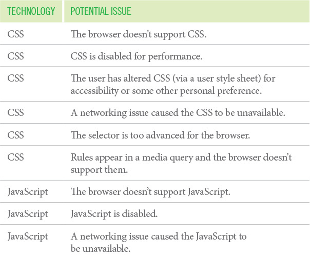
Avoid Introducing Fragility
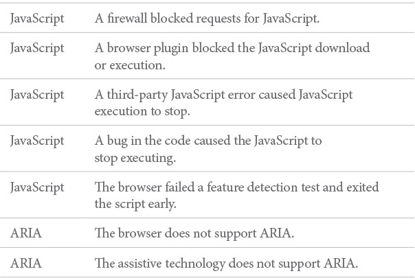
Even with the role attribute, solidly authored CSS, and expertly written JavaScript in place, there are no guarantees that your user will be able to submit the form with the anchor (a) or div. Why? Table 3.2 is a list of the dependencies and a few of the things that can go wrong.
Hmm, that’s a pretty big list...it’s a wonder any page works!
Granted, many of these are edge cases, but details matter. If you’re running an ecommerce shop, you want a user to be able to make a purchase, no matter what. You need to erect as few barriers as possible that could prohibit them from accomplishing that task. If you use an input or a button, anyone will be able to submit an order, regardless. You can always use CSS and JavaScript to make the experience better, but they should serve to enhance the experience, not be the experience. I’ll talk more about CSS and JavaScript in the next two chapters.
As you can see, there are a lot of hoops to jump through to make one element look and behave like another. The trade-offs are rarely worth it. All you’re doing by going down that path is building a more fragile, heavy, and difficult-to-maintain interface. And we’ve been looking at only a single button. Multiply the complexity of this one element by the number of interface elements you have on any given page, and you’re probably starting to see why this isn’t a great road to go down.
Each element has a purpose.7 When you need a paragraph, you use a p. When you have a list of items, they each go in an li (for “list item”). If the items need to be in a particular order, they go inside an ol (for “ordered list”). If not, they go in a ul (for “unordered list”).
You can use CSS to make these elements look however you want, so there is no reason to use a div when what you really need is a p, for example. It was a lesson many of us had to learn back in the olden days when we were abusing tables to no end. I can’t count the number of times I used a two-column table when I should have used a list.8
8 I would put the bullet in the first column of the table and the text in the second column (like you saw in Figure 3.1) to control the margins and padding and to get the bullets to line up nicely with the top of the text. I’d also use an image for the bullets. Table with two columns and five rows—which is what a screen reader says—obscures the fact that it’s a list and obscures the number of items. List of five items is perfectly clear. I should have used an unordered list and some CSS. Oh, the humanity!
When you use an element for its intended purpose, you enhance the meaning of your content: You use h1 to indicate the most important headline on the page and h6 to indicate the least important headline on the page; you use em to add emphasis to a word; you use strong to indicate that phrase is important; and you use code to indicate, well, code. Markup enriches your content and reduces the ambiguity of plain text.
In one final example, consider the last sentence in footnote 8. I’d probably mark up “Oh, the humanity!” in an i element because if I were to read that paragraph aloud to you, I’d say that in a slightly sarcastic way. The i element is for content that is in an alternate voice or mood. One day in the future, I’ll even be able to use CSS Speech (formerly “aural” style sheets) to prompt a synthesized voice—such as a screen reader or digital assistant—to speak that sentence differently.
When you put more thought into your markup—by making more deliberate element choices—you clarify the meaning of your words, make your content more expressive, and create more opportunities to improve your users’ experiences.
Embrace Classification and Identification
Choosing the right element is the crucial first step in progressively enhancing a web page. Once you’ve done that, you can take things a bit further with attributes.
Some elements, such as the a you saw earlier, require attributes in order to serve their purpose. An a without its href would not provide a link to anywhere. Other attributes are optional, like the role attribute you saw in the discussion of buttons.
Two attributes in particular are used to extend HTML’s native semantics in a less formal way. I’m talking, of course, about id and class.
When the W3C’s Dave Raggett drafted a specification for HTML 3.0,9 it contained two new concepts: classification and identification, expressed via the class and id attributes, respectively.10 These two attributes were not formally introduced into the HTML lexicon until HTML 4.0 but were implemented in browsers around the same time as CSS support was added. And CSS, of course, brought us two simple selectors that targeted these attributes explicitly, causing some unfortunate confusion over the intended use of class and id from the get-go.
9 HTML 3.0 (http://perma.cc/RHG6-V5AJ) was an ambitious draft: It introduced numerous tags and attributes. Many of the new elements were dropped by the time it reached recommendation status as HTML 3.2, but the class and id attributes survived. Interestingly enough, some of the same constructs proposed in HTML 3.0 have found their way back into HTML, either formally as part of HTML5 or quasiformally as microformats.
10 It’s worth noting that class and id each make a (very) brief appearance in the HTML 2 spec (http://perma.cc/Y583-YSQF) but were not formally defined attributes. They were simply used to demonstrate the fault-tolerant way in which browsers should treat unknown attributes.
For years, nearly every web designer—myself included—thought the correlation between the attributes and the selectors was intentional. We believed that id and class were intended purely for use with CSS. You can’t blame us, though: At the time CSS didn’t provide many ways to select elements. It made sense that class (e.g., .menu) and id (e.g., #content) would have been introduced so we could style elements both generally and specifically.11
11 And the HTML 3 draft did allow for this use, among others.
Thankfully, we now understand how class and id were meant to operate. The class attribute was introduced specifically to address the limited set of elements within HTML.
As time goes by, people’s expectations change, and more will be demanded of HTML. One manifestation of this is the pressure to add yet more tags. HTML 3.0 introduces a means for subclassing elements in an open-ended way. This can be used to distinguish the role of a paragraph element as being a couplet in a stansa [sic], or a mathematical term as being a tensor. This ability to make fresh distinctions can be exploited to impart distinct rendering styles or to support richer search mechanisms, without further complicating the HTML document format itself.12
12 From the “Scalability” section of the HTML 3 draft.
The intent was that class would contain a list of subclasses for that particular element, with the classes listed from most general to most specific.13 In this example, the generic division is being subclassed as a “promotional module” (as it goes in order from least specific to most specific).14
13 You’ll see this throughout the HTML 3 draft, whenever class is defined for an element.
14 If you’ve heard at all about the Block-Element-Modifier (BEM) methodology developed by Yandex, its concept of a modifier tracks quite closely to this idea, but in BEM it is a bit more explicit (http://perma.cc/L3WQ-9GW5). The nature of subclassing in this example (exemplified by the block--modifier syntax) draws direct connections between the “module” subclass and its “promotional” variant. BEM is an interesting approach to classification that’s grown on me the more I’ve used it.
<div class="module promotional">
...
</div>
The id attribute was created for the purpose of identifying a specific element on the page. Each id is expected to be unique on a given page. Identifiers can be used as a reference point for CSS selection (e.g., #details), scripts (e.g., document.getElementById('details')), and anchors (e.g., <a href="#details">).
The class and id attributes allow page authors to add their own semantics on top of those defined in the HTML spec. Together, these ad hoc semantics imbue the markup with greater meaning and, over time, have gravitated toward a common set of classifications and identifiers in use across the globe (e.g., #header, #nav, and .article). This common set of classifications and identifiers has, in turn, provided valuable guidance in the continued evolution of HTML, resulting in many new elements (e.g., header, nav, and article). They also fostered the development of a community-driven set of HTML conventions known as microformats.
Use Microformats to Empower Tools
Microformats are a set of community-driven specifications for how to mark up content to expose semantics (and metadata) that are not available in HTML. Microformats formalize organically developed class-based naming conventions into a specification that addresses a need not met by HTML. For example, HTML provides no robust way to mark up contact information or events, so the community created microformats to make that possible.
The first microformat arose from a desire to express associations between individuals on the Web and was called XFN (XHTML Friends Network). Though not developed as a “microformat” (that term came later), XFN was a perfect example of extending the semantics of HTML with a specific goal in mind.
Developed by web standards advocate Tantek Çelik, WordPress creator Matt Mullenweg, and CSS wizard Eric Meyer, XFN makes use of the oft-neglected rel attribute. The purpose of rel—which you are probably familiar with in the context of rel="stylesheet" when including external CSS files—is to indicate the relationship of the target of an href attribute to the current page.
The idea was simple: If I wanted to point from my blog to the blog of a colleague, I could employ XFN and add rel="colleague" to the link. Similarly, if I was linking to my wife’s blog, I would use rel="friend co-resident spouse muse sweetheart co-worker" because she is all of those things.15
15 And more. Awwww.
On its own, this additional markup does little more than provide a bit more information about our relationship and why I might be linking to another website, but if I use it for every link in my blog roll and those people, in turn, use it in theirs, all of a sudden we’ve created a network that is programmatically navigable, creating myriad opportunities for data mining and repurposing.
And that’s exactly what happened: XFN spread like wildfire. Software developers integrated it into popular blogging tools (e.g., WordPress, Movable Type) and developers at nearly every site on the “social Web” (e.g., Twitter, Flickr, Last.fm) began adorning user profile pages with the special case of rel="me" (used to link from one web page you control to another), enabling tools like Google’s Social Graph to quickly build a full profile of their users starting from a single URL.16
16 Sadly, Google killed its Social Graph product in 2012.
From that simple (yet powerful) beginning, microformats have increased in number to address common and diverse needs. Most use a specific set of class names to mark up content like a person’s profile (h-card), event listings (h-event), content for syndication (h-feed), and resumes (h-resume). Others build off the rel attribute as XFN did: rel-license to indicate licensing information, rel-nofollow to control search engine spidering, and rel-tag to enable taxonomic tagging.17
17 The Microformats.org wiki keeps a running list of all microformats and documentation on how to use them.
Almost in parallel with the development of these microformats, numerous tools sprung up to make use of them. Search engines pay attention to them and, in many cases, even rank microformatted content higher than non-microformatted content.18 Browser add-ons enable users to extract and repurpose microformatted content. Microformat parsers are also available for nearly every programming language out there, and there are even web-based services that give users direct access to the microformats in use on their sites. Read-it-later services such as Readability also use microformats to extract content reliably from web pages.
Here’s a quick example of an h-card:
<span class="h-card">Aaron Gustafson</span>
Based on this markup—essentially, the inclusion of the h-card class—a microformats parser knows the page contains a reference to a person and that person’s name is Aaron Gustafson. This is a slightly more complicated example:
<a class="h-card"
href="http://www.aaron-gustafson.com">...</a>
I say slightly because it’s not really all that more complicated. But now, the microformats parser knows the page includes a reference to a person, and it knows their name and URL.
Microformats are yet another layer in the progressive enhancement continuum, enabling you to make your sites even more useful to your users. After all, how cool is it that you can enable your users to export an event to their calendar or a business card to their address book directly from your web page? That’s pretty slick. And, as an added bonus—if, like me, you vacillate over class names—microformats provide a set of predefined values to handle a variety of common scenarios.
Take It Further with RDFa and Microdata
If microformats get you excited about the possibilities of adding machine-readable hints and metadata to your documents but you don’t find them rich or flexible enough, you’ll probably love RDFa and microdata. These two technologies provide alternative ways to imbue HTML (and XML and SVG, etc.) with structured data. They are alternatives to microformats but can often play nicely with them too.
I used a microdata vocabulary to describe a book19 on the web page for the first edition of this tome.20 First, I set things up on the html element.
19 I used the vocabulary from Schema.org, a collaboration between Google, Microsoft, Yahoo, and Yandex intended to improve search results.
<html lang="en" itemscope
itemtype="http://schema.org/Book">
Adding the itemscope attribute set the whole page as the scope of the object being described, and itemtype pointed to the Book vocabulary I was using from Schema.org. With that basic stuff in place, I just added one more tag and two more attributes to identify specific bits of content for extraction. The itemprop attribute is the key to identifying pieces of the object.
• I added a meta element with itemprop="image" and pointed to the URL for the book cover image in the content attribute.
• I added itemprop="name" to the h1 element for the book’s title, and I added itemprop="description" to a paragraph I felt best summarized the book.
It was surprisingly simple to implement given how difficult the documentation on Schema.org is to parse (at least to me).
RDFa is a bit more rigorous and formal than microformats and microdata. A good example of RDFa in practice is the Open Graph protocol created by Facebook.21 Incidentally, you can also find Open Graph in use on that same page, serving the same general function. Here’s a representative sampling:
<meta property="og:type" content="book">
<meta property="og:title"
content="Adaptive Web Design">
<meta property="og:image" content="cover.png">
<meta property="og:description"
content="In this brief...">
As with the microdata example, these meta tags enable a web crawler to easily extract key information from the document. Facebook, Google+, Twitter, LinkedIn, and others use the OpenGraph tags to create the preview you see when you link to a website in a post. Twitter has also created its own RDFa tags to build upon the Open Graph protocol in service of its Twitter Cards effort.22 Similarly, Pinterest drives its Rich Pins feature with Open Graph tags.23
You can embed RDFa outside of meta tags too, using the vocab, typeof, and property attributes. RDFa Play24 provides a nice isolated testing environment that helps you see how your RDFa objects come together. Google also offers an incredibly handy structured data testing tool,25 which can expose your microdata, RDFa, and microformatted objects.
When adding structured data like this, you supercharge your HTML documents, making already well-structured, easily indexed content even more useful to search engines and other computer-based tools by identifying the most useful bits using a more formal naming structure. Structured data empowers your content to go far beyond the browser, and that’s another perfect example of progressive enhancement.
Make Deliberate Markup Choices
There are times when you may legitimately need to insert semantically unnecessary markup into your documents. Most often, it’s when you need to group somewhat-related elements to lay out the page properly with CSS. Traditionally, you’d use generic div elements for this purpose and give them semantic class names such as “section,” “article,” or “aside.” With the advent of HTML5, we were given first-class elements that serve those purposes: section, article, aside, header, footer, and main. Using these elements, you can make wrappers like this purposeful, intentional.
You should try to avoid adding unnecessary markup as often as possible to keep your pages smaller and faster to load. To achieve this, I often start marking up the content of a page using only content-related elements such as p and ul. Then, I look for natural ways to group those elements into related chunks (Figure 3.2). In forms, you have the handy fieldset for aggregating related form controls, but outside of forms you can use article or section for that purpose.
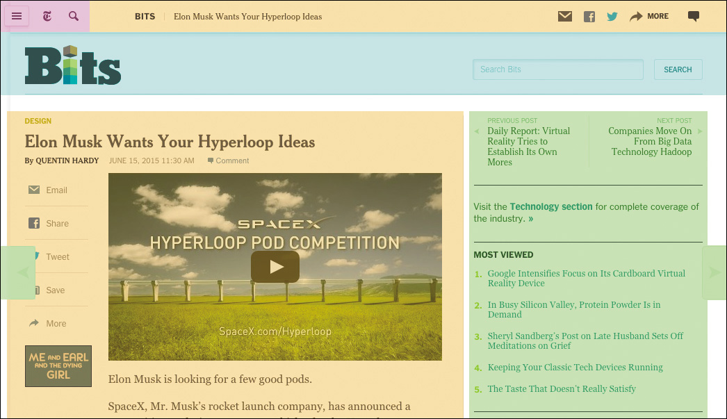
Figure 3.2 A New York Times article page with organizationally linked content grouped into colored blocks.
These two elements are pretty similar but serve different purposes. A section is just what you’d think: a portion of some larger piece of content (for instance, the chapter you’re reading is a section of this book). An article is best thought of as an autonomous unit of content—it can exist on its own. A good rule of thumb for using these elements is that if the content in question could be removed from the document without affecting the meaning of either the document or the content itself, article is your best bet. If it can’t, it’s a section.
Interestingly (and somewhat confusingly), a section can contain one or more article or section descendants, and an article can contain one or more section or article descendants. But if you keep coming back to the article being an independent unit of content, you’ll always make the right call.
Honor the Outline
While visually article and section are no different than a div, from a semantic standpoint they do have an effect on the page. The article and section elements, along with nav and aside, are referred to as sectioning elements because they divide the document in an explicit way. The concept of explicit sectioning came about in HTML5 as a way of overcoming the limitation of having only six heading elements (h1–h6).
The h1–h6 elements generate a natural document outline,26 which enables a browser to create a table of contents for assistive technology to use in order to ease navigation around the page (Figure 3.3). The document outline can also be accessed programmatically by search engines to help them generate better search results. I’ve even accessed the document outline with JavaScript to enable me to turn static content into a dynamic tabbed interface.27
26 The Web Developer Toolbar (http://perma.cc/B88J-6AET) is an excellent browser add-on and features easy access to the document outline.
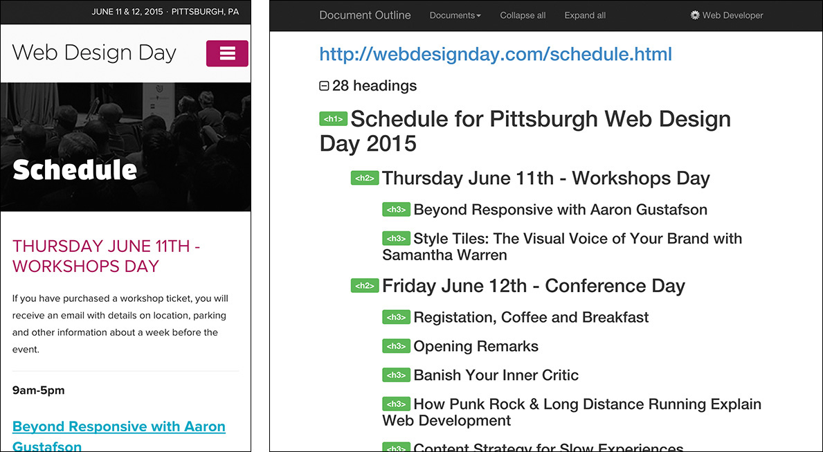
Figure 3.3 The Web Design Day 2015 Schedule (http://perma.cc/E68X-R36B) and its corresponding document outline.
The document outline provides an easy way to review the organization of your web pages and validate your source order decisions. It helps you ensure the content flow works.
As I mentioned, HTML defines only six heading levels. In some cases, that may not be enough to accommodate your document; once you need to go to a seventh level, you’re out of options. Another problem this causes is that in a world of CMSs and componentized templates, maintaining control over the document outline can be painful. For instance, if article teasers came below an h1 on the home page but they came below an h2 in the sidebar of an article (Figure 3.4), you would need to have the teaser title marked up in an h2 in the first instance and an h3 in the second to maintain a proper outline.
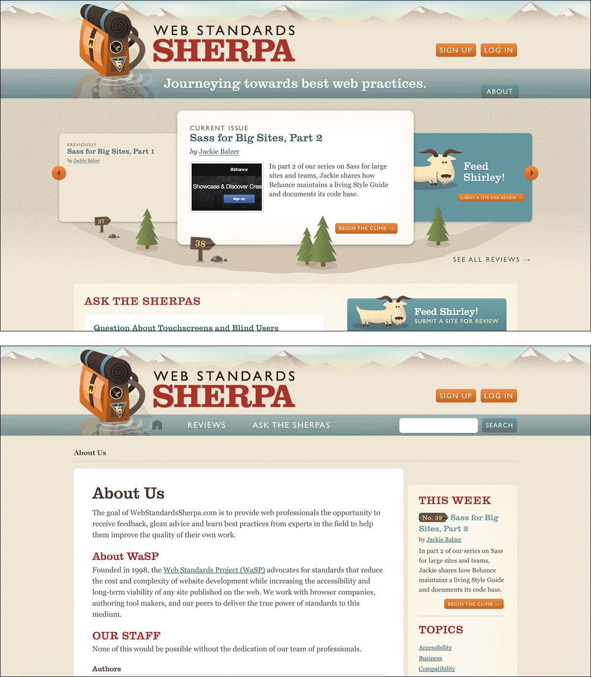
Figure 3.4 The same article teaser used in two different places on Web Standards Sherpa. In the top image, the teaser is featured front and center. In the bottom image, it’s a promotion in the sidebar.
To address these two use cases, explicit “sectioning elements” were added to HTML. In theory, these elements create a nested level in the document outline and allow you to start with h1 all over again. The reason I say “in theory” is that no browser has implemented the accessibility aspect of this approach yet. That doesn’t mean they won’t in the future; I’m hopeful because explicit sectioning is a useful feature in HTML.
Look at the difference. Without sectioning elements, you would create a good document outline like this:
<h1>Ask the Sherpas</h1>
<h2>Question About Touchscreens and Blind Users</h2>
<!-- teaser content -->
<h2>Question About Rounded Corners and Progressive
Enhancement</h2>
<!-- teaser content -->
But with sectioning elements, you have a bit more flexibility because you are being explicit about the outline.
<h1>Ask the Sherpas</h1>
<article>
<h1>Question About Touchscreens and Blind
Users</h1>
<!-- teaser content -->
</article>
<article>
<h1>Question About Rounded Corners and Progressive
Enhancement</h1>
<!-- teaser content -->
</article>
And in both instances the document outline would be as follows:
1. Ask the Sherpas
a. Question About Touchscreens and Blind Users
b. Question About Rounded Corners and Progressive Enhancement
If your website isn’t terribly complex so as to require more than six heading levels and you have the flexibility in your CMS, I’d advise you to use the traditional outlining algorithm as your guide while still using sectioning elements. This allows the outline to remain the same under either outlining algorithm.
<h1>Ask the Sherpas</h1>
<article>
<h2>Question About Touchscreens and Blind Users</h2>
<!-- teaser content -->
</article>
<article>
<h2>Question About Rounded Corners and Progressive
Enhancement</h2>
<!-- teaser content -->
</article>
The reason it works is that explicit sections treat the first heading level they encounter as the top heading level for that section. In other words, if you kick off an article with h2 (as I just showed you), the h2 would be equivalent to an h1 in the same position (or an h3, h4, and so on). This approach ensures that the most users are served, both now and in the future.
One final note regarding sectioning elements and the outline: If you use a sectioning element, make sure it contains a heading. In other words, never do this:
<section>
<article>
<h2>Question About Touchscreens and Blind
Users</h2>
<!-- teaser content -->
</article>
<article>
<h2>Question About Rounded Corners and
Progressive Enhancement</h2>
<!-- teaser content -->
</article>
</section>
The outer section must have a heading inside it before the article elements or else you end up with a broken outline:
1. MISSING HEADLINE
a. Question About Touchscreens and Blind Users
b. Question About Rounded Corners and Progressive Enhancement
You can always use CSS to hide the headline if you don’t want to show it. Or if no headline is really needed, maybe it isn’t worthy of being a distinct section element after all; maybe it’s merely a division (div). Or maybe—in place of a container and a heading—a paragraph-level thematic break (hr) makes the most sense. Each situation is different. Weigh the options and their implications and then make the decision.
Be Intentional with Source Order
As discussed in Chapter 2, the interfaces you create are a conversation with your users. When you consider it in that light, it becomes easy to make smarter decisions in terms of the source order you use for your pages.
A classic design tension is where to place the navigation for your site in terms of source order. Some argue that navigation should come right after the site branding because users may want immediate access to the navigational links to find what they are looking for. Others argue that the content of the page is the priority and should therefore come before the navigation.
On most pages, I find the latter approach to be more beneficial, and here’s why: If I am having a conversation with someone, that conversation is my priority. Navigation ends the conversation by forcing someone to make a choice, possibly before they are even informed enough to feel like they can make a good one.
In his book Mobile First, Luke Wroblewski furthers this argument with a focus on mobile devices (where screen real estate is at a premium).
As a general rule, content takes precedence over navigation on mobile. Whether people are checking on frequently updated data like stocks, news, or scores; looking up local information; or finding their way to articles through search or communication tools—they want immediate answers to their needs and not your site map.
Too many mobile web experiences...start the conversation off with a list of navigation options instead of content. Time is often precious on mobile and downloads can cost money, so get people to what they came for as soon as you can.28
When you consider the continuum of experience moving from the smallest screens to the largest ones, the decisions you make need to support those smaller screen experiences first. Users come to your site for the content, not your navigation.
This approach may also have some benefits when it comes to SEO (search engine optimization). Much of the world of SEO is voodoo and black magic—search engines don’t often want the inner workings of their web crawlers or indexing algorithms to be made public because people would quickly use that information to game their rankings. That said, the web crawlers that search engines employ do tend to reward thoughtful choices for source order as they do other deliberate markup choices. For example, the following gives greater weight to content that appears farther up in the page:29
[T]he placement of your keywords matters far more than their frequency. Posting “auto repair shop” once in the title tag of your site and once in the header matters far more than stuffing it five times into the body copy. Google breaks your site down into key areas, with meta information and headers taking top priority, body copy taking secondary priority, and side bars and footers taking the last priority.
In my experience, making decisions that are in your users’ best interests often yield SEO benefits organically, so I don’t spend much time focusing on SEO-related recommendations. But if you need the extra ammunition for discussing source order with a team member, this is a good argument to have at the ready.
Although it happens less frequently now—with users’ increased reliance on search engines—it’s worth noting that there are instances where a user may land on the home page for a site and need to browse or search for content. In this instance, it’s quite handy to have quick access to the navigation. But if the navigation is at the bottom of a long page on a mobile screen, all that scrolling could be frustrating.
Thankfully, all is not lost. Remember that id attributes can function as anchor reference points in the document. That means if you give your navigation an id of “nav,” you can simply include an anchor to the navigation right after the branding. You can see this approach in use on the Contents Magazine website (Figure 3.5).
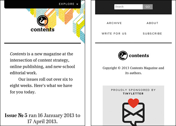
Figure 3.5 Contents Magazine’s website (http://perma.cc/MC93-N5D2) with a link anchoring to the navigation.
Here’s a simplified version of what is going on in this site:
<header>
<!-- logo -->
<p><a href="#site-nav">Explore</a></p>
</header>
<!-- page content -->
<div id="site-nav">
<!-- search form -->
<nav>
<ul>
<li><a href="/articles/">Archive</a></li>
<!-- nav continues -->
</ul>
</nav>
</div>
<!-- site footer -->
You can take this a step further by facilitating movement back up the page as well. After the navigation, offer a link to the content of the page. Nichols College30 does that. You’ll examine this approach and how they used CSS to enhance that experience to great effect in Chapter 4.
On larger screens, most websites place the navigation of a page above the content, which may also seem problematic. But with CSS, there are myriad ways to rearrange the page and move the navigation above the content.
Source order matters. It has a direct effect on the usability of your pages, and navigation versus content is only one example of how this can play out. There are countless other small-scale instances where you need to pay attention to source order. Consider a blog post: It wouldn’t make sense to offer a list of links to related posts until after the user has read the post they’re on. Similarly, it doesn’t make sense to ask them to share it on social media until they’ve actually read it.
The document outline (discussed earlier) is a great tool for getting an at-a-glance view of your overall page’s organization, but there really is no substitute for reading your source. Search engines and assistive technologies experience your content in this way, so you should too. If the order of your elements makes sense as you are reading the interface, then you are well on your way to providing a usable and accessible experience.
Avoid Unnecessary Markup
Another situation in which you might feel the need to add extra markup is when you are coding interactive widgets. Consider a tabbed interface, for example (Figure 3.6). To build a tabbed interface, you need some specific elements in your markup. Here’s a simplified version of the markup from that page:
<div class="tabbed-interface">
<ol class="tablist">
<li class="tab">Target Type</li>
<li class="tab">Therapy Type</li>
</ol>
<section class="tabpanel">
<h1 class="hidden">Target Type</h1>
<table>
<!-- table contents -->
</table>
</section>
<section class="tabpanel">
<h1 class="hidden">Therapy Type</h1>
<table>
<!-- table contents -->
</table>
</section>
</div>
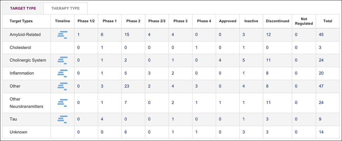
To make the tabbed interface functional, it needs tabs to click on (li.tab), a tab list to contain them (ol.tablist), and content panels to show and hide (section.tabpanel). But a tabbed interface requires JavaScript to function, so if the JavaScript enhancement is not available, a user has to contend with this crufty markup, which may be confusing. It’s also additional markup that has to be downloaded, and it has to be maintained by people like us. What happens if six months down the road you decide to ditch tabbed interfaces on your site in favor of accordions? You’d need to rip all this code out of your documents. Lame!
When you encounter situations like this—where you need extra markup to enable JavaScript-based functionality—it pays to recognize the potential usability and maintainability issues with hard-coding the extra markup. Rather than hard-coding it, you can use JavaScript to generate that markup only when you need it.
JavaScript is really good at manipulating HTML documents, so it is no problem for it to yank out pieces of markup and dynamically assemble the HTML you need to create a tabbed interface. That is exactly what happens on AlzForum.org: The page authors used a class of “tabbed-interface” to inform JavaScript that the content within should be transformed into a tabbed interface, but that’s the only bit that’s hard-coded; the tabbed interface is entirely built using JavaScript. The script then reads out the headings it encounters within—which, per my earlier recommendation, would be better as h3 rather than h1 elements—and dynamically constructs the tabbed interface from there.
From a user’s standpoint, the experience is positive whether JavaScript is available because the linearized content is perfectly usable. From a maintenance standpoint, it becomes inconsequential to make updates to the tabbed interface markup because it’s generated by a single script. Finally, if they ever wanted to get rid of the tabbed interfaces, they could either remove the “tabbed-interface” class names or simply remove that particular JavaScript from the site.
I’ll dissect the tabbed interface on AlzForum and talk more about using JavaScript to progressively enhance pages in Chapter 5.
Clarify Interfaces with ARIA
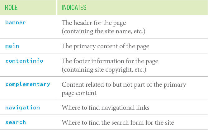
Early in this chapter, I introduced the ARIA role attribute as a way to make one element behave as another as far as assistive technology is concerned. Remember the div masquerading as a button? There is a specific subset of role values that act as landmarks within a document that assistive technology can expose and allow a user to jump from one part of the page to another. Table 3.3 lists a few examples.
Some of these roles directly correlate with existing HTML elements (e.g., main, aside, and nav), which can seem a little confusing. The reason for this is twofold. First, the ARIA spec and HTML5, which introduced these corresponding elements, were developed independently at roughly the same time, so they address some of the very same issues. Second, there are instances where you may want one element to act as another (as in the div button example or in non-HTML markup like SVG where the same semantics don’t exist). In other words, there are times the redundancy can be quite useful.
Whenever possible, you should follow the First Rule of ARIA Use.31
31 This rule and other helpful guidelines are available in the W3C’s Notes on Using ARIA in HTML (http://perma.cc/JHL6-MBJZ).
If you can use a native HTML element or attribute with the semantics and behaviour you require already built in, instead of re-purposing an element and adding an ARIA role, state or property to make it accessible, then do so.
In other words, use the main element rather than role="main", use button rather than role="button", and so on. Now, interestingly, the ARIA landmarks that don’t have direct semantic equivalents become a gateway for new elements to be exposed to assistive technology via the accessibility API. The landmark of main is a perfect example of this: The ARIA role predated the main element, and because it did, the ARIA mapping already existed to expose its semantic meaning. So when the main element came along, its mappings just piggybacked on the ARIA mapping, and it was supported by assistive technology on day one.32
32 For more, see http://perma.cc/DG6Z-LSDE.
ARIA offers a rich set of roles, beyond the landmark ones, that allow you to clarify the function an element is playing in an interface.33 Some map directly to existing HTML elements (e.g., “button”, “listitem”), others are wholly unique to ARIA (e.g., “tablist”, “tree”), but all are intended to help users better understand what is going on in the interface they are using.
33 A complete list is available at http://perma.cc/39LA-6P7U.
I’ll cover some of the widget-related roles (as well as ARIA’s states and properties) in Chapter 5, but there are two unique ARIA roles I want to touch on before we move on.
The “alert” role indicates content that the user should be made aware of immediately. A good use case for using this role is to highlight form errors that are being returned from the server. This is the sort of content you want your users (especially your nonsighted ones) to be made aware of immediately. A closely related role is “alert dialog,” which is like “alert” but the initial focus is taken to an element inside of it.
The “presentation” role removes any semantic meaning an element would otherwise have. In other words, it tells assistive technology to treat it as purely presentational (as opposed to meaningful). This isn’t a role you’re likely to need often, but it’s useful in rare cases, for instance when hiding a presentational image from assistive technology. It’s worth noting that this role is ignored if you apply it to an interactive element like a button or an anchor.
While ARIA roles are not required in your markup, they go a long way toward clarifying the purpose key elements serve within your interfaces, further enhancing the experience for users who can benefit from them.
Understand Fault Tolerance
Progressive enhancement in HTML is possible because of one key feature of the language: fault tolerance. As I mentioned in Chapter 1, fault tolerance makes it possible to browse an HTML5-based website in Lynx. But how is that possible? Lynx originally came out in 1992, and HTML5 wasn’t finalized until 2014.
It’s simple: Browsers are instructed to ignore what they don’t understand. When it comes to HTML, that means elements that aren’t understood are ignored, but their contents are exposed. Unrecognized attributes are simply ignored.34
When I started building websites, it wasn’t something that came up often. Then Flash came along35 and, early on, the default way to include a Flash movie in your HTML was to do something akin to the following:
35 Remember Flash?!
<object ...>
<param name="movie" value="movie.swf">
<!-- more param elements -->
<embed src="movie.swf" ...>
</object>
This weird construct of an embed element nested within an object element had me perplexed. According to the HTML spec, embed wasn’t even a valid element,36 so what was it doing inside the object?
36 It is now.
As it turned out, embed was a proprietary tag created by Netscape to allow plugin content to be run in a web page.37 The W3C had standardized on the object element for embedding generic multimedia content of any kind. To serve both Netscape and Internet Explorer (the two dominant browsers at the time), Macromedia decided to use both.
37 Interestingly, Netscape founder Marc Andreessen is also credited with the creation of the once-proprietary img element, which he included in Mosaic (he also worked on that early browser), much to the chagrin of Tim Berners-Lee and others on the HTML mailing list in 1993.
This is where the fault-tolerant nature of HTML came into play: By wrapping the object element around the embed, the object would be encountered first. Browsers that understood the object element would insert the Flash movie and throw away the embed (since object allows only for param and other object elements inside it). Browsers that didn’t understand object would ignore that element and move into its content, encountering the embed. If they understood the embed element, they would display the Flash movie. Browsers that didn’t understand embed either would show nothing.
HTML is pretty brilliant in this way because it allows you to continue advancing the language without crippling older browsers’ ability to display web pages. Let’s look at a few more examples of fault tolerance in action, starting with another multimedia object: video.
The video element is a lot like object in that it allows you to embed video files natively (rather than relying on a Flash wrapper as we did for many years). The video element comes in two flavors: a single tag version for when the video is available only in a single format and a version with opening and closing tags that lets you supply multiple video format options.
<video src="movie.mp4" controls
poster="movie.jpg">
<video controls poster="movie.jpg">
<source src="movie.ogg" type="video/ogg">
<source src="movie.mp4" type="video/mp4">
</video>
Since you know browsers that don’t support the video element will ignore it, the latter offers you a bit more flexibility to provide fallbacks.
<video controls poster="movie.jpg">
<source src="movie.ogg" type="video/ogg">
<source src="movie.mp4" type="video/mp4">
<p>I’m sorry, we can’t play this video in
your browser. Do you want to download
it instead?</p>
<ul>
<li><a download href="movie.ogg">Ogg Theora
Format</a></li>
<li><a download href="movie.mp4">MP4
Format</a></li>
</ul>
</video>
Now, if a browser comes along and doesn’t grok video, you have provided a nice message and offered them download links instead. But if video is supported in their browser, they just see the video. You can (and should) use this same approach for the audio element too. You may have noticed that I also included the download attribute on the links in the fallback. This causes supporting browsers to automatically download the linked content rather than navigate to it when a user clicks the anchor. That saves users from having to right-click the link to download the file.
The picture element was modeled on video and gives you the ability to define multiple art-directed images to be displayed in different media query-defined contexts. Its markup should look pretty familiar.
<picture>
<source media="(min-width: 38em)"
srcset="large.jpg">
<source media="(min-width: 23em)"
srcset="medium.jpg">
<img src="small.jpg"
alt="Aaron giving you a thumbs-up!">
</picture>
As you can probably guess, browsers that don’t support picture will display the nested img element, but browsers that understand picture would use the source information to create an adaptive image.
There’s another adaptive image option too: srcset and sizes applied to an img. Here’s an example:
<img src="small.jpg" sizes="100vw"
srcset="small.jpg 400w, medium.jpg 800w,
large.jpg 1600w"
alt="Aaron giving you a double thumbs-up!">
Browsers that support both the srcset and sizes attributes will download the most appropriate image given the width of the browser window.38 Browsers that don’t will ignore those attributes and use img in the traditional way by loading the image indicated in the src attribute.
38 The browser will also take into account a ton of other factors, as detailed in the spec at https://perma.cc/B6YW-3YLR.
Switching gears a little, consider form elements. Have you ever misspelled the value of a type attribute on an input before? You know, “chekbox” instead of “checkbox” or “adio” instead of “radio”? I do it all the time. When you do that, the browser displays a standard text field. Why? Fault tolerance! It doesn’t know what an input of type “adio” is, so it falls back to the default input type: text.
This is yet another way the fault-tolerant nature of HTML enables the language to evolve. It’s what allows you to use newer form controls such as “email” and “range” without making the form unusable to folks who are using browsers that don’t understand those input types. It’s pretty amazing.
Now here’s the coup de grâce, courtesy of web developer Jeremy Keith:39
<label for="state" id="state_label">State</label>
<datalist id="states">
<select name="state" aria-labelledby="state_label">
<option>Alabama</option>
<option>Alaska</option>
<option>Arizona</option>
<option>Arkansas</option>
<!-- options continue -->
</select>
If other, please specify
</datalist>
<input id="state" name="state" list="states">
I’ll give you a moment to look that over and come up with what the primary interaction is and what the fallback is.
(Yeah, I’m humming the Jeopardy theme in my head.)
Ready? This example makes use of the datalist element, which, in concert with the list attribute, enables native input suggestions in the browser (a.k.a. predictive typing). As Figure 3.7 shows, browsers that don’t support datalist will see the “State” label, the select, the text “If other, please specify,” and the text field; browsers that support datalist will see the “State” label and the text field only because the datalist element is allowed to contain only option elements (which it cleverly plucks from within the select).
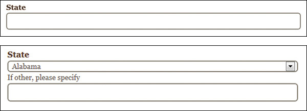
Figure 3.7 Two interpretations of the same markup: a browser that understands datalist displays one thing (above) and a browser that doesn’t displays something else (below).
Mind blown? That’s the power of fault tolerance.
Markup Conveys Meaning
Good user experience starts with content, but it is your job to do whatever you can to ensure the meaning of your words ring loud and clear. By being deliberate in choosing appropriate HTML elements and in providing fallbacks for older browsers when you use new ones, you ensure your users can actually use the markup you write. When you diligently police your markup for cruft and presentational tags, you keep your pages small and avoid confusing your users. When you add greater meaning and structure through microformats, microdata, and RDFa, you increase the potential reach of your content and make it more useful for your customers.
As this chapter has demonstrated, embracing the inherent awesomeness of HTML is not only easy, it also improves your users’ experiences dramatically.