Table of Contents for
Adaptive Web Design: Crafting Rich Experiences with Progressive Enhancement, Second Edition
 Adaptive Web Design: Crafting Rich Experiences with Progressive Enhancement, Second Edition
Published by
New Riders, 2015
Adaptive Web Design: Crafting Rich Experiences with Progressive Enhancement, Second Edition
Published by
New Riders, 2015
- Cover Page
- Title Page
- Copyright Page
- Dedication Page
- Acknowledgments
- About the Author
- Contents
- Foreword
- Introduction
- Chapter 1. Designing Experiences for People
- Chapter 2. Content Is the Foundation
- Chapter 3. Markup Is an Enhancement
- Chapter 4. Visual Design Is an Enhancement
- Chapter 5. Interaction Is an Enhancement
- Chapter 6. Crafting a Continuum
- Progressive Enhancement Checklist
- Further Reading
- Index
- Code Snippets
- Images
- Images
- Images
Chapter 4. Visual Design Is an Enhancement
“I’ve been amazed at how often those outside the discipline of design assume that what designers do is decoration—likely because so much bad design simply is decoration. Good design isn’t. Good design is problem solving.”
—JEFFREY VEEN
In 2012, a blog post from Jason Samuels of NCFR (National Council on Family Relations) caught my eye.1 In the post, Jason took a look at the analytics data collected from the NCFR site2 over a four-year period to demonstrate how much the profile of its users—professionals studying family dynamics and such—had changed over that period.
He found that OS-wise, Windows use had dropped from 93.5 percent to 72.4 percent, no doubt because of the rise of Apple’s OS X and iOS as well as Google’s Android operating system. As you’d likely expect, he found that mobile usage (including tablets) had grown year over year at a rate of 200 to 400 percent from a paltry 0.1 percent in 2008 to 6.2 percent in 2012. Couple the decline of Windows with the rise of mobile and the launch of Chrome (which came out in 2008) and it’s no wonder Jason also saw a sharp decline in Internet Explorer’s numbers: Internet Explorer dropped from a dominant position, bringing 75.5 percent of their visits, to a mere 37 percent.
These stats make complete sense if you were working on the Web at that time. Our relationship with the Web was changing just as new hardware and software options for accessing it were being rolled out. That said, nothing had quite prepared me for what he found regarding screen sizes: In 2008, he detected 71 different screen resolutions, but in the first quarter of 2012, he detected a whopping 830!
Think about that for a minute: 830 different screen resolutions? That’s astounding! But wait, there’s more. Jason updated the post in 2014 to reflect stats from the first quarter of that year, when he was seeing an average of about 1,000 unique screen resolutions every quarter.
That stat blows my mind every time I read it. You can’t create distinct layouts for 71 different screens, let alone 1,000. It’s a fool’s errand. And that’s just variability in screen dimensions and says nothing about CSS capabilities, pixel density, and a host of other visual design–related concerns.
How do you manage all of these variables when it comes to visual design? You do what designers have been doing for centuries: You problem solve. You look for ways to do more with less. You embrace constraints and look for creative solutions to gnarly problems. If that sounds good to you, you’re in the right place: The Web is full of gnarly problems and seemingly binding constraints.
Let’s look at a few ways to tackle them, starting with how to make visual design work less complicated, more consistent, and incredibly flexible.
Design Systems, Not Pages
In the early days of the Web, starting a new web design typically meant cracking open Adobe Photoshop and creating a new canvas onto which you’d draw a picture of a website. As browsers have provided more opportunities to write markup and CSS directly in the browser, some designers have begun to design there instead. I’m not here to tell you which you should use; you should design wherever you feel most comfortable. You might even find you like to work in both.
What I am here to tell you, however, is that you should not be thinking about web design as page design. Web pages rarely exist in isolation, and when you go down the rabbit hole of designing a site in “pages,” you run the risk of overdesigning it. I define overdesign as the practice of making every page type a one-off with only the most tacit aesthetic connections to its siblings within the site. I once worked on a project that had several designers who generated a staggering 135 unique page designs. That was overdesign. Madness, I tell you, madness.
Web developer Stephen Hay lays it out nicely in his book Responsive Design Workflow.
Think in terms of types. Think in terms of components. There are never many page types, so don’t think too much about pages. One of my most challenging conversations with a client involved me explaining that I didn’t have to redesign their site’s 10,000 pages. Rather, we had to spend a lot of time analyzing their content, and then I would design about 10 or 12 pages (plus a battery of small components). I would be designing a system. Not individual pages.
When you design systems, you create thematic links between elements and between pages. When you design systems, you inject predictability, which is comforting for your users. When you design systems, you make reuse easy, which is comforting for you as well.
The systems you design can be created in many ways, and the artifacts of these systems serve different purposes. I’ll walk you through a few popular tools for designing systems and discuss how and when they can be useful.
Conduct a Design Audit
If you are redesigning an existing site, you should consider conducting a design audit.3 With a design audit (or, as it’s sometimes called, an interface inventory), you go page-by-page through your existing website (and the wireframes for the new one), collecting screenshots of each unique style element you spot: headings, buttons, icons, bullets, promotional blocks, and so on. You can do this pretty easily with screen-capture software like the one that’s built into OS X or with programs like Skitch or Jing.4
A design audit is quite helpful for seeing how consistently the site’s brand is realized. If the site in question has been up for quite some time, it’s pretty likely that you will find elements that don’t fit, either because the aesthetic of the organization shifted over time without all the assets being updated or because new designers came onto the project and wanted to do something different. The reasons why your site has 14 different button styles don’t really matter, though—design consistency does. Design consistency belies reliability and trustworthiness. It makes your users feel more comfortable and secure.5
Design audits are also invaluable as you establish a visual language for your site. They remind you of all the elements you will need to design as part of your design system.
Explore Visual Language with Style Tiles
During the ideation phase of your design process, you might consider using what designer Samantha Warren refers to as style tiles.6 Style tiles are single-page documents that represent a design direction through a collection of interface elements such as headings, body copy, iconography, buttons, and whatever elements might be seminal to the purpose of the site (Figure 4.1).
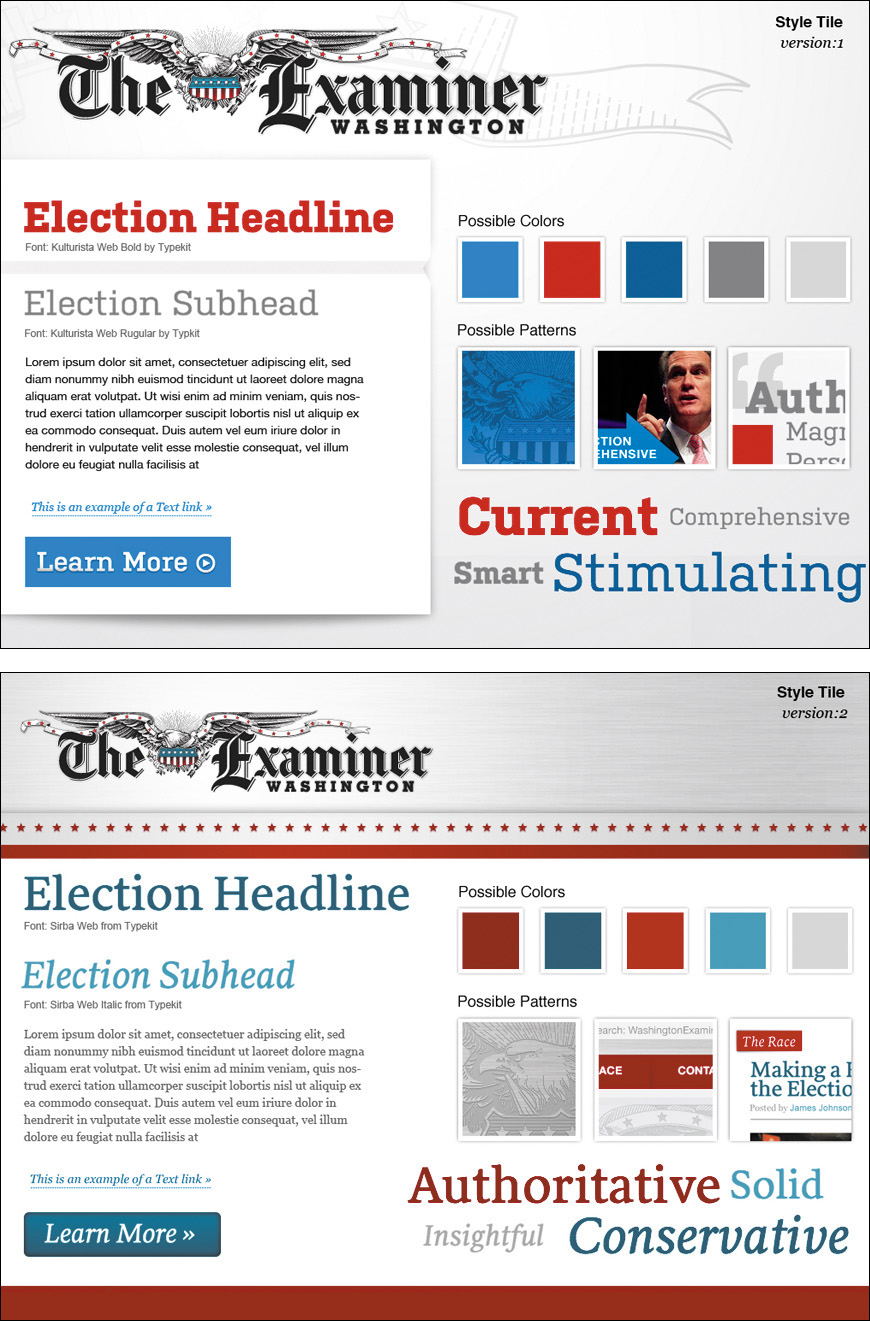
Figure 4.1 Style tiles from Phase2 Technology’s 2012 election site for the Washington Examiner. You can read the case study at http://perma.cc/QW7M-YCTZ.
Style tiles allow you to focus on the overall theme for a site in isolation, and their simplicity means you can revise them easily (or produce a few alternates if you want to offer multiple design directions). You rarely see all the important components of a site on a single page, so style tiles let you look at the collection of interface elements at once, which helps you ensure they fit well together.
Create a Style Guide or a Pattern Library
When you design a system, you need to document that system somewhere. Two popular options for this kind of documentation are style guides and pattern libraries. The actual definitions of these artifacts of the design process seem to vary a little from company to company, but I will explain them in the way I hear them most commonly used (and how I use them in my own practice).7
7 A word of warning: I have heard them used interchangeably, so if you aren’t sure what someone is talking about when they say either of these terms—or something completely different that hints at a similar idea—it’s best to ask for clarification. Teams need to speak the same language and have a shared understanding of what terms mean.
Style guides came to us from the print design world, and they collect all the visual design assets that comprise a site. Taken together, they are the design. Think of them as exhaustive style tiles. Often style guides contain annotations about font sizes, spacing, margins, image sizes, ad dimensions, and the like. They may also indicate the purpose that each element serves, but that’s not always the case. Style guides can exist as HTML documents, PDFs, JPEGs, or even printed books.
Pattern libraries are essentially living style guides. They don’t often contain annotations (though they can), but they exist as live web documents. Pattern libraries should use the same HTML, CSS, and JavaScript that is or will be used on the live site. This can make a pattern library a bit more useful than a style guide (especially a PDF one). Often pattern libraries even provide easy access to the HTML markup so front-end developers can grab that code and drop it into the templates they are assembling.
There are numerous tools for creating pattern libraries. Some popular ones include Barebones, Pattern Lab, Pattern Primer, and Style Prototype.8 For small projects, a pattern library might be overkill, but for large projects, they are well worth the investment. They can take time to produce, but once you have established the design patterns, you’ve essentially created a bucket full of Lego-like pieces that can be fit together in scads of different ways to serve the purpose of every page on your site. Website production goes much more quickly when you have a pattern library.
8 An excellent roundup of pattern library generators is available at http://perma.cc/LK5K-6K8Z.
Additionally, when you think about your design as a system of related components and maintain them within a pattern library, you can isolate each component to ensure it will adapt to your users’ needs. This isolation is also incredibly helpful when it comes to testing your designs on real devices because you are able to limit the number of variables at play and focus on each component individually.
This isolation also allows you to focus on the purpose of every component and how that relates to your content. After all, you are designing a system in support of your content, not just for giggles.
Don’t Design Yourself Into a Corner
As I mentioned in Chapter 2, “final content” is always a challenge. It’s an elusive beast that often takes time (and committees) to produce. The time required to create real content is often underestimated, causing project leadership to put pressure on you to just “get something going” in the design world. If you don’t, the project might not get done on time. And it will be all your fault. No pressure.
As Jeff Veen astutely observed in the quote opening this chapter, design without purpose is not design—it’s decoration. You need content to understand how you can help it become more lively, more effective, and more understandable. The purpose of design is to illuminate. It’s your job, as designer, to push back against decoration and explain that design has a purpose, and it needs content to realize that purpose. Or you need to make things up.
Design the Conversation
In Chapter 2, I mentioned that—in the absence of final content—you might consider borrowing content from a competitor’s site to help you think more clearly about the types of content you need in order to design your site, but there are many instances where borrowing representative content from other sites gets you only so far. Navigation, for instance. Button labels. Error messages. All these things need to be in your company’s voice and appropriate to your audience. As a designer, you should be aware of the purpose of each page and should feel comfortable making suggestions about what those elements should read like. You can (and should) contribute to the conversation your interface is having.
If you don’t do this and use only Lorem Ipsum in your designs, you run the risk of letting your design dictate your content rather than the other way around. When you are designing in Photoshop, in Sketch, or even in the browser, it’s easy to shave off a few words (or paragraphs) here or there to tweak the proportions of the container block to look just right on top of an image. But that isn’t grounded in reality.
You may find that the copy you end up getting is necessarily longer or shorter than what you planned for. That’s when things get awkward. Do you cut or truncate the copy to make it fit? Do you add more content to fill the space? Either decision compromises the content and (possibly) the usability of your site (Figure 4.2). The other option is to change the design to accommodate the content (which is often the correct choice), but that will probably be painful too. How many rounds of revision did that design go through again?
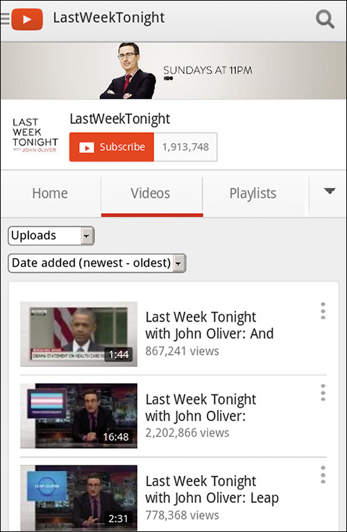
Figure 4.2 YouTube designed the teaser blocks for videos to have only a certain amount of text. When the program name is long, users get no useful information in the teaser, as in this screenshot taken in Opera Mobile on an HTC Evo 4G.
To avoid situations like this, it’s crucial for content strategists, copywriters, and designers to all be on the same page. Designers need to have a good sense of anticipated content length and key words that might be particularly long. Content authors need to be aware of any design constraints they need to consider, such as character limits for buttons, headlines, and teasers. Working together will help establish a shared understanding of what the needs of the content are and ensure the pieces fit together well when the time comes.
Find the Edges
Content is the foundation of design. It’s why you’re building a website in the first place. It needs to be the starting point of your design work and needs to be central to every design decision you make.
When working with copy—real or representative or even Lorem Ipsum—we have a tendency to design for the ideal scenario. We use brief, punchy copy for product descriptions or terse calls to action for buttons and links. It’s natural. It feels good. Sadly, that’s not reality. When designing a given module, it’s always good to throw something ugly in there that breaks from the norm, the comfortable.
Do your product descriptions typically have five bulleted features? Make sure the design holds up when you have one with two and another with 20.
Have nice content images where everyone in the photo is looking in the direction of the text? What if they are facing the other way, off the screen?9 And speaking of photos, are all of your photos in the same aspect ratio? What if you have one that is overly wide or overly tall that doesn’t fit quite right (Figure 4.3)? What if your call to action runs two lines instead of one? What if it runs three? What if your product title includes two really long words? What if the site is being translated into German?10
9 Thankfully, we tend to face right most of the time in photos, so we’re usually looking left on the page, but there’s always an outlier (http://perma.cc/TAP6-AW8V).
10 A word of advice regarding horizontal navigation in German—don’t do it.
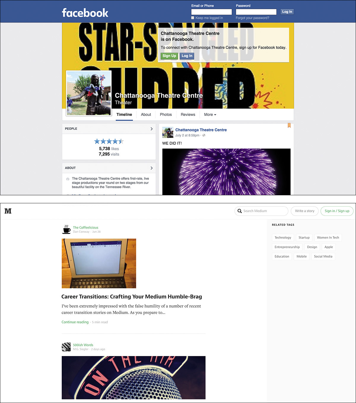
Figure 4.3 The Chattanooga Theatre Centre’s Facebook page (above) has a cover photo that is oriented vertically. Facebook scales it to fill the allotted space, but the result is pretty horrible. Whenever you are dealing with user-generated content, it pays to design defensively. Medium (below) handles user-uploaded images with different aspect ratios rather well.
Considering the edge cases early on makes for more robust designs. It’s kind of like how it’s easier to put together a jigsaw puzzle once you’ve framed it out with the edge pieces.
Understand How CSS Works
This isn’t a CSS book, so I’m not going to walk you through all the options available to you in CSS. One thing I do want to do, however, is give you an ever-so-brief recap of how CSS works because I think it will provide invaluable insight into how to construct progressive designs. If you’re already an expert in CSS, this section may be a bit remedial, but I suggest you at least skim it. The principles of CSS I’ll cover here are not often discussed, but understanding them will undoubtedly make you a better coder.
At its most fundamental, CSS is a series of human-readable rule sets, each composed of a selector and declaration block containing a set of property-value pairs (declarations) to be applied to any element matched by the selector.
p {
color: red;
font-weight: bold;
}
The previous example is about as basic as CSS gets. Anyone who’s worked with CSS before (and probably even someone who hasn’t) can look at it and quickly comprehend that it selects paragraphs and makes their text bold and red. Easy peasy.
Proximity Is Powerful
The first topic I want to discuss with you is the cascade (it is the first word in Cascading Style Sheets after all). The cascade is a pretty easy concept to understand: When everything else is equal, the last value defined for a given property wins. I’ll come back to the “when everything else is equal” bit in a moment, but let’s focus on that second half: The last value defined for a given property wins. This is sometimes referred to as the proximity aspect of the cascade. Here’s an example:
p {
color: red;
color: green;
}
Now this isn’t something you would typically do, but bear with me. When this CSS is applied to the page, the color of all paragraphs would be green rather than red because the “green” color declaration comes second. In other words, the “green” color value overwrites the “red” color value. Let’s look at another example:
p {
color: red;
}
/* imagine some more rule sets here */
p {
color: green;
}
This example has two rule sets with identical selectors but different values assigned for color. This sort of thing happens a little more frequently, typically when you are working on large style sheets or on a team. As you’d expect, paragraphs will be green because the latter declaration wins. It’s closer in proximity to the element it’s affecting.
Expanding this a bit further, consider moving these rule sets into two separate embedded style sheets in the head of the document.
<style>
p {
color: red;
}
</style>
<style>
p {
color: green;
}
</style>
Still green. Move them to linked style sheets.
<link rel="stylesheet" href="red-paragraph.css">
<link rel="stylesheet" href="green-paragraph.css">
Still green. Each of these examples results in a green paragraph because of proximity—the color value was redefined from “red” to “green” in rules that came later in the document. Now here’s a tricky one:
<style>
p {
color: green;
}
</style>
<link rel="stylesheet" href="red-paragraph.css">
In this instance, you might think the paragraph would go red because the linked style sheet comes second, but that’s not the case. Proximity has to do with the distance of the rule to the content in terms of position in the document, true, but it also has to do with actual distance of the rule from the element it describes, following the cascade order. It goes like this:
1. Browser default styles
2. Linked external style sheets (by order they’re linked)
3. Embedded style sheets (by order they’re embedded)
4. Inline styles (which I’ll discuss in a second)
That means declarations in linked style sheets may be overridden by declarations in embedded style sheets. That’s why the paragraphs would still be green.
At the end of the line are the inline styles.
<style>
p {
color: green;
}
</style>
<link rel="stylesheet" href="red-paragraph.css">
<!-- more HTML -->
<p>This paragraph is green.</p>
<p style="color: blue">This paragraph is blue.</p>
As with the previous example, the style rule in the embedded style sheet would turn the first paragraph green, but the inline style declaration trumps both the linked and embedded rules. It’s as close as you can get with respect to proximity.
Why does this matter? Knowing how proximity works allows you to wield it to your advantage when applying CSS. I’ll get into some of that shortly, but first let’s tackle the bit about the cascade I skipped: “when everything else is equal.” The “everything else” is specificity.
Specificity Trumps Proximity
Specificity is another core concept in CSS. It’s a measure of how many elements a given selector can select and is the only mechanism available for overruling proximity. Some selectors are more specific than other selectors. For example, an id selector (e.g., #intro) is infinitely more specific than a class selector (e.g., .vcard), which is, in turn, infinitely more specific than a type selector (e.g., p).11
11 If you don’t quite grasp how specificity is calculated, be sure to check out Andy Clarke’s “CSS Specificity Wars,” http://perma.cc/TQZ2-DJGX.
The specificity of a given selector is calculated by adding the specificity of all its component parts. Let’s take a look at an example:
figure figcaption {
color: green;
}
figcaption {
color: red;
}
Here are two rule sets that each target a figure caption (figcaption). The figcaption element is valid only within a figure, so both rules should select any figcaption on the page. Any figcaption on the page will be green—even though the second rule has greater proximity—because the specificity of the first selector is greater than that of the second. The first rule’s selector includes two type selectors (figure and figcaption), which is more than the second rule’s single type selector (figcaption).
If, however, you were to change things up and switch to using a class for the selector in the latter rule set, the results would be different.
figure figcaption {
color: green;
}
.caption {
color: red;
}
In this instance, the class selector (.caption) is more specific than the two type selectors combined. A good rule of thumb for figuring out which selectors are more specific is to assign a value to each component part of the selector:
• 0 to any universal selector (*)
• 1 to any type or pseudo-element selector (e.g., p or ::before)
• 10 to any class, pseudoclass, or attribute selector (e.g., .caption, :hover, or [alt])
• 100 to any id selector (e.g., #top)
If you use this formula, just be aware that 11 class selectors will never trump an id selector because each of these groupings is infinitely more specific than the ones in the grouping after them.
Rules applied via more specific selectors will trump those applied with less specific selectors, regardless of their order in the cascade.
Specificity of selectors is something that takes time to master and can cause any number of headaches. If you apply all your styles with heavy-handed selectors (e.g., each one contains an id selector), you end up having to create even more specific selectors to overrule them (e.g., two id selectors). To avoid an ever-escalating arms race of specificity, I recommend you make your selectors as nonspecific as possible.12 In other words, keep things simple and work with your markup. Thoughtful, meaningful markup choices—the kind discussed in Chapter 3—should be your guide. Microformat class names and ARIA attributes can be particularly useful for keeping your selectors minimally specific.
12 Numerous style systems based on class selectors have taken off because of the challenges of specificity. BEM and SMACSS are two examples of this and can help you avoid writing overly specific selectors by relying on every element having a class (or two or three) assigned to it. This can make your CSS more modular but can bloat your HTML. Trade-offs!
Errors Create Opportunity
The final aspect of CSS I want to touch on is how fault tolerance applies to CSS. You’ll remember from Chapter 1 that fault tolerance is the chief means by which CSS and HTML are empowered to evolve over time without sacrificing backward-compatibility. In both languages, it comes down to a single rule for browsers: Ignore what you don’t understand.
In HTML, this means unknown elements and attributes are ignored and the browser moves on, but in CSS the error handling works a little differently.
When parsing CSS to determine how to render a page, a browser reads each rule set and examines it. If it encounters something it doesn’t understand, it experiences something called a parsing error. Parsing errors aren’t scary things. They don’t often cause your site to fall apart like JavaScript program errors do. Parsing errors in CSS are fault tolerant in the same way HTML is fault tolerant. Though they are often the result of malformed CSS syntax (e.g., the misspelling of a property name or value, a missing colon or semicolon, etc.), they also result when perfectly valid CSS syntax is simply beyond the parser’s comprehension. Let’s revisit that simple rule set that kicked off this section.
p {
color: red;
font-weight: bold;
}
Assuming all the curly braces, colons, and semicolons are in their proper places (which they are), this example might not be interpreted the way you’d expect. According to the specification,13 if a browser encounters this rule set and doesn’t understand any part of it (i.e., it experiences a parsing error), the browser must ignore the larger component of the rule set in which the parsing error occurs.
So, for example, if the browser did not understand the CSS color keyword “red,” it would ignore the declaration color: red but would still apply the remaining declarations. The same goes for the font-weight keyword “bold.” If, however, the browser was unable to understand the selector (p), it would ignore the entire rule set, regardless of the browser’s ability to comprehend either of the declarations it contained.
The reasoning behind this is simple: We don’t know what the future of CSS may be. As a language, CSS continues to evolve. New features are added, and, on occasion, older features may be removed. For websites to work properly and for CSS to be a reliable design language, it’s imperative that a browser ignores declarations and selectors it doesn’t recognize. This flexibility not only helps you avoid exposing errors to your users but makes it possible to progressively enhance pages using CSS.
Property Fallbacks
For properties, using parsing errors to your advantage is pretty straightforward, and it opens up some awesome possibilities. Here’s a quick example using CSS3’s RGBa color scheme:
p {
background-color: rgb(137, 224, 160);
background-color: rgba(180, 246, 248, .43);
}
A browser parsing this rule set would likely understand the selector (after all, you can’t get much simpler than a type selector), so it would move on to the first background-color declaration. The background-color property has been part of CSS since version 1, so the browser should have no problem there and would move on to the assigned value. RGB-based color values have also been part of CSS since the beginning, so the browser will understand that value too. With the first declaration passing muster with the parser, the browser would apply background-color: rgb(137, 224, 160) to all paragraphs and then move on to the second declaration.
In the second declaration, background-color is redefined with a new value (overriding the previous declaration, per the cascade). Obviously, as I discussed, the browser understands the property, so it would move on to the declared value, which uses RGBa.14 If the browser understands RGBa, there’s no problem, and the RGBa value is assigned to the background-color property, overwriting the original RGB value. If RGBa is not supported, such as in the case of IE 8, the browser experiences a parsing error and ignores the entire declaration, leaving all paragraphs with the original RGB value for background-color.
14 RGBa, in case you aren’t familiar, is an RGB color with an alpha channel that governs opacity.
This is a pretty simple example of how you can use CSS’s fault-tolerant nature to deliver an enhanced experience to users on more modern browsers without sacrificing the experience of folks on older ones. This technique can be used for other values that have been introduced over time such as the calc() function, viewport units (vw and vh), and “flex.” Following this approach ensures your design is robust and will work anywhere. It’s pretty easy to do, too!
Hiding Rule Sets
Using parsing errors to your advantage doesn’t just work at the declaration level, though; you can apply this same technique to hide entire rule sets from a particular browser by using a more advanced selector.
:matches(body) nav {
/* A bunch of advanced stuff goes here */
}
Any browser encountering this rule set would parse it, starting with the selector. If the browser understands type selectors and the :matches pseudoclass, it will continue parsing the rule set and apply the declarations it understands. If, on the other hand, said browser does not comprehend any one of the selectors used, it would experience a parsing error and ignore the entire rule set.15
15 If you’re interested, that selector finds any nav element that is a descendant of a body element, but it does so using a CSS4 selector.
Perhaps the most famous example that uses this technique to selectively deliver rules to one browser over another (more for effect than practicality) is Egor Kloos’ CSS Zen Garden entry titled “Gemination” (Figure 4.4). In this proof-of-concept piece, Kloos created a basic layout aimed at Internet Explorer (then in version 6) and employed a technique dubbed MOSe (“Mozilla/Opera/Safari enhancement”)16 to offer more advanced browsers a completely different experience. Kloos used simple selectors for the basic layout and advanced selectors for the enhanced styles. Here’s a snippet that demonstrates his approach:
16 Dave Shea, curator of the CSS Zen Garden, coined the term in 2003, but when Internet Explorer 7 came out, the term fell out of use because it didn’t have the same selector-based limitations as IE 6. You can read his original post at http://perma.cc/GQX7-DBJL. Why not MOSCE, you ask? Chrome didn’t exist yet.
#intro {
/* Basic styles for IE6 */
}
/* More styles here */
body[id=css-zen-garden] #intro {
/* Advanced styles for everyone else */
}
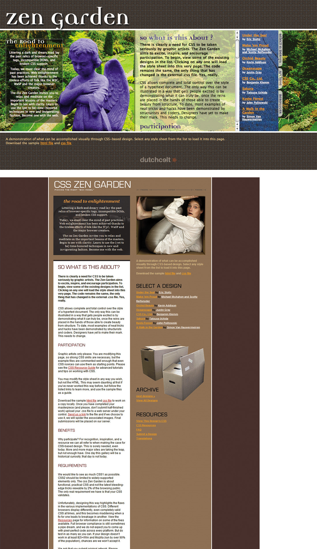
Figure 4.4 Egor Kloos’ “Gemination”—http://perma.cc/GL2V-YPY8—in IE 6 (left) and IE 7 (top).
Following CSS cascade order, the browser parses the first rule set first to render the #intro layout. A little later, the browser parses the “enhanced” rule set for #intro. If the browser understands attribute selectors, it will render a completely different layout for #intro; if it doesn’t, it will ignore the new rule set entirely.
Selector-based screening can be a useful technique, but it tends to trip up many CSS authors who don’t realize selector failure in a compound selector (two or more selector statements, separated by commas) is complete, not discrete.
p, p[class] {
color: red;
font-weight: bold;
}
This example has the same potential for parsing errors as the example that opened this chapter. Browsers that understand only one of the selectors in the compound selector will ignore the entire rule set rather than just the advanced selector (which, in case you were wondering, finds paragraphs with class attributes).
Though it may seem unintuitive, the CSS 2.1 spec clearly states that this is how it should be: “The whole statement should be ignored if there is an error anywhere in the selector, even though the rest of the selector may look reasonable.”17 Every CSS rule set has only one selector. The commas act as an “or” separating multiple options, but those options are not distinct when it comes to parsing.
Knowing this, you can make better decisions about how and when to combine selectors. As a general rule, it’s best to avoid combining advanced selectors with simple ones (as in the example) unless you want to hide the whole rule set from older browsers.
Hiding Multiple Rule Sets
From a maintainability standpoint, this method is not ideal for more than a single rule set here and there; to apply the concept of rule set filtering en masse, you can use at-rules.
@media screen {
p {
color: red;
}
}
@media only screen {
p {
color: green;
}
}
In this example, all browsers that support the “screen” media type will turn the text of paragraphs red. Only browsers that support media queries (signified by the “only” keyword) will turn their paragraph text green. In other words, browsers will not apply rule sets that appear within at-rules they can’t comprehend. The same logic applies with other at-rule blocks such as @supports (which I’ll talk about shortly).
It’s worth noting, however, that some at-rules allow for compound assignment using a comma, like you do in selectors. The behavior is a little different, however.
@media screen, print, refrigerator {
p {
color: green;
}
}
A browser that encounters this at-rule will turn paragraphs green in whichever media they can match (i.e., screen and print because I made the refrigerator media type up). In other words, compound media assignment does not work like compound selectors: An unknown statement within a compound selector will cause the browser to ignore the whole rule set, but an unknown value member within a recognized compound at-rule will cause the browser to ignore only the unrecognized at-rule value.
Example: Progressive Navigation
In Chapter 3, I mentioned that Nichols College had an interesting approach to handling its mobile navigation where the links are at the end of the document and there is a “jump” link that anchors you down to them and another that takes you from the navigation back to the content. Here’s an excerpt of the markup from the Graduate & Professional Studies site:18
<header id="top">
<!-- logo, etc. -->
<p id="jump">
<a href="#nav"><b>Jump to the Navigation
</b>Menu</a>
</p>
</header>
<!-- content, content, content... -->
<nav role="navigation">
<ul id="nav" tabindex="-1">
<!-- navigation options -->
<li id="back"><a href="#top">Back to
top</a></li>
</ul>
<!-- search form -->
</nav>
<!-- footer, etc. -->
The baseline experience of the navigation is the same as what you saw in Chapter 3 with Contents Magazine: The user clicks the “jump” link and the browser scrolls to the navigation. The user clicks the “back” link and the browser goes back to the top of the page. It’s not terribly elegant, but it works everywhere (even without CSS).
With CSS, the links are designed to be easily tappable with your fingers on a small touchscreen (Figure 4.5). That’s a nice affordance for browsers with only basic CSS support. Browsers with more advanced CSS support, however, receive a much more elegant solution: Tapping the jump link reveals the navigation right beneath the site header (Figure 4.6).

Figure 4.5 A selection of the Nichols College Graduate & Professional Studies site navigation in Opera Mobile on an HTC Hero. Note that the links are easy to tap.
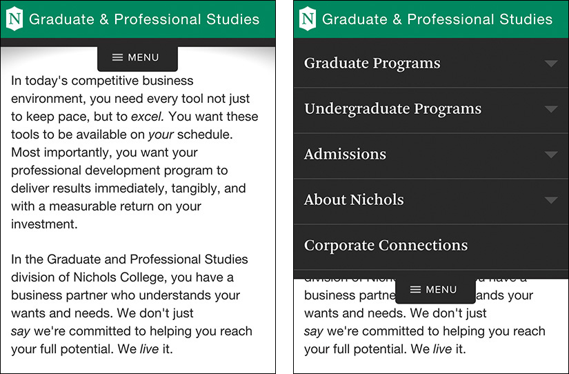
Figure 4.6. Nichols College Graduate & Professional Studies’ enhanced site navigation collapsed (left) and expanded (right).
The site achieves this using the :target pseudoclass, which selects any element whose id matches the fragment identifier in the URL. First, the developers positioned the list just below the header using absolute positioning. Then, they set up the default styles for when the navigation (ul#nav) is not targeted, giving the list items a height of 0. When the navigation is targeted (which happens when the “jump” link is tapped), the list items return to their normal height. Here’s an excerpt of the CSS that makes it possible:
#nav li {
height: 0;
overflow: hidden;
}
#nav:target li {
height: auto;
}
Some browsers (IE 8, for instance) don’t support :target, so Nichols uses a CSS-based filter—body:not(:target)—to restrict these rules to only browsers that understand the :target pseudoclass. They added that selector as a prefix to any selectors in the rule sets that govern this enhancement. So, the rules actually look like this:
body:not(:target) #nav li {
height: 0;
overflow: hidden;
}
body:not(:target) #nav:target li {
height: auto;
}
Taking this step ensures that older browsers remain able to access the navigation in the default manner (at the bottom of the page). Without the filter in there, those browsers would never see the navigation because the default state was for the list items to be hidden.
In another clever application of CSS, Nichols College uses the “back” link as a hidden layer to trigger the menu to be collapsed (because when you click it, #nav is no longer targeted). The developers absolutely position the layer and set its left and right offsets to 0 and set absurdly large negative top and bottom offsets to make it cover the page. They then place the main navigation links on top of it in the stacking order using z-index (Figure 4.7).
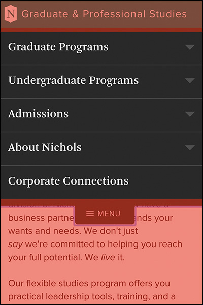
Figure 4.7 Nichols College’s exposed navigation with the “back” link highlighted in red (it’s transparent by default.)
Here’s the code that handles that:
body:not(:target) #nav li a {
position: relative;
z-index: 1;
}
#nav:target #back a {
position: absolute;
left: 0;
right: 0;
top: -999em;
bottom: -99em;
z-index: 0;
}
As if that wasn’t enough, Nichols College makes use of the transition property to animate the height change for the navigation list items. It gives the whole thing a “JavaScript-y” feel (even though no JavaScript is involved).
body:not(:target) #nav li a {
transition: height .25s linear;
}
Since this approach to navigation works best on narrower screens, Nichols College uses a different layout when the screen size gets large enough to accommodate a horizontal nav (which they move from the bottom of the page to the top using absolute positioning). To sequester these styles to smaller screens only—so they don’t have to override all these styles when they build the horizontal nav—the developers use a max-width media query.
@media (max-width: 59.9375em) {
/* All of the mobile navigation-related styles */
}
Interestingly, that media query is contained within a linked style sheet with its own media query.
<link rel="stylesheet" href="/c/layouts.css"
media="only screen and (min-width:20em)">
Taken together, the link and @media block ensure these styles apply only in media query–aware browsers that have a screen size of between 20em and just shy of 60em. This is an excellent example of progressive enhancement that takes full advantage of parsing errors to selectively deliver the enhanced experience to only those users who can actually benefit from it. Clearly, knowing how these mechanisms work pays huge dividends when you start considering browser and device proliferation.
Start Small and Be Responsive
In 2010, web designer Ethan Marcotte was seeking an elegant way to address device proliferation and the requests he was getting from clients.
In recent years, I’ve been meeting with more companies that request ‘an iPhone website’ as part of their project. It’s an interesting phrase: At face value, of course, it speaks to mobile WebKit’s quality as a browser, as well as a powerful business case for thinking beyond the desktop. But as designers, I think we often take comfort in such explicit requirements, as they allow us to compartmentalize the problems before us. We can quarantine the mobile experience on separate subdomains, spaces distinct and separate from ‘the non-iPhone website.’ But what’s next? An iPad website? An N90 website? Can we really continue to commit to supporting each new user agent with its own bespoke experience? At some point, this starts to feel like a zero sum game. But how can we—and our designs—adapt?
In answering that question, Ethan came up with the design approach he termed responsive web design. This quote comes from his A List Apart article that introduced that concept.19 Responsive web design came about as a way of addressing the varied screen sizes we were seeing back then (which pales in comparison to what we are seeing today).
19 http://perma.cc/3KR4-TA3J. He later wrote a book by the same name.
Ethan came up with a basic formula—fluid grids, flexible media, and media queries—that allows a designer to control the visual design of a site across a wide swath of dimensions with little effort. Here’s a breakdown:
1. Fluid grids (i.e., grid columns that are based on percentages) enable the layout to flex and fill the available space, making the layout adapt nicely to different widths.
2. Flexible media are images, videos, and the like that are not allowed to overflow their containers (typically, by setting a width or max-width of 100 percent on the associated element).
3. Media queries are then used to tweak the fluid grid to provide the most appropriate reading experience at that size by optimizing line lengths, font sizes, and so on.
In his original article, Ethan used two different kinds of media queries to adapt the layout of his demo page: max-width and min-width.20
/* CSS for the happy medium */
@media (max-width: 600px) {
/* Adjustments for small screens */
}
@media (max-width: 400px) {
/* Adjustments for even smaller screens */
}
@media (min-width: 1300px) {
/* Adjustments for larger screens */
}
The max-width media query (max-width: 600px) is the CSS equivalent of saying if the browser’s width is less than or equal to 600px, apply these style rules. The min-width media query (min-width: 1300px) says the opposite: If the browser’s width is greater than or equal to 1300px, apply these style rules.
Both of these approaches are completely valid, but, a short while later, it was generally agreed that min-width media queries are the better way to go for your overall design because they are more efficient. They are more efficient because you end up writing less CSS when you are starting with a baseline and building up the design because you have more screen real estate. With the other approach, you end up writing a bunch of style rules for your large screen layout that you then have to override in order to apply the narrower design.
Let’s look at a quick example to demonstrate the difference. Consider the following markup:
<div class="primary"></div>
<div class="secondary"></div>
Let’s say I wanted the two div elements to stack on top of one another on a small screen but to sit side by side on a wider screen. If I consider the small screen first, I could simply say the following:
@media (min-width:600px) {
.primary {
float: left;
width: 68%;
}
.secondary {
float: right;
width: 32%;
}
}
This approach is sometimes referred to as mobile first, though with the advent of smart watches and other similarly tiny screens (that aren’t necessarily mobile), I prefer the broader term small screen first. By contrast, if I wanted to get the same result but considered the large screen first—formerly desktop first—I would have to write this:
.primary {
float: left;
width: 68%;
}
.secondary {
float: right;
width: 32%;
}
@media (max-width:599px) {
.primary, .secondary {
float: none;
width: auto;
}
}
In other words, I would need to include two additional lines of CSS just to override the default settings outside of the media query. Those are unnecessary if I consider the small screen first because they come for free as part of the default rendering of a div element. In other words, approaching CSS thinking of the small screen first embraces default styles and progressively enhances the design when you have more screen real estate to work with.21
21 You can dissect these two contrasting approaches more on CodePen at http://perma.cc/G3KB-XXRC and http://perma.cc/79CZ-WEQ7.
Support Everyone, Optimize for Some
Understanding how browsers handle parsing errors makes it quite easy to draw a line in the sand between older, less capable browsers and modern ones. For example, you can divide your styles into basic styles that every browser can understand (e.g., typography, color, and margins) and more advanced styles that only modern browsers will be able to handle (e.g., layout, positioning, flexbox).
<link rel="stylesheet" href="basic.css" media="all">
<link rel="stylesheet" href="advanced.css"
media="only screen">
Browsers that don’t understand media queries22 would download only the first style sheet. The “only” keyword was introduced with media queries and older browsers don’t know what to make of it, so they ignore the style sheet. Modern browsers would download both. This approach is a perfect example of “mobile first” thinking because older mobile devices (which don’t understand media queries) are not penalized by having to download a ton of styles they’ll never use. It’s a great use of media queries that works because, as web developer Bryan Rieger put it, “[T]he absence of support for @media queries is in fact the first @media query.”23
It’s worth noting that even older browsers like IE 8 are pretty good at handling floats and positioning. That said, IE 8 is a pretty old browser—it doesn’t support media queries, flexbox layouts, or even RGBa. You might consider demoting your support for IE 8. I’m not saying to stop supporting IE 8 entirely, but you can give it a simpler experience. Taking the approach outlined earlier, you could use its lack of media query support to deliver it the mobile experience, and that would be okay. As long as users on IE 8 can still do what they need to do, they don’t need to have the same visual design as someone on the latest version of Chrome, Edge, Firefox, Opera, or Safari.
Now, you might think that delivering a minimally designed website would annoy any users getting that experience. That’s not necessarily the case. If the experience on that device was not so great previously, it might be a pleasant surprise. One of my favorite examples of this comes from A List Apart. In 2001, it stopped delivering CSS to Netscape Navigator 4 and other 4.0 generation browsers. Here’s what the magazine’s cofounder (and web standards luminary) Jeffrey Zeldman had to say about it at the time:
We assume that those who choose to keep using 4.0 browsers have reasons for doing so; we also assume that most of those folks don’t really care about “design issues.” They just want information, and with this approach they can still get the information they seek. In fact, since we began hiding the design from non–compliant browsers in February 2001, ALA’s Netscape 4 readership has increased, from about 6% to about 11%.24
That’s right: When A List Apart switched from delivering a design to Netscape Navigator 4 to delivering only the content, it actually saw the use of that browser increase. In other words, the magazine delivered a better, more appropriate experience in that browser, and people appreciated it.
We often look at usage stats for our sites and take them at face value. One such example of this is seeing a low percentage of a particular browser, say, 0.1 percent. You might look at a paltry number like that and reason that it’s not worth testing or even considering that browser. Before jumping to conclusions like this, however, you should look at these percentages in light of your actual usage numbers—0.1 percent of 1,000 visitors (i.e., one person) is different than 0.1 percent of 1,000,000 users (i.e., 1,000 people).
It’s also worth questioning why the usage stats for that particular browser might be low. Start by looking at your site in that browser. How’s the experience? If the experience is a good one, then it’s likely nothing you’ve done has unintentionally skewed that number. If it’s not a good experience, however, then you might be artificially depressing usage of that browser by prohibiting folks from accomplishing what they need to on that browser. You might want to look into addressing the issues you see, or, if it’s easier, you might consider reducing the amount and type of content you are sending to that browser, just like A List Apart did.
Think of it this way: There’s no musical listening experience quite like sitting dead-center in an acoustically perfect concert hall. A 7.1 channel stereo at home is not nearly the same but still offers a great experience. A 5.1 channel system isn’t quite as impressive as 7.1 channels, but it’s still better than basic two-channel stereo. And finally, there’s mono—it’s not even close to the same experience as a concert hall, but at least you’re still listening to music.
The “mono” design is your baseline small-screen experience that will work on older browsers, desktop or otherwise (e.g., the stuff that can go in basic.css, as mentioned earlier). In all likelihood, the design will be linear (single column, vertically oriented). That works well for old browsers and narrow ones alike.
Example: Growing a Layout
When you think about layout from a mobile-first perspective, you need to begin with optimizing things for as narrow a screen as best you can. Perhaps that screen size is 240px wide, like some feature phones, or even 144px, like some smart watches. Regardless, in addressing a small screen, you’ll want to maximize your use of space. At the same time, however, you also want to keep text from crashing awkwardly into the side of the screen. The Boston Globe25 achieves this balance by letting its primary layout elements maintain their default width while the primary content block (div#main) has a 10px margin on the left and right (Figure 4.8).
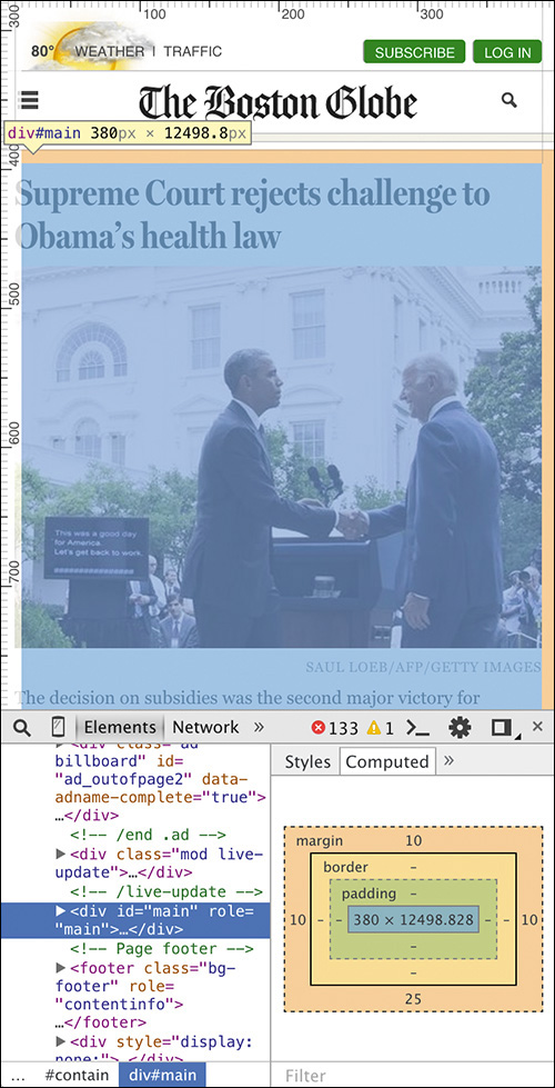
Figure 4.8 The Boston Globe website on a narrow screen with the margins of the primary content div highlighted using the Chrome browser’s Developer Tools.
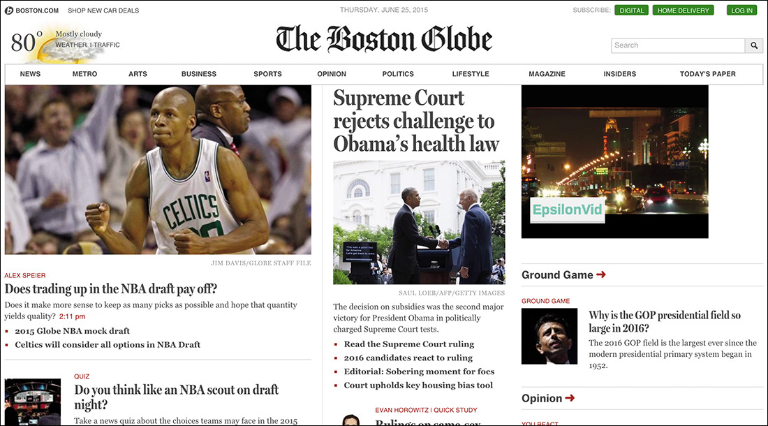
On browsers with a little more horizontal space, the website still maintains a narrow margin, even though it has adjusted the layout to occupy two columns to make the most optimal use of space (Figure 4.9).
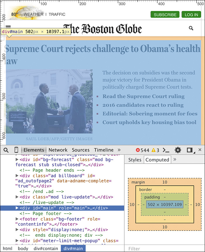
Figure 4.9 The Boston Globe website on a wider screen maintains the same margins even though the layout is slightly different.
As the browser width increases, the website relaxes the layout a bit and increases the horizontal margins. It does this by removing the margin from the primary content div and setting the width of its parent container (div#contain) to 93.75 percent. It also centers the layout by defining a maximum width for div#contain so that it will never exceed 1232px and lets the browser autocalculate its horizontal margins (Figure 4.10). It does this all inside a media query that tests for a minimum width of 620px.
@media screen and (min-width: 620px) {
#contain {
margin: 0 auto 10px;
width: 93.75%;
max-width: 1232px;
}
}
The design continues to adjust, keeping readable line lengths and making the most of the available space until it reaches that maximum with of 1232px—the “concert hall” experience, to bring back that analogy. The layout of the large screen page is far more complex than that of the small screen one, but the site works no matter how much screen real estate a user has available for it.
The Boston Globe web team’s approach of delivering styles in this way had an unintended side effect: On a lark, designer Grant Hutchinson loaded the Boston Globe site on an Apple MessagePad 2100—an old PDA from 1997—and the site worked because progressive enhancement just works (Figure 4.11).
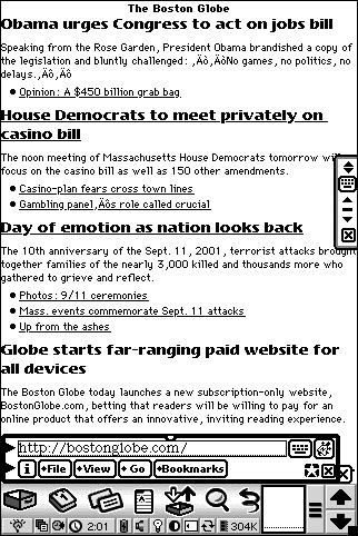
Figure 4.11 The Boston Globe as viewed on in the Newt’s Cape browser on an Apple MessagePad 2100. Screenshot by Grant Hutchinson, used with permission.
The Boston Globe site is a perfect example of progressive enhancement with responsive web design. It’s also great for another reason: The dimensions it chose for the media queries (a.k.a. breakpoints) don’t directly map to any specific devices.
Embrace Fluidity
When we first began to address device proliferation with media queries, we started by mapping our media queries directly to common device dimensions (like those of the iPhone). Using media queries, it’s entirely possible to get super-granular in an attempt to deliver certain rules only to particular devices.
Take a look at this beast:
@media only screen and (min-device-width:1024px)
and (max-width:989px),
only screen and (max-device-width:480px),
only screen and (max-device-width:480px)
and (orientation:landscape),
only screen and (min-device-width:481px)
and (orientation:portrait) {
/* Yikes! */
}
Now banish it from your mind and commit to never, ever writing something this heinous.26
26 I will admit to writing this. I was young, and I needed the money.
I’m thankful that we now have a much better understanding of what we should and should not do with media queries and picking our breakpoints. Stephen Hay sums up the process for picking breakpoints beautifully.
Start with the small screen first, then expand until it looks like shit. Time for a breakpoint!
What Stephen is saying here is simple: Let the content guide you. Start with your browser window very narrow and slowly make it wider. When the design starts to look awkward, it’s probably time to insert a breakpoint to adjust the layout or the page or at least the given component.
Notice that Stephen never said anything about a specific device or browser. Every device is different, and while there are some common sizes, catering only to them can result in a poor experience for anyone who doesn’t use one of those devices. Remember Jason Samuels and the 1,000 different screen sizes he was seeing every quarter? You can’t design every one of those experiences. Chasing screen sizes is pointless. Instead, follow Stephen’s advice and focus on the content. Let it be your guide and inform you as to where you need to add breakpoints.
Interestingly, Pattern Lab (which I mentioned earlier in this chapter) reinforces the idea that screen sizes vary widely. It has buttons to toggle the viewport to be “small,” “medium,” and so on, but the actual width varies each time you click one of them. In one instance, “small” might be 315px; in another it might be 345px. Pattern Lab also sports “Hay Mode,” which starts the viewport off small and slowly enlarges it automatically, just as Stephen recommends (minus the swearing), and “Disco Mode,” which randomly switches viewport sizes in order to stress test the design and makes it look like the browser is dancing.
When considering how your design plays out on different devices, it’s still important to pay particular attention to certain, specific devices. That may sound contradictory to the universal support I’ve been advocating, but it’s not. Certain devices are necessarily more important than others. For instance:
• Devices that frequently visit your site
• Devices that are used by your high-profile clients or the ones you want to attract
• Devices that are starting to take off in the marketplace
Ignoring devices that are used by a large percentage of your users (or by your most influential users) would be foolish. Optimizing the experiences for these devices is a good idea. Give them the “concert hall” experience; just don’t forget about the long tail of other devices and browsers your users rely on to access your website. Support the long tail, but optimize for an important subset.
Everyone deserves to have their device supported, even if they get only the “mono” experience. The more people you support, the greater your reach and the more opportunity you create for sales, leads, visits, shares, or whatever other metrics you use to gauge your website’s success.
Focus on Standards
Earlier on, in my examination of Nichols College’s navigation, I showed the transition property. If you don’t remember, here’s the code again:
body:not(:target) #nav li a {
transition: height .25s linear;
}
CSS transitions are part of CSS3 that was tested—during its development as a feature—on the open Web using vendor prefixes. You may have seen a vendor prefix before; -webkit- is probably the most common.
Vendor prefixes were created as a mechanism that would allow a browser maker (a.k.a. a vendor) to implement an experimental spec to let web designers “road test” the feature. The prefix indicates that the feature is experimental and may change in a future release. In other words, use at your own risk. Sadly, browsers often weren’t very forthcoming about the experimental nature of these features and so we went ahead and used them in production on high-profile sites, often without providing a declaration that would support the future nonprefixed standard.
A perfect example of this becoming problematic is with CSS gradients. CSS gradients were introduced by WebKit in 2008 with a vendor prefix.27 In the blog post unveiling this feature, Apple’s Safari and WebKit Architect Dave Hyatt didn’t explicitly state that this was an experiment, despite using the vendor prefix. Perhaps he assumed that was understood. This was an instance where Apple was testing the waters with an idea—CSS gradients didn’t even make it into a Working Draft at the W3C for another three years.28 Here’s an example of the syntax from that post:
background: -webkit-gradient(
linear, left top, left bottom,
from(rgb(0, 171, 235)), to(rgb(255, 255, 255)),
color-stop(0.5, rgb(255, 255, 255)),
color-stop(0.5, rgb(102, 204, 0))
);
The syntax was pretty impenetrable, but designers were eager to make use of this new feature. After all, it allowed them to generate simple gradient images in the browser rather than having to download an additional asset. And so -webkit-linear-gradient migrated on to the Web and proliferated.
As it made its way through the standards process at the W3C, the syntax changed a bit from Apple’s original proposal.29 Other browsers picked up the revised syntax (as did Apple) and implemented it behind their own prefixes until the spec was deemed final.
As more browsers supported the feature, tools cropped up to enable you to generate the rather verbose gradient syntax; ColorZilla’s tool30 is particularly popular. To ensure all browsers that supported gradients were accommodated, you needed to write something akin to the following:
background: #87e0fd;
background: -moz-linear-gradient(#87e0fd 0%,
#0599c6 100%);
background: -webkit-gradient(linear, left top,
left bottom,
color-stop(0%,#87e0fd),
color-stop(100%,#0599c6));
background: -webkit-linear-gradient(#87e0fd 0%,
#0599c6 100%);
background: -o-linear-gradient(#87e0fd 0%,
#0599c6 100%);
background: -ms-linear-gradient(#87e0fd 0%,
#0599c6 100%);
background: linear-gradient(#87e0fd 0%,
#0599c6 100%);
Background-by-background, these are the steps:
1. A solid color for older browsers
2. The vendor-prefixed Firefox version
3. The first pass from Apple, vendor-prefixed for WebKit (early Chrome used this syntax too)
4. The revised vendor-prefixed WebKit version
5. The vendor-prefixed Opera version
6. The vendor-prefixed IE version (supported in IE 10)
7. The official, standardized W3C version
As you’ll recall, parsing errors results in an unknown value being ignored, so the order of these properties matters. It needed to be the default value first, the vendor prefixes in the middle, and the standardized version at the end. That way, when CSS gradients got standardized—which they were in 2012—the official version would always trump the vendor-prefixed versions.
Despite plenty of articles, blog posts, and examples demonstrating this syntax in order to reach the largest possible number of designers, sites were still being created using only the original concept from Apple. For example, up until its 2014 redesign, Macy’s mobile site31 used only the old linear gradient syntax in its navigation buttons (which were also div elements, not actual links, but I digress).
31 http://perma.cc/XD2R-BDKF. An archive of the version I’m referring to is available at http://perma.cc/4M7N-9Q5U.
They were not the only ones to do this, of course; many other popular sites had and continue to have the same issue. This causes problems from an interoperability standpoint. For instance, without the gradient background, it’s possible that the text could be unreadable (which wasn’t the case with Macy’s but could potentially be an issue on other sites).
To ensure users on other browsers got the experience designers intended, other browser makers eventually ended up having to support Apple’s original experimental syntax, prefix and all.32 Having to make an accommodation like this adds unnecessary bloat to a browser, making it larger and slower.
Having learned from this experience, most browser vendors have moved to put experimental features behind “flags” in the browser’s configuration. To turn on an experimental feature, a user (or developer) would have to opt into it specifically. This should help reduce the likelihood of a situation like this arising in the future, but it’s not a guarantee. It’s possible that you could flip on the feature on your browser and forget that you’ve done so, giving you a false impression of something working for other users. I know; I’ve done it.
When it comes to features like this, it’s important that you take note of their experimental nature. Don’t rely on their availability unless you have some way of testing for whether they are supported (more on that in a minute). And if you do use a vendor-prefixed property, make sure you keep your style sheets updated as the spec for that property matures and as more browser vendors begin to implement it.
If you use a CSS preprocessor like Sass, Less, or Stylus,33 you may find that the preprocessor makes it easy to write the syntax according to the spec, and it will create the fallback and vendor-prefixed versions for you. Autoprefixer, a post-processor for CSS, will also take the W3C syntax for certain features and copy it to the vendor-prefixed versions based on the configuration you supply.34
33 CSS preprocessors are beyond the scope of this book but might be useful in your workflow. Sass (http://perma.cc/4NH9-K8A3) is probably the most popular, with Less (http://perma.cc/9M5Y-FY6K) a close second. Stylus (http://perma.cc/XWK7-HA4N) is a distant third.
34 You can find a great introduction to Autoprefixer on CSS Tricks: http://perma.cc/SPF4-7PE8.
Design Defensively
As I’ve mentioned a few times in this chapter, when you use new CSS features like gradients, you need to make sure you also provide an experience that works for users who don’t have the ability to use that feature. You need to design defensively and provide fallbacks. Thankfully, that is pretty easy to do when you understand how fault tolerance works.
property: basic value;
property: advanced value;
Newer CSS properties and values will be ignored automatically because the browser knows to ignore anything it doesn’t understand. If you have a bunch of advanced properties on an element and need to hide a whole CSS rule set, you can use a more advanced selector like you saw with the Nichols College navigation example. And if you want to hide several rule sets, you can use at-rules (including media queries) to achieve that too.
It’s particularly important that you pay attention to color when it comes to devising different experiences for different browser generations. For instance, if you are using an RGBa color for a background, make sure the foreground color will still be legible against your fallback. You can always supply two different foreground colors for each version if you need to by using the RGBa syntax (even if you are using an opaque color).
color: #fff;
color: rgba(29, 31, 33, 1);
background-color: #000;
background-color: rgba(255, 255, 255, 0.75);
In this example, the second color value is actually an opaque color but will be understood only by browsers that support RGBa, ensuring it partners well with the RGBa background-color value.
Be Conservative in How You Apply Styles
Sometimes you need more robust feature detection in order to isolate CSS code that could cause the design to fall apart in older browsers. Modernizr35 has filled this need for many designers but relies on JavaScript to work. Since JavaScript is not always available, the W3C has introduced feature queries to allow you to achieve this kind of isolation. In practice, they work via a new at-rule: @supports.
Like the @media block for media queries, the @supports block acts as a wrapper around a collection of rule sets to enable you to selectively apply them only if your query evaluates as true. Queries can be made for a property or a property-value pair, and, as with @media blocks, you can also check for lack of support using the “not” keyword. Here are a few examples:
@supports (display:grid) {
/* rule sets that would render the interface
unusable without grid layout support */
}
@supports not (display:grid) or (display:-ms-grid) {
/* Rules for browsers that don’t support CSS Grid
Layout */
}
It’s worth noting that, as of this writing, @supports is still quite new, but it is—er—supported in more browsers with each new release.36 The positive test case (example 1) is your best option; forward-compatibility is far more useful because only advanced browsers currently understand @supports. Older browsers will simply ignore it, making backward compatibility not quite as useful. However, as with media queries, lack of feature query support is, in fact, the first feature query.
36 Reference Can I Use for an updated support table: http://perma.cc/QQB3-QLU4.
Regardless, native CSS-based feature detection is an amazing tool for progressive enhancement. It allows better encapsulation and more granular testing without having to rely on JavaScript.
Hide Content Responsibly
Perhaps the most heavily repeated pattern in JavaScript-based interfaces is showing and hiding content. You’ve seen numerous examples that use it already: tabbed interfaces, accordions, and navigation. It crops up nearly everywhere.
In and of itself, this pattern is not a bad thing, but few people realize how profoundly your choice of hiding mechanism can influence the accessibility of your content when it comes to assistive technologies such as screen readers. It’s important to know what the different approaches do and how they can affect the reading experience of your users.
Techniques to Avoid
Assuming you want your content available to screen readers, it’s best to avoid using any of the following techniques to hide content.
Invisible
.hidden {
visibility: hidden;
}
When you adjust the visibility of an element, the element is hidden from view but is not removed from the normal flow (i.e., it still takes up the space it normally would). Unfortunately, “black hat” SEO folks ruined this option when they started filling pages with popular keywords and hid them from view using this CSS property. To save screen-reader users from having to hear Pamela Anderson’s name over and over,37 assistive technology doesn’t expose content hidden in this way.
Not Displayed
.hidden {
display: none;
}
This is probably the most popular way of hiding content with CSS. Pretty much every JavaScript library does this by default. When you set display to none, the element is removed from the normal flow and hidden. The space it once occupied is collapsed. This was another technique used to “keyword stuff” pages so its contents are ignored by assistive technologies.
This setup collapses the element to nothing and prohibits its contents from flowing outside of its edges. This is yet another technique abused by the black hats, so it’s not accessible. People ruin everything!
Techniques to Use Sparingly
These hiding techniques keep text accessible, but have some limitations.
Negatively Indented
.hidden {
text-indent: -999em;
}
Finally, a technique that assistive technology does expose to users! The negative text-indent shifts the element’s contents off-screen and out of view. Sadly, it works only with text and inline content, and links within the content may focus oddly. Also, you can never be sure the negative indent will be long enough to fully hide the content.
Positively Indented
.hidden {
overflow: hidden;
text-indent: 100%;
white-space: nowrap;
width: 20px; /* fixed width */
}
As with the previous example, this one is accessible. It’s also limited to text and inline content. This approach is useful only when you know the precise width of the element.
Positioned Offscreen
.hidden {
position: absolute;
left: -999em;
}
A perennial favorite, this approach removes the content from the normal flow and shifts it off the left edge. The space the element occupied is collapsed. Its contents are accessible, but this approach works only in left-to-right languages. For right-to-left languages, use the right offset instead of left.
The Best Way to Go
Developed by a team at Yahoo!, this is the current gold standard for hiding content:
.hidden {
position: absolute;
height: 1px;
width: 1px;
overflow: hidden;
clip: rect(1px, 1px, 1px, 1px);
}
It’s a bit to take in, so I’ll walk you through it.
The positioning removes the element from the normal flow, but because no offsets are used, it remains in its original position. The width and height collapse the element to a 1×1 square (which avoids the accessibility issues introduced by the 0×0 approach). Finally, its contents are hidden from view via a combination of overflow and clip. Using this technique, the element’s content is accessible, and its text direction is irrelevant.
One thing to keep in mind with respect to hiding content is that when you hide elements such as images—which can have a significant effect on the performance of your page—in many cases the browser will still download the image.38 Any users who don’t get to see the hidden image are paying to get it and waiting to download it. The current best practice for selectively delivering images and other weighty assets is to load them via JavaScript, assuming, of course, they actually add to the experience (as we discussed in Chapter 2).
The Flip Side: Generated Content
In addition to hiding content, you sometimes need to insert content into your pages via CSS. A perfect example of this is in forms. Imagine you’re laying out a form and can’t decide whether you want colons after the field labels. Rather than adding them to the markup directly, you could simply generate them in with CSS.
label::after {
content: ":";
}
That way you can easily remove the colons later if you decide you don’t like them. NPR uses generated content in a pretty ingenious way on its site: The generated content allows data tables to be linearized on small screens.39 NPR does this through a clever combination of data attributes and generated content.
In the HTML, NPR adds a data-title attribute to each table cell. The contents of this attribute match the column header for that cell. Here’s a sample row:
<tr>
<td data-title="Category">Total (16 years and
over)</td>
<td data-title="January">6.6</td>
<td data-title="February">6.7</td>
<td data-title="March">6.7</td>
</tr>
On the CSS end, inside a media query, NPR converts all table cells, rows, and so on, to display: block so they stack on top of one another. Then it hides the contents of the thead and uses generated content to insert the column headers before the contents of each cell.
@media screen and (max-width: 480px) {
table, tbody {
display: block;
width: 100%;
}
thead {
display: none;
}
tr, th, td {
display: block;
padding: 0;
text-align: left;
white-space: normal;
}
th[data-title]::before,
td[data-title]::before {
content: attr(data-title) ":\00A0";
font-weight: bold;
}
}
That last rule set is where the magic happens: The value of the data-title attribute is inserted into the cell, followed by a colon and a space (\00A0 is hexadecimal for a space).
Now you might be wondering why, after all I did to badmouth display: none, NPR is using it for hiding the thead. They are rendering the thead inaccessible on purpose, because generated content is exposed to assistive technology. If the thead was also available, the column header contents could be read out multiple times.
Why would generated content be read by assistive technology? It’s coming from CSS, which means it’s presentational, right? Yes, that’s absolutely true, and I’m right there with you. It used to be that generated content was not exposed to assistive technology, but sadly, as with visibility: hidden and display: none, designers didn’t understand that generated content was intended to be for presentational content only—they started using it for important page content too. To avoid causing issues for people who depend on assistive technologies, browsers began exposing generated content as though it was real content in the page. It’s still not selectable with a mouse or keyboard, though.
Consider the Experience with Alternate Media and Inputs
The Web is unlike any other medium we’ve encountered thus far. It isn’t print, television, radio, a video game, a kiosk, or an application, but it functions as a hybrid of all these things and more. Realizing this, the W3C added the ability to target styles to a specific medium. I took advantage of that capability earlier in an @media block, but you’re probably more familiar with using media declarations with linked or embedded style sheets (using the media attribute).
The W3C maintains the list of approved media types but is open to adding to it as technology evolves. Currently, the list addresses CSS’s application on the computer screen, in print, on televisions, on handheld devices (which, sadly, no browser maker uses), and in assistive contexts such as screen readers, braille printers, and touch-feedback devices. Without a specific media designation, the browser assumes the screen media type.
At their most basic, media assignments use a single-media designation, but (as you saw with my silly refrigerator example) multiple media assignments can be combined using a comma (which acts as an implicit “or”). As I covered earlier, media assignments are also fault tolerant in that unknown media types are simply ignored, with the browser applying the contained rule sets only in the known media types.40 Media assignments are incredibly powerful because they allow you to create layouts that adapt to the medium in which they are presented.
40 The CSS 2.1 spec (http://perma.cc/D2RD-6S7T) addresses this explicitly in the case of @media and @import but is oddly nonprescriptive about the same behavior applying to linked and embedded styles. Still, all modern browsers treat the HTML-based media designations the same way.
Design the Printed Page
One of the first great examples of designing an experience for a nonscreen medium came from CSS wizard Eric Meyer back in 2000. He showed us how to jettison “printer-friendly” pages and use a media-specific style sheet to provide a printer-friendly view of any web page.41 He offered the following suggestions to make the print experience better:
body {
background: white;
color: black;
}
a:link, a:visited {
background: white;
color: black;
text-decoration: underline;
font-weight: bold;
}
h1, h2, h3 {
background: white;
color: black;
padding-bottom: 1px;
border-bottom: 1px solid gray;
}
div.adbanner {
display: none;
}
Most of these tweaks are focused around improving the readability of the document. They facilitate scanning and hide stuff that’s not all that useful in print (such as that banner ad you can’t click). You could also easily build on this and get rid of other stuff that wastes paper: navigation, most forms, and decorative images.
Two years later, Eric extended that concept and showed how to use advanced CSS to progressively enhance the print experience.42 My favorite bit from that article was the way, in one sweet rule, he made links useful in print.
#content a:link::after,
#content a:visited::after {
content: " (" attr(href) ") ";
}
That simple rule set inserts the href URL value (via the attr() function) as a parenthetical after every link, using generated content (::after).
Since these two articles came out, web designers have been granted a lot more control over the printed page. You can control page margins based on whether the page is left- or right-facing (@page). You can control how many lines of an element should remain when it breaks across pages (widows) and how many can be left alone on the new page (orphans). You can even control where page breaks should occur (page-break-before, page-break-after, page-break-inside).
There are countless ways to embrace alternate media, such as print, and show it the same sort of care you show your screens. In most cases, your rules for alternate media won’t be so many that they require their own style sheet, so it makes sense to put them in an @media block within your basic style sheet. That way it will be there as an enhancement for every browser, and any that don’t support the particular medium will just ignore the block, as they should.
Embrace Alternative Interactions
In addition to considering alternate media, you should be considerate of alternative interaction methods. Technology continues to offer novel ways of consuming and interacting with websites. We, as an industry, are just starting to dip our toes—er, hands—into the world of motion-based gestural controls. We’ve had them in two dimensions on touchscreens for a while now, but three-dimensional motion-based controls are beginning to appear.
The first big leap in this direction was Kinect on the Xbox 360 (and later, Windows and Xbox One). The Kinect watches for body movements such as raising your hand (which gets Kinect to pay attention), pushing forward with your hand to click/tap, and grasping to drag the canvas in one direction or another.
The Kinect was a major revolution in terms of interfacing with computers, but large body gestures such as raising your hand (or a wand controller as with the Nintendo Wii and PlayStation Move) can be tiring. They’re also not terribly accurate. If you thought that touchscreen accuracy was an issue, hand gestures like those for the Kinect or the LEAP Motion pose even more of a challenge.
Interactions like this—which are currently impossible to detect and accommodate—require diligence when it comes to ensuring interactive controls are actually usable. You need to determine whether your buttons and links are large enough to activate. You need to be aware of what kinds of interactive controls work well. You also need to figure out whether there is enough space between them to ensure your user’s intent is accurately conveyed to the browser.
Next-generation media queries give you the ability to apply style rules to particular interaction contexts. Here’s an example of when your user has accurate control over her cursor (as in the case of a stylus or mouse) or less accurate control (as in the case of a touchscreen or physical gesture):
@media (pointer:fine) {
/* Smaller links and buttons are ok */
}
@media (pointer:coarse) {
/* Larger links and buttons are probably a good
idea */
}
Of course, you’ll want to offer a sensible default in terms of size and spacing as a fallback for older browsers and devices that don’t support this new query type.
In addition to querying pointer accuracy, you can detect whether the device is capable of hovering.
@media (hover:hover) {
/* Hover-based interactions (like rich tooltips)
are possible */
}
@media (hover:on-demand) {
/* Hover-related interactions are potentially
difficult, maybe do something else instead */
}
@media (hover:none) {
/* No hover possible :-( */
}
In terms of real-world application, however, no one has figured out a best practice for how all this should work on devices such as Microsoft’s Surface tablet, which supports keyboard, mouse, pen, and touch. Will the design change as the user switches between input modes? Should it? To that end, the spec also provides any-pointer and any-hover values to allow you to query for whether any supported interaction method on the device meets your requirements, but here’s a word of warning from the spec:
Designing a page that relies on hovering or accurate pointing only, because any-hover or any-pointer indicate that an input mechanism with these capabilities is available, is likely to result in a poor experience.43
In other words, use them with caution and probably only in concert with other queries.
Think Bigger
Of course, in addition to considering the level of accuracy your users have while interacting with your site, you need to consider the potentially increased distance at which they are reading your content.
When you design your sites, you’ll want to ensure your line lengths stay somewhere in the 45–75 character range. You can manage that by adjusting column widths according to the font size pretty easily. Assuming you’ve set the max-width of your responsive design for the largest size you want to design for, what happens when the screen is bigger than that? You get white space on one or both sides of the design. The larger the screen, the more white space you see. This can be particularly problematic on large wall-mounted displays.
This is where the viewport width (vw) unit of measurement can be quite useful. A vw is a fraction of the overall viewport width (a.k.a. available horizontal space). Interestingly, however, you can use this unit in scenarios that have nothing to do with layout—such as font size. Check this out:
body {
max-width: 64em;
}
@media (min-width: 64em) {
body {
font-size: 1.5625vw;
}
}
Here I have set a maximum width of 64em on the body element. That makes the width of the body proportional to its font size (which is what you want). Then, within a media query that applies only above that 64em limit, I set the font size to 1.5625vw. How did I arrive at that number? Math!
( 1em / 64em ) * 100
If the font size of the body is 1em and its width is 64em, then the font size of body is roughly 1/64th the width of the element. Multiply that by 100 and you have your vw unit. Now, as if by magic, the site enlarges as the screen size gets bigger (Figure 4.12).

Figure 4.12 North Shore Chiropractic (http://perma.cc/ARA5-JMRU) uses vw units to zoom its design on larger screens. On top is the narrower “wide” version below the 64em cutoff; underneath is the design zoomed in when the browser width exceeds 64em.
If you don’t want to turn something like that on automatically, you could also toggle it on and off with JavaScript.44 Either way you go, however, this is an excellent progressive enhancement for larger screens and televisions, which tend to be viewed from across the room rather than across a desk.
44 You can see an example of this behavior at http://perma.cc/2VYQ-RG22.
Embrace Default Styles
In his astute post “‘Native experience vs. styling select boxes,”45 Opera’s Bruce Lawson correctly identified a common tension in the web world: wanting interface controls to be consistent, while at the same time wanting them to look how we want them to look.
I’ve seen numerous arguments in favor of changing a browser’s native rendering of interface widgets, especially when it comes to form controls. My favorites are as follows:
1. It doesn’t look good to me.
2. It’s not “on brand.”
3. It clashes with our brand’s color scheme.
4. We want the web experience to feel like a native app.
5. It doesn’t behave how we think it should.
It’s worth noting that browsers have done a pretty good job reducing the visual strength (and gaudiness) of their native widgets so they can blend in with a wider variety of designs. The clash mentioned in #3 happens far less often now than it did a decade ago.
Altered Aesthetics
When it comes to aesthetics (arguments #1, #2, and #3), it’s true that the rendering of a native widget is not always the most appealing thing. Native widgets don’t have much personality. But that’s a good thing. Too much personality would lead to visual design clashes. They are intended to blend in to work with pretty much any design.
The native renderings are also familiar to your users. A select box on your website that looks like the one they see on Wikipedia or Zappos or their banking site will be immediately recognizable. That’s reassuring. The look and feel of a select differs from browser to browser and from operating system to operating system, but most people use only a small number of browsers throughout the day—at work, at home, on their device. If you want to ensure the design of a form control feels “right” to them, it’s probably best to go with the native rendering in the browser they’re using at the time.
That OS Look and Feel
It can seem desirable to have a particular widget on the Web look and feel like a similar widget within the operating system (argument #4). That’s not a rabbit hole you want to go down. Here’s why: Achieving exact design and functional parity between a native control and a web control often requires extra markup, a bunch of CSS, and a bit of JavaScript. As with the button I discussed in Chapter 3, it can be done, but it’s a lot more work, and you don’t get to take advantage of all the baked-in behaviors and accessibility mappings you’d get with the native widget. On top of that, the end result is considerably more fragile because it has many more dependencies.
Unlike the button example, modeling your controls after the operating system’s equivalent creates additional complexity over and above simply making a custom control. Of course, you’ll need to decide which operating system or systems you want to mimic. You’ll need to pick the versions of each of those operating systems you plan to create renderings for as well—the design of an operating system can shift dramatically between versions, so this is important.46 You might also need to consider whether you want to support the design variance introduced by manufacturer “skins.”47 And, on top of creating unique style rules for each of your widget themes, you’ll need to write some JavaScript to determine which theme to apply. Then you’ll need to maintain all this extra code over time.
46 The design shift from iOS 6 to iOS 7, for instance, was quite drastic. It would be jarring for a user to see an OS-esque control that looks like an older version of that OS (or, conversely, like a newer version than they are using). It’s not unusual for iOS devices two generations back to be stuck with older versions of the OS because of a lack of support from Apple. And these are perfectly good devices!
47 Skins, if you aren’t familiar with the term, are a customized look and feel put on top of something you didn’t create. You could also call them themes. Skinning the operating system is particularly prevalent in the Android world. Sometimes manufacturers even create unique skins on a device-by-device basis.
Or you could use the native browser rendering, and it will just work.
Embrace the Continuum
When you focus on your content, it keeps your designs honest and supportive of their purpose. When you design in systems rather than pages, it helps you keep your eye on the big picture, ensuring consistency throughout your website. Building up your design from the small screen first will ensure your code is efficient and that your site downloads quickly. When you understand the mechanics of CSS, you can use them to ensure support for the widest number of browsers, media, and input types. When you don’t get hung up on making your design look the same everywhere, you create a flexible design that can flex and adapt to the device accessing it. When you embrace the continuum, you’ll find your site serving far more users while causing you far fewer headaches.
Remember, the purpose of design is to solve problems, not just to make things pretty. Beauty has its place, but a beautiful, unusable thing is not design; it’s art (Figure 4.13).
Figure 4.13 Jacques Carelman famous “Coffeepot for Masochists” (http://perma.cc/8GGW-LJKH) is a beautiful art piece but is completely impractical.