Table of Contents for
How to Wow: Photoshop for the Web
 How to Wow: Photoshop for the Web
Published by
Peachpit Press, 2004
How to Wow: Photoshop for the Web
Published by
Peachpit Press, 2004
Pulling it all together to make eye-popping web sites and home pages
This is the big payoff. Bring together all you've learned and mix in more new techniques to build these exciting and practical home pages and sites. In this chapter you get a real-world sense of how to use what you know to design eye-popping, useful Web pages with that Wow quality that will keep viewers coming back for more. By the time you've finished this chapter, you'll be confident that you've mastered the graphic techniques, tips, and tricks you need to make some of the best-looking sites on the Web.
Getting in the Game
This chapter starts with a bang with the Wow Game Site. We show you how to construct the home page of a portal site for gamers. This page is the gateway to everything from a chat room to a forum. You'll learn how to pack in lots of diverse items on a home page using a modular design that pulls everything together. The beauty of this design is that it's easy to update. Substituting new graphics can give the page a whole new look without the need for a complete redesign. As you build this design, you'll learn the secrets to creating those sexy interface graphics you've seen on other sites with high-end graphics. We give you some easy recipes for creating cool, lightweight patterns in the section called Web Pattern Recipes. You learn how to make scan lines, grids, diagonal lines, boxes, and frames. Along with the recipes come instructions on how to use these patterns as repeating page background graphics and as pattern presets for filling foreground graphics. All that is found in the section on Applying Patterns to Web Graphics.
Showing Off
The Web is the perfect venue for exhibiting your photographs, artwork, and designs. We've put together a couple of projects that will help you do that efficiently and with style. You'll be amazed at how easy it is to make a complete gallery site that solicits automatic feedback from your audience. Check it out in the project called Gallery Site with Viewer Feedback. We weren't content to stop with Photoshop's built-in gallery templates. We show you how to personalize your galleries in the sections on Customizing a Web Photo Gallery and Adding File Information to Images. Then we take things a step further with the Wow Portfolio Site project. There you'll learn how to build a stunning three-dimensional portfolio interface and use it to repurpose images generated by Photoshop's Web Photo Gallery.
Getting Serious
You'll switch gears from image to information as you work through the Wow Information Site project. This project offers two ways to position text and graphics on a page. You'll learn how to create tables in ImageReady to hold everything in place, and how to export a page with CSS (Cascading Style Sheet) positioning. And you may be surprised to learn that you can add HTML text to a page right in ImageReady.
We're sure you can't wait to dive into the last project, the Wow Flash Splash Page. We'll walk you through an ImageReady workaround for making a site splash page with a Flash movie that tests whether your viewers have the Flash Player installed on their systems. So jump right in and try out all these exciting projects.
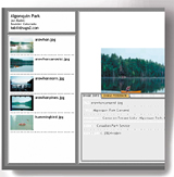
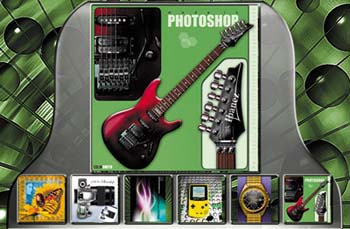
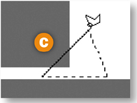
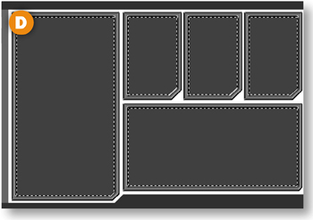
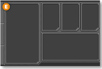
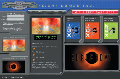
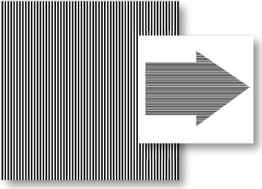
This home page for a game site is ultra-cool. You'll learn how to create its modular elements in Photoshop, and output the results as a full HTML page that's all ready to be included in a Web site for gamers. After you practice these techniques with our files, try them on a site of your own.
Design with Modules
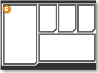
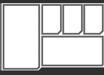
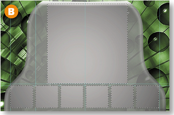
This page layout has lots of information. Its modular design pulls together the diverse elements on the page and makes it easy to update separate pieces of information to keep the page current. You'll begin this project by finishing up the page layout we've started for you. The gray boxes establish the location of each module. In the steps to come you'll shape and style these rectangles to become cool-looking frames.
If you're ever working on a site that offers lots of diverse items on the home page—like games, chat rooms, tutorials, and forums—try this modular approach. When you're working on your own designs, make some plain filled rectangular selections to begin laying out the modular elements of your design. If you make the rectangles on separate layers, you can move them around as you develop the layout.
Move a Box to a Separate Layer
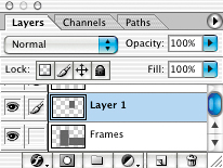
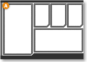
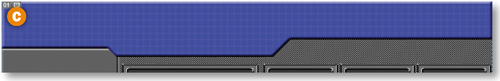
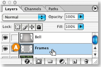
The gray boxes are located on the Frames layer. You'll start by moving the small gray box on the upper-right to its own layer. Select the Frames layer in the Layers palette. Select the Magic Wand tool and check Contiguous in the Options bar. Click on the upper right gray box to select it A. Then press the Shift and Command/Ctrl-J keys to cut the selected box from the Frames layer and move it to an automatically created new layer—Layer 1.
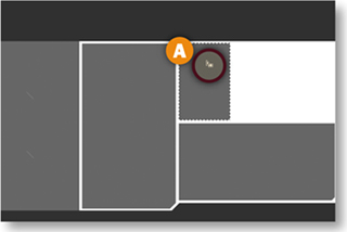
Use a Selection to Shape the Box
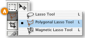
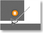
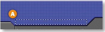
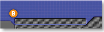
Now you'll cut off a diagonal corner of the Layer 1 box. Select the Polygonal Lasso from the toolbox A. Hold the Shift key and click on one and then the other side of the bottom-right corner of the box to create a 45° selection boundary B. Release the Shift key and click twice more to make the other two legs of a triangular selection C. Then press Delete/Backspace to delete the selected corner D. Press Command/Ctrl-D to deselect.

Make Two More Boxes
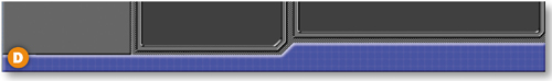
Make a copy of Layer 1 by dragging it to the Create New Layer icon at the bottom of the Layers palette A. Select the Move tool and press the arrow keys on your keyboard to move the copy to the right. Repeat to create and position the second copy, spacing the three boxes evenly B.
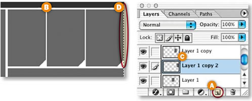
Next you'll cut out a narrow space between the third box and the edge of the document window to accommodate the style you'll be adding to the box later. Select Layer 1 copy 2 in the Layers palette C. Select the Rectangular Marquee tool and draw a narrow vertical selection at the right side of the third box D. Press Delete/Backspace to delete. If you get a warning that no pixels were selected, try again, moving the selection slightly.
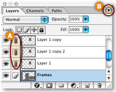
Now you'll merge all the lighter gray box layers into one layer. Select the Frames layer and click in the Link field to the left of Layer 1, Layer 1 copy 2, and Layer 1 copy A. Click the arrow on the right side of the Layers palette B and choose Merge Linked.
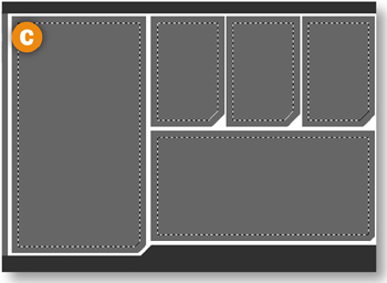
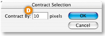
Next you'll select and delete the center of each box. Hold the Command/Ctrl key as you click on the Frames layer in the Layers palette to load a selection of each of the boxes on that layer C. Choose Select>Modify>Contract. Type 10 (pixels) into the Contract Selection dialog box that opens, and click OK D. Then choose Delete/Backspace to delete the selected area of each of the boxes E. Choose Command/Ctrl-D to deselect.
Style the Frames
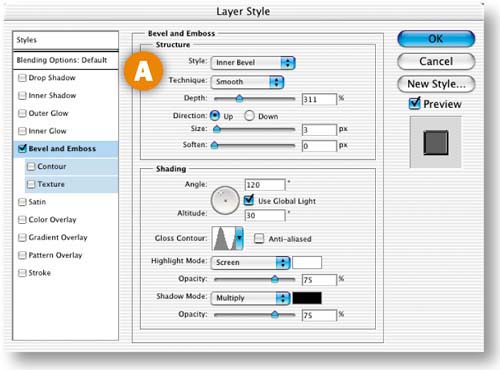
With the Frames layer selected, click the f icon at the bottom of the Layers palette and choose Bevel & Emboss. In the Layer Style dialog box that opens, choose the following Bevel and Emboss settings: (Style: Inner Bevel, Technique: Smooth, Depth: 311, Direction: Up, Size: 3 px, Soften: 0 px, Gloss Contour: Ring) A . Leave the other settings at their defaults.
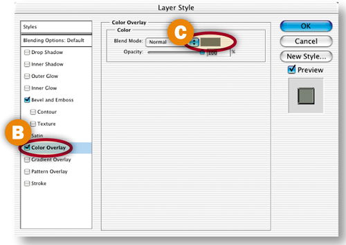
Add another style by highlighting the Color Overlay style in the Layer Style palette B. Then click the Color option on the right C to open the Color Picker, and choose gray-green (R: 120, G: 124, B: 112 ). Click OK to close the Color Picker. Click OK again to close the Layer Style dialog box.
Create Boxes Inside the Frames
Now you'll create some dark gray boxes to fill the inner area of each frame. Select the Magic Wand tool with Contiguous checked in the Options bar. Hold the Shift key as you click in the white center of each of the five frames to select their centers A.
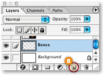
Make a new layer for all the boxes by clicking the Create New Layer icon at the bottom of the Layers palette B. Rename this new layer Boxes. Drag the Boxes layer just above the Background layer in the Layers palette.
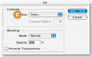
Choose Edit>Fill. In the Fill dialog box, choose Color from the Use menu C. In the Color Picker that opens, choose dark gray (R: 66, G: 66, B: 66). Click OK to close the Color Picker. Click OK again to fill the boxes with gray D. Press Command/Ctrl-D to deselect.
Style the Shapes on the Left
Expand the ShapesLeft layer set by clicking its arrow in the Layers palette A. Select the FramesLeft1 layer in that layer set. Click the f icon at the bottom of the Layers palette B and choose Bevel and Emboss. In the Layer Style dialog box, choose the following Bevel and Emboss settings: (Style: Pillow Emboss, Technique: Smooth, Depth: 100, Direction: Up, Size: 35 px, Soften: 0 px) C. Leave the other settings at their defaults and click OK.
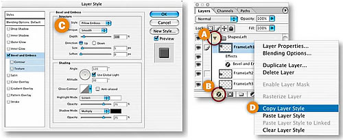
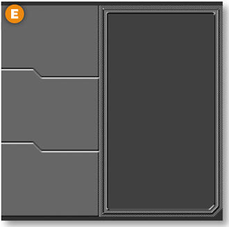
Now you'll use the same layer style on the other two layers in this layer set. Control/right-click on the FramesLeft1 layer in the Layers palette, and choose Copy Layer Style from the pop-up menu D. Control/right-click on the FramesLeft2 layer, and choose Paste Layer Style from the menu. Control/right-click on the FramesLeft3 layer and choose Paste Layer Style again. Beveled edges now separate the three shapes on the left E.
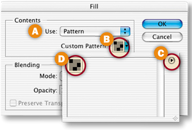
Select the Background layer in the Layers palette. Choose Edit>Fill. In the Fill dialog box, choose Pattern from the Use pop-up menu A. Click in the Custom Pattern field B to open the Pattern picker. Click the arrow on the right side of the Pattern picker C. Choose HTWWeb-Pat from the menu and click OK at the prompt. (If you don't see HTWWeb-Pat in this menu, you haven't properly installed the HTWWeb Presets from the CD. Go ahead and do that now following the instructions in the Introduction. You'll use several items from those presets in this project.)
Double-click the diagonal bg pattern that appears in the Pattern picker D. Click OK to close the Fill dialog box. The background of the image, which is visible around the frames, is filled with a diagonal pattern E.
Cut Out the Top Bar
Next you'll use a selection to shape the black bar at the top of the image. Expand the Bars layer set by clicking the arrow to its left in the Layers palette. Select the BarTop layer. If you turned off the guides, choose View>Show>Guides to see them again. Select the Polygonal Lasso tool and click on the left edge of the second guide from the top A. Hold down the Shift key as you click at the intersections of horizontal and vertical guides to create the tab-shaped selection in the illustration. When you reach the right edge of the image B, click around the top of the document window until you arrive back at the beginning of the selection.
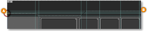
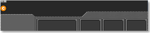
Choose Select>Inverse. Then press Delete/Backspace to delete the selected portions of the bar, creating a unique shape C. Press Command/Ctrl-D to deselect.
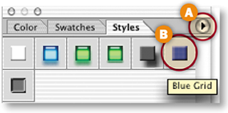
In this step you'll add pattern, color and dimension to the top and bottom bars. Open the Styles palette (Window>Styles). Click the arrow on the right side of the Styles palette A and choose HTWWeb-Styles from the pop-up menu. (You won't see this style set unless you've installed the HTWWeb Presets, as explained in the Introduction.)
Drag the Blue Grid style from the Styles palette B onto the top bar C in the document window. The style is immediately applied to the top bar. Drag the same style from the Styles palette onto the bottom bar D.
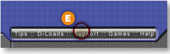
Create a Navigation Bar
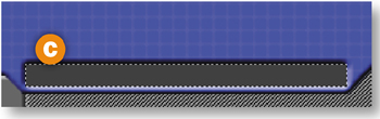
Select the Rectangular Marquee tool and make a short, wide rectangular selection in the tab area of the top bar A. Select the BarTop layer in the Layers palette, and press Delete/Backspace to delete the selected area from the top bar B. The beveled edges of the deleted area come from the style you applied to the top bar in the last step.
Make a new layer above the BarTop layer by clicking the Create New Layer icon at the bottom of the Layers palette. Name the layer NavBar. Use the Eyedropper tool to sample the dark gray color (R: 66, G: 66, B:66) in one of the other boxes on the page. Choose Select>Reselect to reactivate the rectangular selection. Choose Option/Alt-Delete to fill the selection with gray C.
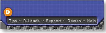
Choose the Type tool. In the Options bar choose a small sans serif font (try Arial, 9 pt) and type some navigation labels separated by decorative colons (Tips :: D-Loads :: Support :: Games :: Help) D. That's all it takes to make the navigation bar for this page.
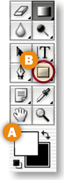
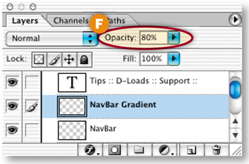
Now you'll add a gradient to the navigation area to make it look rounded. Make another new layer above the NavBar layer and name it NavBar Gradient. Press D and then X to set the Foreground Color box to white A.
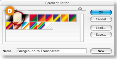
Select the Gradient tool in the toolbox B. Click the Gradient field in the Options bar C. In the Gradient Editor that opens, select the White to Transparent gradient D and click OK.

Command/Ctrl-click the NavBar layer (not to be confused with the NavBar Gradient layer) to select the navigation bar. Create a gradient in this selected area by dragging a short vertical line in the top one-third of the navigation bar E. In the Layers palette, lower the opacity of the NavBar Gradient layer to 80% F.
Group Layers
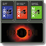
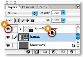
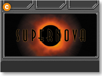
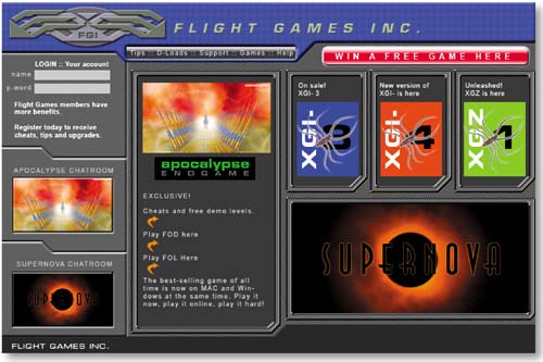
Click in the Visibility field to the left of the Supernova layer in the Layers palette A. In this step you'll link this layer to the Frames layer below it in the Layers palette so that the Supernova image appears to be inside the frame. Hold the Option/Alt key and move your cursor over the border between the Supernova layer and the Frames layer. When you see a double-circle icon B, click to make a clipping group of the two layers. The Supernova image now appears in the image only where it overlaps artwork (one of the frames) on the layer below C.
Make Content Layers Visible
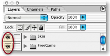
Now you're all set to turn on the layers of content that we made for you. Click in the Visibility field to the left of the Skin layer set and the Free Game layer set in the Layers palette. The content of the layers on those layer sets is now visible inside the interface you've created.
Select the Slice tool in the toolbox and draw slices around each of the text buttons in the small navigation bar so that you can give each button a separate link in a site-building program. Slice each content module too so that each module outputs as a separate GIF or JPEG. This will facilitate updating individual parts of the page later on. For more on slicing and optimizing, take another look at Chapter 1, Navigation.
Optimize and Save
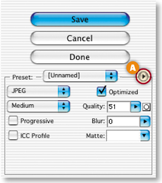
Choose File>Save for Web. In the Save for Web dialog box, optimize individual slices, selecting them with the Slice Select tool A and choosing Optimization settings on the right side of the dialog box B. Optimize each slice so that it is as small as possible, but still looks good. Some slices, like the slice around the Supernova image, will optimize best as JPEGs. Others, like the slice around the Login area, will optimize best as GIFs.
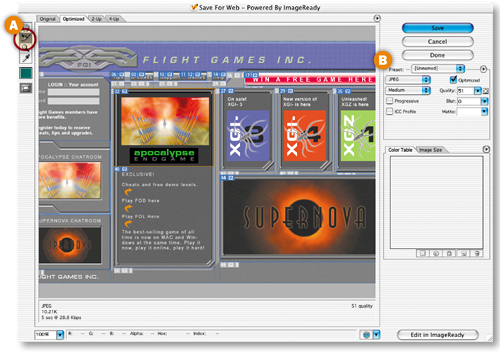
When you're done, click Save. In the Save Optimized As dialog box that appears choose Format/Save As Type: HTML and Images. This will generate a separate GIF or JPEG file for each slice, along with an HTML file with a table that holds the sliced images in place on the Web page. You can bring the HTML file and images into a site-building program like Dreamweaver to incorporate this cool page into a complete game site.

You can use custom-made patterns as tiling Web page backgrounds or as pattern presets for filling foreground objects. Let's review how to do both.
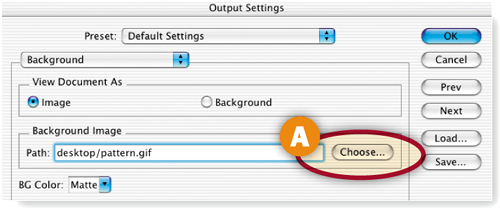
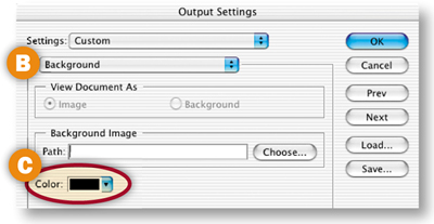
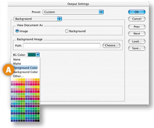
To make a tiling background pattern, start with a small pattern file like those described in the next section, Web Pattern Recipes. Save the file as an optimized GIF or JPEG. With a Web page layout or other foreground image open, specify the small file as the background in the Output Settings>Background dialog box. To access that dialog box in Photoshop, choose File>Save for Web, click the arrow on the top right of the Save for Web dialog box, choose Edit Output Settings from the side menu, and choose Background from the second pop-up menu in the Output Settings dialog box. In ImageReady, just choose File>Output Settings>Background. In the Output Settings dialog box, click the Choose button to the right of the Path field A and navigate to the small pattern file. When you save the foreground image you're working on, choose Format/Save as Type: HTML and Images so that the program generates an HTML file with a background tag that causes the small pattern to repeat itself horizontally and vertically in a viewer's Web browser.
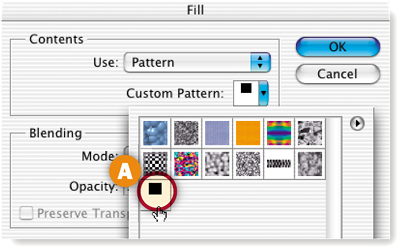
Another way to use a custom pattern is to define it as a pattern preset, and then use it to fill a layer or a selection in a Web graphic. To define a pattern, open a small file, like those in the following section, in Photoshop or ImageReady. Press Command/Ctrl-A to select all, or use the Rectangular Marquee tool to select an area of a larger image. Choose Edit>Define Pattern, and give the pattern a name. The pattern will be added to the currently active pattern set. To fill a layer or selection of a Web graphic with the pattern, choose Edit>Fill. In Photoshop's Fill dialog box choose Pattern from the Use pop-up menu. Then click in the Custom Pattern field to open the Pattern picker and select your newly defined pattern from the active pattern set that's displayed there A. Click OK to fill with the pattern. In ImageReady's Fill dialog box just choose Pattern from the Use menu to fill with the last defined pattern.![]()
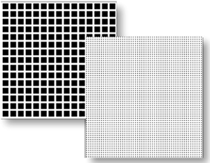
Use these pattern recipes to make tiling backgrounds for your Web pages or to fill your Web graphics, using the techniques explained in the last section, Applying Patterns to Web Graphics. You can make these patterns in Photoshop or ImageReady.
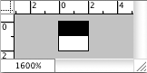
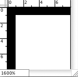
Make a new white image 2 x 2 pixels. Zoom in to 1600%. Select the Pencil tool and choose a 1–pixel hard round TIP from the Brush pop-up palette. Set the Foreground Color box to black. Draw a horizontal line across the top of the image. Optimize and save as a GIF for use as a page background, or define as a pattern for filling foreground images.

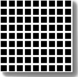
Make a new white image 8 pixels x 8 pixels. Zoom in to 1600%. Select the Pencil tool and choose a 1–pixel hard round TIP. Set the Foreground Color box to black. Draw a horizontal line across the top of the image and a vertical line along the left side of the image. Optimize and save as a GIF with two colors, or define as a pattern.

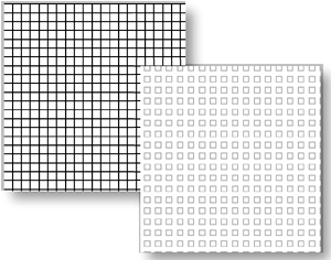
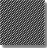
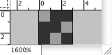
Make a new medium gray image 3 pixels x 3 pixels. Zoom in to 1600%. Select the Pencil tool and choose a 1–pixel hard round TIP. Set the Foreground Color to dark gray. Draw a horizontal line across the top of the image from the right edge of the document window to the 1–pixel mark on the horizontal ruler. Click in the center of the image to draw a 1–pixel square. Draw a vertical line along the left edge of the image from the bottom of the document window up to the 1–pixel mark on the vertical ruler. Click in the bottom-right corner of the image to draw a 1 pixel square. Optimize as a GIF or define as a pattern.

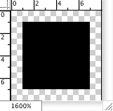
Make a new transparent gray image 7 pixels x 7 pixels. Zoom in to 1600%. Select the Pencil tool and choose a 3–pixel hard round TIP. Set the Foreground Color box to black. Click in the center of the image to draw a 3–pixel square. Optimize and save as a GIF with two colors, or define as a pattern.

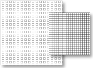
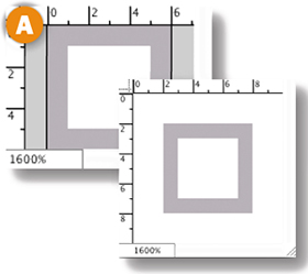
Make a new white image 6 pixels x 6 pixels. Zoom in to 1600%. Select the Pencil tool and choose a 1–pixel hard round TIPs. Set the Foreground Color box to medium gray. Make a new layer. Draw a 1–pixel border touching all sides of the document window A. Choose Image>Canvas size. In the Canvas size dialog box, check Relative and enter 4 pixels in both the width and height boxes. Click OK. Optimize and save as a GIF with two colors, or define as a pattern.![]()

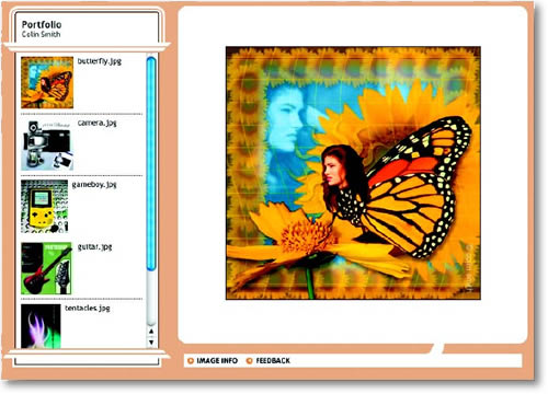
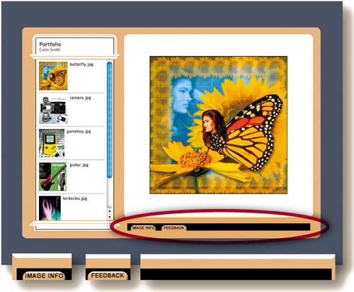
This complete site gives your viewers a way to communicate with you. Use it to show proofs or design comps to your clients and solicit their feedback. It's a snap to make using Photoshop's new and improved Web Photo Gallery.
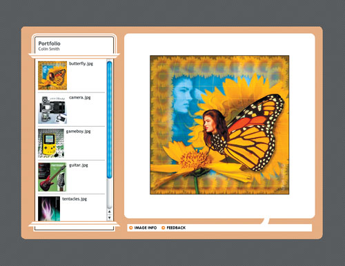
Let Photoshop Do the Work for You
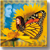
In this project you'll use Photoshop's Web Photo Gallery feature to create a mulTIPage Web site, ready for upload to a Web server. This site displays thumbnails and larger versions of image files. Each large image has two pop-up areas. One gives viewers information about the image A. The other gathers Web viewers' feedback about your images B and incorporates the feedback in an email message to you.
Creating this site is a completely automatic process. You don't have to know a thing about Web design or writing code. And you don't have to do anything special to prepare image files for inclusion in the site, other than attaching whatever file information you want to appear in the Image Info portion of the site (see sidebar). Read on to learn how to set up Photoshop to make this gallery site for you automatically.
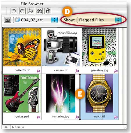
Click the Toggle File Browser icon on the right side of Photoshop's Options bar to open the File Browser. Use the Folders panel A on the top left of the File Browser to navigate to the C04_02_art folder in the project files. The thumbnail area on the right side of the File Browser displays each of the image files in that folder.
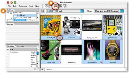
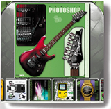
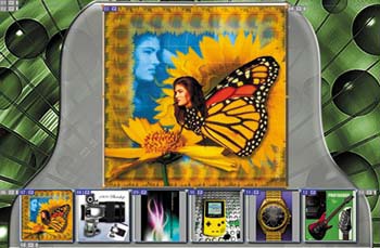
Command/Ctrl-click on the thumbnails to select the following six images for inclusion in the site:
butterfly.tif
camera.tif
gameboy.jpg
guitar.psd
tentacles.jpg
watch.tif
Click the Flag icon at the top of the File Browser B to add a flag C to each of the selected images. Then choose Flagged Files D from the File Browser's Show menu to display only the images you flagged. Decide on the order in which you want the images to be displayed in the gallery site, and click and drag the thumbnails around the File Browser's preview pane E to reflect that order. Press Command/Ctrl-A to select all.
Open the Web Gallery Dialog Box
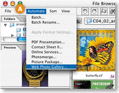
Choose Automate>Web Photo Gallery from the menu bar at the top of the File Browser A. This opens the Web Photo Gallery dialog box B where you'll choose the parameters of your gallery site. (Alternatively, the Web Photo Gallery dialog box can be opened from the File>Automate menu in the main menu bar at the top of the screen.) This is a “sticky” dialog box that opens with the last settings you entered. Highlight and delete any old settings.
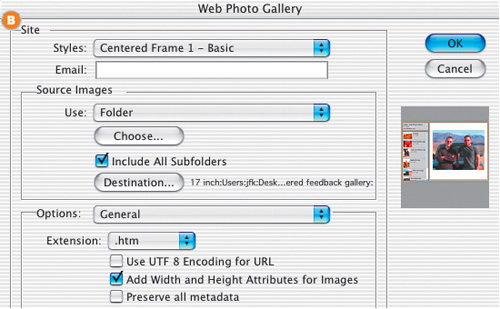
The Web Photo Gallery dialog box has several panels, each accessed from the Options pop-up menu A. The first is the General panel. Choose the following settings in that panel:
Styles: Centered Frame 2 - Feedback B
This is one of Photoshop's prebuilt Web Photo Gallery style templates. You'll see a small preview of this style on the right side of the dialog box C. The rest of the settings vary depending on which style you choose.
Email: Enter your email address D.
Your Web audience will use this address to send you email feedback about the images you display. Use any email box or alias you own.
Use: Selected Images from File Browser E.
The advantage of this choice is that it allows you to include images from anywhere on your hard drive, as long as they are currently displayed in your File Browser. If you choose Folder instead, you would have to prepare by putting all the images you plan to include in one folder.
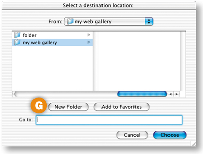
Destination: Click the Destination button F to open a destination dialog box. Create a new folder G to hold all the site files Photoshop will create for you, and click Choose.
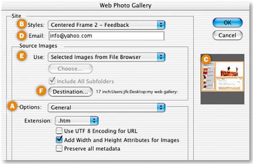
Leave the other settings in the General panel at their defaults, and leave the Web Photo Gallery dialog box open for the next step.
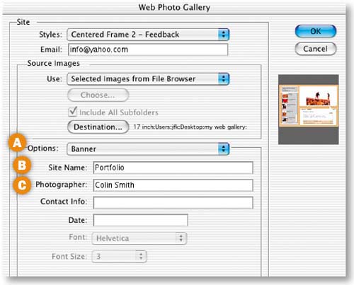
Choose Banner A from the Options menu in the Web Photo Gallery dialog box. These settings determine the information that will appear in the small space at the top of the thumbnails in this design. Enter Portfolio in the Site Name field B and Colin Smith in the Photographer field C. Leave the Contact Info and Date fields blank if you want white space in your design. You don't have to comply with the labels on the Banner fields; they are only suggestions. You can type in anything that fits in the available space.
Choose Large Image Settings
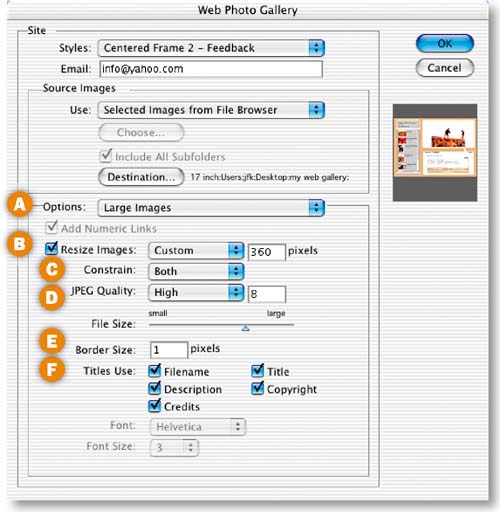
Choose Large Images A from the Options menu to open more settings. These settings govern the display of the large images on the right side of the design. Set these fields as follows:
Resize Images B: Add a checkmark and type 360 into the pixel size box. This sets the largest dimension of the images. The menu of presets automatically changes to Custom.
Constrain C: Leave this set to Both to maintain the proportions of the images.
JPEG Quality D: High (8) to ensure that each image looks its best when the program compresses the image as a JPEG. The File Size slider automatically changes. The trade-off for higher JPEG Quality is larger file size.
Border Size: 1 E. This adds a narrow black border around each image to set it off from the background.
Titles Use F: Check all. These appear in the Image Info pop-up window for each image. The information is taken from the File Info dialog box.
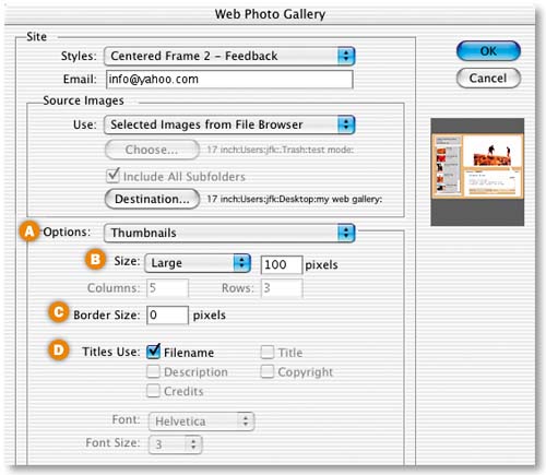
Choose Thumbnails from the Options menu A. These settings determine how the thumbnails in the lefthand vertical bar will be displayed.
Size B: Large. This sizes each thumbnail to fit proportionally within a 100–pixel square area.
Border Size C: Leave this set to 0 so there will be no border around the thumbnails in the site.
Titles Use D: Leave Filename checked to add the filename of each image next to its thumbnail.
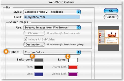
Choose Custom Colors
Choose Custom Colors from the Options menu A Click in the Background field B to open the Color Picker. Check Web Colors Only, choose dark gray (R: 102, G: 102, B: 102), and click OK. This determines the background color of each page in the site. Click in the Banner field C.and choose white (R: 255, G: 255, B: 255) in the Color Picker. This sets the color of the vertical banner on the left of each page. Leave the other options at their defaults.
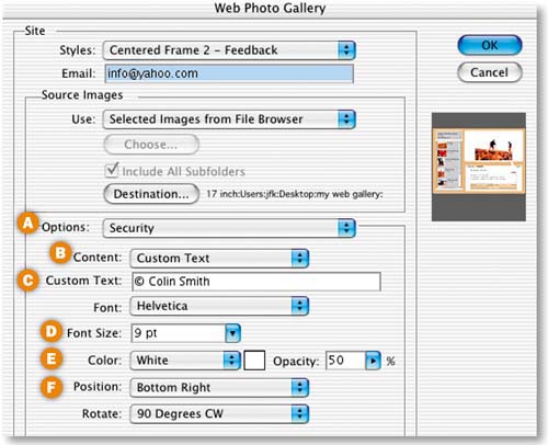
Choose Security from the Options menu A. Here you can specify text that will appear on top of each large image to protect it from unauthorized use. We'll apply a custom copyright message. Set the options as follows:
Content B: Custom Text.
Custom Text C: Type © Colin Smith (pressing Option-G/typing Alt-0169 for the © symbol).
Font: Helvetica and Font Size: 9 pt D.
Color: White and Opacity: 50% E. This will give the copyright message a ghosted look so it doesn't interfere with the view of the image.
Position: Bottom Right, and Rotate: 90 Degrees CW F to locate the copyright vertically along the right edge of each image.
Complete the Site
Click OK in the Web Photo Gallery dialog box to set Photoshop in motion creating your site. It resizes each image as a thumbnail and a large image, compresses the images as JPEGs, and writes the code for a complete Web site. In a few seconds a Web browser opens to the first page of the site.
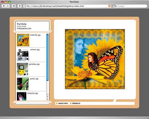
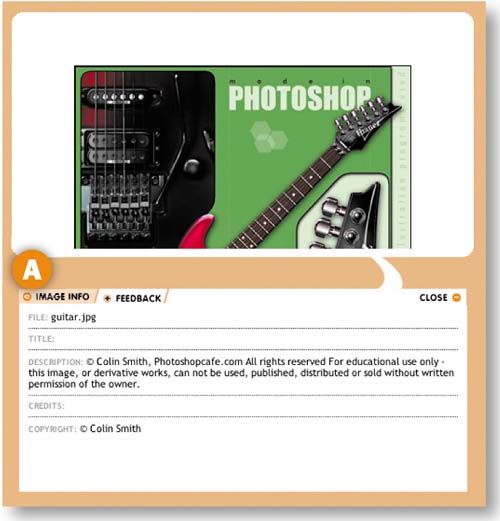
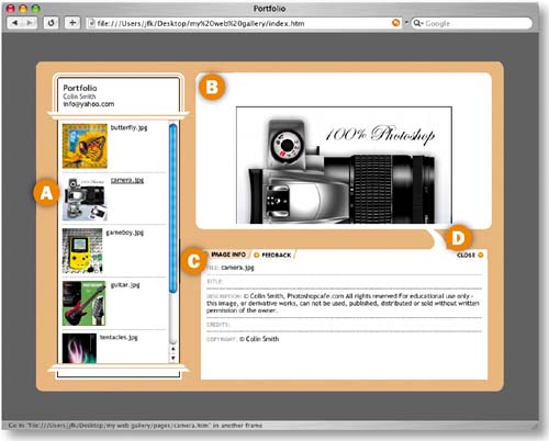
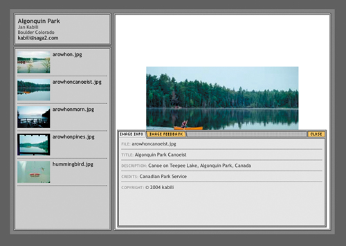
Put yourself in the shoes of your Web audience for the steps that follow. In the Web browser, click on a thumbnail on the left A to see a large version of the corresponding image on the right B. Use the vertical scrollbar to scroll down to more thumbnails.
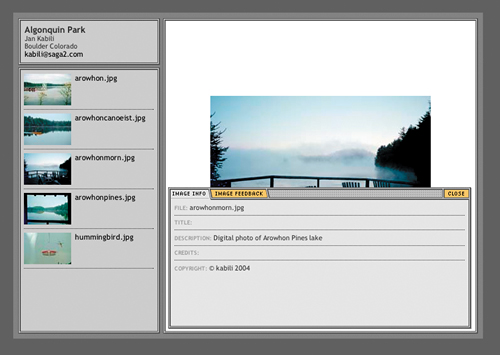
Click on the Image Info tab C.to open a pop-up window displaying information about the selected image, including the file name and copyright information. This is information that we attached to each image in the File Info dialog box and the File Browser's Metadata panel.Learn how to prepare your own images with similar information in the topic that follows this project—Adding File Information to Images. Click Close D to close this pop-up window.
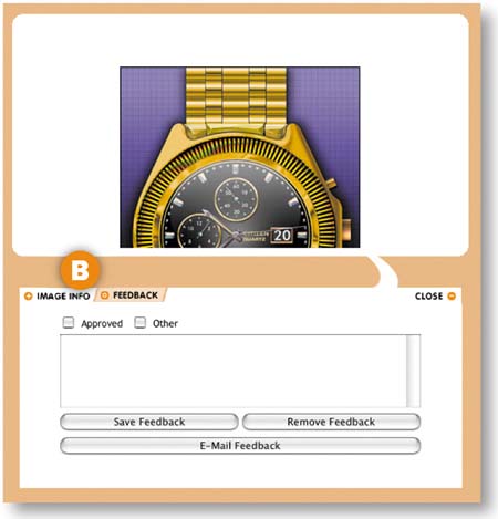
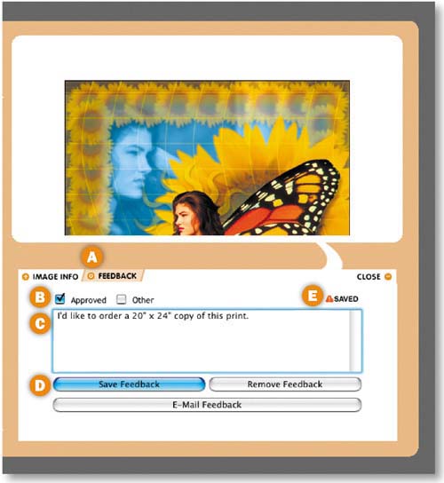
Prepare Image Feedback
In the Web browser, click on the Feedback tab A to open the Feedback pop-up window. Your Web viewers can use this window to approve and correspond with you about the images. Put a checkmark next to Approved B and type a message ordering a print in the box C. Then click Save Feedback D. This stores the message so that it can be combined with feedback on the other images before being automatically emailed to you—the site owner. You'll see a Save notation in the Feedback window E.
Prepare Feedback on other Images
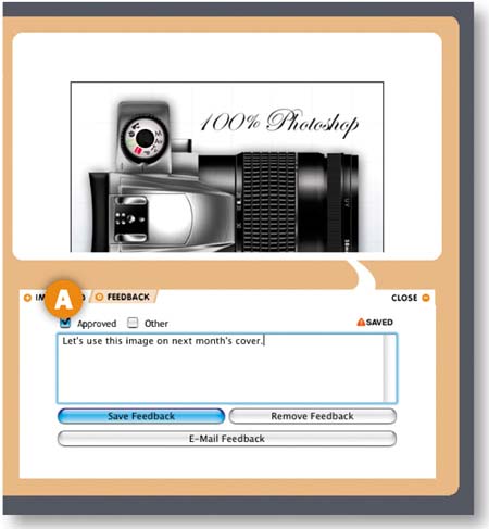
Select another thumbnail in the Web browser and click the Feedback tab to provide feedback on that image A. Put a checkmark next to Other and write a message in the box. Click Save Feedback.
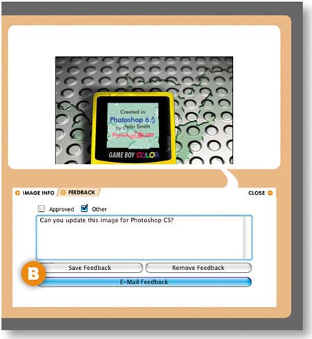
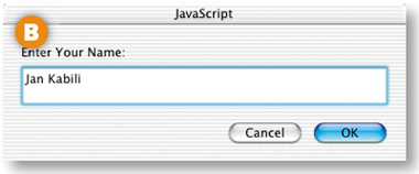
Select a third thumbnail and prepare feedback the same way. This time click E-mail Feedback B. Type the name of a fictitious viewer in the JavaScript dialog box that opens and click OK.
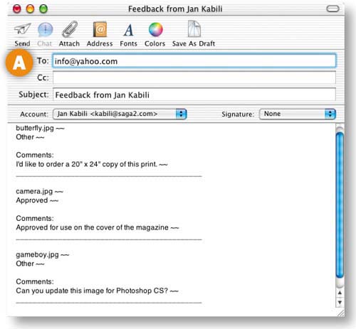
Email Feedback to the Site Owner
The default mail program automatically opens with a message A from the viewer B addressed to the email address you entered earlier into the Web Photo Gallery dialog box. The message contains all of the viewer's feedback on the site images. The viewer can add to the message or send it as-is to you—the site owner—by simply clicking his mail program's Send button. As you can see, this built-in feedback makes it easy for viewers to communicate with you about the site and its images.
CAUTION
Save Your Gallery Site. Keep the site Photoshop made for you in a safe place. In the next Project, Wow Part-folio Site,you'll repurpose the site images, displaying them in a unique, custom-built inter face.
The last project, Gallery Site with Viewer Feedback, covered how to make a Web site that can display file information along with images. There are two ways to attach nondefault file information to an image in Photoshop—in the File Info dialog box or in the Metadata panel of the File Browser. Give either of these methods a try on your own images before making a gallery site of your own.
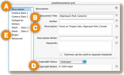
Choose File>Open to open an image in Photoshop. Then choose File>File Info to open the File Info dialog box. Leave Description highlighted on the left side of the dialog box A. Type a caption for the image in the Document Title field B and a short description of the image in the Description field C. In the Copyright Notice field D press Option-G (type Alt-0169 on Windows) to enter a copyright symbol. Type the year and your name after the copyright symbol. Click Origin E on the left side of the dialog box and enter any relevant information into the Credits field. Click OK. Then save the file. You can choose to display any of these items in your site in the Web Photo Gallery template (Centered Frame 2 - Feedback) used in the preceding project. The other File Info fields are not reflected in that template.
To attach the same information to multiple files, record an action as you enter this file information and apply it with batch processing. Or click the side arrow on the File Info dialog box and choose Save Metadata Template. To apply the template, open another file, click the arrow at the top of its File Info dialog box, and choose the template by name.
Open Photoshop's File Browser (File>Browse) and select the thumbnail of an image you plan to include in your site A. In the Metadata panel on the bottom left of the File Browser B, scroll to the area labeled IPTC (an acronym for a press organization) and click one of the pencil icons C.to open the only three fields that can be edited in the Metadata panel—Description, Author, and Copyright.
Type into the Description field. In the Copyright field press Option-G (type Alt-0169 on Windows) to enter a copyright symbol. Type the year and your name after the copyright symbol. You can ignore the Author field because it's not reflected in the Centered Frame 2 - Feedback template you used in the last project. You can add Title and Credits, which are in that template, in the File Info dialog box as explained to the left.![]()

A Web site produced by the Photoshop Web Photo Gallery command is just like any other Web site. It consists of HTML pages and images. This means that you can change the look of a finished Web Photo Gallery site by modifying the image files in Photoshop or editing the HTML code in a site-building program. Here are some ideas for making changes to the gallery site you built in the last project, Gallery Site with Viewer Feedback. We used Dreamweaver in these examples, but you can do the same using GoLive or any site-building program. Use these ideas as a starting point for customizing your own site.

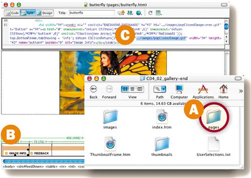
Find the folder that contains all of the HTML and image files Photoshop made for you in the last project. This is the root folder of your Web Photo Gallery site. Take one of the background patterns we showed you how to make earlier in this chapter in the section on Web Pattern Recipes (we used the diagonal pattern bg.gif) and put it into the Images folder A inside your Web Photo Gallery root folder. In Dreamweaver, open the index.htm page from that root folder. Choose Modify>Page Properties from Dreamweaver's main menu bar. In the Page Properties dialog box, click the Browse button next to the Background Image field B, navigate to the file bg.gif in your root folder, and click OK. Then resave the index.htm page into the root folder. Open index.htm in a Web browser to see the repeating striped background.
The inner pages of the Web Photo Gallery site you made in the last project are located in the pages folder A inside that site's root folder. Open one of those inner pages-—butterfly.htm—in Dreamweaver. Use Dreamweaver's split view to see the page design and its HTML code. Click on the three pieces of the navigation bar in the design B to see the names of those graphics in the code view C. (Hint: popClosed.gif, popClosedFeed.gif, and popClosedImage.gif.) Now that you know the names of these navigation graphics, open each one from the root folder into Photoshop, change them as you like, and resave them as GIFs back into the pages folder in the root folder. The images will change on each page in the site, because these graphics are used on every page. Open index.htm in a Web browser to see your site with its new buttons.![]()
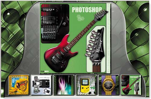
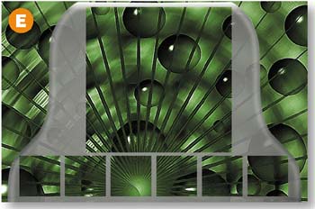
Make this eye-popping interface for displaying a portfolio on the Web. It's easier than it looks if you follow our lead. After you build this 3-D interface, you'll use it to display Web-ready images generated automatically by the Web Photo Gallery.
Focus on Efficiency
In this project you'll create a three-dimensional portfolio interface that looks good enough to eat. The focus here is on efficiency. We'll teach you techniques that simplify and save effort. For example, you'll make only one thumbnail frame from scratch, and then apply a useful step and repeat technique to create the others. And you'll learn how easy it really is to make custom-built 3-D effects with alpha channels.
This portfolio interface is specially designed for repurposing images generated by the Web Photo Gallery template you used in the last project, Gallery Site with Viewer Feedback. You won't have to spend hours resizing and optimizing individual images or writing an action for batch processing. Just run your own images through the Web Photo Gallery with the same settings you used before, and the resulting Web-ready images will fit perfectly into this interface.
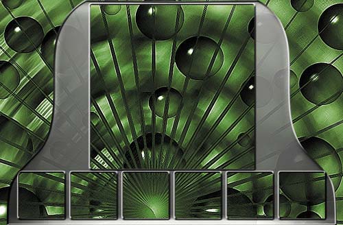
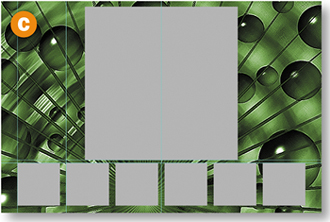
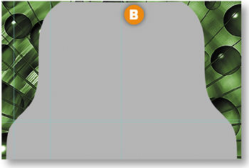
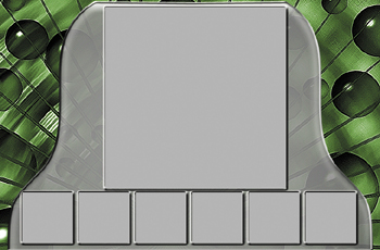
This interface can display six thumbnail-sized images plus one larger image. You'll build it from the inside out— creating placeholders for the images and then making a 3-D bell shape around the placeholders.
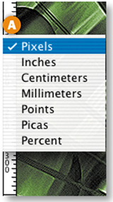
Let's start by creating some guides for positioning the placeholders you'll be making. Choose View>Rulers. If your rulers are not displaying pixels, Control/right-click in one of the rulers and choose pixels from the pop-up menu A.
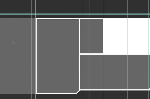
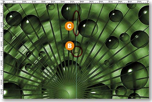
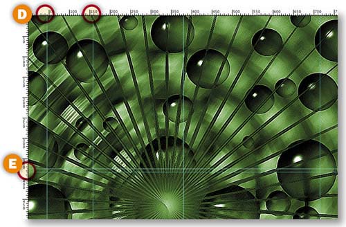
First you'll place a vertical guide at the center of the document. To find the center, press Command/Ctrl-A and then Command/Ctrl-T. An anchor point appears at the document's center B. Click in the vertical ruler and drag out a vertical guide to that point C. Press the Escape key to exit transform mode. Drag out two more vertical guides, placing them at about 45 and 153 pixels D. Drag two horizontal guides from the top ruler and place them at about 375 and 383 pixels E. Use the Move tool to tweak the position of the guides if necessary.
Create a Thumbnail Placeholder
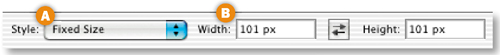
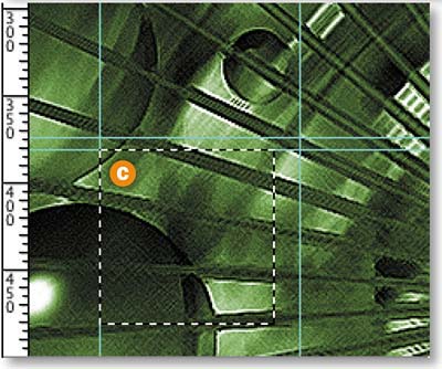
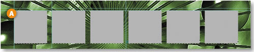
Now you'll make a selection for a square thumbnail placeholder. Select the Rectangular Marquee tool in the Toolbox. In the Options bar, choose Fixed Size from the Style menu A, and type 101 px into both the Width and Height fields B. Click in the document to create a square selection. With the Rectangular Marquee tool, drag the selection to the intersection of the first vertical and horizontal guides C.
Now you'll learn a great way to make evenly spaced copies of selections.You'll use this technique to create and distribute selections for the rest of the thumbnail placeholders. We love this technique because it's automatic and doesn't require doing math.
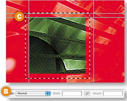
The square selection you made in the last step should still be active. Press Q to enter Quick Mask mode. This mode is just another way of viewing a selection. The selection is clear, and the non-selected area has a red mask A.
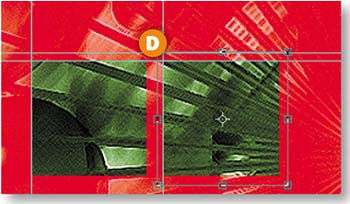
With the Rectangular Marquee tool selected, change the Style setting in the Options bar to Normal B. Click and drag a rough selection around the clear square C. Hold the Option/Alt key and choose Edit>Free Transform. This creates a copy of the clear selection. You can't see the copy yet because it's on top of the original. Still in transform mode, click the right arrow key on your keyboard to move the clear selection copy to the right until its left edge is aligned with the second vertical guide from the left D. Press the big checkmark in the Options bar to exit transform mode.
Now you'll step and repeat in Quick Mask mode to make and position the other thumbnail selections. Holding the Option/Alt key, press Command/Ctrl-Shift-T four times. You'll see a total of six clear boxes, evenly spaced horizontally and aligned vertically E. Press Q to exit Quick Mask mode. The boxes now look like regular selections F.
Click the side arrow on the Layers palette and choose New Layer. Name the layer Frames. Click the Foreground Color box in the toolbox to open the Color Picker. Choose gray (R: 153, G: 153, B: 153). Press Option-Delete/Alt-Backspace to fill the selections with the foreground color A. Choose Command/Ctrl-D to deselect.
Make the Large Image Placeholder
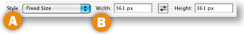
Select the Rectangular Marquee tool. In the Options bar set Style to Fixed Size A and type 361 px in both the Width and Height fields B. Click to create a large square selection. With the Rectangular Marquee tool still selected, drag the large selection so that it rests on the top horizontal guide and is centered horizontally C.
With the Frames layer selected in the Layers palette, press Option-Delete/Alt-Backspace to fill the large square selection with the gray foreground color. Choose Command/Ctrl-D to deselect.
Create Half a Bell Shape
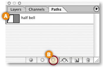
Now you'll work on the 3-D bell shape that surrounds the images in this interface. We made things easier for you by creating a path that outlines half of a bell shape. (If you'd rather draw the path yourself, click and drag with the Pen tool.) In the Paths palette (Window>Paths), select the half bell path A and click the Load Path as Selection icon at the bottom of the palette B. This creates a half bell-shaped selection.
Click the side arrow on the Layers palette and choose New Layer. Name the layer Bell. Choose Option-Delete/Alt-Backspace to fill the selection with the gray foreground color C.
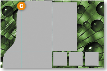
Duplicate the Bell layer by dragging it to the Create New Layer icon at the bottom of the Layers palette A. With the new layer selected, choose Edit>Transform>Flip Horizontal. Select the Move tool in the toolbox. Hold the Shift key to constrain vertical movement and drag the second half of the bell to the right so that its left edge joins the right edge of the other half B. Press Command/Ctrl-D to deselect. Click the side arrow on the Layers palette C.and choose Merge Down to merge the two halves of the bell into one Bell layer.
Make an Alpha Channel for the Bell
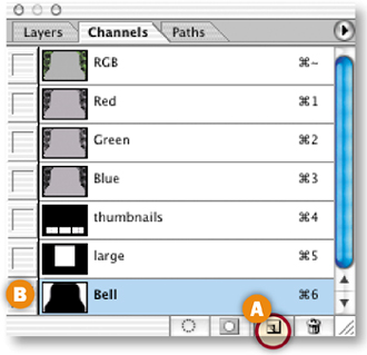
In this step you'll begin to add dimensionality to the bell shape by creating an alpha channel. Command/Ctrl–click on the Bell layer to load a selection around the bell shape. Choose Select>Inverse to select everything but the bell.
Open the Channels palette (Window>Channels). Click the Save Selection as Channel icon at the bottom of the Channels palette A. This creates an alpha channel in which the opaque bell shape is represented as black and the surrounding transparent area as white B. Double-click the new Alpha 1 channel and name it Bell. Press Command/Ctrl-D to deselect.
Blur the Alpha Channel
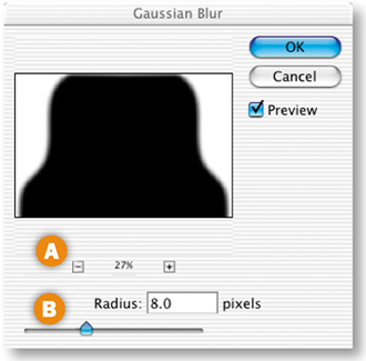
With the Bell channel highlighted in the Channels palette, choose Filter>Blur>Gaussian Blur. In the Gaussian Blur dialog box click the minus sign several times A, and set Radius to 8.0 pixels B. Click OK. This blurs the edges of the bell shape in the alpha channel, which adds grays to the alpha channel and shape to the image. Select the RGB channel in the Channels palette to view the image in its normal state.
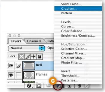
In this step you'll add a small gradient to the bell shape to increase the illusion of dimensionality. Command/Ctrl-click the Bell layer in the Layers palette A to load a selection around the bell shape.
Press D on your keyboard to set the Background Color box in the toolbox to white. Click the Foreground Color box, choose a medium gray (R: 102, G: 102, B: 102) from the Color Picker that opens, and click OK B.
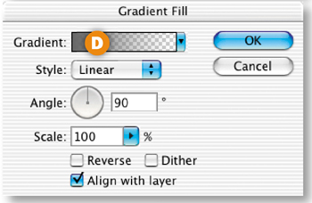
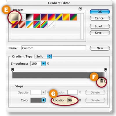
With the Bell layer selected in the Layers palette, click the New Fill or Adjustment layer icon (a black and white circle) at the bottom of the Layers palette C.and choose Gradient from the pop-up menu. In the Gradient dialog box that opens, click in the Gradient field D to open the Gradient Editor. In the Gradient Editor, select the Foreground to Background gradient thumbnail E. Then drag the lefthand gray color stop under the gradient bar F to the right until the Location field G reads about 96%. This will make the white part of the gradient at the top of the bell shape very short. Click OK in both gradient dialog boxes. The top edge of the bell now looks rounded. Press Command/Ctrl-D to deselect.
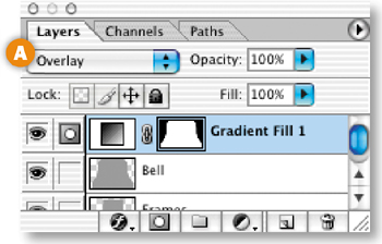
Change Gradient Blending Mode
With the new Gradient Fill 1 layer selected in the Layers palette, choose Overlay from the Blending Mode field at the top of the Layers palette A. This blends the colors in the gradient layer with the underlying colors.

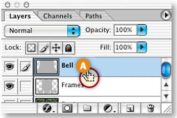
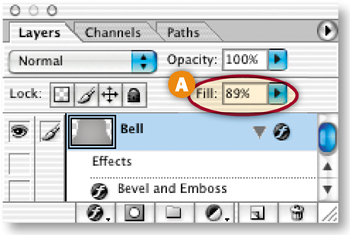
Reduce the Bell's Fill Opacity
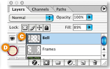
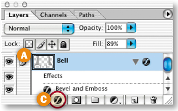
Next you'll lower the Fill opacity of the bell to make it slightly transparent. Select the Bell layer in the Layers palette and decrease the Fill field at the top of the Layers palette (not to be confused with the image Opacity field) to 89% A.

Add Lighting Effects to the Bell
This is the tricky part. You'll apply the Lighting Effects filter to the bell to enhance its dimensionality. The Lighting Effects filter has lots of settings. Use ours as a starting point and experiment to get an effect you like.
With the Bell layer selected in the Layers palette, choose Filter>Render> Lighting Effects. In the Lighting Effects dialog box:
Choose Style: Default A and Light Type: Spotlight B, with On checked.
Set Intensity to around 15 C.and Focus to around 100 D, although you can play with these two settings to get an effect you like.
Choose Bell in the Texture Channel E (not to be confused with Bell Transparency) and check White is High F, This uses the Bell alpha channel you made earlier to set the contours of the lighting effect.
Click and drag the center and side anchor points on the preview on the left side of the dialog box G to get an effect you like. (The configuration of anchor points in the illustration is a good starting point.)
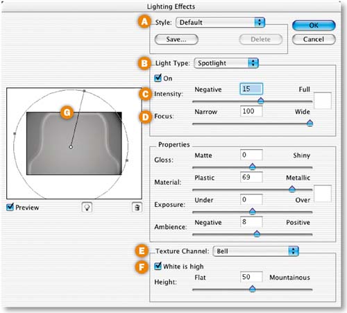
Unfortunately there is no live preview of the Lighting Effects filter in the full document. Click OK to apply the filter, and if you don't like the result, choose Command/Ctrl-Z to undo and try again.
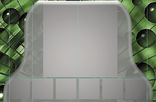
Now you'll use the placeholders to cut frames into the bell interface. Command/Ctrl-click the Frames layer in the Layers palette A to load a selection around the large placeholder and each of the thumbnail placeholders B. It's important that you now select the Bell layer in the Layers palette C. Press Delete/Backspace to cut out the selected areas in the bell interface. Choose Command/Ctrl-D to deselect.
Click the Eye icon next to the Frames layer D to turn the Frames layer off so you can see the cut-outs in the bell interface E. Then click that Eye icon again to turn the Frames layer back on. Finally, drag the Frames layer to the top of the Layer stack in the Layers palette.
Add a Bevel to the Interface
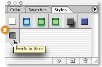
The interface looks good, but it needs one more touch to make it really appear three dimensional. Open the Styles palette (Window>Styles). With the Bell layer selected A, click the Portfolio Iface style B. You won't see this style if you didn't load the HTWWeb presets as instructed in the Introduction. Go back and do that now. Or make your own bevel and emboss by clicking the f icon at the bottom of the Layers palette C, choosing Bevel and Emboss, and experimenting with the Bevel and Emboss settings in the Layer Styles palette that opens. (Hint: Change the Gloss Contour layer style setting to the Ring style.).
Congratulations! You've finished building this unique interface for portfolio images. Next you'll try out some Web-ready images that you generated from the Web Photo Gallery in the last project.
Find the folder of HTML pages and images that you saved from the last project, Gallery Site with Viewer Feedback. If you can't find them, use the final project files for that project (C04_02_gallery-end).
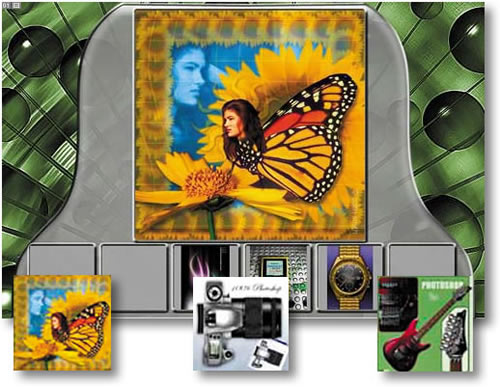
Open each of the six JPEG files you'll find in the thumbnails folder that was generated by Photoshop's Web Photo Gallery. Select the Move tool, click in one of those open images, and drag it into the interface image, where it will be located on a separate layer automatically.
Position the thumbnail image on top of one placeholders in the interface. Repeat with each of the other thumbnail images that were generated by the Web Photo Gallery. Then open the images folder and do the same with one of the larger images you'll find there—butterfly.jpg, camera.jpg, gameboy.jpg, guitar.jpg, tentacles.jpg, or watch.jpg.
Slice the Interface
Click the Eye icons on the thumbnail and image layers you added in the last step to turn off all the content layers. With the Slice tool, create a slice around each of the thumbnail placeholders and around the large placeholder.
Optimize the Slices
Choose File>Save for Web. In the Save for Web window, click on the Optimiize, 2-Up, or 4-Up tab to preview each slice with the optimization settings you choose. Select the slices one by one and choose settings that make each slice as small as possible, while retaining its appearance. (Hint: All these slices optimize best as JPEGs.)
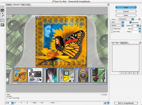
In this step you'll set the color of the HTML page background that will appear around this page when it's viewed in a browser window that's bigger than the green illustration. Click the small arrow at the far right of the Save for Web window A, and choose Edit Output Settings. In the Output Settings dialog box that opens, choose Background from the second pop-up menu B. Click in the Color field C, and choose black from the Color Picker that opens. Click OK to close the Color Picker. Click OK again to close the Output Settings dialog box. Back in the Save for Web dialog box, click Save to open the Save Optimized As dialog box.
Save the Optimized Interface
In the Save Optimized As dialog box, set Format/Save As Type to HTML and Images. Choose a destination folder and click Save. The program will save each slice of the interface as an optimized Web-ready image, along with an HTML file containing a table to hold all the separate image files in place. The thumbnails and large image that were generated by the Web Photo Gallery will not be re-optimized because you turned off those layers before saving.
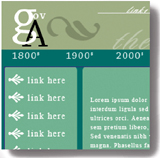
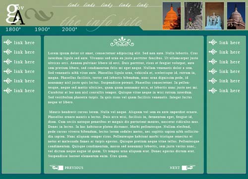
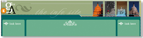
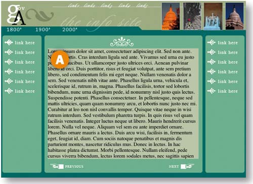
This home page for an information site has lots of text elements. You'll use tables and CSS to organize and output text graphics and coded text for display on the Web. This project takes place in ImageReady.
Decide on Graphics or HTML Text
When you're laying out a page in Photoshop or ImageReady that has lots of text, one of your first decisions is when to use text saved as a graphic and when to use HTML text. The advantage of HTML text is that it is much smaller in file size than text graphics. It can also be easier to change when you're updating a page. However, you can't guarantee what font or font size will be used to display standard HTML text at the viewer's end. If you turn your text into graphics, you can use any font and be assured of how the text will appear to your audience. However, the total size of the page will be noticeably larger. In general, graphics are the way to go for headlines, logos, and text in fancy fonts A, and HTML text makes sense for blocks of small text B. In this project, you'll learn how to prepare both kinds of text when you're laying out a page in ImageReady.
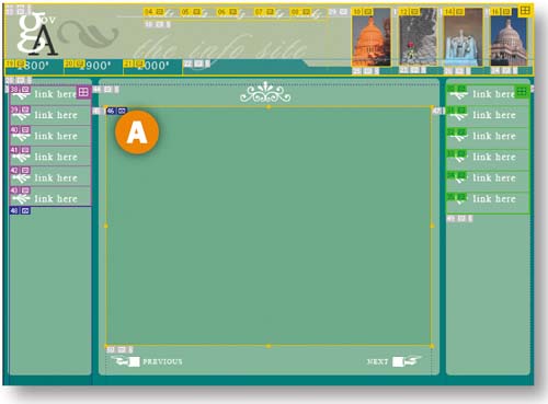
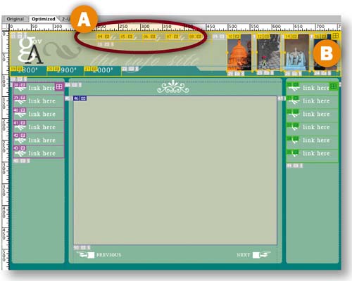
The layout of this page is simple but elegant. There are no loud graphics to compete with its main product-—information. We prepared most of the background elements by creating rectangular color blocks that organize and call attention to the text. In this step you'll set off the secondary navigation (1800s, 1900s, 2000s) by creating a tabbed navigation bar. Choose View>Rulers to turn on ImageReady's rulers. Click in the horizontal ruler and drag out a horizontal guide, positioning it at the baseline of the info site text A. Use the Move tool if you need to tweak the guide.
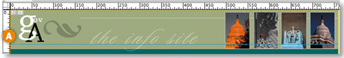
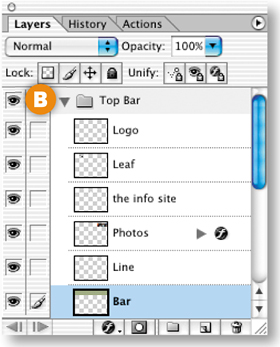
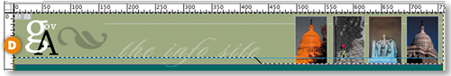
In the Layers palette, click the arrow on the Top Bar layer set B to reveal the contents of that layer set, and select the Bar layer. Select the Polygonal Lasso tool from behind the Rectangular Marquee tool in ImageReady's toolbox C. Hold down the Shift key (which constrains the tool to making straight lines and 45° angles). Click at the following points: the left edge of the guide, just under the e in the word site, on the top of the green bar, and at the right edge of the document. Then click around the outside of the document window to come back to the beginning of your selection D. Choose Select>Inverse, and press the Delete/Backspace key to cut out a tab shape E. Press Command/Ctrl-D to deselect.
Add Text Links
Select the Type tool in the toolbox. Choose white and a Sans Serif font in the Options bar. Type a line of text links: 1800s 1900s 2000s A. Click the checkmark on the Options bar to commit the type. Then choose a script font and create another Type layer by typing link1 link2 link3 link4 link5 B. Use the Move tool to position these two type layers as in the illustration.

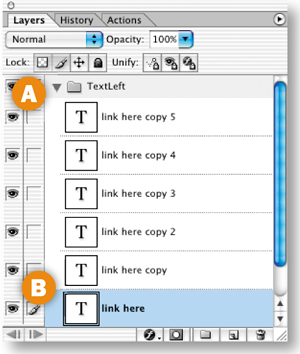
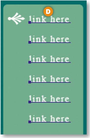
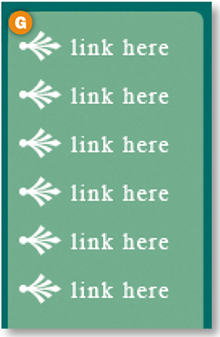
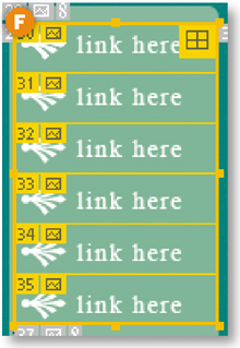
In this step you'll add text and bullet links to the left side of the page. Click the arrow next to the TextLeft layer set to expand that layer set A. Control/right-click the link here type layer and choose Duplicate Layer from the contextual menu. Repeat this until you have a total of six link here layers B.
Select and Distribute the Links
Now you'll select and automatically distribute the six link layers. With the link here layer selected, hold the Shift key and click on the link here copy 5 layer at the top of the layer stack A. Select the Move tool in the toolbox to display alignment and distribution buttons in the Options bar. Type 20 px in the box at the far right of the Options bar B, and click the Distribute Layer Vertical Space button C. This evenly distributes the selected layers vertically, with 20 pixels between each D. The ability to select mulTIPle layers and to specify distribution spacing are features found only in ImageReady, not Photoshop.
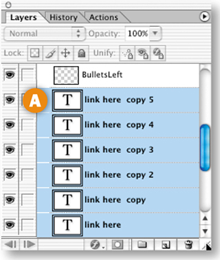
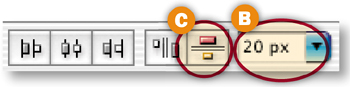
Now do the same thing with the BulletsLeft layer. Make five copies and Shift-click to select the six BulletsLeft layers. This time enter 12 px in the distribute box in the Options bar E and click the Distribute Layer Vertical Space button F. The bullets are now distributed evenly alongside the text G.
Complete the job by repeating Steps 4 and 5 on the text and bullet links on the right side of the pages, which you'll find in the TextRight layer set.
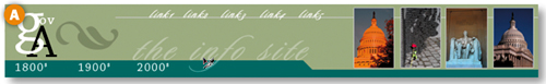
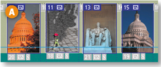
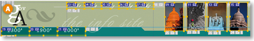
In this step you'll create slices in the banner at the top of the page. First draw a separate slice around each of the photographs A. They merit slicing because they will optimize best in JPEG format, while the text and graphic elements in the banner will optimize best in GIF format.
Next you'll slice the text links in the banner, so that each can be assigned a separate URL link when this page is incorporated into a site in Dreamweaver or GoLive. Draw one slice around the five script links that you added to the banner B. Then chose Slices>Divide Slices in the main menu bar. In the Divide Slice dialog box, choose Divide Vertically Into and type 5 in the field labeled slices across, evenly spaced C. ImageReady automatically divides your one slice into five. You can adjust these slices by clicking on their borders with the Slice Select tool and dragging.
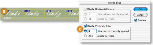
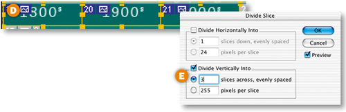
Finally, draw a separate slice around each word in the secondary navigation bar—1800s, 1900s, and 2000s D. Choose Slices>Divide Slices, and automatically divide it into 3 slices across, evenly spaced E.
Group Banner Slices into a Table
In this step you'll group all of the banner slices into a table. When you save this page with HTML, this table will act as a container for all of the GIFs and JPEGs produced by your banner slices.
Select the Slice Select tool in the toolbox and click on each of the slices you created in the banner (known as user slices) A. Then choose Slices>Group Slices into Table. A slice border appears around the table, along with a special table slice symbol B. Drag the borders of the table to make sure they encompass the entire banner.
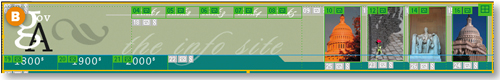
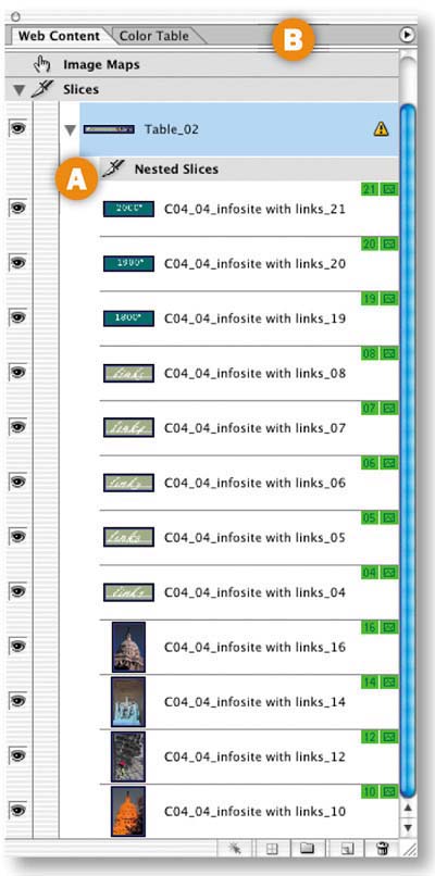
Open the Web Content palette (Window>Web Content) to view a list of all of your user slices. Notice that although you've only made one table yourself, your slices are listed under Table 02 A. That's because when you save a page from ImageReady with standard HTML, the program saves the entire document as one large table—Table 01—with each slice corresponding to a table cell. Any additional tables you create are nested inside of that larger table. That's why these slices are labeled Nested Slices in the Web Content palette.
Slice and Make a Table of Links
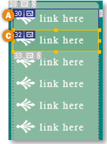
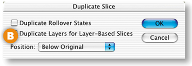
Draw a slice around the top link here text link and bullet on the left side of the page A. Choose Slices>Duplicate Slice. In the Duplicate Slice dialog box, choose Below Original from the Position menu and click OK B. ImageReady makes a new slice that fits nicely around the next link and bullet C. This works because each item is the same size and they are evenly spaced. Repeat four more times to create slices around all the links on the left side of the page.
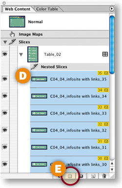
Select all six slices by clicking on one of them in the Web Content palette, holding the Shift key, and clicking on the slice at top of the stack D. Click the Group Slices into Table button at the bottom of the Web Content palette E to join the slices into another nested table F. Repeat with the link here items on the right side of the page.
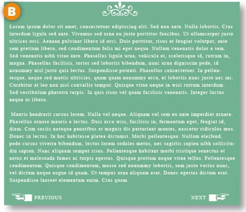
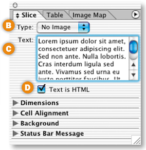
In this step you'll designate a slice as one that will contain nongraphic HTML text. With the Slice tool, draw a slice around the large empty area in the middle of the page A. With that slice selected, open the Slice palette (Window>Slice). In the Slice palette, choose No Image from the Type menu B. The palette changes to display a Text box. Type or paste some text into the Text box C, and check Text is HTML D. You won't see the text in the document window, because ImageReady doesn't preview HTML text. However, you will see it shortly in a browser preview.
Color the Cell Background
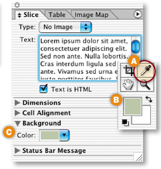
The slice you created for the HTML text is a table cell, just like slices that contain graphics. In this step you'll change the background color of that table cell.
Choose the Eyedropper tool in the toolbox A and click on a light color in the image. That color appears in the Foreground Color box B. Click the arrow next to the Background section of the Slice palette to expand that section. Click in the Color field C.and choose Foreground color from the pop-up menu. This sets the color of the table cell that will display your HTML text.
Preview the HTML Text
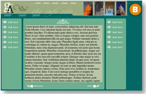
Click the Preview in Browser icon in the toolbox to view the page in your default browser. You'll see the HTML text that you entered into ImageReady's Slice palette against the colored cell background A. You can format and change the color of this HTML text when you bring this page into a site-building program.
Now you'll choose the color that will appear in a browser window behind your page. Select the Eyedropper tool in the toolbox and click on the dark green border of the page to set the Foreground Color. Choose File>Output Settings>Background. In the Output Settings dialog box, click the arrow on the BG Color box and choose Foreground Color A. This sets the Web page background to dark green.
Click the Preview in Browser button to view your page against this HTML background B.
Optimize the Slices
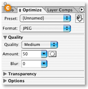
Click on the Optimized, 2-Up, or 4-Up tab A of the document window to preview your page with the slice optimization settings you choose. Select the Slice Select tool in the toolbox. Hold the Shift key and click on each of the photographs in the banner B. In the Optimize palette (Window>Optimize) C, choose JPEG as the format, and set the compression quality to Medium, striving for the lowest file size that retains the image quality you want.
Select each of the other slices in the image and optimize them as GIFs. Similar slices can be linked so that you only have to choose optimization settings one time for all of them. For example, select all of the link slices. Then choose Slices>Link for Optimization from the main menu bar.
Don't forget that you'll need to optimize the auto slices (the ones with the gray numbers that were created automatically) as well as the user slices (the ones you created).
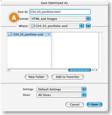
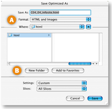
We'll show you how to save this page two ways—first with standard HTML and then with CSS (Cascading Style Sheets). ImageReady produces HTML with tables by default (unless you choose CSS instead). Choose File>Save Optimized As. In the Save Optimized As dialog box, set Format/Save as Type to HTML and Images A. Make sure the Slices menu is set to All Slices B, choose a destination, and click Save.
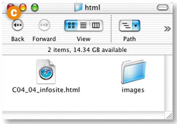
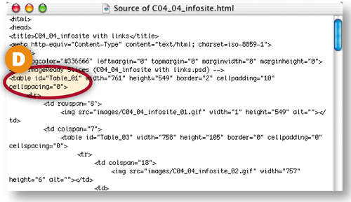
ImageReady generates an HTML page with nested tables to hold all your images in place, along with a folder of images that contains GIFs and JPEGs generated by each slice in the source file C. Open the HTML page in a Web browser and view the source code there. You'll see tables designated in the HTML code D.
Save as CSS
Go back to your PSD file, which is still open in ImageReady. Choose File>Output Settings>Slices. Notice that Generate Table is selected by default. Choose Generate CSS instead A. The Referenced setting offers different ways of referencing the styles that position your slices. Leave it at its default, and click OK. Now choose File>Save Optimized As, using all the same settings covered in the preceding step.
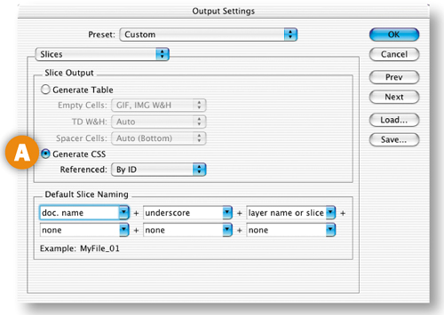
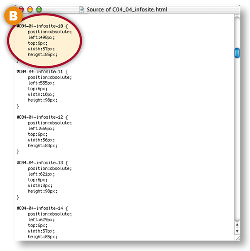
This time ImageReady produces images and an HTML file that employs CSS styles, rather than an HTML table to hold your images in place. Open this HTML page in a Web browser and view its source code there to see the CSS code. You'll see slices listed with pixel positions B. You can take either kind of output into a site-building program or a text editor and tweak it there. Or use the output as-is in a site.
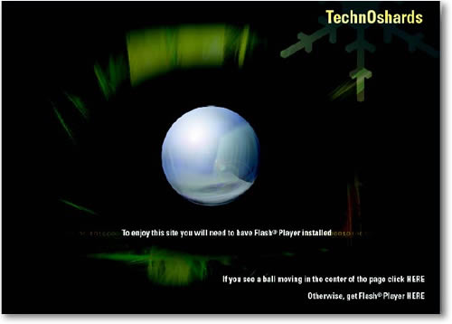
We'll finish up with a big splash. You'll make a splash page for a Web site that includes a Flash animation that tests whether a viewer has the Flash player installed on her computer.
Start with a Splash
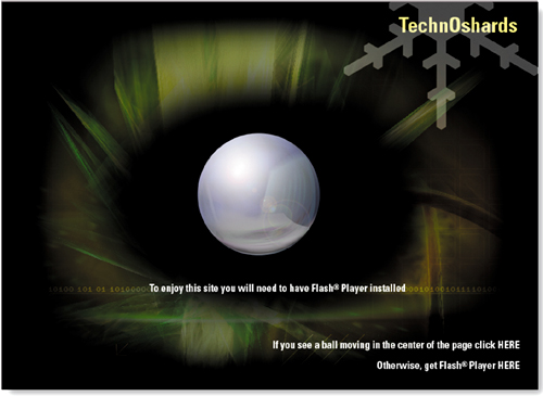
Many sites use a splash page as the gateway to the site. This splash page is all that an introductory page should be. It uses animation to catch viewers' attention, and a sexy three–dimensional graphic to entice them to delve further into the site. Most importantly, it serves a real purpose. This splash page offers viewers a test of whether they have the Flash Player—which is necessary to enjoy a Flash-based Web site-. And if they don't, there's a quick link to download the player.
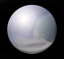

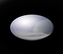
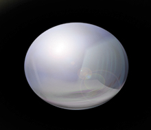
We used Photoshop to make the dimensional graphic for this page. You'll work in ImageReady to animate the graphic and export it as a Flash movie.
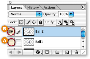
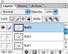
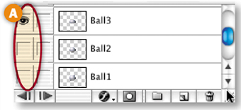
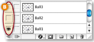
You'll be amazed at how easy it is to make layered artwork for an animation of a sphere pulsing. In the Layers palette, double-click the layer name on the Ball layer and rename that layer Ball1 to correspond to the animation frame on which it will be first visible. Then Control/right-click the Ball1 layer, choose Duplicate Layer from the pop-up menu, and name the duplicate layer Ball2.
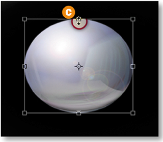
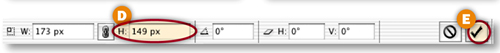
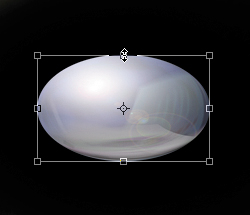
Click in the Visibility field of the Ball1 layer to turn its Eye icon off A, and click in the Visibility field of the Ball2 layer to turn its Eye icon on B. With the Ball2 layer selected, choose Edit>Transform>Scale. Hold the Alt/Option key as you click on the center anchor point at the top of the bounding box C.and drag down to compress the height of the ball from the top and bottom. If you want to be precise, keep your eye on the Height field in the Options bar, dragging down until the original number there (173 px) is reduced to 149 px. D. Click the big checkmark on the Options bar E to exit transform mode.
Transform Another Ball
Repeat the preceding step, duplicating Ball1 and naming the duplicate layer Ball3. Turn off the visibility of the Ball1 and Ball2 layers and turn on the visibility of the Ball3 layer. Compress Ball3 more than Ball2 by Option/Alt-dragging the center anchor point at the top of its transform bounding box down until the Height field in the Options bar reads 107 px.

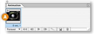
Now that you've made the layered artwork, you're ready to create the animation in ImageReady. This simple animation is made by clicking in the Visibility field of each ball layer to turn its Eye icon on or off on each frame.
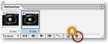
Open the Animation palette, which automatically displays Frame 1 A. In the Layers palette, set the layer visibility as follows B:
Ball1 layer on
Ball2 layer off
Ball3 layer off
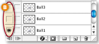
Make Frame 2 of the Animation
Click the Duplicate Animation Frame icon A at the bottom of the Animation palette to create Frame 2. With Frame 2 selected, set layer visibility as follows:
Ball2 layer on
Ball1 layer off
Ball3 layer off

Make Frame 3 of the Animation
Click the Duplicate Animation Frame icon at the bottom of the Animation palette to create Frame 3. With Frame 3 selected, set layer visibility as follows A:
Ball3 layer on
Ball1 layer off
Ball2 layer off
Make Frame 4 of the Animation
Click the Duplicate Animation Frame icon A at the bottom of the Animation palette to create Frame 4. With Frame 4 selected, set layer visibility as follows B:
Ball2 layer on
Ball1 layer off
Ball3 layer off
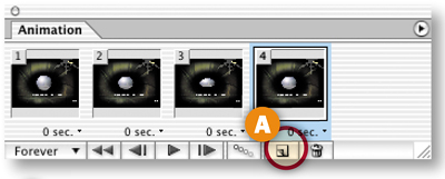
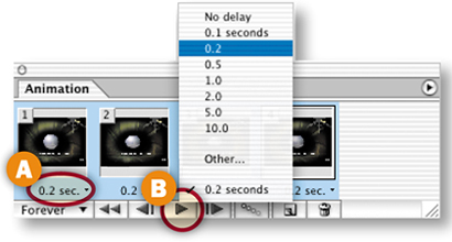
In this step you'll set the time delay between frames. With Frame 4 highlighted in the Animation palette, hold the Shift key and click on Frame 1 to select all the frames. Click the Time Delay label under any frame A and choose 0.2 sec.
Click the Play arrow B at the bottom of the Animation palette to preview the animation in ImageReady. Click the same button to stop the preview. Sweet!
Add Text
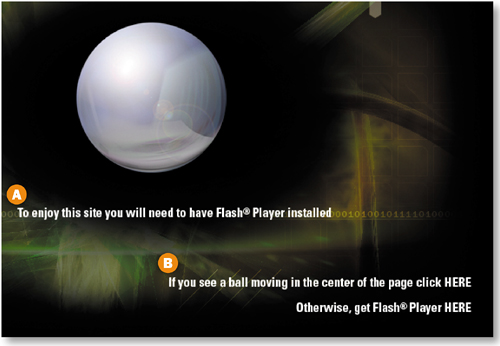
Select the Type tool in the toolbox, and choose white and a Sans Serif font in the Options bar. Type: To enjoy this site you will need to have Flash® Player installed. Use the Move tool to move the text into place under the ball A. (Selecting the Move tool also commits the type and exits text edit mode, so you're ready to add another type layer.)
Type: If you see a ball moving in the center of the page click HERE Press Return/Enter, and type: Otherwise, get Flash® Player HERE
Highlight the last two lines of text, and click the Align Text Right icon in the Options bar. Use the Move tool to move this text into place at the bottom-right corner of the image B.
Make Image Map Hot Spots
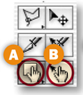
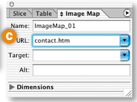
Select the Image Map Rectangle tool in the toolbox A. Drag rectangular hot spots around each of the two words HERE. Select a hot spot with the Image Map Select tool B. In the URL field of the Image Map palette C.(Window>Image Map) add a relative link (like contact.htm) to a page you plan to add to the site. For the second hot spot add a full link (including http://) to an external site where a viewer can download the Flash® Player.
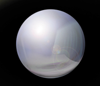
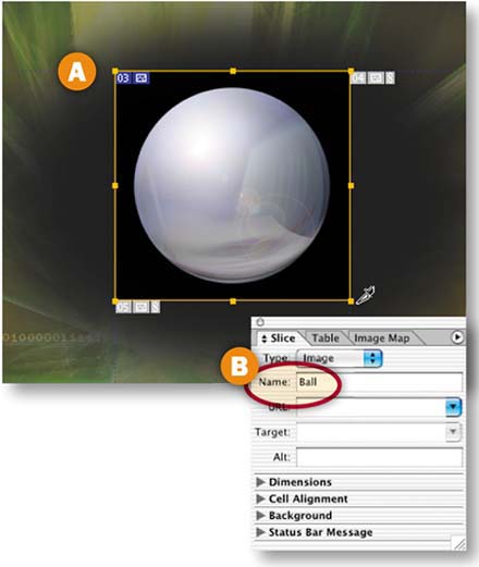
Prepare a Slice Around the Ball
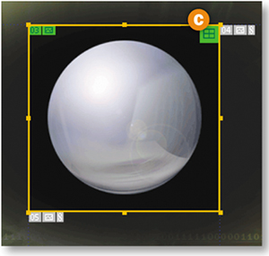
If the fully round ball is not visible, turn on the Eye icon on the Ball1 layer in the Layers palette. Select the Slice tool in the toolbox and draw a slice around the ball no bigger than its black glow A. In the Slice palette (Window>Slice), name the slice Ball B. Choose Slices>Group Slices into Table from the main menu bar. A table symbol now appears in the Ball slice C. Putting this slice alone in a nested table as you just did, rather than leaving it as a cell in a larger table, which is the default behavior, will help keep the area from collapsing in the HTML file when you remove the ball image later in this project.
Optimize the Slices
The file now contains one user slice around the ball and several auto slices that ImageReady made to fill in the surrounding area.You'll optimize these slices in this step.
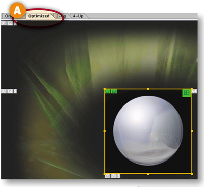
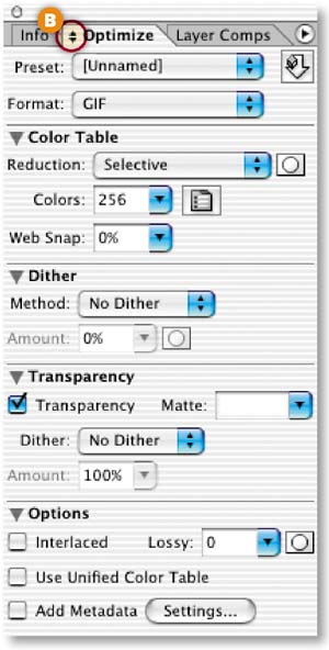
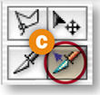
Click on the Optimized tab in the document window A so you can see a preview of the image with the optimization settings you choose. Open the Optimize palette (Window>Optimize), and click the double-pointed arrow on its tab B to see all its settings. Select the Slice Select tool in the toolbox C, and click on the Ball slice in the image. In the Optimize palette, choose the following settings:
Format: GIF (This has to be a GIF because it's an animation. JPEG does not support animation.)
Reduction: Selective
Colors: 256
Dither Method: None
Transparency: Checked
Add Metadata: Unchecked
Repeat this on one of the auto slices.
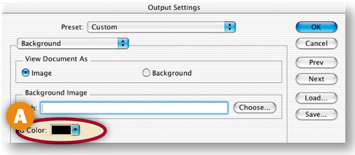
Choose File>Output Settings> Background. In the Output Settings dialog box, click in the BG Color field A and choose black (#000000) in the Color Picker that opens. Click OK in both dialog boxes. This sets the background color of the Web page that will show in a browser window that is stretched larger than this image.
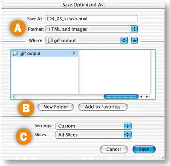
Save with a GIF Animation
Choose File>Save Optimized As. Set Format/Save As Type to HTML and Images A. Click New Folder B and make a new folder in which you'll save these files. Set Slices to All Slices C. Click Save. ImageReady generates a folder of images that contains the Ball.gif animation D generated from your Ball slice. It also produces an HTML file, with a nested table to hold the animation in place.
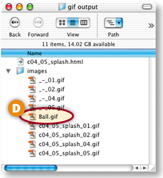
Export ball.gif as a SWF
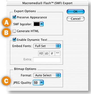
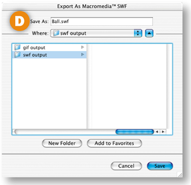
In ImageReady, choose File>Open and navigate to Ball.gif in the folder of images you generated in the last step. With Ball.gif open in ImageReady, Choose File>Export>Macromedia® Flash© SWF. In the SWF Export dialog box, click in the SWF bgcolor field A and choose black from the Color Picker. Uncheck Generate HTML B to save the SWF without an HTML file. Set JPEG Quality to about 50 C. (This setting will apply to the graphics in this animation.) Click OK. In the next Export dialog box, click Save to save the animation as Ball.swf D.
Replace the GIF with the SWF
In Dreamweaver or another site-building program, open the HTML file you saved in Step 14. Delete Ball.gif and substitute the Ball.swf file that you exported in the last step. The Flash animation is now incorporated in your splash page!