Table of Contents for
How to Wow: Photoshop for the Web
 How to Wow: Photoshop for the Web
Published by
Peachpit Press, 2004
How to Wow: Photoshop for the Web
Published by
Peachpit Press, 2004

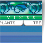

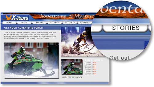
Navigation is the most important graphic element in a Web site. The navigation system is the engine that drives a viewer through a site and the road map the viewer uses to explore the site. A good navigation scheme is one that is both easy to find on every page and easy to use. It communicates clearly and simply where the viewer is in the site, where she can go from that point, and how to get there.
Graphics play a pivotal role in making navigation successful. Meaningful navigation icons, like symbols on a map, guide the viewer in the search for content. Rollovers offer visual clues to the presence and location of navigation. Button size and color can communicate the importance of particular information in the site hierarchy.
The look of a navigation scheme can pack a visual punch that contributes to your site's Wow quotient. This chapter walks you through a variety of recipes for creating visually exciting graphics that support and enhance navigation.
Critical Skills
You'll learn critical skills for building, slicing, and optimizing navigation graphics from the first two projects in this chapter. You'll use these skills to complete many of the projects in this book and over and over in your personal Web work. We urge you to work through these lessons first, even if you're dying to skip to another juicy lesson later in the book.
In the first project, Building a Navigation Bar, you learn how to put together a set of matching buttons for a navigation bar, taking advantage of time-saving construction techniques and special Web-oriented features in ImageReady. The emphasis here is on efficiency— using one button as a template for an entire bar of matching buttons. The second project, Slicing and Optimizing a Navigation Bar, simplifies the seemingly complex tasks of slicing and optimizing individual components of a navigation bar. We explain how and why to slice, and we show you how to optimize slices in GIF and JPEG formats for fast download and display on the Web. The third project, Transparent Buttons, demonstrates how to surround navigation buttons with transparency to allow your Web page background to show through.
Rollovers
With the basics under your belt, you're ready to tackle rollovers. Rollovers and other interactive graphics are what make the Web special. Rollovers actively involve your audience with your site and offer dynamic information about site content and structure. In this chapter's fourth project, Rollover Navigation, you make JavaScript-powered rollover buttons without the hassle of hands-on programming. The next project, Pointers and Remote Rollovers, cranks things up a notch. Here you learn to make rollovers that trigger a remote event elsewhere on the page, applying that technique to create a stylish navigation bar with mobile pointers.
Image Maps
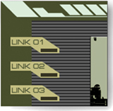
The last project in this chapter, Image Map Navigation, offers an alternative for those times when you don't want your navigation icons all lined up in neat rows. If it's asymmetry you're after, consider making an image map with hot spots as your navigation points. We invite you to work through all the recipes in this chapter with us to savor these tasty treats.
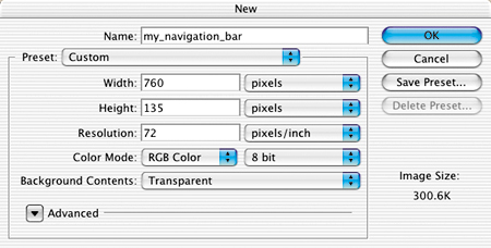
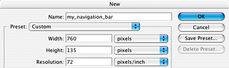
When you create a navigation bar, a page layout, or any Web graphic from scratch, there are some important technical issues to consider up front–including image dimensions, resolution, color mode, and color profile.
You confront most of these issues right off the bat in Photoshop when you set up a new document. We help you unravel these technical mysteries here.
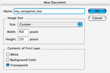
Files are measured in pixels when you design for the Web, but Photoshop's default for dialog boxes and rulers is set to inches. You can change inches to pixels throughout the program by choosing Photoshop/File>Preferences>Units & Rulers and setting the Rulers field to pixels.
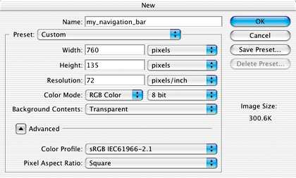
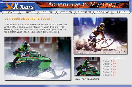
Choose File>New, and enter the Width and Height of a new Web file in pixels. A navigation bar or a page layout is best viewed without scrolling, so choose dimensions for those files that will fit within a typical browser window. Unfortunately, browser window sizes vary with each viewer's monitor display settings, choice of browser, and viewing behavior, so we can't give you one foolproof file size recommendation. Many designers make their navigation bars about 760 pixels wide and their page layouts 760 x 410 pixels, assuming that today's typical monitor is set to 800 x 600 pixels (or more) and accounting for scroll bars and other browser elements.
To be more accurate, do some research to determine the platform, display resolution, and browser that your particular audience is likely to use. Take a screen shot of an open Web browser in that setup, and crop away the browser interface elements to get a measurement in pixels of the area your viewers can see without scrolling. Use those numbers to custom size Web graphics for your audience.
Pixels are small rectangles of color information that are the building blocks of bitmapped images. Resolution, as that term is used in Photoshop's dialog boxes, describes the number of pixels per inch (ppi) in an image. If you take our advice in the previous panel and set the dimensions of a file destined for the Web in pixels rather than inches, it doesn't matter what number is in the Resolution field of the New dialog box. Photoshop will create a file with the number of pixels you dictate—without regard for pixels per inch—just as ImageReady does automatically.
However, if you leave the Width and Height fields in Photoshop's New dialog box set to inches, it's important to set the Resolution field to 72 ppi to approximate the resolution at which images are displayed in a Web browser on a standard screen. The same is true if you're resizing an existing image for use on the Web in Photoshop's Image Size dialog box.
Note that your Photoshop settings do not control the absolute size of an image on a viewer's screen. That depends on the display size of each viewer's monitor. For example, if a viewer changes her display from 800 x 600 to 1024 x 768, each pixel becomes smaller, making the same image look smaller on her screen.
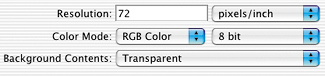
Set Color Mode to RGB Color in Photoshop's New dialog box when you are creating a file for the Web. Web browsers cannot see files in any of the other color modes offered—Bitmap, Grayscale, CMYK Color, or Lab Color.
Color mode describes the set of available colors from which an image is built. Each pixel in an RGB file is composed of a combination of red, green, and blue color values.
Bit depth is the amount of color data in each channel of color (red, green, and blue). Leave Bit Depth set to 8 bit. This creates an image with 24 bits of color information (8 bits in each of the 3 channels of an RGB image), accommodating 16.7 million possible colors.
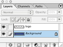
Every new file begins with a single layer. The nature of that layer depends on how you set the Background Contents field in the New dialog box. If you choose Transparent, the first layer will be composed of transparent pixels represented by a gray and white checkerboard pattern and will be a regular layer. This is the best choice if you plan on optimizing the image as a transparent GIF through which you can see a Web page background.
If you choose either White or Background Color in the New dialog box, the first layer will be a special kind of layer called a Background layer. A Background layer acts differently than a regular layer. A Background layer cannot have transparent pixels and you can't change its opacity or move its contents. You also cannot place another layer below a Background layer in the Layers palette. All of these properties can make a Background layer difficult to work with.
If you do create a Background layer and later want to change it into a regular layer, choose Layer>New Layer from Background, or double-click the layer name and enter a new name in the Layer Properties dialog box.
Photoshop's color management system is designed to achieve consistency in the way colors in an image appear on screen and in print. Unfortunately, most Web browsers and a number of other applications used in a Web design workflow are not color-managed. So there is no sure-fire way to achieve consistency between the way colors appear on your screen in Photoshop and the way they will appear in each viewer's Web browser.
The best solution we've found is to design an image for the Web in the sRGB color space, so that it appears much the way it would in a Web browser on a typical Windows monitor. Then save the file without embedding a color profile, since profiles can't be read by most Web browsers and needlessly inflate the file size.
To do this, when you start a new Web file, click the Advanced arrow in Photoshop's New dialog box to reveal the Color Profile menu. Choose the sRGB profile from that menu. (Alternatively, choose Working RGB: sRGB if you've already set sRGB as your RGB working space in Photoshop's Color Settings.) If you save an optimized copy of the file in JPEG format, uncheck ICC Profile in Photoshop's Save for Web window or ImageReady's Optimize palette to avoid embedding the color profile. 
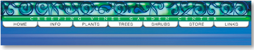
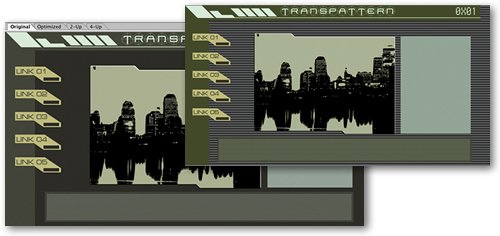
Add a set of matching buttons to a navigation bar.
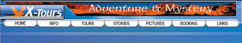
Switch to ImageReady
This navigation bar image was made in Photoshop to take advantage of Photoshop's wide range of image-editing features. You could continue to use Photoshop to add buttons to this bar, but we recommend you switch to ImageReady for that purpose to make use of ImageReady's exclusive object-oriented tools (the Tab Rectangle tool, Smart Guides, multiple layer selection, layer groups, Move tool variations, and more).
With the file open in Photoshop, click the Edit in ImageReady button at the bottom of the Photoshop toolbox. ImageReady launches, and the open file is automatically moved to ImageReady. You'll work in ImageReady for the rest of this project.
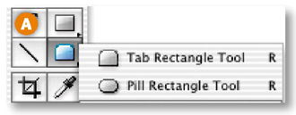
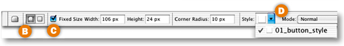
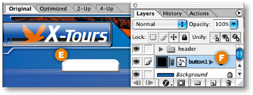
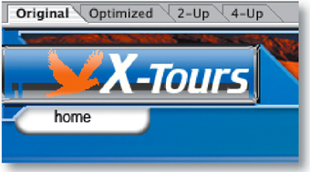
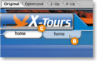
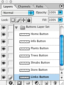
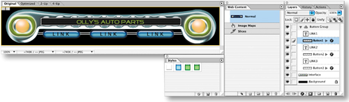
Start by creating one tab-shaped button. Select the Tab Rectangle tool in the ImageReady toolbox A. In the Options bar, make sure the Shape Layer icon is selected B. Set the button's size by checking Fixed Size and entering Width: 106 px and Height: 24 px C. Set the button's style by clicking the arrow on the Style field and choosing 01_button_style D. If this style doesn't appear, load the HTWWeb Presets as explained in the Introduction, or just choose a different style. Select the Background layer in the Layers palette. Then click in the image to create a button on a new shape layer E. Give the layer a meaningful name by double-clicking Layer 1 and typing button 1 in its place F.
Flip and Move the Button
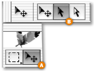
Now you'll turn the button upside down and hang it from the navigation bar. Select the Move Tool in the toolbox A, and make sure the Layer Select tool is highlighted in the Options bar B. This variation of the Move tool automatically selects the layer or layer group that contains the object you click on in the image. Click on the button you just made to automatically select the button 1 layer. Choose Edit>Transform>Flip Vertical to invert the button. Click and drag the button into position under the navigation bar's overhang C.

Add Button Text
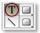
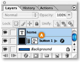
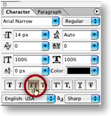
Select the Type tool in the ImageReady toolbox. In the Options bar, set Font Family to Arial Narrow or a similar font A, set Font Size to around 14 px B, and set Font Color to black C. Click on the button in the image and type home. This creates a new home type layer above the button 1 layer. Don't worry about where the text is positioned on the button for now.

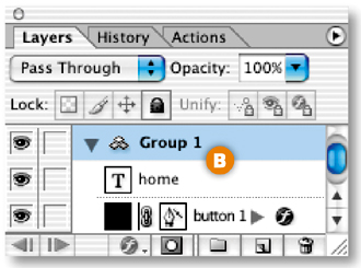
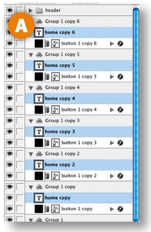
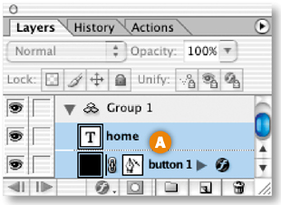
With the home type layer selected, hold the Shift key and click the button 1 layer in the Layers palette, so that both layers are selected A. Then choose Layer>Group Layers from the main menu bar. This gathers the two layers into a layer group labeled Group 1 B. Now that the button and text are grouped, it will be easy to duplicate them as a unit.
Make Duplicate Buttons
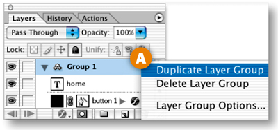
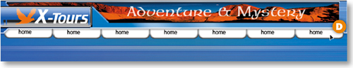
Duplicate button 1 along with its text by Control/right-clicking Group 1 in the Layers palette and choosing Duplicate Layer Group from the menu that appears A. You won't see the duplicate button in the image yet because it is located directly on top of the original button.
Select the Move tool, and make sure its Layer Select tool variation is highlighted in the Options bar. Click on the button in the image and drag to the right to move the duplicate button and its text B.
Notice the light blue lines that appear and disappear as you move the button C. These are Smart Guides–temporary alignment guides that display automatically when you move an object. Use them to align the buttons horizontally as you drag. Release the mouse when a vertical Smart Guide appears in between the two buttons, indicating that they are no longer overlapping.
Repeat this step five more times until you have a total of seven layer groups and seven buttons, all displaying the label home D.
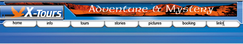
Select the Type tool and click and drag to highlight the word home on the second button from the left. Type the word Info instead. Repeat this step on each button, renaming the next five buttons: tours, stories, pictures, booking, and links.
Edit Multiple Layers at Once
You can save time by editing multiple layers together. Command/Ctrl-click on each of the seven type layers in the Layers palette to select them all A. Open the Character palette (Window>Character). With the Type tool selected, click the All Caps icon in the Character palette to make all the button labels uppercase.
Align Text to Buttons
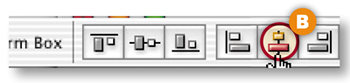
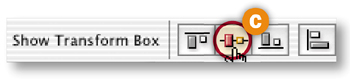
Now align each text label to its button. Start with the home button. Shift-click the home type layer and the button 1 layer to select them both in the Layers palette A. Select the Move tool in the Options bar. Click the Align Layer Horizontal Centers button to move the text to the horizontal center of the button B. Then click the Align Layer Vertical Centers button to move the text to the vertical center of the button C. Repeat this step on each of the six remaining pairs of button and text.
Congratulations! You've created a navigation bar of matching buttons and text with a minimum of fuss. The file is still in PSD (Photoshop Document format), which is a good format in which to save the source file because it retains program features like layers. However, this image is not ready to upload to the Web, because Web browsers cannot display a PSD file. The file must first be converted to a Web-ready format, like JPEG or GIF, as you learn to do in the next project.
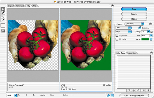
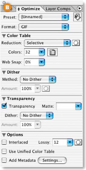
Optimizing reduces the size of an image so it will load faster in a Web browser. JPEG, is the best format for optimizing photographs. JPEG is also useful for optimizing Web graphics that contain graduated colors, like gradients, glows, or shadows. Optimize an image as a JPEG using the following settings in Photoshop's Save for Web window or ImageReady's Optimize palette.
In Photoshop, choose File>Save for Web to open the Save for Web window A. In ImageReady, choose Window>Optimize to open the Optimize palette B and expand the Optimize palette to see all its settings, as explained in the tip on the opposite page. Choose JPEG from the Format menu, or start with a pre-made collection of JPEG settings from the Preset menu.
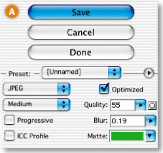
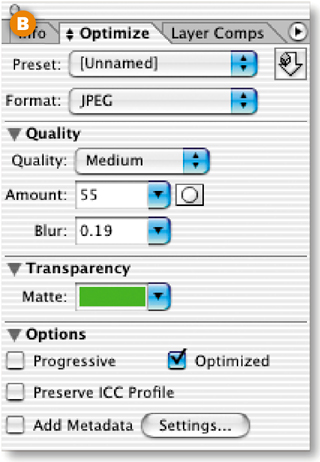
Quality is the variable that has the most significant impact on the file size and appearance of a JPEG. The lower the quality setting, the more compression is applied. This reduces the file size, but can degrade the appearance of the image. Choose a preset from the Quality menu. Fine-tune that setting with the slider in Photoshop's Quality field or ImageReady's Amount field. The circle icon to the right of Photoshop's Quality field and ImageReady's Amount field opens a dialog box in which you can set different quality levels for text layers, vector layers, and individual channels in an image.
Blurring an image decreases its file size. Add blur by dragging the slider in the Blur field to the right. Don't overdo it or your image will look too soft.
This setting causes an image to appear progressively while it's downloading, so the viewer sees a low-resolution version before she sees the real thing. Leave this setting unchecked unless you like this effect.
ICC Profiles contain color management information. We recommend that you do not include ICC Profiles with Web files because most Web browsers can't read them and they increase the size of a file. To do this, uncheck ICC Profile.
The Matte field is only relevant if there are transparent pixels in the source image. Because JPEG format does not allow transparency, any transparent pixels in the source image will be filled with the color in the Matte field when you optimize as JPEG. If you plan to use a solid color Web page background, set the JPEG's Matte field to the same color as the page background. This will cause the areas of the image that were transparent to blend in with the Web page background, creating the illusion of transparency.
Ignore the Color Table in Photoshop's Save for Web window when you're optimizing a JPEG. We mention the Color Table here only to confirm that it should be blank when format is set to JPEG. That's because JPEGs, unlike GIFs, do not map the colors in the source file to a limited color palette.
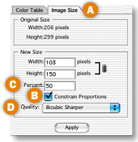
Reducing the dimensions of an image will always reduce the file size. In Photoshop, you can reduce the dimensions of the optimized image without affecting the source file. Click the Image Size tab in the Save for Web window A. Check Constrain Proportions to avoid distorting the image B. Reduce Width and Height to fixed numbers or by a Percent C. Changing image size—particularly sizing up-—can degrade image quality. To minimize the negative effect on image quality, set Quality to Bicubic Sharper when you're sizing down and to Bicubic Smoother when you're sizing up D. In ImageReady, resizing is done on the source file, using similar settings in the Image Size dialog box (Image>Image Size).
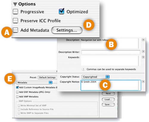
Metadata is file information. You can choose to attach various kinds of metadata to a Web file from ImageReady's Optimize palette. Metadata adds to file size, so we usually uncheck Add Metadata A. If you leave Add Metadata checked, by default ImageReady adds any information that's in the Description B and Copyright Notice C fields of the File Info dialog box (File>File Info), increasing file size slightly. In rare cases, you may want to include EXIF data (information stored in a digital photograph, such as camera settings) or XMP data (keywords and other information about a file for use by other applications). To do that, click the Settings button in ImageReady's Optimize palette D to open the Output Settings dialog box and choose a metadata option there E.

GIF, which stands for Graphics Interchange Format, is the ideal format for optimizing areas of solid color and lines, like illustrations, logos, cartoons, line art, and text. Use the following settings in Photoshop's Save for Web window or ImageReady's Optimize palette to optimize a GIF.
Open Photoshop's Save for Web window (File>Save for Web) A or ImageReady's Optimize palette (Window>Optimize) B. Choose GIF from the Format menu, or choose a collection of GIF settings from the Preset menu. (Two PNG formats are also available—PNG-8, which is similar to GIF, and PNG-24, which can contain varying degrees of transparency. These formats are less popular than GIF and JPEG because not all Web browsers display PNGs correctly, and because PNG-24 files can be relatively large in file size.)
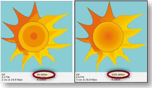
When you optimize a file as GIF, all the colors in the original image are converted to a limited palette of colors. The Reduction setting determines how that color palette is generated. Choose Selective, Perceptual, or Adaptive from the Reduction menu to create a palette based on the colors in your original image. Avoid the other choices, because they are fixed palettes unrelated to the original image and can cause a noticeable change in image color. Don't feel compelled to choose Web (which generates a fixed palette of the 216 “Web-safe” colors), because today most monitors are 24-bit and can display a much wider range of colors. Use the Mask icon next to the Reduction menu to generate different palettes for text layers, vector layers, and selections you've saved to alpha channels.
The Colors setting determines how many colors are included in a GIF's color palette, up to a maximum of 256 colors. This setting has the most significant impact on the file size and the appearance of a GIF. Fewer colors will reduce the file size, but may cause the image to lose important details. Choose the lowest preset from the Colors menu that produces an image that looks good to you. Then fine-tune your choice by typing a slightly lower number into the Colors field. To avoid losing particular colors as you reduce the Colors setting, first select those colors in the image with the Eyedropper tool (Shift+click to select multiple colors) and click the Lock icon at the bottom of the Color Table; then reduce the Colors setting.
Leave Web-Snap set to 0%. This setting converts some of the colors in your palette to Web-safe without allowing you to choose which colors are converted. If you want to use Web-safe colors, it's preferable to select those colors in the image with the Eyedropper tool (Shift+click to select multiple colors), and then click the Web Shift icon (the cube) at the bottom of the Color Table. This method gives you more control over the conversion.
The Color Table displays and allows you to edit the colors in a GIF's color palette. You can select colors in the Color Table to convert them to other colors, make them transparent, shift them to Web-safe, or lock them down. Photoshop's Color Table is located in the Save for Web window. ImageReady's Color Table is located in a separate palette. Choose Window>Color Table, or click the Color Table Palette icon in the Optimize palette to open ImageReady's Color Table palette.
Dither (a pattern of colored dots) is used to simulate a color that's not in the Color Table. No Dither is usually the best choice, because dither increases file size. Dither is useful to avoid banding if you must optimize a photograph, gradient, or glow in GIF format. The Dither and Amount menus offer several dither patterns to choose from. Click the Mask icon to add different amounts of dither to text, vector objects, or alpha channels.
GIFs, unlike JPEGs, can include transparency. If the original image has transparent areas, make sure there's a check mark in the Transparency checkbox to retain transparency in the GIF. You can convert individual colors to transparency by selecting colors in the image with the Eyedropper tool and clicking the Map Transparency icon in the Color Table.
The Matte setting affects the edges of a transparent GIF. If Matte is set to None, the edges of the graphic will appear jagged when the GIF is placed on a Web page. If Matte is set to a color that matches a Web page background, the edges of the graphic will appear smooth against that background. If Matte is left at its default of white, the graphic may display an unsightly white halo against a Web page background.


Transparency Dither creates dots of color at the edge of a transparent GIF, so you can place the same transparent GIF on different backgrounds without seeing a halo of color. Choose No Dither if, like us, you find this look too chunky for your taste.
Increase the Lossy slider slightly to reduce file size. Click the Mask icon to add different amounts of Lossy compression to text, vector objects, or alpha channels. Check Interlaced if you want a low-resolution image to download before the full GIF. Check Unified Color to apply the same Color Table to all states of a rollover graphic. Uncheck Metadata to keep file size down.

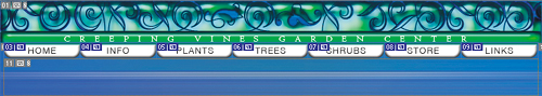
Slice a navigation bar and optimize each slice as a separate GIF or JPEG. You can slice and optimize in either Photoshop or ImageReady. This project uses Photoshop.
Slice the Buttons
Slicing carves an image into pieces, each of which becomes a separate Web file. It's common to slice buttons so that you can attach a separate page link to each button file. (You could add links using Photoshop's or ImageReady's Slice Options, but linking is easier to do later in a site-building program that “knows” the path to each linked page.)
In Photoshop, select one of the button layers in the Layers palette. Choose Layer>New Layer-Based Slice from the menu bar. This creates a tight, rectangular layer-based slice (identifiable by its blue symbol) around the button on that layer, and some surrounding slices called auto slices (identified by gray symbols) to fill in the gaps. Repeat this step on each of the button layers.
Layer-based slicing is quick and easy, and creates slices that move with the underlying art—so you can change your design after slicing. But this slicing method works only if each button is alone on a separate layer.
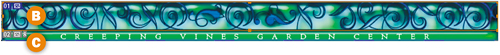
You'll use another method to slice the top graphic, isolating it from the green rule so you can optimize these items with different settings. This is a job for the Slice tool, because both of these objects are on the same layer. Select the Slice tool in the toolbox A, and click and drag around the top graphic to create a manually drawn slice called a user slice B. If your slice needs adjusting, click on any of the slice borders and drag. (You can adjust user slices, but not auto or layer-based slices.)
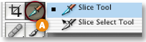
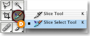
An auto slice has appeared around the green rule C. Select that auto slice with the Slice Select tool (behind Photoshop's Slice tool) D and click the Promote to User Slice button in the Options bar E so you can optimize the green rule slice independently of the auto slices.

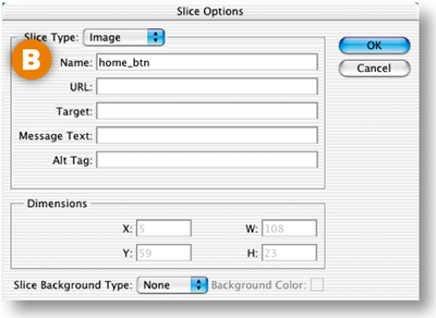
Name the Slices
Give the major slices meaningful names so the files they produce are recognizable later. With the Slice Select tool, click on the Home button slice in the image. Click the Slice Options button in the Options bar A to open the Slice Options palette. Type home_btn in the Name field B and click OK. Repeat for each button slice, giving each a recognizable name. Avoid using spaces or odd characters in slice names.

Open the Save for Web Window
Choose File>Save for Web to open the Save for Web window–where optimizing is done in Photoshop. Click the 2-Up tab so that you can compare the original image A to a preview of the optimized image B. Click the bottom-right corner of the window and drag to resize so that the original and preview panes are horizontal.
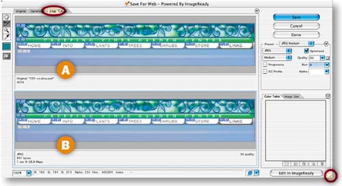
Optimize the Top Graphic Slice
Apply different optimization settings to individual slices to minimize file size and maximize appearance. Start with the top graphic slice, which is likely to optimize best as JPEG due to its many graduated colors. Choose the Save for Web Slice Select tool A, and click on the top graphic slice in the preview pane B. Choose the following optimization settings (described in the preceding JPEG Optimization Settings) for this slice:
Optimized File Format: JPEG.
Quality pop-up menu: Medium. Then increase the Quality slider to 50 to reduce the remaining color artifacts.
Blur slider: increase slightly to 0.21.
Optimized: checked.
ICC Profile: unchecked.
Progressive: unchecked.
The size of this slice is reduced to around 11.63K C. (Your size may vary depending on how you drew your slice.)
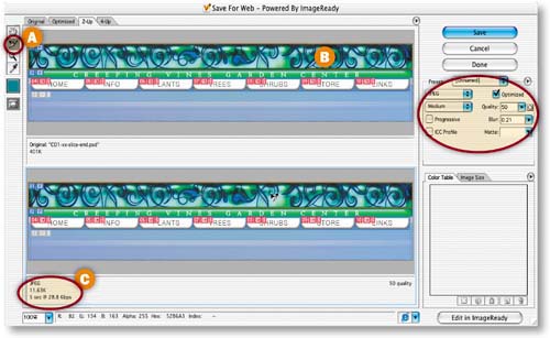
Optimize the Buttons
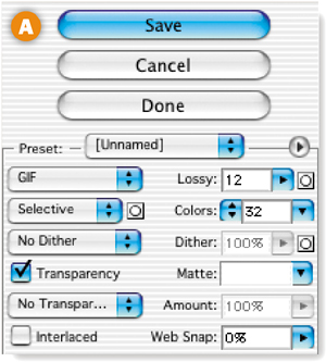
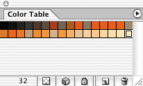
Link the button slices so any optimization change you make to one affects them all. Select one button slice in the preview pane. Shift-click the other button slices. Click the Optimize menu arrow A and choose Link Slices. Choose the following settings (described in GIF Optimization Settings):
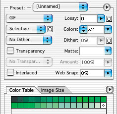
Optimized File Format: GIF.
Color Reduction Algorithm: Selective.
Colors: 32 (seen in the Color Table).
Dither Algorithm: No Dither.
Lossy: 10.
Interlaced: Unchecked.
Web-Snap: 0%.
Transparency, Matte: Not relevant.
TIP
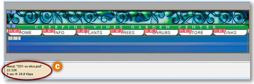
Balance File Size and Appearance. Always choose optimization settings that minimize the file size of a slice, without degrading its appearance too much. This is a balancing act that usually requires compromise. Keep your eye on the file size under the selected preview pane and the appearance of the image in the preview pane. To get a better look at the preview, click the Slice Visibility toggle to hide slices.

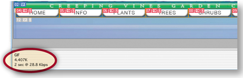
All the buttons together are just 4.4K.
It's difficult to predict whether a slice like the green rule will optimize best as GIF or JPEG because it has a significant bevel with graduated tones. The best approach is to try both, selecting the slice in the preview pane A and comparing its appearance and file size as GIF and as JPEG. We settled on:
Optimized File Format: GIF.
Color Reduction Algorithm: Selective.
Colors: 32.
Dither Algorithm: No Dither.
Lossy: 0.
Interlaced: Unchecked.
Web-Snap: 0%.
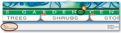
File size is 1.8K-—several times smaller than a comparable-looking JPEG.
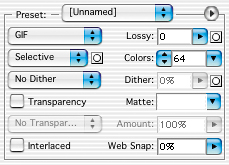
Optimize the Auto Slices
The auto slices (the blue background slices) are automatically linked for optimization. So optimizing one auto slice will optimize them all, saving you time. Select the large blue slice in the preview pane A and choose:
Optimized File Format: GIF.
Color Reduction Algorithm: Selective.
Colors: 64.
Dither Algorithm: No Dither.
Lossy: 0.
Interlaced: Unchecked.
Web-Snap: 0%.
The small blue slices on the sides automatically have the same settings B.
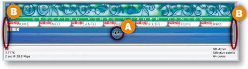
Click and drag with the Slice Select tool over all the slices in the preview pane to select them all. The total file size of the whole navigation bar is now down to about 22.32K-–a reasonable size for display on a Web page C.
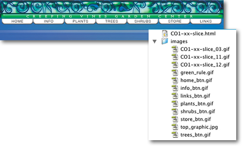
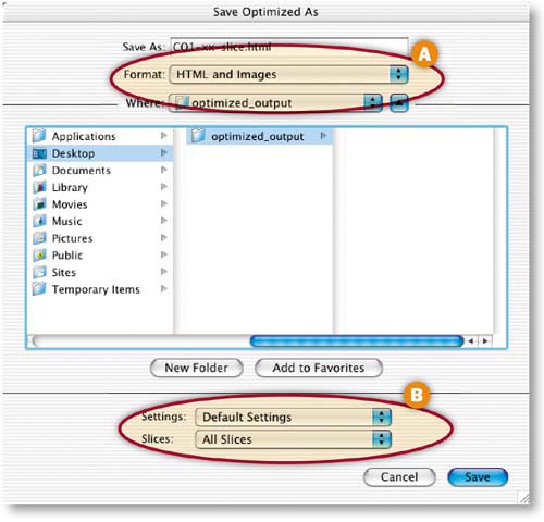
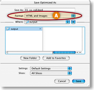
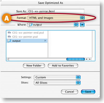
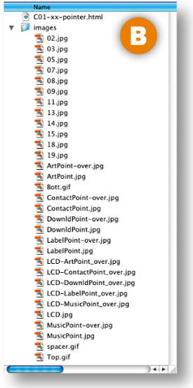
Photoshop will save each of the slices in this image as a separate GIF or JPEG, along with an HTML file containing a table to reassemble all the individual images as your navigation bar. Choose HTML and Images from the Format/Save as Type menu to generate the HTML file A. (If you choose Images, Photoshop will save only individual GIFs and JPEGs, which you could take into a site-building program for assembly there.) Leave the Slices menu set to its default—All Slices B, choose a destination, and click Save. On your hard drive, there will now be an HTML file and an Images folder containing all your GIFs and JPEGs. Don't separate the HTML file and the Images folder or the links to the images will break. Open the HTML file in a Web browser to see the results of your hard work. Each slice has become a separate image in a cell of an HTML table that holds all the images in place.
Save the Source File
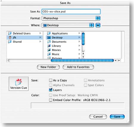
Before you close your original PSD file, choose File>Save As to save a copy that preserves your optimization settings and slices. Choose a destination, check Layers to preserve any layers in the file, and click Save. It's best to return to the source file in case you need to make changes to the Web files in the future, rather than try to edit and recompress the optimized files.
These settings impact how the contents of a selected slice appear in a Web browser. Use them only if you plan to save an HTML file with your slices. To access these settings, choose the Slice Select tool and select a slice. In Photoshop open the Slice Options dialog box A (click the Slice Options button in the Options bar). In ImageReady, open the Slice palette B (click the Slice palette icon in the Options bar).
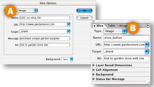
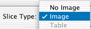
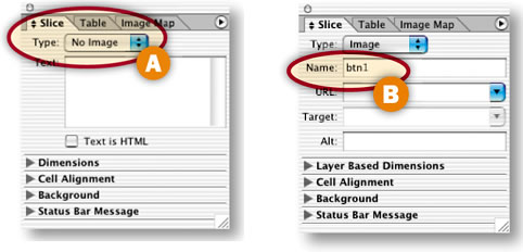
Leave Slice Type set to Image if a slice contains an image you want to display. Change Slice Type to No Image to leave a sliced area blank. No Image is a good choice for auto slices that have no important image content and for areas to which you plan to add HTML text. (Rather than entering your HTML text in the text box that appears, add it later in a site-building program like GoLive or Dreamweaver, where you'll have more control.)
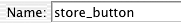
Enter a meaningful name, without spaces or odd characters, for the slice and the image file it will produce. Otherwise, the program automatically generates a complex name.
To add a link from a slice to an external Web site, type the entire URL of that site here. Links to pages in the same site are easier to add later in a site-building program.
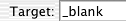
Use the Target field to control how the browser window behaves. Enter _blank to open a linked-to page in another browser window so viewers aren't drawn away from your site. The other choices are used with frames and are best added in a site-building program.
The content of this field appears in the status bar at the bottom of a Web browser when a viewer mouses over the sliced area. Use it to offer extra information to viewers.
These settings add file dimensions to the HTML code. They're available only for user slices.
Place transparent buttons on a Web page without the telltale halo you often see around Web graphics. This project is done in ImageReady.
Delete the Background Layer
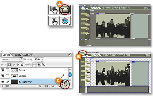
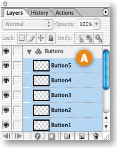
Start with a PSD file that includes navigation buttons. This file has been sliced and optimized for you. If the slices aren't visible, click the Slice Visibility toggle in ImageReady's toolbox A. Saving the solid gray background slices as GIF files would inflate the total file size of this page. Instead, make these areas transparent to let the Web page background show through. The page background color is created with HTML code, which has less impact on file size than do image files. Choose the Original tab in ImageReady's document window B. In the Layers palette, select the Background layer and drag it to the trash icon C. This creates transparency (represented by a checkerboard pattern) in the source file.
Slice the Buttons
Click thee Button5 Layer and hold the Shift key while clicking the Button1 in the Layers palette to select all the button layers A. Choose Layer>New Layer Based Slices from the menu bar to create a layer-based slice around each button B. Slices are always rectangular, so each slice encompasses some of the transparent area that surrounds the button.
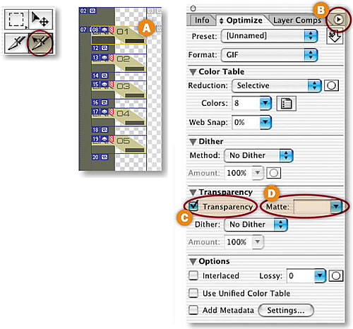
Click on the Optimized tab in the document window to view the slices optimized for the Web. With all the button slices still selected (displaying yellow borders) choose Slices>Link Slices for Optimization from the menu bar. Select any button slice A with the Slice Select tool, and choose the following settings in the Optimize palette. (To expand the Optimize palette choose Show Options from the palette side menu B.)
Format: GIF.
Reduction: Selective.
Colors: 8.
Web-Snap: 0%.
Dither Method: No Dither.
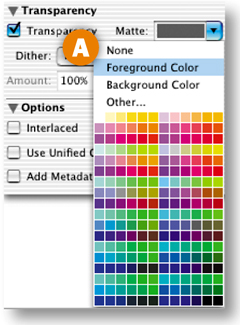
Transparency: Make sure Transparency is checked or you won't see transparency around your buttons C.
Matte: Leave the Matte field at its default of white temporarily D.
Lossy: 0.
Interlaced, Use Unified Color Table, and Add Metadata: Unchecked.
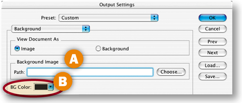
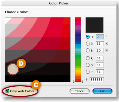
Specify a Page Background Color
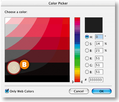
Now set a color for a Web page background that will show through wherever there is transparency in a slice. Choose File>Output Settings>Background from the menu bar. Make sure that View Document As is set to Image, and the Path field is blank A.
Click in the BG Color field B to open the Color Picker. Activate the Only Web Colors checkbox C, click on the darkest Web-safe gray D and click OK. This sets the Web page background color in the HTML file that will be saved with the sliced images. Click OK in the Output Settings dialog box.
Preview the Buttons with Halos
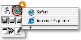
Choose a Web browser from the Preview in Browser button in the toolbox A to preview your sliced images against a gray Web page background in a browser.
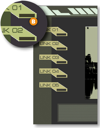
Notice that there are white pixels along the diagonal edges of each button B. This is not part of the design; it is a halo that takes its color from the default white Matte setting in the Optimize palette. The original file is in PSD format, which allows many levels of transparency. You are previewing the optimized file as a GIF, which allows only one level of transparency-—completely transparent or completely opaque. The semitransparent pixels along the diagonal edges of the buttons have become opaque white, as specified in the Matte setting, creating the unsightly halo. The vertical and horizontal edges are not soft, so they have no halo. (Don't be confused by the white lines around the skyline graphic; they are part of this design.)
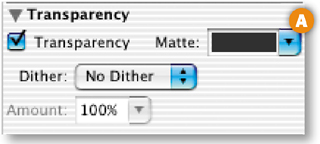
Hide the Halo
To camouflage the halo against a solid color background, simply set the Matte field in the Optimize palette to the same color as the Web page background. In the Optimize palette, click the Matte field A to open the Color Picker. Make sure Only Web Colors is checked, choose the same gray color you chose for the page background B, and click OK.
Click the Preview in Browser button again. This time you won't see the halo around the buttons in your Web browser C. It's still there, but it blends perfectly with the background of the same color.
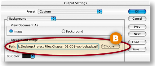
Add a Repeating Patterned Background
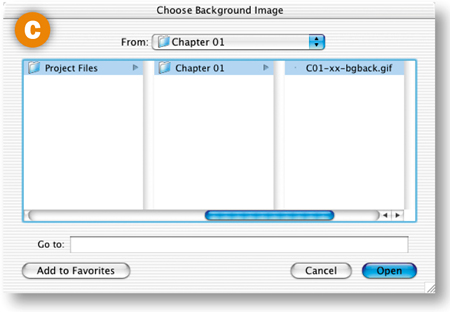
You can use the same technique to camouflage a halo against some patterned backgrounds. To make a patterned background that is small in file size, take advantage of the tiling nature of an HTML background image. Start with a small patterned GIF file. This simple pattern, magnified here to 1600% so you can see it A, is six pixels wide by six pixels high and has a file size of less than 1K. The pattern file will be downloaded only once to a viewer's Web browser, but will be displayed over and over to fill any size browser window. In the sliced document, choose File>Output Settings>Background. Click the Choose button next to the Path field B to open the Choose Background Image window. Navigate to the pattern file, and click Open C. The path to the pattern file appears in the Output Settings dialog box. Click OK. This identifies the pattern as a background image in the HTML file that will be saved with the slices.
Hide the Halo Against the Pattern
Open the background pattern file and click on the lighter gray in the pattern with the Eyedropper tool to set the foreground color. In the Optimize palette, click the Matte field arrow and choose Foreground Color A. Click the Preview in Browser button. The halo blends into the pattern of horizontal stripes created from the repeated pattern file B.
Set Slice Options and Save
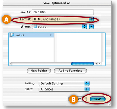
Select each auto slice (those with gray symbols) and set Type to No Image in the Slice palette (Window>Slice) A. Select each button slice and name it in the Slice palette B. Choose File>Save Optimized As, set Format to HTML and Images, and click Save.
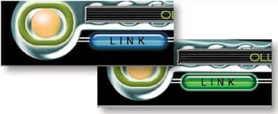
Make a matched set of working rollover buttons in ImageReady the easy way, by creating and applying a rollover style.

Set Up Your Workspace
Open the ImageReady palettes you'll use to create rollover buttons in this navigation bar—the Web Content, Styles, and Layers palettes. Click the Styles tab and drag the Styles palette away from the Web Content palette so you can see them both. Make sure you've loaded the HTWWeb-Styles preset into the Styles palette, as explained in the Introduction.
Create a Layer-Based Rollover
The default Normal state of an image is the way the image looks when it first loads in a Web browser. If you add an Over state, the appearance changes when a viewer mouses over a trigger area that's defined by a slice.
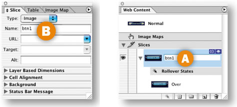
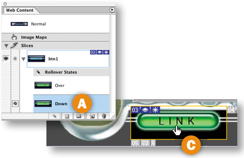
Start by simultaneously creating a slice and an Over state for Button1. You have to use layer-based slicing because that slicing method is a prerequisite for creating rollover styles. Select the Button1 layer in the Layers palette A. Then click the Create Layer-Based Rollover icon at the bottom of the Web Content palette B. This generates a layer-based slice around the content of the Button1 layer C and an Over state for that slice, both listed in the Web Content palette.
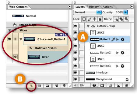
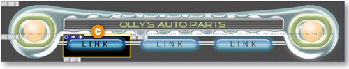
Give your new slice a more manageable name by double-clicking its default name in the Web Content palette and typing btn1 A, or by changing its name in the Slice palette B.
Change the Look of the Over State
Next you'll change the appearance of the sliced button in the Over state by applying a style. Other ways to change the appearance of a rollover graphic are to vary its position, opacity, layer blending mode, or layer visibility.
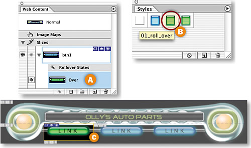
Select the Over state of the btn1 slice in the Web Content palette A. Then click on the 01_roll_over style in the Styles palette to change the button's color and effects in the Over state C. (If the HTWWeb-Styles aren't accessible in your Styles palette, choose a different style.)
Preview the Over State
Click the Preview button in the toolbox, and move your mouse over the first button in the image to see the Over state in action. Click the Preview button again to exit preview mode.
Add a Down State
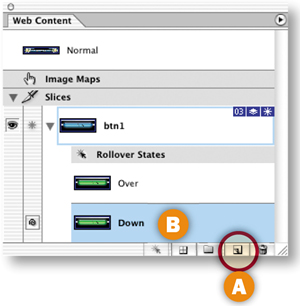
A rollover can have multiple states. Next you'll add a Down state to this rollover button. The Down state occurs in a Web browser when a viewer clicks and holds on an area defined by a slice.
With the Over state of the btn1 slice selected in the Web Content palette, click the Create New Rollover State icon at the bottom of that palette A. The new Down state B starts out looking just like the Over state.
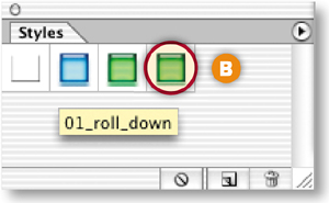
Change the Look of the Down State
With the Down state selected in the Web Content palette A, change the appearance of the button again by clicking the 01_roll_down style in the Styles palette B. Preview the Down state by activating the Preview button in the toolbox, and clicking and holding the first Link button in the image C. Exit preview.
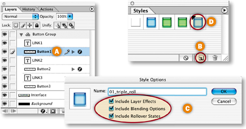
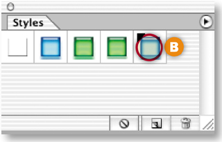
Create a Rollover Style
Now you'll save all the states of your rollover as a reusable rollover style. With the Button1 layer selected in the Layers palette A, click the Create New Style icon at the bottom of the Styles palette B. In the Style Options dialog box that opens, make sure Include Layer Effects, Include Blending Options, and Include Rollover States are checked to retain all the content and functionality of your original rollover C. Name the style 01_triple_roll, and click OK. The style appears in the Styles palette with a black triangle, which indicates that it's a rollover style rather than a static style D.
Apply the Rollover Style to Button2
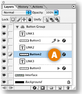
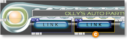
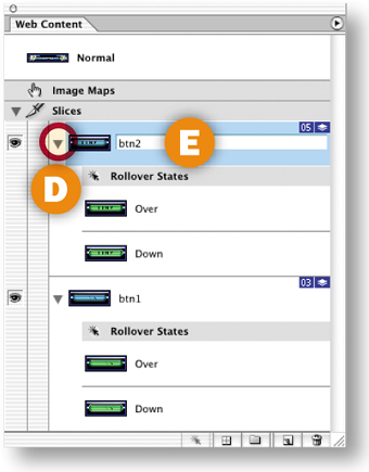
Now you'll reap the rewards of your hard work. It's quick and easy to create a set of matching rollover buttons by applying the rollover style to the other two buttons in this navigation bar.
Select the Button2 layer in the Layers palette A. In the Styles palette, click the new rollover style 01_triple_roll B. This creates a layer-based slice around the content of the Button2 layer C, generates an Over state and a Down state for this slice along with the JavaScript to make the states function, and changes the appearance of the button on each state—all with a single click. Click the triangle next to the new slice in the Web Content palette to see the rollover states for the new slice D. Double-click the slice name and rename this slice btn2 E.
Apply the Rollover Style to Button3
Repeat the preceding step with the Button3 layer selected to complete your set of rollover buttons. Rename the resulting slice btn3.
Preview in a Web Browser
Click the Preview in Browser button in the toolbox to test your rollovers in your default Web browser.
Optimize and Save
Optimize each slice for fast download using the settings in the Optimize palette. When you optimize a slice, you affect all states of its rollover, so check the appearance of all three states of the rollover buttons. Choose File>Save Optimized As. In the Save Optimized As dialog box, set Format to HTML and Images A so that ImageReady generates an HTML file containing the JavaScript that will make your rollovers function. (If you prefer to create rollovers in a site-building program or write your own JavaScript, choose Format: Images Only.) In addition, the program creates an Image folder in which it saves GIFs and JPEGs from the slices and rollovers in the source file B.
Choose File>Save to resave the PSD file with all of the slicing and rollover information you've added.
Open the HTML File in a Browser
Open the saved HTML file in a Web browser to see the results of your work. Each button should change appearance when you mouse over it and when you hold it down.
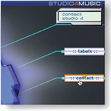
These rollovers look great, but they're not just eye candy. Combine local rollovers that point to a link with informational remote rollovers.
Design with Layers
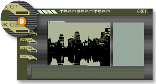
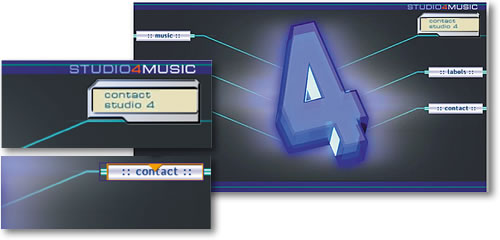
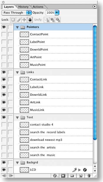
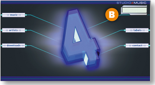
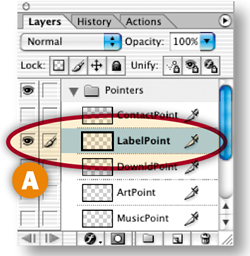
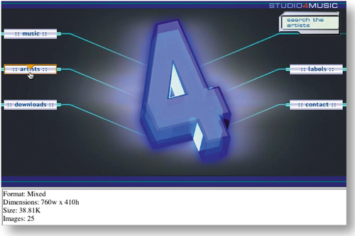
In this project you apply both local and remote rollovers to navigation graphics, pointing your viewers to links and providing descriptions of where the links lead. The key to creating a complex rollover scheme like this one is to make ample use of layers. Take a minute to deconstruct the layers in this file to see what we mean. We've put each element involved in the rollovers-—the pointer graphics, the link graphics, the text messages, and the LCD box—on its own layer A. We've organized the layers into layer sets, and sliced and optimized the background graphics for you so you can concentrate on creating rollovers.
Simplify Slice Names
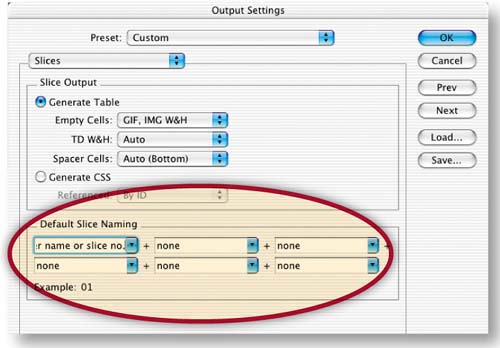
You'll do lots of work with slices in this project. By default, ImageReady creates long, unwieldy slice names. Change the default slice-naming convention to generate simpler names by choosing File>Output Settings>Slices to open the Output Settings dialog box. Click the arrow on the top left slice name field and choose Layer Name or Slice No. from the pop-up menu. Choose None in each of the other slice name menus and click OK.
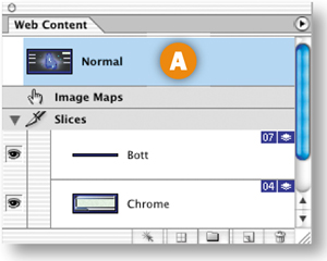
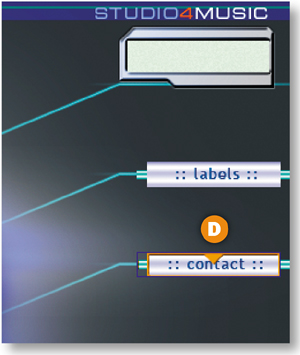
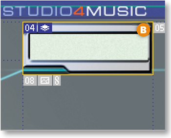
Select the Normal state at the top of the Web Content palette A. This is the way the page will look when it first appears in a Web browser. None of the pointers are visible and there is no text in the LCD on the top right of the page B.
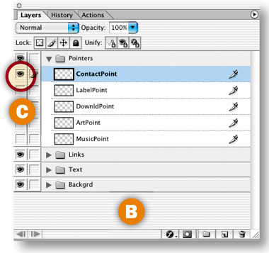
Create Layer-Based Rollovers for the Pointers
When a viewer moves his mouse over a link, a pointer will appear on that link. To create this effect, select all the pointer layers by holding the Shift key while clicking on each of the five pointer layers in the Layers palette A. Then click the Create Layer-Based Rollover icon at the bottom of the Web Content palette B. This single click creates a layer-based slice around each of the five pointers C, along with an Over state for each of those pointer slices D. All the slices and rollover states are listed in the Web Content palette. You don't see the pointers in the image because they have not yet been made visible in this state.
Make a Pointer Visible on the Over State
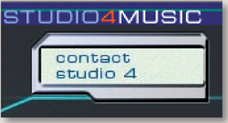
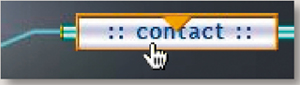
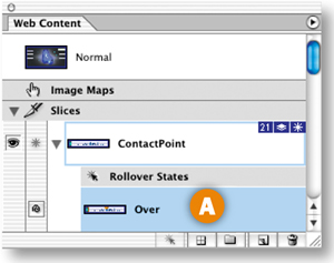
Next you'll change the appearance of the ContactPoint slice in its Over state. Select the Over state of the ContactPoint slice in the Web Content palette A. In the Layers palette, click in a blank area B to deselect all selected layers. Then click in the Visibility field to the left of the ContactPoint layer to display that layer's Eye icon C and to make that layer's contents visible in the image D. Now when a viewer mouses over the contact link in a browser, a pointer will appear on that link.
Repeat Step 5 on the Other Pointer Slices
Create a similar rollover for each of the other pointer slices—the LabelPoint slice, DownldPoint slice, ArtPoint slice, and MusicPoint slice-—by repeating Step 5. Make only the pointer layer of the same name A visible on the Over state B of each pointer slice.
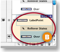
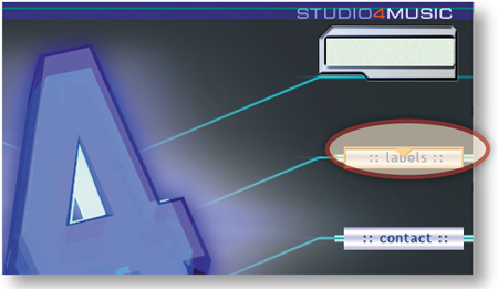
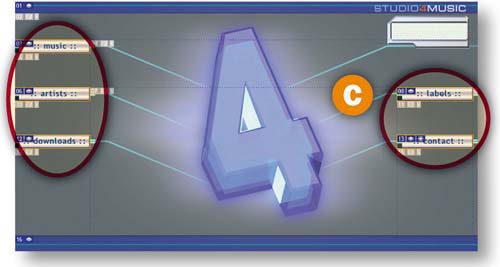
This is a good time to preview what you've done so far by clicking the Preview button in the toolbox C and moving your mouse over each link to display its pointer. Click the Preview button again to exit preview mode.
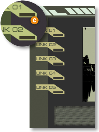
Slice the Remote Area
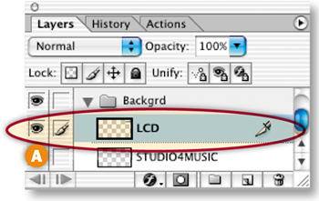
Next you'll add a second rollover event to the Over state of the ContactPoint slice—a text message that will appear in the LCD box at the top right of the page when a viewer mouses over the contact link in a browser. First you'll create a slice for the remote area involved in the rollover. Open the Backgrd layer set in the Layers palette and select the LCD layer A. Choose Layer>New Layer Based Slice from the menu bar to create a slice around the LCD box B.
Create a Remote Rollover
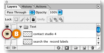
Select the Over state of the ContactPoint slice in the Web Content palette A. In the Layers palette, open the Text layer set and click in the Visibility field of the topmost text layer (“contact studio 4”) to turn on that layer's Eye icon B.
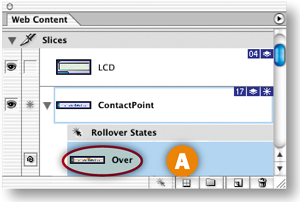
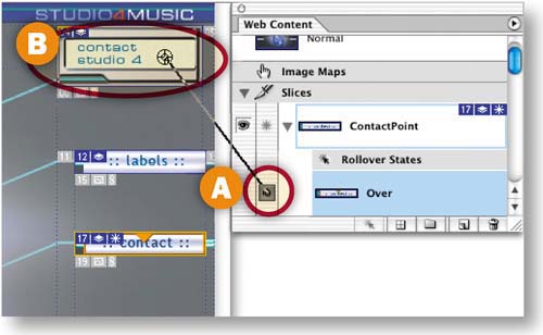
Target the Remote Slice
This is the fun part! When you make a remote rollover, you have to target the slice where the remote event occurs. In the Web Content palette, press the spiral icon (the pick whip) next to the Over state of the ContactPoint slice A. Drag a line from the pickwhip to the LCD box in the image to target the LCD slice B.
Repeat Steps 8 and 9 on the Other Pointer Slices
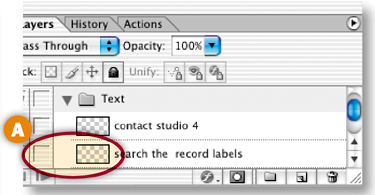
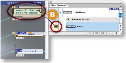
Create a similar remote rollover for each of the other pointer slices. Repeat Steps 8 and 9 on the Over state of each pointer slice, turning on the Eye icon for the matching text layer A:
LabelPoint Slice: “search the record labels”
DownldPoint Slice: “download the newest mp3”
ArtPoint Slice: “search the artists”
MusicPoint Slice: “search the music”
Target the LCD slice each time, by clicking and dragging from the pickwhip icon next to the Over state of each pointer slice in the Web Content palette to the LCD box in the image B.
Preview in a Web Browser
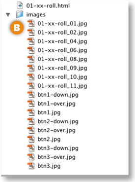
Click the Preview in Browser button in the toolbox A to test the rollovers in your default Web browser. When you mouse over a link, a pointer appears on the link B, and a text message describing the link appears in the LCD box C. As you can see, these rollovers are not just eye candy. They identify which graphics are links and offer additional information about each link, making your navigation scheme user-friendly.
Save
Normally you would optimize each slice at this point. That's been done for you, so just choose File>Save Optimized As, and in the dialog box that appears choose Format: HTML and Images A. This causes ImageReady to generate an HTML file with rollover JavaScript along with image files for each state of all the rollovers on the page B. Choose File>Save to resave the PSD file with the slice and rollover data you've added.
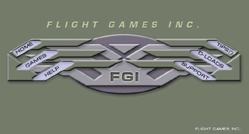
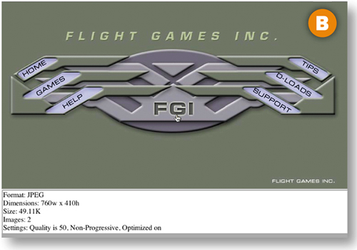
Create image map hot spots in ImageReady to link a single image to multiple pages.
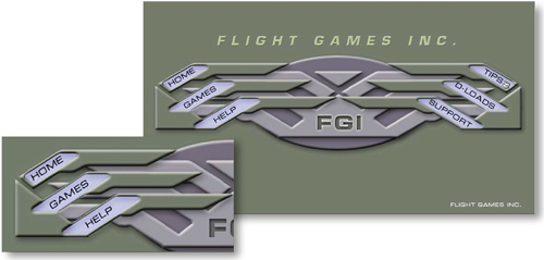
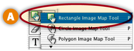
Draw a Tool-Based Hot Spot
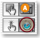
You'll define each of the button links on this page with image map link regions (hot spots). We made this image in Photoshop, but you'll add the hot spots in ImageReady, because Photoshop doesn't have image map tools.
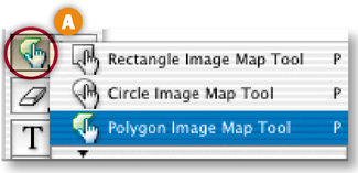
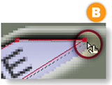
Start by drawing a hot spot around the Home button with the Polygon Image Map tool. If that tool isn't showing, press whichever image map tool is displayed in your toolbox and choose the Polygon Image Map tool from the flyout menu A. Zoom in and then click in each corner of the Home button to draw a hot spot in the approximate shape of the button. To close the hot spot border, move toward the starting point until you see a small circle and click B or just double-click.
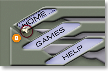
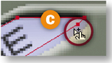
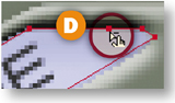
Adjust the Hot Spot
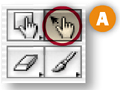
Adjust the hot spot to fit the button by clicking on the anchor points with the Image Map Select tool A and dragging B. For more precision, Shift-click to add an anchor point C or Option/Alt-click to delete an anchor point D.
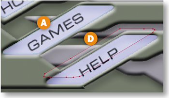
Repeat Steps 1 and 2 to make another hot spot on the Games button A. With the Image Map Select tool active, click the Image Map palette icon in the Options bar B to open the Image Map Select tool active, click the Image Map Palette icon in the Option bar B to open the Image Map palette (or choose Window>Image Map). From the palette's menu C choose Duplicate Image Map. Alternatively Option/Alt-drag the hot spot to copy it. Drag the new hot spot on top of the Help button D.
Make Layer-Based Hot Spots
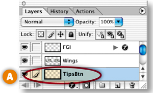
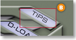
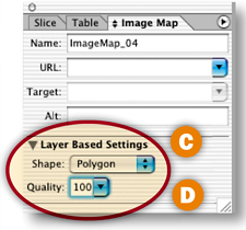
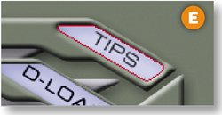
The Tips, D-Loads, and Support buttons were created on separate layer—so you can use a quick, layer-based command to make their hot spots. Select the TipsBtn layer in the Layers palette A. Choose Layer>New Layer Based Image Map Area from the menu bar. By default this makes a rectangular hot spot around the Tips button that doesn't match the shape of this button B. To fix that, in the Image Map palette choose Polygon from the Shape pop-up menu C. Then click the arrow on the Quality field and drag the Quality slider to the right until the hot spot matches the shape of the button D. (We set our Quality field to 100 and got a perfect fit E.) Repeat this step for the D-Loads and Support buttons, each of which is on its own layer too.
Name the Hot Spots
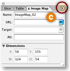
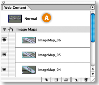
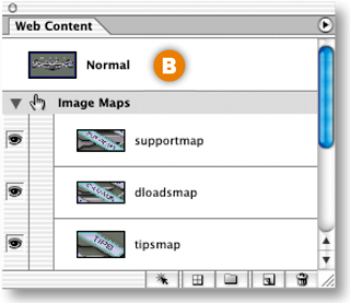
Each of your hot spots is listed in the Web Content palette with default names A. Give your hot sports more meaningful names by double-clicking their names in the Web Content palette and typing helpmap, gamesmap, homemap, tipsmap, dloadsmap, and supportmap repectively B. (Or select each hot spot in the Web content palette and name it in the Image Map palette.)
Select the helpmap hot spot in the Web Content palette. In the Image Map palette, type help.html in the URL field. Repeat this step for each of the other hot spots, typing index.html (for the home button), games.html, tips.html, dloads.html and support.html, respectively.
INSIGHT
Relative Links. We recommend assigning relative links when you're linking to files within the same Web site, so that the site can be moved without the links breaking. Relative links are relative to the location of the current page. So to use them you have to plan in advance how you're going to structure your site files. For example, the relative link from the helpmap hot spot on the current page to the help.html page would be:
help.html if the help page is in the same folder as the current page;
/helpfiles/help.html if the help page is in a folder called helpfiles that's one level down from the current page;
../help.html if the help page is one level up from the current page;
../games/help.html if the help page is in a folder called games that's one level up from the current page.
Absolute Links. Absolute links are best when you're linking to an external site. They are links that include the complete path to a site file. For example, http://www.flightgames.com/help.html includes:
the Internet protocol (http://).
the site domain (www.flightgames.com).
the page name (help.html).
Each of these is a relative link, which means that its path is relative to this image map page. The relative link help.html, for example, assumes that the help page will be in the same folder with this page on a Web server. (See the sidebar for more about relative links.) If you don't yet know what your Web site's file structure will be, you can leave this field blank and use a WYSIWYG site-building program like GoLive or Dreamweaver to make relative links for you later.
Make a Rollover in the Image Map
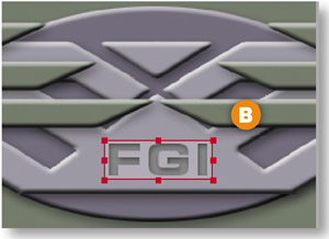
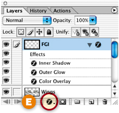
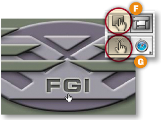
You can include rollovers in image maps. When you add a rollover to an image map hot spot, a slice is created behind the scenes. Select the Rectangle Image Map tool in the toolbox A, and drag a rectangular hot spot around the FGI logo in the image B. Then click the Create Rollover State icon at the bottom of the Web Content palette C to create an Over state in the hot spot D. To change the appearance of the FGI logo in the Over state of the rollover, click the f icon at the bottom of the Layers palette E and choose Outer Glow from the Layer Effects pop-up menu. Click OK in the Layer Style dialog box to accept the default options for this layer effect. Click the Image Map Visibility button in the toolbox F and then the Preview button G and mouse over the logo to preview the rollover. Click the Preview button again to exit Preview mode.
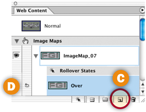
You can even include a remote rollover in an image map.
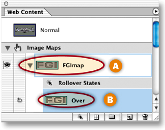
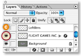
In the Web Content palette, double-click the name of the new image map and rename it FGImap A. Select the Over state of FGImap in the Web Content palette B. In the Layers palette, click in the Visibility field of the Flight Games Inc. layer to display an Eye icon C. This makes the Flight Games Inc. text visible on the Over state of the FGImap rollover.
Preview in a Web Browser
Click the Preview in Browser button in the toolbox A to test the rollovers in a Web browser. When you mouse over the FGI logo in the browser, a glow appears around that logo, and the Flight Games Inc. appears in the image B.
Save
We already optimized this image as a JPEG. These optimization settings apply to the entire image map and its rollovers.
Choose File>Save Optimized As, and in the dialog box that appears choose Format: HTML and Images A, make a destination folder, and click Save B to save imap.html with the image map data and rollover JavaScript, along with a folder of images. Choose File>Save to resave the PSD file with all of its image map, slice, and rollover information.
Congratulations on completing this chapter on navigation. In the next chapter you'll learn how to make amazing animations in ImageReady.