Table of Contents for
CSS Refactoring
 CSS Refactoring
Published by
O'Reilly Media, Inc., 2016
CSS Refactoring
Published by
O'Reilly Media, Inc., 2016
Chapter 6. Code Placement and Refactoring Strategies
We’ve learned a lot about CSS: how the cascade works, the different intents styles can have, how to write better CSS, and how to effectively test it. This chapter first discusses how to organize your styles and then explores strategies for how to best refactor your CSS using everything we’ve learned. Then we’ll wrap up by exploring how success can be measured after your code is refactored.
Organize CSS from Least Specific to Most Specific Styles
We learned in Chapter 2 that CSS styles are applied based on specificity and the order in which they are included. As such, it makes sense to organize your CSS in an order that is harmonious with how it will be applied:
-
Normalizing styles
-
Base styles
-
Styles for components and their containers
-
Structural styles
-
Utility styles
-
Browser-specific styles (if absolutely necessary)
This order includes CSS in such a way that as the declaration block selectors get more specific, more complicated selectors build off of the more general selectors that have already been included.
Here’s a refresher on what the different types of styles are used for. As you read through the intents of these styles, notice how they build upon each other.
Normalizing Styles
We learned in Chapter 4 that normalizing styles are used for providing a starting point that irons out some of the inconsistencies between browsers. With these inconsistencies out of the way, styles that follow can benefit from the properties that have already been defined by these normalizing styles.
Base Styles
Base styles provide a starting point for all of the elements in the website. Things like spacing (margin, padding, line-height, etc.), font sizes and families, and anything else that can be used in the majority of styles that will not need to constantly be overridden should be included here.
Styles for Components and Their Containers
Component styles build on base styles and provide styling that makes use of visual metaphors to make it easier to interact with the website. As we learned, these styles should be written to work for the majority of use cases site-wide, and any changes in styling should be delegated to a parent container.
Browser-Specific Styles
Finally, if you cannot drop support for legacy browsers, the styles you implement specifically for them belong here. These styles also likely make use of !important and are conditionally included in the website. They usually aren’t very pretty, so be sure to delete them when they are no longer needed.
Keep Media Queries Close to Relevant Declaration Blocks
Media queries are used to style elements differently when certain conditions are met, like when a browser viewport is a particular width. Media queries should be kept close to the declaration blocks they style rather than placed at the end of the CSS or split them into a separate file. Doing so provides more context about how styles are applied.
Multiple Files or One Big File?
Code organization can be done in a couple of different ways, namely by using multiple files or one big file. It’s important for developers to be able to work on their code easily with predictable code placement, but it’s also really important that this be done in such a way that the website loads quickly for end users. First let’s look at what happens when CSS is served to a browser, and then let’s discuss developing with one file or multiple files.
Serving CSS
When someone visits a website that includes CSS files (as opposed to being styled by inline CSS) the browser requests those files, downloads them, and then parses them and applies the appropriate styles. Thus, it’s important to make these downloads as small as possible so the site loads as quickly as possible.
Concatenation is the process of combining multiple files into one. It’s a technique commonly used to decrease page load time by reducing the number of files that need to be downloaded. If the two files in Examples 6-1 and 6-2 were concatenated in that order, the result would be the file in Example 6-3.
Example 6-1. Example headings.css file
/*** This file contains styles for basic heading elements.*/h1{color:#333;font-size:24px;margin-bottom:6px;margin-left:12px;margin-right:6px;margin-top:12px;}
Example 6-2. Example lists.css file
/*** This file contains styles for list elements.*/ul{list-style-type:none;padding-bottom:12px;padding-left:0;padding-top:12px;padding-right:0;}
Example 6-3. Example concatenated CSS file
/*** This file contains styles for basic heading elements.*/h1{color:#333;font-size:24px;margin-bottom:6px;margin-left:12px;margin-right:6px;margin-top:12px;}/*** This file contains styles for list elements.*/ul{list-style-type:none;padding-bottom:12px;padding-left:0;padding-top:12px;padding-right:0;}
Concatenation is powerful because it allows for big CSS files to be broken up into smaller files (which can then be reconstructed back into one big file, reducing page load time by reducing the number of files that the end user needs to download). Using multiple files allows for similar rulesets to be grouped together logically, so it becomes easier to find a particular piece of code. Additionally, using multiple files for development makes it easier to understand the contents of a CSS file without being overwhelmed, like you might be by one big file.
A concept that goes hand-in-hand with concatenating CSS files is minification. Minification is the process of removing all unneeded whitespace, comments, and newlines from files without changing their behavior. For example, when the code in Example 6-1 and Example 6-2 is both concatenated and minified it will become the code in Example 6-4.
Example 6-4. Example CSS file after minification
h1{color:#333;font-size:24px;margin-bottom:6px;margin-left:12px;margin-right:6px;margin-top:12px}ul{list-style-type:none;padding-bottom:12px;padding-left:0;padding-top:12px;padding-right:0}
Note
Minified CSS usually appears on one line; the line breaks in this example are a result of formatting for this book.
Notice that all of the spaces and comments have been removed in Example 6-4. This is beneficial because spaces and comments increase the size of the CSS file that ultimately gets downloaded by the end user. By eliminating anything in the file that’s unnecessary, the file can be made smaller. You should not try to write your code in a minified state, however, because doing so will lead to errors that are difficult to track down and it will be a nightmare to maintain.
There are any number of tools available online for concatenating and minifying CSS. When you’re ready to take this step, research a couple of options and use whatever fits your needs. Maybe you just need to use one of the many simple websites that output minified CSS after being given unminified CSS, or maybe your needs are more complicated and you need something that augments your build process.
Developing with a Single File
For small projects, working in a single CSS file is perfectly acceptable and fairly easy. Based on the order in which CSS should be included such that it works with the cascade, the contents of this file can be organized into appropriately commented sections and subsections:
/**
 * Normalizing Styles
 * ---------------------------------------------
 */

/**
 * Base Styles
 * ---------------------------------------------
 */

 /* Base Styles: Forms */
 /* Base Styles: Headings */
 /* Base Styles: Images */
 /* Base Styles: Lists */
 /* Base Styles: Tables */
 /* etc. */

 /**
  * Component Styles
  * ---------------------------------------------
  */

 /* Component Styles: Alerts */
 /* Component Styles: Buttons */
 /* Component Styles: Carousels */
 /* Component Styles: Dropdowns */
 /* Component Styles: Modals */
 /* etc. */

 /**
  * Structural Styles
  * ---------------------------------------------
  */

 /* Structural Styles: Checkout Layout */
 /* Structural Styles: Sidebar Layout */
 /* Structural Styles: Primary Layout */
 /* Structural Styles: Settings Layout */
 /* etc. */

 /**
  * Utility Styles
  * ---------------------------------------------
  */
Working in one CSS file can get difficult as the size of the project grows, though, and at some tipping point it will become evident that the CSS needs to be broken up into multiple files.
Developing with Multiple Files
When developing a website using multiple CSS files, file contents can be kept very focused. This can help prevent CSS from being added in a less optimal place if there is a correct file for it to be in. When developing with multiple CSS files your project might look something like this:
|-css/
|  |-normalizing-styles
|  |    |- normalize.css
|  |
|  |-base-styles
|  |    |- forms.css
|  |    |- headings.css
|  |    |- images.css
|  |    |- lists.css
|  |    |- tables.css
|  |    |- etc.
|  |
|  |-component-styles
|  |    |- alerts.css
|  |    |- buttons.css
|  |    |- carousel.css
|  |    |- dropdowns.css
|  |    |- modals.css
|  |    |- etc.
|  |
|  |- structural-styles
|  |    |- layout-checkout.css
|  |    |- layout-sidebar.css
|  |    |- layout-primary.css
|  |    |- layout-settings.css
|  |    |- etc.
|  |
|  |- utility-styles
|  |    |- utility.css
|  |
|  |- browser-specific-styles
|  |    |-ie8.css
With this many files, you shouldn’t include each in your HTML as that many requests will slow down the page’s load time. Development will be made much easier by an automated task that concatenates them into one file.
Auditing Your CSS Before Refactoring
It can be very helpful to get a high-level view of CSS metrics like:
-
A list of properties being used
-
A list of declaration blocks using a particular property
-
The number of different colors being used
-
The highest and lowest specificities that are used
-
The selectors that have the highest and lowest specificities
-
The length of selectors
CSS Dig is a free plug-in for the Google Chrome browser that can provide you with all of that information. To get it, visit http://cssdig.com using Chrome and install the plugin. Once you’ve installed it, you’ll see the CSS Dig icon (Figure 6-1) next to the rest of the icons for browser extensions you’ve installed.

Figure 6-1. The CSS Dig extension icon
To use it, visit a website and click the CSS Dig icon. A modal window will appear that will present a list of CSS sources that can be analyzed as well as a list of files that cannot be analyzed (Figure 6-2).
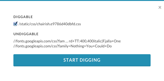
Figure 6-2. The CSS Dig modal prompt
Clicking through the prompt will instruct CSS Dig to analyze the available CSS, at which point it will present another modal that houses two tabs, Properties and Selectors, that provide information about both of those topics (Figure 6-3).
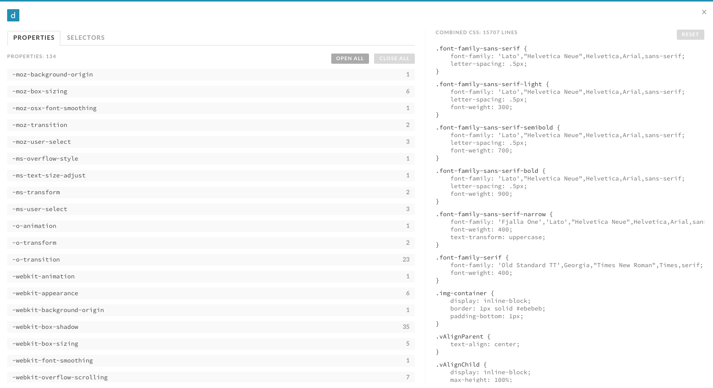
Figure 6-3. The CSS Dig Properties tab
As you’ll see in the following sections, CSS Dig is an invaluable tool that will help you whip your code into shape.
Refactoring Strategies
This section explores strategies for how to approach refactoring your CSS. But first, a warning: when possible, refactoring should be done in small, manageable chunks that get reviewed and released frequently. If a lot of code is refactored and released at one time there is more risk for regression because more things have changed. Refactoring in large chunks can also delay writing code for new features and may require complicated merges in source control that can lead to regressions if not performed correctly. If code is refactored in small chunks there will be fewer changes that can cause regressions and the changes can be tested much more easily.
In Chapter 3 we learned a bunch of techniques for writing better CSS, but it can be overwhelming to implement them in a project that already has lots of code written. The end goal should be to employ all of these ideas, which will leave you with a CSS codebase that contains normalizing, base, component, container, structural, and utility styles. The following strategies should help you implement each idea, in an order that will encourage small changes that can be deployed sooner rather than later.
Consistently Structure Rulesets
Consistently structuring rulesets over time will make development much easier. Decide on how you want to format your declaration blocks and how declarations should be ordered. One way is to keep each declaration on its own line, in alphabetical order when possible. As you modify existing CSS or write new CSS, you can then make your rulesets more consistent with little risk.
Delete Dead Code
It’s really important that you don’t leave dead code in your CSS codebase. Dead code is code that is present but doesn’t get used. In the context of CSS, it can take a couple of forms: unused declaration blocks, duplicate declaration blocks, and duplicate declarations.
Unused declaration blocks are declaration blocks that are present but never get used. Unused declaration blocks are a common occurrence because of human error; it can be difficult to keep track of which styles are used if code is written without a clear vision or lots of things have changed over time.
Duplicate declaration blocks are declaration blocks that are unnecessary because they are identical to other declaration blocks that already exist (Example 6-5). Duplicate declaration blocks usually come as a result of copying and pasting code.
Example 6-5. Duplicate declaration blocks
h1{font-size:28px;font-weight:900;}/* This is a duplicate declaration block */h1{font-size:28px;font-weight:900;}
Similarly, duplicate declarations (Example 6-6) are declarations that are identical to other declarations in the same declaration block. It’s common to have duplicate declarations in different rulesets, and this is fine because the cascade will sort things out for us (though these styles should be combined when possible). However, duplicate declarations in the same ruleset should be avoided because the last occurring declaration will be applied, rendering the ones before it useless.
Example 6-6. Duplicate declaration blocks
h1{font-size:28px;font-weight:900;font-weight:900;/* This is a duplicate declaration */}.section-title{font-size:24px;/* This is not a duplicate declaration because it appears* in a different declaration block for a different selector*/font-weight:900;}
Dead code is bad because it makes your codebase more confusing than it needs to be, which makes it more difficult to maintain. When you go to change code you’re probably pretty careful to make sure it doesn’t break anything, and this can take up a lot of your time if there are large amounts of dead CSS to wade through. On top of that, CSS gets sent from your server to the end user’s browser, so when you have lots of dead code your CSS files take longer to download, which detracts from a good user experience (especially on a slow connection).
Decouple CSS and JavaScript
Classes and IDs that are used to style elements shouldn’t be used to select them in JavaScript because it creates a dependency that makes changing those selectors difficult. Early on, CSS and JavaScript should be decoupled because it’s likely that classes and IDs will be changed and that could result in broken JavaScript.
Decoupling CSS and JavaScript is as easy as searching your JavaScript for places where elements are selected, then prepending the selector with js- and adding that selector to the HTML where the element is defined.
If you’re using a JavaScript framework, consult the framework’s documentation for how to select elements and then search for places where that’s done in your JavaScript. If your code doesn’t make use of a framework, searching for the string document.getElement should reveal where elements are being selected by either document.getElementById or document.getElementsByClassName, which should be a good starting point. Finding the HTML that contains the element being selected is as easy as searching for the original class or ID that was used in the JavaScript.
Separate Base Styles
Base styles should be the simplest styles in any website because they make use of type selectors. After analyzing a website with CSS Dig, the Selectors panel (Figure 6-4) provides a tremendous amount of insight as to when and where a selector is used.
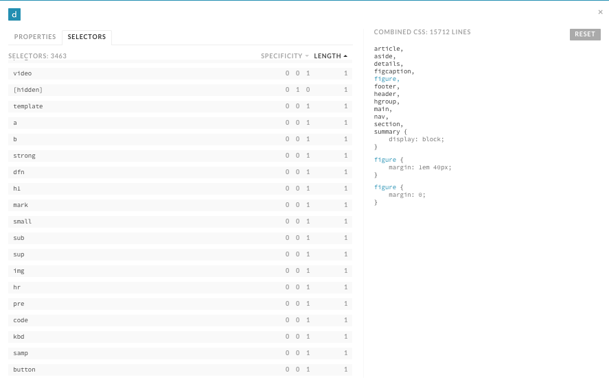
Figure 6-4. The CSS Dig Selectors panel
Make a list of your base styles as different groups:
-
Headings (
<h1>–<h6>) -
Text (e.g.,
<p>,<fig>,<code>) -
Links (
<a>) -
Lists (
<dl>,<ol>,<ul>) -
Forms (e.g.,
<form>,<legend>,<fieldset>,<input>,<button>) -
Tables (e.g.,
<table>,<thead>,<tbody>,<tfoot>,<tr>,<td>) -
Media (e.g.,
<audio>,<object>,<video>)
Once this is done you can use CSS Dig to look for selectors that fall into a particular category. After identifying how often and where the selectors are used, you can compare them and see which properties are common. If a type selector is only used alone and appears once, then it can be safely moved. However, if a type selector is used multiple times, these are the steps to follow:
-
Create a new ruleset in your base styles for the type selector whose styles are being refactored.
-
Copy the most common properties found among all uses of the type selector into the new ruleset.
-
Remove duplicative properties from other rulesets that can be inherited from the new base style.
For example, let’s assume that CSS Dig found there were multiple styles defined for the <h1> tag, as shown in Example 6-7.
Example 6-7. Multiple styles For <h1>
/* File: styles.css */h1{color:#000000;font-family:Helvetica,sans-serif;font-size:32px;line-height:1.2;}body>div>h1{color:#000000;font-size:32px;margin-bottom:12px;}.section-condensedh1{color:#000000;font-size:16px;}.order-formh1{font-family:Helvetica,sans-serif;color:#333333;text-decoration:underline;}
The first step is to create a new ruleset:
/* File: headings.css */h1{}
Next, copy the most common styles into the new ruleset:
/* File: headings.css */h1{color:#000000;font-family:Helvetica,sans-serif;font-size:32px;line-height:1.2;}
Finally, remove duplicate styles from rulesets that can instead inherit them from base styles:
/* File: styles.css */body>div>h1{margin-bottom:12px;}.section-condensedh1{font-size:16px;}.order-formh1{color:#333333;text-decoration:underline;}
If something doesn’t look right after making these changes, inspect the element with your favorite browser’s developer tools and check the CSS panel to determine where the problematic styles are coming from. If the problem cannot be rectified easily, then temporary styles with a more specific selector can be written to overcome the issue. Be sure to leave behind a comment indicating that the styles are temporary and why they are necessary. As you continue to refactor, you’ll eventually be able to remove these temporary styles.
Finally, the styles that are not included in the base styles can be scrutinized to see if they are deviating from what the styles are intended to be. If this is the case, then the styles that deviate can be removed.
Remove Redundant IDs
In CSS files, selectors with the highest specificities will make use of IDs. Selectors that have multiple IDs in them can be refactored first by eliminating everything to the left of the rightmost ID. Because IDs can be used at most once on any given page, having multiple IDs in a selector is redundant. For example, the selector in Example 6-9 will select the same element styled in Example 6-8, but it will have a lower specificity. If lowering the specificity of one element cannot be done because it is overriding styles from an even more specific selector, the more specific selector should have its specificity reduced first.
Example 6-8. Redundant IDs in a selector
#main-header>div>div>ul#main-menu{border-bottom:1pxsolid#000000;}
Example 6-9. Redundant IDs removed from a selector
#main-menu{border-bottom:1pxsolid#000000;}
Convert IDs to Classes
Once redundant IDs are removed, the remaining selectors that make use of IDs can be converted to use classes instead. This process will take some time, but in the end you’ll be left with CSS that has a much lower specificity that can be reused much more easily when needed. When changing IDs to classes remember to use meaningful names rather than cryptic or overly specific names.
When you switch to using classes, you may find that some elements are no longer styled as intended because of the decreased specificity. This can potentially be fixed by decreasing the specificity of the selectors whose styles are overriding the styles with lower specificity. However, if changes to lots of other selectors are required to fix a particular problem, then you’re probably better off not changing the ID to a class and instead waiting to refactor this piece of code until the more specific styles have themselves been refactored to have a lower specificity.
Separate Utility Styles
Utility styles are the only styles that should be making use of the !important exception. Searching your CSS for !important should hopefully turn up few results, but those that do appear and have a single purpose (hiding an element, for example) should be grouped together as utility styles. Earlier in this chapter we determined that utility styles should appear at the bottom when your CSS is concatenated, so be sure to order these styles properly when combining your files.
Styles that are not utility styles that make use of the !important exception should be analyzed using your favorite browser’s developer tools to determine why it is being used. If it turns out !important doesn’t need to be used, then it can safely be removed. However, if !important is being used to override inherited styles, then leave it alone for the time being and leave behind a comment explaining why it is being used. When the styles !important is overriding are refactored, this piece of code can be revisited and refactored, and it can safely be removed.
Define Reusable Components
Defining reusable components can be one of the most daunting tasks when refactoring CSS because there is usually a fear of not getting it right the first time. This fear is unfounded, though, because even if you don’t get things 100% right the first time, you can always revisit them in the future and make them right.
Start off by choosing one interface pattern that gets reused frequently (e.g., tabs) and spending some time surveying your website and noting the places where that pattern is used. Make note of any variations of the pattern and decide whether those variations are legitimate or came into existence as a result of inconsistent CSS. Follow the guidelines for building reusable components in “Component Styles”, and then update all of the occurrences of the pattern to use that code.
Defining reusable components aids in eliminating duplicate CSS and, usually, the remaining IDs that are used to style elements as well. When an interface pattern that could be a reusable component is written for the first time everything is great, but when a similar but slightly different pattern is defined, much of the CSS from the first occurrence is copied and tweaked to meet the needs of the newer, slightly different interface pattern. This duplication can be prevented by making use of the same component styles, but redefining them by delegating that responsibility to either a container group or structural styles.
Remove Inline CSS and Over-Modularized Classes
Removing inline CSS and over-modularized classes should be done at the same time because they’re essentially the same thing, though inline CSS that appears in the style attribute has a much higher specificity unless it is overridden using the !important exception. In both cases, this should be done later rather than sooner.
If you’ve been refactoring in the order presented in this chapter, then by now you:
-
Are on your way to having your CSS structured consistently
-
Have less dead code
-
Have decoupled your CSS from your JavaScript
-
Have established base styles
-
Have lowered your highest specificities by removing redundant IDs and converting IDs to classes
-
Have separated out utility styles and reduced the use of
!important -
Have defined reusable components
After all of that, you now have a place to migrate inline styles to—if you have any left! Had you removed inline CSS earlier on, you would have needed to temporarily place it in interim classes at the end of your stylesheets and possibly use !important to ensure it maintained specificity. If you wait, though, all you have to do is search your HTML for inline styles and either remove them if they are no longer needed or move them into the appropriate places in your stylesheets. Again, inline styles that deviate from base and component styles should be investigated to determine if this was a result of inconsistent design or coding. If this is the case, then the inline styles can safely be removed. If the variation is intentional, then the styles should likely be used to modify an element via its container.
Segregate Browser-Specific CSS Hacks
Not all browsers are created equal, and as a result it’s easy to pollute CSS with hacks to get around browser limitations. But before you segregate browser-specific hacks, remember to look at your website’s traffic and determine if you can drop support for that browser instead. Deleting browser hacks is much easier and more satisfying than refactoring this code into its own home. In the event that you cannot drop support for a browser, all you need to do is style an element specifically for that browser using the conditional comment technique from Chapter 4.
Measuring Success
After everything we’ve learned, it’s important to understand how success can be determined so there are achievable goals to strive for when refactoring. Following are a number of ideas for how success can be measured after refactoring CSS. Some of the recommendations here, like inspecting file sizes, should also be done before refactoring so they can be compared with the results after.
Is Your Website Broken?
The first and most obvious way to determine success after refactoring code is to find out if its behavior has changed in a negative way. Remember, refactoring is the process of rewriting code to make it simpler without changing its behavior. In Chapter 5 we discussed using multiple browsers to test by hand as well as testing visual regressions through taking screenshots. If no visual regressions are detected after thorough visual inspection, then it’s time to consider some of the other aspects.
Low coupling
Quality CSS is decoupled from the structure of the HTML it is used in. You can decouple your CSS from your HTML by creating reusable components and containing elements, using the strategies found in Chapter 4. While there is always going to be some degree of coupling, avoiding overly complex selectors is a reasonable goal to strive for. Tools like CSS Dig can help you sniff out complex and overqualified selectors that should be made more general. Audit your site and inspect your selectors to see where improvements are necessary.
Low specificities
We learned in Chapter 2 that CSS specificity and ruleset order are used to determine which styles are applied to an element. We also learned strategies in Chapter 4 that can and should be used to decrease overall CSS specificity. Selector specificity is a metric that can be measured and used to determine if a CSS codebase contains an abundance of selectors with high specificities that will be difficult to maintain. Tools like CSS Dig can sort selectors by this characteristic.
Fewer files and smaller file sizes
We learned earlier in this chapter that concatenation and minification should be used when serving CSS files to end users—concatenation reduces the number of files that need to be downloaded, and minification reduces the file size by removing unnecessary characters. Both of these processes result in faster downloads, which in turn results in faster page load times. To measure this metric you can simply compare the sum of all CSS file sizes before refactoring with the sum of all CSS file sizes after refactoring.
Number of UI Bugs
Once you begin refactoring your CSS and making use of coding standards, the number of UI bugs as a result of messy or duplicative code should decrease. As we learned in Chapter 5, implementing a UI pattern library and monitoring visual regressions using screenshots are great ways to ensure the user interface is built using code that has been tested thoroughly and is monitored for regressions over time. Software bugs are inevitable—they can be introduced by website developers, or browser issues can be introduced by browser makers—but using a pattern library and visual regression testing are surefire ways that you’ll be able to detect and diagnose these issues faster than you might be able to otherwise.
Reduced Development and Testing Time
After logically organizing your CSS into multiple files, establishing coding standards, and creating a UI pattern library you will hopefully be able to build and maintain user interfaces faster than ever. This metric is highly individual, because some interfaces are much more complicated than others, which means they will take more time to build. For the most part, though, you’ll probably be able to tell if your development time has decreased as a result of refactoring and enhancing your workflow.
In addition to reducing the time spent in development, you might also notice that you’re able to test your interfaces much faster than before if you have the right tools at your disposal. Again, all of the methods for testing that we discussed in Chapter 5 should help you test your interfaces more quickly with a higher level of confidence.
Chapter Summary
In this chapter we discussed how CSS should be organized, strategies for refactoring your code, and how to measure success. Remember that when using these strategies it’s important to use them over time rather than all at once, so changes can be released in smaller, more controlled chunks. When you begin implementing the strategies described in this chapter you’ll be on your way to building a CSS codebase that adheres to all of the tenets of good architecture.