Table of Contents for
CSS Refactoring
 CSS Refactoring
Published by
O'Reilly Media, Inc., 2016
CSS Refactoring
Published by
O'Reilly Media, Inc., 2016
Chapter 3. Writing Better CSS
“Best practices” is a contentious term when it comes to writing CSS because there are so many different ways to accomplish the same thing, and the preference for one technique over another can be very subjective. However, as Chapter 1 explained, a good architecture is predictable, maintainable, extensible, and promotes code reuse. The ideas presented in the following sections keep this definition in mind and are intended to provide a solid foundation from which you can write better CSS.
Use Comments
Comments provide documentation that is helpful when looking at a file in the future. Comments should be used to document things including:
-
File contents
-
Selectors’ dependencies, usages, etc.
-
Why certain declarations were used (this is especially helpful in regard to browser quirks)
-
Deprecated styles that are being refactored and should no longer be used
CSS only has block-level comments (comments that can span multiple lines), and they begin with /* and end with */. In the event that a comment only needs one line, that can be done, but it must still begin with /* and end with */. Here are some examples of comments:
/** Styles for main navigation links.** @see templates/_navigation.html*/.nav-link{padding:4px;text-decoration:none;}.nav-link:hover{border-bottom:4pxsolid#000000;/** prevents addition of the 4px bottom border* from making the element shift*/padding-bottom:0;}/* @deprecated */.navigation-link{color:#1200FF;}
Consistently Structure Rulesets
Rulesets can be written all on one line or they can be formatted to use multiple lines. Example 3-1 shows what a ruleset looks like on one line, and Example 3-2 shows what it looks like on multiple lines. Rulesets can even have their curly braces on new lines, as seen in Example 3-3.
Example 3-1. CSS ruleset on one line
selector{property1:value;property2:value;property3:value;}
Example 3-2. CSS ruleset on multiple lines
selector{property1:value;property2:value;property3:value;}
Example 3-3. CSS ruleset with braces on multiple lines
selector{property1:value;property2:value;property3:value;}
Writing rulesets consistently makes your CSS more predictable, which in turn makes it easier to understand.
While it’s certainly a matter of preference, my preference is for each ruleset to have each declaration on its own line like in Example 3-2. Additionally, I like keeping CSS properties in alphabetical order; this makes things even more predictable by making it easier to find any given property.
Organize Properties with Vendor Prefixes
A vendor prefix is a string that browser makers prepend to new and experimental CSS properties before their behavior is standardized. Typically the prefixes are -webkit- for browsers that use the Blink or WebKit rendering engines (Chrome and Safari), -moz- for browsers that use the Gecko rendering engine (Firefox), and -ms- for browsers that use the Trident rendering engine (Internet Explorer/Edge). When a property is standardized there is no prefix appended to it.
For example, transform-origin is one such property. transform-origin allows you to modify the origin at which transformations (like rotations and translations) occur on elements. In order to use it today, vendor prefixes should be used with the standardized version as a fallback:
-ms-transform-origin: @origin;
-moz-transform-origin: @origin;
-webkit-transform-origin: @origin;
transform-origin: @origin;
The order of these properties is very important because as the browser applies properties in a declaration block from top to bottom, it ignores the ones it does not recognize and applies the ones it does. This means that placing a non-prefixed standard CSS property before its vendor-prefixed version could result in it being overridden on browsers that support both.
Old browsers that do not support a new property or any of its vendor-prefixed versions will simply ignore them. Other old browsers that only support the vendor-prefixed version of the new property will apply the appropriate one and ignore the standard non-prefixed version. Newer browsers that continue to support the vendor-prefixed version of a new property for backward compatibility, but also support the standard non-prefixed version, can apply both. Finally, modern browsers that have dropped support for the vendor-prefixed version of a property and only support the standard non-prefixed version will ignore the vendor-prefixed version and apply the standard version.
Since it may take some time for all users of a particular browser to upgrade, both the prefixed and unprefixed properties should remain until that browser is no longer supported by your website.
Feature Flags
Vendor-prefixed CSS properties can be burdensome to maintain because they notoriously bloat stylesheets. To combat this, many browser makers have made the switch to using opt-in features so developers can experiment with bleeding-edge CSS properties. If your website is still visited by people using older browsers and you need to support them, however, you may want to continue to maintain those vendor-prefixed CSS properties.
Keep Selectors Simple
Selectors can be made very complex by stringing lots of different selectors and combinators together. However, just because selectors can be very specific doesn’t mean they should be. Consider the code in Example 3-4.
Example 3-4. CSS that selects a very specific element
<!doctype html><html><head><title>Keep Selectors Simple</title><styletype="text/css">div>nav>ul>li>a{color:#1200FF;}</style></head><body><div><nav><ul><li><ahref="./policies.html">Policies</a></li></ul></nav></div></body></html>
The code in Example 3-4 styles a very particular anchor tag because of its use of multiple child combinators (>). This isn’t a great way to style the anchor tag element because the selector being used is highly dependent on the HTML structure present on the page. Should something change within that HTML structure, the desired styles will no longer be applied. Instead, adding a class to the HTML element and styling that class is a better solution, as illustrated in Example 3-5.
Example 3-5. HTML hierarchy with an added class
<!doctype html><html><head><title>Keep Selectors Simple</title><styletype="text/css">a.nav-link{color:#1200FF;}</style></head><body><div><nav><ul><li><ahref="./policies.html"class="nav-link">Policies</a></li></ul></nav></div></body></html>
Now that all of the complicated child selectors have been removed, in Example 3-5 the class selector is used to select elements with the class nav-link. However, the selector a.nav-link is still more specific than it needs to be: it’s said to be an overqualified selector because it can only be used on anchor tags.
As can be seen in Example 3-6, the selector can be simplified further.
Example 3-6. A simplified selector
.nav-link{color:#1200FF;}
Simplifying the selector as much as possible, as shown here, is beneficial because it means these styles are no longer dependent on the HTML structure being used and the CSS file size will be slightly smaller. Should this element need to be styled differently than it is in Example 3-6, this can be done in in relation to its parent container (e.g., .parent-container .nav-link { color: #FF0000; }), which not only styles the element differently, but also provides context for when those styles should apply.
However, there are times when qualifying selectors is appropriate—for example, when applying a class to one element results in a different behavior than it would when applied to a different element.
In Example 3-7, the error class makes text red. When styling inputs, though, the design might call for both the text and the border to be red without changing the styles of other elements that share the error class. Because input.error is as specific as it needs to be to style an input element’s text and border color, it is considered a qualified selector as opposed to an overqualified selector.
Example 3-7. Acceptable qualified selectors
.error{color:#FF0000;}input.error{border-color:#FF0000;}
Performant Selectors
Less complex selectors are more performant than complicated selectors; however, as computers continue to get faster and browsers continue to be optimized, most of the time selector performance shouldn’t be something to stress out about. Simple selectors should be preferred because they are more reusable and easy to understand, not because they are noticeably more efficient. Following the guidelines in this book should help you avoid selector performance anxiety, but having a general idea of how selectors work is still worthwhile.
Matching selectors from right to left
Web browsers need to be able to select elements and apply styles quickly so the web page can be used as soon as possible. The browser matches selectors from right to left so it can eliminate elements that don’t match up front, rather than wasting time checking elements that might match. To illustrate this concept, take a look at Example 3-8, which contains some markup that houses a .nav-link and a strong element.
Example 3-8. A simple HTML hierarchy
<!doctype html><html><head><title>Another Example</title></head><body><div><nav><ul><li><strong>Not a Link</strong></li></ul></nav></div><div><nav><ul><li><ahref="#"class="nav-link">Link</a></li></ul></nav></div></body></html>
If the anchor tag is selected using the selector div > nav > ul > li > a and the browser tried to match elements (excluding <!doctype>) from left to right, it would need to:
-
Iterate through each element to see if it is a
<div>element. -
Check each
<div>that was matched in step 1 to see if it has a<nav>element as a child. -
Check each
<nav>element that was matched in step 2 to see if it has a<ul>element as a child. -
Check each
<ul>element that was matched in step 3 to see if it has an<li>element as a child. -
Check each
<li>element that was matched in step 4 to see if it has an<a>element as a child. -
Apply the styles to the one
<a>element that was found.
On the other hand, if the same selector (div > nav > ul > li > a) is matched from right to left the browser will need to:
-
Iterate through each element to see if it is an
<a>element. -
Check if each
<a>element matched in step 1 has an<li>element as a parent. -
Check if each
<li>element matched in step 2 has a<ul>element as a parent. -
Check if each
<ul>element matched in step 3 has a<nav>element as a parent. -
Check if each
<nav>element matched in step 4 has a<div>element as a parent. -
Apply the styles to the
<a>element that matches the selector.
While the number of steps is the same, the big difference is that when matching the selector from left to right both <div> elements need to be traversed. By matching the selector from right to left the browser is able to eliminate entire hierarchies of elements that do not contain an anchor tag. To make things even more performant the anchor tag can be selected by its class, .nav-link, so all the browser has to do is iterate through each element and check if it has that class.
With this very general understanding of how browsers parse selectors, we can analyze a more extreme (and easy-to-avoid) example.
The key selector
The code in Example 3-9 selects any element that is an ancestor of the <body> tag. Parsing the selector from right to left effectively selects each element on the page and traverses its ancestors to see if one is the <body> tag. This is extremely inefficient because almost every visible element is a descendant of the <body> element.
Example 3-9. Universal selector ancestor example
body*{font-size:12px;}
As previously described, the browser will match elements from right to left so it can eliminate elements that don’t match the selector sooner rather than later. The rightmost part of a selector is known as the key selector, so in Example 3-9 this makes the universal selector * the key selector.
When the universal selector is used by itself to apply styles to all elements (* {} ), the browser can do so fairly quickly because it only has to match every element on the page. However, when the universal selector is used in conjunction with another selector and a combinator (the ancestor combinator in Example 3-9), the browser will have to do much more work to match the appropriate elements. This can be avoided by only using the universal selector by itself rather than with combinators and other selectors.
Decouple CSS and JavaScript
JavaScript and CSS can become intertwined because both depend on the classes and IDs that are present on HTML elements. Additionally, because JavaScript can modify an HTML element’s styles it can be easy for the responsibilities of these two languages to become muddled. In order to separate the concerns of CSS and JavaScript, classes and IDs used to select elements in JavaScript should not be used to style elements. Similarly, when element styles need to be modified by JavaScript it should be done by adding and removing classes.
Prefix Classes and IDs that Are Used in JavaScript
It’s fairly common to find HTML that includes classes that are not only used to style elements with CSS, but also used by JavaScript as selectors. It’s also fairly common to see classes and IDs added to elements that are only intended to be used to select elements with no intention of styling them. Classes and IDs that are present in HTML but not used in CSS can make it more difficult to find the styles that are needed to change the appearance of an element. Similarly, JavaScript can break if a class name is changed to more accurately reflect what is being styled without the change to the class name also being made in JavaScript.
A simple fix for this is to prepend the names of classes and IDs that are only intended to be used for JavaScript with js-. For example, if a tab group related to policies needed to be selected in JavaScript, the ID js-tab-group-policies might be used. By only using classes and IDs that are prepended with js- for JavaScript selectors, any dependencies that may exist between JavaScript and CSS can be eliminated.
Modify Element Styles with Classes
Element styles can be modified by JavaScript, and many libraries (like jQuery) make it fairly trivial. However, changing styles in JavaScript usually means adding inline styles to an element via its style attribute, which makes those styles among the most specific. Additionally, modifying styles in JavaScript means that the JavaScript is aware of specific CSS styles, which seems to be out of the scope of its responsibility. In the event that the styling of an element needs to be changed, not only will CSS files need to be searched for existing styles, but JavaScript files will also need to be included in that search.
Instead of modifying the styles of an HTML element by adding them to its style attribute with JavaScript, classes should be added to or removed from the element. Not only will the appropriate styles be applied, but the CSS rulesets used will continue to be appropriately organized with the rest of the website’s CSS.
Use Classes
Classes and IDs are an easy means to identify elements in the DOM that should have certain styles applied to them. Classes can be reused as many times as needed on a page, and they have a fairly low specificity so they can be overridden easily. IDs, on the other hand, are almost exactly the opposite; they have a very high specificity, so they cannot be easily overridden and they should be used at most once per page. When writing CSS for a website that is ever-changing, elements should be styled by using classes.
Exclusively using classes is one of many ideas that divide frontend developers. One argument against only using classes is that IDs are not only valid, but helpful in enforcing that some HTML constructs are only used once. For example, if a website is built that has a two-column page wherein one column is a sidebar and the other houses the page content, the following selectors might be used:
#content{/* #content styles go here */}#sidebar{/* #sidebar styles go here */}
The use of IDs implies that these elements will each be used at most once on the page. However, what if at some point the page needs to be modified so the content is displayed between two identically styled sidebars? Either the second sidebar would need new CSS that gets applied with a new ID or class, or #sidebar could be changed to use a class so its styles can be reused.
Elements that would benefit from using a unique ID can make use of a unique class name instead, and the same goal can be achieved. If it turns out in the future that that styling needs to be reused, it can be without change. Realistically, in most cases there isn’t even a noticeable performance difference between using classes and IDs in regard to CSS.
Tip
IDs are the fastest way to select elements in JavaScript, and not using them to style elements is another good way to decouple CSS from JavaScript, much like prefixing classes and IDs with js-.
Assign Classes Meaningful Names
Meaningful class names provide context by expressing what is being styled without giving so little detail that it’s ambiguous, but also without giving so much detail that it hinders code reuse.
In Example 3-10 a class is used to select an element, but what is a? Cryptic class names are confusing. Maybe .a is intended to signify “animal.” If so, that would have been a better choice, because .animal explains exactly what the element is intended to represent.
Example 3-10. A declaration block with a cryptic class name
.a{width:200px;}
However, while it’s important to be descriptive, it’s just as important not to overdo it. What if instead of animal, the class name was female-black-and-white-kitten? Technically it could be reused, but this class name is far too specific because other animals might be displayed using the same styles, and this class name might not accurately describe the animals being displayed. .animal is a much better class name because it’s descriptive enough that it’s easy to understand what is being styled, but it’s also generic enough that it can describe any type of animal that should be styled similarly, be it male or female, young or old, or an animal that’s not a kitten.
Avoid Over-Modularized Classes
Meaningful class names describe the element that is being styled rather than describing the styles being applied to the element. Have you ever seen a piece of HTML that looks like Example 3-11?
Example 3-11. Over-modularized classes
<h1class="font-bold uppercase blue-text margin-bottom-large no-padding">Too Many CSS Classes</h1>
These classes describe how the element is being styled rather than what is being styled. Additionally, these classes are said to be suffering from over-modularization—because each class only applies one style, they will always need to be used together. Over-modularized classes should be avoided because they aren’t much better than using inline styles, like in Example 3-12.
Example 3-12. Inline CSS
<h2style="font-weight: bold; text-transform: uppercase; color: #1200FF;margin-bottom: 20px; padding: 0">Too Many CSS Classes</h2>
Instead these styles should be grouped together using a meaningful class name that describes what is being styled, like in Example 3-13. Once that is done, the HTML is much more readable because it is styled using one succinct class name, like in Example 3-14.
Example 3-13. A class that describes what is being styled
.section-title{color:#1200FF;font-weight:bold;margin-bottom:20px;padding:0;text-transform:uppercase;}
Example 3-14. A class that groups over-modularized classes together
<h2class="section-title">Too Many CSS Classes</h2>
Build a Better Box
The box model is the method by which a browser determines how to render a rectangle. It is important to understand how the box model works because all HTML elements are essentially boxes, and this knowledge can be the difference between everything fitting together properly or not.
Figure 3-1 displays an element that has a set width, height, padding, margin, and border (the color coding for margin and padding are purely illustrative). This box can be generated using the code in Example 3-15.
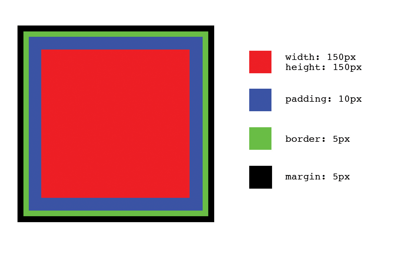
Figure 3-1. An element with a set height, width, padding, margin, and border
Example 3-15. Code for the box in Figure 3-1
<!doctype html><html><head><title>Determining Dimensions with the Box Model</title><styletype="text/css">.example-element{background-color:#FF0000;border:5pxsolid#000000;display:block;height:150px;margin:5px;padding:10px;width:150px;}</style></head><body><divclass="example-element"></div></body></html>
The dimensions for this box can be calculated in one of two ways, depending on the value assigned to the element’s box-sizing property. In each of the following scenarios margin will affect the spacing around the box, but it is not taken into consideration when calculating its size.
box-sizing: content-box
When the box-sizing property is assigned the value content-box, the dimensions of the box are calculated by adding the padding and border dimensions to the element’s height and width dimensions. For example, if the dimensions of the box in Figure 3-1 are calculated this way, the box’s computed dimensions will be 180 px tall by 180 px wide because:
  150px height
+  10px padding-top
+  10px padding-bottom
+   5px border-top
+   5px border-bottom = 180px computed height

  150px width
+  10px padding-left
+  10px padding-right
+   5px border-left
+   5px border-right = 180px computed width
box-sizing: border-box
When the box-sizing property is assigned the value border-box, the dimensions of the box are based solely on the box’s width and height properties. This means that despite the padding and border applied to the box in Figure 3-1, the computed dimensions of the box will be 150 px tall by 150 px wide because those are the dimensions set for the height and width properties; the browser will take padding and border into account and resize the height and width properties appropriately, so the total dimensions equal those set by the height and width properties. In this case:
  150px computed height
-  10px padding-top
-  10px padding-bottom
-   5px border-top
-   5px border-bottom = 120px implicit height

  150px computed width
-  10px padding-left
-  10px padding-right
-   5px border-left
-   5px border-right = 120px implicit width
content-box or border-box?
Given that there are two different ways to calculate the dimensions of a box, it’s reasonable to wonder which should be used and when. Neither content-box nor border-box is “better” than the other, but many find border-box to be a bit more intuitive as it describes the total height and width of an element from border to border, rather than just the dimensions of the content.
box-sizing can be set on any element, so it is possible to mix and match when border-box and content-box are used, but for consistency’s sake it’s usually preferable to choose one and stick with it. This can be accomplished by setting the appropriate value using the universal selector:
*,*:after,*:before{box-sizing:border-box;}
Chapter Summary
The concepts in this chapter have laid another piece of the groundwork for when we begin refactoring. Understanding how to write better CSS before we refactor will make refactoring much easier. Next we’ll explore the intentions that styles can have and how they can help with code reuse. When reading the next chapter, keep the ideas from this chapter in mind because they will help you make decisions that can simplify your CSS tremendously.