Table of Contents for
CSS Refactoring
 CSS Refactoring
Published by
O'Reilly Media, Inc., 2016
CSS Refactoring
Published by
O'Reilly Media, Inc., 2016
Chapter 5. Testing
Testing CSS can be difficult because there are so many different platforms, screen sizes, and form factors that need to be tested. This chapter explores how to determine which browsers and devices need to be tested as well as a number of different ways to test and maintain your CSS. By the end of this chapter you should have a better idea of how to approach testing your CSS, which will result in a higher level of confidence when making changes.
Why Is Testing Difficult?
Thoroughly testing CSS changes can take a long time and requires a lot of different tools.
There are many factors to consider, including:
-
Which browser is the page being tested on?
-
How do you test various browsers on different operating systems?
-
What size is the window that the page is being viewed in?
-
How can a large number of pages be tested quickly?
-
How do you verify that what you’re seeing is correct?
-
How can a website be tested on other devices if you don’t have access to those specific devices?
Which Browsers Are Important to Test?
Before testing, it’s important to know which browsers should be tested. Ideally you will only need to support browsers that are being used to view your website by a minimum number of people (the particular threshold can vary from company to company). You can identify these fairly easily by using an analytics tool that breaks down all of the browsers and devices and the versions of each that are used by the website’s visitors.
Browser Market Share
It’s important to support all of the major browsers that have been released in the past couple of years. Recent versions of Chrome, Firefox, Safari, Microsoft Edge (formerly Internet Explorer), and their mobile counterparts have done a great job of being standards-compliant, so there is less fragmentation in browser behavior than there once was. Each of these browsers offers automatic updates too, which means that as time goes on more people will have up-to-date modern browsers.
Unfortunately, though, some people still use old browsers. For example, at the time of writing the top three most used versions of Microsoft Edge/Internet Explorer according to NetMarketShare were Internet Explorer 11, Internet Explorer 8, and Edge 13, in that order (Figure 5-1).
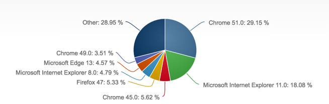
Figure 5-1. Desktop browser market share in July 2016, according to NetMarketShare
If your website isn’t being frequented by people using old browsers, then you probably don’t have to worry about maintaining your code for them. However, if older browsers account for a sizeable percentage of your traffic, then you might want to consider supporting them, especially if your website is generating revenue.
Accessing Browser Statistics and Screen Resolutions in Google Analytics
Google Analytics is a freemium service offered by Google and is one of the most commonly used analytics packages; it tracks website traffic, user behavior, and much more. Let’s look at two pieces of information that are important to refactoring CSS: browser information and screen resolutions.
Finding Browser Statistics and Screen Resolutions in Other Analytics Tools
If you’re using something other than Google Analytics you might still be able to get data about the browsers and screen resolutions being used to view your website. Please refer to your analytics tool’s documentation for more information.
Browser information
At the time of writing, browser information can be found in Google Analytics in the Audience → Technology → Browser & OS menu when “Browser” is selected as the primary dimension (Figure 5-2). Once there, clicking on a browser will reveal the statistics for each version of that browser that has visited your website, as seen in Figure 5-3. This information will provide the necessary information to determine which browsers are being used to view your website. If you find that you’re spending a considerable amount of time writing CSS to support an old browser that very few people are actually using to view your site, you should consider dropping support for that browser.
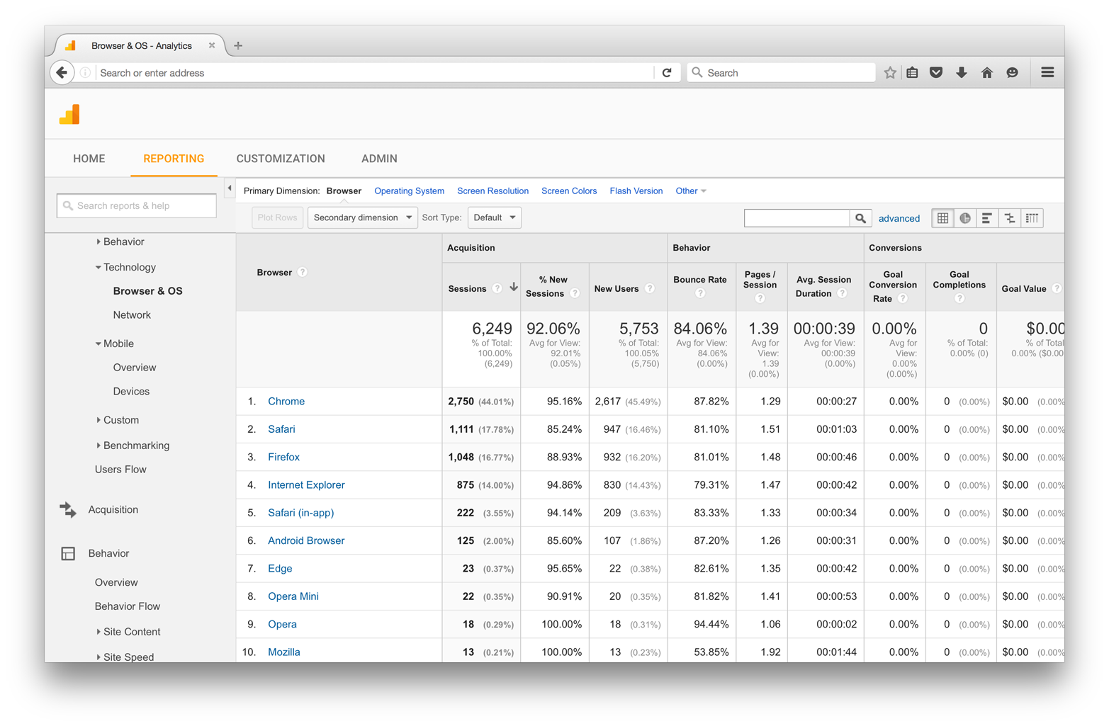
Figure 5-2. The Browser & OS screen in Google Analytics
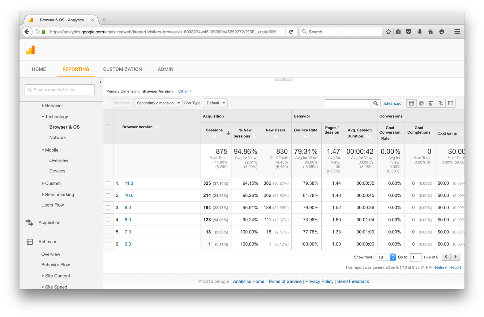
Figure 5-3. The breakdown of browser versions in Google Analytics
Screen resolutions
Information on screen resolutions can also be found in Google Analytics in the Audience → Technology → Browser & OS menu, when “Screen Resolution” is selected as the primary dimension (Figure 5-4). This data indicates the screen sizes at which your website is being viewed and can be helpful in determining the most common use cases that should be designed for.
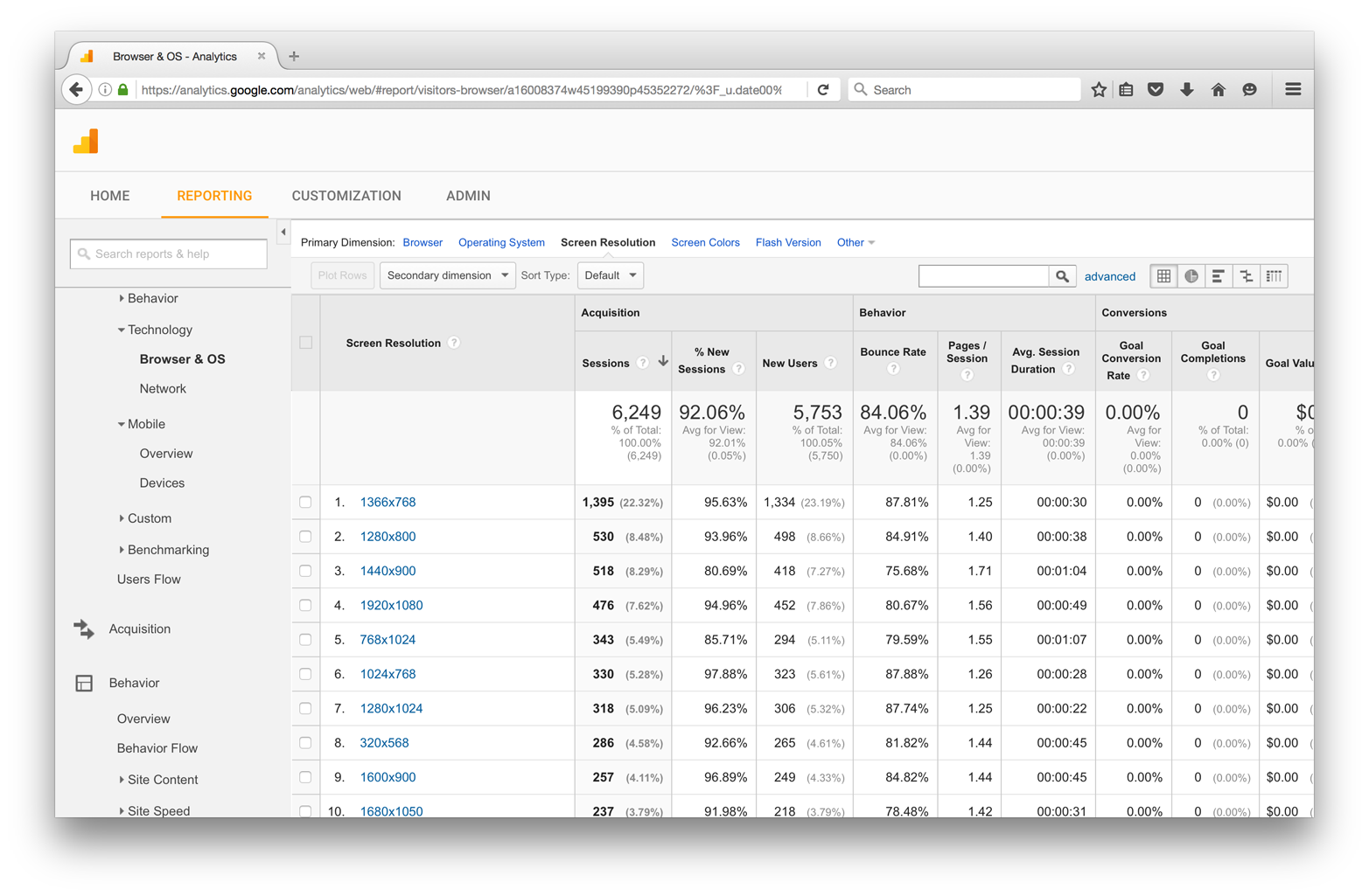
Figure 5-4. Screen resolutions in Google Analytics
Testing with Multiple Browsers
The most common way to test CSS across browsers is to do so manually. You’ll probably want to download all of the major mainstream browsers:
For mobile testing, you’ll need to download browsers from the appropriate marketplace for your device.
Safari for iOS
Safari for iOS can be tested using the native application on an iOS device or the iOS Simulator for Xcode. You can download Xcode for free from the Apple App Store (Figure 5-5), but unfortunately Xcode only runs on Mac OS; it cannot be installed on Windows.
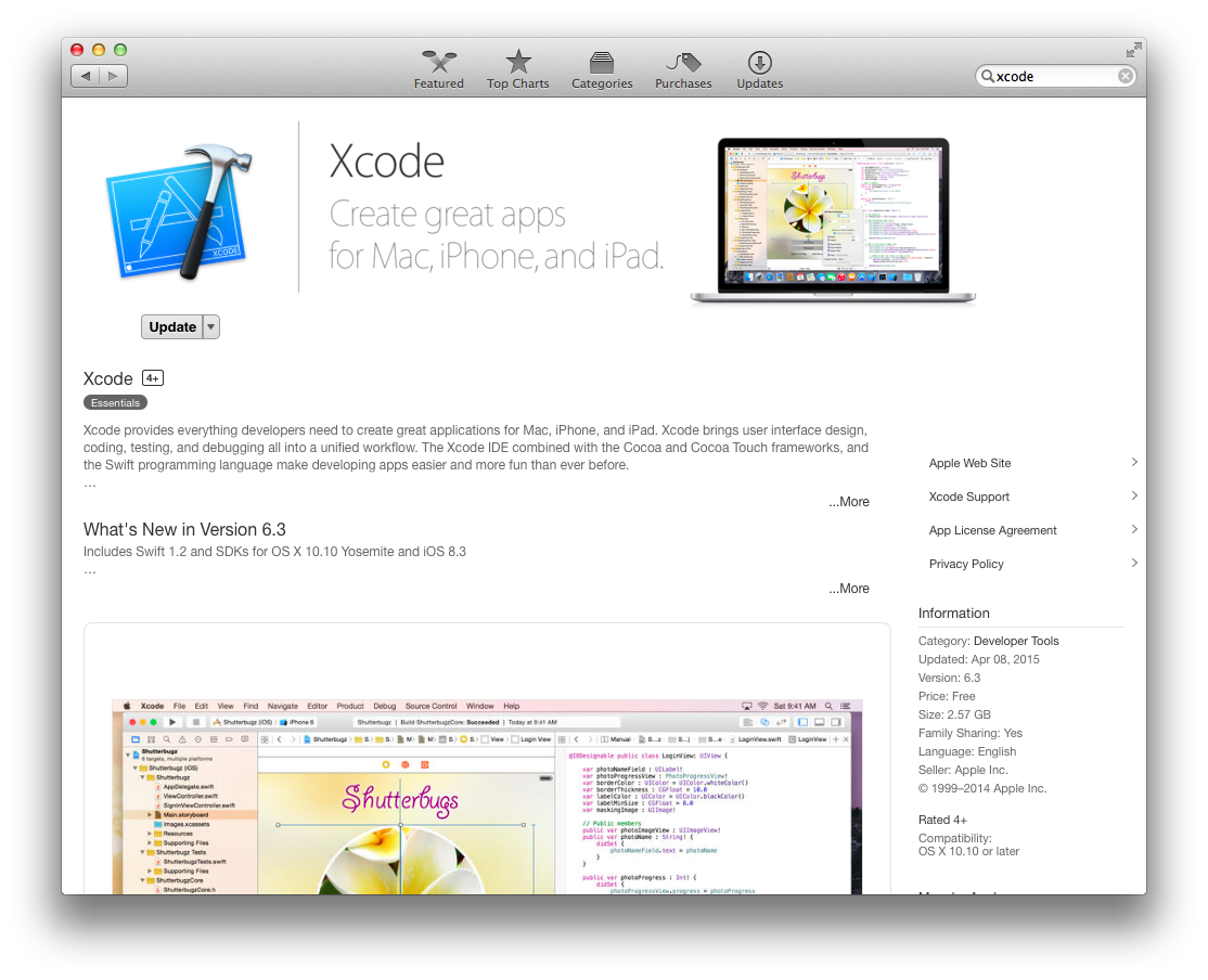
Figure 5-5. Xcode in the App Store
Once you’ve installed Xcode, you can open the iOS Simulator by navigating to Xcode → Open Developer Tool → iOS Simulator. Once the iOS Simulator is running, you can launch Safari and view websites (Figure 5-6).
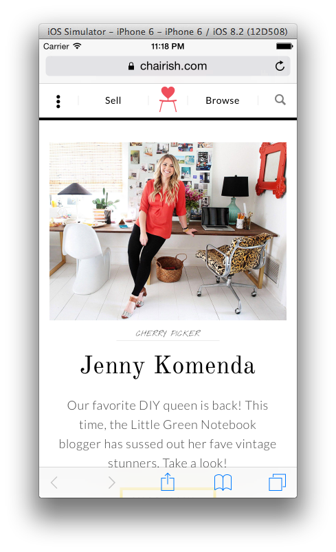
Figure 5-6. Emulating Safari in iOS Simulator
Android
Android devices can be tested in emulators using Android Studio (Figure 5-7), which you can download for free at http://developer.android.com.
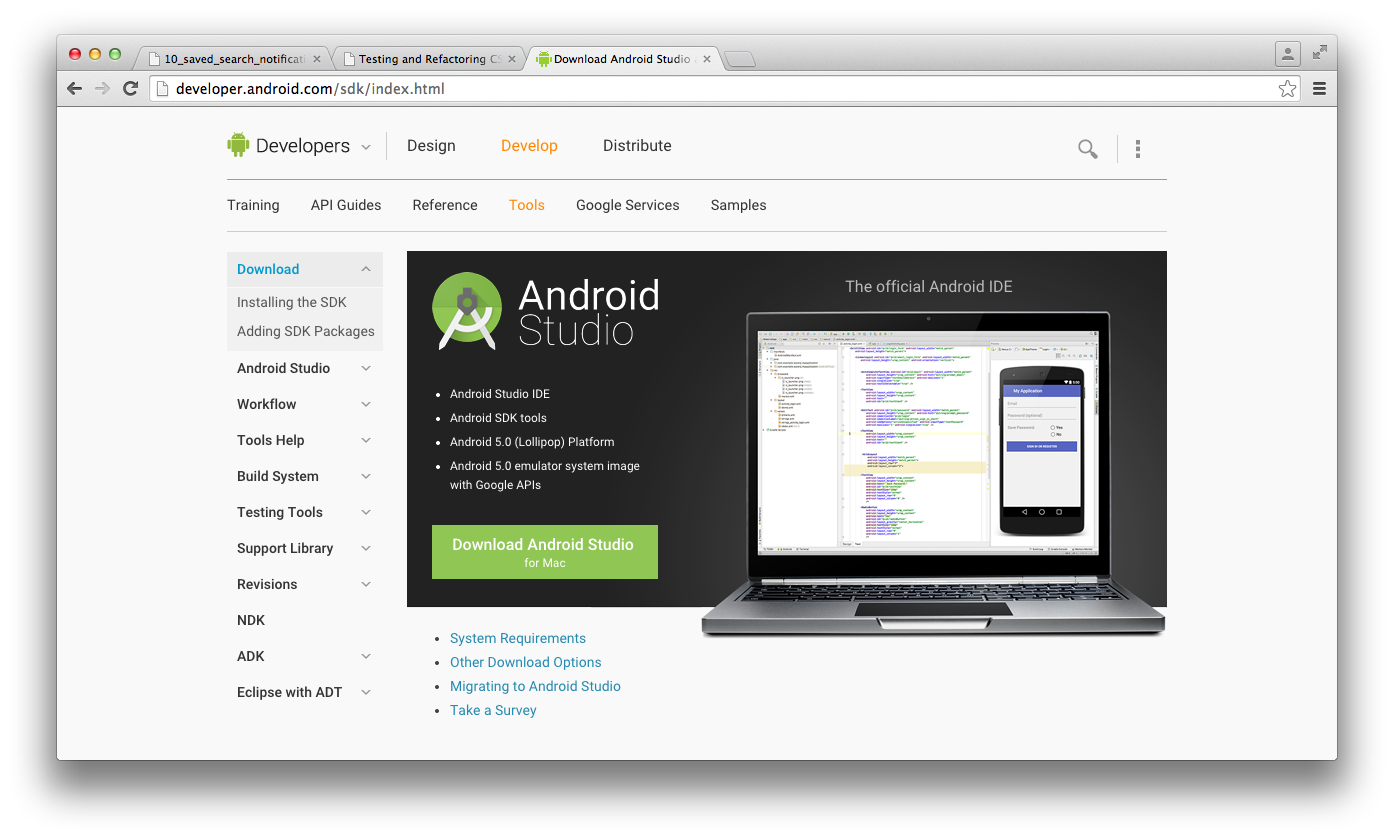
Figure 5-7. The Android Studio landing page
Once you’ve installed Android Studio, you can create and launch emulators by creating an empty project and then selecting an emulator from the Tools → Android → AVD Manager menu (Figure 5-8).
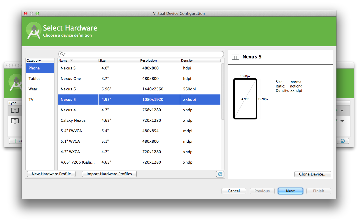
Figure 5-8. The Android Virtual Device Manager
Once you’ve launched an emulator you can launch a web browser from within the simulated device, much like in iOS Simulator, and use it to view websites (Figure 5-9).

Figure 5-9. Emulating an Android device
Testing with Old Versions of Browsers
Earlier in this chapter we learned how to use analytics packages to determine if your website is being frequented by people using out-of-date browsers. In some instances, you might be able to drop support for these browsers—but if you can’t, you’ll need to ensure that your browser works well for this demographic. The following sections contain information on how to test your website on older browsers.
Internet Explorer and Microsoft Edge
You can download Microsoft Edge and old versions of Internet Explorer for testing purposes at https://www.modern.ie. These browsers come as virtual machines that can be run on VirtualBox, VMWare, or Parallels. A virtual machine is a piece of software that emulates an operating system, and Virtual Box, VMWare, and Parallels are programs that can run virtual machines. Virtual machines are especially helpful because programs like Internet Explorer that were compiled to run specifically on one operating system will not run on another.
Firefox
You can download old versions of Firefox at https://support.mozilla.org/en-US/kb/install-older-version-of-firefox. Testing an old version of Firefox is as simple as finding the version you need to test, downloading it for your operating system, and then viewing the website in that browser. If you’re not developing on Windows but you are making use of the Internet Explorer virtual machines, you can also download older versions of Firefox for Windows within the virtual machine to test on that platform.
Safari and Safari for iOS
Testing old versions of Safari unfortunately requires having access to an older version of Mac OS, because Safari uses the WebKit framework found in OS X to render web pages. However, testing old versions of Safari for iOS can be done using the Xcode simulator by choosing the Hardware → Device → Manage Devices menu option and creating a new simulator with the desired operating system in the Devices window (Figure 5-10).
For more information about the iOS Simulator, see the Simulator User Guide.
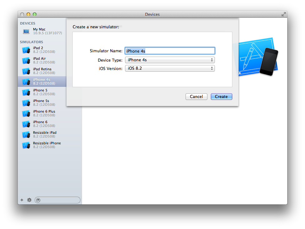
Figure 5-10. Creating a new simulator in the iOS Simulator
Testing the Bleeding Edge
If you’re interested in seeing what’s coming in the next version of Chrome, Firefox, or Safari, you can keep abreast of changes with their nightly releases:
Microsoft does not provide nightly releases for Edge, but it does provide frequent early releases to members of the Windows Insider Program.
Third-Party Testing Services
An alternative to testing your website by maintaining multiple operating systems with lots of browsers and emulators is to use a third-party service. Many services are available that will allow you to test a website on any browser or form factor while providing features like sharing test sessions, manual testing on various browsers, taking screenshots, and more. Here’s a selection, some of which offer a free trial or have a free tier:
Testing with Developer Tools
Each of the major browsers comes with its own set of developer tools that are there to help developers make their websites better: a number of tools are provided with each suite, each of which accomplishes a different task, but in this section only those that are relevant to testing CSS during development will be discussed.
Ever-Changing Dev Tools
The instructions given here are accurate at the time of writing, but browser dev tools are constantly changing. If you find that the inevitable changes render any of the following information obsolete, please refer to the websites referenced in the preceding list for more information.
Emulating Device Sizes
Testing multiple form factors (i.e., phones, tablets, etc.) can be done by buying lots of devices, but that can get expensive quickly. Another option is to use browser developer tools to emulate the desired device dimensions. Device size can be emulated by resizing the browser window, but it’s quicker to use preset dimensions. Google Chrome comes with a number of predefined dimensions that are available in the DevTools Device Mode menu.
You can access the Device Mode menu by:
-
Right-clicking anywhere on the page
-
Selecting “Inspect Element” to open Chrome DevTools
-
Clicking the Toggle Device Mode icon (Figure 5-11)

Figure 5-11. Chrome’s Toggle Device Mode icon
When you’re in Device Mode, a toolbar appears at the top of the window that provides preset device dimensions and the ability to set your own (see Figure 5-12).
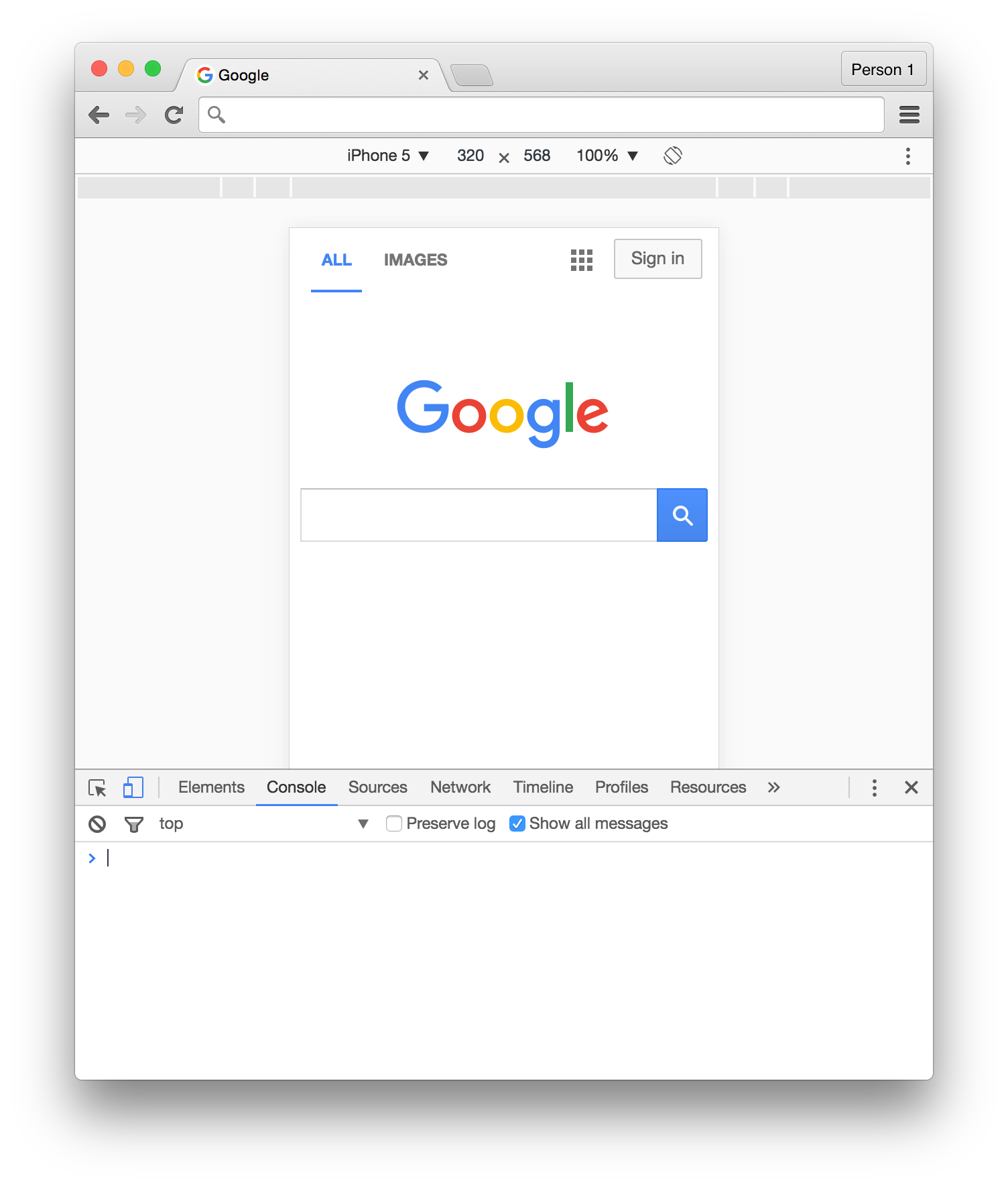
Figure 5-12. Device emulation in Chrome DevTools
Device size can be emulated in Firefox by entering Responsive Design mode from the Tools → Web Developer menu (Figure 5-13).
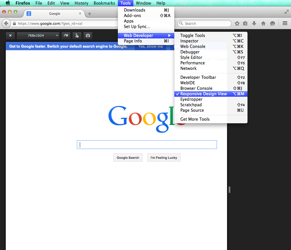
Figure 5-13. Firefox’s Responsive Design mode
Safari also has a Responsive Design mode for emulating device size (Figure 5-14), accessed via the Develop → Enter Responsive Design Mode menu item.
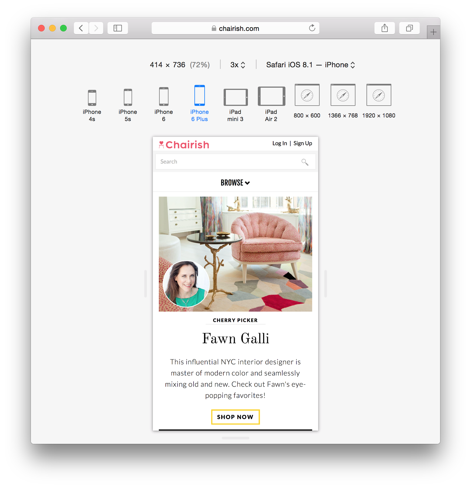
Figure 5-14. Safari’s Responsive Design mode
To emulate device size in Microsoft Edge:
-
Open the F12 Developer Tools.
-
Navigate to the Emulation tab (Figure 5-15).
-
Choose a device size from the “Resolution” dropdown.
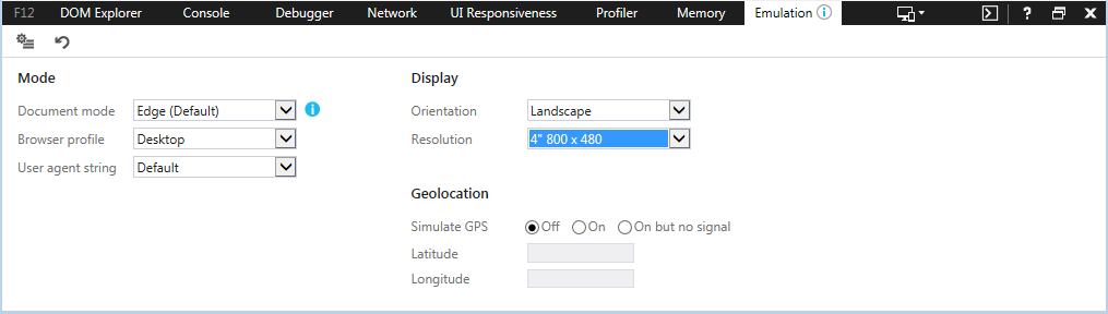
Figure 5-15. Internet Explorer’s F12 Developer Tools Emulation tab
User Agent Spoofing
A user agent is a string that the web browser sends the server to identify itself. The developer tools found in all major browsers allow you to change the user agent, and people often assume that changing this value is effectively the same as simulating a different browser. However, user agent spoofing only changes the way the browser identifies itself; changing the user agent string does not change the browser’s rendering agent.
The Document Object Model (DOM) and CSS Styles
Modern developer tools provide access to the DOM in an interactive state. Elements can be inspected or manipulated by adding, removing, or changing attributes or styles. When an element is selected from the DOM its styles can be analyzed as they are applied or as they are computed.
Figure 5-16 shows each of the CSS rules that are used to style the <body> element in a website as they are applied from various sources. Rules that are inherited are clearly labeled with the files and line numbers they originated from. Styles that are applied to the pseudo ::before and ::after elements are also clearly labeled. Rules that are crossed out are rules that have been overridden by other rules as determined by the cascade. Styles can be added or manipulated in various ways depending on which browser is being used.
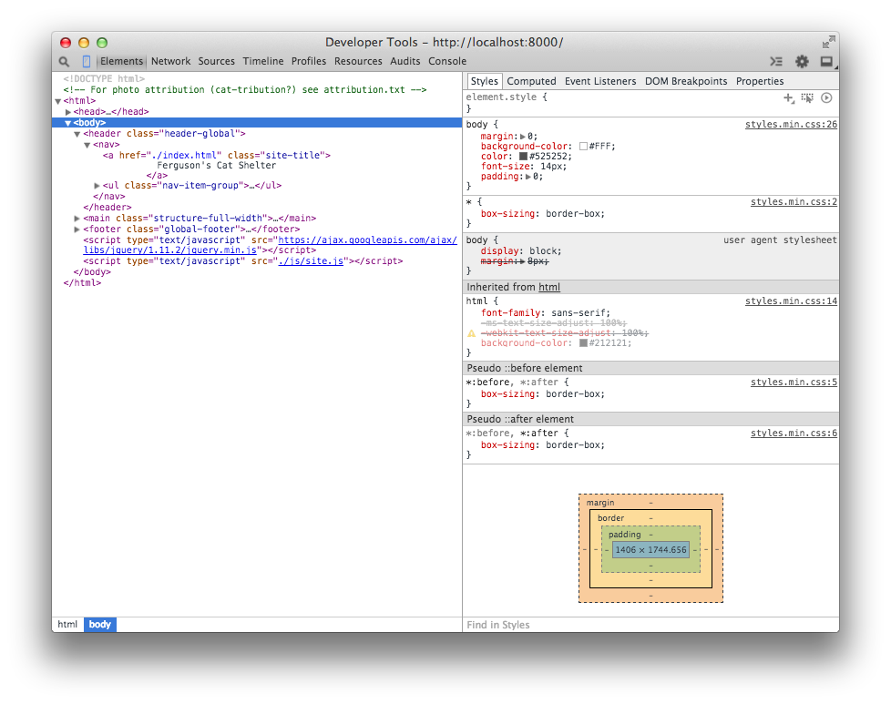
Figure 5-16. The Chrome DevTools Styles panel
Element styles can also be viewed as they would appear after being manipulated by the cascade, as can be seen in Figure 5-17. Expanding a style shows the origin file and line number of the applied style.
To view an element in the DOM, right-click it (Ctrl-click on Mac OS X), and select the “Inspect Element” option from the context menu. This will automatically open the browser’s developer tools and highlight the element in the DOM explorer. The Styles panel appears next to the DOM explorer by default in Chrome, Firefox, and Edge. In Safari, you may need to click the Styles tab at the top right of the developer tools menu to view this tool.
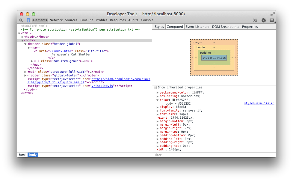
Figure 5-17. The Chrome DevTools Computed Styles tab
Visual Regression Testing
Visual regression testing is a method of testing in which a baseline image of a user interface is compared with other images of the same user interface over time to detect unintended changes (regressions). Visual regressions can be very time-consuming to test because there are lots of browsers that need to be tested, and doing this every time a change is made can result in a lot of testing. Additionally, it can be difficult for the naked eye to determine if small changes in spacing have occurred.
Visual regression testing can be very helpful, but like any method of testing it’s not a silver bullet that will solve all of your problems. By its very nature visual regression testing is used for identifying things that have already gone wrong, so it’s important to do before pushing CSS changes to production.
Tips for Visual Regression Testing
Here are some tips for visual regression testing:
- Test important things
-
Like with unit testing, it can be tempting to try to test every single piece of code you’ve written when writing visual regression tests. However, the more tests you have the more you’ll have to maintain, and on top of that lots of tests aren’t necessarily high-quality tests. Rather than striving for a large quantity of tests, it’s important to test things that really matter. For example, once your base styles are defined, it probably isn’t very likely that they’ll regress; it’s more important to test reusable components that are more complicated and potentially more brittle.
- Make tests granular
-
Visual regression testing makes it easy to test a lot of things all at once by taking a screenshot of an entire page, but it’s important to avoid doing this. When a large number of components are tested together it can be difficult to determine what the actual cause of a regression is because there are so many different things going on. Instead, it’s important to make your tests more granular by testing individual components one at a time. This way if there is a regression, it’ll be much easier to determine the cause.
- Use a variety of browsers
-
Using a variety of browsers for visual regression testing is extremely important since there can be inconsistencies between them. That being said, it’s important not to compare screenshots across browsers because it’s not productive. If one browser renders text a bit differently than another, it’s probably not that big a deal unless it’s really breaking things. This also means that you’ll likely need to have multiple test environments available if you need to test multiple versions of Internet Explorer or Safari, as we learned earlier in this chapter.
Visual Regression Testing with Gemini
Gemini is a project developed by the Yandex team that facilitates visual regression testing. It allows you to write a script that automates taking screenshots of elements with any major browser and then compares them against baseline images with the differences highlighted.
In this example we’ll learn how to use Gemini to test an interface using the WebKit rendering engine, which is accessed through the headless browser PhantomJS. A headless browser is a web browser that doesn’t have a user interface and is used to provide content to other programs. In addition to being able to render and screenshot websites without displaying them, headless browsers usually provide interfaces for developers to supply the browsers with instructions.
Installing Gemini
Gemini requires Node.js and NPM to be installed. You can download Node.js from https://nodejs.org. Installation instructions for Gemini can be found at https://github.com/gemini-testing/gemini. For this example Gemini will also require PhantomJS to be installed. You can download a PhantomJS binary for your operating system from http://phantomjs.org.
Gemini can also test other browsers using Selenium or a cloud service like Sauce Labs or BrowserStack. For detailed instructions, consult the documentation.
Configuration
Once you’ve installed Gemini, you need to create a file named .gemini.js in the root directory of your project. For this simple example, the options that need to be set are shown in Example 5-1. For a complete list of configuration options, visit https://github.com/gemini-testing/gemini.
Example 5-1. Gemini configuration file
module.exports={rootUrl:'http://127.0.0.1:8000',browsers:{phantomjs:{desiredCapabilities:{browserName:'phantomjs'}}}};
The code in Example 5-1 tells Gemini that the root URL is http://127.0.0.1:8000. Given this, as we’ll see in the next section, when we write tests we’ll be able to specify the URLs to test relative to this root URL. This code also tells Gemini that we will be testing with PhantomJS and that when screenshots are taken with this browser, they should use phantomjs as the filename. When using multiple browsers, this helps distinguish which browser took which screenshot.
Tests
Next, you need to write a test file. Gemini has its own set of functions that allow you to open a URL, select particular elements, manipulate the window, and capture a screenshot, among other things. Again, this functionality can be explored in depth in the documentation. For our example, though, we’ll use the code in Example 5-2.
Example 5-2. Gemini test suite file
gemini.suite('animals',function(suite){suite.setUrl('/').setCaptureElements('.animal').capture('plain')});
This code (Example 5-2) is fairly straightforward. First, a test suite is declared and given a name (“animals” in this case) and a function to execute that contains tests. Then the index page of the website (/) is specified as the URL to open using setUrl. Next, the element being tested is selected with .setCaptureElements. Finally, the screenshot is captured using .capture.
Gathering baseline images
Before anything can be tested, baseline images need to be gathered so Gemini has something to compare new screenshots to. To capture baseline images, PhantomJS and Gemini first need to be run in a terminal.
Open a terminal window and issue the command phantomjs --webdriver=4444. The argument --webdriver=4444 runs PhantomJS in WebDriver mode on port 4444. This is what Gemini uses to interact with the browser.
In another terminal window, in the same directory as the .gemini.js file, execute the command gemini update tests/gemini/animal-tests.js to gather the baseline screenshots (animal-tests.js is the test file we just wrote, which is located in the tests/gemini directory). After the baseline images have been gathered, they are stored in a new directory, gemini/screens/animals/plain, in the file phantomjs.png. For our example we’ll have just one baseline image, shown in Figure 5-18.
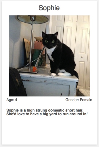
Figure 5-18. Baseline image
Testing regressions
Now that the baseline image has been gathered, we can test for regressions. Since the code we’re testing is brand new and error free, we’ll simply alter the code for illustrative purposes. After altering the CSS for the component being tested, run Gemini using the command gemini test --reporter html tests/gemini/animal-tests.js. This command instructs Gemini to run the tests, compare the screenshots, and output the results to an HTML page that is stored as gemini-report/index.html. Opening that file displays the test results (Figure 5-19).
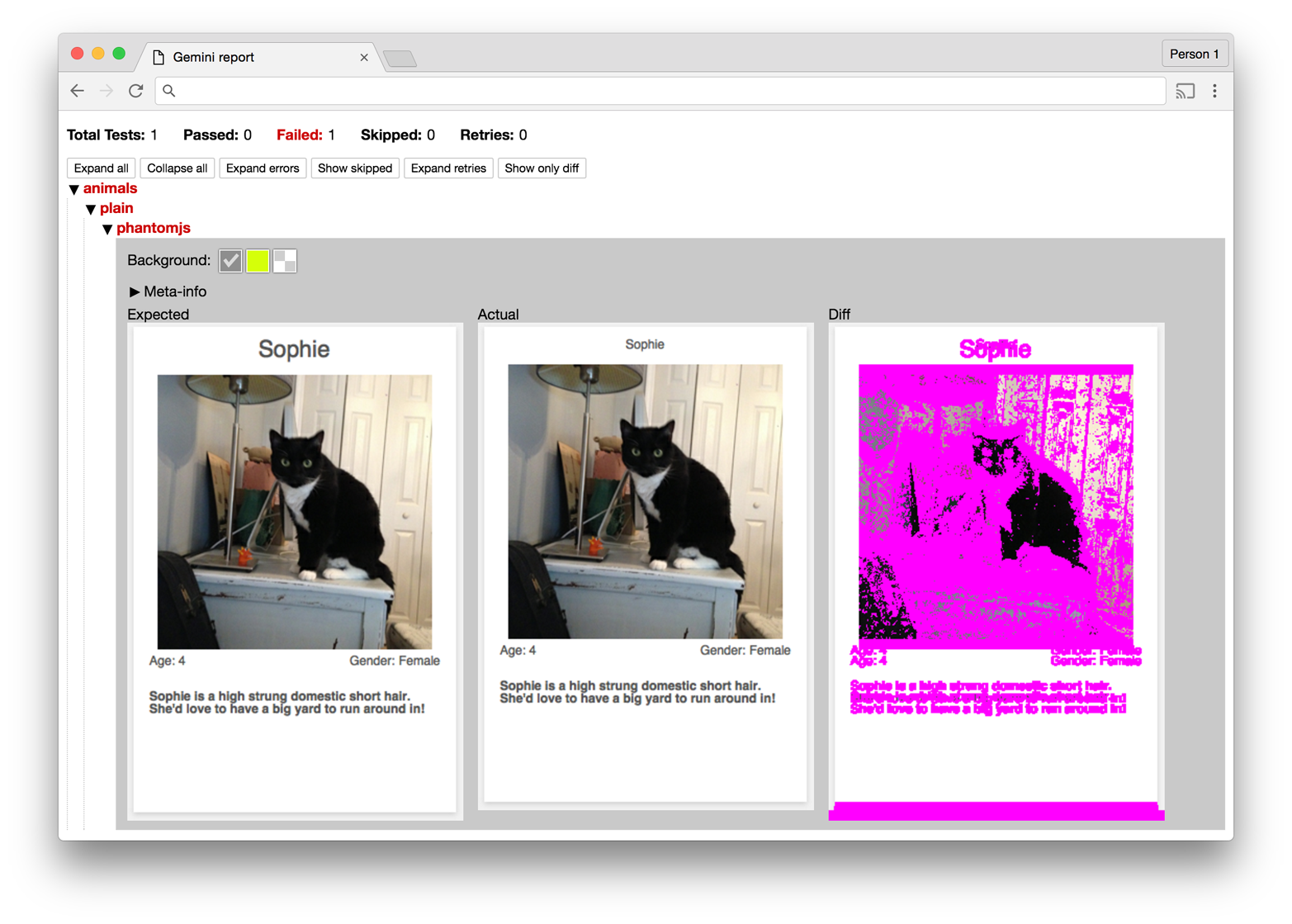
Figure 5-19. Gemini report
The report generated by Gemini provides a summary of the tests and displays the screenshots it used while testing. In Figure 5-19 the difference between the two images seems to be quite large, but analyzing the baseline and current images reveals that the regression is actually a change in font size, which has the side effect of altering the dimensions of the component.
Maintaining Your Code
Testing code is as important as writing it, and over time maintaining quality will be just as important as new code is written. As we’ll see in the next sections, code quality can be maintained by making use of coding standards and pattern libraries.
Coding Standards
Coding standards are guidelines that are written to encourage everyone on a team to write code the same way. Coding standards should be written collaboratively and reviewed and updated on a regular basis. As technology changes, coding standards can help your team keep track of the most up-to-date techniques, especially during code reviews. CSS coding standards commonly dictate conventions regarding commenting, formatting, naming, and selector usage, but they can be as specific or generic as you want.
Take a look at the sample coding standards in Example 5-3. They are intended to serve as a starting point for you and your team to begin the conversation about how CSS should be written in your project. Coding standards can be written and stored in any place that’s convenient for you and your team, but they should be easily accessible so anybody can reference them.
Example 5-3. Example coding standards
1. Commenting:

  A. Each file should begin with a comment that explains what the file contains:

        /**
         * This file contains styles for tab groups.
         * Tab groups are intended to only contain elements with the tab class.
         */

  B. Properties that might be confusing should have a comment explaining them:

        .tab-group-flush {
            display: block;
            margin-left: -12px; /* removes parent container's padding */
            margin-right: -12px; /* removes parent container's padding */
        }

2. Formatting:

  A. Rulesets should:

      - appear on multiple lines when multiple properties are present
      - contain declarations that are indented 4 spaces

        /* Incorrect */
        .selector {
        property1: value;
        property2: value;
        }

        /* Incorrect */
        .selector {
                property1: value;
                property2: value;
        }

        /* Incorrect */
        .selector { property1: value; property2: value; }

        /* Correct */
        .selector {
            property1: value;
            property2: value;
        }

  B. Declarations should:

      - contain one space after the colon
      - always end with a semicolon

        /* Incorrect */
        .selector {
            property1:value;
        }

        /* Incorrect */
        .selector {
            property1: value
        }

        /* Incorrect */
        .selector {
            property1 : value;
        }

        /* Correct */
        .selector {
            property1: value;
        }

  C. Rulesets may appear on one line only when multiple rulesets are
     styling background-position differently

        /* Incorrect */
        .selector1 { property1: value; property2: value; }
        .selector2 { property1: value; property2: value; }
        .selector3 { property1: value; property2: value; }

        /* Correct */
        .selector1 { background-position: 0 0;     }
        .selector2 { background-position: 0 -10px; }
        .selector3 { background-position: 0 -10px; }

  D. Trailing whitespace must be removed from rulesets and declarations

2. Selector Naming Conventions:

  A. Only lowercase letters may be used

        /* Incorrect */
        .SeleCtor {}
        .SELECTOR {}

        /* Correct */
        .selector {}

  B. Selectors with multiple words must use spinal-case

        /* Incorrect: */
        .selectorWithMultipleWords {}
        .SELECTORWITHMULTIPLEWORDS {}
        .selector_with_multiple_words {}
        .selectorWith_multiple-words {}

        /* Correct */
        .selector-with-multiple-words {}

  C. IDs must not be used to style elements; use classes instead

        /* Incorrect */
        #element-to-style {}

        /* Correct */
        .element-to-style {}

  D. Style changes made by JavaScript (regardless of the framework used)
     must be done by adding or removing CSS classes

        /**
         * Incorrect an element's style is changed via the style
         * attribute in JavaScript
         */
        $('.js-menu-item').on('click', function (e) {
            $(this).css('background-color', '#FFFF00');
        });

        /**
         * Correct: an element's style is changed by adding a class with
         * JavaScript
         */
        $('.js-menu-item').on('click', function (e) {
            $(this).addClass('highlighted');
        });

  E. Classes and IDs that are used as JavaScript selectors must be prefixed
     with js- and must not be present in a stylesheet

        /**
         * Incorrect: styles prepended with js- should not be in a
         * stylesheet
         */
        #js-element-only-used-by-javascript {
            background-color: #FFFF00;
        }

        /**
         * Incorrect: an element is selected in JavaScript by a class
         * used to style the element
         */
        $('.menu-item').on('click', function () {
            $(this).addClass('highlighted');
        });

        /**
         * Correct: an element is selected in JavaScript by a selector
         * intended for JavaScript
         */
        $('.js-menu-item').on('click', function () {
            $(this).addClass('highlighted');
        });

  F. Meaningful class names must be used

        /* Incorrect: Class name is meaningless */
        .r {}

        /* Correct: Class name is meaningful and descriptive */
        .resident {}

  G. Class names must describe what is being styled as opposed to how it
  is being styled

        /* Incorrect: describes style being applied */
        .float-left-bold {}

        /* Correct: describes what is being styled */
        .sidebar-important {}

3. Properties

  A. Shorthand properties may only be used for border, margin, and padding

        /* Incorrect: shorthand is used for font property */
        .selector {
            border: 1px solid #000000;
            font: 12px Arial, sans-serif;
        }

        /* Correct: shorthand is only used for border property */
        .selector {
            border: 1px solid #000000;
            font-family: Arial, sans-serif;
            font-size: 12px;
        }

  B. Properties must be alphabetized

        /* Incorrect */
        .selector {
            padding: 12px;
            margin: 24px;
            border: 1px solid #000000;
        }

        /* Correct */
        .selector {
            border: 1px solid #000000;
            margin: 24px;
            padding: 12px;
        }

  C. Properties with a value of 0 must omit the units

        /* Incorrect */
        .selector {
            padding: 0px;
            margin: 0px;
            border: 1px solid #000000;
        }

        /* Correct */
        .selector {
            border: 1px solid #000000;
            margin: 0;
            padding: 0;
        }
For more inspiration, take a look at these examples:
Pattern Libraries
A pattern library (sometimes called a style guide) is a collection of user interface patterns that are used on a website and are displayed with information that is important relative to each pattern. Some of this information may include:
-
Guidelines for when and when not to use a pattern
-
Sample markup explaining how to use a pattern
-
Information about why one pattern is used instead of a different one
Figure 5-20 is an example of a pattern library used by Yelp.
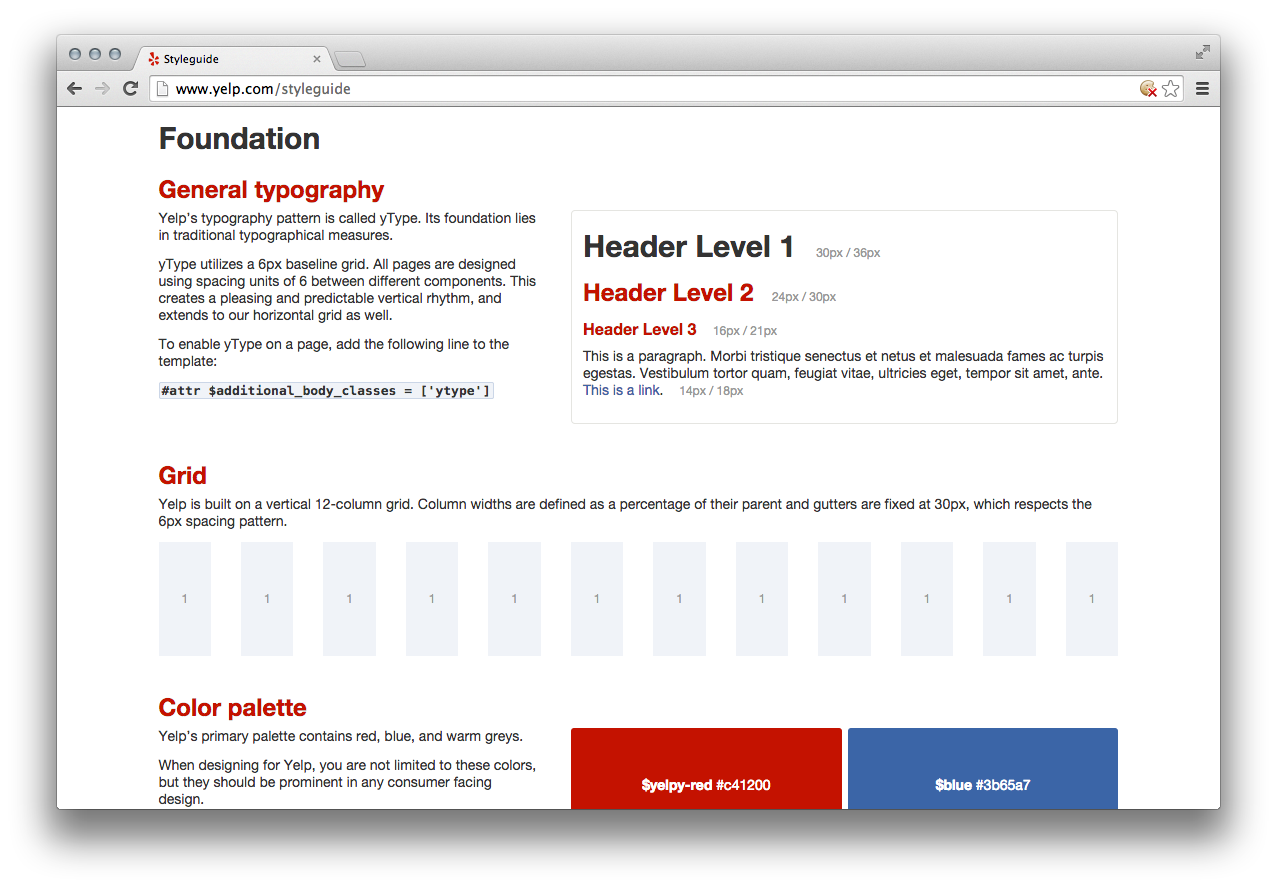
Figure 5-20. Yelp pattern library
Benefits
Pattern libraries are beneficial for a number of reasons. First, a pattern library provides a place where all of the components that make up a website can be seen. This gives everyone involved in a project the same access to the building blocks that make up the website and helps ensure that they are familiar with how things work. Familiarizing everyone with a reusable set of patterns will also provide the added benefit of making development faster because these building blocks won’t need to be rebuilt from scratch for each new project.
Having everything in one place also encourages user interfaces to be built consistently. This can benefit a design team because it allows them to take inventory of existing patterns in the event that they need to change the way something looks. It also provides a constraint on design by encouraging new screens to be designed with these existing patterns, which further solidifies the idea that user interfaces should be consistent.
Finally, when all of the components that make up a website are displayed next to each other detecting inconsistencies becomes easier. Before deploying new code that affects the user interface, a pattern library provides a convenient place to look for visual regressions. When a change is made to a pattern and something doesn’t look right, it becomes easier to diagnose the problem because the pattern is in its simplest form in a pattern library.
Building a pattern library
A pattern library doesn’t need to be a work of art; it just needs to display each of the patterns and information about them. It can be as simple or complex as necessary. A pattern library should be available for everyone on the team to access in a public place so it can be consulted on a regular basis.
Building a pattern library should be a group effort because it encourages more people to familiarize themselves with the visual design patterns that are used on a website. Implementing a pattern library also provides a forum for team members to voice their opinions about everything from the user experience to its implementation, so a lot of new insight can come as a result of this effort. If you don’t already have one, a pattern library should be first built to document the current condition of the user interface and then be iterated upon.
Pattern libraries promote the idea that styles have different intents and illustrate how styles should be combined like building blocks to build more complex patterns. Ideally each pattern should be documented with a working implementation of the pattern, notes about the pattern that include guidelines for when and when not to use it, and a code sample that shows how to implement the pattern. Pattern libraries also provide a terrific place to start visual regression testing. MailChimp’s pattern library (Figure 5-21) does a great job of accomplishing all of these things.
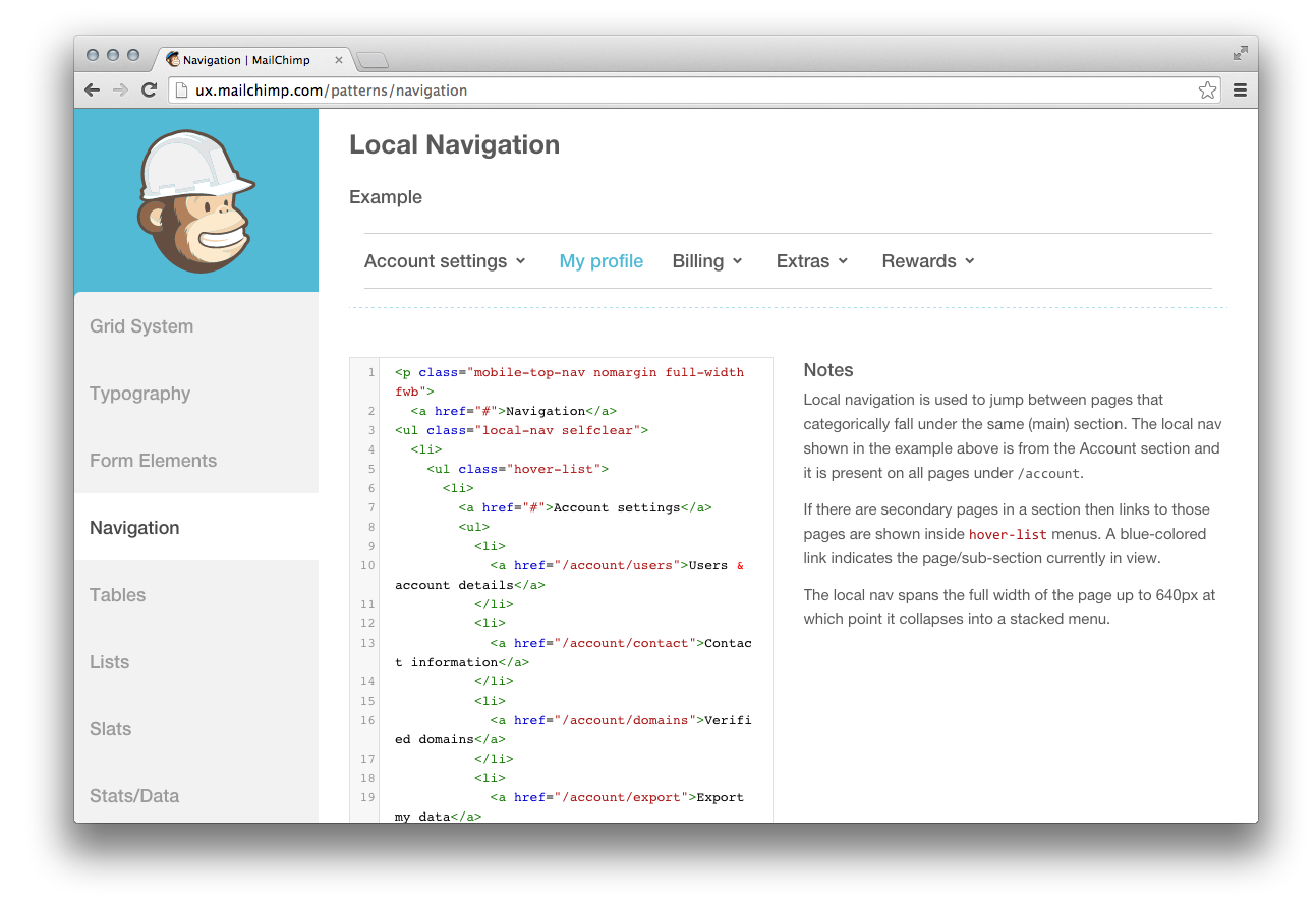
Figure 5-21. MailChimp’s pattern library
More Resources
For more pattern library resources, including examples, articles, books, and podcasts, visit http://styleguides.io.
Chapter Summary
In this chapter we learned about testing CSS. We explored why testing CSS changes is time-consuming and difficult, thanks to the multiplicity of browsers and form factors that need to be tested. Resources were provided for obtaining new and old browsers, as well as emulators, virtual machines, and services for testing on other platforms. The benefits of establishing coding standards and pattern libraries were discussed, as well as visual regression testing with Gemini. With these tools at your disposal, testing CSS should be more approachable.