Table of Contents for
High Performance Responsive Design
 High Performance Responsive Design
Published by
O'Reilly Media, Inc., 2014
High Performance Responsive Design
Published by
O'Reilly Media, Inc., 2014
- Cover
- High Performance Responsive Design: Building Faster Sites Across Devices
- High Performance Responsive Design: Building Faster Sites Across Devices
- Preface
- 1. State of the Industry of Responsive Design
- 2. Primer on Performance of Web Applications
- 3. Start with a Plan
- 4. The Backend
- 5. The Frontend
- 6. Continuous Web Performance Testing
- 7. Frameworks
- A. About the Author
- B. High Performance Responsive Design
- Index
- About the Author
- Copyright
Chapter 7. Frameworks
Looking at the State of Responsive Frameworks
So far, we have looked at web performance patterns and anti-patterns in the world of responsive design. We’ve looked at crafting our own solutions to implement these patterns of best practices, both from the client side and the server side. Chapter 6 shows how to create automated tests via PhantomJS to verify the adherence to our performance-responsive design patterns and include them in a continuous integration (CI) workflow using Jenkins. In this chapter, we will explore some of the frameworks that are available, and analyze how they handle web performance. Different types of responsive frameworks exist: there are boilerplates that give predetermined page layouts; there are grid systems that just define responsive grid layouts; and then there are complete solutions that include different page layouts with reusable modules, web fonts, and JavaScript functionality.
If you look at the overall landscape of frameworks, the first thing you’ll note is that they are all implemented for the frontend. In these frameworks, there will generally be predefined CSS that describes the styling of a module such as a button or a grid, or even complex UI elements such as accordions and sliders and guided navigation. You can use these modules by assigning their classes to elements on your page. Some frameworks have a JavaScript API with which you can programmatically create styled elements on your page.
As of this writing, the biggest names in frameworks are Twitter’s Bootstrap and Foundation from ZURB. In fact, when we look at Google Trend to compare relative search interest in Bootstrap and Foundation to other frameworks, we need to create two different charts because the interest in Bootstrap is a full order of magnitude greater than interest in the other frameworks, which is amply illustrated in Figure 7-1 and Figure 7-2.
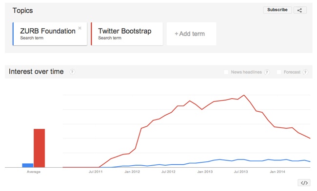
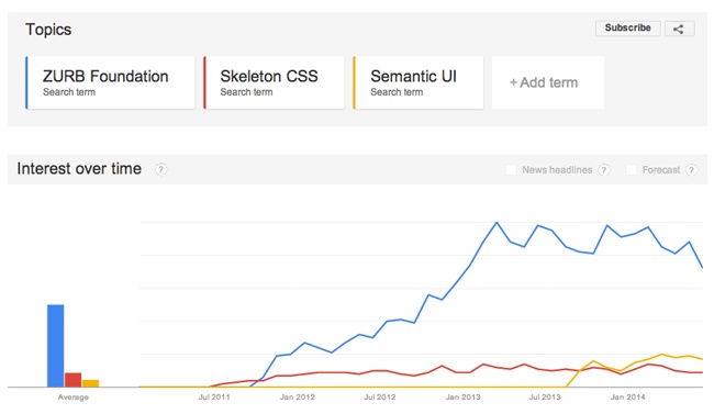
In Figure 7-1 and Figure 7-2, note the difference in scale between the two Google Trend images, with Foundation being the common link between the two charts (the blue line in both charts).
We will begin by establishing criteria that we will be using to evaluate these frameworks.
Our criteria will be the following:
What patterns and/or anti-patterns does the framework use?
How easy is it to use?
What is the size of the framework, including dependencies?
What, if any, dependencies does the framework have, including dependencies on other frameworks or libraries?
Let’s commence the evaluation by first looking at Twitter’s Bootstrap.
Twitter Bootstrap
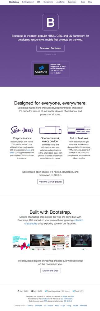
Bootstrap is a frontend, open source framework created in 2011 by Mark Otto and Jacob Thornton at Twitter and is available at http://getbootstrap.com/. Figure 7-3 shows the Bootstrap home page.
Bootstrap’s base installation comes with predefined CSS and JavaScript to implement a set of frontend components that have responsiveness built in to them. These components include buttons, tabs, progress bars, grid systems, patterns for alerts, and even specific page layouts.
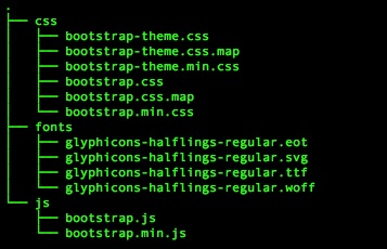
The install consists of the directory structure, which you can see in Figure 7-4.
Using Bootstrap is as simple as including the core CSS and JavaScript files on your page, and then you begin using predefined components. Also note that Bootstrap requires JQuery:
<link href="css/bootstrap.min.css" rel="stylesheet">
<script src="js/bootstrap.min.js"></script>
<script src="https://ajax.googleapis.com/ajax/libs/jquery/
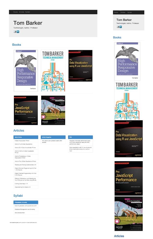
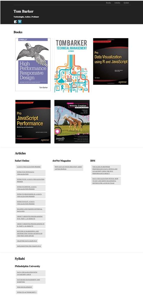
1.11.1/jquery.min.js"></script>It’s easy to see why Bootstrap is so popular: in around 20 minutes, using the built-in components and styles from Bootstrap, I was able to construct the website shown in Figure 7-5 (it’s available at http://tomjbarker.github.io/).
Evaluation
Take a look at Table 7-1 to see how Bootstrap fared in our evaluation.
PATTERNS/ANTI-PATTERNS | Out of the box, Bootstrap will load the same assets for each experience. Images will be resized on the client side to fit the viewport. There are JQuery plug-ins that you can use to somewhat address this. A popular one is HiSRC (available at https://github.com/teleject/hisrc), that loads a smaller, mobile-friendly image first and then, depending on the connection speed and the client device pixel ratio, loads additional larger images. Though this fixes the small-screen scenario, in that it loads a device-specific asset, it then must load additional assets for larger screen experiences. |
EASE OF USE | Using existing Bootstrap modules and styling, I was able to construct a responsive website in less than 20 minutes. |
DEPENDENCIES | JQuery |
SIZE OF THE FRAMEWORK (AND DEPENDENCIES) | The minimum installation requires Bootstrap’s CSS and JavaScript as well as JQuery. As of this writing, the totals for these are: bootstrap.min.css: 107 KB jquery.min.js: 82.6 KB bootstrap.min.js: 31KB ------------------------------------- Grand total: 220.6 KB Keep in mind that this is just the minimum installation. There are themes and web fonts that you might also want to use which would add to that total. |
ZURB Foundation
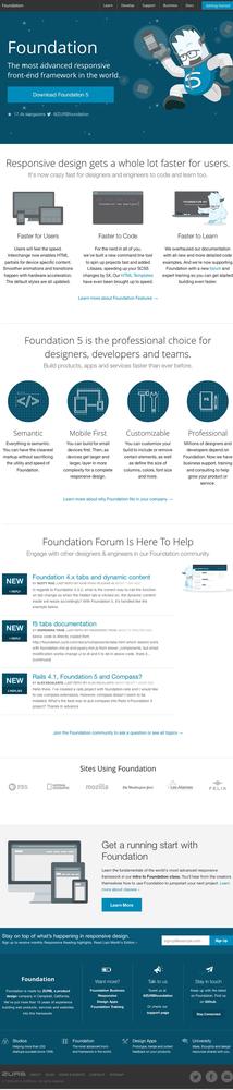
The next framework we will evaluate is Foundation by ZURB, a design firm from California. Foundation was created and made available as open source in 2011. You can download it from http://foundation.zurb.com/. Figure 7-6 depicts the Foundation home page.
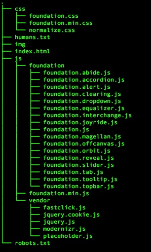
Downloading and unzipping the framework creates the directory structure shown in Figure 7-7.
Just like Bootstrap, Foundation comes with prestyled components, including media queries to handle different viewport sizes. Also, like Bootstrap, pages are arranged in rows and columns with CSS classes assigned to <div>s to specify explicit grid structure and which component to load.
Using the built-in components from Foundation, I constructed the website presented in Figure 7-8. You can look at the site at http://bit.ly/10RjT1n. Table 7-2 provides the evaluation data.

Let’s look at how Foundation fared, see Table 7-2.
PATTERNS/ANTI-PATTERNS | Same assets loaded for every experience, images resized client-side |
EASE OF USE | Same as Bootstrap, using the prepackaged modules |
DEPENDENCIES | Modernizr, JQuery |
SIZE OF THE FRAMEWORK (AND DEPENDENCIES) | foundation.css: 153.6 KB modernizr.js: 11 KB jquery.js: 82.6 KB foundation.js: (minified) 89.9 KB ------------------------------------- Grand total: 337.1 KB |
Skeleton
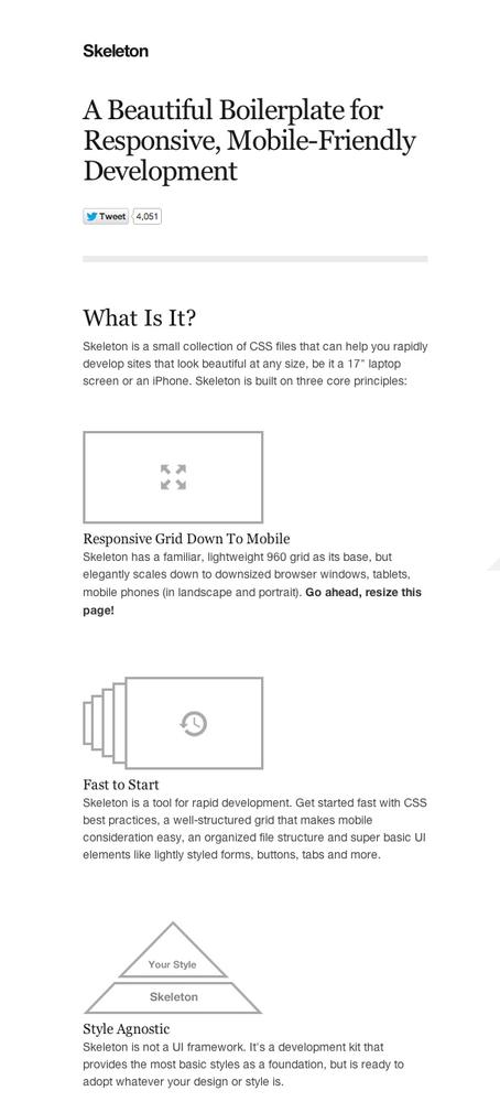
Skeleton was created and released in 2011 by Dave Gamache, formerly of Twitter. You can download it from http://www.getskeleton.com/. Figure 7-9 shows the Skeleton home page.
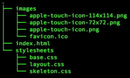
If you download and unzip the Skeleton framework, you can see that it is more of a boilerplate, with an index.html page for us to edit and an existing directory hierarchy with the necessary CSS and images that the code references. Figure 7-10 illustrates the unzipped Skeleton directory tree structure.
Whereas Bootstrap comes with prestyled components such as the Jumbotron, Skeleton takes a much more minimalist approach. There is barely any styling to speak of; mainly it offers just buttons, forms, and typography, along with layout definitions. The idea is to use Skeleton for minimal layout and layer your own styles on top of it.
Using the included boilerplate, you can construct a website similar in structure to the previous examples, styled in in the minimalist vein of Skeleton, as shown in Figure 7-11. You can obtain Skeleton at http://tomjbarker.github.io/skeleton/.
Evaluation
Let’s see how Skeleton fared in our evaluation criteria, see Table 7-3.
PATTERNS/ANTI-PATTERNS | Skeleton loads the same assets for all device experiences. The upside is that there is so little to the framework that it is the smallest possible footprint anyway. |
EASE OF USE | Easy-to-use, baked-in styles, but if you want to have any sort of styling you must add your own. |
DEPENDENCIES | None |
SIZE OF THE FRAMEWORK (AND DEPENDENCIES) | Skeleton really is a minimal install. We only need two of the CSS files that come with the install, base.css and skeleton.css. These files don’t come minified, but for my example I minified them. The totals for these, at the time of this writing, are: base.css: (minified) 6.1KB skeleton.css: (minified) 5.4 KB layout.css: 1.7 KB ------------------------------------- Grand total: 13.2 KB Keep in mind that this doesn’t count any styling we might want to layer on top of Skeleton. And, unless you want the bare minimum of design (any you might actually want that), you will need to add additional styling. |
Semantic UI
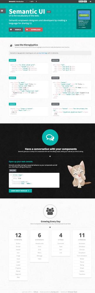
Semantic UI is another web framework, again implemented on the frontend, that provides prestyled UI components with client-side responsiveness built in. It is available at http://semantic-ui.com/. Figure 7-12 presents a screenshot of the Semantic UI home page.
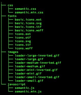
From the home page, you can download a ZIP file that contains the directory structures that shown in Figure 7-13. There is an examples directory that contains a couple of sample pages that demonstrate how to use the framework, a less directory that contains individual LESS files for each component, a minified directory that holds individual minified CSS files for each component. There is also a packaged directory that contains all of the UI components and the JavaScript API aggregated into a single CSS and JavaScript file (plus the minified version of these packaged files). Figure 7-14 shows the contents of the packaged directory. Finally, there is an uncompressed directory that contains all of the individual components as (uncompressed) CSS files.
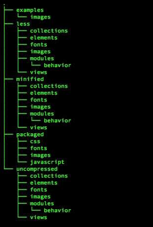
In Figure 7-14, observe that the download also included CSS files for individual components so that we can choose to only utilize the files for the modules that we are using
Using the packaged CSS and based on the homepage.html example from the download, I was able to construct the example website displayed in Figure 7-15. The example is available at http://tomjbarker.github.io/semantic/.
Evaluation
Let’s see how Semantic UI fared in our evaluation criteria (Table 7-4).
Again, Semantic is a frontend framework that has all of the same anti-patterns with which we are all too familiar. | |
EASE OF USE | Same as Bootstrap and Foundation |
DEPENDENCIES | JQuery |
SIZE OF THE FRAMEWORK (AND DEPENDENCIES) | semantic.css: (minified) 231KB jquery.js: 82.6 KB semantic.js: (minified) 134.4 KB ------------------------------------- Grand total: 448 KB |
A Comparison of Frontend Frameworks
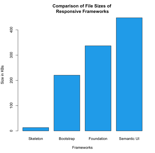
When you compare the raw numbers, you can see that from the pool of frameworks that we’ve looked at, Semantic is the heaviest of the group—if you are using the packaged files and not cherry-picking components to include. Figure 7-16 provides a side-by-side comparison of the sheer size of the frameworks.
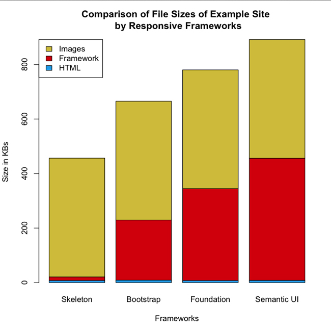
Figure 7-16 illustrates clearly that the sizes vary drastically, from 13 KB for Skeleton, up to 448 KB for Semantic UI. Taking this a step further, if you then look at the example websites using these frameworks—all with the same exact content—and look at the total payload for each site, breaking out the total payload for each asset type, you can see that the page size gets inflated from 460 KB, in the case of our Skeleton example, up to 907 KB for our Semantic UI example. Figure 7-17 depicts this break out.
What is evident in Figure 7-17 is how the size of the frameworks impact the size of the overall page payload, where the red segments represents the size of the frameworks, whereas the blue segments represents the size of the HTML needed to create the pages, and the yellow segments represent the size of the images used in the pages. Notice that all the pages use the same images, and require roughly the same amount of HTML (within a 2 KB difference) to implement.
Ripple
When I surveyed the landscape of responsive frameworks, it became clear to me that they are all frontend frameworks, and with the exception of Skeleton, they are not designed with performance in mind. Armed with this knowledge, I decided to create a bare-bones boilerplate using NodeJS to set up a full-stack responsive website using the principles that we have been discussing in this book. I named the boilerplate Ripple, and made it available for you at https://github.com/tomjbarker/Ripple. Following is the source code for Ripple:
var http = require("http");
var url = require("url");

var handle = {}
handle["/"] = checkUA;
handle["/favicon.ico"] = favicon;

var uaViewPortCategories = {
    "320": new RegExp(/Nexus S|iPhone|BB10|Nexus 4|Nexus 5|
HTC|LG|GT/),
    "640": new RegExp(/Nexus 7/),
    "1024": new RegExp(/Silk|iPad|Android/)
};

var assetPath = {
    "css": "assets/css/1024/",
    "img": "assets/img/1024/",
    "js": "assets/js/1024/"
};

var serv = http.createServer(function (req, res) {
    var pathname = url.parse(req.url).pathname;
    route(pathname, res, req);
});

function route(path, res, req){
    console.log("routing " + path)
    handle[path](res, req);
}

function checkUA(res, req) {
    var ua = req.headers["user-agent"]
    var re = new RegExp(/iPhone|iPod|iPad|Mobile|Android/);
    if(re.exec(ua)){
        getMobileCapabilities(ua, res);
    }
    renderExperience(res);
}

function getMobileCapabilities(ua, res){
    res.writeHead(200, { "Content-Type": "text/html" });
    var viewPortWidth = 1024;
    if(uaViewPortCategories["320"].exec(ua)){
        viewPortWidth = 320
    }else if(uaViewPortCategories["640"].exec(ua)){
        viewPortWidth = 640
    }else if(uaViewPortCategories["1024"].exec(ua)){
        viewPortWidth = 1024
    }

    assetPath.css = "assets/css/"+viewPortWidth+"/";
    assetPath.img = "assets/img/"+viewPortWidth+"/"
    assetPath.js = "assets/js/"+viewPortWidth+"/"
}

function renderExperience(res){
    res.writeHead(200, { "Content-Type": "text/html" });
    res.write(assetPath.css + "<br/>");
    res.write(assetPath.img + "<br/>");
    res.end(assetPath.js);
}

function favicon(res, req){
    res.writeHead(200, {
'Content-Type': 'image/x-icon'
} );
    res.end();
}

serv.listen(80);
To run the boilerplate, simply download the project from GitHub, change directory into the project directory, and then run the engine.js file from node, as follows:
node engine.js
The engine file checks the User Agent from the HTTP request, runs a series of regular expressions against the User Agent to determine the client, and based on the determination creates paths to static assets that are appropriate to the viewport size of the client device.
Summary
As of this writing, all of the frameworks available are frontend frameworks. With the exception of Skeleton, most are heavy—some would say bloated—and all follow the same anti-patterns of loading the same assets for every device experience.
Again, as of this writing, there are no mainstream server-side frameworks or boilerplates available; if you are interested in what you’ve read so far and want to explore the concepts further, I hope you will check out Ripple and begin exploring the performance benefits that can be gained from focusing on responsiveness from the server side.